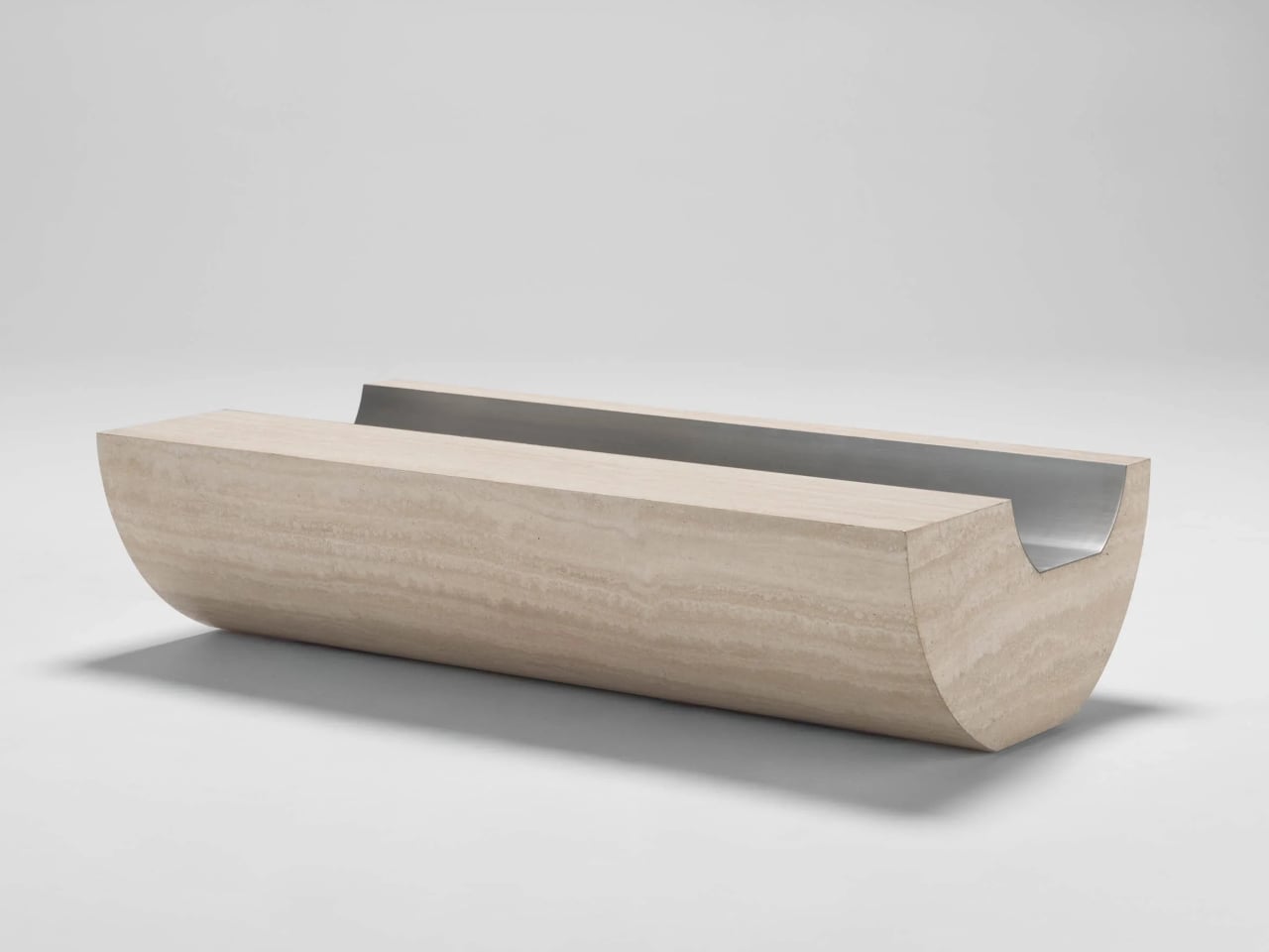
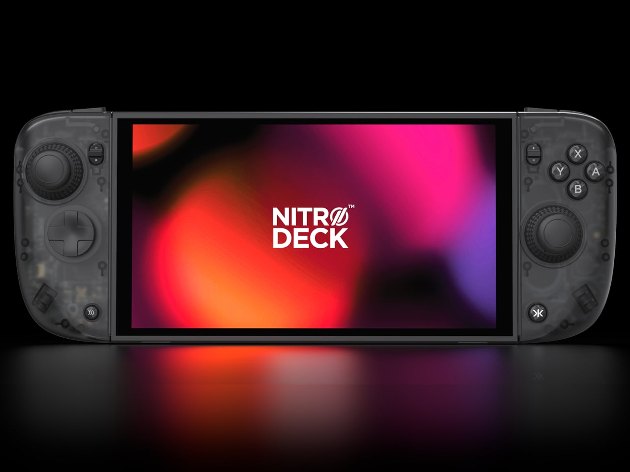
The first Nitro Deck and similar shells made the Nintendo Switch feel more like a proper controller, but they were still mostly one-trick grips that lived in handheld mode. With the Switch 2 looming, there is a chance to rethink what a deck shell should be, not just for Nintendo’s next handheld but for PC, mobile, and TV play. Nitro Deck 2 is CRKD’s answer, expanding the idea from grip to multi-platform controller.
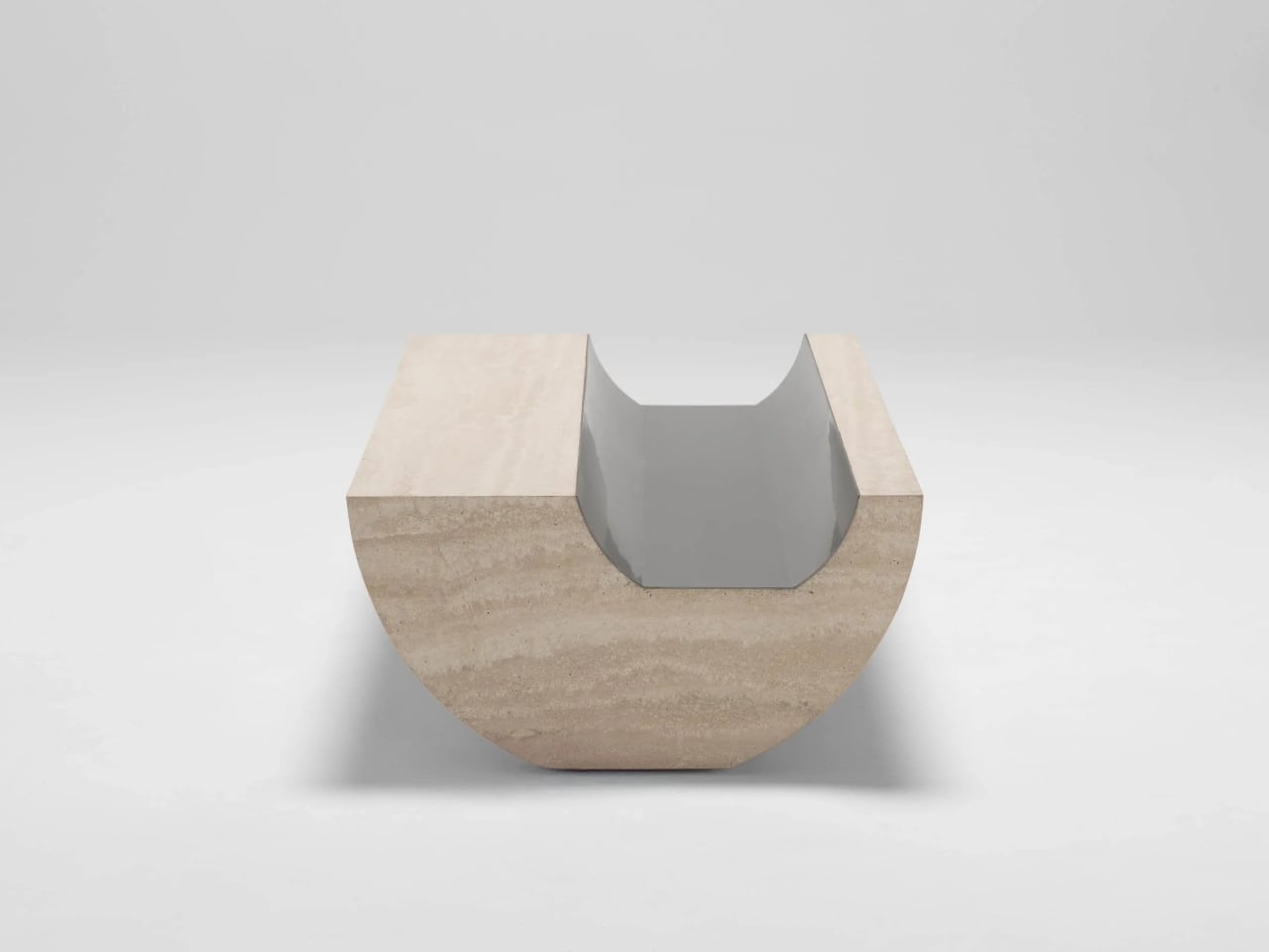
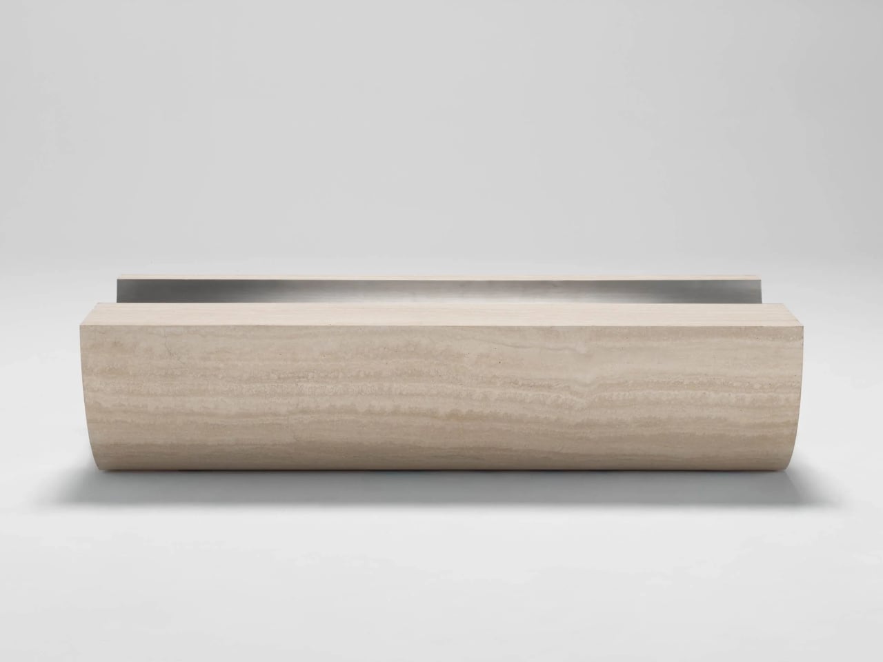
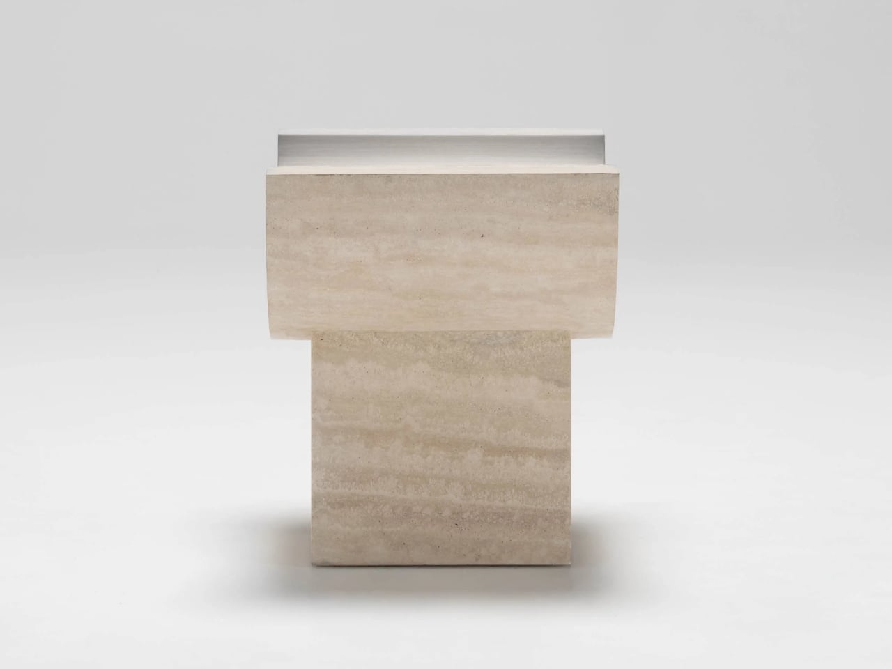
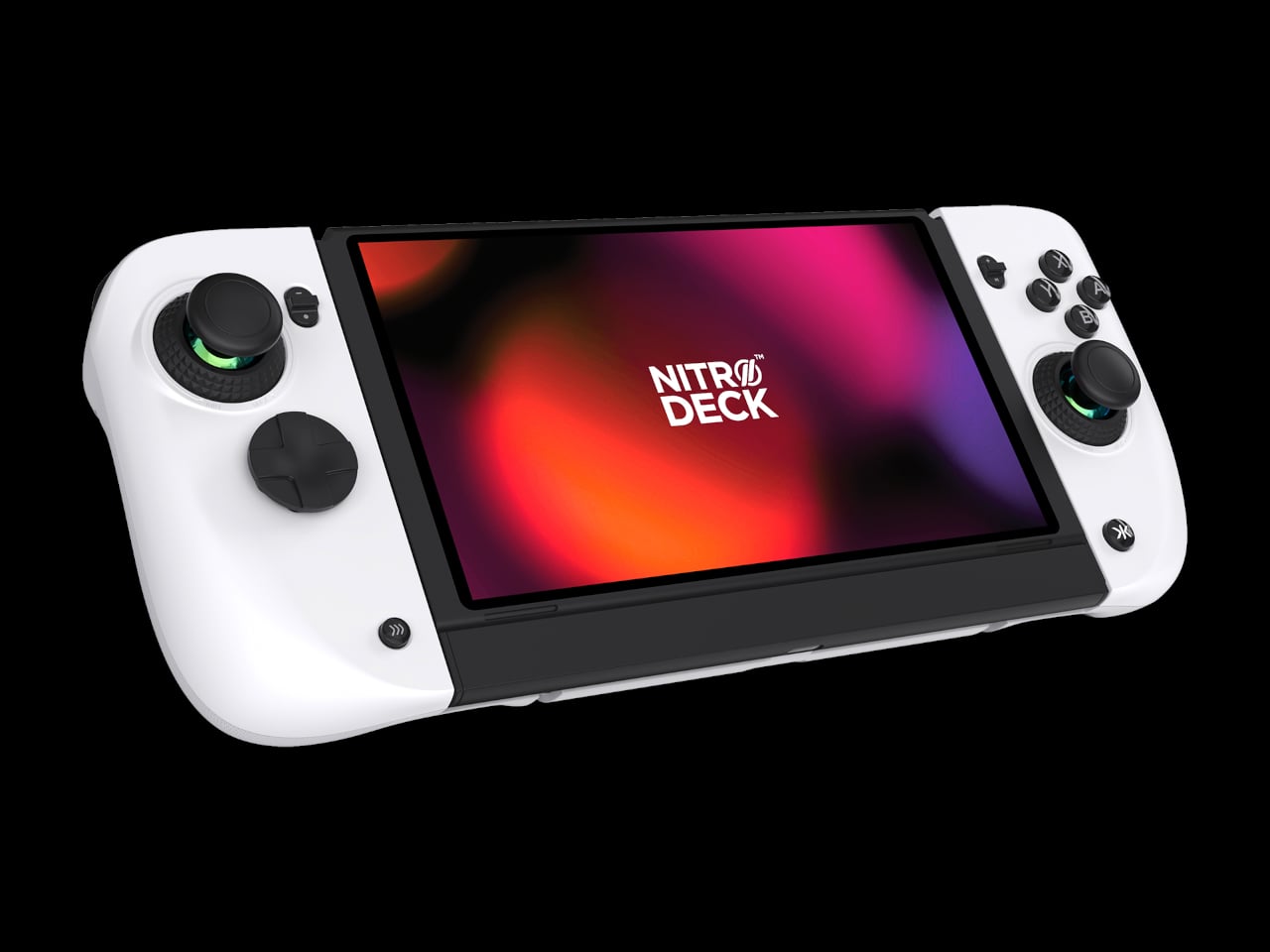
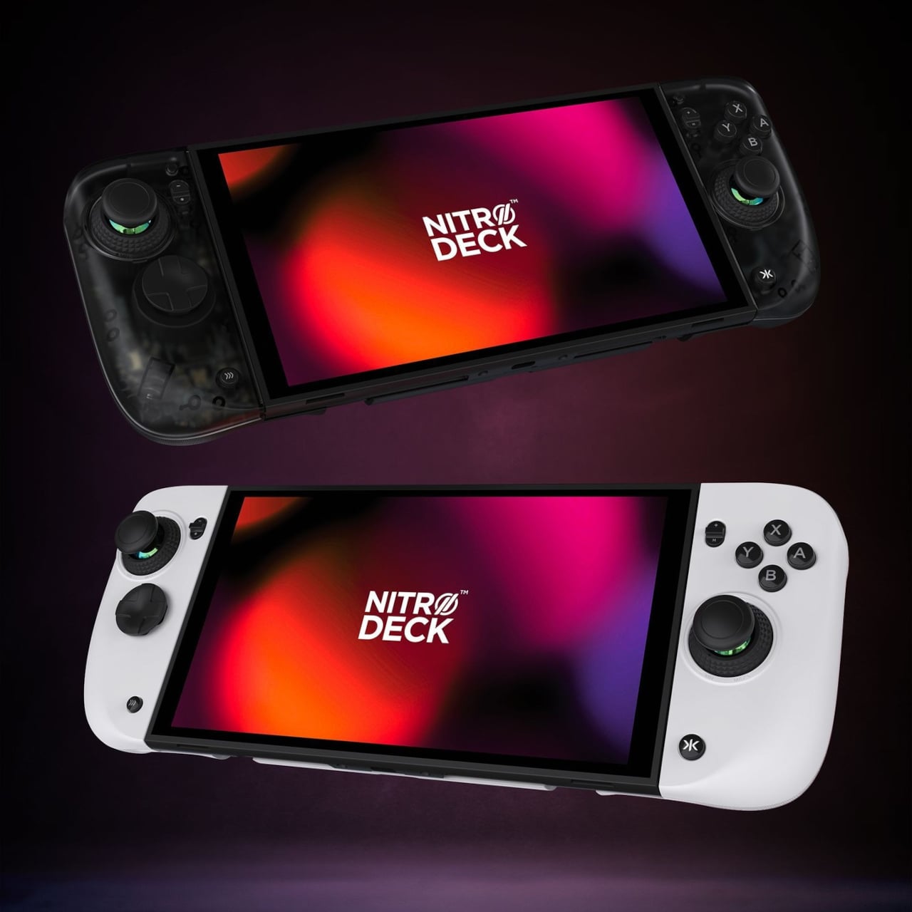
CRKD frames it as a completely new product engineered for the Nintendo Switch 2 and fully backward compatible with the Switch and the Switch OLED, with redesigned ergonomics and expanded versatility across PC, mobile, and smart TVs via Bluetooth and USB. It holds your console for handheld play, but the removable centerpiece lets it convert into a standalone pro-style controller when the console is docked, which is the big conceptual shift from shell to system.
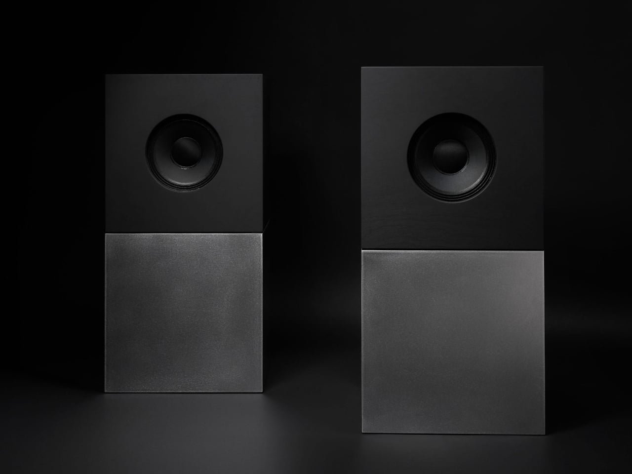
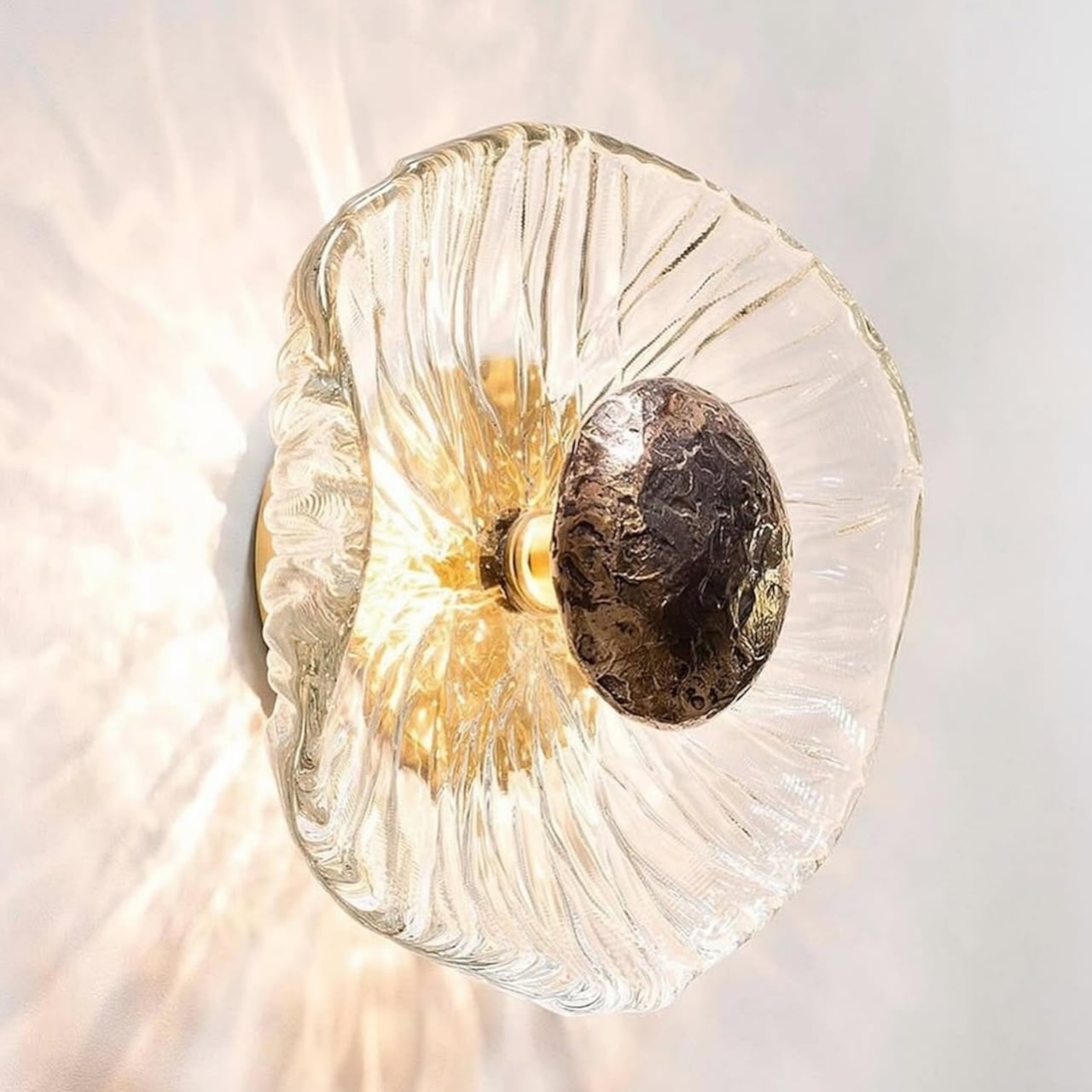
Designer: CRKD
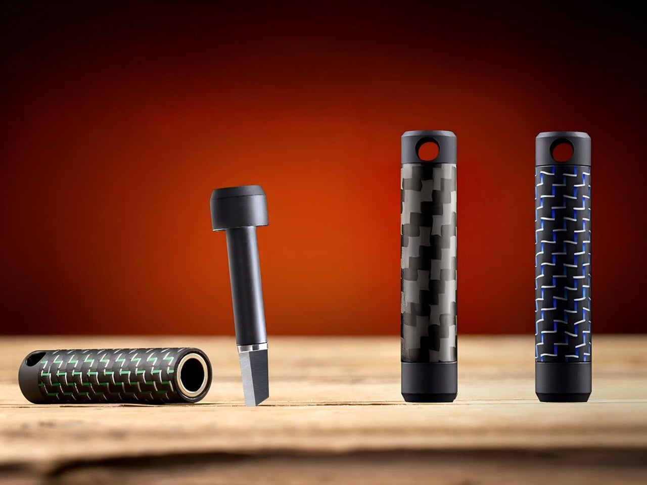
CaptiStick is a capacitor-based, zero-contact sensor design meant to eliminate stick drift and deliver long-lasting precision with no electromagnetic interference. That is CRKD’s alternative to traditional potentiometer sticks that wear out, and Hall Effect sticks that rely on magnets. Nitro Deck 2 also adds adjustable thumbstick resistance and deadzone, tunable through the CRKD Companion App, so you can dial in how loose or tight the sticks feel depending on the game.
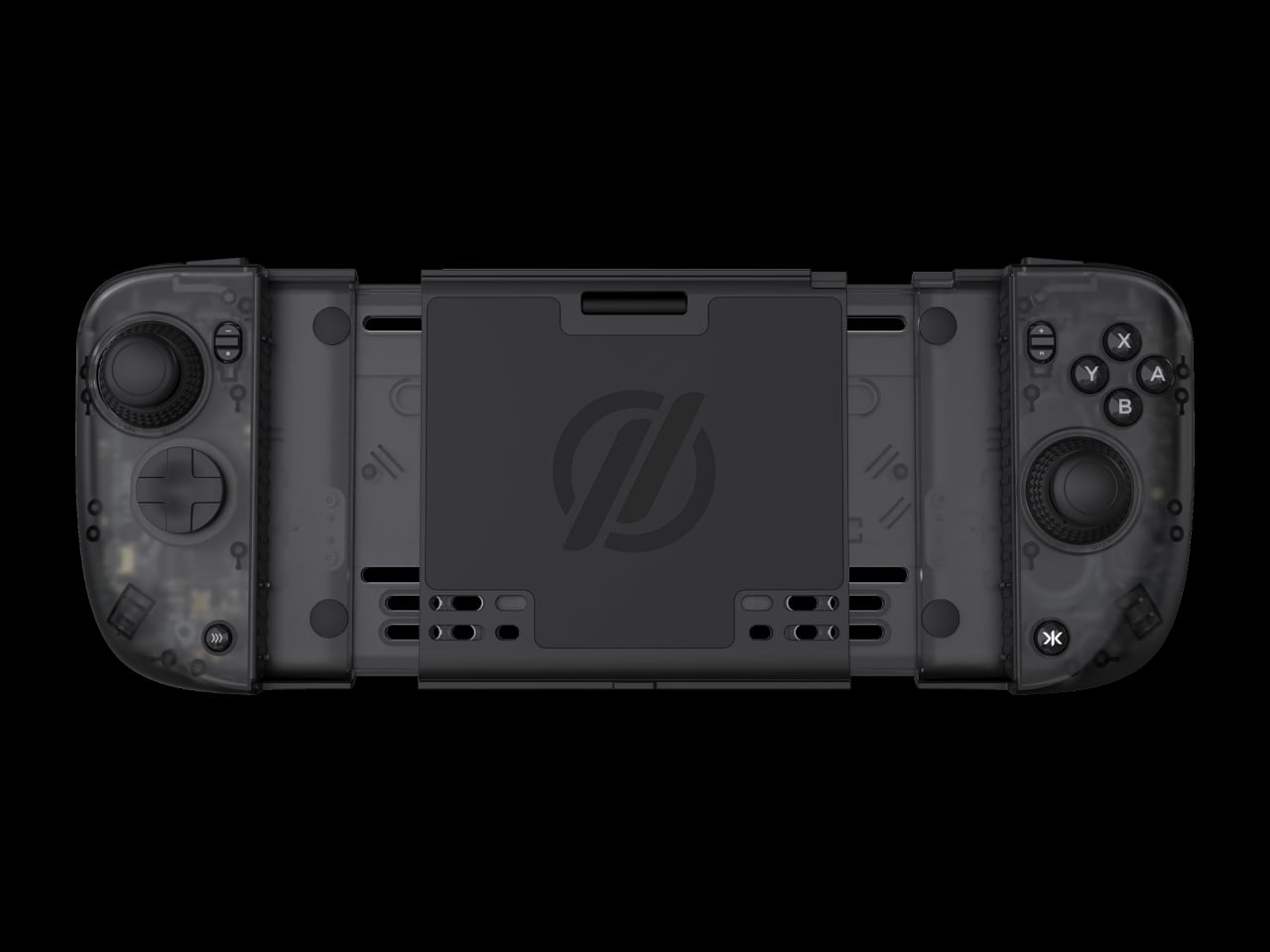
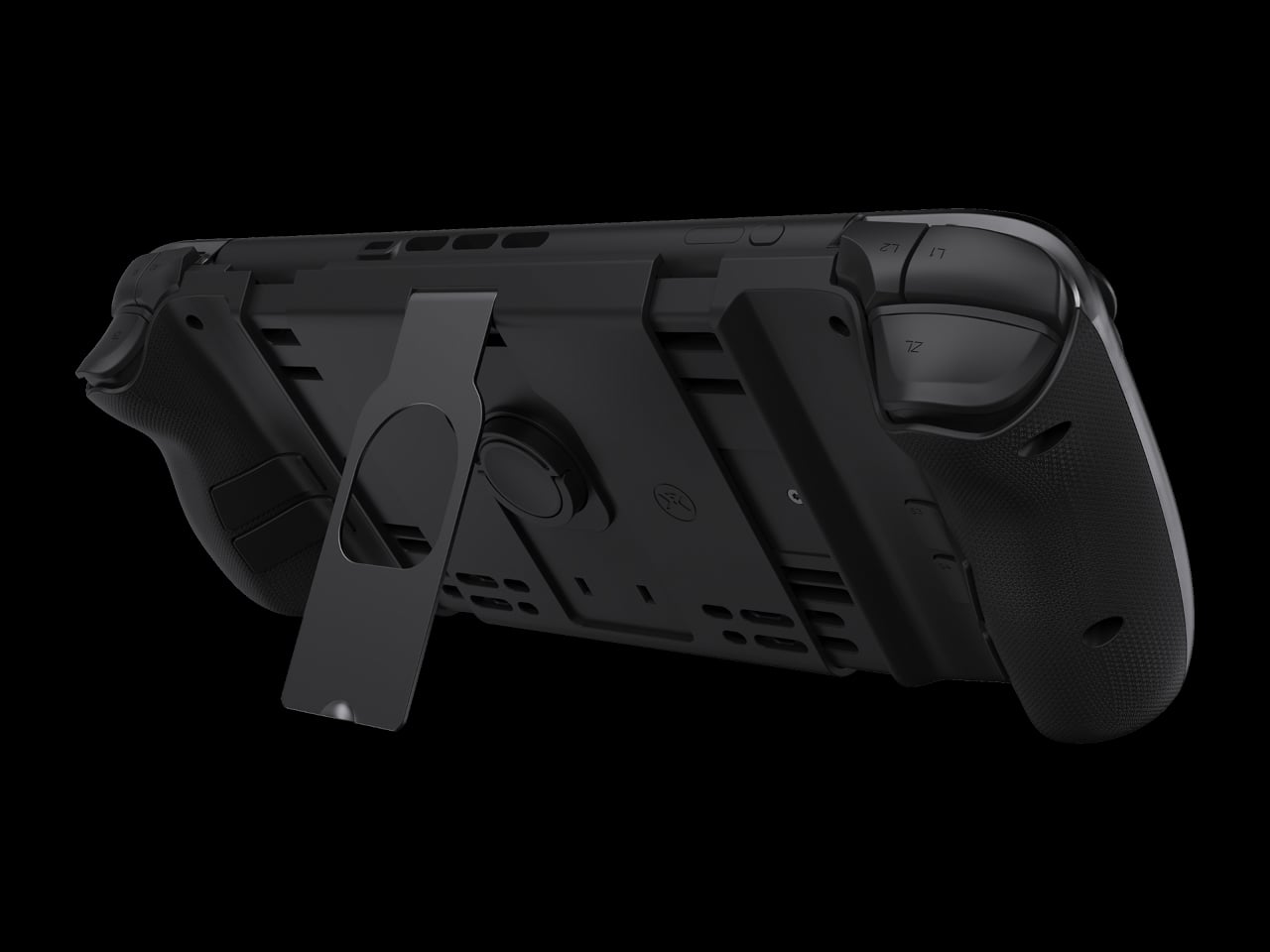
The new retractable locking dial mechanism secures the console and keeps the shell compatible with the original Switch and OLED models, with a legacy adapter included. This is a direct response to fit issues from the first Nitro Deck, and it means Nitro Deck 2 survives console generations. The dial gives you a way to adjust clamping force and fit without swapping the whole shell when Nintendo changes dimensions.
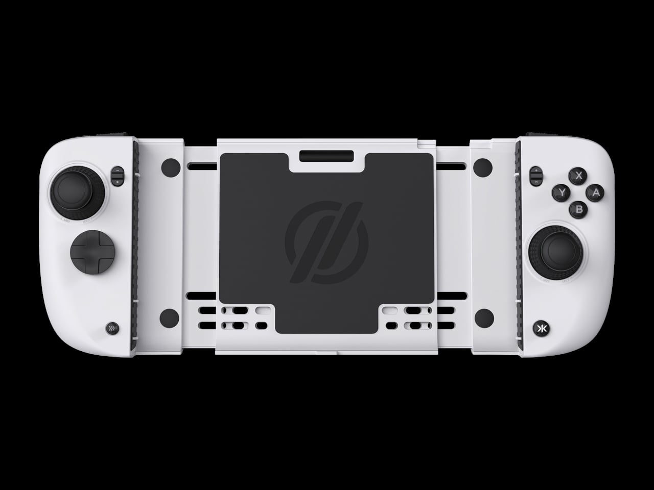
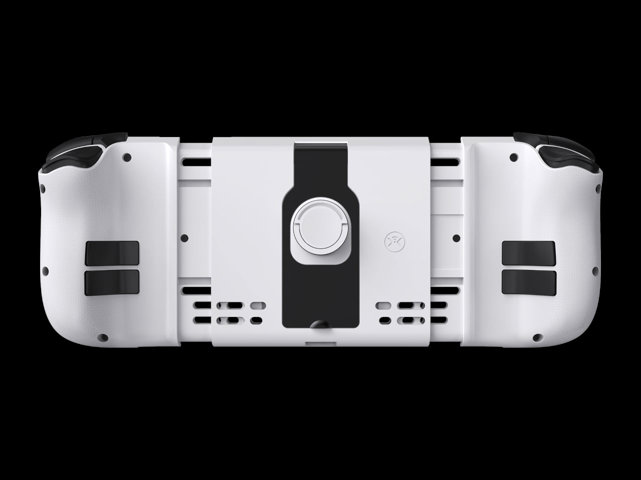
The expanded control set includes extra bumper buttons (L2 and R2), remappable back buttons, smooth tactile digital triggers, and toggle buttons for plus, minus, record, and macro. Nitro Deck 2 supports motion controls and adjustable vibration feedback for supported games, plus Turbo Mode for rapid inputs. The idea is to give you more inputs and a better feel than Joy-Cons or a stock Pro Controller, especially for long sessions.
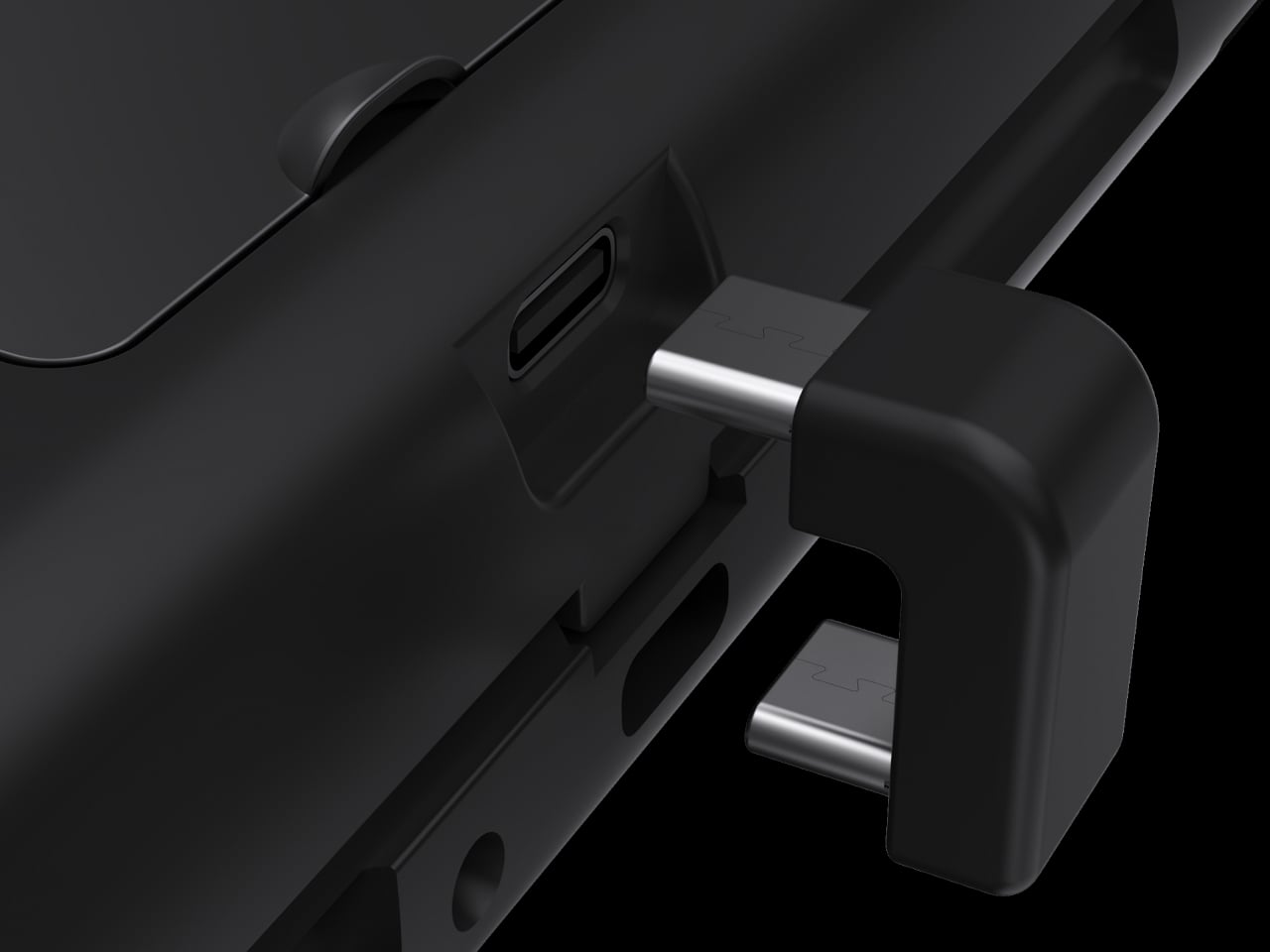
Nitro Deck 2 connects over Bluetooth or wired USB to PC, mobile, and select smart TVs when the console is not installed, acting as an extra pro-style controller. The CRKD app includes its True Collection System for tapping and registering your hardware and CTRL for customizing sticks, vibration, and firmware. It is part collectible, part tuning tool, making the hardware feel like it lives in a broader ecosystem.
Nitro Deck 2 moves the idea of a Switch shell from a simple grip to a long-term controller investment that survives console generations. It is still a pre-order product with questions around weight and battery life, but the combination of CaptiStick, a retractable locking dial, and a removable centerpiece suggests a different kind of accessory, one that grows with your setup instead of getting replaced every time Nintendo ships new hardware.
The post Nitro Deck 2 Controller Fits Switch 2, OG, and OLED in One Shell first appeared on Yanko Design.