TECNO and Tonino Lamborghini Built the Smallest Water-Cooled Gaming PC

Tech collaborations with fashion and luxury brands usually follow a familiar, slightly tired script. A logo goes on the back of an otherwise unchanged device, a press release says something about “shared values,” and that’s more or less it. So when TECNO announced its partnership with Tonino Lamborghini at MWC 2026 in Barcelona, it was fair to be skeptical about what “Italian design meets cutting-edge technology” would actually look like in practice.

It turns out the answer involves water-cooling tubes, a 241-pixel LED matrix on the back of a phone, and a mini gaming PC that looks like it belongs on the set of a science fiction film. The collaboration goes beyond a branding exercise. It’s a full product line with a consistent visual language running across all of it.

Designer: TECNO x Tonino Lamborghini
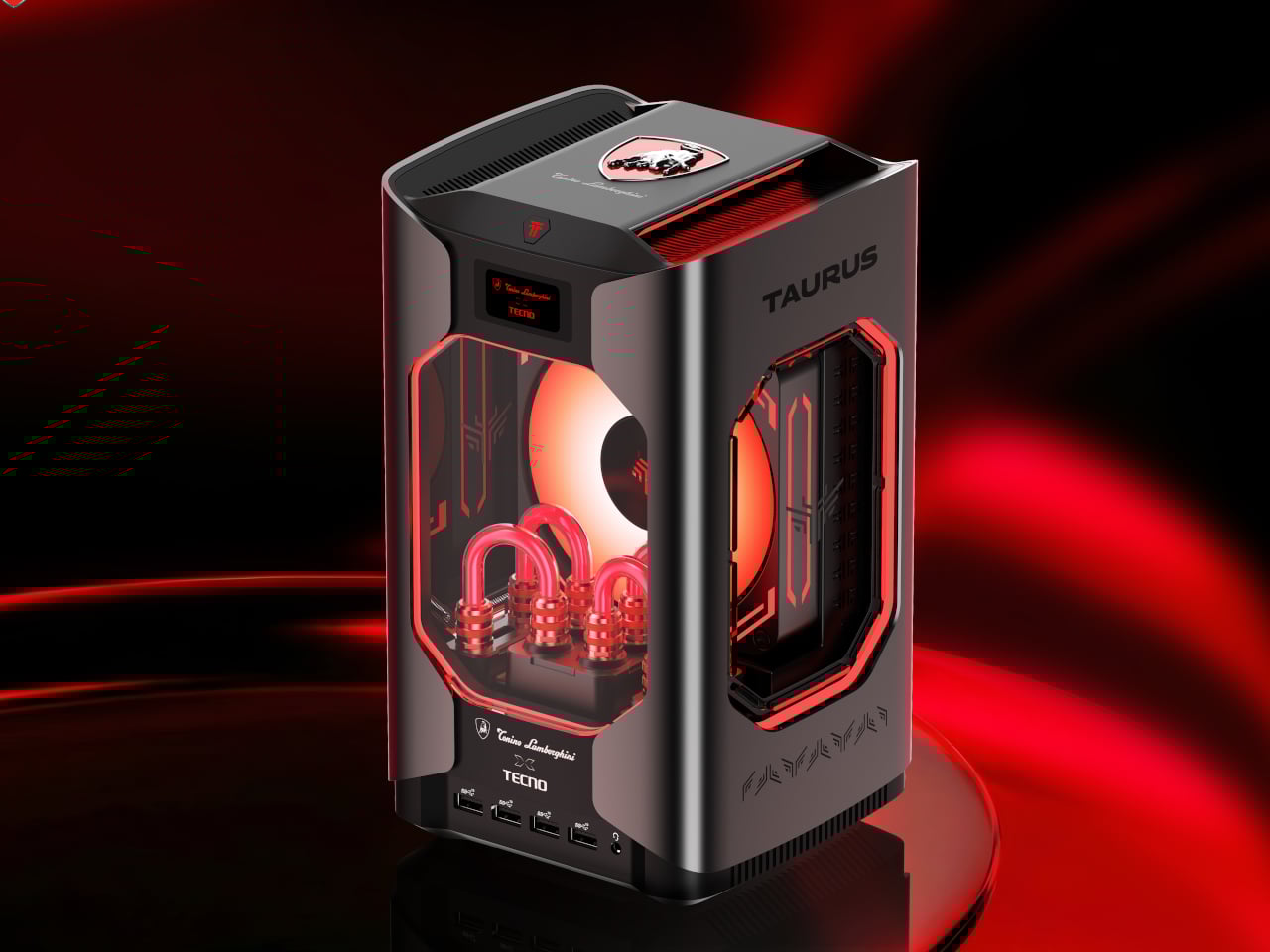
The centerpiece is the Tonino Lamborghini TECNO TAURUS, officially the MEGA Mini G1 Pro, the follow-up to the MEGA Mini G1, which TECNO claimed as the world’s first and smallest water-cooled gaming PC. The TAURUS keeps that cooling system, building around a roughly 10,000 mm² pure copper cold plate and a triple-fan setup inside a gunmetal all-metal chassis.

Through the transparent side panel, you can see the red water-cooling tubes looping around the internals, glowing under orange-tinted fans. Rather than hiding the engineering, it’s deliberately flaunting it. A small status screen on the front body lets you monitor CPU and GPU performance in real time, without opening a separate dashboard on another screen.
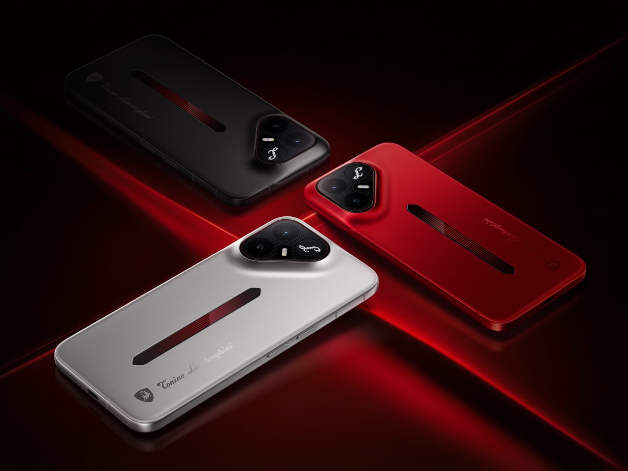
The second launched product is the TECNO POVA Metal Tonino Lamborghini Limited Edition, which TECNO is calling the world’s first full-metal unibody 5G phone. The camera module takes a triangular form, housing the Lamborghini “L” badge at its center, sitting flush against an uninterrupted metal back with bezels down to 0.99 mm.

A vertical slot running down the body doubles as a pulse light strip. The rear also features a 241-pixel independent LED dot matrix that can display call alerts, notifications, and custom animations. It sounds like a gimmick, but it’s one of the few times a phone’s notification system has been treated as a surface design decision. The phone runs on a Snapdragon processor and comes in silver, matte black, and red colorways.
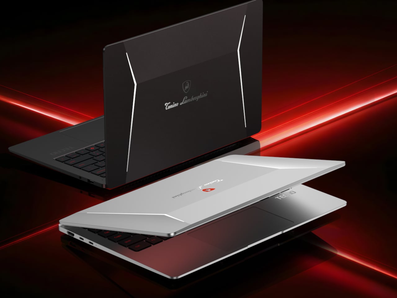
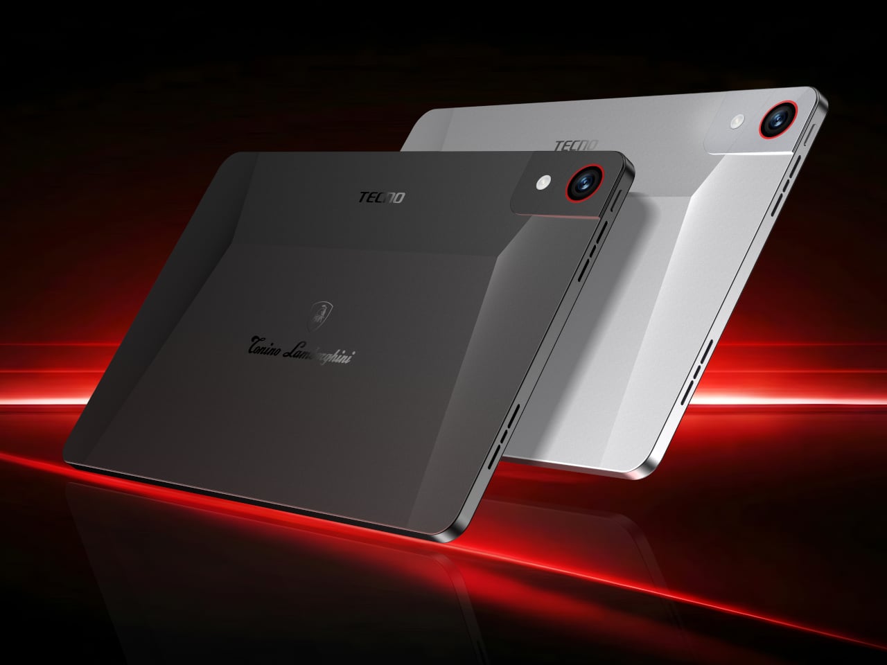
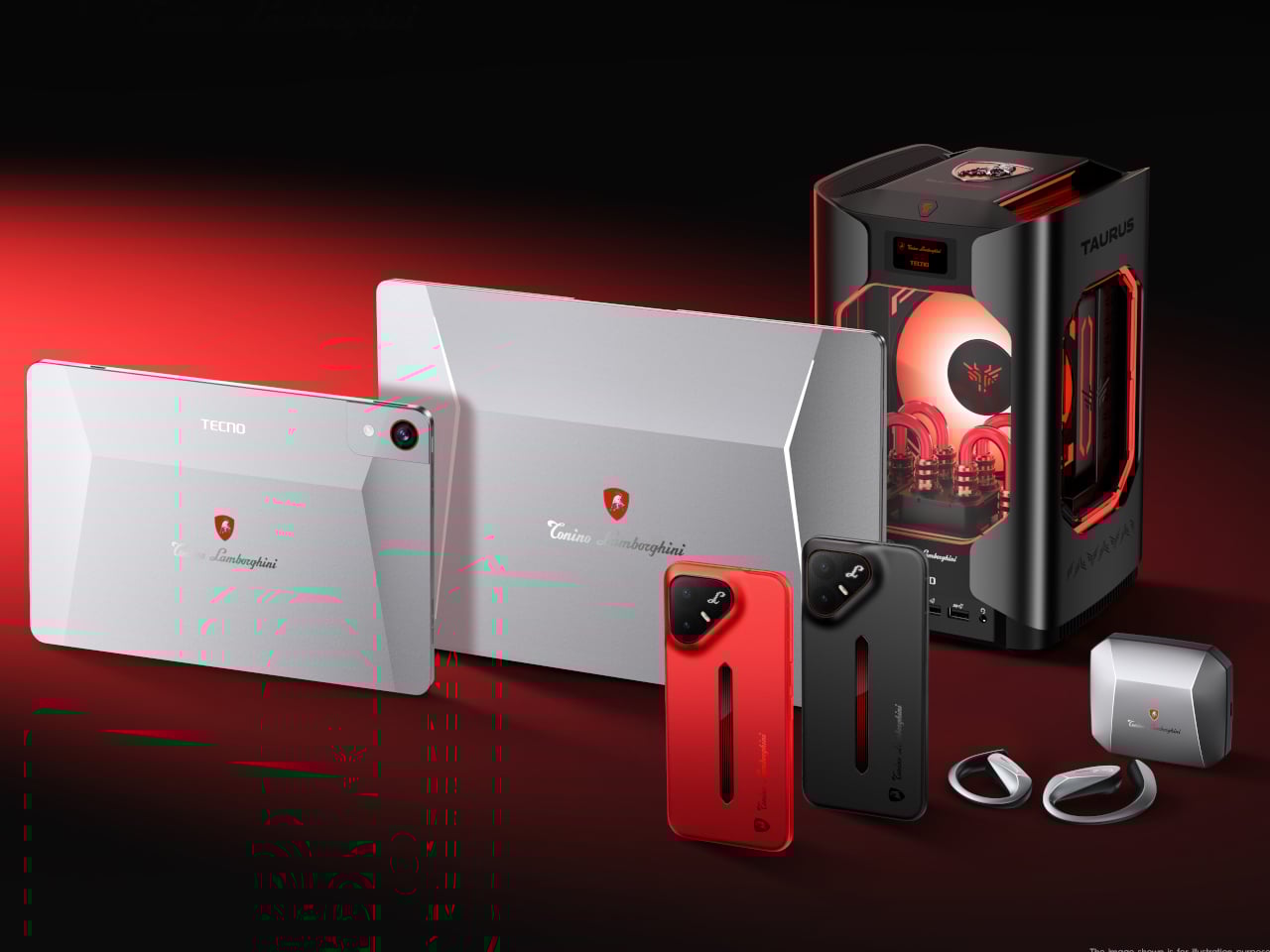
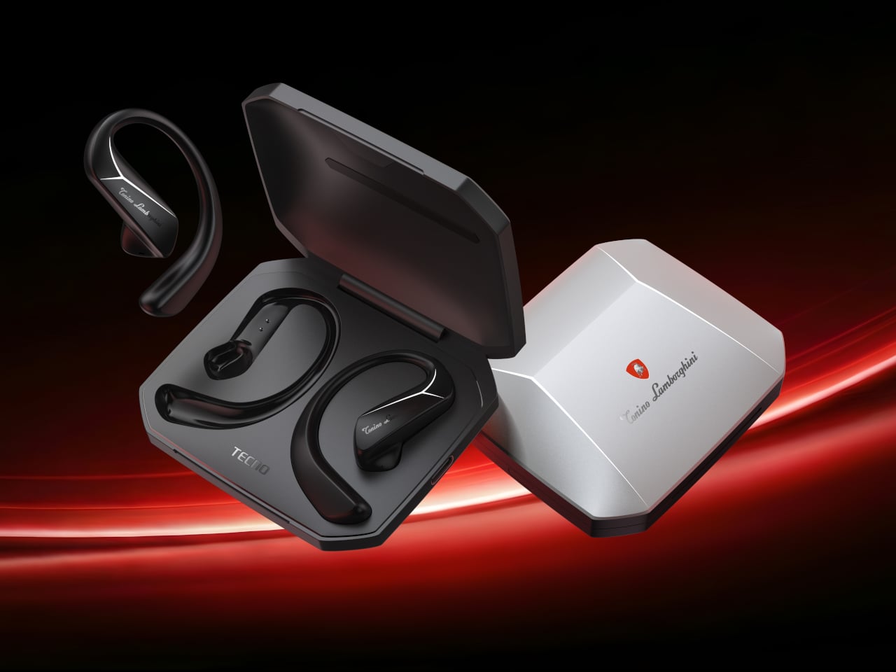
Beyond these two, TECNO showed a concept AIoT ecosystem extending the design language to laptops, tablets, and open-ear earphones, all carrying the same red-and-gunmetal palette and the Tonino Lamborghini shield badge. The laptops feature a sharp V-shaped crease across the lid, the tablets get red-ringed cameras, and the earphone case is angular enough to feel at home next to the rest of the lineup.

The real question this collaboration leaves open is whether the Tonino Lamborghini aesthetic, bold as it is, adds genuine character to these devices or just visual noise. Luxury branding on tech hardware has a long and uneven track record, and most of it ages poorly once the novelty fades. TECNO is betting the design has enough substance to outlast the MWC spotlight.
The post TECNO and Tonino Lamborghini Built the Smallest Water-Cooled Gaming PC first appeared on Yanko Design.
This Card Wallet Replaces Sticky Notes With a Reusable Board

The sticky note has outlasted every productivity trend that was supposed to replace it, and there’s a reason for that. Writing something down by hand, right when it occurs to you, is still the fastest way to keep an idea from slipping away. Digital apps, meanwhile, have the opposite problem: the moment you unlock your phone to jot something down, you’re one notification away from forgetting why you opened it.

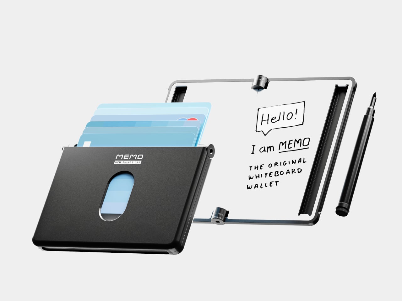
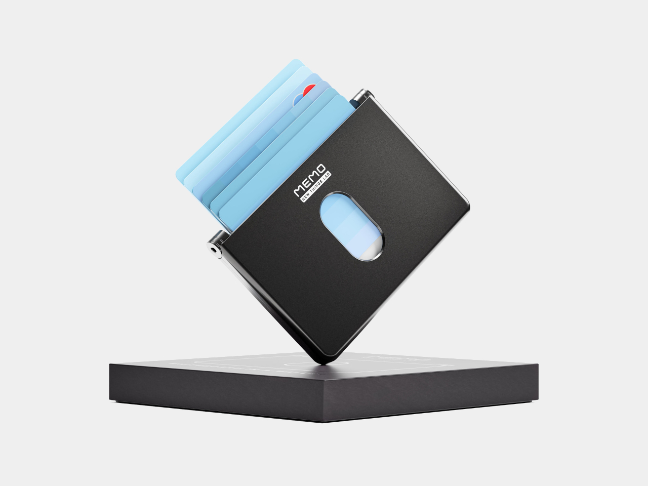
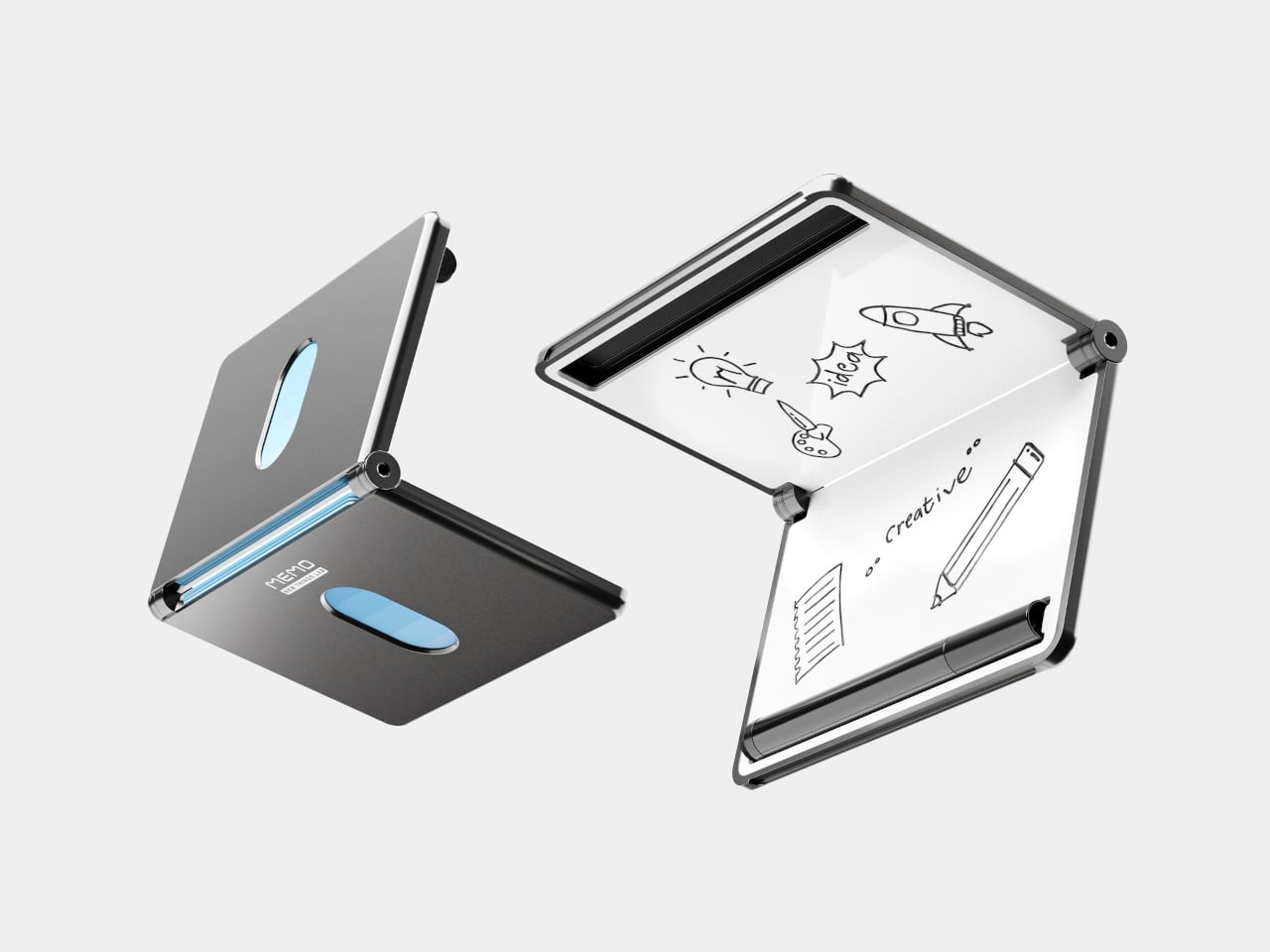
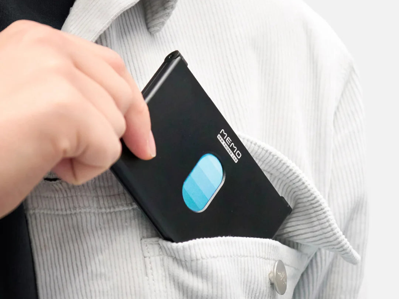
New Things Lab, a design studio from the Netherlands, built a direct answer to that problem. The MEMO Whiteboard Wallet is a precision-machined aluminum card holder with a dry-erase surface built directly into its face, giving you a pocket-sized board that’s always ready when a thought strikes. The concept earned quite a following from people who immediately understood what it was for.

Designer: New Things Lab

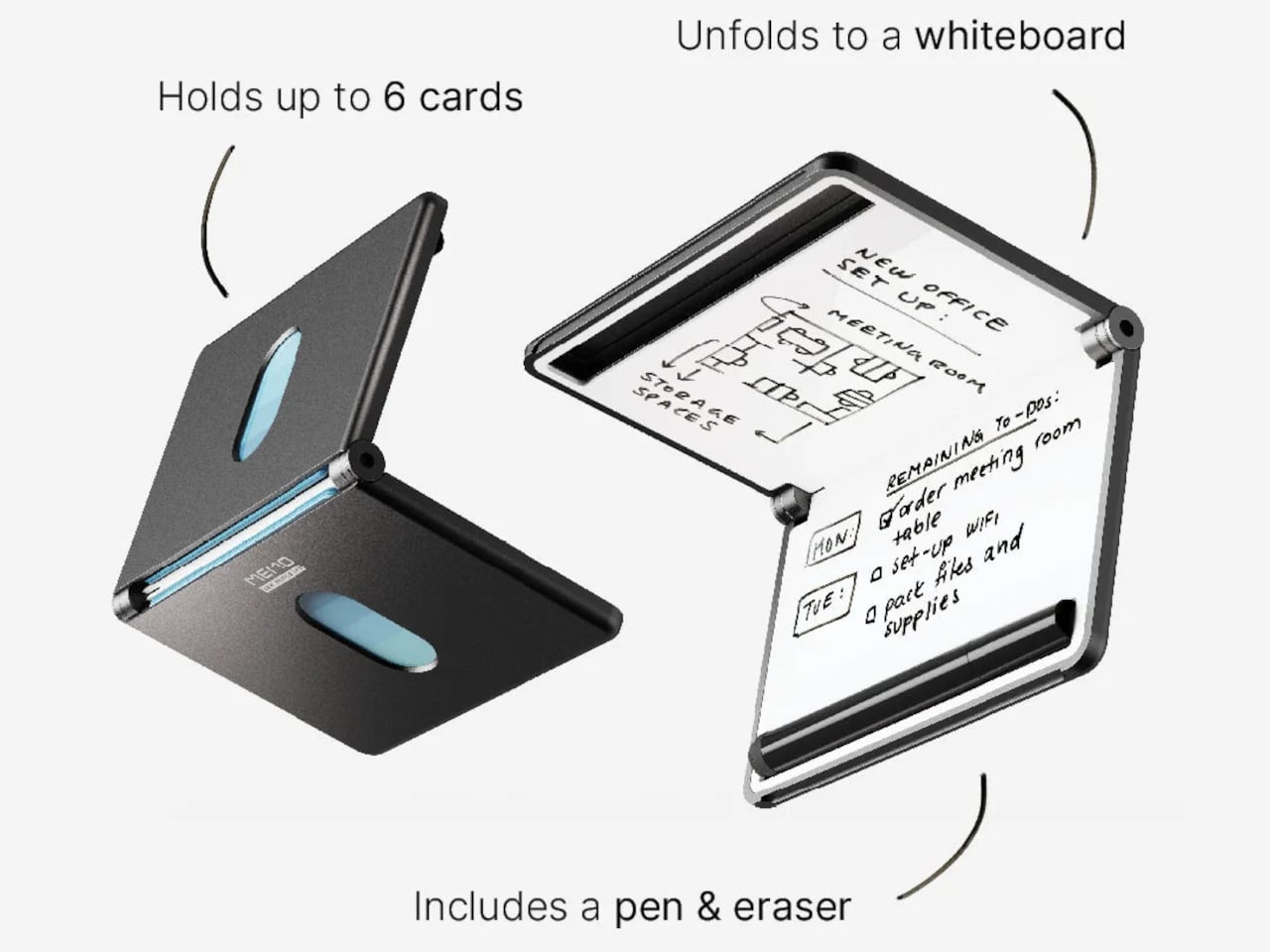
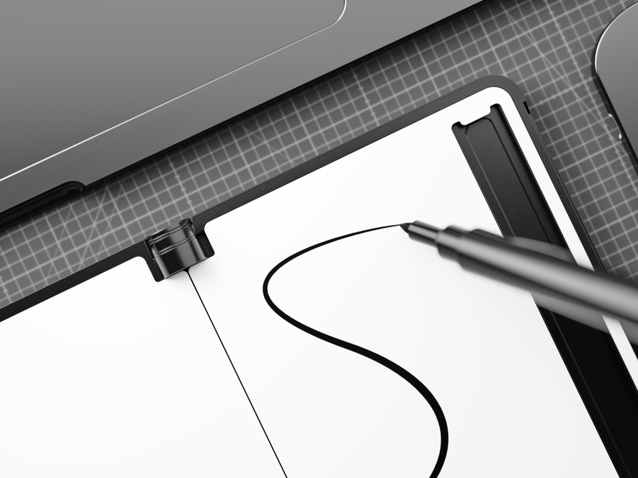
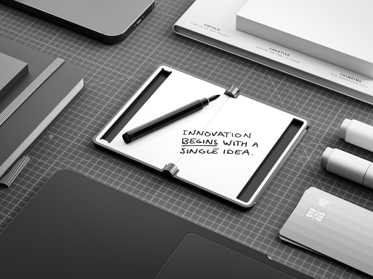
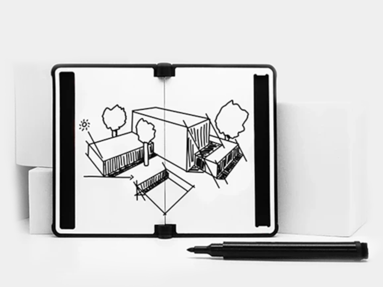
The whiteboard spans 6 inches diagonally, just over A7 in size, and it’s coated with a smooth, heat-cured paint that cleans up without ghosting. It’s large enough to be genuinely useful but slim enough not to add awkward bulk. On a given day, you might use it to jot down a measurement, scribble a password for a guest, or keep a short list of things you’d otherwise forget by lunch.

Writing on the surface is handled by an included 0.8mm fine-point pen that stores in a dedicated slot built right into the wallet’s frame, so it’s always within reach when you need it. Flip the pen around, and there’s an eraser on the other end, making the MEMO genuinely self-contained. You’re not hunting for something to wipe the board with, and there’s no spare piece you’d misplace in a bag.

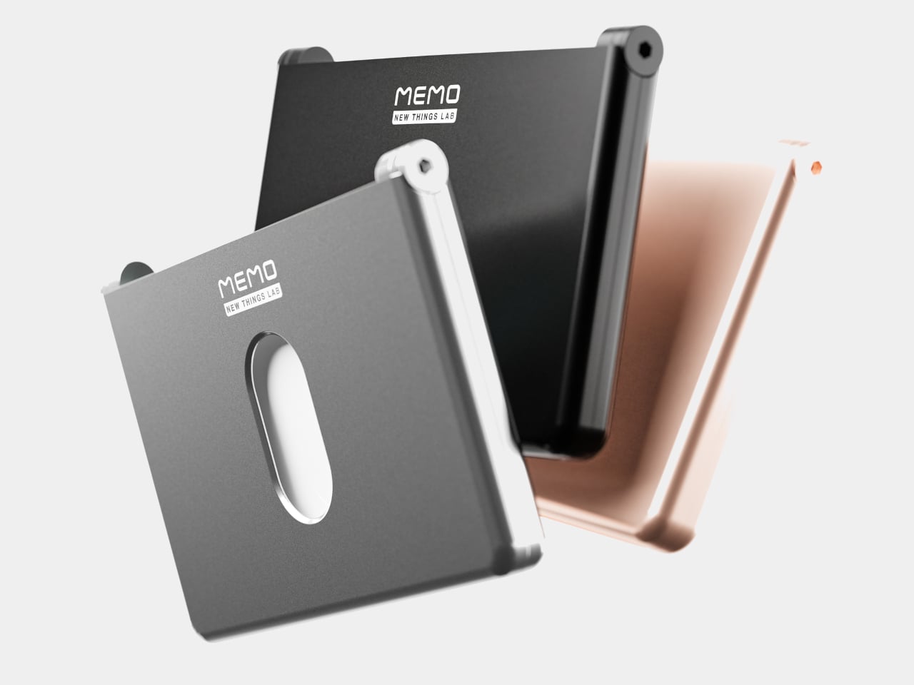
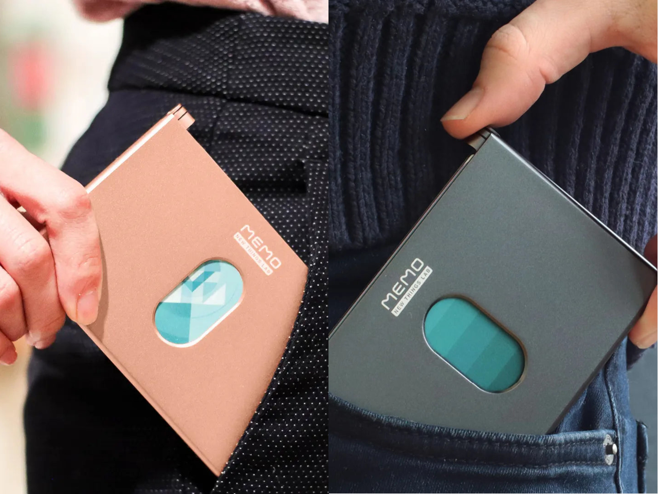
On the other side of the MEMO is the actual card-carrying section, with room for up to six standard cards and a magnetic closure that keeps everything neatly shut. The body is milled from 6063 aluminum, giving it a solid, premium feel without adding unnecessary weight or thickness. That same metal shell also blocks RFID signals, protecting your card data from electronic skimming without needing any additional sleeve or pouch.

The MEMO comes in Charcoal Black, Slate Gray, and Gilded Rose as the standard colorways, with Revision Red and Airmail Blue available as limited editions. All five options lean toward the restrained end of the color spectrum, which suits the product well. There’s also an environmental case to be made here. Every note wiped from the MEMO’s surface is a sticky note that didn’t find its way into the trash, and those savings do compound over time.

The post This Card Wallet Replaces Sticky Notes With a Reusable Board first appeared on Yanko Design.
Motorola Edge 70 Fusion: 144Hz Screen, 7,000mAh Battery, IP69

There’s a specific kind of buyer’s remorse that comes with midrange phones. You get them home, take your first few photos in decent light, and think you made the right call. Then comes the dinner, the concert, the sunset that lasted about 45 seconds, and suddenly you’re squinting at a muddy, blown-out mess, wondering where your hard-earned money went. The hardware looked fine on the spec sheet. It just didn’t survive contact with real life.

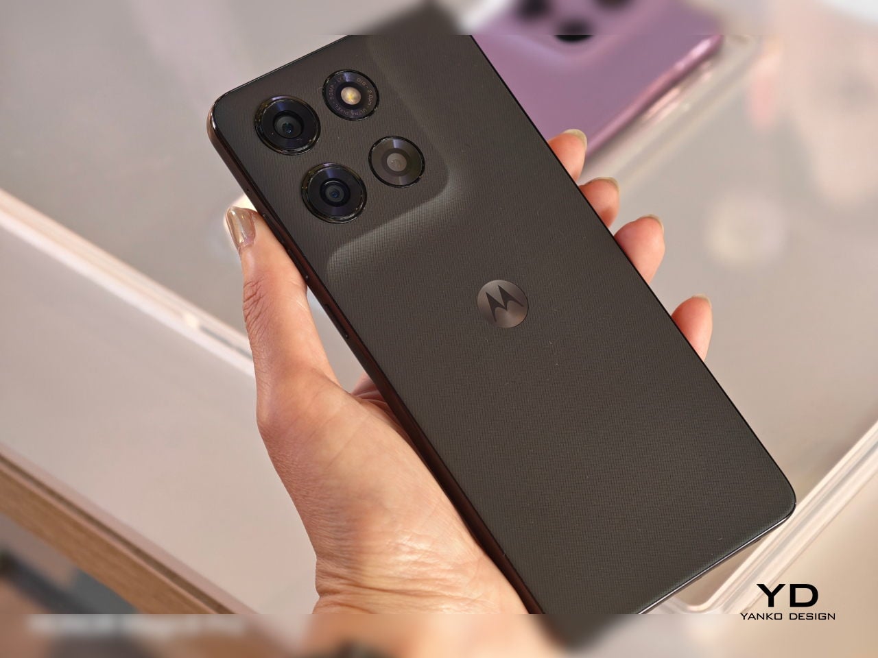
The motorola edge 70 fusion is Motorola’s attempt to close that gap without asking you to spend flagship money. It’s a midrange phone with a few genuinely noteworthy credentials, a handful of firsts, and, depending on which version you buy, a battery that could outlast your weekend. Whether the whole package adds up is worth thinking through carefully.

Designer: Motorola

The headline is the camera, specifically the 50 MP Sony LYTIA™ 710 sensor on the main shooter. This is the first time that particular sensor has appeared in any smartphone, and Sony’s LYTIA line is built around low-light clarity and accurate color reproduction. Optical image stabilization keeps things sharp when your hands aren’t, and moto ai’s Photo Enhancement Engine adds a Signature Style feature that applies consistent color grading across your shots. A 13 MP ultrawide covers the 122° wide-angle and macro territory, and the 32 MP front camera shoots 4K video, which still feels like a meaningful spec at this price tier.

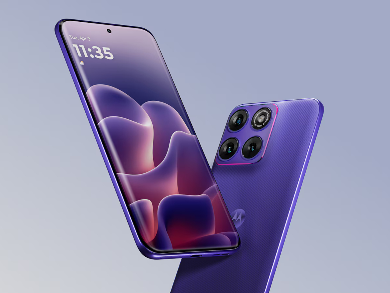
The display is where the edge 70 fusion picks up another first. It’s touted to be the world’s first 144 Hz quad-curved screen with Pantone Validated™ color certification, spanning 6.78 inches of Extreme AMOLED at 1.5K Super HD resolution with a peak brightness of 5,200 nits. That brightness number is the practical one. It means the screen stays legible in direct sunlight, something that budget and midrange panels have never quite solved. The quad-curve design, where the glass flows continuously from front to back without hard edges, adds a physical refinement that usually costs considerably more.

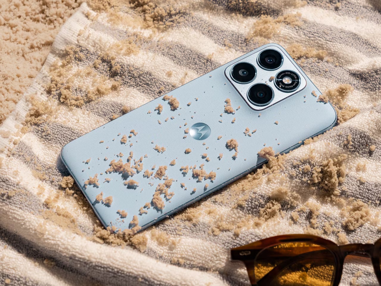
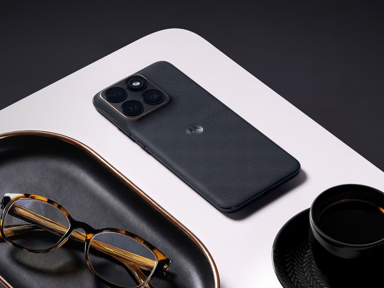
Motorola went further than most midrange phones dare to go on the durability side. The edge 70 fusion carries both IP68 and IP69 ratings, meaning it handles submersion up to 1.5 meters and high-pressure water jets. MIL-STD-810H certification covers the drop and temperature extremes, and Corning Gorilla Glass 7i protects the front. A small but useful detail called Water Touch keeps the touchscreen responsive with wet fingers. The back uses textures inspired by nylon and linen, materials that feel warmer in hand than the cold-glass backs that have become the default on most phones.

There are two battery variants, and the difference between them is significant. The standard model has a 5,200 mAh cell rated for up to 39 hours of mixed use. The second variant ships with a 7,000 mAh silicon-carbon battery, a chemistry that fits more energy into less physical space, rated for up to 50 hours. Both versions charge at 68W via TurboPower, which Motorola says delivers enough power for a full day in just 10 minutes of charging. For anyone who has ever started a long travel day at 34%, that’s not a trivial promise.

The Snapdragon 7s Gen 3 handles processing, paired with up to 8 GB of RAM and a RAM Boost feature for smoother multitasking, with up to 256 GB of internal storage. It’s a capable mid-tier chipset, honest about where it sits. Motorola is guaranteeing three Android OS upgrades, and moto ai brings in features like Next Move for contextual on-screen assistance and Playlist Studio for AI-generated playlists. Google Gemini integration rounds out the software story.

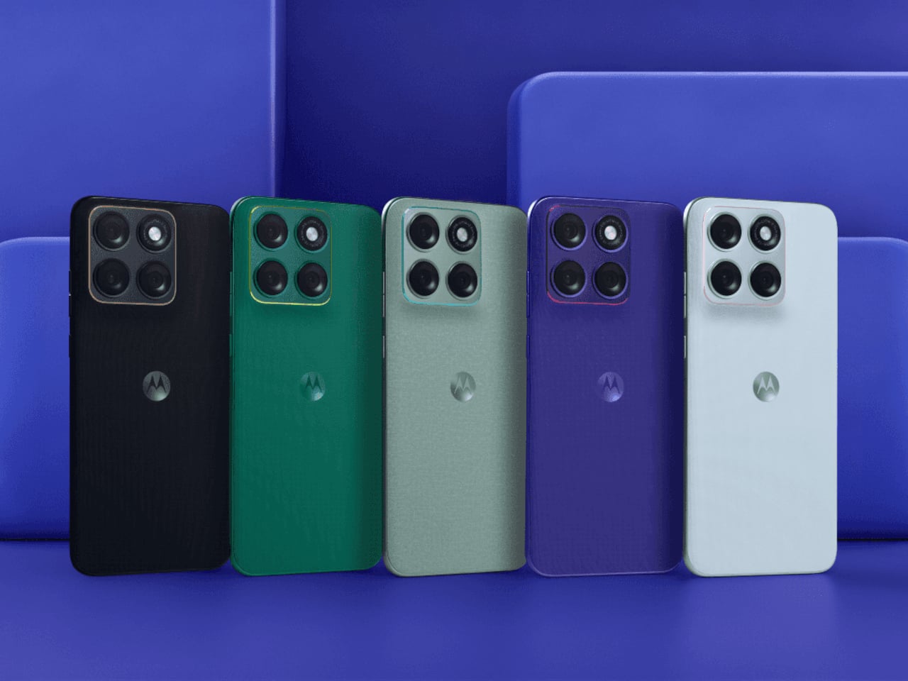
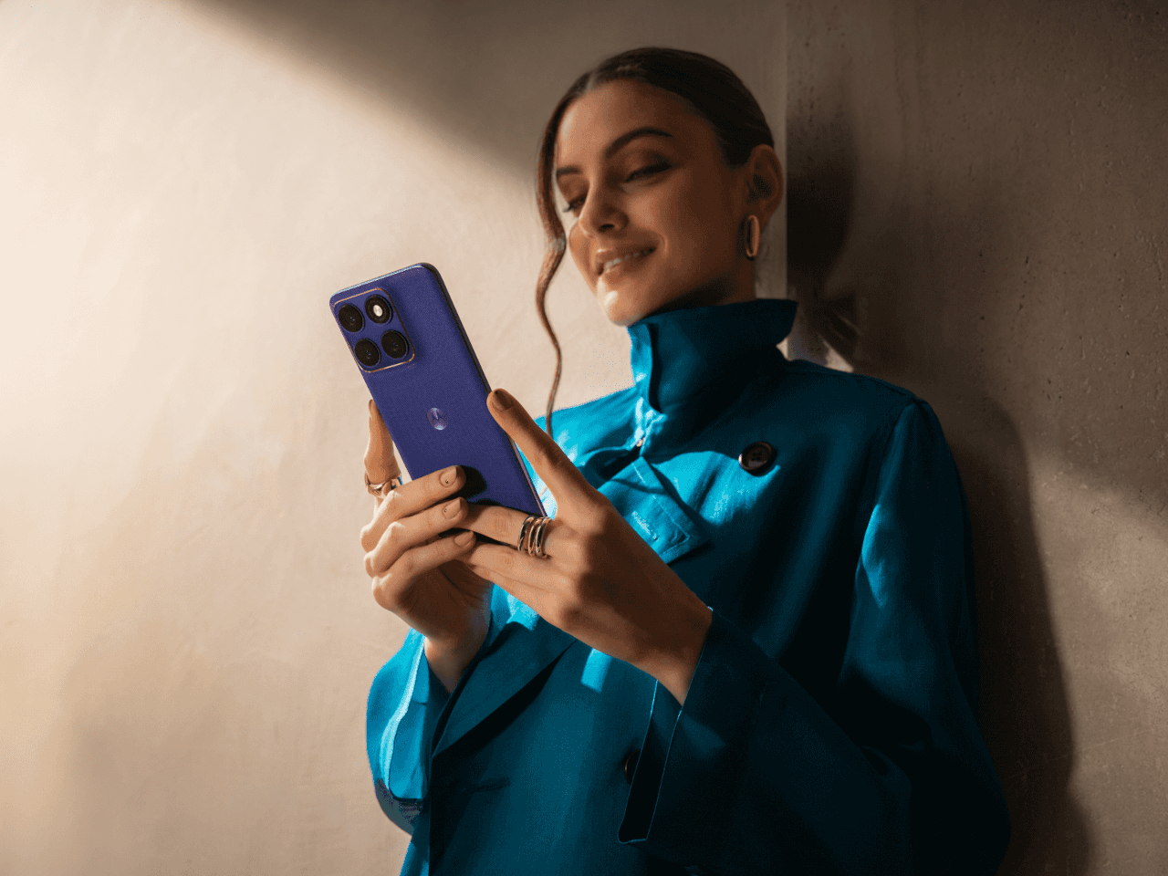
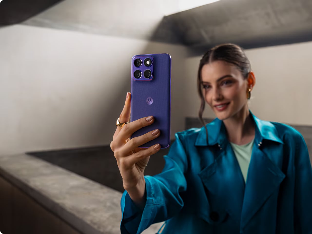
The edge 70 fusion comes in five Pantone-curated colorways, including Orient Blue, Silhouette, Sporting Green, and Country Air, each with matching colored accents around the camera lenses. It’s a detail that suggests the design team was thinking about the phone as something you carry, not just something you use. The real question the edge 70 fusion leaves open is a broader one: at what point does the gap between midrange and flagship stop being about capability and start being about perception?

The post Motorola Edge 70 Fusion: 144Hz Screen, 7,000mAh Battery, IP69 first appeared on Yanko Design.
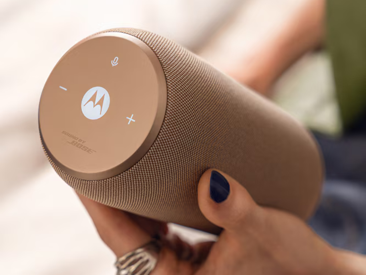
Motorola’s Bose-Tuned Speaker Automatically Follows You Room to Room

Bluetooth speakers have largely solved the portability problem and mostly failed the living room one. They tend to look like gym equipment that wandered indoors, sit awkwardly on a shelf, and demand a ritual of reconnecting whenever you walk back in the door. The moto sound flow, Motorola’s first portable speaker and the newest addition to the moto things lineup, takes a different angle on all three of those frustrations.

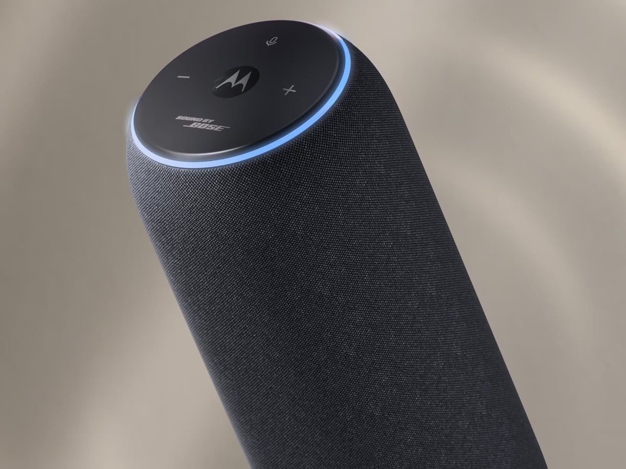
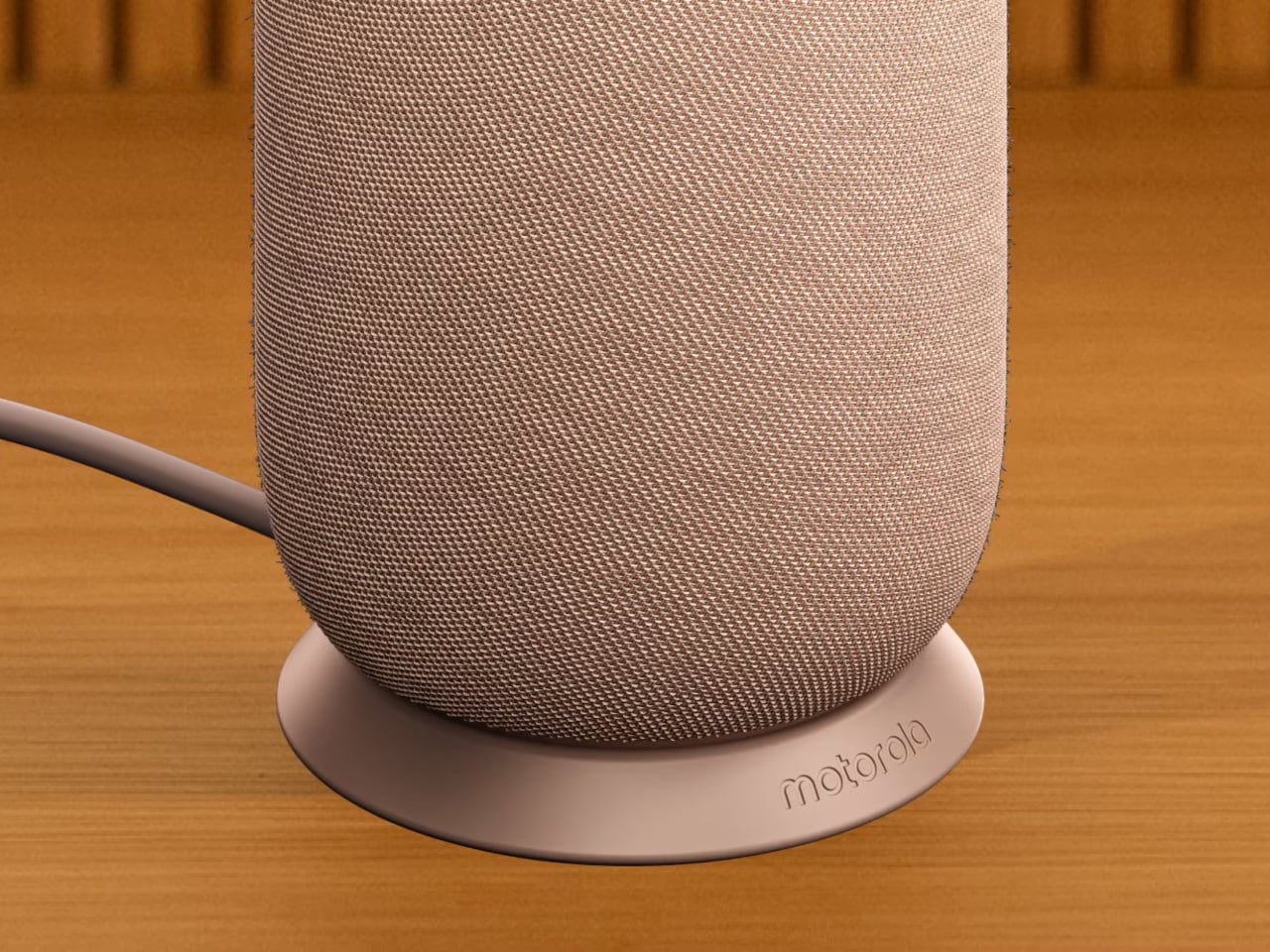
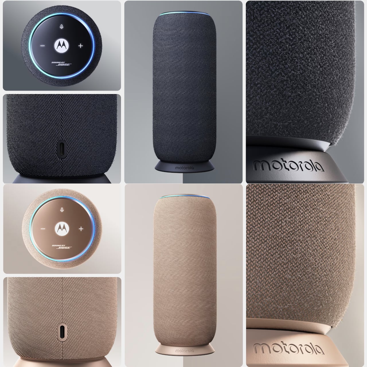
The design makes the first impression. Two Pantone-curated colorways, Carbon and Warm Taupe, wrap the cylindrical body in a twill-textured fabric finish that reads more like a decorative object than consumer electronics. It’s the kind of thing you’d leave on the coffee table without thinking twice, which is precisely the point. Motorola calls it “crafted to be seen and tuned to be heard,” and for once, the marketing copy isn’t entirely hollow.

Designer: Motorola

The hardware inside includes a dedicated woofer, tweeter, and dual passive radiators, producing a 30W output tuned through Motorola’s Sound by Bose partnership. That collaboration, which also appears in the razr fold, applies Bose’s EQ expertise for balanced, detailed sound rather than the bass-heavy thump most compact speakers default to. A companion app also lets you adjust the equalizer to your own taste, available on both Android and iOS.

The moto sound flow also distinguishes itself in terms of connectivity. Beyond Wi-Fi, Bluetooth 5, AirPlay, Google Cast, and Spotify Connect, the speaker uses UWB technology to do something more interesting. Walk close to it with a compatible phone, and it picks up your audio automatically, no tapping required. Run two units together, and Room Shift reroutes music to whichever speaker is nearest, while Dynamic Stereo adjusts left and right channels based on where your phone sits between them.

Those UWB features do carry a fine print worth reading. They require a compatible Android 9 or later phone with UWB enabled, so iPhones and older Android devices don’t qualify. The speaker still works over Wi-Fi and Bluetooth for everyone else, but Room Shift and Dynamic Stereo, the parts that make the pitch most compelling, are locked behind a hardware requirement many buyers won’t check before purchase.

The 6,000 mAh battery covers long listening sessions, and the IP67 rating makes outdoor or poolside use fair game. A dock handles charging instead of a cable, which keeps things tidy. Four built-in microphones manage speakerphone calls. Starting at €199, the moto sound flow enters a competitive space where JBL, Sonos, and Bose already have devoted followings, each with years of speaker-only focus behind them.

The post Motorola’s Bose-Tuned Speaker Automatically Follows You Room to Room first appeared on Yanko Design.
Motorola’s First-Ever Book-Style Foldable Has the #1-Rated Camera

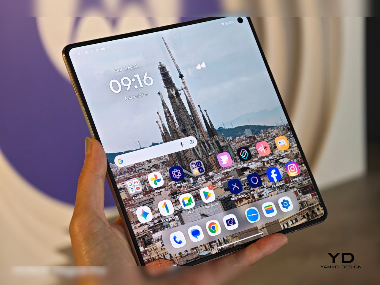
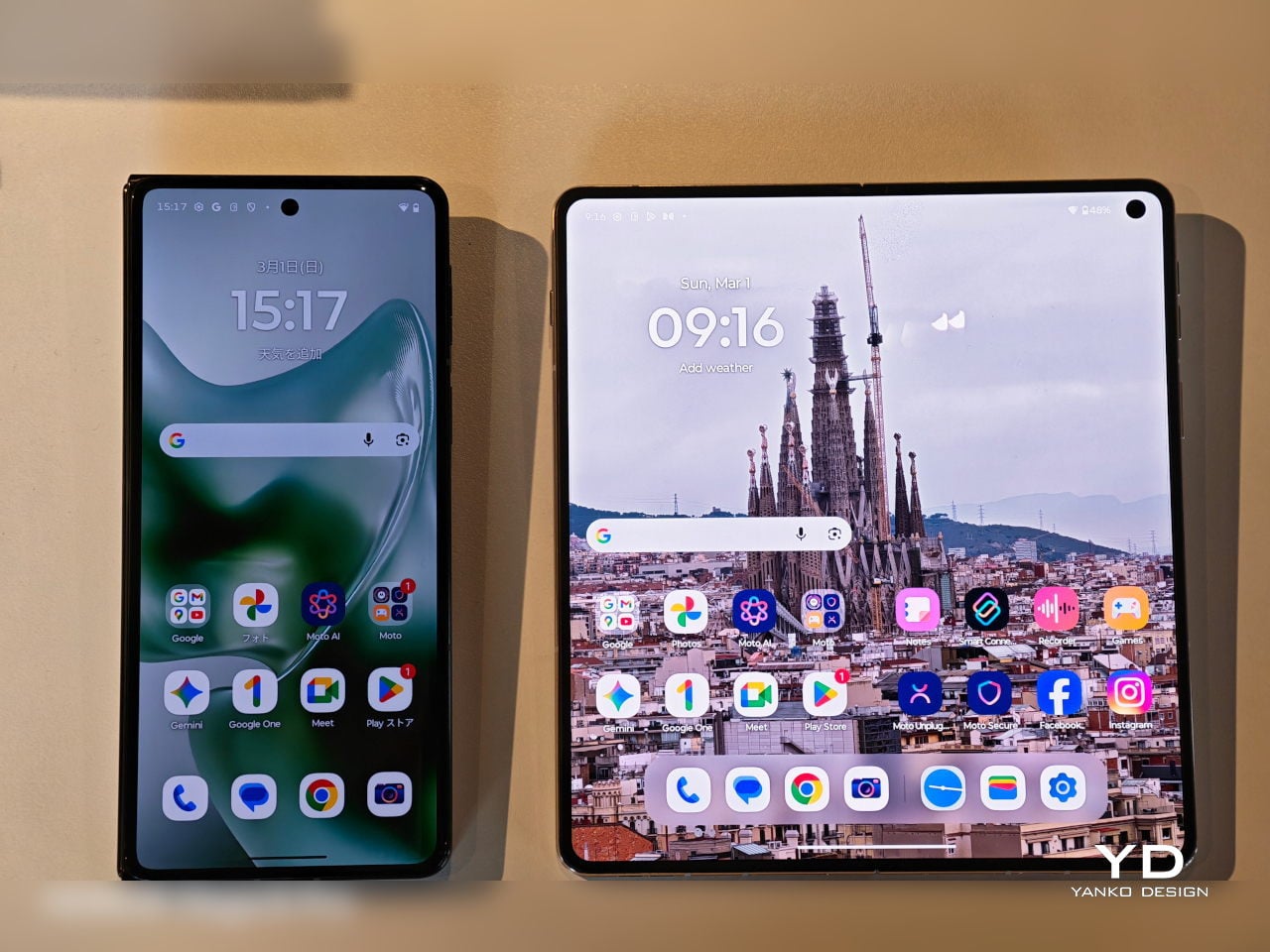
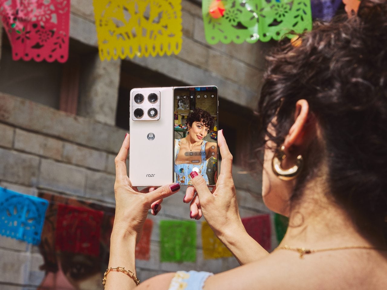
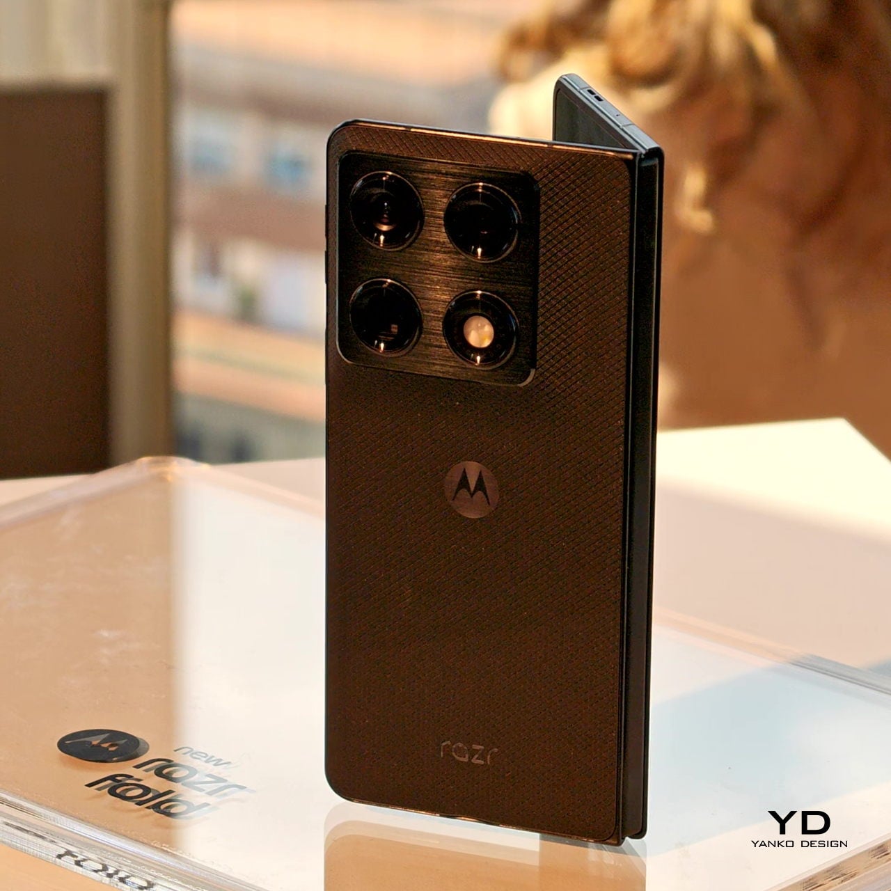
The RAZR name has always carried a certain drama to it. For two decades, it meant the thinnest thing in the room, often at the expense of everything else. The new motorola razr fold, first teased at CES 2026, takes the opposite approach, asking what happens when you refuse to give anything up, and the answer turns out to be a phone that unfolds into an 8.1-inch canvas you can actually work on.

This is Motorola’s first book-style foldable, a different animal from the clamshell razr that folds vertically. Open it up, and you get a 2K LTPO display that peaks at 6,200 nits, bright enough to use comfortably in direct sunlight, and wide enough to run three apps side by side without everything feeling cramped. Close it, and the 6.6-inch external screen handles most of what you’d normally unlock the phone for anyway.

Designer: Motorola

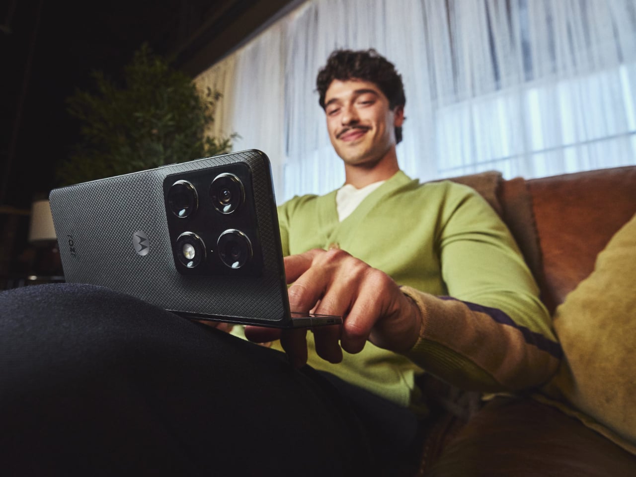
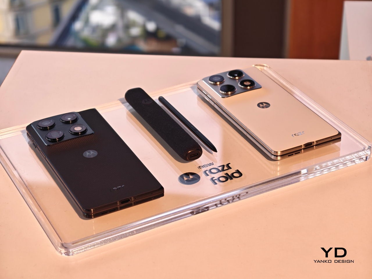
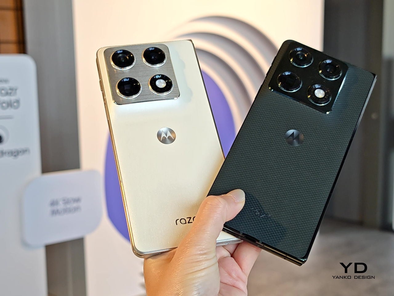
The physical design is harder to dismiss than the numbers suggest. At 4.6mm thin when open and 9.9mm when folded, it doesn’t read as a productivity device that tolerates being a phone on the side. A stainless steel teardrop hinge guides the fold, while a titanium inner plate distributes pressure across the crease so the display returns to its original shape after each cycle. The Pantone Blackened Blue version has a matte, textured surface; the Lily White option goes for a softer, more reflective hand.

Camera performance is where Motorola appears to have placed its biggest bet. The razr fold earned DXOMARK’s #1 ranking for foldable cameras in North America, backed by a 50 MP Sony LYTIA 828 main sensor, a 50 MP Sony LYTIA 600 periscope telephoto with 3x optical zoom, and a 50 MP ultrawide with a 122-degree field of view that focuses as close as 3.5 cm. The fold-forward form also doubles as a tabletop tripod, which is a minor convenience until you stop fumbling with a prop.

Inside, a Qualcomm Snapdragon 8 Gen 5 handles the workload with 16GB of RAM and storage of up to 1TB. The 6,000 mAh silicon-carbon battery is, by Motorola’s account, the largest in any foldable currently available. The 80W TurboPower charging is supposed to deliver 12 or more hours of use from under 10 minutes plugged in, though those results depend on usage conditions that are rarely as tidy as a manufacturer’s press release describes.

The razr fold also supports the moto pen ultra, sold separately, adding pressure sensitivity and palm rejection to the large display. For anyone already carrying a stylus with a tablet, the pitch is obvious. For everyone else, it leaves an open question about whether a phone at €1,999 for the European launch bundle actually replaces the tablet it resembles, or just occupies an expensive spot between the two.

The post Motorola’s First-Ever Book-Style Foldable Has the #1-Rated Camera first appeared on Yanko Design.
Compal turns a laptop palm rest into an always-on E Ink notepad

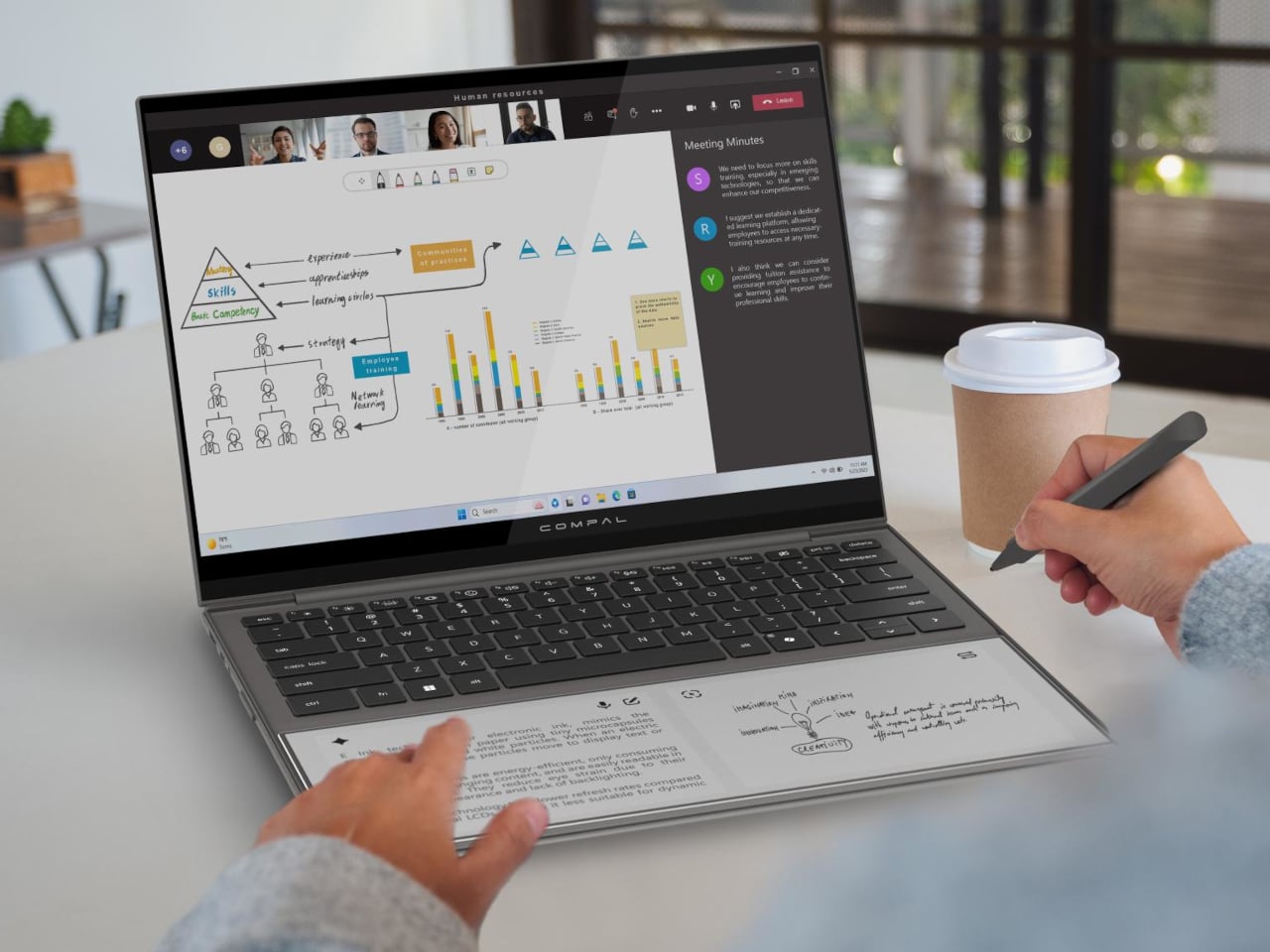
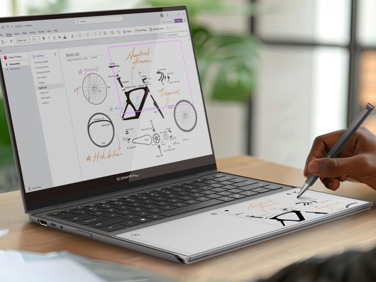
Most of the unused real estate on a laptop has never really been a problem worth solving. The palm rest just sits there, flat and inert, supporting your hands while the screen above does all the actual work. Compal, the Taiwanese ODM behind a string of forward-looking laptop concepts, decided that was a waste of space and came up with something genuinely different for its AI Book concept.

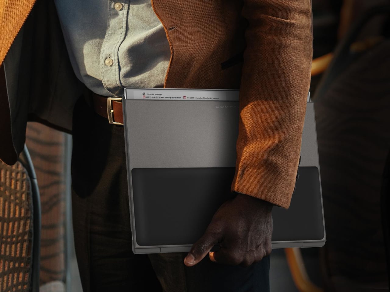
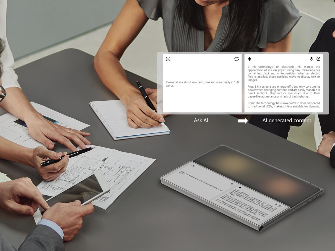
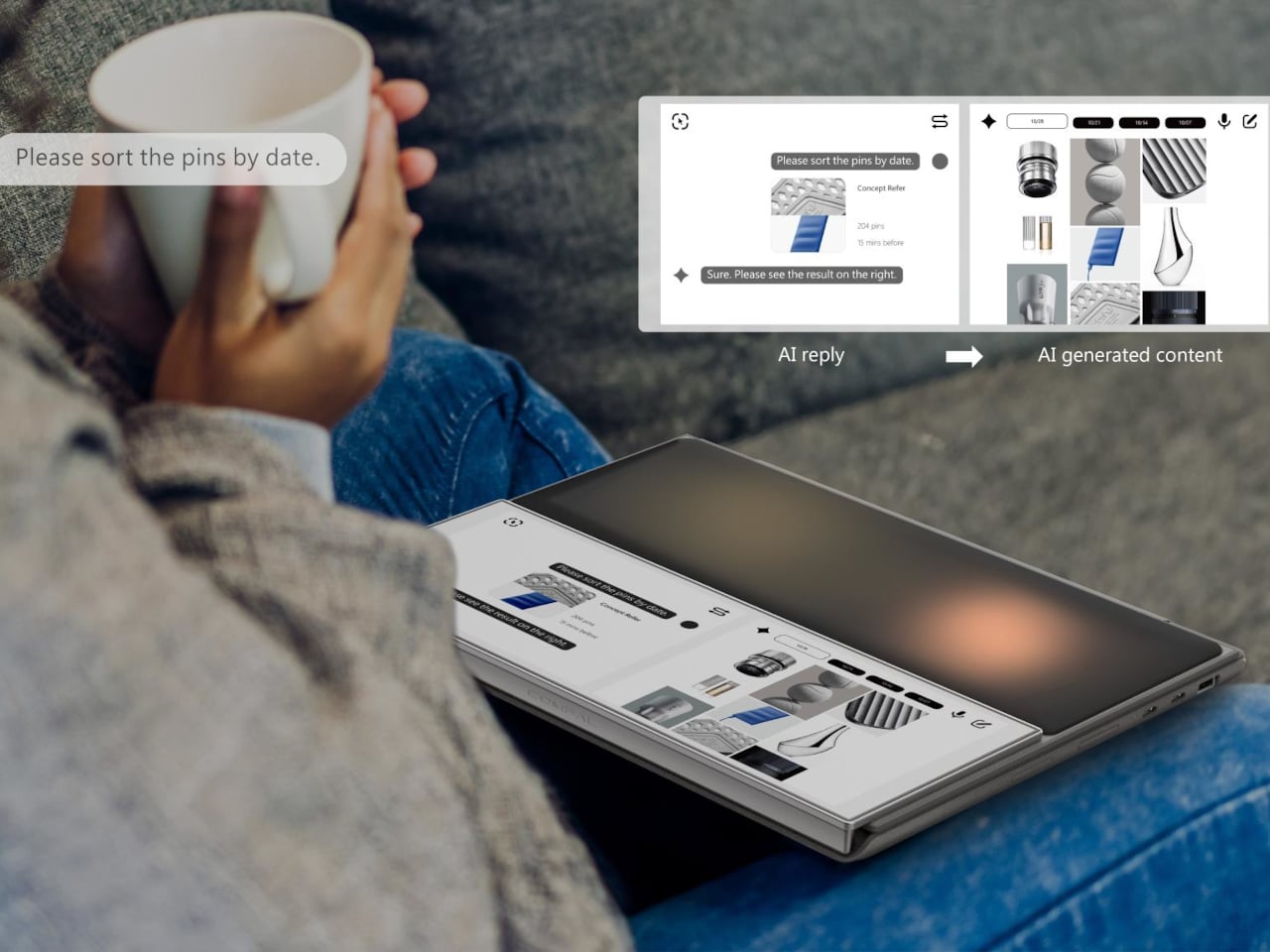
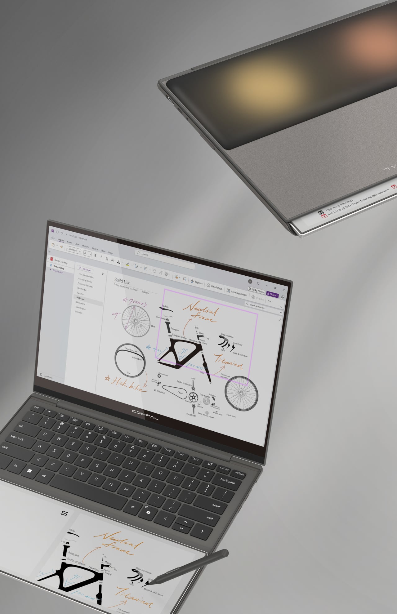
The AI Book replaces the traditional static palm rest with a touch-enabled E Ink display that supports stylus input, turning dead surface area into a secondary workspace. You could sketch a quick diagram while waiting for a file to export, jot down a phone number without switching apps, or keep a running to-do list visible without dedicating screen space to a sticky-note app. E Ink doesn’t consume power to hold a static image, so that list stays put even after you shut the laptop down.

Designer: Compal

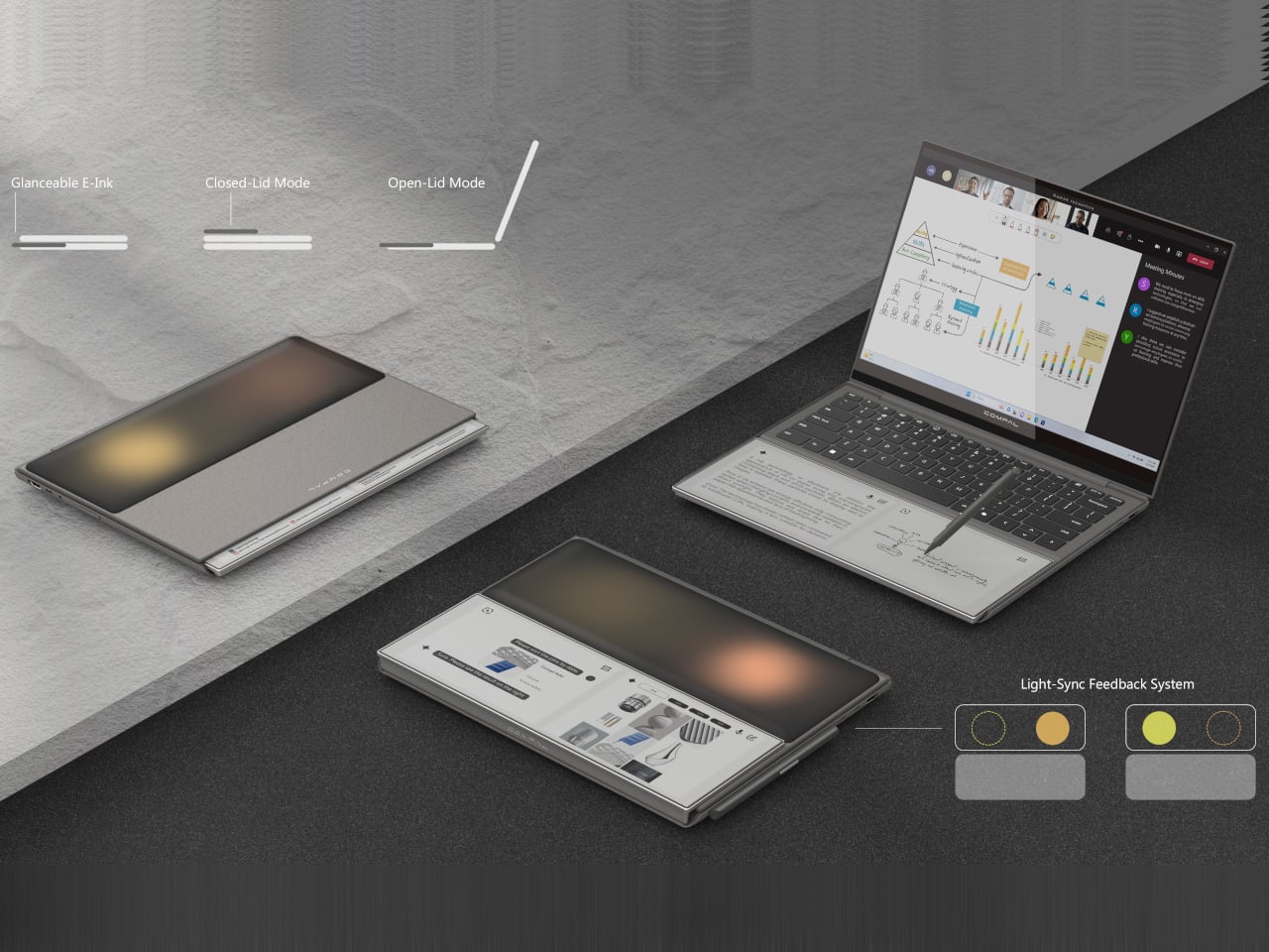
That last detail matters more than it might seem at first. A conventional display goes dark the moment you close the lid, taking your notes with it. The AI Book’s E Ink panel doesn’t, which means whatever you left there is still there in the morning, no login required, no waiting for the machine to wake. For anyone who treats a physical notebook as a memory aid rather than an archive, the behavior feels familiar and immediately sensible.

The concept goes further than a fixed notepad. The E Ink panel has a hinge, allowing it to flip outward when the laptop is closed so it faces up rather than folding in against the keyboard. In that position, it can show notifications, calendar entries, or a stylus sketch without requiring the lid to open. A narrow strip of the panel also stays visible even before flipping, offering a passive, glanceable information band that doesn’t ask anything of the user.

The “AI” branding, though, is harder to defend. Compal explains the name by pointing to the laptop’s ability to display AI-generated content, which describes any screen sold in the last decade. It’s a label that says more about current marketing instincts than about any specific hardware capability, and it does the more interesting E Ink story no favors at all. The palm rest idea holds up fine without the prefix.

As with most Compal concepts, this one comes with the standard caveats: no confirmed specifications, no launch date, no pricing. The company has introduced compelling ideas before, including a modular laptop and one with a rollable display, and neither made it to production in any recognizable form. The more honest question here isn’t whether the E Ink palm rest is clever, because it is, but whether it would actually change how people work, or just become another surface that gets ignored after the first week.

The post Compal turns a laptop palm rest into an always-on E Ink notepad first appeared on Yanko Design.
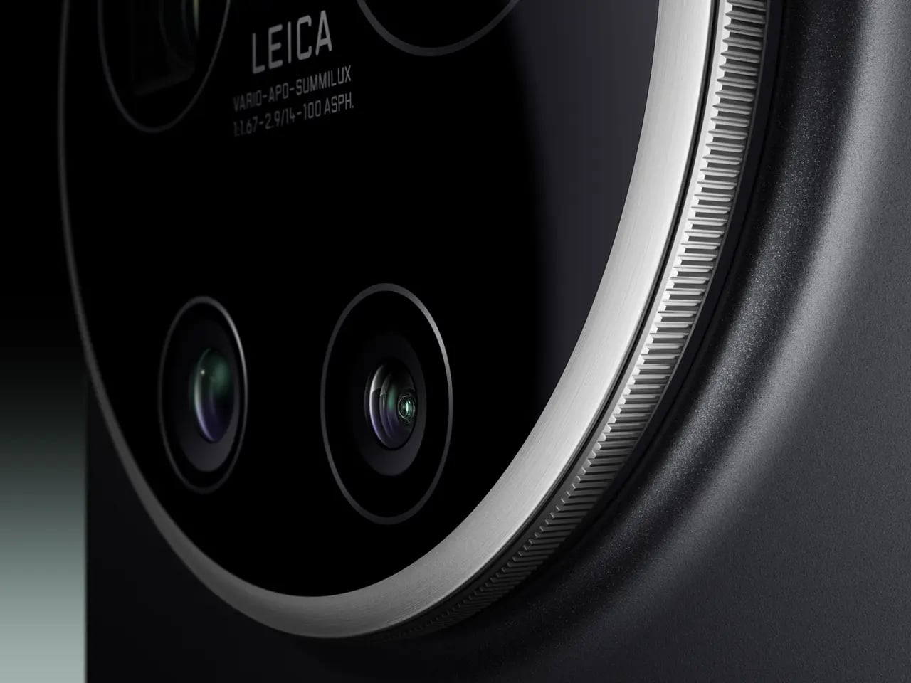
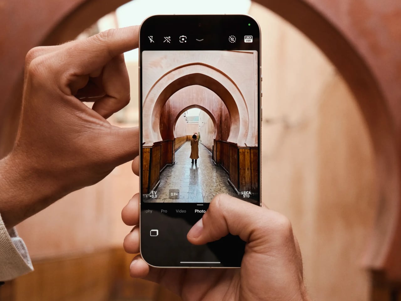
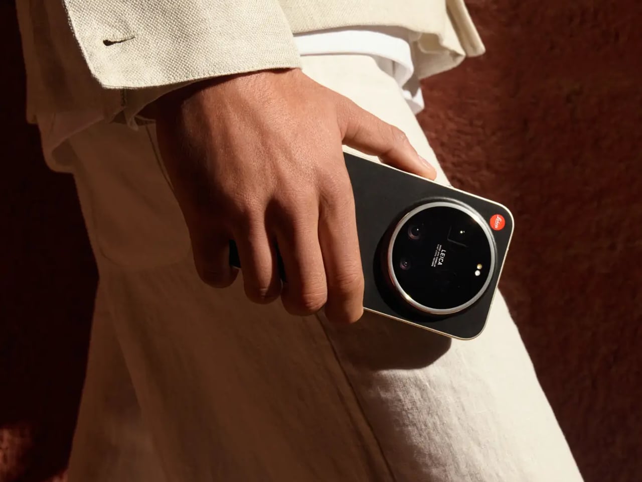
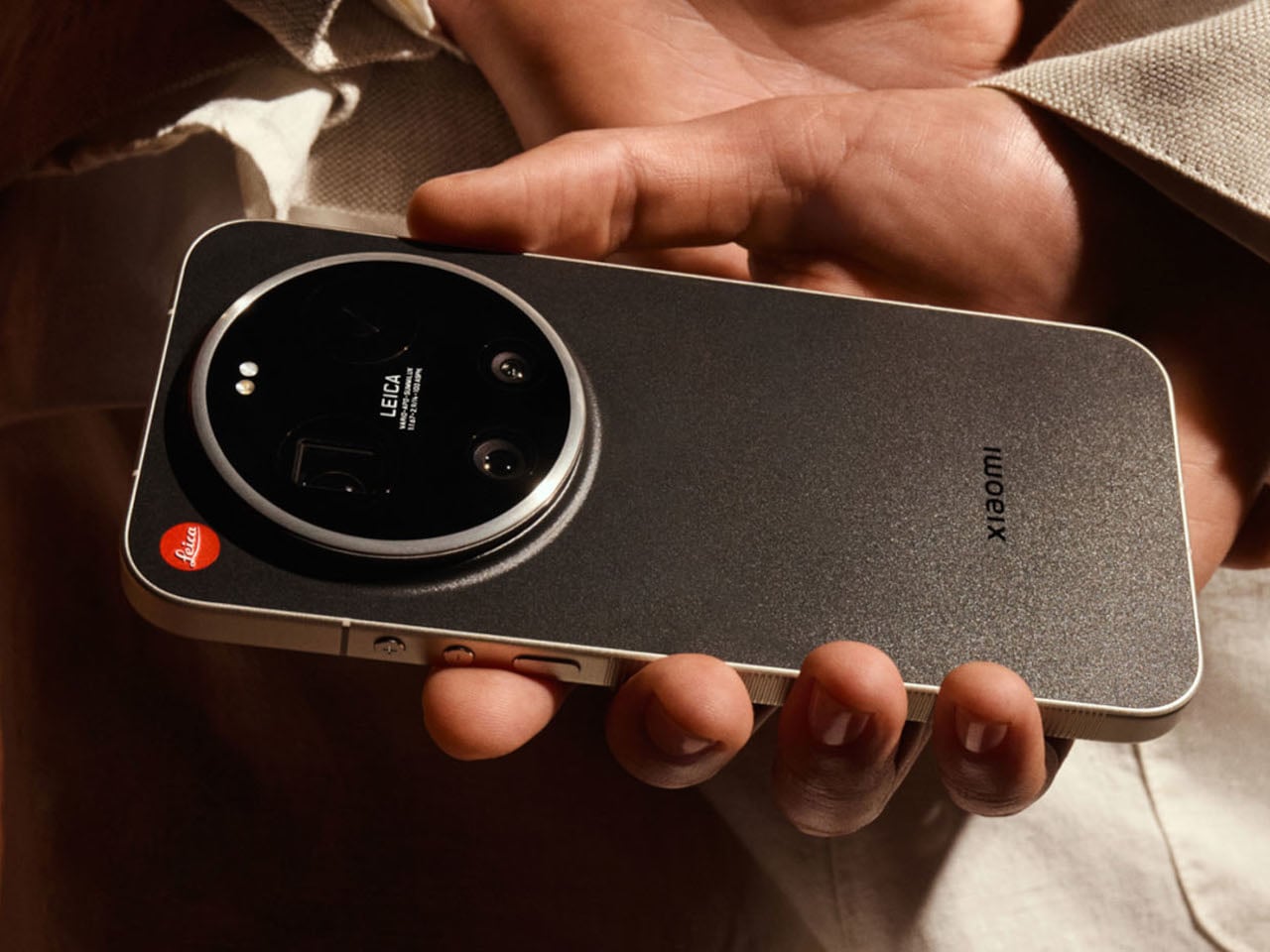
Leica and Xiaomi Built a Phone With a Rotatable Camera Ring

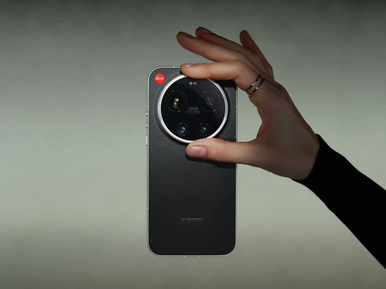
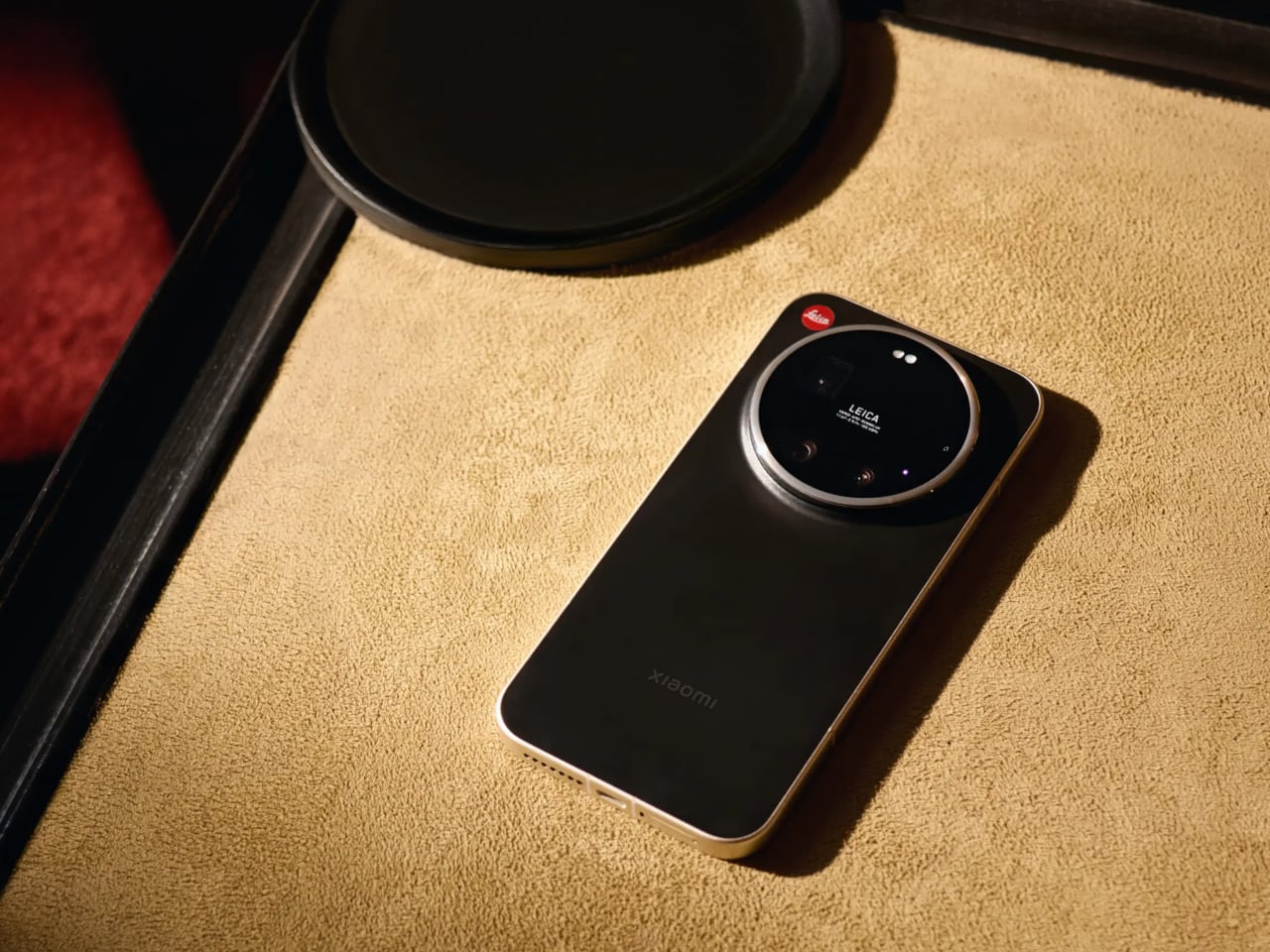
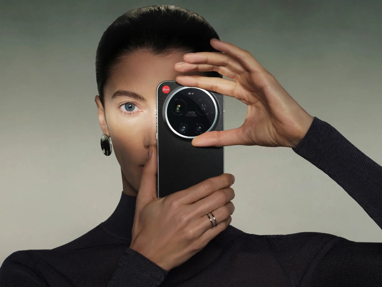
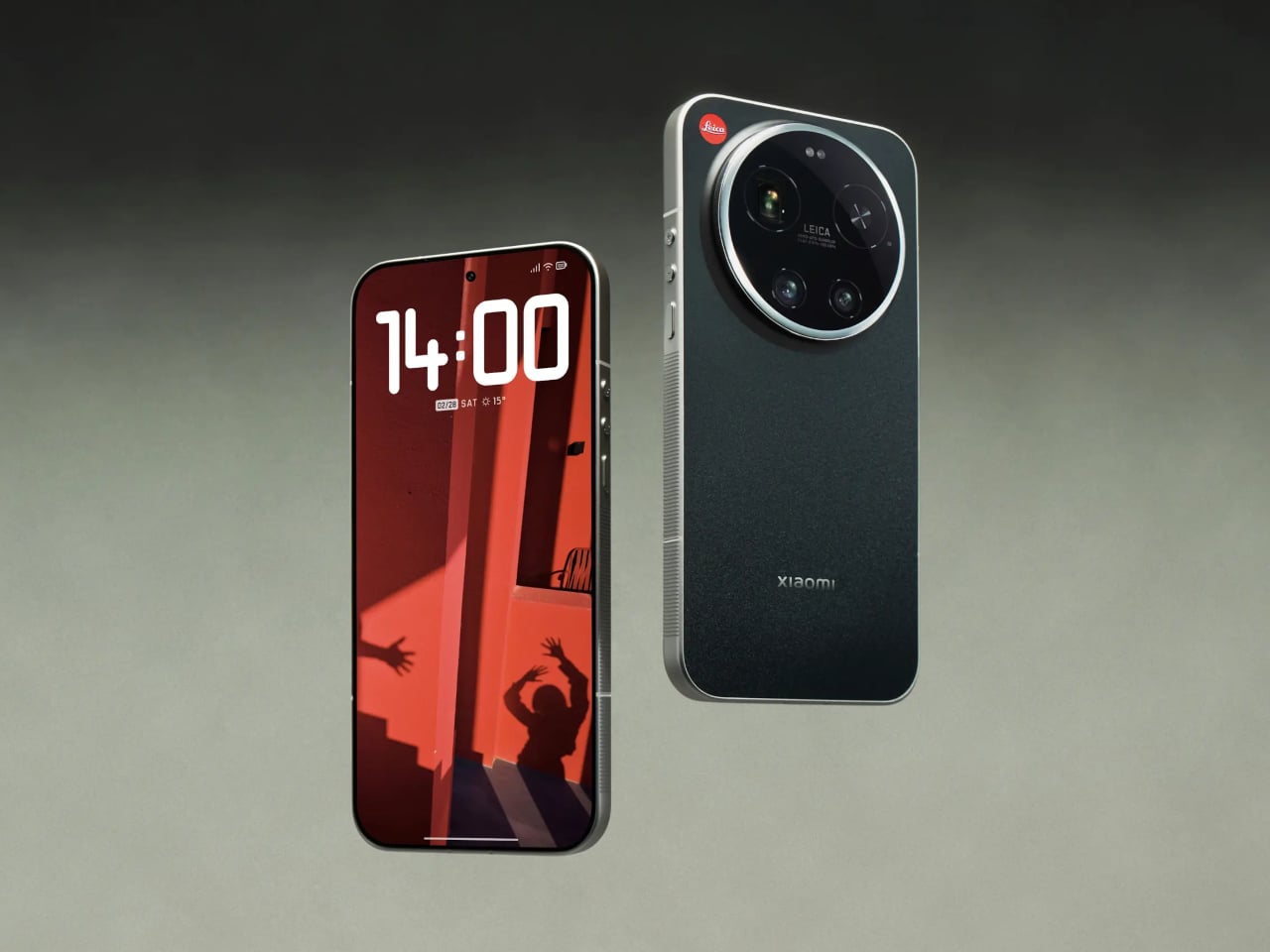
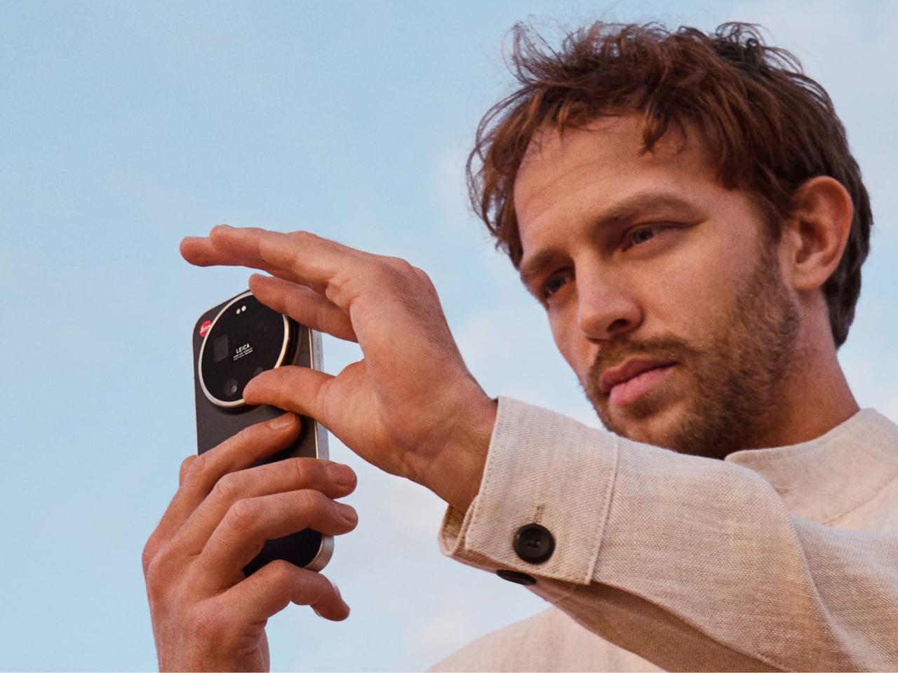
Most of us carry a capable camera in our pockets every day, yet somehow the act of taking a photo still feels like wrestling with a piece of software rather than making an actual picture. You tap, swipe, wait for the AI to decide what the scene should look like, and end up with something technically perfect and faintly anonymous. That’s the frustration the Leica Leitzphone powered by Xiaomi is trying to address, arriving at MWC 2026 as a phone designed around the idea that shooting should feel deliberate.

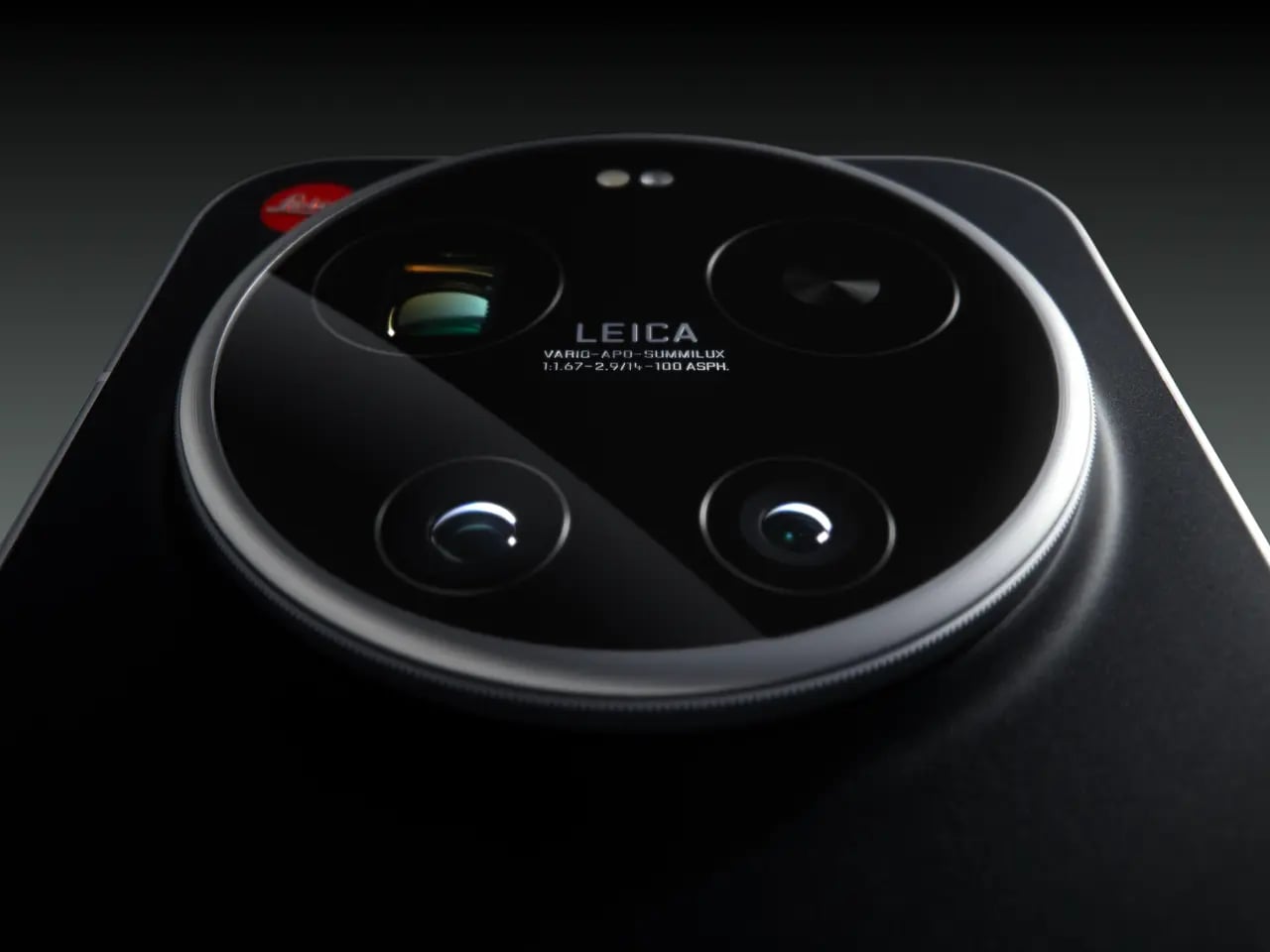
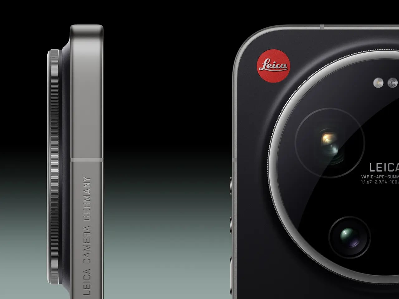
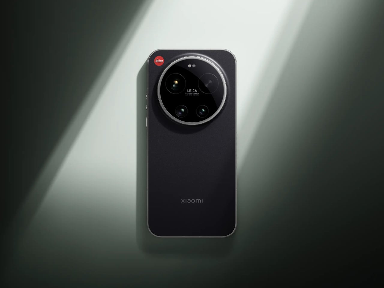
The most telling detail is the rotatable camera ring around the lens module. It’s a physical control you can assign to focal length, focus, or bokeh depth, borrowing directly from the tactile language of Leica’s rangefinder cameras. There’s something telling about that choice: at a time when every interaction is a touch gesture, adding a ring you can actually turn is a quiet argument that the best interface for a camera might not be a flat sheet of glass.

Designer: Leica x Xiaomi

The hardware behind that ring is genuinely serious. The primary sensor is a 1-inch format with LOFIC HDR technology, which gives it a real optical size advantage over the smaller sensors in most flagship phones, particularly in high-contrast or low-light situations. A 200 MP telephoto covering 75–100 mm and a 14 mm ultra-wide complete the system, so the focal length range maps fairly naturally onto how photographers tend to think rather than how smartphone specs sheets tend to read.

Software is where it gets more interesting, and where you’re asked to trust the collaboration a little more. Leica Essential Mode simulates the output of two specific cameras: the Leica M9 and the M3 with MONOPAN 50 film. For people who know those cameras, that’s a specific and meaningful promise. For everyone else, it’s an aesthetic reference that requires some faith, and there’s a gap between “inspired by classic Leica lenses” and actually using one that the marketing doesn’t quite close.

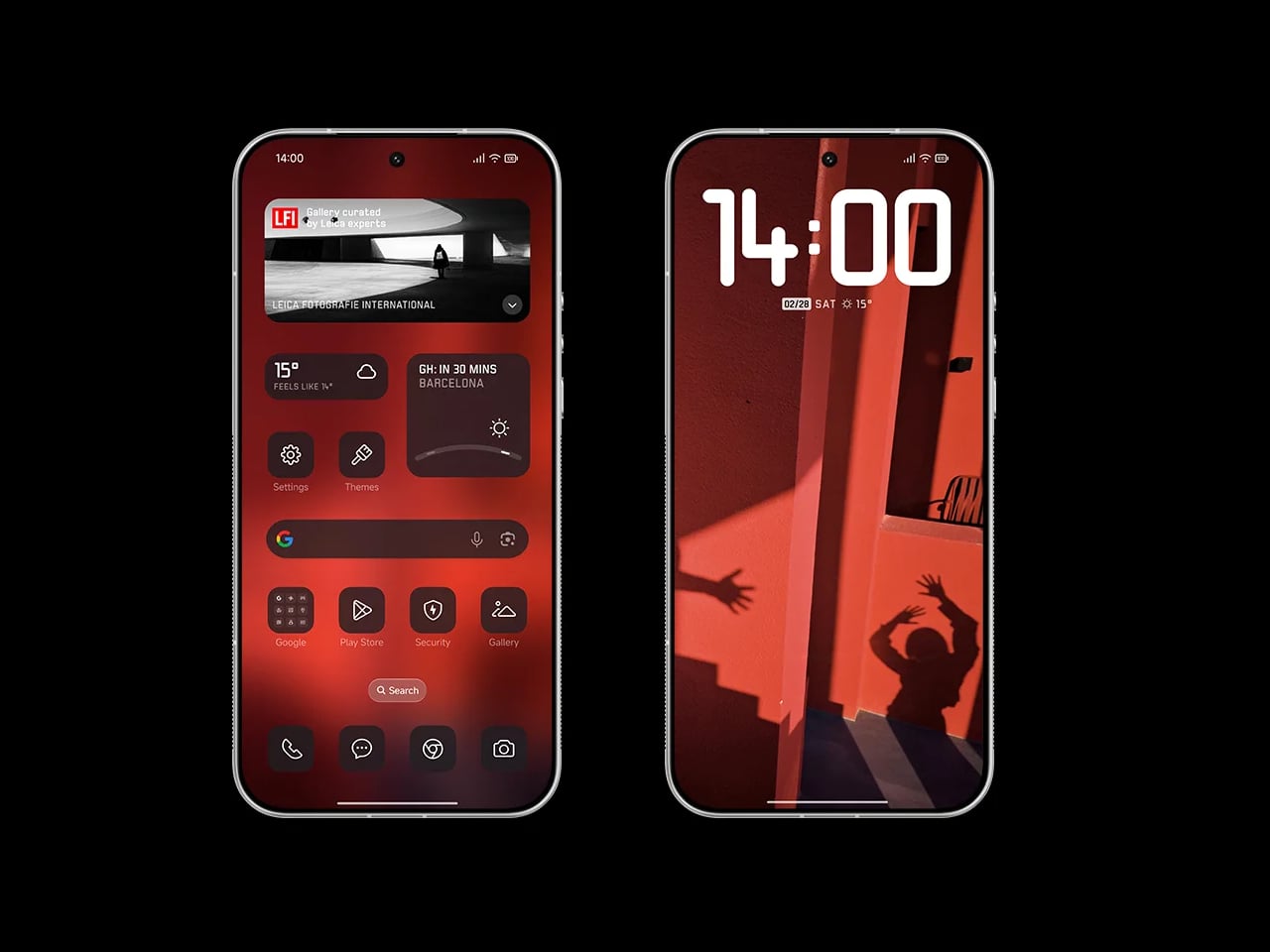
The rest of the phone is exactly what a 2026 flagship should be. Qualcomm’s Snapdragon 8 Elite Gen 5 handles the processing, a 6,000 mAh battery supports 90W wired and 50W wireless charging, and the 6.9-inch 120 Hz OLED display hits 3,500 nits peak brightness. Leica also redesigned the entire UI, with custom fonts, icons, and two interface themes running across every system element, which is more thoroughgoing than a co-branded phone usually gets.

One feature that doesn’t make the headline but probably should is the built-in Content Authenticity Initiative metadata support, which embeds provenance data in every image to confirm its origin and integrity. As AI-generated imagery gets harder to distinguish from photographs, having a phone that can prove a picture is real starts to feel less like a niche feature and more like an actual need.

The post Leica and Xiaomi Built a Phone With a Rotatable Camera Ring first appeared on Yanko Design.

From Magnetic Modules to Neon Lights: TECNO’s Wild Phone Concepts

For years, smartphone makers have been quietly taking things away. The removable battery went first, then the headphone jack, then anything else that made a phone feel repairable or adaptable. TECNO showed up at MWC 2026 with a different idea, bringing a collection of concepts that go in the opposite direction, adding to the phone rather than stripping it down. Some of these ideas are genuinely practical. Others are just fun to think about.

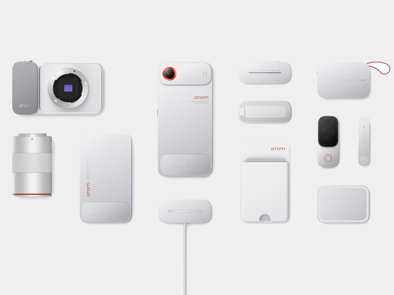
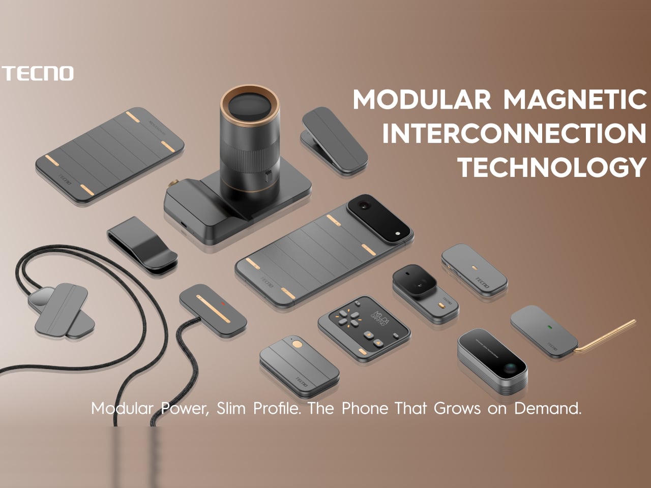
The most developed concept is the Modular Magnetic Interconnection Technology, which lets you snap hardware modules onto the phone magnetically. Telephoto lenses, action cameras, extra battery packs, and over a dozen other components can attach and detach as needed. TECNO presented two design versions: ATOM, with a clean white-and-red palette built around the idea of efficient, intentional use, and MODA, which takes the same modular logic but wraps it in a bolder, more aggressive look. The phone stays slim by default, and you only add bulk when the situation actually calls for it.

Designer: TECNO

MODA

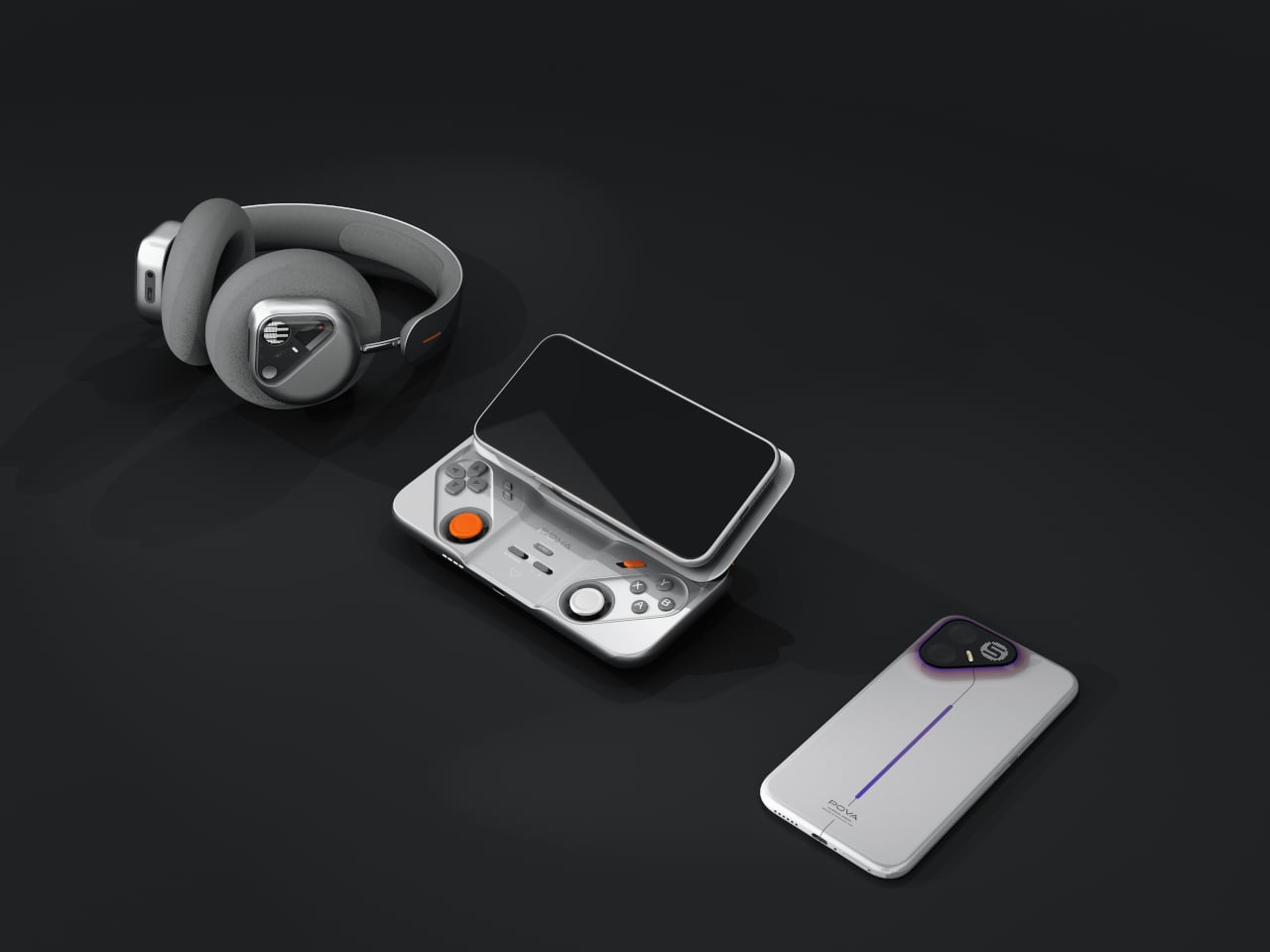
The POVA Ecosystem takes a more focused angle, targeting mobile gamers specifically. POVA Metal is the world’s first full-metal unibody 5G phone, and it pairs with a POVA Controller Slide that supports a 0 to 25-degree adjustable viewing angle and is optimized for both FPS and MOBA games. The controller also supports wireless charging, which is a small but welcome detail. A POVA Earphone with dot-matrix lighting rounds out the set, giving the whole ecosystem a consistent visual identity.

POVA Ecosystem

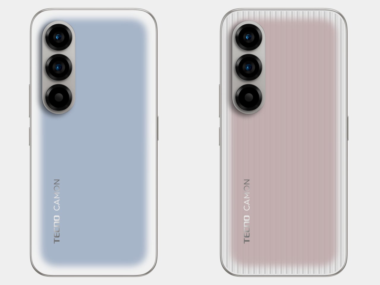
AI EINK is one of the quieter ideas in the lineup. The back panel reads colors from the camera and shifts its appearance to match, with further adjustments available through an app. How often someone would actually use this outside a case is a fair question, but the idea of a phone that responds to its surroundings rather than just sitting there is at least an interesting one to sit with.

AI EINK

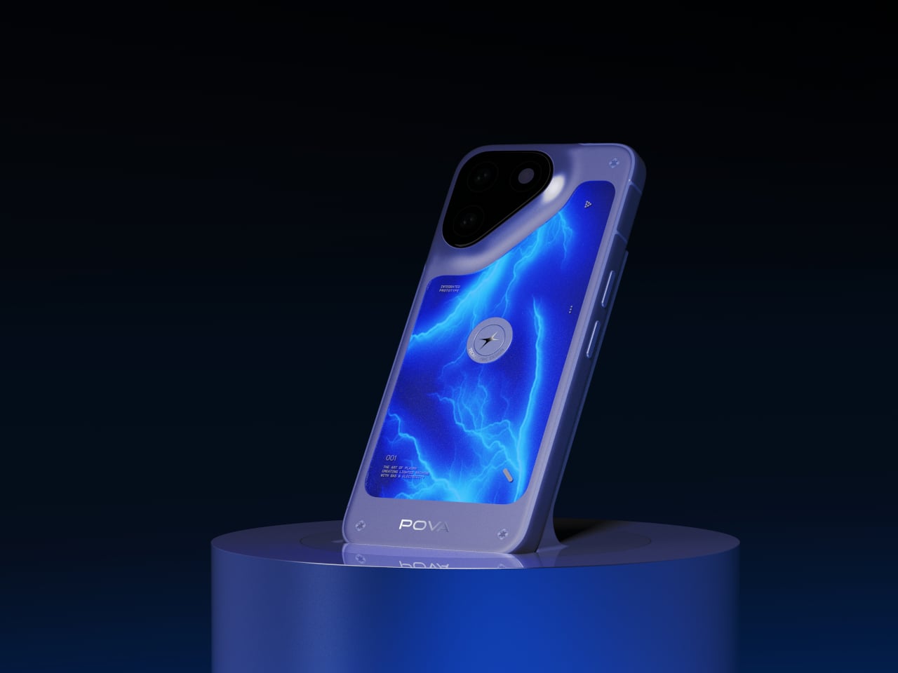
POVA Neon is the concept that most clearly exists as a statement rather than a solution. It uses ionized inert gas lighting, the same technology behind neon signs, to create a glowing effect on the back panel. The renders show branching blue light that looks like something between a lightning bolt and a screensaver. It’s hard to argue that it solves a problem anyone has, but not everything at a concept showcase needs to. Sometimes a phone that looks like it’s charging from a thunderstorm is just fun to put on a table.
POVA Neon

These are all still concepts, which means most of them won’t ship in this form, if they ship at all. The modular system is the one worth watching most closely, since the core tension it tries to address, keeping phones lightweight while making AI and computing demands heavier, isn’t going away. We can only hope that TECNO will fare better than others who also tried to make the modular phone dream a reality.

The post From Magnetic Modules to Neon Lights: TECNO’s Wild Phone Concepts first appeared on Yanko Design.

Xiaomi Built a Tracker That Works on Apple Find My and Google

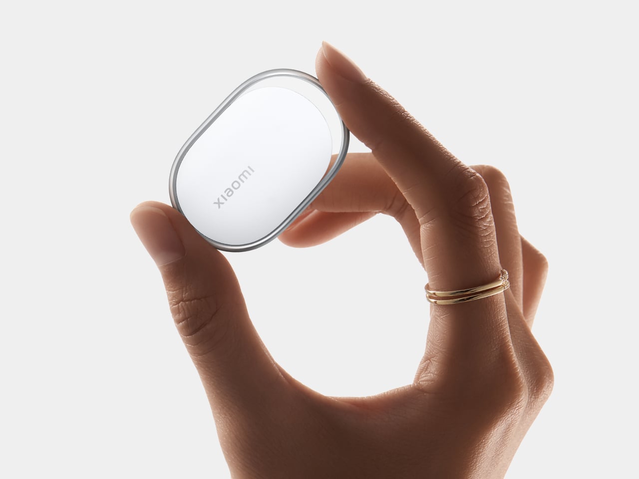
Losing your keys right before you have to leave is one of those small disasters that feels disproportionately catastrophic. Bluetooth trackers were supposed to fix that, and they mostly have, except for one nagging issue: the good ones tend to work best inside a single ecosystem. Apple’s AirTag is excellent if everyone around you has an iPhone. Most of the world, however, does not. That’s the gap Xiaomi is aiming at with its new Tag, unveiled at MWC 2026.

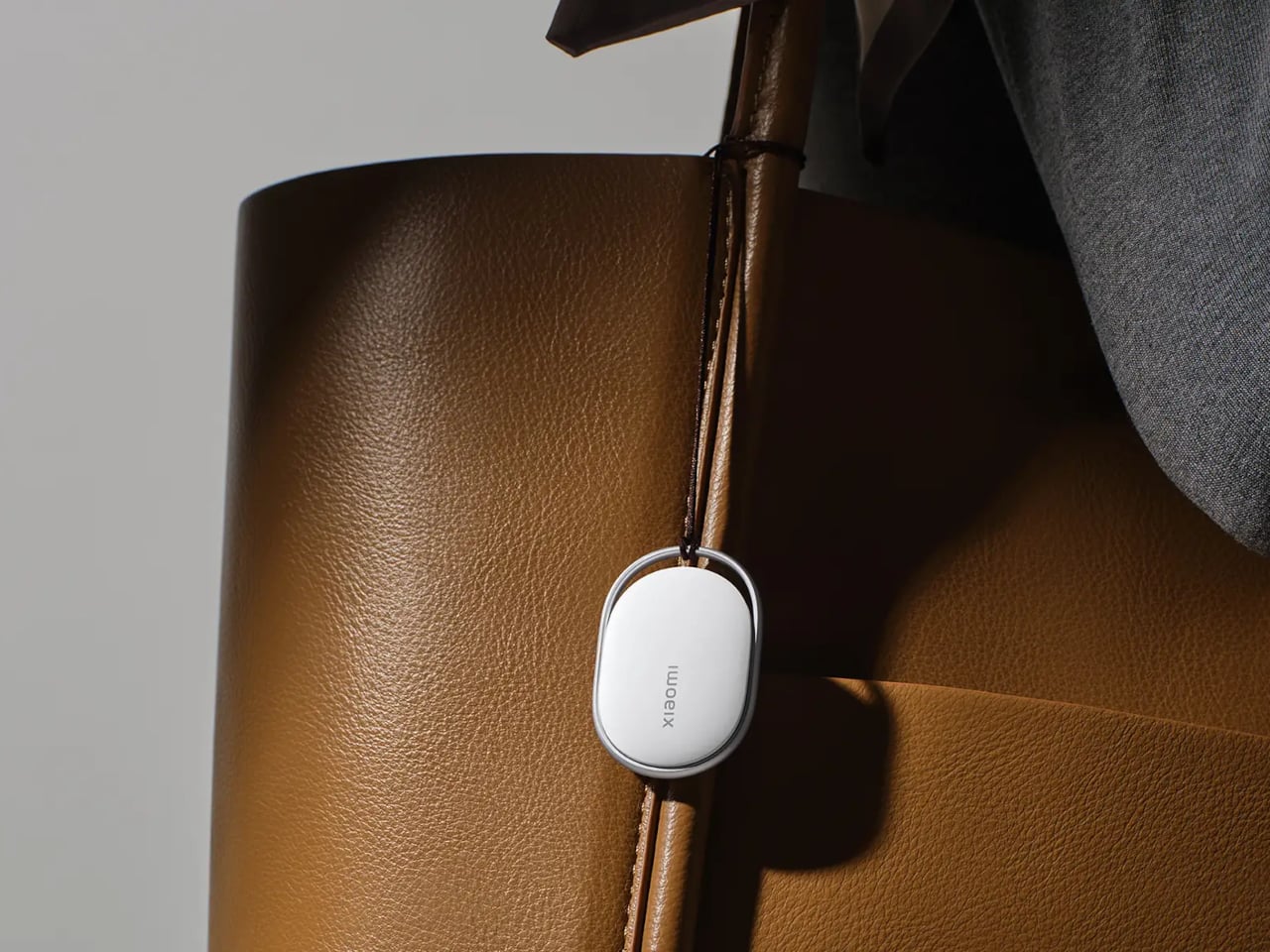
The Xiaomi Tag supports both Apple Find My and Google Find Hub, which matters more than it might sound. Bluetooth trackers don’t locate your lost bag on their own. They rely on other people’s phones nearby to silently ping the tag’s location back to you. The larger the network of phones, the better your odds of actually finding something. Android outnumbers iPhone significantly across most of the world, so a tracker that taps both networks has a meaningful practical advantage over one that doesn’t.

Designer: Xiaomi

The two networks don’t run at the same time, so the Tag operates on one or the other depending on your setup. Still, the flexibility alone puts it ahead of most alternatives. Connectivity runs on Bluetooth BLE 5.4, and for Lost mode, Apple Find My users can tap any NFC-enabled phone to pull up the owner’s contact details without downloading a single app. That last part is a small but genuinely thoughtful detail.

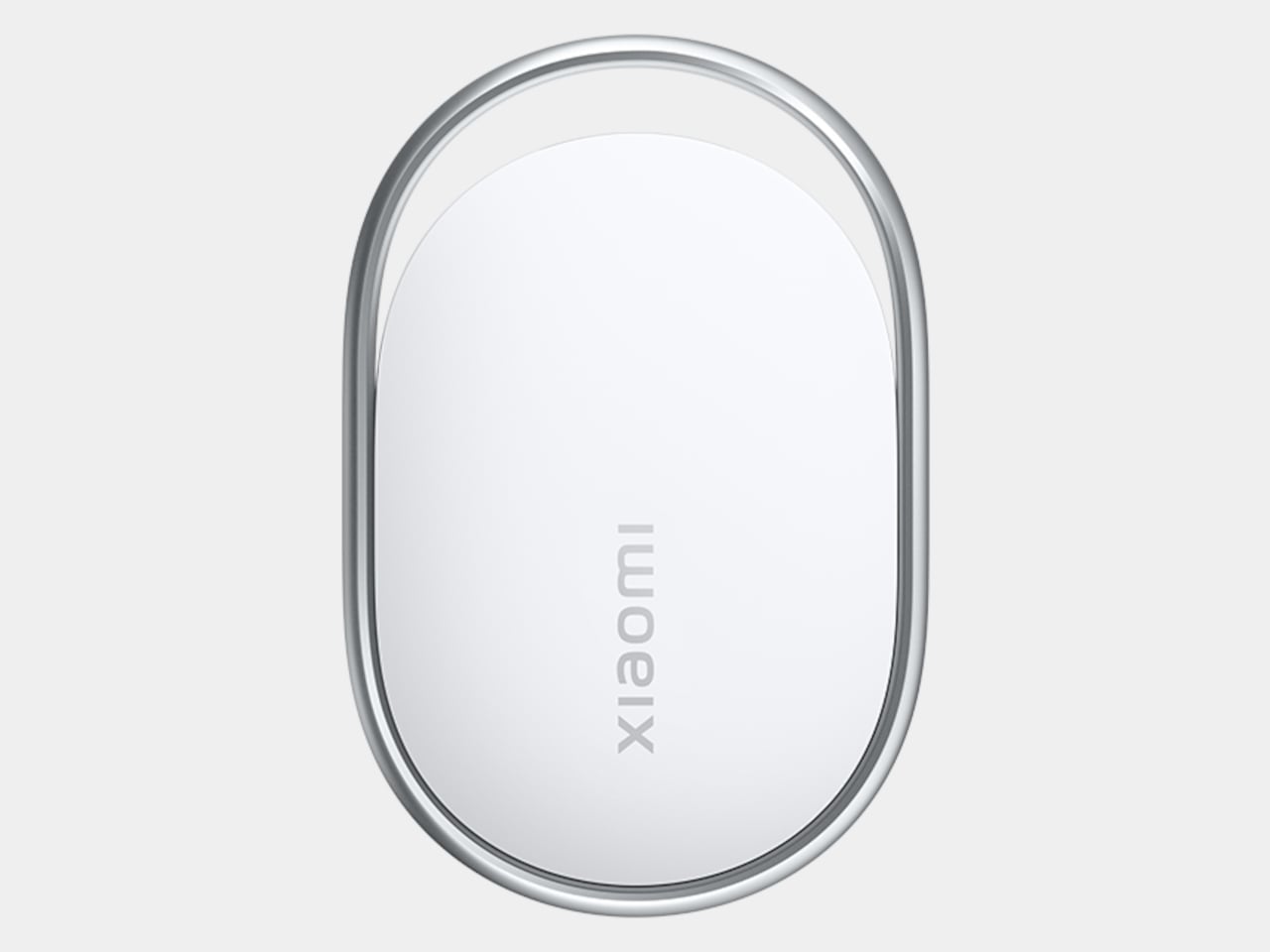
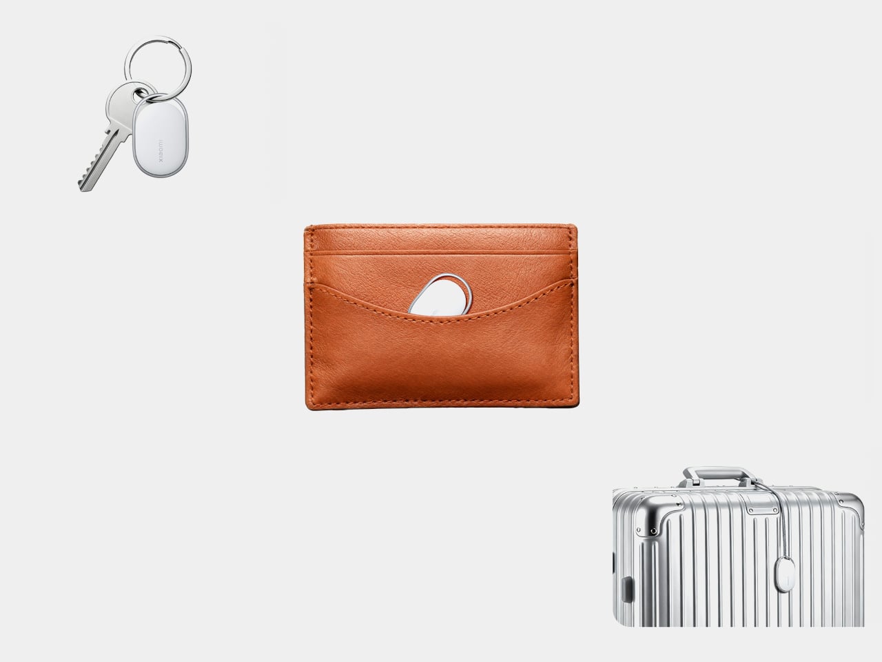
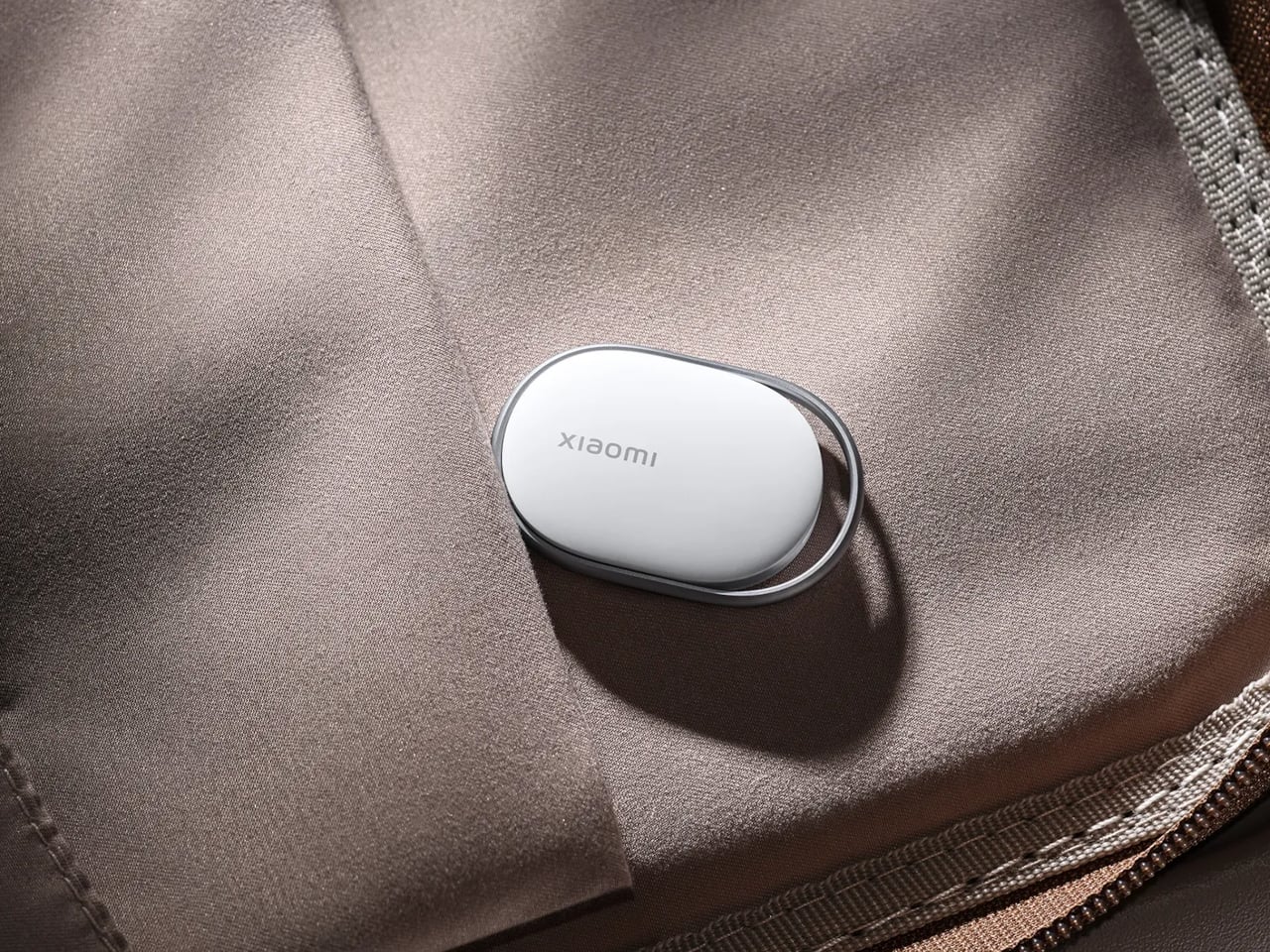
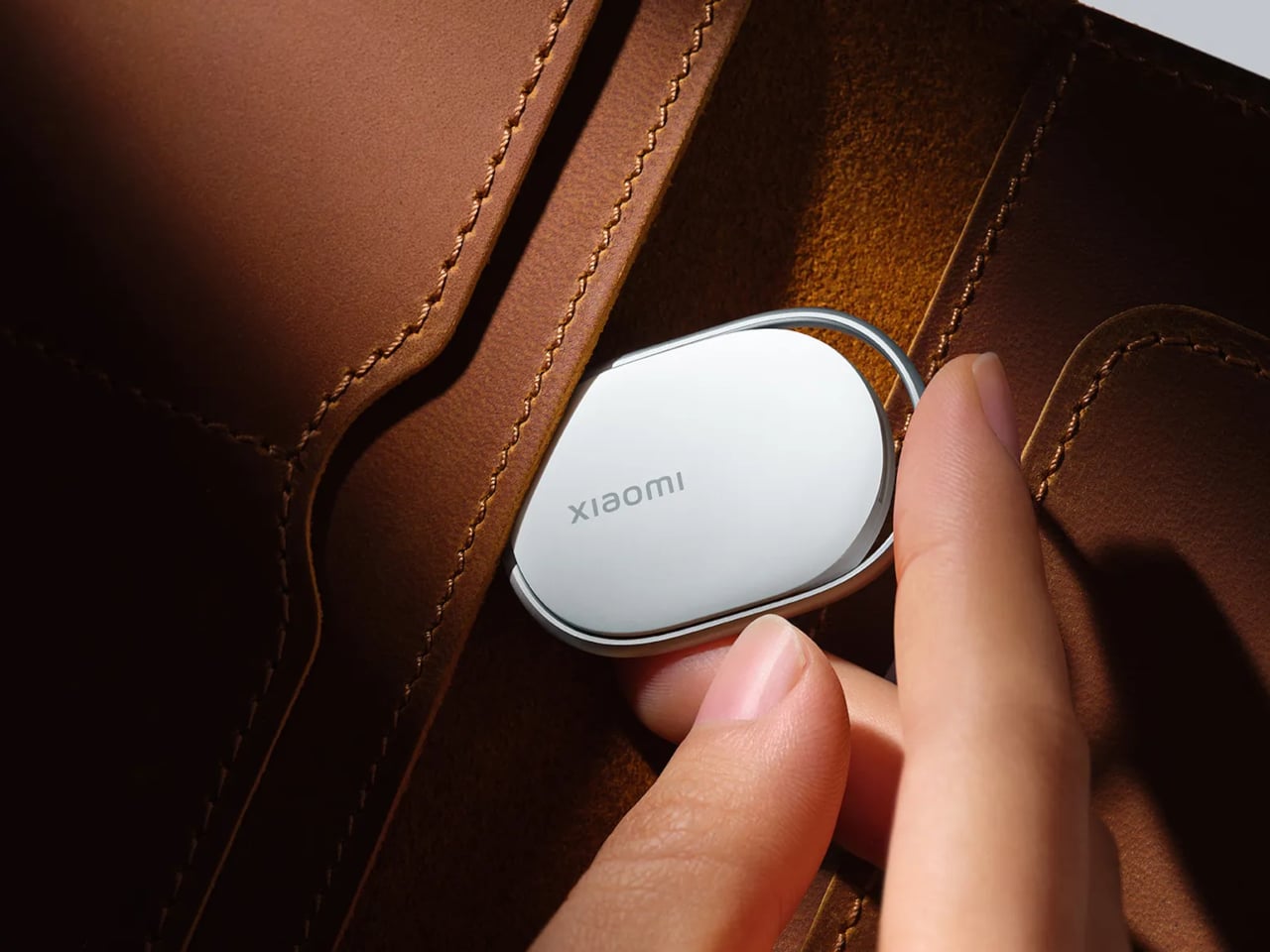
Physically, the Tag weighs 10g and measures 46.5 x 31 x 7.2 mm, compact enough to slide into a wallet without creating a noticeable lump. IP67 dust and water resistance means rain and accidental puddle encounters are not going to be a problem. The battery is a removable CR2032 button cell, rated for over a year of life based on four sound searches per day, and the app sends a low-battery alert before it dies on you.

There’s an accelerometer inside, and the app can send left-behind alerts when the Tag separates from a location you frequent, though that feature currently works only on Apple Find My. Lost mode lets you attach your contact details and a message, so a stranger who finds your luggage can get that information either through an Android pop-up or an NFC tap on an iPhone, no app required on their end. It’s the kind of friction-reduction that makes the difference between someone actually returning your bag and just walking past it.

An anti-tracking alert is also built in, notifying you if an unknown Tag appears to be following your movements. Xiaomi notes that coverage depends on the Find network’s own implementation, which is an honest caveat that most trackers quietly bury. The Tag is available as a single unit or a four-pack, which is useful if your wallet, keys, backpack, and luggage all feel equally likely to disappear at any given moment.

The post Xiaomi Built a Tracker That Works on Apple Find My and Google first appeared on Yanko Design.

This AI Desk Terminal Has a Screen, Knob, and Voice Control

AI has become a permanent fixture in how we work, but accessing it still feels strangely clumsy. Most of the time, it means opening yet another browser tab, typing a prompt into a chat window, waiting for a response, then copying it somewhere else. The irony is thick: tools designed to save time end up buried under the same pile of windows and notifications they were supposed to help manage.

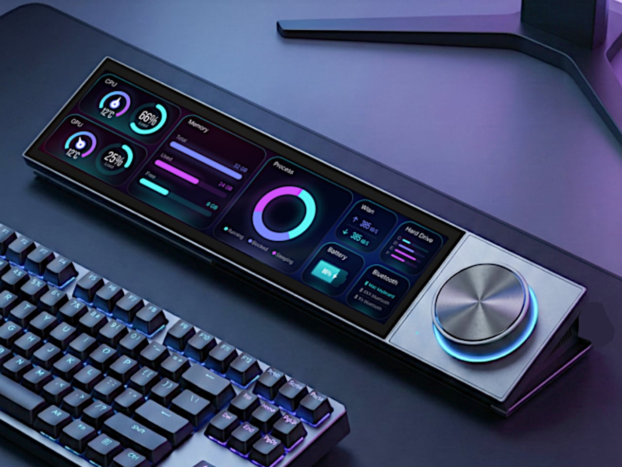
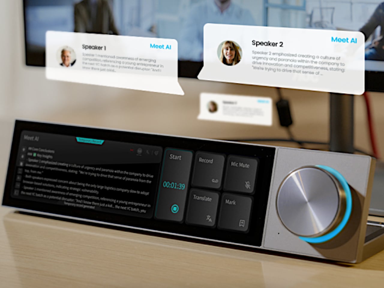
The DECOKEE Quake approaches this problem sideways, and the solution is physical. It is a desktop terminal built around an 8.88-inch ultra-wide IPS touchscreen and a single rotary control knob, designed to sit alongside a keyboard rather than compete with the monitor above it. Everything about the form factor suggests a device that wants to be glanced at, tapped, and spoken to, not stared at for hours.

Designer: DECOKEE

Click Here to Buy Now: $279 $359 (22% off). Hurry, only 66/500 left! Raised over $231,000.

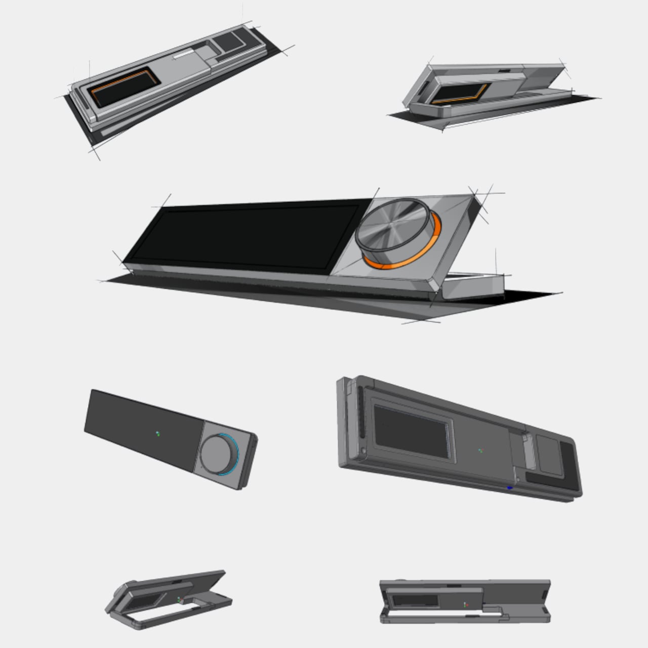
Pick it up and the construction registers immediately. The body is CNC-machined aluminum alloy with an anodized matte finish, a material choice that gives the Quake a density and coolness that plastic peripherals simply cannot replicate. A transparent backplate on the rear adds a subtle design signature, while the adjustable stand lets the screen tilt anywhere from flat to 60 degrees. At roughly 800g, it has enough heft to stay planted on a desk without feeling like an anchor.
1

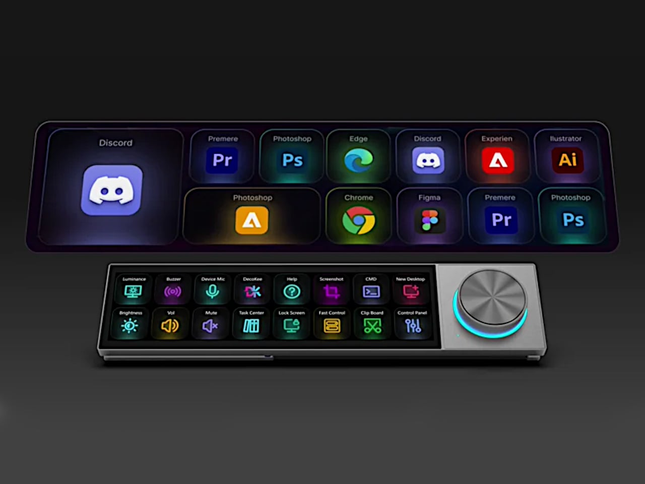
That ultra-wide screen has a 1920×480 resolution at 450 nits or brighter, and its unusual aspect ratio turns out to be a deliberate design decision. Rather than mimicking a small monitor, the panel is shaped for control surfaces: rows of customizable touch shortcuts, status dashboards, system stats, and meeting interfaces laid out horizontally. The rotary knob beside it offers infinite rotation with a push-button click and an RGB light ring that changes color based on what mode the Quake is operating in, turning a simple input device into a status indicator.
1

Where the Quake earns its “AI copilot” label is in meetings. Tap a button, and it begins recording through a built-in far-field microphone with noise reduction, then auto-generates a structured transcript and summary when the call ends. Ten summary templates let the output match the context, whether it is a standup, a client call, or a brainstorm. Real-time translation covers 17 languages, and a system-level mic mute button works across every app on the computer, not just Zoom or Teams.

1

Beyond meetings, holding the knob and speaking activates a conversational AI layer with over 100 configurable assistant roles. Ask it to generate a shortcut layout for Photoshop, and it builds one on screen, ready to use. Ask for a translation, a compliance check, or a math solution, and the response appears on the Quake’s display without ever pulling focus from the main monitor. The same voice input can produce custom wallpapers and emojis, though the novelty of AI-generated desktop art will vary by taste.

1

1

The feature list stretches further than expected for a device this compact. A system monitoring mode displays real-time CPU, memory, and network stats. A Discord overlay gives gamers channel and mute controls without alt-tabbing. Home Assistant integration (through API setup) allows single-tap smart home control from the touchscreen. There is even a music player with a vinyl-inspired interface that connects to Spotify or plays local files, which is a charming if unexpected addition to a productivity device.

1

What makes the Quake interesting as a design object is the underlying argument it makes about where AI belongs on a desk. Not trapped inside a browser tab, not buried in a notification, but sitting in a physical surface with tactile controls and a screen that stays visible. Whether that argument holds up after months of daily use is something only shipped units will answer.

Click Here to Buy Now: $279 $359 (22% off). Hurry, only 66/500 left! Raised over $231,000.

The post This AI Desk Terminal Has a Screen, Knob, and Voice Control first appeared on Yanko Design.