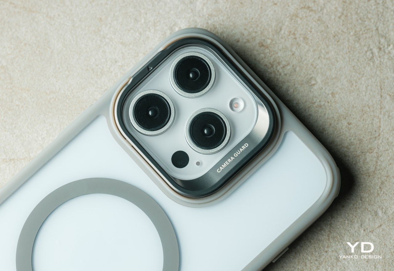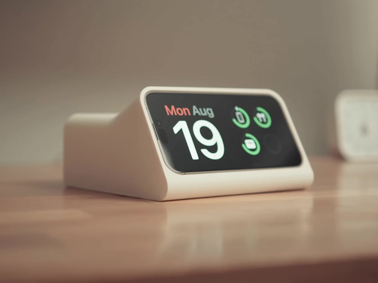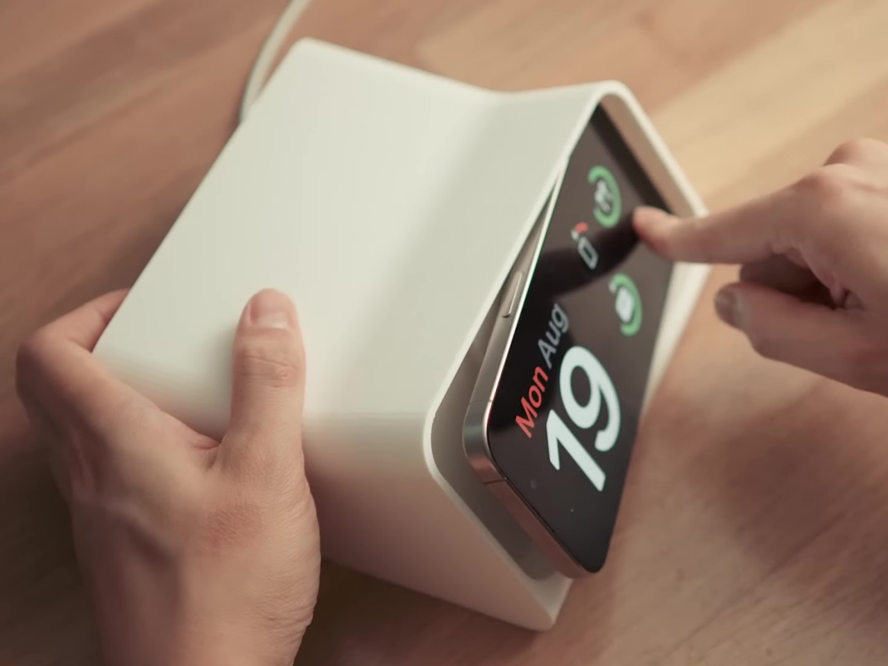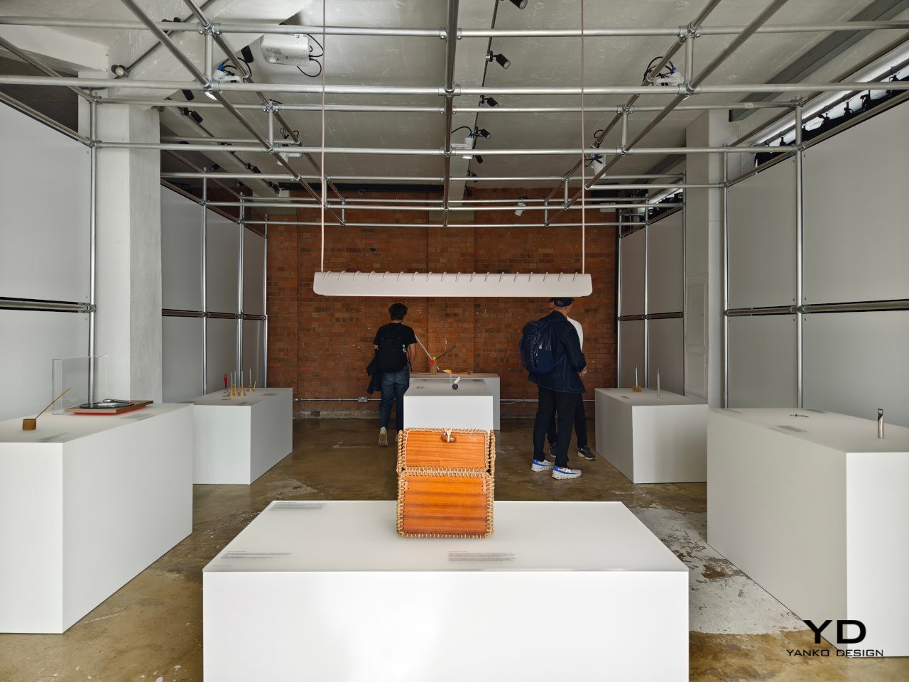
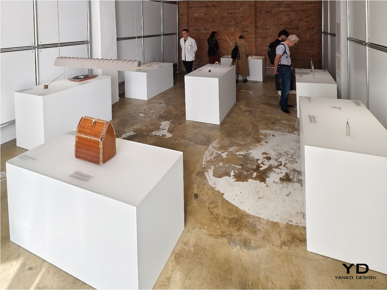
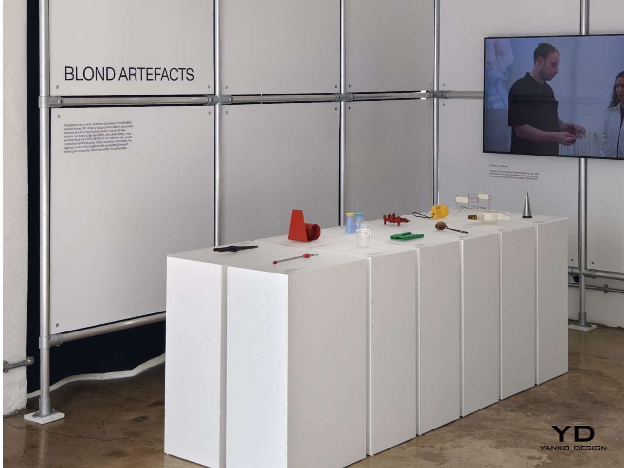
There are plenty of wise sayings about how the past guides our future, and nowhere is that perhaps more evident than in the design and fashion industries. “Retro” might seem like a passing fad, but this isn’t the first time that the design pendulum has swung back to the past for inspiration. This homage to the designs of our predecessors may be the guiding spirit behind famed London-based design studio BLOND’s ARTEFACT initiative, taking objects that are no longer in production or even in use and reimagining them in a completely different light. At the London Design Festival this week, the BLOND LABORATORY challenged a stellar roster of international designers and studios with this quest, and here are the responses that give these “offline” products a new kind of life in this modern world.
Designer: BLOND
From Us With Love: Mallet Flashlight
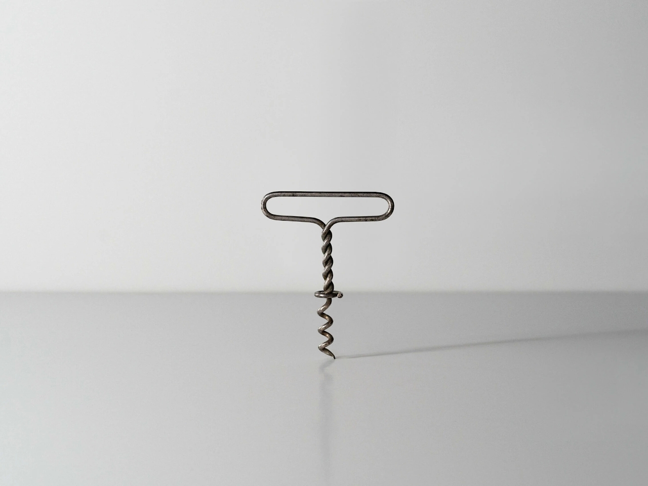
Opening wine bottles today is as easy as turning a cap, but true connoisseurs still prefer the classic cork that is just as difficult to remove as in the old days. Of course, we have it easy today as well with more modern tools, but the traditional corkscrew and its menacing metal spiral has always been the weapon of choice for that task. Even older designs used a single bent rod of metal, which is probably not as comfortable to use as those with wooden or even plastic handles.
Designer: From Us with Love
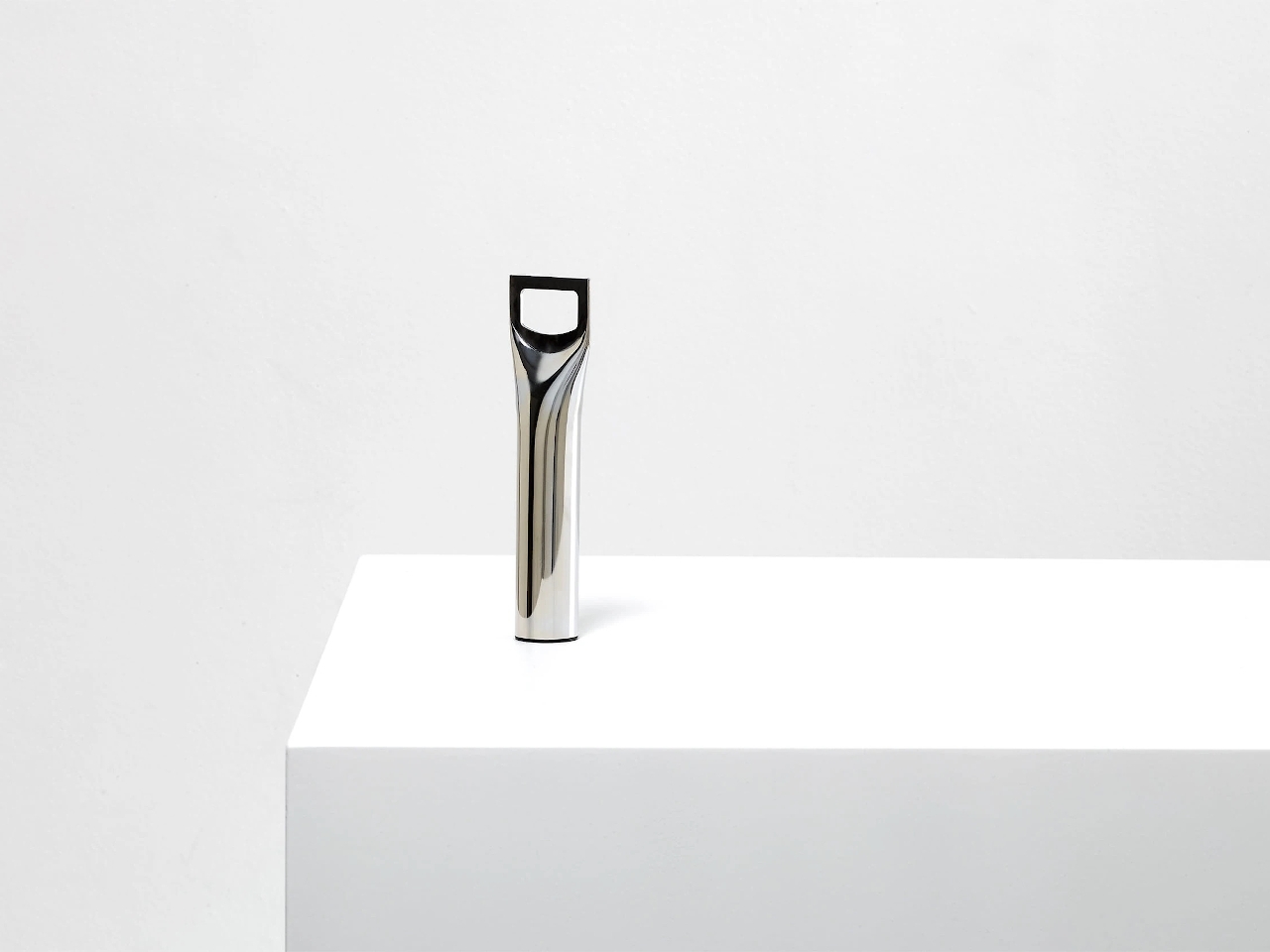
Turning something crude into an art object is the feat that From Us With Love accomplished. Taking a single rod of metal, flattening its top, and cutting out a hole in the middle resulted in a simple yet functional bottle opener. It embraces the functional minimalism of the old-school corkscrew and imbibed with the elegance of modern tools, a true retro design if there ever was one.
Hirotaka Tako: Marking Gauge Ikebana Lamp
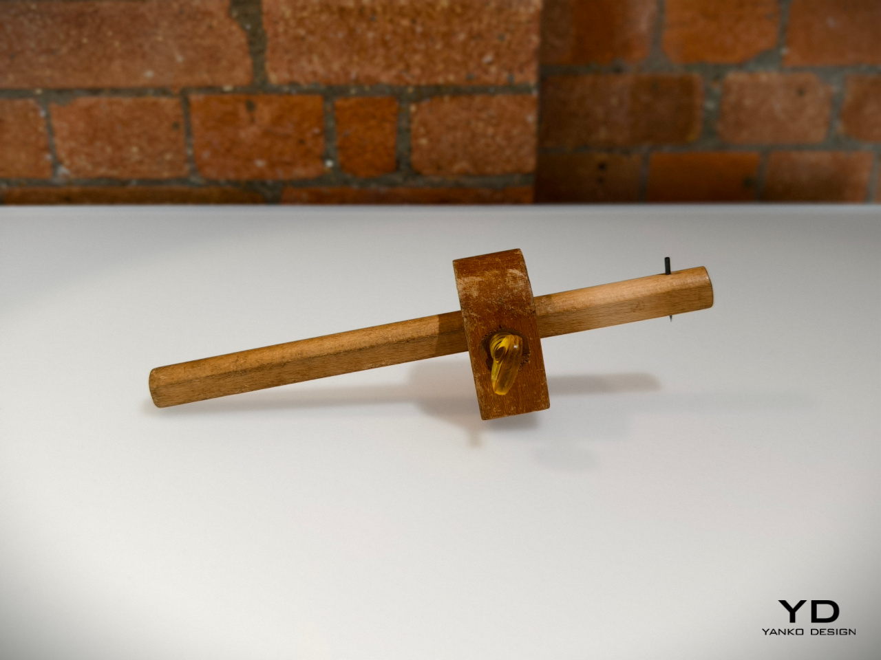
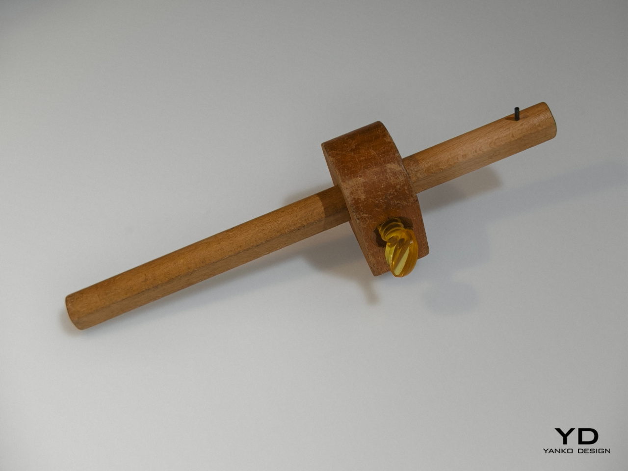
We enjoy a lot of convenient tools today that make it trivial to do things like measuring pieces of wood. In the old days before measuring tapes and meters, however, people had to make use of rather complicated tools that involved a wooden rod sliding inside a a block. This measuring gauge, though crude, created a rather interesting form that was not that different from a piece of art, which is exactly what inspired this rather geometric lamp design.
Designer: Hirotaka Tako
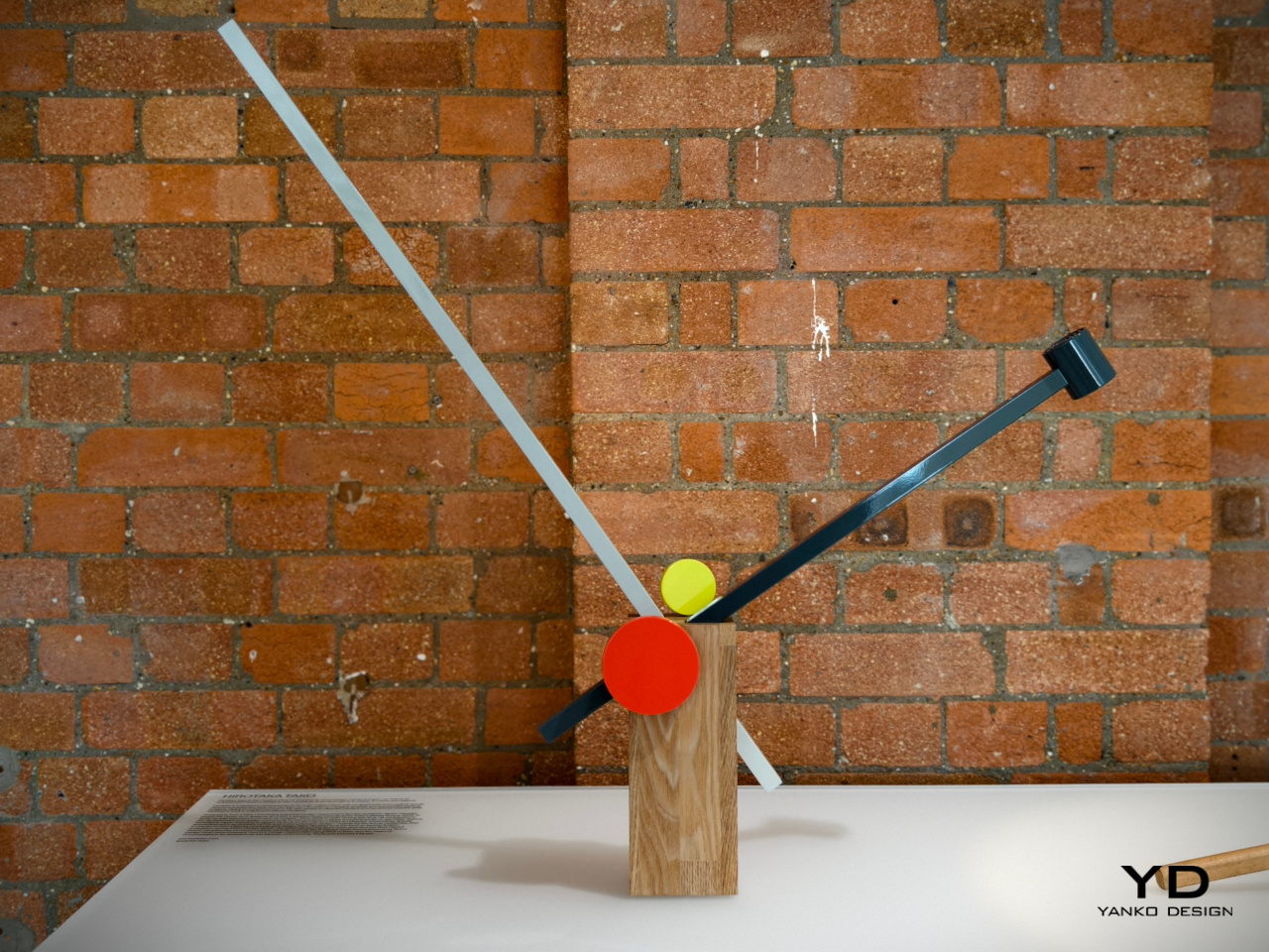
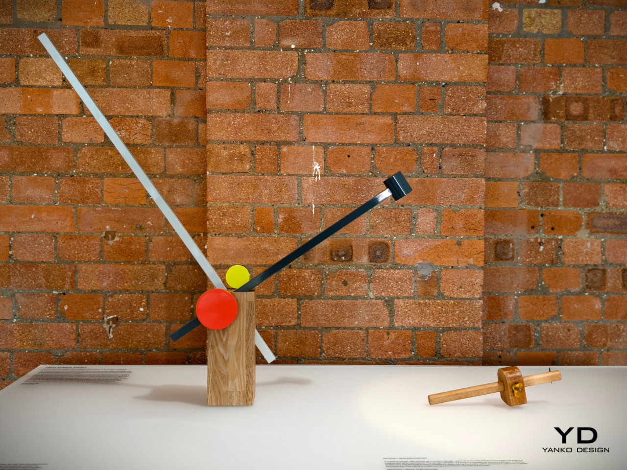
Taking inspiration from both this outdated tool as well as a Japanese art of floral arrangement, Hirotaka Tako designed a table lamp that similarly used the concept of inserting a long thin stick into something bigger. He likened the wooden rods to a flower stem inside a vase, exactly like an Ikebana arrangement. The result is a table lamp that is both functional and artistic, inspired by a tool that was anything but.
James Melia: Timber Basket Pendant Lamp
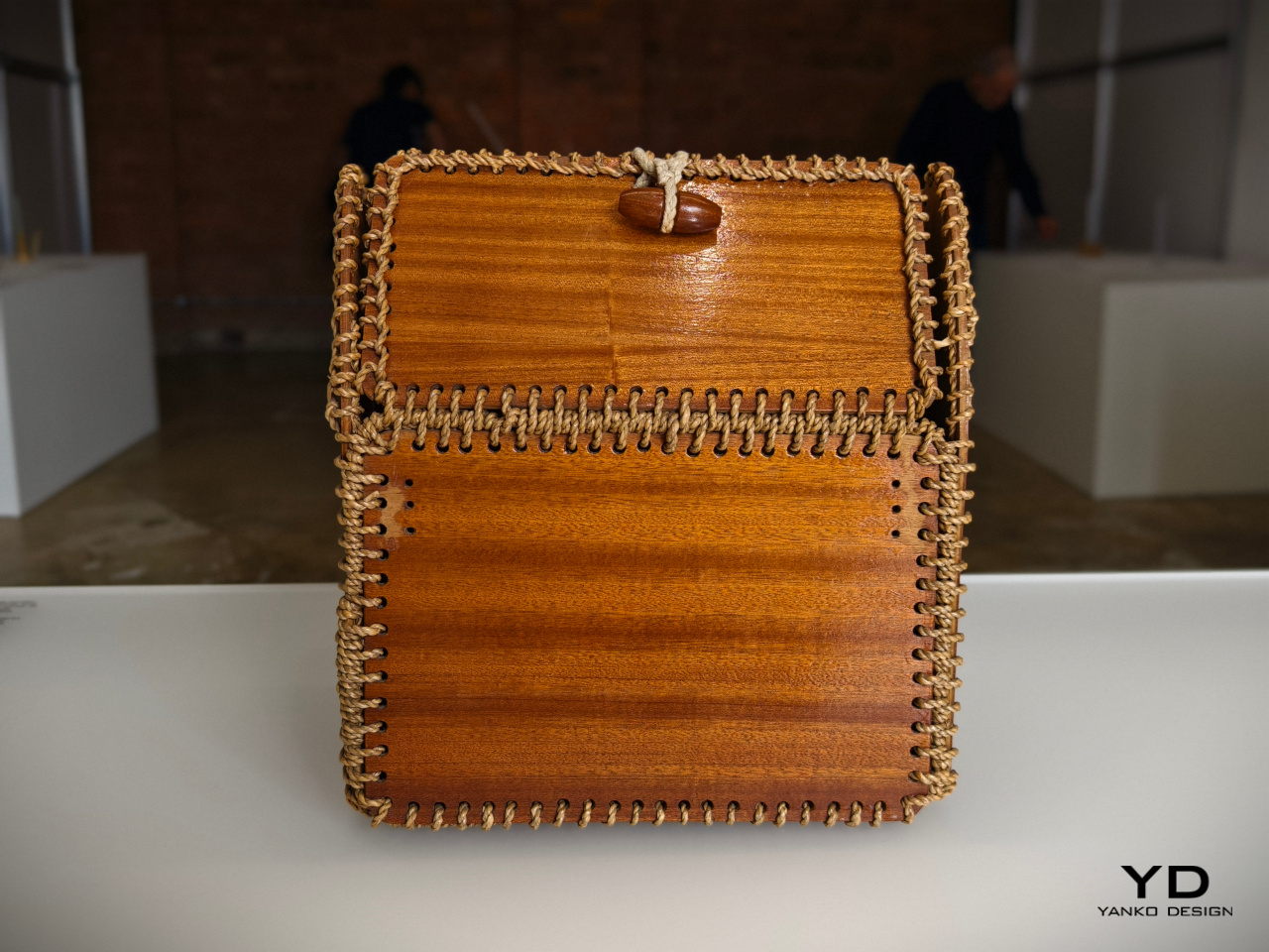
We take for granted the materials used to create modern products these days, not to mention the methods for making them. Today, we have machines that can print almost any shape imaginable, but past generations had to do things by hand, using stubborn and difficult materials. The rope patterns used to keep a timber basket together, for example, offered not only structural stability but also an interesting visual, one that can add a bit of a flair to an otherwise normal object.
Designer: James Melia
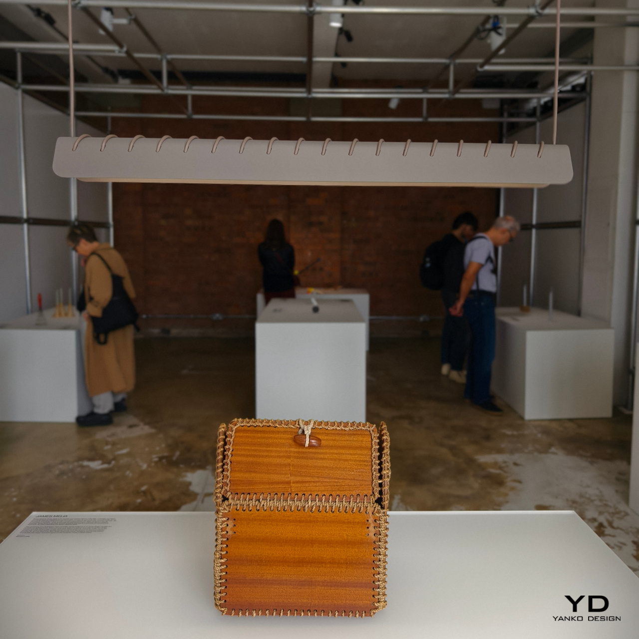
James Melia takes a hanging lamp’s power cord and stitches it along the length of its shade, creating a row of diagonal stripes that turns a plain lamp into an art object. That same cord is used to actually hang the lamp from a ceiling, reducing the number of parts involved in designing the lamp and creating a simpler and more sustainable design.
John Tree and Neal Feay: Tea Ladle Turntable
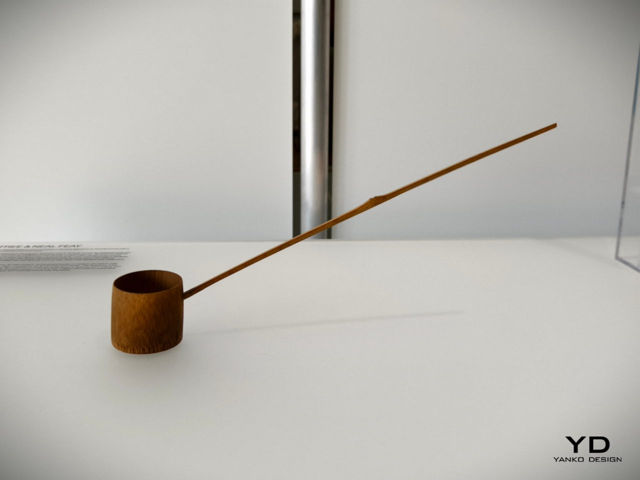
The Japanese are famed for their minimalist tools which are an art form in their own right. A simple scoop for tea powder, for example, takes the form of a bamboo ladle with a distinct charm. Though today’s tea lovers will probably use different tools, this traditional object still remains a staple in Japanese culture today as well as practices that recreate it. To some extent, it’s almost like the venerable turntable that has seen a renaissance and is getting some use even today.
Designer: John Tree x Neal Feay
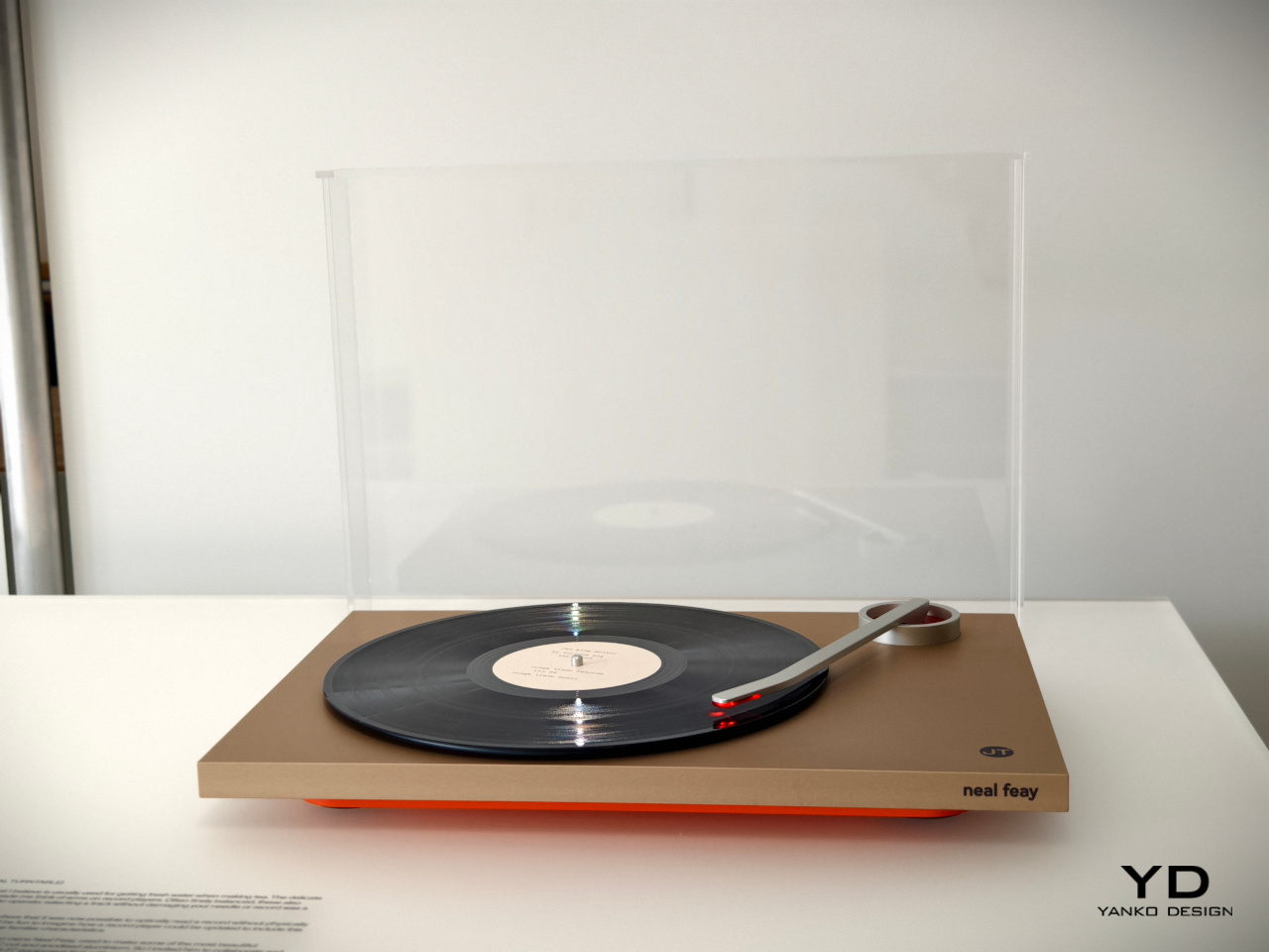
This optical turntable takes that delicate-looking bamboo tea ladle and transforms it into a turntable arm that preserves that spirit of gentleness. Rather than using a sharp pin to read the grooves of the platter, it uses light to avoid any physical contact and help preserve the vinyl material. It’s a gentle and delicate spin on a classic retro design, no pun intended.
Jon Marshall: Whisk Candelabra
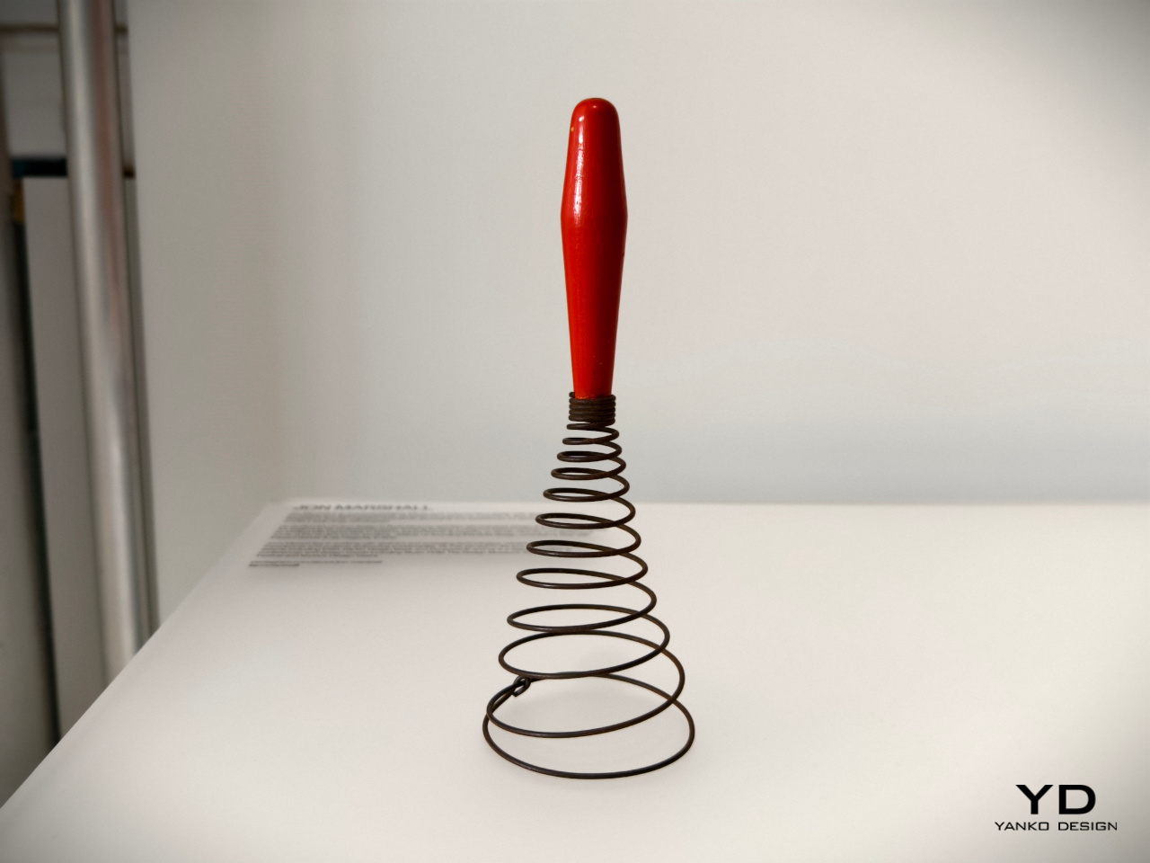
Today’s whisks are light, compact, and handy tools that use a few loops of bendable wire or plastic, a design that’s so far removed from the coiling iron wires of much older versions of the kitchen tool. Looking more like springs or even weapons, this antique whisk form isn’t very efficient at what it’s meant to do, but it admittedly looks novel and interesting to our modern eyes.
Designer: Jon Marshall
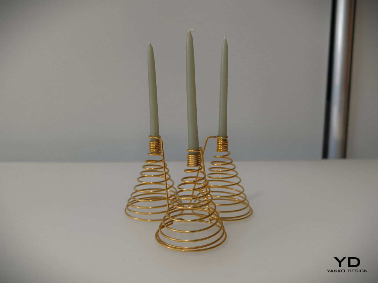
It might not make scrambled eggs, but this candelabra will definitely bring a bit of delight to your dinner table. The spiraling form of the base and the tight coils of the candle holder make for an interesting visual, but it’s when the candles are lit and the shadows dance that this rather luxurious-looking light fixture truly comes alive.
Julie Richoz: Balance Bird Balancing Lighter
Kids tend to find science and math lessons boring until they encounter puzzles and feats that really blow their minds. Something as simple as a perfectly balanced eagle held up only by its beak is sure to pique curiosity, even those of adults. This ingeniously disguised pendulum is not an uncommon toy or desk ornament, but the same principles can be used to the same effect for other objects, including more utilitarian ones.
Designer: Julie Richoz
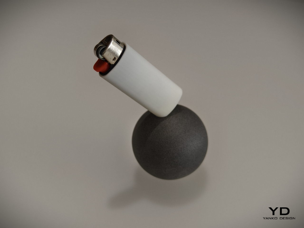
A lighter standing only one of its corners is definitely going to make you the talk of the party, and it provides not only an entertaining piece of decoration but also practical use. It will be easy to see if the lighter is missing from its base, and people who use it will be more likely to put it back on its perch just to marvel at its balancing act. It’s a very simple twist to a simple object but one that has a nontrivial effect on those who see it, all thanks to some inspiration from old objects we have taken for granted.
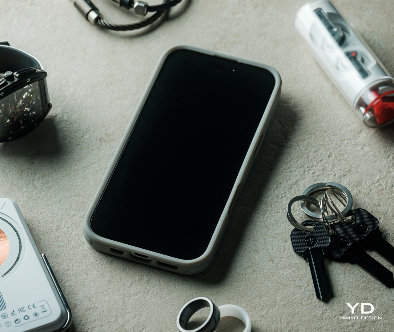
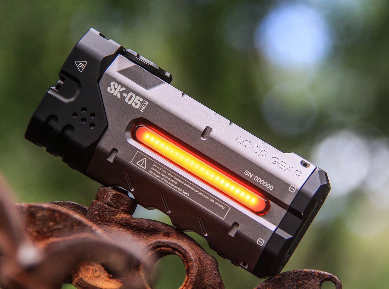
Maddalena Casadei: Mallet Flashlight
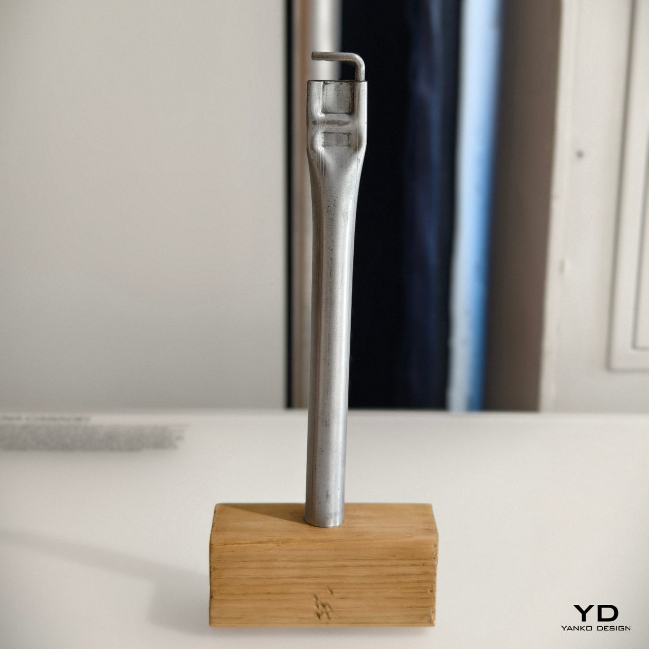
Most of us who have done any sort of handiwork may have used a hammer at one point in time or another. There are different kinds of hammers, of course, and one such type is the mallet. Often made with a heavy head to pound things flat, some old-school mallets would reverse the typical hammer design and use a steel rod handle with a wooden block for the head.
Designer: Maddalena Casadei
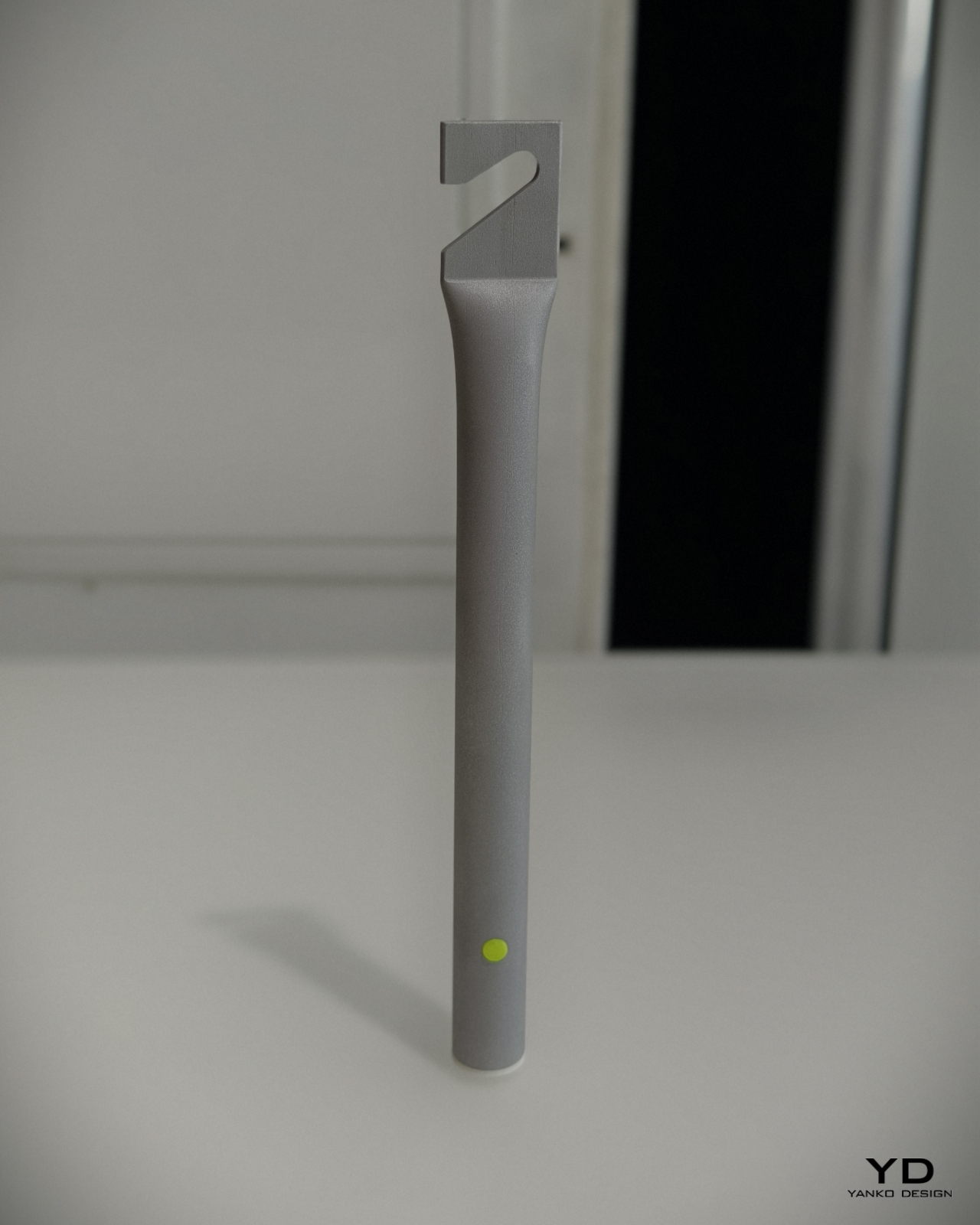
Maddalena Casadei took that raw-looking industrial metal handle to turn it into a cylindrical flashlight with similarly brutalist aesthetics. Instead of the wooden head, it has a small removable cone that serves as a diffuser for the light. On the opposite end is a flattened section with a hook that serves the same purpose as the hammer from decades ago: hanging the tool from walls or rods. It’s a rather interesting depiction of a flashlight that sheds off all the sleek and luxurious designs of its modern equivalents, embracing the utilitarian character of its inspiration.
The post BLOND LABORATORY at London Design Festival 2024 revives old designs in unexpected ways first appeared on Yanko Design.