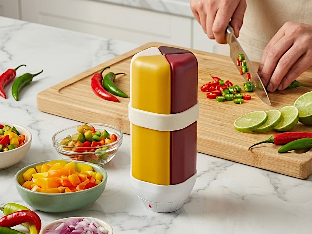
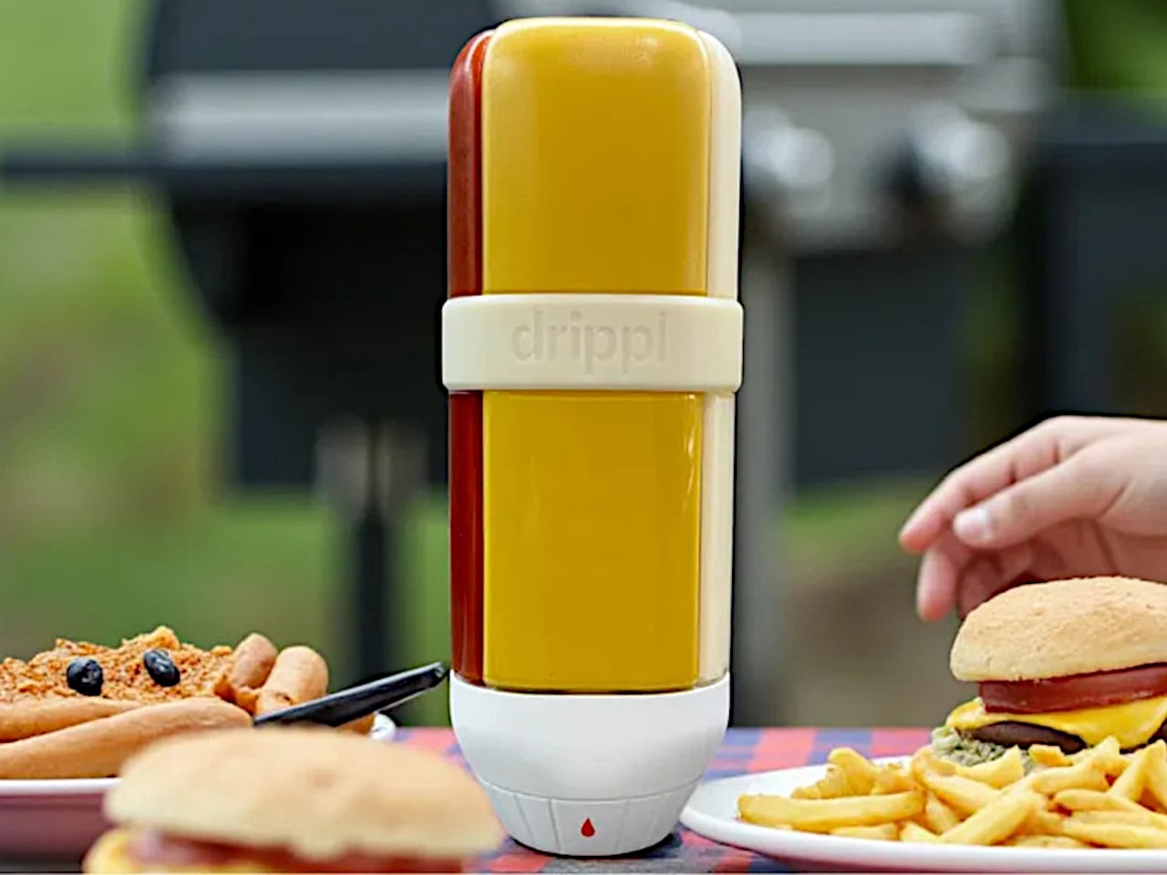
There is a particular kind of table chaos that happens at a backyard barbecue or a casual dinner. Four or five sauce bottles crowd around the food, each one sticky at the cap, half of them tipped on their side. It is a small problem but a persistent one, and it is the exact friction that the Drippl is designed to remove. The device consolidates four condiments into a single, upright dispenser.
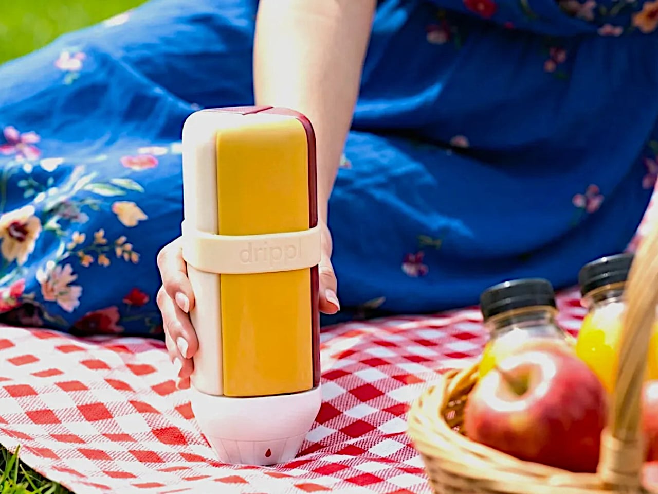
The Drippl stands 20cm tall and 7cm wide, sized to sit comfortably in one hand. Its four wedge-shaped compartments each hold 150ml of sauce for a combined capacity of 600ml. The form is composed: a white base with frosted, semi-transparent chambers that let you see the sauce inside without fully exposing it, keeping the table looking calm rather than congested with mismatched packaging.
Designer: Drippl
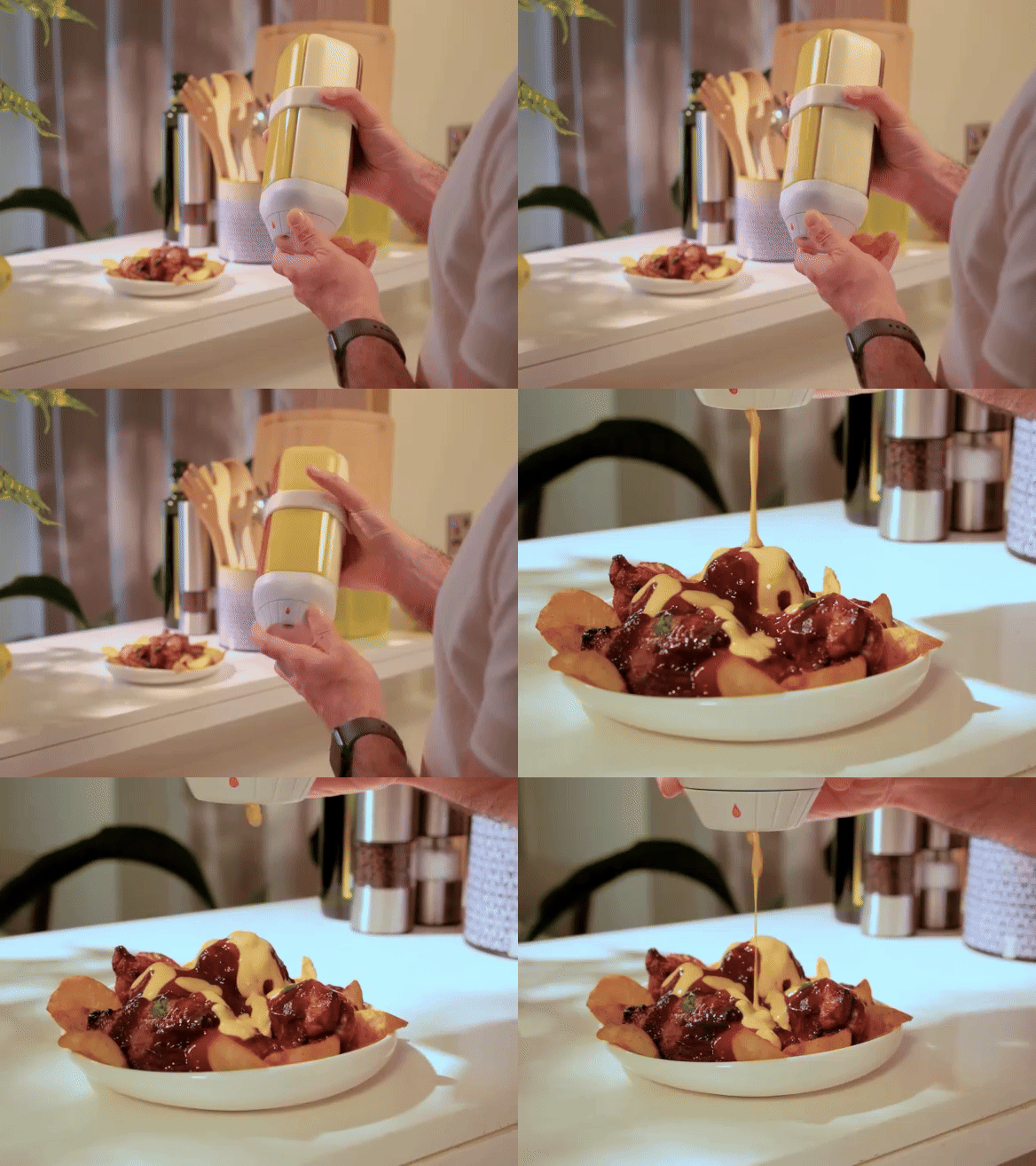
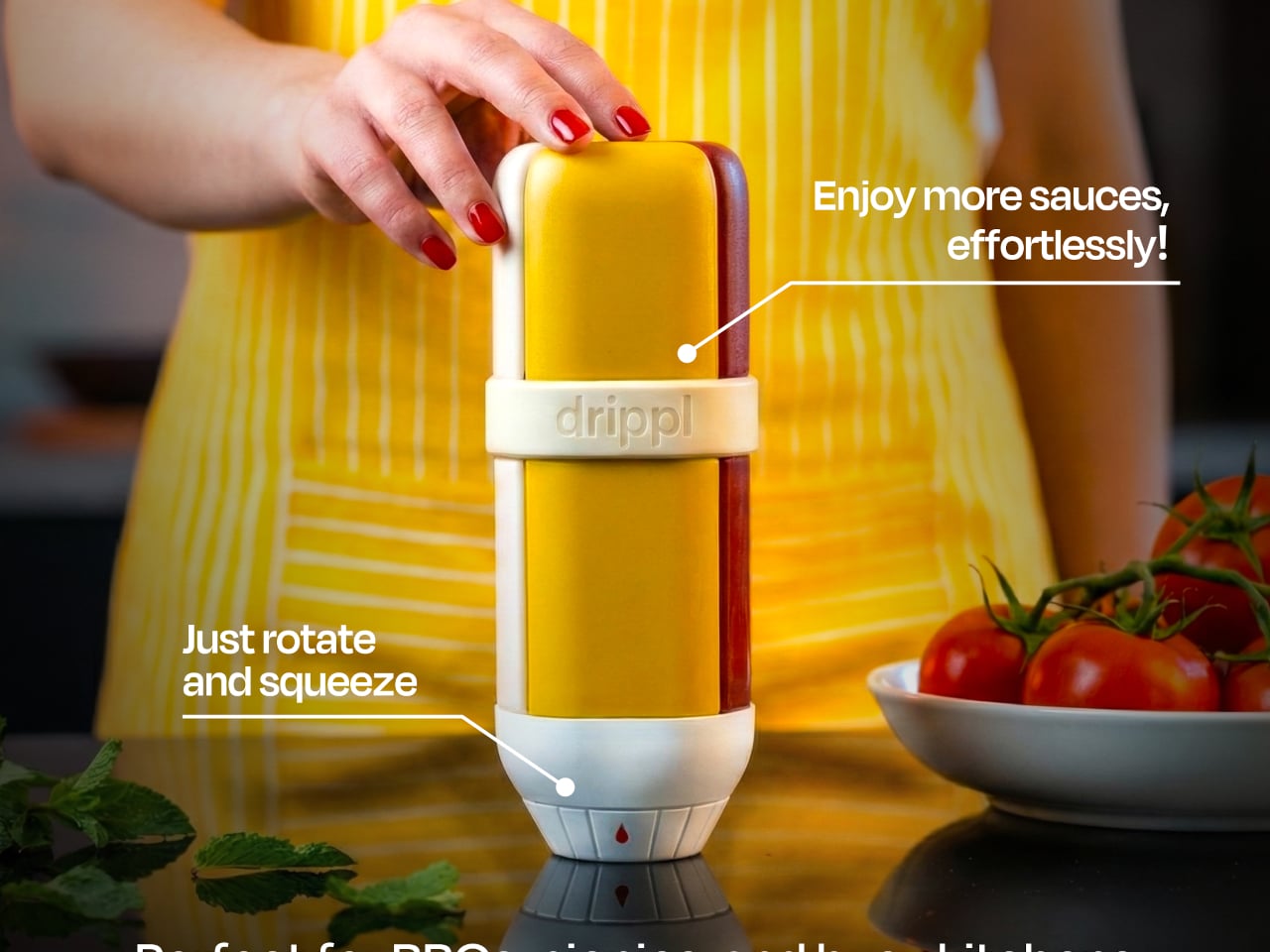
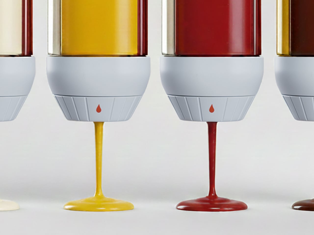
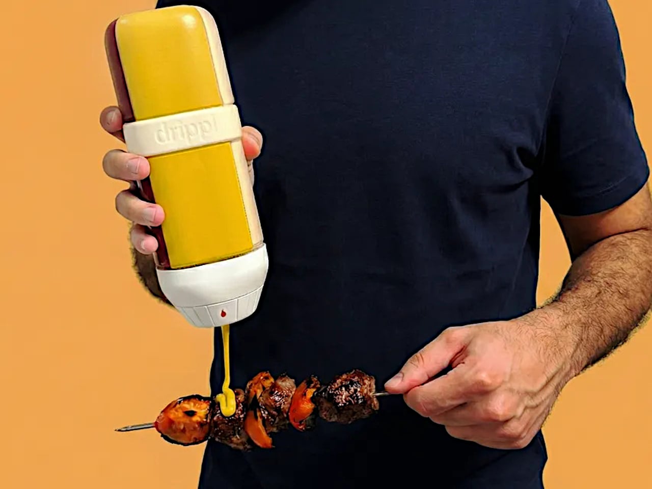
The interaction is straightforward. Rotate the selector dial at the base to the sauce you want, feel a tactile click when it locks in, and squeeze. Only the selected chamber opens; the remaining three stay fully sealed. Turn to the fully closed position, and all outlets are blocked, which matters when the unit is in a bag on the way to a picnic or packed into a cooler for an outdoor cookout.
The valve system treats sauce viscosity as a variable worth solving for, rather than applying a single nozzle to everything. A large valve handles creamy, thick sauces like mayo; a medium valve suits ketchup and mustard; a small valve controls thinner pours like soy sauce or hot sauce. The valves are interchangeable, so the configuration adapts to whatever combination you fill it with on a given day.
Cleanup is just as stress-free thanks to a fully detachable design. Every compartment, spout, and the selector base separates for hand washing or the dishwasher. The materials are food-grade and BPA-free, with compartments designed to resist staining and odor absorption. The unit also handles sauces up to 70°C (158°F), covering warm applications like heated barbecue sauce, though anything beyond that temperature falls outside its range.
What the Drippl addresses, beyond pure consolidation, is the presentation problem that standard sauce bottles ignore entirely. Most condiment packaging is designed for storage and retail shelf presence, not for the experience of using it at a table. The frosted compartments and white base give it the visual grammar of a considered object, rather than a row of utilitarian squeeze bottles.
That said, the design raises practical questions worth sitting with. At roughly 800 to 850g when fully filled, it is not a lightweight carry. Consolidating four sauces works smoothly when your preferences stay consistent, but swapping out one sauce mid-rotation requires cleaning that compartment first, reintroducing some of the same friction the product is trying to eliminate.
The Drippl is currently in prelaunch, so there are no answers yet on how the sealed valve system holds up across repeated use with thicker sauces, or whether the tactile selector stays reliable after months of daily rotation. Those are fair questions for any mechanism-dependent kitchen product. The concept is well-reasoned, but durability at the valve level will ultimately determine whether this stays on the table or gets retired to a shelf.
Spring has a way of resetting what we carry. The heavy layers come off, pockets shrink, and that overstuffed pouch of winter tools starts feeling like dead weight. This is the season where everyday carry gets honest about what actually earns space against your body, and what was just riding along out of habit. The five products on this list survived that edit. They are compact, functional, and built with enough design intelligence to justify displacing whatever is currently rattling around in your jacket.
What ties these picks together is a shared rejection of bulk for its own sake. The EDC market loves to pile features into objects that end up living in drawers because they are too heavy or awkward to carry daily. These five go the other direction, packing serious utility into forms that disappear into a pocket or clip onto a keyring without protest. Each one solves a real, recurring problem with clean engineering and a material palette that does not apologize for looking good while doing it.
1. Pockitrod Multitool Pen
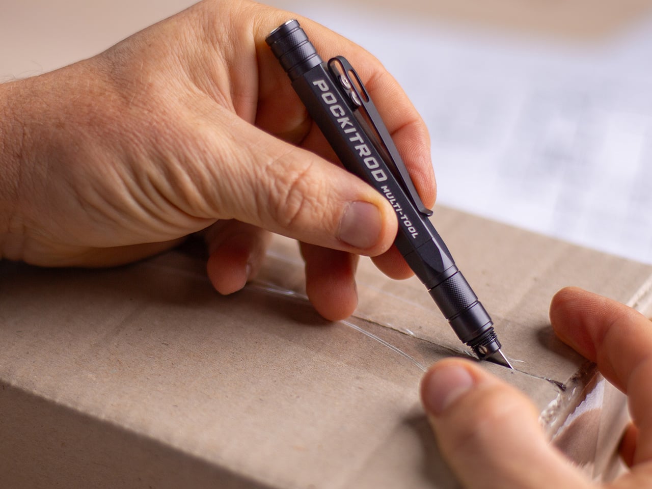
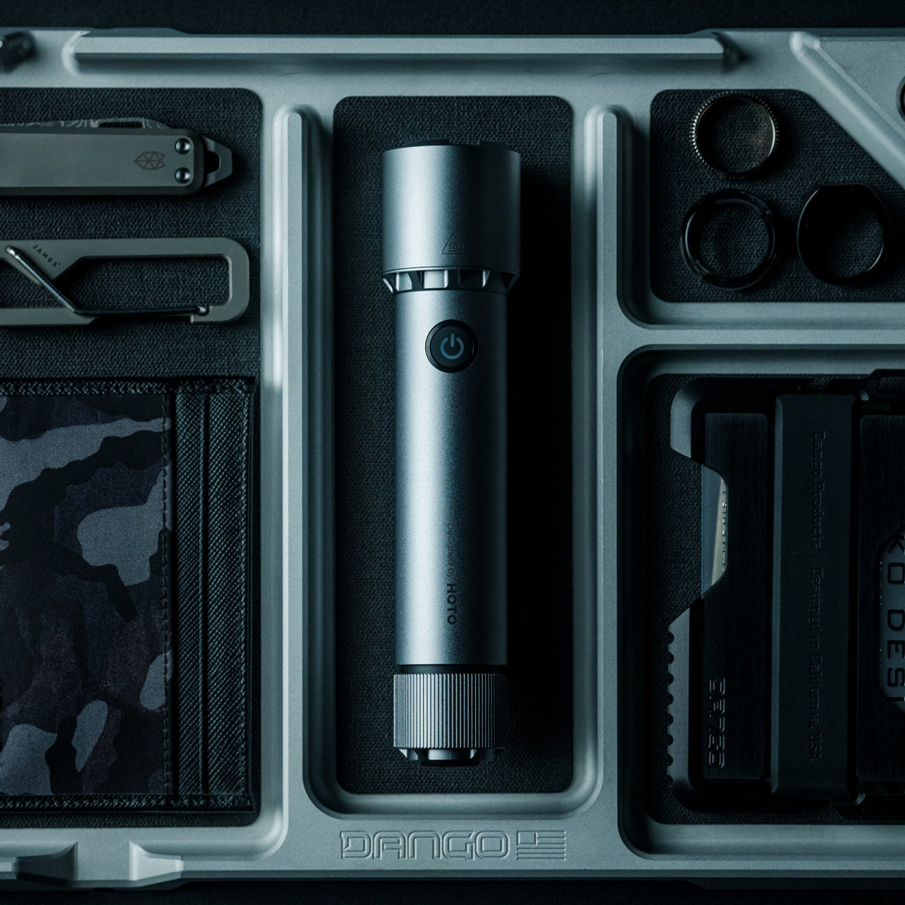
The pen is the oldest item in pocket carry, and it has been the target of designers trying to cram more function into that slim cylinder for decades. Most tactical pens add a single trick (usually a glass breaker nobody ever uses) and call it innovation. The Pockitrod takes a fundamentally different approach, treating the pen form as a modular platform rather than a finished object. Its body is machined from 6061-T4 aluminum with a hex cross-section that doubles as a driver grip, a detail that sounds minor until the first time a screw needs tightening and the tool is already in hand.
The system is organized around a central driver assembly inside the handle, with additional modules that thread on as extensions: a box opener with interchangeable 20CV steel tips, an inkless writing implement, and a magnetic-base LED flashlight. Etched measurement markings run along the body with a zero-reference aligned to the edge, turning the entire tool into a ruler that actually measures from where objects begin rather than from some arbitrary point inset from the tip. What makes this work different from other multitool pens that collapse under their own ambition is the threading system. Each module is a self-contained unit, so the Pockitrod can be as simple or as loaded as the day demands.
What we like
The hex-shaped body provides a non-slip grip when used as a screwdriver, which most round pen multitools completely ignore.
Modular threading means the tool adapts to different carry needs without requiring a full kit commitment every day.
What we dislike
The added modules increase overall length, which could push the pen past comfortable shirt-pocket territory.
An inkless writing tip is a niche preference, and some users will want a ballpoint option that is not currently part of the system.
2. BlackoutBeam Tactical Flashlight
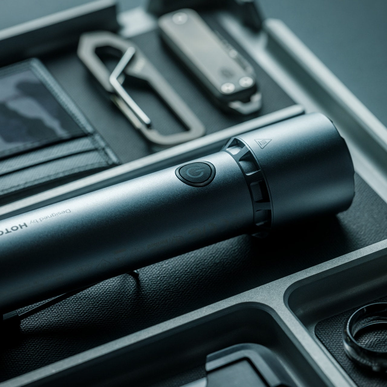
Flashlights are one of those categories where specs have outpaced what most people need, and manufacturers keep chasing lumen counts that look impressive on paper but blind the user as much as the target. The BlackoutBeam lands at 2300 lumens with a 300-meter throw, which is serious output, but the detail worth paying attention to is the 0.2-second response time. There is no lag, no warm-up flicker, no half-second of wondering whether the switch registered. Light appears the instant the button moves, and in a power outage or a dark parking lot, that immediacy changes the entire experience of using a flashlight.
The body is aluminum with an IP68 rating for water and dust resistance, which means submersion rather than just rain tolerance. Where most tactical flashlights lean into an aggressive, knurled aesthetic that screams preparedness, the BlackoutBeam keeps its lines industrial and clean. It is a tool that communicates function through proportion and material rather than surface decoration. The multiple lighting modes provide range for different scenarios, from full-blast flood to something more conservative for close work. Spring carries a flashlight that handles the transition from late-winter darkness to longer evenings without demanding a separate headlamp or phone-screen compromise.
The 0.2-second activation eliminates the hesitation gap that plagues cheaper flashlights in urgent situations.
IP68 waterproofing means genuine submersion protection, not just a splash rating that fails in real rain.
What we dislike
At 2300 lumens, the beam can be excessive for indoor or close-range tasks where a lower floor would be more practical.
Battery drain at full output will be aggressive, and the frequency of recharging could become a friction point for daily carriers.
3. Bullet SSD
Cloud storage has convinced most people that physical drives are obsolete, right up until the moment a file transfer stalls over weak Wi-Fi, a client meeting has no internet access, or a backup needs to happen without trusting data to someone else’s servers. The Bullet SSD is built for those moments. It measures 51 x 16 x 8mm, weighs 18 grams, and clips onto a keyring with the same casual permanence as a house key. Inside that shell sits up to 2TB of TLC NAND storage with USB-C 3.2 connectivity and read/write speeds around 500 MB/s.
The body is machined from a single piece of aerospace aluminum, which gives it structural rigidity that a plastic thumb drive cannot match, and the IP67 certification means water and dust exposure are non-issues. What separates this from a standard flash drive is the SSD architecture running underneath. Transfer speeds are fast enough to edit video and photos directly from the drive without copying files to a local machine first. For creatives, field workers, or anyone whose workflow involves moving large files between devices that do not share a network, the Bullet SSD turns a keychain into a portable workstation. The form factor is the real argument here: it is small enough to carry without thinking about it, and fast enough to use without compromise when the moment arrives.
What we like
The 18-gram weight and keychain form factor mean this drive is always present without occupying dedicated pocket space.
USB-C 3.2 with 500 MB/s speeds makes direct editing from the drive a practical reality rather than a spec-sheet fantasy.
What we dislike
The compact body limits heat dissipation, which could throttle sustained write speeds during large, continuous transfers.
At this size, the USB-C connector is exposed to pocket debris and lint, and there is no integrated cap or cover to protect it.
4. CraftMaster EDC Utility Knife
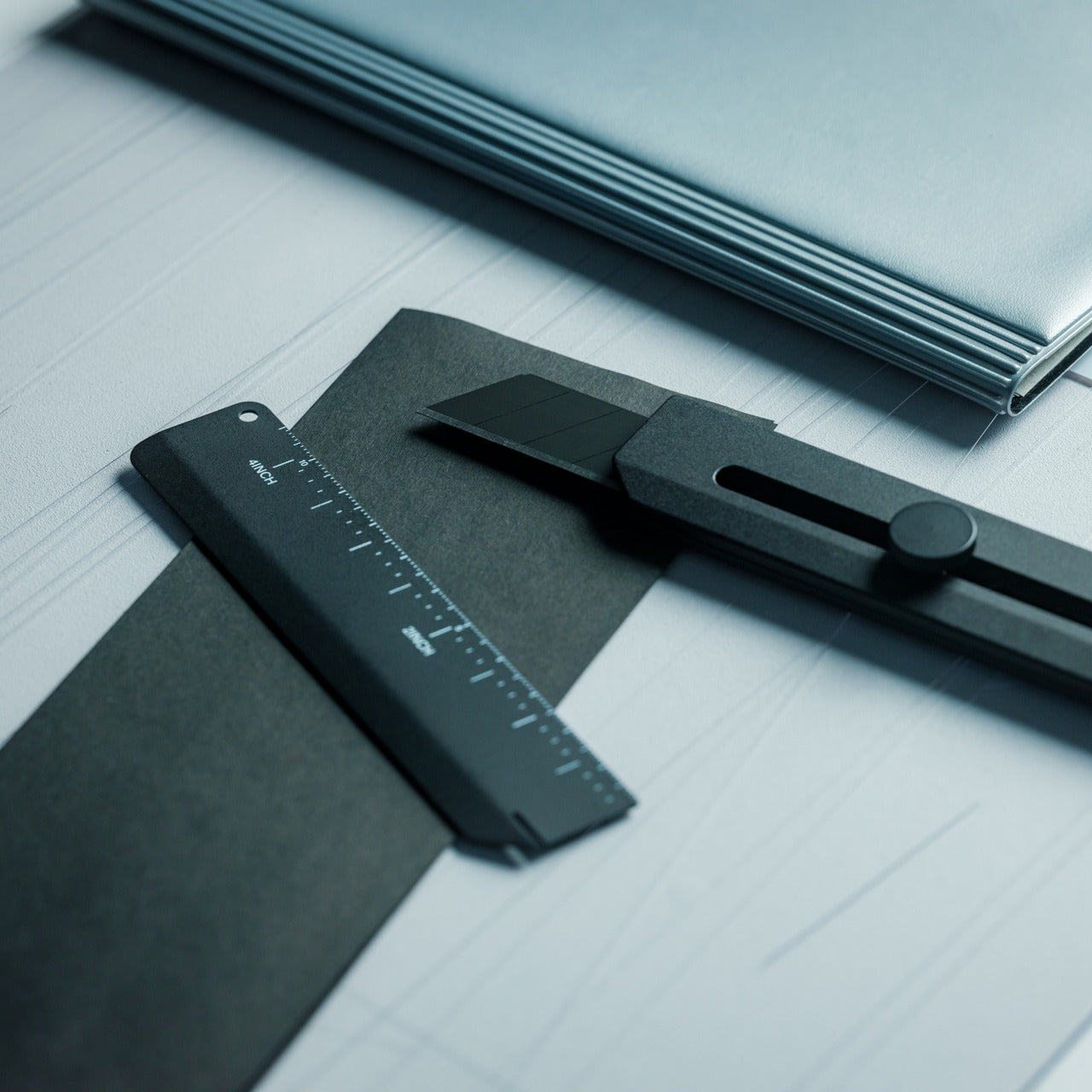
The utility knife is one of the most used and least respected tools in everyday carry. Most people settle for a flimsy box cutter from a hardware store or a folding knife that is overkill for opening packages. The CraftMaster occupies the gap between those extremes with a metal body that measures just 8mm thick and 12cm long, paired with an OLFA blade deployed through a tactile rotating knob. The thinness is not a gimmick. At 0.3 inches, this knife slides into a pocket alongside a phone without creating a noticeable bump, which is the difference between a tool carried daily and one left in a bag.
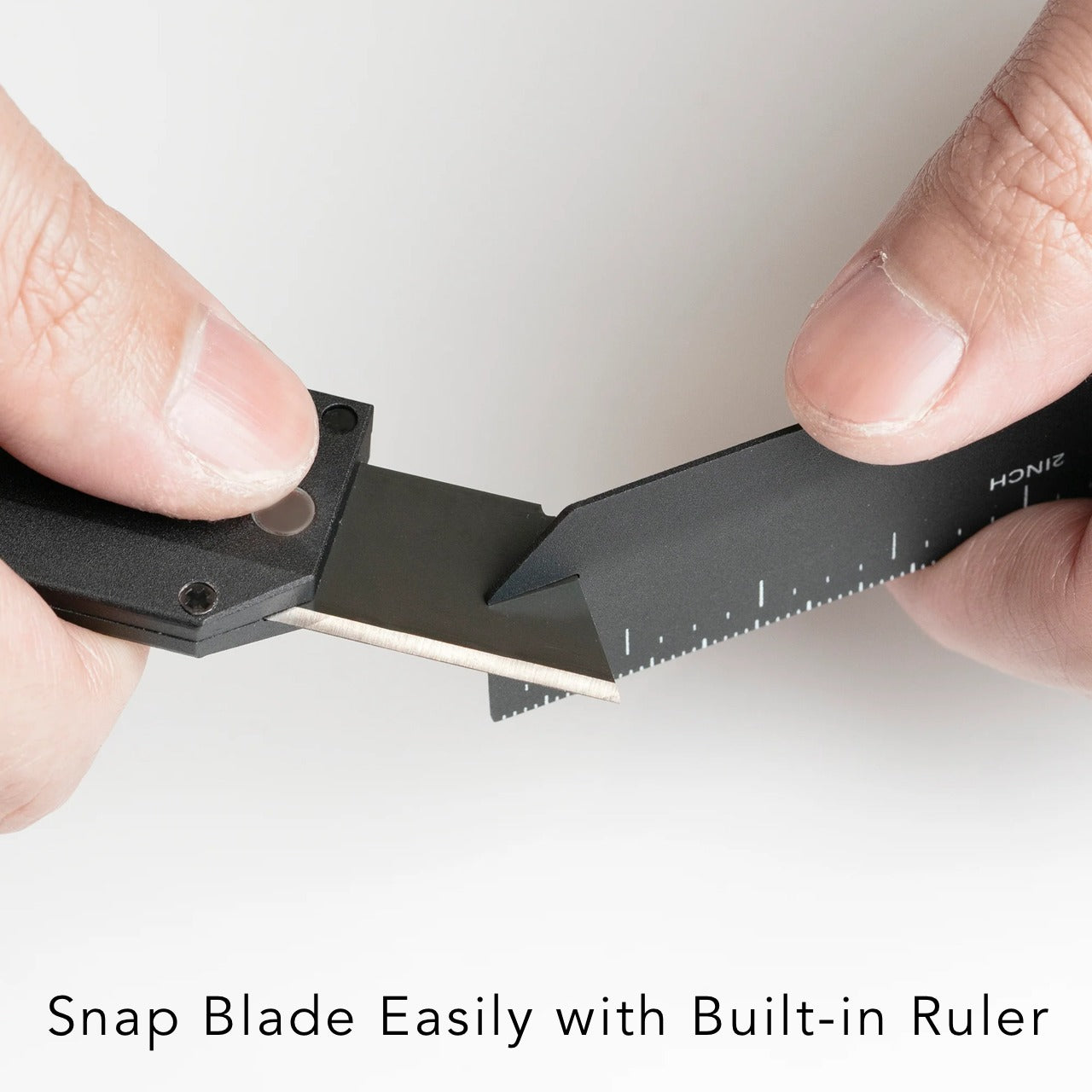
The companion metal scale docks magnetically to the knife’s back, adding dual-scale ruler markings in metric and imperial alongside a blade-breaker for snapping off dull OLFA segments. A 15-degree curvature on the ruler edge protects fingers during cutting, a small detail that reveals how much thought went into the interaction design rather than just the object’s appearance. OLFA blades are replaceable and widely available, which means the CraftMaster avoids the trap of proprietary consumables that plague many premium EDC knives. The 45-degree blade inclination is optimized for box opening, making this a tool that excels at the single task most people actually need a blade for, rather than pretending to be a wilderness survival instrument.
The magnetic-docking ruler scale transforms the knife into a measuring tool without adding bulk or requiring a separate carry item.
OLFA blade compatibility means replacements are cheap, universal, and available at any hardware store on the planet.
What we dislike
The rotating knob deployment, while tactile, is slower than a thumb-stud or flipper mechanism for one-handed opening.
At 12cm total length, the cutting depth is limited to anything beyond packages and light materials.
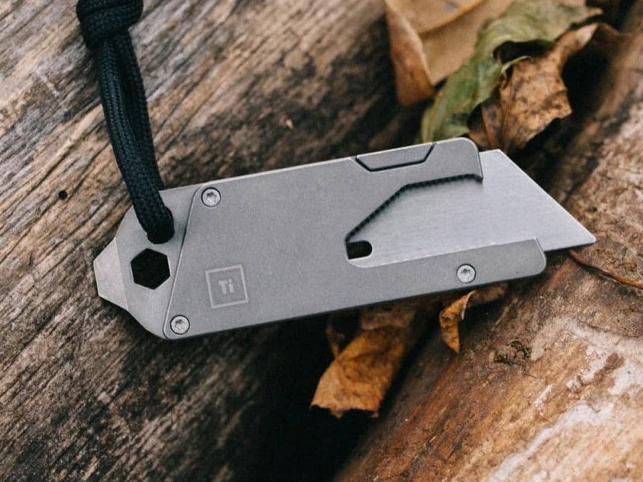
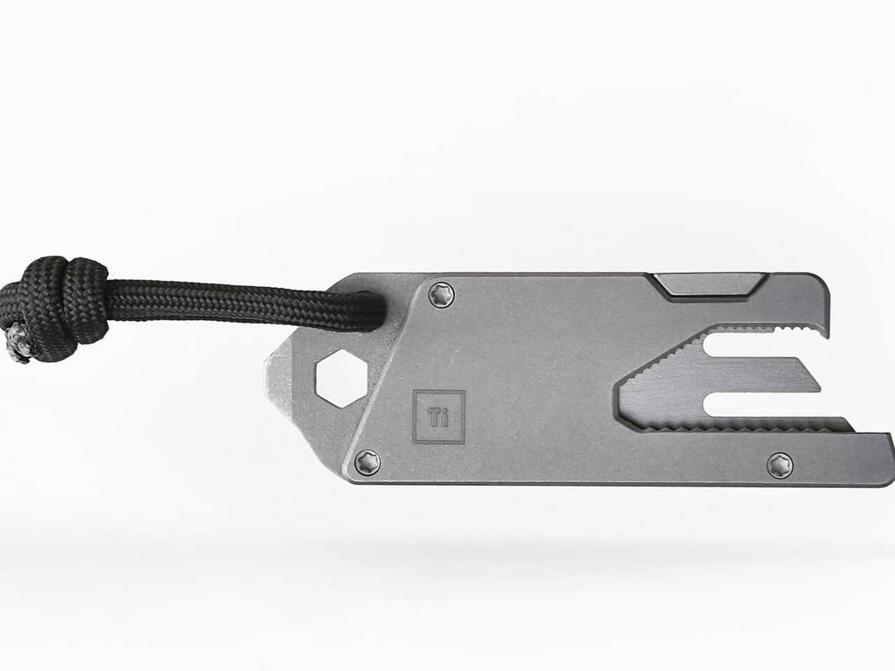
5. TPT (Titanium Pocket Tool)
Multitools love to advertise tool counts, but most of those numbers are inflated by variations on the same function (three slightly different screwdriver tips, two redundant pry edges). The TPT earns its ten-tool count because each function occupies its own distinct geometry on a body that measures just three inches long and weighs 28 grams. Grade 5 titanium alloy (6AL4V) gives it a strength-to-weight ratio that steel multitools cannot touch at this size, and the TSA-approved design means it travels without the anxiety of confiscation at airport security. That alone removes one of the biggest barriers to consistent carry.
The tool set includes a full wrench array covering 15 socket sizes (both SAE and metric), a bottle opener, a hex bit driver, a scraper edge, a mini pry bar, measurement cues, and a retractable insert that functions as both a box opener and a camp fork. The stainless steel insert is dual-function, with a fork-tined end for eating and a conventional cutter shape on the other, which is a clever use of a single replaceable component. A removable pocket clip and paracord lanyard provide carry options, and the included leather sheath protects both the tool and whatever pocket it lives in. The TPT does not try to replace a full-sized Leatherman. It targets the 90% of daily situations where a compact, always-present tool solves the problem faster than digging through a bag for something bigger.
What we like
TSA approval means this tool crosses through airport security without issue, making it one of the few multitools suitable for travel carry.
The 15-size universal wrench built into the body handles quick fixes that would otherwise require a dedicated wrench set.
What we dislike
The retractable blade insert can be difficult to swap one-handed, and some users report that the magnet holding it in place could be stronger.
At three inches, the wrench openings are small, limiting torque and access in tight spaces where a longer tool would provide better leverage.
Where spring carry is heading
These five tools share a common design philosophy: carry less, carry better. The days of stuffing pockets with redundant gear are giving way to a more considered approach where each item earns its real estate through daily use rather than hypothetical scenarios. A pen that is also a driver and a ruler. A flashlight that responds before the thought finishes forming. A solid-state drive disguised as a keychain. A utility knife is thinner than most phones. A titanium multitool that flies through security.
The best EDC gear in 2026 does not demand attention or lifestyle changes. It occupies the margins of a pocket, a keyring, or a clip, and waits for the moment it is needed. Spring is the right season to audit what makes the cut and what gets retired. These five have earned permanent rotation.
Model-making has a rhythm, and it is surprisingly easy to break out of the zone. You pull out the tape measure, get your reading, set it down, hunt for the caliper, check a dimension, reach for the cutter, and by the time you’ve touched four separate objects, you’ve lost track of where you were in the build. It’s a minor friction, but it compounds quickly across a studio session into something genuinely disruptive.
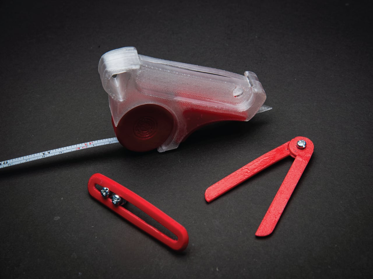
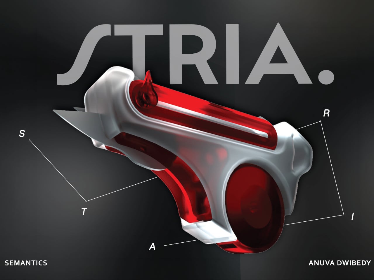
That friction is the exact problem STRIA was designed to address. The concept starts from a straightforward observation: the actions that make up physical prototyping, measuring, checking dimensions, and cutting materials, are tightly connected in practice but spread across a handful of unrelated objects. It combines four of the most essential tools that designers and architects reach for, creating a Swiss Army knife for any kind of physical creative work.
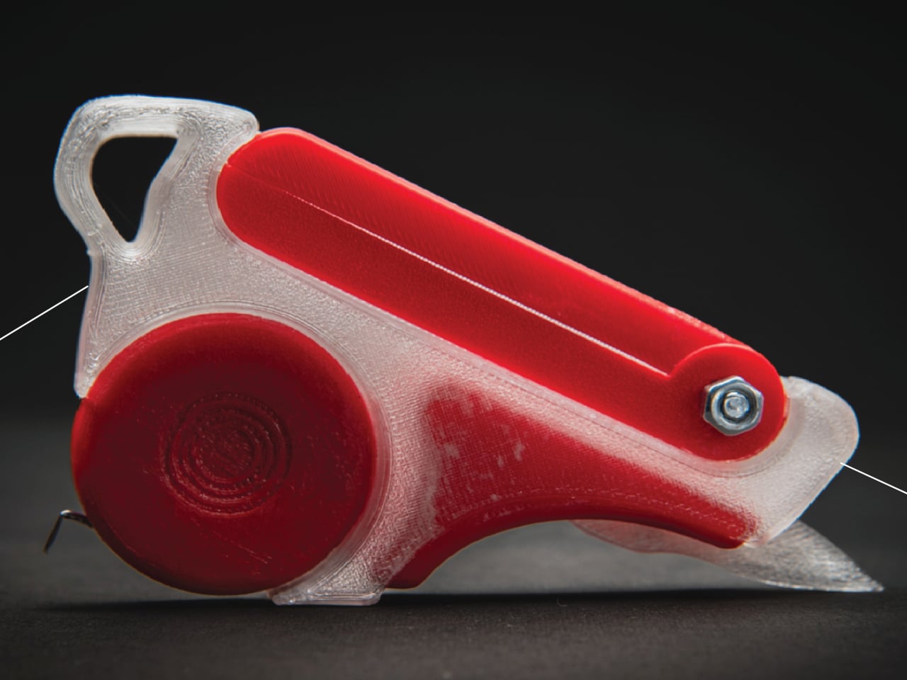
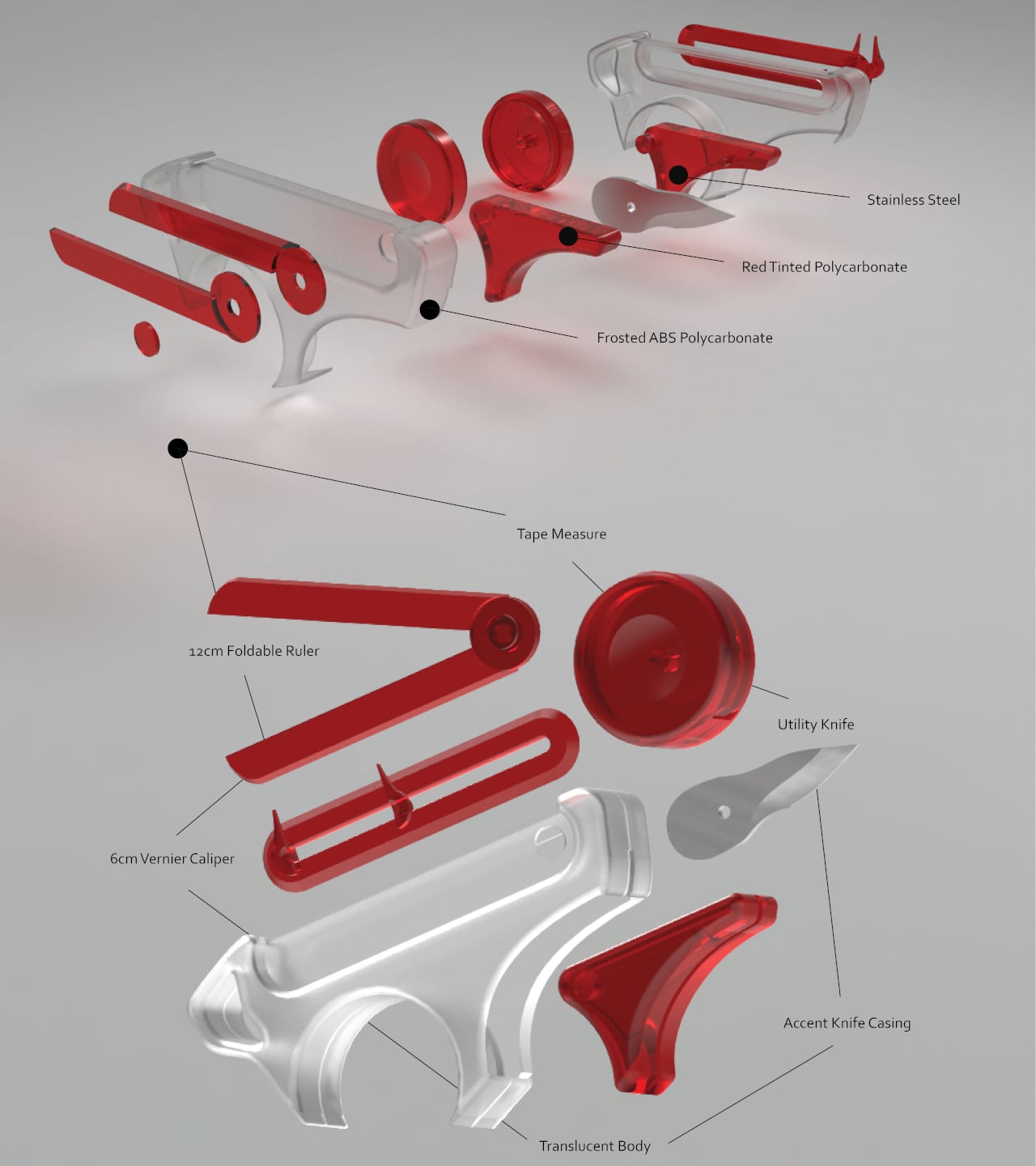
Those four are a tape measure, a 12 cm foldable ruler, a 6 cm vernier caliper, and a utility knife, all integrated into a single handheld device. The body is frosted ABS polycarbonate, with red-tinted polycarbonate accents and stainless steel for the blade and hardware. The translucent construction lets you see the internal components at a glance, which feels appropriate for a tool aimed at designers who spend a lot of time thinking about how things fit together.
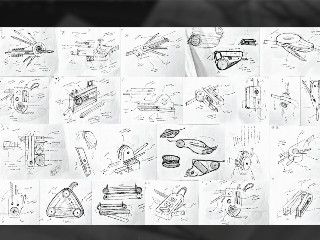
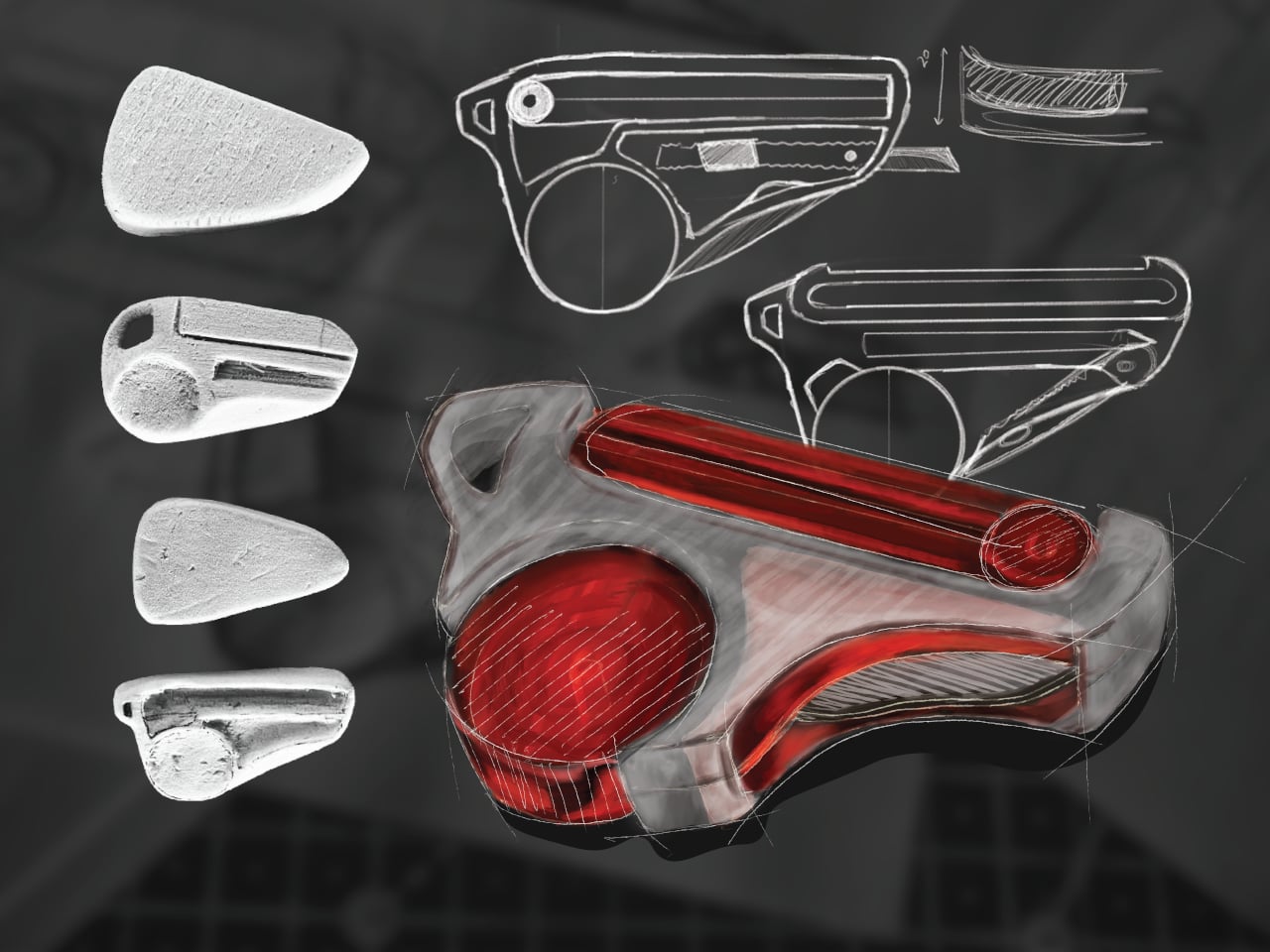
The form went through extensive iteration, with dozens of sketched directions and physical grip studies preceding the final shape. That process matters because fitting four tools into something pocket-sized is a mechanical problem as much as a visual one. Each function needs a deployment mechanism that doesn’t compromise the others, and the grip has to stay comfortable when you’re switching between them repeatedly during a long session.
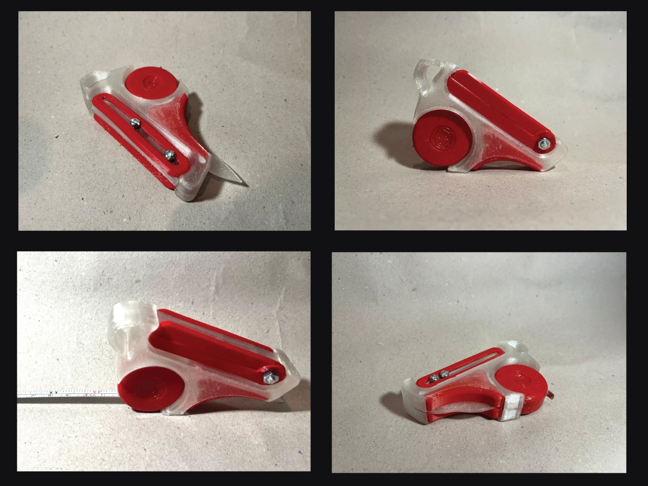
What STRIA gets right in concept is treating workflow continuity as a design constraint rather than an afterthought. Its five stated goals, compact, precise, durable, ergonomic, and integrated, read less like marketing language and more like a checklist for something that needs to survive a studio environment. A 3D printed prototype has already been produced, so the integration challenges aren’t purely theoretical at this stage.
Whether every mechanism holds up to the repetitive, sometimes rough handling that model-making actually demands is what a finished version would need to prove. And there’s a subtler question underneath that: consolidating tools changes how you reach for them, and it’s worth asking whether that’s always an improvement or occasionally a trade-off.
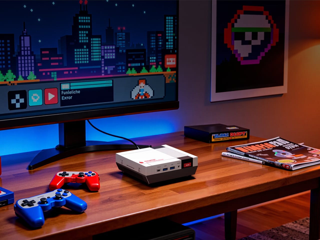
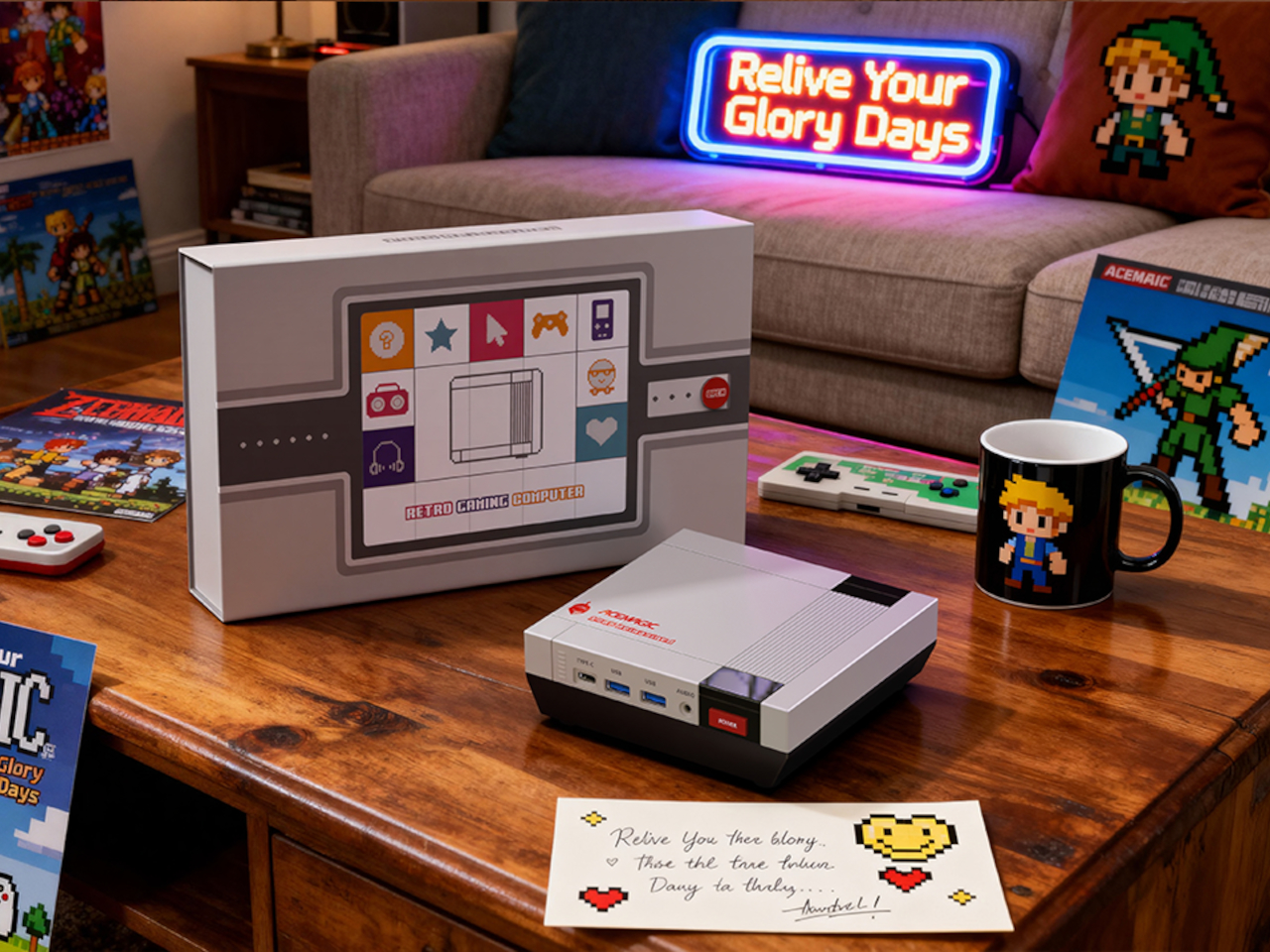
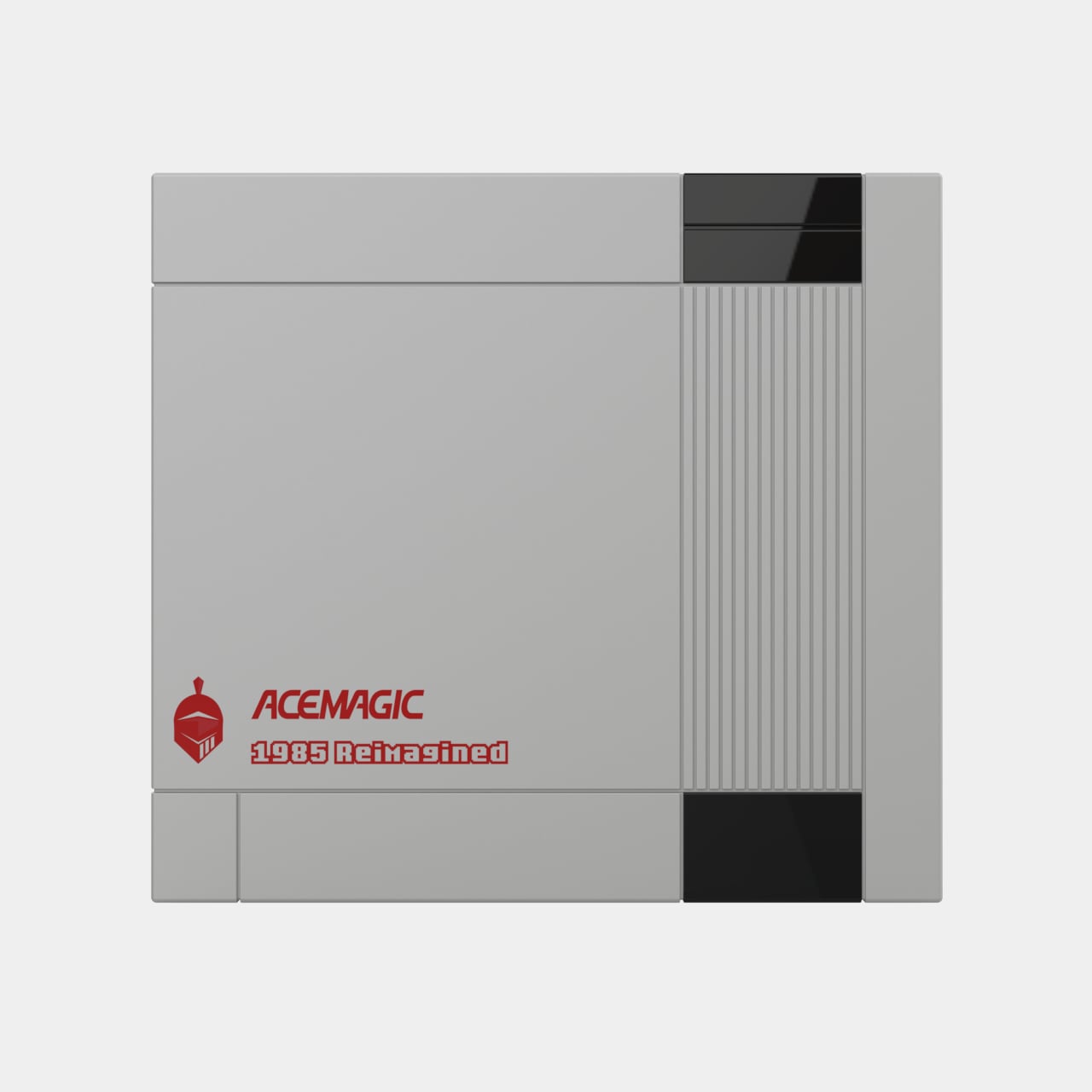
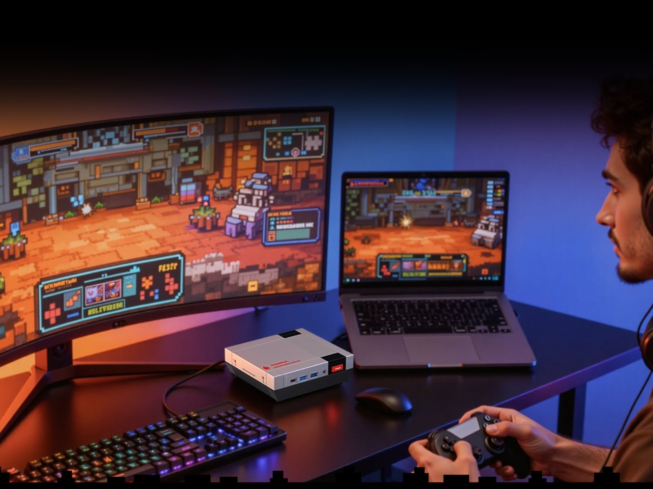
There is something quietly absurd about building a serious PC in the shape of a 1980s game console. Not absurd in a dismissive way, but more in the way that a very good idea sometimes sounds ridiculous until you see it sitting on a desk. The ACEMAGIC Retro X5 is exactly that kind of object: a compact Windows 11 Pro machine dressed in the rectangular geometry of classic cartridge-loading hardware, with a red power button where the reset button probably lived in your memory.
At 138mm x 128mm x 45 mm, the Retro X5 occupies roughly the footprint of a thick paperback. The body follows a black, white, and gray palette, with mechanical-style grilles cut into the cooling vents. A removable snap-fit panel lets you access the internals without tools, which signals something deliberate about the design: the whole thing is meant to be touched, handled, and opened rather than just admired from across a shelf.
Inside that nostalgic shell sits AMD’s Ryzen AI 9 HX 370, a 12-core, 24-thread processor paired with the Radeon 890M GPU running at 2,900 MHz. The base configuration ships with 32 GB of DDR5 5,600 MT/s memory and a 1 TB PCIe 4.0 NVMe SSD. For anyone who has watched mini PCs ship with soldered RAM and single storage slots for years, the two M.2 2280 slots, expandable to 4TB total, are a more practical detail than the retro styling gets credit for.
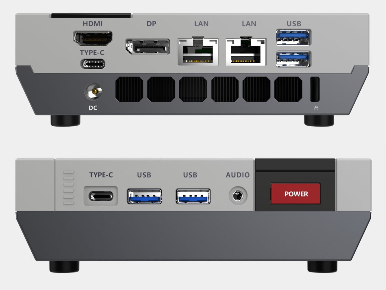
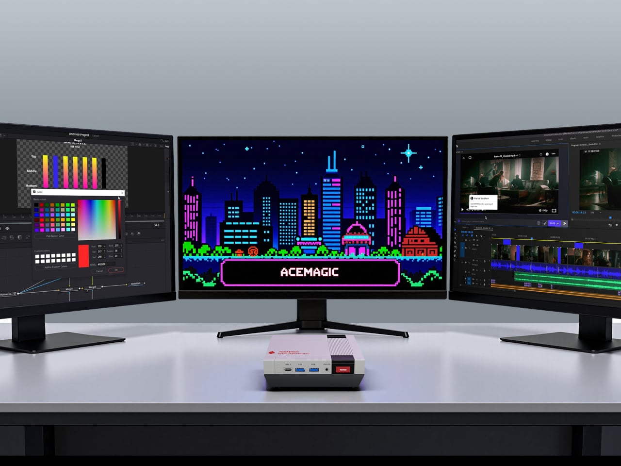
The port selection makes the Retro X5 less of a novelty and more of a credible desk workhorse. The front has two USB 3.2 Gen 2 Type-A ports, a USB4 Type-C, and a 3.5 mm audio jack. The rear adds two more Type-A ports, a second Type-C, dual 2.5 GbE Ethernet, HDMI 2.1, and DisplayPort 2.0; altogether, the machine supports up to four screens at once, with both HDMI and DP capable of 8K at 60 Hz.
ACEMAGIC also positions the Retro X5 around local AI workloads, citing support for models like DeepSeek R1 70B and LLaMA. The HX 370’s neural processing unit makes that plausible on paper, but running a 70B-parameter model on 32 GB of shared memory depends heavily on quantization levels. That distance between the spec sheet and actual large-model performance is the part that the product page, understandably, does not get into.
At $959 for the 32 GB and 1 TB pre-order configuration, the Retro X5 sits at the upper end of the mini PC category, where other AMD Strix Point machines without the retro treatment tend to start closer to $600 or even $700. The premium covers partly the HX 370’s stronger GPU tier and partly the design itself. Whether that casing reads as a charming object worth the difference, or just a clever coat of paint on familiar hardware, is probably the right question to ponder before hitting that Checkout button.
The must-have for your home used to be a choice: a speaker or a digital frame. Good audio gear fills a room with sound but rarely does anything worth looking at. Digital frames look considered and calm on a wall but go completely silent the moment you need them to do something else. It seems obvious, in hindsight, that someone would eventually stop treating these as separate problems.
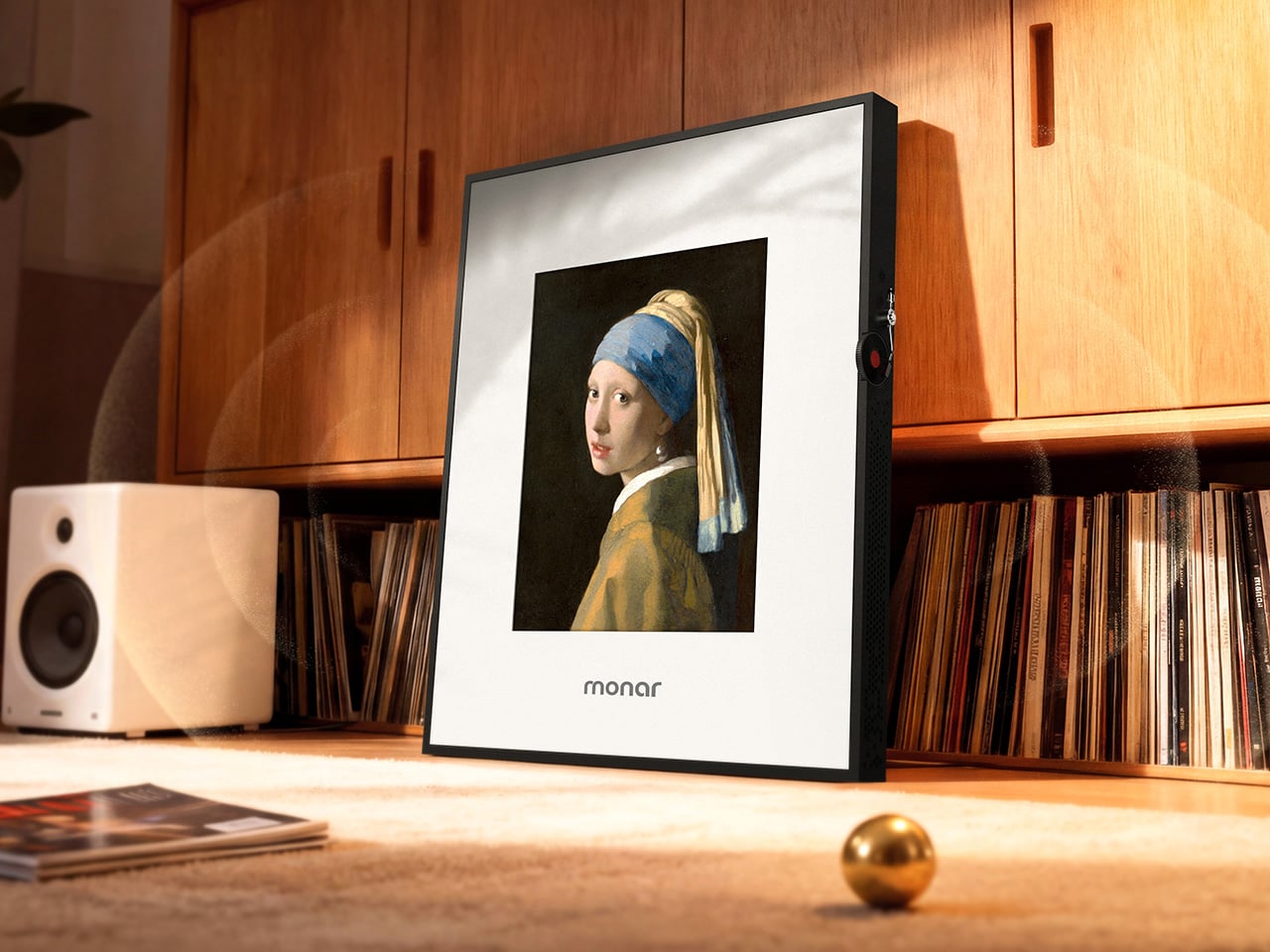
Monar is that someone. The Monar Canvas Speaker brings both together in a single framed wall piece that plays Hi-Fi audio while displaying art on a built-in screen, and the two functions are genuinely connected. When music plays, the display responds in real time, generating visuals that shift and react to the track. It fills your home with sound. It decorates your wall with art. It does both at once.
The design draws its visual logic from classical oil painting. Traditional canvas proportions, the kind that have framed masterworks for centuries, informed the 4:5 portrait ratio of the panel, a deliberate departure from the widescreen format most screens default to. That historical reference is not decorative. It is the reason the Monar reads like framed art on a wall rather than a screen that someone forgot to put away.
The outer frame is interchangeable across eight options: premium ABS plastics, natural linen, and brushed aluminium, with one ABS option styled after Mondrian’s primary color geometry. Swapping the frame is a practical feature rather than a gimmick, since the object is permanent décor. If your interior changes, the frame can too.
The audio side makes bold claims for an enclosure that is only 4.9cm deep. Six drivers handle the load: 2 titanium tweeters, 2 midranges using a golden ratio cone geometry, and full-size subwoofers running through a 2.2-channel amplifier. The 20Hz to 20kHz frequency response is ambitious for a chassis this thin, and one definitely worth hearing.
Where the product earns genuine interest is in the everyday texture of using it. Put on an album, and one of 12 lyric display themes animates the words in sync with the music. Switch to the World Gallery and the screen cycles through more than 50,000 digitized artworks, from Van Gogh to Hokusai. Activate Meditation Mode and the visuals shift to ambient scenes timed to calming audio. When no music is playing, it displays personal photos or videos, so it never really goes blank or dormant.
The generative AI tools go further still. Monar’s AI Studio lets you create original artwork through text prompts, uploaded images, or even a musical concept. The result displays on screen, making it possible to have genuinely new wall art on demand without touching a single frame nail. These features run on a points system, with a free tier offering 100 points per month. The World Gallery and Meditation Mode cost nothing extra, regardless.
Paid AI tiers range from $9.90 to $39.90 per month for heavier creative use, and the free allocation covers casual experimentation comfortably. What makes the pricing structure interesting is what it says about the product underneath it: even without touching a single AI feature, the Monar already delivers a fully functional Hi-Fi speaker system and a complete digital frame in one object. That combination alone is something no single product category had managed to pull off before it came along.
A speaker that becomes a painting, a gallery that plays music, a frame that reacts to sound: the Monar pulls off a combination that no single product category has figured out before it. The real question worth sitting with is not whether it works, but how much your walls have been missing something like it.
Any tech nerd knows the unspoken contract that comes with being the only tech-literate person in the family. You get texts when someone’s laptop is slow, called over during the holidays to fix the router, and consulted every eighteen months when someone needs a new phone or computer. For years, the laptop question had a clean, confident answer: a Windows machine. Cheap entry points, massive software compatibility, games that actually run, no walled gardens, no ecosystem hostage situations, and enough flexibility that even a non-technical person could figure out the basics without feeling like they’d violated a terms of service agreement. But the last time someone asked me what laptop to get, I paused. For a good minute I asked myself, should I even recommend Windows anymore?
That pause is new, and it carries weight that no benchmark score or spec sheet can explain. The designated family tech person has historically been one of the most reliable organic distribution channels Windows ever had, recommending the same platform generation after generation because it worked, it was accessible, and there was nothing obviously better for normal people at a reasonable price. When that person hesitates, the platform has a problem. Microsoft built an empire on being the obvious, low-friction answer to the laptop question, and somewhere between Windows 10 and the Copilot era, they stopped protecting that position. And with Apple dropping a $599 MacBook just last week, that position seems even more in danger.
2024 CrowdStrike Outage
The OS that holds civilization together
Windows runs somewhere between 72 and 73 percent of the world’s desktops, and while that’s an impressive monopoly, it completely ignores the critical systems where Windows is actually even more prevalent and essential. Hospital admission systems, ATM networks, military command infrastructure, government offices, court systems, school networks, and banking operations across virtually every country on earth run on Windows. These institutions did not choose Windows out of preference; they are locked in through decades of infrastructure investment, software dependencies, and training costs that make switching systemically impractical at scale. The July 2024 CrowdStrike incident put a specific number on what this dependency looks like under pressure: one faulty content update to a single Windows security tool simultaneously bricked approximately 8.5 million machines, grounded over 8,500 flights globally, knocked hospital systems offline across multiple countries, and disabled 911 call centers across several US states. One third-party software layer, one bad update, and the operational skeleton of modern civic life visibly buckled.
That is the platform Microsoft has been treating as a vehicle for AI feature experiments. Recall, the AI tool Microsoft attempted to ship as part of Windows 11, worked by screenshotting the user’s screen every few seconds and storing those images locally to build a searchable timeline of everything they had ever done on the machine. Security researchers flagged it almost immediately as a catastrophic privacy liability: a permanent, silent, queryable record of every document, message, and webpage the screen had ever displayed. Microsoft paused the rollout after a fierce public backlash, but the revealing fact is that Recall cleared internal review in the first place. The teams approving that feature were not thinking about hospital clerks processing patient records, lawyers working with privileged communications, or government employees handling sensitive data. They were building a keynote demo.
The market is responding accordingly
Microsoft ended official Windows 10 support in October 2025, cutting off security patches for what was still the most widely used version of the OS. Months of upgrade campaigns, notification banners, and every available form of institutional pressure followed. The result: as of December 2025, Windows 10 sits at 44.68% market share and actually gained users after support ended, while Windows 11 dropped from 55.18% in October to 50.73% in December, shedding over four percentage points in two months while the officially dead OS clawed back ground. People are choosing to run a security-vulnerable, unsupported operating system rather than upgrade to the one Microsoft actively maintains, and that is not technophobia or inertia. It is a calculated judgment, made by millions of users independently, that the known risks of the old version beat the unknown risks of moving to the new one.
The TPM 2.0 hardware requirement blocked installation on millions of perfectly functional machines with no meaningful performance justification for everyday users, which meant the upgrade conversation started with resentment before it ever got to features. First-boot setup funnels new users toward a Microsoft account, with the offline bypass buried past the point where most non-technical people will ever find it. OneDrive integration sits deep enough in the OS that users regularly discover their Desktop files have been syncing to the cloud without understanding when or how they agreed to that. A fresh Windows 11 install in 2026 ships with TikTok, Instagram, Disney+, and a collection of Microsoft’s own unfinished apps pre-pinned to the Start menu, none of them arriving with any user consent. Copilot, which no consumer demand survey had identified as a priority, now appears in the OS sidebar, the taskbar, and since 2024, as a dedicated hardware key on new laptops, occupying real estate where a key with actual utility used to live.
Running alongside all of that is a separate update quality crisis that has been building its own track record. A January 2026 security update caused boot failures on certain Windows 11 machines, with Microsoft eventually tracing the issue to a botched December 2025 update that had left affected devices in what they diplomatically described as an “improper state.” An October 2025 security update broke VPN networking for enterprise users running OpenVPN and Cisco Secure Client, a bug that carried through the December patch cycle without a clean resolution. Security updates, the category Microsoft explicitly tells users they cannot afford to skip, became a threat to system stability in their own right. When the patch and the problem are indistinguishable from each other, the trust issue has moved well past inconvenience.
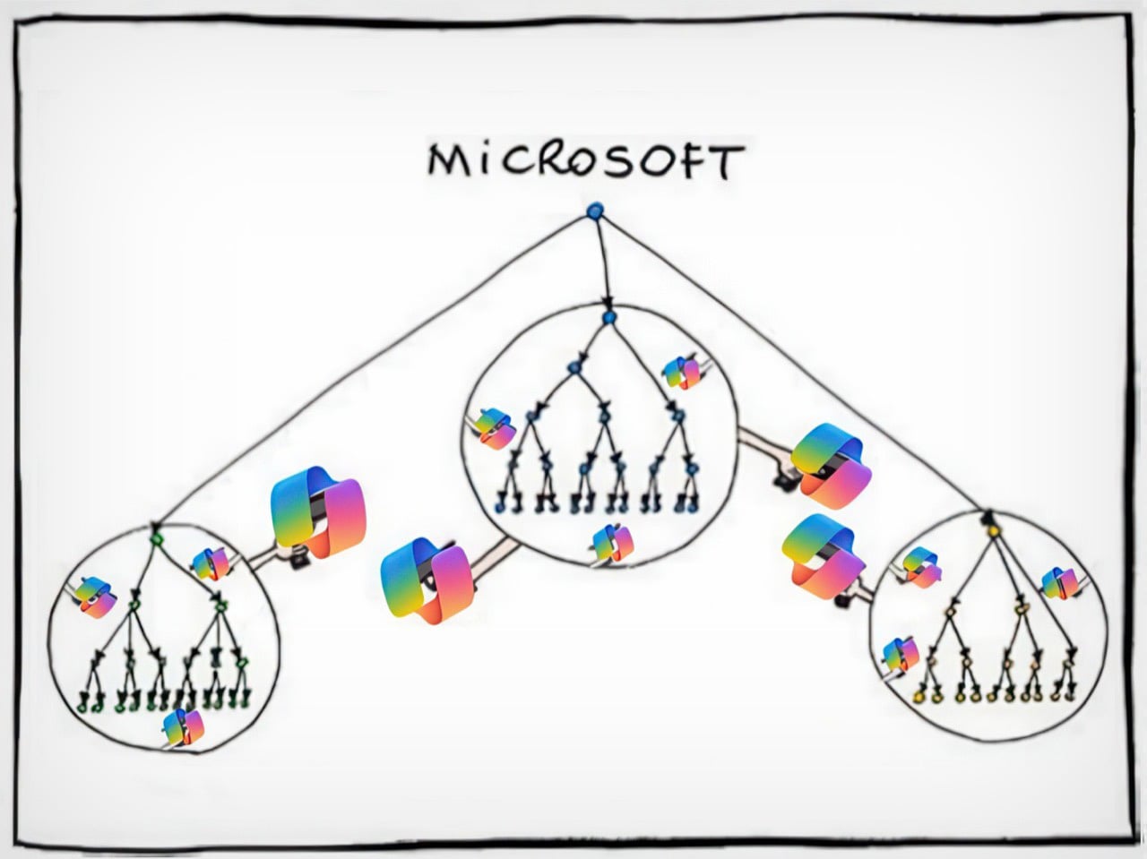
A modified version of a comic by Manu Cornet
Nadella is a great CEO. Just not for desktop operating systems.
Satya Nadella took Microsoft’s stock from roughly $35 in 2014 to over $400 at its peak, killed the Nokia disaster before it could fully metastasize, repositioned the entire company around cloud infrastructure, and placed an early bet on OpenAI when AI was still considered expensive academic theater. Azure’s consistent 30%-plus year-over-year growth commands complete executive attention and pulls the best engineering talent in the building toward it like gravity. By any honest standard corporate metric, Nadella’s Microsoft is a legitimate turnaround story, and the shareholder returns are not fabricated. But Nadella is a cloud and enterprise person at his core, and consumer Windows is a mature product in a saturated market, which in corporate strategy language translates cleanly to “managed asset.” The product that generates excitement gets the architects and the product visionaries; the one that just needs to keep working gets whoever is left after that allocation is done.
Paul Thurrott, who has covered Microsoft longer than most of the current Windows team has worked there, documented what that organizational reality looks like in practice. He wrote that Microsoft “relegated Windows to a backwater world led by B-teamers as the brightest minds at the company moved onto more lucrative career opportunities in Azure and AI.” That is an organizational autopsy, not editorial frustration, and it explains the product trajectory better than any feature changelog can. The talent followed the money and the excitement, and what remained shipped a redesigned Start menu nobody requested, a Copilot key nobody asked for, and a feature that the security community identified as dangerous within hours of its public announcement. The B-team does not ship bad decisions out of malice; they ship them because nobody senior enough to stop them is paying attention.
This pattern has a name
Nadella did not invent this behavioral tendency; it recurs reliably enough across modern tech to qualify as its own CEO archetype. Elon Musk built Tesla into the most culturally significant car company on earth, then spent the better part of two years fixated on Twitter, rebranding it to X, eliminating roughly 80% of staff, and torching advertiser relationships that took years to build, while Tesla’s stock dropped roughly 40% in the first quarter of 2025 alone. Now, he’s discontinued two Tesla models permanently while focusing efforts on an extremely polarizing AI chatbot. Mark Zuckerberg committed somewhere between $40 and $50 billion to the metaverse between 2021 and 2023, a virtual world that peaked at approximately 300,000 daily active users on Meta Horizon Worlds, before quietly pivoting to AI and becoming a public figure most associated with jiu-jitsu tournaments. The pattern is consistent enough to have a shape: a CEO builds something genuinely dominant, gets pulled toward the next big technological narrative, and hands the original product to the maintenance crew while energy and capital chase the new story. The difference with Nadella is the scale of what he handed off.
What separates his case from Musk and Zuckerberg is that he did not get distracted from Windows. He consciously stripped it for parts. Azure and AI received the budget, the senior talent pipeline, and the executive attention. Windows received the downstream output of that redistribution: mandatory AI integrations nobody requested, hardware specifications designed around Microsoft’s AI keynote roadmap rather than user needs, and a product direction driven more by investor narrative than by any user research that has ever been made public. The ordinary people buying $400 laptops are absorbing the cost of that sacrifice. The shareholders benefiting from Azure’s quarterly growth numbers are not.
Enshittification, documented
Cory Doctorow’s enshittification framework describes a platform lifecycle: start good for users, degrade toward serving business partners, then degrade further to extract maximum value for shareholders at everyone else’s expense. Windows 11 maps cleanly onto the third stage. The Start menu was rebuilt from scratch for the Windows 11 launch, stripping out Live Tiles that users had configured over years and replacing them with a static grid that is less functional and harder to customize, with no usability gain justifying the regression. Drag-and-drop onto taskbar applications was removed entirely at launch and only partially restored after months of sustained community pressure. Windows 11 originally shipped without the ability to right-click the taskbar to open Task Manager, a function that had existed since Windows NT 4.0 in 1996, and whose removal was not a redesign decision so much as evidence that nobody tested the product against the habits of actual users.
Control Panel, introduced in 1985, and the modern Settings app, first introduced in 2012 with Windows 8, still coexist in parallel inside Windows 11 in 2026. Basic system configuration requires jumping between both because neither is complete on its own, and the logic governing which settings live in which interface has never been consistently explained or resolved. Thirteen years of two competing tools sharing the same OS, and Microsoft never cared enough about the end-user experience to finish the job. This is not a legacy oversight or a technical debt problem that nobody knows how to solve. It is a choice, visible in its incompleteness, that reveals how little Windows product ownership has mattered to anyone with the authority to demand better.
Where this leaves ordinary people
Windows remains the most practical OS for most consumers, and that matters because it means there is no clean exit for the people being failed by it. MacOS is polished and stable but paternalistic by design: Apple creates deliberate friction around installing software from outside its ecosystem, the interface carries a genuine learning curve for anyone transitioning from Windows, and a MacBook Air M4 starts at $1,099 against a capable Windows laptop at around $400. Sure you can buy the $599 MacBook Neo too, but it’s genuinely less of a laptop and more of a netbook. The price difference between a regular MacBook and a similarly spec’d Windows laptop is not marginal in most of the world, particularly in the markets where Windows adoption is highest. Linux is genuinely improving year over year and deserves acknowledgment for it, but recommending Ubuntu to a non-technical family member invites more trouble than relief. The alternatives exist, but they serve a different user than the one who has to ask for a laptop recommendation.
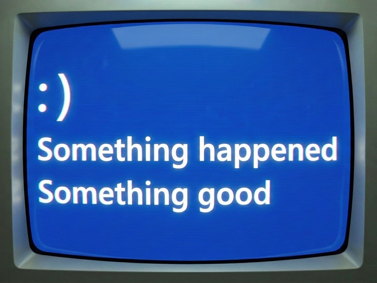
A regular person can still buy an affordable Windows machine, install whatever software they want, run games across a hardware range that nothing else matches, plug in any peripheral without a compatibility interrogation, and operate without being treated as a security risk for opening a file from outside a curated store. Microsoft is eroding that value proposition methodically, one forced integration at a time, but the erosion has not yet reached full collapse. As of early 2026, reporting suggests Microsoft is pulling back from the AI-everywhere approach in Windows and refocusing on core stability, with Paul Thurrott describing the shift as “something happened,” which from a journalist who has spent years documenting Windows’ decline with the exhausted precision of someone watching a building settle incorrectly reads as cautious acknowledgment rather than optimism. Whether that represents genuine reprioritization or noise management ahead of a Windows 12 announcement nobody has officially confirmed is the question worth watching.
Rebuilding trust after Recall, after a year of destabilizing updates, after years of treating the world’s most consequential operating system as a demo environment for products the market never asked for, takes considerably longer than a few stable patches and a tonal reset in engineering blog posts. The millions of people still on Windows 10, knowingly running an unsupported OS past its expiration date, made a rational call: the known risks of yesterday’s software beat the unpredictable risks of an OS whose roadmap is driven by whatever Microsoft needs to show investors next quarter. That is not the normal frustration cycle where users grumble and eventually upgrade. It is a trust deficit built through years of consistent bad decisions, and a few good patch cycles will not close it. The easiest tech recommendation in the world has become a pause, and the people responsible for that pause are too deep in Azure dashboards to understand what it actually costs.
Any tech nerd knows the unspoken contract that comes with being the only tech-literate person in the family. You get texts when someone’s laptop is slow, called over during the holidays to fix the router, and consulted every eighteen months when someone needs a new phone or computer. For years, the laptop question had a clean, confident answer: a Windows machine. Cheap entry points, massive software compatibility, games that actually run, no walled gardens, no ecosystem hostage situations, and enough flexibility that even a non-technical person could figure out the basics without feeling like they’d violated a terms of service agreement. But the last time someone asked me what laptop to get, I paused. For a good minute I asked myself, should I even recommend Windows anymore?
That pause is new, and it carries weight that no benchmark score or spec sheet can explain. The designated family tech person has historically been one of the most reliable organic distribution channels Windows ever had, recommending the same platform generation after generation because it worked, it was accessible, and there was nothing obviously better for normal people at a reasonable price. When that person hesitates, the platform has a problem. Microsoft built an empire on being the obvious, low-friction answer to the laptop question, and somewhere between Windows 10 and the Copilot era, they stopped protecting that position. And with Apple dropping a $599 MacBook just last week, that position seems even more in danger.
2024 CrowdStrike Outage
The OS that holds civilization together
Windows runs somewhere between 72 and 73 percent of the world’s desktops, and while that’s an impressive monopoly, it completely ignores the critical systems where Windows is actually even more prevalent and essential. Hospital admission systems, ATM networks, military command infrastructure, government offices, court systems, school networks, and banking operations across virtually every country on earth run on Windows. These institutions did not choose Windows out of preference; they are locked in through decades of infrastructure investment, software dependencies, and training costs that make switching systemically impractical at scale. The July 2024 CrowdStrike incident put a specific number on what this dependency looks like under pressure: one faulty content update to a single Windows security tool simultaneously bricked approximately 8.5 million machines, grounded over 8,500 flights globally, knocked hospital systems offline across multiple countries, and disabled 911 call centers across several US states. One third-party software layer, one bad update, and the operational skeleton of modern civic life visibly buckled.
That is the platform Microsoft has been treating as a vehicle for AI feature experiments. Recall, the AI tool Microsoft attempted to ship as part of Windows 11, worked by screenshotting the user’s screen every few seconds and storing those images locally to build a searchable timeline of everything they had ever done on the machine. Security researchers flagged it almost immediately as a catastrophic privacy liability: a permanent, silent, queryable record of every document, message, and webpage the screen had ever displayed. Microsoft paused the rollout after a fierce public backlash, but the revealing fact is that Recall cleared internal review in the first place. The teams approving that feature were not thinking about hospital clerks processing patient records, lawyers working with privileged communications, or government employees handling sensitive data. They were building a keynote demo.
The market is responding accordingly
Microsoft ended official Windows 10 support in October 2025, cutting off security patches for what was still the most widely used version of the OS. Months of upgrade campaigns, notification banners, and every available form of institutional pressure followed. The result: as of December 2025, Windows 10 sits at 44.68% market share and actually gained users after support ended, while Windows 11 dropped from 55.18% in October to 50.73% in December, shedding over four percentage points in two months while the officially dead OS clawed back ground. People are choosing to run a security-vulnerable, unsupported operating system rather than upgrade to the one Microsoft actively maintains, and that is not technophobia or inertia. It is a calculated judgment, made by millions of users independently, that the known risks of the old version beat the unknown risks of moving to the new one.
The TPM 2.0 hardware requirement blocked installation on millions of perfectly functional machines with no meaningful performance justification for everyday users, which meant the upgrade conversation started with resentment before it ever got to features. First-boot setup funnels new users toward a Microsoft account, with the offline bypass buried past the point where most non-technical people will ever find it. OneDrive integration sits deep enough in the OS that users regularly discover their Desktop files have been syncing to the cloud without understanding when or how they agreed to that. A fresh Windows 11 install in 2026 ships with TikTok, Instagram, Disney+, and a collection of Microsoft’s own unfinished apps pre-pinned to the Start menu, none of them arriving with any user consent. Copilot, which no consumer demand survey had identified as a priority, now appears in the OS sidebar, the taskbar, and since 2024, as a dedicated hardware key on new laptops, occupying real estate where a key with actual utility used to live.
Running alongside all of that is a separate update quality crisis that has been building its own track record. A January 2026 security update caused boot failures on certain Windows 11 machines, with Microsoft eventually tracing the issue to a botched December 2025 update that had left affected devices in what they diplomatically described as an “improper state.” An October 2025 security update broke VPN networking for enterprise users running OpenVPN and Cisco Secure Client, a bug that carried through the December patch cycle without a clean resolution. Security updates, the category Microsoft explicitly tells users they cannot afford to skip, became a threat to system stability in their own right. When the patch and the problem are indistinguishable from each other, the trust issue has moved well past inconvenience.
A modified version of a comic by Manu Cornet
Nadella is a great CEO. Just not for desktop operating systems.
Satya Nadella took Microsoft’s stock from roughly $35 in 2014 to over $400 at its peak, killed the Nokia disaster before it could fully metastasize, repositioned the entire company around cloud infrastructure, and placed an early bet on OpenAI when AI was still considered expensive academic theater. Azure’s consistent 30%-plus year-over-year growth commands complete executive attention and pulls the best engineering talent in the building toward it like gravity. By any honest standard corporate metric, Nadella’s Microsoft is a legitimate turnaround story, and the shareholder returns are not fabricated. But Nadella is a cloud and enterprise person at his core, and consumer Windows is a mature product in a saturated market, which in corporate strategy language translates cleanly to “managed asset.” The product that generates excitement gets the architects and the product visionaries; the one that just needs to keep working gets whoever is left after that allocation is done.
Paul Thurrott, who has covered Microsoft longer than most of the current Windows team has worked there, documented what that organizational reality looks like in practice. He wrote that Microsoft “relegated Windows to a backwater world led by B-teamers as the brightest minds at the company moved onto more lucrative career opportunities in Azure and AI.” That is an organizational autopsy, not editorial frustration, and it explains the product trajectory better than any feature changelog can. The talent followed the money and the excitement, and what remained shipped a redesigned Start menu nobody requested, a Copilot key nobody asked for, and a feature that the security community identified as dangerous within hours of its public announcement. The B-team does not ship bad decisions out of malice; they ship them because nobody senior enough to stop them is paying attention.
This pattern has a name
Nadella did not invent this behavioral tendency; it recurs reliably enough across modern tech to qualify as its own CEO archetype. Elon Musk built Tesla into the most culturally significant car company on earth, then spent the better part of two years fixated on Twitter, rebranding it to X, eliminating roughly 80% of staff, and torching advertiser relationships that took years to build, while Tesla’s stock dropped roughly 40% in the first quarter of 2025 alone. Now, he’s discontinued two Tesla models permanently while focusing efforts on an extremely polarizing AI chatbot. Mark Zuckerberg committed somewhere between $40 and $50 billion to the metaverse between 2021 and 2023, a virtual world that peaked at approximately 300,000 daily active users on Meta Horizon Worlds, before quietly pivoting to AI and becoming a public figure most associated with jiu-jitsu tournaments. The pattern is consistent enough to have a shape: a CEO builds something genuinely dominant, gets pulled toward the next big technological narrative, and hands the original product to the maintenance crew while energy and capital chase the new story. The difference with Nadella is the scale of what he handed off.
What separates his case from Musk and Zuckerberg is that he did not get distracted from Windows. He consciously stripped it for parts. Azure and AI received the budget, the senior talent pipeline, and the executive attention. Windows received the downstream output of that redistribution: mandatory AI integrations nobody requested, hardware specifications designed around Microsoft’s AI keynote roadmap rather than user needs, and a product direction driven more by investor narrative than by any user research that has ever been made public. The ordinary people buying $400 laptops are absorbing the cost of that sacrifice. The shareholders benefiting from Azure’s quarterly growth numbers are not.
Enshittification, documented
Cory Doctorow’s enshittification framework describes a platform lifecycle: start good for users, degrade toward serving business partners, then degrade further to extract maximum value for shareholders at everyone else’s expense. Windows 11 maps cleanly onto the third stage. The Start menu was rebuilt from scratch for the Windows 11 launch, stripping out Live Tiles that users had configured over years and replacing them with a static grid that is less functional and harder to customize, with no usability gain justifying the regression. Drag-and-drop onto taskbar applications was removed entirely at launch and only partially restored after months of sustained community pressure. Windows 11 originally shipped without the ability to right-click the taskbar to open Task Manager, a function that had existed since Windows NT 4.0 in 1996, and whose removal was not a redesign decision so much as evidence that nobody tested the product against the habits of actual users.
Control Panel, introduced in 1985, and the modern Settings app, first introduced in 2012 with Windows 8, still coexist in parallel inside Windows 11 in 2026. Basic system configuration requires jumping between both because neither is complete on its own, and the logic governing which settings live in which interface has never been consistently explained or resolved. Thirteen years of two competing tools sharing the same OS, and Microsoft never cared enough about the end-user experience to finish the job. This is not a legacy oversight or a technical debt problem that nobody knows how to solve. It is a choice, visible in its incompleteness, that reveals how little Windows product ownership has mattered to anyone with the authority to demand better.
Where this leaves ordinary people
Windows remains the most practical OS for most consumers, and that matters because it means there is no clean exit for the people being failed by it. MacOS is polished and stable but paternalistic by design: Apple creates deliberate friction around installing software from outside its ecosystem, the interface carries a genuine learning curve for anyone transitioning from Windows, and a MacBook Air M4 starts at $1,099 against a capable Windows laptop at around $400. Sure you can buy the $599 MacBook Neo too, but it’s genuinely less of a laptop and more of a netbook. The price difference between a regular MacBook and a similarly spec’d Windows laptop is not marginal in most of the world, particularly in the markets where Windows adoption is highest. Linux is genuinely improving year over year and deserves acknowledgment for it, but recommending Ubuntu to a non-technical family member invites more trouble than relief. The alternatives exist, but they serve a different user than the one who has to ask for a laptop recommendation.
A regular person can still buy an affordable Windows machine, install whatever software they want, run games across a hardware range that nothing else matches, plug in any peripheral without a compatibility interrogation, and operate without being treated as a security risk for opening a file from outside a curated store. Microsoft is eroding that value proposition methodically, one forced integration at a time, but the erosion has not yet reached full collapse. As of early 2026, reporting suggests Microsoft is pulling back from the AI-everywhere approach in Windows and refocusing on core stability, with Paul Thurrott describing the shift as “something happened,” which from a journalist who has spent years documenting Windows’ decline with the exhausted precision of someone watching a building settle incorrectly reads as cautious acknowledgment rather than optimism. Whether that represents genuine reprioritization or noise management ahead of a Windows 12 announcement nobody has officially confirmed is the question worth watching.
Rebuilding trust after Recall, after a year of destabilizing updates, after years of treating the world’s most consequential operating system as a demo environment for products the market never asked for, takes considerably longer than a few stable patches and a tonal reset in engineering blog posts. The millions of people still on Windows 10, knowingly running an unsupported OS past its expiration date, made a rational call: the known risks of yesterday’s software beat the unpredictable risks of an OS whose roadmap is driven by whatever Microsoft needs to show investors next quarter. That is not the normal frustration cycle where users grumble and eventually upgrade. It is a trust deficit built through years of consistent bad decisions, and a few good patch cycles will not close it. The easiest tech recommendation in the world has become a pause, and the people responsible for that pause are too deep in Azure dashboards to understand what it actually costs.
A quiet revolution is reshaping the future of sustainable architecture. Instead of treating buildings merely as energy-saving shells, designers are now turning them into active power generators. With innovations such as Building-Integrated Photovoltaic (BIPV) panels and ultra-thin solar films, the building’s exterior becomes an energy-harvesting surface, enabling power generation directly where people live and interact. This shift creates a new, dynamic dialogue between architecture and the landscape it occupies.
This transformation moves the industry beyond passive efficiency toward a more expressive, technology-driven design philosophy. Structural components now serve dual roles as sculptural elements and renewable energy assets. For high-net-worth homeowners, this translates into increased long-term property value, reduced operational costs, and a significantly lower carbon footprint, and a new visual language defined by sleek, intelligent, nearly invisible power.
Core Drivers of the Micro Power Revolution include:
1. Aesthetic Solar Integration
The challenge with older photovoltaic systems was their tendency to disrupt a building’s visual harmony. Today, architects tend to favor thin-film solar cells and BIPV solutions that blend seamlessly into the building’s envelope. These systems maintain material authenticity while introducing clean, unobtrusive energy generation.
Resembling glass, ceramic tiles, or flexible metal sheets, these technologies transform roofs and façades into active energy skins, rather than passive surfaces. High-net-worth clients want sustainability without aesthetic sacrifice, and this approach delivers both. The architecture retains its visual clarity while every sun-facing surface works quietly as an elegant, invisible power source.
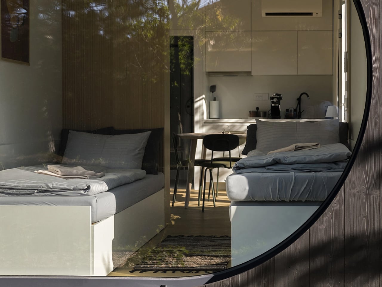
The Ecocapsule Box embraces a clean, rectangular design that prioritizes comfort and practicality over novelty. Its elongated form, expansive glass walls, and neatly organized interior create a bright, contemporary living space that feels far more like a modern micro-home than an off-grid experiment. The layout flows effortlessly, with convertible seating, integrated storage and clear zoning that make the compact footprint feel genuinely functional. This present design shifts the focus from making a visual statement to offering a calm, well-crafted environment that blends quietly into different landscapes.
Solar panels are central to the Box’s current architecture, powering essential systems with reliable renewable energy. These roof-mounted panels support lighting, appliances and climate control, allowing residents to live fully off-grid without sacrificing comfort. The technology is seamlessly built into the structure, maintaining the clean aesthetic while delivering true energy independence.
2. Versatile Solar Surfaces
The micro power revolution thrives on turning previously passive surfaces, especially vertical ones, into productive energy assets. New flexible, lightweight solar harvesters, such as perovskite and CIGS thin films, can adapt to curved forms and unconventional façades, allowing architects to integrate power generation into complex geometries.
This adaptability expands harvesting potential far beyond the flat roof, proving that expressive design no longer limits energy performance. In dense urban settings, this capability is essential for achieving net-zero targets. By transforming vertical cladding into a power-producing layer, buildings improve ROI through higher energy yield per square meter of their envelope.
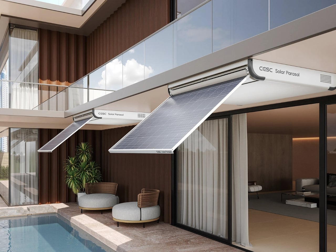
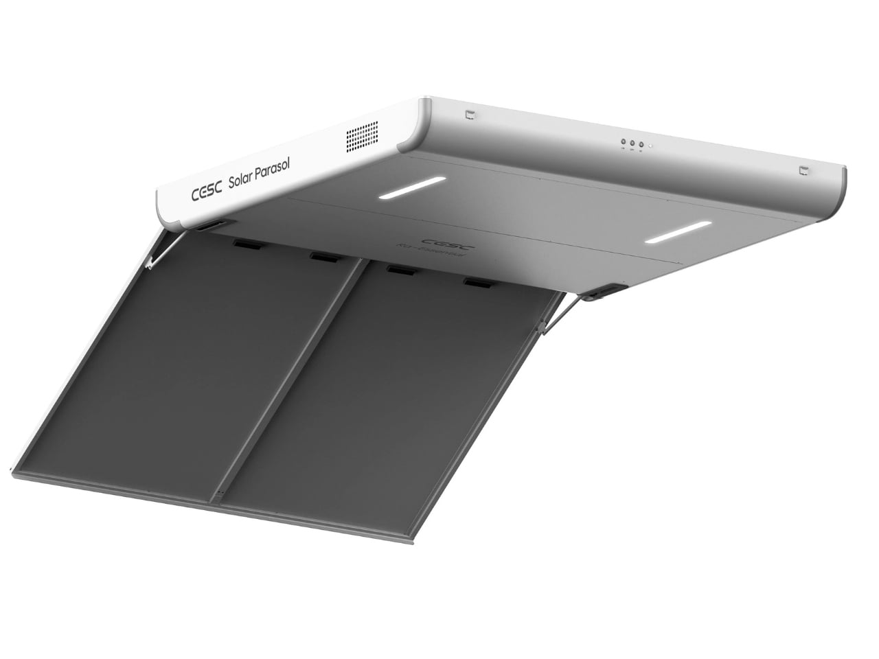
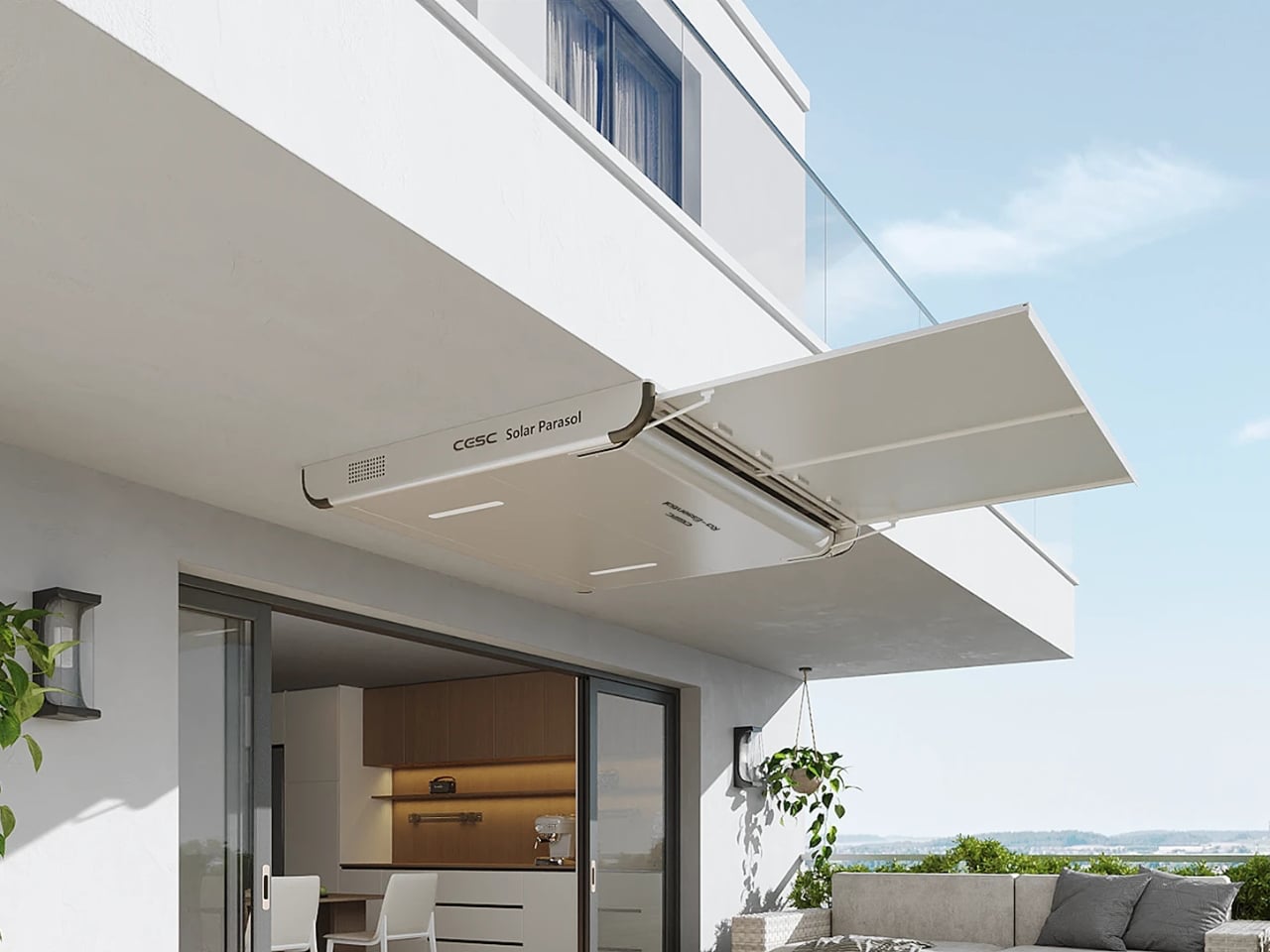
As more people seek sustainable energy options, urban homes often struggle with limited space for traditional solar installations. The CESC Solar Parasol by gang.lab design addresses this challenge with an elegant, space-efficient solution tailored for high-rise living. This smart parasol turns small balconies and overlooked corners into clean-energy hubs. Its minimalist aluminum frame, sleek white finish, and integrated LED lighting create a refined, modern aesthetic while enhancing the usability of compact outdoor areas.
At the heart of the design are high-efficiency solar panels capable of generating 315W of renewable power. These flexible panels fuel a 12W LED system and support intelligent energy management through an adaptive control mechanism. Users can adjust the parasol’s angle between 0°, 35°, and 90° via remote or mobile app, optimizing both shading and solar intake. By merging elegant design with practical photovoltaic technology, the CESC Solar Parasol offers a realistic, future-ready approach to sustainable urban living.
3. Thermal Smart Envelope
Optimized thermal performance is a central advantage of today’s BIPV systems. Beyond producing electricity, these panels function as an outer skin that absorbs solar radiation before it reaches the primary insulation. This reduces heat gain and lowers the cooling demand inside the building, making the envelope work harder and smarter.
This dual-purpose design turns the energy-generating layer into a dynamic shading surface. It doesn’t just add solar capacity; it actively shapes the thermal behavior of the interiors. The result is cooler spaces, reduced reliance on mechanical systems, lower long-term operating costs, and a more comfortable environment for occupants.
Michael Jantzen’s Solar Vineyard House combines sustainability and aesthetics in a 5,000-square-foot concept that merges living space, small-scale wine production, and environmental responsibility. Four sweeping concrete composite arches, linked by expansive glass sections, anchor the design and echo the rolling Californian landscape. Sustainably sourced wood pathways weave through the vineyard and over the structure, offering natural shading and circulation.
Sustainability is integrated seamlessly, not added as an afterthought. Curved solar panels along the south side generate renewable power while maintaining the home’s sculptural fluidity. Natural ventilation, deep overhangs, and rainwater harvesting reduce energy use and support vineyard irrigation. Inside, modular cylindrical units on wheels create flexible living and working zones, with filtered sunlight animating the interior and strengthening the home’s constant dialogue with its surrounding landscape.
4. Microgrid Advantage
Integrating surface harvesters opens the door to creating a decentralized building microgrid, a major advantage for homeowners seeking true energy resilience. With micro-inverters installed at the module level, each unit can operate independently, improving performance and adding built-in protection against system failure.
Pairing BIPV with advanced battery storage transforms the building into a self-reliant power ecosystem. This setup provides autonomy during outages or peak-demand periods, offering long-term security for high-net-worth homes. The property becomes a self-sustaining micro-economy of energy, ensuring consistent, uninterrupted power and elevating resilience and overall value.
Solar energy was once considered a luxury, but today it has become accessible enough for anyone to experiment with. A DIY solar generator offers an affordable way to generate clean, renewable power using just a few essential components. Whether you want emergency backup power, a portable source for camping, or simply a way to lower electricity costs, building your own generator is both practical and rewarding. The project took inspiration from NASA’s solar technology, adapting high-efficiency panels and smart battery systems similar to those used on space missions into a setup suitable for everyday use at home.
The build requires solar panels, lithium iron phosphate batteries, a charge controller, power outlets, and a portable case, all assembled by following the video guide. Once completed, the generator can charge phones, laptops, lights, and small appliances, offering both convenience and energy savings. Beyond cost efficiency, it provides peace of mind during outages, supports sustainable living, and allows anyone to harness solar power in a hands-on, meaningful way.
5. Material Innovation
Advances in materials science are rewriting what solar technology can look like. Semi-transparent PV glazing now allows windows to generate power while still delivering daylight, turning a basic architectural element into an active energy source without sacrificing interior quality.
Colored and textured BIPV options, enabled by specialized coatings and nanotechnology, give architects a much broader palette of finishes. This means solar technology becomes an intentional design feature rather than a visual concession. By merging color, texture, and energy production, these next-generation materials elevate each surface from a functional module to a refined architectural expression that blends performance with beauty.
The EO Canopy by Electric Outdoors represents a significant advancement in off-grid camping, delivering urban-level comfort through a fully solar-powered system. Classified as a “canopy,” it requires neither permits nor additional infrastructure, offering exceptional flexibility in a variety of locations. The unit is notable for its ability to generate its own water and for its substantial energy system, which includes a 154-kWh sodium-ion battery pack that can be expanded up to four times. Its 6,600-watt solar-tracking roof produces between 45 and 64 kWh of power per day, ensuring a highly reliable and continuous energy supply.
This solar configuration is capable of generating enough electricity to power approximately two American homes each day. It also supports the charging of electric vehicles, including Tesla and Rivian models, providing an estimated driving range of up to 150 miles (241 km) via the integrated Level 2 charging station. Additionally, the 154-kWh battery bank enables uninterrupted air-conditioning use, positioning the EO Canopy as a sophisticated and self-sufficient solution for modern off-grid living.
The Micro Power Revolution redefines how architecture and energy interact. By embedding solar harvesters directly into building materials, every structure becomes an active generator rather than a passive consumer. This self-sustaining model represents modern luxury: high design, strong performance, and true ecological responsibility.
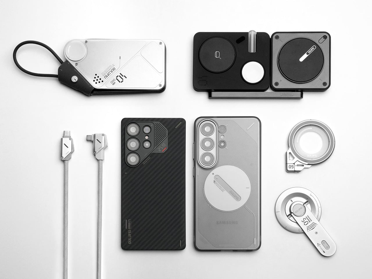
Most people buy a phone case the same way they buy a phone. They want it to feel like them. Some people want basic, slim protection that keeps the phone looking as close to naked as possible. Others want rugged, military-grade armor that could survive a construction site. Some hunt for modular systems with swappable wallets and stands. Others obsess over grip texture, or thermal performance, or MagSafe ecosystem compatibility. The criteria are wildly personal, and the options are endless. It sounds like a trivial consumer category until you realize the global phone case market is worth tens of billions of dollars. People are buying identity as much as they are buying protection. Aulumu, the Shenzhen-based accessory brand with a growing cult following, seems to have understood this from day one.
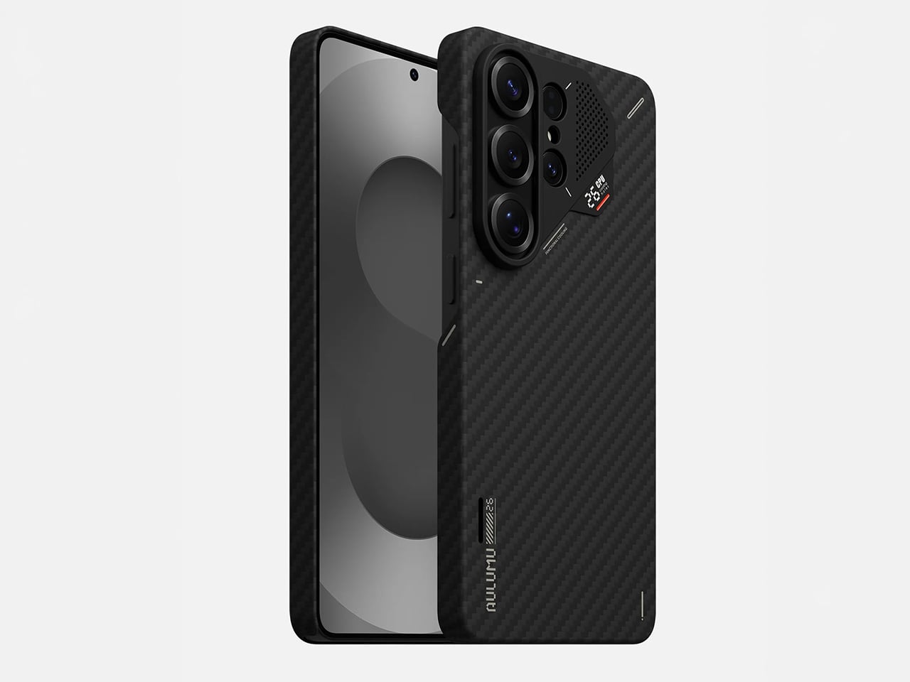
Which is exactly why the brand showed up to the Samsung Galaxy S26 Ultra’s launch with two cases that could hardly be more different from each other. The S26U Frosted Glow Case is a frosted TPU build with a photosensitive UFO disc on the back that charges under light and glows electric green in the dark, doubling as a MagSafe alignment guide. The S26U Ultra-Slim Aramid Fiber Case wraps the same phone in aerospace-grade 1500D woven fiber and hides a CoolHyper thermal management system inside, complete with a color-changing temperature indicator. One is for the person who wants their phone to have a personality. The other is for the person who treats their S26 Ultra like a workstation. Aulumu built both because the S26 Ultra owner is never just one type of person.
Designer: Aulumu
S26U Frosted Glow Case: A Glowing Case That Wants Your Attention (And Earns It)
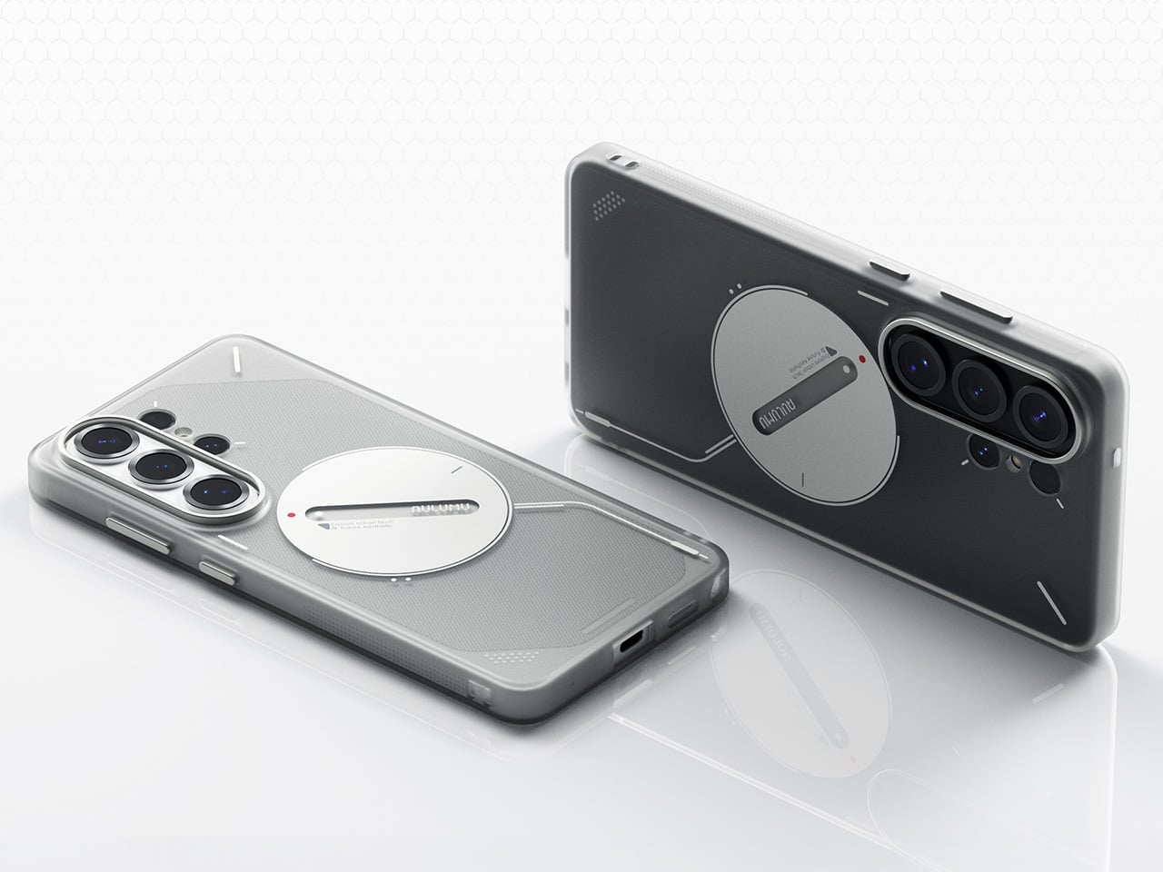
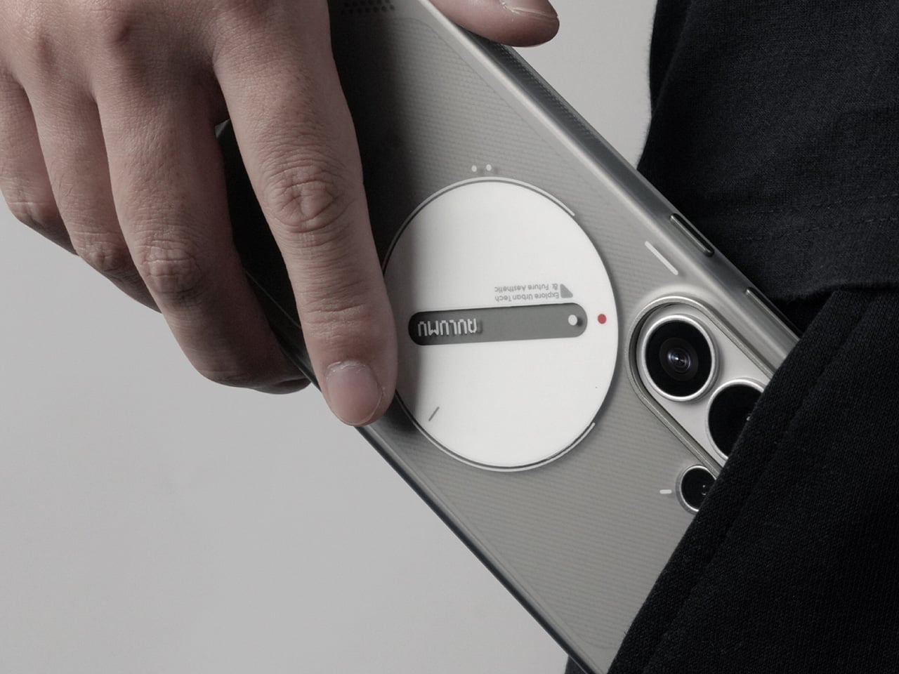
The visual centerpiece of this case is the big glowing circle on the back. Aulumu calls it a “Glow UFO Design,” and it’s made from a photosensitive material that soaks up light during the day and gives off a bright green glow when the lights go out. It’s a neat trick that makes your phone easy to find on a nightstand and gives it a ton of personality. The graphic is printed using a two-layer IMD process, meaning it’s embedded inside the TPU plastic itself so you don’t have to worry about it fading or scratching off. The main body has a frosted, translucent finish, so you can still see a hint of the Galaxy S26 Ultra’s actual color, but with a diffused, softer look.
They also got the small details right, especially the parts you actually touch. Instead of turning the phone’s satisfyingly clicky buttons into mushy plastic bumps, Aulumu used separate aluminum alloy buttons that preserve that original tactile feel. That same metal is used to create a tough, raised lip around the entire camera module, giving you a solid barrier of protection that feels much more reassuring than a simple sliver of raised plastic.
That glowing ring isn’t just for looks, either; it’s the case’s built-in MagSafe magnet array. It’s a really clever way to integrate a functional feature into the core aesthetic, so you don’t have that generic white circle plastered on the back. All your MagSafe accessories, from chargers to wallets, snap right into place, guided by the UFO design. This thing is clearly built for someone who wants their phone to be a bit of a statement piece. It’s expressive and fun, but it doesn’t skimp on the practical stuff like good buttons and legitimate camera protection.
Why We Recommend It
You know a case design is working when the flashiest feature turns out to be the most functional one. The glowing UFO disc is a passive MagSafe alignment guide that charges under ambient light and radiates green in the dark, and it genuinely earns its place on the back of the phone. The 2-layer IMD construction keeps the embossed pattern from fading, the aluminum alloy buttons feel identical to the S26 Ultra’s own hardware, and the anti-slip dot texturing gives you real confidence holding a phone this large one-handed. All of that lands at $35.98. For someone who bought the S26 Ultra because they wanted their tech to have a personality, this case is the natural next step.
S26U Ultra-Slim Aramid Fiber Case: A High-Performance Cover Built for the Power User
This case is wrapped in 1500D aramid fiber, which is the same family of high-strength synthetic material used in body armor and aerospace components. It’s incredibly thin and light, but it offers serious scratch resistance and rigidity that you just can’t get from plastic or silicone. The case barely adds any bulk to the Galaxy S26 Ultra, preserving its original form factor while giving it a stealthy, woven finish. The texture itself is smooth with just a hint of the interwoven pattern, providing a confident feel in the hand that isn’t exactly grippy, but certainly not slippery. It’s a piece of precision hardware for someone who appreciates advanced materials and wants protection that feels more engineered than simply molded.
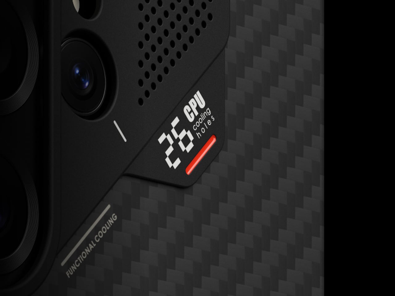
What really separates this case from other aramid fiber options is the little tech-badge built into the back. Aulumu calls it the CoolHyper system, and it’s designed to help manage the S26 Ultra’s thermal output during heavy use. The system uses what the company calls “superconducting cooling” to pull heat away from the phone’s core. More practically, that little badge near the camera has a color-changing indicator that reacts to the phone’s temperature. It gives you a quick, visual cue when the device is heating up, making it a functional dashboard for power users who are gaming, editing video, or pushing the processor hard. It’s a genuinely nerdy feature that serves a real purpose.
Even with its focus on slimness and thermal tech, the case doesn’t neglect basic protection. The camera system is shielded by a raised aluminum alloy frame, providing a rigid barrier against drops and impacts right where the phone is most vulnerable. This metal accent adds to the case’s premium, industrial feel while serving a critical defensive role. The whole package is designed for the person who views their S26 Ultra as a high-performance tool. It offers a sophisticated, understated aesthetic backed by aerospace-grade materials and a clever, functional cooling monitor, delivering on the promise of being slim, strong, and genuinely smart.
Why We Recommend It
The S26 Ultra is a device people buy for peak performance, and most cases punish you for doing exactly that by trapping heat against an already warm chassis. The CoolHyper system changes that equation, with a silicone pad and aluminum alloy plate combination that Aulumu claims keeps temperatures up to 1-2°C cooler during heavy workloads. Add 1500D aramid fiber construction at 0.6mm on the frame and 1.2mm on the back, and you have a case that makes the phone feel barely dressed while actually making it thermally smarter than going naked. The color-changing temperature indicator is the kind of detail a power user appreciates immediately. At $69.98, this is the case for someone who treats their S26 Ultra like a tool and wants every component around it pulling its weight.
Most tablets arrive as sealed objects with decisions already made for you: storage is fixed, the battery is buried somewhere inaccessible, and the operating system is whatever the manufacturer chose. You use the device on those terms until it slows down or falls out of software support, and then you replace it. Brax Technologies, the company behind the BraX3 privacy smartphone, is betting there’s a different way to do this.
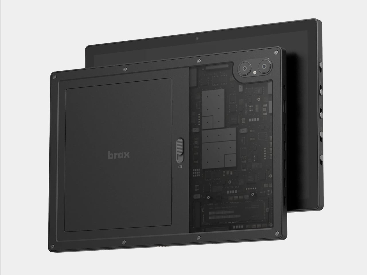
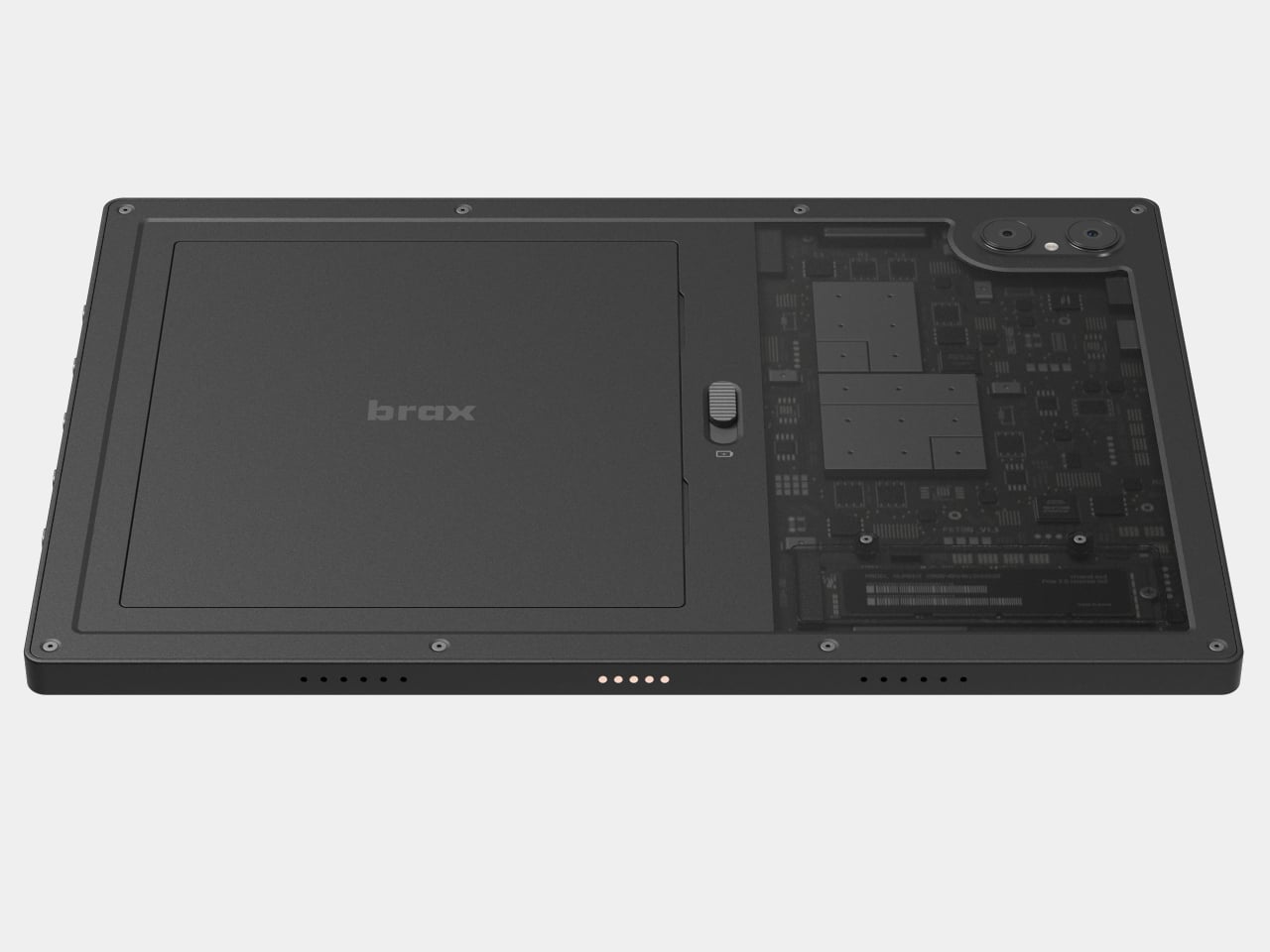
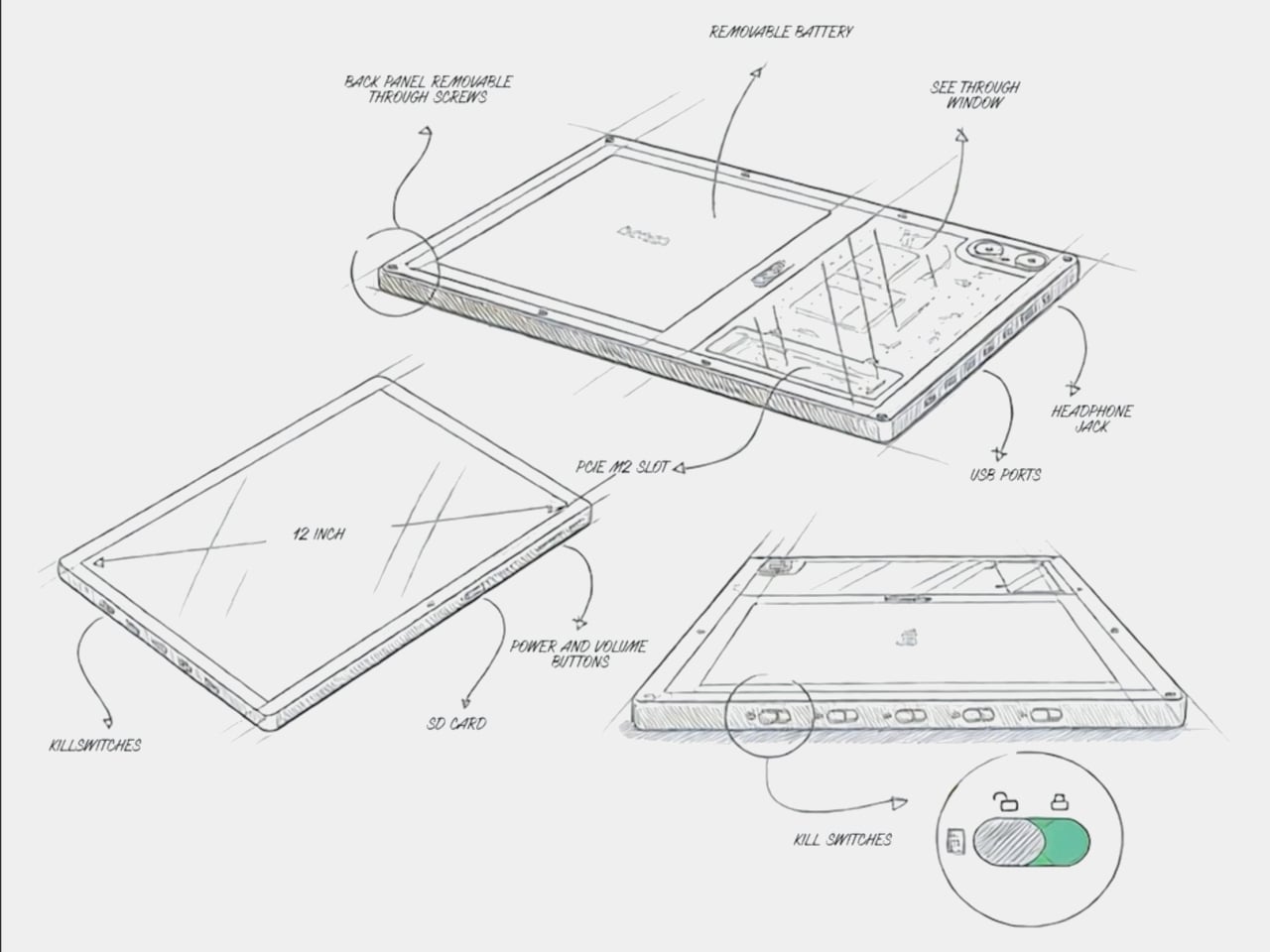
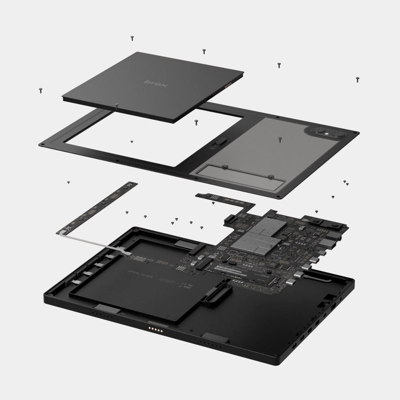
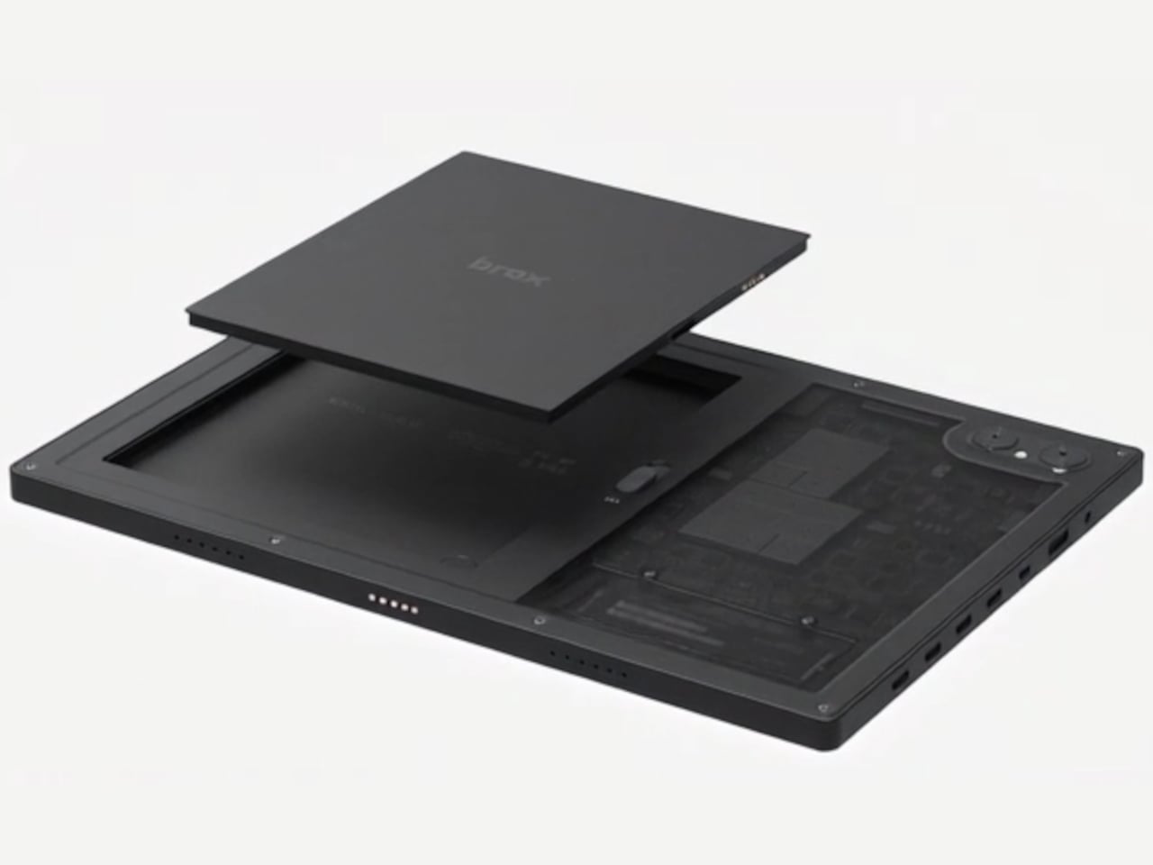
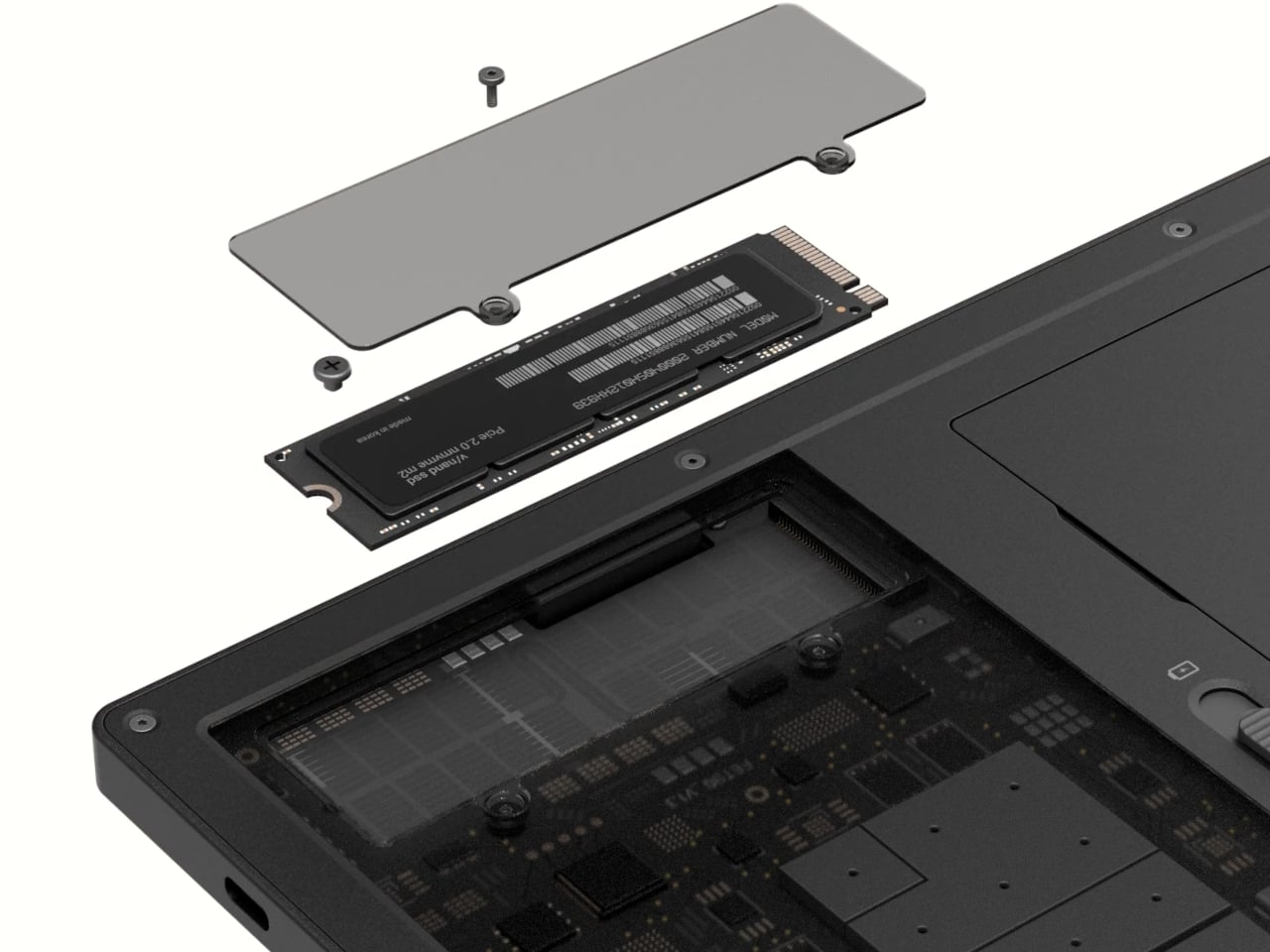
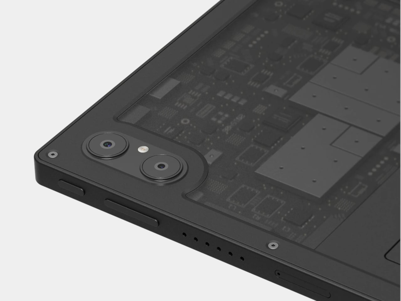
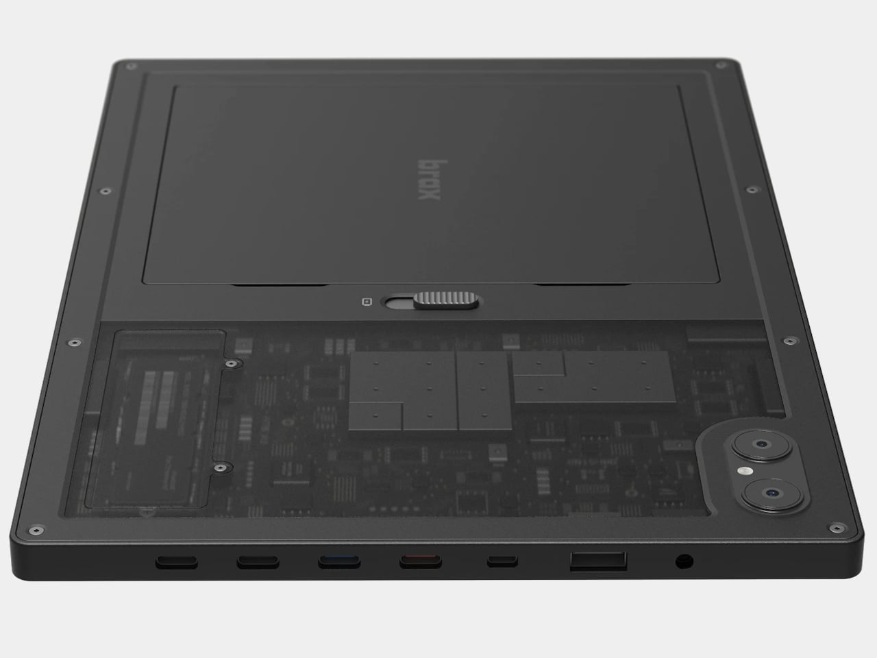
The open_slate is a 12-inch 2-in-1 tablet that treats its hardware as a starting point rather than a finished product. Inside the chassis sits an M.2 2280 slot, a standard used in laptops and desktops, allowing owners to swap in faster storage, add capacity, or eventually slot in a network card. There’s also a user-replaceable battery, which sounds mundane until you consider how few tablet makers have bothered to include one in years.
That battery holds 8,000mAh and carries a claimed 20-hour runtime, a figure that tracks given how efficiently ARM processors handle light workloads. The MediaTek Genio 720 chip pairs two Cortex-A78 performance cores with six Cortex-A55 efficiency cores. It’s a capable mid-range processor, not a desktop replacement, but paired with either 8GB or 16GB of RAM and a 120Hz display, daily use should feel smooth for the tasks the device is designed for.
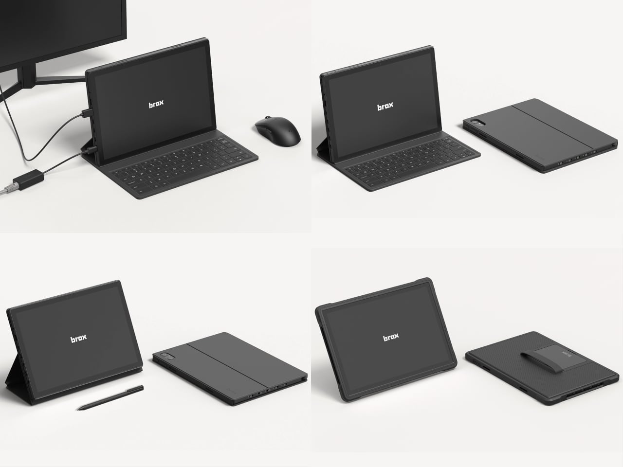
That 12-inch IPS screen runs at 1600 x 2400 resolution with Gorilla Glass protection and supports a stylus at 4,096 levels of pressure sensitivity. Connectivity covers Wi-Fi 6E, Bluetooth 5.3, GPS, and two USB-C ports, one supporting DisplayPort 1.4 output. Someone writing on the go, sketching ideas, or running a Linux terminal while connected to an external monitor could reasonably treat this as a primary machine, provided the software cooperates.
On that note: the open_slate ships with BraxOS, a de-Googled Android build, and targets Ubuntu support through MediaTek’s Genio developer platform. Brax acknowledges that some Linux features may not be complete at launch, which is an honest position for a small team working outside the mainstream supply chain. ARM Linux has improved considerably, but it still surprises you at inconvenient moments.
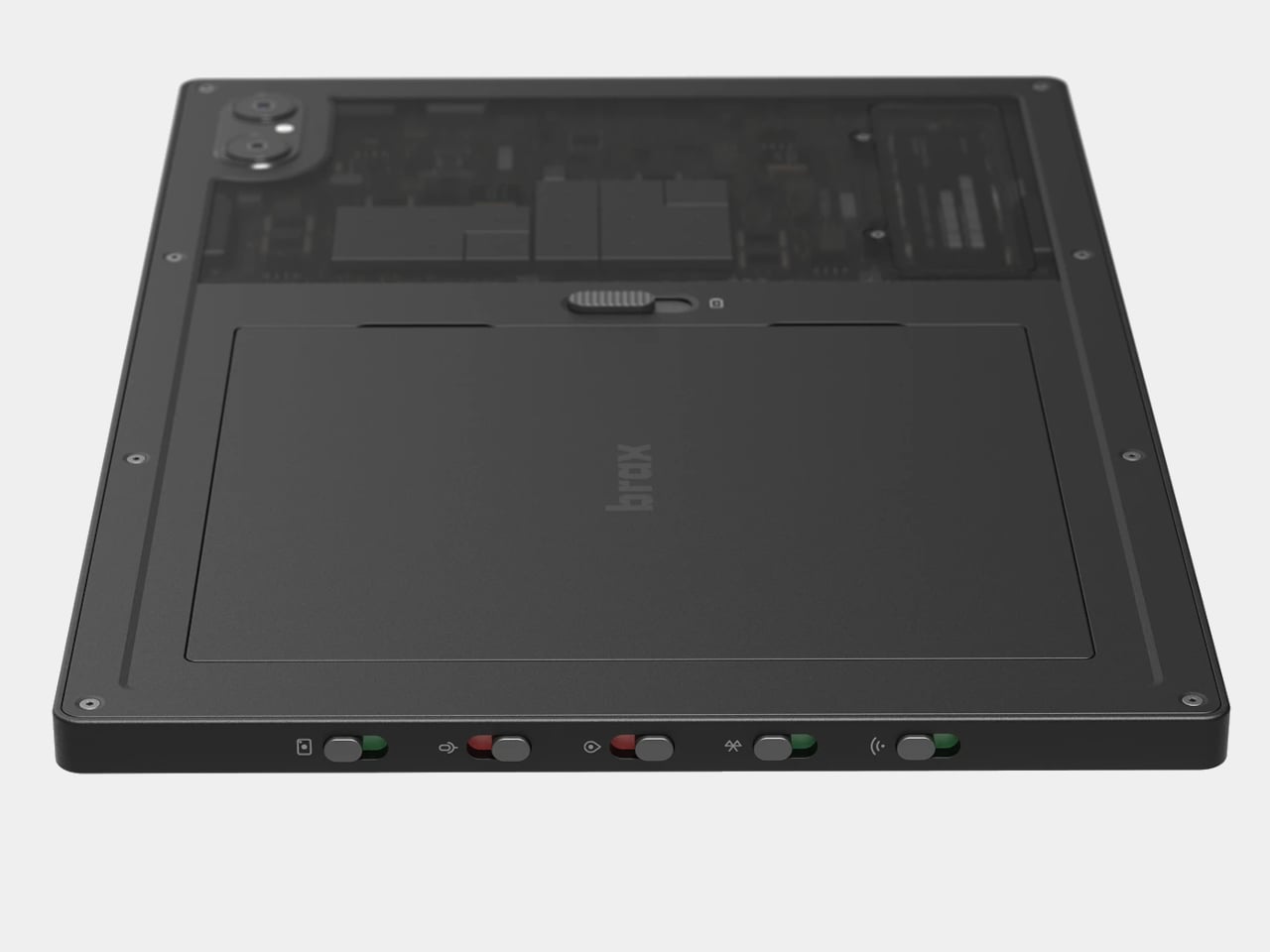
The physical kill switches are the most distinctive feature on paper. Dedicated toggles cut power to the cameras, microphone, Wi-Fi, Bluetooth, and GPS at the hardware level, not through a software setting that an app might quietly bypass. This design logic comes from the secure laptop world, and applying it to a consumer tablet is unusual enough to notice. For anyone who’s thought seriously about what their devices transmit and to whom, the appeal is immediate.