5 Biomimicry-based Architectural Designs That Copy Nature’s Best Ideas

Designers working across product design and interior architecture view the Amazon not as a backdrop, but as a lesson in how materials, forms, and systems perform under real conditions. Designing in this context means moving away from rigid objects and fixed layouts, and learning from the forest’s logic of layering, adaptation, and response to heat, moisture, and constant change. From furniture to spatial planning, every decision must align with the environment rather than resist it.

This mindset shapes interiors and products that prioritize durability, comfort, and reduced environmental impact. Light is softened through screens, textures, and surfaces that gently diffuse glare, while materials are selected for resilience and tactile warmth. Let’s understand how strong design is defined by solutions that behave like living systems, adaptive, efficient, and quietly luxurious in harmony with nature.

1. Layered Roofs Inspired by the Canopy

In the Amazon, a roof is more than just a cover. It must work like the forest canopy, using layers to control heat and handle heavy rainfall. Instead of a single surface, a layered roof helps reduce heat build-up and protects the interior from extreme weather, creating a naturally cooler living environment.

This can be achieved through a double-layer roof system, with an outer protective layer and an inner insulated ceiling. The space between them allows hot air to escape, improving natural ventilation. Deep roof overhangs further protect interiors by blocking harsh midday sun while letting in soft morning light, creating comfortable, shaded spaces that feel connected to nature.
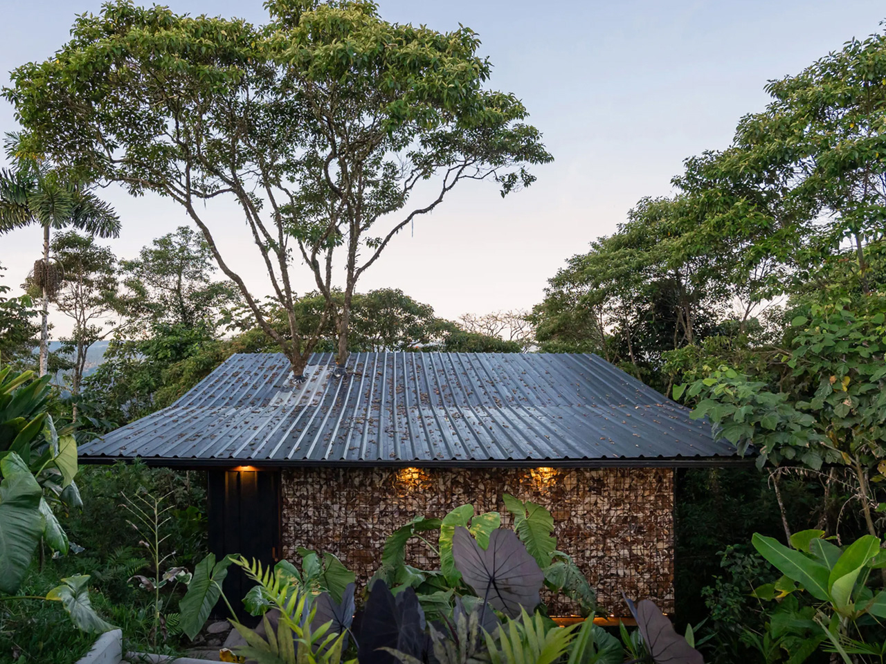
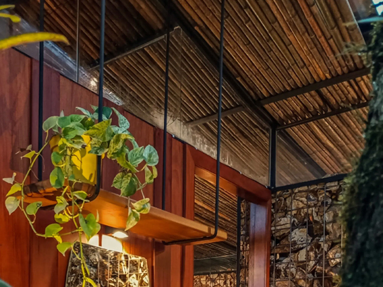
Tucked deep within Ecuador’s Amazon rainforest, A Lodging in the Pigüe is a 484-sq-ft cabin that forges an intimate dialogue between architecture and nature. Designed around a pre-existing Pigüe tree, the structure gently rises around it, allowing the tree to remain untouched while becoming a living component of the home. Located near El Calvario, the cabin seamlessly blends industrial and organic materials, drawing inspiration from tree houses to create a quiet retreat immersed in the forest landscape.
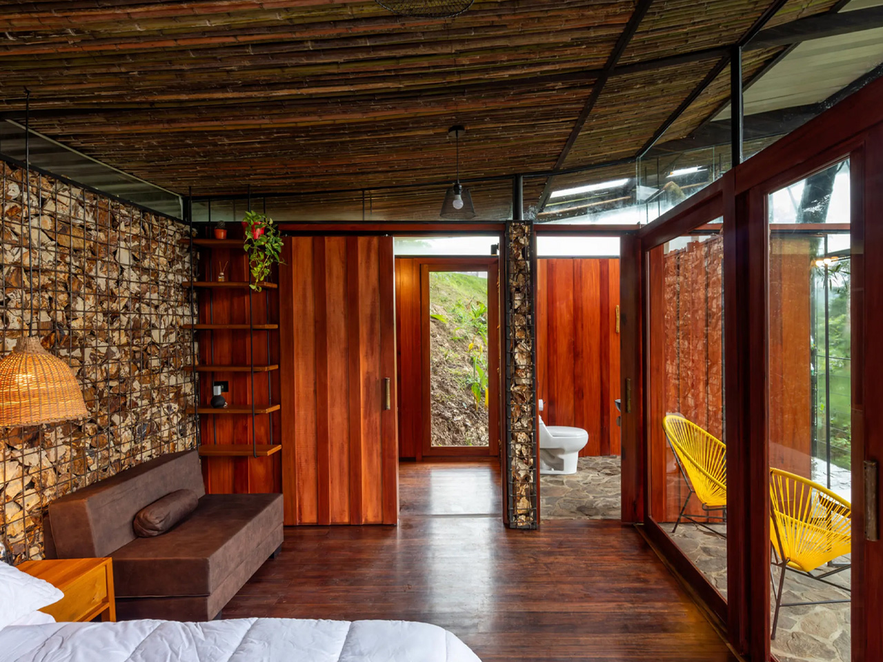
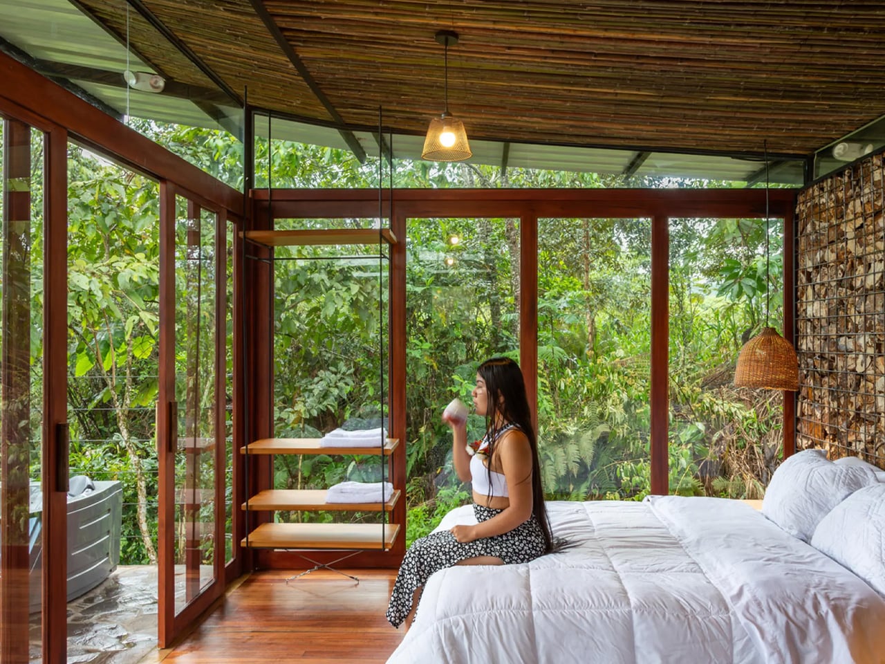
Elevated on stilts made from recycled metal pipes, the home appears to float among the trees, protecting it from ground moisture while preserving natural water flows and encouraging the growth of vegetation below. This raised design also enables bio-filters for wastewater treatment. Inside, a warm, earthy palette dominates, with gabion stone walls, locally sourced bamboo and wood, and polished timber floors. Living spaces extend outdoors through a terrace and net balcony, while floor-to-ceiling glass in the bedroom, along with a compact kitchen, bathroom, and semi-outdoor shower, deepens the connection to nature.

2. Water-Smart Design from Leaf Patterns

In the Amazon, water shapes every design decision. Instead of fighting moisture, buildings should work with it. Surfaces and details must guide rain away quickly, reducing damage while improving long-term performance in a high-humidity climate.

Drainage systems can take cues from leaf veins, where water flows naturally and efficiently. Gutters and channels are integrated into the structure, turning heavy rainfall into a controlled, visible flow rather than a problem to fix later. Materials also matter as moisture-friendly woods and modern bio-based materials perform better in damp conditions, aging slowly and beautifully while reflecting the climate they belong to.
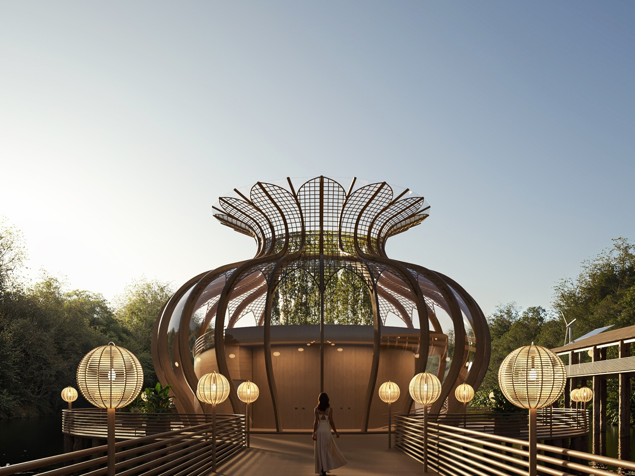
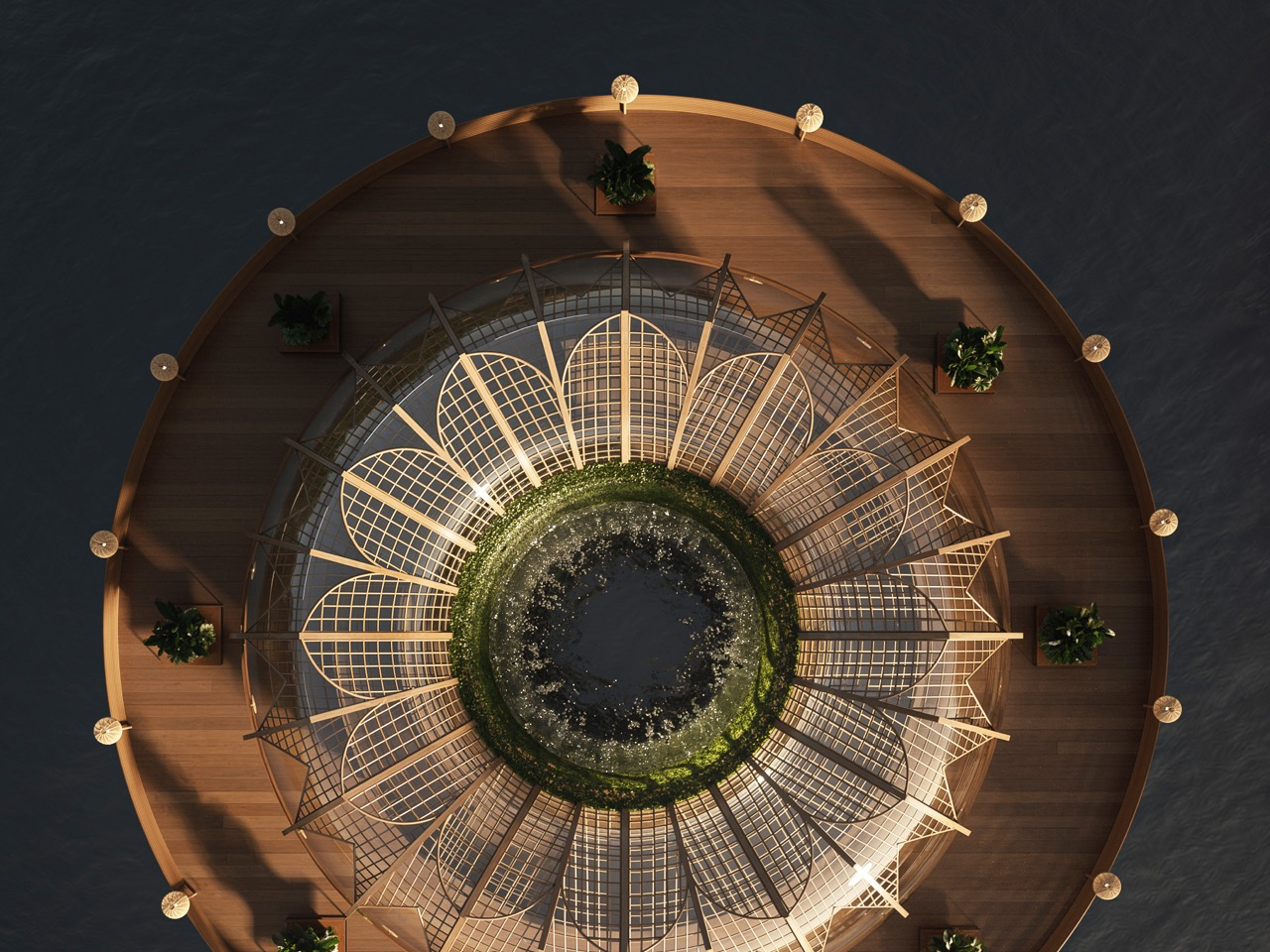
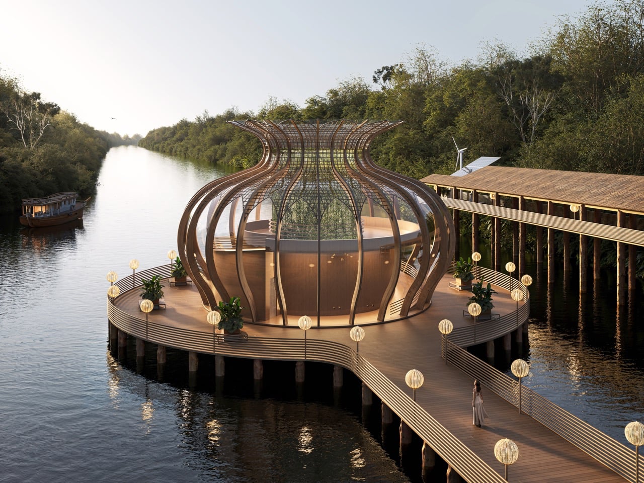
As technology-driven lifestyles pull people further from nature, the Amazon Immersion Pavilion is imagined as a quiet architectural counterpoint rooted in presence and ecological respect. Conceived as a conceptual project for Iquitos, Peru, the pavilion invites visitors to experience the rainforest through sound, light, texture, and movement. Rather than treating the Amazon as a backdrop, the design approaches it as a living partner, encouraging deliberate sensory engagement. Shaped by biomimicry and local ecological understanding, the pavilion uses bamboo as its primary material, reflecting regional building traditions while supporting low-impact construction and environmental responsibility.
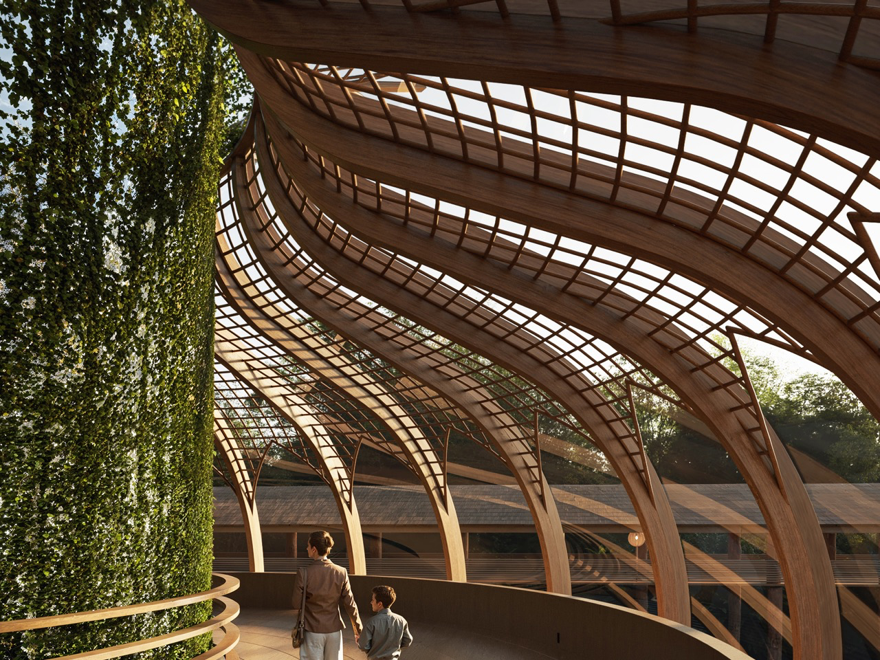
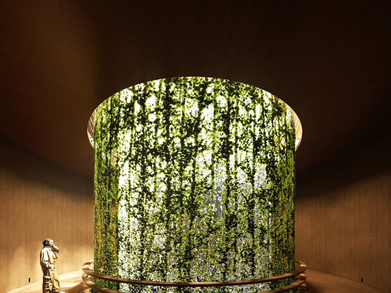
The spatial journey unfolds across two levels, creating a clear emotional progression. The lower level offers an introspective, cocoon-like atmosphere, where filtered daylight, flowing water, and dense vegetation heighten sensory awareness. As visitors move upward, the pavilion opens toward expansive views of the Amazon River, allowing the architecture to recede in favor of the landscape. Passive ventilation, natural light, and low-impact assembly techniques enable the structure to align quietly with the rhythms of the forest.

3. Floating Floors That Respect the Ground

In sensitive ecosystems like the Amazon, real luxury means building without disturbing the land. Lifting structures above the forest floor allows natural water flow, plant life, and biodiversity to continue untouched. The building becomes a guest, not an intruder.

Raised floor systems on stilt-like foundations let air move freely beneath the structure, improving cooling while protecting interiors from moisture and insects. This approach also draws from regional building traditions, where homes are elevated to adapt to the climate and terrain. By combining this wisdom with modern design, architecture stays rooted in culture while meeting contemporary performance needs.
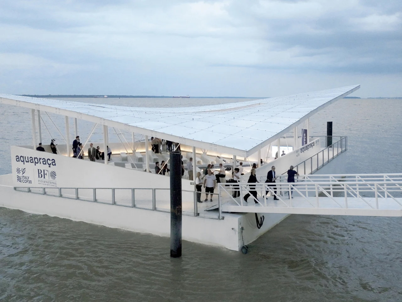
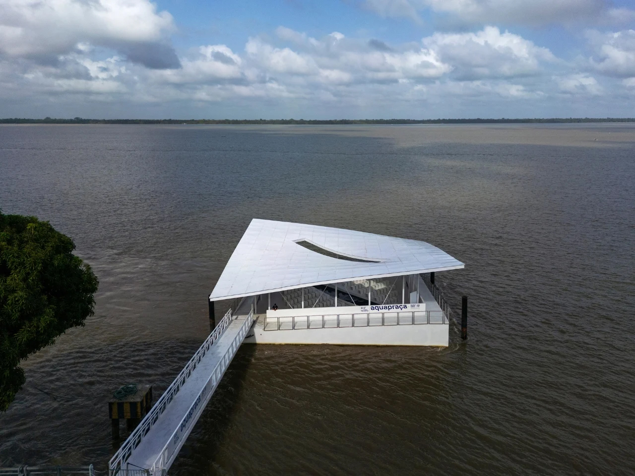
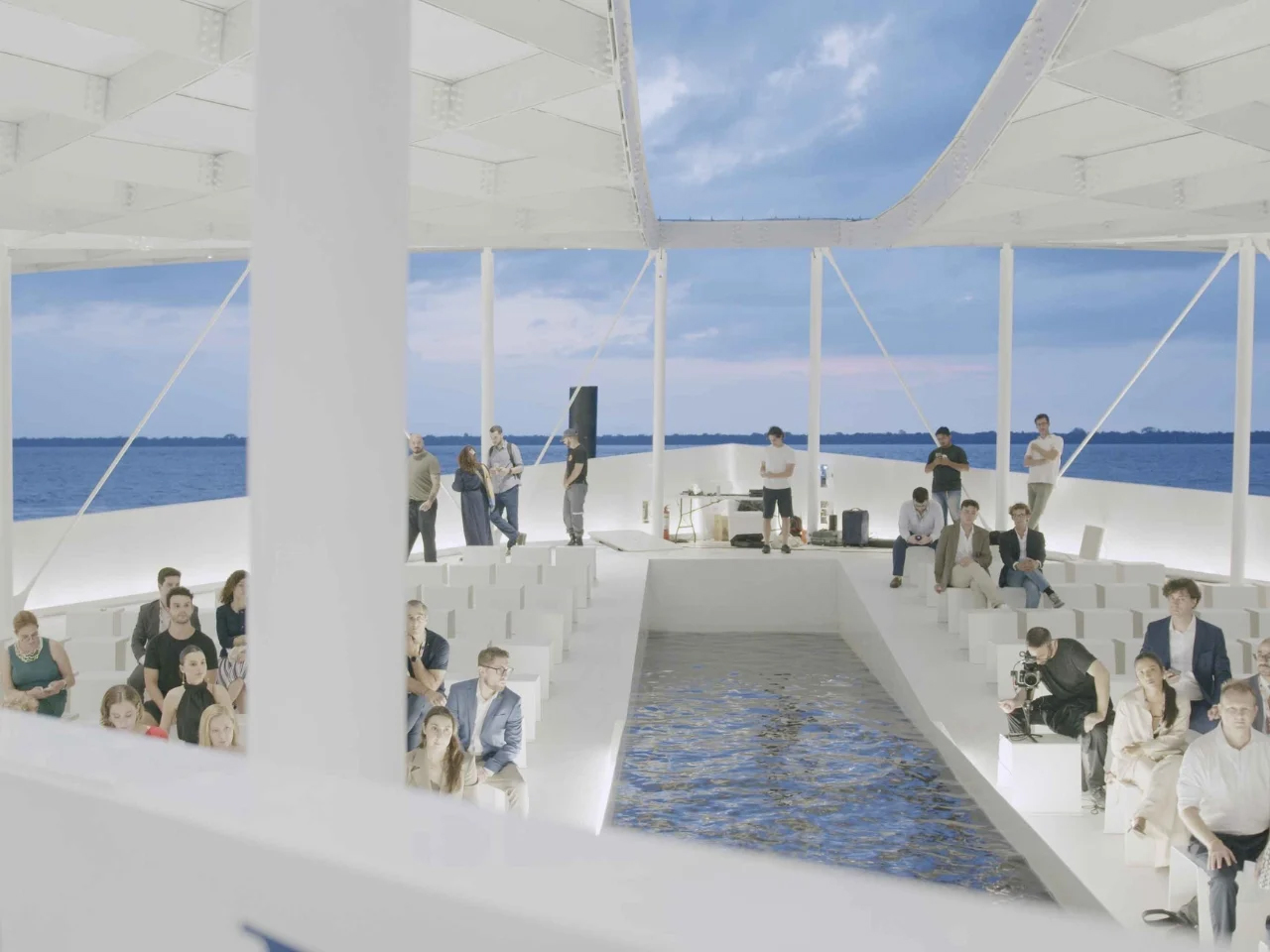
AquaPraça is a floating public square that responds directly to tidal movement, rising and falling with the water. Unveiled at the UN Climate Change Conference COP30 in Belém, Brazil, the 400-square-metre platform is conceived as a permanent cultural and civic space rather than a temporary installation. Designed by CRA–Carlo Ratti Associati in collaboration with Höweler + Yoon, the structure is anchored in Guajará Bay and adapts to daily tidal variations of up to four metres through buoyancy-based engineering. By positioning visitors at eye level with the river, the project transforms environmental change into a perceptible spatial experience.
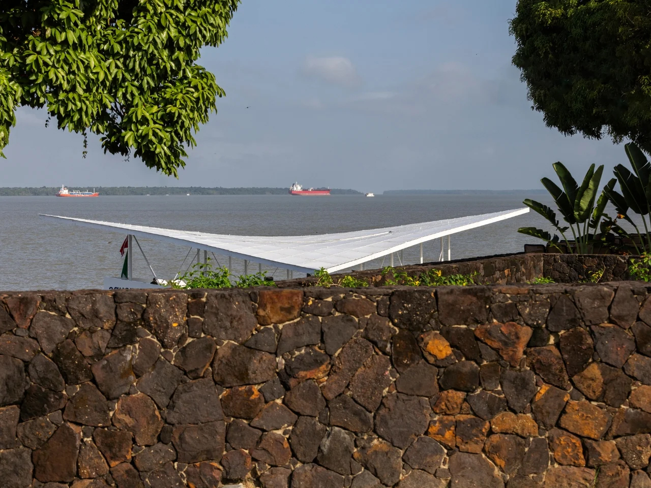
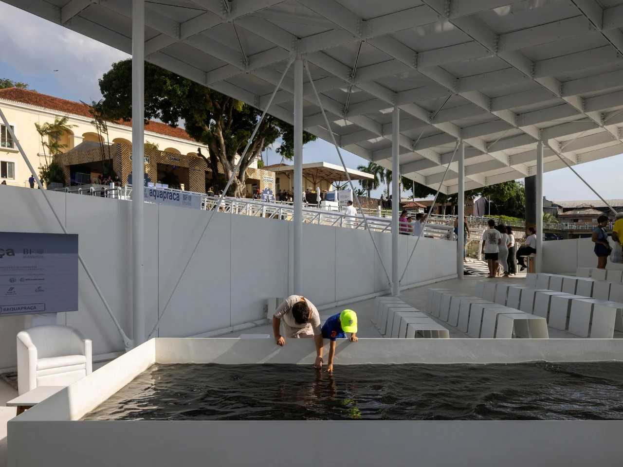
First presented at the Venice Architecture Biennale, AquaPraça later arrived in Belém as part of Italy’s pavilion at COP30 and will be donated to Brazil for continued public use. Its sloped surfaces respond in real time to shifting water levels, offering a physical demonstration of sea-level rise. Located at the confluence of the Amazon River and the Atlantic Ocean, the project exemplifies adaptive architecture that aligns environmental responsibility with long-term cultural engagement.

4. Breathing Buildings for Tropical Comfort

In the Amazon, sealed glass buildings simply do not work. The forest itself breathes, and architecture must do the same. Instead of airtight enclosures, buildings should allow air to move naturally, responding to heat, humidity, and daily climate shifts.

Walls can be designed as adjustable layers using louvers made from sustainable wood, perforated brick walls, or recycled metal. These openings act like breathing pores, letting fresh air flow through while maintaining shade and comfort. Compared to fully air-conditioned spaces, breathable facades consume less energy and create a stronger connection to the surroundings, allowing occupants to experience natural airflow, sounds, and scents of the forest.
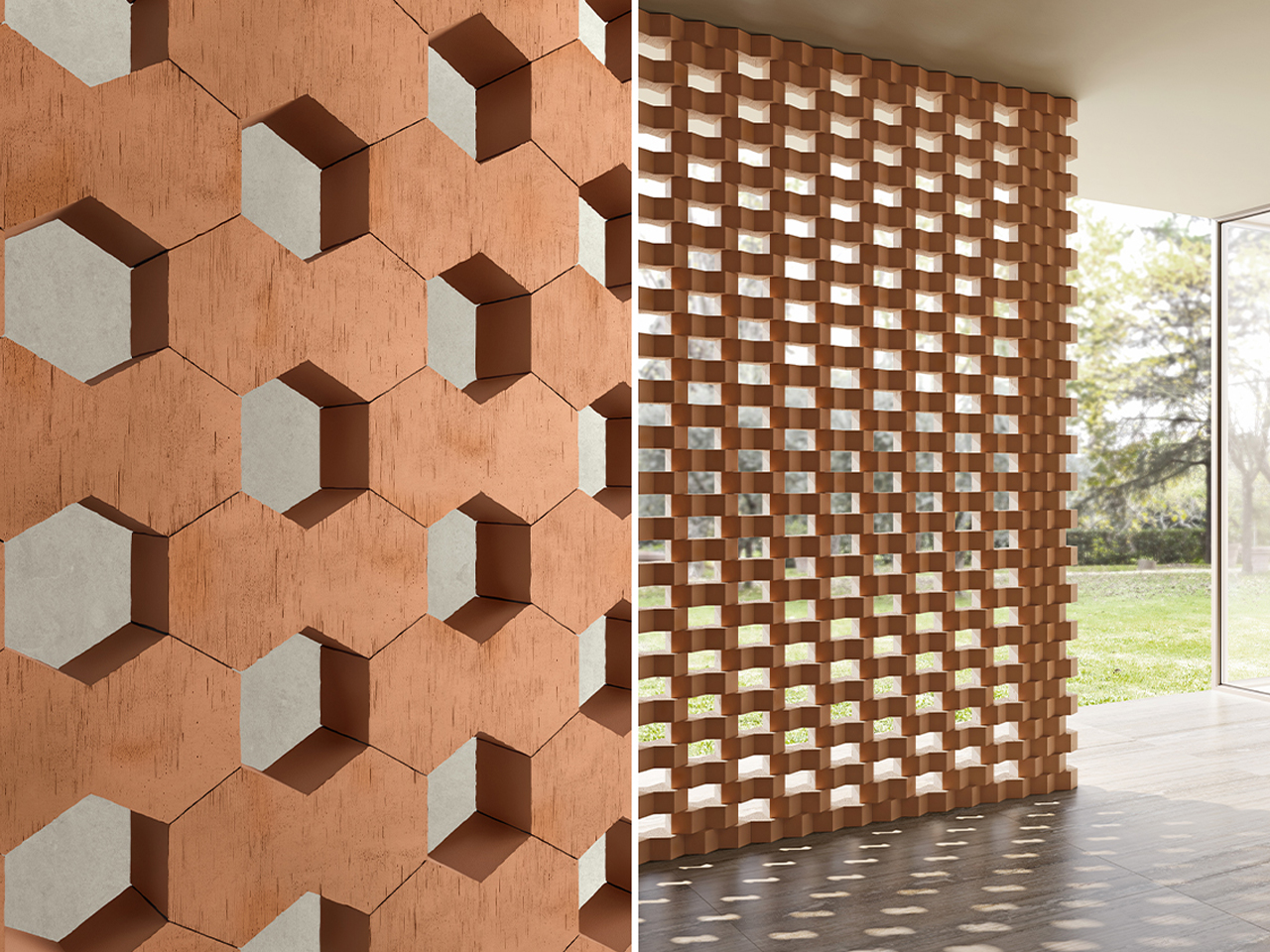
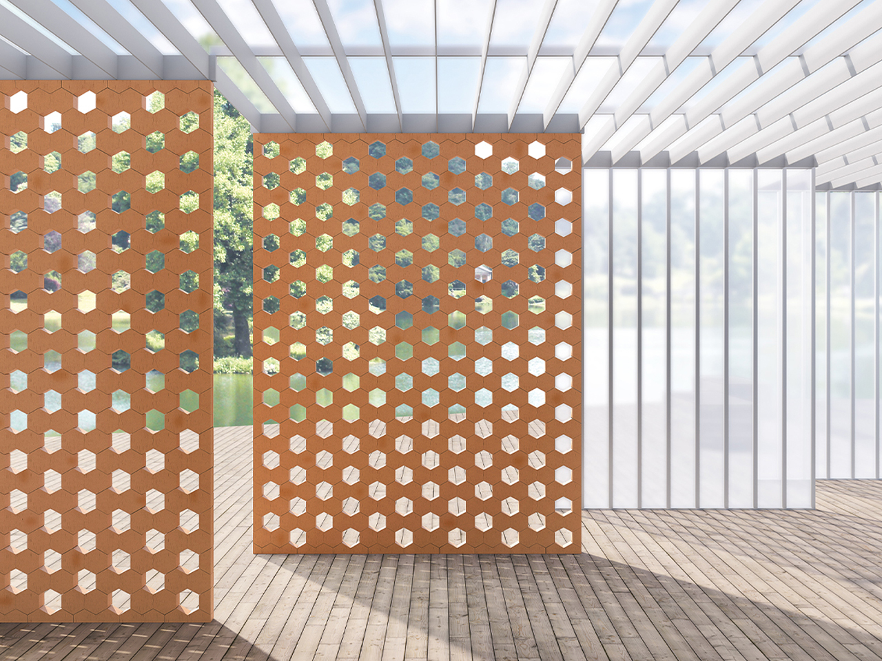
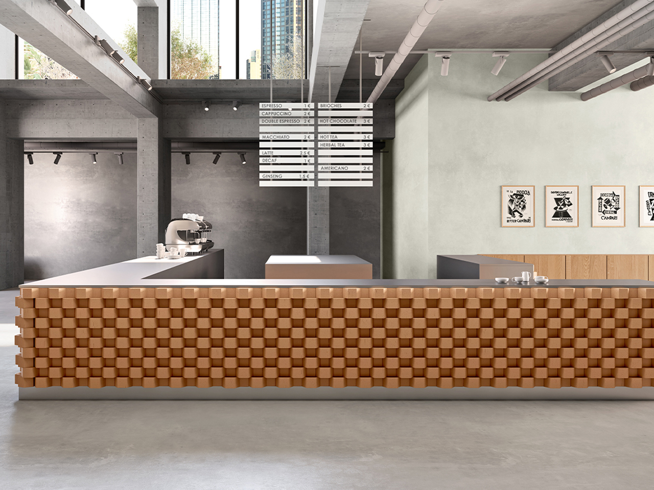
Hives is a modular system of hexagonal terracotta bricks designed to create flexible interior furnishings and architectural structures. Developed for Mutina, the Italian ceramics brand known for collaborating with leading designers, the collection reflects its commitment to material innovation and expressive form. Konstantin Grcic was commissioned to rethink the fixed nature of traditional brick construction, drawing inspiration from the intricate geometry of beehives. Each brick appears as two fused hexagonal units, resulting in a distinctive three-dimensional form that supports a wide range of spatial compositions.
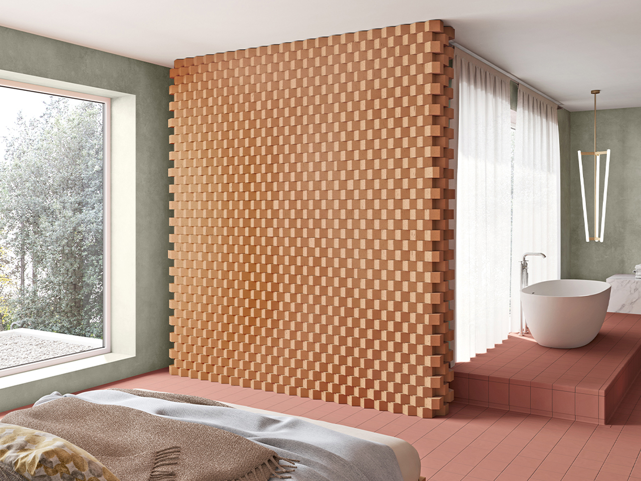
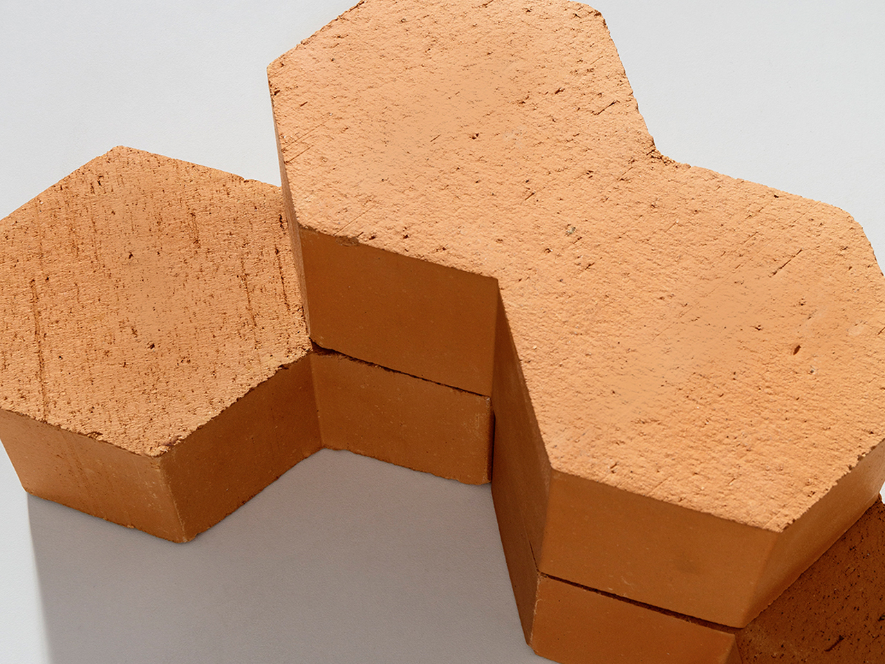
The bricks can be arranged vertically to produce semi-open structures with pronounced cavities, or laid horizontally in staggered or flush patterns to create dynamic, undulating surfaces for columns, walls, and counters. Measuring 13 × 22.5 × 7 cm, the terracotta units offer excellent thermal and acoustic properties alongside durability and tactile warmth.

5. Designing for Circular Living

In the Amazon, nature shows that growth and decay are part of the same cycle. Architecture should follow this logic by using materials that can return safely to the earth over time, without pollution or waste.

Low-impact materials such as mycelium-based insulation and responsibly sourced mass timber help reduce carbon footprint while storing carbon instead of releasing it. Interiors can extend this thinking through natural finishes like local stone, clay plasters, and handwoven elements. The result is a calm, tactile environment that feels connected to the forest, reinforcing the idea of the building as a respectful, temporary presence within a living ecosystem.
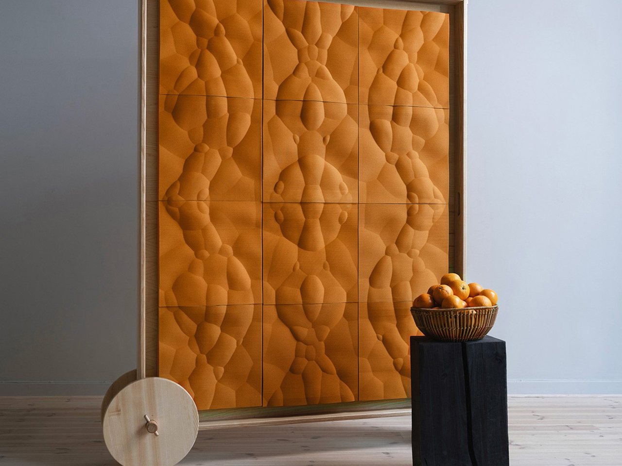
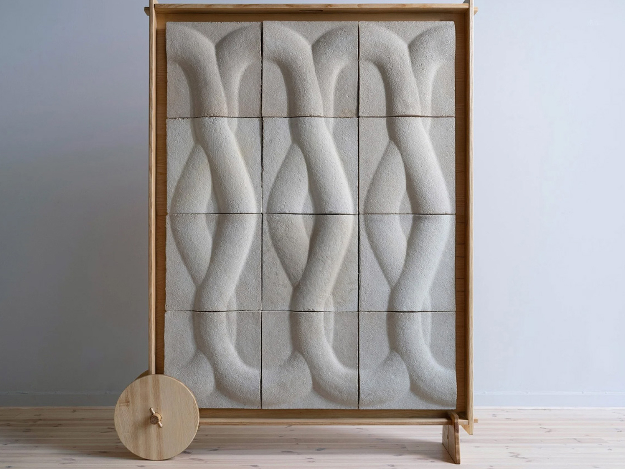
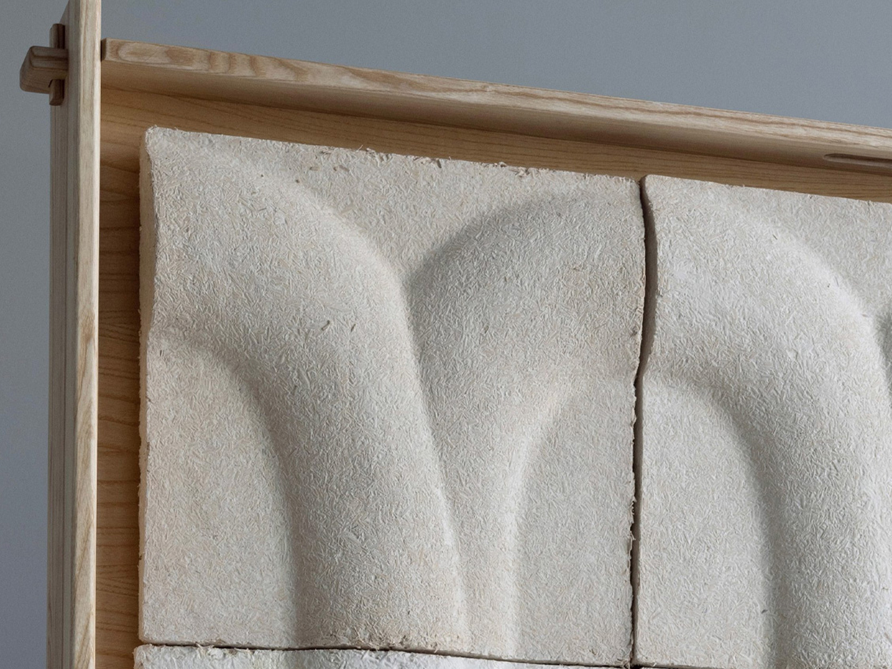
Design studio Interesting Times Gang, in collaboration with cooperative homebuilder OBOS, has introduced Veggro, a collection of sustainable partitions made from biomaterials such as mycelium and orange peel. The Loom design uses mycelium grown on agricultural waste to create textured, mushroom-inspired panels, while Jugoso features 3D-printed orange rinds arranged in geometric patterns shaped by natural fruit vesicles.
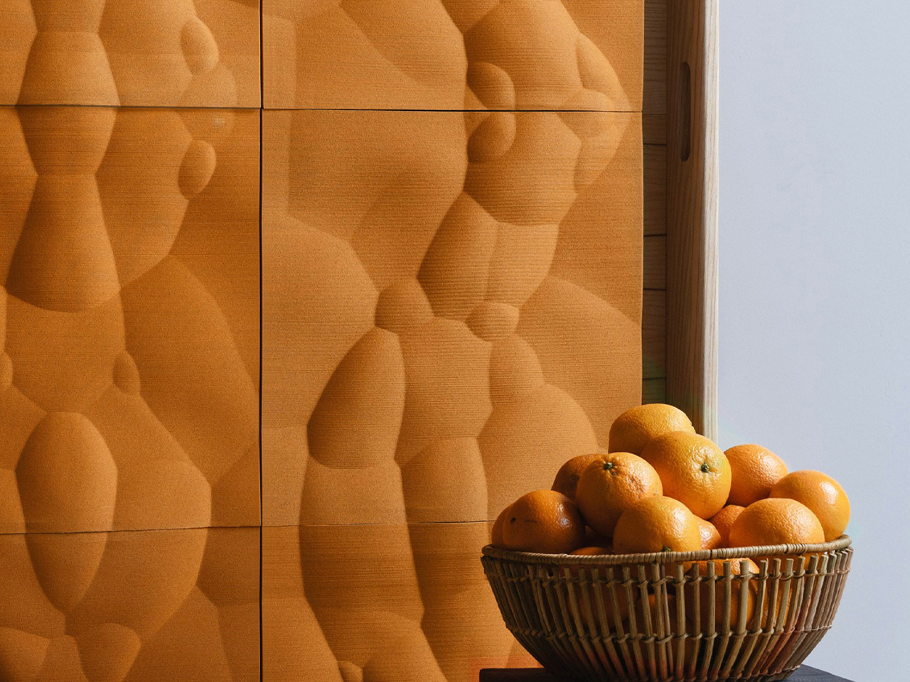
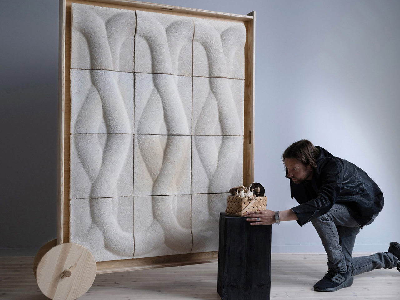
Described as a biophilic “wall-as-furniture” concept, Veggro offers acoustic insulation, decorative value, and modular flexibility, representing the first outcome of the partners’ research into low-carbon construction materials.

Designing for the Amazon tests both humility and intelligence. It demands moving away from monumental statements toward buildings that behave like living organisms. By translating rainforest strategies into design, architecture becomes responsive and poetic. This defines a new luxury where spaces that breathe, adapt, and exist in balance with nature.

The post 5 Biomimicry-based Architectural Designs That Copy Nature’s Best Ideas first appeared on Yanko Design.
Lie Under This Solar Roof and Watch the Sun Move in Real-Time

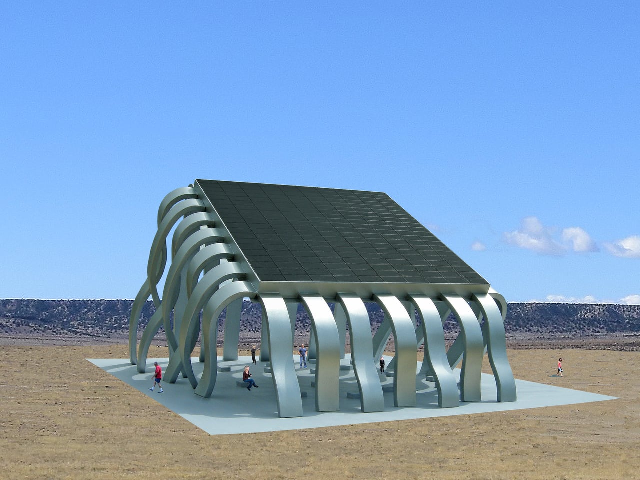
Most solar infrastructure is treated as background hardware, panels on roofs or fields that quietly feed the grid while public life happens somewhere else. That separation makes renewable energy feel abstract, a number on a bill rather than an experience. The Solar Eclipse Pavilion imagines a different approach, where the act of harvesting sunlight becomes the centerpiece of a place where people actually gather, making energy visible and social at the same time.

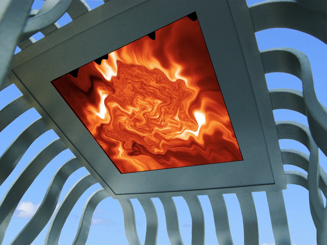
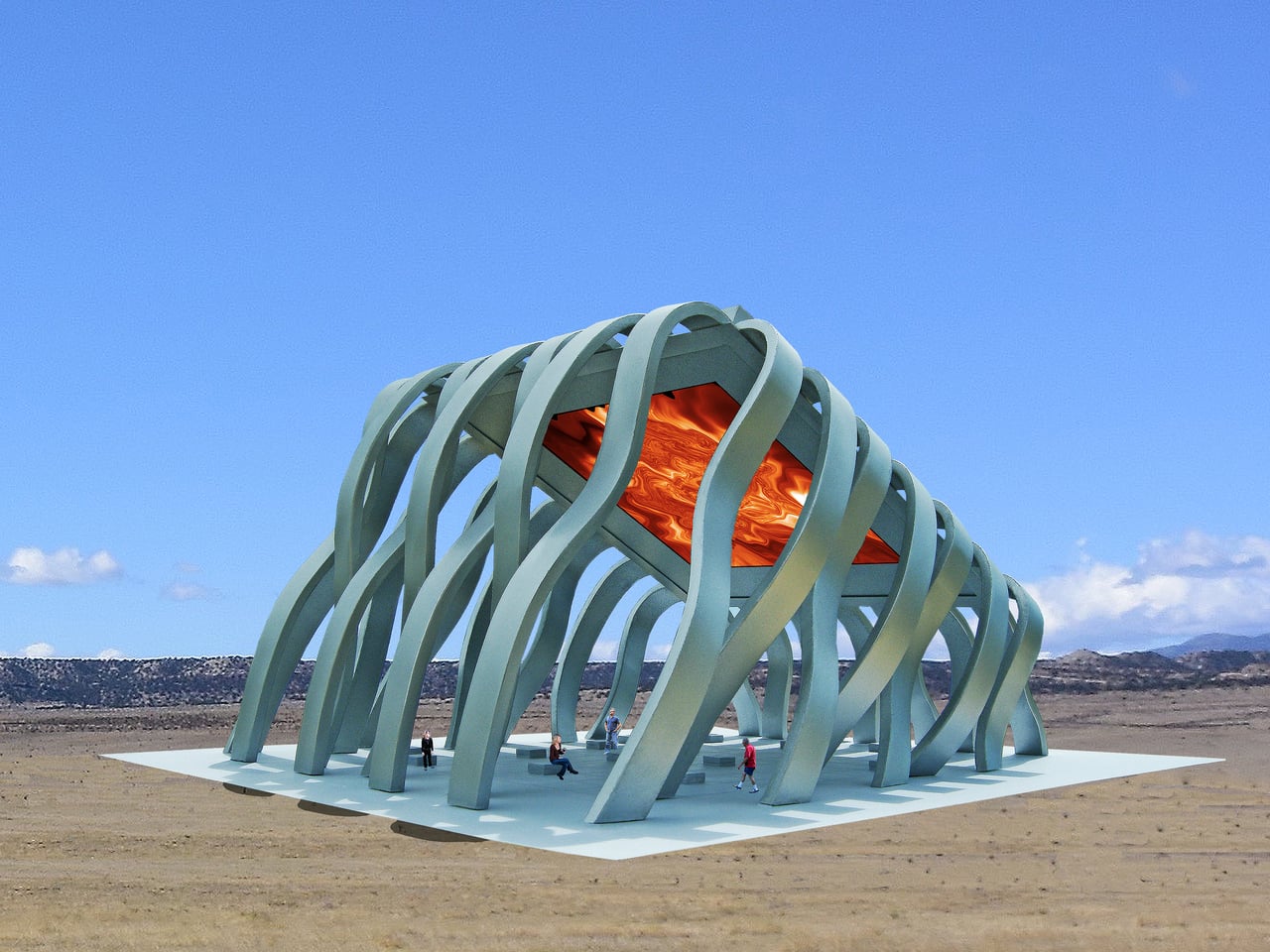
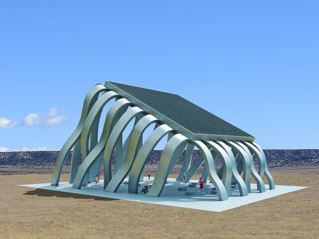
The Solar Eclipse Pavilion is a large steel public art structure that doubles as a small power plant. A 7,000 square foot photovoltaic array forms its roof, converting energy from the sun into electricity for the surrounding community. Some of that power goes straight into the local grid, while some is reserved to run a low-energy LED display mounted on the underside of the canopy, turning the ceiling into a kind of artificial sun overhead.

Designer: Michael Jantzen

The LED surface does not just loop a stock animation. Sensors embedded in the solar array continuously record variations in light and heat across the surface, and those fluctuations drive the graphics and sound. The ceiling shows graphic color images of the sun that morph in response to clouds, temperature shifts, and the angle of light, while an electronic soundscape shifts along with them, making the invisible behavior of the sun legible as color and tone.

After sunset, the photovoltaic cells stop generating power, but the pavilion does not go dark. Pre-recorded images and sound, captured from earlier solar activity, play back through the night until the sun rises and takes over the controls again. For special public events, the default sun imagery and audio can be swapped out for other content, turning the LED ceiling into a programmable media surface for performances, data visualizations, or civic messages.

The solar array shades a large plaza beneath, with built-in seating that invites people to sit, talk, or lie back and watch the ceiling. The pavilion becomes a place for markets, concerts, or informal hangouts, with the energy infrastructure quietly doing its work overhead. Instead of separating technical function from social function, the project fuses them, so the same structure that generates electricity also generates shade, spectacle, and a reason to linger.

The designer describes the pavilion as a gigantic computer chip, a surface where information and energy are manipulated to do work for the people who use it. In that reading, the photovoltaic modules are like transistors, the LED ceiling is like a display bus, and the plaza is the user interface. It is a speculative project, but it points toward a future where renewable energy systems are not hidden away, but turned into civic landmarks that make the sun’s power feel tangible, shared, and even a little theatrical.

The post Lie Under This Solar Roof and Watch the Sun Move in Real-Time first appeared on Yanko Design.

Realme P4 Power Review: Battery Anxiety is Finally Dead

PROS:


  • Massive 10,001mAh battery with 80W wired fast charging

  • Bright and vibrant display

  • Solid mid-range performance

CONS:


  • Slightly heavier and chunkier compared to many mid-range devices

  • Ultra-wide and front-facing cameras are only average for the price

RATINGS:

AESTHETICS
ERGONOMICS
PERFORMANCE
SUSTAINABILITY / REPAIRABILITY
VALUE FOR MONEY

EDITOR'S QUOTE:

Realme P4 Power proves that killing battery anxiety is more useful than chasing benchmarks, wrapping a 10,001mAh cell, tough IP69 shell, and smooth performance into an honest mid‑range package.

Realme has built a reputation for pushing smartphone battery tech forward, from faster charging to bigger and more efficient cells. Instead of treating battery life as an afterthought, the brand has consistently tried to make it a headline feature that changes how often you actually need a charger. That focus has turned power and charging from a boring spec line into one of Realme’s main selling points.

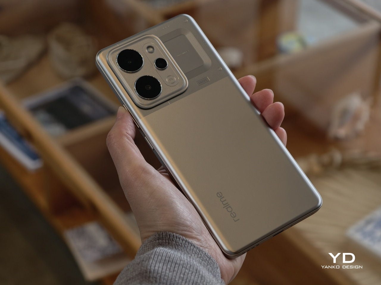
The Realme P4 Power is the clearest expression of that idea so far. It packs a massive 10,001 mAh battery into a phone that still looks and feels familiar, then backs it up with 80W fast charging, 27W reverse charging, a bright 144Hz AMOLED display, and 5G performance aimed at everyday users and gamers alike. More than just another mid‑range phone with a slightly bigger battery, it’s a device built around the promise that you should be able to forget about battery anxiety for days at a time.

Aesthetics

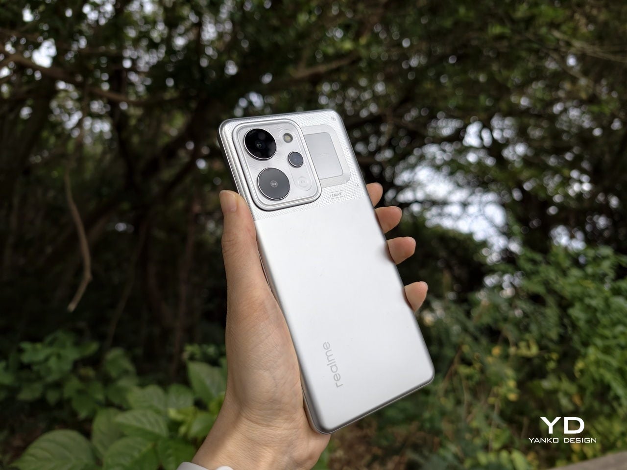
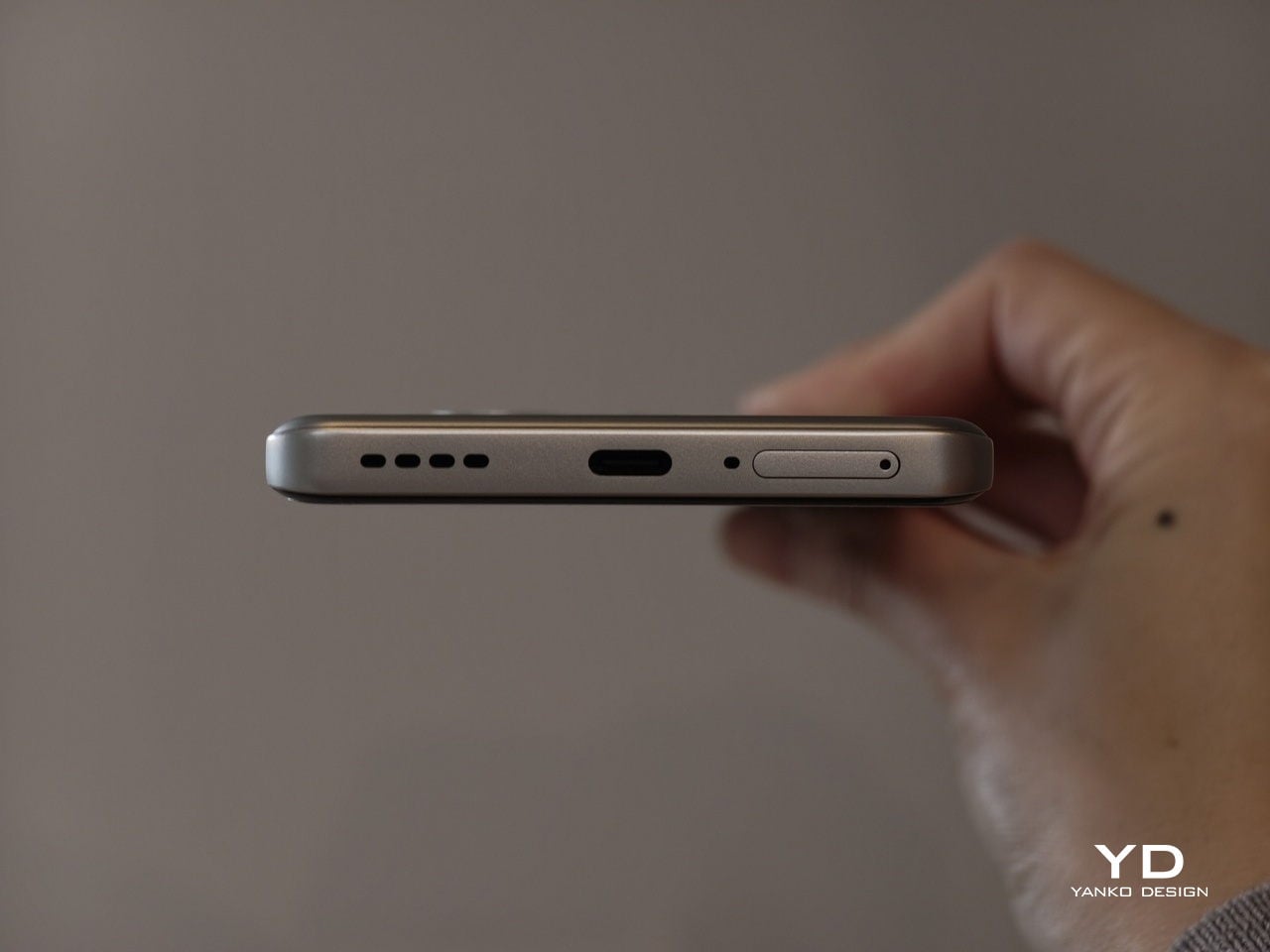
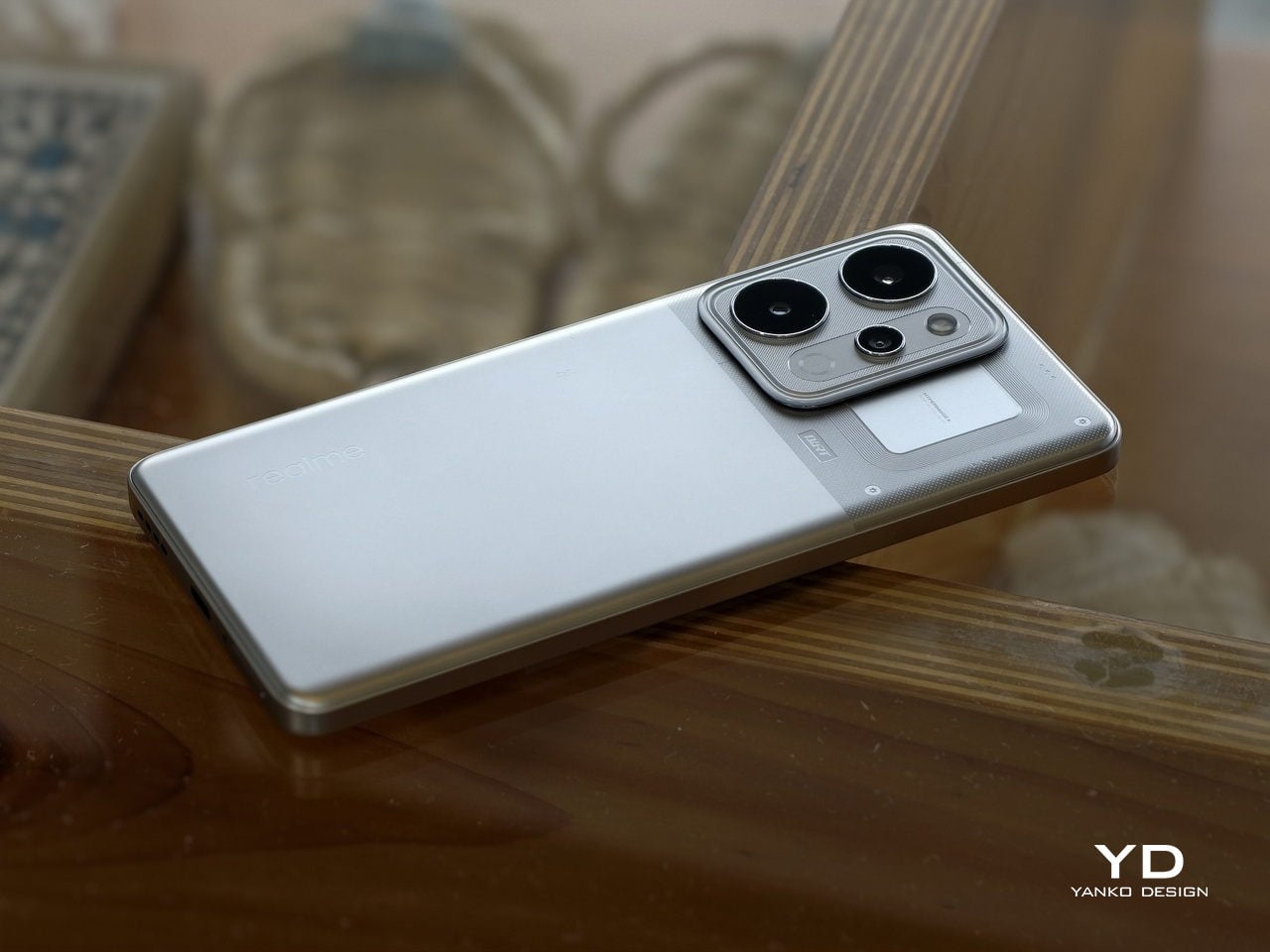
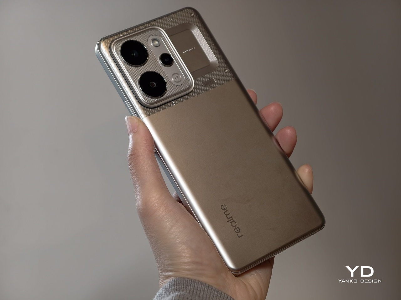
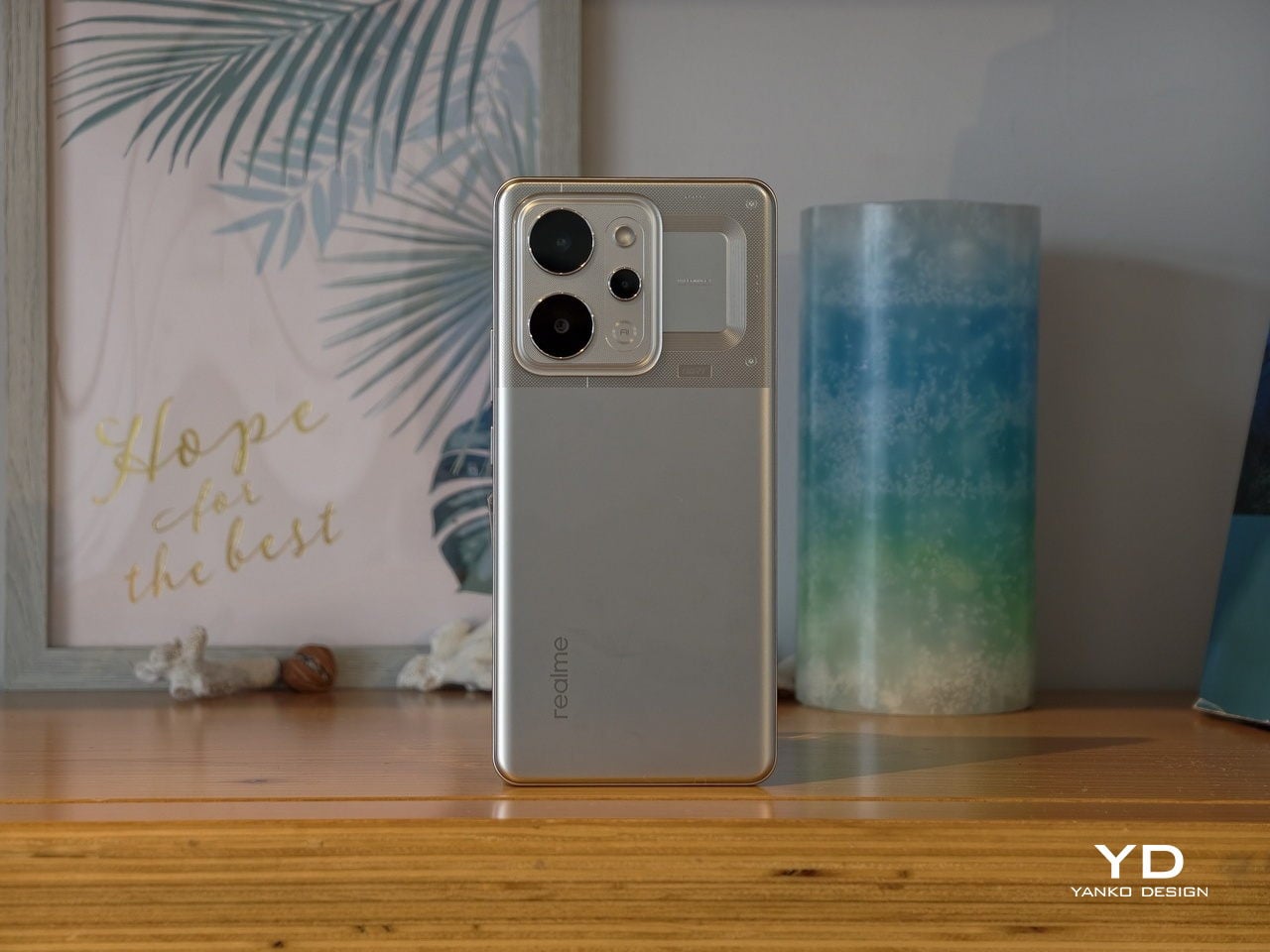
The Realme P4 Power is a battery‑first phone that does not look like one at first glance. On the table, it reads as a modern, fashion‑driven slab rather than a chunky endurance tool, which is exactly what Realme is going for. It comes in two color variations, Flash Orange and Power Silver.

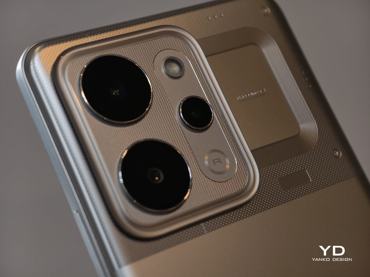
The upper third of the back panel has a distinctive pattern that creates an almost translucent effect, playing with reflections and depth when light hits it. The rectangular camera island is neatly integrated, with a clean ring‑based layout that avoids the oversized, fussy modules you see on some rivals. The overall look feels intentional and confident, not like a normal phone that accidentally got thicker to fit a bigger battery.

The design is more playful than minimalist, especially in the brighter Flash Orange variant, while Power Silver keeps a slightly more muted but still distinctive character. For a phone whose headline feature is a huge battery, it is surprisingly stylish and clearly aimed at people who care how their device looks on a desk or in a hand. Branding is present but not overpowering, so the rear stays relatively clean even with the layered graphics and that “under‑glass” pattern.

Ergonomics

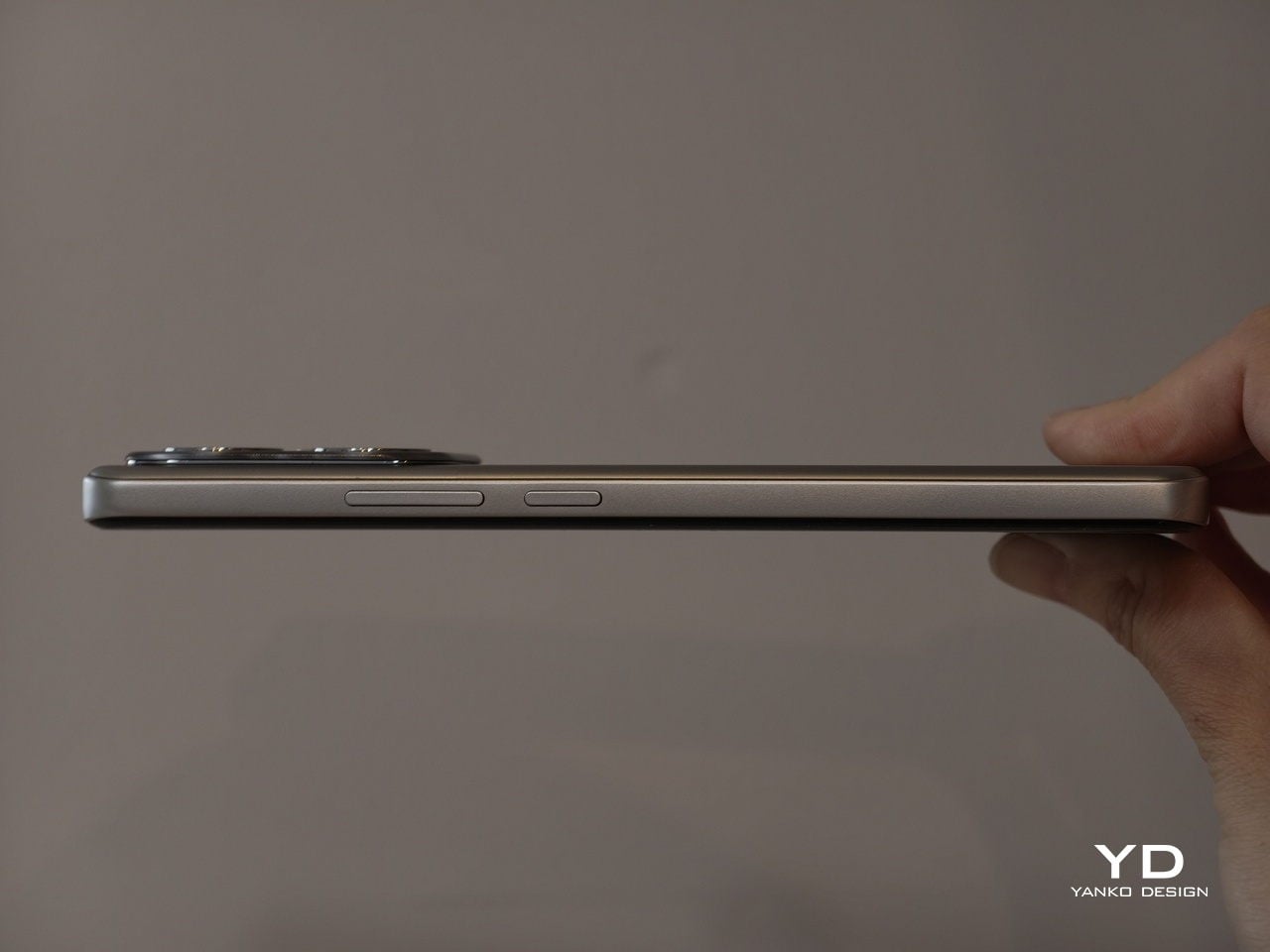
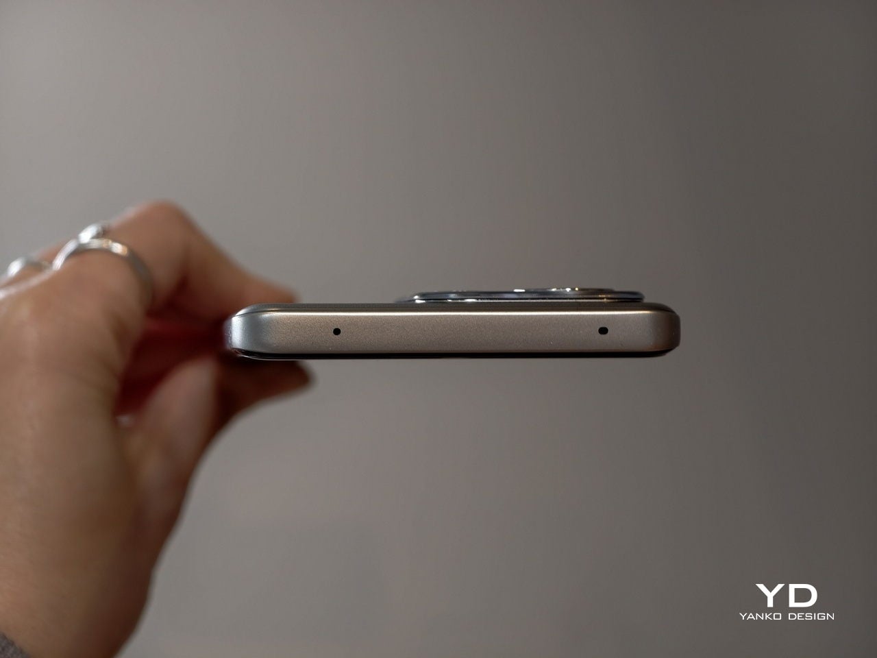
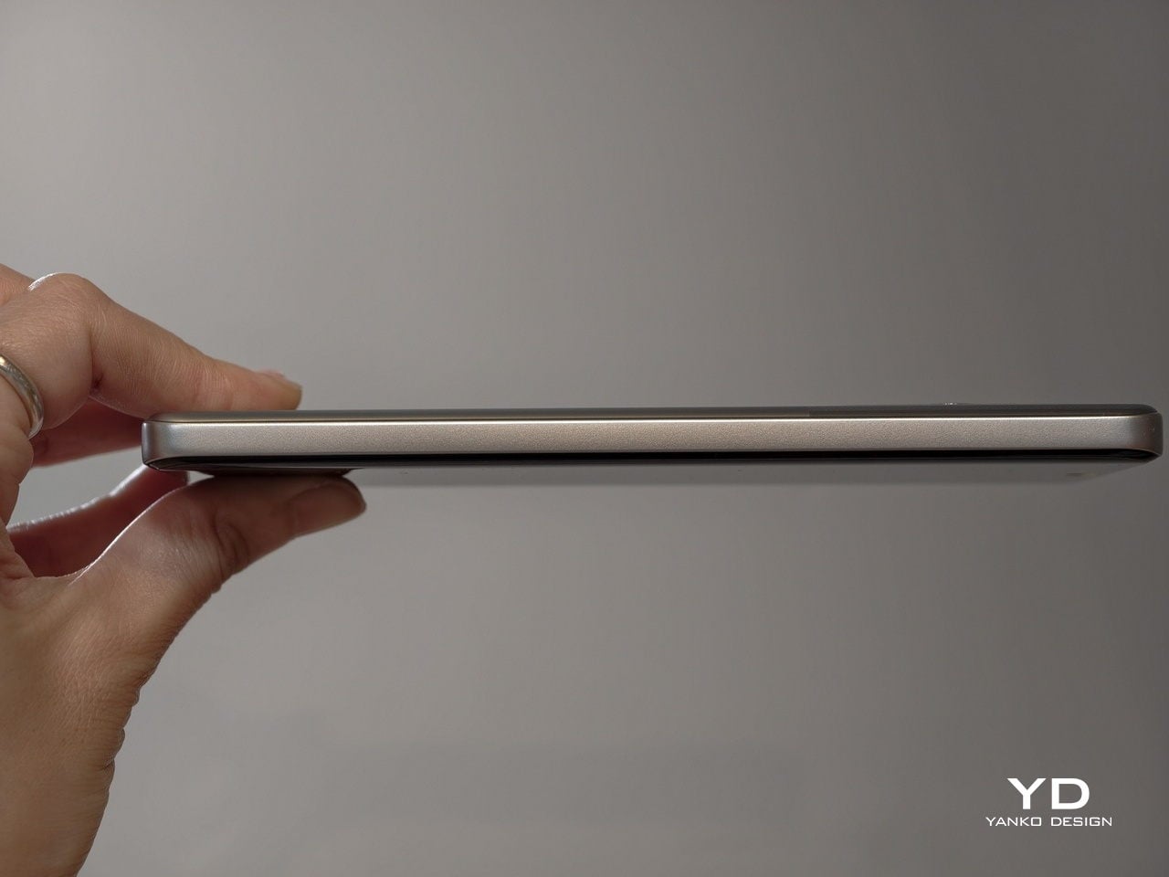
Even when you pick it up, the P4 Power feels a little deceptive. This is not a featherweight device, coming in at about 219g and measuring 162.26 x 76.15 x 9.08mm. The large 10,001 mAh battery and sturdy build give it noticeable heft in the hand, and you will feel that if you are coming from a slim device. However, Realme has done a great job of balancing the mass so it does not feel awkward during normal use. For many users, the extra grams will be an acceptable trade‑off for the freedom from constant charging.

The shape helps more than the spec sheet suggests. The slightly curved 6.8‑inch display and curved‑edge back panel let your fingers naturally wrap around the device rather than pressing into a sharp edge. The matte back does a good job of hiding fingerprints and smudges, although it can feel a bit slippery, so a case might still be a smart idea.

The power and volume keys are within comfortable reach on the right side, so you do not have to stretch or shuffle the phone around to adjust volume or wake the screen. The in‑display fingerprint reader, on the other hand, sits quite close to the bottom of the display, which can make quick unlocks feel a bit forced, especially in one‑handed use. Overall, the build quality feels more premium than the price tag suggests, and ergonomics are good for a device built around such a large battery.

Performance

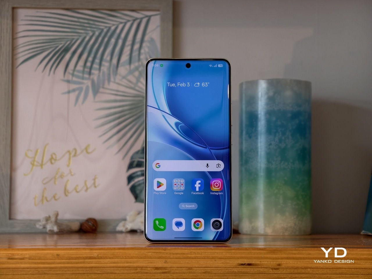
On the front, the P4 Power offers a quad‑curved 6.8‑inch AMOLED display with a resolution of 1280 × 2800 pixels and a maximum refresh rate of 144Hz. In practice, though, only a few native apps, such as Calculator, Compass, and Recorder, actually run at 144Hz, while most of the interface and third‑party apps stick to lower refresh rates.

Realme quotes typical brightness around 600 nits, a boosted mode up to 1800 nits, and a local peak figure of 6500 nits for small areas of the screen. In real‑world use, the display stays readable in harsh sunlight and bright outdoor conditions. The panel supports HDR10+ and 10‑bit color, so compatible streaming content looks rich, punchy, and pleasantly saturated.

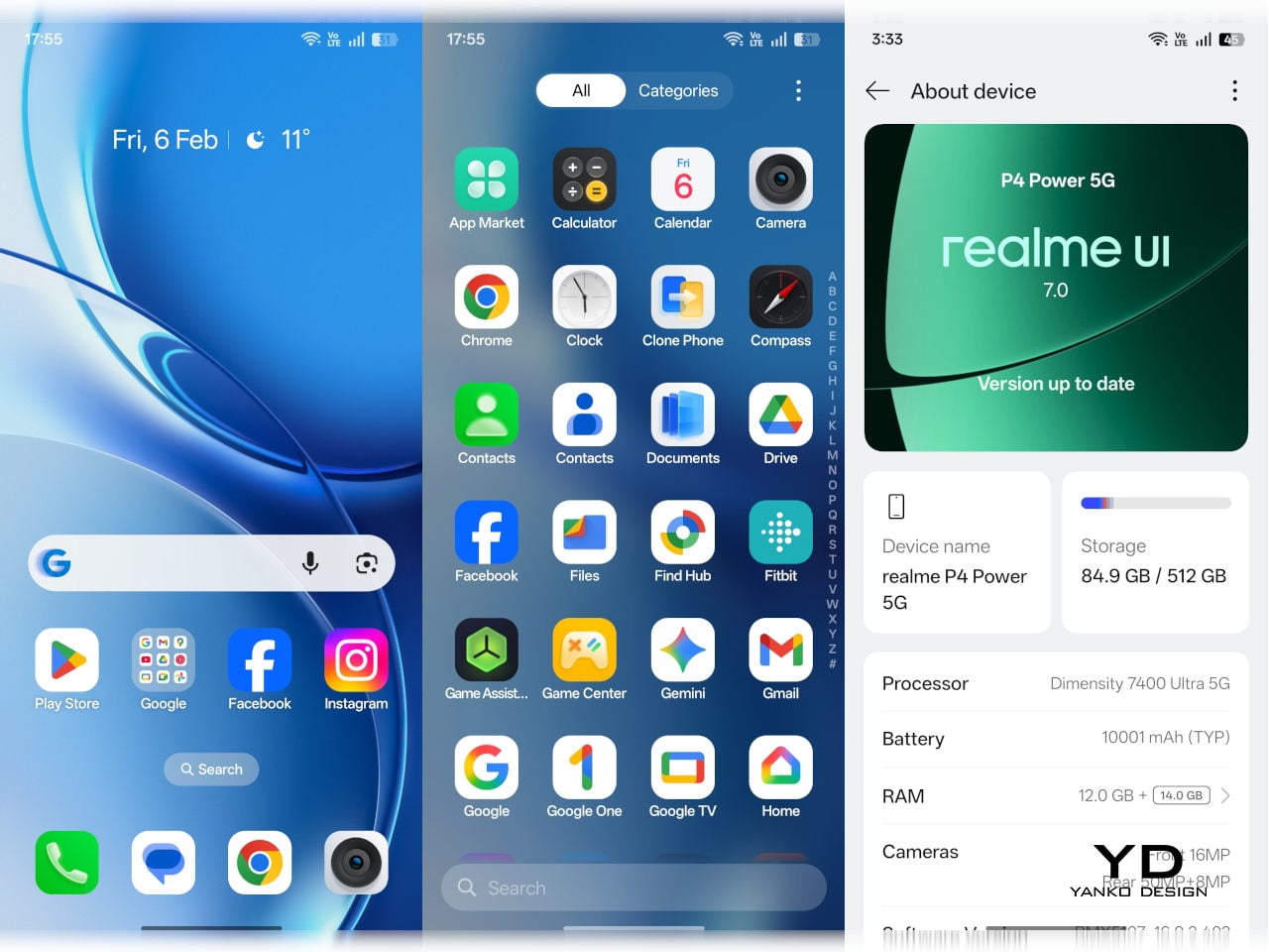
Inside the P4 Power sits MediaTek’s Dimensity 7400-Ultra chipset. It is paired with 8GB or 12GB of RAM and 128GB, 256GB, or 512GB of UFS 3.1 storage. This combination places the phone firmly in the mid‑range. It is not chasing raw benchmark records, yet it is designed to deliver smooth performance in everyday tasks and mainstream games without obvious slowdowns or stutters.

Out of the box, the phone runs Android 16 with Realme UI 7.0 on top, and Realme also uses a dual‑chip approach. Alongside the main Dimensity processor, there is a dedicated Hyper Vision+ AI chip focused on display and gaming tasks, and there are a handful of AI image features such as AI Perfect Shot and 3D emoji. AI Perfect Shot recognizes faces and can fix closed eyes or awkward expressions by swapping in better face poses from other photos of the same person in your gallery, and AI also helps during gaming by quickly generating message replies in supported messaging apps so you can respond without fully dropping out of your game.

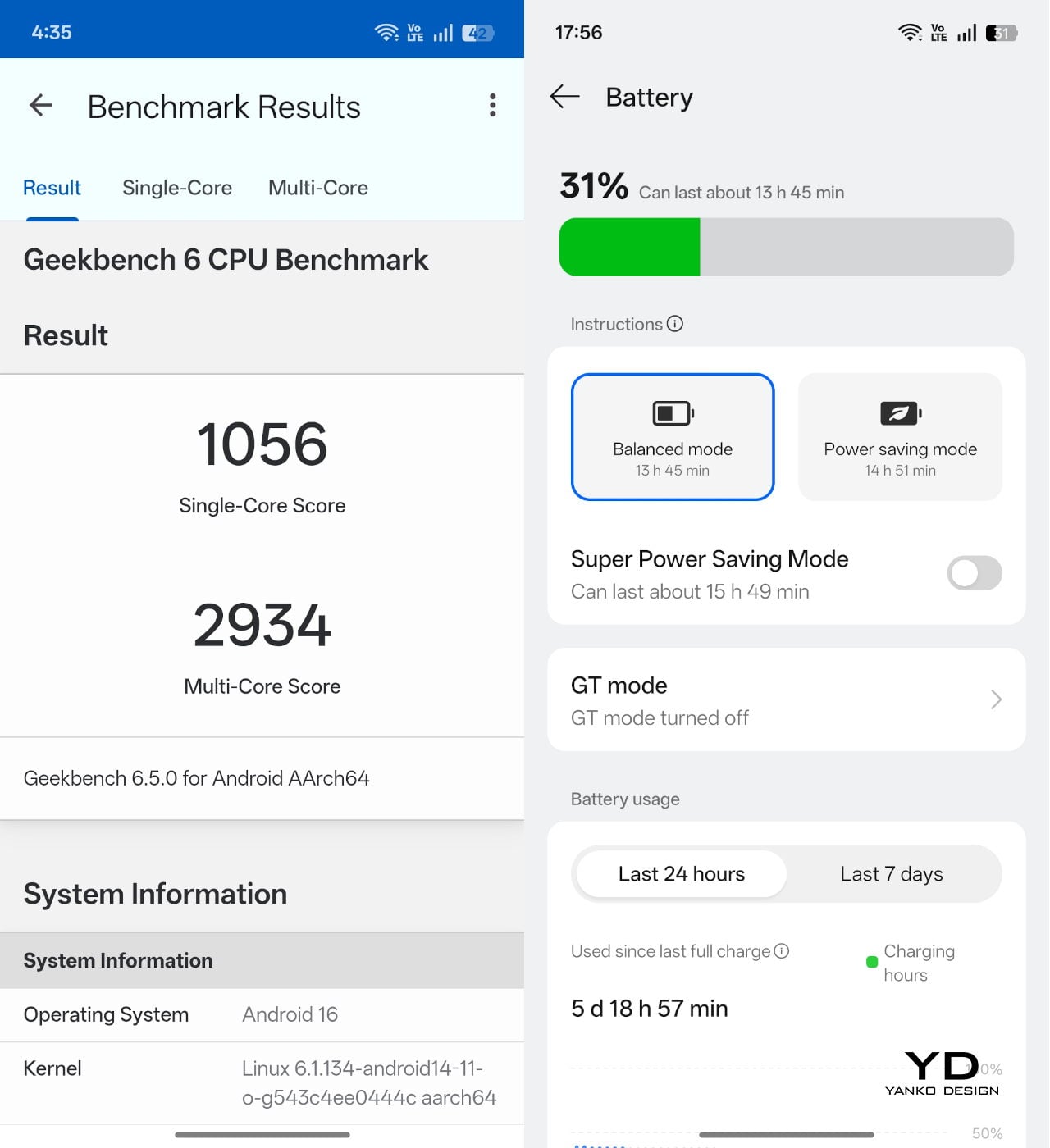
Battery life is the reason this phone exists. The 10,001mAh cell is dramatically larger than the 4,500 to 5,000mAh batteries found in many mainstream phones, and even bigger than the 6,000 or 7000mAh packs in endurance‑focused models. Realme achieves this using a third‑generation silicon‑carbon anode and a compact internal stacking design, which allows more capacity in roughly the same physical space.

In practical terms, this capacity is meant to deliver several days of mixed use. I used the Realme P4 Power as my primary device on a 3‑night, 4‑day scuba trip, with light screen time during the day, and it lasted the entire trip without a charge, still showing around 20 percent battery when I got back home. That kind of real‑world endurance is a clear step up from phones that need a nightly top‑up.

When you do need to charge, the P4 Power supports 80 W wired fast charging. It also supports 27 W reverse charging, so it can basically double as a power bank for your other gadgets when you are on the move.

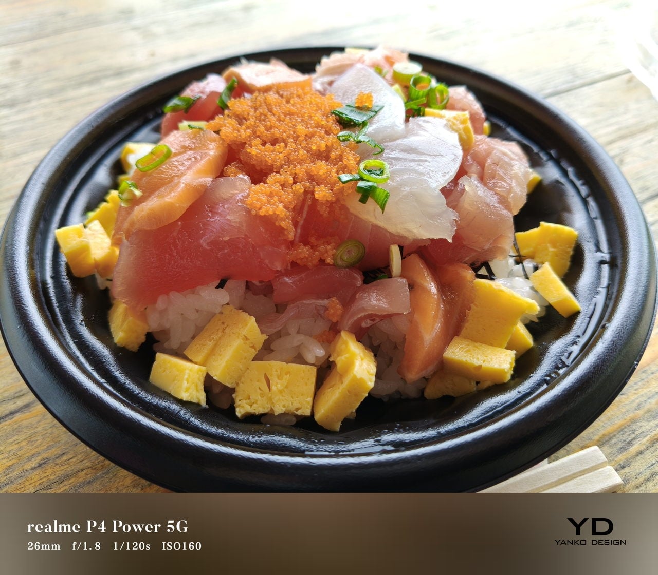
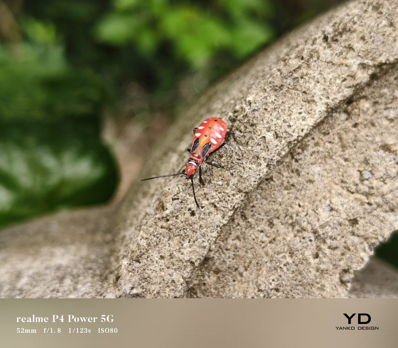
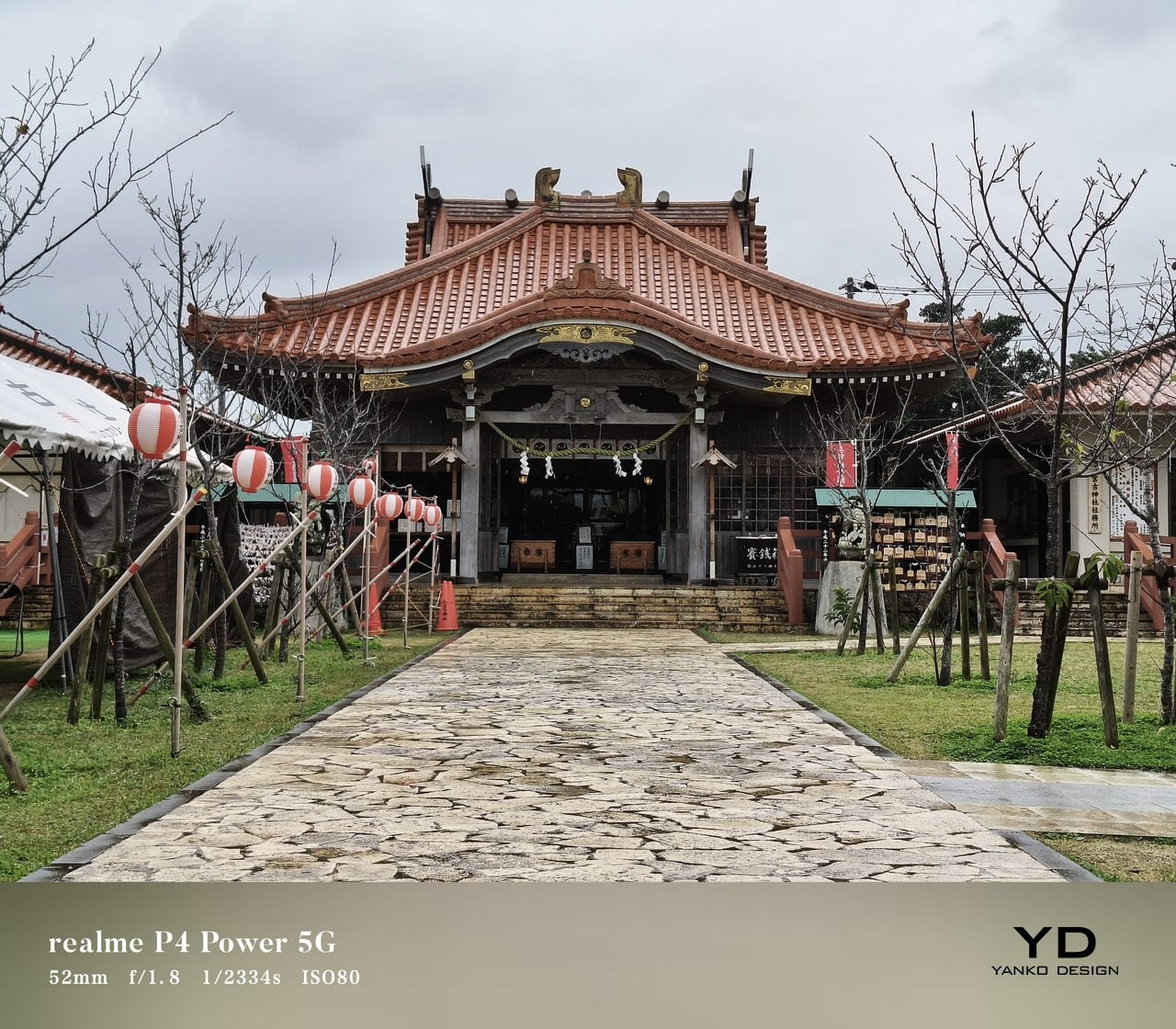
The camera system on the P4 Power is straightforward. On the back, there is a 50MP main camera using Sony’s IMX882 sensor with optical image stabilization and an f/1.8 lens, paired with an 8MP ultra‑wide camera that offers a 112‑degree field of view. On the front, you get a 16MP selfie camera. For video, the main camera can record up to 4K at 30 fps, while the ultra‑wide and front‑facing cameras are capped at 1080p at 30 fps.

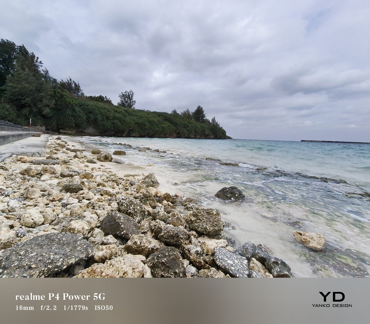
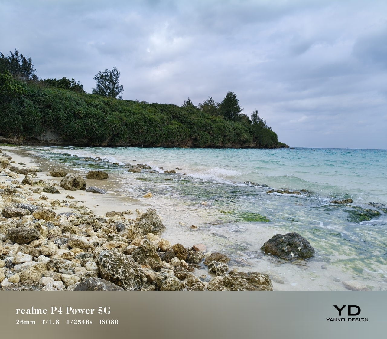
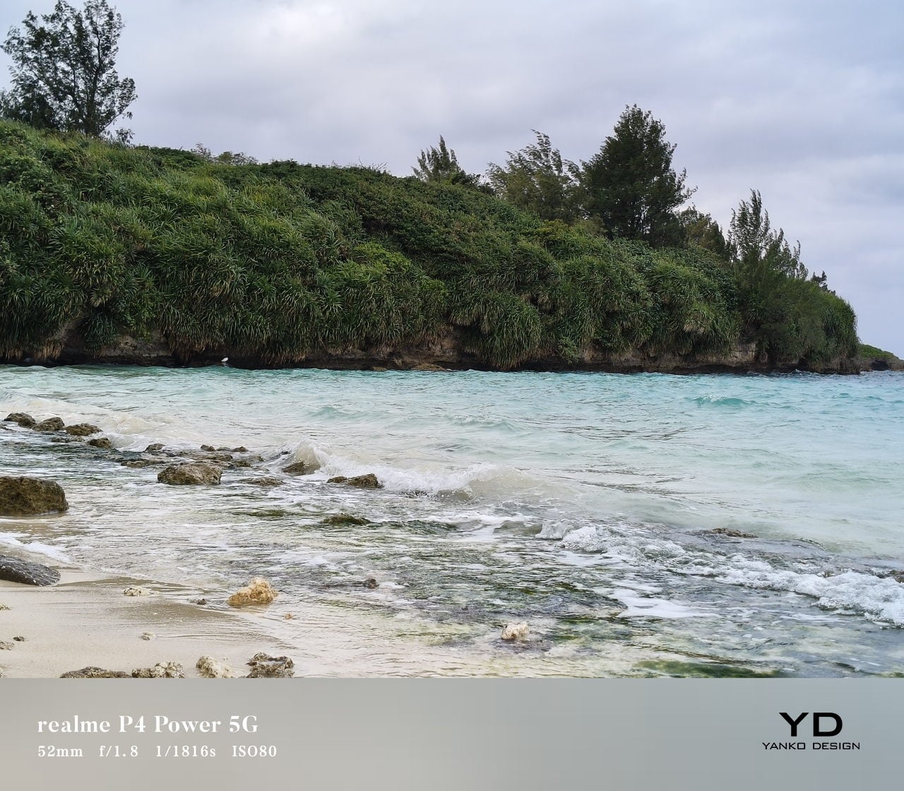
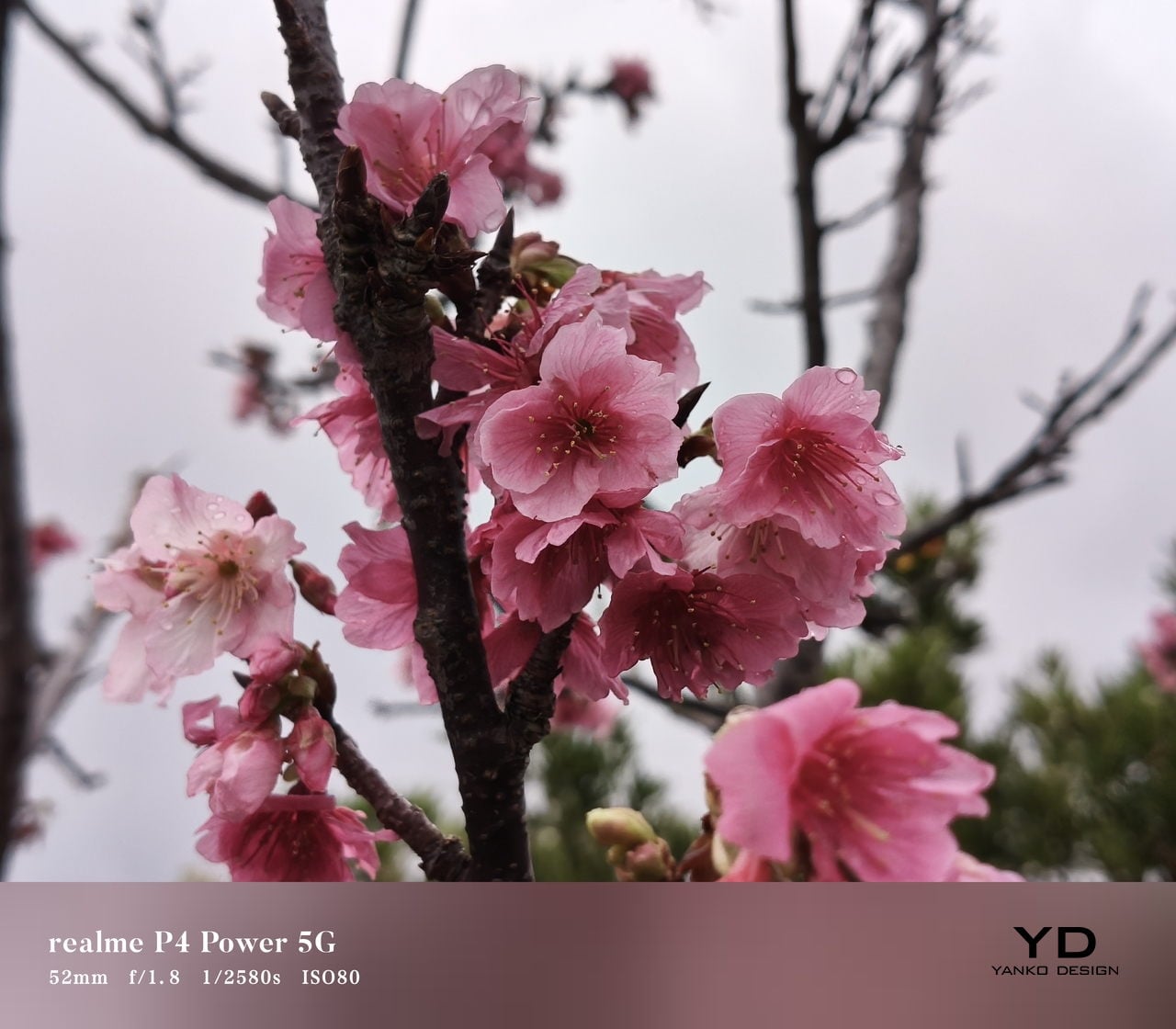
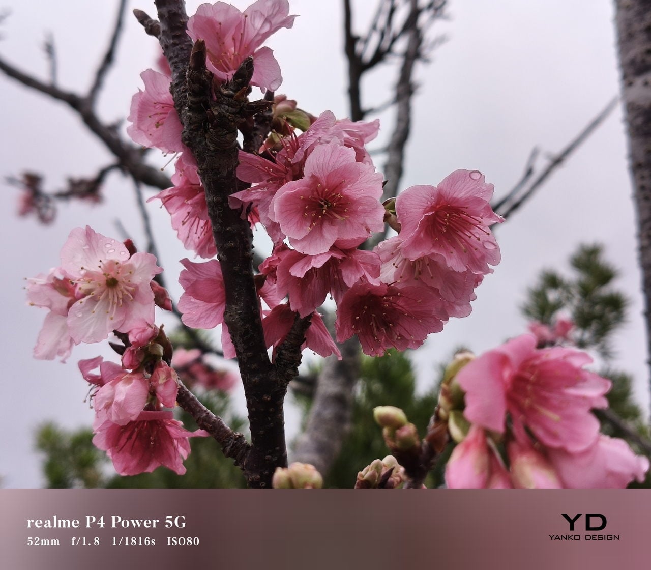
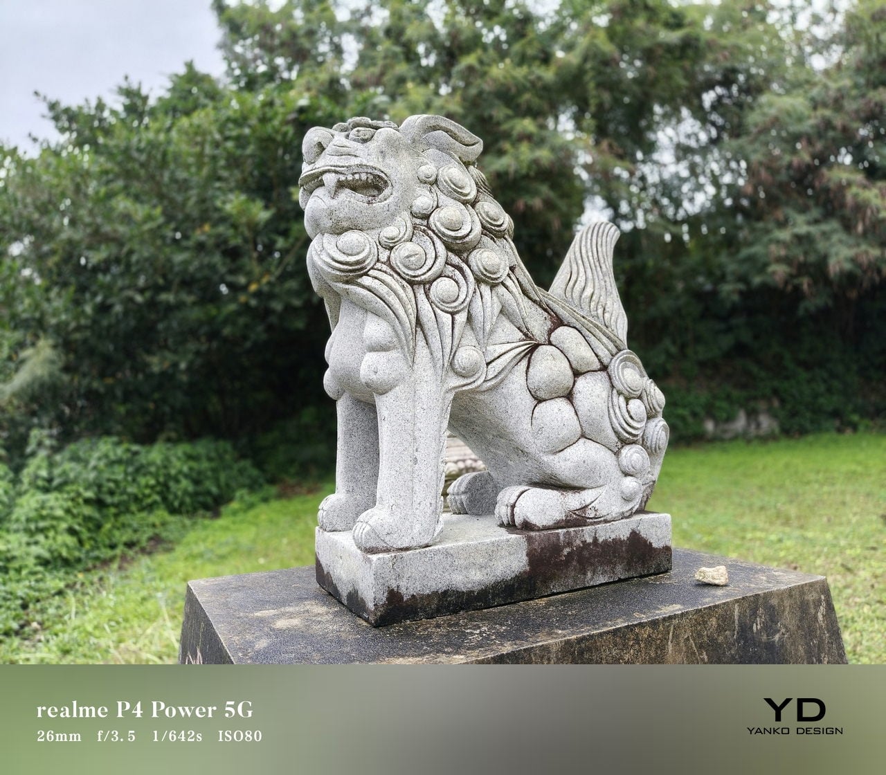
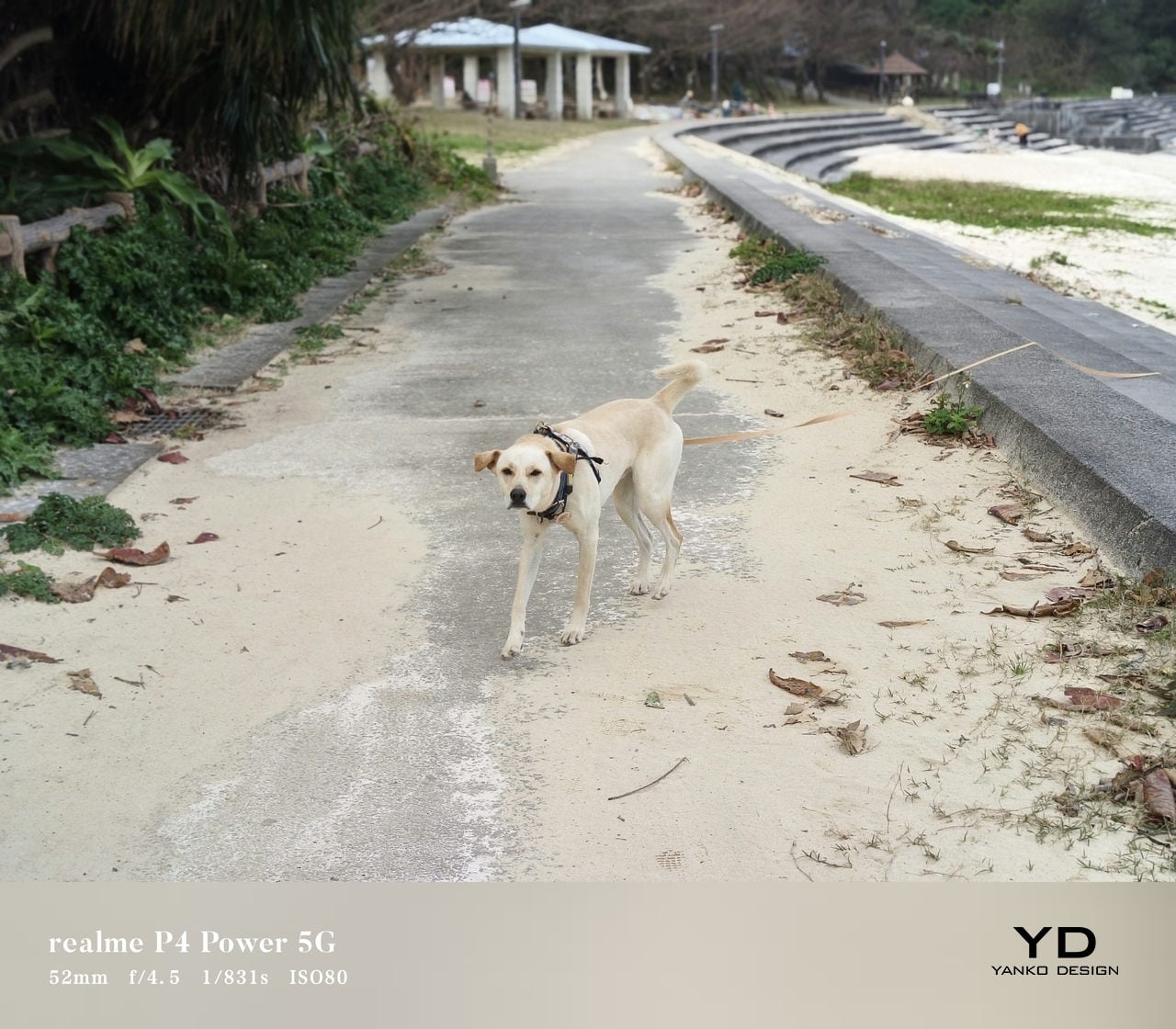
You can choose between Vibrant and Natural color modes. Natural mode is essentially a toned‑down look rather than a more accurate one, so it comes down to preference more than strict realism. The main camera takes good photos with pleasing detail and contrast in daylight, while the ultra‑wide is serviceable but nothing to write home about, with softer detail and more noise. The front‑facing camera delivers decent selfies that are fine for social media, though it does not stand out in this price range.

Natural Color Mode

Vibrant Color Mode

Portrait Mode

Sustainability

The oversized battery also has a clear sustainability angle. Because the 10,001 mAh cell gives you so much headroom, you are less likely to run it close to empty every day or charge it multiple times, which reduces the number of full charge cycles. Realme’s silicon‑carbon chemistry and battery management build on that, and the company claims the battery can retain over 94 percent of its original capacity after three years of typical use and around 80 percent after eight years.

The Realme P4 Power also leans on durability and software support. It is IP69, IP68, and IP66‑rated, so it is tested for dust tightness, high‑pressure water jets, and immersion, making it less likely to die from everyday splashes or rain. On the software side, Realme promises three major Android OS upgrades and four years of security patches, which is fine for a mid‑range phone but not class‑leading, and it slightly undercuts the otherwise long‑term hardware story.

Value

In India, the Realme P4 Power starts at around ₹25,999 (roughly $310) for the 8GB RAM and 128GB storage variant. That pricing puts it in the crowded lower mid‑range segment, where a lot of brands are fighting on specs and features. The Honor Win also features a 10,000mAh battery, but it is officially only available in China, so for most buyers, the P4 Power is the more accessible way to get this kind of battery size.

The phone is aimed at people who value endurance and reliability above camera experience or absolute thinness. That can include gamers, frequent travelers, delivery workers, content creators on the move, and anyone who is simply tired of carrying a power bank. At this price level, the P4 Power tries to stand out by solving a real‑world problem in a very direct way.

Verdict

The Realme P4 Power is a very focused product. It does not try to be the best camera phone or the thinnest fashion accessory. Instead, it aims to be the phone you do not have to think about charging, even on your busiest days. For many everyday users, that single promise can be more valuable than a slightly better zoom lens or a few extra benchmark points.

If your top priority is battery life, with smooth performance and a bright display for gaming and media, the P4 Power is an easy device to recommend in its price range. If you care more about advanced photography features, ultra‑lightweight design, or wireless charging, you may want to look at other options. For everyone else, this is a rare phone that tackles a common frustration head‑on and mostly succeeds.

The post Realme P4 Power Review: Battery Anxiety is Finally Dead first appeared on Yanko Design.

Realme P4 Power Review: Battery Anxiety is Finally Dead

PROS:


  • Massive 10,001mAh battery with 80W wired fast charging

  • Bright and vibrant display

  • Solid mid-range performance

CONS:


  • Slightly heavier and chunkier compared to many mid-range devices

  • Ultra-wide and front-facing cameras are only average for the price

RATINGS:

AESTHETICS
ERGONOMICS
PERFORMANCE
SUSTAINABILITY / REPAIRABILITY
VALUE FOR MONEY

EDITOR'S QUOTE:

Realme P4 Power proves that killing battery anxiety is more useful than chasing benchmarks, wrapping a 10,001mAh cell, tough IP69 shell, and smooth performance into an honest mid‑range package.

Realme has built a reputation for pushing smartphone battery tech forward, from faster charging to bigger and more efficient cells. Instead of treating battery life as an afterthought, the brand has consistently tried to make it a headline feature that changes how often you actually need a charger. That focus has turned power and charging from a boring spec line into one of Realme’s main selling points.

The Realme P4 Power is the clearest expression of that idea so far. It packs a massive 10,001 mAh battery into a phone that still looks and feels familiar, then backs it up with 80W fast charging, 27W reverse charging, a bright 144Hz AMOLED display, and 5G performance aimed at everyday users and gamers alike. More than just another mid‑range phone with a slightly bigger battery, it’s a device built around the promise that you should be able to forget about battery anxiety for days at a time.

Aesthetics

The Realme P4 Power is a battery‑first phone that does not look like one at first glance. On the table, it reads as a modern, fashion‑driven slab rather than a chunky endurance tool, which is exactly what Realme is going for. It comes in two color variations, Flash Orange and Power Silver.

The upper third of the back panel has a distinctive pattern that creates an almost translucent effect, playing with reflections and depth when light hits it. The rectangular camera island is neatly integrated, with a clean ring‑based layout that avoids the oversized, fussy modules you see on some rivals. The overall look feels intentional and confident, not like a normal phone that accidentally got thicker to fit a bigger battery.

The design is more playful than minimalist, especially in the brighter Flash Orange variant, while Power Silver keeps a slightly more muted but still distinctive character. For a phone whose headline feature is a huge battery, it is surprisingly stylish and clearly aimed at people who care how their device looks on a desk or in a hand. Branding is present but not overpowering, so the rear stays relatively clean even with the layered graphics and that “under‑glass” pattern.

Ergonomics

Even when you pick it up, the P4 Power feels a little deceptive. This is not a featherweight device, coming in at about 219g and measuring 162.26 x 76.15 x 9.08mm. The large 10,001 mAh battery and sturdy build give it noticeable heft in the hand, and you will feel that if you are coming from a slim device. However, Realme has done a great job of balancing the mass so it does not feel awkward during normal use. For many users, the extra grams will be an acceptable trade‑off for the freedom from constant charging.

The shape helps more than the spec sheet suggests. The slightly curved 6.8‑inch display and curved‑edge back panel let your fingers naturally wrap around the device rather than pressing into a sharp edge. The matte back does a good job of hiding fingerprints and smudges, although it can feel a bit slippery, so a case might still be a smart idea.

The power and volume keys are within comfortable reach on the right side, so you do not have to stretch or shuffle the phone around to adjust volume or wake the screen. The in‑display fingerprint reader, on the other hand, sits quite close to the bottom of the display, which can make quick unlocks feel a bit forced, especially in one‑handed use. Overall, the build quality feels more premium than the price tag suggests, and ergonomics are good for a device built around such a large battery.

Performance

On the front, the P4 Power offers a quad‑curved 6.8‑inch AMOLED display with a resolution of 1280 × 2800 pixels and a maximum refresh rate of 144Hz. In practice, though, only a few native apps, such as Calculator, Compass, and Recorder, actually run at 144Hz, while most of the interface and third‑party apps stick to lower refresh rates.

Realme quotes typical brightness around 600 nits, a boosted mode up to 1800 nits, and a local peak figure of 6500 nits for small areas of the screen. In real‑world use, the display stays readable in harsh sunlight and bright outdoor conditions. The panel supports HDR10+ and 10‑bit color, so compatible streaming content looks rich, punchy, and pleasantly saturated.

Inside the P4 Power sits MediaTek’s Dimensity 7400-Ultra chipset. It is paired with 8GB or 12GB of RAM and 128GB, 256GB, or 512GB of UFS 3.1 storage. This combination places the phone firmly in the mid‑range. It is not chasing raw benchmark records, yet it is designed to deliver smooth performance in everyday tasks and mainstream games without obvious slowdowns or stutters.

Out of the box, the phone runs Android 16 with Realme UI 7.0 on top, and Realme also uses a dual‑chip approach. Alongside the main Dimensity processor, there is a dedicated Hyper Vision+ AI chip focused on display and gaming tasks, and there are a handful of AI image features such as AI Perfect Shot and 3D emoji. AI Perfect Shot recognizes faces and can fix closed eyes or awkward expressions by swapping in better face poses from other photos of the same person in your gallery, and AI also helps during gaming by quickly generating message replies in supported messaging apps so you can respond without fully dropping out of your game.

Battery life is the reason this phone exists. The 10,001mAh cell is dramatically larger than the 4,500 to 5,000mAh batteries found in many mainstream phones, and even bigger than the 6,000 or 7000mAh packs in endurance‑focused models. Realme achieves this using a third‑generation silicon‑carbon anode and a compact internal stacking design, which allows more capacity in roughly the same physical space.

In practical terms, this capacity is meant to deliver several days of mixed use. I used the Realme P4 Power as my primary device on a 3‑night, 4‑day scuba trip, with light screen time during the day, and it lasted the entire trip without a charge, still showing around 20 percent battery when I got back home. That kind of real‑world endurance is a clear step up from phones that need a nightly top‑up.

When you do need to charge, the P4 Power supports 80 W wired fast charging. It also supports 27 W reverse charging, so it can basically double as a power bank for your other gadgets when you are on the move.

The camera system on the P4 Power is straightforward. On the back, there is a 50MP main camera using Sony’s IMX882 sensor with optical image stabilization and an f/1.8 lens, paired with an 8MP ultra‑wide camera that offers a 112‑degree field of view. On the front, you get a 16MP selfie camera. For video, the main camera can record up to 4K at 30 fps, while the ultra‑wide and front‑facing cameras are capped at 1080p at 30 fps.

You can choose between Vibrant and Natural color modes. Natural mode is essentially a toned‑down look rather than a more accurate one, so it comes down to preference more than strict realism. The main camera takes good photos with pleasing detail and contrast in daylight, while the ultra‑wide is serviceable but nothing to write home about, with softer detail and more noise. The front‑facing camera delivers decent selfies that are fine for social media, though it does not stand out in this price range.

Natural Color Mode

Vibrant Color Mode

Portrait Mode

Sustainability

The oversized battery also has a clear sustainability angle. Because the 10,001 mAh cell gives you so much headroom, you are less likely to run it close to empty every day or charge it multiple times, which reduces the number of full charge cycles. Realme’s silicon‑carbon chemistry and battery management build on that, and the company claims the battery can retain over 94 percent of its original capacity after three years of typical use and around 80 percent after eight years.

The Realme P4 Power also leans on durability and software support. It is IP69, IP68, and IP66‑rated, so it is tested for dust tightness, high‑pressure water jets, and immersion, making it less likely to die from everyday splashes or rain. On the software side, Realme promises three major Android OS upgrades and four years of security patches, which is fine for a mid‑range phone but not class‑leading, and it slightly undercuts the otherwise long‑term hardware story.

Value

In India, the Realme P4 Power starts at around ₹25,999 (roughly $310) for the 8GB RAM and 128GB storage variant. That pricing puts it in the crowded lower mid‑range segment, where a lot of brands are fighting on specs and features. The Honor Win also features a 10,000mAh battery, but it is officially only available in China, so for most buyers, the P4 Power is the more accessible way to get this kind of battery size.

The phone is aimed at people who value endurance and reliability above camera experience or absolute thinness. That can include gamers, frequent travelers, delivery workers, content creators on the move, and anyone who is simply tired of carrying a power bank. At this price level, the P4 Power tries to stand out by solving a real‑world problem in a very direct way.

Verdict

The Realme P4 Power is a very focused product. It does not try to be the best camera phone or the thinnest fashion accessory. Instead, it aims to be the phone you do not have to think about charging, even on your busiest days. For many everyday users, that single promise can be more valuable than a slightly better zoom lens or a few extra benchmark points.

If your top priority is battery life, with smooth performance and a bright display for gaming and media, the P4 Power is an easy device to recommend in its price range. If you care more about advanced photography features, ultra‑lightweight design, or wireless charging, you may want to look at other options. For everyone else, this is a rare phone that tackles a common frustration head‑on and mostly succeeds.

The post Realme P4 Power Review: Battery Anxiety is Finally Dead first appeared on Yanko Design.

HEINZ Put Ketchup on Tap, and Game Day Will Never Be the Same

Abundance defines the modern football watch party. Chips come in oversized bowls, wings arrive by the tray, and drinks are rarely poured one glass at a time. Yet one essential element of the game day ecosystem has remained painfully under-engineered. The ketchup bottle, small, squeezable, and deceptively fragile, has long been the weakest link in an otherwise well-orchestrated snack spread. And during football’s biggest game of the year, that failure is almost inevitable.

This season, HEINZ decided to redesign the ritual!

Designer: HEINZ

Ahead of the Big Game, the brand has introduced the HEINZ KegChup, a stainless steel, 114-ounce keg filled entirely with its unmistakably rich ketchup. The idea borrows directly from beer culture, a space that solved the problem of running out long ago. Football fans understand this instinctively. When something matters to the experience, it is engineered for scale. It is put on tap!

For decades, beer has been treated as the centerpiece of watch parties, designed for endurance across four quarters. Food, however, has quietly taken on an equally important role. The Big Game is now the second-largest food holiday in the US, with the majority of fans watching from home and preparing their own snacks. Fries, sliders, nuggets, and hot dogs are not just menu items. They are structurally dependent on ketchup. Yet the condiment itself has remained confined to packaging designed for moderation rather than momentum.

The HEINZ KegChup flips that logic entirely. Standing 19.5 inches tall and fitted with a tap-style spigot, the keg is unapologetically excessive. It removes the need to squeeze carefully, ration servings, or keep a backup bottle hidden in the fridge. Instead, it allows ketchup to flow freely throughout the game. Pour, dip, repeat. No interruptions. No halftime shortages.

From a design perspective, the KegChup does more than scale volume. It reframes ketchup as infrastructure. The spigot becomes a visual and functional anchor on the snack table, much like a beer tap at a tailgate. The stainless steel body signals durability and seriousness, while the familiar HEINZ branding ensures the object reads as trustworthy rather than novelty. The result is playful, but grounded in real use behavior.

The product also reflects a feedback-driven design approach. After teasing the concept on Instagram last fall, HEINZ saw nearly 1 million views and thousands of fan interactions, effectively validating the idea before it became physical. That momentum has now translated into a limited rollout, with fans able to enter a social giveaway and sign up for exclusive access ahead of a broader limited edition release planned for the start of the 2026 football season.

In a category often focused on new flavors or packaging tweaks, the HEINZ KegChup stands out by redesigning the ritual itself. It acknowledges a simple truth of football culture. Running out of ketchup can feel like a bigger party foul than a dry keg. By putting its most iconic product on tap, HEINZ is not just solving a supply problem. It is designed for the emotional rhythm of game day, from kickoff to the final whistle.

When the clock is ticking, the crowd is hungry, and the stakes are high, the last thing anyone should be worrying about is whether there is enough ketchup left.

The post HEINZ Put Ketchup on Tap, and Game Day Will Never Be the Same first appeared on Yanko Design.

This Asthma Nebulizer Looks Like a Toy, Not a Scary Medical Machine

Most home nebulizers are loud, beige boxes that look like they escaped from a hospital supply closet. Kids with asthma sit next to them for breathing treatments, staring at dials and vents while a motor wheezes. These devices are designed around clinical priorities rather than home life, so they end up bulky, noisy, and visually jarring on bedside tables, which does nothing to help a child already anxious about another round of therapy.

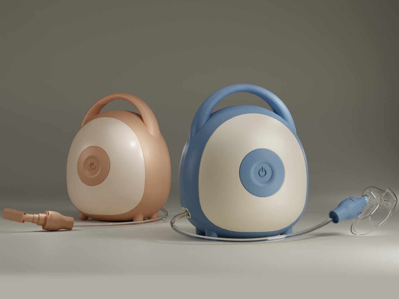
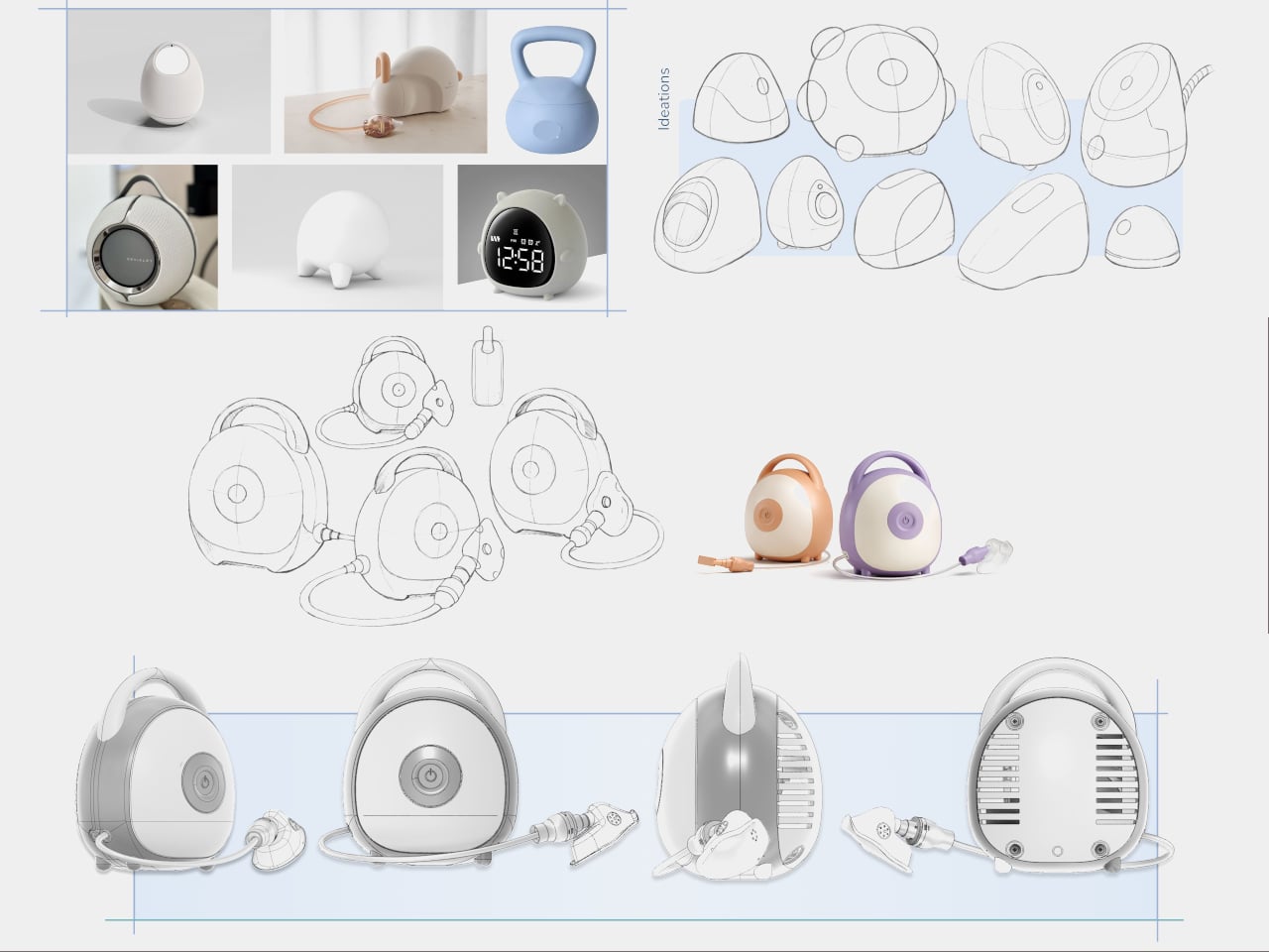
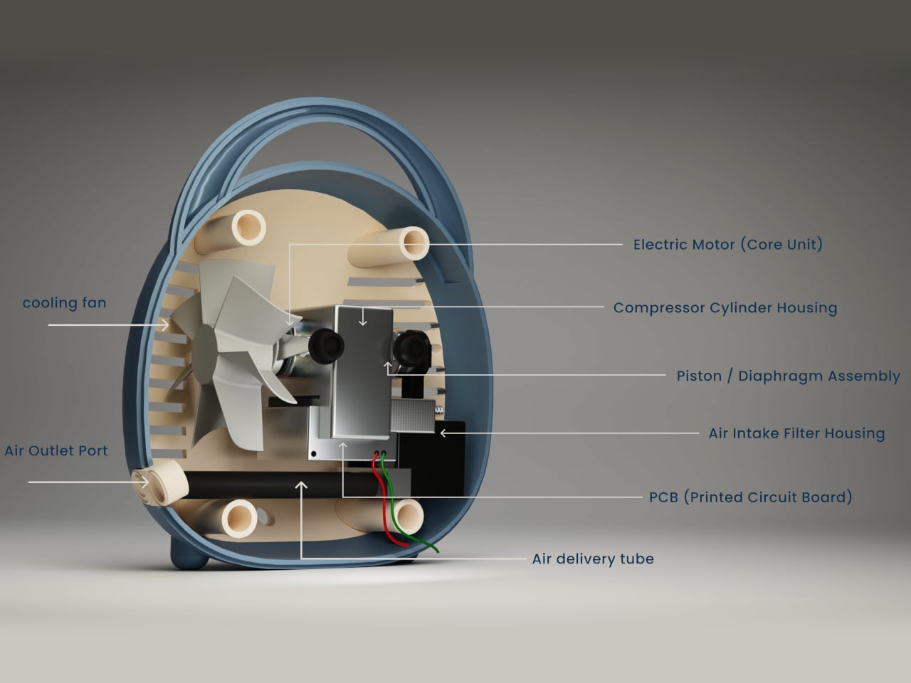
Breevo is a concept that tries to reframe the home nebulizer as a calm, approachable object. It keeps the familiar compressor mechanism inside but wraps it in a soft, rounded shell with an integrated handle and a single front power button. The goal is to make therapy feel less like plugging into a machine and more like interacting with a friendly household gadget that happens to deliver aerosol medication.

Designer: Neha Pawar

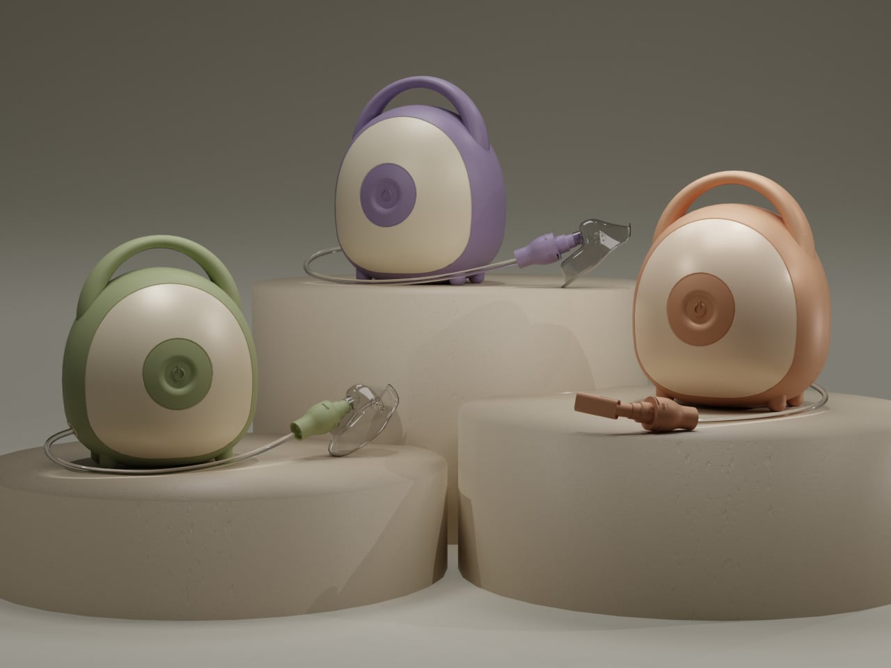
Picture a parent grabbing Breevo by its handle and carrying it from a shelf to the child’s room, setting it down without rearranging furniture. One large button starts the session, the tubing connects cleanly to the front, and the child focuses on breathing rather than switches and gauges. The compact footprint and simple interface reduce setup friction when treatments are frequent and time-sensitive, turning a stressful ritual into something a little more routine.

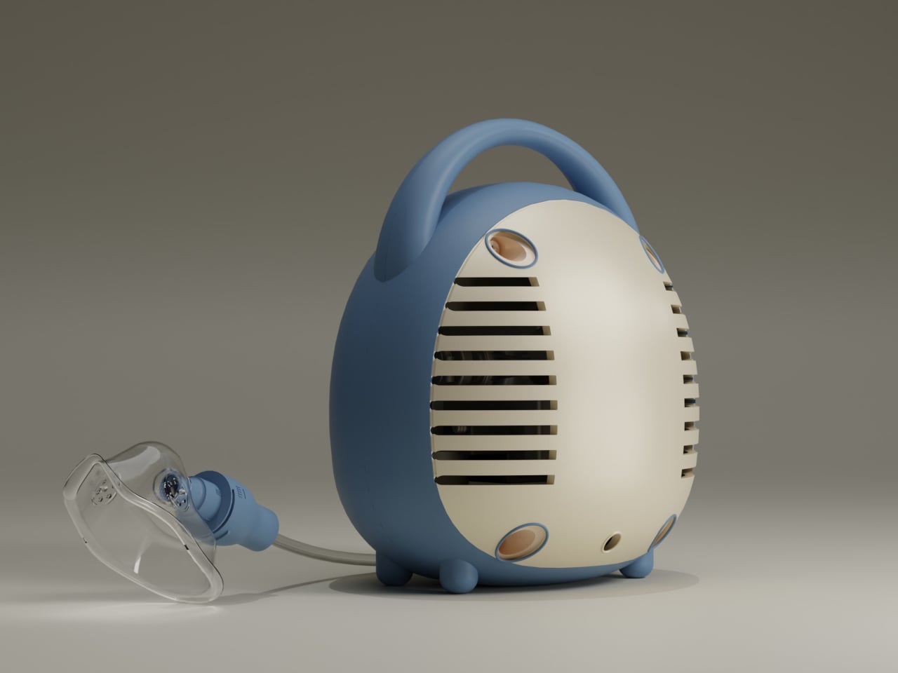
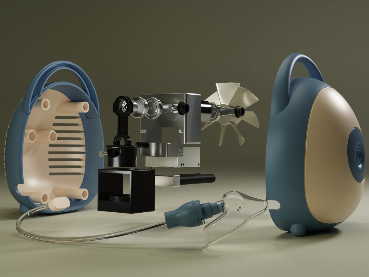
Under the shell, Breevo still uses a piston or diaphragm compressor, cooling fan, and medical-grade nebulizer cup and mask. The design doesn’t reinvent nebulization technology but just packages proven hardware in a way that makes sense for bedrooms and playrooms instead of hospital wards. The compressor drives air through the medicine cup to create aerosol, the same way every other home nebulizer works.

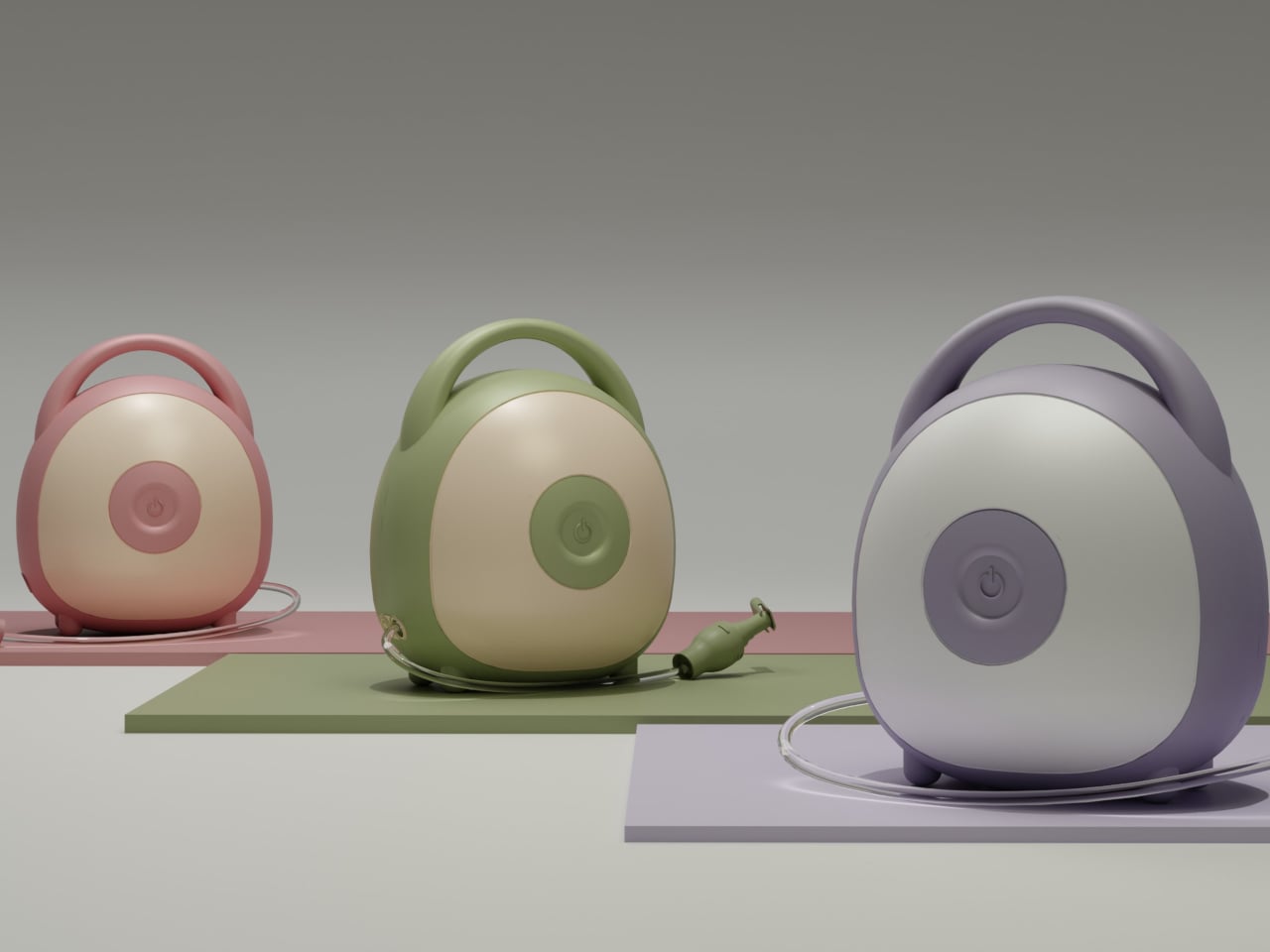
The exterior uses soft geometry and pastel colorways that make Breevo feel closer to a toy storage bin or portable speaker than medical equipment. The rounded body and integrated handle invite touch, and the two-tone front face with its central button gives kids a simple focal point. That shift in visual language matters when you are asking a six-year-old to sit still with a mask on their face, day after day, often without much choice.

The integrated handle and relatively light ABS shell make it easy to move Breevo between rooms or stash it away when not in use. Parents can carry it in one hand while managing tubing and a child with the other. The quieter, less clinical presence means it can live on a shelf without constantly reminding everyone of illness, which is its own kind of psychological relief in homes managing chronic respiratory conditions over months and years.

Breevo treats the home as the primary care environment, not just a place where hospital gear is parked temporarily. By focusing on form, tactility, and intuitive interaction, it suggests that medical devices for chronic conditions should be designed like any other long-term roommate, something you can live with visually and emotionally, not just something that meets a spec sheet and gets hidden between treatments when guests come over.

The post This Asthma Nebulizer Looks Like a Toy, Not a Scary Medical Machine first appeared on Yanko Design.

DIYer creates a retro-modern typewriter computer with moving screen on the slide

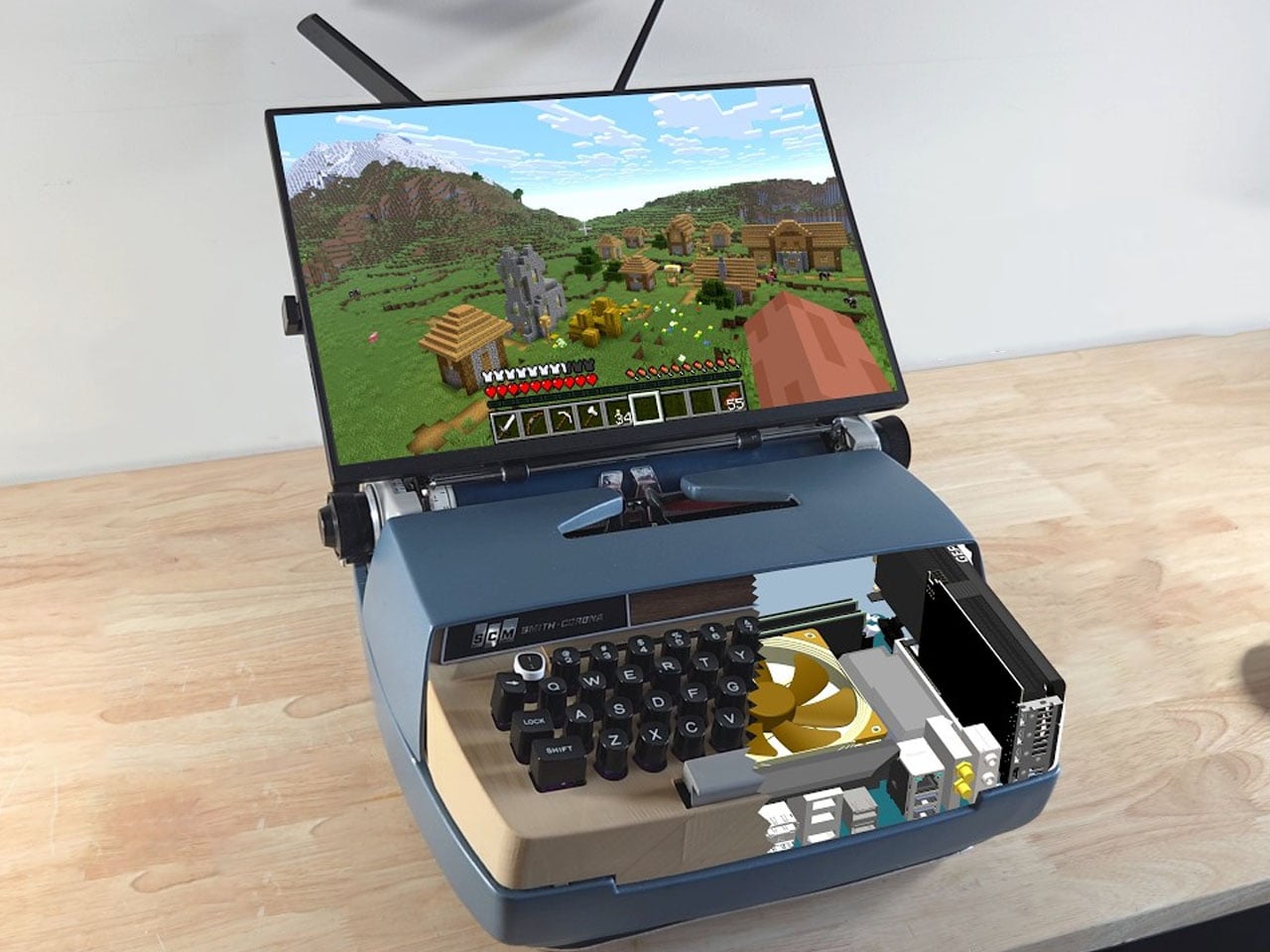
What’s the precursor of the computer? The typewriter, of course. Taking things the other way around, a DIYer has built a gaming PC inside an old typewriter for the sake of technology. First of its kind, this DIY is all about building everything from scratch to have a typewriter that works better than your average computer.

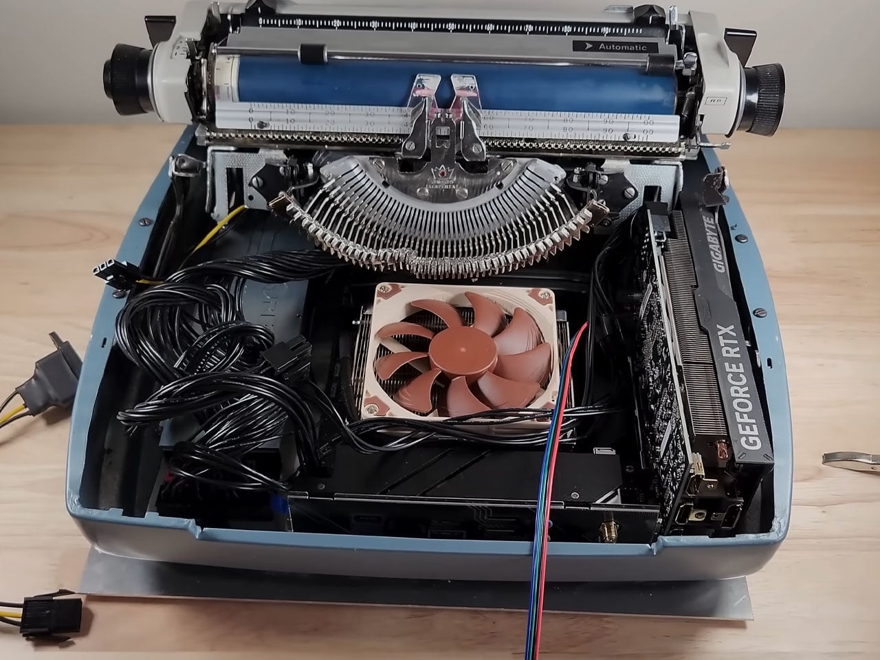
Fitting a computer inside a typewriter requires a lot of brainstorming about which components are useful and which can give way to the PC components. Sounds easy, doesn’t it? The art here is to be very careful when removing unwanted parts like the keyboard, motor, and side brackets, while still retaining the slide’s functionality via the hammers and the main movement.

Designer: Prototype

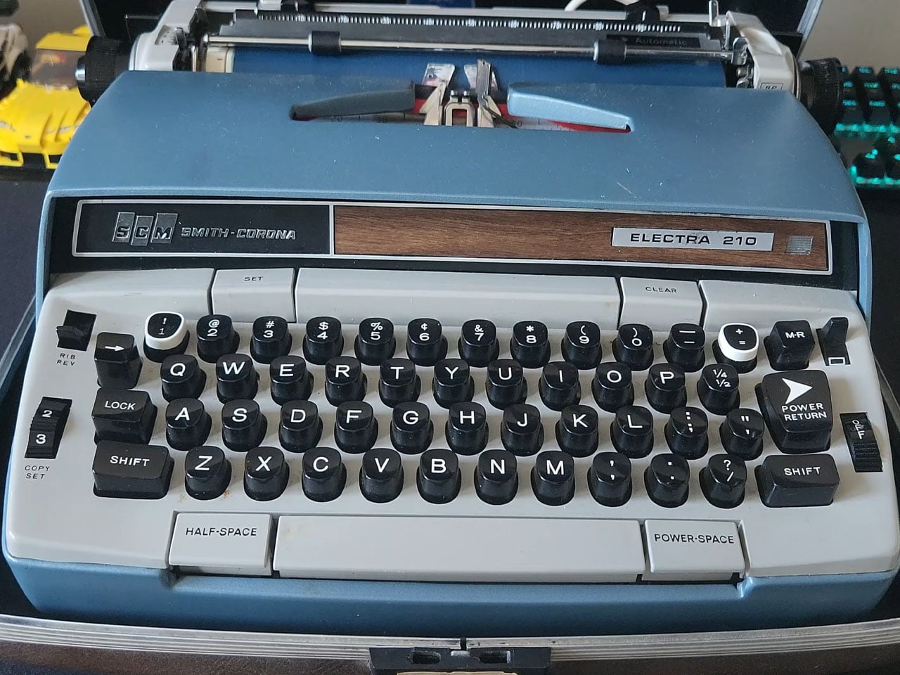
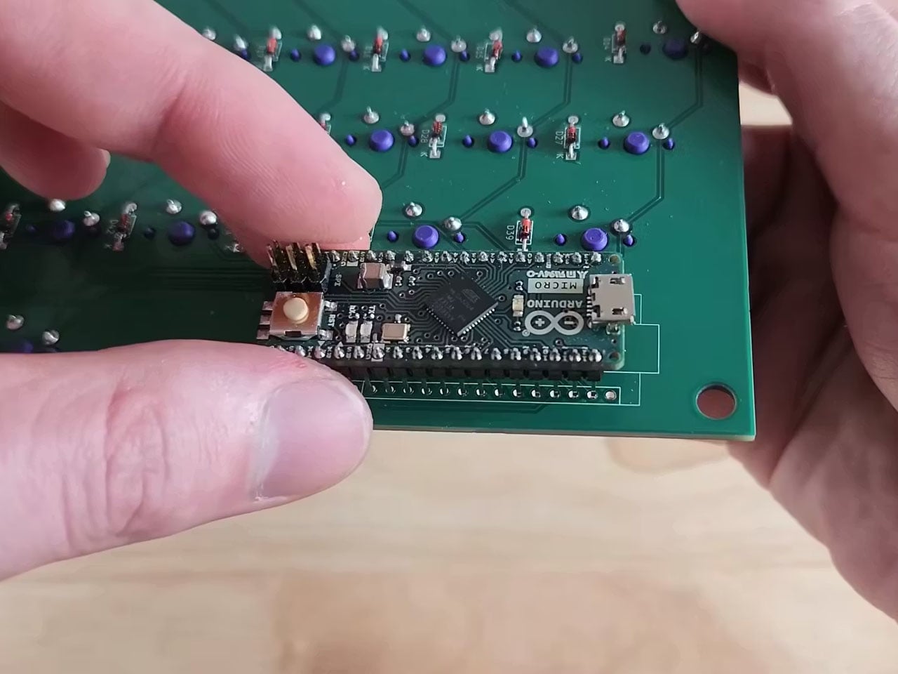
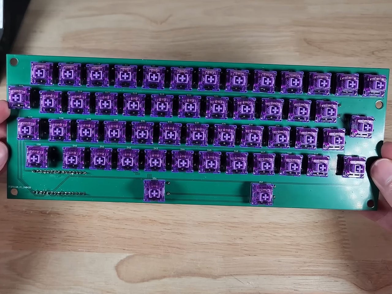
After removing the components, there is just enough space to fit in a motherboard, power supply, and a graphics card. Before sorting this bit of the DIY, the first step is to sort out the keyboard assembly by preplacing it with a modern keyboard that is made from scratch, using the keys of the keyboard to keep the theme alive. This is where 3D printing comes in by taking a 360-degree scan of the typewriter’s keyboard and modelling the desired keyboard case that has more height for fitting in all the PCB components of a modern keyboard. The hard part here is to make the PCB assembly that corresponds to the key input and send it over to a PCB manufacturer to make.

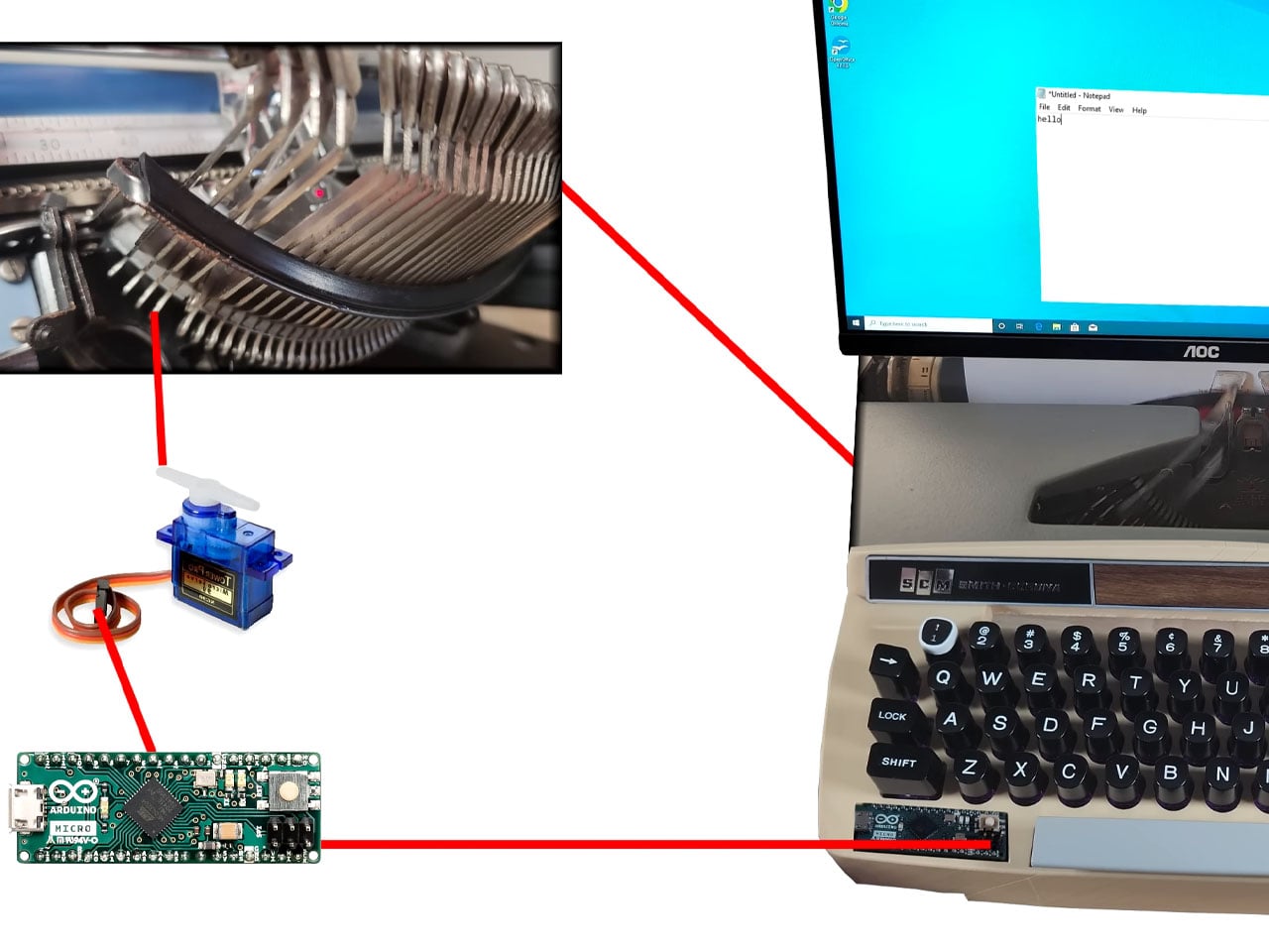
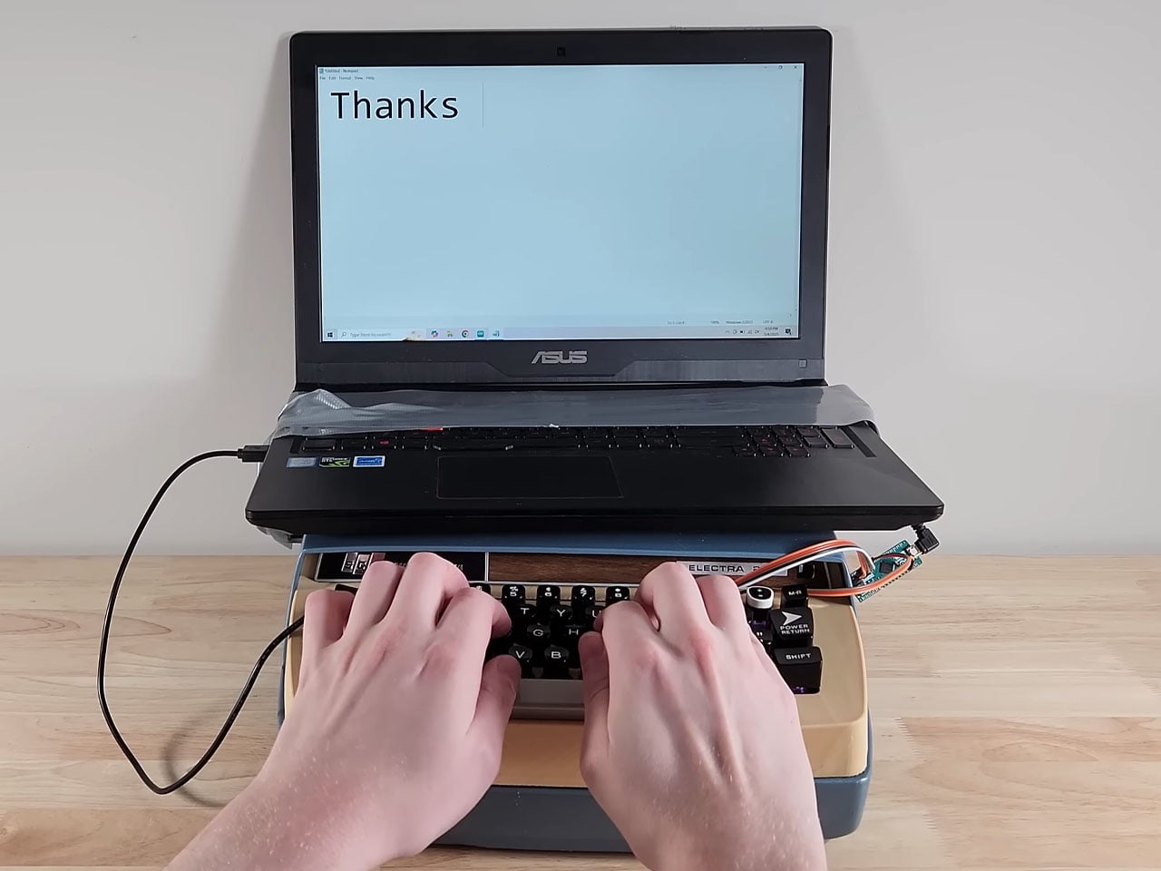
Next comes the easy bit, where the keycaps are 3D modelled and printed to test fit the adapters. Attaching them to the corresponding key strokes does the job. The backplate is a cakewalk, and the parts are done. Finally, all the parts are put together, and the keyboard for the typewriter is ready. Then it’s time to connect the keyboard to the complex working of the computer using a servo motor. To test the thing, the DIYer attaches it to his laptop, and it works all fine with the slide and the bell working perfectly.

The final part is to fit the PC mechanism and screen onto the typewriter assembly for the magic as the typing action moves the whole thing on the slide. Incredible, I must say. The final part of the build is yet to be released, but we know what to expect!

The post DIYer creates a retro-modern typewriter computer with moving screen on the slide first appeared on Yanko Design.

7 Best Minimal Valentine’s Gifts Under $150 That Outlast Roses

Roses wilt. Chocolates disappear. Cards gather dust in drawers. There’s nothing wrong with tradition, but this year calls for something different—gifts that don’t expire with the season. Minimal design offers a solution: objects that carry intention without noise, crafted to be used, touched, and remembered long past February.

The best Valentine’s gift isn’t about grand gestures. It’s about thoughtfulness made tangible. These seven designs prove that restraint speaks louder than excess. Each piece sits comfortably under $150, chosen for its ability to enhance daily rituals rather than interrupt them. They’re tools for presence, reminders of care, objects that age with grace rather than obsolescence.

1. FoldLine Pen Roll

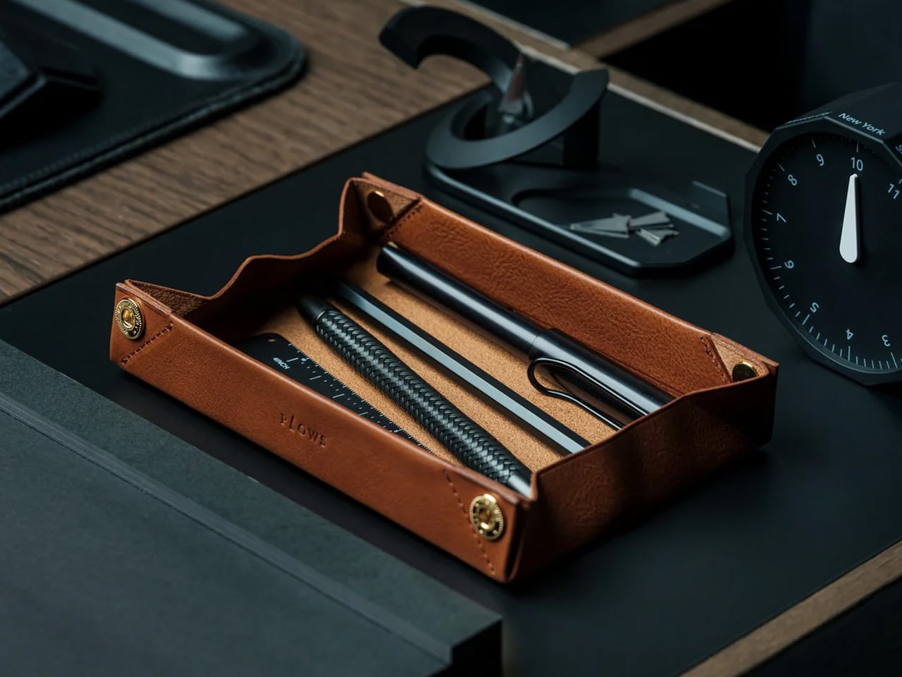
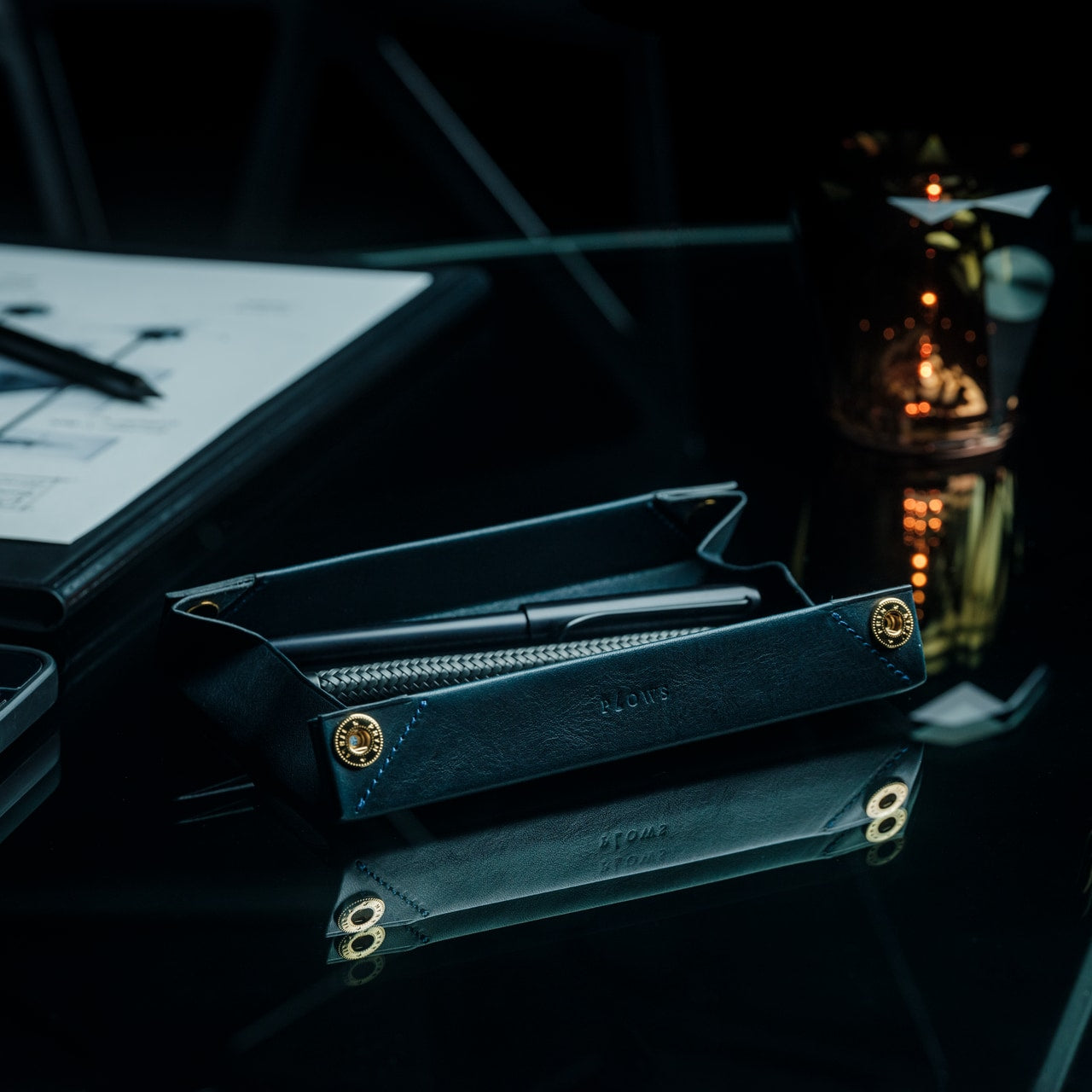
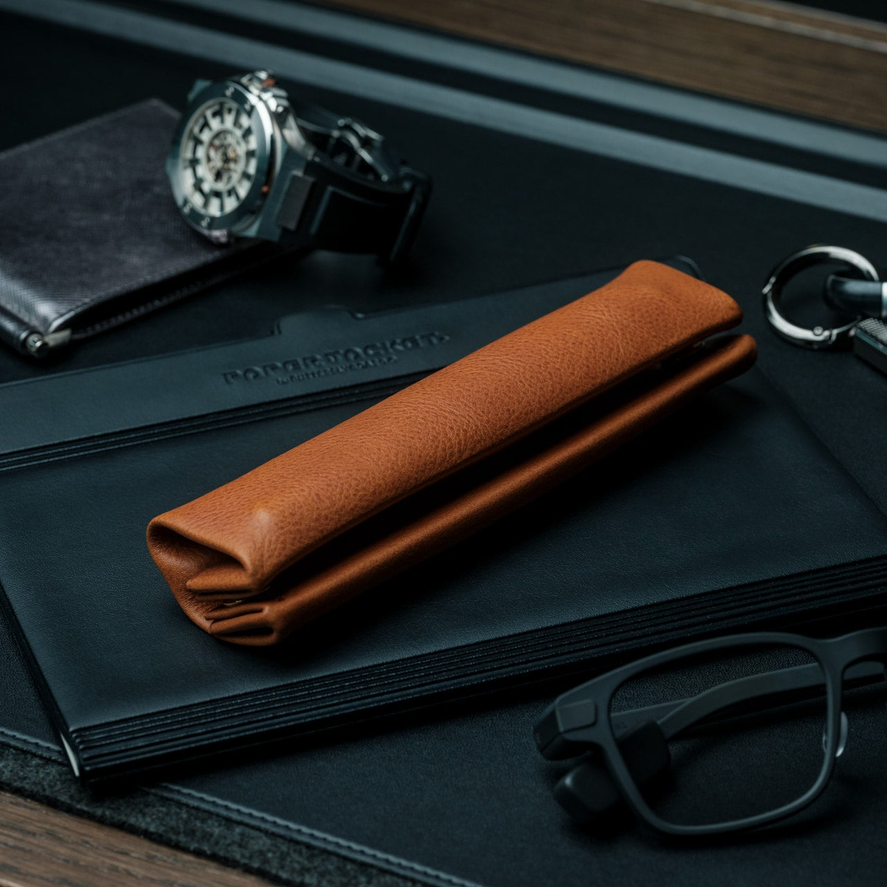
Writing by hand feels increasingly rare. The FoldLine Pen Roll recognizes this shift and offers something back—a leather case that transforms the act of retrieving a pen into something worth pausing for. Crafted from a single piece of Italian leather, it folds open to become a tray, creating instant order on any surface. There’s no clutter, no rattle of pens jostling in a bag. Just quiet geometry and purposeful design that recalls the precision of origami without the fuss.

The ritual matters here. Unroll the leather. Watch it become a workspace. Reach for your pen without searching. For someone whose thoughts flow through fountain pens, rollerballs, or pencils, this gift acknowledges their process. It’s intimate without being sentimental, practical without losing elegance. The leather will patina with use, developing character that reflects how often they return to the page—a physical record of all the words, sketches, and ideas that followed your gift.

Click Here to Buy Now: $135.00

What We Like

  • Italian leather that develops a personal patina over time
  • Two-step transformation from roll to organized tray in under two seconds
  • Protection without partitions means no scratching or rattling between metal pens
  • Compact enough to slip into bags while maintaining structure and presence

What We Dislike

  • Limited capacity may not suit those who carry extensive pen collections
  • Leather care is required to maintain the appearance over the years of heavy use

2. Prism Titanium Beer Glass

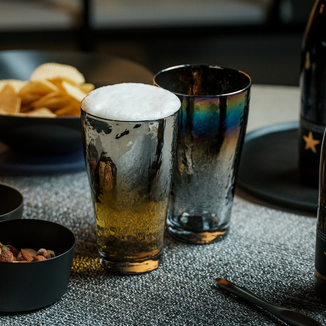
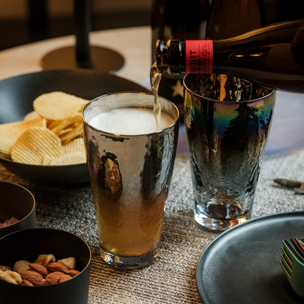
The Prism Titanium Beer Glass combines minimalist form with meticulous Japanese precision, transforming an ordinary beer into a ceremony. The interior is crafted from 99.9% pure aerospace-grade titanium, which neutralizes metallic aftertastes and preserves the drink’s true flavor. Choose the Silver finish for timeless restraint or the Infinite, which shifts with light in aurora-like gradients. Either way, the gently flared rim improves flow, softening texture while lifting aroma with each sip.

This isn’t glassware for parties. It’s for the person who pours one good beer and actually tastes it. The symbolic etched patterns reference Japanese ideals of longevity and prosperity—a fitting subtext for a Valentine’s gift meant to last. Crafted in Shizuoka with hand-finished precision, each glass is present without pretension. Years from now, this won’t be the beer glass that broke. It’ll be the one that stayed, accumulating quiet evenings and conversations that stretched longer than intended.

Click Here to Buy Now: $99.00

What We Like

  • Titanium lining neutralizes off-flavors and enhances the purity of each drink
  • Two finish options suit different aesthetic preferences without compromising function
  • Japanese craftsmanship ensures durability alongside refined visual detail
  • Corrosion-resistant material means it ages gracefully rather than deteriorating

What We Dislike

  • Single-serve capacity limits sharing moments during gatherings
  • Premium materials command a higher price point within the budget range

3. ClearMind Kendama

The ClearMind Kendama is more than a hobby. It’s a testament to the power of mindful play, offering an alternative to screens and scrolling. Tokyo Kendama engineered this traditional Japanese skill toy with thoughtful updates: larger cups for easier trick landing, recalibrated balance for smoother precision, and a bearing system that minimizes string twists. What emerges is a tool that sharpens coordination while providing tangible breaks from digital overload.

The minimalist aesthetic means it doesn’t hide in a closet between uses. It sits on a shelf as sculpture, invitation, challenge. For a partner who needs permission to step away from productivity, this gift provides exactly that. Each trick mastered builds confidence. Each session offers a reset button for scattered attention. The larger tama hole increases success rates in advanced moves—spikes, stalls, stilts—making progression feel achievable rather than frustrating. It’s play with purpose, wrapped in wood and intention.

Click Here to Buy Now: $59.00

What We Like

  • Larger cups and improved balance accelerate skill development and maintain engagement
  • Bearing system reduces string tangling for uninterrupted practice sessions
  • Minimalist design makes it display-worthy rather than something to hide away
  • Offers a tactile, offline activity that builds actual skills over time

What We Dislike

  • The initial learning curve may discourage those seeking immediate gratification
  • Wooden construction requires care to prevent damage from drops on hard surfaces

4. Aroma Fragrance Pin

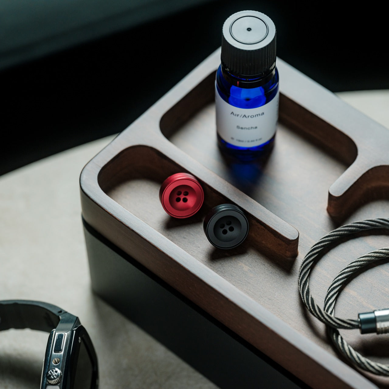
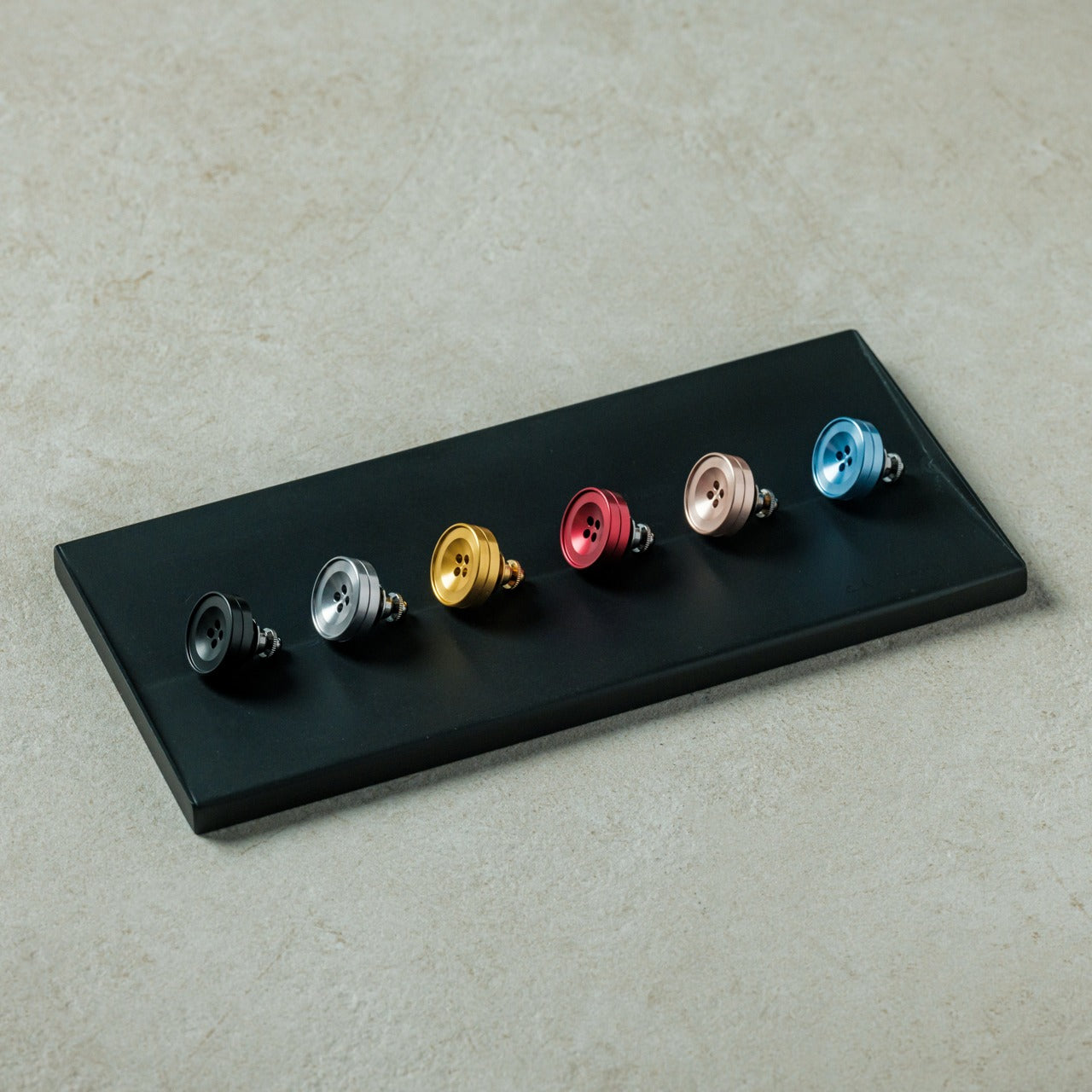
Scent memory outlasts almost everything else. The Aroma Fragrance Pin disguises itself as a minimalist button while functioning as a personal diffuser. Carved from a single aluminum block by skilled craftsmen, each pin holds cotton infused with essential oils. Pin it to a jacket lapel, bag strap, or scarf, and the wearer carries their chosen scent throughout the day—lavender for calm, eucalyptus for clarity, whatever matches their rhythm.

The discretion appeals here. No one needs to know it’s a diffuser. It reads as intentional design, a thoughtful detail in someone’s aesthetic. The Alumite dye finish creates color variations between batches, ensuring no two pins look identical. For a Valentine’s gift, this speaks to personal space and sensory preference. You’re not choosing their scent—you’re giving them the vessel to carry what brings them peace. Each time they catch the fragrance, it’s a small reminder of care without being obvious about it.

Click Here to Buy Now: $49.00

What We Like

  • Discreet button design integrates seamlessly with any wardrobe or accessory
  • Handcrafted aluminum construction ensures durability and unique batch variations
  • Easily refillable with preferred essential oils for ongoing customization
  • Portable aromatherapy requires no batteries, plugs, or complicated mechanisms

What We Dislike

  • Scent dissipates faster than traditional diffusers, requiring more frequent refreshing
  • Small size means cotton holds limited oil, reducing longevity between applications

5. Rolling World Clock

Distance complicates the connection. The Rolling World Clock simplifies it. This twelve-sided object sits on a desk or shelf, each face representing a major timezone city: London, Paris, Cape Town, Moscow, Los Angeles, Karachi, Mexico City, New York, Shanghai, Tokyo, Sydney, and New Caledonia. Roll it to the relevant city, and a single hand displays the current time there. No apps, no menus, no glowing screens at midnight when you wonder if they’re still awake.

The tactile element transforms time-checking into something physical. There’s satisfaction in the roll, the small thud as it settles, the confirmation of connection across hours and miles. For long-distance relationships or anyone tracking loved ones across continents, this gift acknowledges the effort of staying synchronized. The minimalist design—available in black or white—means it occupies space without demanding attention until the moment it’s needed. Then it delivers exactly what matters: awareness of someone else’s now.

Click Here to Buy Now: $49

What We Like

  • Single-hand display removes unnecessary complexity from global time-checking
  • Tactile rolling mechanism adds satisfying physicality to a digital-age task
  • Twelve major cities cover most international time zones without overwhelming choice
  • Minimalist aesthetic works as a functional sculpture rather than a utilitarian device

What We Dislike

  • Limited to twelve cities may exclude specific locations important to some users
  • Single-time display requires rolling between zones rather than viewing multiple simultaneously

6. Anywhere Use Lamp

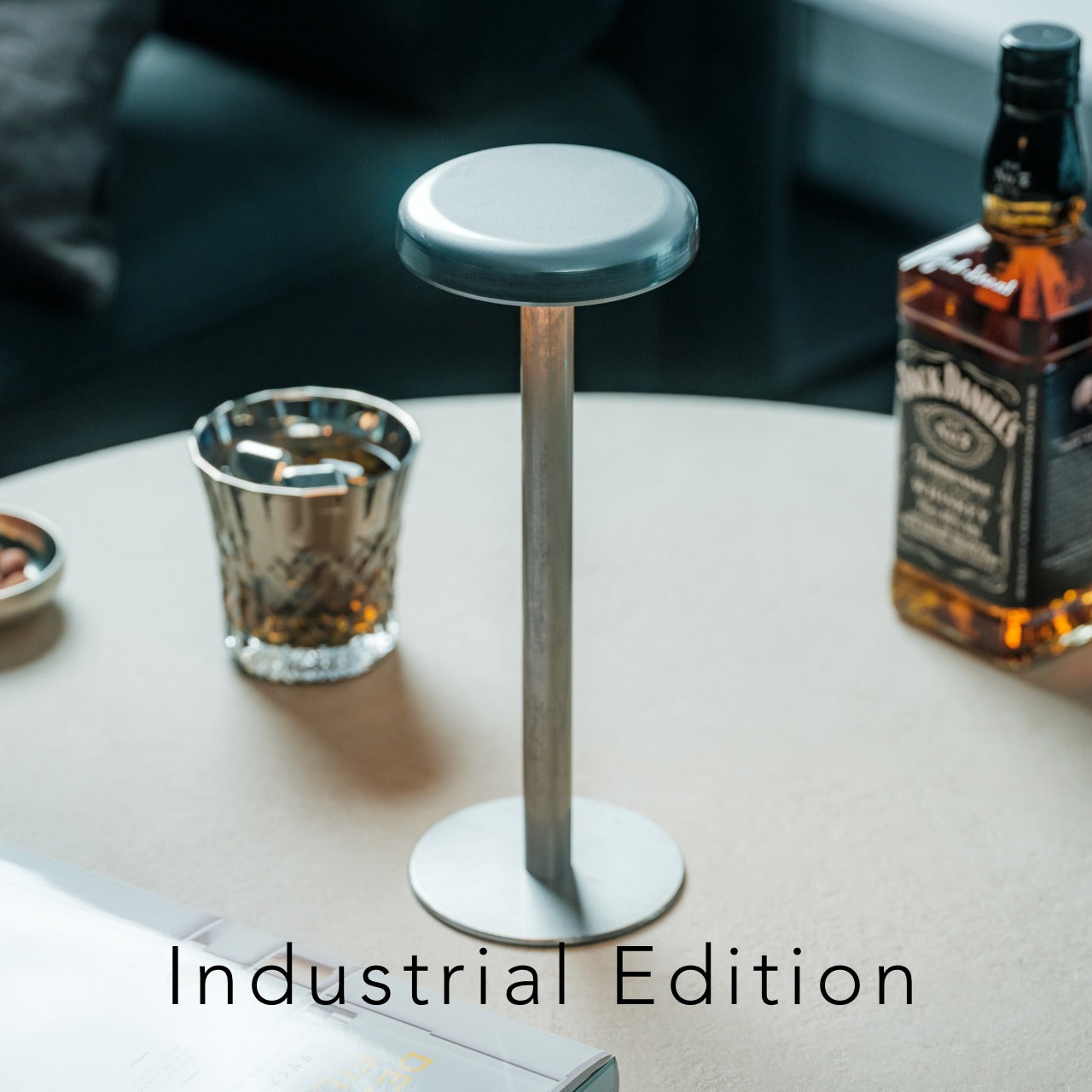
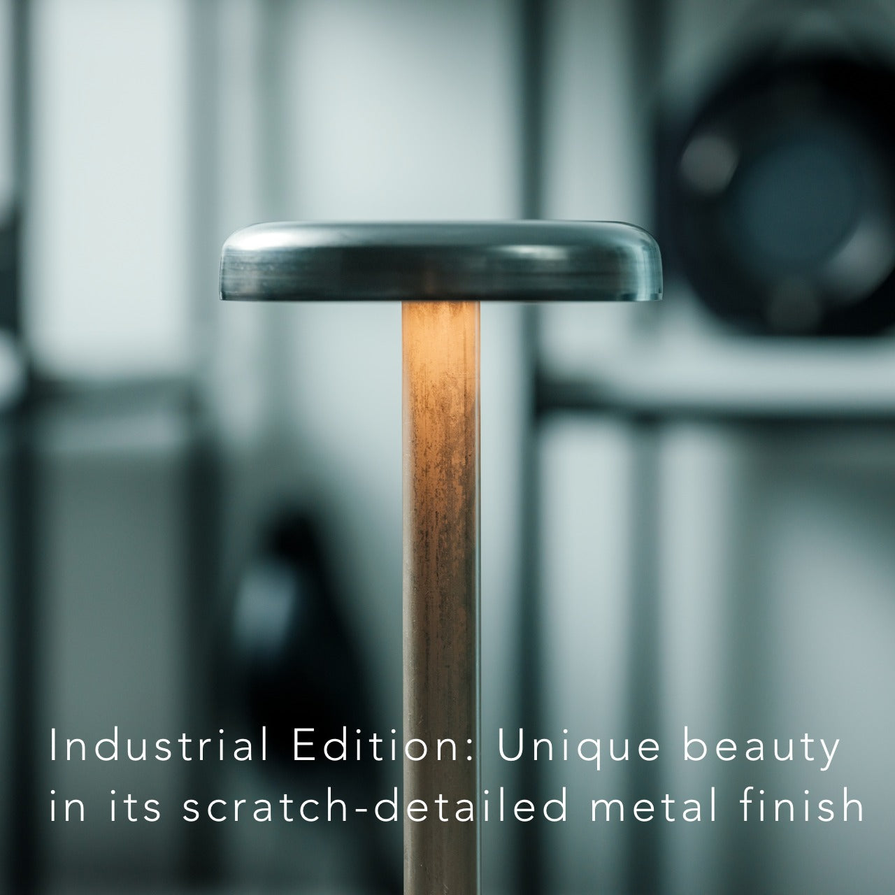
Light shapes mood more than most people acknowledge. The Anywhere Use Lamp delivers soft, warm illumination without requiring outlets or charging cables. Six high color-rendering LEDs provide glow rather than glare, enhancing atmosphere wherever it’s placed. The mushroom-inspired silhouette comes in black, white, or the new Industrial edition—a variant celebrating imperfection through scratch-detailed metal that turns wear into aesthetic intention.

The modular design means it travels. Bedroom to living room, desk to bedside, even outdoors for evenings that extend past sunset. Four AA batteries power it, chosen deliberately for reusability and accessibility. Press any edge of the cap to cycle through brightness levels, each click offering satisfying haptic feedback. For a gift, this speaks to flexibility and mood-setting across contexts. It’s light that moves with someone’s life rather than tethering them to fixed locations. The Industrial edition particularly suits those who appreciate objects that carry stories in their surfaces.

Click Here to Buy Now: $149.00

What We Like

  • Battery power eliminates cord dependency, enabling true portability across locations
  • High color-rendering LEDs provide warm, flattering light rather than harsh brightness
  • Modular design allows easy disassembly for storage and transport
  • Haptic feedback on brightness adjustment adds satisfying tactile interaction

What We Dislike

  • Battery replacement is needed periodically, though the AA format maintains accessibility
  • Limited brightness range may not suffice for task lighting needs

7. Miniature Bonfire Wood Diffuser Set

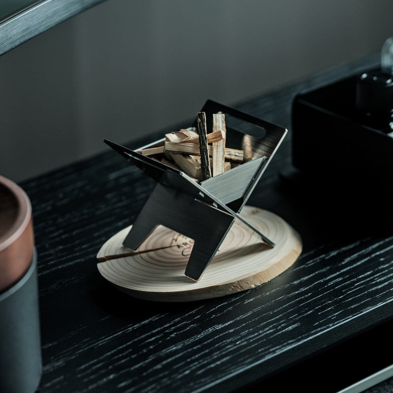
The final gift on this list doubles as entertainment. The Miniature Bonfire Wood Diffuser Set recreates camping atmosphere indoors, complete with bundled firewood that diffuses aromatic oils, capturing the scent of Mt. Hakusan. Rust-resistant stainless steel ensures longevity, while included trivets transform the diffuser into a functional pocket stove—meaning you can actually cook small portions over it, adding an authentic bonfire experience to the aromatic element.

This gift works for adventurers stuck indoors, for those who crave forest and mountain air but live surrounded by concrete. The scale makes it charming rather than gimmicky. Set it on a table, light the small fuel source beneath the firewood, and watch essential oils evaporate into a scent that recalls open air and slow evenings. The ability to cook adds unexpected utility—miniature s’mores, anyone? For Valentine’s Day, it creates a shared experience. You’re not just giving an object. You’re giving an excuse to slow down, light something small, and remember what calm feels like.

Click Here to Buy Now: $99.00

What We Like

  • Dual function as diffuser and pocket stove expands utility beyond aromatherapy alone
  • Stainless steel construction resists rust and ensures years of reliable use
  • Mt. Hakusan essential oil provides an authentic mountain-forest scent profile
  • Bundled firewood with a tying knot adds aesthetic detail to functional design

What We Dislike

  • Requires careful handling due to the open flame component during use
  • Specialized fuel needed for the cooking function may not be readily available everywhere

Why Minimal Design Makes Valentine’s Gifts Last

Objects designed with restraint don’t compete for attention. They integrate. The gifts above share a common philosophy: enhancement over decoration, function refined to its essential form, materials chosen for how they age rather than how they impress initially. These aren’t things to display once and forget. They’re tools for daily rituals, anchors for habits worth keeping, reminders that care can be practical without losing meaning.

Roses die because they’re meant to. These gifts persist because they’re built to. When Valentine’s Day passes, and its commercial urgency fades, what remains are objects that earned their place through use, through presence, through the quiet accumulation of moments they witnessed. That’s the difference between a gesture and a gift that actually lasts. One marks a date. The other marks time itself.

The post 7 Best Minimal Valentine’s Gifts Under $150 That Outlast Roses first appeared on Yanko Design.
The 2026 Olympic Torch That Knows When to Disappear

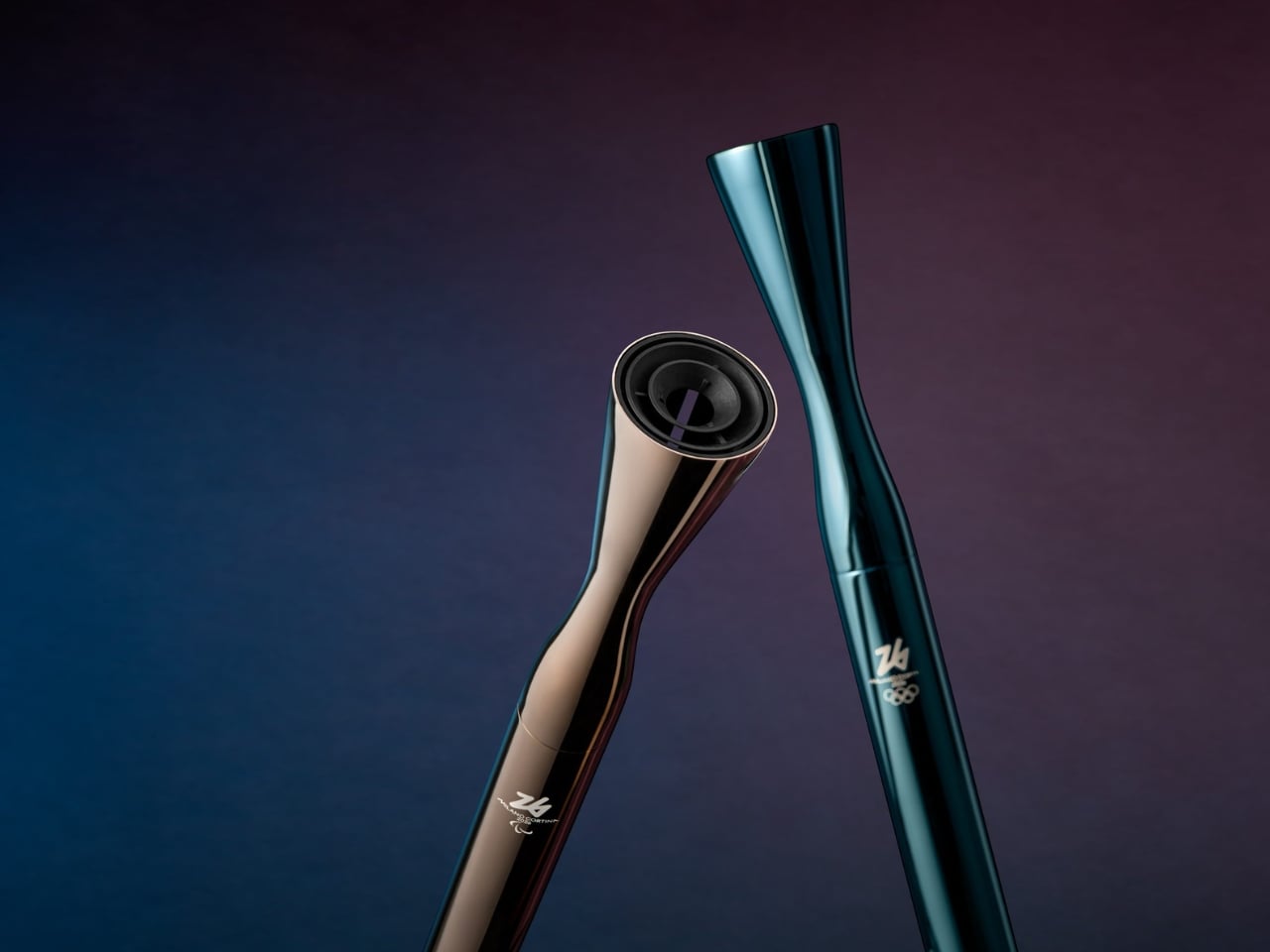
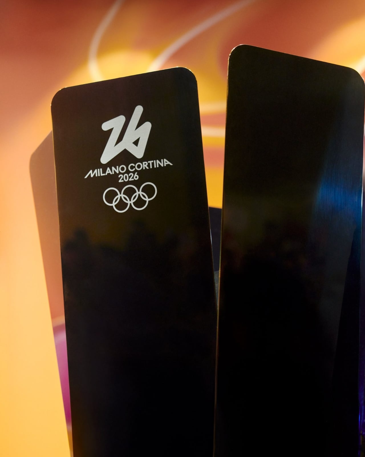
Right now, as the 2026 Winter Olympics torch relay makes its final journey through Milan toward tonight’s opening ceremony at San Siro Stadium, Carlo Ratti’s design is doing something revolutionary. It’s getting out of its own way. The MIT professor and architect didn’t set out to create another sculptural showpiece when he designed the Milano Cortina 2026 Olympic torch. Instead, he asked a question that probably should have been asked decades ago: what if the torch wasn’t the star of the show?

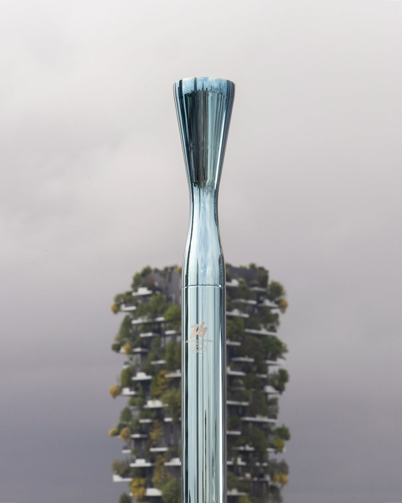
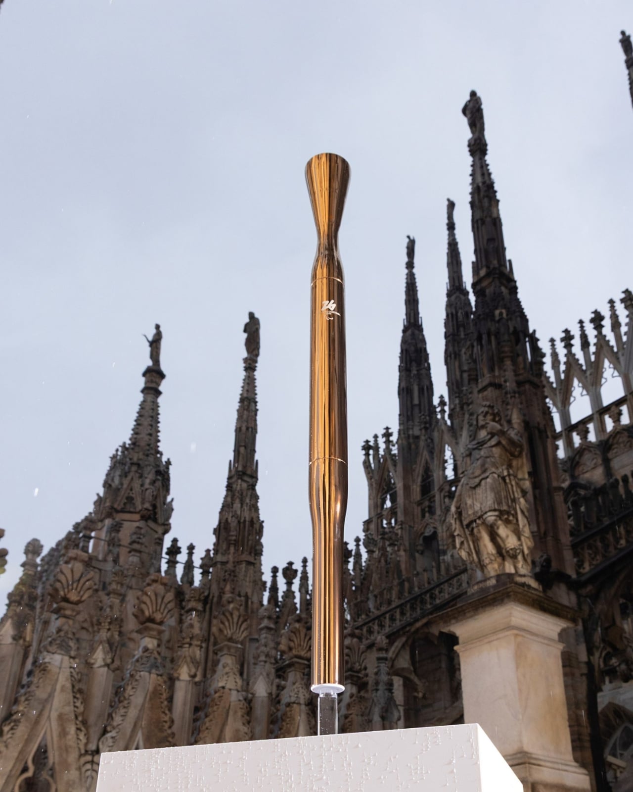
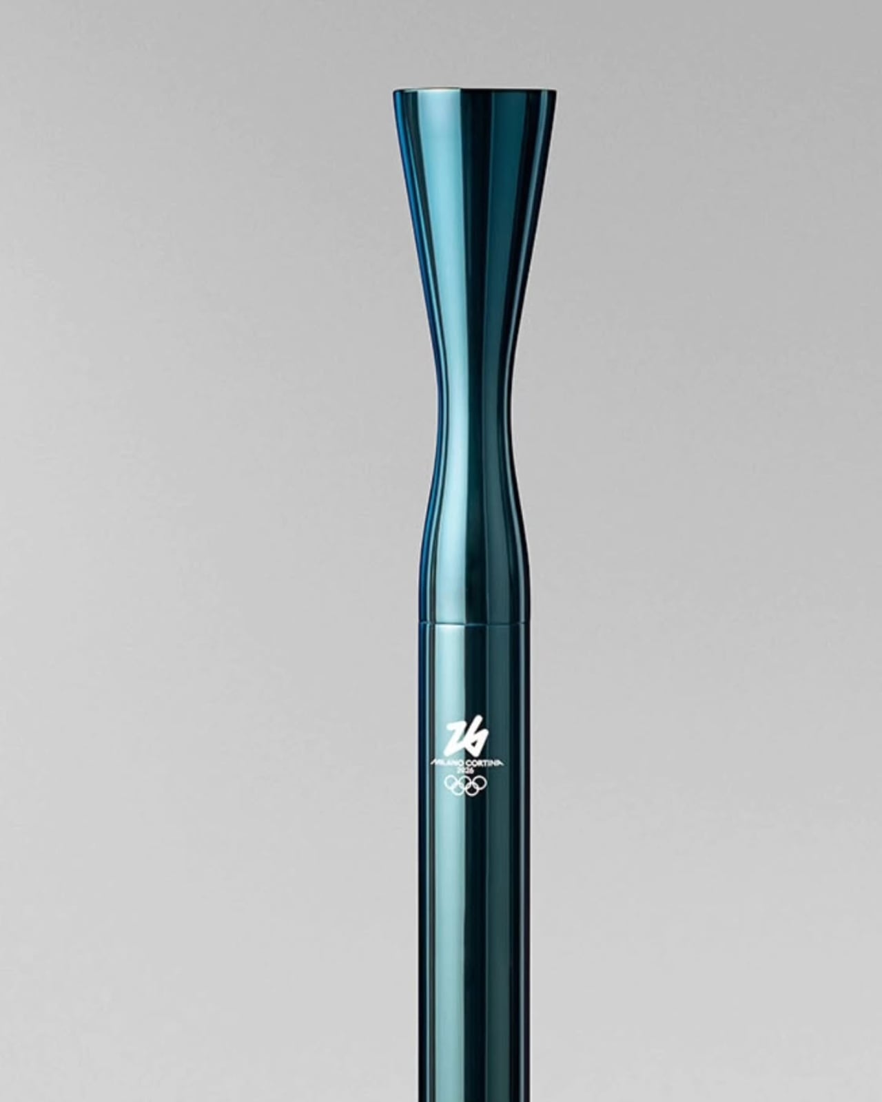
The result is something Ratti calls “Essential,” a name that feels like a manifesto. He designed the torch from the inside out, treating the flame itself as the architecture. The metal cylinder becomes a frame, almost a supporting actor, letting fire take center stage. It’s counterintuitive in a design culture that often mistakes complexity for sophistication.

Designer: Carlo Ratti

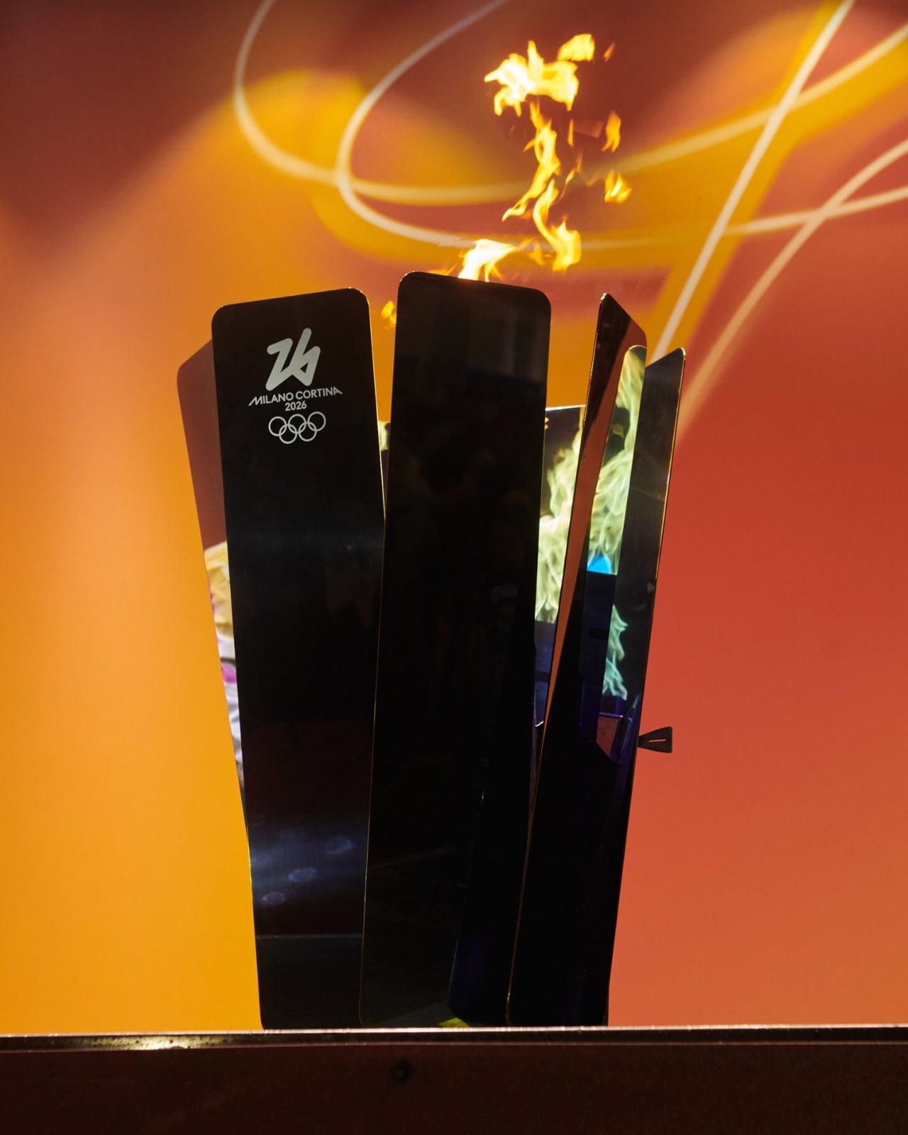
But the torch is only half the story. What makes this Olympic relay genuinely different is the mobile mini cauldron that travels alongside it, a piece of design that somehow manages to be both sculptural and invisible at the same time.

The cauldron exists to solve a practical problem: keeping the Olympic flame alive between legs of the relay. Previous Games handled this with utilitarian metal boxes, functional but forgettable. Ratti approached it differently. His studio created a transparent cylinder that transforms the flame into a vertical vortex, a twisting column of fire that appears to float in midair. The effect is hypnotic, like capturing a living piece of energy under glass.

The cauldron stands on a circular base finished in the same blue-green PVD coating as the Olympic torch itself, creating visual continuity between the two objects. When the relay pauses, when torchbearers hand off their flames, when the procession needs to rest, the cauldron becomes a temporary altar. It holds the fire safely while making it visible, watchable, alive.

Ratti’s team demonstrated the cauldron against some of Milan’s most iconic backdrops before the relay began. Against the Bosco Verticale towers with their cascading vertical forests. In front of the Duomo’s Gothic spires. At each location, the vortex flame created this strange visual dialogue between ancient architectural ambition and contemporary restraint. The buildings reached upward with ornate complexity. The flame spun quietly in its transparent case. Both were spectacular, but only one knew when to shut up.

This gets at something deeper in Ratti’s design philosophy. He splits his time between Turin, New York, and MIT, and brings an academic’s rigor to questions about how objects shape human experience. His studio created the French Pavilion for Osaka Expo 2025 and has worked across scales from furniture to urban planning. The through-line in all of it is this question of when design should assert itself and when it should recede.

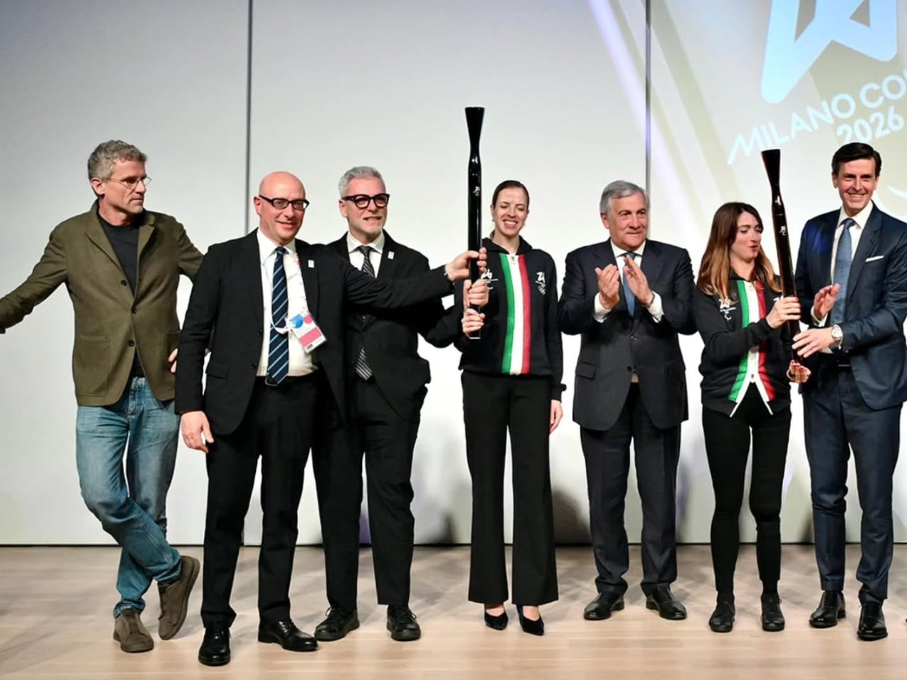
Yesterday, the torch relay reached Piazza Duomo, carried by an extraordinary mix of athletes and celebrities. Snowboarding legend Shaun White, Paralympic swimming champion Simone Barlaam, and former figure skater turned K-pop idol Sunghoon of Enhypen. Even Snoop Dogg showed up to carry the flame through Milan’s streets. The spectacle of watching these recognizable faces holding Ratti’s understated torch drove home the design’s core idea: the people and the flame matter more than the object connecting them.

Today, the relay completes its final stage through Central Station, Castello Sforzesco, Parco Sempione, the Darsena, and neighborhoods like Brera and Porta Nuova. By tonight, that flame will ignite the Olympic cauldron at San Siro Stadium, and Ratti’s torch will have fulfilled its purpose by staying out of the way.

What strikes me about this whole system, torch and mobile cauldron together, is how it refuses to pander. A lot of Olympic design leans into grandiosity, into making bold statements about national identity or technological prowess. Ratti went the opposite direction. He created objects that work beautifully because they work honestly, that earn attention by being exactly what they need to be and nothing more.

The mobile cauldron especially embodies this. It could have been a massive sculptural statement, a piece of design that competed with the landmarks it appeared beside. Instead, it became a lens, a frame for the flame itself. The vortex effect isn’t decorative flourish; it’s a way of making fire more visible, more present, more itself.

When this relay ends tonight and the Games officially begin, thousands of people will have held that torch, watched that vortex flame, felt part of something larger than themselves. What they’ll remember isn’t the objects in their hands or on that base. It’s the fire they carried, the journey they were part of, the connection they felt. The design just made space for that to happen. Sometimes the most powerful statement is knowing when to disappear.

The post The 2026 Olympic Torch That Knows When to Disappear first appeared on Yanko Design.
MOFT Dynamic Folio Case Turns a Single Sheet into an iPad Origami Desk

iPads have quietly become laptops, sketchbooks, second monitors, and TV screens, while most cases still only prop them up at two angles or turn them into heavy keyboard bricks. The pile of stands and folios people accumulate, one for drawing, one for watching, one for travel, never solves the “I just want one thing that works everywhere” problem. You end up carrying multiple accessories or compromising on whatever you need to do next.
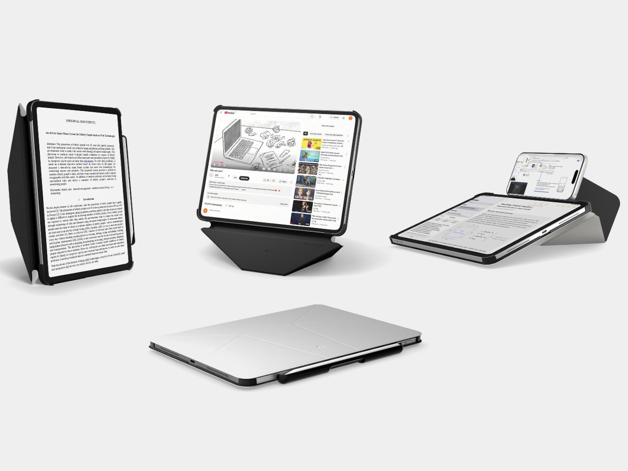
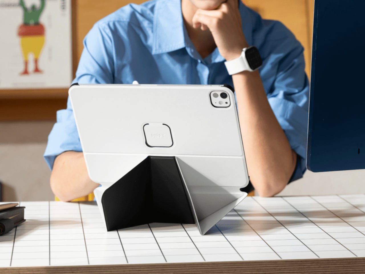
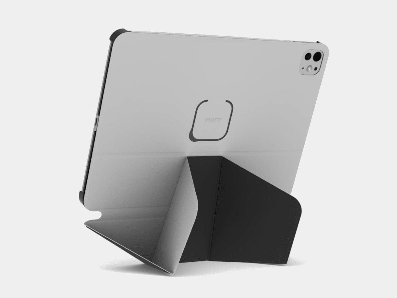
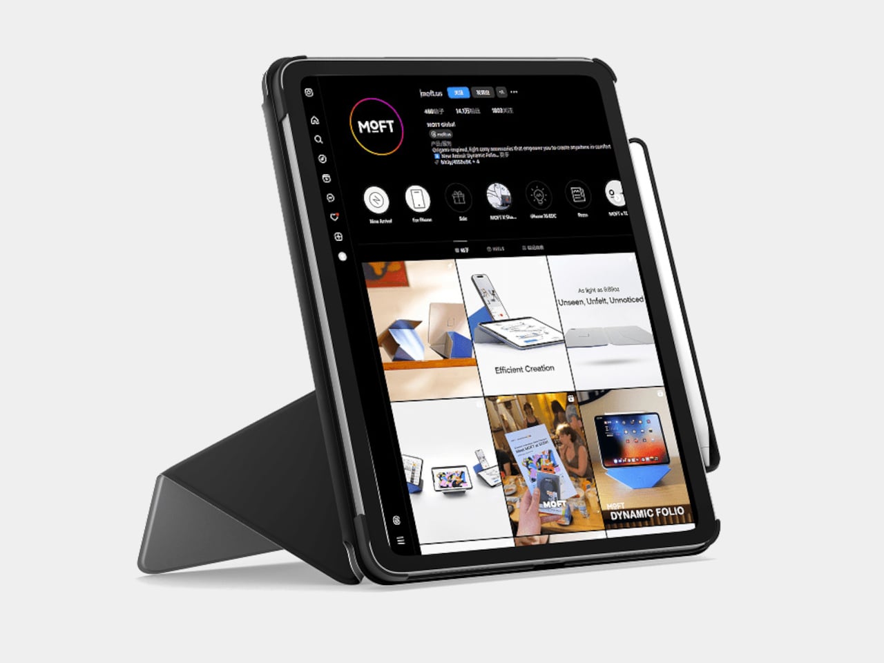
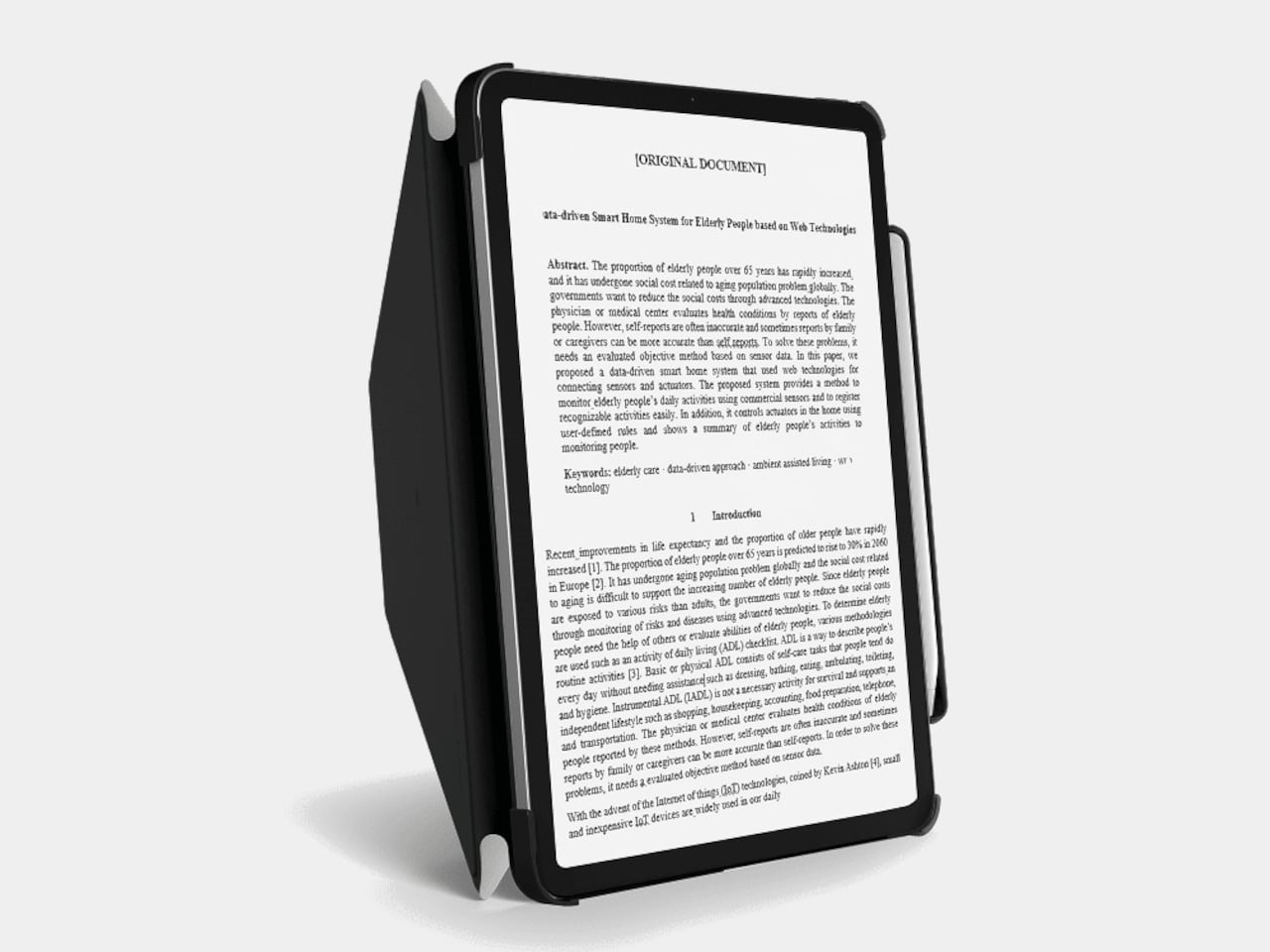
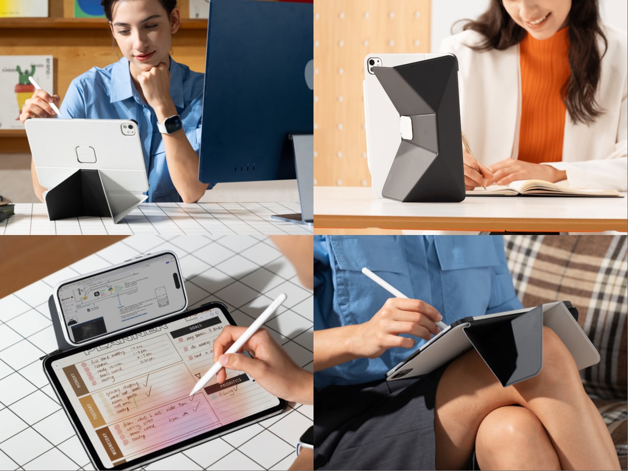
MOFT’s Dynamic Folio Case is a folio, case, and stand in one, pitched as “one carry for productivity anywhere.” It is a single sheet weighing just over 10 ounces that stays on the iPad and folds into a surprising number of shapes, trying to be a desk stand, lap desk, dual-screen dock, and protective shell, without adding a keyboard or bulky frame around the tablet.

Designer: MOFT

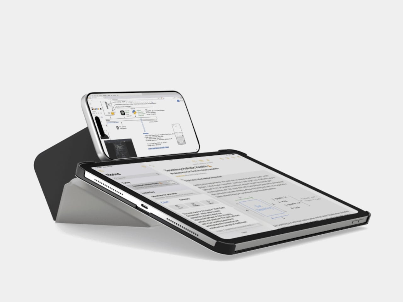
Picture dropping the iPad next to a laptop and folding the folio into its taller stand mode, lifting the screen level with the laptop display. The Dynamic Folio even supports a phone on a ridge above the iPad, so you end up with a stacked, three-screen tower that reduces neck strain and makes it easier to keep notes, reference, and chat visible without craning down at a flat tablet.

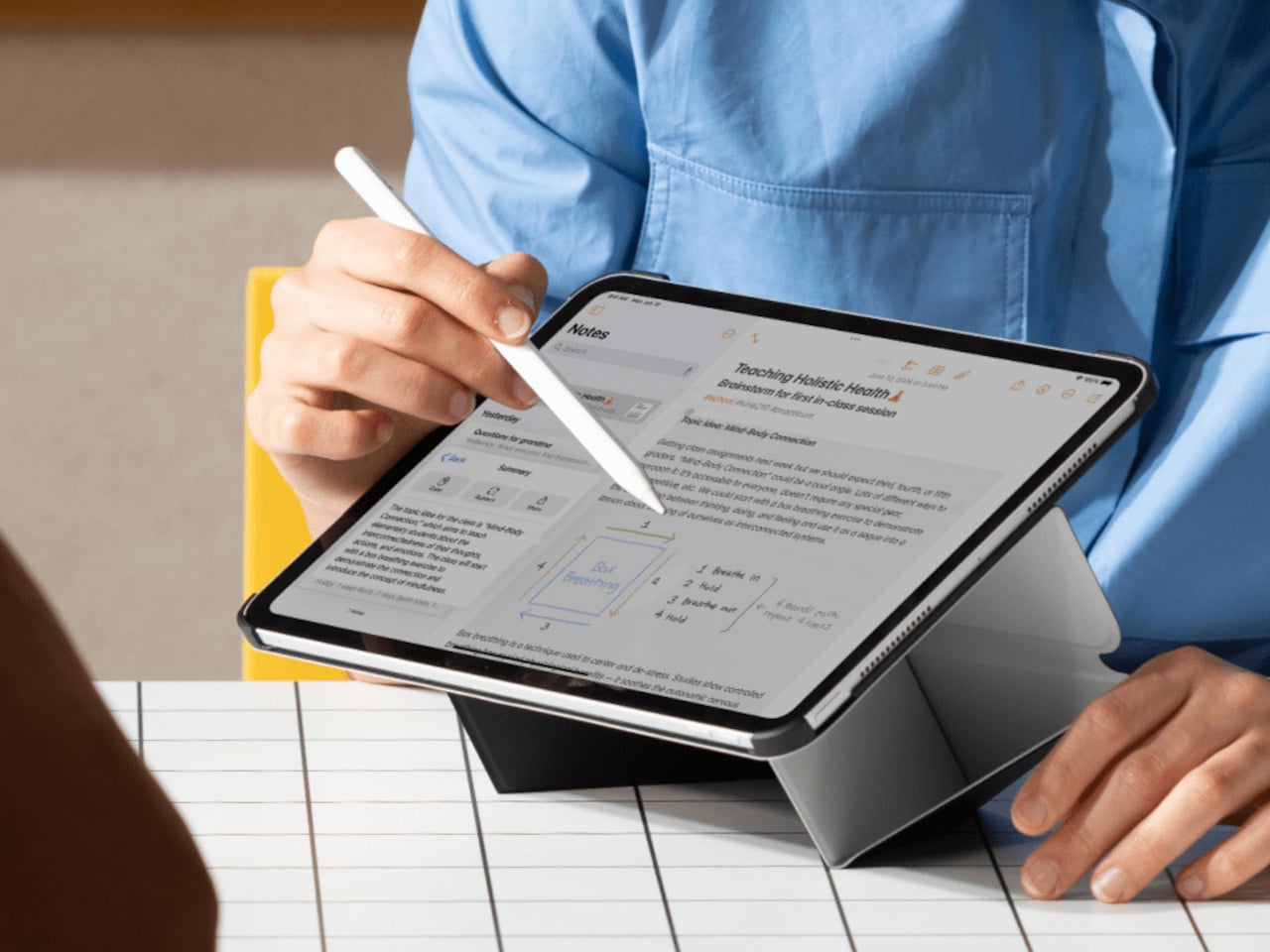
On a sofa or train seat, the folio folds into a wedge that rests comfortably on your legs or arm, giving you a stable angle for sketching or handwriting without hunting for a table. The case is light enough that the whole setup still feels portable, and the low drawing angles make it easier to treat the iPad like a sketchbook instead of a slippery glass slab balanced on your knees.

The back of the folio has subtle printed icons, circles, and lines that you align to quickly find specific angle presets. MOFT calls out examples, 60 degrees for watching movies on a plane, 30 degrees for note-taking in a meeting, 18 degrees for drawing in a cafe, and steeper angles for reading or gaming. It is less trial-and-error origami and more a guided folding system you can remember after using it a few times.

Of course, reinforced corners wrap the iPad’s most vulnerable edges, ready for bags and bumps, while MOVAS-P vegan leather gives the outside a refined texture and the inside a smooth finish that resists scratches. A magnetic pencil holder snaps on the side to keep an Apple Pencil secure on the go, solving the familiar problem of the stylus detaching from the iPad’s edge the moment you slide everything into a backpack.

The Dynamic Folio behaves less like a case and more like soft origami furniture for your iPad, trying to keep up with every role the tablet plays without asking you to carry extra hardware. It will not replace a full keyboard for heavy typing, but for people who draw, read, watch, and occasionally work across two screens, one well-designed sheet that can do twenty things is a tempting trade.

The post MOFT Dynamic Folio Case Turns a Single Sheet into an iPad Origami Desk first appeared on Yanko Design.