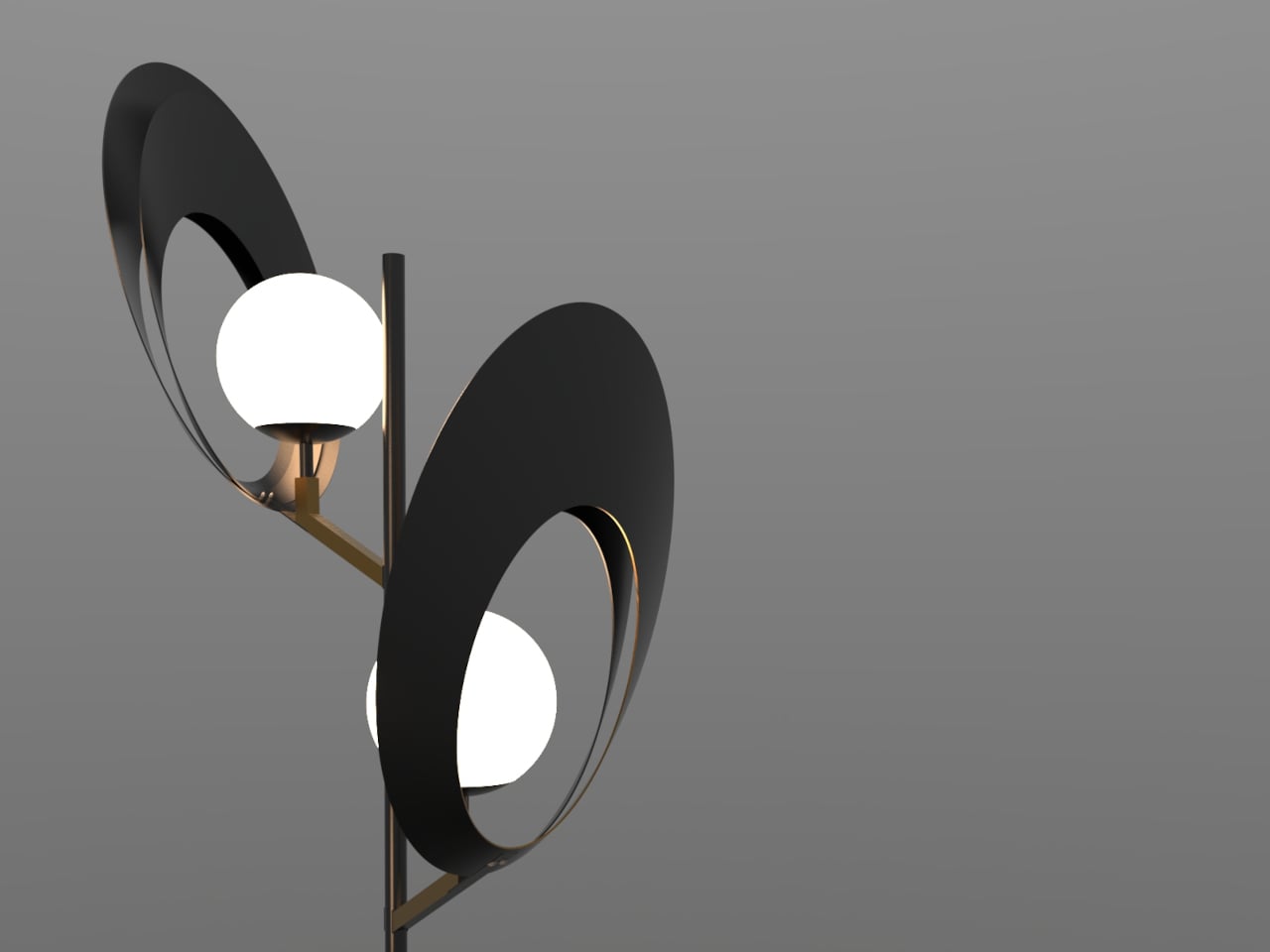
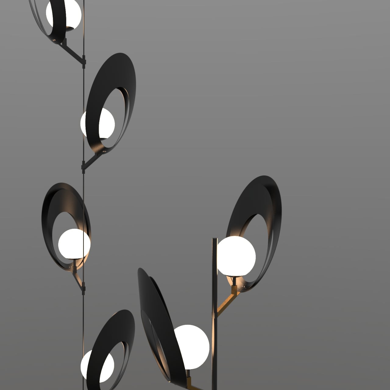
Most lamps are designed to disappear into a room. The fixture is an afterthought, a delivery mechanism for the bulb, and anything drawing attention to itself risks becoming a problem rather than a solution. Mostafa Arvandbarmchi and Lampart Lighting Solution took the opposite position with the Pelk collection, designing lamps that treat the fixture as the point, with light almost secondary to the form holding it.
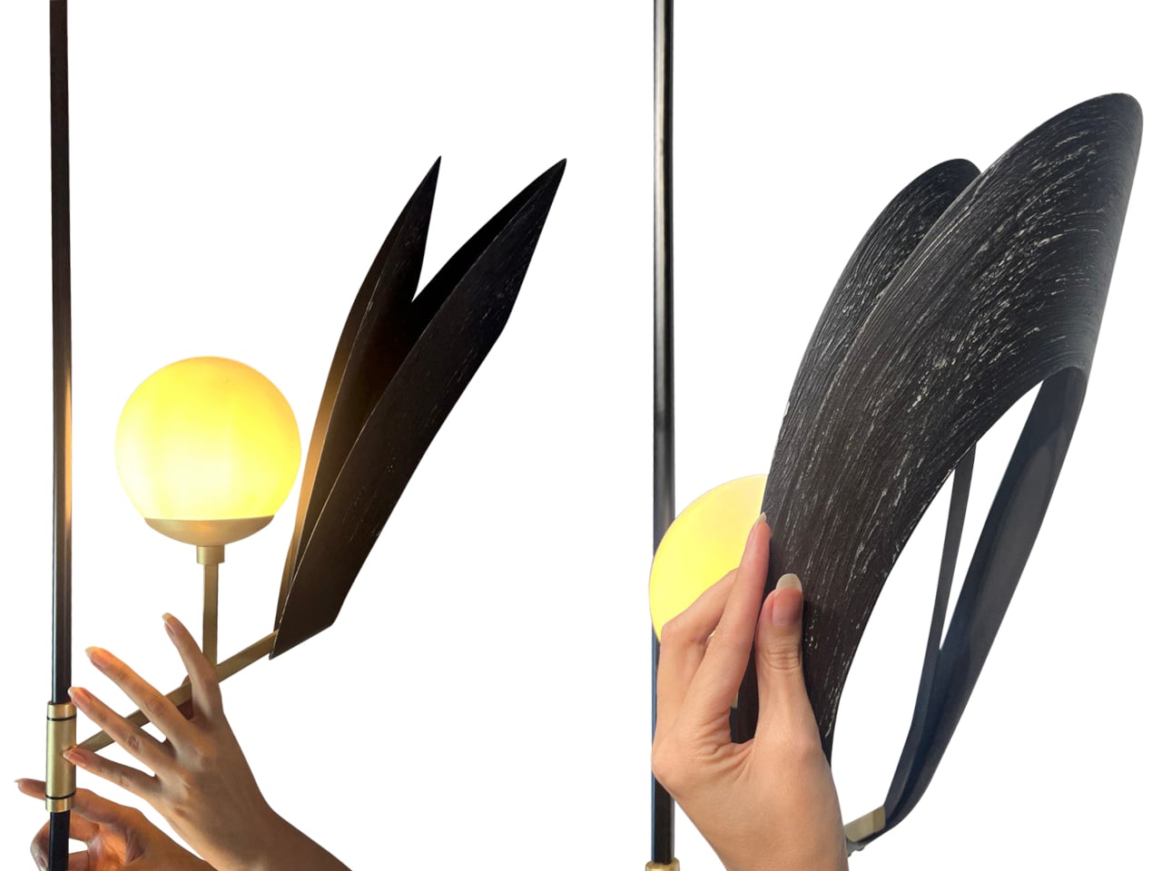
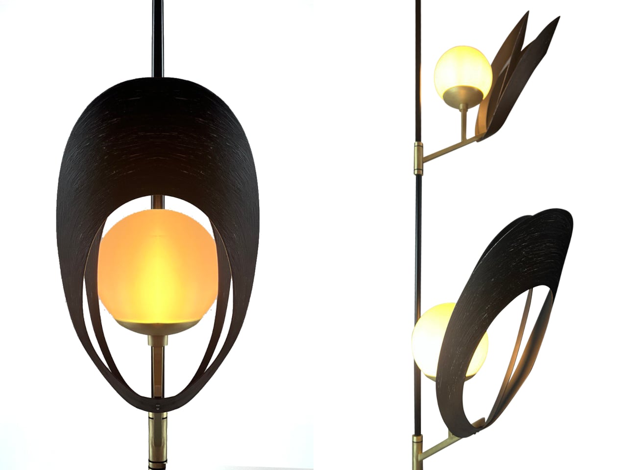
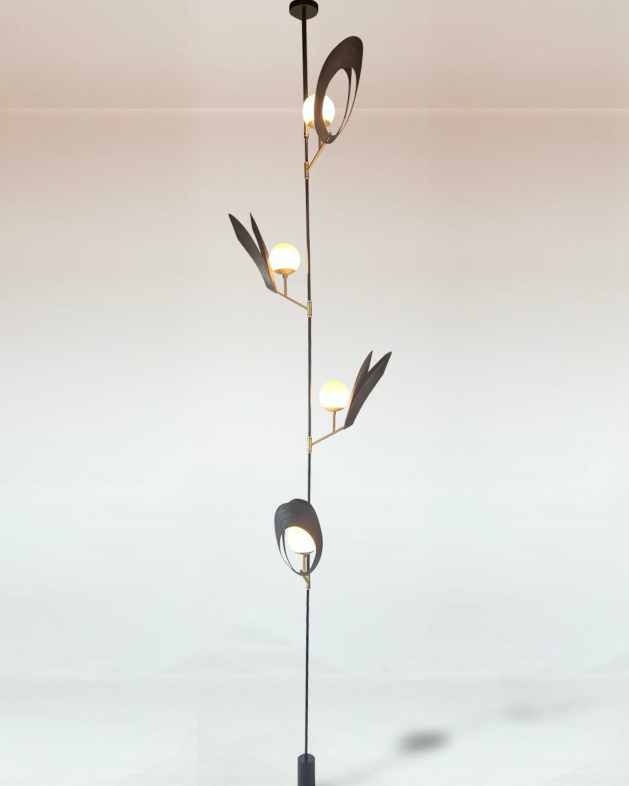
The starting reference is the black sea shell, specifically the way its structure balances curvature, layering, and quiet rhythm without any of it feeling constructed. Each Pelk module translates that logic into a pair of curved metal arcs, split open at the front, wrapping a frosted spherical globe without fully enclosing it. The arcs have a brushed, darkened finish and a visible surface texture that reads as geological up close, smooth from a distance, but clearly worked.
What the shell geometry does for the light is more interesting than what it does for the form. The arcs cup the globe rather than enclose it, so light spills forward and sideways while the back of the shell stays dark. Brass-toned cylindrical connectors catch just enough ambient glow to register as a material contrast. On the wall behind, the arcs throw wide, wing-like shadows that shift with viewing angle, extending the fixture’s presence well beyond its physical footprint.
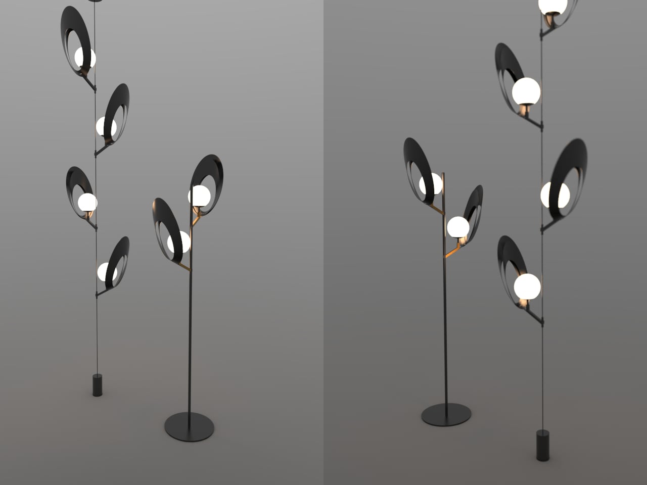
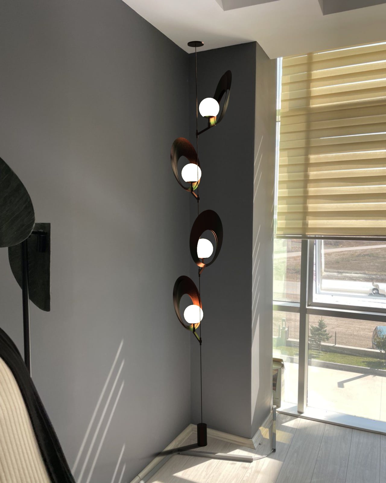
Pelk comes in two configurations. The floor lamp mounts two modules on a slender black rod above a flat circular base, staggered in height and rotated so the pair reads as a branching structure rather than a stack. The pendant version runs a thin cable from a ceiling mount down to a cylindrical floor counterweight, with four modules spiraling the full length, each rotated slightly from the last for a slow, unwinding rhythm.
That pendant version is the more spatially demanding of the two, occupying a full ceiling-to-floor span and working best against tall, uninterrupted walls where the vertical composition has room to resolve. A low ceiling or a cluttered corner fights it. The floor lamp is more forgiving, but it still performs better with clear wall space behind it, where the shadow work has somewhere to register, and the arcs read as architecture rather than decoration.
Arvandbarmchi frames Pelk as a spatial object that brings rhythm and proportion into a room, not just illumination. That ambition holds up in the pendant version especially, where the spiraling modules do something genuinely unusual with vertical space. That said, the lamp’s strong visual identity could either make it a collaborator in a room’s composition or a fixture that quietly competes with everything around it.
Vinyl outsold CDs in the U.S. for the first time since 1987 back in 2022, with 41 million records moved compared to 33 million compact discs. That number was not driven by audiophiles chasing warmer bass response. It was driven by people who missed the ritual: pulling a record from its sleeve, lowering a needle, and sitting with an album the way its creators intended. Streaming made music frictionless, and in doing so, it made music forgettable.
The turntables on this list understand that tension between convenience and ceremony. None of them are trying to replace a Spotify subscription, and none of them should. What they offer instead is a physical relationship with music that no algorithm can simulate, wrapped in design languages that range from invisible minimalism to brutalist sculpture. These five are worth the counter space.
1. Miniot Black Wheel
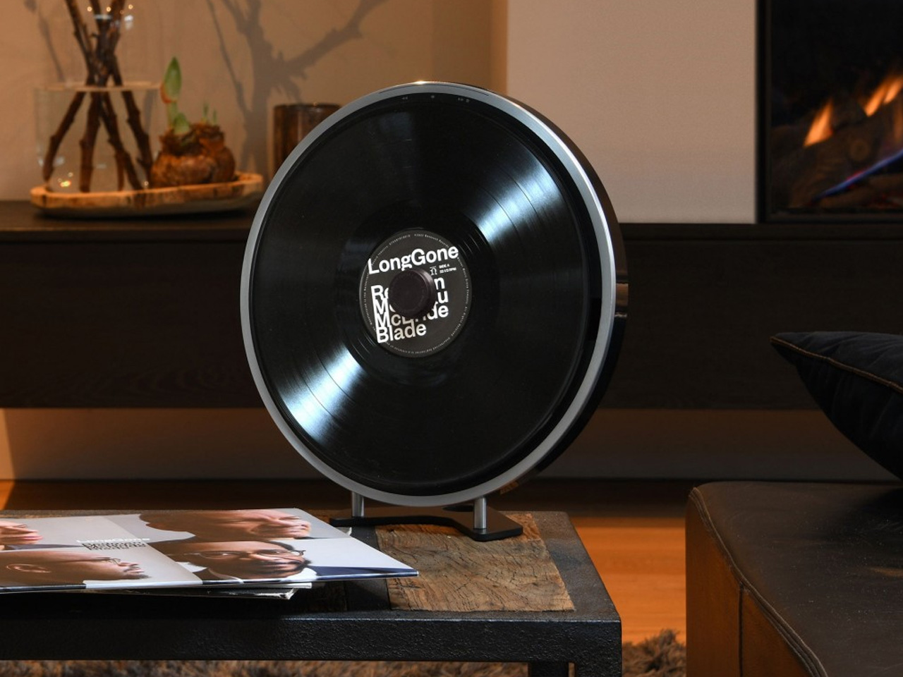
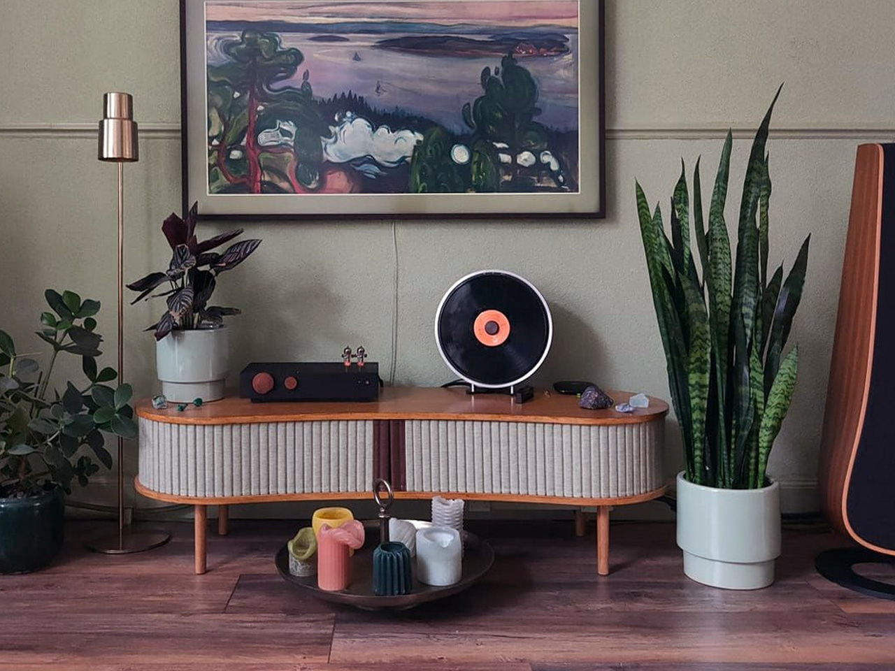
The turntable has not changed much in form since the 1970s: platter, tonearm, plinth, visible mechanism. Miniot’s Black Wheel throws all of that away. Every electronic and mechanical component sits inside a thin circular body that disappears completely once a record is placed on top. What remains visible is the record itself, spinning in what looks like mid-air.
Standing the Wheel upright amplifies the illusion, turning a turntable into a floating disc of sound. A tactile Slide Track hidden along the edge handles volume, track selection, and even stylus weight adjustment through a single physical interface. Slide or push, and the controls respond without ever breaking the visual spell. Despite the impossibly slim profile, Miniot has not sacrificed audio quality for the sake of the trick, which is the part that separates this from a design exercise.
What we like
The disappearing-body design makes the record the only visible element, turning playback into a visual experience as much as an auditory one.
The hidden Slide Track control system is intuitive and tactile, eliminating buttons and knobs without removing physical interaction from the equation.
What we dislike
The minimal form factor means no dust cover, leaving the record and stylus exposed to the environment between listening sessions.
Repairing or servicing the internals of such a tightly integrated body is likely far more complex than working on a traditional turntable.
2. Vivia CD Turntable
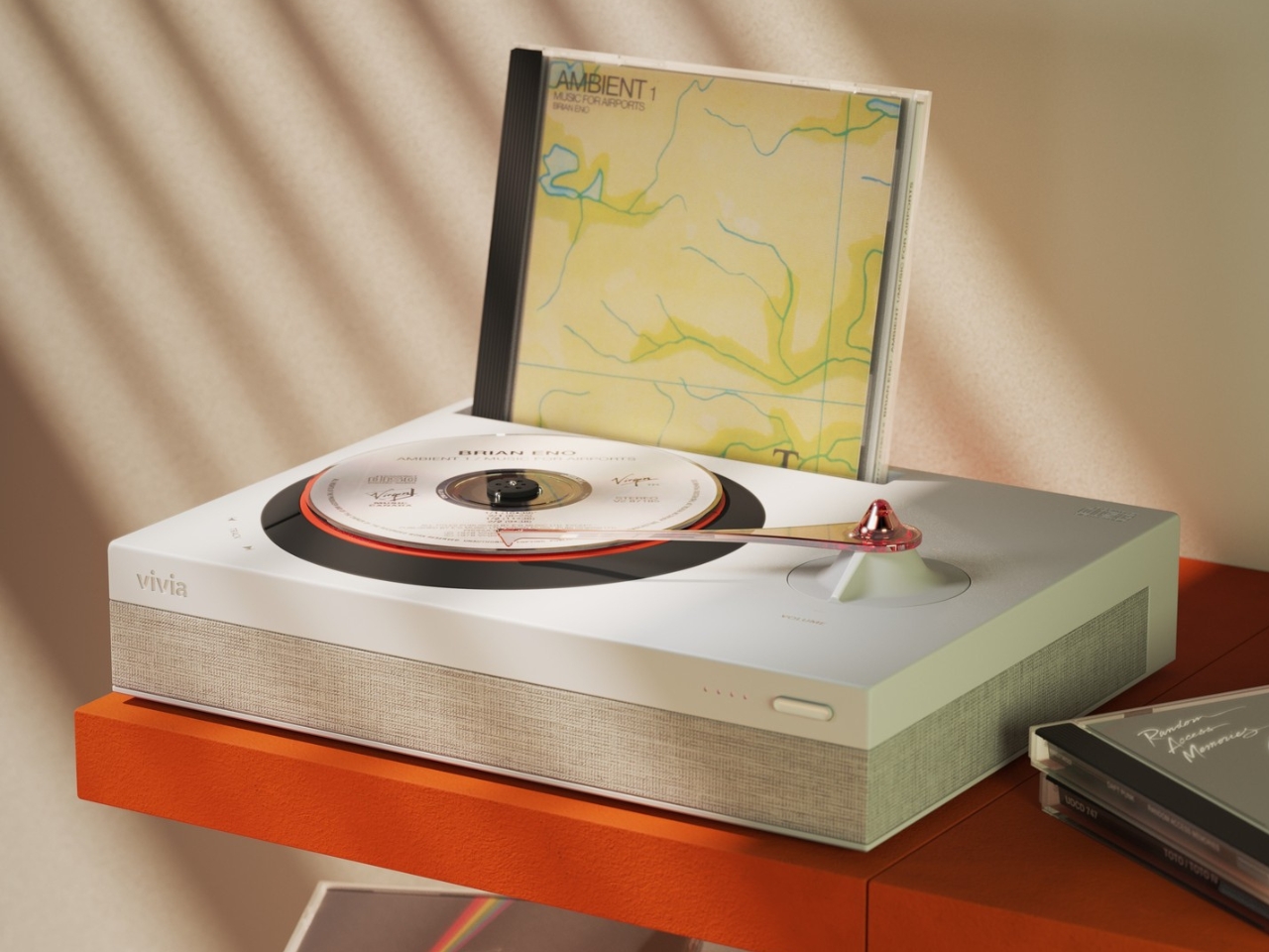
Here is where this list takes a deliberate left turn. Vivia is not a vinyl turntable at all. It is a turntable designed for compact discs, and the audacity of that idea is exactly why it belongs here. The concept takes the ritualistic appeal that drove vinyl’s comeback and applies it to a format that the industry abandoned in favor of streaming, even though CDs deliver superior audio clarity to most compressed digital files.
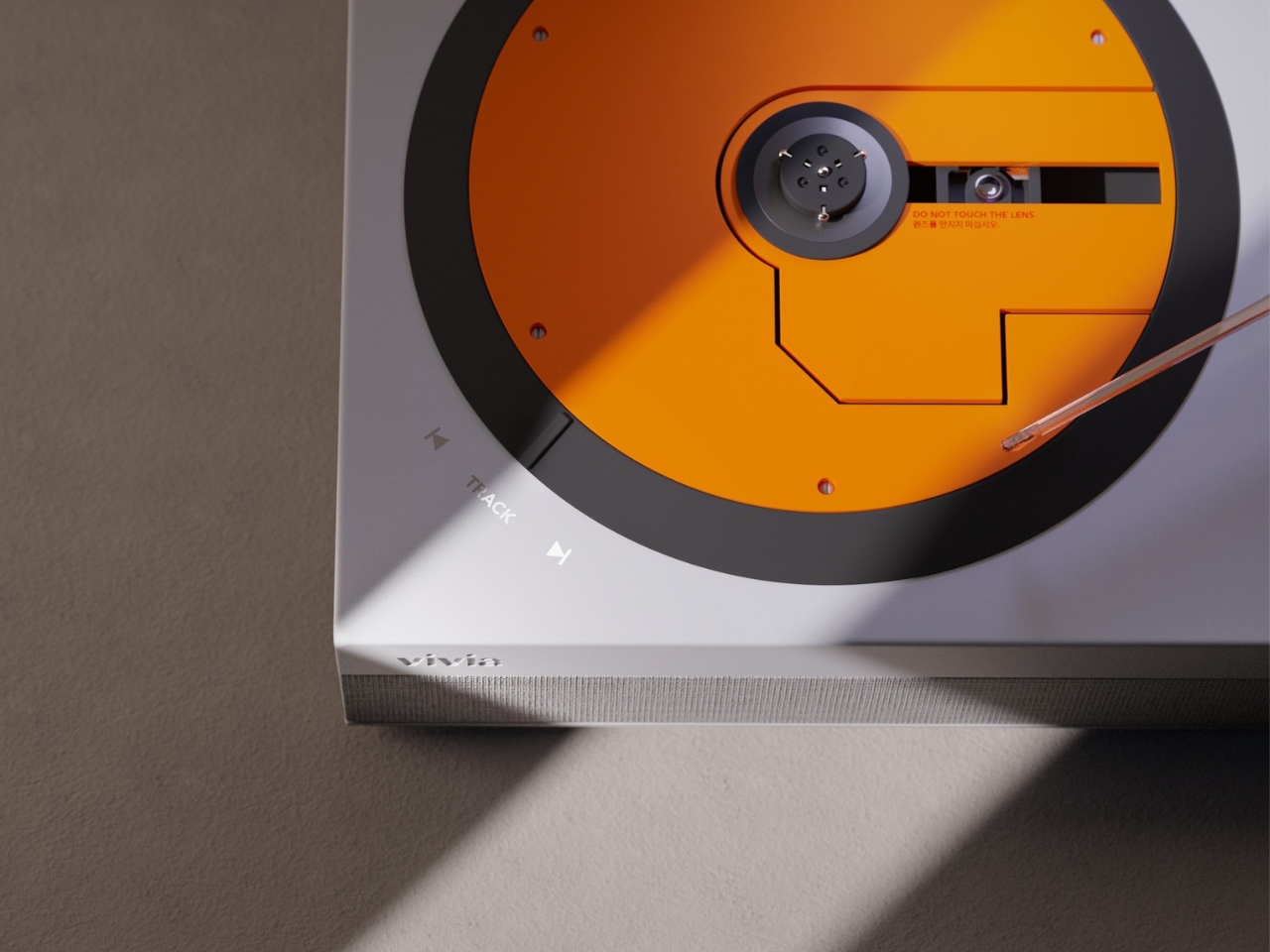
Vivia reimagines the CD listening experience as something tactile and intentional. Loading a disc, watching it spin, and physically interacting with playback controls recreates the ceremony that made vinyl appealing again, but for a format that has spent two decades collecting dust in storage boxes. The design borrows the visual grammar of analog turntables (the platter, the visible rotation) and translates it into a CD context that feels more like a statement about how we consume music than a product trying to compete on specs alone.
What we like
Visual design language borrows from analog turntables in a way that makes CD playback feel deliberate and special rather than outdated.
What we dislike
This remains a concept with no confirmed production timeline, pricing, or technical specifications to evaluate.
CD collections have shrunk dramatically, so the audience for a premium CD turntable is narrow compared to the growing vinyl market.
3. McIntosh x Sun Records Limited Edition MTI100
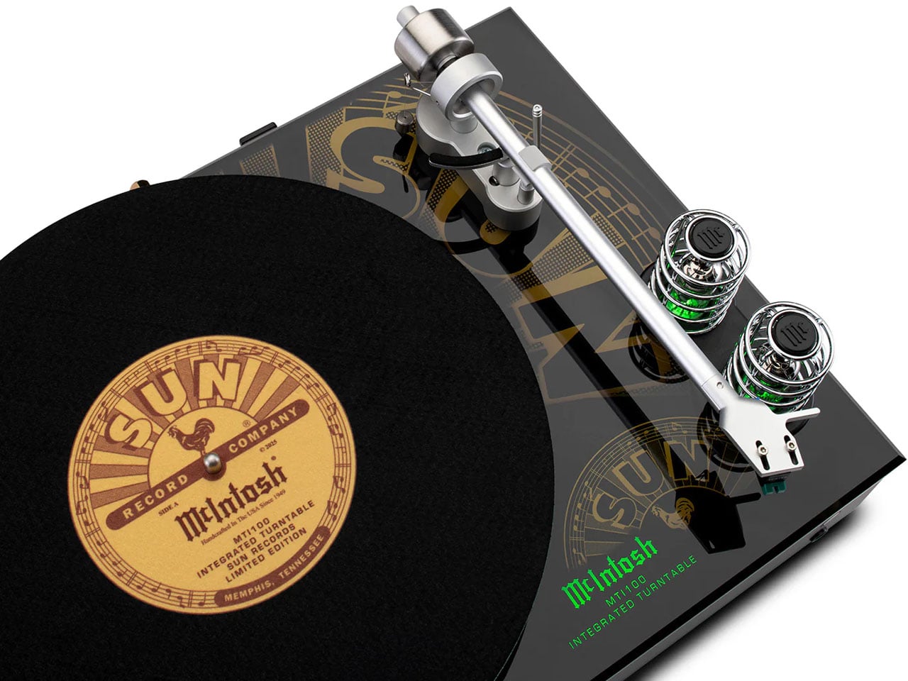
McIntosh has been building audio equipment since 1949, and the MTI100 carries that lineage into a format that appeals to listeners who want a complete system without a rack full of separates. This special edition, created in collaboration with Sun Records (the label that launched Elvis Presley, Johnny Cash, and Jerry Lee Lewis), packs a turntable, preamplifier, and amplifier into a single integrated unit with Bluetooth and auxiliary inputs.
The catch, and it is a deliberate one, is that speakers are not included. McIntosh recommends pairing with their own XR50 bookshelf or XR100 floorstanding speakers, but the unit connects to any audiophile-grade loudspeaker or even a pair of headphones for private listening. That flexibility is the real design move here. Instead of locking buyers into a closed ecosystem, the MTI100 acts as a hub that adapts to whatever speaker setup already exists in a room. The Sun Records branding adds a layer of music history that gives the limited edition a collectible weight beyond its audio performance.
What we like
The all-in-one integration of turntable, preamp, and amplifier eliminates the need for a multi-component audio rack while preserving high-fidelity output.
Bluetooth and auxiliary inputs mean the unit pulls double duty as a hub for digital sources alongside its vinyl playback function.
What we dislike
Speakers sold separately means the total system cost climbs well above the sticker price, especially if pairing with McIntosh’s own recommended models.
The limited edition Sun Records branding, while collectible, adds a premium that does not change the underlying audio performance of the base MTI100.
4. Samsung AI OLED Turntable
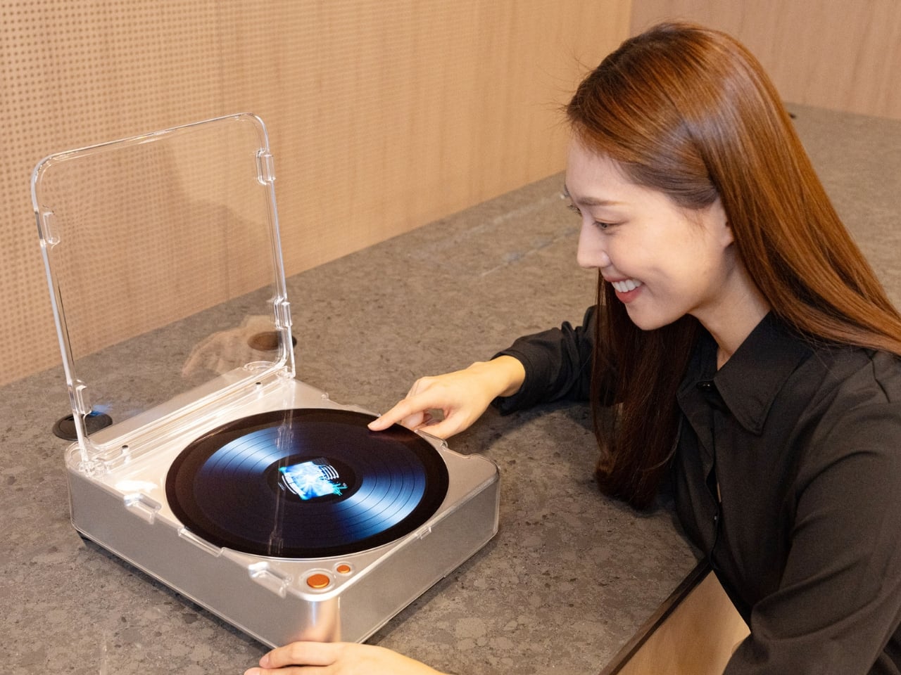
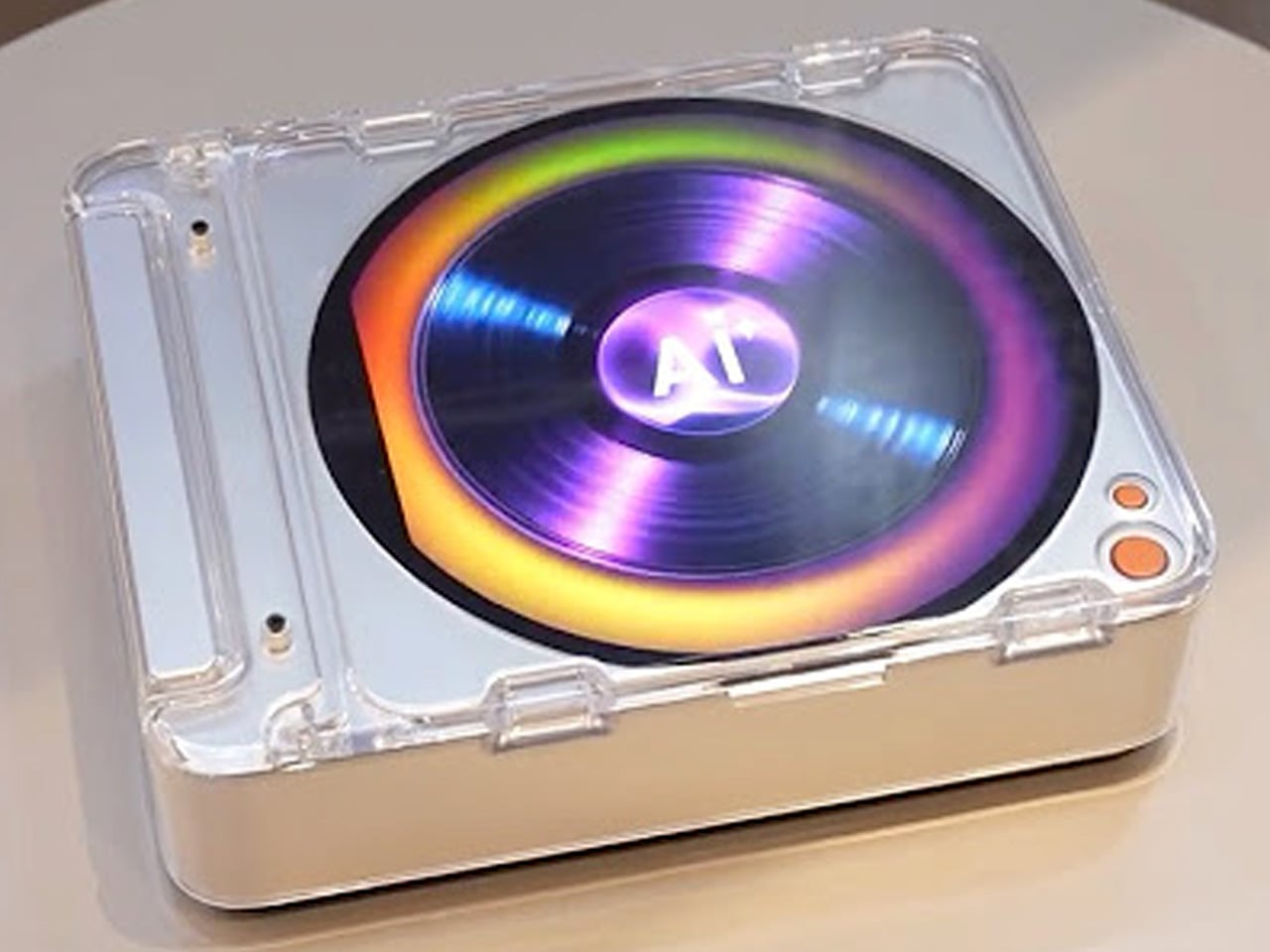
Samsung’s concept entry takes the turntable form factor and fills it with a 13.4-inch circular OLED touchscreen, turning the platter into a display surface that shows images, videos, and ambient visuals while music plays. It is part music player, part art installation, part conversation piece, and it makes no apologies about prioritizing spectacle over audiophile purity.
The circular OLED display becomes the centerpiece of whatever room it occupies, commanding attention in a way that most modern tech actively avoids. Imagine hosting friends and having the turntable surface shift between album art, ambient animations, and visual patterns that respond to the music. The design asks whether a turntable needs to be functional in the traditional sense to earn its place in a room, or whether the experience around the music matters just as much as the playback itself. Samsung has not confirmed production plans, but as a direction for where music hardware could go, this concept is more provocative than most finished products.
What we like
The 13.4-inch circular OLED display transforms a turntable into a visual centerpiece that adds ambiance to any room, not just sound.
The concept pushes the definition of what a music player can be, treating the listening experience as multi-sensory rather than purely auditory.
What we dislike
Concept status with no production timeline means this exists as a provocation rather than something listeners can actually buy and use.
The emphasis on visual spectacle raises questions about whether audio quality is a priority or an afterthought in the design.
5. RA84 Reycycled Plastic Turntable
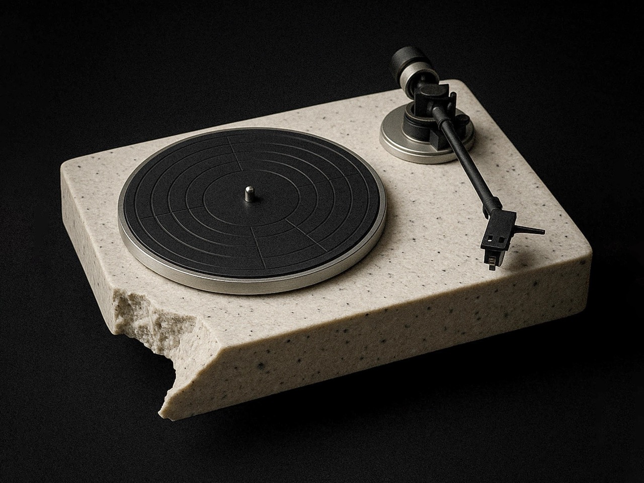
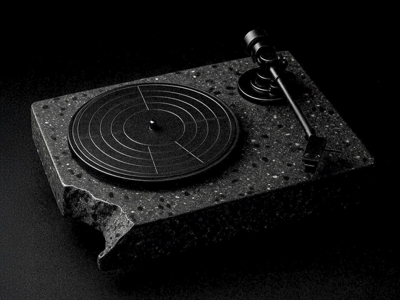
Ron Arad’s original Concrete Stereo from 1984 was a brutalist statement piece that treated audio equipment as sculpture. Stu Cole’s RA84 revives that same energy, but swaps the concrete for recycled plastic that mimics the look and weight of stone so convincingly that the difference is nearly impossible to detect without touching it. Available in concrete grey or a black finish that reads like expensive terrazzo, the RA84 is a turntable that doubles as furniture.
The material choice is more than an environmental gesture. That heft and density kill vibration, which is the enemy of clean vinyl playback. Recycled plastic performs surprisingly well acoustically in this application, delivering isolation results that rival traditional stone or concrete builds. Built-in speakers make this a complete system out of the box, and the deliberately chipped corners reveal the recycled material’s texture in a way that turns sustainability into a design detail rather than a hidden compromise. Cole’s execution proves that environmental responsibility and luxury do not need to compete with each other.
What we like
Recycled plastic construction achieves the vibration-dampening performance of concrete while being lighter and more environmentally responsible.
Built-in speakers deliver a complete, ready-to-play system that does not require separate components or additional purchases.
What we dislike
The brutalist aesthetic is polarizing, and the sheer visual weight of the RA84 will dominate a room whether the owner wants it to or not.
Built-in speakers, while convenient, limit upgrade paths for listeners who want to evolve their audio setup over time.
The needle and the algorithm
These five turntables (and one very bold CD player concept) share a common argument: that music playback is a designed experience, not just a data delivery mechanism. Streaming solved the problem of access. Every song ever recorded lives in a pocket now. But access without friction created a generation of listeners who consume music the way they scroll feeds, passively and endlessly. The turntable is the antidote to that passivity.
What makes this current wave of designer turntables different from the vinyl nostalgia of a decade ago is the ambition of the design thinking behind them. These are not retro objects cosplaying as vintage gear. They are new ideas about what a music player can look like, what it can be made from, and what role it plays in a room and a life. The best turntable in 2026 is not the one with the flattest frequency response. It is the one that makes someone sit down and listen to an entire album, start to finish, without reaching for their phone.
Most balcony railings do exactly one thing: keep people from falling off. The corners, in particular, tend to collect nothing more useful than rust and pigeons. Rephorm, a Berlin-based furniture brand, has a different idea about what that corner could be doing, and the result is a planter that fits where no standard pot ever has.
The Eckling is designed specifically for balcony corners, addressing a gap that rectangular window boxes and round hanging pots have never managed to fill. Most railing planters sit along a straight stretch of rail, so corners get skipped entirely. An L-shaped recess cut into the base of the hemispherical bowl allows it to rest squarely on two railing legs at a corner junction, no extra hardware required.
This is actually the second generation of Rephorm’s thinking on railing planters. The brand’s original Steckling pot, developed in 2006, introduced the idea of a planter that simply drops onto the rail rather than clipping or hanging. The Eckling borrows that logic and extends it to corner placement. Two plastic cable ties hidden beneath the bowl add security in wind, and the design fits railing stock up to 80mm wide across flat steel, round, and rectangular profiles.
At roughly 44cm in diameter, the Eckling offers about double the planting area of a standard round railing pot. The bowl holds approximately 16 liters of soil, nearly three times the capacity of a typical balcony planter. For anyone who has watched a small pot dry out in a single July afternoon, that volume difference matters. More soil means deeper root runs and longer intervals between watering, practical for herbs or compact perennials filling the wide, shallow bowl.
The material is recyclable polyethylene with a wall thickness Rephorm claims is two to three times that of budget planters from hardware stores. At approximately 2.5kg unfilled, the bowl is noticeably heavier than thin-walled alternatives, and that weight is part of the structural argument. Frost resistance is built into the formulation, so the pot stays through winter rather than being hauled inside each autumn. The matte surface reads closer to coated ceramic than the hollow appearance most balcony planters carry.
One real limitation is worth knowing before ordering. If corner posts project above the top rail line, the L-shaped recess cannot seat properly. The geometry only works when corner posts are flush with or below the horizontal rail, common in modern flat-steel and tube railings but less so in older ornamental ironwork, where vertical elements continue past the handrail. That’s a non-starter for a number of older apartment balconies, so it is worth measuring the railing before committing.
The Eckling is made in Germany, and the design is by Berlin-based architect Michael Hilgers, whose broader practice around what he calls “pragmatic design” tends to focus on modest objects that improve existing infrastructure without replacing it. A balcony corner is about as modest a canvas as it gets.
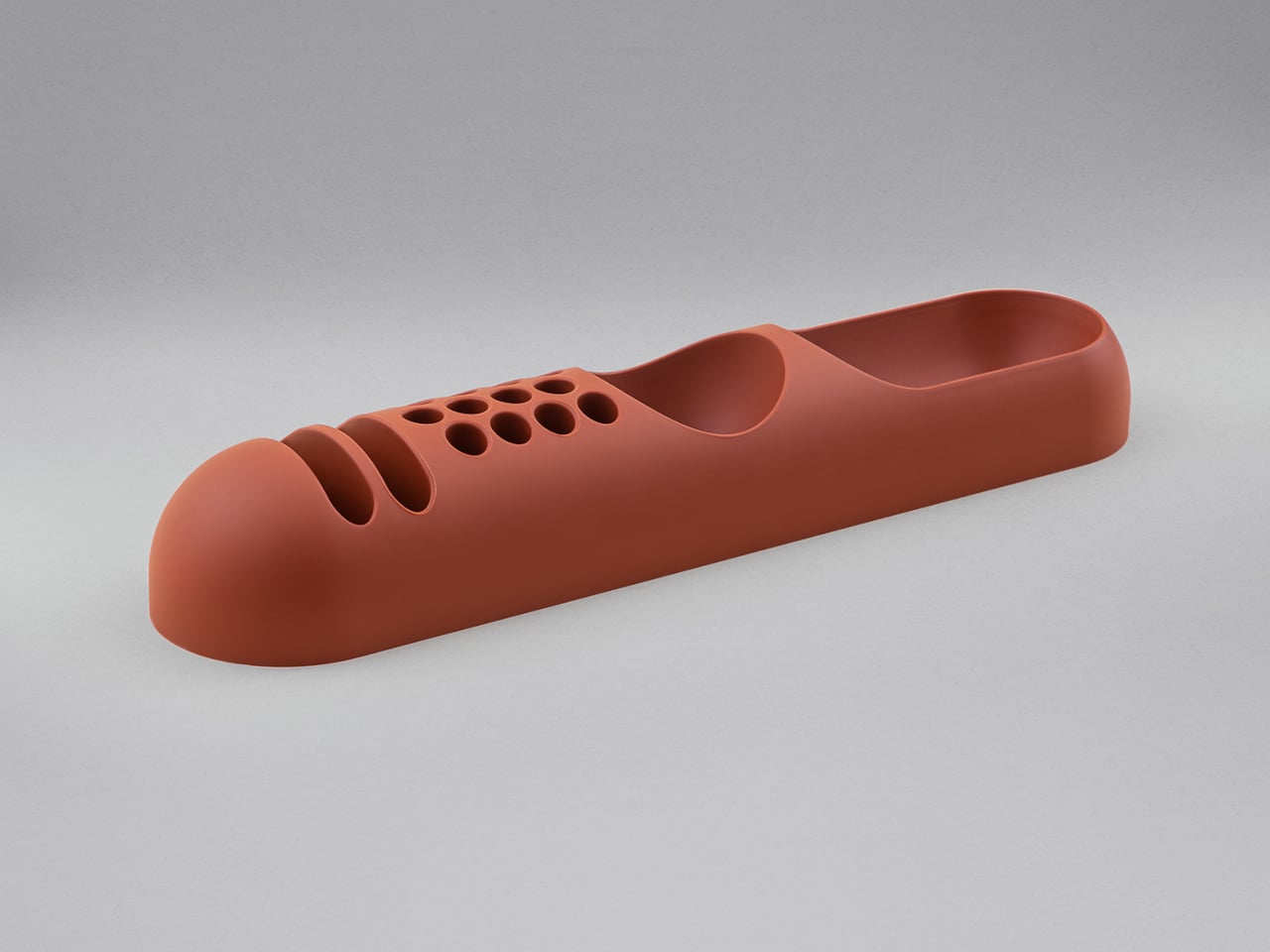
Desk organizers have a reputation problem. Most are either forgettable plastic trays that could have come from any office supply aisle, or overdesigned contraptions that look busier than the mess they’re meant to fix. Joe Colombo, the Milanese designer who died at just 41, had a very different take on this problem back in 1970, and it looked like nothing else on a desk then or now.
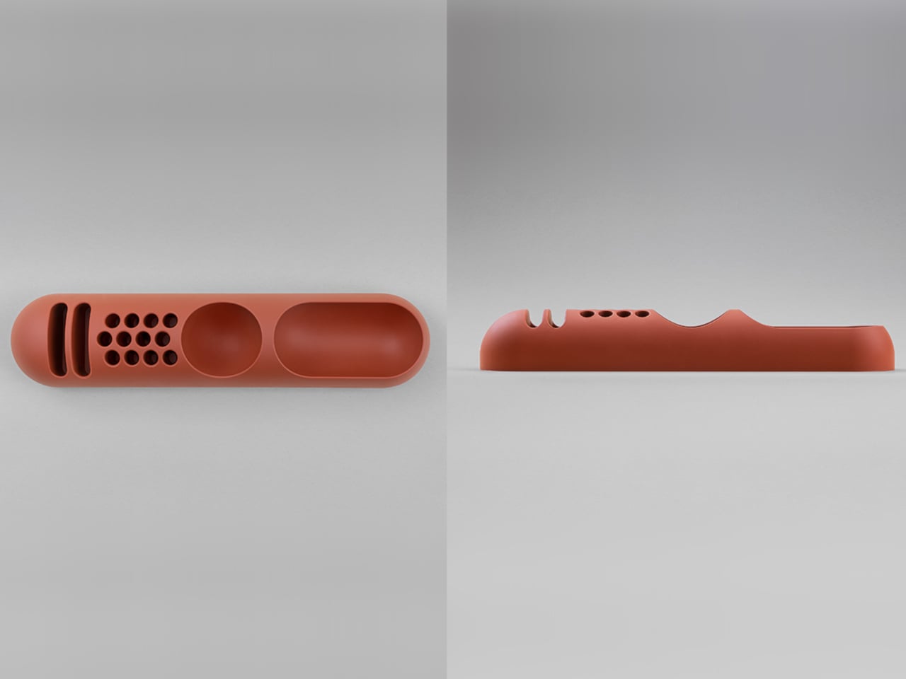
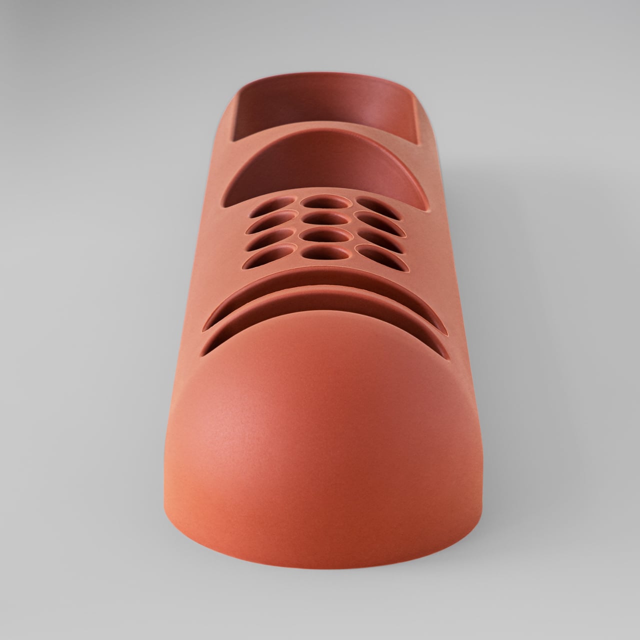
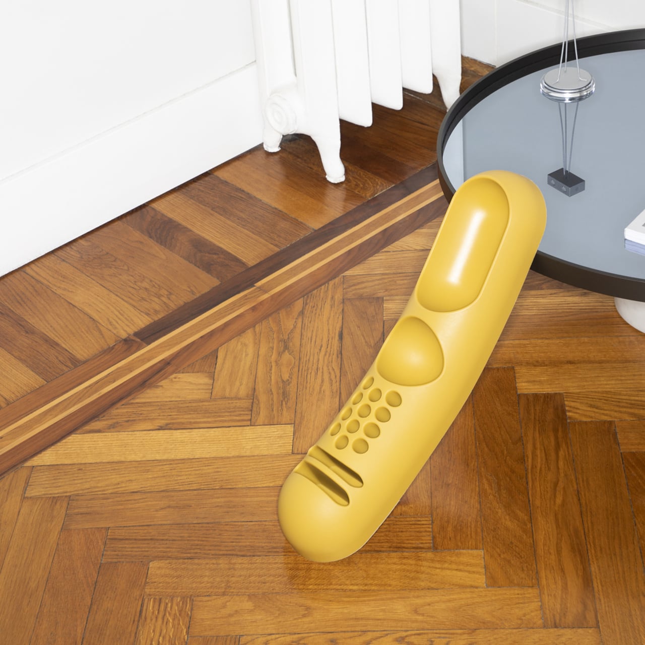
That design was BOB, a compact object holder made from polyurethane gel that Colombo shaped into something unmistakably organic. The form is elongated and low-profile, almost pill-shaped from above, with one end rising into a soft dome and the other tapering nearly flat. B-Line, an Italian label dedicated to acquiring original molds from discontinued Italian design objects, reissued it in 2023 in five colors: terracotta, slate blue, mustard yellow, warm white, and a translucent frosted version called “ice.”
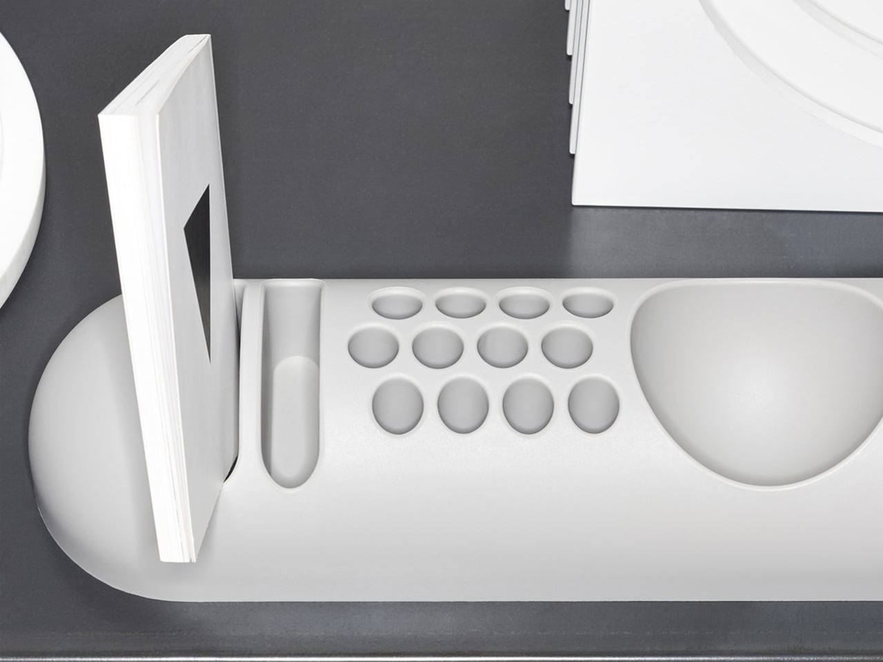
The top surface divides into three zones with no visible partition between them. The dome end opens into a large oval scoop for bulkier items; the center holds a 3-by-4 grid of individual circular holes, each sized for a single pen or brush; the tapered tail has two horizontal slot grooves that hold flat objects like rulers or small notebooks upright. None of this reads as a spec sheet in person. It reads as a single continuous gesture that happens to organize things.
Colombo was working at a moment when Italian design was treating plastic not as a cheap substitute for better materials, but as a medium with its own formal possibilities. Polyurethane gel has a tactile quality most rigid desk accessories never attempt: it gives slightly under pressure, has a matte surface that’s almost skin-like, and its flexibility is what makes the low, curved profile structurally possible in the first place. A stiffer material would have needed walls. This one doesn’t.
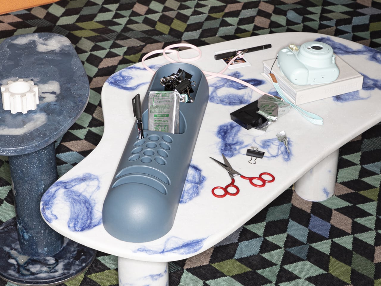
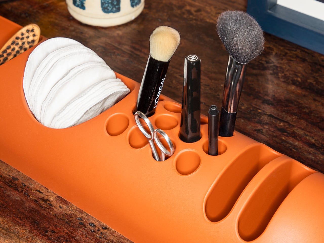
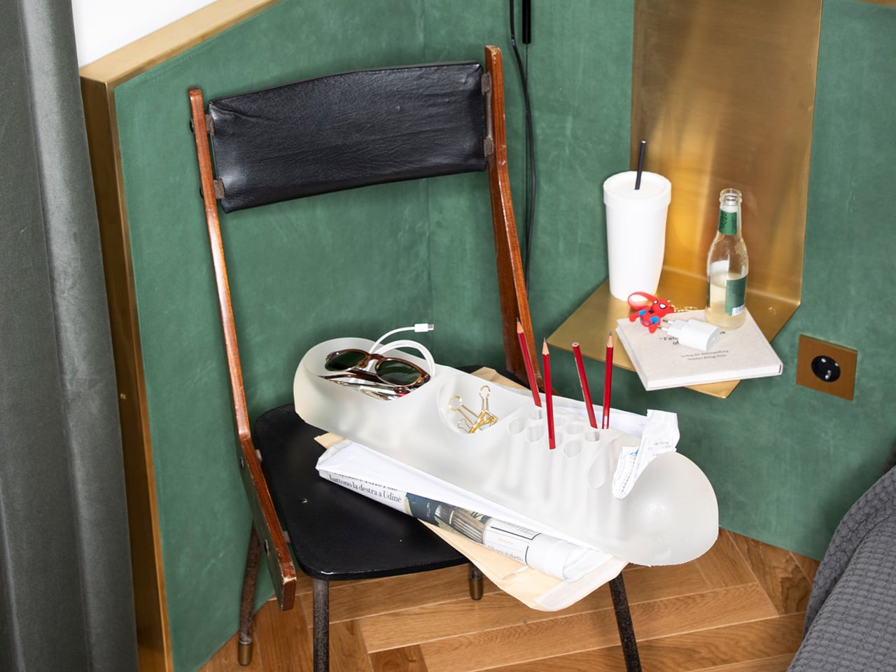
B-Line’s campaign photography makes a quiet argument for where BOB actually belongs. It appears on a marble coffee table holding binder clips and scissors, on a chair seat catching pencils and sunglasses, and on a bathroom vanity with makeup brushes in the pen holes and cotton pads in the scoop. One image places the ice-colored version inside a freezer, either a dry joke about the colorway name or a genuine hint that the flexible polyurethane handles cold fine. Probably both.
That flexibility is worth taking seriously. BOB lies nearly flat on any surface, which means it doesn’t create visual clutter the way upright organizers do. It also means the pen holes require implements long enough to stay upright on their own, which is a quiet limitation Colombo’s grid doesn’t advertise. Short lipstick caps, small erasers, and anything under roughly 10 centimeters will just rattle around rather than stand.
The price reflects provenance more than function. B-Line sells through retail partners, not directly to consumers, and those partners have set their own figures: Design Public at $190, Bauhaus 2 Your House at $427. Colombo’s other B-Line reissue, the Boby trolley, is in MoMA’s permanent collection. BOB is the quieter object from the same designer and the same era, and it raises a question the images don’t quite answer: how many rooms does a well-made desk organizer need to conquer before that price starts to feel reasonable?
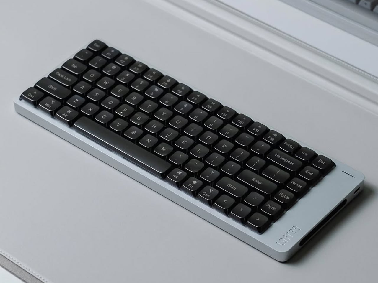
Low-profile mechanical keyboards have always had a bit of an identity problem. They look the part: slim, clean, desk-friendly. Set one beside a MacBook and it fits right in, at least until you start typing and the plastic keycaps remind you that the aesthetic only goes so far. It is not that PBT is bad. It is just that plastic has a ceiling, and once you have typed on a well-built board, you start to feel where that ceiling is. The sound is a little hollow. The surface wears down. For a form factor that sells itself on refinement, the keycaps have always been the weakest part of the pitch.
That gap is exactly what Awekeys Air is designed to fill. These are low-profile metal keycaps built from recycled cupronickel, a copper-nickel alloy most people know from coins rather than keyboards. Beyond the material upgrade, there is an immediate visual payoff. A set of Satin Copper or Satin Gold caps on a slim board transforms what was previously just a functional object into something that actually improves the desk around it, the kind of detail that catches the eye mid-conversation and holds it.
At 5 mm tall, the Awekeys Air is half the height of a standard keycap, which typically sits at around 11 mm. That gap matters more than it sounds. A slim keyboard paired with standard-height keycaps loses its whole visual argument, and any ergonomic board designed for low-profile switches defeats its own purpose if you pile taller caps on top. The Air keeps that geometry honest while upgrading what that geometry is made of.
As someone who writes for a living and codes on the side, I see the keyboard as less a tool and more a constant physical companion, and the I find that the Awekeys Air shifts that relationship in a way that is difficult to ignore. The cupronickel surface stays cool under extended sessions, the low profile keeps wrist angle natural, and the grip from the hand-brushed Special Edition means fingers land where they are meant to, without any of the slight drift that smooth plastic encourages over a long afternoon.
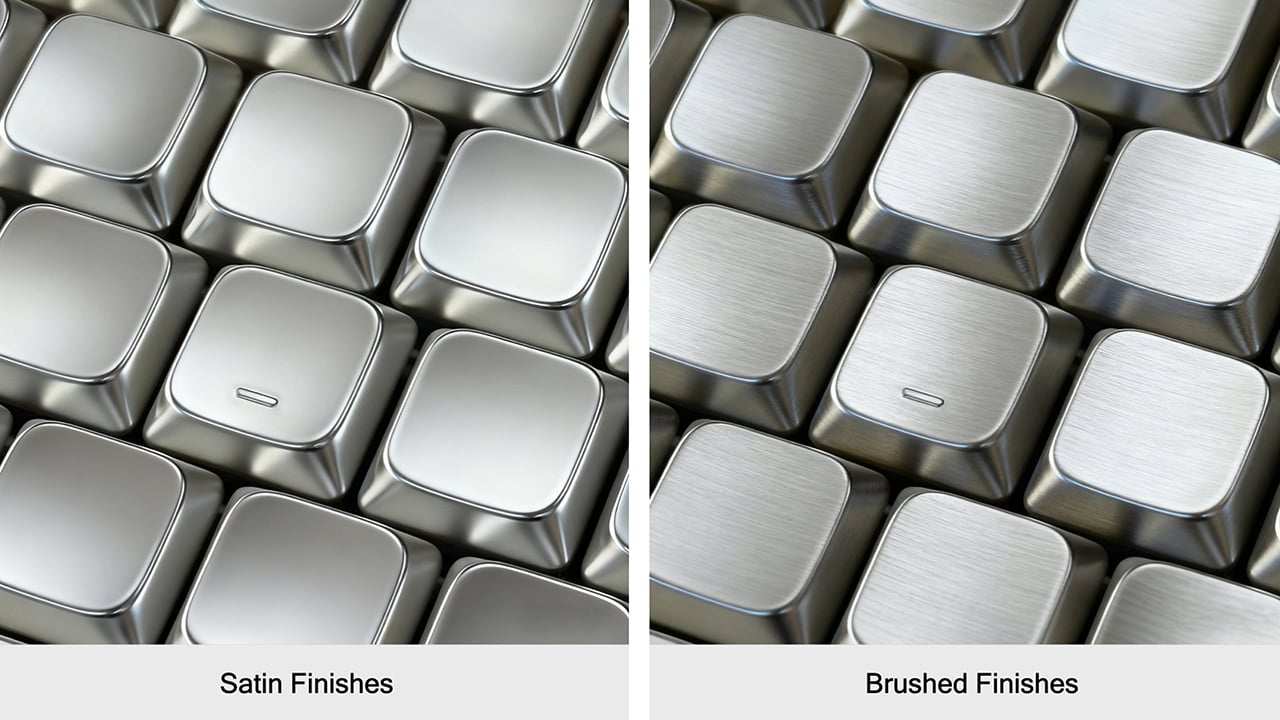
Finish is where the Awekeys Air earns a lot of its character. Seven keycap colorways cover the satin-style options: Satin Gold, Satin Silver, Satin Copper, Titanium Black, Obsidian Black in matte, Ivory White in matte, and Sakura Pink. Each of them reads differently on metal than on plastic. Satin Copper picks up warm ambient light in a way no dye-sublimated PBT can replicate. Titanium Black has that flat, composed surface that makes a keyboard look more like a precision instrument than a peripheral. Small distinctions, but they add up when the whole point is a desk setup that looks as considered as it feels.
The Special Edition hand-brushed finish takes things a step further, available in Gold, Silver, Copper, and Ti Black. Each keycap is brushed individually, which creates a directional texture that shifts under light and adds a grip that the satin versions do not have. It is the kind of finishing detail that is easy to overlook in a product photo and immediately obvious the moment you sit down to type.
Holding it all together is a second-generation nano-coating that Awekeys claims delivers twice the scratch resistance of its first version. For keycaps that will see thousands of actuations daily, surface protection matters more on metal than on plastic, where wear is expected and mostly forgiven. The coating is what keeps the finish consistent across the whole set over time, and on a metal that is this unforgiving of surface variation, that consistency is doing real work.
The recycled angle is worth taking seriously, too. Awekeys notes that processing recycled cupronickel requires roughly 15% of the energy needed for raw metal extraction. giving the material story a logic beyond a simple badge. The acoustic character completes the picture: denser, more planted, with a sound that leans satisfying rather than sharp. The slim keyboard has been waiting a long time for a keycap set built to match it, and the Awekeys Air makes a strong case that the wait is over.
A sneaker-sized robot developed at RMIT University in Australia is making a compelling case for rethinking how humanity responds to one of the ocean’s most persistent threats. The “Electronic Dolphin” is a Wi-Fi-controlled minibot built to skim oil slicks from contaminated marine surfaces without deploying any chemical dispersants, and without putting human responders anywhere near the hazard. Detailed in the journal Small, the device is compact, remote-operated, and draws on one of nature’s more underrated structural templates to do its job. It is not the first machine built to address marine oil contamination, but it may be the first to approach the problem with this particular combination of biomimicry, material science, and autonomous ambition.
The secret is in the filter. Rather than relying on PFAS-based absorbents, which are toxic, persistent in the environment, and increasingly regulated worldwide, the RMIT team engineered a composite coating from specialized carbon layers and modified barium carbonate. The resulting material mimics the microscopic spine geometry found on sea urchins, forming tiny protrusions that trap air pockets in a precise architectural arrangement. That structure makes the surface simultaneously superhydrophobic and oleophilic, a combination that causes water to roll straight off while oil latches on and gets drawn in. The chemistry here is elegant in the way good materials science often is: solving a messy physical problem through surface geometry rather than reactive chemistry.
Designers: RMIT University
The filter sits at the robot’s nose, paired with a small onboard pump that actively draws the oil slick inward. In controlled laboratory tests, the prototype processed oil at roughly two milliliters per minute, achieving over 95% purity in the recovered material. The coating also demonstrated strong corrosion resistance when exposed to saltwater, and held up across multiple reuse cycles without meaningful degradation. Those numbers matter because reusability is one of the practical bottlenecks that has historically limited oil spill response hardware. A filter that survives repeated deployment in a corrosive marine environment is a filter worth scaling.
The current battery life runs to about 15 minutes, which is honest enough for a research prototype operating at this scale. The RMIT team is candid about the limitations, and equally clear about the trajectory. Future iterations are envisioned at dolphin scale, fully autonomous, and capable of operating in a continuous loop: skim the surface, return to a base station, drain the collected oil, recharge, and head back out. That remediation model borrows from how robotic vacuum cleaners normalized autonomous domestic cleaning, and it translates surprisingly well to open-water spill response, where the geography is hostile, the timeline is open-ended, and human supervision is expensive.
Marine oil spills remain one of the more intractable environmental disasters, not because the problem is poorly understood but because the cleanup tools available have lagged behind the scale of the damage. Dispersants break oil into smaller particles that sink rather than surface, which looks like cleanup but often relocates the harm. Booms and skimmers are manual, slow, and weather-dependent. The Electronic Dolphin does not solve all of that at once, but it represents a shift in the design logic: autonomous, chemical-free, biomimetically informed, and built from the start with continuous deployment in mind. That is the kind of thinking the problem has always deserved.
Jurassic Park lied to you. The velociraptors that terrorized a kitchen full of children and hunted Jeff Goldblum through tall grass were modeled after Deinonychus, a considerably larger North American cousin, because the filmmakers thought the real animal’s name sounded cooler than its actual dimensions warranted. The real Velociraptor mongoliensis stood about 1.6 feet at the hip and weighed roughly as much as a medium-sized dog. Formidable, certainly, but built to the scale of a farmyard bird rather than an apex predator capable of coordinated ambushes.
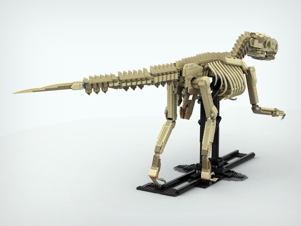
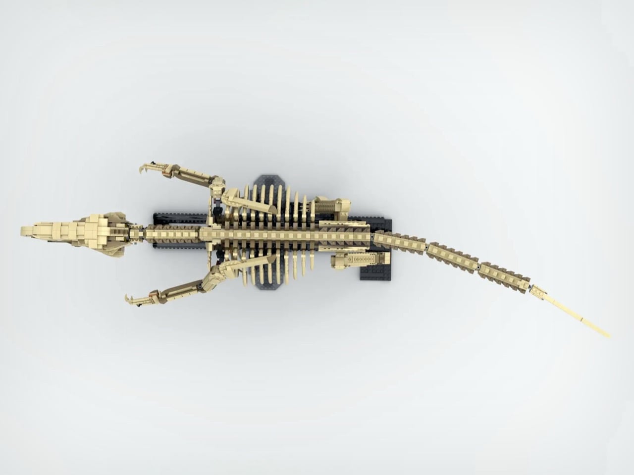
Which is exactly what makes this LEGO Ideas submission by creator Terraxz so interesting. Built to true scale from paleontological measurements of a juvenile V. mongoliensis specimen, the model sits at approximately 120 cm long and 40 cm tall on a museum-style display stand. It has the ribcage, the vertebrae, the sickle claw, the whole skeleton rendered in tan brick. LEGO has been on a fossil skeleton tear lately, but nobody has attempted one at actual 1:1 scale until now.
Designer: Terraxz
LEGO’s Dinosaur Fossils line began as a fan submission that became the 910-piece Ideas set 21320, featuring T. rex, Triceratops, and Pteranodon skeletons at 1:32 scale. LEGO then escalated with the Jurassic World set 76968, a 3,145-piece T. rex skeleton stretching over 105 cm at 1:12 scale, which launched in March 2025 and immediately became the largest Jurassic World set the company had ever produced. Every iteration in this lineage has been a scaled-down representation, a display piece calibrated for shelf real estate rather than scientific fidelity. Terraxz is doing something structurally different: the model matches the actual size of the animal it depicts, which reframes the whole exercise from decorative object to physical argument about what the creature actually was.
Look at the skull closeup and you can see individual tooth rows built from stacked brick elements, fenestrae represented as open negative space through clever plate offsetting, and a jawline that actually captures the elongated low-profile snout that distinguishes V. mongoliensis from the broader-headed Hollywood version. The spine runs in a proper S-curve, the tail extends horizontally as it should for a bipedal theropod using it as a counterbalance, and the legs are proportioned correctly for an animal that stood 0.5 meters at the hip rather than eye level. The black display armature borrows the same museum-mount language as LEGO’s official sets, with cross-braced vertical supports that would look at home in any natural history gallery.
A fully adult V. mongoliensis reaches around 1.8 to 2 meters in length, which would push this build into genuinely unwieldy display territory. Choosing a juvenile specimen is a calibrated decision that keeps the model physically manageable while maintaining the true-scale claim, and it maps to real fossil record data: a complete juvenile skeleton described from the Djadochta Formation gives the builder a legitimate scientific reference point rather than an averaged extrapolation. Terraxz has a catalog of related MOCs on Rebrickable, including a true-scale V. mongoliensis skull, so this submission is the culmination of an ongoing paleontology project rather than a standalone pitch.
LEGO Ideas requires 10,000 supporter votes within the submission window for a design to enter official review, and Terraxz currently sits at just over 1,000 with 605 days remaining. That’s enough time to accrue the votes needed to turn this into a retail set. I’m pretty sure that a whole bunch of people beyond
paleontologists would like a to-scale velociraptor skeleton adorning their bedroom or hallway. The submission is live on the LEGO Ideas website, and it takes about thirty seconds to cast your vote, so what exactly are you waiting for?
There’s a certain kind of person who loves the idea of vinyl records without necessarily owning a turntable. They appreciate the artwork, the ritual of flipping a side, the warm analog aesthetic that streaming services have spent years trying to replicate with album art thumbnails and animated soundwave graphics. For that person, and honestly for plenty of actual vinyl collectors too, LEGO quietly released one of its more charming sets of 2024, and a lot of people missed it entirely.
The LEGO 40699 Retro Record Player wasn’t sold in stores. It was a gift-with-purchase exclusive during LEGO Insiders Weekend in November 2024, meaning you had to spend $250 or more on LEGO.com within a two-day window to take one home. That’s a steep entry point for a 310-piece set that fits in the palm of your hand. Unsurprisingly, it’s now showing up on secondary markets for around $50, which tells you more about how people actually feel about it than the promotional circumstances suggest.
What makes it interesting as a design object isn’t the scarcity. It’s the details LEGO chose to include for a freebie that most buyers would have been happy to receive with far less effort. Every single element in the set is printed, no stickers anywhere, including new tile pieces featuring equalizer bars and musical note graphics that were debuted specifically for this set.
The needle swivels and can be tucked behind a small antenna piece when not in use. Flip it around, and there are printed red, white, and grey ports on the back representing stereo channels, details that nobody asked for and that audio enthusiasts will immediately clock. A hidden gear underneath lets the record actually spin, which is either a delightful touch or a reminder that LEGO designers genuinely cannot help themselves.
The set slots into a growing line of brick-built nostalgia objects LEGO has been developing with some consistency. The Retro Radio, the Typewriter, the Polaroid OneStep Camera, each one picks a specific object from cultural memory and asks whether it still means enough to someone to sit on a shelf. The record player fits that pattern, though its scale is more playful than faithful. Closed, it measures about 1.5 inches high and 6 inches wide, so it’s not pretending to be a replica. It’s more like a knowing nod to the thing, compressed into something you can place next to a real turntable or a stack of records and let it be what it is.
The timing of its renewed attention is interesting. Search interest in record players has spiked noticeably in early March 2025, and the LEGO set has moved with it, picking up momentum in trend data well after its promotional window closed. That’s a pattern worth watching with this category of LEGO set. They’re not designed to chase a specific cultural moment. They’re designed around objects durable enough in people’s memories to stay relevant across multiple ones.
Whether a 310-piece brick turntable that doesn’t play music belongs in the same conversation as the real vinyl revival is a fair question. What’s harder to dismiss is that a set distributed as a promotional freebie is generating genuine collector interest months later, and that LEGO apparently left enough room in the design for people to discover details they weren’t expecting to find.
Game controllers have not changed much in shape since the mid-1990s. They’re still two-handed symmetrical slabs built around adult grip dimensions, loaded with enough buttons to pilot a small aircraft. For a 10-year-old just getting into gaming, picking one up for the first time is a bit like being handed a TV remote and told to perform surgery, no sweat.
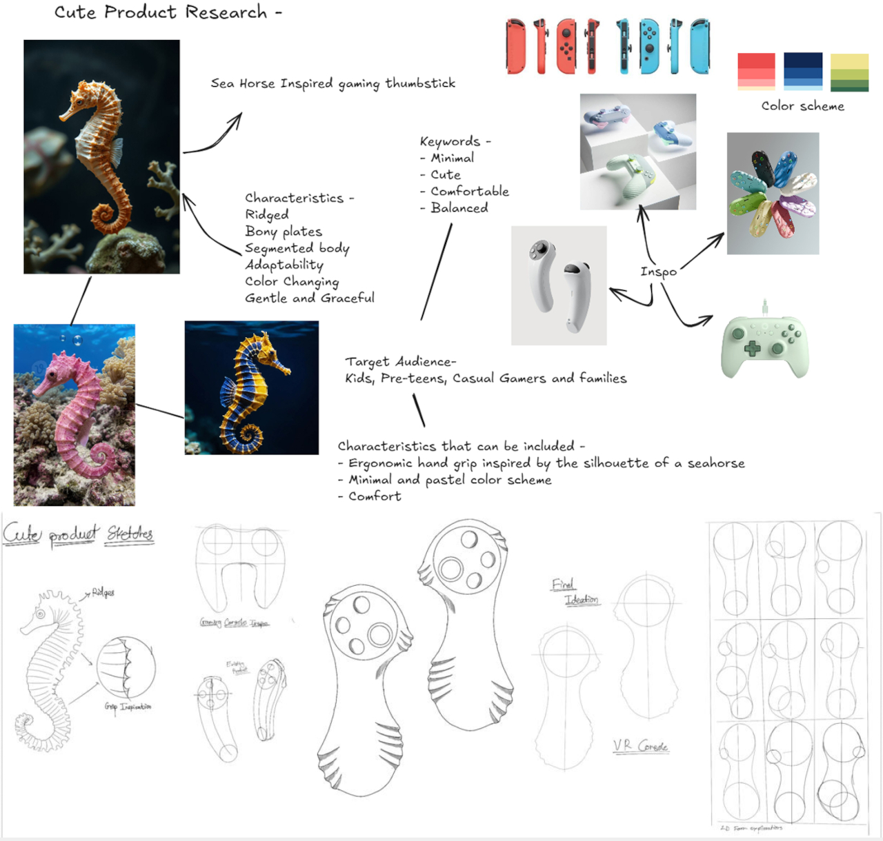
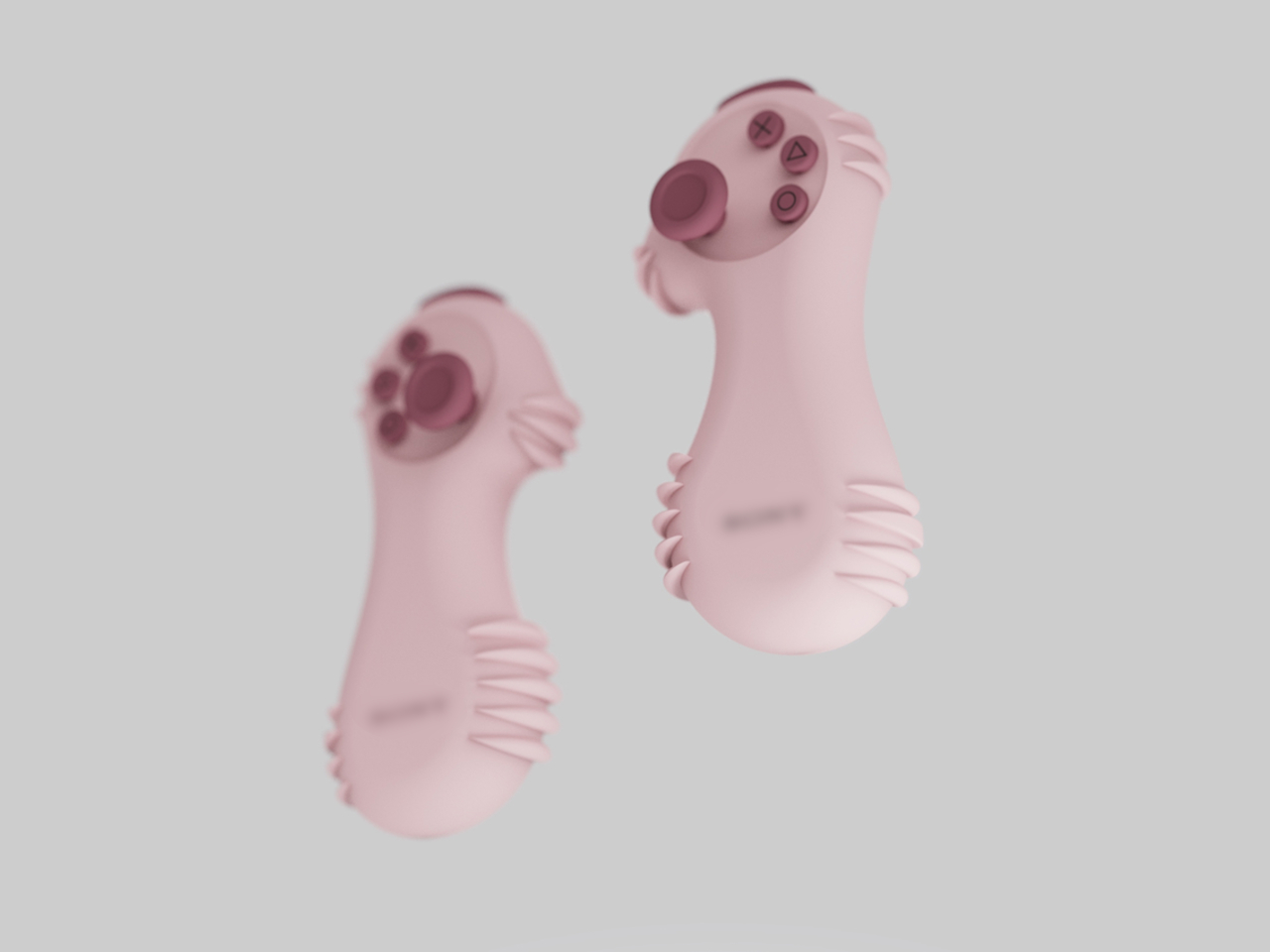
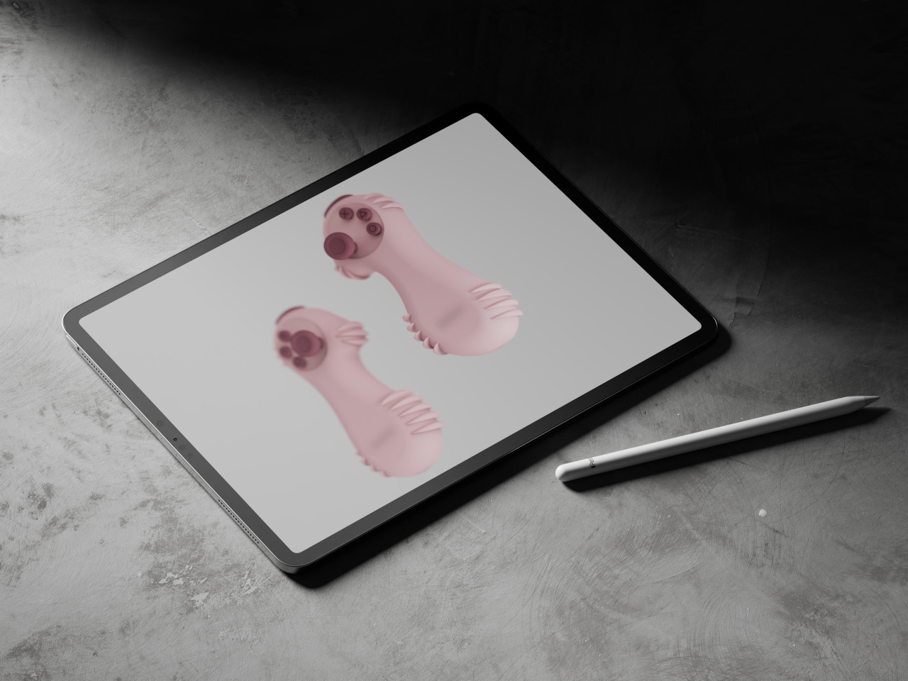
The concept is called LEVION, and it proposes a split controller: two separate units, one per hand, each sized for a pre-teen’s palm. It was designed as a rethink of the thumb stick from scratch, and the result looks like nothing in the current gaming peripheral market, which is mostly the point. And its inspiration comes from the most unlikely source you can imagine.
The form comes from a seahorse, specifically its upright posture, curved spine, and ridged body. Those horizontal ridges, translated into a soft frill around the base of each unit, are the structural logic of the grip. A seahorse’s bony plates give it stability without bulk, and LEVION’s ridges do the same thing for a small hand holding a rounded object across an hour of gameplay. It’s biomimicry that connects cause to effect rather than borrowing a shape for decoration.
Each unit carries a joystick, three face buttons, and a shoulder button, arranged on a circular head that sits atop a curved hourglass body. The silhouette is wider at the head and base, pinched at the waist, giving the thumb a natural landing zone and keeping the unit from rotating mid-game. The sketch process started with a seahorse drawing annotated “grip inspiration” before moving through VR console proportions to arrive at this form, so the shape isn’t just decorative shorthand.
The colorways lean into the pre-teen audience: pink, mint green, sky blue, and lavender, all in a soft matte finish that reads more like a toy than a peripheral. That positioning is deliberate. Standard controllers signal seriousness and capability. LEVION signals approachability, which matters when the target user is still sorting out that the left stick moves the character and the right one moves the camera.
The honest question is one of input coverage. A standard PlayStation controller has two joysticks, a D-pad, four face buttons, four shoulder buttons, and several system controls. LEVION offers a joystick, three face buttons, and one shoulder button per hand. For casual and younger audiences, that might be exactly right. For anything more demanding, the math gets uncomfortable, and the concept doesn’t address how that gap closes when the pre-teen turns 13.
That’s worth taking seriously, but it doesn’t diminish what LEVION gets right in the space it occupies. The design’s own research board lists the Nintendo Switch Joy-Cons as a reference point, and the parallel is fair: the Joy-Con also split a standard controller into two smaller units and found an audience that didn’t know it needed that format. LEVION asks the same question one step earlier in the age range, in a form that a kid might actually want to reach for.
Rugged smartphones have long been DOOGEE’s playground, as the brand frequently experiments with bold ideas that blur the line between utility gadget and everyday smartphone. Past releases have showcased this experimental streak successfully. The DOOGEE S200 embraced a mech-inspired aesthetic with a design that looked more like a piece of futuristic equipment than a typical handset, while the DOOGEE S98 leaned into spy-gadget territory with a secondary rear display and an unmistakably tactical vibe. Even more unusual was the DOOGEE S119, a device that literally mounted a smartwatch-like display on its back.
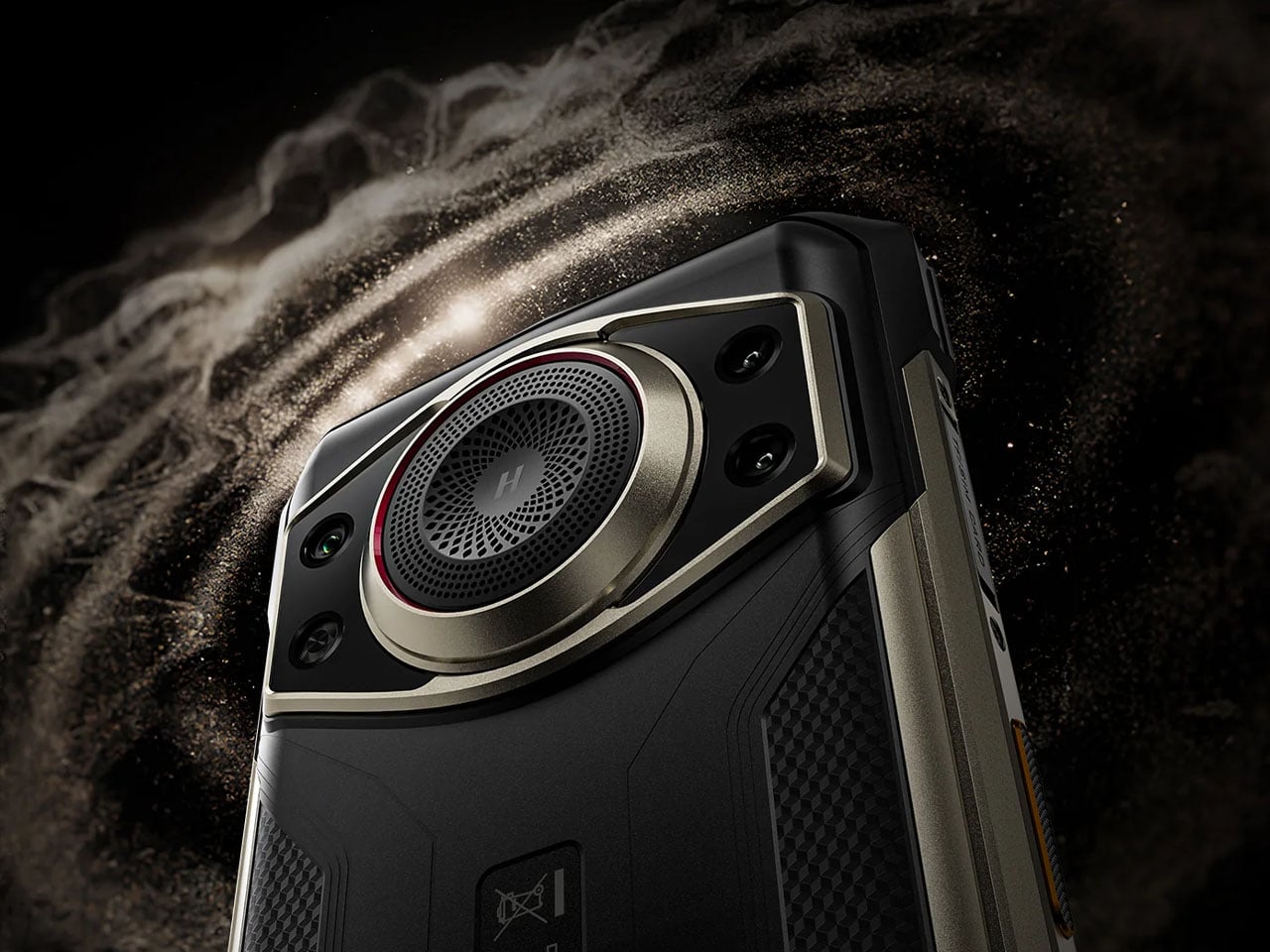
The newly introduced DOOGEE Fire 7 Ultra continues that spirit of experimentation but shifts the focus toward communication rather than design theatrics. Instead of simply building a phone that survives harsh environments, DOOGEE is positioning the Fire 7 Ultra as a hybrid device that combines smartphone functionality with the instant communication capabilities of a professional two-way radio system.
At the heart of the Fire 7 Ultra is its Push-to-Talk Over Cellular (PoC) system, a feature designed to transform the phone into a real-time communication hub for teams. Using cellular or Wi-Fi connectivity, the device allows users to initiate instant voice communication with a single press of a dedicated PTT button on the side. This setup enables one-to-one or group communication similar to traditional walkie-talkies but without the range limitations typically associated with radio hardware. As long as there is network connectivity, the communication range is essentially unlimited, making it suitable for field teams, logistics crews, event staff, and emergency responders.
The device also incorporates a short-range Bluetooth intercom mode for situations where cellular coverage is unavailable. This feature allows nearby users to communicate directly with each other without relying on network infrastructure, which can be particularly useful in environments such as tunnels, forests, or construction zones. Supporting these communication features is a powerful 125-decibel speaker powered by a 34mm, 3.5W driver, ensuring that voice transmissions remain clear even in noisy outdoor environments.
Durability remains a USP of the Fire 7 Ultra’s design philosophy. The phone carries IP68 and IP69K water and dust resistance ratings and meets MIL-STD-810H durability standards, allowing it to withstand water immersion, dust exposure, and accidental drops from around 1.5 meters. The rugged construction is paired with a large 6.6-inch IPS display featuring a 90Hz refresh rate and HD+ resolution, protected with reinforced glass designed to handle demanding outdoor conditions. Powering the device is MediaTek’s Dimensity 6300 chipset, a 6nm processor that supports 5G connectivity while delivering efficient performance for everyday tasks and communication-heavy workloads. The phone ships with 8GB of RAM, which can be virtually expanded up to 32GB, alongside 256GB of internal storage and a microSD slot for further expansion.
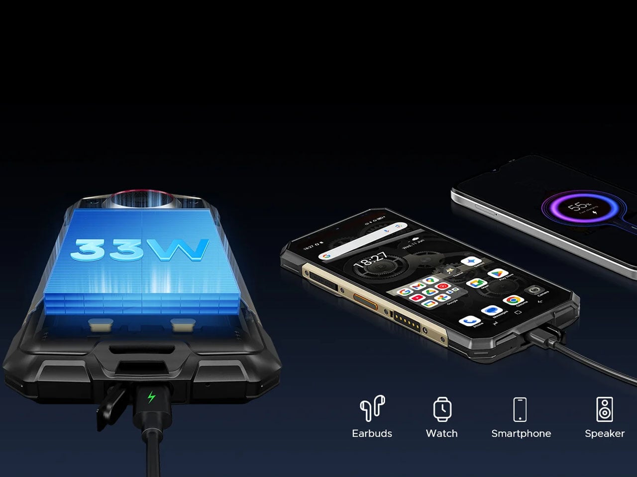
A massive 13,000mAh battery keeps the device operational for extended field use, reducing the need for frequent charging during long shifts or outdoor expeditions. The phone supports 33W fast charging and even includes reverse charging capabilities, allowing it to power smaller devices such as earbuds or smartwatches when needed. The camera setup is straightforward but capable, featuring a 64-megapixel main camera paired with a 2-megapixel macro lens and a 16-megapixel front-facing camera. Running on Android 15, the phone also supports features such as NFC for contactless payments, side-mounted fingerprint recognition, facial unlock, and a triple card slot that accommodates two SIM cards and a microSD card simultaneously.
The DOOGEE Fire 7 Ultra phone is currently available at official stores and select online retailers, with pricing around $360 for the 8GB RAM and 256GB storage variant.