Crowdfunding vs. Awards vs. Media: A Design Insider’s Guide to the Best Path

Design Mindset, Yanko Design’s original podcast series powered by KeyShot, has been steadily carving a niche for itself in the design world by giving listeners an inside view on how creativity becomes impact. Every Friday, the show brings together design’s top minds to share stories that go beyond the project and into the strategies, pitfalls, and breakthroughs shaping the industry today. Episode 10 is no exception, it explores the real-world effects of design publicity on careers, and the conversation is especially relevant to anyone hoping to turn a portfolio into a profession.

This week’s guest is Sarang Sheth, Editor-in-Chief at Yanko Design and a designer whose own path was transformed by media exposure. Few are better positioned to dissect the mechanics of design publicity, both as a former featured designer and now as a gatekeeper for one of the world’s most influential design platforms. The episode not only spotlights Sarang’s journey but also delivers a tactical playbook for designers seeking to amplify their work and maximize recognition.

Download your Free Trial of KeyShot Here

When Five Views Become 450: The Career-Altering Power of Global Exposure

There’s a stark difference between being a talented designer and being a recognized one. This isn’t a lesson taught in most design schools, but it’s one Sarang Sheth learned firsthand in 2014. Fresh out of university and nine months into an unsuccessful job hunt abroad, he was sending portfolio links to companies and tracking their engagement. “I would see like, you know, I’m sending portfolios out to these companies and I’m getting like five views a day, three views a day. So I knew that people were checking their mails and at least looking through my work,” Sarang recalls. Then something shifted. He submitted work to Yanko Design, and editor Troy Turner decided to feature it. “Suddenly I saw like 300 views on my website and like 450 views. And I was like, okay, that’s a significant jump.”

But the numbers told only part of the story. The granular data revealed something more profound: views were coming in from Turkey, Croatia, and the UK. “This is incredible because A, I didn’t pay for it. And B, there was no extra work for me. All I had to do was share it with someone who was willing to talk about it,” Sarang says. This moment crystallized two truths for him. First, that international media exposure offered opportunities that local recognition simply couldn’t. As he bluntly puts it, “local recognition is like winning best dancer within your society, it does nothing.” And second, that storytelling itself could be a viable career path. The article about his work resonated with him as much as the traffic spike did. “I read the article and I realized that this is something I can actually do,” he remembers. That realization, combined with the viral reach of design media, didn’t just land him a job, it set the stage for his entire career trajectory. Today, Yanko Design reaches millions per month across multiple platforms, Instagram, Pinterest, Twitter, LinkedIn, Facebook, YouTube, and its newsletter. “Regardless of what your concept is, what your project is, there are multiple ways that Yanko Design can sort of get you to reach the audience that you’re looking to reach,” Sarang notes. Those eyeballs, he adds, increasingly include potential investors, jury members, and employers, all of whom can change the course of a designer’s career with a single connection.
Ideas Don’t Need to Be Real to Be Powerful

One of the most counterintuitive insights from the conversation is that conceptual work can resonate as powerfully as finished products, sometimes even more so. Sarang points to several examples that illustrate this phenomenon. Earlier this year, he featured a project by Indian designer Siddhant Patnaik, a Google-branded version of the AirPods Max. “People resonated with it so much that it ended up getting its own segment on Marques Brownlee’s Waveform podcast,” he shares. The design garnered hundreds of thousands of views not just on Yanko Design but across multiple media outlets, despite never being a real product. This isn’t an isolated case. Sarang has created his own conceptual designs for Yanko, foldable phones, patent-related concepts, and an Apple Pencil that docks inside a MacBook, which is still featured on Forbes. “I’ve seen reels on it and reels showing Yanko Design’s page. So, it’s great to see that people realize that they’re not necessarily fond of great products, they’re also fond of great ideas.”

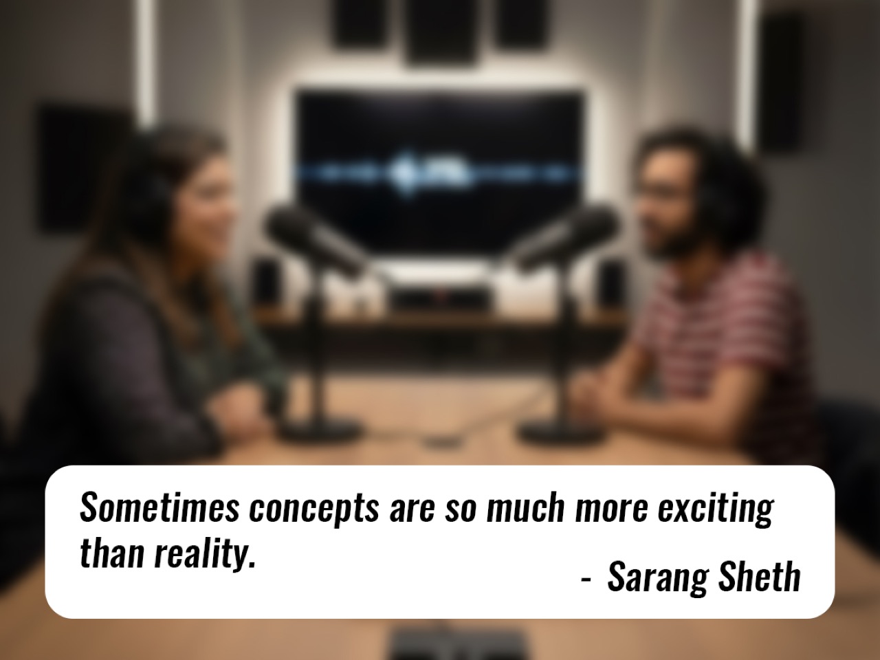
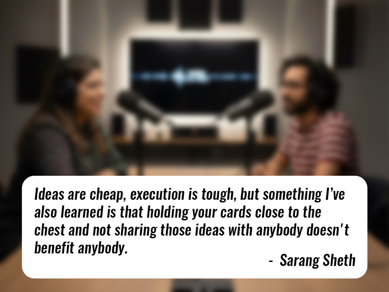
This creates a fascinating dynamic: media visibility alone can stimulate demand and validate interest even before a product enters production. “A lot of times they’re concepts,” Sarang says about inquiries from potential buyers. “Which validates the fact that sometimes concepts are so much more exciting than reality.” The takeaway for designers is clear: don’t wait until you have a manufactured product to share your work. High-quality 3D renders and compelling narratives can generate demand, attract licensing interest, and open doors to partnerships. “Ideas are cheap, execution is tough, but something that I have also learned is that holding your cards close to the chest and not sharing those ideas with anybody doesn’t benefit anybody,” he advises. The key, however, is presentation. In the age of AI-generated imagery, granular control offered by professional 3D rendering can push a concept over the credibility threshold. “A pencil sketch has to be incredibly good as an idea to sort of translate to massive success. Whereas a really, really well-made render has a much easier path ahead,” Sarang explains.
Turn Ripples Into Waves: The Designer’s 48-Hour Action Plan

Getting featured is just the beginning. Too many designers treat media coverage as a finish line when it should be treated as a starting gun. Sarang is emphatic about this: designers need to move from passive observation to active amplification. “Don’t just repost initial coverage; turn ripples into waves,” he urges. The first step is preparation. Before pitching any publication, designers should have a press kit ready, complete with high-resolution images, project descriptions, and relevant context. “Please, it’s not that difficult. ChatGPT will literally write the press release for you and your images are already in there, you need to just compress them,” Sarang says. AI tools have made this process easier than ever, but the fundamentals remain: professional assets signal that you’re serious about your work.

Once a feature goes live, the real work begins. Designers should immediately reach out to other outlets, Designboom, Hypebeast, and niche blogs relevant to their work. “You should have at least five or six media contacts in your outreach,” Sarang recommends. Each additional feature compounds the impact of the first, creating what he calls a “cascading effect.” Media coverage also serves as social proof that can be leveraged in other contexts. “Use features to bolster award entries, multiplying reach and credibility,” he advises. But there’s a crucial caveat: not every design fits every outlet. Understanding platform fit is essential. “Each design blog or each design platform has its own visual ethos, has its own direction, has its own strengths,” Sarang explains. Yanko Design, for instance, may not be the right fit for highly technical architecture projects, but it excels with consumer-facing product design, EDC items, and tiny homes. Sarang is candid about this curation process: “If designers come to us with 2D sketches, we’re like, hey, you know what, render it out and then bring it back to us. We’d love to feature it then.” This isn’t gatekeeping; it’s guidance. The goal is to reach the right audience, and sometimes that means directing designers to other platforms where their work will resonate more strongly. As Sarang puts it, “You won’t go trying to plant a mango in winter.”

Crowdfunding First, Media Second, Awards Third

When presented with a hypothetical scenario during the podcast’s “Design Mindset Challenge”, a talented designer with budget and time to pursue one of three paths (major design award, crowdfunding campaign, or media features), Sarang’s answer was surprising and strategic. “Start with crowdfunding,” he says without hesitation. His reasoning is multifaceted. First, crowdfunding offers the strongest form of validation: real demand, backed by real money. “When you’re going down the crowdfunding route, it’s the highest form of design skill validation because you’re not getting clicks, you’re not getting a job, you’re setting up a company that is solely focused around your product,” he explains. Unlike media coverage, which generates interest, or awards, which confer prestige, crowdfunding forces execution. It demands prototyping, production planning, and supply chain management. “The people who look at the product and are like I believe in that vision, those are the people who are jumping on board, and that is the best way to put that stamp of approval on your product being a good idea,” Sarang notes.

Crowdfunding also offers pragmatic intellectual property protection. By being first to market, even in a crowdfunding context, designers stake their claim publicly. “When you share an idea on a design platform like us, we do share a lot of concepts, but it’s obvious,” Sarang says, acknowledging the risk of plagiarism. “First crowdfund, secure your IP in however, whatever way possible. Spend money on patents or copyrighting or whatever.” Once the crowdfunding campaign is live or funded, designers can leverage that momentum for media coverage. Publications are far more likely to feature a project with market validation than a standalone concept. “That will help you secure your idea and make sure that you’re not being plagiarized by other people who beat you to it,” Sarang adds. Finally, awards should come third. “Awards are a much more expensive bet, I would say. And the awards do have timelines,” he explains. Media can react quickly, publishing within days, while award results take months. The strategic sequence, crowdfunding, media, then awards, allows designers to build credibility at each stage, using prior success to unlock the next opportunity. This ecosystem approach doesn’t just maximize recognition; it creates sustainable business outcomes.

Why 2 Million Views Trump a Design Award

In the rapid-fire segment of the podcast, host Radhika Seth posed a provocative question: what’s more career-changing, winning a design award or getting 2 million views on Yanko Design? Sarang’s answer was immediate and unequivocal: “2 million views on Yanko Design. Wow. Because that has a cascading effect.” His response cuts to the heart of a broader truth about recognition in the digital age. Awards carry prestige and credibility, especially when backed by respected juries, but their reach is often limited to industry insiders. Media exposure, by contrast, casts a far wider net. A feature on Yanko Design doesn’t just reach designers; it reaches design consumers, potential investors, manufacturers exploring licensing opportunities, and employers scouting for talent. “Global features expose work to buyers, investors, co-founders, and employers,” Sarang notes, emphasizing that media responsiveness can even aid with time-sensitive opportunities like visa documentation.

Yanko Design’s audience, which Sarang describes as “design consumers” rather than just designers, is particularly valuable. “I like to believe that our audience are not only designers, but they also design consumers because I have seen so many campaigns, Kickstarter campaigns or the Indiegogo campaigns that we feature bring in so much of revenue for the campaigners,” he explains. Certain niches perform exceptionally well: EDC (everyday carry) items and tiny homes consistently generate strong engagement and conversions. “EDC content often drives campaign revenue,” Sarang says, noting that the writers at Yanko are genuine enthusiasts whose passion translates into the coverage. “A lot of our write-ups also come from a place of excitement and that just translates to the readers.” This isn’t to diminish the value of awards. Jury validation carries weight, and media partners often amplify award wins, creating a multiplier effect. But for sheer, immediate impact on a designer’s trajectory, media reach is unmatched. As Sarang puts it, “A 2 million-view YD feature can be more career-changing than a single award due to cascading recognition, opportunities, and serendipitous discovery by influential readers.”
From Designer to Storyteller: Why Context Matters

Sarang’s own career shift from designer to editor was inspired by filmmaker Gary Hustwit, an industrial designer turned documentarian whose films on Dieter Rams, Apple, and the Helvetica font have become cultural touchstones. “He was basically an industrial designer who also graduated and realized that his calling wasn’t industrial design, it was storytelling,” Sarang says. This resonated deeply. “Whenever I introduce myself, I say, you know how they say a picture is worth a thousand words? I’m the guy who writes those thousand words.” For Sarang, storytelling is a design-adjacent calling, one that expands the impact of products by giving them context and accessibility. “A lot of designers are so involved with creating products that they forget sometimes that the products need context and explanations,” he observes. This is where design media plays a crucial role: translating innovation into narratives that resonate with broader audiences.

Sarang’s approach to writing reflects this philosophy. Yanko Design doesn’t just catalog products; it explores their potential, their cultural relevance, and the problems they solve. “Translating products into accessible narratives expands impact,” he says, framing editorial work as an essential bridge between creators and consumers. This storytelling function is especially vital in an era dominated by algorithmic feeds and unpredictable social media platforms. “Algorithms are unpredictable,” Sarang notes. “Editorial curation connects designers with targeted stakeholders, buyers, investors, co-founders, through trusted storytelling and focused audiences.” Unlike a viral TikTok or Instagram post, which might reach millions but lack context or credibility, a curated editorial feature provides depth and legitimacy. It signals that the work has been vetted, that it’s worth paying attention to. For designers, this means that presentation and narrative matter as much as the design itself. A well-crafted story can turn a good product into a great one, and in some cases, it can even turn a concept into a business opportunity before the product exists at all.


Design Mindset premieres every Friday on Yanko Design, bringing fresh perspectives from design’s leading voices. This episode underscores a critical truth: design recognition isn’t just about talent, it’s about understanding the ecosystem of media, awards, and crowdfunding, and knowing how to navigate it strategically. For designers ready to share their work, Sarang’s advice is simple: “Send your work to Yanko Design, publication@yankodesign.com. Send it to us on Instagram, send us links, Behance links, whatever, however you want to send it to us. Please keep sending your work. It can’t get easier.”

Download your Free Trial of KeyShot Here

The post Crowdfunding vs. Awards vs. Media: A Design Insider’s Guide to the Best Path first appeared on Yanko Design.
This Wood Chair Appears to Sprout From Grass, Where Art and Nature Converge

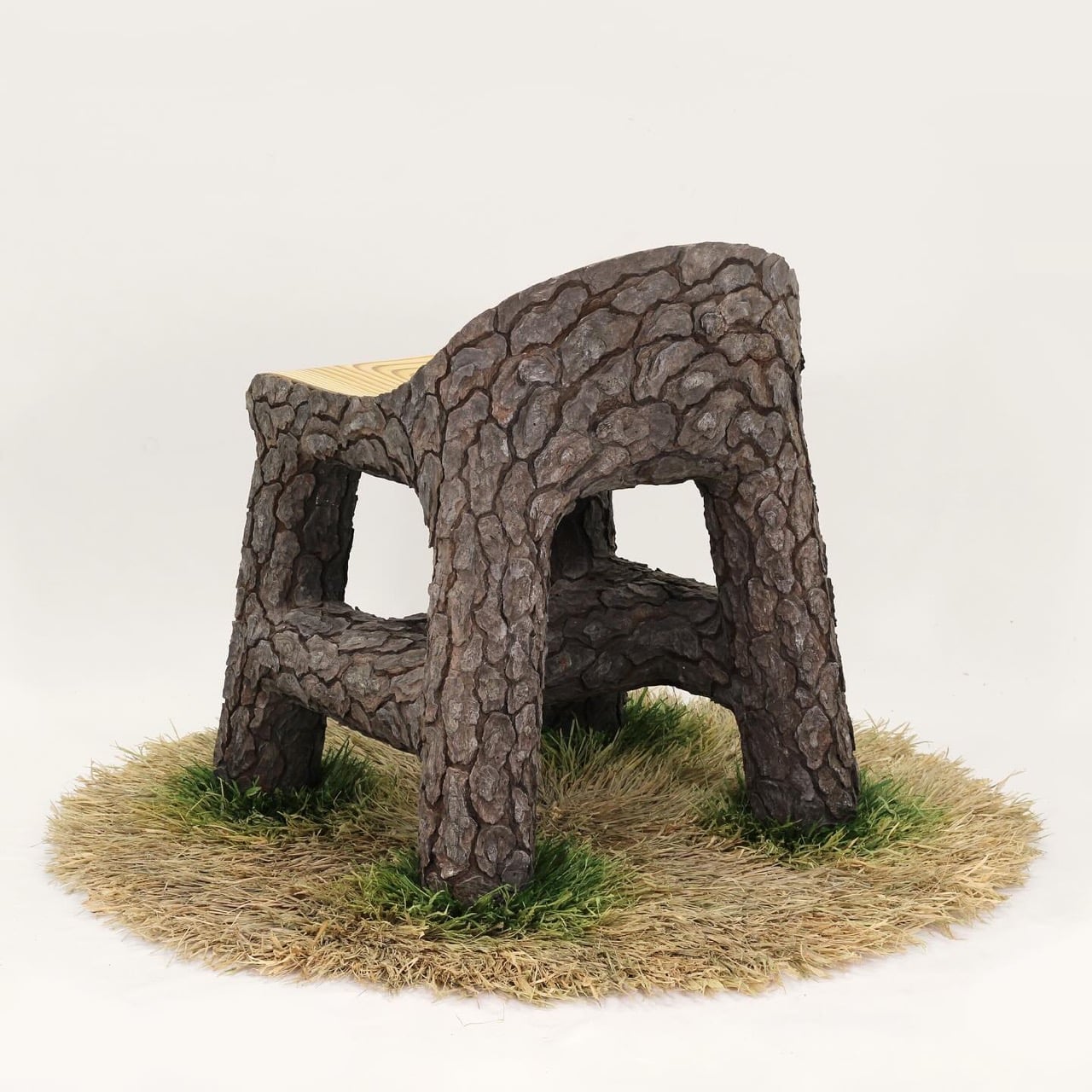
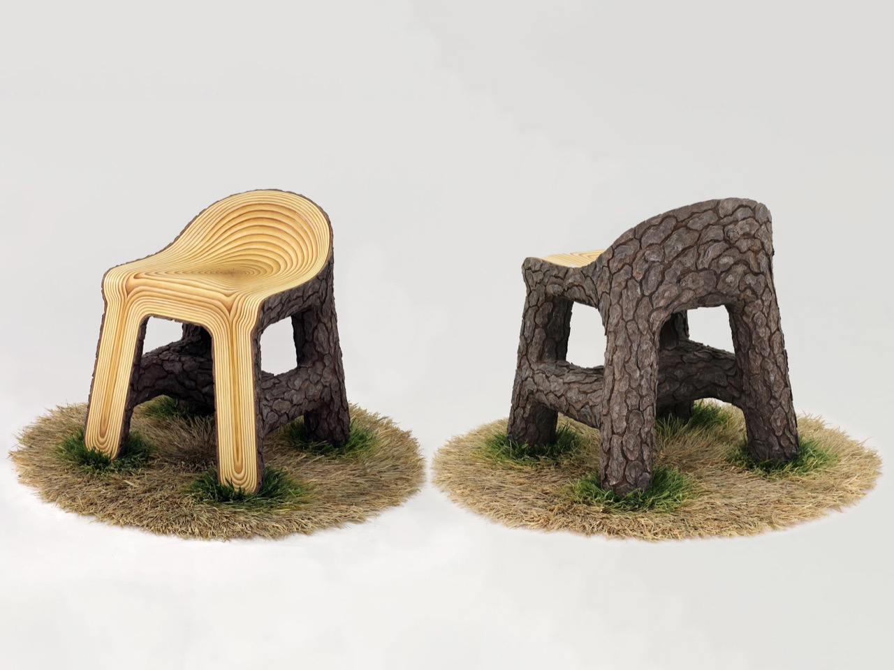
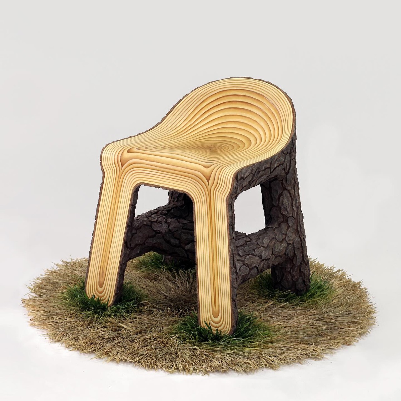
In Wood Chair on Grass, 2025, the artist extends the celebrated Wood Chair series into a deeply tactile meditation on nature, artifice, and the human instinct to create comfort out of raw material. This piece, crafted from oil paint, epoxy clay, plywood, wood, and raffia fibers, reveals the artist’s meticulous dialogue between the organic and the handmade, between illusion and touch.

At first glance, the chair presents itself as a modest, almost familiar object, a low-back saddle seat resting calmly atop what seems like a patch of grassy earth. But upon closer inspection, it becomes clear that every element is a constructed illusion. The “grass” is not real, but a latch-hooked rug of dyed and painted raffia fibers. Each strand mimics the play of sunlit blades swaying in a breeze, but they are fixed in place, forever frozen in mid-motion. This deliberate tension between the natural and the artificial is what gives the piece its quiet power.

Designer: Joyce Lin

The seat itself is modeled after pine wood, yet it transcends imitation. Cracks are hand-carved into the surface, each line a gesture of imperfection that makes the chair feel lived-in, almost sentient. The wood grain alternates between matte and satin varnishes, an effect invisible under soft light but revealed dramatically when illuminated directly. This shifting visibility turns the viewer into an active participant, requiring them to move around the piece, to discover it rather than merely observe. It’s a subtle invitation to slow down, to look with intent, to feel the weight of craftsmanship.

The artist’s pride in the bark detail is well-earned. The bark, sculpted with epoxy clay and layered with oil paint, might be their most convincing and three-dimensional work yet. It clings to the seat’s edges like memory to an old tree, giving the illusion that the chair has grown from the ground rather than been placed upon it. There’s a certain poetry in this, an object designed for rest that itself seems to have taken root.

Beyond its technical mastery, Wood Chair on Grass captures the artist’s evolving relationship with materials. The raffia fibers, dyed and painted by hand, bring softness and unpredictability, contrasting the solidity of the wooden frame. The juxtaposition of natural texture with synthetic precision makes the work feel both ancient and contemporary, a bridge between folk craft and fine art.

Ultimately, this piece is an environment condensed into an object. It embodies the artist’s ongoing fascination with how we recreate nature within our own boundaries, how we seek to hold onto fleeting sensations through form and surface. In Wood Chair on Grass, 2025, the familiar becomes extraordinary, and the humble materials of wood and fiber transcend their physicality to evoke the emotional warmth of presence, patience, and place.

The post This Wood Chair Appears to Sprout From Grass, Where Art and Nature Converge first appeared on Yanko Design.
5 Photorealistic Designs Rendered in KeyShot Every Minimalist Homebody Wants

In the world of product design, there’s a special kind of magic that happens when a concept moves from sketch to stunning photorealistic image, and KeyShot rendering software has become the go-to tool for designers who want to bring their visions to life with breathtaking clarity. This powerful rendering engine transforms 3D models into images so realistic you’d swear you could reach out and touch them, capturing every subtle detail from the grain in natural wood to the way light refracts through fluted glass. For designers, it’s not just about making pretty pictures; it’s about communicating ideas, testing color palettes, and visualizing how a piece will actually feel in your space before a single prototype is ever made.

We’ve rounded up five exceptional designs that showcase just how transformative KeyShot rendering can be, from a Japanese-inspired bird feeder that looks like garden sculpture to a modular glass lighting system that captures the neon glow of Taiwan’s street culture. Each piece tells its own story through these beautifully rendered images, whether it’s a playful desk organizer that helps you find misplaced items or a minimalist bedside table that celebrates honest craftsmanship. These aren’t just concept drawings or rough sketches; they’re fully realized visions that let you fall in love with a design before it ever leaves the digital realm. Let’s dive into these stunning creations and discover what makes KeyShot rendering such a game-changer for contemporary design.

Create your own Aesthetic Render: Download KeyShot Studio Right Now!

1. Kasa by Ed.I.d

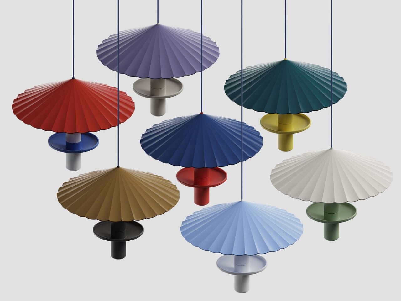
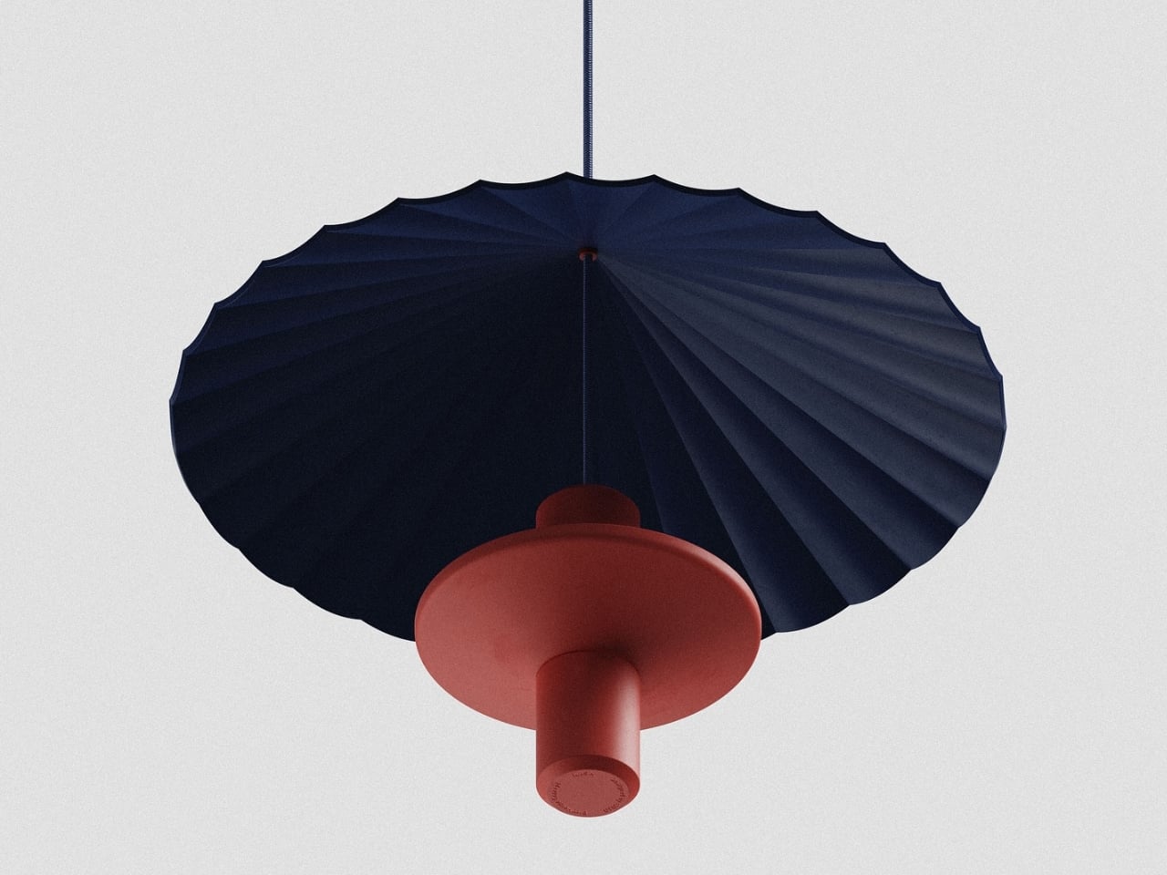
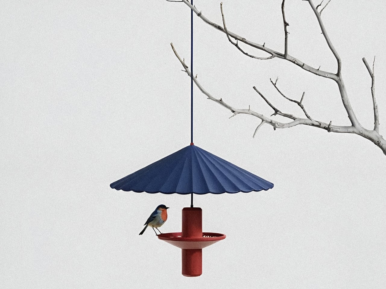
This elegant bird feeder reimagines a garden staple through the lens of Japanese design, drawing inspiration from the graceful, pleated form of a traditional wagasa umbrella. The umbrella canopy features delicate radial folds that fan outward in a sunburst pattern, creating both visual drama and functional shelter for visiting birds. Available in a stunning array of rich, matte colors, from deep navy and terracotta to sage green and mustard yellow, each feeder becomes a sculptural accent piece in your outdoor space, blending seamlessly with modern aesthetics while honoring centuries-old craftsmanship.

The design process by Ed.i.d reflects a beautiful marriage of tradition and technology, beginning with conceptual sketches and AI-assisted explorations in Vizcom.ai, then refined through detailed 3D modeling and photorealistic KeyShot rendering. The result is a piece that’s as thoughtful as it is beautiful: the umbrella canopy protects seed from rain while providing a safe dining spot for small songbirds, and the central cylindrical body adds architectural interest even when birds aren’t visiting. Whether hung from a tree branch or displayed as a cluster in varying colors, this bird feeder transforms functional outdoor decor into a gallery-worthy statement piece that celebrates both nature and design.

2. Ice Cube by Harry Chang

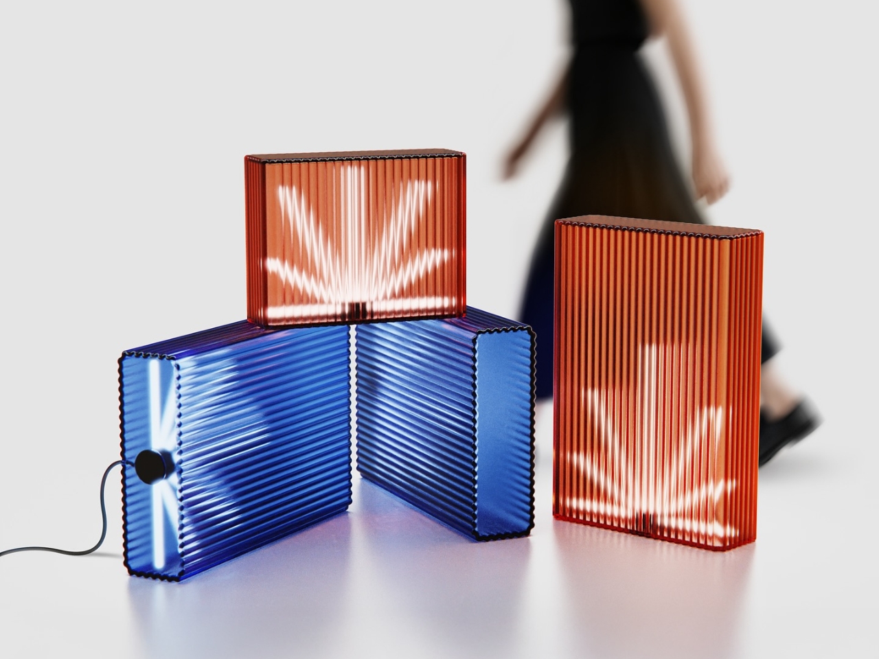
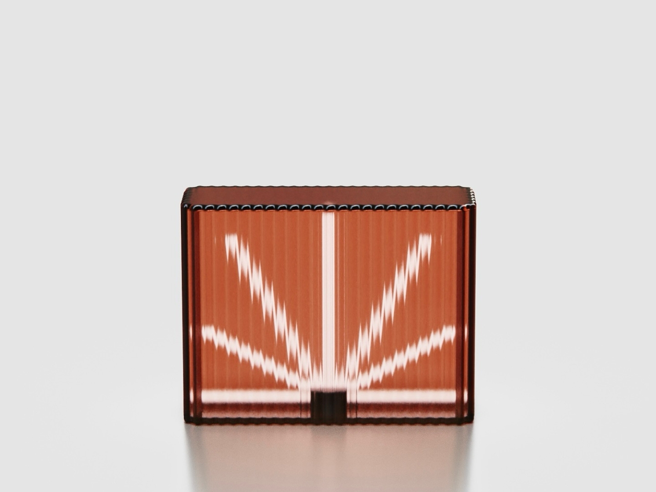
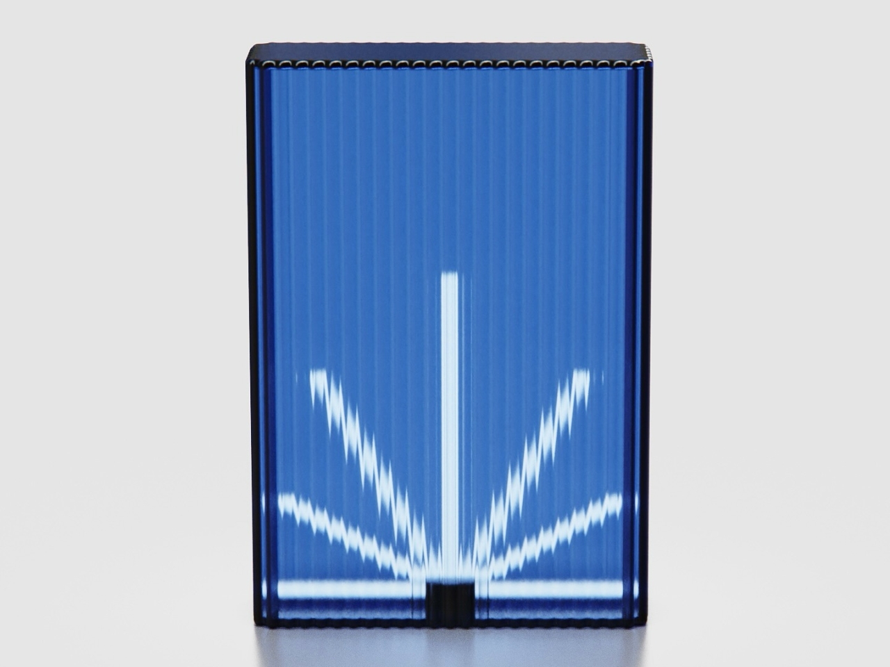
Ice Cube by Harry Chang draws from an unexpected blend of influences: the utilitarian geometry of office ceiling lights meets the electric, neon-soaked ambiance of Taiwan’s iconic betel nut shops. The result is a lighting concept that feels both nostalgic and utterly contemporary, capturing the raw energy of urban nightlife in a refined, sculptural form. Each piece is crafted from 1cm thick fluted glass that transforms ordinary light into something almost magical: the vertical ridges diffuse and refract illumination into starburst patterns that seem to pulse and shift as you move around them. Available in jewel-toned hues like sapphire blue and warm coral, these glowing glass blocks bring an unexpected dose of drama to any space.

What makes Ice Cube truly special is its modular flexibility. It is offered in two heights (70cm and 40cm), the lights can be stacked, clustered, or lined up to create custom lighting installations that double as spatial dividers. Imagine grouping several in varying heights to define a dining area, or placing a single glowing cube on a console table as a sculptural accent piece. The fluted surface doesn’t just look gorgeous; it creates an ever-changing play of light and shadow that turns walls and ceilings into canvases for radiant, geometric reflections.

3. Bold Text by Silvester Kössler

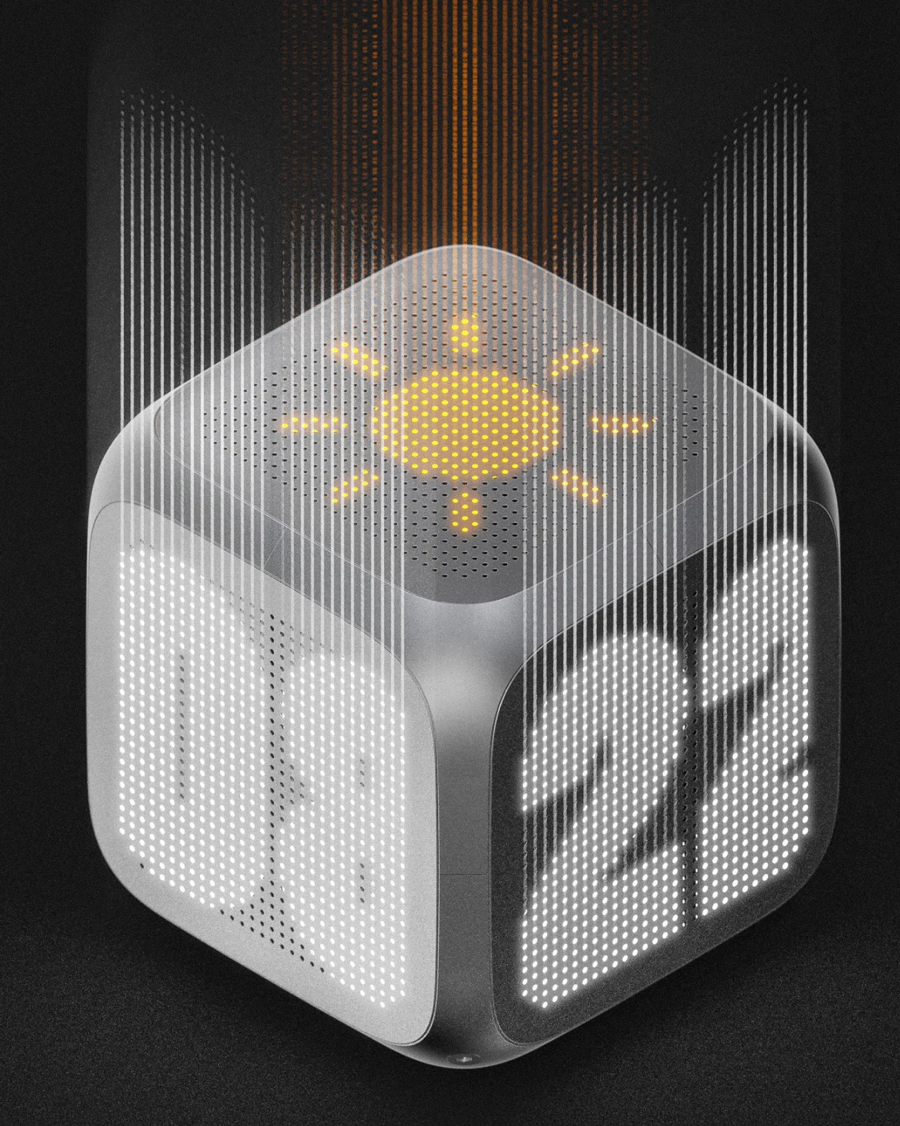
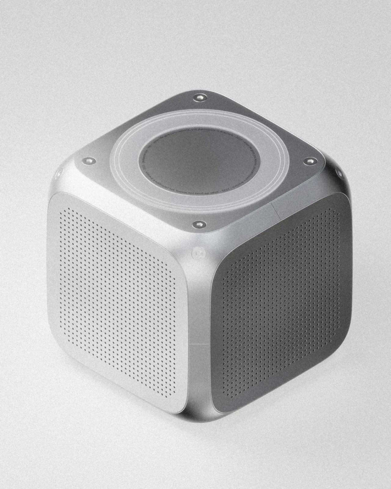
Bold Text reimagines the humble desk clock as a three-dimensional conversation piece that refuses to be ignored. Breaking away from the flat, one-sided displays we’re all used to, this cube-shaped design by Silvester Kössler wraps time around you, literally. Each face features perforated metal screens that conceal bold LED typography displaying hours, minutes, weather icons, and ambient information that glows through the industrial mesh like a secret waiting to be discovered. The genius here is in the positioning: this isn’t a clock you face head-on from your desk; it’s meant to exist in space, casting its dot-matrix glow from a console table, shelf, or corner where multiple sides can be appreciated at once. The aluminum frame and geometric form give it an architectural presence that feels equal parts tech-forward and brutalist sculpture.

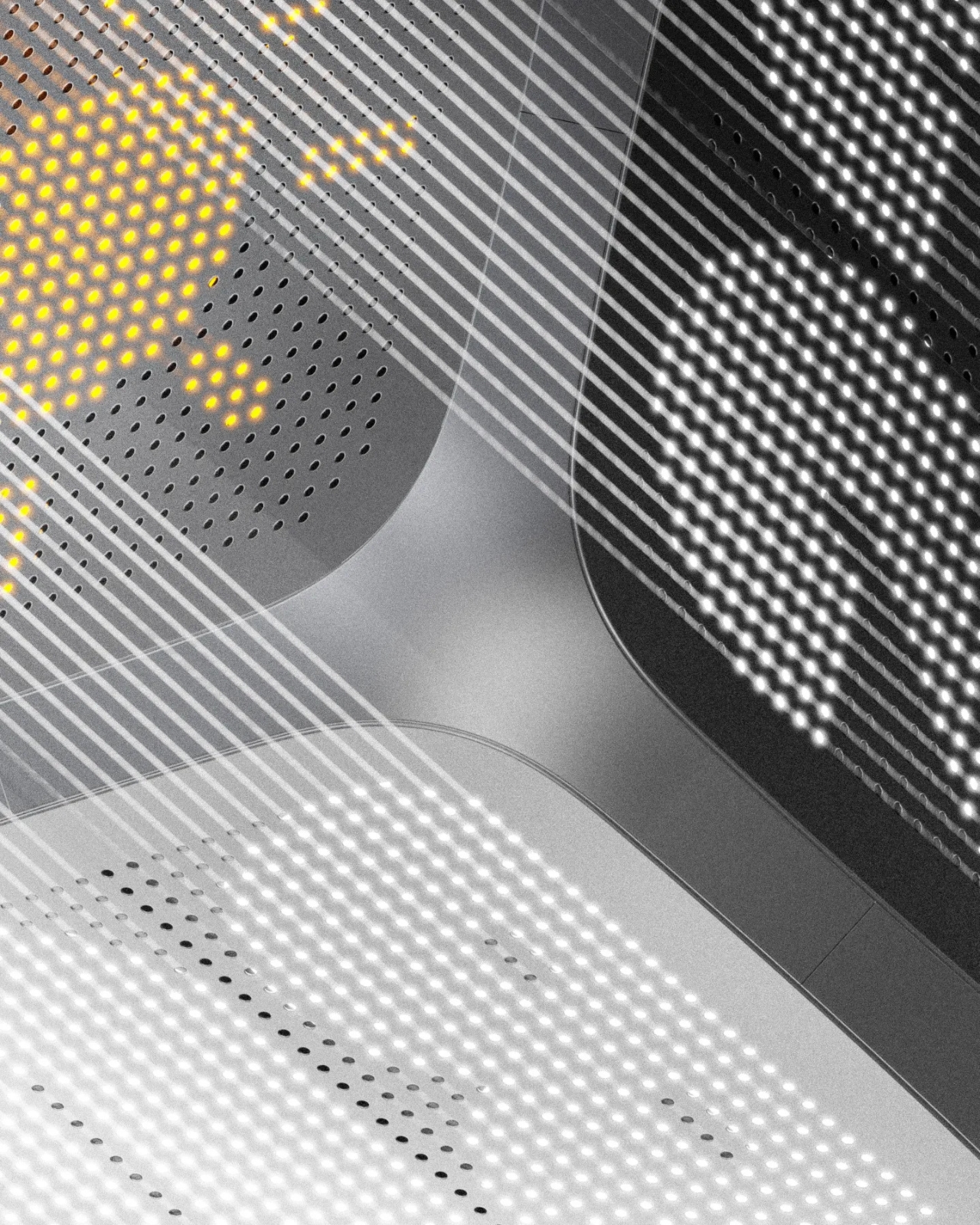
Created as part of a design challenge to push beyond comfortable territory, this concept leans hard into graphical, almost cinematic rendering. Think of it as a clock that wants to be photographed from every angle. The perforated screens create mesmerizing moiré patterns when the LEDs illuminate beneath, and the bold, chunky typography ensures legibility without sacrificing style. There’s something beautifully paradoxical about a timepiece that demands you move around it, that rewards curiosity and changes its personality depending on your vantage point. Bold Text transforms timekeeping from a passive glance into an active, spatial experience. It’s proof that even the most utilitarian objects deserve a little drama.

4. Xylo by Kim Min Hyeok

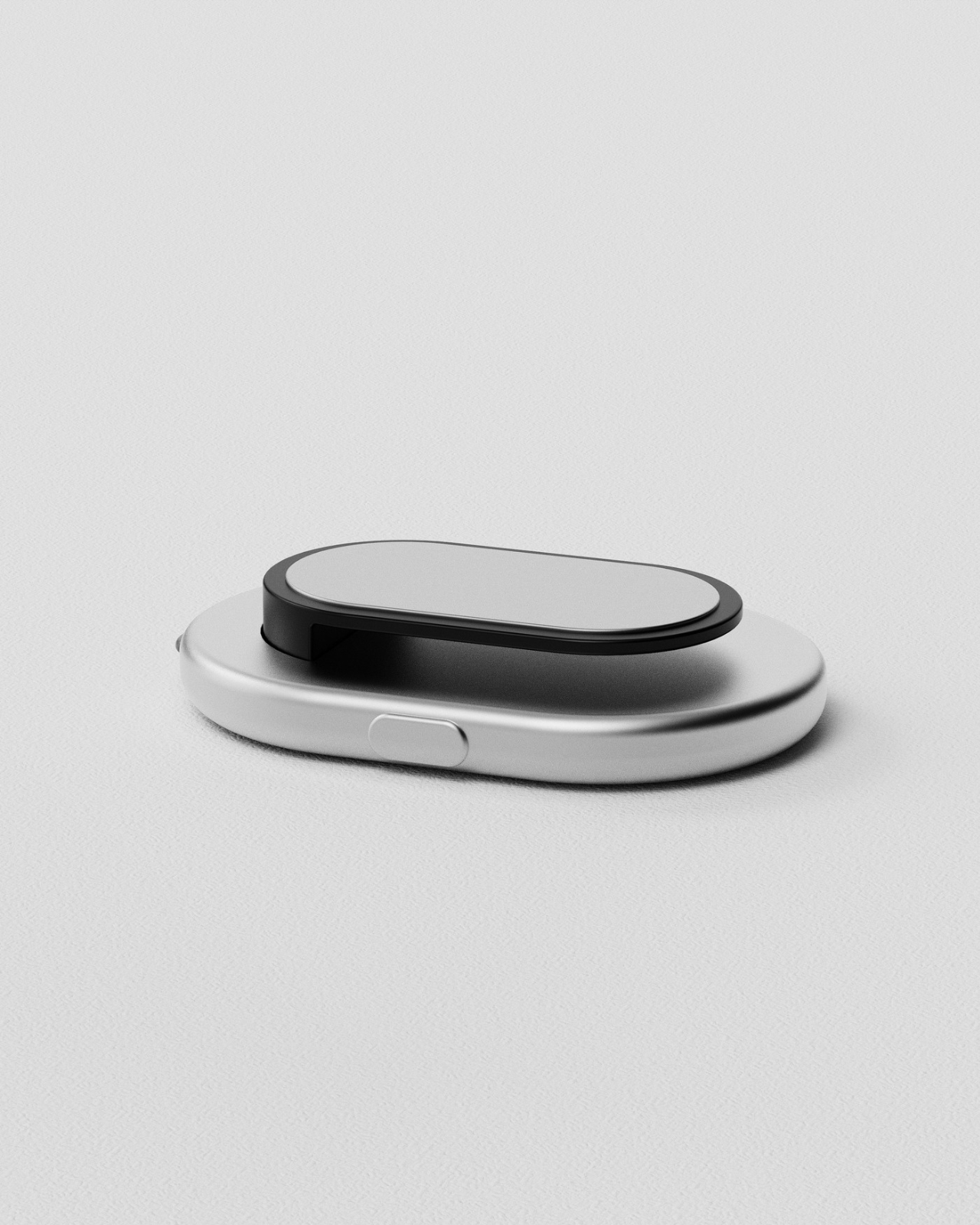
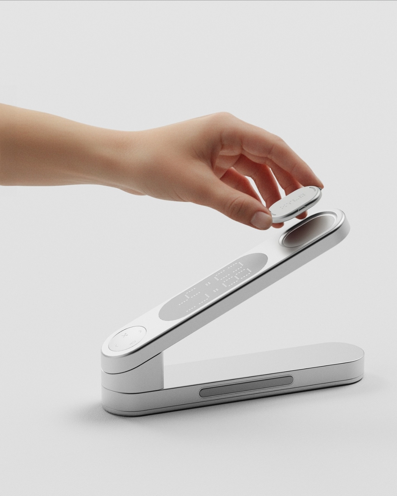
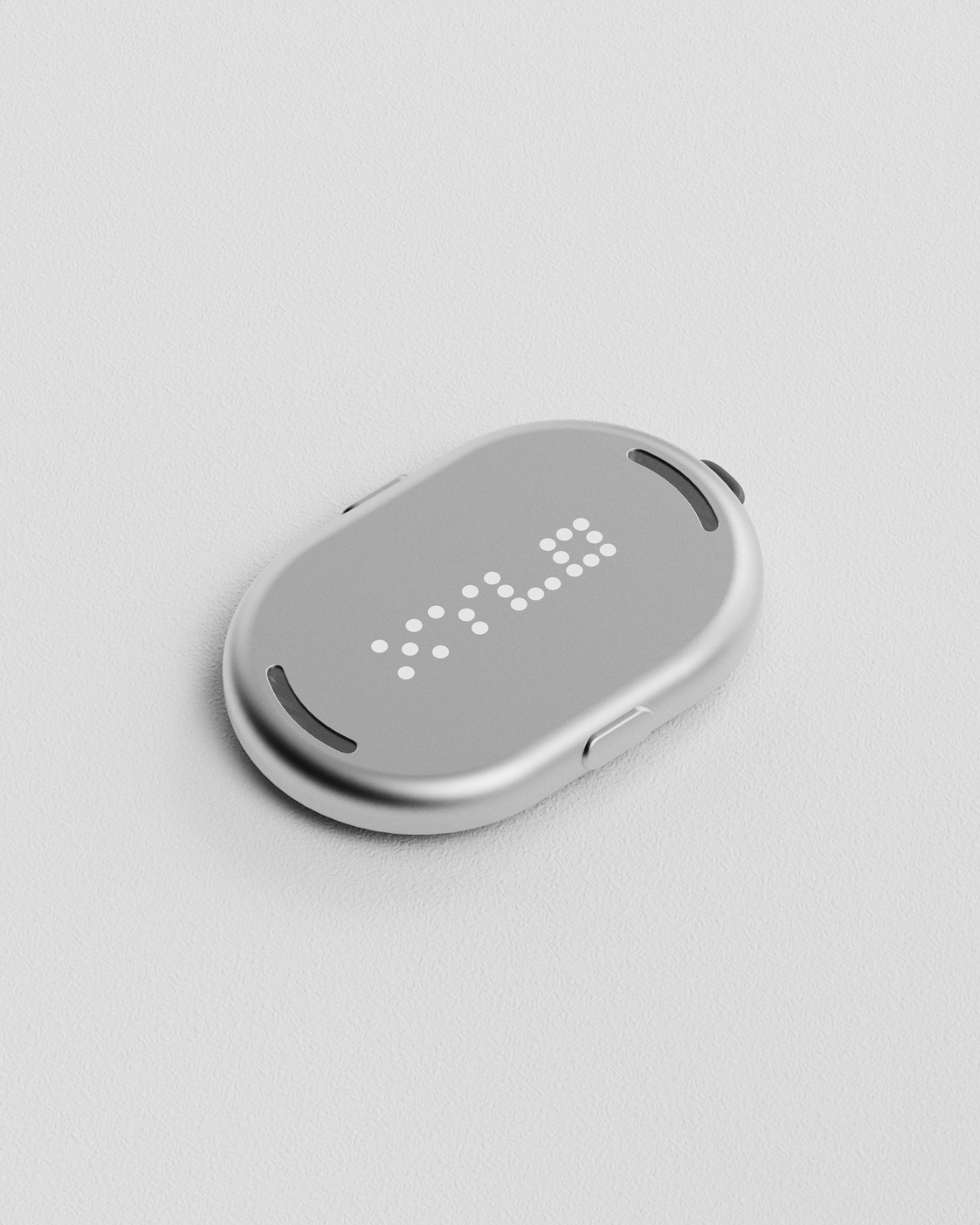
XYLO solves one of those frustrating everyday problems we all know too well: that frantic search for your favorite notebook, important documents, or that USB drive you swear you just had five minutes ago. Unlike our smartphones that chirp back when we call for them, most of our workspace essentials stay frustratingly silent. This sleek desk object designed by Kim Min Hyeok changes that game entirely. Inspired by the classic xylophone, XYLO features detachable tags that respond instantly with sound when you press the corresponding key on the minimalist base unit. Just attach a slim tag to anything you tend to misplace, and suddenly your most elusive items become findable with a single tap.

What makes XYLO so clever is how intuitive and elegant the whole system feels. The design borrows from the xylophone’s most satisfying quality: that immediate, tactile response when you strike a note. Each smooth, pebble-shaped tag magnetically nests into the base when not in use, creating a sculptural desk accessory that’s as beautiful as it is functional. The tags are lightweight enough to clip onto notebooks, slip into laptop sleeves, or attach to pouches and folders without adding bulk. For anyone who collects beautiful desk objects or just wants to bring a little more order (and a lot less stress) to their workspace, XYLO transforms the mundane task of keeping track of things into something almost playful.

5. Bedside Table by Mads Hindhede Svanegaard

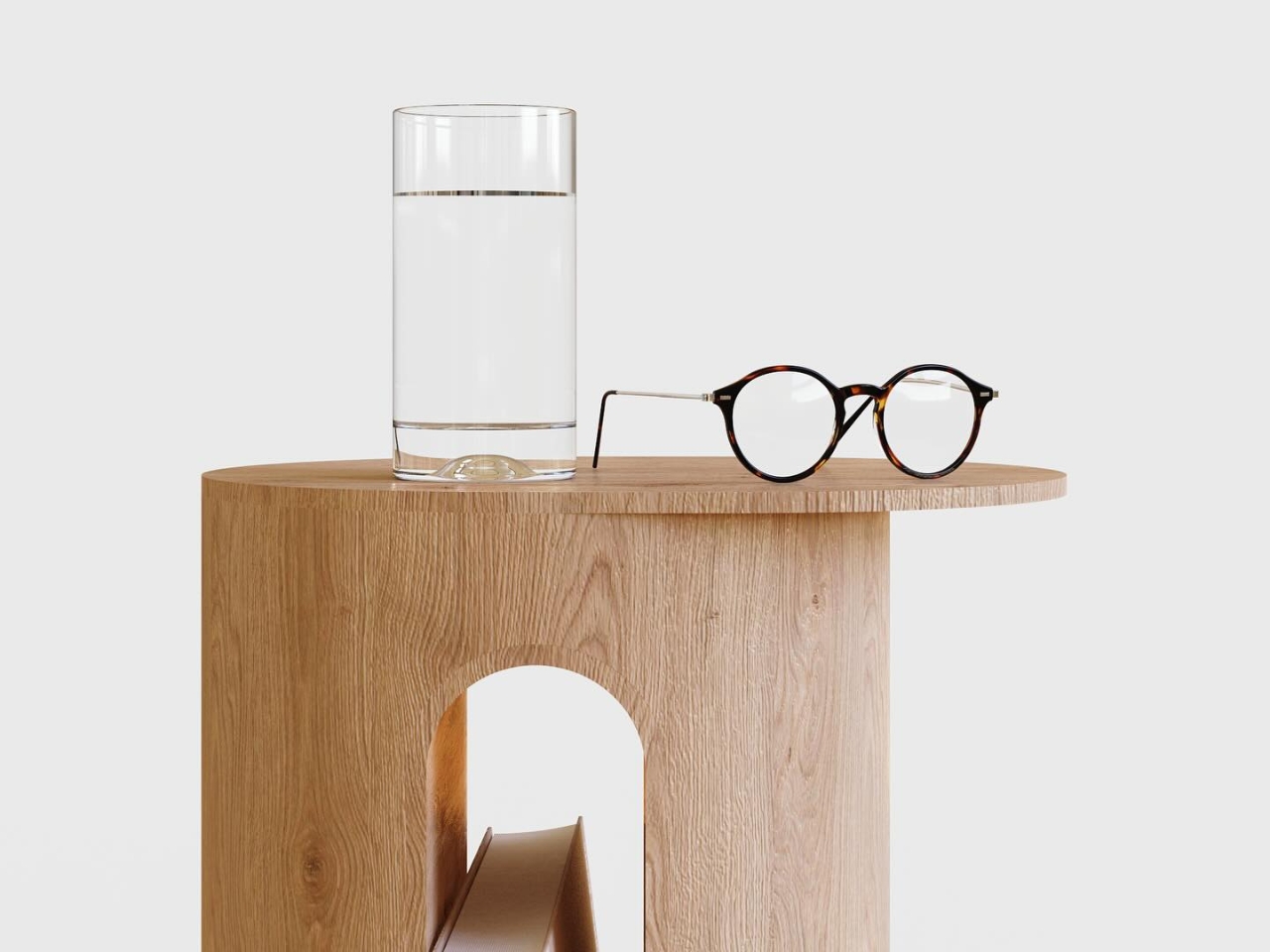
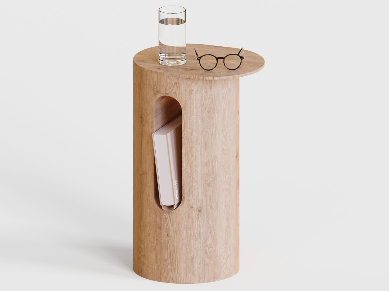
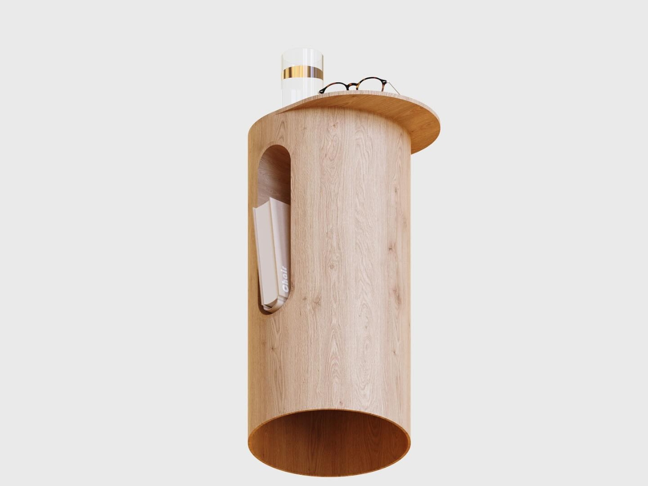
Sometimes the most beautiful designs are the ones that don’t try too hard, and this cylindrical bedside table is a perfect example of that philosophy. Crafted from warm, natural oak, the simple pedestal form by Mads Hindhede Svanegaard feels both modern and timeless, like a sculptural accent piece that just happens to hold your water glass and reading glasses. What makes it special is that clever arched cutout on the front, a built-in magazine or book holder that keeps your current read within arm’s reach without cluttering the top surface. The rounded tabletop offers just enough space for nighttime essentials, while the hollow cylinder design keeps the visual weight light and airy, perfect for smaller bedrooms or minimalist spaces.

Created as an exercise in efficient design workflow, this piece was modeled in Fusion 360 and rendered in KeyShot using traditional, old-school techniques with no AI assistance. The result is refreshingly straightforward: a side table that celebrates the beauty of natural wood grain and honest construction. The cutout detail casts gorgeous shadows that shift throughout the day, adding subtle visual interest without any fuss. It’s the kind of design that would feel at home next to a mid-century platform bed or a contemporary upholstered frame, proving that sometimes simplicity and thoughtful functionality are all you really need. For collectors who appreciate understated Scandinavian-inspired design and furniture that feels both functional and sculptural, this little table delivers quietly confident style.

Create your own Aesthetic Render: Download KeyShot Studio Right Now!

The post 5 Photorealistic Designs Rendered in KeyShot Every Minimalist Homebody Wants first appeared on Yanko Design.
Award-Winning Sculptural Device Makes Water From Air, Not Your Tap

Water quality and sustainability are growing concerns for modern households, but most purifiers still rely on tap water with inconsistent quality, bulky filter systems, and plastic jugs that clutter up the kitchen and generate waste. For anyone who wants pure hydration without the hassle, plastic waste, or aesthetic compromises, traditional systems can feel like choosing between wellness, the planet’s well-being, and the visual harmony of your carefully curated space.

Kara Pure 2 offers a new vision for home hydration that eliminates these trade-offs entirely. By pulling water straight from the air, mineralizing it with essential nutrients, and presenting it in a sculptural stainless steel form, it changes the simple act of pouring a glass of water into a daily wellness ritual that’s as beautiful as it is sustainable and convenient.

Designer: Cody Soodeen

Click Here to Buy Now: $3899 $5999 ($2100 off). Hurry, only 10/20 left! Raised over $260,000.

Kara Pure 2’s tall, brushed steel silhouette and oval pouring window bring a sculptural presence to any kitchen or office space. The sleek, minimalist design, with clean lines and premium materials, fits seamlessly into modern interiors without dominating valuable counter space. The 7-inch touchscreen is 40 percent larger than the original model, offering intuitive control over water temperature, filter status, and system settings with smooth, responsive interaction.

Inspired by the Stenocara beetle from the Namib Desert, which harvests water from air using specialized shell structures, Kara Pure 2 uses advanced desiccant technology to extract up to 10 liters of water from ambient air each day. Every drop is filtered through a new ultrafiltration system that removes 99.99 percent of impurities, microplastics, and bacteria before being enriched with essential minerals for optimal health.

The water is balanced to a 9.2 pH alkaline level and enriched with calcium, magnesium, potassium, zinc, sodium, and silica for smooth, great-tasting hydration that supports overall wellness and proper body function. The commercial-grade EPA air filter purifies intake air before it becomes water, offering dual benefits by improving both your drinking water quality and indoor air quality simultaneously.

Kara Water’s air-to-water innovation has earned recognition that few companies achieve: two TIME “Best Inventions” awards and two CES Innovation Awards, placing it alongside just 14 other companies in history like Apple, Tesla, and Samsung. The technology has already found homes in prestigious venues including House of Sound NYC, the luxury Gotham Hotel, and Hilton’s Conrad Hotel, proving that design-conscious hospitality and wellness spaces trust Kara Pure for both performance and presence.

There’s no plumbing installation, no refilling large tanks, and no waiting for delivery trucks to bring heavy bottled water to your door every week. Just plug in Kara Pure 2 and enjoy bottleless hydration on demand without lifting heavy jugs, storing bulky containers, or dealing with the environmental impact of single-use plastics piling up in recycling bins, or worse.

The 20 percent larger pouring area accommodates pitchers and bottles up to 64 ounces, making it easy to fill larger containers for family meals, workout sessions, or office meetings. Adjustable temperature settings provide instant hot water for morning coffee and tea or refreshing cold water down to 45 degrees Fahrenheit for afternoon hydration, all controlled through the intuitive touchscreen interface.

Kara Pure 2’s thermoelectric cooling technology is significantly more energy-efficient than traditional compressor systems and uses no harmful refrigerants, reducing both electricity bills and environmental impact for eco-conscious households. The upgraded recirculating system eliminates quarterly descaling maintenance, while the easier filter change design and single removable tank make upkeep straightforward and quick without requiring professional service.

The whisper-quiet 32 decibel operation means Kara Pure 2 can sit comfortably in bedrooms, home offices, or open-plan living spaces without disrupting conversations, sleep, or focused work throughout the day. Families with young children appreciate the instant access to clean, mineralized water for bottles and snacks, while busy professionals enjoy having both hot and cold hydration ready throughout long workdays.

Kara Pure 2 reimagines hydration as a centerpiece of modern living, combining air-to-water innovation, health-conscious mineralization, and sustainable design in a device that makes drinking water feel intentional, satisfying, and effortless. For homes that value both performance and presentation equally, it offers a refreshing alternative to the hidden appliances and plastic-dependent systems most people simply accept as unavoidable compromises in daily life.

Click Here to Buy Now: $3899 $5999 ($2100 off). Hurry, only 10/20 left! Raised over $260,000.

The post Award-Winning Sculptural Device Makes Water From Air, Not Your Tap first appeared on Yanko Design.
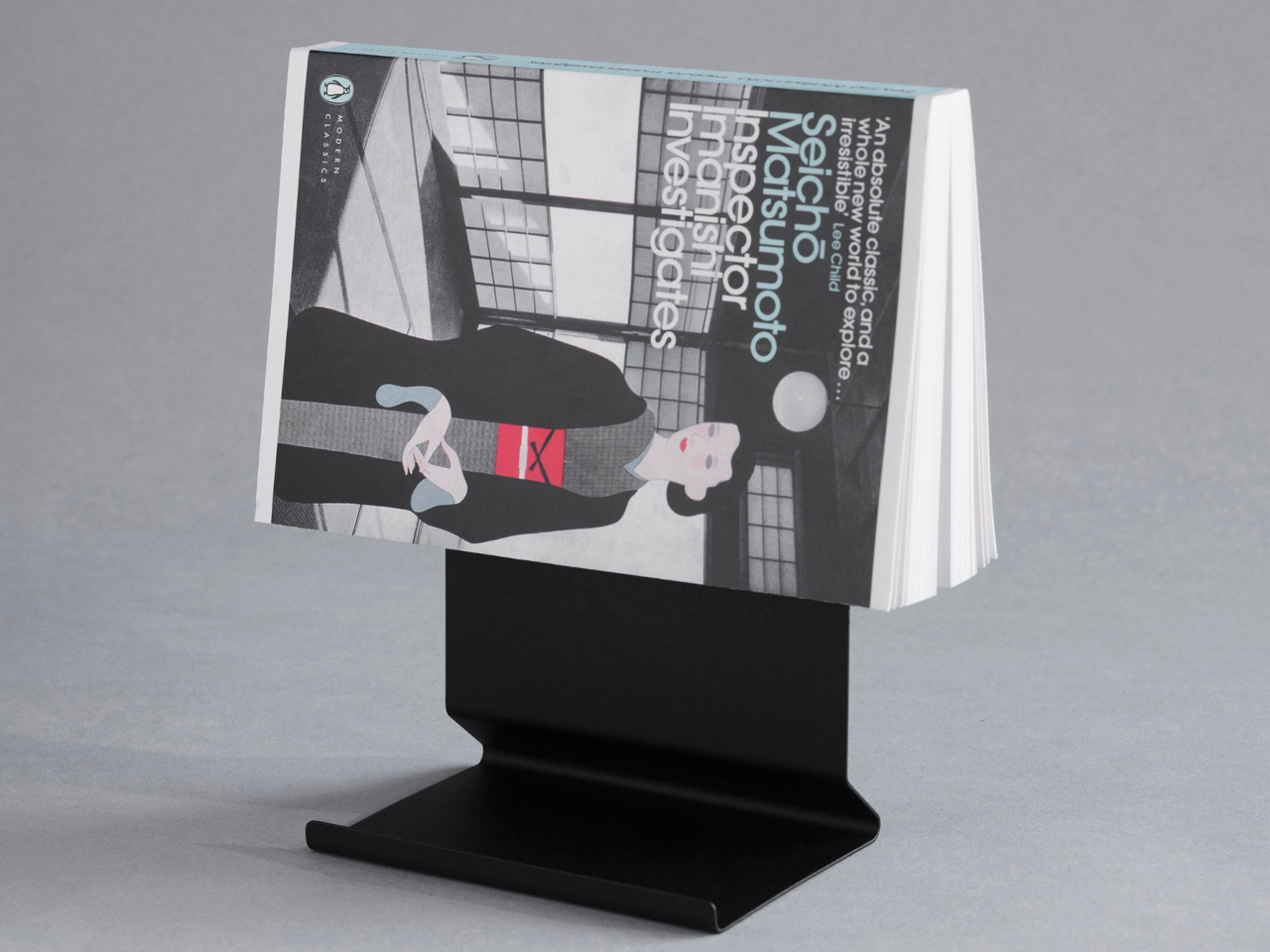
Minimalist Book Stand Works as Bookmark, Display, Bookends

Books in progress disappear easily in daily life. They slide beneath magazines, stack horizontally until the pile tips, or close flat on nightstands where they compete with phones and glasses for space. Bookends organize collections but ignore single volumes being actively read. Most stands prop books at awkward angles or take up more surface area than they deserve for what they accomplish.

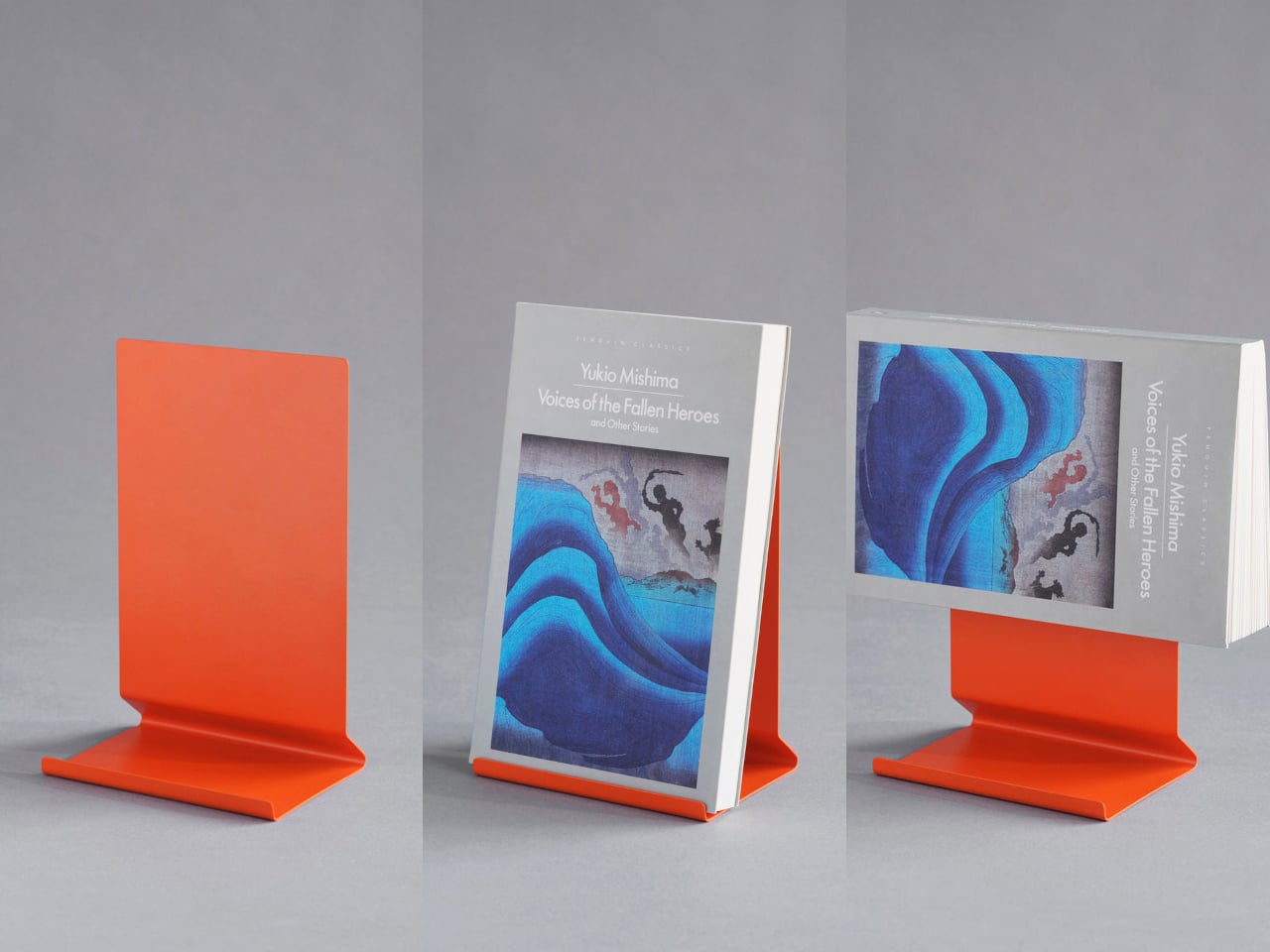
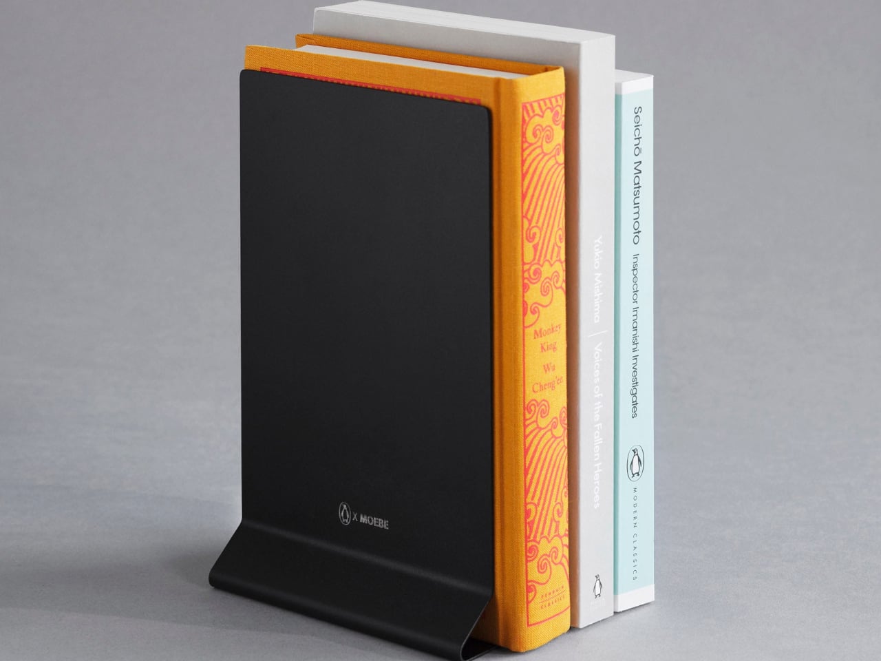
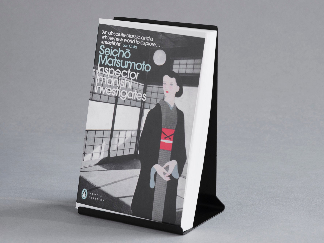
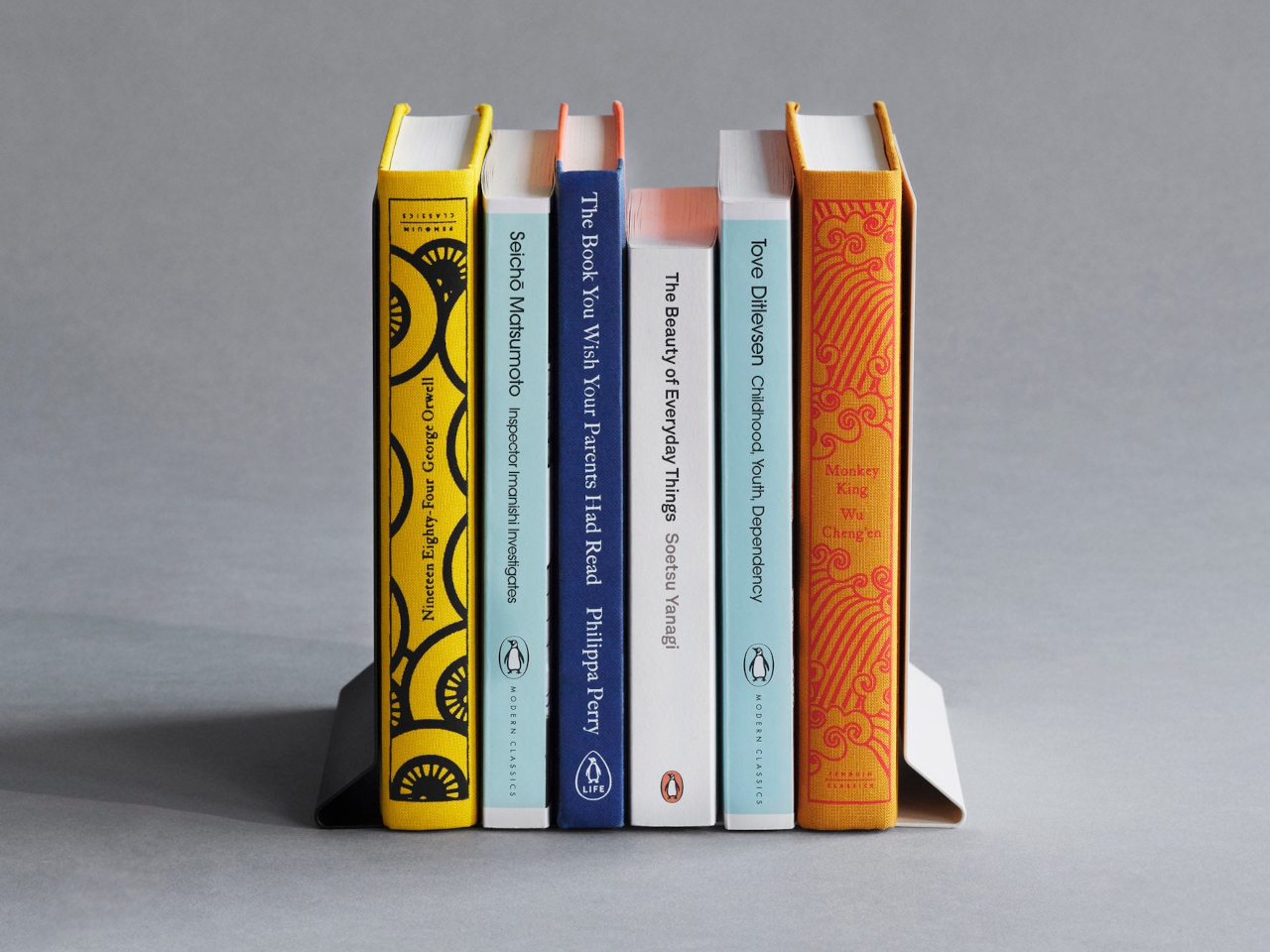
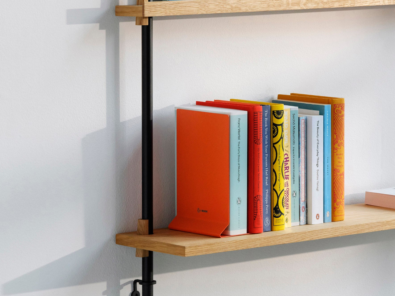
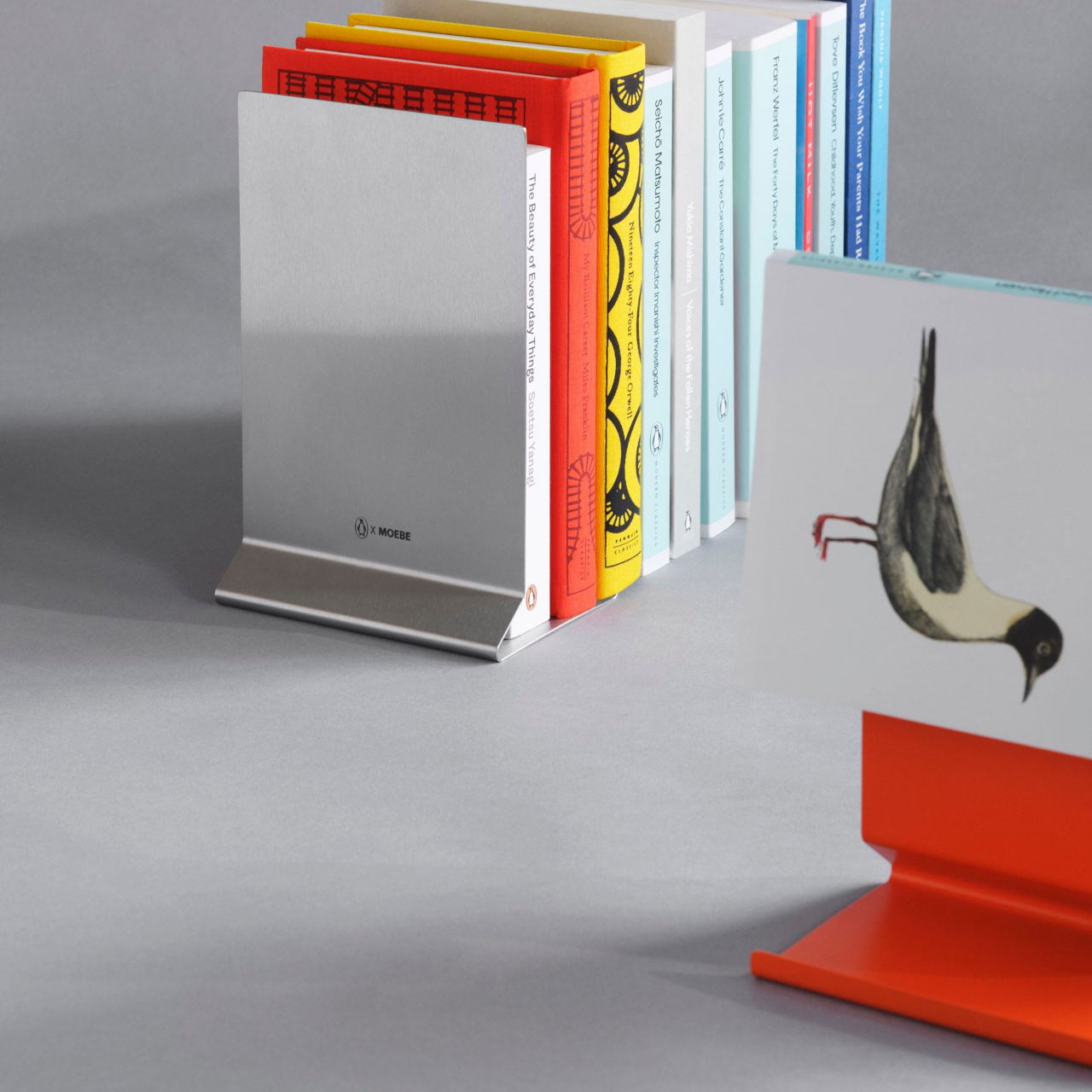
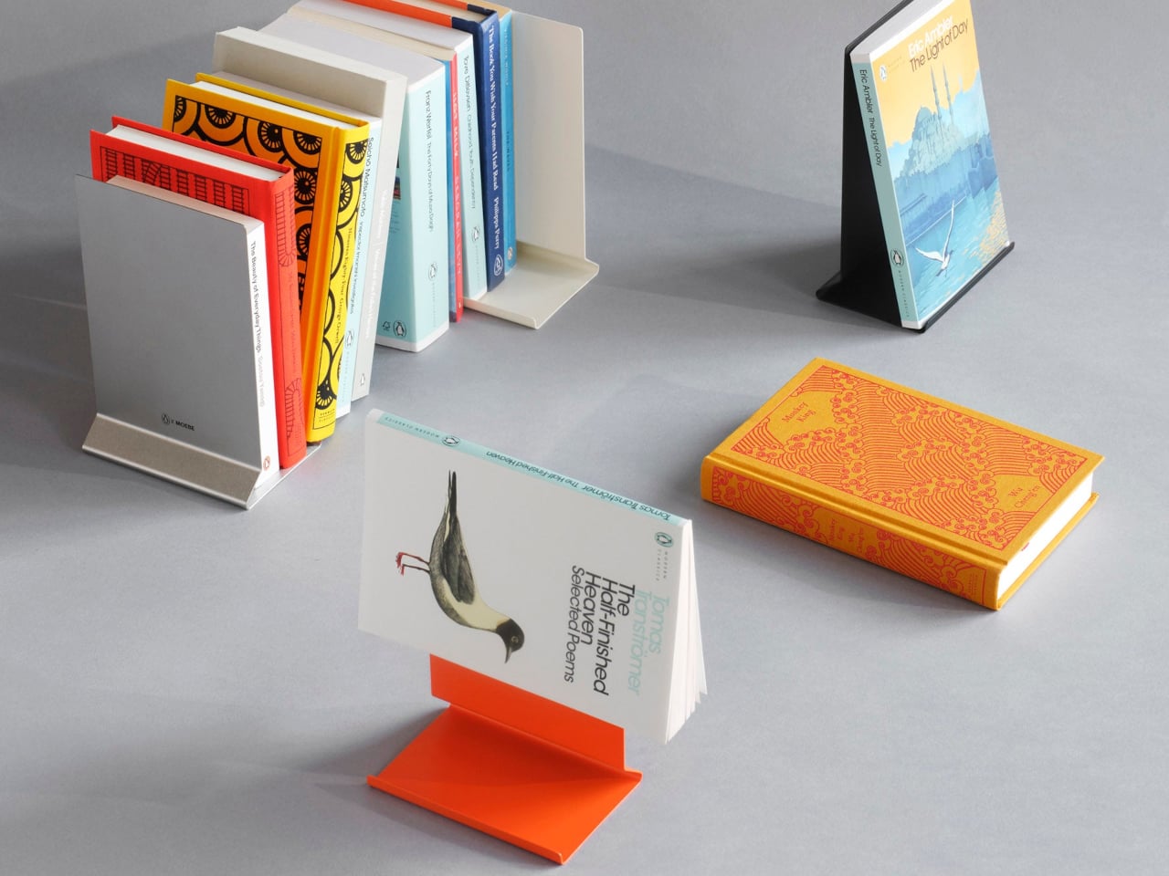
The Penguin x MOEBE Book Stand treats books as objects worth displaying rather than just storing. Created to celebrate Penguin’s 90th anniversary, the stand gives reading material a visible place that makes returning to your current page feel natural. Its bent steel construction holds books open, displays single volumes upright, or works in pairs as bookends depending on what you need.

Designer: MOEBE for Penguin

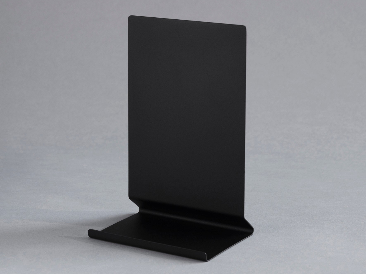
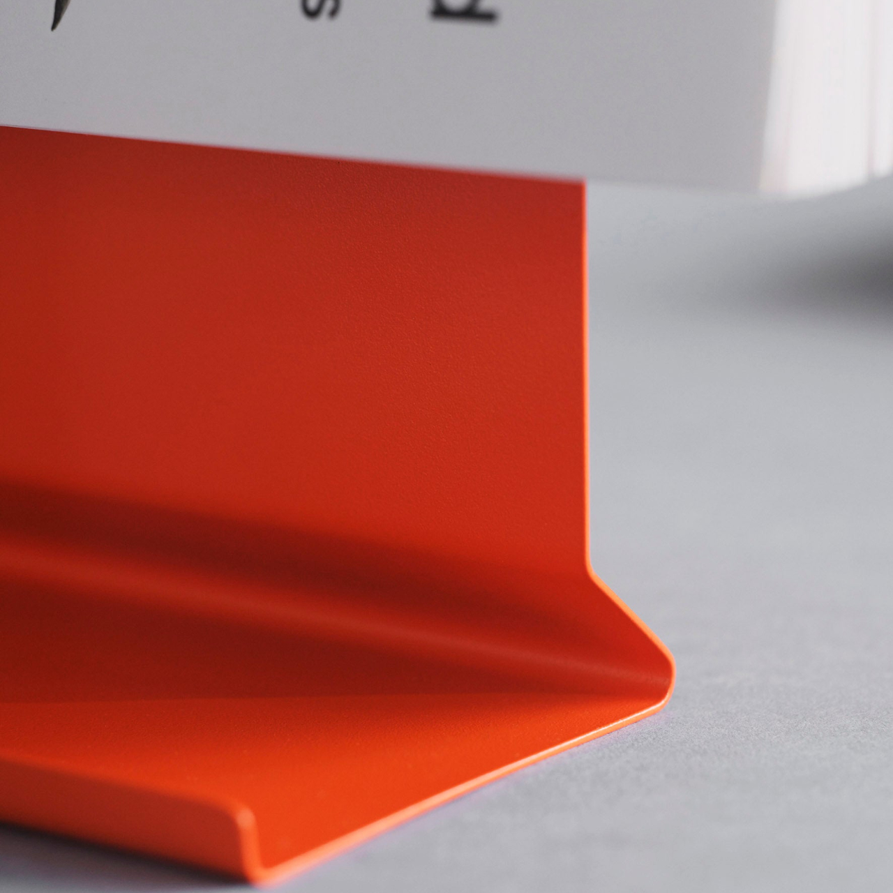
The stand comes in stainless steel, cream, black, and Penguin’s signature orange. Each version uses a single bent sheet of steel, creating a seamless L-shape with no visible fasteners. The matte finish stays quiet visually while the angled base supports books of different thicknesses without wobbling. Subtle Penguin and MOEBE marks sit on the base where they don’t interfere.

Functionally, the stand adapts without adjustment. Prop a novel open to your current page and it holds position, removing the need to constantly relocate your place. Stand a hardcover upright to display its cover temporarily. Pair two stands to bookend a small collection on a desk, with everything staying secure. The same object shifts between these roles depending on what you’re reading.

The compact footprint fits bedside tables, narrow shelves, or kitchen counters where cookbooks get referenced mid-recipe. The vertical back supports books without hiding spines or covers entirely. The open form lets you grab volumes from either side depending on where you’re sitting, which removes the awkward reaching that happens with conventional stands when books sit facing one direction.

Books become the primary visual element when the stand holding them stays minimal. A colorful Penguin paperback in the orange version creates complementary color pairings. Hardcovers with interesting artwork get framed rather than buried. The stand recedes visually while making whatever sits in it more noticeable, which feels backwards from typical accessories that announce their presence louder than their contents.

Using the stand shifts how books exist in rooms. Instead of closing a novel and setting it somewhere to get buried later, you leave it propped open where it stays visible. That reminder makes picking it back up feel easier than hunting through stacks for where you abandoned it last. The ritual around reading becomes slightly more deliberate without requiring extra effort.

The Penguin x MOEBE Book Stand handles practical storage while maintaining enough visual restraint to work on surfaces where aesthetics matter. It gives books presence without making the stand itself compete for attention, which most reading accessories struggle to balance properly. The bent steel form stays minimal while adding genuine utility to spaces where people actually read rather than just collect.

The post Minimalist Book Stand Works as Bookmark, Display, Bookends first appeared on Yanko Design.
5 Emotional Design Products Designed to Spark Joy Every Single Time You Use Them

The process of transforming everyday products from mere tools to cherished companions might seem like a grand challenge, but it is surely achievable through the magic of emotional design. Industrial product design shows that when emotion is infused into a product, it can go beyond its basic function. The primary goal of emotional design is to create an experience that resonates with users, making them feel understood, delighted, or even comforted.

Let’s explore how we can design products that truly speak to the heart, turning mundane interactions into memorable moments, making them not just functional but truly loved.

1. The Heart of the Matter: What is Emotional Design?

Emotional design isn’t just about making something look pretty but about crafting an experience that elicits a specific emotional response. Think about products you love, perhaps a sleek coffee maker that brings joy to your morning ritual, or a comfortable chair that offers a sense of calm after a long day. This isn’t accidental but is the deliberate result of designers considering how the product will make you feel. It’s about more than just utility and about evoking positive sentiments and building a connection, turning simple interactions into delightful moments.

This approach goes beyond ergonomics or material science, diving into psychology to understand human needs and desires. For industrial product designers, it means viewing the product not just as an object, but as a catalyst for emotion.

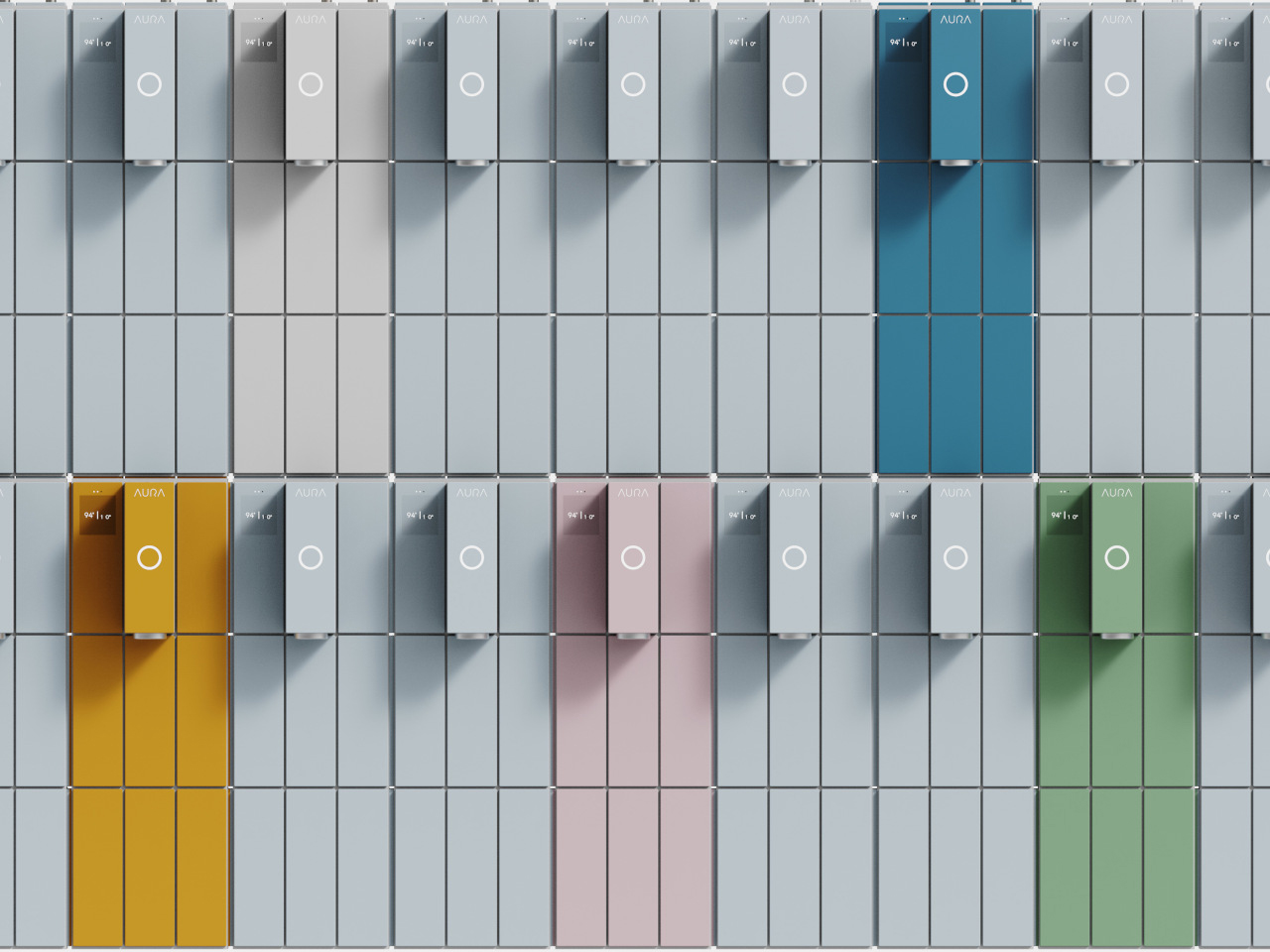
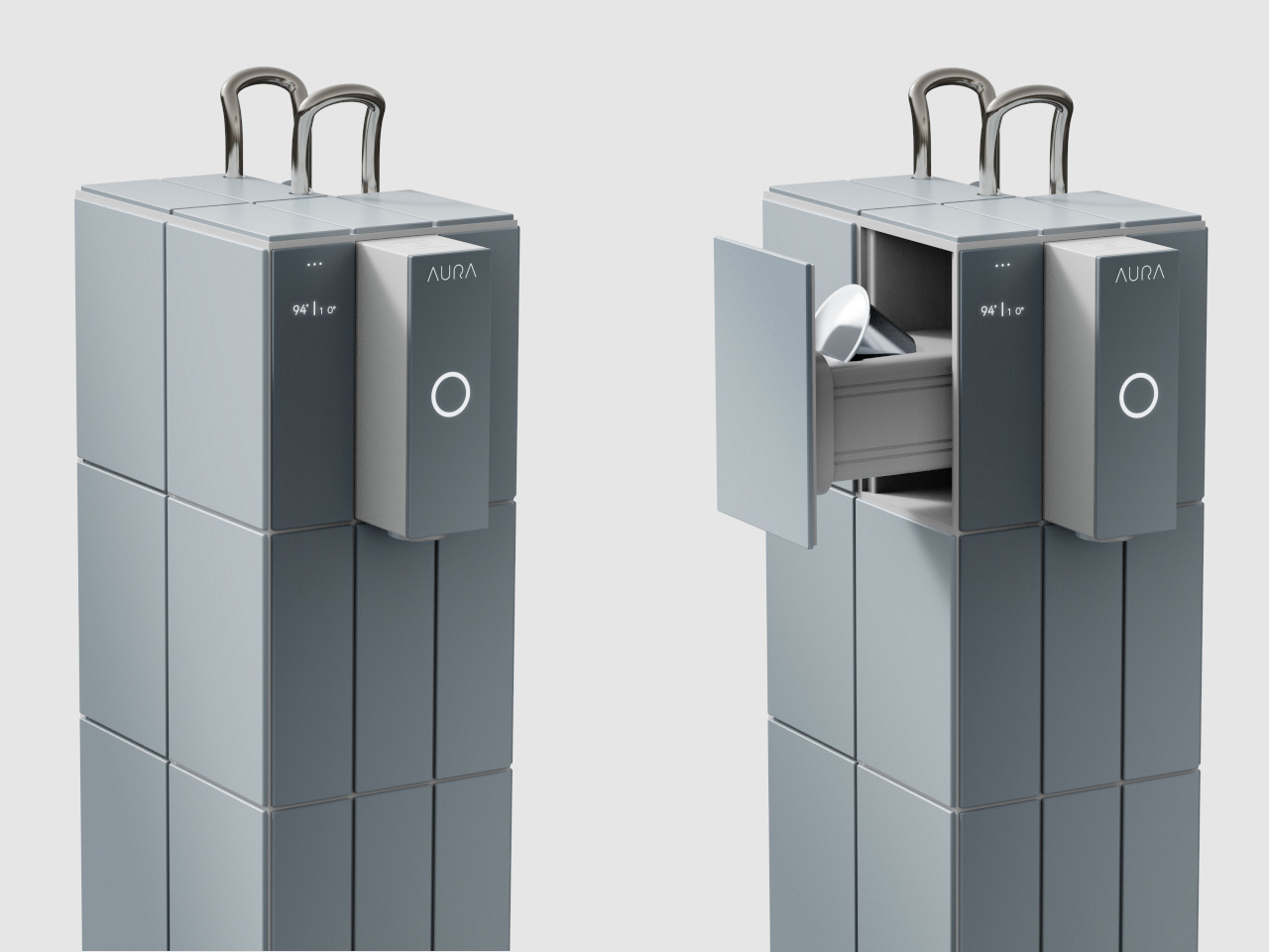
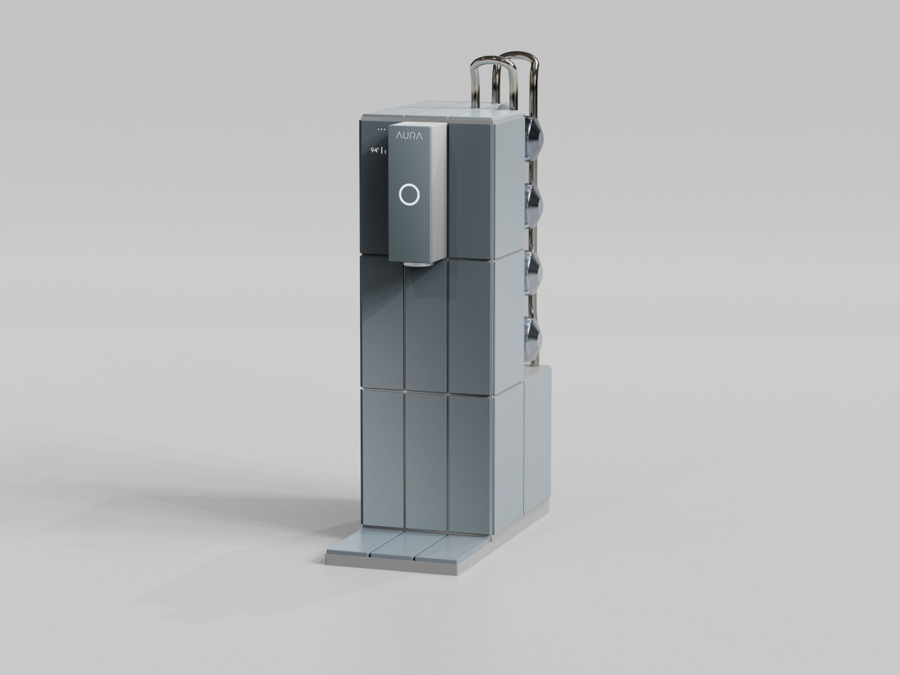
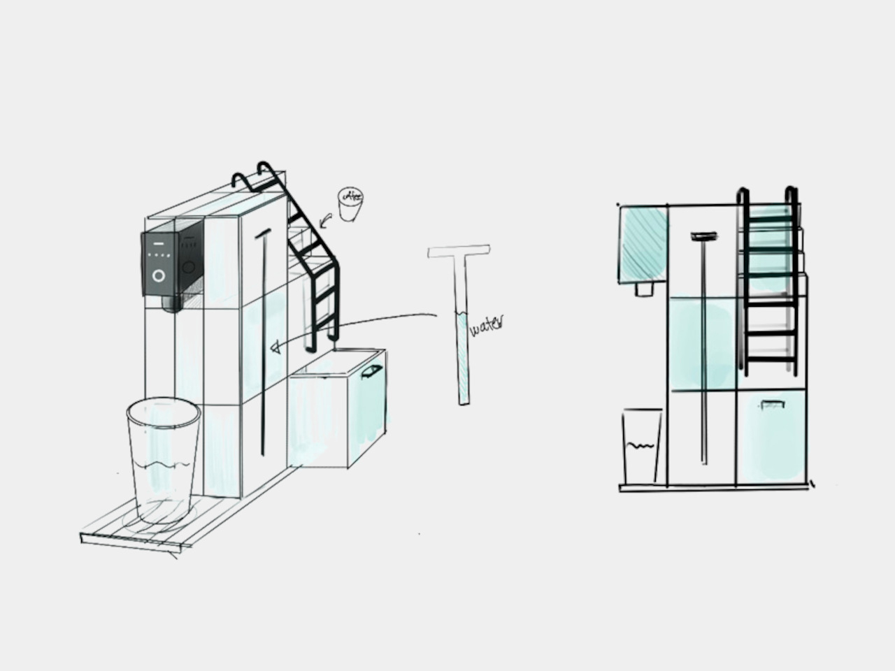
The AURA coffee machine concept reimagines your morning ritual by blending the invigorating experience of swimming with the comfort of coffee. Drawing inspiration from serene blue swimming pools, AURA transforms coffee-making into a sensory experience that awakens the body and mind. More than just a functional appliance, it celebrates the parallels between swimming and coffee, both moments of renewal that prepare you for the day ahead. With visual cues like tile patterns and clever ladder-like capsule holders, AURA brings a splash of joy to your countertop.

What makes AURA stand out is its seamless integration of form and function. The capsule holder, cleverly disguised as a miniature pool ladder, eliminates the need for extra accessories while reinforcing the playful concept. Functional components like the water tank are hidden within the tiled surface, preserving a clean, sculptural look. The result is a beautifully cohesive object that balances practicality with visual delight, turning routine into ritual.

2. Beyond Function: The Power of Form and Aesthetics

The visual appeal of a product is often the first point of emotional connection. Consider the elegant curves of a classic car or the satisfying click of a well-designed switch; these are not just functional features; they’re aesthetic choices that stir feelings of sophistication, reliability, or even playfulness.

Every detail, from color to contour, plays a role in shaping how users perceive and relate to a product. Product designers thoughtfully select shapes, finishes, and hues to communicate the intended personality and purpose. Soft, rounded edges may suggest warmth and approachability, while sharp, angular lines can convey precision, performance, or modernity.

The Paper Tube Chair redefines accessible design by transforming waste into function and form. Created by the Dhammada Collective and founded by Nipun Prabhakar, the chair pays homage to Pierre Jeanneret’s teak library chairs but replaces expensive wood with discarded cardboard tubes. Collected from local print shops, these tubes are cut and assembled using leftover vermilion rope in a figure-eight lashing pattern. This system not only holds the structure together but also allows for flexibility, comfort, and easy repair. The design embodies “joyful frugality,” making quality design available beyond urban centers.

Through trial and error, the team refined the structure by adding smaller tubes at joints and trusting rope tension over adhesives. A light varnish preserves the tubes’ original texture and markings, celebrating their past use. Open-source by intent, the chair requires only basic materials and skills to build—empowering local makers and encouraging replication across diverse contexts. It blends modernist aesthetics with vernacular craft, creating something that is rooted and contemporary.

3. Usability with a Soul: Intuitive and Delightful Interactions

Beyond looks, the way a product feels during use is equally important. An intuitive interface, a comfortable grip, or a seamless user journey can transform a mundane task into a delightful experience. When interaction feels effortless, it fosters a sense of empowerment and deep satisfaction.

For industrial product designers, this means meticulously planning every interaction point. When a product is not only functional but also a joy to operate, it reduces frustration and enhances the overall user experience. This sense of delight often turns users into advocates, eager to share their experiences and strengthen the product’s emotional appeal and a loyal following.

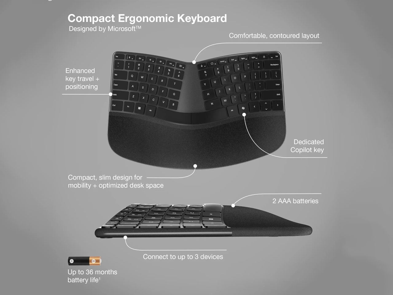
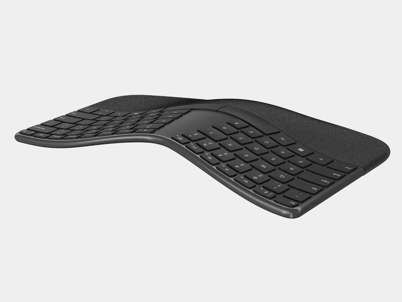
Ergonomic keyboards are a response to the growing need for comfort in long hours of computer use. Designed with a contoured, split layout, this Microsoft keyboards aim to reduce strain on the hands, wrists, and shoulders by promoting a more natural typing posture. The compact form factor of newer designs minimizes desk clutter while still providing essential ergonomic support. Integrated cushioned wrist rests add to the comfort, although their fixed placement means users need to account for extra desk space.

A key feature in many modern ergonomic keyboards is wireless connectivity, often supporting multiple device pairing via Bluetooth. Battery-powered options, such as those running on AAA cells, offer extended usage, sometimes up to 36 months without the need for charging ports or cables. This minimalist approach not only enhances aesthetics but also simplifies user interaction. Combining thoughtful ergonomics with sleek, functional design, these keyboards cater to writers, developers, and anyone seeking comfort and efficiency in daily computing tasks.

4. Storytelling Through Materials and Textures

The materials and textures of a product can tell a powerful story and evoke strong emotional responses. The cool, smooth feel of brushed aluminum might convey a sense of modern sophistication, while the warmth of natural wood can evoke feelings of comfort and authenticity. Even the weight of a product in your hand can communicate quality and durability. These tactile experiences are often subconscious but profoundly impact how we perceive and connect with a product.

In industrial product design, selecting materials isn’t just about performance; it’s about the sensory experience. A durable, robust texture for a piece of industrial equipment might inspire confidence in its strength, while a soft, inviting fabric on a piece of furniture invites relaxation.

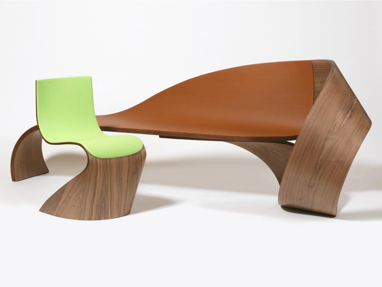
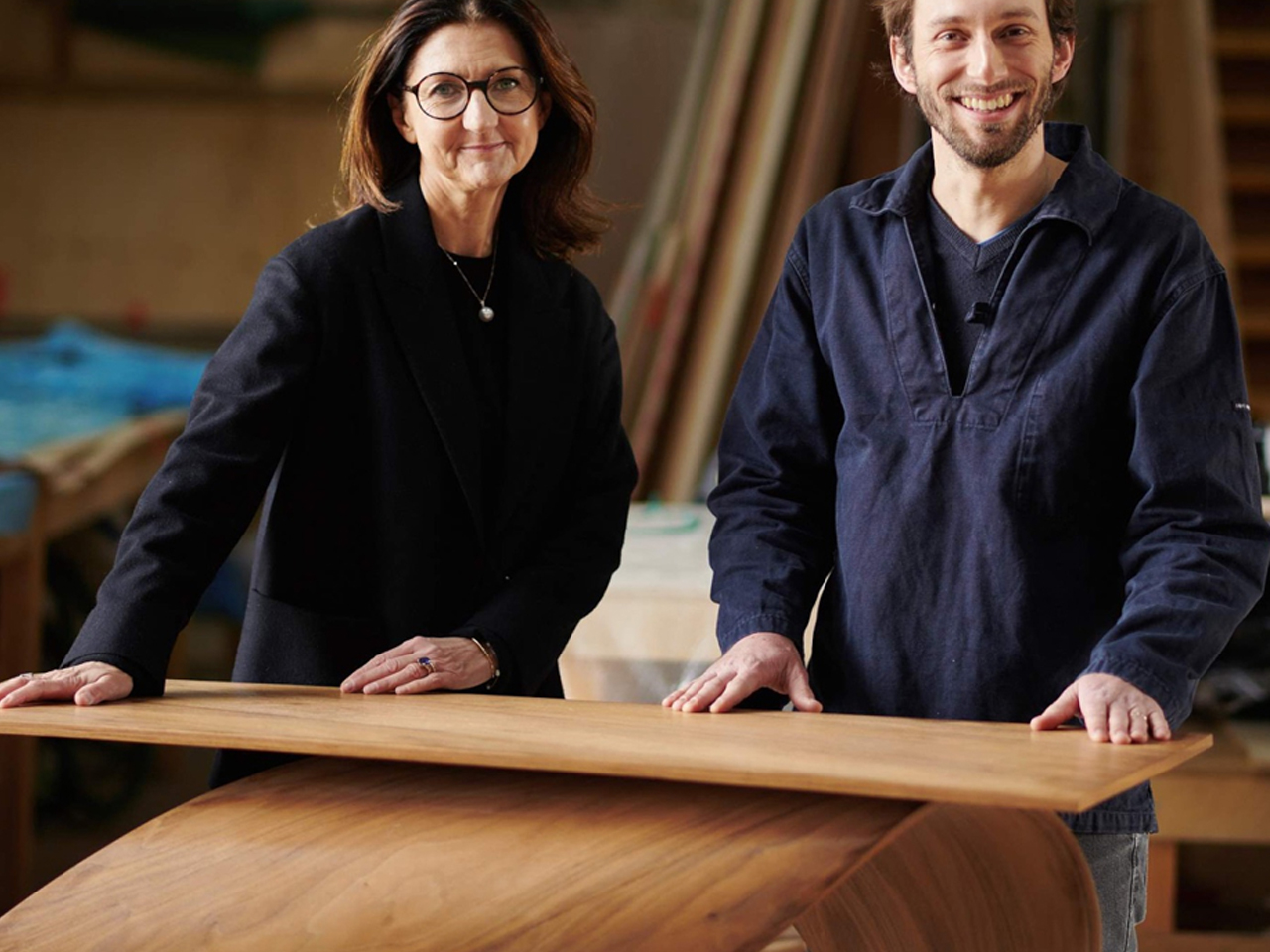
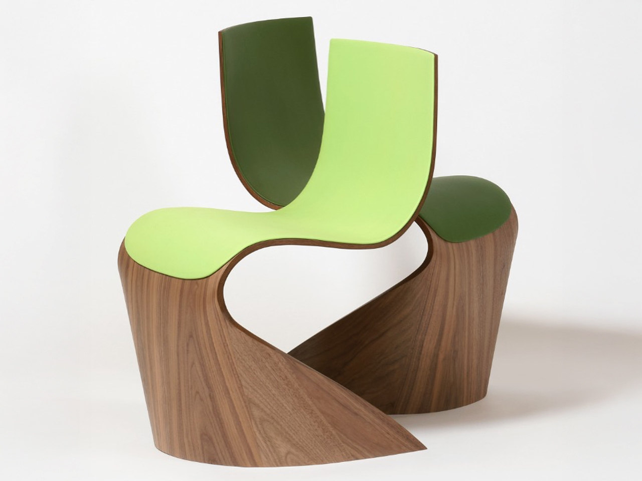
Longchamp collaborates with renowned designer Pierre Renart to bring its legacy of leather craftsmanship into the world of home design. The collection blends Longchamp’s refined aesthetic with Renart’s fluid woodworking techniques, resulting in sculptural pieces that appear to move despite their solid construction. This seamless transition from fashion to furniture reflects a shared philosophy that honours traditional craftsmanship while pushing creative boundaries.

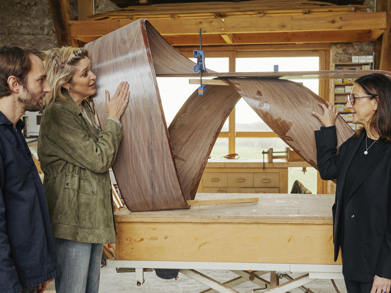
The centerpiece, the Wave bench, is upholstered in supple cashew-toned leather and seems to float above its curved wooden base. Renart’s technique of layering thin wood sheets creates a ripple-like effect, evoking the softness of fabric in motion. Accompanying the bench are the Ruban chairs, featuring leather in eight shades, including Longchamp’s iconic greens, that add depth and rhythm to the design. Each piece stands as a testament to functional art, merging elegance with tactile storytelling.

5. The Long-Term Connection: Building Loyalty and Trust

Emotional design fosters a lasting relationship between the user and the product. When a product consistently delivers positive emotional experiences, it builds trust and loyalty. Think about a brand you consistently return to; it’s because their products consistently make you feel good, whether it’s through reliability, thoughtful features, or simply a sense of consistent quality.

A product that grows with its user and consistently delivers emotional value becomes an irreplaceable part of their life, moving from a mere possession to a trusted companion, fostering a deep and long-lasting connection.

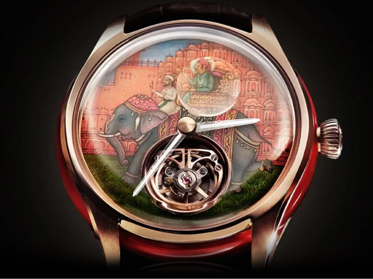
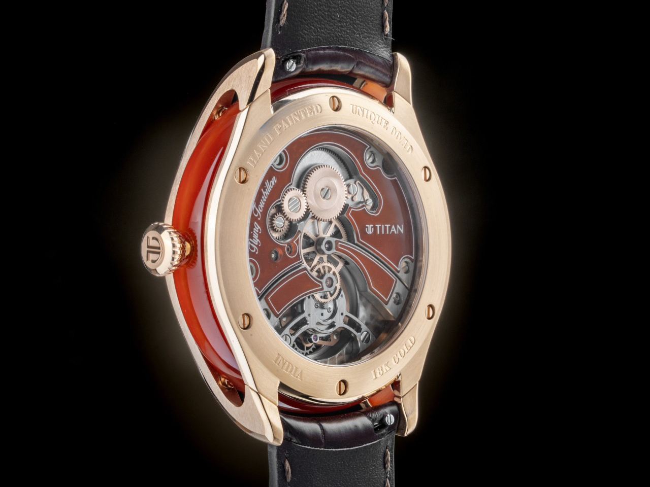
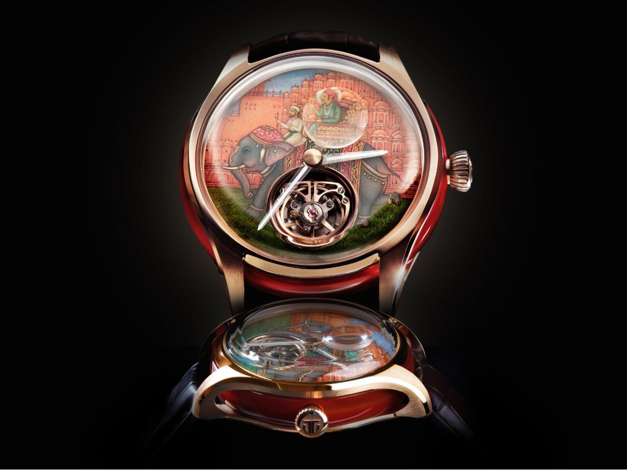
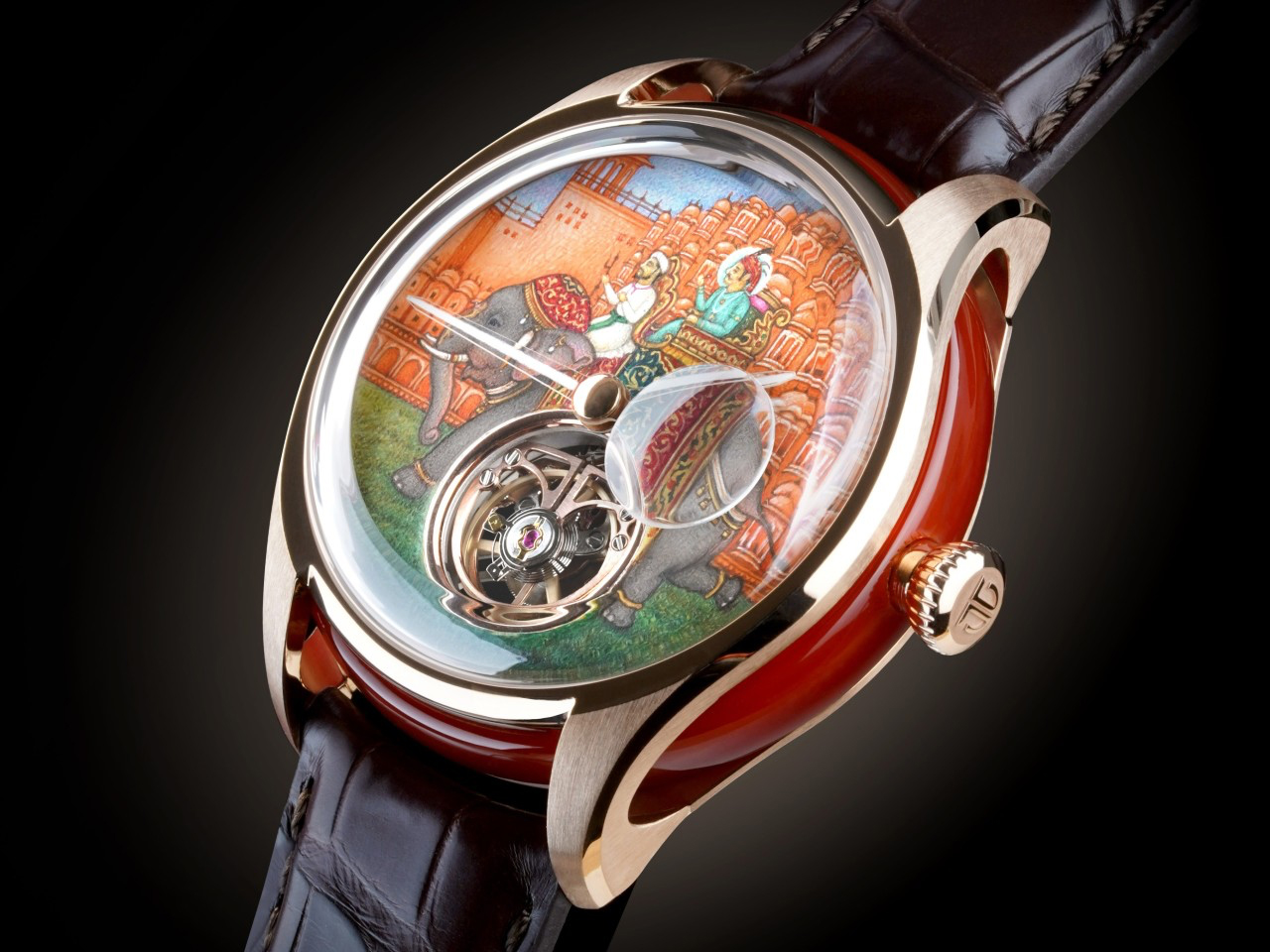
Titan’s Jalsa watch marks a bold leap into haute horlogerie, blending fine watchmaking with deep cultural storytelling. Instead of following Swiss conventions, Titan chose to honor 225 years of Jaipur’s architectural legacy through a hand-painted dial that captures the emotional richness of Indian heritage. Limited to just 10 pieces, Jalsa is India’s second flying tourbillon and the first to carry a miniature painting. More than a technical achievement, it offers a deeply personal connection to India’s artistic traditions, transforming timekeeping into an experience of pride and nostalgia.

Technically remarkable, the Jalsa houses a 144-component in-house flying tourbillon movement within a 43.5mm, 18K rose gold case. The marble dial, painted by Padma Shri Shakir Ali, features a royal procession before the Hawa Mahal, using natural pigments like turmeric, lac, and gold. Floating sapphire hands and red agate accents echo the design’s soul. Every detail invites emotional engagement, blending precision with cultural memory.

Designing products with emotional intelligence means creating more than just objects, as it means crafting experiences that enrich lives. By understanding and embracing the principles of emotional design, product designers can create products that are not just used, but truly loved, becoming indispensable parts of people’s daily lives and building lasting loyalty.

The post 5 Emotional Design Products Designed to Spark Joy Every Single Time You Use Them first appeared on Yanko Design.
7 Best Tech Products That Upgrade Your Daily Digital Experience

The modern digital landscape demands more than functional gadgets—it requires tools that seamlessly integrate into daily routines while enhancing productivity, creativity, and connectivity. As work and personal lives become increasingly intertwined with technology, the accessories we choose make the difference between digital frustration and digital mastery in our interconnected world.

Today’s tech enthusiasts face unique challenges, as smartphones and laptops have reached remarkable sophistication, yet their peripheral ecosystems often lag. From touchscreen typing inefficiency to the bulk of portable workstations, these pain points accumulate into genuine barriers. The seven innovative products in this guide represent thoughtful design solutions that transform routine digital interactions into intuitive experiences.

1. Akko MetaKey

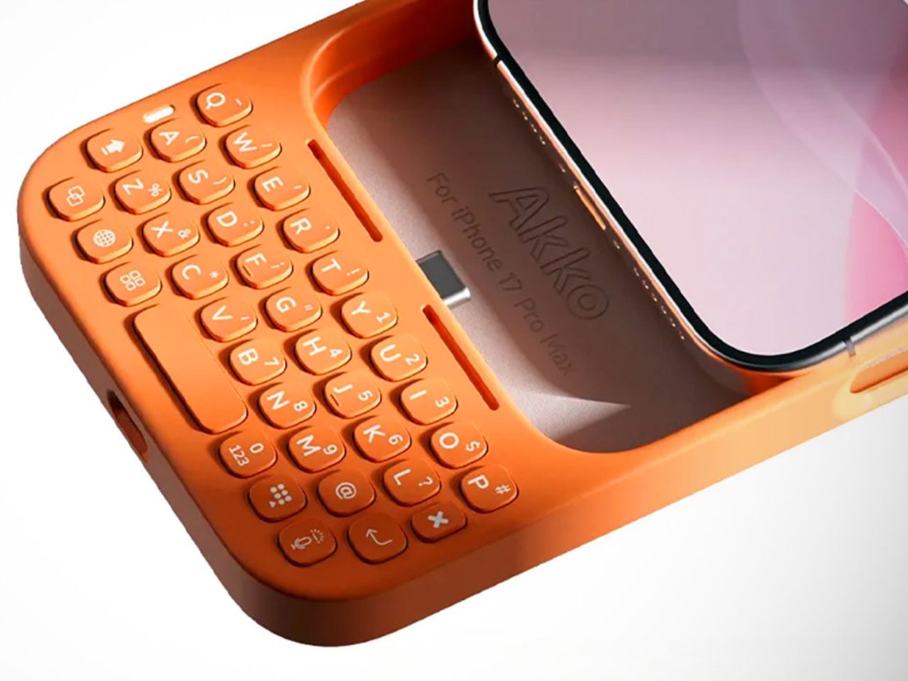
The smartphone revolution brought incredible computing power to our pockets, but eliminated one of the most satisfying aspects of digital communication: tactile typing. The Akko MetaKey addresses this fundamental trade-off by engineering a physical keyboard directly into an iPhone case, creating a bridge between nostalgic typing satisfaction and modern mobile functionality that genuinely enhances productivity.

This isn’t just a novelty accessory trying to recreate BlackBerry nostalgia. The MetaKey features genuine mechanical switches, backlit keys for low-light situations, and intelligent software integration that transforms typing from a necessary evil into a genuinely pleasant experience. The compact layout maximizes efficiency while USB-C passthrough ensures charging and data transfer remain seamless throughout daily use.

What we like

  • Genuine mechanical keyboard experience delivers satisfying tactile feedback on mobile devices.
  • USB-C passthrough maintains full charging and connectivity without removing the case.

What we dislike

  • Significantly increases device size and weight, compromising portability and one-handed use.
  • Limited compatibility restricts usage to specific iPhone models only.

2. OrigamiSwift Folding Mouse

Traditional productivity setups force an uncomfortable choice between portability and functionality. Full-sized mice offer precision and comfort but consume valuable bag space, while compact travel mice sacrifice ergonomics for convenience. The OrigamiSwift eliminates this compromise through ingenious origami-inspired engineering that transforms from a flat storage profile to a full-sized pointing device in under half a second.

Weighing just 40 grams, this Bluetooth mouse delivers surprising precision and comfort despite its transformative design. The folding mechanism feels robust and reliable, while the ergonomic shape ensures extended use remains comfortable. For digital nomads and frequent travelers who refuse to compromise on input precision, the OrigamiSwift represents a genuine breakthrough in portable productivity accessories.

Click Here to Buy Now: $79.00

What we like

  • Folds completely flat for effortless storage while maintaining full-size mouse functionality.
  • Ultra-lightweight 40-gram design makes it barely noticeable in bags or pockets.

What we dislike

  • The folding mechanism may wear out over time with repeated daily use.
  • Premium pricing makes it expensive compared to traditional compact mice.

3. WELDER Foldable Keyboard

The dream of a perfect mobile workstation often involves compromises between screen real estate, input quality, and portability. The WELDER keyboard eliminates these trade-offs by integrating a 12.8-inch touchscreen display directly above mechanical keys in a CNC-machined aluminum chassis. This engineering marvel folds completely flat for transport while providing dual-screen productivity when deployed for serious work sessions.

The all-metal construction delivers premium heft and rigidity that rivals high-end laptops rather than feeling like a peripheral accessory. When folded at the 180-degree hinge, there’s zero flex or wobble during aggressive typing sessions. The integrated display remains perfectly stable, creating a genuine dual-screen workspace that transforms any surface into a professional workstation without requiring multiple devices or cables.

What we like

  • Integrates a full-size mechanical keyboard with a 12.8-inch display in a single portable device.
  • CNC-machined aluminum construction provides exceptional build quality and zero flex when typing.

What we dislike

  • Significant weight and bulk make it less portable than traditional folding keyboards.
  • High price point puts it out of reach for casual users.

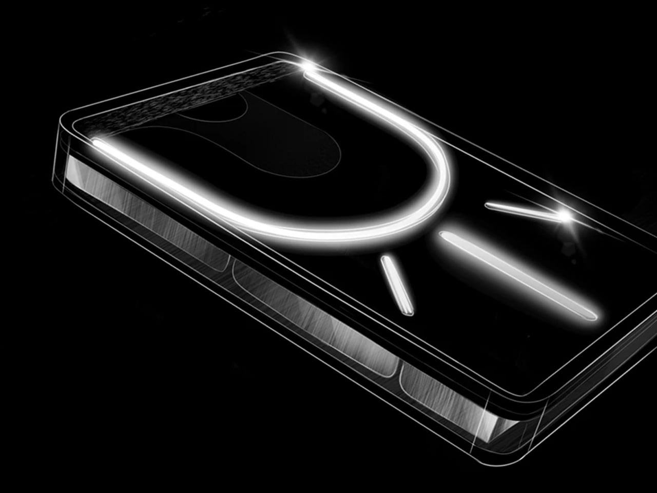
4. Nothing Power (1) Battery Bank

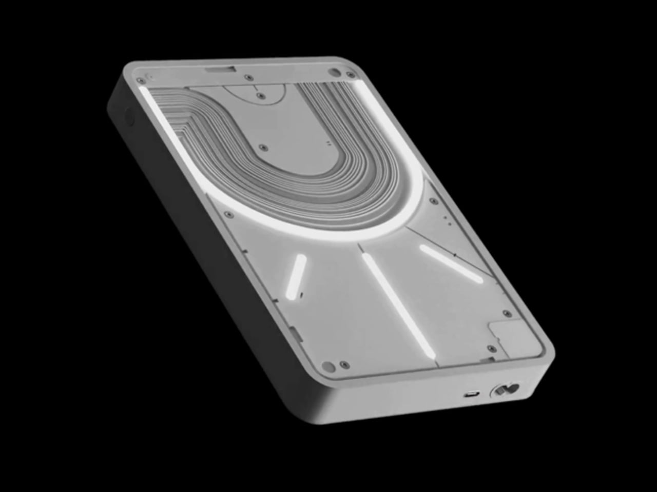
Portable chargers typically prioritize function over form, resulting in bland rectangular blocks that disappear into bags and offer no visual feedback about charging status. The Nothing Power (1) concept revolutionizes this category by incorporating the brand’s signature Glyph interface, transforming a utilitarian power bank into an interactive communication device that provides elegant visual feedback throughout the charging process.

The transparent design philosophy extends beyond aesthetics to create genuinely useful functionality. Bold light paths illuminate to indicate charging status, remaining capacity, and device communication through carefully choreographed light patterns. This isn’t just visual flair—it’s practical information design that eliminates guesswork about power levels and charging status without requiring additional displays or complex button combinations for status checking.

What we like

  • The glyph interface provides elegant visual feedback for charging status and remaining capacity.
  • Transparent design language creates a unique aesthetic that stands out from generic power banks.

What we dislike

  • Concept status means actual availability and pricing remain uncertain.
  • Transparent materials may be more fragile than traditional power bank construction.

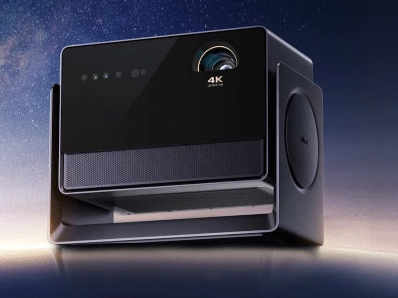
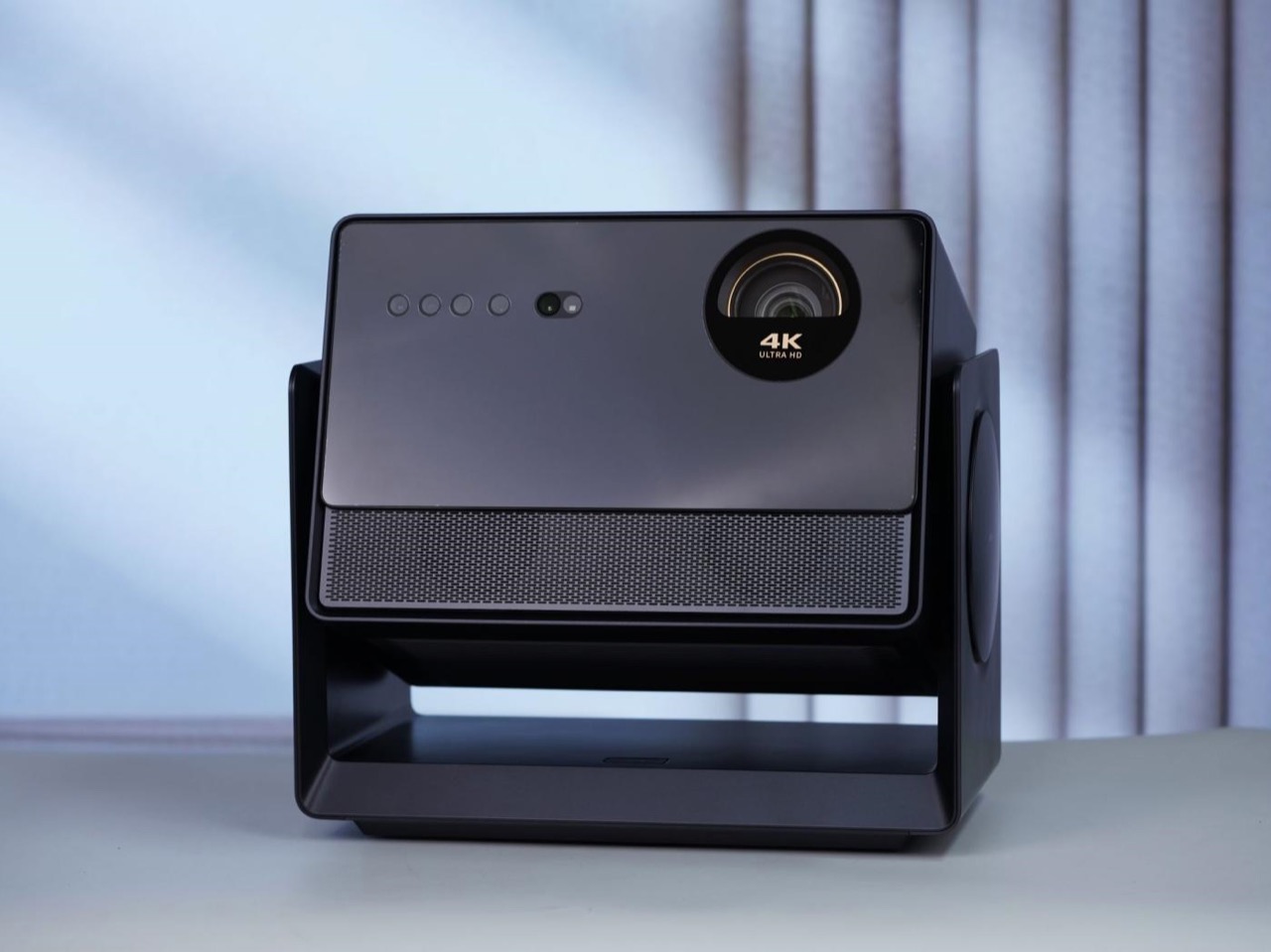
5. Dangbei S7 Ultra Pro Liquid-Cooled Projector

Home projectors traditionally require darkened rooms and careful setup to deliver acceptable image quality, limiting their practicality for everyday use. The Dangbei S7 Ultra Pro eliminates these restrictions through aggressive engineering that combines liquid cooling, 4,500 CVIA lumens brightness, and advanced light management to create a projector that performs excellently even in well-lit environments without requiring room modifications.

The liquid cooling system enables sustained high-brightness operation without thermal throttling, while the polarized light-control engine boosts optical efficiency by 10% and light throughput by 168%. Native 4K resolution, HDR10+ support, and 8,000:1 contrast ratio ensure this projector delivers cinema-quality imagery. MediaTek’s MT9681 chipset and 4GB RAM power Dangbei’s AI OS 6.0 for smooth smart features and app integration.

What we like

  • Liquid cooling enables sustained 4,500 lumens brightness without thermal throttling or noise issues.
  • Advanced light management works effectively in daylight conditions without requiring room darkening.

What we dislike

  • Premium pricing at approximately $1,700 puts it beyond casual projector buyers’ budgets.
  • Large size and weight make it less portable than traditional compact projectors.

6. Timekettle W4 AI Translator Earbuds

Language barriers create genuine obstacles in our increasingly connected world, forcing reliance on smartphone apps that struggle with ambient noise and conversational context. The Timekettle W4 eliminates these limitations through innovative bone-voiceprint sensor technology that captures speech vibrations directly from the speaker’s bones, achieving crystal-clear voice input regardless of environmental noise levels or crowded surroundings.

Powered by proprietary Babel OS 2.0, these earbuds deliver 98% translation accuracy across 42 languages and 95 accents with a remarkable 0.2-second lag time. Advanced language models understand conversational context to correct confusing homophones intelligently. Future updates promise AI voice cloning technology that will make translated speech sound like the original speaker’s voice, creating even more natural cross-language communication experiences.

What we like

  • Bone-voiceprint sensor technology ensures accurate voice capture even in extremely noisy environments.
  • Real-time translation with 0.2-second lag across 42 languages makes conversations feel natural.

What we dislike

  • Premium pricing makes them significantly more expensive than standard wireless earbuds.
  • Reliance on internet connectivity may limit functionality in areas with poor network coverage.

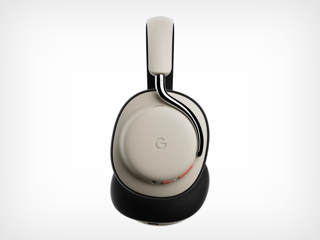
7. Google Pixel Headphones Concept

Premium headphone markets are dominated by Apple’s AirPods Max and luxury audio brands, leaving Android users without cohesive ecosystem integration. This Google Pixel Headphones concept addresses the gap by translating Pixel Buds Pro’s pebble-esque design language into an over-ear form factor while integrating advanced Gemini AI capabilities for seamless Google ecosystem interaction and enhanced productivity features.

The design balances Google’s signature soft aesthetics with premium materials, incorporating metal elements that connect earpieces to the headband without venturing into polarizing design territory. Gemini AI integration promises contextual assistance, smart noise cancellation adjustments, and seamless integration with Google Workspace applications. The concept represents Google’s potential entry into the premium headphone market with a differentiated AI-first approach rather than simply matching existing competitors’ features.

What we like

  • Gemini AI integration offers unique productivity features unavailable in competing premium headphones.
  • Design language maintains Google’s aesthetic while incorporating premium materials and construction.

What we dislike

  • Concept status means no confirmed release date, pricing, or final specifications.
  • Success depends heavily on Google’s commitment to hardware categories beyond smartphones.

Redefining Digital Interaction

These seven products represent more than incremental improvements—they demonstrate how thoughtful engineering can eliminate long-standing compromises in digital device usage. From mechanical keyboard satisfaction on smartphones to dual-screen productivity in folding form factors, each solution addresses genuine pain points that have persisted despite advancing technology capabilities throughout the industry.

The common thread connecting these innovations is their focus on human-centered design rather than feature proliferation. Instead of adding complexity, they simplify digital interactions by removing barriers between intention and execution. Whether enabling precise mobile typing, providing portable dual-screen workspaces, or breaking down language barriers through advanced AI, these products enhance daily digital experiences meaningfully.

The post 7 Best Tech Products That Upgrade Your Daily Digital Experience first appeared on Yanko Design.
World’s First Projection-Based Digital Photo Frame Hits Ceilings

Most of our favorite memories live on tiny screens, buried in albums we never open anymore, or lost in endless camera rolls and grids we rarely revisit. The digital photo frame tried to bring them back into our lives, but always with a border, a size limit, and a sense of separation from the room around it that made memories feel confined and distant rather than integrated.

PixyBeam reimagines what it means to display your moments and the stories they tell about your life and relationships. Instead of a frame that confines images to a fixed size, it uses projection to turn any wall or ceiling into a living gallery, filling your space with the stories, colors, and faces that matter most.

Designer: Innoscend

Click Here to Buy Now: $349 $499 ($150 off). Hurry, only 8/15 left!

Imagine family moments being projected on the ceiling above your child’s bed, family photos drifting across the living room wall during quiet evenings together, or a creative portfolio that turns your studio into a dynamic showcase for clients and collaborators who visit. PixyBeam makes memories part of your everyday environment, blending nostalgia with the present in a way that feels immersive and emotionally present throughout your day.

The device’s minimalist, rounded design with its soft white finish fits anywhere without demanding attention or clashing with your carefully chosen decor and furniture. It sits quietly on a shelf or table until it’s time to bring your space to life. The compact form means you can move it from room to room as your needs change throughout the day or week.

Setting up PixyBeam is as simple as placing it on any flat surface, plugging in USB-C power, and opening the companion app on your phone. Within minutes, your space becomes a living gallery. There’s no need for wall mounts, complicated menus, or learning curves that take hours to master before you can enjoy your first projection. The app lets you upload photos and short clips, organize galleries by mood or event, and invite friends to share moments.

Over 20 animated gallery styles turn slideshows into expressive, moving displays that feel fresh and alive with personality. The app’s dynamic templates let you match the vibe to any occasion, whether it’s a birthday celebration, holiday gathering, or just a quiet evening reflecting on travels and adventures you’ve had. Each style brings personality and movement to your photos rather than simply fading between static images.

With the innovative Guest Share feature, photo sharing becomes an experience, not a chore. A simple scan of a QR code lets friends and family beam their own photos and short clips straight onto your wall, no cables, no accounts to juggle. It’s instant, intuitive, and social: a living gallery that grows with every visit, where everyone contributes to the story unfolding across the room.

PixyBeam’s all-glass short throw lens projects vivid, 1080p images up to 200 inches across, even in small apartments or bedrooms with limited space. The 900 ANSI lumens engine ensures images are bright and clear throughout the day or night, while adaptive color calibration keeps photos looking true-to-life on any wall, whether it’s white, beige, or painted in bold hues you’ve chosen.

Autofocus and keystone correction mean you always get a sharp, perfectly aligned picture with just a tap on the device or through the app without manual fiddling. The 90-degree rotating lens lets you project upward to the ceiling or out across the room without moving the base, adapting to wherever the moment feels right without complicated repositioning or manual adjustments that interrupt the experience.

The magic of PixyBeam is how it dissolves the boundaries between technology and home entirely, making digital memories feel organic and present. A birthday slideshow becomes part of the party atmosphere, vacation photos turn a hallway into a visual travelogue, and creative work finds a new canvas that’s as big as your imagination allows without physical constraints.

PixyBeam’s compact body, soft finish, and zero-hardware setup blend into any decor without permanent installation or visible mounting brackets. The device includes 32GB of internal storage for offline playback, smart home integration via Matter for automation, and intuitive controls that anyone can master immediately. For anyone who wants their home to feel more personal, PixyBeam offers a compelling new way to turn your empty space into a canvas for the moments that matter most.

Click Here to Buy Now: $349 $499 ($150 off). Hurry, only 8/15 left!

The post World’s First Projection-Based Digital Photo Frame Hits Ceilings first appeared on Yanko Design.
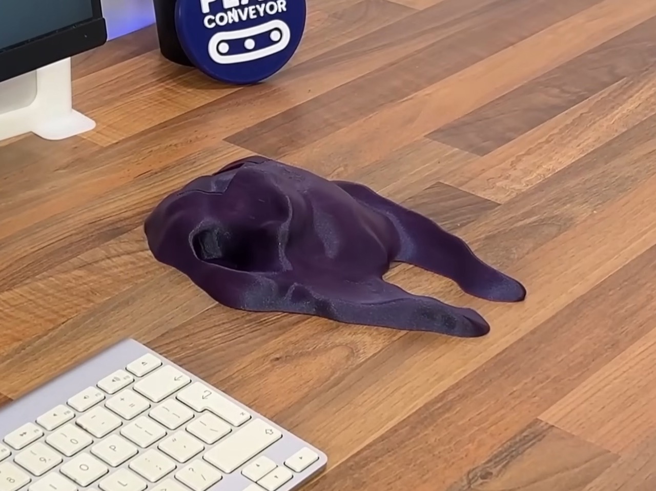
World’s Comfiest Mouse looks legitimately ugly… but it somehow works

I remember being in the third year of design college when I was introduced to this massive book titled “Indian Anthropometric Dimensions.” For the uninitiated, this book contained practically all the dimensions of the average (and non-average) Indian person, male and female, old and young. The purpose of such a book was to understand ergonomics numerically, rather than visually. And for designers, this meant adding the ultimate constraint to our wild designs… so humans could actually use them.

This YouTuber’s take on an ergonomic mouse is the antithesis of everything I was taught. The problem is, however, it works! See, designers have to balance this ergonomic approach with actual aesthetics. That’s why ergonomic mice actually look stylish, rather than being shaped exactly like the inverse of your hand. It’s why gun grips look the way they do; why bike seats, or car seats have an abstract-ness to them, and don’t actually have your individual buttocks molded into their designs. The world’s comfiest mouse works, but at a rather painful aesthetic cost!

Designer: Play Conveyor

Play Conveyor’s design process ignites a pretty strong debate between aesthetics and comfort. The Apple Magic Mouse, for example, is a prime example of the former completely ignoring the latter… and almost every mouse (even the ergonomic ones) aim at trying to achieve a balance between the two. Play Conveyor’s experiment swings the pendulum the absolute opposite way – what if a mouse was hideous as sin, but legitimately comfortable?

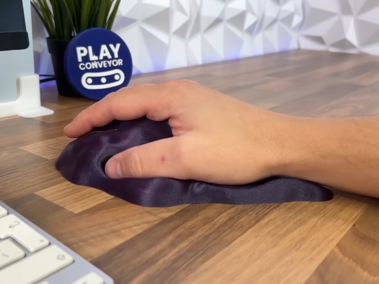
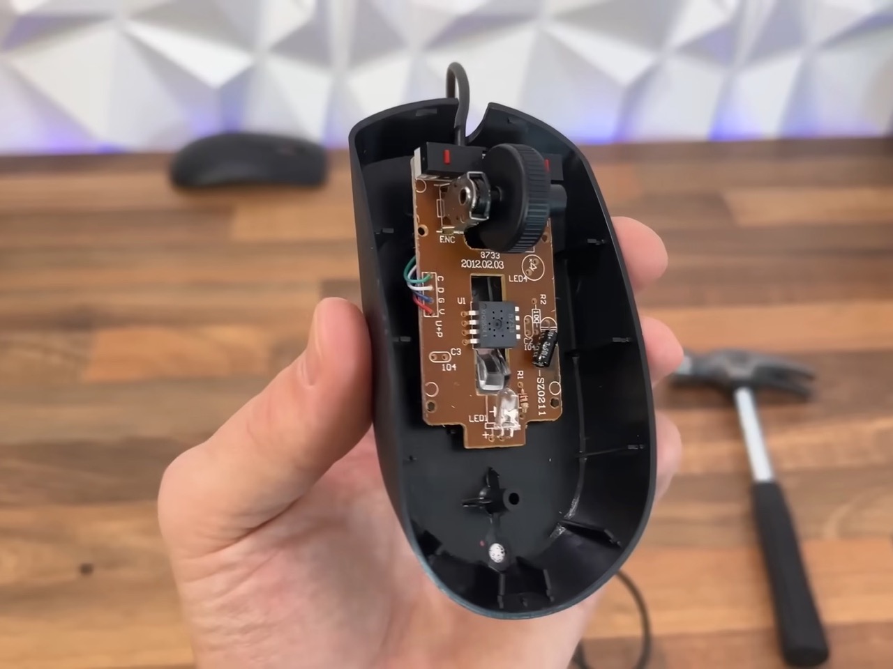
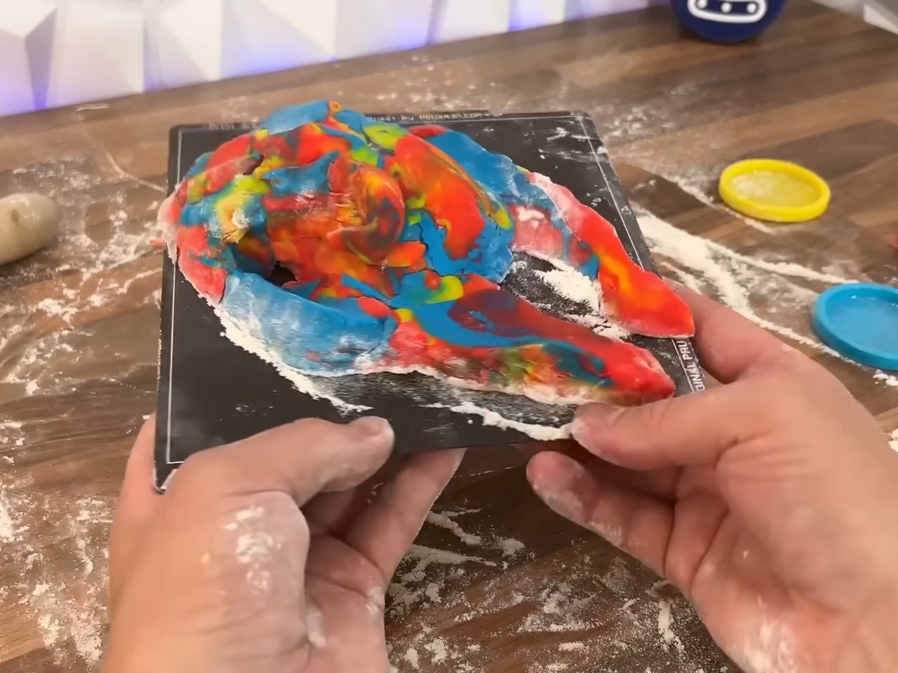
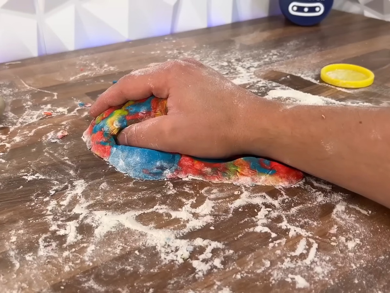
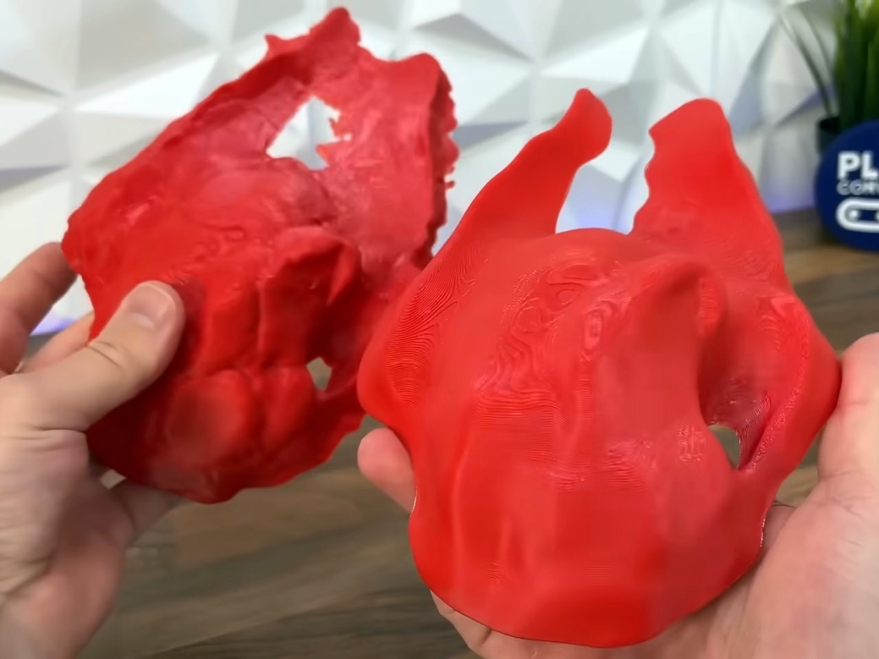
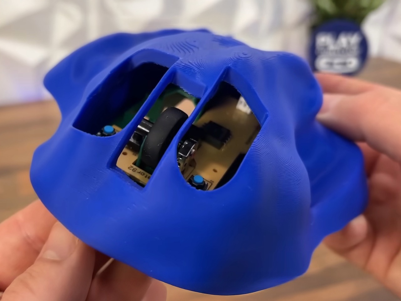
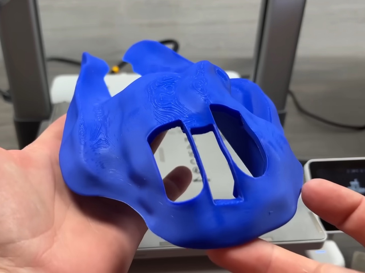
The process starts fairly simply. Play Context first ripped apart a wired mouse to see what the inner components looked like. He then 3D printed a plastic chassis on which he added play dough, filling in all the negative space created by his hand. This basically turned the mouse into a direct inversion of his hand, creating something that quite literally fit like a glove. After the play dough model was made, he scanned it, refined it, and printed it. What we see here is pure anthropometrics at work – no design, no aesthetic study, nothing.

What’s interesting is how accessible the whole process has become. A decade ago, this would’ve required industrial equipment, professional 3D scanners, and a hefty budget. Now it’s an iPhone, a 3D printer that costs less than a decent laptop, and some squishy molding compound. The democratization of manufacturing tools means anyone can now ask the question: what if products were designed for me, specifically me, and nobody else? It’s selfish design in the best possible way.

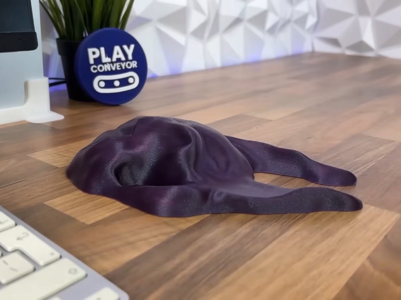
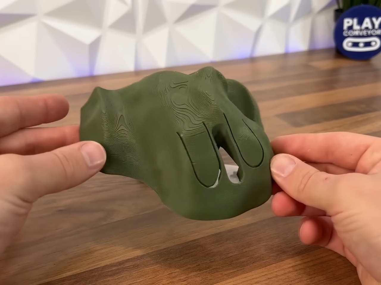
The first iteration (top left) was way too sharp, with jagged edges left behind either during the molding process or the scanning process. Play Context merely softened the edges down to create something that looks like, well, the Millennium Falcon covered in goo. Cutouts was added for left and right clicks, but soon ditched for actual hinged buttons, along with a central groove for the scroll wheel.

The final result is, well, a mouse that’s too ugly to be seen in the outdoors. It’s also a mouse that uniquely ONLY fits the ergonomic grip of one user. The justification for this can be two-fold: First, just accepting that there’s no way a company would be able to mass-produce this. People have different grips, different hand sizes, and even usage frequencies. That’s why companies like Logitech or Razer make mice the way they do, blending ergonomics with a healthy dose of aesthetics to have peripherals that actually look good while functioning flawlessly. The second justification, however, is for more edge-cases. Maybe a mouse designed for someone with Parkinsons, or with a genuine handicap or special need. We’ve seen special-needs gaming controllers from Sony for the PlayStation and Microsoft for the Xbox, but they’re mass-produced too. What if we could somehow build outer bodies of gadgets to suit our anthropometric needs? As Play Context demonstrates, the process is fairly easy, requiring only a 3D printer as a specialized equipment. All you need is a fair bit of free will, determination, and play dough!

The post World’s Comfiest Mouse looks legitimately ugly… but it somehow works first appeared on Yanko Design.
RISD’s $100K Loop Lab Creates Art Supplies From Campus Waste

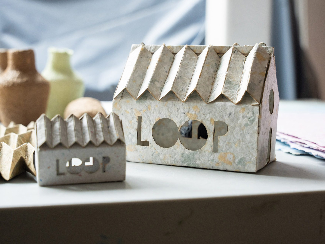
The Rhode Island School of Design has discovered something remarkable hiding in plain sight: their trash bins contain tomorrow’s art supplies. Through the newly launched Loop Lab initiative, what once headed to landfills now becomes raw material for the next generation of designers and artists. The Edna W. Lawrence Nature Lab spearheaded this ambitious pilot project with backing from a substantial $100,000 grant from the Maxwell/Hanrahan Foundation. The concept appears deceptively simple yet revolutionary in practice. Rather than purchasing new materials while simultaneously discarding potentially useful waste, RISD has created a closed-loop system that transforms campus refuse into studio-ready resources.
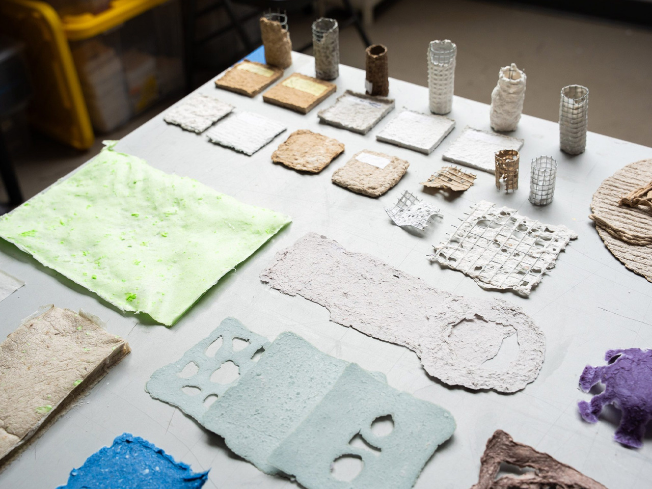
Walking through the Loop Lab reveals an almost alchemical process. Blotter paper that once absorbed spilled paint finds new life as a substrate for experimental work. Cotton muslin scraps, previously destined for disposal, emerge as carefully prepared materials ready for student projects. The transformation extends beyond mere recycling, representing a fundamental shift in how educational institutions can approach resource management. Students participate directly in this material resurrection, learning firsthand about circularity principles while solving practical design challenges. The hands-on approach ensures that sustainability becomes integral to creative education rather than an abstract concept discussed in theory classes.

Designer: Rhode Island School of Design

Each transformed material carries embedded stories about waste reduction, resourcefulness, and environmental responsibility. Recent media attention from design publication Dezeen highlights the broader implications of RISD’s approach. The coverage emphasizes how the initiative addresses what project leaders call “the lowest hanging fruit” in institutional sustainability efforts. By focusing on internal waste streams, the school creates immediate impact while developing scalable solutions for other educational institutions. The timing proves particularly significant as design schools worldwide grapple with sustainability mandates and environmental consciousness among students.

Loop Lab offers a practical framework that other institutions can adapt, creating measurable change without requiring massive infrastructure investments or complete curriculum overhauls. Material circularity research forms the theoretical backbone of the project, but practical applications drive daily operations. The lab expands understanding of how discarded matter can inform regenerative design practices, presenting students with materials that carry environmental narratives alongside creative possibilities. Each project becomes an exploration of both aesthetic potential and ecological responsibility.

The Nature Lab’s documentation through social media platforms reveals ongoing discoveries and successes. Students share their experiences working with transformed materials, creating a growing archive of circular design practices that extends the project’s influence beyond campus boundaries. Loop Lab represents more than waste reduction or cost savings. The initiative fundamentally questions traditional material sourcing while providing tangible alternatives. Students graduate with direct experience in circular design principles, carrying these approaches into professional practice where sustainable material choices increasingly influence client decisions and project outcomes.

As design education evolves to meet environmental challenges, RISD’s Loop Lab demonstrates how institutions can transform operational necessities into educational opportunities. The pilot project’s success suggests a future where campus waste streams become integral components of creative curricula, turning every scrap into a story worth telling. This innovative approach positions RISD at the forefront of sustainable design education, creating a model that combines environmental stewardship with creative excellence while preparing students for a future where circular design principles define industry standards.

The post RISD’s $100K Loop Lab Creates Art Supplies From Campus Waste first appeared on Yanko Design.