People are more stressed than ever, yet still find it hard to talk honestly about how they feel, even with therapists or friends. Most mental health tools live inside apps that want you to rate your mood on a slider or fill out forms about your day, which can feel clinical or like homework you forgot to do. Clover is a concept that tries to make emotional check-ins gentler and more tangible, focusing on collecting small moments that went right instead of cataloging everything that went wrong.
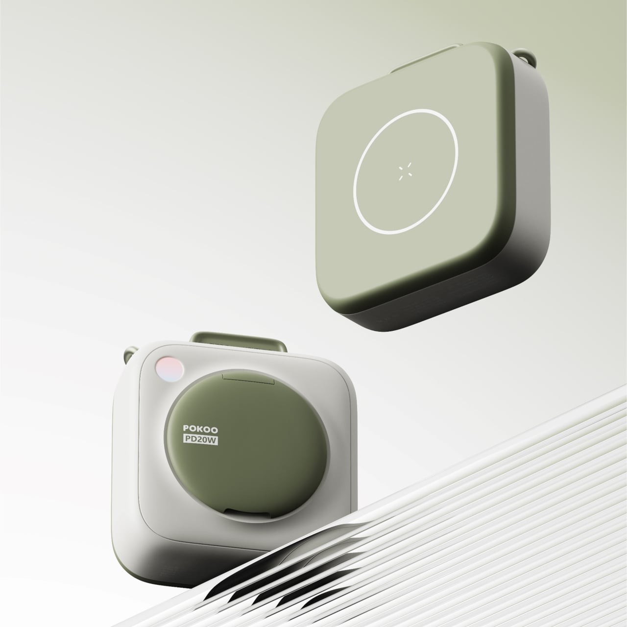
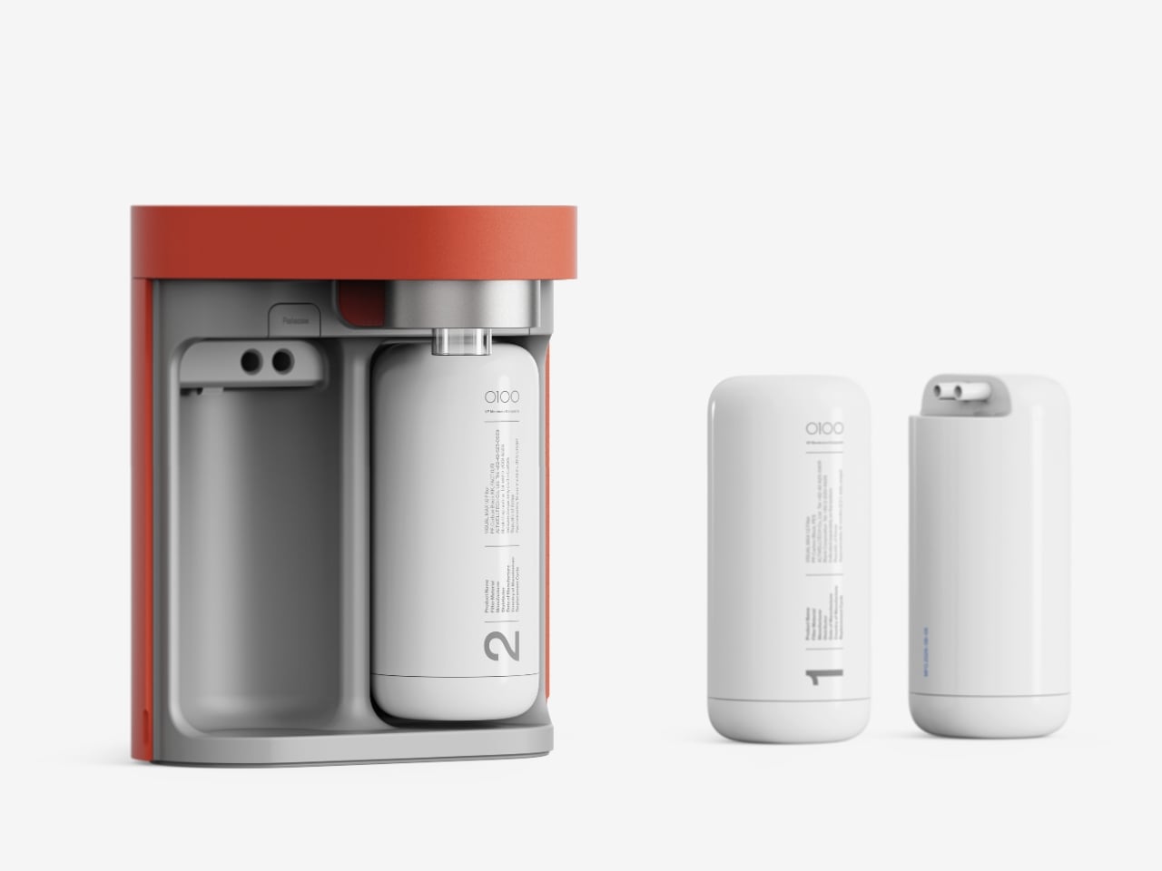
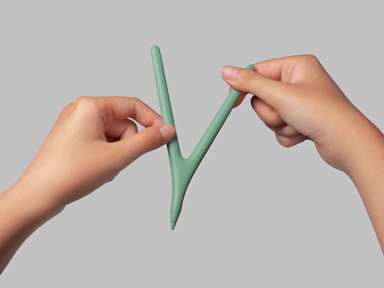
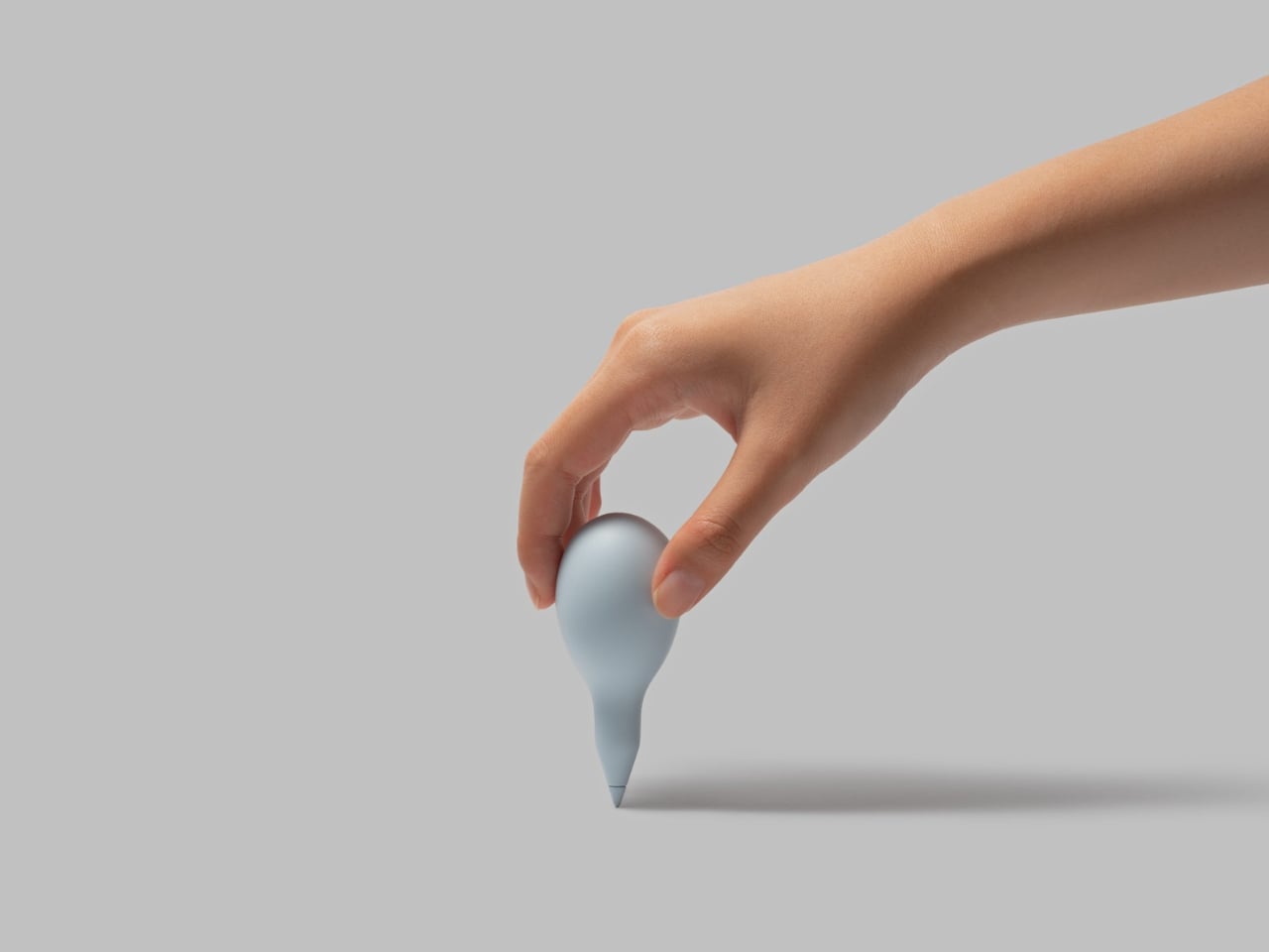
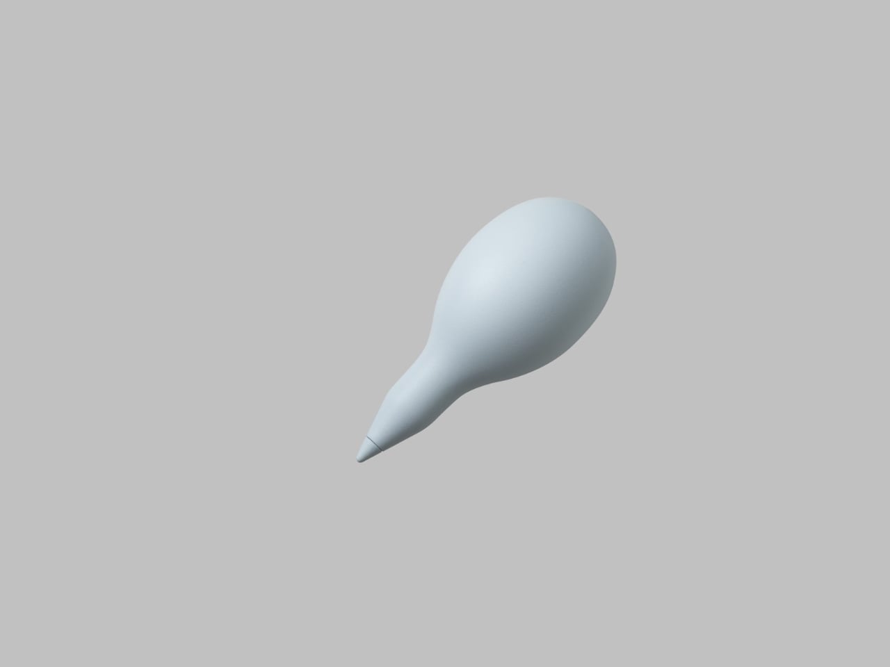
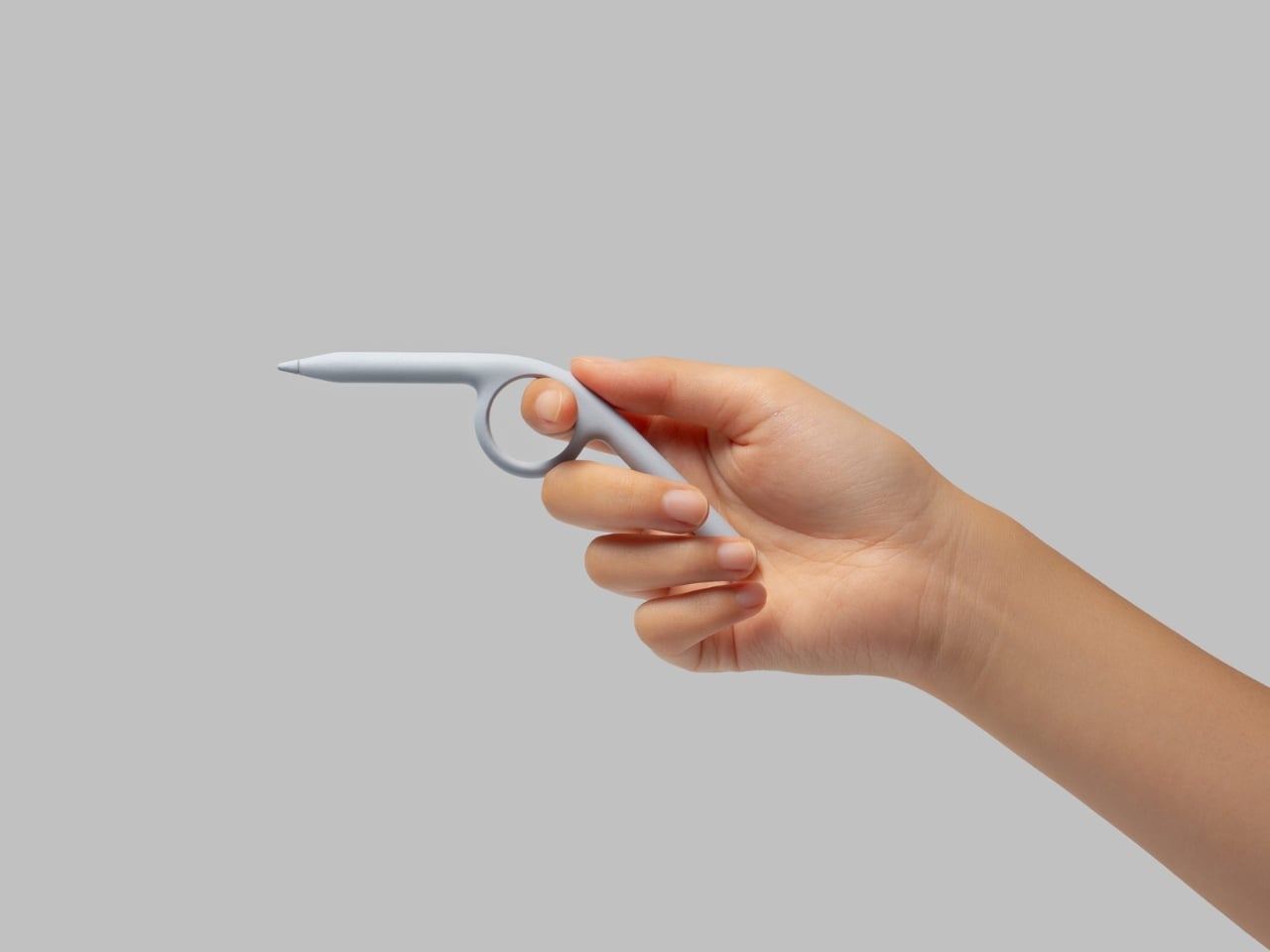
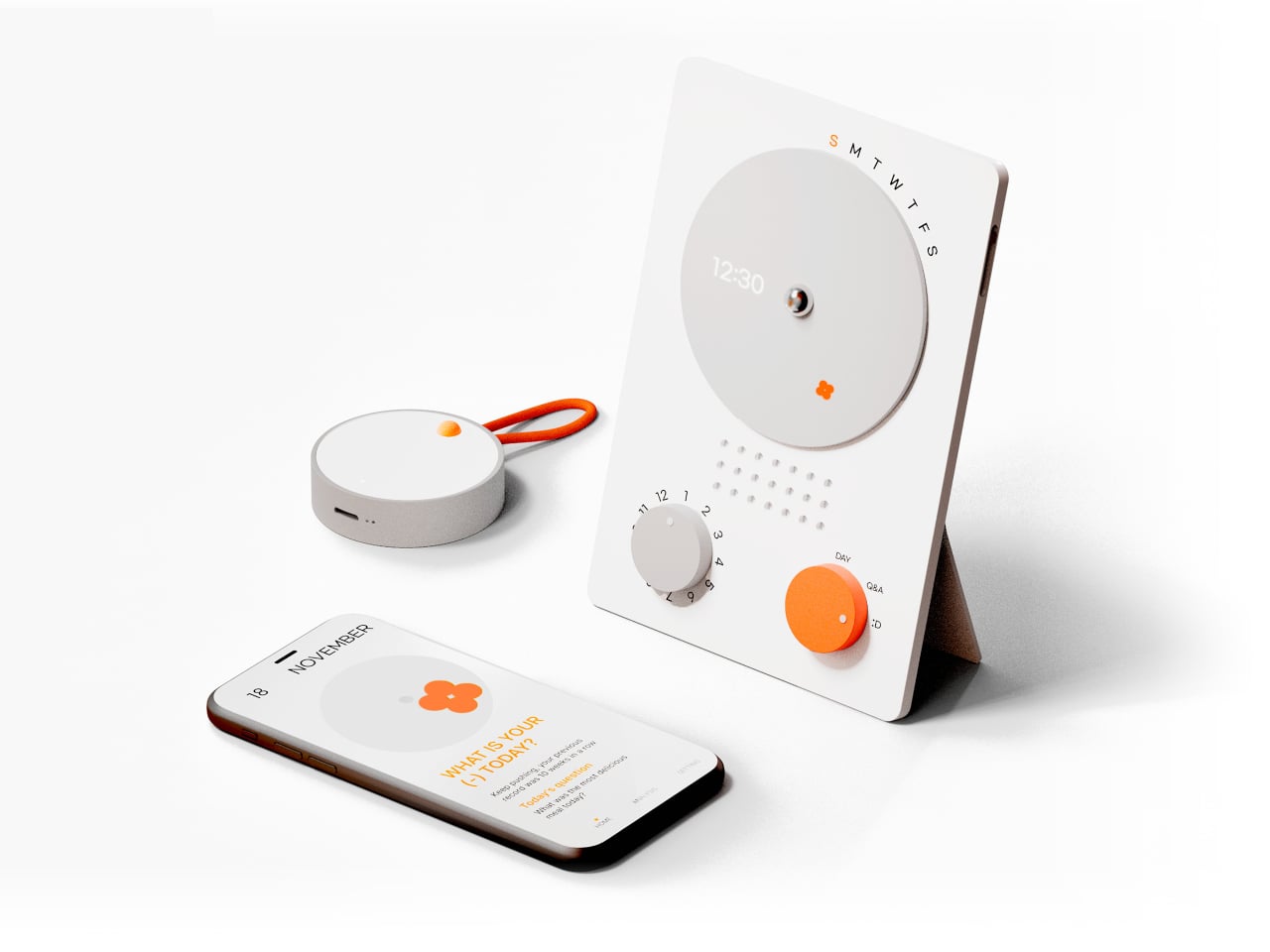
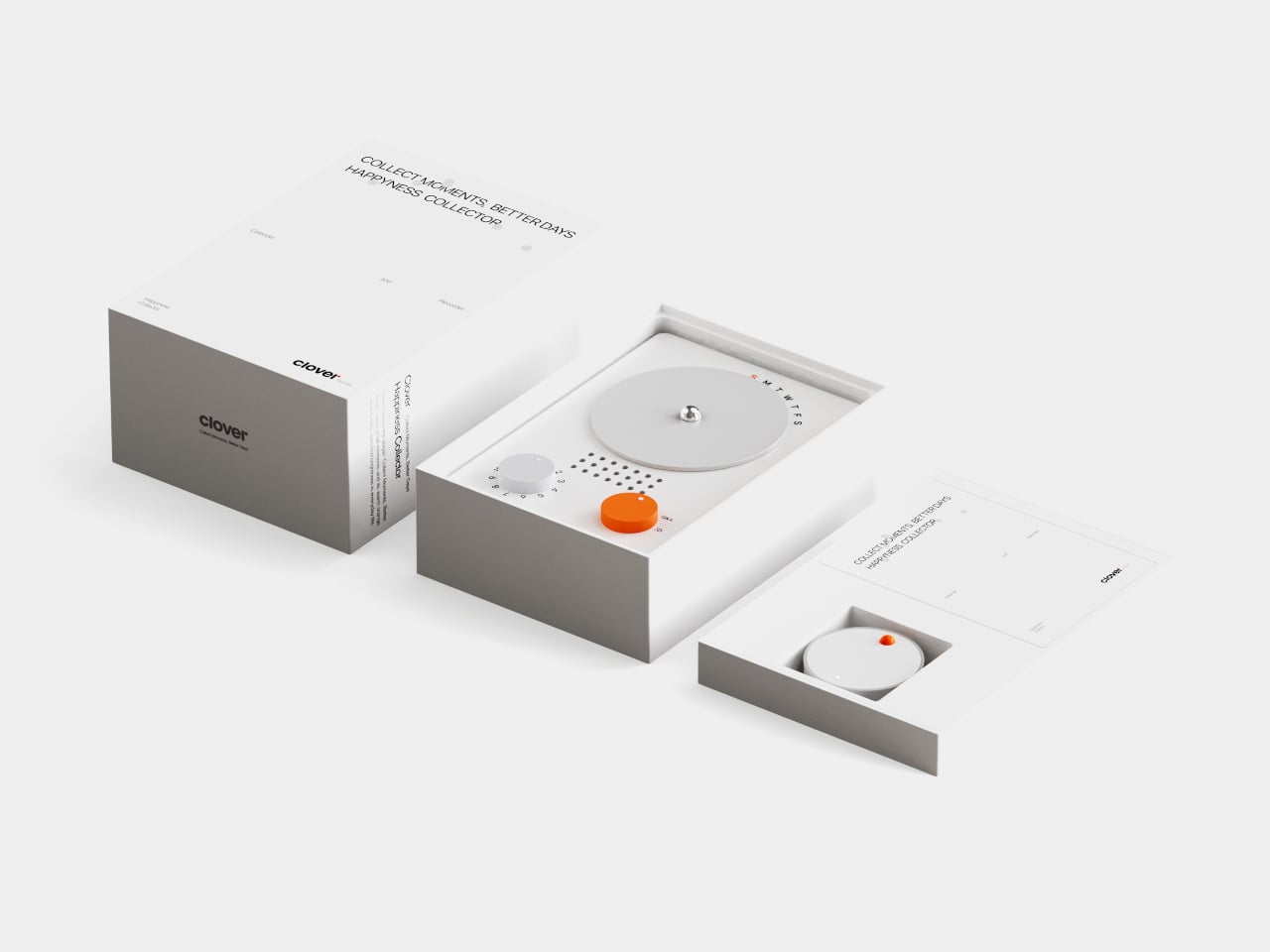
Clover is a small ecosystem built around three pieces: a pocketable voice recorder, a desk-calendar device, and a companion app. Instead of logging stress or symptoms, you press a button and record short voice notes whenever something makes you genuinely happy. Those moments are then visualized on the calendar and analyzed in the app, turning your week into a kind of happiness log that quietly reframes how you see your days.
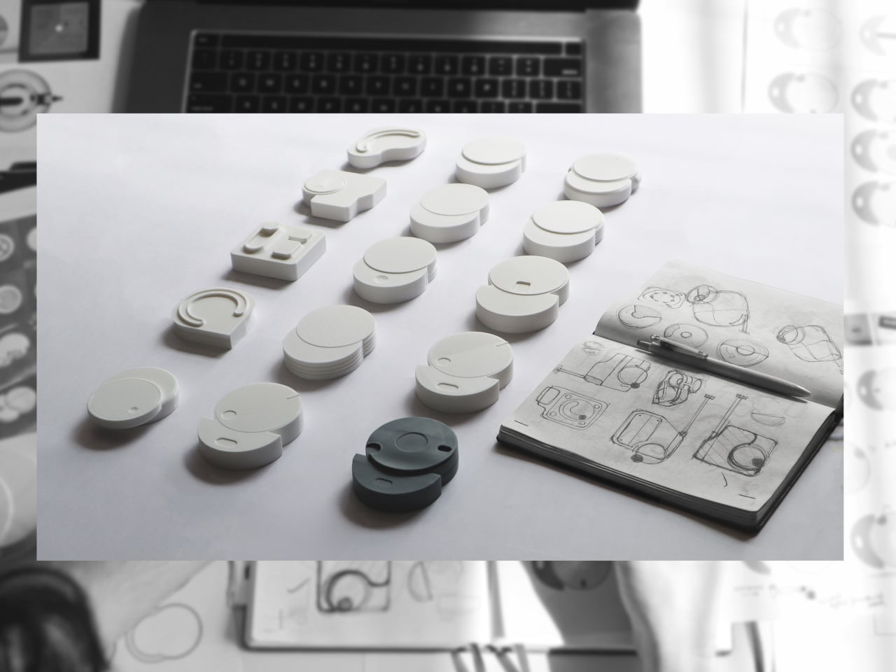
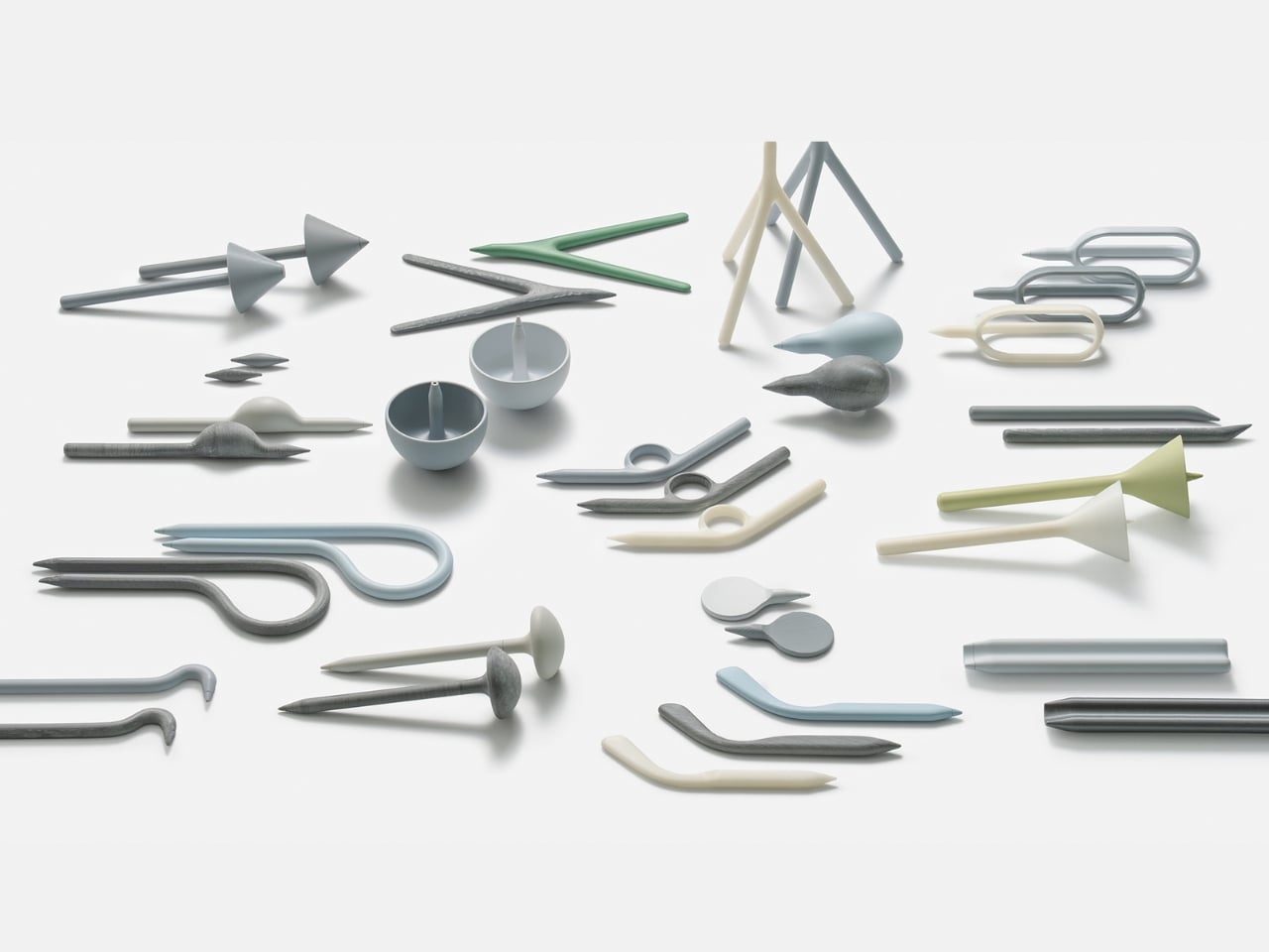
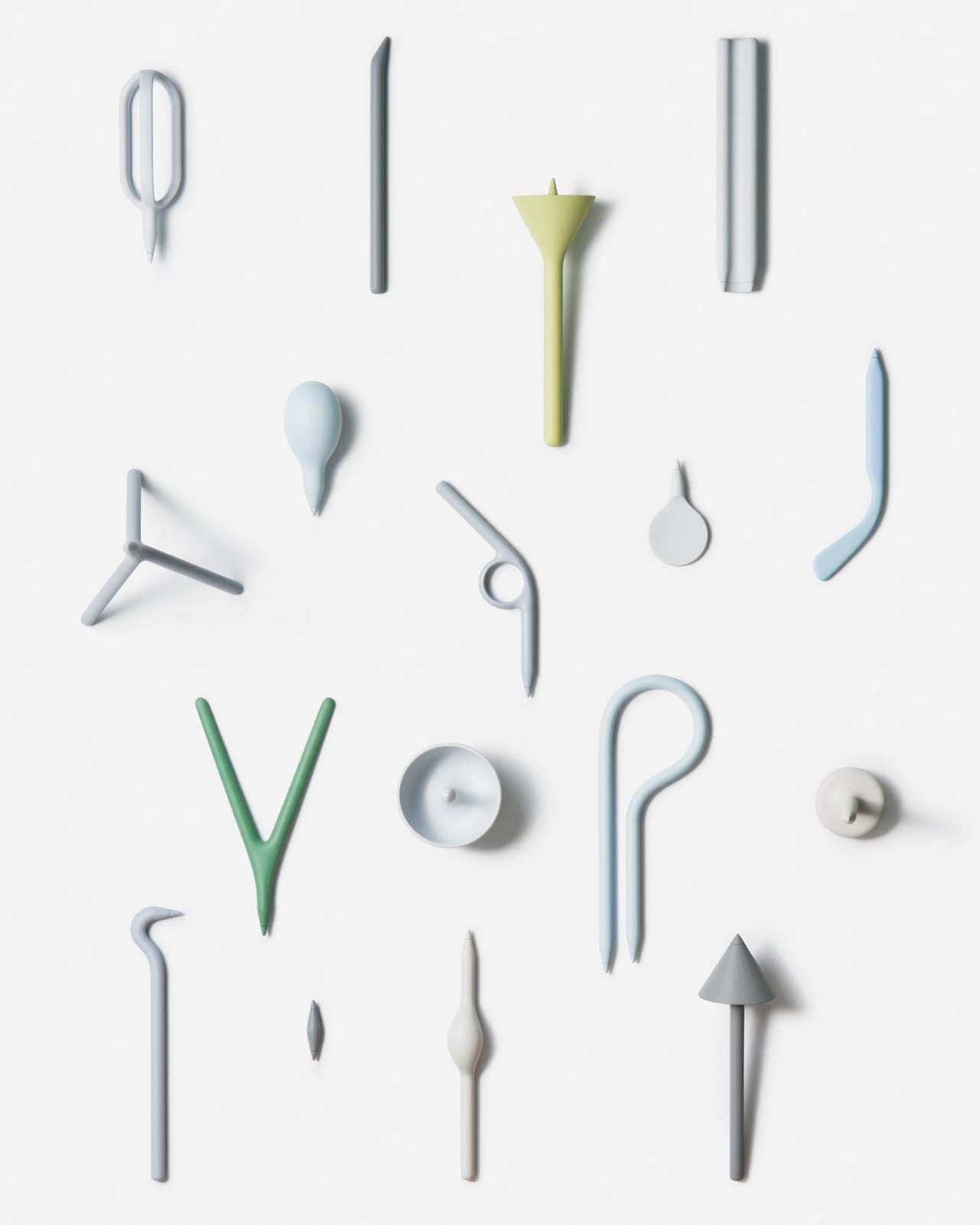
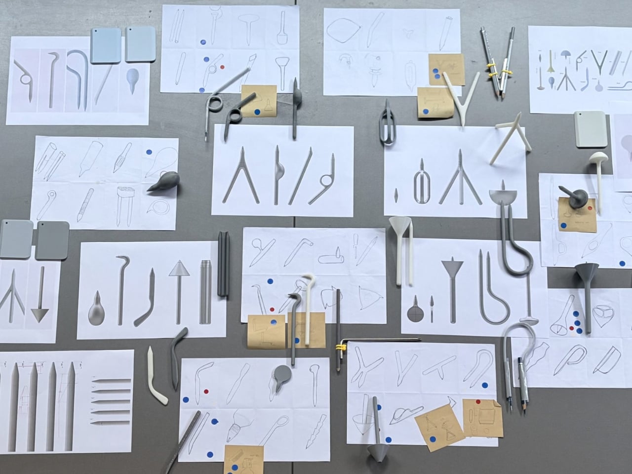
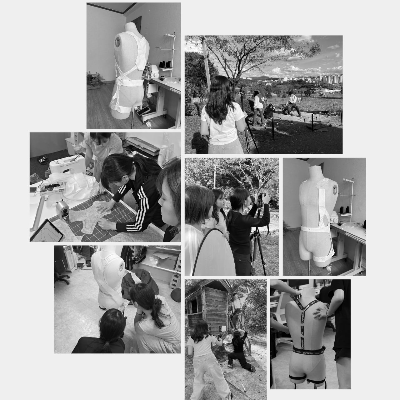
Designers: Seyeon Park, Bhin Son, Yu Jin Song, Jiwon Park, Jinya Kim
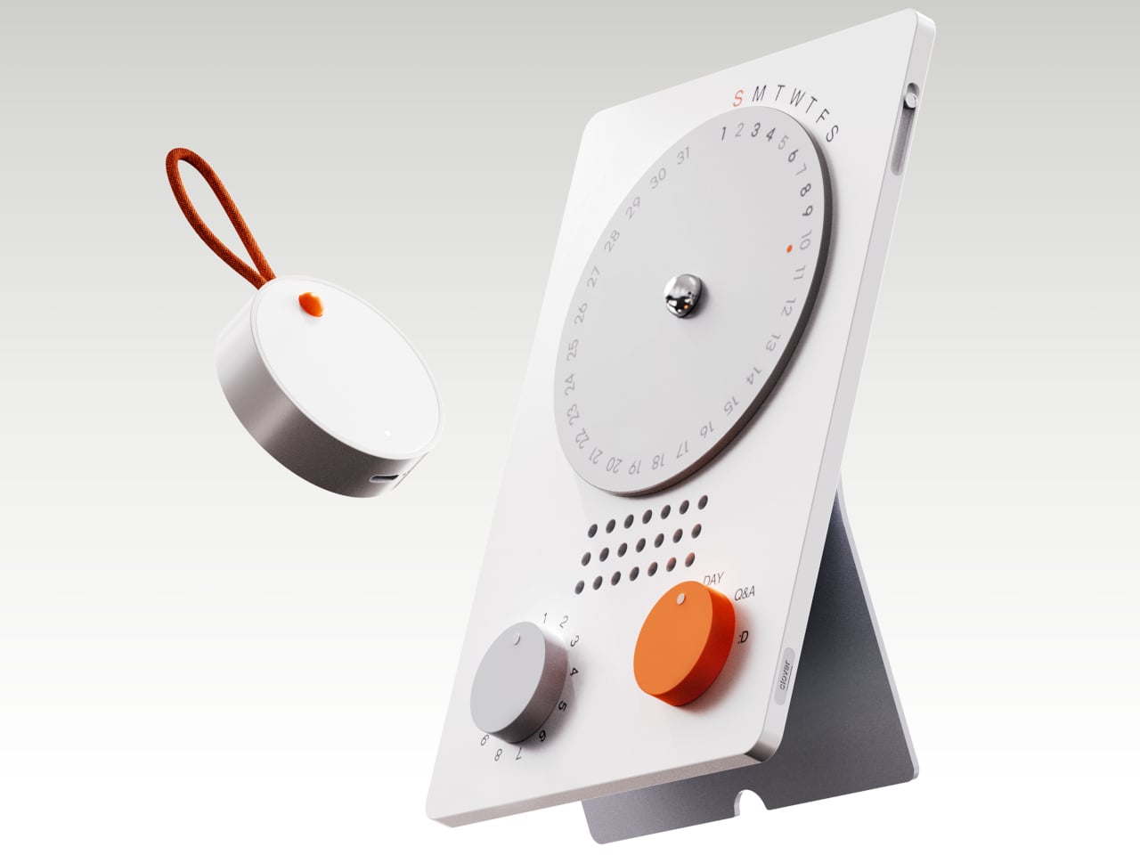
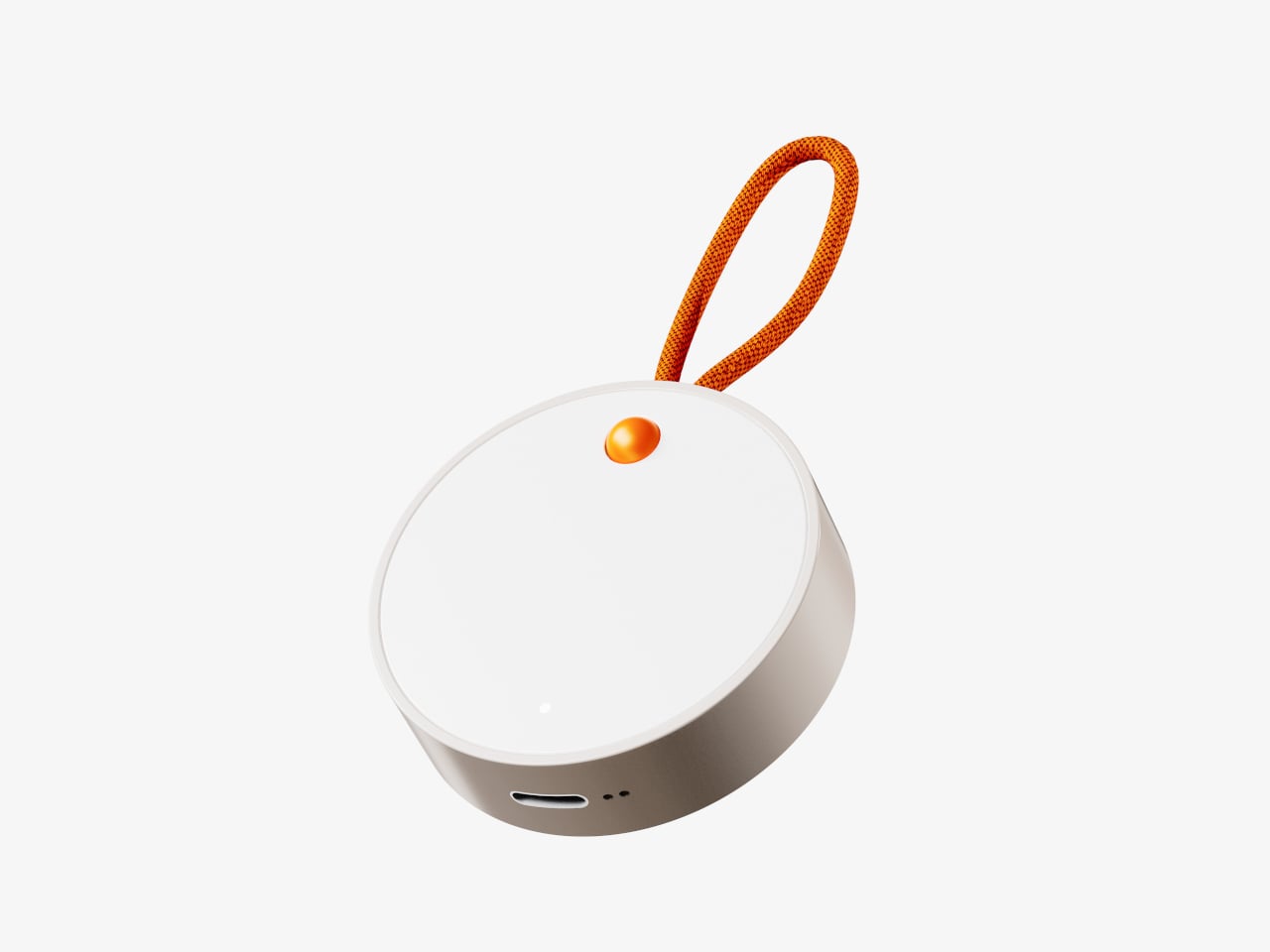

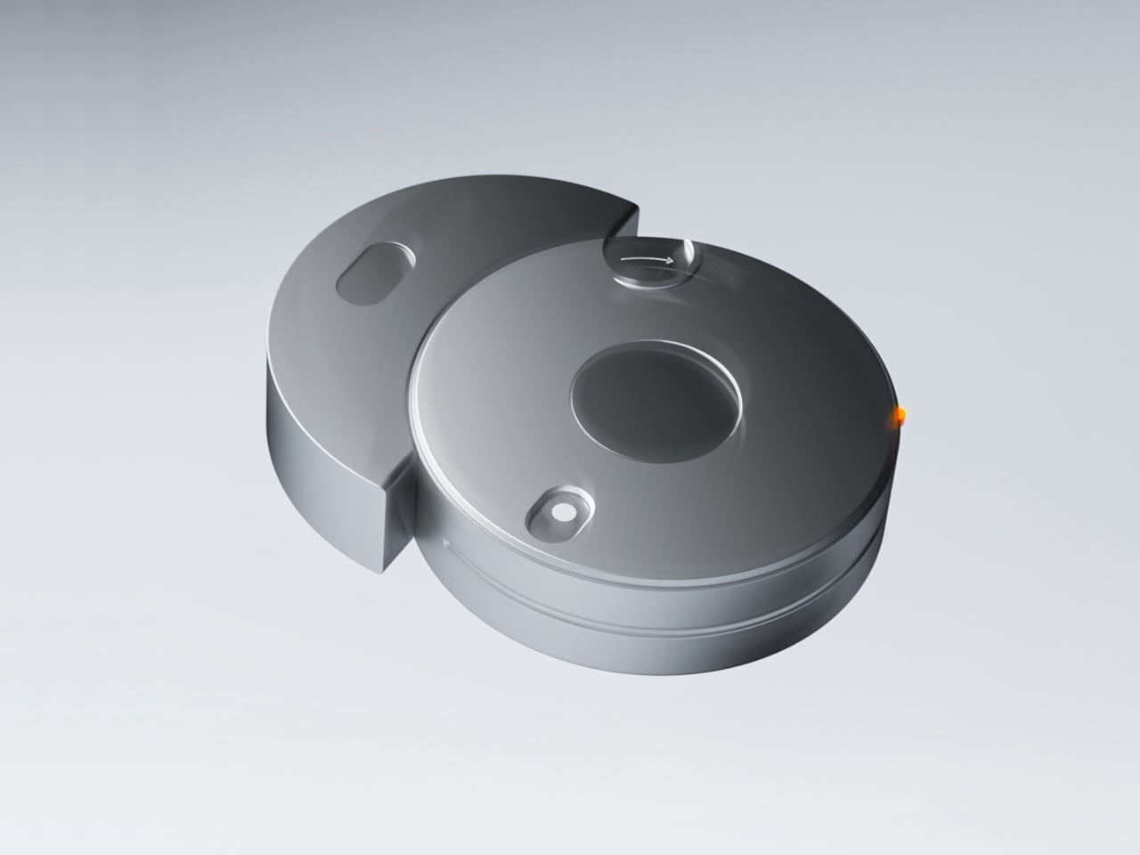
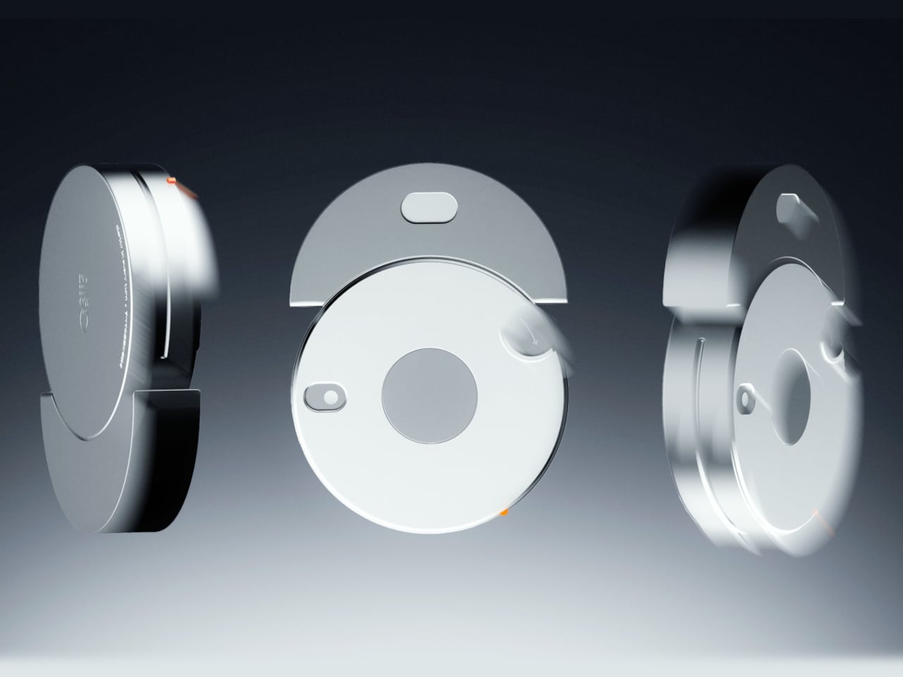
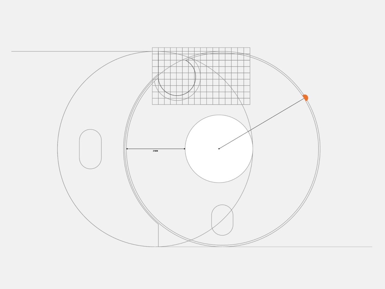
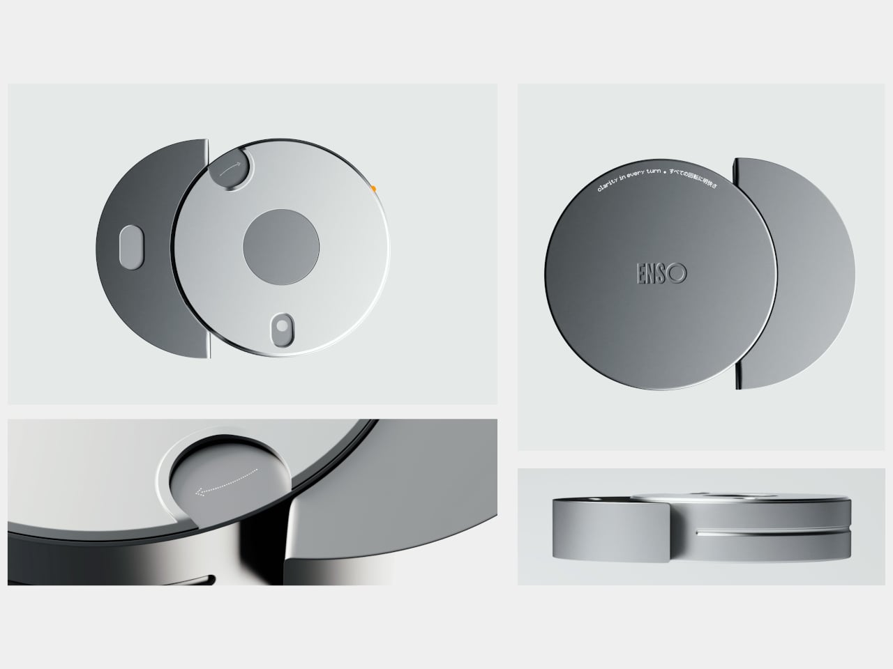
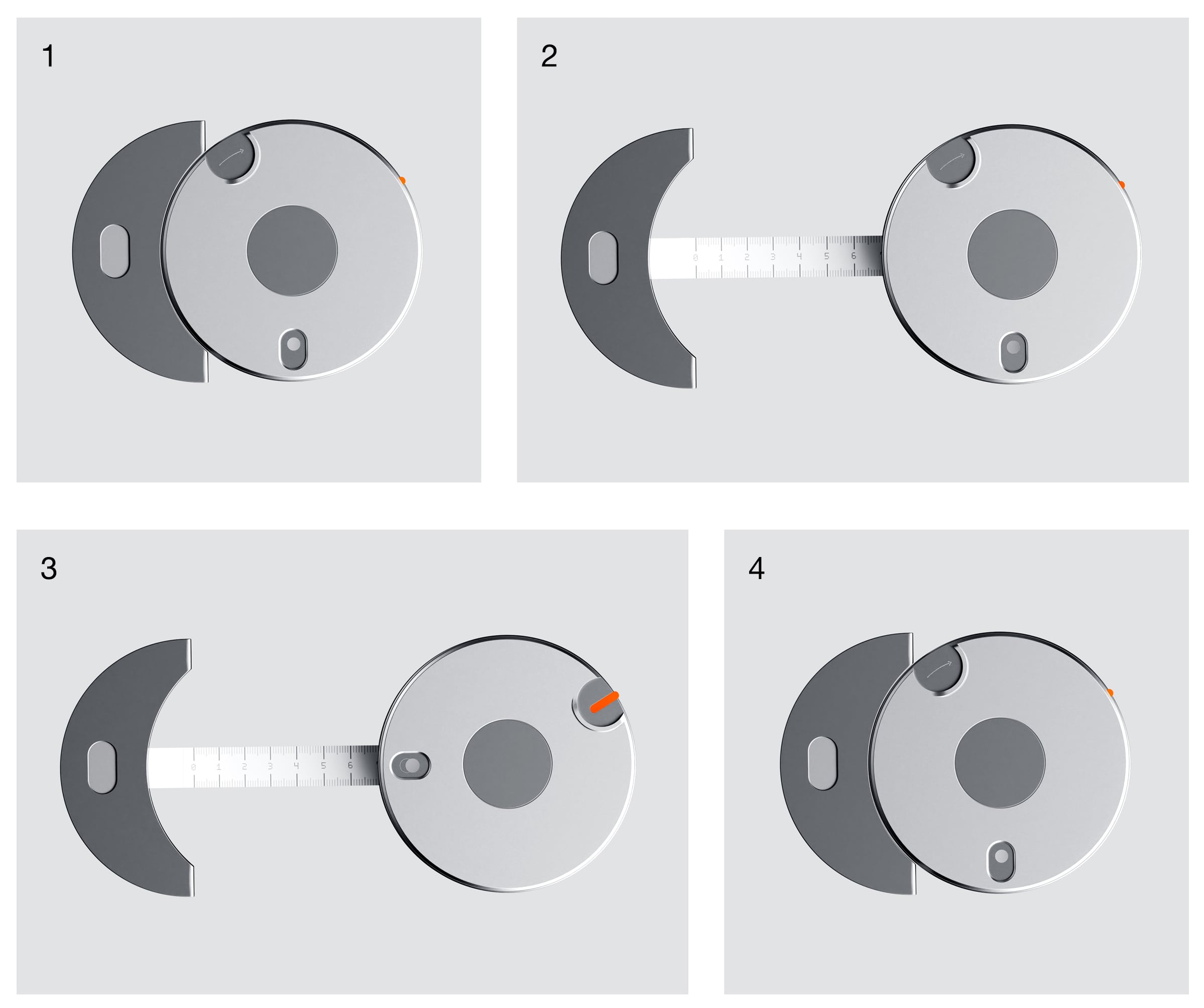
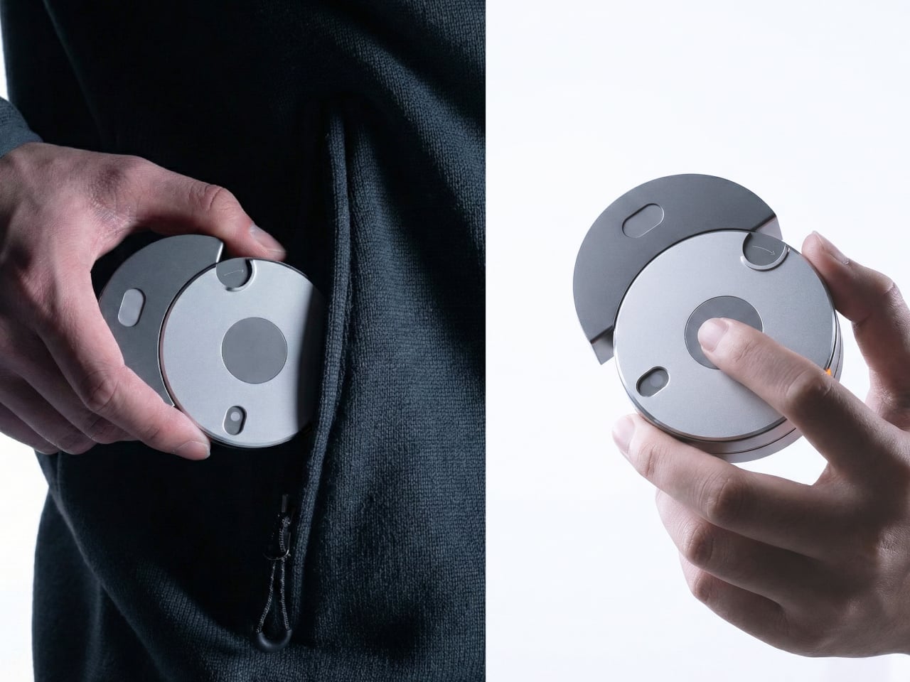
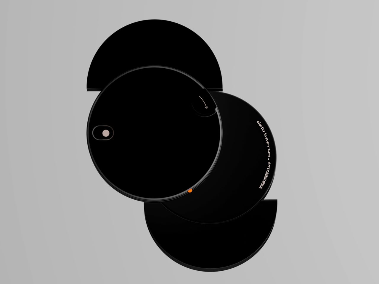
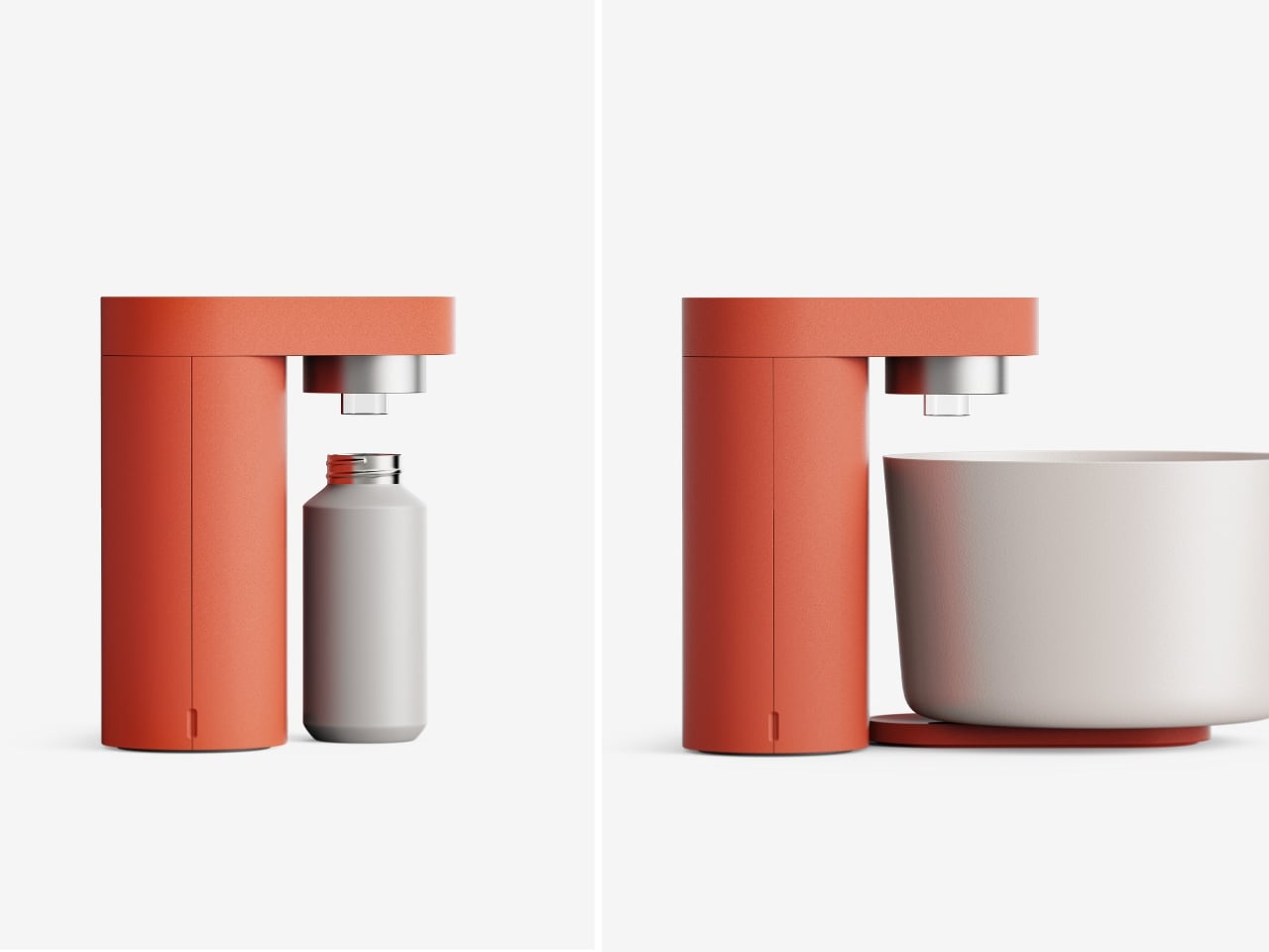
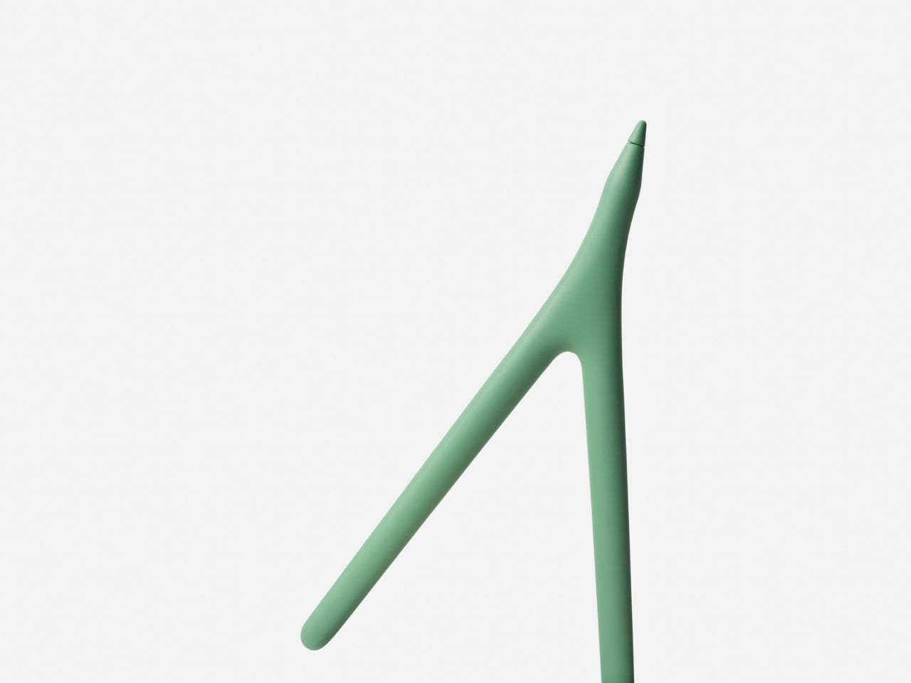
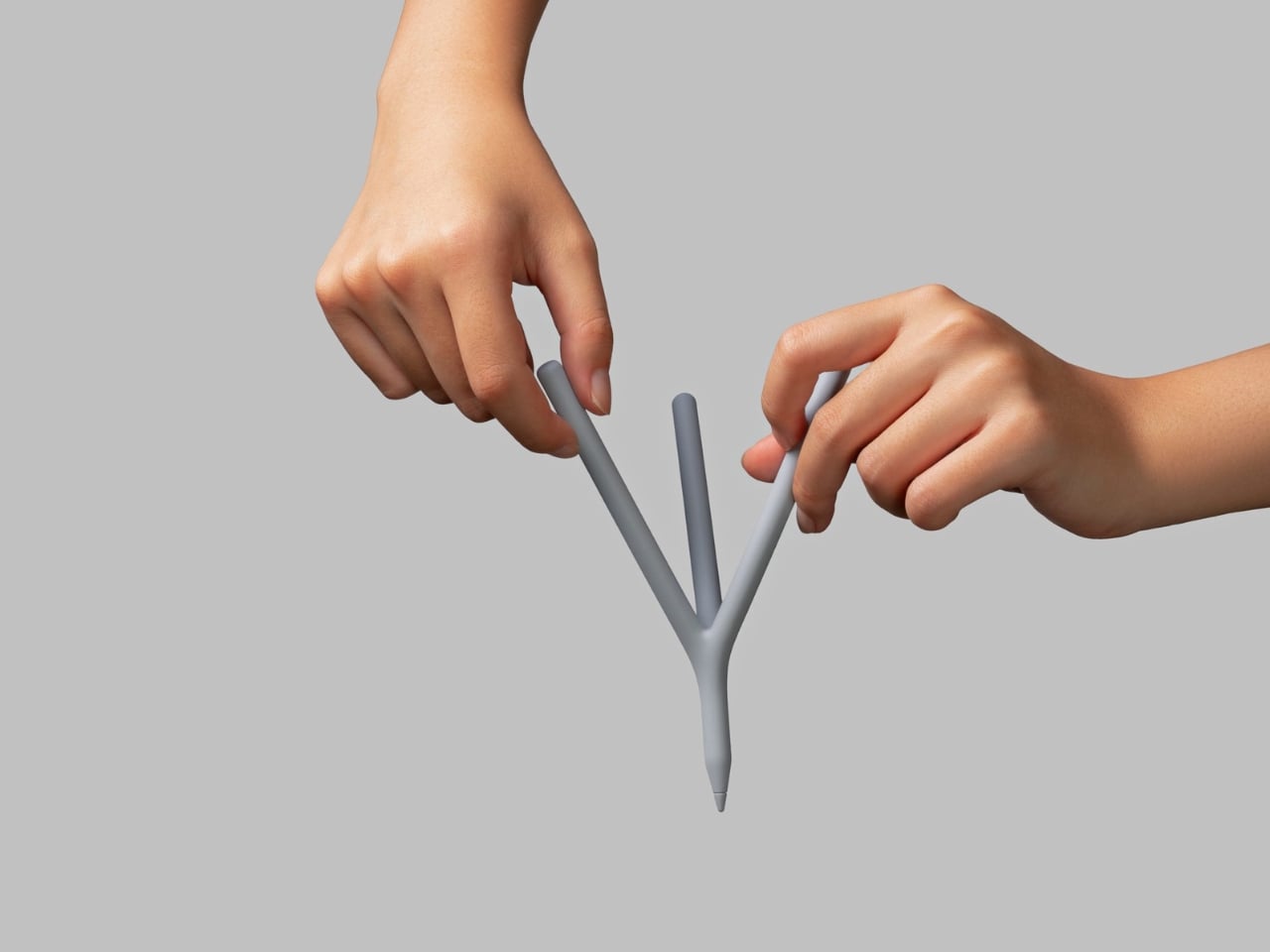
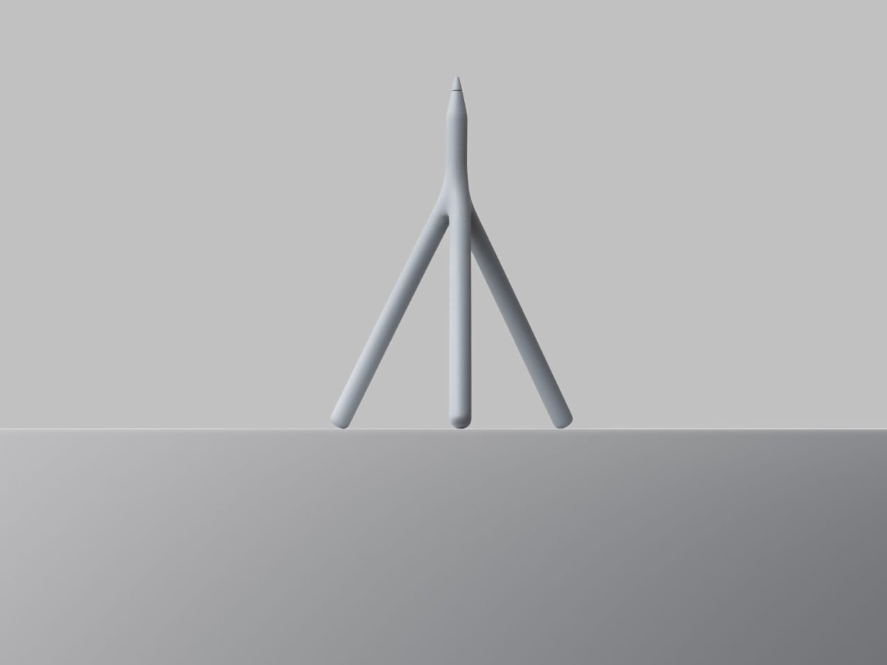
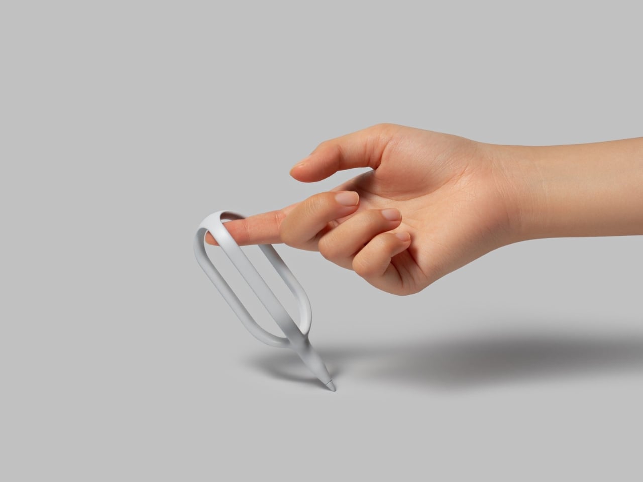
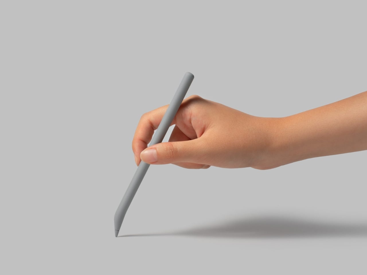
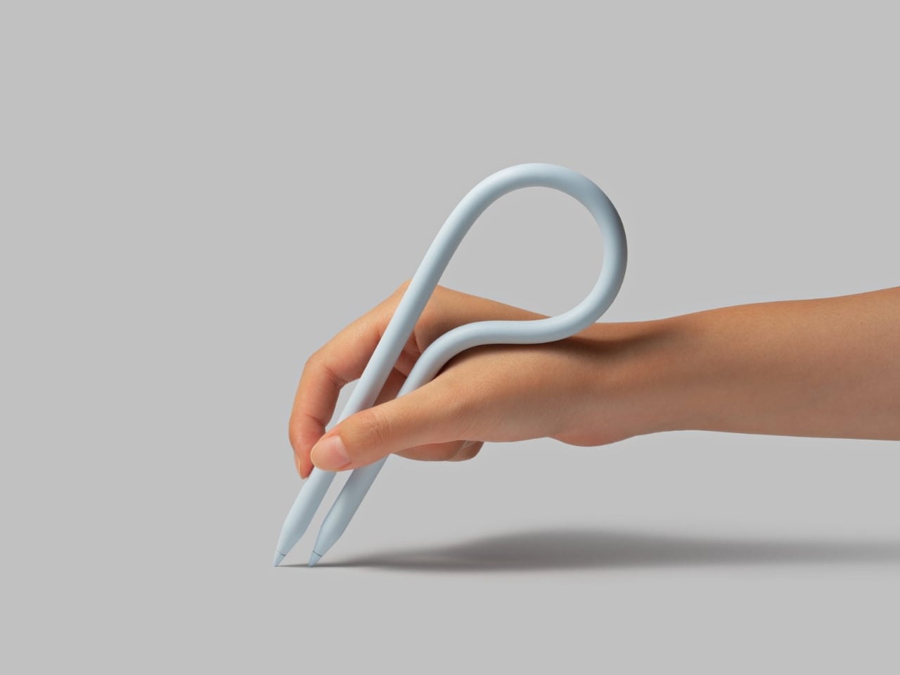
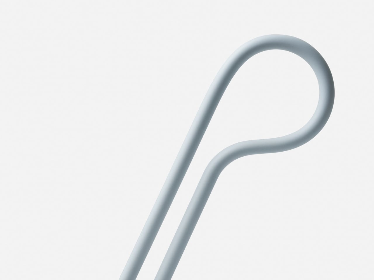
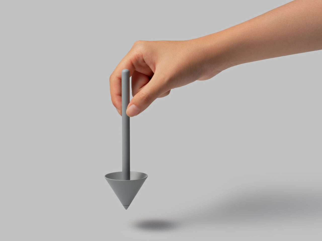
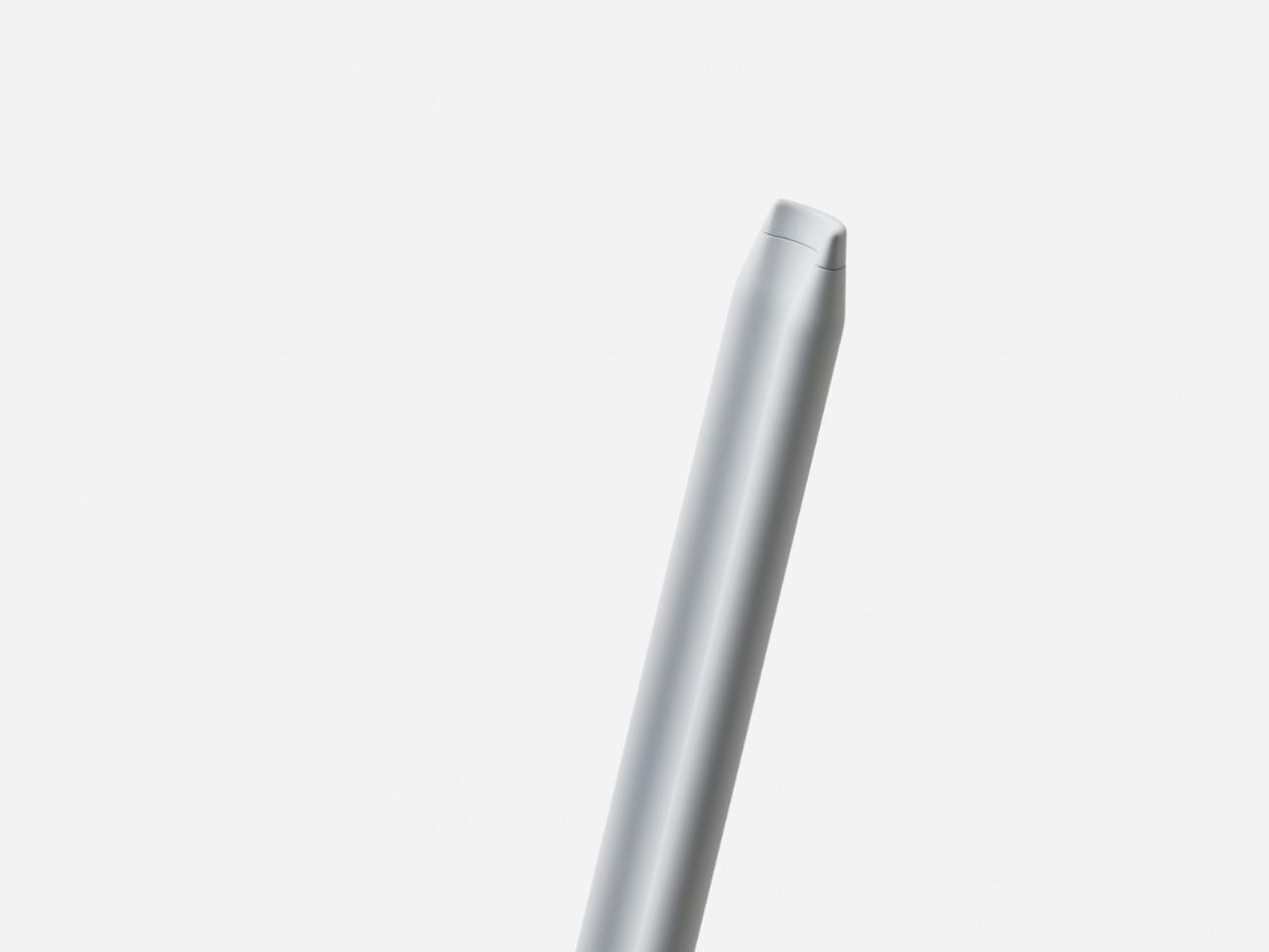
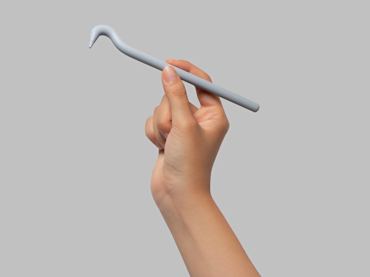
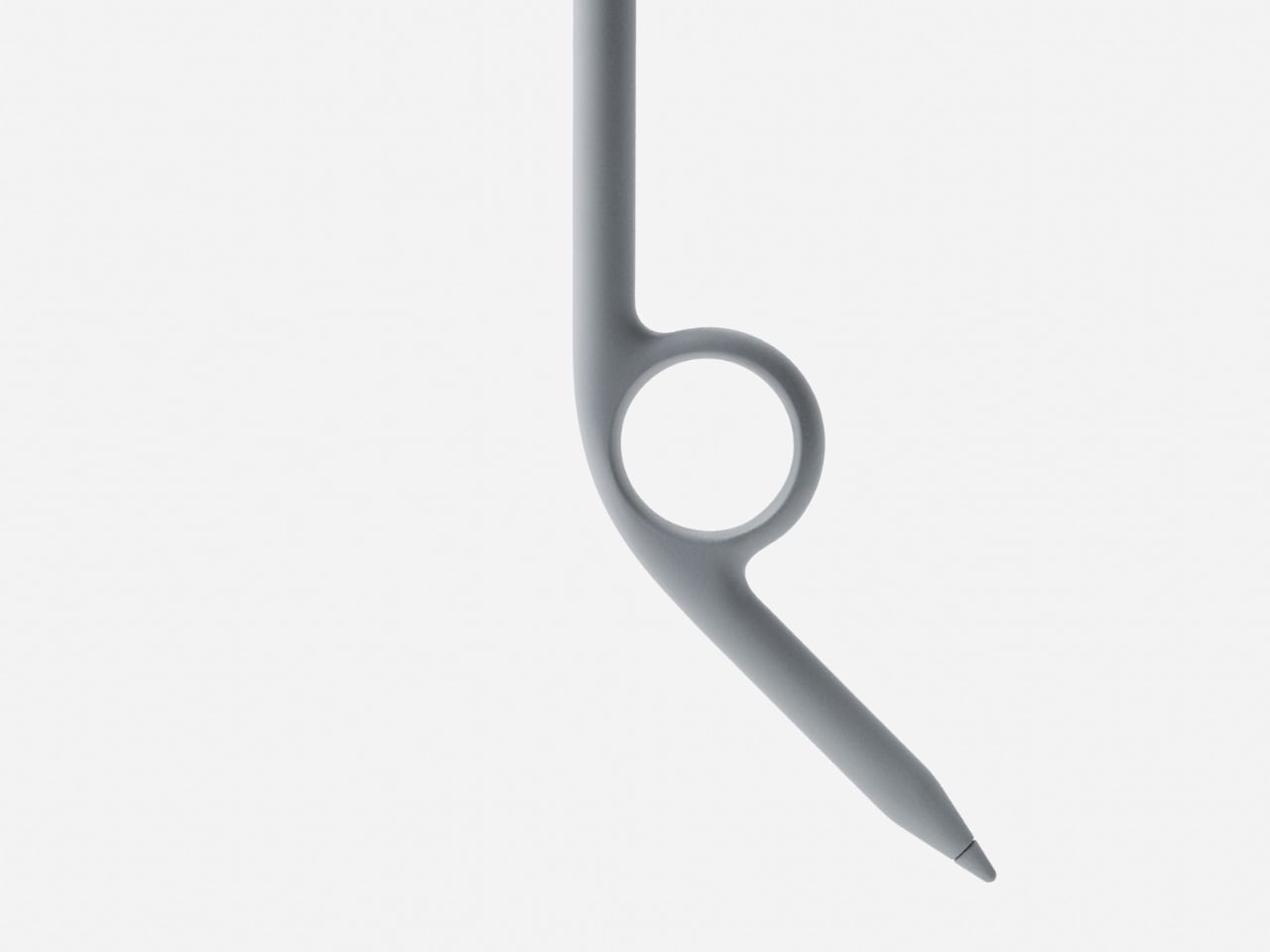
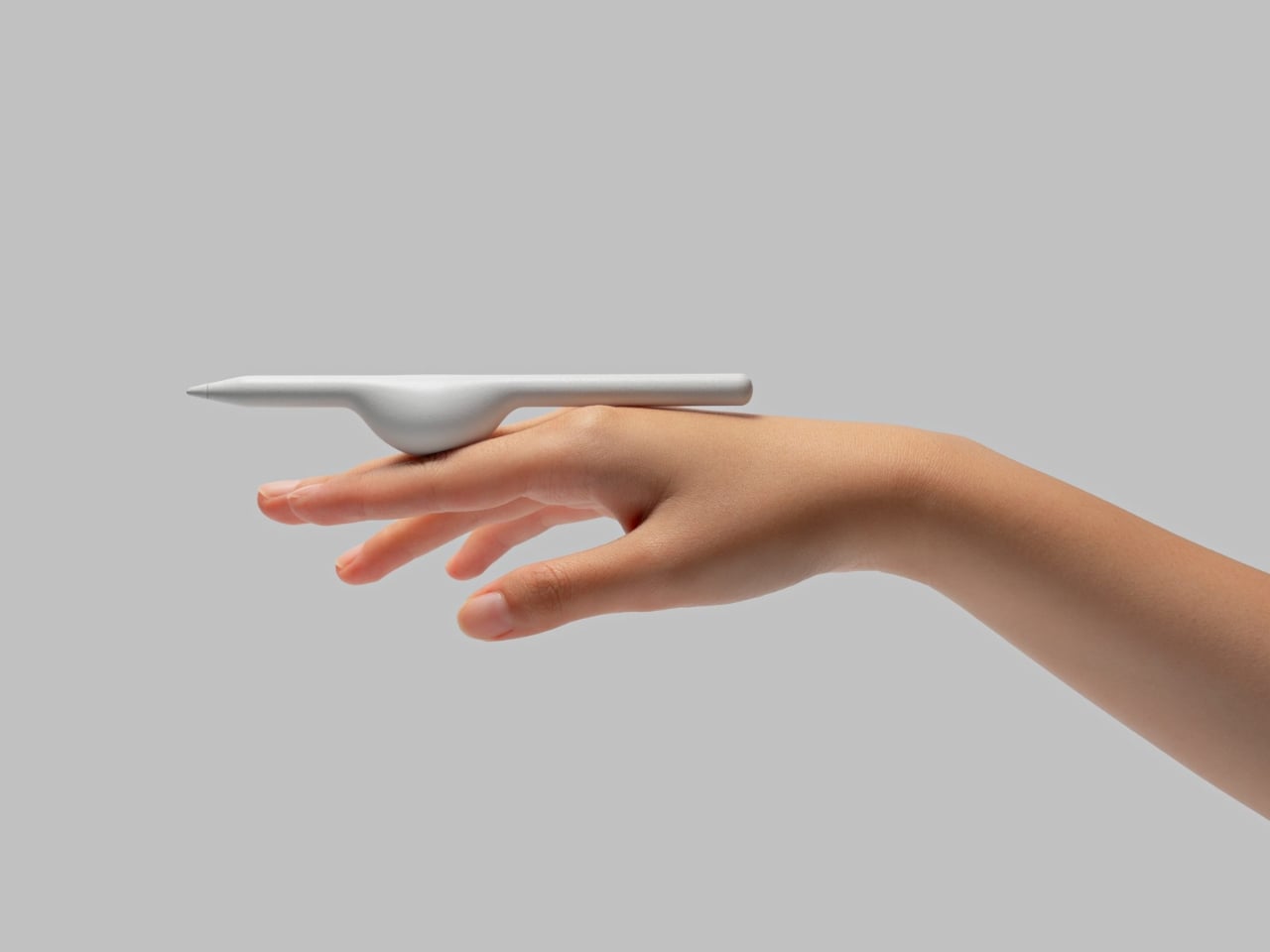
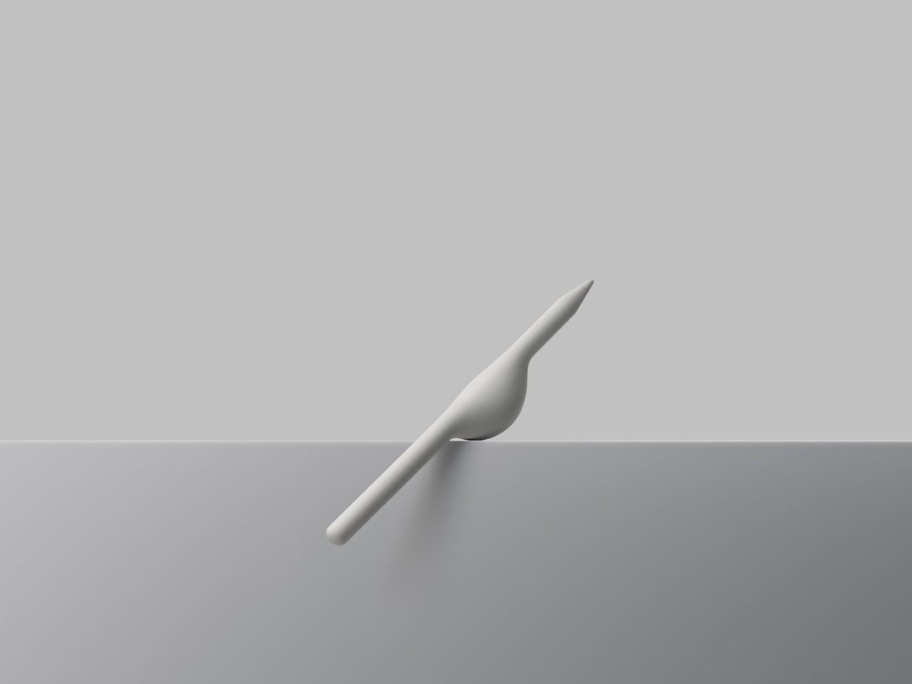
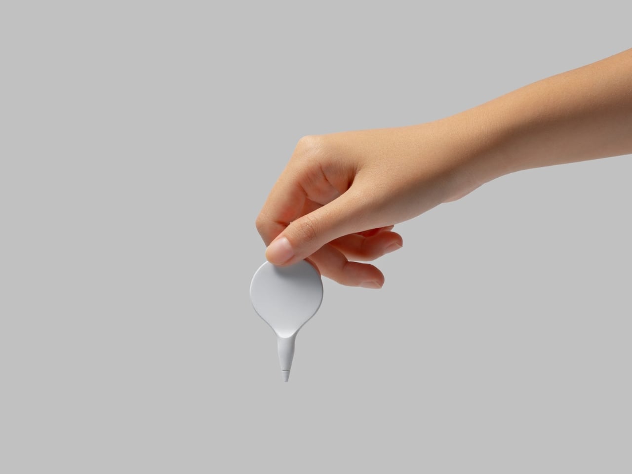
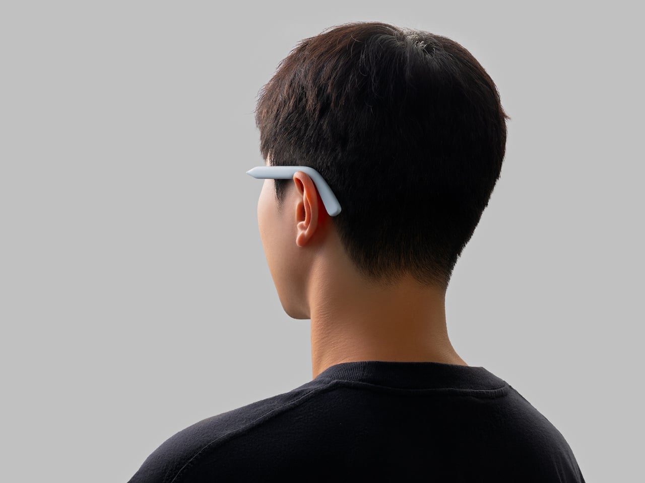
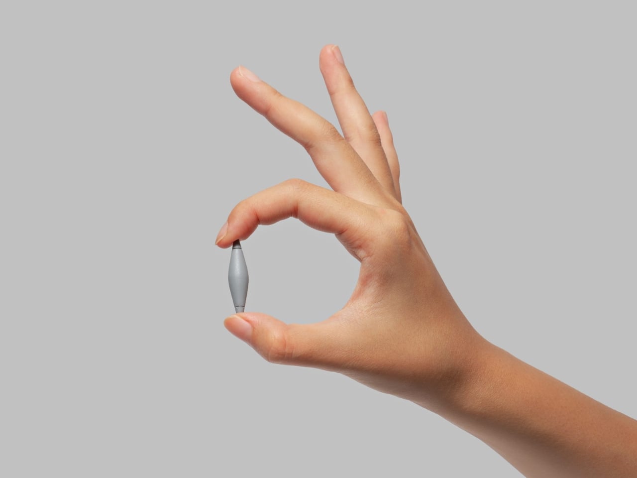
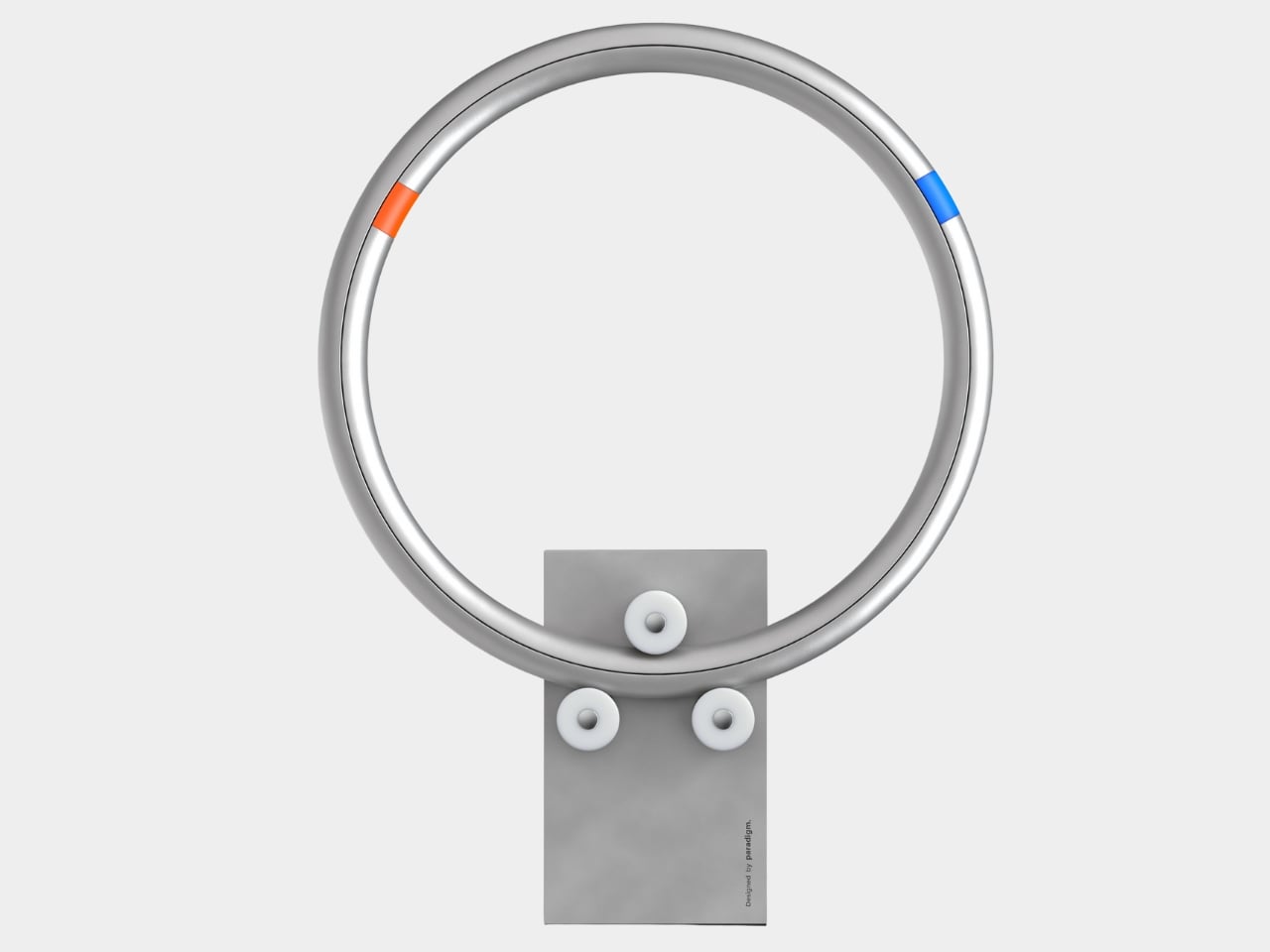
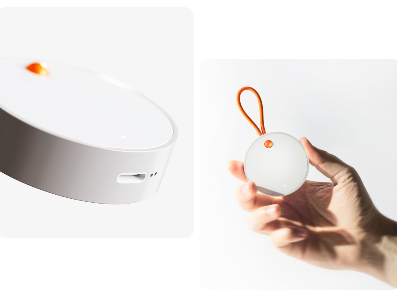
The recorder is a small, circular object with a single orange button and a loop strap, designed to be grabbed and pressed quickly. It is meant for capturing tiny, specific moments, sunlight on your desk, a good cup of tea, a joke from a friend, in your own voice. The goal is to lower the friction so much that recording a positive moment feels as easy as taking a photo, no unlocking, no tapping through screens, just press and speak.
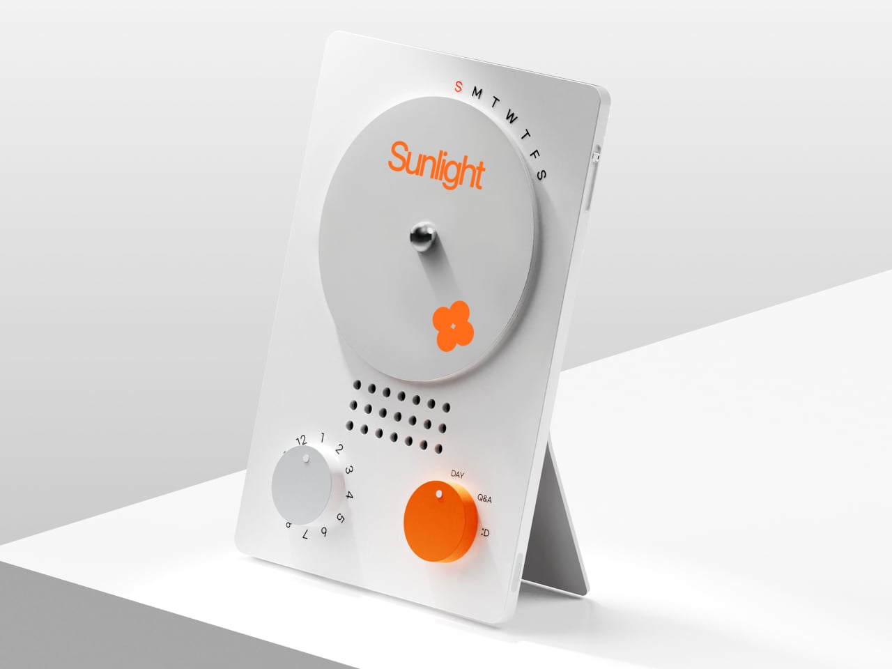
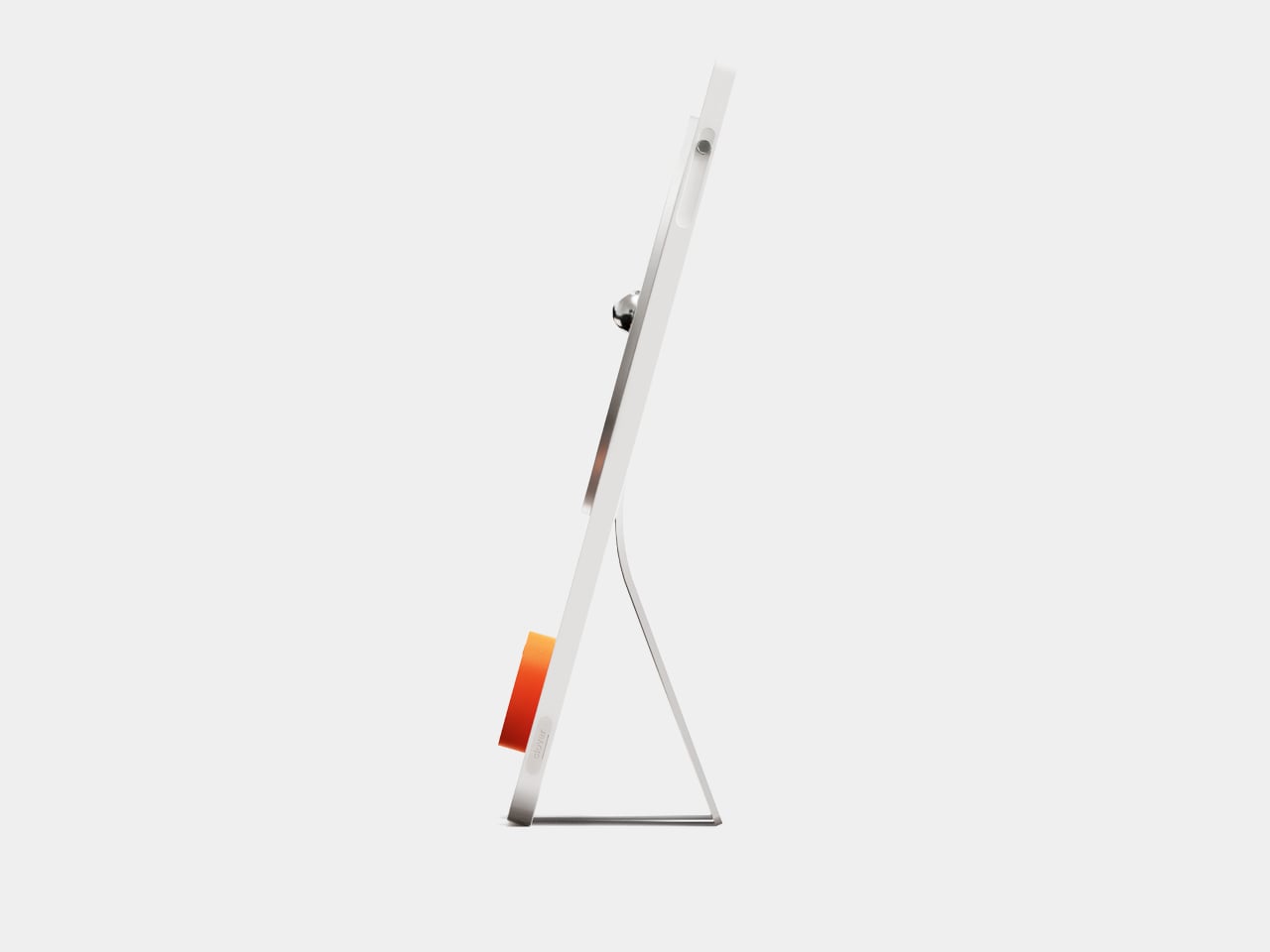

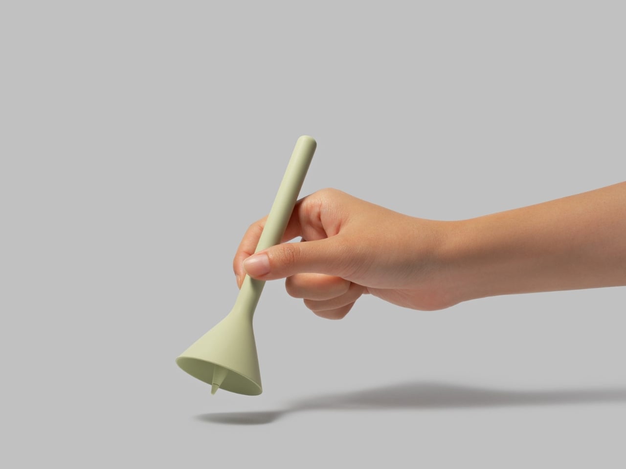
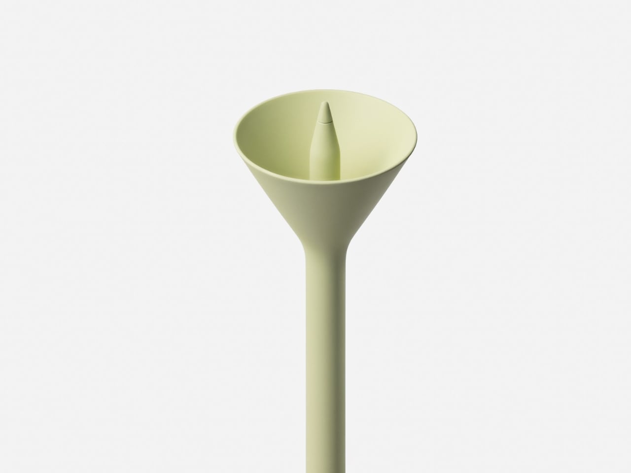
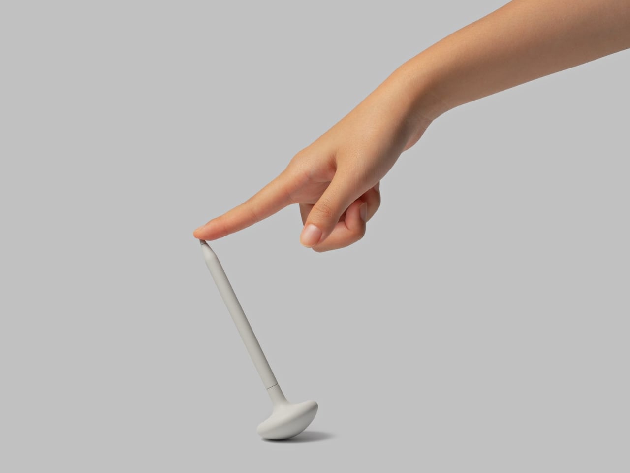
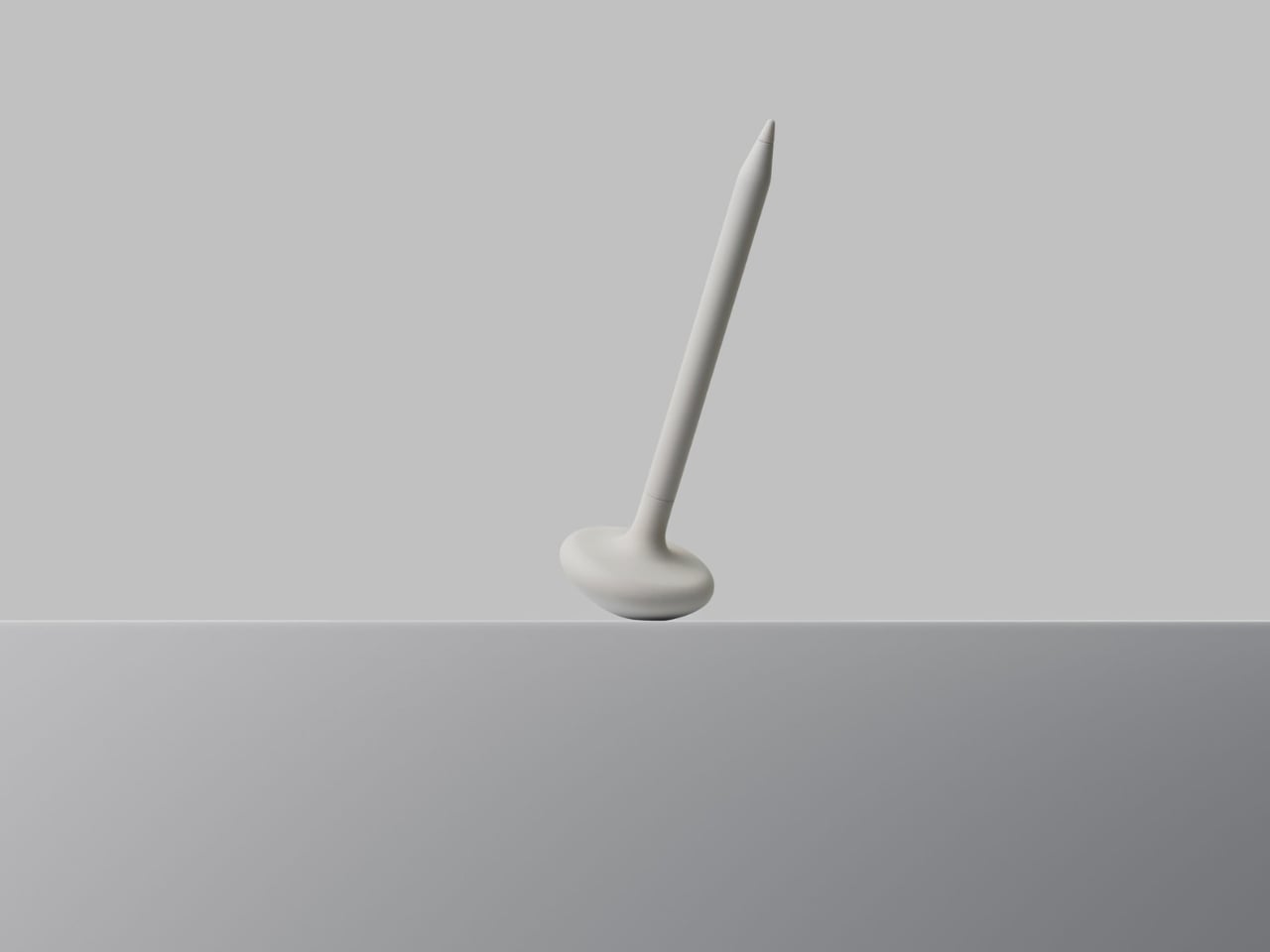
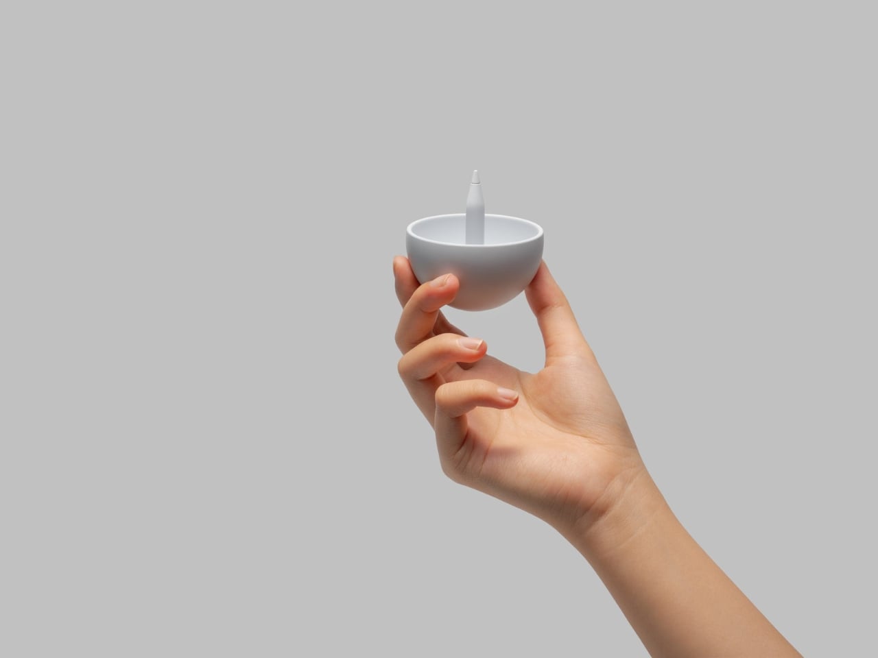
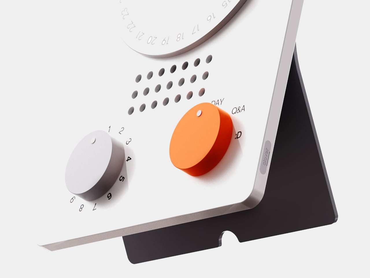
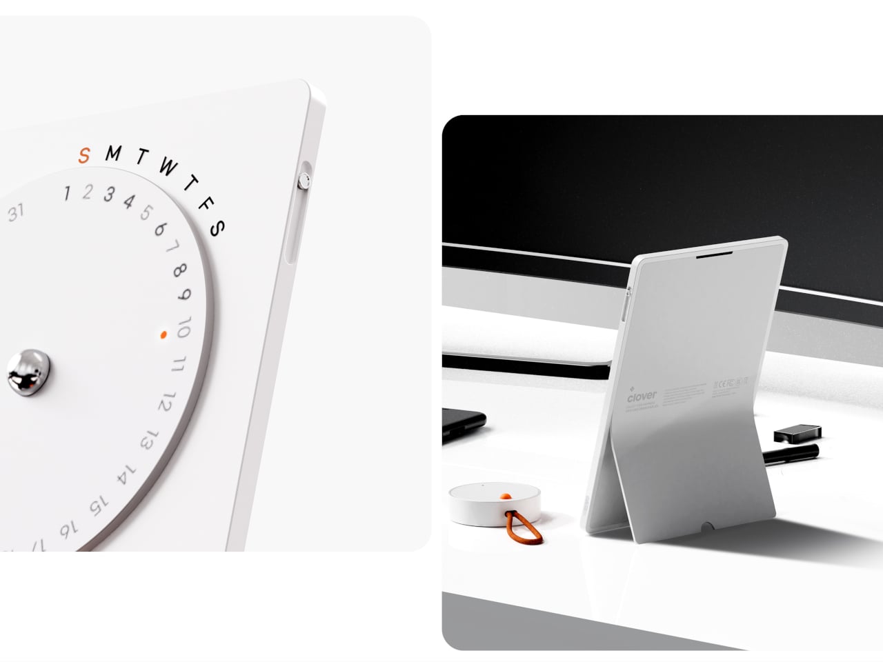
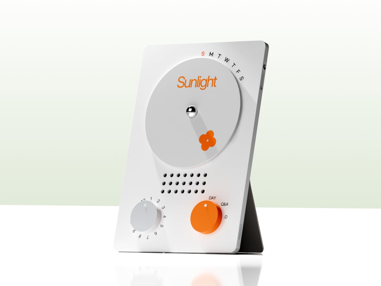
The desk calendar is a tilted white slab with a large circular dial labeled with days of the week and a small screen that displays words like “Sunlight” or “Spring.” It plays back or summarizes your voice recordings by day, and turning the dial lets you move between Day mode, Q&A mode, and long-term overview modes. Checking your emotional log becomes a physical ritual, more like flipping through a calendar than scrolling a feed or staring at another glowing interface.


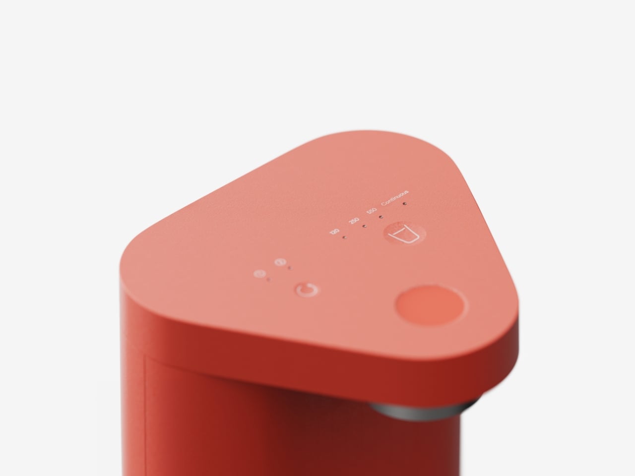
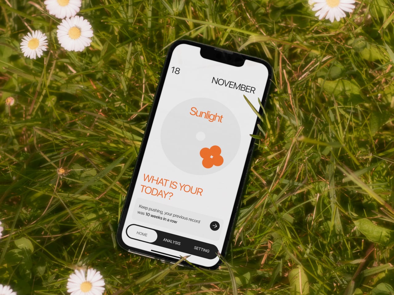
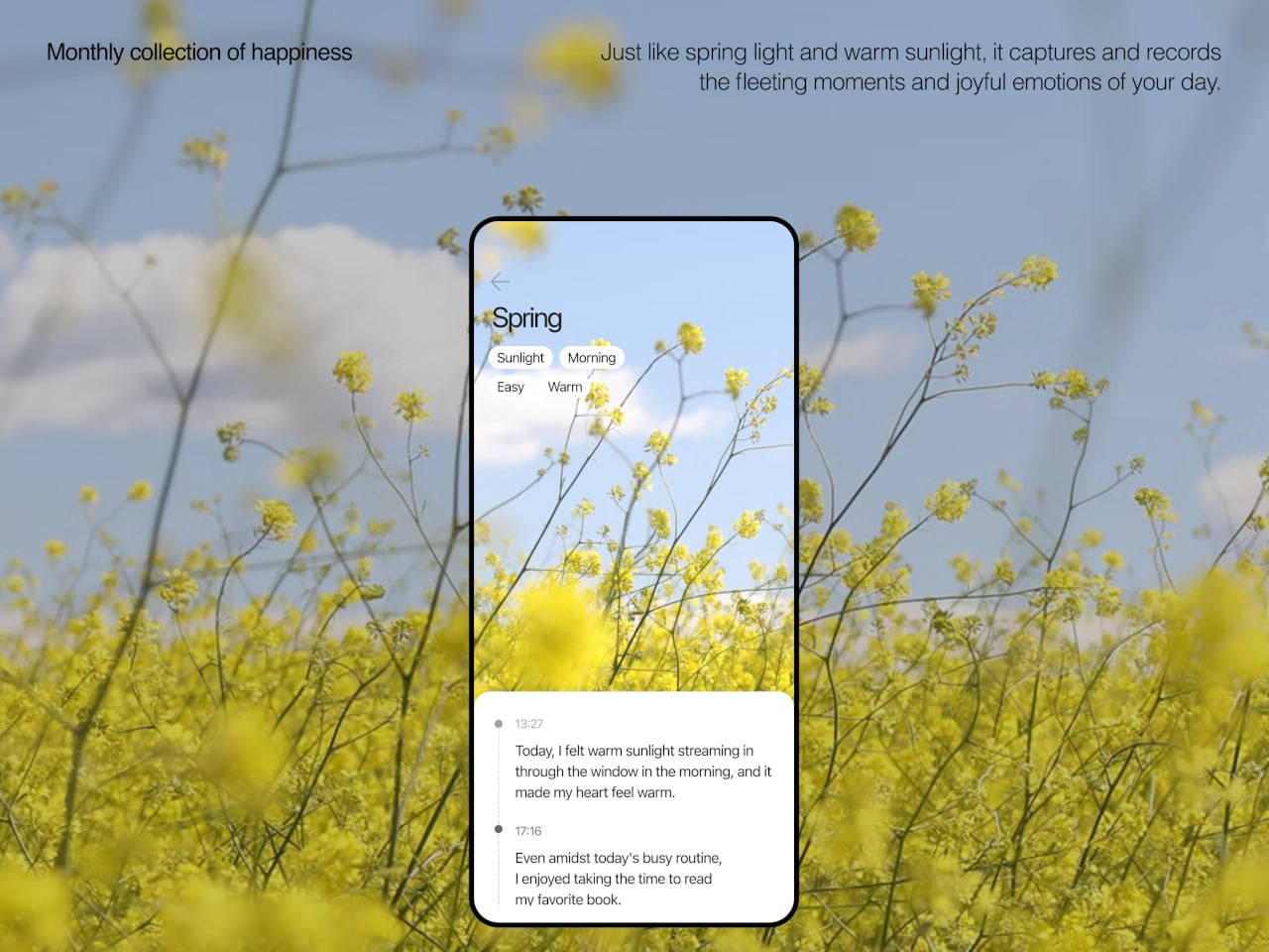
The app brings everything together, with daily cards asking “What is your today?”, weekly and monthly views full of dots and bars, and simple text insights that highlight recurring themes. You can tag entries by time, category, or keywords, and later see which people, places, or activities show up most often in your happiest moments. The analysis stays gentle, showing patterns without drowning you in numbers or making you feel like you failed when a week looks sparse.

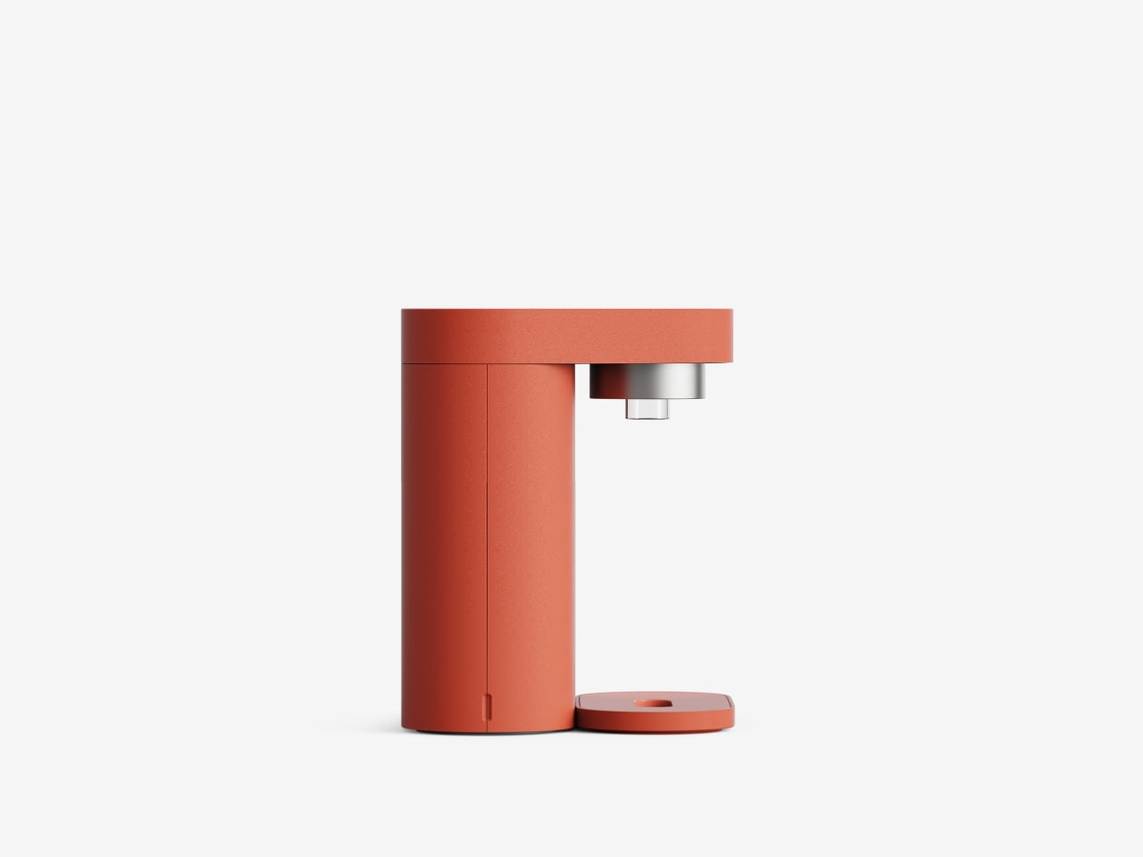
Clover’s visual language, white and grey surfaces with orange accents, soft typography, and a clover icon that appears on hardware and UI, keeps the system from feeling like medical equipment. The core values, self-honesty, emotional balance, and everyday positivity, are baked into how it looks and behaves. It frames itself as a friendly desk object and app you would not mind seeing every day, not a reminder that something is broken.
Clover quietly flips the usual tracking script. Instead of asking you to monitor symptoms or productivity, it asks you to notice and collect small good things, then shows you that they happen more often than you think. For people who are tired of mood sliders and habit streaks, the idea of a physical recorder and calendar that simply help you remember what felt right might be the most calming part of the concept.
The post Clover Emotion Tracker Turns Small Happy Moments into a Daily Desk Ritual first appeared on Yanko Design.