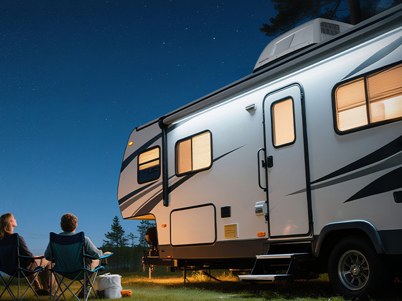
There’s a moment every RV owner knows: you’ve been hiking all day in 95-degree heat, you’re covered in dust and questionable decisions, and you open the door to your trailer expecting relief. Instead, you get a wall of stagnant air that somehow feels hotter than outside. Your rooftop AC has been running for three hours and achieved exactly nothing. The problem isn’t usually the BTU rating on paper. Most 13,500 or 15,000 BTU units can theoretically cool the space. The problem is airflow distribution, compressor efficiency under load, and the reality that your RV is essentially a greenhouse on wheels with minimal insulation and windows everywhere. By the time cooled air reaches the back bedroom, it’s already been defeated by physics.
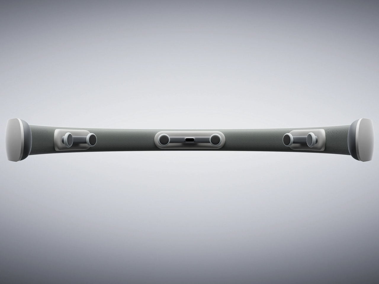
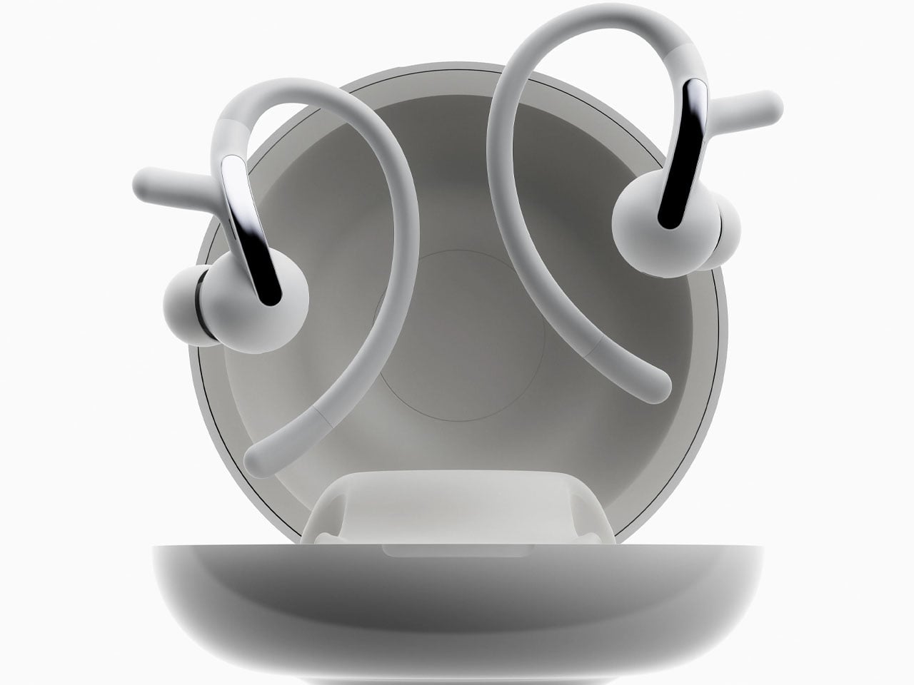
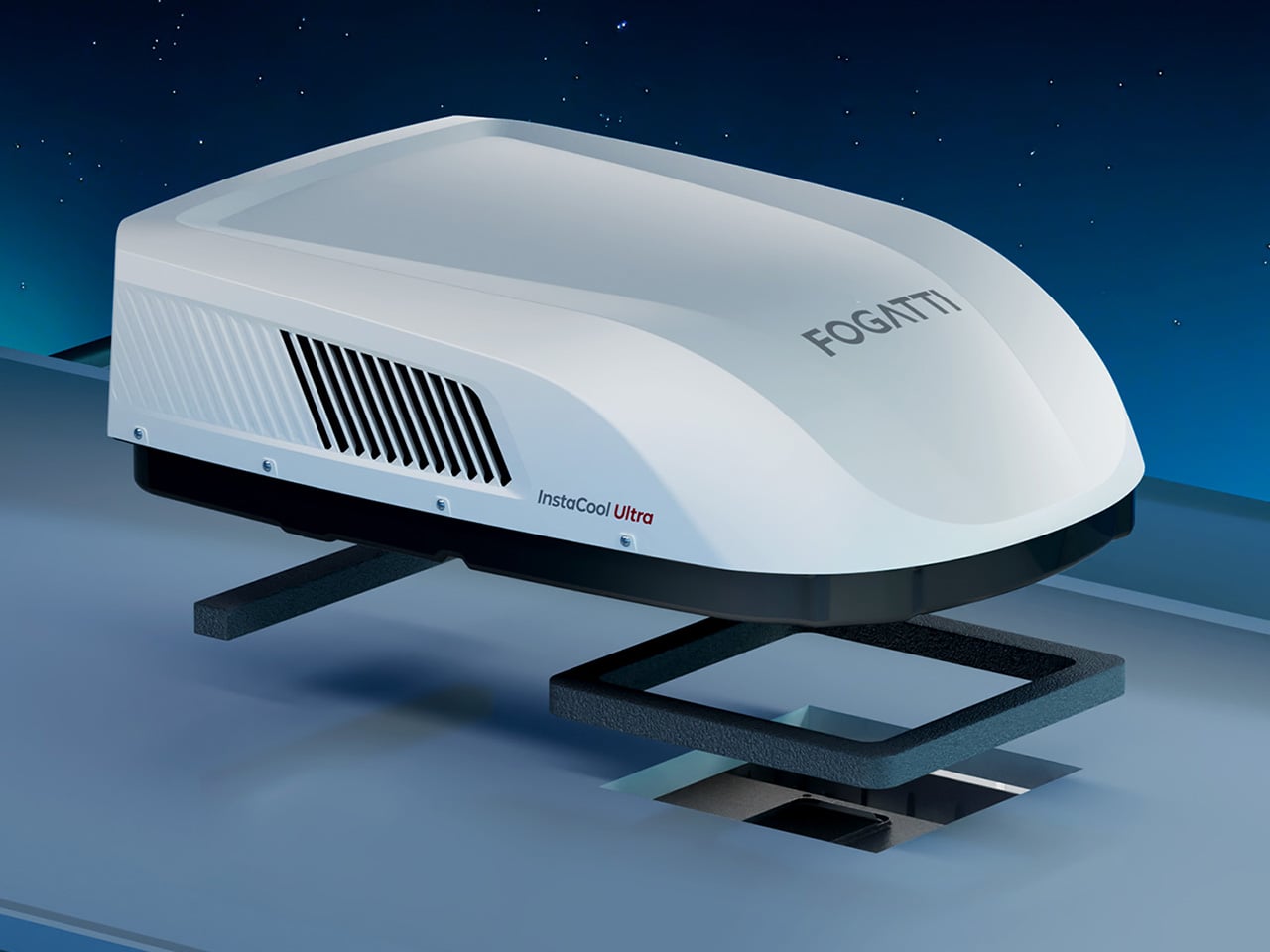
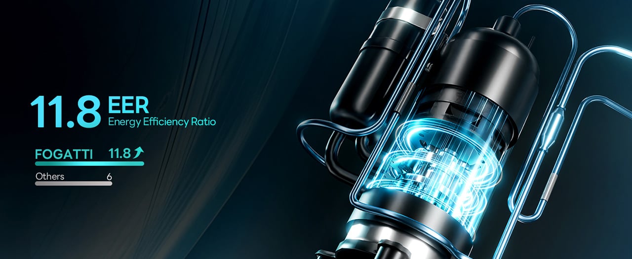
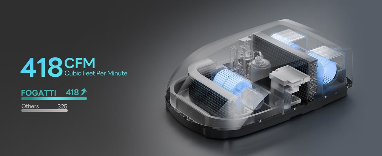
FOGATTI’s InstaCool Ultra approaches this with 418 CFM of airflow pushed through dual synchronous motors that sweep 85 degrees, creating whole-RV coverage in roughly 4 minutes according to the company. The 16,000 BTU cooling capacity targets spaces up to 600 square feet, which translates to RVs up to 36 feet long. The unit doubles as a heat pump delivering 12,500 BTU of warmth, giving it legitimate four-season capability without installing separate heating hardware. Heat pumps move thermal energy rather than creating it, which makes them roughly 3-4 times more efficient than resistance heating. The 9.2cc high-displacement compressor achieves an 11.8 EER rating (the Department of Energy considers anything above 10.7 high efficiency), operates at 43 decibels, and fits standard 14.25-inch roof openings without modification. At $1,399 (down from $1,759), it undercuts premium units while outspeccing budget alternatives.
Designer: FOGATTI
Click Here to Buy Now: $1299.99 $1759.99 ($460 off). Hurry, deal ends in 48-hours! Website Link Here.
The heat pump architecture sits at the center of what makes this unit different from the Coleman-Mach and Dometic systems that dominate most RV roofs. Traditional RV climate control treats heating and cooling as separate problems requiring separate solutions. The InstaCool Ultra runs a reversible refrigerant cycle, which means the same compressor and heat exchanger hardware that cools in July also heats in October. The system operates across an ambient temperature range from 23°F to 115°F, covering most of the continental United States outside of genuine Arctic expeditions or desert extremes that would make you question your life choices anyway.
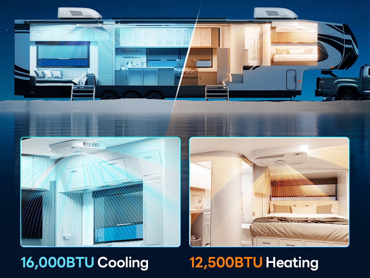
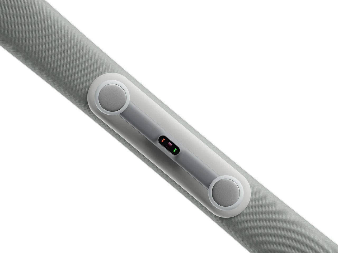
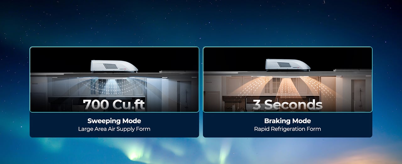
The airflow system uses dual synchronous motors driving three fans to push 418 CFM through the cabin. For context, most 15,000 BTU RV air conditioners move 325-350 CFM. The extra volume comes from the triple-fan configuration rather than just running the motors harder, which keeps noise down while increasing air circulation. The motors drive an 85-degree sweep mechanism that oscillates the airflow rather than blasting it straight down in a single column. You can also lock the vents in place for targeted cooling when you want maximum airflow in one zone.
The reversible heat pump system automatically switches between cooling and heating modes, using compressor-based thermal transfer rather than combustion-based heating. Five segments run during milder conditions or when you’re just maintaining temperature overnight. This variable output prevents the temperature swings you get with single-stage systems that either blast full power or shut off entirely. The heat pump delivers 12,500 BTU of heating capacity, which sounds less impressive than the 16,000 BTU cooling until you account for the efficiency difference. A heat pump operating at a 3.4 coefficient of performance moves 3.4 watts of thermal energy for every watt of electricity consumed. Resistance heaters convert electricity to heat at a 1:1 ratio.
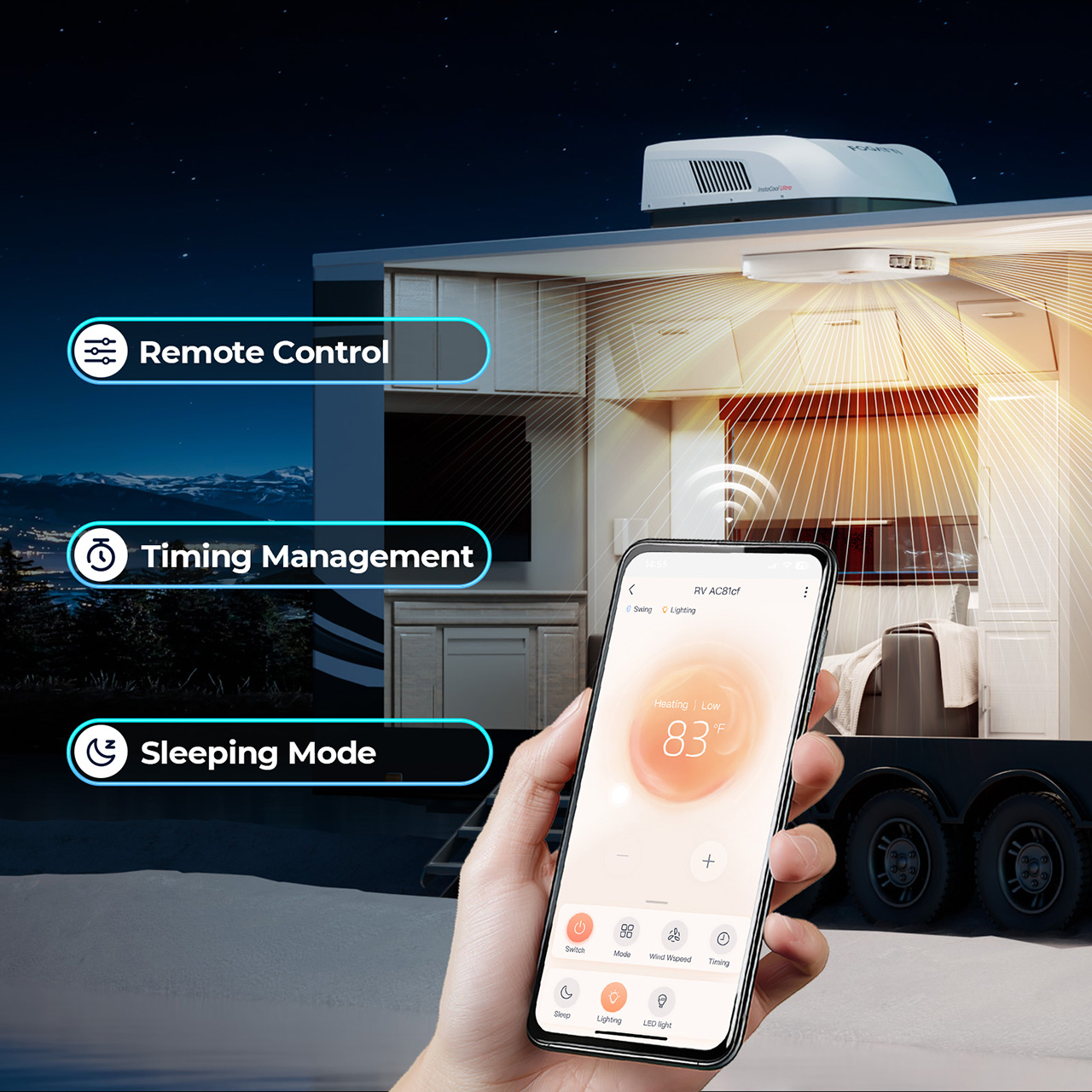
The control ecosystem offers three entry points: a physical remote, a touchscreen ADB panel mounted inside the RV, and a WiFi-connected smartphone app. The app lets you pre-cool or pre-heat the RV before you return from a day hike, which sounds like a luxury feature until you experience stepping into a 72°F trailer after spending six hours in the sun at Arches National Park.
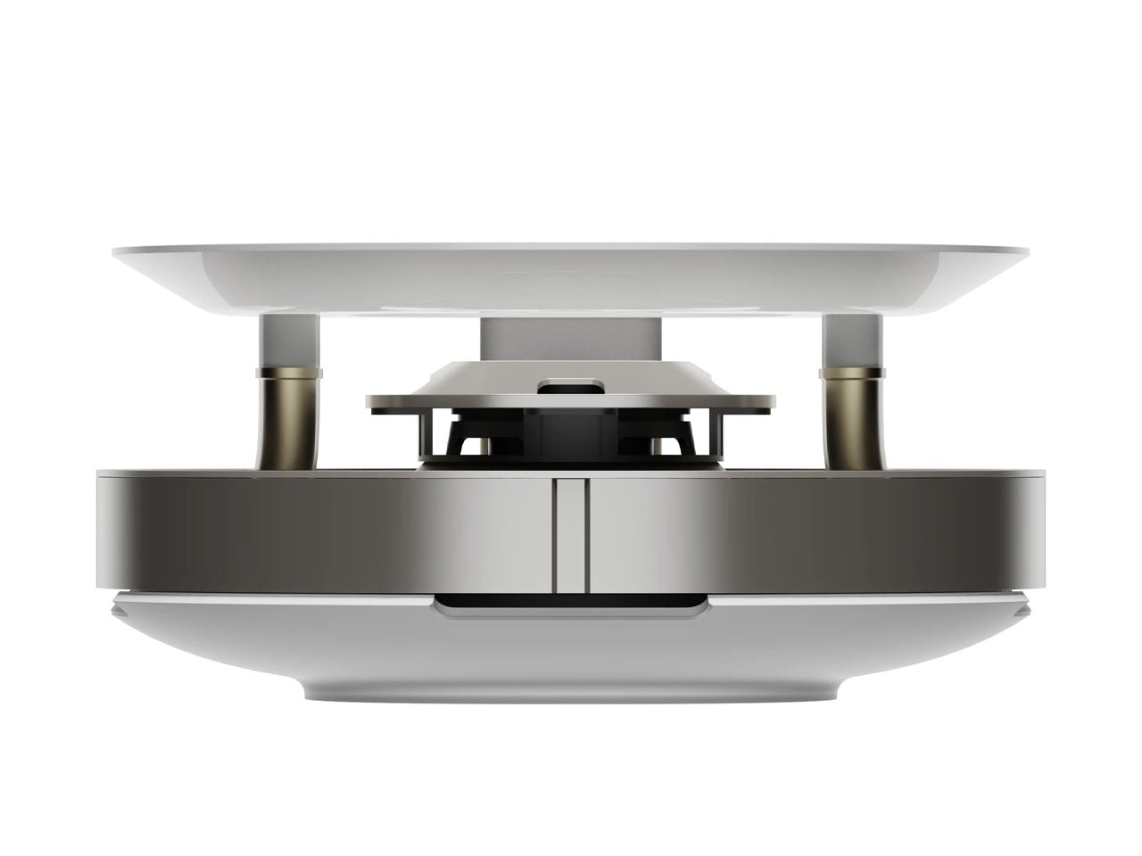
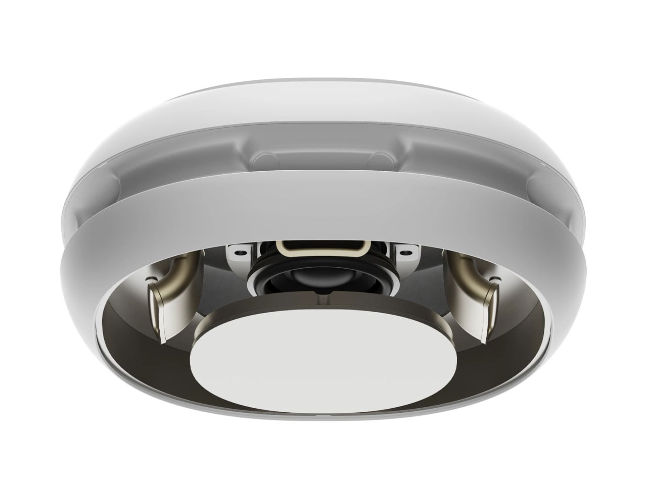
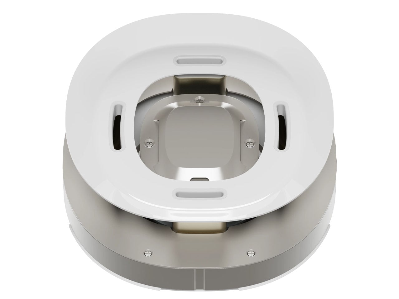
The physical installation targets the standard 14.25-inch by 14.25-inch roof cutout that Coleman, Dometic, and Furrion units use, which means most RVers can swap this in as a direct replacement without modifying the roof structure. The streamlined profile measures 12.2 inches tall, which keeps it in low-profile territory. For comparison, the Dometic Brisk II sits around 14 inches tall, and the Coleman-Mach 15 runs closer to 13.5 inches. Those couple of inches determine whether you clear that 13-foot bridge on the backroad to your favorite dispersed campsite.
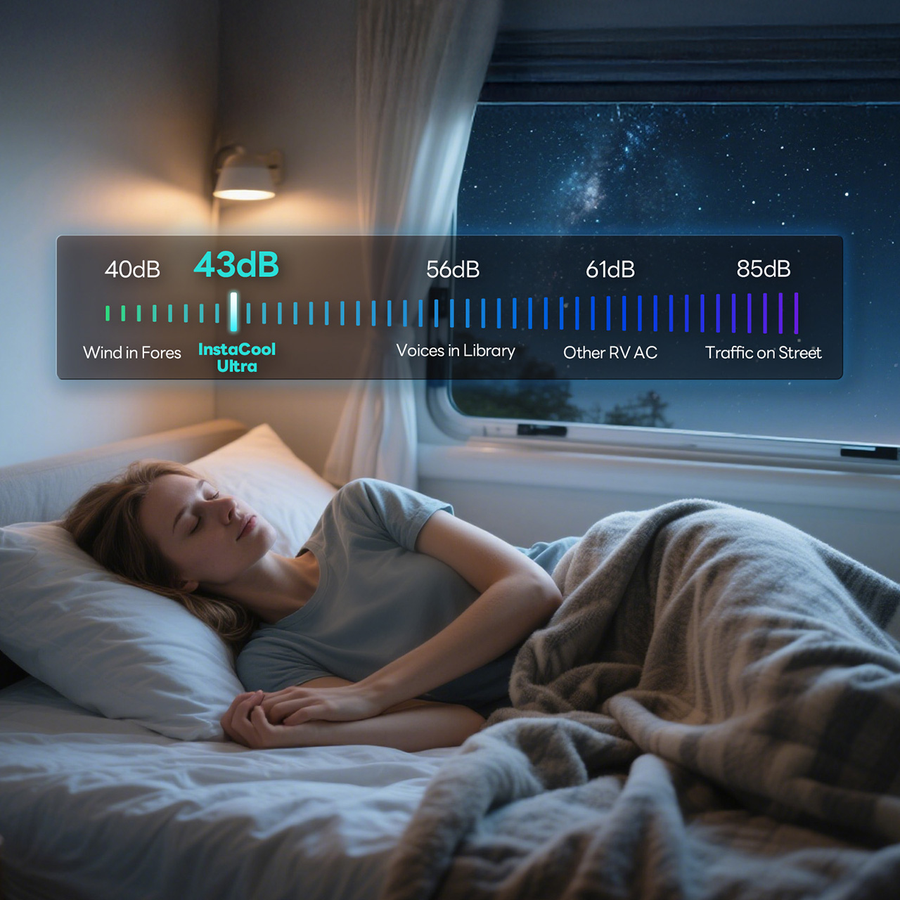
The 43-decibel noise rating puts this in the quiet category for RV air conditioners. Coleman-Mach units typically run 65-72 decibels. Dometic’s quieter models hit 50-59 decibels. The InstaCool Ultra’s 43-decibel claim would make it one of the quietest rooftop units available, though that figure likely represents the lowest speed setting rather than full-power operation.
The InstaCool Ultra ships for $1,399, down from the original $1,759 price point. That positions it between budget-tier units from Advent or RecPro (which run $700-900) and premium models from Dometic’s FreshJet or GE’s Profile series (which approach $1,400-1,600). The unit currently ships in white, fitting standard non-ducted installations. What you’re really buying here is year-round climate control without installing two separate systems or draining your battery bank every time the temperature drops. Heat pump, real airflow, quiet operation, and an efficiency rating that lets you boondock longer. For RVers chasing fall colors in the Rockies or spring wildflowers in the desert, that combination finally exists at a price that doesn’t require financing.
Click Here to Buy Now: $1299.99 $1759.99 ($460 off). Hurry, deal ends in 48-hours! Website Link Here.
The post Stop Buying a Separate RV Heater. This 16,000 BTU RV Air Conditioner Does Both first appeared on Yanko Design.