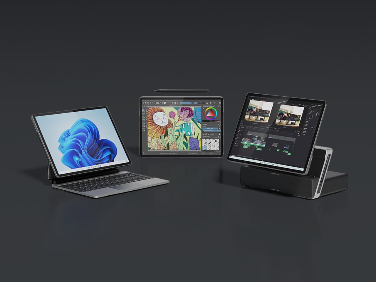
The question of whether a single small device can replace a laptop and desktop without feeling compromised keeps surfacing. Past attempts include phone lapdocks and 2-in-1 tablets that end up either too heavy to hold or too weak to be real workstations. Khadas’ Mind Go tries a different path. Instead of forcing everything into one slab, it lets the form factor grow and shrink depending on what you need.
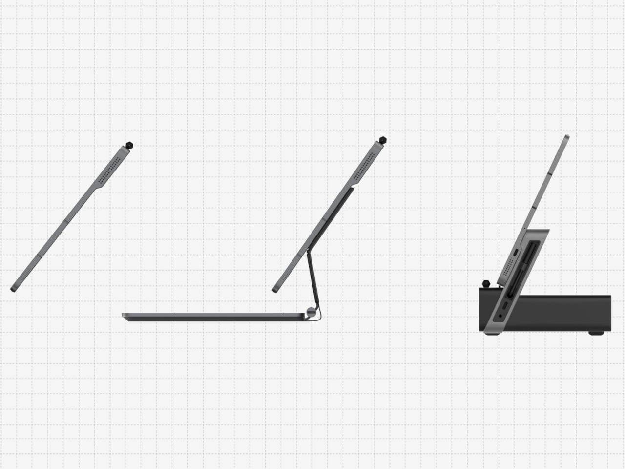
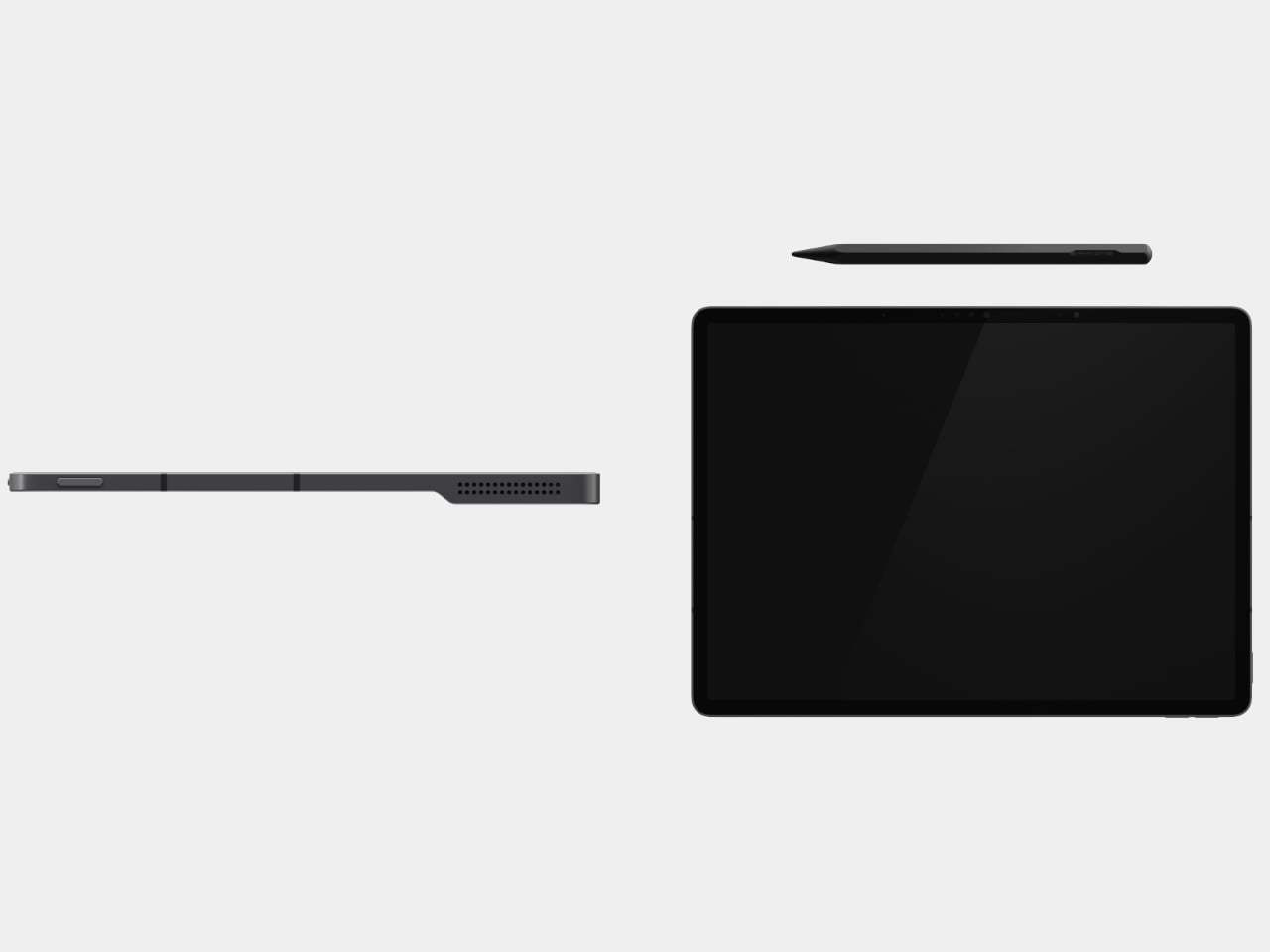
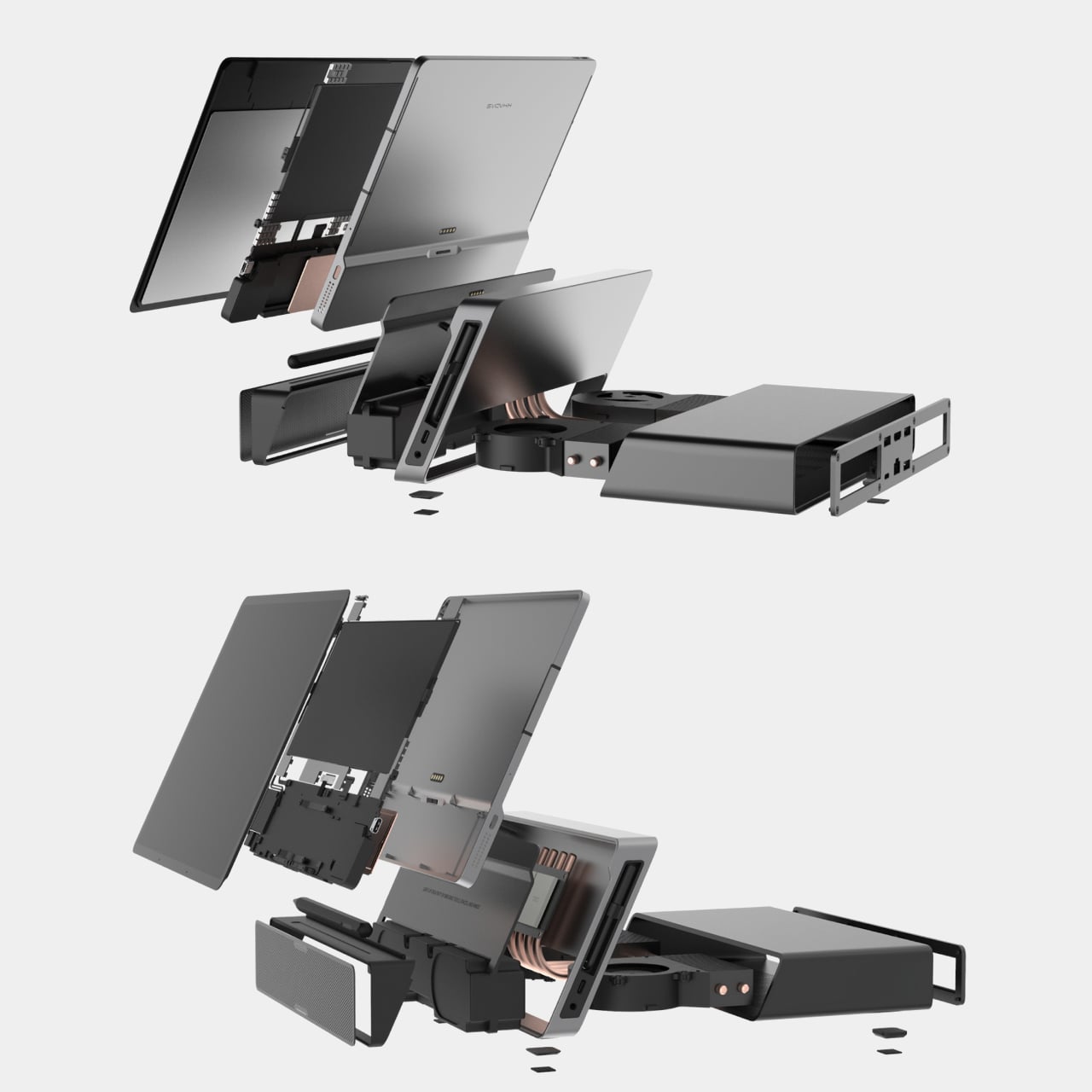
Mind Go is a modular 3-in-1 that starts with an 11.6-inch tablet, weighing around 600g and roughly 6.1mm thick in the current prototype. It is fanless, with built-in speakers, a front camera, Mind Pencil support, and a raised edge on the back that makes one-handed grip easier. The tablet is deliberately not a battery monster on its own because it is meant for shorter, mobile sessions where lightness matters more than runtime.
Slipping the tablet into a bag, reading or sketching on the train, reviewing documents while standing, or sharing a screen in a hallway all become easier with the smaller 11.6-inch size. The lack of fans keeps it quiet and cool. You are not running a full workstation here, just doing the kind of light work that benefits from being truly portable and easy to hold without needing a table.
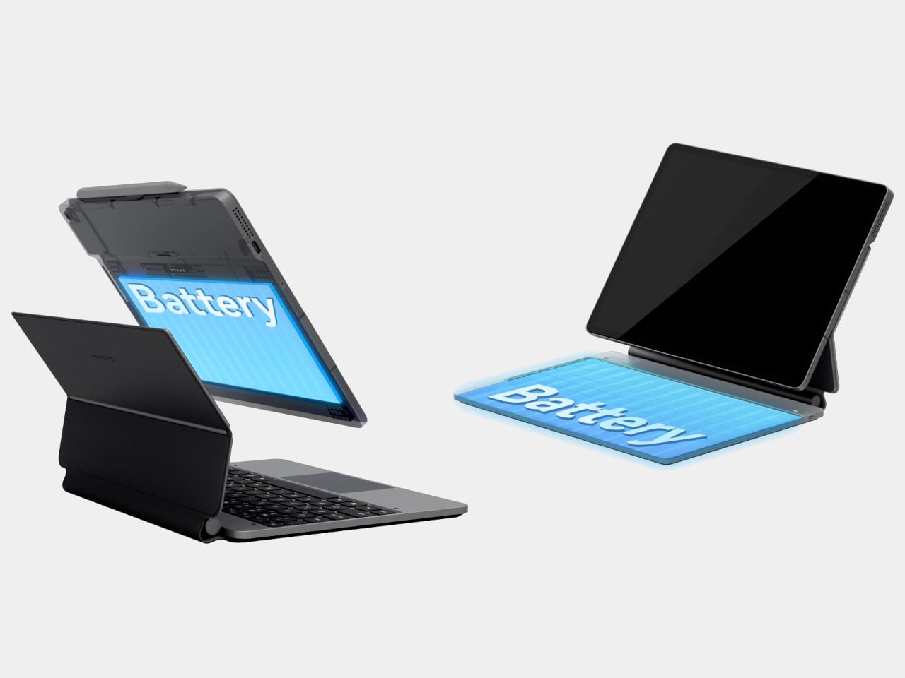
At a desk or café, the tablet drops into the Mind Go Keyboard. The keyboard is both input and battery, connected through pogo pins, bringing total capacity to 45Wh and roughly nine hours of local video playback. The trackpad and full keys turn the setup into a familiar laptop, and you can detach or reattach the tablet without interrupting what you are doing, shifting between seated and walk-around work.
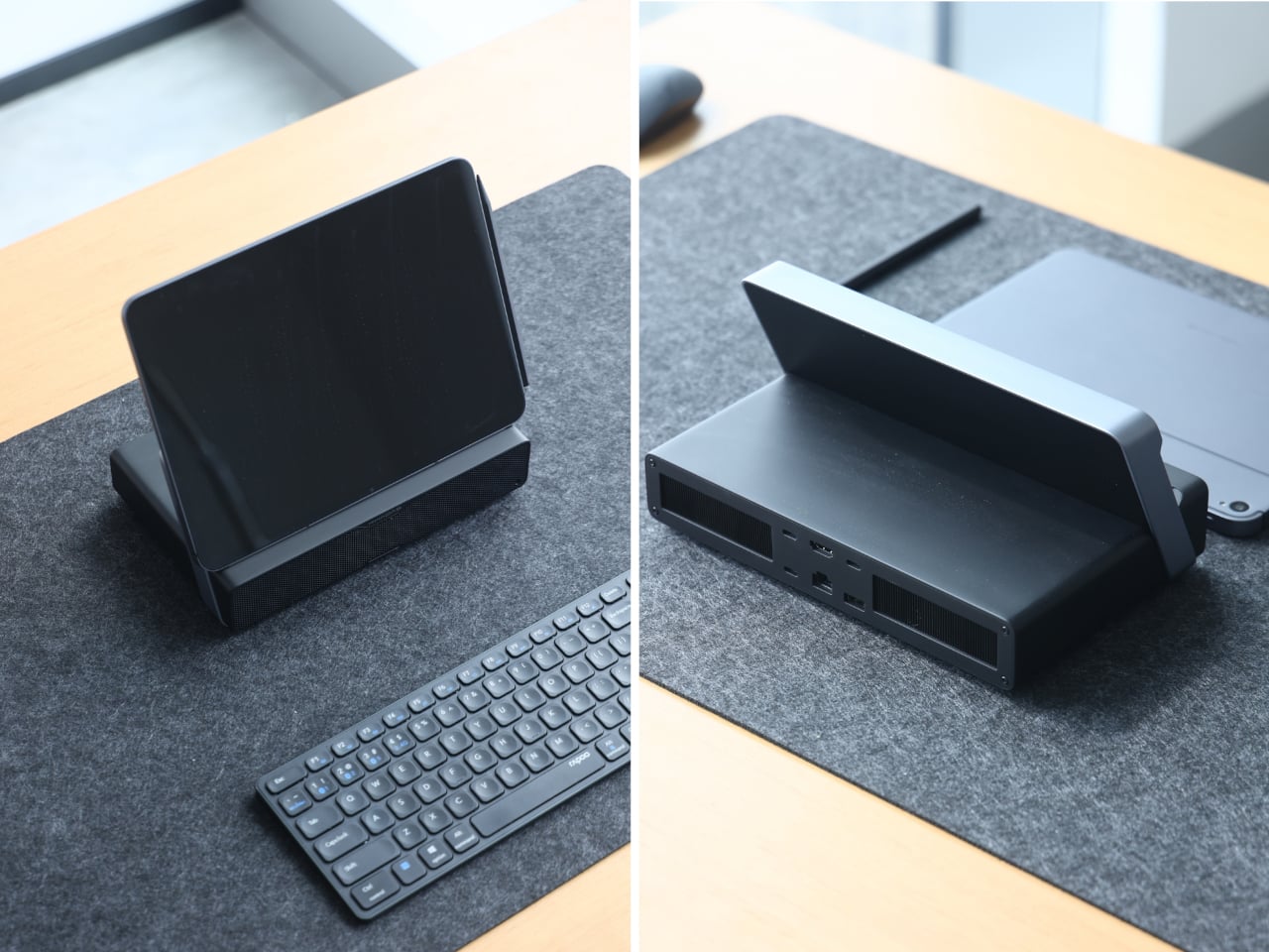
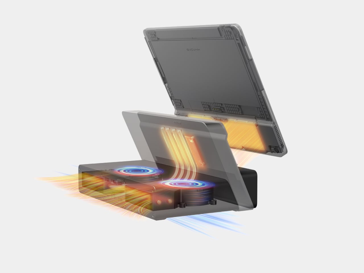
The Mind Go Stand is where the device stops pretending to be just a tablet. The stand adds active cooling and a full set of ports, USB-C, HDMI, USB-A, Ethernet, headphone jack, plus integrated speakers. With sustained cooling, Mind Go can push up to about 30 W of performance, roughly double its tablet mode, and suddenly the small screen is driving multiple external displays and heavier workloads.
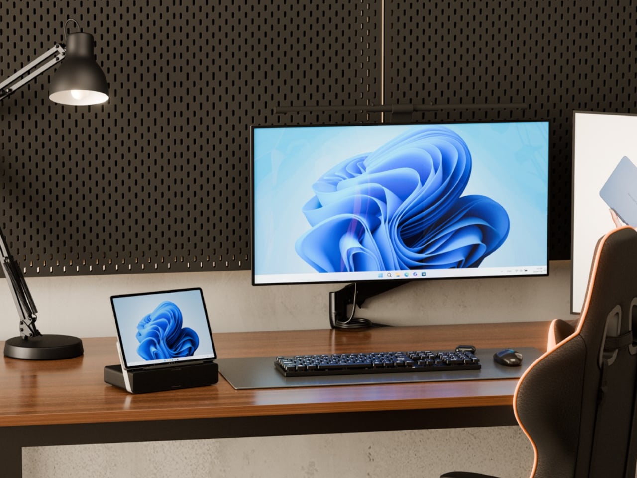
This setup changes the usual dance of syncing files between machines. Your projects live on the same device that moves from commute to meeting to desk. On the way home, you are not hunched over a tiny laptop debating whether to sync to a desktop later. You just drop the tablet into the stand, and your posture, visual space, and performance all expand around the same core without transferring files or logging into another machine.
Mind Go is still in market validation, with Khadas asking the community to help decide big questions, Snapdragon or Intel, 11.6 or 13 inches, LCD or OLED, pogo pins or wired stand, even whether the dock should offer optional GPU support. It is an unusual invitation to shape not just the look but the architecture of a device that wants to be your tablet, laptop, and desktop without pretending those are the same thing.
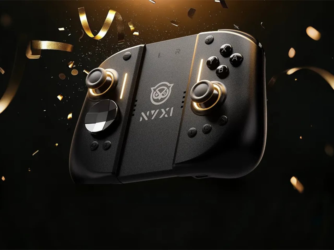
Playing the Switch 2 for more than an hour in handheld mode means the flat Joy-Cons and small buttons start to feel like a compromise. Your hands end up clawed around the rails, drift anxiety creeps in, and you start shifting your grip to avoid cramping. NYXI’s Hyperion 3 is built for people who treat the Switch 2 like a main console, not a travel toy used in short bursts.
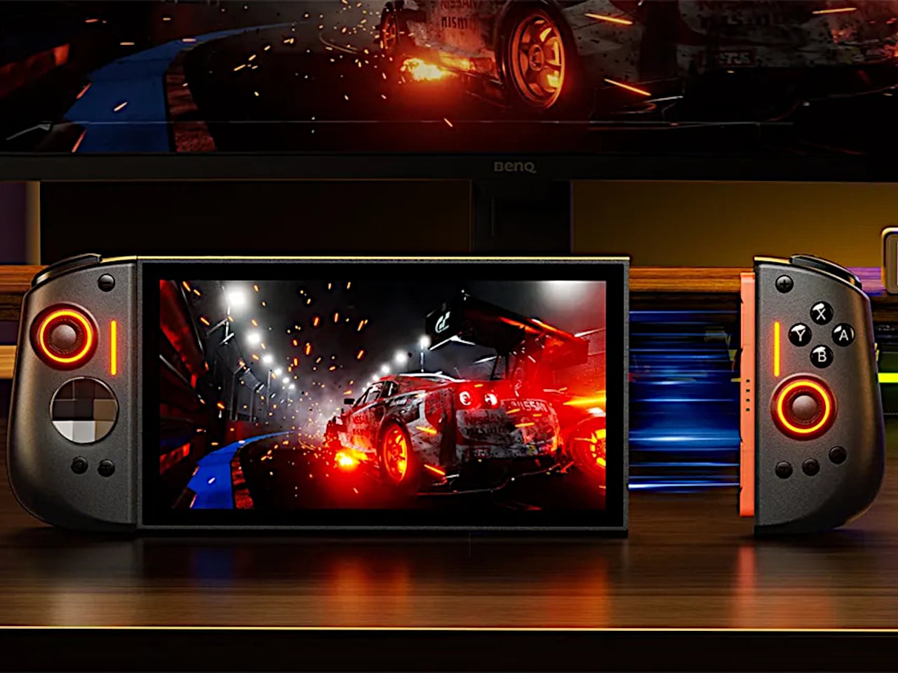
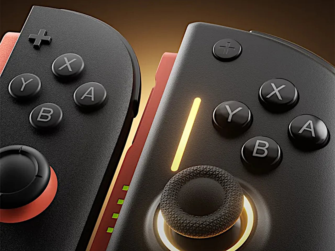
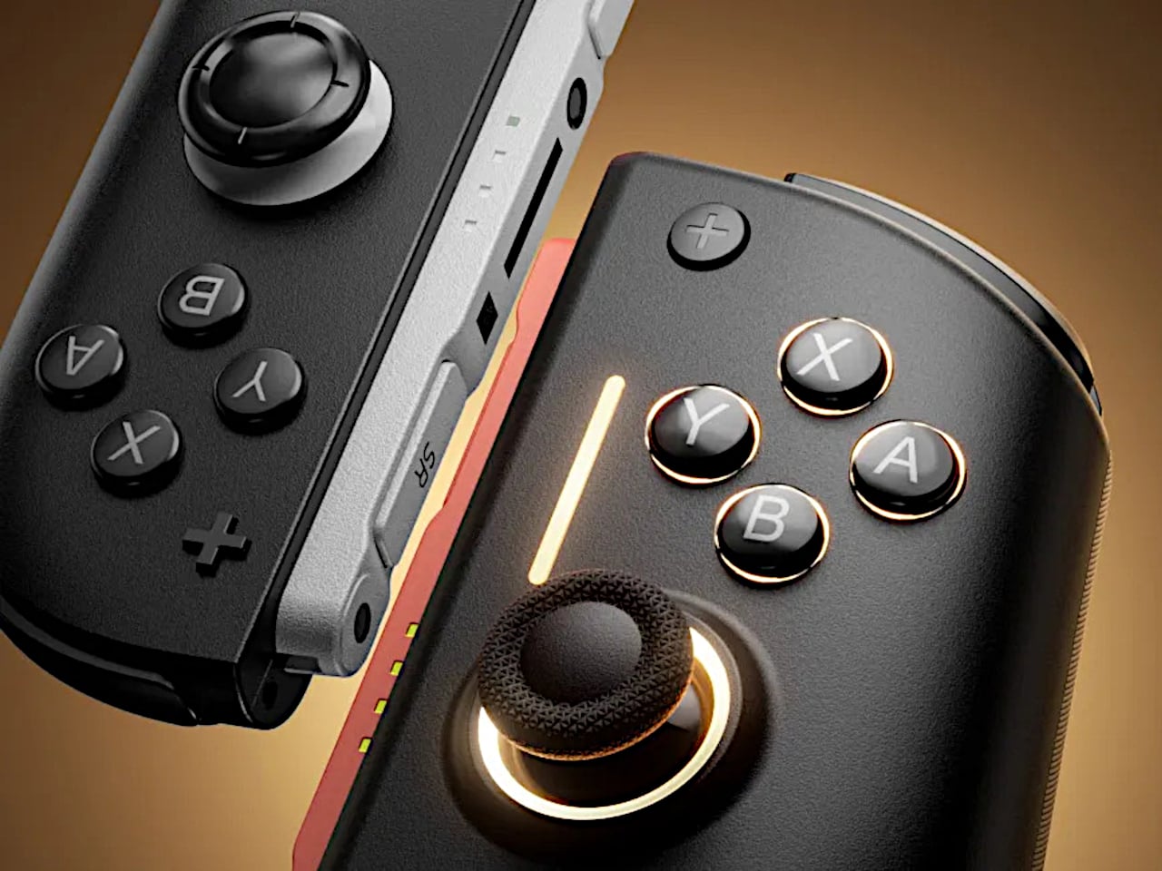
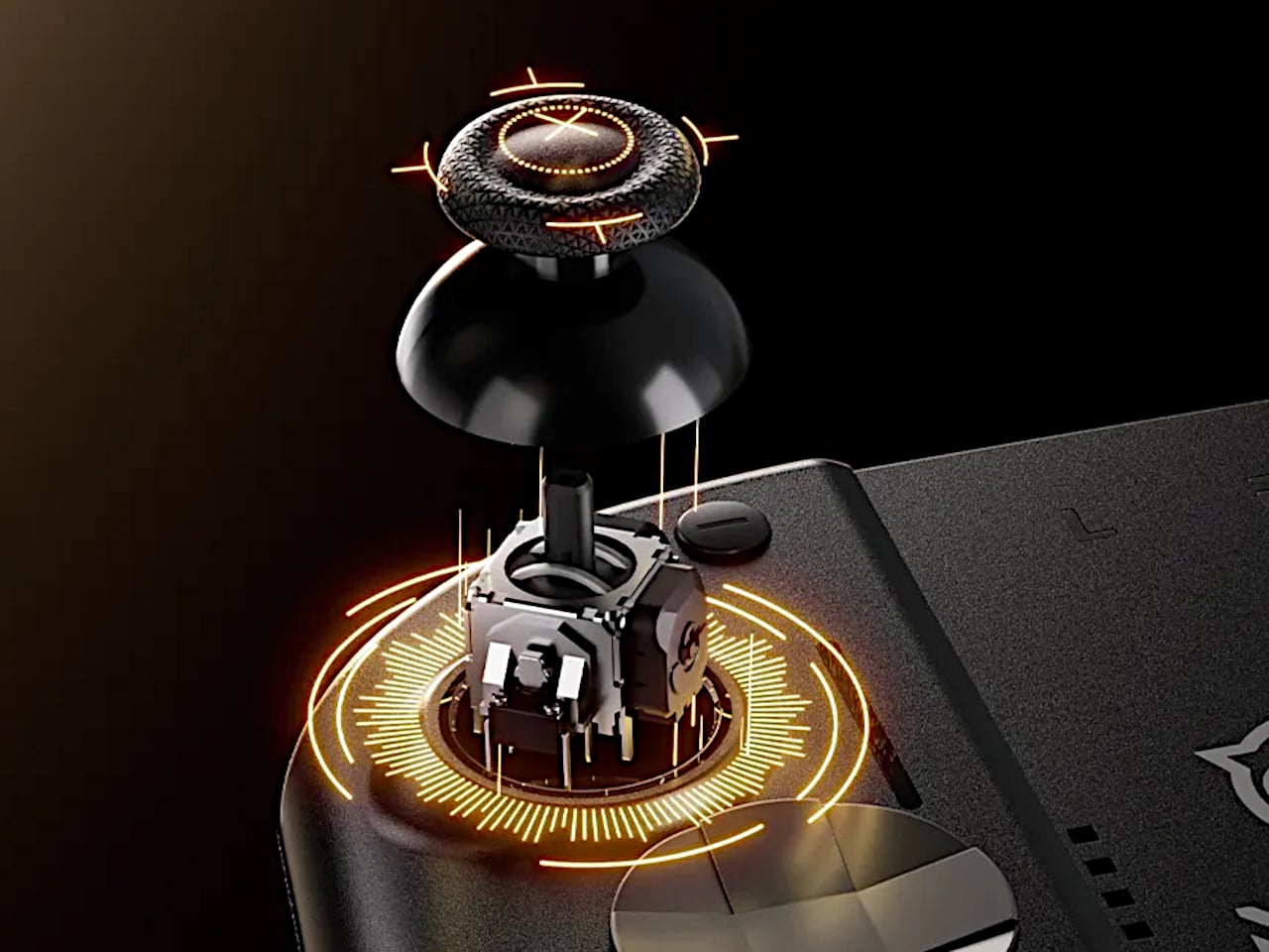
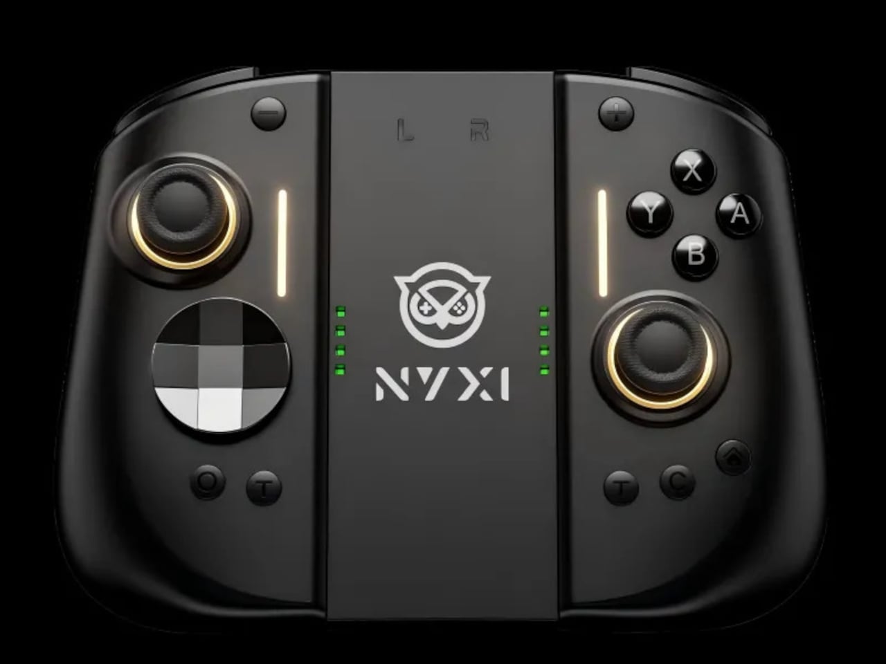
NYXI’s Hyperion 3 is a wireless JoyPad that snaps onto the Switch 2 for handheld play and works as a standalone pad when docked. It adds real grips, larger sticks, and more spaced-out buttons, swapping the usual potentiometer sticks for hall-effect joysticks designed to be drift-free over the long haul. It is pitched as the world’s first ergonomic JoyPad for Switch 2, treating comfort and reliability as primary goals.
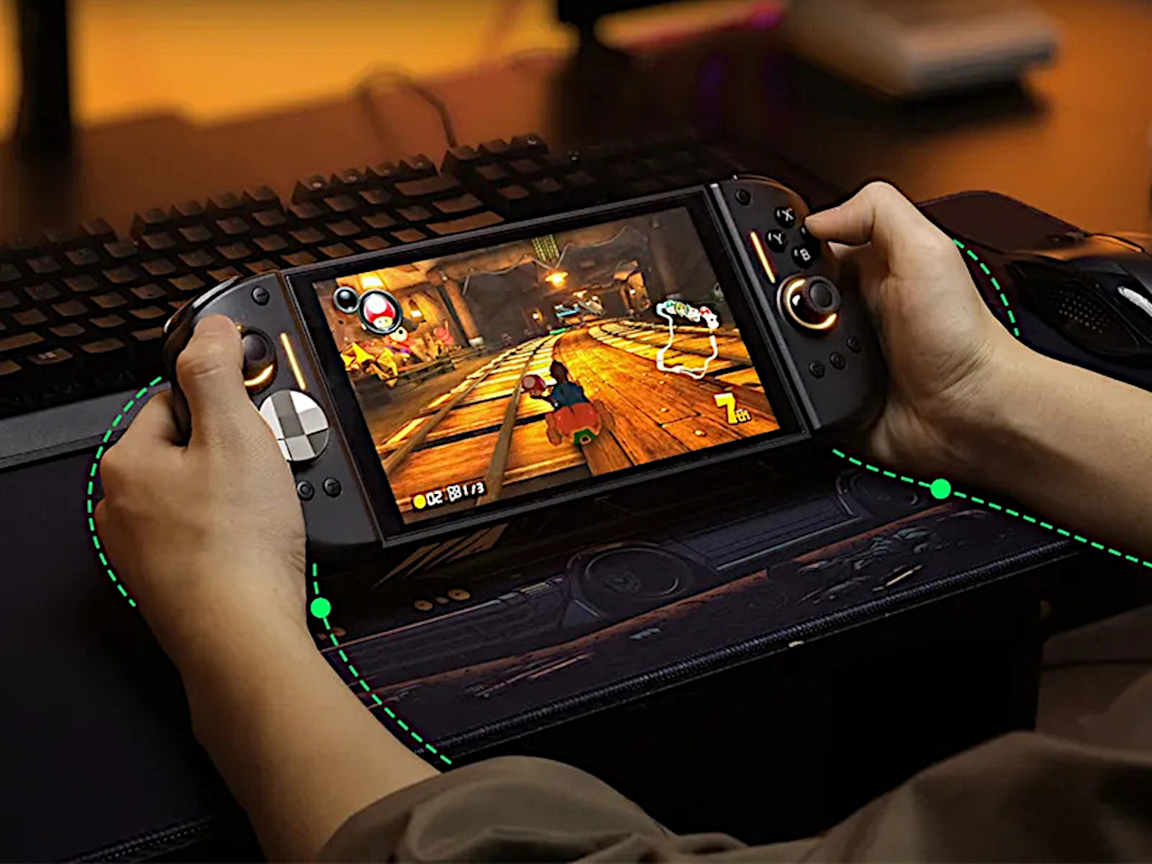
Settling into a long RPG or racing game in handheld mode, the full-size grips let your hands relax instead of pinching edges. The hall-effect sticks feel smooth and precise, and you are not waiting for the first sign of drift that ruined your last controller. The strong magnetic lock keeps everything solid, so the console feels like one piece rather than a screen with two wobbly handles threatening to flex apart.
The larger micro-switch face buttons and D-pad click with a clear, mechanical feel, making fast inputs and diagonals more reliable in fighters or platformers. The 9-axis gyro gives you fine motion aiming in shooters or steering in racers, so you can lean on tilt controls without fighting laggy sensors or imprecise calibration that drifts halfway through a match.
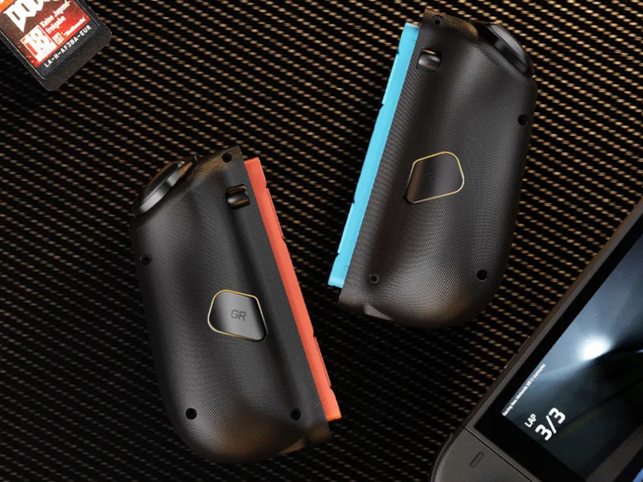
The programmable back buttons let you move key actions off the face buttons, so your thumbs can stay on the sticks more often. Mapping jump, reload, or item use to the back means fewer awkward stretches, especially in games designed around a traditional pad. Over time, that small shift in where your fingers land makes the controller feel tailored to your habits instead of forcing you into Nintendo’s layout.
Hyperion 3 is not as slim or neutral as Nintendo’s own Joy-Cons. The full-size grips and gaming-centric styling make the Switch 2 less pocketable and more like a small console with a screen. That is exactly the point, though, a handheld that finally feels built for adult hands, even if it means giving up a bit of throw-in-a-bag convenience.
Hyperion 3 shows what happens when a third-party accessory takes the Joy-Con format seriously as a starting point, not a template to clone. By fixing drift, upgrading buttons, adding back paddles, and leaning into ergonomics, it treats the Switch 2 like a platform deserving of pro-level hardware. Playing on Nintendo’s hybrid for hours makes that kind of overkill feel pretty reasonable.
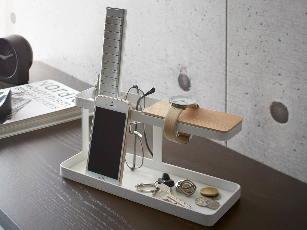
Desks and side tables collect phones, glasses, remotes, pens, keys, and watches by the end of the day. The half-hearted attempts to corral them in a bowl or let them drift into a loose pile never quite work, and by the next morning, you are hunting for your phone under a stack of papers or fishing keys out from behind the lamp. What is missing is not more storage, but a small, clear structure that tells each thing where to go.
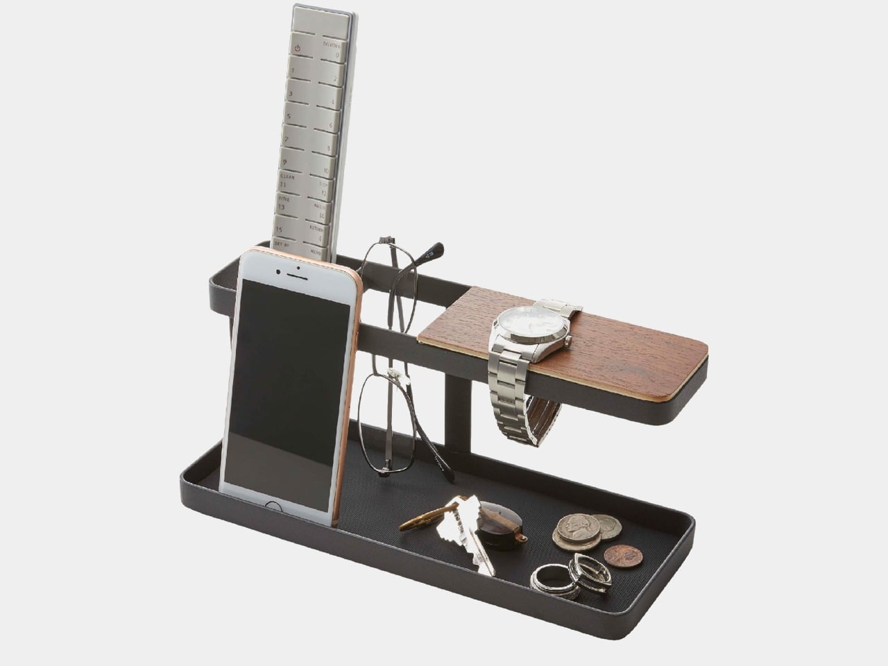
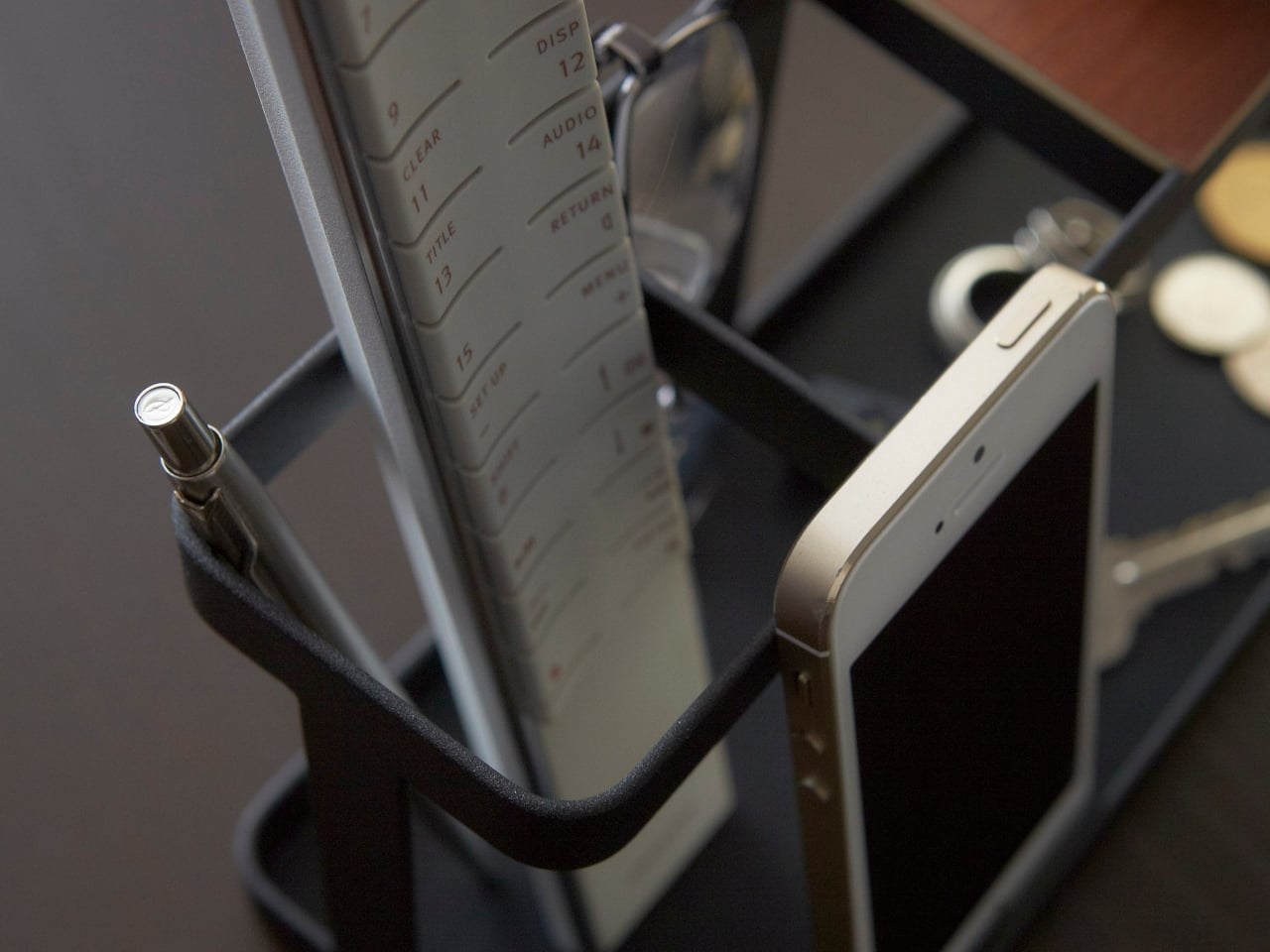
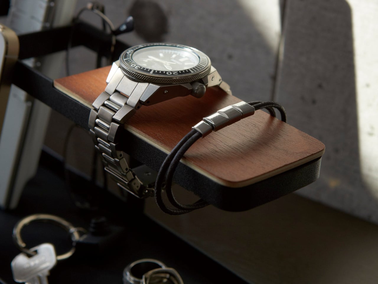
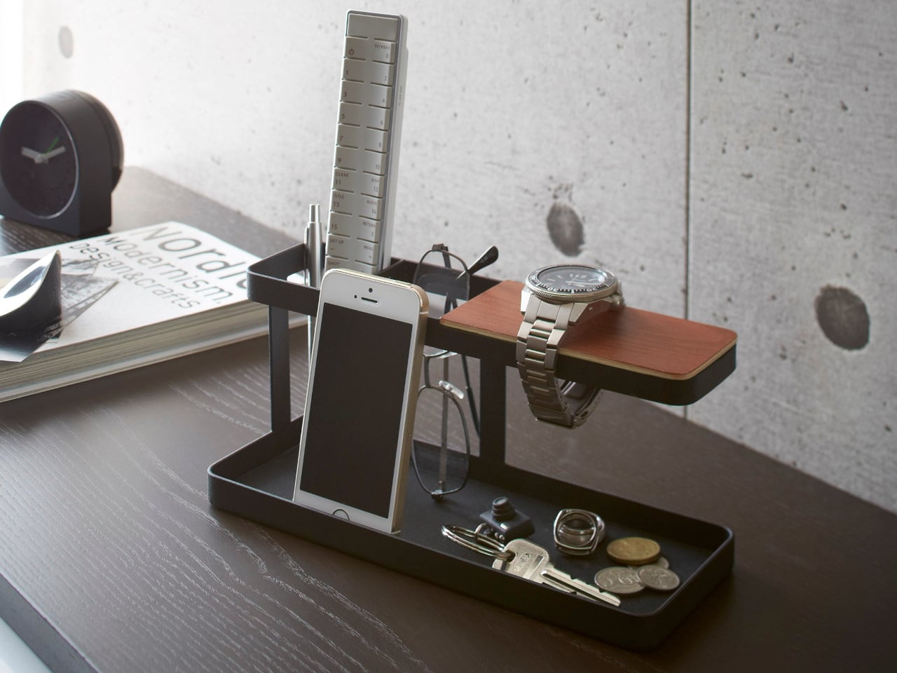
Yamazaki’s Tower Desk Organizer is a compact steel and wood bar that behaves more like a miniature piece of furniture than a generic tray. It has a slim base tray divided into two zones, a vertical post, and a raised wooden rest for watches or bracelets, all within a footprint that fits between a keyboard and monitor or next to a sofa arm.
Sitting down at a desk in the morning, you drop your phone into one side of the tray, slide a pen and small notebook into the other, and hang a watch on the wooden bar while you type. The silicone mat keeps the phone from sliding when notifications buzz, and the low walls of the tray stop things from drifting under papers or behind the laptop. It becomes a predictable spot instead of another improvised pile.
By evening, the same organizer moves to a living room table, where it now holds a couple of remotes, reading glasses, and a phone while you watch something or read. The two compartments make it easy to separate tech from analog items, so you are not fishing for a remote under a pile of keys. The watch bar doubles as a small display for a bracelet or everyday watch when you are off the clock.
The powder-coated steel body with its textured matte finish, available in white or black, and the plywood top plate that adds a warm accent, feel more like a quiet architectural element than a gadget. The combination lets it blend into both minimal workspaces and softer living-room setups without drawing attention to itself, staying useful while staying calm.
The organizer is designed for smartphones, not tablets, and the watch bar comfortably holds two large watches rather than an entire collection. It is a home for a curated set of essentials, not a dumping ground. That constraint is part of what keeps it from turning into another overstuffed catch-all that defeats its own purpose and ends up just as messy as the pile it replaced.
The Tower Desk Organizer treats everyday clutter as something worth designing for at a structural level. By giving phones, glasses, remotes, and watches a simple base, post, and beam to relate to, it turns a messy corner of the room into a small, legible landscape. Sometimes the most effective organizing tools are not big systems with a dozen compartments, but a single, well-drawn line on the desk that quietly suggests where things belong.
Most desks end up with a laptop brick, a phone charger, a watch puck, a wireless stand, and a small power strip fighting for space. The ritual of swapping plugs, stealing power from lamps, and dragging cables across the keyboard becomes part of the background noise. The problem is not just power but how scattered that power has become and how much horizontal real estate disappears under adapters.
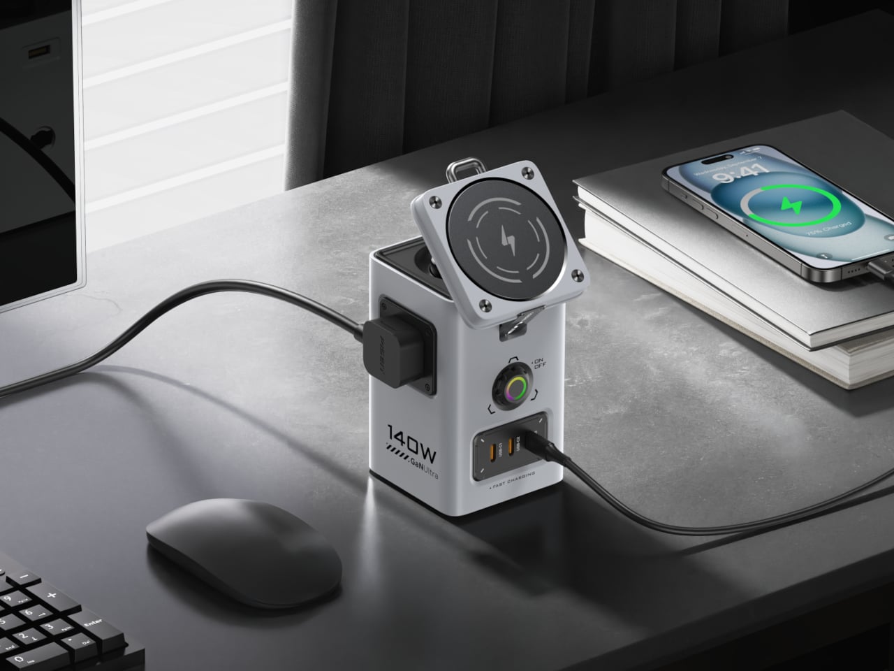
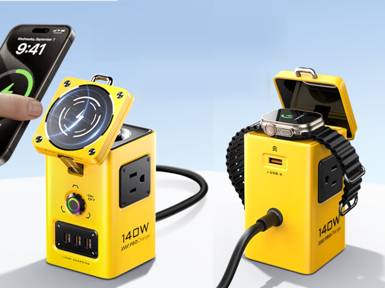
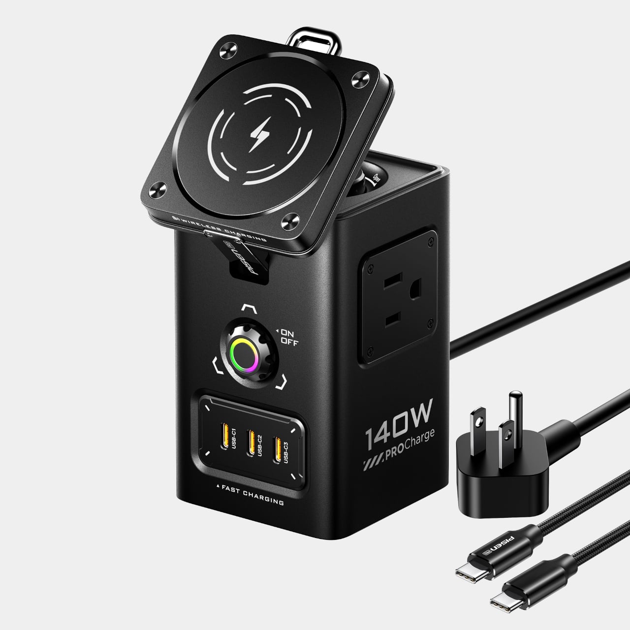
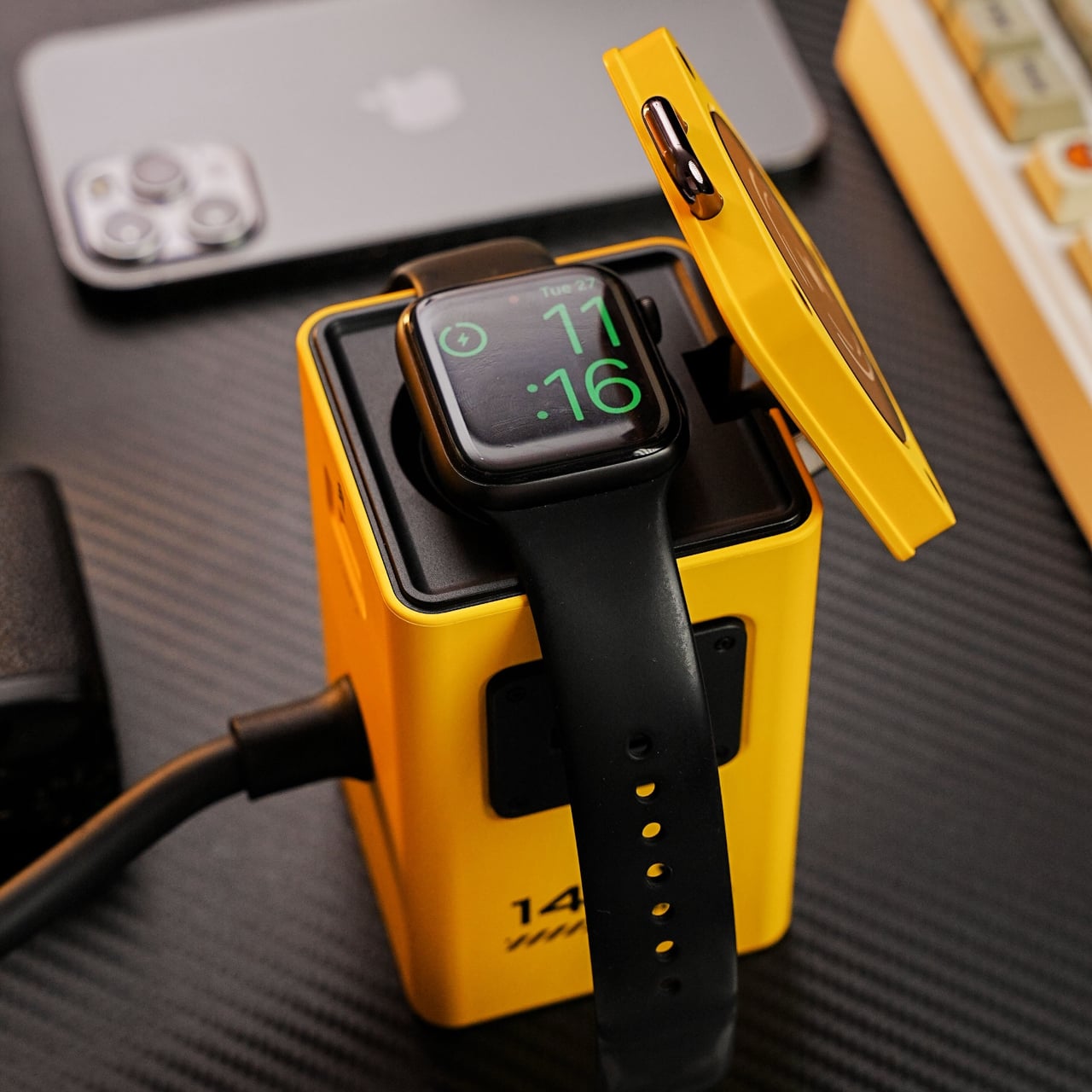
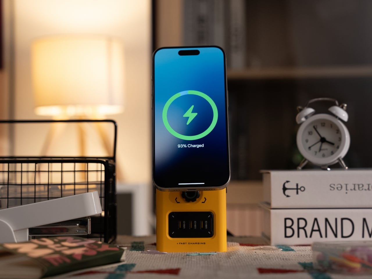
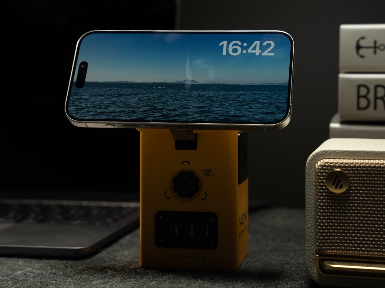
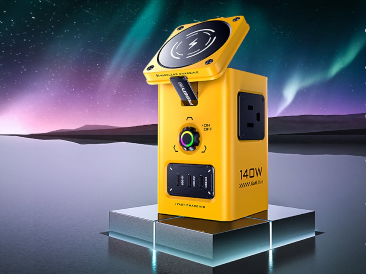
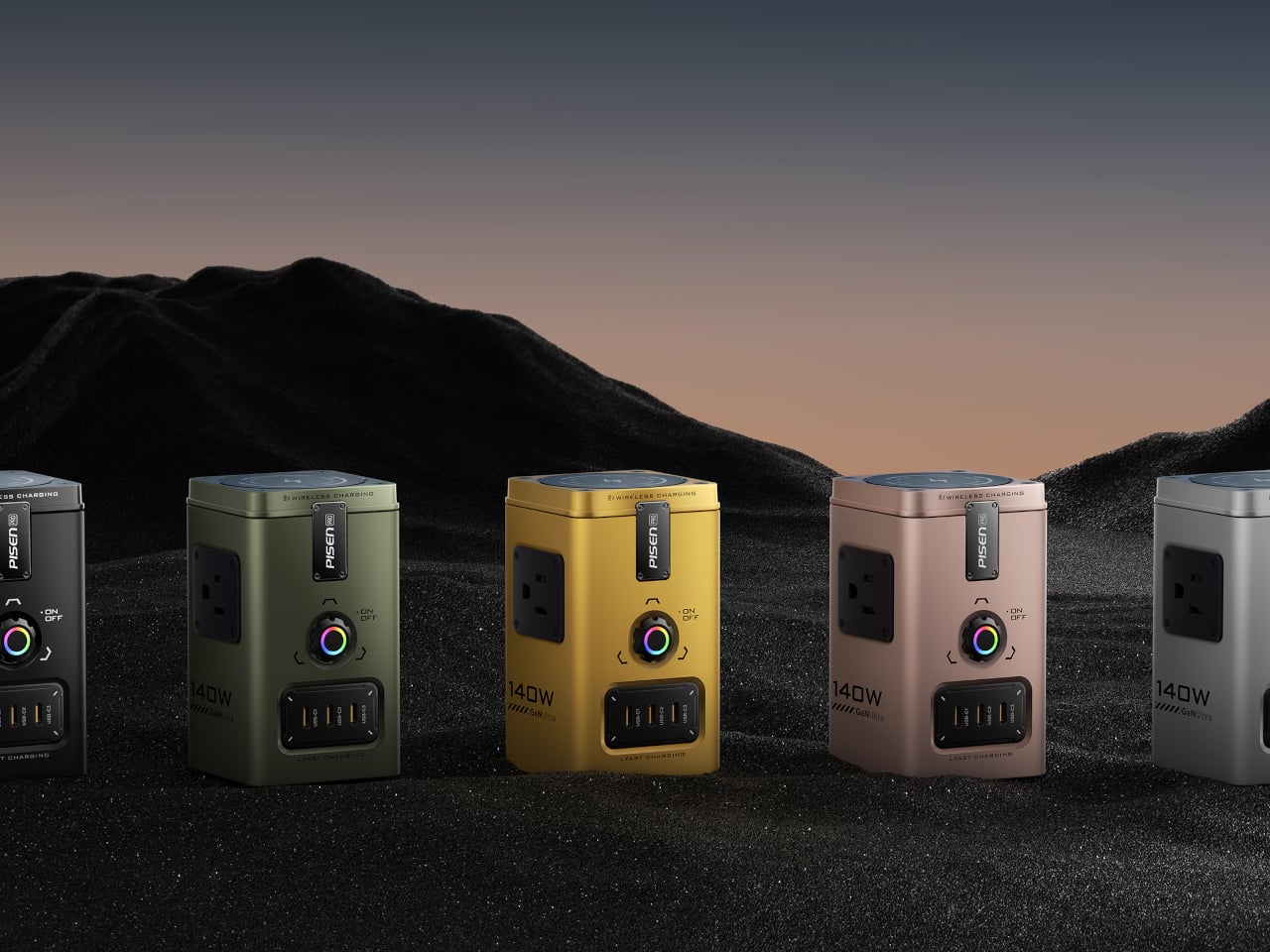
PISEN’s 140W Mega Charging Hub is a compact vertical tower that pulls everything into one place. It combines two AC outlets, three USB-C ports, one USB-A port, a Qi2-certified 15 W MagSafe pad for iPhone, and a dedicated wireless charger for Apple Watch and compatible earbuds. Available in black or bright yellow, it is meant to live on the desk, with its color and form turning a charging hub into something closer to a small power console.
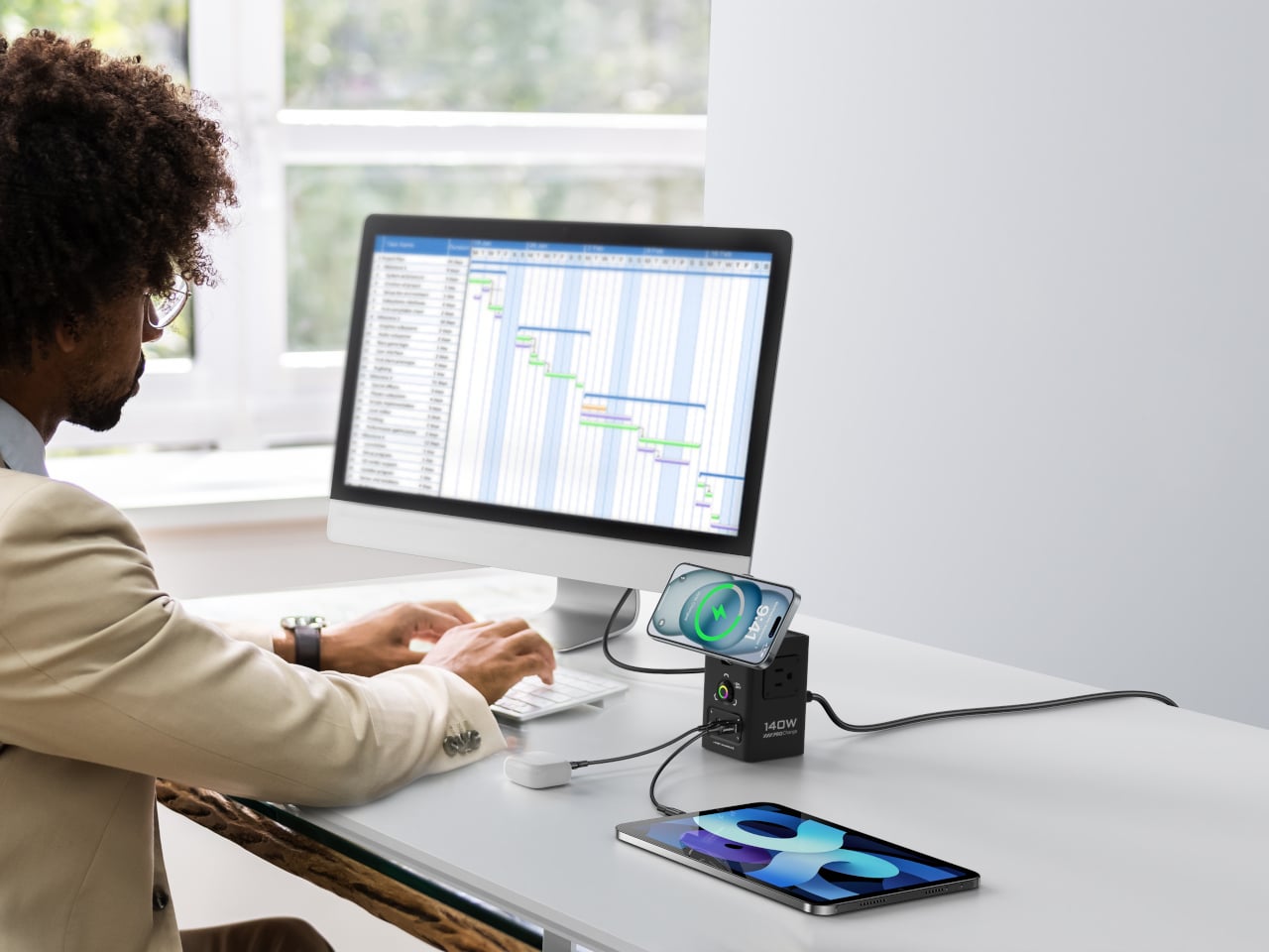
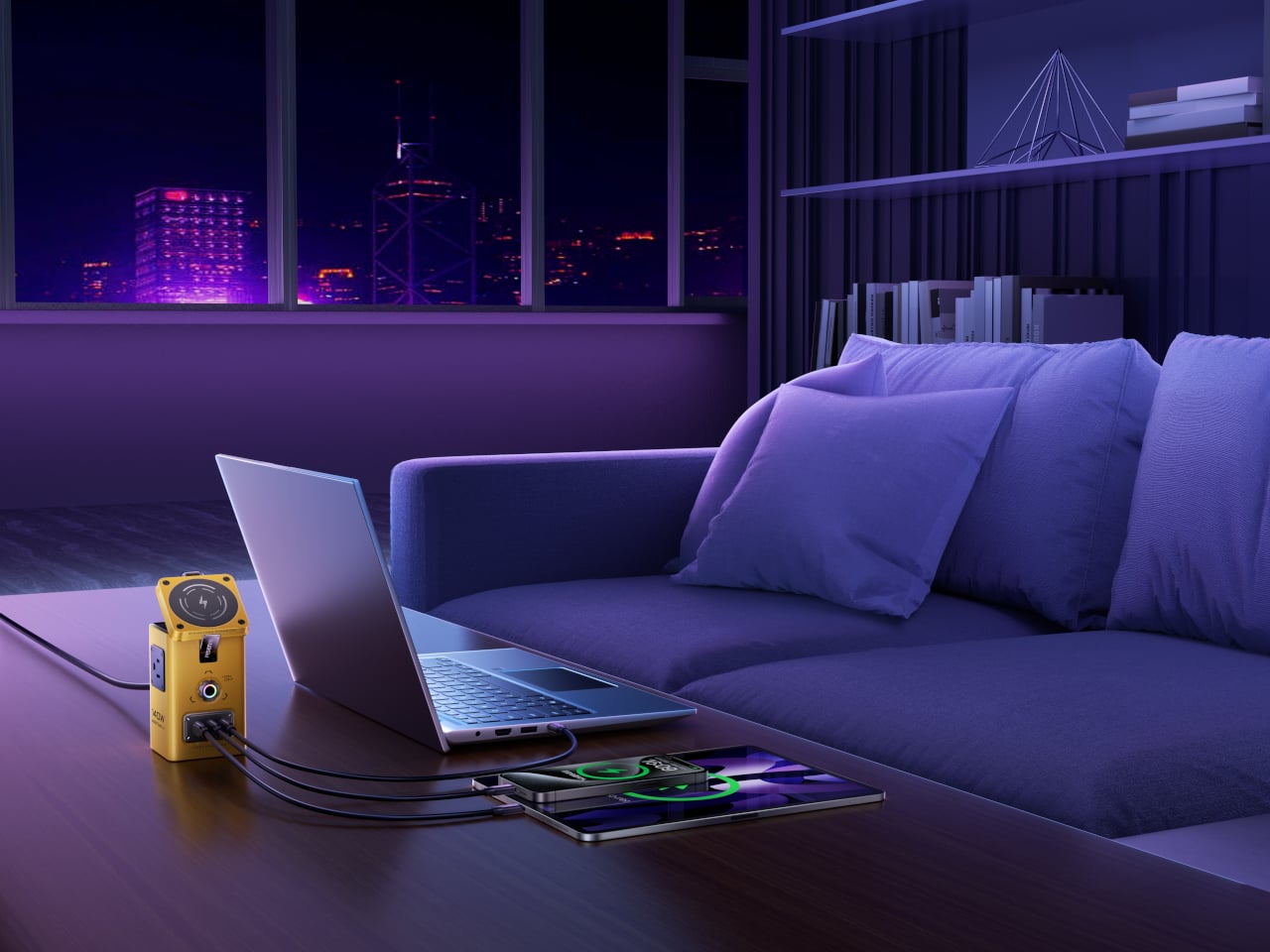
Dropping a laptop cable into one USB-C port, plugging a monitor or lamp into the AC outlets, and snapping an iPhone onto the magnetic pad, the tower becomes a small staging area. The watch rests on its charger, earbuds sit nearby, and the remaining ports top up a tablet or spare phone. Instead of a tangle of bricks scattered across the surface, there is one hub doing the work, tucked into a corner but fully loaded.
The hub uses GaN to push up to 140 W through a single USB-C port when needed, enough to feed a power-hungry laptop. It supports PD3.1, QC3.0, PPS, AFC, FCP, DCP, and PE, so tablets and phones see their preferred fast-charging profiles. When more devices join, power is shared intelligently across ports instead of everything grinding to a slow trickle, keeping the desk humming through long sessions.
The Qi2 MagSafe pad on top locks onto iPhone 12 through 16 series with proper magnetic alignment and can tilt up to 65 degrees, making it easy to glance at notifications, take a call, or watch a video while charging. That small hinge turns the charger into a stand, which matters when the phone effectively becomes your second screen or the only thing within arm’s reach when the laptop is buried.
An Aurora Australis-inspired breathing light pulses gently when charging, shifting color with voltage, green at 5 V, purple between 9 and 15 V, yellow at 20 V. It is part status indicator, part ambient detail, giving the hub a slightly cyberpunk, glowing-console vibe. Underneath, nine layers of protection handle overvoltage, undervoltage, overcurrent, overheating, short circuit, and foreign object detection, with GaN keeping temperatures under control.
It is not a minimalist block that disappears. Once loaded with cables and a phone perched on top, it looks more like a small power tower with intentional visual density. The yellow version especially leans into that industrial, almost sci-fi energy. The PISEN hub condenses that scattered ecosystem into one vertical footprint where everything plugs in, pulses, and charges without taking over the entire desk.
Desks start tidy and slowly fill with stacks of printouts, notebooks, sketchpads, and loose sheets. The half-hearted attempts to tame it with file folders and trays end up closed, stacked, and forgotten in a corner or drawer. Most filing systems are great at hiding things but not so great at keeping the work you are actually doing visible and ready, which means you either let the surface turn into chaos or you bury everything and lose track.
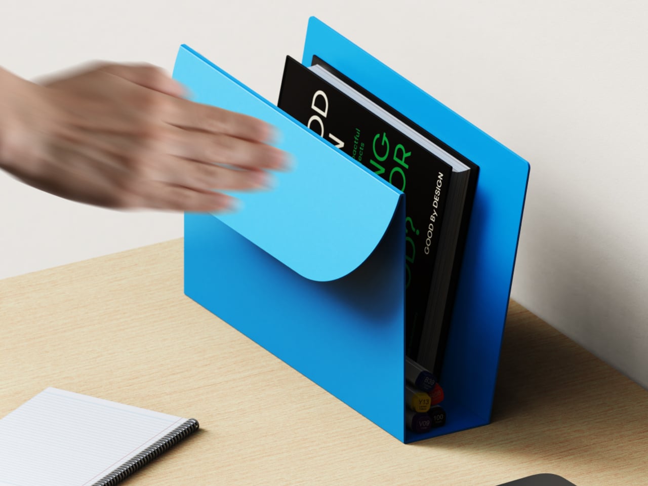
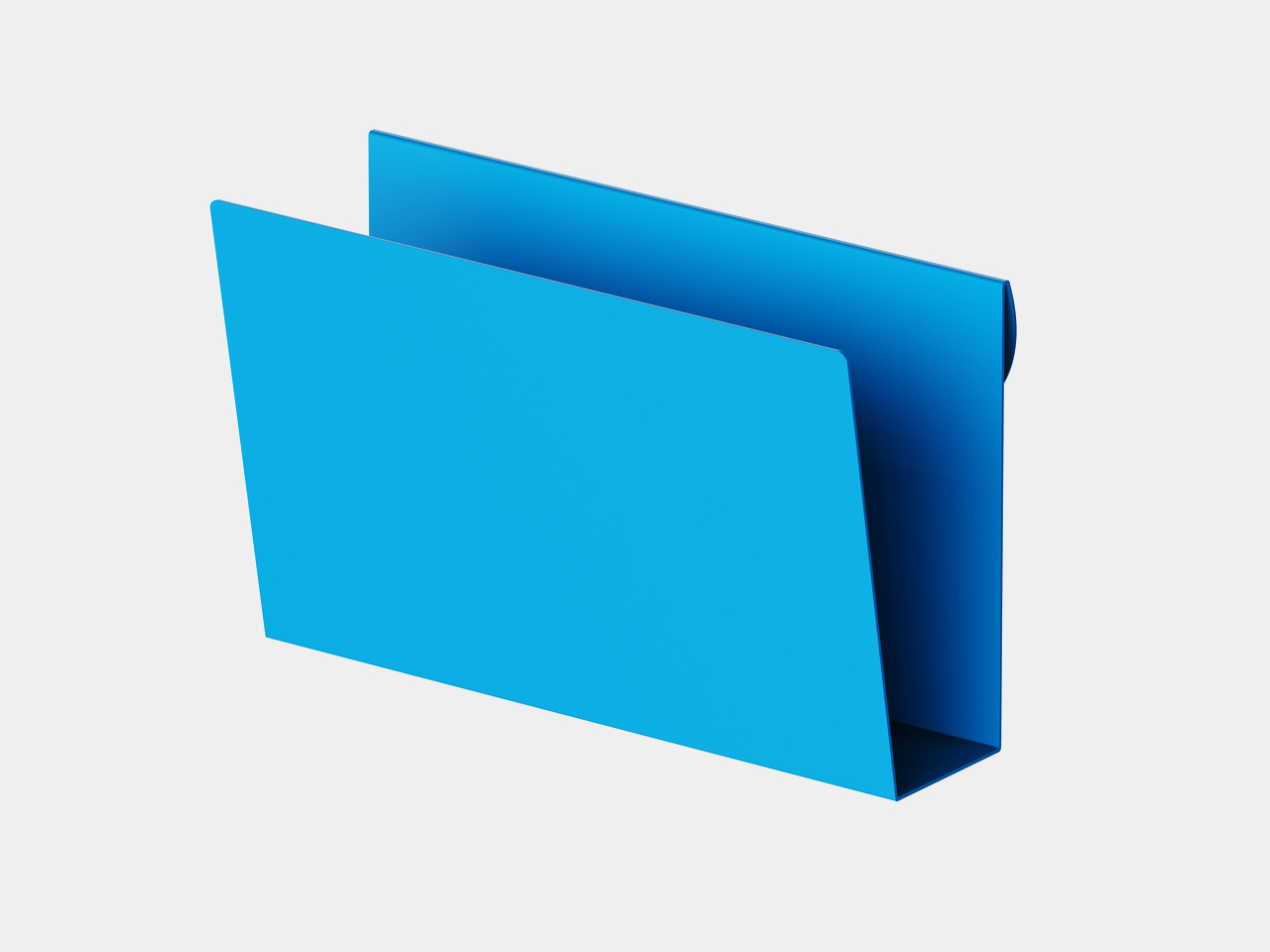
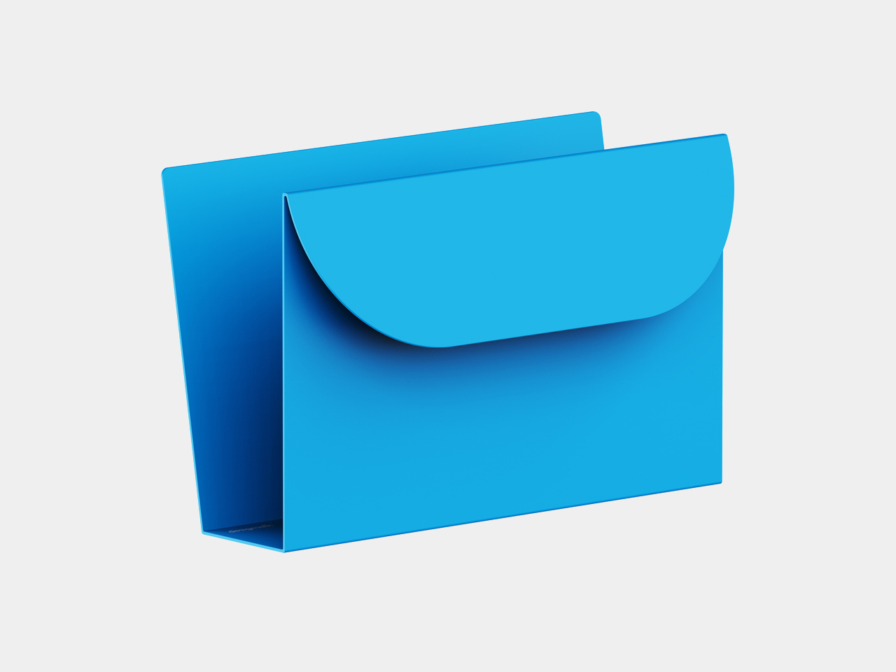
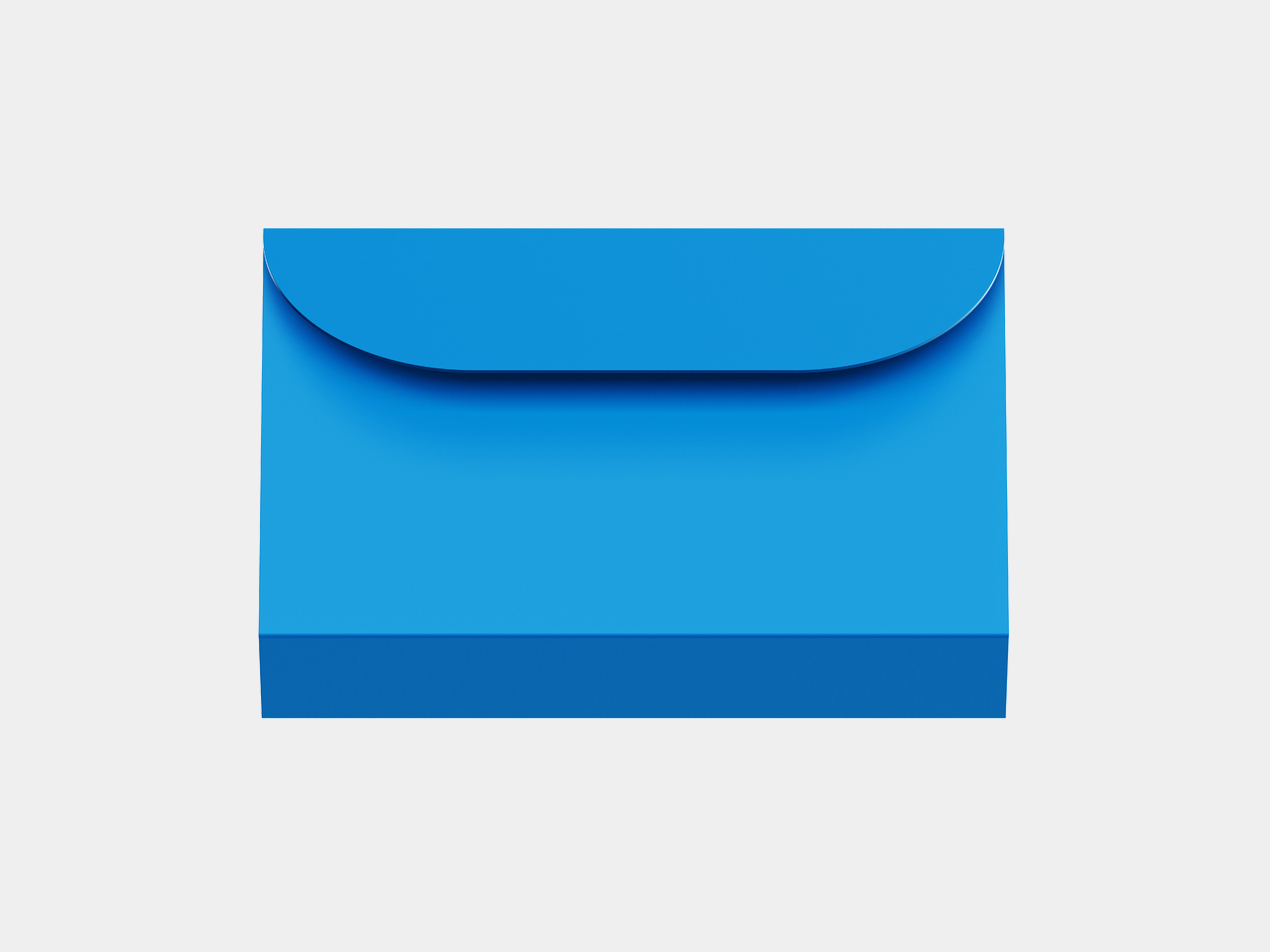
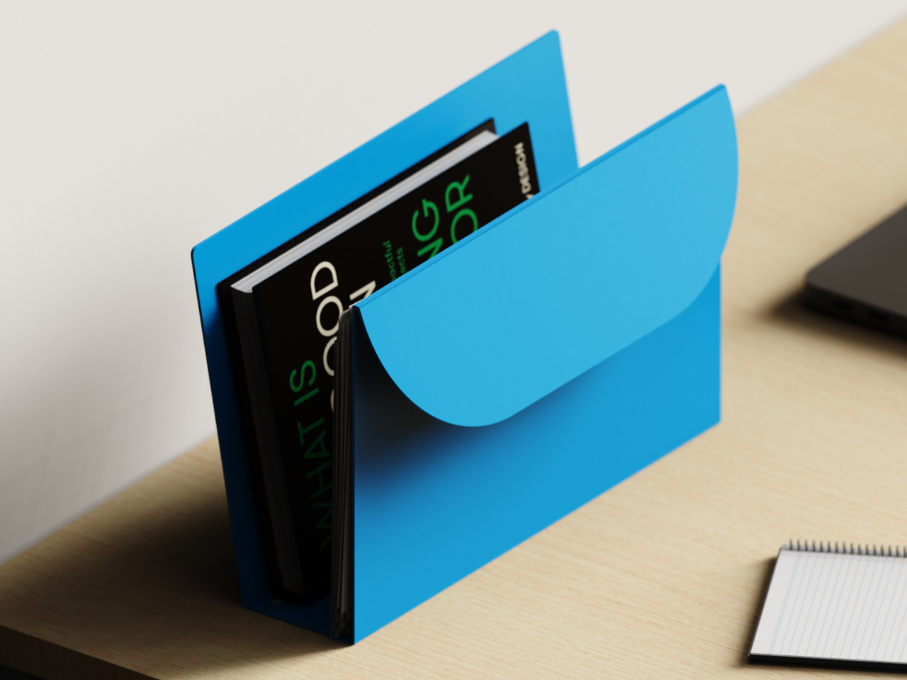
Tab is a desk organizer that rethinks the file through form, material, and use. It is made from a single folded sheet of metal, forming a self-standing sleeve that holds papers, books, sketches, and everyday tools in one continuous, open structure. Instead of zips, lids, or clasps, it borrows the logic of a folder but leaves everything accessible from the top and side, removing the need for hiding or closing.
Sitting down to work with a few active projects, the current book, notebook, and reference prints slide into Tab, standing upright instead of spreading across the surface. When you switch tasks, you reach into the same place, pull out what you need, and drop it back when you are done. The organizer becomes a physical “now” stack that keeps the desk clear without burying anything in a drawer you will forget to check.
The open, continuous form changes behavior in small ways. Because there is no lid to open or box to slide out, grabbing a sketch or document feels as low-friction as picking something up off the table, which means you are more likely to put it back when you are done. The metal walls keep everything aligned and upright, so even a handful of items feels ordered rather than precarious.
The choice of a single folded metal sheet keeps the object visually quiet and structurally clear. There are no visible joints or added parts, just a few decisive bends that create the base, back, and front. The minimal geometry and solid color let it sit quietly on a desk, acting as a calm backdrop for whatever you place inside, rather than adding another fussy object to the mix.
Tab is not meant to swallow an entire archive. Its narrow footprint and single compartment work best when you treat it as a home for active work, not everything you own. Overfilling it would defeat the point, and people who need strict separation between projects might want more than one. But that constraint is also what keeps it from turning into another overstuffed in-tray that never gets emptied.
Tab turns a familiar storage object into a purposeful everyday design. By keeping active work visible and immediately accessible, it nudges you toward a simple rhythm of organizing, selecting, and returning without much thought. A single folded sheet of metal, shaped with the right intent, can do more for focus and clarity than a whole stack of labeled folders ever did, especially when those folders are closed and stacked somewhere you stopped looking six weeks ago.
Phones became both lifelines and germ magnets during the pandemic: the one thing you touched constantly but probably never cleaned properly. People started wiping screens with alcohol wipes or shirt sleeves, while juggling separate UV boxes and wireless chargers that never felt portable. The idea of a cleaner phone battling the reality of one more device to pack rarely worked out in daily practice.
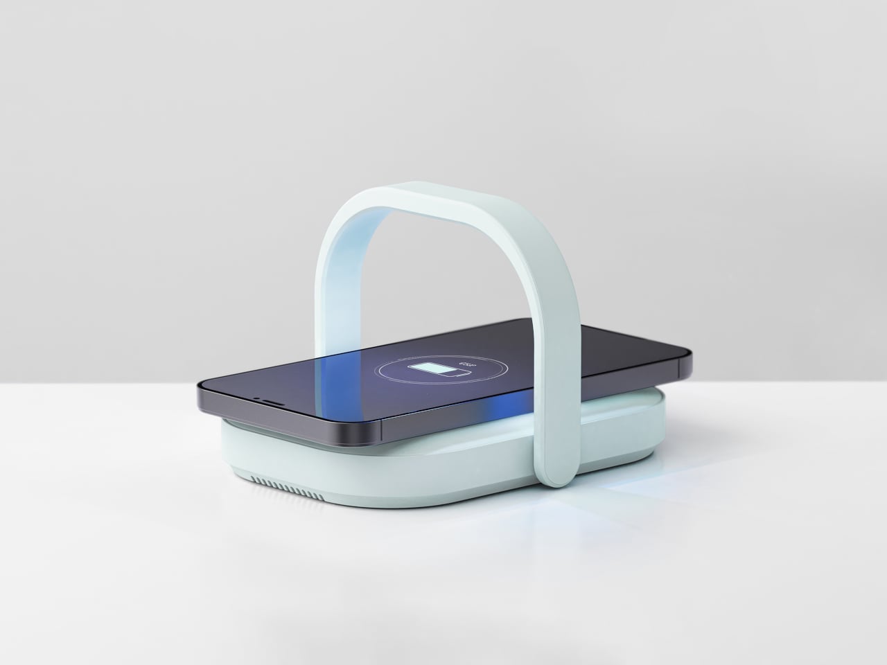
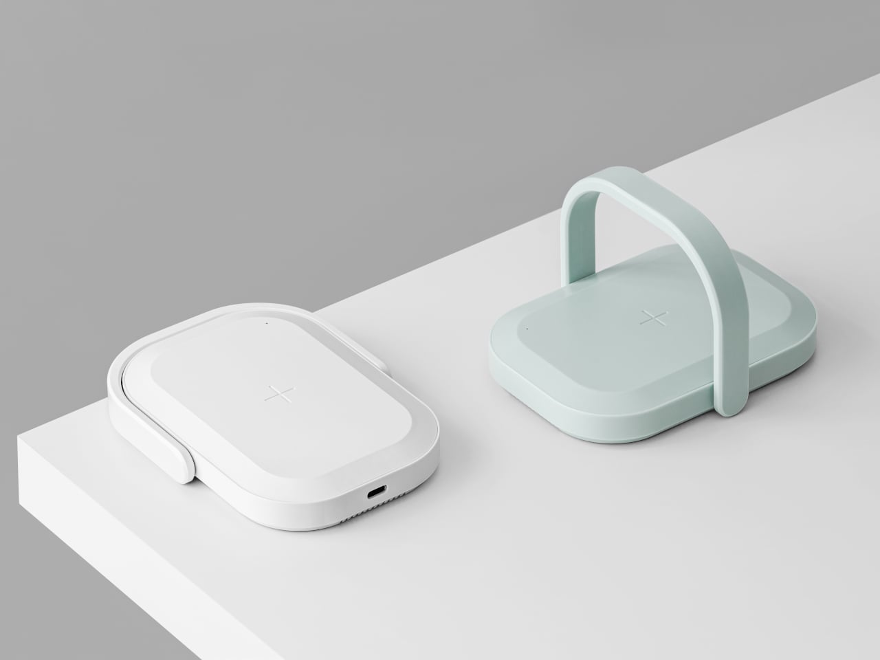
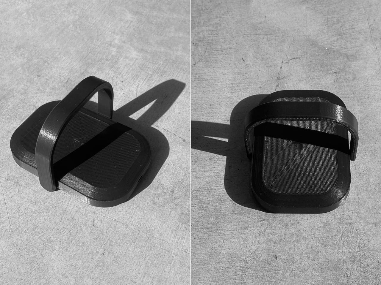
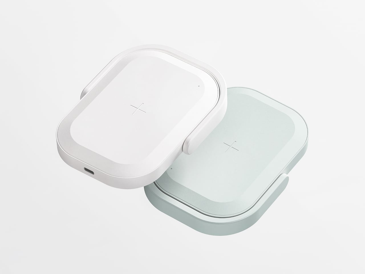
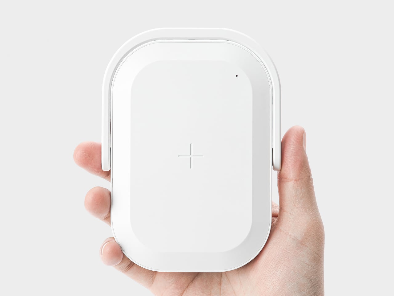
Picnic UV Charger merges those two needs, an extra battery and a cleaner phone, into one object. It is a wireless charger with a built-in UV sanitizer and a 10,000 mAh battery, shaped like a tiny picnic bag you can grab by the handle and drop into a tote or backpack. The compact body and soft colors keep it from looking like medical equipment parked on your desk.
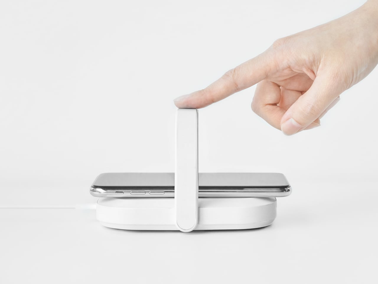
At a café with a questionably clean table, your battery is low, and you drop your phone onto the Picnic UV Charger instead of directly on the surface. You flip up the handle, which arches over the phone, and in about five minutes, the UV light has done its 99.9 percent sterilization pass while wireless charging quietly tops up the battery. Both tasks happen in a single gesture instead of requiring two separate gadgets.
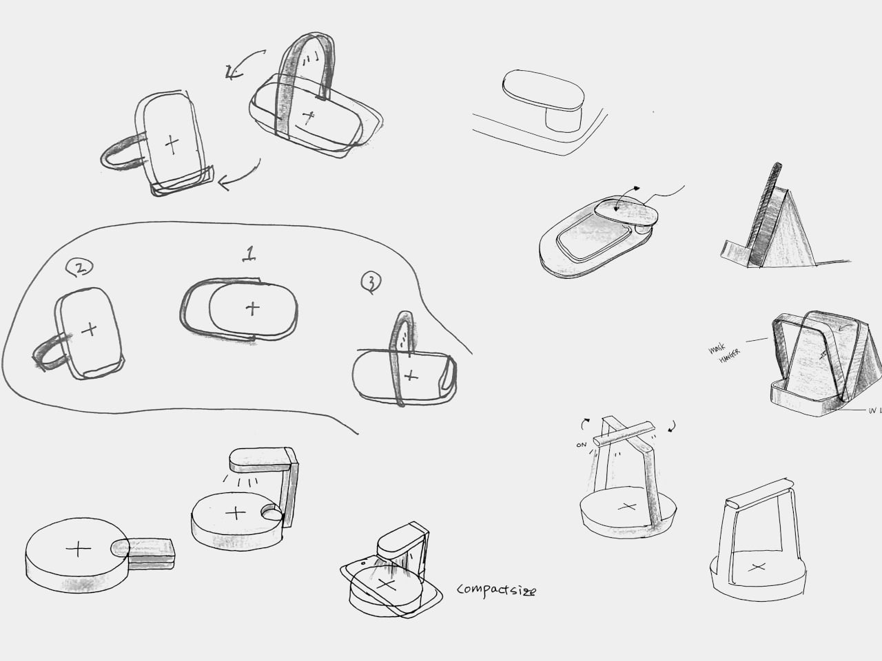
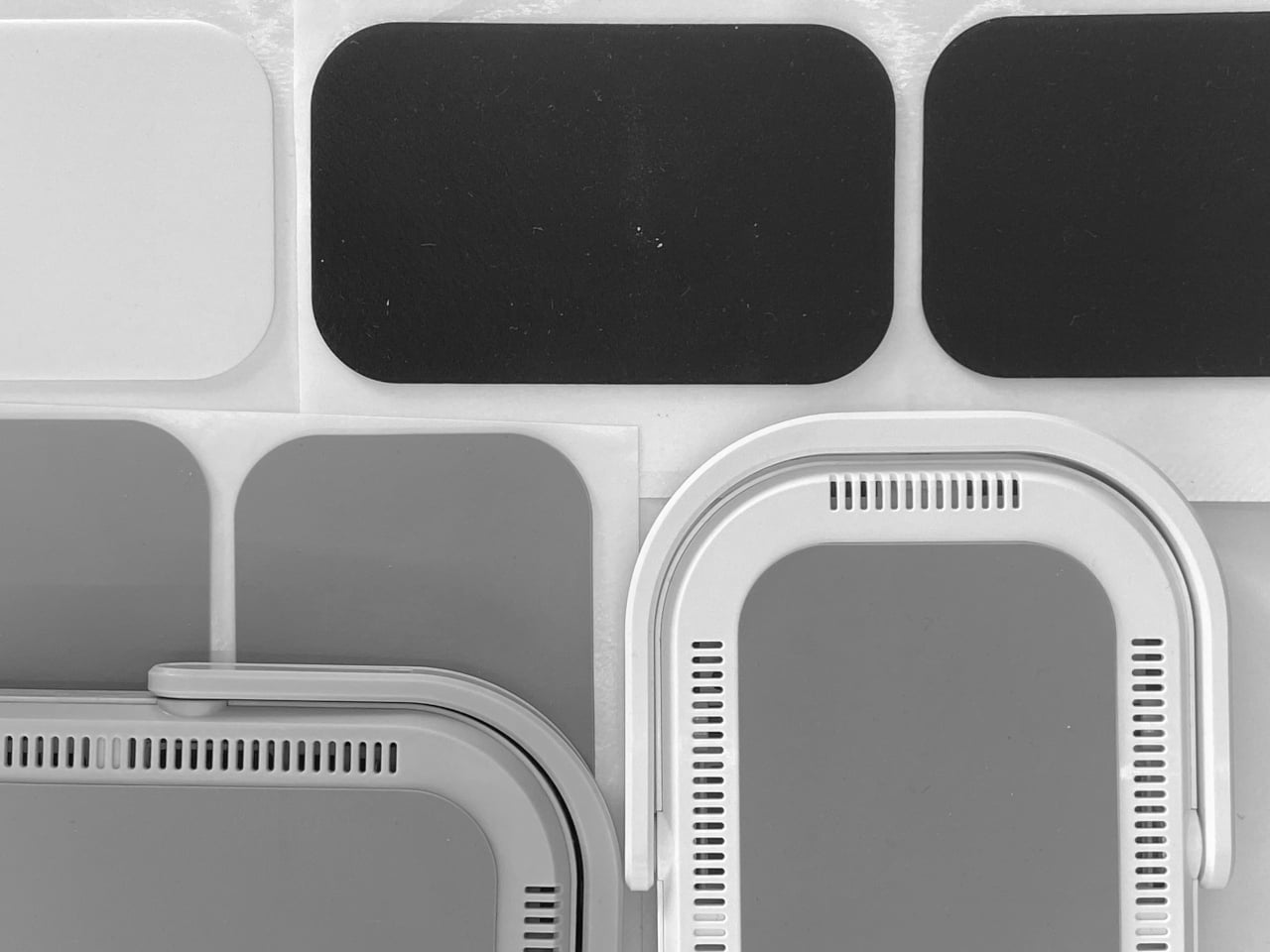
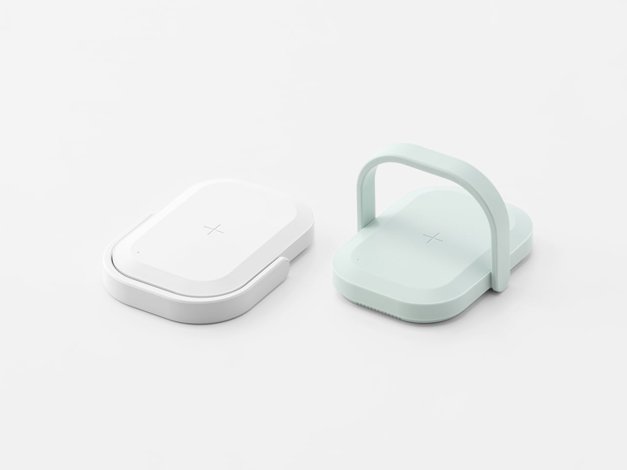
The handle does double duty: acting as a grip and carrying the UV LEDs. Its outline follows the shape of the body, so when folded down, it disappears into the silhouette, keeping everything compact and flat enough to slip into a bag. The form was prototyped with foam and paper to check scale, then refined with 3D printing to make sure the handle felt natural to raise and lower without snagging.
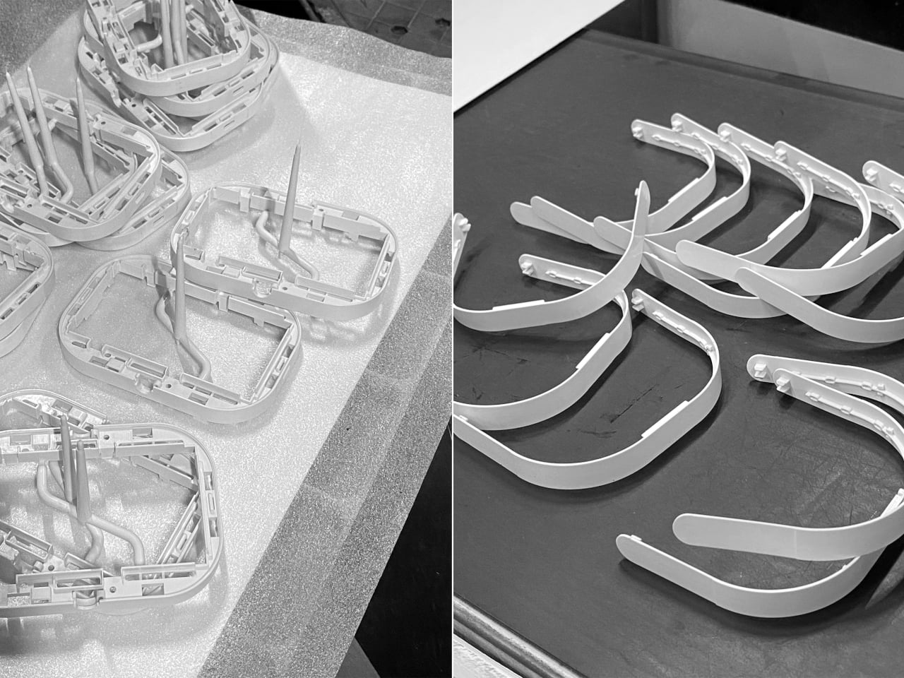
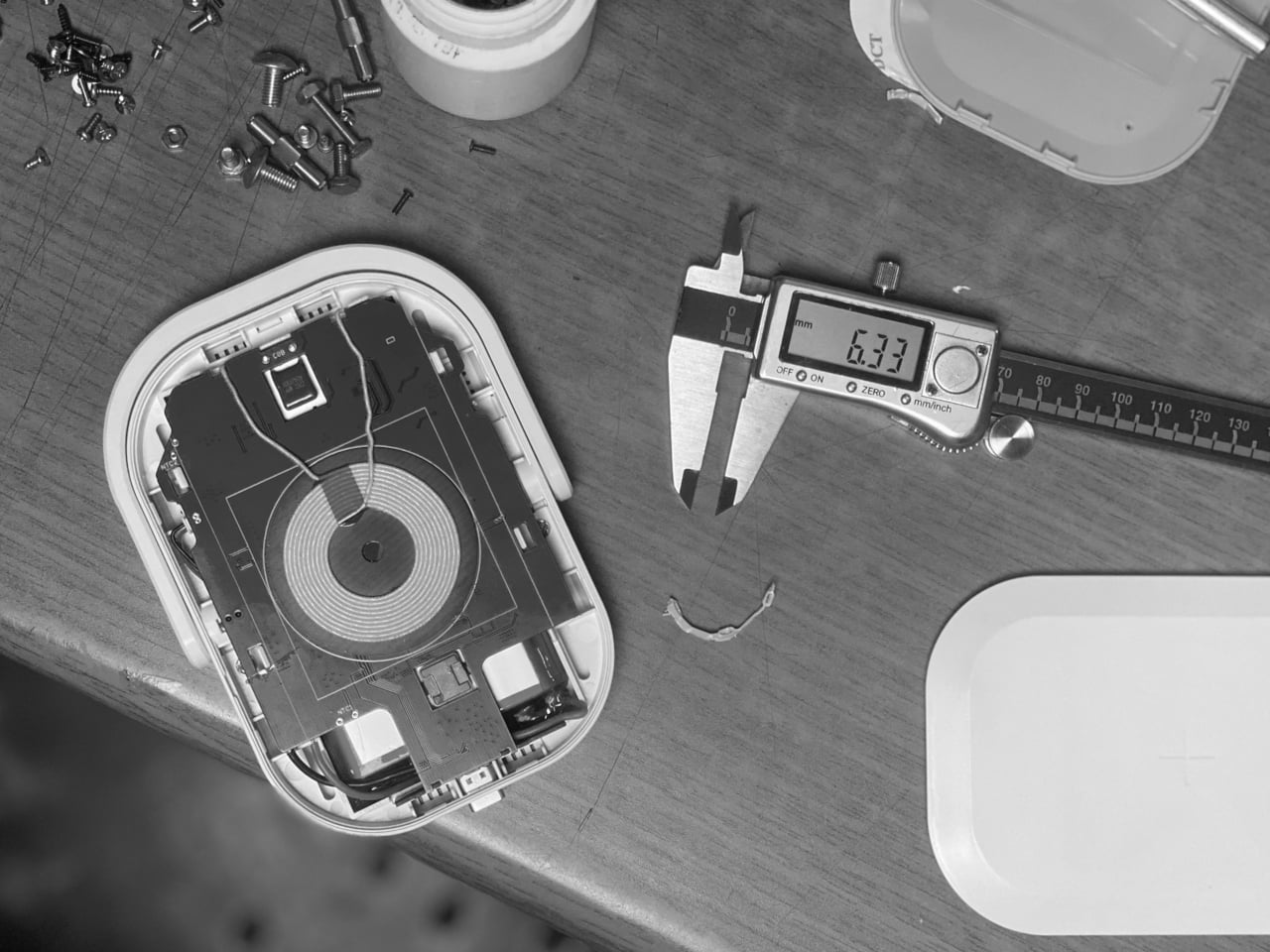
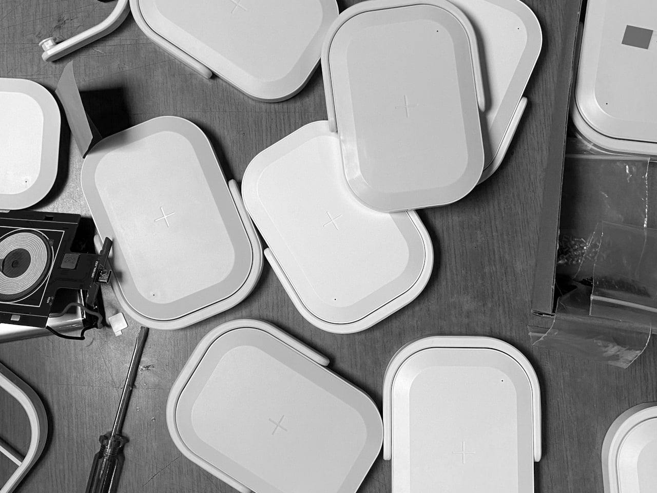
Working mock-ups were used to check battery heat and operation, which is important when combining a 10,000 mAh pack, wireless charging, and UV light in a small enclosure. The team iterated the molds several times to improve assembly and minimize breakage risk, suggesting attention to hinges, snaps, and internal ribs. It is the kind of work that makes a product feel trustworthy rather than fragile after a few uses.
The soft white and mint color options, rounded corners, and lunchbox-like proportions keep it from looking clinical. Even as Covid-era anxiety fades, a portable wireless charger that also sanitizes your phone still makes sense in crowded cities, shared offices, and travel. It turns a slightly uncomfortable task into something folded into a familiar ritual: place phone on charger, flip handle, walk away.
Picnic UV Charger treats hygiene as an add-on to something you already do, charging, instead of a separate chore. The handle, the compact body, and the dual function make it feel like a small, friendly object rather than a reminder of worst-case scenarios. A wireless power bank that also quietly cleans the screen you have been tapping all day turns out to be useful, especially when it fits into your bag without looking like you are carrying a sterilization station.
Decluttering your home doesn’t mean emptying it. The real transformation happens when you replace bulky, single-purpose objects with designs that work harder, look better, and take up less mental space. Minimalist home decor swaps prioritize intention over accumulation, choosing pieces that blend function with form so seamlessly they feel like they’ve always belonged there. Each item earns its place not through compromise but through clarity.
These seven swaps prove that less isn’t about deprivation. It’s about choosing objects that serve multiple roles, disappear when not in use, or turn everyday rituals into moments worth noticing. From shoehorns that vanish into the background to mirrors that double as vases, each design replaces clutter with calm. Your space becomes easier to navigate, simpler to maintain, and infinitely more intentional in how it supports your daily life.
1. Invisible Shoehorn
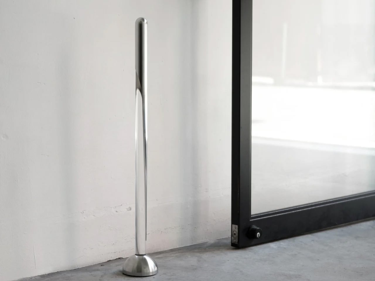
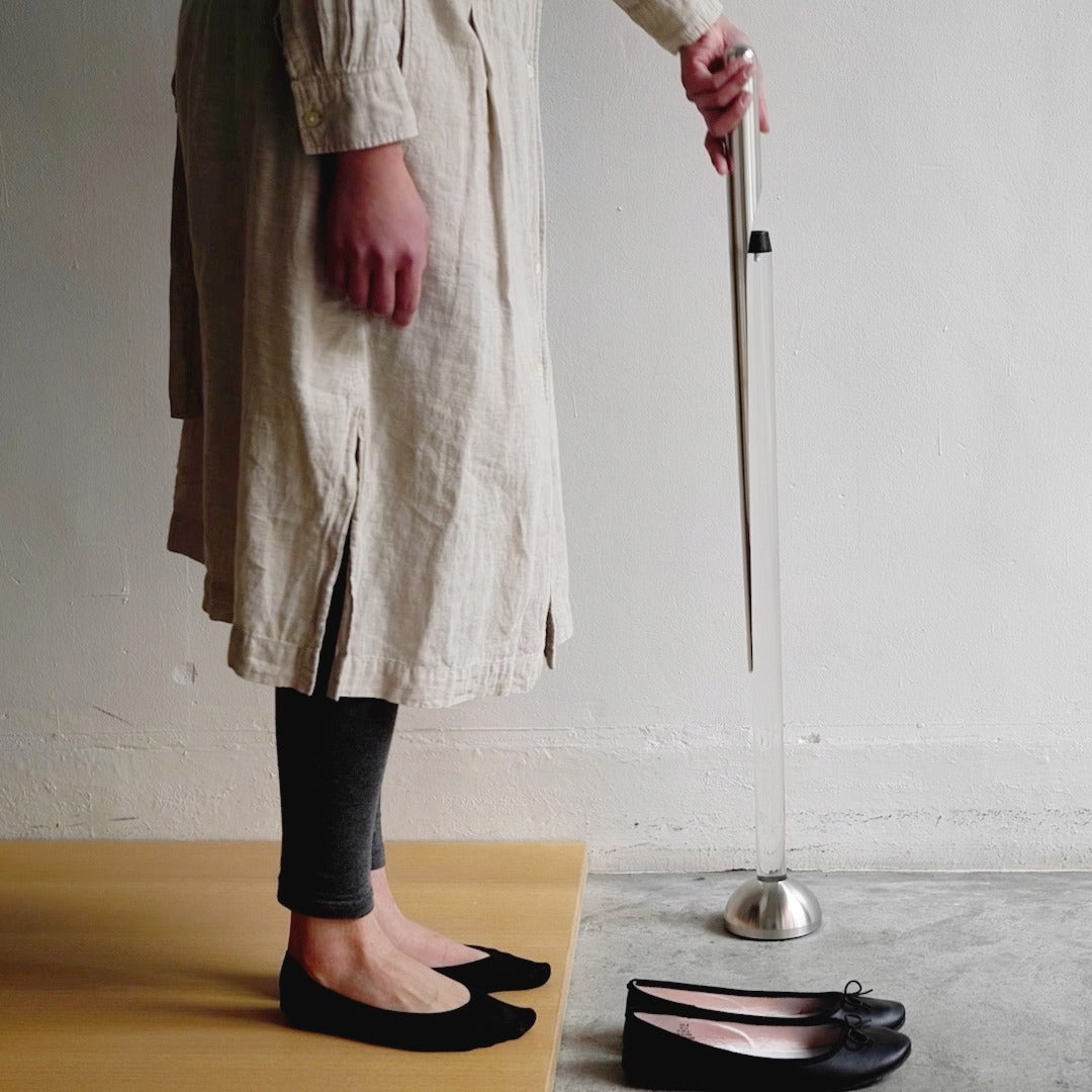
Most shoehorns live in that awkward space between useful and ugly. They lean against walls, slide under furniture, or get tossed into closets where you can never find them when your hands are full. This shoehorn takes a different approach entirely. Its long stainless steel body handles the practical work of protecting your footwear and your lower back, while its transparent stand makes the whole thing look like a sculptural accent rather than a utilitarian tool.
The magic happens when you step back and realize you’re not looking at a shoehorn at all. The clear stand holds the polished metal at just the right angle, creating visual interest without announcing its purpose to everyone who walks past your entryway. It replaces the need for a separate decorative object while solving the chronic problem of where to put the shoehorn when you’re done with it. You get function and form occupying the same footprint.
The transparent design hides the shoehorn in plain sight, eliminating visual clutter.
The extended length means you can put on shoes without bending or straining your back.
The polished surface slides smoothly without catching on delicate socks or stockings.
What We Dislike
The transparent stand may require occasional cleaning to maintain its clarity.
Some might prefer a shorter version for travel or smaller spaces.
2. Key Holder Wakka
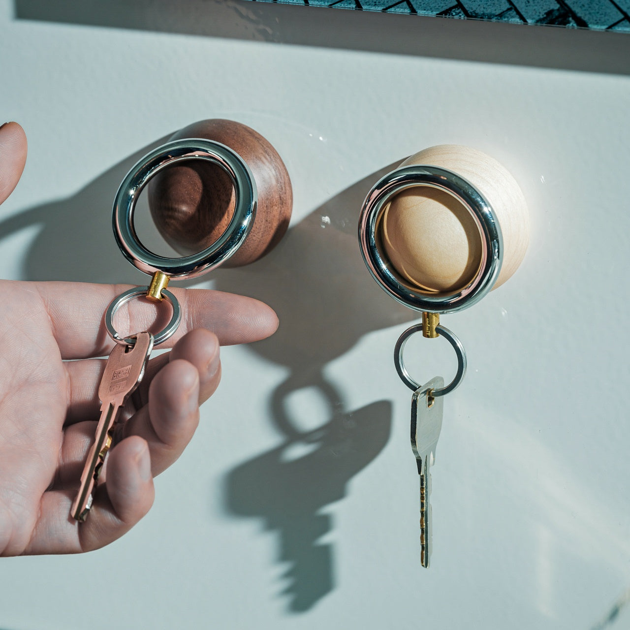
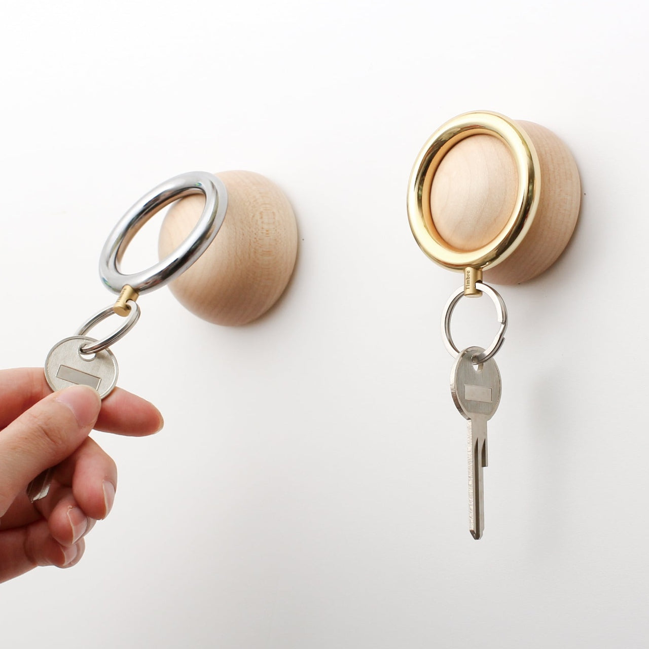
Keys create chaos in ways that seem disproportionate to their size. They end up on kitchen counters, buried in bags, or tossed onto random surfaces throughout your home. The Wakka Key Holder turns the simple act of putting your keys away into something you’ll actually want to do. The wooden base anchors the design with natural warmth, while the magnetic ring creates a satisfying connection that you can hear and feel.
That audible tap when metal meets magnet becomes a tiny ritual that marks your arrival home. The sound itself is calming, almost meditative, turning a forgettable action into a moment of intentional pause. The key ring works independently when you need it, and the wooden base stands alone as a sculptural element even when the keys are gone. This swap replaces messy key bowls or hooks that accumulate clutter with a singular object that does one thing exceptionally well.
The powerful neodymium magnet keeps keys secure without fumbling.
The brisk tapping sound creates a satisfying sensory experience.
Available in Silver/Maple and Silver/Walnut to match different interior styles.
What We Dislike
The magnetic system is only compatible with the included keyring design.
The wooden base requires a dedicated surface spot rather than wall mounting.
3. Penguin x MOEBE Book Stand
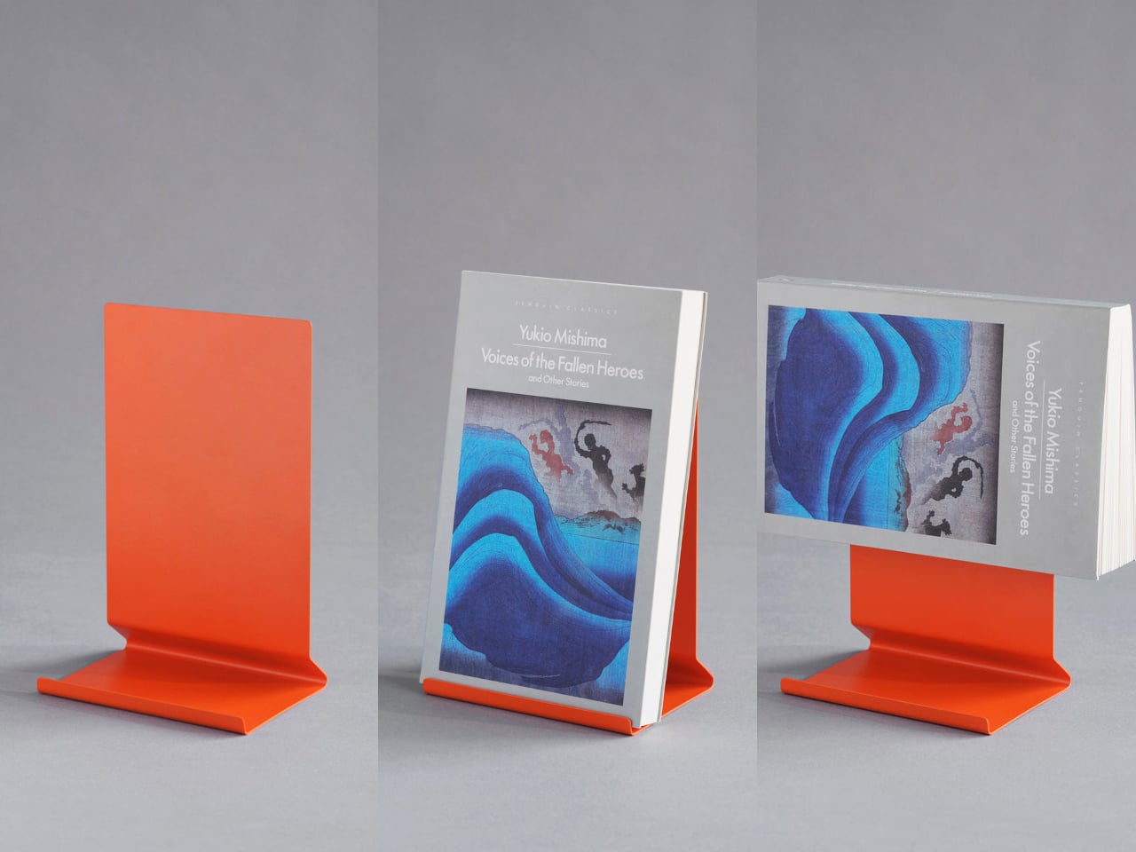
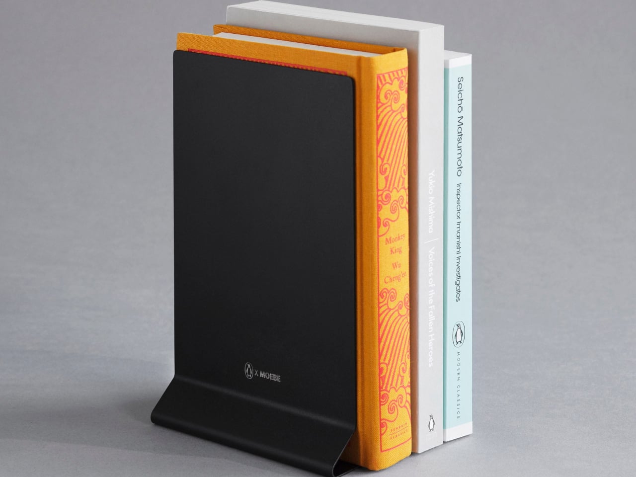
Books pile up in ways that make spaces feel chaotic even when everything else is tidy. Stacks lean precariously on nightstands, current reads disappear into shelves, and bookmarks slip out when you’re trying to remember your place. This bent steel stand treats books as objects worth displaying rather than just storing. It holds volumes open for reading, props single books upright for visibility, or works in pairs as bookends, depending on your needs.
The single-sheet construction means no visible fasteners or complicated assembly to wrestle with. The matte finish in stainless steel, cream, black, or Penguin orange stays visually quiet while the angled base supports different book thicknesses without wobbling or tipping. It replaces bulky bookends, flimsy wire stands, and the habit of leaving books face-down to hold your place. Your reading material gets a dedicated home that makes returning to the page feel natural.
What We Like
The versatile design works as a reading stand, display prop, or bookend.
The seamless bent steel construction creates clean lines without hardware.
Multiple color options coordinate with different interior aesthetics.
What We Dislike
The minimal footprint works best with standard book sizes.
Pairs are needed for full bookend functionality.
4. Miniature Bonfire Wood Diffuser Set
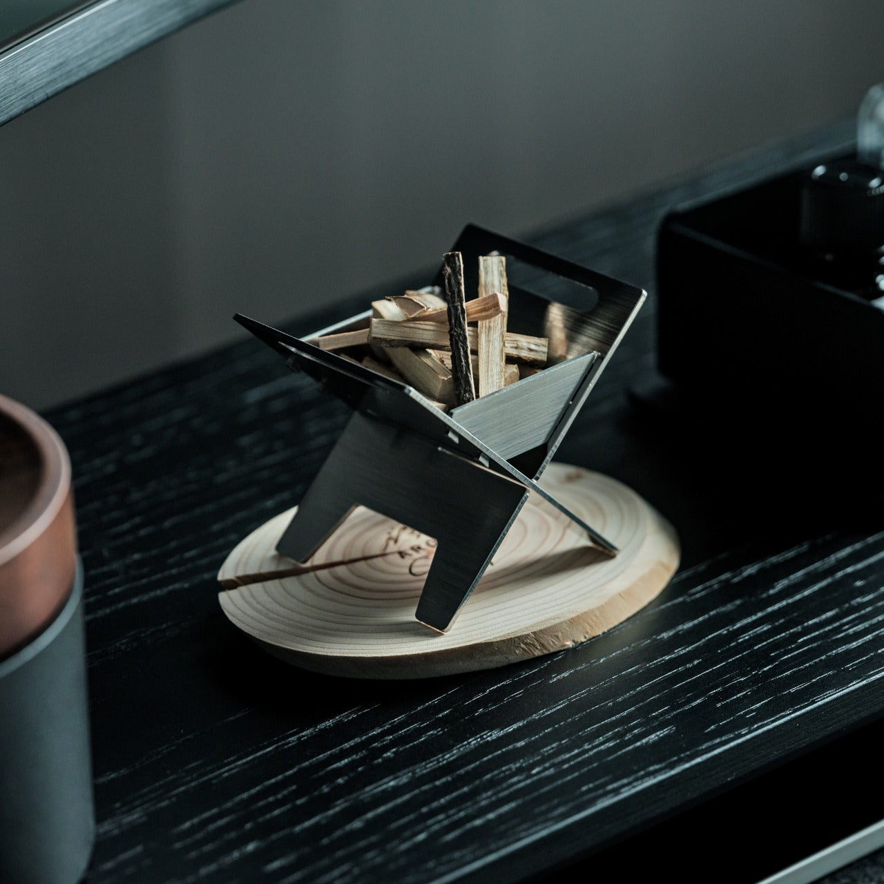
Traditional diffusers either look clinical or try too hard to blend in, taking up counter space without contributing much to the room’s atmosphere. This miniature bonfire flips that equation completely. The stainless steel construction creates a tiny sculptural fire pit that doubles as an essential oil diffuser, with miniature firewood pieces that spread fragrance as gently as an actual forest breeze. The camping aesthetic brings outdoor calm indoors without requiring commitment to literal nature decor.
The real versatility shows up when you realize the trivets transform the whole setup into a functional pocket stove. You can use it to warm small amounts of food or create an authentic camping experience right at your table. This single object replaces conventional diffusers, decorative candles, and even emergency heating elements. The rust-resistant material means it lasts, and the bundled firewood pieces with their tiny tying knots add handmade charm that mass-produced diffusers can’t match.
The rust-resistant stainless steel ensures lasting durability.
The included trivets convert the diffuser into a functional pocket stove.
The Mt. Hakusan essential oil captures authentic forest fragrance.
What We Dislike
The compact size limits oil capacity for larger rooms.
The campfire aesthetic may not suit all interior styles.
5. Lotus Clock
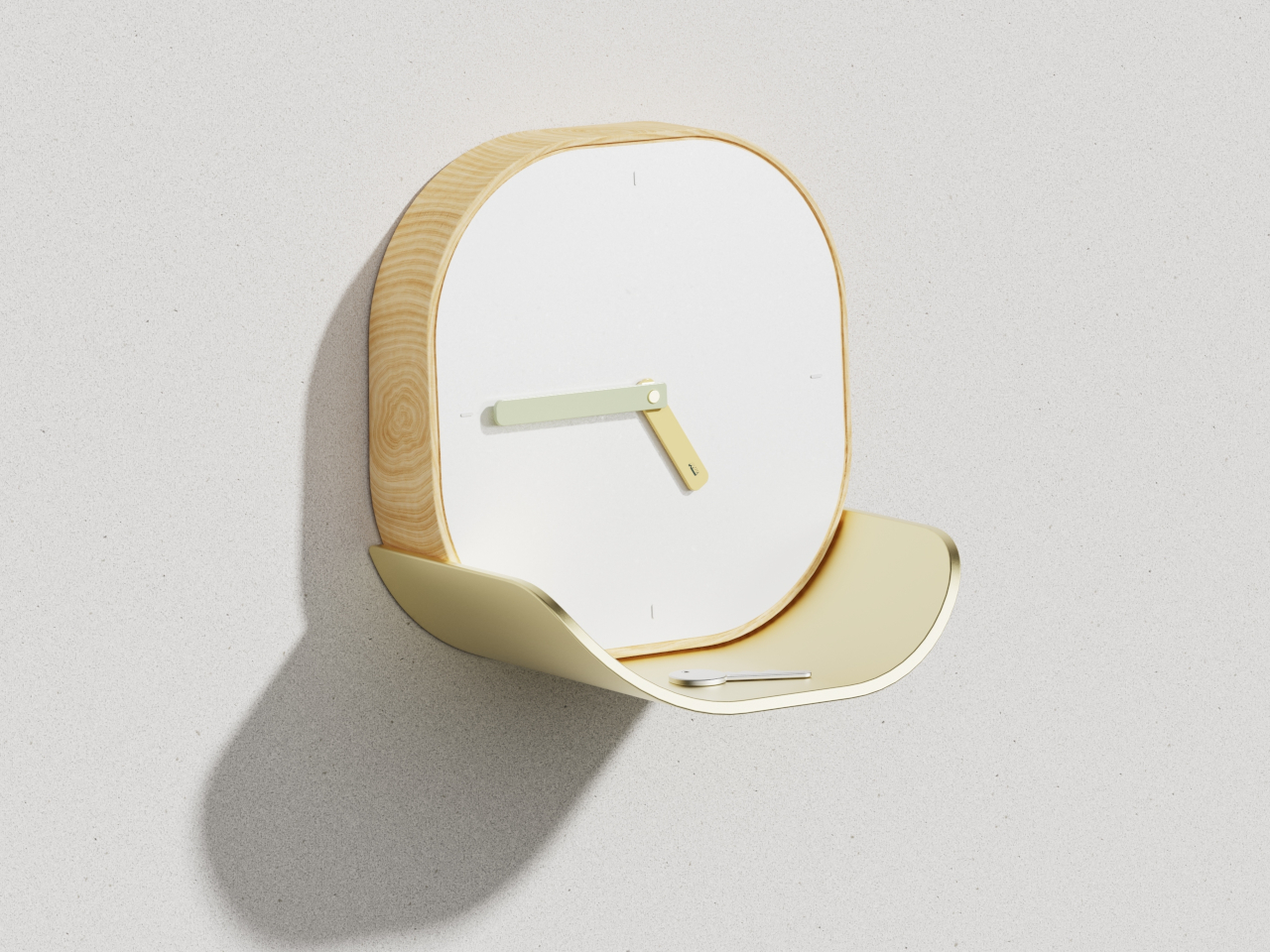
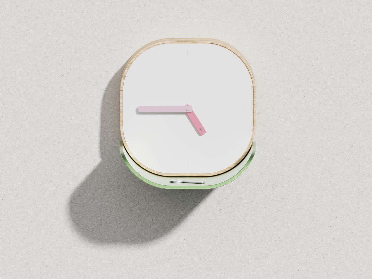
Wall clocks usually do one thing, and catchall dishes do another, which means you end up with both competing for wall and surface space. The Lotus Clock merges these functions into a single design that draws inspiration from nature’s problem-solving. The curved metal tray sits beneath the clock face like a lotus leaf collecting morning dew, creating a natural resting spot for keys, coins, and the small items that usually scatter across entryway tables.
The biomimetic approach makes the dual functionality feel intentional rather than forced. The wooden frame features soft rounded corners that read as approachable, while the clean white face keeps time-reading effortless even from across the room. The broad flat hands coordinate with the tray’s finish, whether you choose soft gold or gentle green, creating visual harmony between timekeeping and storage. This swap eliminates the need for separate wall clocks and entryway organizers, freeing up both vertical and horizontal real estate.
What We Like
The integrated tray provides dedicated storage for daily carry items.
The biomimetic design feels both poetic and practical.
Multiple colorway options allow personalization while maintaining minimalist aesthetics.
What We Dislike
The tray size limits what can be stored there comfortably.
Wall mounting is required, which may not work for renters.
6. ClearFrame CD Player
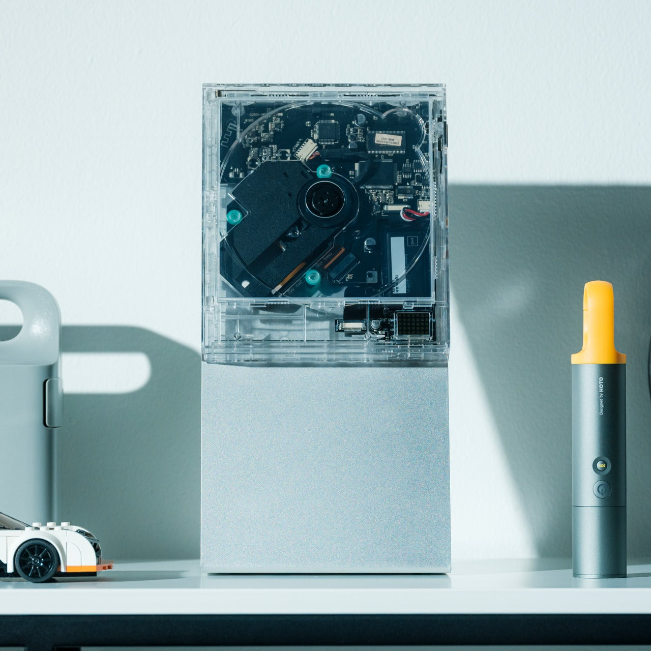
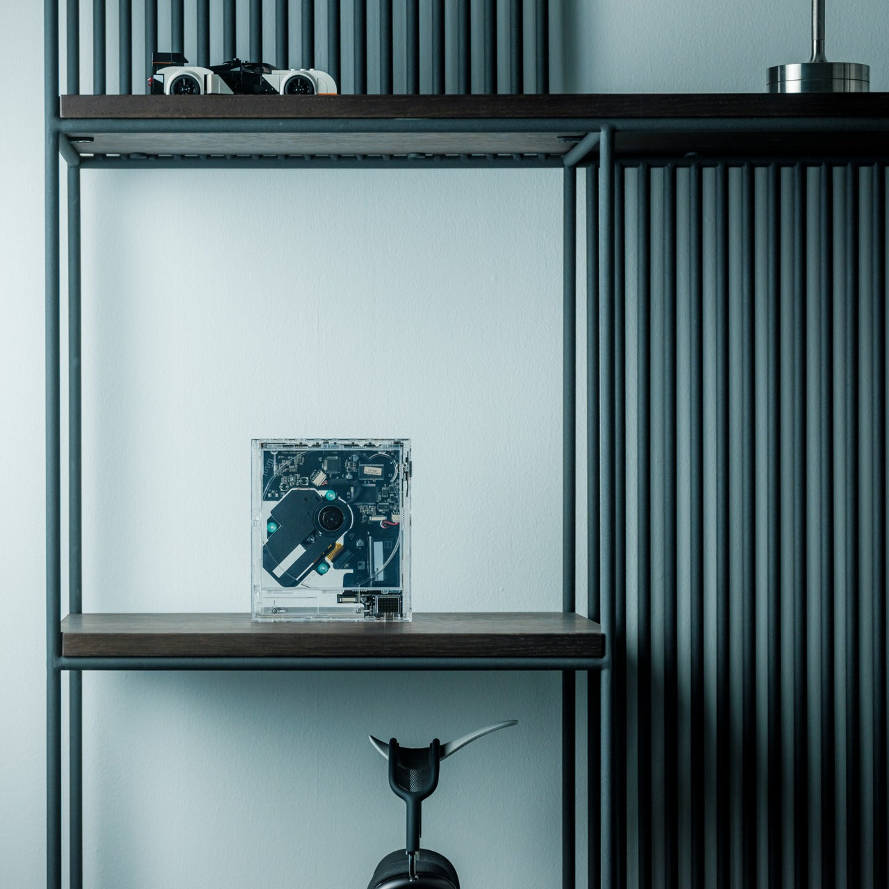
Physical media creates display challenges that streaming never will. CD collections sit in drawers or bulky towers that broadcast “clutter” even when organized. The ClearFrame CD Player reframes music as something worth exhibiting. The crystal-clear polycarbonate body turns the disc and album artwork into a miniature gallery, while the exposed black circuitry invites you to appreciate the engineering as part of the aesthetic rather than something to hide away.
The transparent design means the player becomes part of your decor, whether it’s playing or silent. Bluetooth connectivity, seven-hour battery life, and wall-mount capability give it flexibility that traditional players lack. It works on shelves, desks, or mounted as wall art, adapting to your space rather than demanding accommodation. This swap replaces both oversized stereo systems and hidden-away music players with something that celebrates physical media while taking up minimal space and maximum attention.
The transparent polycarbonate showcases both album art and internal engineering.
Bluetooth connectivity and a rechargeable battery offer placement flexibility.
Multiple mounting options adapt to different room configurations.
What We Dislike
The focus on CDs excludes vinyl collectors.
The transparent design shows dust and fingerprints more readily.
7. JewelVase Mirror Stand
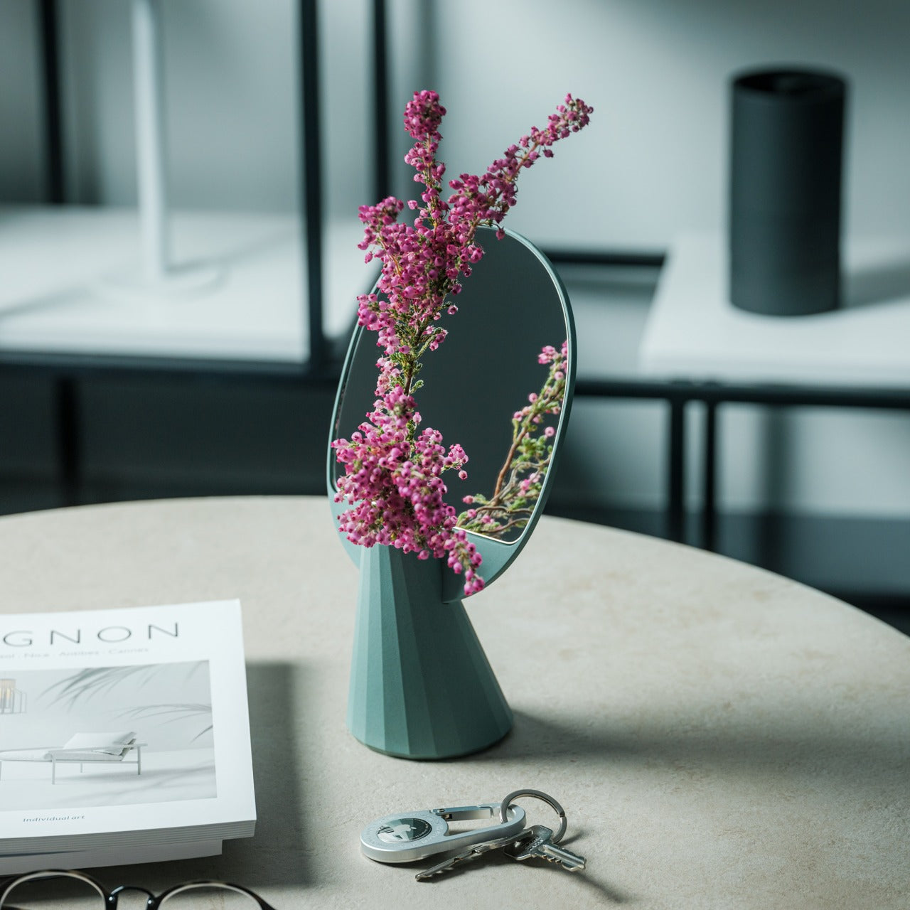
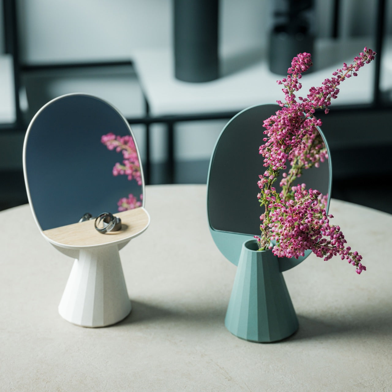
Mirrors, accessory storage, and vases typically occupy separate zones in your home, each claiming surface area and visual attention. The JewelVase collapses these categories into a single polyhedron form that functions as all three. The mirror reflects light and lets you check your appearance, the structure holds rings and bracelets, and the basin accepts water for fresh flowers. Each function enhances the others rather than competing for dominance.
The bioplastic construction contains rice husks, bringing material sustainability into the minimalist equation without sacrificing durability. The unique angled shape creates visual interest that earns its spot on any desk, table, or shelf, while the reflective surface doubles whatever beauty you place in front of it. Even pouring water becomes a small meditative ritual when the mirror shows you the flower from both sides simultaneously. This swap eliminates multiple accessories, consolidating them into one elegant object that does more with less.
The multipurpose design combines a mirror, an accessory stand, and a vase.
The bioplastic material incorporates sustainable rice husk content.
The polyhedron shape creates sculptural presence without bulk.
What We Dislike
The vase capacity suits single stems rather than large arrangements.
The angled mirror may not work for full-face viewing.
Making Space by Choosing Better
These seven swaps share a common philosophy. They refuse the false choice between function and beauty, instead insisting that thoughtful design delivers both simultaneously. Each piece earns its place by doing more than one thing well, by disappearing when appropriate, or by transforming mundane tasks into moments worth savoring. Your space becomes less about what you’ve removed and more about what you’ve chosen to keep.
Decluttering through minimalist swaps creates lasting change because you’re not fighting against your needs. You’re meeting them with objects designed to take up less room, require less maintenance, and contribute more to the atmosphere you’re trying to create. The result feels lighter, not because you’re doing without, but because everything present is pulling its weight. That’s where real minimalism lives, in the space between empty and intentional.
Your laptop gets thinner every year and your tablet ditches another port with each refresh. Meanwhile, the actual work you do requires more connectivity than ever. Photographers need fast SD card access during client reviews. Presenters need a clicker and a thumb drive while streaming to the big screen. Educators move between rooms with different projectors and zero time to fumble with settings. The gap between sleek hardware and messy reality keeps widening.
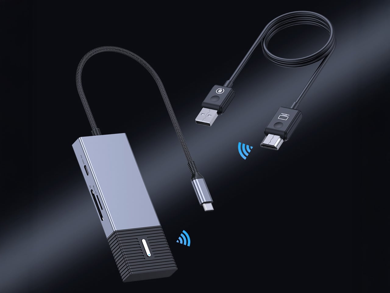
4URPC built the Gen 3 to close that gap entirely. The system pairs a plug-and-play wireless HDMI link with a genuinely useful hub, all in a single piece of kit. Plug the USB-C transmitter into your device and the HDMI receiver into any display. You get wireless 1080p 60Hz video in 0.02 seconds, plus immediate access to SD/TF cards, three high-speed USB ports, and 100W power delivery. No apps, no network dependency, no compromise. Just the screen and the tools you actually need, working together the way they should.
You can see the direct line from user feedback to this design. Their Gen 2 was a solid wireless 4K transmitter, but it was a single-purpose tool. People clearly pointed out that the moment they went wireless, their other ports were still occupied by hubs for storage, peripherals, and power. 4URPC took that to heart, building the new SP06 model around a complete workflow. They collapsed the entire dongle ecosystem into the transmitter itself, which is a far more practical solution for anyone working outside of a fixed desk setup.
The integrated hub is built with professional-grade specs. We are looking at two 10Gbps USB-A ports and a 10Gbps USB-C data port, which provides plenty of speed for fast external SSDs or multi-channel audio interfaces. The SD and TF card slots run at a respectable 5Gbps, fast enough for offloading photos and video without a huge bottleneck. Critically, the 100W USB-C power delivery input means you can run all of this connectivity and still keep a MacBook Pro or a powerful Windows laptop fully charged through a single connection.
All that local I/O becomes even more useful in a collaborative setting. A single HDMI receiver can pair with up to eight different transmitter hubs, completely changing the dynamic in a meeting room. Instead of passing a cable around or fighting with clunky software casting, each person can switch to become the active presenter with a button press. The 0.02-second switching time they claim makes the handoff nearly instant. This hardware-based approach sidesteps the need for everyone to be on the same Wi-Fi network or have specific apps installed, which is a constant headache in corporate or guest environments.
Packing a dual-band Wi-Fi module, a high-speed USB controller, and a PD circuit into one chassis generates serious heat, so the move to an aluminum alloy casing is a practical necessity. The metal body functions as a heat-sink, which should lead to more stable performance during long sessions where you are pushing 1080p video and transferring data simultaneously.
Super early backers can snag the complete system for $99, which includes the wireless transmitter/hub unit, the HDMI receiver, and the necessary cables. That is a 50% discount off the planned $198 retail price, limited to the first 500 backers. After that, early bird pricing sits at $109, and there are multi-pack options if you want to outfit an entire team or multiple rooms. The 4URPC G3 ships globally, starting April 2026.
Setting up a desk usually means the laptop and lamp go on top while the power strip disappears underneath, tangled with dust and forgotten cables. Electricity gets treated as something to manage and conceal, even though it quietly runs everything you do all day. Most power strips look industrial or aggressively technical, which is why they end up banished behind furniture, making plugging things in feel like reaching into a dark cave.
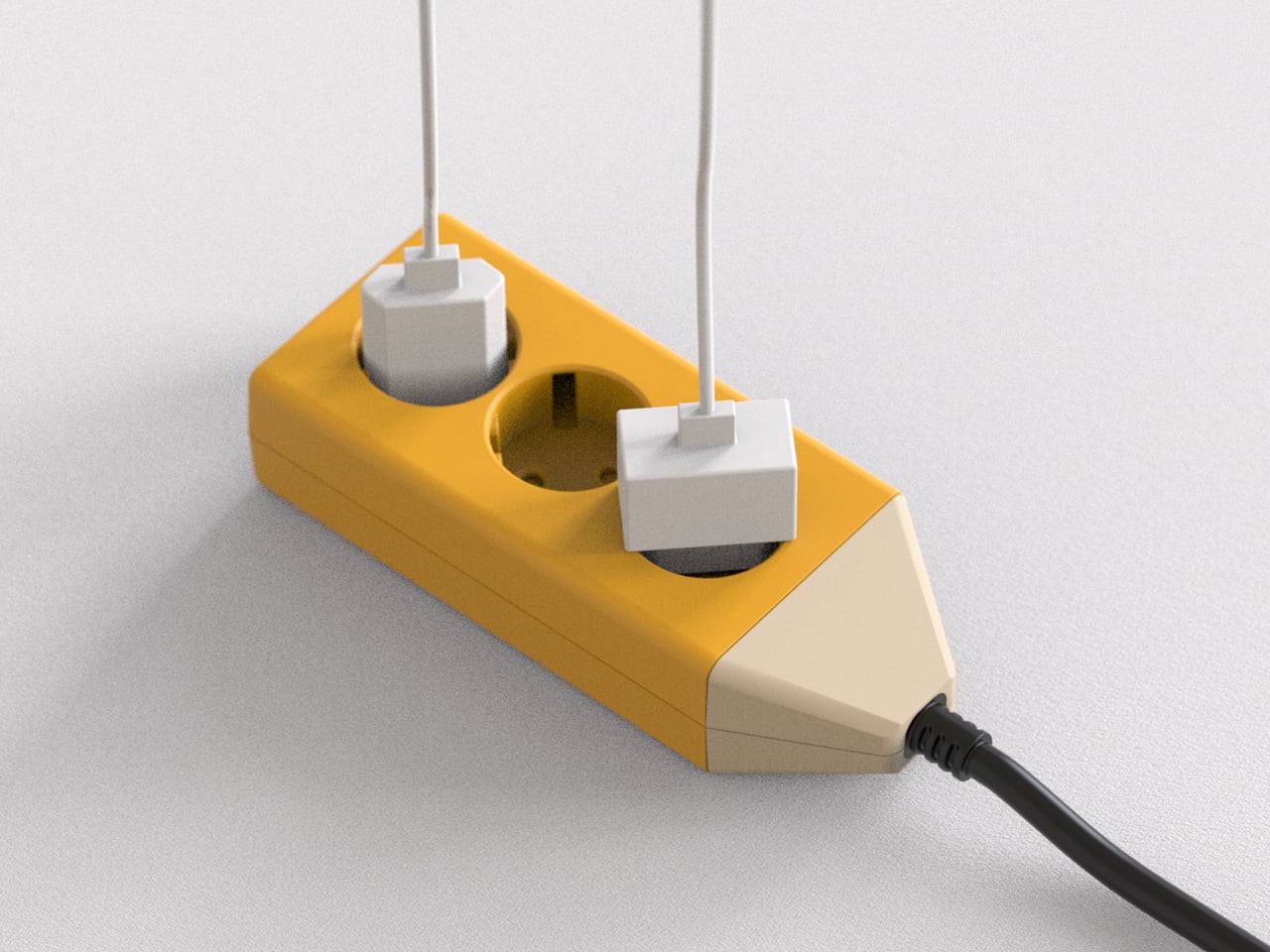
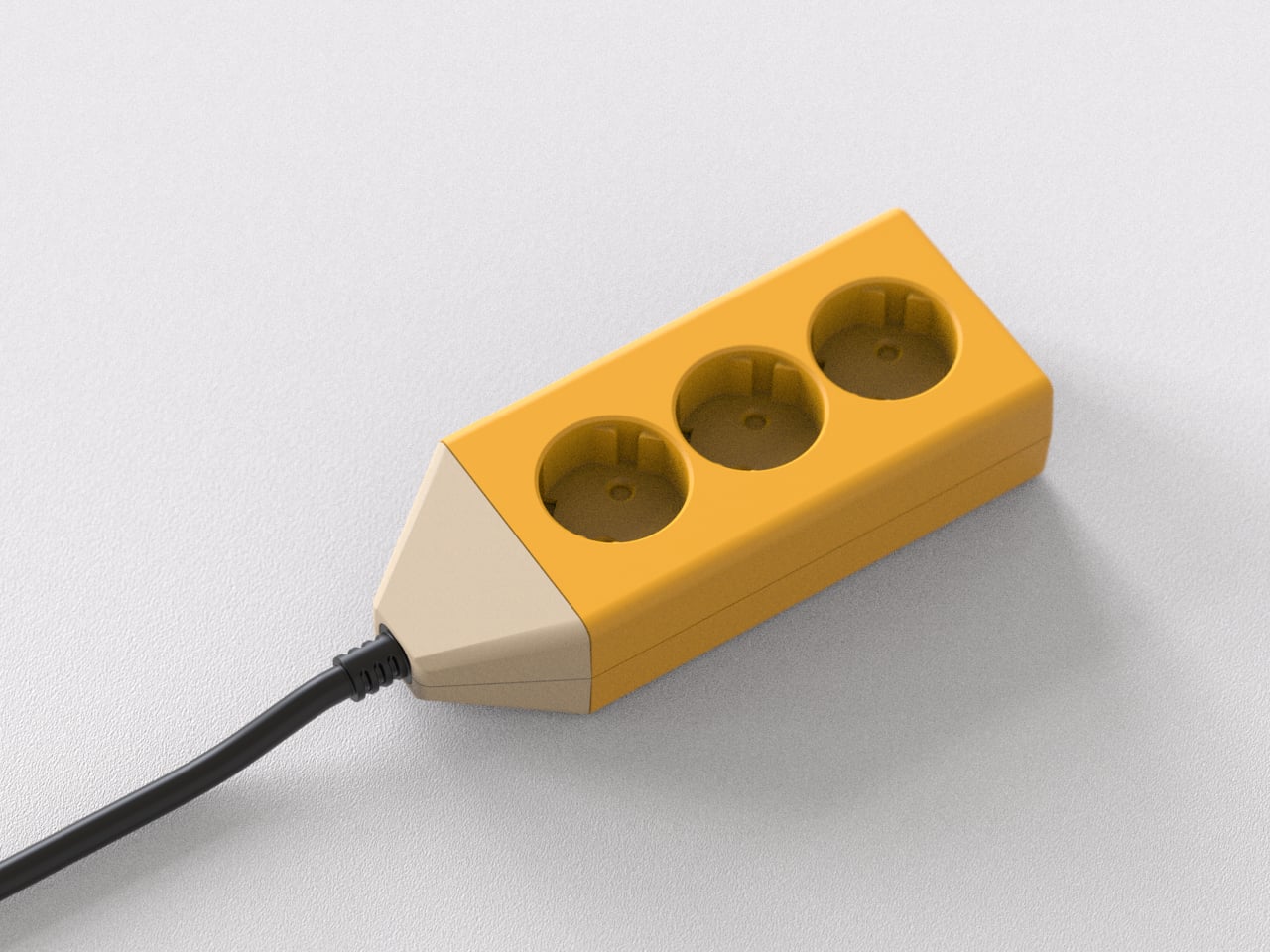
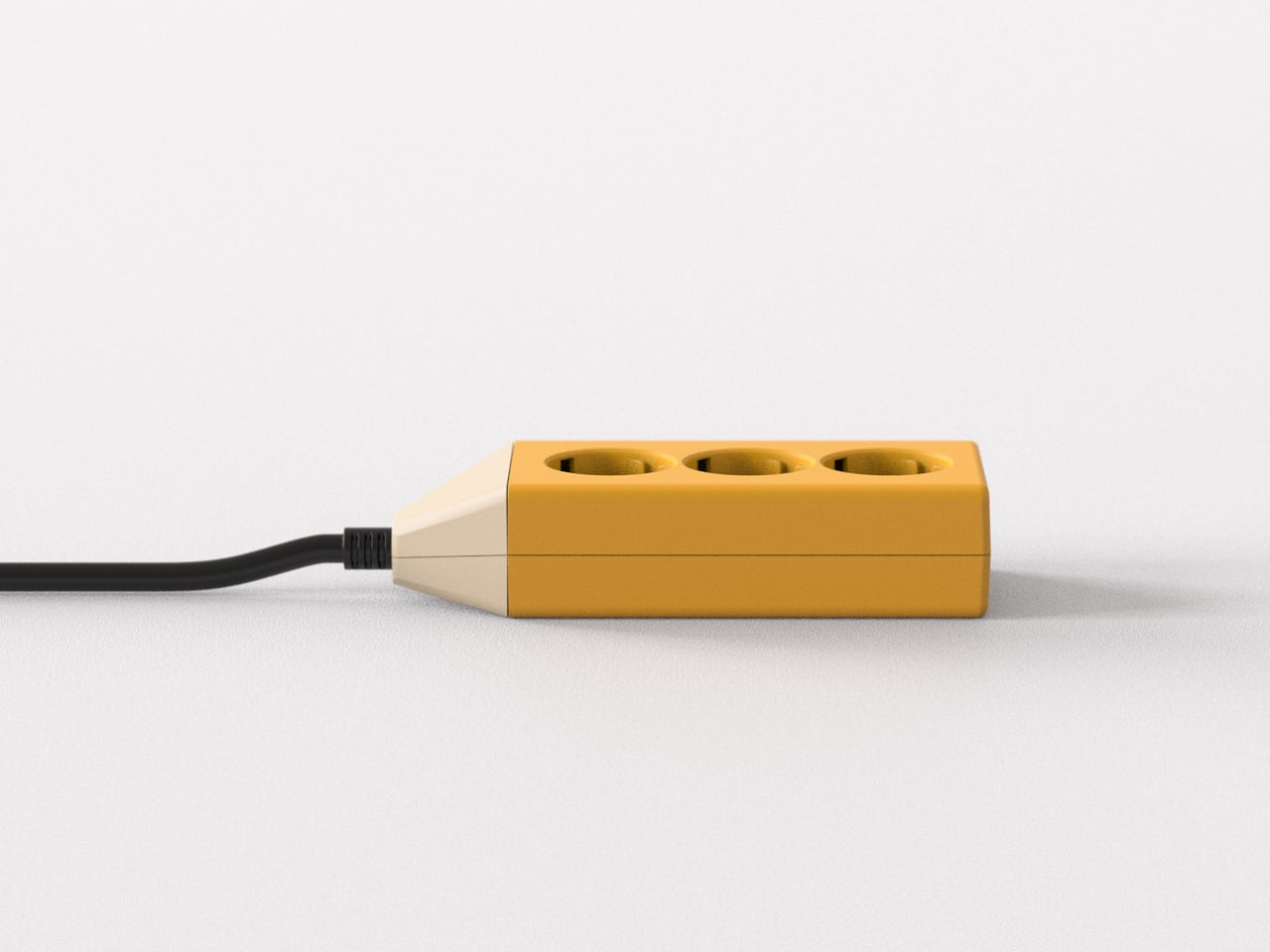
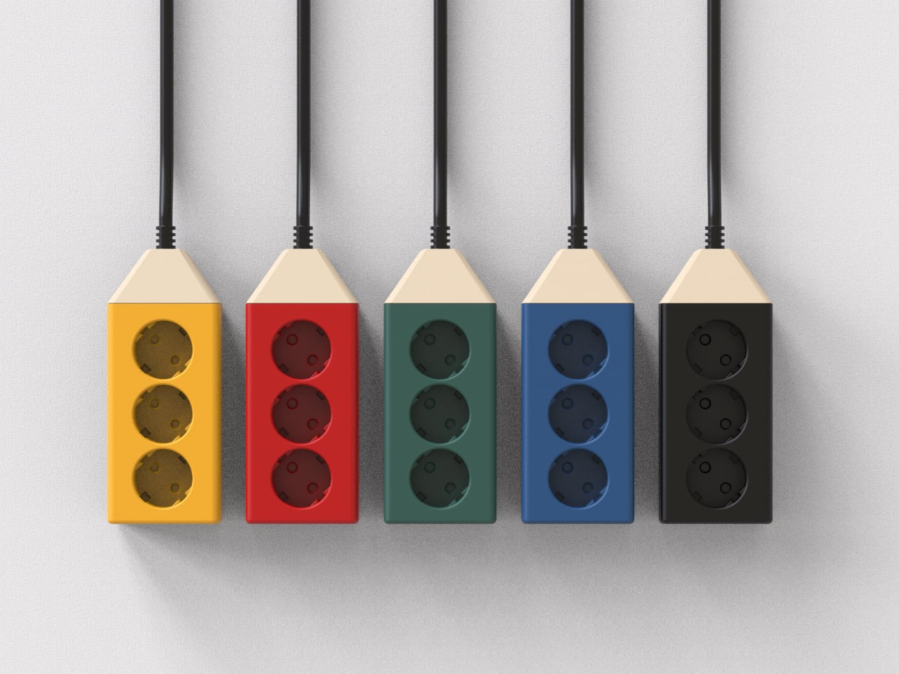
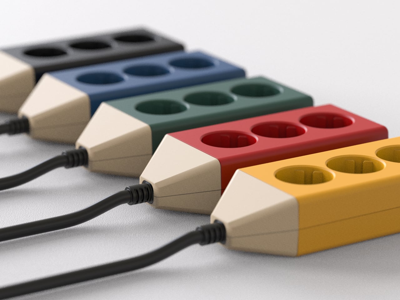
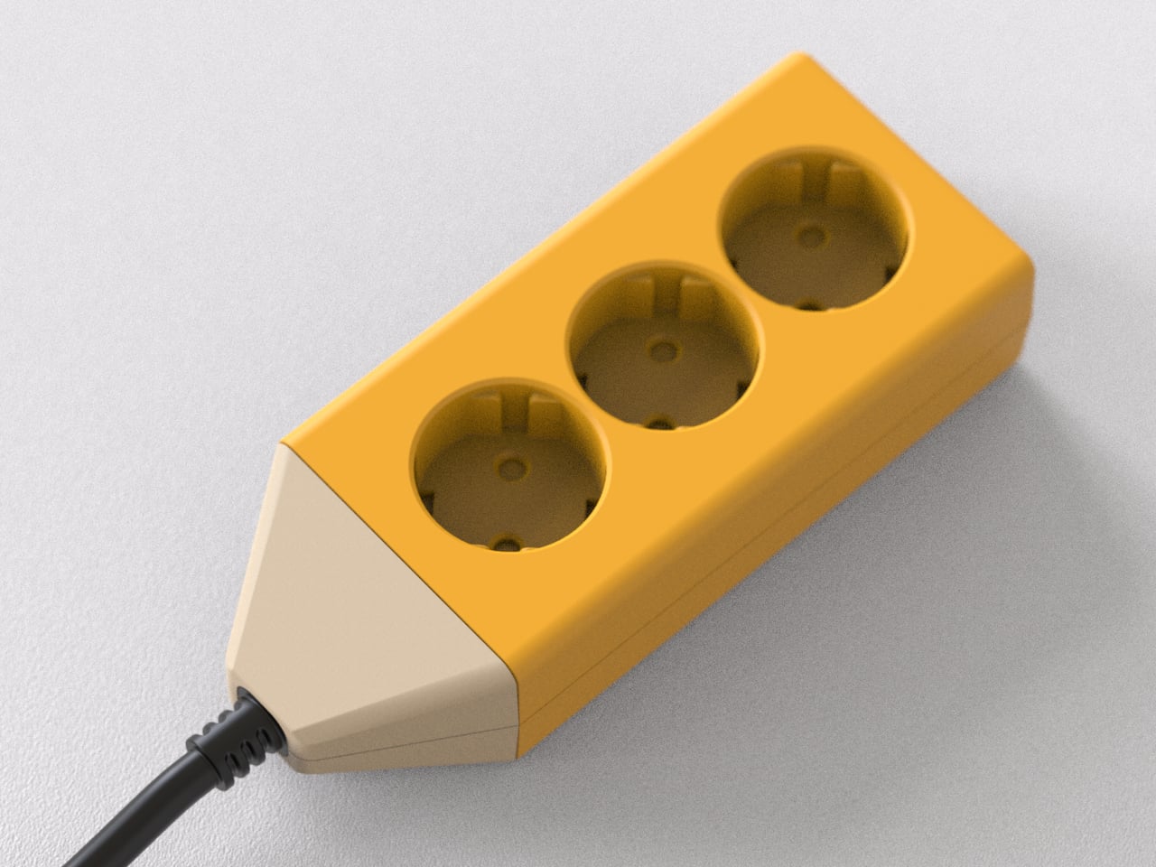
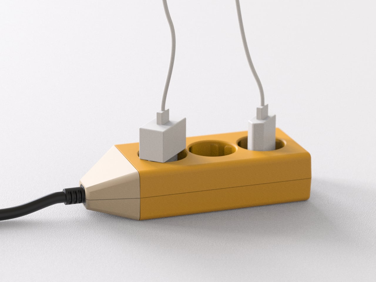
Composition Studio’s Pencil Multi-Tap follows a different line of thought. The studio designs objects that make you want to record simply by looking at them, asking what happens if the object itself initiates the act instead of waiting for discipline or habit. The Pencil Multi-Tap turns a power strip into something that feels closer to a pencil on a desk than a piece of hardware you are supposed to hide, treating electricity as part of the creative process.
Sitting down at a clean desk in the morning, you drop your notebook, tablet, and laptop on the surface and plug them into a small block that reads as a fat, sharpened pencil. The black cable trails away like a drawn line toward the wall outlet. It feels less like plugging into infrastructure and more like drawing the first line on a blank page, a quiet signal that work is about to begin.
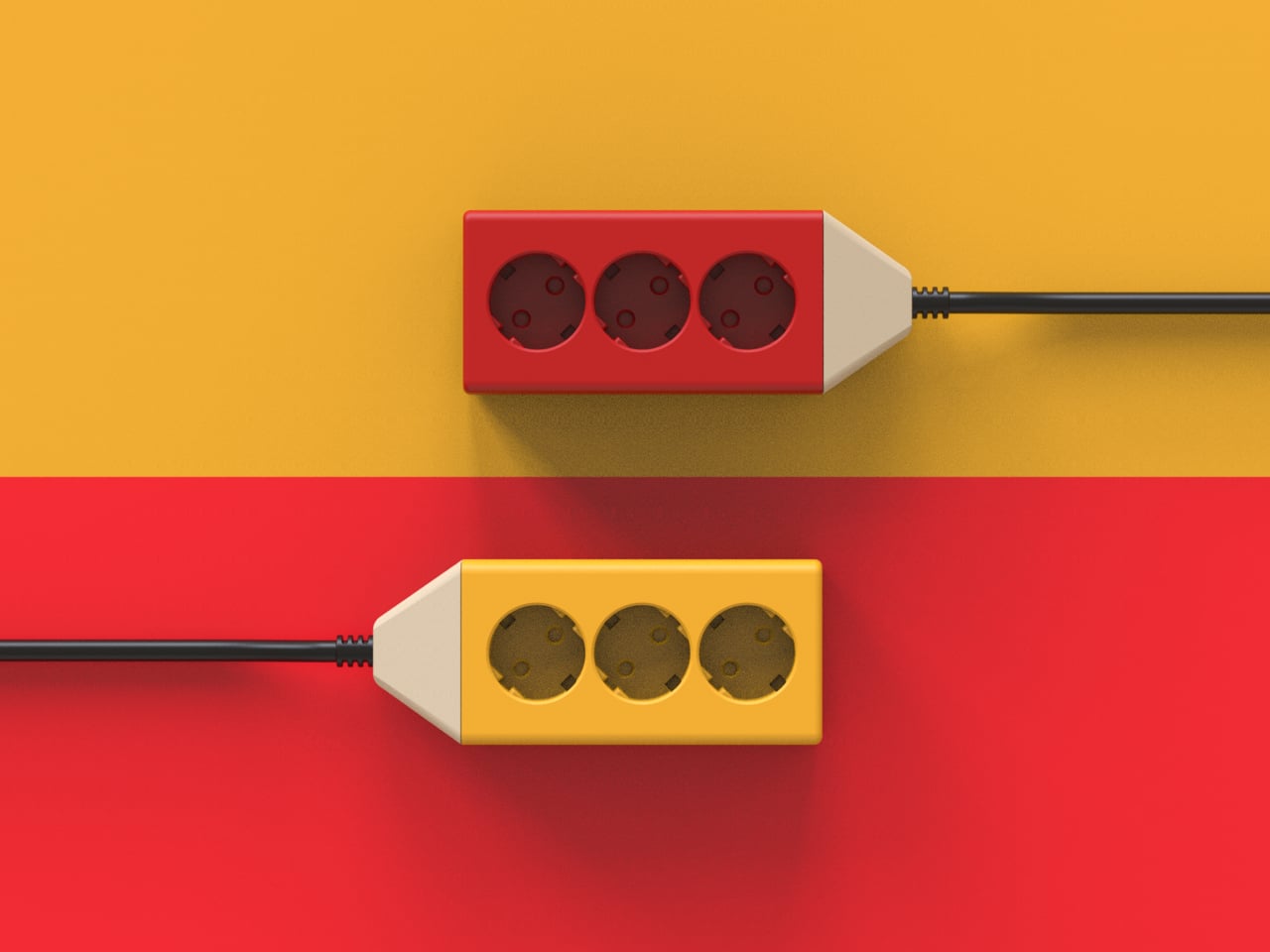
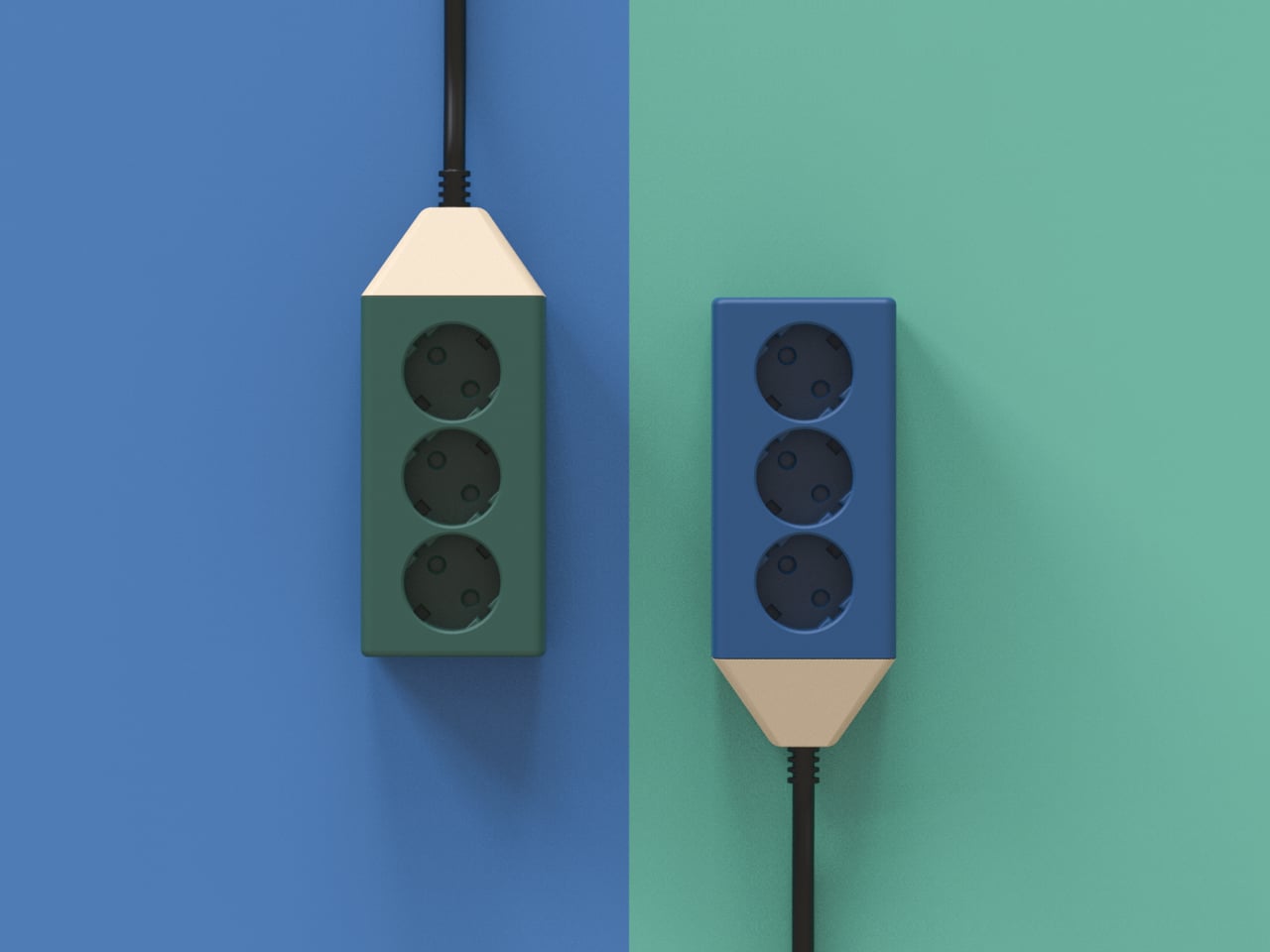
The practical side is straightforward. Three outlets give you enough capacity for a laptop, a charger, and a lamp without turning the surface into a cable farm. The compact, blocky body means it can sit anywhere on the desk or move with you to another room. Because it looks intentional, you do not mind leaving it visible, which makes plugging and unplugging devices easier and less of a contortion exercise under the table.
The pencil shape and color blocking make it feel familiar and non-technical, especially in a studio full of screens and metal. Instead of another black brick with a glowing switch, it reads as part of your creative kit, like a favorite pen or ruler. The single cable becomes a deliberate gesture instead of visual noise, which helps the workspace feel calmer even when multiple devices are connected and drawing power.
Three sockets mean this is not the strip you use to power an entire entertainment center or a full office rack. Big power bricks might still crowd each other if you stack too many adapters, and safety standards, surge protection, and regional plug types would all need careful engineering in a real product. But as a desk-level companion for a focused setup, the simplicity is part of the appeal.
The Pencil Multi-Tap treats electricity as part of the workspace experience instead of a background chore. Just as a pencil on the table invites you to write or draw, this little multi-tap invites you to plug in and begin. It is a reminder that even the most mundane tools can be designed to nudge you toward making something, rather than just managing the machines that do the making for you.
Projects pile up on the bench with a ruler that stops at 30 cm, a square for right angles, a separate protractor for odd cuts, a level somewhere in a drawer, and a pencil that has wandered off. Those small frictions add up when you are trying to stay in a flow state, and most rulers can measure but do not really help you think through the layout. You end up switching between tools, rechecking marks, and occasionally cursing when parallels drift, or angles end up slightly crooked.
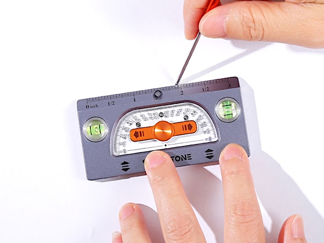
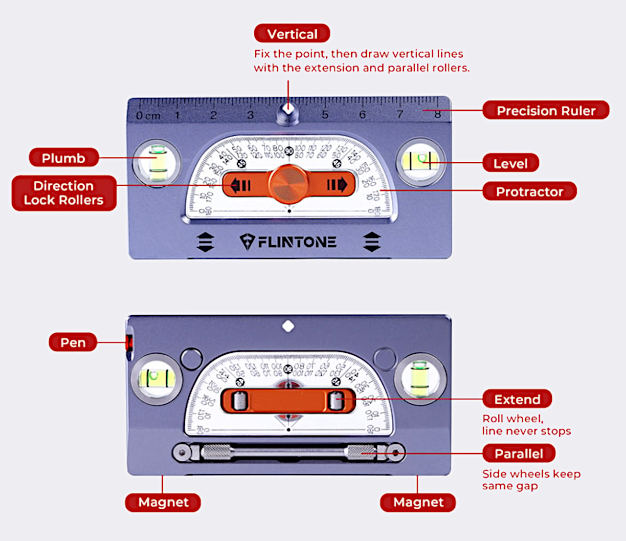
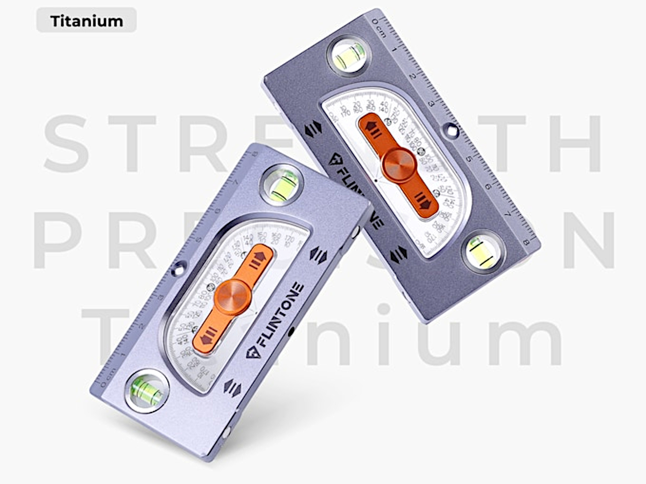
The FLINTONE MegaRuler is a titanium 9-in-1 drawing master that tries to compress a whole layout kit into something smaller than a phone. It is designed for garage tinkerers, designers, woodworkers, model builders, electronics people, and 3D-printing geeks who want strength, accuracy, and versatility in one object. The body is machined from titanium, so it feels like a small instrument rather than a disposable ruler, and it packs infinite extension lines, perfect parallels, angles, levels, magnets, and a built-in pen into a single pocket-sized block.
The infinite extension feature uses a central roller that lets you draw a straight line as long as you need by rolling the tool along the surface. You can dock the ruler end-to-end 27 times with less than 0.1mm cumulative error, enough to lay out an 8m straight line without a laser or chalk box. For framing, cabinetry, set building, or large-format graphics, that kind of repeatable accuracy means less rework and fewer compromises when the layout determines everything downstream.
The side wheels hug a reference line, so every new line stays exactly the same distance away. In testing, drawing 50 parallel lines produced a maximum drift of 0.07mm, which is effectively negligible for most jobs. That lets you stop measuring every joist, slat, or tile and simply roll the MegaRuler along, trusting it to keep spacing consistent for grooves, stitch lines, or printed patterns. The result feels less like measuring and more like running a tiny machine that thinks about geometry for you.
MegaRuler handles angles by letting you draw any-angle slanted lines from 1° to 179° in one smooth motion. The integrated protractor is laser-etched with a high-contrast scale that remains readable in bright light, dust, or glare, so you can lean the body to the exact angle you want and draw without switching tools. For miters, chamfers, or odd-angle joints, it becomes the single reference you reach for instead of juggling a ruler and a protractor and hoping the alignment holds while you mark.
Dual bubble vials turn the tool into both a horizontal level and a plumb checker. Standing it up gives true vertical in half a second, laying it flat gives an instant surface check. N52 magnets are flush-mounted in the body, so it sticks to steel beams, machines, or a shop cabinet, allowing hands-free marking and storage. A small marking pen lives inside the ruler itself, sliding out to mark and back in when you are done, so measuring and marking are finally in the same place instead of scattered across the bench or lost in pockets.
MegaRuler might live clipped to a pocket on a jobsite, sitting next to a sketchbook on a designer’s desk, or magnetized to a drill press in a home workshop. Instead of reaching for a different tool every time you need a line, angle, or level check, you grab the same titanium block and let its rollers, vials, magnets, and pen handle the details. It earns its space by doing many jobs well, feeling less like a novelty and more like the ruler you wish you had from the start, compact enough to forget until you need it and precise enough to trust when accuracy actually matters.