DIY LED Flower is the perfect geeky gift that will never wilt

It’s that time of year again when the prices of flowers skyrocket as demand far outpaces supply. Of course, there’s nothing wrong with gifting flowers this week or on any other day of the year, but the sad truth is that those flowers will eventually wilt and die, at least the real ones will. Their ephemeral beauty is actually part of their appeal, but those who want to preserve the memory of the gift will have to resort to other strategies that don’t involve cheap plastic. What better gift is there, then, than a flower that was made by your very own hands? Especially one that will never wilt nor wither away and only requires replacing the broken parts, presuming the recipient is equally adept at electronics.

Designer: Marcel (potblitd)

It won’t be the prettiest flower, admittedly. Not unless you’re actually the type to fall head over heels for the raw beauty of naked electronics. If so, FloLED will definitely be up your alley, but that’s not an assurance that your recipient will have similar tastes. Regardless, it is both an interesting project you can undertake on your own as well as a distinctive piece of decoration should decide to keep it for yourself instead.

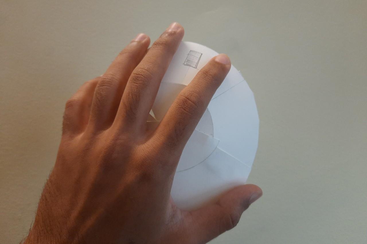
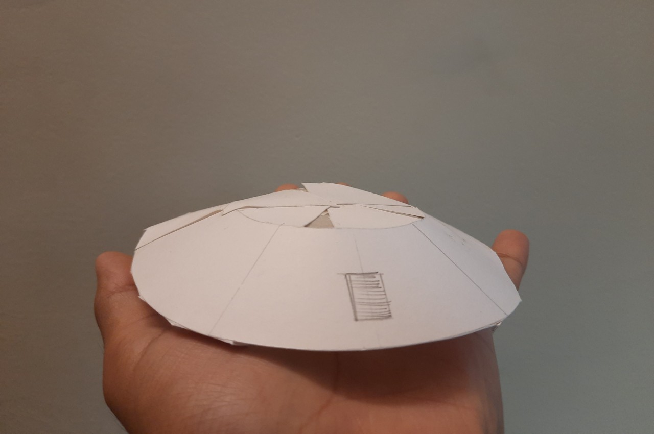
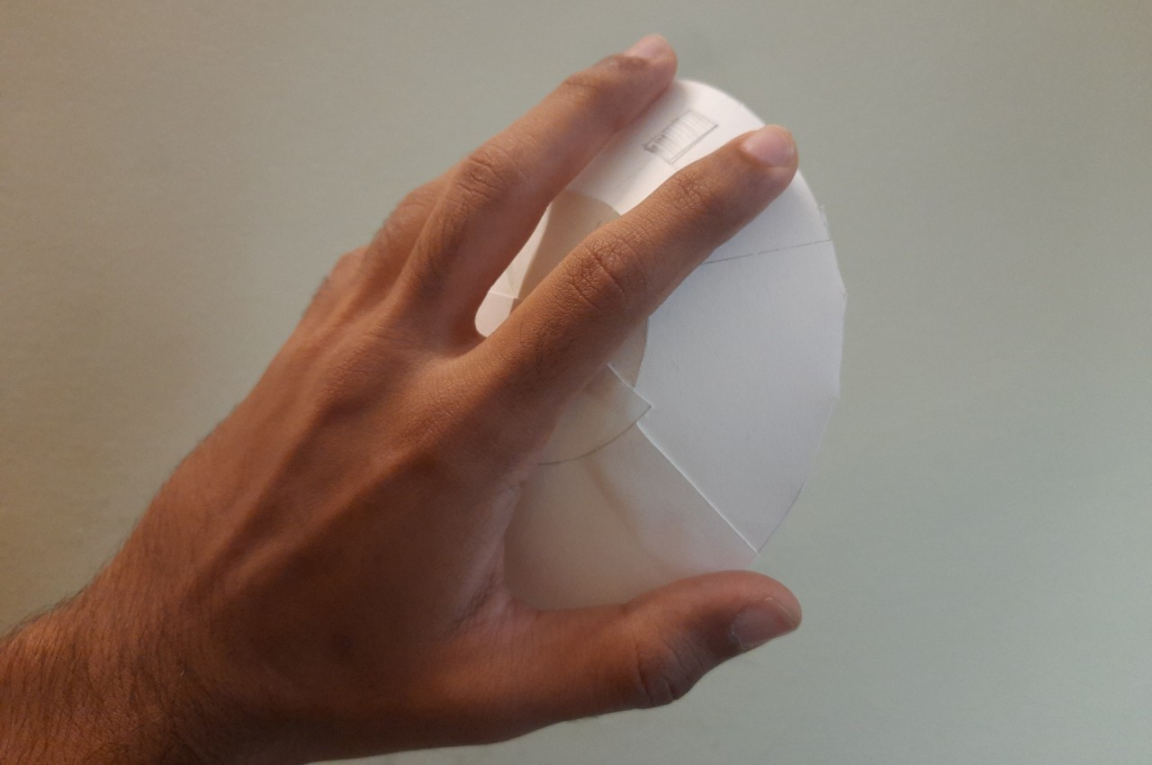
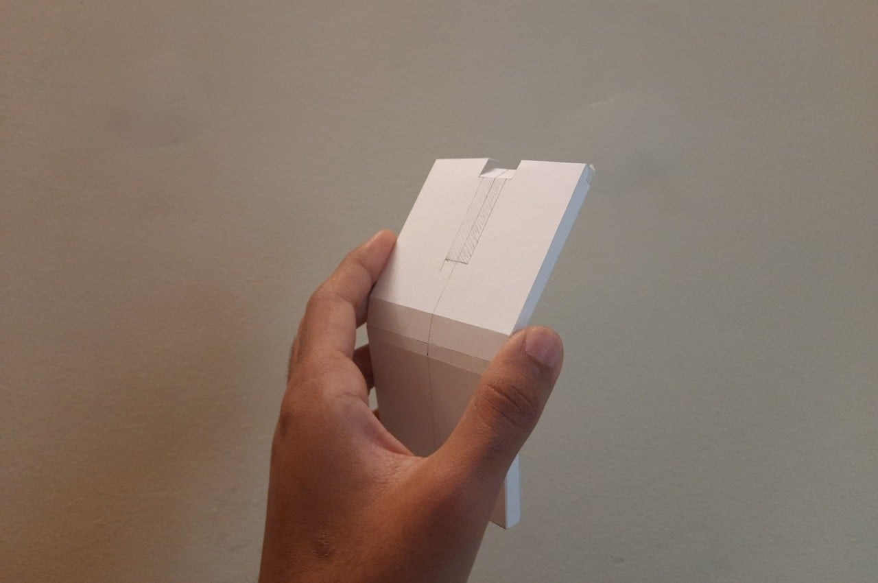
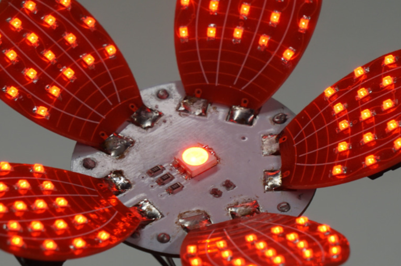
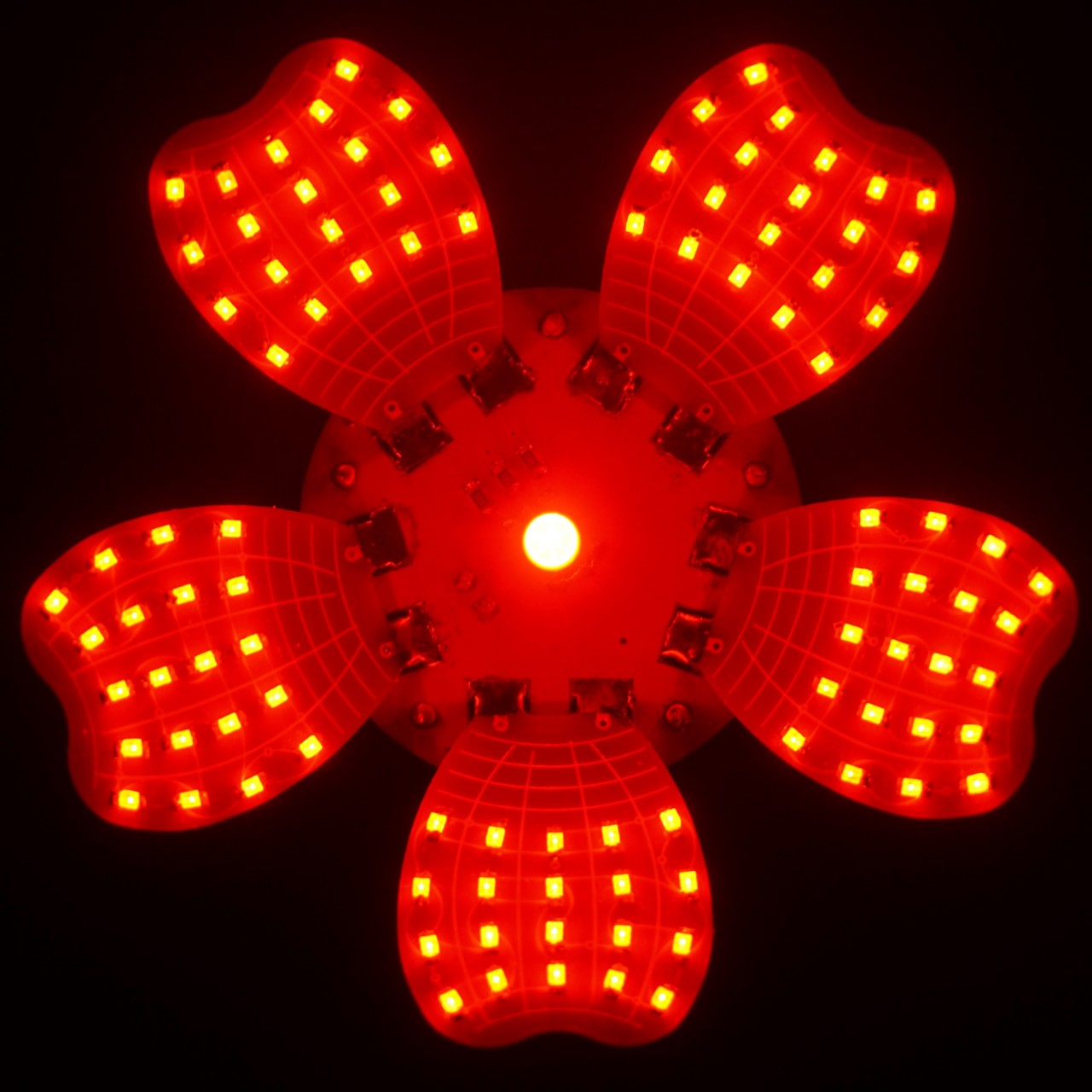
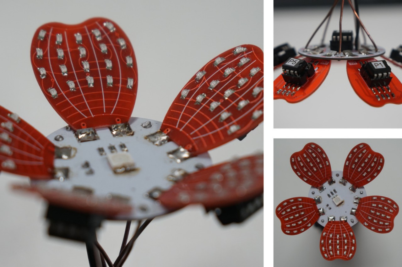
This wouldn’t be the first LED-illuminated flower, but the project sets itself apart with its flexibility. The flower has six petals, each with 20 LEDs for a grand total of 120, and each petal has its own microcontroller, which means it can operate on its own independently of the others. That also means that should one petal go awry, it’s a simple matter of replacing that part rather than redoing the whole flower.

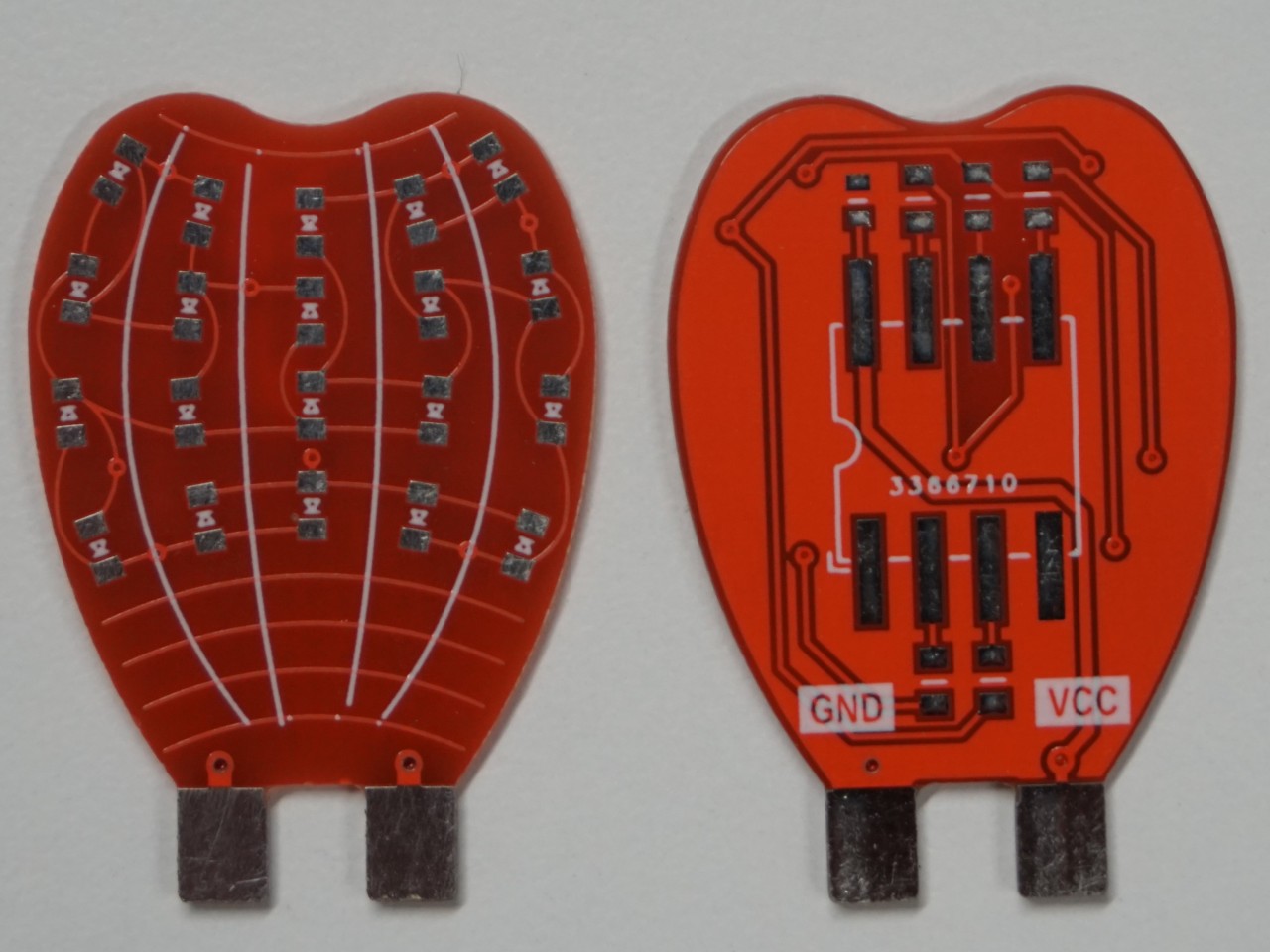
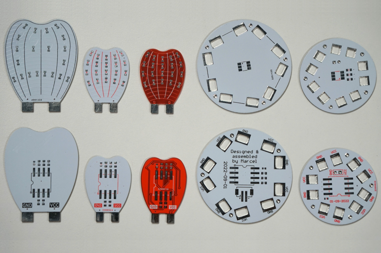
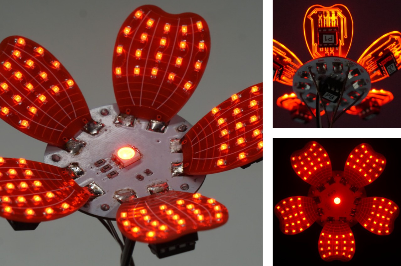
Of course, you have to make everything yourself, from the custom-shaped PCB (printed circuit board) to soldering the LEDs down. The circular base, itself a PCB, has slots that make the petals connect at an angle, giving the impression of a flower in mid-bloom. The base also has a single large LED that glows the brightest, representing the head of the flower.

FloLED is definitely a sight to see, especially at night. Given the almost translucent makeup of the petals, you can also see the circuit lines glowing in a yellow light against the red surface. And since each of the petals can be controlled and programmed individually, you could create an animated light show with one or more of these LED flowers, a spectacle that’s sure to enchant anyone, regardless of their aesthetic inclinations.

The post DIY LED Flower is the perfect geeky gift that will never wilt first appeared on Yanko Design.

Smart earrings can read your temperature, paving the way for new wearables

When people talk about wearables or wearable tech, they are mostly thinking of smartwatches and fitness trackers, basically those that are worn on your wrist. Technically speaking, however, any kind of technology that can be worn on your body would qualify as wearables, hence the name, but we have been restrained by the limits of current technologies and design trends. Fortunately, it isn’t a dead end yet, and smart rings are starting to become a viable alternative, allowing some people to still keep track of their health while finally being able to wear their favorite classic watches again. These rings reveal the potential of jewelry that could deliver those same features while allowing you to maintain your fashion sense, like this earring that can read your body temperature, something that is still uncommon even on smartwatches today.

Designers: Qiuyue (Shirley) Xue, Yujia (Nancy) Liu, Joseph Breda, Vikram Iyer, Shwetak Patel, Mastafa Springston (University of Washington)

Our bodies are a treasure trove of data, depending on which part you are observing. Smartwatches try to shed light on our health by literally shining light through the skin on our wrists and down to blood vessels. Smart rings largely do the same, though on your finger, of course. While much of your body’s state can be calculated from these areas, some body parts give more accurate biometrics than others. There might still be some debate about it, but some researchers believe that the ears, particularly our earlobes, are a better source for that kind of information.

That’s the medical foundation that the Thermal Earrings are based on, a research project that is attempting to create a new wearable that is both functional and potentially fashionable, especially for women. The device uses two sensors, one that magnetically clips to the earlobe and measures body temperature, while another dangles an inch below it to measure room temperature. Comparing data from these two sources yields a more accurate body temperature reading compared to smartwatches that can’t properly differentiate ambient temperature. This accurate reading is crucial not just for knowing your body’s temperature but, for women, also for keeping track of their ovulation and periods.

The Thermal Earrings’ diminutive design presents both a challenge and an opportunity. It uses up very little power and uses low-power Bluetooth to transmit its data to a paired smartphone. In theory, it can be charged with solar or kinetic energy, but implementing a charging system for that is proving to be a bit tricky. And since only one earring is enough to read the wearer’s body temperature, it raises the question of what the other earring would do. Should it be a simple non-smart decoy to pair with the smart earring or can it also be used to read some other biometric as well?

More importantly, however, the Thermal Earrings open the doors to another kind of wearable accessory. Although the current prototype is largely limited by the electronics it uses, it can already be customized with charms and gemstones. More research into different materials and forms can hopefully lead to more chic styles, ones that ladies won’t be embarrassed to be seen wearing.

The post Smart earrings can read your temperature, paving the way for new wearables first appeared on Yanko Design.

Terrazzo side table concept seems to tempt fate and defy the laws of physics

Tables come in all shapes and sizes, but regardless of the design, they all need to have a single critical trait: they have to be stable. No matter how breathtaking a table might be, it is nothing but a piece of art if it comes crashing down under the lightest of weights. Stability can be achieved through many means, but for something like a coffee table or even a side table, that mostly means having a flat surface that doesn’t wobble or, more importantly, doesn’t tip over. That’s the behavior that people have come to expect from even the most beautiful table, which is why this side table concept is striking both for its elegant looks as well as its rather worrying composition that precariously balances the tabletop on a curved surface, or at least it would seem like it.

Designer: Stuart Cole

Objects that boggle the mind and seem to defy the laws of physics have always been a fascination for us, which is probably why balancing toys or levitating speakers have always been popular products. That, however, doesn’t apply to furniture, especially ones that we expect to be stable or fixed. Seeing a table that’s about to topple over is enough to give some people a heart attack, but fortunately, that’s not the case for the aptly named “Balance” side table design concept.

The table’s form is actually pretty simple, utilizing basic geometrical shapes like a disc and cups. It’s the tension between these shapes, however, that gives Balance its dynamic and rather unstable appearance. It’s almost as if the circular tabletop would topple and fall off the upside-down bowl shape of its base, or that the cup would similarly fall over the edge and break. Of course, it’s all just an illusion because all three parts are joined using interlocking mechanisms that prevent them from falling apart, at least not without much effort.

Balance’s appeal doesn’t stop at its eye-catching shape. Its unique appearance is due not only to the use of terrazzo but also from employing recycled materials. This gives the side table not only a distinctive visual character but also a sustainable narrative that will surely be a topic of conversation for envious visitors. You might even be tempted to use it as a coffee or center table, rather than just leaving it off to the side, though that temptation might also be tempered by unfounded worries that the table will eventually become unbalanced and send your cups and books crashing down.

The post Terrazzo side table concept seems to tempt fate and defy the laws of physics first appeared on Yanko Design.

Tactile lamp and timer concept fosters focus and mindfulness in work-from-home arrangements

Although travel and work restrictions have mostly been lifted already, the office world is really no longer the same. It has now been proven that the work your bosses claim can only be done in the office can actually be done at home or even in a coffee shop, and so more flexible remote working conditions have started to take root in many companies. At the same time, however, the pandemic also proved that working from home is far from being the idyllic scenario that many people dreamed of in the past. Maintaining focus and motivation isn’t exactly easy to achieve, but this curious desk lamp helps develop that sense of balance between work and personal life using a very visual and tactile experience.

Designers: Pinar Aydogdu, Naren Yildirim, Nurbanu Kocak

One of the oldest productivity tricks in the book involves focusing on a single task for a certain amount of time and then taking a brief break before repeating the cycle all over again. Ironic as might sound, this technique, most popular by its “Pomodoro technique” moniker, actually helps you focus during those moments you are working. It also elevates rest to its proper place in our hectic lives, presenting it not as wasted time but as an important factor in boosting productivity.

You’d probably never think that a decorative desk lamp would be the tool to encourage that productivity practice, but the Fall concept design is exactly that. At its most basic, it is composed of a conical lamp standing on a circular base that has a rippling surface, almost like the ripples in a pond. The soft diffused light that the lamp gives isn’t going to be enough to illuminate your work, but that’s not the purpose of the lamp anyway. It works in conjunction with eight balls that magnetically attach to the top of the cone, turning this productivity practice into something like a game.

Each ball represents one hour of working time, so their total makes up an entire day’s work. At the start of your work day, you stick those balls at the top, and after an hour has passed, one ball falls down on the base. Because of the undulating surface of the base, the balls won’t roll off, but you can remove each ball as you please. In fact, you remove the ball from the base to signify that you’re taking a break and you put the ball back on the base when you’re back. If you don’t bring back the ball within a set amount of time, usually ten minutes, the lamp’s light will turn red to nudge you back to your work.

Fall is an interesting idea that encourages physical involvement in juggling those work hours, making sure you’re more mindful of your time instead of simply glancing at a clock or swiping an alarm away. The lamp itself gives a rather distinctive aesthetic, one that encourages play and interactivity instead of just looking pretty. Admittedly, it’s just a concept and one that will be rather complicated to implement in a real functioning device.

The post Tactile lamp and timer concept fosters focus and mindfulness in work-from-home arrangements first appeared on Yanko Design.

Screw-less stackable chairs offer a stress-free and sustainable way to sit

Most seating furniture is designed to more or less stay permanently where they’re located, but some spaces require chairs that can be added or removed, sometimes even at a moment’s notice. In order to conserve space, some of these chairs can be folded while others can be stacked on top of each other. One common trait between these two different designs, however, is that they either already come in a single inflexible piece or have to be assembled with much effort. In this agile and fast-paced world, neither seems to be an ideal condition, and this sustainable design offers an alternative that eases the burden of setting up each chair and doesn’t take up space when you don’t need them for the time being.

Designer: Martini & Dall’Agnol

Stackable chairs aren’t exactly novel or uncommon, but the majority of those tend to have a limit before they start tipping over because of the overall form of the chair. The Stack chair, in contrast, was designed especially with that use case in mind, and thanks to its compass-like four-legged base, you can stack the chairs almost to infinity, at least in theory. Of course, you’ll be limited by how much vertical space you have and how high you can safely reach, but it’s reassuring to know that there is enough leeway there for you to stop worrying about dozens of chairs taking up precious space when not in use.

That’s not even the most impressive thing about the Stack chair, though. The design comes in only two parts, the base and the shell, and these two parts can be joined by simply snapping the base underneath the shell’s uniquely designed rim. With just a snap, the two become a single and stable piece of furniture, simplifying not just the manufacturing process and assembly but also shipping.

This fastener-free design also lends itself quite well to customization, as you can mix and match different base and shell colors or even materials. By default, it comes with a polypropylene shell, but it can also be made from wood that’s then upholstered with fabric, leather, or other materials. The chairs can be made to match any style that your space requires, and not just with a single color either.

The choice of polypropylene wasn’t made on a whim either and was intended to help make the chair not only long-lasting but also recyclable. In addition to being space-efficient when it comes to storage, the Stack chair also aims to be efficient in manufacturing, packaging, and transportation, leading to a more sustainable product overall.

The post Screw-less stackable chairs offer a stress-free and sustainable way to sit first appeared on Yanko Design.

Ergonomic mouse concept gives left-handed users the comfort they deserve

The vast majority of computer products are designed to favor the biggest groups of users, sometimes to the exclusion of the minority. We’re not speaking about accessibility for persons with physical disabilities, but that is especially true for them as well. Even just the common keyboard and mouse are designed with the presumption that they will be used by right-handed people. And while ambidextrous mice do exist, those tend to sacrifice comfort for the sake of a symmetrical design. That doesn’t have to be the case, as this concept design tries to prove, promising both comfort as well as proficiency, regardless of which hand you hold it with.

Designer: Sameeraj Dronamraju

There has been an increasing awareness and demand for ergonomic mice, sadly due to the equally rising cases of computer-related injuries. But while there are plenty of ergonomic designs now available, most of them only cater to right-handed users. You’d be lucky if the manufacturer produced a left-handed design, but most don’t because of the costs involved in another product with only a few minor differences.

The proper solution would be to mix ergonomics and symmetry to create a mouse that is comfortable to hold for both kinds of people. Vertrous, a portmanteau of “vertical” and “ambidextrous,” takes its cue primarily from the plethora of ergonomic mice now in existence, most of which adopt a vertical design that attempts to reduce the strain placed on the wrist by offering a more natural grip. But rather than have your hand holding it sideways, you almost grip it like a claw, with your index and middle fingers still resting on top.

At the same time, the mouse’s shape is more or less equally balanced on both sides. Great care is taken to ensure that textured areas are found on both sides, so no one hand has the advantage over the other. That said, there are some features that can really be found in only one place, like the power button, but that’s really a minor detail that has no significant impact on the use of the mouse itself.

While Vertrous does present an interesting solution, there are still some considerations left unanswered by the design. For example, gripping the mouse like a claw could actually end up being more uncomfortable and strenuous than a regular mouse. The symmetrical design also leaves out features like extra buttons that would normally be found only on one side, an absence that many power users will feel acutely. These aren’t flaws per se but more like points for further improvement, paving the road for the day that we finally land on a standard ergonomic mouse design that will really leave no one out, whichever hand they prefer to use.

The post Ergonomic mouse concept gives left-handed users the comfort they deserve first appeared on Yanko Design.

Polaroid-inspired DIY camera uses AI to print poems instead of photos

AI today powers many devices and services with mixed results. Some produce truly mind-blowing images, captivating narratives, and critical information that help drive cars, vacuum cleaners, and robots. Sometimes, those very same AIs are abused for selfish gains or nefarious purposes. In both cases, it proves that AI, impressive as it may be, is just a tool that can be used for good or for ill, depending on who’s wielding it. Or it could also be used for fun, whimsical projects that, while not exactly advancing the field, turn those rather mundane AI applications into delightful experiences. This DIY Polaroid-inspired camera, for example, does take pictures, but what it prints out isn’t a flat facsimile of the three-dimensional but instead spits out an interpretation expressed in words filtered through the minds of digital poets.

Designer: Sam Garfiedl (sam1am)

Two of the most controversial uses of AI today revolve around images and words, both of which tread gray legal areas. Image generators are infamous for taking well-worded prompts and turning them into images that truly look professional, though sometimes end up looking like an artist’s copyrighted work. On the opposite side of the spectrum are AIs that churn out essays and articles that also border on plagiarism.

The Poetroid, thankfully, won’t be treading those same waters. It does turn images into words, but nothing that can really be attributed to copyrighted material. In a nutshell, this rather crude-looking DIY camera sees the world through a webcam and then produces sheer poetry, literally, based on the object it sees. After all, there is perhaps no better way to truly capture the spirit of a flower, a fruit, or a pizza than with a mosaic of metaphors mixed together in a “mellifluous meter.”

What is rather impressive about this little project is that it can be assembled from off-the-shelf components like a webcam, a single-board computer, and a lunchbox, among other things. The tin lunchbox is probably a bit uninspired, but it was large enough to cram everything necessary inside, with a little modification for the screen and buttons. If the name wasn’t a giveaway, the idea was heavily inspired by the Polaroid instant camera that revolutionized photography during its time. Instead of getting a small photo, however, you get a poem printed out on thermal paper, almost like a receipt and probably just as incomprehensible as one.

The best part is that the AI and large language models needed to pull this off can run locally on the device itself, preventing any private data from leaking and saving you from potential embarrassment over accidental photos and hideous poetry. There’s definitely a lot of room for improvement in the design of the Poetroid, and having all the necessary pieces known and available can go a long way in helping design one that will look just as majestic as the words it ejects from its proverbial mouth.

The post Polaroid-inspired DIY camera uses AI to print poems instead of photos first appeared on Yanko Design.

Moto Watch 40 design straddles the line between smartwatch and fitness band

Smartwatches have more or less become a stable presence in today’s modern lifestyle to the point that no one will make fun of you anymore for wearing a screen on your wrist, except those coming lovers of classic mechanical watches. That said, not everyone is a fan of these hi-tech timepieces and would prefer something less distracting and more focused on just the health-tracking aspects. Dedicated fitness bands, however, often come in sporty and rugged designs, as if the only ones that would wear them are athletes or very active people who don’t mind strapping a rubber or silicone band on their wrists, even on formal occasions. That’s where the new Moto Watch 40 comes in, offering a wearable that almost looks like a stylish smartwatch but is a fitness band at heart.

Designer: CE Brands (Motorola licensee)

Although there was a bit of experimentation in the beginning, smartwatches today come in only two shapes: a square or a circle. Although circular smartwatches were touted to be classier or more stylish because of their resemblance to the majority of luxury timepieces, the Apple Watch has constantly made the case for equally elegant designs on square smartwatches. Unsurprisingly, there are some manufacturers that have even opted to walk the same path, producing smartwatches that, for better or worse, look like the Apple Watch.

The Moto Watch 40, however, is neither of those and is walking the fine line between smartwatch and smart band instead. It has a rectangular body, more common with fitness trackers, but the size of the device and its general appearance are more in line with smartwatches. It has a screen that curves at the edges, giving it a refined appearance compared to the rugged looks of common fitness trackers.

At the same time, however, its limited functionality leaves no doubt that it isn’t a smartwatch either. It has a variety of sensors for tracking activity, including blood oxygen levels and even sleep, but you won’t be seeing a lot of the advanced functions and options you’d find on a smartwatch. It supports only viewing notifications, so you’ll have to pull out your phone if you want to reply to messages or even take calls. Its 10-day battery life may sound a little disappointing, but the Moto Watch 40 compensates with an advertised charging speed of 25 minutes only.

That combination of essential functions and stylish design will set you back for only $64.99. It might sound like a tempting proposition, especially when other fitness bands are either too expensive or too informal. That said, even a wrist-worn device might still be too conspicuous for some people, and a smart ring that would let them wear their favorite mechanical watches could be the perfect compromise instead.

The post Moto Watch 40 design straddles the line between smartwatch and fitness band first appeared on Yanko Design.

Google Pixel Fold 2 leak hints at worrying changes, questionable design

Just like with the Apple Vision Pro, Google’s entry into the foldable smartphone market has been a long time coming. Given how the Android maker itself has been rather slow on jumping on trends, there might have even been a chance that it would snub the form factor completely. After all, it showed tablets no true love, even if big Android slates have been around for years. For better or worse, Google did decide to join that bandwagon, which isn’t always an assurance that it will work on a second-gen device. Now it seems that a Pixel Fold 2 is indeed in the works, at least based on a blurry leak, but that small glimpse might be dashing some hopes, as word of Google’s big changes also comes with questions about its design goals.

Designer: Google (via Android Authority)

There are two distinctive elements of the Google Pixel Fold’s design. The most prominent is its camera bar, an approximation of the “visor” design that it uses on its Pixel phones. The other is the external or second screen’s wider aspect ratio, which meant that the unfolded device would also be wider and take on a horizontal or landscape form factor. It’s a design that was more conducive for wider content like videos as well as splitting the screen between two panels or two apps. More importantly, however, it meant that the folded phone was more comfortable to use and hold, almost like a regular phone.

A single leaked photo of the Pixel Fold 2 might be leaving some fans scratching their heads. The external display is noted to be narrower, as per the source, which inches it a bit closer to the awkwardness of the Samsung Galaxy Z Fold, though thankfully not yet on that level. This also means that, when unfolding the phone, you will be greeted with an internal screen that is more square than rectangular.

The biggest change, however, seems to be the camera, which moves away from the bar design to a bump that sits in a corner of the Pixel Fold 2’s back. It’s not the same square design as older Pixel phones, nor is it even similar to rectangular camera islands that run vertically down. Instead, it seems that this box will march across the width of the phone, taking up almost two-thirds of the space.

Granted, the photo is an alleged prototype only, so there is no guarantee that the final Pixel Fold 2 will take this form. If it does, however, Google might be facing a bit of a backlash for changing the design so drastically and in such an unappealing manner. It will be interesting to see how the Pixel Fold 2 will actually look like in the end, and we might not even see a shadow of it until Google I/O 2024, which should happen sometime in May or June.

The post Google Pixel Fold 2 leak hints at worrying changes, questionable design first appeared on Yanko Design.

Invite Serenity Anywhere with the Elegance of a Wood & Brass Incense Holder

Whenever people think of fragrant aromas, most immediately presume something like essential oils. Of course, those aren’t the only way to indulge your nose, and some people prefer the smoky, woody, and unique scents produced by incense. Compared to oils, however, handling incense can be a bit of a hassle, especially the more popular long-stick variety. Never mind needing to light a small fire in the first place, making sure that the ashes don’t spill or get blown away can induce stress instead of calm. Fortunately, it doesn’t take much to fix this situation, and this elegant wood and brass box offers a simple yet effective solution to enjoy your favorite incense sticks safely and peacefully wherever you are.

Designer: Masami Tanaka of Takumi Tokyo

Click Here to Buy Now: $169 $199 (15% off at checkout). Hurry, Valentine’s Day sale ends in 48 hours!

Marrying walnut wood and brass in a seamless fusion that complements your living space.

You need fire to light up incense, and anything that burns always produces some residue, particularly ash. Regular incense stick holders, simple and portable as they are, barely do more than just hold up that thin, burning stick, leaving you with ashes to clean up, if they don’t get blown by a weak gust of wind and become fire hazards in the meantime. Rin is a simple yet beautiful solution that lets you carry those incense sticks with you, light them up for a few minutes of respite, and never worry about ash blowing in the wind.

The main body of this minimalist incense holder is made of walnut wood and is divided into two tiers. The lower tier has three long nooks that can hold five sticks each for a total of 15. Thanks to the natural properties of wood, each holder will be unique, both in the visual pattern of the grains as well as the texture and color, making each item a limited edition product.

The part that actually holds the burning incense is made of brass, a metal that is popular for developing unique and beautiful discolorations over time. The brass plate is recessed deep inside the wooden box so that the ashes don’t fly off after they’ve fallen inside. A matching brass cover can be used to snuff out the fire and also keep the ash secured inside until you’re ready to dispose of it properly.

The wood and brass elements, while contrasting in nature, beautifully complement each other and blend perfectly with any decor. The light brown of natural walnut brings out the golden yellow of brass, while the oil-painted darker colorway exudes a dapper character with the matching black brass cover and plate. And thanks to its small size, you can conveniently bring a bunch of your preferred incense sticks with you wherever you go, allowing you to enjoy brief moments of fragrant peace when and where you need it.

Click Here to Buy Now: $169 $199 (15% off at checkout). Hurry, Valentine’s Day sale ends in 48 hours!

The post Invite Serenity Anywhere with the Elegance of a Wood & Brass Incense Holder first appeared on Yanko Design.