ASUS ROG Mjolnir solar power station is shockingly real, but is it worthy?

One of the worst days to announce or tease a new product is April 1st. Most people already presume that the majority of “news” going out that day is a hoax, especially if it’s about something outlandish or unbelievable. Then again, it might also be the best time to get as much attention, even if it means being doubted until the product actually lands on store shelves. That’s the kind of situation that ASUS’ Republic of Gamers created when it teased one of the weirdest-looking yet also most interesting portable power stations to grace the industry, only to reveal that, no, it is no April Fool’s joke. But is this Mjolnir-lookalike worthy to be wielded by gamers and enthusiasts or is it just a dastardly plot by Loki to have a laugh at everyone’s expense?

Designer: ASUS ROG

Myeu-muh? What’s a Myeu-muh?

Even if you’re not a comics or movie buff, you’re most likely to already be familiar with the icons of Marvel’s Cinematic Universe given the media over-saturation. This is especially true for the most popular icons and their paraphernalia, such as Captain America’s shield, Iron Man’s mask, and Thor’s hammer. That hammer has a formal name, even in the original Norse mythology, though few will probably be able to utter Mjolnir’s properly unless they watched the first Thor film. It’s MYOL-neer or MYOL-nur, by the way. You’re welcome.

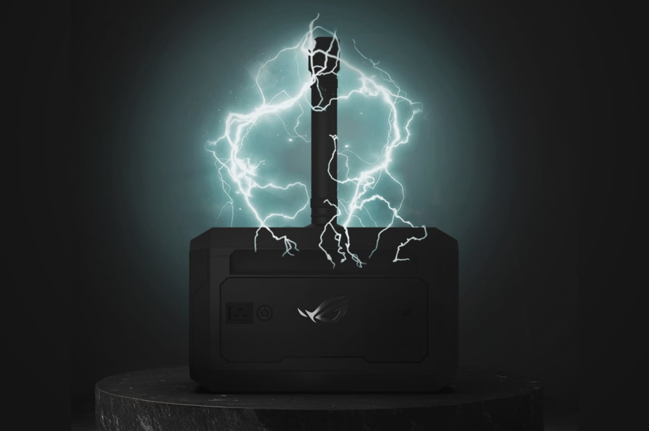
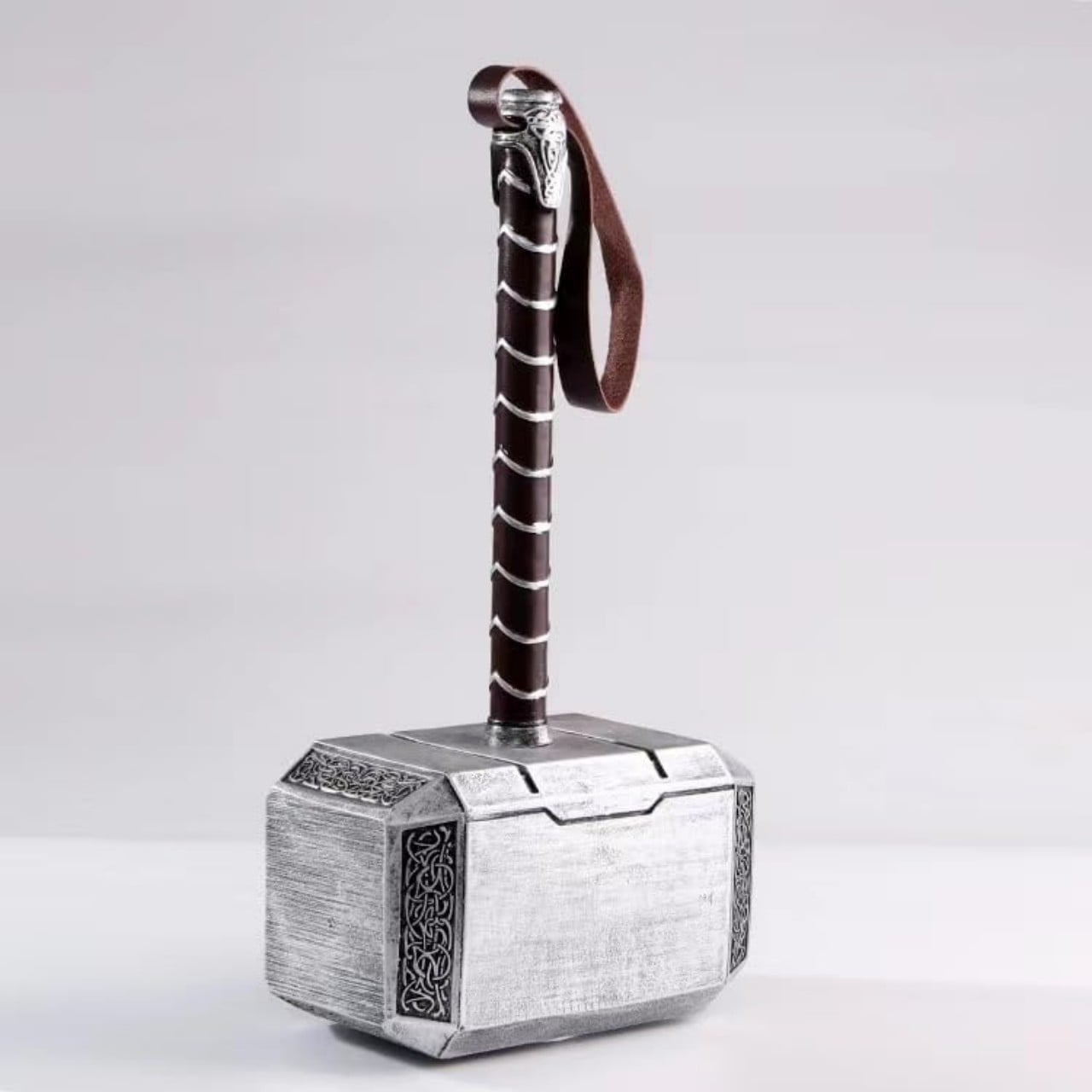
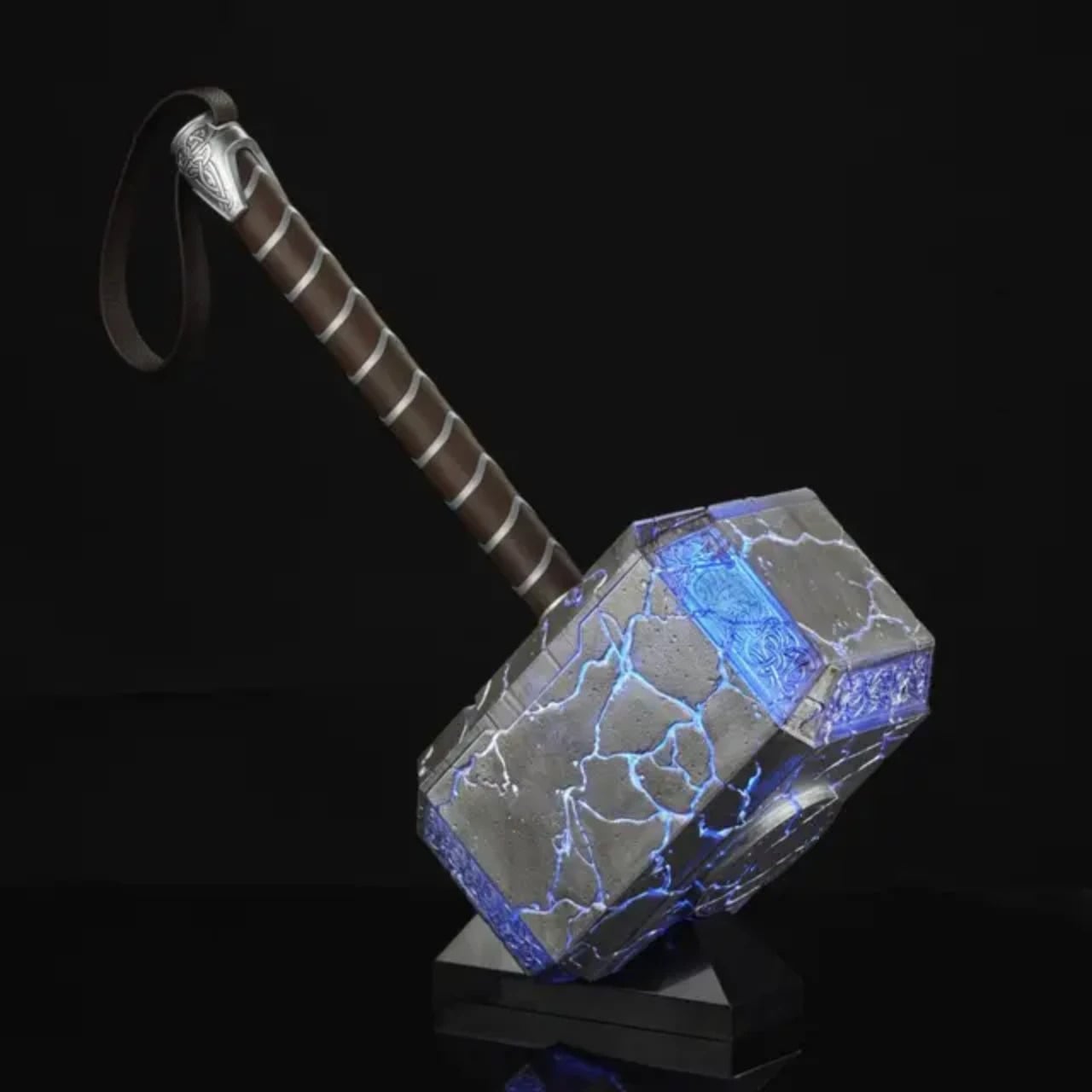
That hammer is the subject of today’s speculation. On the 1st of April, probably one of the trickster god Loki’s favorite days, ASUS’ gaming brand teased and then announced Mjolnir, not as a weapon but as an electrifying computer accessory. It’s a power station that indeed resembled the movie prop to some extent, with a large rectangular box whose sides tapers a bit, and a rod extending from the body acting as a handle. ROG was quick to point out that it’s a real thing, not a hoax, but that in itself could be the joke. But maybe it would have been better if it remained hidden from mortal hands.
What We Know So Far

To be fair, there’s not much we know other than what ROG itself has revealed, but there’s quite a bit already available. The most important is that this power station can be charged using solar energy, drawing power from the sun instead of lightning. How it does that, however, is still anyone’s guess. The teaser showed a dark rectangle on the station’s front that could be a tilting solar panel, though that would be too small to supply the power that this large box needs and was probably just a placeholder graphic.
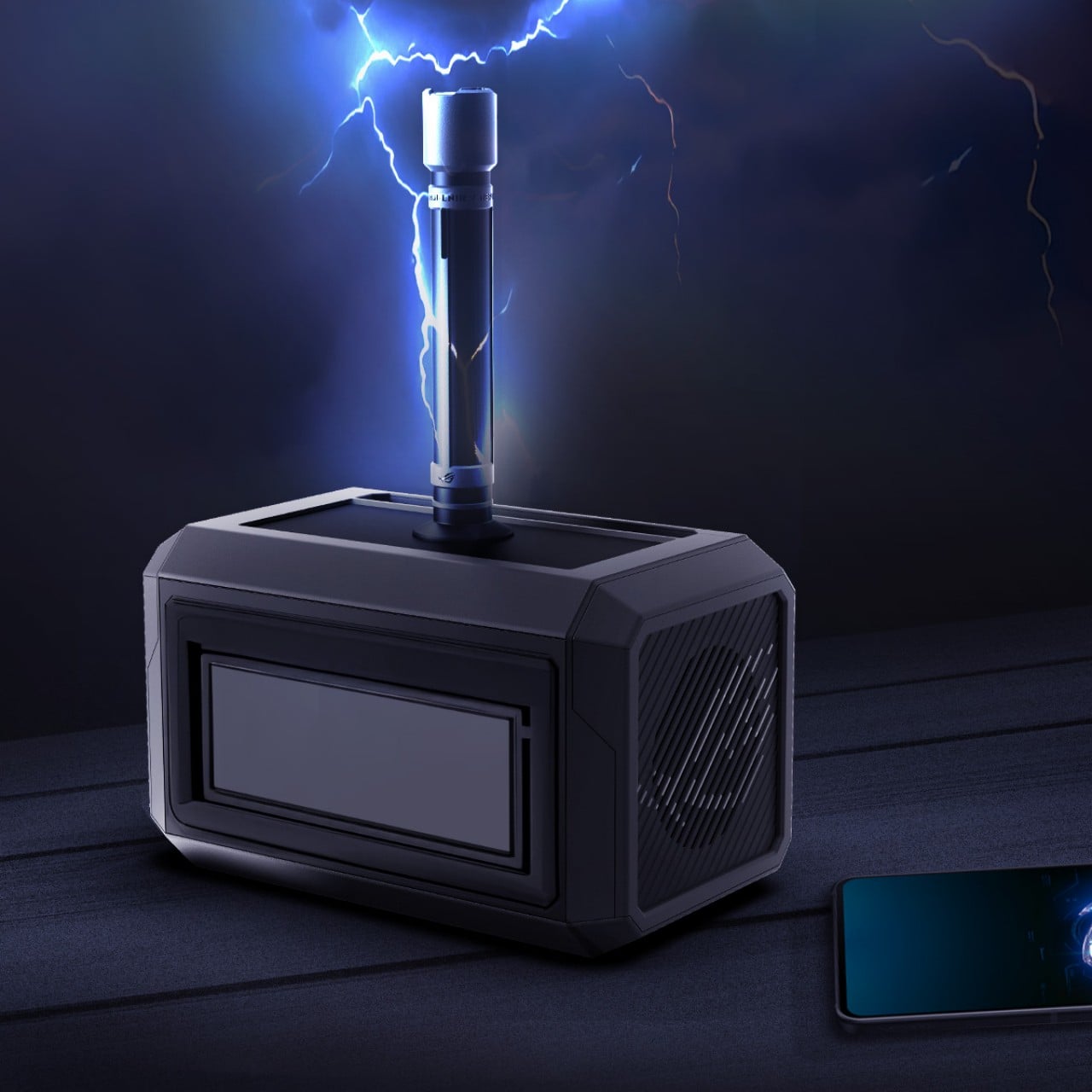
On the front, you will see an assortment of ports typically found on power stations. There are four AC outlets, two full-sized USB-A ports, and two USB-C ports. There’s an LCD display above these ports that shows important information about the input, output, and remaining battery capacity. Noticeably missing here, however, are DC and car charging ports, which hints that this power station might not have outdoor adventures in mind.

The teaser also mentions that the ROG Mjolnir can illuminate your path with the light it summons, but it unsurprisingly doesn’t say how. That panel on the back could be a very bright flood light, but the better theory is that the handle itself is some sort of lighting component. Either the handle lights up or, more likely, it’s a removable flashlight, which is a better design for a part that would otherwise simply be a cosmetic detail that gets in the way.

Cracks in the Hammer

There’s no denying that the ROG Mjolnir has an interesting design, one that will appeal to a large segment of the market, especially the brand’s gaming audience. Its upturned hammer shape sets it apart from other portable power stations, if the ROG branding doesn’t already make sure of that. The bigger question, however, is whether that design is actually good for the product’s usability or hinders it.

That handle is going to be the biggest point of contention, with a tall rod sticking out from the top of the box. If it acts as a removable flashlight, then it’s not as big of an issue. But if it’s permanently fixed in that position, it will become a problem when storing or moving the power station. It’s not like you can carry the Mjolnir using its handle for real. But if that handle were removable, it also introduces a different kind of problem, one of durability and reliability. There’ll be a hole where the handle connects to the body, which means an opportunity for dust and liquid to get into the sensitive electronics. Definitely not a smart design.

It doesn’t look like the power station is designed for easy carrying either. Depending on how much battery it’s packing inside, this power station can end up being a bit heavy to carry with one hand without a handle. You’d have to hold it with both hands, but there doesn’t seem to be any grips to make that convenient. Admittedly, it doesn’t look too big beside a smartphone, but that’s just a render that might not reflect the product’s actual size.

True Power

There’s admittedly not much we know about the ROG Mjolnir Solar Power Station yet, including its specs, its price, and whether it’s really an actual product or ROG has just been pulling our leg and chuckling at the buzz going around their vaporware. Then again, it’s a pretty niche design as far as a power station is concerned, anyway, and there are plenty of other options in the market, albeit with less sensational aesthetics.


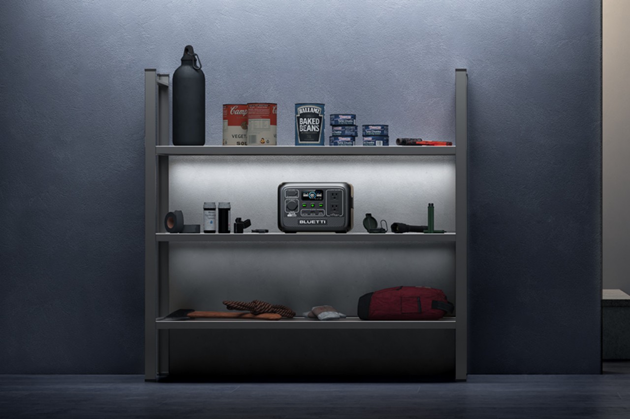
When it comes to solar portable power stations, the BLUETTI AC2A comes with all the bells and whistles, including proven product quality and durability. There are only two AC outlets, yes, but it makes up for it with a wider variety of input and output ports. You will need to plug in a solar panel, but that might also be the case for the ROG Mjolnir anyway. The BLUETTI AC2A is indeed designed more for outdoor use, though it can be an emergency backup for computers at home as well. As far as we know, the ROG Mjolnir is primarily designed to serve gamers’ needs, with rather questionable outdoor survivability.


Designer: BLUETTI

Is the ROG Mjolnir Power Station going to sell? It will probably have a few fans, especially those who will readily throw money at cool-looking and unique designs. It is going to be a practical and usable product? It’s definitely too early to say, and ROG might still end up surprising us, or completely disappointing us with the harsh reality of a month-long joke. Either way, we don’t expect the ROG Mjolnir to be a ground-breaking new design beyond its unique aesthetics, and if you’re looking for truly gamer-ready power solutions, you don’t have to wait for the truth to be revealed.
The post ASUS ROG Mjolnir solar power station is shockingly real, but is it worthy? first appeared on Yanko Design.
Flip phone concept aims to inspire creativity with Nokia, Nothing aesthetics

It may have been criticized for flooding the mobile phone market with dozens of confusing designs, but Nokia’s seemingly eccentric designs sometimes hit the right marks when it comes to uniqueness, aesthetics, or usability. From the XpressMusic to the N-Gage to the Communicator, there are times when those designs felt far ahead of their time, which didn’t do their sales any favors. There has been a great deal of interest in revisiting these designs, most of which, however, only make sense for non-smart feature phones like the ones HMD is offering. One particular design, however, might find a place in this modern world that’s obsessed with taking photos and recording videos, especially if it gets a little Nothing-inspired facelift.

Designer: Viet Doan Duc

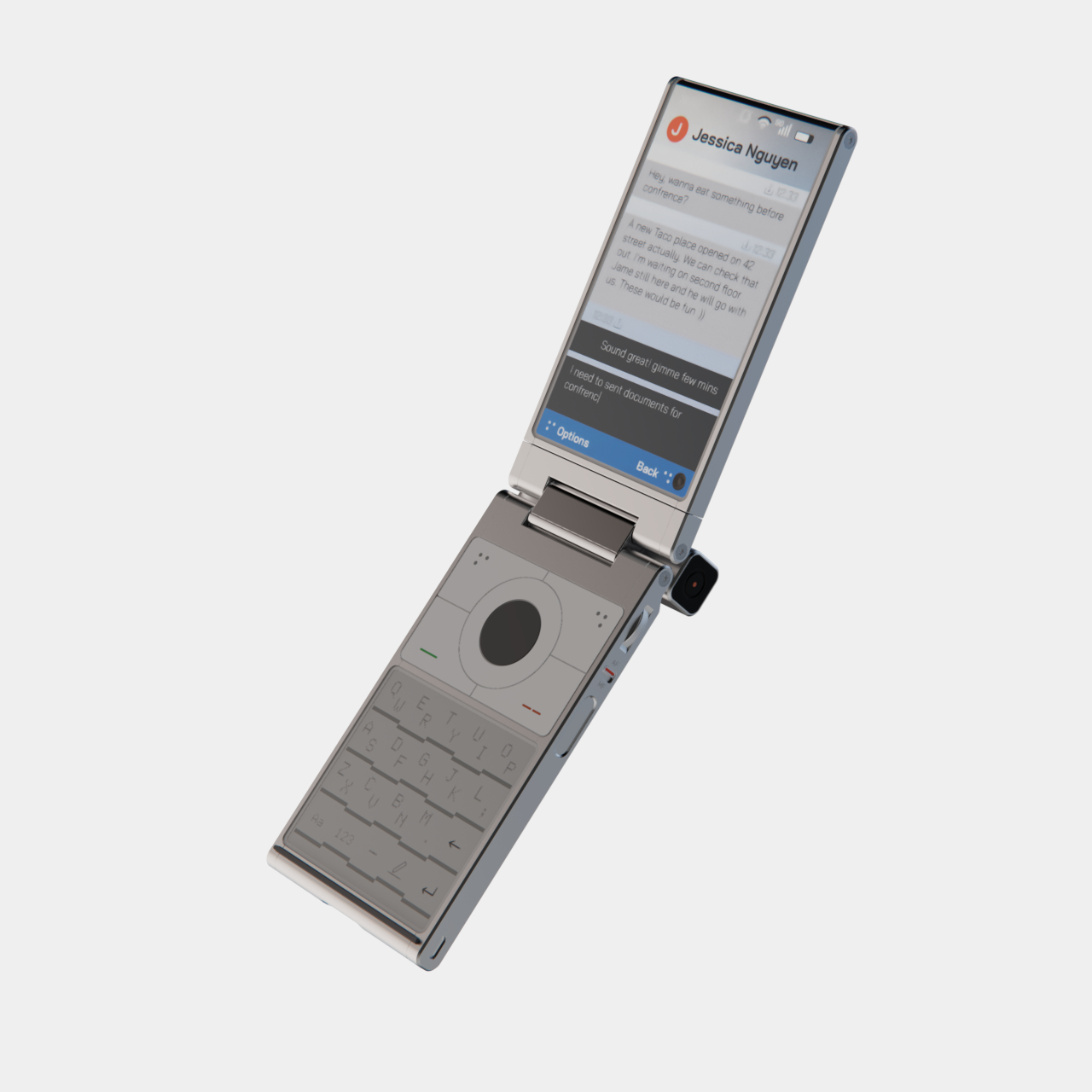
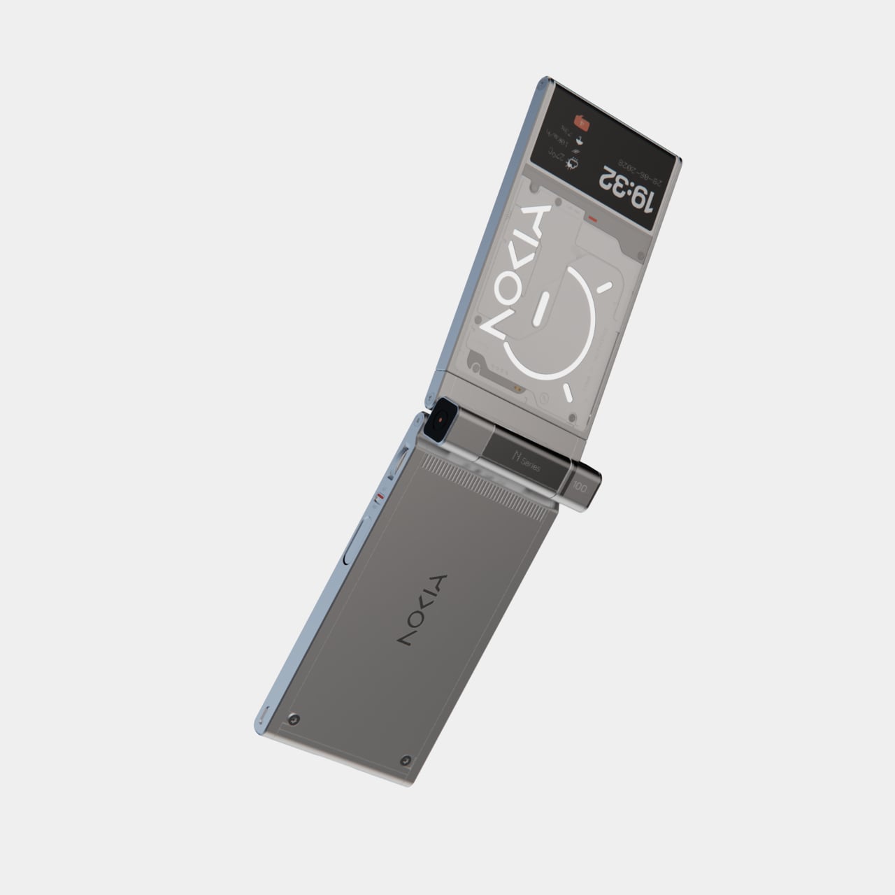
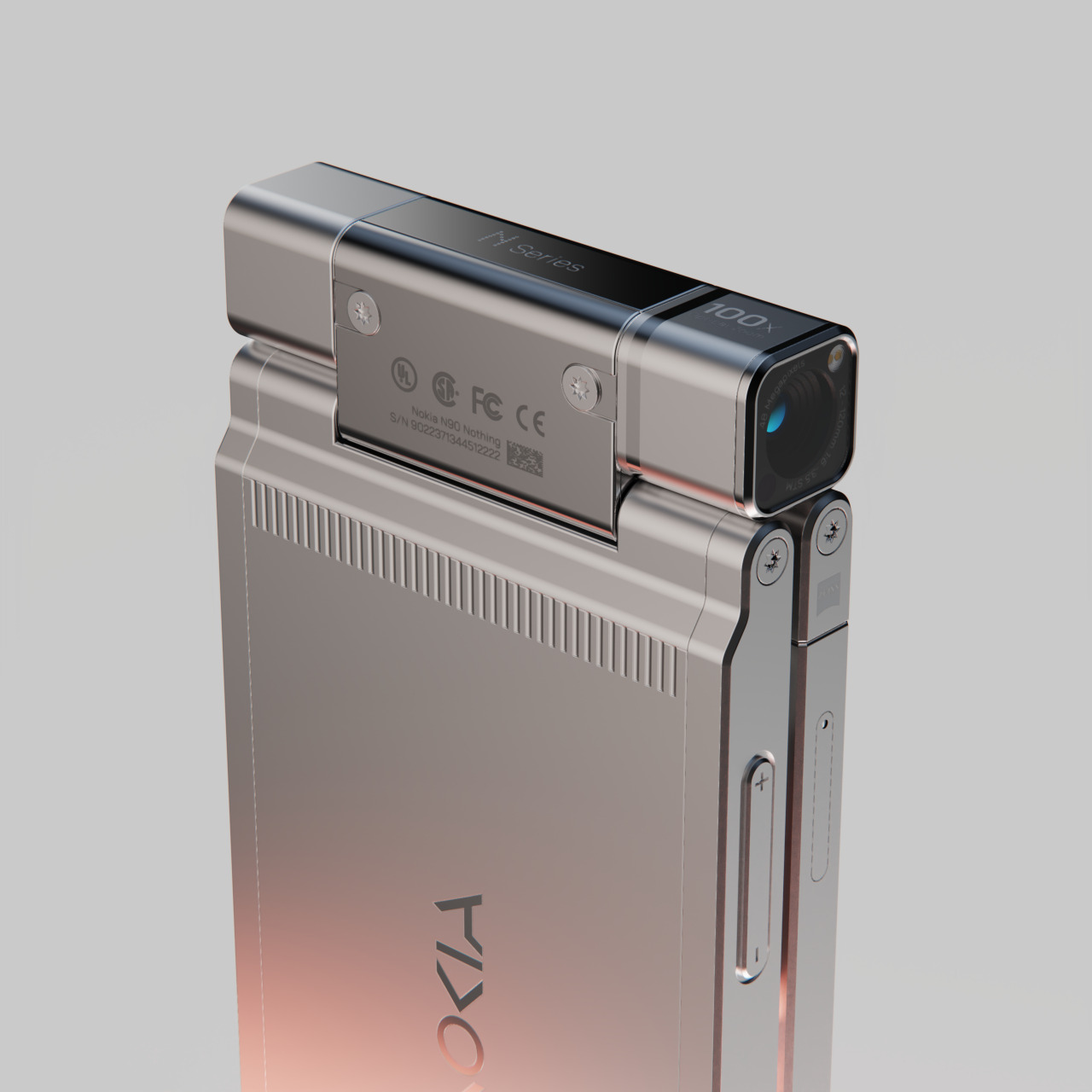
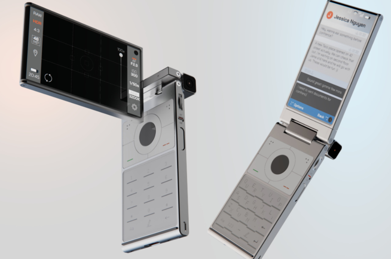
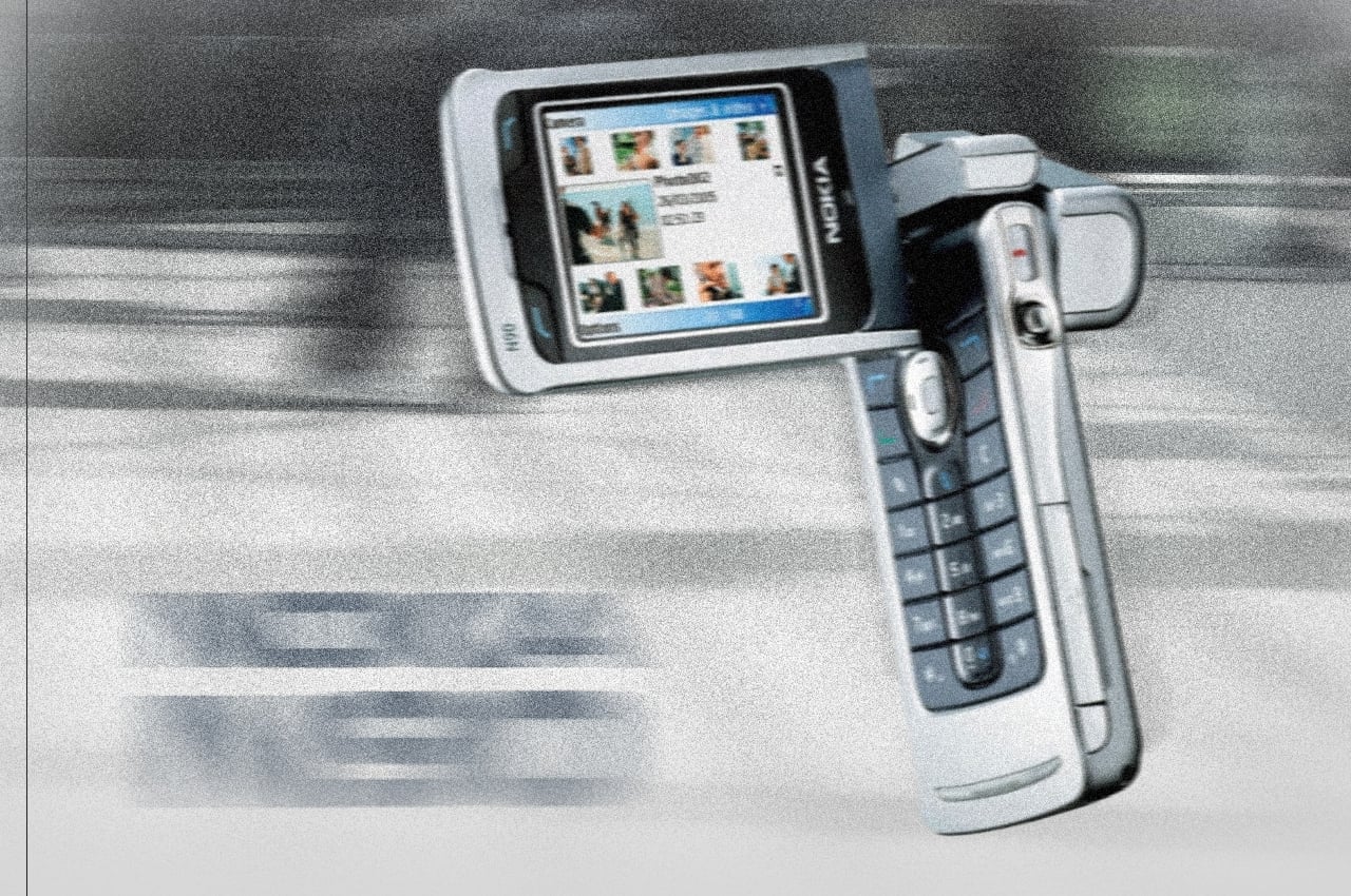
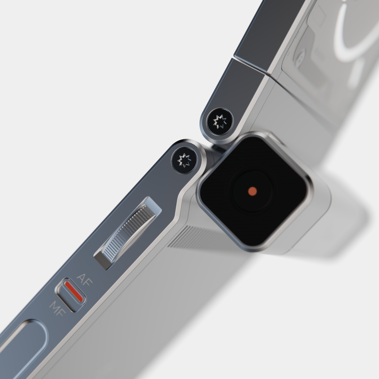
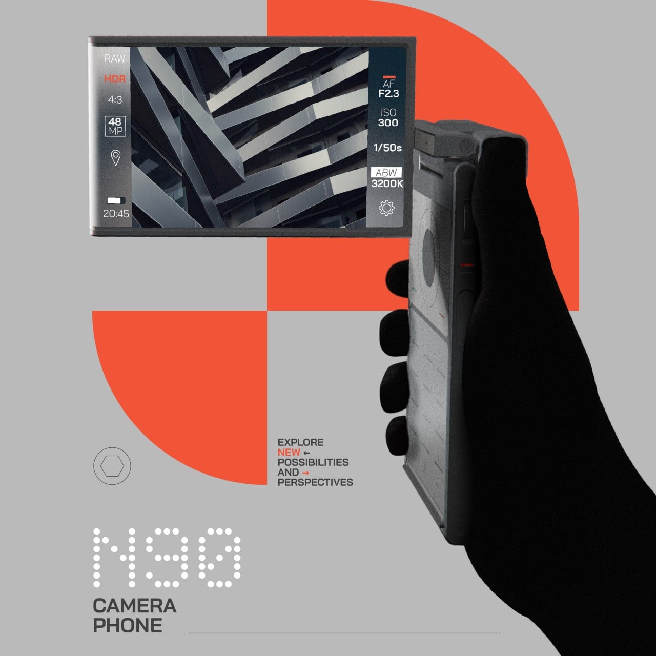
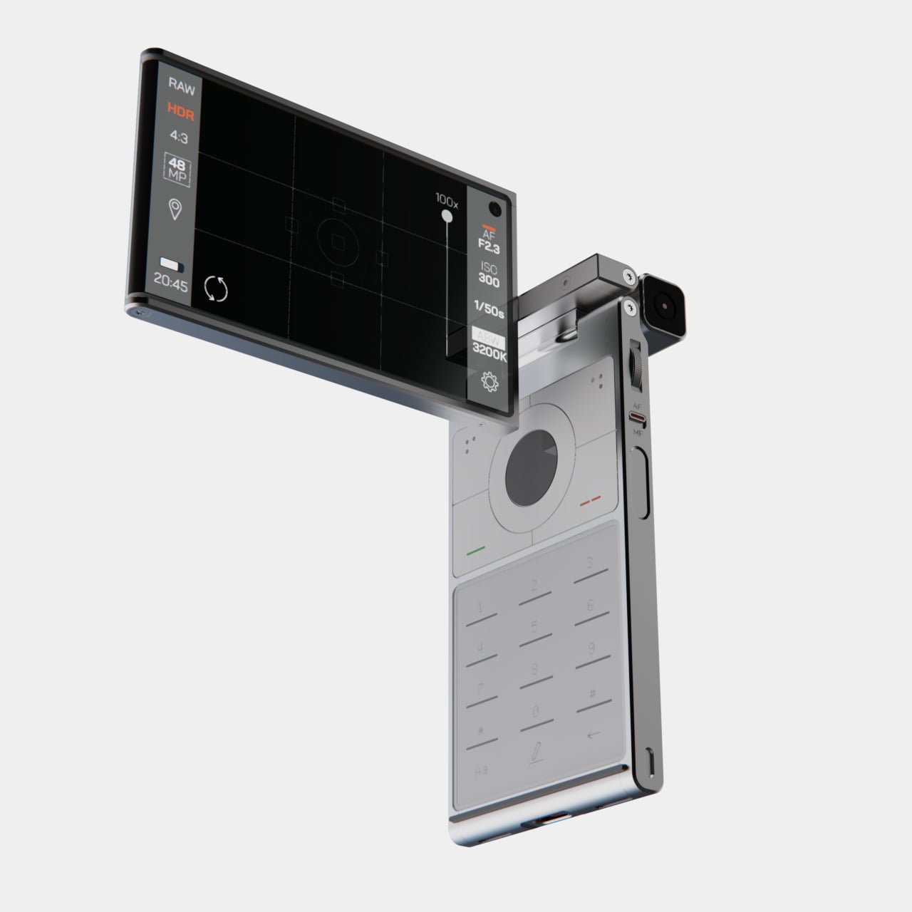
Flip phones or clamshell designs are nothing new, even if the recent generation of foldable phones has given birth to their renaissance. The Nokia N90, however, did more than just open up in a stylish way to reveal a bigger screen and a large T9 keypad inside. It could also twist its top half so that you could hold it like a camcorder and feel more like a proper content creator. That was 20 years ago, even before the word “influencer” or even “YouTube” came to light. Now smartphones are pretty much pocketable cameras, and this concept design tries to give the Nokia N90 a second chance, with a bit of a twist.

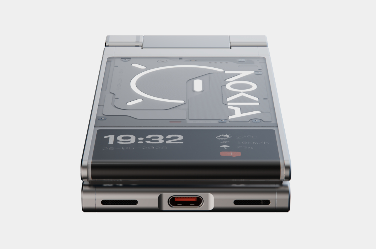
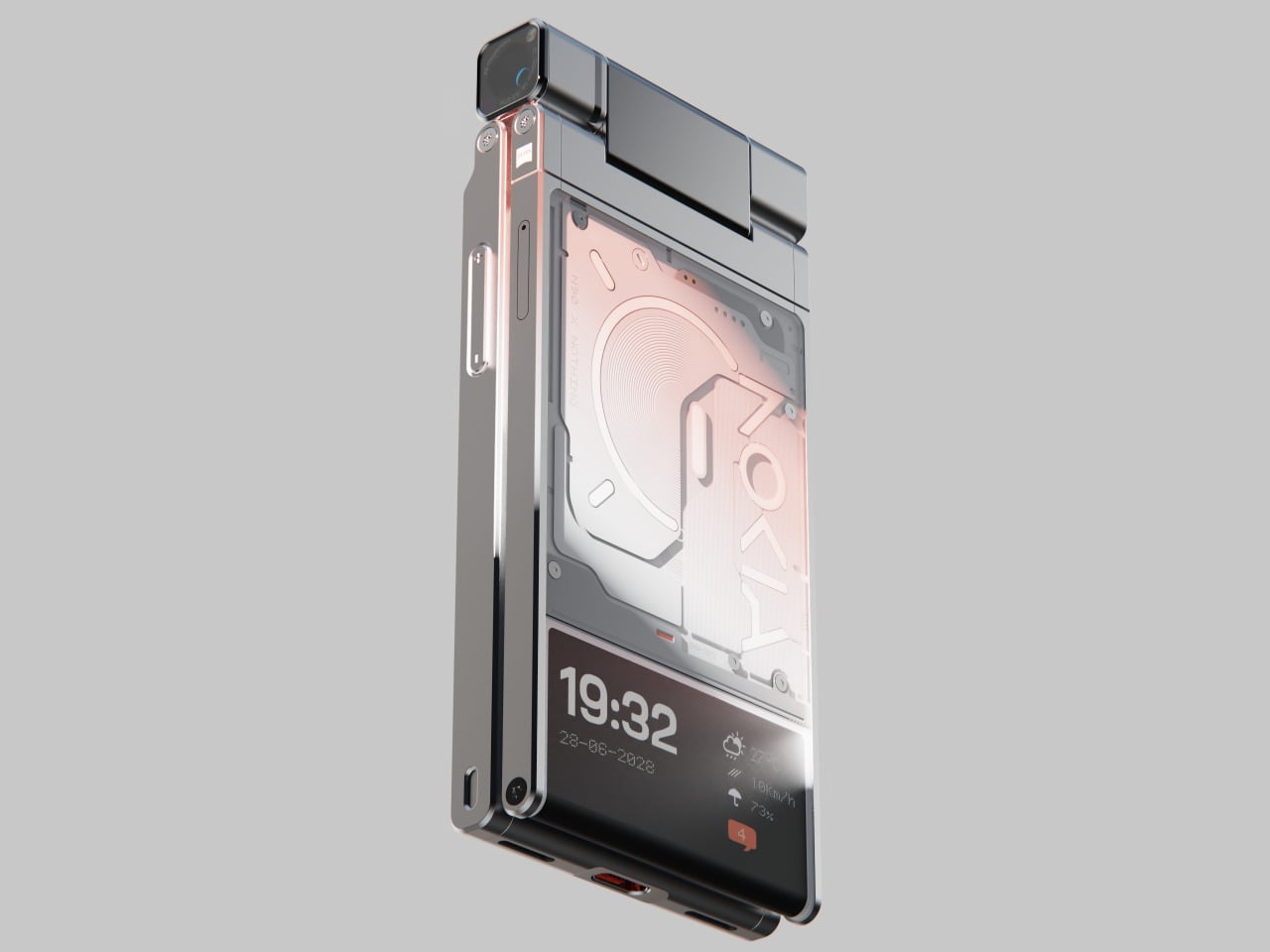
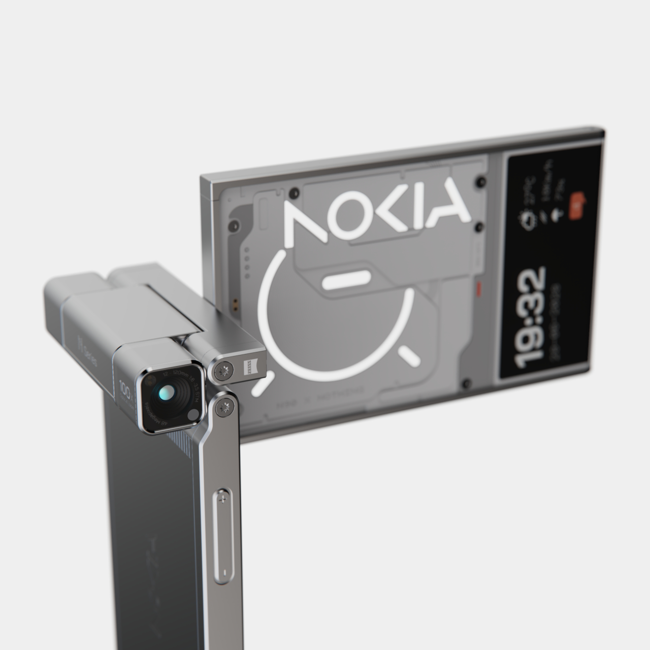
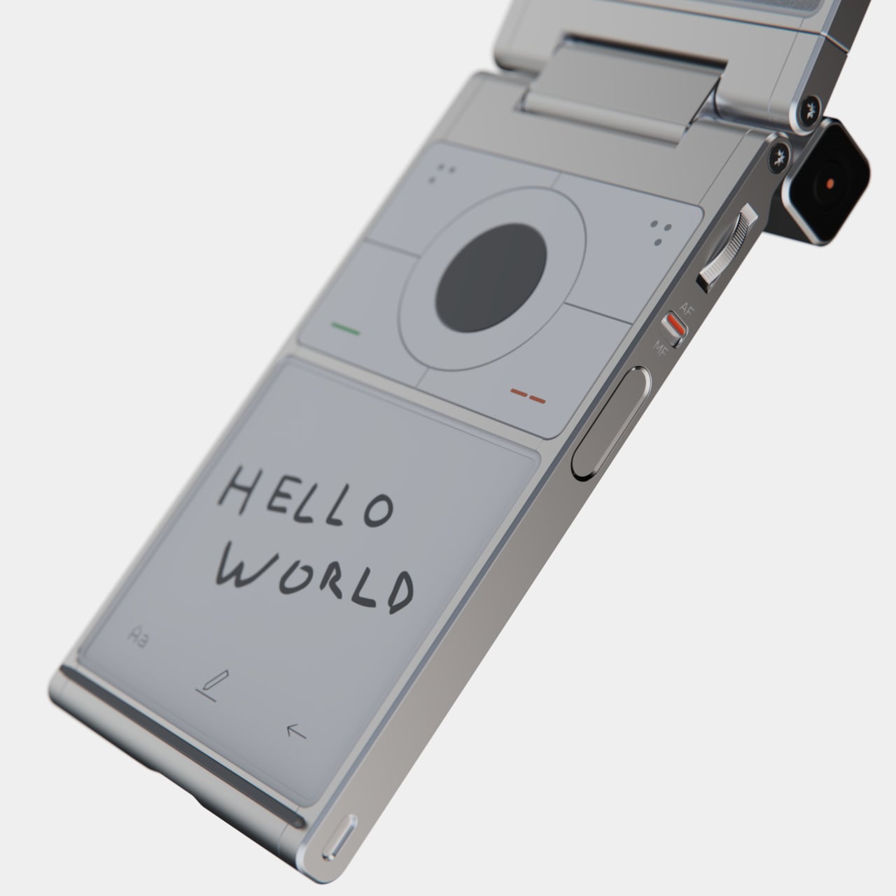
The Nokia N90 design is obviously outdated by today’s standards, so this revision borrows some inspiration from Nothing’s now iconic translucent glass design. The concept focuses on three main concepts: mechanical precision, the spirit of exploration, and minimalist language. The mechanical aspect can be clearly seen from the smartphone’s industrial appearance, revealing details of precision circuity and clear edges. At the same time, however, it still manages to embrace minimalism by keeping the details down to the essentials, eschewing the noisy details that pervaded Nokia’s design language.

The Nokia N90 x Nothing concept is clearly a design that encourages exploration and creativity with its core design gimmick, turning the upper half around for a more immersive photography experience. Not only does it try to convey the feeling of using a camcorder, it also makes some difficult angles more feasible because of the degree of freedom the mechanism offers.

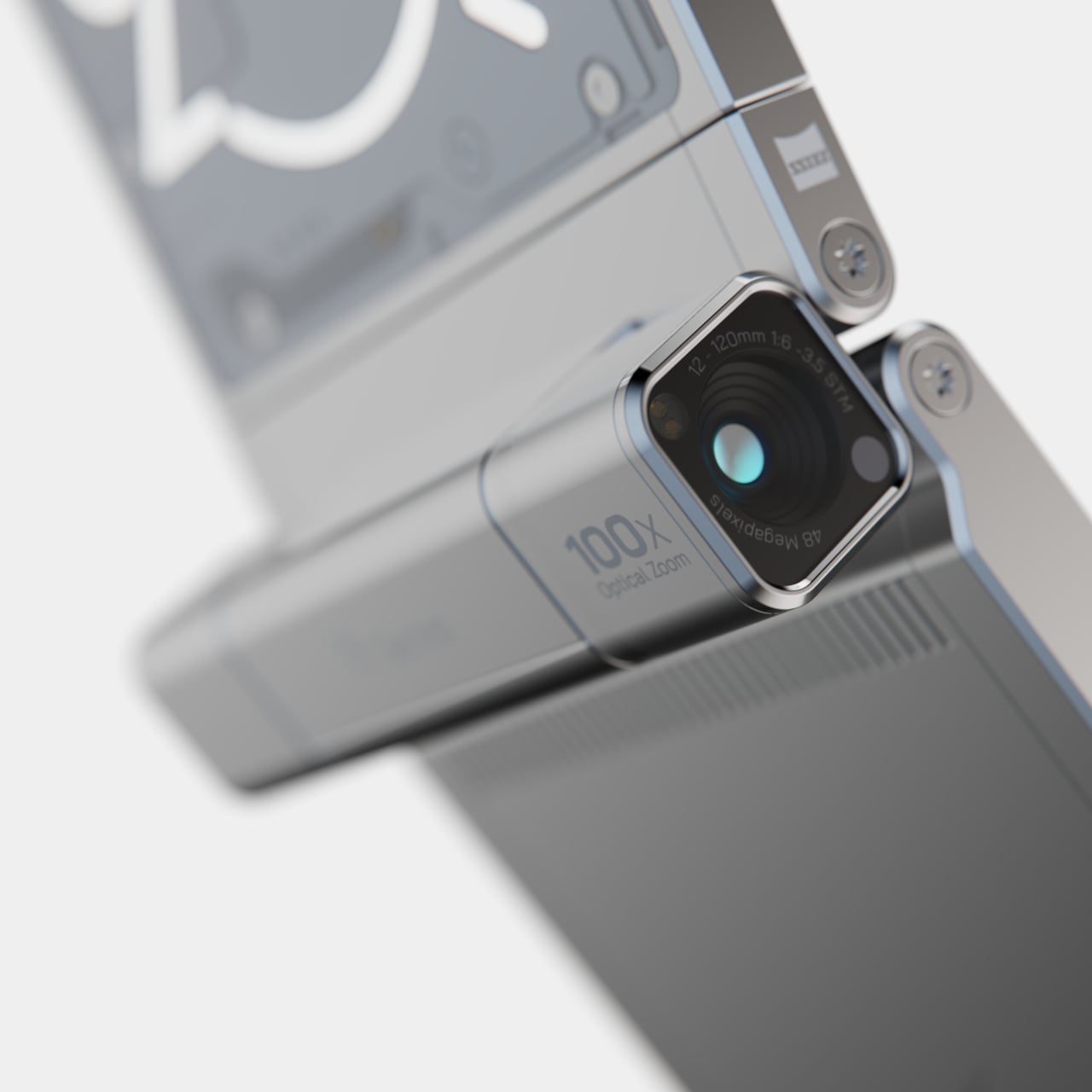
On the technical side, the dreams of some of the best hardware features that the mobile industry has to offer, and not just with the camera that’s installed on the phone’s hinge rather than its back. The physical keypad, for example, is replaced by an E Ink display that combines customizability and power efficiency, while a touch-sensitive D-Pad above it offers more precise control. All these, however, make the Nokia N90 x Nothing even more of a pipe dream, but the design itself is something that could definitely spark interest, and hopefully sales, among today’s generation of design-conscious creators.

The post Flip phone concept aims to inspire creativity with Nokia, Nothing aesthetics first appeared on Yanko Design.
Geometric chair concept almost looks like an Escherian optical illusion

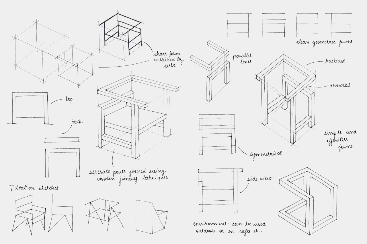
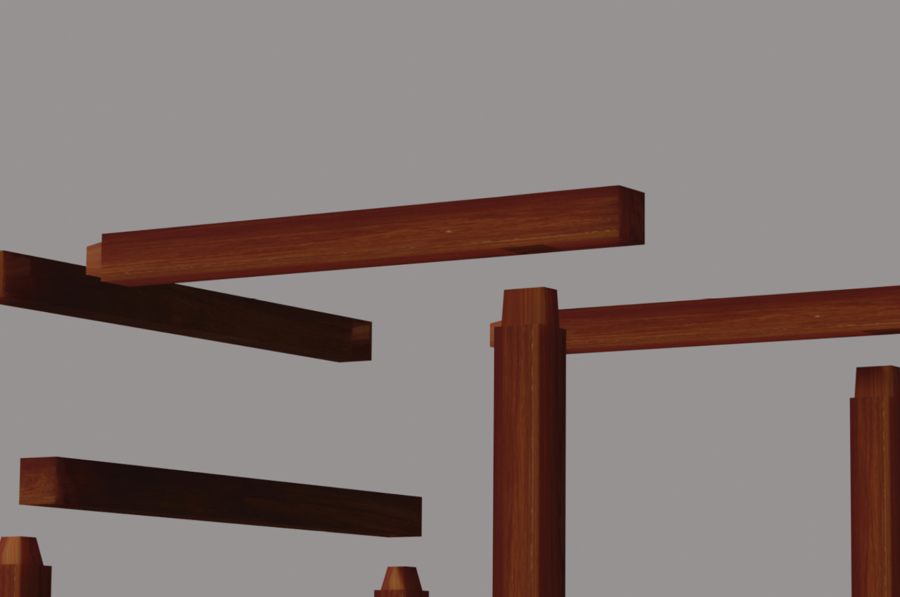
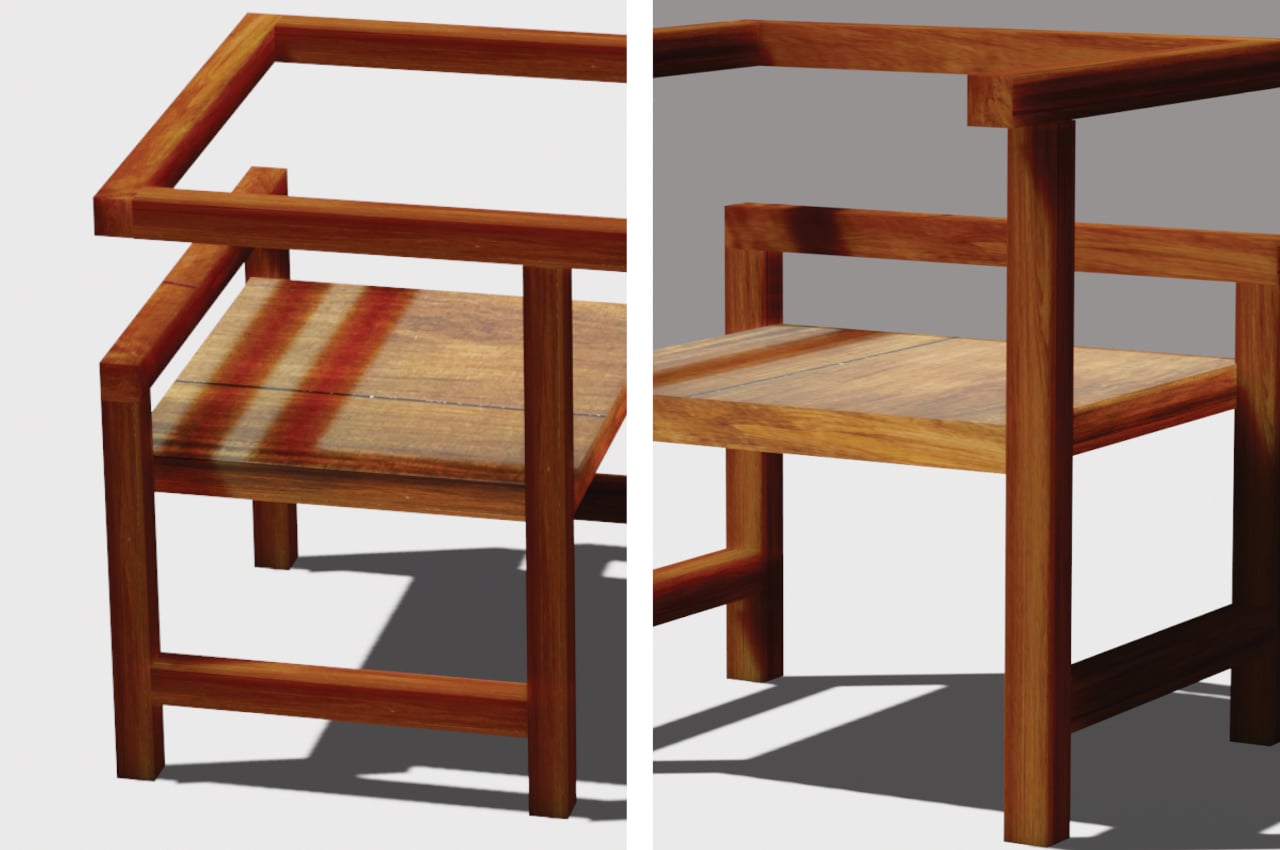
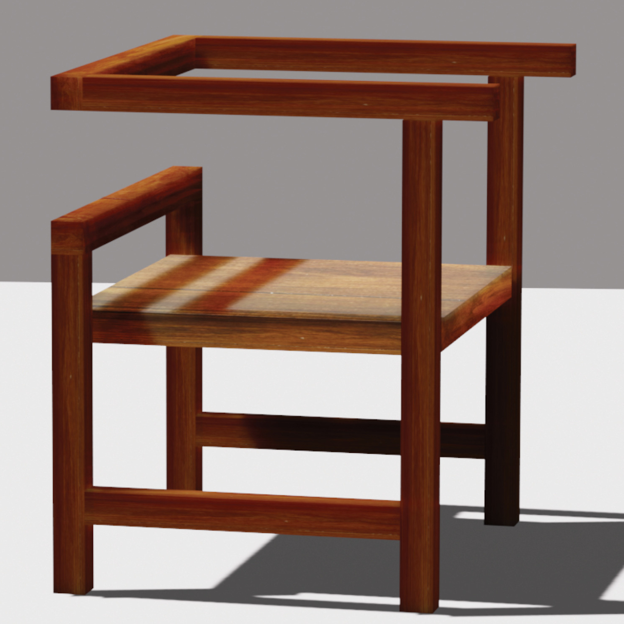
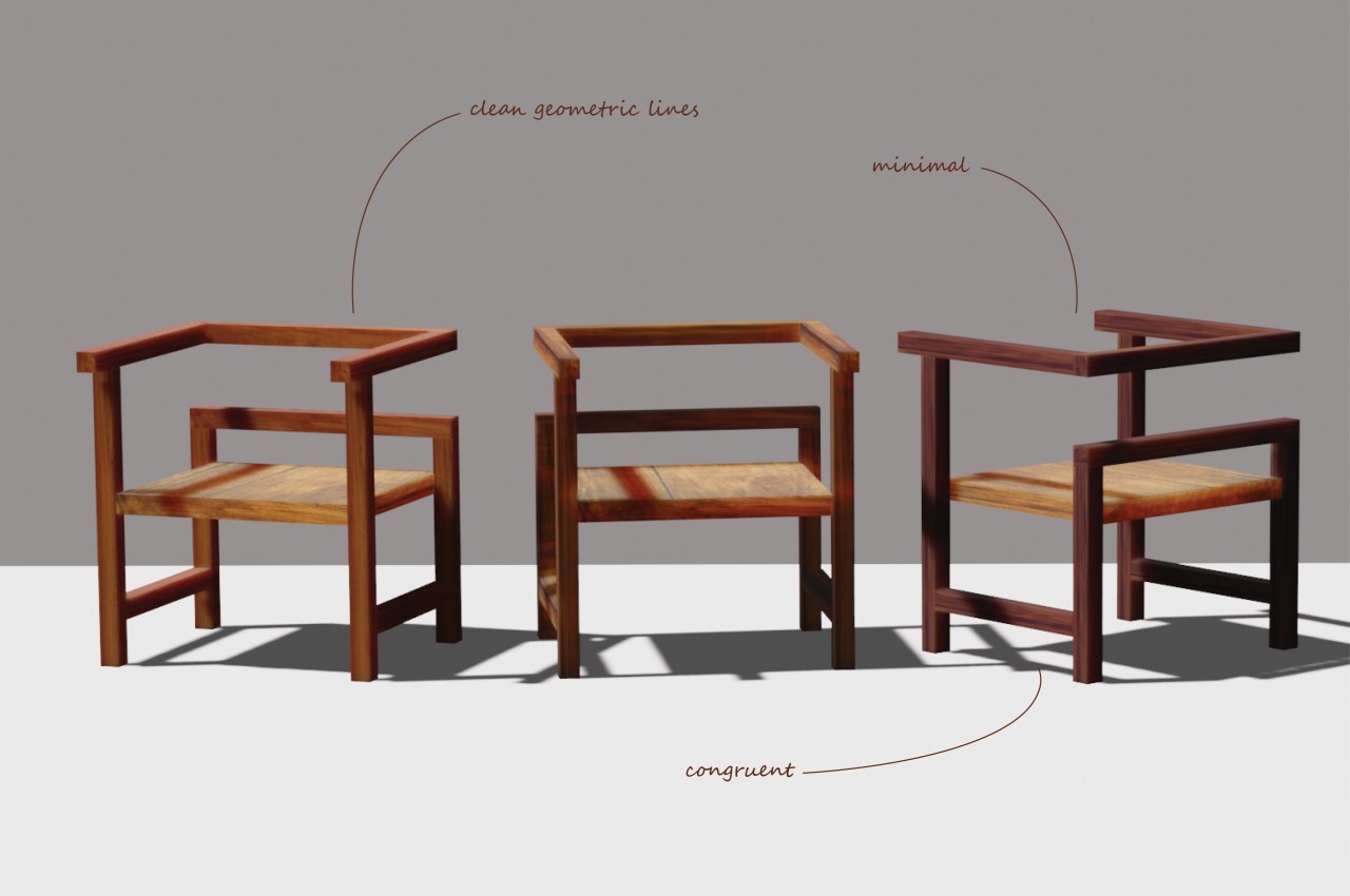
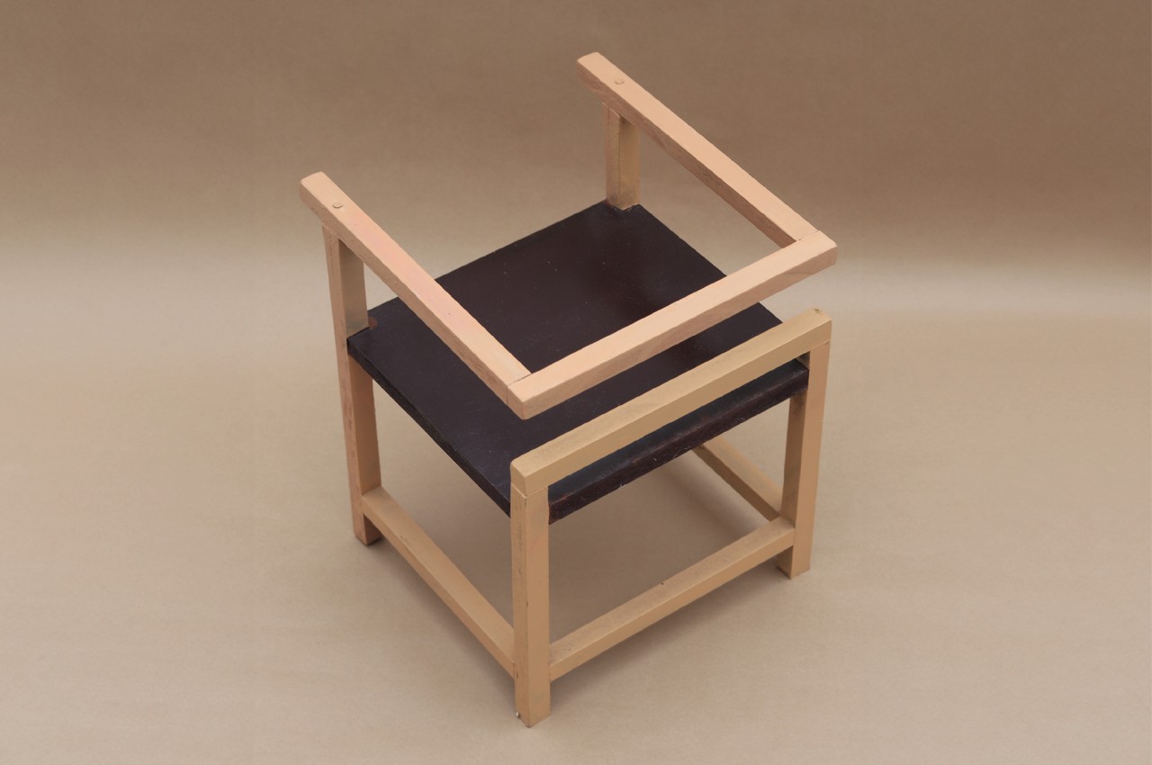
Chairs can come in all shapes and sizes. Some can take on complicated and organic forms, while others can be extremely minimalist or even brutally raw. They can range from designs that take inspiration from nature to those that adhere to simpler geometric shapes. The Euclid concept is one of the latter, aptly named after the ancient Greek mathematician. But while it draws its shape from a simple cube, its execution sparks a bit of wonder and curiosity as it resembles more the skeleton or wireframe of the shape, represented by almost unbroken lines that are reminiscent of Escher’s famed optical illusion, the impossible cube.

Designer: Sonakshi Gupta

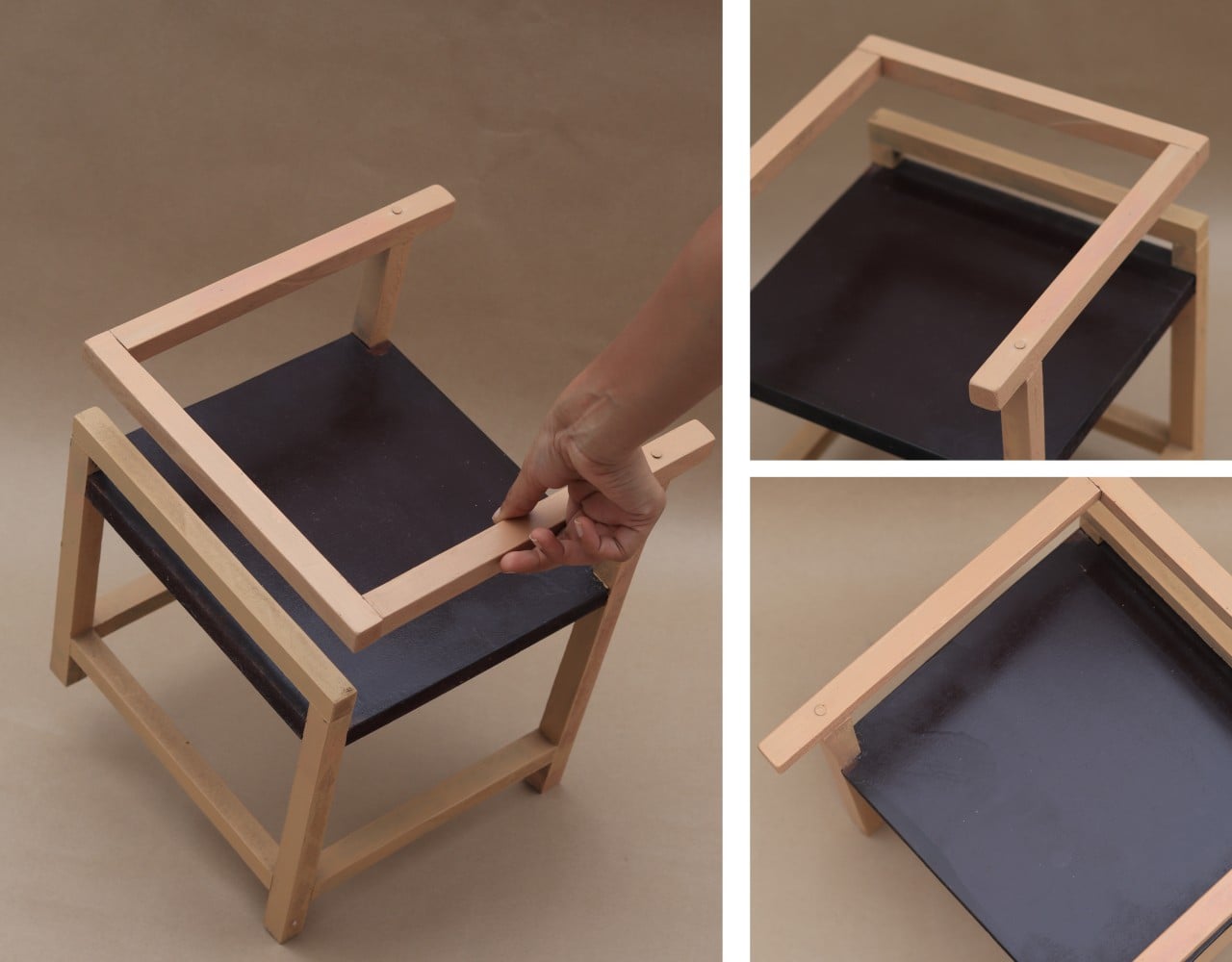
Admittedly, it’s a bit difficult to see the Euclid chair as a cube, since most of us have this idea of a cube as having 12 lines that are all connected at eight corners to form six faces. Then again, that popular Escher object already shows an impossible depiction of that shape, and those familiar with that print might see some of that characteristic in this chair when viewed from certain angles. Overall, it creates a dynamic form that has your eyes following the lines and moving all over the place, sometimes confused about where the front and back sides are.

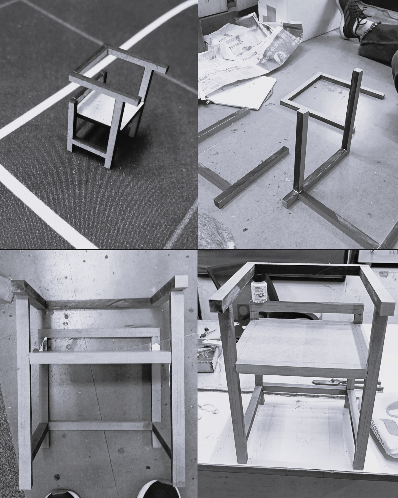
Its unique form isn’t the only notable thing about this concept, however. Its use of reclaimed wood gives it more than a sustainable character. That material, in a way, carries some history from what it was before becoming a part of this chair. Even if that past is unknown to the new owner, simply knowing it has one could give each Euclid chair its own unique charm.

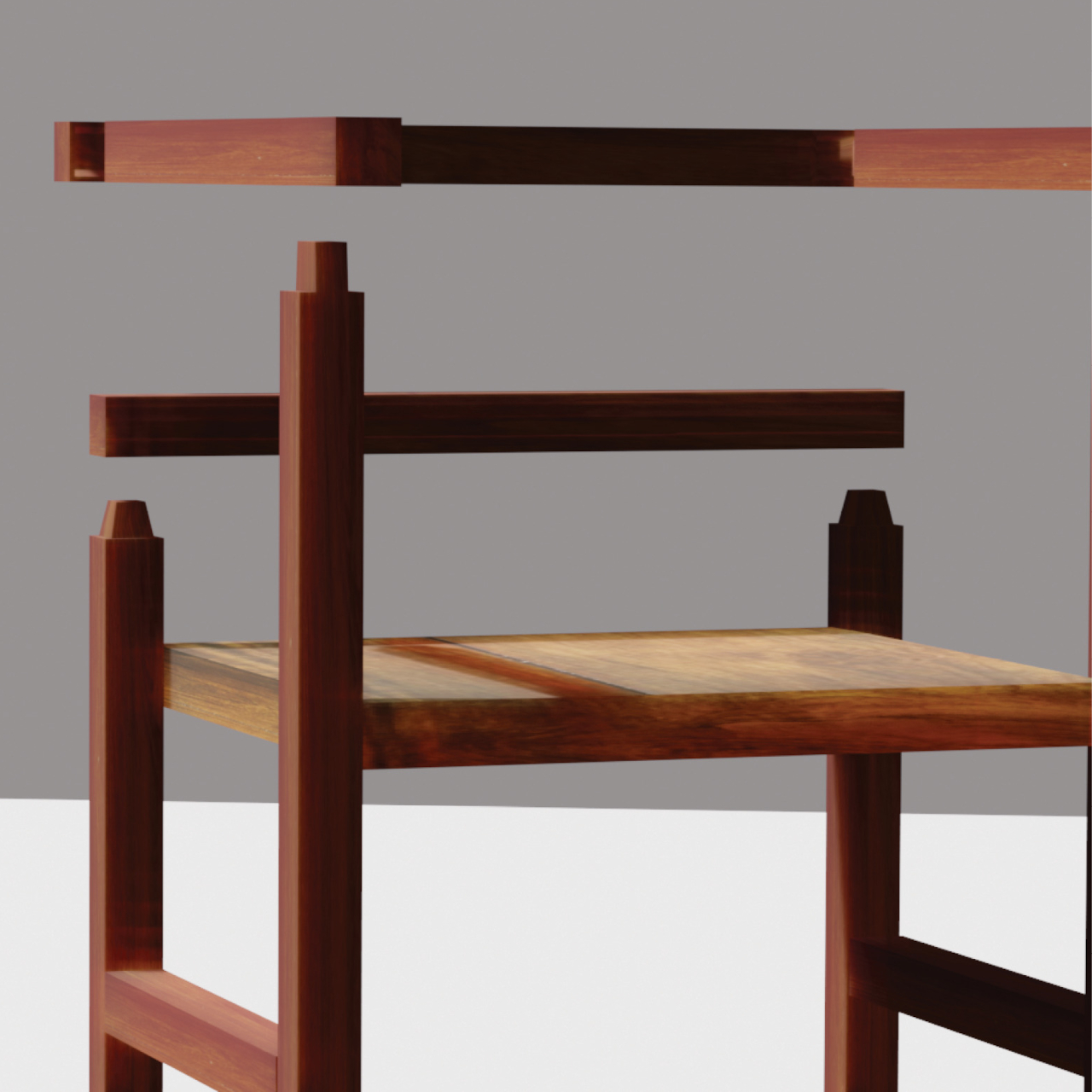
And then there’s the method used to bring all the pieces together. Instead of requiring screws or even glue, a mortise and tenon joinery is used to provide stability without introducing complicated mechanisms. In theory, this could make it easy to later take the chair apart if some pieces need to be replaced, though that could also start to weaken the connection over time if done too frequently.

The Euclid concept chair offers a design that is minimalist, sustainable, and visually interesting. Whereas a cube is pretty much the epitome of symmetry, the missing edges and disconnected faces give the chair a bit more volatility. That said, it doesn’t seem like the most comfortable chair to sit on. Even if you put a cushion on the seat, the hard edges of the armrest and especially the backrest could give your body some grief after a long period of time.

The post Geometric chair concept almost looks like an Escherian optical illusion first appeared on Yanko Design.
Quirky wooden side tables bring delight with geometric holes like a kid’s game

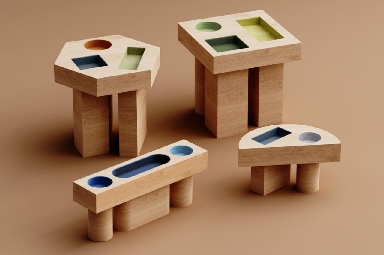
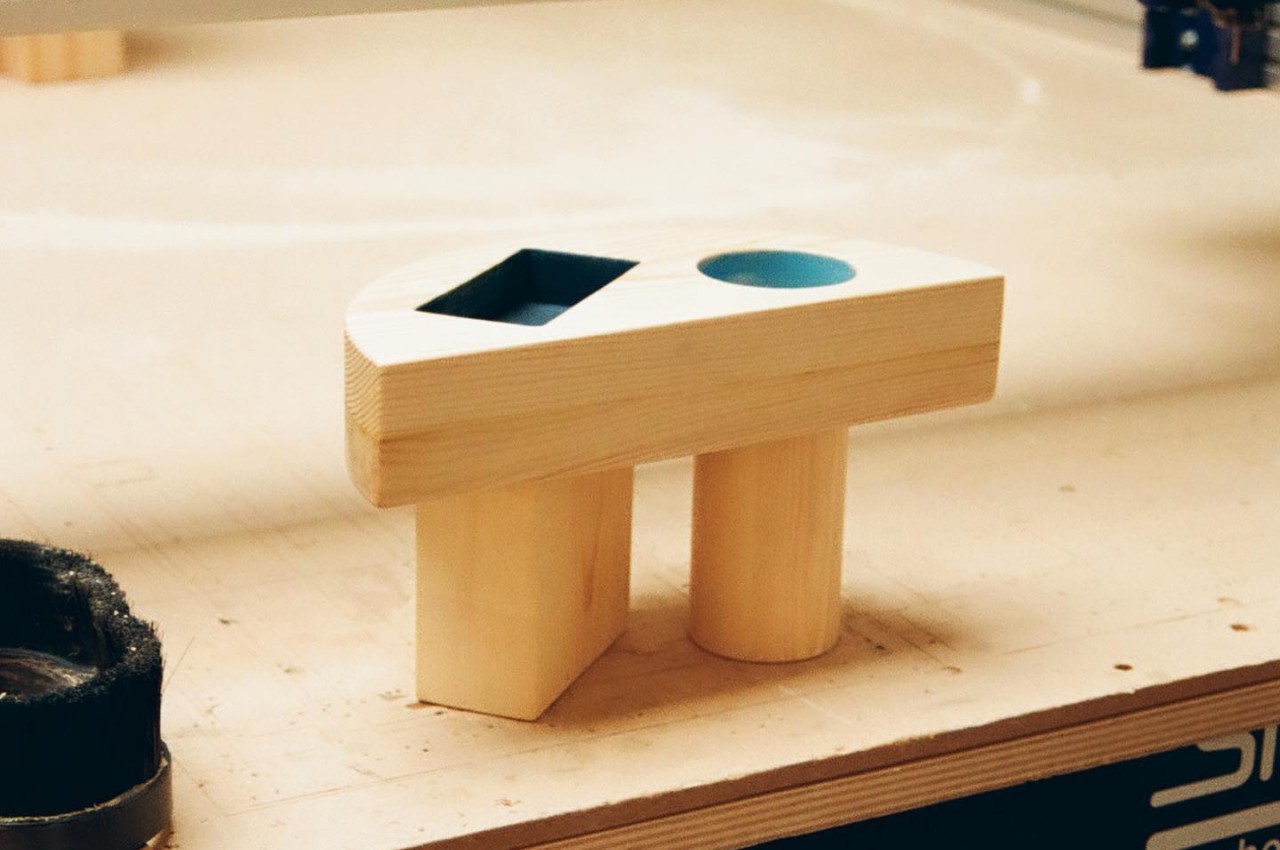
Almost all tables have tops that are flat and horizontal mostly because of the function they serve. You wouldn’t want your glass to tilt over or your phone to slide down just because of an uneven or inclined surface, right? But as long as you are able to place things down on the table without having them wobble, fall, or roll off to the side, then the tabletop can almost be open to any design or shape. That seems to be the reasoning behind these fun-looking side tables that, at first glance, don’t look reliable or functional, at least until you realize that using them is almost like playing that educational game of fitting shapes inside the right holes.

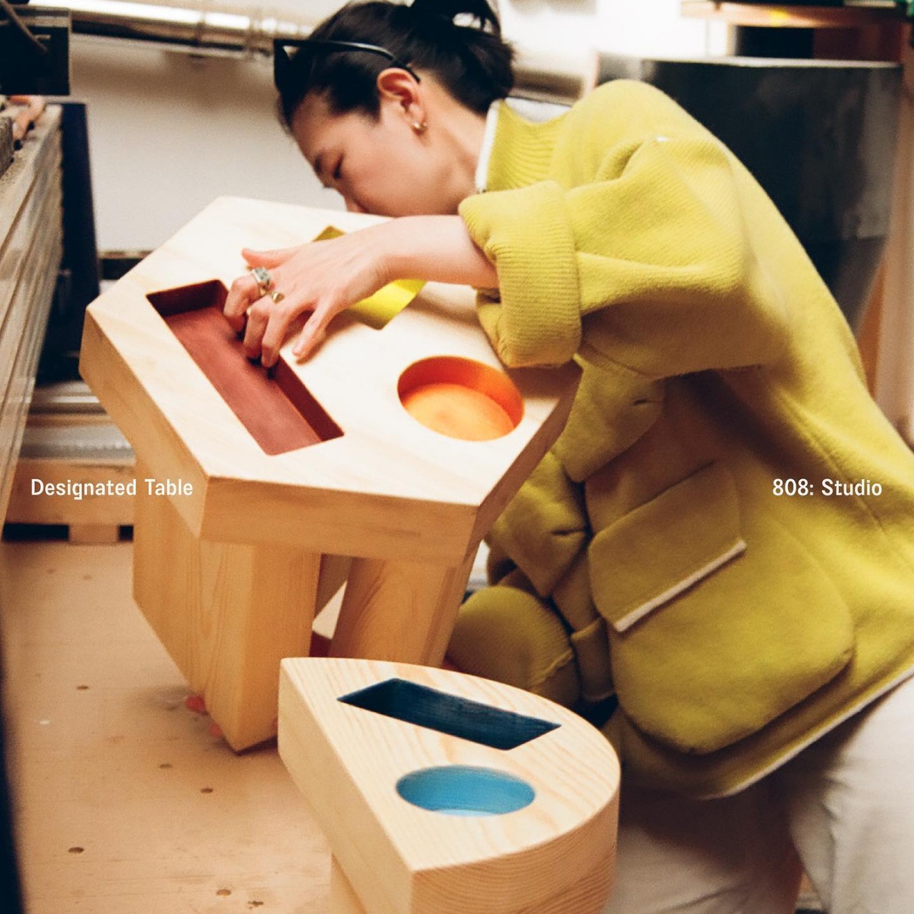
Designer: Chien Yuoning

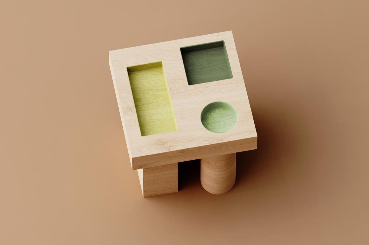
Many parents or even kids might be familiar with that toy where you have holes in a geometric shape and you’re supposed to drop matching geometric blocks inside them. This side table collection might immediately remind people of those toys and, unfortunately, might also give them the wrong impression of the practicality of such a design. Fortunately, it isn’t just a whimsical decision as these geometric holes can actually act as helpful organization aids in addition to being quite interesting to look at.

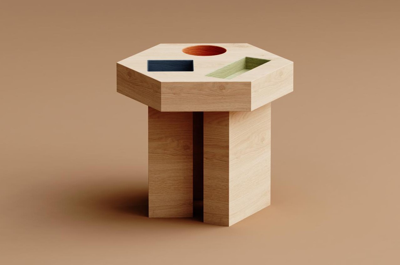
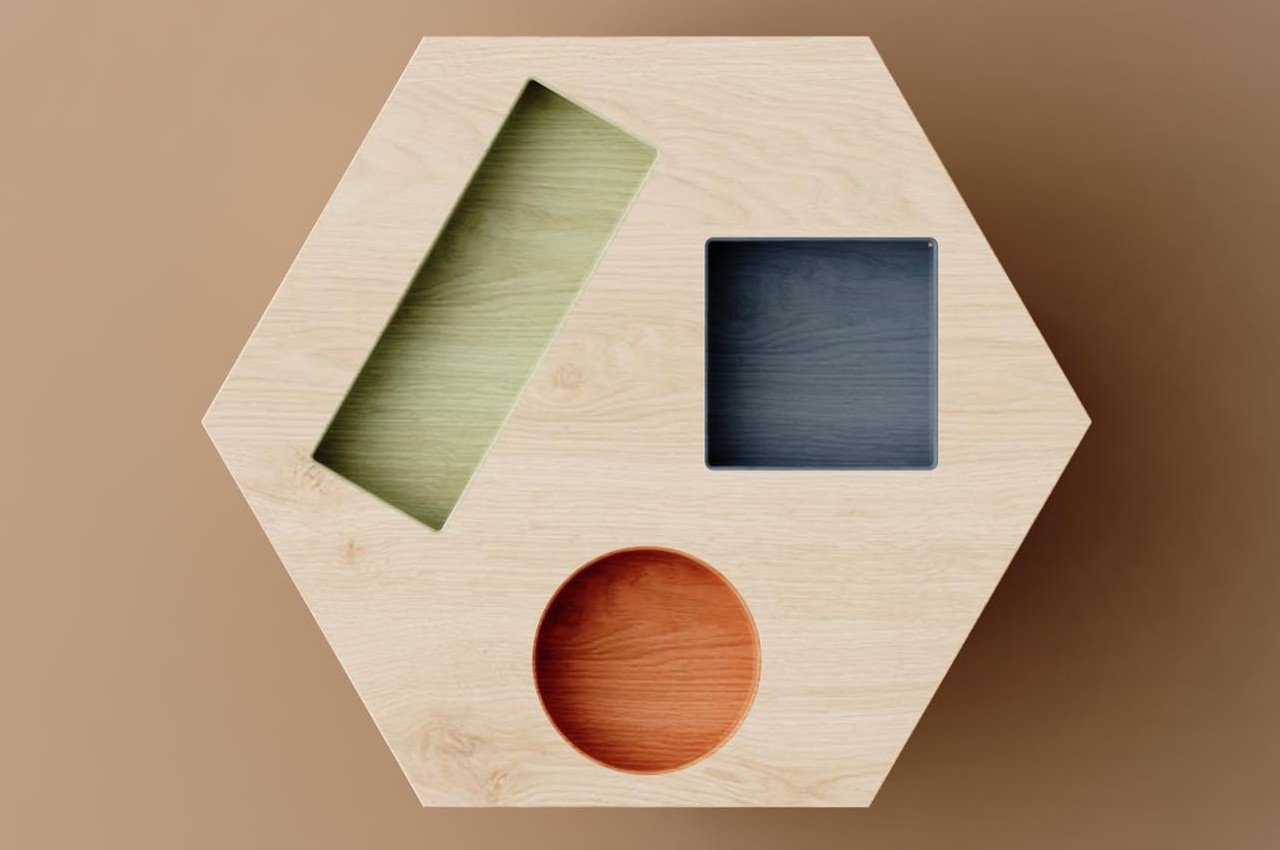
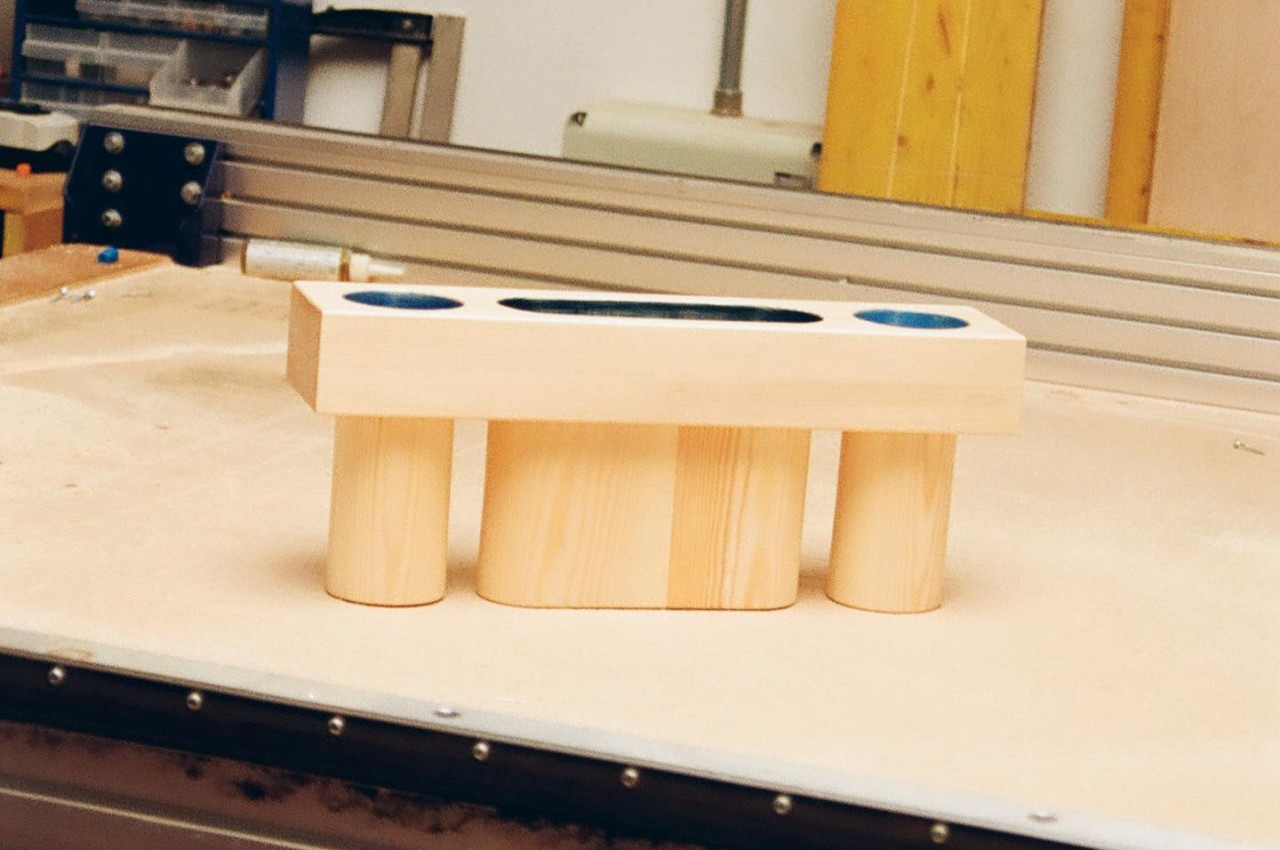
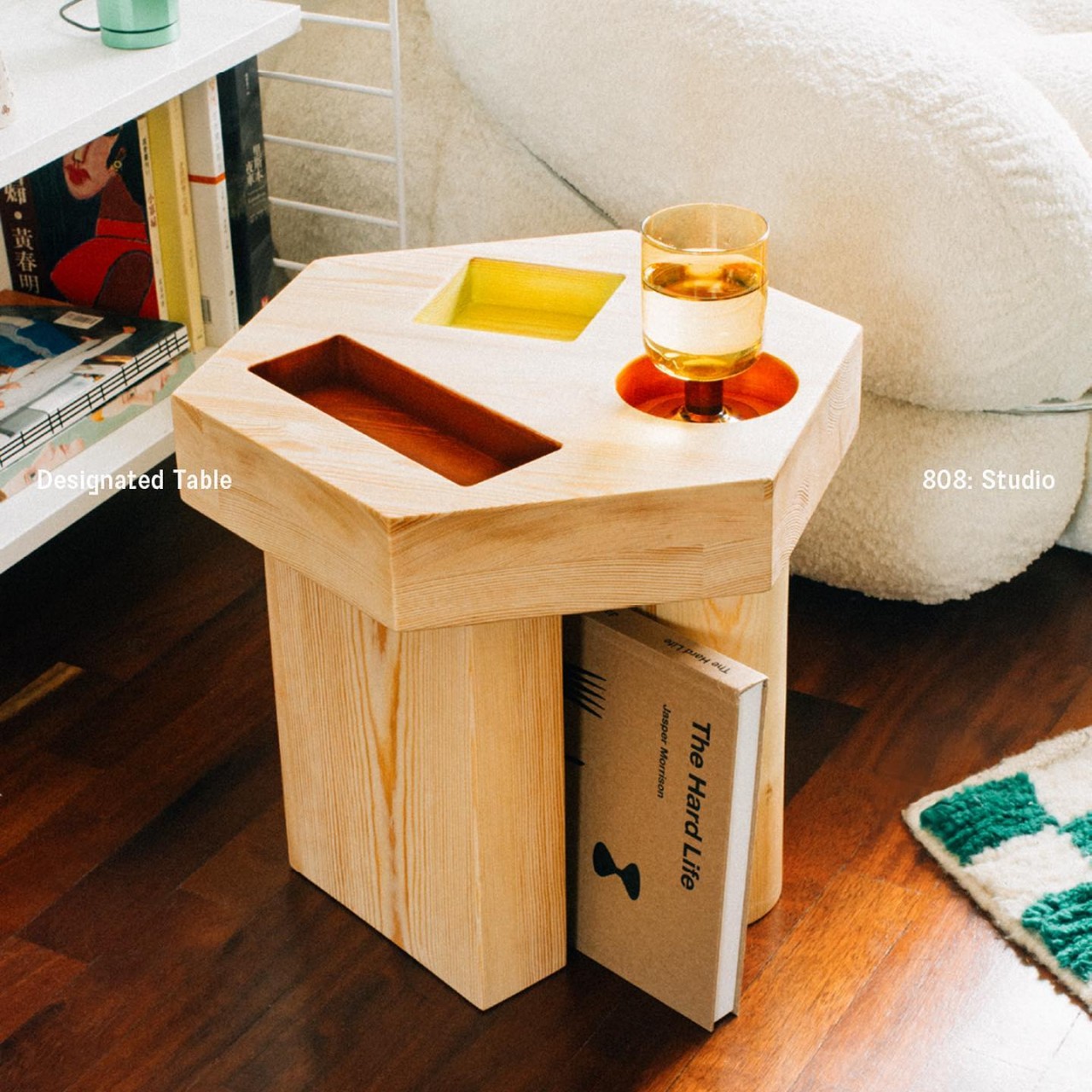
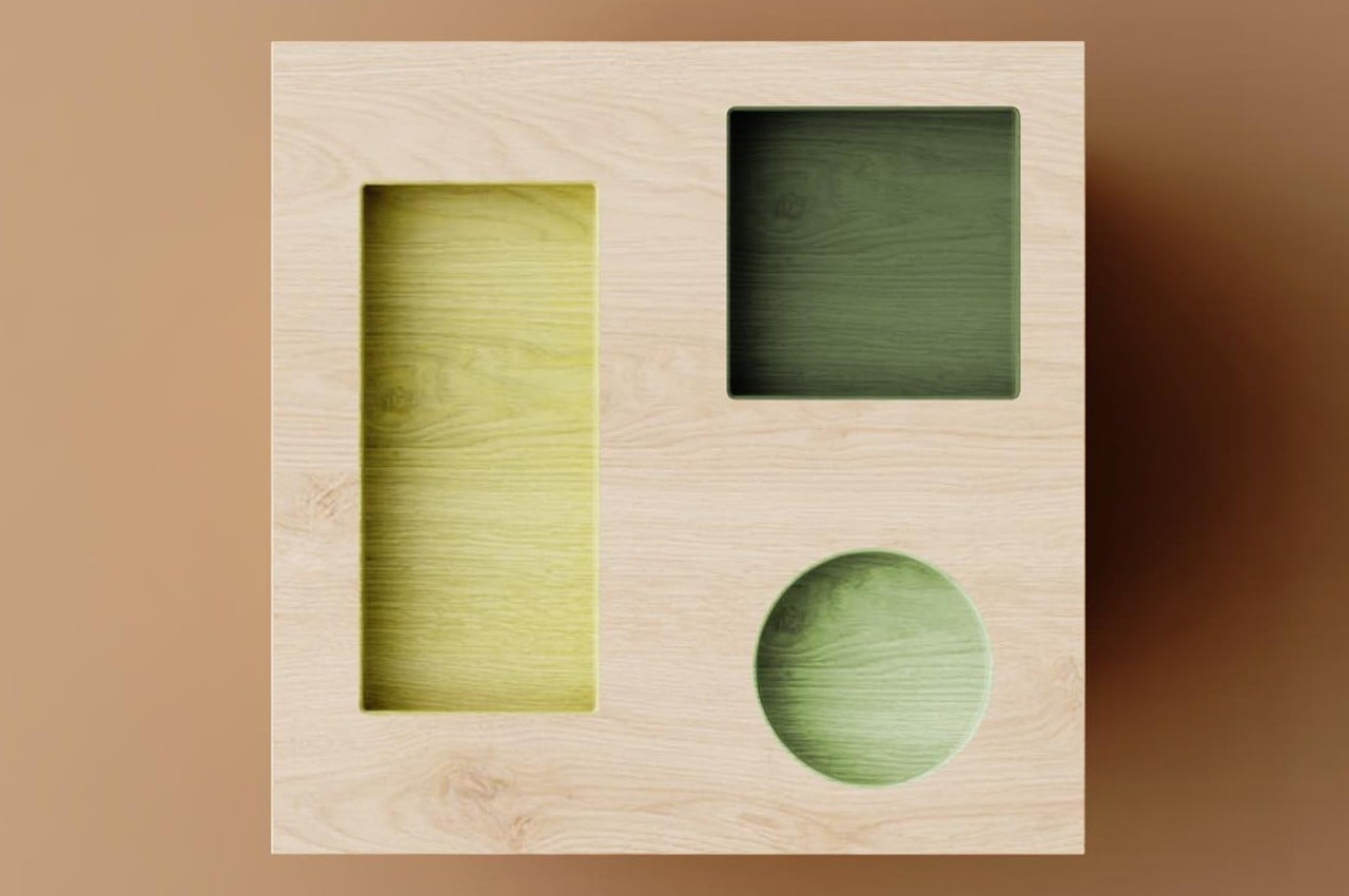
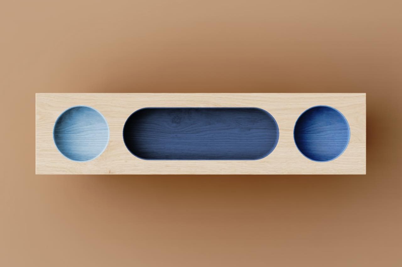
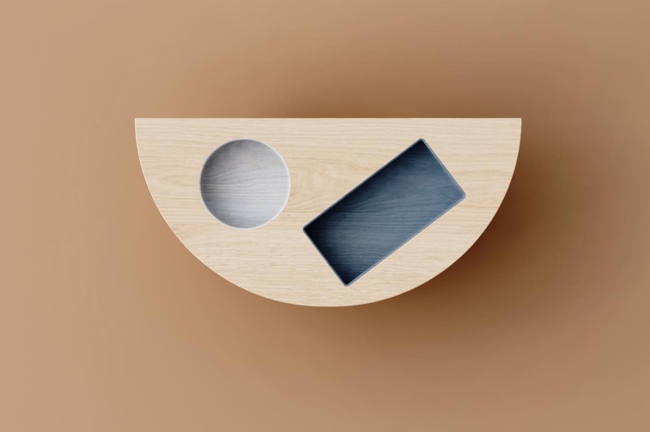
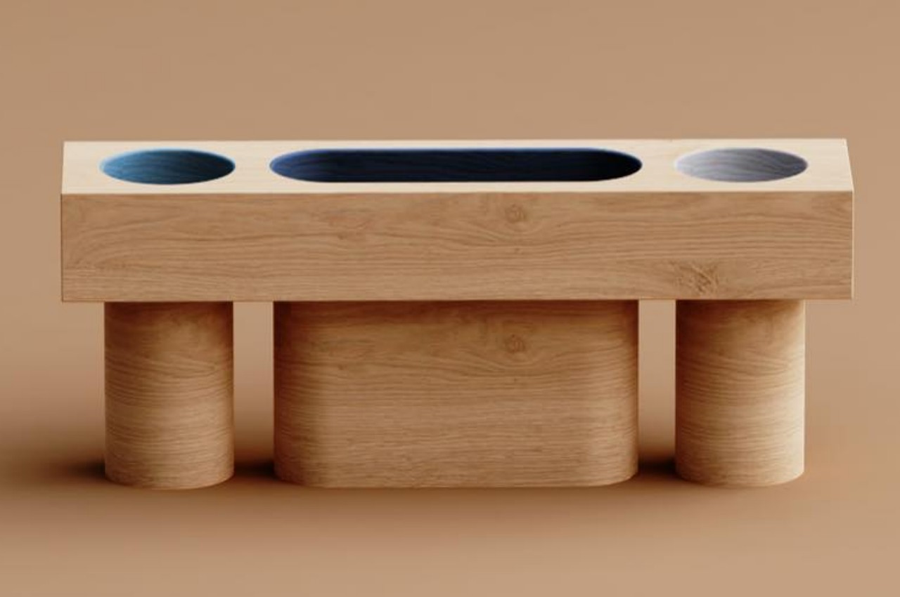
The Designated Table collection has geometric shapes like circles, squares, rectangles, and even pills cut out from the tabletop. While they might look like a loss in terms of usable space, they act as designated containers for things like glasses, phones, books, or whatnot. These compartments let you separate different things while also providing a bit of support to some extent. It’s harder for a glass to topple over if its area is constricted.

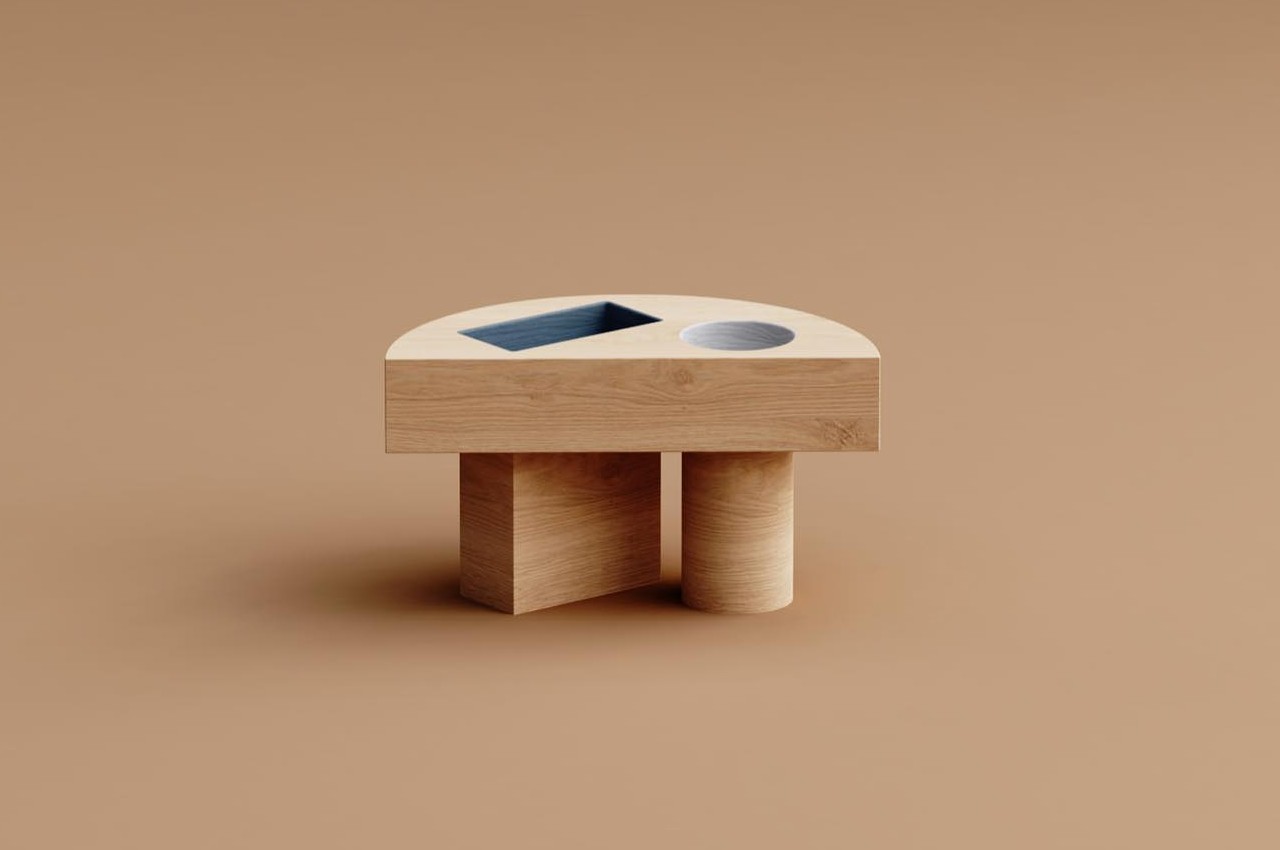
At the same time, the shapes add a playful character to the tables, especially since the shapes have a different color from the natural finish of the rest of the wooden table. The tables themselves come in different shapes, including a hexagon and a half circle, doubling the fun factor of each side table. That, however, also determines where some of these side tables can be placed, like the hexagon-shaped side table making a poor fit for a nightstand or anywhere the table needs to be flush against a flat surface like a wall, a couch, or a bed.

Another interesting aspect of the Designated Table’s design is that the legs follow the shape and orientation of those seemingly random shapes. That makes it feel like the wooden legs flow from these geometric indentations or vice versa, giving the tables an almost whimsical flavor that doesn’t sacrifice their stability. The gaps between the legs can even become a place for magazines, taking advantage of the narrow space. The geometric design of the Designated Table feels jovial and delightful but still makes the side tables completely functional and, perhaps, even more effective in keeping your things in their proper places.

The post Quirky wooden side tables bring delight with geometric holes like a kid’s game first appeared on Yanko Design.
Unique DIY watch moves liquid droplets around to tell the time

With the arrival of smartwatches, the divide between analog and digital has become a little bit blurrier. After all, you can create the illusion of a mechanical watch using a display and you’ll only realize the difference on closer inspection. That said, these two extremes aren’t the only ways to tell the time, and if you look hard enough, you’ll find other intriguing designs that make use of a combination of patterns and lights that you need to decipher and translate to regular numbers. This distinctive watch project doesn’t go to that extreme and still presents a more familiar face, but it does so using a medium that you’d least expect to see on an electronic watch.

Designer: Armin Bindzus

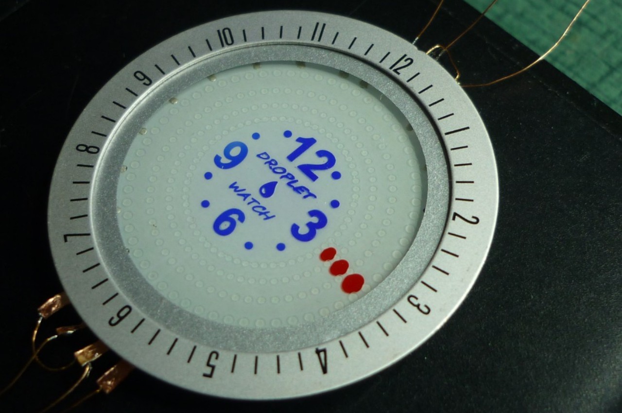
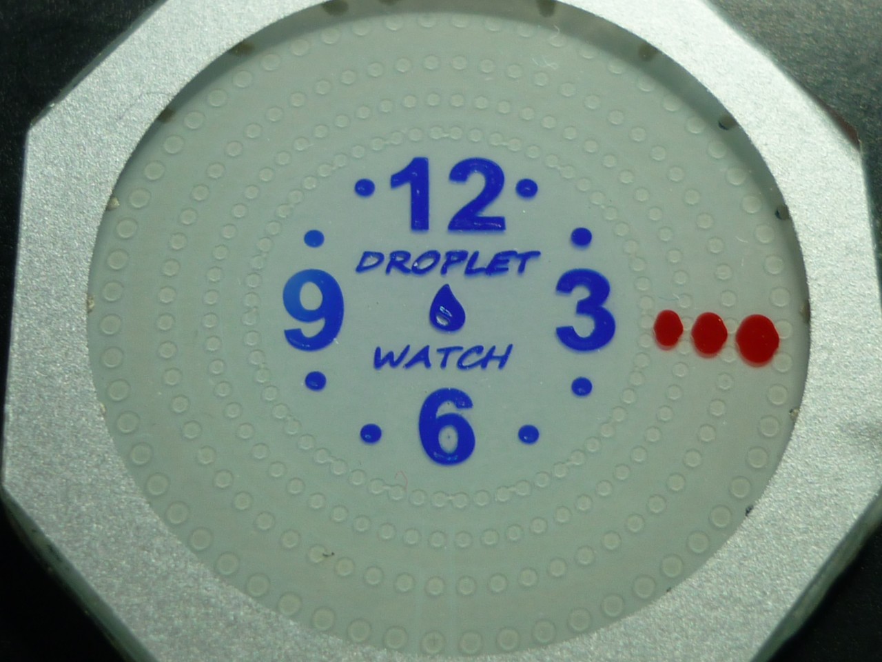
Analog watches and clocks use physical moving parts to indicate the passage of time, but there’s no hard rule that says there have to be three long bars or lines. Some minimalist designs even reduce those “hands” into circles, going so far as even removing all but four numbers from the watch face. This leaves a little wiggle room for experimentation, like this DIY electronics project that uses something like those aforementioned dots but also has those dots in liquid form.

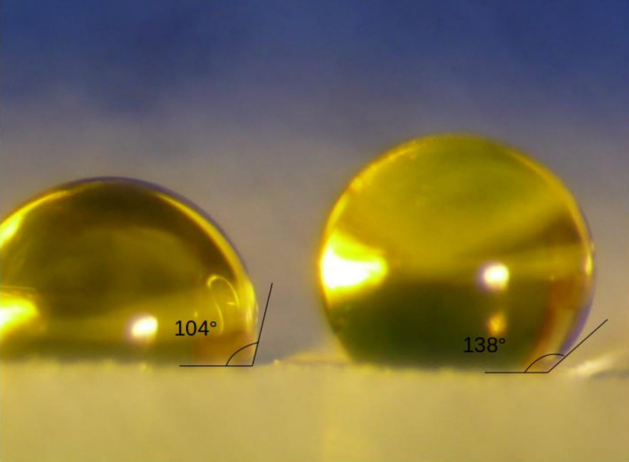
Given how we’re often told not to let liquid near electronics, this might come as a bit of a surprise, but the droplets used in this intriguing design are actually polar liquids. This means they can be electrically charged and, in this case, move around a surface exactly because of that charge. The technical principle behind this technique is called “electrowetting,” and it is able to induce liquid motion by changing the electrical field on a given surface.

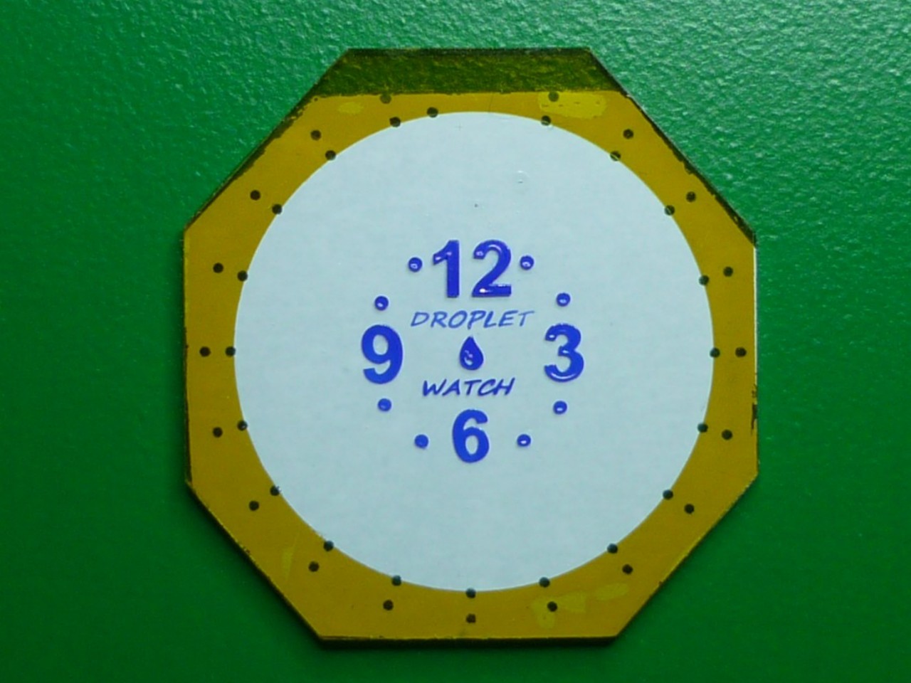
With the Droplet Watch, that shifting electrical field is done through three concentric circles of 60 electrodes, representing the 60 “ticks” on a watch face. Electrodes get charged or discharged, which causes the droplets along the lanes between these circles to move around, just like the hands on a clock. It’s a complicated process that has plenty of room for errors, but it’s certainly interesting to watch liquid dots moving around the clock, briefly leaving a trail before it catches up to the rest of the mass.

The Droplet Watch only consumes power when moving the liquid, which puts it on the same level as an E Ink display. Sadly, it’s also not a practical design, at least not for a watch that will move a lot since the liquid could be dislodged accidentally. And with many digital screens on clocks and watches these days, that same visual effect can be accomplished with little to no effort at all.

The post Unique DIY watch moves liquid droplets around to tell the time first appeared on Yanko Design.
Sustainable and minimalist desk tray collection lets you mix and match to your needs

Desk trays are an indispensable part of any organization system, and their designs vary wildly to meet different needs and aesthetic tastes. While wooden desk accessories are not uncommon, the most standard materials used for these products are often virgin plastics that, given the volume of their use, spell trouble for the planet. Fortunately, a few designs nowadays do try to utilize recycled or even upcycled materials to ease the burden on the environment, but good design doesn’t have to stop there. This concept, for example, seems to check all the right boxes by offering not only a sustainable solution with a beautiful minimalist design but also one that lets you combine pieces as you see fit or use them solo in different places as needed.

Designers: Hoyeon Shin, Seokhyoun Han, Joae Kim, Yeongha Kim, Zoae Kim for Haus Bari

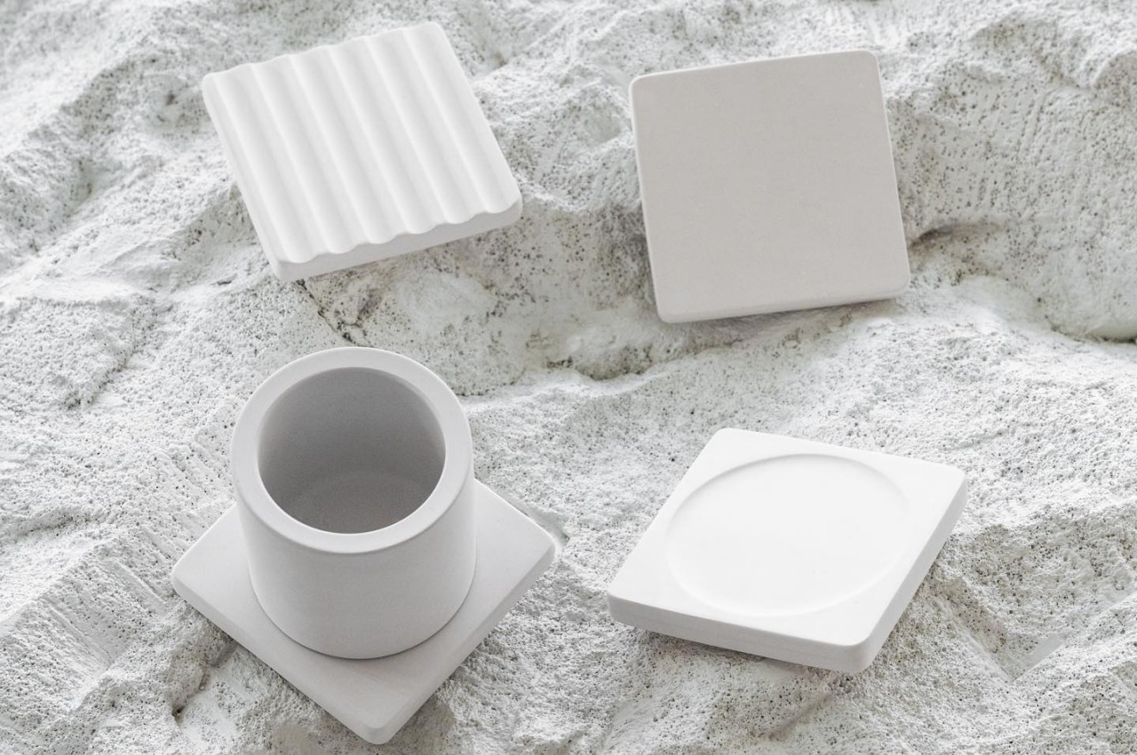
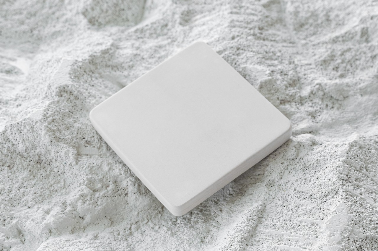
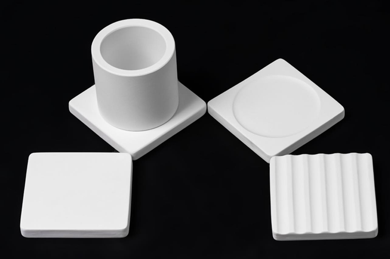
Truth be told, this design is actually four separate products sharing a similar DNA. One design, however, can’t meet all the needs of all users, so rather than make a monolithic product that wastes space and materials, this series of trays simply offers four unique designs that can be used for a variety of purposes, including in places that don’t involve work tables and stationery.

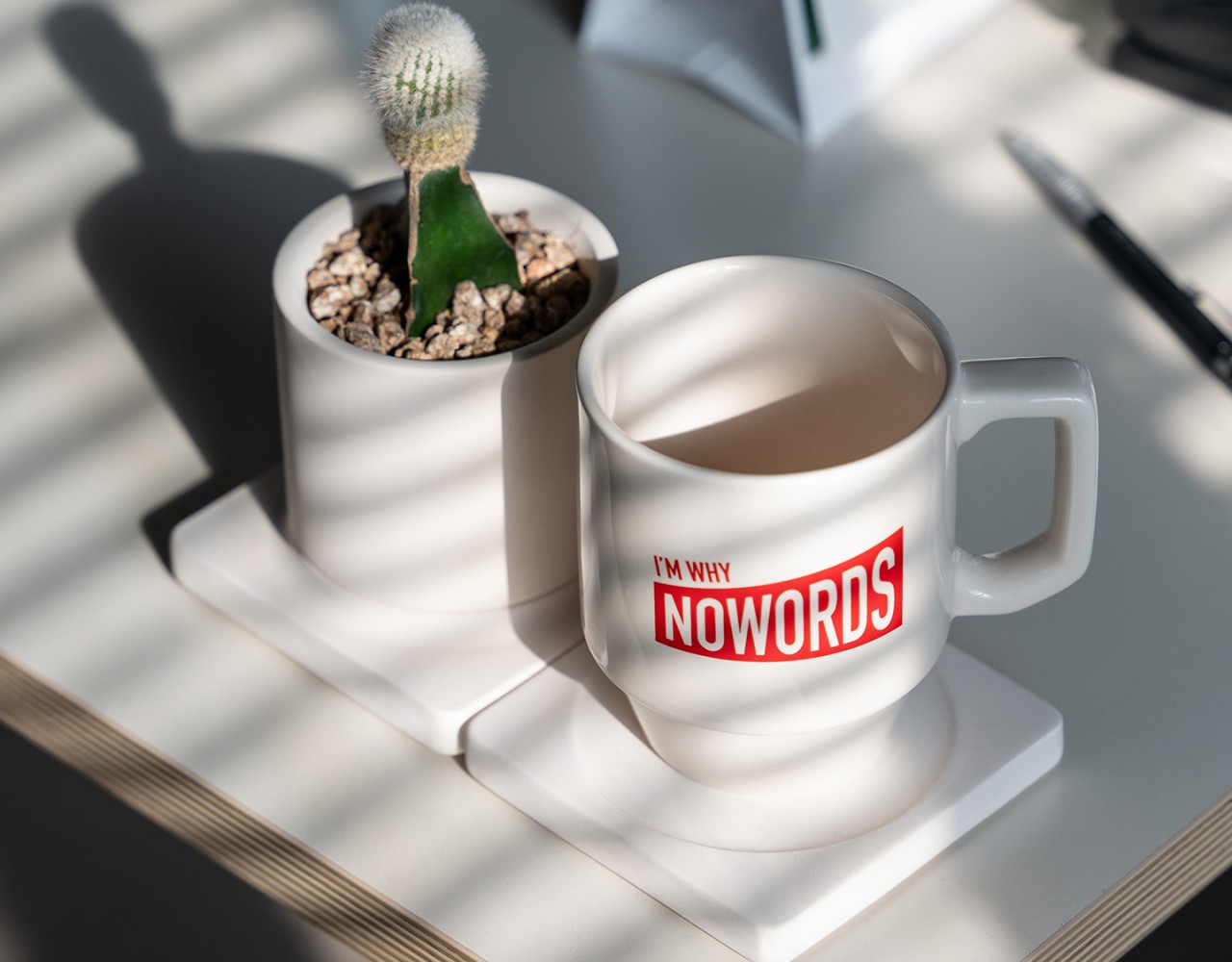
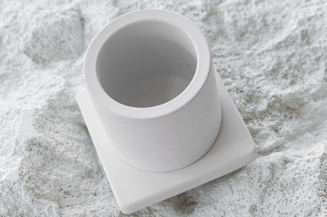
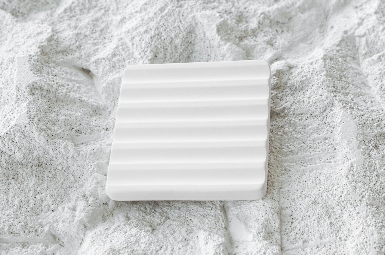
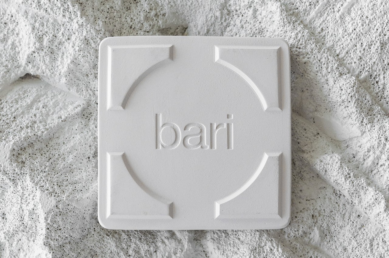
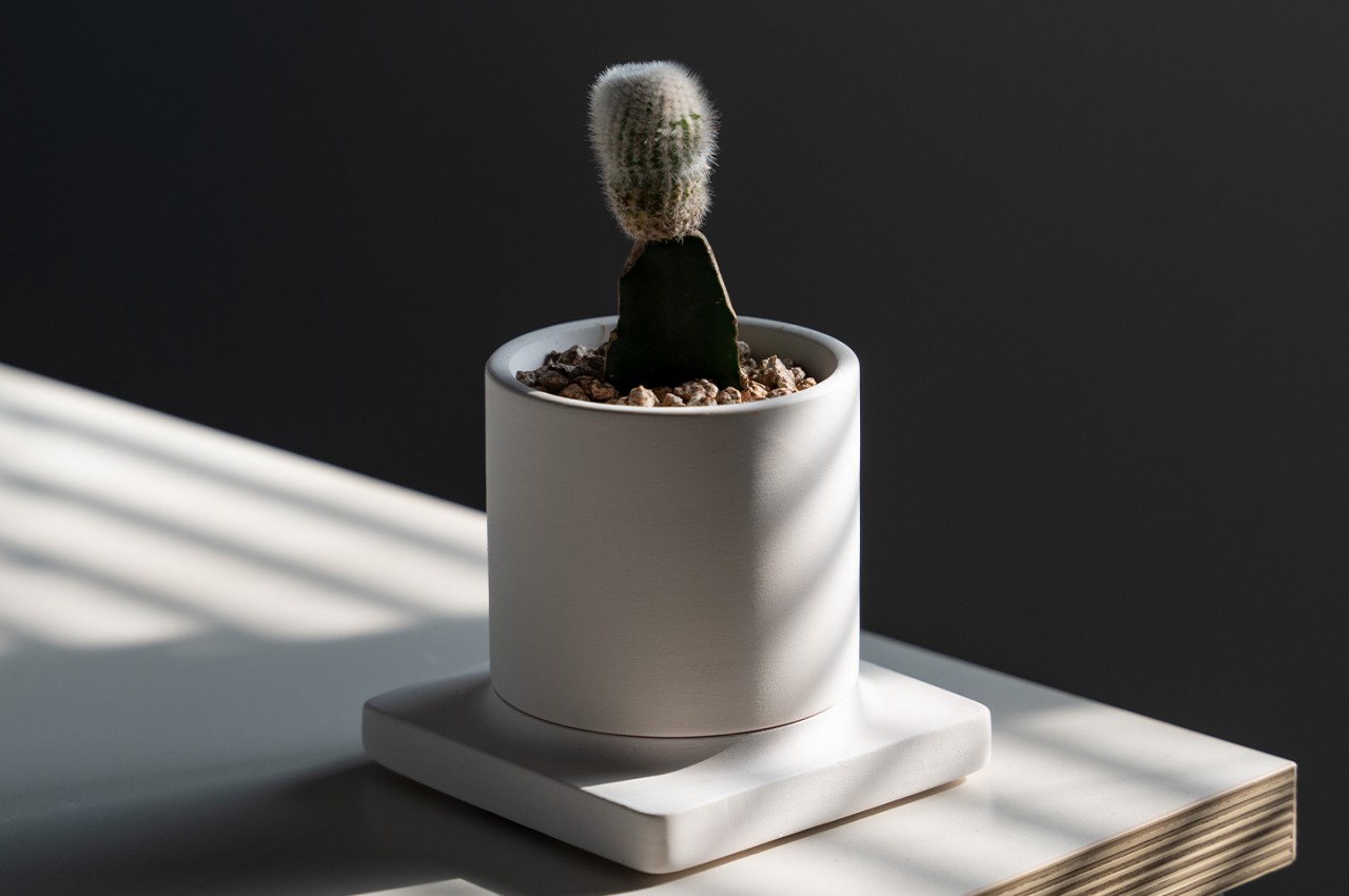
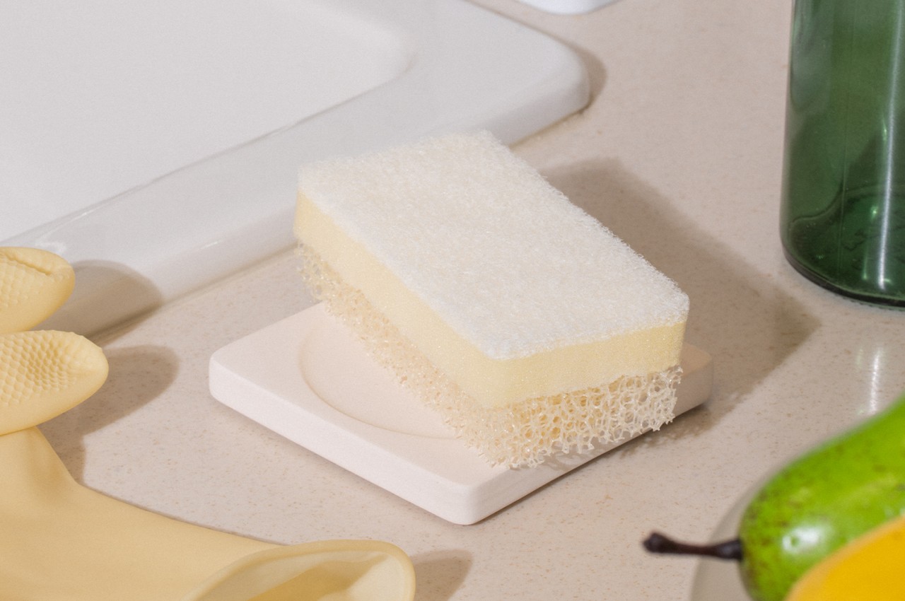
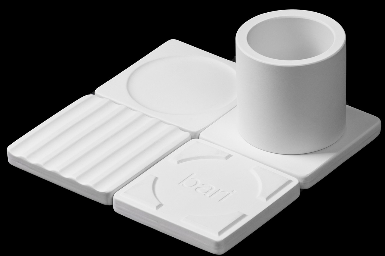
All four pieces share the same thin square platform, but that’s pretty much where the similarities end. One “block”, for example, has a fixed cylinder that can be used for holding writing instruments, tools, or maybe even flowers. Another has a circular indentation that invites you to place a mug or glass on it, though it can also fit small items such as an AirPods charging case. The tray with a wavy surface can be a bed for pens and pencils without having them jumbled up together. The fourth member has a simple flat surface, but flip it over and you will behold the Bari branding underneath. It can also function as another coaster thanks to that circular groove again.

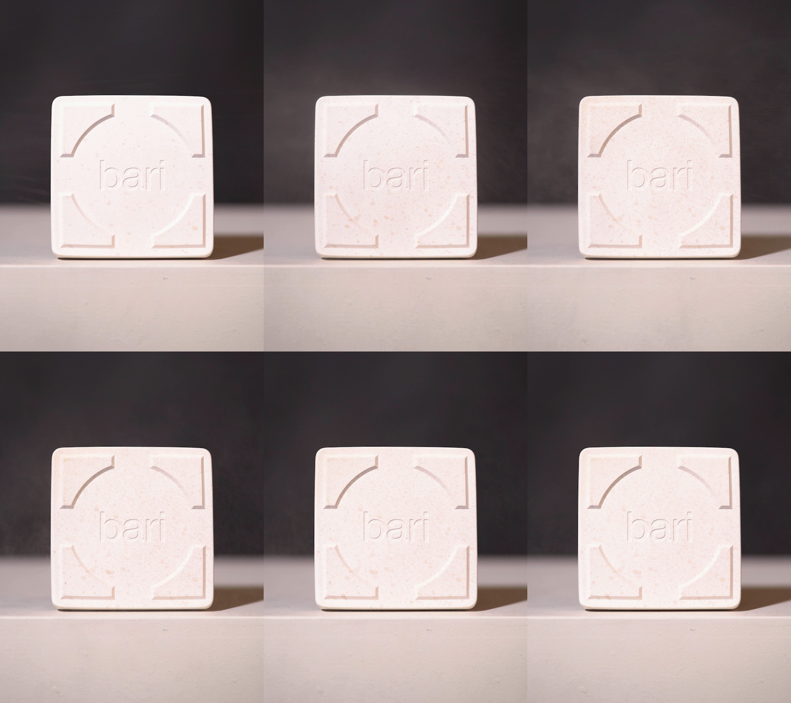
The trays use diatomaceous earth, a sustainable material that is gaining popularity among product designers. It also gives the tray a textured appearance that resembles rough, unpolished stone, making the minimalist products look a little more visually interesting. It also makes it possible to place wet or damp objects on top of the tray, such as sponges or even soap, thanks to the material’s moisture resistance and self-drying properties.

1

Although each of these trays functions as an independent unit, you can also combine them as a single organization system where you have free reign over how they are arranged. You can have them for a line, put them in a grid, or spread them out all over the desk. Of course, you’re not limited to just one of each piece, either, and can form an army of trays and containers ready to keep your mess at bay. It’s an admittedly simple solution to desk and life organization, but one that offers beauty and flexibility in a package that tries to reduce its negative impact on the environment.

The post Sustainable and minimalist desk tray collection lets you mix and match to your needs first appeared on Yanko Design.
Origami-inspired table concept folds into a lamp to save space

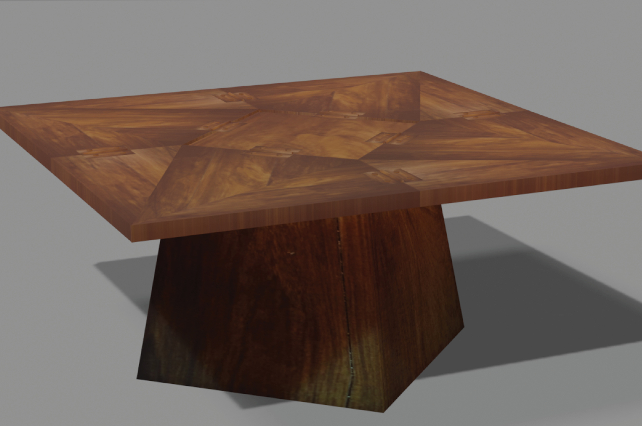
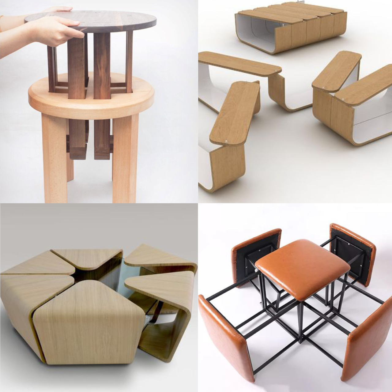
Tables are important pieces of furniture in any human space, whether it’s the dining table at home or a meeting table at the office. That said, we don’t always use these flat horizontal surfaces all the time, and there will be times when they’re just taking up precious space. Yes, more aesthetic tables do provide some visual value, but it doesn’t outweigh the cost of their presence. Foldable tables are practical, but few actually look good even when unfolded and the hassle of moving the folded table out of the way makes them less compelling. But what if you didn’t need to put the table away because it not only becomes more compact but also serves a different purpose? That’s the kind of multi-functional design that this concept proposes, turning a table into a lamp.

Designer: Sonakshi Gupta

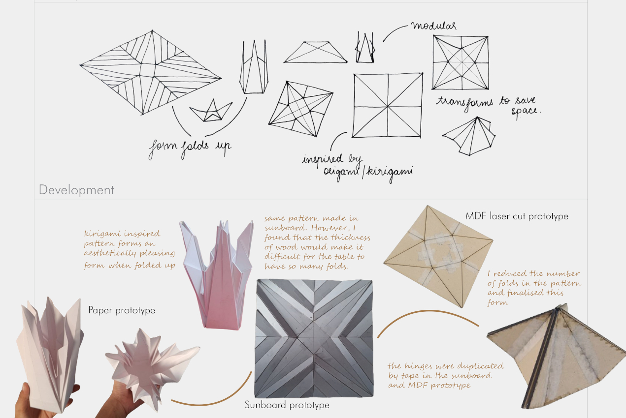
The Japanese art of folding paper has inspired many designs because of its beauty, simplicity, and space efficiency. A large and flat sheet of paper can suddenly become a geometric flower or swan with a few folds, significantly reducing the area that the piece of paper once occupied. This art doesn’t involve removing or adding parts, which makes each piece an independent and standalone unit.

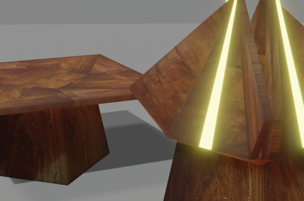
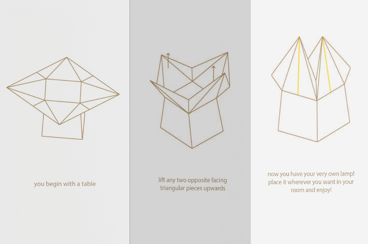
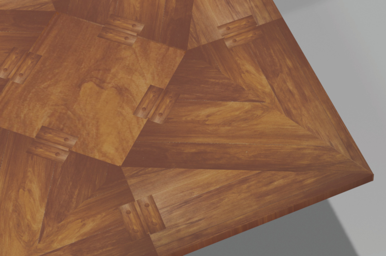
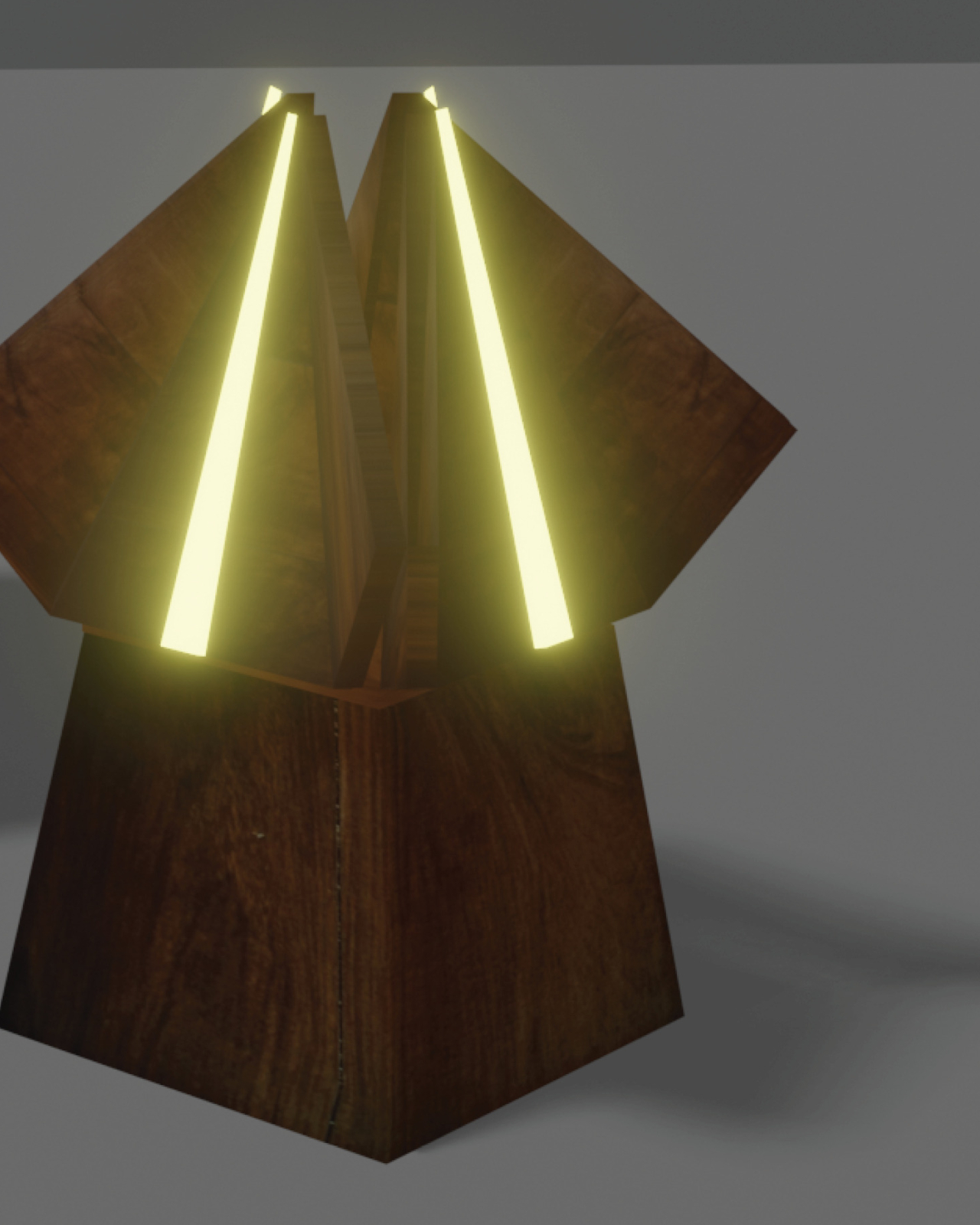
LightUP is a concept that takes inspiration from origami and kirigami (which does involve cutting away and gluing pieces together) to design a table that not only saves space but also provides a completely different functionality or two. The squarish wooden tabletop folds up into a shape that’s like a flower bud, freeing up the space around the table for use. Thanks to ingenious invisible hinges, not only do you have a clean and flat table surface but moving only one or two corners is enough to fold and unfold the table. The easier you can perform this action, the more frequently you’re willing to do it.

Of course, that’s not where it all ends. The design’s name comes from the fact that wide LED light strips from the pyramidal base of the table to each of the four corners. Thus, the table becomes a room-wide lamp at night but can also remain as a space-saving art object when the lights are off.

Admittedly, the design’s implementation is actually more complicated than it looks thanks to the moving parts and hinges involved. Those may become points of failure over time due to wear and tear. The idea, however, could give birth to a simpler design, one that takes into account aesthetics, functionality, and sustainability altogether for a truly space-saving piece of furniture.

The post Origami-inspired table concept folds into a lamp to save space first appeared on Yanko Design.
Hand-worn smart display concept safely shows information for bikers, mountaineers

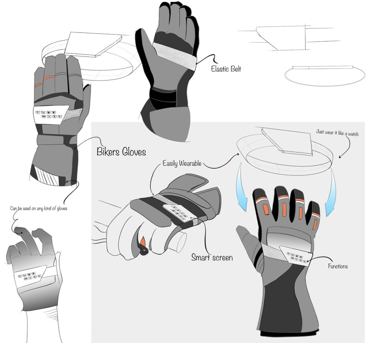
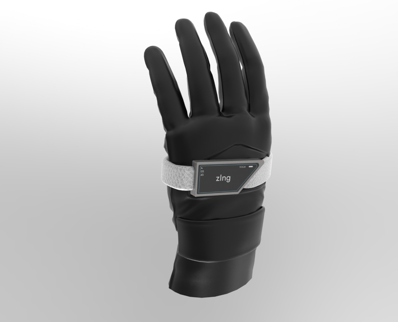
Smartphones can provide all sorts of useful information and features, but there will always be occasions when you can’t just whip out the phone from your pocket to use it. Smartwatches are supposed to solve that problem by offering more condensed information on your wrists, but that can still be problematic for some class users, especially those who engage in outdoor activities. Although smartwatches are often marketed for athletes and people with active lifestyles because of their health-tracking features, actually using the wearable once the gloves come on can actually be difficult, if not impossible. Fortunately, your wrist isn’t the only body part you can use for a wearable, and this design concept tries to place a bigger display on the back of your hand instead.

Designer: Anuj Pate

Smartwatches are the most popular kind of wearable design simply because they are the most convenient and the most familiar. That doesn’t exactly mean they’re the best or only design possible, definitely not for all kinds of people. The rising interest in smart rings does indicate a sort of “smartwatch fatigue” that’s making people think outside the box on how to deliver some of those features through other means. A smartwatch’s display, for example, is only useful if can see it, which often means having to twist your wrist at the very least to have the screen at a proper angle.

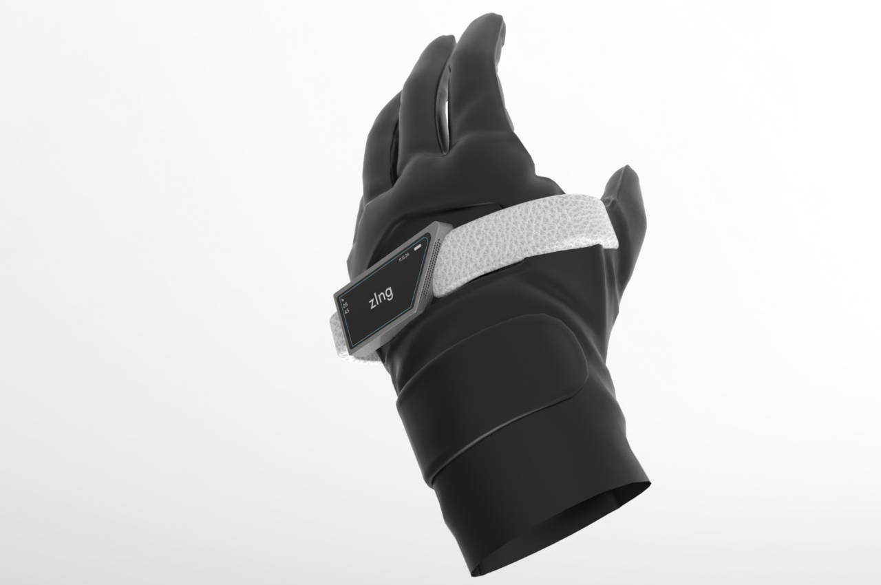
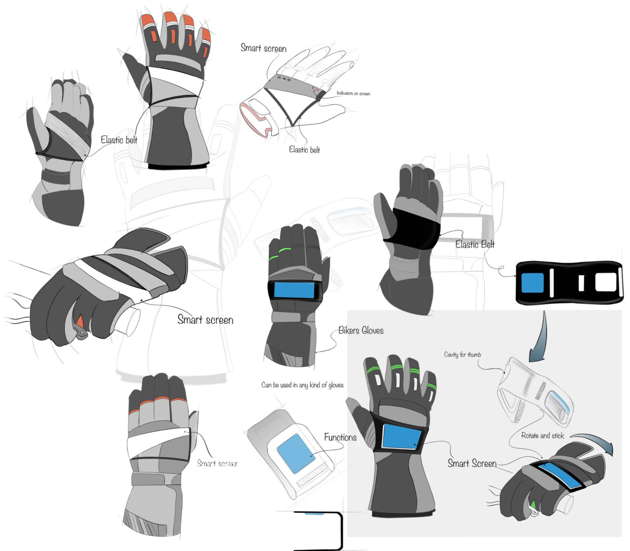
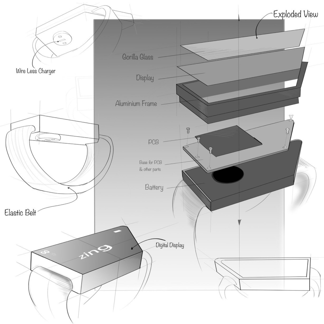
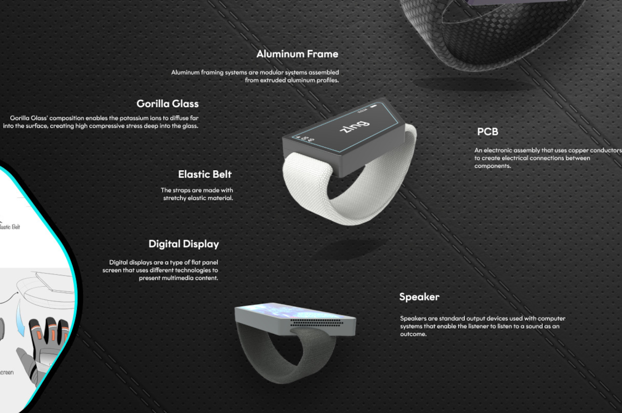
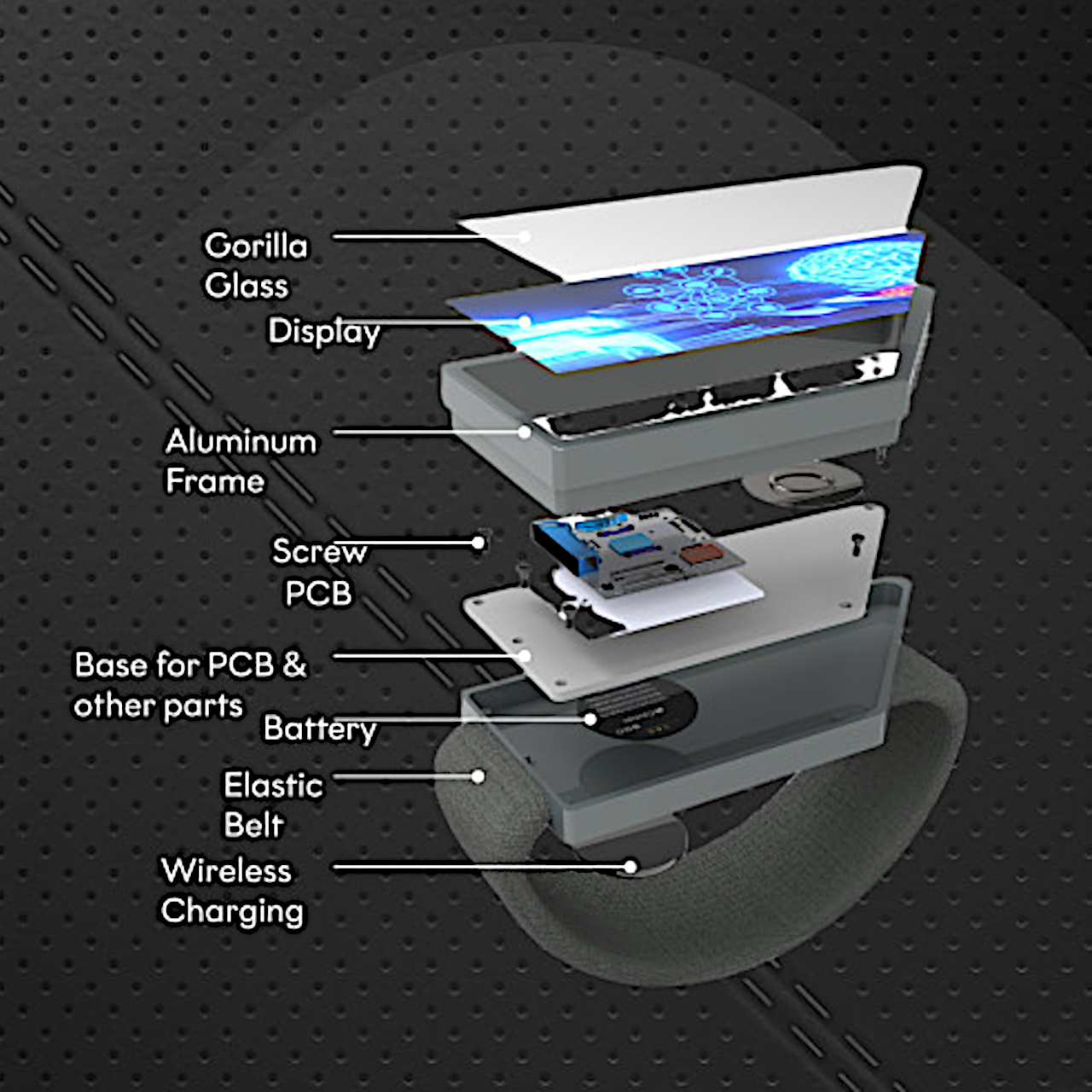
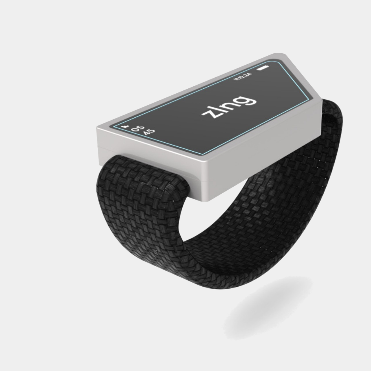
Unfortunately, that’s not easy or even safe for some people whose hands have to be in a fixed position or can’t easily touch the smartwatch screen once they’ve started wearing gloves. That’s the case for cyclists, bikers, and mountain climbers who still need access to some critical information but can’t see their smartwatch for one reason or another. Rather than rely on complicated and distracting solutions like audio notifications or augmented reality goggles, zIng simply moves the display to a position where it can be easily seen even without twisting your wrist or squinting your eyes.

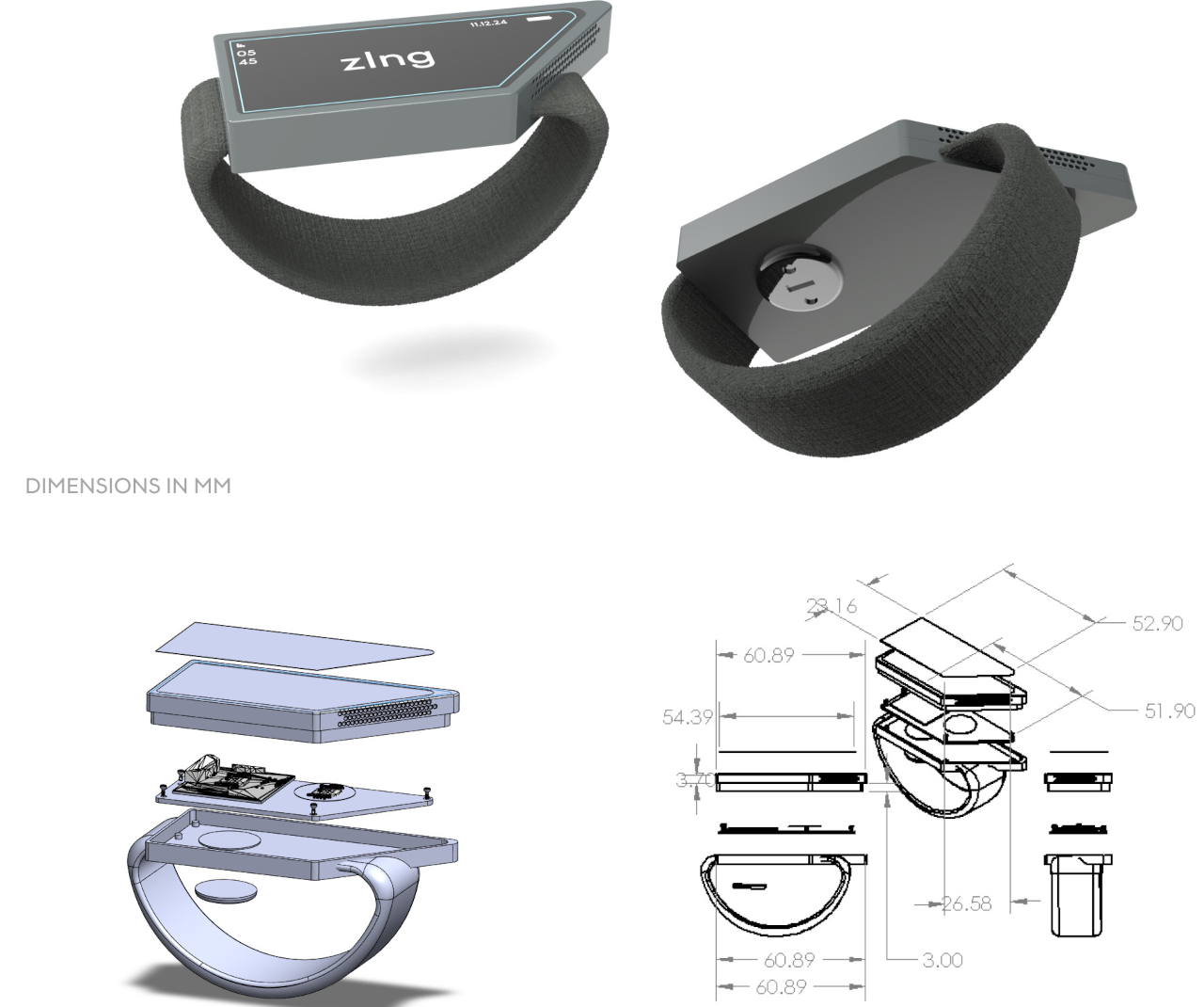
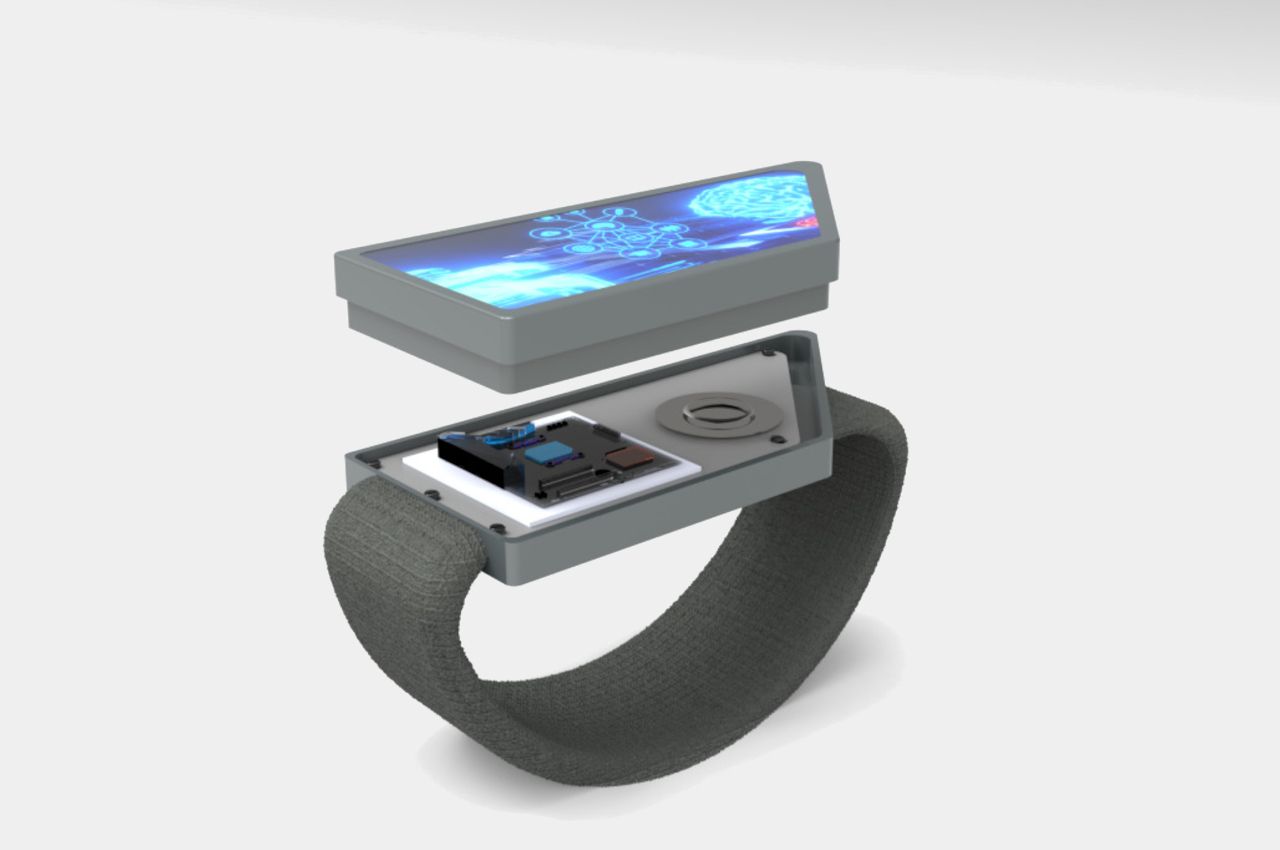
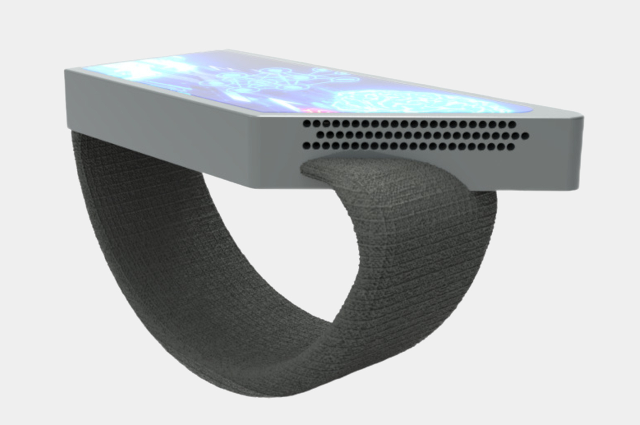
The wearable design concept practically puts a decently sized trapezoid-shaped display on the back of your hand. If you have your hand forward like when you’re holding bike handles or gripping a mountain wall, this immediately puts that screen within your vision. The display is also large enough to tap with a finger even when you’re wearing very thick gloves, which is often the case for biking and mountaineering gear.

zIng is just one of a new generation of wearable designs that are challenging the status quo of smartwatches. An ergonomic Apple Watch band moves the smartwatch away from the wrist and onto the back of the hand as well, this time a little below the thumb, though that doesn’t solve the cramped screen space. Admittedly, the zIng concept targets a very niche market, but it also clearly shows that there’s no one-size-fits-all wearable design that will be perfect for all use cases.

The post Hand-worn smart display concept safely shows information for bikers, mountaineers first appeared on Yanko Design.
Sculptural chair design pays homage to a century-old wooden classic

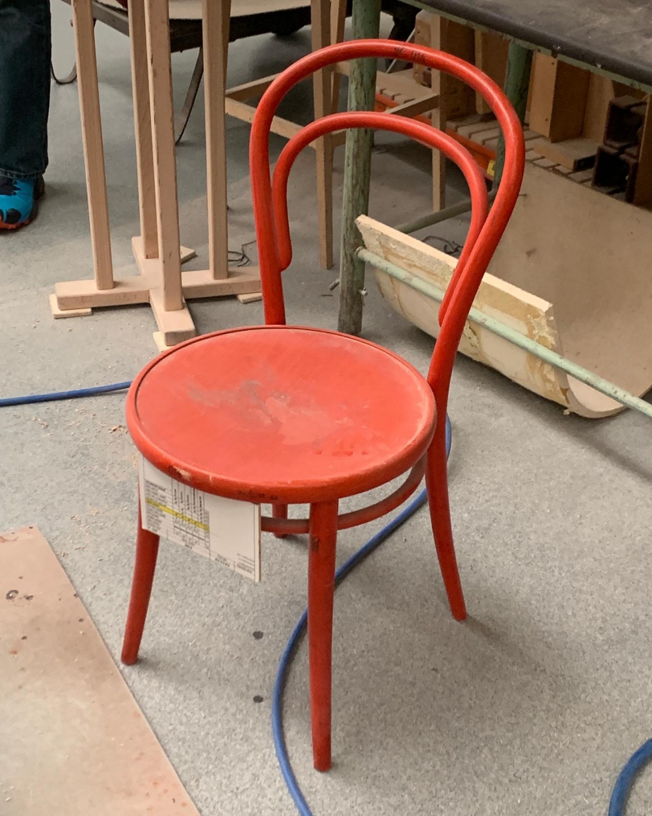
Designs come and go, but some manage to become icons in their field. There are quite a few such designs in the larger furniture market, especially in the categories of tables and chairs. More than a century ago, a particular wooden design shattered expectations and became the precursor of mass-produced chairs for years, even decades, to come. It has since then inspired many product designers not only to follow in this chair’s footsteps but also to improve on it or even reimagine it with modern techniques and sensibilities. One such ode turns what was primarily a utilitarian design into an art object, exaggerating the structure and form that gave the No. 14 Chair its identity.

Designer: Jiri Krejcirik

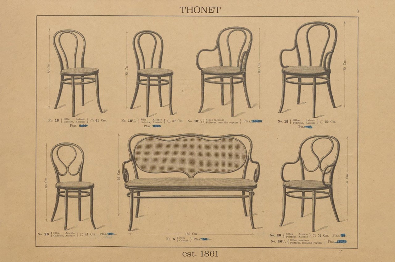
Wooden chairs have, of course, been around for centuries, but most of them were often made with elaborate hand-carved designs that didn’t scale well for mass production. In 1859, the Thonet company revolutionized the furniture industry with the No. 14 Chair, or simply the Chair 14, which could indeed be put through a pipeline but still looked elegant in its simplicity. Its most characteristic design was the steam-bent wooden rods that formed the chair’s back, legs, and support.

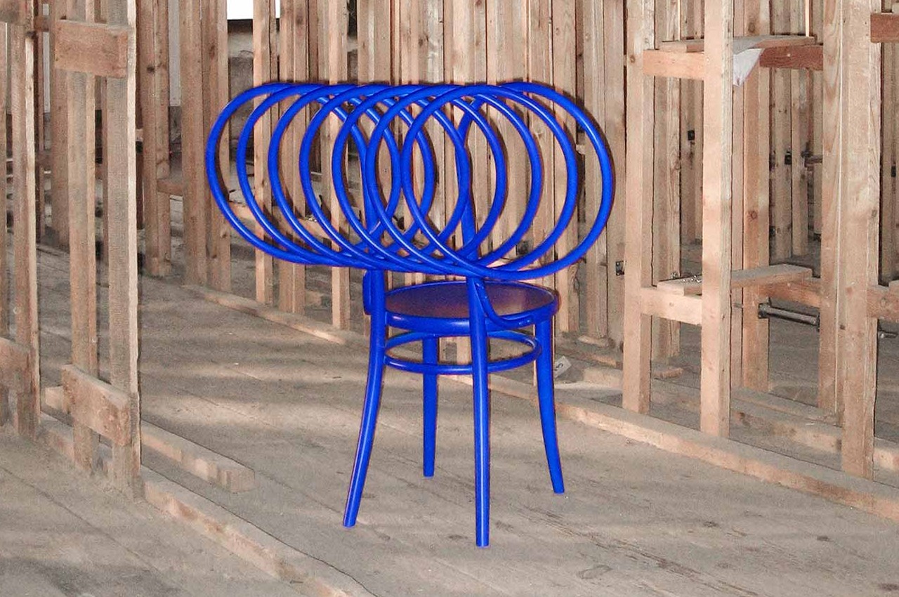
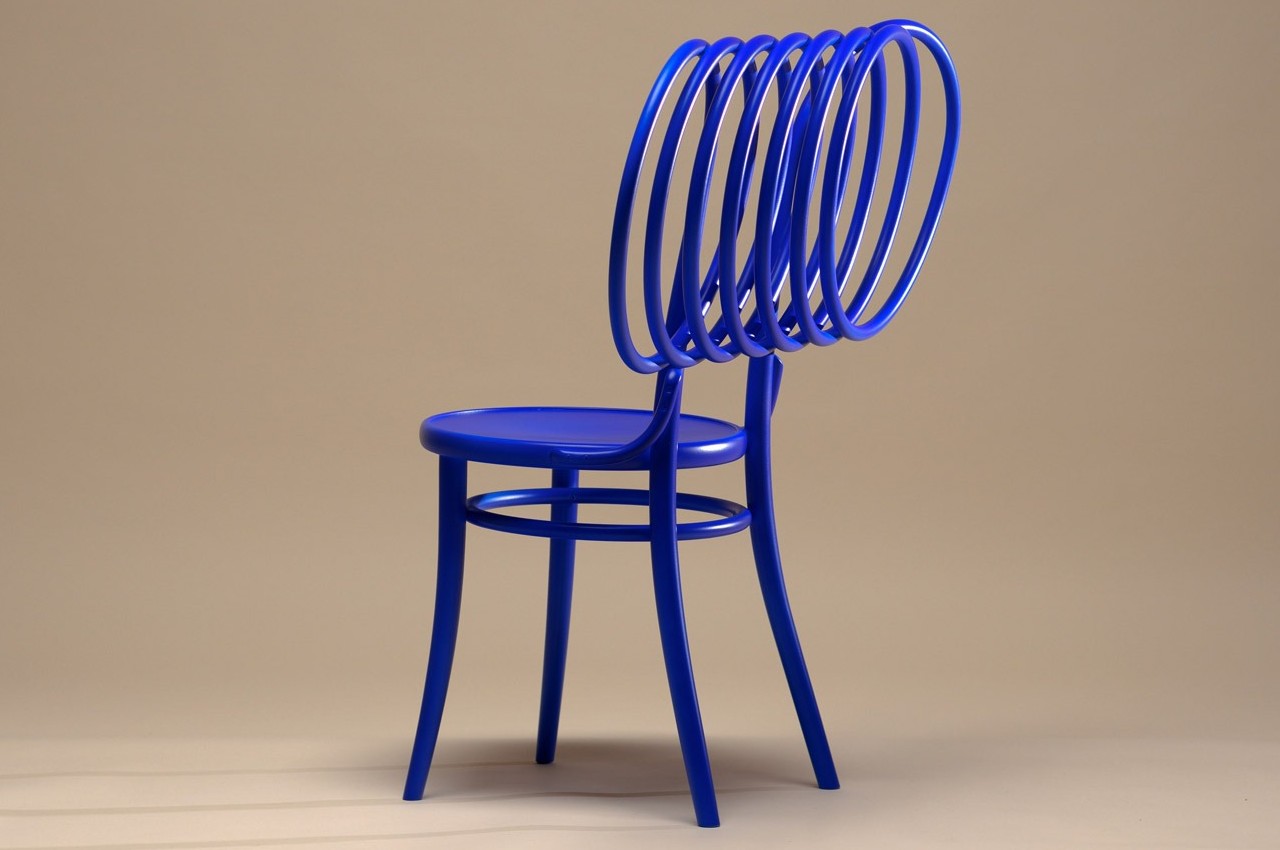
More than 160 years after its birth, a new design breathes new life into that classic chair and dials it up to eleven. But rather than modernizing the original design, “Ode to Chair 14” reinterprets it from a different angle, one that puts form and aesthetics on a pedestal. While the original No. 14 adopted bent wood to give a mass-produced design more style and elegance, this particular rendition turns that design element into an art form, transforming the chair from a piece of furniture into an art object.

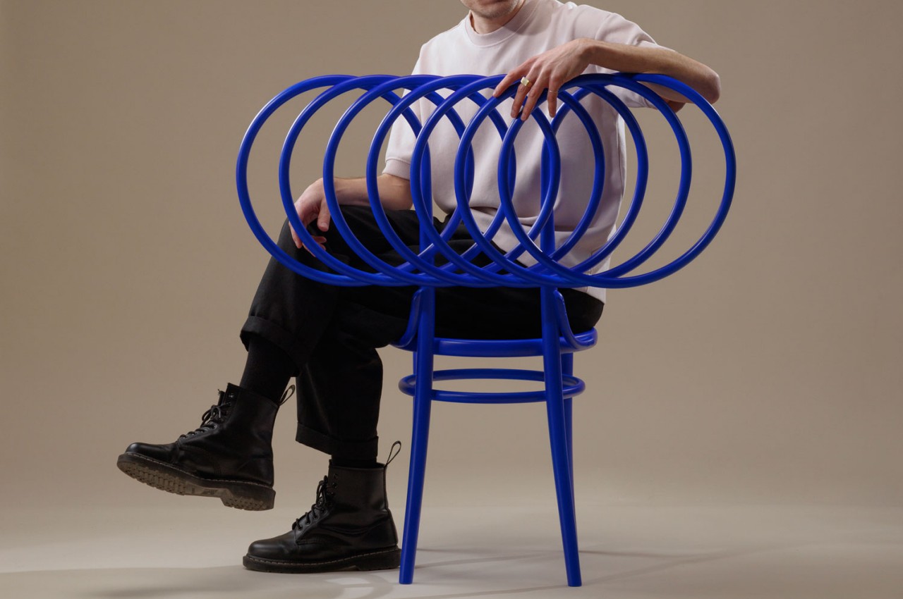
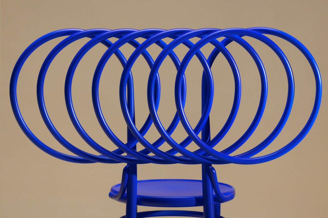
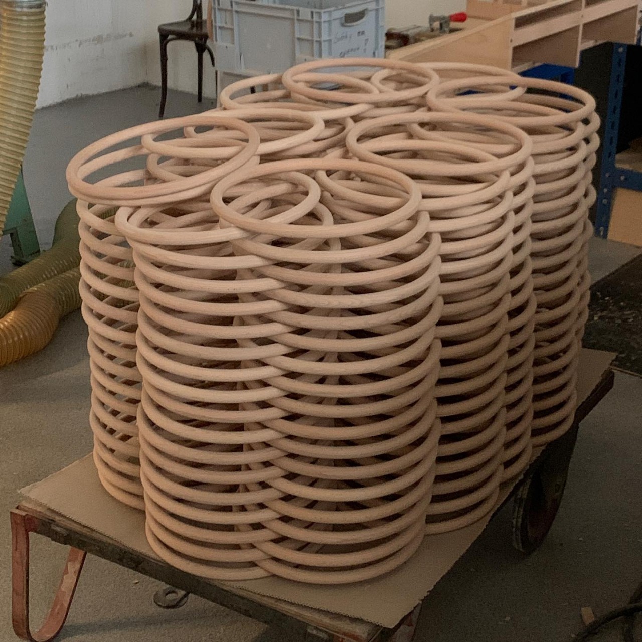
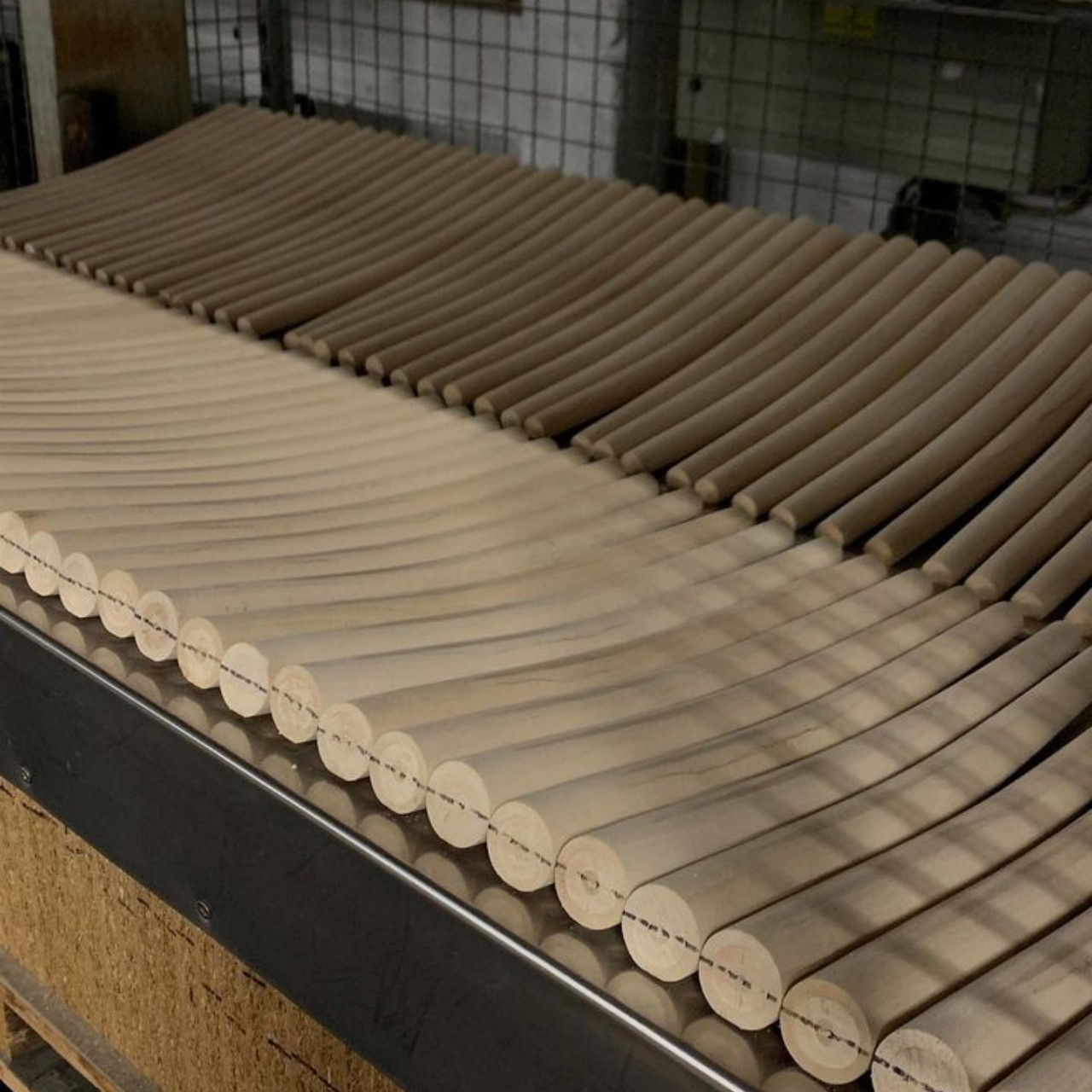
The Ode to Chair 14’s base is similar to the original, with a circular seat supported by four curved legs joined by a ring midway down their length. Where it differs, however, is the backrest, where what would have been a simple arching curve almost spirals out of control and loops repeatedly until it forms a row of intersecting rings. It gives the chair a character that is both eccentric and regal at the same time.

Despite its glossy blue hue, the chair is still made from bentwood beech wood just like the original design. In a way, it demonstrates how production processes have advanced to the point of making even such complex shapes possible. At the same time, however, it retains the same structural simplicity as the first Chair 14, a vision that paved the way for a new breed of chairs for decades to come.

The post Sculptural chair design pays homage to a century-old wooden classic first appeared on Yanko Design.
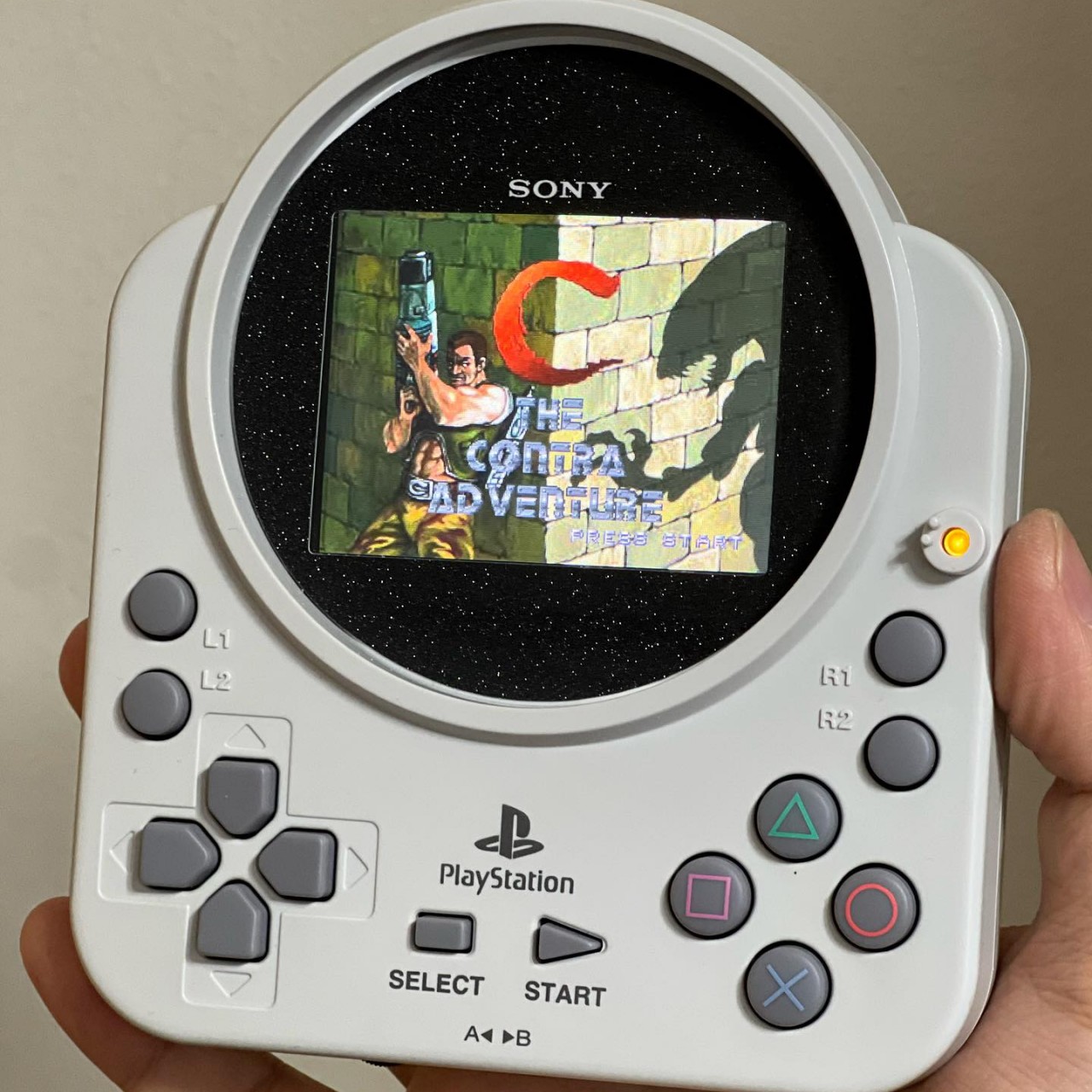
Rare 2001 PS1 controller modded into a quirky PlayStation handheld emulator

Game controllers today follow a standard design and format, and most of them gravitate between two or three conventions, depending on the major console brand they’re supporting. Once upon a time, however, there was a bit more variety and exploration in what controllers could look like, at least as long as they still supported all the basic controls that the machine and the games required. This gave birth to a few oddities, some of which gained widespread notoriety despite their limited availability. One of those was perhaps one of the weirdest but also rarest controllers ever made for the original PlayStation, and one such design was reshaped to become one is probably one of the most distinctive PlayStation handhelds ever crafted.

Designer: Takara Tomy (modded by Hairoh Satoh)

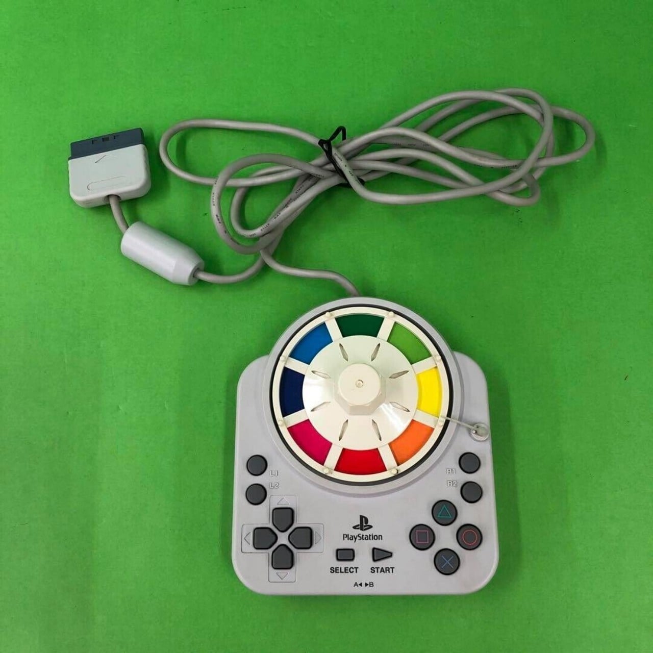
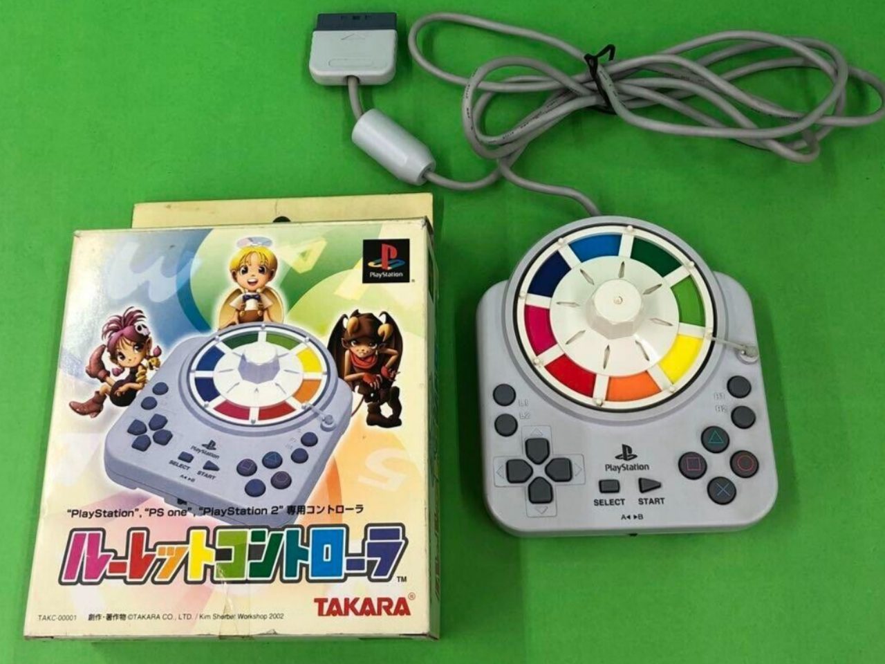
In 2001, PlayStation owners in Japan got a glimpse of an officially licensed controller specifically designed for the popular Game of Life video game. Unlike rectangular controllers even during that period, this custom gamepad was practically square with a circle at the top edge extending a bit beyond the border. This circle was home to a roulette wheel used in conjunction with that game, earning this Japanese-exclusive design the name “Takara Roulette Controller.”

Images courtesy of miepro_02

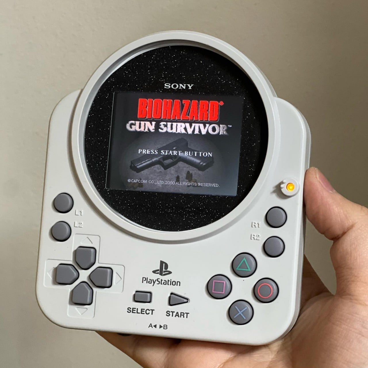
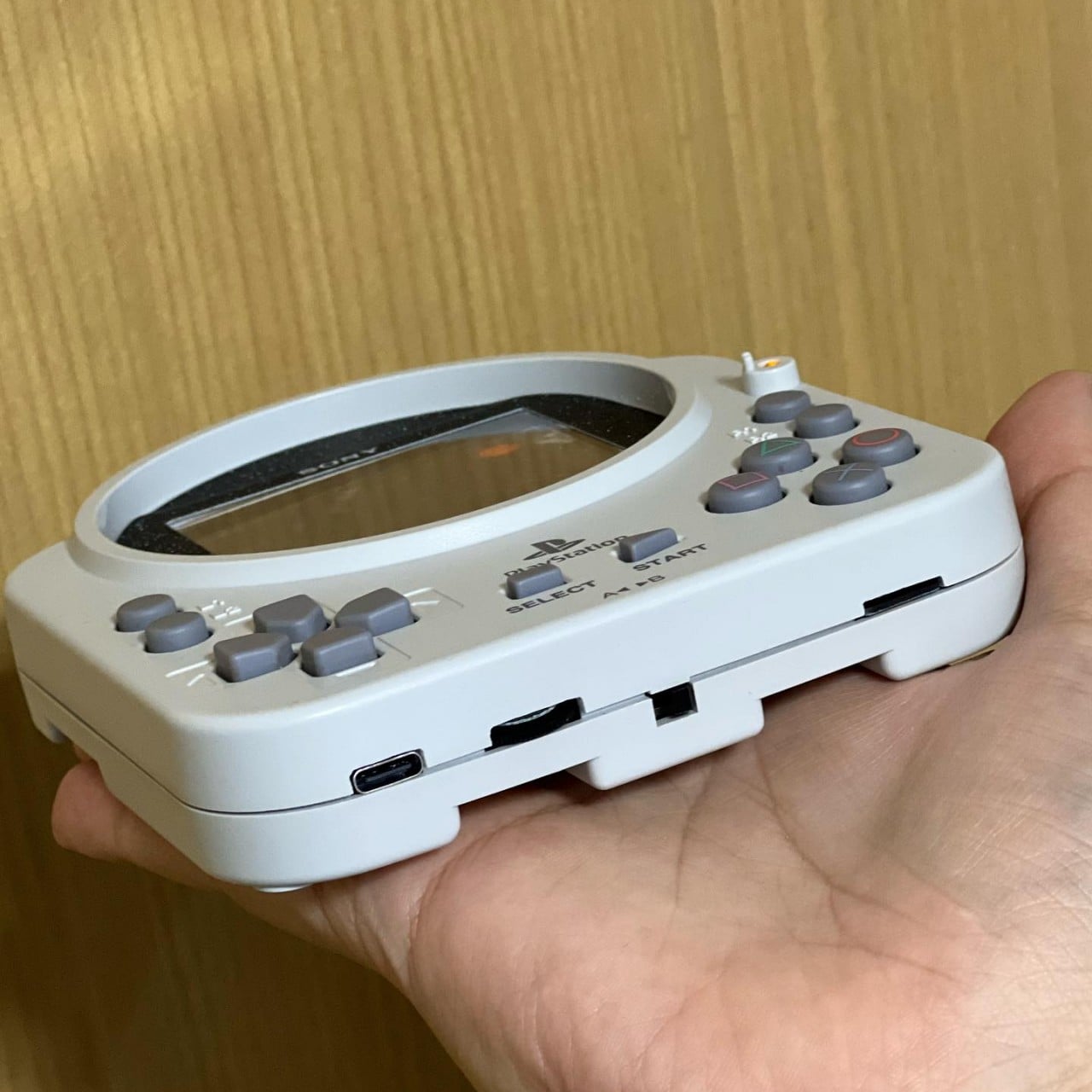
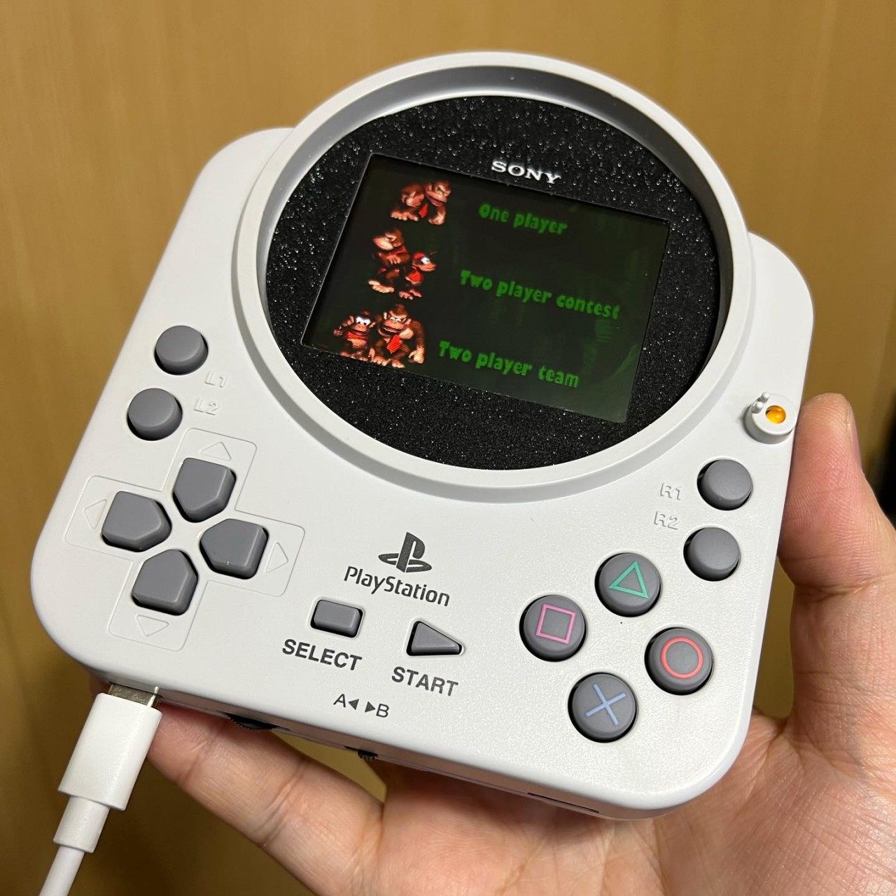
More than two decades later, a modder best known for his Game Boy mods has given this rarely-seen controller a new lease on life as a standalone gaming device. The spinner wheel, which has no use in any other game, was replaced by a small LCD screen that allowed the user to play games directly on it. Of course, that also means that the internals of the controller have been gutted out to make room for a small computer, probably a Raspberry Pi or one of its kind.

That alone would have been impressive enough, but the mod goes above and beyond to bring a few modern gaming conveniences. While the original controller is more or less complete when it comes to buttons, the mod adds L and R back triggers as well. The small space also has a memory card slot, USB-C charging, and speakers that truly make the gaming handheld independent and portable. Whether it’s comfortable to actually play on for long periods of time is a different question entirely.

Unfortunately, the controller clearly shows its age with the absence of analog joysticks that are now standard on modern controllers. Then again, since it’s mostly emulating PS1-era games, that’s not exactly a problem either since those titles didn’t make use of such controls. But since it’s technically using a computer that can run emulation software, it’s theoretically possible to also run games from other consoles, particularly classic titles that have simpler controls, less demanding graphics, and gameplay that’s well suited for this retro controller design.
The post Rare 2001 PS1 controller modded into a quirky PlayStation handheld emulator first appeared on Yanko Design.