There’s a quiet lie running through every automotive options sheet. It tells you that safety, intelligence, and situational awareness are features you earn by selecting the right trim level, ticking the right package, or visiting the right dealership. The implication is that proper capability lives at the factory and nowhere else. These five gadgets disagree loudly. Each one does something that costs hundreds or thousands of dollars as a factory option, and does it better, for less money, without requiring a new vehicle or a dealer appointment.
The aftermarket has always had better answers than the showroom — that’s not a new observation. What is new is how sophisticated those answers have become. These aren’t optimistic spec sheets printed on cheap plastic. They are purpose-built tools with genuine engineering behind them, from tungsten-carbide emergency escape instruments to AI-vision heads-up displays. Together, they make a compelling case that the best version of your car is assembled in parts, not ordered off a build sheet.
1. WYN Bullet
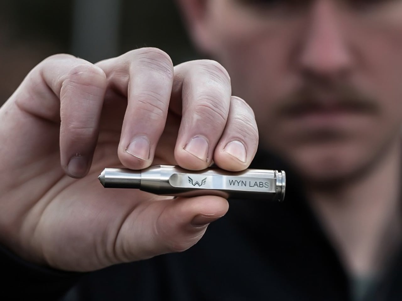
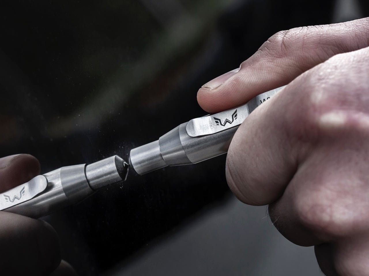
In 2017, over 20,800 US accidents involved fire or water submersion, resulting in nearly 1,900 deaths. A significant portion involved drivers who couldn’t exit their vehicles quickly enough — doors jammed on impact, electrical systems failed, windows stopped responding, and the compression of panic turned every second into a decision too difficult to make clearly. Every premium automaker sells a safety package. Not one of them ships an emergency glass-breaking tool. The WYN Bullet, developed alongside first responders and machined from stainless steel with a tungsten-carbide tip, is exactly that tool — small enough to clip to a keychain and powerful enough to shatter a tempered glass window in under a second with a single push.
The engineering behind it is precise where it needs to be. Toughened glass is designed to withstand the broad, flat impact of a panicked human fist. The WYN Bullet’s patent-pending direct-impact mechanism positions the internal striker directly behind the tungsten-carbide tip, concentrating force into a contact area so small it creates shock waves that fracture the entire panel instantly—no technique required, no repetitive strikes, no Dwayne Johnson-level force. The tool measures 77mm, weighs 45 grams, and ships with both a pocket clip and a keyring loop in stainless steel or black oxide finish. This is AAA-endorsed emergency equipment built for firefighters and EMTs, now available to anyone for the price of a dinner out.
What we like:
- One-push mechanism requires no practice or upper-body strength to activate
- Dual carry options — pocket clip and keyring — keep it genuinely reachable in an emergency
What we dislike:
- The tool’s fidget mechanism makes accidental discharge in a pocket a real possibility
- No protective case is included, leaving the tungsten tip exposed in storage
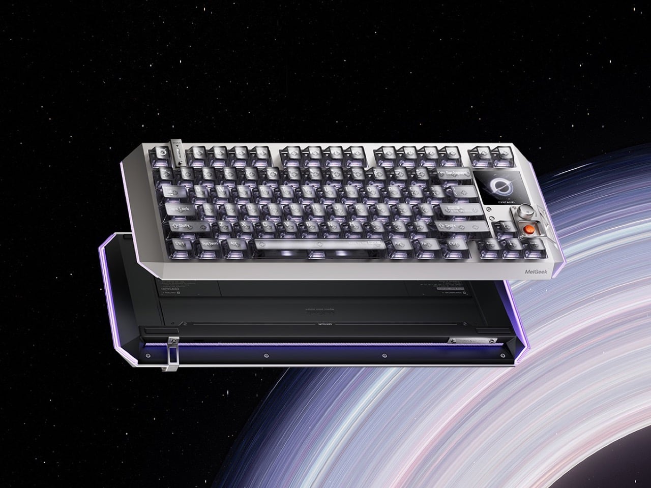
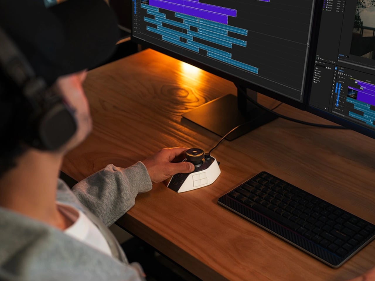
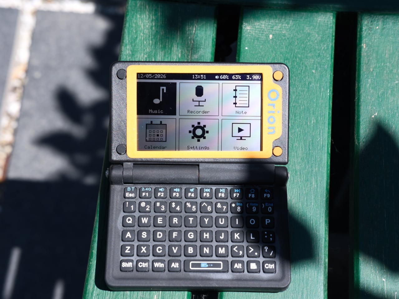
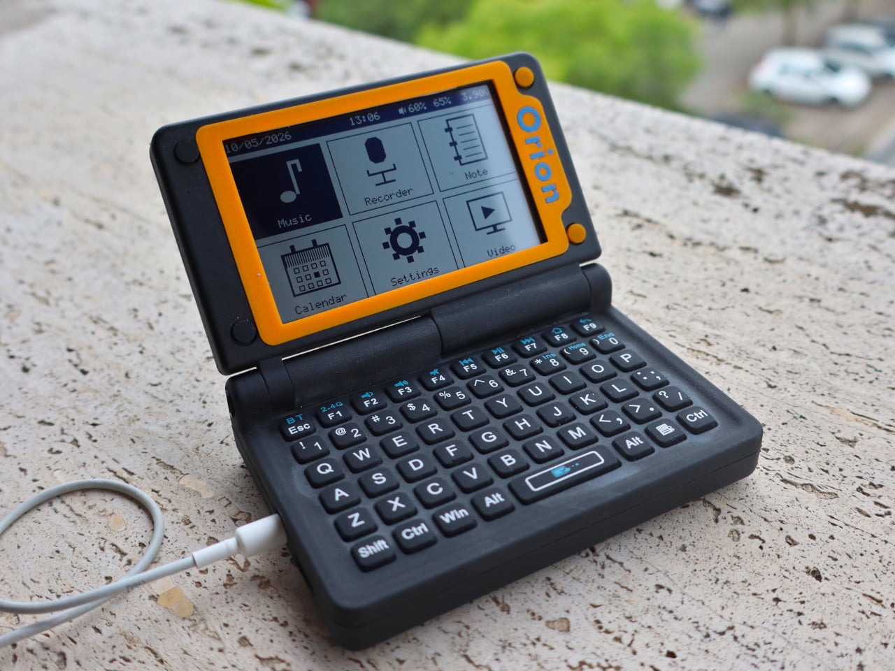
2. TrantorVision NeuroHUD
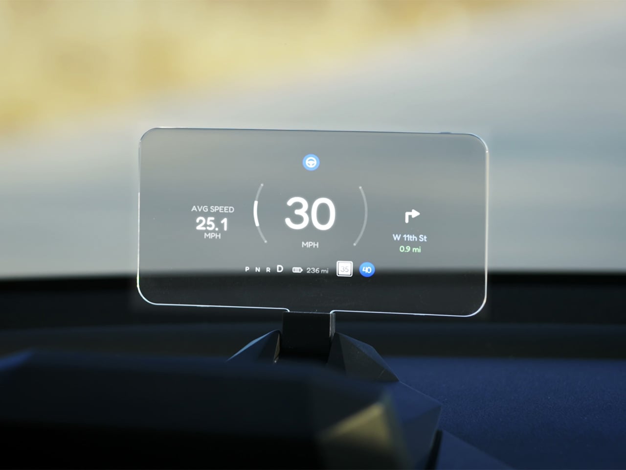
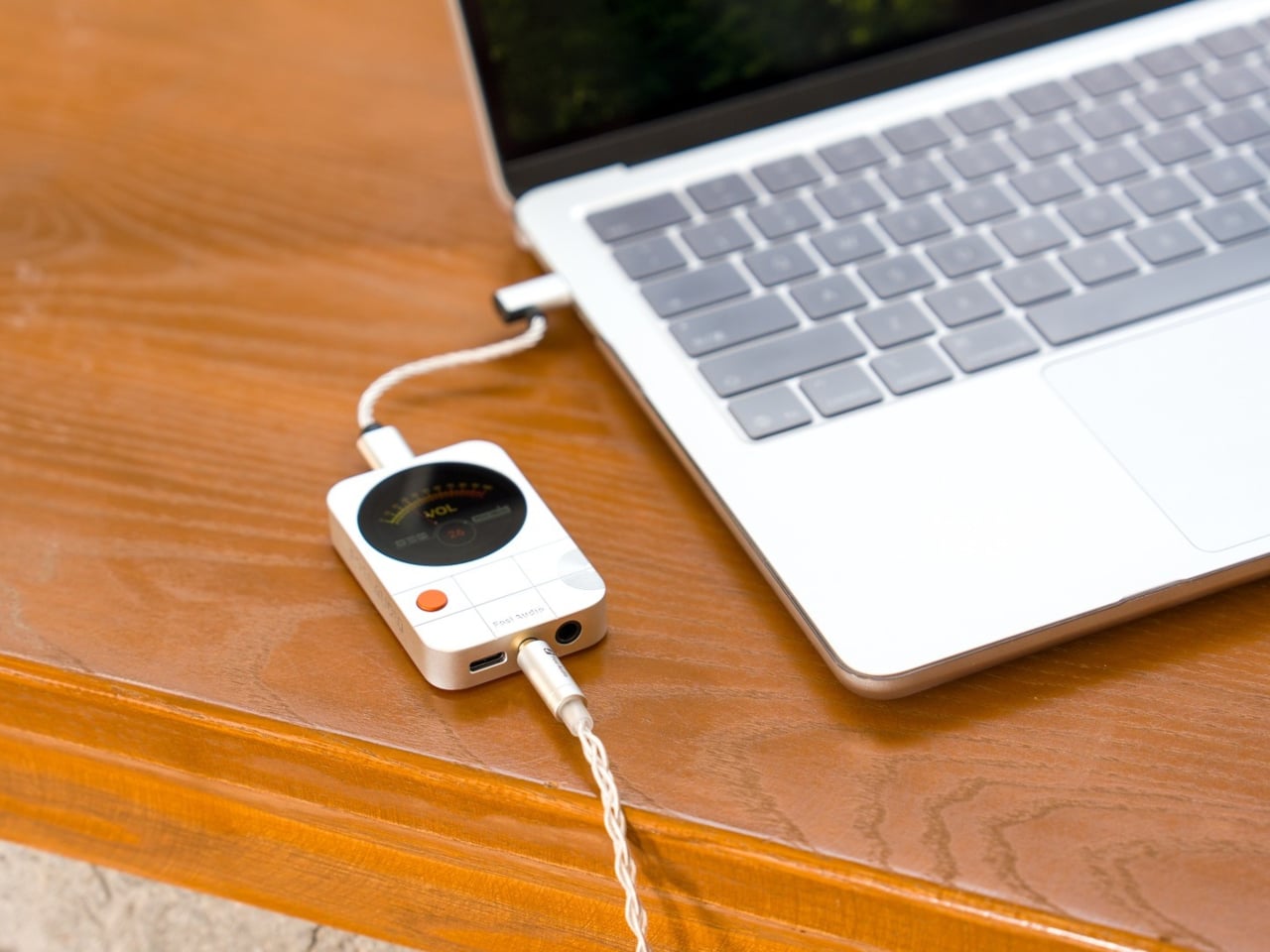
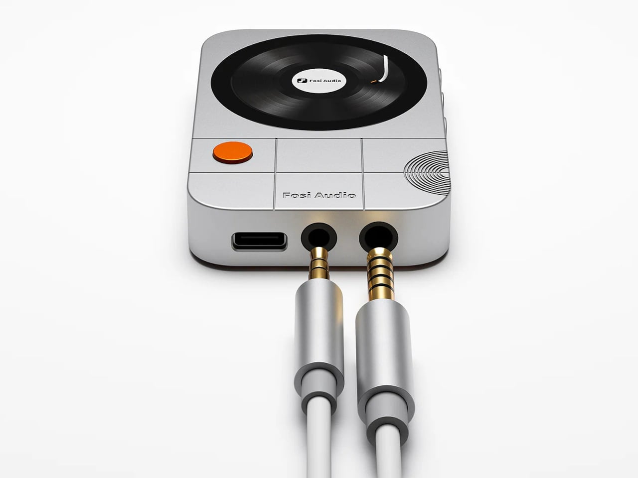
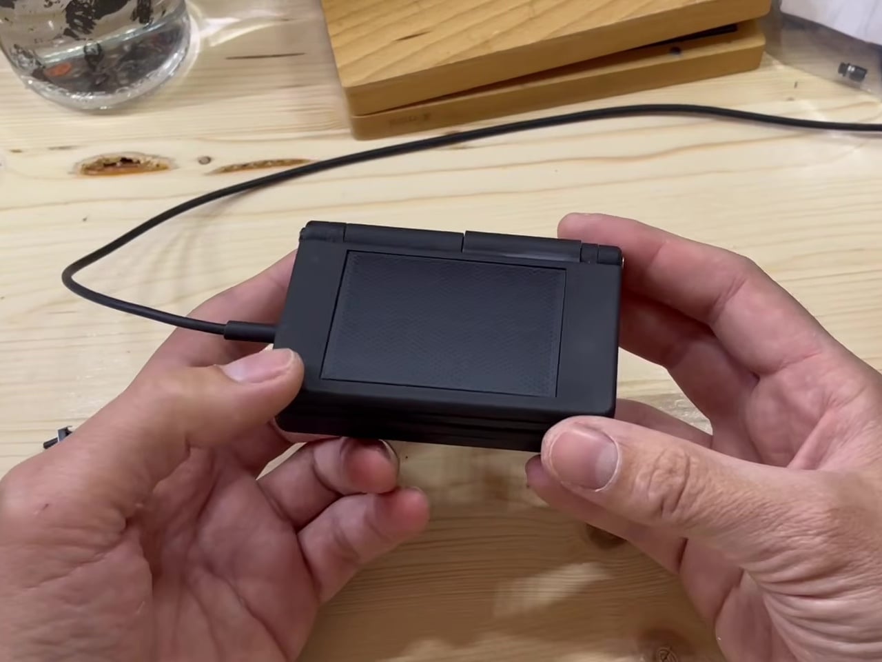
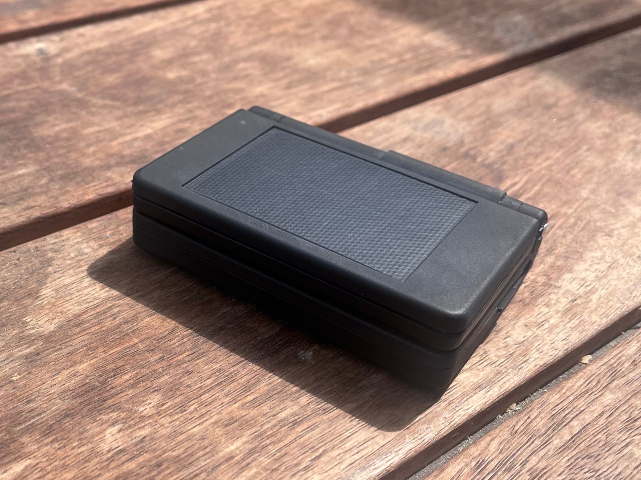
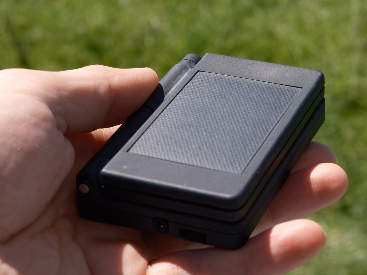
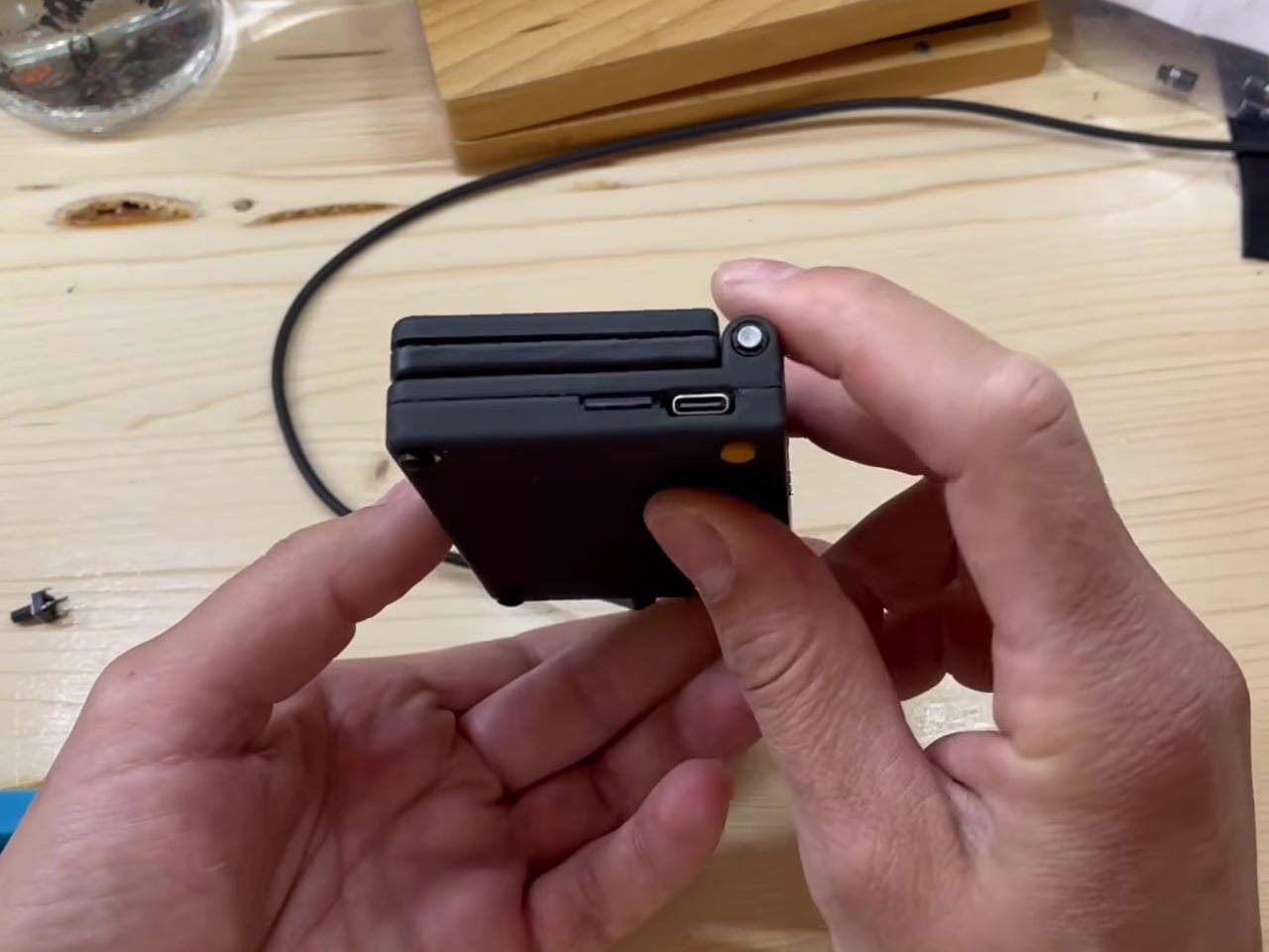
General Motors put a heads-up display in the Oldsmobile Cutlass Supreme in 1988. By 2026, BMW charges $1,200 for one, Porsche charges $2,600 for an augmented reality version, and Tesla — a company founded on the premise that software could replace hardware — ships every Model 3 and Model Y without one, directing all critical driving data to a center-console touchscreen roughly 30 degrees below the driver’s natural forward sightline. TrantorVision built the NeuroHUD specifically for that gap. It installs without tools in under a minute, clips behind the center screen, draws power through a single USB-C cable, and leaves the factory wiring completely untouched.
The dual-channel data architecture is what separates it from the category. A pair of 150-degree AI fisheye cameras face Tesla’s display and read high-frequency data — speed, gear state — at 50Hz, with end-to-end latency as low as 20 milliseconds. Battery range and navigation pull through the Tesla API on a separate channel. The output is a 1,500-nit, 4-inch TFT panel at 480×800 resolution, visible in direct sunlight, projecting information into the driver’s sightline through either a combiner screen or directly onto the windshield — switchable without tools. Screen mirroring, GPS-triggered garage automation, CarPlay, Android Auto, an open API, and a community layout library round out a software stack designed to grow over-the-air. No new hardware required when new features ship.
Click Here to Buy Now: $379 $629 (40% off). Hurry, only a few left! Raised over $557,000.
What we like:
- Dual-channel architecture matches production-fitted HUDs in latency and data richness without touching factory wiring
- Open API and community layouts mean the display continues evolving after purchase
What we dislike:
- Shipping begins September–October 2026, making this a pre-delivery commitment at checkout
- Windshield Projection Mode and deeper Tesla API integration require the Pro tier at $429, not the standard $379
3. GOOLOO DS200 DeepScan
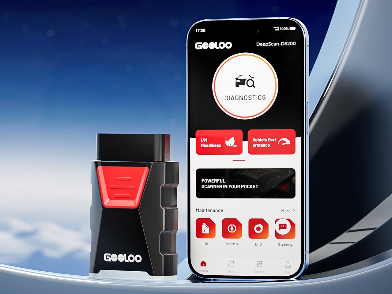
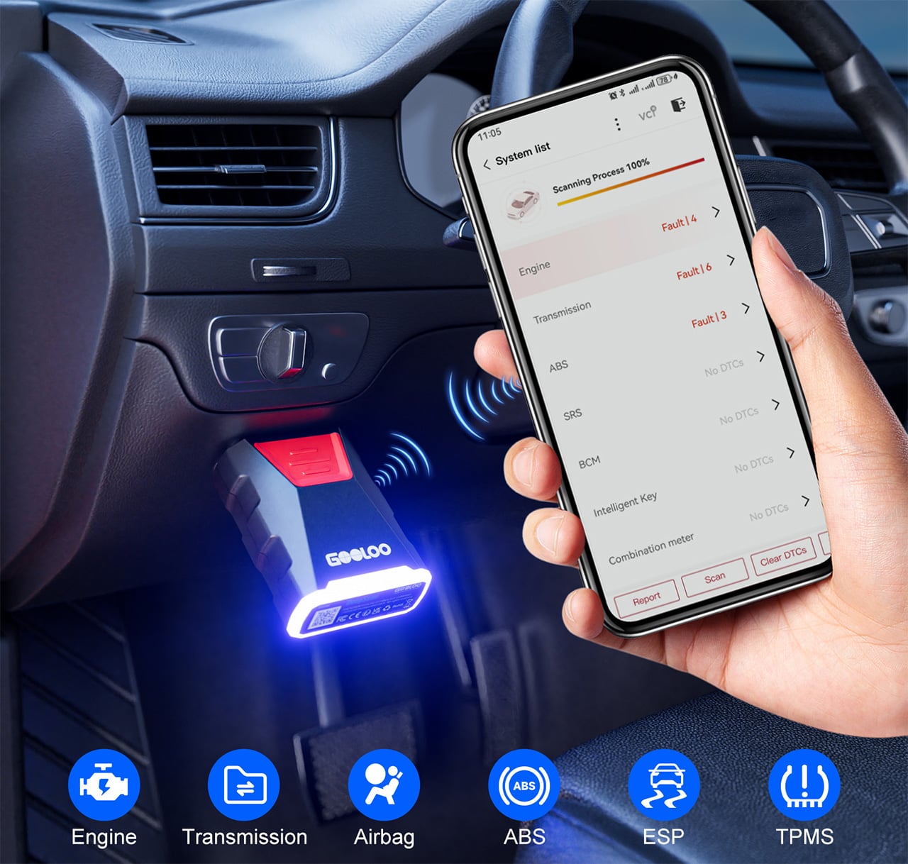
Every car sold in the United States since 1996 carries an OBD2 port — a standardized diagnostic socket that must be present, accessible, and readable by any compliant tool. Dealers have known this for thirty years and built a reliable business around owning the only compliant tool in the conversation, charging $100 to $200 every time a warning light appears to read data that has been sitting in the car’s computer the entire time. The GOOLOO DS200 DeepScan is a Bluetooth dongle the size of a matchbox that performs a full-system scan across engine, transmission, ABS, airbags, stability control, TPMS, steering, and air conditioning, then delivers every result to your phone in plain language, without a waiting room.
What separates the DS200 from the basic code readers that have existed for a decade is the breadth of the scan and the intelligence layered on top of it. It doesn’t hand you a code number to Google separately — it calculates volumetric efficiency, logs fault histories with timestamps, and performs active maintenance functions including oil light reset, electronic parking brake recalibration, steering angle sensor reset, and DPF regeneration. Secure gateway unlock for FCA and Renault vehicles is built in, giving access past the authentication wall that stops most competing tools cold. AutoVIN identifies the vehicle automatically. Bluetooth 5.0 holds a stable connection at 33 feet. The unit weighs 2.89 ounces. The diagnostic intelligence that used to require a $10,000 workshop scanner now fits in a $60 dongle that stays plugged in permanently.
What we like:
- Full-system sweep across 20+ vehicle systems, not just engine and emissions codes
- Secure gateway unlock is a genuinely rare capability at this price point
What we dislike:
- Full functionality requires an annual subscription after the first year of use
- The $129.99/year tier for advanced special functions is a meaningful ongoing cost for casual home users
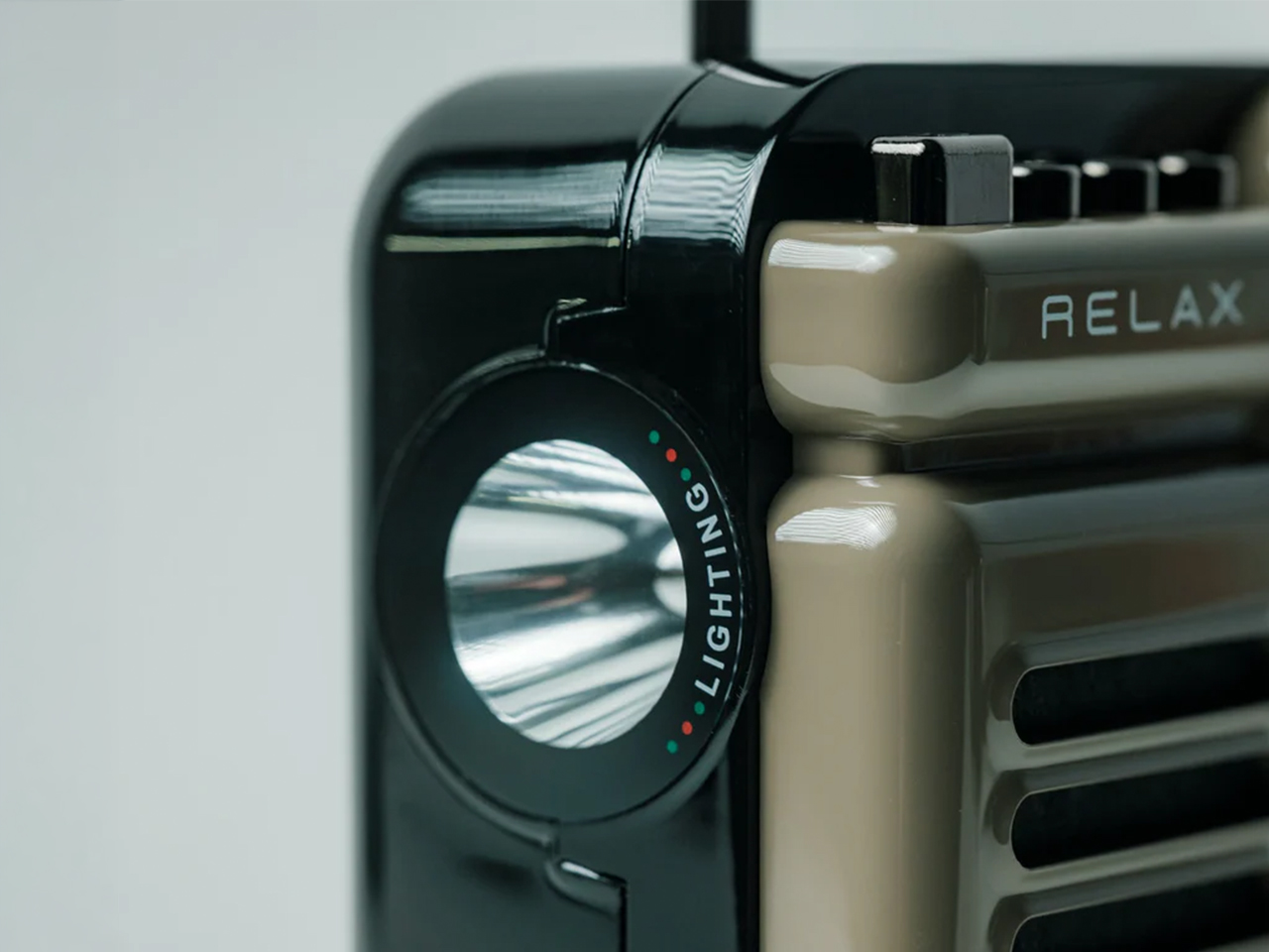
4. Tymate TM7
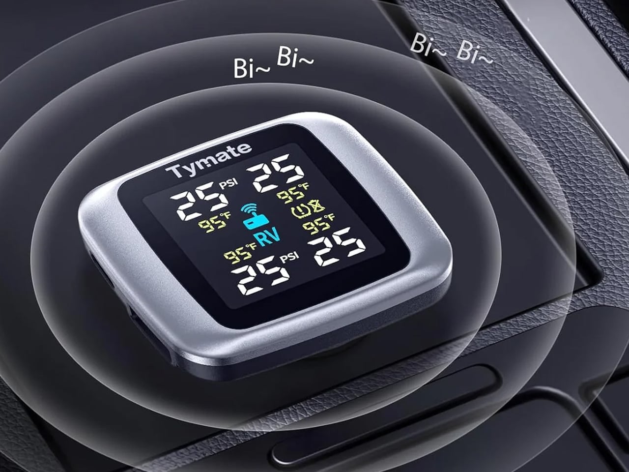
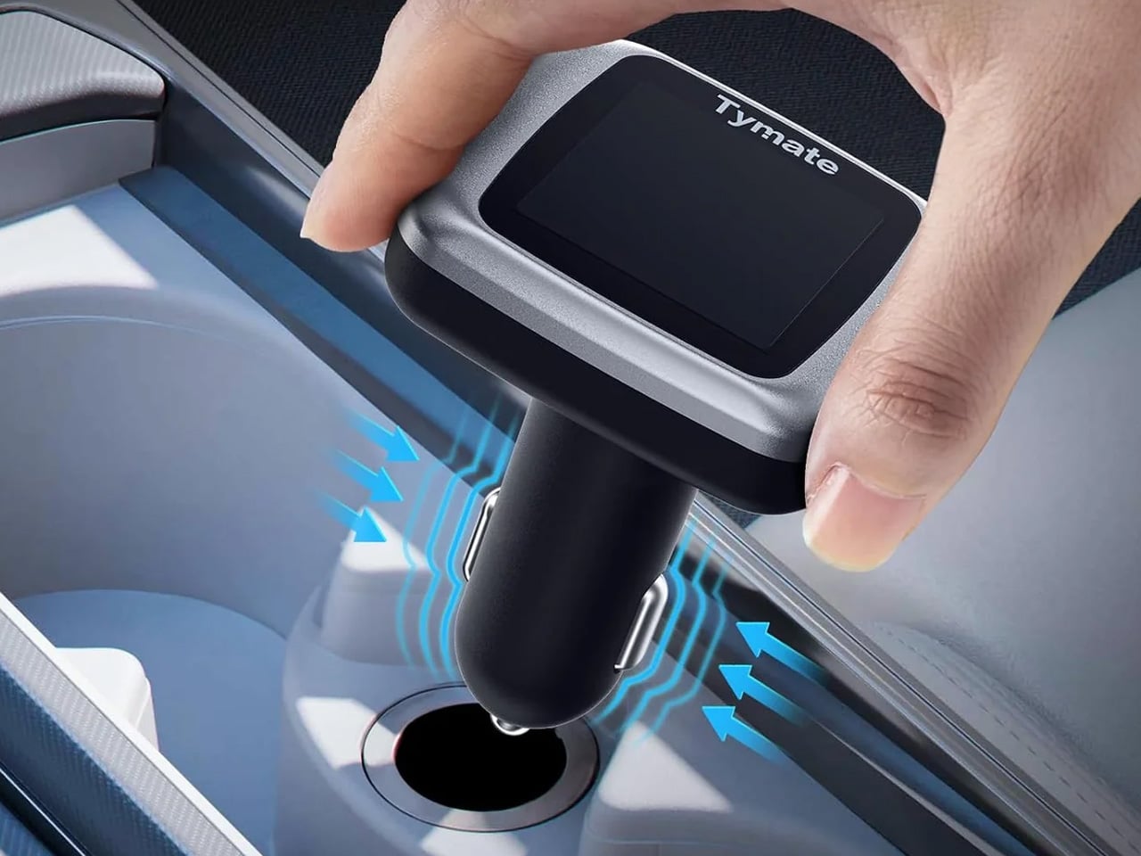
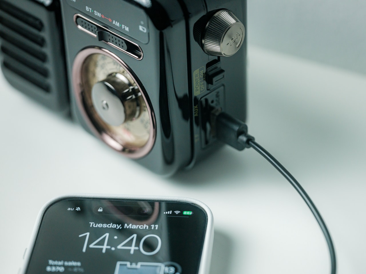
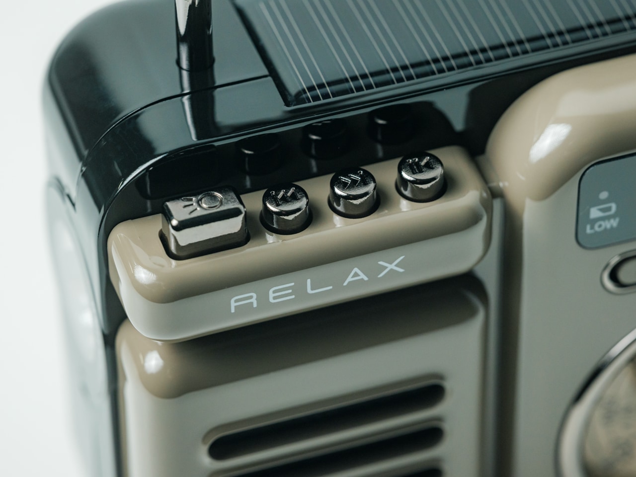
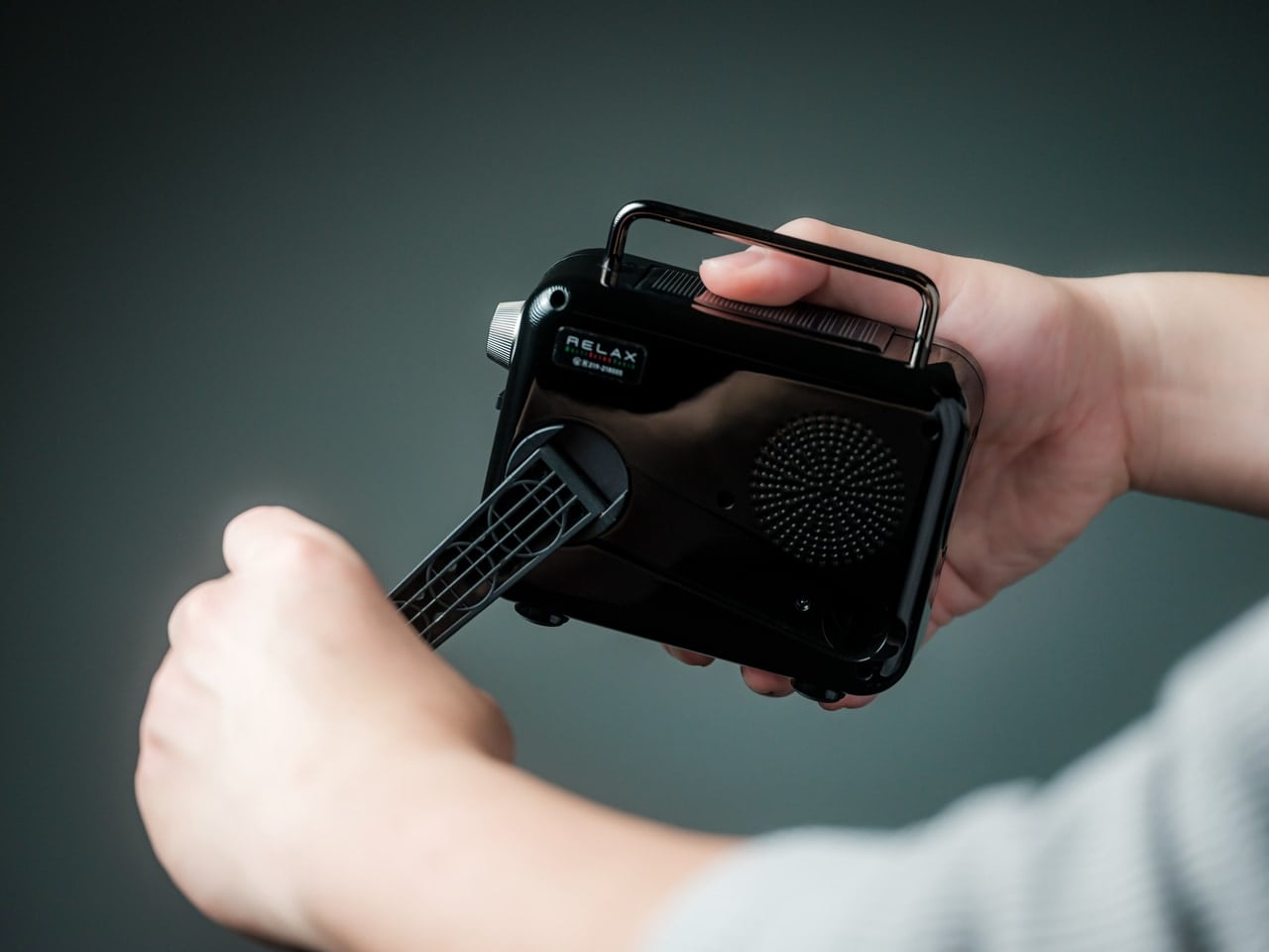
The factory TPMS experience goes like this: a yellow icon appears on the dashboard. It says a tire is low. It does not say which tire, by how much, or at what temperature — only that something somewhere is wrong. The drive to a dealer follows. A service advisor explains that the sensor in question has failed and needs to be replaced. The part costs $150, reprogramming adds another fee, and a four-sensor job on a well-maintained vehicle can clear $1,000 without touching anything else. The Tymate TM7 screws four external sensors onto existing valve stems in under five minutes. From that moment, it monitors pressure and temperature on all four tires simultaneously with ±1.5 PSI and ±3°F accuracy, displayed live on a solar-charged color LCD receiver that plugs into the cigarette lighter with no wiring.
Six independent alarm modes cover every meaningful failure scenario: high pressure, low pressure, rapid leakage, high temperature, low sensor battery, and signal loss. The receiver includes two USB charging ports, turning the cigarette socket from a single-use outlet into a charging hub. The display adjusts its backlight for direct sunlight and near-darkness without manual input. Pressure range runs from 0 to 87 PSI, covering sedans, SUVs, trucks, and RVs. Sensors run on replaceable CR1632 batteries with a guided video for the swap. For vehicles that shipped with no meaningful TPMS feedback at all, the TM7 converts a vague warning light into four individual readings refreshing throughout every drive — which is a more honest picture of what’s happening under the car than most factory systems bother to provide.
What we like:
- Six distinct alarm types give genuinely comprehensive coverage across failure modes
- Solar charging on the receiver removes one more thing to remember to plug in
What we dislike:
- External cap sensors sit exposed on the valve stems, making them easier to steal or damage than internal units
- Trailers over 36 feet require an additional repeater module, sold separately
5. 70mai 4K T800

BMW’s Driving Assistant Professional — the camera suite with cross-traffic alerts and the full parking sensor array — runs around $1,700. Volvo’s Pilot Assist Pro is closer to $2,000. What those factory systems deliver is a collection of cameras engineered primarily for driver assistance, not evidence. The 70mai 4K T800 works the problem from the other direction: it’s built first for documentation, with the understanding that a camera that captures everything is ultimately more useful than one that warns you about things. Its triple-channel system pairs two Sony STARVIS 2 IMX678 4K sensors for the front and rear — the same sensor class found in flagship smartphones — with a 1080p interior camera backed by four 940nm infrared LEDs. Three synchronized angles, running continuously, all the time.
The engineering decisions that matter most are the ones that don’t surface until something goes wrong. A three-minute pre-collision buffer means the camera was already recording before the accident happened, capturing the context that determines fault. Wi-Fi 6 on the 5GHz band transfers footage at up to 40MB/s, making roadside evidence retrieval a seconds-long task rather than a twenty-minute wait. A supercapacitor replaces the traditional battery, operating cleanly from -40°C to 85°C without the swelling that terminates most consumer dashcams after a few summer cycles. 70mai Lumi Vision handles nighttime parking surveillance across all three channels simultaneously. ADAS alerts cover lane departure, forward collision, and separate detection for pedestrians and cyclists. The system supports up to 512GB of storage, meaning weeks of continuous footage before anything loops.
What we like:
- Identical 4K quality front and rear — most competing systems give the rear a significantly weaker sensor
- Pre-collision buffer captures the lead-up to an incident, not just the moment of impact
What we dislike:
- Running the rear camera cable through the headliner is a job most owners will want professional help with
- Full parking surveillance with the UP05 hardwire kit pushes total cost well above $500
The Best Version of Your Car Isn’t on the Options Sheet
The factory narrative has always relied on convenience — the idea that buying everything at once, from one source, is simpler than assembling capabilities piece by piece. That’s true, as far as it goes. What it leaves out is that the pieces you’d assemble are often better. A tungsten-carbide escape tool, a full-system diagnostic scanner, four live tire readings, three-angle 4K documentation, and a pilot-grade heads-up display — none of these required a new car. They required a valve stem, a USB port, an OBD2 socket, and a windshield.
What connects all five is something more specific than price. Each one solves a problem the car was designed around without solving — the emergency exit nobody plans for, the check engine light nobody decodes, the tire warning nobody quantifies, the blind spot nobody documents, the HUD nobody included. The aftermarket has always been where honest engineering lives. Right now, it’s producing some of the most considered, driver-focused products available at any price point, and the options sheet doesn’t get a vote.
The post 5 Best Car Gadgets That Just Made $100,000 Factory Options Look Embarrassingly Overpriced first appeared on Yanko Design.