Apple’s 50th Anniversary Gets a Retro iPhone 17 Pro Case Inspired by the Lisa and Macintosh

Spigen keeps one foot planted firmly in Apple’s past. Their retro-inspired cases have become something of a signature move, from iMac G3 translucent homages to see-through AirPods cases that capture Jony Ive’s obsession with showing off internal components. The accessory maker has proven there’s a market for nostalgia you can actually use.

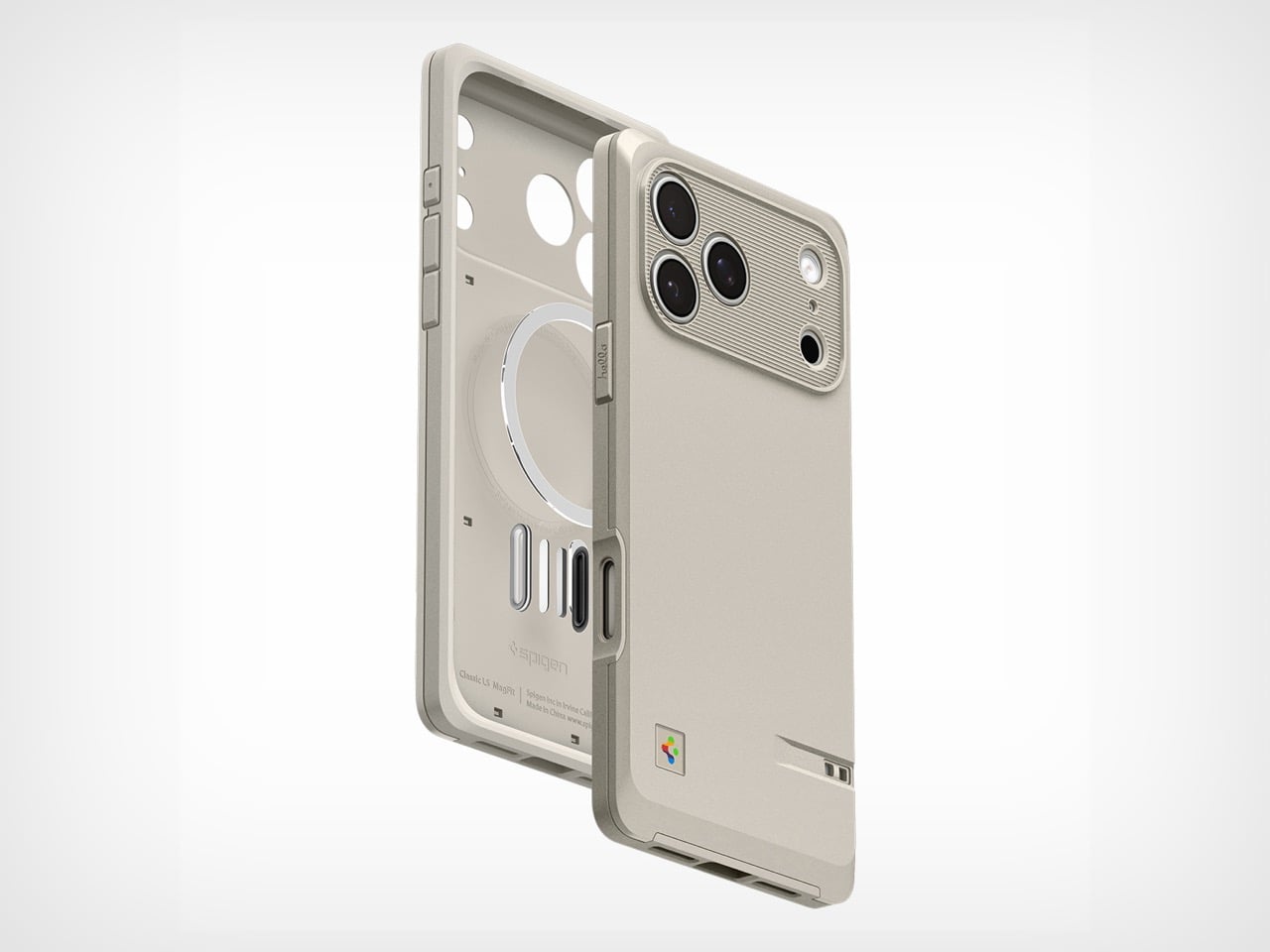
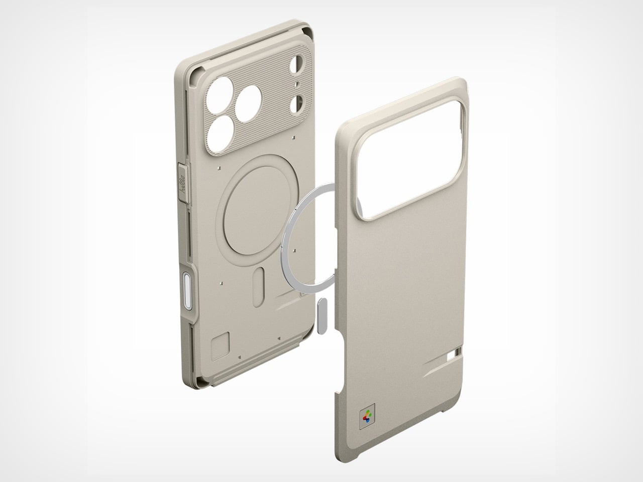
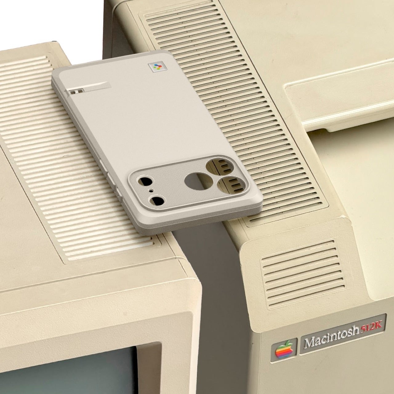
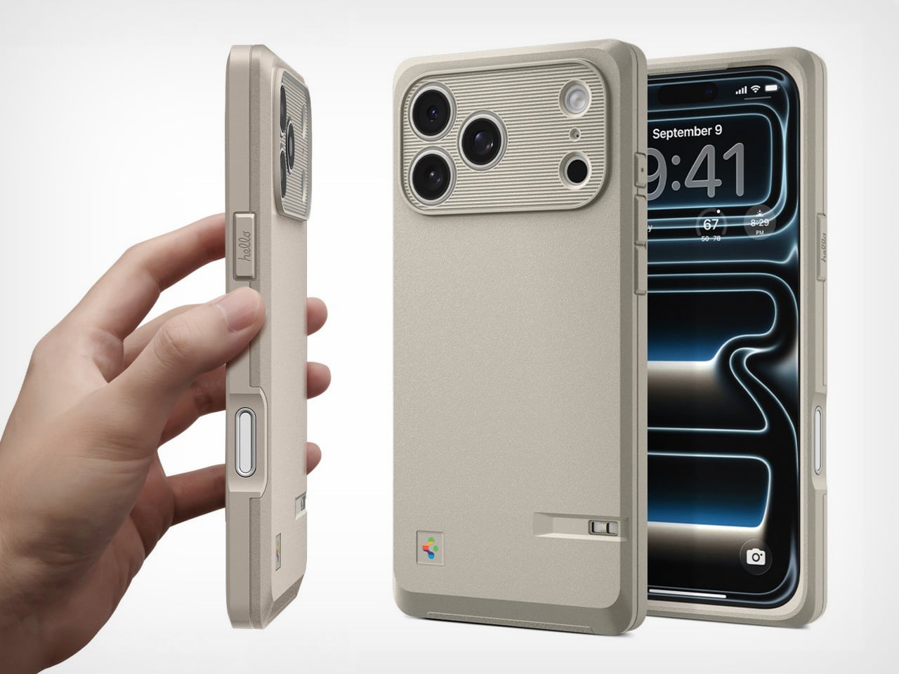
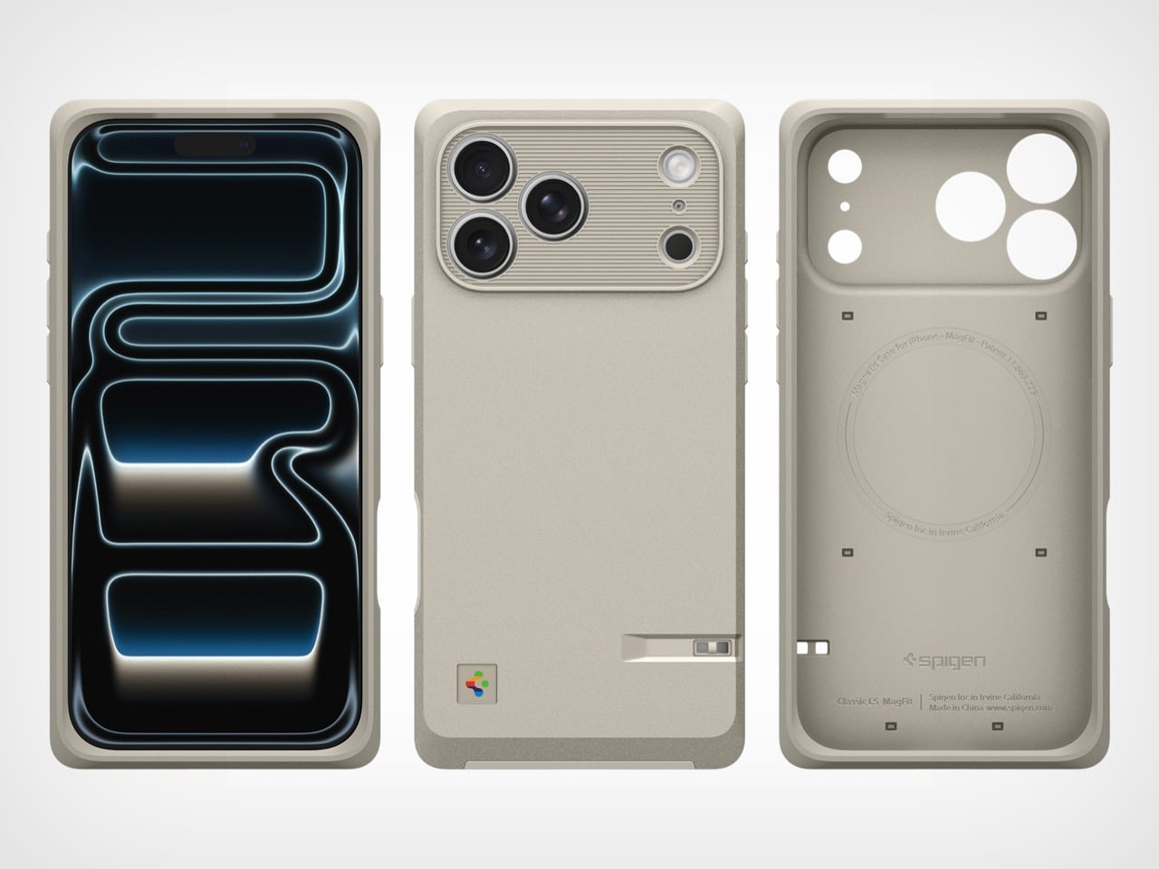
The Classic LS marks a pivot from colorful transparency to utilitarian elegance. Celebrating Apple’s 50th anniversary, this new case reaches back to the Macintosh 128k and Apple Lisa era, when computers came in beige enclosures and harbored revolutionary ambitions. The platinum-gray finish, ridged camera module, and rainbow logo placement all reference those iconic machines. Spigen has managed to honor the design legacy and vision Steve Jobs set in motion while keeping features like MagSafe and Camera Control Button functionality intact.

Design: Spigen

Click Here to Buy Now

Pivoting to the 128k and Lisa is a deliberate, almost academic move compared to their previous work. The iMac G3 was about making computers seem fun and harmless; the Macintosh was about making them seem possible. This case captures that earlier, more serious ethos. The horizontal ridges around the camera module directly evoke the necessary ventilation slats of those CRT-era machines, and the case’s texture feels like a direct nod to the plastics of the time.

All this design reverence would be wasted if it didn’t work as an actual case for a 2026 flagship. Spigen is limiting this to the iPhone 17 Pro and Pro Max, with built-in support for the Camera Control Button (rather than a mere cutout). For $39.99, you get the expected MagSafe ring and a discrete lanyard cutout, so the aesthetic doesn’t compromise modern convenience. This is a piece of designed history that actually functions as a daily driver, not just a shelf-bound novelty item.

It’s just refreshing to see an accessory that has a real, informed opinion. The market is drowning in a sea of identical clear cases and minimalist leather folios that say absolutely nothing. The Classic LS, however, makes a statement. It’s for a different kind of Apple enthusiast, one who appreciates the foundational designs that made today’s devices possible. It wraps a sleek, modern slab of technology in something with texture, history, and a point of view. Spigen has managed to create a product that feels both nostalgic and completely current.

Click Here to Buy Now

The post Apple’s 50th Anniversary Gets a Retro iPhone 17 Pro Case Inspired by the Lisa and Macintosh first appeared on Yanko Design.

DIY LEGO ‘Connect 4’ Brickset lets you actually play the game after building it!

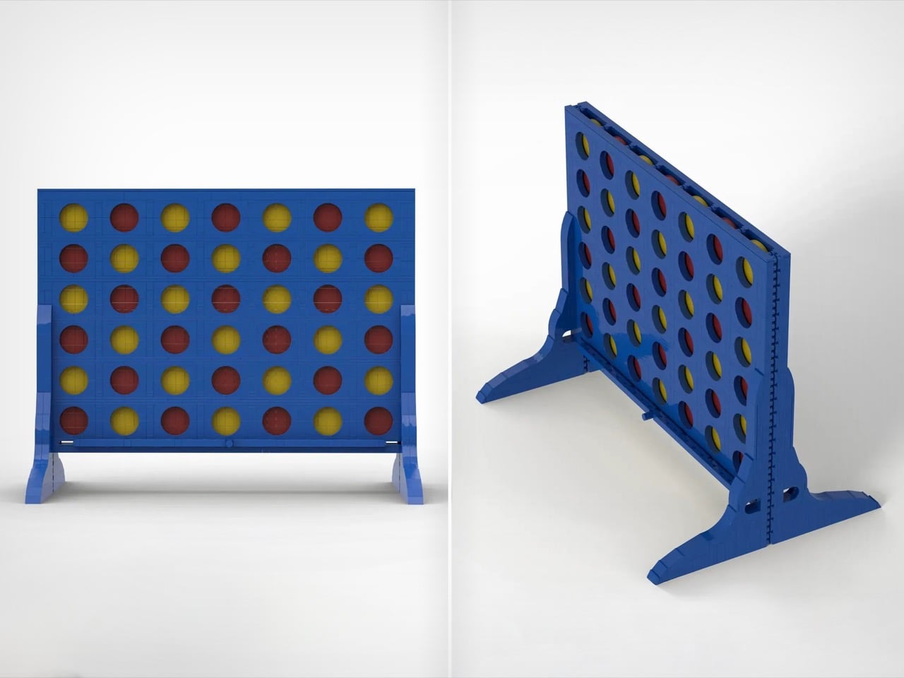
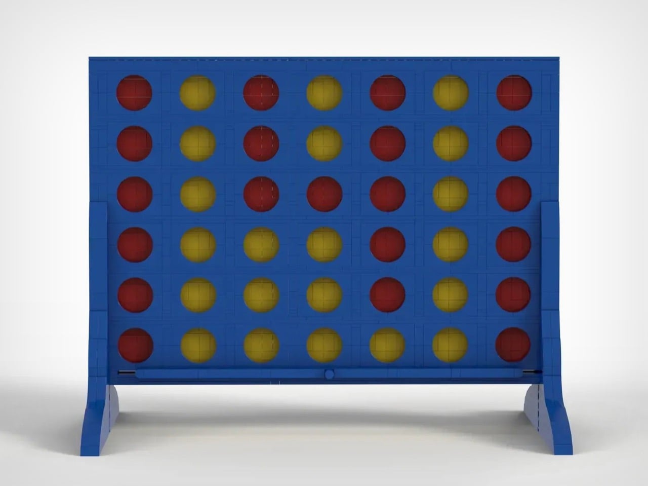
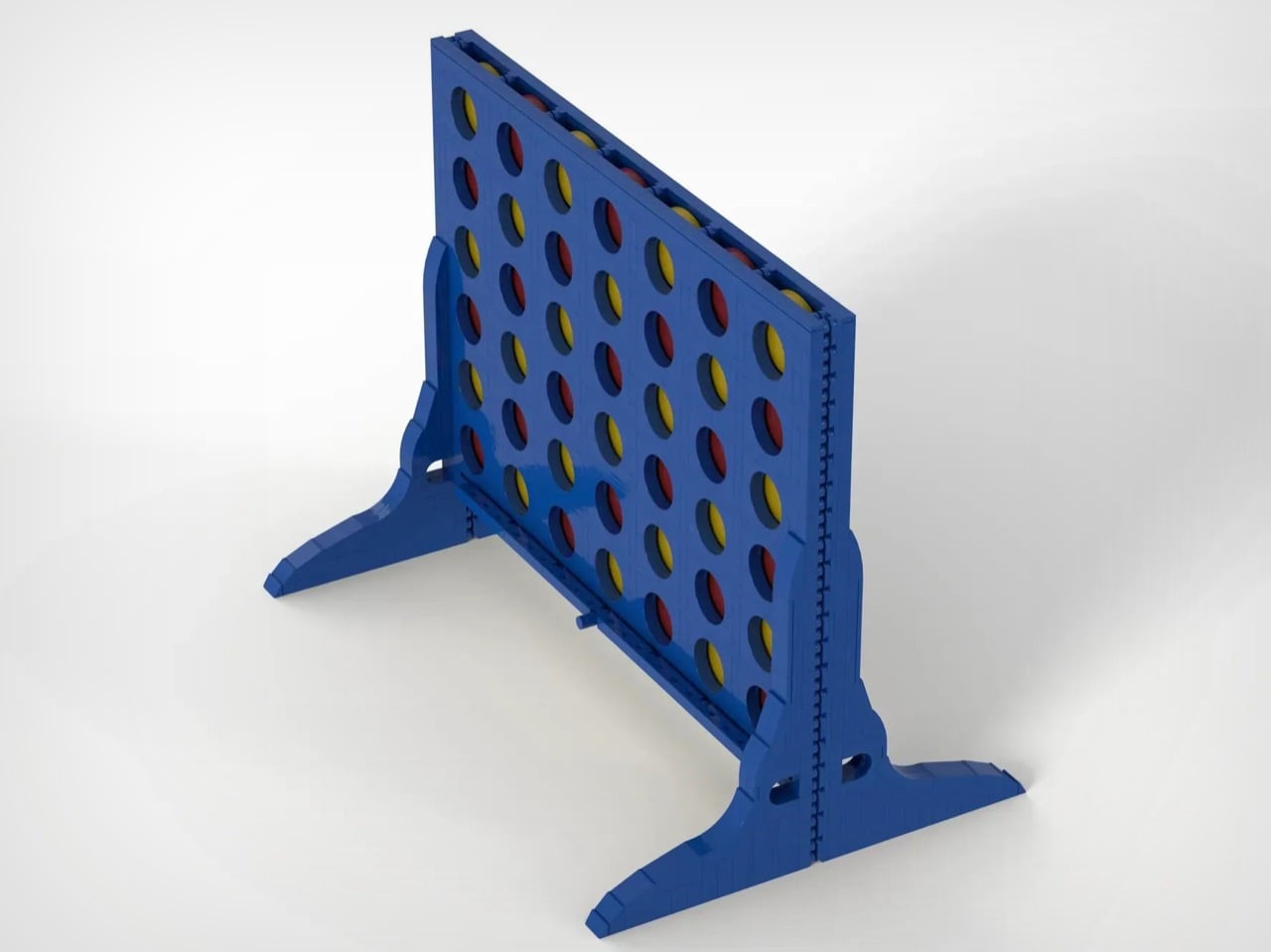
There aren’t many LEGO sets designed to played with once they’re built. A lot of them are envisioned as show-pieces, and yes, you can do imaginary play with them like you would holding a LEGO Millennium Falcon and whooshing around the house, but this MOC from HH Bricks captures a kind of LEGO playability that’s absolutely rare. Inspired by his daughters’ love for building and playing with LEGO, HH Bricks designed this playable version of one of the world’s most popular tabletop games.

For those uninitiated, Connect 4 is a simple game where you drop tokens down a vertical slot-board, trying to build a set of 4 tokens in a straight line. Your job is to simply build a straight line without being stopped, while also consistently breaking your opponent’s ability to build a solid 4 streak on their own. The game just celebrated 50 years since it was first invented in 1974 (and commercially sold in ’75), and this set recreates the game’s strategic magic, just using LEGO bricks.

Designer: HH Bricks

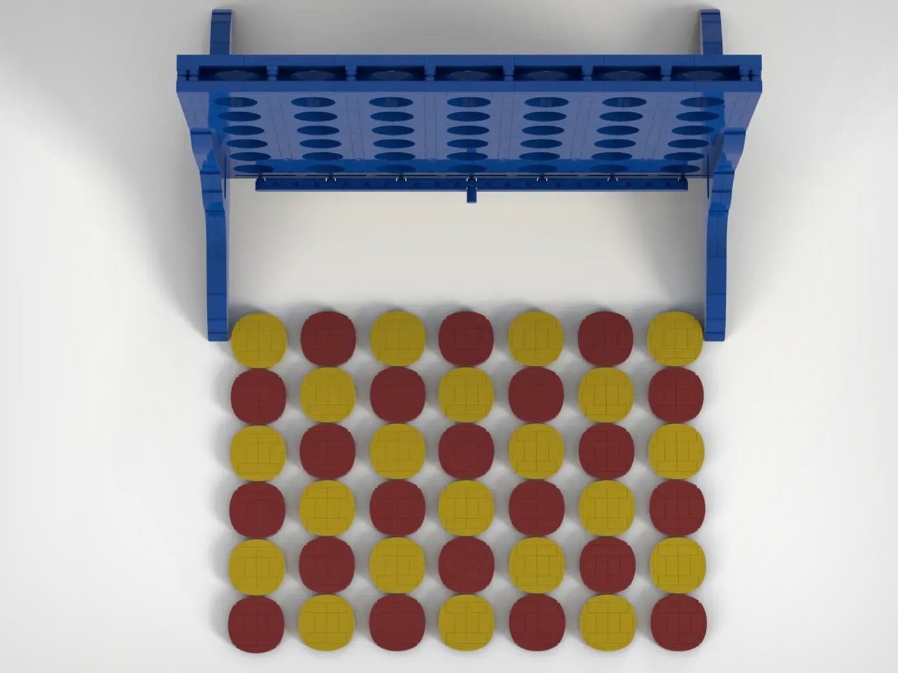
Although HH Bricks doesn’t specify how many pieces come together to build this set, one could venture it’s easily in the higher end of the spectrum, just because of how many tiny single or double-stud bricks were used to build the set’s flat panels and the 42 tokens that come along with the board. Flat surfaces are fairly complex in LEGO, not because of any visual complexity, but just the fact that they require a lot of bricks to build out.

The rules are ridiculously simple. Each player chooses a color and gets to work, dropping tokens into any slot they want. Beat your opponent by building a connection of 4 tokens in the same color in a straight line (horizontal, vertical, or diagonal). Some people even play a double-streak round, trying to hit two connections to eventually win the game. Once the game is over, simply pull out the bottom tray and all the tokens come crashing out, reseting the game for the next session.

If you’re here you’ve probably heard of LEGO Ideas – the online forum where LEGO fans and enthusiasts build, share, and vote for MOCs (or fan-made My Own Creations). This LEGO Connect 4 set is a part of the Ideas forum too, having racked up more than 2,800 votes as of writing this. The ultimate goal is to hit the 10k vote mark (which this MOC has 478 more days to reach), following which LEGO’s internal team reviews the build and turns it into a retail box set if everything goes well. The first step, however, is to hit that 10,000 vote mark, which you can help HH Bricks reach by voting for their MOC on the LEGO Ideas website here!

The post DIY LEGO ‘Connect 4’ Brickset lets you actually play the game after building it! first appeared on Yanko Design.

This $600 Tic Tac Toe Set Wants You to Slow Down

You know that feeling when you see something so beautiful and unnecessary that you immediately want it? That’s exactly what happened when I discovered Bionic’s Tic Tac Toe set. And before you ask, yes, it costs $600. Yes, it’s just Tic Tac Toe. And yes, I’m completely obsessed with it.

Paris-based design studio Bionic just dropped this made-to-order piece, and it’s causing quite the stir in design circles. Not because it reinvents the wheel or solves some massive problem, but because it does the opposite. It exists purely to make you pause, sit down, and actually be present for a moment. In a world where everything screams productivity and optimization, here’s a luxury object that says “hey, maybe just play a simple game for three minutes.”

Designer: Bionic

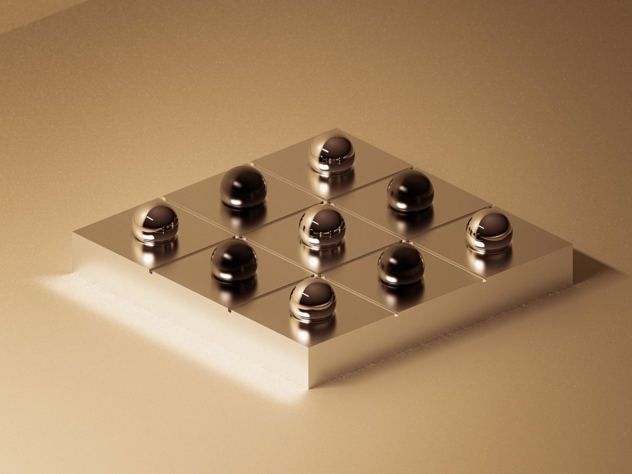
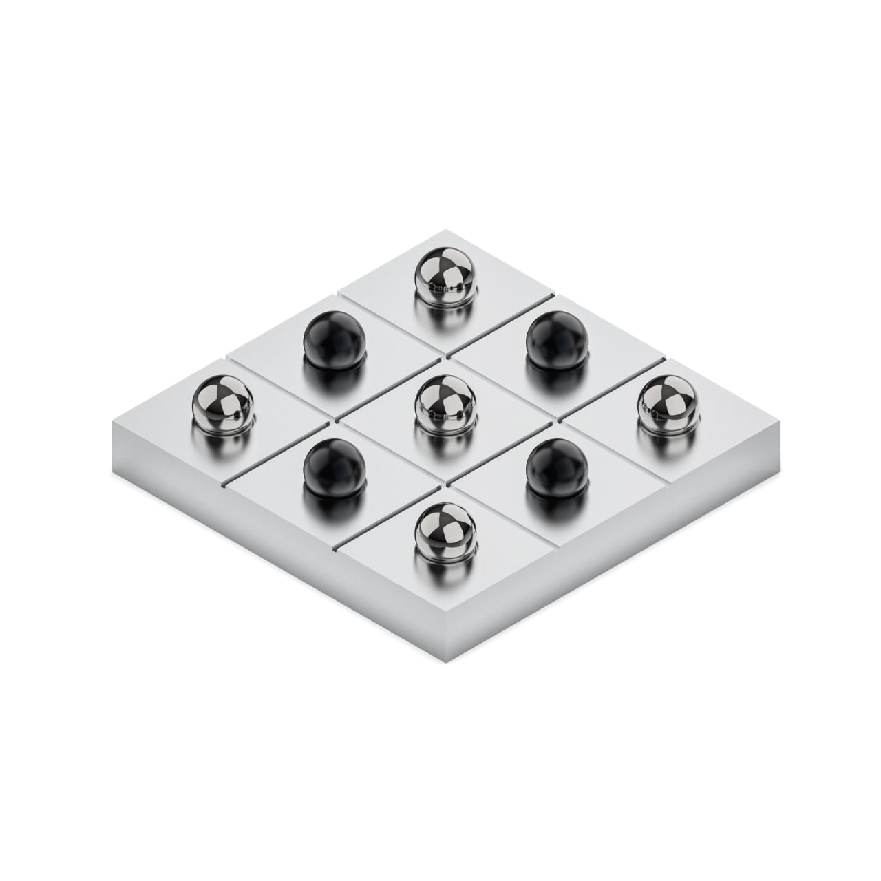
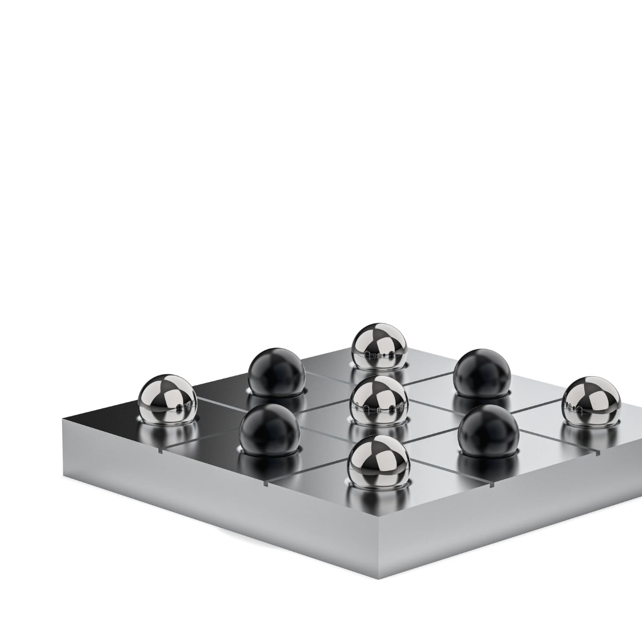
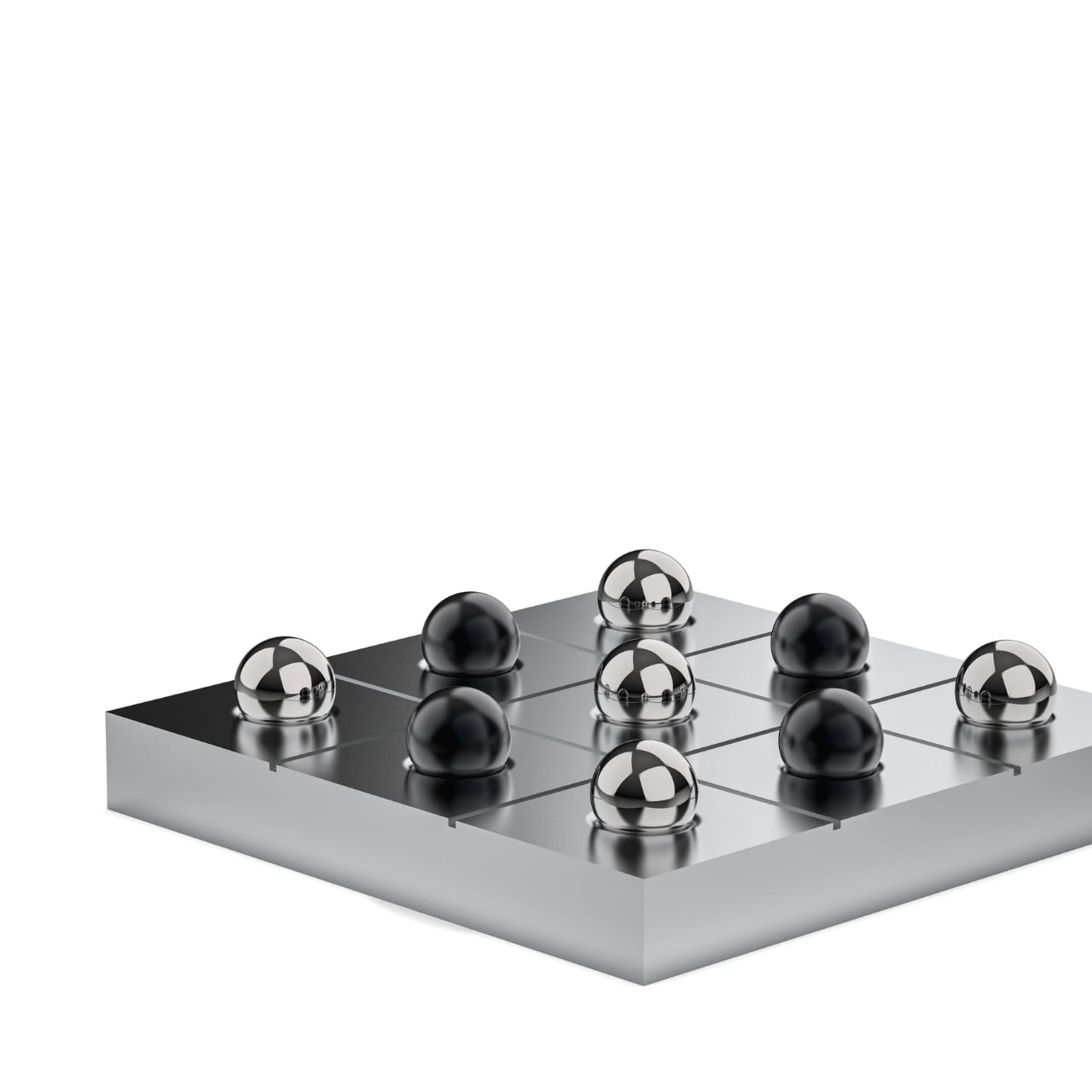
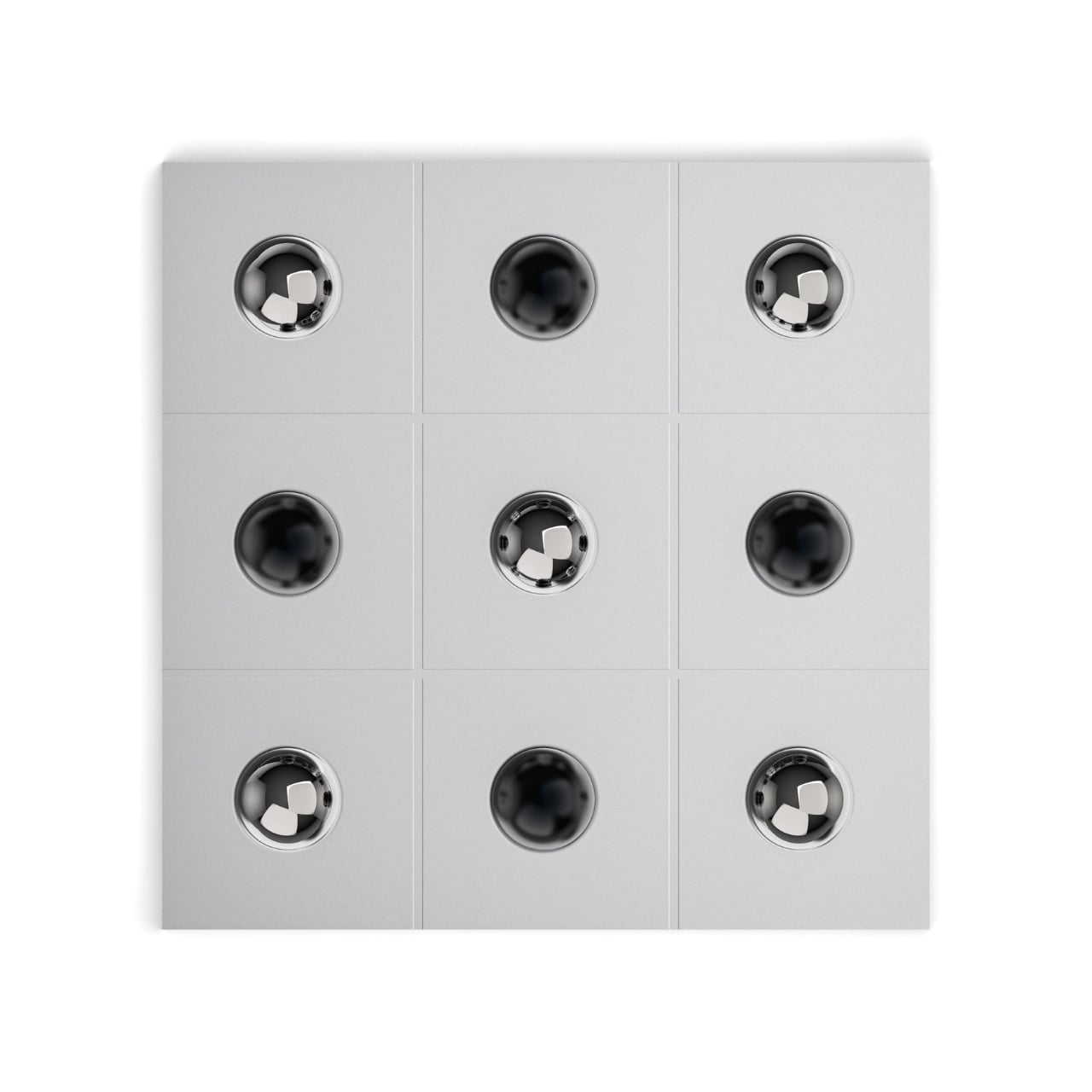
The base is machined from a single solid block of aluminum, which immediately tells you this isn’t your childhood travel game. It’s heavy, grounded, and precise in a way that makes you want to run your fingers along its edges. The grid isn’t painted or etched on after the fact. It’s formed through machining alone, no decorations, no unnecessary flourishes. Just clean lines and intention.

Then there are the playing pieces, and this is where things get really interesting. The O’s are five mirror-polished stainless steel pawns that catch the light beautifully. The X’s are five black anodized aluminum pawns, each individually CNC machined and finished. Bionic specifically designed them to feel distinct in your hand, because this isn’t about rushing through a game. It’s about the tactile experience, the weight of each piece, the contrast between materials.

I’ll be honest, when I first saw the price tag, I laughed. Six hundred dollars for Tic Tac Toe? But then I started thinking about what we’re actually willing to spend money on. We drop thousands on desks and chairs for productivity. We buy standing desks and ergonomic everything because we’re optimizing our workspace for maximum output. But what about objects that exist purely to give us a break from all that?

Bionic wrote something in their product description that really stuck with me: “Some objects exist to help us work faster. Others exist to give us a moment away from that rhythm.” This Tic Tac Toe set is firmly in the second category. It’s designed to live on your desk or coffee table as a reminder that not everything needs to justify itself through efficiency. And honestly? That feels kind of revolutionary right now. We’re so addicted to hustle culture and productivity hacks that an object designed specifically for pausing feels almost subversive. It’s a sculpture you can interact with, a conversation starter that actually starts conversations instead of just sitting there looking pretty.

The made-to-order aspect adds another layer. This isn’t mass-produced. You’re not going to see these everywhere. It’s exclusive in the truest sense, crafted specifically after you order it. For collectors and design enthusiasts, that matters. It’s the difference between owning furniture and owning a piece. Is it practical? Absolutely not. You could play Tic Tac Toe with literally anything. Pen and paper works just fine. But that’s missing the entire point. This is about elevating something simple and familiar into an experience. It’s about materials, craft, and intention. It’s about having an object in your space that exists purely because it’s beautiful and makes you smile.

Bionic specializes in precision-machined aluminum accessories and workspace tools, all crafted in Paris with that distinctly European sensibility where form and function aren’t at odds. Their whole philosophy is about creating beautiful, thoughtfully designed products that are tools for daily life. This Tic Tac Toe set might be their most purely playful creation yet. So will I spend $600 on this? Maybe not today. But I love that it exists. I love that someone looked at Tic Tac Toe and thought, “what if we made this as beautiful as humanly possible?”

The post This $600 Tic Tac Toe Set Wants You to Slow Down first appeared on Yanko Design.

Retro iMac G3-style AirPods Max takes inspiration from Apple’s most colorful tech era

Sure, the AirPods Max come in colors – but there’s something so cold and un-emotional about anodized aluminum. It grabs your eye, but then immediately lets your eye wander once your fingers have run past its cool matte surface. Aluminum’s only purpose was to help build devices that were sleek and thermally advantageous. The problem, however, is that the AirPods Max aren’t ‘sleeker’ than your average headphone. Again sure, the MacBook Air looks so much thinner than the other average laptop – but aluminum in headphones achieves nothing. It adds weight, makes the head feel heavy, and doesn’t even look as eye-catching as some of its plastic-based counterparts.

Saffy Creatives recognized this and decided to give the AirPods Max a rather fitting makeover. After reinventing the Apple Watch as a G3-inspired retro-dream, they’re back with a redesign for the AirPods Max that looks oh-so-gorgeous it makes me want to try licking the headphones – obviously in a non-creepy way.

Designer: Saffy Creatives

What Saffy Creatives did is clever because it doesn’t change the AirPods Max silhouette – just its material treatment. Fair warning, the images ARE made using AI, but to be honest, AI is used more as a rendering tool here than it is as an imagination aid. The device looks exactly the same, except the parts made from metal are now replaced with dual-tone transparent/translucent plastic. The headphones here adopt Apple’s iconic Bondi Blue color scheme, with the outer cans giving a look into the headphones’ inner mechanics (just as Jobs intended with the iMac G3). A cloudy white element breaks the transparent shell, adding almost a halo of sorts around the can while also meaningfully separating the materials that would be probably impossible to injection-mold otherwise.

The old colorful Apple logo also finds itself on both the outer cans – something Apple wouldn’t be caught dead doing with their metal headphones. Is the detail almost too distracting? Some Apple purists would probably say it is – but nobody buys headphones because they look boring. Every audio-lover worth their salt wants headphones that make a noise, whether it’s through audio drivers, or through visuals.

The rest of the headphone remains fairly the same. The cups stay exactly the way they originally were, with the 3D mesh we’ve come to love. Similarly, the headband retains its mesh cushion too, however, the outer plastic frame also gets translucent/cloudy white plastic treatment to match the overall vibe. The result is a pair of headphones that are as gorgeous as any of Apple’s turn-of-the-millennium products – when Jobs and Jony Ive probably had more fun than they ever had making products.

Obviously such a pair of headphones will never exist (and I do wish Nothing had done a better job with their transparent design), but if there’s some maverick YouTuber looking to mod the AirPods Max, this weirdly nostalgic build is definitely worth a shot. After all, it’s nothing a 3D printer could churn out in a few hours. You’re not really changing the geometry either – just the material.

The post Retro iMac G3-style AirPods Max takes inspiration from Apple’s most colorful tech era first appeared on Yanko Design.

Anker SOLIX E10 Brings Hybrid Whole-Home Backup to the Modern House

Modern homes depend on electricity for everything, from fridges and routers to medical devices and central A/C. Storms, rolling blackouts, and grid hiccups trigger a familiar scramble for flashlights and ice bags. Food spoils, devices die, and working from home becomes impossible. Most backup options either feel like camping gear with a couple of outlets or like a renovation project with permits and opaque pricing.

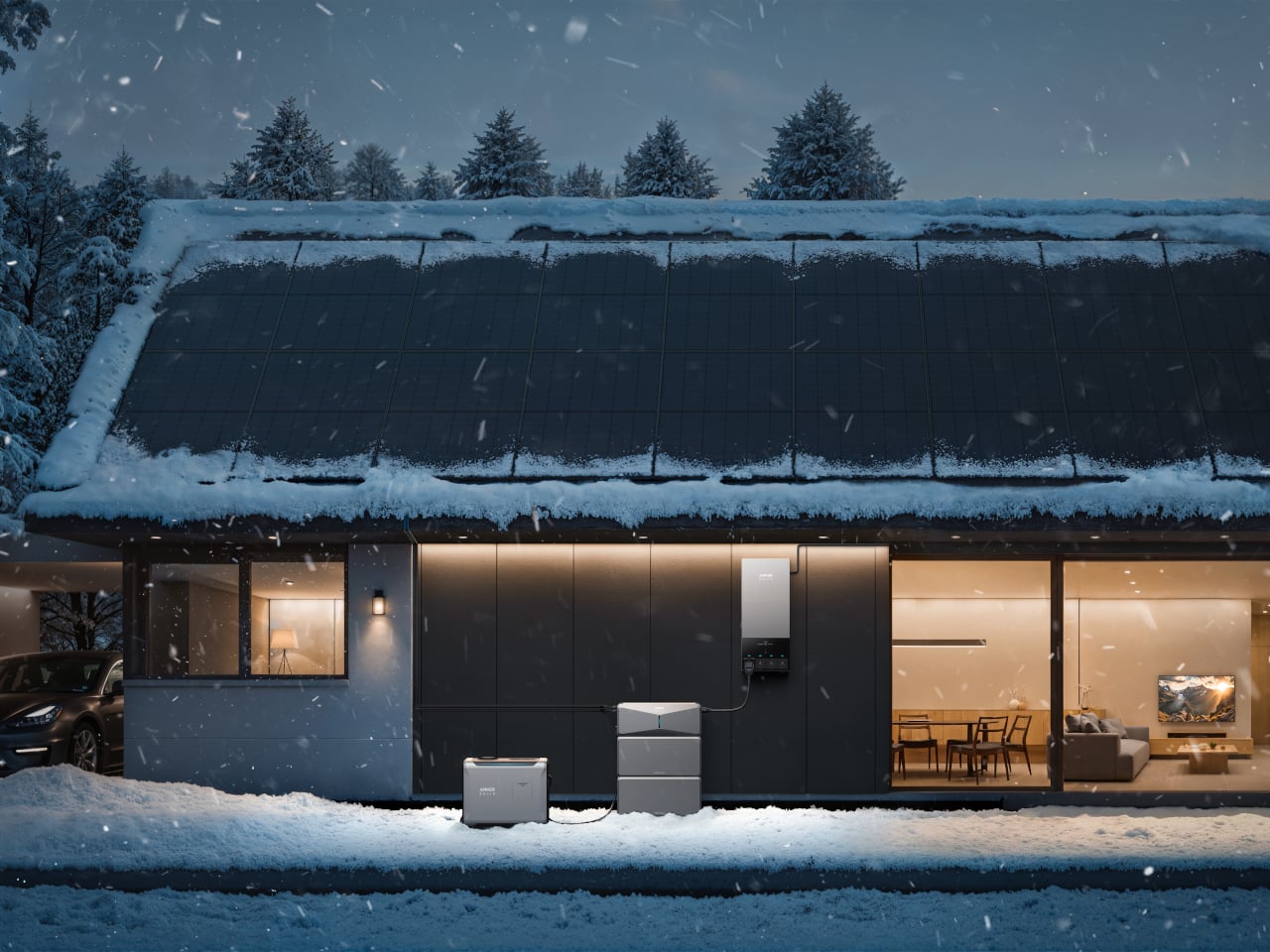
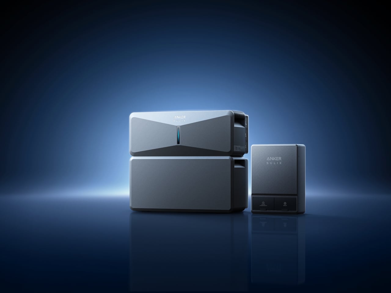
Anker SOLIX E10 is a smart hybrid whole-home backup system that blends batteries, green solar power, and a smart generator into one coordinated setup. It is designed to keep an entire house running, not just a few circuits, and is rated for whole-home backup with a 200-amp connection when paired with its Power Dock, matching a typical US main panel.

Designer: Anker

On a normal day, the SOLIX E10 quietly charges from solar and the grid, storing energy in modular 6 kWh battery packs that can scale to around 90 kWh with multiple stacks. When the power drops, the system steps in, deciding when to draw from batteries, when to add fuel through a DC link to its tri-fuel smart generator, and when to resume solar charging once the storm clears.

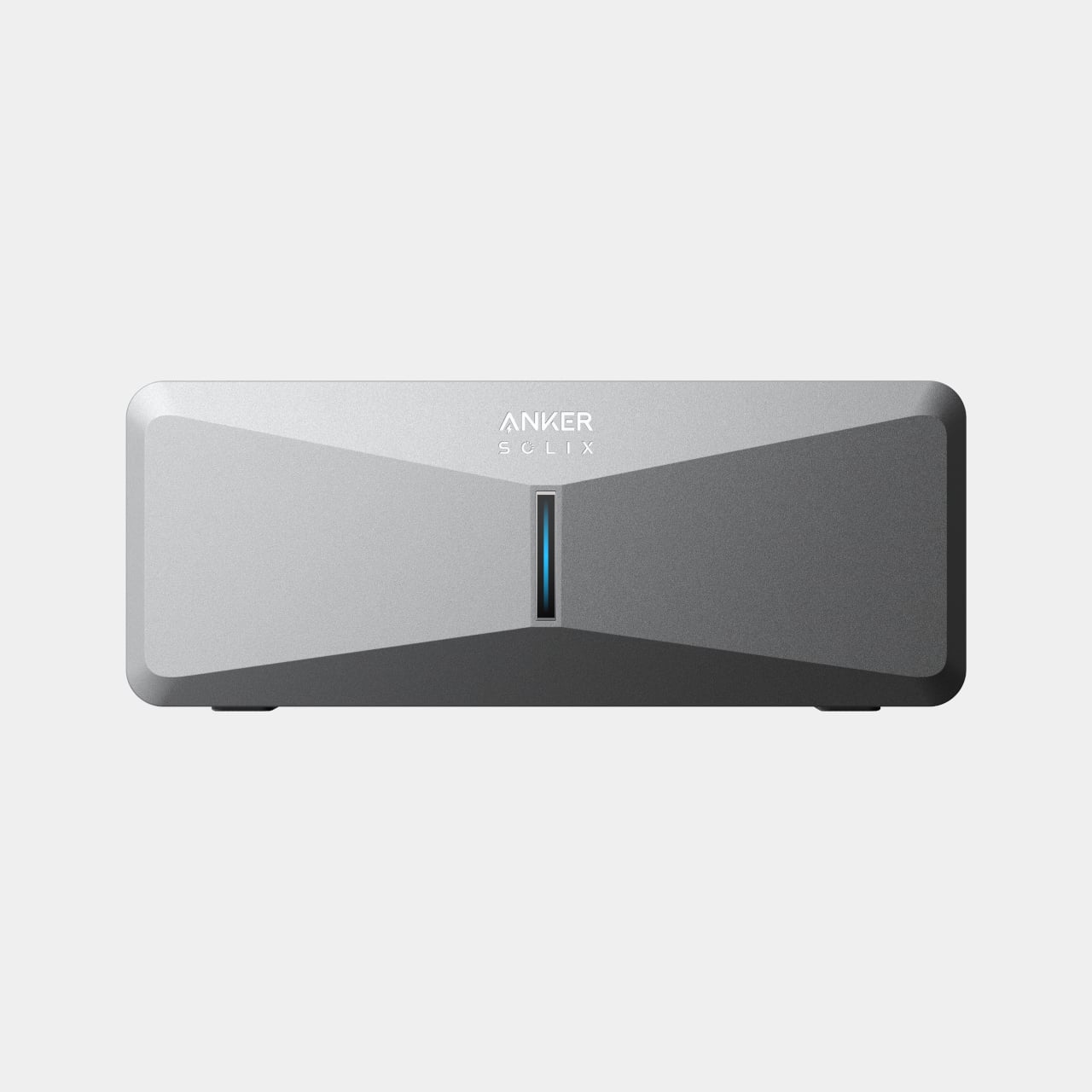
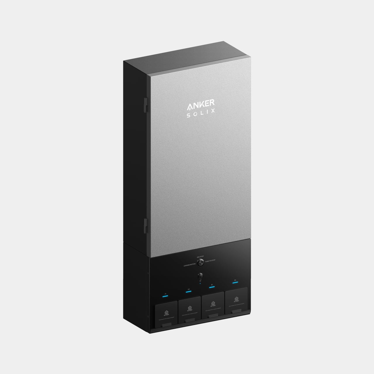
SOLIX E10 Power Module Inverter

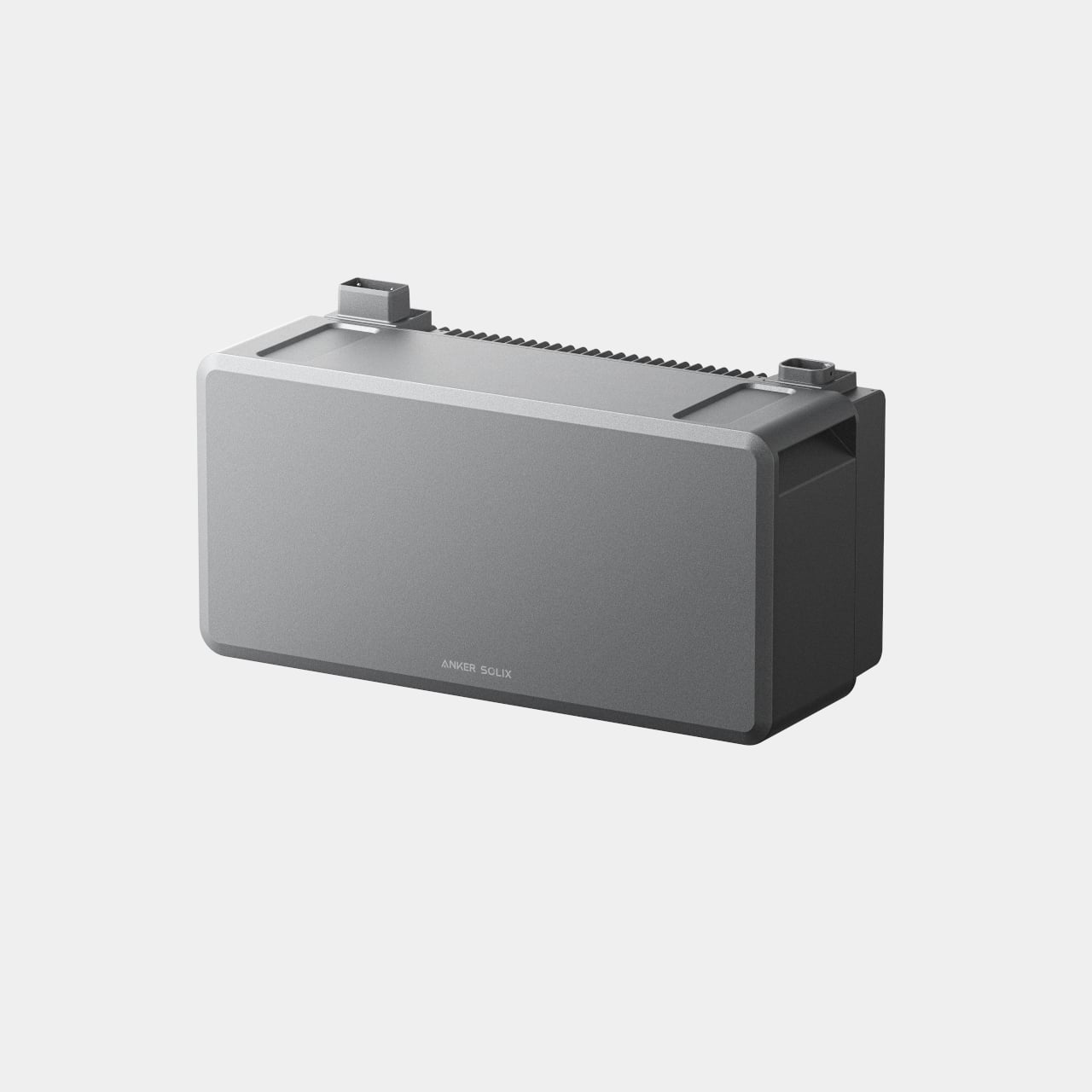
Anker SOLIX B6000 Battery Module

With the Power Dock or Smart Inlet Box, the SOLIX E10 can back up every circuit in a typical house, so you are not choosing between the fridge and the router. It is engineered to start and run a full-size 5-ton central A/C by handling the high inrush current that usually trips smaller systems, which matters when a summer outage hits during a heatwave.

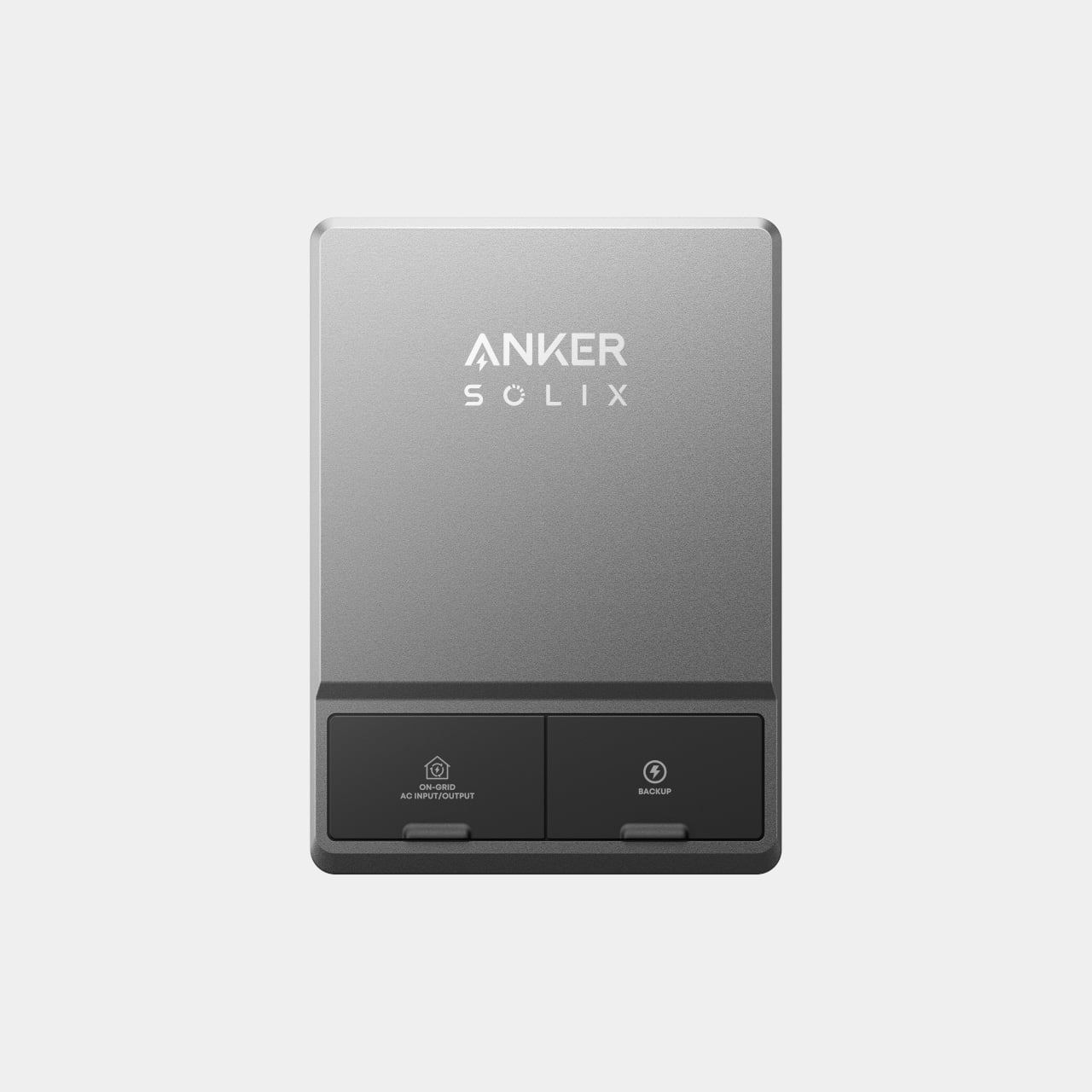
Anker SOLIX Power Dock

Anker SOLIX Smart Inlet

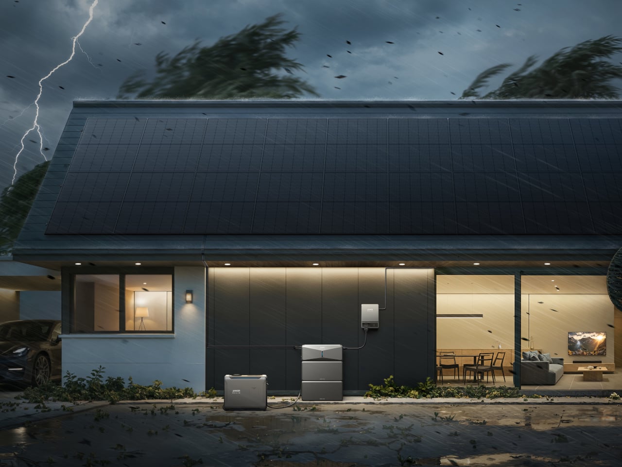
When the grid fails, the lights stay on without flickering, the Wi-Fi does not reboot, and the A/C keeps humming. The system switches over in under 20 milliseconds, fast enough that most electronics never even notice. The feeling is less about the exact speed and more about the house simply not going dark anymore, even when the neighborhood does and trees are still down.

The SOLIX E10 can watch the weather and charge itself ahead of a predicted storm through its Storm Guard feature, so you are not caught with half-full batteries when the first tree hits a line. The modular packs give enough headroom for multi-day outages, while the forecasting takes backup power from a reactive scramble to a quiet ritual where the system prepares itself before you think to check.

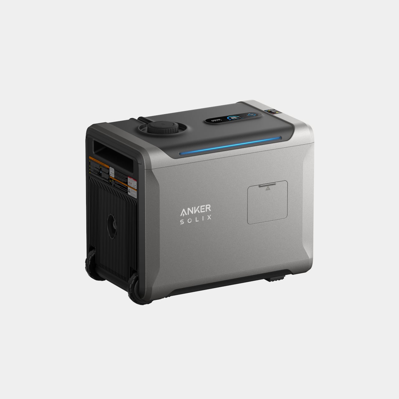
Anker SOLIX Smart Generator 5500

The optional smart generator stretches backup power through long outages without running nonstop. Instead of charging through AC conversion, it feeds the batteries directly over DC, which Anker claims is up to five times more fuel-efficient than a traditional setup. It runs when needed, rests at night, and feels more like part of a system than a last-resort accessory.

The SOLIX E10 is not only for rare blackouts. On normal days, it can store cheap off-peak energy or excess solar and run the house when rates spike, trimming bills. Each unit accepts up to about 9 kW of solar input, so a rooftop array keeps the batteries topped up, and the system prioritizes important circuits to keep essentials alive longer during outages.

The hardware is a family of clean, stackable modules, with batteries that can be wall-mounted or floor-standing as the setup grows. The core units use an all-metal NEMA 4 enclosure and are certified to UL 9540 and UL 9540A, signaling they are built to live outdoors, handle bad weather, and meet the toughest residential safety standards.

Power anxiety is real, the feeling that one bad storm could wipe out food, work, and comfort for days. An outage where the house stays lit, the air stays cool, and the fridge keeps humming while the street outside goes dark is the payoff Anker SOLIX E10 is built around, making blackouts feel like minor blips instead of household emergencies.

The post Anker SOLIX E10 Brings Hybrid Whole-Home Backup to the Modern House first appeared on Yanko Design.

MP-1 Reimagines a Modern Walkman Through a Teenage Engineering Lens

Listening to music has mostly collapsed into phones and streaming apps, buried between notifications and multitasking. Some people still crave a single-purpose device that treats listening as the main event, not background noise. The MP-1 is an independent concept study that asks what a modern Walkman could look like if it borrowed Teenage Engineering’s design language, without being affiliated with the company or trying to become an official product at all.

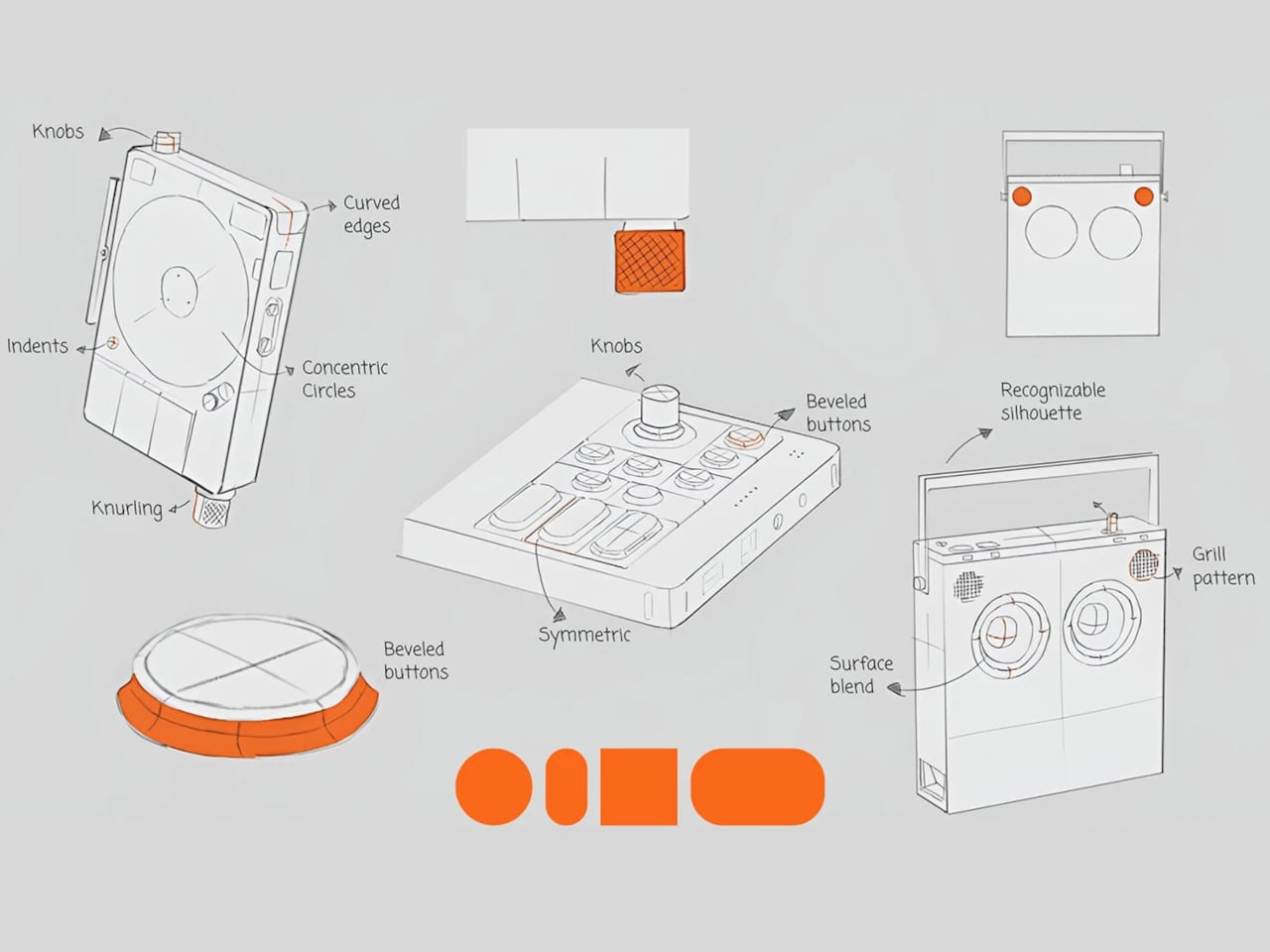
The project set out as a brand-led design study, not a fan mash-up or a wild render. The brief was to study Teenage Engineering’s approach to minimalism, playful restraint, tactile controls, and clear functional expression, then translate those principles into a believable handheld music player. The goal was manufacturable intent and intuitive interaction, not speculative tech or exaggerated shapes, treating it as a disciplined exercise in understanding how strong brand identities shape form.

Designer: Prithvi Manoj Bhaskaran

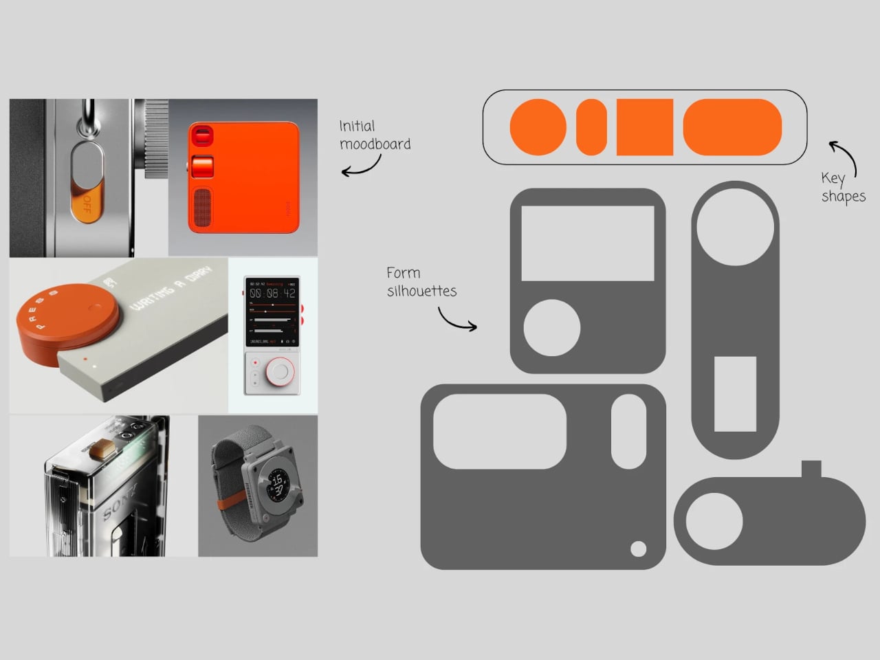
The study pulled four keywords from Teenage Engineering’s portfolio, playful, tactile, curious, purposeful complexity. Those traits show up in devices like the OP-1 and TP-7, where dense functionality is expressed through simple forms, color accents, and satisfying controls. A focused music player fits naturally into that philosophy, turning listening into an intentional, distraction-free ritual that foregrounds sound as a primary experience rather than something competing with notifications while you commute.

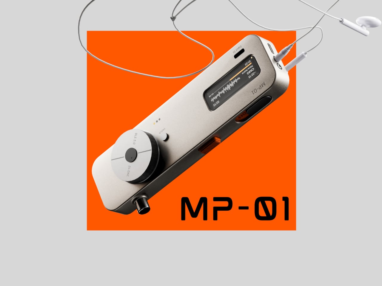
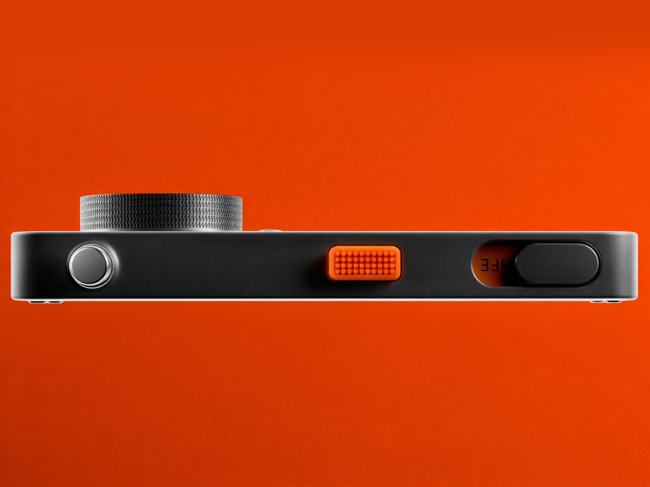
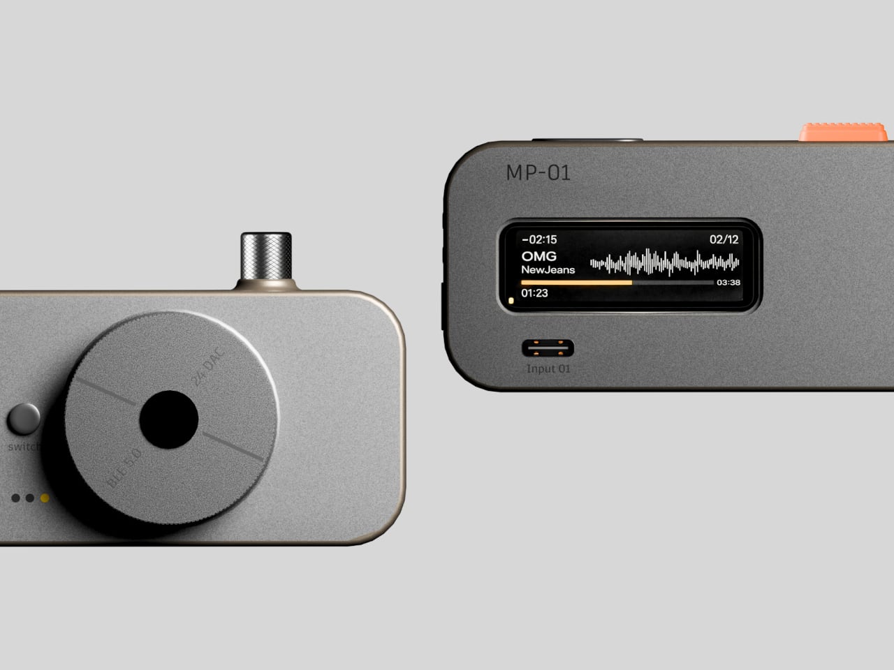
The MP-1’s basic layout is a slim rectangular body with softened corners, a large circular dial as the main control, and a narrow horizontal display that handles track info and waveform visualization. This mirrors Teenage Engineering’s habit of giving one control visual priority, then letting everything else recede, so your hand and eye always know where to go first, with the orange accent adding personality without overwhelming the minimalism.

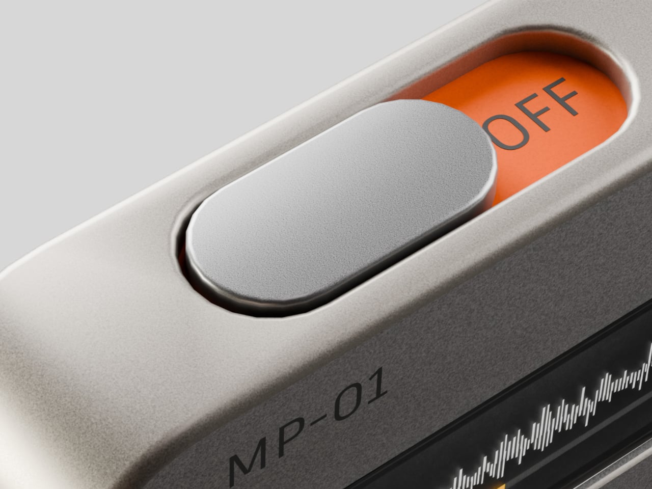
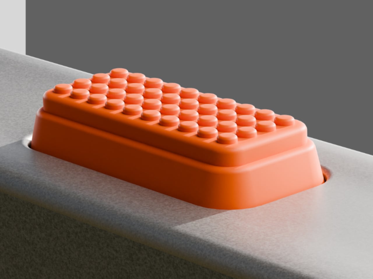
The tactile controls embody the playful side of the brief. An orange textured rocker invites your thumb, its grid of soft nubs making it feel like a toy in the best sense. A slider reveals “OFF” in orange when pulled back, hiding the label when pushed forward. These details use motion and color to communicate state without cluttering the surface with text, making every interaction feel more deliberate and satisfying.

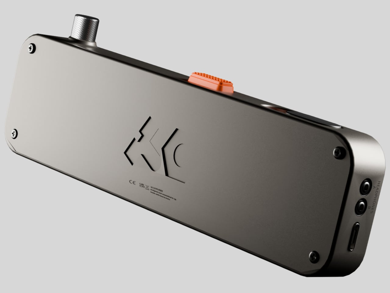
Practical touches include a USB-C port for charging and data, realistic thickness that suggests room for a battery and mechanical parts, and restrained use of materials. The backplate carries a subtle logo and regulatory text, the kind of thing you would expect on a real product, reinforcing that this is not just a styling exercise but a thought-out object that could plausibly be manufactured and carried in a pocket or bag.

The MP-1 shows the power of a strong design language, recognizing Teenage Engineering’s influence without logos or official ties. Most listening today happens on general-purpose slabs, which makes a small, tactile player appealing, even as a concept. For people who miss dedicated devices and the ritual of choosing to listen rather than letting a playlist run in the background, MP-1 feels like a quiet argument that sometimes less is exactly what you need.

The post MP-1 Reimagines a Modern Walkman Through a Teenage Engineering Lens first appeared on Yanko Design.

Satechi’s Thunderbolt 5 CubeDock Is A Minimalist Dock With Maximum Bandwidth

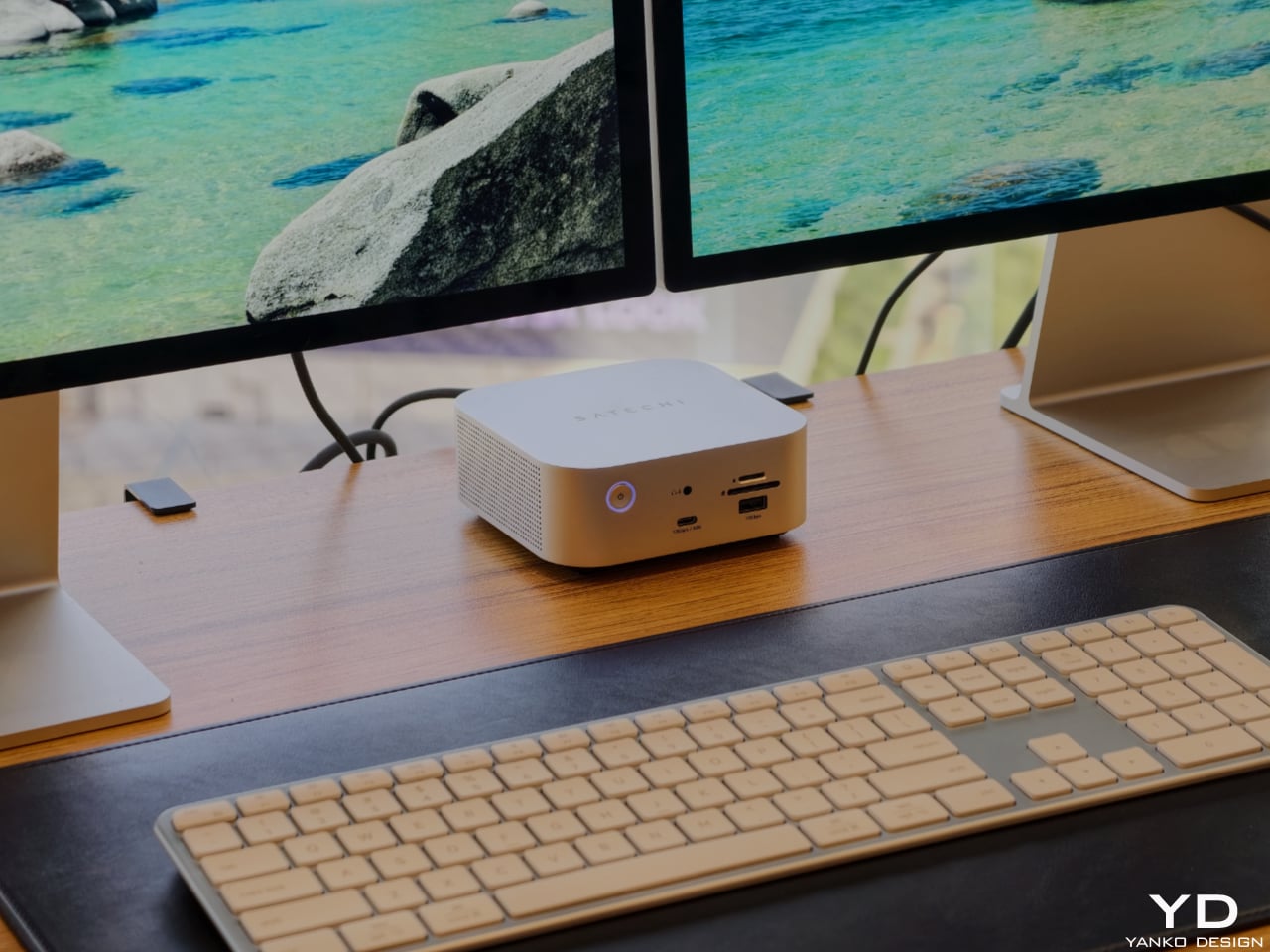
Satechi’s Thunderbolt 5 CubeDock with SSD Enclosure is built to look as sophisticated as the devices it serves. The compact 5 x 5 x 2-inch footprint mirrors the proportions of Apple’s Mac mini, so the two stack neatly into a clean, monolithic tower on your desk rather than a cluttered pile of hardware. The solid aluminum body and soft, rounded corners pick up Apple’s visual language in a way that feels intentional, making the CubeDock read like an extension of a modern Mac setup instead of an aftermarket add‑on.

Designer: Satechi

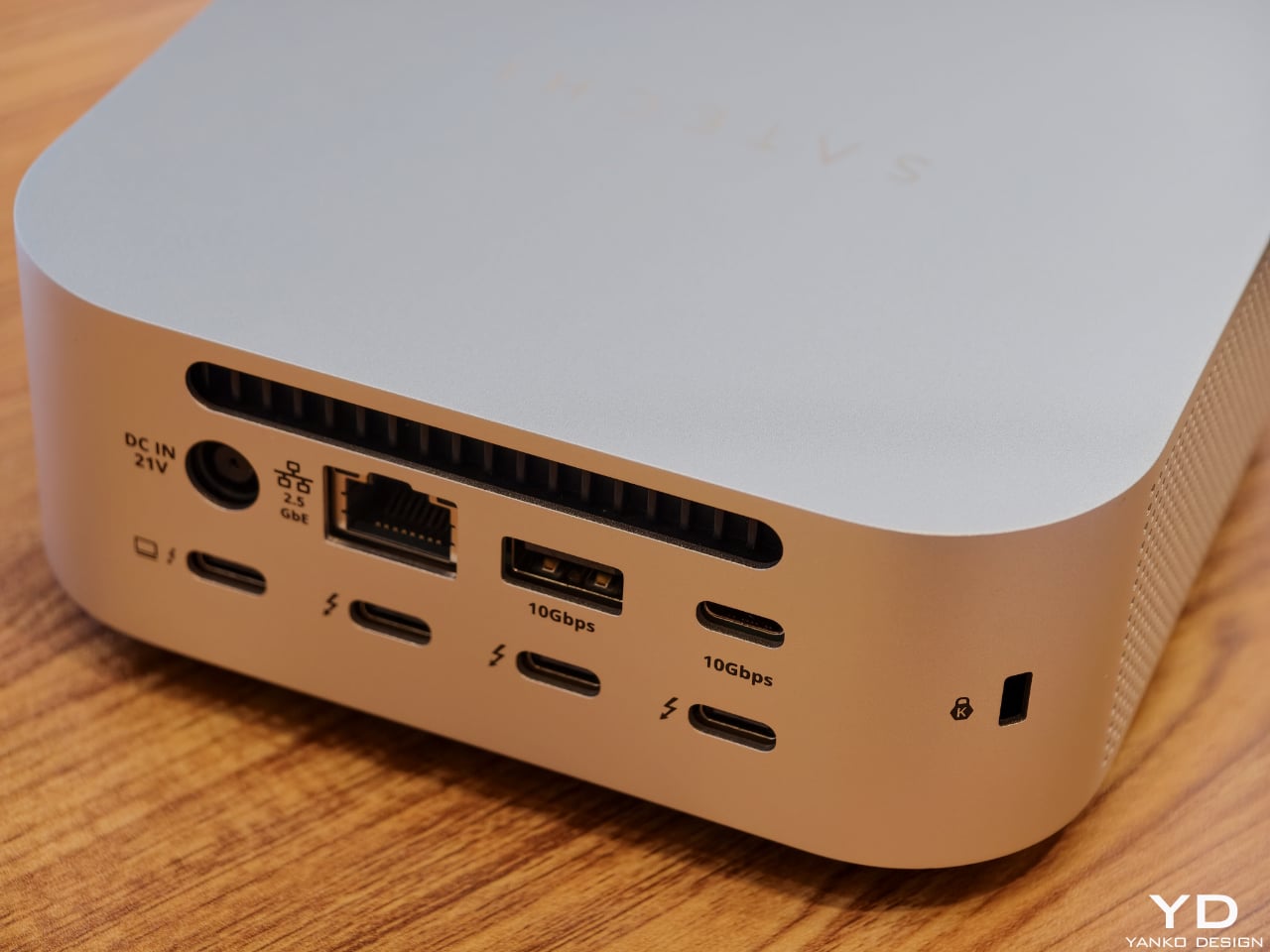
That design focus does not mean the dock is only for Mac users, though. Satechi is positioning the CubeDock as a cross‑platform, Thunderbolt 5‑first hub for creative professionals and power users on both Windows and macOS. Built on Intel’s Thunderbolt 5 technology, it doubles the bandwidth of previous generations, delivering 80 Gbps of bi‑directional bandwidth and up to 120 Gbps with Bandwidth Boost for external graphics and multi‑display configurations. On supported Windows machines, it can drive triple 8K displays at 60 Hz or triple 4K panels at 144 Hz, while on newer Apple silicon systems, it supports dual 6K at 60 Hz, all from a single cable.

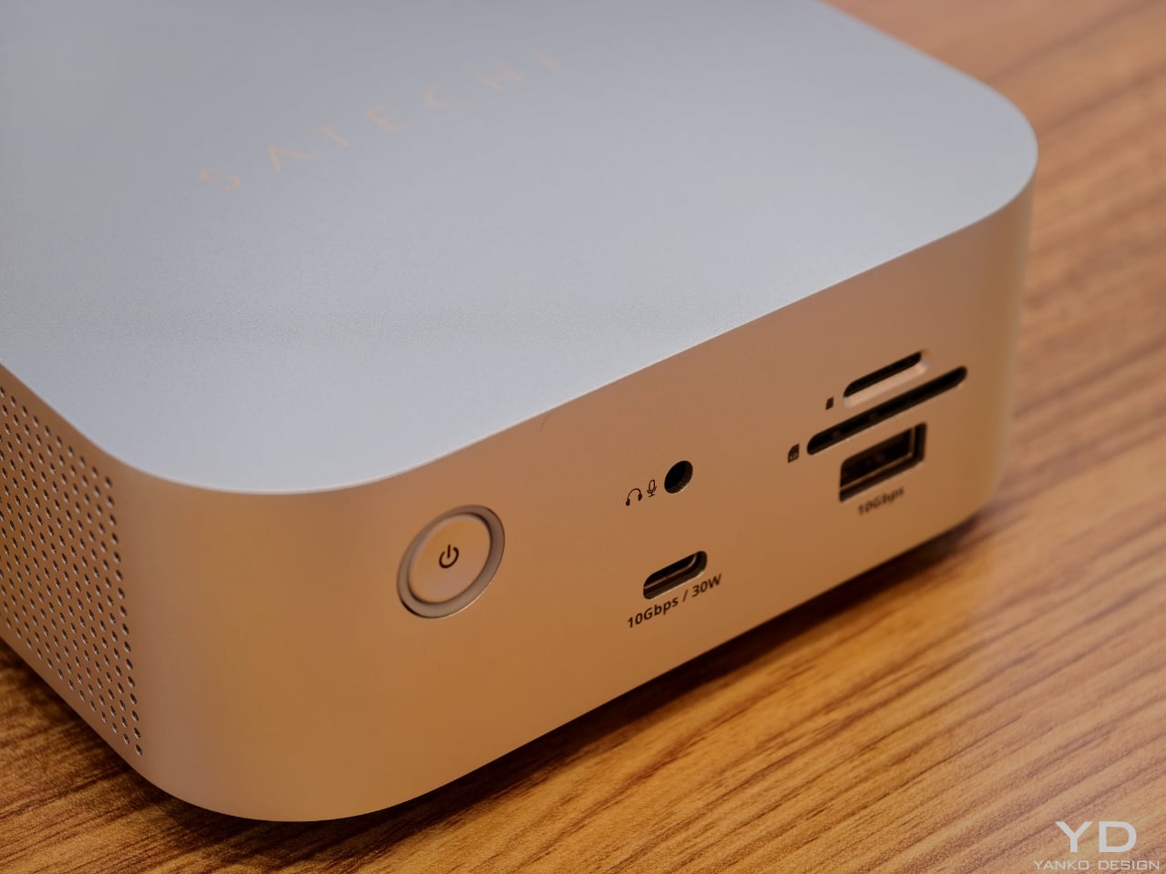
The CubeDock’s compact size hides a serious amount of connectivity. It boasts Thunderbolt 5 downstream ports, multiple 10 Gbps USB‑C and USB‑A ports, UHS‑II SD and microSD card readers, and 2.5 Gb Ethernet. For photographers, filmmakers, and 3D artists, that means fast card ingestion, wired networking, and external drives all plug into one cube that visually recedes into the background. A 180 W smart power supply delivers up to 140 W back to the host laptop, plus 30 W of Power Delivery for phones and tablets, so the dock can replace multiple separate chargers on the desktop.

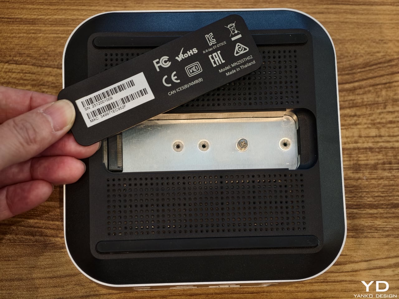
One of the most thoughtful touches is the integrated NVMe SSD bay. Instead of forcing users to add yet another external enclosure, Satechi has built a PCIe 4×4 slot into the CubeDock itself, supporting up to 8 TB of storage at speeds up to 6000 MB per second. That turns the dock into both a visual anchor and a primary working drive, ideal for 4K and 8K video, large RAW photo libraries, or CAD files. Adaptive active cooling keeps the cube whisper‑quiet even under heavy workloads, maintaining performance without adding fan noise to your workspace. For anyone building a refined, minimal workstation around a Mac mini or modern laptop, yet wanting the flexibility to move between platforms, the CubeDock offers a rare combination of industrial design, raw bandwidth, and integrated storage in one small aluminum cube.

The post Satechi’s Thunderbolt 5 CubeDock Is A Minimalist Dock With Maximum Bandwidth first appeared on Yanko Design.

Observation Pavilion Sends a Camera Up While You Stay on the Ground

Climbing an observation tower involves a lot of steel and concrete just to stand a few dozen meters higher and take in a view. The ritual is familiar, the ascent, the vertigo, the panorama, but the infrastructure demands are massive for what amounts to a few minutes of elevated looking. Michael Jantzen’s Telepresence Observation Pavilion asks whether we always need to build big vertical structures to get that feeling, especially when most distant experiences already come through screens and networks.

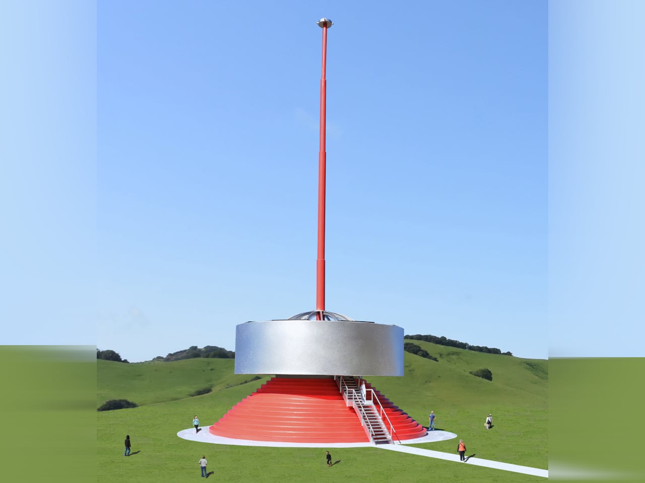
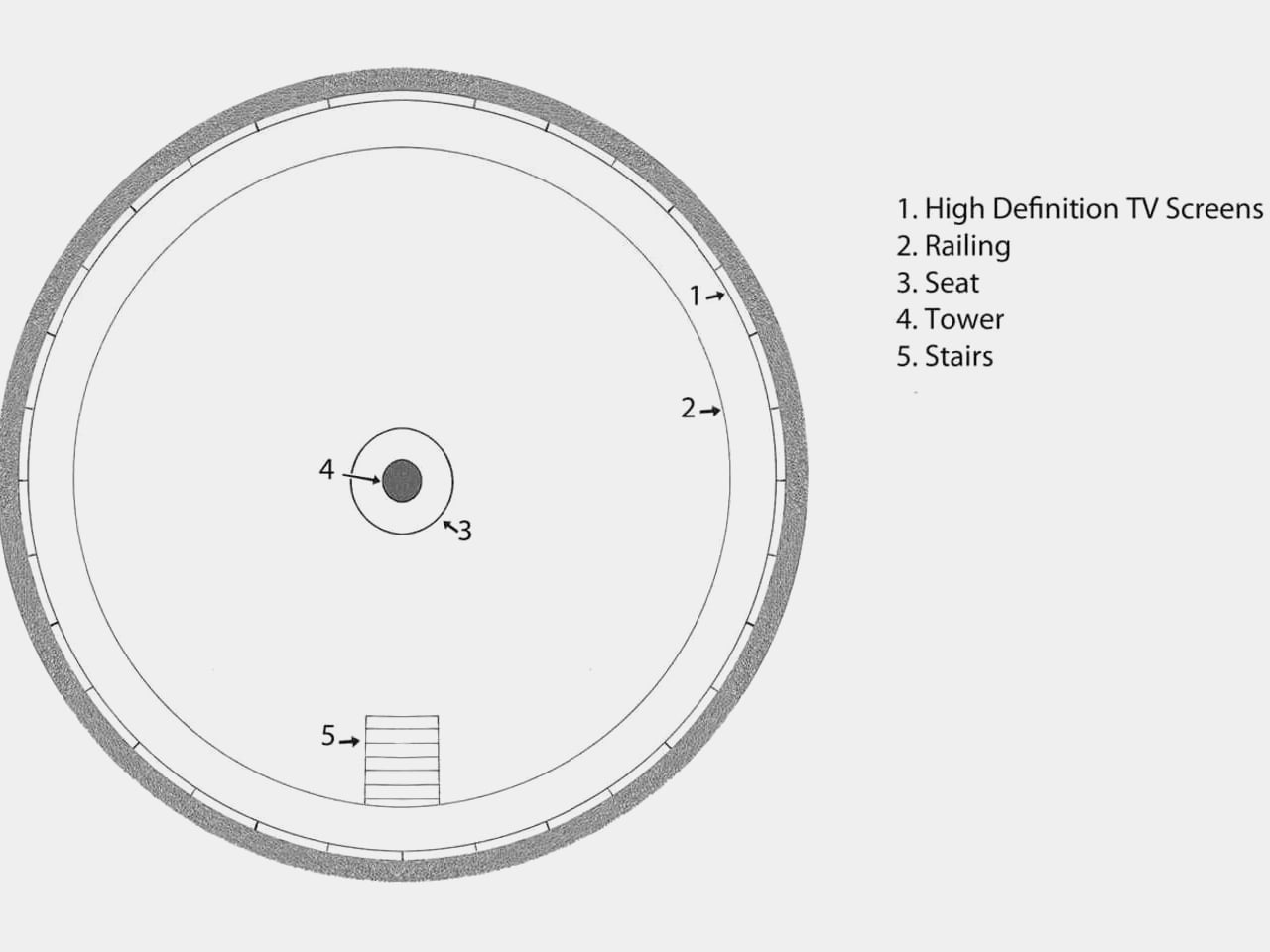
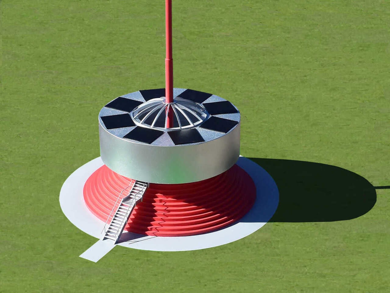
Instead of lifting people into the air, the pavilion lifts a 360-degree camera on a tall telescoping mast, then brings the view down to ground level. Inside a circular room, a ring of high-definition screens shows a live panoramic feed from the camera, synced with sound, so visitors see and hear exactly what they would if they were standing at the top of a traditional tower, without leaving the ground or climbing a long staircase.

Designer: Michael Jantzen

Walking into a round, open space where the walls behave like windows wraps you in a continuous horizon of forest, water, or city. A circular bench sits around the central mast, the floor stays open, and a guardrail keeps you a step back from the screens, so you are aware you are in a room, but your eyes are convinced you are somewhere higher and more exposed.

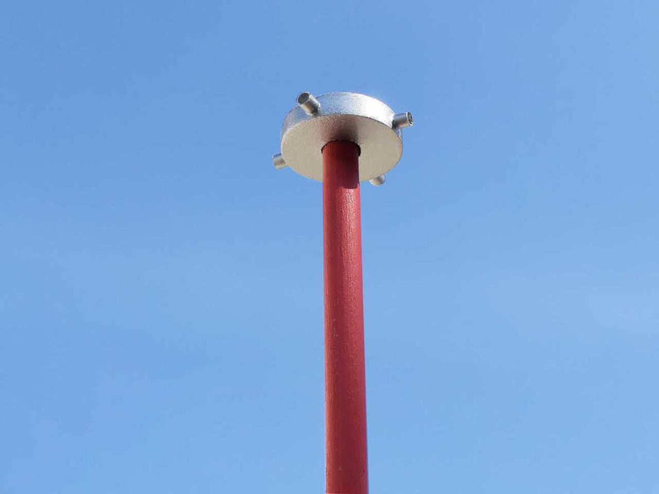
The camera sits on top of a tall series of telescoping pipes anchored to the pavilion floor, rising far above the roof. The module captures real-time sights and sounds in every direction, then sends that data down to the screens. The only tower you need to build is this slender mast, not a full structure sized for people, which drastically cuts material and engineering demands.

Eight solar panels ring the central skylight on the pavilion roof, feeding the camera, screens, and lighting. This connects to Jantzen’s goal of using information technology to replace or reduce physical building materials. The pavilion becomes an environmental argument, suggesting that if we can satisfy the desire for elevated views with data and light, we might not need to pour as much concrete into the sky.

Jantzen imagines many camera modules installed on existing structures, communication towers, mountain lodges, and skyscrapers. Those feeds could be sent over the internet to any pavilion, letting visitors switch channels between live elevated views from around the world. You could stand in a field and look out over Tokyo, then switch to a mountain ridge in Patagonia or a coastal city, turning a local building into a global observatory.

This changes the idea of an observation tower. You still make a trip to a specific place and share a room with other people, but the view is no longer tied to that exact spot. It can be curated, rotated, or scheduled, and multiple pavilions can share the same remote vantage point without crowding fragile sites. The architecture becomes as much about routing information as it is about shaping space.

The Telepresence Observation Pavilion will not replace every lookout or mountain hike, and there is still value in feeling the wind and height directly. But as a thought experiment, it points toward a future where we build less mass to get more experience, using cameras, networks, and solar-powered rooms to give people elevated perspectives without the environmental and structural cost of traditional towers, or the bottlenecks that come when everyone wants to see the same sunset from the same narrow platform at once.

The post Observation Pavilion Sends a Camera Up While You Stay on the Ground first appeared on Yanko Design.

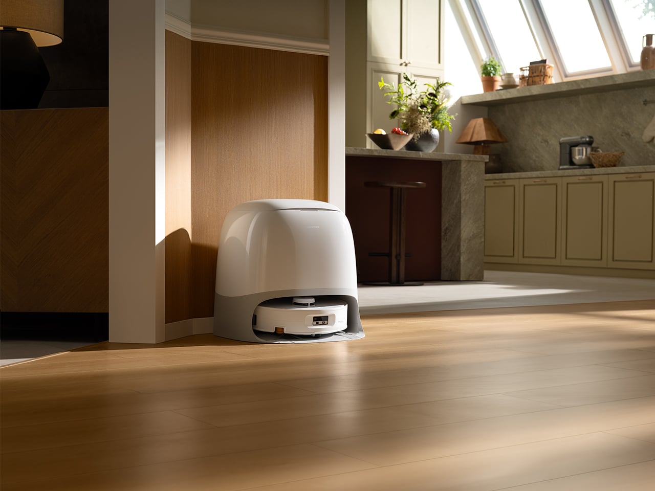
Top 5 Reasons the Roborock Qrevo Curv 2 Flow Is Built for Open-Plan Homes With Mixed Flooring

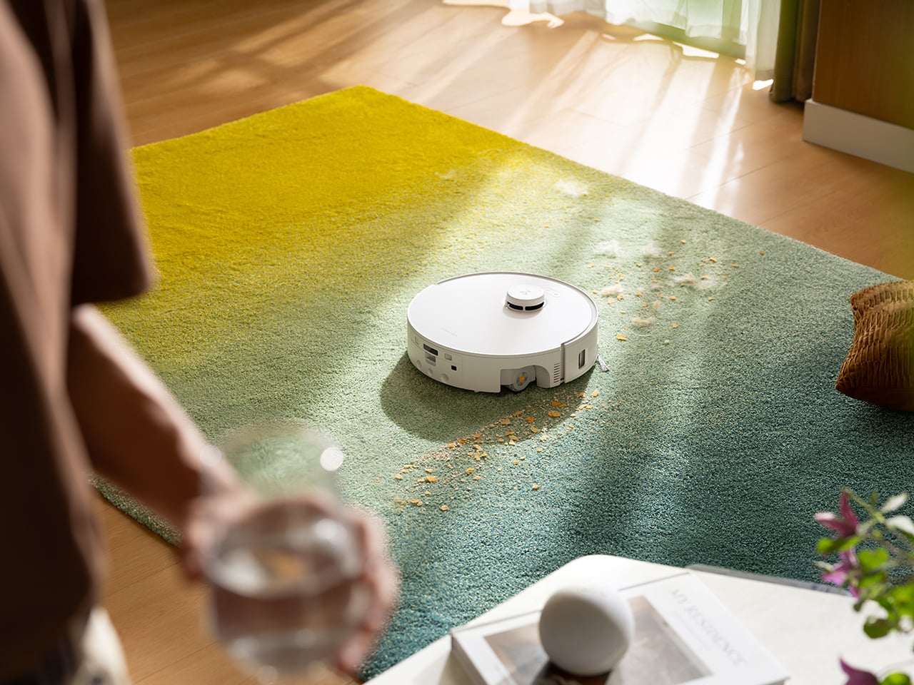
Most robot vacuum-mop combos on the market right now do an acceptable job on light dust and can push a damp pad across hardwood, but ask them to handle a real kitchen spill or a week’s worth of tracked-in dirt from a dog, and the cracks start to show. Streaky floors, damp patches that take twenty minutes to dry, wheel marks through the mess, and mop pads that smell like a gym locker after three days. The promise has always been “set it and forget it,” but the reality for most owners involves regular pad washing, manual spot cleaning, and a nagging sense that the robot is just redistributing grime rather than actually removing it. Homes with kids, pets, or open-plan layouts where the kitchen flows into the living room need more than a technical pass, they need floors that are genuinely clean and dry enough to walk on immediately.

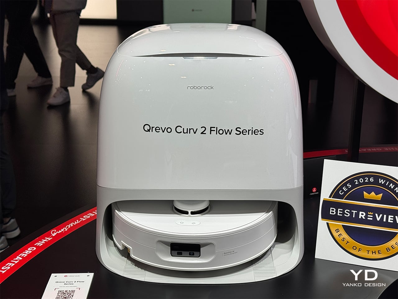
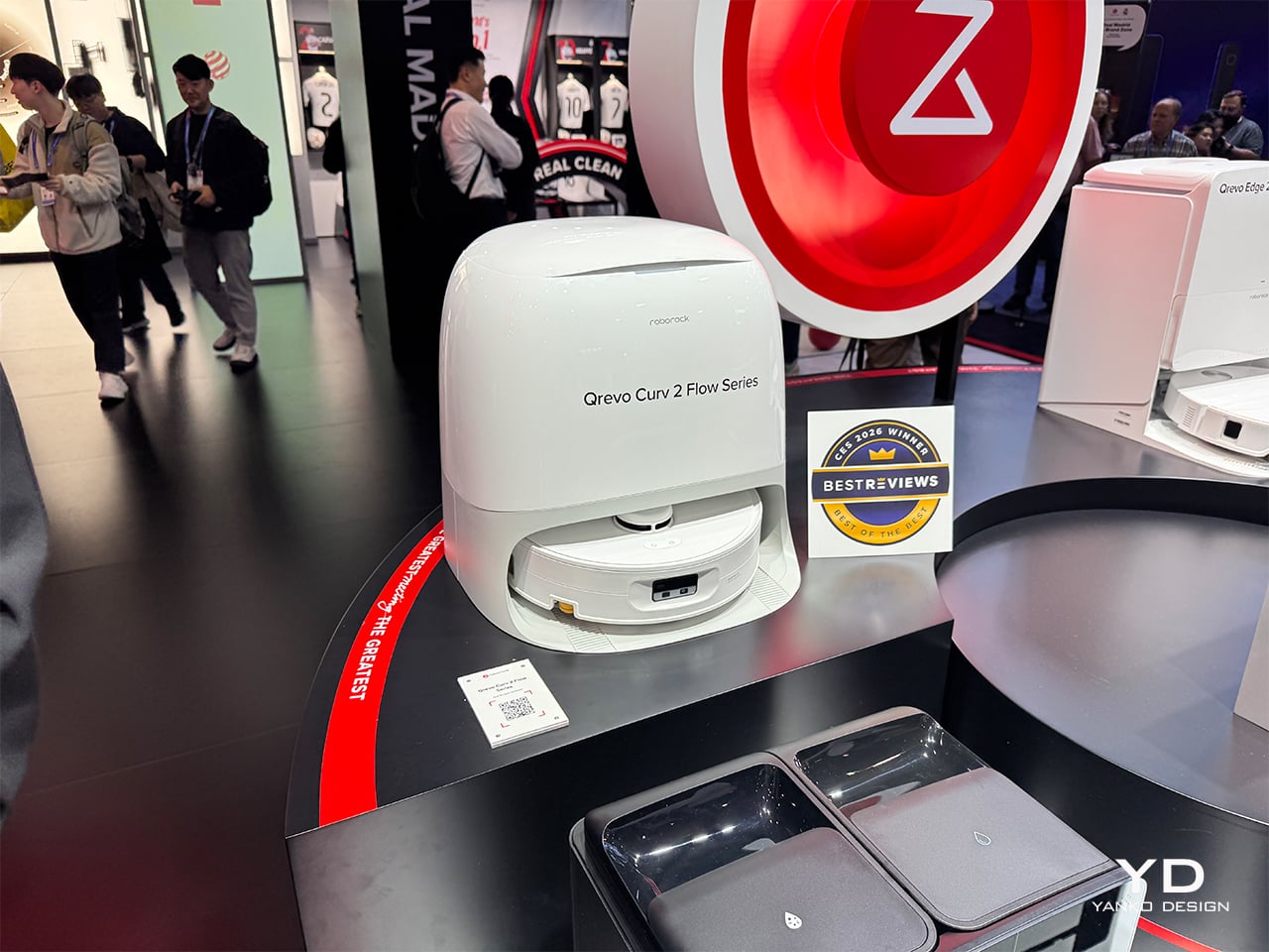
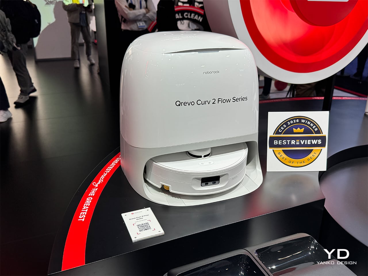
Roborock’s answer to that gap is sitting on the show floor at CES 2026, and it is called the Qrevo Curv 2 Flow. Positioned as the brand’s first “Real Clean Challenge” hero product, it is engineered specifically around what North American households actually throw at a robot vacuum: sticky spills, pet messes, carpets next to hard floors, and the expectation that a thousand-dollar machine should not become another maintenance project. The pitch centers on “real dry and real clean” performance, delivered through a one-pass roller-mop system, automatic wet/dry carpet separation, and a dock that handles most of the gross maintenance work without intervention. What follows is a walkthrough of the five things that stand out most after watching it run through Roborock’s booth demos, with an eye on what actually matters once this machine is navigating a real living room.

Designer: Roborock

1. One-Pass Roller Cleaning That Actually Looks Finished
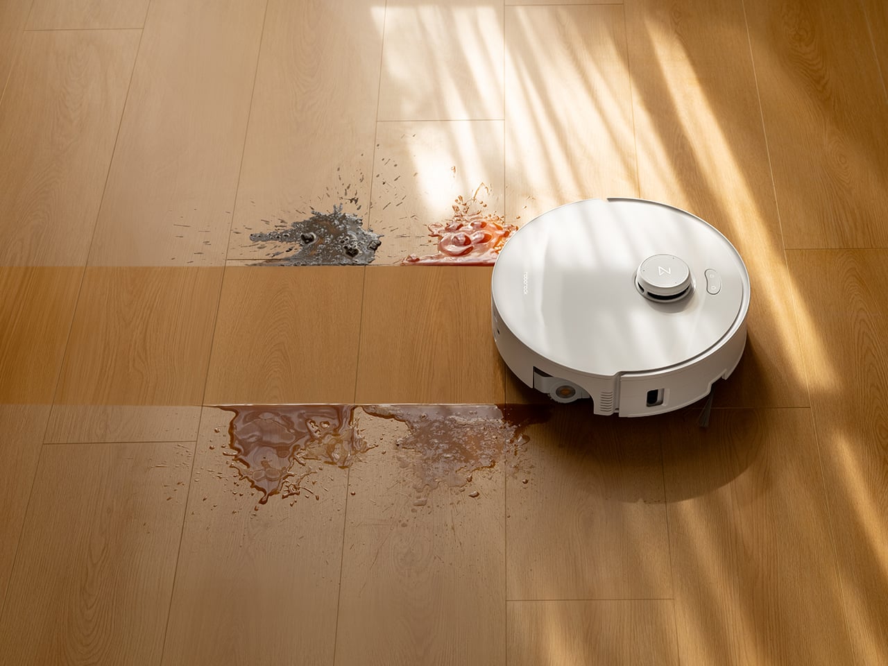
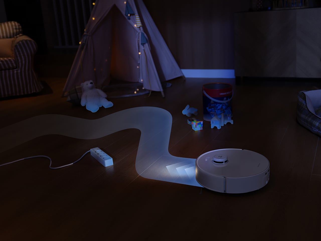
The centerpiece is a 270mm-wide roller mop, noticeably wider than the typical 180mm rollers on most competitors. That extra width means fewer passes to cover the same area, and in booth demos running over simulated coffee spills and muddy pet prints, the difference is visible. The system applies 15N of downward pressure (roughly 2.5 times the previous model, equivalent to about 1.5kg of force) combined with 220 RPM rotation, so the roller scrubs rather than just wipes. Where shorter rollers leave streaks or require a second pass, this one clears the mess in a single stroke and moves on.
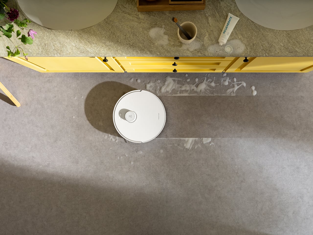
What keeps it from smearing dirty water around is the SpiralFlow real-time self-cleaning system. Eight precision hydration points distribute clean water across the roller while a built-in floating scraper removes excess moisture and channels dirty water into a separate wastewater tank. The four-step process (hydrate, control moisture, scrub, collect) happens continuously while the robot moves, so every pass uses a relatively fresh section of roller. The floating scraper automatically adjusts to the roller surface, unlike fixed scrapers on track-mop designs that apply uneven pressure and leave streaks. In controlled spill tests, floors look finished after one pass and dry to the touch within a couple of minutes.

2. Carpets Stay Dry, Even When You’re Not At Home
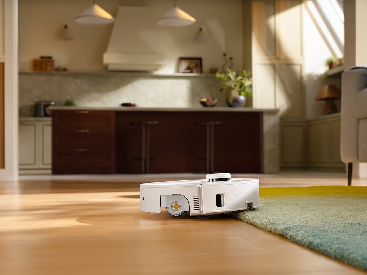
Before the robot reaches a carpeted area, the roller lifts up to 15mm off the floor while a roller shield simultaneously extends to cover the mop, creating a physical barrier that blocks both moisture and dirt from transferring onto carpet fibers. The system works with carpets up to about 13mm pile height, and for taller rugs, the app lets users set custom behaviors. In the demo setup with a kitchen runner adjacent to tile and a living room area rug, the robot transitions cleanly between surfaces without leaving visible damp spots on carpet edges, which is usually where most robots fail.

That edge transition matters for homes with mixed flooring, especially where a spill on hard floor sits right next to a rug. Most two-in-one robots either roll onto the rug and react (leaving damp edges) or force users to draw manual no-go zones around every carpet. The shield solves that by keeping the wet roller physically separated during the entire crossing, rather than relying solely on lift height.

3. Edge Cleaning Without the Baseboard Crunch
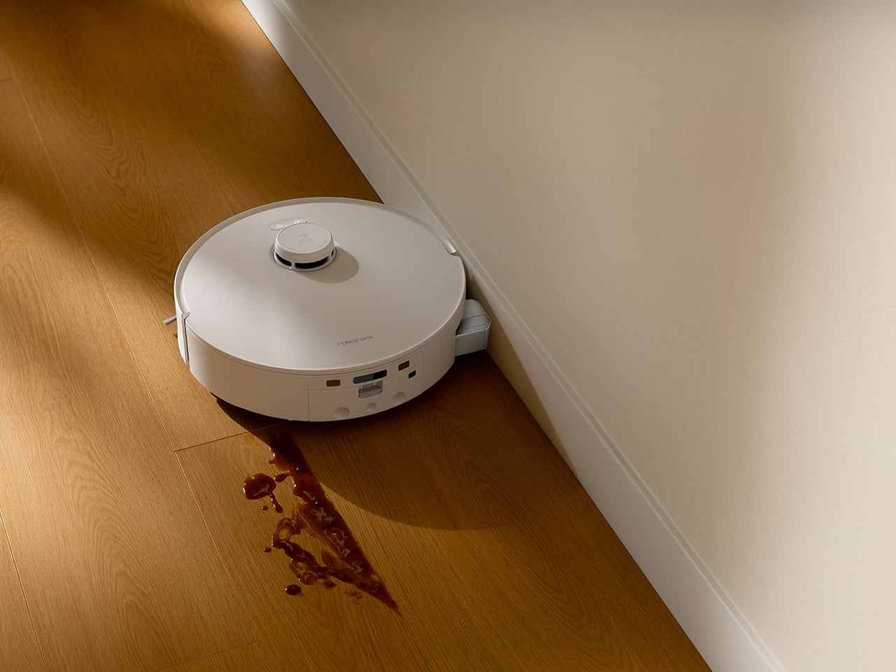
Getting close to walls has always been a trade-off: stay back and leave a visible dirt line, or bump repeatedly into trim and sound like the robot is attacking the baseboards. The Qrevo Curv 2 Flow uses an edge-adaptive roller mop that extends outward to reach within about 10mm of the wall, rather than relying entirely on side brushes. The precision extension mechanism activates when the robot detects an edge, allowing the roller to cover areas that would normally be missed without requiring the entire robot body to press against the wall.
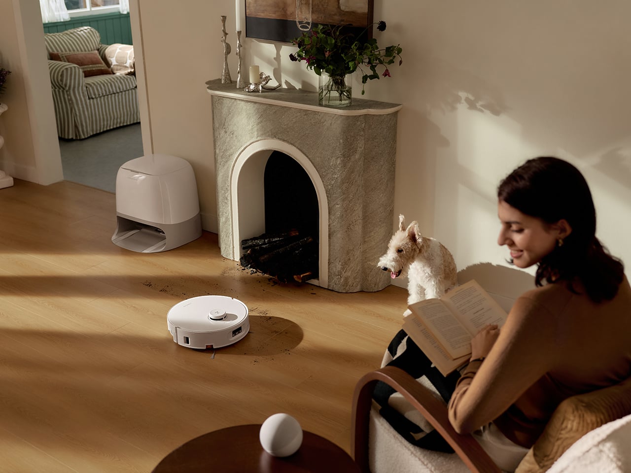
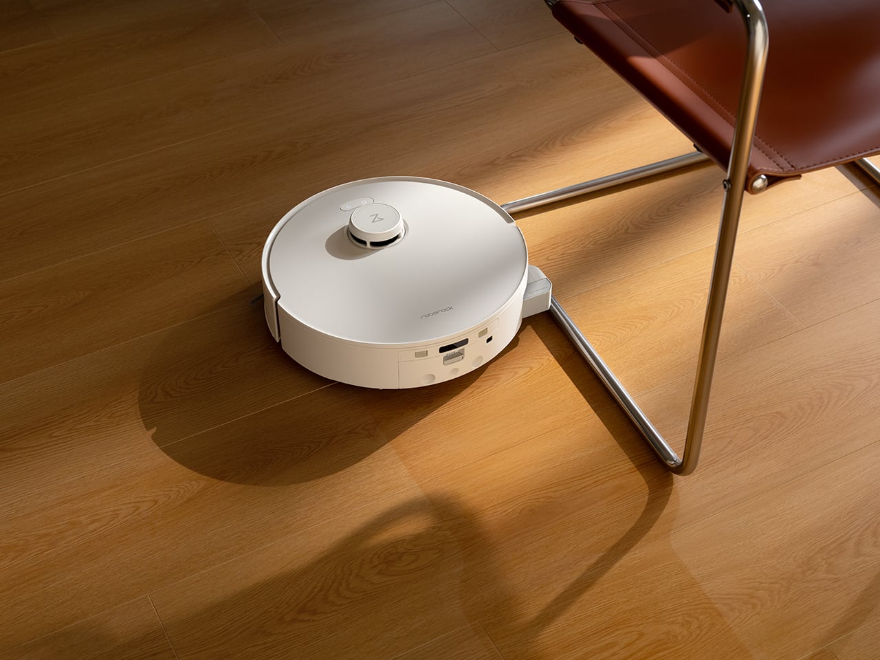
In booth demos around skirting boards, TV cabinet legs, and furniture corners, the coverage is noticeably better than non-extendable designs, which typically leave a 2-3cm gap that accumulates dust. The other advantage is noise and wear. Robots that compensate for short rollers by repeatedly bumping into walls create scraping sounds and can scuff paint over time. The extendable design means the robot maintains a few millimeters of clearance while still getting the roller right up to the edge, reducing both noise and long-term cosmetic damage.

4. Hair Management That Doesn’t Turn Into Weekly Surgery
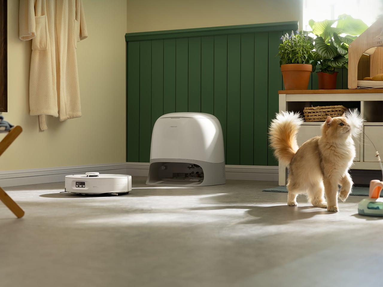
The DuoDivide main brush uses a split design with two counter-rotating arms that move hair from both ends toward the center, cutting transport distance in half. At the center gap, the two brushes spin at slightly different speeds, creating a differential effect that tears apart bundled hair rather than letting it wrap into a solid ring. A precision scraper strips the hair off, and high-flow suction pulls it into the dustbin. After a simulated hair test at the booth (long hair and pet fur spread across hard floor and low-pile carpet), the brush remains visibly clean with no wrapping at the ends and no hair stuck in the dustbin inlet.


The side brushes use dual lifting arc designs with an asymmetrical spiral arc shape. As the brush rotates, centrifugal force pushes hair outward toward the bristle ends instead of letting it spiral inward toward the hub, and a soft rubber baffle at the base blocks hair from wrapping around the mounting point. Both side brushes also lift automatically when switching to mop-only mode or approaching wet messes, preventing them from getting caked with damp debris. Whether the zero-tangle performance holds up over weeks in a real home is the open question, but the engineering choices are mechanically sound approaches to the hair problem.

5. A Dock That Cleans Like a Mini Washer, Not Just a Parking Spot

When the robot returns to wash its roller, the dock first drains the dirty water from the previous clean, then rinses the roller with fresh water, rather than back-washing dirty water into the roller. While the roller is being cleaned, it alternates between forward and reverse rotation while dual scrapers comb through the fibers from both directions. The dock heats wash water to 75°C (Roborock claims 99% bacteria removal) and runs 55°C warm air drying afterward to prevent mildew and odor. Intelligent dirt detection monitors how dirty the water is during washing, and if it detects heavy soiling, it automatically extends wash duration and can trigger the robot to return to heavily soiled areas for an additional mopping pass.
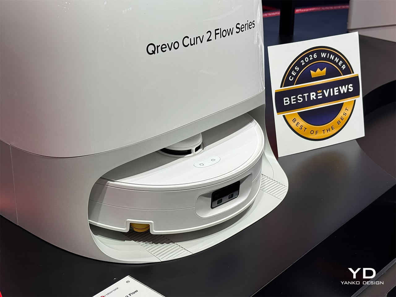
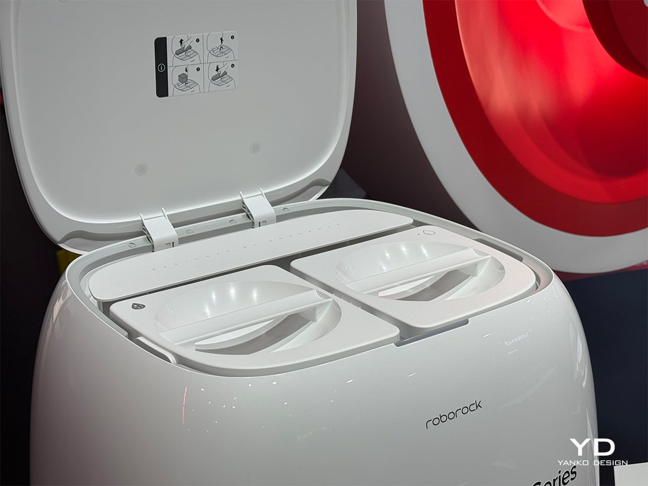
The dock handles auto dust emptying with a 2.5L bag capacity (roughly 65 days under typical use), and more importantly, the roller, roller shield, dirty water tank, and dock base are all designed for quick removal and manual cleaning. Unlike competitor docks with non-removable shields and narrow gaps that accumulate hidden grime, everything that touches dirty water can be pulled out and rinsed. The trade-off is complexity: more sensors, more moving parts, and likely higher consumable costs. But the design philosophy is clear: take on more of the maintenance burden at the dock level so the user does not have to babysit the system daily.

The post Top 5 Reasons the Roborock Qrevo Curv 2 Flow Is Built for Open-Plan Homes With Mixed Flooring first appeared on Yanko Design.
CES 2026’s Loudest Flex: Brane Party Pro Hits The Bass Notes So Hard I Actually Got Goosebumps

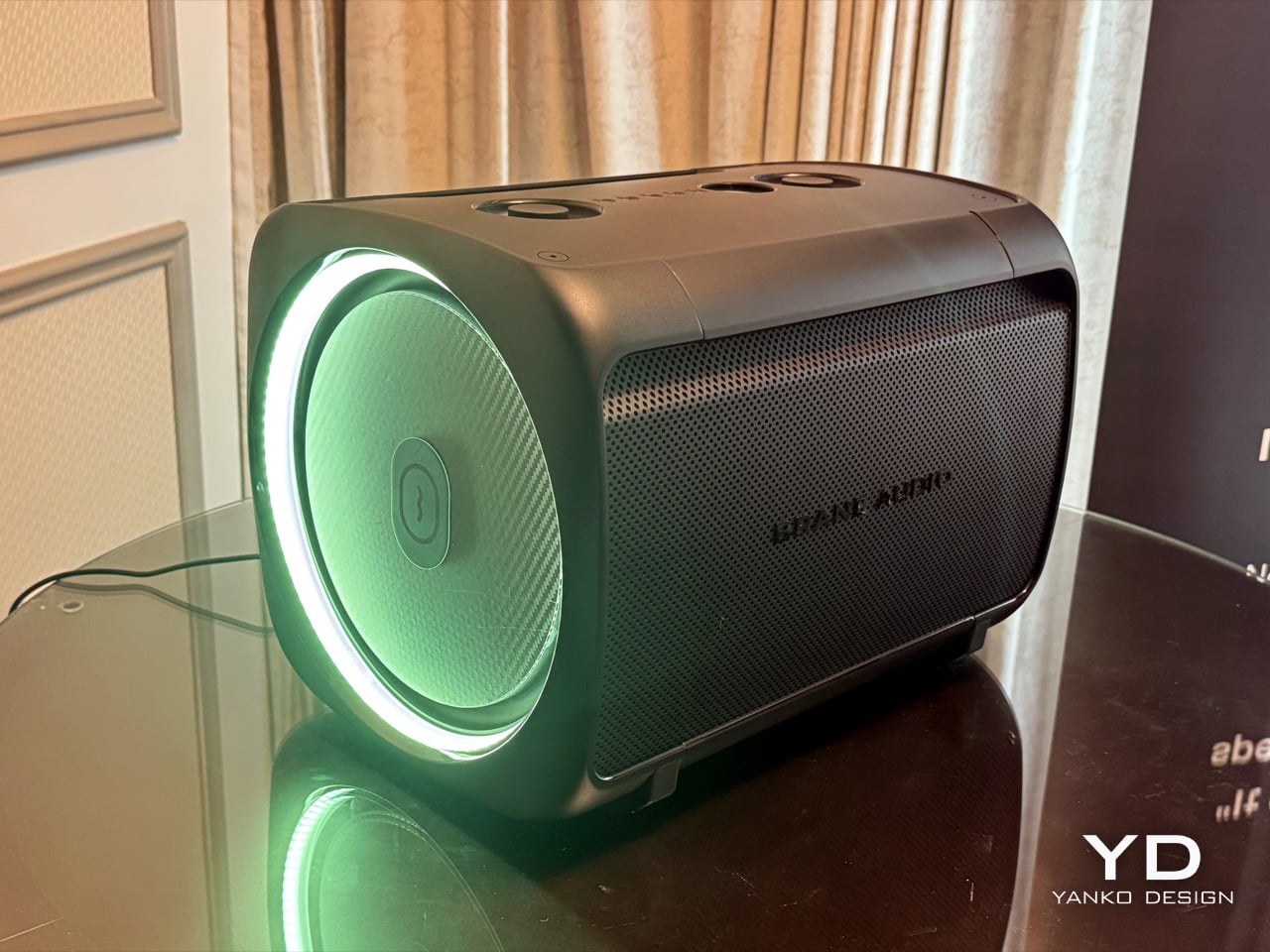
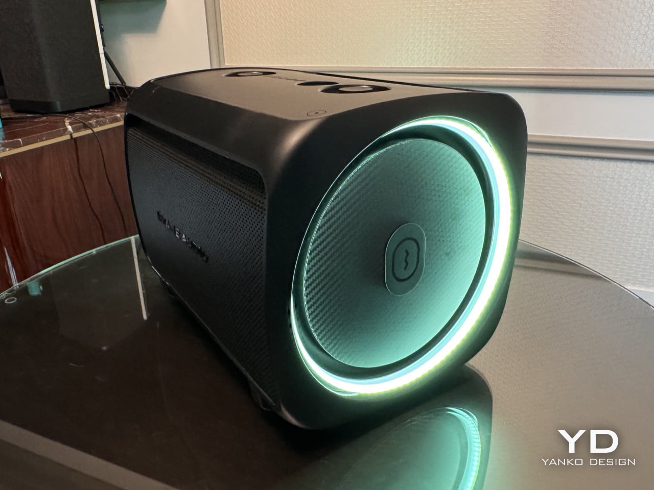
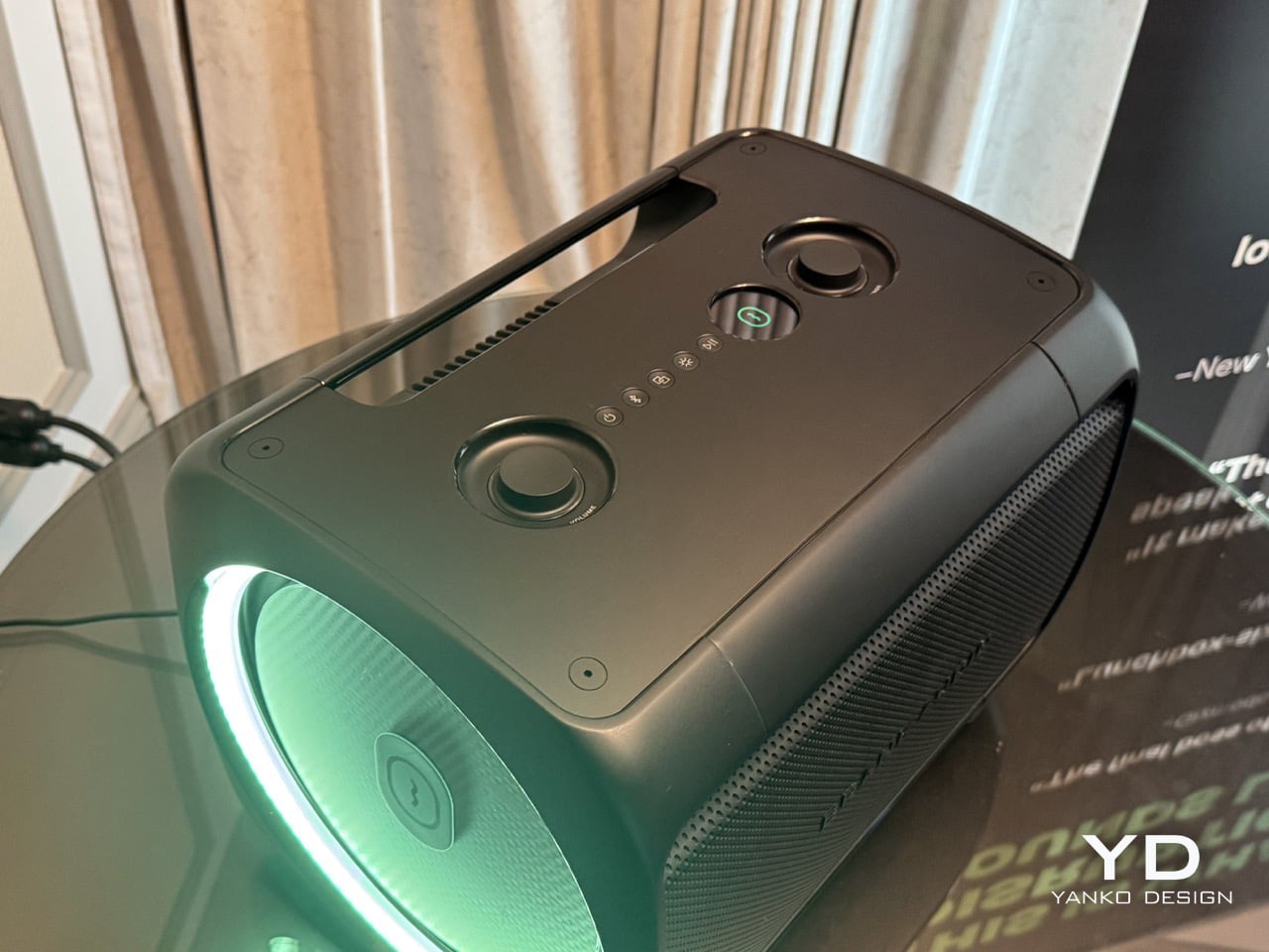
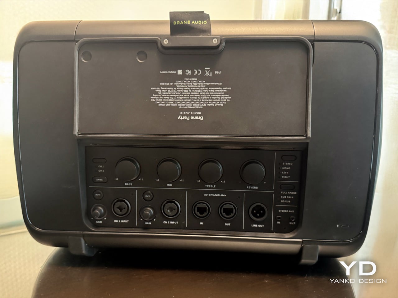
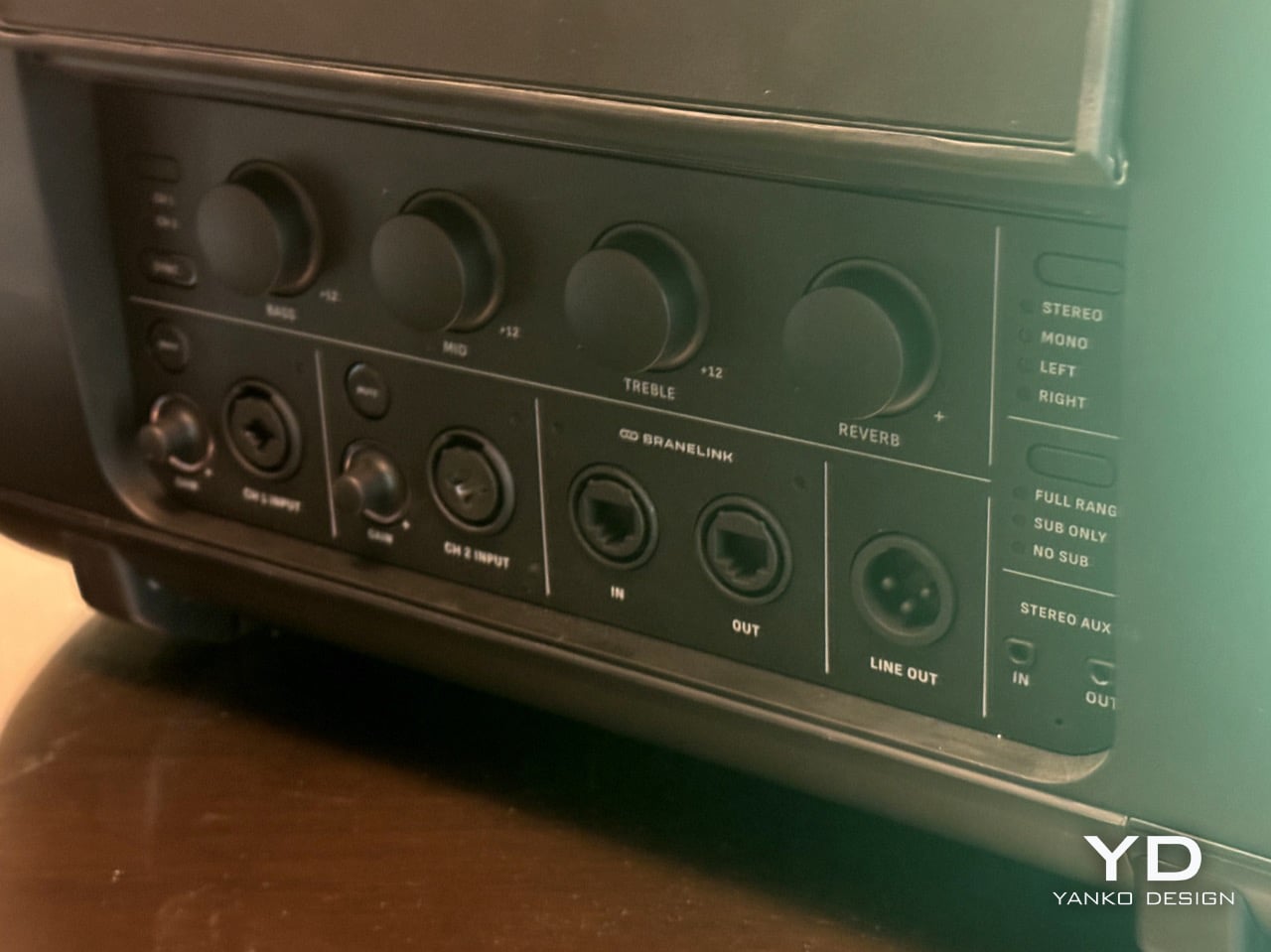
There’s a specific moment that happens when you first hear deep bass done properly. Your brain needs a second to process what’s happening because the sound doesn’t match what you expect from a speaker that size. I experienced that exact moment at CES 2026 while listening to Brane Audio’s Party Pro prototype, and for the sake of the rest of the hotel guests, Brane only limited the demo to 10 seconds and played its audio at 25% capacity. The sound is so thundering (especially the base notes), Brane had to quite literally hold its speaker back to avoid noise complaints.

Brane Audio structured their CES presentation strategically, starting with the Brane X to establish their credibility against established competition. Then they unveiled the Party Pro, and the difference was staggering. The low-end reproduction didn’t just sound powerful; it revealed details in familiar tracks that had been buried under inadequate bass response for years. Only after the demo did they mention the kicker: we’d been listening to a single RAD2 driver at half capacity. The shipping version with two drivers will hit four times harder, which means this might legitimately be the first speaker good enough to make your neighbors consider moving.
Designer: Brane Audio

That single driver, the RAD2, is the whole story here. It’s the second generation of their Repel-Attract Driver tech, and the numbers are just absurd. They claim a 30-fold deep-bass advantage over conventional drivers, which sounds like marketing fluff until you hear it for yourself. The genius is in how it handles the lowest frequencies. Instead of just producing a generic boom, it articulates the bass, letting you hear textures and notes in the sub-100Hz range that are usually a muddy mess. You start hearing things in your favorite songs you swear were never there before, which is a wild and slightly surreal experience.

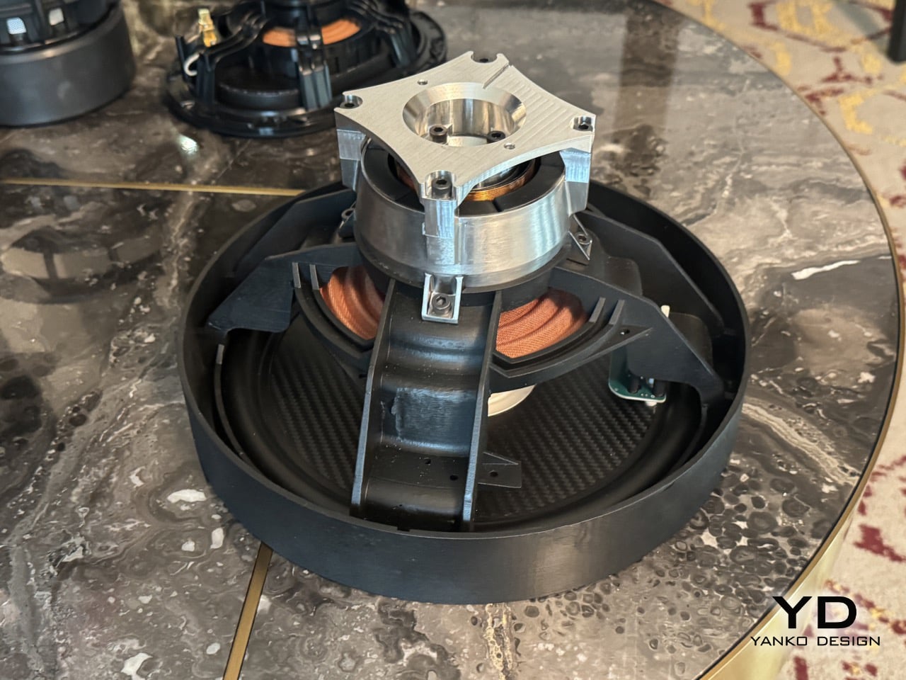
Closer look at the RAD2 Driver

The way it prepares for that bass is mechanically fascinating. The original RAD driver in the Brane X used a small air pump to create the necessary pressure differential. For the RAD2, they’ve engineered a system of small mechanical legs that physically push the driver cone outward to prime it before the music even starts. This pre-tensioning creates the pressure needed for its massive excursion without the lag or potential noise of a pump. It’s a clever bit of electromechanical engineering that solves a very specific physics problem, and watching it happen is almost as impressive as hearing the result. It’s a purely functional design choice that looks incredibly cool.

This level of mechanical control allows for some seriously smart audio processing. Brane’s team explained that the speaker’s internal DSP analyzes the incoming audio in real-time to identify the resonant frequency of each specific track. It then adjusts the driver’s behavior to perfectly match that frequency, essentially tuning itself to every song it plays. This is a huge leap beyond simple EQ presets. The speaker is actively collaborating with the music, ensuring that the bass response is not just powerful but also perfectly in sync with the artist’s original intent. It explains why the bass felt so integrated and clean, rather than being a loud, detached layer on top of the music.

So you take that resonant frequency matching, add the mechanical priming system, and then remember the demo was at quarter-power. The final Party Pro, with its two drivers, will displace a full 1000cc of air, which is an immense amount of sound pressure from a portable enclosure. Brane is essentially breaking Hofmann’s Iron Law, that old rule about deep bass, small boxes, and power efficiency being mutually exclusive. They’ve found a way to have all three. This technology is a new blueprint for how to generate low-frequency sound. I walked away from that demo feeling like I’d just seen the audio equivalent of the first flat-screen TV. The Party Pro will hit shelves later this year, with a price range between $1000 and $1500. You honestly may need to take permission from your Homeowner’s Association before you buy one!

The post CES 2026’s Loudest Flex: Brane Party Pro Hits The Bass Notes So Hard I Actually Got Goosebumps first appeared on Yanko Design.