5 Libraries That Look Nothing Like Libraries (And Are Better For It)

In a world shaped by AI, constant notifications, and shrinking attention spans, focused reading has become harder to protect. Distractions are no longer just external; they are embedded in the very tools you use every day. Against this backdrop, libraries are no longer quiet backdrops to digital life, but intentional spaces designed to help you slow down, disconnect, and return to deeper forms of attention.

The library has evolved far beyond its conventional identity as a storage space for books. You now experience it as an active social and intellectual landscape, one where spatial rhythm, light, and material honesty shape moments of focus and exchange. Contemporary design responds to how you move, pause, and engage, creating environments that support deep concentration and collective learning in an age of constant interruption.

By shifting away from static shelving systems toward spaces that encourage interaction and introspection, here is how architecture establishes a deeper dialogue between built form and human presence.

1. Libraries in Motion

The portable library signals a new approach to how knowledge inhabits the home. Rather than remaining fixed, it moves with you and is integrated into daily life through carefully designed, lightweight structures. These mobile elements allow reading, reflection, and display to shift naturally across spaces, responding to changing moods and routines.

From a design and value standpoint, portability introduces long-term flexibility. Spaces can be reconfigured without loss of visual coherence or function. These modular forms act as movable architectural markers, maintaining relevance as lifestyles evolve while transforming reading into a deliberate, spatial experience woven through the home.

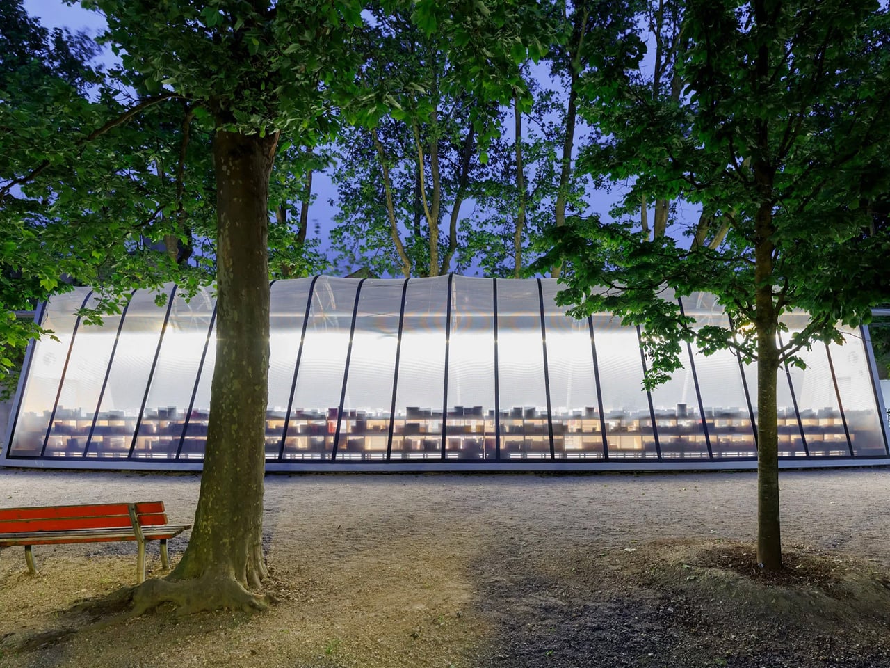
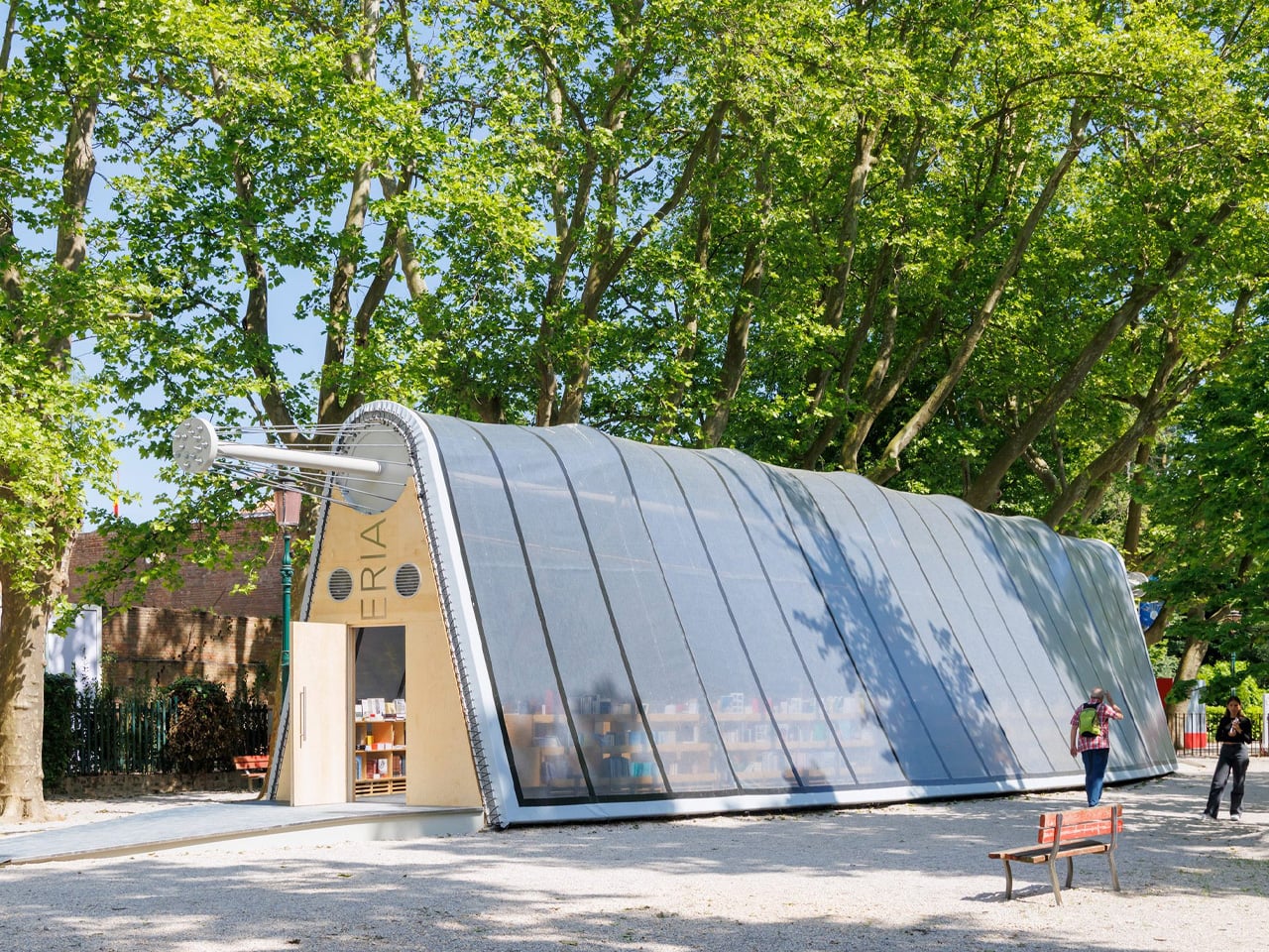
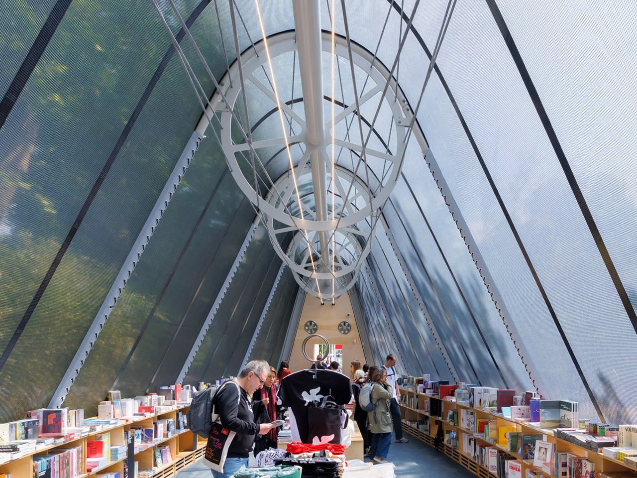
La Libreria is a lightweight, demountable library designed by Diller Scofidio + Renfro for the Venice Architecture Biennale, created to travel and encourage reading wherever it is installed. Spanning 24 metres, the pavilion draws on principles of tensile architecture influenced by the research of French engineer Robert Le Ricolais. Rather than being fixed to the ground, the structure gains stability from ballasts and the weight of the books themselves, which are displayed on timber shelves running along its length. This clever integration of structure and storage keeps the library open, flexible, and easy to reassemble in new settings.

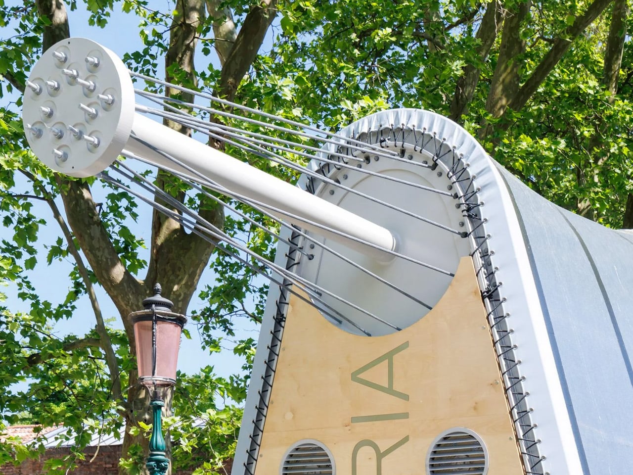
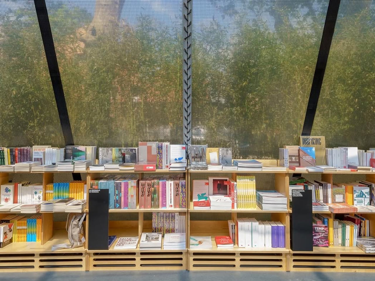
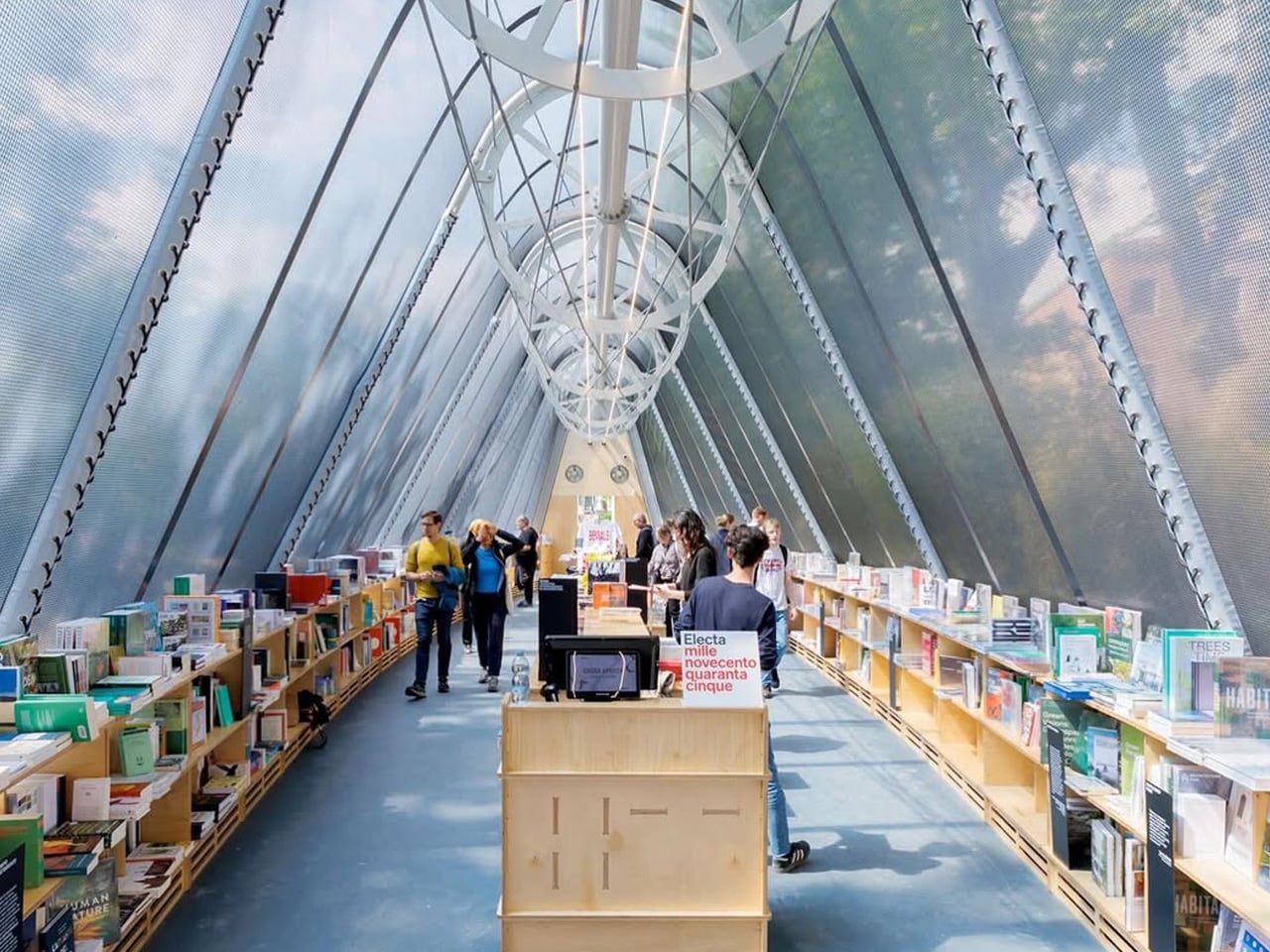
Wrapped in a transparent STFE architectural textile, the pavilion remains visually light while being durable and portable, allowing it to be packed into a container and relocated with ease. Currently situated in the Giardini della Biennale, it stands among experimental national pavilions, reinforcing the event’s spirit of innovation.

2. Biophilic Reading Sanctuary

Integrating biophilic design transforms the library into a calm, light-filled refuge. You experience softened architectural edges through diffused daylight, interior planting, and tactile natural materials. This deliberate balance between structure and nature supports mental clarity, creating a focused reading environment that restores attention and strengthens your sensory connection to space.

Beyond visual comfort, biophilic strategies deliver measurable performance value. You benefit from improved air quality, passive cooling, and reduced energy demand through living walls and natural ventilation. These systems create a stable microclimate while grounding the design in regional traditions, ensuring the library feels timeless, responsible, and deeply human.

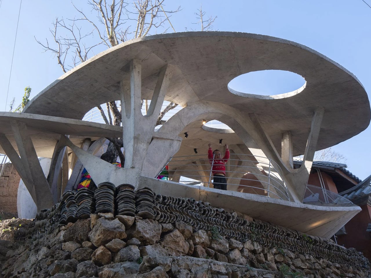
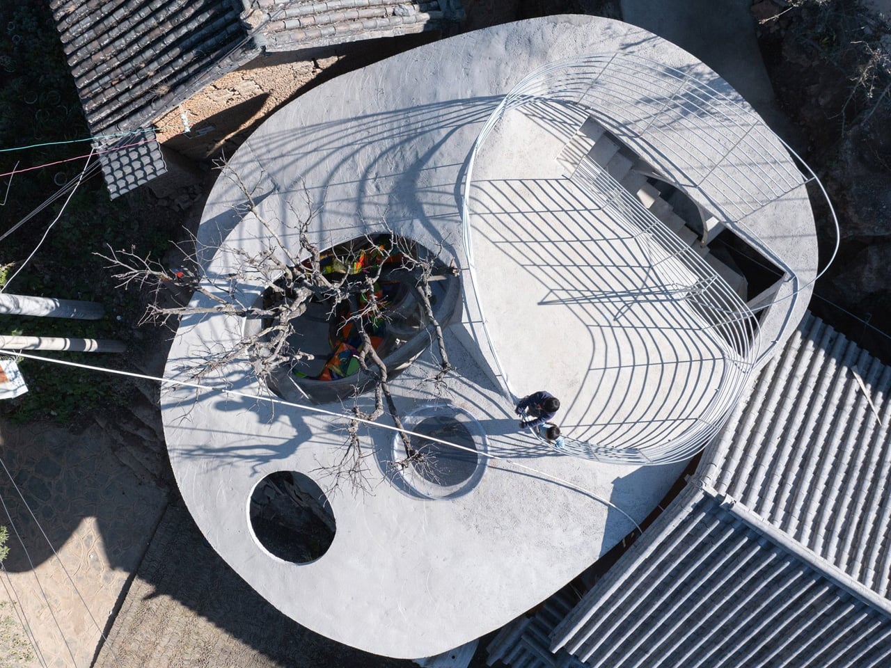
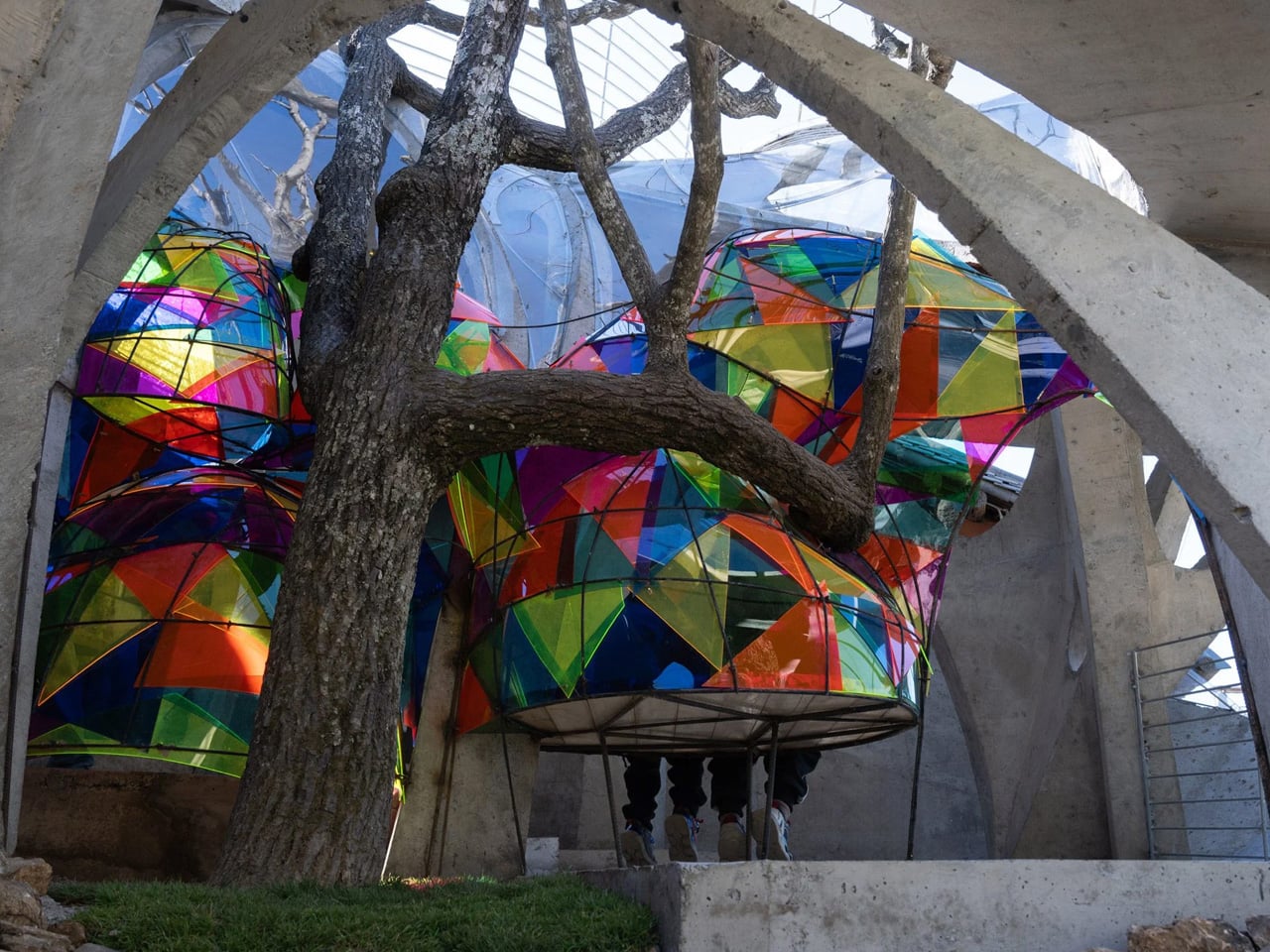
Stalk-like arches and mushroom-inspired canopies form a playful shelter for the Mushroom Library, a children’s reading space in Yanzitou Village, rural China. Envisioned as a “fantastical village landmark,” the library acts as a welcoming gateway to a future community centre and a lively gathering point. Inspired by the fungi found in nearby forests, the structure blends gently into its landscape while standing out as a symbol of cultural continuity. In a village facing depopulation, the library becomes a place where returning children and residents reconnect, turning weekends into moments of shared learning and intergenerational exchange.

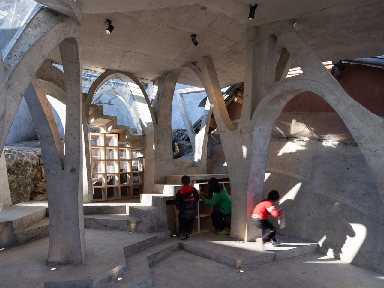
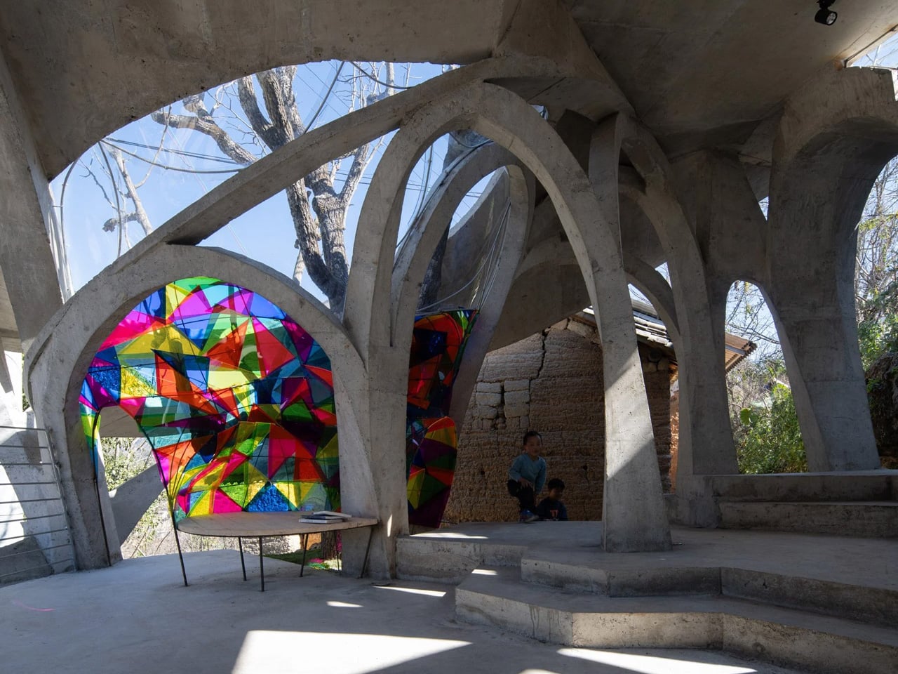
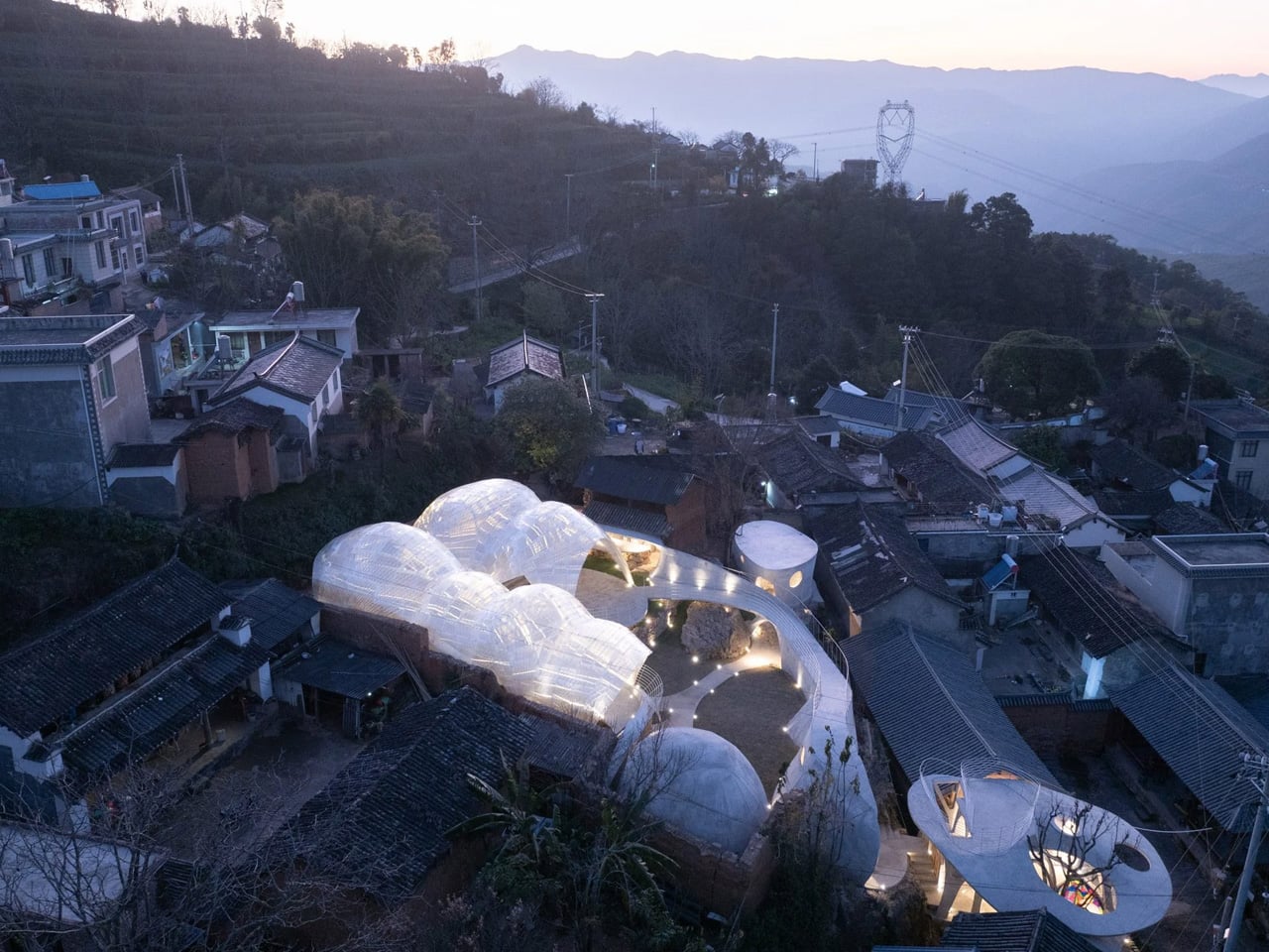
Built around an existing raisin tree, the library reflects close collaboration with local craftspeople. Ribbed steel bars are woven into tall arches, later encased in concrete to create an organic yet durable form. An irregular canopy, punctured with circular openings, filters daylight into the reading room, while one opening allows the tree to grow through the roof. Inside, curved concrete walls and timber shelves create cosy reading corners, as shifting light patterns animate the space and spark imagination.

3. Multifunctional Library

The multifunctional library functions as a central knowledge hub where work, study, and social exchange coexist. You experience a carefully layered spatial sequence that supports silence, collaboration, and digital engagement within a single setting. Integrated joinery discreetly houses technology, allowing the space to shift seamlessly with your daily intellectual needs.

From a value perspective, this typology maximizes spatial efficiency by intensifying the use of every square foot. These libraries remain active throughout the day, contributing measurable performance to the home. Through refined materials and bespoke detailing, functionality is elevated into a lasting architectural statement.

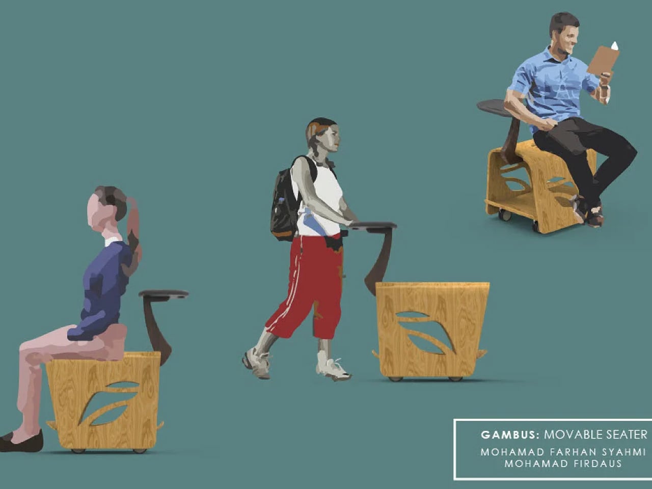
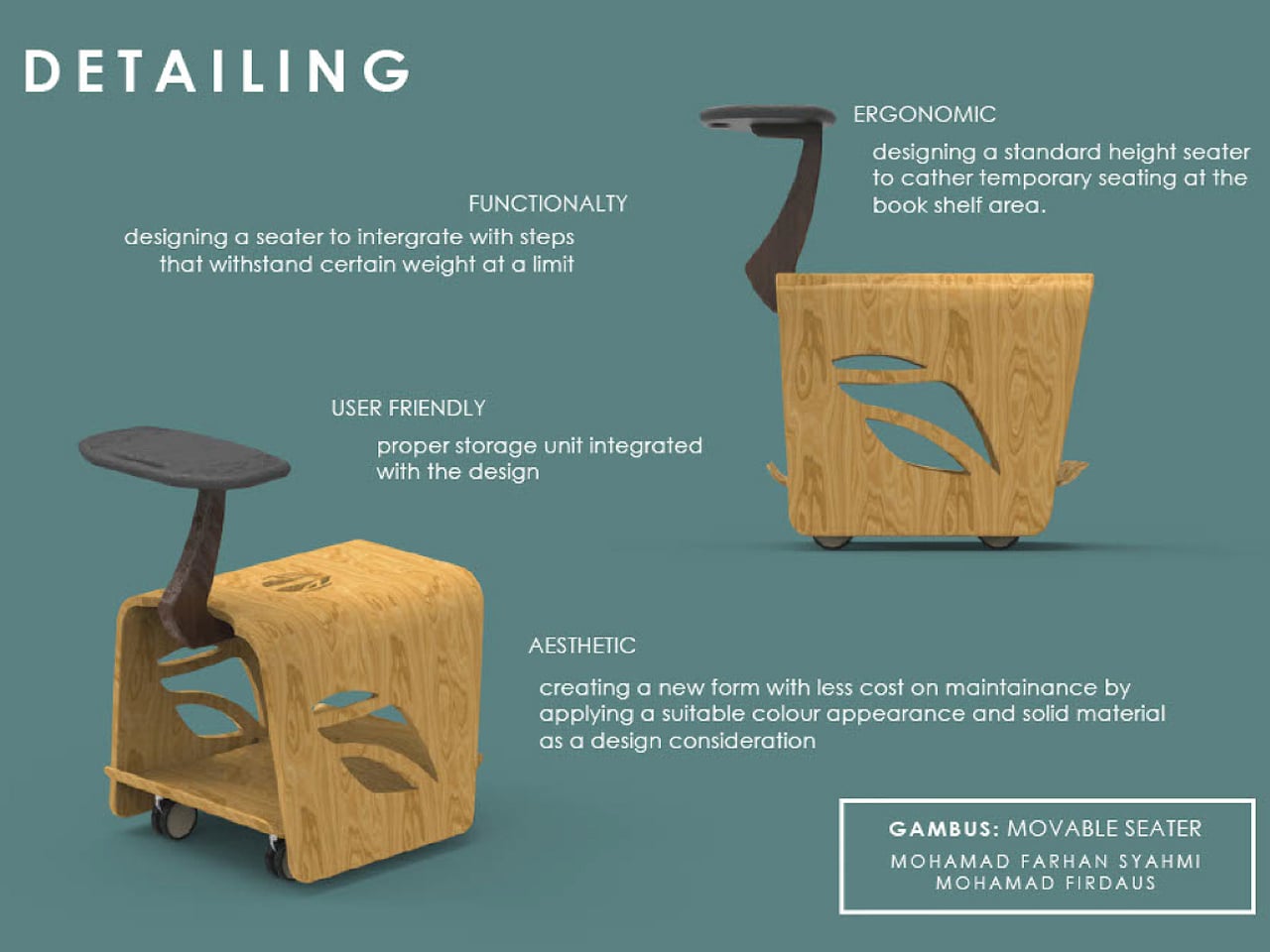
You may not wheel this compact book cart outdoors, but it lets you carry your favourite reads to any quiet corner indoors. Most people have a preferred spot for unwinding with a book, whether it’s a sofa, a bed, or a tucked-away chair that offers a sense of privacy. Public spaces like libraries rarely provide that comfort, often relying on long shared tables and stiff seating that make reading feel more like work than pleasure. This mobile bookshelf rethinks that experience, allowing you to choose your own corner and settle in with both your books and a place to sit.

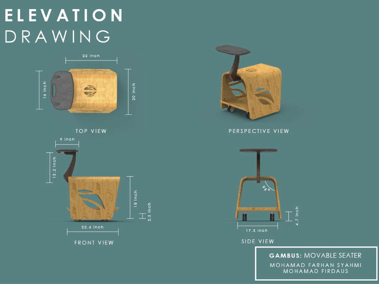
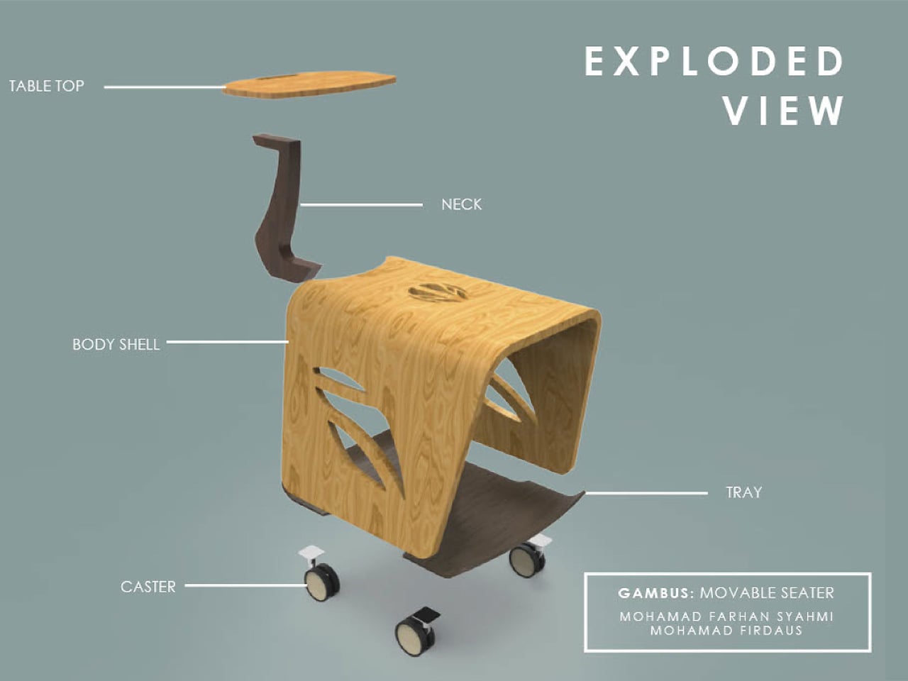
Inspired by the pear-shaped gambus instrument, the wooden body holds several books while doubling as a seat. A curved stem rises to form a small tabletop for resting your current read and helps guide the cart across the floor. Designed as a personal, movable reading nook, it encourages quieter, more intimate moments with books, even in busy shared spaces.

4. Exploring Sculptural Forms

Futuristic library design reimagines the archive as a sculptural experience rather than a static container. You move through fluid, parametric forms shaped by curves, height, and light. These spaces dissolve rigid shelving, allowing architecture to express the boundless nature of knowledge through movement, transparency, and spatial drama.

Behind the expressive geometry lies technical rigor. Advanced composites and high-performance materials ensure strength, thermal control, and longevity. You gain durability and distinction, as these libraries balance innovation with precision. Visionary form becomes a long-term asset, connecting intellectual heritage with the evolving digital landscape.

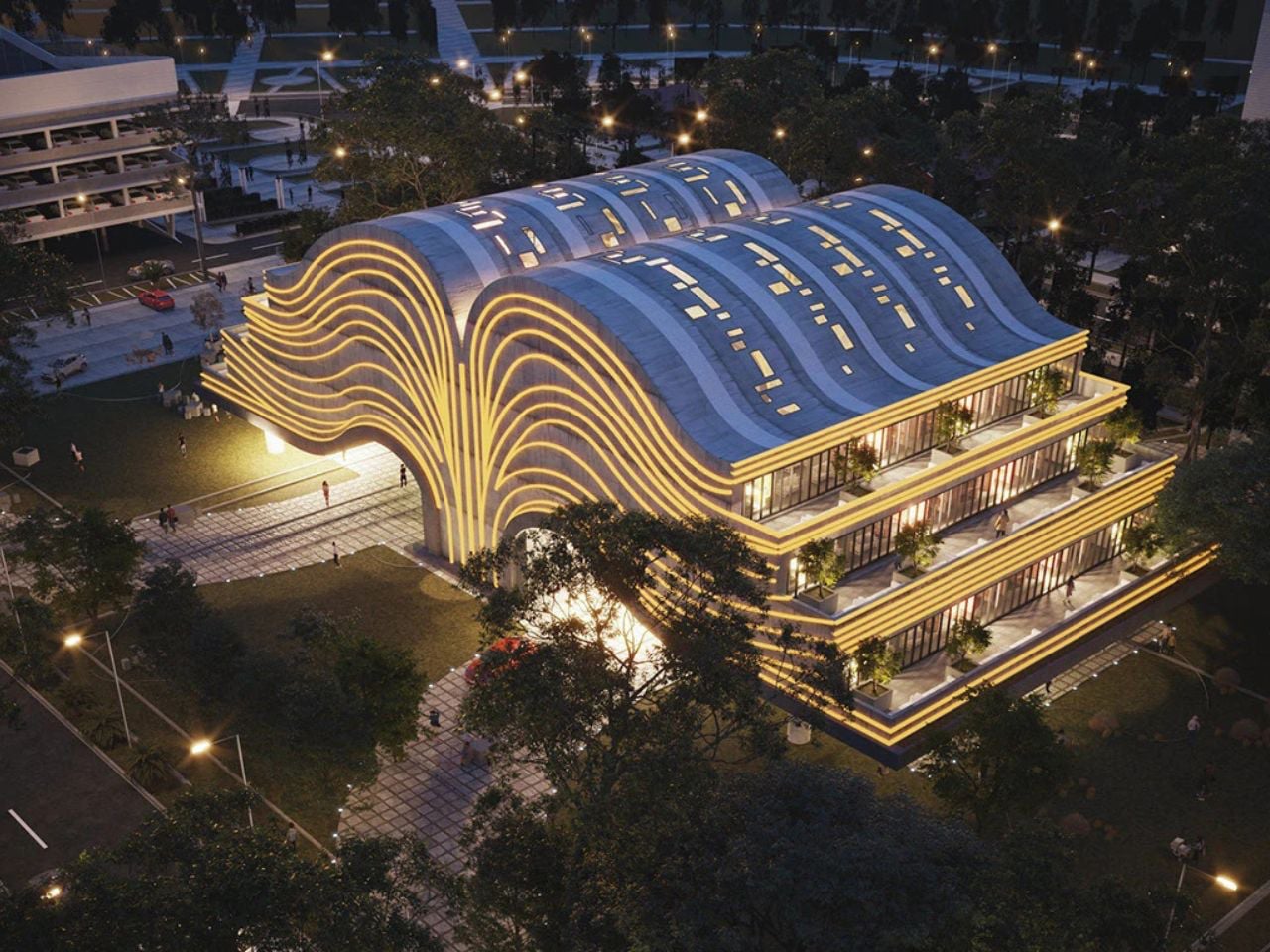
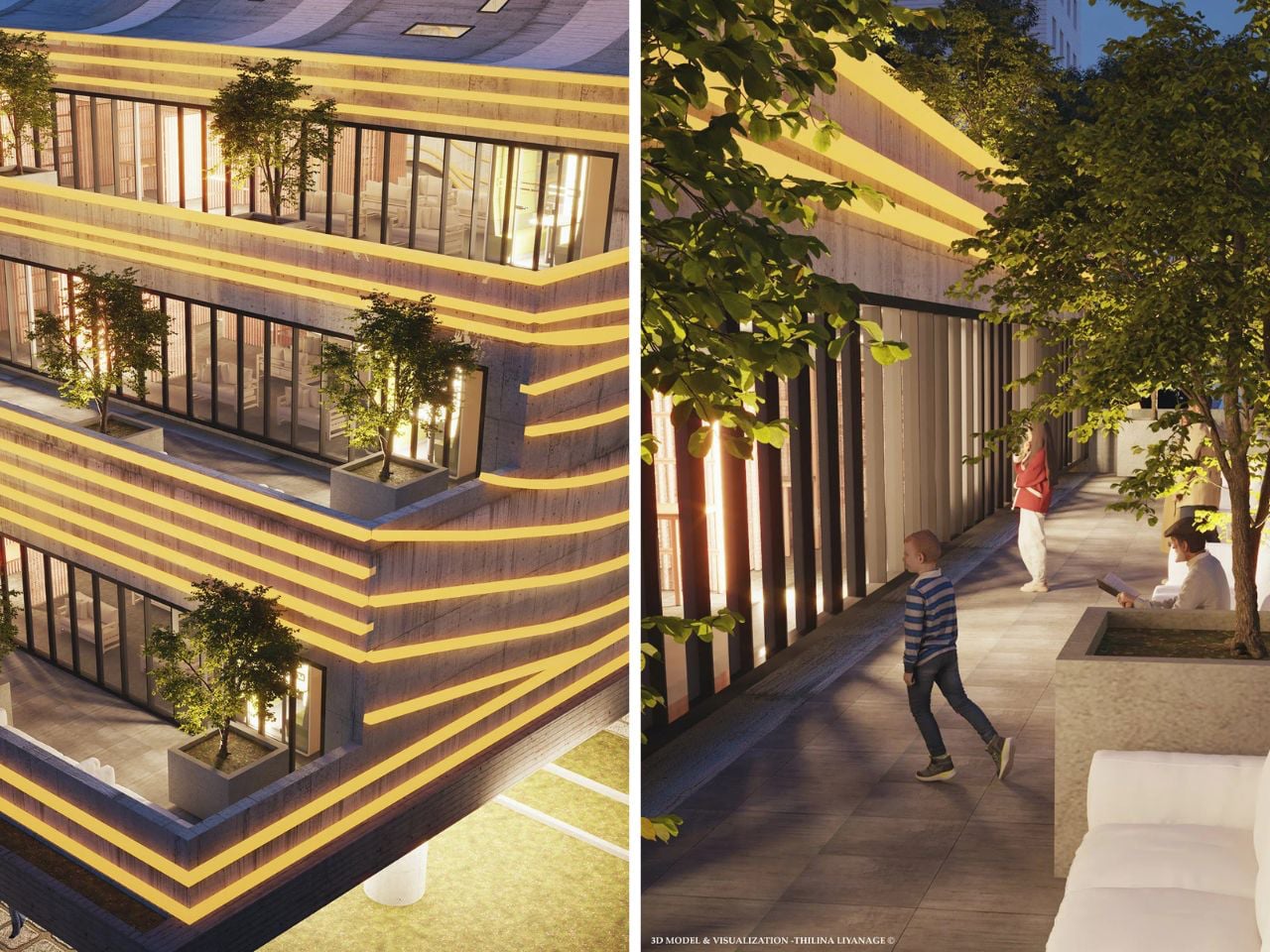
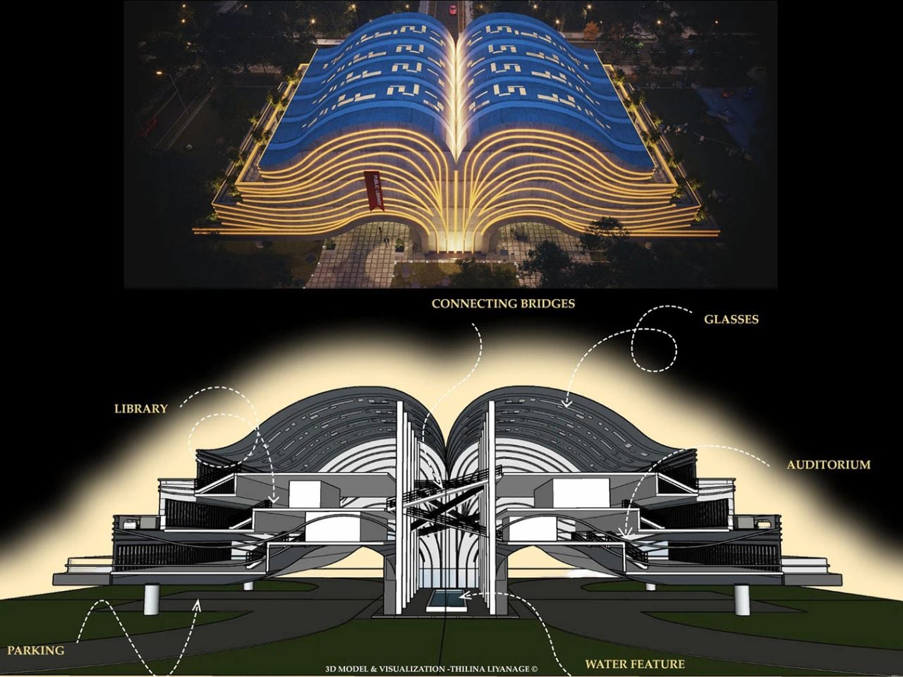
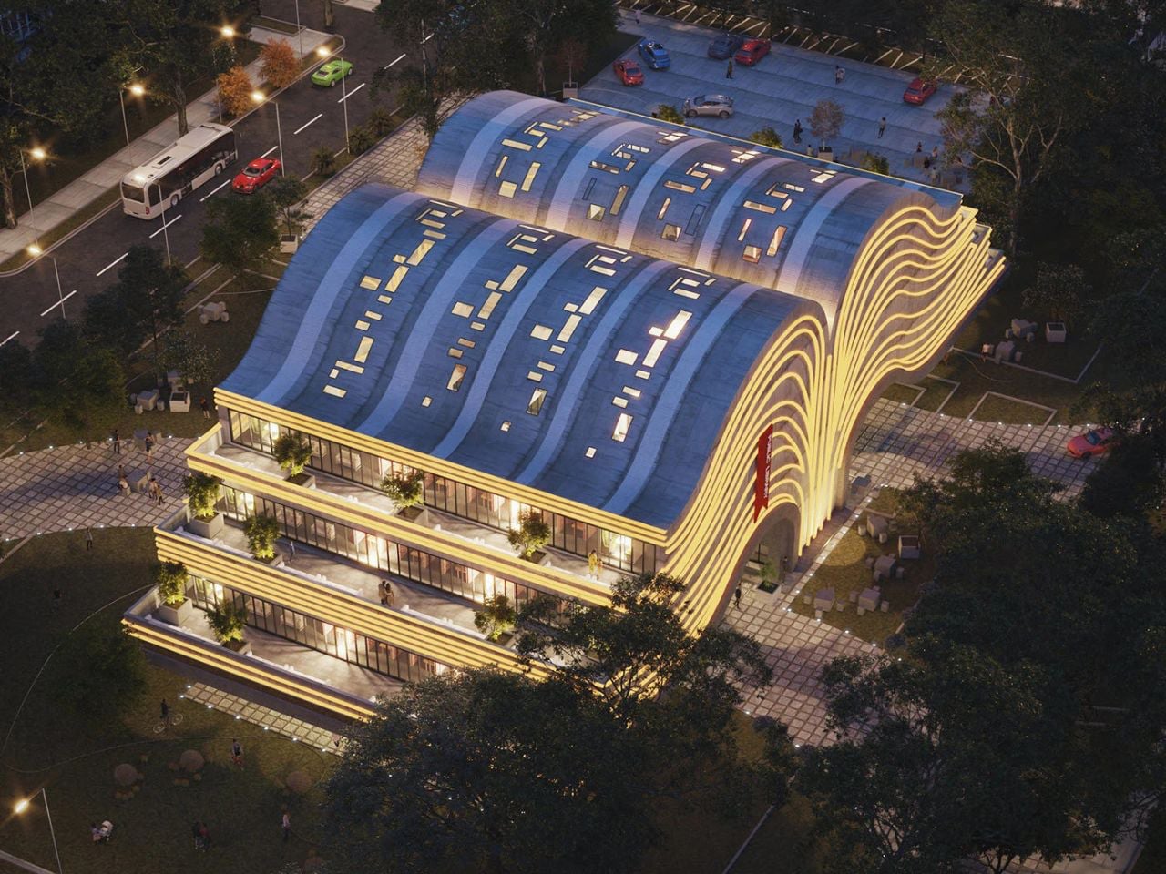
Envisioned as more than a functional building, this futuristic public library was designed as a living tribute to books and the act of reading. The architect imagined a space that evokes wonder, sparks curiosity, and offers calm – an intellectual refuge rather than a mere storage for knowledge. Shaped like an open book, the form symbolises openness, shared ideas, and limitless learning. Sweeping curves echo turning pages, while illuminated roof lines resemble flowing text, making the structure appear animated even from afar. A bold cantilevered concrete base lends the building a sense of lightness, opening generous interiors filled with natural light and quiet comfort.

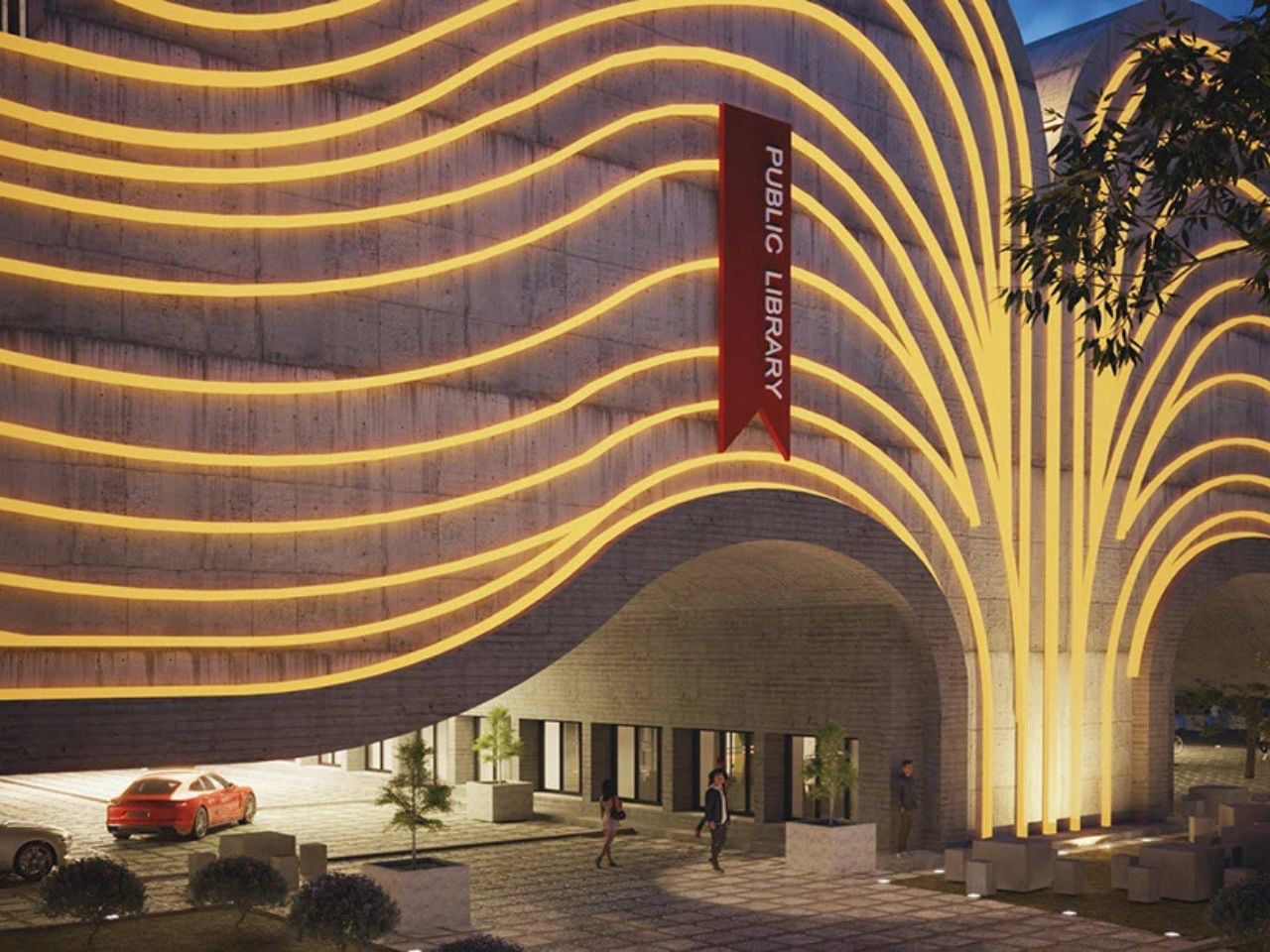
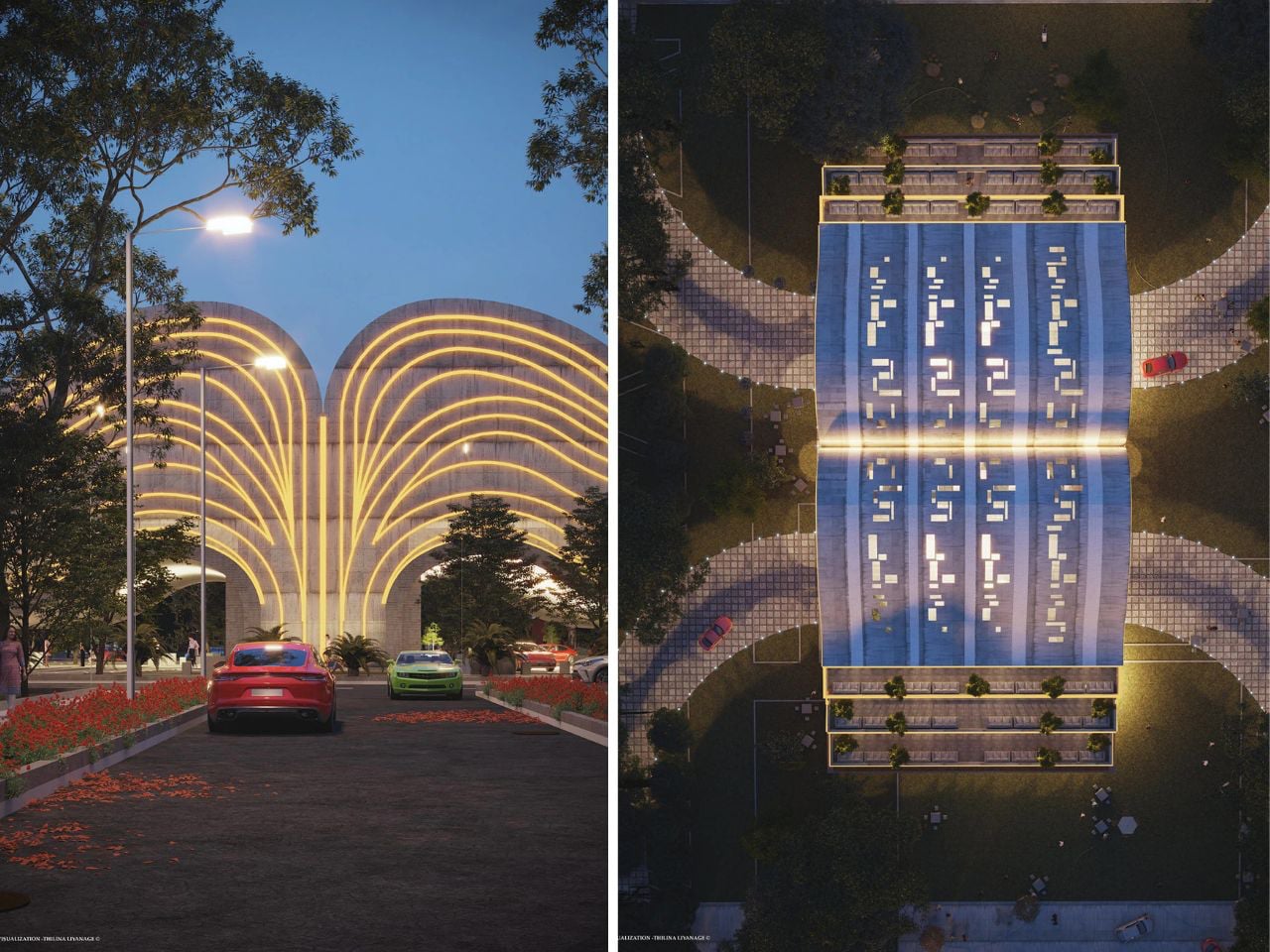
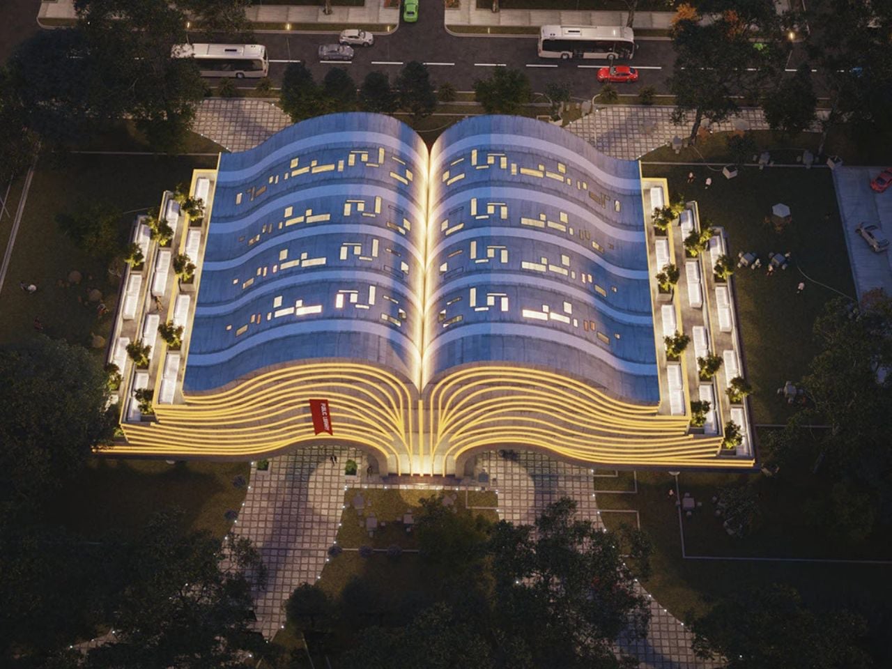
The “pages” of the book become layered floors with balconies that extend reading into the open air, while shaded spaces below host gatherings and mark the entrance with a calming water feature. From the front, the silhouette subtly recalls a tree, linking learning to growth and renewal. A central “spine” connects reading halls and auditoriums through elevated bridges, reinforcing the metaphor while guiding movement. Every detail balances symbolism with contemporary elegance, creating a space that honours tradition while embracing modern expression.

5. Transparent Reading Lounge

The community reading lounge restores the library’s role as a shared cultural space. You experience it as a modern gathering ground where quiet reflection and conversation coexist. Thoughtful layouts and contextual references help the space feel rooted, familiar, and socially inclusive.

Its success lies in sensory balance, like soft acoustics, gentle light, and spatial warmth. Value is measured through social engagement and long-term relevance rather than metrics alone. With local materials and passive strategies, the lounge becomes a low-impact, resilient environment that nurtures collective intellectual life.

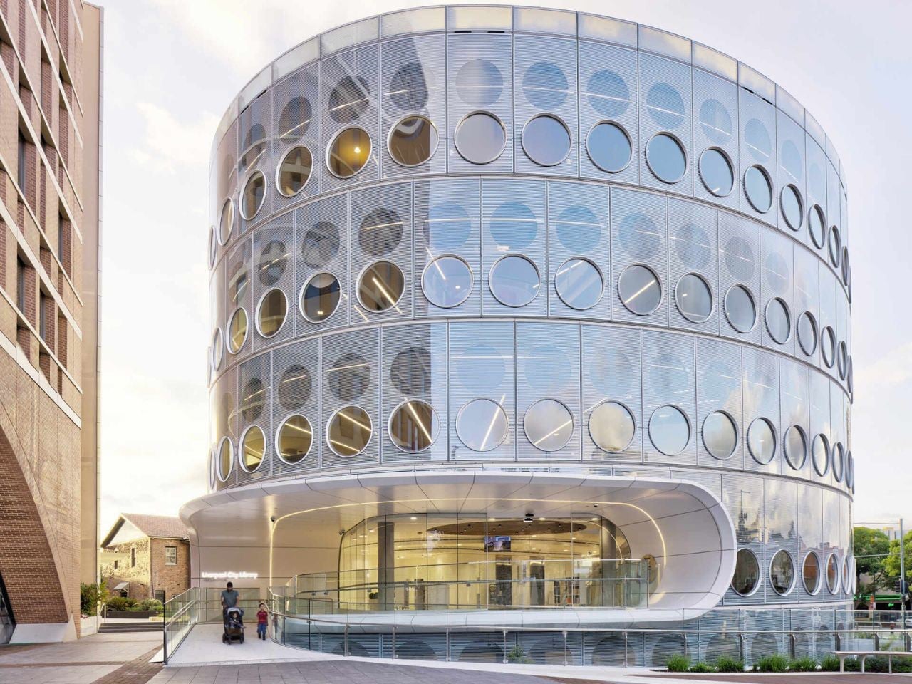
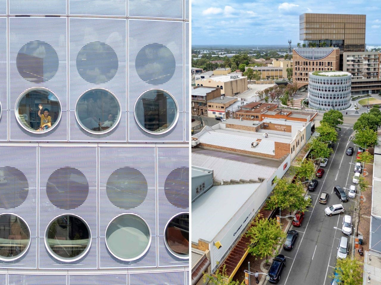
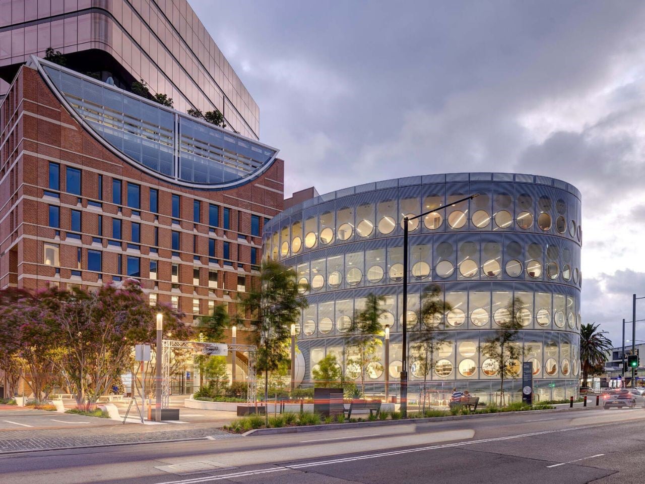
In an age dominated by digital ease, Yellamundie Library in Western Sydney shows how physical libraries are evolving rather than disappearing. Designed by fjcstudio as part of the Liverpool Civic Place precinct, the building is conceived as a social and cultural anchor for one of Australia’s fastest-growing and most diverse communities. Its oval form and round windows soften the surrounding urban grid, drawing inspiration from the nearby Georges River. With transparent façades on all sides, the library puts community life on display, and by night it glows like a lantern, signalling openness and welcome.

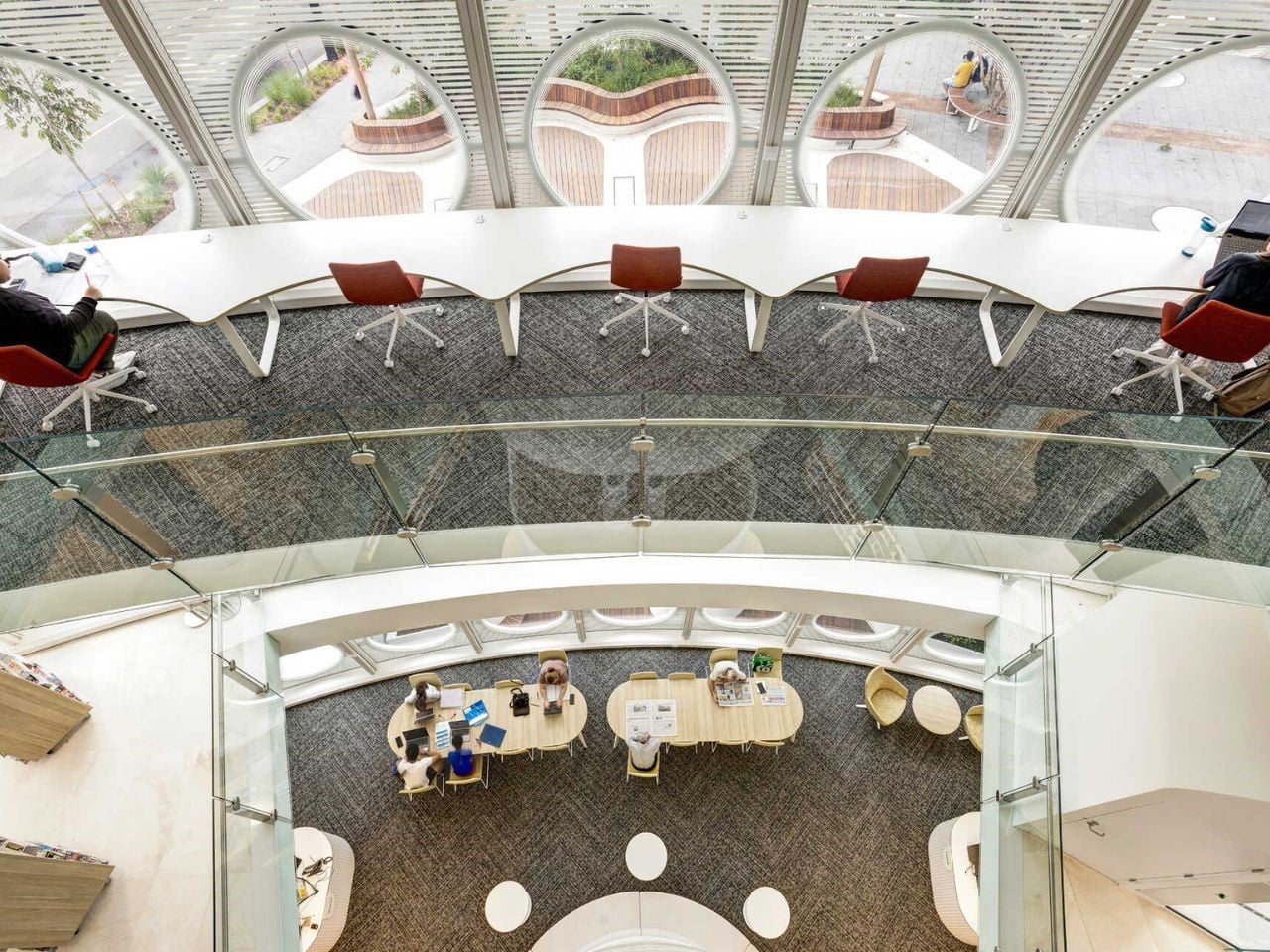
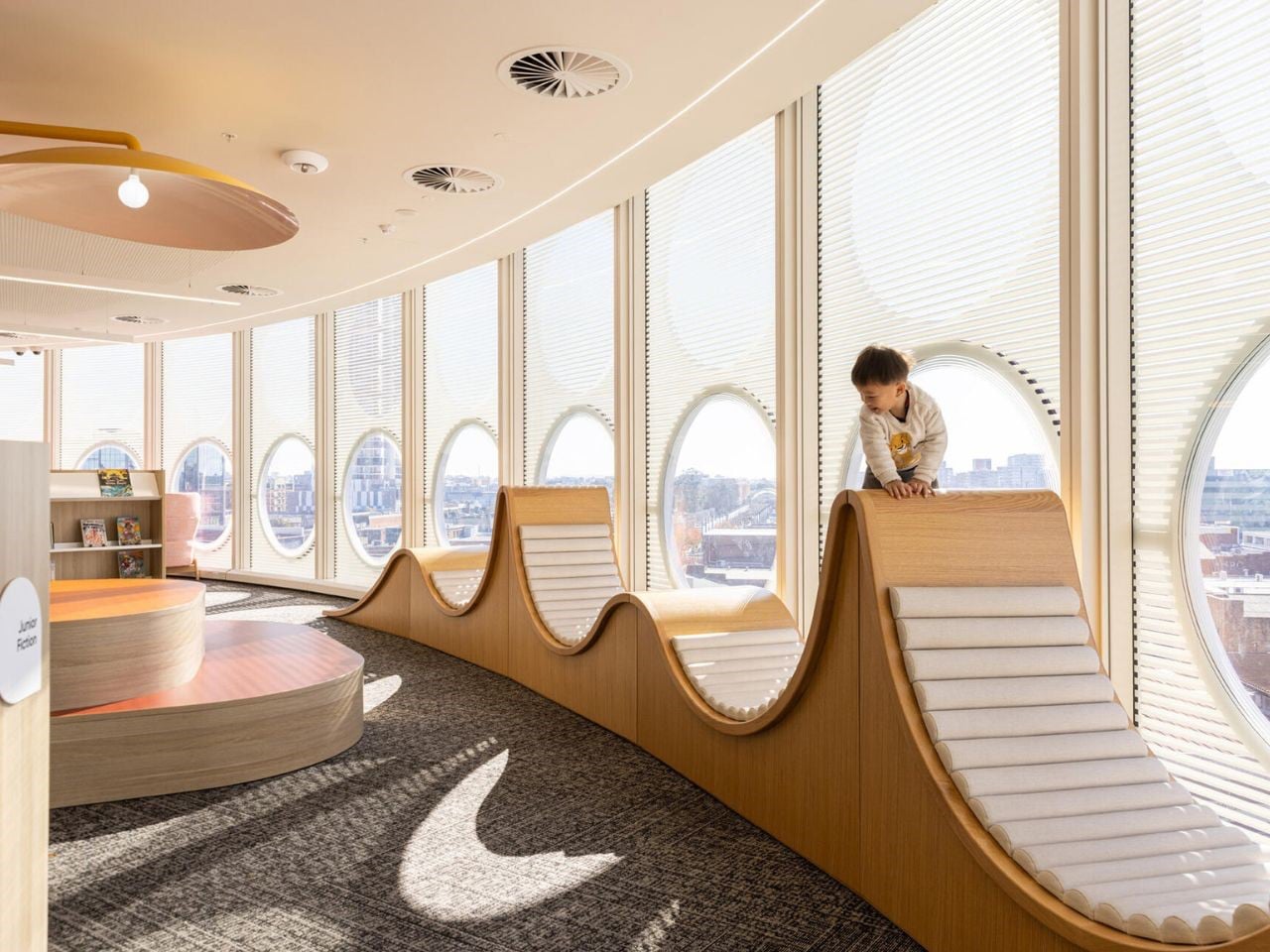
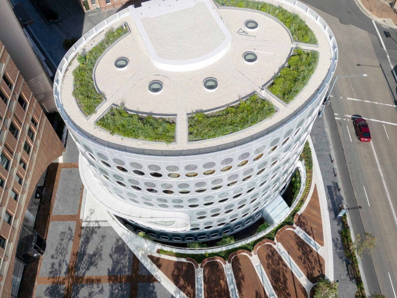
Inside, the 5,000-square-metre space is layered and adaptable, with part of the library set below the public plaza and lit by skylights and a planted courtyard. Upper levels house study areas, maker spaces, digital labs, and flexible event zones, all supported by mobile shelving. Multilingual collections, youth-focused floors, and creative programmes ensure the library serves every generation, making it a place for learning, making, and belonging.

The evolution of the library reflects a decisive move away from static storage toward a dynamic architectural experience. By integrating portability, biophilic principles, and forward-looking forms, you shape spaces that function as living systems of knowledge. These libraries transcend utility, becoming active environments that support resilience, creativity, and intellectual growth through a continuous dialogue between human experience and built form.

The post 5 Libraries That Look Nothing Like Libraries (And Are Better For It) first appeared on Yanko Design.

LOOPGEAR’s Dual-Beam 5000 Lumen EDC Flashlight Also Doubles As A 12V Laptop Power Bank

Flashlight manufacturers love to brag about lumen counts, but raw output means very little when the beam profile can’t match the task at hand. A spotlight punches distance but leaves your peripheral vision in the dark. A floodlight washes everything in even brightness but can’t reach past thirty meters. LOOPGEAR’s SK05 Pro 2 solves this by housing both emitter types in a single body, controlled independently through a Rose Gold rotary dial that snaps between modes with mechanical precision. This is the second generation of their dual-light platform, and the performance gap between versions is staggering. Spotlight output jumped 92 percent, from 1300 lumens to 2500, while the floodlight climbed 24 percent to 3800 lumens.

The SK05 Pro 2 measures 106mm long, 47.8mm wide, and 22.5mm thick, a form factor that sits somewhere between a smartphone and a multi-tool. Two 18650 cells run in parallel, giving you 8000mAh of capacity that charges devices at up to 12 volts, a rare feature in the EDC flashlight category. LOOPGEAR offers two emitter choices for the floodlight: Nichia 519A for high color rendering or RE-SF18-W for higher raw output. Both versions use the same SFT42R LED for the spotlight channel. The entire package shares the same machined metal body, IP68 waterproofing, magnetic base, and integrated sidelight with true white and RGB modes. The body ships in black or white MAO (matte anodized) finishes, and the overall design language leans heavily into tactical geometry with angular cutouts and textured gripping surfaces.

Designer: LOOPGEAR Team

Click Here to Buy Now: $113.98 $159.99 ($46.01 off, use coupon code “4Y7JDGBH”). Website Link Here (use coupon code “Yanko052”). Hurry, deal ends in 48-hours!

Smartphone connected to a rugged electronic device via a charging cable on a dark surface, blue glow from the device visible.

The rotary dial controls everything, and its mechanical feedback feels deliberate in a way touchscreens and membrane buttons never will. Twist clockwise and you cycle through the spotlight’s four brightness levels: 40 lumens for map reading, 320 for general navigation, 950 for serious illumination, and a 2500-lumen turbo that steps down after 40 seconds to prevent overheating. Twist counterclockwise and you access the floodlight’s range, from a 50-lumen low that won’t destroy your night vision to the 3800-lumen turbo that lights up a campsite like midday. Hold the dial for two seconds and both emitters fire simultaneously, combining for 5000 lumens of output that reaches 410 meters in the spotlight channel. The dial itself is CNC-machined with knurling that grips even when wet, and the detents are firm enough that accidental mode changes in a pocket or bag are nearly impossible.

Compact flashlight with a 231g metal body, labeled as flat & pocket-friendly and with a balanced, ergonomic grip for secure hold.

Two 18650 batteries slide into the body from the bottom, both oriented the same direction thanks to the parallel wiring configuration. This setup has practical advantages beyond the 8000mAh total capacity. If one cell dies mid-trip, the light continues running on the remaining battery, albeit at reduced runtime. The cells LOOPGEAR includes are standard 4000mAh units, meaning replacements are easy to source. The USB-C port sits on the side, protected by a magnetic metal flap that seals tight enough to maintain the IP68 rating. Charging happens at up to 22 watts, which fills both batteries in roughly three hours. What separates this from most rechargeable flashlights is the powerbank output capability, specifically the ability to deliver 5V, 9V, or 12V depending on what your device negotiates. Most EDC lights with powerbank features max out at 5V, which limits you to slow-charging phones and basic USB accessories. The SK05 Pro 2 can fast-charge a laptop, power a USB-C monitor, or run higher-voltage gear in the field.

Split image: left shows a black tactical flashlight standing on wood with a bright vertical beam; right shows a black battery pack with red LEDs held by a gloved hand over a wood stump.

The sidelight runs along the length of the body, a COB (chip-on-board) LED strip that outputs white light in four brightness levels or switches to RGB mode for signaling and ambient lighting. LOOPGEAR upgraded this to a high-CRI emitter in the Pro 2, and the difference is immediately visible when you’re working on anything that requires color accuracy. The white mode ranges from a sub-lumen moonlight setting that lasts over 100 hours to a 120-lumen high that floods your immediate workspace without the harshness of the main emitters. The RGB mode cycles through red, green, and blue, useful for preserving night vision, map reading, or just making the light visible in a packed bag. The sidelight activates through a separate button near the dial, so you can run it independently or combine it with either the spotlight or floodlight for layered illumination.

Person holding a small flashlight with blue glowing circular LEDs in a dark background.

White handheld flashlight partly buried in snow, lens facing left, rugged outdoor design visible.

LOOPGEAR machined the body from metal (likely aluminum based on the weight-to-size ratio) and applied a matte anodized finish that resists scratches and provides grip without being aggressively textured. The corners are chamfered, the sides feature cutouts that reduce weight and add visual interest, and the overall aesthetic skews tactical without crossing into mall-ninja territory. A magnetic base sits at the tailcap, strong enough to hold the light vertically on a car hood or toolbox while you work hands-free. The pocket clip along with a separate nameplate mount via screws (included, along with the installation tool), and you can position it in multiple orientations depending on how you carry. At 231 grams with batteries loaded, this sits heavier than a typical EDC pen light but lighter than most full-size tactical flashlights, and the flat profile distributes that weight in a way that disappears in a cargo pocket or bag.

Night scene in a park: a blossoming tree lit by a blue flashlight beam from a handheld torch toward the trunk and grass behind on the right.

The competitive landscape for dual-emitter flashlights is sparse, mostly because the engineering complexity tends to drive prices into the $200-plus range where brands like Acebeam and Nitecore operate. LOOPGEAR positioned the original SK-05 Pro around $150, and early indications suggest the Pro 2 will land in similar territory despite the significant performance upgrades. That puts it well below premium dual-channel lights while offering comparable (in some cases superior) output and feature density. The closest analog is probably the Acebeam E70, which offers similar throw and flood capabilities but weighs more, costs more, and lacks the powerbank voltage flexibility. The Sofirn IF22A delivers comparable spotlight performance at a lower price, but it’s a single-emitter design with no floodlight option and no powerbank functionality.

Rugged white handheld flashlight with a vertical green glow bar beside its blueprint-style box.

The SK-05 II Pro currently retails at $113.98, down from the original $159.99 list price, a $46 discount that positions it aggressively below the dual-channel competition. Comparable lights from Acebeam and Nitecore typically land in the $180 to $200 range, and most lack the multi-voltage powerbank capability that makes the LOOPGEAR viable as a backup charging solution for higher-draw devices. LOOPGEAR ships the light with both 18650 cells, a USB-C charging cable, pocket clip hardware, and installation tools, so you’re field-ready out of the box. The company’s track record with the original SK-05 Pro and the LOOPDOT platform suggests consistent firmware updates and responsive customer support, which matters when you’re trusting a single device to handle both illumination and emergency power in remote environments. Whether this becomes your primary EDC light depends on whether you value dual-emitter flexibility over the slimmer profile of a traditional cylindrical flashlight, but at this price point with this feature set, few competitors deliver comparable performance per dollar.

Click Here to Buy Now: $113.98 $159.99 ($46.01 off, use coupon code “4Y7JDGBH”). Website Link Here (use coupon code “Yanko052”). Hurry, deal ends in 48-hours!

The post LOOPGEAR’s Dual-Beam 5000 Lumen EDC Flashlight Also Doubles As A 12V Laptop Power Bank first appeared on Yanko Design.

5 Japanese Zen Desk Accessories That Turn a Tuesday Morning Into a Meditation

There is a particular kind of Tuesday that gets you. Not Monday, which at least carries the clean energy of a fresh start. Tuesday is when the week begins to feel long before it has any right to, when the desk stops feeling like a chosen space and starts feeling like a place you were assigned. The objects surrounding you have more influence over that feeling than most people acknowledge.

Wabi-sabi, the appreciation of imperfection and transience. Ma, the intentional use of space. Ikigai, the reason to get up. These are not aesthetic trends or interior design keywords. They are deeply considered frameworks for how the material world supports a good life. The five accessories here carry those values in practical, beautiful, desk-ready form — not to impress anyone walking by, but to make every Tuesday worth being present for.

1. ZenFlow Personal Aroma Diffuser

The ZenFlow Personal Aroma Diffuser earns its place on your desk through all your senses at once. It looks sculptural — a handcrafted porcelain filter sitting atop an anodized metal base in Silver, Gold, or Black — but the experience it creates is what makes it genuinely useful. The diffuser combines heat and airflow technology to evenly disperse essential oils through the air without water or mist, keeping your workspace clean and calm. It is aromatherapy without the clutter, without the fuss, and without the puddle on your desk.

For you, this means a desk environment that actively supports focus rather than merely existing around it. Switch between Normal Mode for stronger scent presence during deep work, Airflow Mode when you want subtlety, or ECO Mode for energy-efficient background relaxation throughout the day. The handcrafted porcelain filters are a product of Shibukusa Ryuzo Porcelain’s 180-year legacy, adding a layer of cultural weight to a device that already justifies itself on practicality alone. When the air around you smells intentional, the entire morning shifts slightly in your favor.

Click Here to Buy Now: $170.00

What We Like

  • Water-free technology keeps your desk surface completely clean and mess-free
  • Three adjustable modes let you match the diffuser to your energy level throughout the day

What We Dislike

  • Essential oil refills add an ongoing cost over time
  • The handcrafted porcelain filter requires careful handling to avoid breakage

2. Magboard Clipboard

Paper notebooks are personal things. They carry the texture of actual thinking — the crossed-out lines, the sketches in the margins, the half-finished sentences that eventually turn into something better. The Magboard Clipboard understands this in a way that most stationery products do not. Its magnet and lever mechanism lets you bind up to 30 loose sheets without any predefined layout, order, or margin, giving your note-taking the same flexibility as your actual thought process. The hardcover construction is rigid enough to write on while standing.

What it gives you is freedom from the structure that most notebooks quietly impose. Pull out a page, reorder your notes, add a fresh sheet mid-thought, and put everything back in whatever sequence makes sense for how your brain works that day. The water-resistant surface means the board travels without hesitation — into a client meeting, a coffee shop, or a commute in unpredictable weather. For anyone who thinks with a pen in hand, Magboard removes every practical reason not to write, and in doing so, makes the act of capturing ideas feel genuinely frictionless.

Click Here to Buy Now: $45.00

What We Like

  • Loose-sheet format lets you reorganize, remove, and add pages freely without tearing
  • Hardcover design supports writing without needing a flat surface underneath

What We Dislike

  • Loose pages can be easy to misplace if not managed with some care
  • The magnet and lever mechanism may feel unfamiliar to those used to traditional bound notebooks

3. Madco Table Lamp

Designed by Italian designer Elisa Ossino for Japanese brand Ambientec, the Madco Table Lamp takes the warmth of a festive Japanese lantern and distills it into something small, quiet, and considered. A sphere-shaped diffuser sits suspended within a sleek metal frame, available in five colors chosen to add playful elegance without overwhelming a space. It marks the first time Ambientec introduced color into its design language, and the restraint with which they did it says everything — there is nothing loud here, only warmth and a kind of confident understatement.

For you, the Madco is the kind of light source that changes the felt quality of your desk at the start or close of a working day. It is rechargeable via USB-C, fully portable, and waterproof, meaning it moves with you from desk to balcony to garden without complaint, creating soft visual conversations with plants and outdoor textures along the way. The 360-degree rotating light source lets you direct warmth exactly where you need it. It is less a lamp and more a mood rendered in physical form — the sort of object that makes the transition into work feel like a deliberate choice.

What We Like

  • USB-C rechargeable and waterproof, making it genuinely portable for indoor and outdoor use
  • The 360-degree rotating diffuser lets you customize and redirect light output precisely

What We Dislike

  • Battery life will limit continuous use, particularly at higher brightness settings
  • Available in five fixed colors only, which may not suit every interior palette

4. Aya & Sfera Desk Organizers

Ikigaiform describes their practice as Japanese minimalism meeting parametric design, a combination that produces objects feeling simultaneously ancient and quietly futuristic. Aya and Sfera began as full-size self-watering planters before being scaled down into desk-sized cups, carrying the same organic forms and intricate surface patterns into a far smaller footprint. The result is a pen holder — or catch-all, or shelf object — that shares design DNA with a living planter, blurring the line between the functional and the living in a way that feels entirely natural on a working desk.

What makes these organizers genuinely useful for you is the way they bring considered calm to whatever surface they occupy. Wabi-sabi aesthetics and Japandi sensibility run through every curve and surface pattern, making each piece feel deliberate rather than merely decorative. Whether you use them to hold pens, cables, a small succulent, or simply as a visual anchor on an otherwise noisy desk surface, they carry an almost-living quality that rewards closer attention. On a Tuesday morning when everything feels like an obligation, these small objects quietly remind you that your environment is something you actually designed.

What We Like

  • Organic forms and intricate surface textures make these genuinely rewarding to study up close
  • Compact size fits naturally on desks and shelves without claiming excessive space

What We Dislike

  • As a niche studio product, availability and restocking may be limited
  • The soft, organic form may not align with stark industrial or heavily geometric desk setups

5. Heritage Craft Unboxing Knife

Most box cutters are purely transactional. You use them, drop them into a drawer, forget them completely. The Heritage Craft Unboxing Knife refuses that fate entirely. Carved from a block of aluminum, its circular form directly references Paleolithic hand axes, a shape carrying the entire arc of human tool-making history within it. The wave-like patterns left by precision machining are not purely decorative — they give the object grip, texture, and a visual richness that makes you want to pick it up. It is the rare tool that actively asks to be handled.

For you, this is the object that stays on top of the desk rather than inside it. It is effective — genuinely sharp for slicing tape and opening packages — but it holds its position through presence as much as through function. The tapered form sits confidently on any surface, operating simultaneously as a tool and a quiet sculpture. Japanese design philosophy holds that objects should be worthy of the attention we give them, that usefulness and beauty are not separate qualities. The Heritage Craft Unboxing Knife takes that idea seriously, and in doing so, makes even the small ritual of opening a package feel like something worth noticing.

Click Here to Buy Now: $99.00

What We Like

  • Sculptural aluminum form means it stays visible on the desk rather than disappearing into a drawer
  • Wave-patterned machining provides both a secure grip and a distinctly artisanal visual quality

What We Dislike

  • The circular form may require a short adjustment period for those used to standard box cutters
  • Aluminum construction may accumulate visible surface scratches with regular daily use

The Desk Is the One Space You Actually Get to Choose

The desk is one of the few environments you actually control. Most of what shapes a Tuesday is decided before you sit down — the calendar, the emails, the inbox count. The objects you choose to keep in your immediate space are one of the last genuinely personal decisions left. These five accessories share a quality that goes beyond mere aesthetics: they each slow the eye down, just for a moment.

And in that pause, the morning becomes slightly less automatic. That is exactly what Japanese design has always understood — that objects worthy of attention gradually change the quality of attention you bring to everything else. You cannot redesign your calendar, your inbox, or your Tuesday. But you can redesign the surface in front of you. Fill it with objects that ask something of you. That, quietly, is more than enough.

The post 5 Japanese Zen Desk Accessories That Turn a Tuesday Morning Into a Meditation first appeared on Yanko Design.

PITAKA Is Letting the World Design Its Next Phone Cases, Royalties Included. Here’s How To Participate

Tech accessories have hit a curious inflection point. The last year trained us to worship thinness and glass, but somewhere between the tenth identical ‘Air’ or ‘Edge’ smartphone and the fifteenth glossy case, a countermovement quietly took root. Texture matters again. Grip, weave, and tactile identity are no longer afterthoughts, they’re the differentiators that keep objects from sliding into the sea of sameness. PITAKA, a brand built on aerospace-grade aramid fiber and what it calls “fusion weaving,” has spent years proving that phones don’t have to feel like jewelry-store display pieces. Now, with the launch of “Weave the Next, Weave Our World,” the company is turning that philosophy outward, inviting designers worldwide to imagine the surfaces and visual languages that will define the next generation of tech we carry, hold, and interact with every day.

Launching April 24th, 2026, the competition is framed explicitly around the intersection of technology and art, which is less marketing speak and more PITAKA’s operational DNA. The brand’s cases have always leaned hard into material science, using woven aramid fibers (the same stuff in bulletproof vests and aircraft components) that are five times stronger than steel and a fraction of the weight. But strength alone doesn’t sell. What makes PITAKA cases notable is the texture vocabulary they’ve developed over years of refining weave patterns, experimenting with 600D and 1500D aramid densities, and pushing techniques like “fusion weaving,” where multiple patterns coexist on a single loom to create intricate, layered surface designs. “Weave the Next, Weave Our World” extends that exploration beyond the company’s internal design studio and into the hands of students, professionals, and independent creators who might see texture, pattern, and tactility from entirely different cultural or aesthetic starting points.

Click Here to Submit Now. Hurry, Competition Ends: May 25, 2026.

The Brief

Nordic Knit Dream

Drifting Shadows

PITAKA’s “Weave the Next, Weave Our World” global design competition invites designers to create texture and visual language systems for the brand’s future product series, positioned explicitly at the intersection of technology and art. Participants choose from four thematic directions: “These Moments,” which captures the raw beauty and shifting rhythms of the natural world; “Timeless Threads,” weaving stories of culture, memory, and human journeys; “Beyond Tomorrow,” exploring visionary futures where innovation reshapes daily life; or “Roots of Rhythms,” celebrating the textures, symbols, and spirit born from each land’s heritage. The competition aims to explore emerging global trends in tactile and visual design, strengthen PITAKA’s art-tech identity, and potentially commercialize winning designs through royalties, co-branding, and official recognition.

How To Participate

  1. Visit the official competition website or Dribbble page to submit your entry
  2. Provide participant information and upload your texture designs
  3. Include a written design explanation with your submission
  4. Entries will be evaluated through a combination of professional jury review and public voting
  5. Winners will be announced and showcased in an online exhibition

Competition Dates

  • Competition Launch: April 24, 2026
  • Submission Period: April 24 – May 25, 2026
  • Judging Period: May 26 – May 31, 2026
  • Winners Announcement: June 9, 2026

Jury Panel

  • Qiongzhi Xie (Artist; Founder of Daxing Jizi Studio)
  • Matteo Menotto (Head of Design, Prints & Textile Accessories at Bulgari)
  • Sarang Sheth (Editor-in-Chief, Yanko Design)
  • James (Founder / CEO, PITAKA)

Important Information

The most compelling entries are likely to do three things at once:

  1. Treat texture as a system, not a single image
    PITAKA’s products live across multiple form factors, so a strong entry will propose a visual/tactile system that can scale and adapt, not just a one-off pattern.
  2. Anchor the concept in one of the four themes without being literal
    “These Moments” does not need a photo-real print of a wave; “Roots of Rhythms” does not need a direct copy of a folk motif. Abstraction, distillation, and translation into a tech-accessory context will matter.
  3. Consider manufacturability and user experience
    Even in a speculative competition, the jury includes industrial design and brand leadership. Textures that look stunning in render but collapse in real material or feel uncomfortable in hand will likely be deprioritized.

If you already experiment with materials, parametric patterns, or culturally rooted visual systems, “Weave the Next, Weave Our World” is essentially an invitation to push that work into a space where it might actually ship.

Click Here to Submit Now. Hurry, Competition Ends: May 25, 2026.

Click Here to Submit Now. Hurry, Competition Ends: May 25, 2026.

The post PITAKA Is Letting the World Design Its Next Phone Cases, Royalties Included. Here’s How To Participate first appeared on Yanko Design.