Galaxy S26 Ultra Buried the Note’s Boxy Soul, and Fans Are Split

The race to make flagship phones thinner, smoother, and more visually unified has become one of the defining stories in premium smartphone design. Hard angles and bold silhouettes that once gave each model its own character have been quietly traded for softer frames and tighter lineup coherence. It’s a direction that makes these phones easier to hold and sell, but not always easier to tell apart.

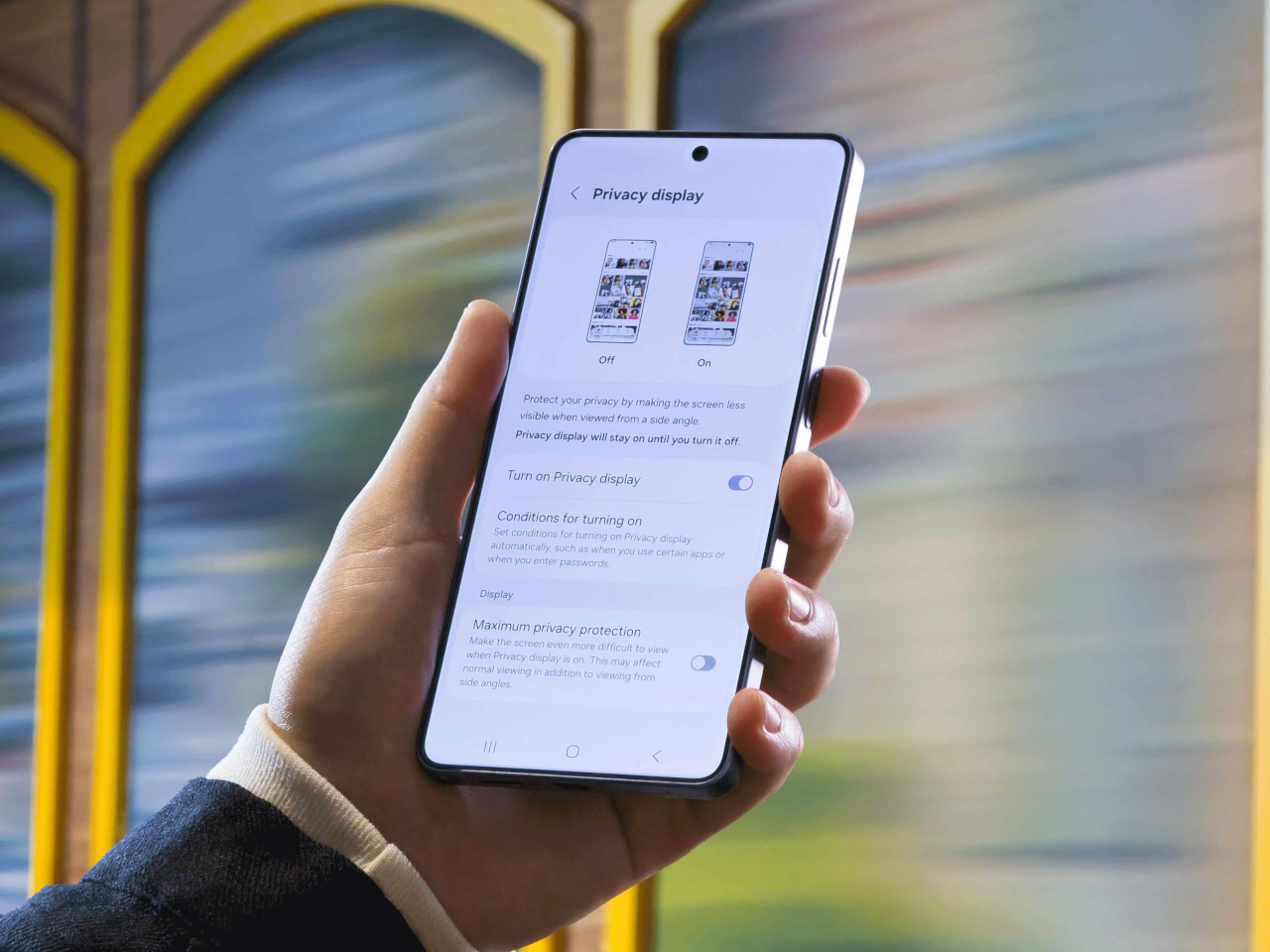
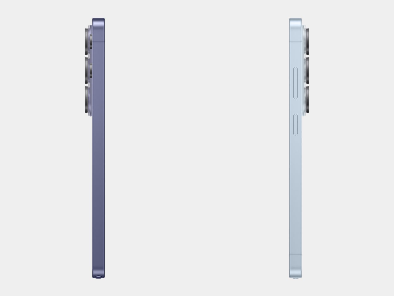
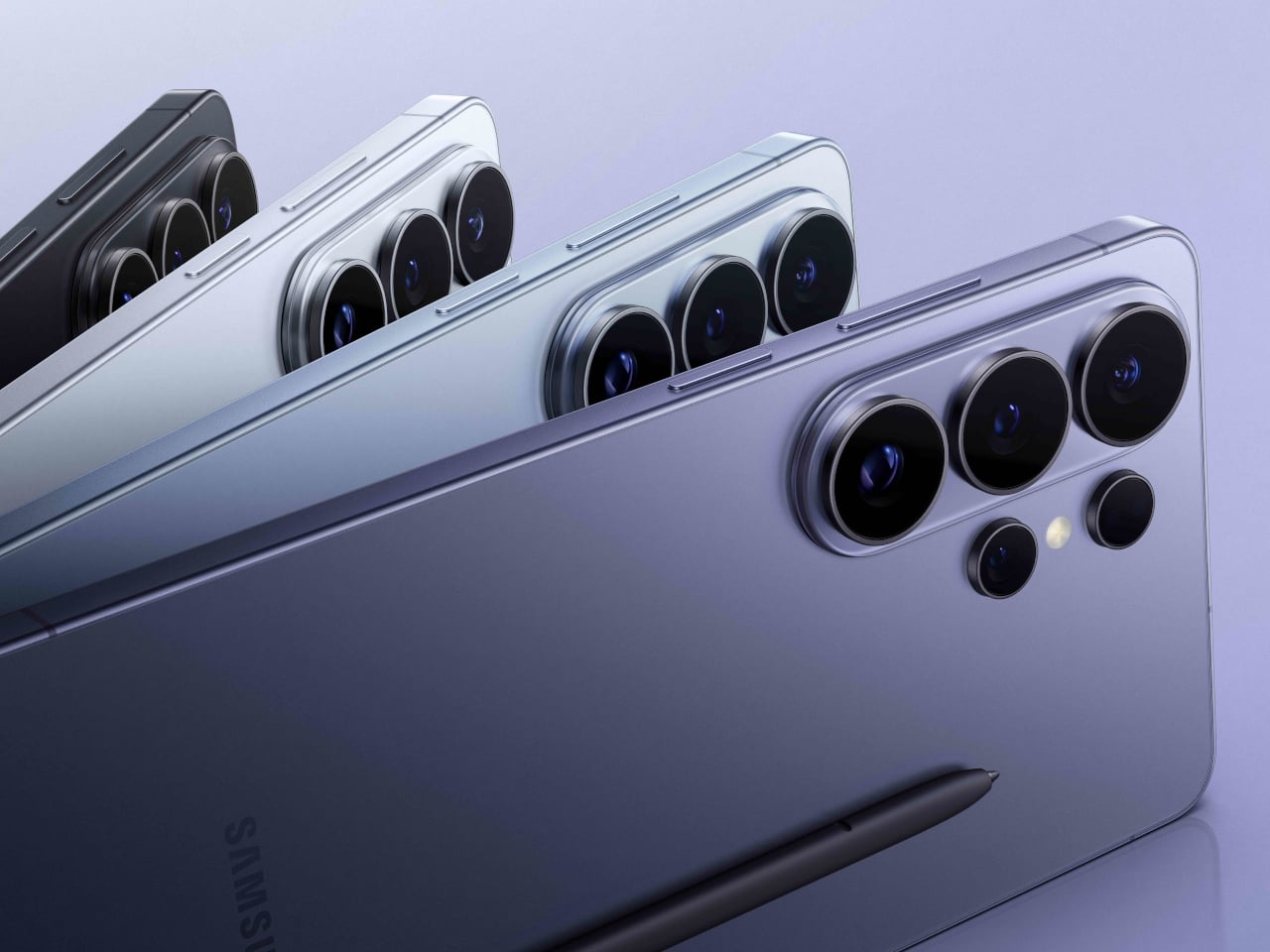
The Samsung Galaxy S26 Ultra, which hit shelves on March 11, 2026, fits squarely into that movement. Samsung pushed the chassis below 8mm for the first time on any Ultra, trimming it down to 7.9mm. Add to that a softer corner radius, an Armor Aluminum frame, and an anti-reflective Privacy Display, and it starts to feel like something more deliberate than a routine generational update.

Designer: Samsung

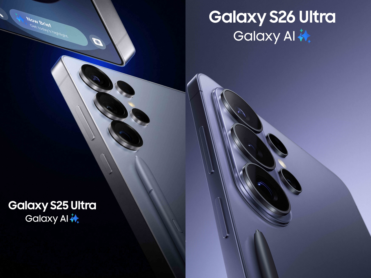
To understand why that matters, it helps to remember where the Ultra came from. When Samsung discontinued the Galaxy Note in 2021, it didn’t retire the design language that defined it. The Note’s boxy corners, flat sides, and upright proportions migrated into the Ultra line, giving those phones a distinctly tool-like character. The Ultra felt like a device built for serious use, and its shape made that clear.

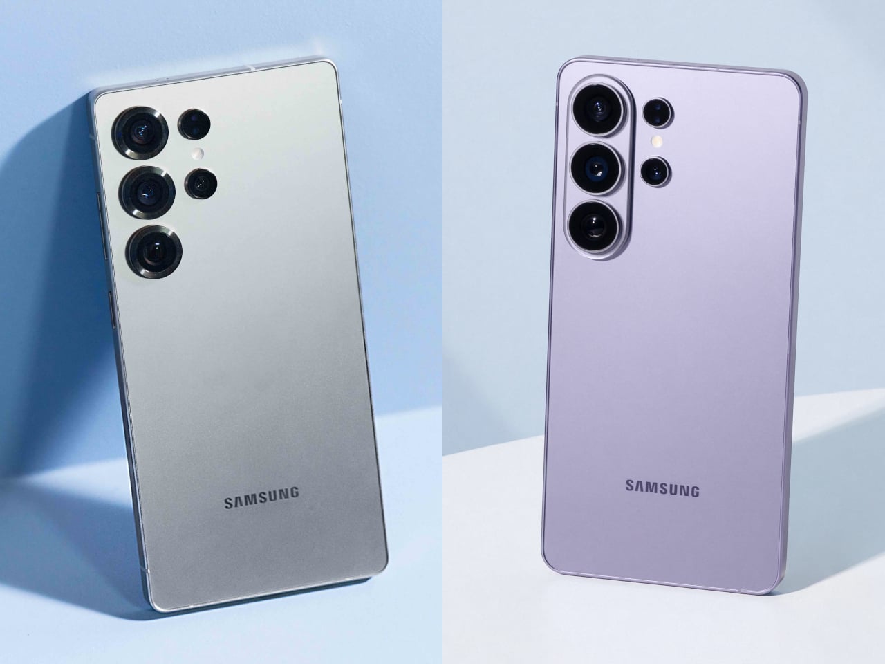
Galaxy S25 Ultra

Galaxy S26 Ultra

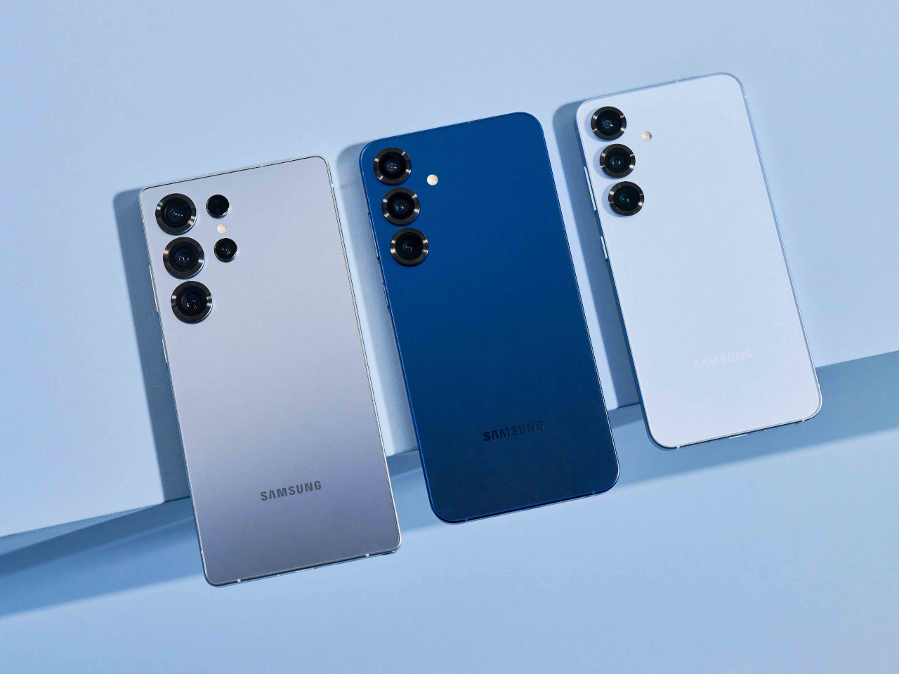
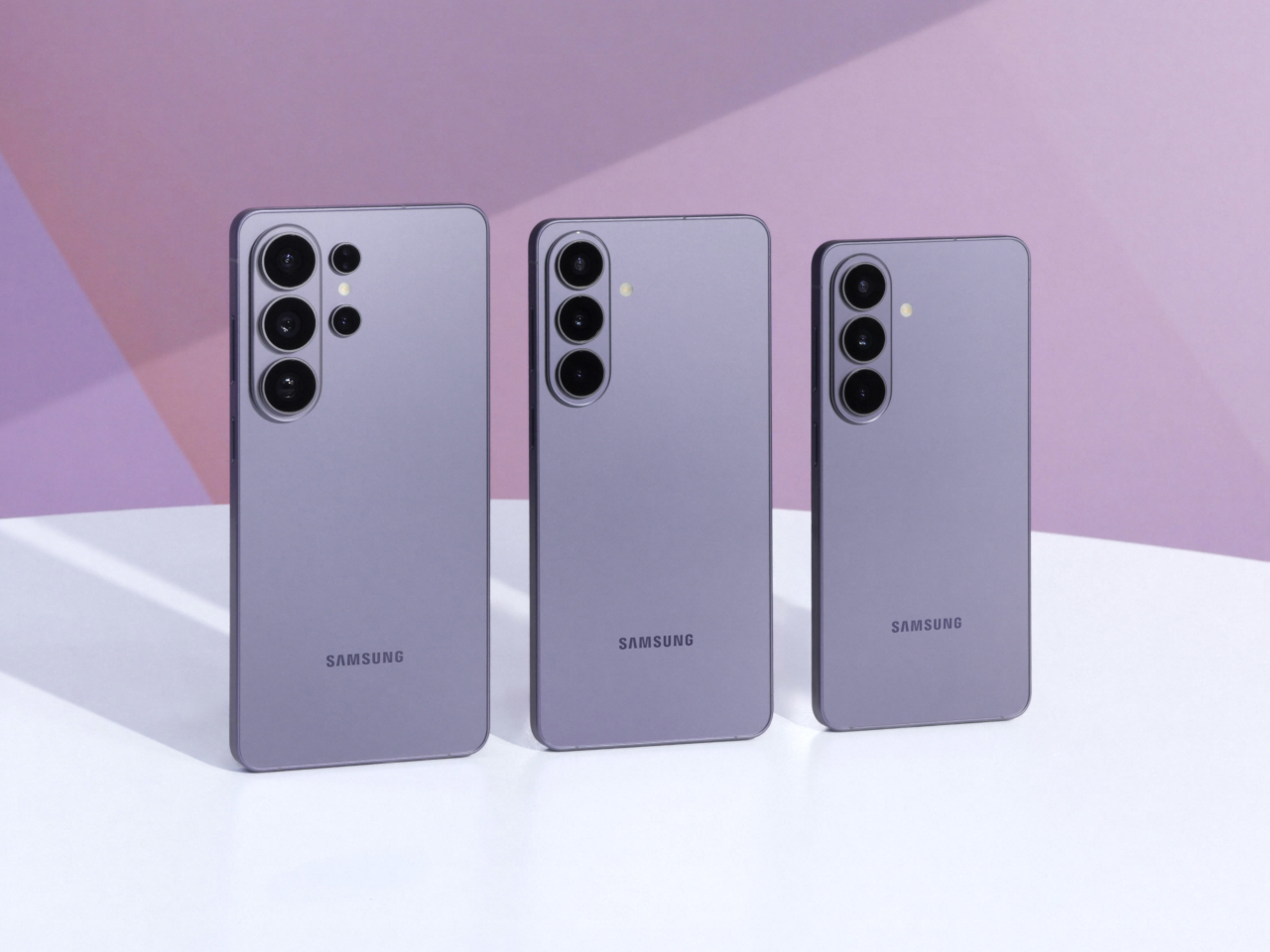
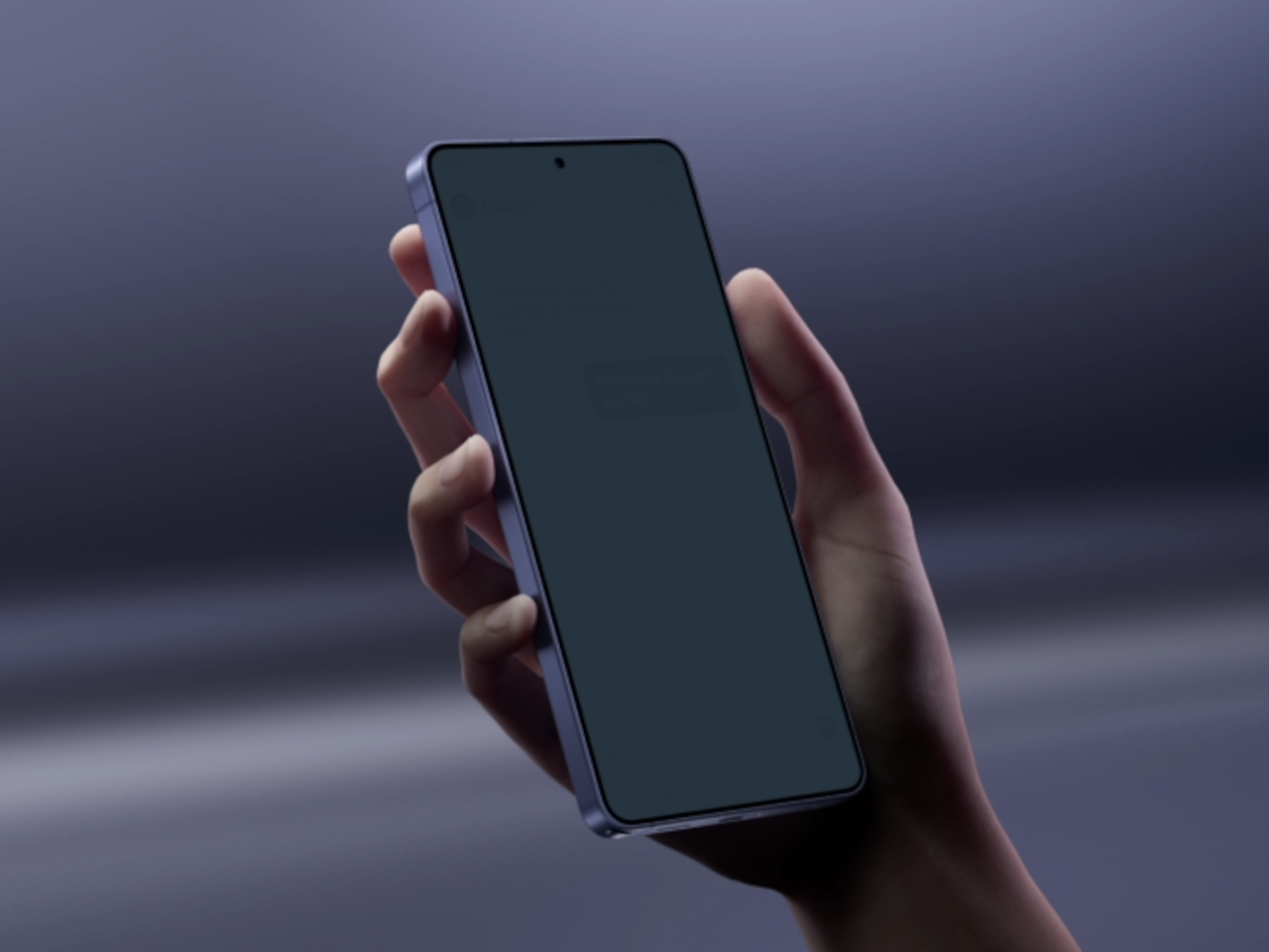
The Galaxy S26 Ultra leaves most of that behind. Samsung rounded the corners, softened the edges, and made the phone look far more like the standard Galaxy S26 and S26+ than any Ultra model before it. That visual coherence is good design management, but it’s also the moment the Ultra stops looking distinctly like its own thing. It’s harder to spot in a lineup now.

Galaxy S25 Ultra

Those softer edges do make a real difference in how the phone sits in the hand over a long day. When you’re scrolling through a document or holding the device on a commute, the rounded frame distributes pressure more evenly across the palm. The 7.9mm chassis also disappears into a pocket more gracefully than its predecessor, which sounds minor until you realize how often you actually notice it.

Galaxy S26 Ultra

With the silhouette doing less visual heavy lifting, Samsung shifted the premium story into the surface itself. The Armor Aluminum frame carries the finish more evenly from back to edge, giving the phone a cleaner look that doesn’t need dramatic geometry to feel expensive. The anti-reflective Privacy Display adds a different kind of thoughtfulness, letting you check sensitive messages or browse in public without worrying about prying eyes.

What really puts the 7.9mm figure in perspective is the competition. The iPhone 17 Pro Max measures 8.75mm thick, and while a 0.85mm difference might not sound dramatic on its own, the context here matters quite a bit. Samsung is fitting a built-in S Pen into a phone that still comes in thinner than Apple’s stylus-free flagship, which is an engineering tradeoff worth acknowledging.

iPhone 17 Pro Max

What makes this shift more significant is what it says about Samsung’s intentions for the lineup as a whole. The Galaxy S26, S26+, and S26 Ultra now share the same curvature and visual language for the first time. That’s Samsung quietly admitting that the Ultra doesn’t need to look like a separate category; it’s a flagship, not a relic from a discontinued line.

Two months after launch, the Galaxy S26 Ultra’s design verdict has had time to settle, and the conversation is genuinely split. There’s something complete about how it all comes together now, smoother, thinner, and more coherent. The S Pen remains, but the body no longer insists on its Galaxy Note roots. Whether that reads as maturity or loss probably depends on how long you’ve been following the Ultra.

The post Galaxy S26 Ultra Buried the Note’s Boxy Soul, and Fans Are Split first appeared on Yanko Design.

PC Gamers Have Too Many Windows, ROG’s $199 Screen Fixes That

Gaming setups have grown considerably more complex, and the demands on screen real estate have grown right along with them. A serious session today might involve a game running on the main display, a chat window competing for space, system performance stats tucked into a corner, and a streaming interface sharing the same screen. Managing all of it in one place means cluttered desktops and tab-switching at exactly the wrong moments.

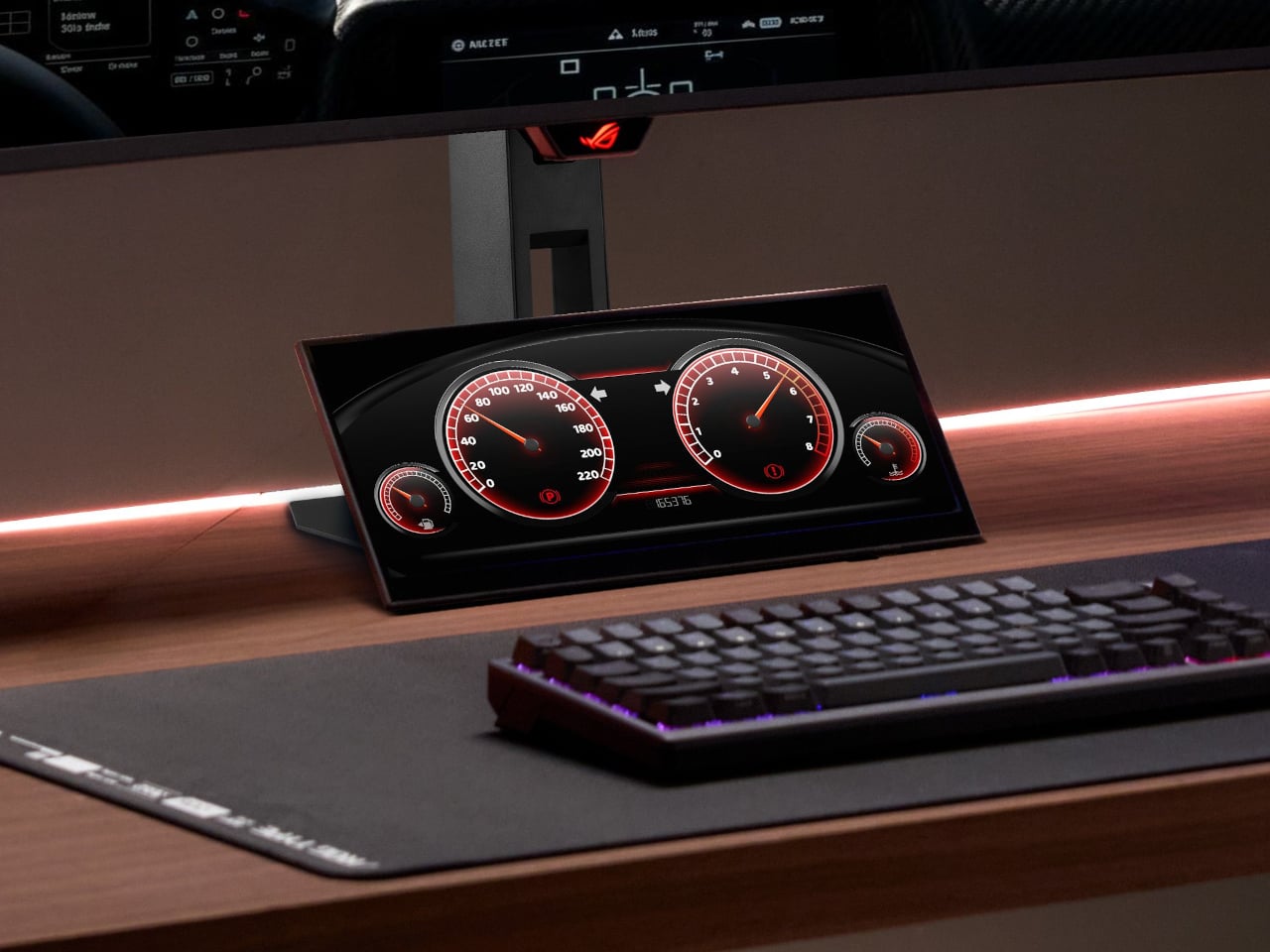
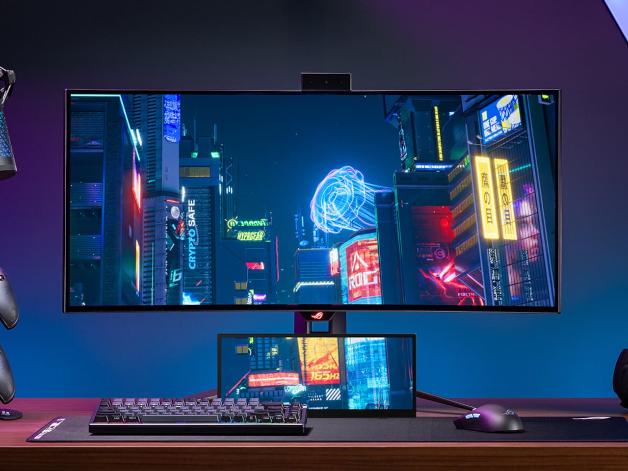
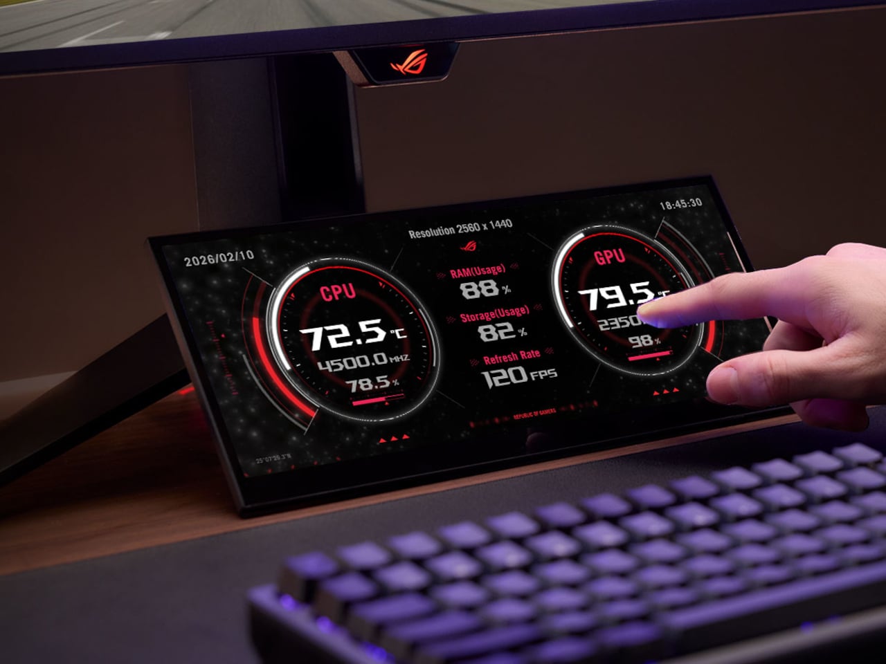
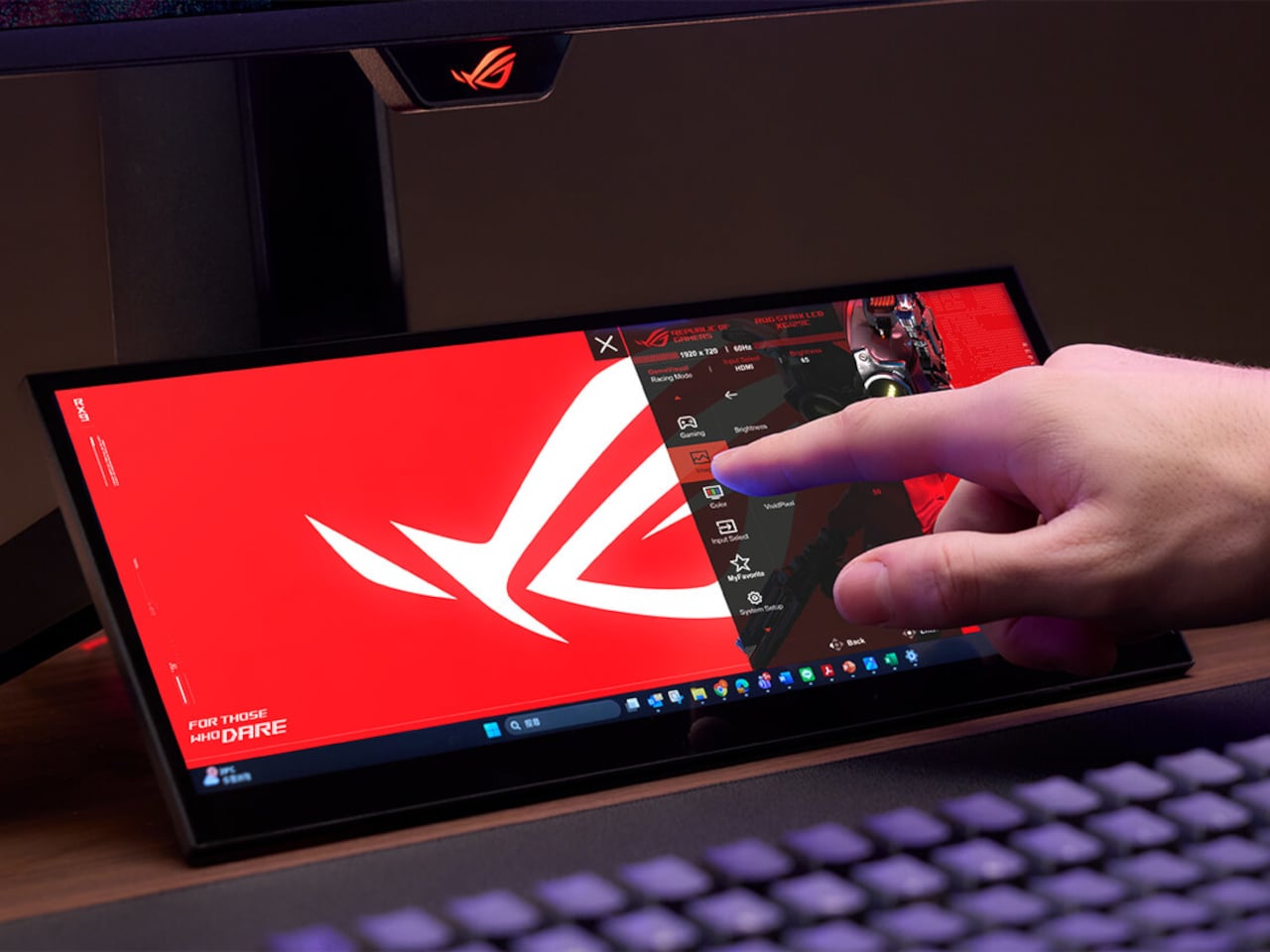
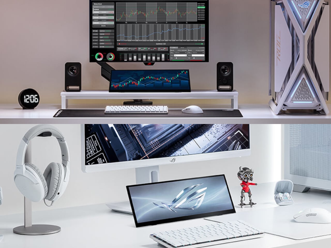
ROG’s answer to this is the Strix XG129C, a 12.3-inch secondary touchscreen designed to sit beneath a primary monitor and take over all those support duties. Rather than competing for real estate on the main screen, it gives peripheral information its own dedicated space, keeping the game in full focus without losing sight of everything running alongside it. It’s a small display with a very specific job in mind.

Designer: ASUS ROG (Republic of Gamers)

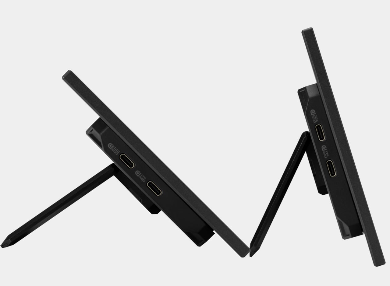
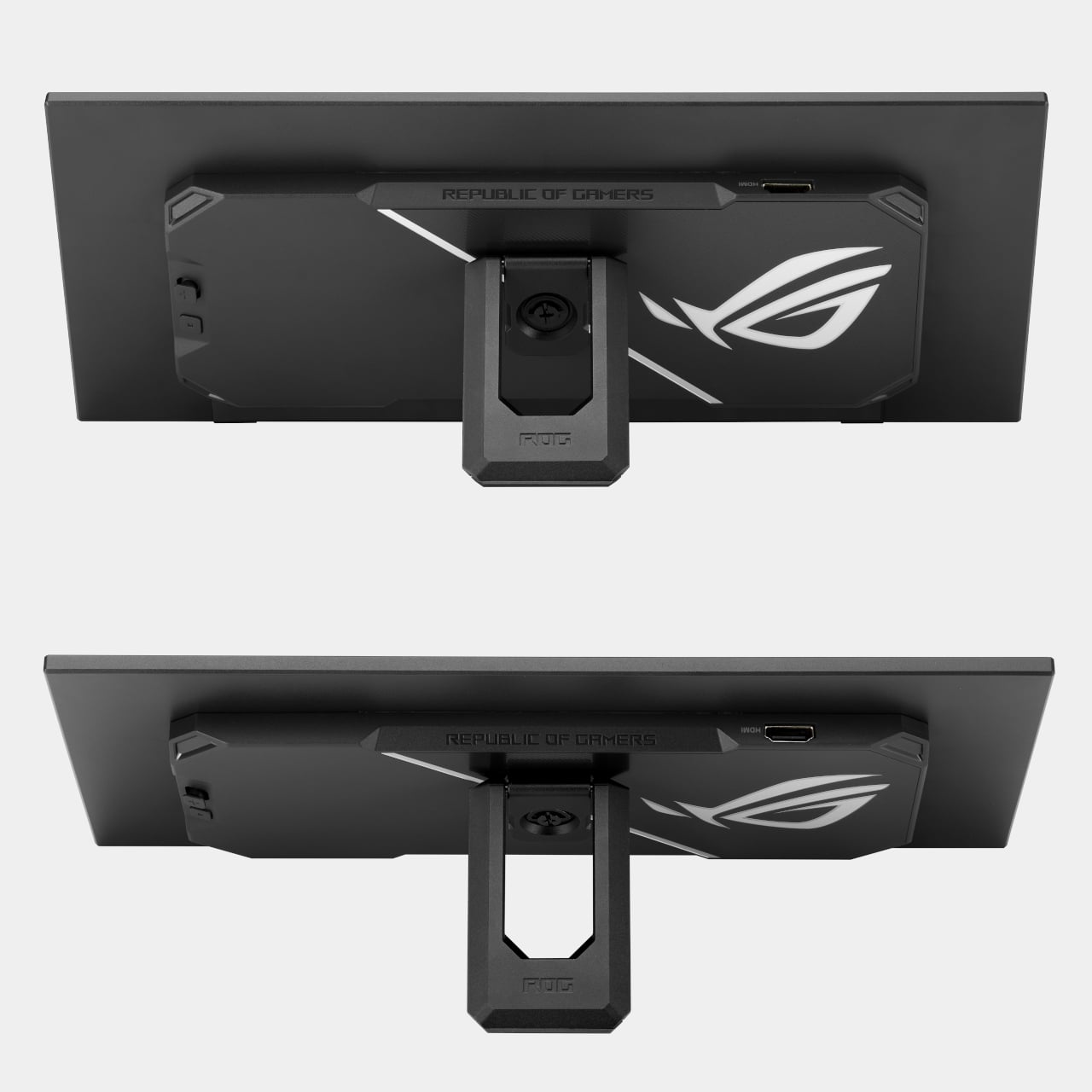
The screen uses a 24:9 aspect ratio with a 1920 x 720 resolution, a less common format that works decidedly in its favor here. Unlike typical 32:9 companion displays, this configuration provides more vertical viewing area, which means less scrolling through chat threads, fewer black bars on 16:9 content, and a layout that reads more naturally at a glance. A slim profile and adjustable kickstand let it slide neatly under most primary monitors.

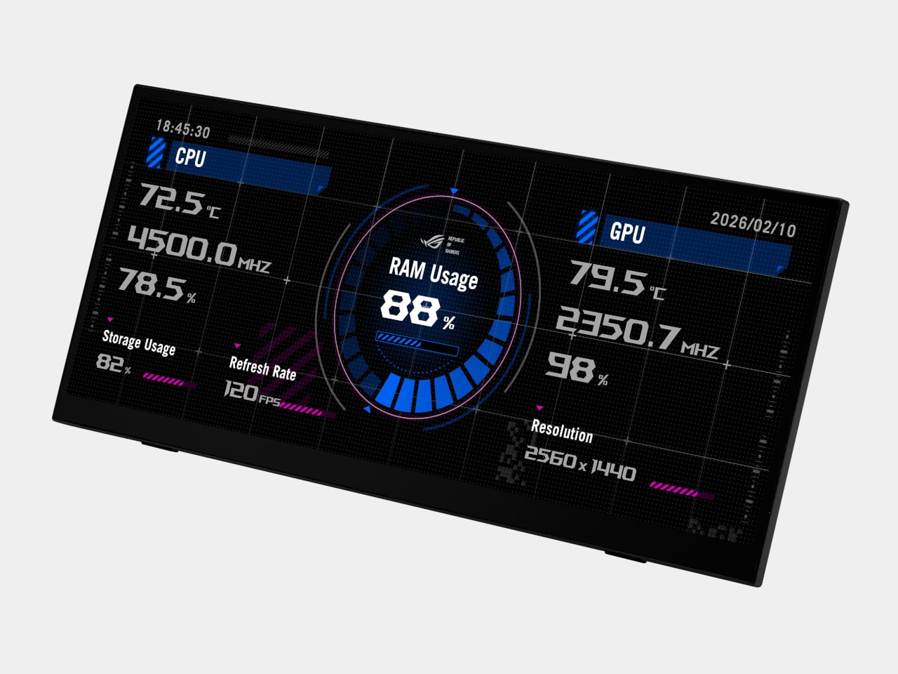
The XG129C comes bundled with a one-year AIDA64 Extreme subscription, a hardware monitoring tool that turns the screen into a live readout of CPU temperatures, GPU load, fan speeds, memory usage, and more. For anyone running demanding games or keeping an eye on thermals, having that data on a separate screen rather than overlaid onto the game changes the experience considerably. It stays visible without ever getting in the way.

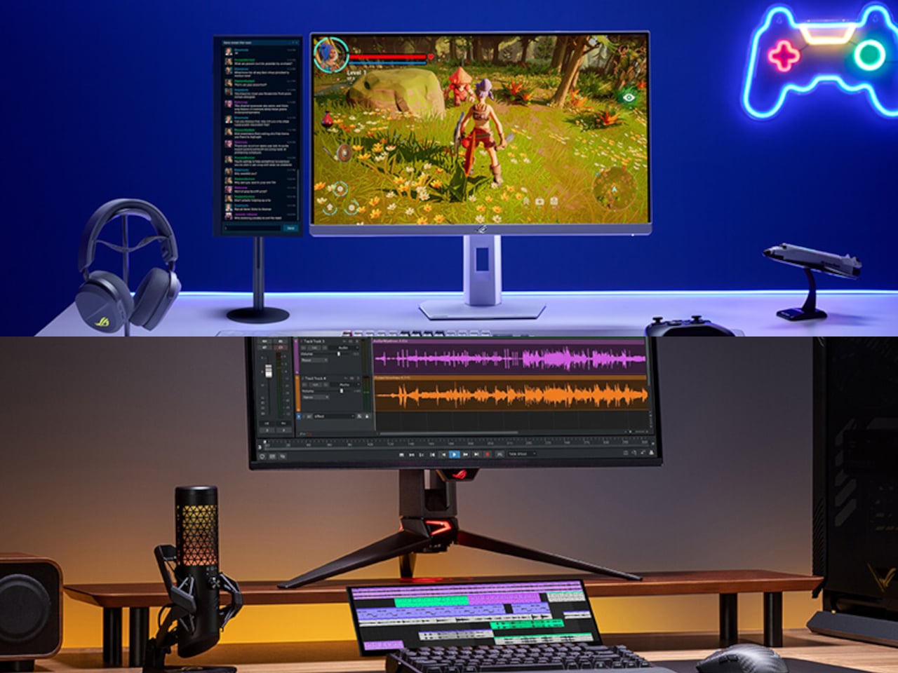
Live streamers and content creators get a different kind of value from the XG129C. Discord conversations, OBS controls, viewer chat, and music playback can all live on this screen while the main display stays dedicated to whatever’s being recorded or played. Tapping the screen to adjust a streaming setting or mute a channel doesn’t require switching windows or minimizing anything, keeping the workflow moving without interruption.

The 10-point multi-touch IPS panel handles that kind of interaction with enough precision for hotkeys, app shortcuts, and quick swipe inputs. Reaching over to pull up a game guide, tap a lighting shortcut, or adjust a fan profile doesn’t require a mouse or keyboard, which matters when both hands are on a controller or tied up on the main display. It responds the way a well-built touchscreen should.

A single hybrid USB-C cable handles power, video, and touch data simultaneously, keeping the desk clean and the cable run minimal. There’s also a second USB-C port with 20W Power Delivery and an HDMI 1.2 port for broader device compatibility. For setups where desk placement isn’t straightforward, a built-in 1/4-inch tripod socket makes it possible to mount the display on an arm or stand instead.

The IPS panel covers 90% of the DCI-P3 color gamut and 125% of sRGB, notably strong for a display that isn’t the main event. Colors hold up alongside most primary monitors without the visual mismatch that cheaper companion screens tend to produce. It earned a Red Dot Award in the gaming and streaming design category, and at around $199, it’s a focused solution for setups that have simply outgrown a single screen.

The post PC Gamers Have Too Many Windows, ROG’s $199 Screen Fixes That first appeared on Yanko Design.

Amazon Won’t Build This Kindle Remote, So BOOX Did It for $26

E Ink readers have steadily become better at mimicking the feel of paper, but getting through a book with one still requires the same thing it always has: tapping the screen to flip a page. It’s a minor interruption that adds up over a long reading session, and while third-party ring-style page-turners have tried to address it, they haven’t exactly been the most reliable solution.

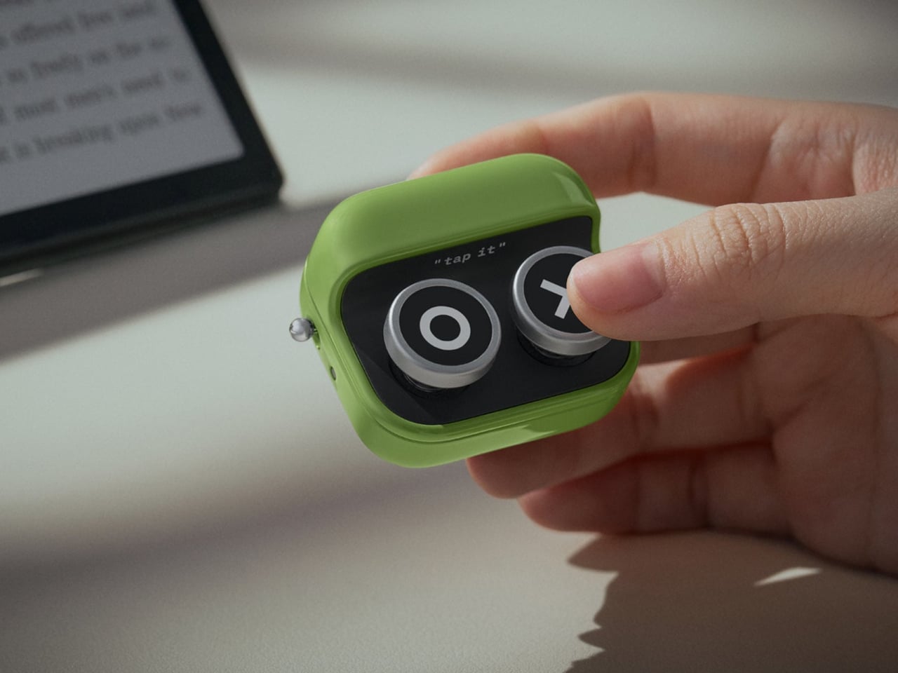
BOOX, the brand behind a well-regarded lineup of E Ink readers and tablets, now has its own take on the problem. The Tappy is a compact two-button Bluetooth remote that lets you control your device without touching the screen. It’s the kind of accessory that BOOX fans have quietly wanted, and one that Kindle users have been asking Amazon to make for years.

Designer: BOOX

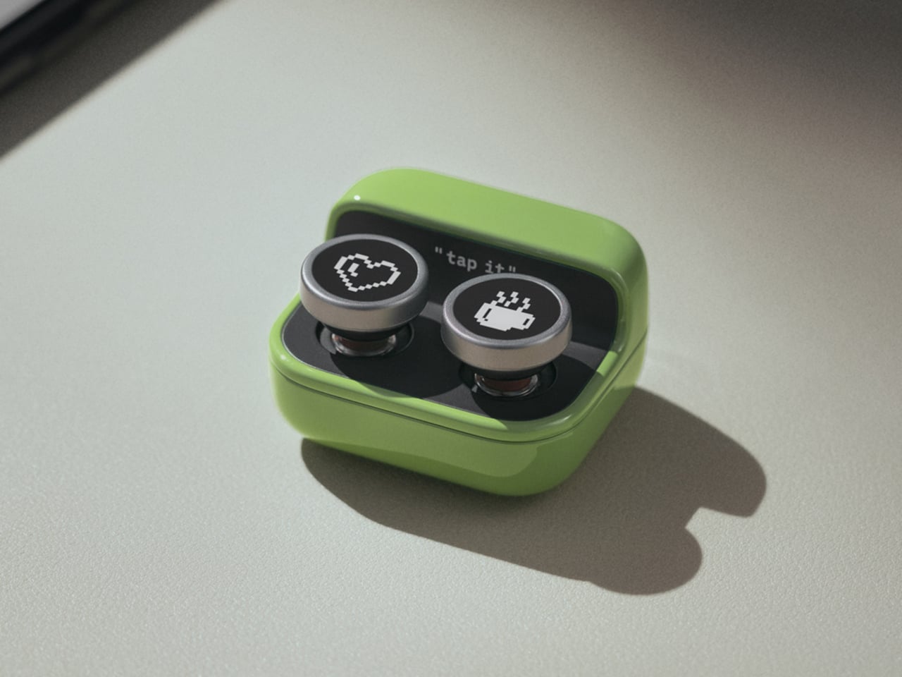
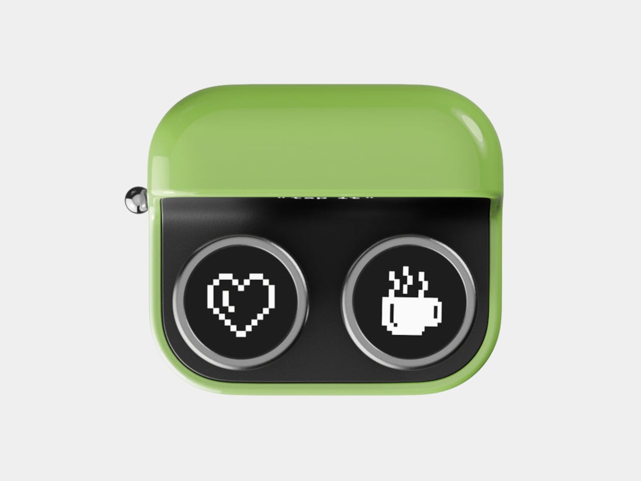
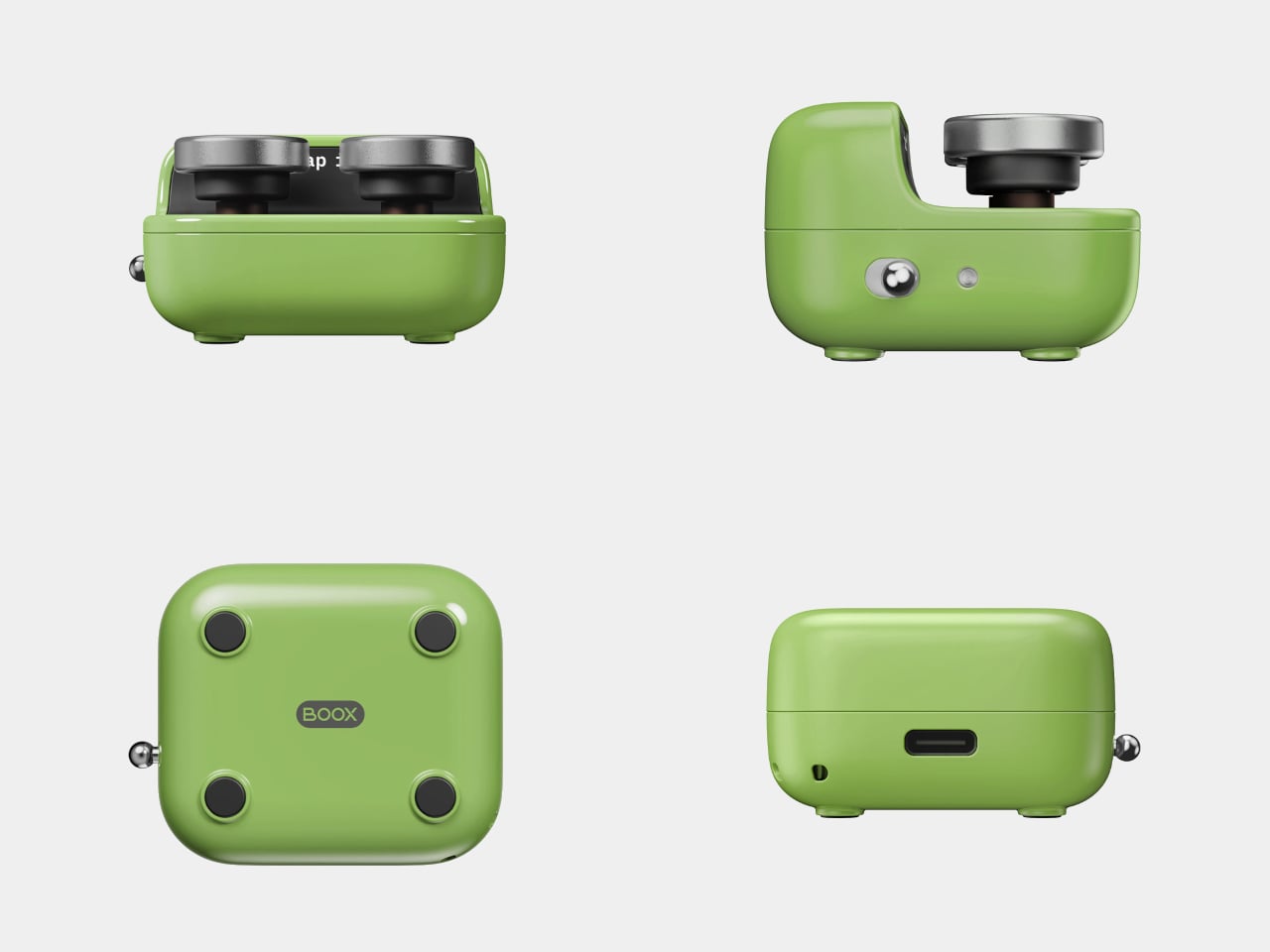
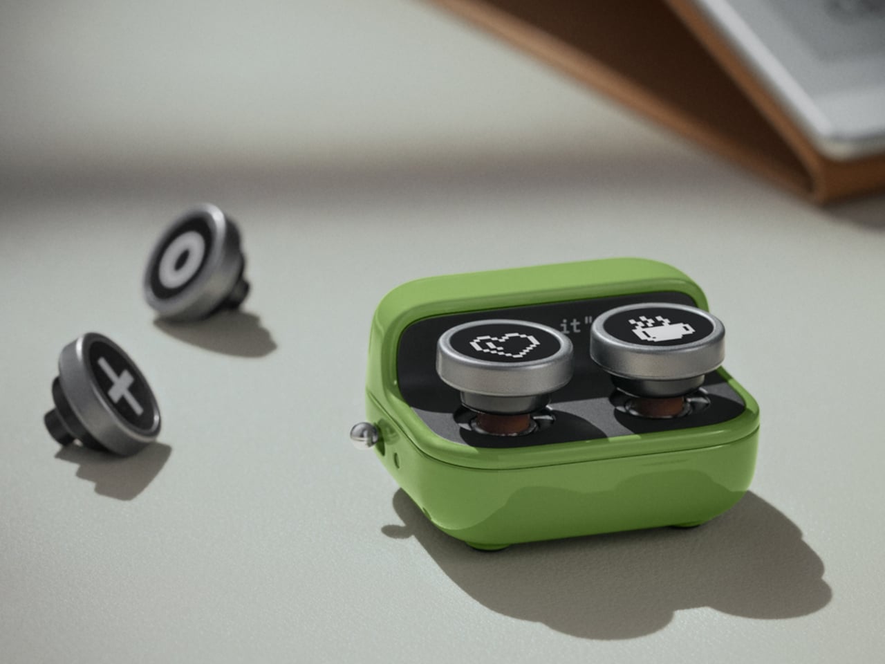
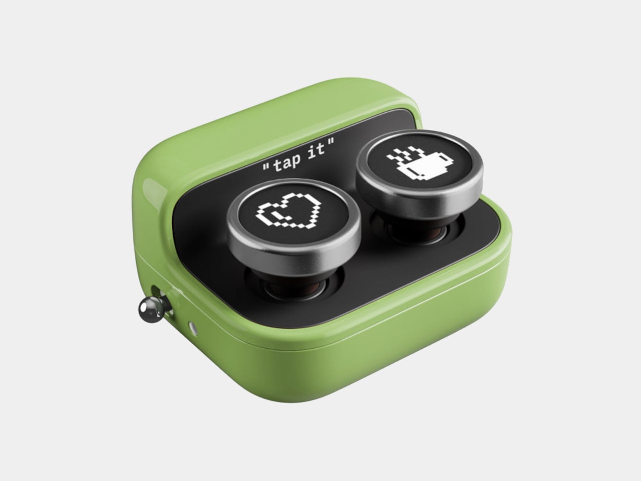
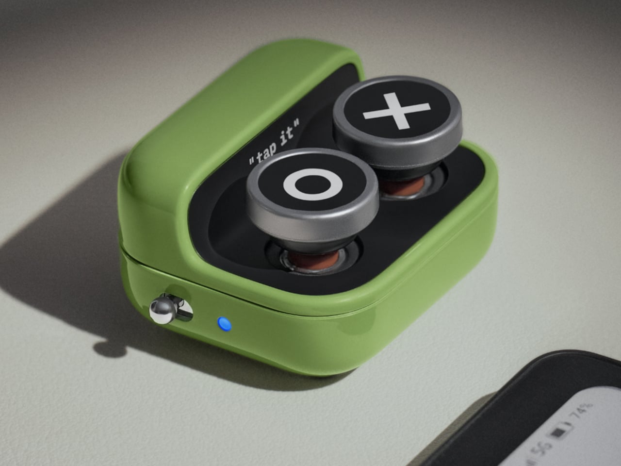
The Tappy’s appearance takes some cues from a miniature typewriter, with two large, round keys on a compact body that fits comfortably in one hand. A small indicator light on the left side doesn’t leave you guessing about pairing status, mode changes, or battery level, while a level-style power switch keeps accidental presses from being a nuisance. Two spare keycaps are also included in the box.

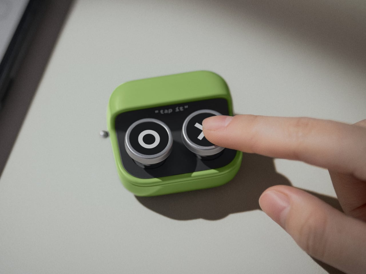
Those two buttons do quite a lot, actually. The Tappy operates in three distinct modes, each built for a different type of content. Reading Mode handles page-by-page navigation, Browsing Mode lets the buttons scroll vertically through web content or documents, and Multimedia Mode turns them into playback controls for audio. You won’t need more than a five-second hold of both buttons to switch between them.

Picture settling in for a late-night read with your e-reader propped on a stand, flipping through pages without reaching out. Or standing in the kitchen with your hands full, scrolling through a recipe without getting the screen dirty. The Tappy adapts naturally to these situations, and it doesn’t break the immersion of the moment by demanding you reach over and interact with the screen.

Multimedia Mode adds another layer to what the Tappy can do. An audiobook listener lying back can skip chapters or pause playback without sitting up. A commuter with a bag in one hand and coffee in the other can get through content without fumbling. The same two buttons handle all of it, which is part of why the Tappy doesn’t feel like a niche gadget.

A 95mAh rechargeable battery keeps the Tappy running for weeks before it needs a charge, and there’s a USB-C port for fast charging when that time comes. The Bluetooth connection reaches up to 33 feet, well beyond what most reading setups require. That extra range, however, means it can double as a basic media remote for a smartphone, laptop, or even a sound system.

The Tappy pairs with any Bluetooth-enabled device, not just BOOX hardware, which makes the $26 price feel reasonable for what it delivers. It’s a focused little tool that doesn’t try to be more than it needs to be. For anyone who reads regularly on an E Ink device, it quietly removes one of the last remaining physical interruptions that keeps the experience from feeling truly seamless.

The post Amazon Won’t Build This Kindle Remote, So BOOX Did It for $26 first appeared on Yanko Design.

BEYOND Expo 2026: Asia’s Biggest Tech Event Just Told the World That AI Software Was Only the Warm-Up

Every major tech conference eventually finds its thesis statement. CES landed on “everything is connected.” SXSW staked out culture-meets-technology. BEYOND Expo‘s thesis for 2026 is more specific, and honestly more timely: AI has spent years proving itself in software, and the interesting question now is what happens when it leaves the screen. The official theme, “AI: Digital to Physical,” takes over from last year’s theme of Transforming Uncertainty into a Trigger for Innovation. Timed perfectly around the global speculation that AI’s a bubble, it’s a genuine reflection of where the most consequential AI work is actually happening right now, in robotics labs, automotive platforms, wearables, and manufacturing floors across the Greater Bay Area.

BEYOND has been building toward this moment since Dr. Lu Gang launched it during a global lockdown in 2021, a decision he’s called delusional in hindsight during an interview with Yanko Design, but with the kind of grin that says he’d do it again. The original problem he was solving was simpler than people realize: Asia’s most interesting founders kept showing up at CES and Web Summit as attendees rather than headliners. A hardware startup out of Shenzhen with genuinely world-class AI chops would get a 3×3 booth on a back wall while the stage went to the usual suspects. BEYOND was built to fix that imbalance, and five years in, it’s working.

Click Here to know more about the BEYOND Expo 2026

The 2026 edition is aiming for 30,000 attendees, a significant jump from 2024’s 20,000, and the programming reflects a maturing event that knows its own strengths. The summit lineup spans Humanoid Robotics and Embodied AI, Enterprise Agentic Workflows, Autonomous Driving, AI-Integrated Wearables, and a PayFi and Decentralized AI track that will either feel prescient or premature depending on your priors. What ties all of it together is the through-line of AI becoming something you interact with physically, not just through a chat interface. That’s a meaningful editorial choice, and one that puts BEYOND in a different conversation than conferences still treating large language models as the whole story.

The most interesting addition this year is the GBA Innovation Tour, which gives international attendees direct access to Greater Bay Area manufacturing infrastructure. This matters more than it might sound. Lu Gang has argued for years that what makes Asia’s tech ecosystem genuinely different isn’t just the innovation pipeline, it’s the compression of the distance between idea and physical product. Watching an AI concept move from prototype to production in a Shenzhen facility in weeks rather than months is something you can describe in a keynote, but apparently you need to see it to really understand the scale and speed involved. The tour is BEYOND’s way of making that argument visceral rather than theoretical.

Last year’s theme, “Unveiling Possibilities,” was about reframing uncertainty as creative fuel, which was the right message for a chaotic moment. “AI: Digital to Physical” is more declarative, more confident. It names a specific transition that the industry is mid-stride through, and plants BEYOND squarely in the middle of it. Registration and exhibition details are live at beyondexpo.com.

Click Here to know more about the BEYOND Expo 2026

The post BEYOND Expo 2026: Asia’s Biggest Tech Event Just Told the World That AI Software Was Only the Warm-Up first appeared on Yanko Design.

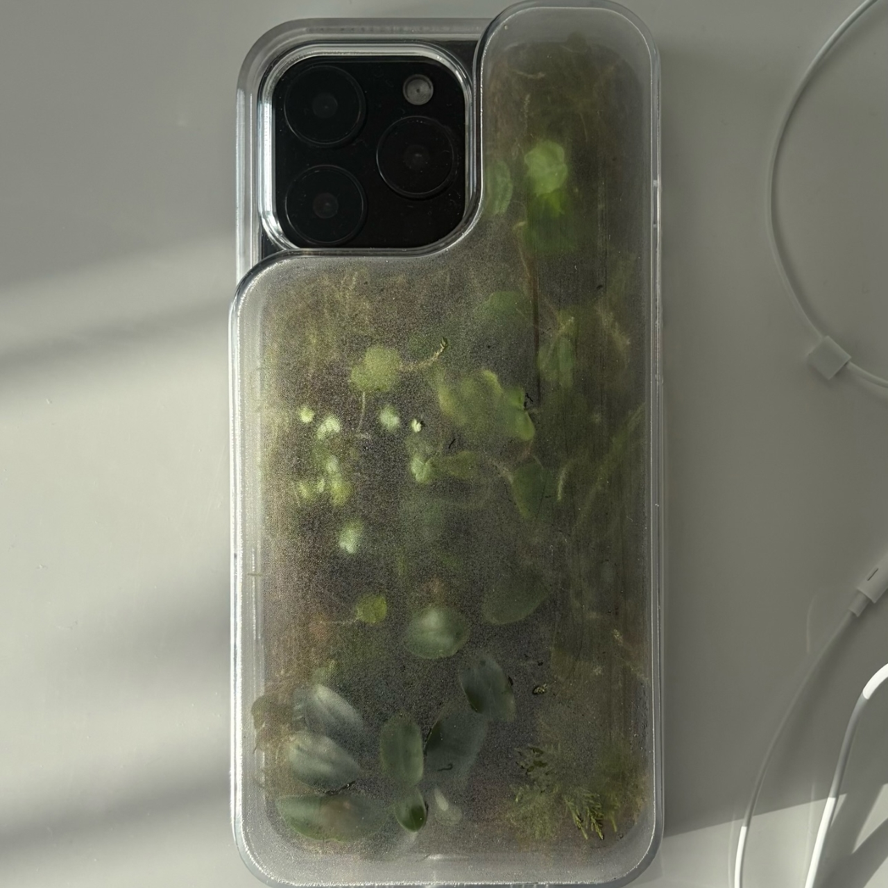
Phone Cases Are Boring, This One Puts a Living Terrarium Inside

Phone cases have largely settled into two camps: the ones that protect your phone without anyone noticing they exist, and the ones that make a statement with printed graphics, colors, or textures. Neither approach has found a way to make the back of a phone genuinely interesting rather than just decorated. Designer Daniel Idle found a third option that neither camp seems to have considered.

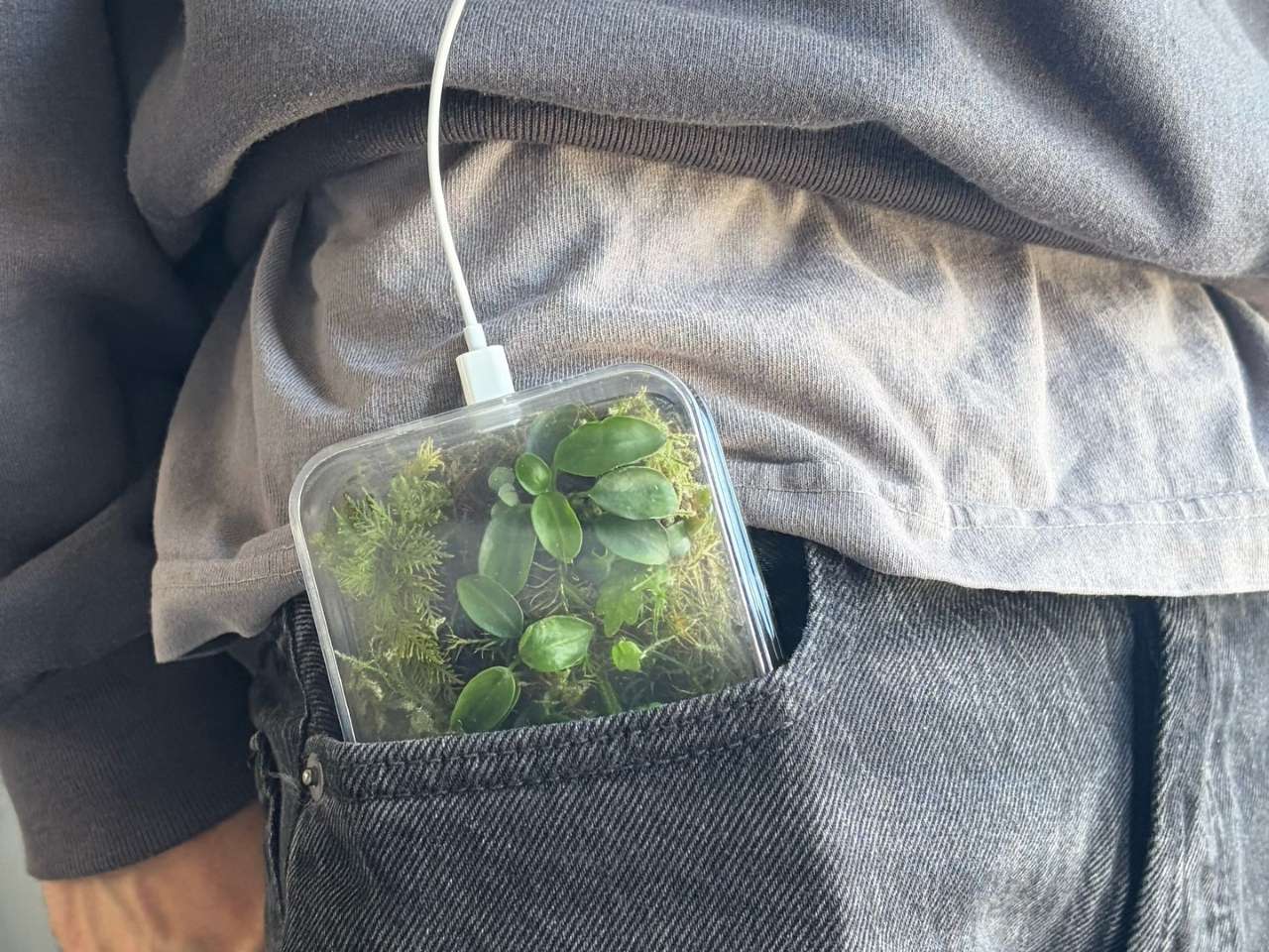
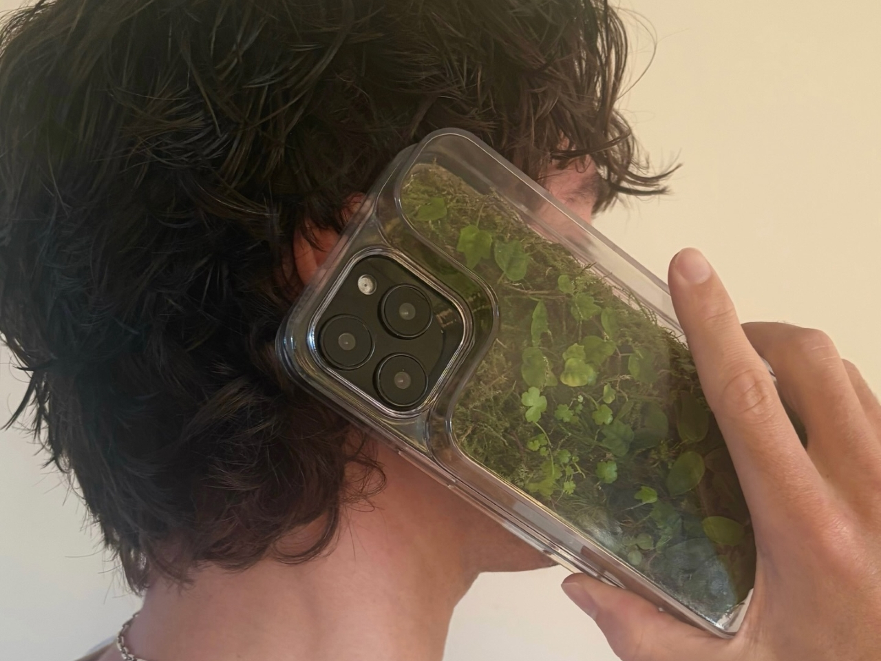
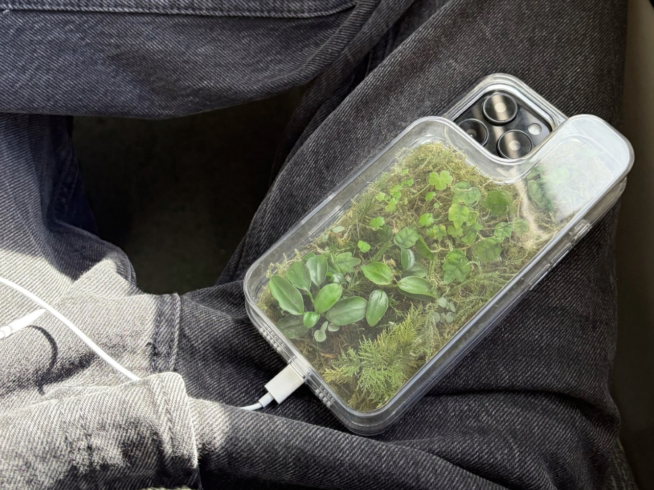
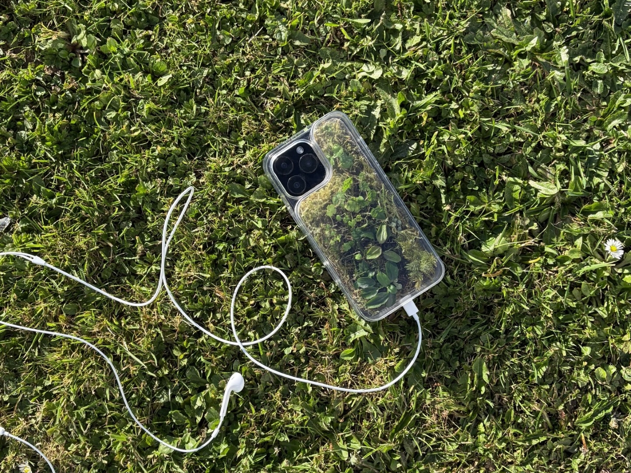
The Terrarium Phone Case is a clear resin case for the iPhone 16 Pro Max with an actual planted environment sealed inside the back cavity. Moss, small-leafed plants, and a stabilized soil substrate are embedded within the transparent shell, creating a thin cross-section of living terrain that you carry around with you wherever the phone goes. It’s a working phone case, a functional terrarium, and an oddly calming thing to have in your pocket all at once.

Designer: Daniel Idle

The construction involved 3D modeling and fabrication in clear resin, producing a case with enough depth in the back wall to house soil, roots, and plant matter. The plants are packed using a stabilized substrate that keeps the arrangement intact when the phone is picked up, rotated, tilted, or slipped into a bag. The camera cutout is fully preserved; the charging port at the bottom remains accessible; the phone continues to work exactly as it always did.

What keeps everything alive inside the sealed cavity is a closed-loop moisture system. The plants and soil generate humidity, which evaporates toward the inner surface of the resin, condenses back into droplets, and cycles down again. Light passing through the clear shell feeds the plants from outside, while the substrate provides gradual nutrient release. The whole thing is, in a fairly literal sense, a miniature ecosystem that sustains itself without any intervention from the person carrying it.

The condensation that forms on the inside of the shell during high-humidity moments is part of the visual appeal rather than a flaw to be engineered away. Seeing that vapor cycle through the case is a reminder that something in there is alive, actively breathing and responding to its environment, in the same pocket or bag as a device specifically engineered to minimize all biological interference.

There’s a running thread through design culture about bringing nature back into objects and spaces that have drifted too far from it. Biophilic design has become a recognizable term for everything from moss walls in offices to plant-filled shelving in apartments. Most of those applications treat plants as decoration layered on top of an existing design. Idle’s approach is different because the plant system isn’t decoration; it’s structural, sealed directly into the object’s body as a core component rather than an afterthought.

Of course, there will be some reservations about putting moisture and soil so close to your phone, which might be resistant to water and dust, but only from brief encounters. Good thing, then, that it’s still a concept project right now. But as a thought experiment about what a phone case could reasonably contain, it lands somewhere between genuinely novel and gently absurd, which is probably the most honest place for a good idea to start.

The post Phone Cases Are Boring, This One Puts a Living Terrarium Inside first appeared on Yanko Design.

The Roomba Guy Just Built a Robot Pet You Might Actually Love

If you’ve ever watched your Roomba bump helplessly into a chair leg for the third time and thought, “I deserve better from my robots,” you’re not alone. And apparently, neither did Colin Angle. The co-founder of iRobot, the man who essentially put a hockey puck-shaped vacuum in millions of homes, left the company in 2024 with a new question rattling around in his head: what if a robot could actually feel like it cares about you? The answer is the Familiar, the first prototype from his new startup, Familiar Machines & Magic. And it is not your average robot.

Picture a creature somewhere between a soft-eared dog and a round, slightly abstract bear. It has four legs, huge paws, and doe eyes that make it immediately charming in a way that no Roomba ever attempted to be. It’s furry, expressive, and was designed with the help of former Disney Imagineers, which explains why it looks like it belongs in an animated feature rather than a tech showcase. The Familiar has 23 degrees of freedom, meaning it can wiggle its ears, tilt its head, and wag a small nub of a tail with the kind of fluidity that feels less mechanical and more… alive. Its coat is touch-sensitive, built specifically to encourage physical interaction between you and it.

Designer: Familiar Machines & Magic

It also doesn’t talk. That detail feels deliberate and, to me, very smart. Voice assistants have trained us to think of robots as tools we command. The Familiar is going for something completely different. It’s designed to read your tone of voice, your body language, your overall energy, and respond accordingly. Angle calls it “Consumer Physical AI,” and while the label sounds like something off a product white paper, the idea behind it is genuinely compelling.

The name itself is worth noting. A “familiar” in folklore refers to the supernatural animal companion of a witch or magical figure, a creature bonded to a person not through ownership but through genuine connection. Angle’s team chose that name deliberately, and I think it sets the tone for what they’re trying to build. The goal isn’t to sell you a novelty gadget. It’s to create a new kind of relationship between humans and machines, one built on trust, attentiveness, and something approaching care.

Now, I’ll be upfront: I have feelings about this. Part of me finds it genuinely beautiful as a design concept. The Familiar was clearly approached the way good industrial design should be, with deep thought about how an object makes you feel, not just what it does. The choice to make it animal-like rather than humanoid is interesting, too. There’s far less of the uncanny valley unease that tends to follow humanoid robots around, and more of the universal warmth that most people already extend toward animals.

But another part of me wonders about the emotional stakes here. We’re already watching people form attachments to AI chatbots. A touch-sensitive, furry, expressive robot that mirrors your emotional state is a much more potent version of that. Angle has said he wants it to feel like the machine actually cares about him. That’s a lovely vision. It’s also a design brief that puts enormous responsibility on the creators to get it right, because the flip side of emotional bonding is emotional dependence.

Still, I’d be lying if I said the Familiar didn’t make me curious in the best possible way. The prototype images are almost disarmingly sweet. It looks like something you’d want sitting on the couch next to you while you read, or settled quietly in the corner while you work. If any robot was ever designed to move through your life rather than just function within it, this might be it.

The Familiar is still in the prototype stage, with no confirmed price or release date. But as debut concepts go, it’s a strong one. Whether or not it ever makes it into our homes, it raises questions about what we actually want from the machines we live with. And those questions feel well overdue.

The post The Roomba Guy Just Built a Robot Pet You Might Actually Love first appeared on Yanko Design.

This AC Does 5 Jobs at Once and Looks Like Furniture on Your Wall

The split air conditioner is one of the least loved objects in any home, which is a strange thing to say about something most people couldn’t live without. It works, technically, but it tends to make its presence known in all the wrong ways. The air is too direct, the noise is a constant background irritant, and the plastic box on the wall rarely belongs in any thoughtfully designed interior.

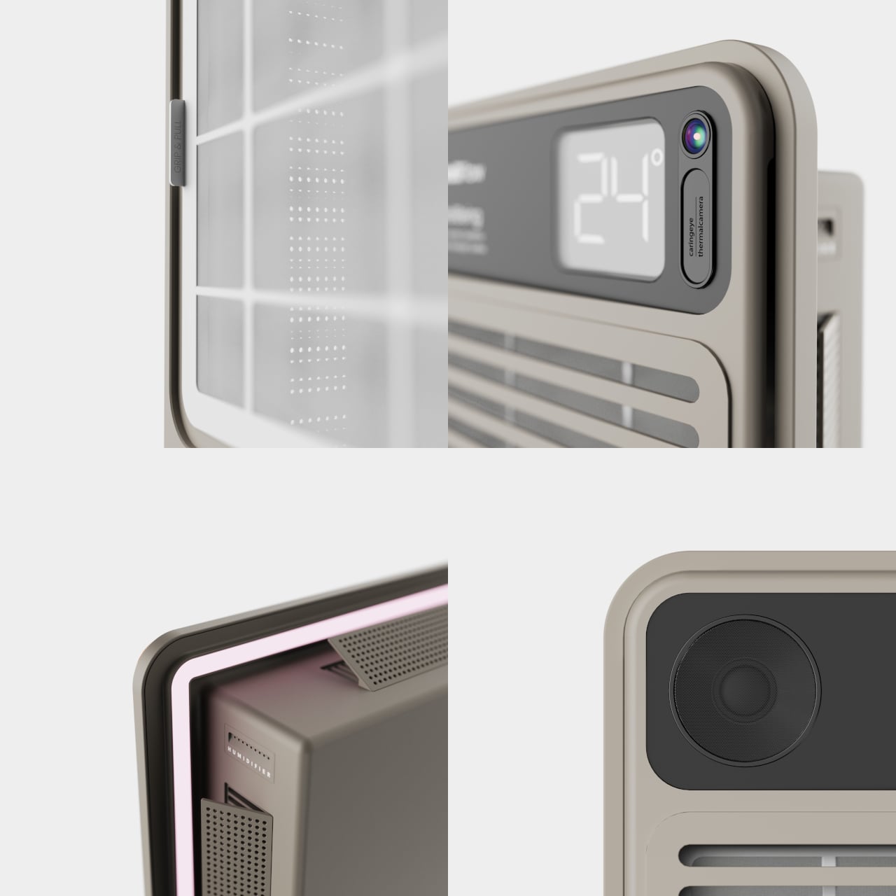
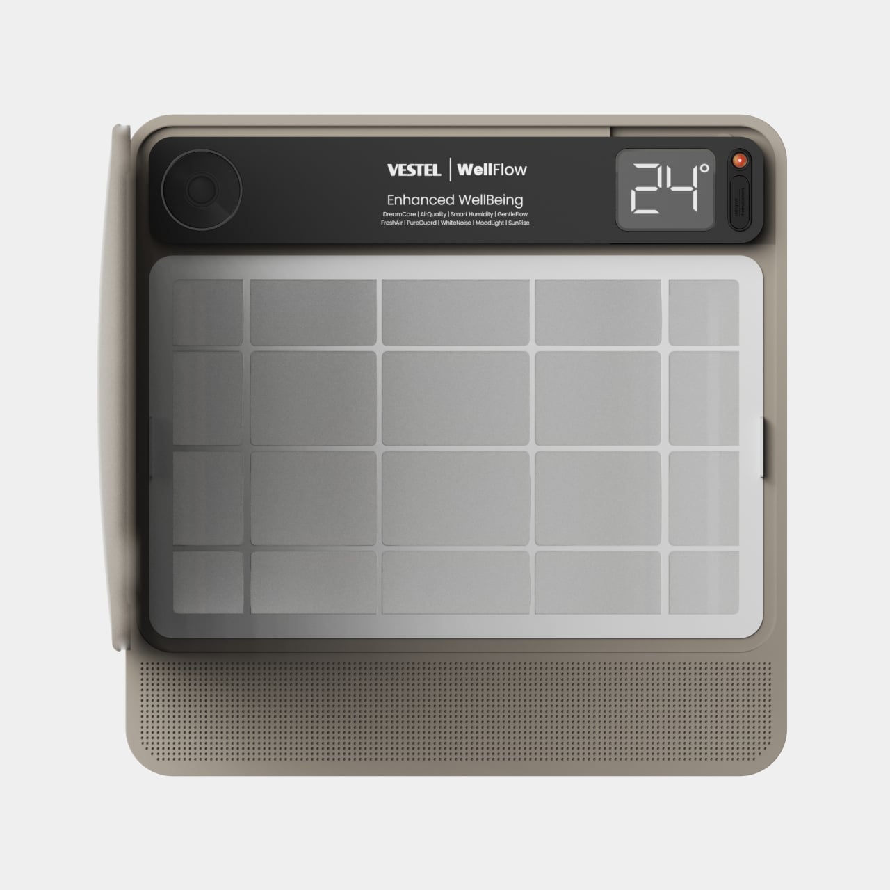
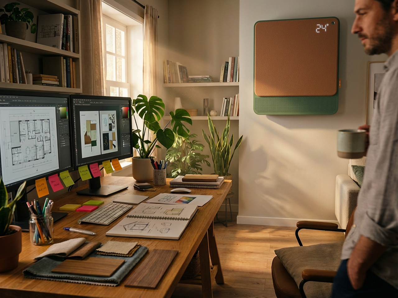
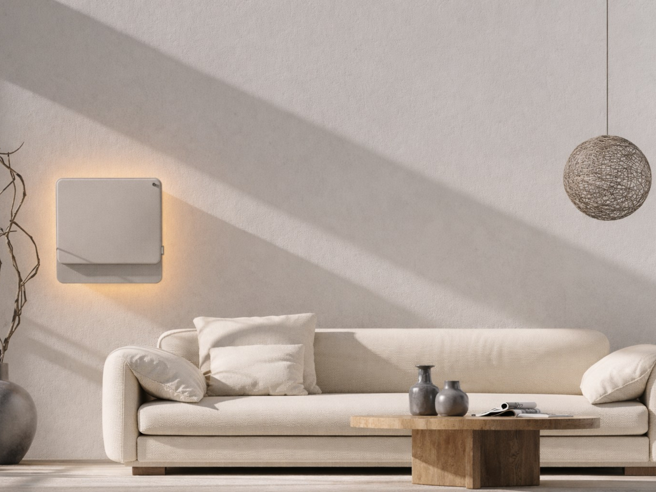
From that frustration comes WellFlow, a concept that reframes what air conditioning is supposed to do for the people living around it. Rather than engineering a better cooling box, the designers built something closer to a wellness device. It’s a concept that received validation through the iF Design Award in 2026 and was first revealed at IFA Berlin 2025.

Designer: Merve Nur Sökmen, Zehra Sarıarslan

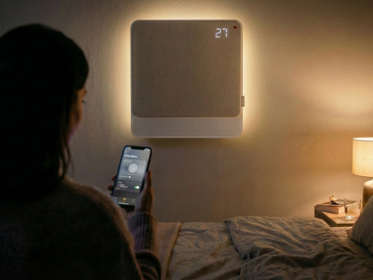
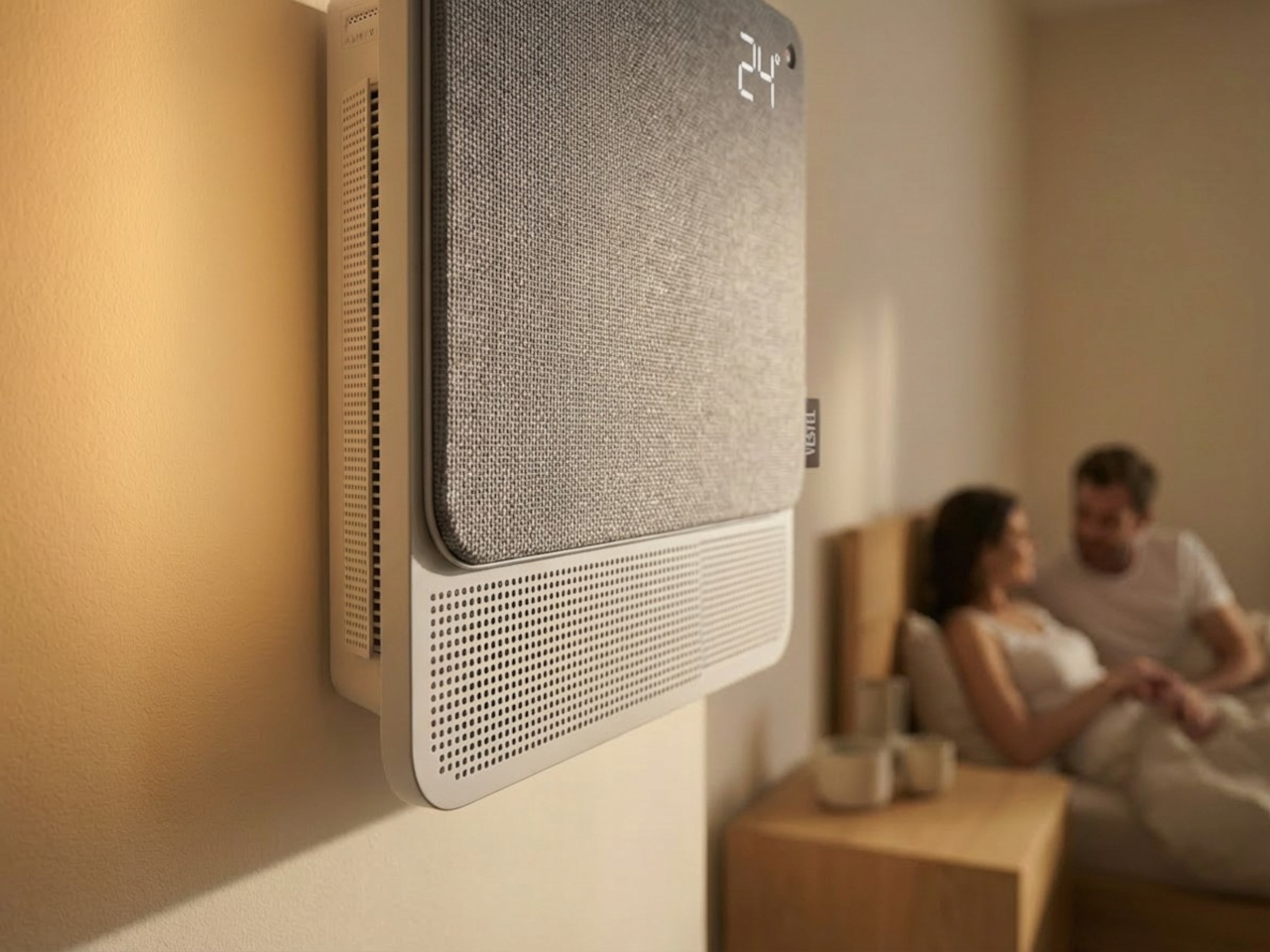
The most immediate shift is in how air actually moves. Conventional units push output in one direction, landing directly on whoever is in the room. WellFlow uses four-way diffusion to spread conditioned air from all sides without targeting anyone in particular. Sensors also monitor occupancy and steer airflow accordingly, so the unit quietly adapts to the room rather than expecting the room to tolerate it.

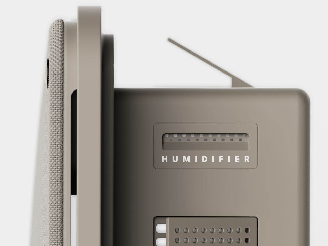
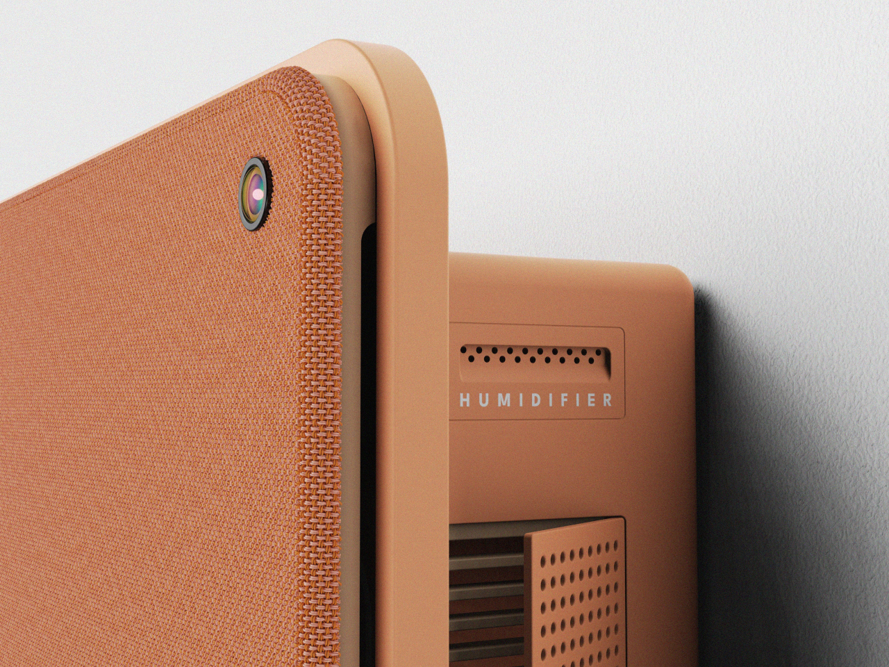
Beyond airflow, the system also handles humidity, air purity, ambient lighting, and sound. A built-in humidifier balances moisture levels rather than leaving the air artificially dry, which is one of the most common complaints about running a conventional unit through the night. Circadian lighting and integrated speakers complete the picture, creating conditions that support sleeping, concentrating, or quietly winding down, depending on what the moment calls for.

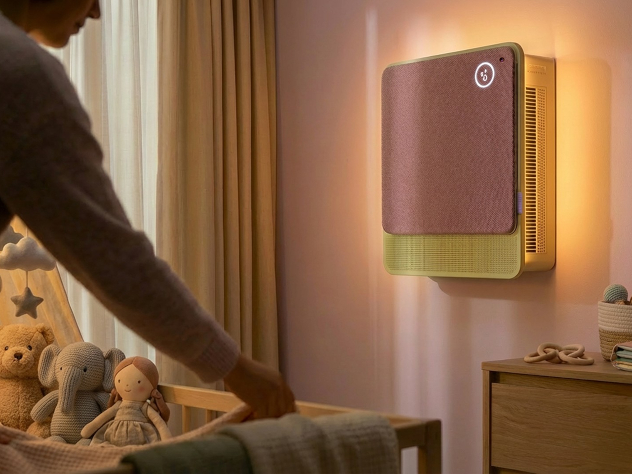
All of this adjusts automatically. The system continuously monitors temperature, humidity, and air quality, then fine-tunes its output without any manual input. A baby’s room needs different conditions than a home office or a gym corner, and WellFlow is designed to recognize those differences. Its behavior was shaped through user research spanning new parents, older adults, and people with respiratory sensitivities, groups that conventional air conditioners routinely fail to address.

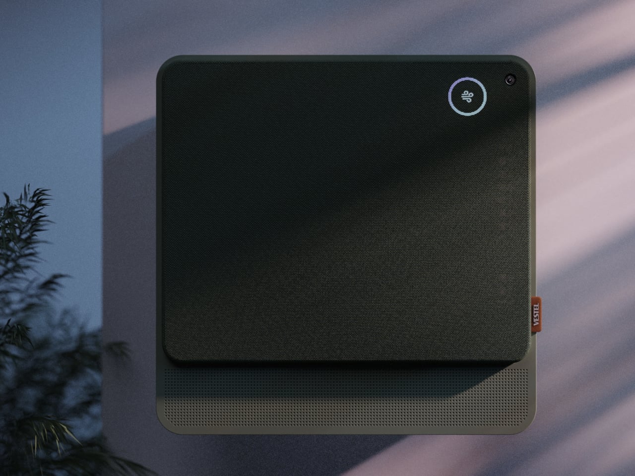
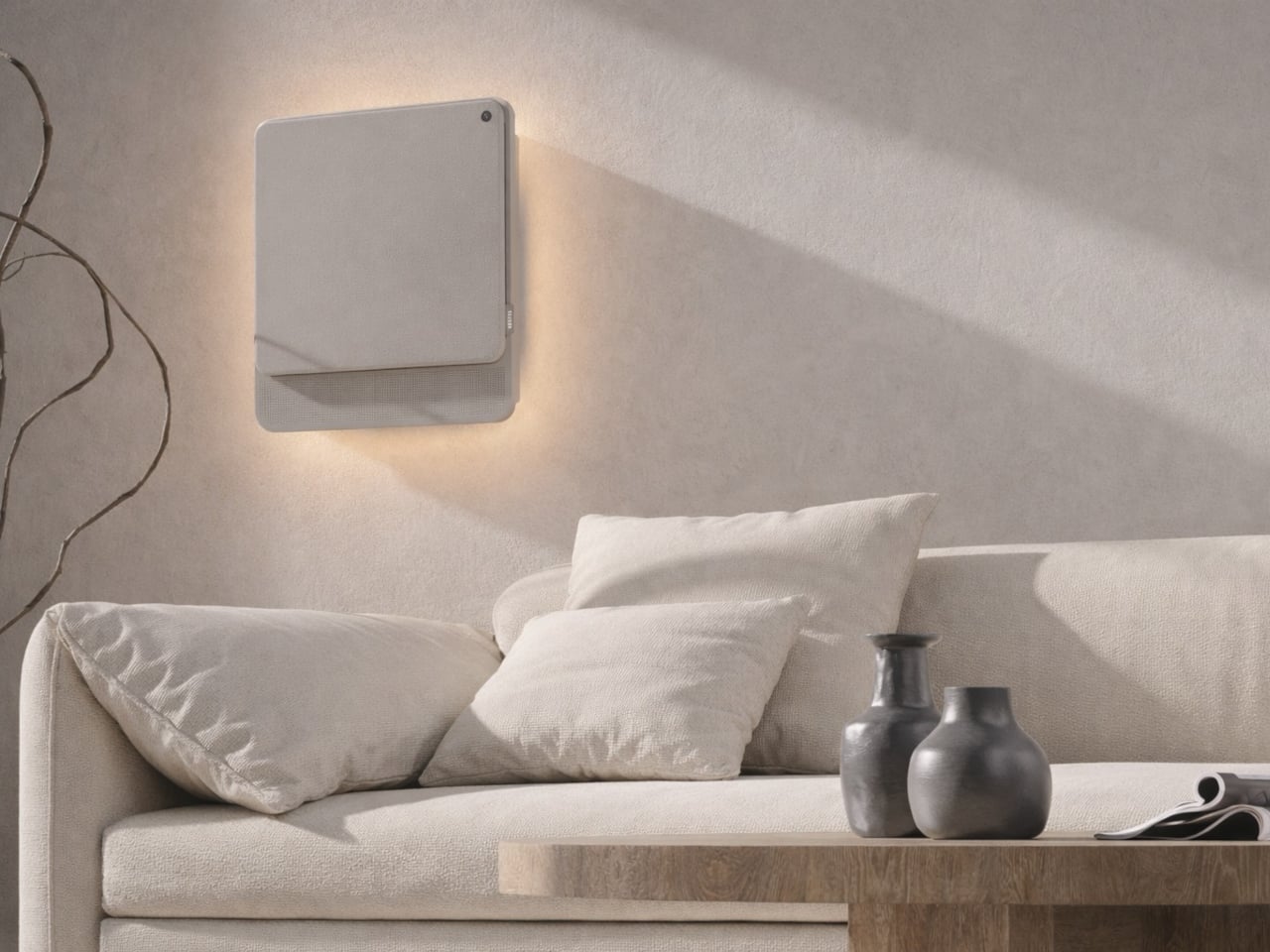
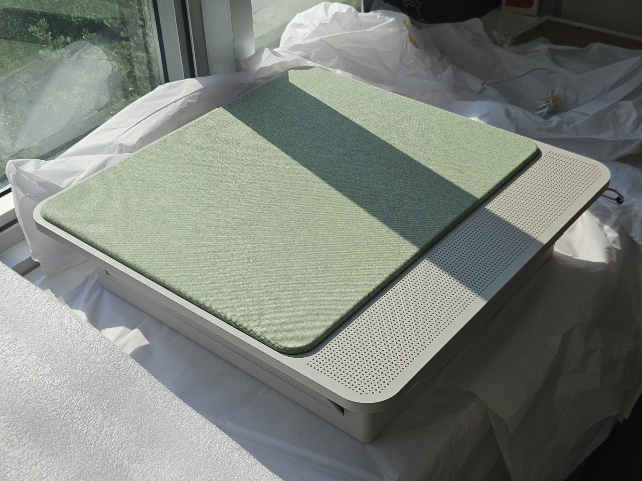
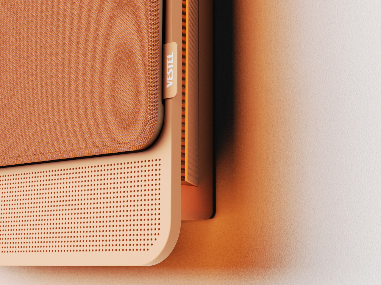
The physical form is just as deliberate as the behavior. Most air conditioners are conspicuously technical, with plastic housings that fight against any interior aesthetic. WellFlow uses a woven textile front panel with rounded corners and a matte finish, giving it a material quality far more associated with furniture than appliances. An ambient light halo behind the unit softly signals its presence on the wall without demanding any attention.

A pull-out front filter makes maintenance visible and intuitive, addressing something the design team identified as a recurring trust issue with conventional units. People often aren’t sure when or how to clean their filters, and that uncertainty quietly chips away at confidence in the device. WellFlow removes that ambiguity. For a machine designed around human comfort, even that seemingly small detail ends up mattering quite a lot.

The post This AC Does 5 Jobs at Once and Looks Like Furniture on Your Wall first appeared on Yanko Design.

10 Genuis Gadgets That Turn Any Hotel Desk Into a Proper Workstation in 2026

The hotel desk is a fiction. A flat surface with a lamp, a notepad nobody uses, and an ethernet port from 2009. For the digital nomad, making it functional is entirely a gear problem — solved or compounded by what is in the bag. The right tools collapse the gap between a rented surface in a foreign city and a setup that performs as well as anything permanent back home.

Ten products made this list because each one addresses something specific about the mobile workstation problem. Not the flashy kind of specific that reads well in a press release, but the unglamorous kind — the port you ran out of, the cable you excavated for four minutes, the surface that made everything feel temporary. These are the tools that stop you from tolerating the desk you are given and start letting you build the one you need.

1. OrigamiSwift Mouse

A trackpad handles most things until the work demands precision. Editing photos, building detailed spreadsheets, reviewing design files — these sessions expose the trackpad’s limits inside the first hour. The OrigamiSwift folds completely flat at 4.5mm, weighs 40 grams, and snaps open into a full-sized ergonomic mouse in under half a second via magnetic clips. Bluetooth 5.2 connects without a dongle, the infrared sensor tracks at 4000 DPI, and three months of battery life run on a single USB-C charge.

What makes this a permanent carry item rather than a novelty is the form factor. It slides into a laptop sleeve, drops into a shirt pocket, or sits flat in any corner of a tech pouch without displacing anything else. The fold is not a compromise — the shape is fully ergonomic and properly contoured for extended sessions. For nomads working in applications that reward a real mouse, this removes every excuse for not carrying one.

Click Here to Buy Now: $85.00

What We Like

  • Folds to 4.5mm and weighs 40 grams, pocketable without sacrificing full-size ergonomic comfort
  • Three-month battery life on a single USB-C charge keeps it out of the daily charging rotation entirely

What We Dislike

  • The touch-sensitive scroll area replaces a physical wheel, requiring real adjustment for heavy scrollers
  • Bluetooth-only connectivity means no wired fallback for tasks where minimal latency matters

2. HubKey Gen2

Two USB-C ports on a modern ultrabook sound fine until you are simultaneously charging, running an external display, reading an SD card, and needing ethernet at a co-working desk with unreliable Wi-Fi. HubKey Gen2 resolves the port shortage with 11 connections in one compact cube: dual 4K/60Hz HDMI outputs, USB-A 3.1, USB-C 3.1, SD and TF card readers, 2.5 Gbps ethernet, a 3.5mm audio jack, and 100W USB-C power delivery through a single cable.

The programmable shortcut keys and central control knob on the top panel are what separate this from every other travel hub. Volume, mute, screenshot, and display toggle become physical actions rather than keyboard shortcuts buried in menus. For anyone driving dual monitors from a co-working space or managing video calls across time zones, five tactile keys and a precision knob turn a connectivity device into a proper control surface. At 7 × 7 × 3 centimeters, it fits anywhere without announcing itself.

What We Like

  • Dual 4K/60Hz HDMI outputs let you build a two-monitor workstation from a single compact device
  • Programmable keys and a physical control knob bring hands-on workflow control that no standard hub offers

What We Dislike

  • Tightly packed ports mean thick cables or large drives can crowd each other along the edges
  • The cube form factor, while compact, is less pocketable than flat card-style hub alternatives

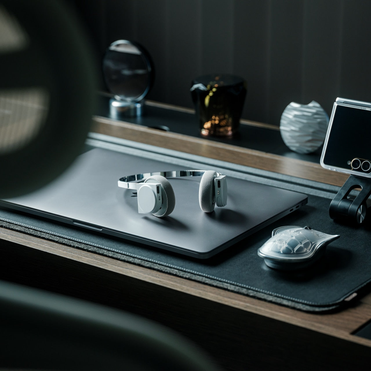
3. StillFrame Headphones
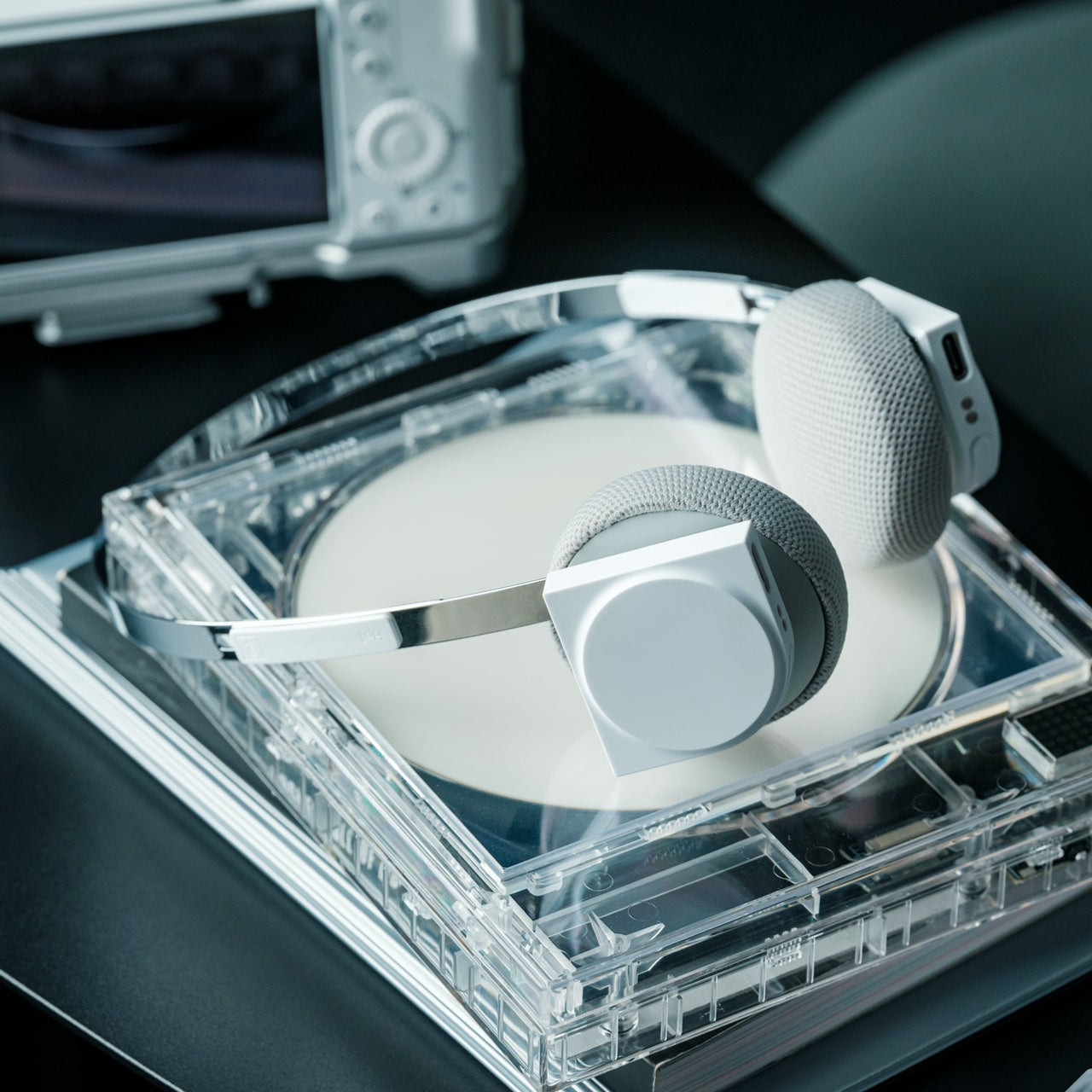
Concentration in a café, a co-working lobby, or an airport gate is a skill that requires backup. StillFrame provides it at 103 grams — on-ear headphones with 40mm drivers that produce an open, layered soundstage rather than a compressed signal. Active noise cancellation removes the environment when deep work requires it. Transparency mode pulls it back in with a tap when a gate announcement or colleague’s question needs to land. Both transitions happen cleanly, without drama or lag.

Twenty-four hours of battery life is the figure that justifies carrying these on long international routes. New York to Singapore, including a layover, without reaching for a charging cable. The retro-informed aesthetic references the deliberate listening era of physical media — a design decision that reads quietly and carries well in client-facing environments. For nomads spending serious hours in headphones across work sessions and transit days, the combination of weight, battery life, and sound quality earns the price.

Click Here to Buy Now: $245.00

What We Like

  • 24-hour battery life covers the longest intercontinental travel days without requiring a charge
  • At 103 grams, these stay genuinely comfortable through extended wear across full working days

What We Dislike

  • On-ear design provides less passive isolation than over-ear models in extremely loud transit environments
  • The retro aesthetic is distinctive but polarizing — not everyone wants a conversation piece on their ears

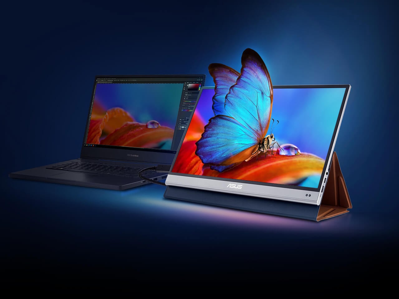
4. ASUS ZenScreen OLED MQ16AH
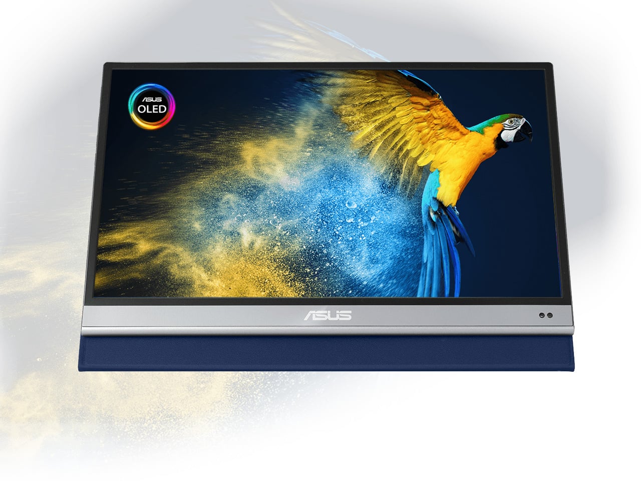
A second screen changes how you work, and the ZenScreen OLED MQ16AH is the portable monitor worth carrying. The 15.6-inch OLED panel delivers 100% DCI-P3 color coverage, matching studio-grade display accuracy at a fraction of the footprint. At 730 grams, it slides into most laptop sleeves alongside a thin ultrabook without requiring its own bag compartment. USB-C handles both video input and power delivery through a single cable, and the adjustable cover doubles as a multi-angle stand.

What makes OLED relevant specifically for nomadic work is panel behavior in variable light. Café windows, outdoor co-working terraces, hotel rooms with inconsistent artificial lighting — OLED handles contrast and legibility in conditions where LCD panels wash out and lose precision. ASUS includes a fabric sleeve so the screen travels protected. For creative professionals editing in temporary locations, this removes the monitor as a point of compromise in the mobile setup.

What We Like

  • 15.6-inch OLED with 100% DCI-P3 delivers studio-quality color accuracy in a 730-gram form that travels cleanly
  • Single USB-C cable handles both video signal and power delivery, keeping the desk free of extra cables

What We Dislike

  • At roughly $399, it sits at the premium end of portable monitors, with capable IPS alternatives at a lower cost
  • OLED panels carry a higher burn-in risk than IPS alternatives when static interface elements stay on screen long-term

5. Peak Design Tech Pouch
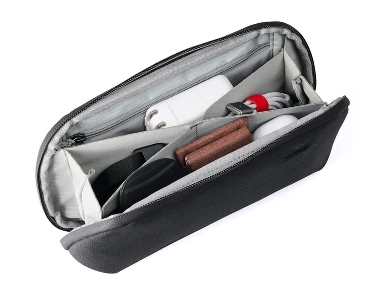
Cable management is the invisible tax on nomadic work. The time spent untangling cords, hunting for the right adapter, and repacking scattered accessories across a year of constant travel accumulates into something genuinely absurd. Peak Design built the Tech Pouch as an accordion-style organizer that opens completely flat, revealing modular loops, elastic pockets, and zippered compartments arranged with the same intentionality the brand applies to its camera gear. Everything has a designated position and stays there across every repacking cycle.

The weatherproof shell handles what transit actually looks like: overhead bins, bag drops, and light rain between a taxi and a terminal. What justifies the premium over a generic cable case is the layout logic. Cables stay separated. Adapters surface when reached for. The daily ritual of setting up at a new desk becomes faster and less irritating. For something touched every single day, the build quality means it survives years of travel without visible wear.

What We Like

  • Accordion design opens fully flat, giving complete visual access to every cable and adapter without excavation
  • Weatherproof construction handles the genuine roughness of daily transit without requiring careful handling

What We Dislike

  • At $59.95, it is a meaningful spend for a cable organizer, though the quality distributes that cost across years of use
  • Structured form takes up more interior bag volume than a soft-sided pouch, even when lightly packed

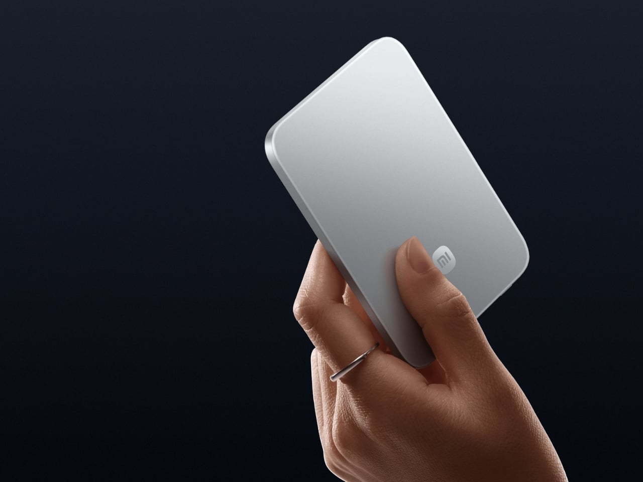
6. Xiaomi UltraThin Magnetic Power Bank 5000 15W
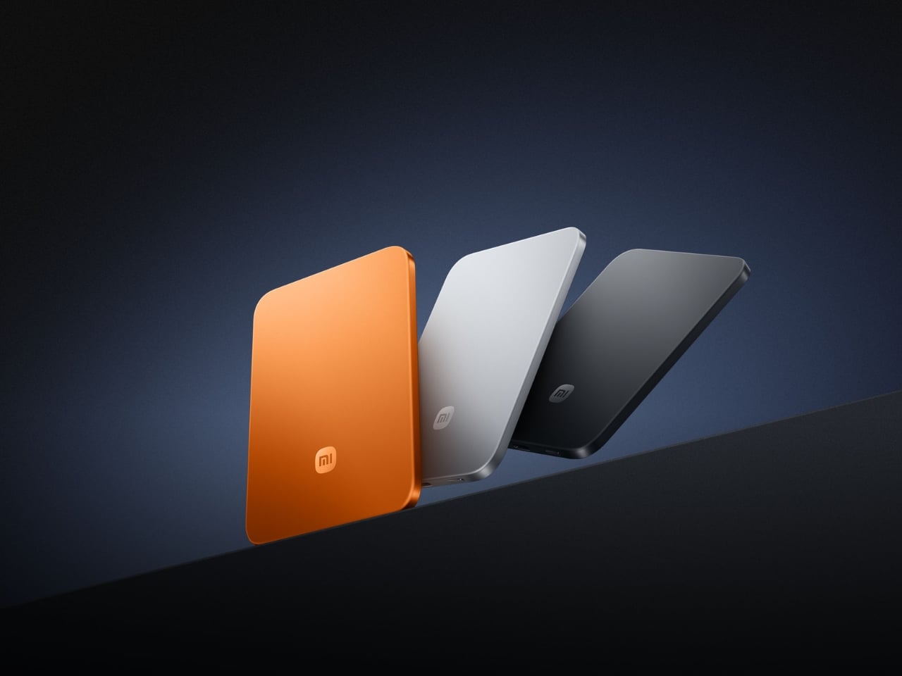
Power banks have had a design problem since the category was invented. They are essential and clunky in equal measure, reliable and bulky in the same breath. Xiaomi’s UltraThin Magnetic Power Bank 5000 starts with an answer at 6mm — thinner than most smartphones currently shipping. The aluminum alloy shell comes in Glacier Silver, Graphite Black, and Radiant Orange, each finished with a photolithographically etched logo. At 98 grams, it weighs less than two eggs and carries like nothing at all.

The engineering behind that form is silicon-carbon battery chemistry with 16% silicon content, enabling the energy density to fit 5,000mAh into a body this slim. It supports 15W wireless charging for compatible Android devices, 7.5W for iPhone, and 22.5W wired via USB-C, with two devices chargeable simultaneously while being recharged itself. Showcased at MWC 2026 in Barcelona, this is the first power bank in the category that genuinely does not feel like a concession made to the carrying requirement.

What We Like

  • At 6mm and 98 grams, it is the most pocket-friendly 5,000mAh power bank available — effectively weightless in daily carry
  • Silicon-carbon battery chemistry delivers the full 5,000mAh capacity without any dimensional sacrifice

What We Dislike

  • Wireless charging for iPhone is capped at 7.5W, noticeably below dedicated MagSafe speeds
  • 5,000mAh suits phones and earbuds well, but will not meaningfully extend a laptop’s runtime in a pinch

7. Side A Cassette Speaker

Music changes a workspace, even when the workspace is a shared lounge in Chiang Mai or a rented desk in a Lisbon co-working building. The Side A Cassette Speaker earns its bag space through character as much as function. Roughly the size of an actual cassette tape, it runs Bluetooth 5.3 with microSD support for offline playback when the Wi-Fi situation is characteristically unreliable. The clear shell and cassette label make it the kind of object people ask about across café tables.

The protective case doubles as a stand, keeping the speaker elevated and projecting properly on any flat surface. The warm, analog-tuned sound suits morning background music in a temporary apartment and wind-down playlists after a long day of client calls in equal measure. It is light enough to forget it is in the bag and distinctive enough to feel worth carrying. Among the ten products on this list, it is the one most likely to start a conversation at the desk next to yours.

Click Here to Buy Now: $49.00

What We Like

  • Palm-sized form with a case that doubles as a stand makes it the most packable speaker in its class
  • microSD support enables offline playback even when connectivity is completely absent

What We Dislike

  • No built-in microphone means it does not support speakerphone calls or group video conferencing
  • Volume ceiling suits personal and small-room listening, but will not carry in outdoor or open-plan group settings

8. Medispace

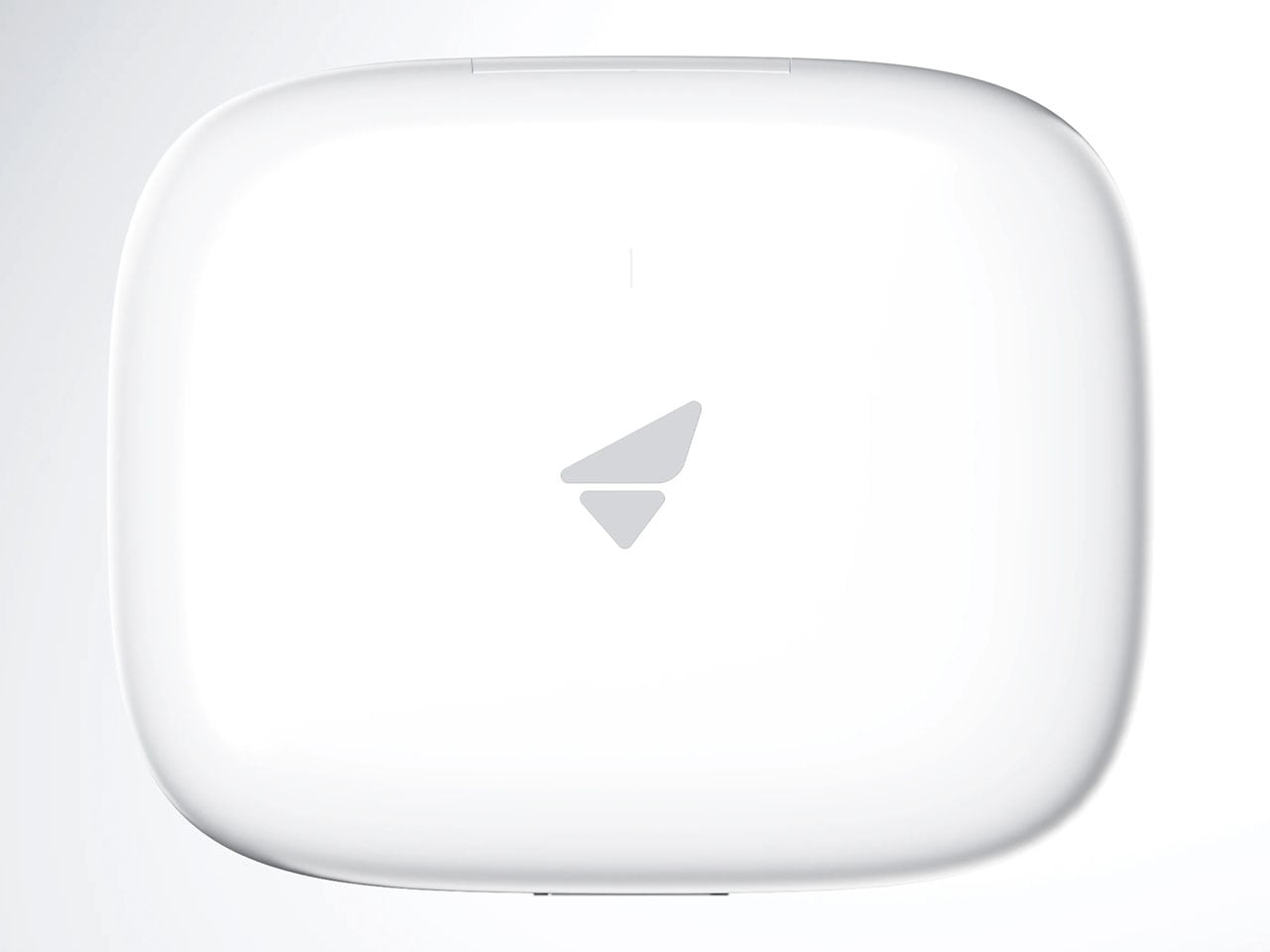
The ten-minute gap between back-to-back video calls is rarely used well. Most nomads fill it with email or a phone scroll — the cognitive equivalent of eating fast food between meetings. Medispace is a concept designed by Suosi Design, inspired by Himalayan singing bowls. It simulates more than ten types of bowl sound changes through a metal disc on the top surface, and houses noise-canceling earbuds inside its body, stored in what functions as an integrated case. The whole device fits in a palm.

The gesture of using it — tapping and touching the metal disc to trigger sound — mirrors the physical ritual of the Tibetan instruments it references. For nomads managing cognitive load across multiple time zones, the design makes a case for deliberate ten-minute resets between work blocks as a productivity strategy rather than a distraction. Medispace is currently a concept, and not yet in commercial production, but as an object that understands where sustained focus actually comes from, it belongs in this conversation.

What We Like

  • The singing bowl interaction model turns a between-meeting break into a deliberate reset rather than a passive phone scroll
  • Earbuds nested inside the device create a complete self-contained system that functions as both a case and a meditation prompt

What We Dislike

  • Medispace is a concept and is not currently available as a production product
  • Effectiveness as a focus tool depends on the user’s willingness to actually stop and use it during real work sessions

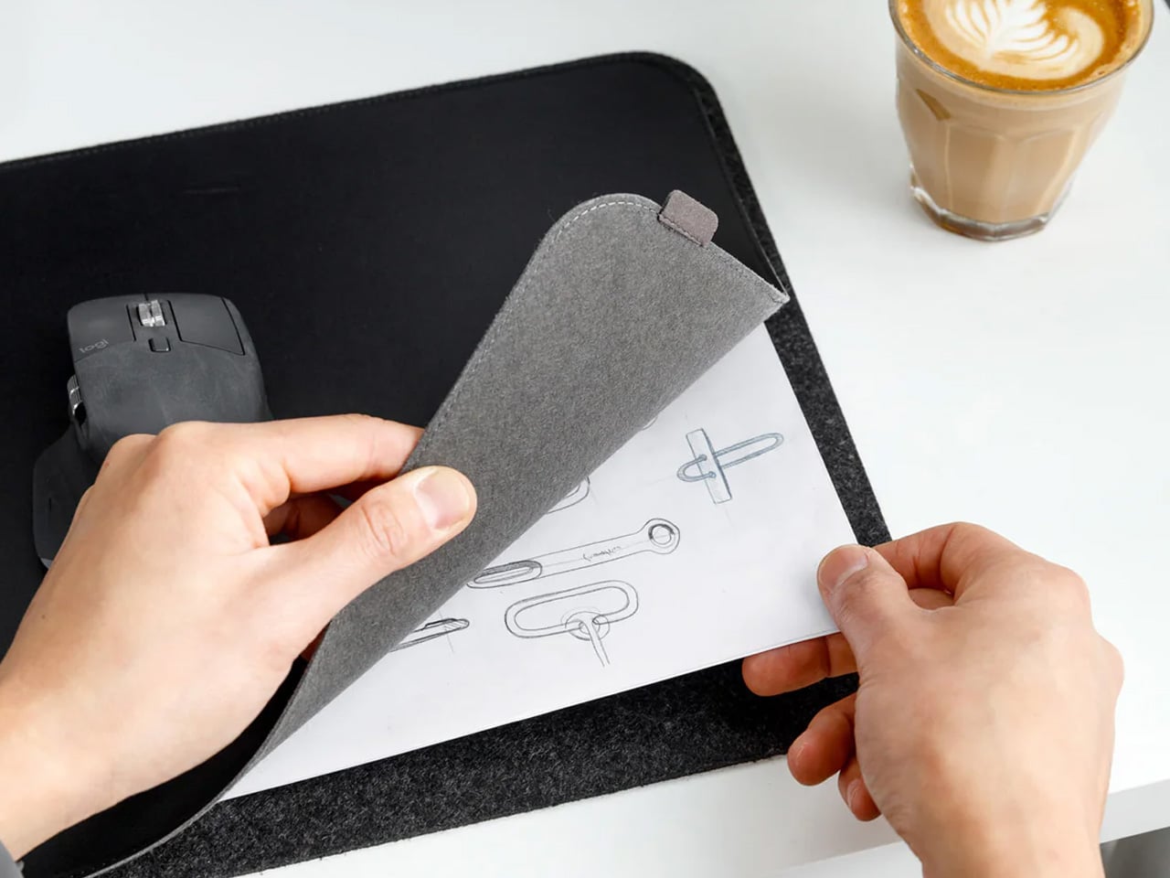
9. Orbitkey Desk Mat Slim
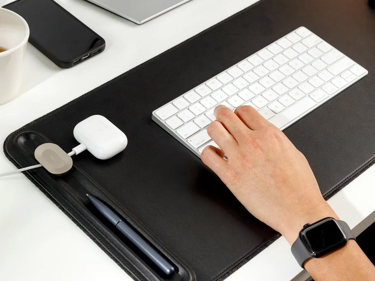
The working surface in a co-working space or hotel room is rarely clean, rarely the right size, and rarely yours. The Orbitkey Desk Mat Slim claims it anyway. Made from premium vegan leather on top and 100% recycled PET felt underneath, it lies flat, stays planted via an anti-slip backing, and turns whatever surface it lands on into a proper workspace. A magnetic cable holder keeps charging cables from drifting to the edge. A slim document pocket along the front holds papers out of sight.

For nomads who set up and break down a working surface daily, this mat compresses the ritual into a single unrolling action. Everything that belongs on the desk goes on the mat. When it is time to move, it rolls tight and fits inside a laptop sleeve or along the flat edge of a backpack. The vegan leather ages without cracking, the recycled PET felt resists compression over time, and the restrained design works equally well in a client-facing meeting room or a hostel common area.

What We Like

  • The document pocket reduces visible surface clutter without adding bulk or requiring a separate organizer
  • Rolls tightly enough to travel inside most laptop sleeves without claiming dedicated bag space

What We Dislike

  • The slim format may feel narrow for users running wide multi-monitor setups who want full horizontal coverage
  • The magnetic cable holder manages a small cable count cleanly, but becomes less effective in heavily wired configurations

10. Timekettle W4 AI Interpreter Earbuds

Language is the friction point that no amount of productivity hardware addresses. Client calls in Tokyo, supplier negotiations in Milan, co-working introductions in Mexico City — the moment a conversation requires a translation app, the professional register of the interaction collapses entirely. The Timekettle W4 treats this as a design problem worth solving properly: real-time two-way translation across 43 languages and 96 accents, with 98% accuracy and a 0.2-second lag that keeps conversation moving rather than stopping it between sentences.

The Bone-voiceprint sensor picks up speech through vibrations rather than ambient microphone capture, which means background noise from a conference hall or a busy co-working café stops interfering with the translation input. Share an earbud with a counterpart, speak naturally, and the Babel OS engine handles the rest. Four hours of continuous translation per charge extends to ten with the case. For nomads managing international client relationships from a carry-on, this closes the gap between understanding the meeting and merely attending it.

What We Like

  • Bone-voiceprint sensor isolates speech from background noise in loud environments where microphone-based translation fails
  • A 0.2-second translation lag keeps conversation genuinely natural rather than halting it into a sequence of pauses

What We Dislike

  • At $331.55, this is a professional investment rather than a casual travel accessory — positioned and priced accordingly
  • Four hours of continuous translation per charge requires active battery management across a full day of back-to-back meetings

The Desk You Build Is Better Than the One You’re Given

Every product on this list addresses a different layer of the same problem: making a temporary surface in a foreign city perform as well as a setup you designed yourself. The hub covers ports. The monitor covers screen real estate. The mat claims the surface. The translation earbuds cover language. The mouse, headphones, power bank, speaker, and pouch handle the frictions that accumulate quietly across a hundred working days in rooms that were never designed for serious output.

The nomadic workstation is personal by necessity — built piece by piece through the kind of deliberate editing that only comes from actually doing the work on the road. These ten products survive that edit. None of them announces themselves. Each one earns its bag space through what it changes about the day: fewer compromises, faster setups, cleaner surfaces, and the quiet confidence of arriving somewhere new and knowing the work will get done.

The post 10 Genuis Gadgets That Turn Any Hotel Desk Into a Proper Workstation in 2026 first appeared on Yanko Design.
Samsung Just Turned a Theme Park Queue Into a 3D Safari, No Glasses

Waiting in line at a theme park is one of those unavoidable experiences that nobody designs for enthusiastically. The physical infrastructure exists, the rope lines are laid out, and in the best-case scenario, there’s some signage or ambient music to occupy the time. But the queue is fundamentally dead space, a stretch of minutes that happens before the experience begins rather than as part of it. That’s a design problem, and most parks accept it as one that can’t really be solved.

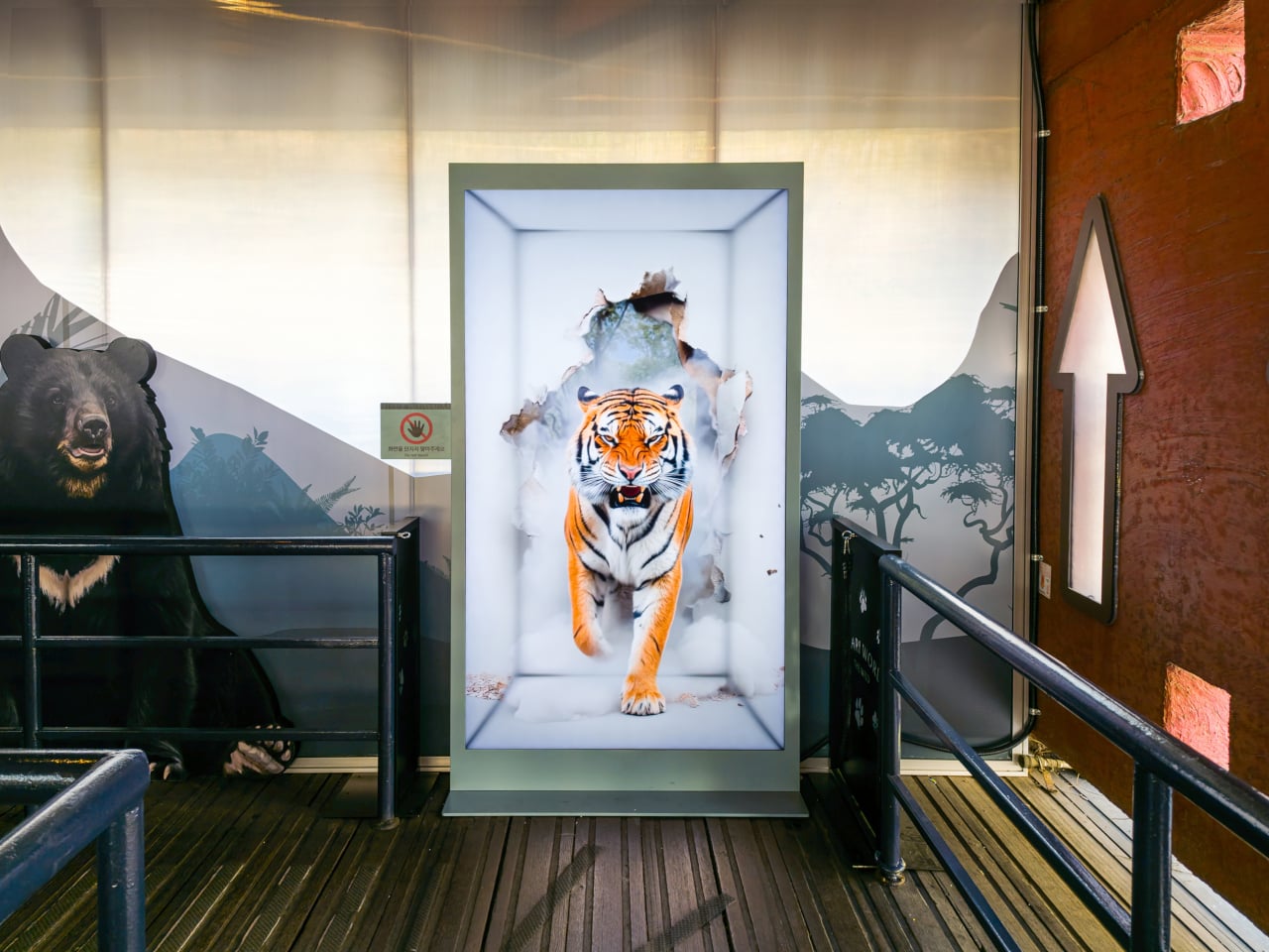
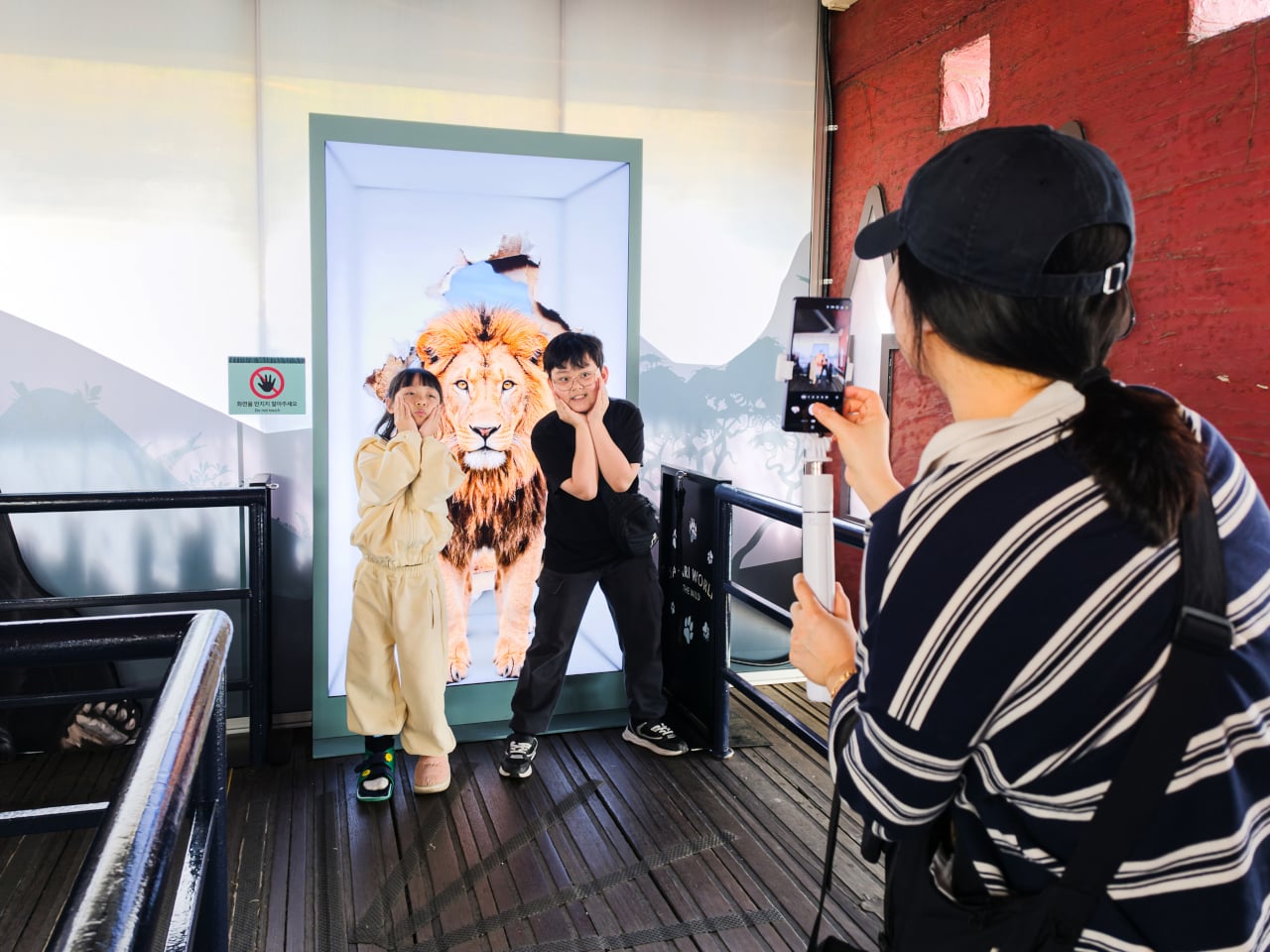
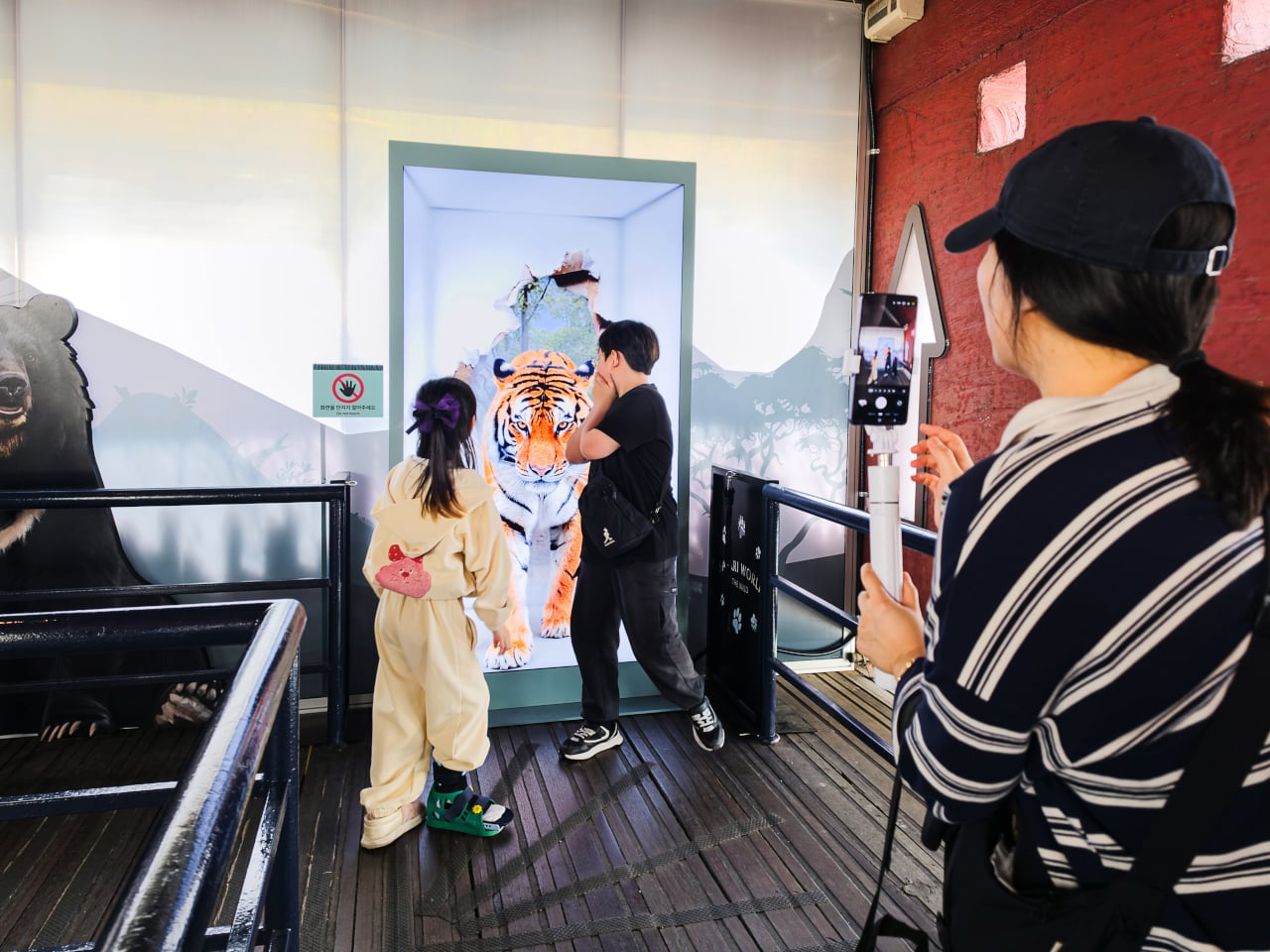
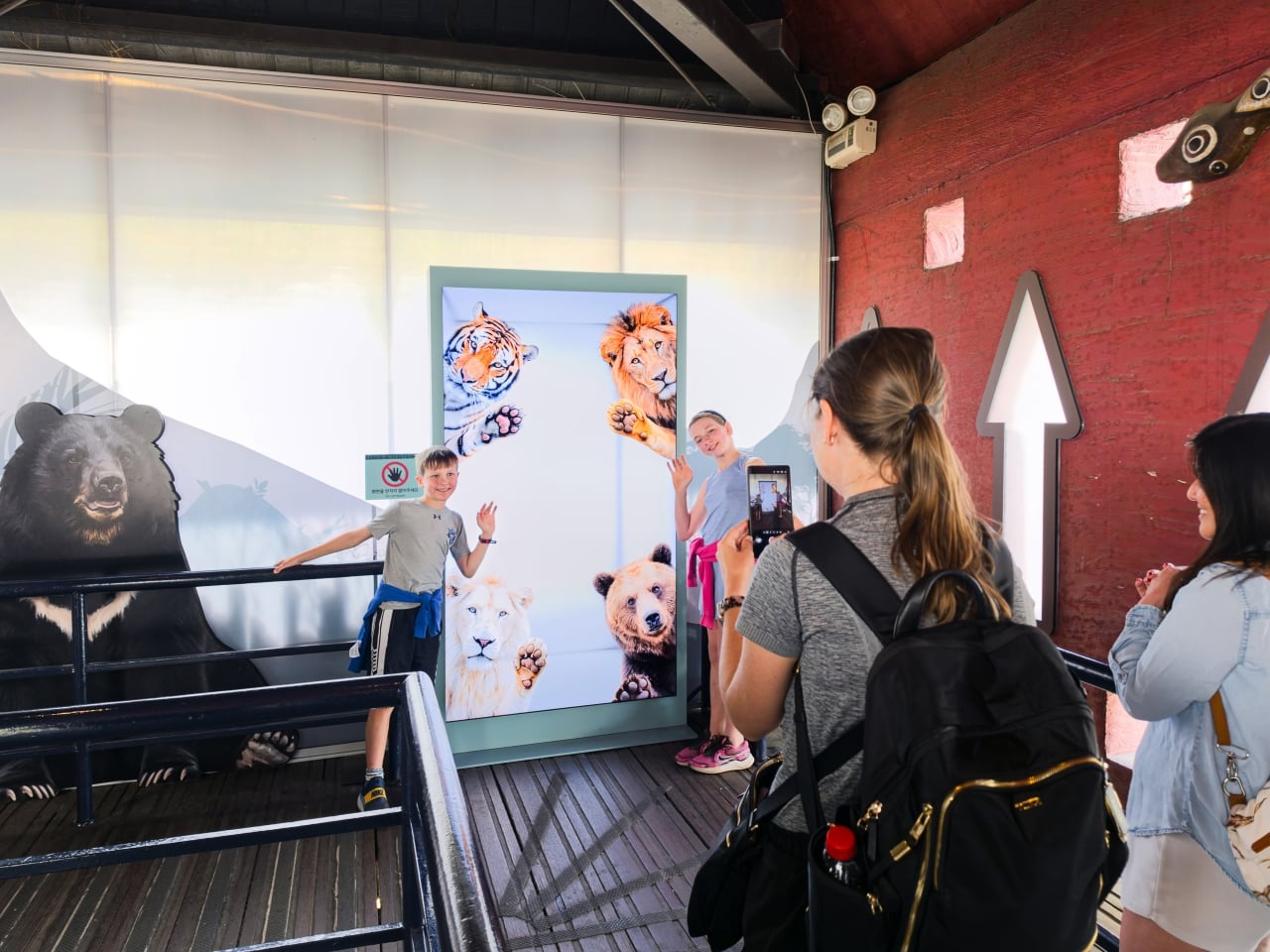
Samsung’s Spatial Signage installation at Everland in South Korea offers a different answer. At the newly renovated Safari World: The Wild attraction in Yongin, the company installed its glasses-free 3D display directly in the queue area, where life-scale tigers and lions appear to surge toward visitors without so much as a pair of 3D glasses required. The wait effectively becomes the opening act.

Designer: Samsung

The technology making that possible is Samsung’s patented 3D Plate system, which uses binocular parallax to deliver separate images to each eye, tricking the brain into perceiving depth the same way it does when looking at real objects at real distances. Unlike the boxy, space-hungry installations that most 3D signage has historically required, the Spatial Signage display slots into the queue corridor in an 85-inch, portrait-oriented panel with a 52 mm profile. There’s nothing protruding into the space, and no hardware for visitors to interact with.

The content for the Everland installation was developed by Klleon, whose team prioritized capturing the natural movement rhythms of the animals rather than exaggerated cinematic effects. The result is a quality of realism that works specifically because of the environment: a queue is typically a narrow, enclosed space where visitors are already looking forward and standing relatively still, which happens to be exactly the viewing geometry where the 3D depth effect lands best.

What that means practically is that the queue line stops being something guests endure and starts being something they talk about. Anticipation for an attraction is one of the least exploited moments in the theme park visit. Visitors heading toward Safari World already have the right frame of mind for a wildlife encounter, and the display capitalizes on that readiness by delivering a preview of that encounter before anyone boards a vehicle or rounds a corner.

The broader implication is about how display technology fits into destination entertainment design. For years, attractions have used projection mapping, animatronics, and theatrical sets to build immersion during rides and shows, but the queue almost always remains a visual afterthought. A display that can occupy a narrow corridor at wall depth, require no headgear, and show content at true-to-life scale without any spatial awkwardness changes what’s possible in that format.

Everland isn’t a retail shelf or a shopping center atrium. The animals aren’t selling anything. They’re there because a flat screen in that corridor would register as background noise, and a three-dimensional tiger at eye level does not. That distinction, between content that is present and content that actually commands attention, is the problem Spatial Signage was built to solve, and the queue turned out to be a rather fitting test.

The post Samsung Just Turned a Theme Park Queue Into a 3D Safari, No Glasses first appeared on Yanko Design.

AI-powered earbuds with built-in camera expand your capabilities in the real world

Headphones and earbuds have, over the last couple of years, become staples of this fast-paced world for good reason. The little audio gear essentials can do a multitude of tasks with just the push of a tactile button or pinch gesture. They can trigger smart assistant support for a smarter you, and if this concept were to be imagined, they can give you a pair of smart eyes, too.


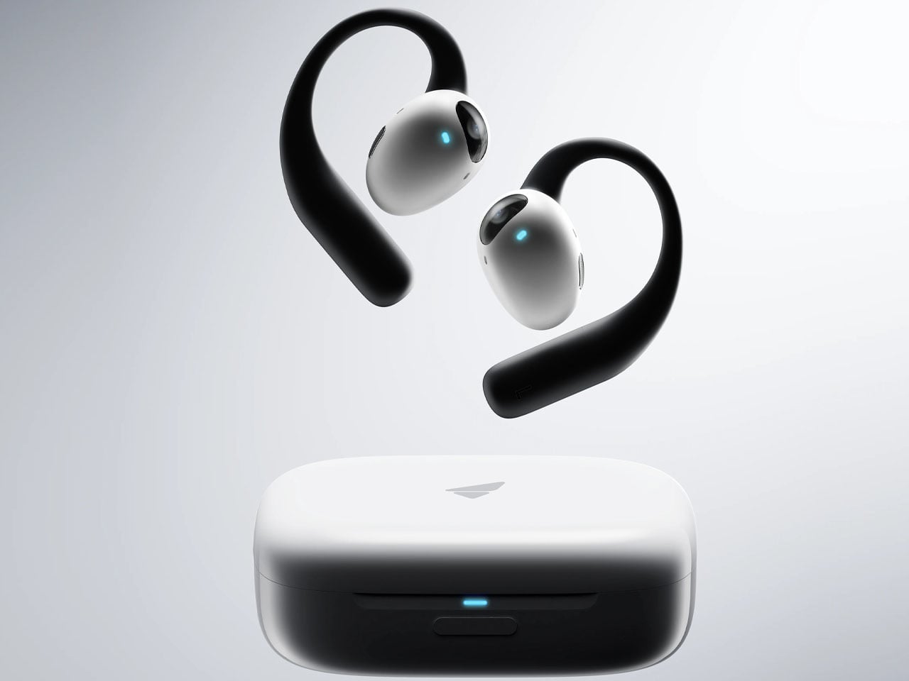
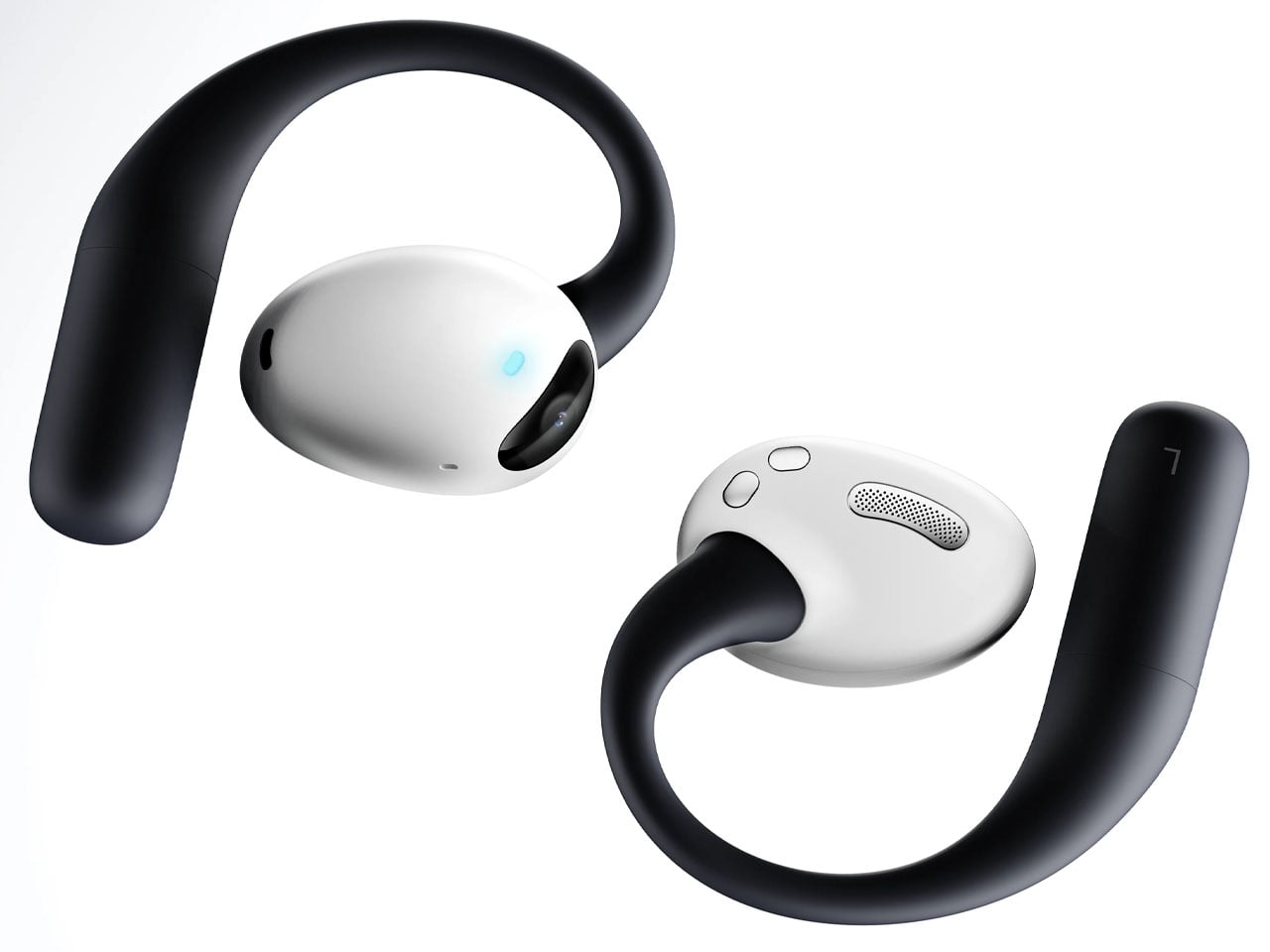
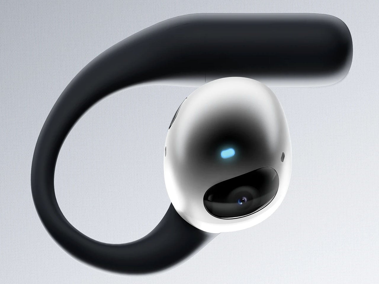
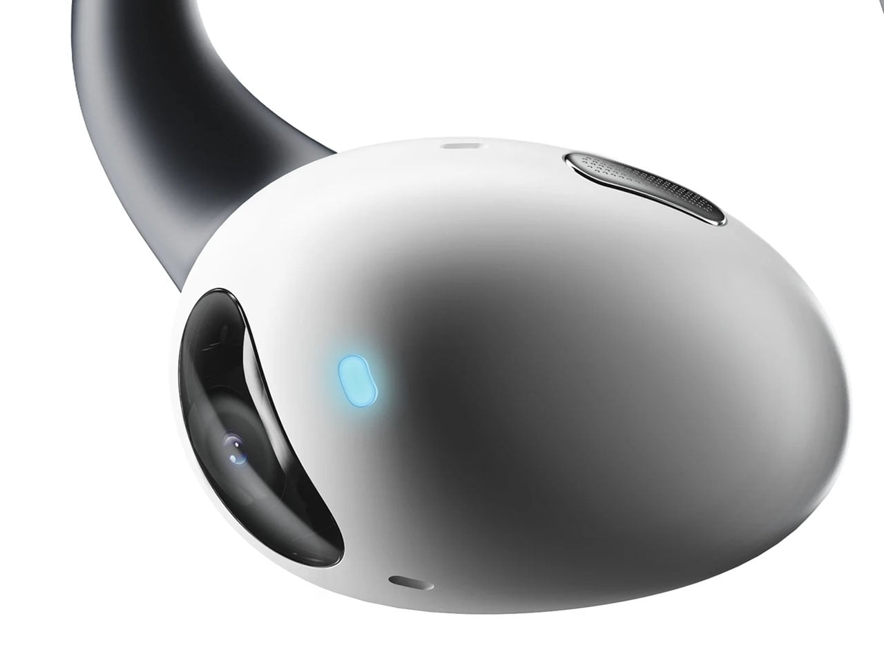
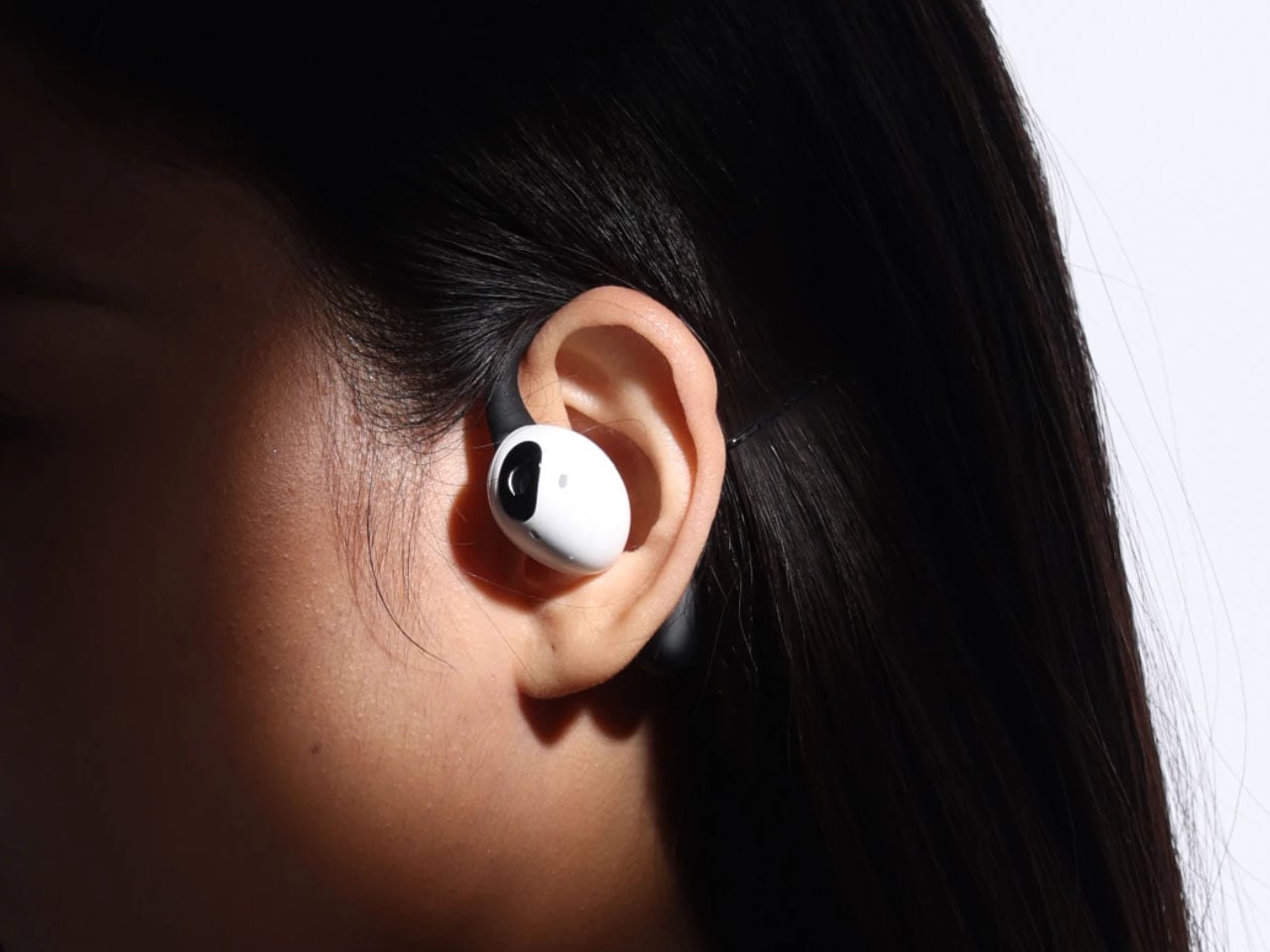
The idea of a pair of earbuds with integrated cameras is not new, as Emil Lukas imagined, and now another concept reinforces the merit in having a pair of lenses on earbuds. Dubbed Lightwear, the earbuds look something straight out of a sci-fi flick, but underneath, they are a pair of smart assistant earphones that enhance your environmental perception in real time.

Designer: Suosi Design

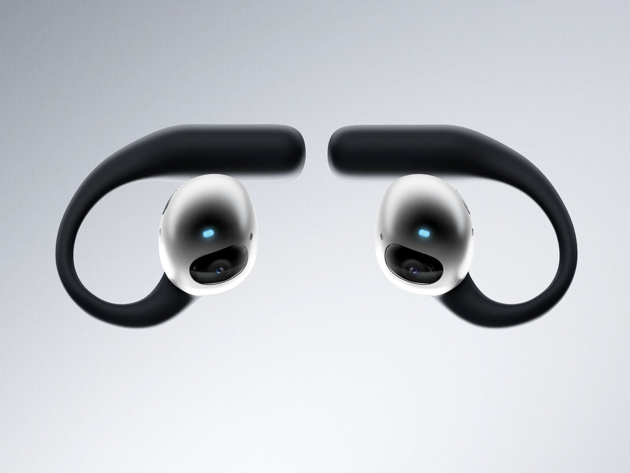
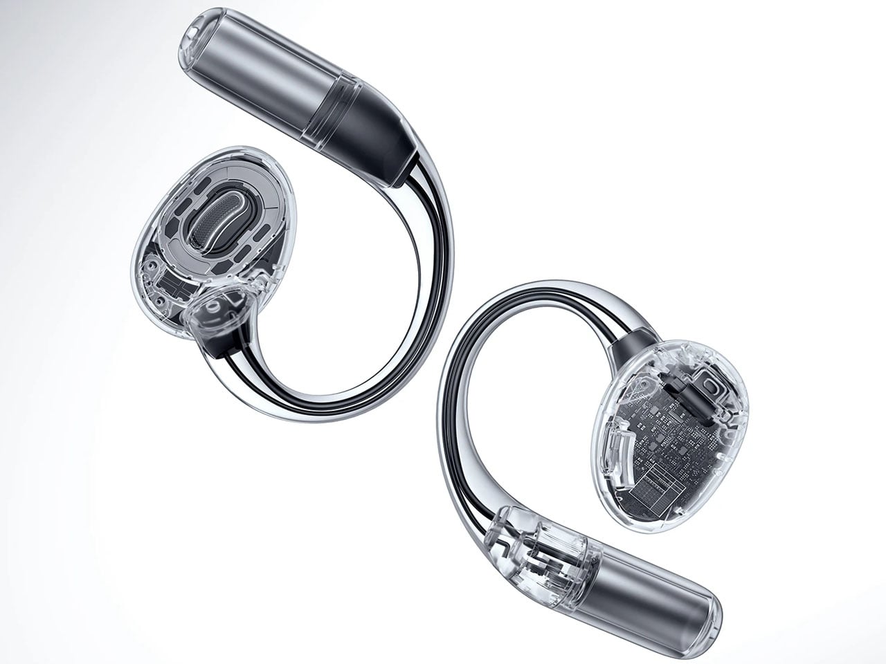
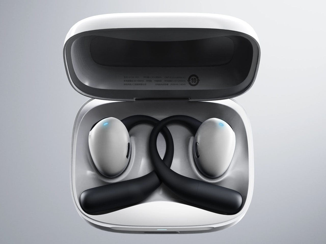
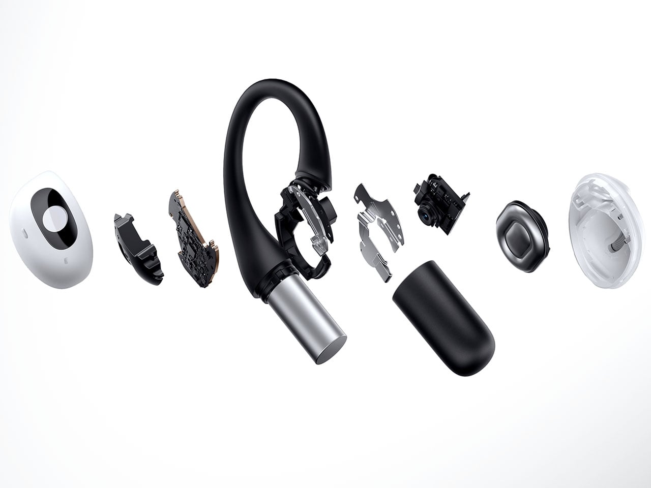
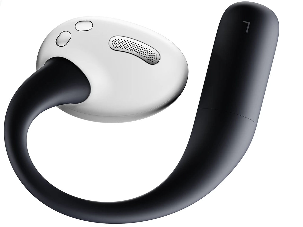
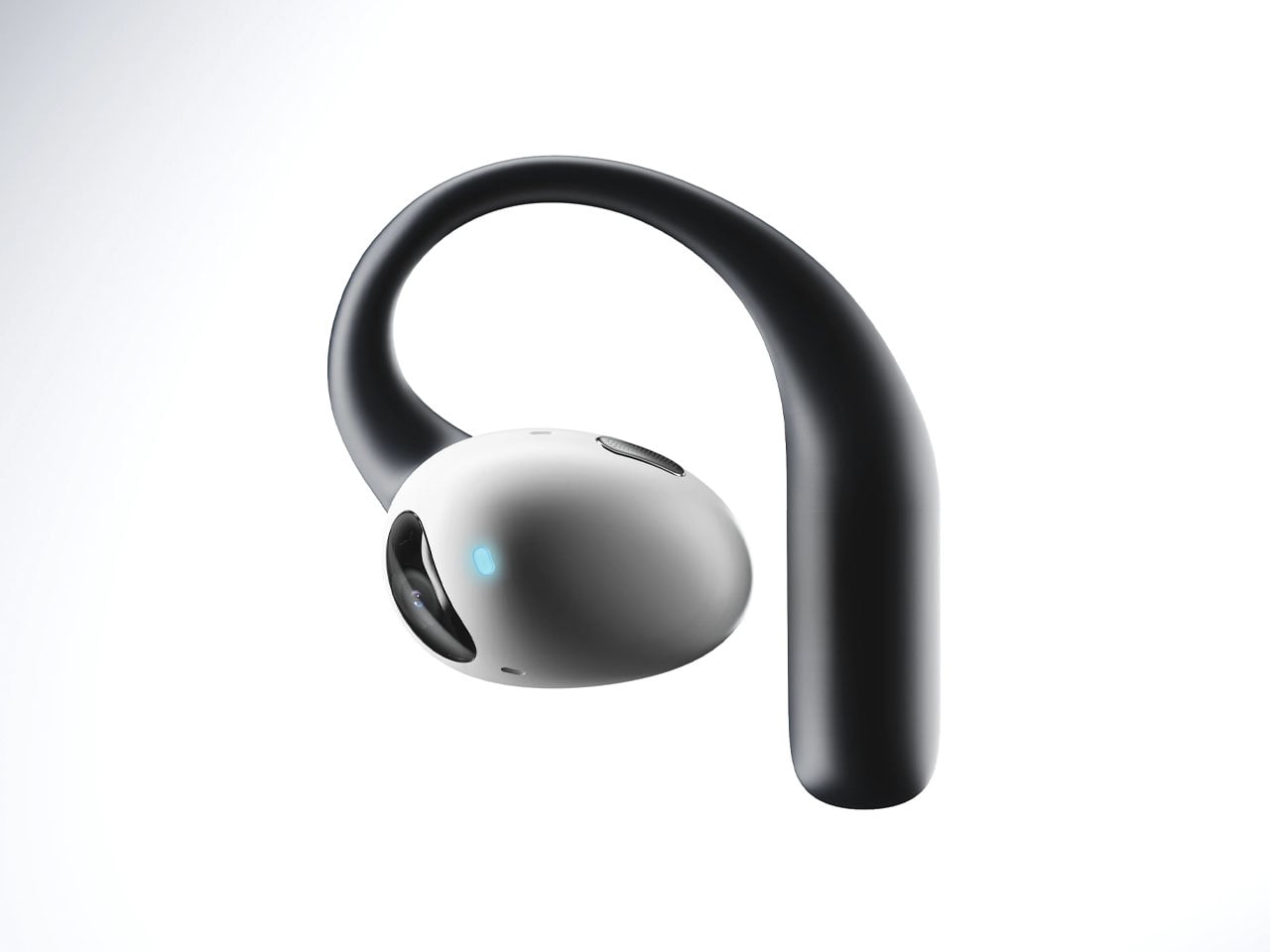
Touted as the world’s first AI-powered earphones, Lightwear comes with a set of HD camera lenses to expand the sense perception as a vision module to interpret the surroundings and deliver the desired result. One can detail them via voice command about any information required in real time, and the buds respond with a detailed set of instructions or navigation guidance. Having gesture control support, the buds can control the connected home devices remotely using just gesture commands. All the data fed into the smart data system is end-to-end encrypted and stored locally. For enhanced privacy and protection, the sensitive data is automatically cleared on a scheduled cycle.

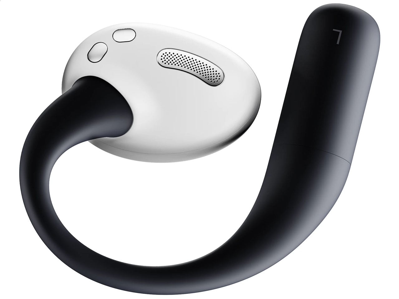
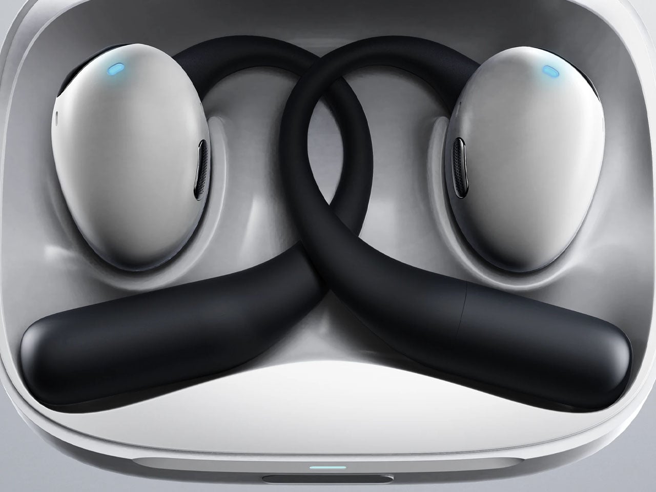
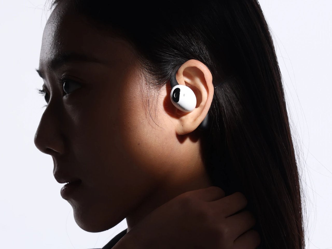
Compared to Emil’s version, these earbuds have a very downplayed camera presence, which I prefer. They look and feel just like any normal earbud, but have a function that makes them stand out from most pairs of earbuds that have the predictable features. Unlike other AI-powered earbuds, these stand true to their name as they come with the added visual apparatus to put forth better results. The use of AI functions is not limited to the earbuds, since the charging case does the same. This removes the use-case scenario to just when the earbuds are being worn. Loaded with highly sensitive microphones, the AI features can be triggered anytime the user wants. Privacy is also taken care of, as the user can opt to activate the fingerprint unlock module to prevent any unauthorized use.

These have an over-the-ear design, reminiscent of the way IEMs sit flush on the ears. The battery resides in those lobes, and although the designers don’t specifically talk about the usage time, these should last longer than TWS earbuds. Nor is there a specific word about the sound quality, ANC levels, or the app features. But then it’s just a concept centred on the form factor and usability.

The post AI-powered earbuds with built-in camera expand your capabilities in the real world first appeared on Yanko Design.