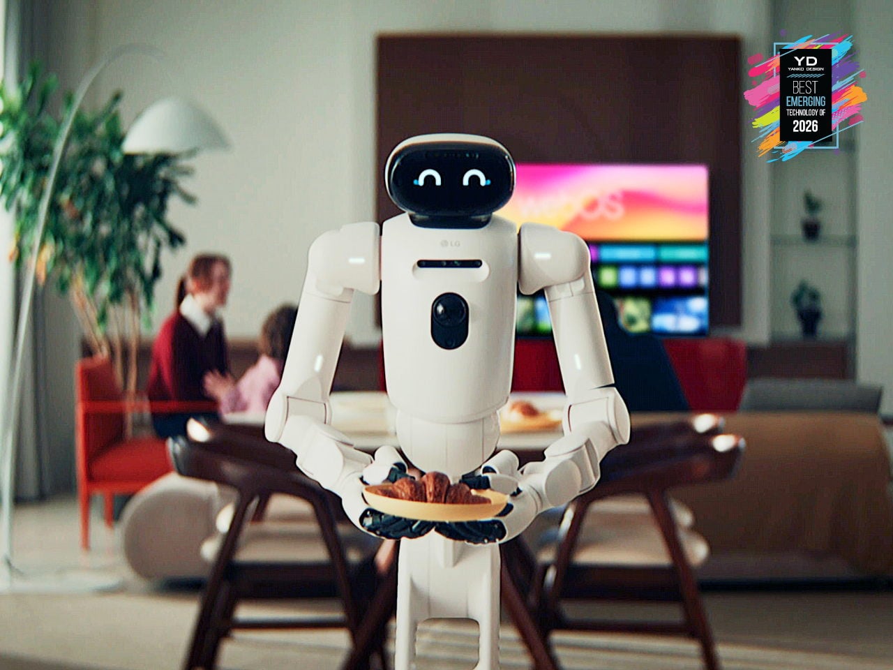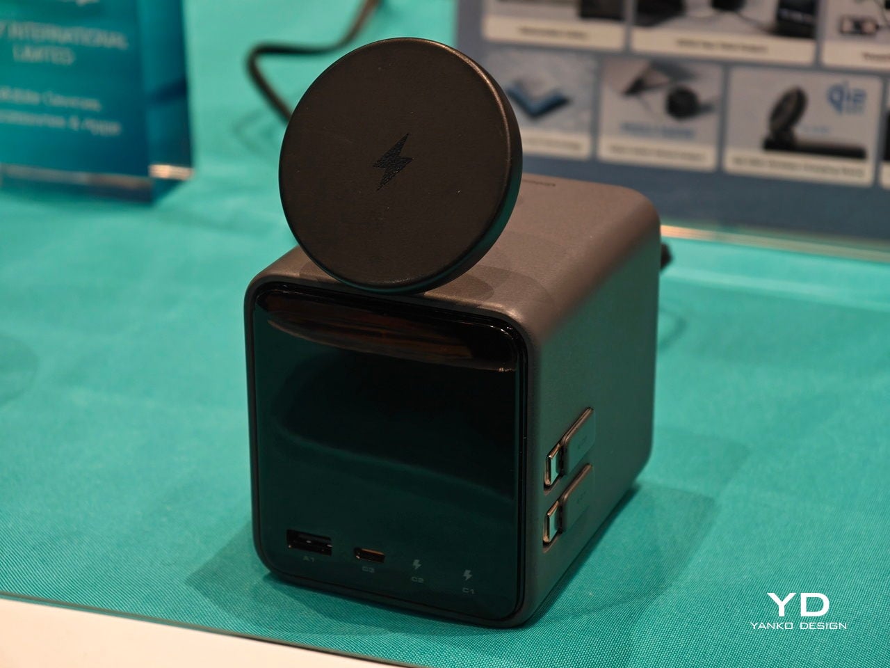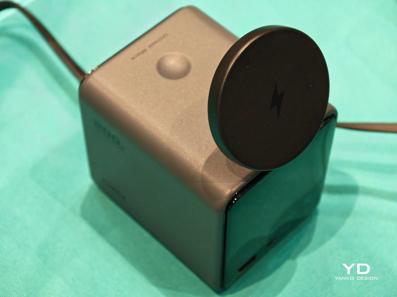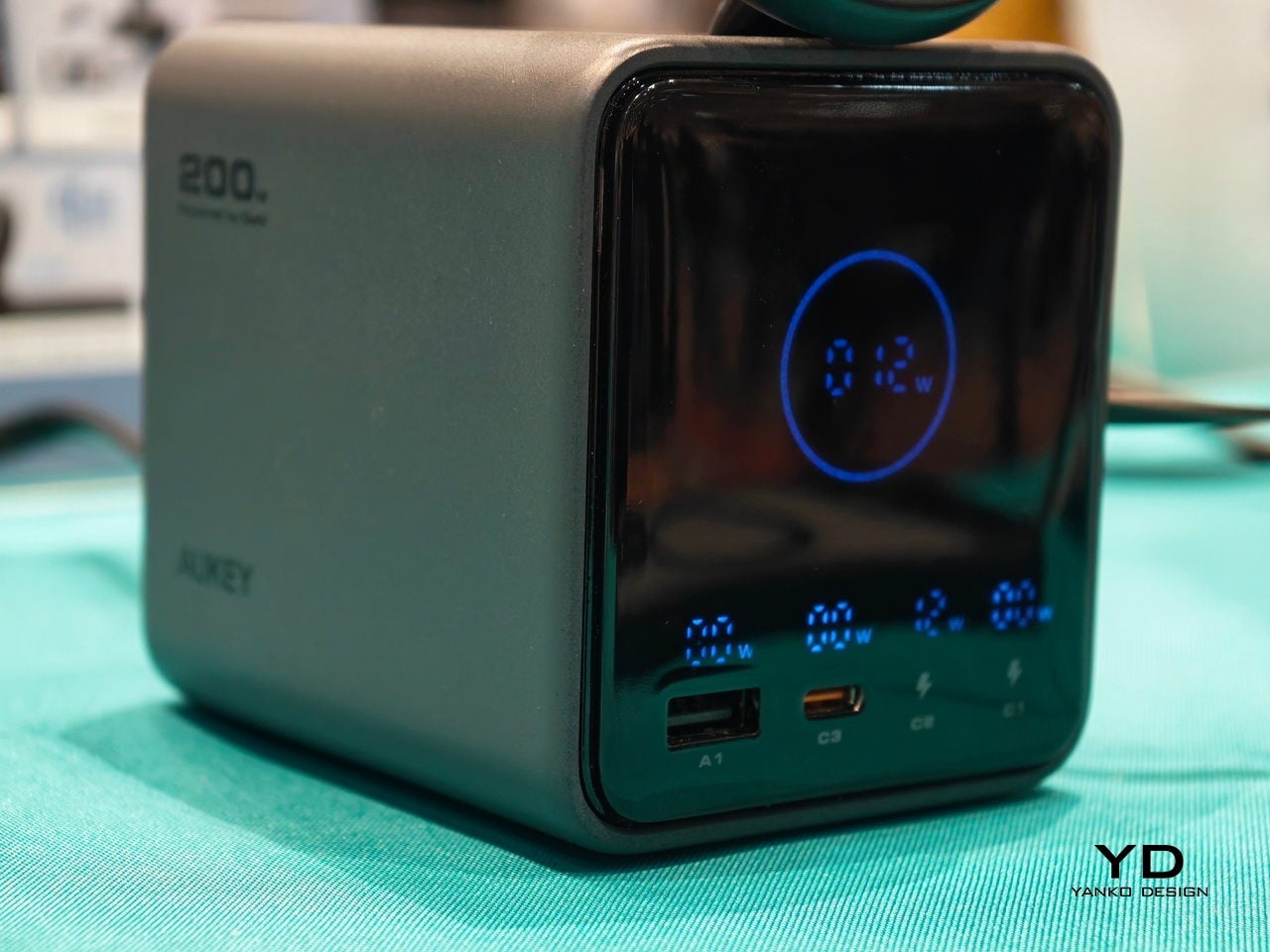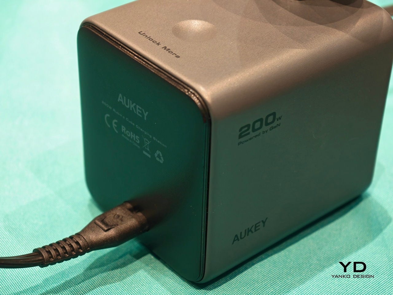
CES usually means prototypes that look like they escaped from a sci-fi movie and demo reels that promise to change everything by next Thursday. This year felt different, or at least the products that actually mattered did. The best stuff on the floor was not trying to replace your habits or announce itself from across the room. It was quietly upgrading things you already reach for, tucking serious engineering into familiar objects and using it to remove friction from how you already live, work, and move through spaces.
The through-line across our favorites is technology that earns its place by behaving like a better version of something you already understand. Glasses that translate or restore hearing, a home battery that looks like furniture, headphones that twist into speakers, a TV backlight that adds a fourth primary. Even when intelligence is involved, it smooths edges rather than steals the spotlight, treating the upgrade as something you notice only when a moment becomes easier, clearer, or less annoying.
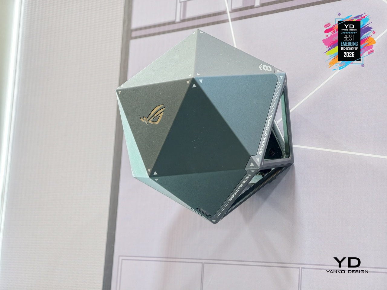
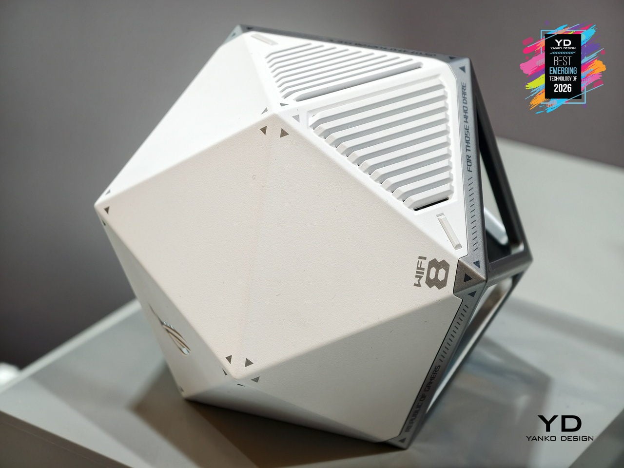
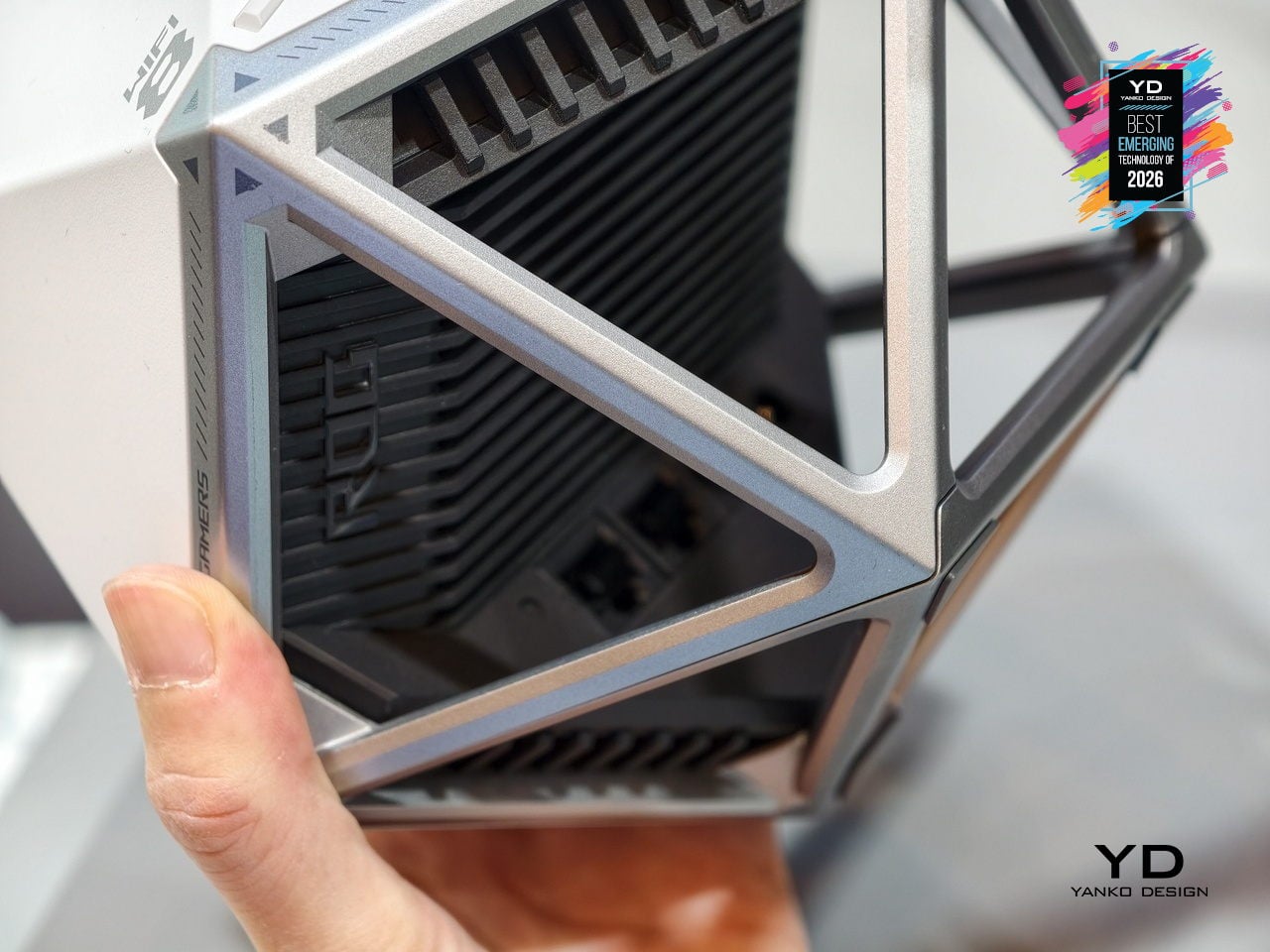
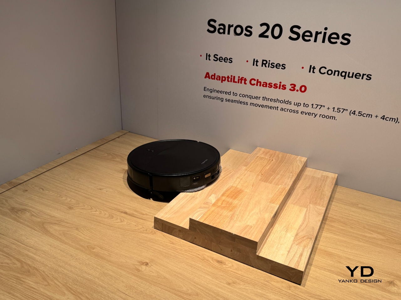
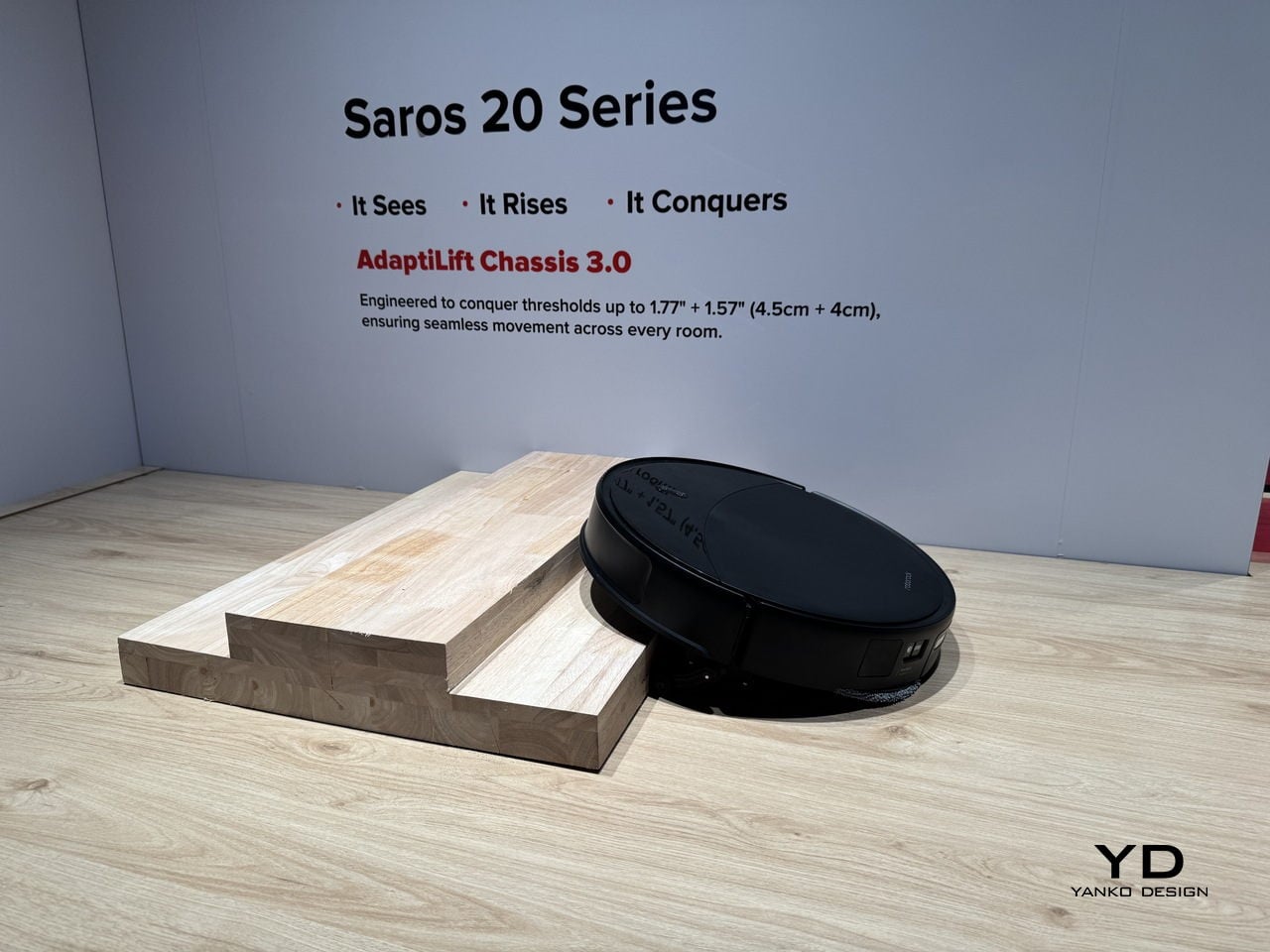
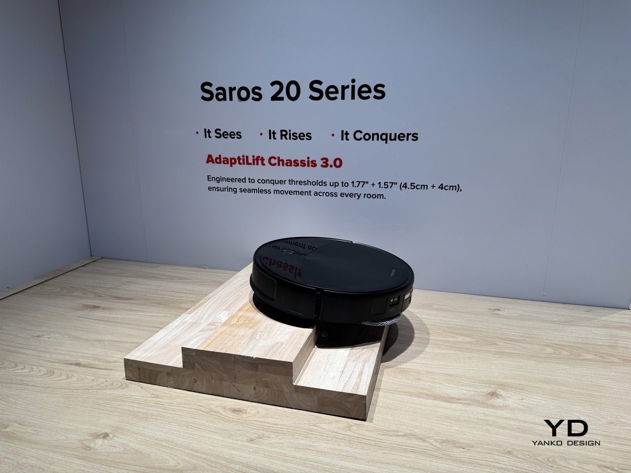
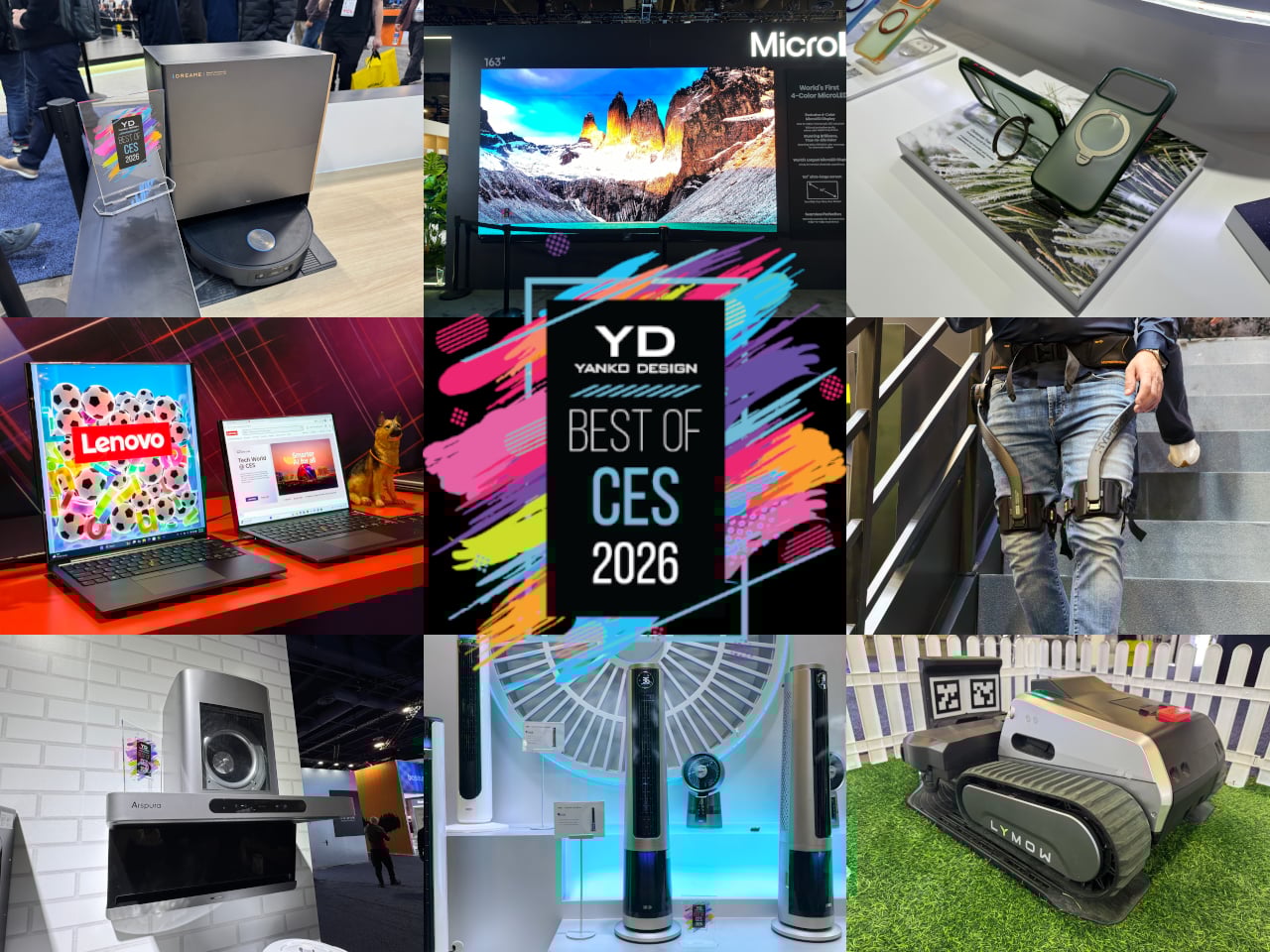
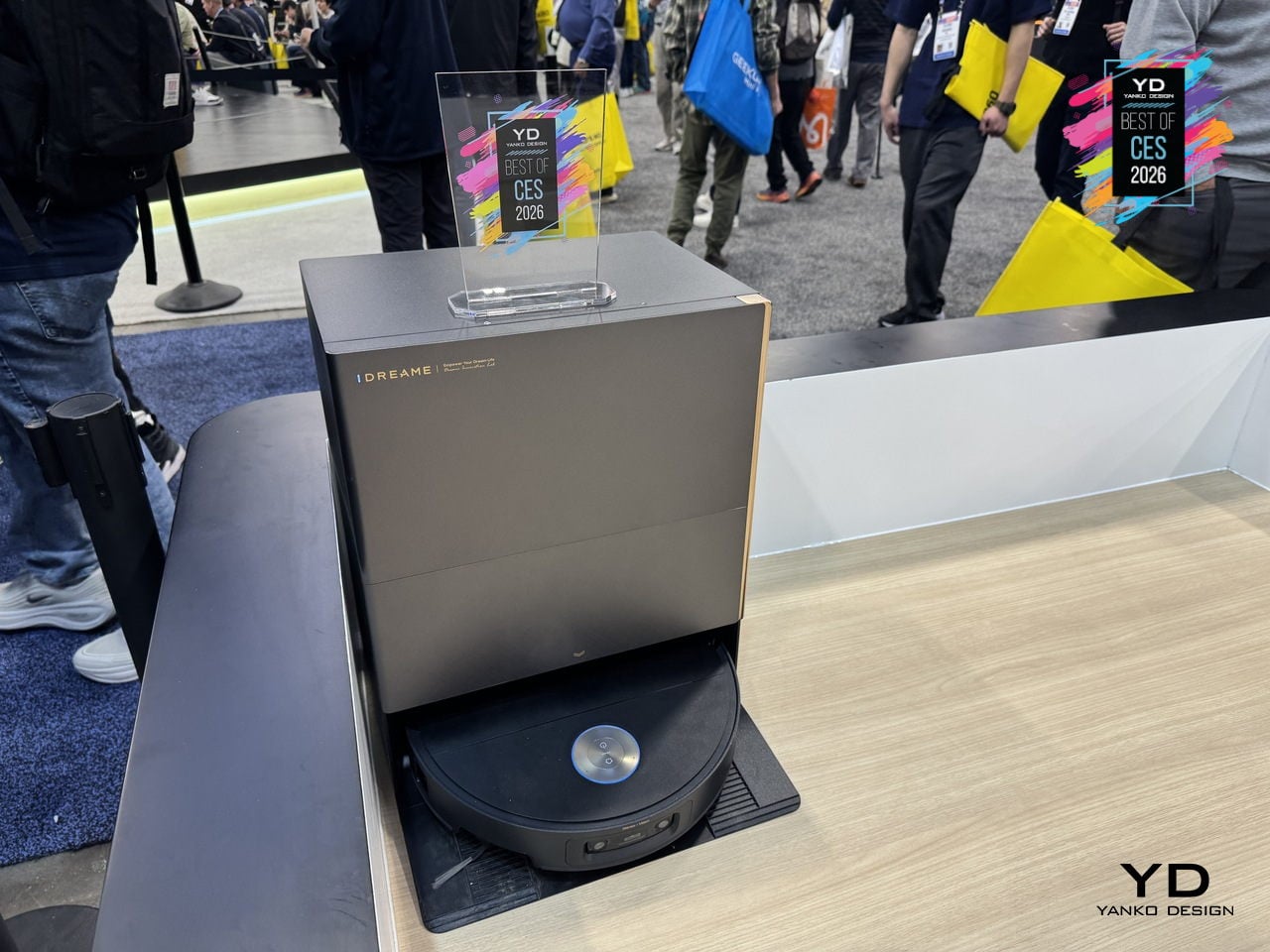
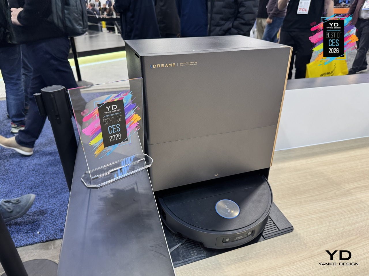
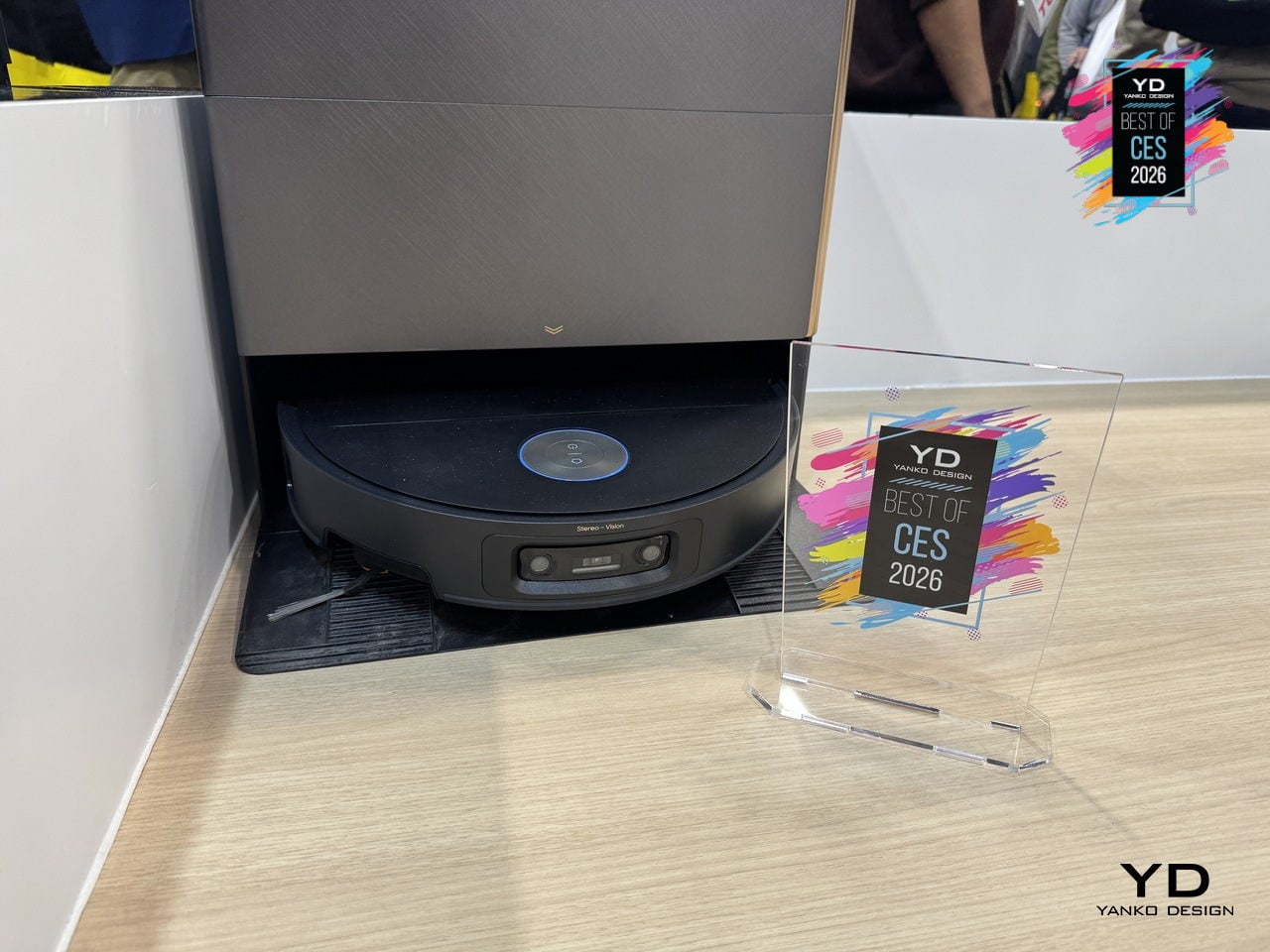
Dreame X60 Max Ultra Robot Vacuum
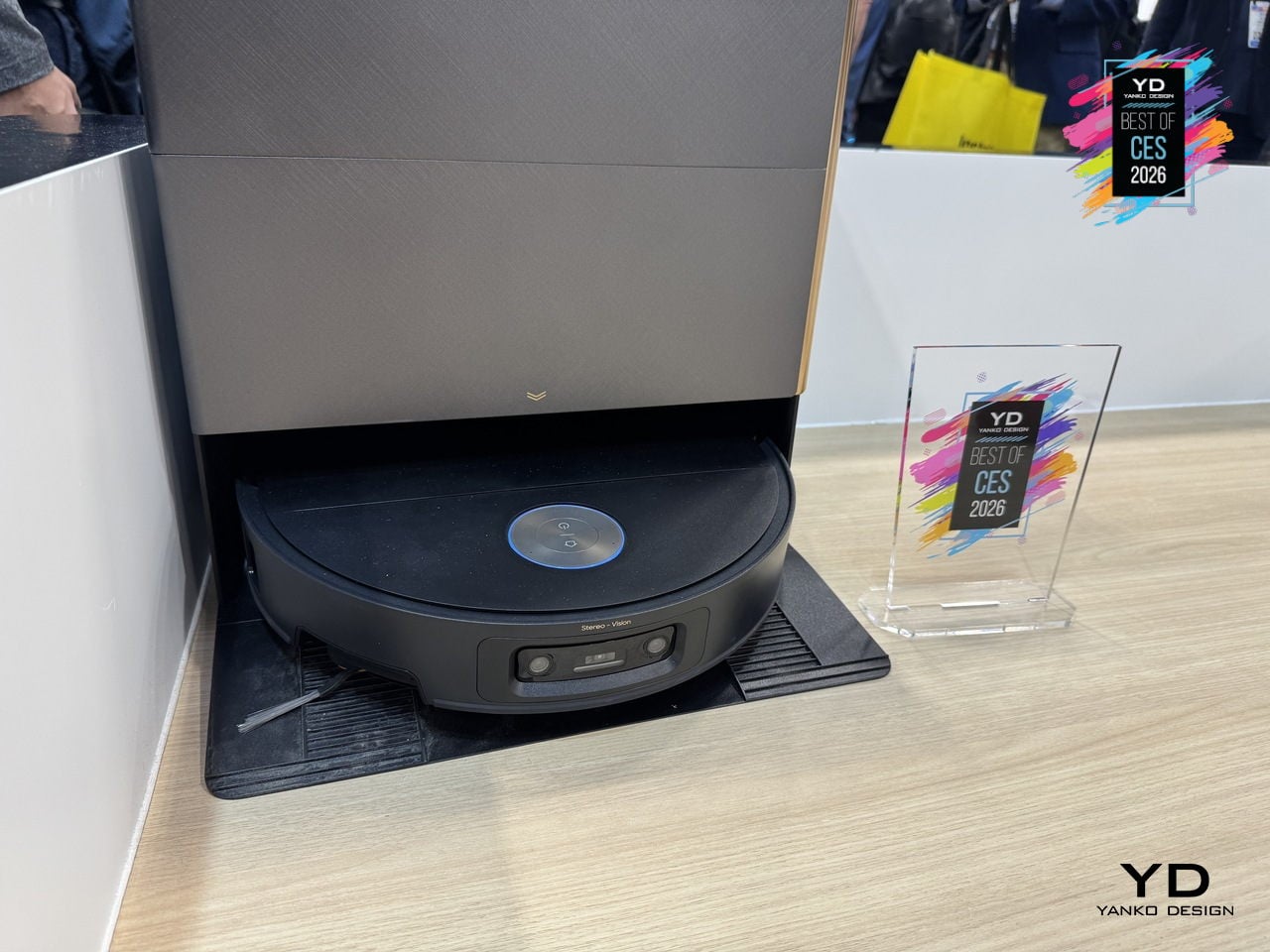
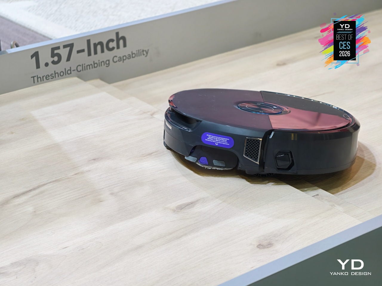
Dreame’s X60 Max Ultra is the top of the new X60 Ultra series, reimagined for whole-home adaptive cleaning. It pairs a 7.95cm ultra-thin body with a sculptural all-in-one dock, combining engineering that lets it navigate low furniture, climb tall thresholds, and handle carpets and hard floors without leaving messes behind, treating deep cleaning and hot-mop care as a mostly background process.
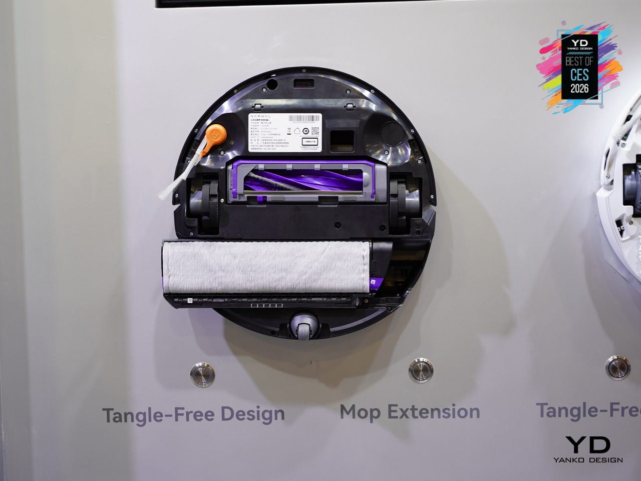
The retractable sensor and VersaLift navigation let the robot clean under beds and sofas at just 7.95cm tall, switching to dual AI cameras and LEDs when it retracts. The AI-Enhanced OmniSight system uses 120-degree cameras, 3D structured light, and a 0.1s response to recognize over 280 object types and plan routes up to 200 % faster, while the ProLeap system climbs thresholds up to 8.8 cm with retractable legs.
Cleaning performance combines up to 35,000 Pa Vormax suction with the HyperStream Detangling DuoBrush 2.0, featuring 60% thicker rubber strips and 1,600 RPM speed. DreameGlide mopping uses thermal mop pads, dual omni-scrub heads, 15 N downforce, and 230 RPM rotation, while ThermoHub self-cleaning washes pads with 100 °C hot water on a self-cleaning washboard, keeping them grease-free and ready for the next run.
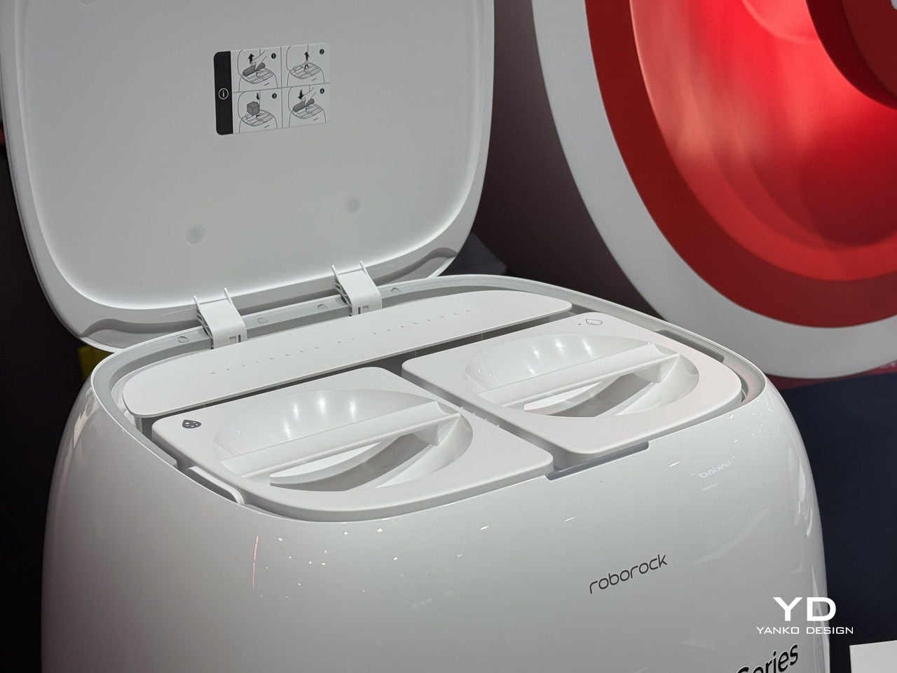
The All-in-One PowerDock auto-empties for up to 100 days, washes and mops with 100°C water, dries them with hot air, and manages 4.2L and 3.0L water tanks. The Max version adds dual-solution dosing for floor cleaner and pet-odor solution, and an optional water hookup handles refilling and draining, turning vacuuming, mopping, mop care, and waste management into a mostly autonomous background routine.
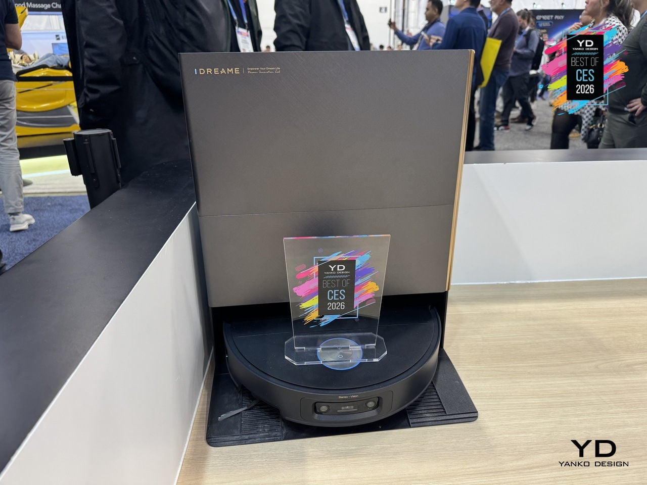
The design has a minimalist, geometric base station with semi-transparent accents that reads like furniture, paired with a robot featuring offline voice control, smart carpet strategies, Pet Care 4.0, and upcoming Matter support. For CES 2026, X60 Max Ultra feels like where robot vacuums are headed, combining architectural aesthetics and serious engineering into something built for large, complex homes where floors, carpets, thresholds, and pets all demand attention.
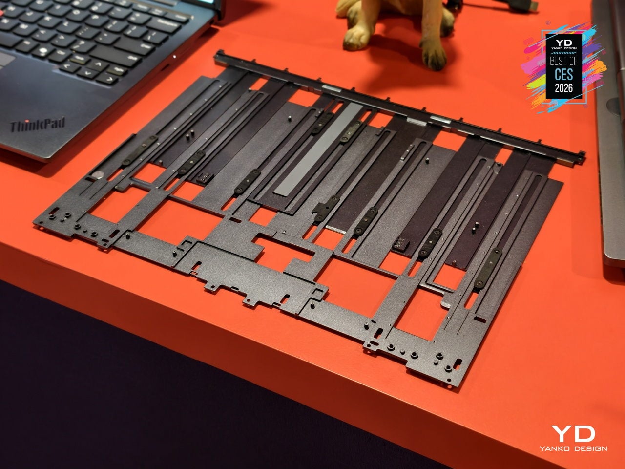
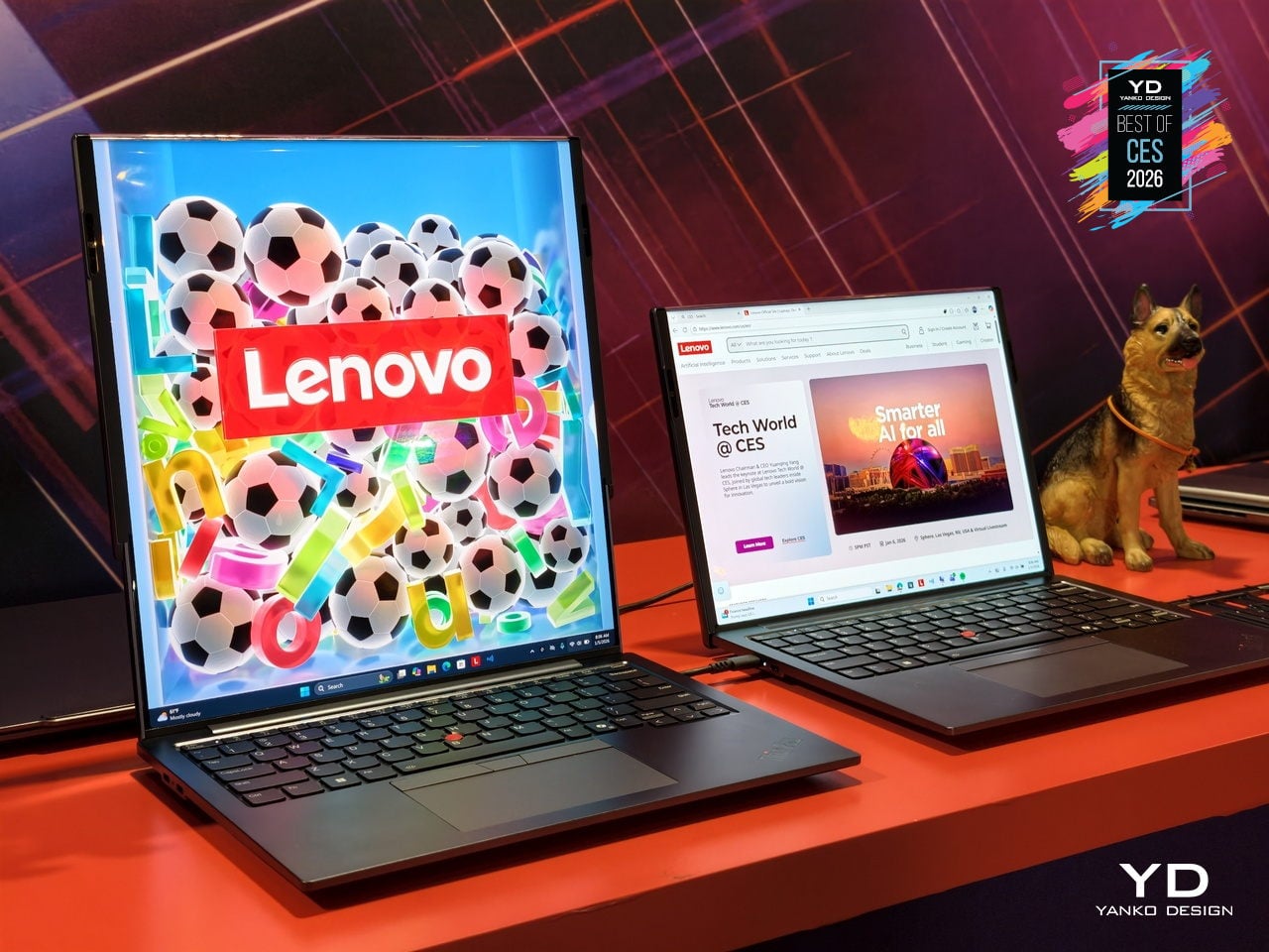
Lenovo ThinkPad Rollable XD Concept
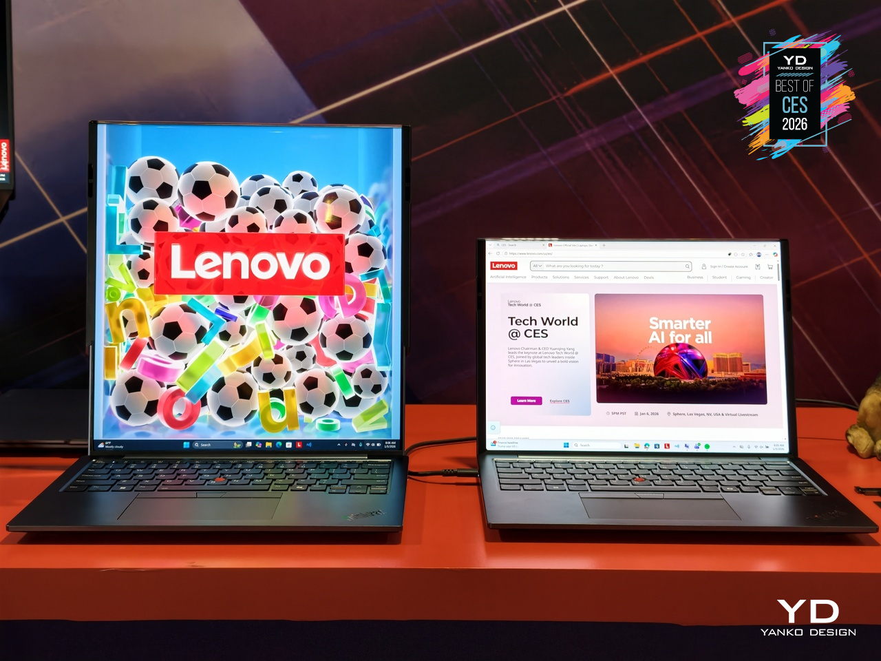
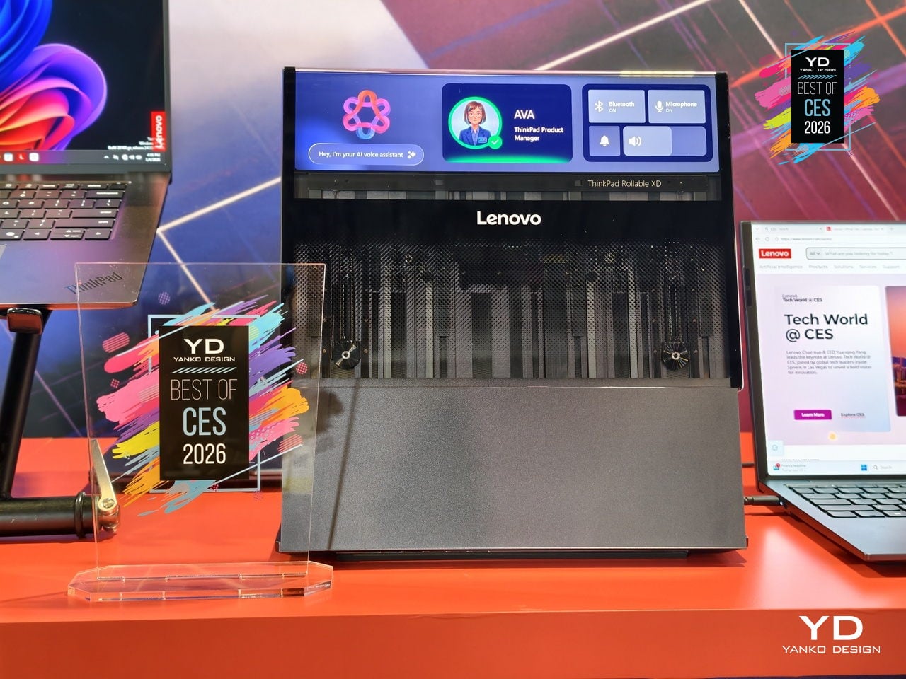
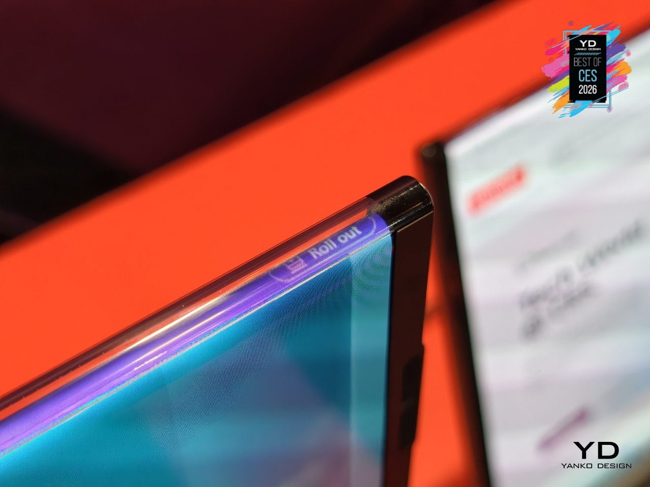
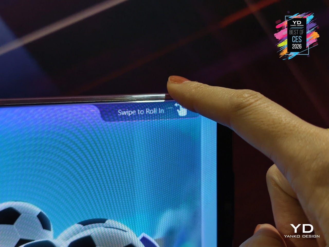
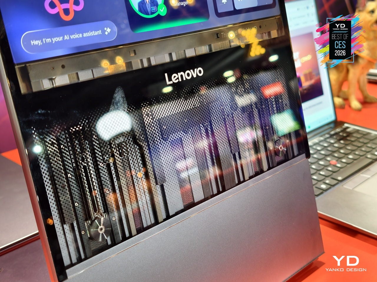
Laptop screens have been stuck as fixed rectangles for years. The ThinkPad Rollable XD Concept is Lenovo’s bold reimagining of the laptop PC, building on experiments like the ThinkPad X1 Fold and ThinkBook Plus rollable designs but pushing further with a rollable OLED that can change shape and face both the user and the outside world, treating the display as something that stretches and wraps instead of just opening and closing.
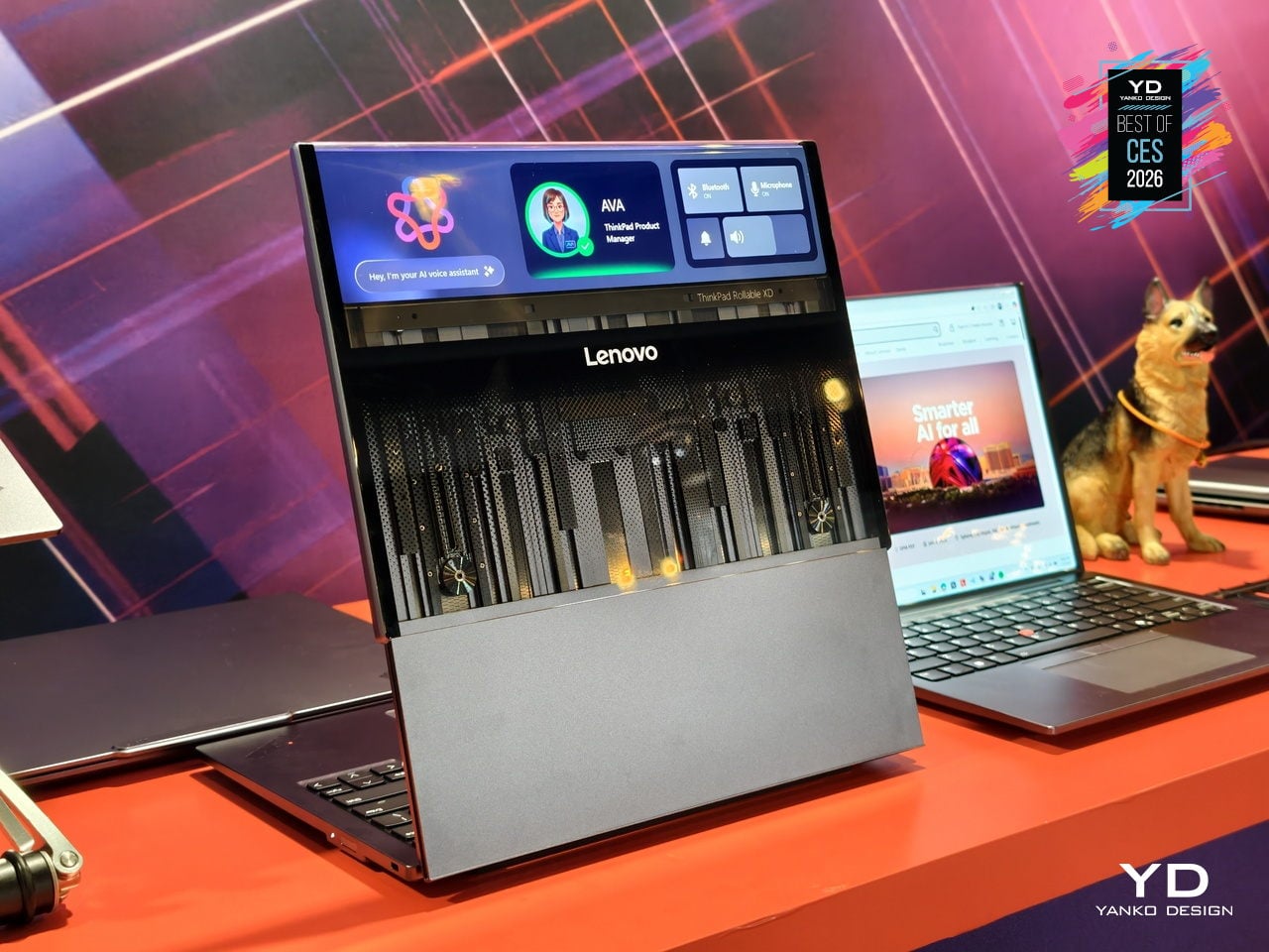
The concept is one of the world’s first out-folding devices with a world-facing display and expanding user-facing screen. Part of the rollable panel is always visible on the lid, even when the laptop is closed, while the rest extends upward when opened, transforming a compact 13.3-inch notebook into a near-16-inch workspace and delivering over 50 % more screen real estate without the bulk of a traditional 16-inch chassis.
The taller, expanded screen supports multitasking and creative work: stacked documents, vertical timelines, side-by-side apps, or code and preview in one view. The world-facing strip on the lid shows calendars, notifications, or custom widgets, turning the outside of the laptop into a personal dashboard or a small signboard for collaboration and retail scenarios, making the closed laptop a live information surface instead of a blank slab of metal.
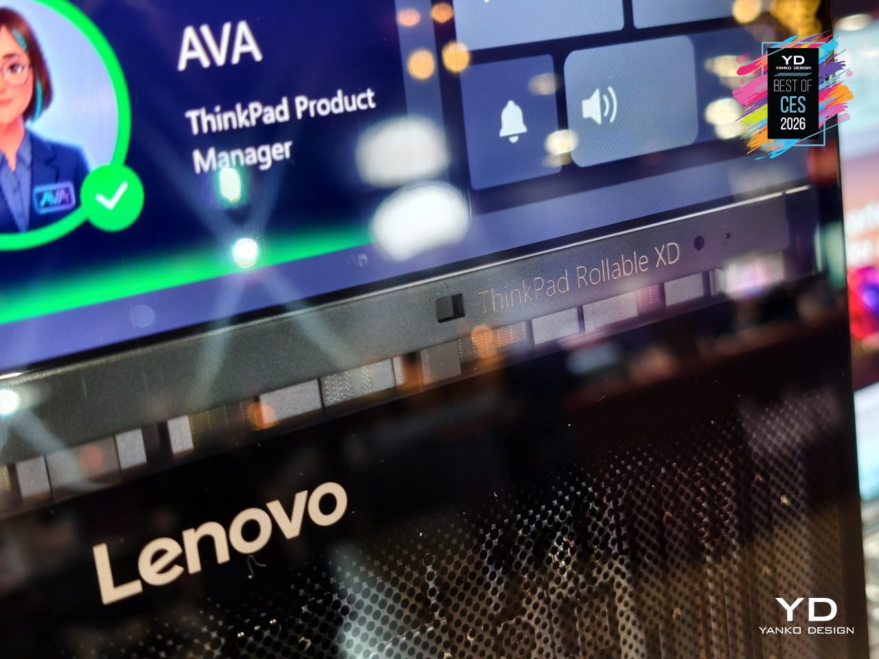
Lenovo folds in AI-driven features like live translation, voice assistant, multi-modal input, and lid-closed interactions that take advantage of the world-facing display. Swipe to X touch gestures and voice controls let users launch apps or switch modes with a finger or a command, framing the Rollable XD as a platform for new AI-era workflows rather than just a clever mechanical trick that extends a screen without adding much practical value.
The transparent 180-degree Corning Gorilla Glass Victus 2 cover, jointly developed by Lenovo and Corning, protects the rollable panel while revealing some of the mechanism underneath. The concept keeps familiar ThinkPad cues like the keyboard and TrackPoint, so it still feels like a ThinkPad even as the screen stretches and wraps. It offers a glimpse of laptops that can expand when you need more space and broadcast information outward when you close the lid.
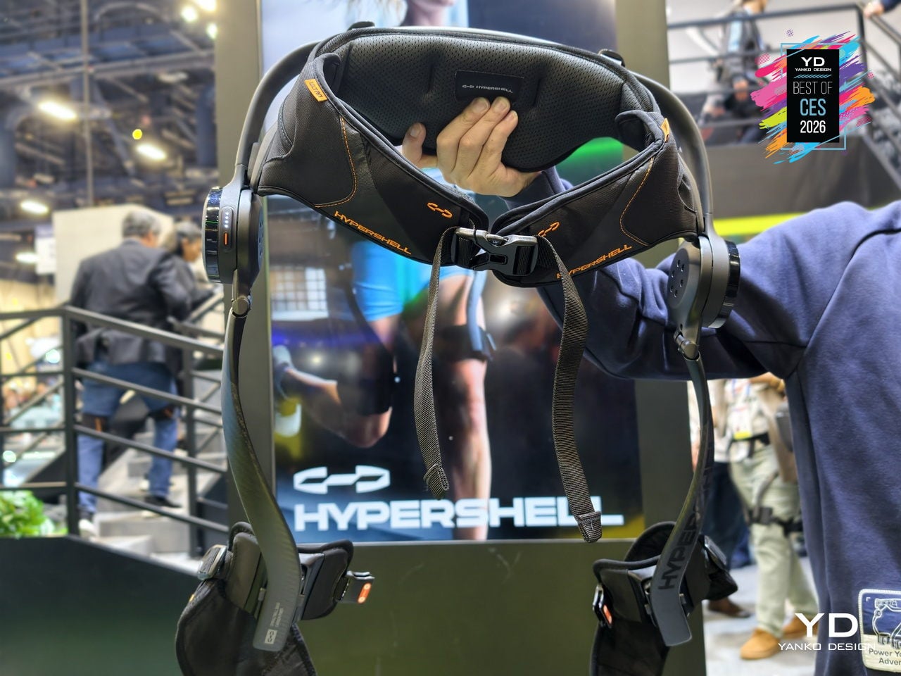
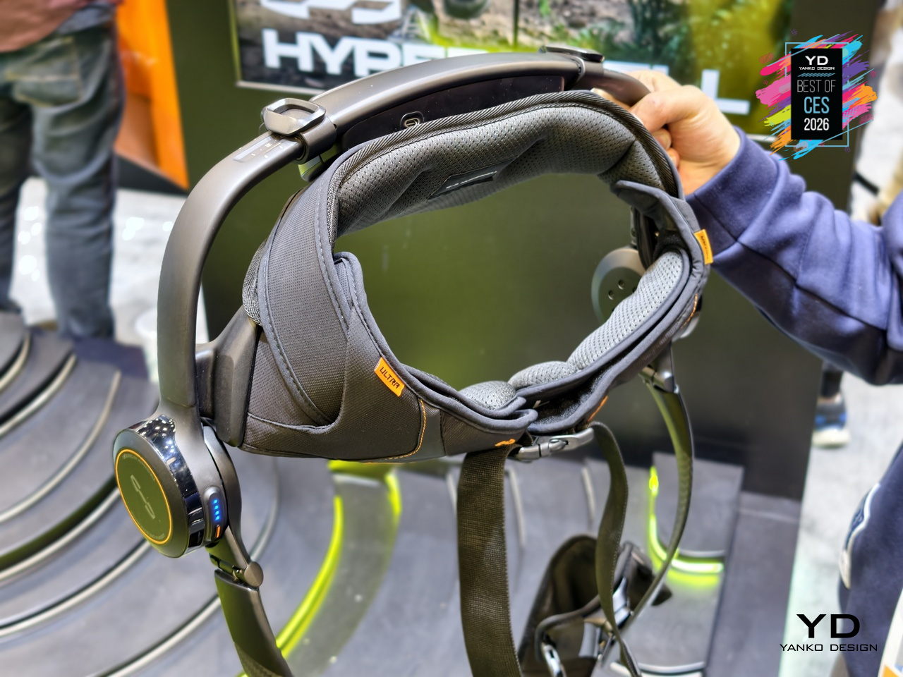
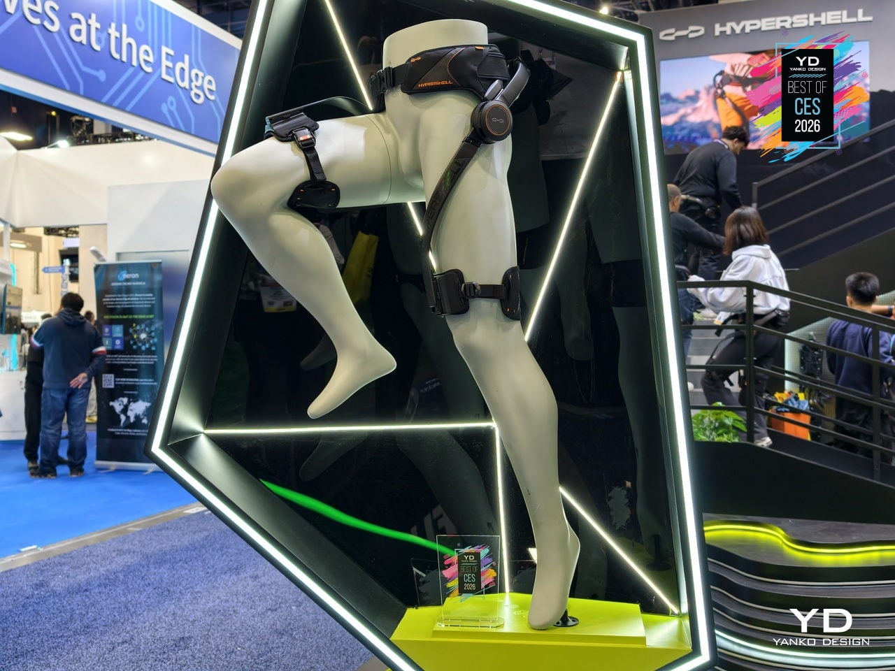
Hypershell X Ultra Robot Exoskeleton
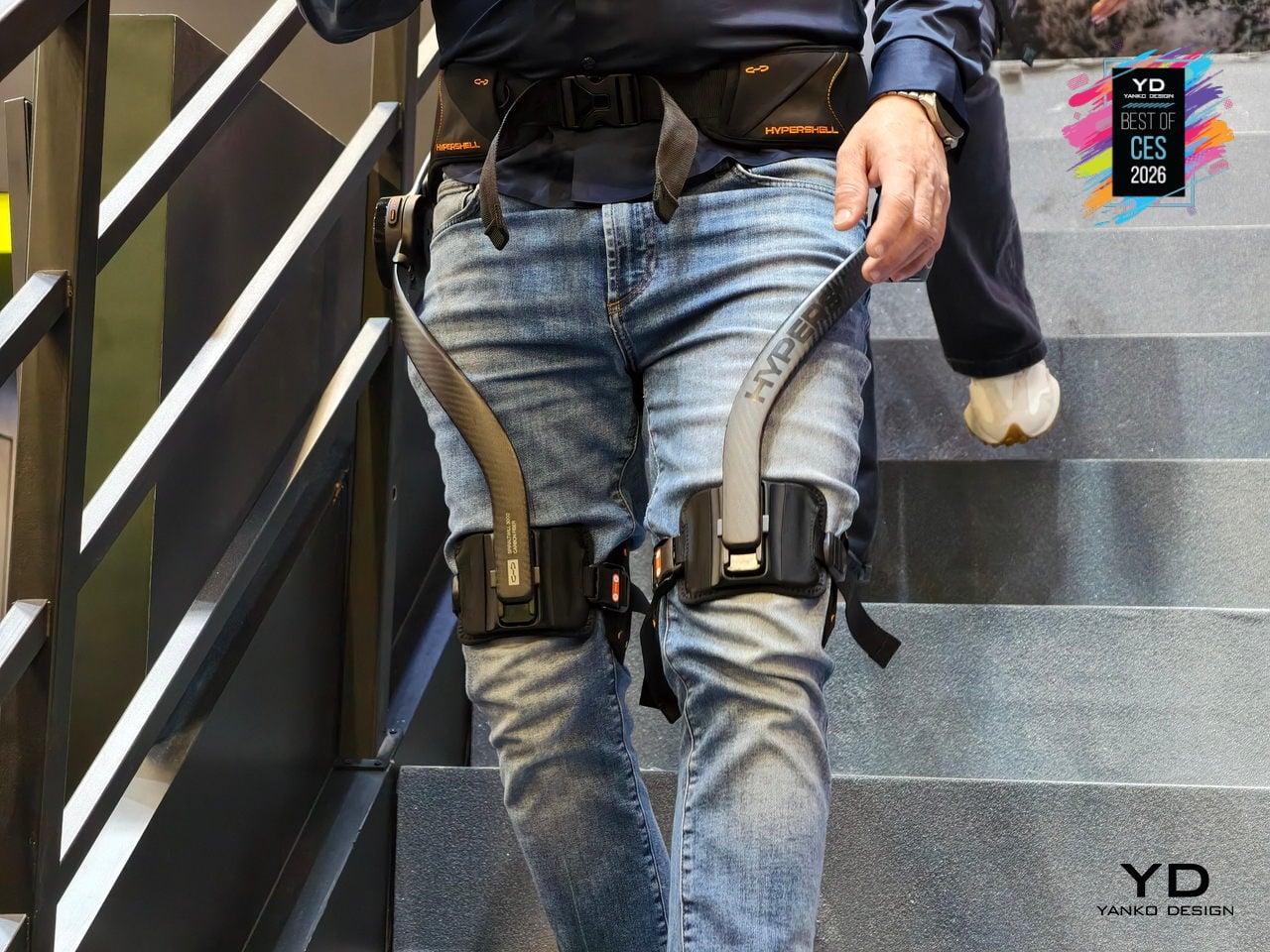
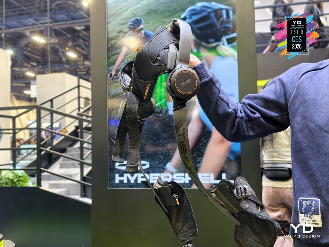
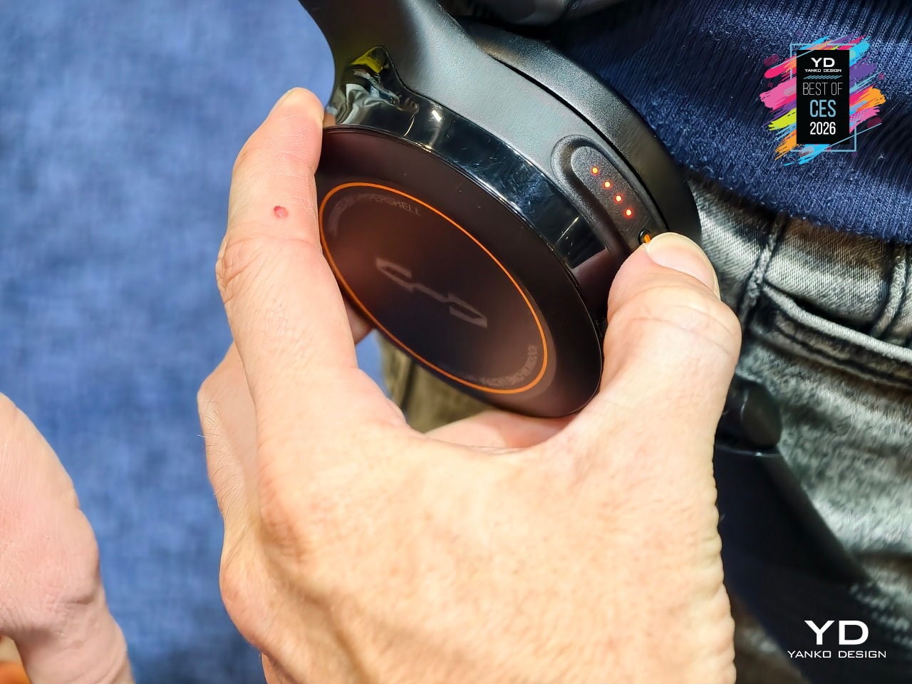
Hypershell X Ultra is the world’s best outdoor exoskeleton to date, built for people who want to hike, run, and ride farther without feeling wrecked at the end of the day. It is a high-performance, AI-powered frame that wraps around your hips and legs, delivering motorized assistance that blends into outdoor life instead of announcing itself. At CES 2026, it signals that exoskeletons are finally stepping into the same category as backpacks and boots for serious adventure.
The performance is SGS-certified, not just claimed. Independent testing confirms up to 39% less physical exertion when cycling, around 2022% less when walking, and a 63% increase in hip flexor endurance, with heart rate reductions of up to 40%. Each battery delivers about 30km of hiking in Eco Mode or intense bursts in Hyper Mode, and two batteries extend walking range to roughly 60km on a single outing, turning multi-day treks with heavy gear into something more achievable.
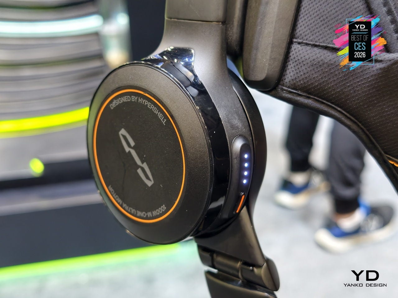
The AI MotionEngine Ultra takes input from more than a dozen sensors and adapts assistance in real time to terrain, activity, and stride. Key modes like Running+ and Cycling+ deliver stronger bursts during take-off and acceleration, while Snow and Dune stabilize movement on powder and sand. Downhill buffering shifts support to protect knees on long descents, making the exoskeleton feel like an extension of your legs rather than a rigid frame pushing against your gait.
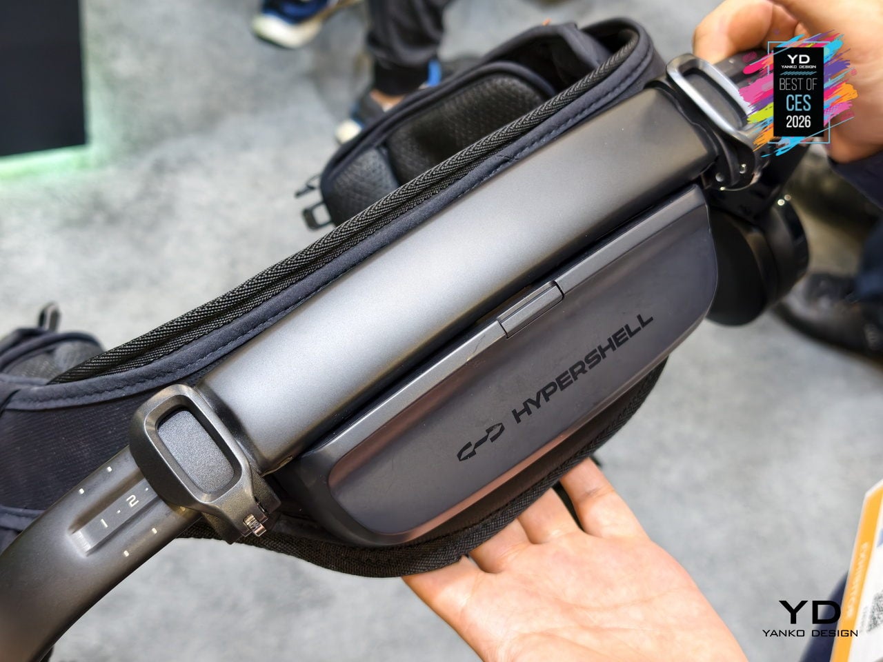
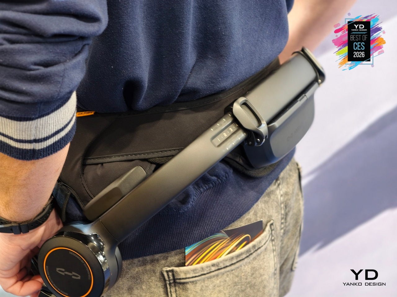
The hardware is built from SpiralTwill 3000 carbon fiber and aerospace-grade titanium alloy, with more than half the frame using automotive-grade dry carbon molding and key load-bearing parts shaped through 3D hollow forming. At 1.8kg structural weight, it is designed to shrug off scratches and abrasion on rocky terrain, operate from 20°C to 60°C, and fold down for transport, so it feels like serious outdoor gear instead of industrial equipment that belongs in a factory.
At CES 2026, Hypershell is using initiatives like the Hypershell Hundred on the show floor, and a Red Rock Canyon hike to prove that exoskeletons belong in the same conversation as performance footwear and technical apparel. The Hypershell X Ultra is a glimpse of a near future where strapping on a lightweight, AI-driven exoskeleton before a big day out feels as normal as lacing up trail shoes, and where going farther stops being about raw endurance and starts being about choosing the right gear.
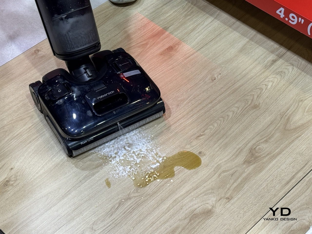
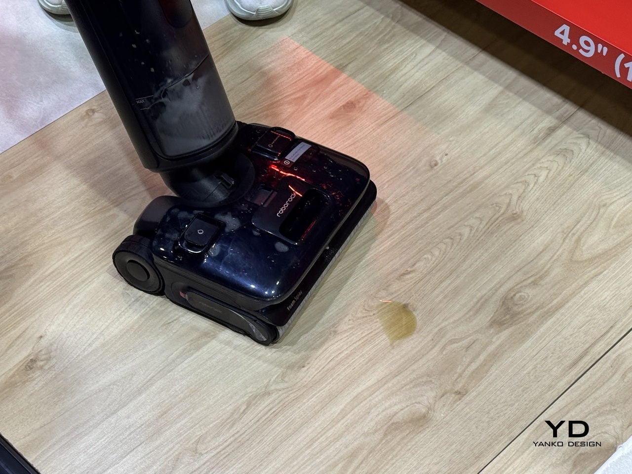
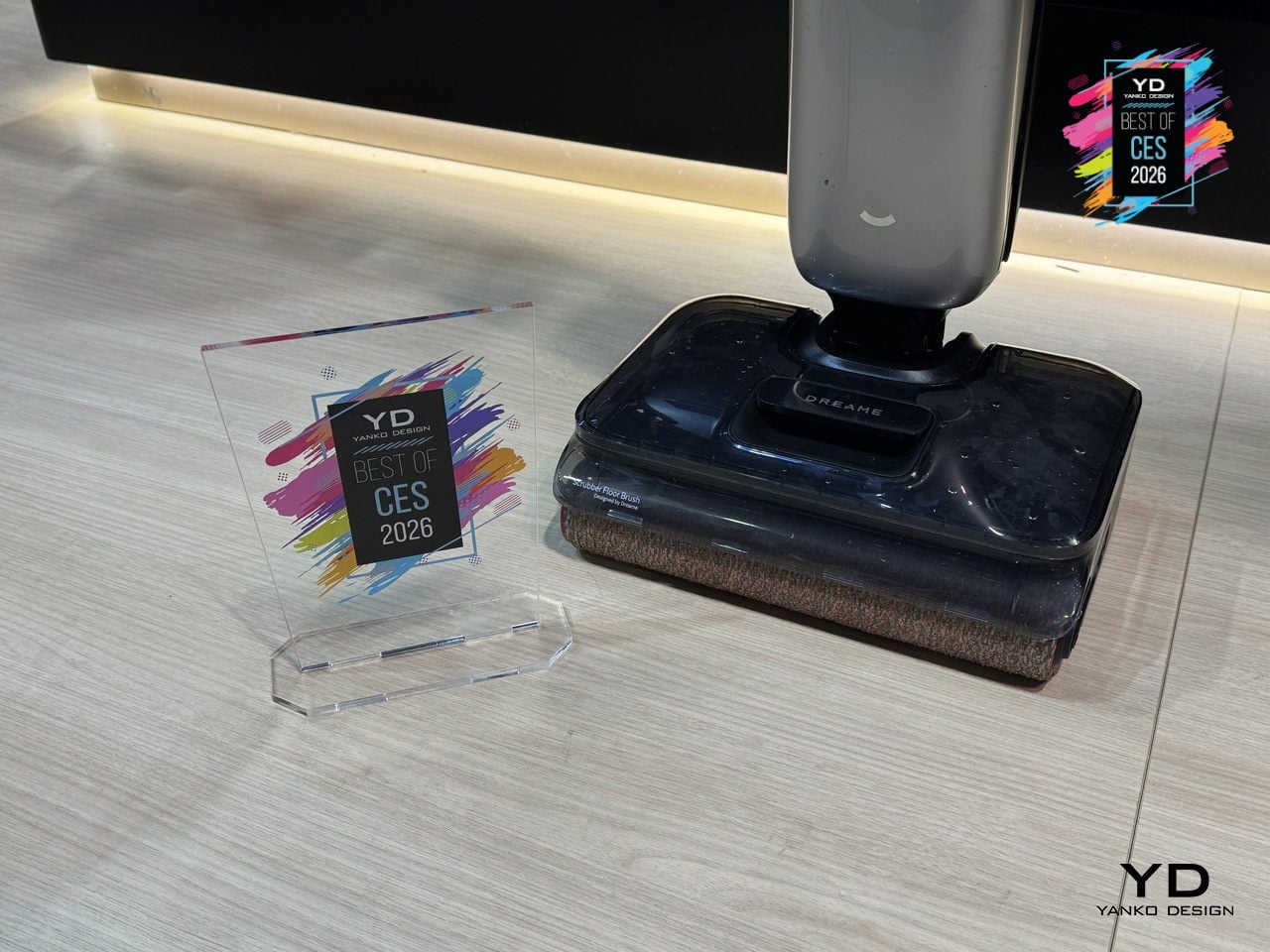
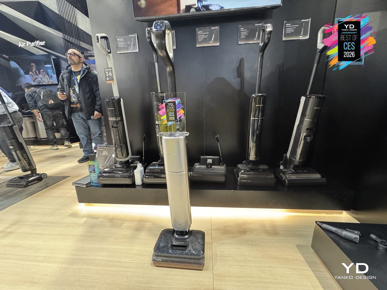
Dreame Aero Pro Dry Wet Vacuum
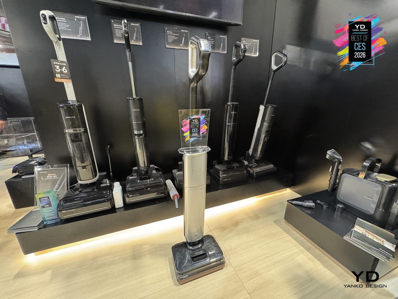
Most homes have a familiar blind spot: the strip of dust under the sofa, the pet hair hiding under the bed, and the sticky spill that never fully disappears near the dining table. Dreame’s Aero Pro feels built for that gap, a flagship wet‑dry vacuum that lies completely flat, reaches under low furniture, and then cleans itself with hot water and hot air instead of asking you to scrub a dirty roller by hand.
The Aero Pro’s 9.85 cm ultra‑thin body and 180‑degree lie‑flat design let the cleaning head hug the floor and slide under sofas, beds, and cabinets that upright cleaners and many robots simply cannot reach. Dual‑side edge cleaning helps it trace along baseboards and furniture legs, while the cordless form and low profile make it easier to weave through tight spaces without constantly stopping to rearrange a room.
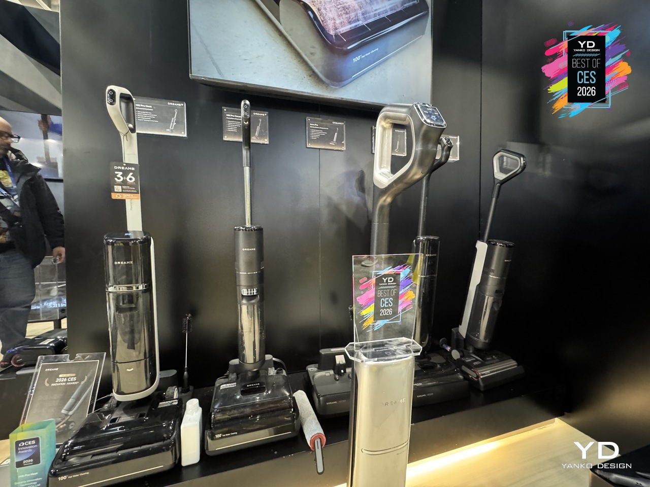
Cleaning power comes from a 25 kPa vacuum‑and‑mop 2‑in‑1 setup that handles dry debris, pet hair, and liquid spills in a single pass. Dreame’s TangleCut 2.0 brush is designed for 0 hair residue, cutting through more than 3,000 hairs without clogging, which matters when you share a home with pets or long hair. Instead of pausing to detangle the roller every few days, you can focus on actually getting the floor back to clean.
Afterwards, the Aero Pro looks after itself. A 90°C hot‑water self‑cleaning cycle flushes the roller and internal channels, eliminating 99.9% of bacteria, then a 194°F hot‑air smart‑drying system finishes the job in about five minutes with intelligent humidity control. A 1,000ml clean‑water tank, 500ml dirty‑water tank, and up to 60 minutes of runtime mean you can cover a full home in one session without constant refills or a long post‑clean routine.
Smart dirt detection and voice prompts round out the experience, nudging you when the floor is especially dirty or when the machine needs attention, while the understated design lets Aero Pro live in a hallway or living room without shouting for space. It feels like a sign that wet‑dry vacuums are growing up, blending serious cleaning performance, self‑care, and thoughtful ergonomics into a slim machine that finally tackles the corners you usually ignore.
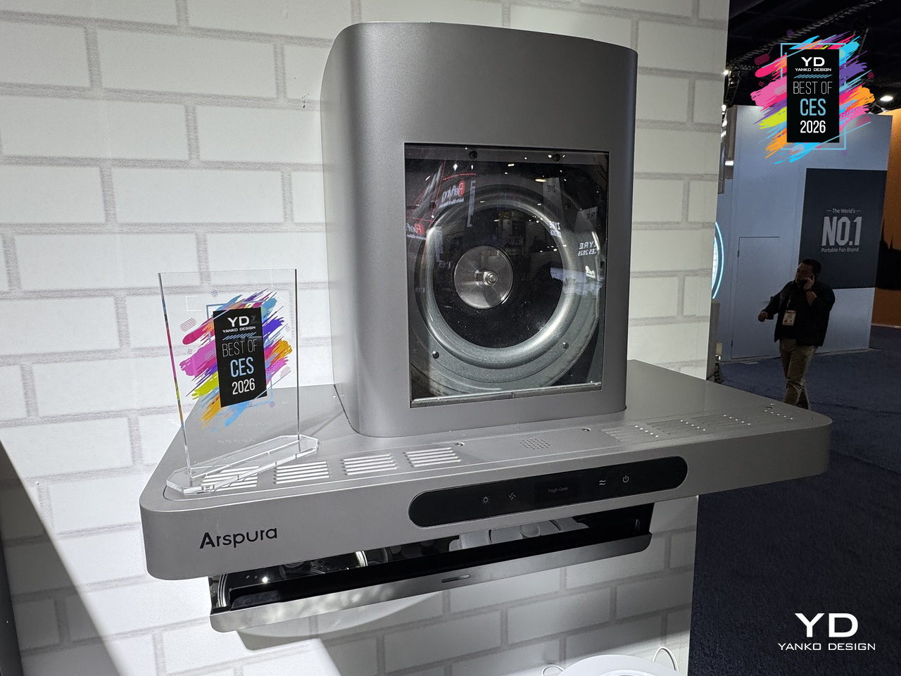
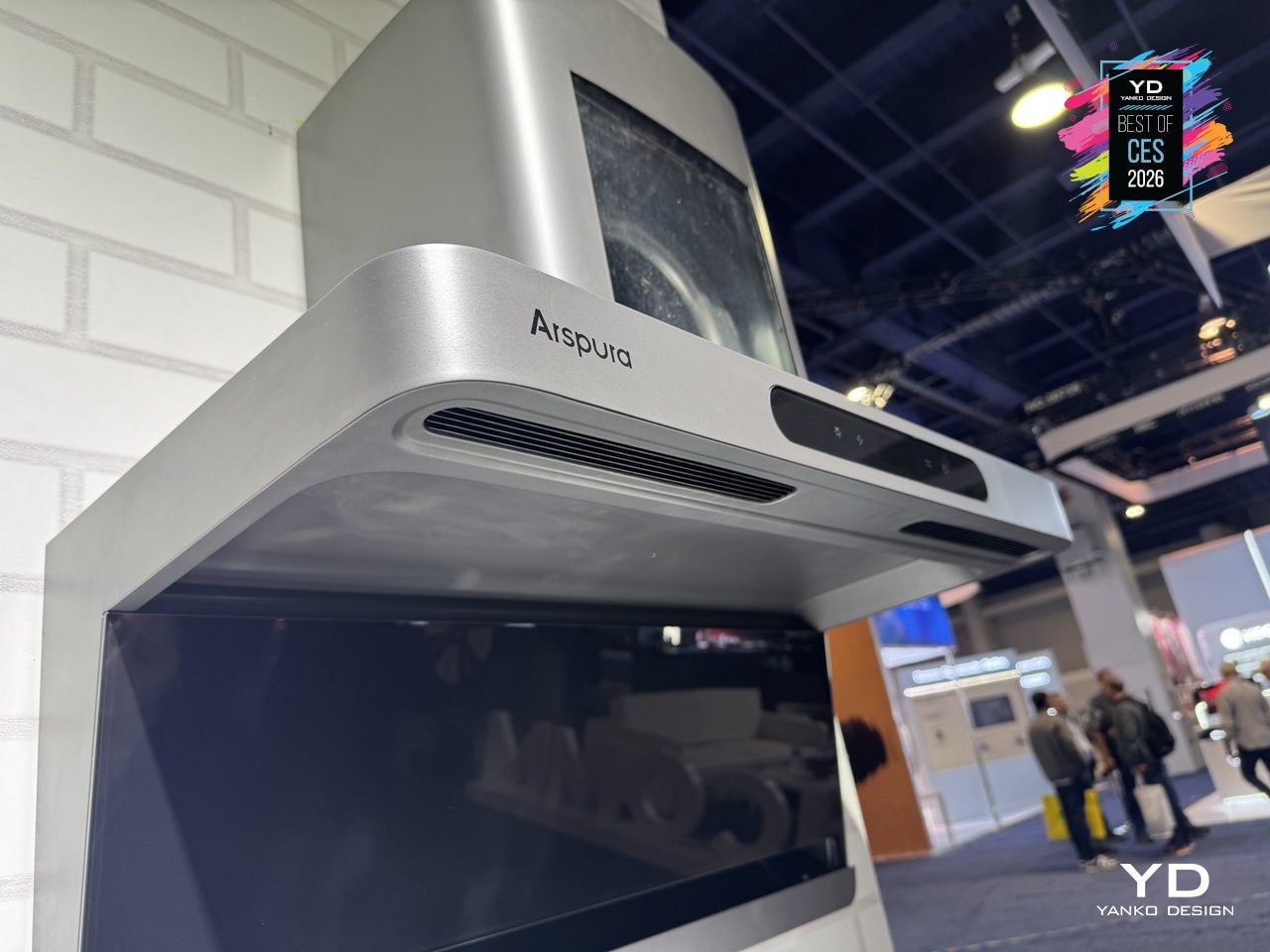
Arspura F1 Range Hood
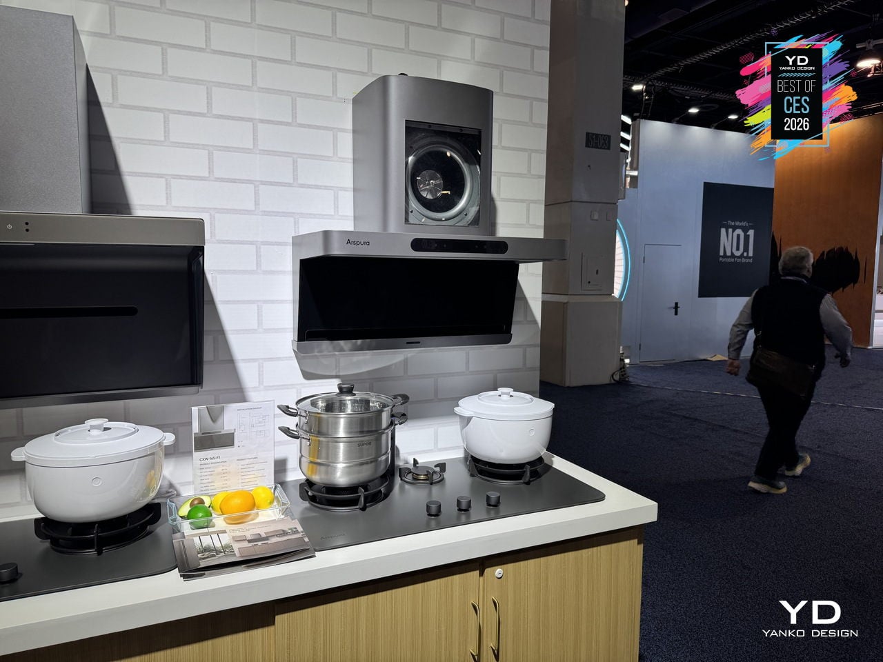
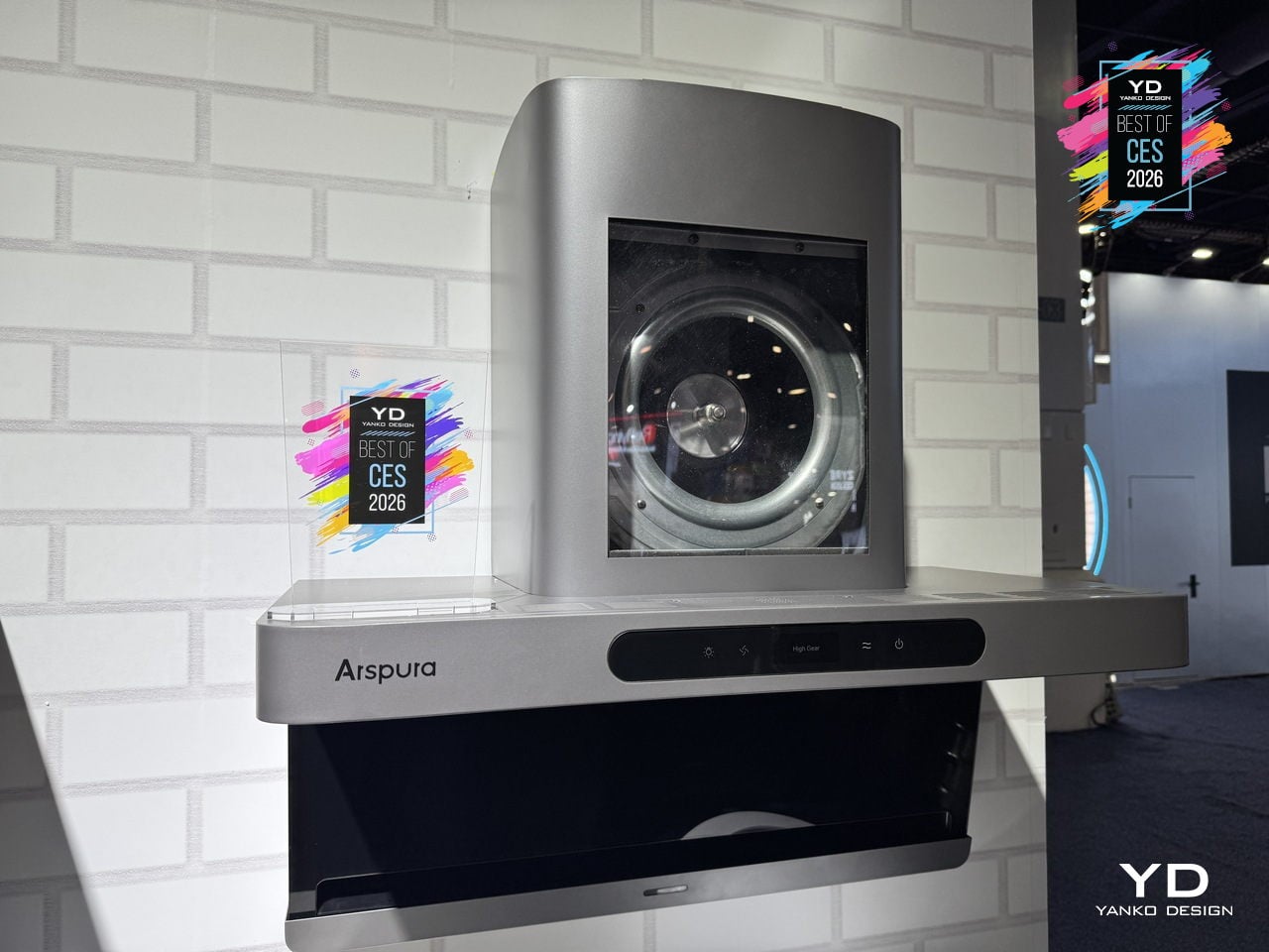
Searing a steak or stir-frying usually means watching smoke roll past a noisy hood that never quite keeps up with the pan. The Arspura F1 is a top-suction range hood built around speed and silence rather than just big CFM numbers, using a high-speed BLDC motor and ultra-fast airflow to clear smoke at the source before it drifts into the rest of the kitchen or lingers in the air.
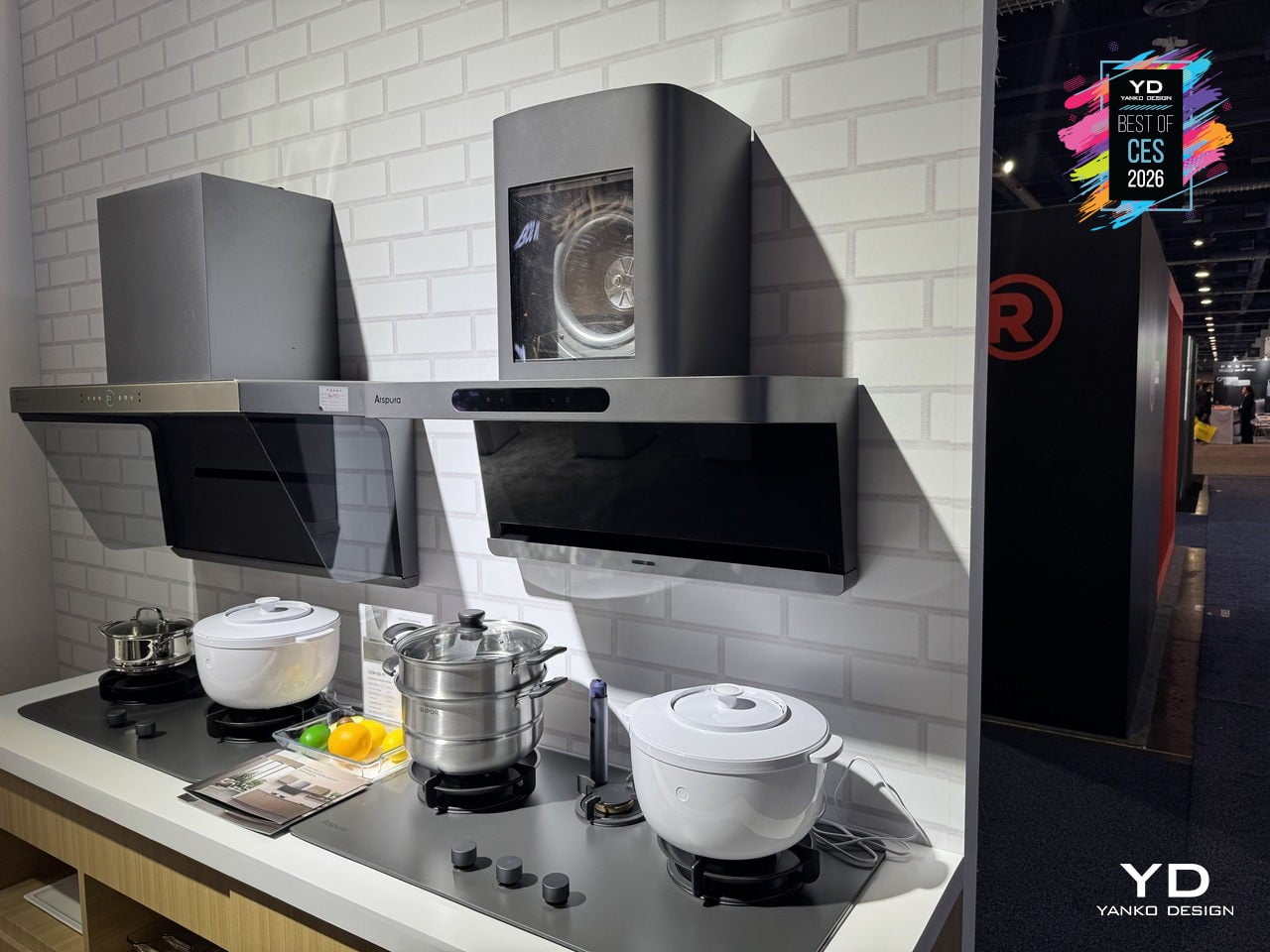
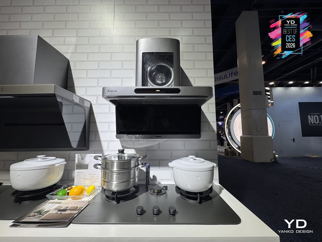
The F1 focuses on airspeed at the inlet, pushing up to 16 m/s through an elongated front slot that captures fumes in about 0.03 seconds, compared to the 3–5 m/s typical of many hoods. This source-capture approach keeps grease and odors from spreading, making the cooking zone feel clearer and the rest of the home less like it just hosted a steakhouse service, even during high-heat sessions.
Instead of metal filters that clog and need replacing, the F1 uses centrifugal force to spin grease out of the airstream and drop it into a large oil cup. The intelligent self-cleaning cycle spins the motor at high speed to fling away residue, preserving suction over time and reducing yearly maintenance to emptying the cup, with zero filter costs compared to conventional hoods that can easily add up.
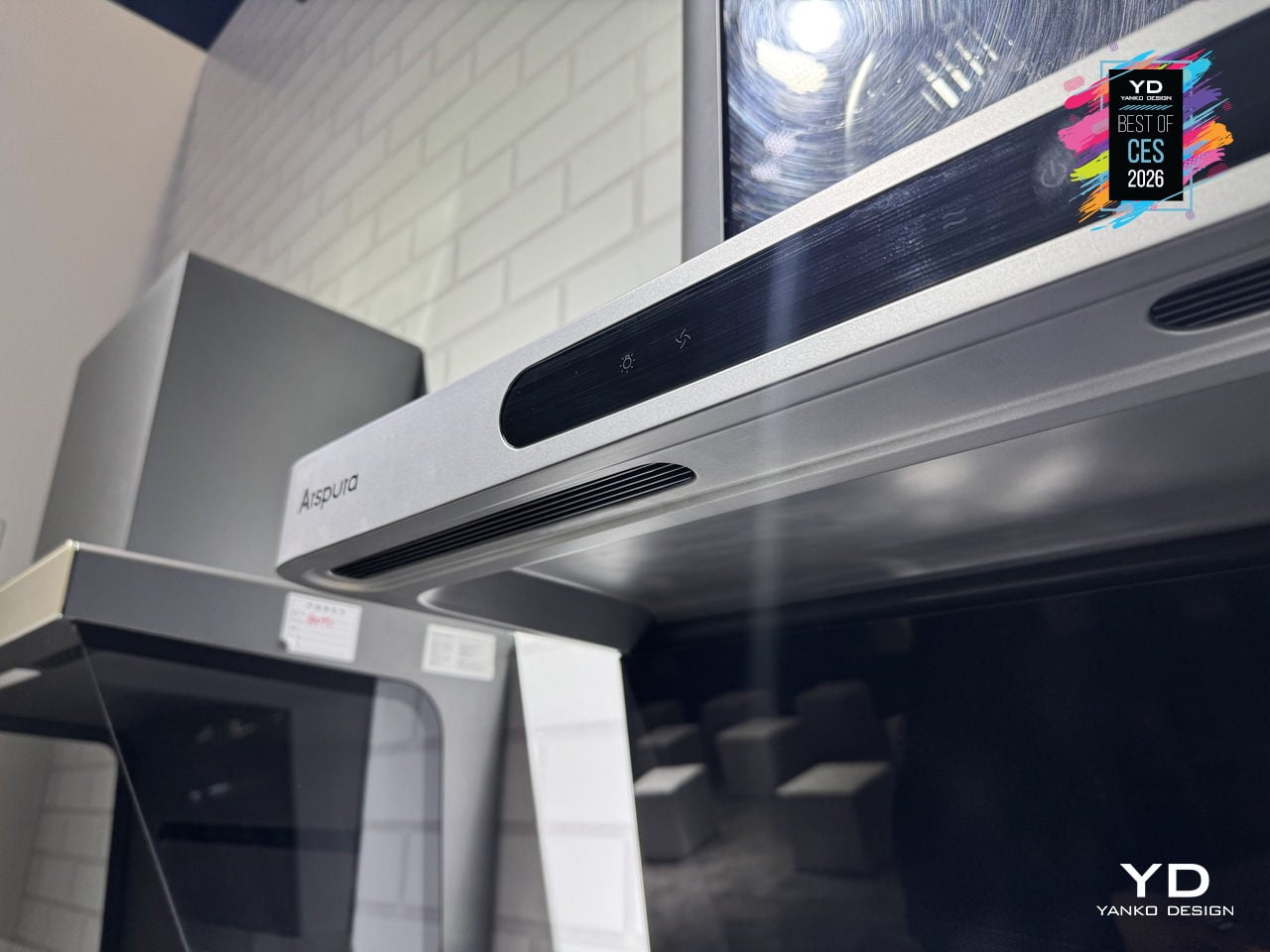
Everyday touches include three adjustable speed levels, wave-to-control gesture input that changes fan speed without smearing the front panel, and an eye-comfort LED cooking light that illuminates the cooktop evenly without glare. Auto delay shut-off keeps the fan running for a few minutes after you finish, plus the Arspura Smart App handles scheduling cleaning and sending oil-cup alerts, turning maintenance into background notifications instead of forgotten chores.
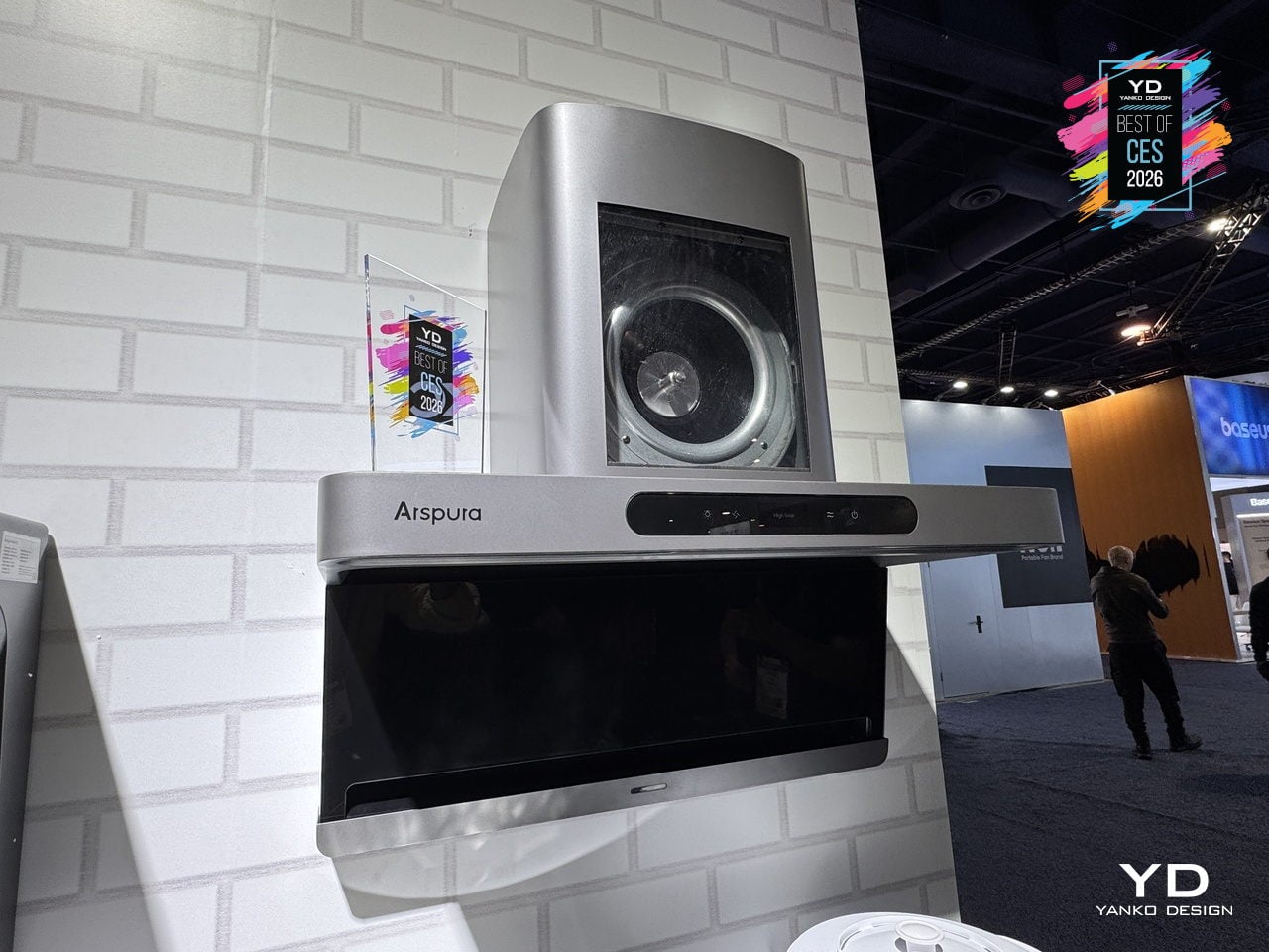
The F1’s 30-inch-class form factor, shortened body, and minimalist grey finish fit standard cabinetry and multi-burner ranges without dominating the room. By combining high-speed source capture, filter-free self-cleaning, and smart, touch-free controls in a clean, compact shell, Arspura’s F1 feels less like a necessary box over the stove and more like a quietly overqualified piece of kitchen infrastructure that earns its space by working harder and asking for less.
Dreo Smart TurboCool Misting Fan 765S
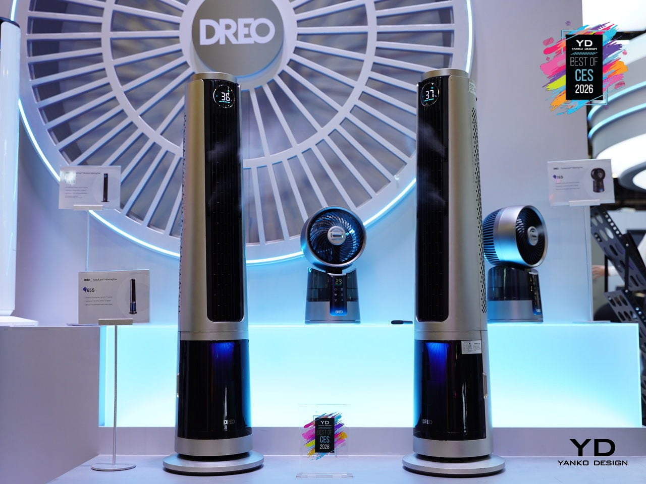
Traditional misting fans cool well but leave floors, furniture, and electronics damp, so they end up on patios and garages instead of living rooms. The idea of a tower fan that delivers real, evaporative cooling inside without leaving residue has always felt like a promise that dissolves the moment you turn it on. The DREO TurboCool Misting Fan 765S, debuting at CES 2026, is a serious attempt to finally make mist-based cooling truly indoor-friendly.
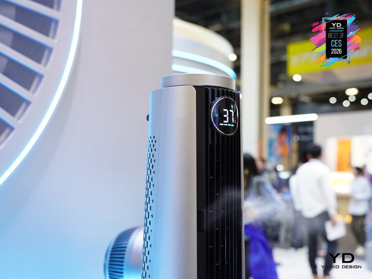
The TurboCool 765S uses DREO’s self-developed ultrasonic misting module to generate 17µm droplets that evaporate almost instantly in high-velocity air, delivering a perceived temperature drop of up to about 10°F without condensation. The TurboWind Power system pushes around 1,800 CFM at 32ft/s, reaching up to 70ft with smooth 90° oscillation, and secondary re-dispersion keeps surfaces dry even at mist outputs up to 900ml/h.
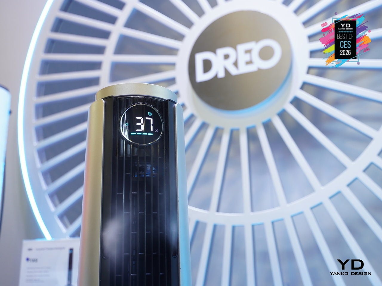
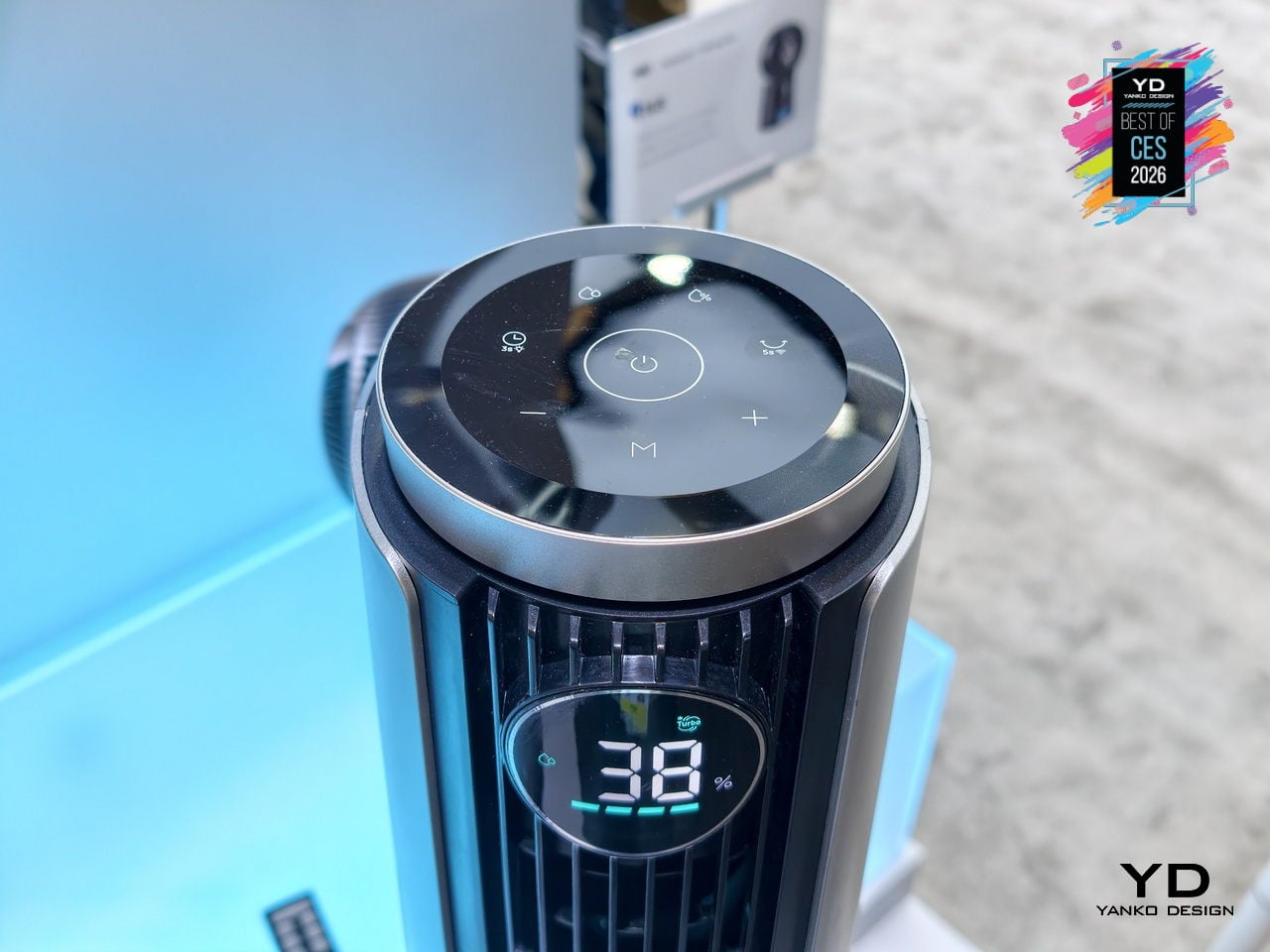
Despite that airflow, HyperSilent engineering keeps noise as low as roughly 20dB, thanks to optimized impeller geometry and air-duct design, so it can run in a bedroom or open-plan living space without dominating the soundscape. The intelligent humidity-management system, with built-in temperature and humidity sensing, a customizable RGB indicator, and automatic humidity-target control, turns the 765S into a 3-in-1 climate tool, fan, cooler, and humidifier, instead of just a fan with a water tank.
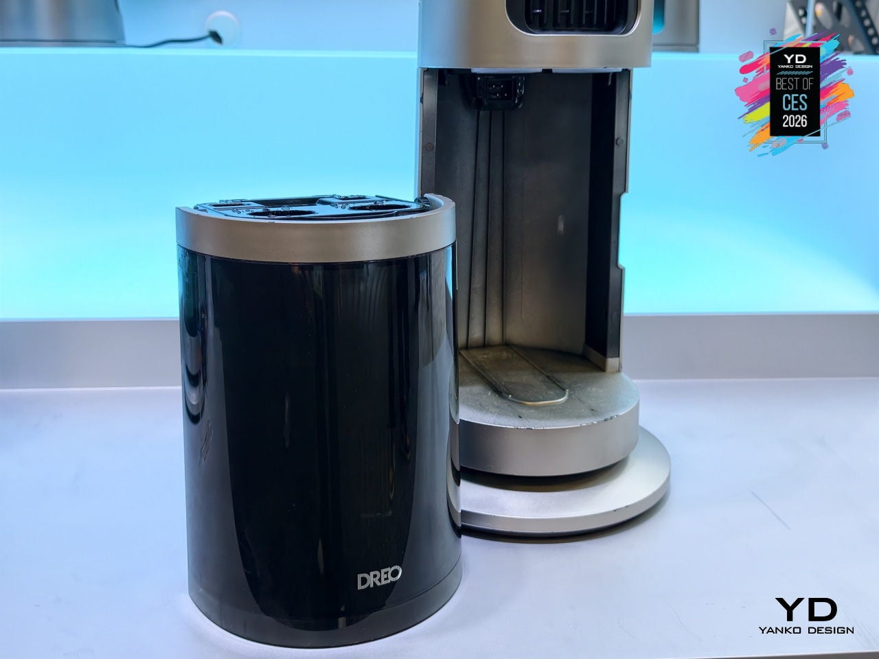
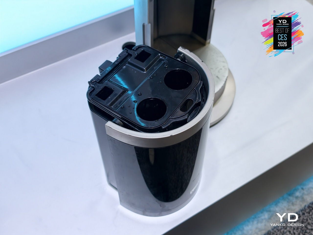
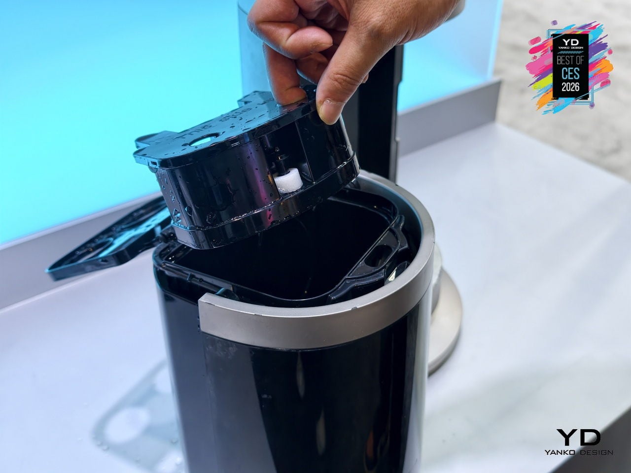
The 6L top-fill tank supports up to 7 hours of Turbo cooling, reducing how often you need to refill it during hot days or long evenings. The pump-free, hygienic design minimizes mold and bacterial risks and makes cleaning simpler than with traditional evaporative coolers. Independent control of wind and mist, plus a dedicated humidification function, means the same appliance can handle dry winter air, sticky summer heat, and shoulder seasons without swapping devices.
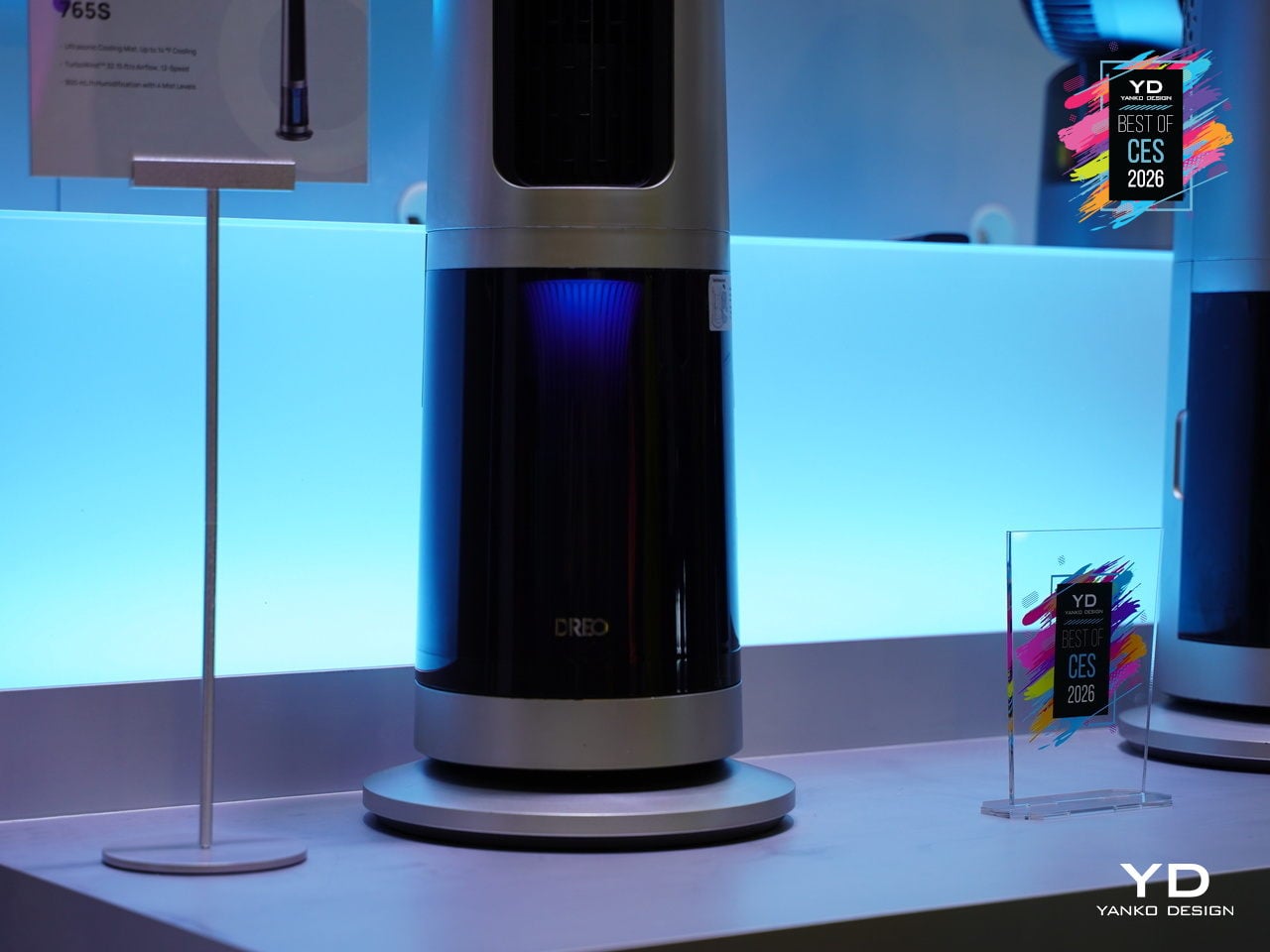
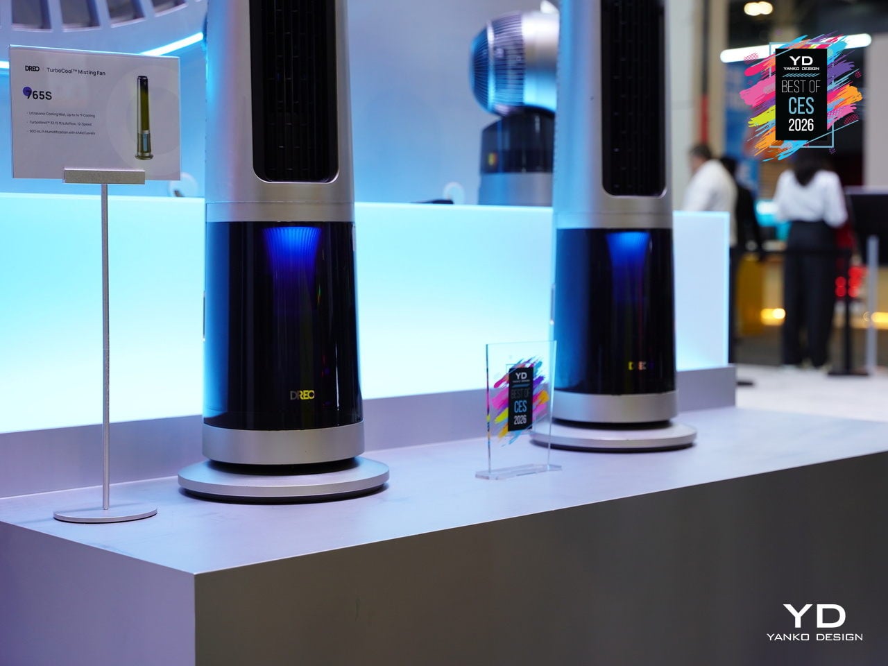
The TurboCool 765S fits into smart homes with 12 fan speeds, 4 cooling modes, and 4 humidity levels accessible via app, voice, or remote, plus child-lock safety and ecosystem compatibility. The slim, silver-and-black tower with a transparent base and blue core looks more like a high-end audio column than a utility fan. At CES 2026, it stands out as climate tech that respects both performance and living-room aesthetics, making all-day indoor cooling feel less like a compromise.
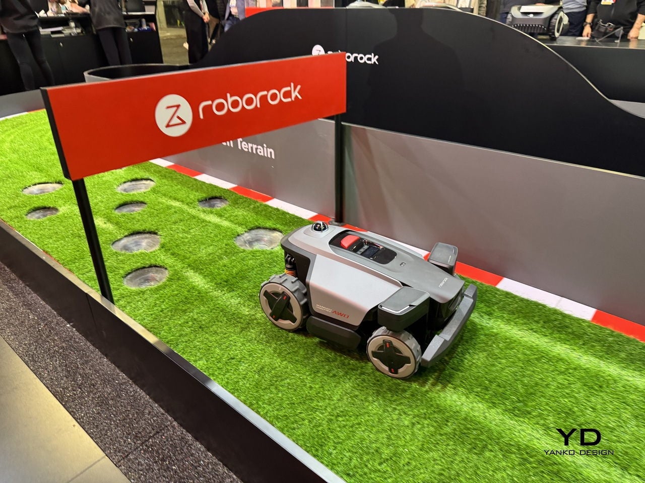
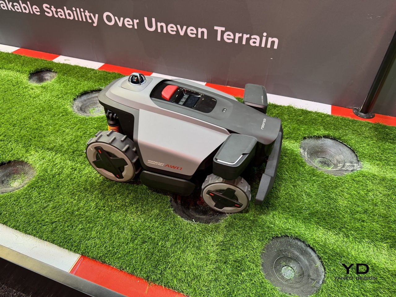
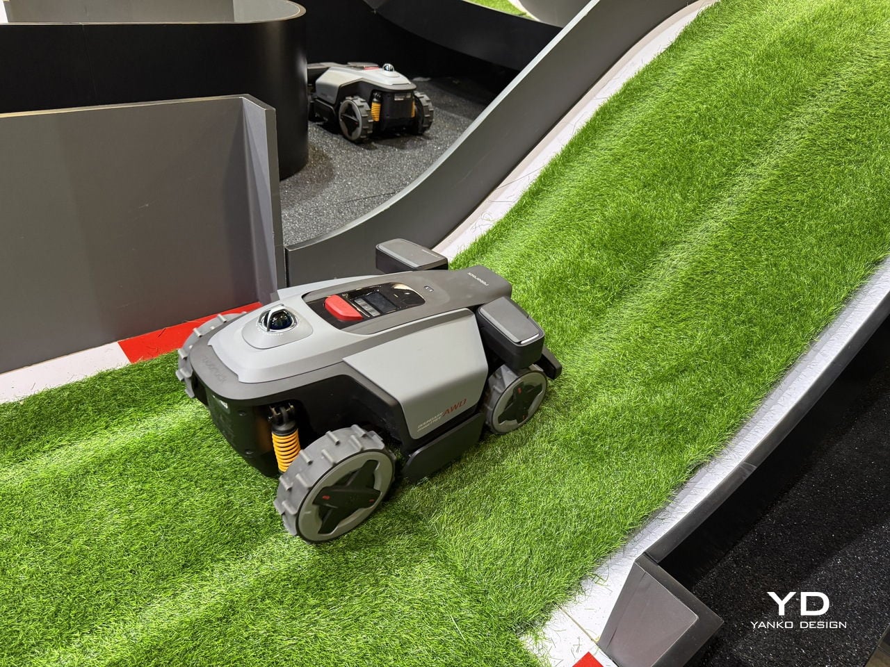
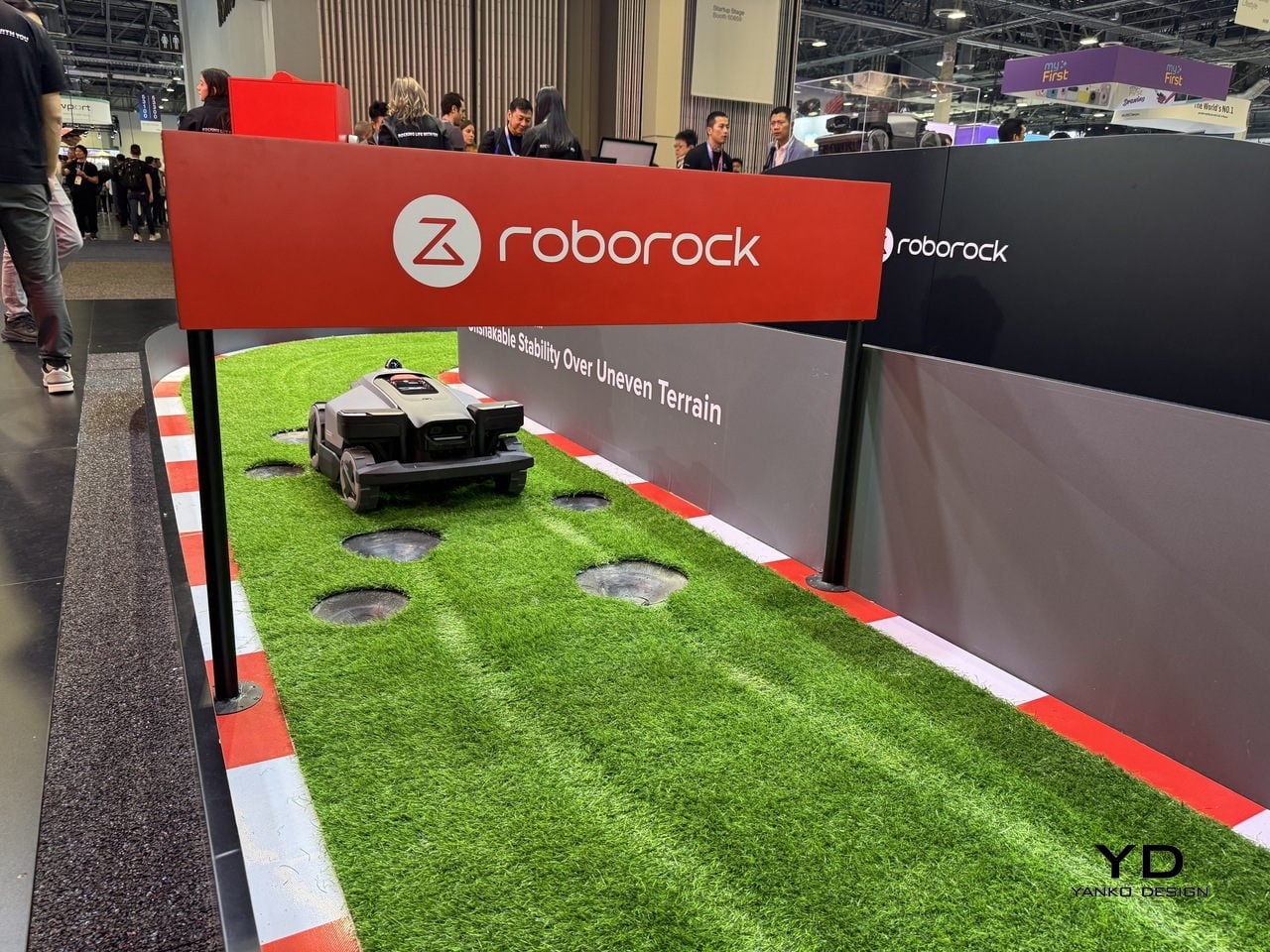
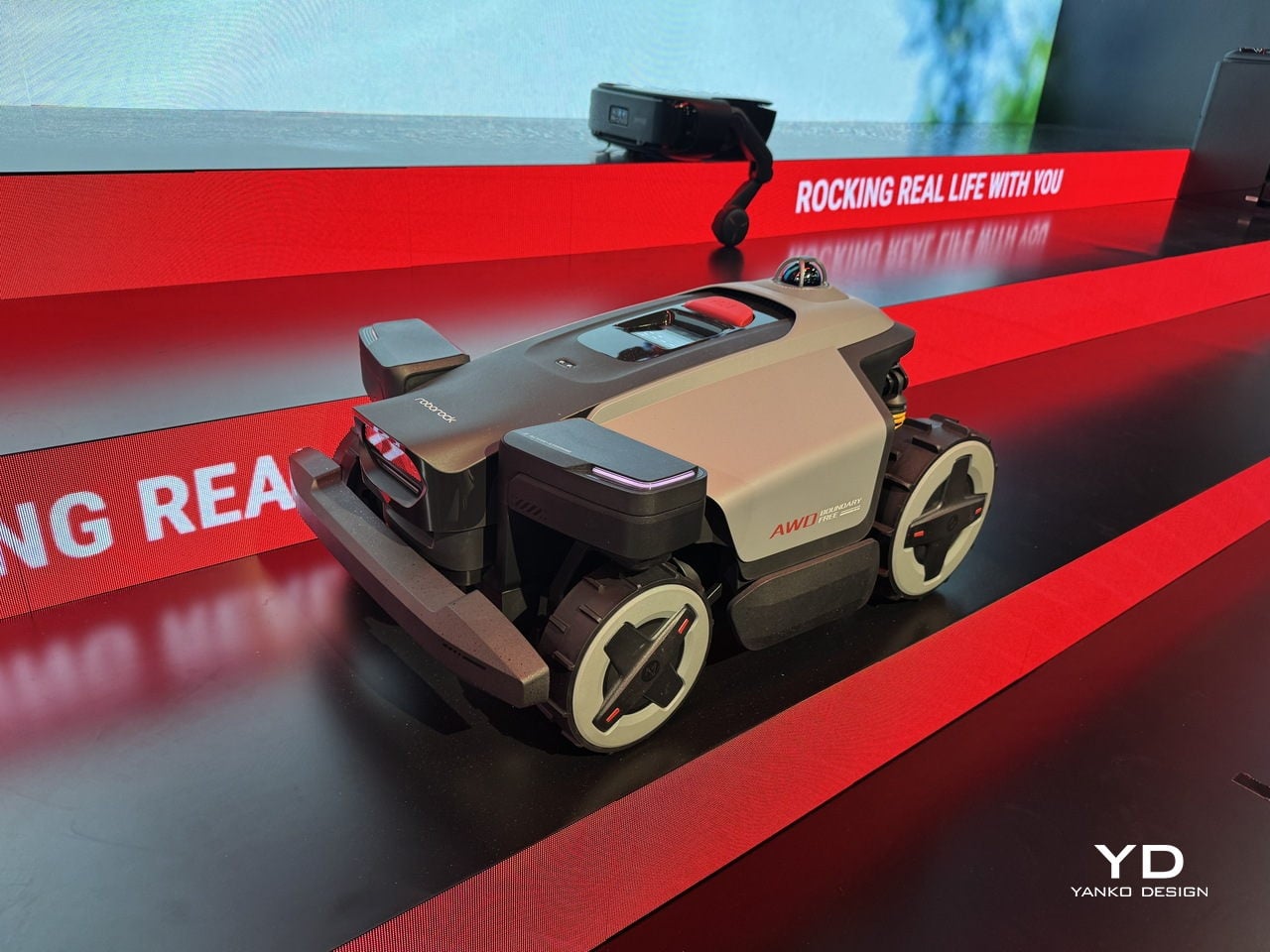
Dreame A3 AWD Pro Robot Mower
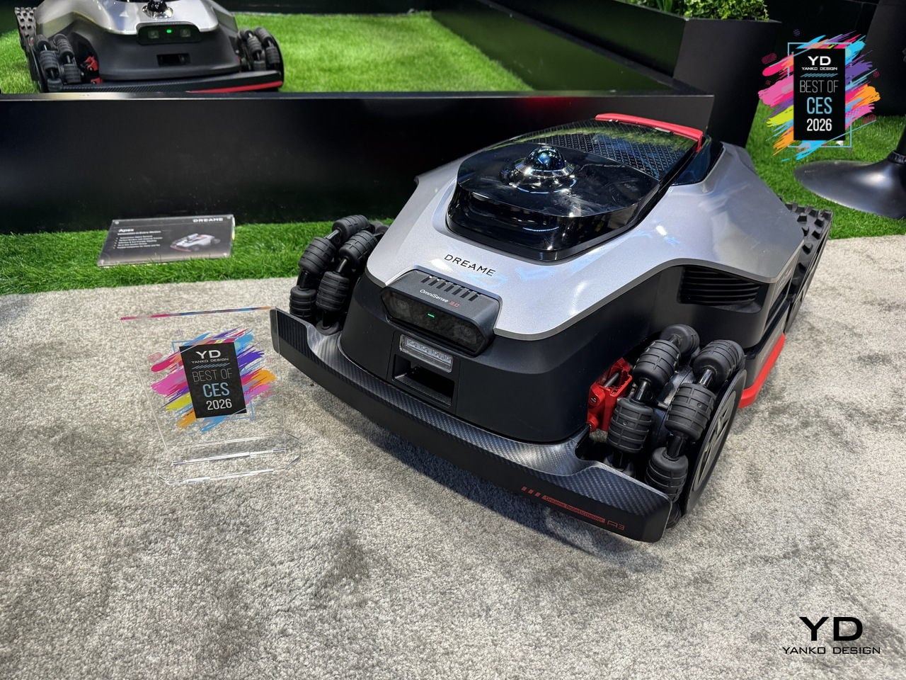
Dreame’s A3 AWD Pro is a robotic mower built for the kind of lawn that usually defeats robots: sloped, uneven, full of trees, edges, and family life. It uses 360° 3D AI vision, LiDAR, and RTK mapping instead of perimeter wires, and it sits at the top of Dreame’s mower lineup as the one meant to tame complex yards without asking you to spend a weekend trenching wire around flower beds.
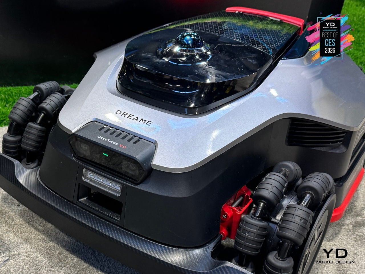
The 4WD hub motors and all-wheel-drive architecture let it handle up to 80% slopes and climb 4.5cm obstacles, which means it can deal with hills, roots, and transitions that would stop a typical mower. The low, wide stance and independent wheel control keep it stable on inclines and let it move confidently across different surfaces without getting stuck or leaving awkward uncut patches halfway up a slope.
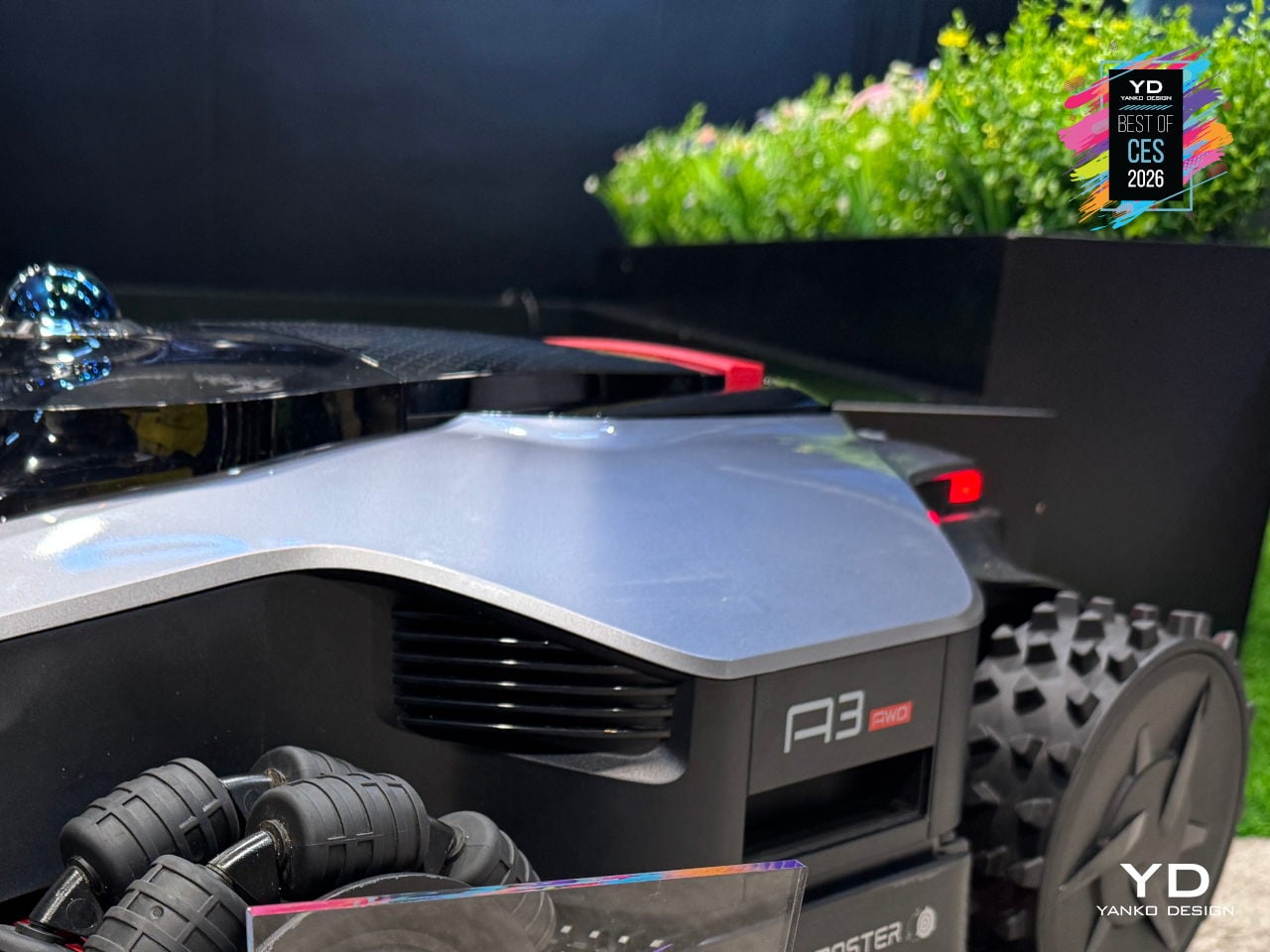
The 45cm dual-blade cutting deck and adjustable height speed up mowing on larger lawns, while 1mm edge precision reduces the strip of grass that usually needs manual trimming along fences, paths, and garden beds. Dreame frames this as the difference between a robot that roughs in a lawn and one that actually finishes the job, covering wide swaths while still respecting borders closely enough that you are not breaking out a string trimmer every week.
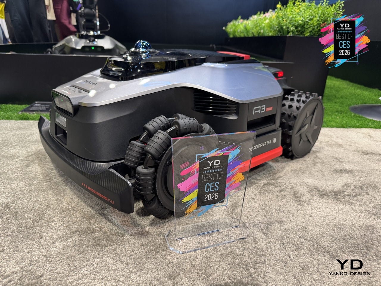
AI-powered auto-mapping, 360° vision, and LiDAR let the A3 AWD Pro recognize yard boundaries, create virtual zones, and avoid obstacles without wires. Garden Guardian features include obstacle detection, child and pet awareness, and anti-theft alerts, making it feel safe to let the mower work while kids play or pets wander, and reassuring if it lives outside full-time, parked on a charging tower in the yard.
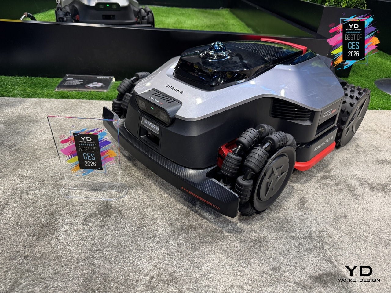
Automatic return to the dock for charging, rain detection that sends it home during showers, app control for schedules and zones, and OTA updates that keep navigation and behavior evolving turn lawn care from a weekly chore into something that mostly happens in the background. For people with tricky yards who usually spend Saturday mornings wrestling a push mower up hills, the Dreame A3 AWD Pro feels like the kind of upgrade that finally justifies a robot.
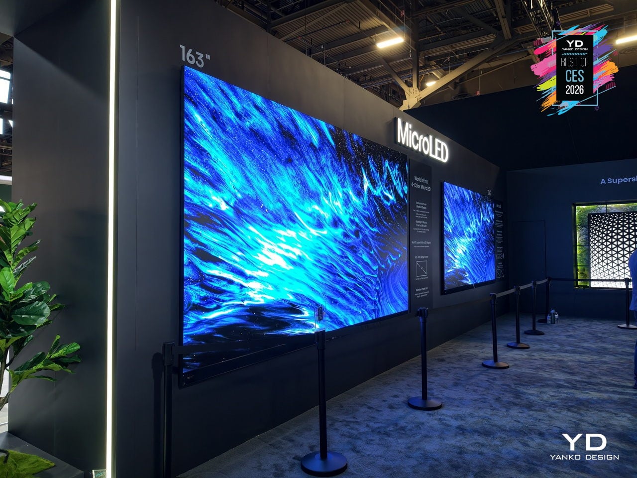
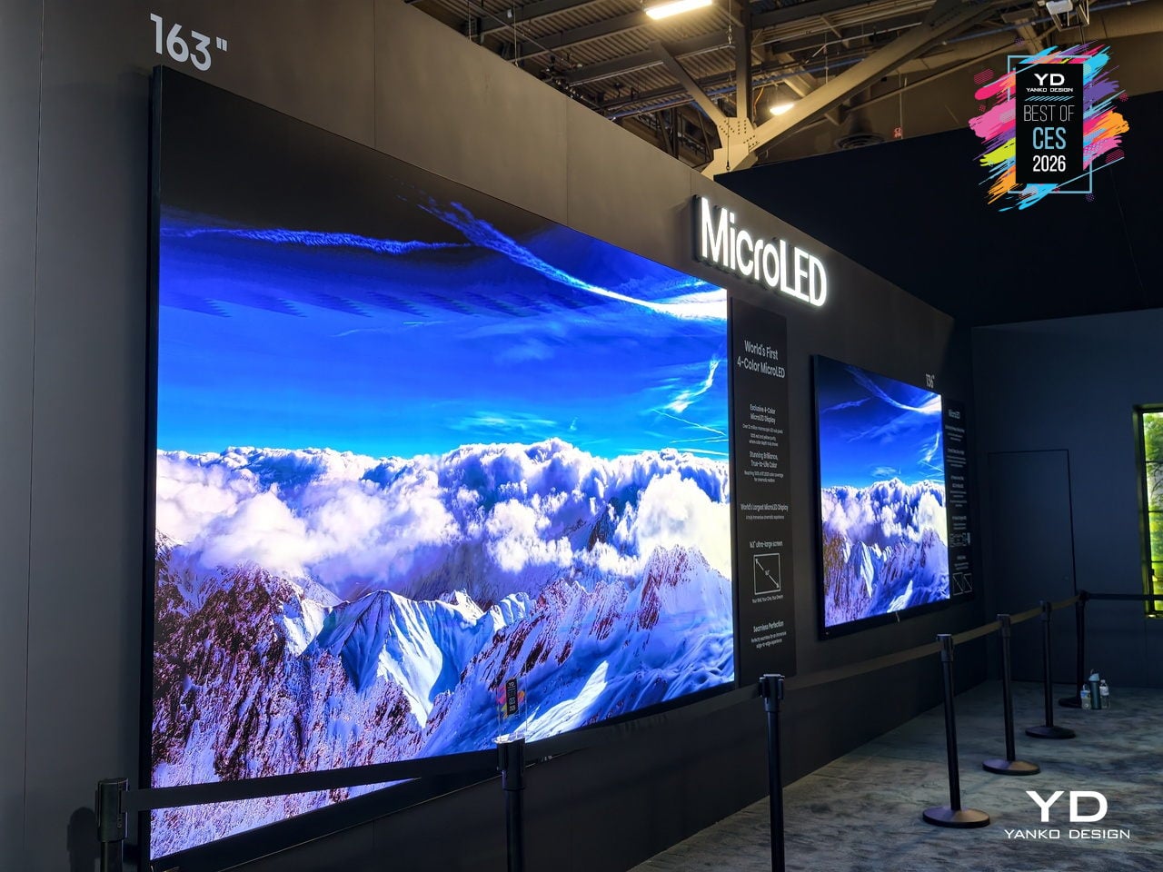
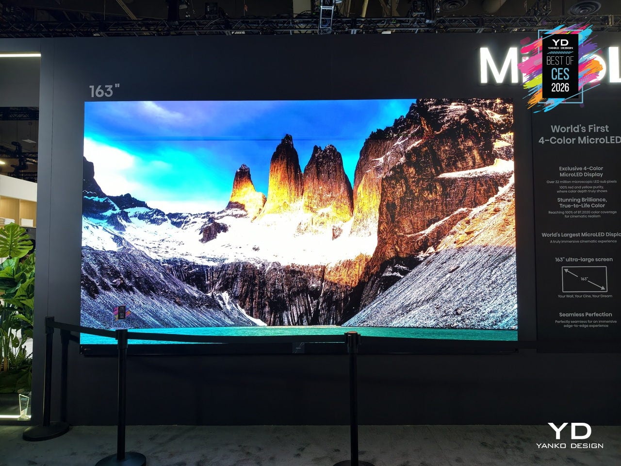
Hisense 163MX RGBY MicroLED TV
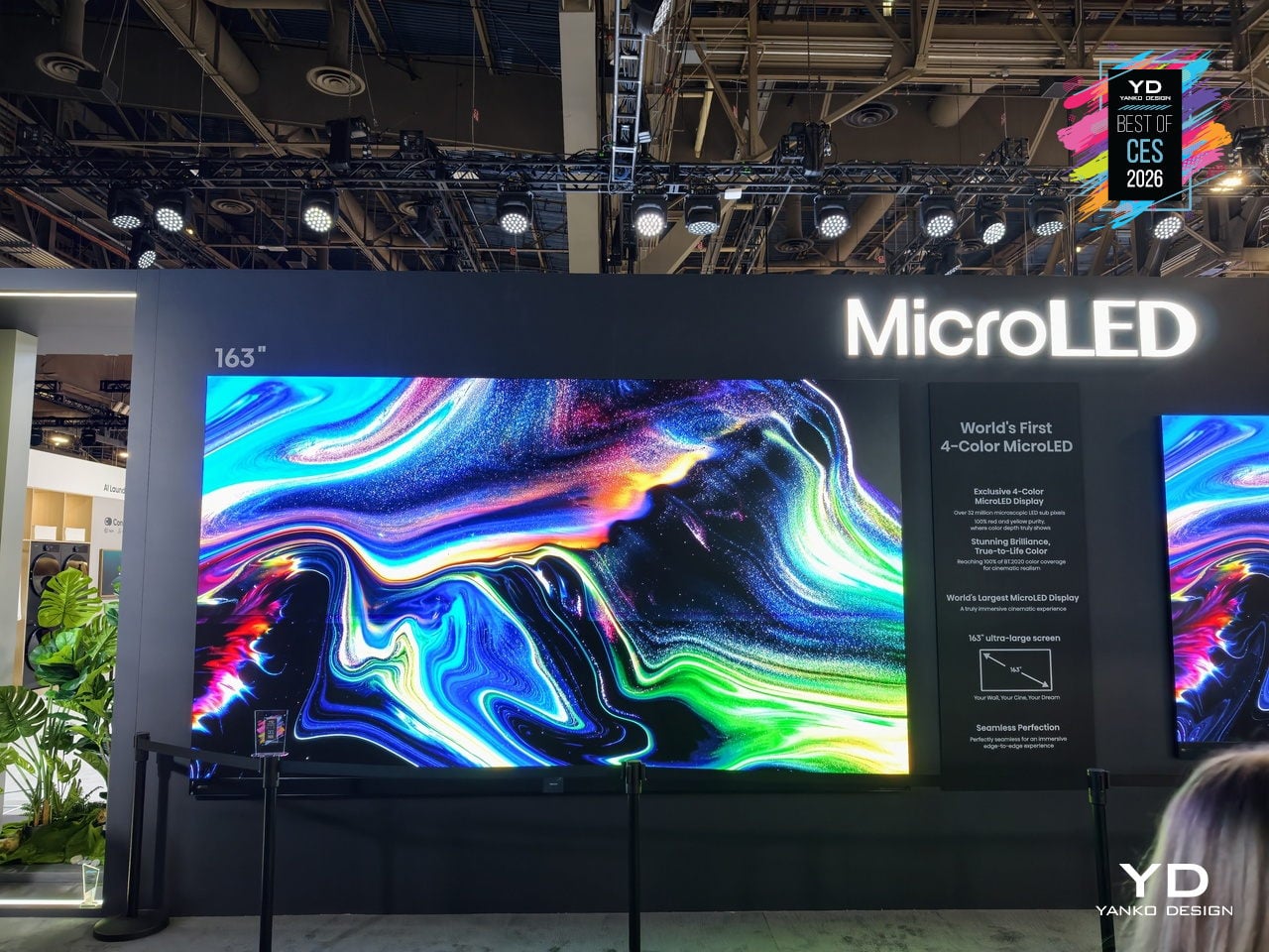
The Hisense 163MX RGBY MicroLED is a 163-inch wall-sized display that tries to solve a long-standing problem with ultra-large TVs: they can be bright and sharp but still miss the warmth and nuance that creators intend. It debuts an industry-first four-primary RGBY architecture and has already been recognized with a CES 2026 Best of Innovation Award for pushing MicroLED color forward in a direction that feels genuinely different.
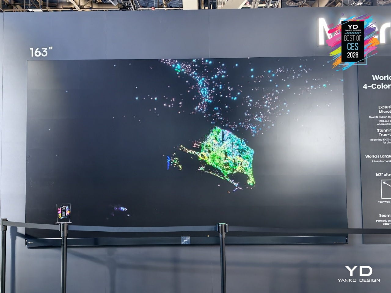
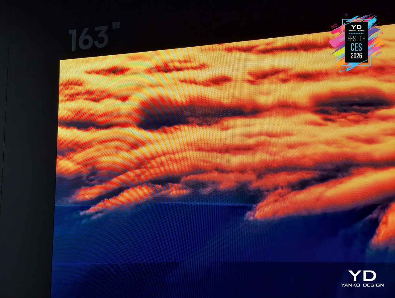
Adding a yellow sub-pixel to the usual red, green, and blue fills the spectral gap between 500 and 600nm, where many MicroLEDs tend to mute subtle tones. The 163MX uses this RGBY structure and advanced color management across 33.17 million sub-pixels to dramatically enhance color fidelity and achieve up to 100 % of the BT.2020 color space, making it suitable for creator-true content that demands accurate warmth and vibrancy.
The display lives in a room with an ultra-slim 32 mm profile and a precision zero-gap wall mount that lets it sit flush against architectural surfaces. In a large, open living space or private screening room, the TV reads more like a luminous wall panel than a conventional screen, keeping the focus on the content while still feeling deliberately designed, not just enormous and imposing like commercial signage.
Hisense positions the 163MX as the next step in a longer journey, from pioneering RGB MiniLED technologies to exploring multi-primary systems and now RGBY MicroLED. The CES 2026 Best of Innovation Award recognizes this work in expanding the color spectrum and sets the 163MX up as a reference point for future large-format displays, not just another giant TV chasing higher brightness numbers or deeper blacks.
By treating color architecture, industrial design, and wall integration as a single problem to solve, Hisense’s RGBY MicroLED points toward living rooms and dedicated spaces where a 163-inch screen can deliver cinema-grade color without feeling like a piece of commercial equipment bolted to the wall, offering a preview of how ultra-large displays might evolve when warmth, vibrancy, and refined integration matter as much as sheer size.
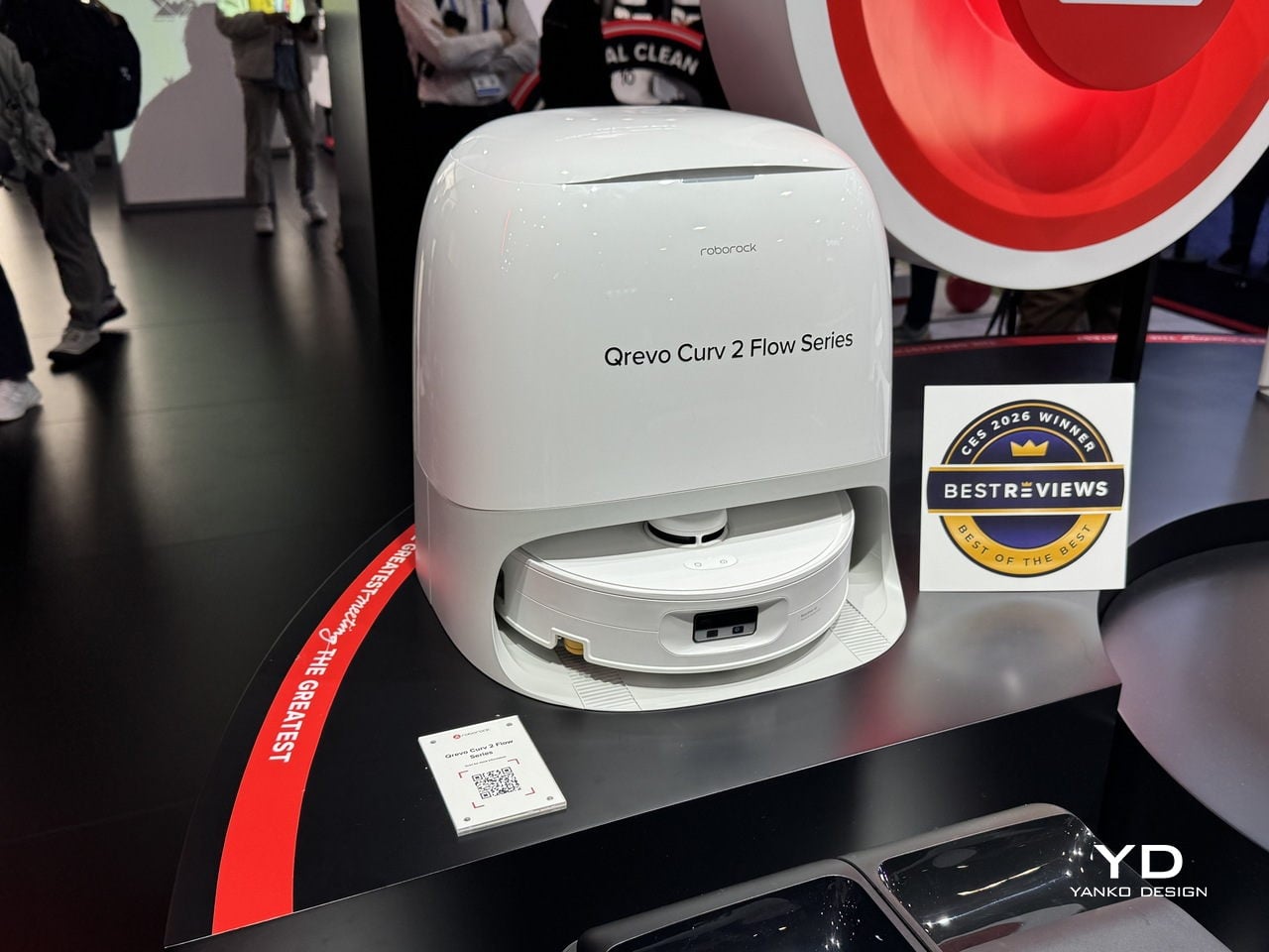
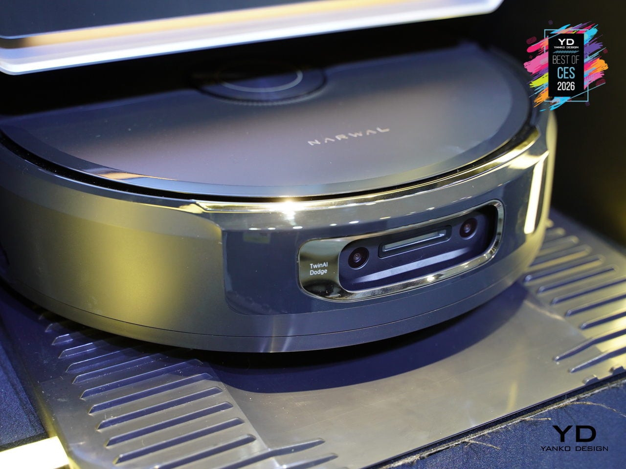
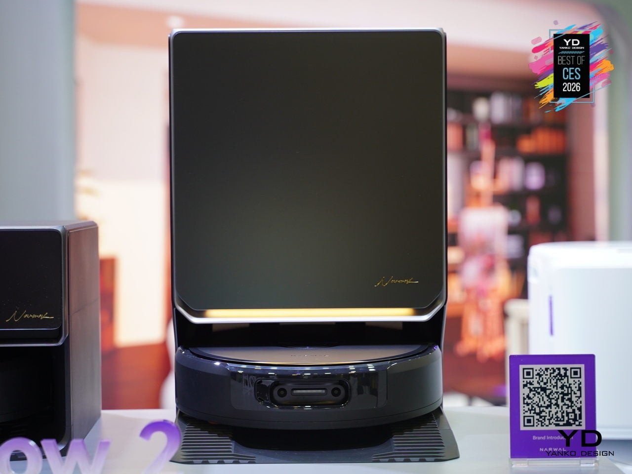
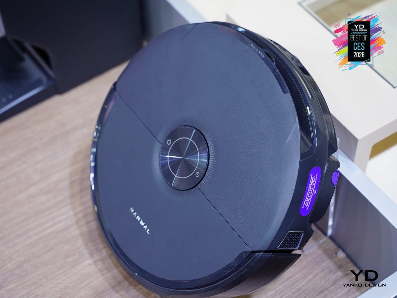
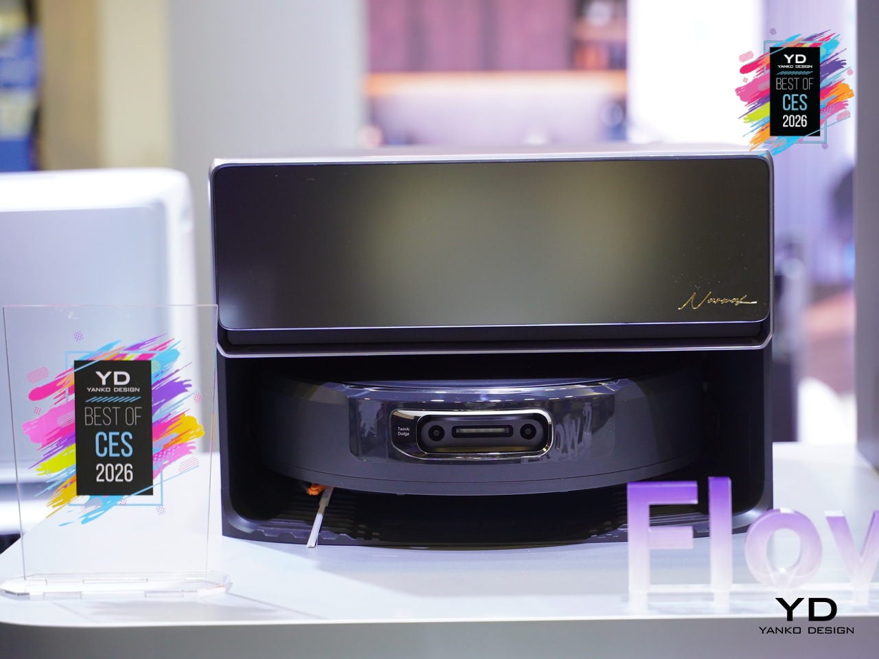
Narwal Flow 2 Vacuum
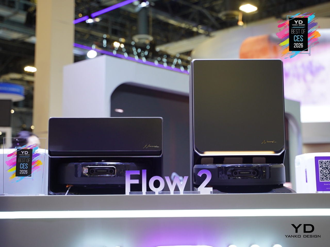
Narwal Flow 2 debuted at CES 2026 as the brand’s smartest robot vacuum yet, built around a NarMind Pro autonomous system that recognizes unlimited objects and assigns risk-based cleaning strategies. Instead of treating every obstacle the same, it adjusts distance and intensity based on what it sees, cleaning within 8 mm of walls while giving pet waste a protective 70 mm bypass to avoid messy accidents.
The headline intelligence upgrades are Pet Care Mode, Baby Care Mode, and AI Floor Tag. Pet Care Mode automatically identifies pet zones, can scan for missing pets, and even video-calls them. Baby Care Mode drops into ultra-quiet operation near cribs, recognizes toys, and avoids crawling mats. AI Floor Tag spots valuables and logs them with alerts, turning the robot into something that adapts to families, not just floors.
Flow 2 also brings a new design outlook, with a rational arc-form dock, a frosted glass panel on the front, and easy-lift water tanks shaped for straight-up lifting. The integrated status light bar glows softly through the glass, giving the dock a premium, sleek presence that looks more like furniture than an appliance. It is designed to live in visible spaces without visual friction or clutter.
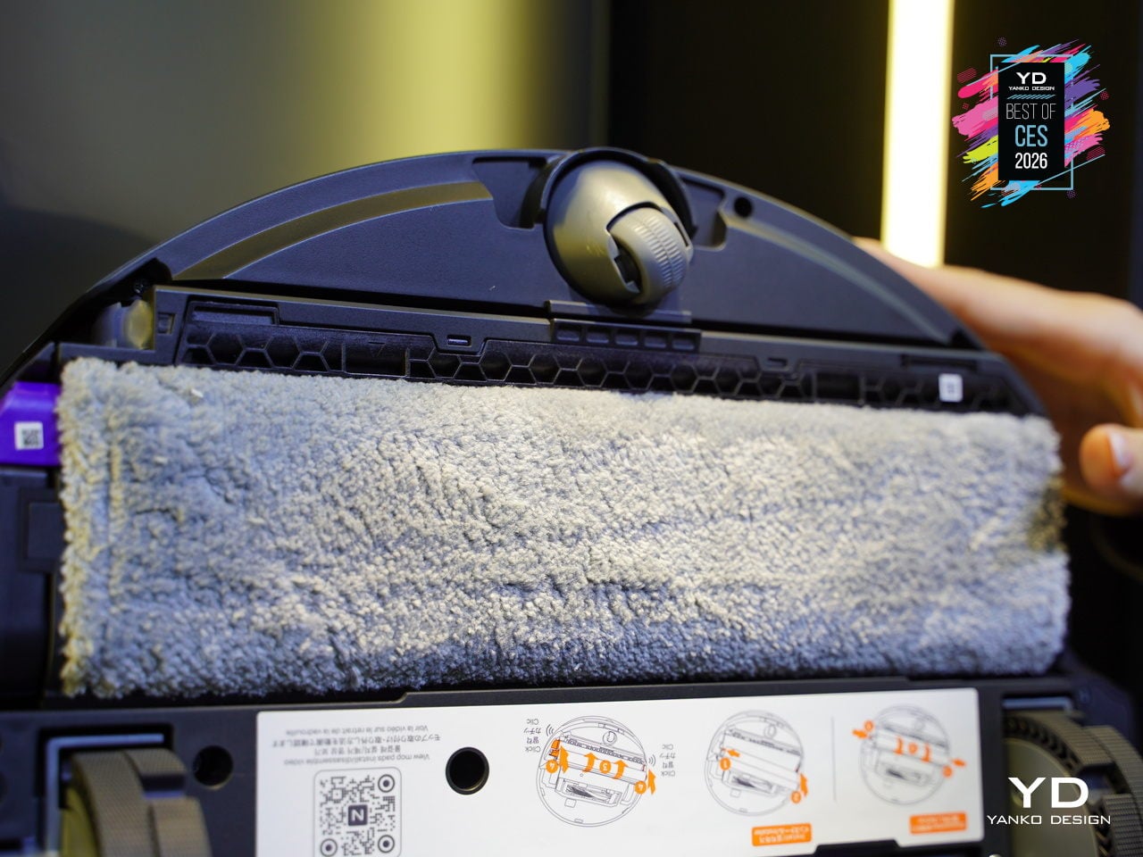
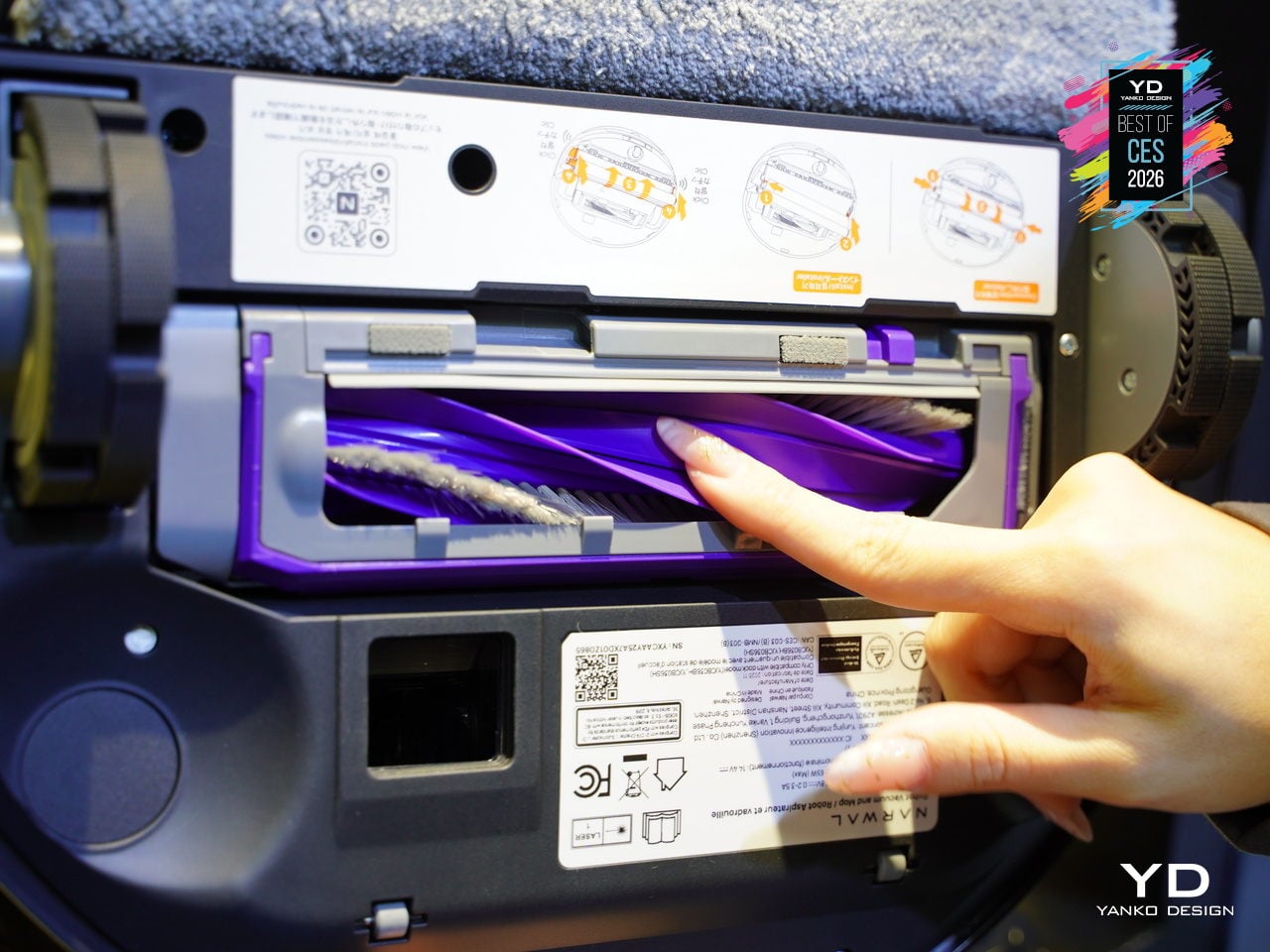
The FlowWash track-mop system continuously infuses the mop with fresh water at 140 °F, while a scraper strips away dirt in real time, and a built-in stirrer prevents odors in the dirty tank. Combined with 30,000 Pa suction, CarpetFocus Mode, and full-cycle de-tangling, Flow 2 handles everything from kitchen spills to pet hair without rewashing floors or clogging up after the first run through a busy home.
Flow 2 represents a shift from robots that simply avoid obstacles to robots that understand context. The combination of risk-based avoidance, scenario-specific modes, self-cleaning mopping, and a dock that looks like furniture shows that robot vacuums are finally moving from basic obstacle avoidance to genuine household awareness, adapting to pets, babies, and busy schedules without constant supervision.
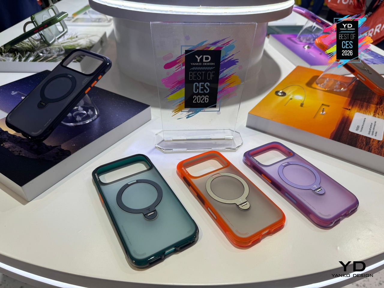
TORRAS Ostand Q3 Air Phone Case
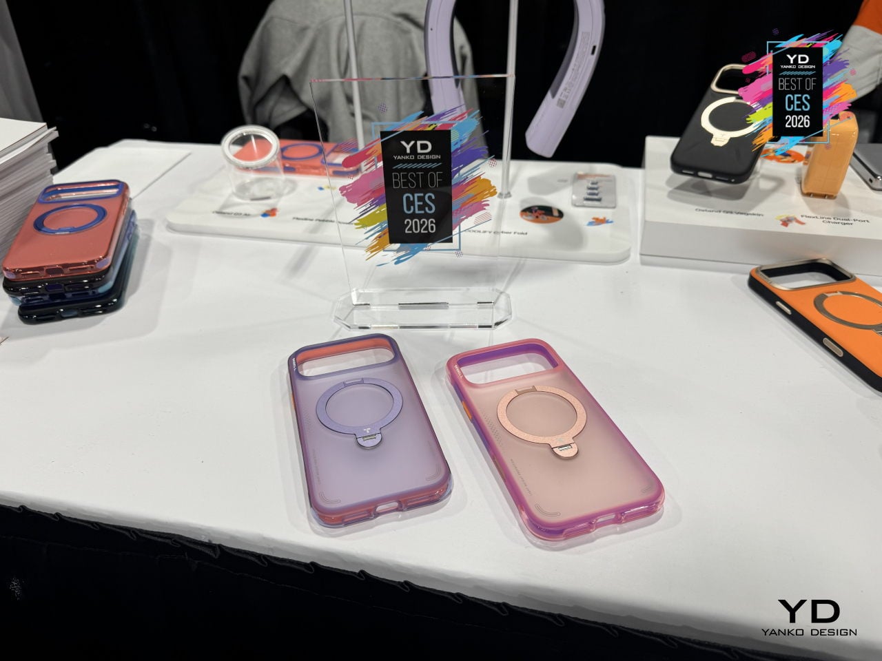
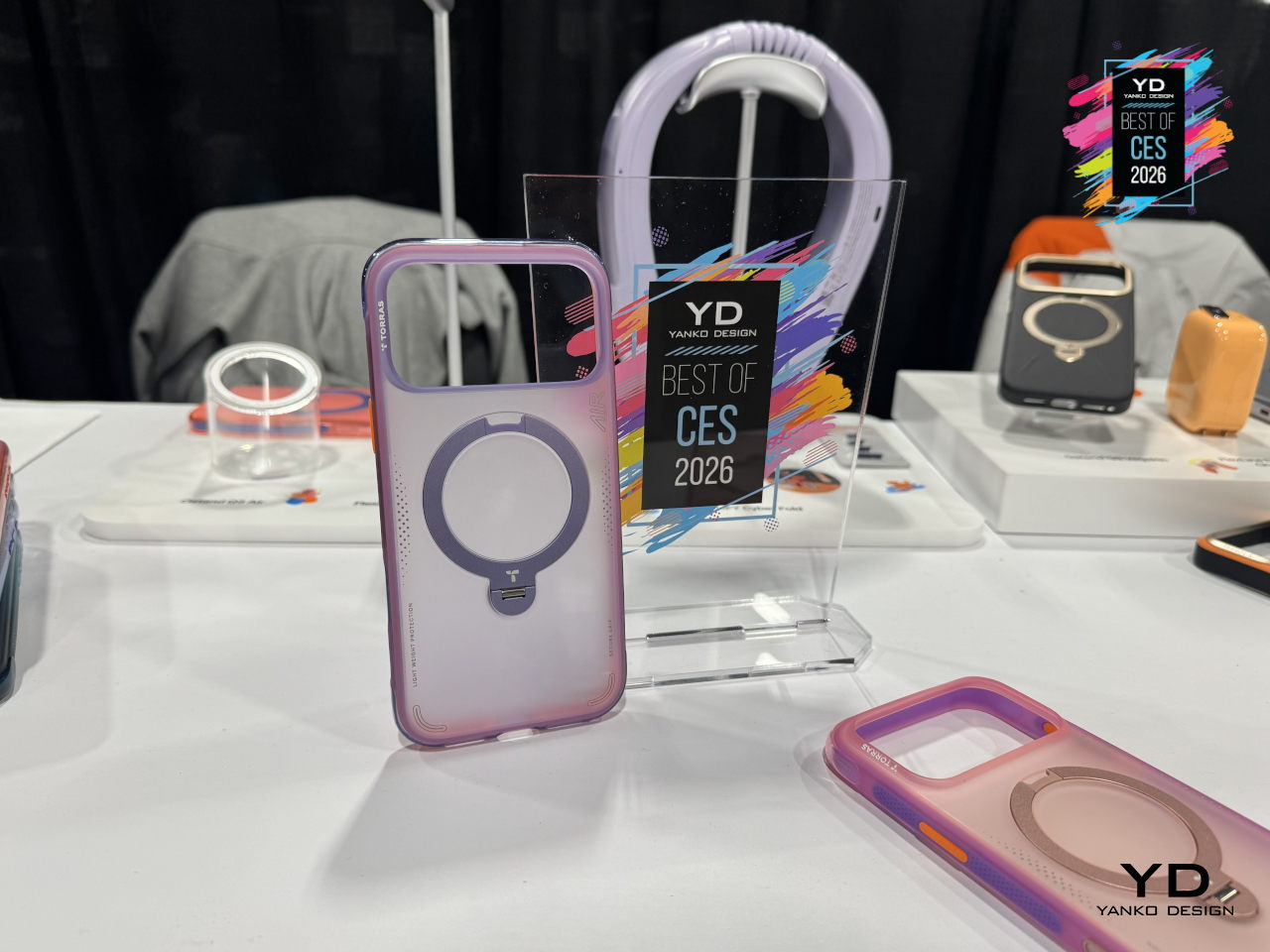
Pro-level phones get used for everything, from desk work and video calls to weekend hikes, and most cases still force you to choose between protection, a stand, or something that looks grown-up. The TORRAS Ostand Q3 Air is the third-generation evolution of its stand-based flagship, built for people whose days constantly shift between office, commute, and outdoor time, blending protection with a rotating stand and refined style.
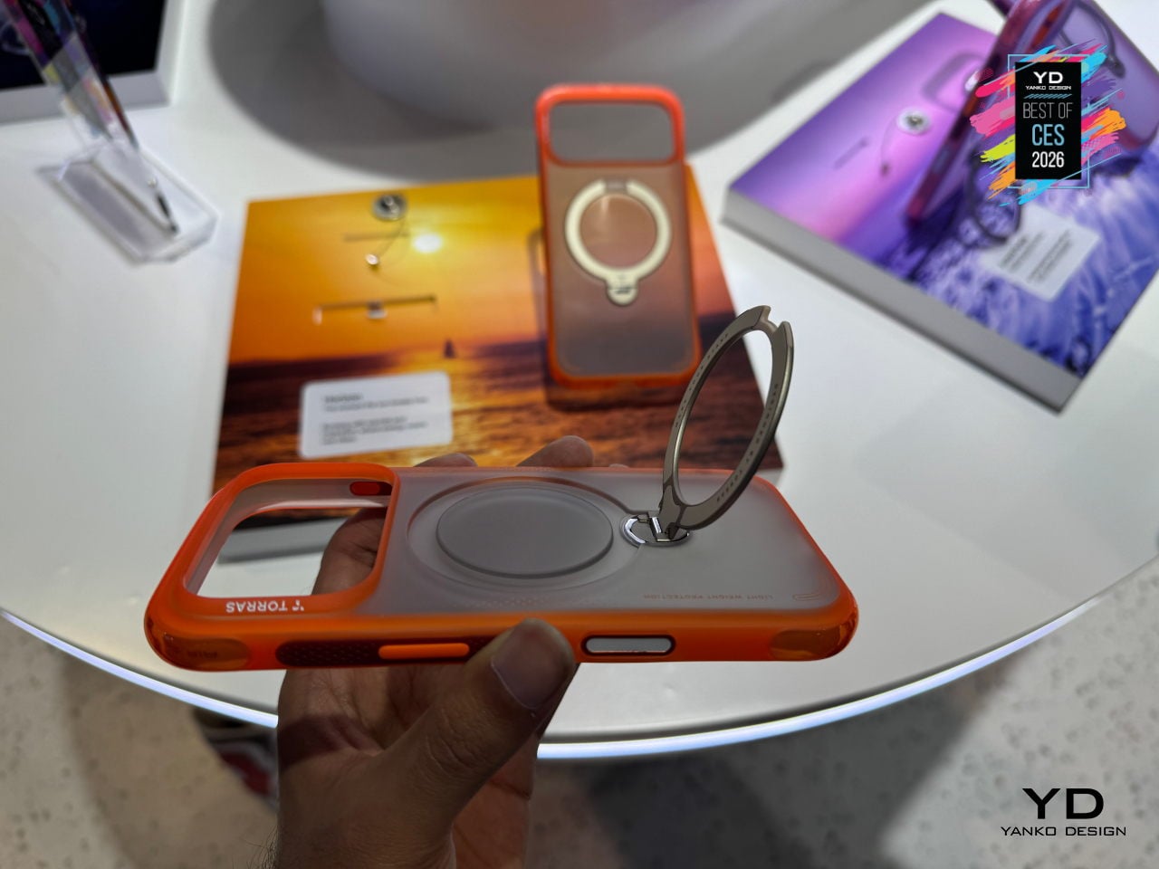
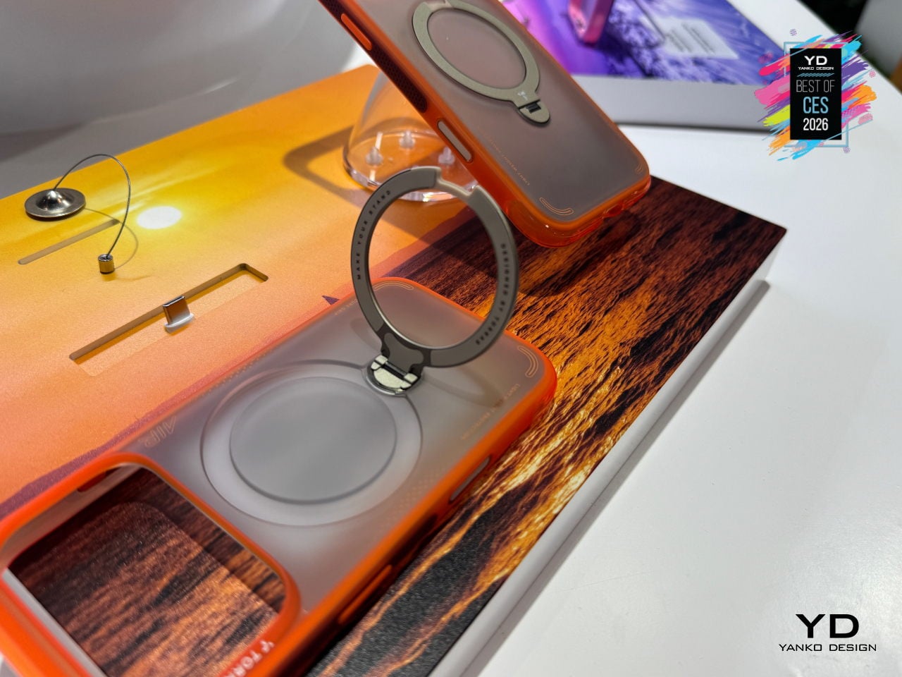
The updated air-cushioned architecture at the top and bottom edges, plus an internal airbag-inspired system, delivers 12-ft drop protection by buffering and dispersing impact forces. Lattice-textured side panels, anti-friction grip points at natural contact zones, raised 1.2mm lips around the screen and camera, and a ring-shaped air cushion encircling the lens combine to protect without adding much bulk, keeping the case at just 3.35mm thick.
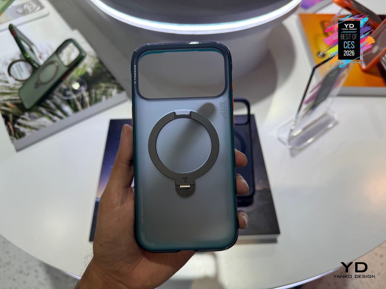
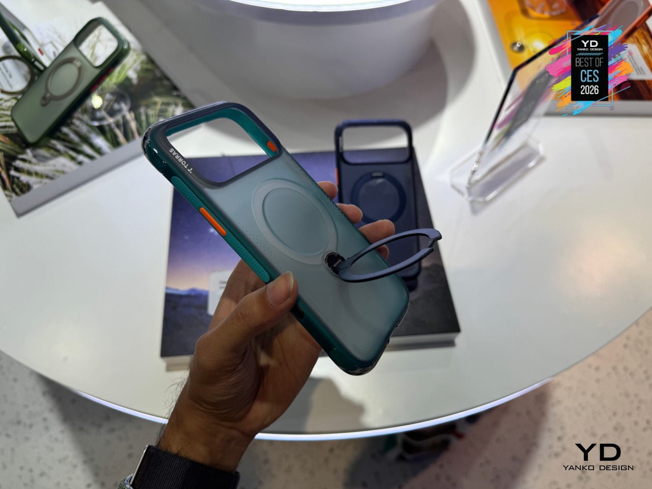
The proprietary 360-degree Ostand ring sits flush when not in use, then flips out to lock at different angles for portrait video calls, landscape streaming, or quick hands-free snapshots. It is fully compatible with MagSafe charging and accessories, so you do not have to peel the case off to drop the phone on a charger, and the ring itself acts as a precise magnetic alignment point on desks and car mounts.
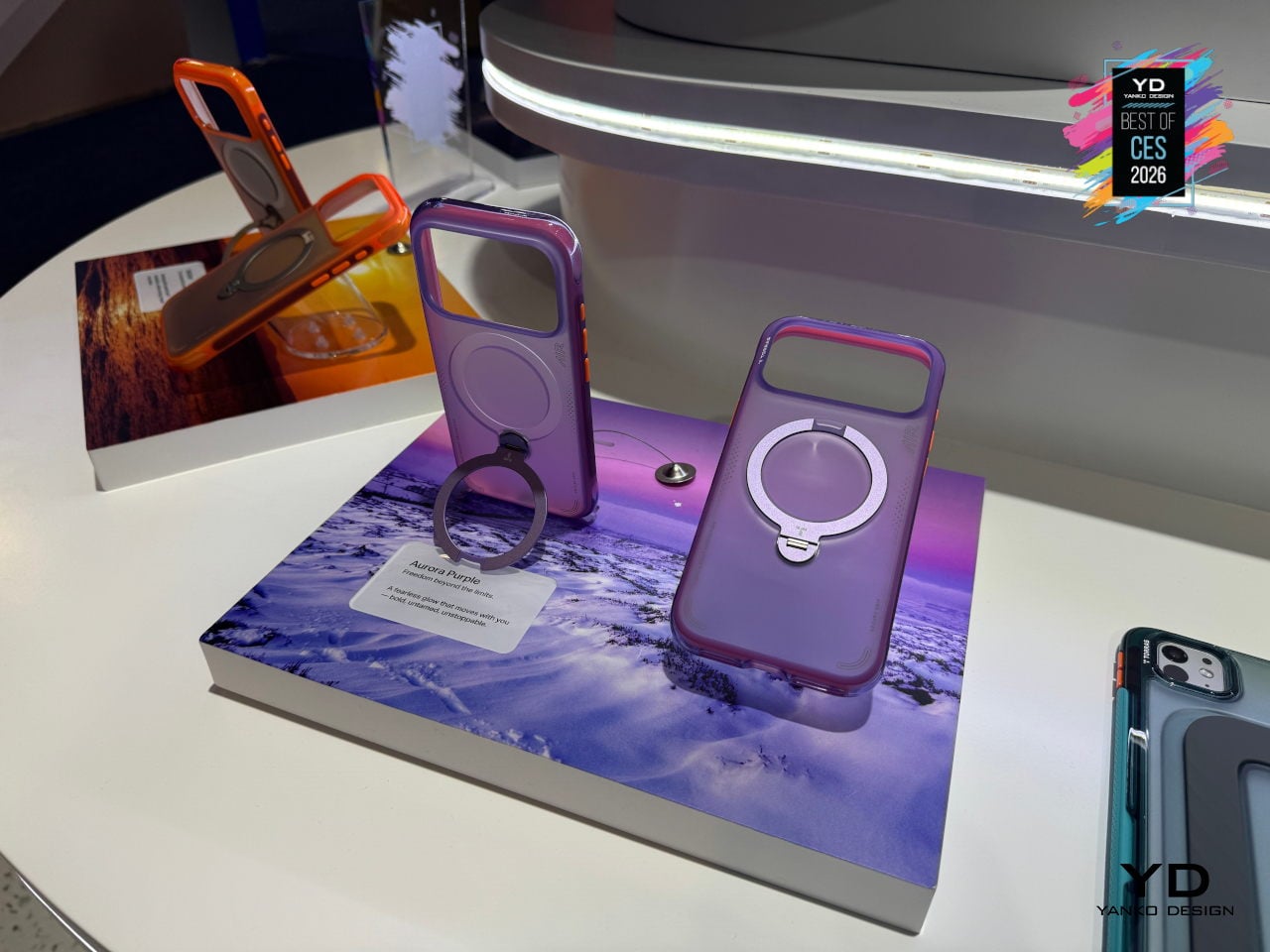
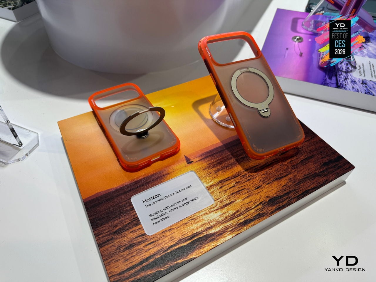
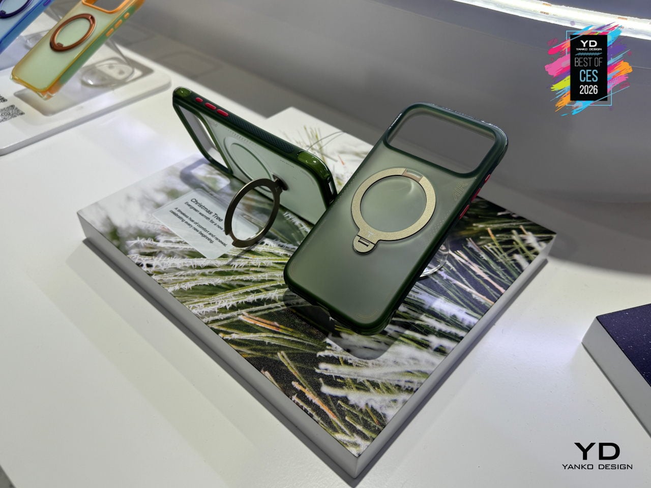
The Guardian-style back panel uses TORRAS’s Tora-Smooth coating and fingerprint-resistant finish, chosen to feel refined rather than rubbery. Color options include Lava Red for a more assertive, energetic look, Glacier Sprint as a cool alpine-inspired tone, and Shadow Black as the minimalist default that fits both meetings and mountain trails, giving people subtle ways to match the case to their daily rhythm without sacrificing durability.
A case that can survive 12 ft drops, prop itself up at any angle, stay grippy and pocket-friendly, and still look considered on a conference table feels like where stand-style cases are heading. By treating the stand, the air-tech protection, and the fashion-influenced finish as parts of a single everyday tool rather than bolt-on features, the Ostand Q3 Air makes a strong case for itself as the kind of accessory that earns its spot on a carefully chosen phone.
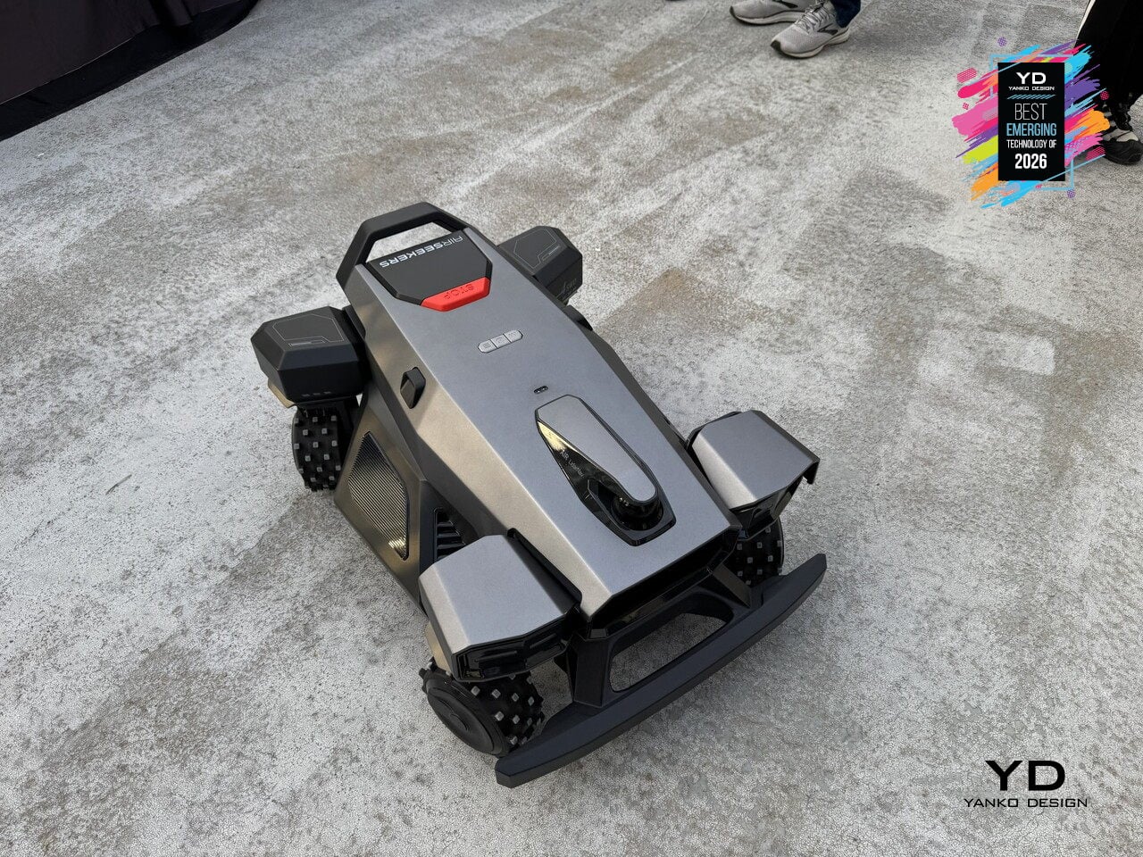
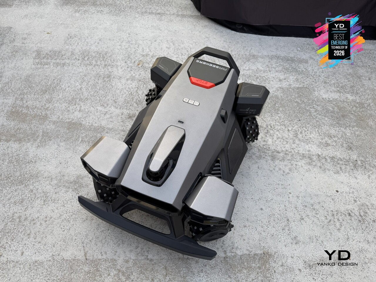
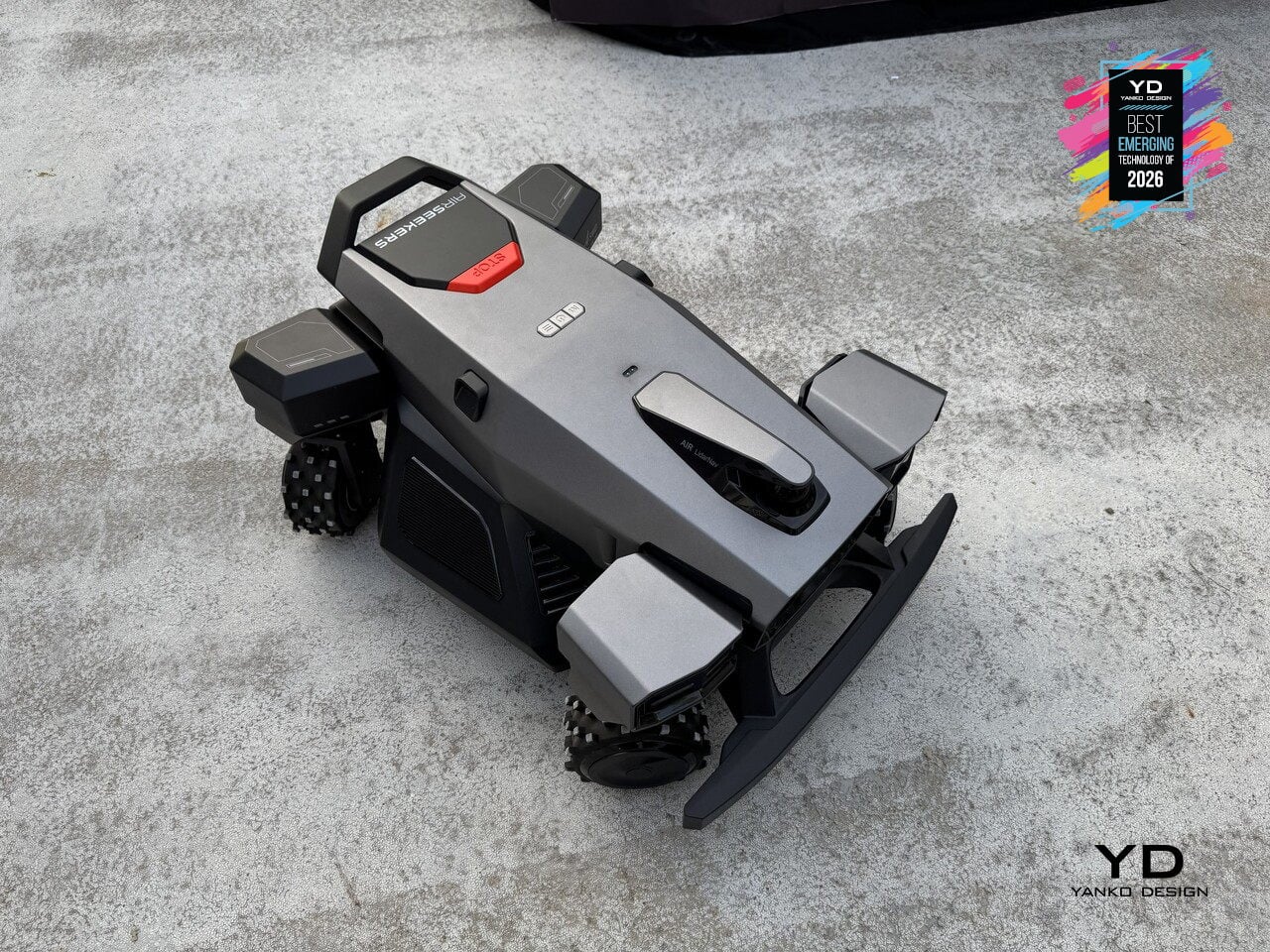
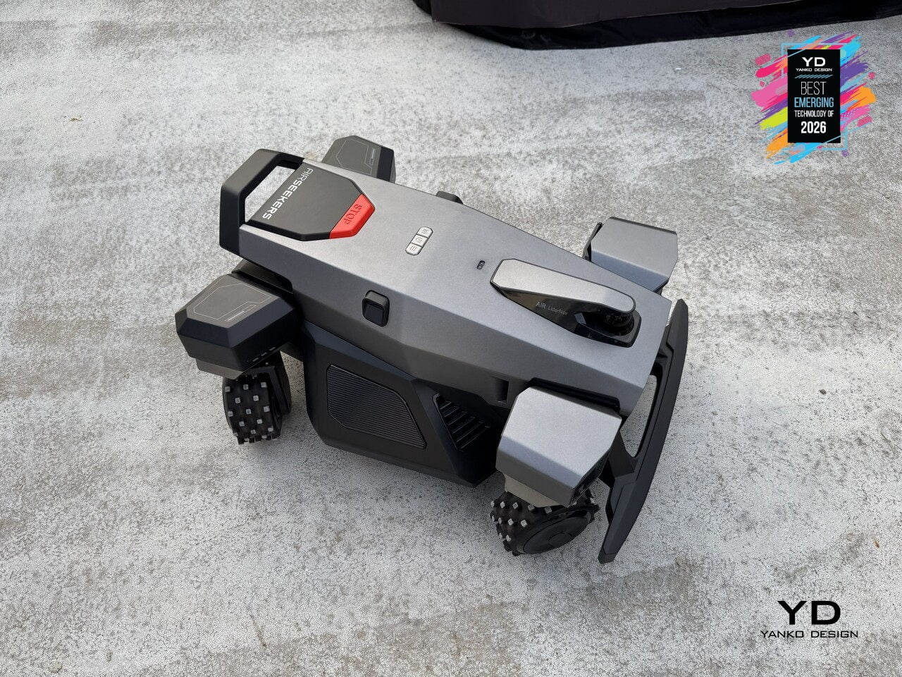
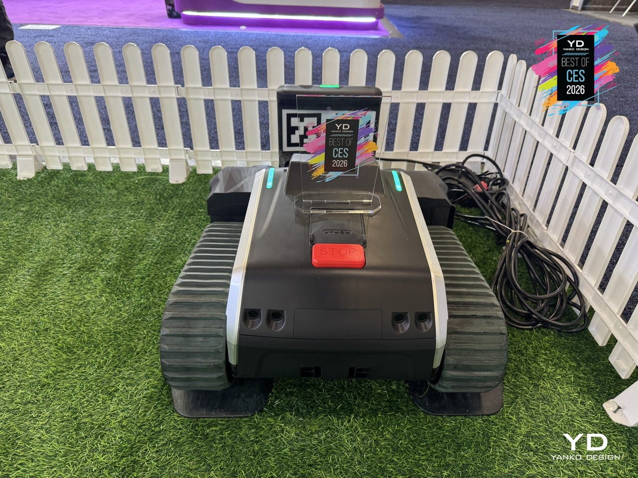
Lymow One Plus Mower
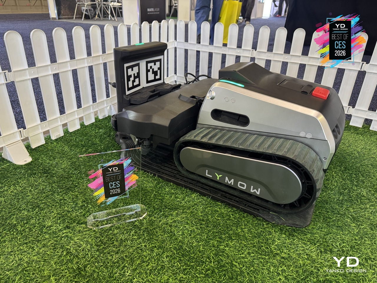
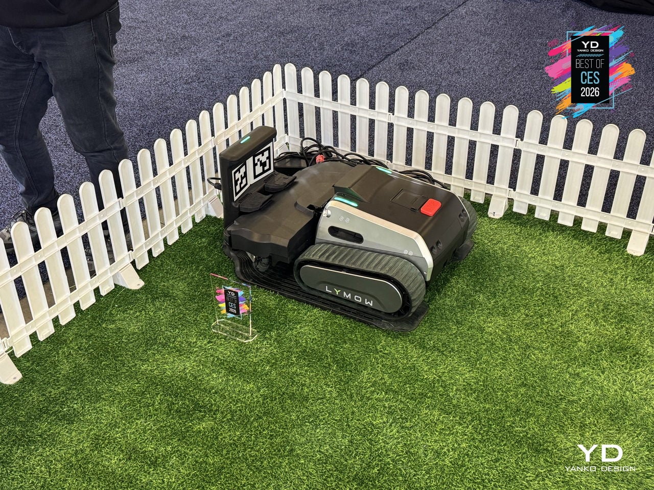
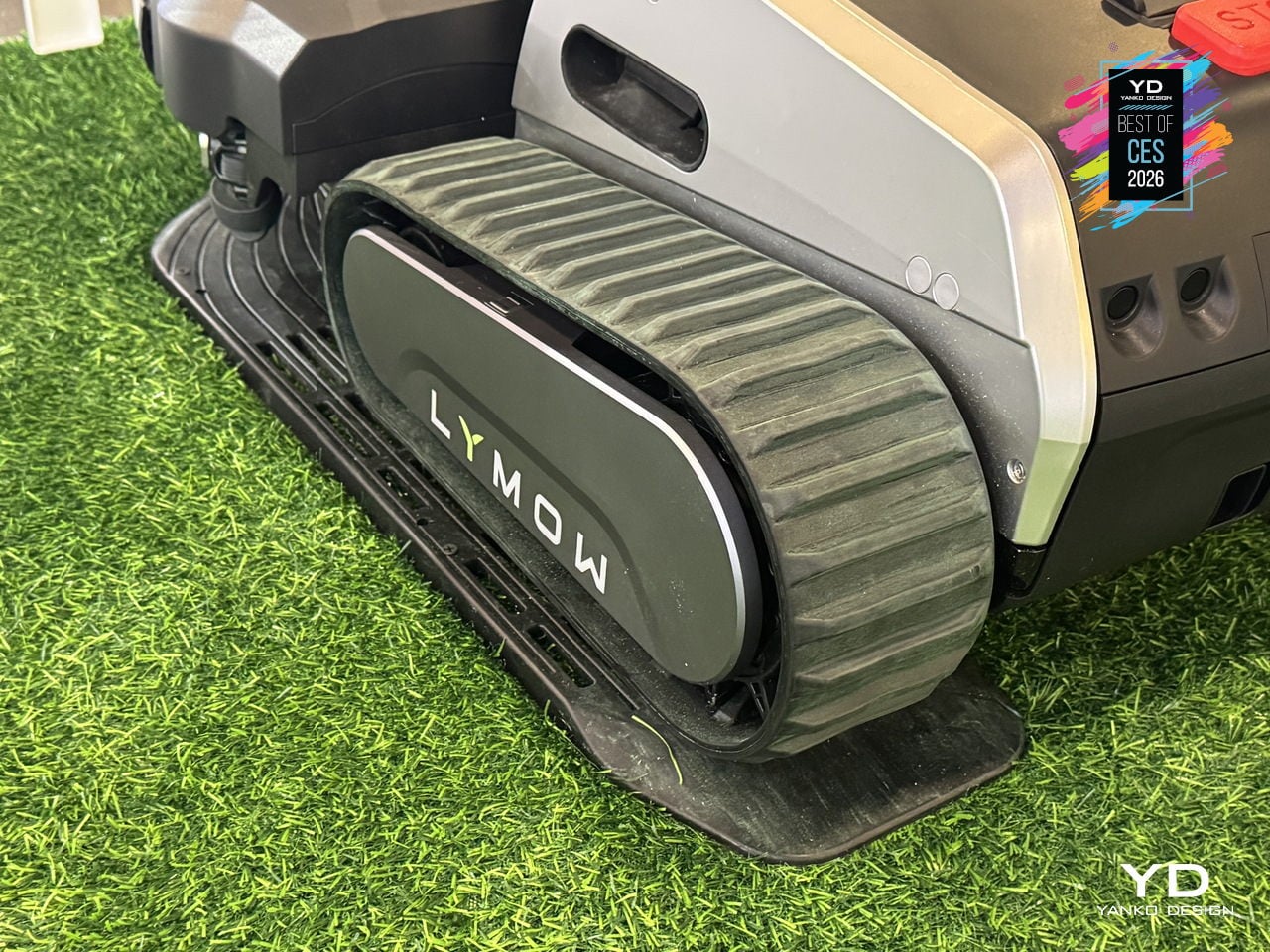
Homeowners with large, uneven lawns, trees that drop leaves, and enough obstacles to confuse basic robot mowers usually spend Saturday mornings wrestling a push mower up hills. Lymow One Plus is a second-generation, boundary-wire-free tracked mower built to handle that complexity, with 50% more cutting power, heavy-duty mulching blades, and a Cyclone Airflow Cutting System that turns it into both a mower and a blower for year-round yard care.
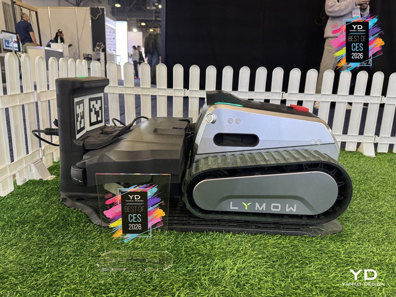
The Cyclone Airflow architecture lifts and stretches grass blades so the deck can cut more evenly, then pulls clippings through a clean tunnel to a single discharge port, preventing clogging and keeping paths cleaner. Reinforced SK5 tool-steel blades, the same grade used in premium pruning shears and axes, shred fallen leaves, thick grass, and common debris, so autumn leaf piles become fine mulch instead of another weekend chore.
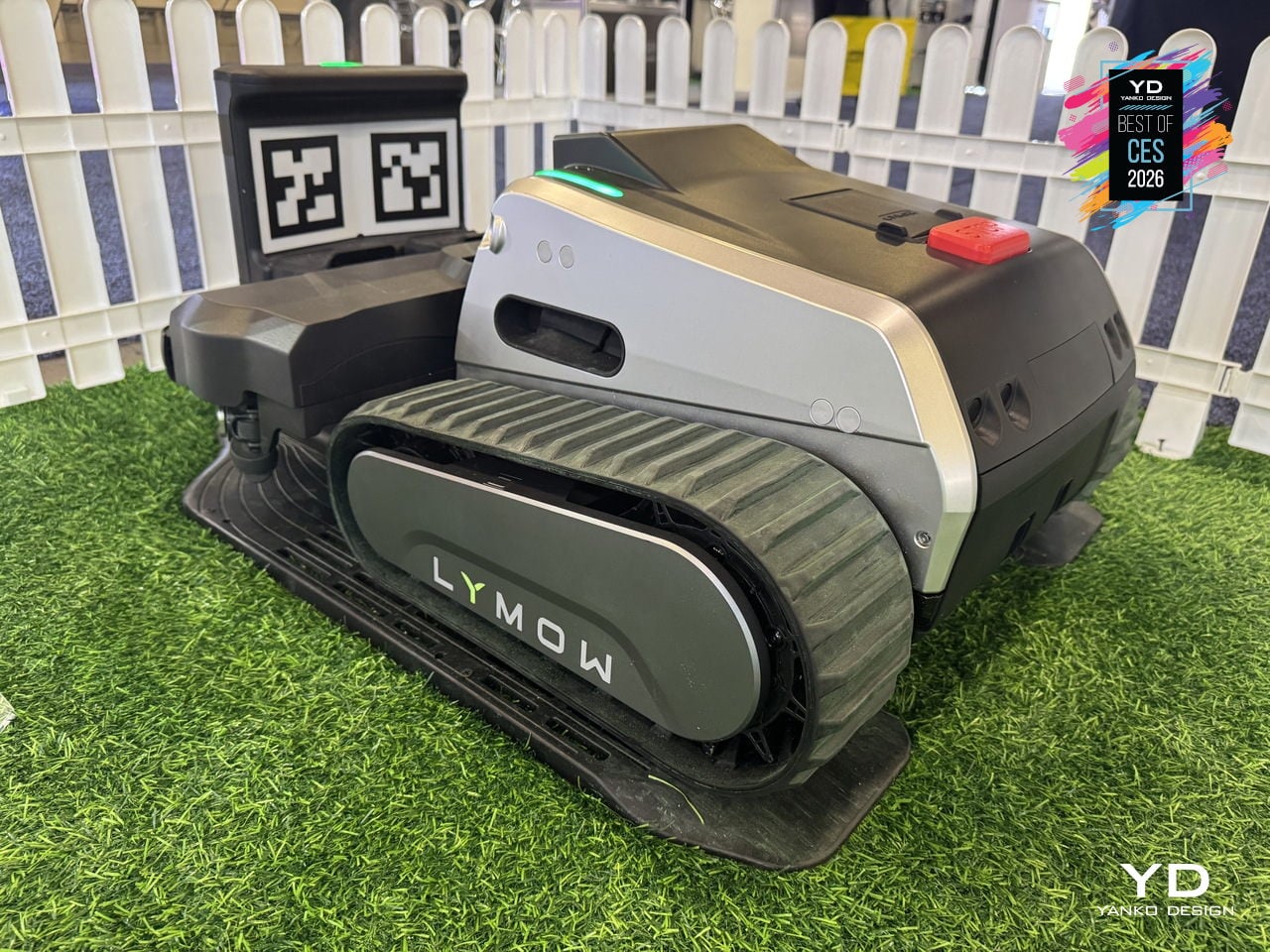
The upgraded LySee sensor-fusion suite combines RTK-VSLAM navigation with a next-generation stereo camera and 10 TOPS of computing power for faster, more accurate perception. AI training on thousands of complex yards lets the Lymow One Plus recognize more than 20 common yard objects, from trees and stones to fences and curbstones, with environmental intelligence sophisticated enough to distinguish over 10 hedgehog species, keeping both lawn and wildlife safer.
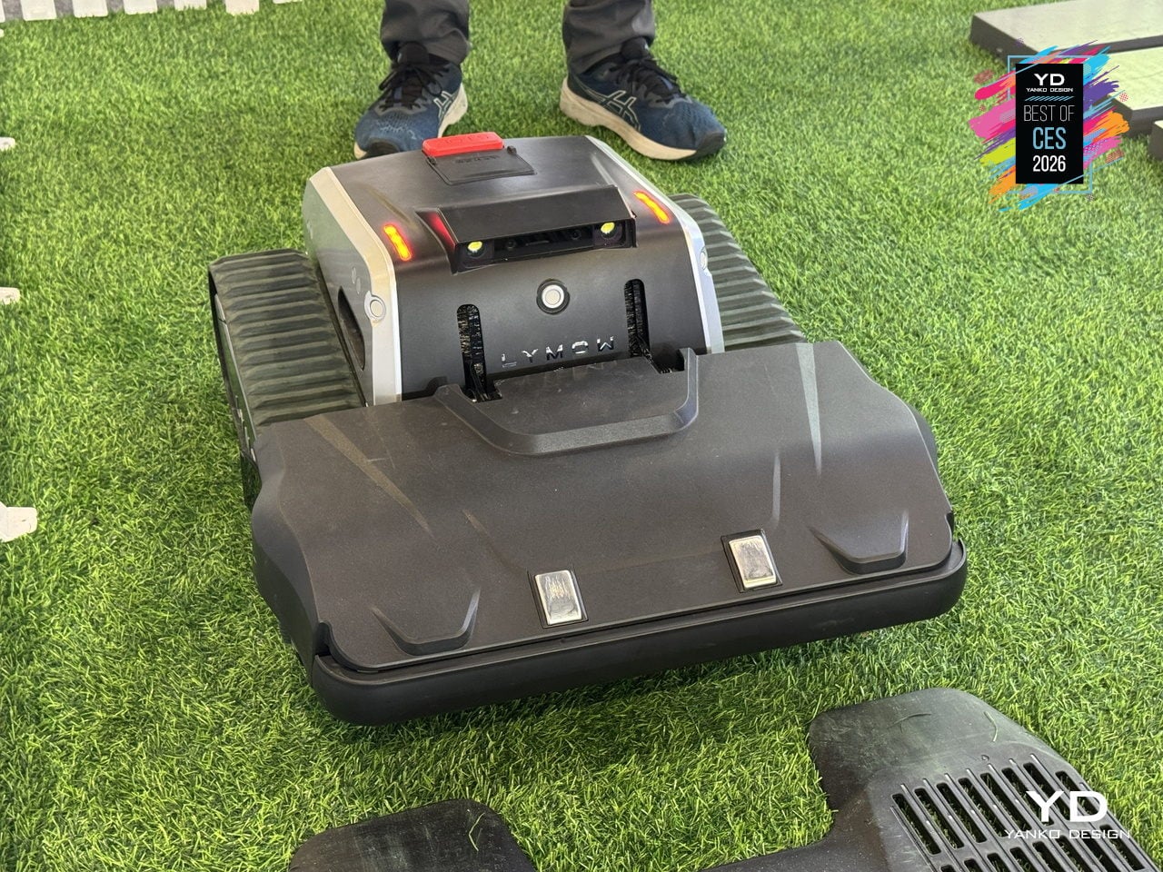
The automotive-grade construction includes a reinforced frame, upgraded sealing, and hub-motor rigidity strengthened by more than 200%, built to handle harsh sun, heavy rain, morning dew, and everyday bumps. The self-cleaning side-brush system and rubber film barrier keep grass out of the wheel cavity, while heated camera housings and anti-glare display shielding let One Plus maintain traction and visibility on slopes, gravel paths, and wet grass without stalling.
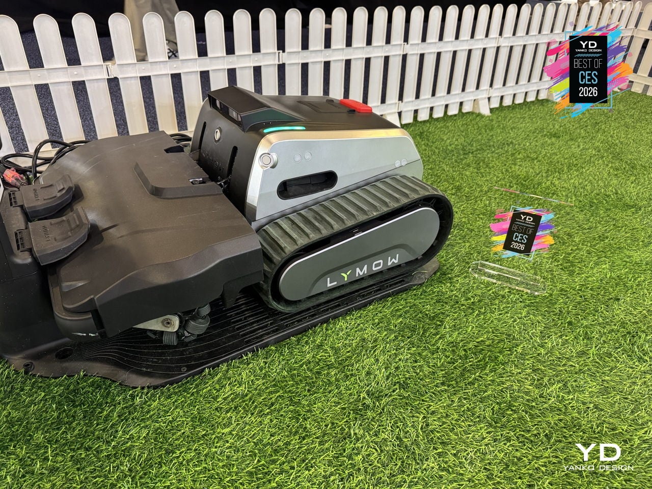
A tracked mower that can mow, mulch, and blow leaves, navigate complex lawns without boundary wires, and keep working through weather changes and rough patches feels like a sign that robotic mowing is growing up. By moving from light trimming on small, flat lawns to genuinely heavy-duty yard maintenance, Lymow One Plus lets you reclaim weekends while the machine quietly handles grass, leaves, and debris in every corner, treating large yards as a job it was built for instead of a stretch goal.
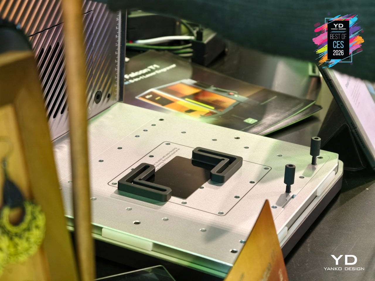
Creality Falcon T1 5-in-1 Laser Engraver
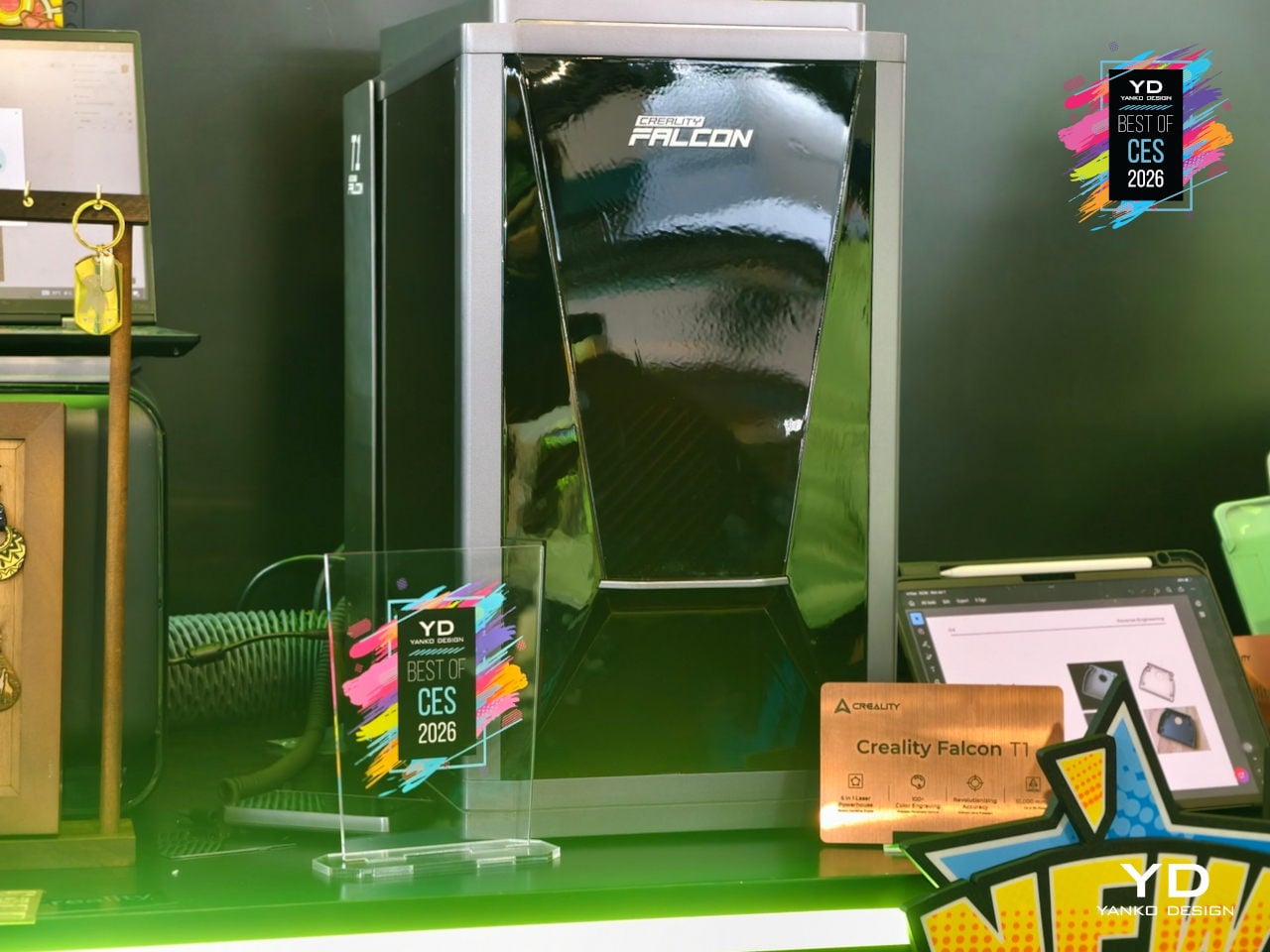
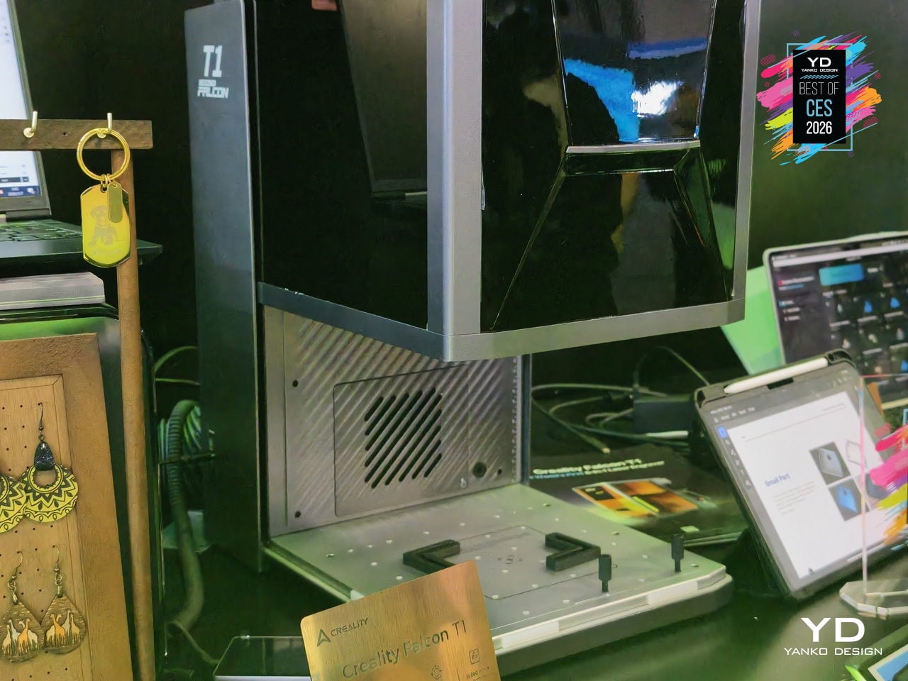
Typical diode engravers handle one or two materials before hitting a wall. Creality’s Falcon T1 is a fully enclosed workstation billed as the world’s first 5-in-1 laser engraver, built as a modular platform with swap-in diode, fiber, MOPA, and UV modules. A single machine can follow a studio from wood prototypes to metal badges to glass awards without changing hardware footprints, treating laser work as a family of processes instead of isolated tasks.
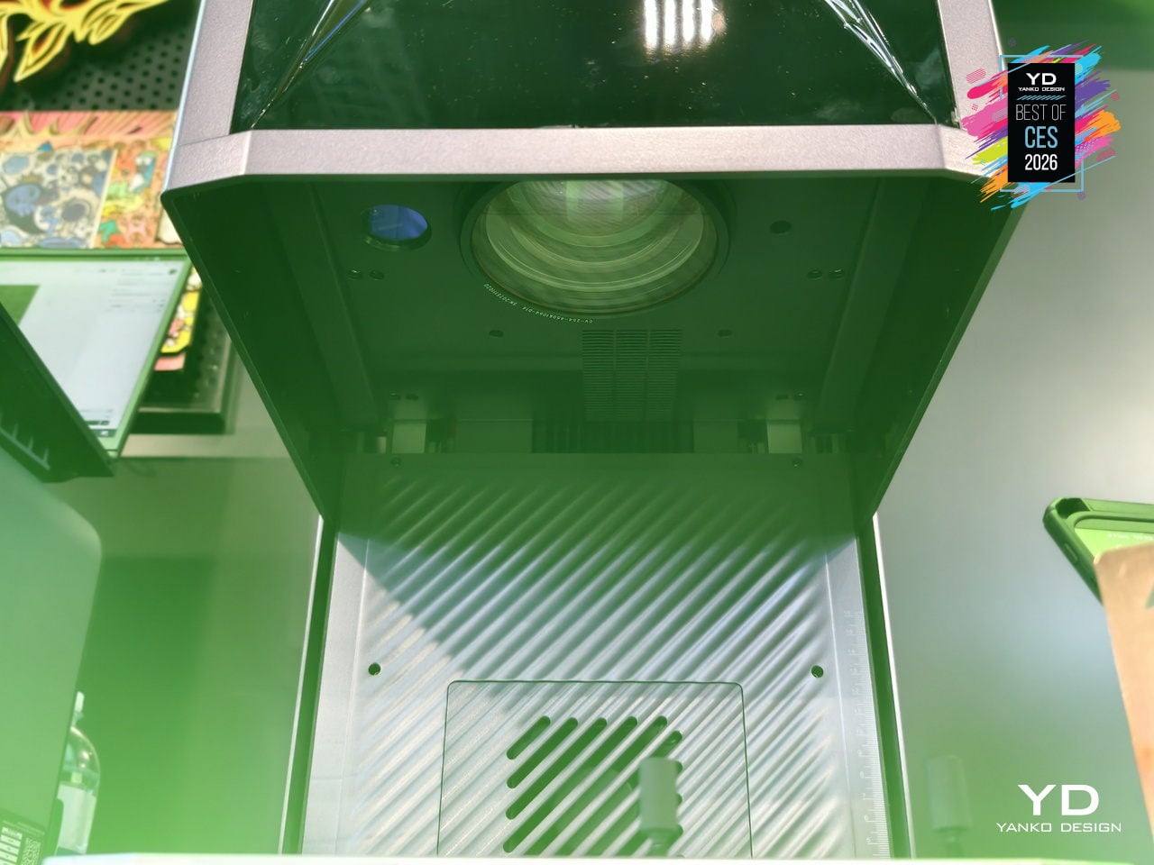
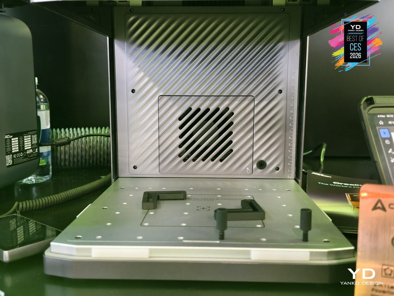
WaveSync is the adaptive multi-wavelength system that automatically recognizes which of the five laser modules is installed, then dials in working distance, power, and scan speed every time it starts. Users can switch modules in about 30 seconds without tools, and the diode, fiber, MOPA, and UV options together cover wood, leather, coated metals, stainless steel, titanium, plastics, ceramics, glass, and transparent acrylics in one compact tower.
The high-speed galvo system pushes up to 10,000 mm/s line speeds, making the Falcon T1 up to roughly 10 to 15 times faster than conventional frame-style diode machines while holding 0.01 mm precision. It can carve 3D reliefs on wood and stone, engrave inside glass blocks via the UV module, and mark one-touch full-color patterns on stainless steel and titanium using over 100 MOPA colors and in-house process libraries.
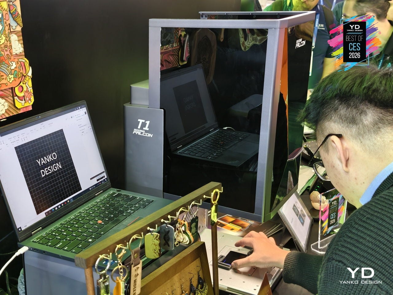
AI-assisted tools handle 3D relief image generation from standard 3D models, Smart Fill & Layout that auto-detects materials and boosts batch efficiency, curved-surface engraving, flame monitoring, and auto focus for different heights. The fully enclosed, Class 1-certified design, with lid and tray interlocks, emergency stop, and key lock, makes the T1 far more comfortable to run in shared studios or small shops than open-frame Class 4 rigs.
By letting one machine handle cutting, 3D relief, internal engraving, and full-color metal work across so many materials, the Creality Falcon T1 gives design teams and makers a flexible, upgradeable core tool instead of another specialized box on the bench. The modular lasers, WaveSync automation, industrial-grade speed, and Class 1 enclosure turn a compact tower into a small-format production cell ready to handle whatever material or creative idea comes through the studio next.
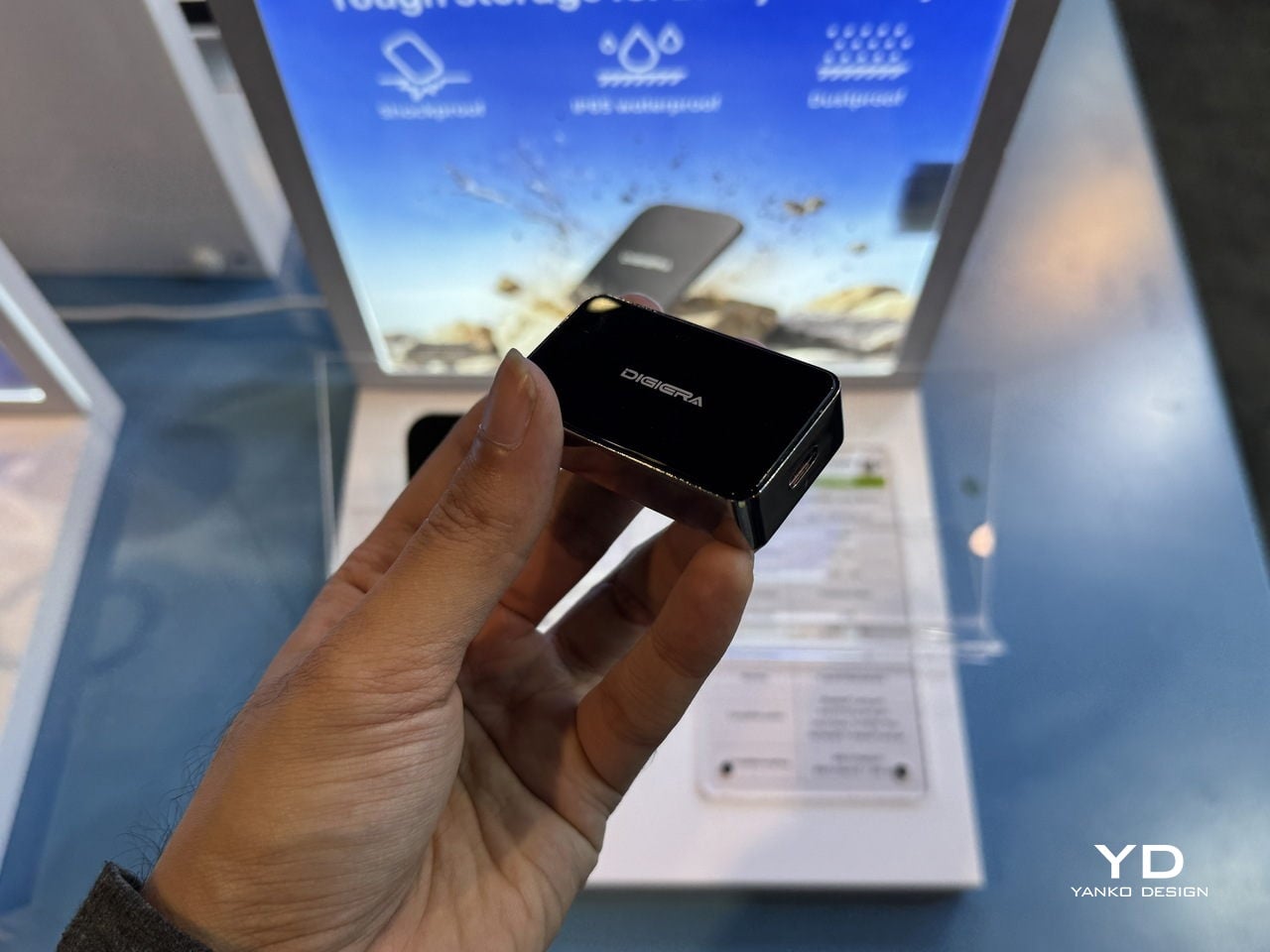
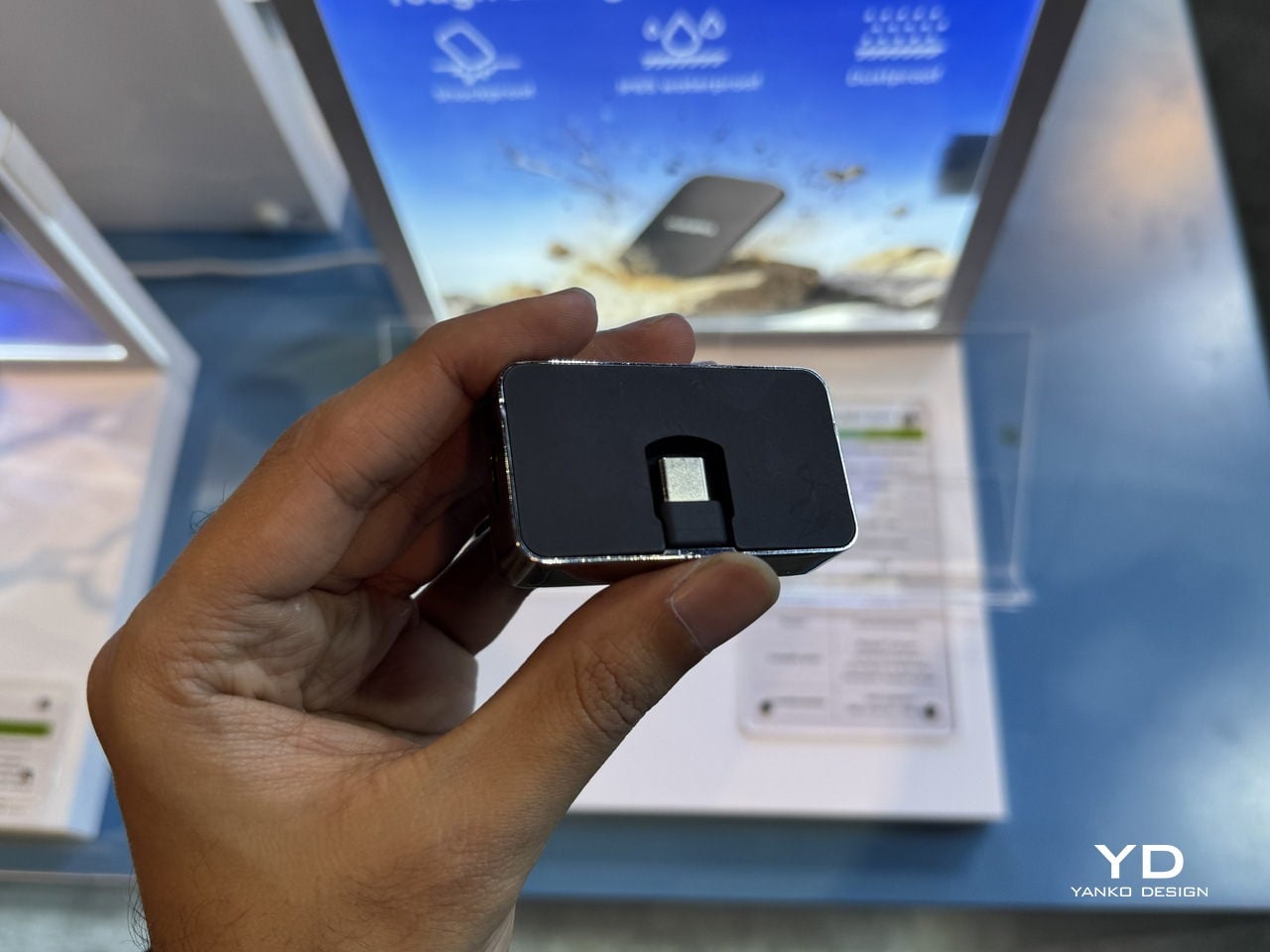
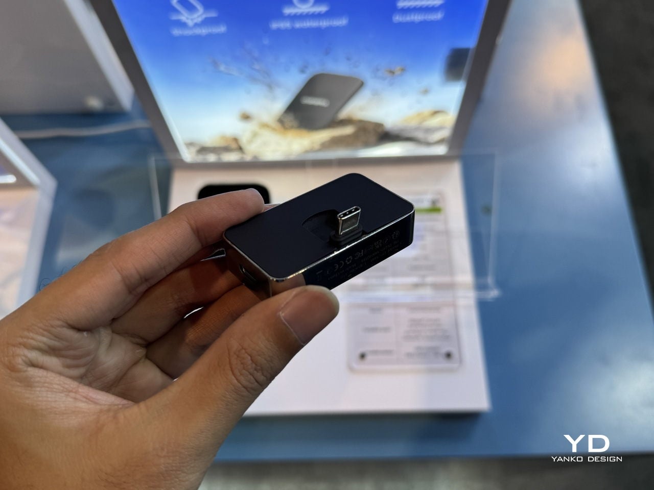
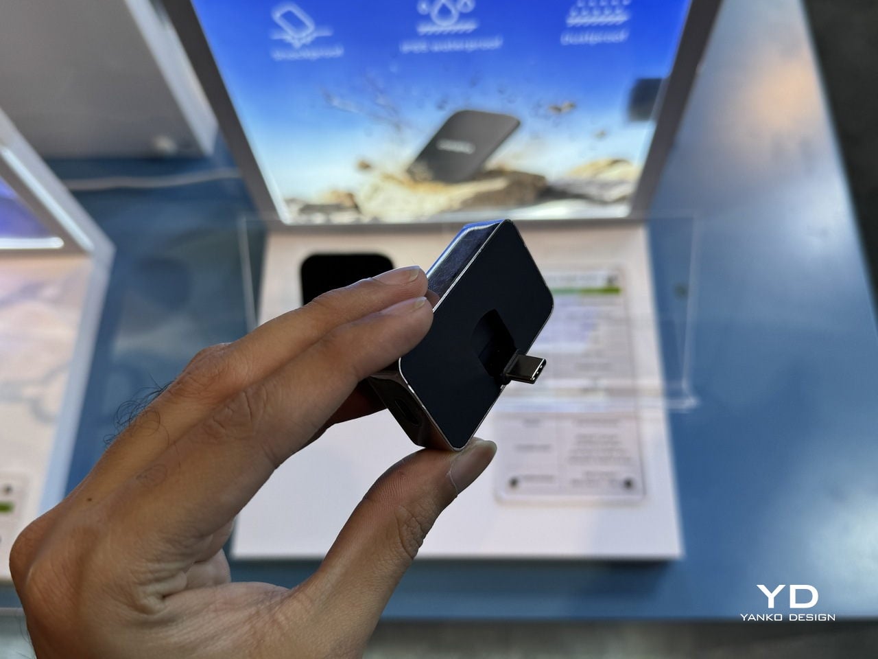
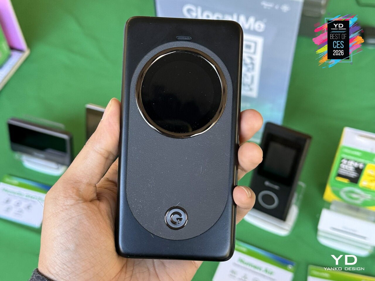
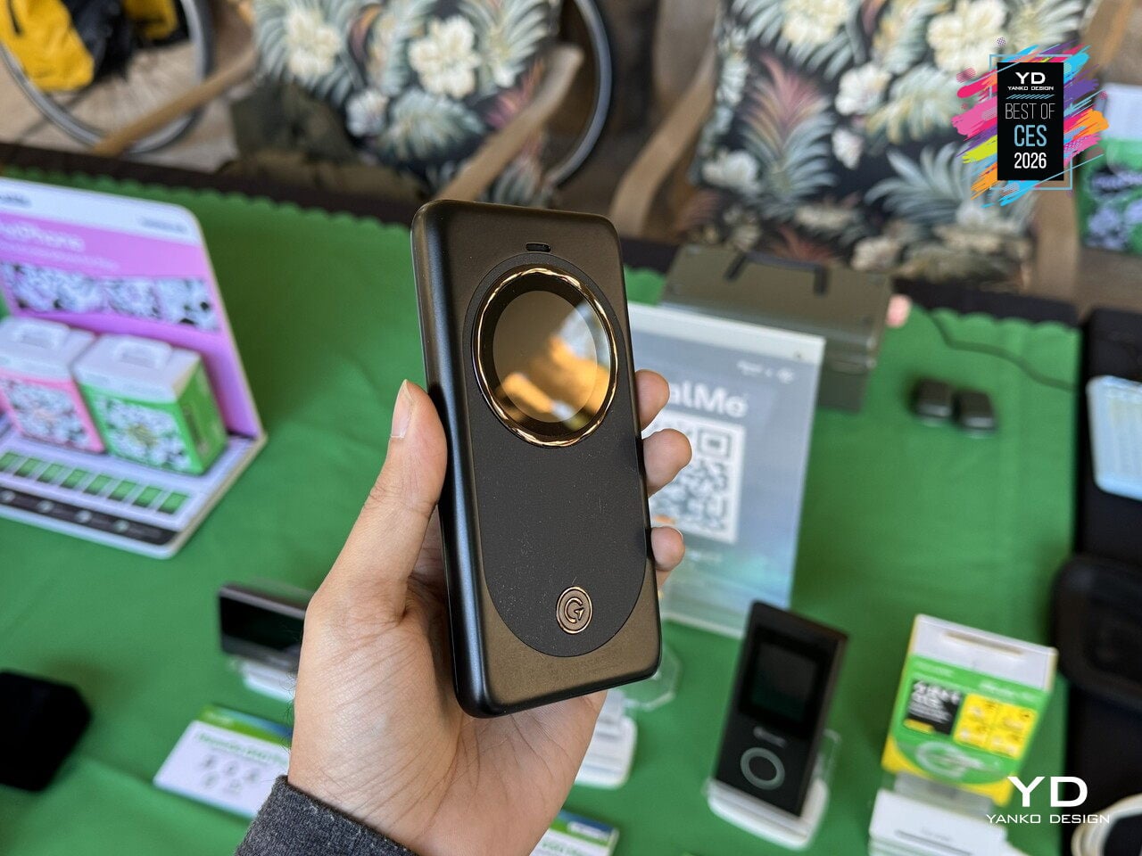
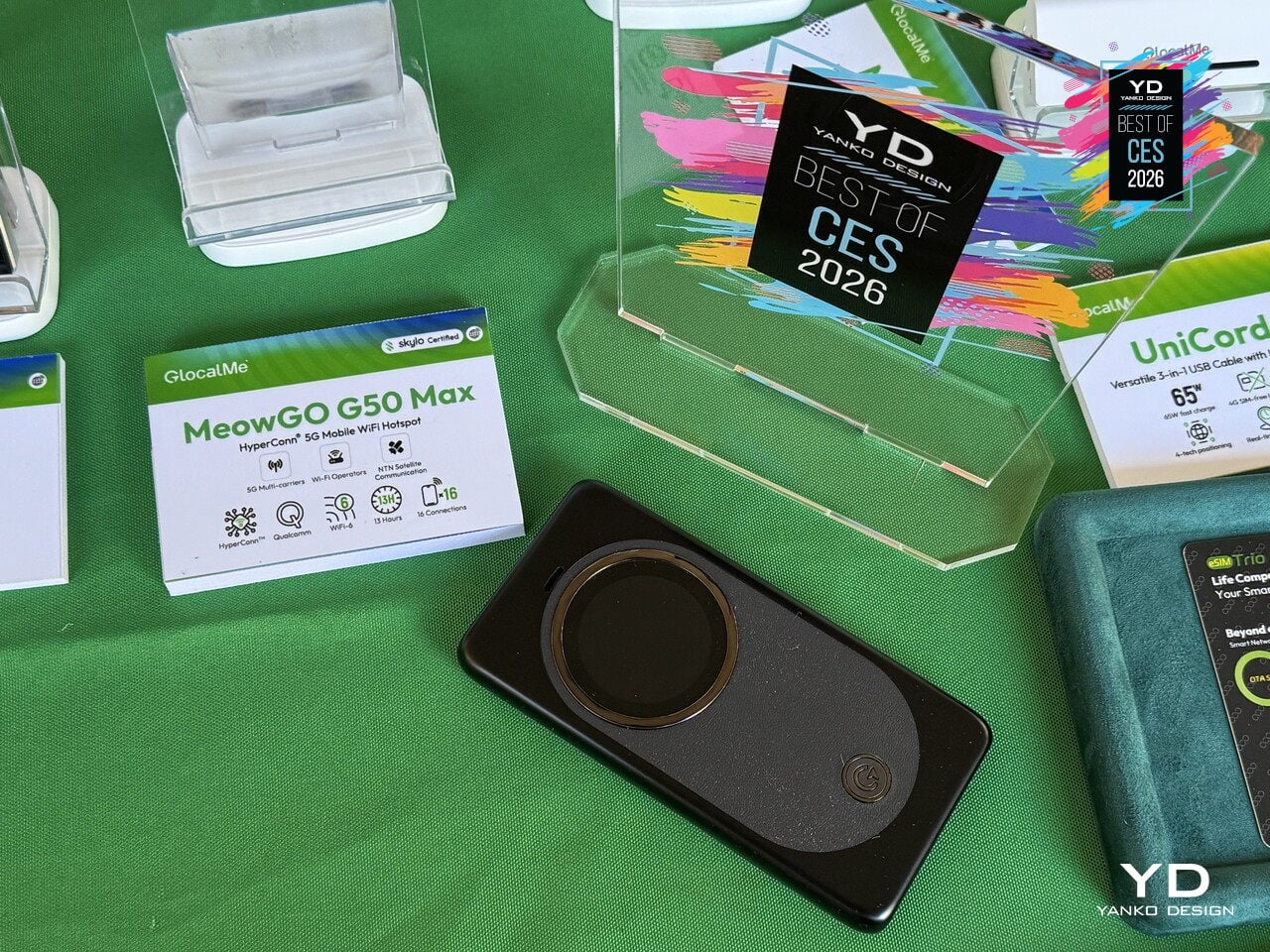
GlocalMe MeowGo G50 Max Satellite Mobile WiFi Hotspot
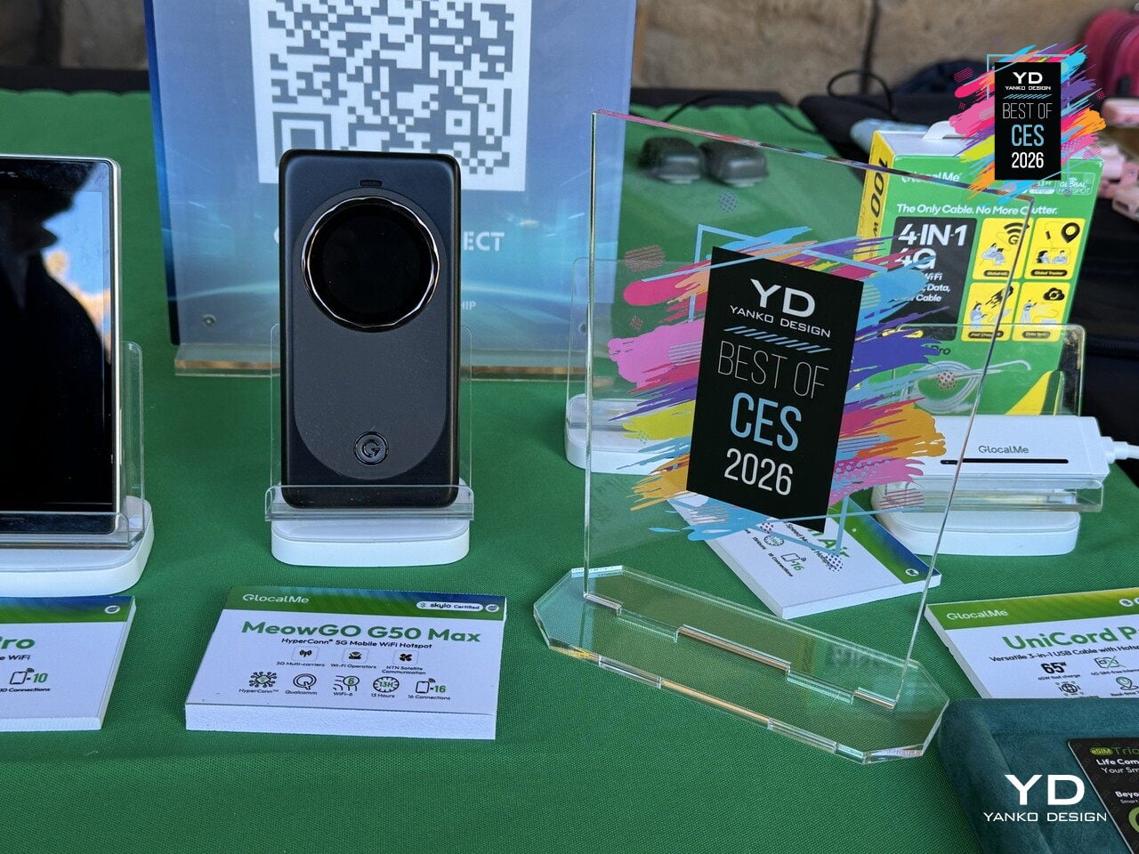
International travel and remote work usually mean swapping SIM cards, paying roaming fees, losing signal in mountains or on flights, and juggling multiple hotspots or paywalls just to stay online. The GlocalMe MeowGo G50 Max is the world’s first device to seamlessly integrate terrestrial cellular, in-flight Wi-Fi, and satellite connectivity into one pocket-sized hotspot that automatically chooses the best network, treating every environment as just another mode in the same system.
HyperConn architecture combines three layers. On the ground, 5G and 4G across over 200 countries with speeds up to 3.4 Gbps and localized, roaming-free tariffs. In the air, CloudSIM technology taps into in-flight Wi-Fi at 35,000 feet for seamless work and streaming. Off the grid, NTN satellite communication provides emergency voice and SMS in remote locations where traditional networks disappear, keeping you connected in deserts, mountains, or open water.

HyperConn monitors latency, congestion, and signal strength in real time, automatically switching between 5G, 4G, 3G, office Wi-Fi, and satellite without user intervention. Wi-Fi offloading means that when the device detects a high-quality home or office network, it switches to save cellular data, then switches back when that network degrades. It acts like a smart traffic controller that constantly optimizes for speed, reliability, and cost without asking you to think about it.
The G50 Max offers 5G coverage in 80+ countries, support for over 300 operators, and Wi-Fi 6 sharing to up to 16 devices, making it suitable for teams or families on the move. A 4,850 mAh battery with 18 W charging handles a full day, while a multi-layer security stack with encryption, firewall protection, and automatic authentication keeps data safe across all three connectivity layers, from urban 5G to satellite links.
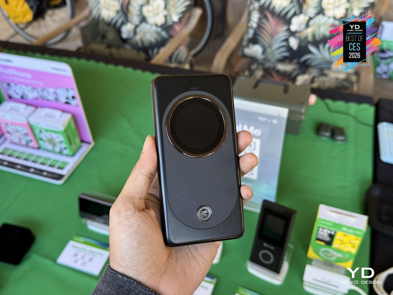
The sleek, rounded body features a large circular MOLED touchscreen that visualizes network modes, wrapped in a premium cream or lavender finish that makes it feel like a thoughtfully designed travel tool rather than a utilitarian router. MeowGo G50 Max offers a glimpse of always-connected life, where a single device in your bag seamlessly handles connectivity, whether you are in a city, on a plane, or halfway up a mountain, treating the network as something that should just work everywhere you go.
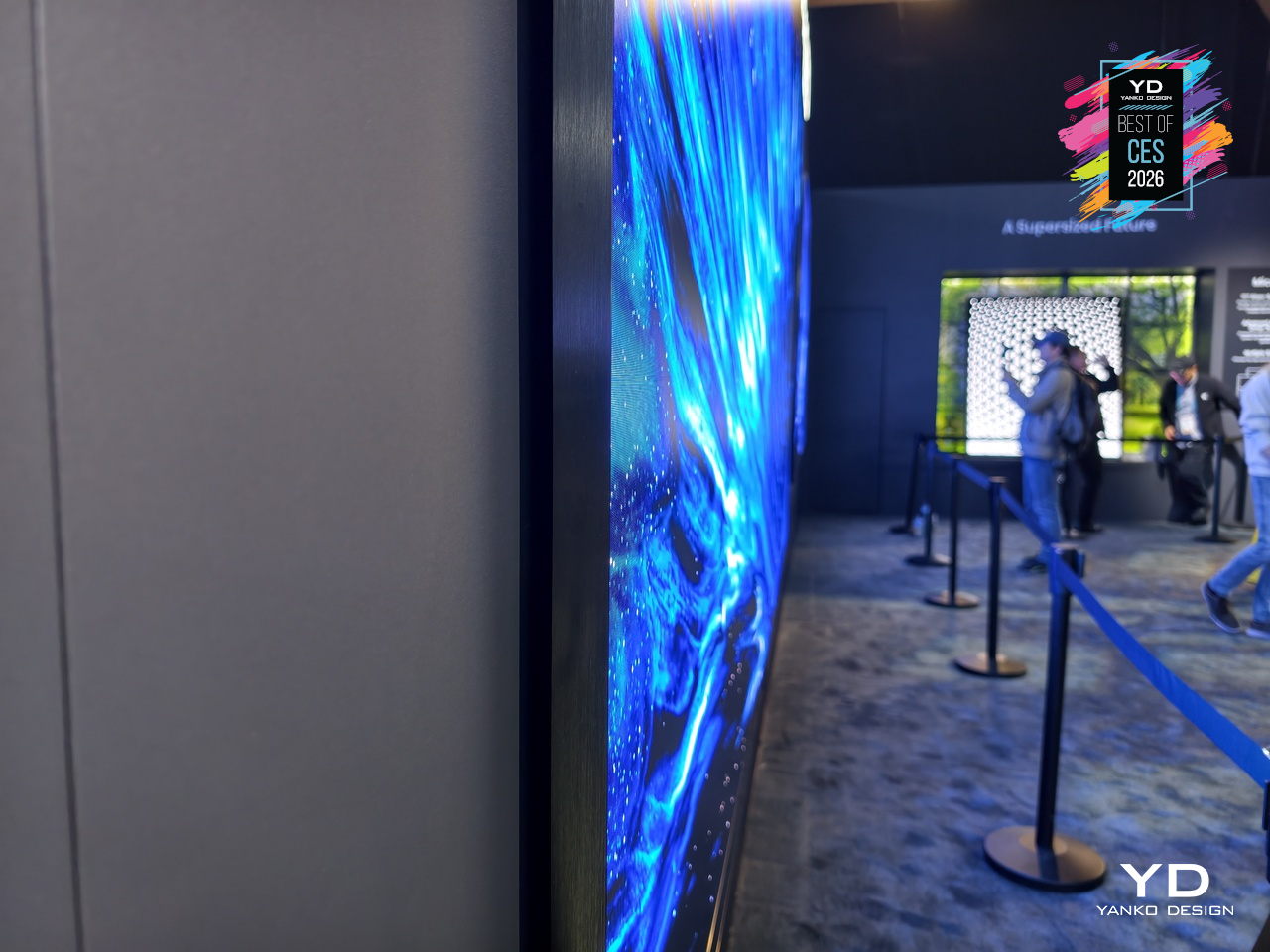
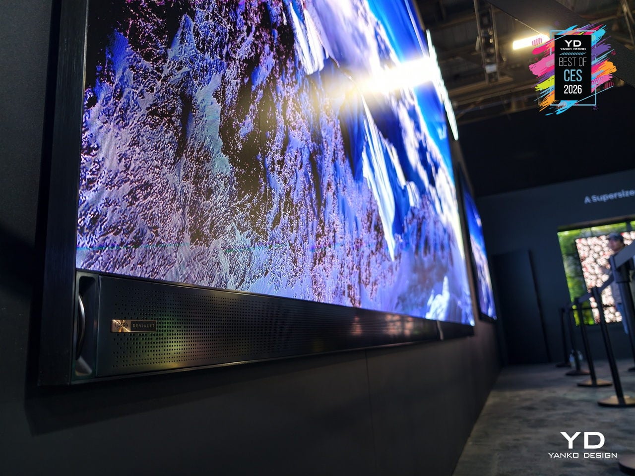
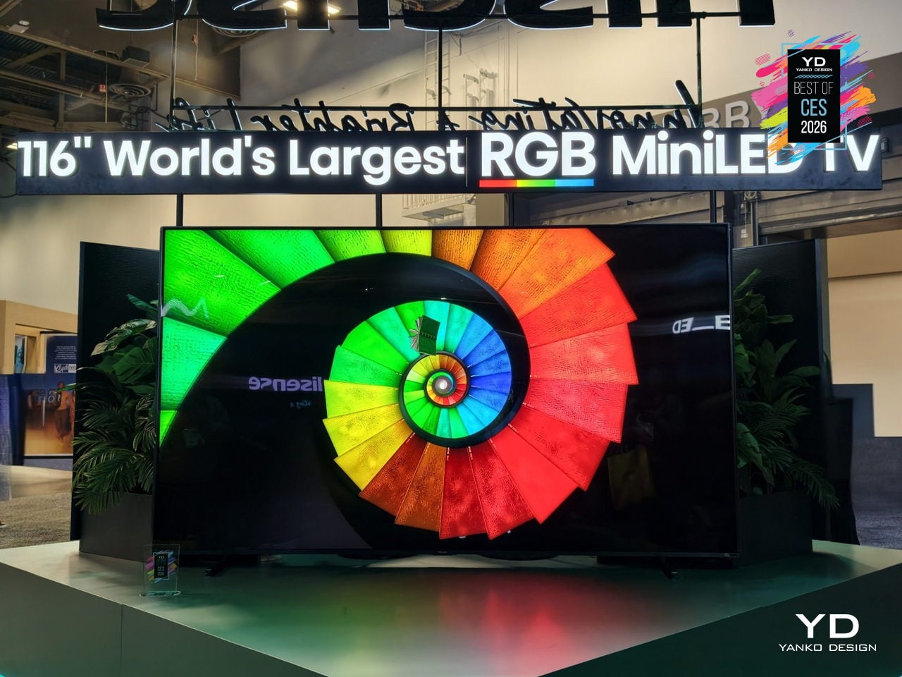
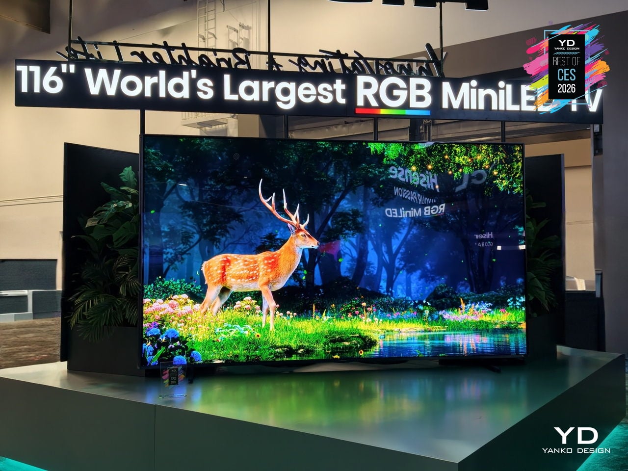
Hisense 116UXS RGB MiniLED TV
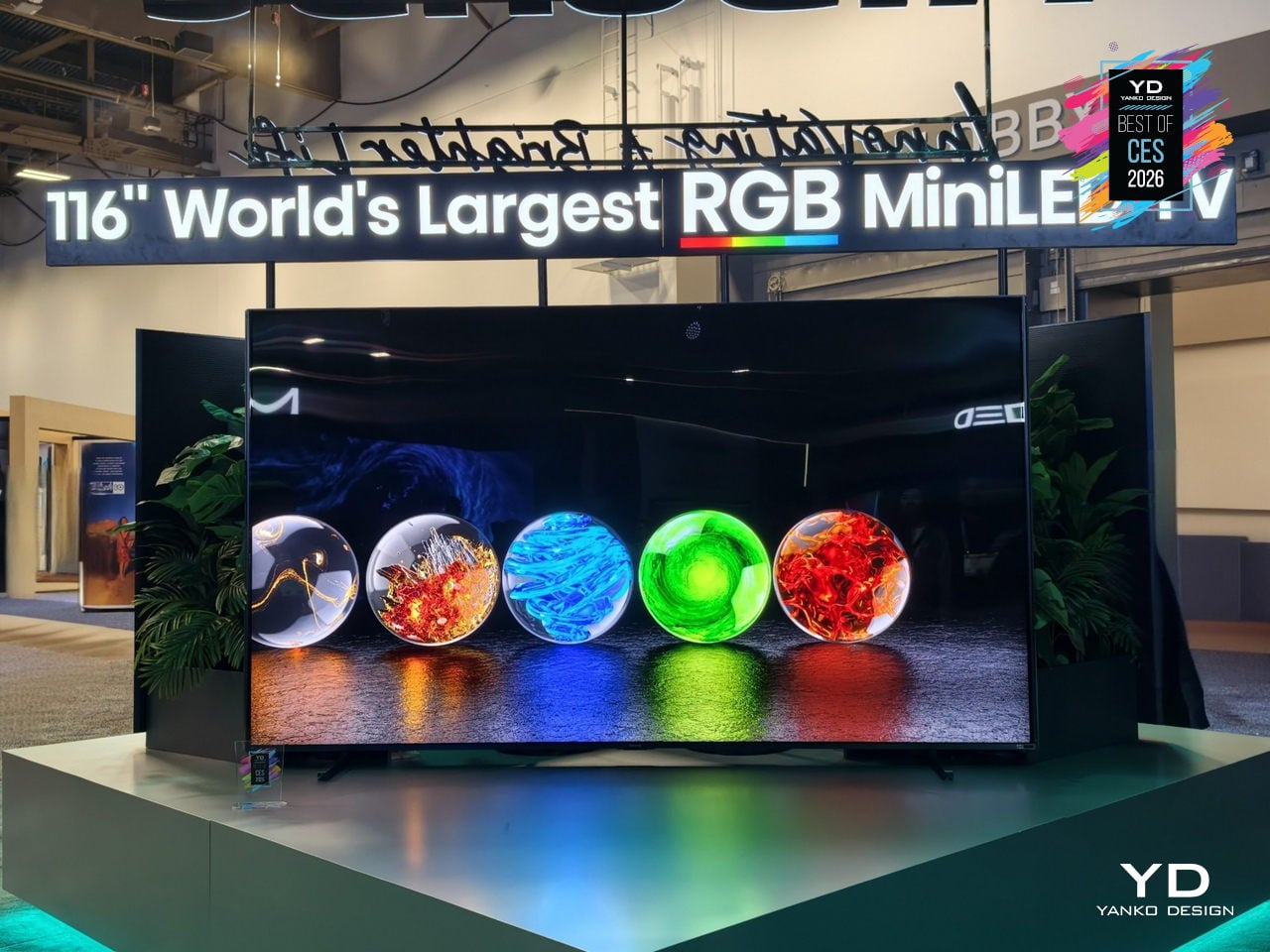
Most extra-large TVs chase more brightness and more inches, often feeling like commercial signage in a living room. The Hisense 116UXS is a 116-inch flagship that instead treats color as the main story, using the next-generation RGB MiniLED evo system to make a wall-sized screen feel more natural, expressive, and at home in bright, design-heavy spaces rather than overwhelming them with sheer scale or nits.
RGB MiniLED evo is a four-primary backlight architecture that adds cyan to the usual red, green, and blue, because cyan sits in the part of the spectrum where our vision is most sensitive to subtle shifts. This lets the 116UXS render gradients, skin tones, and shadow transitions with more nuance, adding depth without cranking saturation, so everyday scenes look richer rather than just more intense.
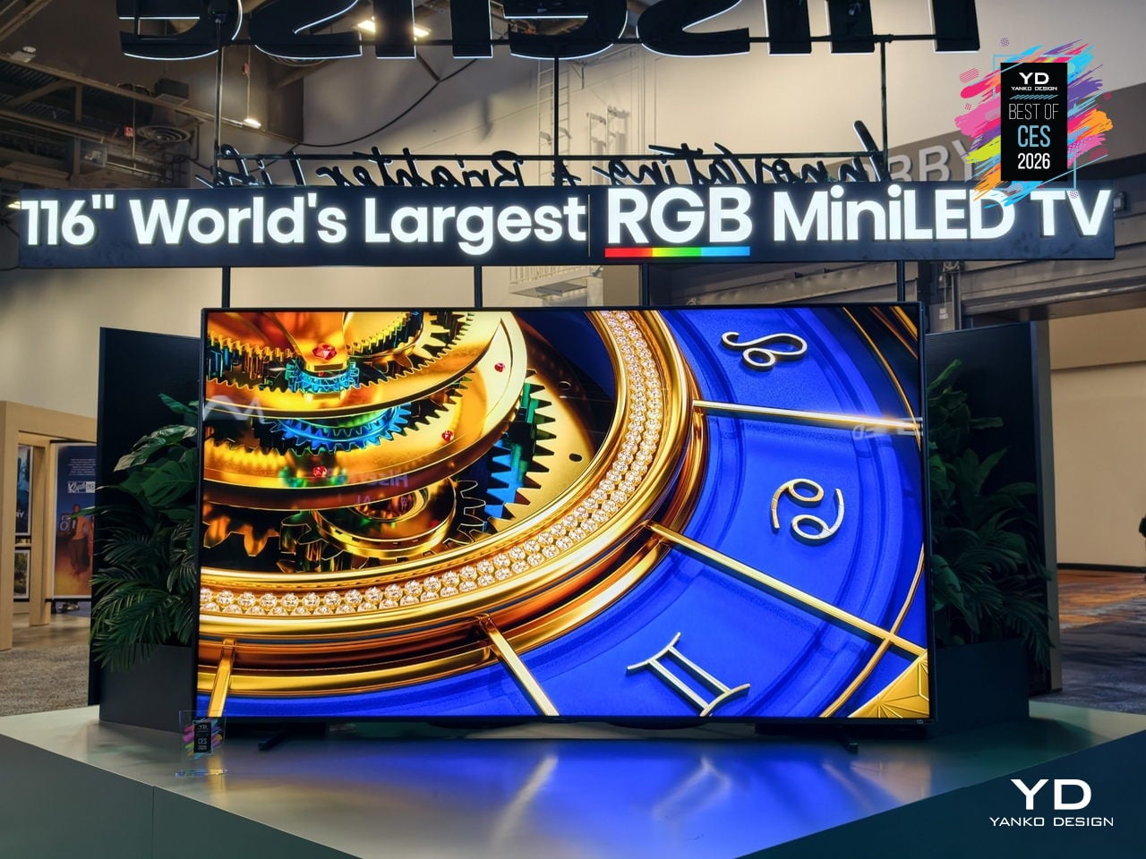
The Hi-View AI Engine RGB chipset manages tens of thousands of color dimming zones, constantly balancing fast motion, bright highlights, and deep blacks to preserve that tonal subtlety. Hisense claims up to 110 % BT.2020 color coverage, pushing beyond standard wide-gamut sets, with the result being a picture that holds its character across sports, films, and games instead of only shining in HDR demo clips.
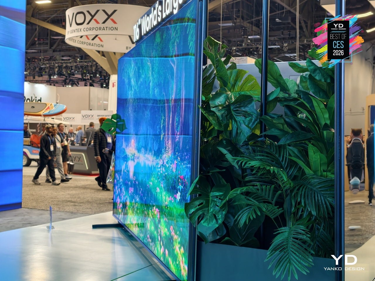
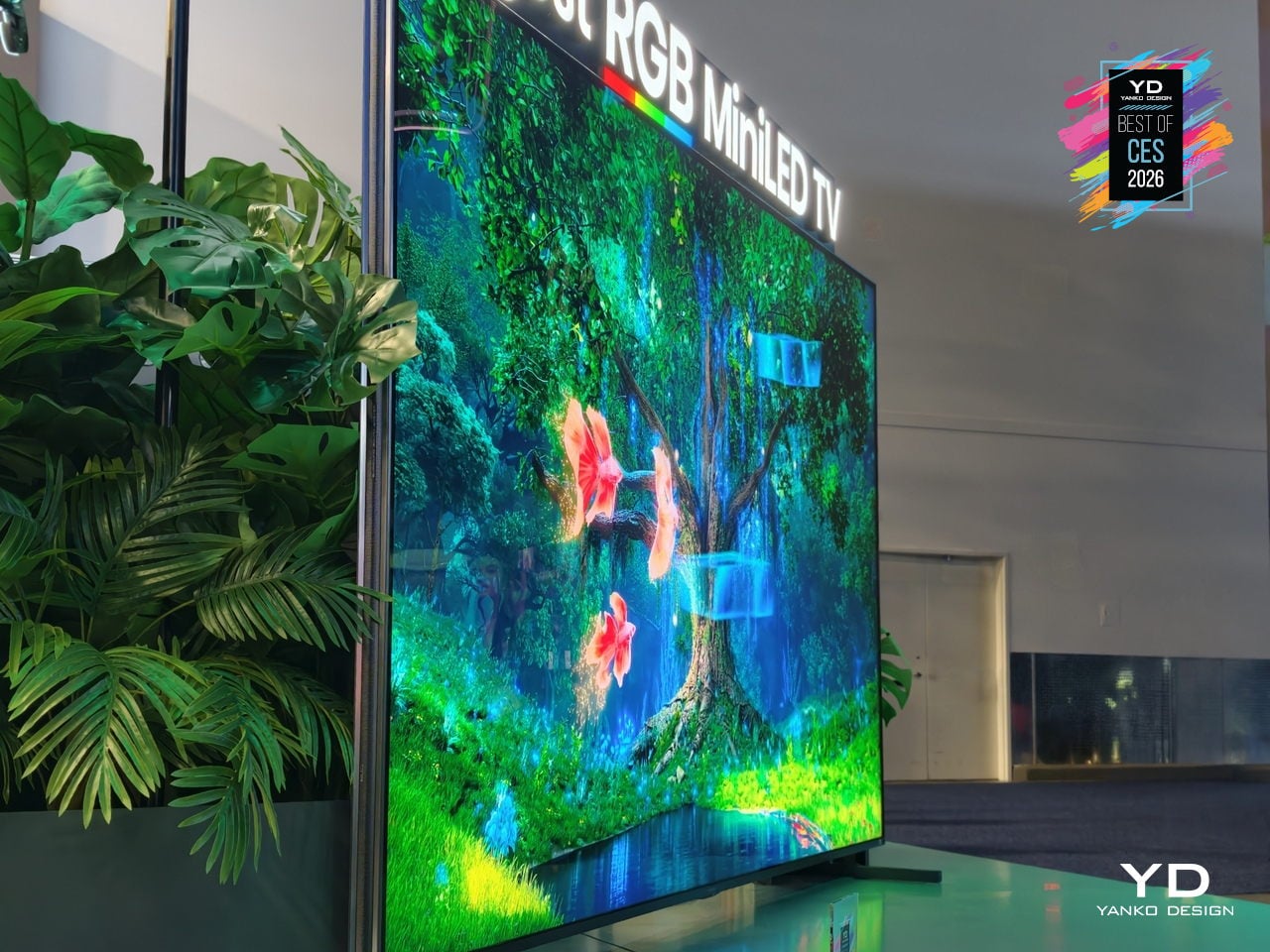
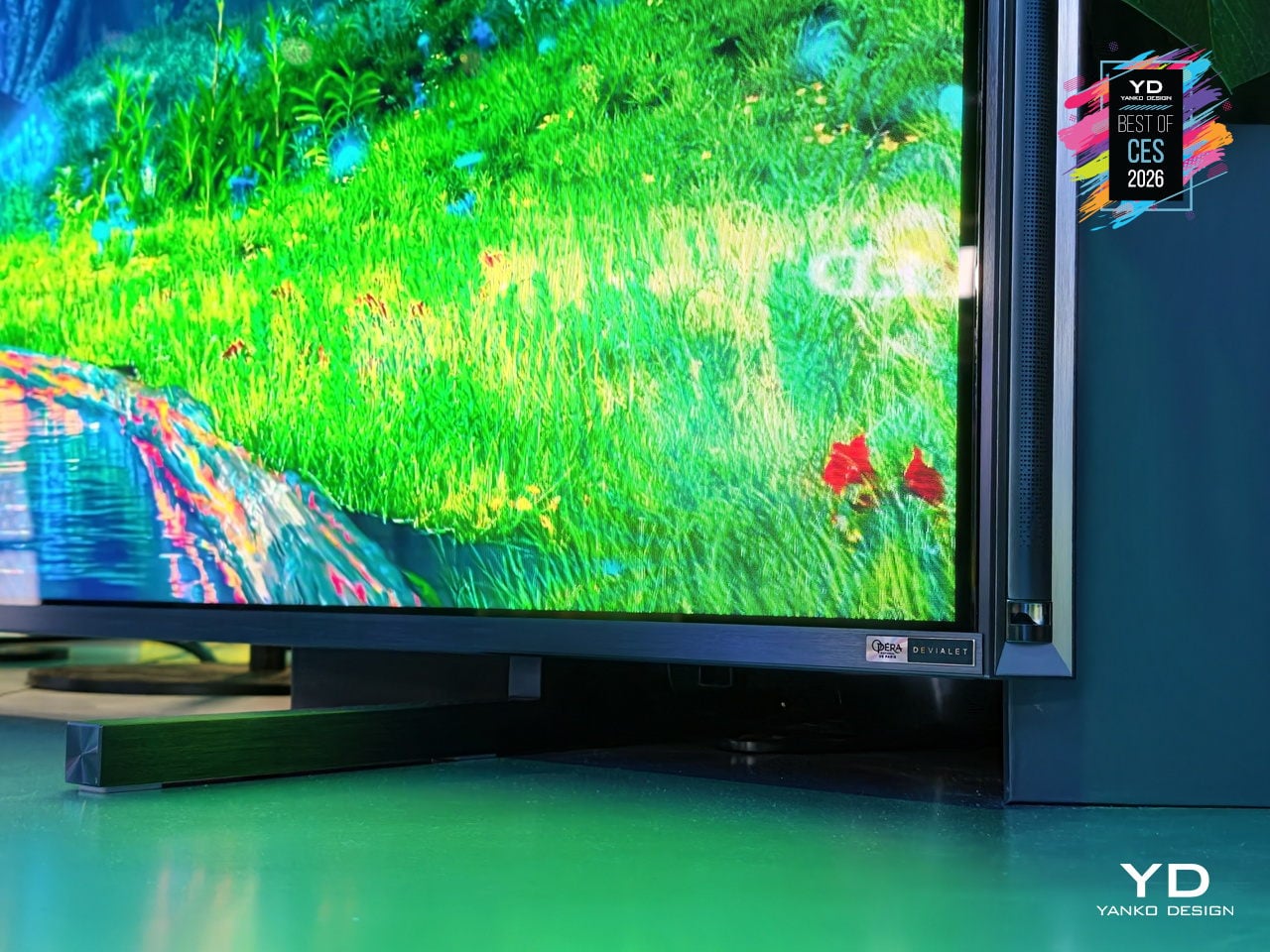
The nearly bezel-free design and 1.57-inch profile let the 116UXS sit on a wall like a luminous surface rather than a framed object, as seen mounted above a low console in a glass-walled living room. The integrated Devialet Opéra de Paris 6.2.2 audio system delivers cinematic sound tuned to match the expanded color performance without needing a separate soundbar cluttering the clean AV setup.
The 116UXS is the fullest expression of Hisense’s color philosophy, with the UR9 and UR8 series scaling RGB MiniLED to more sizes, but this model carries the multi-primary evo system and the highest-end design. For readers who care as much about how a giant TV sits in a room as how it measures on a chart, the 116UXS shows what happens when color architecture, processing, industrial design, and audio are treated as a single flagship brief.
Dreame Aero Hair Straightener
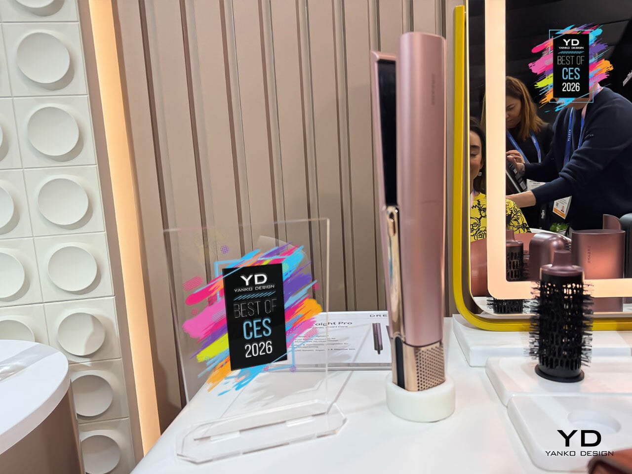
Straightening hair usually means juggling a dryer and flat iron, waiting for hair to dry, then clamping it between hot plates that can leave it dry or frizzy. Dreame’s Aero Straight Pro is an air-driven straightener that uses high-velocity airflow instead of metal plates, drying and smoothing in one glide while aiming to be kinder to hair and scalp, treating the blow-dry and straightening ritual as a single step.
The dual hot-and-cold airflow channels use the Coandă effect to wrap air around strands, with hot air straightening and cold air setting in the same pass. A 120,000 RPM motor pushes airflow at 58 m/s and 45 m³/h, letting it go from wet to straight without a separate blow-dry. Dreame claims up to 50 % higher styling efficiency compared to traditional flat-iron routines.
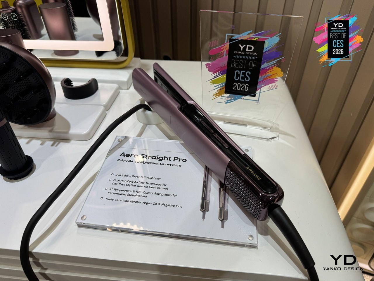
Six NTC sensors check temperature 200 times per second, while temperature and humidity sensors watch how wet the hair is, adjusting airflow and heat automatically. The AI Styling Assistant and app-based hair-type recognition tune temperature and speed to your hair’s length, thickness, and moisture level, so you are not guessing settings or worrying about over-drying fragile strands or under-styling thick hair.
The ion-infused and oil-coated care system combines negative ions to reduce static and frizz, a keratin-infused coating to reinforce strands, and Moroccan argan oil that releases under heat to add moisture and shine. A 57 °C root-care mode lifts roots while keeping the scalp comfortable, and Dreame’s lab data suggests smoother, shinier, longer-lasting results compared to traditional flat-iron passes.
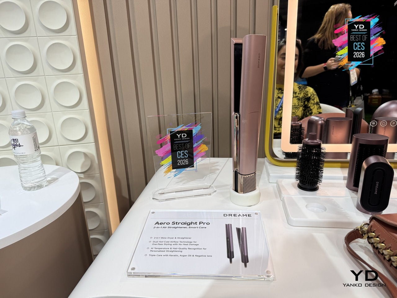
The smart display shows Wet, Dry, Root, or Cold modes along with temperature and airflow, and the intelligent safety guard slows, pauses, and shuts off automatically if you set it down. The lightweight, balanced body, long 2.8 m cord, and soft metallic finishes in Rosy Purple or Pink Gold make the Dreame Aero Straight Pro feel like a thoughtfully designed tool rather than just another hot appliance.
Acer Swift 16 AI Laptop
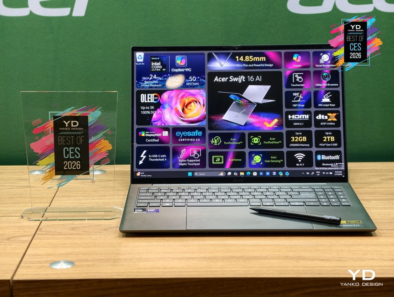
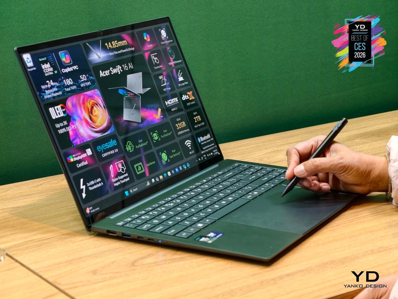
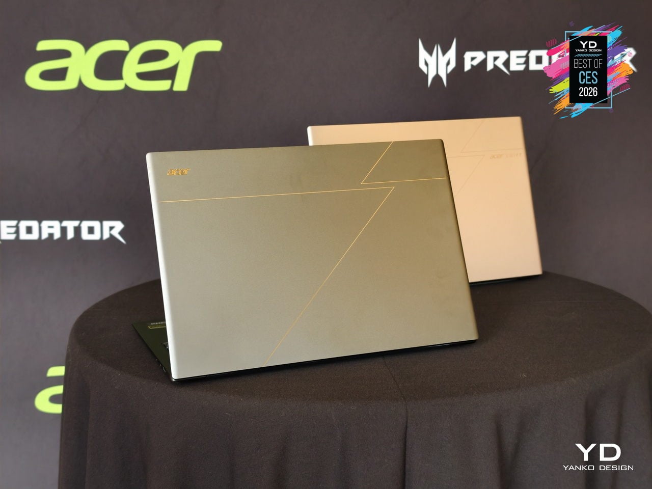
Acer’s Swift 16 AI is the flagship of the new Swift AI Copilot+ PC lineup, built for creators and professionals who need AI horsepower without carrying a workstation. Powered by up to an Intel Core Ultra X9 388H processor with integrated Arc B390 graphics, wrapped in a thin aluminum chassis at just 14.9 mm, it is designed to feel like a premium ultrabook that can still handle heavy creative tools and large files.
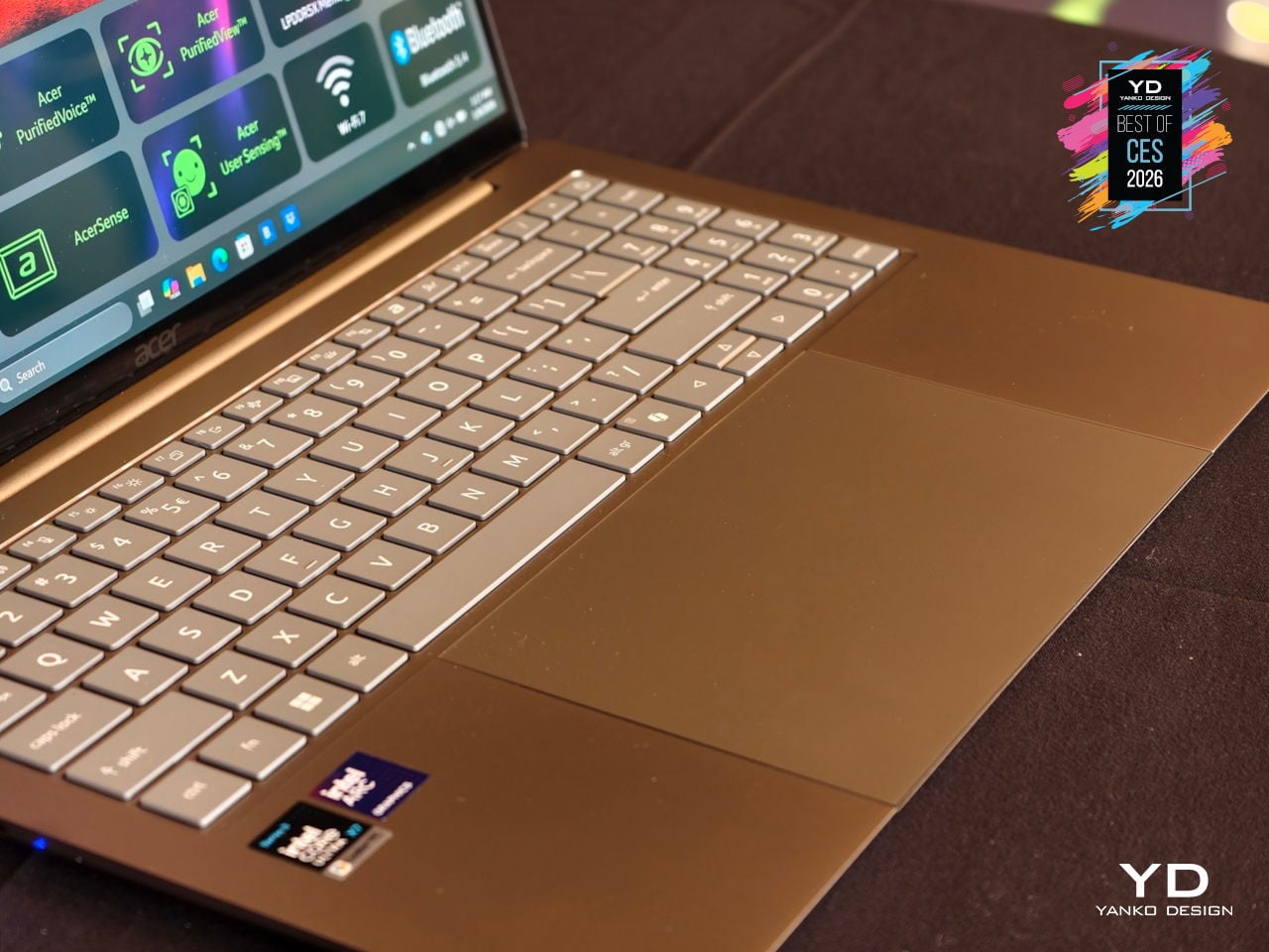
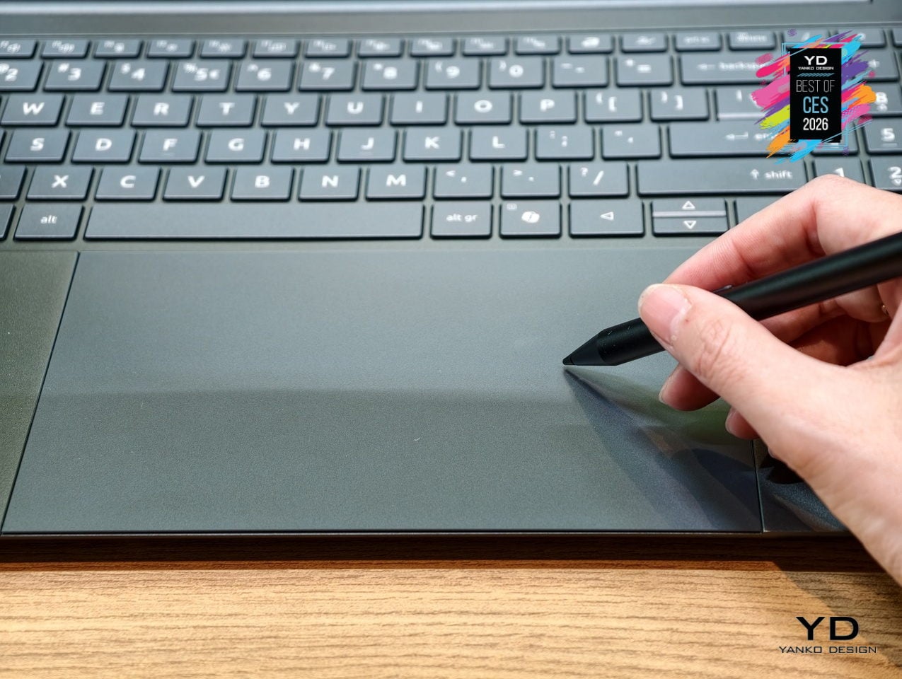
The 16-inch 3K OLED touch display runs at 120 Hz with 100 % DCI-P3 color and DisplayHDR True Black 500 certification, covering photo editing, video grading, and fast scrolling in one tall 16:10 canvas. Below it sits the world’s largest haptic touchpad, measuring 175.5 × 109.7 mm and supporting MPP 2.5 stylus input, turning the palm rest into a secondary drawing surface for sketching, animating, and editing directly without needing a separate tablet.
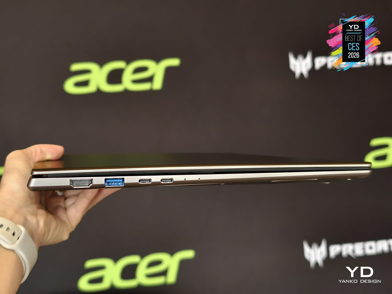
As a Copilot+ PC, the Swift 16 AI unlocks Click to Do, Copilot Voice, and Copilot Vision, while Acer adds PurifiedVoice, PurifiedView, User Sensing, and the Intelligence Space hub for calls, privacy, and productivity. Dual Thunderbolt 4 ports, HDMI 2.1, MicroSD, Wi-Fi 7, DTS:X speakers, and an FHD IR camera complete a machine that treats AI, I/O, and everyday ergonomics as equally important, making it one of the most complete thin-and-light creative laptops arriving this year.
Clicks Power Keyboard
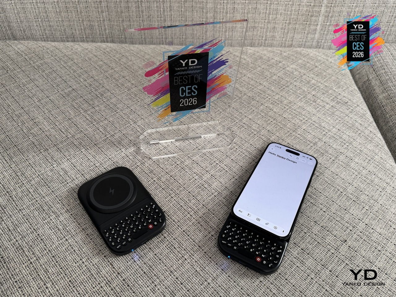
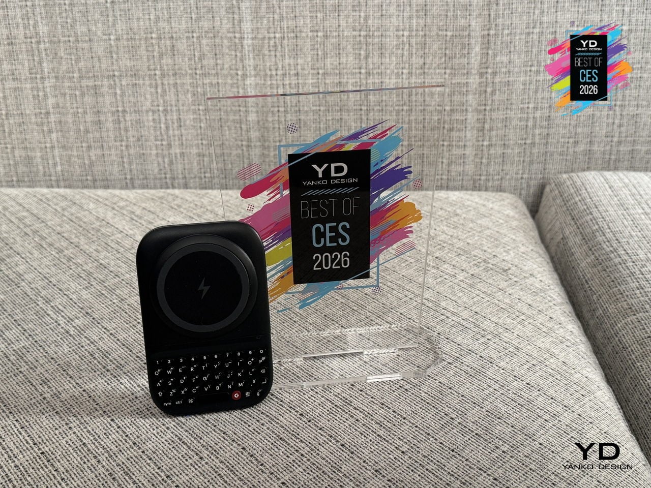
Typing on glass, remote controls, and air-gesture keyboards still feels like a compromise when you are trying to write more than a couple of words. Clicks Power Keyboard is a pocket keyboard designed for smart screens, snapping onto phones via MagSafe or Qi2 and riding along like a slim backplate. It is built for people who bounce between phones, tablets, TVs, and headsets but still want fast, confident typing everywhere.
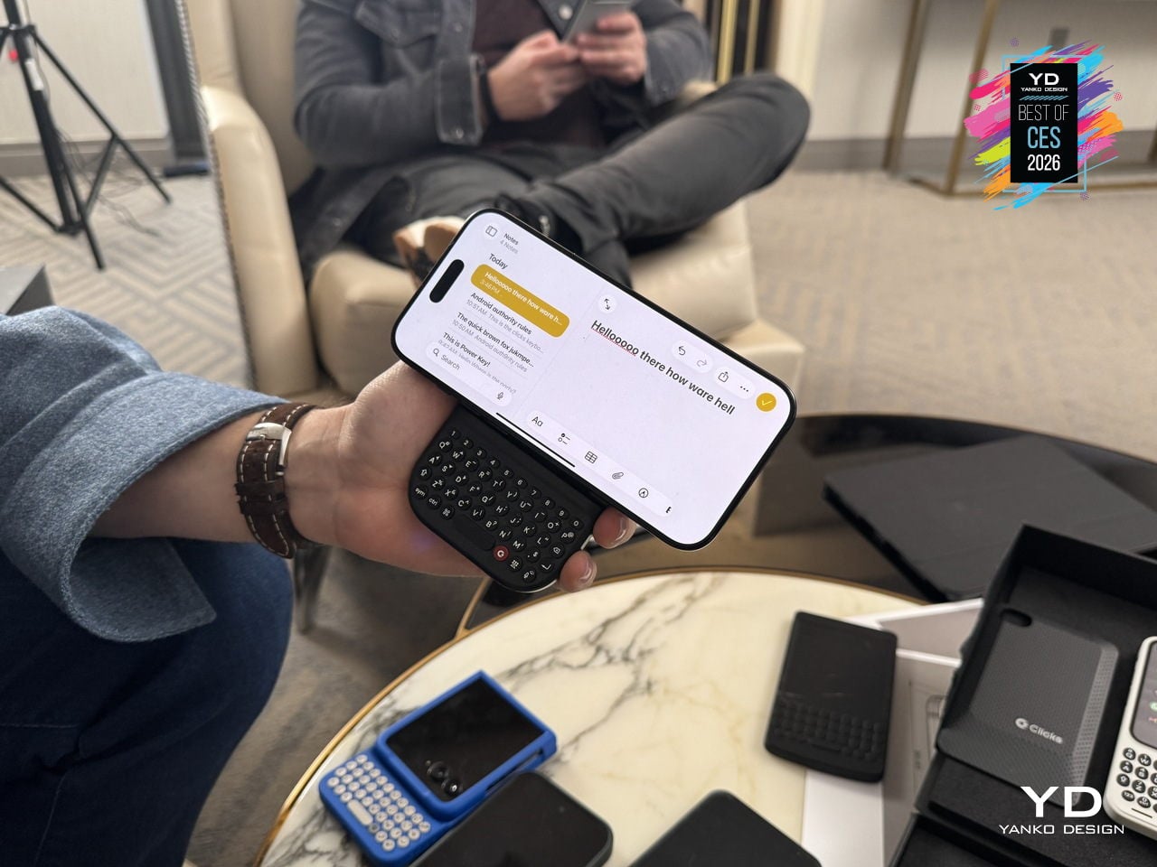
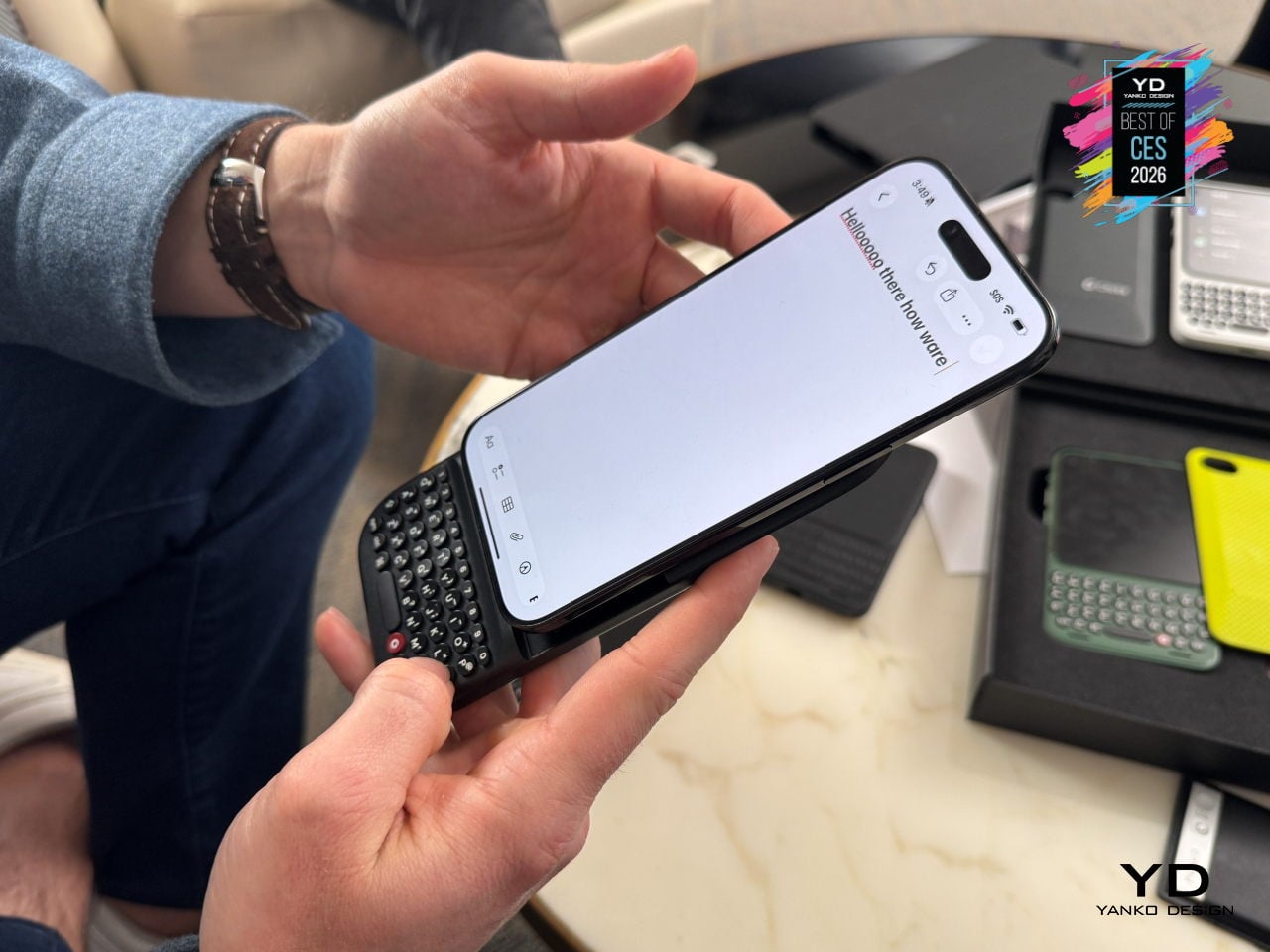
A slide-out mechanism reveals an ergonomic QWERTY layout with sculpted keys, directional arrows, and a dedicated number row, with multiple slider positions and landscape support so it can adapt from compact phones to big Ultra and Pro Max devices. An integrated 2,150 mAh battery powers the keyboard and wirelessly tops up a phone, turning it into a power bank that actually earns its pocket space while you type.
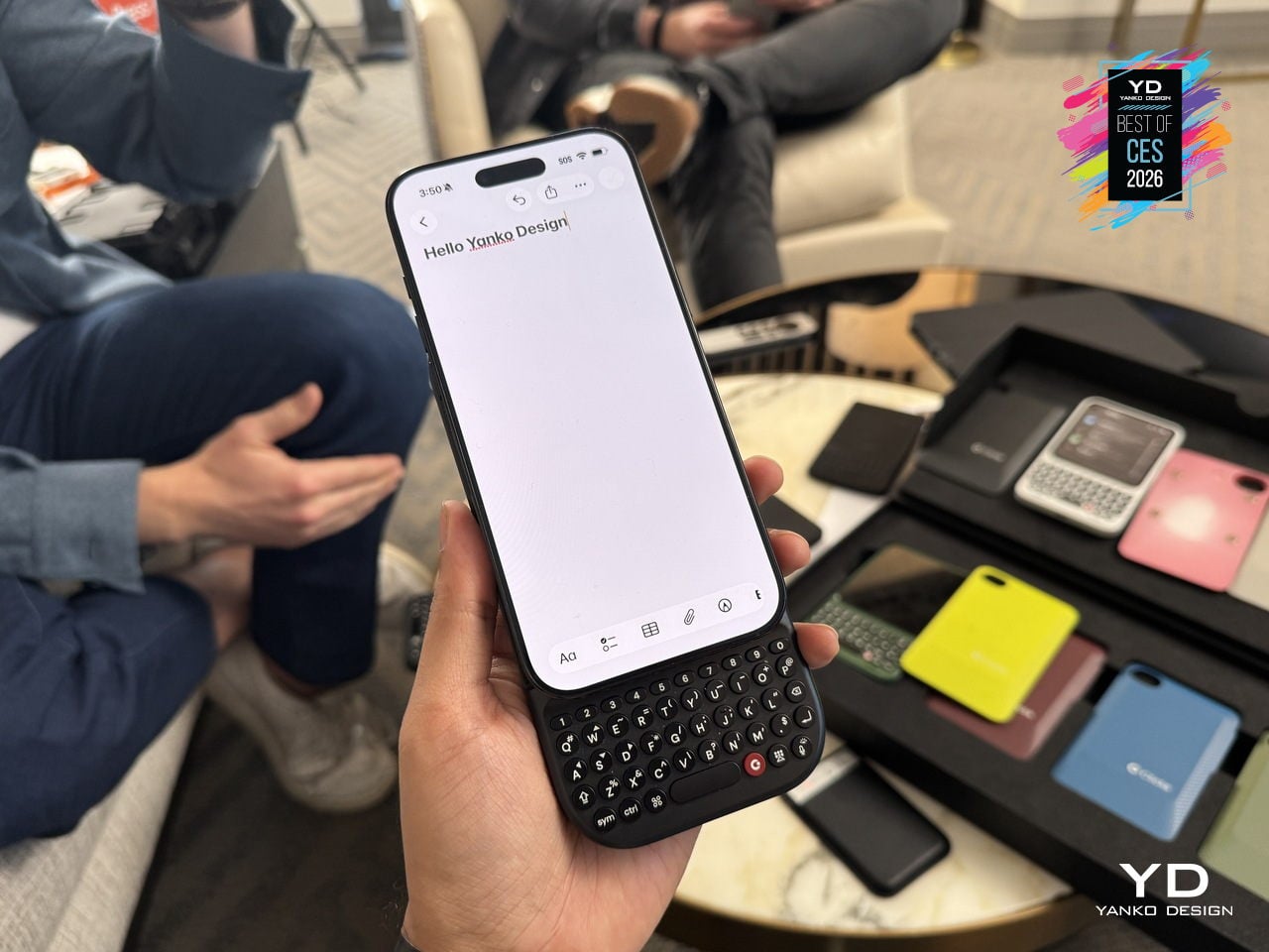
Power Keyboard also works as a multi-device Bluetooth keyboard for phones, tablets, smart TVs, and headsets, with quick profile switching so you can jump from drafting an email on your phone to searching on a TV or naming files in AR. The Clicks app on iOS and Android lets you tune key behavior, shortcuts, and backlighting, so one small accessory quietly fixes input across your whole ecosystem instead of adding yet another single-purpose gadget.
Pininfarina-designed InkPoster Duna Art Frame
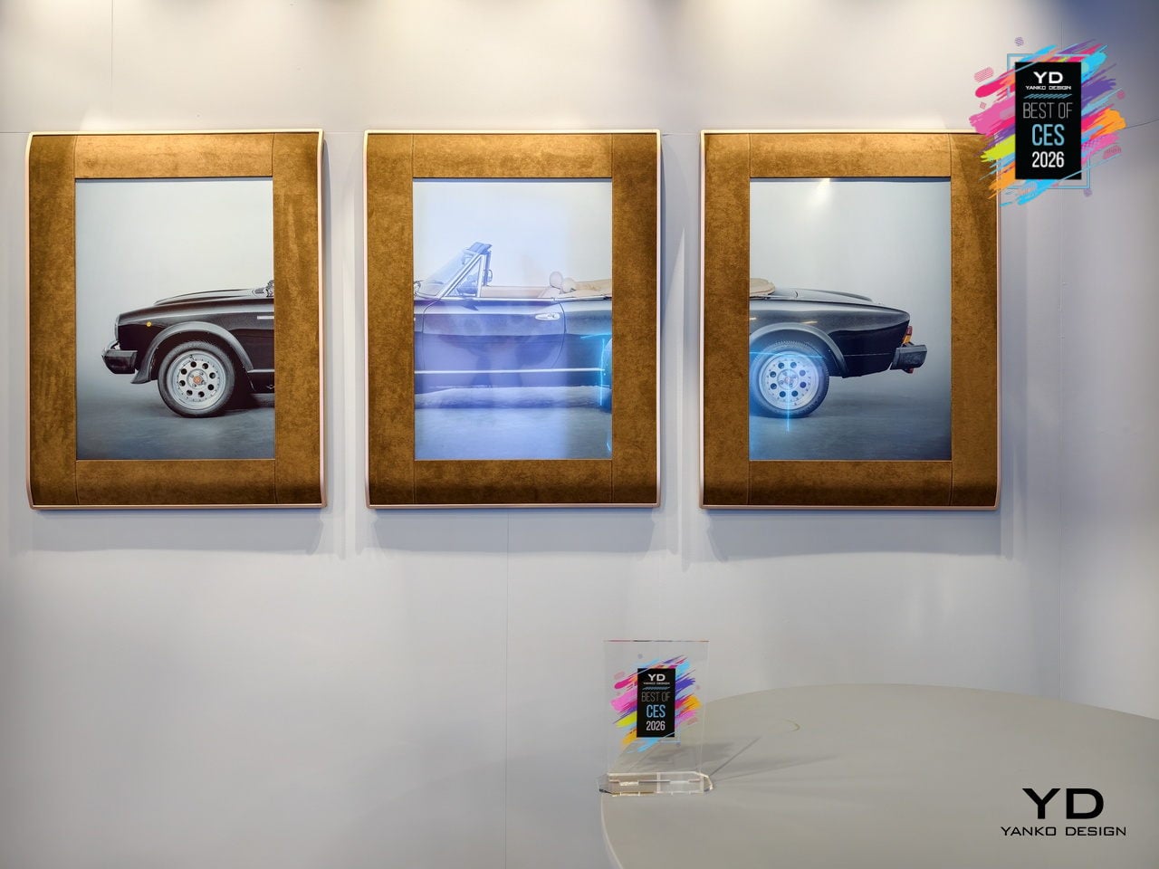
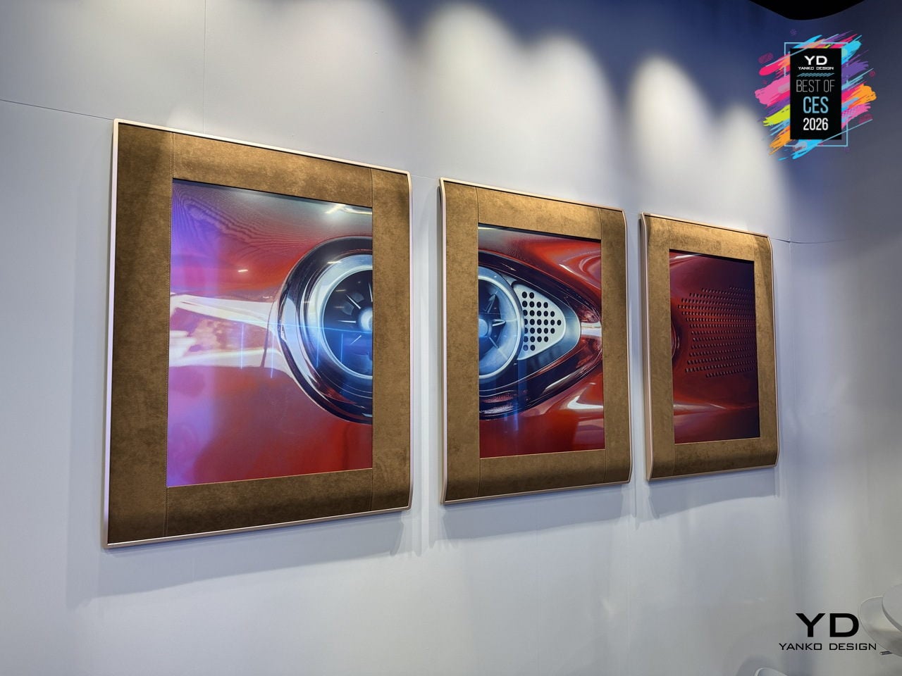
TVs and digital frames dominate rooms with glow and cables, either demanding constant power or looking like technology trying too hard to be art. InkPoster Duna is a Pininfarina-designed A1 color ePaper art poster, conceived as furniture rather than a gadget. The precision-engineered aluminum frame, wrapped in elegantly stitched Alcantara borrowed from luxury automotive interiors, uses fluid curvature and tailored details to make the piece feel timeless and deliberate, not disposable.
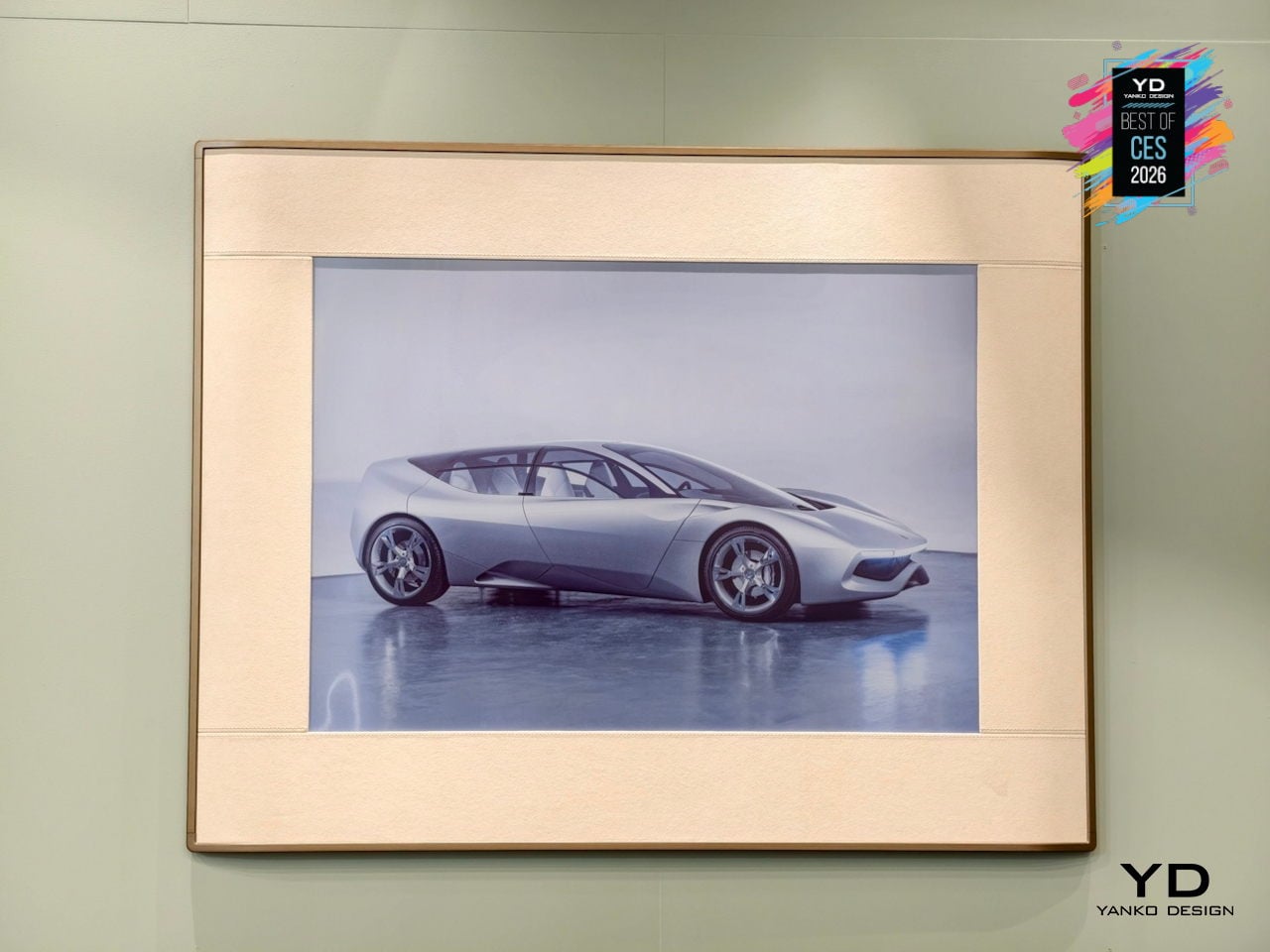
The E Ink Spectra 6 screen with Sharp IGZO backplane displays more than 60,000 colors without any backlight, using pigment-like color capsules that behave like printed ink. Once the image is set, no power is needed to hold it on screen, so one charge can last up to a year. No blue light, no flicker, no glow, no heat, just a surface that looks like a poster and can change with a tap.
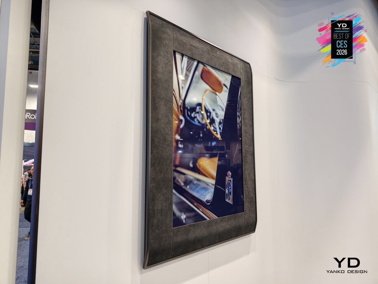
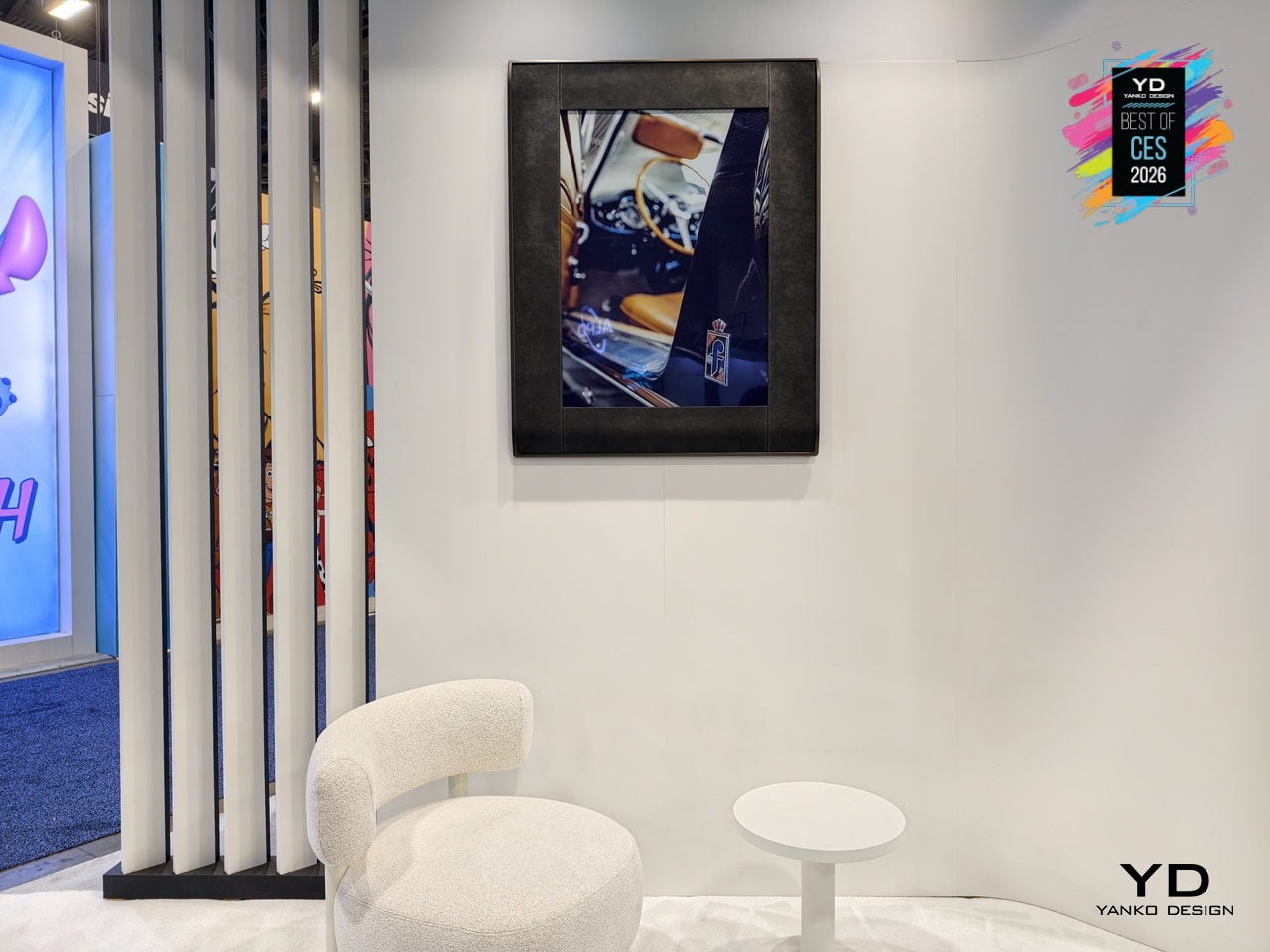
The InkPoster app offers thousands of licensed artworks, from vintage graphics to timeless classics, plus an exclusive collection of original Pininfarina design sketches and automotive prototype images. You can also upload personal images and update artwork remotely, hanging Duna vertically or horizontally, completely cable-free. It becomes an evolving design element that can shift a room’s mood in seconds without adding another glowing screen to the wall.
CyberPower MA-01 Desktop PC Cases
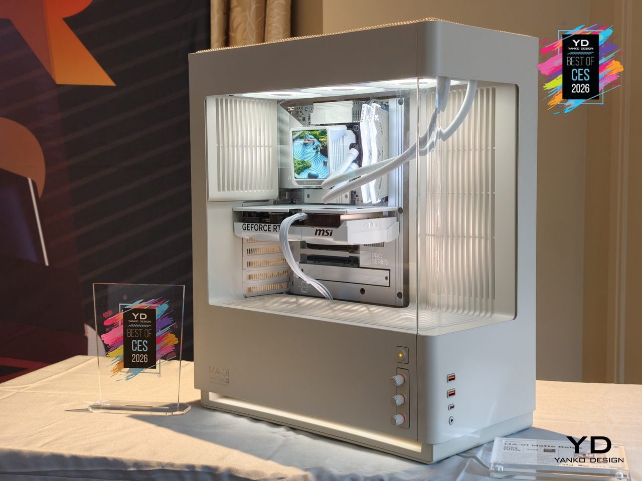
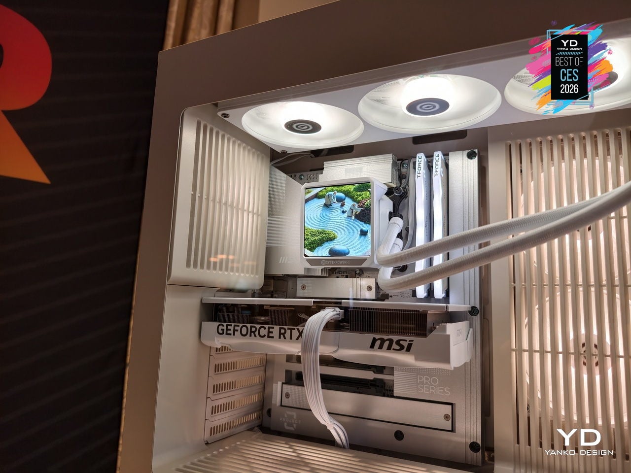
The MA-01 Modern Analog Series chassis from CyberPowerPC treats a gaming tower as something you want visible on a desk. It hides fans, radiators, and cabling behind sculpted vents and shrouds, framing only the GPU, CPU cooler, and memory through pillar-less curved glass. The woven steel mesh top reduces high-frequency resonance, cutting exhaust noise by 20 to 30 percent while moving enough air to keep temperatures controlled.
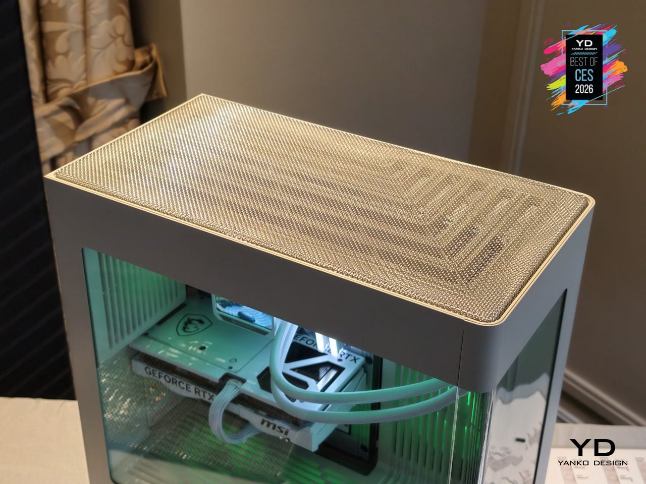
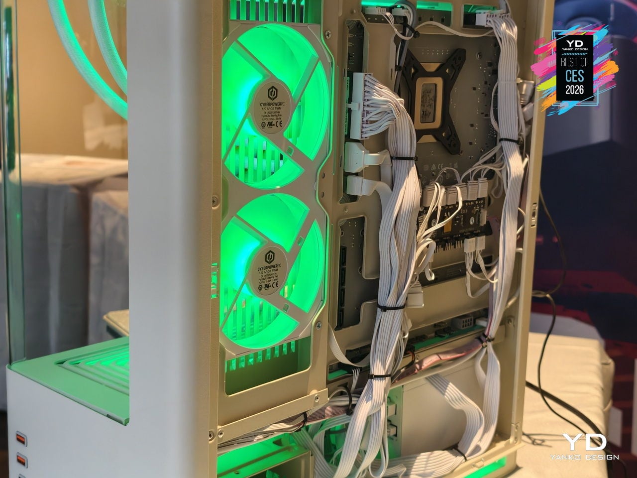
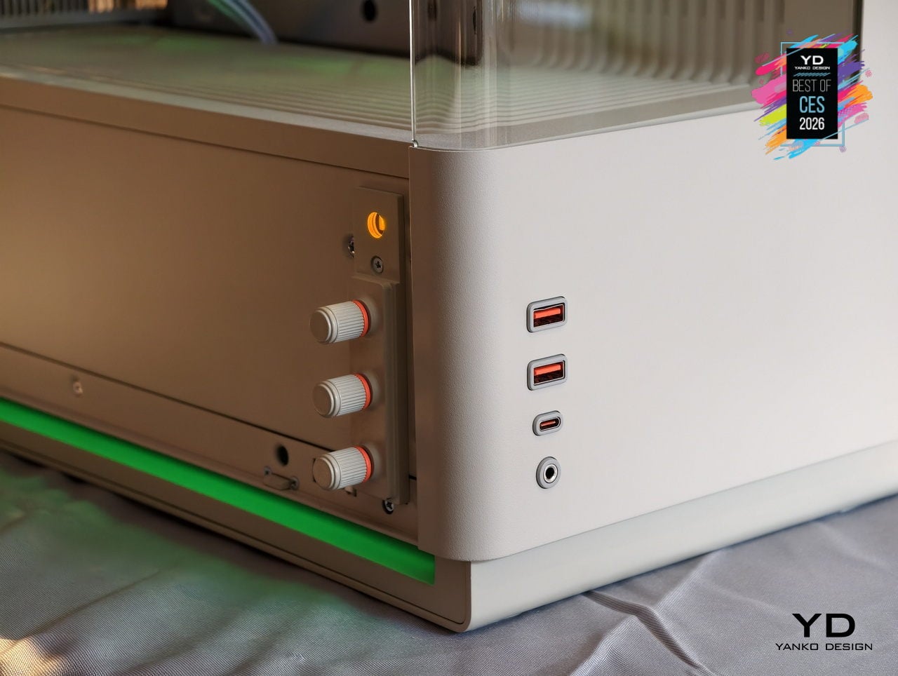
Three analog RGB knobs let you dial through 16.7 million colors and adjust brightness and effects without software. Pressing each knob activates secondary functions, so color, brightness, and lighting modes are controlled with hardware instead of menus. Precision-molded I/O shrouds self-center cables and reduce wear. The MA-01 ships in warm matte off-white, dark steel gray, and metallic dark silver, supporting ATX and BTF motherboards with space for 360 mm radiators and long GPUs.
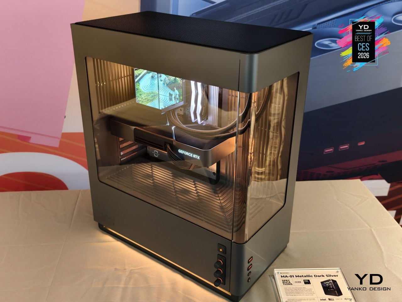
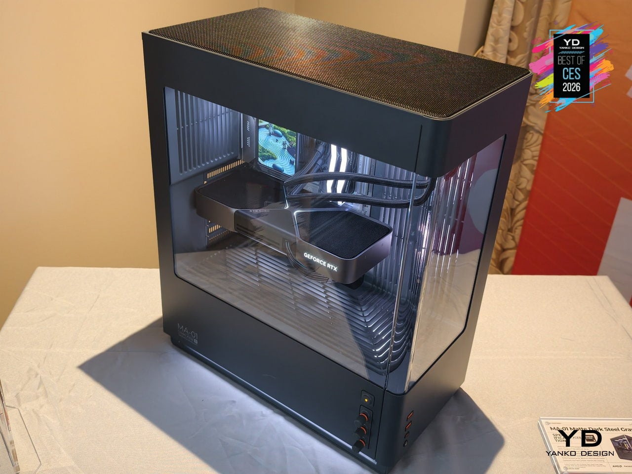
The CyberPowerPC MA-01 suggests that gaming hardware can behave like a mature object in the room. It still moves air and lights up, but through woven mesh, sculpted vents, and analog controls that feel considered. For people who want a powerful tower that can live on a desk without shouting, that shift in attitude turns a spectacle into something you choose to keep visible.
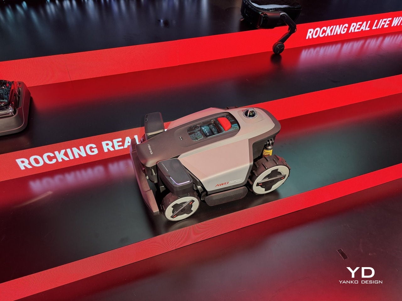
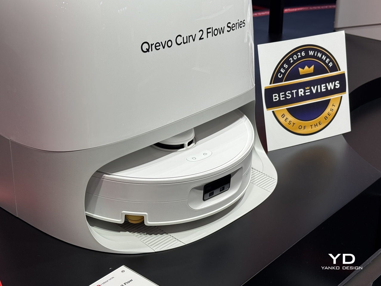
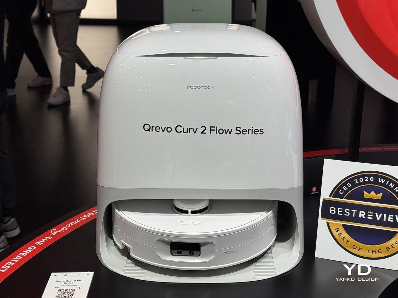
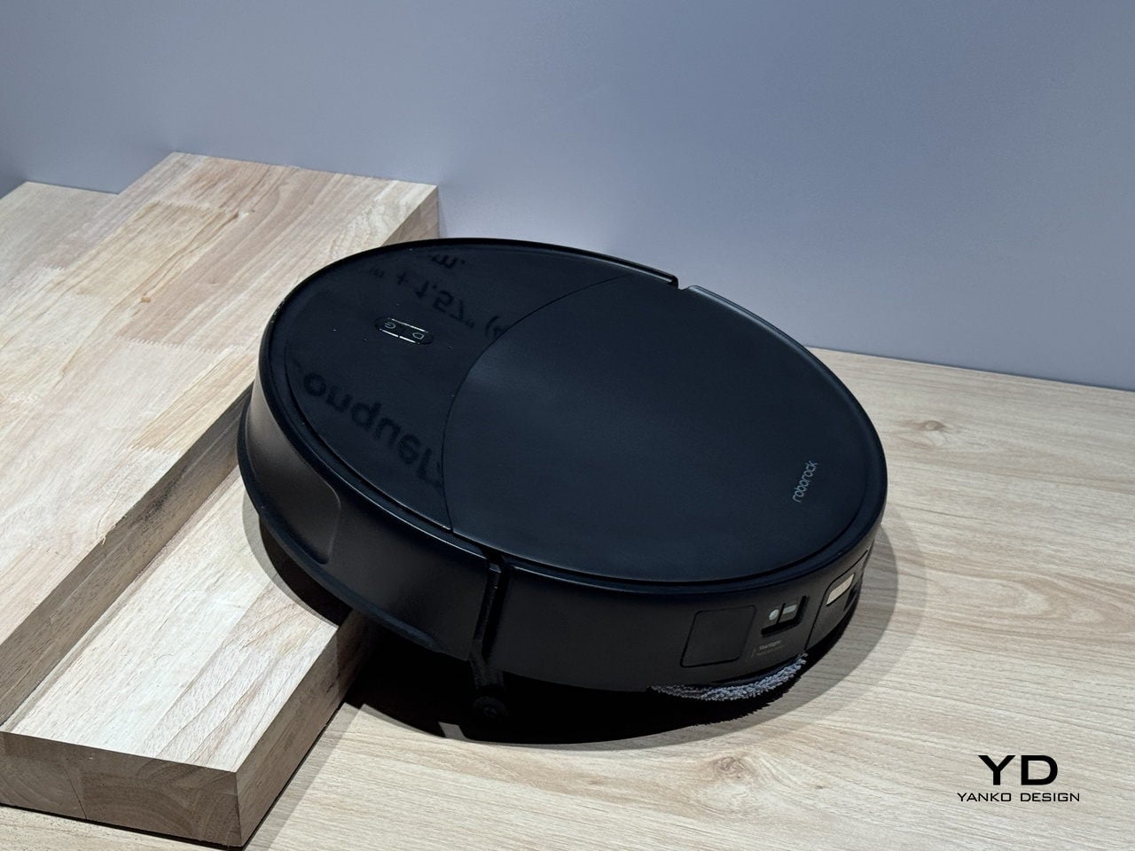
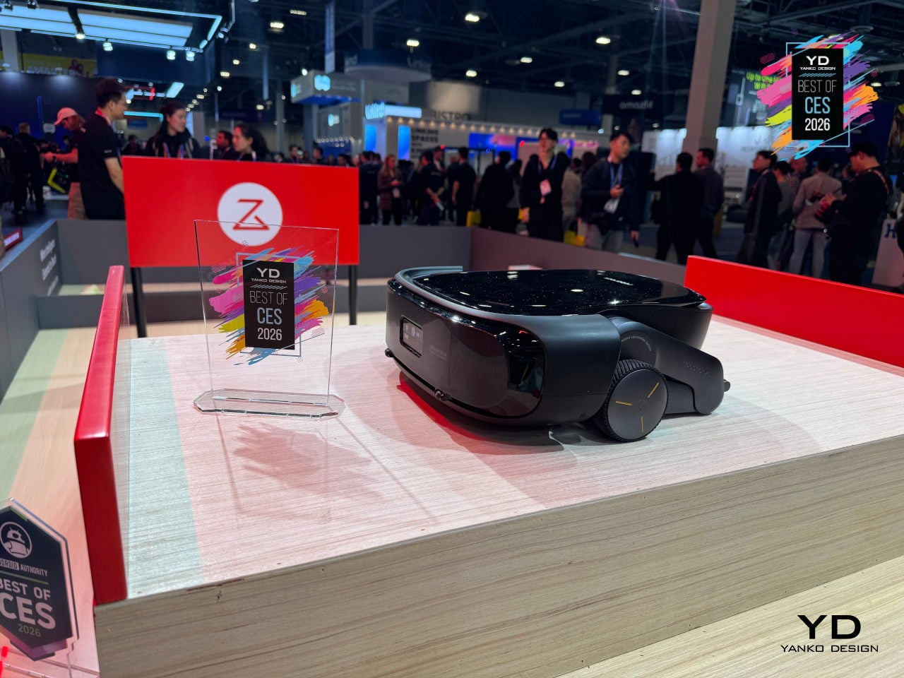
Roborock Saros Rover
Most robovacs stop at stairs, split levels, and weird thresholds, then politely give up and wait downstairs. Roborock’s Saros Rover is a development-stage robot that uses the world’s first two-wheel-leg architecture in a robovac, moving more like a small rover than a puck that just rolls and bumps. Each wheel-leg can independently raise, lower, and bend, giving it reach, lift, and height while keeping its body level as the ground changes.
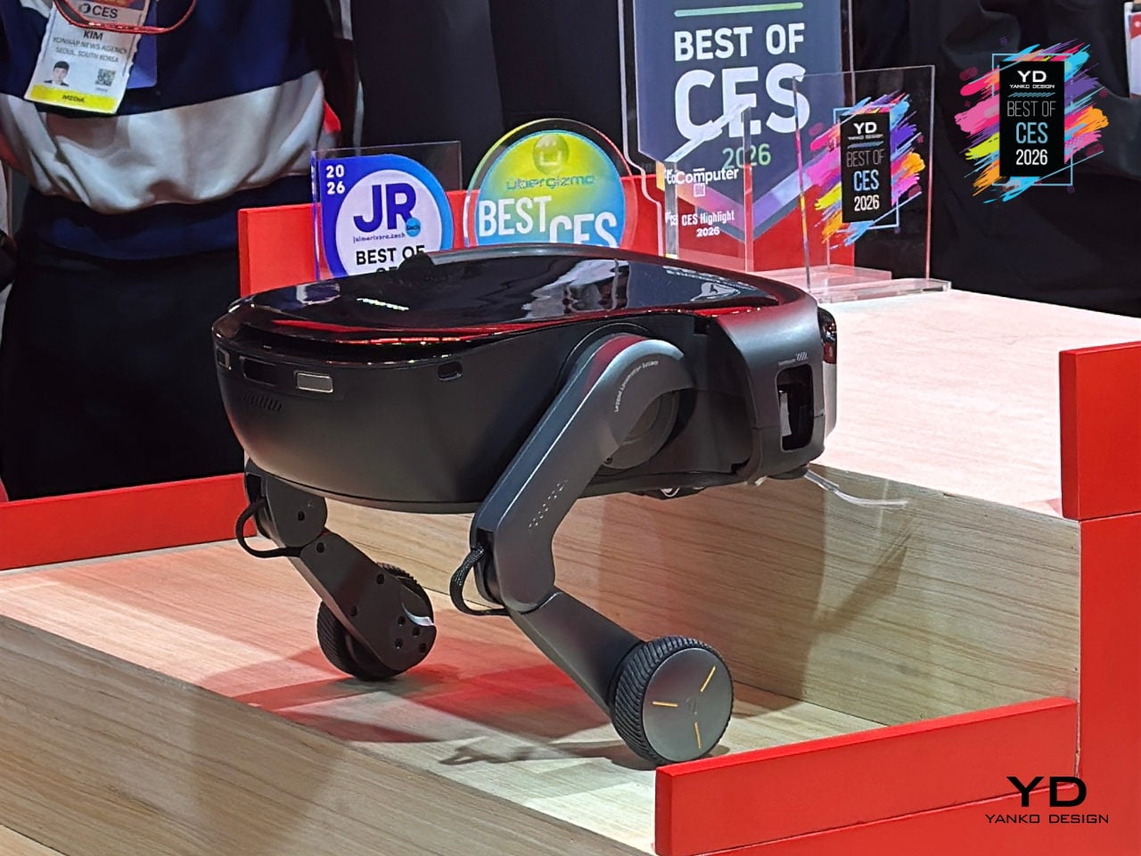
The wheel-legs let Saros Rover execute small jumps, agile turns, sudden stops, and directional changes, enabling it to tackle traditional, curved, and carpeted staircases with bullnose fronts, cleaning each step as it climbs or descends. It also handles slopes and complex multi-level room thresholds, transitioning into areas that have been hard no-go zones for homes trying to clean multiple floors with a single robot.
AI algorithms work with motion sensors and 3D spatial information to understand the environment and make those wheel-legs react with precision, dramatically shrinking no-go zones in multi-storey homes. For people who have given up on a single robot handling upstairs and downstairs, Saros Rover offers a glimpse of where robovacs might be heading, treating stairs and split levels as just another surface instead of a permanent boundary, though launch timing remains unconfirmed.
Pila Energy Plug-and-Play Home Battery
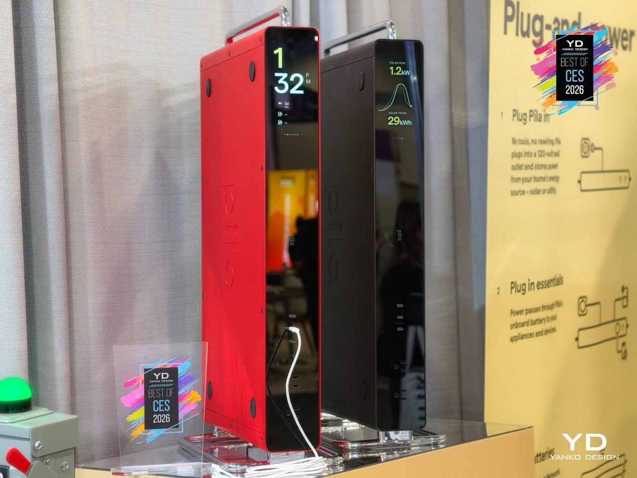
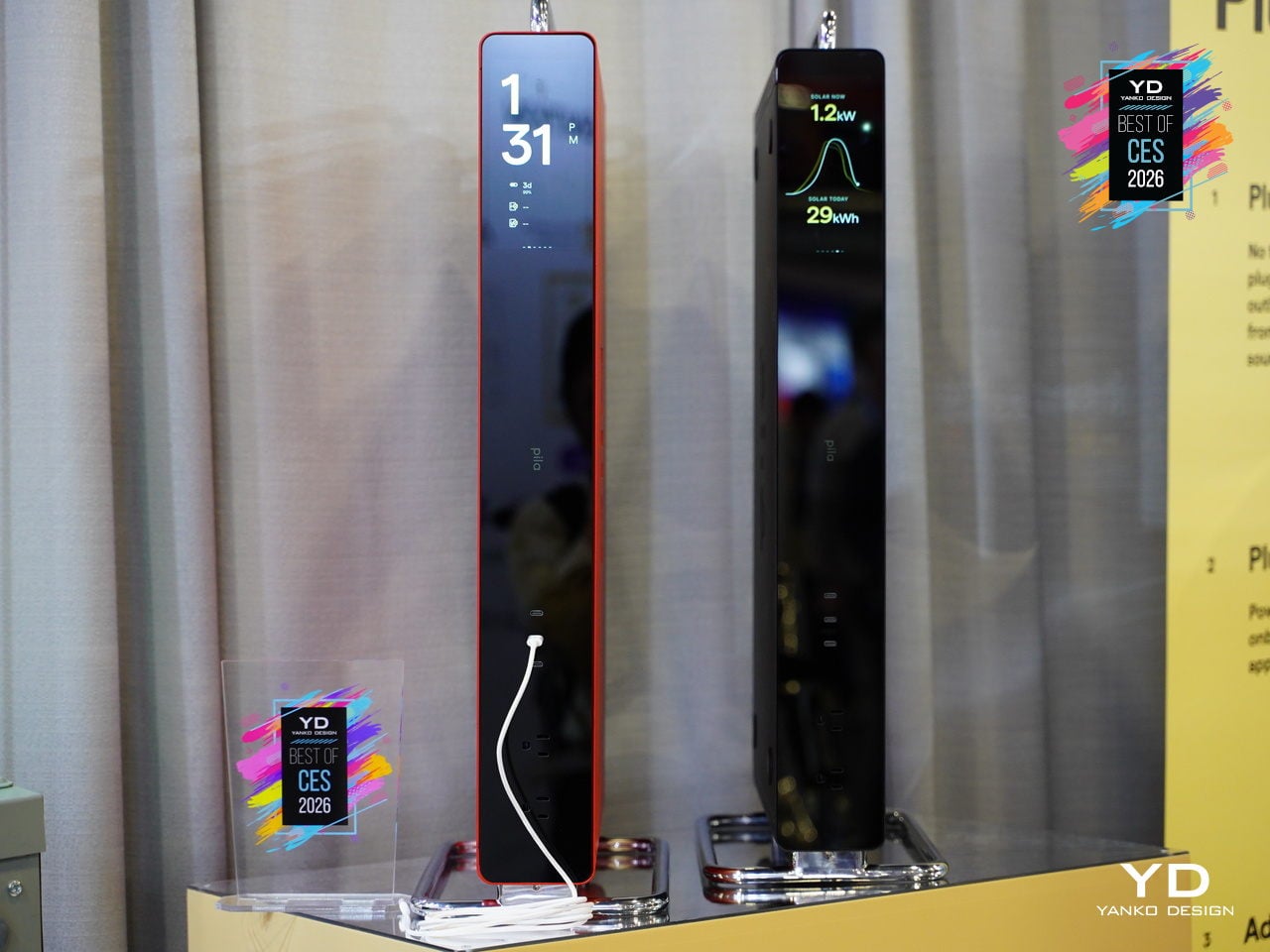
Backup power is usually something you hide in a garage or closet. The Pila Mesh Home Battery is a slim, 3.3-inch-thick object designed by bould Design to sit beside a desk or under a console, treating energy infrastructure as something you actually want to see. A monolithic front panel, integrated handle and stand, stackable form, and four color-accented shells turn the battery into a piece of living-room furniture.
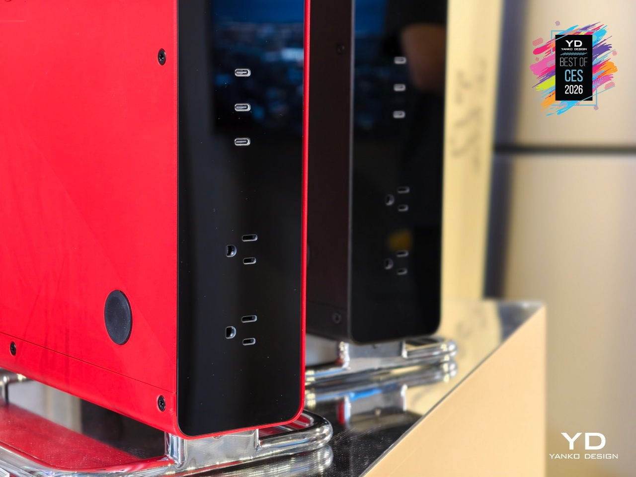
Each Pila unit plugs into a standard outlet with no electrician, permits, or landlord approval, so renters and homeowners can drop backup power exactly where it is needed. Multiple batteries coordinate wirelessly like a Wi-Fi mesh, charging during off-peak hours and discharging during expensive peaks, while the Pila app monitors appliance-level usage, refrigerator temperature, and solar input, turning scattered appliances into a coordinated, intelligent energy system.
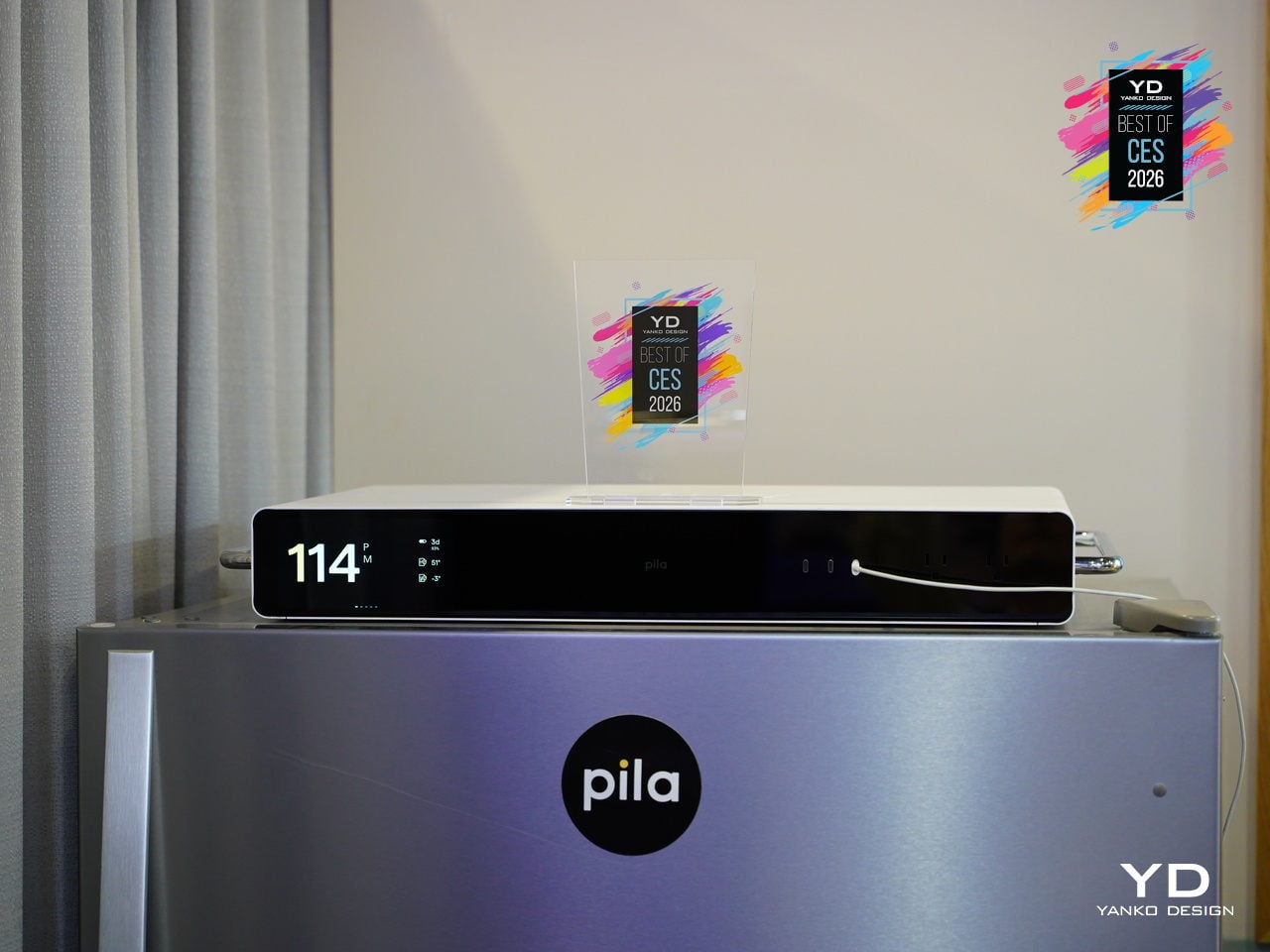
The numbers behind it: 1.6 kWh LFP capacity per unit, 2,400 W continuous output, 10-year lifespan, Wi-Fi and cellular connectivity, smart-home support for Alexa, Google, and HomeAssistant, and $1,299 per unit that can scale as needs grow. At fleet scale, connected Pila batteries form a virtual power plant that smooths peak demand and strengthens the grid, turning individual design-forward boxes into shared energy infrastructure.
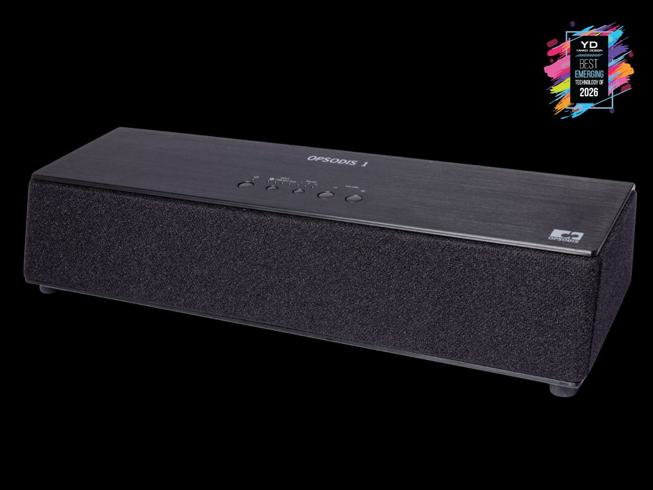
TDM Neo Hybrid Headphones
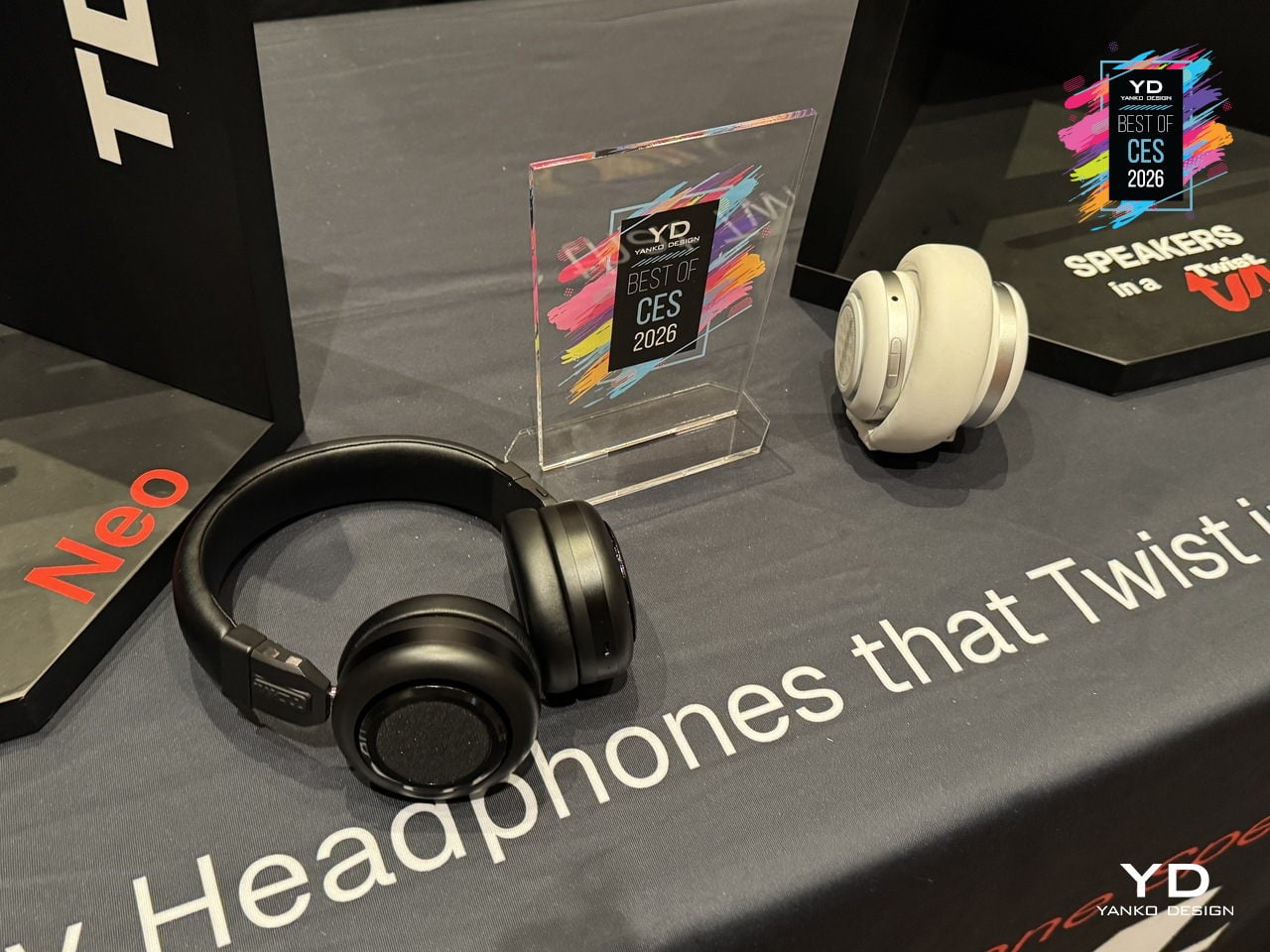

Neo is TDM’s hybrid headphone speaker that twists from on-ear headphones into a compact speaker with a single motion. It is built for people who move from solo listening on a commute or walk to spontaneous hangs in parks, hotel rooms, or studios, without swapping gear. TDM’s “Tomorrow Doesn’t Matter” philosophy is about making those shifts feel effortless, treating music as something you can keep private or share on impulse.
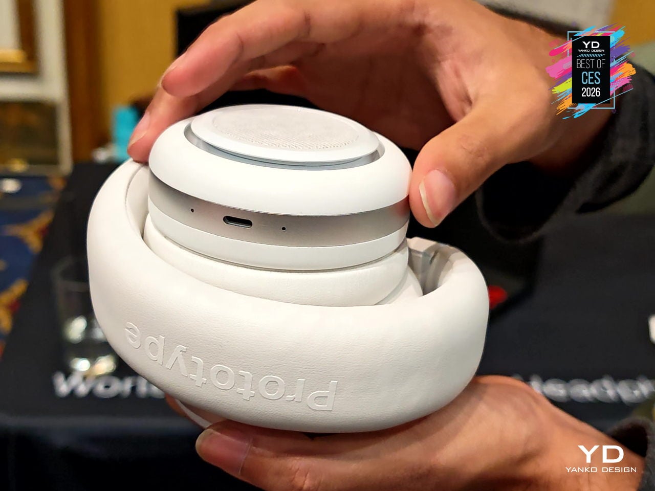
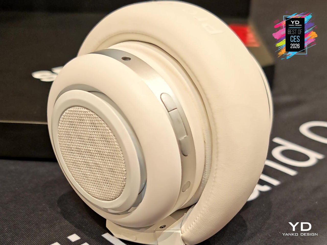
The quad 40 mm driver setup uses two inward-facing drivers for clean, detailed headphone sound and two outward-facing drivers that turn Neo into a palm-sized speaker with surprising volume. Dual-layer memory-foam cushions, a soft vegan-leather headband, and an adjustable clamp keep it comfortable during long wear, while customizable twist controls and simple buttons let you switch modes, pause, or power off without digging through menus.
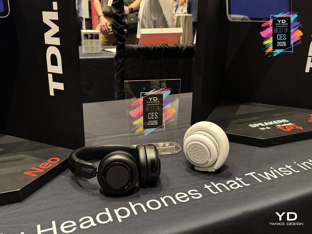
Neo delivers 200+ hours of battery life in headphone mode and 10+ hours in speaker mode, with USB-C fast charging that gives about 8 hours from a 5-minute top-up. Bluetooth 6 multipoint and Auracast readiness, a 3.5 mm aux port, voice assistant support, and replaceable batteries frame Neo as design-forward audio gear that earns its spot in a bag by doing double duty between private listening and shared sound.
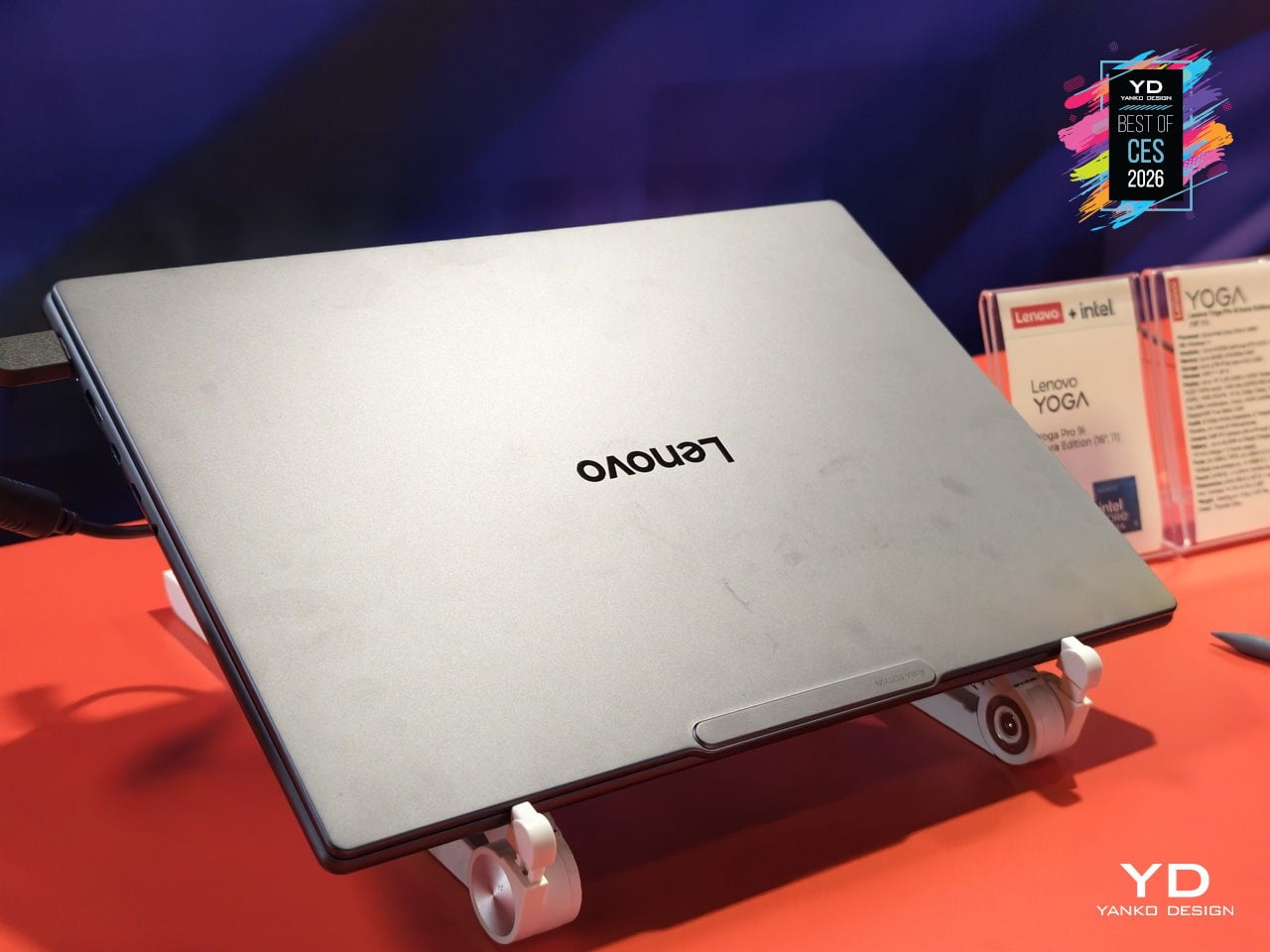
Lenovo Yoga Pro 9i Aura Edition (16″, 11″)
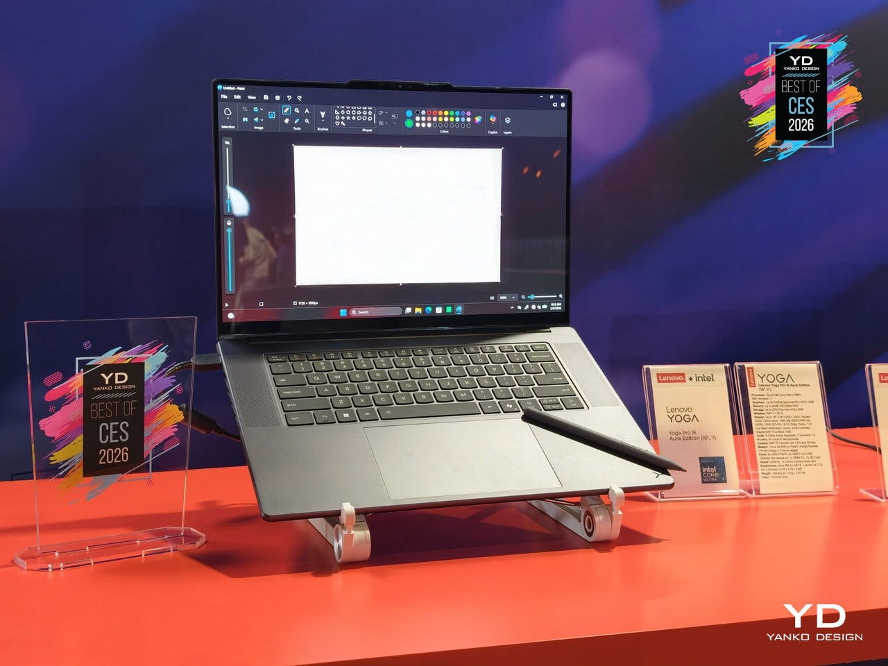
Lenovo’s Yoga Pro 9i Aura Edition is the flagship Yoga for people who spend days inside timelines, node graphs, and layered canvases. Framed as “The Ultimate Power to Create,” it pairs Copilot+ PC intelligence with up to an Intel Core Ultra 9 processor and NVIDIA GeForce RTX 5070 Laptop GPU, all wrapped in a redesigned Thunder Grey chassis that still looks like a Yoga, not a bulky workstation trying too hard to signal power.
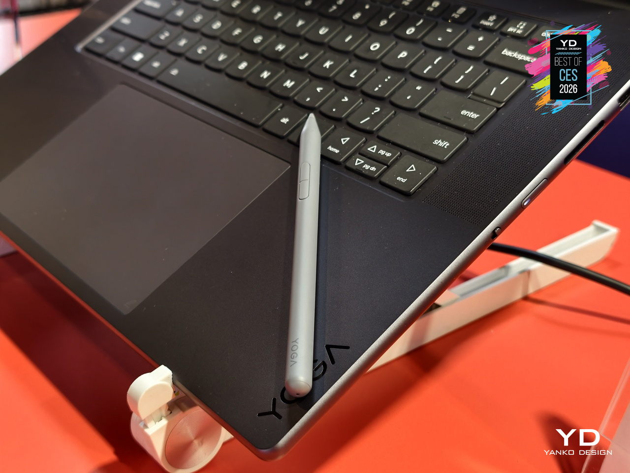
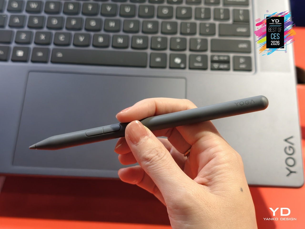
The 16-inch 3.2K PureSight Pro Tandem OLED display runs at a 16:10 aspect ratio, 120Hz variable refresh, and up to 1,600 nits peak brightness, covering 100% of Adobe RGB, P3, and sRGB with Delta E below 1, tuned for Dolby Vision and True Black 1000. The glass Force Pad and included Yoga Pen Gen 2 turn the 150 × 95 mm surface into a sketchpad that automatically disables touch when the pen is in use.
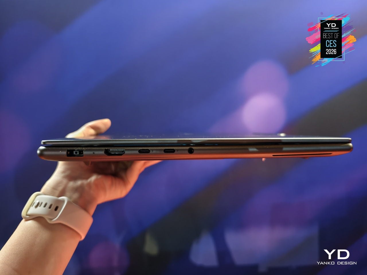
Performance hardware includes up to 64 GB of LPDDR5X memory, up to 2 TB PCIe 4.0 storage, a 92.5 Wh battery, and a six-speaker Dolby Atmos system around a centered 1.5 mm-travel keyboard. A 5 MP IR webcam, dual Thunderbolt 4, HDMI 2.1, SD UHS-II reader, and Wi-Fi 7 handle connectivity, while Lenovo Power Engine’s AI modes shift between Extreme Power Boost, Adaptive Performance, and Extreme Low Power as your work moves from rendering to writing.
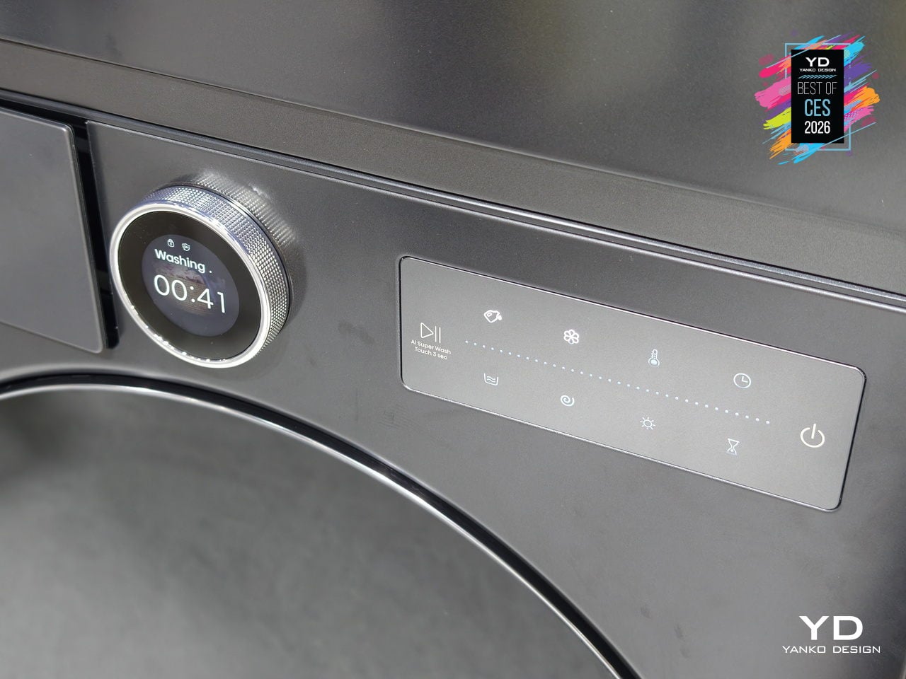
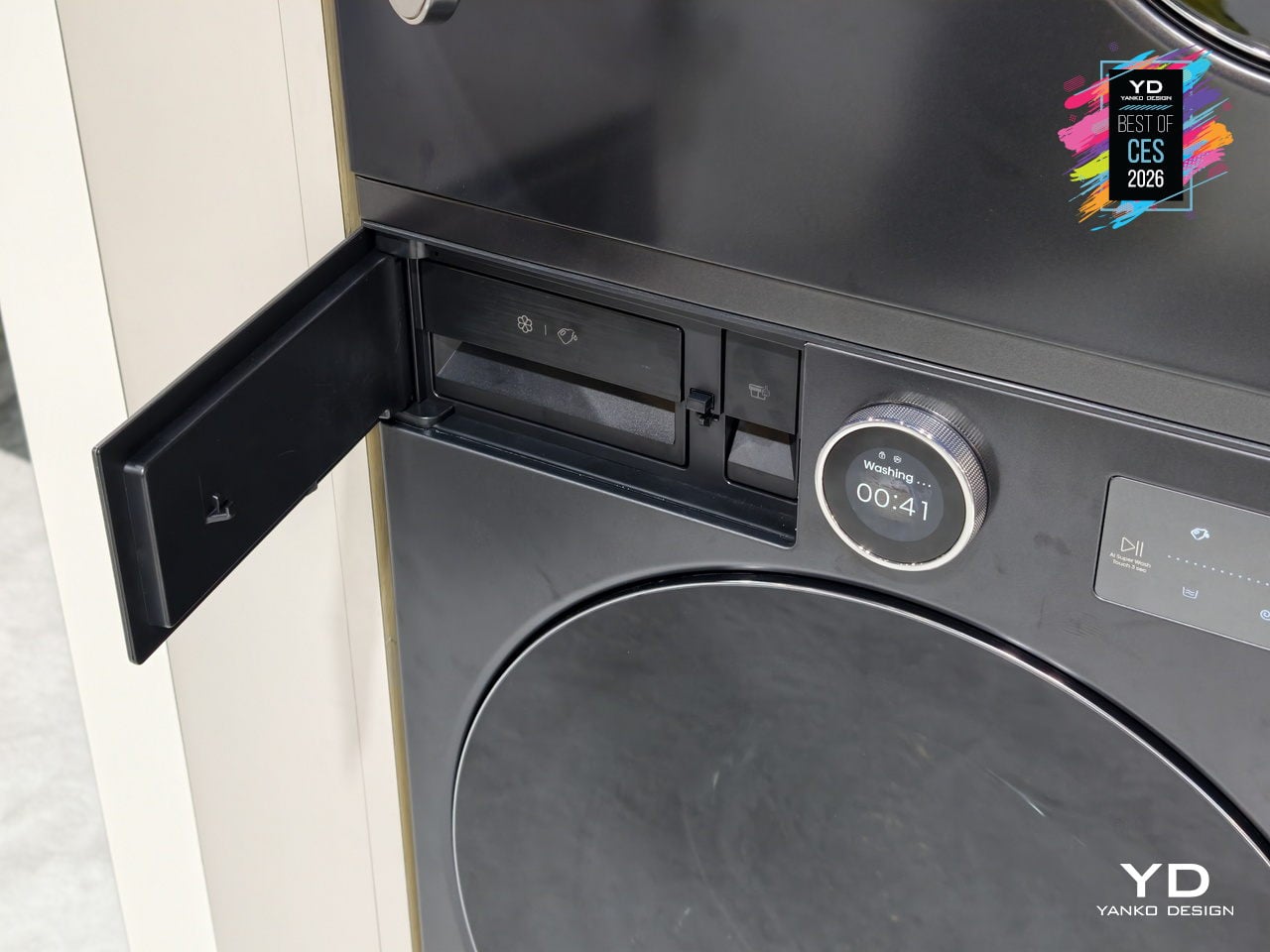
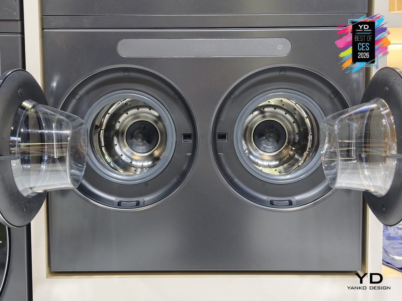
Hisense X-Zone Master Laundry System
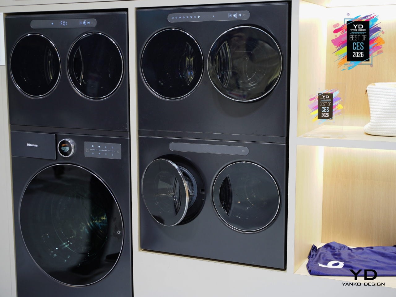
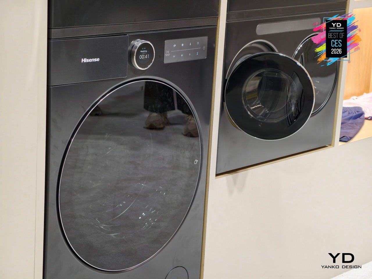
Hisense’s X-Zone Master is the world’s first infinitely scalable modular washer-dryer system, built around the idea that laundry needs change faster than most people want to buy new machines. You start with a high-capacity main unit and add mini double-drum modules over time, arranging them side-by-side, stacked, or built into cabinetry. The system grows with pet-owning families, active households, or anyone tired of mixing delicates with gym clothes.
The main unit handles 28.7lb wash and 19.8lb dry loads using Hisense’s Zeus heat-pump hybrid drying, while each mini module tackles 4.4lb wash and 2.2lb dry with fresh-air condensation. Dedicated minis let you run baby clothes, pet bedding, workout gear, and intimates simultaneously without cross-contamination or waiting, operating under 46dB even when multiple units run at once.
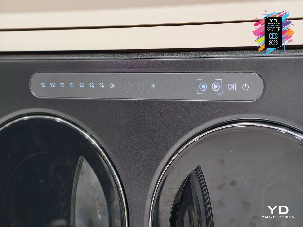
AI-driven natural-language control through the ConnectLife platform identifies fabric types and soil levels, optimizes cycles, and provides predictive time-to-ready updates. Backed by 66 global patents in modular design, zoned care, and efficient drying, X-Zone Master hints at a future where your laundry setup can evolve room by room instead of being replaced wholesale every decade or when your household changes shape.
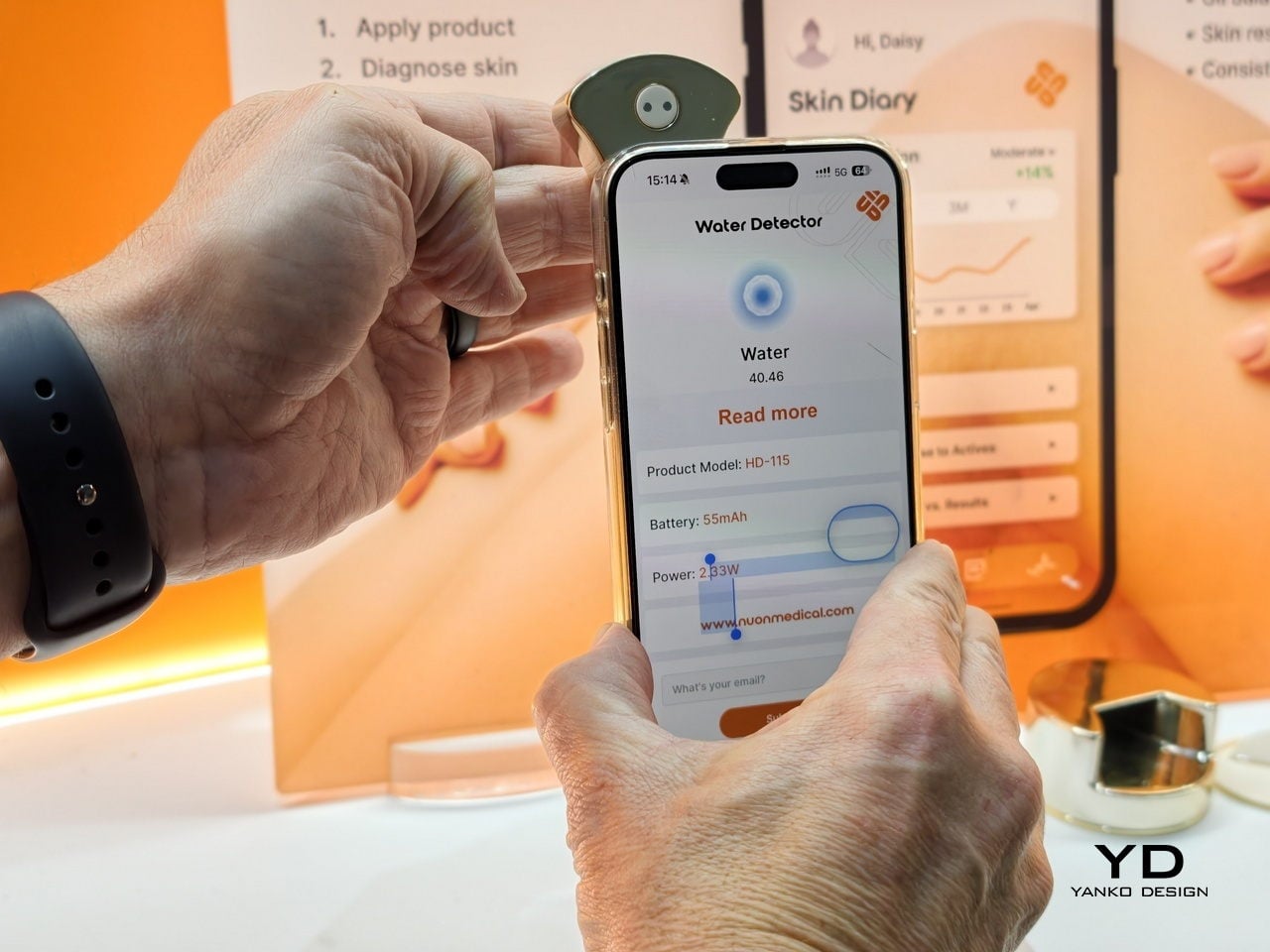
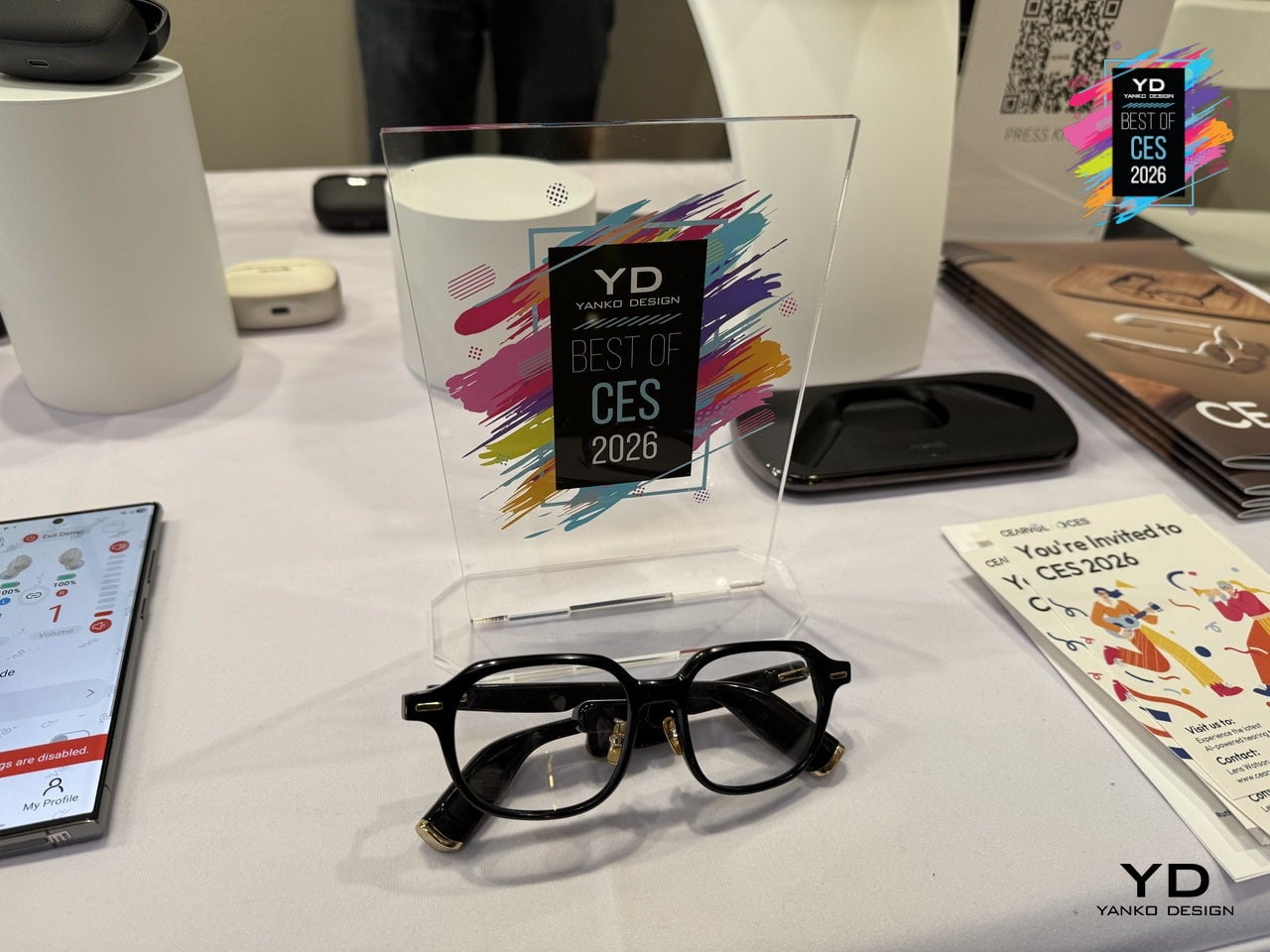
Cearvol Lyra Glasses with built-in Hearing Aids
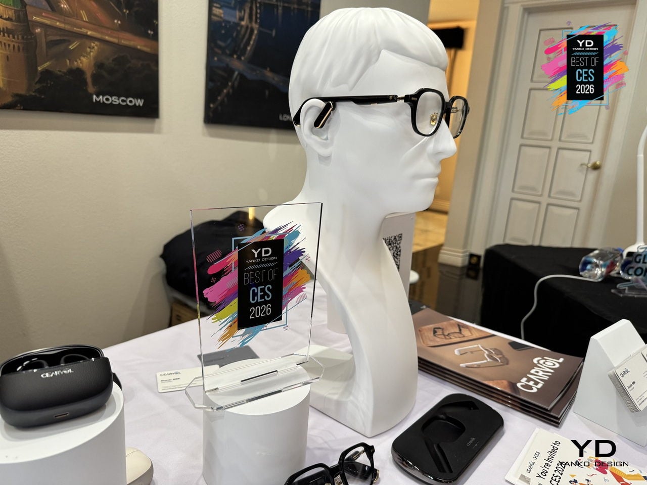
Many adults who need hearing help avoid traditional aids because they do not want to advertise age or disability, even though they already wear glasses. Cearvol Lyra hides professional-grade hearing enhancement inside stylish frames, merging prescription vision correction with intelligent audio so users can see clearly and hear clearly at the same time without broadcasting their hearing needs to everyone in the room or feeling self-conscious.
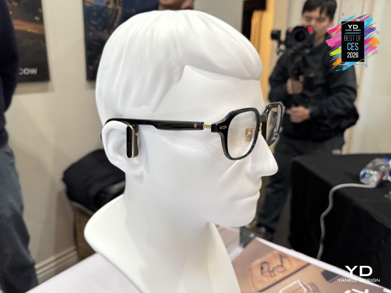
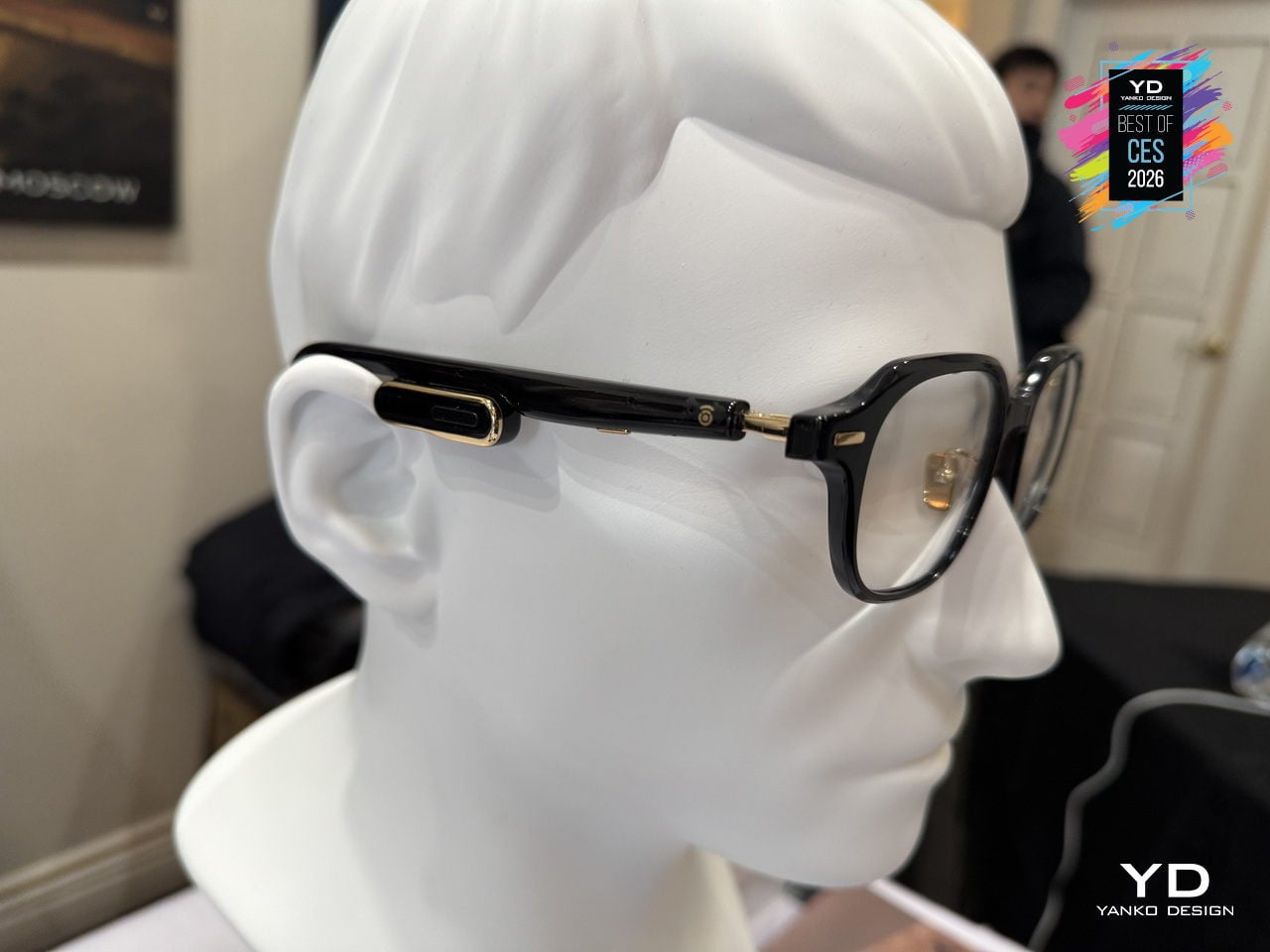
Lyra comes in two models: Lyra OWS with a dynamic driver and 35dB gain for moderate loss, and Lyra RIC with a balanced armature receiver and 50dB gain for moderate-to-severe loss. A 3-microphone beamforming array with Voice Pickup Unit, self-voice suppression, AI noise reduction, NAL-NL2 amplification, and Bluetooth 5.3 audio keep ears open while streaming calls and music, maintaining environmental awareness.
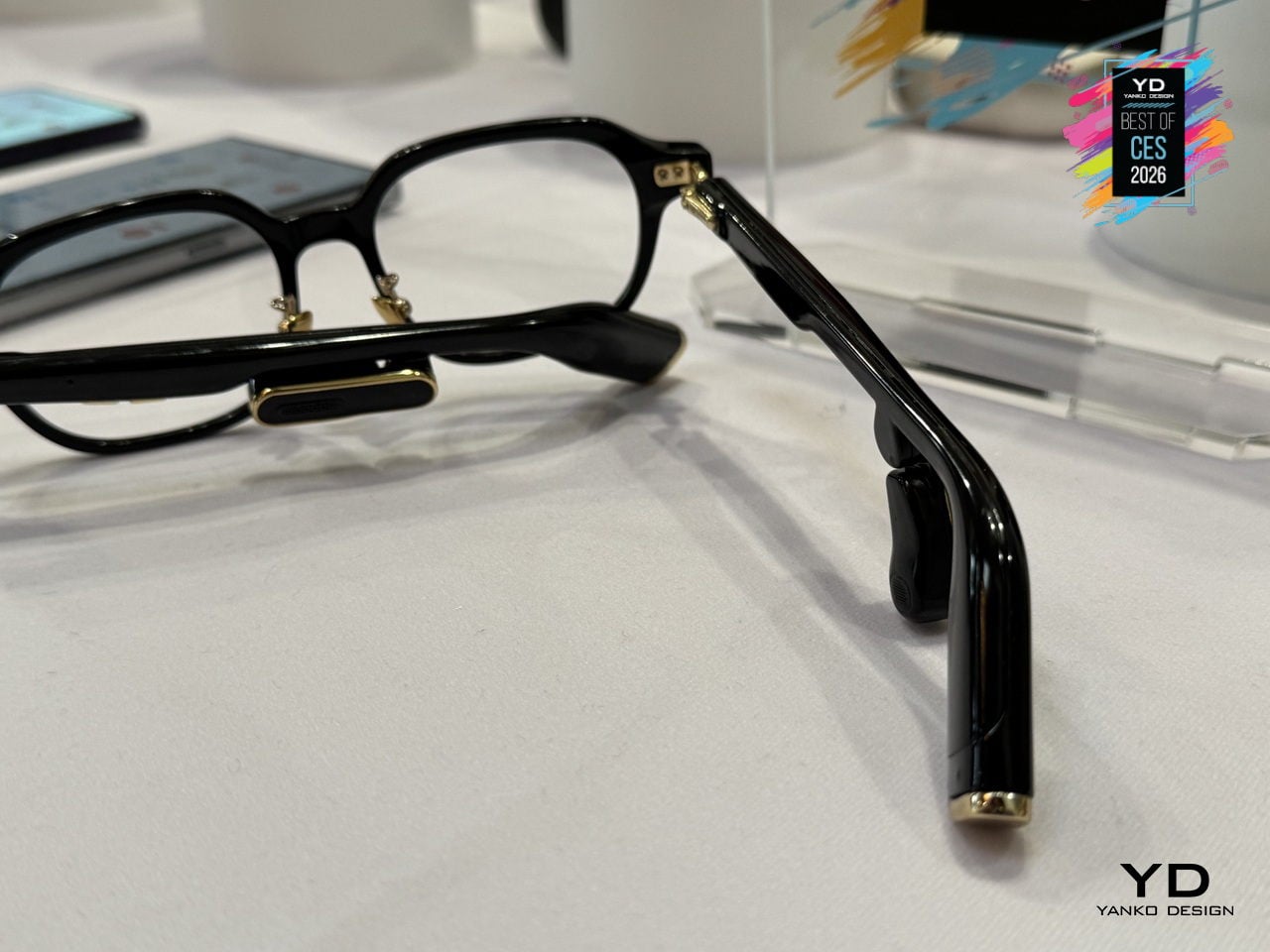
The multi-size frame system and smart electronics distribution balance weight and reduce nasal pressure for all-day wear. Discreet physical buttons on the arms handle volume and modes, the Cearvol app offers environmental presets and an in-app hearing test on Lyra RIC with OTA updates, and the NFC wireless dock charges Lyra simply by setting the glasses on a stand at night, like any favorite pair of eyewear.
The post Yanko Design’s Best of CES 2026: Tech That Removes Friction first appeared on Yanko Design.