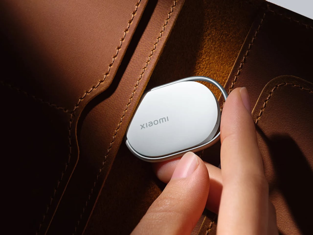
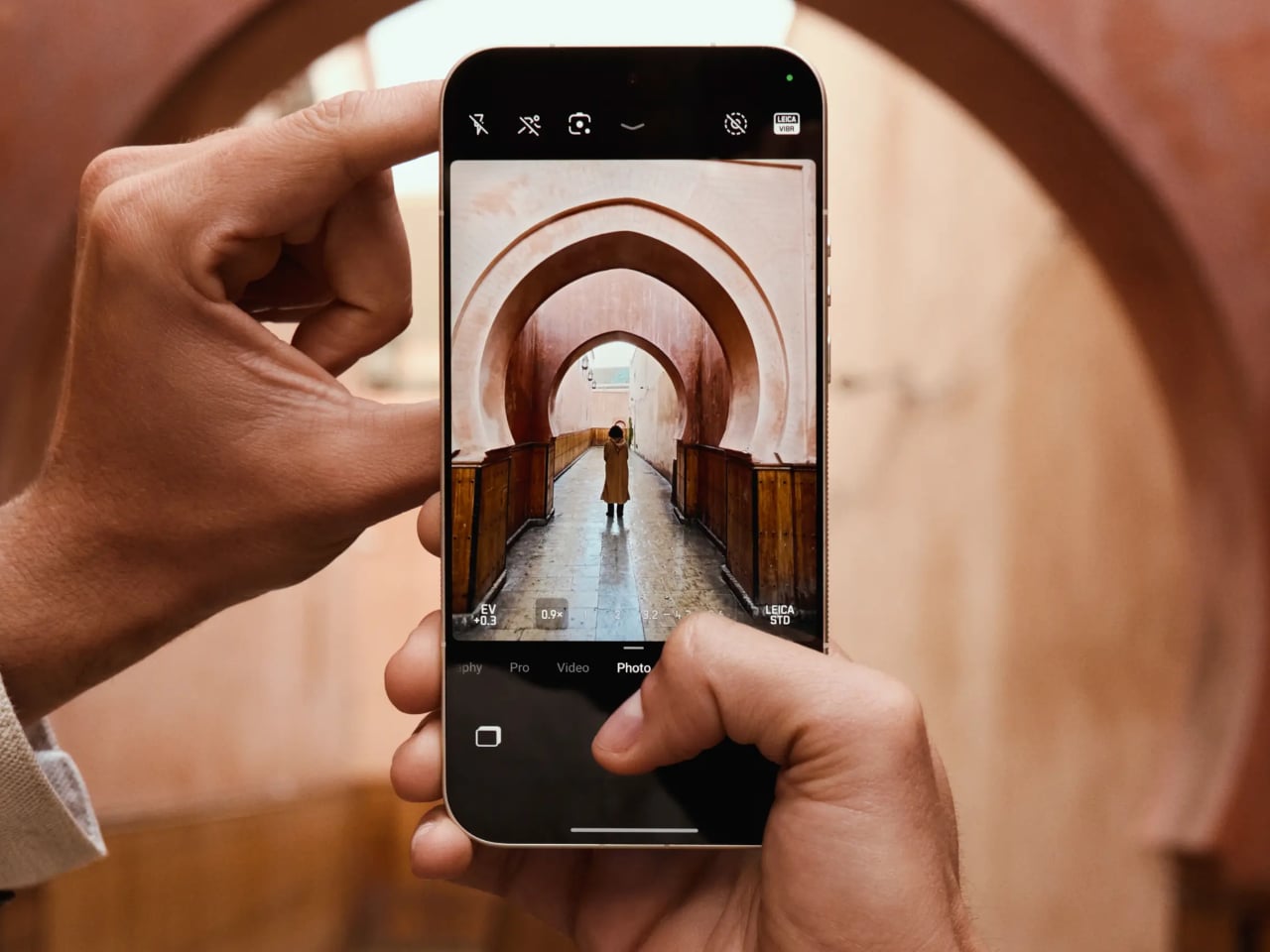
Most of us carry a capable camera in our pockets every day, yet somehow the act of taking a photo still feels like wrestling with a piece of software rather than making an actual picture. You tap, swipe, wait for the AI to decide what the scene should look like, and end up with something technically perfect and faintly anonymous. That’s the frustration the Leica Leitzphone powered by Xiaomi is trying to address, arriving at MWC 2026 as a phone designed around the idea that shooting should feel deliberate.
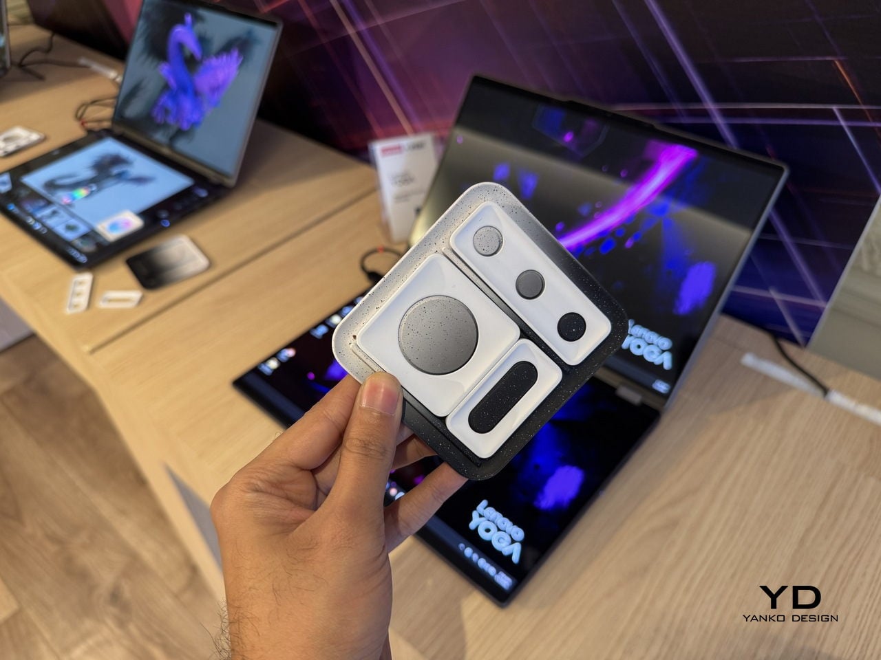
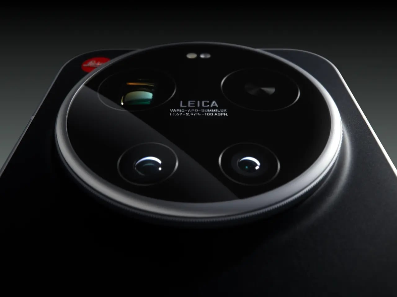
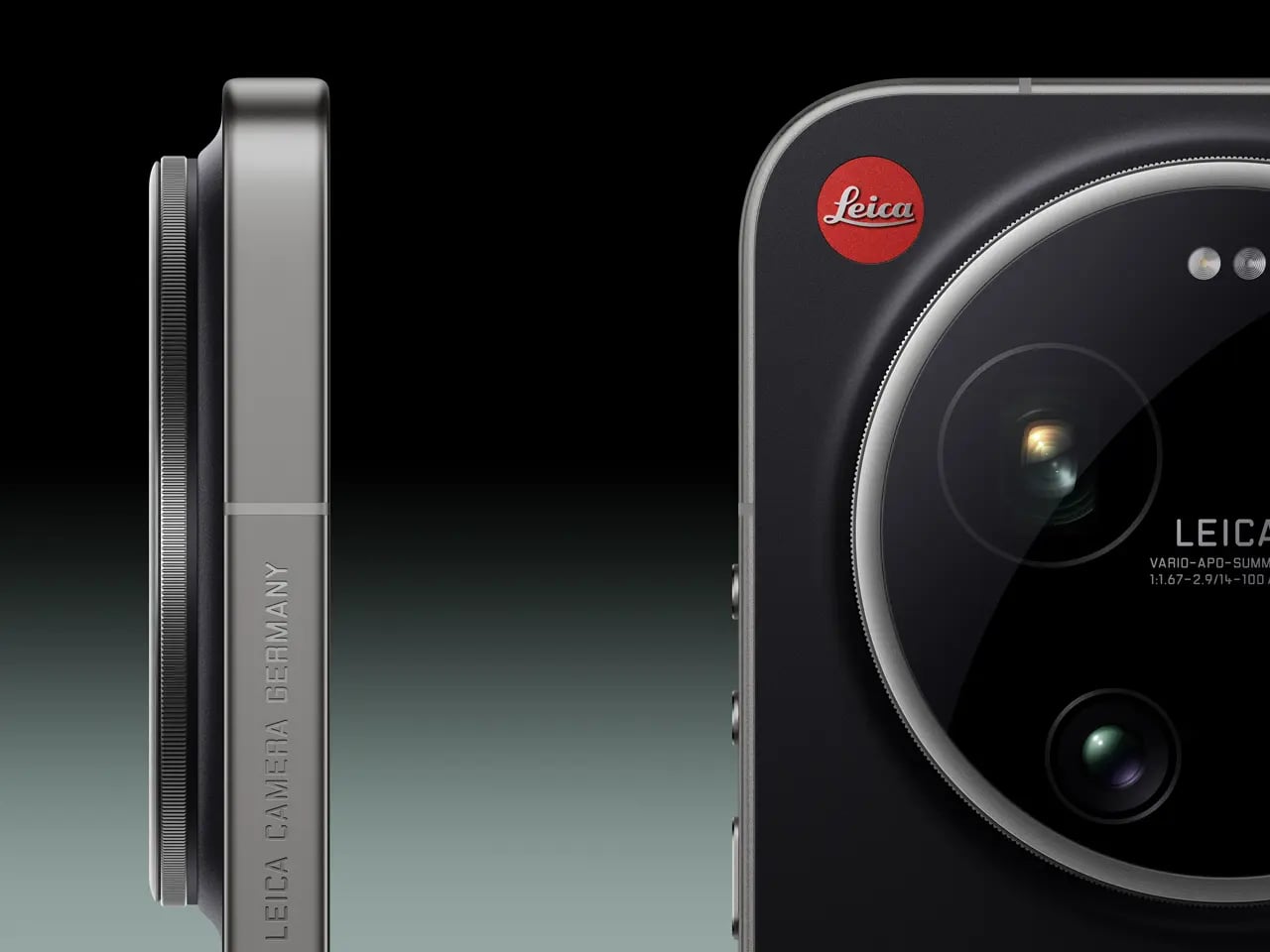
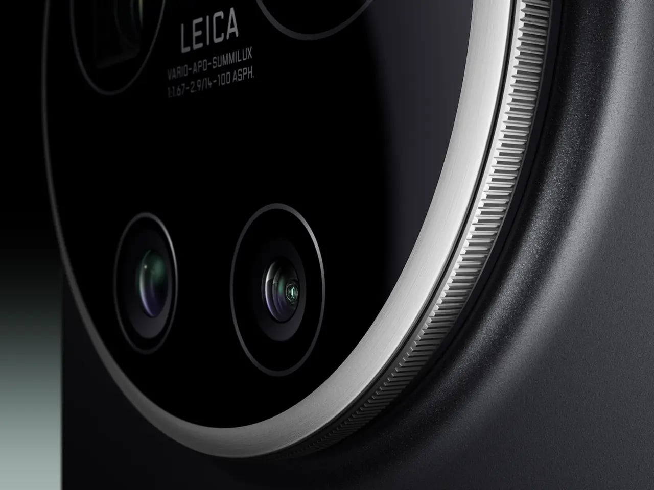
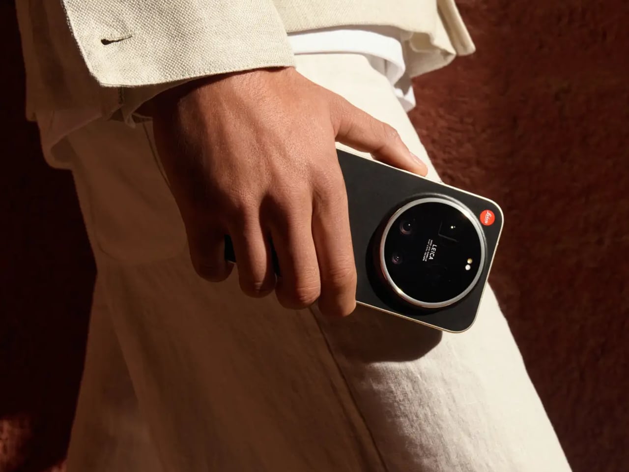
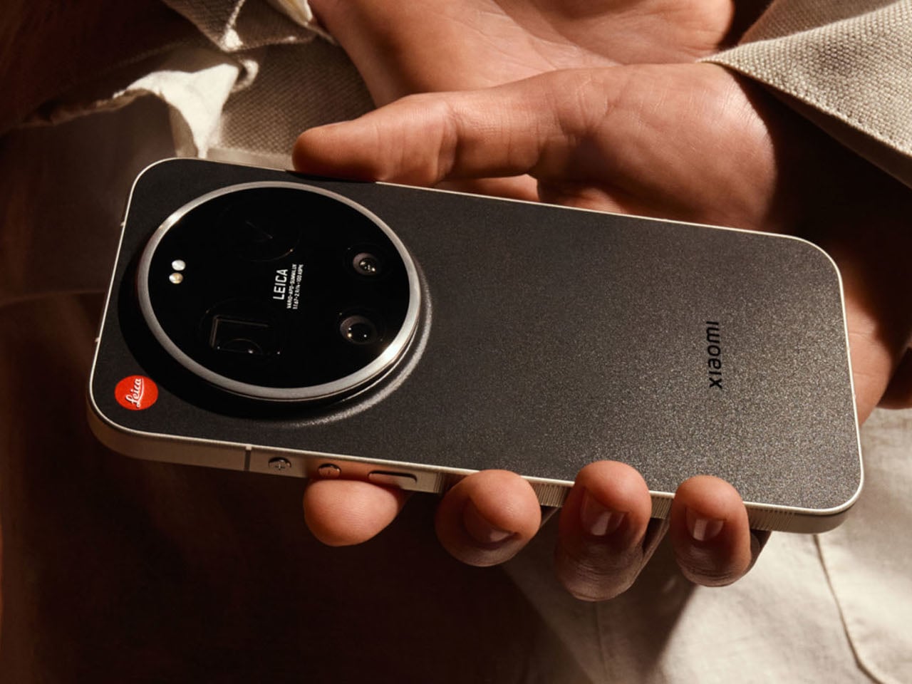
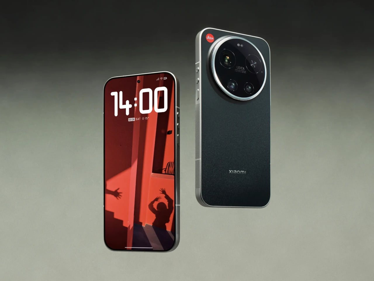
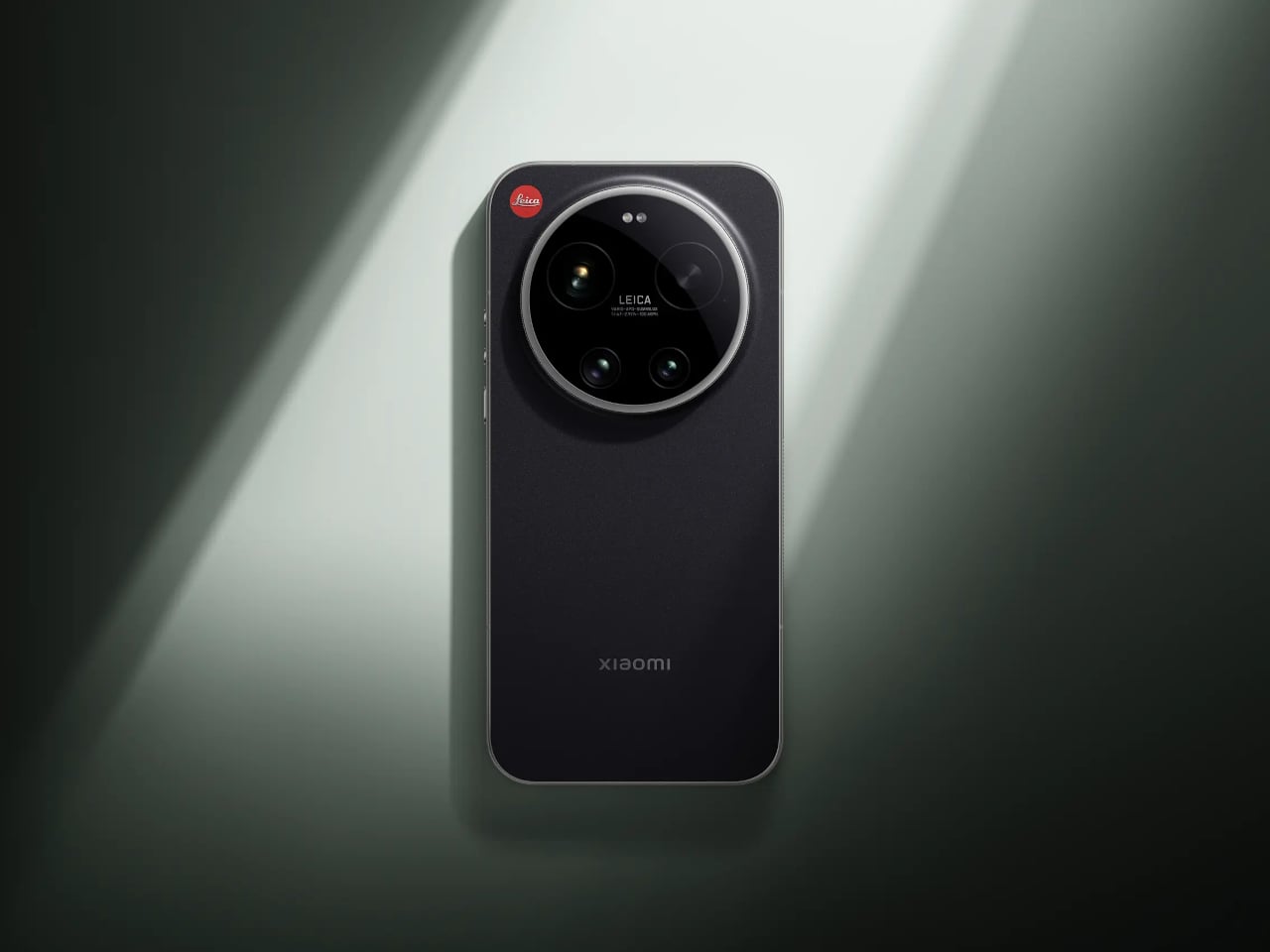
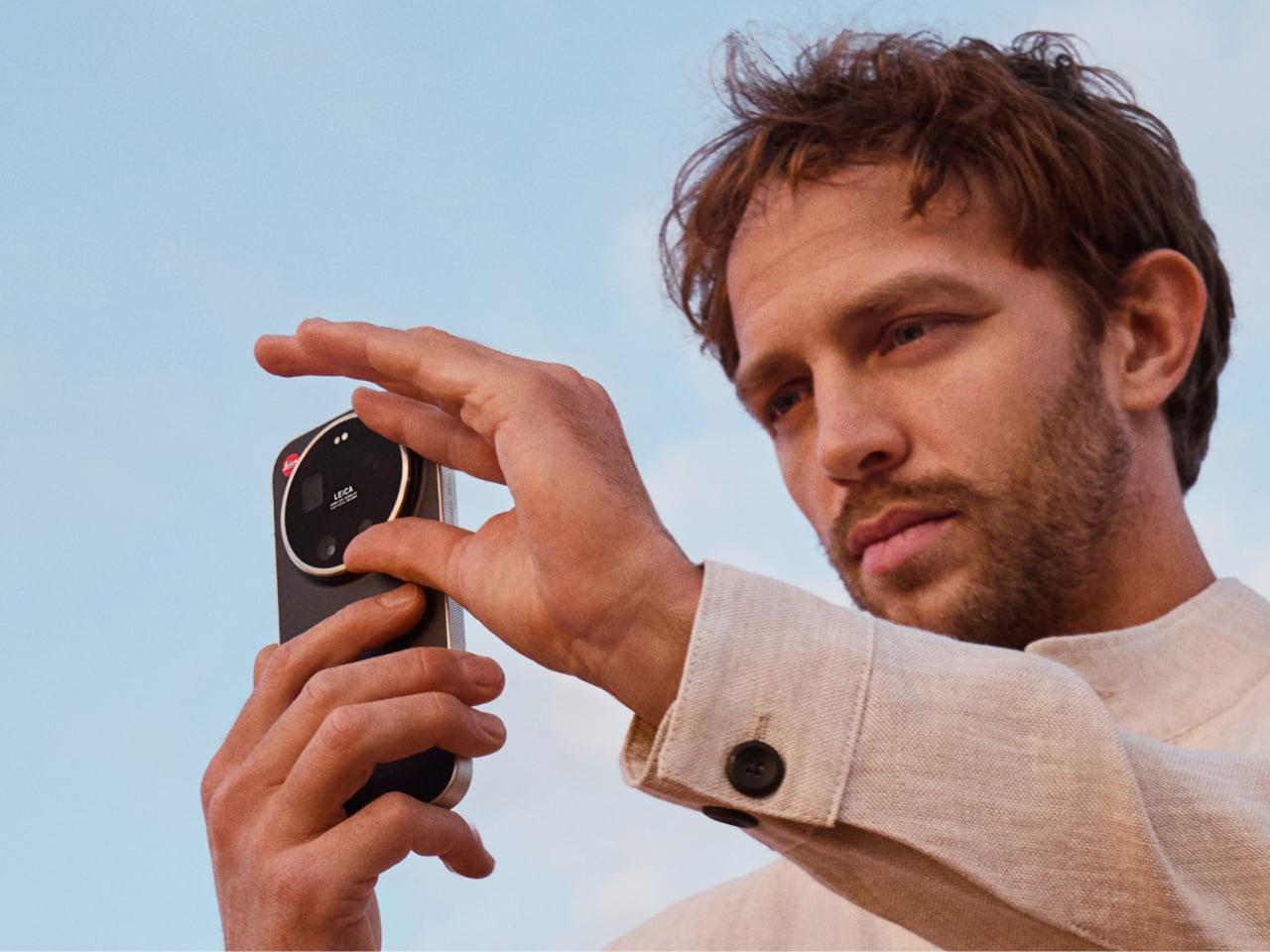
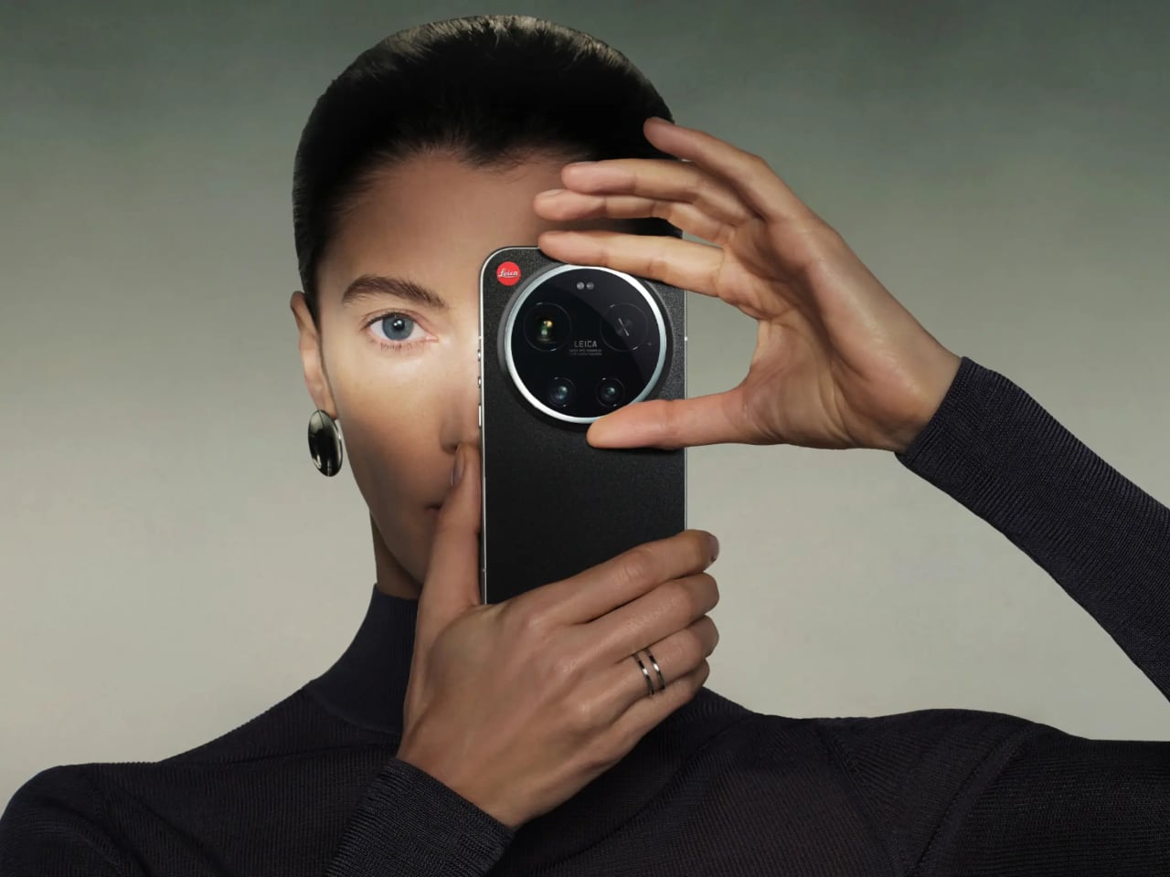
The most telling detail is the rotatable camera ring around the lens module. It’s a physical control you can assign to focal length, focus, or bokeh depth, borrowing directly from the tactile language of Leica’s rangefinder cameras. There’s something telling about that choice: at a time when every interaction is a touch gesture, adding a ring you can actually turn is a quiet argument that the best interface for a camera might not be a flat sheet of glass.
Designer: Leica x Xiaomi
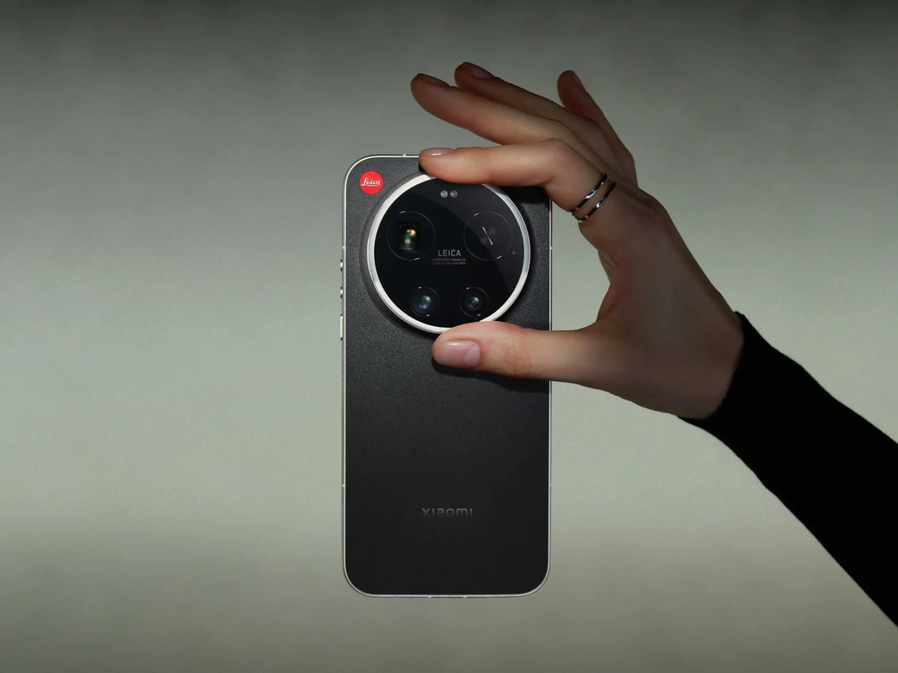
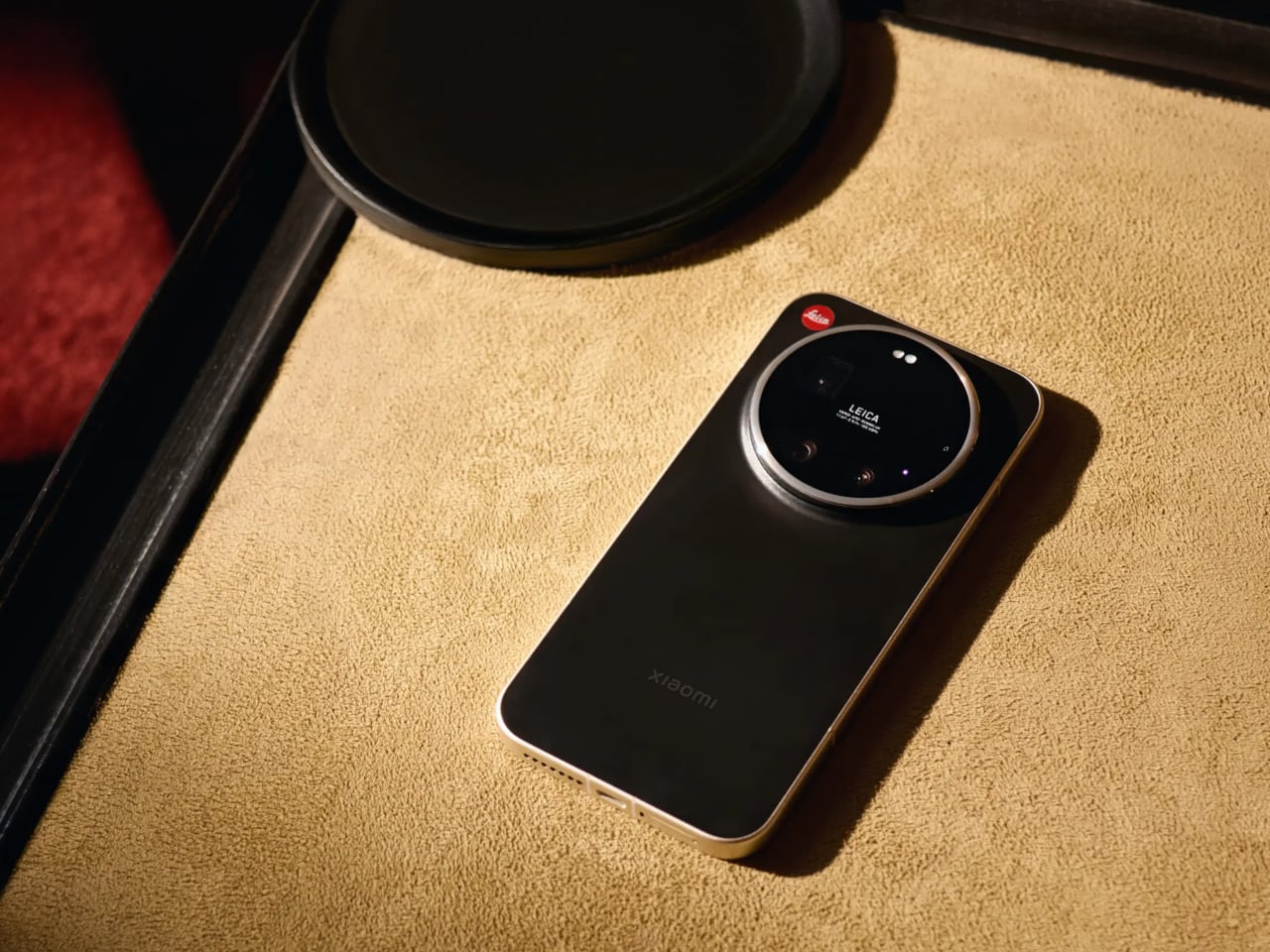
The hardware behind that ring is genuinely serious. The primary sensor is a 1-inch format with LOFIC HDR technology, which gives it a real optical size advantage over the smaller sensors in most flagship phones, particularly in high-contrast or low-light situations. A 200 MP telephoto covering 75–100 mm and a 14 mm ultra-wide complete the system, so the focal length range maps fairly naturally onto how photographers tend to think rather than how smartphone specs sheets tend to read.
Software is where it gets more interesting, and where you’re asked to trust the collaboration a little more. Leica Essential Mode simulates the output of two specific cameras: the Leica M9 and the M3 with MONOPAN 50 film. For people who know those cameras, that’s a specific and meaningful promise. For everyone else, it’s an aesthetic reference that requires some faith, and there’s a gap between “inspired by classic Leica lenses” and actually using one that the marketing doesn’t quite close.
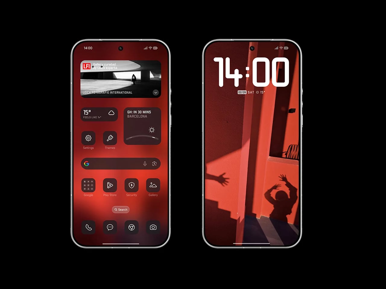
The rest of the phone is exactly what a 2026 flagship should be. Qualcomm’s Snapdragon 8 Elite Gen 5 handles the processing, a 6,000 mAh battery supports 90W wired and 50W wireless charging, and the 6.9-inch 120 Hz OLED display hits 3,500 nits peak brightness. Leica also redesigned the entire UI, with custom fonts, icons, and two interface themes running across every system element, which is more thoroughgoing than a co-branded phone usually gets.
One feature that doesn’t make the headline but probably should is the built-in Content Authenticity Initiative metadata support, which embeds provenance data in every image to confirm its origin and integrity. As AI-generated imagery gets harder to distinguish from photographs, having a phone that can prove a picture is real starts to feel less like a niche feature and more like an actual need.
The post Leica and Xiaomi Built a Phone With a Rotatable Camera Ring first appeared on Yanko Design.