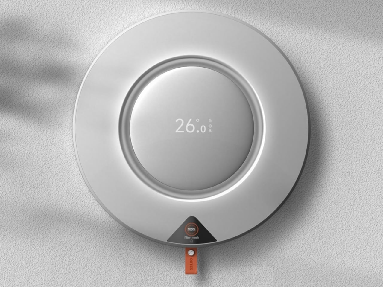
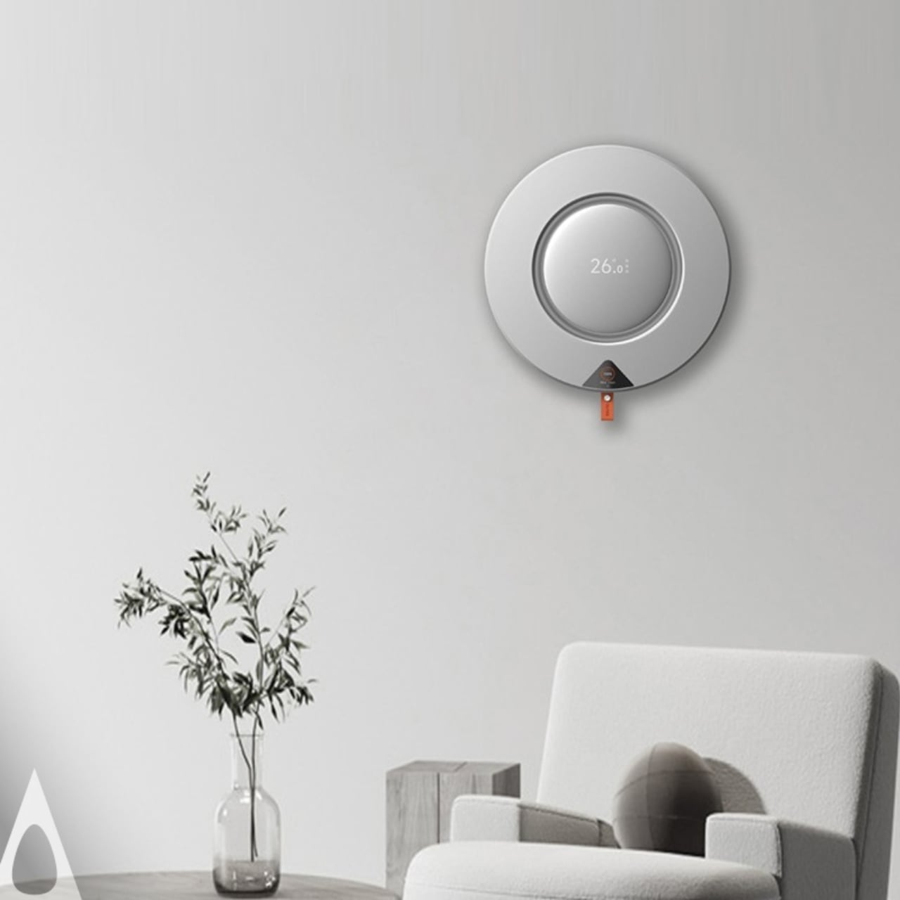
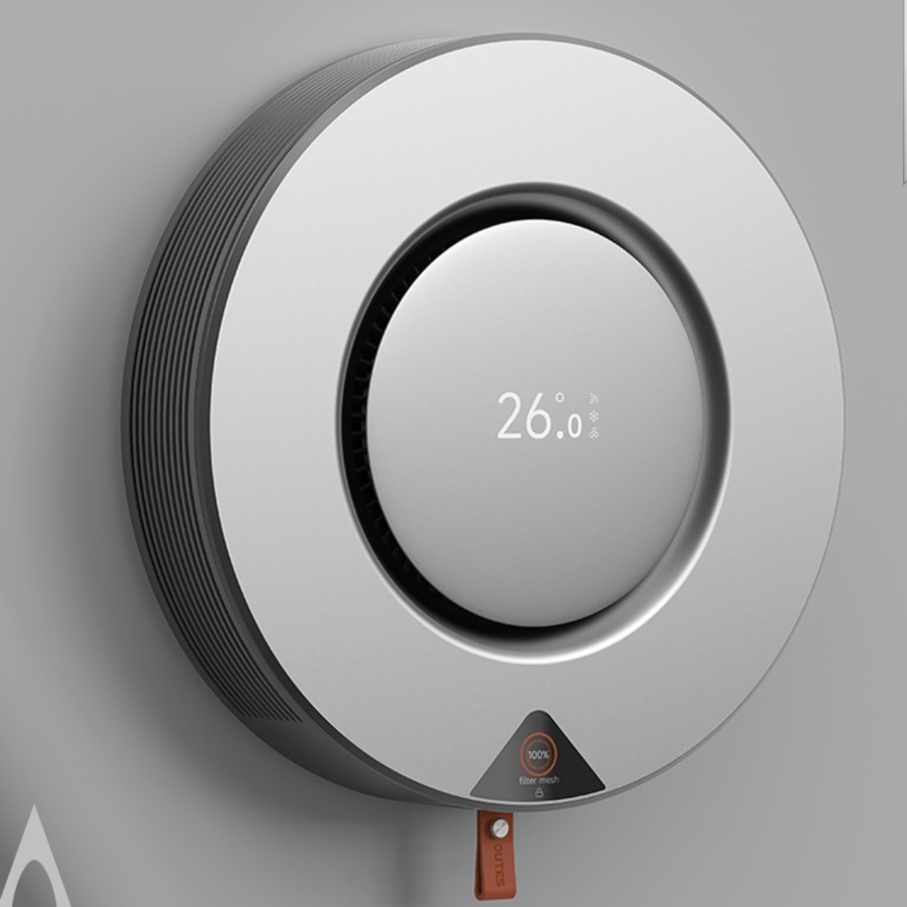
Let me tell you about something that caught my eye recently. When was the last time you actually looked forward to cleaning your air conditioner filter? Yeah, I thought so. But the folks at ZHEJIANG ZHONGGUANG ELECTRICAL CO.,LTD have done something pretty clever that might change how we think about one of home maintenance’s most tedious tasks. Their Snapcool air conditioner just won a Golden A’ Design Award, and here’s why it deserves your attention.
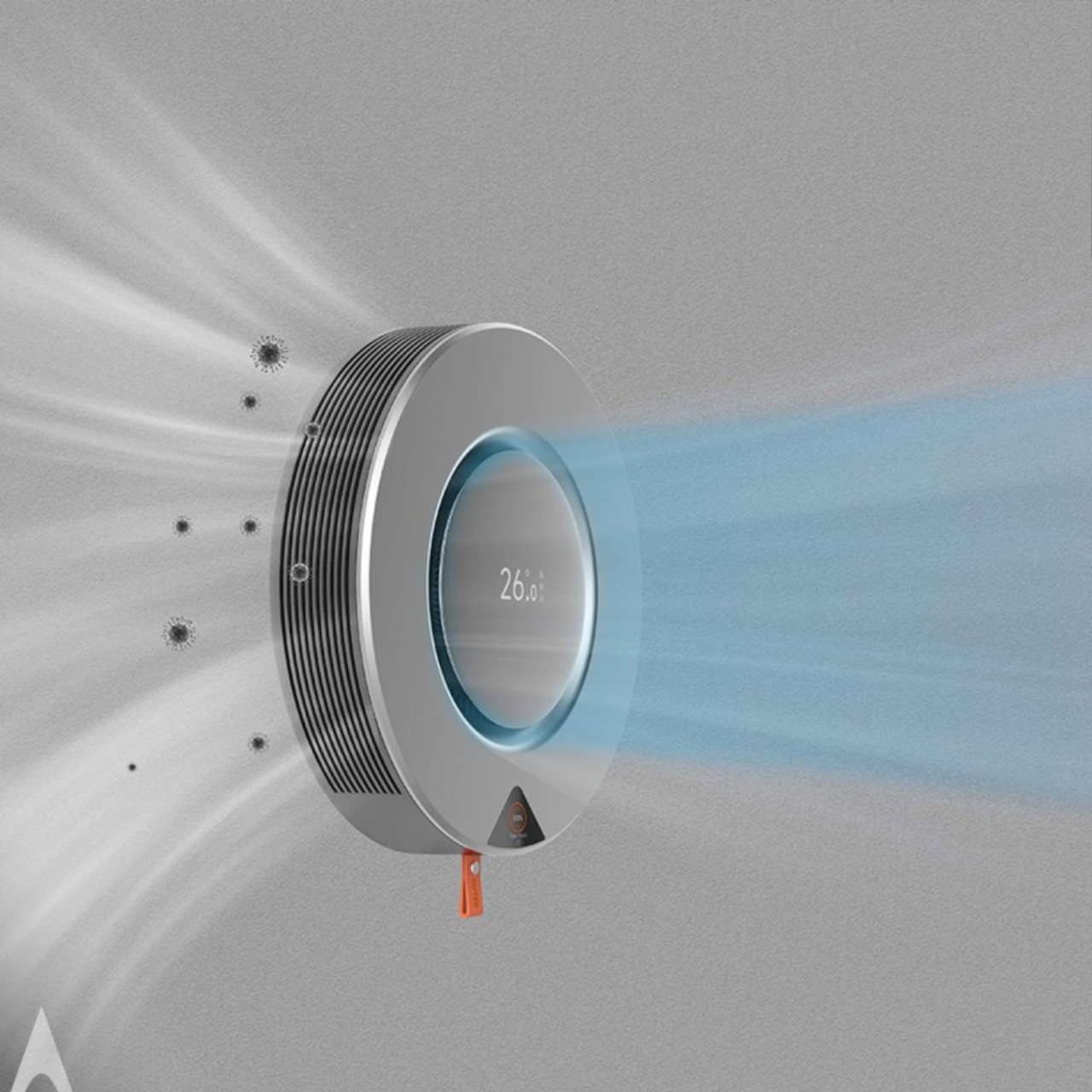
Picture a tape measure. You know that satisfying feeling when you pull out the metal strip and it snaps back into place with a smooth click? Now imagine that same mechanism applied to your AC’s filter system. That’s exactly what the design team behind Snapcool did, and the result is both practical and surprisingly delightful.
Designer: ZHEJIANG ZHONGGUANG ELECTRICAL CO.,LTD
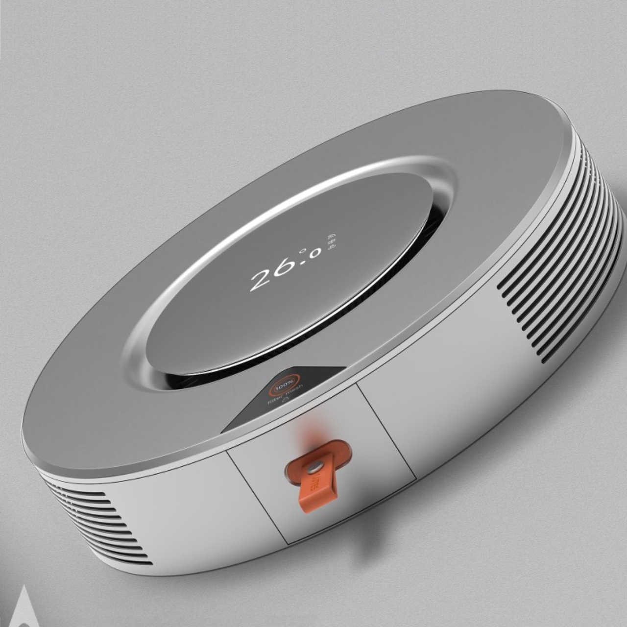
The whole concept flips conventional air conditioner design on its head. Most AC units hide their filters behind awkward panels that require tools, patience, and sometimes a bit of cursing to remove. Snapcool mounts its filter system on the side, where it slides in and out with the ease of extending a measuring tape. This isn’t just about making maintenance easier (though it definitely does that). It’s about turning a chore into something almost fun.
What really makes this design sing is the eye-catching orange filter compartment. It’s not just there to look cool, though it certainly does that. The bold color serves as a constant visual reminder to check your filter status, which means you’re more likely to keep up with maintenance and enjoy better air quality. It’s the kind of thoughtful detail that shows someone actually considered how people interact with these machines in real life, not just in a sterile testing environment.
The aesthetics matter here too. Traditional air conditioners tend to be those white boxes we tolerate but don’t exactly love. Snapcool breaks that mold with its sleek, modern shape that actually looks like it belongs in a contemporary home. There’s something inherently futuristic about its design language. It feels less like an appliance and more like a piece of tech you’d actually want to show off. This project came to life through collaboration between six team members: Jinghong Zhang, Yuxin He, Menglin Xie, Yuhui Xu, Haiping Hou, and Xiaojun Yuan. Their collective vision demonstrates what happens when designers stop treating home appliances as purely functional objects and start seeing them as opportunities for innovation and delight.
The recognition from the A’ Design Award isn’t just a trophy for the mantle. It’s validation of a broader shift happening in product design right now. We’re moving away from the idea that utilitarian objects should be invisible or purely functional. Instead, designers are asking why everyday items can’t be both beautiful and practical, why they can’t spark a little joy even as they perform mundane tasks.
ZHEJIANG ZHONGGUANG ELECTRICAL CO.,LTD, operating under their OUTES brand, has been building a reputation for integrated climate control solutions across hotels, universities, factories, and residential buildings. This isn’t their first rodeo with design excellence either. They’ve racked up six A’ Design Awards, proving that Snapcool isn’t a fluke but part of a consistent commitment to pushing boundaries in HVAC design.
What strikes me most about Snapcool is how it challenges our assumptions. We’ve collectively decided that air conditioners should be forgettable white boxes tucked into corners. But why? There’s no rule that says climate control can’t have personality. There’s no law stating that filter maintenance must be annoying. The tape measure inspiration is genius because it’s so obvious in hindsight. We’ve had this perfectly functional, satisfying mechanism sitting in our tool drawers for decades, and it took creative thinking to realize it could solve a problem in a completely different context.
Snapcool represents a future where even the most utilitarian objects can bring a smile to our faces. Where maintenance becomes less of a burden and more of an experience. Where our living spaces are populated by thoughtfully designed products that respect both our intelligence and our desire for beauty. Sometimes the best innovations aren’t about inventing something entirely new. They’re about looking at old problems through fresh eyes and borrowing brilliance from unexpected places.
The 58mm Swiss Army Knife has occupied pockets for over a century with the same basic formula: red plastic scales, a handful of tools, and a design language that never needed to change. Victorinox perfected compact utility decades ago, and the format became so synonymous with everyday carry that entire generations never questioned whether it could evolve. But that permanence also created a constraint. Once you chose your tool configuration, you were locked in. Swapping scales meant glue, risk, or permanent modification.
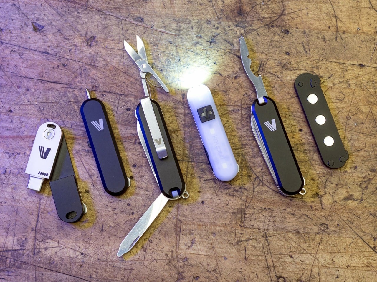
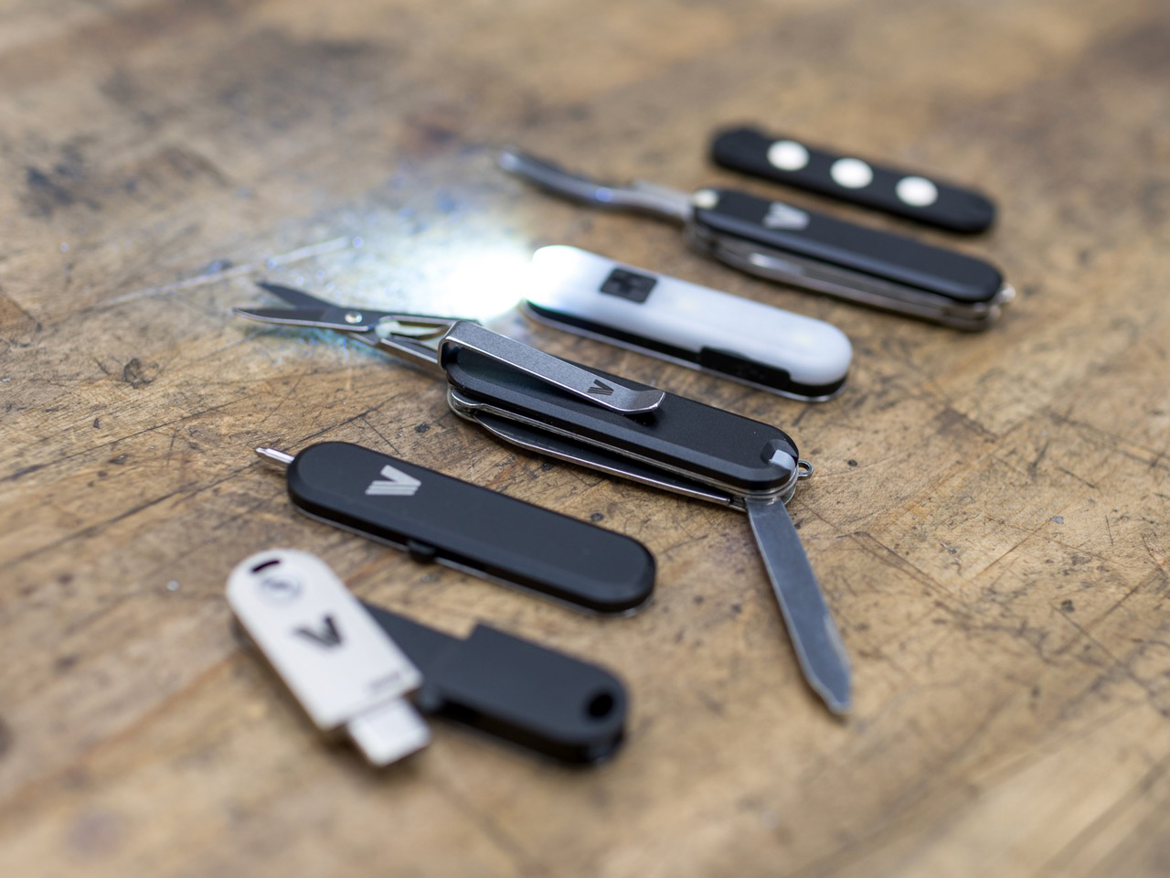
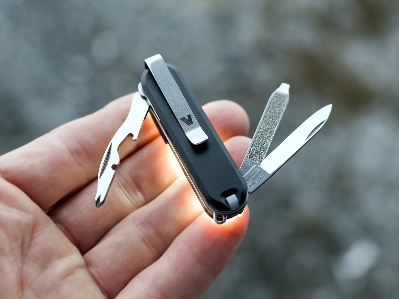
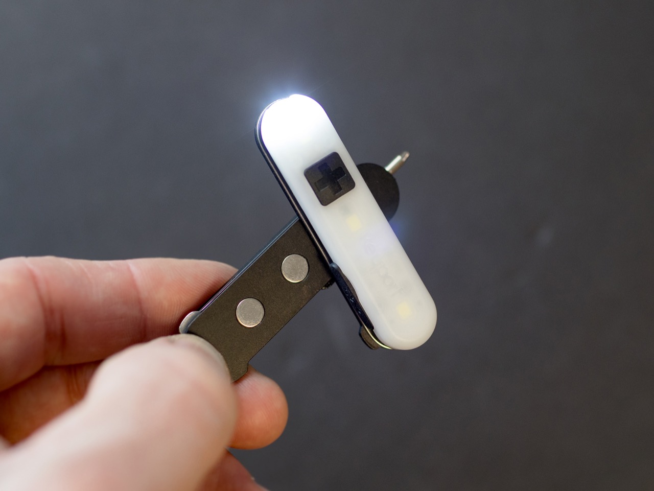
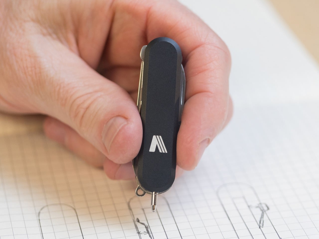
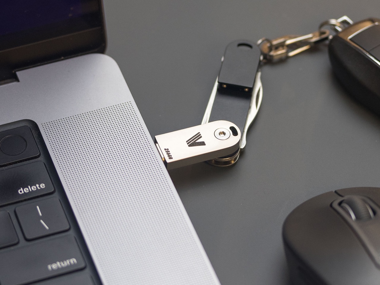
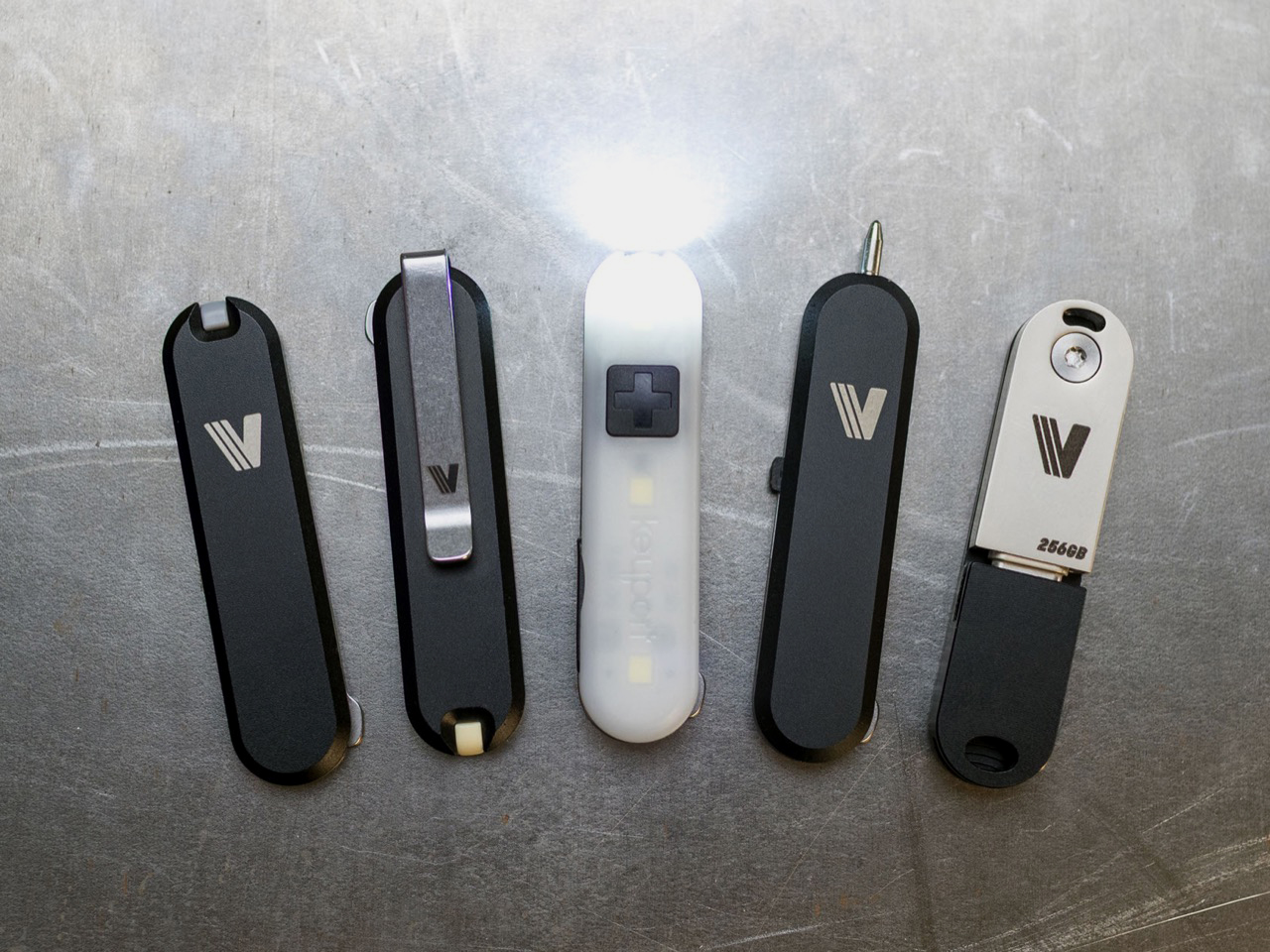
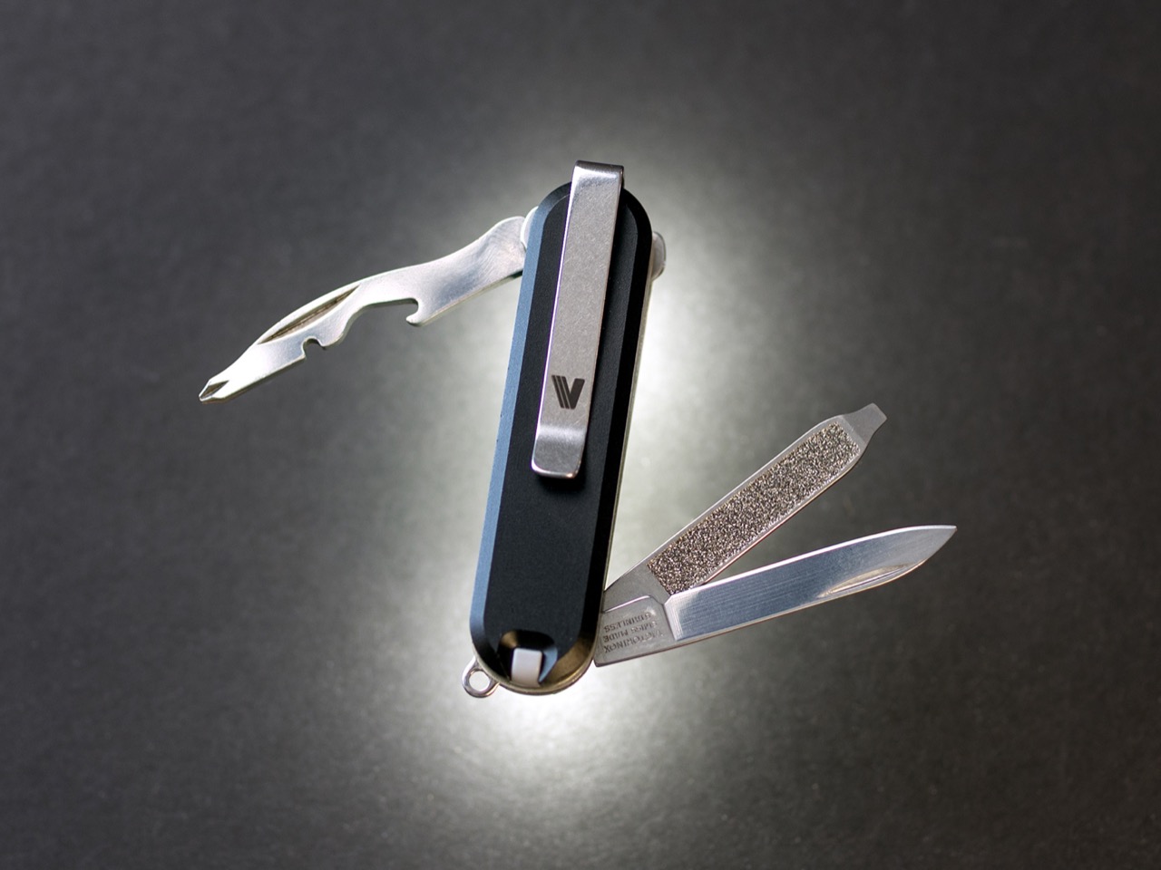
Keyport’s Versa58 system breaks that constraint without breaking the knife. The platform introduces a snap-on interface that attaches to any 58mm SAK’s existing rivets, transforming fixed scales into swappable modules. Add a rechargeable LED light, a mini pen, a USB-C flash drive, or a deep-carry pocket clip in seconds. Remove them just as fast. The knife stays intact, the heritage remains untouched, but the capabilities expand in ways the original designers never imagined. It’s modularity meeting tradition, and somehow both sides win.
The core of this entire system is a deceptively simple piece of spring steel. This patent-pending interface plate is the result of a full year of development and seven complete revisions, a process that speaks to the engineering challenge involved. The plate is engineered to flex just enough to click securely onto the mushroom-shaped rivets that hold a standard SAK together, the same ones hidden beneath the factory scales. The design had to be robust enough to handle repeated attachment cycles without loosening, yet gentle enough to avoid damaging the knife’s frame. It’s a tool-free, glue-free, and completely reversible process that takes seconds. This single component unlocks the entire platform.
Versa58 operates in two distinct universes. The first is as a direct upgrade to your existing Victorinox. You pop off the original scales and snap on the Versa58 modules you need for the day. The second universe is completely independent of the knife. Using a magnetic connector system called MagMount, any two modules can be attached to each other to create standalone tools. This dual functionality means you can either enhance the classic SAK you already own or build an entirely new, minimalist multi-tool from scratch. The system offers a level of flexibility that the 58mm format has never seen before.
The MagMount system is absolute genius, using three tuned neodymium magnets to create a crisp, satisfying connection. This allows for the quick assembly of pocketable rigs or keychain tools. You could, for instance, snap the flashlight module to the pen module for a compact, non-knife tool perfect for travel or restrictive environments. The magnetic pull is tuned for a secure hold while still allowing for smooth rotation and easy reconfiguration. It also introduces an addictive fidget factor, turning the act of customizing your carry into something tactile and engaging. It’s a smart design that expands the ecosystem beyond the knife itself.
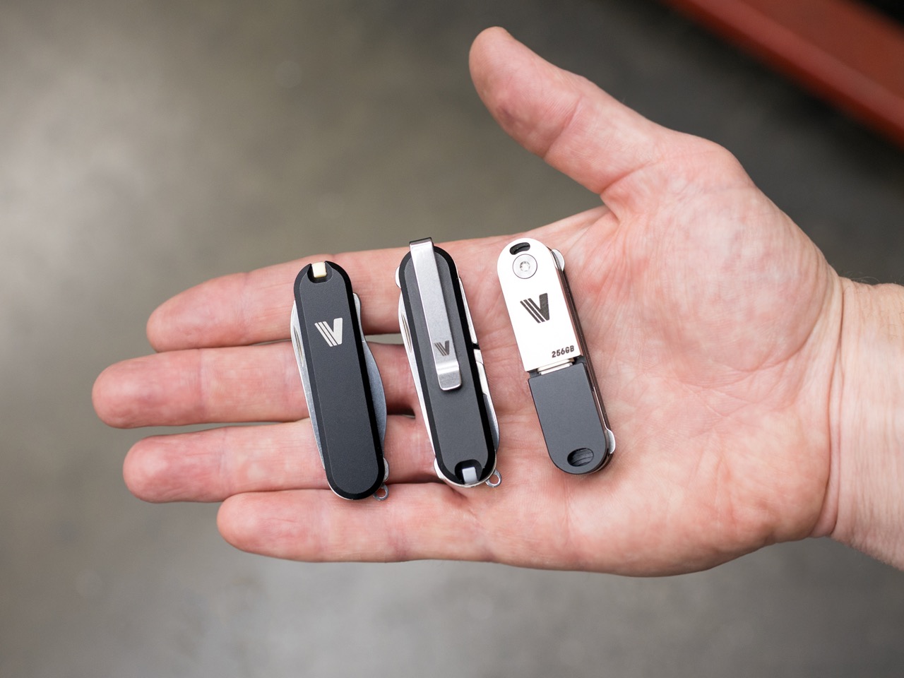
Among the first wave of modules, the Clip Scale is likely to be the most celebrated. Machined from either 6061 aluminum or Grade 5 titanium, it finally adds a clean, low-profile pocket clip to the 58mm SAK. This has been a common request in the EDC community for years. Crucially, the clip is designed to be reversible and does not interfere with the knife’s keyring, a flaw seen in some aftermarket solutions. It’s paired with a V Scale for the front, which includes a multi-use slot designed to hold the original SAK’s toothpick or tweezers, ensuring you don’t lose core functionality.
The Pocket Flare module brings modern illumination to the platform. It’s a compact, USB-C rechargeable light with a beam tuned for close-range tasks. It offers three modes: a 3-lumen low beam with a 12-hour runtime, a 43-lumen high beam that runs for two hours, and a 45-lumen side light that acts as a lamp to brighten a small area. Because it uses the MagMount interface, you can also snap it onto any metal surface for hands-free lighting, which is incredibly useful for repairs or finding something in a dark tent.
Keyport also developed modules that bridge the analog and digital worlds. The Pen Module features a precision mini pen with a premium German Troika refill, offering a smooth writing experience without any rattle. For digital needs, there is a streamlined USB-C 3.0 flash drive module available in 64GB and 256GB capacities. This flip-out drive seamlessly integrates secure, portable storage into your pocket setup for documents, media, or backups. These additions transform the classic pocket knife into a tool that feels much more relevant to modern daily life.
Perhaps the most forward-thinking aspect of the Versa58 platform is its openness. Keyport will be selling standalone interface plates, inviting makers, modders, and machinists to design their own compatible modules. This opens the door for a community-driven ecosystem of custom tools built on the Versa58 standard. It’s a canvas for creativity, allowing anyone with an idea to contribute to the platform. This move could give the system incredible longevity and a range of options far beyond what Keyport could develop on its own.
Keyport has already outlined a roadmap for future modules, showing a long-term commitment to the system. Upcoming additions being explored include a Bluetooth locator, an NFC module for digital access or automation, a craft blade for precision cuts, and even a minimalist carrier for a Bic lighter. The plan is to build Versa58 into a comprehensive platform, not just a single product release. Backer feedback from the initial campaign will help shape which of these new tools get prioritized, making early adopters part of the development process.
The Versa58 system is available for backing on Kickstarter, with special pricing tiers for early supporters. The campaign offers several bundles, including the foundational Origin Bundle with the core scales starting at $39 and the more comprehensive Apex Bundle that adds the Pocket Flare module starting at $77. All modules and scales are available in either machined 6061 aluminum or the more premium Grade 5 titanium. The Versa58 ships globally starting August 2026.
At a time when memories are increasingly flattened into folders, feeds, and cloud backups, a new experimental device from MIT Media Lab proposes a far more intimate archive: scent. Developed by Cyrus Clarke, the Anemoia Device is a speculative yet functional prototype that translates photographs into bespoke fragrances using generative AI, inviting users not to view memories, but to inhabit them through the body.
The choice of scent as a medium is deliberate. Among the human senses, smell is widely understood to be the most directly linked to memory and emotion, bypassing rational processing and triggering vivid recall almost instantaneously. Unlike images or text, scent has the ability to summon atmosphere, mood, and feeling without explanation, making it a particularly powerful carrier for both personal and imagined memories. The Anemoia Device is built around this sensory potency.
Designer: MIT Media Lab
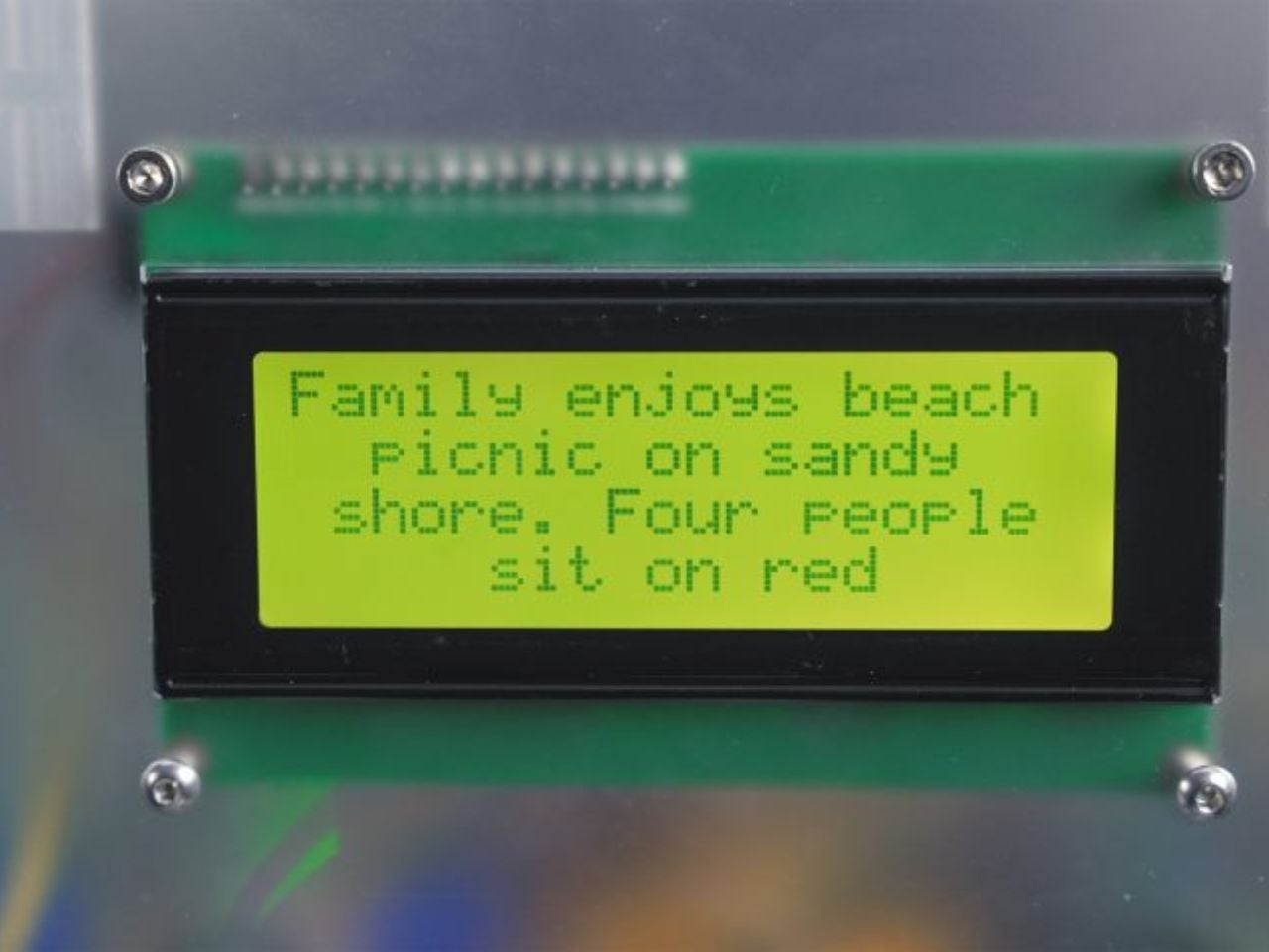
Referred to as a scent memory machine, the device operates on the metaphor of distillation. Memory is treated as something dense and layered that can be compressed into an essence. Physically, the prototype is organised as a vertical apparatus with three distinct sections. At the top, users insert an analogue photograph, a deliberate design decision that slows interaction and foregrounds tactility in contrast to screen-based memory consumption. The middle section houses an AI-powered computer that analyses the image using a vision language model. At the bottom, a series of pumps connected to fragrance reservoirs mix and release a custom scent.
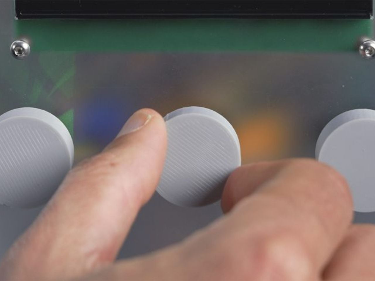
Importantly, the Anemoia Device is not designed as a fully automated image-to-scent translator. Instead, it positions the user as an active participant in shaping the final outcome. After the photograph is interpreted, users interact with three tactile dials that guide the AI’s understanding. The first establishes a point of view within the photograph, which could be a person or a non-living element such as a tree, bicycle, or piece of fruit. The second situates that subject within a lifecycle. For people, this may mean childhood or old age. For objects, the range moves from raw to in use to decay. The third dial assigns emotional tone, shaping the fragrance through mood rather than literal accuracy.
Conceptually, the project draws on anemoia, a form of nostalgia for a time one has never personally experienced. While the device can theoretically transform any photographic memory into scent, its design places particular emphasis on unlived or inherited memories. Archival photographs, family collections, and fragments of collective history become interpretive starting points rather than records to be faithfully reproduced. This framing allows the system to move fluidly between the universal and the deeply personal.
Early trial sessions illustrate how this interpretive flexibility plays out. In one example, a participant uploaded an archival photograph depicting a couple eating fruit in a garden. By selecting the fruit as the subject, defining its state as in use, and choosing a calm emotional tone, the system generated a scent combining spiced apple, pear, and earthy musk. The participant associated the fragrance with autumn, demonstrating how scent can evoke emotional landscapes rather than literal scenes.
This range is enabled by a scent library of 50 base fragrances, spanning notes such as sandalwood, pine forest, leather, old books, and sand. Each fragrance is dispensed in one-second increments, allowing for countless nuanced combinations. While the system begins with shared cultural associations, user narrative and emotional framing often push the output beyond predictable or clichéd interpretations.
The Anemoia Device builds on Clarke’s longer-standing interest in making memory tangible. Before joining MIT, he founded Grow Your Own Cloud, which explored storing digital data within the DNA of plants. Across this body of work runs a consistent critique of contemporary memory practices, which externalise experience into digital infrastructure that is accessible but largely disembodied.
Looking ahead, the project suggests multiple future directions. The prototype could evolve into a desktop-sized device for personal use, allowing people to print memories at home, or into a remote service that translates mailed or uploaded photographs into scents. While it relies on advanced technology, its ambition is notably restrained. Rather than competing for attention, the Anemoia Device gestures toward a form of computing that encourages slowness, reflection, and sensory presence.
Most renewable energy systems hide in plain sight. Rooftop solar panels blend into shingles, batteries sit in containers behind fences, and wind turbines spin in distant fields. They quietly do their jobs without helping anyone understand what happens inside them, which feels like a missed opportunity when you are trying to build support for systems that might keep the planet livable for another generation or two.
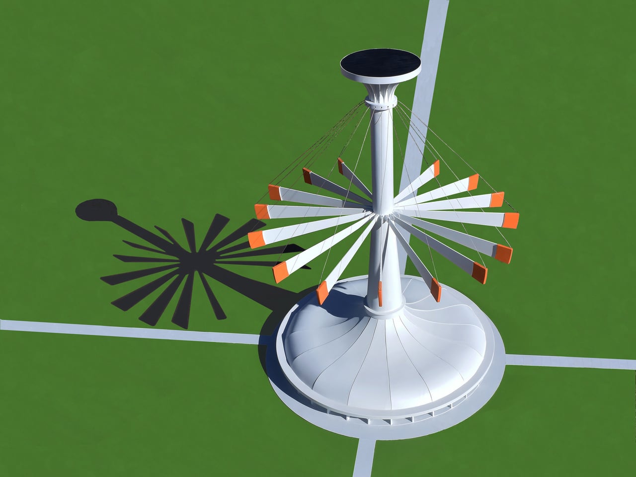
Michael Jantzen’s Solar and Gravity Powered Art and Science Pavilion treats that visibility problem as a design challenge. The conceptual structure combines a public exhibition space under an umbrella-shaped roof with a tall central tower supporting 16 long, weighted steel arms. Those arms lift and lower throughout the day, creating shifting silhouettes while demonstrating how solar power and gravity work together as a functional energy system rather than just theoretical concepts.
The cycle works simply enough. A solar cell array at the top powers 16 winches that pull the weighted arms upward, storing potential energy. When the pavilion needs electricity, or when someone wants to change its shape, the arms fall back down under gravity. Their descent drives 16 generators that feed power to the building or local grid, turning stored height into usable electricity without batteries or other complex systems getting in the way.
Arriving on a sunny afternoon, you would see the arms at different angles around the tower, sometimes clustered vertically, sometimes fanned out like a mechanical flower. The shifting positions are not just decorative but are the visible result of energy being stored and released. You can read the building’s energy state in its skyline without needing a diagram, which turns out to be a surprisingly rare thing for infrastructure to offer at any scale.
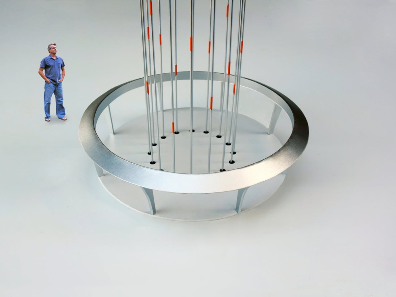
Inside, the umbrella roof shelters a large floor for exhibitions, lectures, or performances. At the center, 16 cables drop through holes in the floor, each marked with an orange spot matching the orange-tipped arms outside. Those cables connect to winches and generators below, making the mechanical core part of the exhibition rather than something hidden. Visitors can track which arms are up or down by watching cables move, turning passive observation into something closer to active participation.
Of course, the setup means the building becomes a working model while hosting events about climate or technology. People walk through exhibitions while the structure demonstrates solar capture and gravity storage without needing to explain every detail. The pavilion functions as a tourist attraction, classroom, and public art that teaches through motion instead of asking you to absorb paragraphs about conversion rates nobody remembers afterward.
Jantzen’s proposal might never be built as drawn, but treating energy flows as choreography feels worth exploring. It hints at a future where infrastructure does not just work efficiently behind walls, it performs visibly in ways that invite people to understand systems that usually stay hidden until something breaks. Making those processes watchable might matter more than squeezing out another efficiency percentage point, which is something worth considering the next time we design places meant to teach.
Coat racks are designed to be covered. Designers refine sculptural hooks and stands that look great in catalogs, but the moment you hang coats and bags, they disappear under fabric. No matter how interesting the form, the object gets visually erased by its own function. Most designs pretend this is not happening, even though vanishing under outerwear is basically written into the job description from the start.
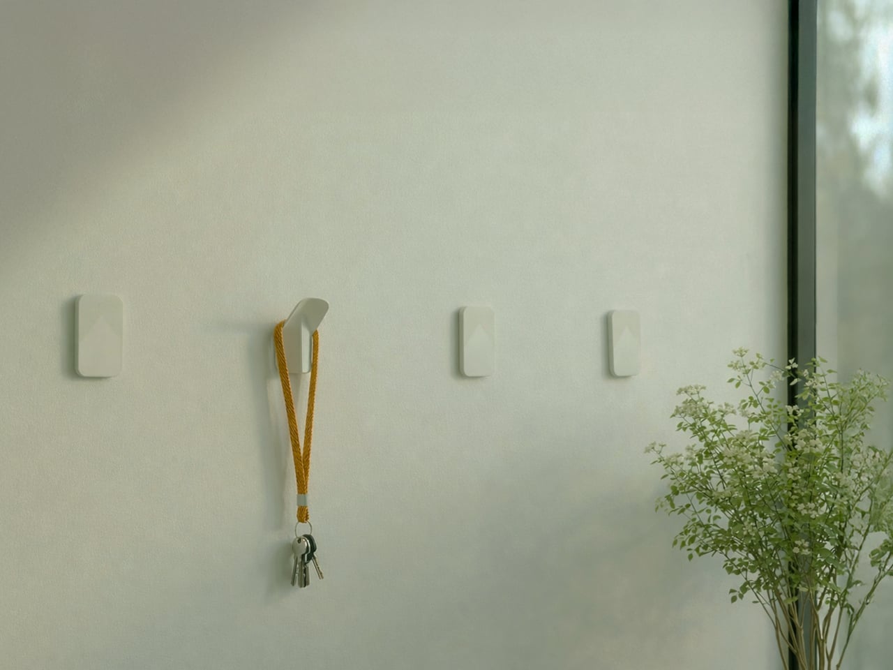
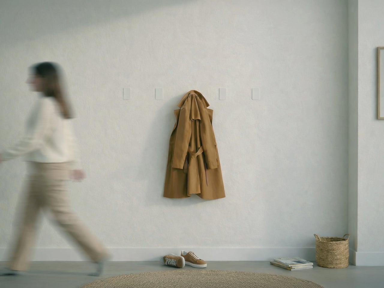
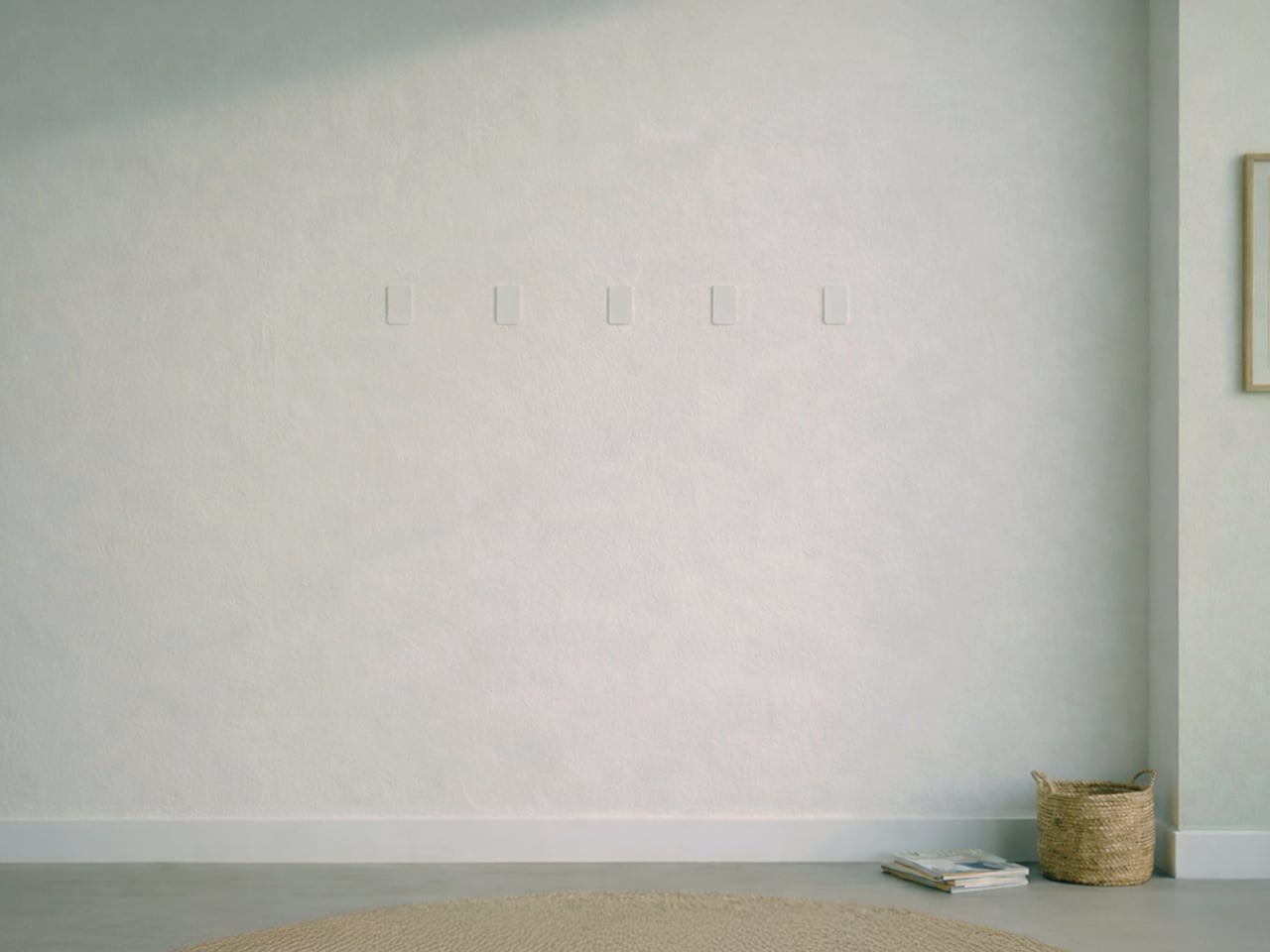
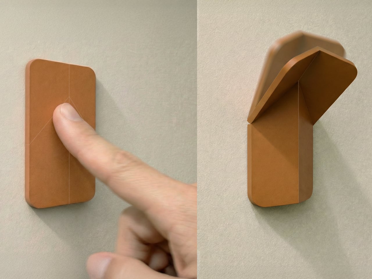
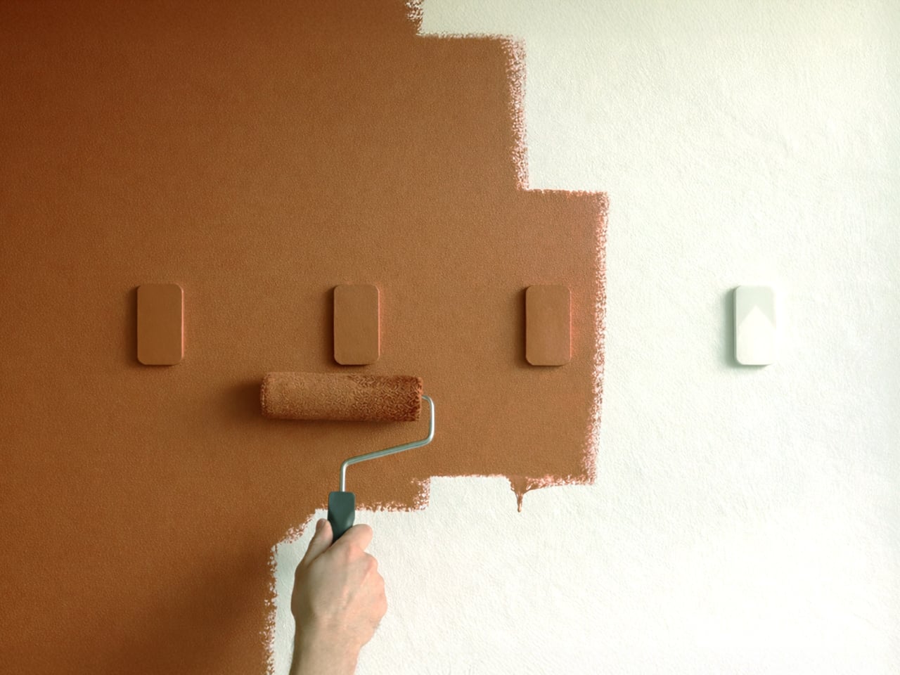
VELTO accepts that contradiction instead of fighting it. The wall-mounted coat rack stays completely flat when not in use and only reveals itself when needed. The philosophy revolves around the idea that design does not always need to shout to be valuable, and sometimes disappearing is actually the point. When closed, it sits flush against the wall like a small tile and can be painted the same color to blend entirely.
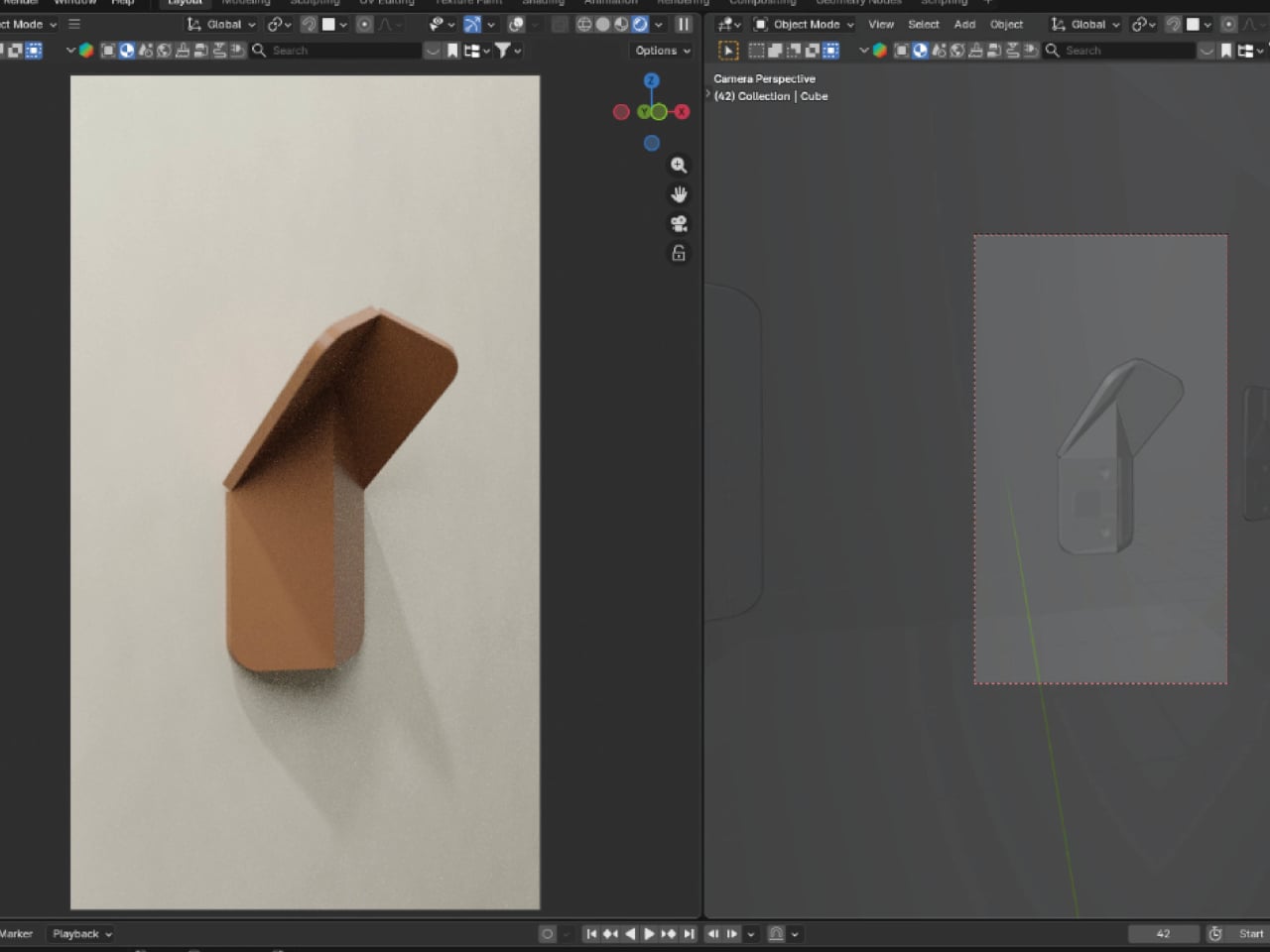
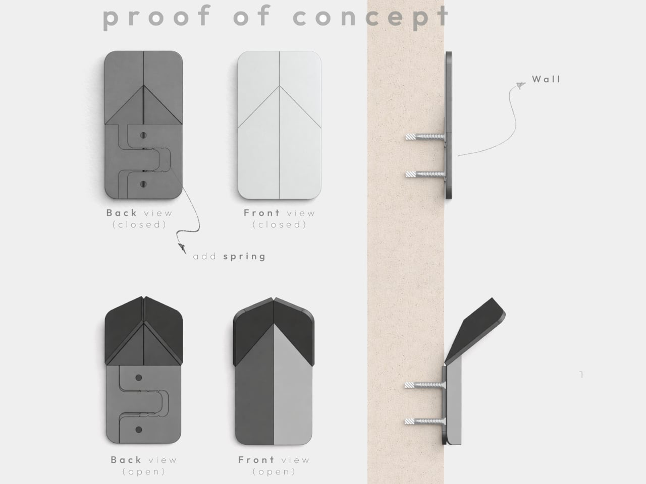
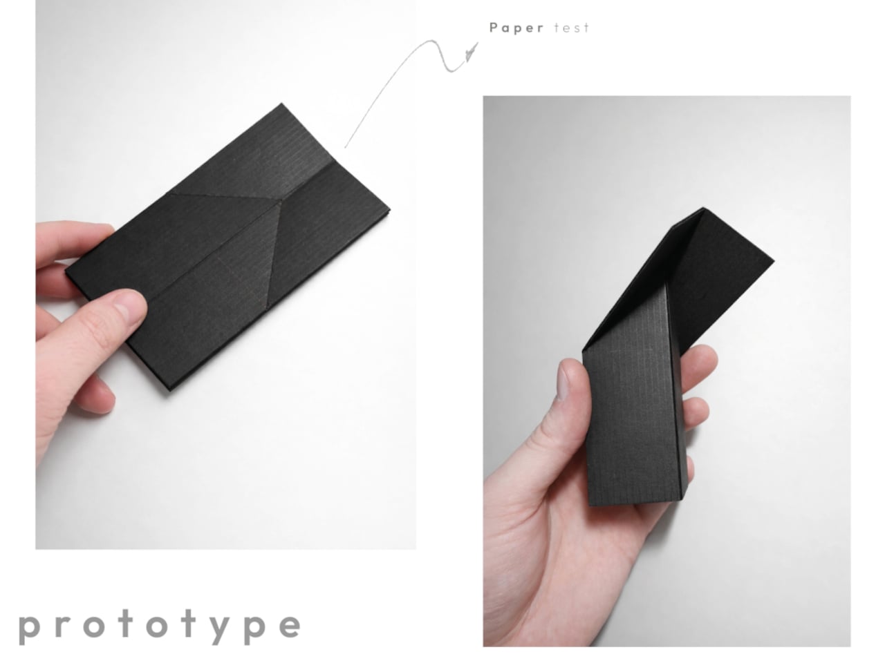
The transformation happens with a single push. A spring-assisted mechanism lets the flat panel unfold into a hook that holds coats, bags, or scarves without extra effort. The movement is inspired by origami, turning a flat surface into a functional volume through precise folds. The interaction becomes a small, deliberate gesture every time you come home or leave, pressing the panel and watching it quietly fold out to catch your jacket.
The object starts from a single flat shape laser-cut from polypropylene, which flexes repeatedly without breaking, and can be painted in any color. That flat-pack logic keeps production efficient and reduces waste. You can paint VELTO to disappear into the wall or let it stand out as a subtle accent, depending on whether you want it to blend or quietly announce itself in the entryway.
In narrow hallways or compact entryways, every protruding object becomes something you bump into or work around. Traditional coat racks and hooks always occupy space, even when empty, creating visual clutter on days when you are not using them. VELTO stays flat until pressed, so walls remain clean most of the time. When guests arrive or winter coats come out, hooks appear on demand, then fold back once everything is put away.
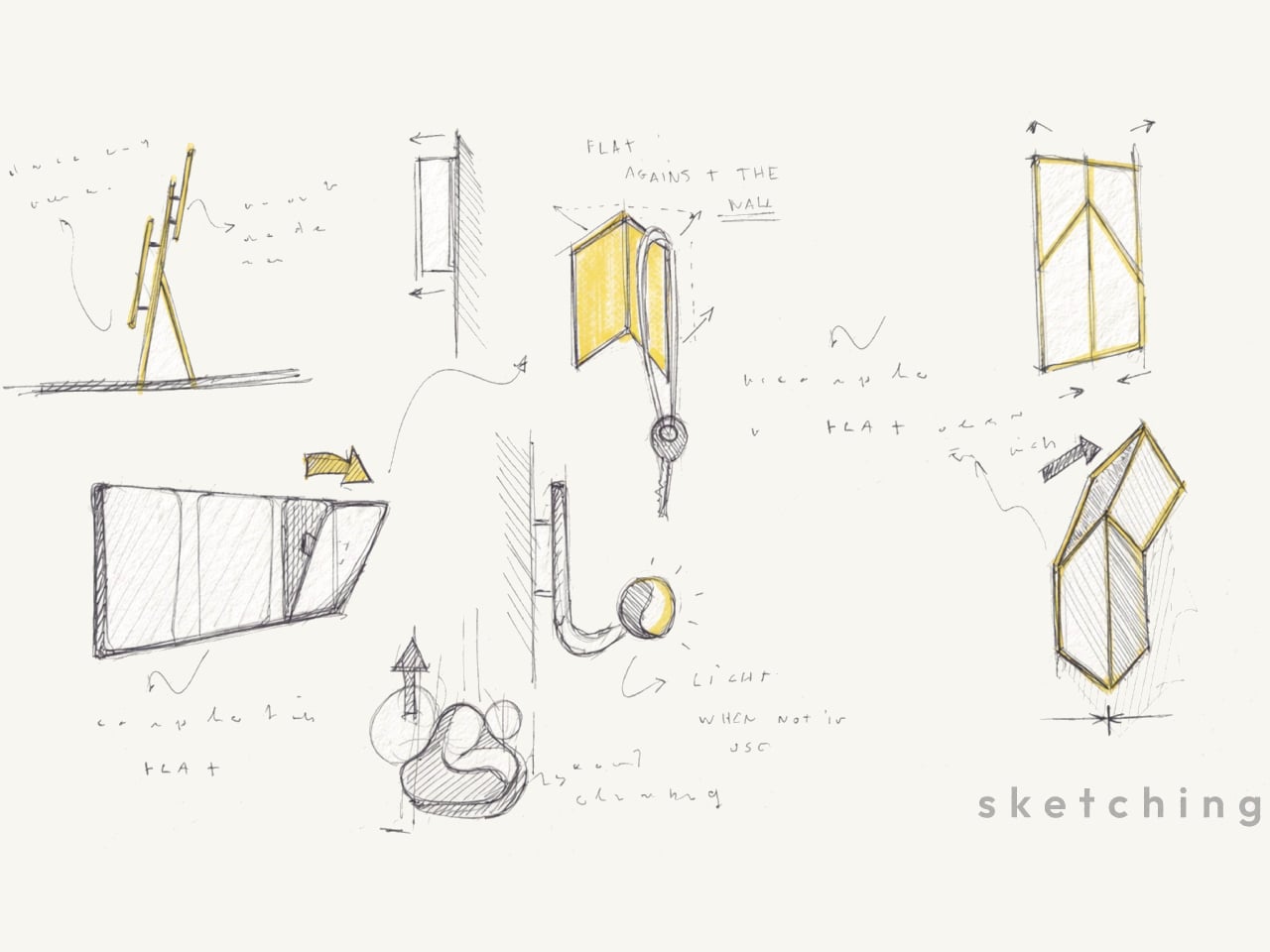
The project grew from sketches about movement and hinges rather than styling, followed by paper models and prototypes testing folding angles, opening force, and stability. Only after the mechanism felt right did the designer refine proportions and edges. That process shows in the final concept, where the memorable part is not a decorative detail but the calm, almost self-explanatory way the object transforms when you actually need it.
VELTO treats absence as a feature instead of a problem. Rather than trying to dominate a room, it tries to coexist quietly with walls and daily routines, only stepping forward when you need a place to hang something. In a world full of products competing for attention, a coat rack designed to be covered and happy to disappear feels like a surprisingly refreshing stance.
Most desks accumulate the same clutter. A stack of paper that never stays neat, a pen cup filled with tools you never touch, and business cards sliding around until they fall behind the monitor. The typical solution is plastic organizers that do not age well and do not really help. They just give the mess a slightly more defined shape while taking up even more space on the desk.
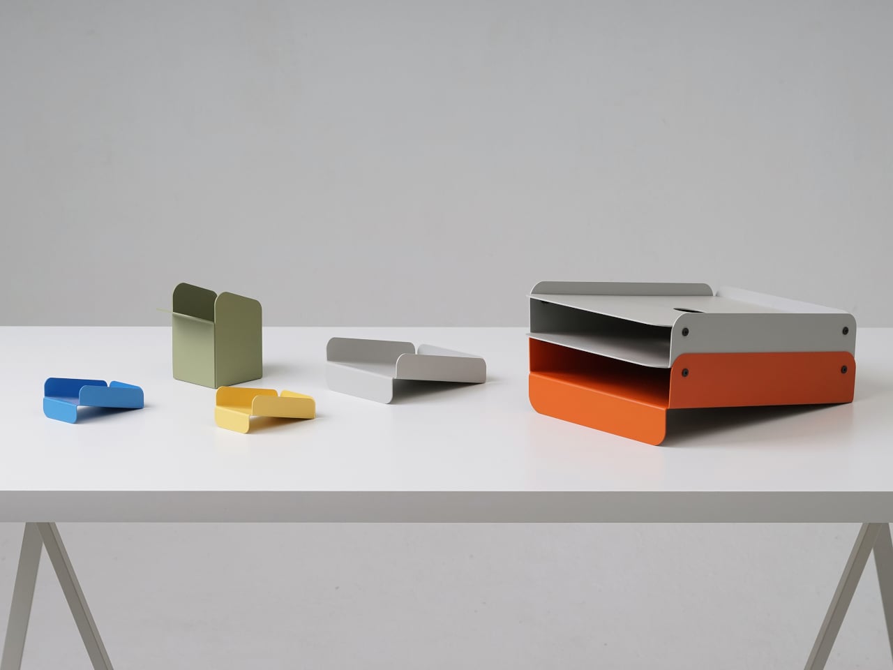
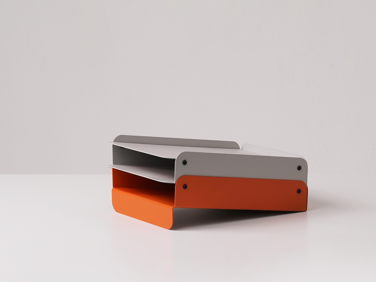
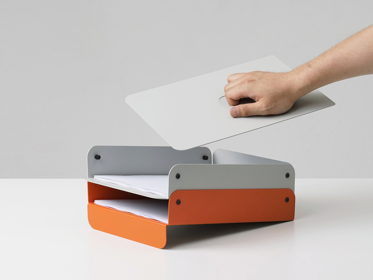
That is where Foldy comes in. This small family of office trays starts from a single 1.6 mm metal sheet bent into shape. Sheet-metal bending is cheap, durable, and works for small runs, but usually looks industrial. Foldy leans into that process while rounding every edge and coating pieces in soft matte colors, so they feel more like friendly desk companions than leftover machine parts from a factory floor.
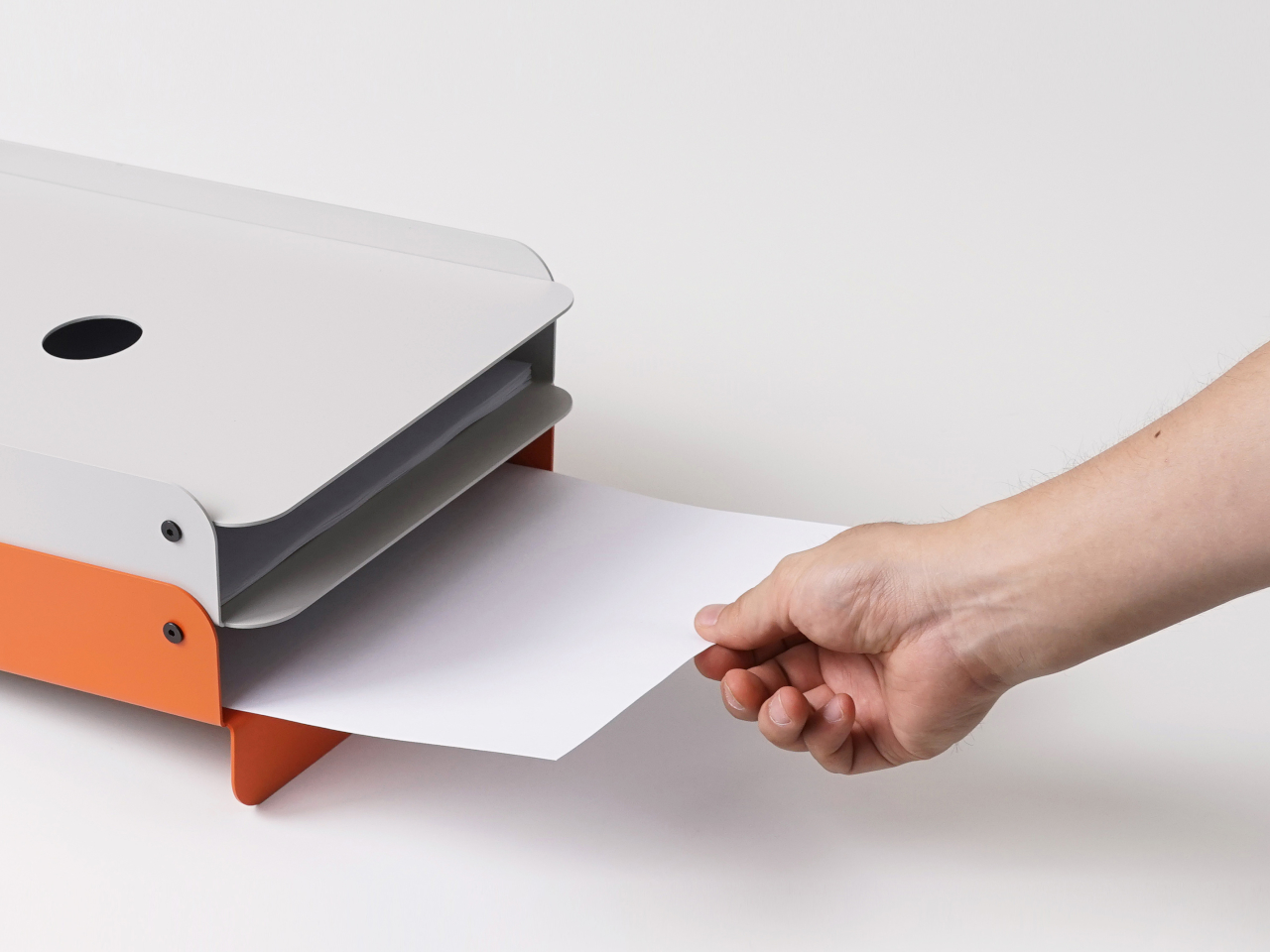
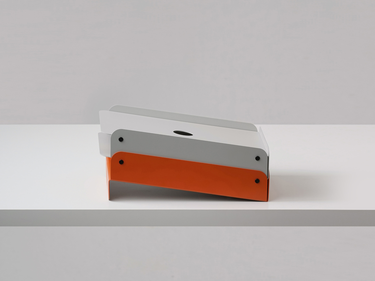
The paper tray tackles how people actually stack A4 sheets and half-finished printouts. The slightly slanted face lets paper slide back into alignment instead of creeping forward. The two-level, stackable design separates “now” piles from “later” piles without spreading across the desk, and the metal construction keeps everything solid instead of flimsy enough to tip when fully loaded with documents waiting for signatures.
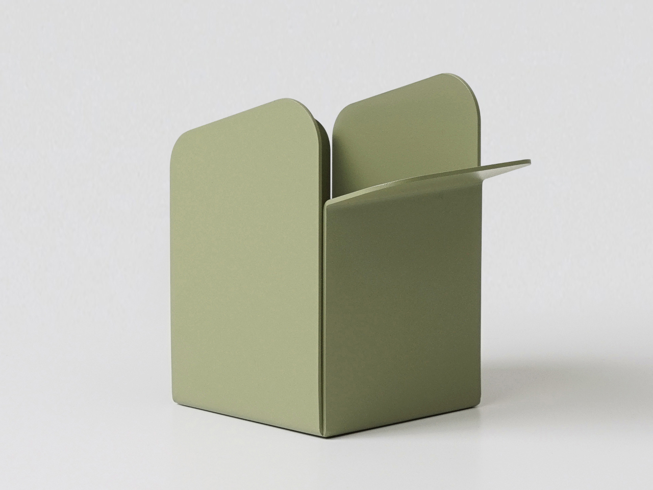
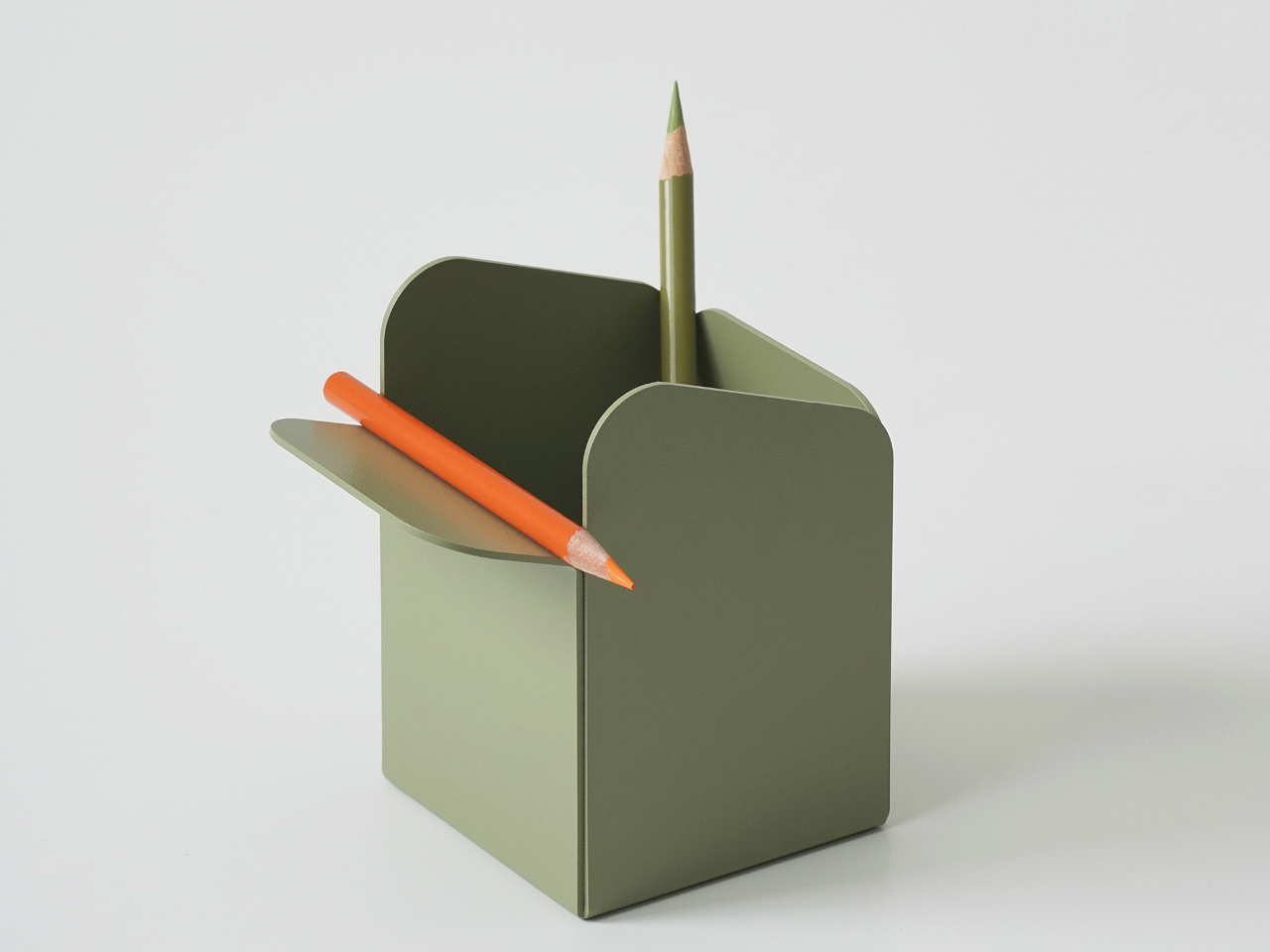
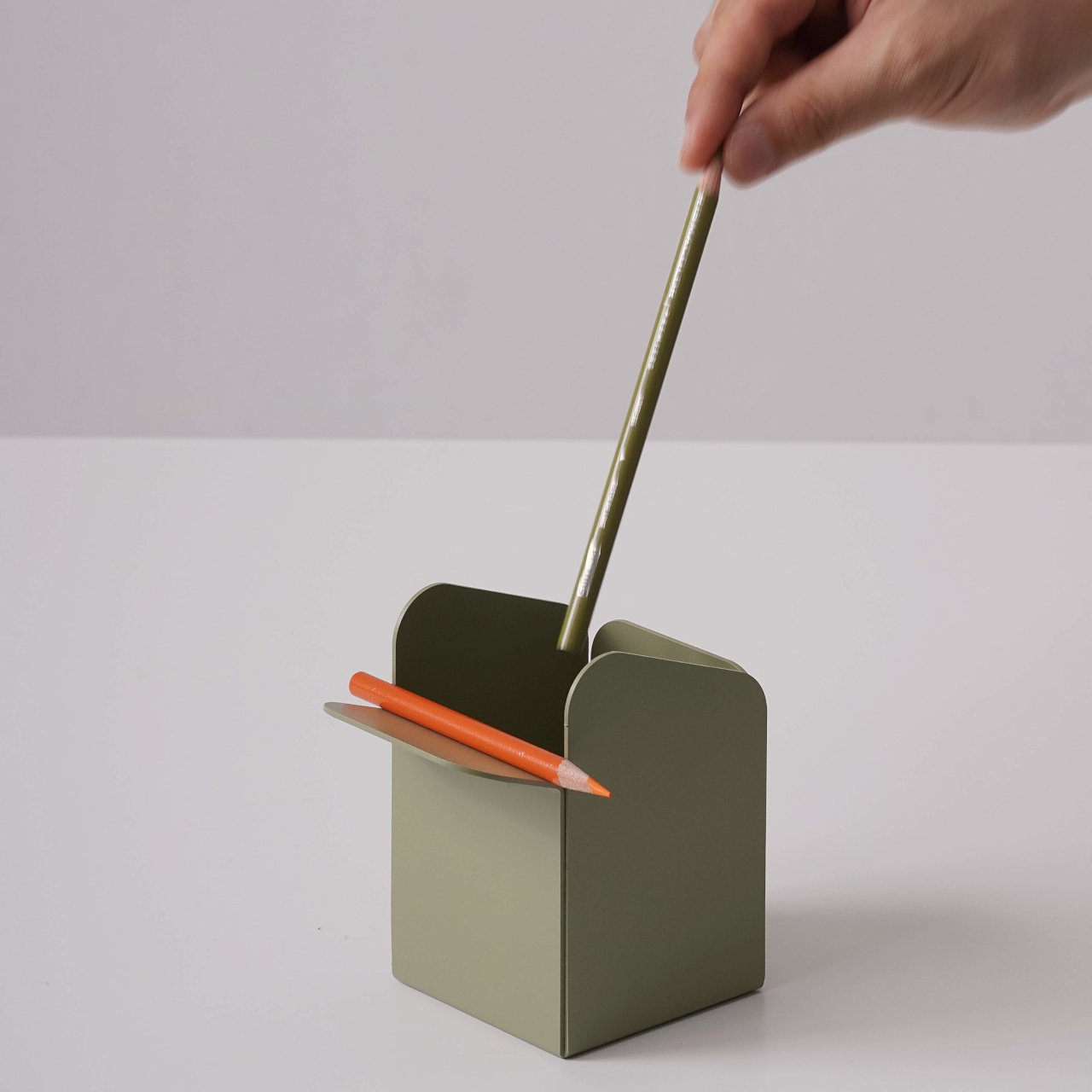
The pen holder responds to a different frustration. Most pencil cups are graveyards for dried-out markers and forgotten highlighters, which means digging through clutter every time you need your favorite pen. Foldy’s version keeps the upright cavity but adds a folded lip on the front where one or two favorite tools rest horizontally. It acknowledges that you always reach for the same pens, so it gives them a front row seat.
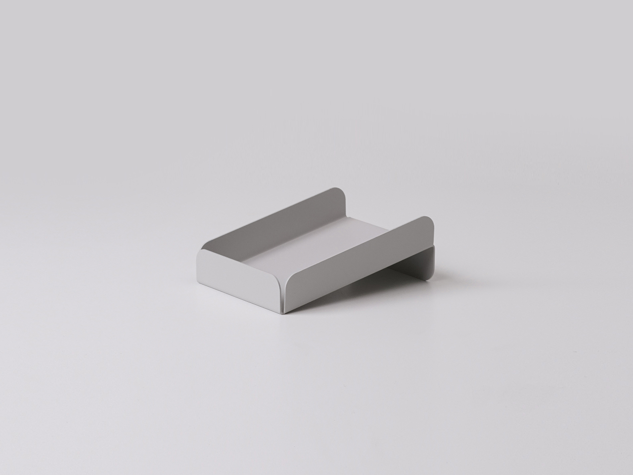
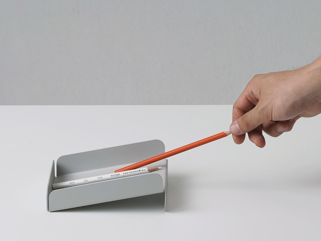
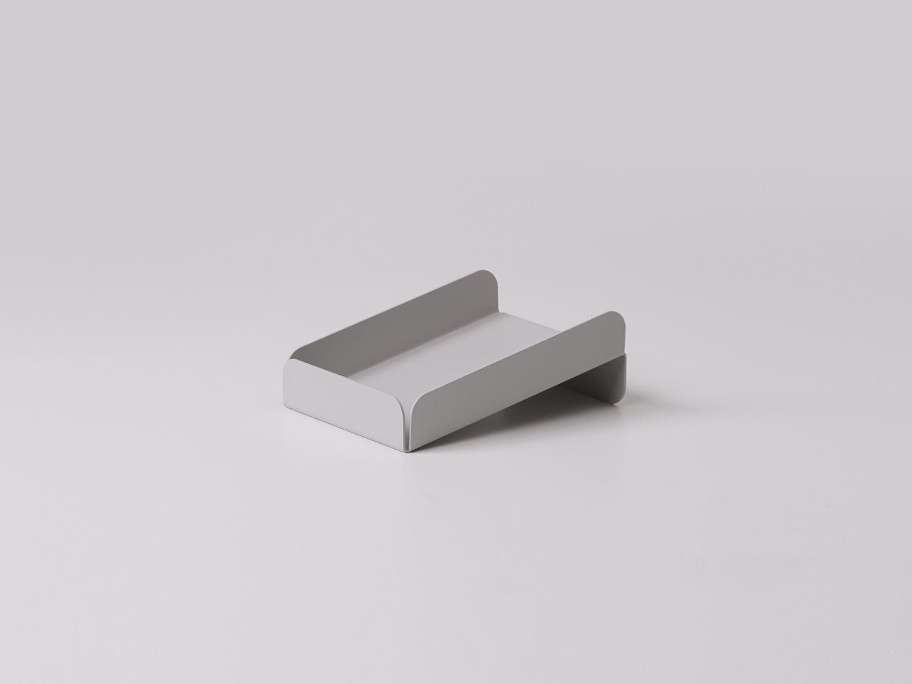
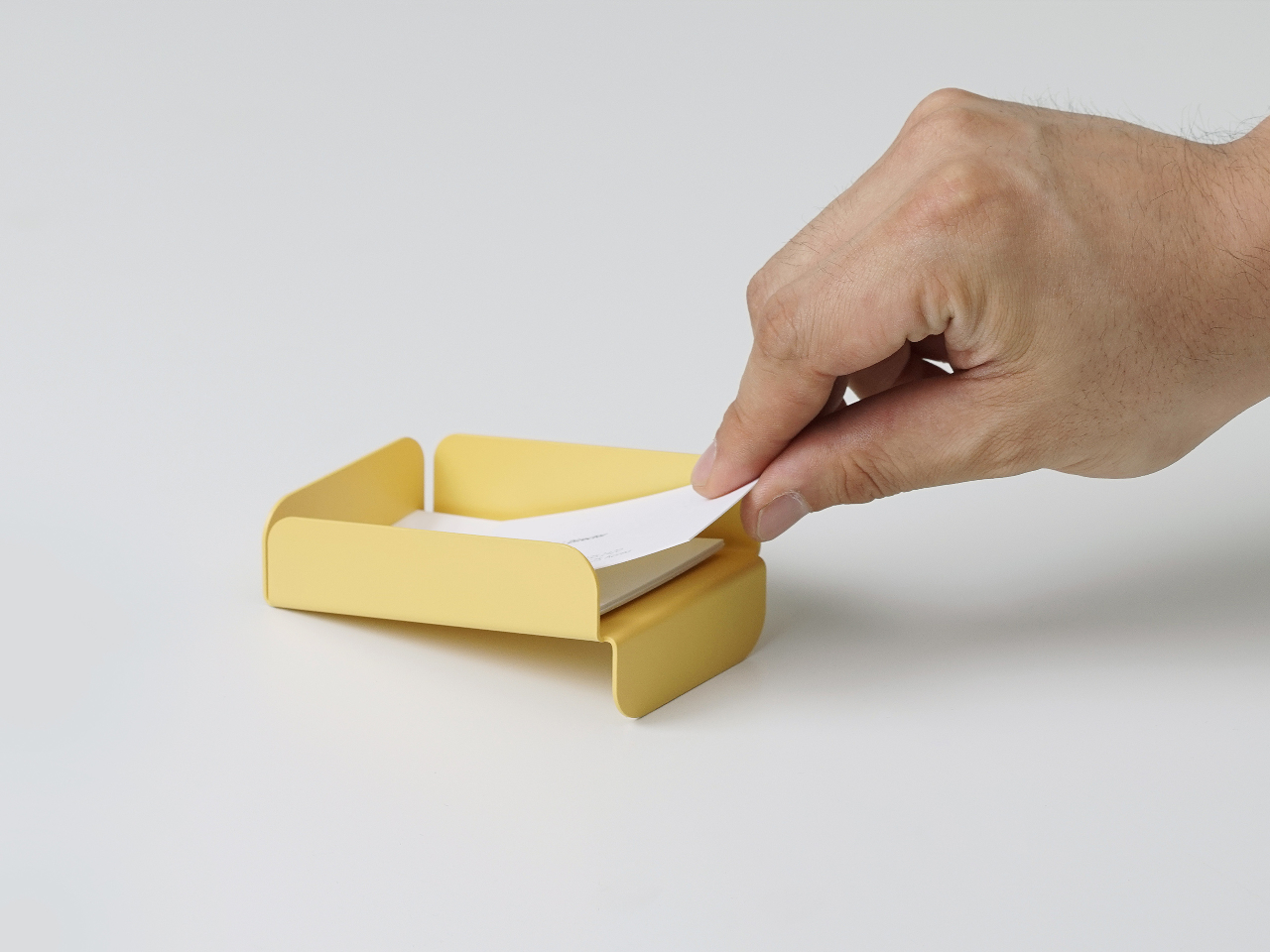
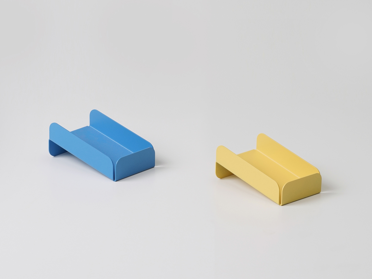
The low pencil tray and business card tray follow the same logic. The pencil tray is just a shallow channel that keeps a pen from rolling away when you set it down between tasks. The card tray is angled so business cards naturally settle into a neat stack and are easier to pick up with a thumb instead of sliding flat fingers underneath them. Both share rounded edges and folded profiles, making them feel like siblings.
Of course, tactile details matter as much as organizational logic. The rounded corners and matte finishes take the edge off metal, literally and visually. The colors, from muted greens to brighter blues and yellows, are soft enough not to shout but distinct enough to zone different functions. The result is a set of objects that look simple but feel surprisingly considered once you start using them daily.
Foldy shows what happens when you let manufacturing drive form for something as humble as a paper tray. Instead of hiding the fold, it celebrates it, and instead of fighting everyday habits like reaching for the same pen or letting paper drift forward, it leans into them. The result is desk tools that quietly tidy things up without asking you to reorganize your entire workflow or pretend to keep your desk perfectly clean all the time.
Japanese design has spent centuries perfecting the balance between restraint and richness. These seven gifts embody that philosophy, where every material choice and geometric decision carries intention. From transparent polycarbonate that frames music like sculpture to hand-planted bristles that honor century-old brush-making techniques, each piece reflects the considered craftsmanship that typically commands luxury prices. The precision is palpable, the materials exceptional, yet the cost remains accessible.
Valentine’s Day presents the perfect occasion to invest in objects that honor both form and function. These aren’t disposable gestures wrapped in red paper. They’re thoughtfully engineered pieces that reveal their quality through daily interaction. Whether it’s the satisfying weight of meteorite-tipped metal in hand or the quiet elegance of brass flames reflecting across polished surfaces, these gifts communicate value without shouting price tags. They look like they belong in design museum gift shops. They cost like they belong in your cart.
1. StillFrame Headphones
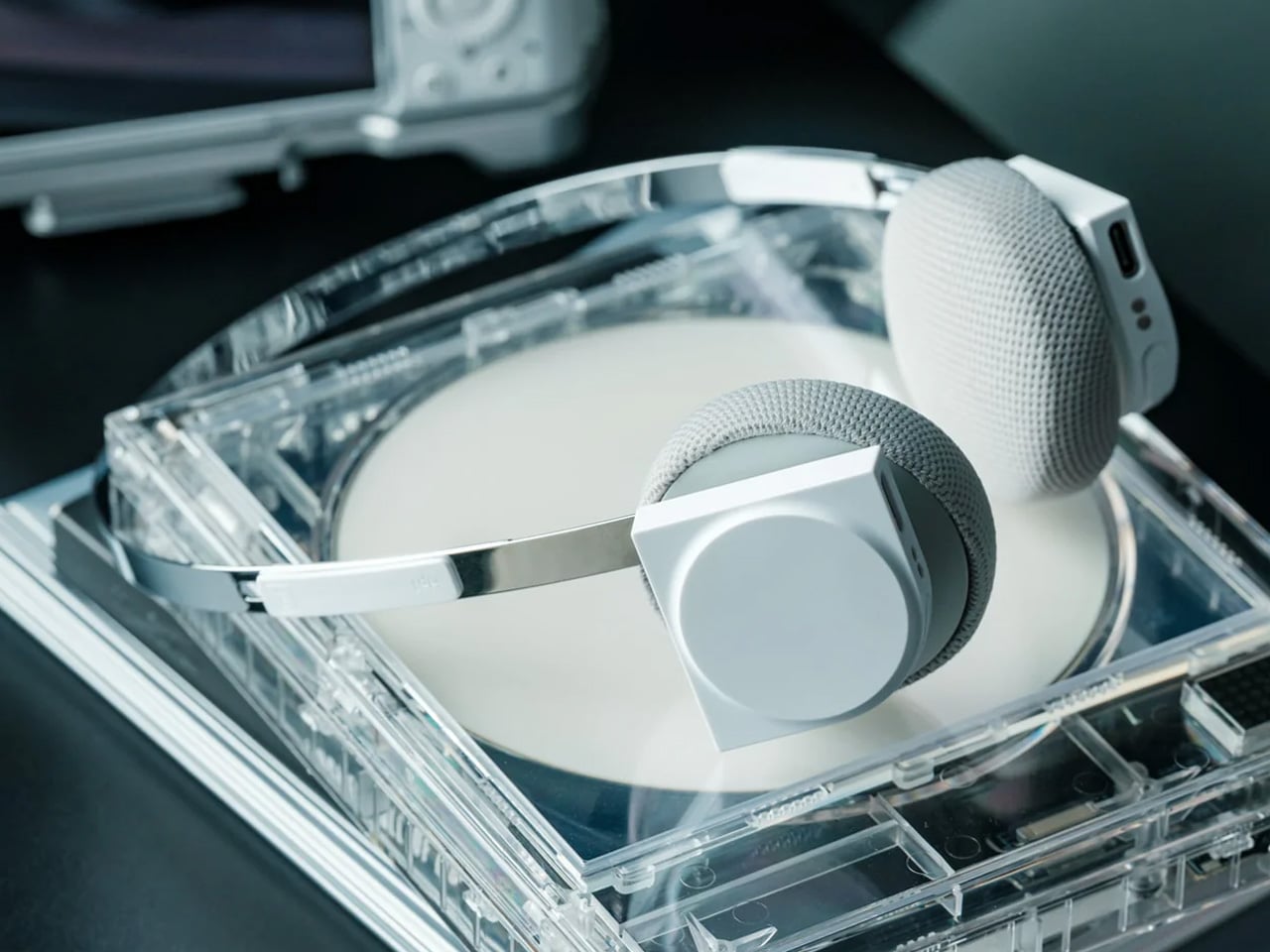
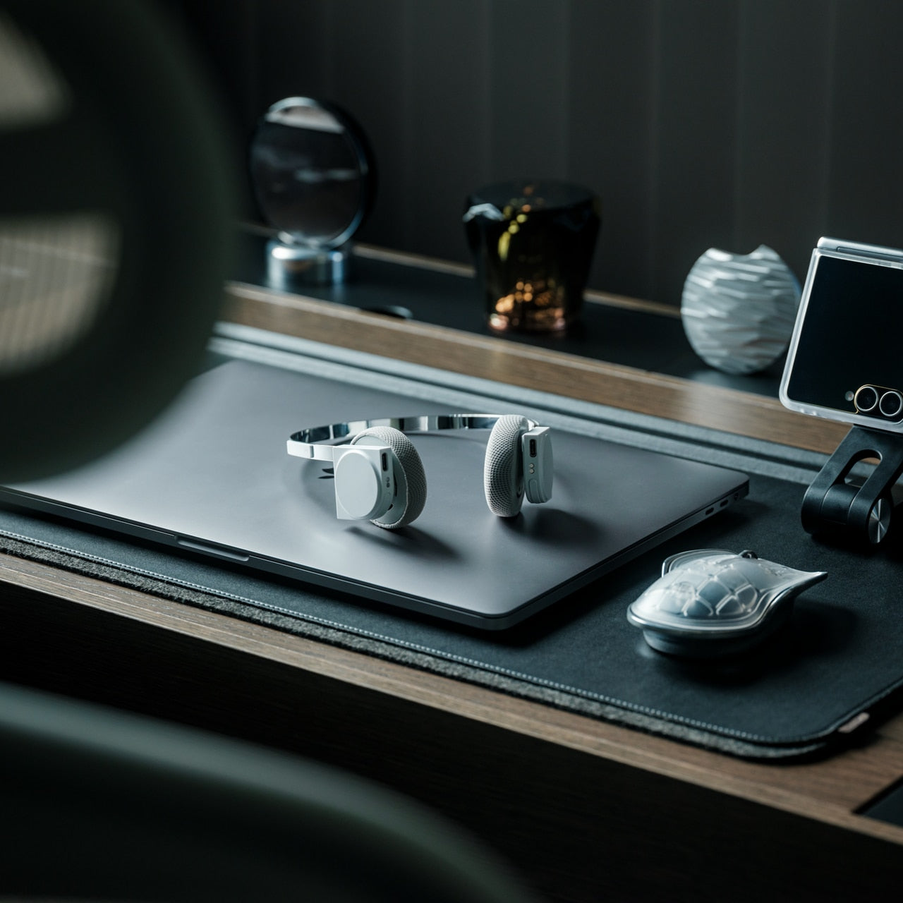
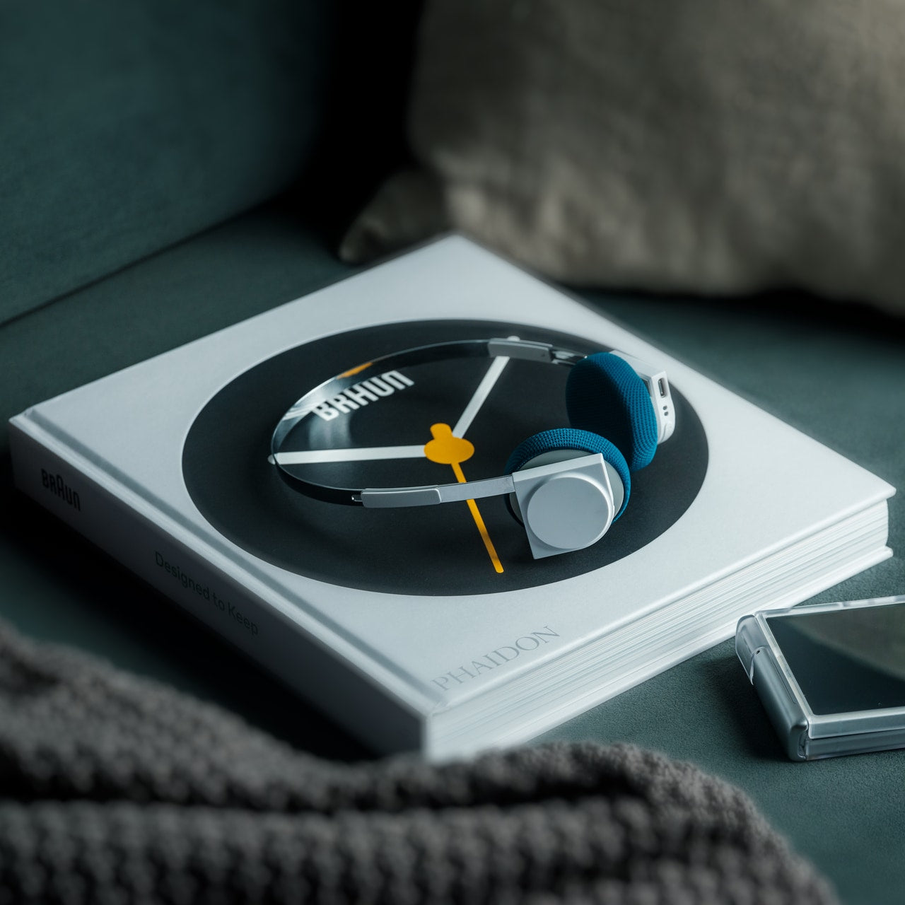
The StillFrame headphones reject the maximalist approach most audio brands take with aggressive curves and ostentatious branding. Instead, their geometry pulls directly from 1980s CD jewel cases, those square transparent housings that once protected physical music. The silhouette sits somewhere between over-ear bulk and in-ear invisibility, creating a deliberate middle ground that feels like a deliberate middle ground. At 103 grams, they register as barely there on your head, yet the 40mm drivers inside deliver the kind of spatial audio typically reserved for studio monitoring headphones that cost three times more.
The transparent aesthetic works because it’s structural, not decorative. You can see the internal architecture, the way components nest together with mechanical precision. Noise cancellation toggles to transparency mode depending on whether you need isolation or awareness, adapting to your environment without requiring menu diving. Twenty-four hours of battery life means you’re not tethered to charging rituals. The entire package feels like something designed by people who understand that luxury isn’t about excess. It’s about eliminating everything unnecessary until only the essential remains.
The 103-gram weight makes all-day wear genuinely comfortable without pressure points.
Transparent construction shows rather than hides the engineering quality.
Wide soundstage creates spatial separation that cheaper headphones collapse into mono mush.
Twenty-four-hour battery life eliminates the anxiety of mid-day charging.
What We Dislike
The minimalist aesthetic won’t satisfy people who want flashy brand recognition.
Lack of a carrying case means you’ll need to source your own protection for travel.
2. Levitating Pen 2.0: Cosmic Meteorite Edition
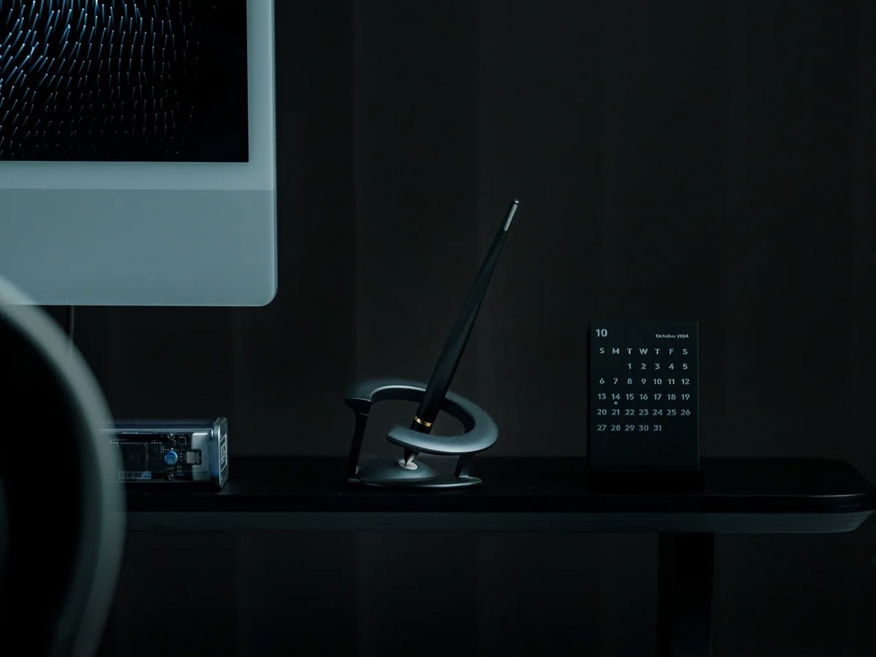
Levitation technology has existed for years in desk toys and Bluetooth speakers, but applying it to a functional writing instrument required actual engineering restraint. The Levitating Pen 2.0 suspends at a precise 23.5-degree angle, creating the illusion of defying physics while remaining stable enough to grab without knocking over. The real story lives in the tip: a genuine Muonionalusta meteorite, a material older than Earth by 20 million years. That’s not marketing poetry. That’s verifiable cosmic debris transformed into a functional writing point through precision machining.
The spacecraft-inspired silhouette nods to USS Enterprise proportions without crossing into kitsch territory. The pen writes like any quality ballpoint when lifted from its magnetic cradle, but returns to its floating position with satisfying precision. It functions as a functional fidget object, a conversation piece, and a legitimate writing tool simultaneously. The meteorite tip catches light differently than standard metal, creating subtle texture variations that reveal themselves over time. For anyone who appreciates objects that merge form and cosmic accident, this pen justifies its desk real estate.
A genuine meteorite tip provides a tangible connection to materials older than our planet.
Twenty-three point five degree levitation angle creates a stable suspension without wobbling.
Spacecraft silhouette balances retro-futurism without feeling costume-y.
A functional writing instrument that also serves as a kinetic desk sculpture.
What We Dislike
Magnetic base requires dedicated desk space that smaller workstations may not accommodate.
The meteorite tip, while stunning, doesn’t write differently from high-quality standard metal.
3. ClearFrame CD Player
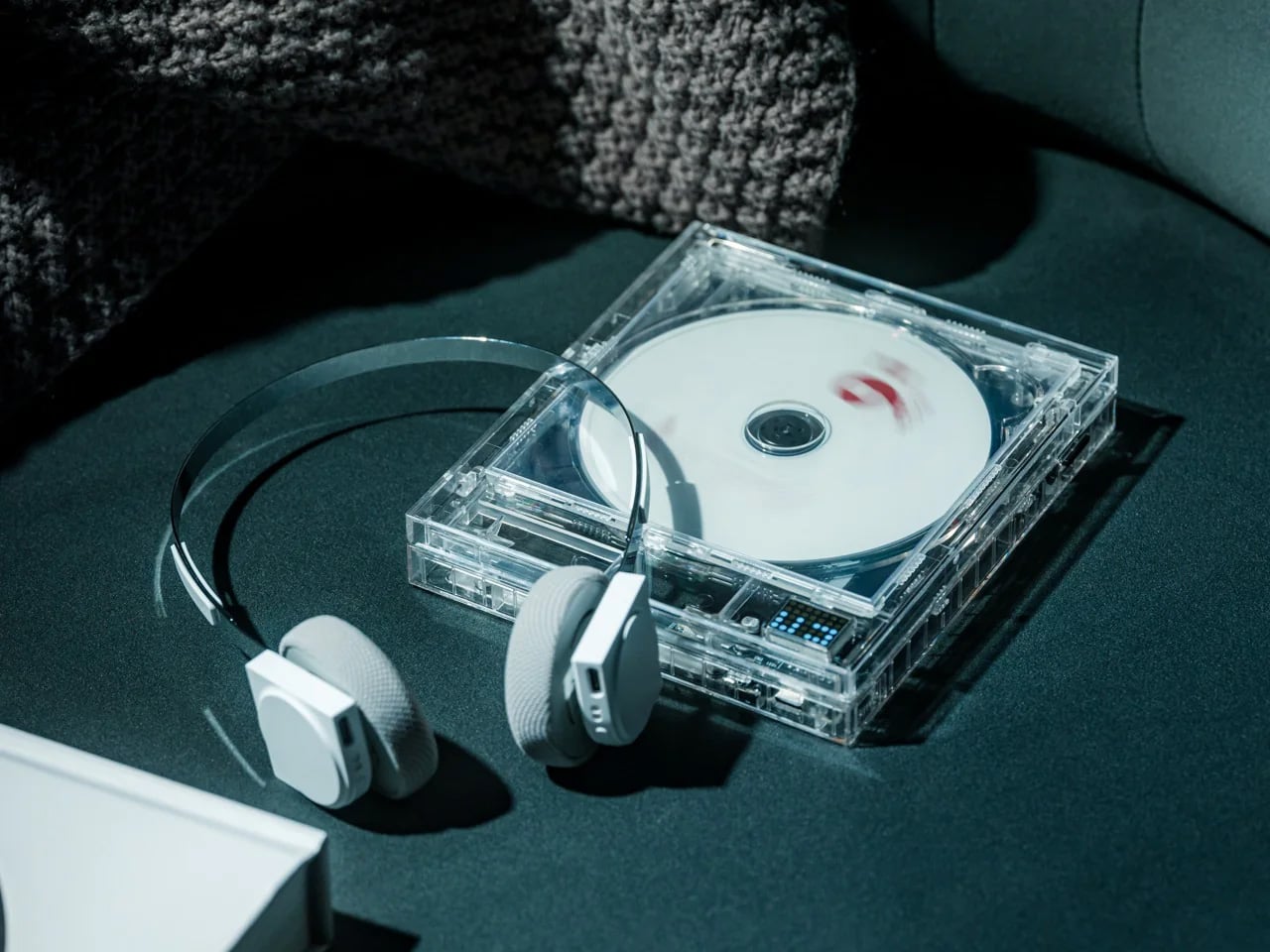
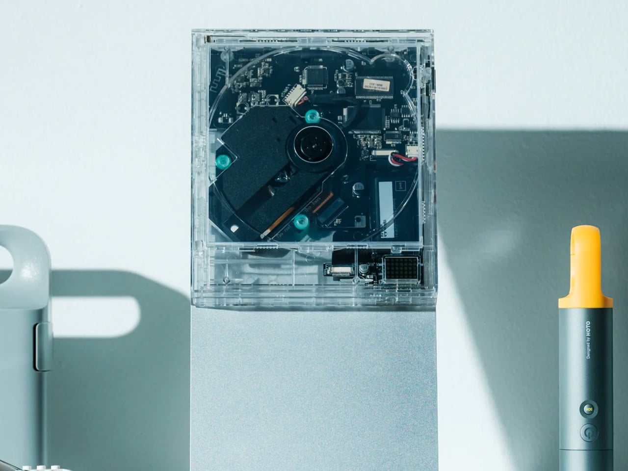
Physical media never truly disappeared. It just got shoved into closets and forgotten behind streaming convenience. The ClearFrame CD Player resurrects the ritual of album playback through transparent polycarbonate construction that frames both the disc and album artwork simultaneously. The exposed black circuit board isn’t hidden behind opaque plastic. It sits visible, turning electronic components into part of the aesthetic language. The square silhouette mimics CD jewel case proportions, creating visual continuity between the medium and the player.
Bluetooth 5.1 connectivity means you’re not locked into wired speaker limitations, while the seven-hour rechargeable battery enables portability that traditional CD players never offered. Wall-mounting capability transforms it into functional art that displays your current listening choice like a gallery piece. Multiple playback modes, including repeat, shuffle, and single-track loop, accommodate different listening intentions. The entire experience slows down music consumption in the best way, forcing deliberate album selection instead of algorithmic autopilot. It’s a rejection of playlist culture disguised as consumer electronics.
Transparent polycarbonate construction turns internal circuitry into a visible design element.
Wall-mounting capability transforms music playback into a spatial art display.
Seven-hour battery life provides true portability without cord tethering.
Square silhouette creates visual harmony with CD jewel case proportions.
What We Dislike
Limited to CD format means no vinyl, cassette, or other physical media playback.
Exposed circuitry, while beautiful, lacks the protective housing of traditional players.
4. AromaCraft Clothes Brush
The Miyakawa Hake Brush Workshop has spent over a century perfecting bristle placement using the traditional Tsubokiri method, where individual boar hairs get hand-planted into wooden handles with painstaking precision. This technique prevents shedding and extends brush lifespan far beyond mass-produced alternatives. The AromaCraft takes that heritage craftsmanship and adds aromatic paper inserts that hold essential oils, transforming garment maintenance into a sensory experience. Each brushstroke doesn’t just remove dust and pollen. It deposits a subtle fragrance that refreshes fabric without overwhelming.
White boar bristles provide the ideal firmness-to-flexibility ratio for lifting debris from fabric weave without damaging delicate fibers. The walnut wood handle receives a shea butter finish that develops patina over time, aging gracefully rather than deteriorating. The entire object feels substantial in hand, communicating quality through weight and balance. For anyone who appreciates Japanese devotion to perfecting everyday rituals, this brush represents garment care elevated to meditative practice. It’s the kind of object that gets better with use, developing character while maintaining function.
Hand-planted bristles using the century-old Tsubokiri technique prevent shedding and extend lifespan.
Aromatic paper insert system allows customizable scent profiles with essential oils.
White boar bristles provide optimal cleaning without fabric damage.
Walnut handle with shea butter finish develops beautiful patina over the years.
What We Dislike
Regular aromatic paper replacement adds ongoing cost beyond the initial purchase.
Requires manual brushing technique learning for optimal dust and pollen removal.
5. Harmony Flame Lamp
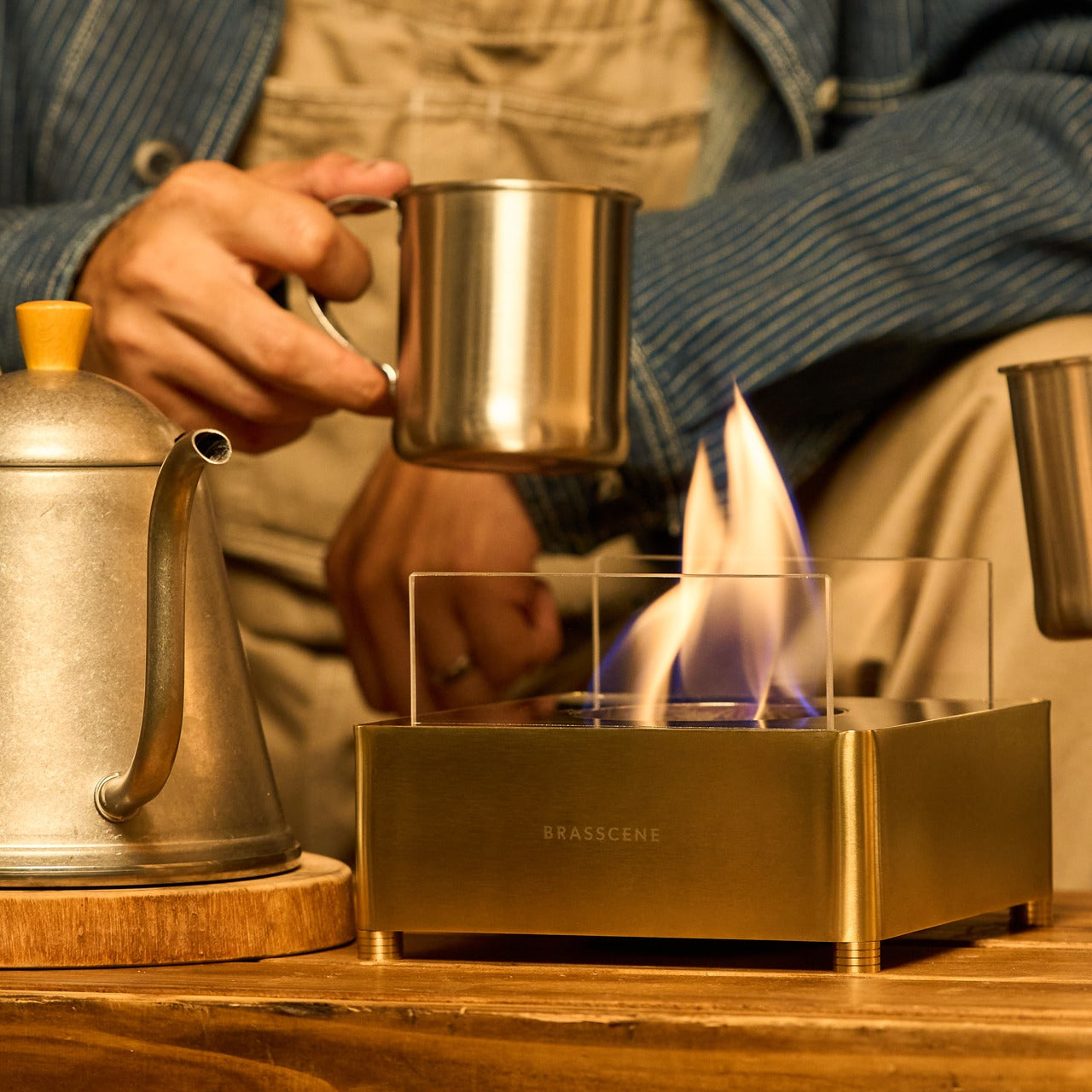
Real fire indoors typically requires complex ventilation, safety protocols, and permanent installation. The Harmony Flame Lamp bypasses all that friction by using bioethanol fuel that burns clean, odorless, and smokeless. The brass construction gets hand-crafted using the same metalworking techniques that musical instrument makers employ for tubas and French horns. That’s not arbitrary. Musical instrument brass requires precise acoustical properties and structural integrity that translate beautifully to flame containment. The polished surface catches and reflects firelight, creating dynamic shadows that shift with flame movement.
Bioethanol burns at lower temperatures than wood or propane, making it genuinely safe for tabletop use without requiring permanent fixtures. The brass box design contains flames while allowing full visibility of the fire’s movement and light play. No installation means you can move it from the dining table to the patio to the bedroom, depending on where you want ambient warmth and illumination. The entire experience feels ritualistic in the way lighting candles does, but with more substantial presence and longer burn time. For anyone seeking atmosphere without artificial LED fakery, this lamp delivers authentic fire with modern safety.
Bioethanol fuel requires ongoing purchase and isn’t as universally available as standard fuels.
Open flame, while safer than traditional fire, still requires basic fire safety awareness.
6. All-in-One Grill
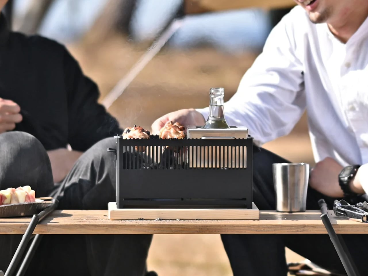
Outdoor cooking usually means hauling multiple pieces of equipment for different cooking methods. The All-in-One Grill consolidates barbecuing, frying, grilling, steaming, smoking, and stewing into modular components that stack and separate based on what you’re cooking. Each module serves a specific function but shares a universal footprint that maintains stability when stacked. There’s even a dedicated bottle warmer module that holds containers upright, perfect for mulled wine or keeping sauces at serving temperature. The tabletop size means you’re not committed to permanent patio installation or dealing with full-sized grill storage.
The modular approach makes cleanup dramatically easier than traditional grills, where grease and debris accumulate in hard-to-reach crevices. Each component separates for individual washing, then reassembles without tools or complicated mechanisms. The compact footprint works on apartment balconies, small patios, or even indoor tables when using the non-flame cooking methods. For anyone who wants outdoor cooking flexibility without equipment sprawl, this grill delivers restaurant-range versatility in a package small enough to store in a closet. It’s the kind of design that makes you wonder why all grills aren’t built this way.
Modular components enable six different cooking methods from a single base system.
Compact tabletop size works on balconies and small outdoor spaces.
Individual modules are separate for easier cleaning than traditional grill designs.
Bottle warmer module keeps beverages and sauces at optimal serving temperature.
What We Dislike
Smaller cooking surface limits capacity for large group gatherings.
The modular system requires storage space for multiple components when not in use.
7. Invisible Shoehorn
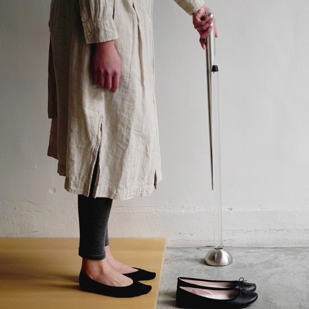
Long shoehorns solve the ergonomic problem of putting on shoes without bending over, but they typically look medical or utilitarian. The Invisible Shoehorn uses transparent acrylic and polished stainless steel to create a tool that reads as a sculptural object when mounted on its stand. The long steel body provides the leverage and length needed to slip shoes on without back strain, while the mirror-polish finish prevents sock snags and stocking tears that cheaper shoehorns cause. When mounted vertically on its transparent stand, the entire assembly looks more like minimalist art than a functional footwear tool.
The transparent stand creates the illusion that the shoehorn floats, letting it disappear into backgrounds rather than announcing its presence. The stainless steel construction ensures it won’t bend or deform over time like plastic alternatives. For anyone with mobility limitations or those who simply value not destroying socks every morning, this shoehorn transforms a mundane necessity into an object worth displaying. It’s the rare household tool that improves both function and aesthetics, solving a real problem while looking like it belongs in a design catalog.
Transparent stand creates a floating illusion that minimizes visual footprint.
Long stainless steel body eliminates back strain during shoe wearing.
Mirror-polish finish prevents sock snags and stocking damage.
Sculptural aesthetic turns a functional tool into a displayable object.
What We Dislike
Requires dedicated floor space near the entryway that smaller homes may lack.
Stainless steel, while durable, shows fingerprints that require occasional wiping.
Smart Luxury for Valentine’s Day
These seven gifts prove that Japanese design philosophy—where restraint meets meticulous craftsmanship—creates objects that feel more expensive than their price tags suggest. Each piece demonstrates how material choice, manufacturing technique, and geometric consideration combine to communicate value. The bioethanol lamp uses brass. The clothes brush employs century-old bristle placement methods. The headphones weigh 103 grams because every unnecessary element was eliminated. This isn’t luxury through excess. It’s luxury through precision and intentionality that reveals itself slowly.
Choosing Valentine’s gifts based on design integrity rather than brand recognition shifts the conversation from spending to investing. These objects improve with use, develop patina, and maintain relevance beyond trend cycles. The CD player will still spin discs when streaming services change algorithms. The shoehorn will protect backs and socks for decades. The levitating pen combines cosmic debris with a practical function that doesn’t expire. When you gift something that honors both form and utility while respecting Japanese craft traditions, you’re not just presenting an object. You’re offering a daily ritual that compounds value through repeated interaction.
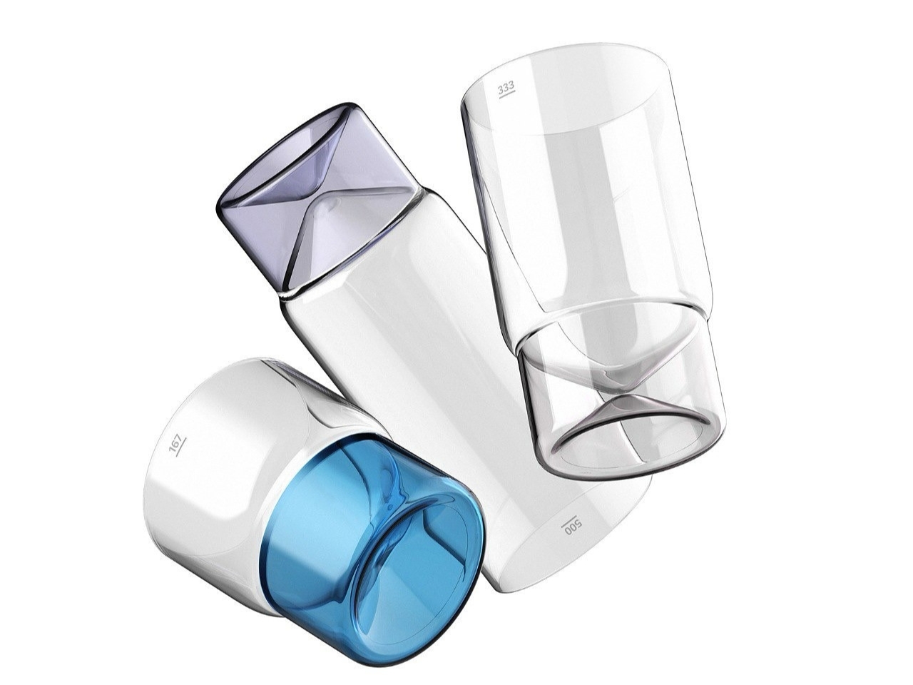
There’s something incredibly satisfying about a drinking glass that just feels right. You know what I mean: the perfect weight in your hand, a shape that fits naturally to your lips, and maybe even a little something extra that makes you smile every time you reach for it. Austrian designer Florian Seidl gets this, and his Cali glassware series just won a Platinum A’ Design Award, proving that even the simplest everyday objects deserve serious design love.
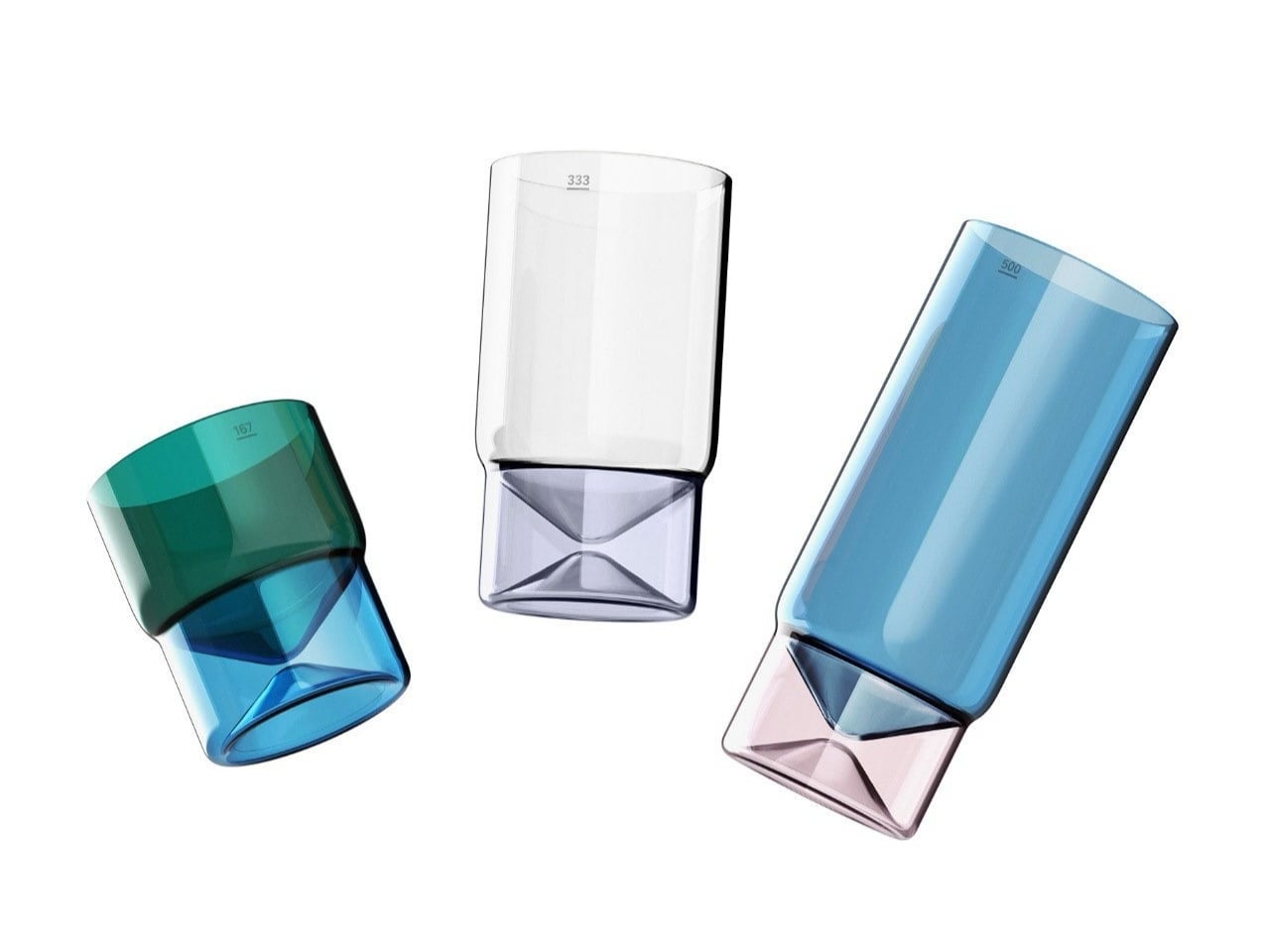
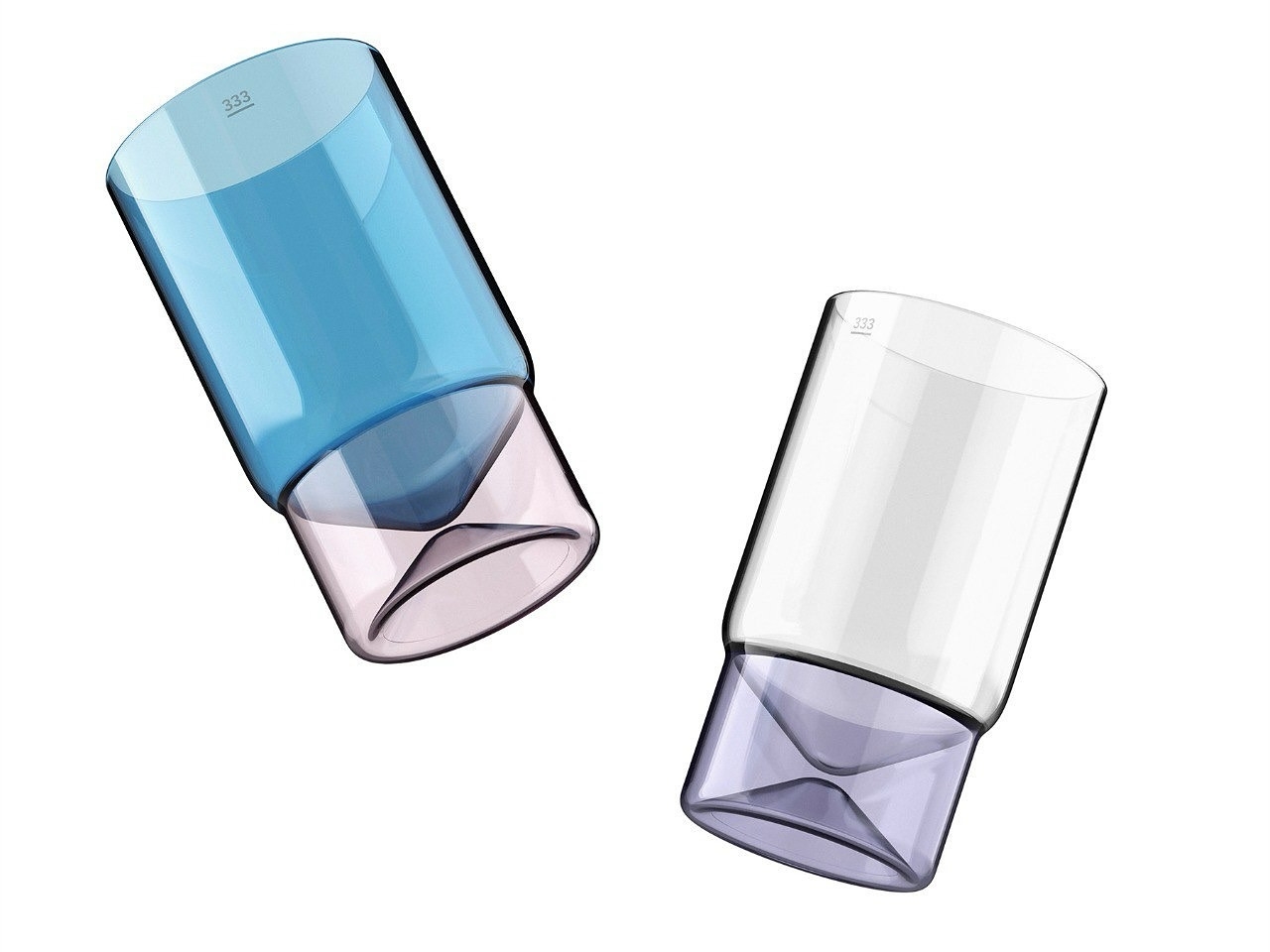
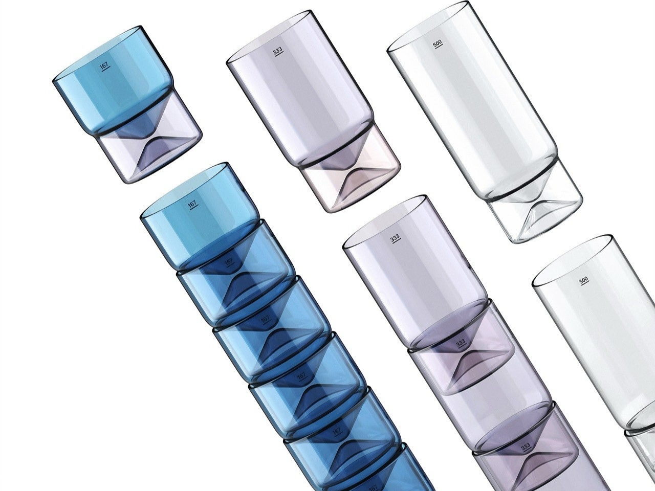
The Cali series comes from Officina Endorfino, Seidl’s creative playground where curiosity meets experimentation. These aren’t your standard kitchen glasses. Made from borosilicate glass (the same stuff used in lab equipment and high-end cookware), they’re surprisingly lightweight yet durable enough to handle hot and cold liquids without breaking a sweat. But what really catches your eye is how they play with light and perception. The material’s unique properties create captivating reflections that mess with your sense of volume and weight, making each glass look almost sculptural on your table.
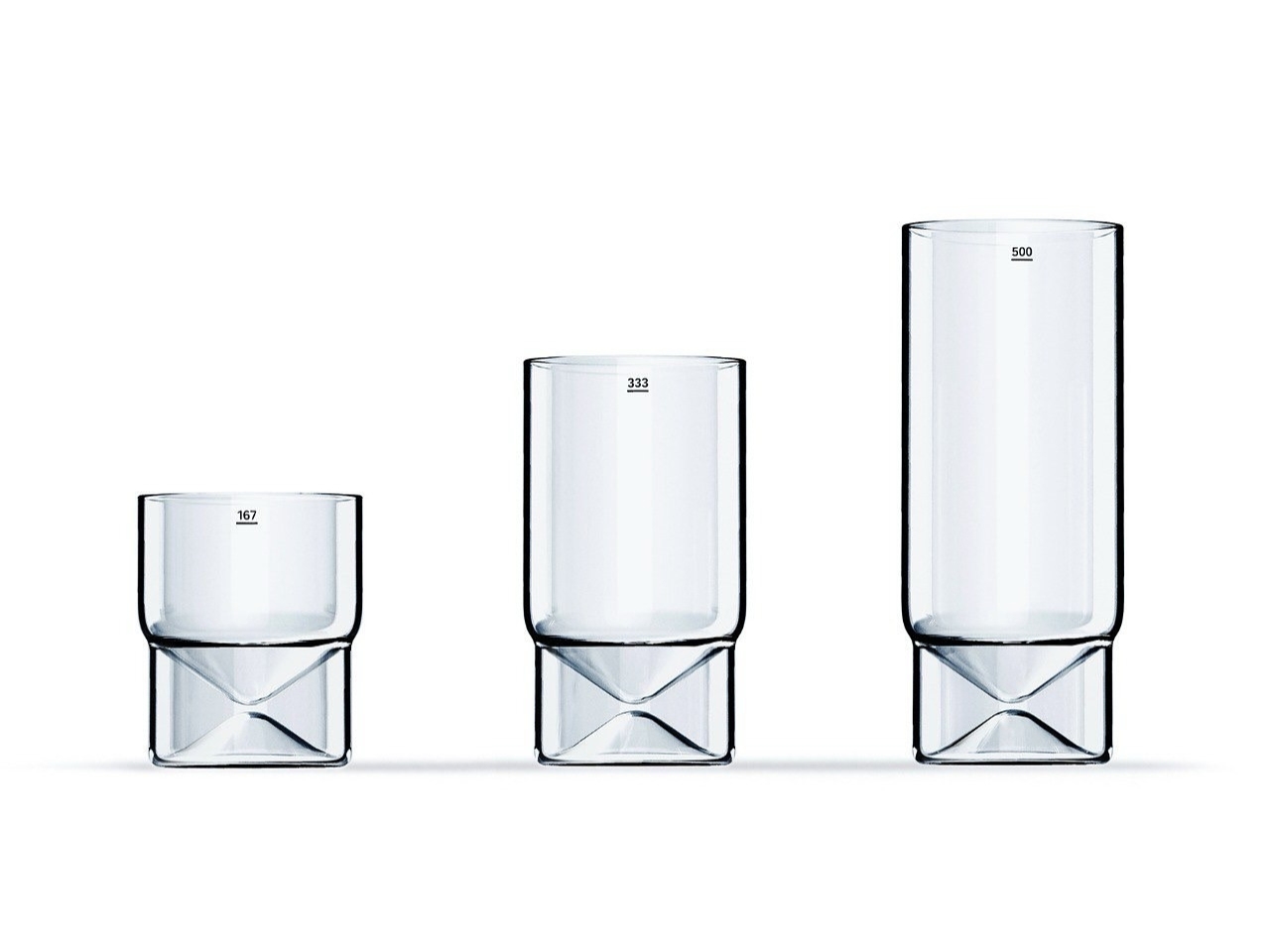
What makes this collection particularly clever is its stackable design. The glasses come in three distinct sizes that nest together beautifully, solving that eternal kitchen cabinet space problem we all deal with. But Seidl didn’t just think about storage. The way these glasses stack actually references the elegant form of a chalice, giving them a subtle sophistication that elevates your everyday water or morning juice into something more special.
Seidl brings an interesting background to this project. With years of experience across various industries, including automotive and product design, he knows how to balance form with function. His multidisciplinary approach shows in the Cali series, where practical considerations never overshadow the aesthetic vision. Each glass manages to have personality without being fussy, and functionality without being boring.
The sustainability angle is worth mentioning too. While the glasses themselves are built to last (borosilicate glass is notably resistant to thermal shock and everyday wear), the packaging gets its own eco-friendly treatment with recycled cardboard. It’s a thoughtful touch that shows consideration for the entire product lifecycle, not just the glamorous end result.
What strikes me most about Cali is how it represents a growing shift in design culture. We’re moving past the idea that everyday objects should just blend into the background. Instead, designers like Seidl are asking why our daily rituals shouldn’t involve beautiful, well-considered pieces. Your morning coffee, your afternoon iced tea, your evening wind-down beverage all of these moments can be enhanced by thoughtful design that respects both your practical needs and your aesthetic sensibilities.
The Platinum A’ Design Award recognition is particularly significant here. This isn’t a participation trophy. It’s an acknowledgment from design professionals that Cali represents something genuinely special in the kitchenware category. The award highlights how the series addresses contemporary needs for space-efficient, versatile solutions while pushing creative boundaries in material exploration.
For anyone who cares about the objects they live with (whether you’re a design enthusiast, a minimalist who values quality over quantity, or simply someone who appreciates when things are done right), the Cali series feels relevant. It’s not about status or showing off. It’s about recognizing that the small choices we make about our everyday surroundings actually matter. They accumulate into an environment that either energizes us or drains us, delights us or just exists.
Seidl’s work with Cali suggests that good design doesn’t require complexity or gimmicks. Sometimes it’s about understanding a material deeply, respecting functional requirements completely, and then adding just enough personality to make something memorable. The result is a drinking glass series that works beautifully in practice while looking like something you’d want to display even when you’re not using it. That’s the kind of everyday magic worth celebrating.
A lot of people who picked their first starter Pokémon on a Game Boy now sit in front of multi-monitor setups, pretending to be adults. Their desks are full of neutral black peripherals that say serious work, even though their playlists are lo-fi Pokémon remixes and their browser tabs tell a different story. The gear stays boring because that is what grown-up keyboards and mice are supposed to look like, apparently.
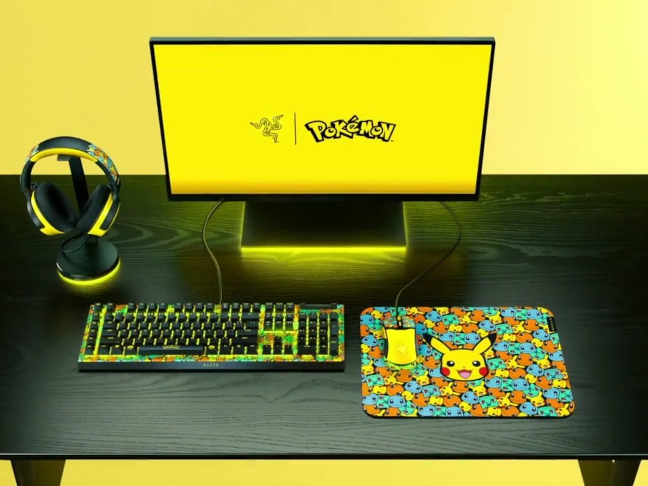
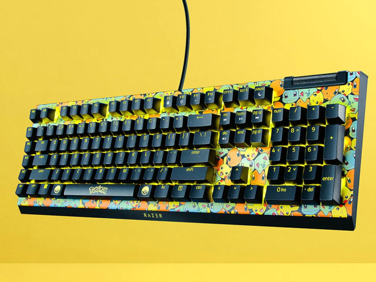
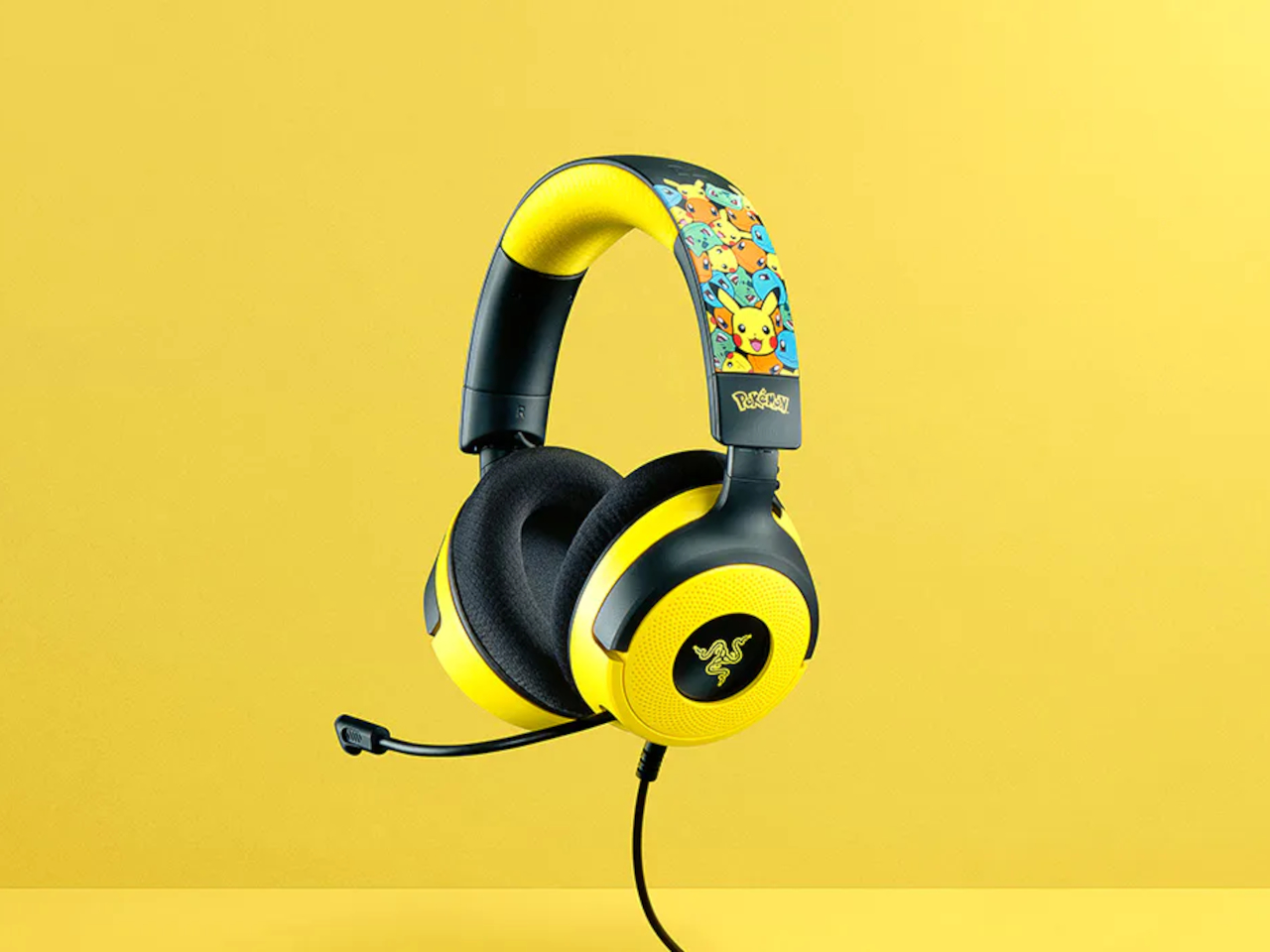
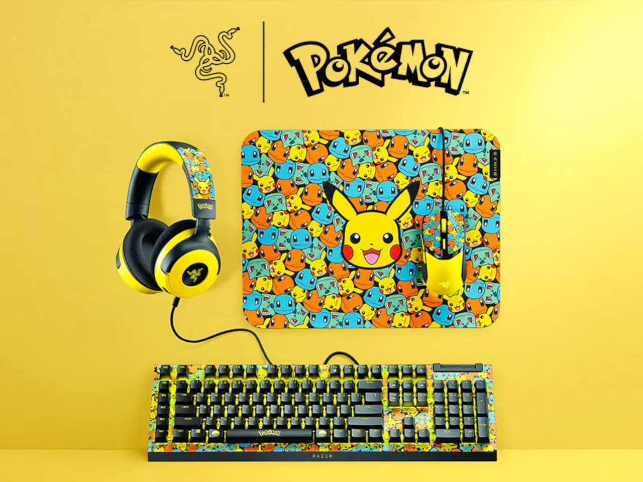
That is where Razer’s Pokémon collection comes in. Instead of one Pikachu mousepad, Razer built a full ecosystem that includes the BlackWidow V4 X keyboard, Cobra mouse, Kraken V4 X headset, and Gigantus V2 M mat. The line is officially licensed and leans into Kanto nostalgia, wrapping every peripheral in Pikachu, Bulbasaur, Charmander, and Squirtle graphics across bright yellow surfaces with synced Razer Chroma RGB lighting.
The BlackWidow V4 X Pokémon Edition keyboard anchors everything. Underneath the graphics, it is a mechanical keyboard with Razer’s clicky switches, six macro keys, and programmable RGB. You can map macros for raids or productivity shortcuts, and the mechanical switches help with both gaming and marathon typing. The Pokémon skin does not change performance; it just turns something you already needed into something that feels like a personal trophy from childhood.
The Cobra mouse and Gigantus V2 M mat work as a paired set. The lightweight wired mouse uses optical switches for durability and precision, with RGB lighting that syncs with the rest of your setup. The soft mat underneath is optimized for fast swipes, whether flicking through game menus or dragging layers in design software. Together, they turn everyday cursor movement into something that feels like your oldest digital companions are right there.
The Kraken V4 X headset pulls audio into the same universe. It supports surround sound for positional cues, has a clear mic for calls or streaming, and features RGB lighting around the earcups. You hear footsteps in matches, but you also use it for music while answering emails or video meetings without switching gear, which makes it more versatile than something covered in Pikachu art probably should be.
Of course, Razer points out the collection works for productivity and content creation, not just gaming. Mechanical keys help with typing speed, the mouse and mat work in design software or spreadsheets, and the headset handles conference calls. The Pokémon layer is simply a visual narrative on top of hardware you could justify buying even in plain black, which means you get function and nostalgia without compromise.
The collection treats your desktop as more than a neutral workspace. It acknowledges that the same person editing spreadsheets might still know every line of the Pokémon theme song, and both can coexist. Instead of hiding that part of yourself in a drawer of old cartridges, Razer lets it sit under your fingers, lighting up every time you log in and reminding you that being functional and still loving Pikachu are not mutually exclusive.
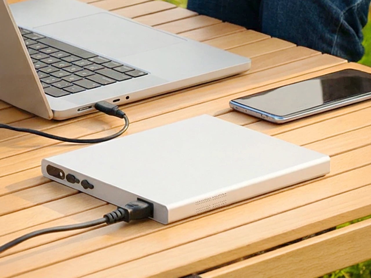
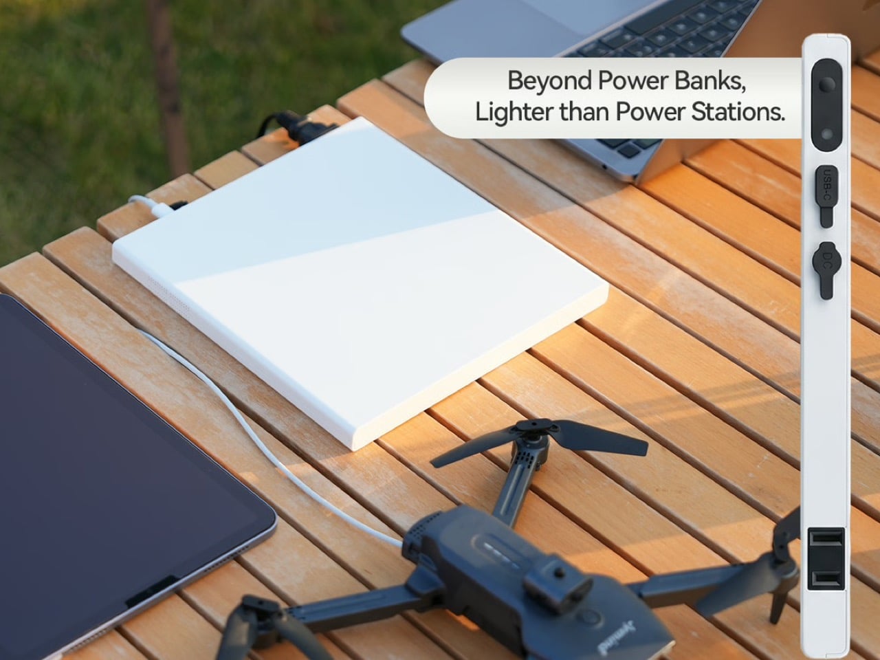
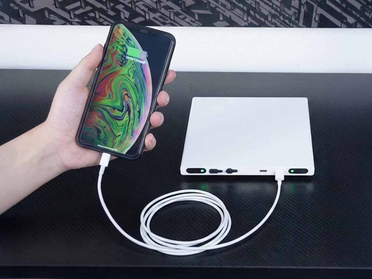
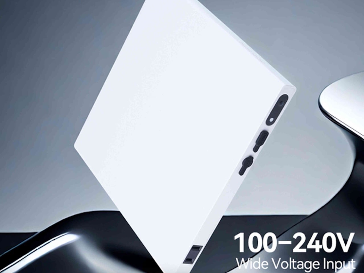
Digital nomads, field photographers, and mobile creatives share a common frustration: needing wall outlet power in places that don’t have walls. USB power banks handle phones and tablets, but cameras, projectors, and portable monitors still demand actual AC power. The world’s slimmest AC power bank exists because someone finally asked the right question: why do portable power stations look like car batteries instead of something you’d actually pack? The Noomdot N1 brings 70W of pure sine wave AC output to a device thin enough to slip into the laptop sleeve of a standard backpack.
At 16mm thick, it’s built around portability rather than maximum runtime. The semi-solid-state battery delivers approximately 40 minutes of continuous output at full 70W load, or several hours for lower-draw devices like LED lights or camera batteries. That’s not camping-weekend capacity, it’s designed for day trips, flights, and situations where outlets exist but aren’t convenient. The unit stays flight-safe under 100Wh limits, recharges in 90 minutes, and includes both USB-C PD output and pass-through charging. It’s live on Kickstarter at early pricing before the $259 retail launch.
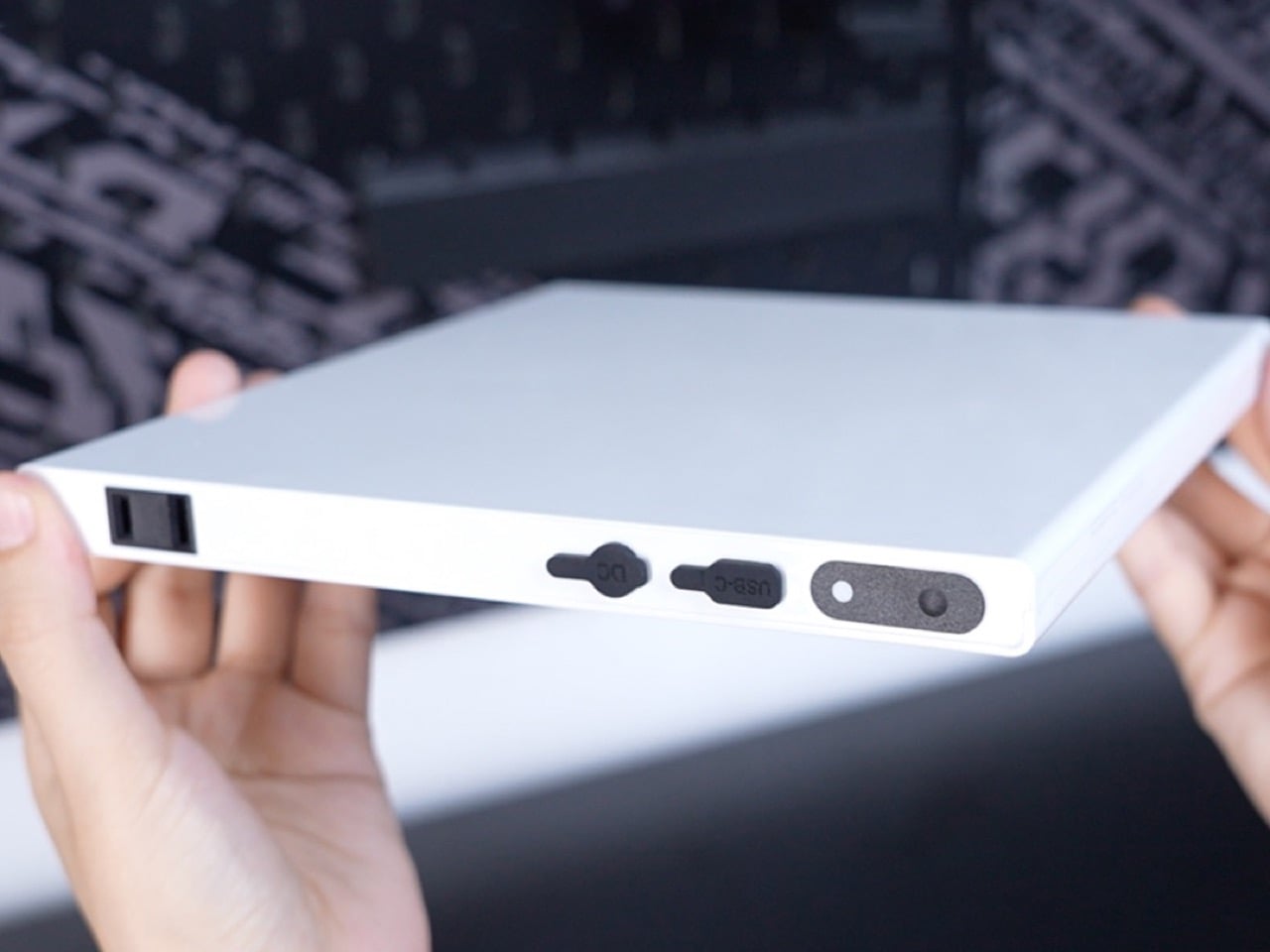
Years ago, a company called Memobottle had a brilliant, simple idea: since our bags are full of flat things like books and laptops, why are our water bottles round? The Noomdot N1 is the Memobottle of portable power, born from that same flash of spatial intelligence. It abandons the dense, pocket-bulging brick in favor of a slim slab of milled aluminum designed to slide into the forgotten spaces of a laptop sleeve or document pouch. This design is not an aesthetic choice; it is a fundamental understanding of the modern carry ecosystem. The N1 is engineered to be a good citizen in a world of flat devices, integrating seamlessly rather than demanding you build your bag around its awkward shape.
The use of a semi-solid-state battery is what enables this form factor without compromising on safety or longevity. While not a true solid-state cell, this hybrid chemistry significantly reduces the amount of volatile liquid electrolyte, leading to better thermal stability and a much slower rate of degradation. The claim of retaining 99% capacity after 100 full charge cycles is a direct benefit of this technology. For anyone who has felt the disappointment of a lithium-ion pack that barely holds a charge after a year, this focus on durability is a welcome and practical innovation. It reframes the device as a lasting piece of essential kit.
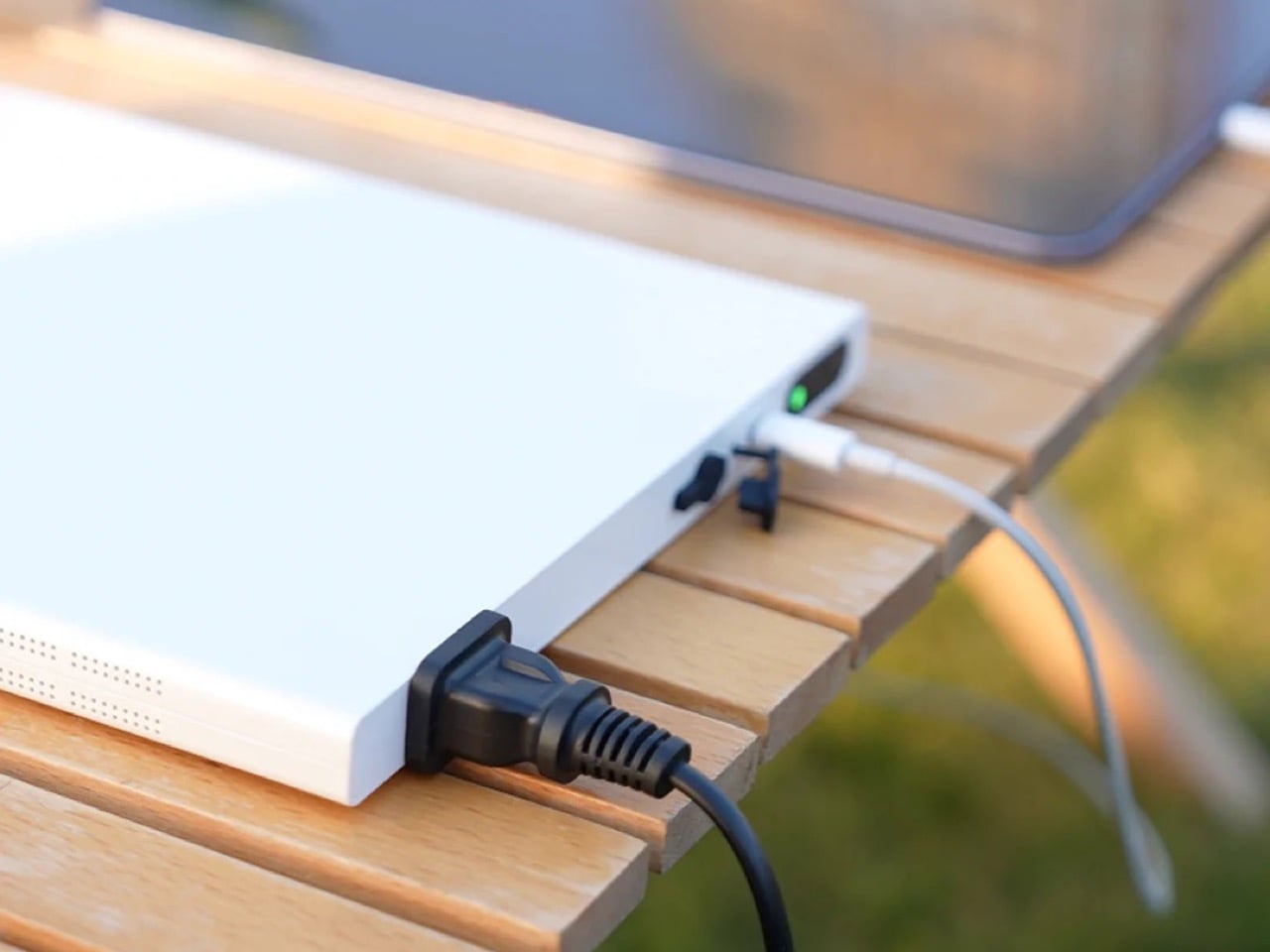
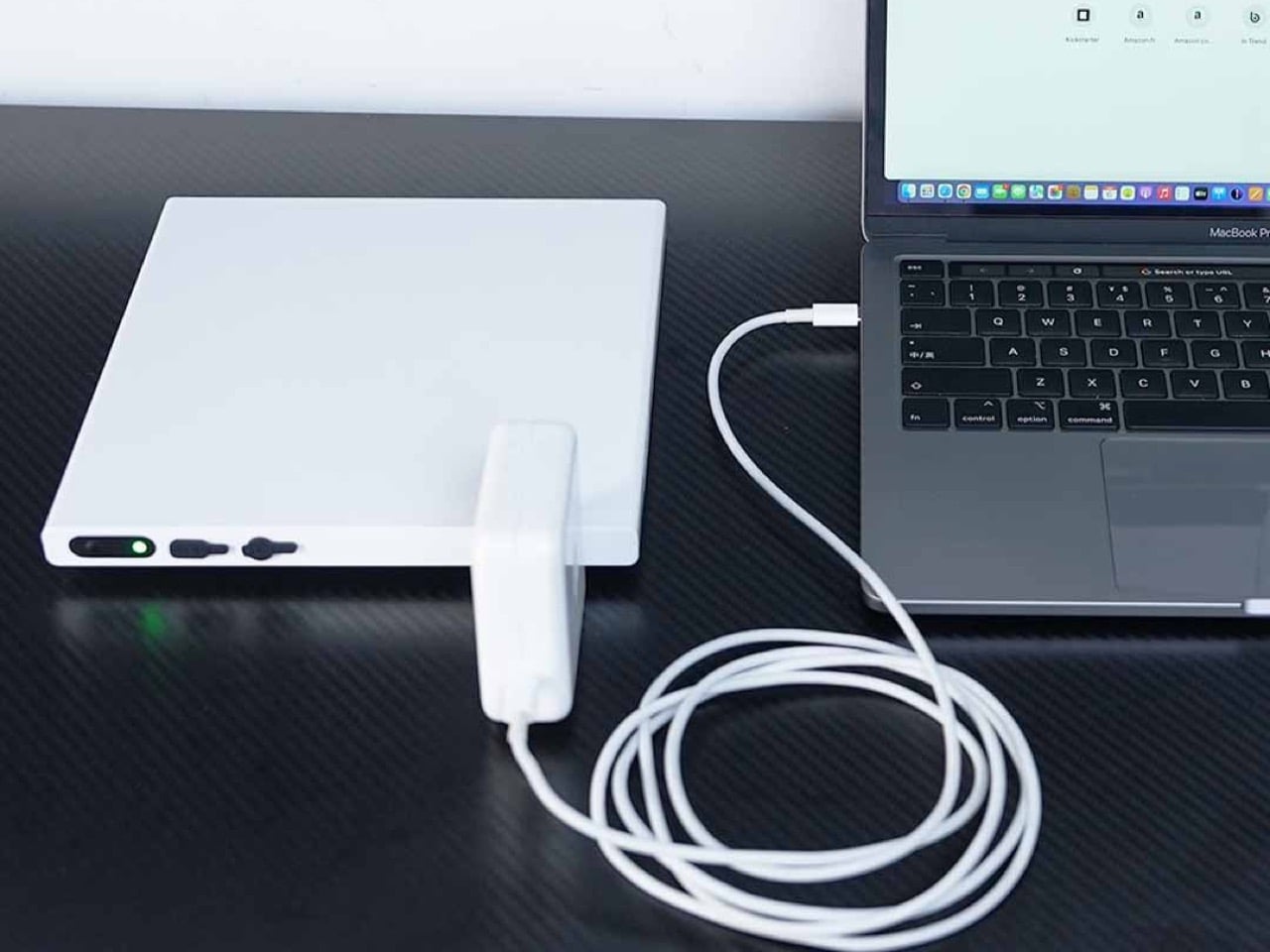
The main event is, of course, the 70W AC outlet. Its pure sine wave inverter is the kind of detail that professionals appreciate, ensuring clean, stable power that will not harm sensitive electronics. This is what separates it from cheaper, modified sine wave alternatives that can introduce electrical noise or even damage delicate circuits in cameras and audio gear. The inclusion of a 60W USB-C PD port is a nod to modern workflows, allowing it to charge a laptop directly or be slowly recharged itself. For a quick turnaround, the dedicated DC input remains king, refueling the entire 20,000mAh capacity in a scant 90 minutes.
Packing an inverter into a 16mm-thin chassis is a thermal challenge, and the N1 addresses this with a feature I’ve never seen in a power bank: an active cooling fan. An internal 6000 RPM fan kicks in during AC output to pull heat away from the core components, ensuring the device can sustain its peak performance without overheating. It is a pragmatic, if slightly brute-force, solution. The tradeoff is acoustics. While the fan is likely tuned to be as quiet as possible, it will not be silent… but that’s honestly a tiny price to pay for running a bunch of appliances or charging gadgets off a ‘wall-less power outlet’.
The N1 is a tool for a very specific mission: bridging the gap when AC power is needed for a short, critical period. It is for the wedding photographer who needs to juice up strobe batteries between the ceremony and reception. It is for the consultant who needs to run a projector for a 30-minute pitch in a conference room with no available outlets. Its 40-minute runtime at maximum load defines its purpose clearly. This is not an off-grid power solution for a weekend in the woods; it is a mobile professional’s get-out-of-jail-free card, ensuring a dead battery never becomes a single point of failure.
An IPX4 rating means it can shrug off a sudden rain shower, and passing a 1-meter drop test suggests it can survive being fumbled out of a backpack. These are not features one typically finds on power banks, and they speak to an understanding of the chaotic nature of travel and fieldwork. Combined with its TSA-friendly sub-100Wh capacity, the N1 is one of the few AC power sources truly designed from the ground up to leave the house and see the world, legally and safely.
You get to choose between two variants – 110V and 220V (depending on the country you live in and the rated voltage its appliances operate on). The Noomdot N1 ships along with a DC adapter for charging it, at a fairly discounted price of $169 ($90 less than its MSRP of $259). The device ships globally starting May 2026.