In a shipping container parked next to Macnica’s headquarters in Yokohama, an innovative revolution in Japanese agriculture is taking root. Inside the 40-foot steel box, 1,800 premium wasabi plants thrive under LED lights, nourished by circulating purified water and monitored by AI-powered sensors. This isn’t a futuristic concept. It’s a solution to a very real crisis threatening one of Japan’s most iconic flavors. Tokyo-based AgriTech startup NEXTAGE has partnered with global technology firm Macnica to develop the Wasabi Cultivation Module. This container-based plant factory allows wasabi to be grown anywhere in the world.
The innovation comes as Japan grapples with a growing wasabi shortage driven by multiple converging pressures. Climate change, declining agricultural workers, and the strict environmental demands of traditional cultivation have created a perfect storm for this notoriously temperamental crop. Wasabi has always required clean water, precise temperature control, and meticulous soil management. Traditionally grown in cool mountain streams, the plant is particularly vulnerable to typhoons and floods. Climate change has intensified these challenges, threatening the survival of historic wasabi farms that have operated for generations. Global demand continues to surge alongside the worldwide popularity of Japanese cuisine, but supply has struggled to keep pace.
The cultivation module addresses these vulnerabilities through total environmental control. Each container houses five-tiered shelves equipped with sophisticated systems, including air conditioning, dehumidifiers, LED lighting, water temperature controllers, and carbon dioxide management devices. Cameras and sensors throughout the container continuously monitor conditions, tracking everything from temperature fluctuations to door usage that might affect air circulation. This data feeds into an AI-powered remote monitoring system, allowing NEXTAGE experts to provide real-time cultivation guidance to operators who may have no prior farming experience. The technology packages decades of specialized knowledge into an accessible, turnkey solution.
Perhaps most impressive is the dramatic acceleration in harvest times. The module cultivates Matsuma Wasabi, a premium variety from Wakayama Prefecture that is highly prized in high-end restaurants for its balanced aroma, spiciness, sweetness, and distinctive flavor profile. In natural conditions, this exceptional variety requires 20 to 24 months to reach maturity. Inside the precisely controlled environment of the cultivation module, the time drops to approximately 10 months. This dramatic reduction doesn’t compromise quality but rather optimizes growth conditions that would be impossible to maintain consistently in traditional outdoor cultivation, where weather and seasonal variations create unavoidable challenges.
Macnica became the pioneering customer in December 2023, installing a module at its Shin-Yokohama headquarters as both a demonstration facility and agricultural innovation laboratory. The semiconductor and IT company brought substantial technical expertise to the partnership, contributing specialized knowledge in growth visualization systems, communication technology, and customized LED development specifically designed for plant cultivation. In January 2024, following months of refinement and testing, the two companies officially launched commercial sales of the modules to businesses and agricultural entrepreneurs. NEXTAGE founder Takuya Nakamura, who started the company after witnessing the devastation of traditional wasabi fields, secured Series A funding in October 2024 to accelerate development of the automated cultivation technology.
The vision extends far beyond Japan’s borders. NEXTAGE’s ambitious slogan, “bringing ALL JAPAN MADE plant cultivation technology to the world,” signals plans to export this innovation globally. For high-end sushi restaurants that have long depended on limited supplies of fresh wasabi, the implications are transformative. The day may soon come when chefs grate wasabi grown in a container just blocks away, preserving the pungent, complex flavors that define authentic Japanese cuisine while building resilience into a supply chain threatened by our changing climate.
Do I have a problem with Squidward? Fundamentally, no. Emotionally, maybe. He could be less of a buzzkill, but he’s truly a model neighbor and a great employee at Krusty Krabs. But do I have a problem with Squidward-themed Crocs? Overwhelmingly. I’m a Croc evangelist for life, but these footwear are so incredibly niche I wouldn’t want to be caught dead wearing them. At the same time, I want to be around people who wear then just for the opportunity to judge them!
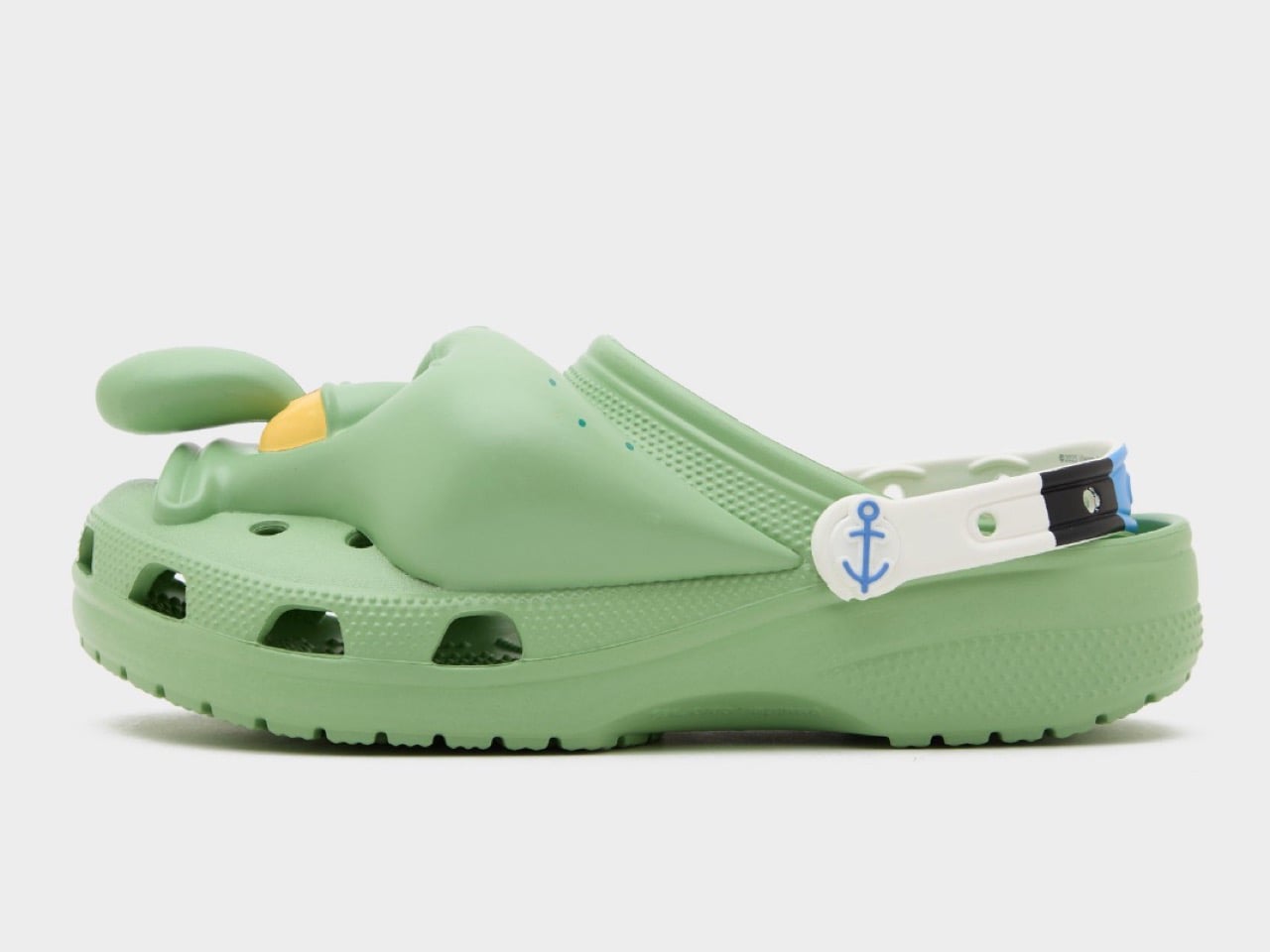
So, Crocs has been launching Spongebob-themed footwear to mark the launch of the latest movie, and while the company already unveiled Spongebob and Patrick-inspired clogs, they decided to keep the best (subjective, of course) drop for the absolute end. You see, the Spongebob and Patrick ones look fairly benign… but the Squidward clogs, dropped today, quite literally look like you’ve slipped your feet into a hole in Squidward’s skull. The details aren’t subtle at all. Each clog has an immaculate representation of Squidward’s face, with its skeptical stare and raised eyebrow, along with that nose only a mother can love.
Designer: Crocs
Let me reiterate. I love Spongebob as a franchise. I like Squidward as a character. But these shoes are, well, repellent to say the least. Don’t expect to score any ladies with these, but if you’re a diehard fan of the franchise, it’s entirely within your rights to collect these limited-edition pairs, and probably even wear them in support of the movie, which launches in May next year.
The entire croc is molded in the iconic Squidward pale green, with the strap being white and sporting an anchor symbol on the pivot-point. Available in unisex sizes, the shoes will officially hit the shelves on December 11th, with a price tag of $80. Am I talking smack about these shoes just so that I can convince enough people to NOT buy them so that I can get a shot at owning them? Probably, you’ll never know.
Also hitting the shelves tomorrow are the Spongebob and Patrick Star clogs, in their iconic colors and designs. The Spongebob one comes with arms on the shoes’ body, along with a belt running around the midsole to denote Spongebob’s iconic pants. The insole has Spongebob’s face printed on it, so the shoes look like him from the top. Similarly, even the Patrick Star ones come with Jibbitz that are typical to the starfish, like a rock, a minifigure of Patrick himself, a bottle of sunscreen, and a jar of mayo. The straps read Patrick’s famous lines ‘Is Mayonnaise An Instrument?’, and the midsole (like Spongebob) features the green and purple print from Patrick’s pants.
We knew Nothing was launching headphones this year, most of us imagined glyphs on them, but Nothing pulled a fast one by choosing a different design direction to stand out amongst a sea of headphones. Instead of the conventional circular or capsule-shaped cups, they unveiled rectangular headphones that took the world by surprise. A lot of us (me included) had reservations on the design, but if anything, the rectangular format was unique enough to really make an impact. The problem? I didn’t associate that design language with Nothing as a brand.
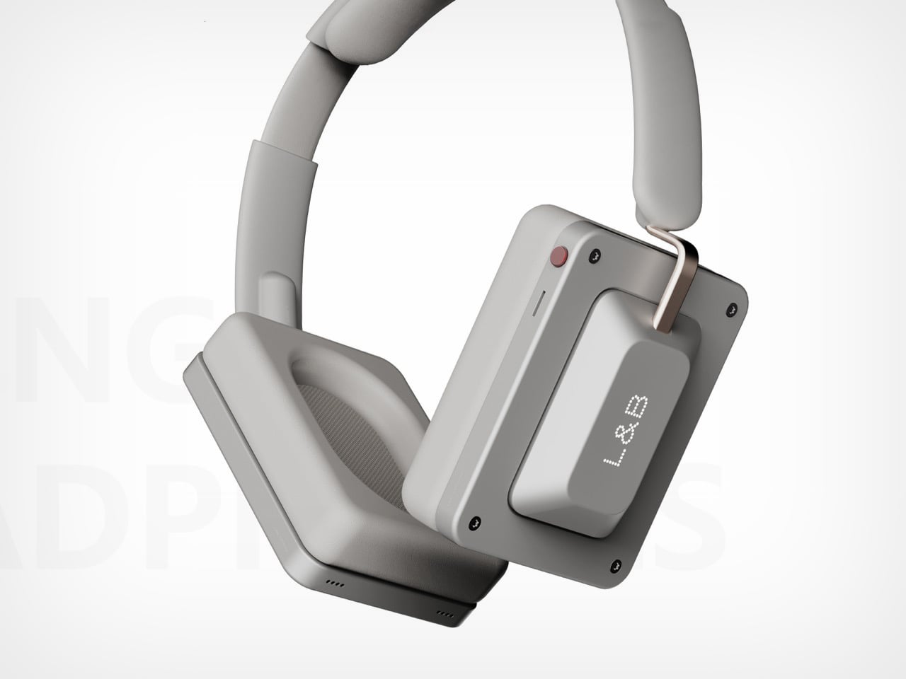
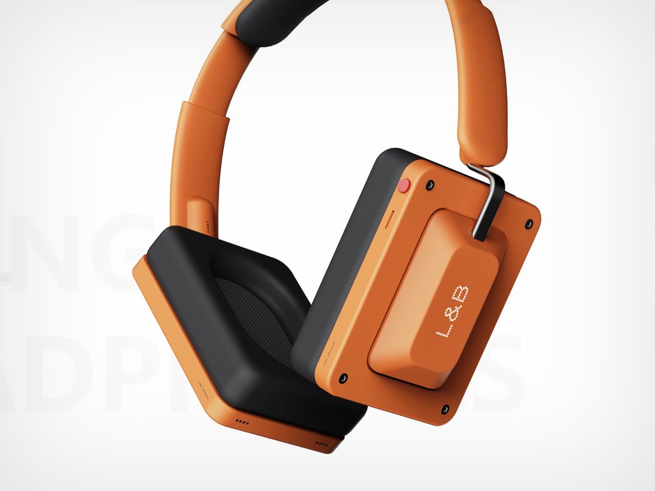
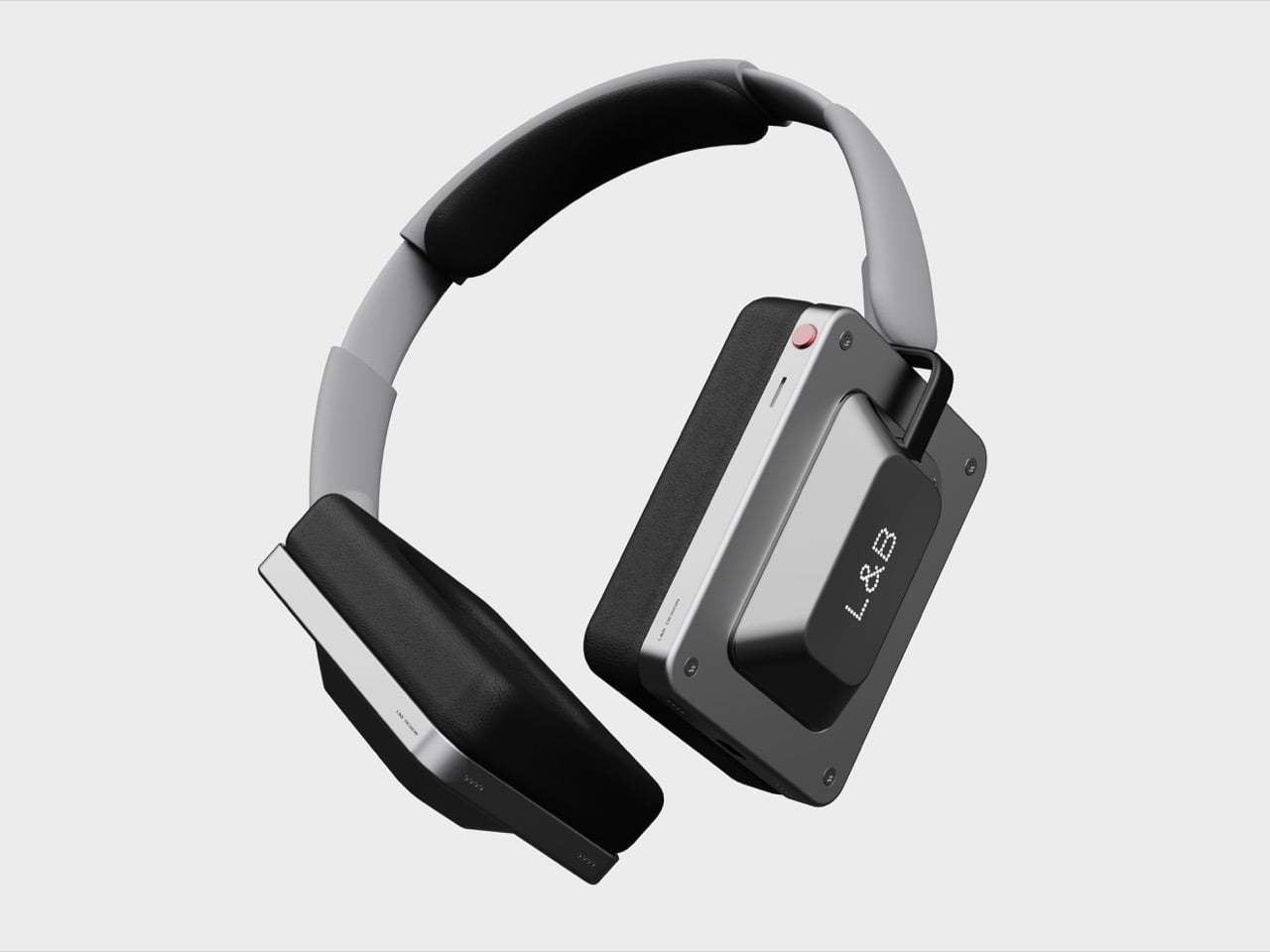
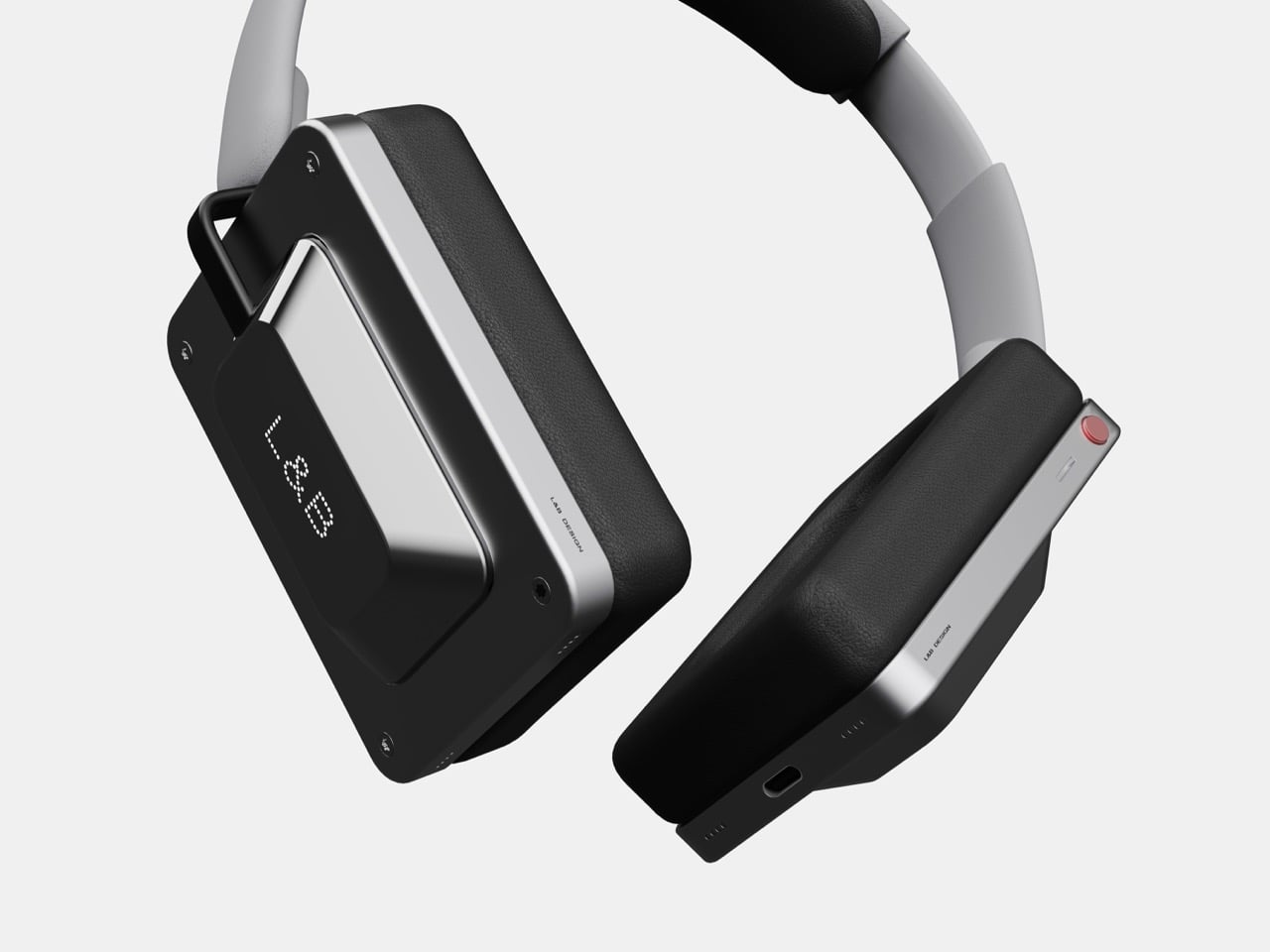
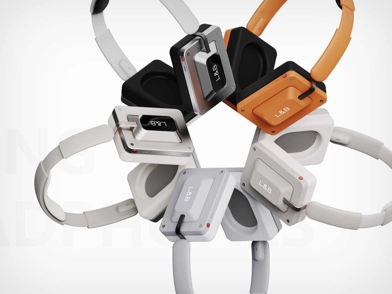
Now, if we’re designing headphones that are just meant to be different, these keycap-inspired headphones really take the cake. Designer Tougou Daciqeng calls it “Cross-border integration of tactile design and auditory technology”, which is just fancy designspeak for ‘we drew a parallel between two senses – touch, and sound’. The result is a pair of headphones that welcome your ears, but also your eyes and hands. That keycap-inspired can on the outside just begs your fingers to touch touch it, sometimes even attempt pressing it.
Designer: Tougou Daciqeng
The result is a fun design language that I don’t attribute to Nothing, but I definitely do to a brand like Teenage Engineering. Fun, funky designs, vibrant and subdued color options, and a silhouette that feels unmistakable. Teenage Engineering doesn’t lean into hyper-ergonomics, everything they make has this industrial, engineering-driven touch, resulting in very soft curves that often punctuate otherwise straight lines and geometric forms.
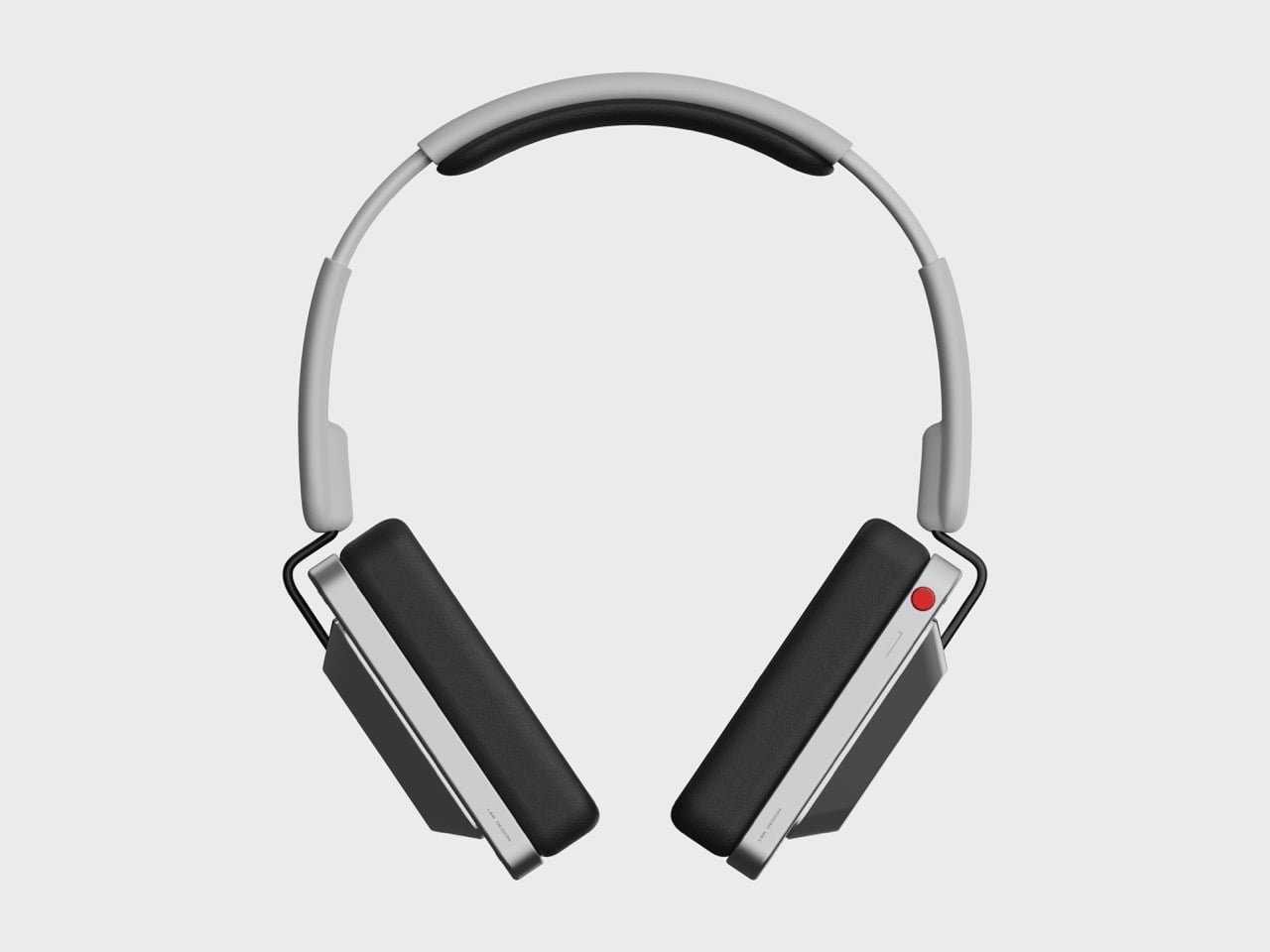
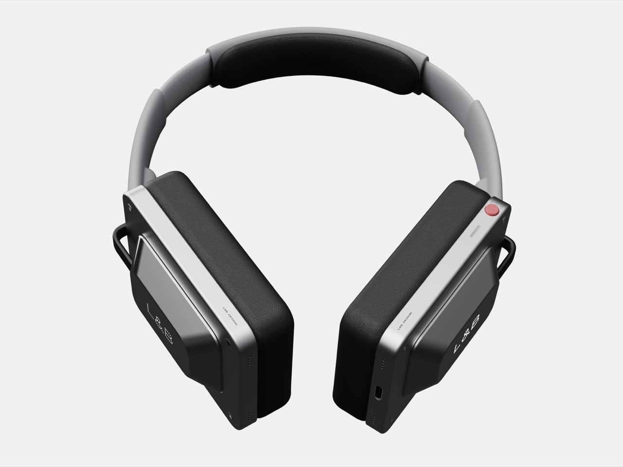
The beauty of such a pair of headphones lies in not its sound, but its appearance. Sure, sound is arguably the most important feature of a headphone, but what we’re looking at here is purely conceptual, so we’ve only got visuals to go by. To that end, the Keycap Headphones are a visual masterclass. They come with rectangular earcups, but the cutout is still elliptical, allowing them to fit around your ear snugly.
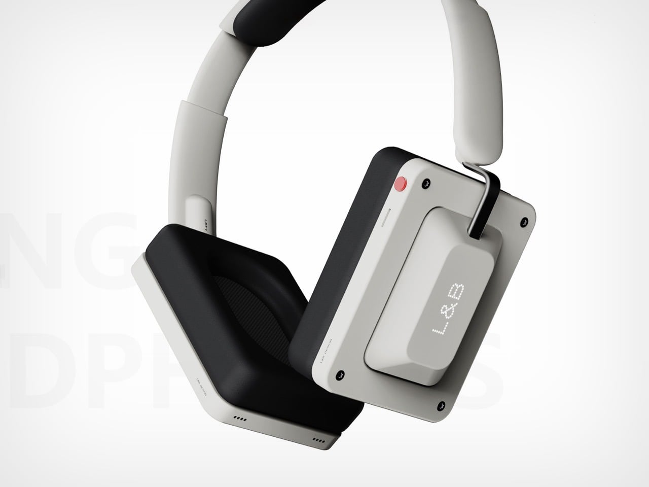
Everything else revolves around that key-shaped surface on the sides. Styled like a Cherry key (although a little different and a lot larger), this surface lets you control the playback through taps, swipes, etc. I’d have preferred a nice clicky key, but we work with what we’ve got. There’s one button on the top of the right earcup for powering on and off the earphones. Everything else can be done through the faux keys on the sides.
The designer definitely gets that a clicky key would be better than a touch surface, which is why they’ve built haptics into the earphones. Press the surface and a click plays through your ear, giving you a satisfactory sensory experience that affirms a key press. The rest of the headphones are fairly uncomplicated. A telescopic headband, a fairly repairable design thanks to exposed countersunk screws on the cans (for that industrial aesthetic), and USB-C charging on the bottom. The headphones come in 5 color variants too, including two metallic finishes, a retro off-white and a classic grey, and finally a fairly CMF-ish orange that’s definitely going to grab a few eyeballs.
A ring that does nothing but listen. In a category defined by biometric excess, the Pebble Index 01 arrives with radical minimalism: one button, one microphone, no display, no haptic motor, no health sensors whatsoever. Eric Migicovsky, the designer who created the original Pebble smartwatch before selling it to Fitbit, has returned with a device that treats subtraction as its primary design gesture. The result is a stainless steel band that costs $75 and exists for exactly one purpose: catching thoughts before they vanish.
The Form Language of Refusal
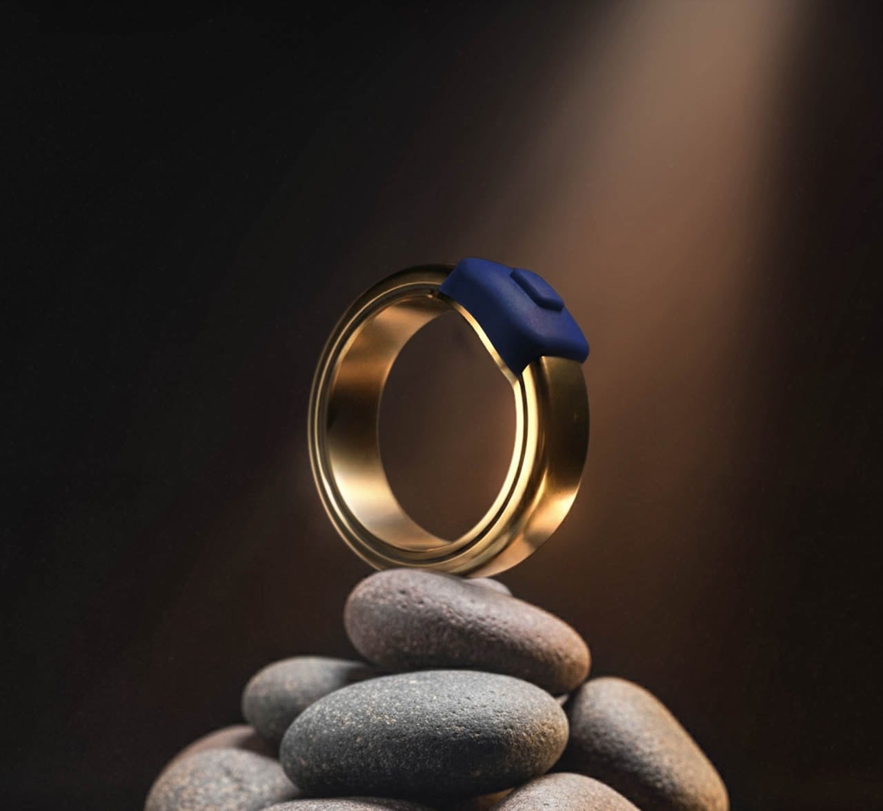
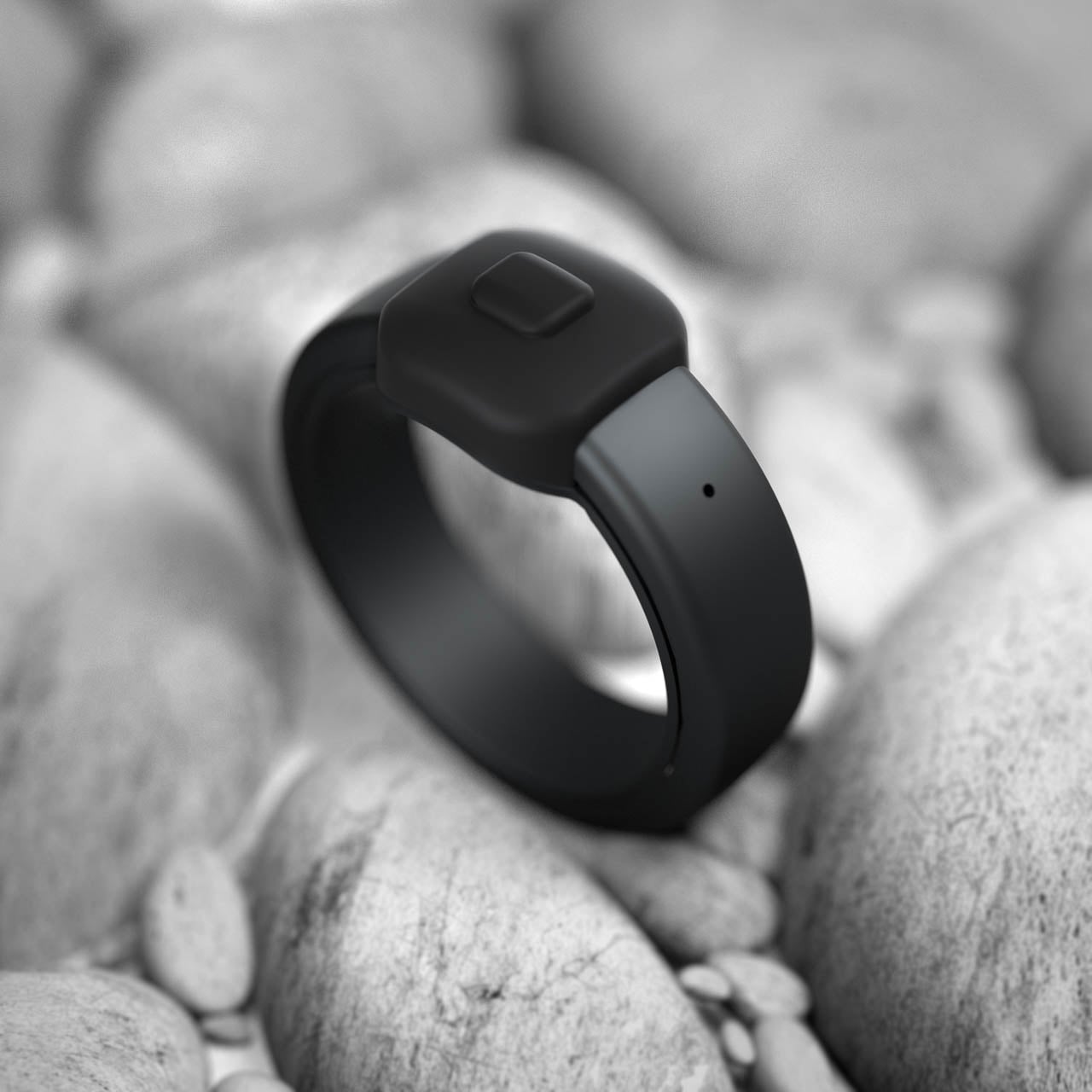
Where contemporary smart rings pile sensors beneath the surface, the Index 01 presents a deliberately quiet silhouette. The body arrives in stainless steel with three finish options: a matte black that absorbs light, a polished silver that catches it, and a polished gold that warms skin tones. Sizing spans from 6 to 13, covering the full range of adult finger dimensions. Submersion tolerance extends to one meter of depth, accommodating daily encounters with water but drawing the line at sustained swimming. A single tactile control rises slightly from the band surface, positioned where the thumb naturally falls during a closed fist. The metal arrives cool against skin, then gradually matches body temperature until the ring becomes thermally invisible.
This external button represents the entire interaction vocabulary. Press and hold to record. Single press for a customizable action. Double press for another. The tactile click either happens or it does not. Migicovsky designed this mechanical simplicity to eliminate the software failure states that plague capacitive touch surfaces. A button pressed is a button registered. The interaction model carries the directness of a light switch, with none of the ambiguity that haunts gesture-based interfaces where a swipe might be a scroll or a tap might be a hold.
Material Decisions and Lifecycle Architecture
The battery architecture reveals the sharpest design trade-off. The power source borrows from audiological medicine: silver oxide chemistry, the same electrochemical foundation that enables hearing aids to operate for extended periods without user intervention. Under typical usage patterns, this chemistry sustains the Index for roughly twenty-four months. The cells accept no recharge. When electrochemical capacity exhausts, the object transitions from functional tool to recyclable material, and the replacement cycle begins at the standard retail threshold.
Migicovsky frames this as liberation from charging infrastructure. No dock to pack for travel. No percentage to monitor across the day. No dead device at the moment of need. The battery simply works until it does not. Pebble accepts spent units for recycling, though the environmental calculus of disposable electronics remains uncomfortable regardless of end-of-life handling. The choice prioritizes reliability over sustainability, a trade-off that will resonate with users who have missed critical moments because a rechargeable device died at the wrong time.
Onboard storage accumulates voice data during periods of wireless disconnection. The device operates autonomously at the moment of capture, holding content until the paired phone returns to communication range. This independence from continuous connectivity means the critical instant of thought preservation never depends on signal strength. Total storage capacity approaches fourteen hours of compressed audio before the power source reaches depletion.
The component inventory reads like an exercise in restraint: a single mechanical switch, a voice-optimized transducer capable of cutting through ambient noise, and nothing else. The absence of a vibration motor removes one failure point. The absence of a screen removes another. The absence of haptic feedback removes a third. Migicovsky constructed this architecture around a singular reliability thesis: fewer components mean fewer opportunities for malfunction.
Privacy Embedded in Architecture
The conversion pipeline executes entirely within the paired phone’s processor. Voice becomes text through a speech recognition system distributed under open licensing. A secondary language model, also running locally, sorts each capture into categorical bins: reminder, timer, or unstructured thought. The data path terminates at the device boundary. No packet crosses to external infrastructure. No server receives the content. The application code itself lives in public repositories, enabling inspection of every function that touches the user’s recorded cognition.
This transparency represents a structural commitment rather than a policy promise. The architecture makes privacy violation technically difficult rather than merely prohibited. Over 100 languages receive support for transcription, and the app retains both raw audio and text transcription as a practical backup for moments when ambient noise garbles the speech-to-text conversion.
The Cognitive Friction of Remembering
Three months of prototype wear revealed Migicovsky’s personal rhythm: between ten and twenty capture events per day, most compressed into windows of three to six seconds. Micro-utterances preserved before cognitive decay erases them. The friction point he identifies sits between idea formation and idea preservation: the gap between thinking something and writing it down often exceeds the retention window of working memory. The ring attempts to close that gap by reducing the capture gesture to a thumb press.
No phone to extract from a pocket. No app to open. No interface to navigate. The ring lives on the finger, perpetually ready, requiring only mechanical activation. Recording duration extends to five minutes for longer thoughts, though Migicovsky’s own usage suggests most captures are momentary. This design philosophy treats the human mind as the bottleneck rather than the technology. The device does not attempt to augment cognition. It simply catches output before it disappears into the noise of the next distraction.
The absence of a display removes the temptation to glance. No notifications pull attention away from the present moment. The ring offers no visual feedback during recording, only the physical sensation of the button depression and the knowledge that somewhere inside, a microphone is capturing sound. This sensory reduction forces trust in the device rather than verification of it.
Market Position Through Aggressive Restraint
The market already contains an alternative philosophy. Sandbar’s Stream Ring arrives at a quarter-thousand-dollar entry point, layers a subscription model at ten dollars per month for full functionality, and frames itself as a conversational AI presence worn on the hand. Delivery timelines stretch into the following summer. The Index inverts every variable: seventy-five dollars during the preorder window, ninety-nine after the March 2026 ship date, zero recurring fees, complete feature access from activation.
The value proposition rests entirely on whether memory capture alone justifies a ring on the hand. For users who want biometric tracking, the Index offers nothing. For users who want AI interaction, the device provides only a side door accessed through a specific gesture, and Migicovsky admits this feature will not work consistently. The honesty is refreshing in a category saturated with overpromise.
The organization behind the Index operates with five employees and no external capital. Migicovsky constructed this structure deliberately after the original Pebble trajectory concluded with a Fitbit acquisition that generated minimal founder returns. The Index embodies an opposing growth philosophy: constrained scale, margin sustainability from the first unit sold, price points accessible without the pressure of venture expectations demanding hyperbolic expansion curves.
Designing for Disappearance
The Index 01 succeeds or fails based on its ability to vanish from conscious attention. A health-tracking ring demands engagement: it provides data that requires interpretation. The Index asks only to be worn and pressed. The interaction surface shrinks to a single gesture repeated throughout the day.
Whether this reduction represents design clarity or feature poverty depends entirely on the user’s relationship with their own thoughts. Some people remember what matters. Others watch ideas dissolve before they can act on them. For the second group, the Index offers external memory that requires no charging ritual, no subscription fee, and no data uploaded to distant servers. The stainless steel band catches light. The button waits under the thumb. Somewhere inside, a microphone stands ready. The design statement is the emptiness itself: a ring that does almost nothing, executing that nothing with perfect reliability.
Most architecture, even the wildest parametric forms, is fixed the day it opens and stays that way until it is renovated or demolished. Michael Jantzen points out that exciting spaces are often “fixed in time” while people’s needs and desires keep shifting. The Malleable Space Pavilion is a small, clear argument for buildings that can change as easily as furniture, where space becomes something you can push, pull, and rewrite whenever you want.
The Malleable Space Pavilion is an experimental interactive structure made from a very simple kit of parts. Two tall gray support columns anchor the design, and 192 white horizontal elements, 96 per side, are mounted on tracks between them. In the default state, they form two opposing blocks with a narrow canyon between them, a calm, almost minimalist object sitting in a field that reads more like land art than a building you can enter.
Every white element can slide in and out independently, letting visitors pull pieces to create steps, ledges, and overhangs. Jantzen describes configurations ranging from symmetrical simplicity to chaotic complexity, and the same hardware can read as a tunnel, a grotto, or a solid bar depending on how far the elements are extended. Space is literally carved out of the blocks in real time, turning a static object into a responsive spatial machine.
One moment, you walk into a symmetrical canyon with terraced walls and a rectangular skylight, the next you find yourself in a jagged, pixelated chamber where light leaks through irregular gaps. The elements double as benches and low roofs, so you can pull out a seat or shade with the same gesture. The pavilion becomes a place to sit, play, and experiment rather than just pass through, with every configuration suggesting new ways to occupy the same footprint.
Pushing and pulling the elements is performative; visitors become visible agents of change. The stepped profiles feel like editing a low-resolution 3D model, but at a human scale and with your hands instead of a mouse. The pavilion records those actions as a temporary composition, so every group leaves behind a different spatial drawing until someone else comes along and rewrites it, turning the structure into a constantly evolving collaboration between architect and occupants.
Jantzen believes that a more advanced architecture is one that can be changed in time, and this pavilion sits within his series of transformable structures. Questions remain about full-scale mechanics, durability, and accessibility, but the value here is conceptual clarity. The project makes adaptability tangible and playful, turning a big conversation about flexible buildings into something you can push, pull, and sit on, rather than leaving it abstract and theoretical.
The Malleable Space Pavilion treats architecture less like a finished sculpture and more like an instrument waiting to be played. Instead of a single author deciding what the space should be, every visitor gets to compose their own version for a while. For a design culture used to talking about responsive environments in abstract terms, there is something refreshing about a pavilion that simply hands you the handles and lets you reshape it yourself, making change the default rather than the exception.
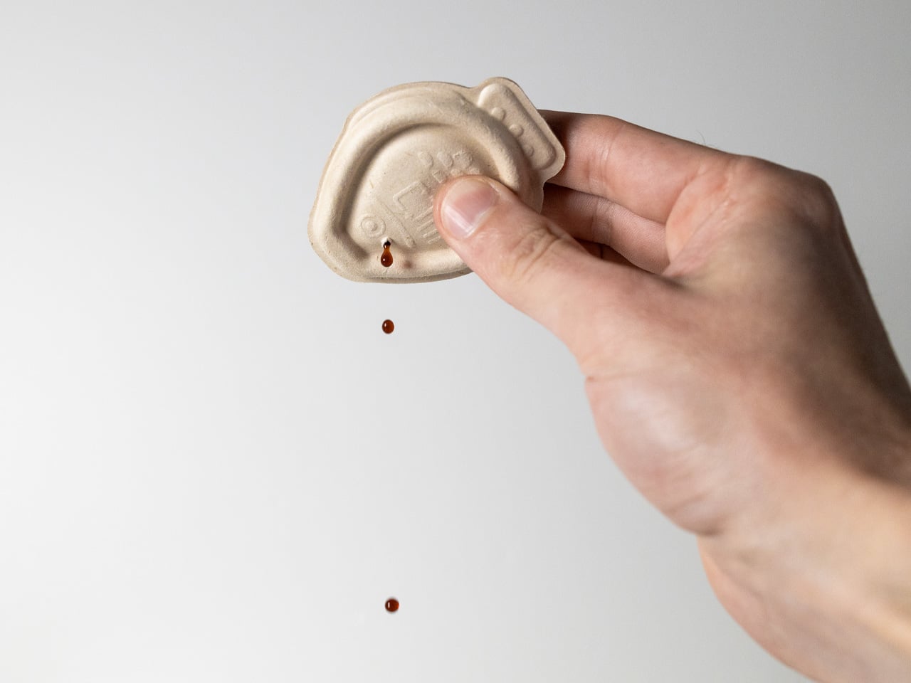
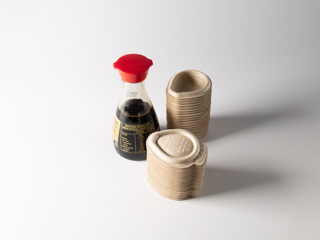
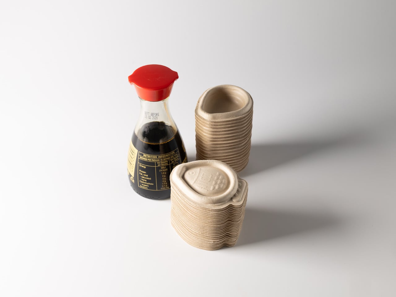
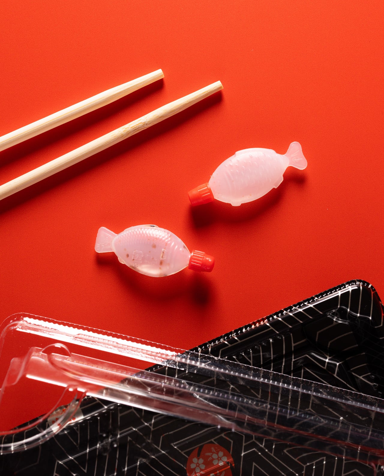
As someone who can demolish a sushi platter in minutes, I’ve always felt a pang of guilt watching those tiny plastic fish pile up on my plate. Sustainable design studio Heliograf clearly felt the same way. After five years of development, they’ve launched Holy Carp!, the world’s first home compostable soy sauce dropper that doesn’t make you choose between convenience and conscience.
The Australian team initially drew attention to this plastic problem through their brilliant Light Soy lamps made from recycled ocean-bound plastic. But they didn’t stop there. With South Australia banning those beloved little fish and other states following suit, Heliograf knew they had to create something that worked just as well. Consider this: since 1950, we’ve used between 8 and 12 billion soy fish. Each one serves us for maybe three minutes before hanging around for centuries.
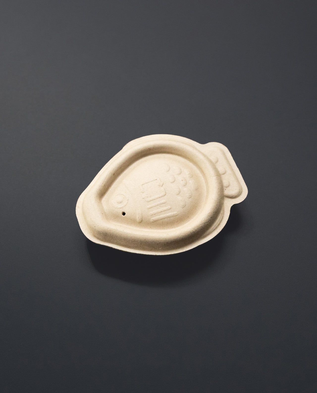
Here’s where it gets clever. Holy Carp! droppers are made from bagasse pulp—basically sugarcane waste that would otherwise be thrown away. The genius part is that these decompose in your compost bin within 4-6 weeks, not 400 years. Plus, restaurants fill them fresh instead of getting pre-filled plastic ones shipped from who-knows-where, meaning fresher soy sauce for your salmon rolls.
Working with Vert Design and actual sushi restaurants (people who understand the stakes), Heliograf kept that perfect fish shape we all love while fixing the obvious problems. The 12mL container is deliberately bigger than those frustratingly tiny plastic ones because, let’s be honest, who hasn’t grabbed three or four at once? The designers watched people do exactly that, creating even more waste.
Plant Pulp Expertise Meets Ocean Impact
What I love about this story is how Heliograf used knowledge from their existing lamp packaging to crack this problem. Sometimes the best solutions come from your own backyard—literally, in this case, since their lamps already use plastic-free packaging. The droppers hold soy sauce safely for 48 hours and won’t leak all over your takeaway bag.
“It’s a small change, but we truly believe every drop matters,” says co-founder Angus Ware. “We wanted to show that we can still create moments of joy when being sustainable.” Since 2020, their cleanup efforts have removed over 32 tonnes of plastic—equivalent to 32 million soy fish.
Available Soon for Early Adopters
The numbers are staggering: 40% of plastic waste comes from packaging, with nearly 855 billion single-use sachets used annually. For those of us who can’t imagine sushi without that perfect little fish, Holy Carp! offers guilt-free indulgence. Restaurants can register at heliograf.com/holycarp for early access. Finally, we can enjoy our California rolls without contributing to microplastic soup in our oceans.
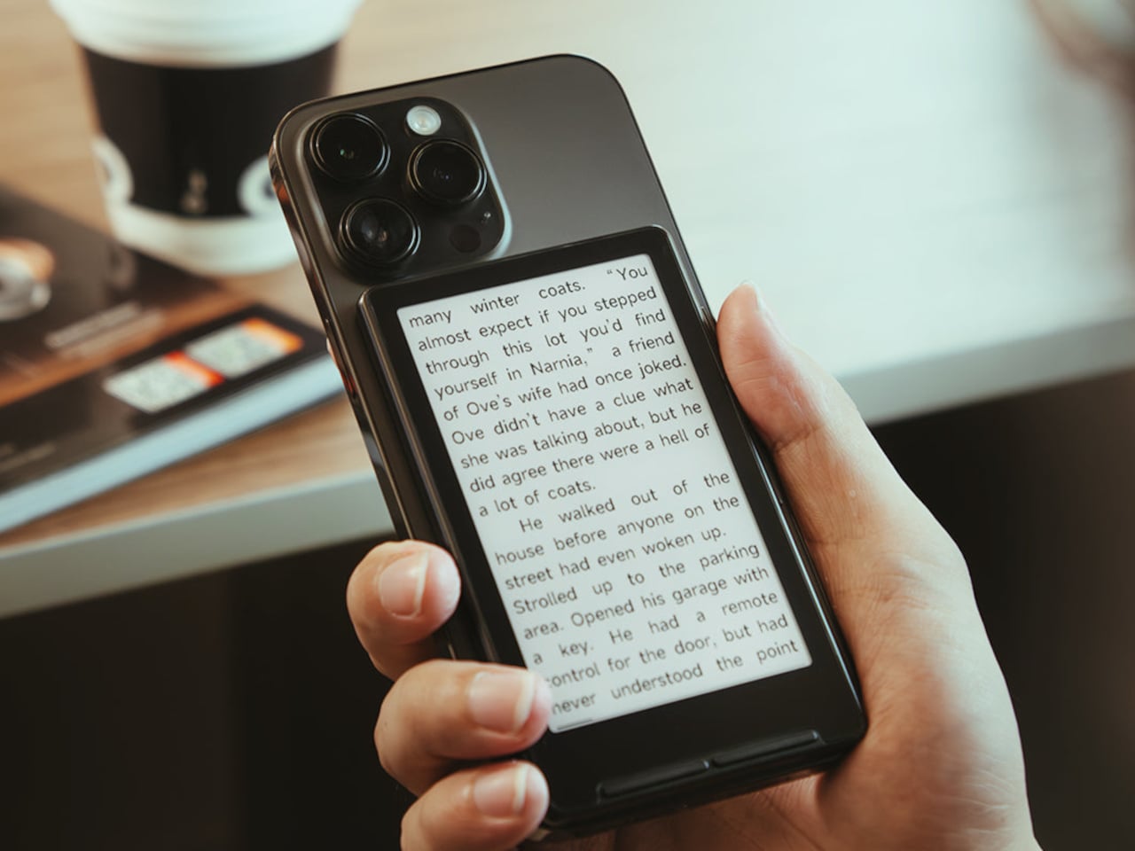
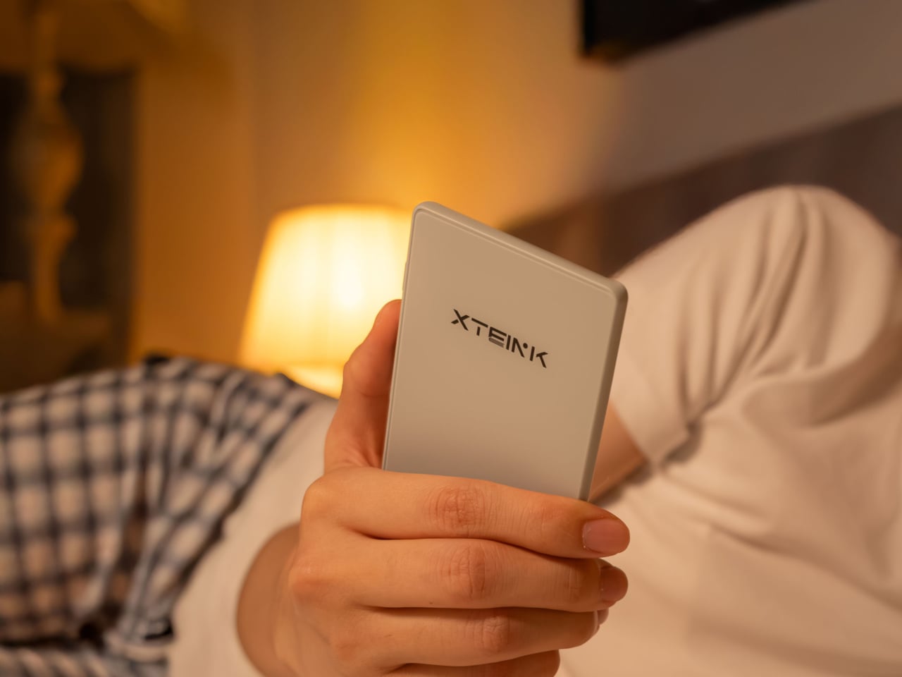
You buy a Kindle or Kobo, load it with books, then leave it on a nightstand while your phone follows you everywhere. Reading apps on phones compete with notifications and social feeds, so you end up doomscrolling instead of finishing that novel you downloaded. Xteink’s X4 tries to solve that by becoming a tiny, magnetic e‑ink sidekick that literally rides on the back of your phone, going wherever it goes.
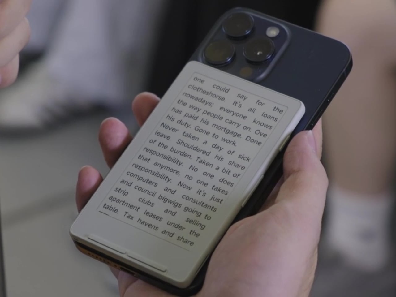
The Xteink X4 is an ultra-thin magnetic back eReader with a 4.3-inch e‑ink screen and a footprint closer to a deck of cards than a tablet. At 114 by 69 by 5.9 millimeters and just 74 grams, it snaps onto MagSafe or Qi2 compatible phones, or onto any handset using the included adhesive magnetic ring, turning your phone into a dual-screen reading machine without much extra bulk.
The 220 ppi e‑ink display is not as sharp as a Paperwhite, but it is perfectly fine for text at this size. There is no touchscreen and no frontlight, just physical page turn buttons and a power key, so it behaves more like a tiny paperback than a gadget. You need ambient light to read, but in return, you get a very focused, distraction-free surface that does not glow or buzz at you.
The internals are minimal: an ESP32 processor, 128 megabytes of RAM, and a bundled 32GB microSD card with support up to 512GB. The 650mAh battery lasts up to fourteen days with one to three hours of reading per day. It charges over USB-C and connects via 2.4GHz Wi‑Fi and Bluetooth for file transfers, so you can grab books wirelessly or just swap the microSD card.
The X4 only supports EPUB and TXT for documents, plus JPG and BMP for images, and does not run third-party apps or connect to any bookstore. You sideload everything, either over Wi‑Fi or by copying files to the card. For people tied to Kindle or Google Play, this is a hurdle, but for readers with DRM-free libraries, it feels refreshingly simple and vendor-neutral, just you and your files.
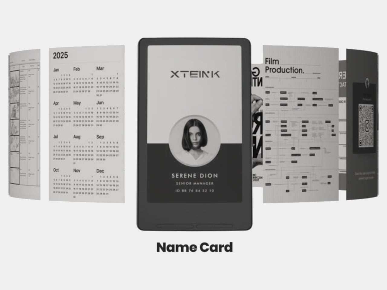
Xteink markets it as “More Than a Reader,” suggesting you use the X4 as a digital business card, a tiny calendar, a film production workflow board, or a reference screen for notes and checklists. Because it displays static images and text, it doubles as a little always-on panel you can stick to a monitor, fridge, or phone, not just a book page. The magnetic back makes those experiments feel natural and reversible.
The X4 is really for minimalists, tinkerers, and people who like the idea of a dedicated reading screen that goes everywhere their phone does. It is quirky, with no light, no touch, and no store, but those constraints are the point. It is a tiny reminder to read instead of scroll, thin enough to forget until you need a page instead of a feed, and cheap enough at $69 that the experiment feels worth trying even if you already own a proper eReader gathering dust at home.
Generic wireless earbuds arrive in identical white plastic shells with forgettable names and indistinguishable sound profiles. Smart speakers reduce albums to voice commands and invisible algorithms. Mass-produced audio gear does the job, but it does nothing for the soul. The following collection rejects that sameness entirely. These seven designs treat sound as something worth seeing, touching, and displaying. They transform listening from background noise into intentional ritual, proving that audio equipment can spark conversation, elevate spaces, and reconnect us with the physical pleasure of music.
Each piece here champions visibility over invisibility. Whether through kinetic wooden tiles that dance with your vinyl, transparent frames that showcase spinning CDs, or cassette-shaped speakers that resurrect mixtape culture, these gifts refuse to disappear into pockets and smart home ecosystems. They’re designed for people who curate rather than consume, who value craftsmanship over convenience, and who believe technology should enhance spaces rather than colonize them. For anyone exhausted by tech that looks and feels like everything else, these selections offer genuine alternatives.
1. Orbit Kinetic Turntable
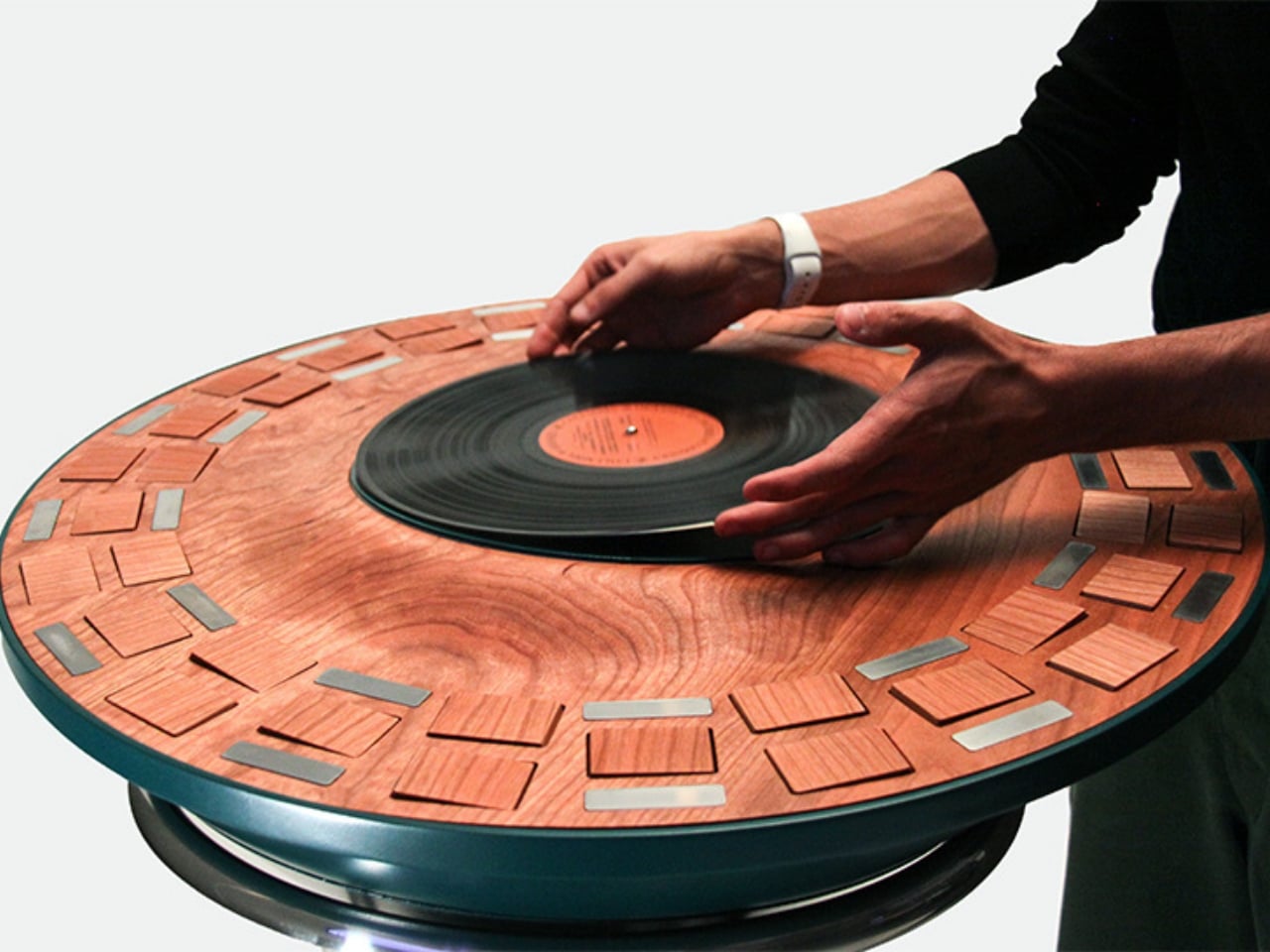
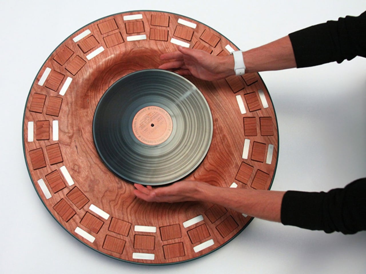
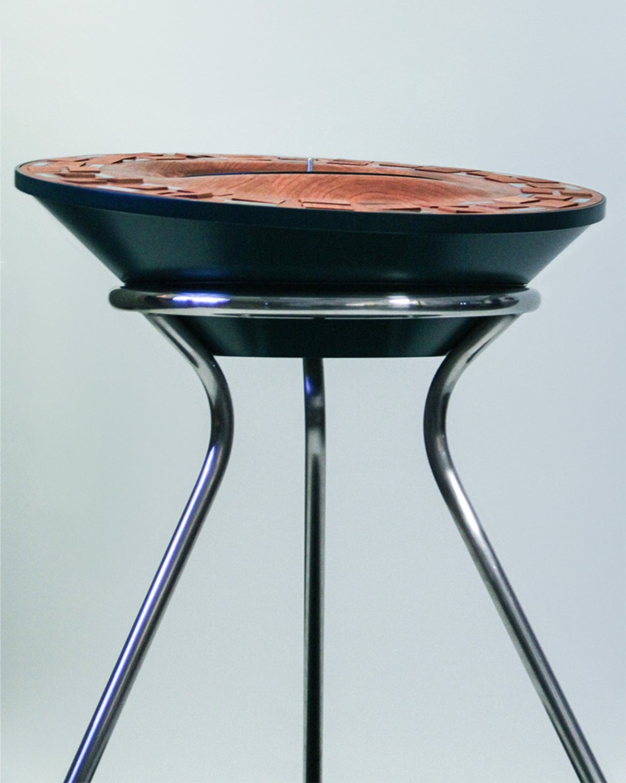
Lillian Brown’s Orbit Kinetic Turntable makes music visible. Thirty-nine handcrafted wooden tiles surround the record platter in concentric circles, flipping and rotating as your album plays. Every bassline triggers motion. Every cymbal crash shifts the pattern. What started as Brown’s senior thesis at the Savannah College of Art and Design became a sculptural performance piece that translates sound waves into physical movement. The tiles respond to frequency and amplitude, creating hypnotic displays unique to whatever you’re spinning.
This isn’t gear that fades into the background. Friends will gather around this turntable to watch music unfold, seeing frequencies become choreographed motion. The wood construction fits contemporary interiors while bridging generations—showing younger listeners that sound once demanded full attention. Brown created something between a turntable and a kinetic sculpture, resurrecting the ritual of intentional listening. It proves music’s physical dimension extends beyond grooves pressed into wax. For collectors ready to showcase vinyl as living art, this is it.
What we like
The handcrafted wooden tiles create mesmerizing visual patterns synchronized to your music’s actual frequency and amplitude.
The kinetic sculpture element transforms passive listening into an active sensory experience worth gathering around.
What we dislike
Availability remains uncertain as the design may still be in concept or a limited production phase.
The complex mechanical system likely requires more maintenance than standard plug-and-play turntables.
2. Portable CD Cover Player
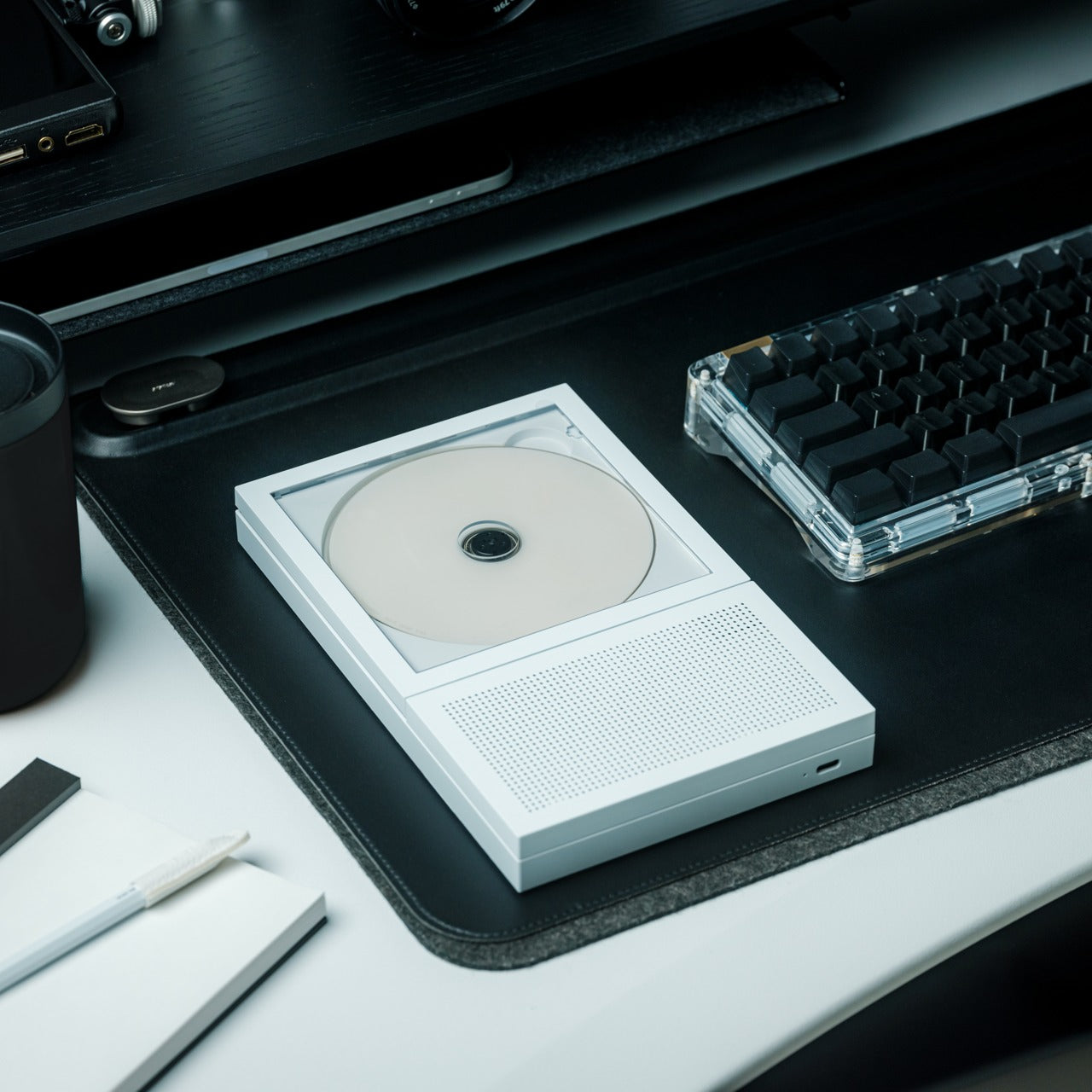
The Portable CD Cover Player brings album artwork back from digital exile. A transparent pocket displays your CD jacket prominently while the disc spins behind it. Built-in dual stereo speakers mean no external equipment, while the rechargeable battery lets you mount it anywhere—kitchen walls, bedroom shelves, wherever. It’s for people who kept their CD collections when everyone said physical media was dead. Who remembers studying liner notes and album photography instead of scrolling past thumbnail images?
You can rotate it between rooms or bring it to gatherings where tangible music matters. The minimalist design keeps focus on your collection rather than technology. Streaming services show cover art optimized for phone screens. This player presents it at the proper scale where typography and photography get the prominence the artists intended. It suits anyone rebuilding relationships with albums they once owned, anyone tired of faceless playlists. Physical formats offer something algorithms can’t replicate—the complete artistic statement combining sound, image, and object.
The transparent jacket pocket prominently displays album artwork at the proper scale, where design details become visible.
Wall-mounting capability combined with built-in speakers and a rechargeable battery provides genuine placement flexibility without wire management struggles.
What we dislike
The price point may feel substantial for those with extensive CD libraries expecting to use the player daily across their entire collection.
Built-in speaker sound quality likely cannot match dedicated external audio systems preferred by serious audiophiles.
3. ClearFrame CD Player
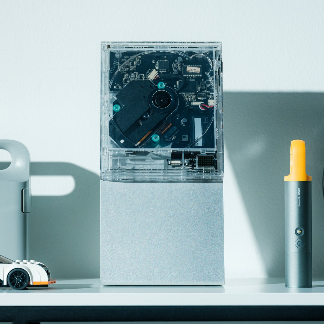
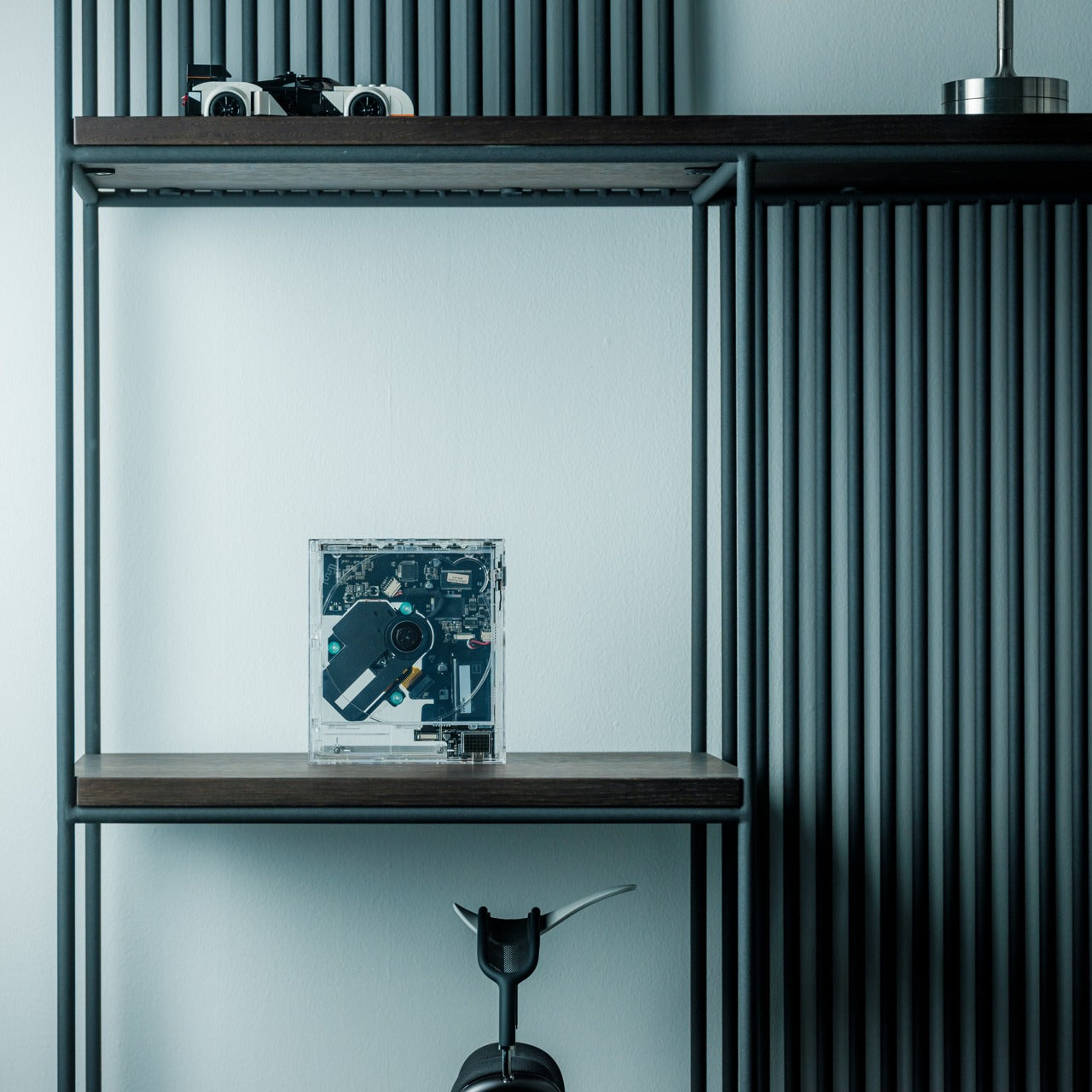
ClearFrame strips away every opaque surface to expose what’s usually hidden. Crystal-clear polycarbonate reveals spinning discs, visible circuitry, and mechanical processes typically concealed behind plastic shells. Black circuit boards become part of the aesthetic rather than hidden components. The design philosophy is simple—technology shouldn’t hide its engineering. Bluetooth connectivity, seven to eight hours of battery, and multiple outputs balance vintage format with modern convenience. Position it on desks, mount it to walls, or prop it on shelves where it catches light.
The transparency transforms electronics into a conversation-starting sculpture for minimalist spaces. Three playback modes paired with one-touch controls make operation intuitive despite visual complexity. Built-in shock protection handles standard CDs, mini discs, and MP3 formats. It works for people who view possessions as curated statements, who want technology that enhances spaces rather than clutters them. The visible mechanics remind you that playback involves real physical processes. Each session feels more intentional than streaming’s invisible delivery. For anyone reconnecting with albums they meant to revisit, this frames them beautifully.
The fully transparent acrylic construction showcases internal components and spinning discs, turning consumer electronics into a visible kinetic sculpture.
Multiple placement options, including optional wall mounting and a desk stand, offer versatile display configurations for varied interior aesthetics.
What we dislike
The exposed circuitry and transparent surfaces collect dust and fingerprints more readily than enclosed traditional players.
Maintaining the pristine, transparent aesthetic requires frequent cleaning to prevent smudges from diminishing the visual impact.
4. Side A Cassette Speaker
Side A Cassette Speaker looks exactly like a mixtape from 1985. Transparent shell, Side A label, authentic dimensions—then you realize it’s hiding Bluetooth 5.3, microSD playback, and six-hour battery life beneath that analog disguise. At just 80 grams with its clear case, it slips into pockets for music anywhere while delivering warm sound tuned to echo tape-era audio. The included case doubles as a display stand, transforming portable audio into shelf decoration that broadcasts your retro credentials.
This design resurrects the emotional weight mixtapes once carried. Modern playlists offer infinite choice but lack the physical presence and intentional curation that cassettes demanded. Creating a tape meant selecting every track with purpose. Giving someone a mixtape meant something. The microSD support enables offline listening without Wi-Fi dependency, while Bluetooth bridges analog aesthetics with contemporary devices. It suits people who appreciate character in their audio gear, who value objects that tell stories beyond specifications, who find joy in designs that refuse sameness.
The faithful cassette styling with transparent shell and authentic labeling creates immediate nostalgic recognition while hiding modern Bluetooth technology.
The included clear case transforms into a hands-free display stand, elevating portable audio into shelf-worthy decoration.
What we dislike
The compact size inherently limits sound quality and volume compared to larger dedicated speakers.
The nostalgic aesthetic may not resonate with younger recipients who lack personal memories of cassette culture.
5. Battery-Free Amplifying iSpeakers
Battery-Free Amplifying iSpeakers need nothing. No electricity, no batteries, no charging cables. Crafted from aerospace-grade Duralumin metal using golden ratio proportions, this passive amplifier channels your smartphone’s sound through acoustic chambers that fill rooms. Slot your phone into the metal frame and watch vibration-resistant construction transform tinny device speakers into genuine audio using pure physics. The minimalist metal sculpture enhances desk aesthetics while remaining portable enough to carry anywhere outlets don’t exist.
This philosophy rejects planned obsolescence entirely. Nothing to charge, sync, or update. The Duralumin construction offers durability like vinyl records once provided—objects built for decades, not seasons. Optional Bloom and Jet mods allow sound direction control. It suits minimalists exhausted by tech demanding constant feeding, environmentalists seeking sustainable alternatives to disposable Bluetooth speakers, and anyone appreciating elegant solutions. The visible craftsmanship makes a statement about valuing quality over connectivity. While Bluetooth speakers race toward feature bloat, these iSpeakers prove the best technology is sometimes no technology—just intelligent design exploiting acoustic principles.
The completely battery-free passive amplification eliminates charging anxiety and planned obsolescence inherent in electronic speakers.
Aerospace-grade Duralumin construction designed using golden ratio principles provides both acoustic performance and lasting sculptural desk presence.
What we dislike
Acoustic amplification cannot match the volume and sound quality of powered Bluetooth speakers in larger spaces.
Compatibility depends on phone size and case thickness, potentially limiting use with certain devices or protective cases.
6. RetroWave 7-in-1 Radio
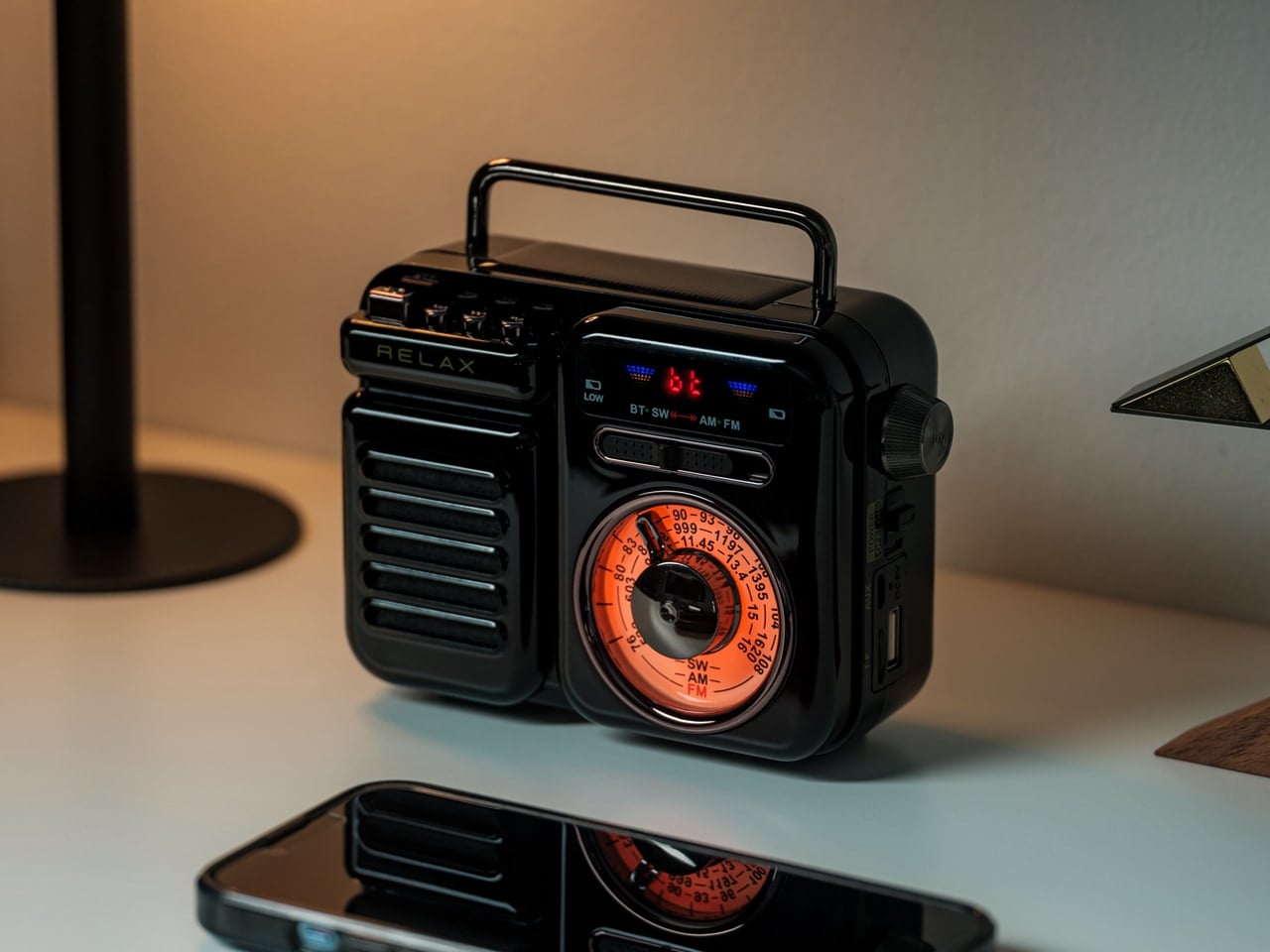
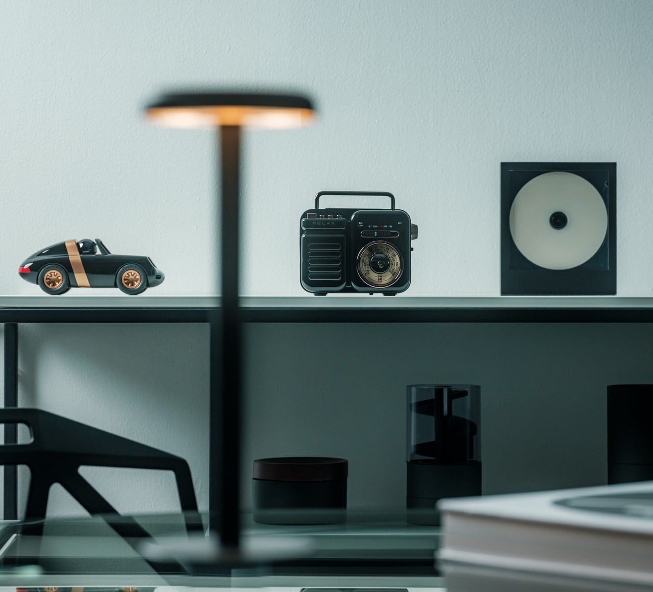
Behind its retro Japanese-inspired design and tactile tuning dial, the RetroWave packs seven functions into one compact unit. Speaker, MP3 player, FM/AM/SW radio, LED flashlight, clock, power bank, and SOS alarm—all wrapped in nostalgic packaging that works on kitchen shelves or emergency kits. Stream Bluetooth during normal times. Hand-crank or solar charge when power fails. The 2000mAh battery delivers up to twenty hours of radio time or six hours of emergency lighting while also charging your phone during blackouts.
This isn’t nostalgic cosplay. The RetroWave addresses genuine preparedness needs while remaining functional daily. Some mornings, it plays jazz stations during coffee, dial glowing softly on countertops. Other days, it’s charging phones during outages, flashlight guiding hallways, and SOS alarm signaling for help. AM/FM/SW radio provides access when internet infrastructure fails, while USB and microSD enable offline music. It suits design lovers wanting gear that looks as good as it performs, preparedness people building resilient systems, and travelers heading off-grid. Multi-functionality means fewer devices cluttering spaces. Equally suited to counters and disaster caches.
The seven-in-one functionality consolidates speaker, radio, flashlight, power bank, and emergency features into one versatile unit.
Hand-crank and solar charging provide genuine off-grid power independence when electrical infrastructure fails, or outdoor adventures demand self-sufficiency.
What we dislike
The retro aesthetic and multi-function design add bulk compared to specialized single-purpose devices.
Audio quality from the built-in speaker likely trails dedicated Bluetooth speakers focused solely on sound performance.
7. StillFrame Headphones
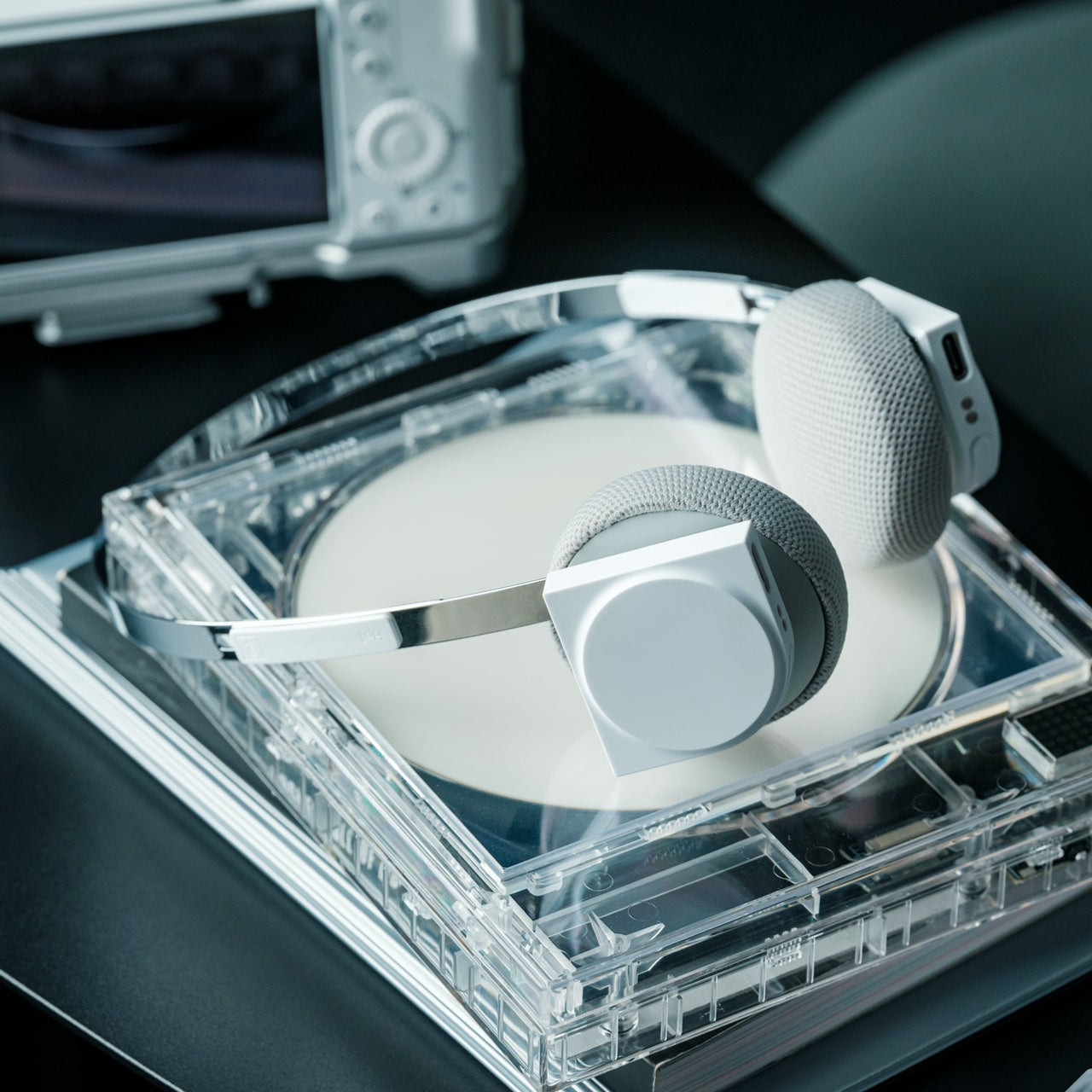
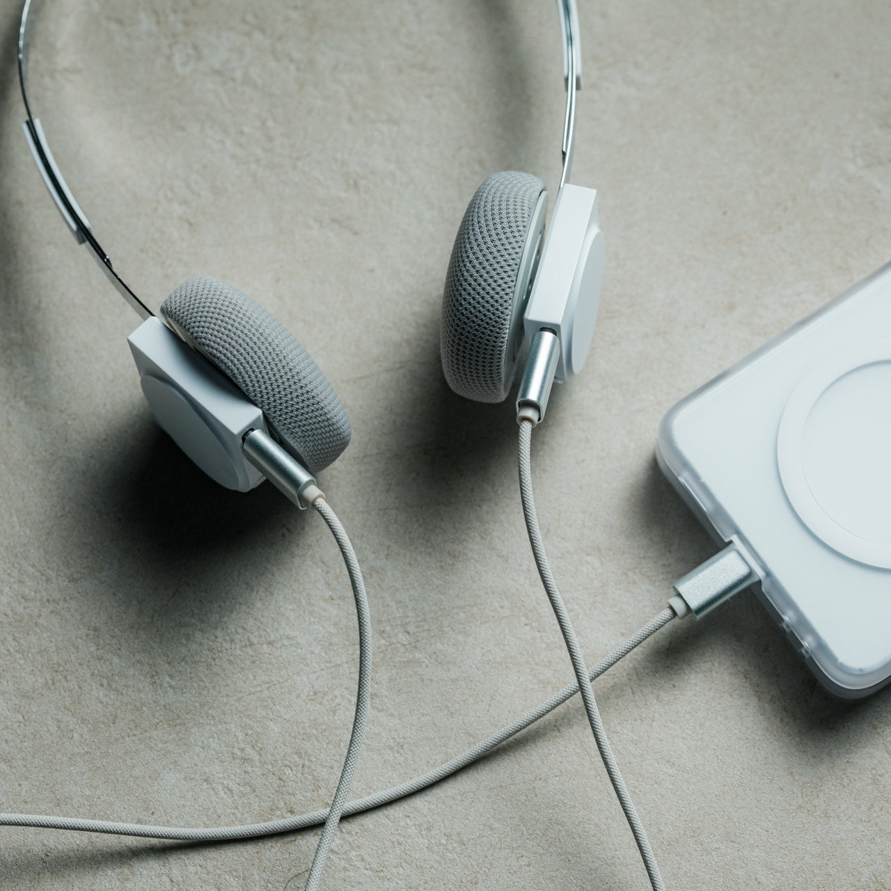
StillFrame Headphones sit somewhere between earbuds and over-ear cans, offering a middle ground between intimacy and openness. Transparent construction exposes internal circuitry and 40mm drivers that shape wide, open soundstages. At just 103 grams, they feel nearly weightless across 24-hour battery life, carrying you from morning routines through late-night sessions. Adaptive noise cancelling silences distractions when needed. Transparency mode maintains environmental awareness when circumstances demand it. Bluetooth provides wireless freedom, while a USB-C cable enables high-resolution wired playback for latency-sensitive work.
The design deliberately references the ClearFrame CD Player, creating visual dialogue between devices sharing a transparent philosophy. These suit people seeking the middle ground, listeners wanting presence without pressure. Exposed components make technology visible rather than hidden, turning electronics into statement pieces broadcasting your design sensibility. Dual mics with noise-cancelling maintain voice clarity during calls. The 40mm drivers deliver melodic textures and spatial detail that cheap earbuds compress into flat sound. For anyone exhausted by identical white plastic buds, anyone building intentional audio ecosystems prioritizing lasting design over disposable convenience, these fit.
The transparent construction and exposed circuitry create a distinctive visual identity that references classic CD-era design language.
The lightweight 103-gram build, combined with 24-hour battery life, provides all-day comfort without constant recharging interruptions.
What we dislike
The transparent materials and exposed components may show dust and require more frequent cleaning than opaque enclosed designs.
The on-ear positioning sacrifices some noise isolation compared to over-ear designs for listeners seeking complete acoustic separation.
Sound Worth Seeing
Generic tech hides itself, disappearing into pockets and blending into walls until nothing distinguishes one device from another. These seven designs take the opposite approach, making audio equipment worth displaying, worth discussing, and worth choosing deliberately. They prove that sound can be visual, that nostalgia can coexist with modern functionality, and that rejecting disposable uniformity doesn’t require sacrificing convenience. From kinetic turntables that dance with your vinyl to transparent players that frame your CDs as art, each piece here elevates listening from background activity into an intentional ritual that engages multiple senses.
The common thread isn’t retro fetishism but honest design that respects both materials and listeners. Whether through battery-free acoustic amplification, emergency-ready multi-function radios, or transparent headphones that expose their engineering, these gifts champion lasting value over planned obsolescence. They suit anyone exhausted by identical tech, anyone rebuilding physical music collections, anyone who believes possessions should spark joy rather than fade into forgettable functionality. For music lovers, design enthusiasts, and anyone shopping for people who seem to have everything, these unique audio pieces offer something genuinely different from what everyone else is giving.
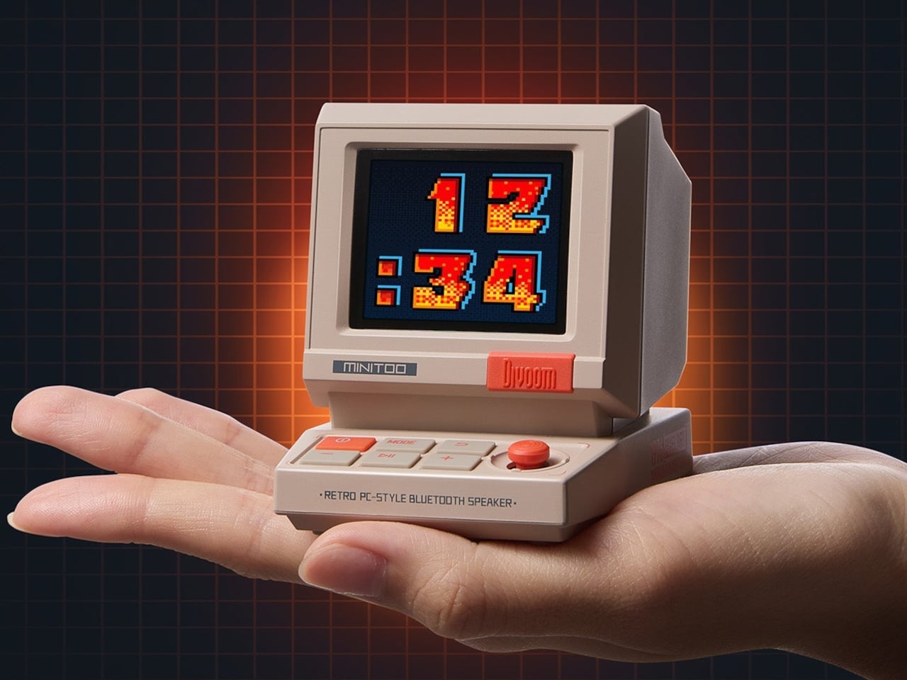
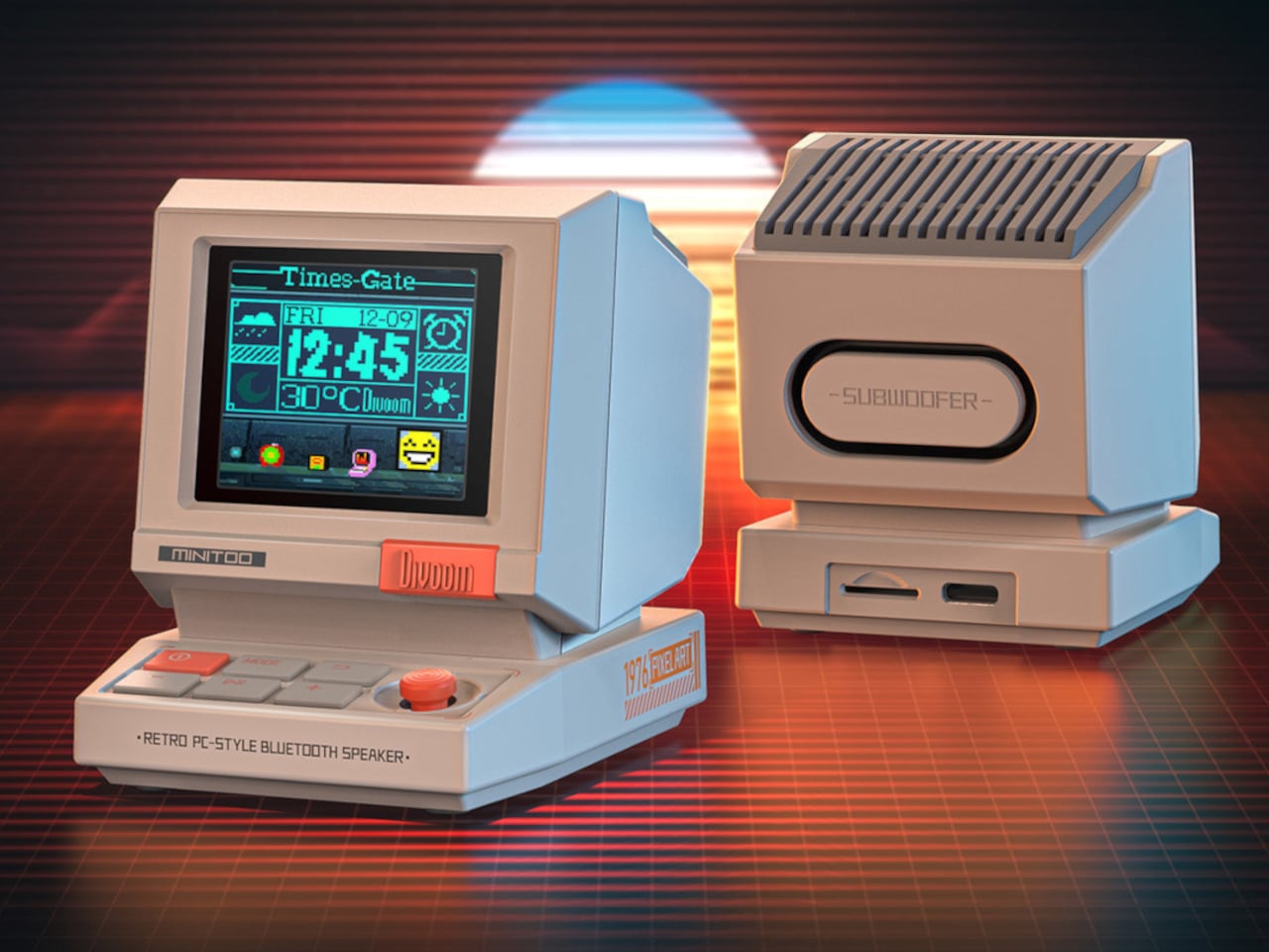
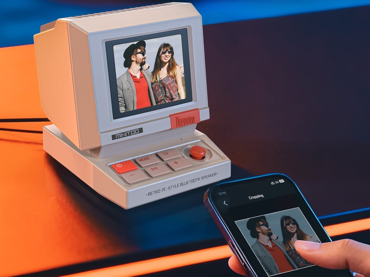
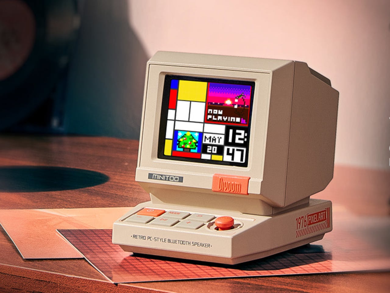
Cozy desk setups have become a competitive sport. Tiny CRTs, retro keyboards, and beige plastic everywhere, usually looking very cute but doing very little beyond collecting dust and likes. Most of that gear is either pure decor or pure utility, rarely both. MiniToo leans into the 80s PC silhouette hard, complete with a CRT-style screen and chunky keyboard buttons, but it tries to earn its footprint by being a Bluetooth speaker, alarm clock, white noise machine, and pixel art display all at once.
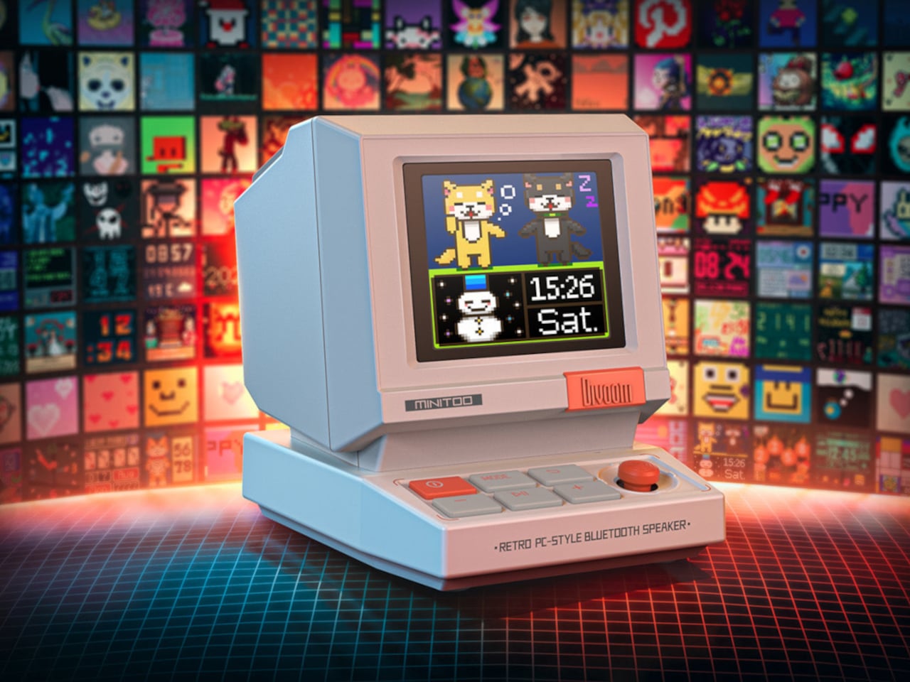
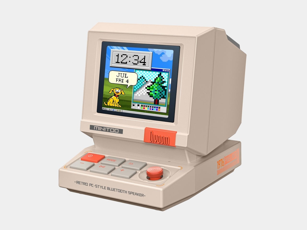
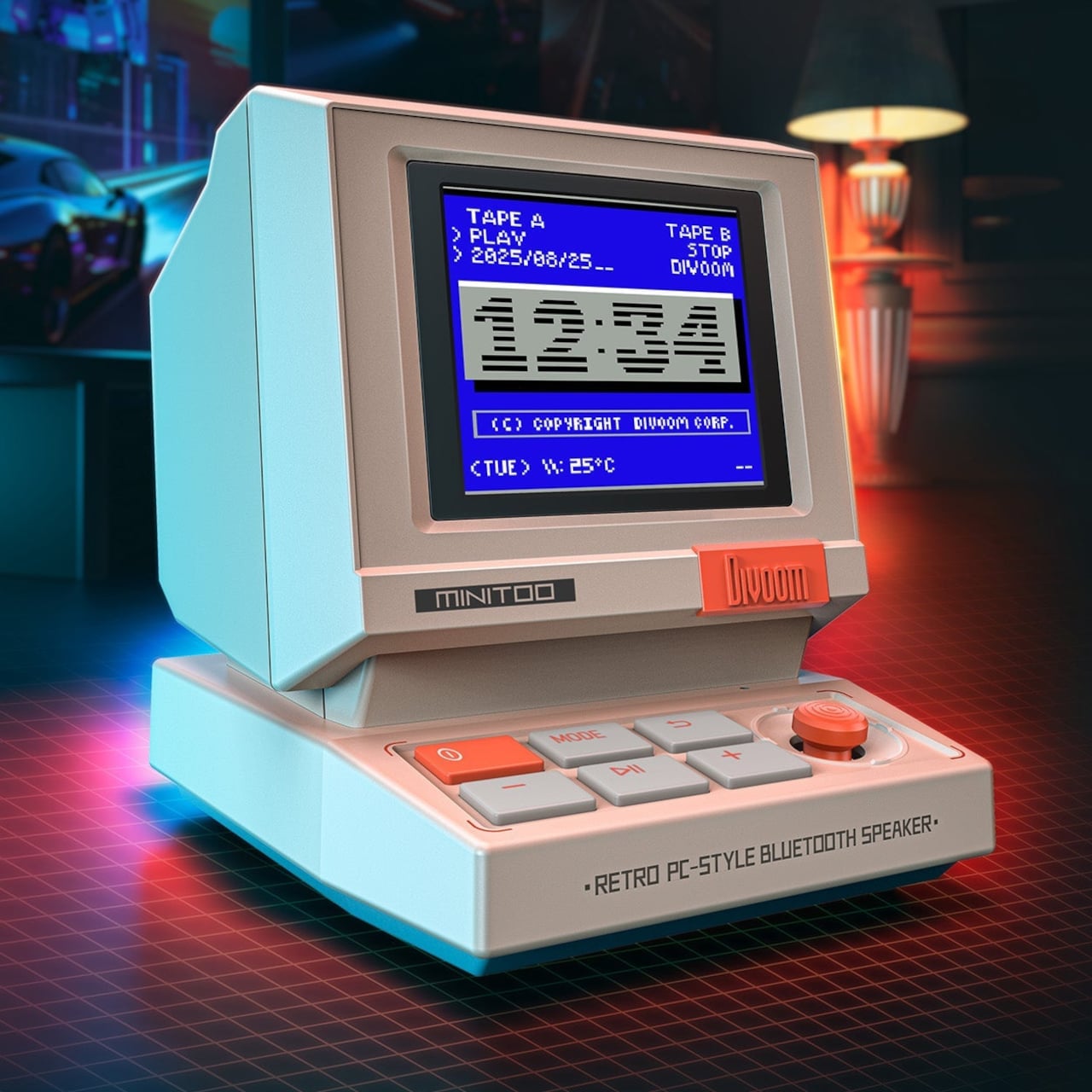
The MiniToo Retro PC Style Pixel Bluetooth Speaker & Alarm Clock looks like a palm-sized beige desktop computer that escaped from an 8-bit office. The CRT-style screen sits on top with a thick bezel, while the sloped keyboard base sports four large square buttons and a bright orange volume knob. It measures about 3.2 by 2.4 by 2.9 inches and weighs just over 200 grams, small enough to fit between your laptop and coffee cup.
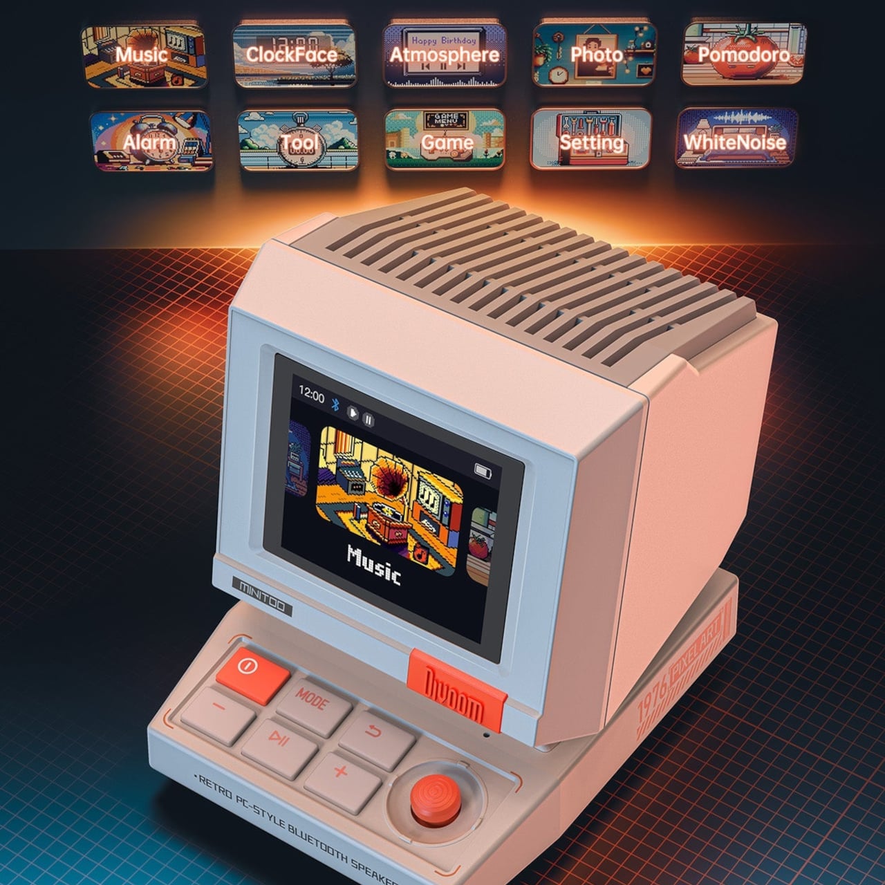
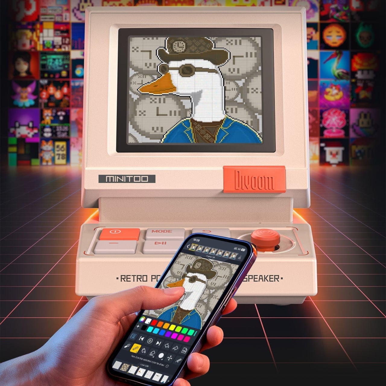
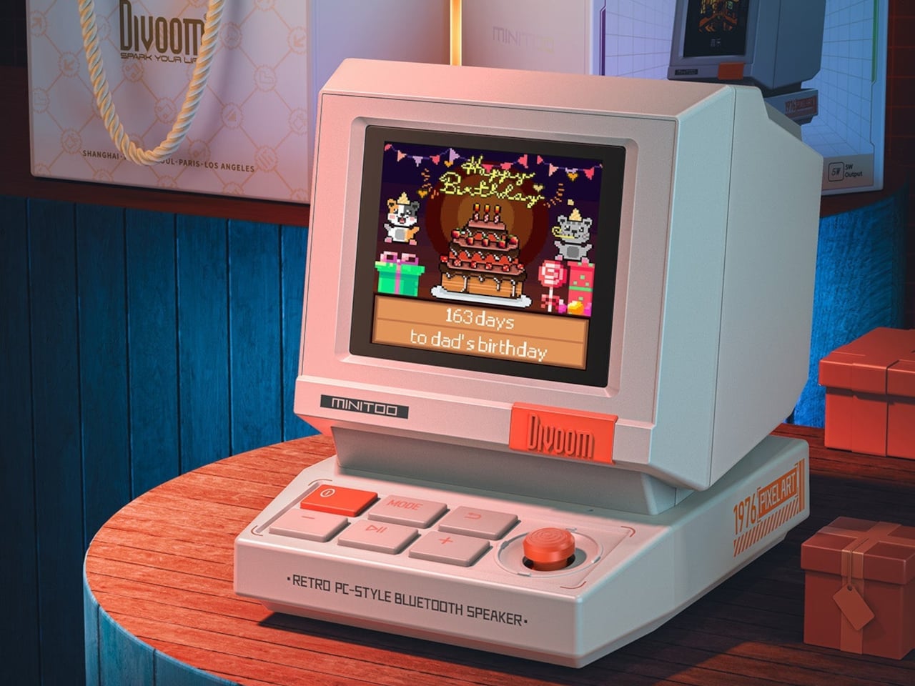
The 1.77-inch TFT screen runs more than seventy clock faces, from DOS blue screens with chunky pixel fonts to colorful analog dials and animated scenes. The companion app lets you design your own pixel faces, animations, and text, then sync them with a tap. You can also cast photos to the screen, turning it into a tiny digital photo frame that cycles through your favorite shots in gloriously chunky pixel form, which somehow makes even vacation snapshots feel more fun.
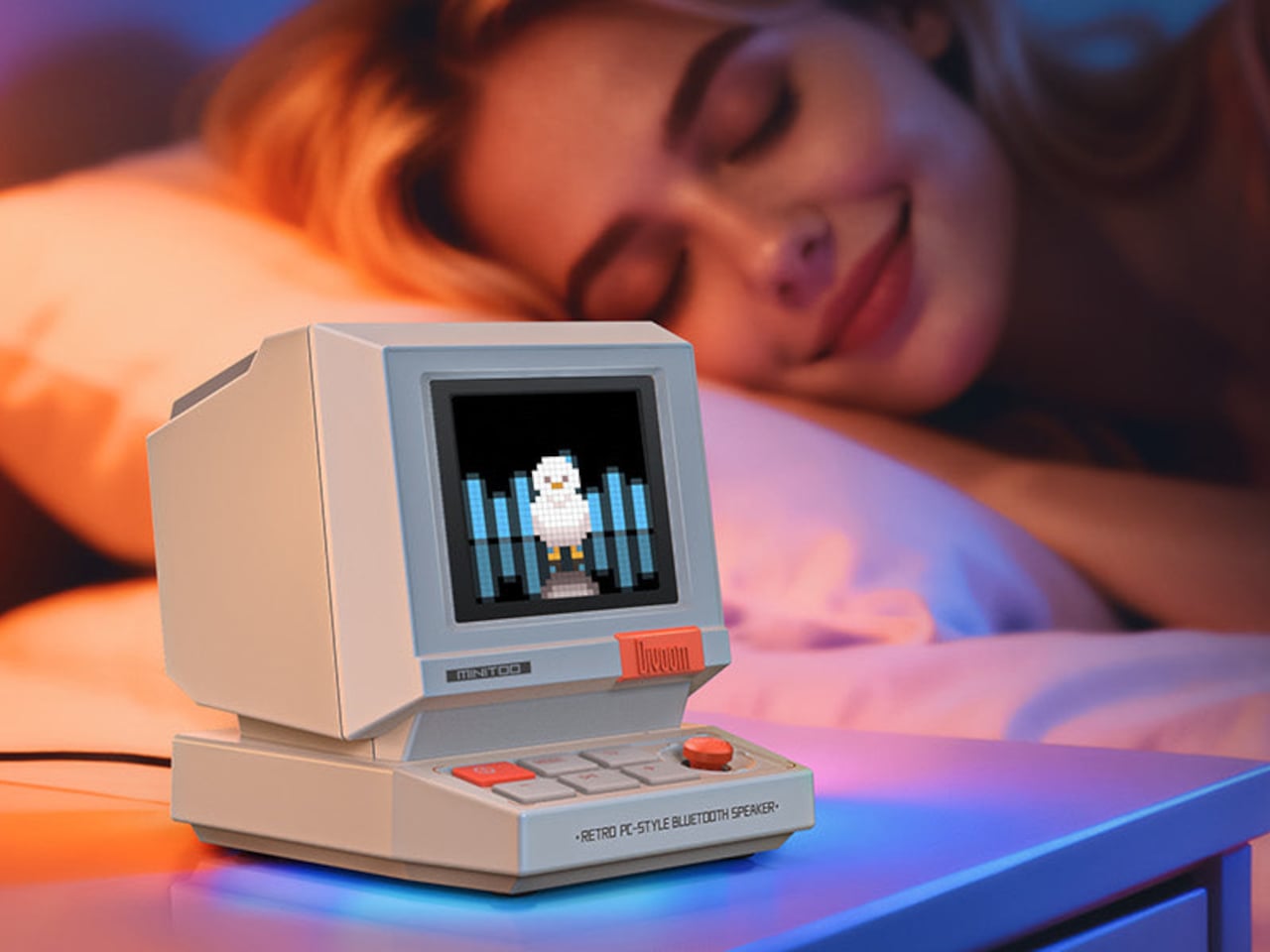
The audio side packs a 5-watt full-range driver with enhanced bass reflex tuned for near-field listening, good for a desk or bedside but not built to fill a room. Bluetooth 5.3 handles wireless playback, plus it supports white noise and twelve wake-up sounds. You can set alarms, play music, and fall asleep to ambient sounds, all from the same little box that looks like it should be running floppy disks instead of Spotify or whatever you streamed last night.
Built-in pixel tools include a Pomodoro timer, reminders, and simple games that live on the device. It can sit next to your laptop as a focus timer during the day, then shift to an alarm clock and white noise machine at night. The four front buttons and knob make it easy to use without always reaching for your phone, helping it feel like a standalone object rather than just another Bluetooth accessory demanding app attention.
Connectivity options cover Bluetooth 5.3, USB audio, and TF card playback, so it works with laptops, phones, or local files. The app is still required for deeper customization, but once your faces and sounds are set up, the device runs on its own. The compact size makes it easy to move between desk and bedside, or pack as a little travel speaker with personality and actual utility instead of just nostalgia.
MiniToo is clearly gift-ready, shipped in a neat box, and aimed at teens, designers, and retro lovers who want their desks to look like fun. What makes it interesting is not just the nostalgia, but the way it folds real utility into that nostalgia, giving you a tiny computer that finally behaves like the playful, expressive desk companion those beige boxes never were when they were actually new and just ran spreadsheets.
Skin loses the hydration war quietly in today’s modern world. Office air conditioning runs all day, planes recycle cabin air for hours, and cars blast heat or cold depending on the season. Most hydration routines still happen at a bathroom mirror with a cotton pad and a bottle, even though the real damage shows up at desks, in conference rooms, and halfway through a flight when your face feels tight and tired.
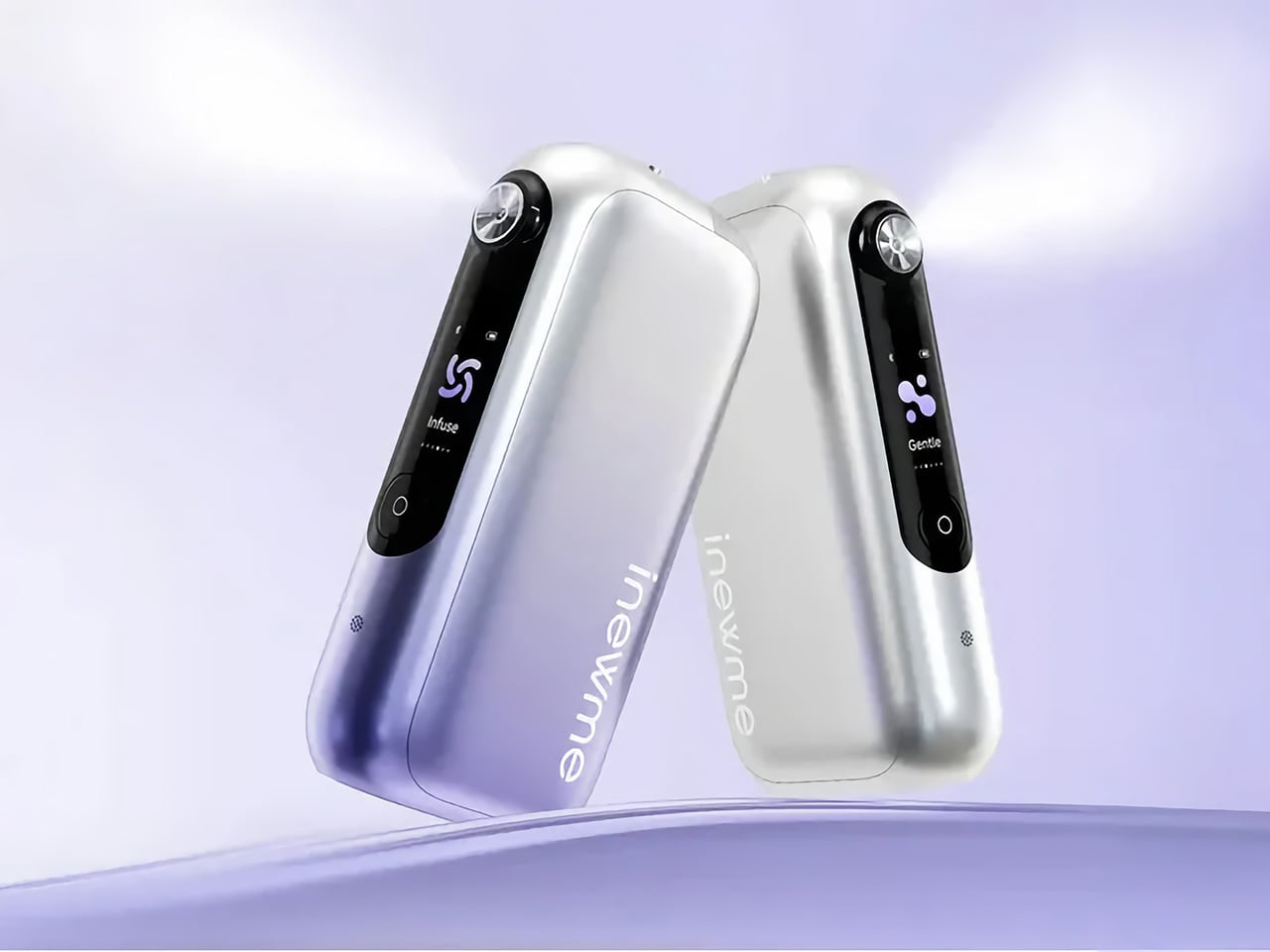
NanoHydra Pro tries to close that gap by shrinking a fairly advanced hydrator into something pocket-sized. It looks like a small metallic gadget with a gradient finish, the kind of thing that sits on a desk next to a phone or slips into a bag without announcing itself. A dual pump nano mist system atomizes toner or serum into a 10 micron droplet cloud, fine enough to sit on skin rather than drip off.
The 10 micron mist feels different from a regular spray bottle. Most misters shoot larger droplets that either evaporate too fast or run down your cheeks, leaving streaks on your makeup or pooling near your jawline. NanoHydra Pro atomizes liquid into something closer to a soft fog, light enough to absorb quickly without leaving skin wet or sticky, and you can use the same toner you already have.
What makes it feel smarter is the ToF distance sensor built into the front. It reads how close the device is to your face and quietly adjusts mist output in real time. Hold it near, and the spray softens to avoid oversaturating small areas. Pull it back, and coverage expands for broader strokes. Step outside the detection range, and it shuts off automatically, saving product and avoiding accidental desk misting.
The design seems built for people who keep skincare at their desk rather than just in the bathroom. Five modes let you shift between everyday hydration, a gentler setting for sensitive days, a lifting mode when skin feels slack, an infuse mode for deeper serum sessions, and a manual option for one quick burst. Each mode adjusts mist intensity and duration to match the moment.
The battery lasts around a week with regular use, so it sits there ready without becoming another thing to plug in every night. You press a button, pick a mode on the small LCD screen, mist your face, and go back to work. It fits into the kind of routine where hydration happens between calls or emails rather than as a separate event you have to carve out time for at home.
Travel is where the leak-proof capsule starts to matter. The chamber locks toner or serum inside with enough seals that you can toss it into a bag, check it in luggage, or carry it through airport security without spills soaking into clothes or electronics. The compact body fits easily into a jacket pocket or backpack side slot. On a long flight or dry commute, pulling it out and misting your face takes less effort than digging through a toiletry kit.
A companion app adds a layer for people who like tracking routines. It lets you adjust mist intensity, log each session, and review hydration trends over time, turning a simple spritz into something more intentional. The app also offers guidance based on your skin type and habits, though the device still works perfectly well as a one-button hydrator if you would rather skip the data layer entirely.
NanoHydra Pro hints at a version of skincare tools that pay attention to context instead of just pushing liquid through a nozzle. It reads distance, tunes droplet size, and fits into spaces where traditional routines fall apart, like desks, cars, and airplane seats. As hydration stops being something that only happens at a mirror, a small object that adapts quietly in your hand starts to feel like the more useful kind of upgrade.