Polaroid Just Upgraded the Tiny Camera Collectors Love

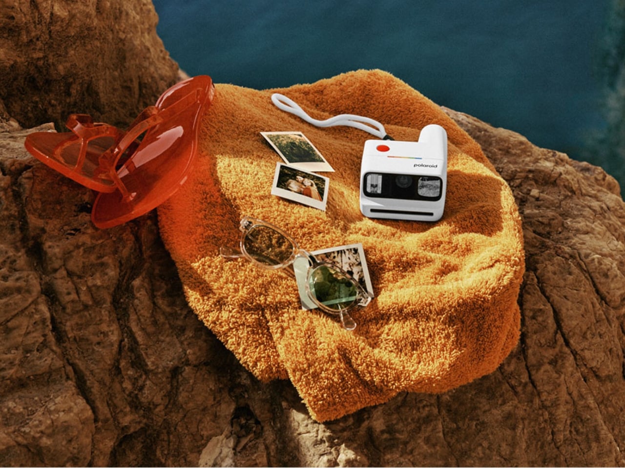
There was a time when the only people you would see carrying around Polaroid cameras were the hipster film or art students or the always-on-a-nostalgic-trip enthusiasts. But now, analog cameras have become part of the lives of those who are into photography or those who just like collecting printed photos to tuck into their journals or cork boards.

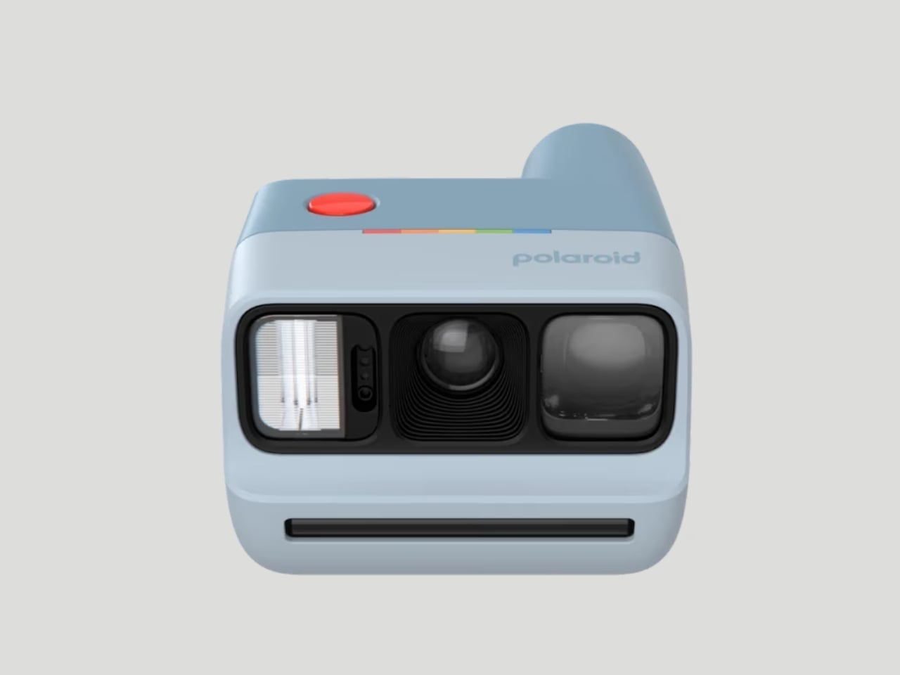
Polaroid is one of those brands that has really gotten into this whole analog-digital hybrid lifestyle by consistently releasing new products that the market gobbles up. Their latest release is the Polaroid Go Generation 3, the newest iteration of this product line that brings exciting new features, fresh vibrant colorways, and even more ways to capture those memories.

Designer: Polaroid

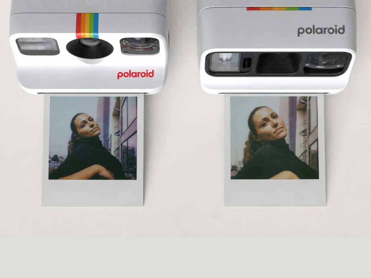
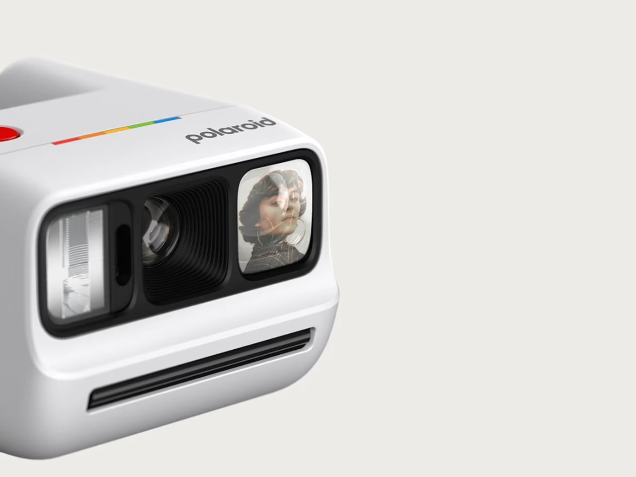
This new version of this beloved Polaroid camera offers several new things that collectors and enthusiasts will enjoy. The biggest upgrade is that the new polycarbonate optic brings you sharper and clearer photos. I know the lo-fi nature of a lot of these analog cameras is part of the appeal, but of course, sometimes you’d still want to have something that has higher quality.

This camera, which is the world’s smallest instant analog one, now also has a better Xenon flash which performs better than the LED flashes on modern cameras when taking low-light photos. It is also able to handle lens flaring better, and the selfie mirror now also has less glare.

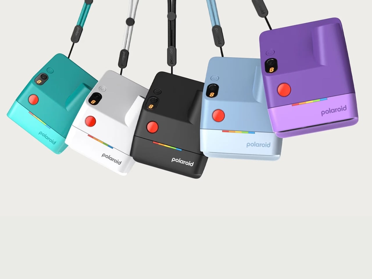
For collectors who are focused on the design of the camera itself, this version comes in five new vibrant colors: purple, teal, light blue, black, and white. Personally, I can’t wait to have the purple one and carry it around with its pocket-friendly dimensions.

Another upgrade worth getting excited about is the improved viewfinder. The new wider design with its elongated eyepiece lets you see your full composition comfortably, with no more awkwardly pressing your face against the camera just to frame a shot. It is a small but impactful change, especially when you’re trying to capture a spontaneous group moment and need to get the framing right on the first try. No more accidentally cut-off heads or missed expressions.

What also stays from the previous generations, and that is very much a good thing, are the beloved shooting modes. Use the self-timer for those full-group shots where everyone actually needs to be in the frame, or activate the double exposure mode for dreamy, creative layered shots that give your photos a truly artistic edge. Flash control is also all handled through a single button, keeping the whole experience intuitive and fuss-free. It is simple, fun, and exactly the kind of energy you want from a camera this size.

And for those who still want a little digital in their analog life, the Polaroid Go Gen 3 pairs nicely with the free Polaroid app. You can scan your prints and share them online, so you truly get the best of both worlds. The physical photo to stick on your wall, tuck into your journal, or swap with a friend, plus a digital copy ready to share whenever you feel like it.

The rechargeable lithium-ion battery holds up impressively too, giving you up to 15 film packs per charge, more than enough for a full weekend getaway or a long day of adventures without worrying about it dying on you at the worst possible moment. And at just $89.99, it is an accessible and very giftable entry into the world of instant analog photography.

Whether you are a die-hard Polaroid collector, a photo journaler, or someone who simply wants to step away from the overly curated world of digital photography and capture something real and unfiltered, the Polaroid Go Generation 3 is worth every penny. It is small enough to slip into a bag, beautiful enough to show off, and capable enough to make your memories look genuinely great. Big energy in the tiniest package, and honestly, is there anything more Polaroid than that?

The post Polaroid Just Upgraded the Tiny Camera Collectors Love first appeared on Yanko Design.

Harvard Students Built a Lamp That Taught a Robot to Make Art

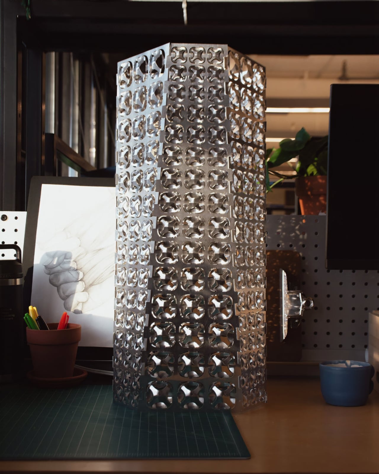
There are moments in design when your first thought isn’t “how does it work” but “how does it feel.” Hikarigami is one of those objects. Created by four Harvard Graduate School of Design students, Luke Fiorante, Joseph Fujinami, Annie Xing, and Chi Zhang, it’s a luminaire that looks, at first glance, like an intricate metal tower carved by a very patient and very precise hand. But the story behind it is far more interesting than the object alone, and the object itself is already extraordinary.

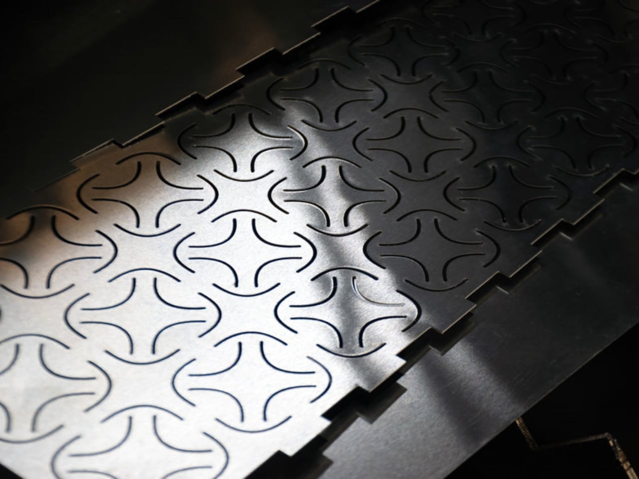
The name is a portmanteau of two Japanese words: hikari, meaning light, and kirigami, the traditional art of cutting and folding a single sheet of material into three-dimensional form. The fusion isn’t just poetic; it’s structural. The team took that ancient paper-craft logic and translated it into sheet aluminum, using an industrial robotic arm to press, deform, and expand the metal into a lattice of thousands of individual cells. Each cell is unique. Each one catches light differently. And every fold was made without a mold.

Designers: Luke Fiorante, Joseph Fujinami, Annie Xing, Chi Zhang

That last part is the quiet revolution tucked inside this project. Traditional metal forming depends on expensive, custom-made dies and molds, static tools that lock a design into one fixed shape and require significant capital before a single piece can be produced. Hikarigami throws that model out entirely. The team developed a custom script called Machina, which programs the robot to adjust its actuation depth for every single cell in the lattice. Because the cells vary in size across the panel, a uniform press would cause the metal to fail. The script scales the force to each cell’s geometry, working right up to the material’s yield limit without crossing it. It’s precision at a scale that a human hand simply couldn’t replicate.

But precision isn’t the point. Craft is. The team was genuinely asking whether robotic automation could learn the intuitions of handmaking: the responsiveness to material, the calibration to context, the sense that a gesture should change depending on where you are in the process. Most industrial fabrication doesn’t care about any of that. Hikarigami does. And to me, that’s the more interesting question.

The result is a tower made of six identical aluminum panels with no fasteners, no adhesives. The panels interlock through tabs built directly into the geometry, which means the whole assembly is a single material: pure aluminum, fully recyclable, and designed to age gracefully. The team noted that over time, the aluminum will develop a patina shaped by its environment. The lamp doesn’t resist change. It participates in it.

When you turn it on, the experience shifts completely. During the day, Hikarigami reads as architectural, almost industrial, the kind of object that would feel at home in a gallery or a thoughtfully designed living space. At night, with the central LED filament lit, the aluminum skin opens up. The thousands of robotically formed apertures cast overlapping pools of shadow and caustic highlights across every nearby surface. The room becomes part of the lamp. The lamp becomes the room.

It’s worth noting that this is a student project, and I find that genuinely refreshing. It won in the sustainability category at one of design’s most respected annual competitions, and it also picked up a notable distinction in furniture and lighting. For work produced inside an academic program, the level of technical and conceptual rigor here is striking. Beyond the accolades, Hikarigami feels significant because it takes a position. It argues, quietly but clearly, that sustainable design doesn’t have to mean sacrificing beauty or experimentation. That mold-free fabrication can be expressive. That a robot can be a collaborator, not a replacement.

The team divided their roles with intention: Xing led computational design and fabrication, Fiorante handled robotic toolpath programming, Fujinami managed structural assembly, and Zhang contributed to the robotic fabrication process. Together they didn’t just design a lamp. They designed a process, and the lamp emerged from it. That’s the kind of thinking that tends to outlast the object itself.

The post Harvard Students Built a Lamp That Taught a Robot to Make Art first appeared on Yanko Design.

A Moss-Covered Payphone Just Became the Voice of 2147

Picture a payphone. Not a sleek, reimagined version, just an actual, beat-up Telefónica booth, the kind you might walk past on a Barcelona street without a second glance. Except this one is overtaken by moss. And if you pick up the handset, the Earth answers.

That’s the premise of 2147: A Voice from the Future, an interactive installation by Cris Olmedo of Divina Machina, the digital art branch of creative innovation studio QS Ventures. The piece was presented at Sónar+D, set against the medieval backdrop of the Llotja de Mar in Barcelona. That pairing alone says something: one of the oldest commercial buildings in the city, hosting an open-ended conversation with an AI that speaks on behalf of a future planet.

Designer: Cris Olmedo (Divina Machina)

The concept is disarmingly simple. You pick up the handset. The AI, voiced through an ElevenLabs system and powered by a Raspberry Pi 5 tucked inside the original booth, responds in real time as a fictional representation of the Earth. No scripts, no predefined dialogue paths, no multiple-choice menus. You take the conversation wherever you want, whether that’s climate, survival, memory, or grief. The Earth, imagined 121 years from now, has things to say. Whether you do is another matter.

What makes this work is the object itself. Olmedo didn’t design something new and purposefully futuristic. The booth kept its original Telefónica structure, its original signage, its unmistakably analog bones. Only what’s hidden inside changed. The moss slowly consuming the exterior reads like nature quietly reclaiming something that people gave up on. That tension between the obsolete and the alive does a lot of the emotional heavy lifting here, and it’s a smarter choice than any glowing interface could have been.

We tend to think of design as a forward-moving discipline, always chasing newer, faster, more capable. But 2147 asks a different question: what happens when you take something we’ve already discarded and give it a new reason to exist? The payphone is a perfect vessel for that question, precisely because it was once the most public, most democratic form of long-distance communication we had. You didn’t need an account, a plan, or a device you owned outright. Just a coin and a number to dial.

Now that infrastructure is largely gone. Olmedo took what’s left of it and filled it with something else entirely. That’s not just clever art direction. It’s a genuinely pointed observation about how we build things, discard them, and eventually recognize that the shell still has something to offer. The fact that this installation lives inside an actual retired Telefónica booth, rather than a replica, matters more than it might seem.

The year 2147 gives me pause, in the best way. It’s far enough to feel like science fiction, but close enough to feel like a countdown. It’s the kind of temporal framing that shakes you out of the comfortable haze of “we’ll deal with it later.” The Earth speaking through this installation isn’t a distant abstraction. It’s speaking through a receiver you’ve held before, in a language you already understand, about problems you’ve already heard about.

The moss is the detail I can’t stop thinking about. It reads as both beautiful and quietly alarming, the natural world slowly spreading over a structure that once represented human connection. As if the planet didn’t wait for us to sort things out. It also turns a mundane artifact into something you actually want to stop and stare at, which is half the job of any good installation. It communicates instantly and without explanation, which is exactly what good design is supposed to do.

2147: A Voice from the Future earns its concept. It’s not a payphone with AI bolted on. It’s a meditation on time, obsolescence, and the conversations we keep putting off. And the most compelling thing about it is that it asks you to start one, right now, handset in hand, with a planet that’s been waiting for you to pick up.

The post A Moss-Covered Payphone Just Became the Voice of 2147 first appeared on Yanko Design.

Transparent Purple Makes This $35 Phone Controller Impossible to Ignore

Touch controls on smartphones are a compromise most mobile gamers have learned to live with. They work well enough for casual games designed around them, but the moment you try running a classic arcade title or an emulated game that expects physical buttons, things fall apart quickly. Your thumbs slide off invisible buttons, precision goes out the window, and the whole appeal of playing a retro game on the go quietly evaporates.

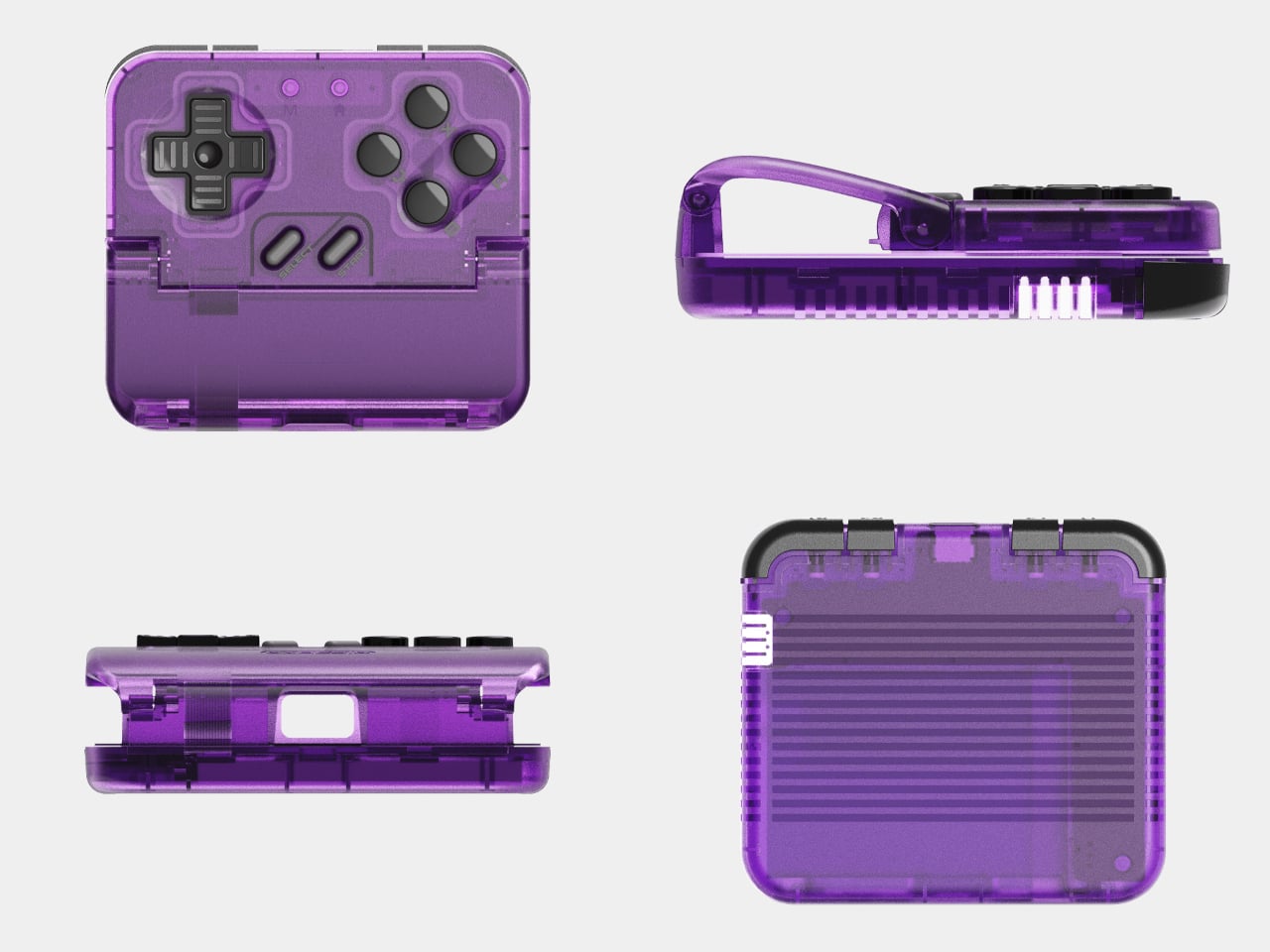
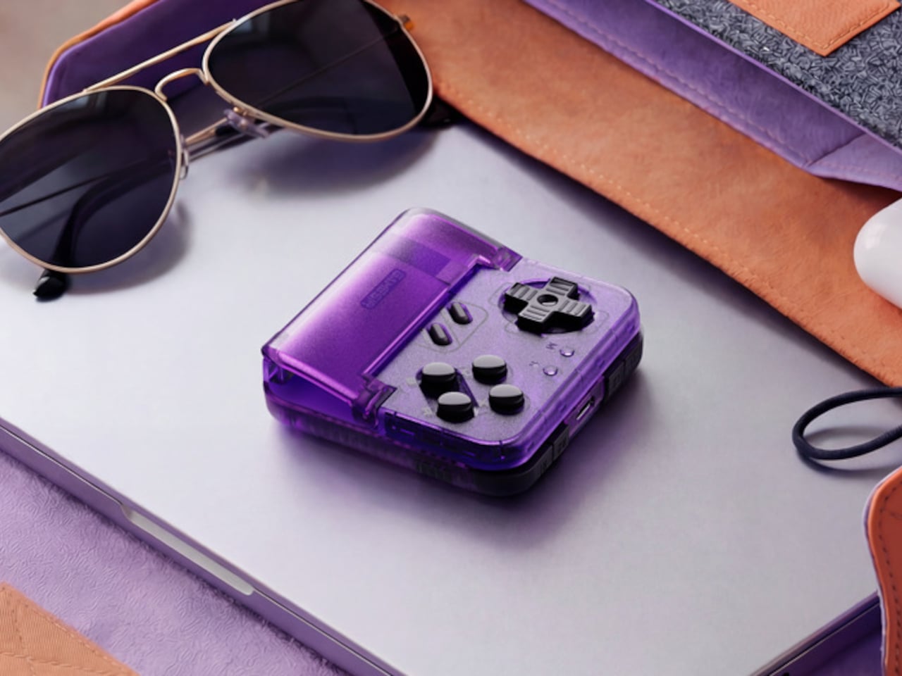
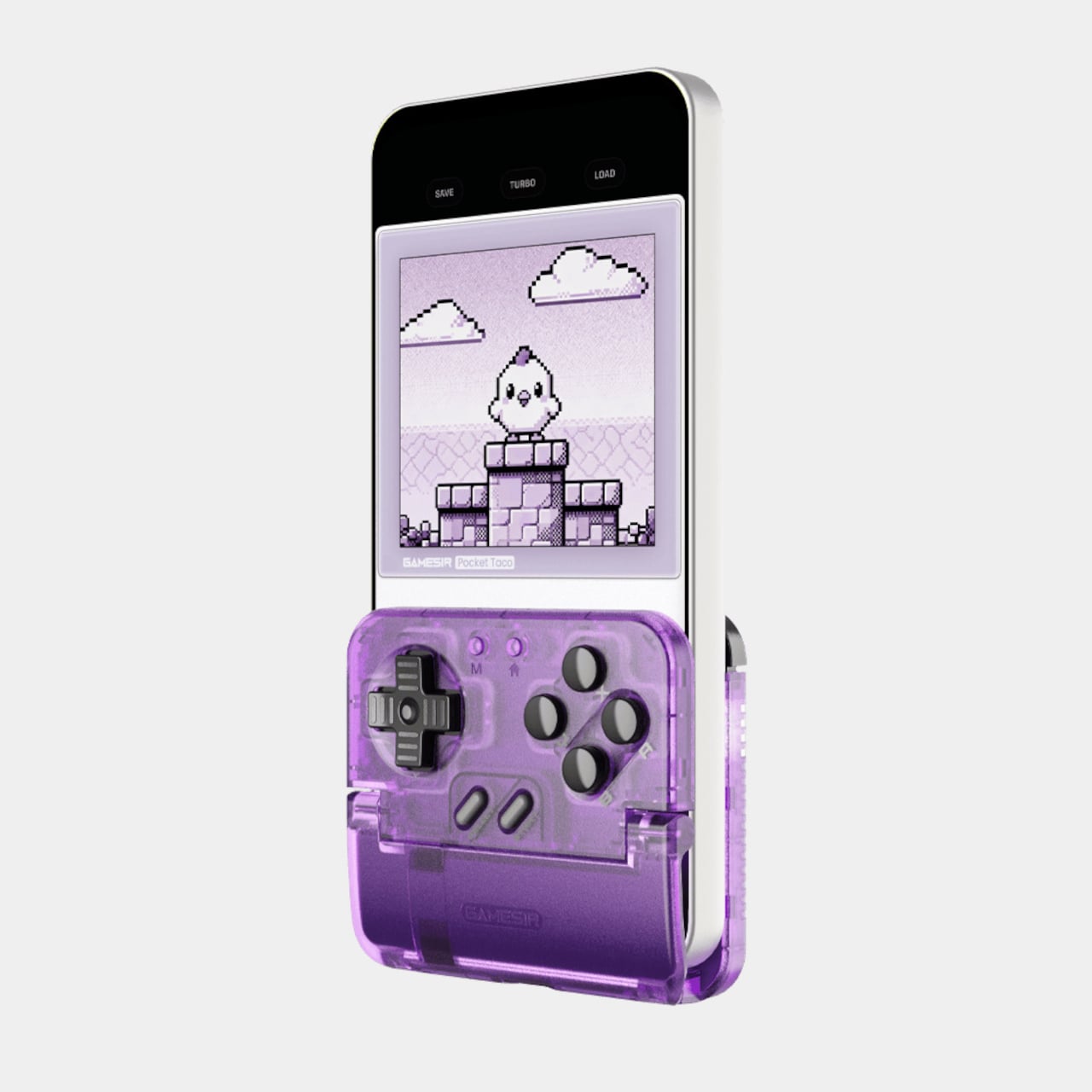
The GameSir Pocket Taco is a clamp-style vertical controller that clips around your phone and instantly turns it into something far closer to a proper handheld console. The design is vertical rather than the sideways landscape grip most mobile controllers use, which puts the phone in portrait style and gives the whole setup that unmistakable Game Boy silhouette. It’s a specific choice that makes a lot of sense for the kind of games it’s clearly built around.

Designer: GameSir

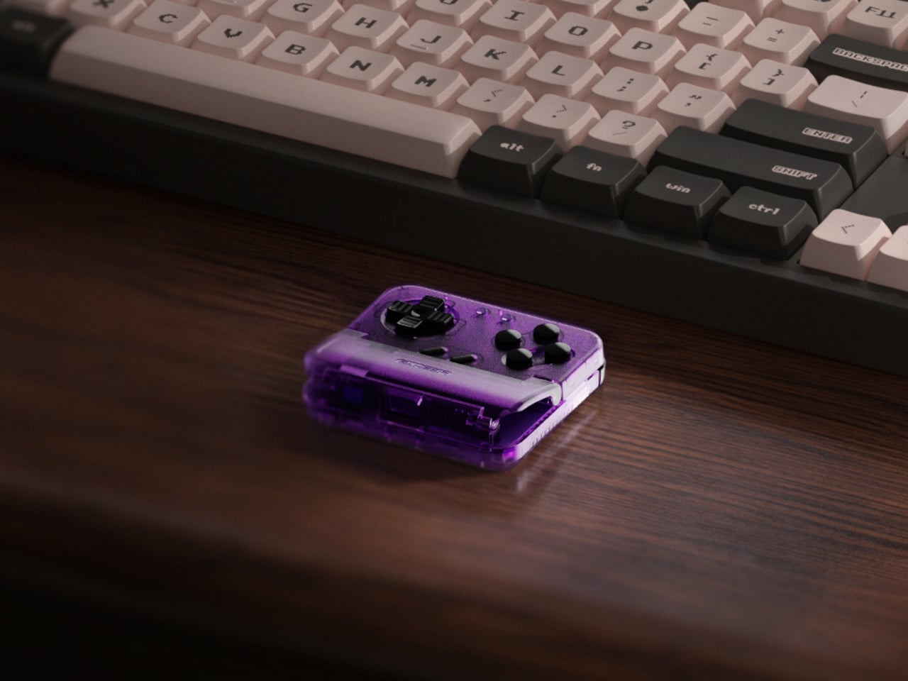
The Voltage Purple colorway is a new option for the Pocket Taco, arriving a few months after the original retro grey version launched. Where the original leaned into a deliberately aged aesthetic, Voltage Purple reads much more confidently as a contemporary gaming accessory. Both versions carry the same hardware and features, so the choice between them comes down entirely to how you want the thing to look in your hand.

The buttons are the central selling point. Cushioned membrane ABXY and D-pad inputs sit at the bottom of the controller, backed by tactile switch triggers and bumpers, and the whole layout comes together in a way that feels genuinely satisfying for side-scrollers, shoot ’em ups, and anything else designed around a proper gamepad. A turbo function covers all eight main buttons, which the hardcore retro gaming crowd will appreciate immediately.

The Pocket Taco handles some practical concerns that most accessories at this price point ignore. Soft silicone pads line the phone clamp area to prevent scratches, a hollow gap at the bottom aligns with your phone’s charging port so you can top up during longer sessions, and the whole thing powers on automatically when you unfold it and shuts off when you close it. At 62.2 g, it barely adds any noticeable weight.

The GameSir App extends the experience further with button remapping, D-pad diagonal lock, and G-Touch and V-Touch functions for on-screen input simulation. There’s also a keyboard mode built in, letting you switch input types for games or apps that need it. A 600 mAh battery handles cordless sessions, and the package includes a storage box, a charging cable, and a lanyard so the whole thing stays organized between uses.

The Pocket Taco in Voltage Purple retails for $34.99, while the original grey version currently sits at $29.99. The $5 difference comes down entirely to the color choice. At 78mm x 70.9mm x 20.7mm, it slips into a pocket or bag with the storage box without much fuss, which keeps the pitch for daily carry entirely believable for anyone who tends to game in short bursts throughout the day.

It’s not a controller for every kind of mobile gaming. If you spend most of your time in landscape-format games that already support proper controller input, a horizontal grip will serve you better. But for anyone running emulators, arcade titles, or vertical shoot ’em ups on their phone, the Pocket Taco fills a gap that the rest of the mobile controller market has mostly ignored.

The post Transparent Purple Makes This $35 Phone Controller Impossible to Ignore first appeared on Yanko Design.

The $99 Gadget That Clears 3 Devices Off Your Nightstand

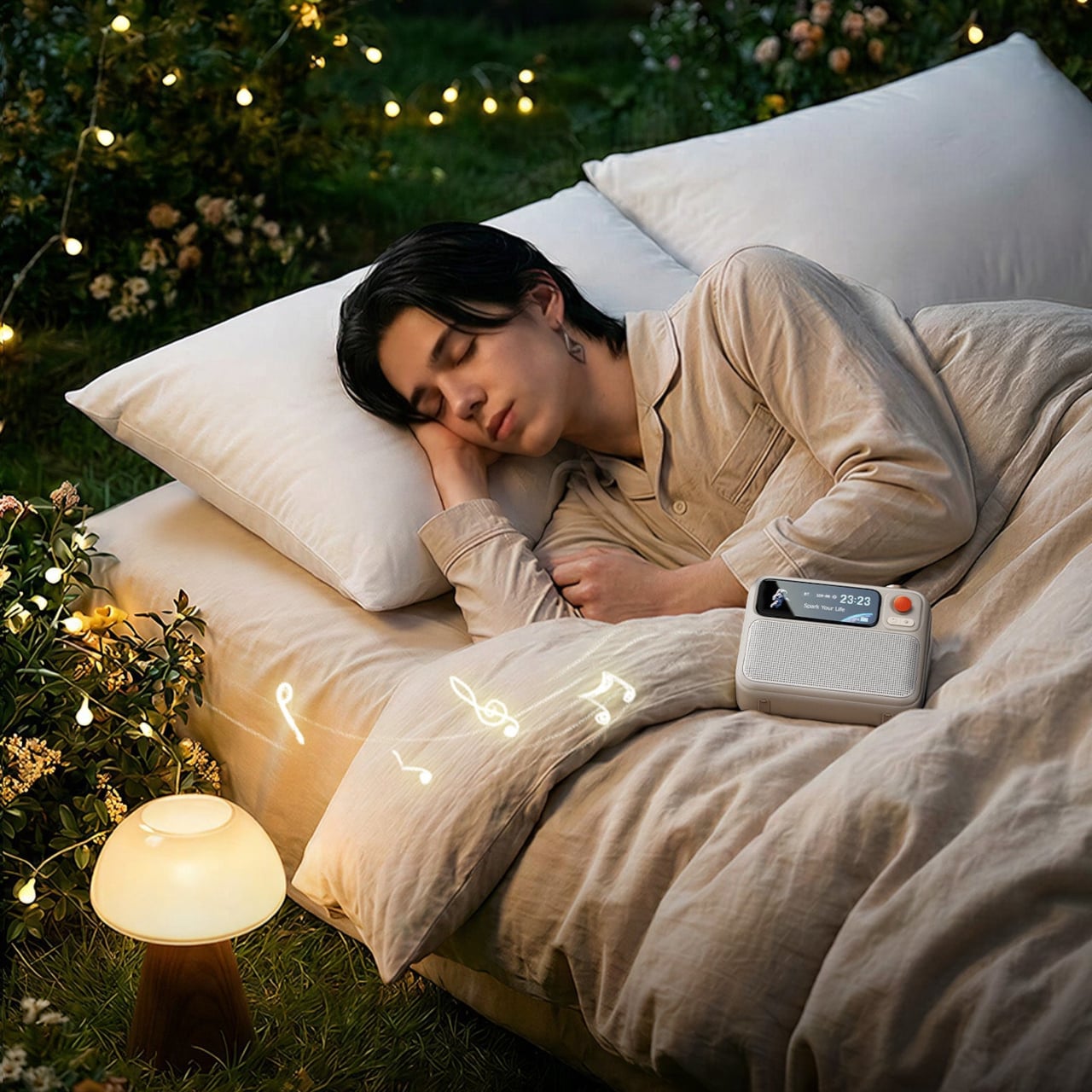
The nightstand has become a staging ground for technology. Between a phone, a white noise machine, a lamp, and whatever book you’re pretending to read before you fall asleep, it tends to get crowded. That clutter has gotten to the point where some people start their mornings already stressed from looking at the pile, which is counterproductive for something that’s supposed to help you rest.

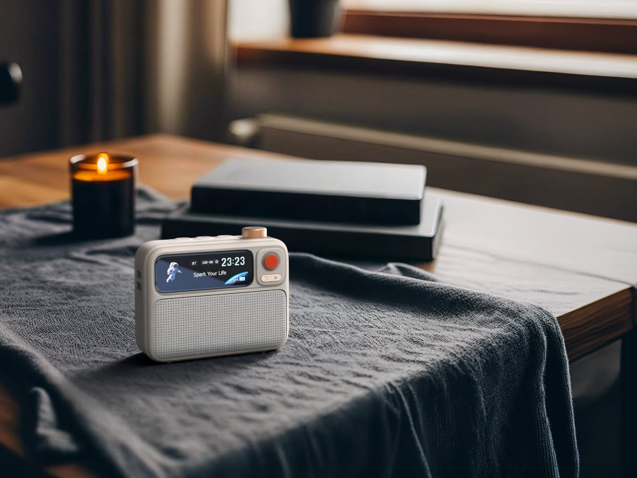
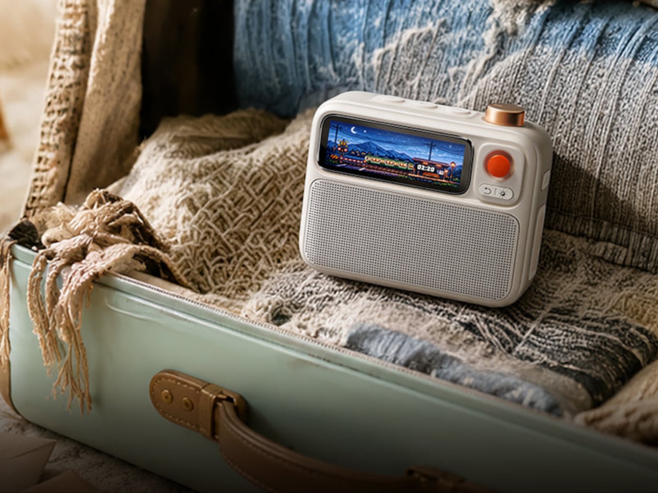
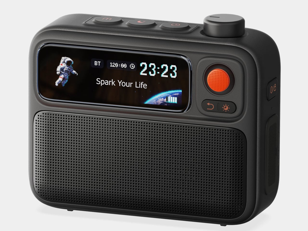
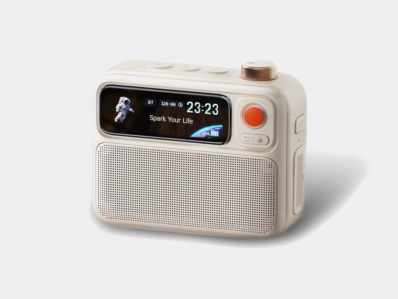
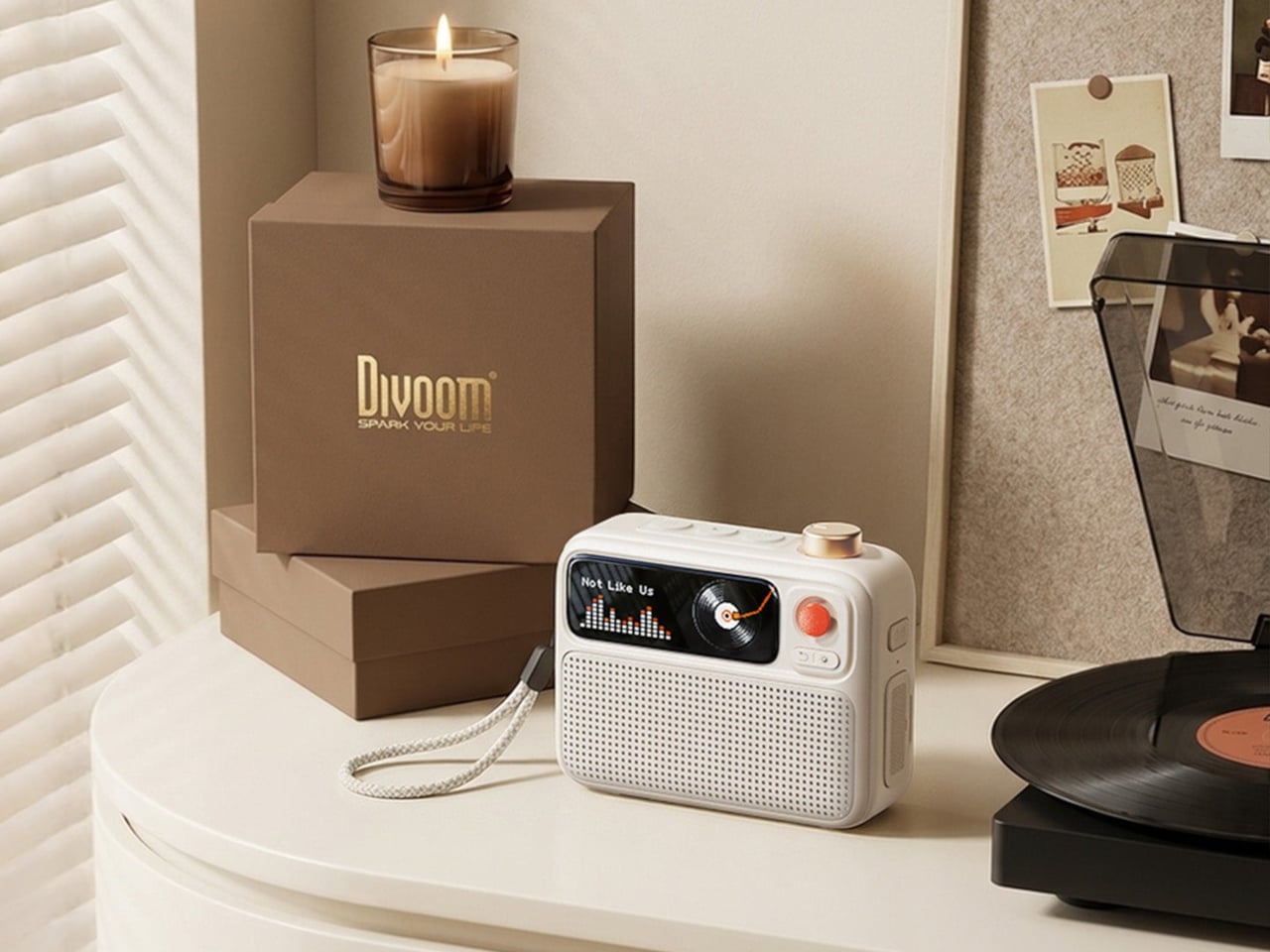
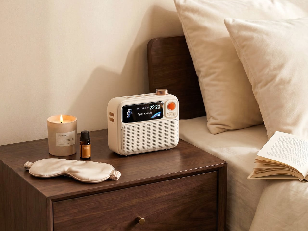
The Divoom FlowToo works around that problem by collapsing three bedside staples into a single compact device. It’s a Bluetooth speaker, white noise machine, and alarm clock all at once, with a customizable display that rounds the whole thing out. Rather than adding another device to the pile, it’s designed to clear some of it, while actually improving on each of those functions rather than just combining them with asterisks.

Designer: Divoom

The speaker runs through a 10W amplifier and 45mm full-range driver, which makes it a genuine music speaker rather than the obligatory audio feature most alarm clocks bolt on as an afterthought. You can stream music from your phone over Bluetooth and get enough volume to fill a bedroom without things getting harsh. For a device that lives on a nightstand, that sets it apart from most of the competition.

The FlowToo’s more than 90 built-in sounds cover what people actually reach for at night, from rain and ocean waves to forest ambience and other calming tones. These aren’t just sleep aids; they work just as well for focusing during the day when you need background noise that doesn’t pull your attention elsewhere. The library is large enough that finding something to suit your preference won’t take long.

Getting out of bed is the harder side of this equation, and the FlowToo handles it carefully. Rather than a jarring alarm tone, it wakes you gradually with natural sounds that grow louder while a gentle light fills in from the display. The idea is to bring you up without jolting you out of sleep, which tends to leave you considerably less wrecked for the rest of the morning.

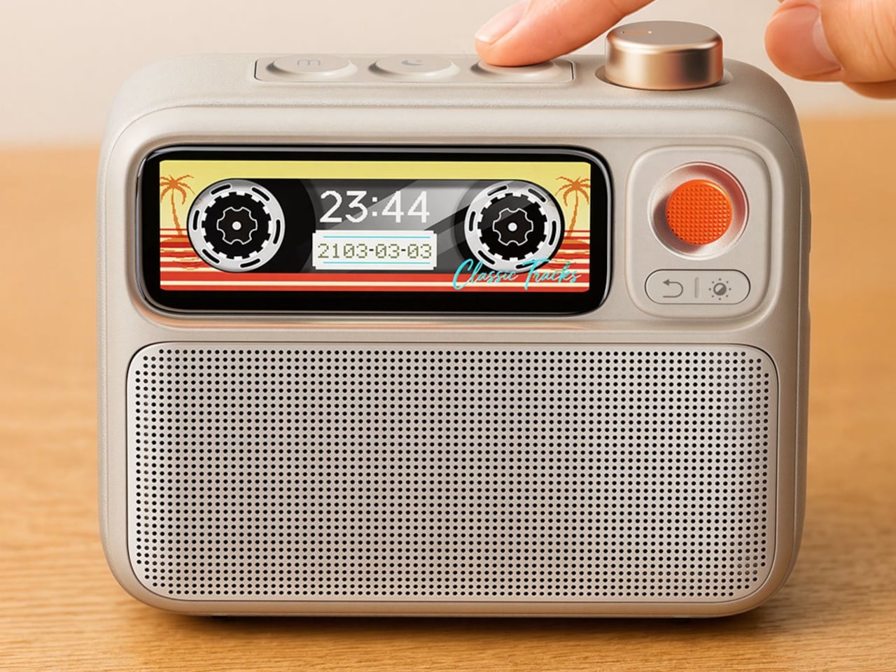
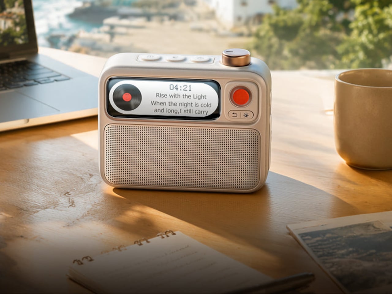
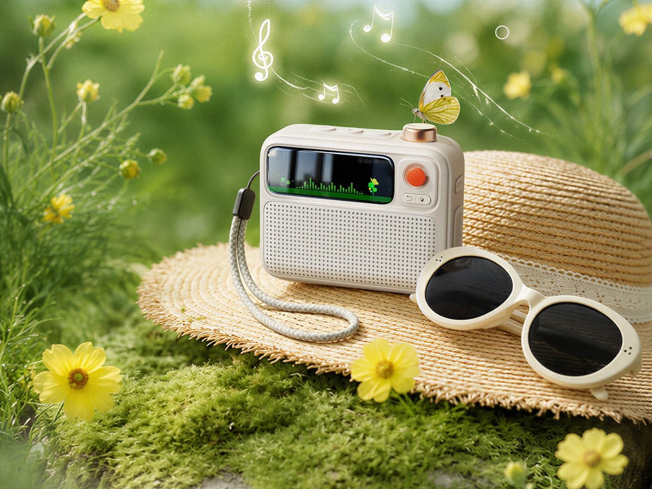
The 2.26-inch smart display is where the FlowToo takes on a bit more personality than a typical clock radio. It can show multiple clock face designs, music visualizers that react to what’s playing, sleep scene animations, and mood lighting to set a different tone in the room. The Divoom App lets you swap between these, set alarms, and choose sounds from your phone, which keeps the device simple to operate.

The FlowToo comes in White and Black and currently retails for $99.99. It’s compact enough to sit comfortably beside most beds without taking over the surface. The overall look is clean and rounded rather than clinical, which makes it easier to accept as a permanent bedroom addition instead of something that feels like a tech purchase trying too hard to belong on a nightstand.

There are more focused devices for each of those individual functions, and some will argue that a dedicated white noise machine sounds better or that a standalone speaker gets louder. That’s fair enough. But most people aren’t looking for world-class performance across every category; they’re looking for something reliable and pleasant that takes up less space, starts their morning decently, and doesn’t require them to manage four different apps.

The post The $99 Gadget That Clears 3 Devices Off Your Nightstand first appeared on Yanko Design.

7 Best Portable Tech Gadgets That Were Designed for the Job Site and Are Better for It Everywhere Else

Most portable tech exists on a spectrum of compromise. It is either capable but too heavy, light but too fragile, or designed so carefully for the desk that the real world breaks it within a year. The products in this list started from a harder question — what does this need to survive a construction site, a remote field deployment, or a category-five weather event — and solved backward from there. The answers turned out to be better than anything built with easier conditions in mind.

What happens when you build something to those standards and then bring it somewhere ordinary is the story this list is actually telling. An 800-nit gloved-touch tablet designed for warehouse logistics turns out to be the best thing you can take camping. A power bank built to disappear into a pocket started life as a silicon-carbon engineering challenge. Extreme design requirements have a way of producing exceptional objects, and the people who benefit most are the ones who never set foot on a job site.

1. Lenovo ThinkTab X11

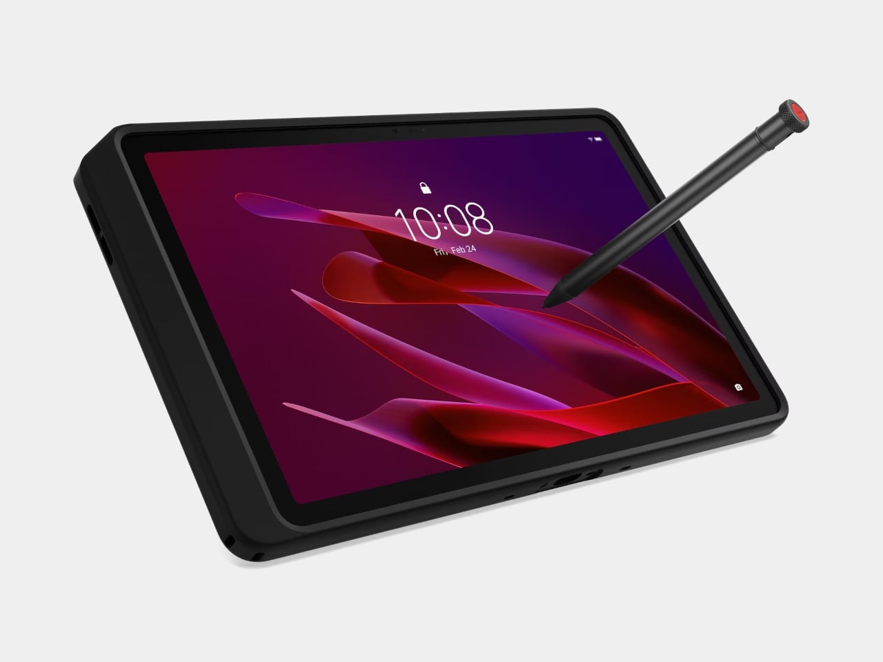
The ThinkTab X11 is the first device to carry Lenovo’s Think name in rugged Android territory, and it makes a strong case for why that should have happened sooner. At $499, it brings MIL-STD-810H certification, IP68 water and dust resistance, a 10.95-inch 90Hz display running at up to 800 nits behind Corning Gorilla Glass, and a touch layer calibrated for gloved hands and wet fingers. These are the specifications that matter on a logistics dock, but they matter just as much on a camping trip, a rainy commute, or the moment a tablet slides off a kitchen counter at exactly the wrong angle.

The design decision that separates it from everything else at this price is the battery. A 10,200mAh cell removes without tools through a screwless mechanism that lets a worker swap a depleted pack for a fresh one mid-shift without losing a step. It goes further with a battery-less operating mode: when mounted in a vehicle or fixed workstation, the ThinkTab X11 runs directly from DC power with no battery installed at all, reducing heat during continuous use and removing battery degradation from fixed deployments entirely. These are not features written for enterprise procurement brochures. They are simply better answers to how devices actually get used.

What we like:

  • Screwless hot-swap battery, and battery-less DC operating mode solve power dependency where it starts, rather than managing around it
  • MIL-STD-810H and IP68 certification delivered at a price point significantly below comparable enterprise hardware

What we dislike:

  • The included rugged case adds substantial thickness compared to consumer tablets of similar screen size
  • Rugged form factor and enterprise-first design language may feel over-specified for casual home use

2. OrigamiSwift Foldable Mouse

A full-sized mouse that folds completely flat is a more radical design proposition than it sounds. Most portable mice solve the carry problem by making the mouse smaller, which just trades one compromise for another and leaves you working on a cramped surface. The OrigamiSwift, designed by Horace Lam and drawing on the structural logic of origami, keeps the mouse full-sized in use and removes the footprint entirely when you’re done. A triangular structure that locks open with a satisfying click and collapses flat in a single motion is the kind of mechanism that makes every other portable mouse feel like an incomplete answer.

At $85, the Bluetooth connection is seamless, and the tracking is accurate enough for a full workday, but the real value is what it does to your bag. Most portable mice shift bulk from the desk into a dedicated pocket. The OrigamiSwift genuinely disappears — flat enough to slip between a laptop and a notebook without reorganizing anything. For anyone working across multiple locations, hot-desking in office environments, or simply refusing to carry more than a bag actually requires, it is the mouse that finally solves the carry problem without asking you to accept smaller performance as the price.

Click Here to Buy Now: $85.00

What we like:

  • Folds completely flat without sacrificing full-sized performance or reliable Bluetooth tracking across devices
  • Triangular origami structure locks securely open and collapses cleanly in a single motion every time

What we dislike:

  • The folding mechanism requires brief adjustment for users accustomed to a traditional fixed mouse shape
  • Limited color options compared to the wider range available with standard portable mouse alternatives

3. HMD Terra M

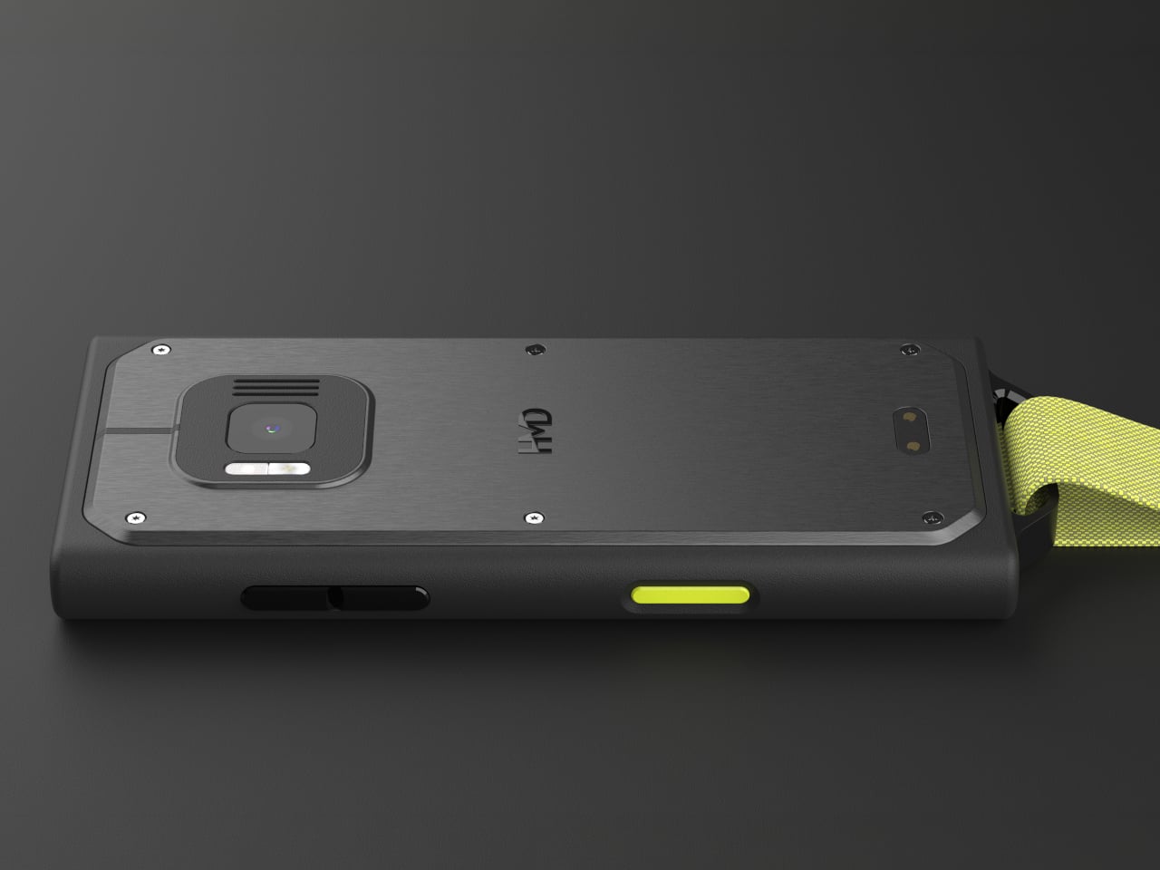
Most rugged phones solve the wrong problem. They add external armor, lose usability, and end up too bulky to carry without making a deliberate statement about it every time it comes out of your pocket. The HMD Terra M builds its field credentials directly into the design rather than bolting them on afterward. IP68 and IP69K ratings cover submersion and high-pressure water jets at 100 bar and 80 degrees Celsius. MIL-STD-810H military certification covers drop resistance from 1.8 meters. Resistance to gasoline, industrial solvents, and medical-grade sanitizers completes a durability profile that most flagship phones would quietly fail to meet.

Where it builds genuine daily value is in the smaller decisions. Large physical keys respond to gloved hands when fingers are too cold or too wet for a touchscreen to register. A 550-nit display behind Corning Gorilla Glass 3 reads clearly in direct sunlight without shielding it with your hand. A non-slip textured grip reduces the fumbling that costs seconds in a fast-moving work environment. All of that translates directly to everyday life without requiring any adjustment. The Terra M does not care whether you are wiring a commercial building or navigating a trailhead in autumn rain.

What we like:

  • IP68, IP69K, and MIL-STD-810H certifications handle conditions that eliminate most consumer devices from consideration
  • Glove-compatible physical keys and a high-brightness display designed for real-world outdoor and industrial use

What we dislike:

  • The 2.8-inch screen limits usefulness for media consumption and app-heavy daily workflows
  • The feature phone format means a second smartphone is still necessary for full platform functionality

4. Xiaomi UltraThin Magnetic Power Bank 5000

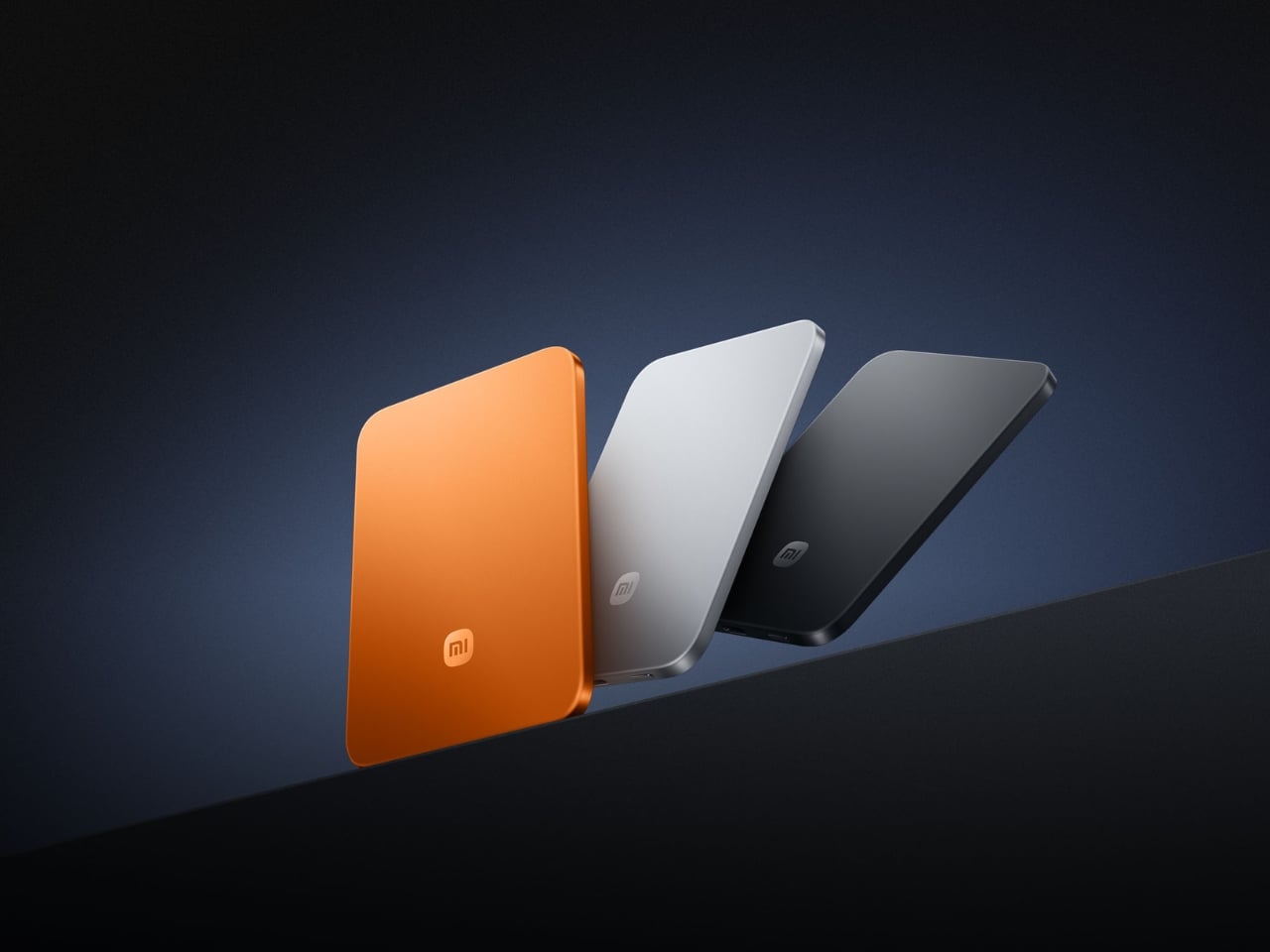
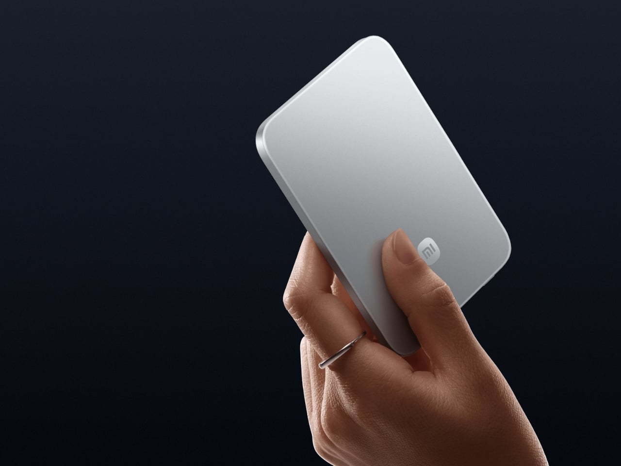
A 6mm power bank sounds like a specification claim until you hold one and feel that it is thinner than the phone you are about to charge. The Xiaomi UltraThin Magnetic Power Bank weighs 98 grams, makes a 5,000mAh capacity possible at that profile through silicon-carbon battery chemistry at 16 percent silicon content, and wraps it in an aluminum alloy shell with a fire-resistant fiberglass phone-facing surface. A photolithographically etched logo is the kind of finishing detail that signals a product someone cared about making, not just engineering. Showcased at MWC 2026 in Barcelona and available in Europe at around 60 euros, it reached Japan and Australia first.

Snapping it magnetically to the back of your phone and forgetting it is there is the intended experience, and it earns that description. Up to 15W wireless output is available with the Xiaomi 17 series; iPhone users land at 7.5W due to Apple’s own MagSafe ceiling. A USB-C port handles 22.5W wired, and the bank charges two devices simultaneously when the situation calls for it. Ten layers of protection cover overvoltage, overcurrent, overheating, and short circuits, with dual NTC temperature sensors and a 4,369mm² graphite sheet managing thermal dissipation across the ultra-thin body. The power bank category spent years making capacity the story. Xiaomi carried the story instead.

What we like:

  • At 6mm and 98 grams, it is genuinely the thinnest power bank available at this capacity level
  • Silicon-carbon battery chemistry achieves 5,000mAh without the bulk that traditionally defines the category

What we dislike:

  • iPhone MagSafe compatibility is capped at 7.5W due to Apple’s ecosystem restrictions, not Xiaomi’s
  • 5,000mAh capacity will not fully recharge most current flagship smartphones from zero in a single pass

5. Battery-Free Amplifying iSpeakers

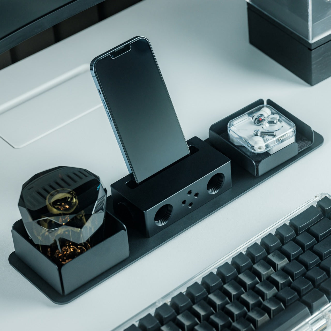
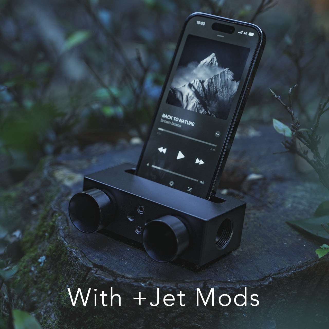
Every portable speaker eventually runs out of charge, usually at the exact moment you most want it not to. The Battery-Free Amplifying iSpeaker removes that problem by having no battery to run out. Set your phone into the slot and the Duralumin body — the same aircraft-grade aluminum alloy used in aerospace construction — channels your phone’s audio through its form, adding warmth and volume without drawing a single watt of power. Golden ratio proportions give it a visual presence on a surface that most speakers trailing cables and charging bricks never quite manage. At $299, it is considered an object as much as it is a functional one.

The simplicity is entirely deliberate, and it produces a kind of reliability that connected audio gear simply cannot replicate. There is nothing to configure, nothing to pair, and nothing to charge before you use it. It is ready at any moment, in any room, at any location, with no setup and no thought required. Optional Bloom and Jet modular accessories let you adjust how sound disperses if more directional control suits the space. For the home desk, the kitchen counter, the campsite table, or a van where an outlet is not guaranteed, this is the speaker that is always just there.

Click Here to Buy Now: $179.00

What we like:

  • No battery, no electricity, and no pairing required — permanently ready with zero setup or maintenance overhead
  • Aircraft-grade Duralumin shaped to golden ratio proportions earns permanent shelf or counter placement as a display object

What we dislike:

  • Amplification quality is entirely dependent on the output of your phone’s own built-in speaker hardware
  • Bloom and Jet modular sound-directing accessories that expand their utility are sold separately at additional cost

6. O-Boy Satellite Smartwatch

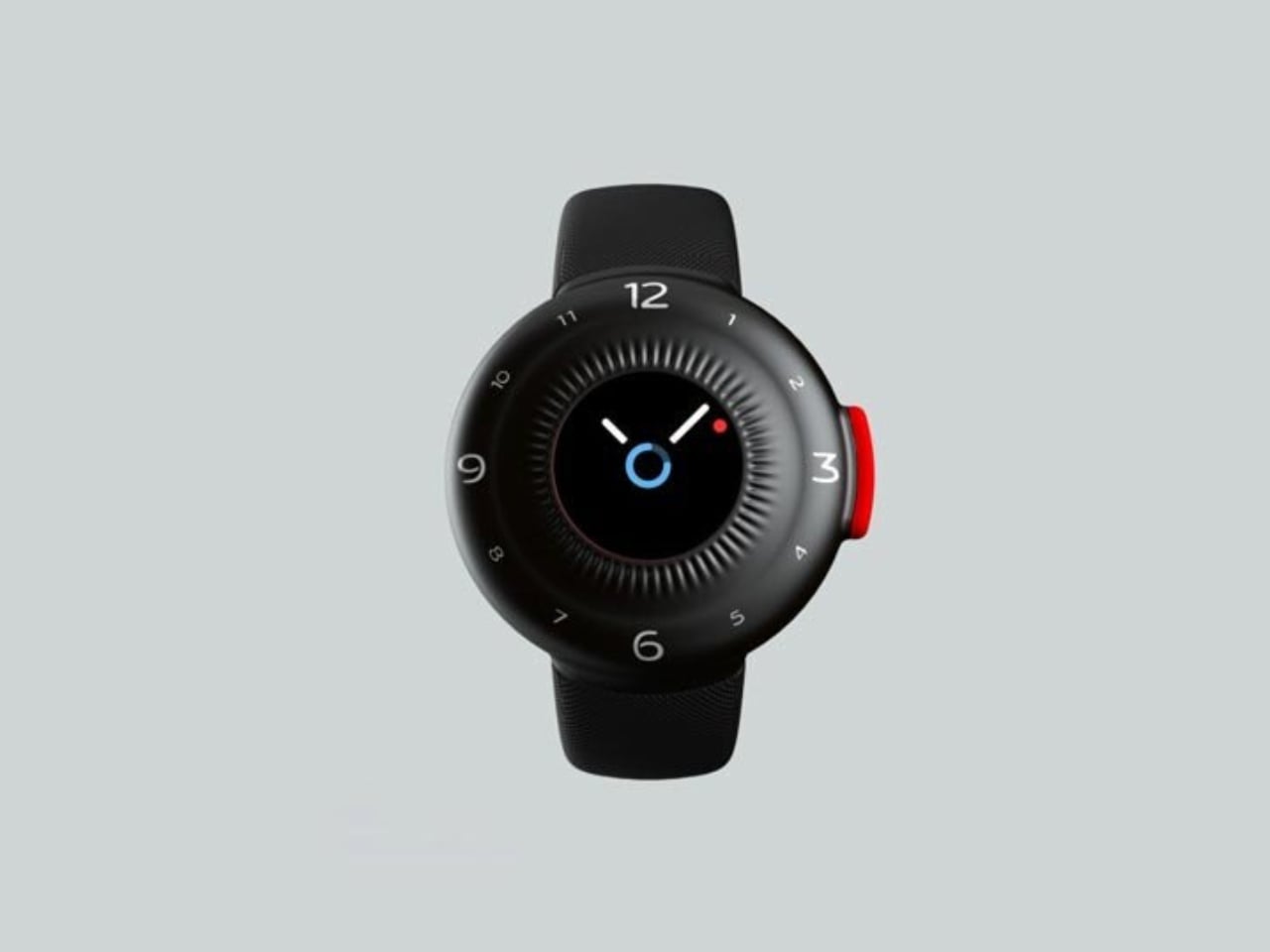
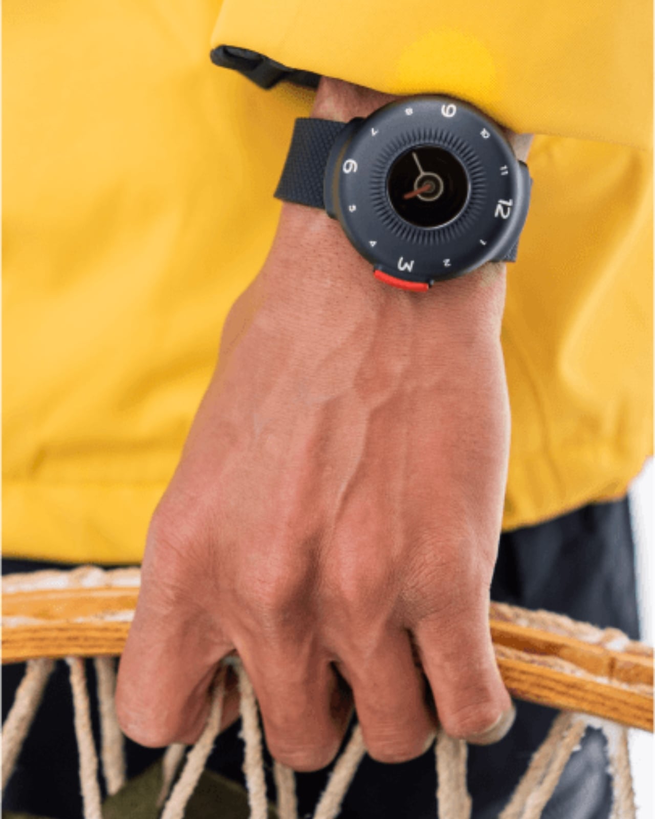
Most wearable safety technology carries its purpose visibly. It bulks up, goes tactical, and ends up being gear you wear only when you genuinely expect to need it. The O-Boy, developed by Brussels-based studio Futurewave, refuses that convention. It is a satellite-connected smartwatch that functions as a direct satellite communication link in environments where mobile networks simply stop existing — mountains, open ocean, remote construction and survey sites, maritime operations. The satellite connectivity transmits an emergency alert from anywhere on Earth, completely independent of carriers, towers, signal strength, or what infrastructure exists beneath your feet.

What Futurewave got right, beyond the technology, is the design brief. The O-Boy does not read as survival gear. It looks like something a person who regularly spends time in remote environments would choose to wear rather than something they reach for when a trip turns serious. That distinction matters more than it appears on the surface, because the people who most need a reliable safety layer are not all extreme athletes. They are field engineers, remote workers, offshore technicians, and anyone who has been somewhere and understood for the first time that their phone was not a plan. The O-Boy is built for all of them.

What we like:

  • Satellite connectivity operates independently of mobile coverage in any location on the planet
  • Design language is genuinely wearable across everyday and professional contexts without tactical visual signaling

What we dislike:

  • Satellite communication requires an ongoing subscription service to remain active beyond initial setup
  • Smartwatch battery management becomes a daily consideration for a device that functions as a primary safety tool

7. BLUETTI Handsfree 2 Solar Generator Backpack

A 512Wh power station built into a 60-liter backpack is the kind of product that takes one sentence to explain and several minutes to fully appreciate. The BLUETTI Handsfree 2 integrates an LFP battery delivering 700W continuous output rated to 4,000 charge cycles at 80 percent capacity, dual 100W USB-C ports, dual USB-A, and a full AC outlet in a carry system that holds your gear alongside it. Solar panels mounted directly to the pack accept up to 350W of input, achieving a full charge in roughly three hours of sun. The design requirement that field workers never run out of power while moving produced something genuinely useful for everyone who moves.

The practical difference between this and a power station you remember to put in the bag is that the Handsfree 2 charges while you walk. Transit becomes charging time, which is a consequence of starting from job site requirements rather than outdoor recreation ones. Fragmented solar panel technology handles overcast days with reasonable efficiency. At 21.4 pounds for the full system, it is not a light carry, but for photographers hiking to remote locations, van-lifers managing continuous power, and digital nomads building a setup that never depends on finding an outlet, the BLUETTI Handsfree 2 changes the math on what portable power actually means.

What we like:

  • Solar panels mounted to the pack charge the battery while walking, turning transit itself into productive charging time
  • 4,000-cycle LFP battery is engineered for sustained daily use over years rather than seasonal or occasional carry

What we dislike:

  • The full system weight of 21.4 pounds becomes a real consideration on longer trails or extended travel days
  • Premium price sits well above basic portable power station alternatives, offering similar output specifications

The Job Site Always Had Better Design

The consistent argument running through all seven products is that designing for a harder use case raises the floor for everyone. A tablet engineered for warehouse logistics turns out to be the best device for a camping trip. A power bank built for engineering-grade thinness becomes the one you carry without noticing. A speaker designed around having no power source at all is the most reliable speaker you will ever own. Solving problems at the end of a use spectrum produces objects that handle everything beneath it without effort or exception.

None of these products asks you to care about where they came from. They simply work better because of it. The rugged phone that survives industrial solvents and 100-bar water jets does not need that context to be a better everyday companion — it just is one. That is the quiet argument this list makes, and it holds across every category here. The best portable tech you own was probably built, at some point, to answer a question far harder than the one you are currently asking it.

The post 7 Best Portable Tech Gadgets That Were Designed for the Job Site and Are Better for It Everywhere Else first appeared on Yanko Design.

The LG Rolling TV That Went Viral Is Now 32 Inches, 4K, and $1,299

TVs have stayed mostly where you put them. Whether wall-mounted or parked on a stand, they tend to define the room around them. Portable screens have existed on the margins, mostly small and underpowered, better suited for camping trips than everyday home use. The idea of a full-featured smart display that doesn’t need a power outlet and can move freely from room to room is still a fairly new proposal.

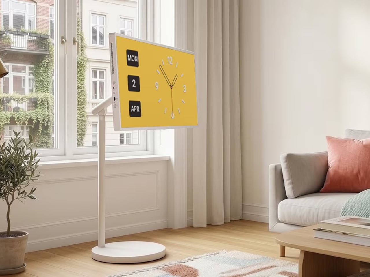
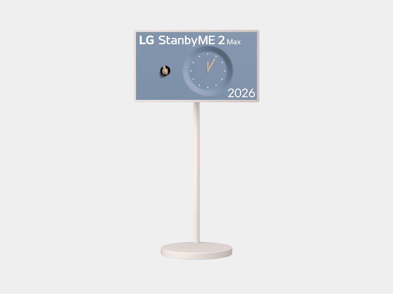
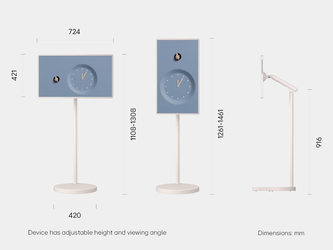
The LG StanbyME 2 Max pushes that concept further than its predecessors managed. It’s the largest StanbyME yet at 32 inches, now with 4K resolution, and a built-in battery lasting up to 4.5 hours without any outlets nearby. The screen area is roughly 40% larger than the 27-inch model it succeeds, which makes a genuine difference when you’re watching something rather than just glancing at a display.

Designer: LG

The battery is a 144Wh cell, a meaningful step up from earlier StanbyME versions that started with three hours of playback back in 2021. When the charge runs low, a USB-C port accepts input from an external power bank, so you don’t have to hunt for a wall outlet mid-movie. A magnetic clip-on mini remote stores against the side of the display, keeping the overall setup clean.

The display detaches from its wheeled floor stand with a single click and comes with a second tabletop stand for positioning on a desk or counter. Landscape and portrait orientations are both supported, so it adapts to what you’re watching or doing. The wheeled base lets you roll the setup from one room to another without lifting anything, which is what made earlier StanbyME models a social media phenomenon.

The jump to 4K UHD means the 32-inch panel renders at 3,840 x 2,160 pixels, which holds up well at the close-up distances a screen of this kind naturally invites. Dolby Vision handles HDR content, while side-firing speakers output Dolby Atmos supported by AI Sound Pro processing. The α8 AI Processor Gen3 handles picture enhancement automatically, detecting what’s on screen and adjusting the image accordingly.

Running on webOS, the StanbyME 2 Max behaves like LG’s current smart TV lineup, giving access to more than 400 free LG Channels alongside major streaming services. Mood Maker turns it into an ambient display when idle, while built-in touchscreen apps include board games and Let’s Draw for sketching. HDMI and USB ports cover external connections for laptops, gaming consoles, and set-top boxes.

The StanbyME 2 Max earned a CES 2026 Innovation Award in the Content & Entertainment category, building on the iF Design Award and Red Dot Design Award that its predecessor picked up. LG has kept the visual profile clean enough that it doesn’t look conspicuous propped beside a bed or rolled into a kitchen. It’s available for pre-order now at $1,299.99.

The first StanbyME was a genuinely strange product that found an audience anyway. This one is harder to dismiss as a novelty. At 32 inches with 4K resolution, a 4.5-hour battery, and HDMI connectivity for consoles and laptops, it competes as much with a secondary monitor as it does with a conventional TV. The $1,299.99 price tag is the part that asks the most of prospective buyers.

The post The LG Rolling TV That Went Viral Is Now 32 Inches, 4K, and $1,299 first appeared on Yanko Design.

Xiaomi Watch S5 46mm Review: Looking Good, Lasting Longer

PROS:


  • Stylish and premium design

  • Bright, vibrant display

  • Excellent battery life

CONS:


  • Limited app ecosystem compared with Wear OS

  • Sleep tracking can miss naps

RATINGS:

AESTHETICS
ERGONOMICS
PERFORMANCE
SUSTAINABILITY / REPAIRABILITY
VALUE FOR MONEY

EDITOR'S QUOTE:

The Xiaomi Watch S5 46mm feels well judged. It is stylish, comfortable, and impressively long-lasting, even if the software still leaves some room to grow.

The Xiaomi Watch S5 46mm looks less like a gadget trying to pass as a watch and more like a watch that happens to be smart. That distinction matters because design still shapes how often a wearable actually ends up on your wrist. Xiaomi seems to understand that, and the Watch S5 leans hard into premium materials, a traditional silhouette, and a feature set built around daily usability.

Beyond the styling, there is a solid hardware pitch here, too. Xiaomi is promising a bright 1.48-inch AMOLED display, updated health tracking, new cycling features, and battery life of up to 21 days under light use. If those claims hold up, the Watch S5 could be appealing for people who want a smartwatch that feels less demanding and more natural to wear. I spent some time with the Watch S5 to see whether that mix of style and practicality actually comes through in daily use.

Designer: Xiaomi

Aesthetics

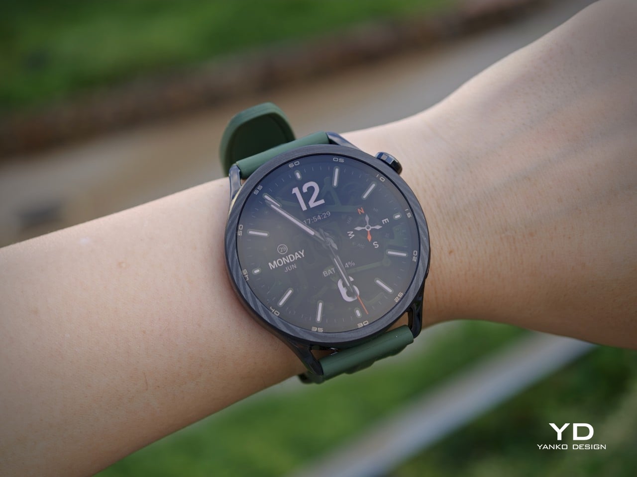
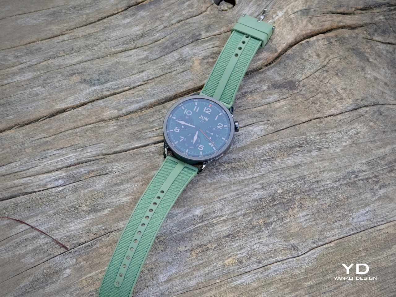
That design-first approach is obvious the moment you see the Watch S5. It sticks with a classic round shape, but the detailing keeps it from blending into the crowd. The slim bezel and minute markings make it feel closer to a proper wristwatch than a lot of smartwatches that still come off as generic or overly sporty. Combined with the forged stainless steel frame, the design has a solid sense of polish without trying too hard.
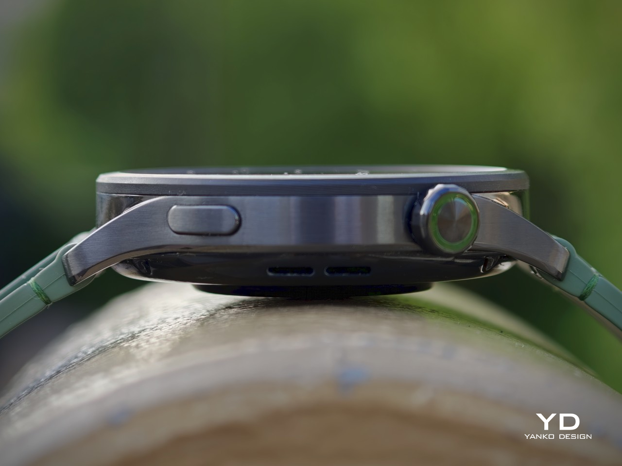
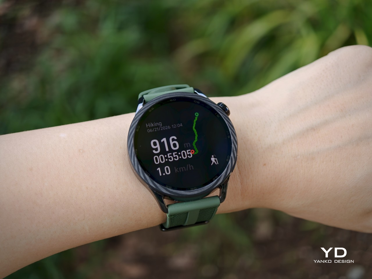
The lineup itself is well judged, too. The black and silver versions are the standard models, both using the stainless steel frame and a cleaner, more understated finish. The Ceramic Blue version is clearly the dressier option, with a zirconia ceramic bezel, enamel-filled markings, and a leather strap that gives it a more tailored look. The Jungle Green model I received takes a sportier approach, swapping in a forged carbon bezel and a hybrid strap that make it feel more rugged and outdoorsy. It is a smart spread of styles, and it gives the Watch S5 range more character than a simple color refresh would have.

Ergonomics

At 46mm, the Xiaomi Watch S5 is not a small watch, but it wears better than that number suggests. I used the Jungle Green version, and even on my small wrist, it never felt bulky or awkward. Xiaomi lists it at 46 x 46 x 10.99mm and 46g without the strap, so it is still very much a full-size smartwatch, but in day-to-day use, it comes across as lighter and easier to wear than I expected.
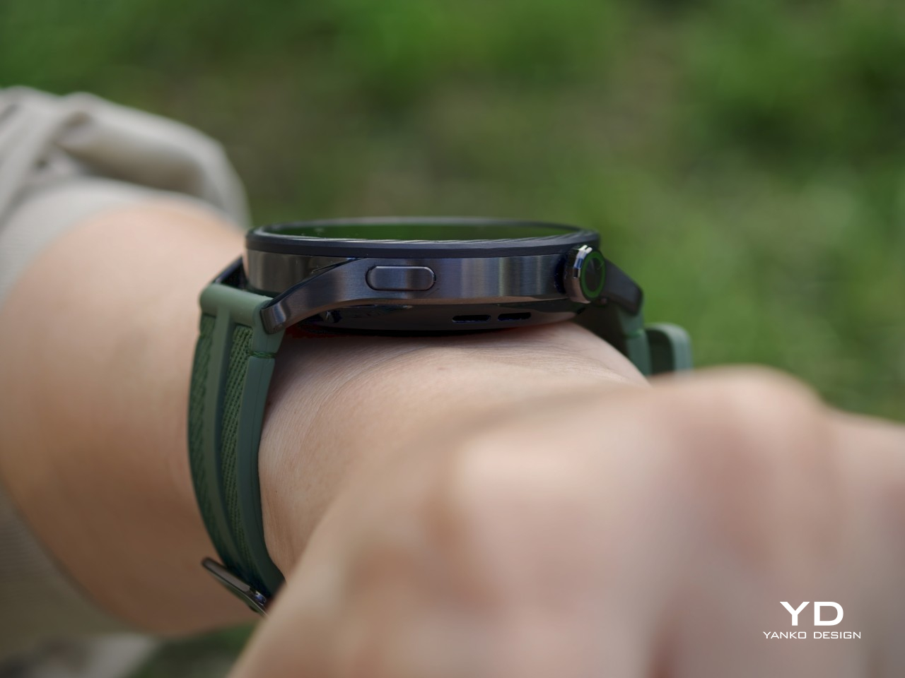
A lot of that comes down to how the watch sits on the wrist. It has enough presence to feel substantial, but it never feels clunky or uncomfortable. The hybrid strap on the green model helps, too, since it feels secure and practical for longer wear. That sense of ease carries over to the controls. The rotating crown and side button are both responsive, which makes the watch straightforward to use, though I would have liked slightly stronger haptic feedback from the crown.

Performance

A lot of the Watch S5’s appeal comes down to how easy it is to use, and the display does a lot of the heavy lifting there. It uses a 1.48-inch AMOLED panel with a 480 x 480 resolution and up to 2500 nits of peak brightness. The bezel is slimmer too. Xiaomi says it measures 2.6mm, which is 40 percent narrower than the previous generation, and that helps the screen feel more open and modern. In use, it looks sharp, vibrant, and bright enough to stay readable outdoors without much effort. That alone goes a long way on a smartwatch, since a dim screen can get annoying very quickly when you are checking the time or glancing at notifications on the move.
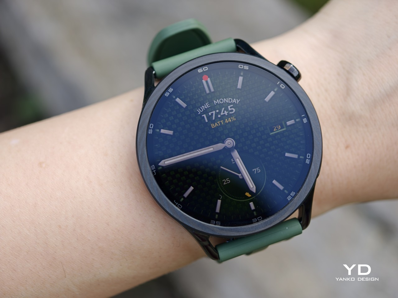
Fitness and health tracking are a big part of the Watch S5, even if I am not really the target user for the more training-heavy side of it. I am not someone who works out intensely or spends much time digging through performance metrics during exercise, which happens less often than I would like to admit. That is partly why I found the Watch S5 surprisingly approachable. It gives you some flexibility over what data shows up on the watch, so it does not have to feel like a wall of numbers every time you start moving.
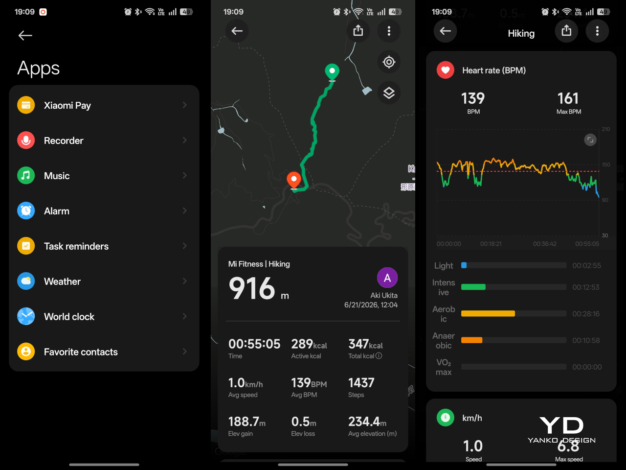
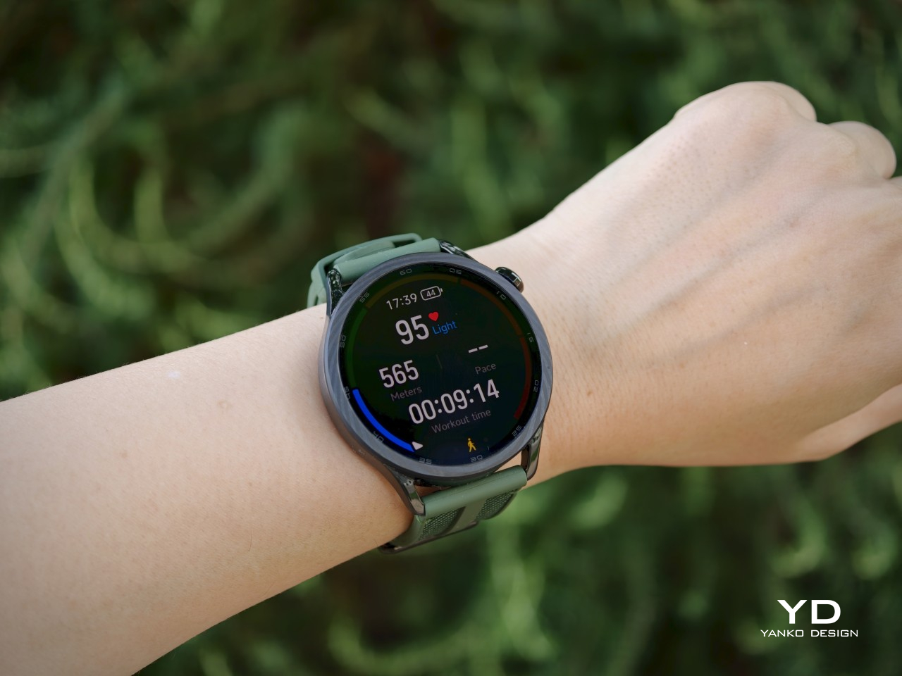
Most of my time with it was spent on walks and a light hike rather than anything especially demanding, but I still found the tracking useful. Being able to glance down and see things like heart rate, distance, and workload made the experience feel a bit more engaging, especially during the hike when I was already feeling tired. I would not suddenly pretend this turned me into a training-focused person, but it did make the data feel more motivating than I expected.
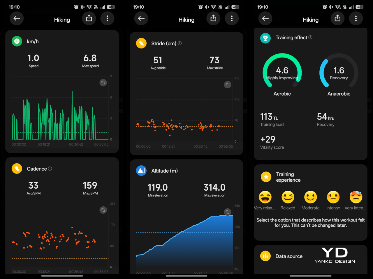
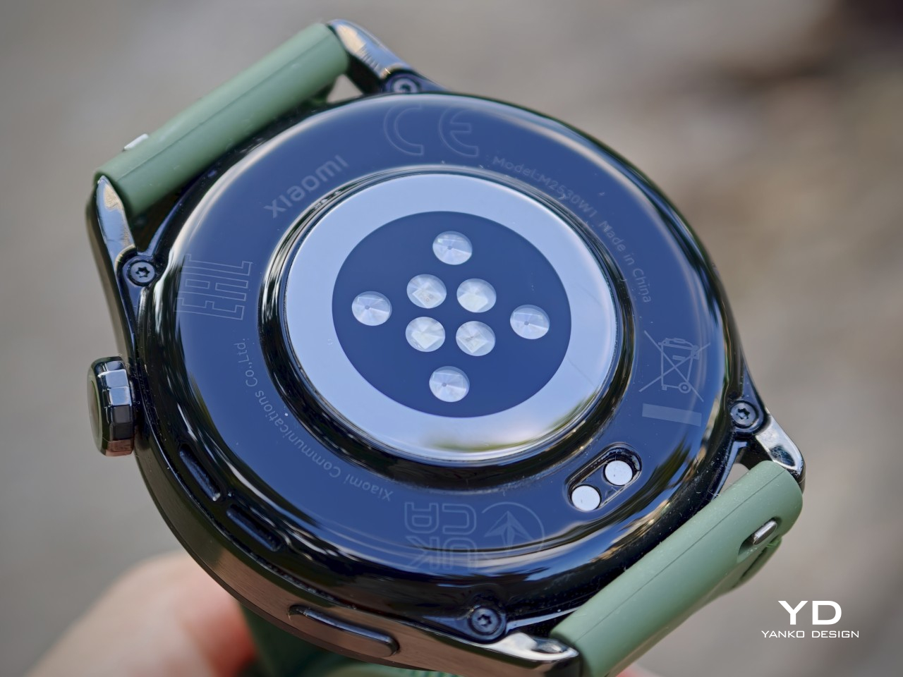
The Watch S5 uses the same heart-rate sensor setup found in the flagship Xiaomi Watch 5, with 4 LEDs and 4 PD, alongside L1 plus L5 five-system GNSS and 5ATM water resistance. There are also more than 150 sports modes, so the watch clearly has a much broader fitness toolkit than the small slice of it I used. Sleep tracking is a bit more mixed. Xiaomi claims its updated sleep algorithms improve fall-asleep and wake-up detection by 11 percent, with sleep-stage tracking improved by 14 percent. In my use, though, it still had a tendency to miss naps. That does not make the feature useless, but it is a reminder that health tracking claims on paper do not always translate perfectly in everyday use.
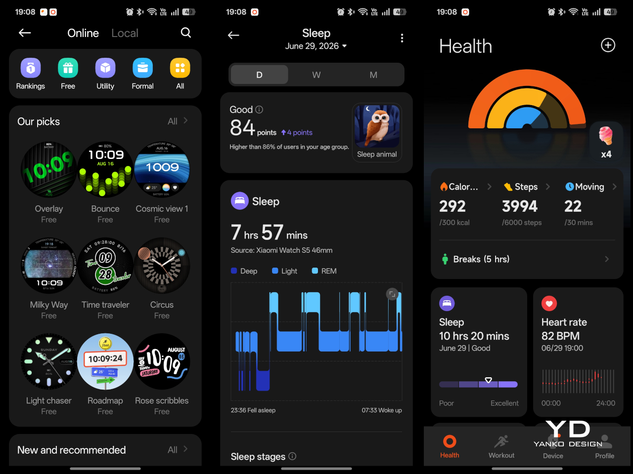
Beyond health and fitness, the software experience is mostly straightforward, too. The Watch S5 runs Xiaomi HyperOS 3, and for the most part, it is easy enough to get around. The interface is straightforward, and it does not take long to figure out where everything is. Swiping down brings up notifications, though your options are fairly limited once you are there. You can dismiss them, but you cannot quickly reply to messages, which makes the experience feel a bit more passive than on some rival smartwatches.
The rest of the navigation is a little uneven. Swiping up opens widget cards, while swiping right lets you cycle through the watch faces stored on the device. Swiping left, though, does nothing at all. I found that a bit frustrating, especially since I do not change watch faces very often. It feels like Xiaomi could have made better use of the side gestures here, or at least given users the option to customize them.
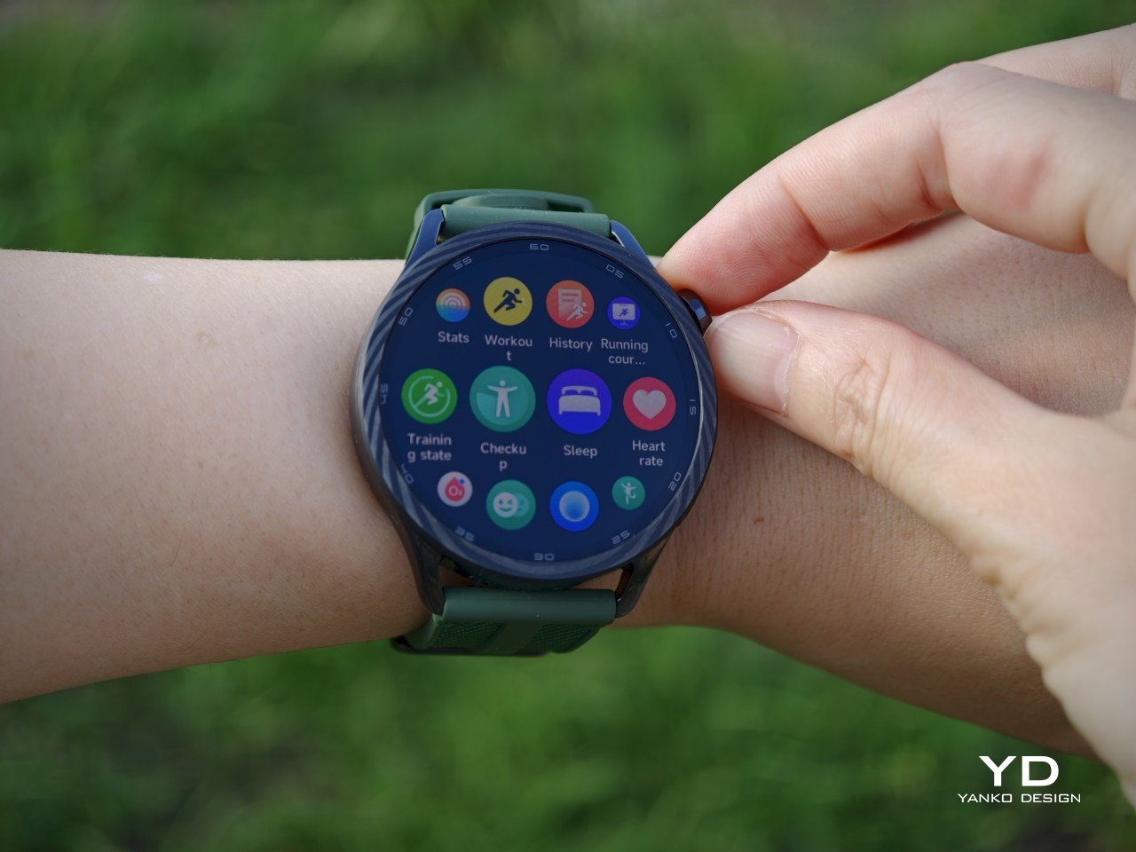
Pressing the rotating crown opens the app list, while the side button brings up the control center. That all works as expected, but the software does feel more limited once you look beyond the basics. Since the Watch S5 does not run Wear OS, there is no access to the Google Play Store, and Xiaomi’s own app selection for HyperOS 3 is still quite limited. On the phone side, the Mi Fitness companion app covers the essentials and also gives you access to plenty of free watch faces, which is a nice way to add some variety even if the wider software ecosystem remains fairly basic.

Battery life may be the Watch S5’s most practical strength. Xiaomi rates it for up to 21 days of light use from the 815mAh battery, which it says is a 68 percent jump over the previous generation. In my case, with Always On Display turned on and all the health tracking features enabled, it lasted about six days. That is genuinely impressive, and it makes the Watch S5 feel far less needy than many smartwatches. Charging happens through the included proprietary magnetic pogo-pin charger, which works fine, though it does mean dealing with yet another device-specific cable.

Sustainability

Sustainability is not a major part of Xiaomi’s pitch for the Watch S5, though to be fair, that is true of most smartwatches. There is no clear emphasis here on recycled materials or repairability, so it is hard to give the watch much credit on environmental grounds alone. What it does offer, though, are a few practical touches that could help with longevity.
The 5ATM water resistance also helps on the longevity front, especially for a watch that is meant to handle swimming as well as everyday wear. The use of standard 22mm quick-release straps is another plus, since it makes the watch easier to refresh over time without being locked into one specific band. That may sound like a small thing, but replaceable straps can help a device stay in use longer, especially when comfort or style preferences change. The stainless steel frame and the more premium material options should also hold up well over time. For now, the Watch S5 feels built to last, even if it does not make much of a sustainability case.

Value

The Xiaomi Watch S5 makes a pretty strong case for itself on value. At £149.99, or about $205, for the black and silver versions, and £169.99, or roughly $232, for the Blue and Green models, it sits in a price range that feels competitive for what you are getting. The stainless steel frame, bright AMOLED display, strong battery life, and broad fitness feature set already give it a solid hardware foundation, and the more premium Blue and Green finishes do at least look like they justify the small step up in price.
That pricing also helps make some of the watch’s limitations easier to accept. The software is straightforward but not especially deep, and the app ecosystem is still quite limited compared with Wear OS alternatives. Even so, the Watch S5 is not really trying to compete as the most app-rich smartwatch in its class. It feels more like a well-rounded option for people who care about design, comfort, battery life, and fitness basics, and at these prices, that balance is easier to appreciate. For the money, Xiaomi is offering a lot of watches.

Verdict

The Xiaomi Watch S5 succeeds by focusing on the right things. It puts design, comfort, battery life, and the kind of fitness features that are useful without becoming overwhelming at the center of the experience. That makes it easy to recommend, especially for people who want something that looks more like a proper watch and less like a tiny gadget strapped to the wrist.

The trade-off is that Xiaomi HyperOS 3 still feels fairly limited once you look past the basics. You are not getting the depth or flexibility of a Wear OS device, and that will matter to some buyers. Even so, the Watch S5 gets enough right to stand out where it counts. At £149.99, or about $205, for the standard versions and £169.99, or roughly $232, for the Blue and Green models, it offers a lot without asking too much in return.
The post Xiaomi Watch S5 46mm Review: Looking Good, Lasting Longer first appeared on Yanko Design.

The Smartest Upgrade for Better Sleep Isn’t a New Mattress

We spend about a third of our lives asleep, and most of us are still doing it on the same basic setup we’ve had since forever: a mattress, some pillows, and a blanket we’re either kicking off or pulling back over our shoulders at 3 a.m. For something so essential to how we function every single day, every workout, every decision, sleep technology has been surprisingly slow to catch up with everything else in our homes. That changes with the Orion Sleep System.

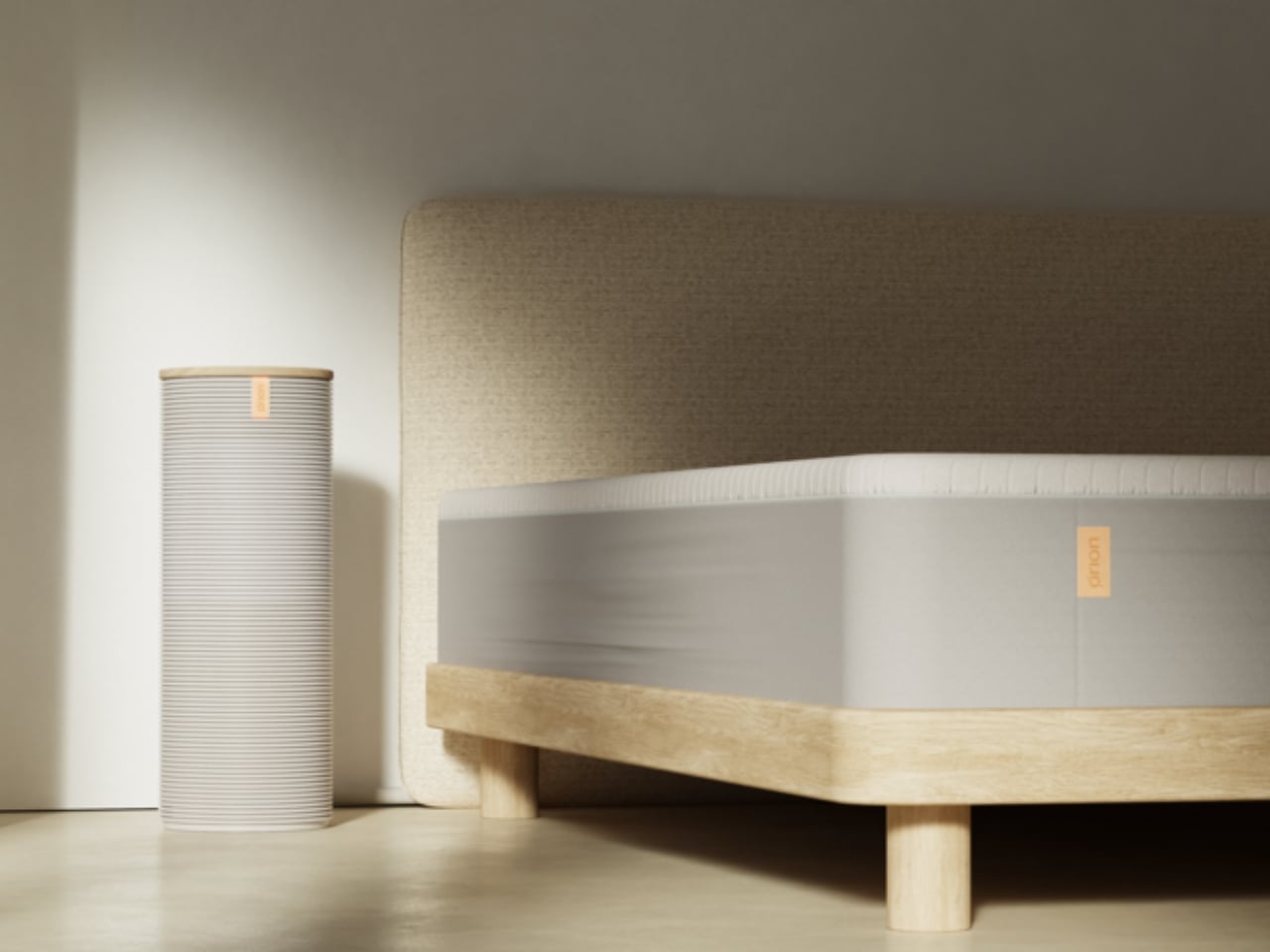
Designed by Santa Cruz-based studio Herbst Produkt, Orion is a Smart Cover that turns your existing bed into a fully intelligent, AI-powered sleep system. No mattress replacement required. The concept alone is worth pausing on. Most high-tech sleep products ask you to invest in an entirely new bed setup. Orion fits over what you already have, which says a lot about how this team thinks about design: it’s not about selling you more, it’s about making what you already own work smarter.

Designer: Herbst Produkt

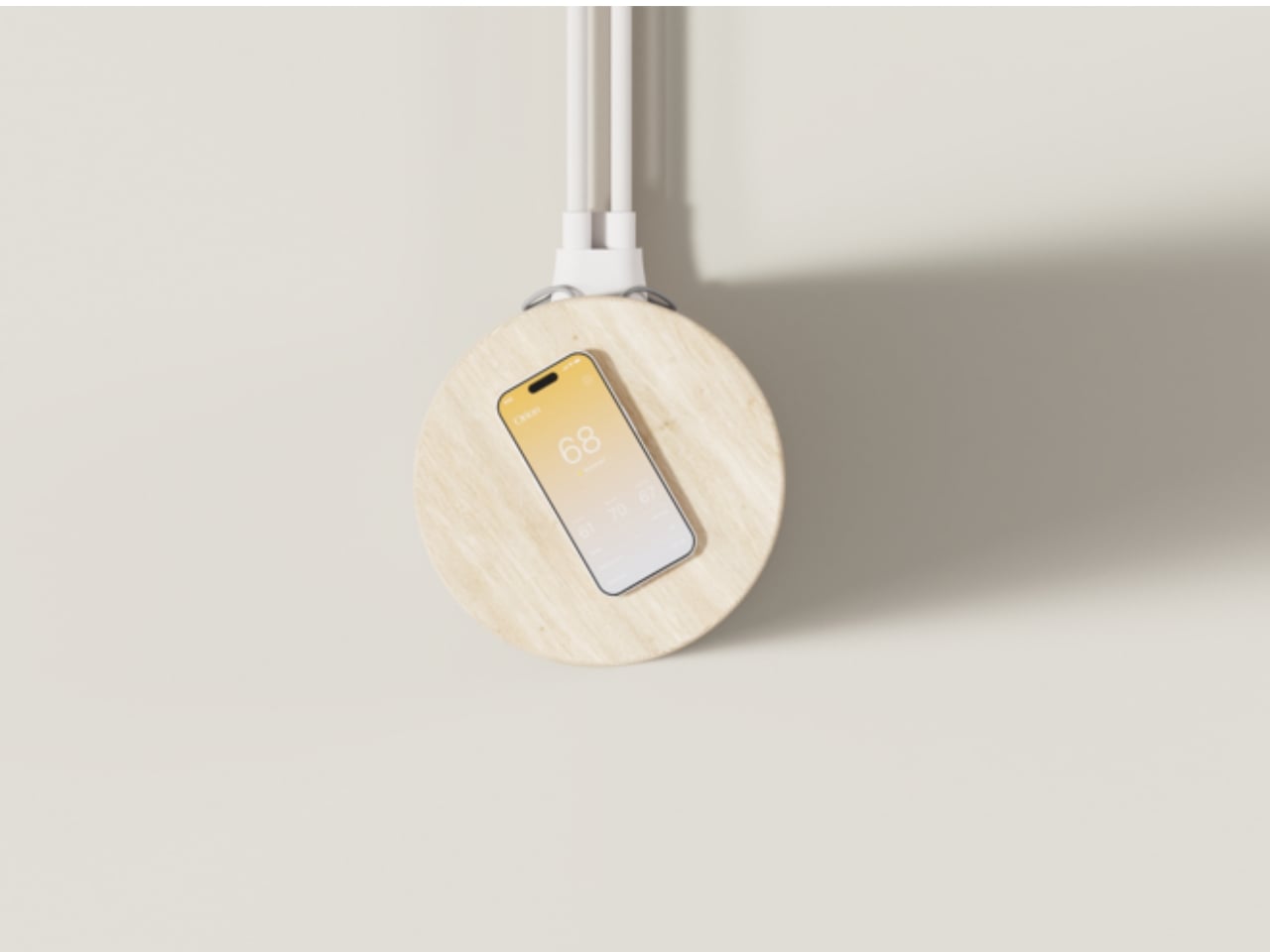
The core technology centers on dual-zone thermoregulation that senses, learns, and adapts in real time. If you tend to overheat at night and your partner is perpetually cold, Orion handles both sides of the bed separately, without negotiation, without a thermostat war, and without anyone losing sleep over it (pun fully intended). Biometric sensing feeds data into an AI that builds personalized temperature profiles over time. The more you sleep with it, the better it gets at keeping you in that ideal zone where deep, restorative sleep actually happens.

Temperature, by the way, is one of the most underrated factors in sleep quality. Research consistently shows that our bodies need to cool down to fall asleep and stay that way through the night. For anyone who’s ever been yanked out of a deep sleep by a sudden hot flash, a restless partner, or just a bedroom that refuses to cooperate with the season, that’s not a small thing. Orion treats it like the serious physiological variable it actually is.

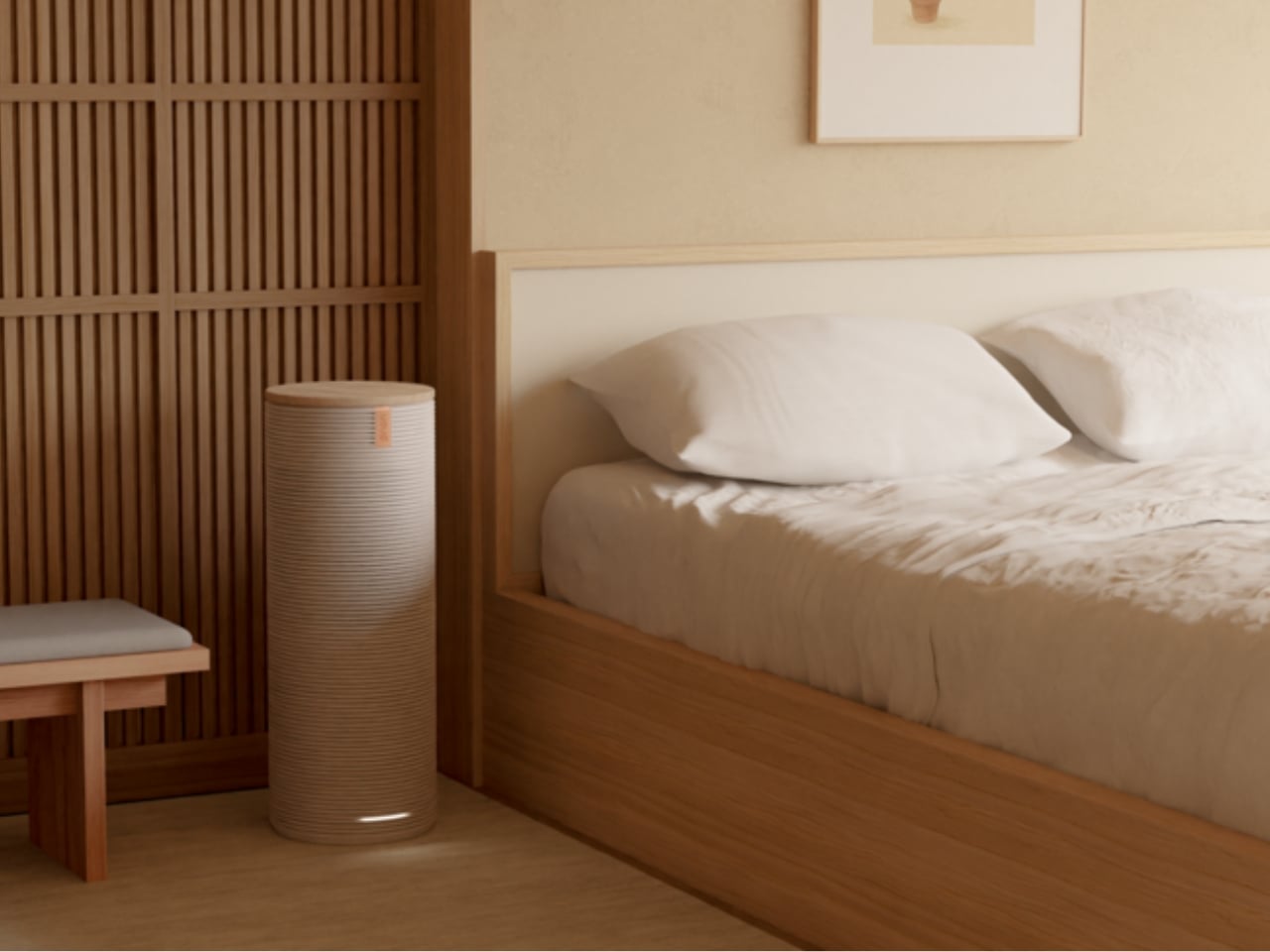
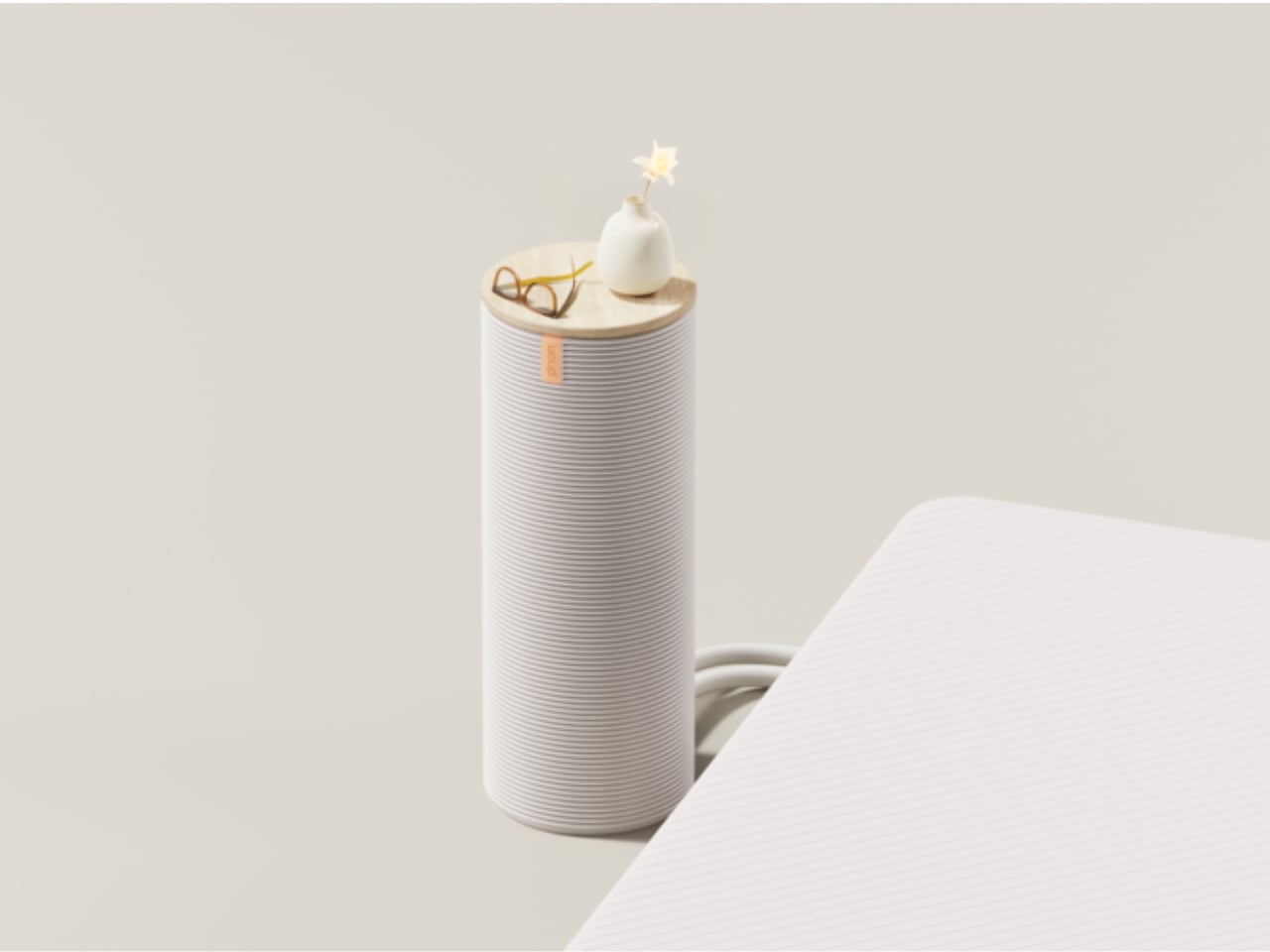
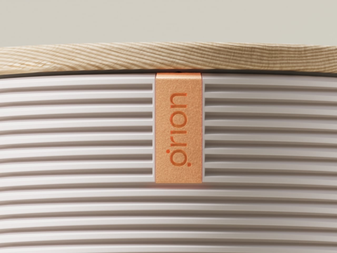
What makes this stand out beyond the specs, though, is the physical design approach. Sleep tech has a history of looking like medical equipment, things you’d rather keep hidden than have sitting prominently on your nightstand. Orion went the opposite direction. The hub is built with warm wood tones and a clean cylindrical form that reads more like a considered home object than a gadget. It sits on your nightstand like something you consciously chose to put there. It was designed to live in your space, not just function in it, and the difference between those two things is exactly what separates good design from great design.

That choice matters more than it might seem. The best technology is the kind you forget is there, the kind that doesn’t make your bedroom feel like a biohacking lab. Orion lands somewhere between sophisticated and approachable, and the design team specifically built it to be accessible to people who aren’t particularly tech-savvy. There’s no steep learning curve here, no intimidating interface to decode at midnight. That kind of inclusive thinking in product design still doesn’t happen enough.

At around $2,295 for a Queen size, the Orion Sleep System is a real investment. It’s not for everyone’s budget, and glossing over that would be doing you a disservice. But the framing matters here. This is being positioned alongside wellness tools, not bedding. When you start thinking about it the way people think about a Peloton or a standing desk, the math starts to feel different.

Sleep is the foundation everything else is built on. Energy, focus, mood, recovery, even creativity all trace back to how well you rested the night before. The fact that a product this considered, this well-designed, and this genuinely functional now exists to address it feels like a meaningful signal of where the wellness and design worlds are finally, properly meeting. It took long enough.

The post The Smartest Upgrade for Better Sleep Isn’t a New Mattress first appeared on Yanko Design.
5 Best Gadgets of June 2026 That Quietly Run Your Home in the Background

The best technology in your home shouldn’t announce itself. Not in the way a smart speaker waits for a wake word, or a connected display flashes notifications from across the room, but in the deeper sense of design that integrates so completely into daily life, it stops registering as technology at all. The products below share that quality. They handle a specific, defined task without requiring anything from you after the initial setup is done.

This is not a list of gadgets that respond to commands or unlock new workflows once you’ve mastered an app. These are products built around a different premise: that your home should be capable enough to manage itself. From the air cycling through your living room to the lawn outside your front door, the version of home technology worth paying attention to is the version that quietly gets on with it.

1. Blueair Blue Signature Air Purifier

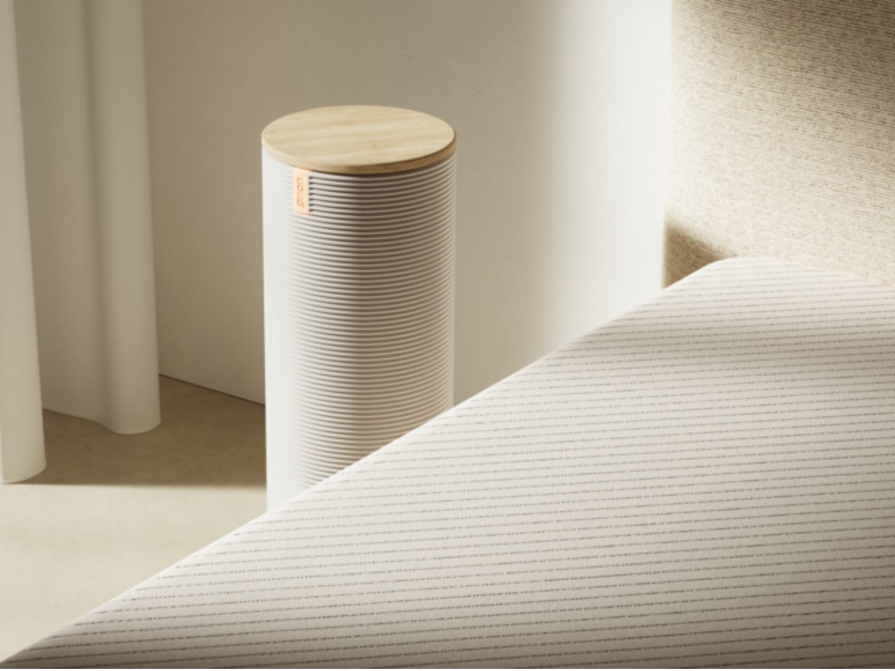
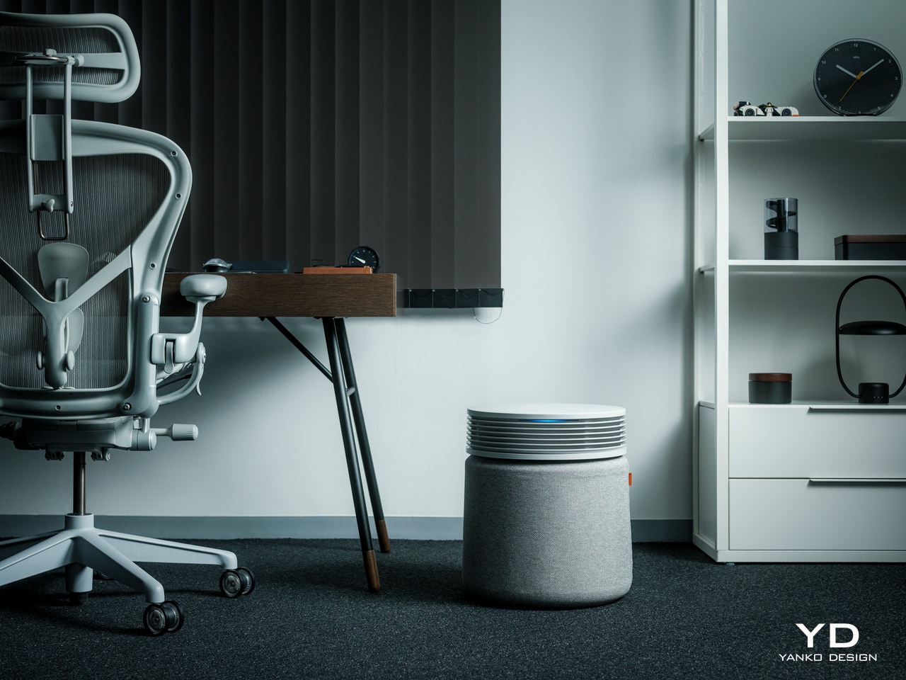
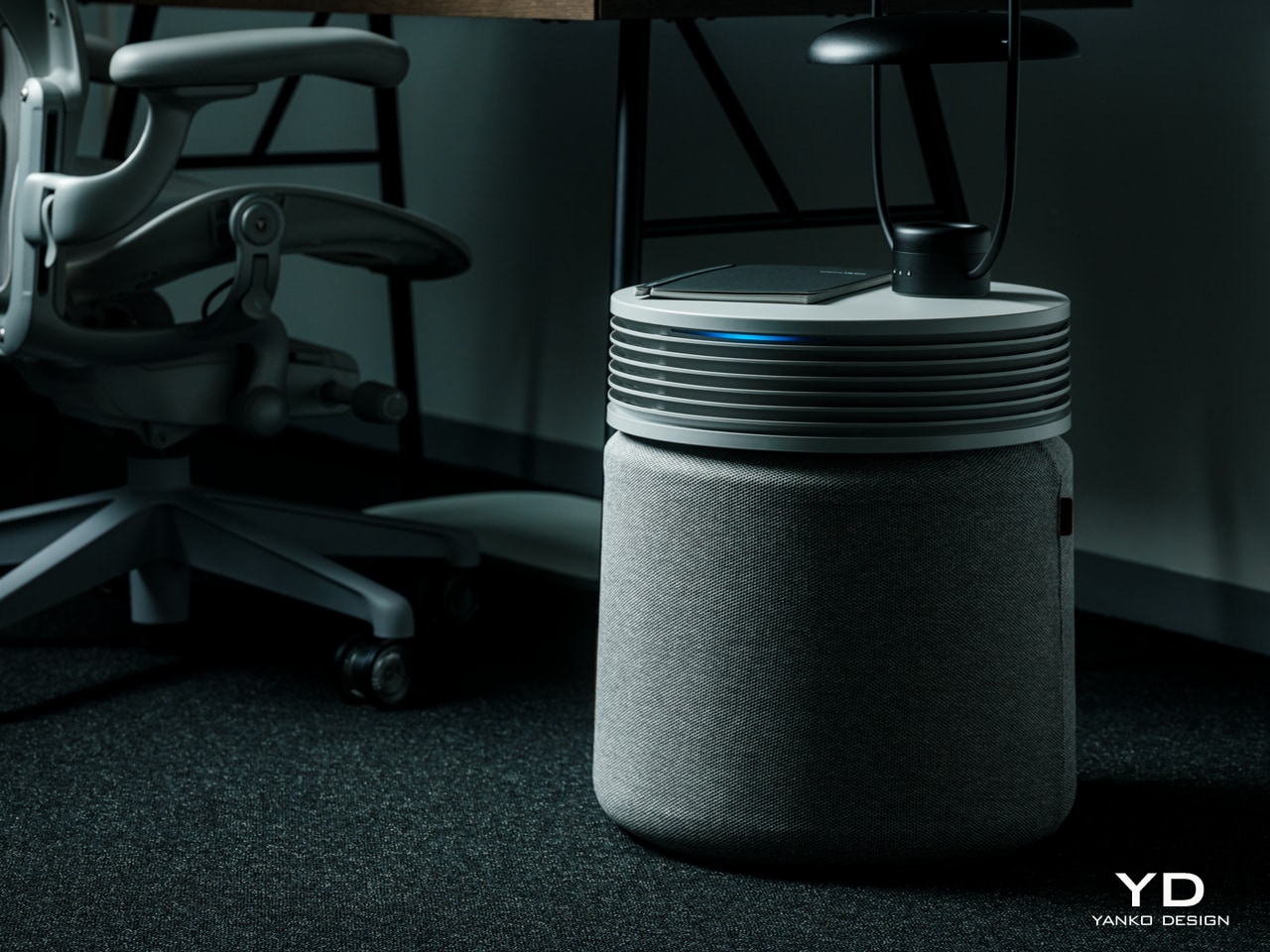
Most air purifiers operate on a schedule someone set during the first week of ownership and never revisited. The Blueair Blue Signature works differently, running in Auto mode and reading actual air quality in the room to decide when and how hard to work. When particulate matter spikes after cooking, or pollen drifts in through an open window, it responds by increasing output. When the air settles, it pulls back. There is no schedule to maintain, no mode to adjust, and no need to open the app.

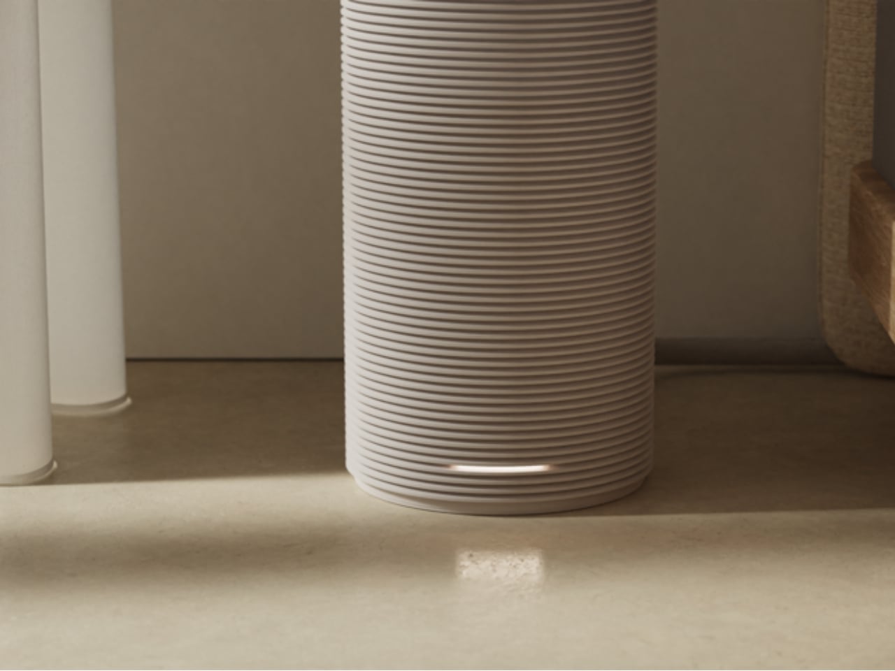
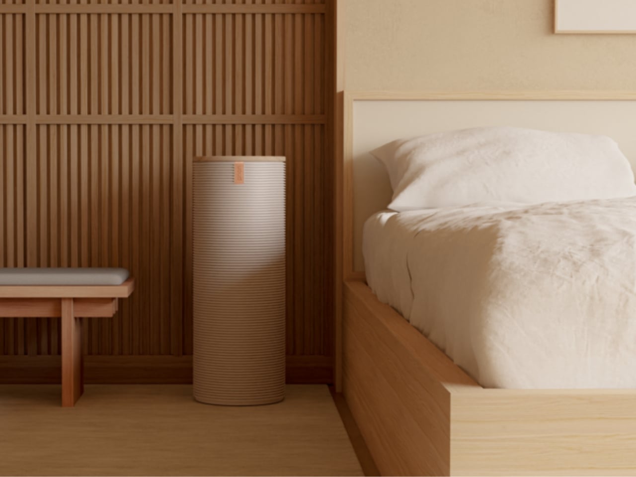
What earns the Blue Signature a place on this list beyond its performance is how seriously Blueair approached the design. The enclosure reads more like considered furniture than medical equipment, the kind of thing you’d choose for a room rather than accept as a necessity. Its filter tracking operates on the same logic as the purifier itself: instead of counting calendar days, it monitors actual fan speed, pollution exposure, and runtime to calculate precisely when a replacement is due. You change it when it needs changing, not when an arbitrary notification decides it should.
What We Like

  • Auto mode reads ambient air quality continuously and calibrates fan output in real time, reacting to the actual environment rather than a fixed timetable someone set and forgot
  • Filter tracking based on measured usage rather than scheduled intervals means you replace the filter when it genuinely needs it, not a day before or a month after

What We Dislike

  • The premium price point places the Blue Signature well above what most households will budget for an air purifier without considerable deliberation
  • In a smaller room, the cabinet-form enclosure takes up visible floor space in a way a slimmer column design would not

2. Dreame A3 AWD Pro

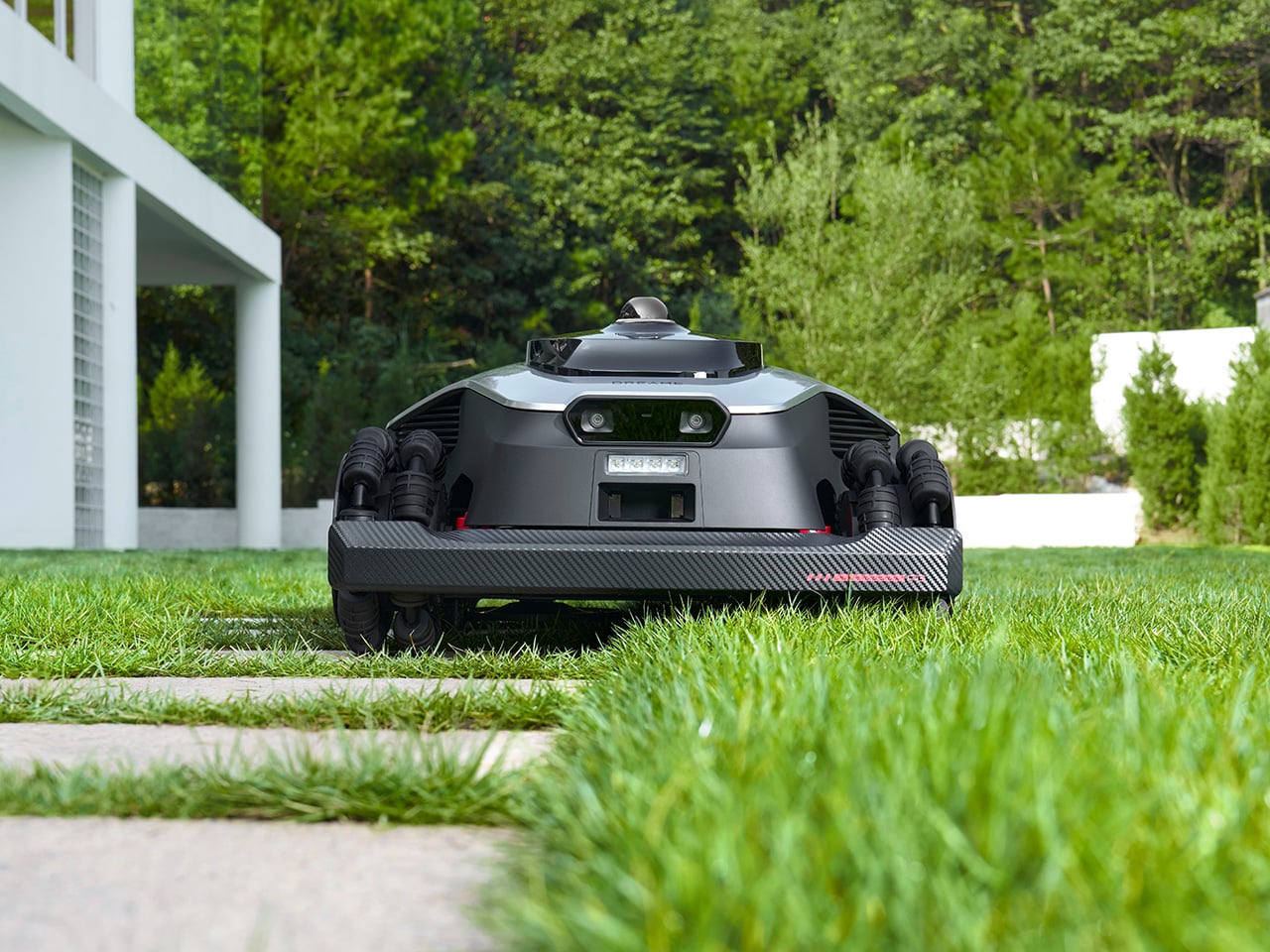
Robot lawn mowers have existed for years, and most of them require you to bury a perimeter wire around the full boundary of your garden before they will take a single pass. The Dreame A3 AWD Pro eliminates that. A 360-degree 3D LiDAR unit sits on top of the machine alongside a binocular AI vision system capable of classifying over 300 distinct obstacle types. On its first run, it maps the yard, sets its own working boundaries, and begins. No wire, no boundary markers, no setup beyond placing it on the grass.

Four independent hub motors drive each wheel separately, giving the A3 AWD Pro the ability to climb slopes up to 80 percent and handle terrain that stops most two-wheel-drive alternatives. The 40-centimeter dual-disc cutting deck floats independently over ground contours, keeping the cut height consistent across a lawn that isn’t perfectly level. At 65 decibels, it runs quietly enough for early mornings without becoming a neighborhood complaint. Built-in 4G connectivity and a PIN-protected anti-theft system keep it tracked and secure whether you are home or away.

Click Here to Buy Now: $2099.99 $3099.99 ($1000 off). Hurry, deal ends soon!

What We Like

  • Wire-free boundary mapping via LiDAR means setup takes minutes rather than an afternoon running cable around your garden perimeter, removing the single biggest friction point in robot mower ownership
  • Independent four-wheel drive and a floating cutting deck handle genuinely uneven terrain rather than the idealized flat lawns most competitor spec sheets assume

What We Dislike

  • At $2,599.99, the starting price is a significant commitment, and households with smaller or simpler lawns may find the engineering exceeds what their garden actually requires
  • Very long or overgrown grass can slow the first few passes as the machine establishes its initial map and finds its rhythm

3. Narwal Flow 2

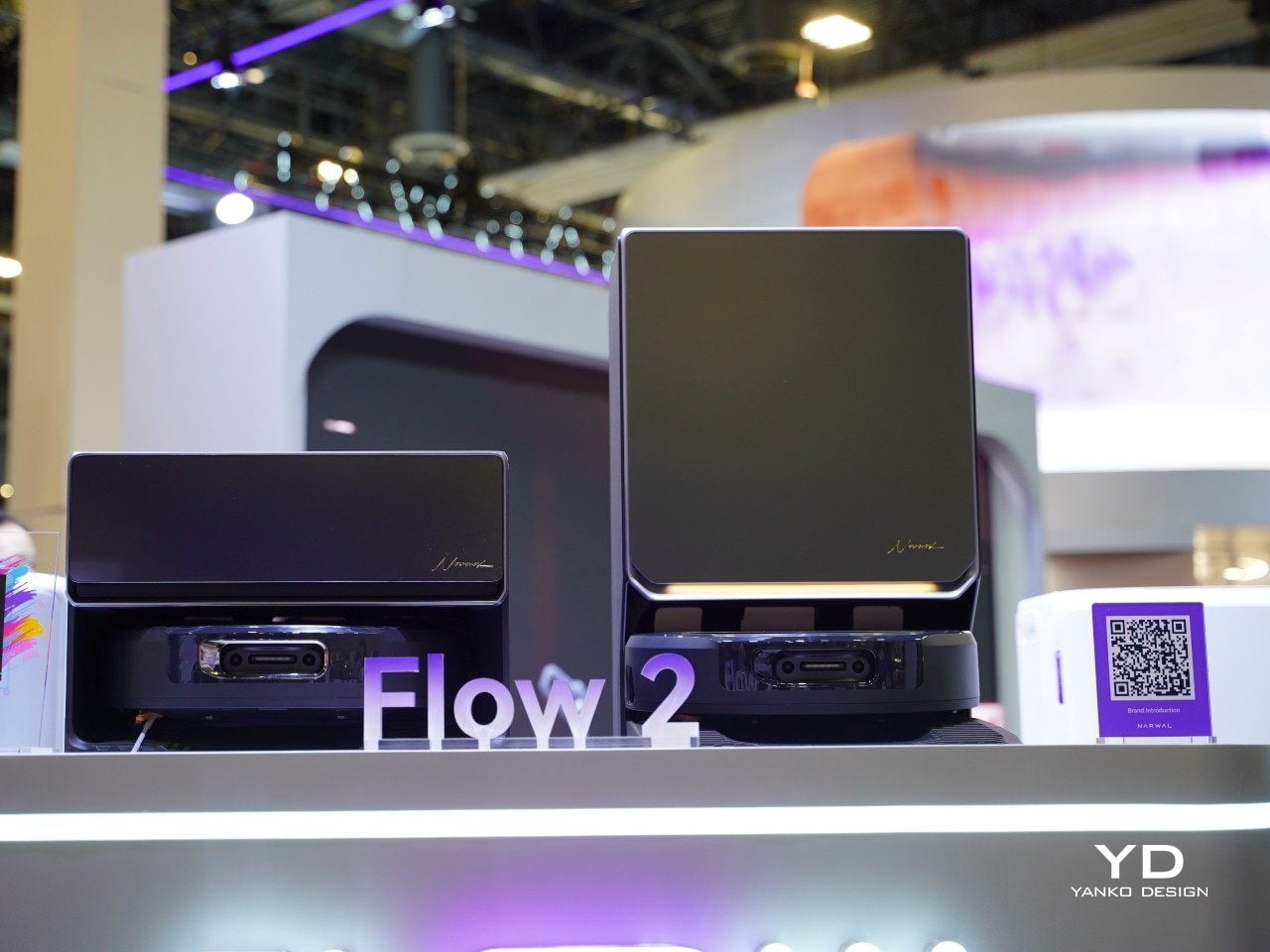
Robot vacuums spent most of the last decade chasing suction numbers. The Narwal Flow 2 pursues a different kind of performance: judgment. Its NarMind Pro autonomous system processes 1.5 million data points per second through dual RGB cameras running on a 10 TOPS AI platform, building a continuous picture of the space it works in. Every object it encounters gets assigned a risk level — walls get 8 millimeters of clearance, pet bowls get 20 millimeters, and high-risk items trigger a protective reroute at 70 millimeters. The floor plan adapts every run, not just during initial mapping.
The mopping system is where the Flow 2 makes its clearest case. Sixteen angled nozzles continuously feed fresh water into a moving mop track throughout each pass, while a reverse-rolling mop applies 12 newtons of downward pressure at 140 degrees Fahrenheit. A scraper strips dirt from the fabric in real time, which means the surface touching your floor is constantly refreshed rather than dragging accumulated grime from room to room. The dock handles hot-water self-cleaning and hot-air drying automatically. You empty the bin when it needs emptying, and that is the full extent of your involvement.

What We Like

  • Risk-level classification for individual objects adjusts cleaning behavior intelligently rather than following a fixed avoidance pattern, making it genuinely capable in a lived-in home rather than a staged one
  • The FlowWash mopping system continuously renews the mop surface during each pass, a meaningful distinction from systems that simply wet a fixed pad and carry whatever it picks up into the next room

What We Dislike

  • The dock has a substantial footprint that is difficult to place in apartments or homes where floor space near a power outlet is limited
  • The level of onboard AI processing introduces a software dependency that requires reliable long-term update support from Narwal to stay relevant

4. Aqara Presence Multi-Sensor FP300

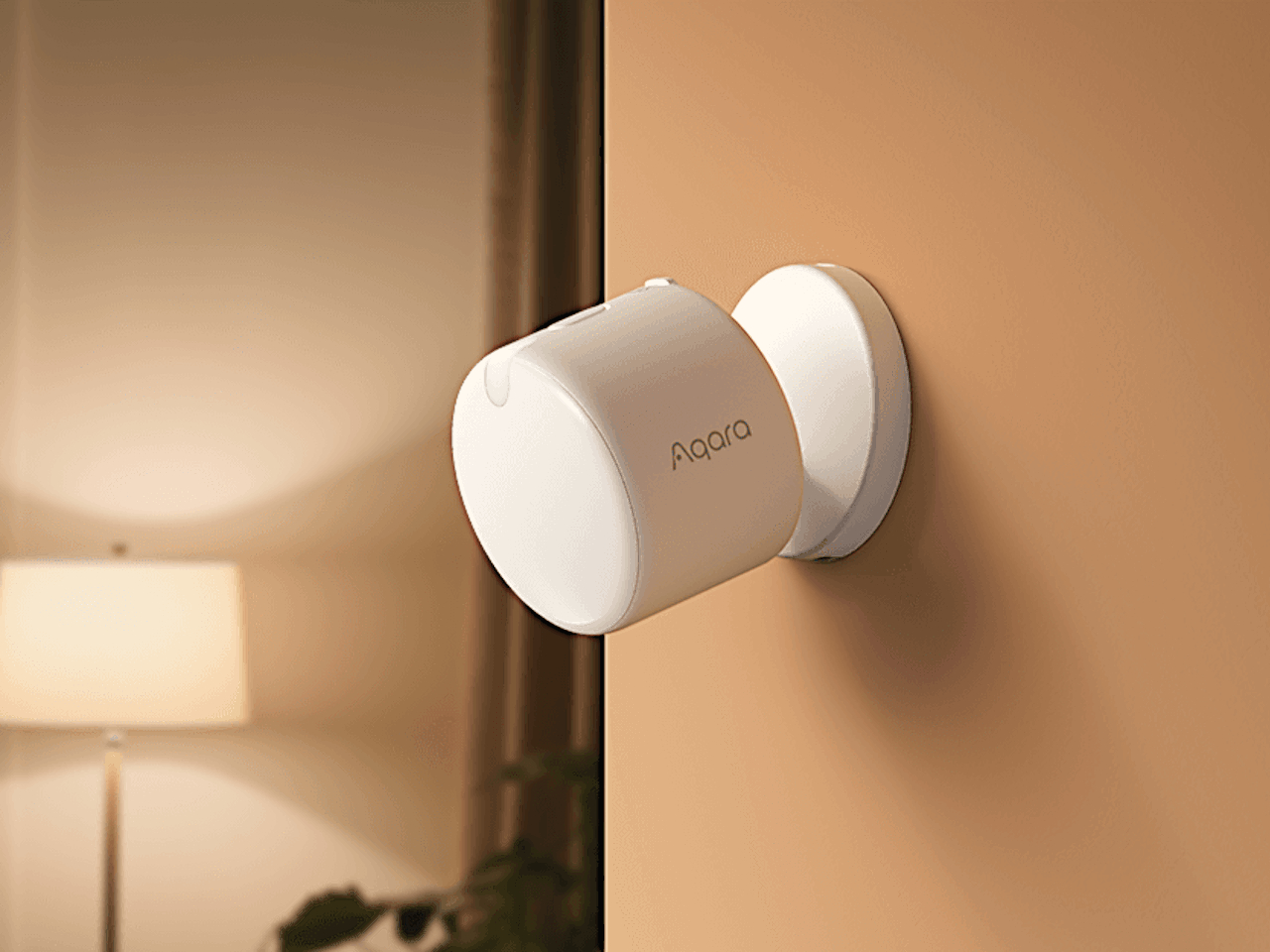
Smart thermostats are good at learning schedules. The limitation is that most presence detection underneath them relies on passive infrared sensors that declare a room empty the moment you stop moving. Sit still at a desk, fall asleep on a sofa, or settle in to watch a film, and the system decides you have left. The Aqara FP300 uses millimeter-wave radar instead, a technology that reads presence as a continuous state rather than a series of motion events. It knows you are in the room, whether you are moving across it or completely still.

The practical result is a home that responds to where you actually are. Temperature and humidity data feed directly into your HVAC system, triggering heating or cooling only when a room is genuinely occupied and pulling back the moment it is not. You stop conditioning empty rooms, and you stop arriving home to a space that turned itself off an hour before you walked through the door. The FP300 is not the most visually interesting product on this list, but it may be the most quietly useful — the invisible layer that makes everything else in a smart home respond to real life rather than a preset timetable.

What We Like

  • Millimeter-wave radar detects occupancy even when the user is completely stationary, solving the single most common failure point of standard motion-based smart home sensors
  • Direct HVAC integration eliminates energy wasted conditioning unoccupied rooms without requiring the homeowner to manage zones or schedules manually

What We Dislike

  • Getting full value from the FP300 requires familiarity with the Aqara ecosystem and an initial configuration phase, which creates a barrier for users who are new to smart home infrastructure
  • The device is visually minimal by design, and for an audience that pays attention to how objects look in a room, the hardware itself offers nothing to appreciate

5. Waterdrop X16

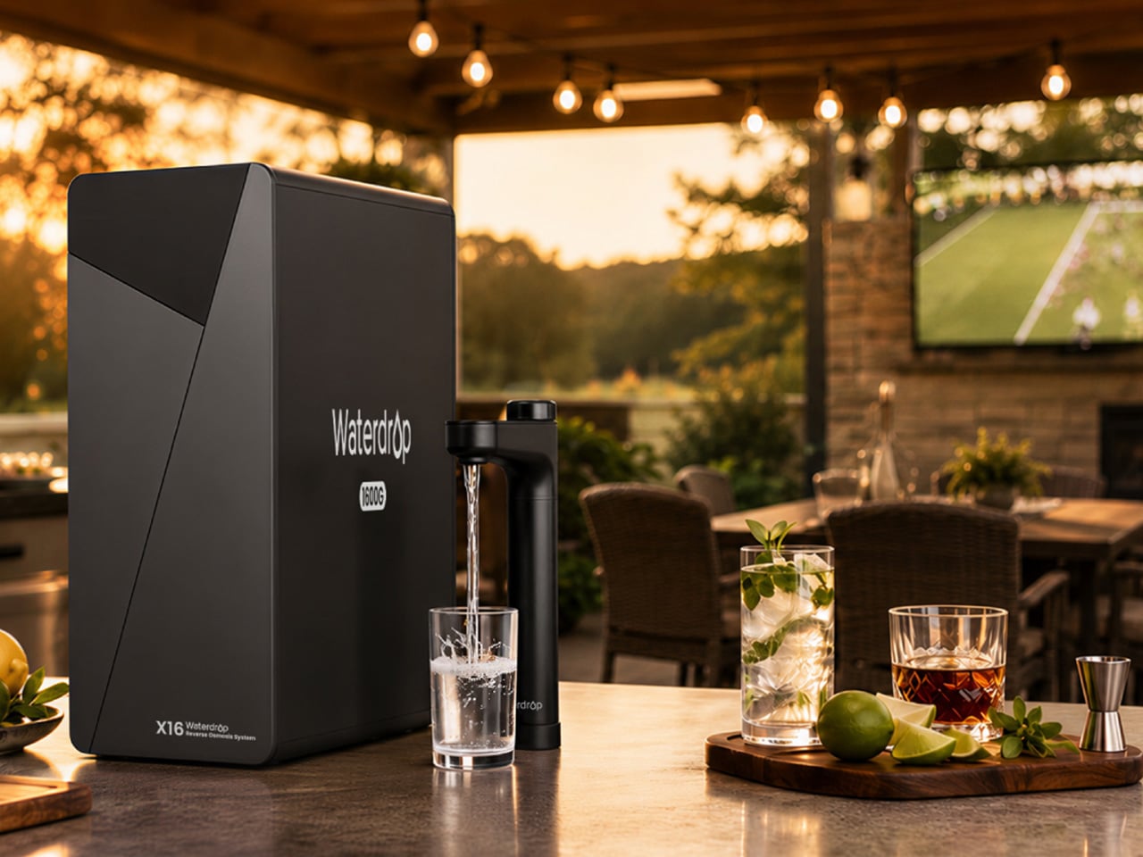
Water filtration belongs in the same conversation as any other home system that runs without daily input. The Waterdrop X16 installs under the kitchen sink in a tankless configuration that takes up a fraction of the space older reverse osmosis systems require, and from the moment it is connected, it runs continuously, processing up to 1,600 gallons per day, without a schedule, a button, or a reminder. A smart faucet mounted above the sink displays water quality and remaining filter life in real time, so the one piece of information worth knowing is always visible at a glance.

The 11-stage filtration process removes a broad range of contaminants while reintroducing alkaline minerals, calcium, and magnesium, bringing the water’s pH to 7.5. The difference in taste is noticeable in everyday use — for drinking, cooking, and making coffee — and the 3:1 pure-to-drain ratio makes it one of the more efficient systems in the reverse osmosis category. It runs every hour of every day without any input from you. That is the only metric worth measuring it against, and the Waterdrop X16 delivers on it completely.

Click Here to Buy Now: $1234.05 $1999 ($764.95% off, use coupon code “YANKOPD26”). Hurry, Prime Day deal ends soon!

What We Like

  • The tankless design reclaims meaningful cabinet space beneath the sink compared to traditional RO systems, which typically consume most of that under-counter storage area
  • The smart faucet’s real-time water quality display provides ongoing confirmation that the system is working correctly, without requiring the homeowner to run a manual test or open an app

What We Dislike

  • The X16 sits at the premium end of the home filtration market, and the value proposition requires a long enough ownership horizon to offset the upfront cost against ongoing bottled water spending
  • Installation requires basic plumbing confidence or a professional, adding a cost and coordination step that doesn’t apply to the other products in this roundup

The Best Home Is One You Barely Notice Running

The five products above cover five distinct home domains — air, outdoor space, floors, climate, and water — and none of them overlap. Together, they represent a fairly complete picture of what a home that runs without constant attention actually looks like in practice. The investment varies by product, but the return in each case is the same: one fewer thing competing for your attention in a day that already has enough of those.

There is a version of home technology that adds complexity in the name of control, and a version that quietly reduces the number of decisions the house asks you to make. The products in this roundup belong to the second category. They are not the most dramatic purchases available, and none of them will be the first thing you mention to a guest who walks through the door. They will be the things that make the house feel, without quite being able to explain why, like it simply works.

The post 5 Best Gadgets of June 2026 That Quietly Run Your Home in the Background first appeared on Yanko Design.