Physical Double-Sided Gboard is the keyboard of your dreams or nightmares

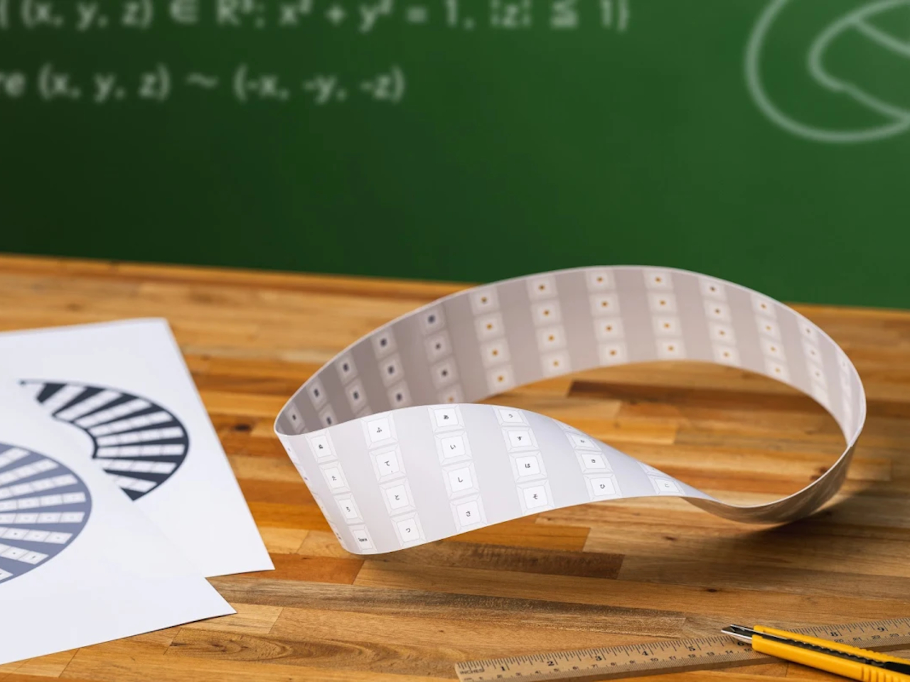
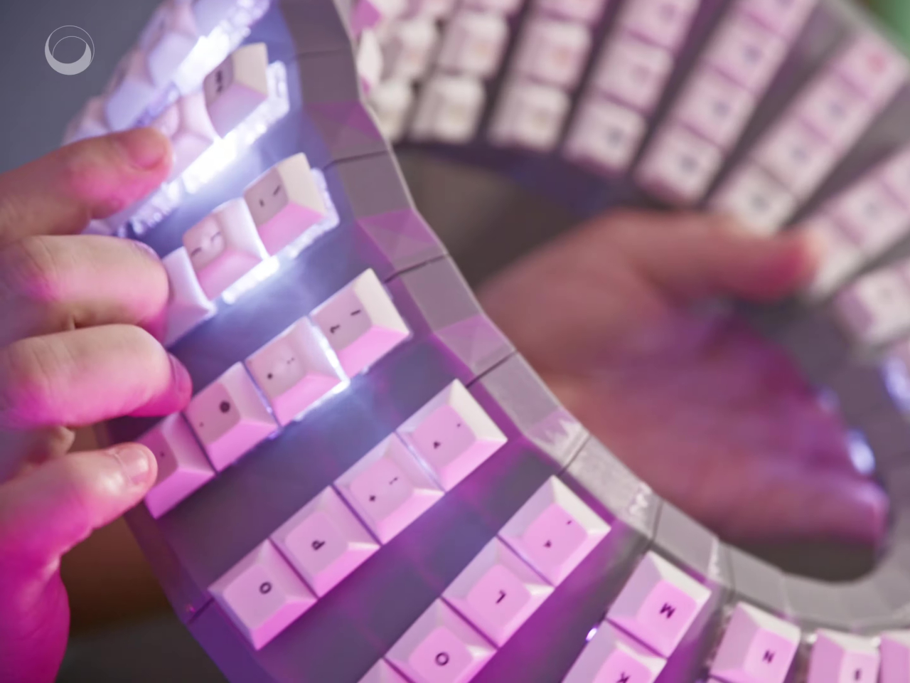
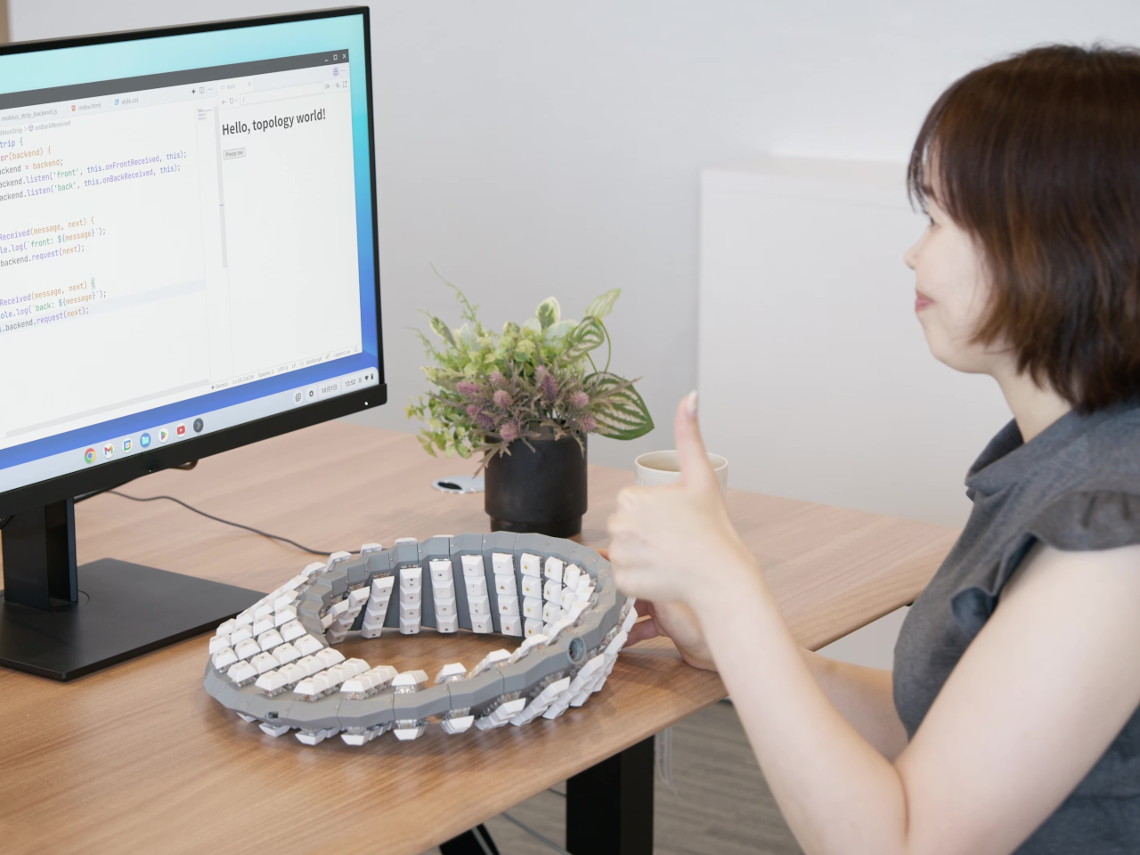
Our computer keyboards have just enough keys to cover the letters and numbers of the English language, but sometimes those aren’t enough. Some probably wish there were more keys to assign to certain app shortcuts and actions, while others dealing with other languages and scripts will probably want to cover those without having to switch keyboard layouts every time. Of course, a keyboard with that many keys will probably be huge, but not unless you design it in a creative form. Fortunately, Google Japan has our backs, and fronts for that matter, with a double-sided keyboard monstrosity inspired by one of math’s most classic paradoxes: the Möbius strip.

Designer: Google
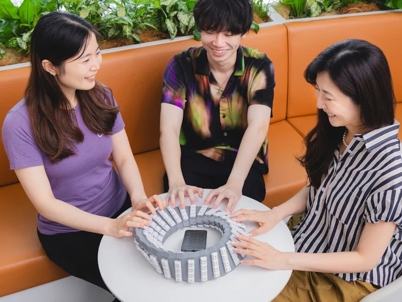
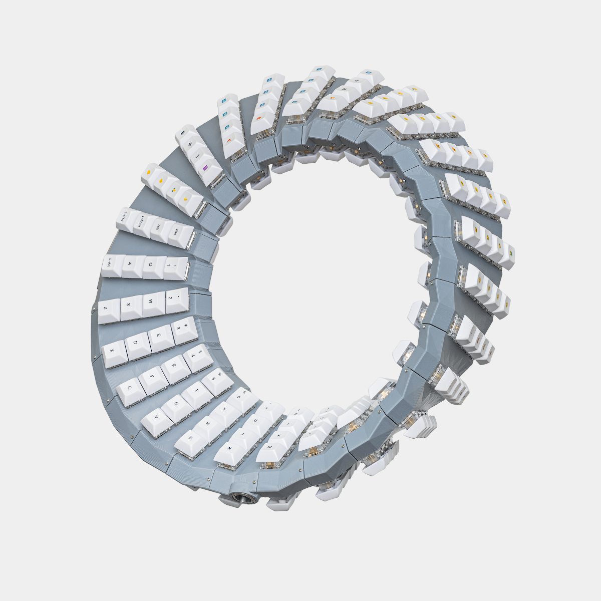
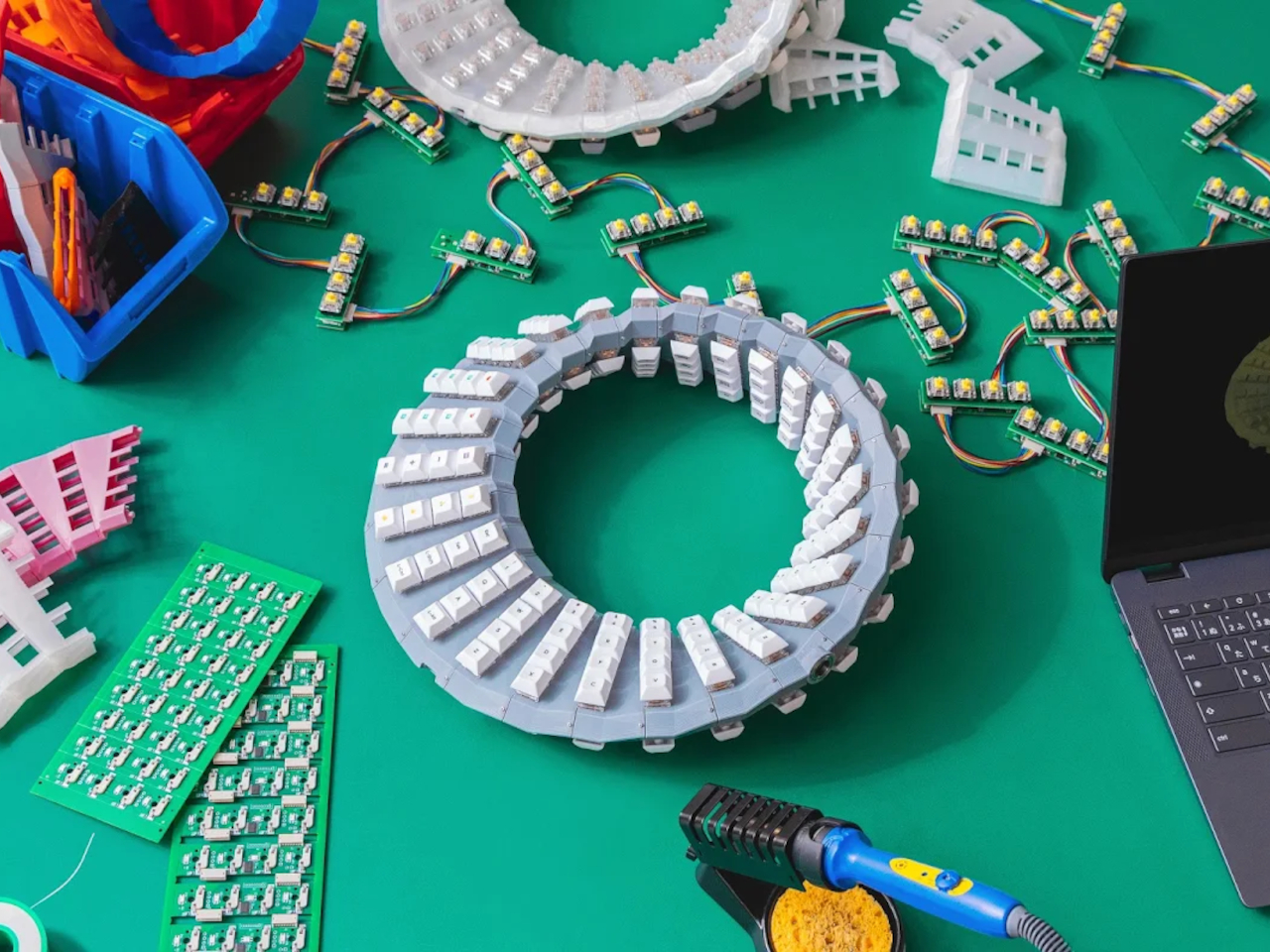
The keyboard is made up of 26 modules, each of which has eight RGb-backlit keys, four on each side of the structure. They’re laid out in a band that technically has no front or back, which is what the Möbius strip is infamous for. That means you can practically turn this “keyboard” around or flip it on its side and it will always be right side up. Sort of.
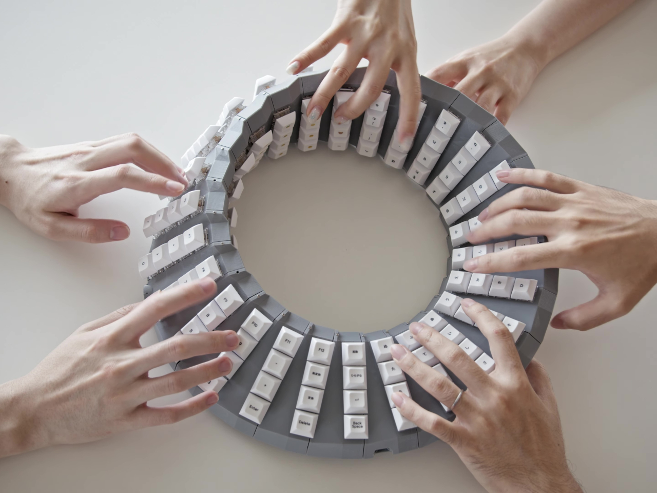

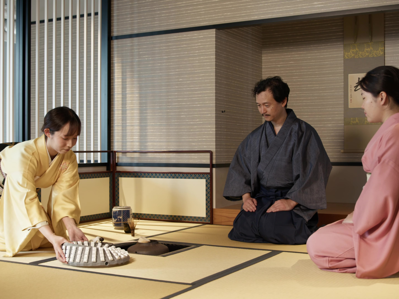
Of course, it’s pretty obvious how unusable such a contraption would be as a keyboard, but the bright minds at Google Japan do have a few suggestions. Forget pair programming! This keyboard lets up to three or even more people type simultaneously, which increases productivity threefold. Since it basically has no right or wrong side, it will be an essential tool in zero-g environments as well. The possibilities are nearly endless, especially since you can’t figure out where this keyboard begins and ends either.
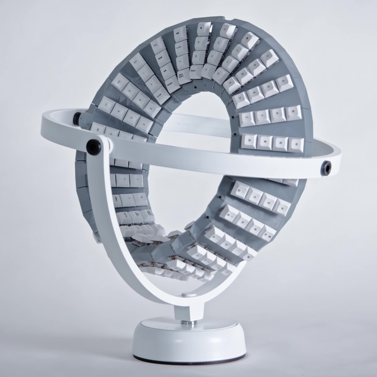

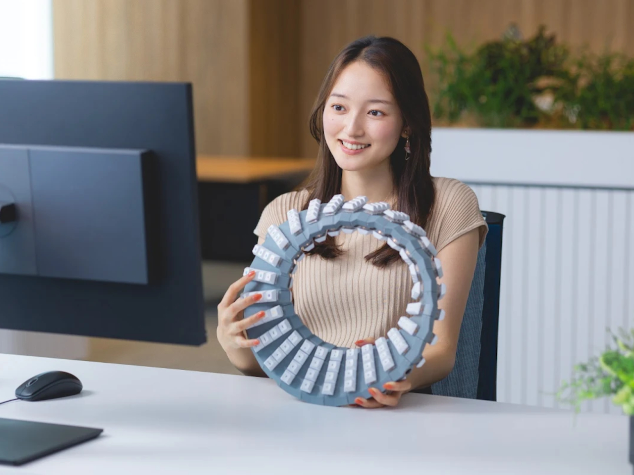
The Double-Sided Gboard also has utility outside of typing. It can be put on a spinning pedestal as a futuristic desk decoration or hung on doors as a welcoming wreath. Google suggests that, just like the strip itself, future updates could unlock access to alternate dimensions. Even if that day never comes, you can still proudly carry the keyboard around like a fashionable handbag.
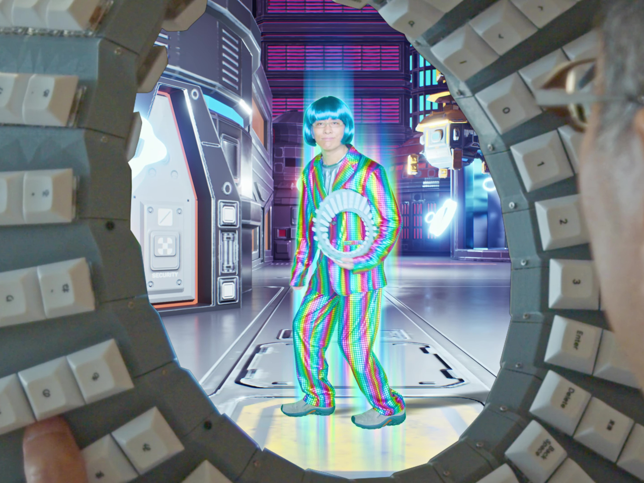
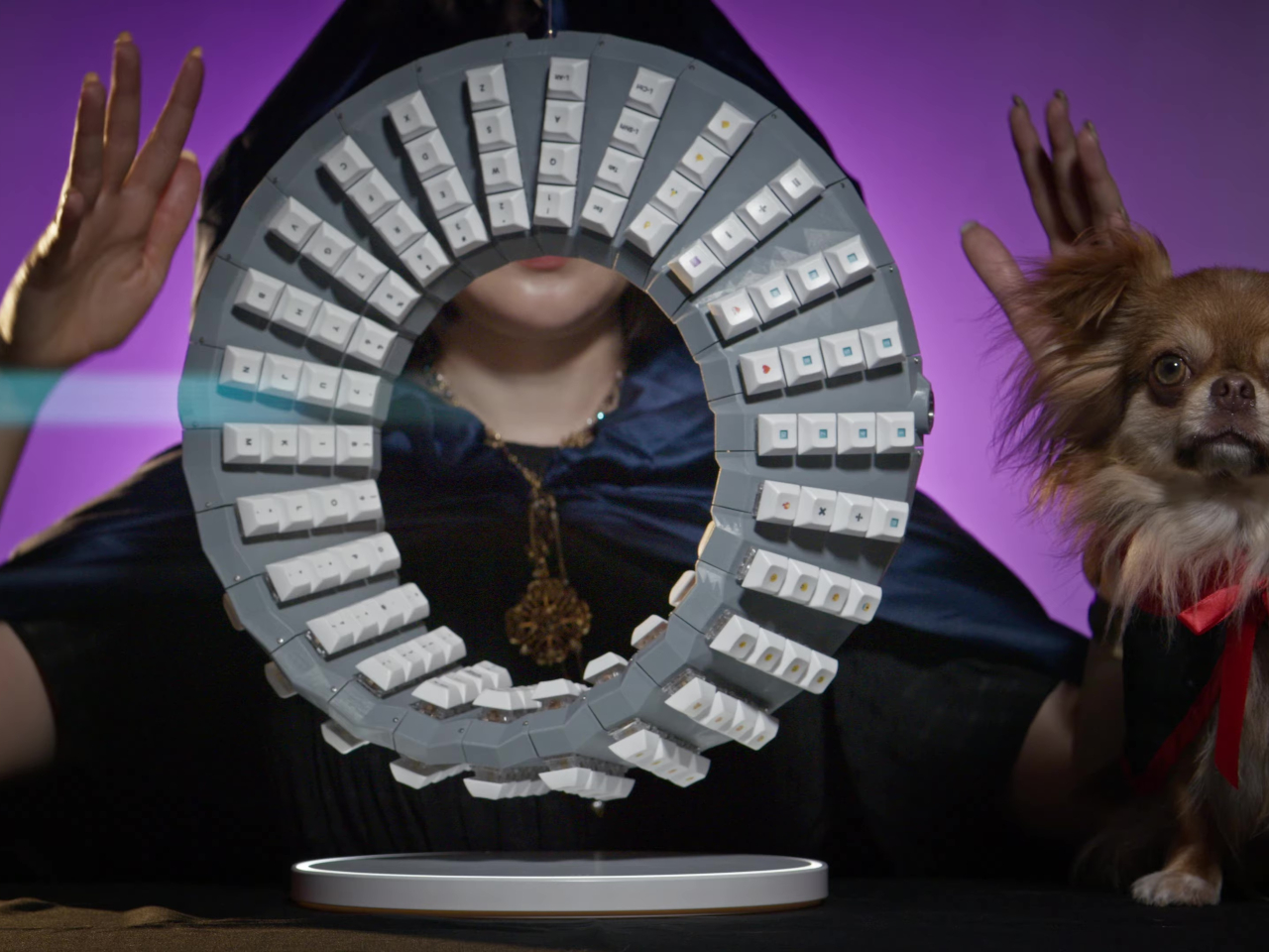
Of course, Google isn’t planning on putting this highly advanced design into production, but it is generously allowing others to attempt building it on their own, providing complete 3D printer files, firmware, and guidance. The Double-Sided Gboard is just the latest in Google Japan’s series of keyboard designs launched on October 1st, a.k.a. 10/1, to celebrate the iconic and standard 101 keyboard.
The post Physical Double-Sided Gboard is the keyboard of your dreams or nightmares first appeared on Yanko Design.
iPhone 17 concept dreams of an interesting direction Apple will never take

Apple is both famed and notorious for its meticulous attention to detail and it has been hailed as a champion of product design in the tech industry. It rarely makes big changes to its design language, but when it does, it holds on to that aesthetic for years. It held onto the notch for six years before giving way to the island on the iPhone 15, and it still uses the square camera design it first introduced on the iPhone 11 back in 2019. That’s not to say that the iPhone 17 next year couldn’t be different from this year’s iPhone, and this concept tries to explore designs that could make sense but will probably never happen under Apple’s watch.

Designer: Mohamed Mahdy

Apple has championed minimalism for its most recent products, barely adding any vibrant colors or textured finishes to its iPhones and MacBooks, save a small number of special editions. It has left the doors wide open for case makers to offer those flavors to people who do want them, but it has reserved for itself classier aesthetics. Of course, it’s not like Apple has never embraced more eye-popping hues before, as proven by the candy iMac G3, the colorful iPhone 5c, and the current generation of vibrant flat-screen iMacs.

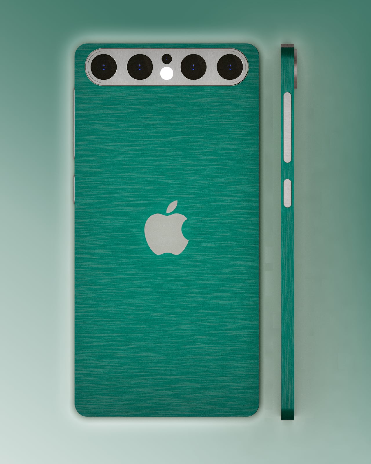
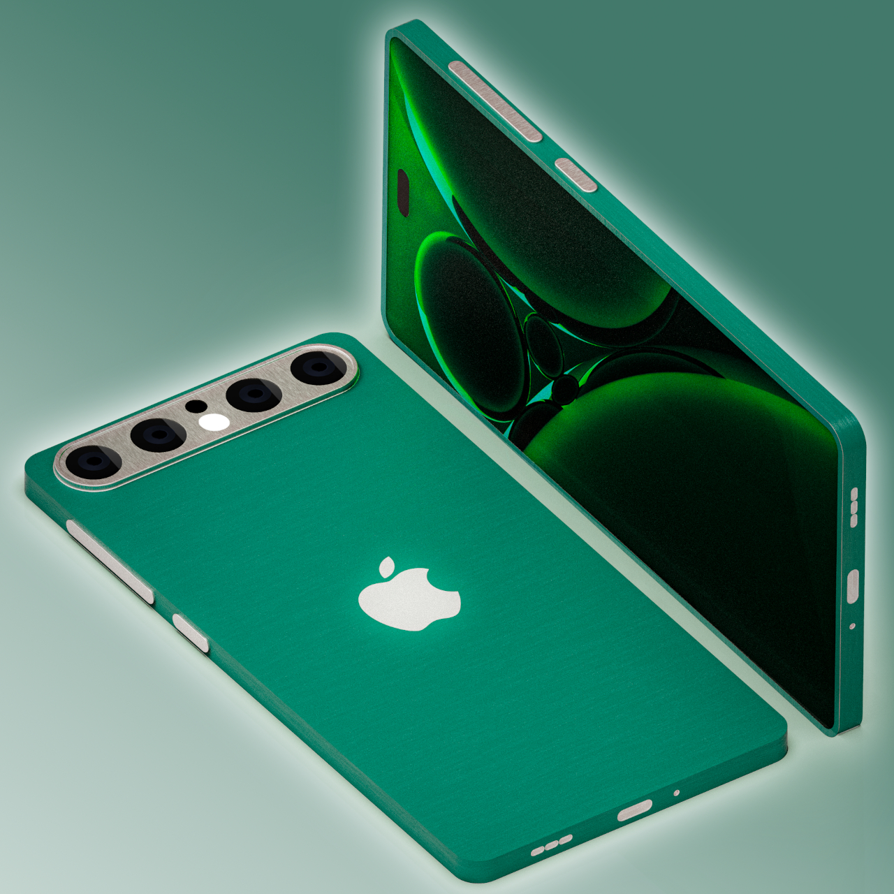
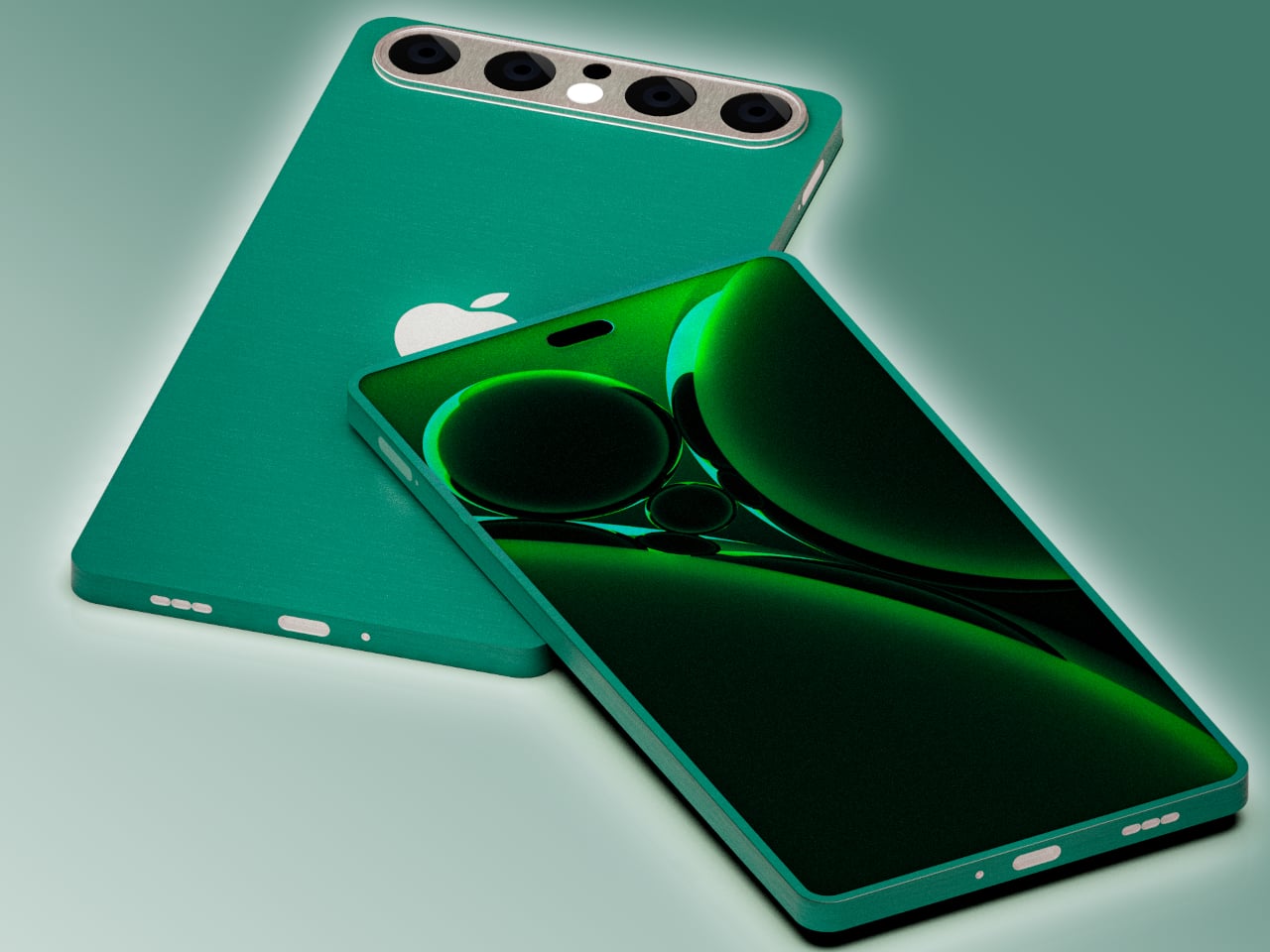
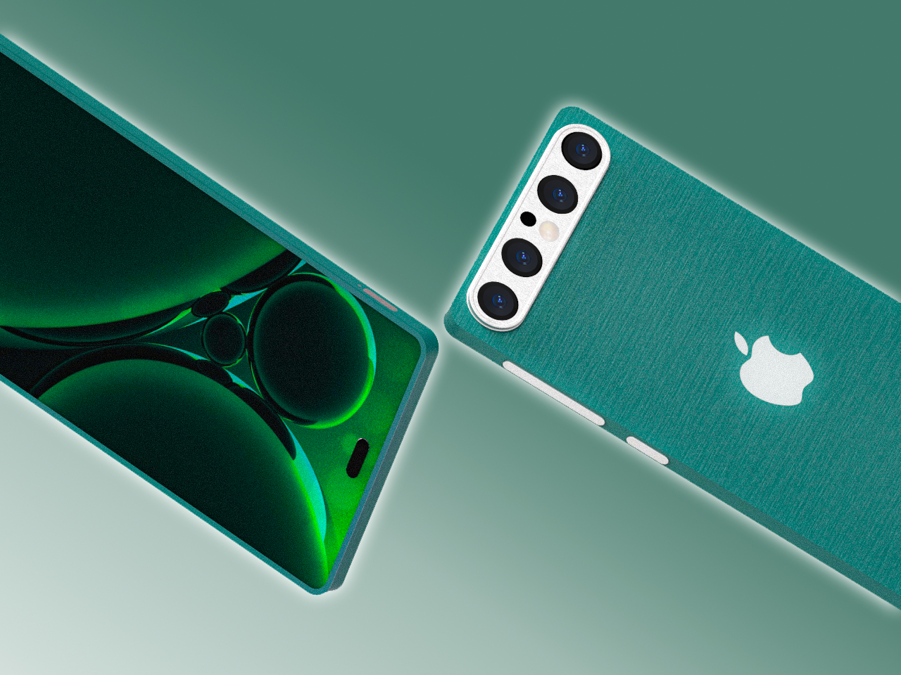
This Apple iPhone 17 conceptual design dares to venture into unknown territory with a design that, almost doesn’t look like Apple if not for the telltale logo. It does have the flat design of the current iPhones, but rather than a smooth and featureless chassis, it adds a bit of texture that looks almost like fabric. This can perhaps be an opportunity for Apple to use more sustainable recycled materials rather than just plain metal.

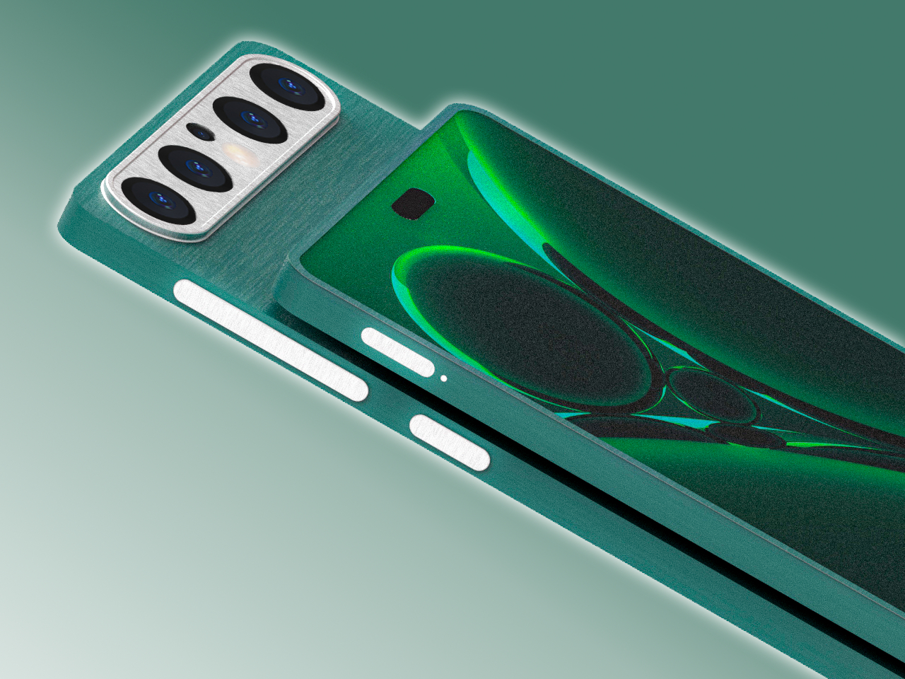
The biggest deviation, however, is the camera design, a pill shape that runs across the width of the phone. It has four cameras, something that has yet to happen on any iPhone, arranged in a row with the LED flash and 3D time-of-flight sensor in the middle. This design is one possible solution to the design puzzle that Apple will have to face when it does add another camera sensor to next year’s iPhone. It also fixes the wobbling problem that most smartphones have because they push the thick camera bump off to the corner.

Interesting as it may seem, it does feel unlikely that Apple would go this far if it ever does finally change the iPhone 17’s design. The changes are far too great and the benefits are far too few. It’s still an interesting thought experiment, of course, one that does try to at least stick to the general design of current iPhones. Chances are, however, that the company won’t be ready to make such a drastic leap, even with sustainability and ergonomics at stake.

The post iPhone 17 concept dreams of an interesting direction Apple will never take first appeared on Yanko Design.

This floating cart could become a dream come true for shoppers and workers

The shopping cart, also known as a trolley or buggy, is one of the most essential tools people use inside stores, especially supermarkets, both for customers as well as store workers. Despite its importance, its design has basically remained unchanged in almost a century, even when that design doesn’t really take the comfort of users in mind. Yes, the four wheels and the spacious metal basket can hold your groceries and take them from one point to another, but they are difficult to control, heavy, and more importantly, unable to climb up or go down the stairs. This prototype tries to address those pain points to make dealing with groceries and packages easier, safer, and more accessible.

Designers: Geonwoo Park, Hyungeun Park, Wooyong Park, Dongjae Lee, Murim Kim, Seung Jae Lee (Seoul National University of Science and Technology)

Shopping carts are so iconic that they have literally become icons in digital stores that don’t have anything to do with wheeling physical objects around. Despite that popularity, they’re not exactly the easiest tools to use and offer only the bare minimum convenience so that we don’t have to carry our groceries. Considering their cheap and mass-produced designs, it’s no surprise that many have damaged wheels that make them difficult to turn. These wheels also don’t let you drive the cart up or down places that don’t have inclined planes for them to roll on.

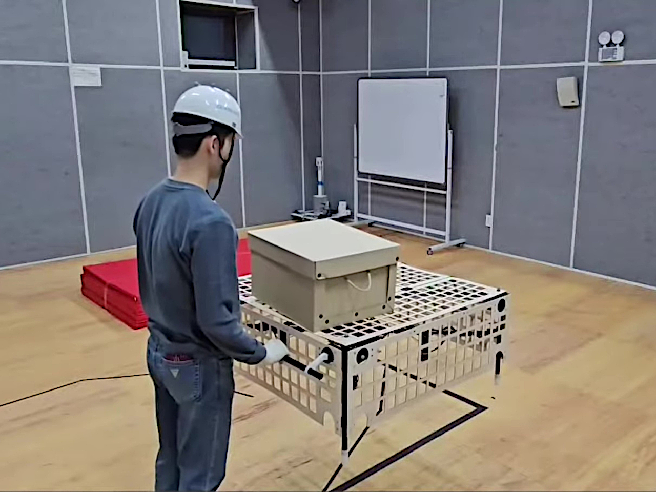
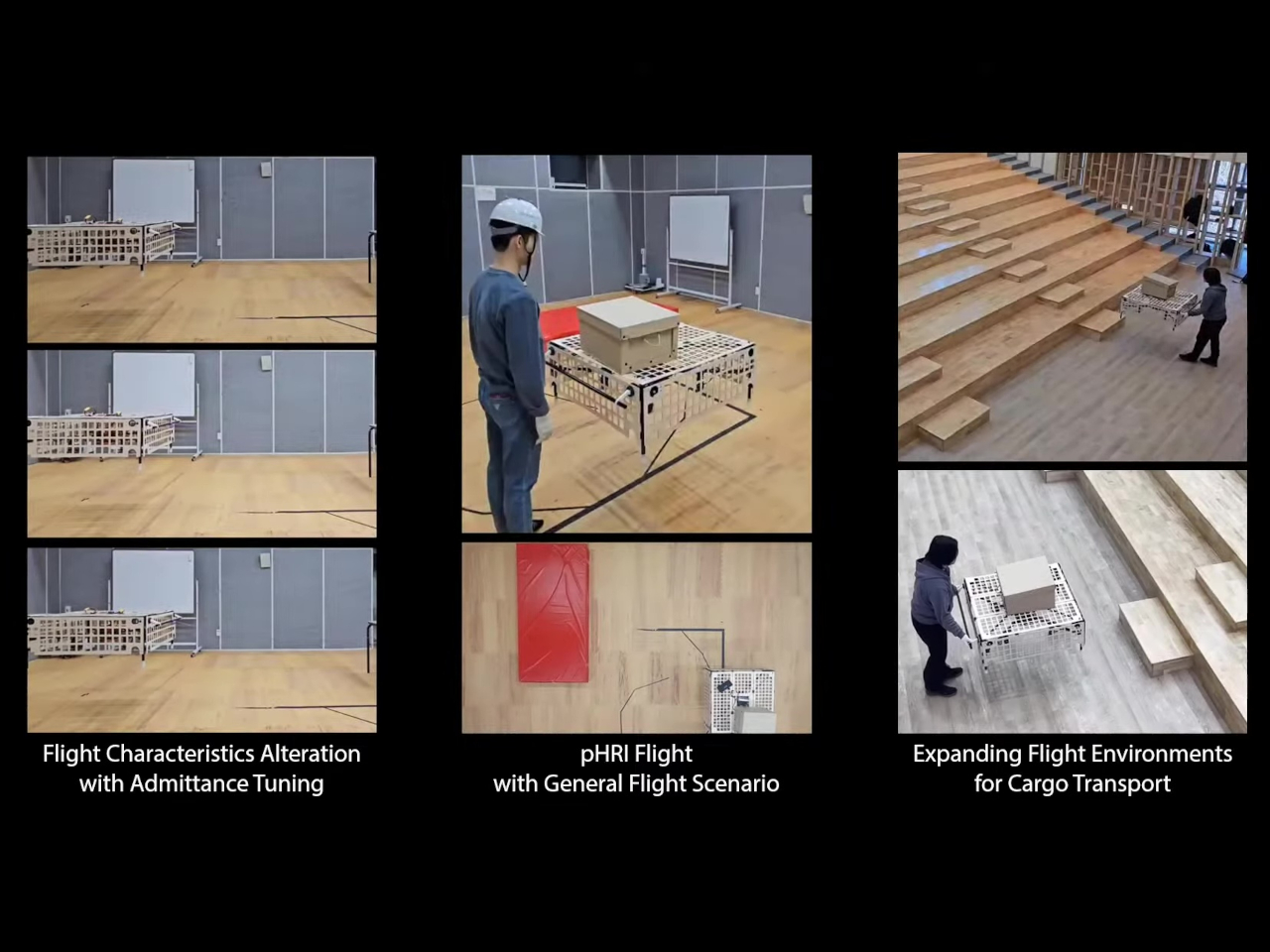
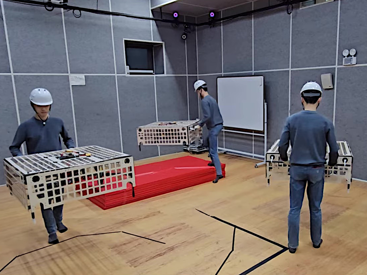
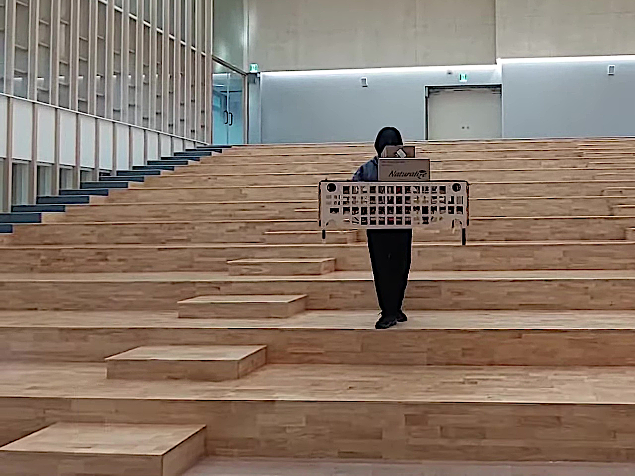
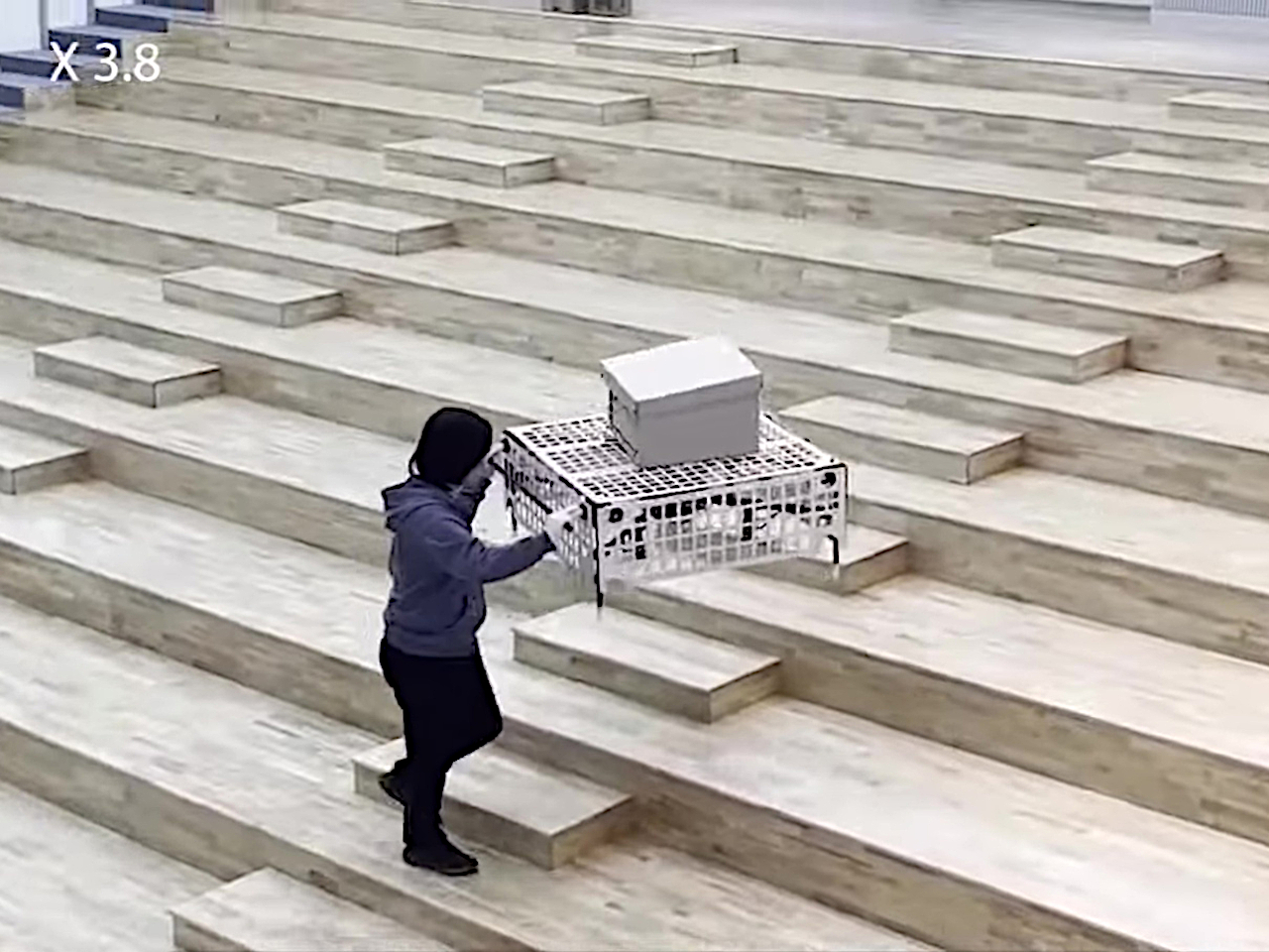
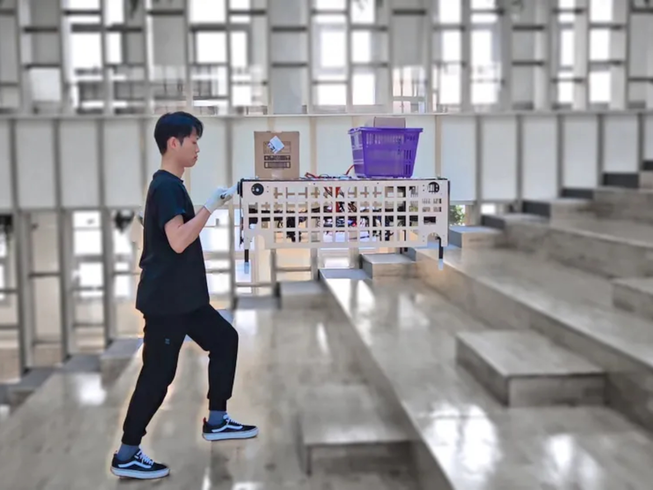
Palletrone’s solution is to do away with those problematic wheels completely. Instead, it uses a rather large drown to lift a platform that will hold your groceries and boxes. There’s also a cage around the drone to protect humans from those powerful and dangerous propellers. Think of it like an upside-down basket with the drone inside, flying to keep the platform off the ground.

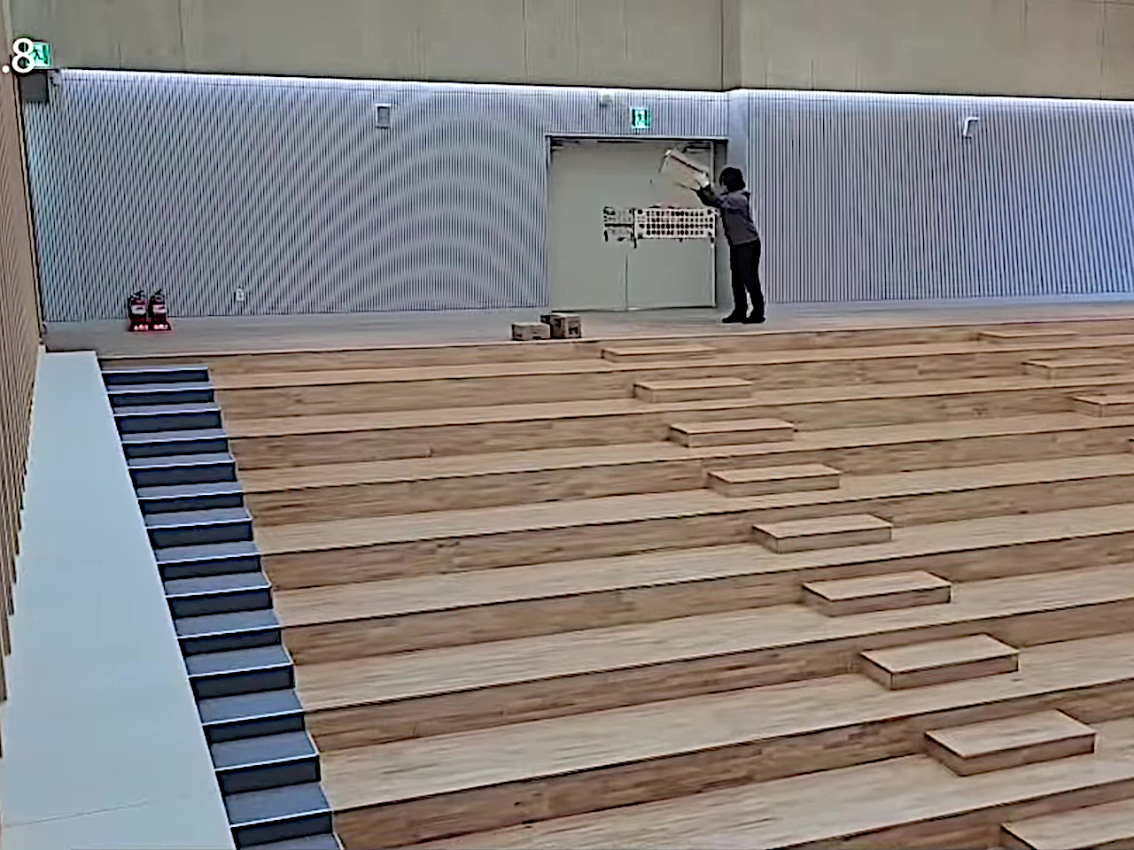
The description might sound simple, but there’s definitely a lot complicated technology involved. For one, the Palletdrone always flies at around the person’s chest height, which means that it will also ascend or descend as the person goes up or down stairs. It also doesn’t tilt so that the contents on top of it don’t slide off. Finally, it moves and turns as the person pushes or pulls it, so the experience is more or less exactly like a shopping cart minus the wheels. And it can do all this by knowing if the force being exerted is being done by a human or from the weight of the objects on top of it.

This floating and hovering “cart” sounds dreamy and very useful both for shoppers as well as personnel who have to bring goods from storage to the aisle. That said, the design is far from perfect, let alone presentable and aesthetic. For one, everyone who has ever used a drone will know how noisy they can be, especially one of this size. For another, the current Palletrone is only able to carry less than 3kg of cargo, which is significantly less than a family’s typical grocery bag. It’s a start, though, and one that finally addresses one of the biggest inconveniences when going to the supermarket by boldly giving the decades-old shopping cart a do-over.

The post This floating cart could become a dream come true for shoppers and workers first appeared on Yanko Design.

Artistic router concept opens like a folding fan based on the Wi-Fi strength

Being stuck at home for months on end has been an eye-opening experience for many people. For some, it revealed how little space we have at home, while others realized how they are ill-equipped to work at home. At the same time, many people have also become more aware of how the tools they use, especially consumer electronics, have aesthetic value that could either uplift their mood or burden their subconscious minds because of their designs. Wi-Fi routers, in particular, come in uninspiring or sometimes menacing designs that we often hide in corners or behind other objects that can actually negatively affect their performance. This router concept design tries to address that and other pain points with a design that turns a boring box into something like an art object that unfurls its beauty like a peacock when the Wi-Fi signal is strong.

Designer: Sunjin Na

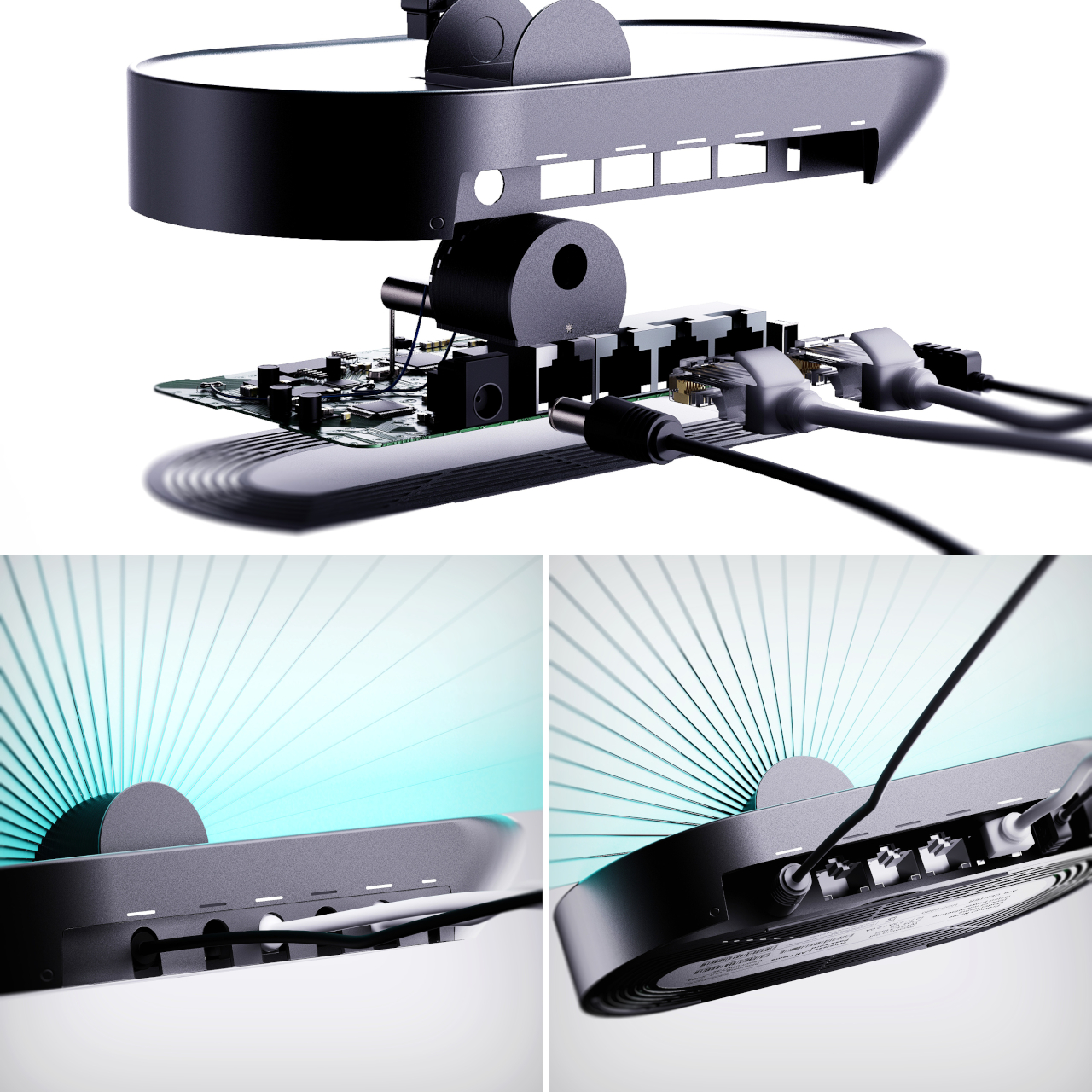
Common home routers are simple boxes with one or two antenna rods sticking out from them. More powerful and sophisticated equipment, however, would have multiple antennas that transform the router into something like a robotic sci-fi creature. Unless you actually go for that kind of aesthetic, chances are you’ll be hiding the router from view. But if you’re not careful, that could actually affect the signal that it transmits. Additionally, you wouldn’t have any way of knowing whether the router itself is receiving a good Internet signal without looking at your phone’s Wi-Fi bar or some other app.

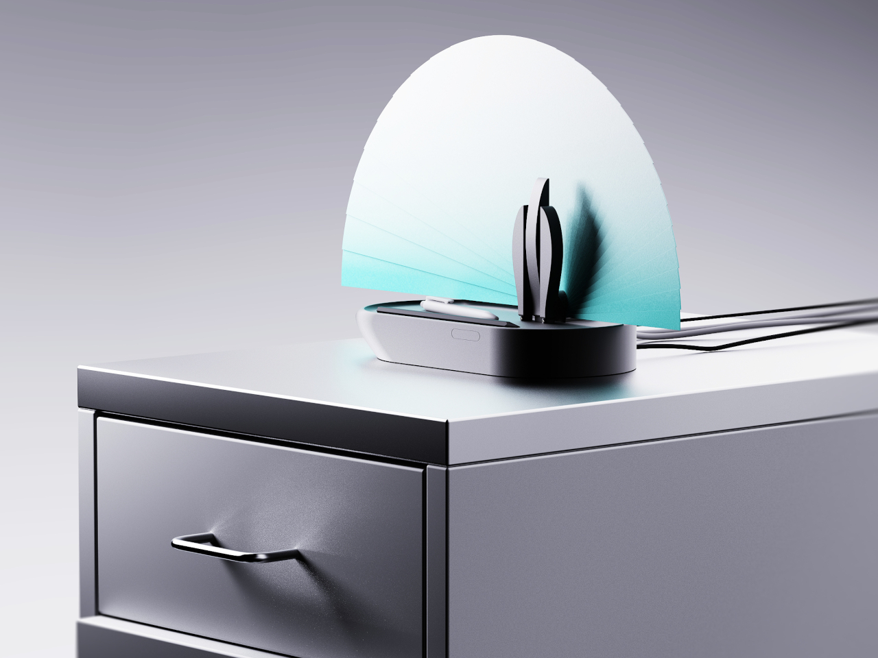
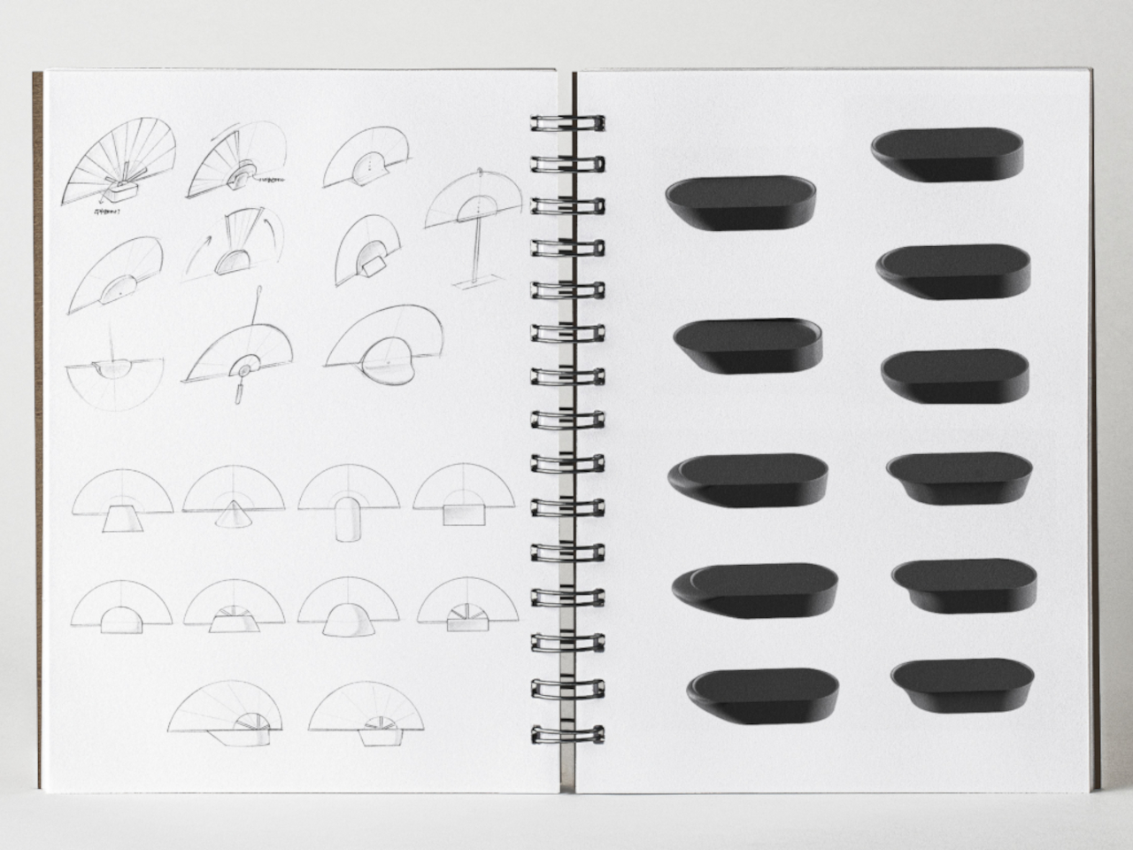
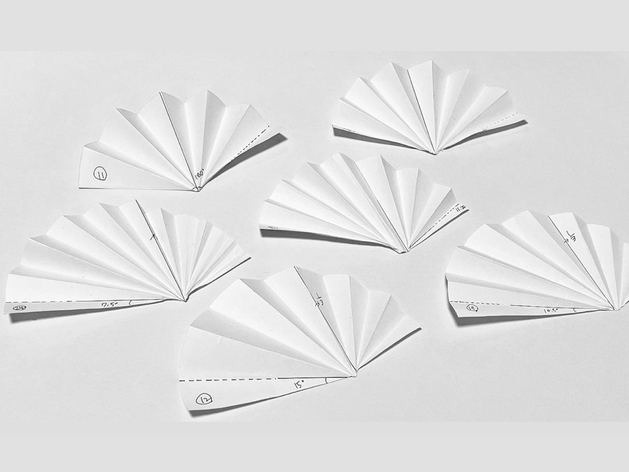
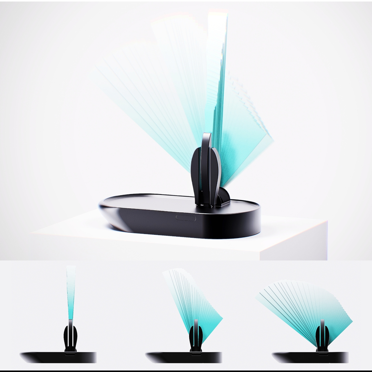
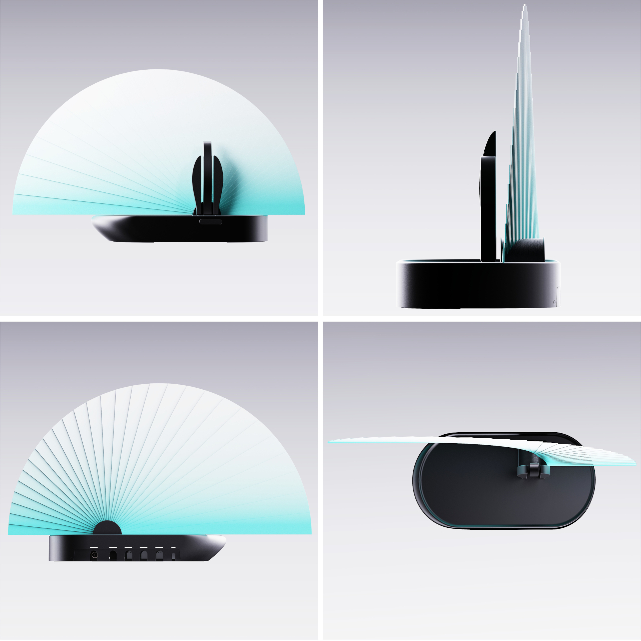
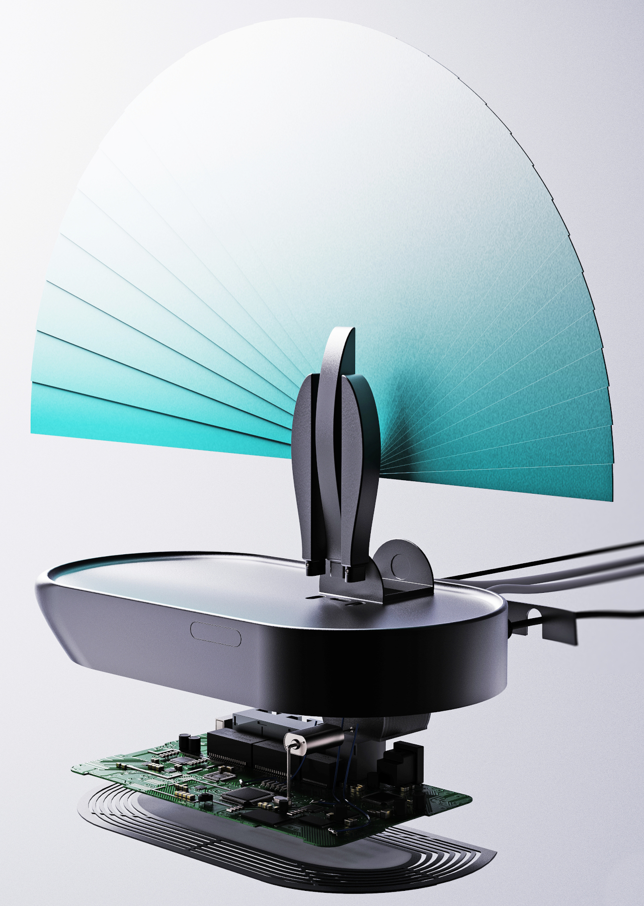
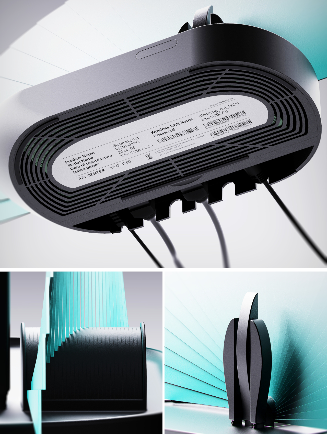
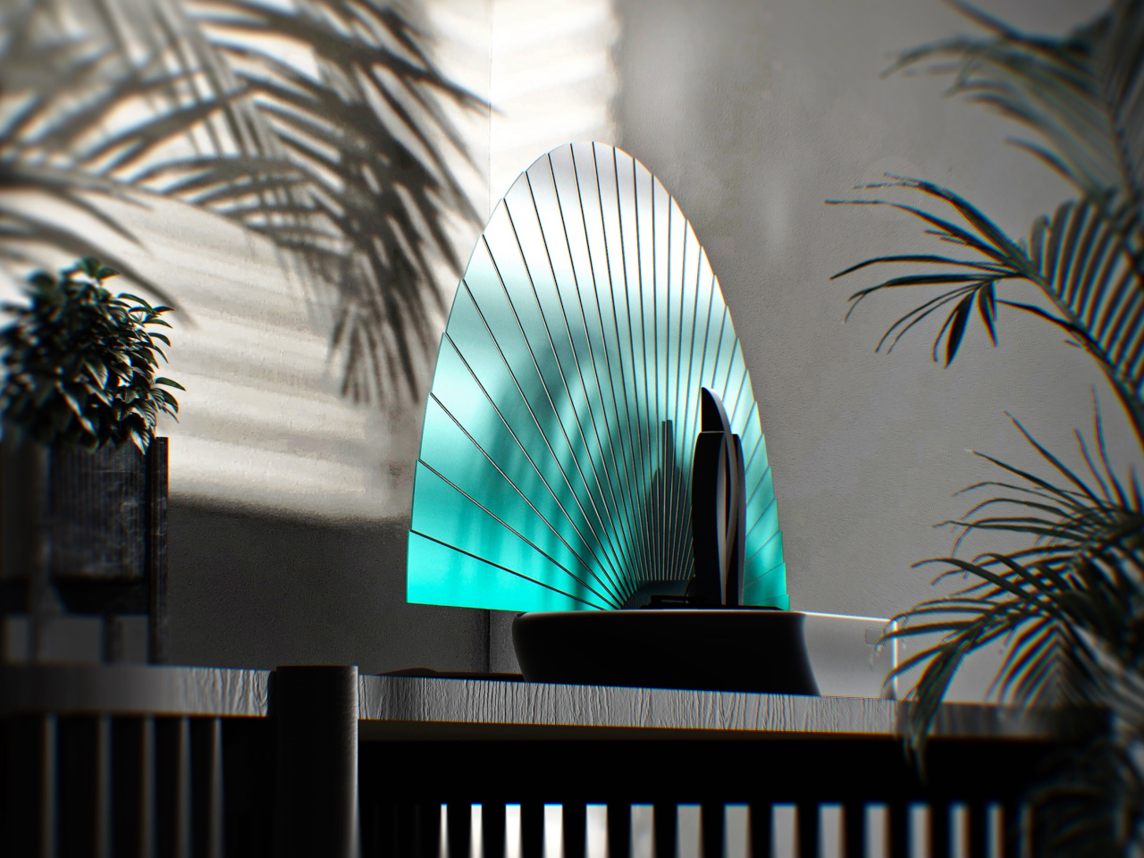
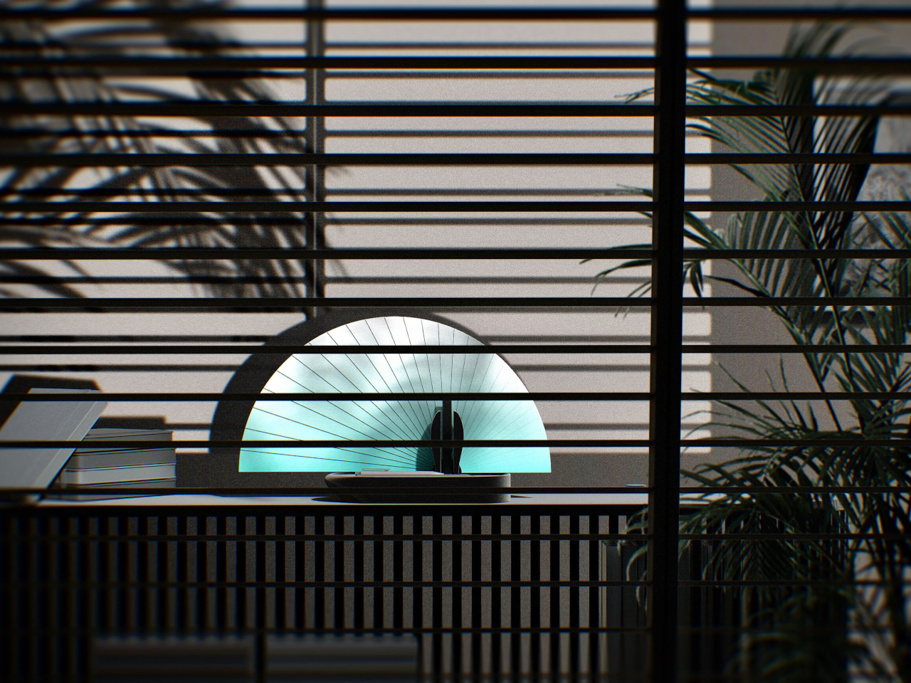
Blooming Out is a design concept that fixes those problems by making sure you wouldn’t want to hide the router in the first place. It gives the router a makeover that isn’t just aesthetically pleasing but also functional. It uses the concept of a folding fan that “blooms out” when the Wi-Fi signal is strong but retracts and folds in when it is weak. It’s not a binary state, though as the 29 fans can indicate the signal strength in between.

1

The router also has visible antennas, but not in the design you’d normally expect. The three antennas stand together a bit off-center and can be rotated to maximize the spread of the signal. Because of this design, Blooming Out looks more like a peacock fanning out its tail in pride when it’s working in full force.

With this design, the Blooming out router concept becomes more than just a tool. It becomes an aesthetic object that adds visual value to any space, disguising its actual function without compromising its functionality. Of course, there could still be some technical drawbacks with this unconventional design, but it could be something that’s easily resolved with today’s technologies.

The post Artistic router concept opens like a folding fan based on the Wi-Fi strength first appeared on Yanko Design.

Revolutionary sneakers expand to fit your growing feet

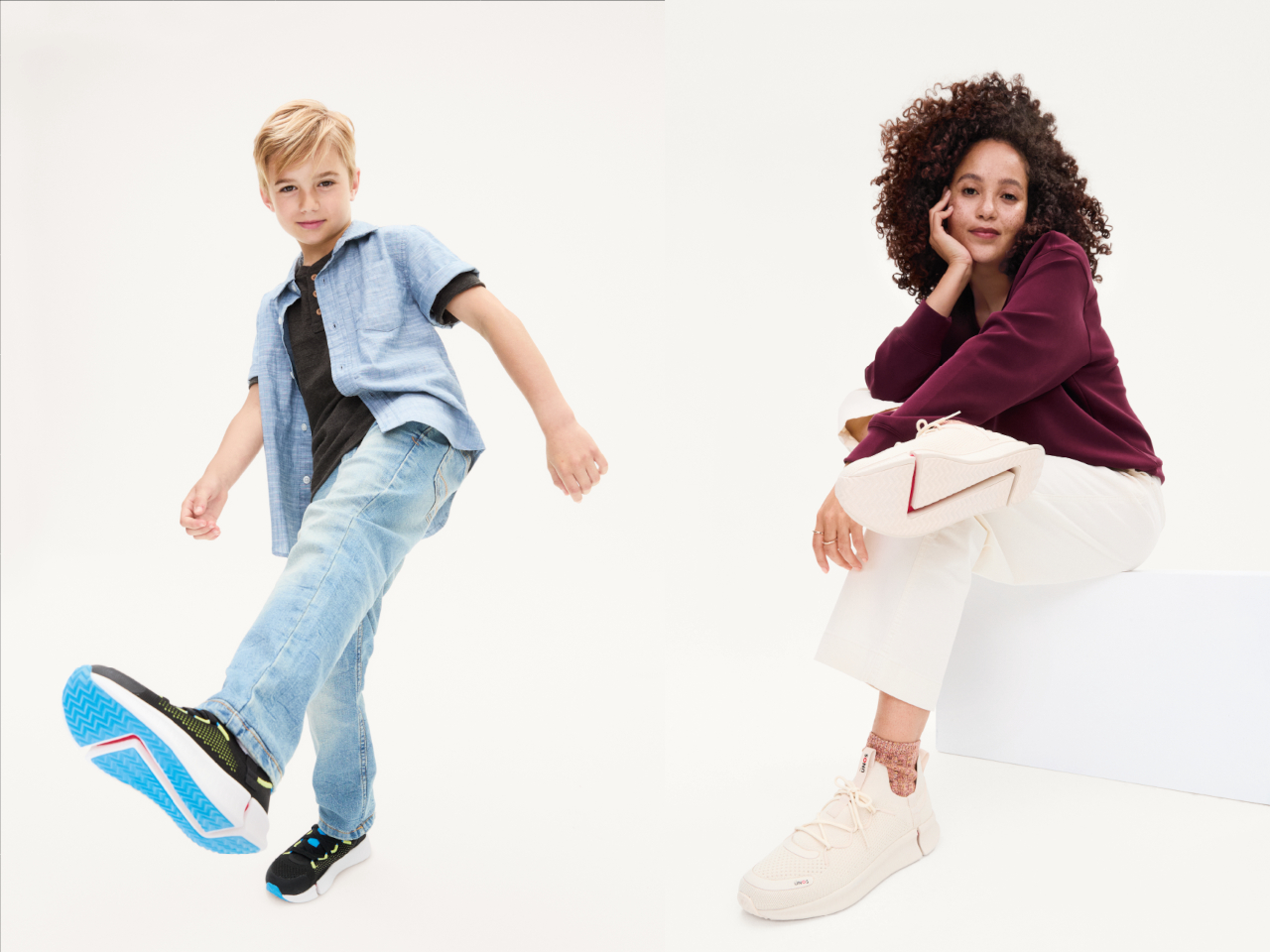
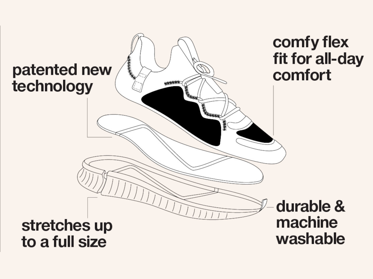
Of all the pieces of clothing that we regularly buy, shoes are probably the most tedious. We need to get the fit just right, because, unlike regular clothes, we don’t simply grow into them nor do they shrink after several washes. In fact, shoes are often discarded once our feet have outgrown them, making footwear rather wasteful and unsustainable. What if, however, your shoes could grow with you, at least for a while longer? That’s the kind of kind of unbelievable value that these sneakers bring to the table, or on the ground rather, promising footwear that stretches and expands to accommodate the varied, uneven, and complicated needs of your feet.

Designer: Dr. D’Wayne Edwards for Target

Given their still-developing bodies, it’s not really surprising that kids would outgrow their shoes faster than their parents can keep up with. Adults, however, aren’t immune to this problem, as their feet can expand and contract a little during the day. That perfect fit you might have at one time might not be so perfect anymore sooner rather than later, and the financial and material waste that comes from buying new pairs often definitely adds up.

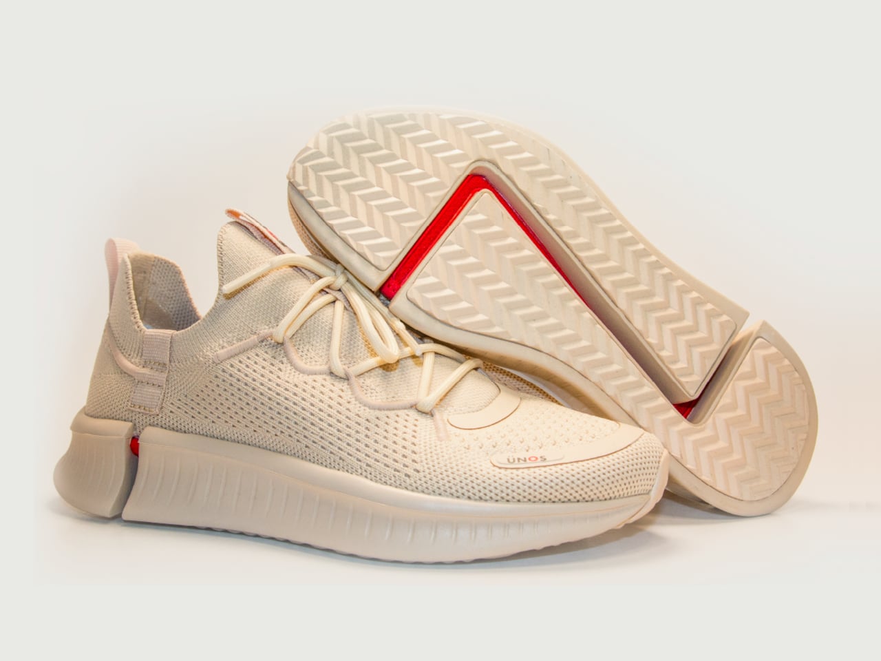
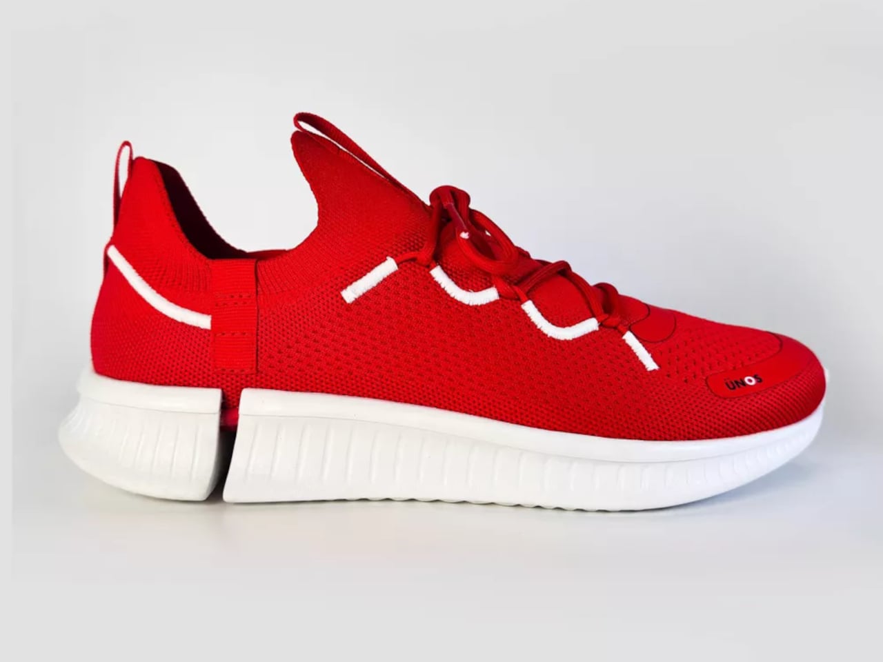
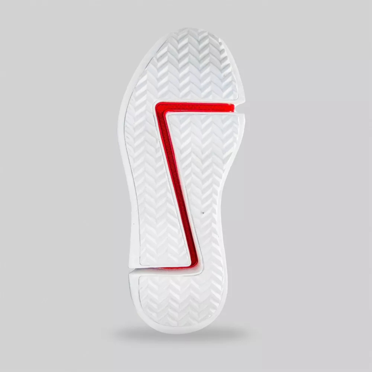
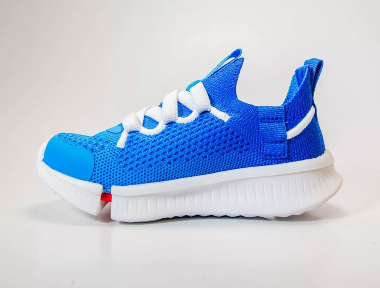
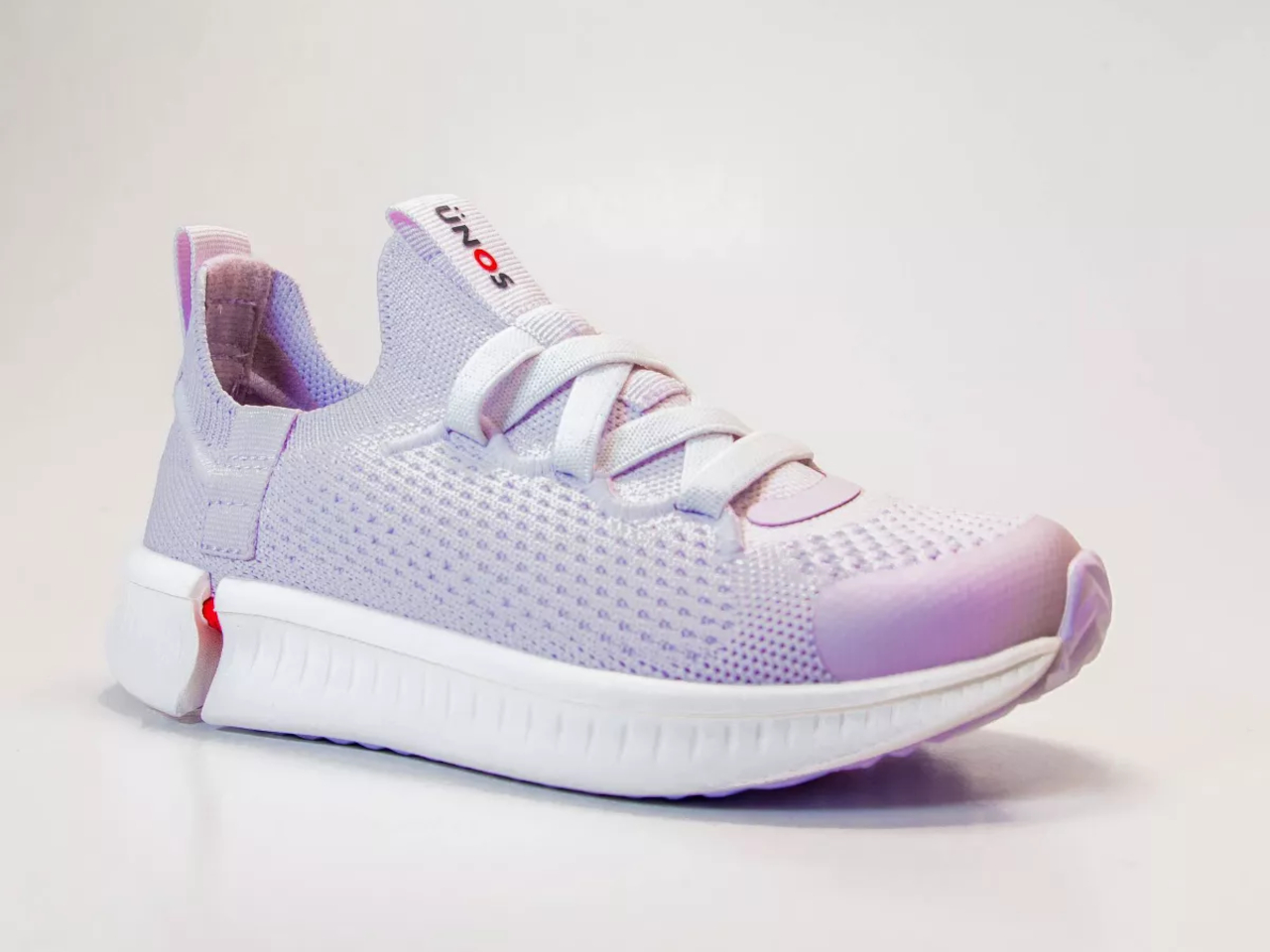
UNOS by Sz is a revolutionary sneaker design that solves this problem, at least for a while longer than you would normally chuck out the old Chucks and buy new ones. The shoe can expand by a half size for kids and a full size for adults, and it doesn’t even look like some complicated contraption to make that possible. It does look like it has a cracked or split sole, which is actually the secret to its magic. Turn the shoe over and you’ll see the patented Z-shape running across the sole, allowing the shoe to stretch a bit farther than its initial size.

This unique design solves many footwear problems, not just ones involving growing feet. People whose feet have slightly different sizes don’t need to buy two different pairs of the same design just to have a matching pair, and people who need bigger shoe sizes than what’s available don’t have to give up either. It’s a very economical solution to a problem that’s often taken for granted, ensuring that “U Need One Size” only, which is what the shoe’s name stands for.

Of course, the sneakers are also made to be comfortable to wear, regardless of your current foot size. The upper has an unconventional sock-like shape that can stretch to adapt to the wearer’s foot shape. It also makes the shoe breathable and easy to slip your foot into, also fixing one of the biggest pain points about having to wear shoes quickly.

The post Revolutionary sneakers expand to fit your growing feet first appeared on Yanko Design.

HoloLens 2 discontinuation practically ends Microsoft’s Mixed Reality vision

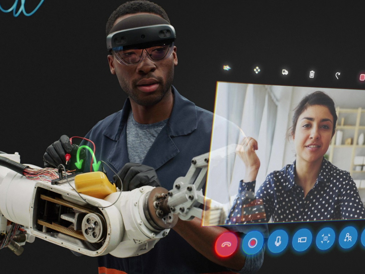
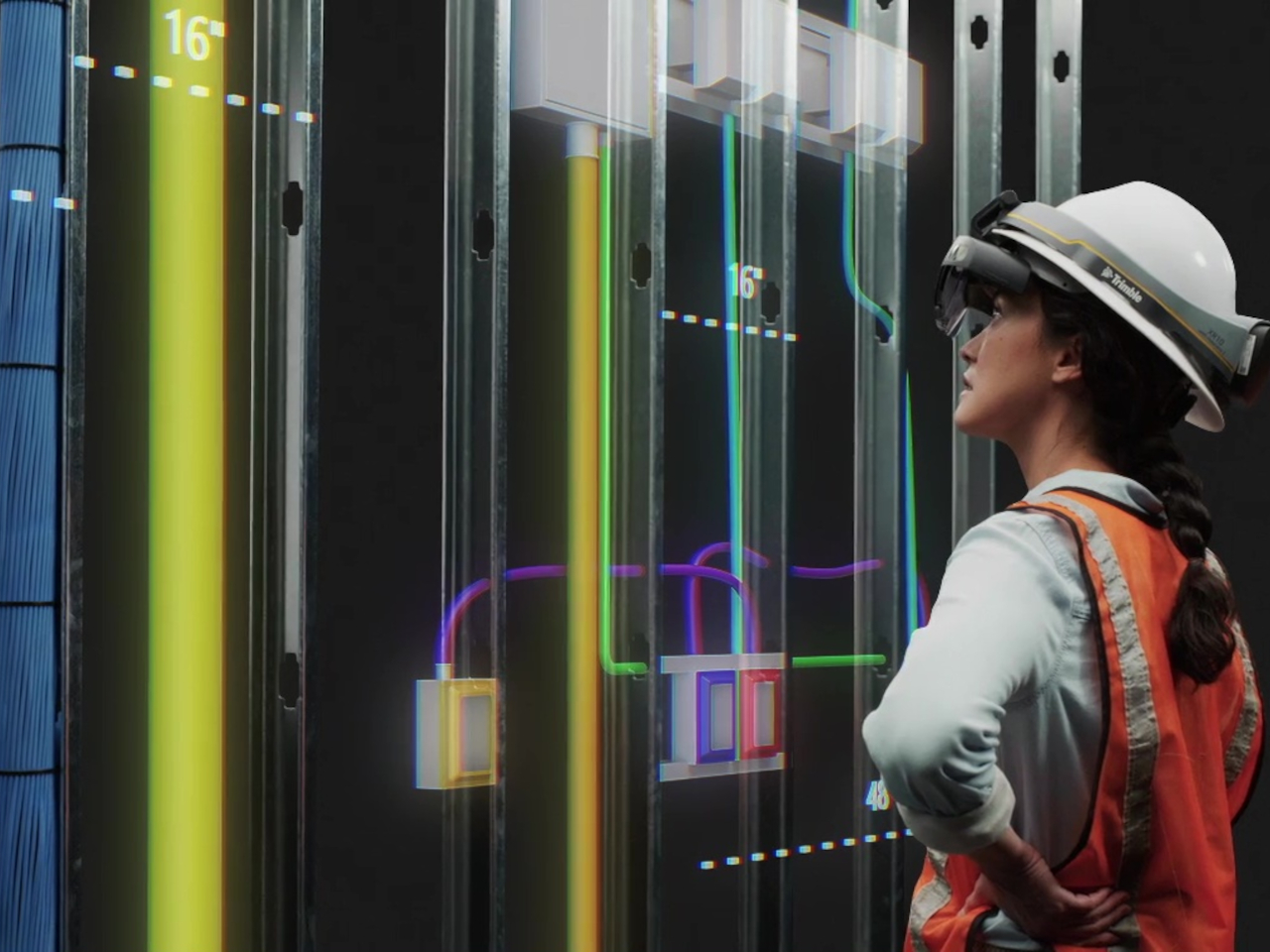
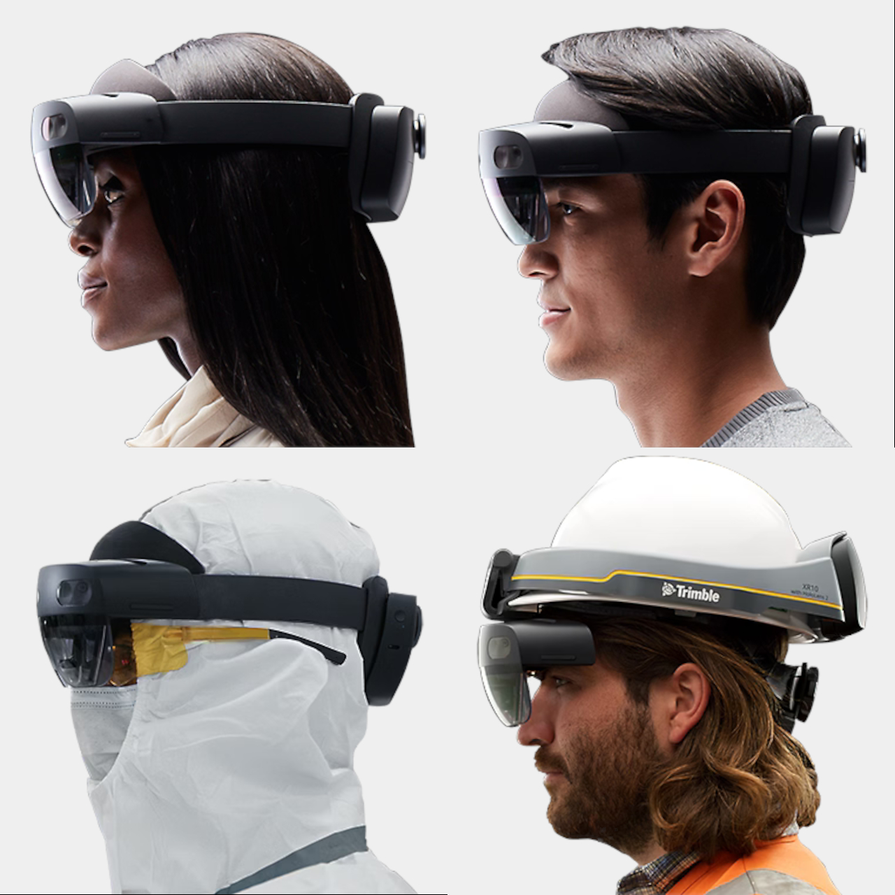
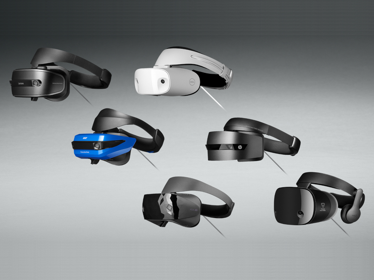
There was a time, before today’s AI rush, when anyone and everyone seemed to be going all in on eXtended Reality or XR, the umbrella term for AR, VR, and mixed reality all smashed together. Now it seems that Meta and Apple, the latter with its self-branded “spatial computing” platform, are the only big players left in this field. HTC Vive, like its smartphones, has silently gone into the background, and Valve’s SteamVR and Index headset have taken a backseat to the Steam Deck. Now another big name in that is practically calling it quits, regardless of any lingering ties and commitments. Microsoft has reportedly discontinued its remaining mixed reality headset, the HoloLens 2, and in doing so puts the final nail in the coffin of a virtual experience that was already on life support for a long time.

Designer: Microsoft (via UploadVR)

It probably surprises no one that the HoloLens 2 is on its way out. It’s a five-year-old device that sported advanced features no one else had back in 2019 but has been surpassed by modern headsets since then. Without any successor, however, it’s clear that Microsoft has other plans, ones that no longer involved the enterprise, nor the mixed reality experience that it made available to the public.

Microsoft actually announced late last year that its Windows Mixed Reality (WMR) platform was being deprecated, so the writing has been on the wall ever since. This mixed reality platform, launched back in 2017, predated Apple’s visionOS but practically promised the same virtual computing experiences in real-world space. Of course, the technology back then wouldn’t be able to hold a candle to today’s Vision Pro, and Microsoft quickly learned that its HoloLens and WMR aren’t going to fly with consumers who can’t even afford the headset. It has, since then, pivoted to the enterprise market, targeting industrial and field workers, training scenarios, and the like.

According to the report, the HoloLens 2, the current and last iteration of that hardware, has gone out of production, so the moment supplies run out, that will be it for the headset. It will remain supported until December 2027, perhaps to honor Microsoft’s existing enterprise contracts. That said, it hasn’t completely turned its back on extended reality, but its focus will be on the militarization of the technology, which means custom experiences that won’t be available to the public. And that will last for only as long as the US Army is interested in that technology.

Microsoft’s exit from the XR market is perhaps yet another sign of this industry’s ailing health. Although the Apple Vision Pro generated plenty of hype, its prohibitive price tag has made it less of a commercial success. In the meantime, Meta more or less remains at the top and continues to try its luck with new designs that could bring this technology to even more people. Even Microsoft has put its XR eggs in the Quest basket, making its Office suite and Xbox Cloud Gaming available there, which in turn, made its own XR platform really pointless. But with even fewer stakeholders, XR runs the risk of becoming a monoculture where only one company dictates the kind of experiences you’ll have in the Metaverse and beyond.

The post HoloLens 2 discontinuation practically ends Microsoft’s Mixed Reality vision first appeared on Yanko Design.

Stay Cool Anywhere With the Ultimate Portable Air Duster Fan for Any Adventure

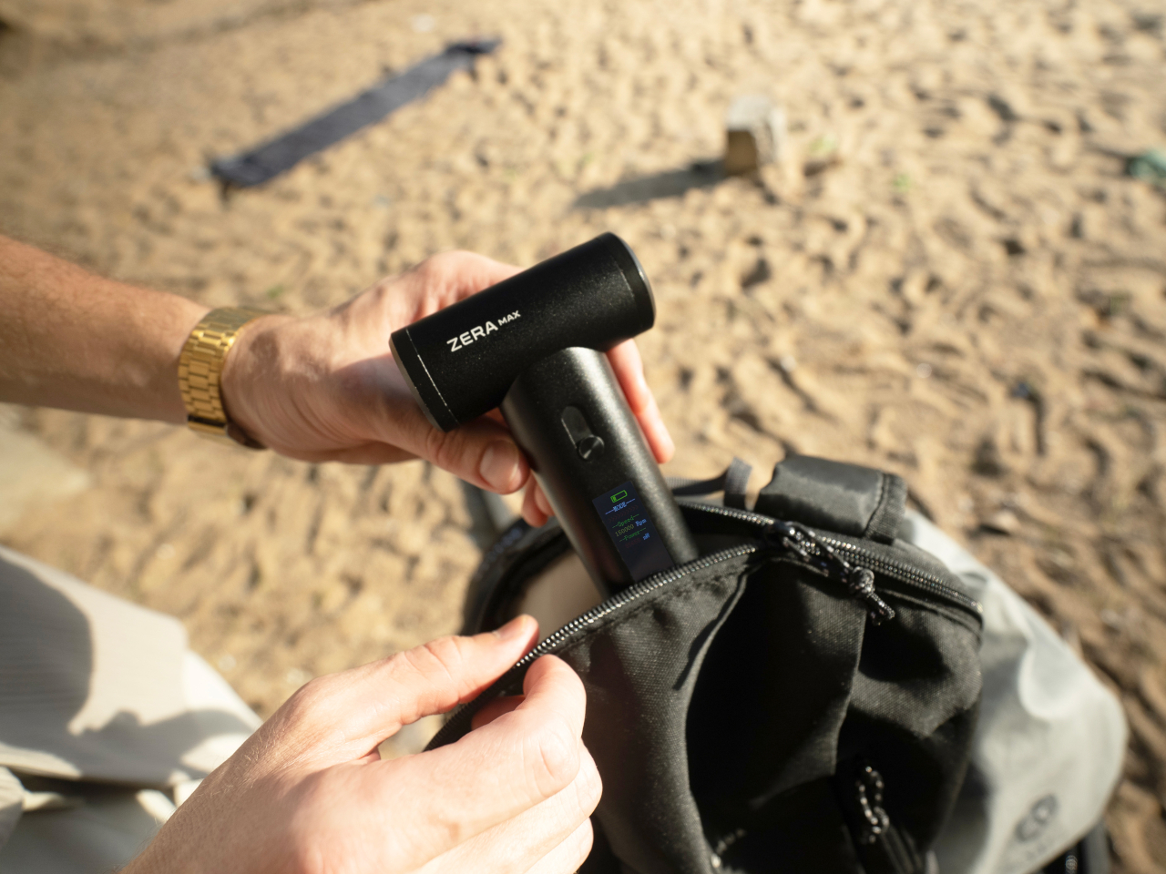
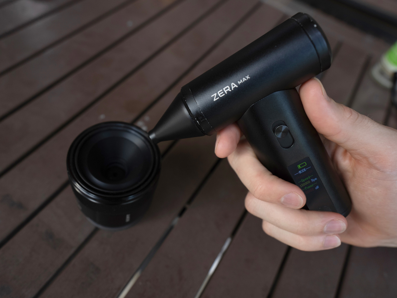
Imagine being in the great outdoors, basking in nature’s beauty, but also sweating profusely and feeling sluggish under the oppressive sun. You might not believe it, but your body definitely feels both days and nights getting hotter. Portable fans are the rage these days, but many of them require you to carry large bottle-sized contraptions that sacrifice your comfort just to beat the heat. That’s where ZERA MAX comes in, a revolutionary portable air duster fan designed to keep you cool and comfortable no matter where your adventures take you. Meticulously crafted to seamlessly combine power, portability, and stunning design, this handheld turbine delivers the wind you need to keep cool and look cool anytime. Whether you’re an avid camper, a dedicated hiker, or someone just looking to conquer the summer heat, the ZERA MAX promises to bring indoor comfort to your outdoor experiences.

Designer: ZERA

Click Here to Buy Now: $89 $159 (44% off). Hurry, deal ends soon! Raised over $106,000.

1

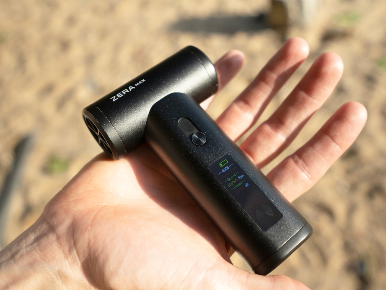
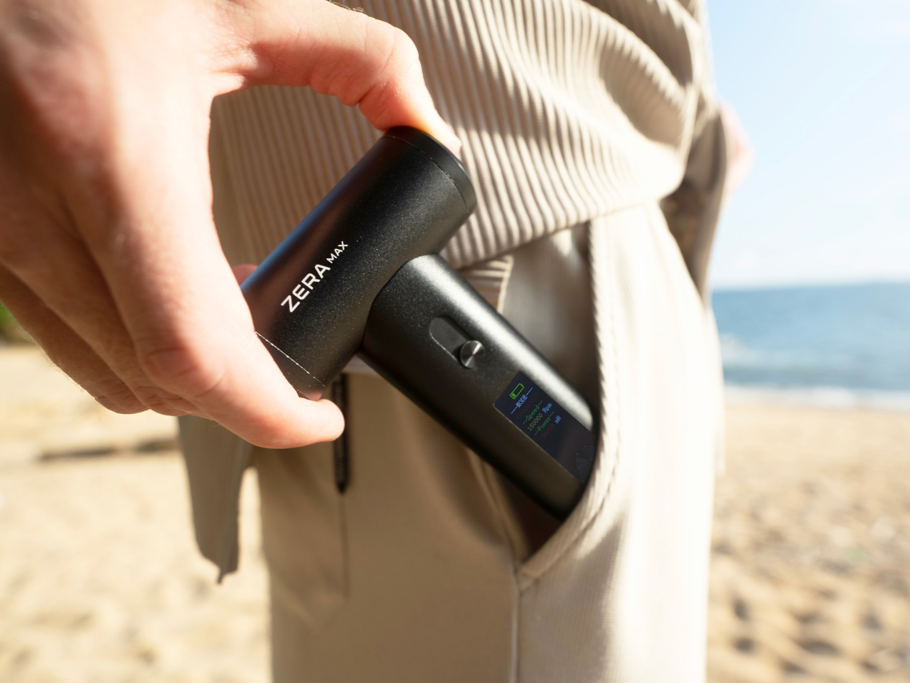
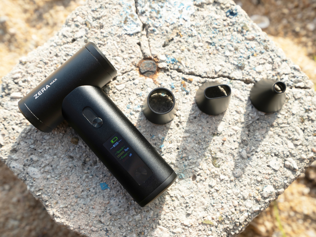
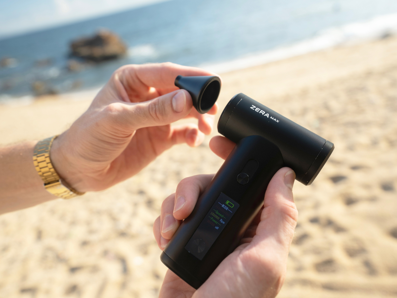
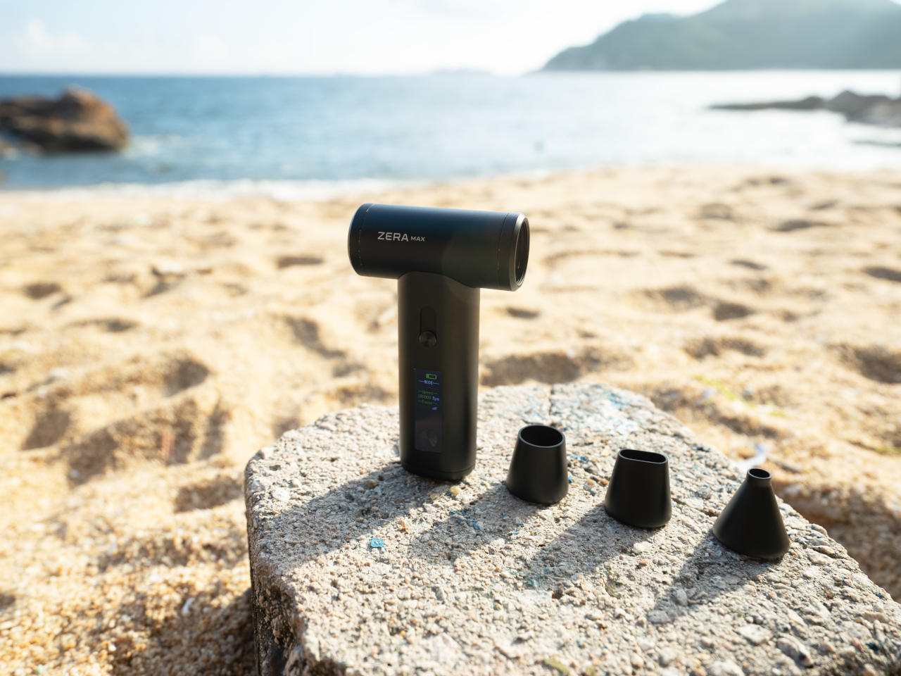
What sets the ZERA MAX apart at first glance is its sleek, ergonomic, and pocket-sized design. Crafted from aluminum alloy, this fan is lightweight yet incredibly durable, making it an indispensable companion for any outdoor activity. Its modern and minimalist aesthetic is a visual delight, ensuring it doesn’t just function well but looks good doing it. The convenience of its compact build cannot be overstated – you can effortlessly slip it into your backpack, hiking gear, or beach bag, giving you the freedom to carry it wherever you go, unlike other fans that are as large as water bottles. This blend of style and practicality ensures that relief from the heat is always within arm’s reach.

1

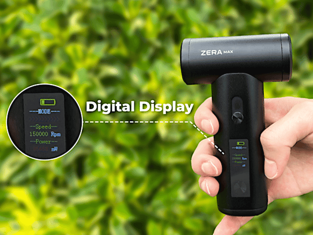
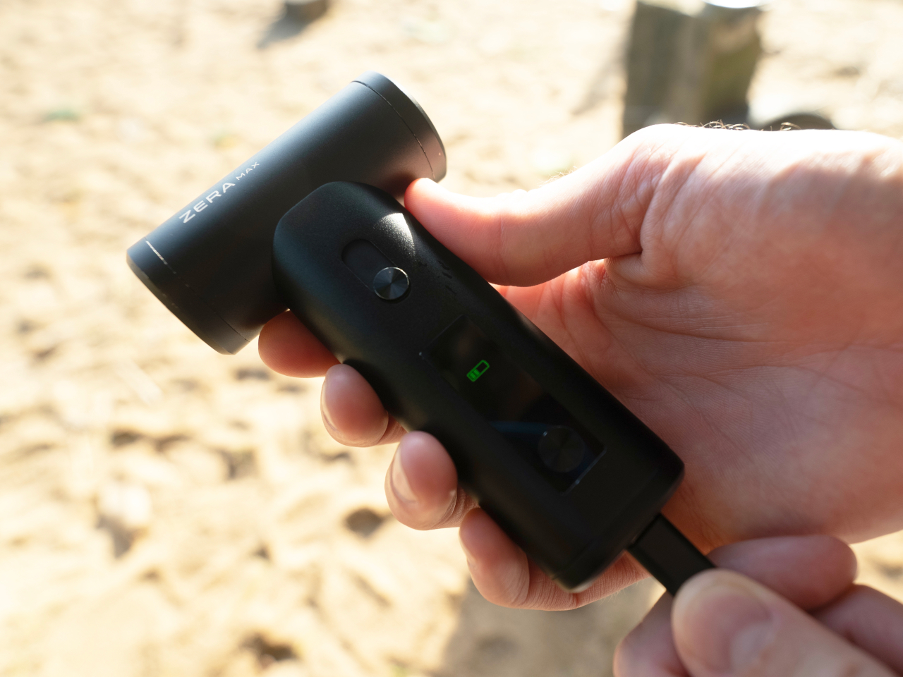
The relief is delivered by a small yet powerful wind turbine with a top speed of 150,000 rpm. With a simple sliding button, you can customize the speed that you need, whether it’s a gentle breeze for a mellow afternoon or a strong gust to keep the sweltering midday heat at bay. All the information you need is available at a glance on the handle’s digital display, whether it’s battery charge or speed. It’s these thoughtful features that distinguish the ZERA MAX as a versatile tool, perfect for any situation you might find yourself in.

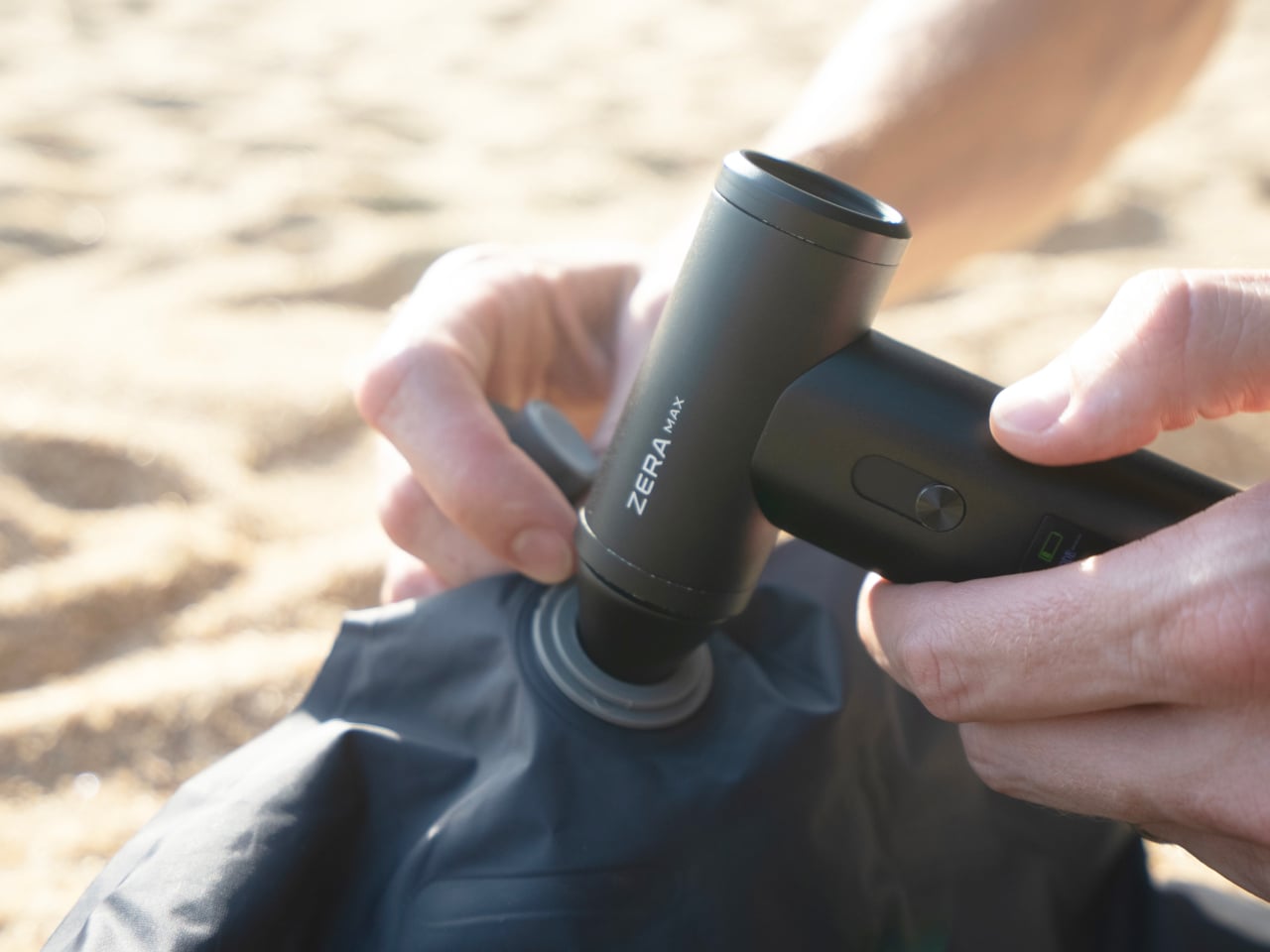
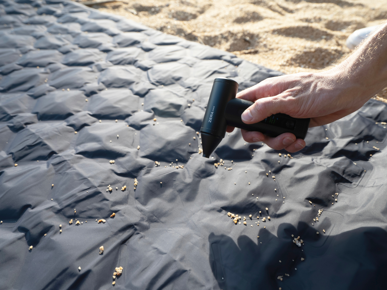
But the ZERA MAX isn’t just a fan – it’s a powerhouse of functionality. Picture this: you’ve just reached your camping spot, and with a quick switch, your fan doubles as an air duster to swiftly blow away dirt from your equipment. It’s a dream come true for outdoor enthusiasts who often have to deal with dusty environments and gear. It can also function as a vacuum, an air mattress and ball inflator, an eyeglasses cleaner, and more. All these functions are made possible with a variety of interchangeable nozzles that quickly snap and stay on thanks to a strong rare-earth magnet on the fan’s nose. These features are not just convenient but essential, ensuring your gear stays clean and functional, allowing you to focus on enjoying your adventure.

1

With such a powerful wind turbine in your pocket, the last thing you’d want is for your portable air duster fan to die after just half an hour of use. Thanks to a large 4,000mAh battery in the handle, that’s never a worry and you can enjoy a comfortable breeze for up to 3 hours. And when it does come to juice up the ZERA MAX, its fast USB-C charging makes sure you’ll be up and ready again in no time. It is designed to keep up with your energetic lifestyle, providing uninterrupted comfort throughout your outdoor excursions. With its harmonious fusion of innovative design, exceptional functionality, and versatile adaptability, this handheld wind turbine redefines what a portable fan can be. Whether you’re embracing the outdoors, trying to survive a hot day, setting up a mattress, or simply cleaning your laptop, the ZERA MAX is ready to revolutionize your adventures, wherever the wind blows, especially if the wind isn’t blowing at all.

Click Here to Buy Now: $89 $159 (44% off). Hurry, deal ends soon! Raised over $106,000.

The post Stay Cool Anywhere With the Ultimate Portable Air Duster Fan for Any Adventure first appeared on Yanko Design.

Key-bowed hybrid violin and keyboard synthesizer produces pure musical joy

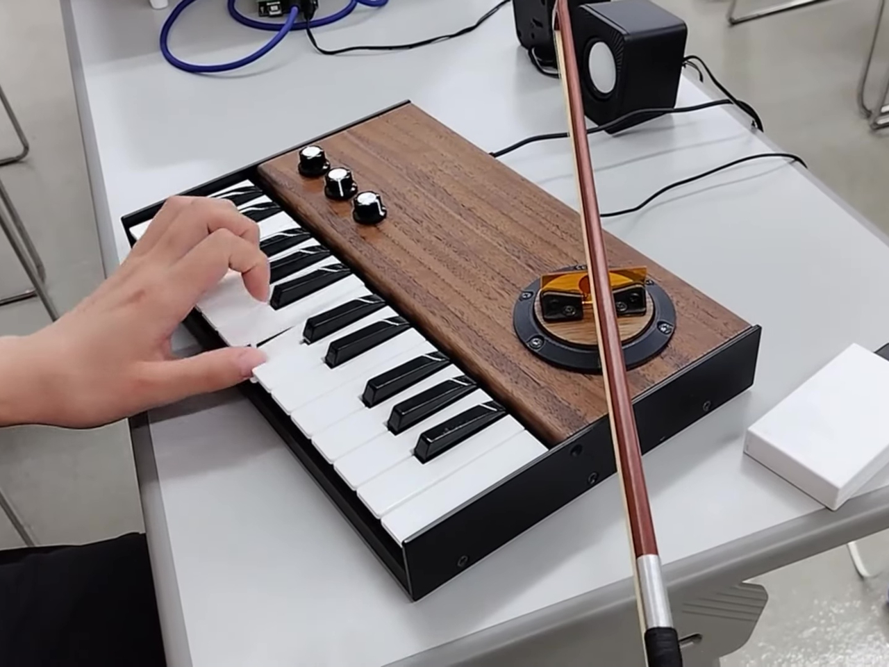
Of the many creative endeavors, music is probably one of the hardest to learn and practice. And of the well-known musical instruments, the violin is one of the hardest to play. But what if you can play the violin or some semblance of the instrument as easily as you could press down keys on a piano? And what if that produced the unique tonal quality of a violin while still hitting all the right notes perfectly? That’s the kind of musical experience that this DIY synthesizer offers, combining two classical instruments in a single form that might leave you confused with one hand playing the keyboard and the other playing the violin.

Designer: Washiyama Giken

Electronic keyboards can try to mimic the sounds of different musical instruments, but they don’t always work. They can’t, for example, reproduce the unique vibrating quality of the violin family, which at the very least would require some physical medium to produce that kind of sound. Conversely, violins are hard to master because you need to also move the bow at a very precise location to hit the right pitch, and that location isn’t marked like on a guitar.

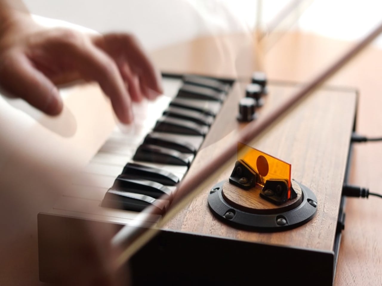
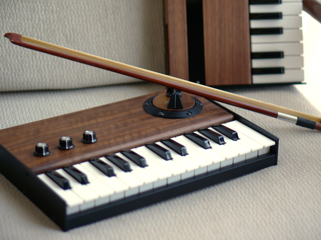
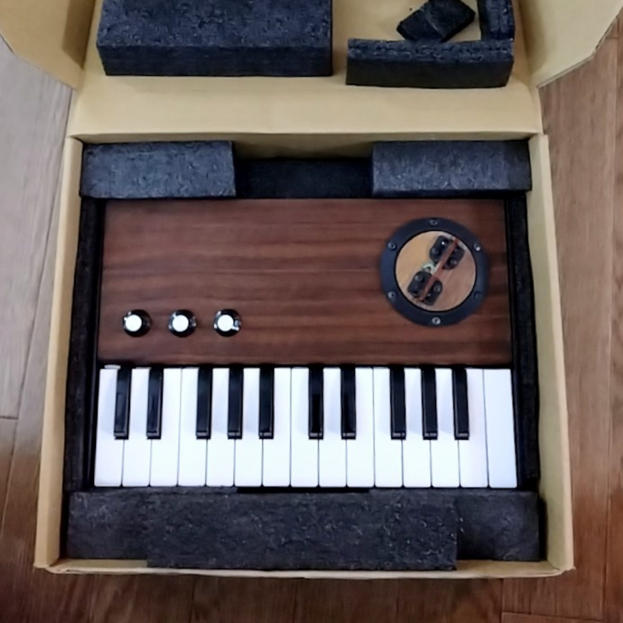
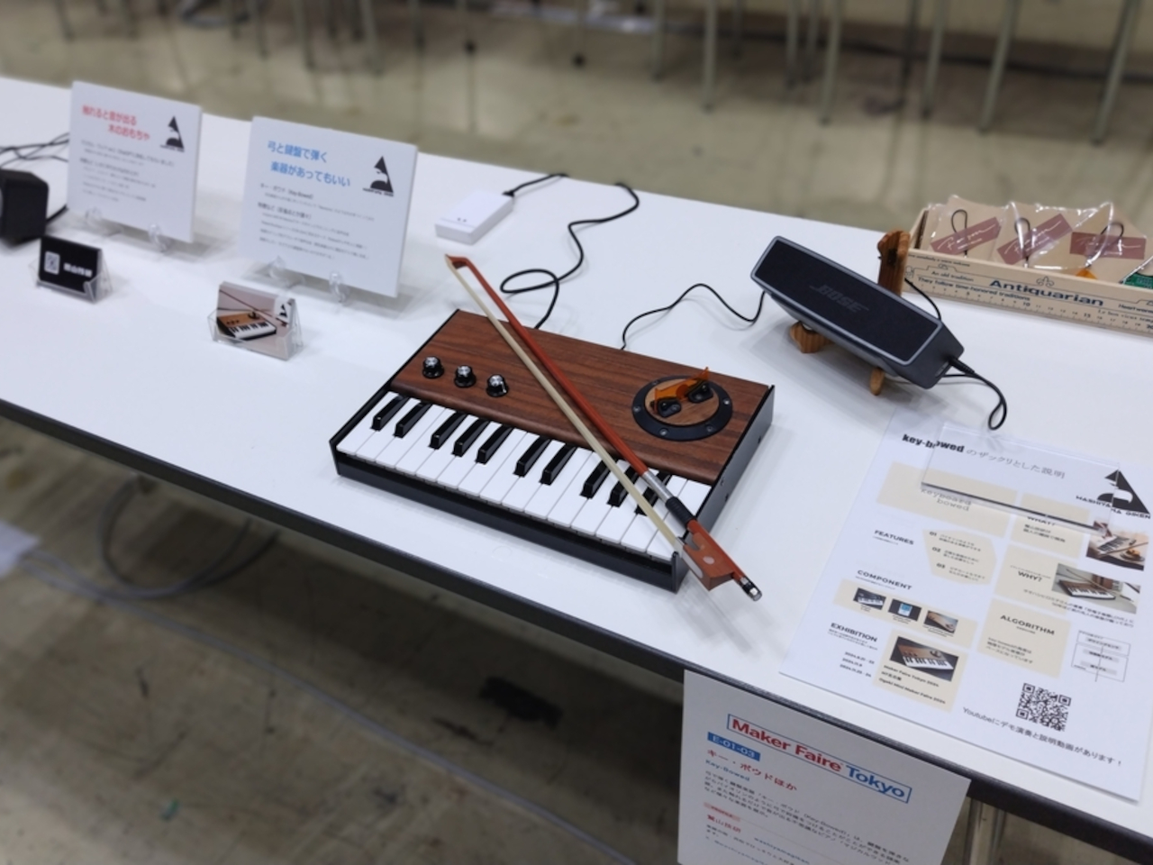
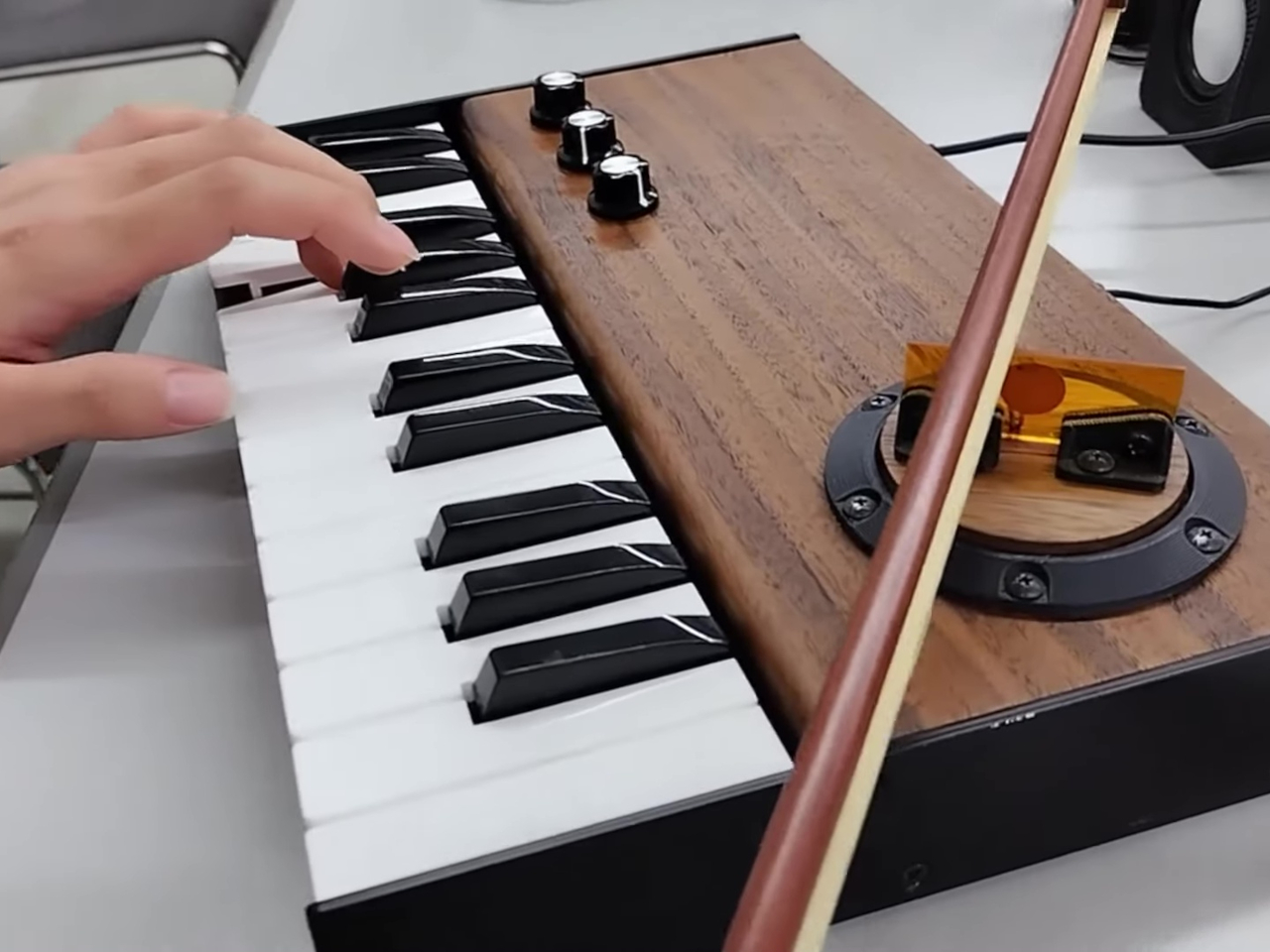
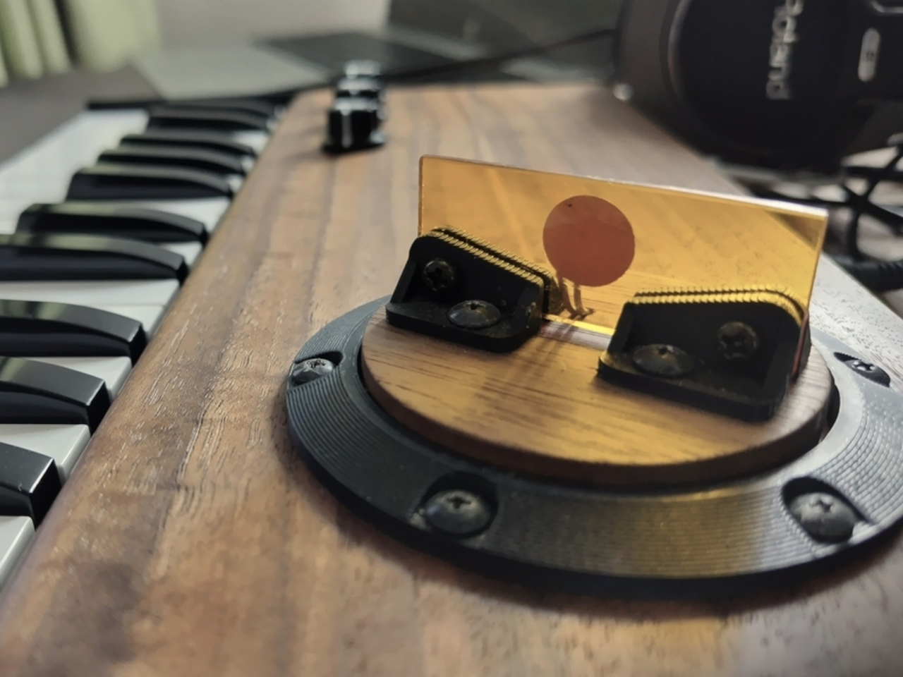
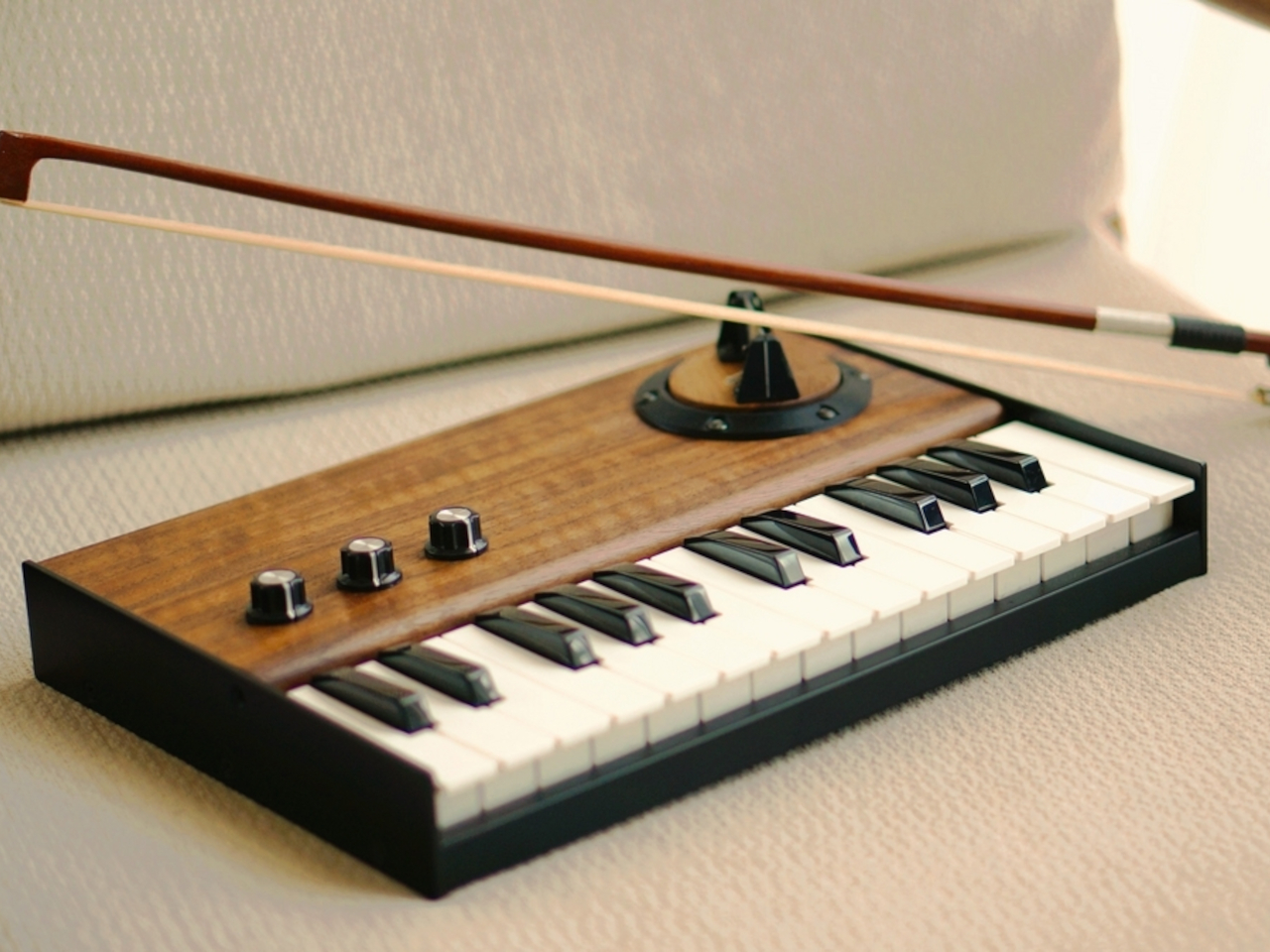
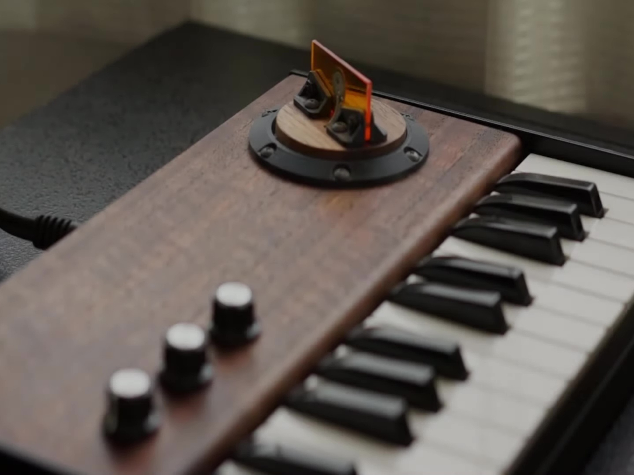
Key-bowed, which is a very creative name, tries to combine the strengths of both the keyboard and the violin with very few of the flaws. It’s actually an idea decades in the making, but it’s finally possible to pull it off thanks to modern technologies and hardware. The synthesizer combines a Roland K-25m keyboard, an Arduino Uno R4 minima controller, and a self-made bowing sensor with a vertical acrylic plate. Of course, the assembly also requires some programming know-how, especially when dealing with sound waves.

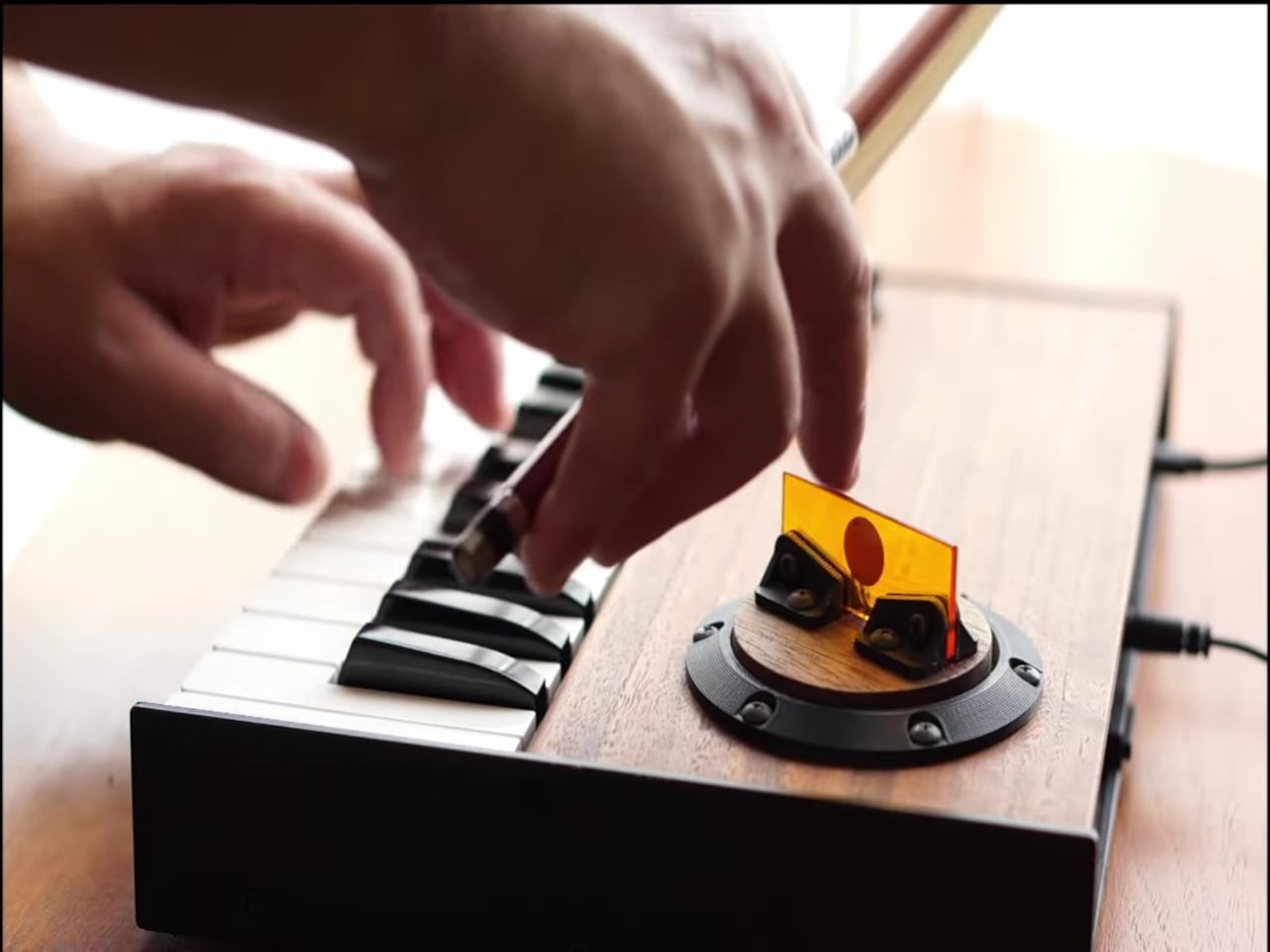
Despite the complexity of the build, using the Key-bowed looks pretty simple, at least for the musically inclined. You simply hit the keys with one hand to produce music like on a regular keyboard or piano, and then you use the other hand to move the bow across the acrylic plate as you would with a violin. The vibrations on the plate are detected by the sensor and then transformed into waves that modify the note that’s produced, resulting in a very realistic recreation of a violin sound, with perfect pitch, and without the screeches. You can even pluck the plate and make it sound like you’re really plucking a string.

240702181648552

Key-bowed is definitely a work of genius that makes playing music both fun and enchanting. It still requires you to have some basic music knowledge, of course, but it makes the execution less daunting, especially if you’ve always dreamed of playing the violin. Of course, there are limits to the music you can play, since you’re technically producing notes with only one hand, and the design is made for those who hold the violin bow with their right hand. Nonetheless, it still creates a captivating experience, and hopefully, it can become a commercial product that will let everyone enjoy that experience as well.

The post Key-bowed hybrid violin and keyboard synthesizer produces pure musical joy first appeared on Yanko Design.

Rectangular robot vacuum concept proposes a more efficient design for smaller spaces

Robot vacuum cleaners and mops are common sights these days, but despite all the advancements they’ve made in terms of technology, their basic shape has remained unchanged since the first-ever Roomba. They’re almost all circular, though the are some that have taken on rounded square forms, a shape that was dictated by the limitations of old technologies that don’t seem to be relevant today. This standard design, however, still carries over other limitations, like squeezing into tight spaces or cleaning corners. Perhaps it’s time to rethink that old and outdated design, which is what this concept tries to do in order to cater to homes with smaller, cramped spaces and messy floors.

Designer: Subin Kim

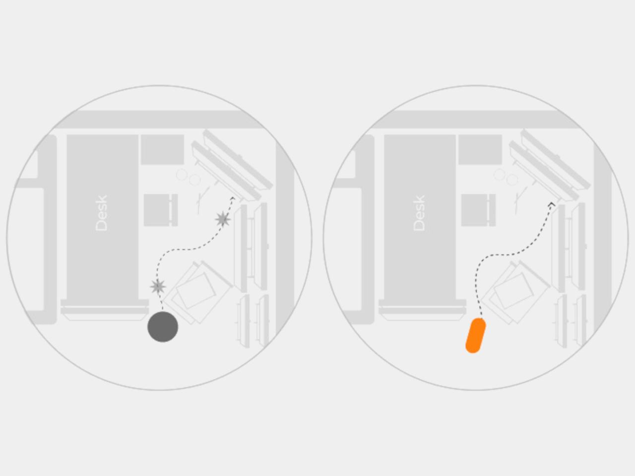
The initial design of robot vacuums was made primarily for the robot and not the humans. The circular shape made it easier for the machine to turn and correct its direction, something that was all too common given the very basic technologies from decades past. Today, however, most robot cleaners have no problem navigating the most cluttered floors, so there’s now an opportunity to rethink that basic shape.

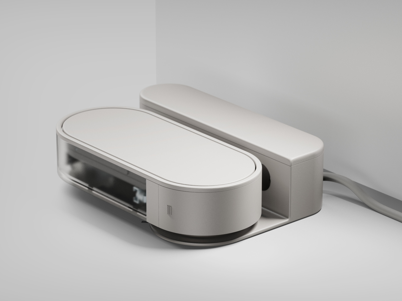
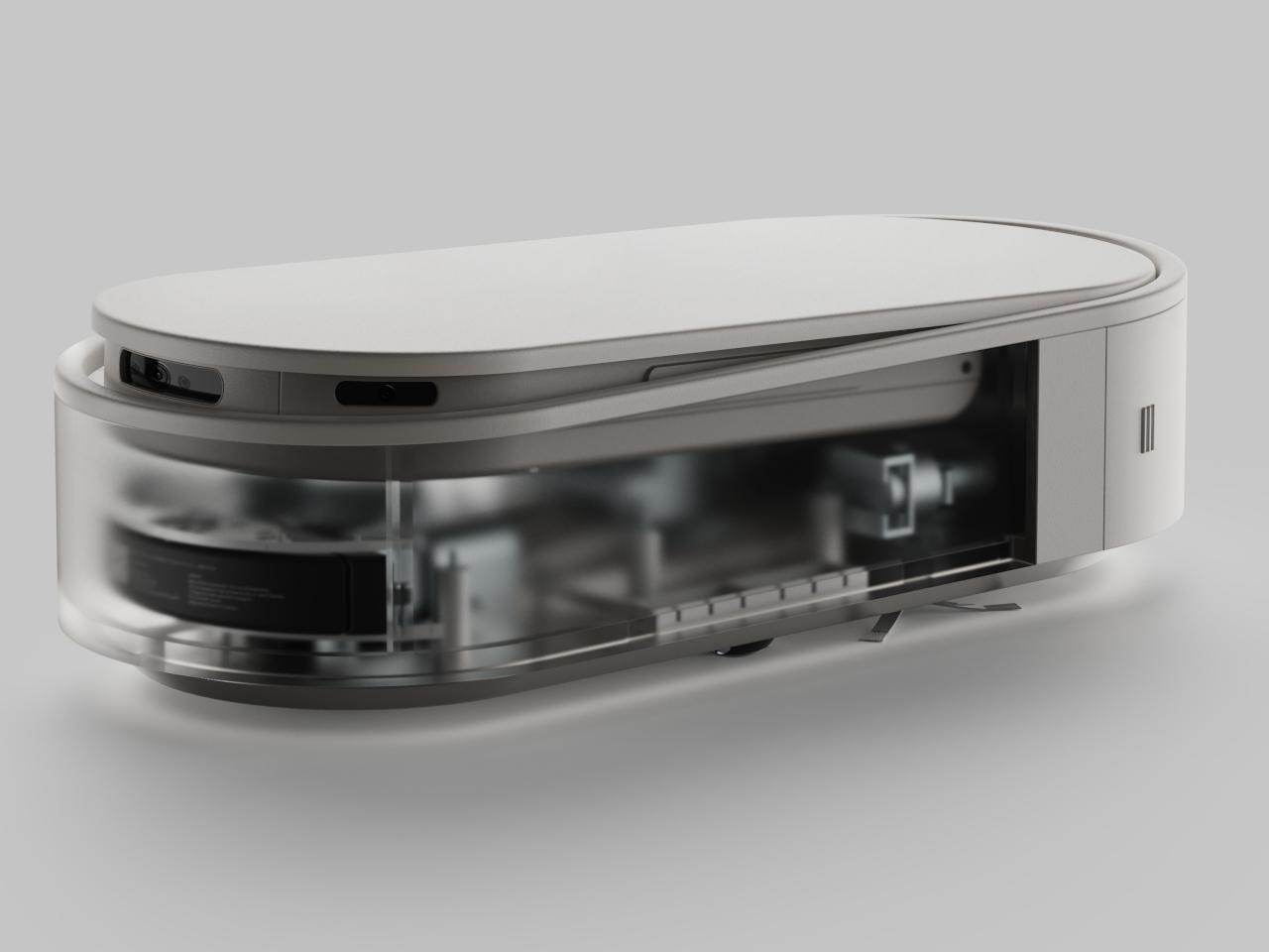
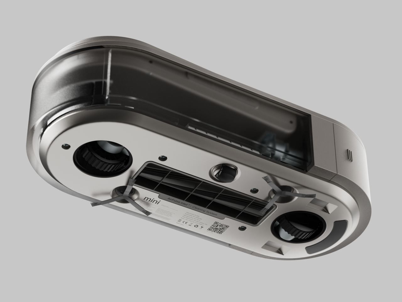
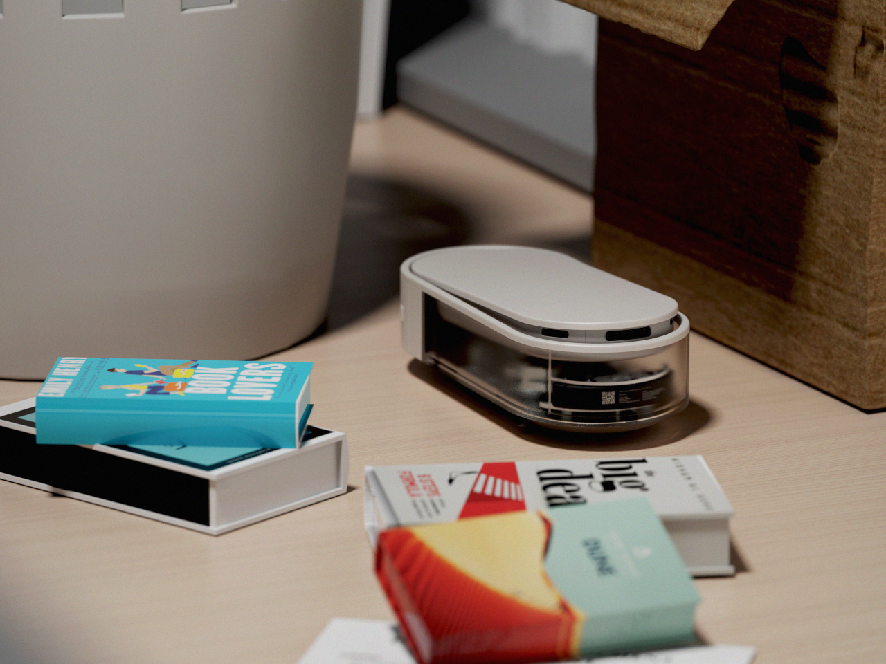
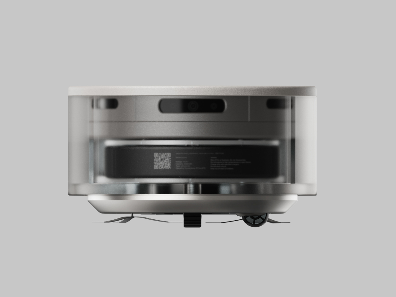
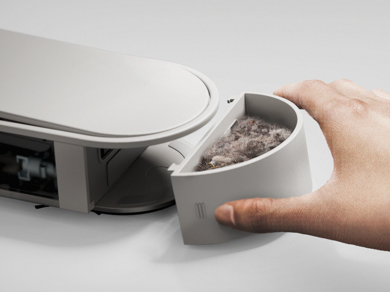
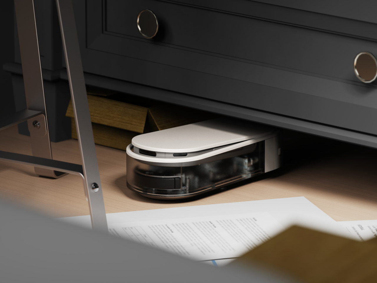
mini is a concept design that stretches the robot vacuum into a more rectangular form, technically more pill-shaped with its rounded sides. The idea is that this robot can better squeeze itself into narrow spaces, like those between walls and furniture, or hug edges to properly brush and vacuum areas that even the most sophisticated circular robot can’t reach. In small apartments or tiny homes, that is more often the case, so such a design is more useful than the majority of round or square robots.

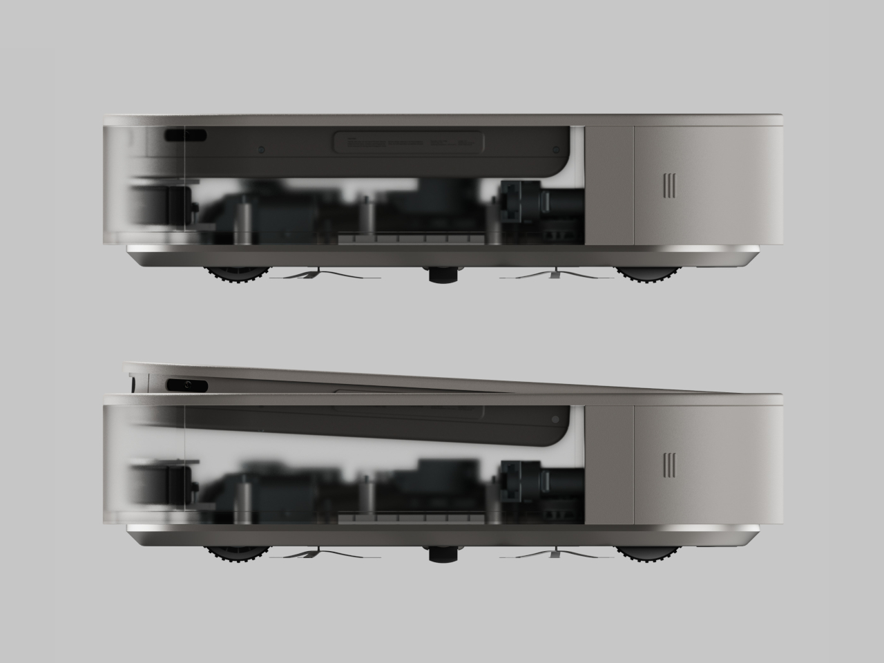
The design can actually be even more efficient than standard robot vacuums because it can change its orientation depending on the area of the floor to be cleaned. In its vertical mode, it can easily clean out narrow gaps, but then it can rotate and switch to horizontal mode if there’s a wider space available for it to move. Such a feat would require AI and advanced sensors, both of which are readily available on most robot cleaners today.

mini’s design does mean it won’t be able to turn quickly, but that can be handled by better obstacle detection and smarter navigation. Although it might not work perfectly in practice, the concept does challenge the status quo and encourages a design that really puts the user at the center, rather than simply turning such robot helpers into technological showcases.

The post Rectangular robot vacuum concept proposes a more efficient design for smaller spaces first appeared on Yanko Design.
Pixel 9a leaked renders look pretty barren without the distinctive camera bar

With the Pixel 6 in 2021, Google embarked on a new design language and visual identity for its smartphones. Like it or not, and some definitely didn’t, the camera “visor” has become an identifying mark of the Pixel phones since then, something that no other brand dared to even try. It underwent a few refinements until it was finally replaced by the camera “bar” in this year’s Pixel 9. Some loved it, some despised it, and some even wanted to have the old visor back. It seems that Google isn’t done playing around with the design just yet if these early unofficial renders for next year’s “mid-release” Pixel phone. And if the Pixel 9a is any indicator of the direction that Google will take in the future, it’s bound to split camps yet again.

Designer: Google (via AndroidHeadlines and OnLeaks)

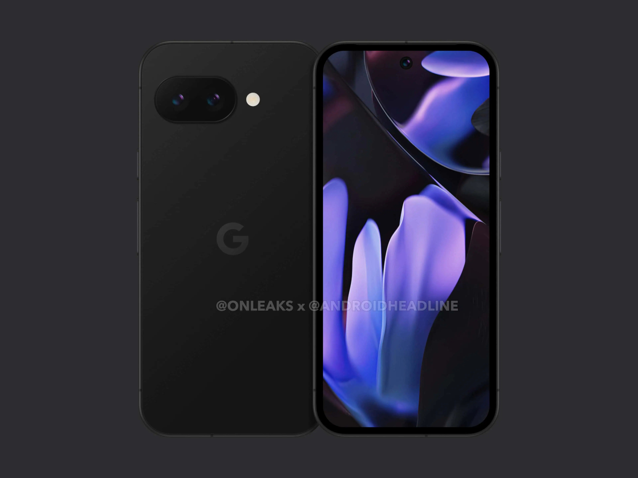
It’s not that hard to understand how divisive the Pixel camera design is. On the one hand, it is big, visible, and distracting, but on the other hand, it is executed elegantly, balances the phone on your desk, and gives your index finger something to rest on when holding the phone. What both camps will probably agree is that the camera visor or bar is an identifying mark of the Pixel phone, and it’s something the Pixel 9a might lack.

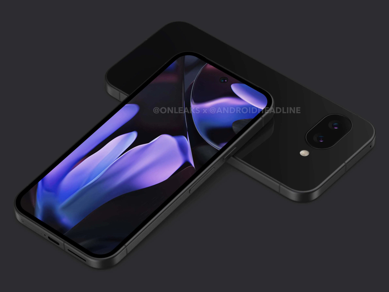
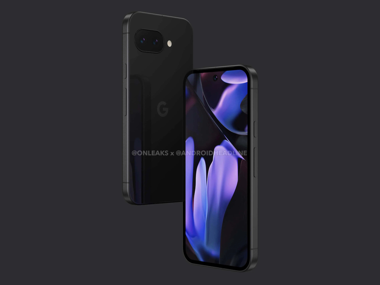
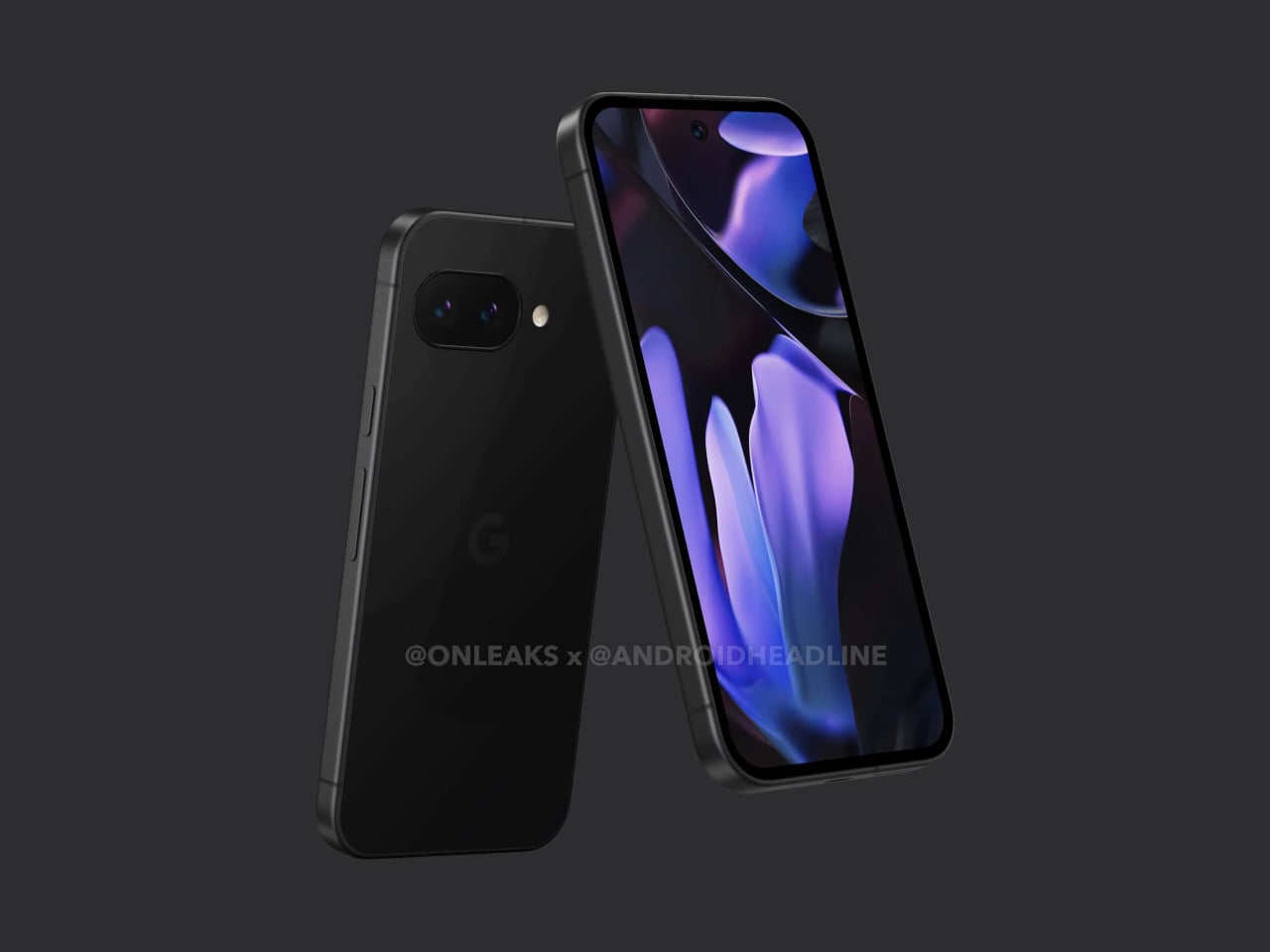
Based on the first CAD renders made from leaked information, the next mid-range Pixel phone will ditch the camera bar for a flatter design. Curiously, the cameras aren’t placed closer to the upper left corner of the phone’s back even without the bump, and it seems to be in the exact same position if it did have that bar. It’s almost as if Google just did a magic trick like pulling out the tablecloth from under the cameras, leaving them in the exact same place. At the same time, however, the camera island isn’t completely flush with the rest of the phone’s back as it has a raised lip around the oval, perhaps for protection. Whether it will make the wobble is something that can only be tested with an actual unit.

Other than that, the rest of the Pixel 9a’s design is pretty similar to the Pixel 9, down to having only two cameras on its back. The exact dimensions of the upcoming phone remain undisclosed, so we don’t know yet how bigger or smaller it is compared to the Pixel 9. The bezels around the display, however, do look a little thicker, giving it a less premium appearance overall.

The Pixel “a” series often carries the design from the same generation, so it would be surprising to see this big a change for the phone. It could also be Google’s strategy to further differentiate the Pixel 9a from the Pixel 9, giving it an aesthetic that definitely looks more “mid-range” than the flagship models. You can still see signs of the Pixel DNA if you look hard enough, but other than the position and orientation of the cameras, it’s almost too easy to pass the Pixel 9a over for some more visually interesting mid-tier phones.

The post Pixel 9a leaked renders look pretty barren without the distinctive camera bar first appeared on Yanko Design.