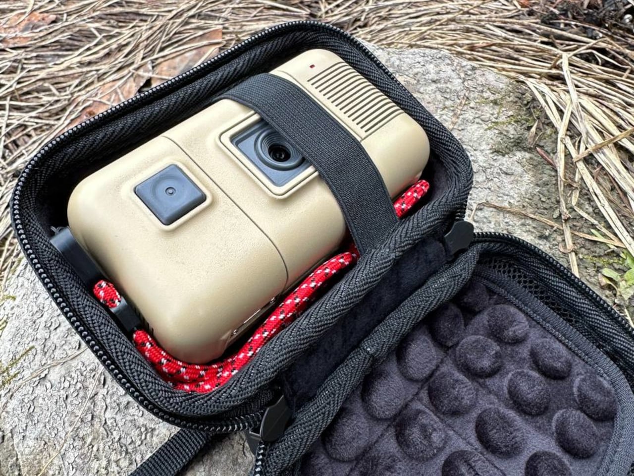
There’s a particular visual language that 1980s science fiction used for technology. It was chunky, industrial, and slightly alien in form, the kind of hardware that felt like it belonged on a spaceship more than in a pocket. That aesthetic has been largely absent from consumer electronics for decades, replaced by sleek glass rectangles and matte aluminum that all end up looking roughly the same.
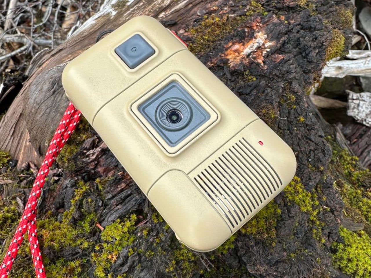
A maker going by Yutani on Reddit has built something that resurrects that forgotten design language in the form of a functional digital camera. It’s called the Saturnix, and the concept is simple but strange: what would a camera look like if it were designed in the 1980s, not to look like what cameras looked like then, but to look like what cameras were imagined to eventually become?
Designer: Sf140/Yutani
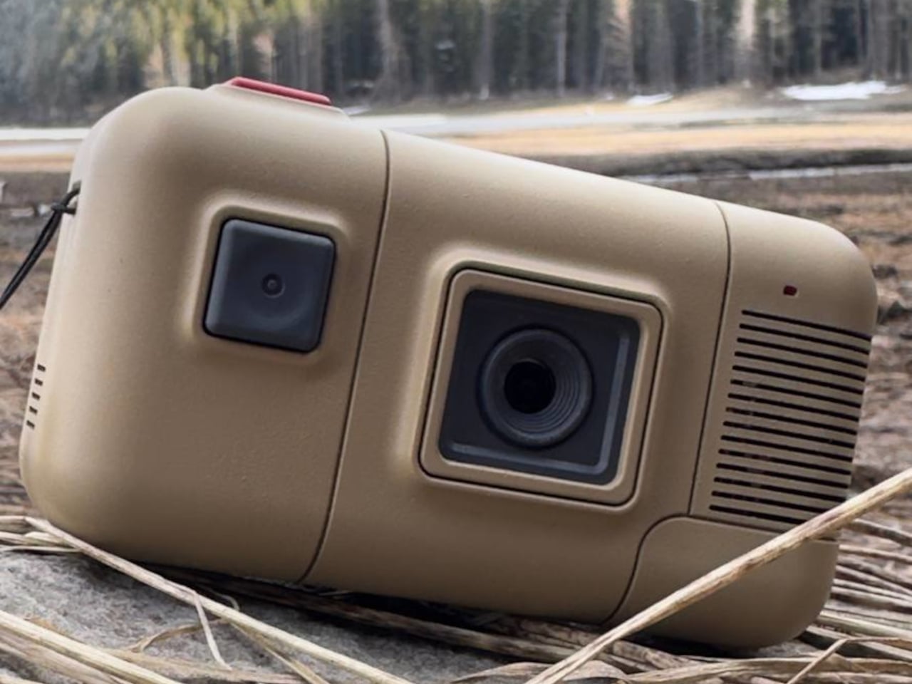
The body is 3D printed and draws clear inspiration from the science fiction hardware of that era, specifically the industrial aesthetic of films like Alien. It’s chunky and deliberate by design. The five control buttons use mechanical Kailh switches, a choice the creator was specific about: “a camera should feel like a real tool, not a touchscreen.” The tactile feedback from each press reinforces exactly that.
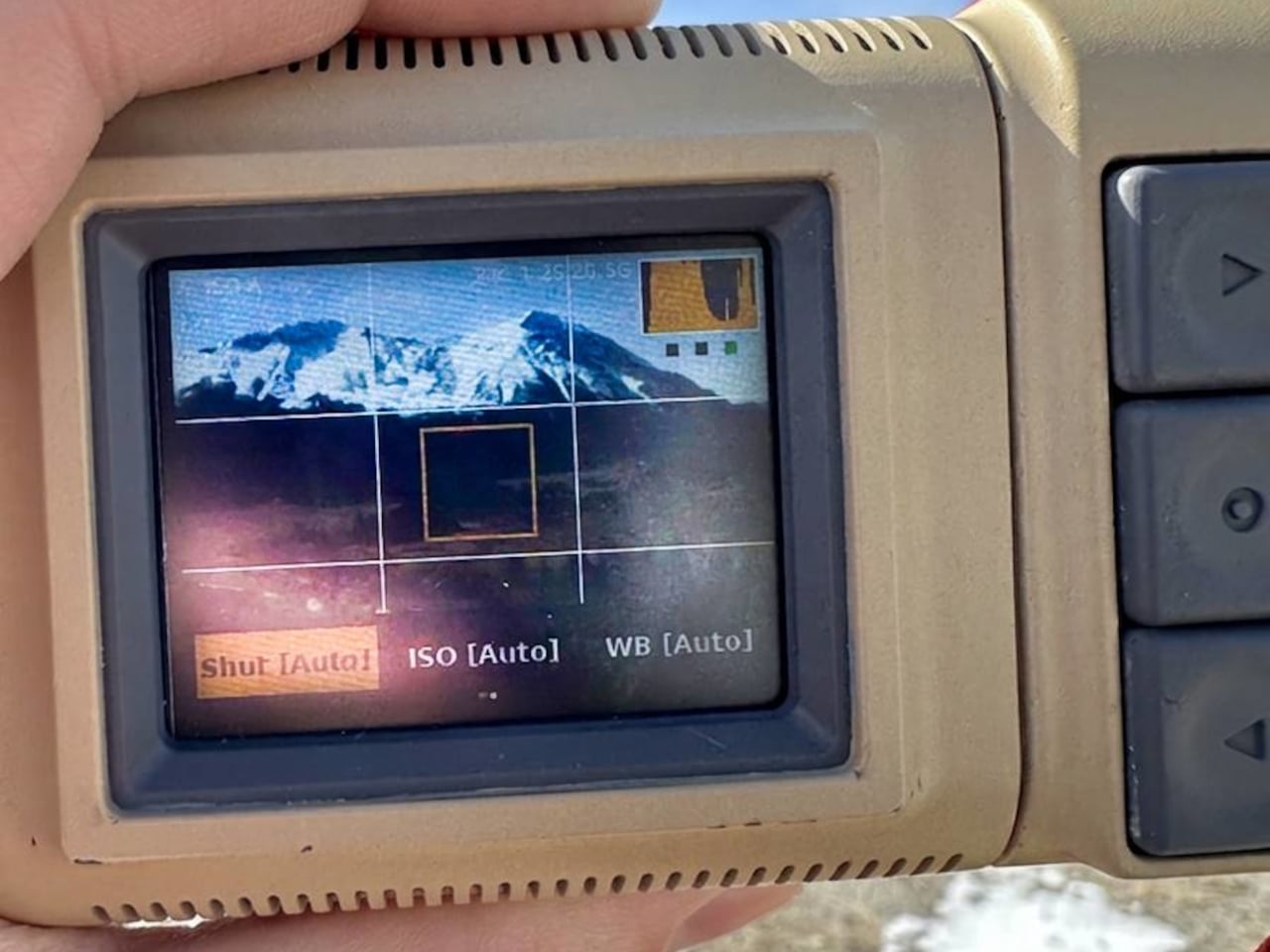
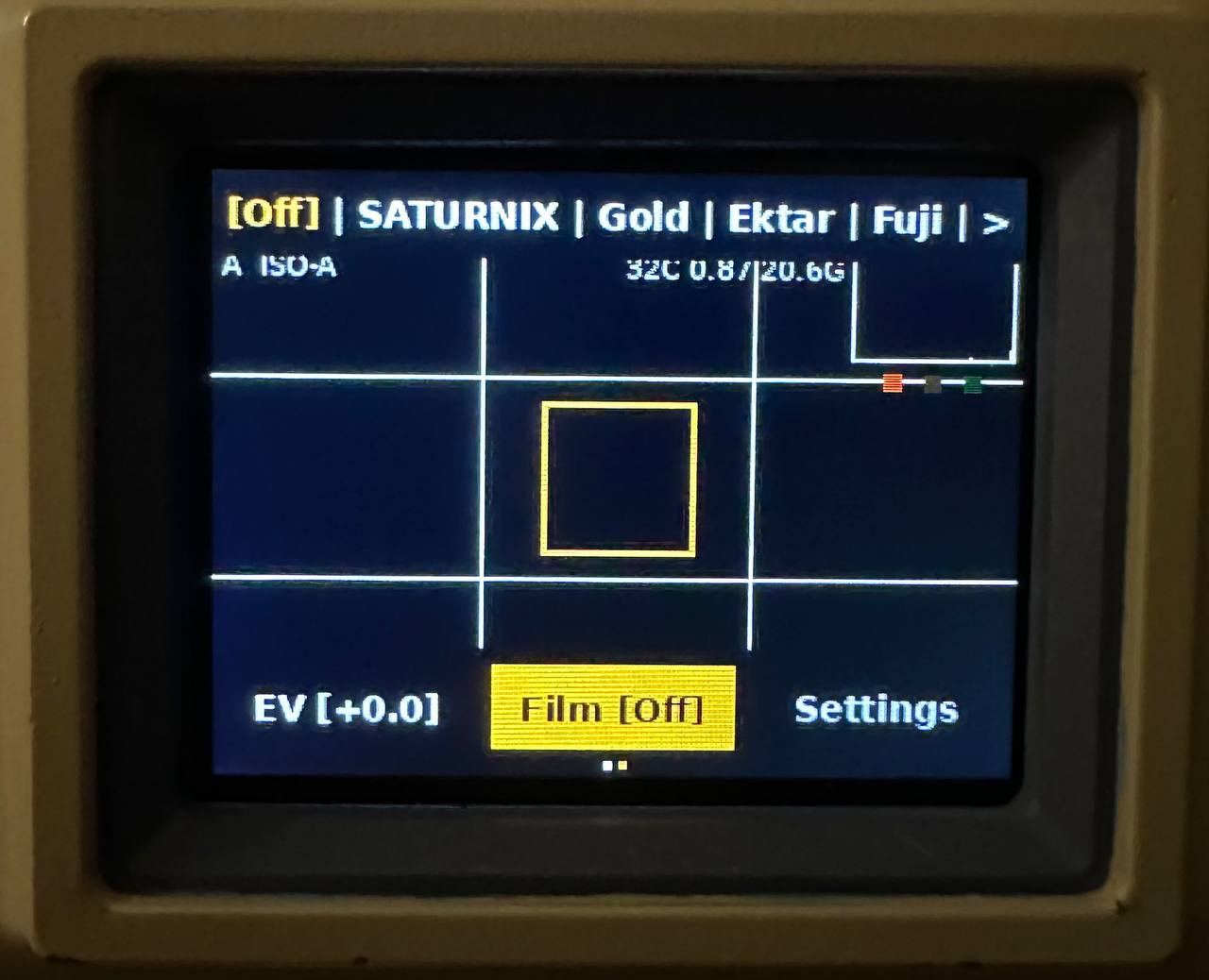
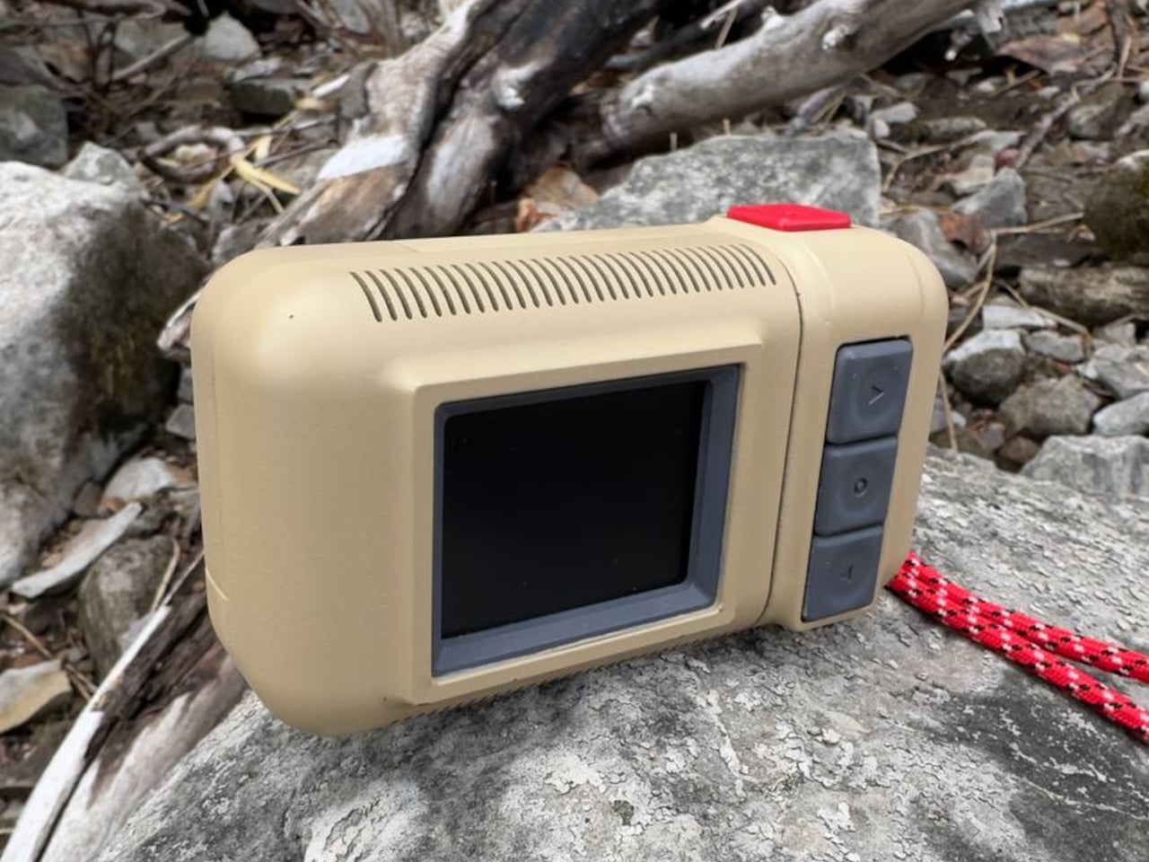
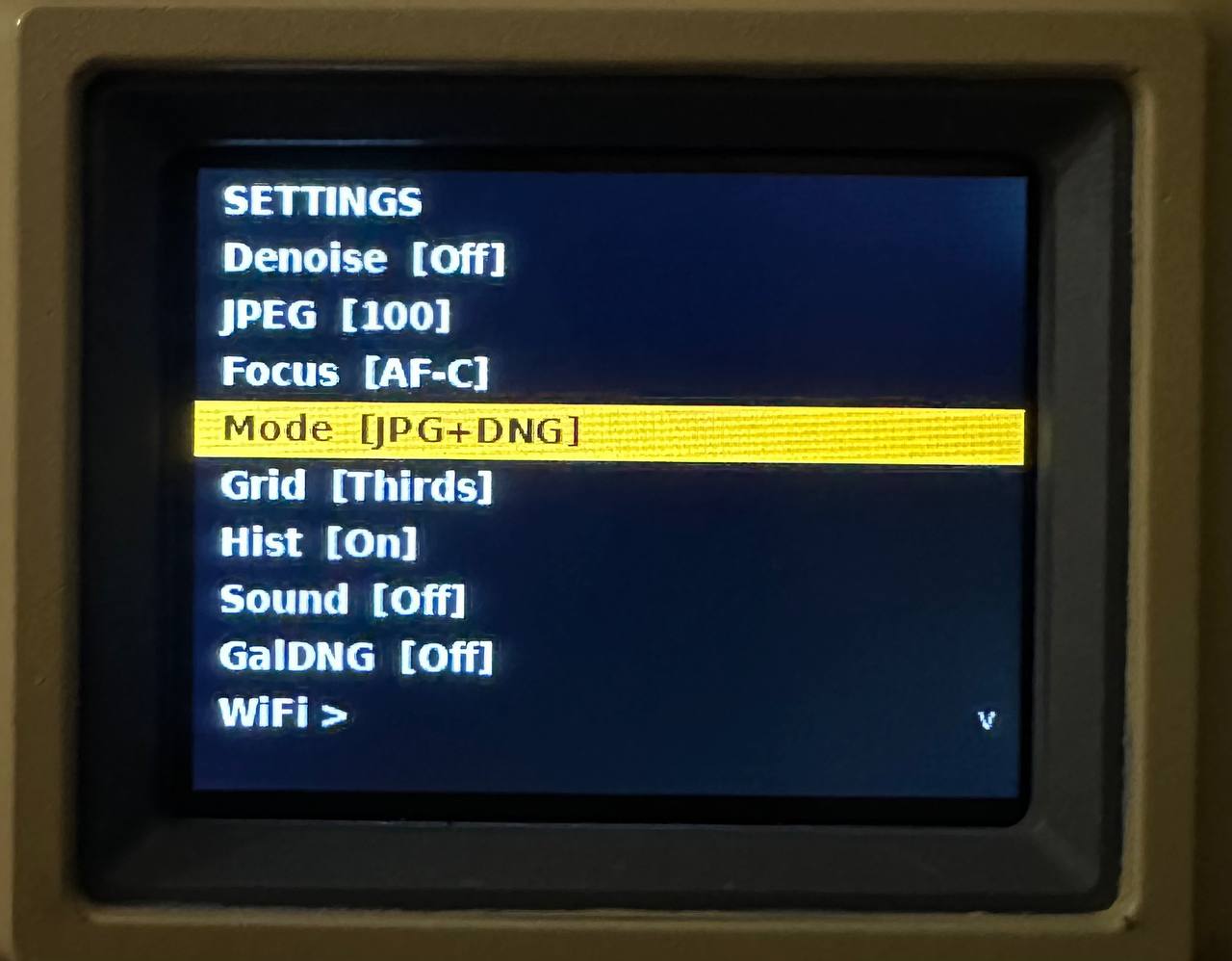
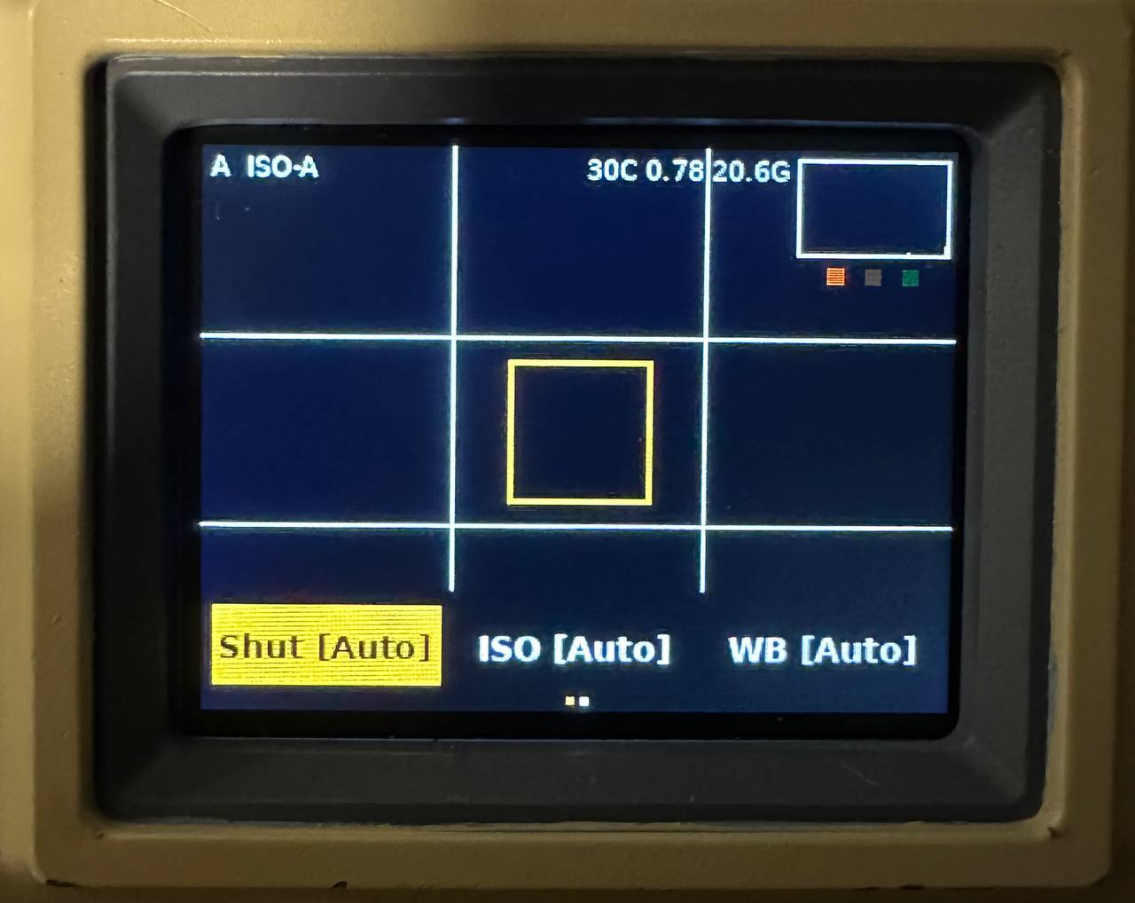
Inside, the Saturnix runs on a Raspberry Pi Zero 2W paired with a 16-megapixel Arducam IMX519 autofocus sensor and a 2-inch IPS LCD viewfinder. It captures RAW and JPG simultaneously, with full manual controls covering shutter speeds from 30 seconds to 1/4000, ISO from 100 to 3200, and white balance and exposure compensation adjustments. Three autofocus modes round out the shooting options.
The film simulation engine is what separates the Saturnix from other DIY camera builds. Six presets are available, all processed on-device with no apps or cloud services involved. You can shoot with profiles mimicking Kodak Gold’s warm analog tones, the hyper-saturated punch of Kodak Ektar 100, the cool greens of Fujifilm 400, and the rich grain of Kodak Tri-X 400 black and white.
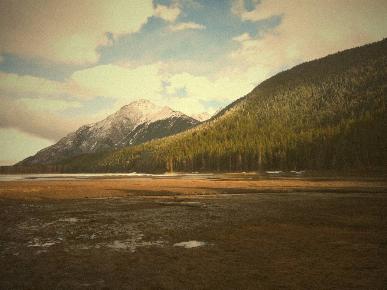
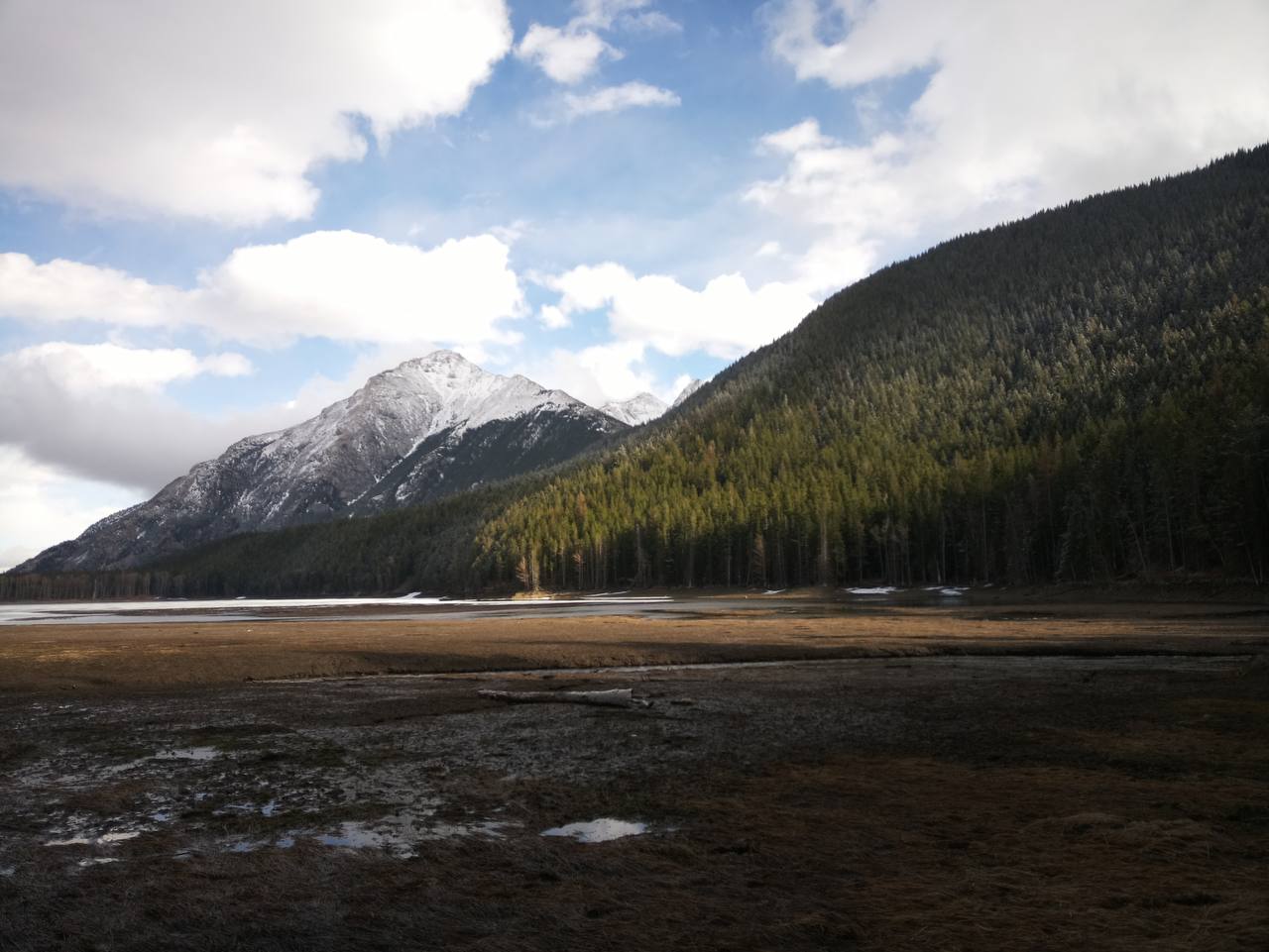
Filter: Kodak Gold
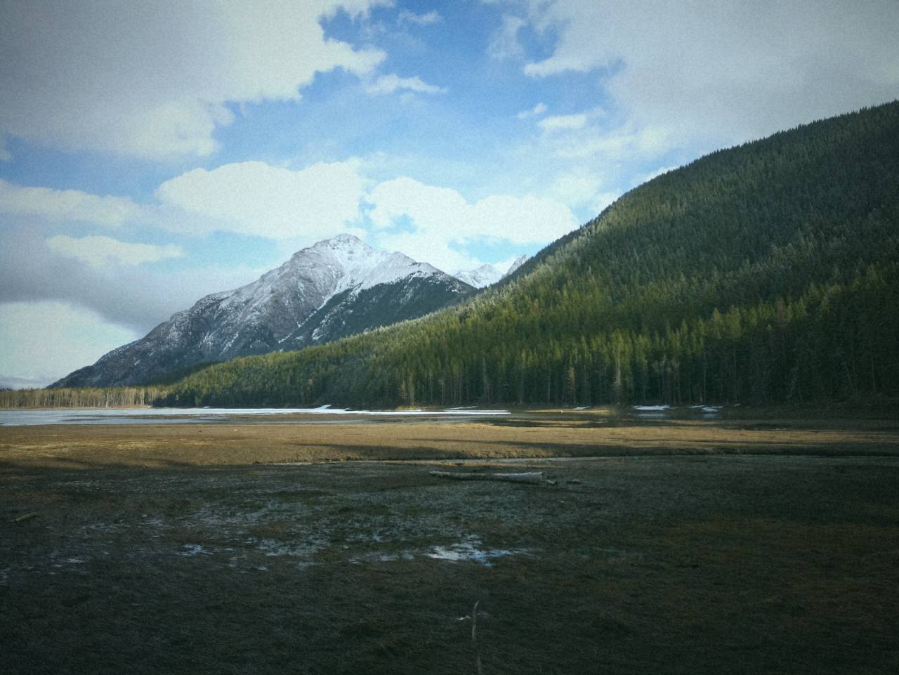
Filter: Fujifilm 400
Photo transfers happen via a built-in Wi-Fi hotspot, keeping the entire process completely self-contained. The entire project is open source. The code, STL files for the 3D-printed case, and sample outputs from each film simulator are all available on the Saturnix GitHub page under MIT and Creative Commons licenses, meaning anyone with a printer and the right components can build one. A firmware release hasn’t shipped yet, but the creator is actively developing it.
Filter: None
The Saturnix doesn’t compete with commercial cameras on paper, and it doesn’t try to. What it does is offer something most cameras, cheap or expensive, don’t bother with anymore: a strong point of view about what a camera should feel like to hold, use, and look at, from a set of aesthetics that mainstream design long since walked away from.
The post This Raspberry Pi Camera Looks Like It Was Made in the 80s for 2050 first appeared on Yanko Design.