Apple has never really done “affordable.” For decades, the cheapest way into the Mac ecosystem meant spending at least $999, and that was considered a deal. So when the company announced the MacBook Neo at $599, or $499 for students and educators, the reaction wasn’t just surprise. It was something closer to disbelief. This is the same Apple that charges $19 for a polishing cloth, and it just put a laptop on the shelf for less than most people’s monthly rent.
It’s not an accident or a moment of generosity. The MacBook Neo is a deliberate move into a market segment Apple has ignored for years: the budget laptop buyer. Students, first-time Mac users, families on tighter budgets. These are the people who’ve been defaulting to Chromebooks and cheap Windows machines, not because they preferred them, but because a Mac was simply out of reach. Apple just changed that math, and the PC industry is already scrambling to respond.
Designer: Apple
More Than a Fresh Coat of Paint
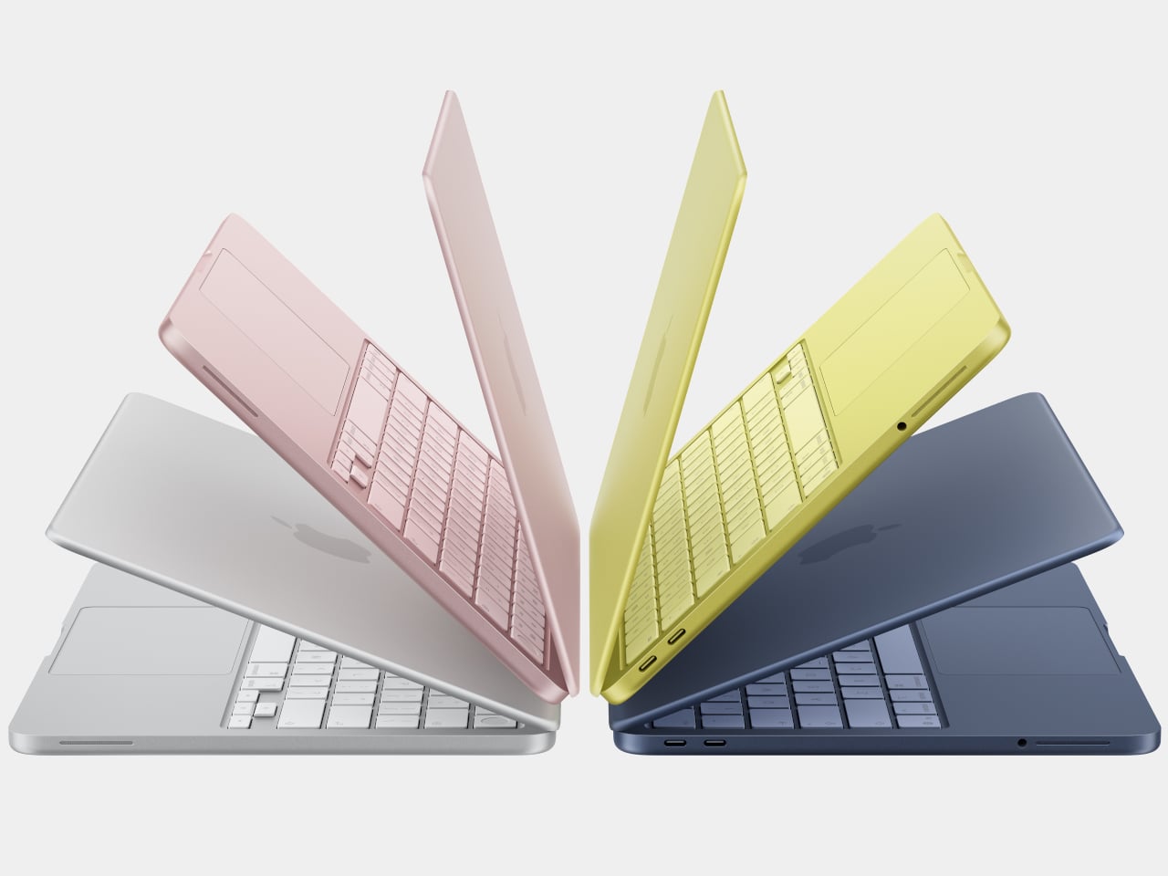
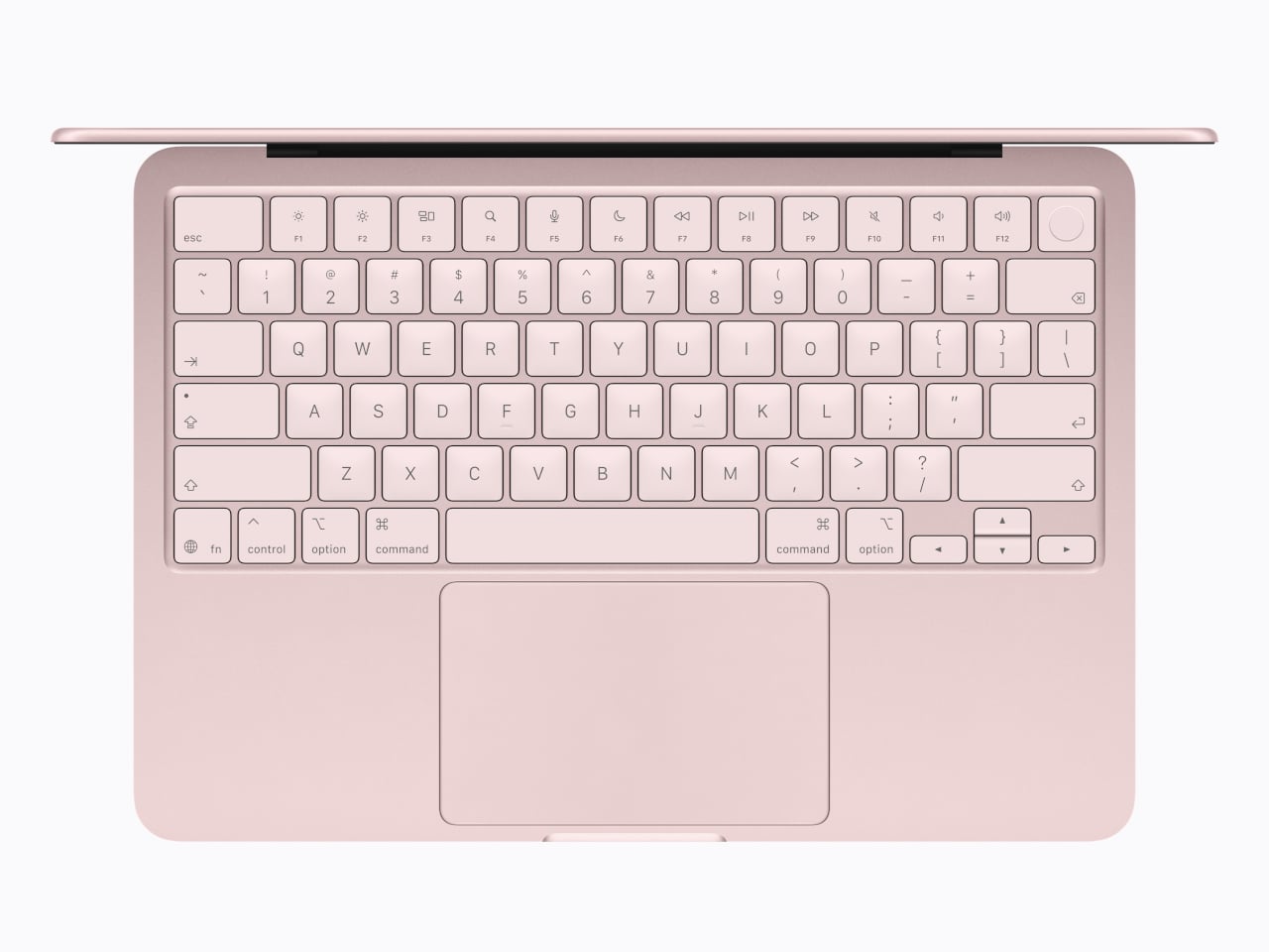
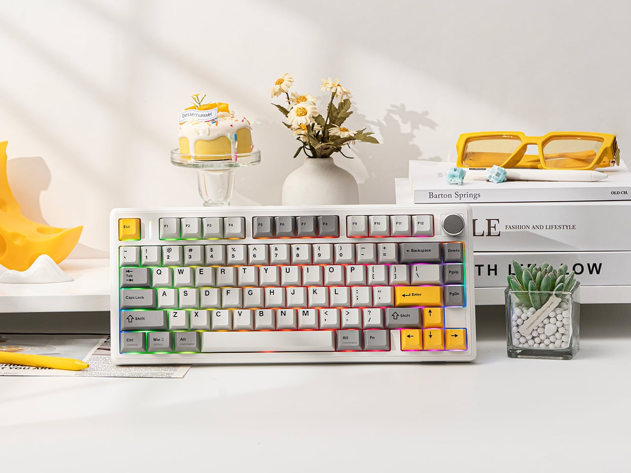
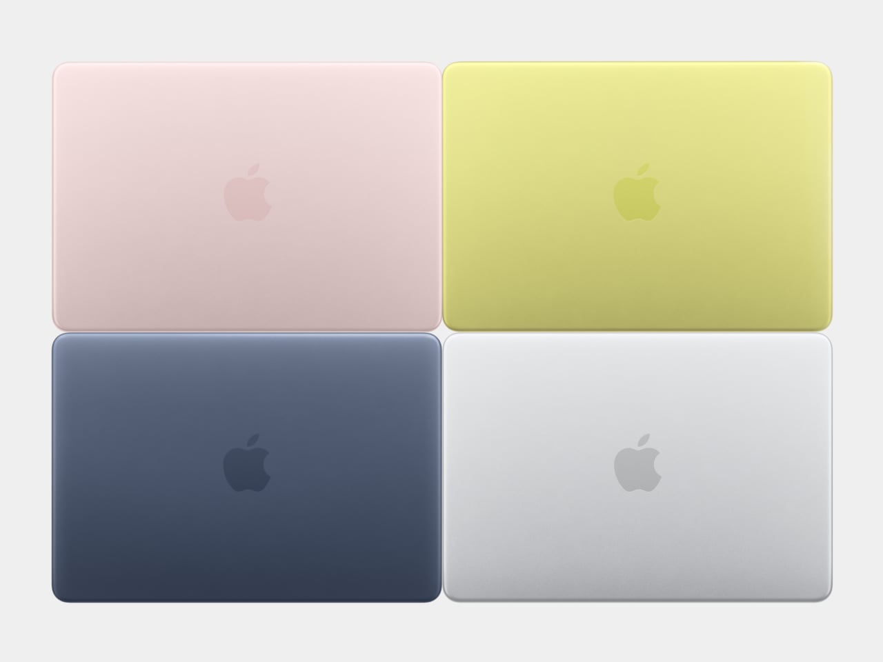
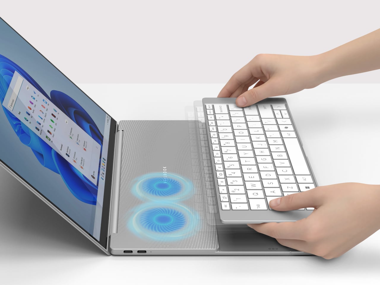
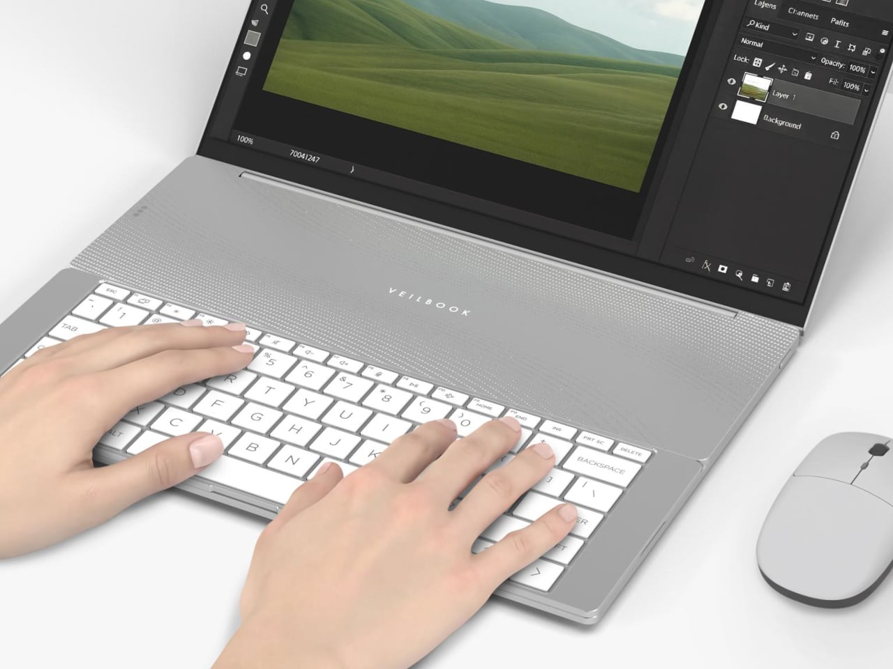
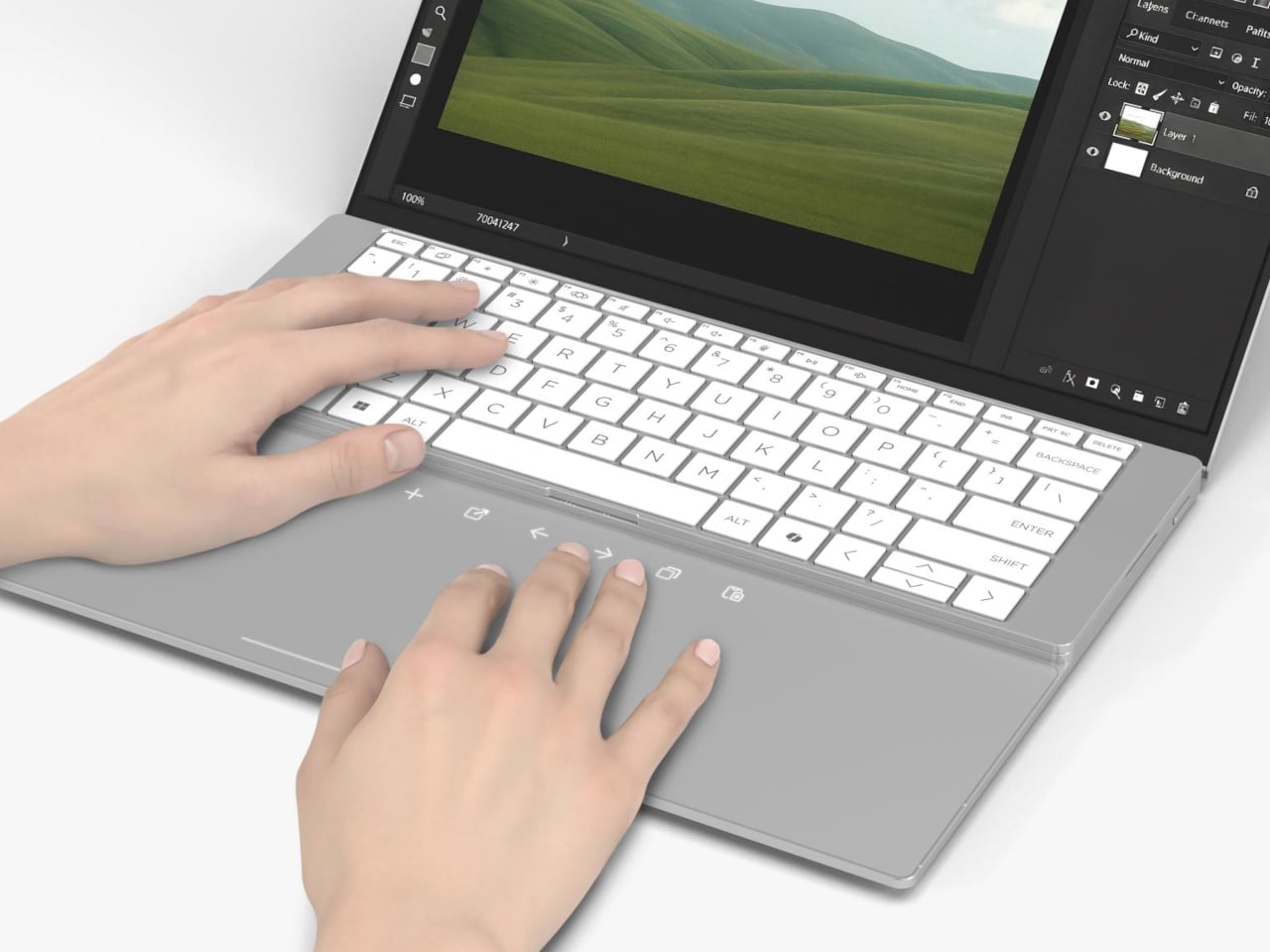
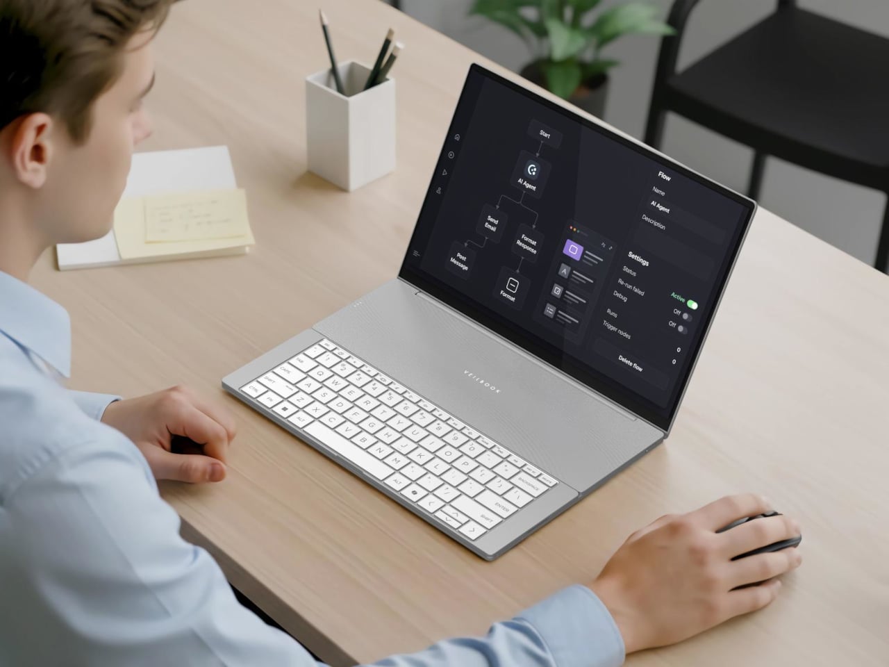
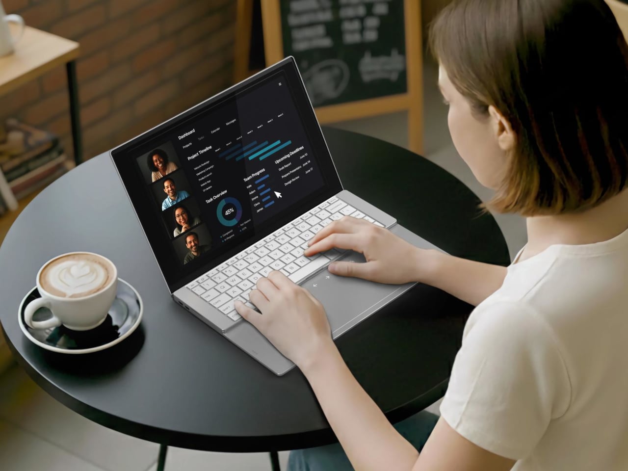
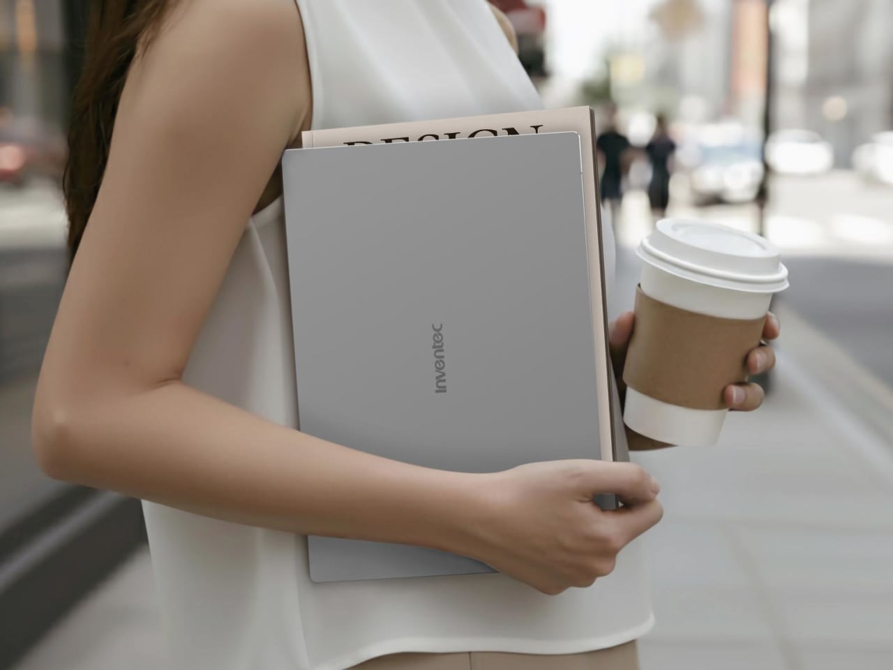
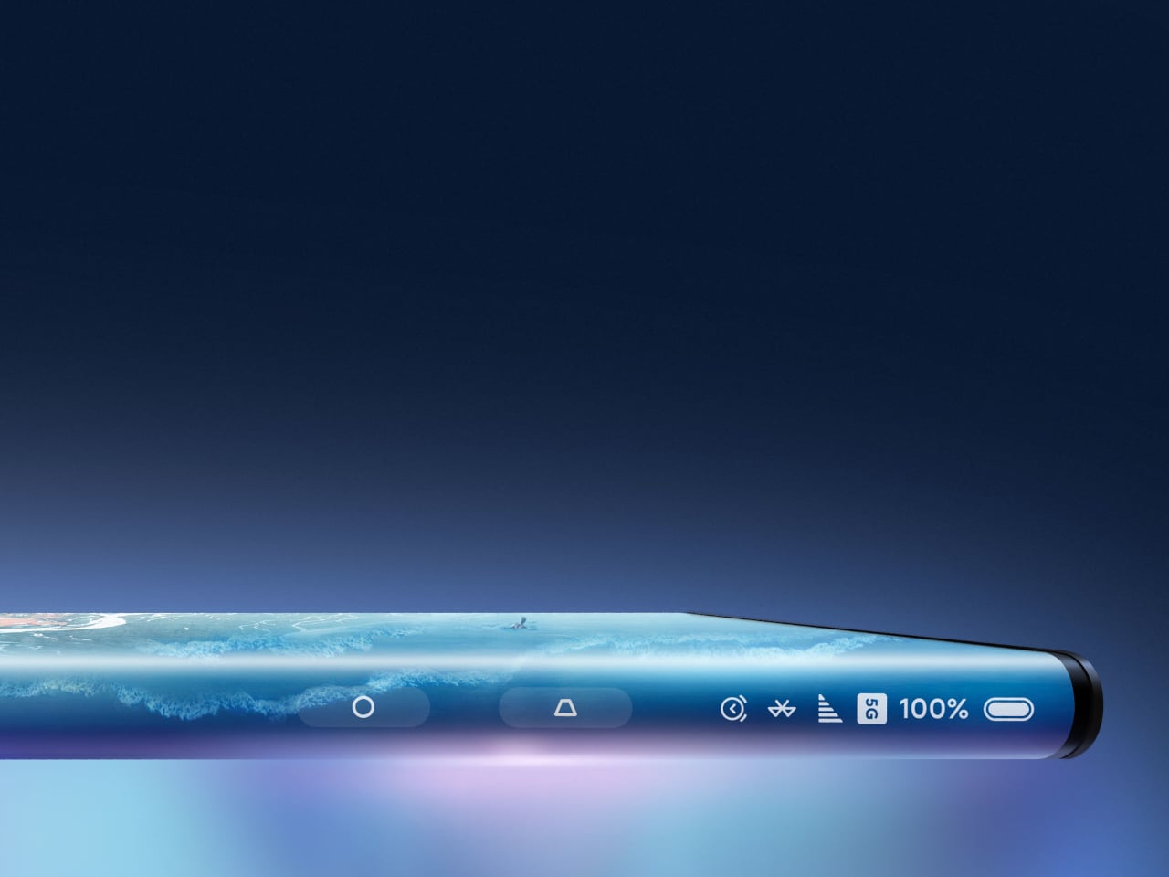
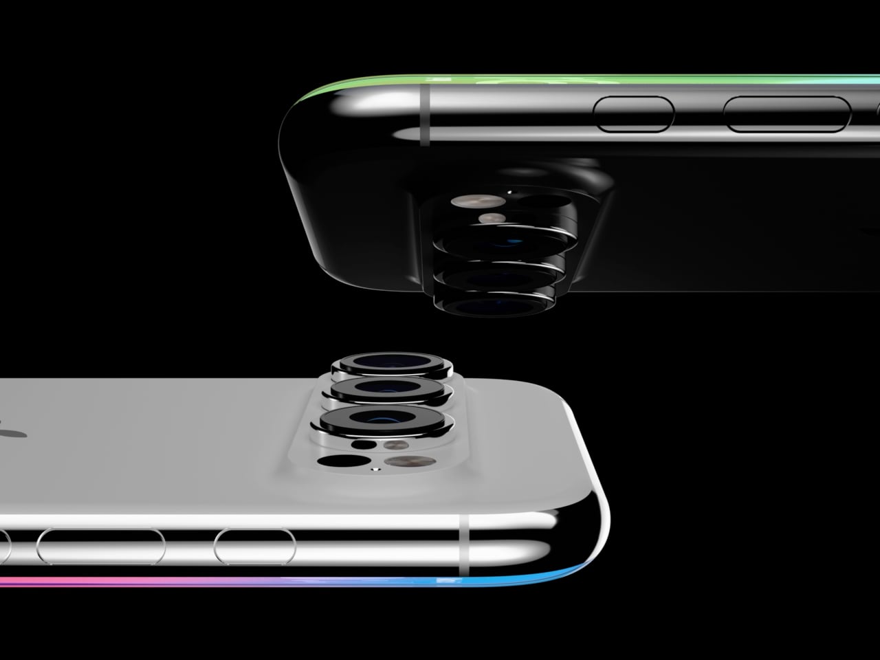
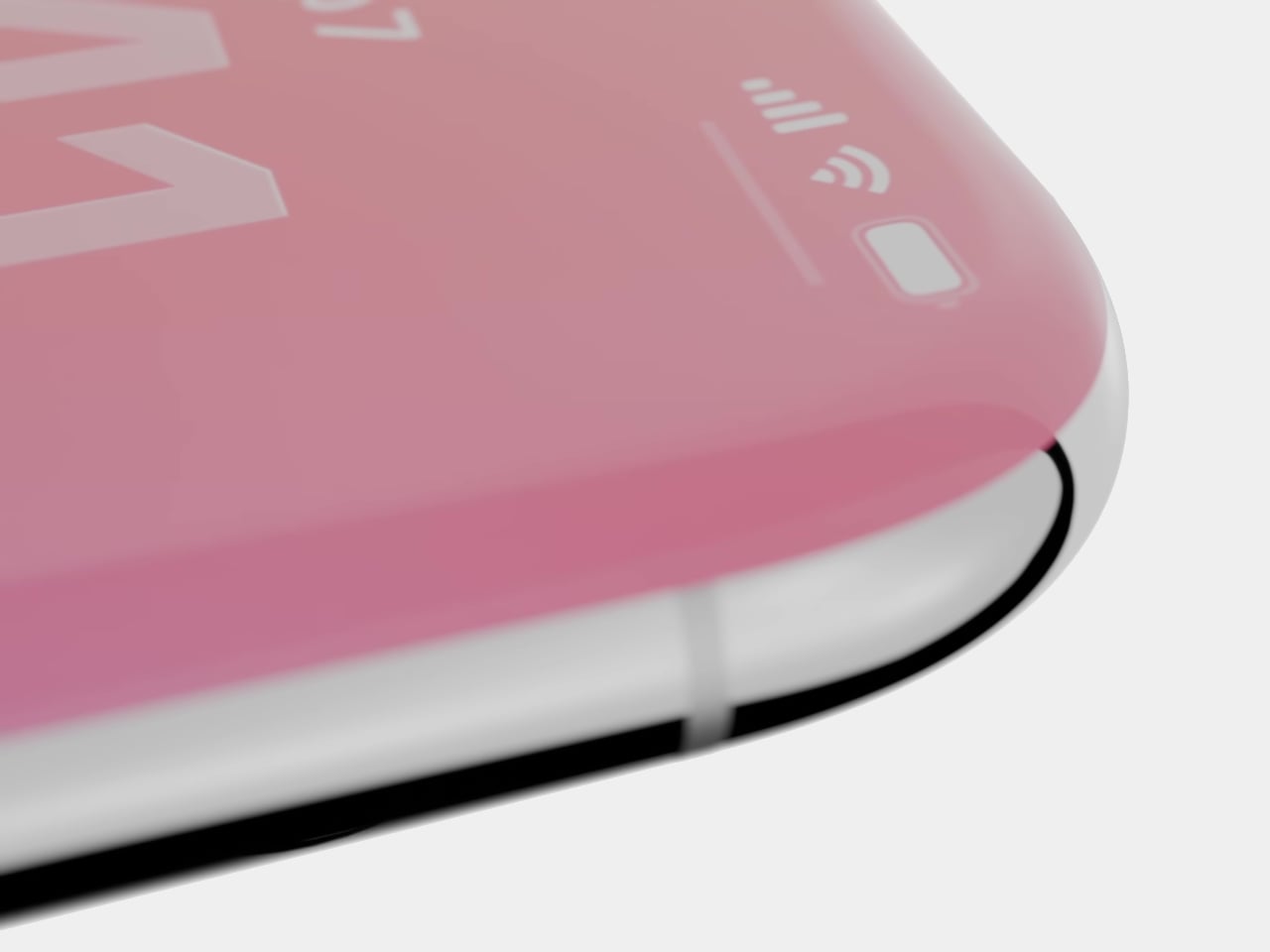
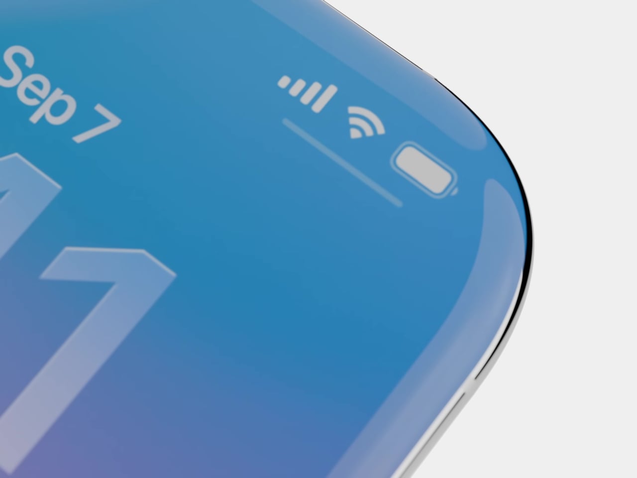
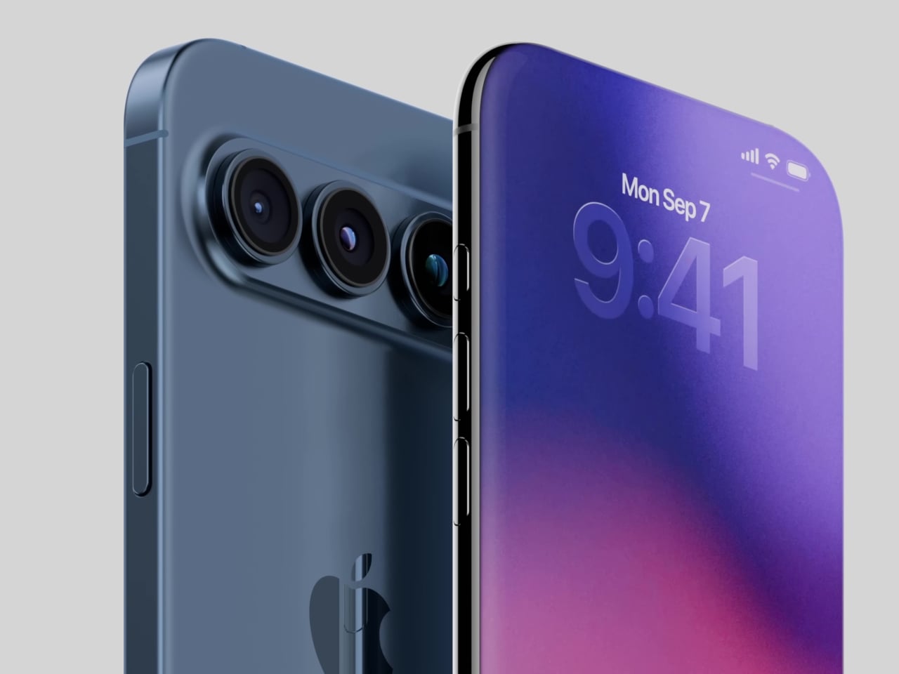
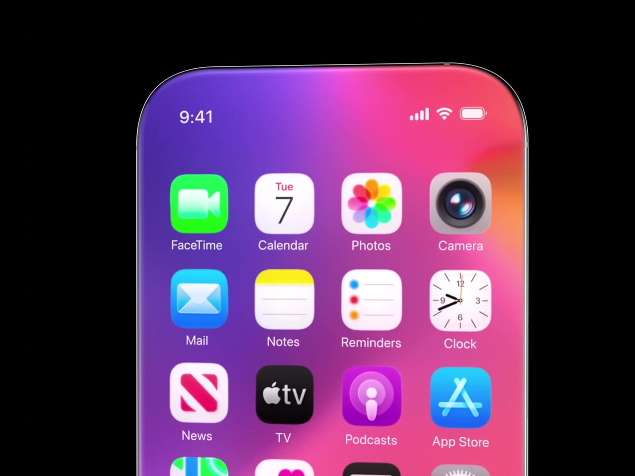
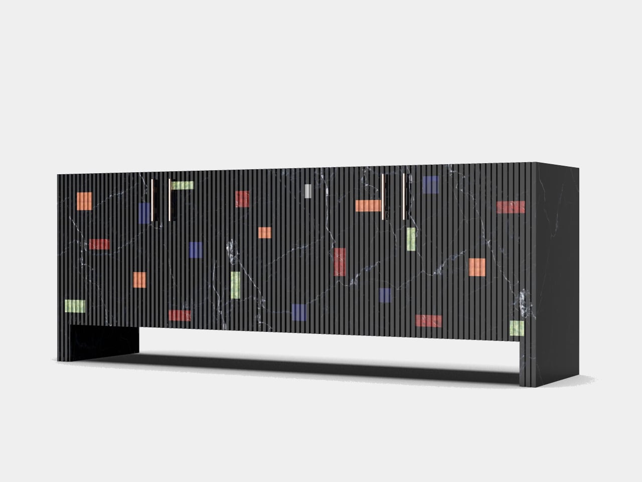
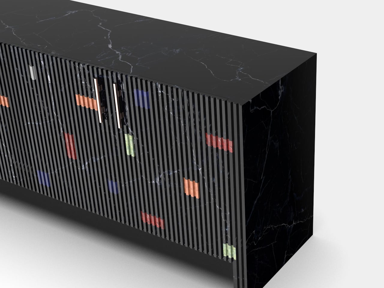
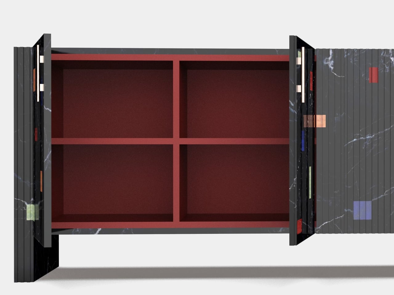
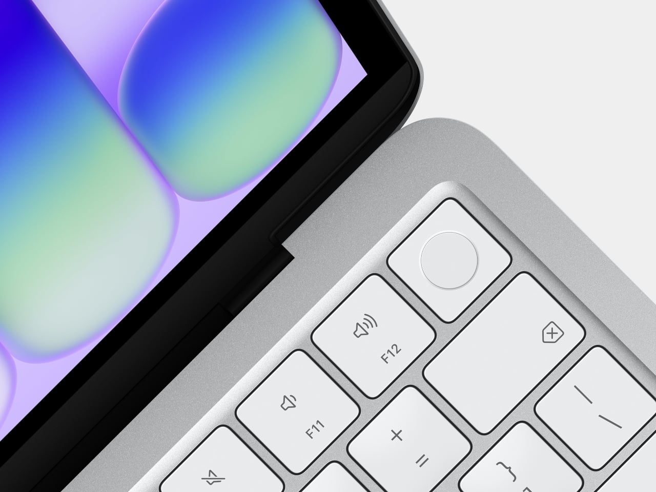
The Neo comes in four colors: blush, indigo, silver, and a sharp citrus yellow. The colors even extend to the Magic Keyboard in lighter shades and matching wallpapers, which is a level of cohesion you genuinely don’t see at this price point in Windows hardware. The aluminum enclosure weighs 2.7 pounds, and the 13-inch Liquid Retina display runs at 2408-by-1506 resolution with 500 nits of brightness, outpacing most competing devices in this segment by a considerable margin. Combine that with up to 16 hours of battery life, and the headline specs read like a mid-range laptop, not an entry-level one.
The chip underneath all of that is the A18 Pro, the same processor that powered the iPhone 16 Pro in 2024. That’s where the picture gets a bit more nuanced. It’s definitely more than enough for web browsing, document editing, streaming, casual photo editing, and AI tasks. What it isn’t is a creative workstation. This machine is fanless, silent, and cool-running, but it isn’t going to replace even a MacBook Air for serious video work or sustained heavy computation. Apple has been honest about that positioning, and the spec sheet backs it up.

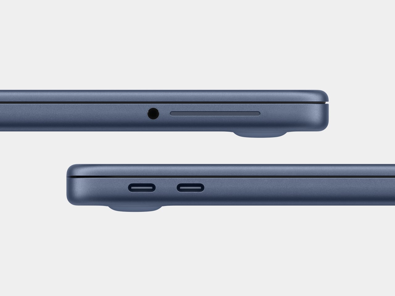
There are also a few caveats beyond the silicon. There’s no backlit keyboard on the base $599 model, which feels like an odd omission in 2026. Fast charging isn’t supported either, with only a 20W USB-C adapter in the box. The connectivity is minimal: one USB 3 port (USB-C) and one USB 2 port (USB-C), the latter topping out at 480Mb/s, which is slow enough to matter if you regularly move large files. No Thunderbolt. No MagSafe. Touch ID is exclusive to the $699 model. These are deliberate subtractions, not oversights, designed to protect the MacBook Air’s value proposition while keeping the Neo’s cost down.
Road Once Traveled: Windows RT
Before getting too swept up in the novelty of the MacBook Neo, it’s worth remembering that the idea of an affordable, ARM-based portable computer aimed at everyday users isn’t new. Microsoft tried exactly this in 2012 with Windows RT, a version of Windows designed to run on ARM chips and released alongside the original Surface tablet. The pitch was appealing: a sleek, efficient, battery-friendly device that could handle the basics and connect to the broader Windows world.
The fact that it failed is pretty much part of history by now. The core problem wasn’t the hardware or even the concept: it was the software. Windows RT looked and felt like Windows but couldn’t run traditional Windows desktop applications. It was a watered-down experience wearing a familiar face, and users who expected full Windows compatibility found themselves stranded. The app ecosystem didn’t materialize fast enough, either, and Microsoft eventually abandoned the platform. Windows on ARM has continued in various forms since then, but it’s never fully shaken the baggage of that first failed attempt.

Apple, by contrast, spent years laying groundwork before making its ARM leap. When the company transitioned the entire Mac lineup to Apple Silicon starting in 2020, it didn’t ask developers to build for a new platform overnight. The Rosetta 2 translation layer handled legacy Intel apps smoothly from day one, and Apple had spent over a decade pushing developers toward modern APIs and frameworks through iOS. By the time the A18 Pro landed inside a $599 laptop, the software ecosystem was already there waiting for it. The MacBook Neo doesn’t run a restricted version of macOS. It runs full macOS Tahoe, with access to the same App Store and the same apps as any other Mac, and that is the fundamental difference that Microsoft was never able to bridge with Windows RT.
The best alternatives if the MacBook Neo isn’t for you
The MacBook Neo sets a new standard for what a $600 laptop can look and feel like. That said, it’s not the right machine for everyone. If you’re committed to Windows, need more RAM, prefer a larger display, or simply aren’t ready to switch ecosystems, there are some solid alternatives worth considering in the same price range.
Acer Swift Go 14 (SFG14-73)
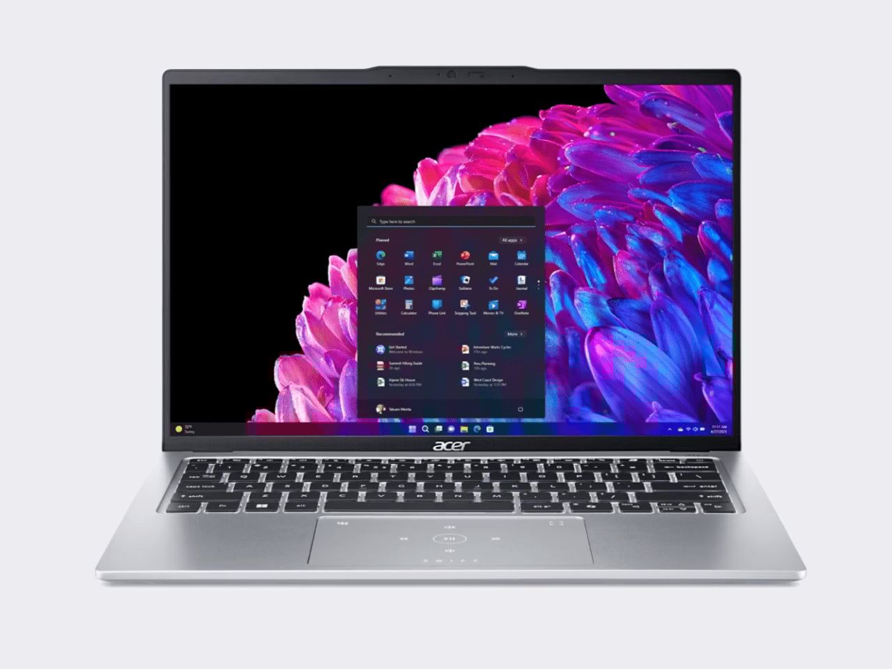
The Acer Swift Go 14 is one of the more compelling Windows options at this price point, running on an Intel Core Ultra 5 processor with integrated Intel Arc graphics, 8GB of RAM, and a 512GB SSD. That’s double the storage of the base Neo for roughly the same $600 price. The bigger draw is the display: a 14-inch OLED panel at 2880×1800 resolution, which is genuinely excellent for a laptop in this category and makes the Swift Go a strong pick for anyone who consumes a lot of media.
Designer: Acer
The trade-offs can’t be ignored, though. Battery life comes in around 8.5 hours, which is significantly shorter than the Neo’s 16-hour rating, and it weighs about 2.87 pounds in a larger chassis. It’s also a somewhat older-gen model, and that sweet price tag is only available in select retailers. If you want a bigger, sharper screen and don’t mind carrying a charger more often, the Swift Go earns a serious look.
Lenovo IdeaPad Slim 3 (15″, AMD)
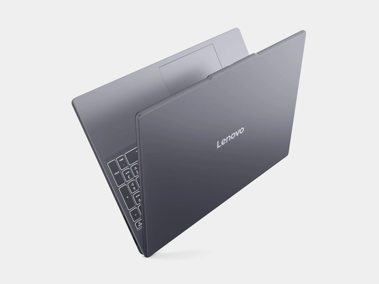
Lenovo’s IdeaPad Slim 5 punches above its price with a more generous hardware loadout than the Neo: an AMD Ryzen 5 8540 processor, 8GB of RAM, and 512GB of storage, all available around the $500 price point. Lenovo also tends to make the best keyboards in the budget Windows space, and this one continues that tradition.
Designer: Lenovo
Where it falls short is predictable. The display is a 15-inch 1920×1200 IPS panel, which is perfectly functional but a noticeable step down from the Neo’s Liquid Retina screen in terms of sharpness and color. The battery life is what you’d expect from a Windows laptop. It won’t make you smile when you pull it out of a bag the way the Neo will, but if raw specs-per-dollar is the priority, the IdeaPad Slim 3 is a difficult machine to argue against.
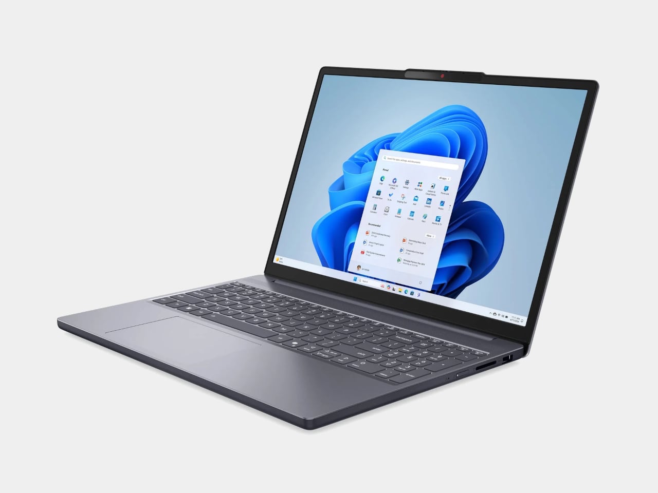
HP OmniBook 5 (BA1056NR)
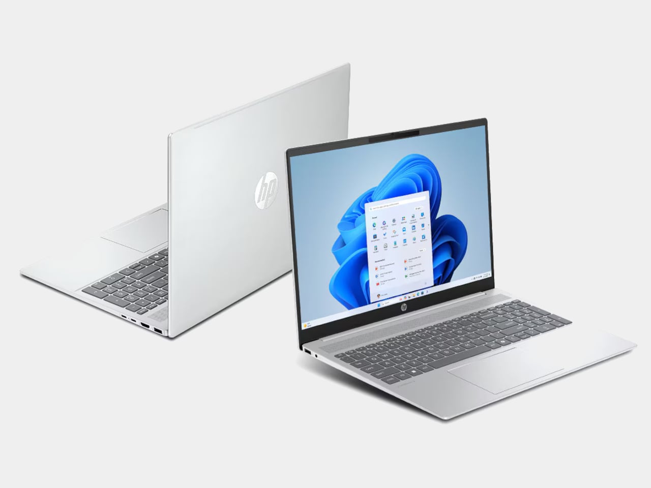
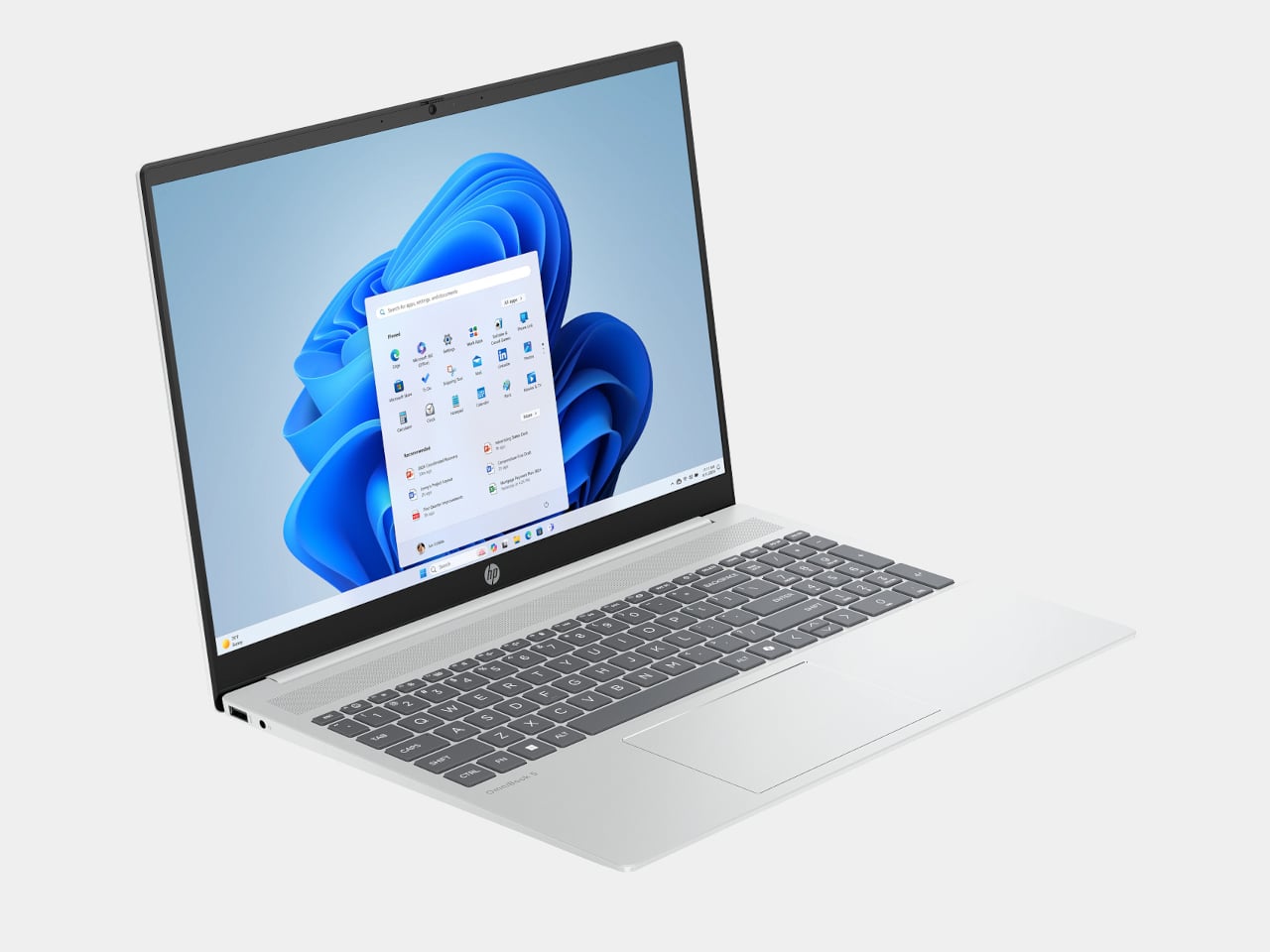
HP’s OmniBook 5 positions itself as an entry-level everyday laptop with pricing that frequently dips below $650, giving it a clear edge over the Neo in pure cost. It runs on modest Intel hardware, comes with a generous serving of 16GB of RAM, and is built primarily for email, web browsing, document editing, and video calls, the exact workload profile Apple says the Neo is designed for. Battery life is rated respectably, and the keyboard and trackpad are comfortable enough for extended daily use.
Designer: HP
The honest version of this recommendation comes with a caveat: the OmniBook 5 doesn’t compete with the Neo on display quality, build materials, or software longevity. The screen is a standard 16-inch 1080p IPS panel in a plastic chassis, and it runs Windows on Intel Core 5 silicon, which is a much older generation than today’s selection. It makes sense as a pure budget play if the price tag is still a stretch, but going in with eyes open about what those savings cost you is important.
Acer Chromebook Plus Spin 714 (CP714-1H-54UB)
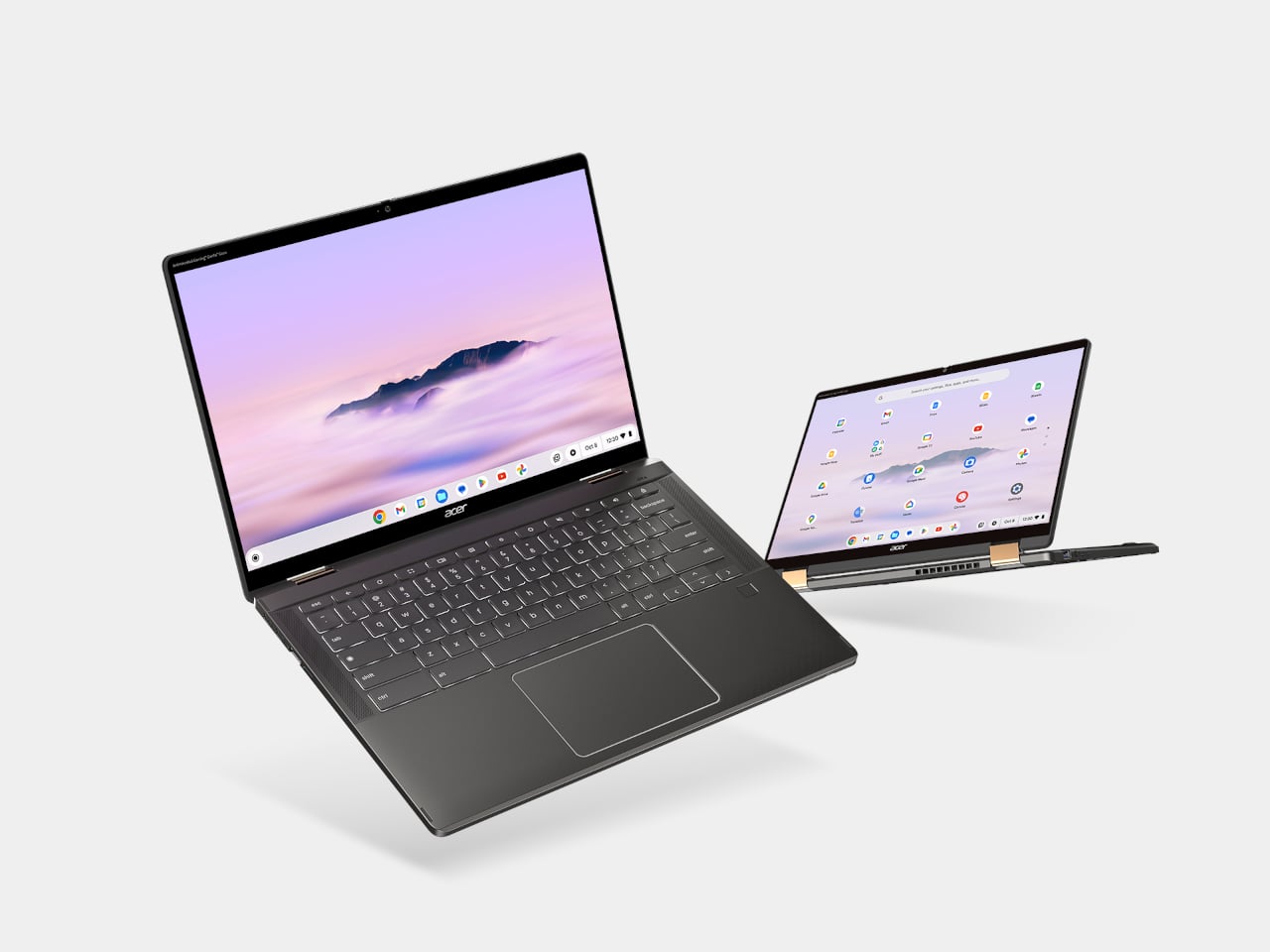
The Acer Chromebook Plus Spin 714 is one of the more capable Chromebooks available around the $530 mark with a discount ($699 in full), and it brings a feature the Neo completely lacks: a touchscreen. Running on an Intel Core Ultra 5 with 8GB of RAM and 256GB of storage, it matches the Neo’s base memory and storage configuration while adding 2-in-1 convertibility and a 14-inch IPS display at 1920×1200. For students, especially, the tent and tablet modes open up use cases that a standard clamshell laptop can’t cover.
Designer: Acer
The limitations are ChromeOS itself, which has narrowed the gap with full desktop operating systems considerably but still trails macOS and Windows for professional app compatibility. Battery life is advertised to be around 10 hours, shorter than the Neo but solid for a school day. At 3.21 lbs, it’s heavier and physically larger, and the display is a step behind the Neo in resolution and color quality. For someone already in the Google ecosystem, though, this is the sharpest Chromebook rival to the Neo in this price window.
Lenovo Chromebook Plus 14 (ChromeOS)
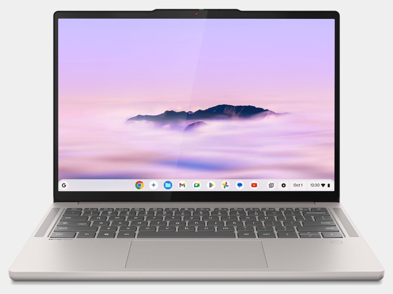
Lenovo’s Chromebook Plus 14 is the premium option in the ChromeOS space, and its headline feature is the display: a 14-inch 1920×1200 OLED panel with touchscreen support at a price of $749. For a Chromebook, that’s genuinely unusual hardware, and the screen quality puts it ahead of most of the Windows competition in this tier. It also supports Wi-Fi 7, runs on an Arm-based MediaTek Kompanio Ultra 910 chip with 16GB of RAM, and offers a build quality noticeably above the typical Chromebook standard.
Designer: Lenovo
The case for it over the Neo comes down to ecosystem preference. If Google Docs, YouTube, and Android apps cover your workflow, the Chromebook Plus 14 delivers a premium screen and a refined experience for less money than a MacBook Air. If you need desktop-class software, the ceiling becomes apparent quickly. ChromeOS has matured, but it still hits walls that macOS doesn’t. This is the Chromebook that makes you reconsider the category, not the one that makes you forget its limitations entirely.

Refurbished MacBook Air M1
It feels slightly odd to list an older Mac as an alternative to a newer Mac, but the refurbished MacBook Air M1 is worth the mention. Available through Apple’s certified refurbished store, third-party retailers, and resellers, the M1 Air frequently surfaces in the $600 to $700 range and represents a considerable step up from the Neo in several areas. The M1 chip is more capable than the A18 Pro for sustained workloads, it has MagSafe-era USB-C with Thunderbolt support, and it comes with 8 to 16GB of unified memory in the base configuration with a more mature, battle-tested macOS optimization story.
The catch is that you’re buying hardware from 2020, and Apple’s software support timeline means the M1 will eventually age out of macOS updates before a Neo purchased today will. For someone who wants macOS and a bit more headroom without stepping up to the $1,099 MacBook Air M5, the refurbished M1 is a pragmatic option rather than an inspired one. It gets the job done, but it doesn’t have the new colors, and the MacBook Neo, despite its compromises, is the more forward-looking machine.
Wake-up call
Affordable Windows laptops and Chromebooks have never been in short supply. The problem has always been that most of them require accepting significant compromises: dim displays, plastic chassis that creak, battery life that barely lasts a workday, or chips so underpowered that the experience degrades within a year of purchase. Many of the more appealing options in this segment come from lesser-known manufacturers, which brings its own concerns around software support and build reliability over time.

What the MacBook Neo does is reframe the question the PC industry has been comfortable not asking. ARM-based Windows laptops have existed for years, and the Snapdragon X series has made genuine progress, but Windows on ARM still hasn’t found the cultural moment that would turn it into a mainstream category. The Neo’s arrival and the reaction to it suggest that the market for a well-made, genuinely affordable computer aimed at students and everyday users is larger than the industry has been willing to address seriously. Apple just walked in and asked whether cheap and simple was enough, or whether those buyers might actually want something better.

The post The $599 MacBook Neo is Shaking Up the PC Industry: 6 Best Alternatives first appeared on Yanko Design.