Tiny breaks in the day, waiting for a kettle, standing in a hallway, sitting on the toilet, tend to collapse into the same pattern. Unlock phone, scroll, refresh, repeat. It is not about being distracted so much as not having anything better that fits into sixty seconds. A small, self-contained game console can live in that gap without dragging you into an endless feed, offering something that feels finished instead of endless.
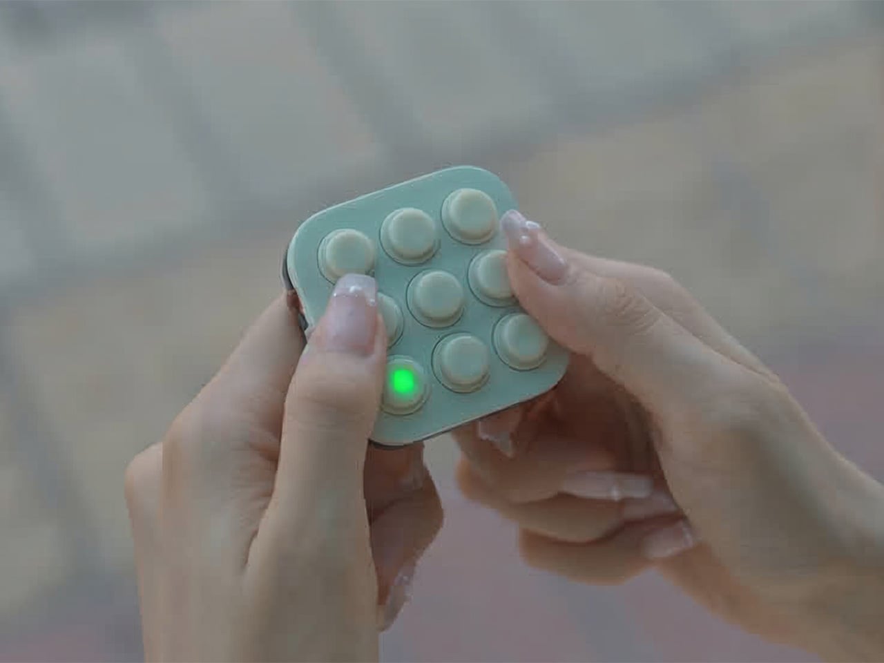
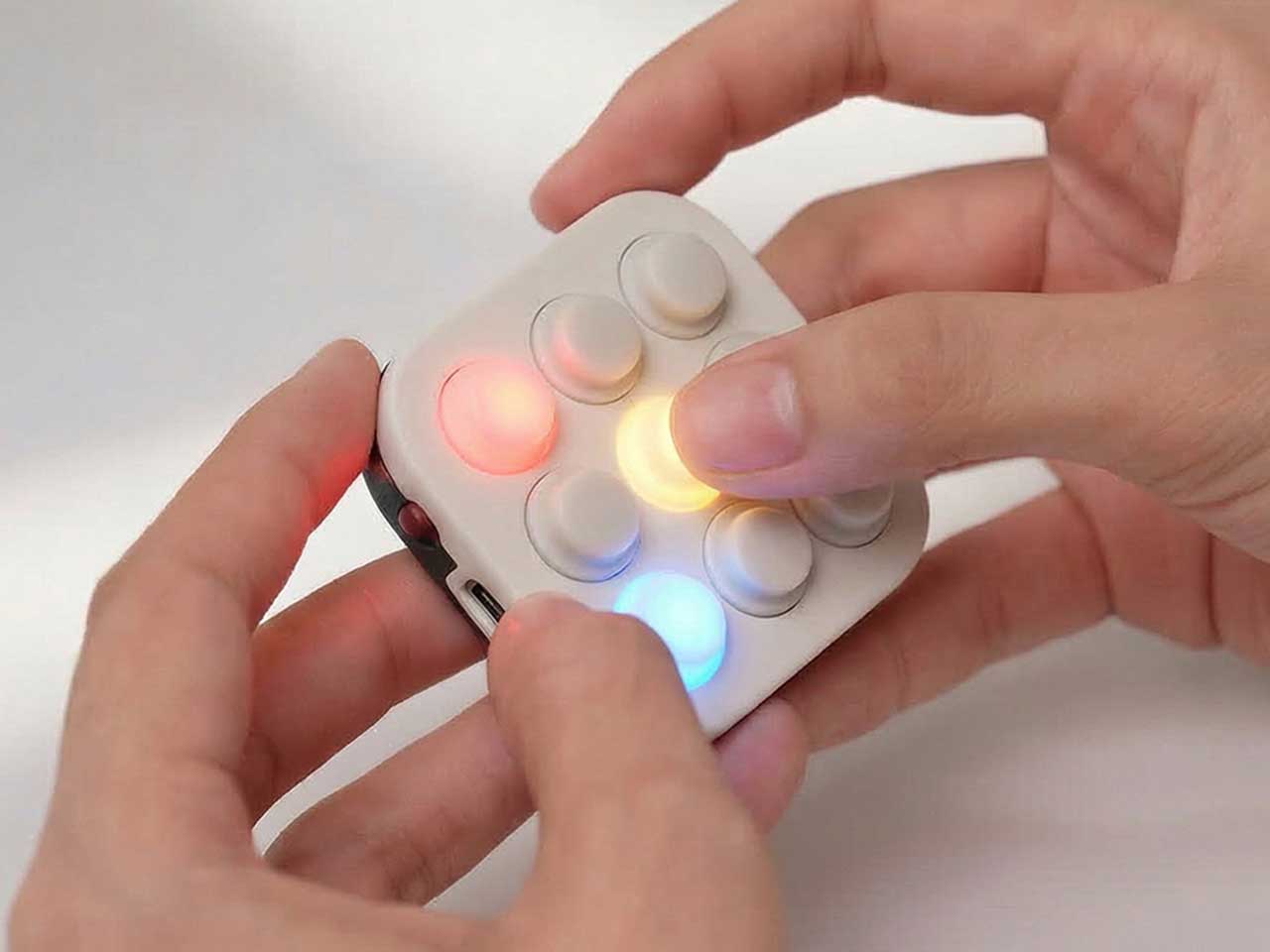
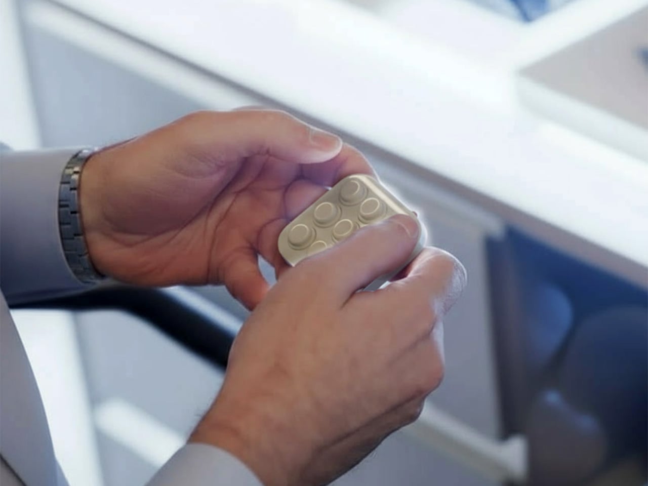
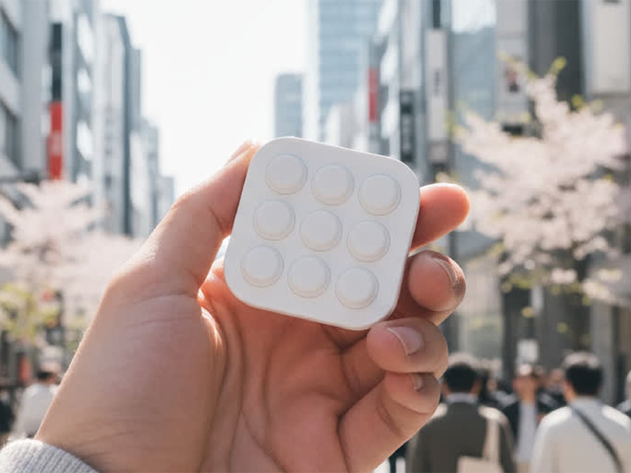
BrainBlink is a pocket-sized brain-training arcade, a nine-button handheld with 60-second games, real tactile switches, and an optional global ladder. It is built around the idea of mental fitness, not in a heavy way, but as a quick hit of focus and challenge that feels satisfying to start and finish. It is designed for those tiny windows of time when a full game or deep work session is unrealistic, but doing nothing leaves you restless.
Designer: Nicolas Aagaard (LastObject) and Joshua Fairbairn (Morpho)
BrainBlink ships with eight on-device games, each a 60-second challenge that targets different skills, working memory, reaction time, pattern recognition, focus, and speed. The games are quick to learn but hard to master, and the device is offline-first, storing scores locally so you can play anywhere without a phone or network. The fixed session length makes it easy to dip in and out without losing track of time or getting sucked into another hour of screen glowing.
The competitive layer kicks in when you sync to the global ladder and tournaments. When you hit 3-2-1-GO in those modes, you are matched against another human brain somewhere else, both of you trying to out-tap and out-focus each other in the same sixty-second window. The appeal is not just the score, but the sense that someone in Chicago, Berlin, or Tokyo is wide awake and locked in with you for that minute, feeling the same pressure.
The companion app for iOS and Android adds stats, streaks, profiles, leaderboards, and performance charts as an optional layer. It handles Bluetooth Low Energy 5.0 sync, over-the-air firmware updates, and ghost races, but you do not need it to enjoy the core games. This keeps the device from becoming another notification source while still letting people who love data and progression dig deeper when they want, without forcing that on everyone who just wants to play.
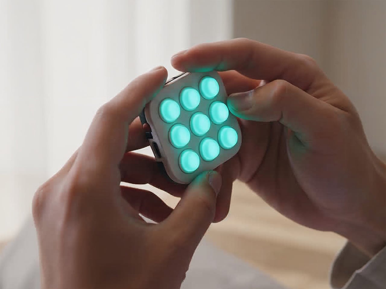
The hardware is a 55 × 55 × 17.6 mm square with nine mechanical-style buttons, an RGB LED array, and a rechargeable lithium battery over USB-C. The tactile switch matrix is rated for more than 100,000 presses, the durable ABS housing is wrapped with soft-touch silicone buttons, and the water-resistant shell is built for bags and pockets. An adaptive difficulty engine in the onboard MCU models your performance and adjusts challenge levels to keep sessions engaging as you improve.
BrainBlink is offline-first, storing every score locally until you decide to sync, which makes it usable on planes, in elevators, or anywhere signals are flaky. Over-the-air firmware updates mean new modes and refinements arrive over time, so the device does not feel frozen on day one. That combination of physical durability and evolving software makes it feel more like a tiny console than a novelty gadget that stops being interesting after a week.
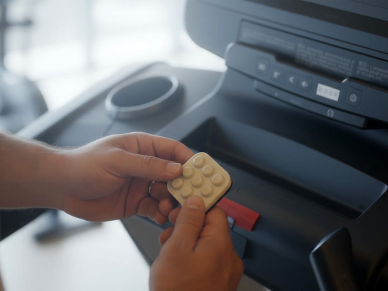
The device might live next to a laptop, in a hoodie pocket, or clipped to a bag. Instead of reflexively reaching for a phone during a spare minute, you pick up a small square, press a button, and give your brain a short, focused sprint. For people who like the idea of training attention without turning it into a chore, that kind of playful, sixty-second ritual is where a device like this quietly earns its place, offering something deliberately finite in a world of infinite feeds and tabs that never close.
Code education has a reputation problem. For a lot of kids, it means more screen time, more syntax errors, and more worksheets that feel nothing like the robots they care about. For many adults, it is too many tools, too much boilerplate, and not enough time to get from idea to working prototype. Codee, from Codeebots, tries to redraw that picture by turning code into something you pick up, snap together, and watch come alive, whether you are six or sixty.
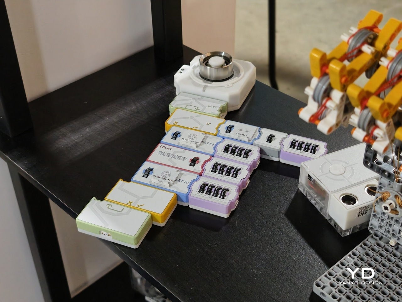
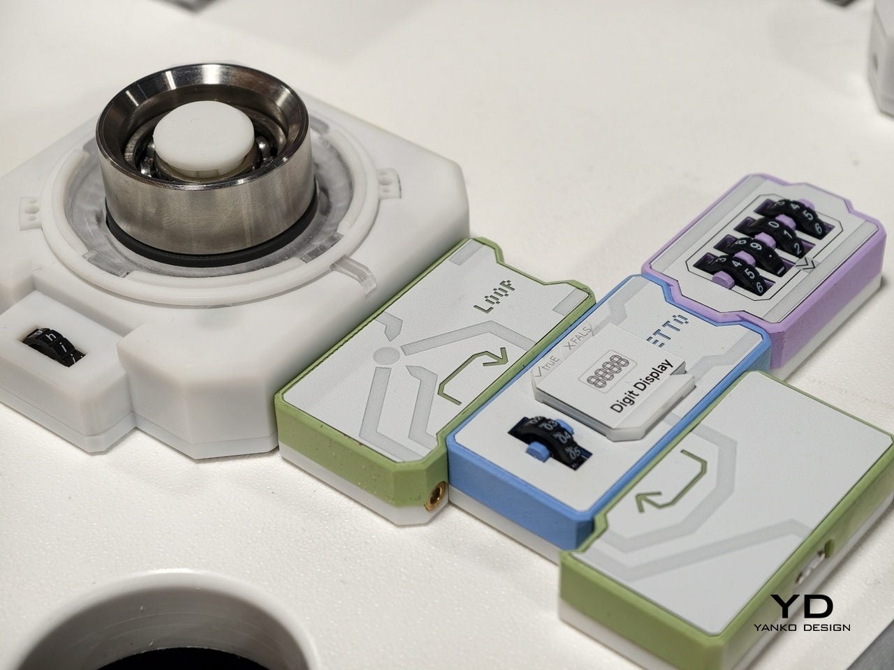
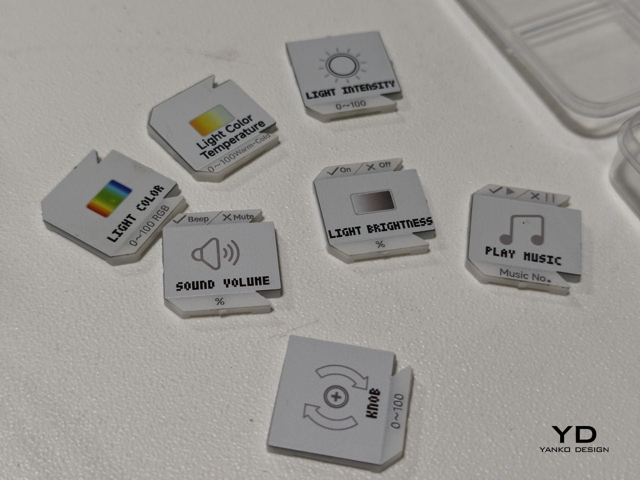
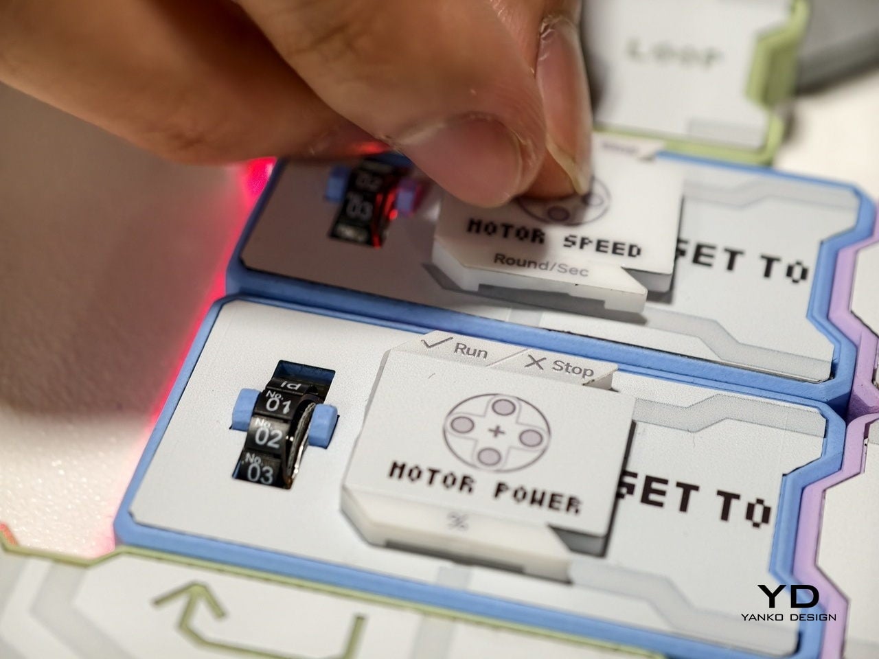
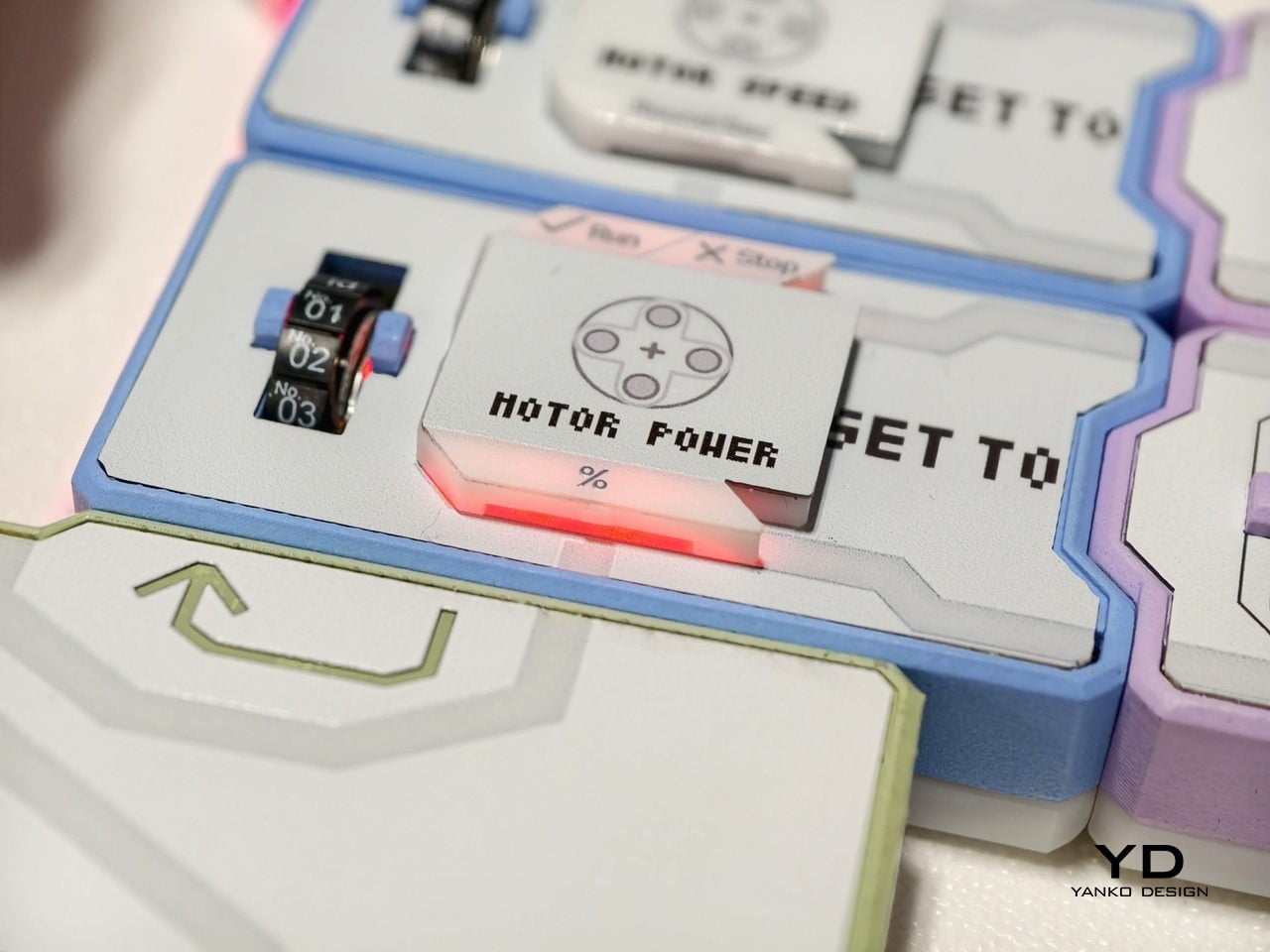
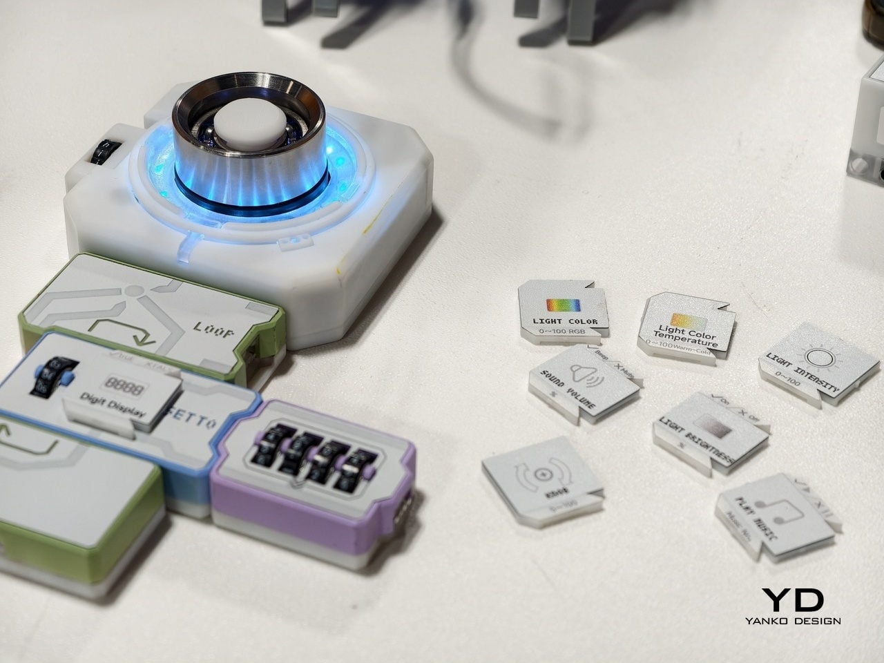
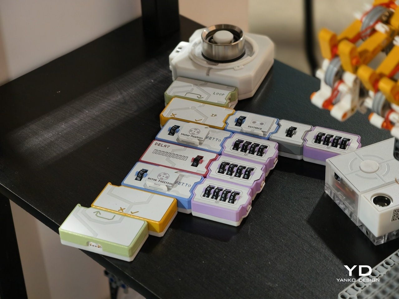
At the heart is a set of magnetic tiles that behave like physical lines of code. Each tile carries a clear label and icon, MOTOR POWER, MOTOR SPEED, LIGHT COLOR, LIGHT BRIGHTNESS, SOUND VOLUME, or PLAY MUSIC, along with small number wheels for setting values. You lay them out on a table in order, snapping them together so the arrows line up. Instead of typing IF, LOOP, or DELAY, you drop in tiles that embody those concepts.
For younger learners, that shift is huge. Kids from about four to twelve can create code with their own hands, without staring at a tablet. The base unit sends power and data through the snapped‑on tiles, and LEDs under the surface trace the program’s flow. When something goes wrong, the light trail stops at the problem block, making debugging as simple as seeing where the chain breaks, tangible logic training that feels closer to building with bricks.
There is also an AI layer behind the scenes. Codee talks about GPT tutors that act as a personal guide, explaining what a block does, suggesting what to try next, and celebrating small wins. For a child working through their first conditional or loop, that means there is always a patient voice ready to rephrase or nudge. For parents and teachers, it lowers the barrier to running robotics sessions without being a programmer.
The same hardware becomes different in adult hands. On the Codee for Adults side, the language shifts from classrooms to workshops. The tiles drive 3D‑printed prototypes, finalize complex LEGO builds, or wire up smart lights and sensors. Instead of opening an IDE, you sketch behavior on the table, using the MOTOR, LIGHT, and SENSOR blocks. An AI pair programmer, again powered by ChatGPT, suggests improvements, helps debug, and translates that physical logic into traditional code when needed.
This makes Codee feel like a bridge between toy‑like kits and serious prototyping platforms. A weekend project can start with a handful of tiles and a motor, then grow into a more complex robot with distance sensors, displays, and multiple outputs, without abandoning the snap‑together language. Because the system is LEGO compatible and offers expandable robotics IO, it slots into existing maker habits rather than demanding a clean slate.
For budding makers and veterans alike, the appeal is in that continuity. Codee is not just another coding toy for kids or another dev board for adults. It is a physical grammar for behavior that scales from first experiments to surprisingly capable machines, with AI acting as a gentle translator between intuition and implementation. It is a reminder that sometimes the best interface for code is still the table.
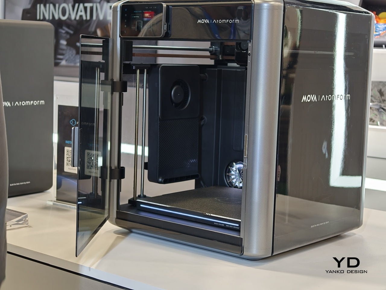
Desktop 3D printing has always promised “anything you can imagine,” but in practice, that usually means single-color PLA, lots of tinkering, and a trash bin full of purge towers. The gap between colorful renders and what actually comes out of most desktop printers has been wide enough to make many designers quietly give up on FFF for anything beyond simple prototypes. AtomForm’s Palette 300 shows up at CES 2026, trying to close that gap.
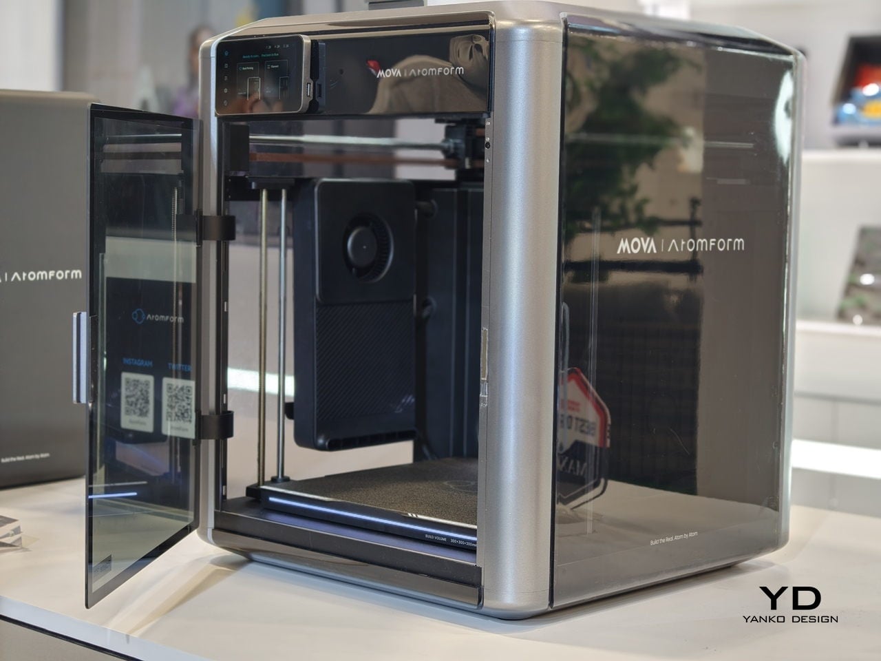
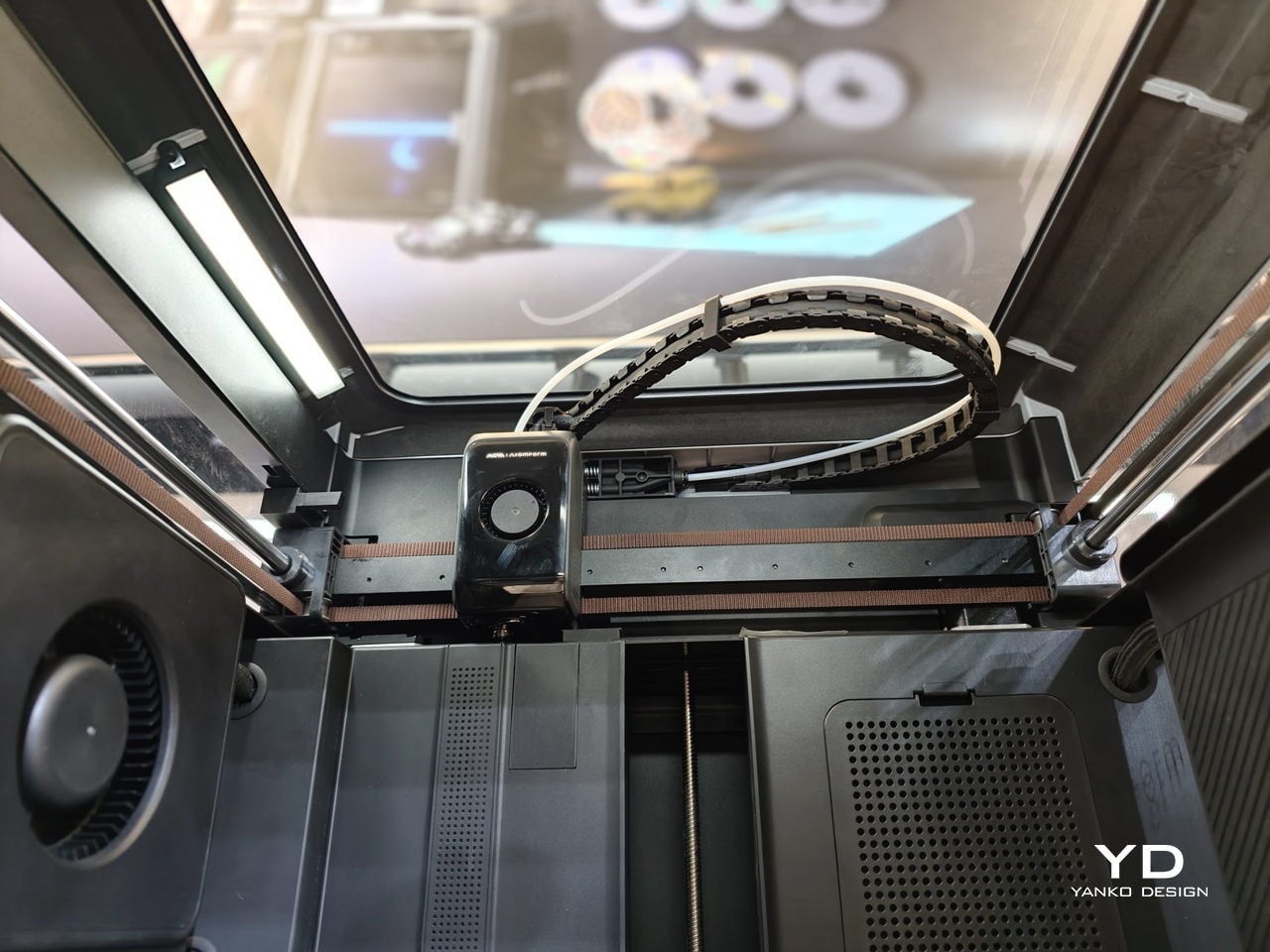
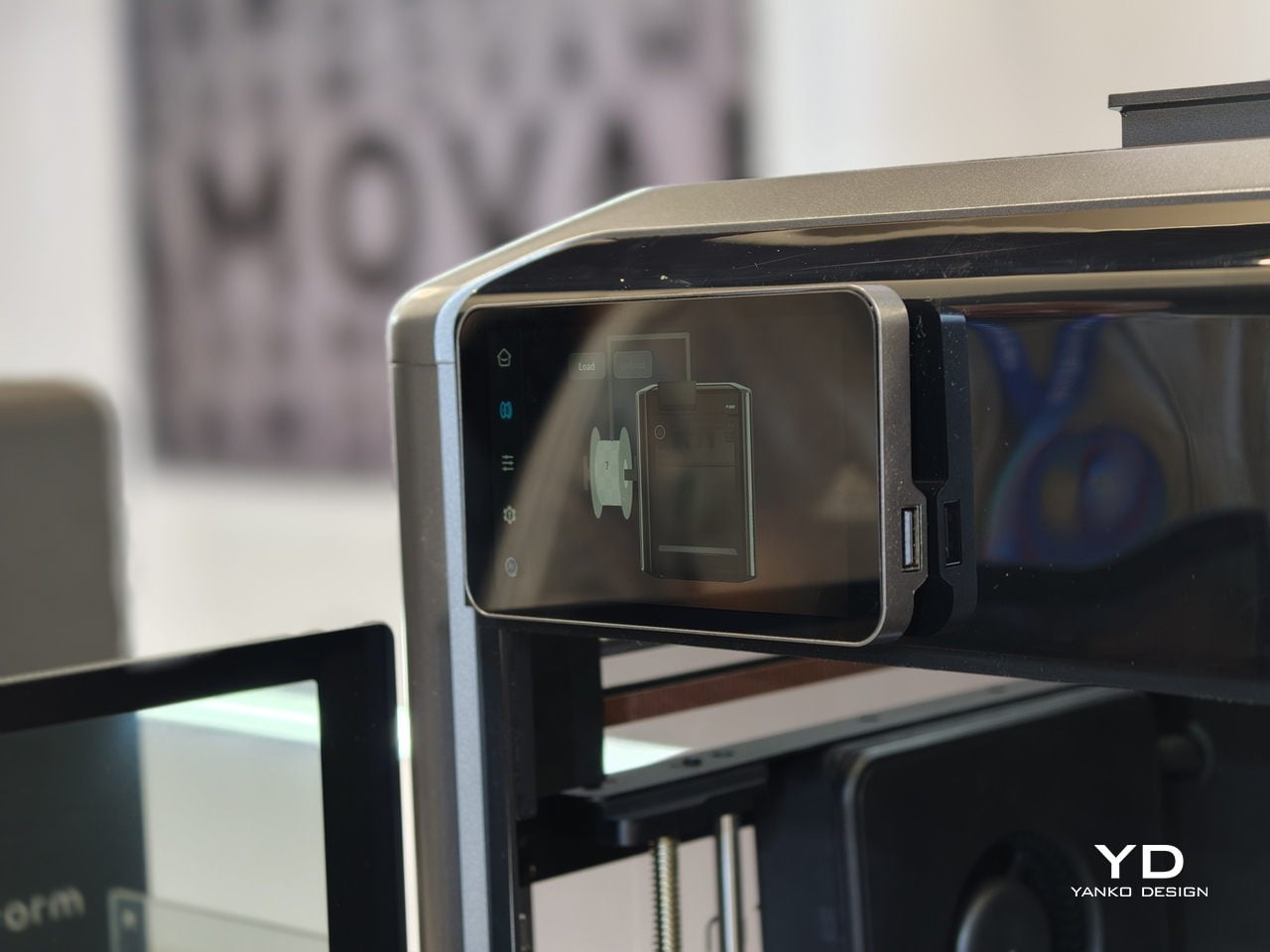
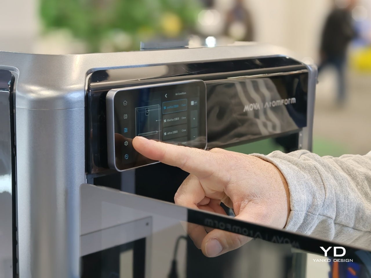
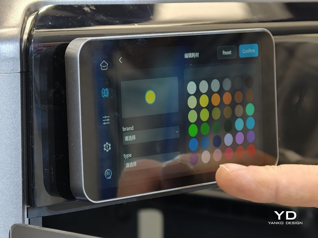
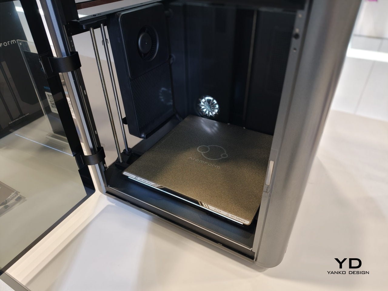
AtomForm Palette 300 is a 12-nozzle, enclosed 3D printer built to combine up to 36 colors and 12 materials in a single print. It uses a rotating OmniElement automatic nozzle-swapping system, where each nozzle stays dedicated to one filament. AtomForm claims that the approach cuts filament waste by up to 90% by avoiding constant purging, while still hitting 800 mm/s print speeds and 25,000 mm/s² acceleration in a 300 × 300 × 300 mm enclosed cube.
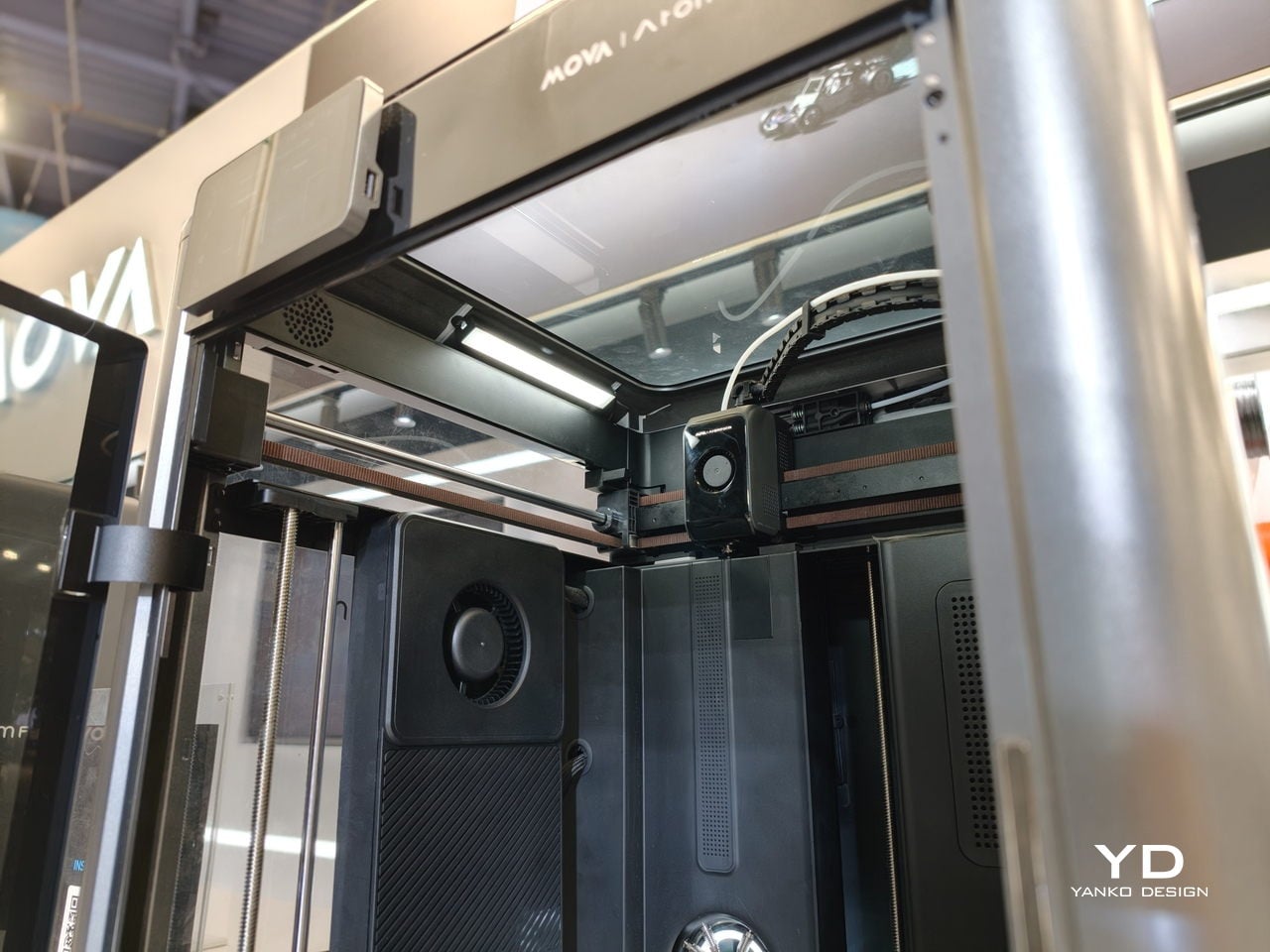
Most multi-material printers either swap entire toolheads or force a single nozzle to purge every time you change color, which costs time and plastic. The Palette 300’s turret of 12 filament-dedicated nozzles can jump from one to another without constant reloading, so complex color and material changes do not feel like a penalty. That means a product prototype can have brand-accurate colors and soft-touch grips in one pass.
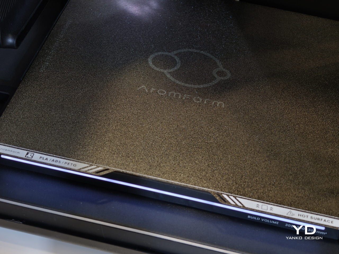
The 350°C hotend and 300mm cube volume give headroom for engineering filaments and larger pieces, not just small decorative figures. A prototype sneaker with flexible soles and rigid eyelets, or an architectural mock-up that mixes translucent windows with textured facades, can happen in one job instead of several glued-together prints. That kind of integration changes how much iteration fits into a day and how confident you can be that parts will actually fit together.
Reliability is where the AI and sensing layer come in. The Palette 300 uses more than 50 sensors and four AI-powered cameras to watch the print in real time. Those systems automatically calibrate nozzle alignment across all 12 extruders and look for defects before a long job is ruined. For complex, multi-hour prints, that is the difference between trusting the machine to finish and spending the afternoon hovering nearby.
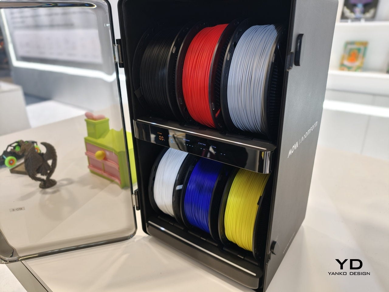
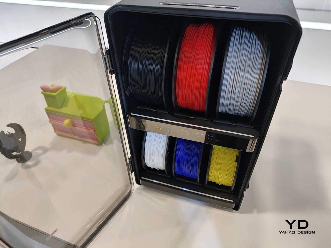
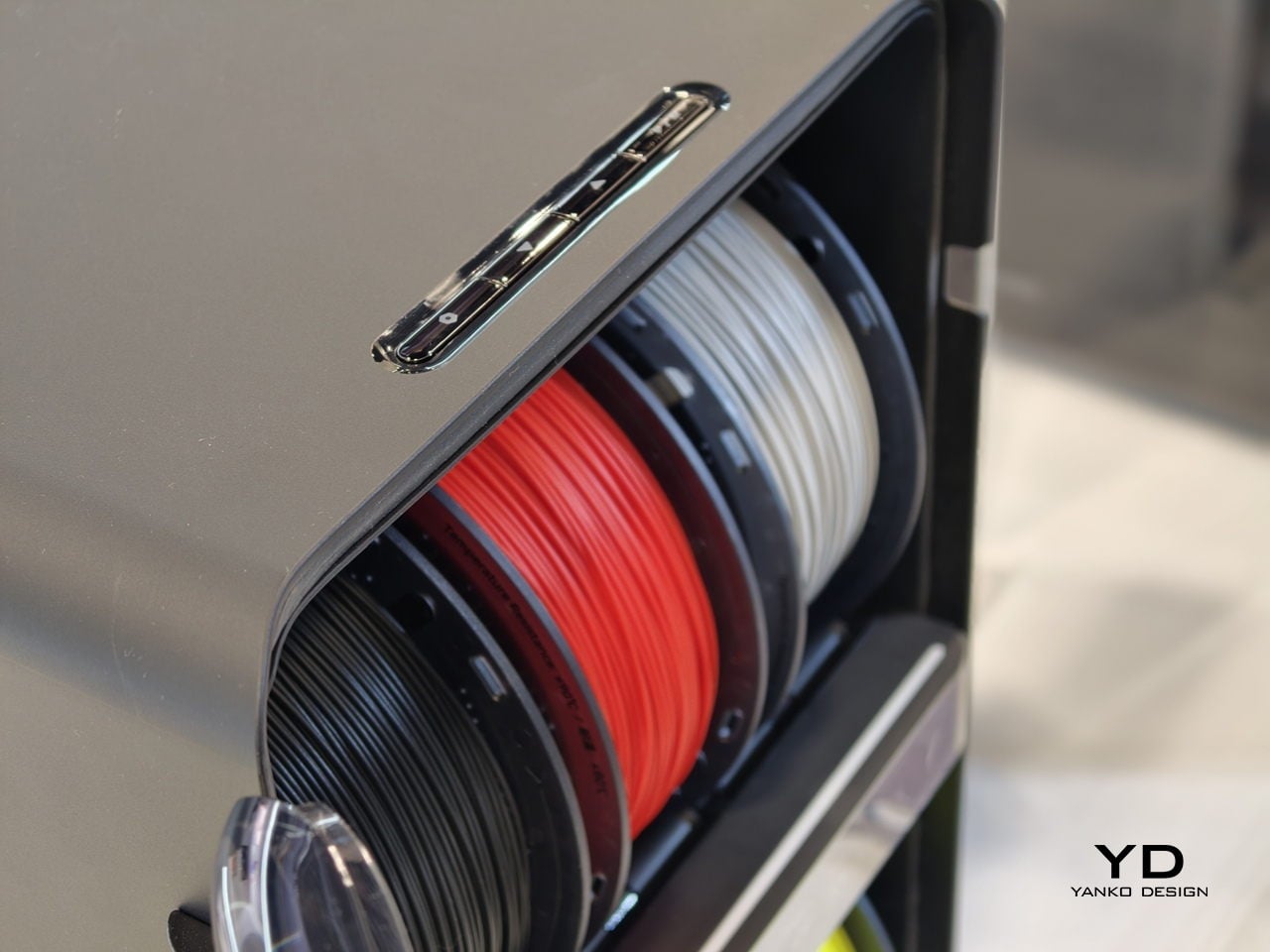
The studio-friendly details matter just as much. The fully enclosed design, ≤48 dB noise rating, and built-in air filtration make it plausible to run the Palette 300 in a shared office or classroom instead of a back room. It can connect to up to six RFD-6 filament boxes that keep 36 spools dry and ready, so a full color and material library can stay loaded instead of living in cardboard boxes.
AtomForm Palette 300 is an attempt to move multi-color FFF from novelty into something designers can rely on. It is a first-generation machine from a new brand, so long-term reliability and software polish still have to be proven. But the combination of 12-nozzle hardware, AI-assisted oversight, and a thought-through filament ecosystem makes it one of the more interesting 3D printers to come out of CES 2026, especially for people tired of choosing between detail, color, material diversity, or speed.
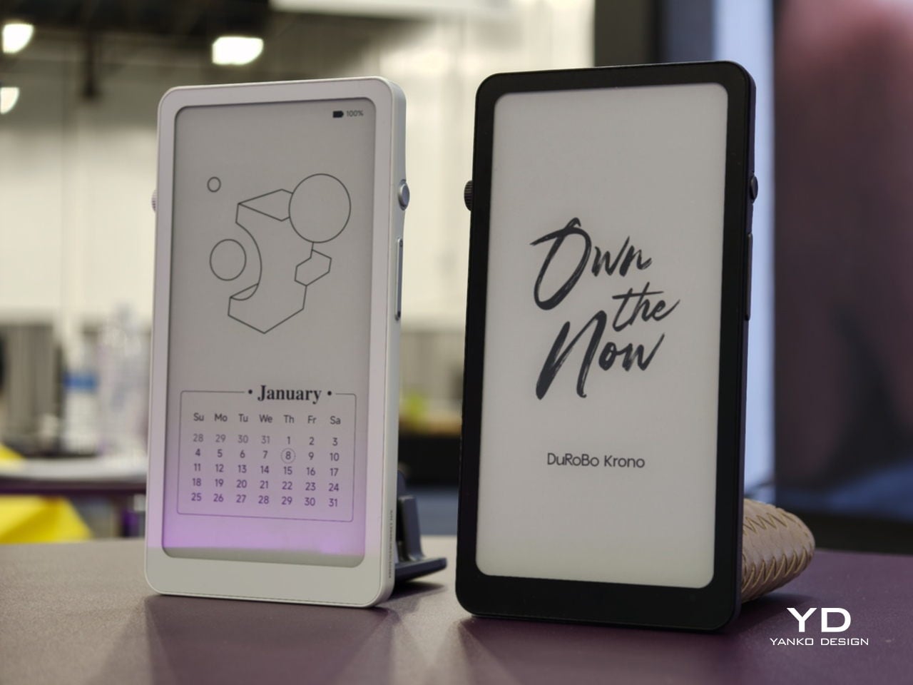
Trying to read or think on a phone never quite works. Notifications interrupt articles halfway through, feeds wait one swipe away from whatever you were concentrating on, and even long reads become just another tab competing for attention. E‑readers tried to solve this, but most stopped at books and stayed locked into one ecosystem. DuRoBo, a Dutch e‑paper specialist, is bringing Krono to CES 2026 in Las Vegas with a different ambition, treating focus, reflection, and idea capture as equally important.
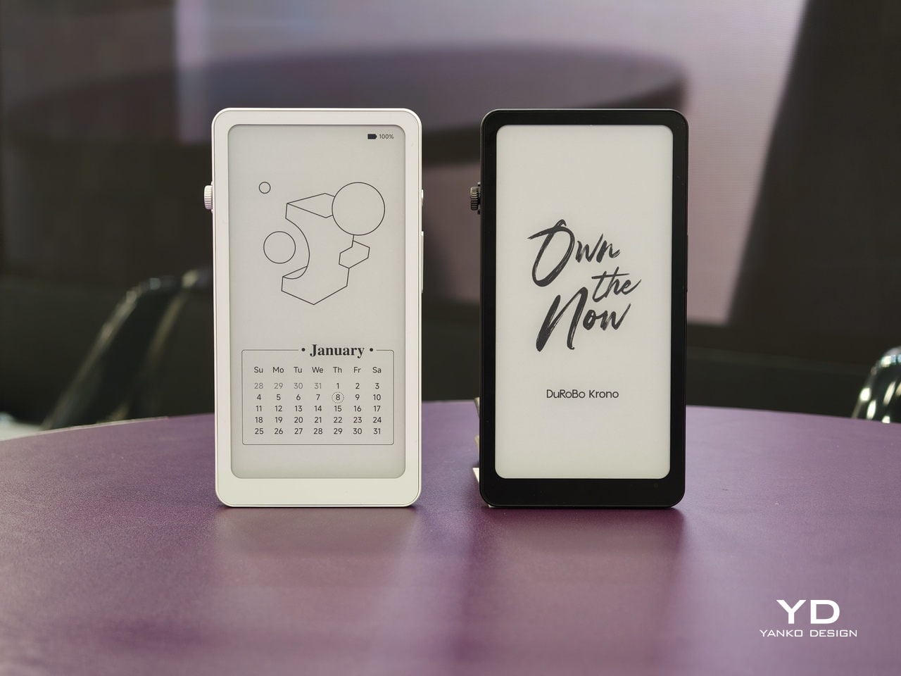
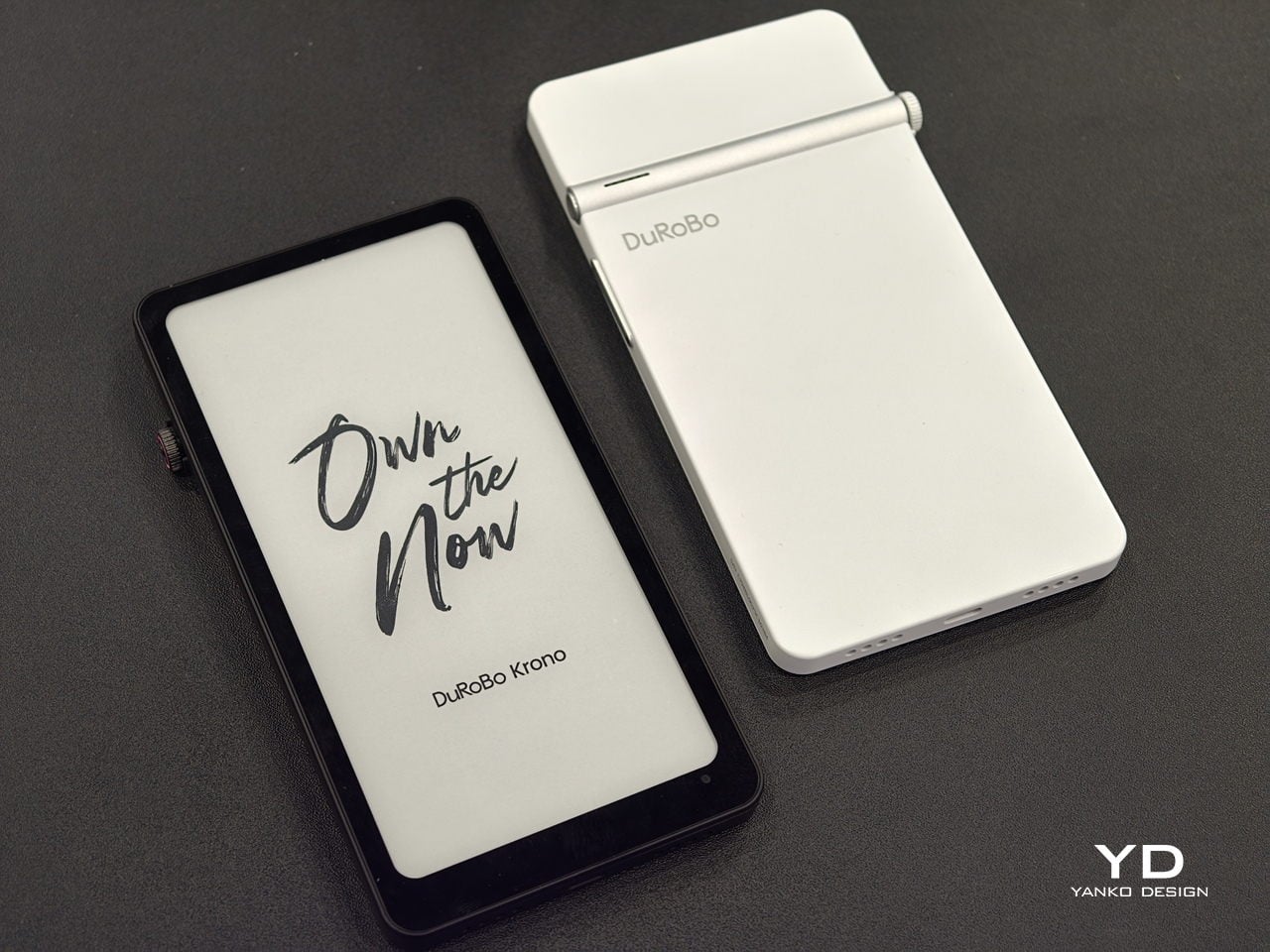
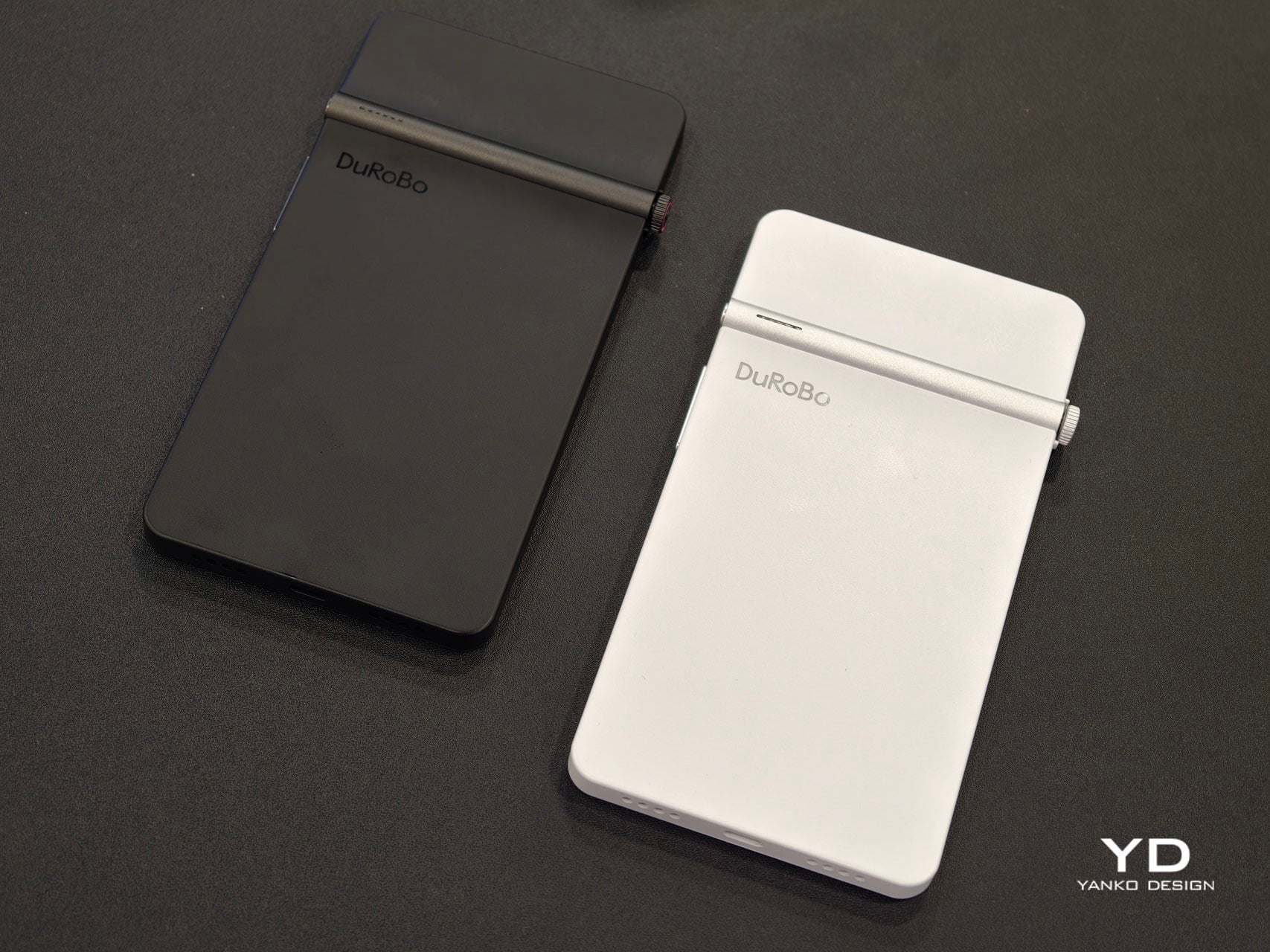
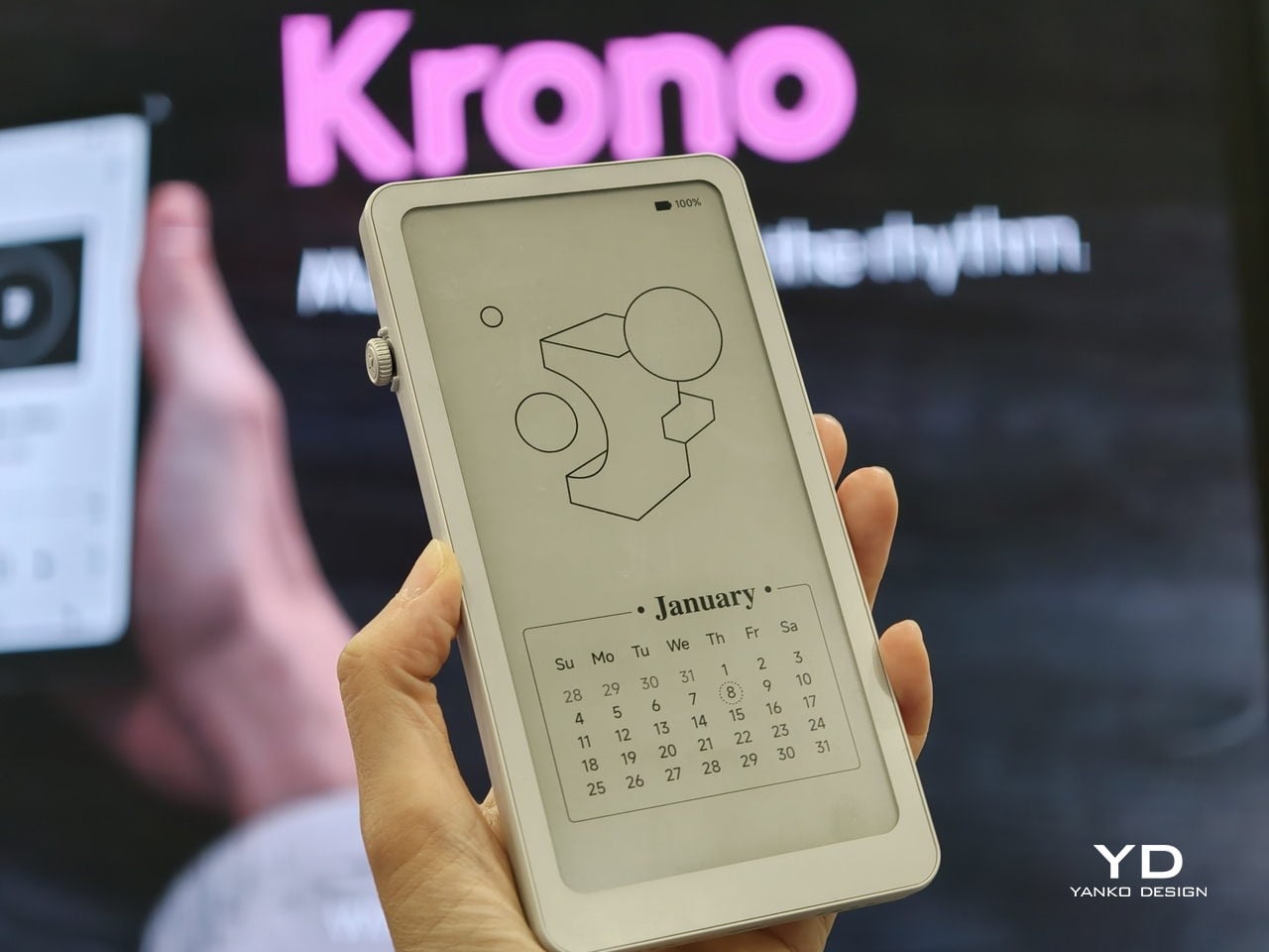
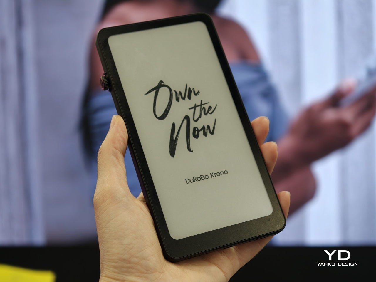
Krono is a pocket‑sized smart ePaper focus hub that has made waves in Europe and is now entering the US market. It wraps a 6.13‑inch E Ink Carta 1200 display with 300 PPI clarity into a minimalist, mechanical‑inspired body that measures 154 × 80 × 9 mm and weighs about 173 g. It is for capturing and shaping thoughts with on‑device AI, ambient audio, and a Smart Dial that feels more tactile than tapping glass.
The paper‑like screen, anti‑glare etching, and dual‑tone frontlight make it comfortable for long reads, whether books, saved articles, or PDFs. The compact body feels closer to a large phone than a tablet, which encourages carrying it everywhere as a dedicated space for slower content. The display mimics paper well enough that you can read for hours without the eye strain from backlit screens.
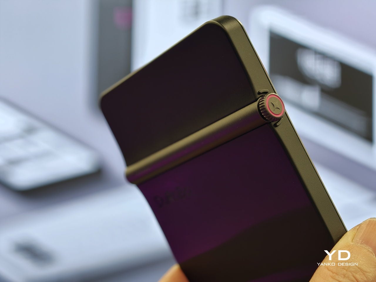
The Smart Dial and Axis bar are the main interaction story. The dial lets you flip pages, adjust brightness or volume, and, with a long‑press, open Spark, Krono’s idea vault. The Axis along the top rear houses eight breathing lights that glow subtly while you read or work, reinforcing the sense of a calm, separate device. The dial and lights give Krono a more analog feel, turning navigation and focus into something you do with your hand.
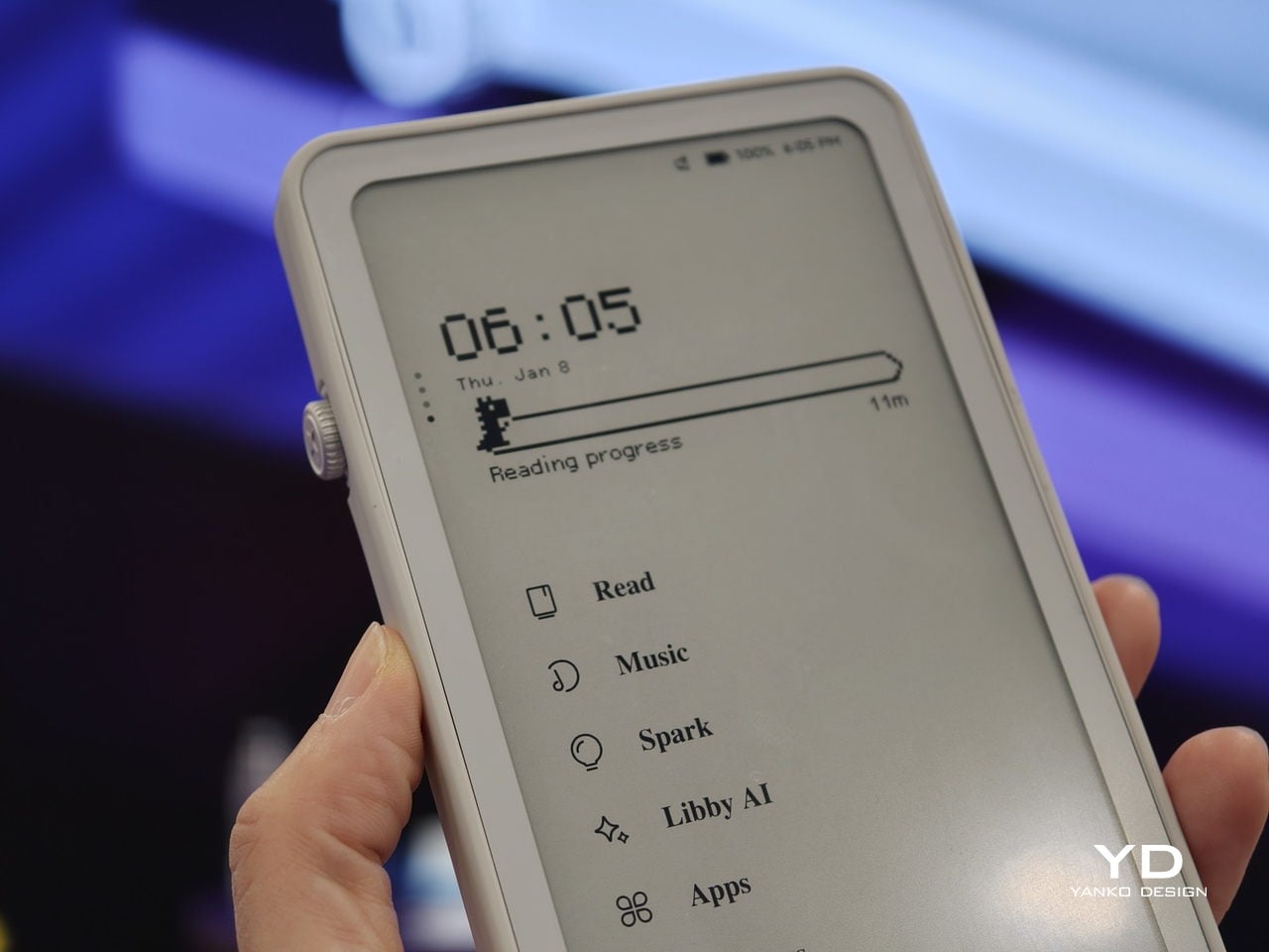
Spark is where AI enters. Press and hold the dial to dictate a thought, meeting note, or passing idea, and Krono records it, transcribes it with speech‑to‑text, and runs an AI summary that turns it into a structured note. Text Mode lets you refine that note on the e‑paper screen. The whole process happens on‑device, keeping ideas private and the interface calm.
Libby AI is the on‑device assistant that answers prompts and helps with outlines or clarifications without dragging you into a browser. Krono runs Android 15 with full Google Play Store access, powered by an octa‑core processor, 6 GB of RAM, and 128 GB of storage, so it can run Kindle, Notion, or other tools. DuRoBo’s own interface keeps the experience geometric and minimal.
The built‑in speaker and Bluetooth audio are part of the focus story. You can listen to music, podcasts, or audiobooks while reading or writing, turning Krono into a self‑contained environment for commutes or late‑night sessions. The 3,950 mAh battery and tuned refresh algorithms support long stretches of use, not constant app‑hopping, which is what you want from a device that is supposed to be a reprieve from the usual screen.
Krono’s CES 2026 appearance is more than just another e‑reader launch. It is DuRoBo’s attempt to give US readers and thinkers a pocketable device that treats focus, reflection, and idea capture as first‑class design problems. The specs matter, but the real promise is a small, quiet object that can sit between a book and a phone, borrowing the best of both without inheriting their worst habits.
We have seen quite a number of laptops bearing mind-blowing flexible screens that fold or roll, and while they do help push the envelope of laptop design, they might be the future, but it is definitely not yet here. Foldables still scratch easily and are expensive, rollables are at a concept stage, and both rely on technology that is impressive in a demo booth but nerve-wracking when you actually need to get work done and cannot afford downtime or repair bills.
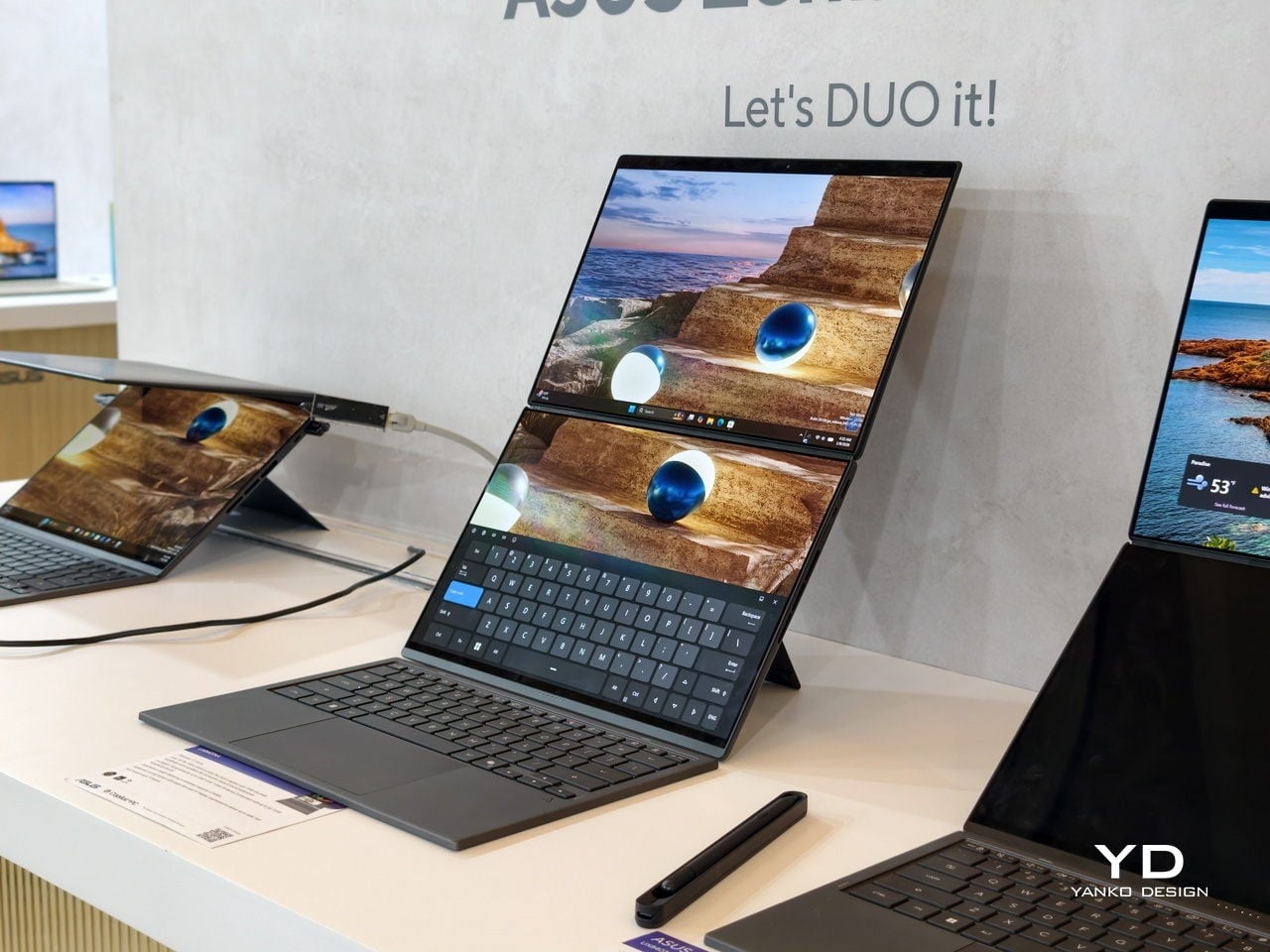
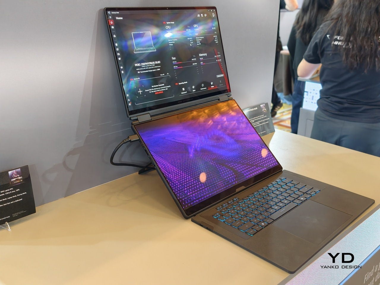
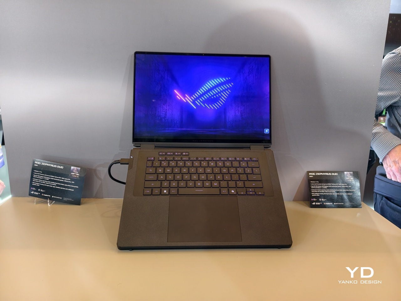
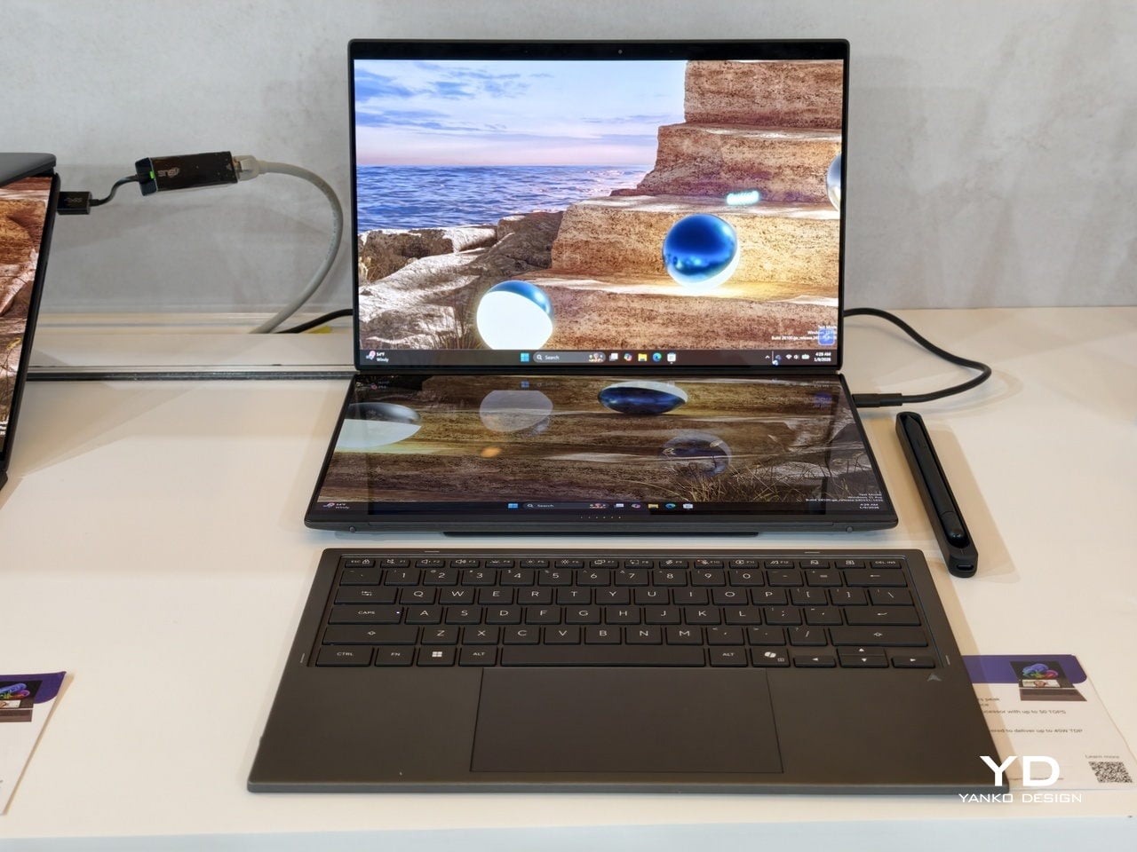
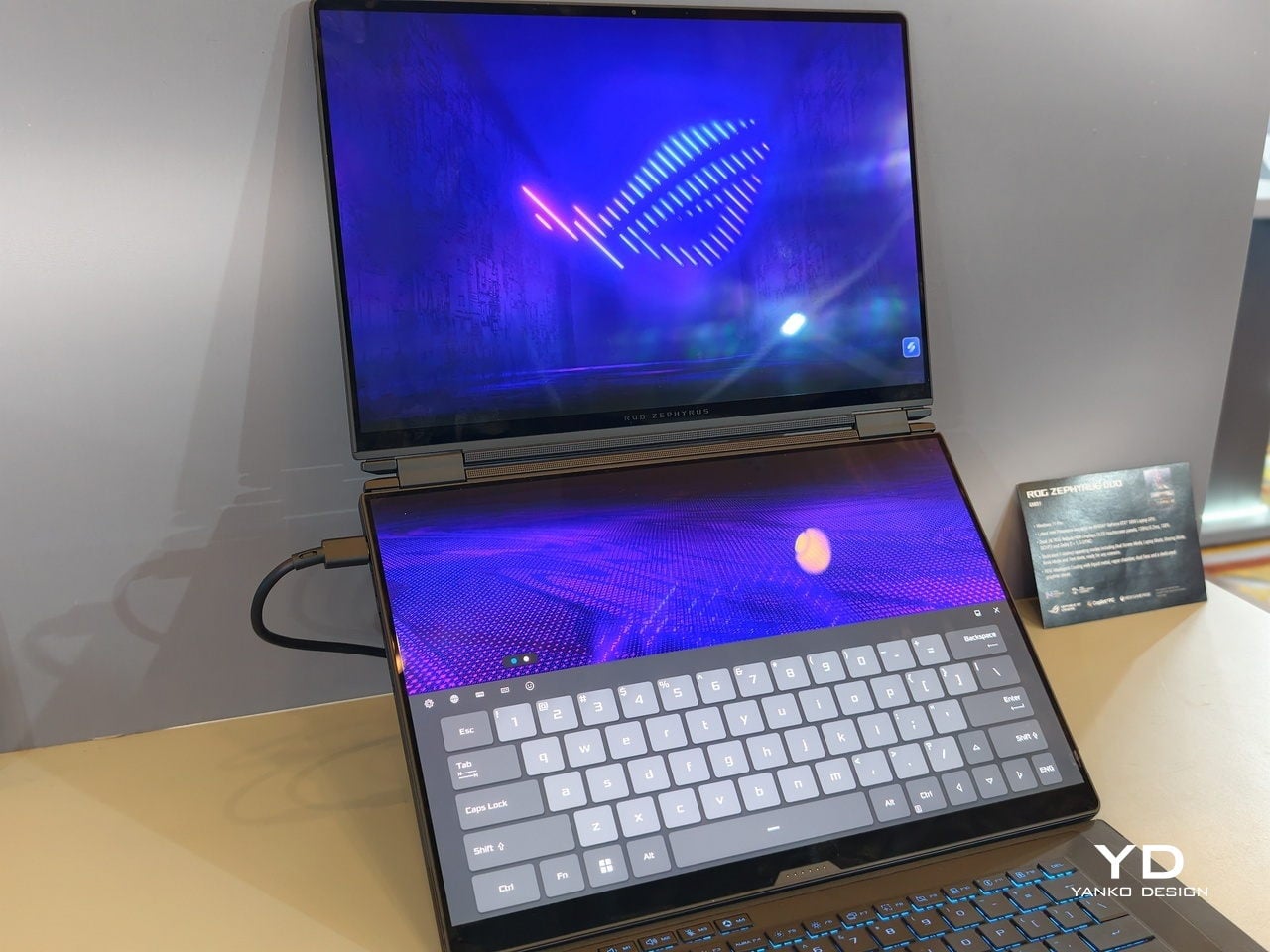
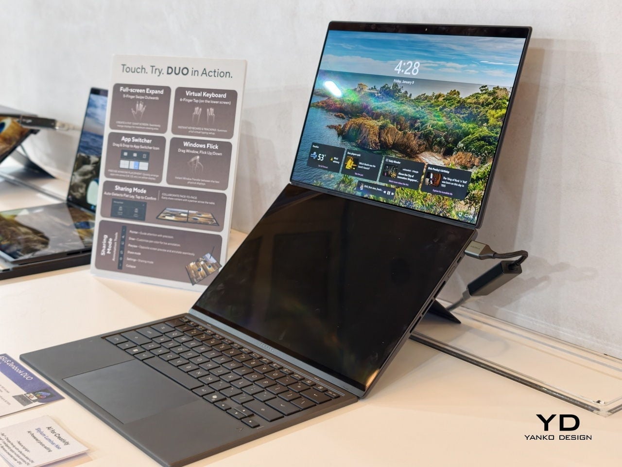
At CES 2026, ASUS and its gaming brand Republic of Gamers are offering two designs for people who need to get stuff done here and now. Although less spectacular than a screen that folds like paper, the ROG Zephyrus Duo 2026 (GX561) and the ASUS Zenbook DUO 2026 (UX8407) promise a more versatile and more reliable experience, using two rigid OLED panels, conventional hinges, and software layouts that treat dual screens as a workflow multiplier instead of a party trick.
Designer: ASUS
Dual Screens, Multiple Possibilities
With a foldable laptop, you get a large screen that folds down to the size of a normal laptop, or a laptop-sized screen that folds down to half its size. A rollable laptop, on the other hand, starts with a normal size and then expands for more real estate. They both try to offer more screen space with a manageable footprint, but it is still a single panel with a limited set of poses. You can fold it like a book or lay it flat, but you cannot flip one half around into a true tent or dual-monitor arrangement, and the panel itself stays soft and fragile under your fingertips.
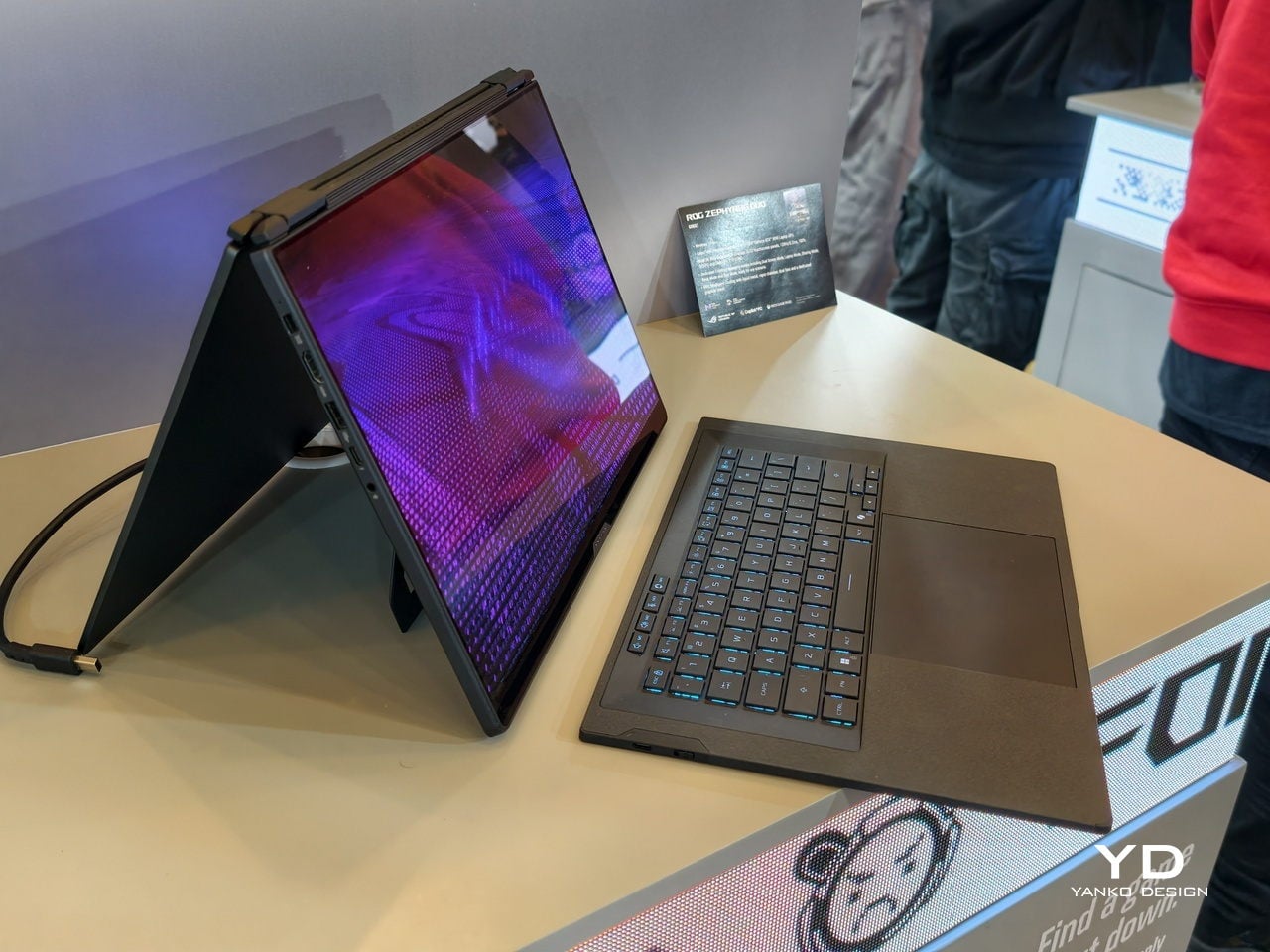
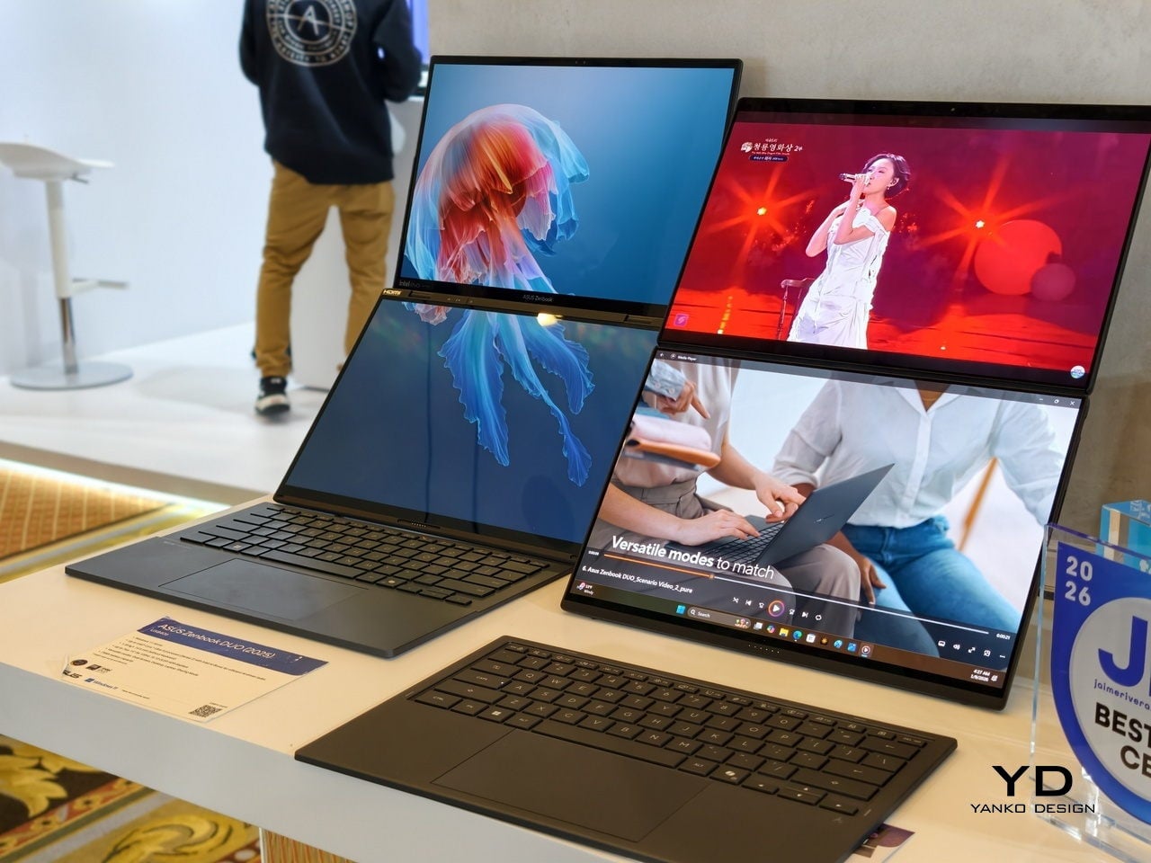
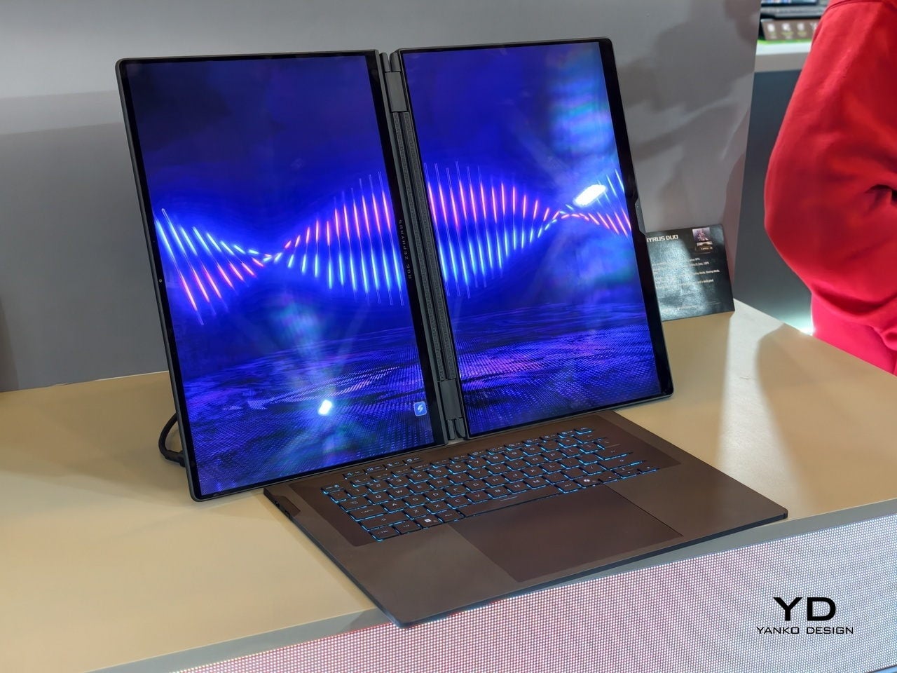
The dual-screen design sported by the new Zephyrus Duo and Zenbook DUO uses two independent but connected screens, practically dual monitors connected by a hinge. They are conventional, rigid OLED panels, so none of the soft, scratch-prone flexible displays of foldables. It feels almost like a normal laptop, just one that has a second monitor permanently attached, hinged, and ready to be stood up, laid flat, or folded back into tent mode for sharing across a table.
More importantly, however, this design offers more versatility in terms of how you actually use the machine throughout the day. You can use only a single screen in laptop mode if space is a constraint or if you want to stay focused. You can flip the whole thing into tent mode to share your screen with someone sitting across from you. You can detach the keyboard entirely and stand both panels up as a tiny dual-screen desk, with the keyboard floating wherever your hands are most comfortable. ASUS brings this design to two different kinds of laptops, really just two sides of the same coin, offering the same core idea with the flexibility you can use today.
ROG Zephyrus Duo 2026 (GX561): Not Just a Gaming Laptop
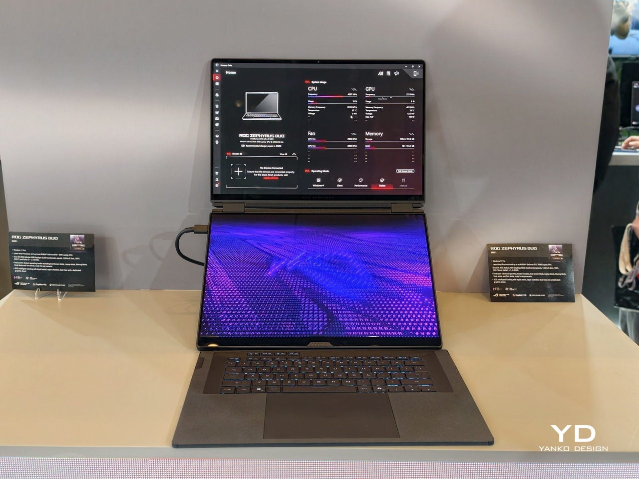
This is not the first Zephyrus Duo, but the first one launched nearly six years ago was more of a one-and-a-half-screen laptop. There was a smaller touchscreen right above the keyboard that offered some space for tool palettes and chat windows, but it was still very much a secondary strip. This 2026 redesign, in contrast, is a bold new direction, going full dual-screen with two large OLED panels and a detachable keyboard like no other gaming laptop has dared to go.
It is a true gaming laptop, of course, and the specs show its pedigree. An Intel Core Ultra 9 processor, paired with up to an NVIDIA GeForce RTX 5090 Laptop GPU pushing up to 135W TGP, backed by up to 64GB of LPDDR5X memory and up to 2TB of PCIe Gen5 SSD storage with easy swap access. The 90Wh battery supports fast charging, hitting 50% in 30 minutes.
The main display is ROG Nebula HDR, a 3K OLED panel running at 120Hz with 0.2 ms response time, HDR 1100 nits peak brightness, 100% DCI-P3 coverage, and ΔE below 1 color accuracy, protected by Corning Glass DXC. All of that is cooled by ROG’s Intelligent Cooling system, with liquid metal on the CPU, a vapor chamber, graphite sheets, and 0 dB Ambient Cooling mode for silent operation when you are not rendering or fragging.
At 6.28 lb and just 0.77 inches thin, it is heavy enough to remind you there is serious silicon inside, but still portable enough to live in a backpack. The machine includes Wi-Fi 7, Thunderbolt 4, HDMI 2.1, USB 3.2 Gen 2 Type-A, and an SD card slot, plus a six-speaker system with two tweeters and four woofers running Dolby Atmos, so you can actually enjoy game audio without always reaching for headphones.
Where the ROG Zephyrus Duo 2026 really shines is in versatility. Because a laptop that can run AAA games can practically do anything as well, including content creation, programming, video editing, and 3D work. Designers and creatives will definitely love the freedom such a design offers, paired with powerful hardware that does not compromise just to fit two screens. You can keep After Effects timelines on one panel while the preview lives on the other, or split code and output, or run a game on the main screen with Discord and guides on the second, all without alt-tabbing or shrinking windows.
ASUS Zenbook DUO 2026 (UX8407): Dual-Screen Goes Lux
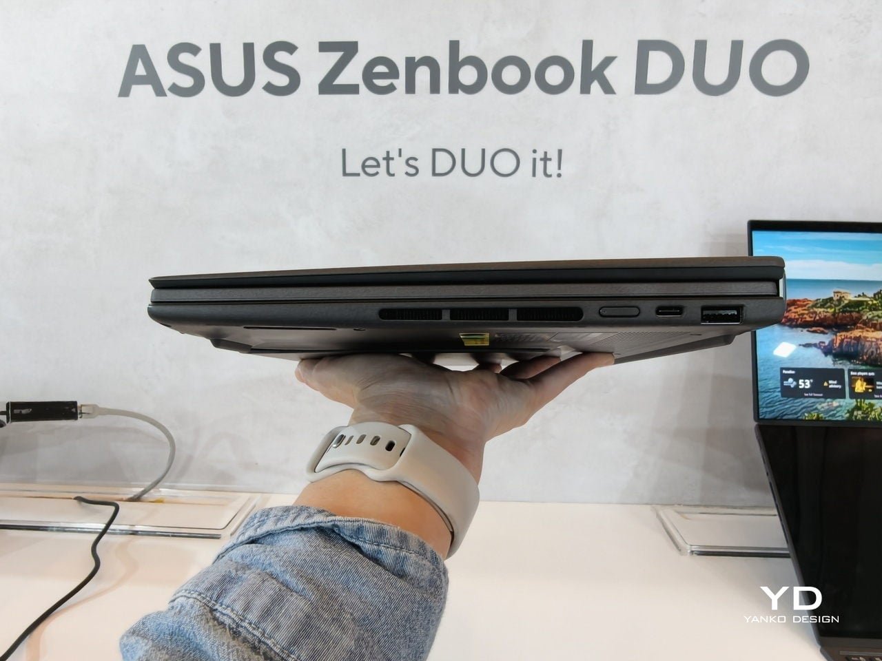
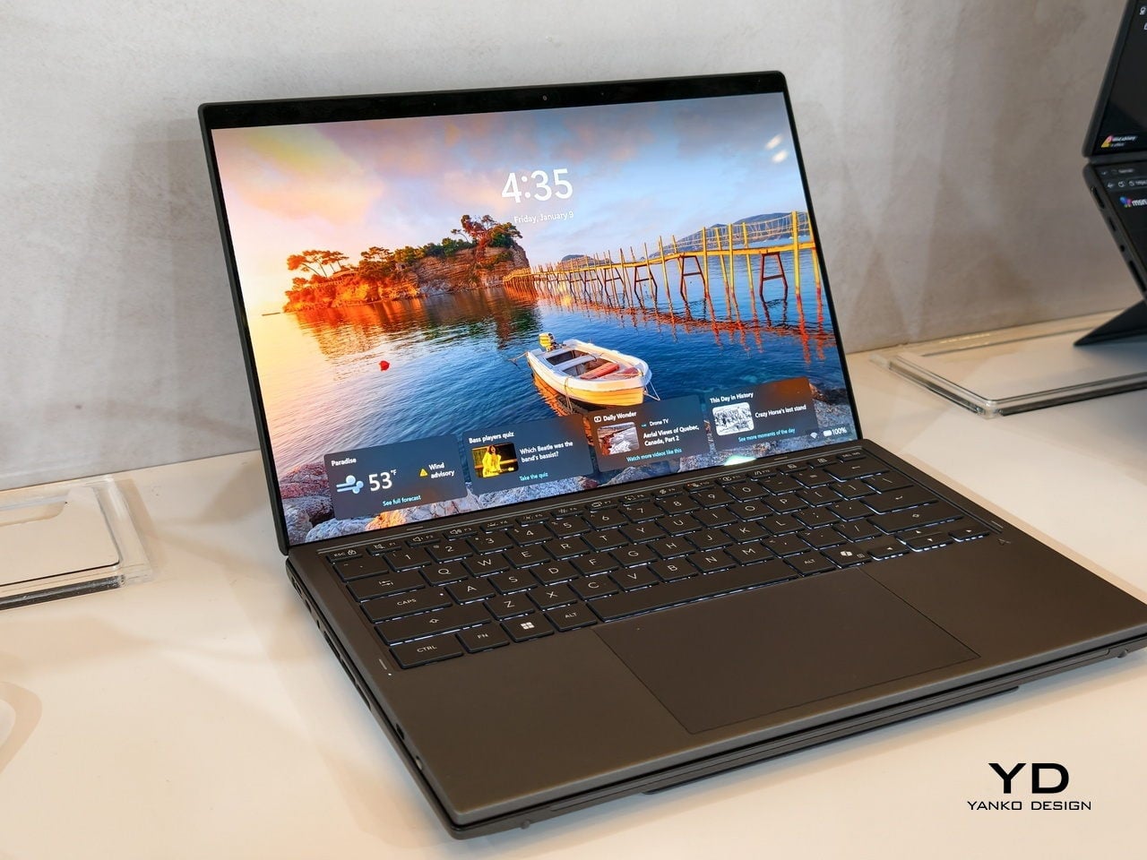
The ASUS Zenbook DUO 2026 shaves off some of the gaming hardware to offer a dual-screen laptop that is slimmer, lighter, and a little more stylish. It is no slouch, though, and carries plenty of muscle to handle any productivity task you might throw at it. That also includes content creation, with a bit of light gaming on the side when you want to unwind between meetings or deadlines and do not need RTX power for every session.
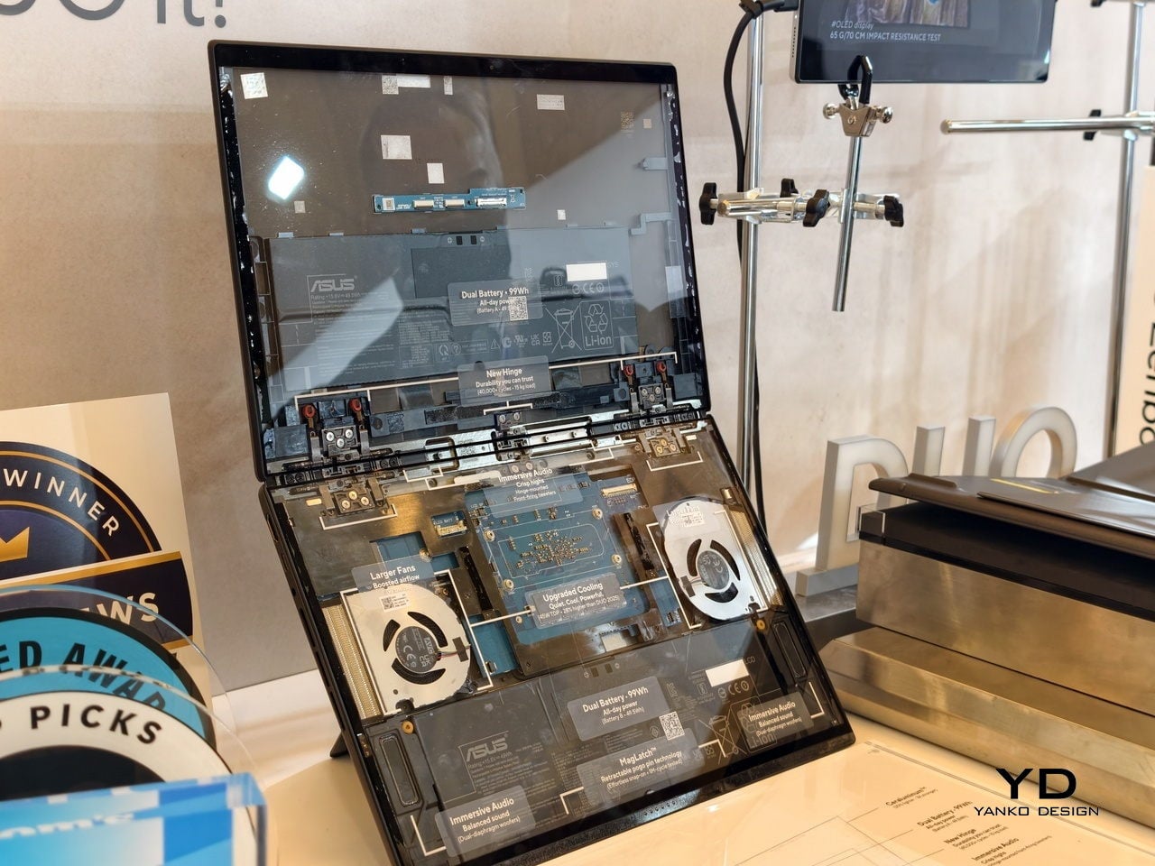
The Zenbook DUO 2026 runs a next-gen Intel Core Ultra processor with up to 50 TOPS NPU for AI workloads, paired with Intel Arc integrated graphics, up to 32GB of memory, and up to 2TB of SSD storage. It supports up to 45W TDP with a dual-fan thermal solution, keeping the machine stable during sustained loads without the heavy cooling overhead of a discrete GPU, which helps keep the chassis thin and light.
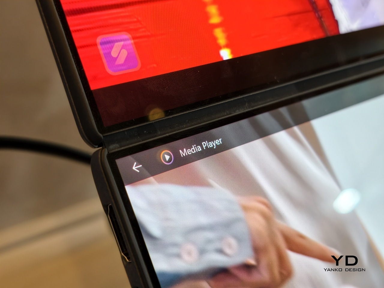
The main display is an ASUS Lumina Pro OLED with 1000 nits peak brightness, and both screens are treated with the same level of care, making them equally usable for productivity, media, and light creative work. What differentiates this next-gen dual-screen from its predecessor is the new hinge design that puts the screens closer together. With thinner bezels, they now sit just 8.28mm apart, a 70% reduction, and they almost look like a single continuous piece.
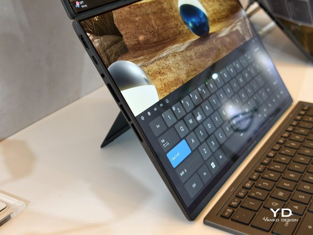
ASUS has adopted its Ceraluminum material for the Zenbook DUO 2026’s laptop lid, bottom case, and kickstand, making it not only look and feel more luxurious but also be a bit more resilient to accidents and daily wear. The Zenbook DUO weighs just 1.65kg and has a 5% smaller footprint than previous generations, which makes it easier to carry and fit on smaller desks or café tables.
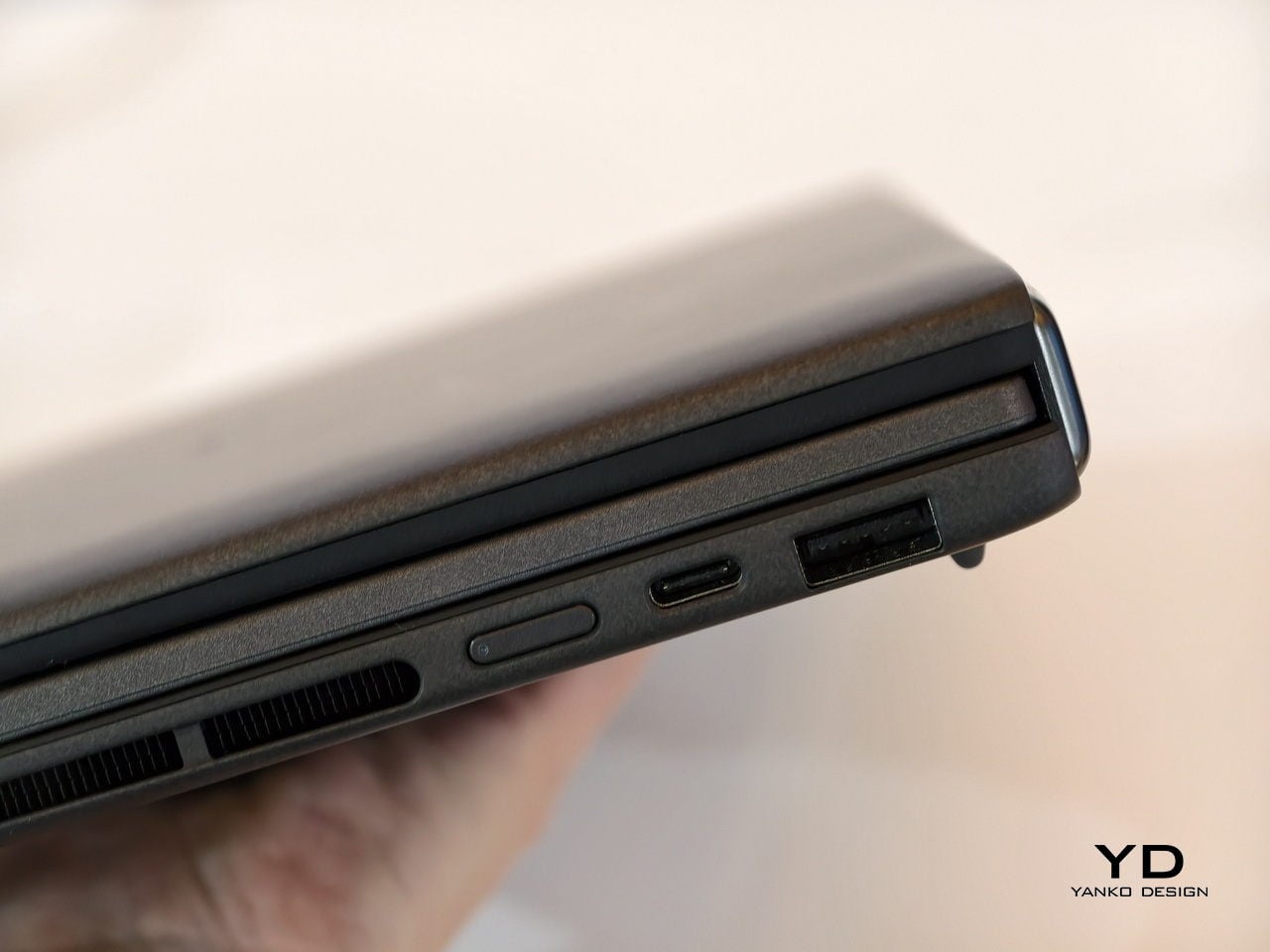
It is packed with ports, including two Thunderbolt 4 connections, HDMI 2.1, USB 3.2 Gen 2 Type-A, and an audio jack, plus six speakers with two front-firing tweeters and four woofers for surprisingly rich audio from a thin chassis. The keyboard connects via magnetic pogo pins or Bluetooth, and the machine supports ASUS Pen 3.0, turning both screens into writable surfaces for notes, sketches, or annotations during video calls or brainstorming sessions.
Like the Zephyrus Duo, the Zenbook DUO 2026 can be used in multiple orientations. Laptop mode with the keyboard on top of the lower screen for traditional clamshell use. Desktop mode with both screens stacked or side-by-side, the detachable keyboard placed separately, and the built-in kickstand propping the whole thing up like a tiny dual-monitor workstation. Tent mode for presentations or sharing content across a table without needing an external display or awkward screen mirroring. The flexibility is the point, and it works without asking you to trust a flexible panel not to crease or scratch under normal use.
Trade-offs and Potential
Dual-screen laptops are not perfect, of course. You need to keep track of a separate keyboard you hope you will not lose, though that is also the case for some foldable laptops anyway, and the detachable keyboard is also what lets both the Zephyrus Duo and Zenbook DUO behave like tiny dual-monitor desks in tent or desktop modes. These machines are easily heavier than single-screen laptops with equivalent specs, and they will likely be priced firmly in premium territory, though still far below the stratospheric costs of early foldables.
There is also that unavoidable divider between the two screens, though ASUS has gotten it down to 8.28 mm on the Zenbook DUO, and at that point it starts to feel more like a subtle pause than a major interruption. The hinge is still visible, the gap is still there, but it is less about accepting compromise and more about acknowledging that two rigid, high-quality OLED panels with a small gap are more practical than one fragile foldable panel with no gap at all.
Despite those limitations, these designs offer a kind of versatility that neither conventional laptops nor foldable laptops can match. You get to decide how to use the laptop, unrestricted by a single panel or a prescribed set of folds. You can boost your productivity with two screens for timelines and tools, or save space with just one when you are working in a tight spot. You can stand them up for presentations, lay them flat for collaborative work, or use them as a traditional clamshell when muscle memory takes over.
Maybe someday, we will have foldable laptops that can bend both ways, support multiple modes, and will not easily scratch with a fingernail or develop a permanent crease after a few months of daily folding. But if you want to be productive and create content today, the ROG Zephyrus Duo 2026 and ASUS Zenbook DUO 2026 could very well be among the most productive and most versatile laptops of 2026, delivering the dual-screen promise without the fragility, the expense, or the anxiety that comes with carrying a piece of still-experimental tech into the real world.
The new year brings fresh opportunities to reimagine how we work, create, and organize our daily routines. As we step into 2026, the tools we choose to accompany us matter more than ever. The right instruments don’t just help us complete tasks—they transform how we think, collaborate, and bring ideas to life. From portable writing companions to innovative digital hybrids, these productivity tools represent a shift toward smarter, more thoughtful design.
What makes a tool truly productive isn’t complexity or feature overload. The best instruments fade into the background, becoming natural extensions of our creative process. They’re the ones we reach for instinctively, the ones that remove friction rather than add it. These seven designs embrace that philosophy, offering elegant solutions that respect your time, space, and workflow while helping you achieve more with less effort.
1. Inseparable Notebook Pen
The frustration of reaching for a pen only to find it missing is universal. This magnetic pen eliminates that daily annoyance by becoming one with your notebook. The design features a sleek magnetic clip that securely attaches to your journal, ensuring your writing instrument is always exactly where you need it. The built-in silencer creates a satisfying, quiet click when attaching or removing the pen, adding a touch of refinement to every interaction.
Beyond its clever attachment system, this pen excels at its primary function. The gel ink delivers smooth, consistent lines whether you’re sketching rapid concepts or writing detailed notes. Its minimalist form fits comfortably in your hand during extended writing sessions, while the compact profile maintains your notebook’s portability. The pen becomes invisible until needed, then performs flawlessly, embodying the principle that great design serves without drawing attention to itself.
The magnetic attachment system keeps your pen and notebook inseparably paired, ending the search for missing writing tools.
The built-in silencer creates a refined, quiet experience when attaching or detaching the pen from your notebook.
Smooth gel ink flows consistently for precise writing across all note-taking styles and purposes.
The minimalist design complements any notebook aesthetic while providing a comfortable grip during extended use.
What We Dislike
Limited to notebooks with compatible attachment points or covers that accommodate the magnetic clip.
The specific gel ink refills may require sourcing from particular suppliers rather than universal options.
2. OrigamiSwift Folding Mouse
Traditional portable mice force you to choose between compact size and comfortable ergonomics. OrigamiSwift refuses that compromise. Inspired by Japanese paper-folding techniques, this Bluetooth mouse transforms from pocket-sized flat form to a full-function tool in half a second. The origami-inspired triangular structure provides surprising stability and durability, proving that portability doesn’t require fragility. At just 40 grams, it disappears into bags and pockets until needed.
The engineering behind the folding mechanism feels almost magical. One fluid motion unfolds the mouse into an ergonomic shape that fits naturally in your palm, ready for hours of comfortable use. Silent click buttons respect shared workspaces, while the smooth tracking works across various surfaces. The USB-C rechargeable battery eliminates disposable battery waste and delivers up to three months of use per charge, making this mouse as sustainable as it is portable.
The instant transformation from flat to functional in under half a second makes setup effortless anywhere.
Weighing only 40 grams with an ultra-slim profile, it’s the ultimate travel companion for mobile professionals.
USB-C rechargeable battery provides three months of use per charge, eliminating disposable battery waste.
Soft-click buttons and smooth tracking enable quiet, precise work without disturbing those around you.
What We Dislike
The folding mechanism may require occasional cleaning to maintain the smooth transformation over extended use.
The compact size, when unfolded, while ergonomic, may feel smaller than full-sized desktop mice for users with larger hands.
3. Personal Whiteboard
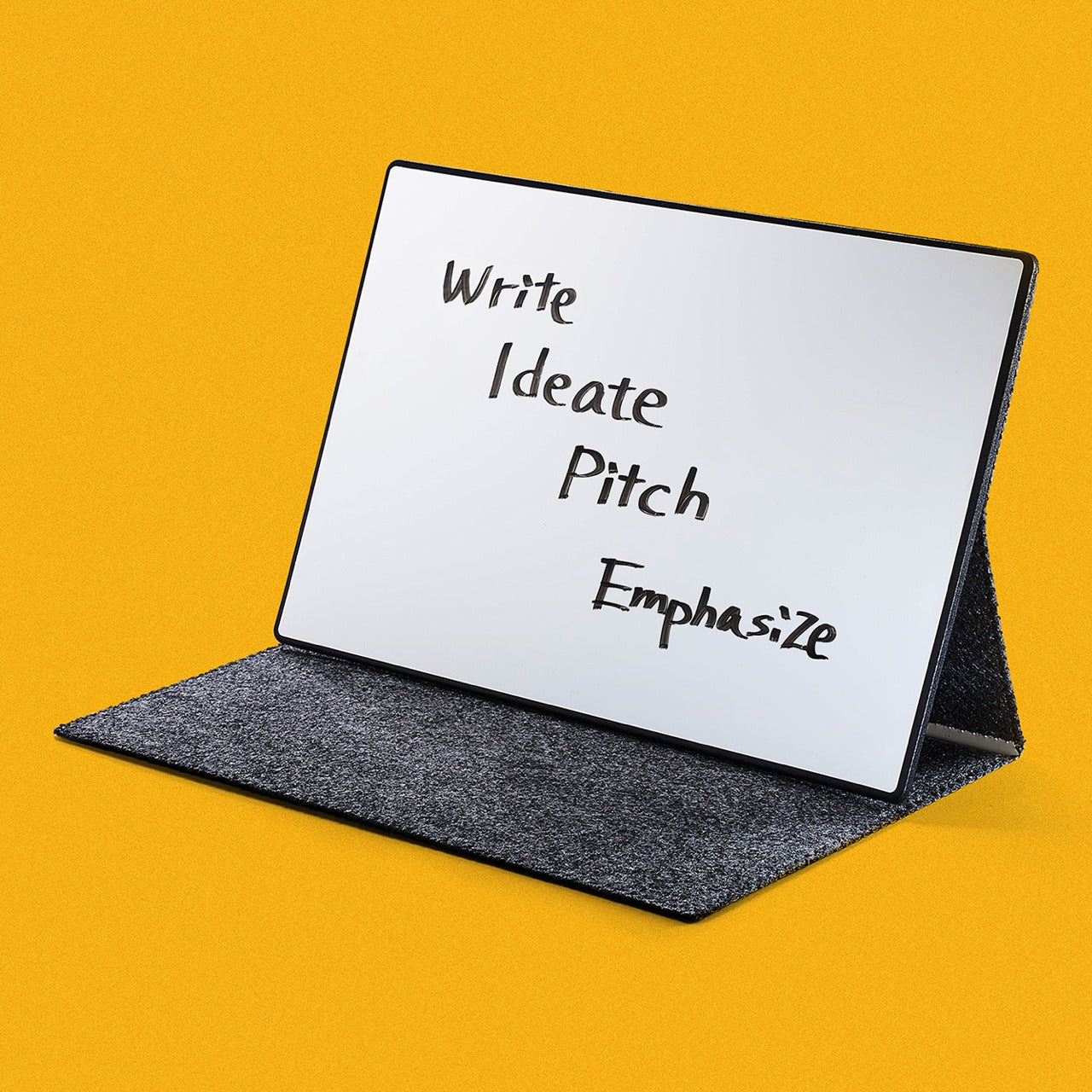
Digital tools dominate modern workflows, yet the immediate tactile feedback of writing by hand remains unmatched for ideation. This portable whiteboard bridges both worlds beautifully. The single-page design offers a clean slate for brainstorming, quick diagrams, or temporary notes. When you’ve captured that breakthrough idea, snap a photo to digitize and share it instantly. The multi-functional cover serves triple duty as eraser, built-in stand, and storage pocket.
The innovative Mag Force system demonstrates thoughtful design at its finest. This mechanism functions as both a comfortable cover handle and a secure pen holder, keeping everything together during transport. Compatibility with any standard whiteboard marker means you’re never locked into proprietary supplies. The swift wipe-clean process prepares the surface for your next thought in seconds, creating a flow that makes note-taking feel natural rather than procedural.
The multi-functional cover acts as an eraser, a stand, and a pocket, consolidating several tools into one elegant package.
The Mag Force system cleverly serves as both a carry handle and secure pen holder for all-in-one portability.
Compatible with any regular whiteboard marker, eliminating dependence on specific brand supplies.
Instant erasability and photo-to-cloud workflow combine tactile ideation with digital organization seamlessly.
What We Dislike
Single-page format means you can’t flip back to reference previous notes without reviewing digital photos.
Whiteboard markers can dry out if left uncapped, requiring mindful storage habits.
4. Functional LEGO Rubik’s Cube
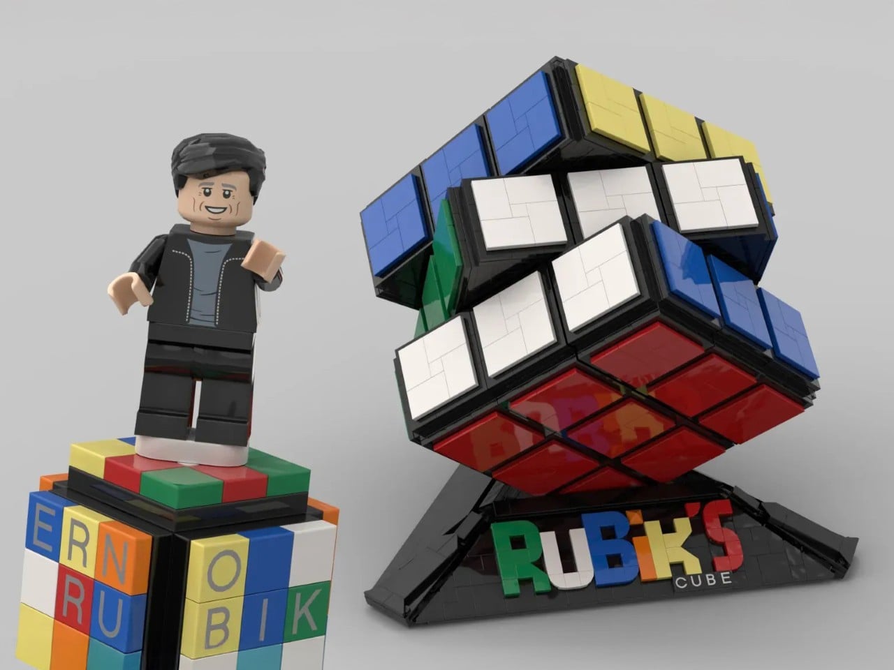
Desk toys often serve as simple fidget objects, but this 2,216-piece creation transcends that category entirely. This fully functional Rubik’s Cube, built entirely from LEGO brick,s represents engineering precision that borders on obsessive. Every twist and turn operates with the smoothness of commercial cubes, despite being constructed from elements never intended for such tolerances. The color-accurate design maintains the classic 3×3 configuration, creating a solving experience identical to traditional cubes.
The achievement here extends beyond mere functionality. Building this cube yourself transforms it from a desk decoration into a meaningful accomplishment, a conversation piece with genuine substance behind it. The tactile satisfaction of solving a puzzle you constructed brick by brick creates a connection between maker and object that mass-produced items can’t replicate. It’s a productivity tool disguised as play—the mental breaks spent twisting and solving actually refresh focus and problem-solving abilities for the work that matters.
The 2,216-piece build creates a meaningful project that rewards patience and attention to detail.
Serves dual purpose as an engaging desk toy and a legitimate stress-relief tool during mental breaks.
The color-accurate design maintains classic Rubik’s Cube aesthetics while showcasing LEGO’s versatility.
What We Dislike
The substantial piece count and complex build require significant time investment before you can use it.
LEGO construction makes the cube more fragile than solid plastic commercial alternatives if dropped.
5. Rolling World Clock
Managing global connections shouldn’t require complex apps or mental gymnastics. This twelve-sided world clock reduces time zone tracking to pure physicality. Each face represents a major city—London, Tokyo, New York, Shanghai, Sydney, and seven others—creating a tactile globe of time. Simply roll the clock to your desired city and watch the single hand indicate the current hour there. The minimalist design strips away digital complexity in favor of immediate, intuitive understanding.
The rolling interaction introduces an element of play to what’s typically a mundane task. There’s satisfaction in the physical act of turning the clock, feeling its weight and geometry in hand before setting it down to display the time you need. This transforms checking time zones from a forgettable tap on a screen into a moment of mindful awareness. The black or white finish options ensure it complements any workspace aesthetic while serving as both a functional timekeeper and a sculptural desk accent.
The twelve-sided design elegantly represents major world cities, making global time tracking beautifully intuitive.
Rolling the physical clock introduces satisfying tactile interaction to an otherwise digital task.
The minimalist single-hand display eliminates visual clutter while maintaining instant readability.
Serves double duty as a functional timekeeper and striking desk sculpture in black or white finishes.
What We Dislike
Limited to twelve pre-selected cities, which may not include all locations relevant to your specific connections.
Reading the exact minute requires estimation rather than precision, making it better for general awareness than scheduling.
6. MagBoard Clipboard
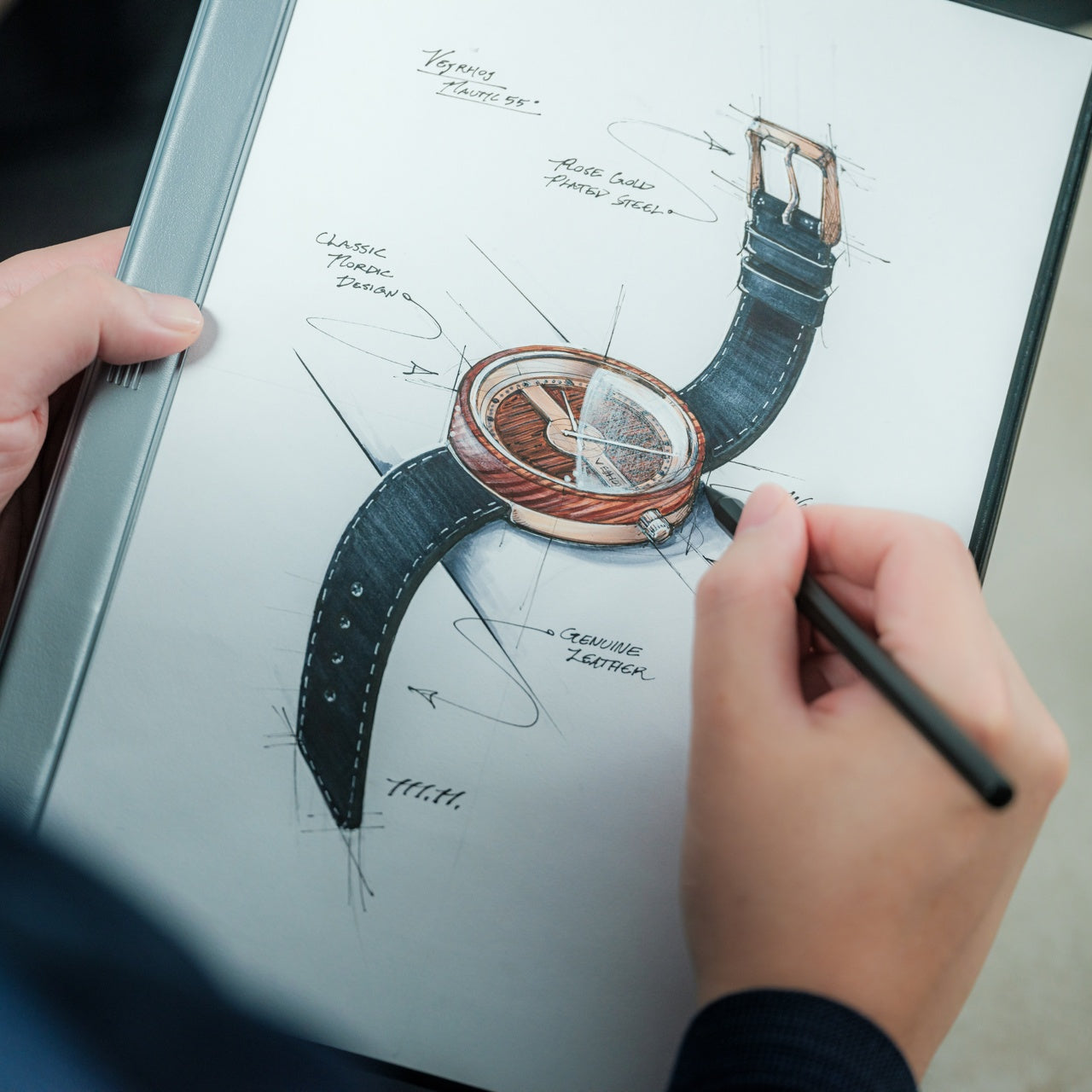
Traditional notebooks impose structure through bound pages and fixed layouts. MagBoard takes the opposite approach. This minimalist clipboard uses a magnetic lever mechanism to secure up to 30 loose sheets, giving you complete freedom to arrange, remove, or add pages as your project evolves. The hardcover design transforms any surface into a stable writing platform, enabling you to capture ideas while standing, walking, or working in unconventional spaces.
The water-resistant, easy-clean surface means this tool adapts to various environments without worry. Sketch at a construction site, take meeting notes in a coffee shop, or diagram concepts during outdoor collaboration sessions. The flexibility extends beyond physical durability—the loose sheet system means you can mix paper types, share individual pages instantly, or reorganize your notes to match your thinking process rather than forcing your thoughts into predetermined structures.
The magnet and lever clip system securely holds up to 30 sheets while enabling instant page rearrangement and removal.
Hardcover construction creates a stable writing surface for note-taking in any position or location.
Water-resistant and easy-clean materials protect your work in diverse environments and weather conditions.
The loose sheet approach offers complete flexibility in paper choice, layout, and organization methods.
What We Dislike
Loose sheets lack the permanent binding of traditional notebooks, requiring care to prevent page loss.
The hardcover adds weight compared to standard notepads, making it less ideal for ultra-minimalist carry setups.
7. Rocketbook Reusable Sticky Notes
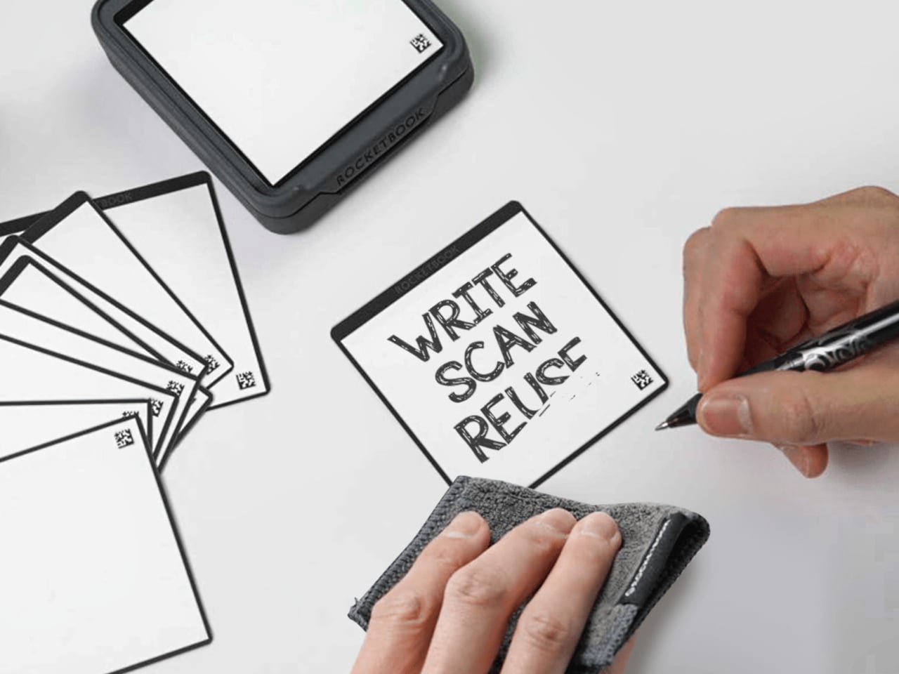
Sticky notes are workplace staples, yet their disposable nature creates constant waste. Rocketbook reimagines this productivity classic with genuinely reusable notes that feel like paper rather than plastic alternatives. Using special material compatible with Pilot FriXion erasable pens, these notes wipe clean with water and cloth. The paper-like texture and flexibility match traditional sticky notes, avoiding the rigid whiteboard feel of other reusable options.
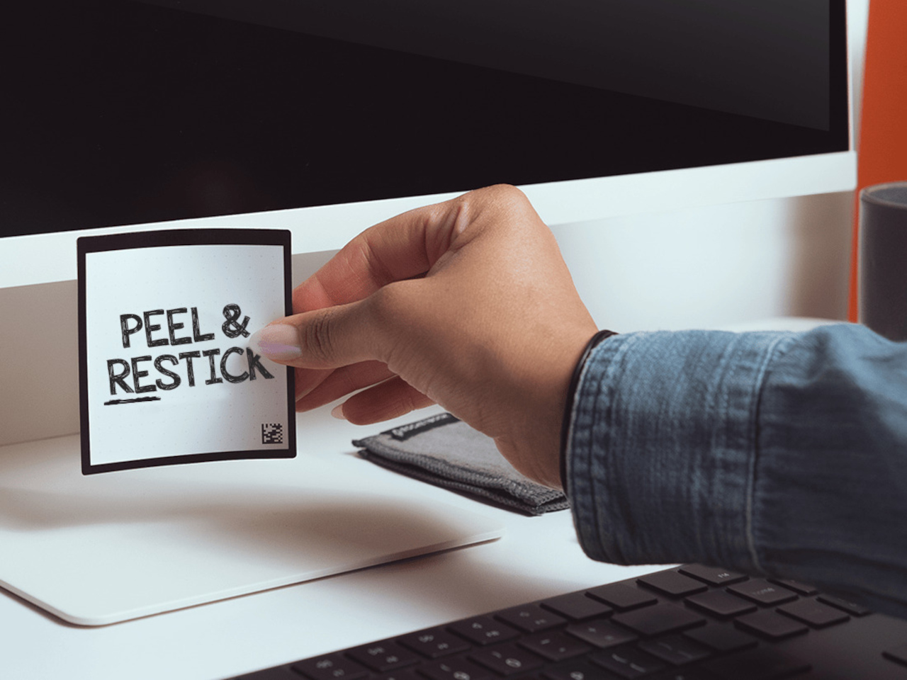
The adhesive strip demonstrates the same reusability philosophy. Rather than losing stickiness after one use, simply rinse the adhesive area to restore full grip. This means your temporary reminders and quick notes become permanent tools rather than trash-bound consumables. The environmental impact reduction compounds over time—what would have been hundreds of discarded notes becomes a small set of reusable squares that serve just as effectively while generating zero waste.
What We Like
Genuinely reusable design eliminates sticky note waste while maintaining the paper-like feel and flexibility of traditional versions.
The water and cloth cleaning process is quick and simple, preparing notes for immediate reuse.
The reusable adhesive strip rinses clean to restore full stickiness across countless applications.
Compatible with Pilot FriXion pens, which are widely available and offer smooth writing experiences.
What We Dislike
Dependent on specific FriXion pen compatibility, it limits ink color and style options compared to traditional notes.
The water-cleaning requirement means you need access to moisture for erasure rather than instant disposal.
Making 2026 Your Most Productive Year
Productivity isn’t about cramming more tasks into each day. These seven tools share a common philosophy: remove friction, respect the user, and enhance the creative process without dominating it. They’re instruments that adapt to your workflow rather than forcing you into theirs. Each design solves real problems with elegance and thoughtfulness, proving that the best tools are those you stop noticing because they simply work.
As you build your workspace for 2026, consider which frictions slow your daily progress. Perhaps it’s the missing pen, the awkward mouse, or the wasteful sticky notes. The right tool doesn’t just fix a problem—it transforms that moment of your workflow into something smooth, satisfying, and ultimately forgettable. That’s when productivity stops feeling like effort and starts feeling like flow.
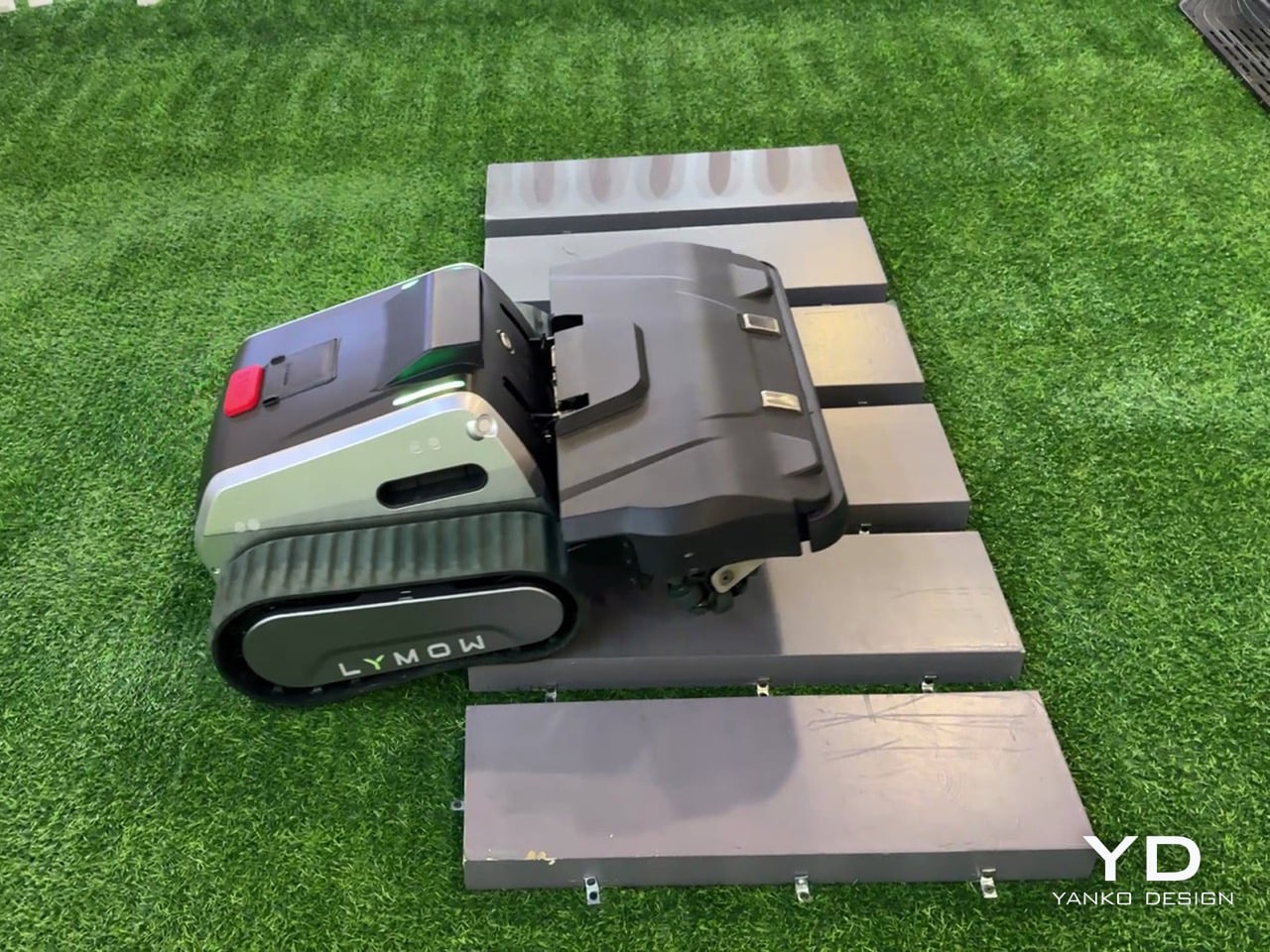
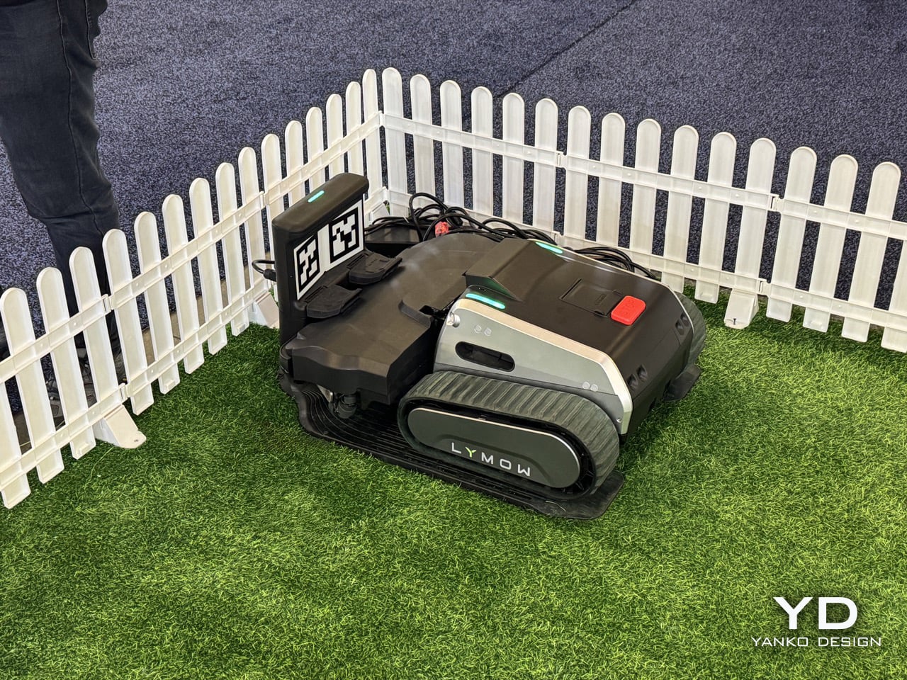
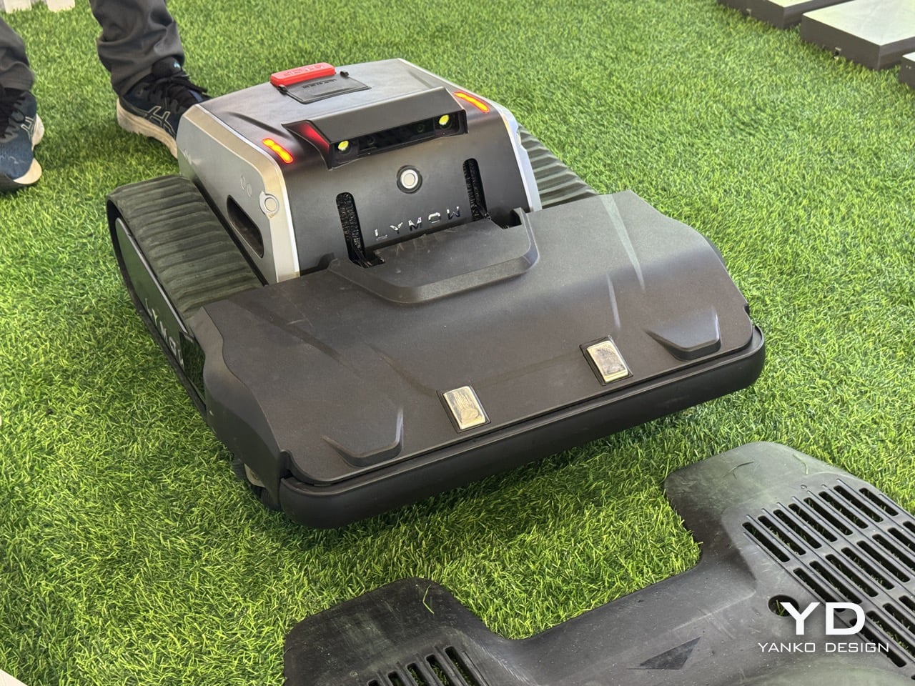
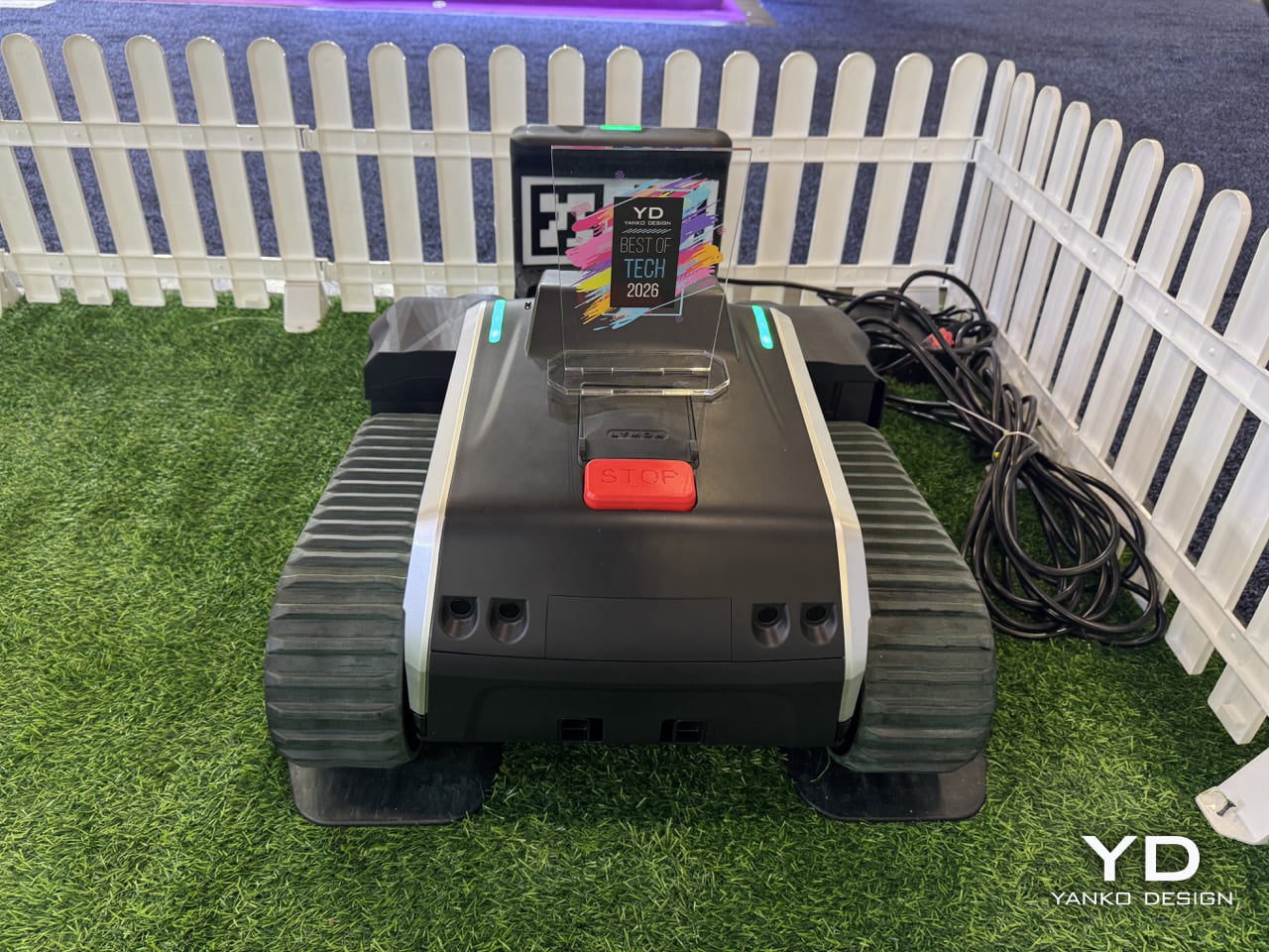
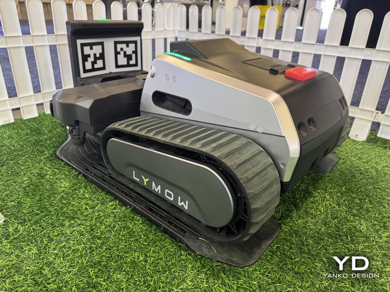
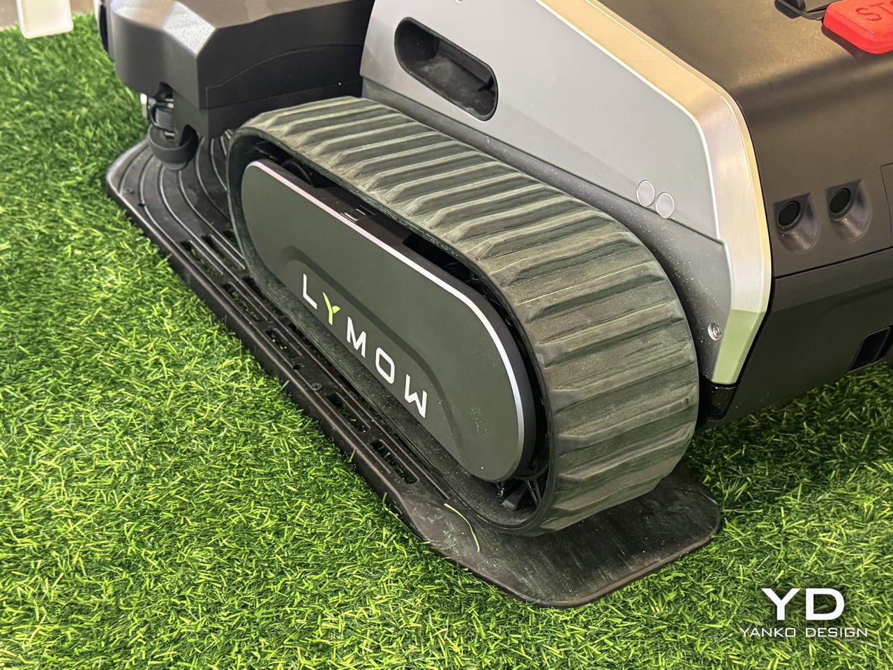
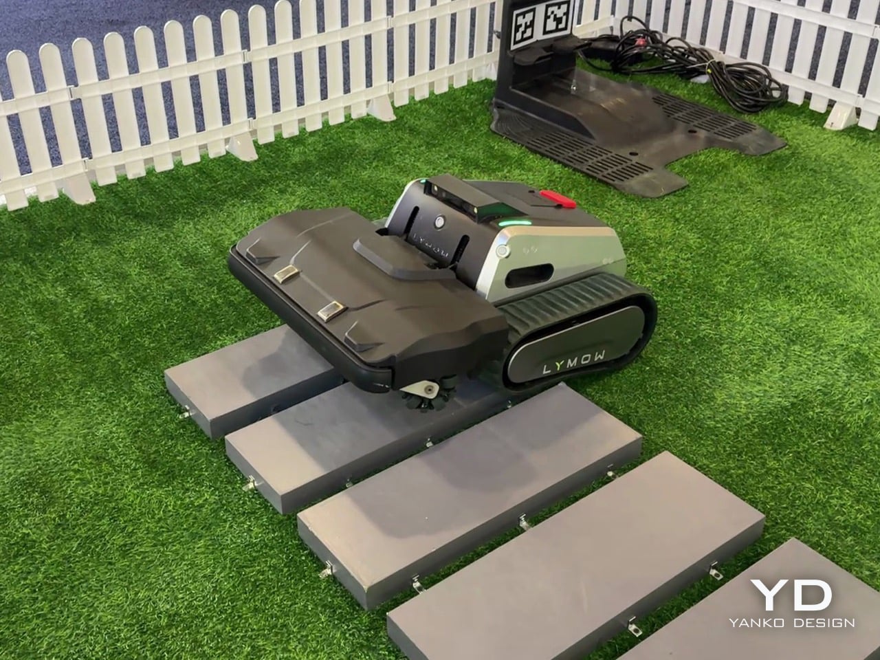
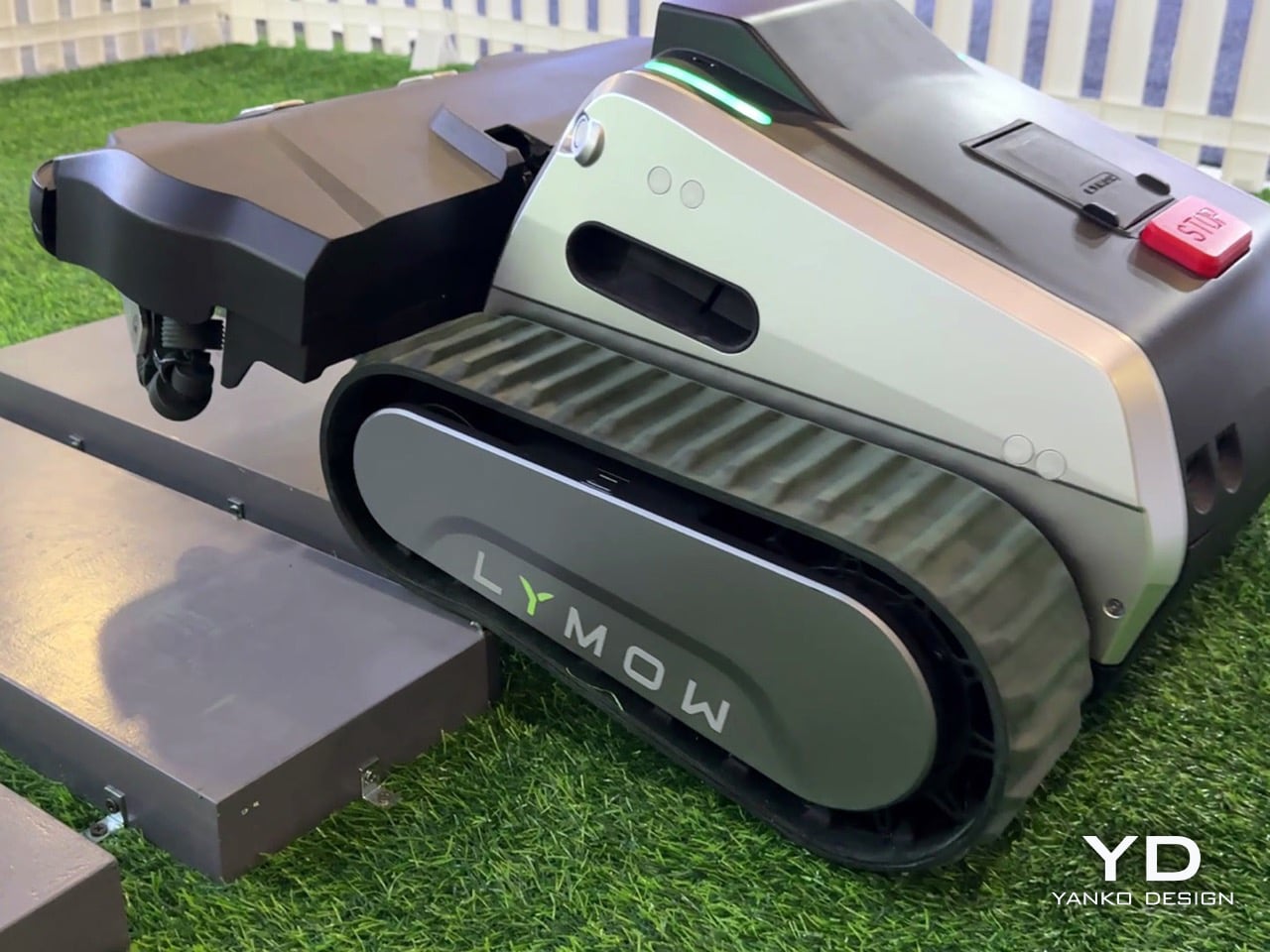
Robotic lawn mowers don’t fail because they lack autonomy – they fail because owners stop trusting them. Missed patches, unexpected downtime, edge-case breakdowns: these are the reasons robotic mowing still hasn’t fully replaced traditional mowers on large and complex lawns. Lymow One Plus addresses that trust gap head-on. An evolution of Lymow’s tank-tread, boundary-free mower that has already attracted attention for its rotary mulching blades and steep‑slope capability. The new model builds on its predecessor with targeted hardware and software enhancements, including sharper SK5 blades, an improved airflow system, and advanced AI algorithms. For homeowners with demanding lawns, that means more confidence that the mower will get the job done right.
On the CES floor in Las Vegas, Yanko Design’s Radhika Seth sat down with Lymow co‑founder Charles Li to unpack what “replacement‑grade” actually means. Across the conversation, a few themes kept surfacing: ruthless user‑centric research, a willingness to admit and fix first‑generation flaws, and an almost stubborn insistence on “appropriate technology” over spec‑sheet theater. Lymow One Plus is the hardware expression of those values.
From Lymow One to One Plus, a mower built to actually solve North American yards
Charles describes Lymow One Plus as nothing less than a ground‑up evolution of the original product. “Lymow One Plus is a comprehensive upgrade of Lymow One,” he says. “It delivers a fundamental step up in cutting performance, stability, and long‑term reliability, while becoming noticeably smarter in complex, real‑world yard conditions.”
The target is very specific. Lymow One Plus is “a mower built to genuinely solve problems for large and complex lawns in North America, and increasingly, globally.” Instead of chasing flashy AI tricks, the team went back to first principles. “We didn’t design it to showcase flashy intelligence. Instead, we went back to the first principles and asked a very simple question. What does the user ultimately care about? The answer is very straightforward. Cut the grass short, and well, consistently, without hassle.”
That framing also ties into timing. Robotic mower penetration in North America is still under 5 percent as of 2025, and Charles is blunt that “no one is really successful in the robotic lawn market in the US” yet. The team sees 2026 as a genuine inflection point and wants Lymow One Plus positioned as the product that makes skeptical homeowners comfortable crossing the chasm.
Road‑tripping for R&D, and why a startup can ship what big brands will not
Charles makes it clear that Lymow One Plus is not the result of a whiteboard exercise. He talks at length about the legwork behind the company’s user research. “We’ve traveled through the U.S. I have visited more than 10 states. I’ve spoken to more than 30 families, three hours each one,” Charles explains. “You touch the grass through your own hands. You listen to the users from the deep, from your heart.”
That qualitative research is layered on top of a fairly serious engineering pedigree. “We do have very good accumulation in R&D,” Charles says. “Hardware level, mechanical design. Software level, we do have our accumulation, our autonomous algorithm. Our software team, most of our software team are from autonomous driving industry.” This is the same toolkit used to keep cars between lane markings, now repurposed to keep a mower reliably on task in a yard with patchy GPS and changing light.
There is also a cultural angle: Lymow is deliberately leaning into what a startup can do that a large appliance company often cannot. Charles contrasts their top‑down product decisions with the risk‑averse committees he remembers from his big‑company days, where “the quality manager is going to say, hey, you don’t have reference data” and after‑sales teams push back on anything too unconventional. For Lymow One Plus, that freedom shows up in choices like a front‑mounted mulching deck and tracked treads that would be harder to push through a conservative roadmap.
“Appropriate technology,” not tech for tech’s sake
When asked about Lymow’s long‑term vision, Charles does not talk about AI, RTK, or connectivity first. He talks about time. “Our core vision has always been using the best, or let’s say the most appropriate technology to give people their time back, to make them truly hands‑free,” he says. “Not to show off those fancy technology, but to understand what users need. We tend to say the most appropriate technology, rather than the best technology.”
That philosophy also reframes the yard itself. “A yard should be an extension of the home,” Charles notes in the same breath. If the home has already been transformed by robot vacuums and smart locks, Lymow wants the yard to feel similarly invisible in terms of maintenance, without forcing homeowners to become part‑time robotics engineers.
Specs are treated as a means to that end, not the end itself. Near the close of the interview, Charles relays something “from the bottom of our founder’s heart”: “Specs can tell you what a product is capable of, but they rarely explain how it feels to live with it… What truly earns trust is solving real problems in a pragmatic way, paying attention to small details, and delivering a level of reliability users can depend on day after day.” For Lymow One Plus, he says, “many of its most important [things] don’t stand out on a spec sheet, but users will feel them in how consistently the model works, how little friction it adds to daily life, and how thoughtfully it handles edge cases.”
Redefining “all‑terrain” around real backyards, not demo slopes
“All‑terrain” has become a throwaway phrase in outdoor robotics marketing. Charles is visibly wary of that. “Marketing is kind of tricky,” he says with a laugh. “A lot of manufacturers or lots of brands tend to use those, how can I put it, extreme words. Yeah, I can do everything. People use that in marketing words. ‘All terrain’ is a very strong word. It means a lot. It actually means a lot.”
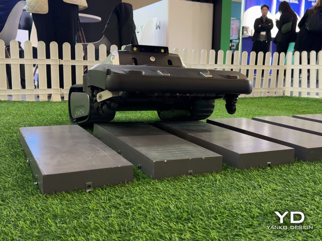
For Lymow, redefining it started again with fieldwork. North American yards, they found, are not just about inclines. They are about unpredictability. Open lawns with exposed tree roots, mole and rabbit holes, swings, trampolines, and informal forest edges became the true baseline, not edge cases. “In North America, these aren’t edge cases, but they are the baseline. So they became the scenarios we absolutely refused to fail at,” Charles says.
Grass type is another non‑negotiable benchmark. The team evaluated more than a dozen common cool‑ and warm‑season grasses, including thick, tough varieties that will quickly expose underpowered blades. That research directly informed Lymow’s rotary mulching blade system, which is designed to maintain cut quality across that diversity, not just on manicured test plots.
Fixing wet‑mowing failures and rebuilding the cutting system from the inside out
One of the most candid portions of the interview comes when Radhika asks what feedback from Lymow One directly shaped Lymow One Plus. Charles does not sugarcoat it. “One of the issues reported was our hub reliability during wet mowing conditions,” he admits. “In our first generation, the grass clippings could accumulate and eventually kind of damage the hub motor. We’re honest for this.” The response came in two stages. First, interim fixes and even unit swaps for affected early adopters. “For the people that are suffering this issue, we already swapped some new Lymow One units for them,” Charles notes. Mandy adds that it only affected a small number of users, but was taken seriously precisely because they did not want it to happen to anyone.
For Lymow One Plus, the team went much further. “We added dedicated debris shields to significantly reduce grass clippings and introduced scraping guards to prevent the clippings from getting trapped. And also we increased our motor strength by more than two times. Altogether, this changes fundamentally, entirely resolve these issues rather than masking it.” Underneath, the cutting system itself has been re‑architected. The cutting chamber volume has been expanded by roughly 50 percent, creating the airflow headroom needed for more aggressive mulching. Peak cutting power is up by about 50 percent as well, paired with SK5 industrial‑grade blade steel and redesigned geometry that generates a cyclone‑like airflow to lift grass before cutting. “When the blade is rotating, the grass will lift up, so you’re going to have a clean, even cut,” Charles explains.
Side discharge has also been rethought. Instead of leaving visible windrows, the Lymow One Plus deck is tuned to blow clippings out in a more even pattern. “We just kind of blow the grass clipping to make sure it’s not in the line… so in this case it’s healthier for your lawn,” Charles says. “You don’t have grass clippings in the line, but you have, like, an average… so that’s healthy.” Functionally, all of that shows up in three scenarios the team calls out as major improvement areas: wet and rainy mowing, heavy growth (long grass and dense weeds), and leaf‑heavy autumn yards. With the new airflow and power, Lymow One Plus can now lift and mulch thick vegetation that previously needed more favorable conditions or manual intervention, and it shreds fallen leaves more effectively so homeowners can “have a relaxed autumn.”
Why Lymow thinks Lymow One Plus can lead the category, not just join it
Asked to deliver a 30‑second elevator pitch against premium competitors, Charles narrows it down to three claims. “We’re the first one using rotary blades, multi‑rotary blades, the best cutting capability. And we’re the first one who can support the slope of 45 degrees, 100 percent, so let’s say the best climbing capability. And we mow up to 1.73 acres per day in our testing environment. So that’s an industry‑leading cutting efficiency.”
Those are bold numbers, but he quickly pivots back to something less easily quantified: trust. Lymow is not especially interested in feature‑by‑feature comparison charts. “We don’t spend much time positioning ourselves feature by feature against premium competitors,” he says. “What Lymow does is understanding user needs and systematically improving real user experience. So for us, more importantly, it’s the market education. It’s a heavy job, honestly, it’s a heavy job.”
That combination of specs and stance might be what makes Lymow One Plus interesting in a sea of CES robots. On paper, it is a tracked, rotary‑blade mower that climbs 45‑degree slopes, handles over an acre and a half per day, and navigates without boundary wires. In conversation, it is a case study in how a young hardware brand can own its mistakes, obsess over edge cases, and still talk about something as unsexy as “low friction daily life” with conviction.
If CES 2025 was Lymow’s coming‑out party for the original One, CES in Las Vegas now feels like the moment the company starts arguing not just that robot mowers can replace traditional ones, but that they should be held to the same standard of reliability and cut quality. Lymow One Plus is the company’s attempt to prove that out, one tricky backyard at a time.
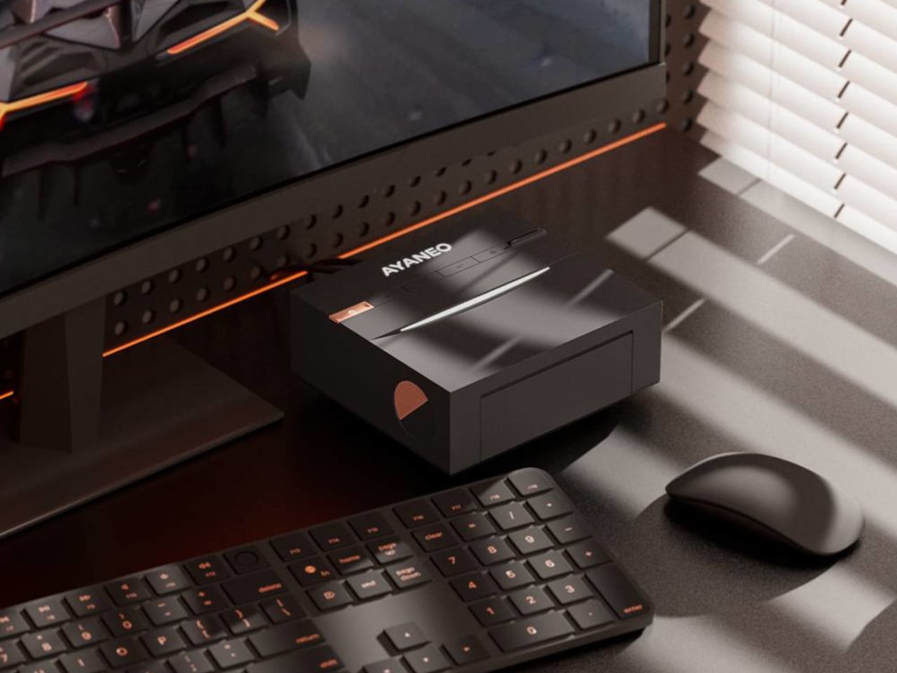
Most mini-PCs are treated like necessary clutter, small black rectangles taped to the back of a monitor or shoved behind a stack of books. That makes sense if you only care about ports and benchmarks, but it feels at odds with the attention people now give to desk setups, where everything else on the surface is chosen to be seen, from the keyboard to the mousepad to the plant in the corner.
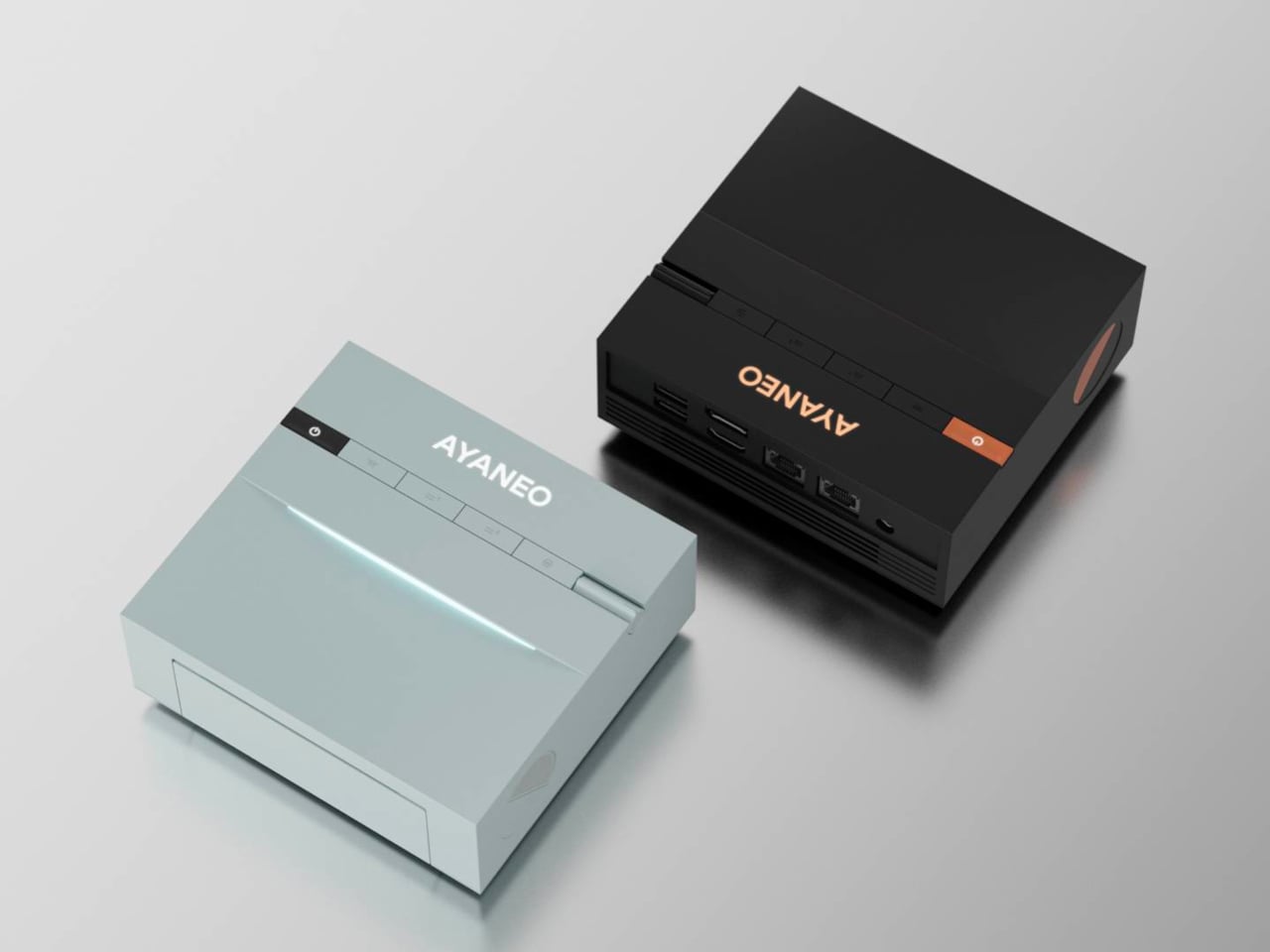
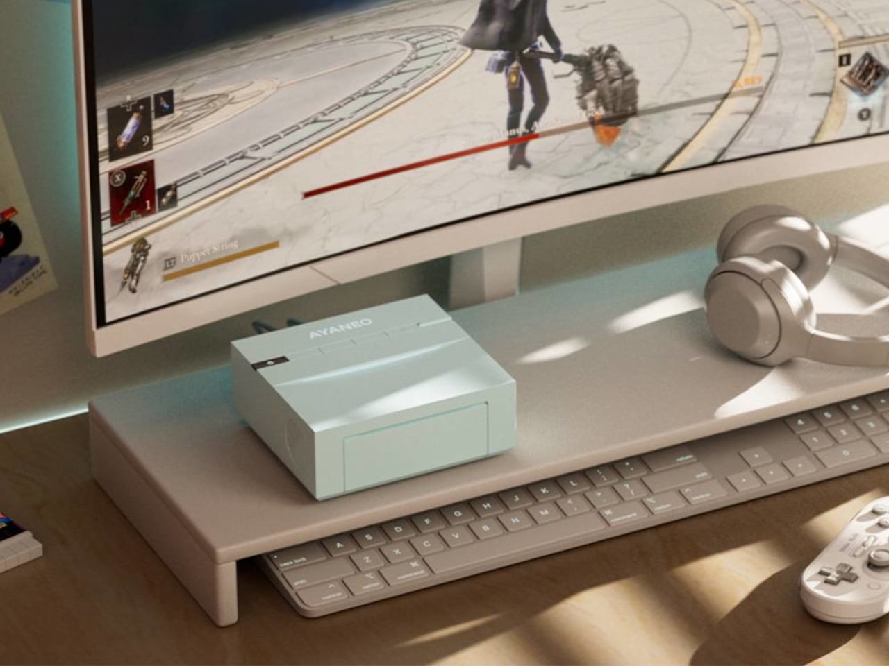
The AYANEO Mini PC AM03 is a machine that is not trying to hide. It is pitched as a desktop setup essential and entertainment powerhouse, blending a retro-inspired shell with an Intel Core i9-12900H and AYASpace 3.0. The idea is that it should be both the performance core and the visual anchor of a desk, not just another anonymous box tucked under it or behind cables.
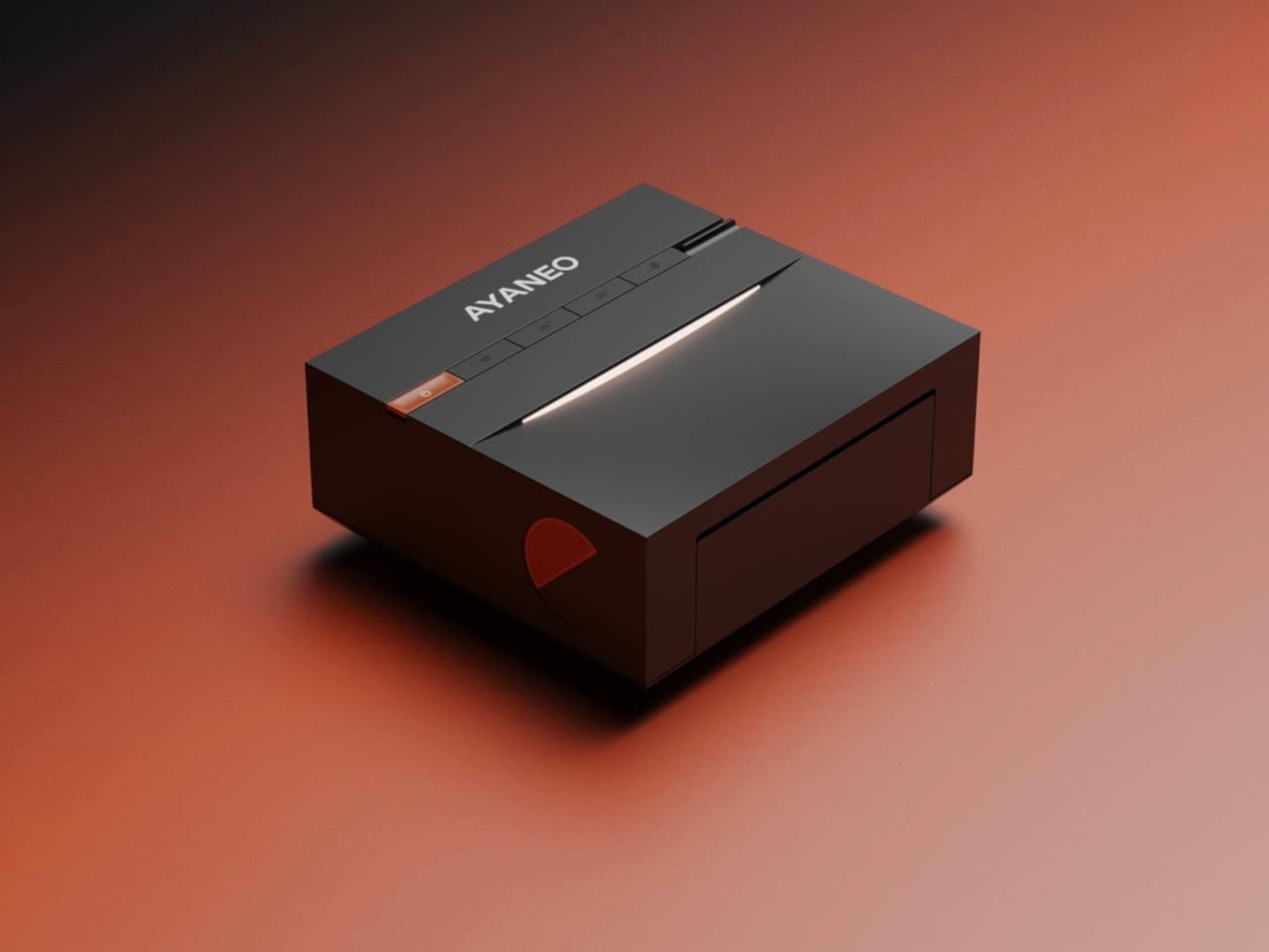
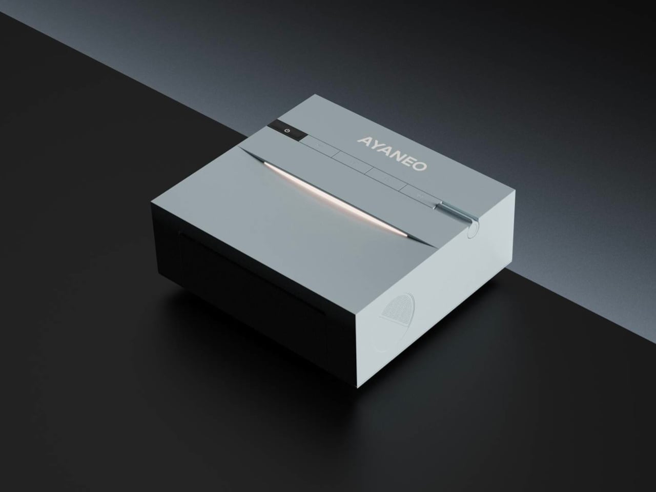
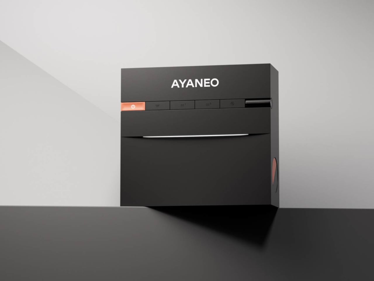
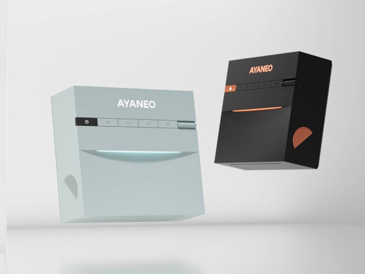
AYANEO has a habit of treating hardware as design objects, and the AM03 continues that with smooth contours, refined finishes, and two colorways, Sky Blue and Ink Black. One feels airy and bright, the other more serious and moody, both meant to sit comfortably next to a monitor, keyboard, and handhelds without looking like industrial equipment that wandered in from a server rack or a crowded electronics store shelf.
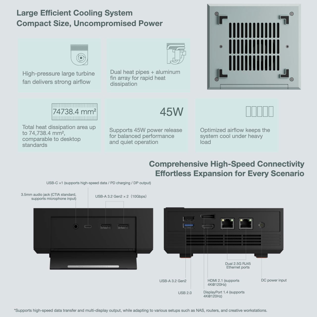
The foldable front panel keeps the face of the machine clean when closed and turns into a port bay when you flip it down. That means you can keep the front visually quiet most of the time, then reveal USB ports and other connectors when you need to plug in a drive, headset, or controller. It respects the difference between everyday viewing and occasional tinkering or heavy expansion.
Under the shell sits an Intel Core i9-12900H running at a 45 W TDP, which gives the AM03 laptop-class flagship performance in a compact body. Support for up to 64 GB of dual-channel memory and PCIe 4.0 SSDs makes it comfortable handling productivity, creative work, and gaming, especially when paired with an external GPU or cloud service for more demanding titles that need extra graphics horsepower.
The large cooling system keeps that 45W chip stable under load, so long renders or game sessions do not trigger throttling. Built-in stereo speakers handle office audio and light entertainment without separate desktop speakers, simplifying a setup for people who want fewer boxes and cables on the desk and more space for the things that actually earn their spot there, like a good lamp or a notebook.
AYASpace 3.0 is the software layer that makes the AM03 feel more like a console-grade device than a barebones PC. Users can switch performance modes, tweak TDP, organize game libraries, and monitor frame rates with FPS Thunder, all from a unified interface. It turns the box into something you tune and monitor as part of the desk experience, not just a Windows machine you forget about once it boots.
The AM03 tries to answer what gaming-grade hardware should look like when it lives in a living room or home office. By combining a fold-front design, Skyline Arc RGB, and serious silicon, it suggests that a mini-PC can be both a tool and a piece of desk art, something you keep in view because you like looking at it as much as you like what it can do.
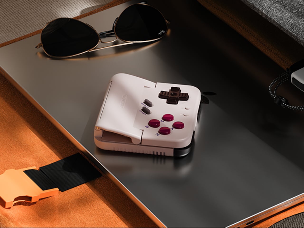
Almost every mobile controller assumes you want to play in landscape, snapping your phone into a wide handheld that feels great for modern shooters and racing games. This works for most titles, but when you fire up Game Boy-era platformers or vertical arcade classics, the experience feels slightly off, like forcing old games into a shape they were never meant to inhabit, holding them sideways while your thumbs reach for controls that never land right.
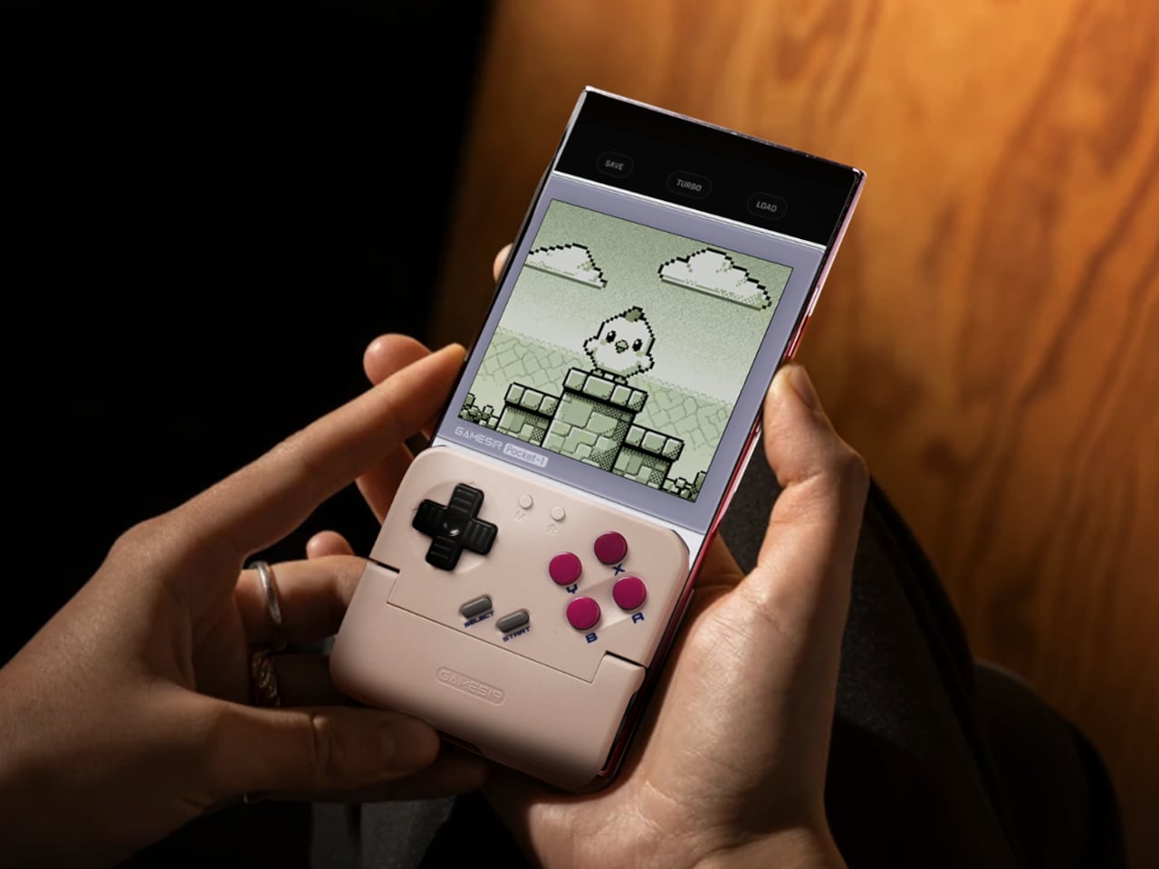
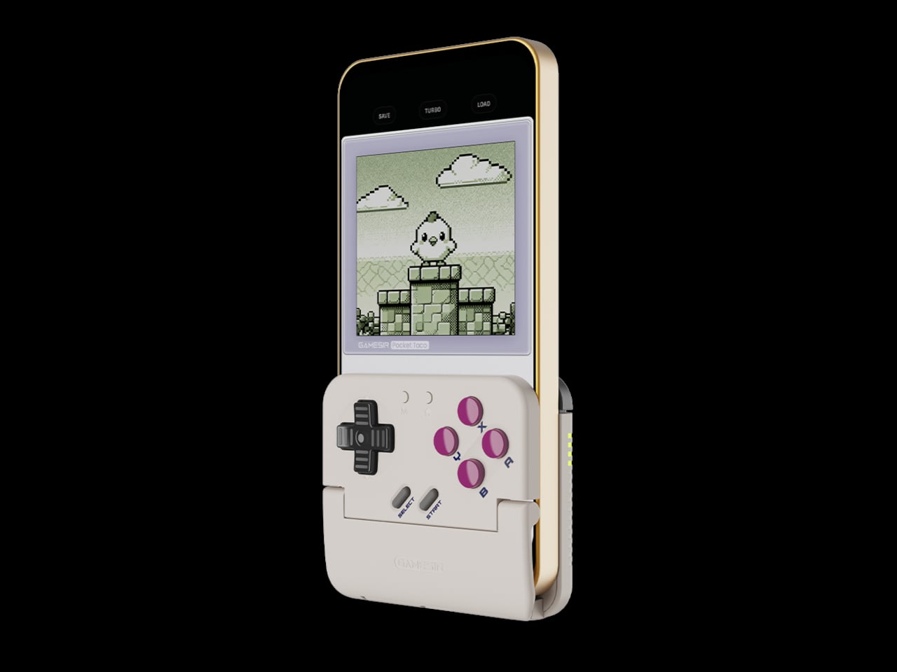
GameSir’s Pocket Taco leans into portrait play instead of fighting it, turning your phone into something closer to a classic handheld. It first appeared as the Pocket 1 at Tokyo Game Show, then resurfaced as Pocket Taco just as 8BitDo teased its own vertical FlipPad, setting up a clash of design philosophies aimed at people who want to hold their phones the way they held Game Boys.
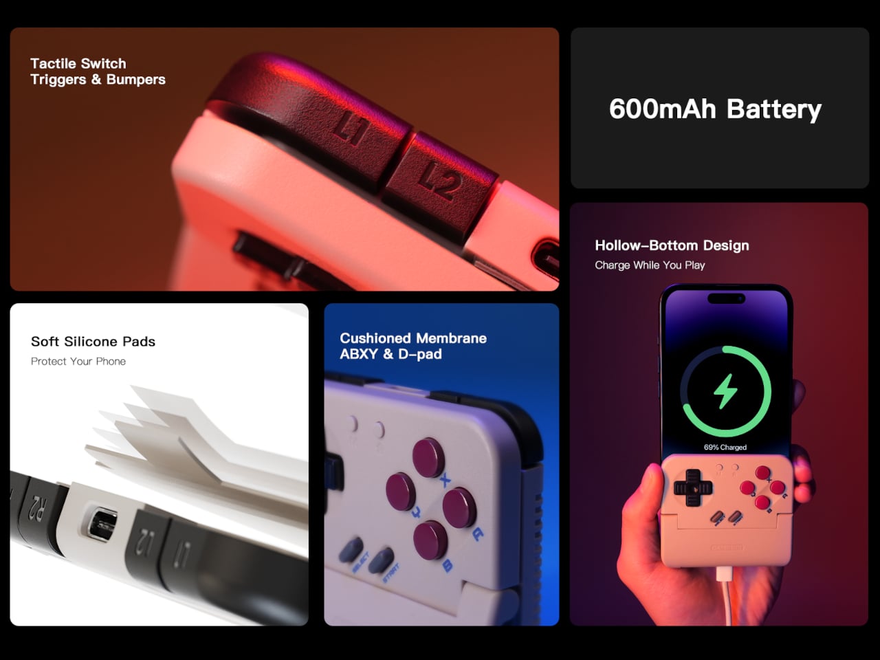
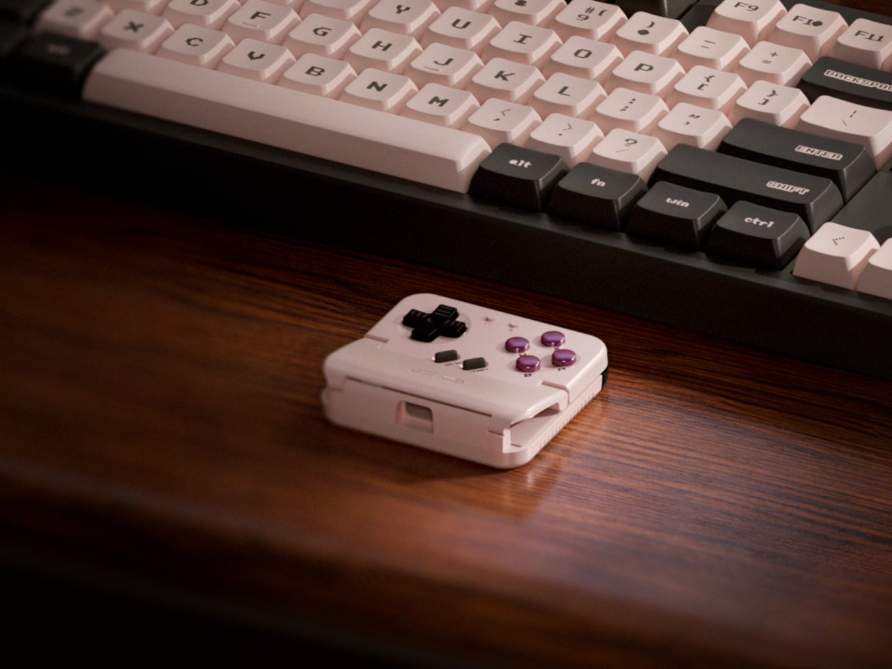
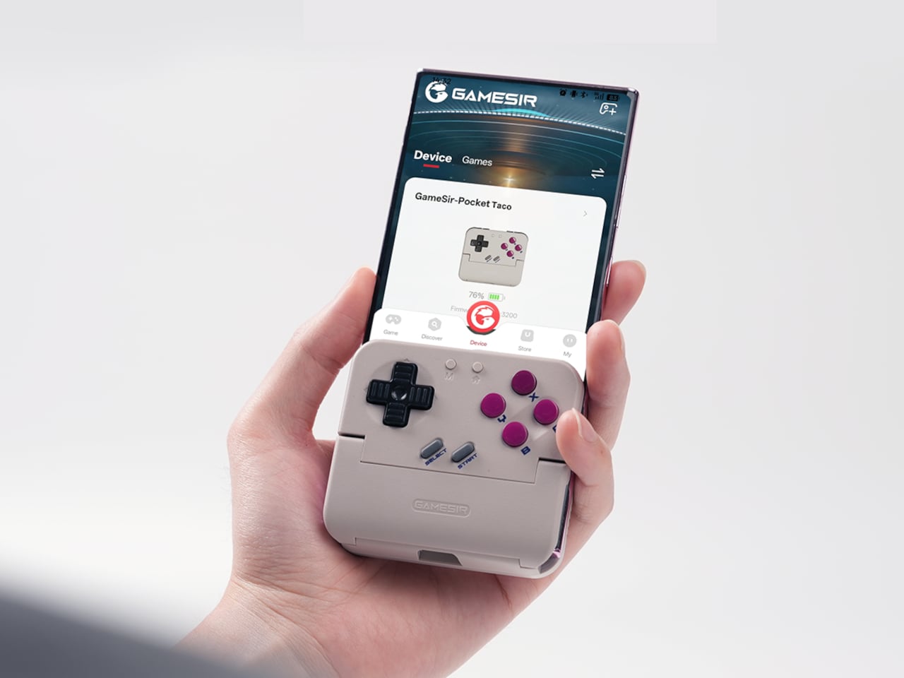
The rebrand to Pocket Taco fits the design; the controller clamps to the bottom of your phone like a taco shell. The foldable front accommodates different phone sizes, and soft silicone pads line the clamp area so you are not grinding plastic against glass every time you snap it on, which matters when you pull it out multiple times a day for quick sessions between meetings or commutes.
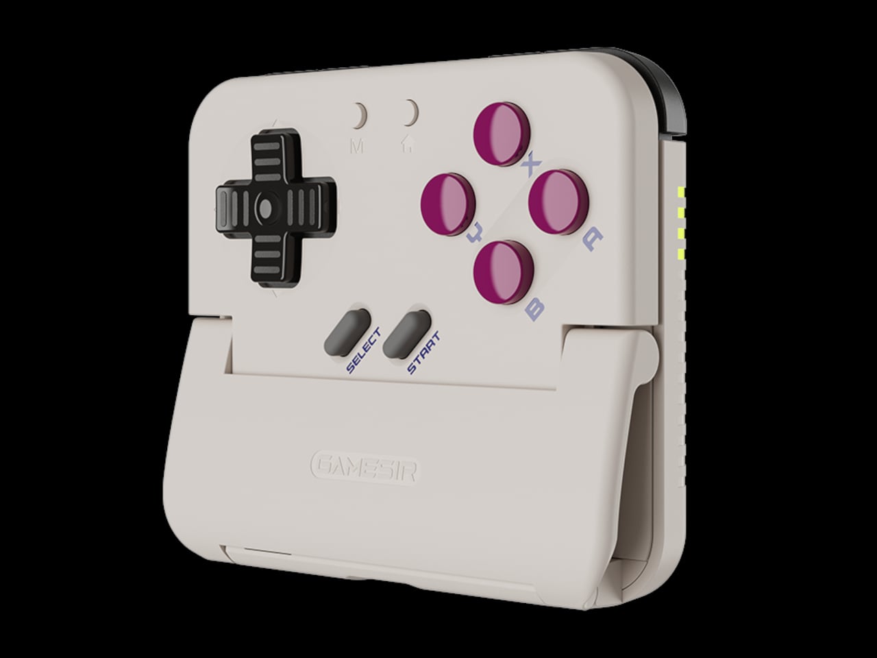
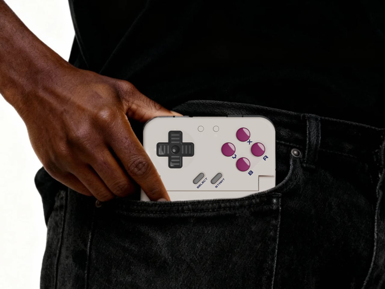
The control layout separates Pocket Taco from 8BitDo’s FlipPad. Pocket Taco gives you a traditional D-pad, ABXY face buttons, and actual triggers and bumpers on the back. FlipPad keeps everything on the front in a row of circular buttons, which is clever for compactness but less like the shoulder-button ergonomics many players expect from dedicated handhelds, especially during games with heavy simultaneous inputs.
Pocket Taco uses Bluetooth, so it can talk to Android and iOS phones, tablets, and other devices, and it still works when not clamped. FlipPad plugs in over USB-C, which keeps latency low and removes battery anxiety, but ties it to phones with that port and to a tethered style where the controller must stay attached to function at all.
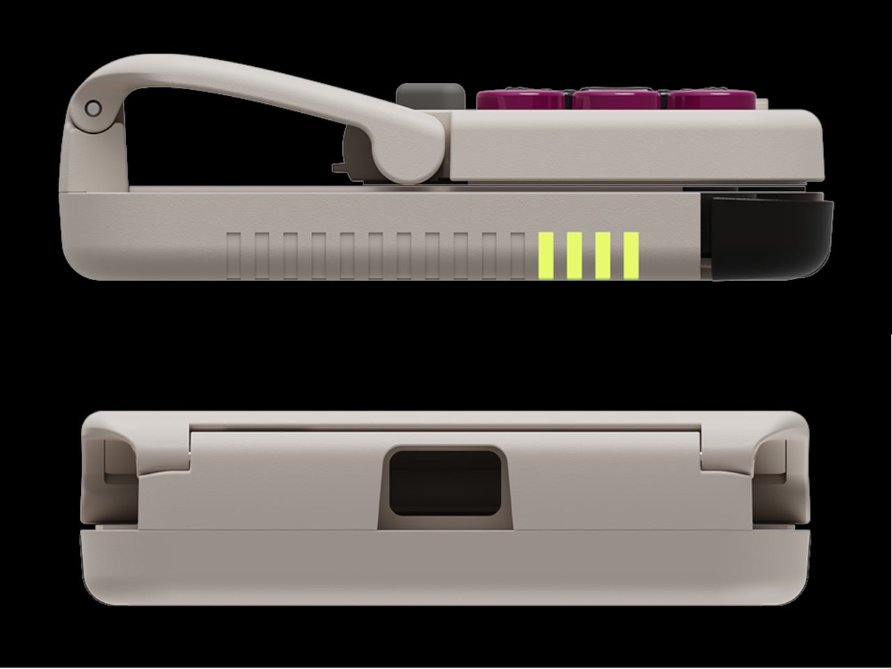
One practical touch is the large cutout at the bottom that leaves your phone’s charging port accessible while the controller is attached, so you can plug in and keep going during long sessions. FlipPad occupies the USB-C port and does not offer passthrough charging, which is fine for short bursts but less ideal for marathon runs that drain the phone before you finish the dungeon.
Pocket Taco runs on a 600 mAh battery with smart power behavior, open to play, close to rest. The trade-off is one more battery to watch and slightly more bulk. FlipPad stays slimmer and battery-free, but leans on your phone for power, shifting the burden and adding a small drain to your phone’s battery during long play sessions.
Pocket Taco and FlipPad are two paths toward the same fantasy, turning a slab of glass into a dedicated retro handheld. Pocket Taco leans into wireless freedom, proper triggers, and charging-while-playing practicality, while FlipPad bets on wired simplicity and a flatter front. For anyone who grew up holding a Game Boy vertically, it is nice to have options that respect that muscle memory instead of pretending mobile gaming should feel like a miniature Xbox stuck in landscape.
Almost every mobile controller assumes you want to play in landscape, snapping your phone into a wide handheld that feels great for modern shooters and racing games. This works for most titles, but when you fire up Game Boy-era platformers or vertical arcade classics, the experience feels slightly off, like forcing old games into a shape they were never meant to inhabit, holding them sideways while your thumbs reach for controls that never land right.
GameSir’s Pocket Taco leans into portrait play instead of fighting it, turning your phone into something closer to a classic handheld. It first appeared as the Pocket 1 at Tokyo Game Show, then resurfaced as Pocket Taco just as 8BitDo teased its own vertical FlipPad, setting up a clash of design philosophies aimed at people who want to hold their phones the way they held Game Boys.
The rebrand to Pocket Taco fits the design; the controller clamps to the bottom of your phone like a taco shell. The foldable front accommodates different phone sizes, and soft silicone pads line the clamp area so you are not grinding plastic against glass every time you snap it on, which matters when you pull it out multiple times a day for quick sessions between meetings or commutes.
The control layout separates Pocket Taco from 8BitDo’s FlipPad. Pocket Taco gives you a traditional D-pad, ABXY face buttons, and actual triggers and bumpers on the back. FlipPad keeps everything on the front in a row of circular buttons, which is clever for compactness but less like the shoulder-button ergonomics many players expect from dedicated handhelds, especially during games with heavy simultaneous inputs.
Pocket Taco uses Bluetooth, so it can talk to Android and iOS phones, tablets, and other devices, and it still works when not clamped. FlipPad plugs in over USB-C, which keeps latency low and removes battery anxiety, but ties it to phones with that port and to a tethered style where the controller must stay attached to function at all.
One practical touch is the large cutout at the bottom that leaves your phone’s charging port accessible while the controller is attached, so you can plug in and keep going during long sessions. FlipPad occupies the USB-C port and does not offer passthrough charging, which is fine for short bursts but less ideal for marathon runs that drain the phone before you finish the dungeon.
Pocket Taco runs on a 600 mAh battery with smart power behavior, open to play, close to rest. The trade-off is one more battery to watch and slightly more bulk. FlipPad stays slimmer and battery-free, but leans on your phone for power, shifting the burden and adding a small drain to your phone’s battery during long play sessions.
Pocket Taco and FlipPad are two paths toward the same fantasy, turning a slab of glass into a dedicated retro handheld. Pocket Taco leans into wireless freedom, proper triggers, and charging-while-playing practicality, while FlipPad bets on wired simplicity and a flatter front. For anyone who grew up holding a Game Boy vertically, it is nice to have options that respect that muscle memory instead of pretending mobile gaming should feel like a miniature Xbox stuck in landscape.