Motorola Edge 70 Is 5.9mm Thin But Somehow Lasts 50 Hours

Flagship phones keep getting pricier and chunkier, making it easy to feel left out if you want a device that’s both stylish and practical without emptying your wallet or your pockets. The latest Samsung Galaxy S25 Edge and Apple iPhone Air are everywhere, but their price tags and premium positioning aren’t for everyone who just wants a good-looking phone that works reliably without costing a month’s rent.

The Motorola Edge 70 is Motorola’s answer to those flagships with a phone that looks the part, feels great in hand, and packs a battery that goes the distance without constant charging. It’s designed to compete with the big names visually and functionally, but takes a slightly different approach under the hood with mid-range specs. The Edge 70 offers style and stamina where others demand deep pockets and constant charging anxiety.

Designer: Motorola

The Motorola Edge 70 is impossibly thin at just 5.9mm, making it the slimmest in its class and lighter than most competitors at only 159 grams. The matte finish, rounded corners, and Pantone-certified color options like Lily Pad and Bronze Green give it a premium vibe that stands out in a sea of black rectangles flooding the market. The aerospace-grade aluminum frame adds durability without compromising the slim profile.

Up front, you get a 6.7-inch pOLED display with a buttery-smooth 144Hz refresh rate and Pantone-validated color accuracy for authentic visuals. It’s bright at 4500 nits peak, vibrant, and smooth for scrolling, streaming, or editing photos on the go. The screen-to-body ratio of 96.32 percent delivers edge-to-edge immersion that rivals the best flagships on the market today.

Under the hood, the Snapdragon 7 Gen 4 chip, 12GB LPDDR5X RAM, and 512GB UFS 4.0 storage handle daily tasks, social media, and light gaming with ease and reliability. While it won’t out-muscle the Galaxy S25 Edge or iPhone Air in benchmarks, it’s more than capable for most users who aren’t pushing hardcore gaming or intensive video editing. The specs are mid-range, but performance feels premium for everyday life.

The Motorola Edge 70 sports a triple 50MP camera setup, including main, ultra-wide, and telephoto lenses, plus a high-resolution selfie camera for social sharing and video calls. Moto AI brings smart features like auto-capture, scene optimization, and instant note-taking from photos without complicated menus or settings. The camera system is versatile for everyday snaps, portraits, and 4K video recording, though it’s not aiming to dethrone dedicated camera phones at higher price points.

Where the Motorola Edge 70 really shines is battery life and charging speed that outpace many flagships. The 4800mAh silicon-carbon cell and 68W TurboPower charging mean you can go up to 50 hours on a single charge with moderate use, and top up in just 15 minutes when you’re running low. This battery performance beats many flagships that sacrifice capacity for thinness, making the Edge 70 ideal for heavy users.

Shipping with Android 16, IP68 splash resistance, 5G connectivity, Wi-Fi 6E, and stereo speakers with Dolby Atmos, the Motorola Edge 70 is a well-rounded package at £700. For anyone who wants flagship style, exceptional battery life, and everyday performance without the flagship price or constant charging anxiety that plagues thinner competitors, it’s a compelling alternative worth serious consideration.

The post Motorola Edge 70 Is 5.9mm Thin But Somehow Lasts 50 Hours first appeared on Yanko Design.

This 6.5g Quick-Release Titanium Keychain Opens With One Hand

Most of us have struggled with key rings that jam in your pocket, carabiners that tangle with everything else in your bag, or split rings that pop open at the worst possible moment when you’re rushing to unlock something important. Everyday carry should be about readiness and preparation, not frustration and fumbling with gear that fights you instead of helping you stay organized and efficient throughout your day.

The Titaner Quick-Release EDC Carry System offers a completely different approach by blending aerospace-grade GR5 titanium, a patented magnetic-mechanical lock, and a modular design that adapts to your gear and your daily routine without adding unnecessary bulk or complexity. It features four sub-connectors that support various carrying use cases, from everyday carry to professional outdoor gear. Best of all, it feels as good as it looks, engineered to disappear into your pocket until the exact moment you need quick, one-handed access to whatever you’re carrying.

Designer: Titaner

Click Here to Buy Now: $36 $65 (45% off). Hurry, only a few left! Raised over $94,000.

Crafted entirely from GR5 titanium, the Titaner system manages to be both ultra-light and incredibly strong for its compact size. Each connector is CNC-machined with precision tooling and finished with careful attention to edge smoothness, available in your choice of stonewashed, machine, or bold anodized finishes in yellow and blue. The result is gear that feels warm and tactile rather than cold and industrial.

The minimalist form follows function precisely without wasting a single millimeter on unnecessary features or decorative elements. Weighing just 6.5 grams, lighter than two sheets of paper, the main connector is barely noticeable in your pocket yet tough enough to survive years of daily use and harsh outdoor environments without failing. The titanium construction means it will never rust, discolor, or irritate your skin during extended contact with sweat or seawater.

The heart of the system is a patented dual-action lock combining an N56 neodymium magnet for effortless alignment with a physical GR5 titanium lock for absolute security you can trust completely. Connecting your gear is as simple as snapping the pieces together with a satisfying, audible click that confirms proper engagement, but releasing them requires a deliberate press and 90-degree twist motion that prevents accidental detachment.

This dual-action approach ensures your keys, tools, or tech never detach by accident during daily activities, no matter how much you pull, shake, or jostle your bag during commutes, hikes, or outdoor adventures. The connector maintains its hold through vibration, snagging, and heavy use in demanding conditions, providing peace of mind for carrying expensive equipment you can’t afford to lose unexpectedly or replace on short notice.

The newly launched EDC Connector modular system eliminates the need for traditional key rings entirely through four distinct sub-connector types that attach directly to the main buckle. This direct-attach approach removes bulk, weak points, and the annoying jingle that comes with metal rings clanking together in your pocket. Each sub-connector is purpose-built for specific carry needs, from single items to webbing straps, letting you build a setup that actually makes sense for your lifestyle.

There are four types of sub-connectors that work seamlessly with the main buckle for different purposes. The U-Series provides balanced carry for single items, the X-Series features a reinforced titanium pin for tools with small attachment holes, the D-Series stacks keys quietly like pages in a book for flat carry, and the E-Series creates ultra-stable anchor points for webbing and backpack straps.

Whether you’re organizing house and car keys for daily commutes, hanging a flashlight or multitool from your belt, attaching gear to a backpack for outdoor adventures, or keeping pet tags secure during walks through the neighborhood, the system adapts seamlessly to different scenarios throughout your day. The 360-degree swivel keeps everything tangle-free and automatically positions gear in the most convenient orientation for immediate, effortless access.

Every edge is finished smooth for absolute comfort, and the connector’s action is so precise and crisp that you’ll find yourself clicking it open and closed just for the tactile satisfaction and stress relief it provides. The titanium is hypoallergenic and completely corrosion-resistant, maintaining its appearance and performance even after years of sweaty hikes, rainy commutes, or daily handling without showing degradation or requiring special maintenance.

The finishes let you match your gear to your personality and specific use case preferences. Stonewashed provides a rugged texture that hides daily wear and tells your adventure story, machine finish showcases pure titanium with clean technical elegance, and anodized versions make a bold visual statement with vibrant color that distinguishes your carry from typical EDC gear most people settle for every day.

The Titaner Quick-Release EDC Carry System delivers minimalist design, technical innovation, and everyday practicality in a package that feels both premium and approachable for serious users who demand quality. For anyone who wants their gear to be as reliable and refined as the rest of their daily routine, this titanium connector system offers a thoughtful alternative to the clunky key rings and unreliable split rings most people simply tolerate.

Click Here to Buy Now: $36 $65 (45% off). Hurry, only a few left! Raised over $94,000.

The post This 6.5g Quick-Release Titanium Keychain Opens With One Hand first appeared on Yanko Design.

Insta360’s Design Chief Says Your ‘Perfect’ Product is Already Too Late

Welcome to a new creative space at Yanko Design, where we explore the minds behind the products that shape our world. We are thrilled to introduce our new podcast, Design Mindset, your weekly dive into the philosophies and frameworks that drive modern innovation. Every Friday, host Radhika Seth sits down with leaders, creators, and thinkers who are redefining their industries. In our ninth episode, we explore a fascinating concept: the invisible grid. These are the seamless systems and technologies that, when designed perfectly, fade into the background, allowing pure creativity to flourish without constraint.

Our guest for this exploration is Edward Mao, a product design lead and the head of the integrated design department at Insta360. Edward brings a global perspective to his work, having studied and lived across the US, Sweden, and Schengen. He leads teams that build the very systems millions of creators depend on daily. Insta360 is known for its groundbreaking 360-degree cameras and action cameras, particularly its “invisible selfie stick” technology, which serves as a perfect metaphor for our conversation. The best systems, like the best tools, should empower the user to the point where they are no longer thinking about the tool itself, but only about what they want to create.

Click Here to learn more about Insta360’s latest X5 Camera

The Innovator’s Mindset: Redefining the Rules of the Game

What truly separates an innovator from a follower? According to Edward, it transcends simple risk-taking and digs deep into one’s fundamental mindset. An innovator is driven by a desire to establish entirely new rules, to create categories that never existed before, and to set the benchmarks that will define the market for years to come. Their focus is on impact and purpose, a relentless pursuit of a unique vision that pushes the entire industry forward. Edward explains that this path is inherently harder, but the reward is a profound sense of satisfaction that cannot be replicated. As he puts it, “innovating makes you unique… the payoff, you can get the sense of purpose, the sense of satisfaction, right? It’s way bigger than the comfort of staying safe.” It’s a conscious choice to author the next chapter rather than simply editing a page in someone else’s book.

Conversely, the follower’s path is often a strategic one, focused on efficiency and execution. They excel at optimizing proven formulas and competing on established metrics like price and features, a strategy that allows them to catch up quickly and capture market share. However, this approach has a natural limit. Edward notes that many successful creators and companies eventually hit a “growth ceiling,” a point where the old formulas no longer yield the same results. This is the critical juncture where the question shifts from “How can we do this better?” to “What’s next?” This moment of stagnation often becomes the catalyst for a radical shift in thinking, forcing even the most dedicated follower to consider the daunting but necessary leap into the unknown territory of innovation, where the potential for true differentiation lies.

The Disappearing Act: When Great Technology Becomes Invisible

The ultimate goal of great design is to render itself invisible. This is the central philosophy Edward champions, where technology becomes so intuitive and seamless that it dissolves into the background, leaving only the user and their creative vision. The tool ceases to be an object of focus and instead becomes a natural extension of the user’s intent. Insta360’s “invisible selfie stick” is the perfect embodiment of this principle. When a creator uses it, they are not thinking about the pole in their hand or the mechanics of the software erasing it. They are thinking about capturing an impossible, drone-like shot, fully immersed in the act of creation. This is the magic moment Edward strives for, when “the tech basically disappears and the creativity takes over… that’s when you know you have built something truly invisible.” The technology becomes a silent partner, empowering the user without ever demanding their attention.

Achieving this level of invisibility is not a matter of adding more features, but of ruthless simplification and a return to first principles. Instead of asking how to build a better version of an existing product, the innovator asks what the user’s ultimate goal is and what the absolute, unchangeable constraints are. This approach fundamentally reframes the problem, steering the design process away from incremental improvements and toward breakthrough solutions that address the core need. By focusing on the “why” behind the user’s actions, designers can build tools that anticipate needs and remove friction points before they are even noticed. This frees the creator’s mind from the burden of technical problem-solving, allowing them to dedicate all their cognitive energy to what truly matters: storytelling, expression, and bringing their unique vision to life.

Paying the ‘Tuition’: The Unseen Investment of a Pioneer

Embarking on a path of true innovation is an expensive education, and as Edward suggests, the early struggles are the “tuition” paid for a future advantage that cannot be bought. Pioneering is a slow, arduous process, much like pushing a heavy flywheel. The initial effort is immense, with little visible momentum to show for it. These early phases are filled with setbacks, costly mistakes, and the constant feeling of pushing against inertia. However, this upfront investment in learning, testing, and overcoming unforeseen obstacles builds a deep well of experience-based knowledge. This hard-won wisdom becomes a strategic moat, a defensible asset that late-coming competitors cannot easily replicate. They may be able to copy the final product, but they cannot copy the years of struggle and learning that made it possible.

This pioneering journey is fueled by more than just resilience; it is powered by profound empathy. Edward emphasizes that the most insightful innovators are often their own most demanding users. They relentlessly stress-test their own creations in the messy, unpredictable real world, uncovering failure points and latent needs that would never surface in a controlled lab or a market research report. This hands-on process builds an intuitive understanding of the user experience. Furthermore, this journey requires a pragmatic acceptance of imperfection. The goal is not to launch a flawless product from day one. Instead, the strategy is to release a solid, valuable minimum viable product and then iterate relentlessly with the market. As Edward advises, “perfection comes later iteration by iteration i think it’s less scary that way.” In this model, the community of users becomes a collaborative partner in the design process, their feedback shaping the product’s evolution.

Beyond the Product: Why Sustainable Innovation Lives in Ecosystems

In today’s hyper-competitive market, a single breakthrough product is no longer enough to guarantee long-term success. A brilliant feature can be copied, a clever design can be replicated. True, durable advantage, as Edward argues, comes from building a comprehensive ecosystem around the product. This system of interconnected value is far more difficult for competitors to duplicate. For a company like Insta360, this means the camera itself is just the beginning. The real strength lies in the surrounding ecosystem: the intuitive editing software that simplifies complex workflows, the active user communities that provide support and inspiration, the extensive library of tutorials that flatten the learning curve, and the wide array of accessories that expand the product’s capabilities. This holistic approach creates a sticky, high-friction-to-exit experience that compounds the product’s value over time, turning customers into loyal advocates.

This powerful principle of ecosystem thinking is not just for large corporations; it is equally critical for individual creators striving to build a sustainable career. A viral video or a popular design is fleeting, easily lost in the endless stream of digital content. A career built on an ecosystem, however, is enduring. Edward advises creators to think beyond the next piece of content and instead focus on building systems around their work. This could manifest as developing mentorship programs to nurture emerging talent, creating collaborative workflows with other artists to cross-pollinate audiences, or productizing their expertise through workshops and digital assets. By building a network of value around their core creative output, they transform their work from a series of replaceable artifacts into a resilient, interconnected enterprise that can withstand the unpredictable shifts of trends and algorithms.

From Follower to Leader: A Practical Guide to Making the Leap

The transition from a follower to an innovator can feel like a terrifying leap into the abyss, especially when a proven formula is already paying the bills. The fear of abandoning what works is a powerful deterrent. However, Edward’s advice demystifies this process, transforming the reckless gamble into a series of calculated, manageable steps. The core principle is to de-risk innovation by starting small. Instead of betting the entire farm on an unproven idea, he advocates for experimenting on the periphery with “low-stakes side projects.” This approach allows a creator or a company to explore new technologies, test radical ideas, and build new skills without jeopardizing their main source of income or alienating their core audience. As he simply states, “start small always start small.” It’s a strategy of quiet evolution, building the future in the background while continuing to deliver consistency in the foreground.

To guide this process, Edward offers a practical three-part test to determine if an innovative idea is worth pursuing. First, can the concept be explained in a single, simple sentence? This is a test of clarity and focus, ensuring the idea isn’t convoluted. Second, does it create a unique experience that nothing else currently offers? This validates its potential for true market differentiation. And third, does it address common user complaints? This is the most crucial test, as it confirms that the innovation is solving a real, pre-existing problem, signaling a clear and unmet demand. By using this framework, innovation shifts from being a blind bet to a strategic, evidence-based pursuit. It encourages prototyping, running small user tests, and co-creating with the community, allowing the audience to help guide the direction of progress and ensuring that when you do finally push the boundaries, you bring them along with you.


To hear more about Edward’s work and his systematic approach to creativity, you can follow him at “designer mr mao” on red note and tiktok, or go check out how Insta360 is revolutionizing how we capture our world. Be sure to tune in to Design Mindset next Friday for another look into the minds shaping our creative world.

The post Insta360’s Design Chief Says Your ‘Perfect’ Product is Already Too Late first appeared on Yanko Design.

These Transparent Rolling Chairs Turn Your Living Room Into a Moving Color Canvas

Like De Stijl once deconstructed form and space into elemental purity, Color Roller reimagines that legacy through motion and transparency. Using the three primary colors, red, yellow, and blue, this experimental furniture collection plays with the relationship between geometry, light, and interaction. When made transparent, these primary hues transcend their boundaries, merging into endless new shades through layering and rotation. The result is not just furniture, but an evolving chromatic sculpture that invites users to participate in the reconstruction of their environment.

At its core, Color Roller explores how color and form can coexist as active agents in spatial design. Each of the three components, a hexagonal chair, rectangular table, and triangular floor lamp, embodies a minimalist geometry while sharing a dynamic logic of rolling and transformation. Made entirely from transparent acrylic panels that intersect in pairs, these forms create a vivid and flexible composition of color. Depending on light direction and intensity, the furniture transforms, casting overlapping shadows and gradients that turn interiors into interactive canvases.

Designer: Chuheng He

The unique property of Color Roller lies in its capacity to change color combinations through rolling and rearrangement. By simply flipping or rotating the pieces, users can recompose the palette of their space. This transforms the act of furnishing into an act of play and authorship, where each arrangement reflects personal taste, emotion, and atmosphere. The design embraces De Stijl’s philosophy of modularity and freedom, yet it translates those ideas into a tactile, participatory experience.

From a technical standpoint, Color Roller is realized through colored acrylic thermoforming and adhesive bonding. The production process required precise experimentation to ensure both structural integrity and optical clarity. The research began with 1:5 scale models exploring the overlapping behavior of panels under various lighting conditions. Later, 1:1 prototypes were constructed to test materials, weight-bearing capacities, and balance. The hexagonal chair, in particular, underwent extensive trials with acrylic, wood, and aluminum to find a structure that was both light and strong. After iterative testing, the design was optimized, retaining its ethereal appearance while ensuring durability through minimal adhesive use and refined jointing.

The greatest challenge lay in reconciling aesthetics with performance. Early versions of the acrylic chair, though solid and stable, appeared too heavy, compromising the design’s intended transparency. Through reduction and structural optimization, the final outcome achieved both visual lightness and functional strength.

Ultimately, Color Roller aims at being an experiment in perception and participation. By letting color and geometry dance through light, it invites users to rediscover the poetry of everyday space. Each movement reveals a new intersection, a new hue, and a new perspective, transforming ordinary interiors into living expressions of form and color.

The post These Transparent Rolling Chairs Turn Your Living Room Into a Moving Color Canvas first appeared on Yanko Design.

Design Without Compromise: How Samsung Is Rethinking Home Appliances From the Inside Out

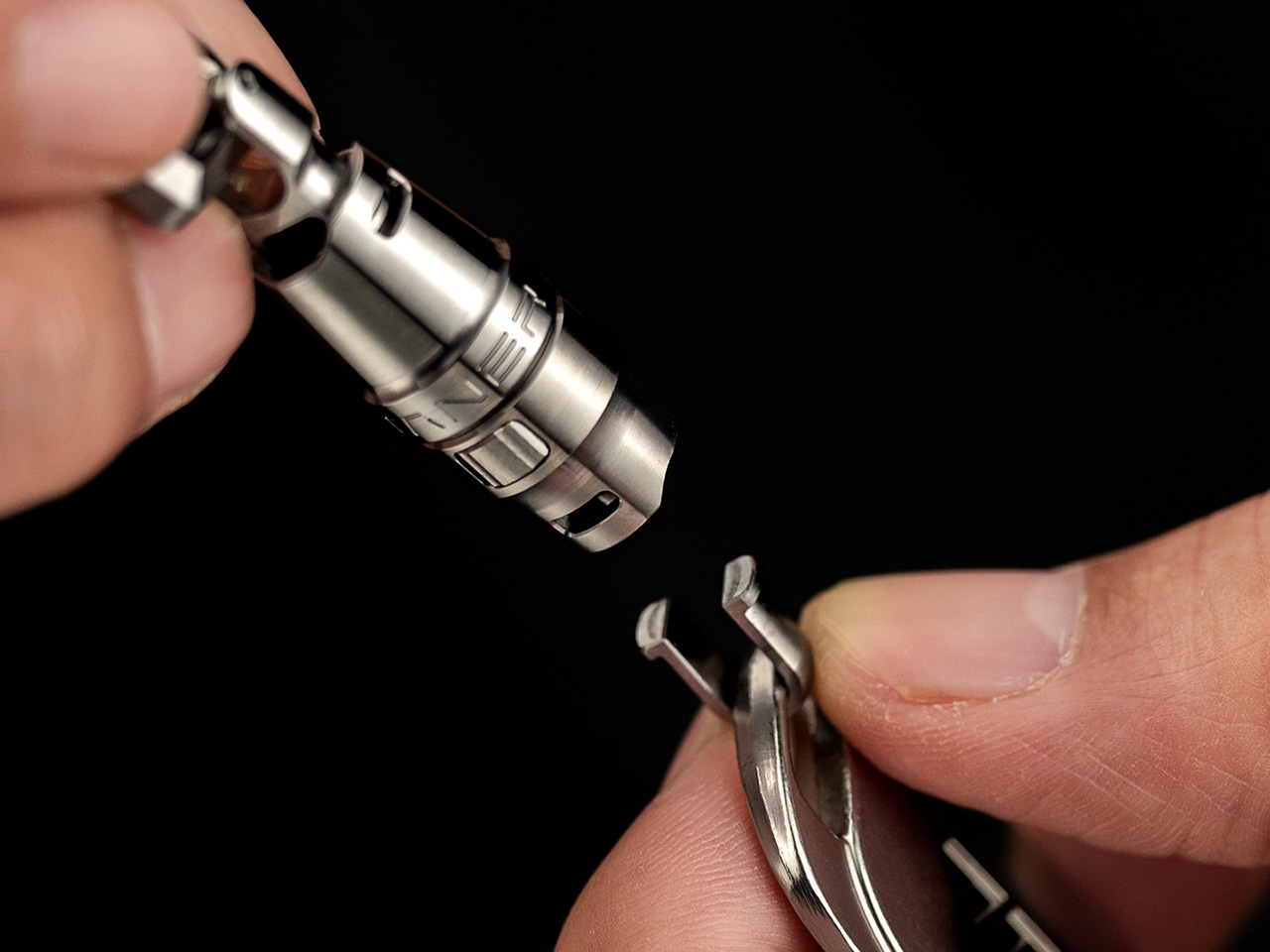
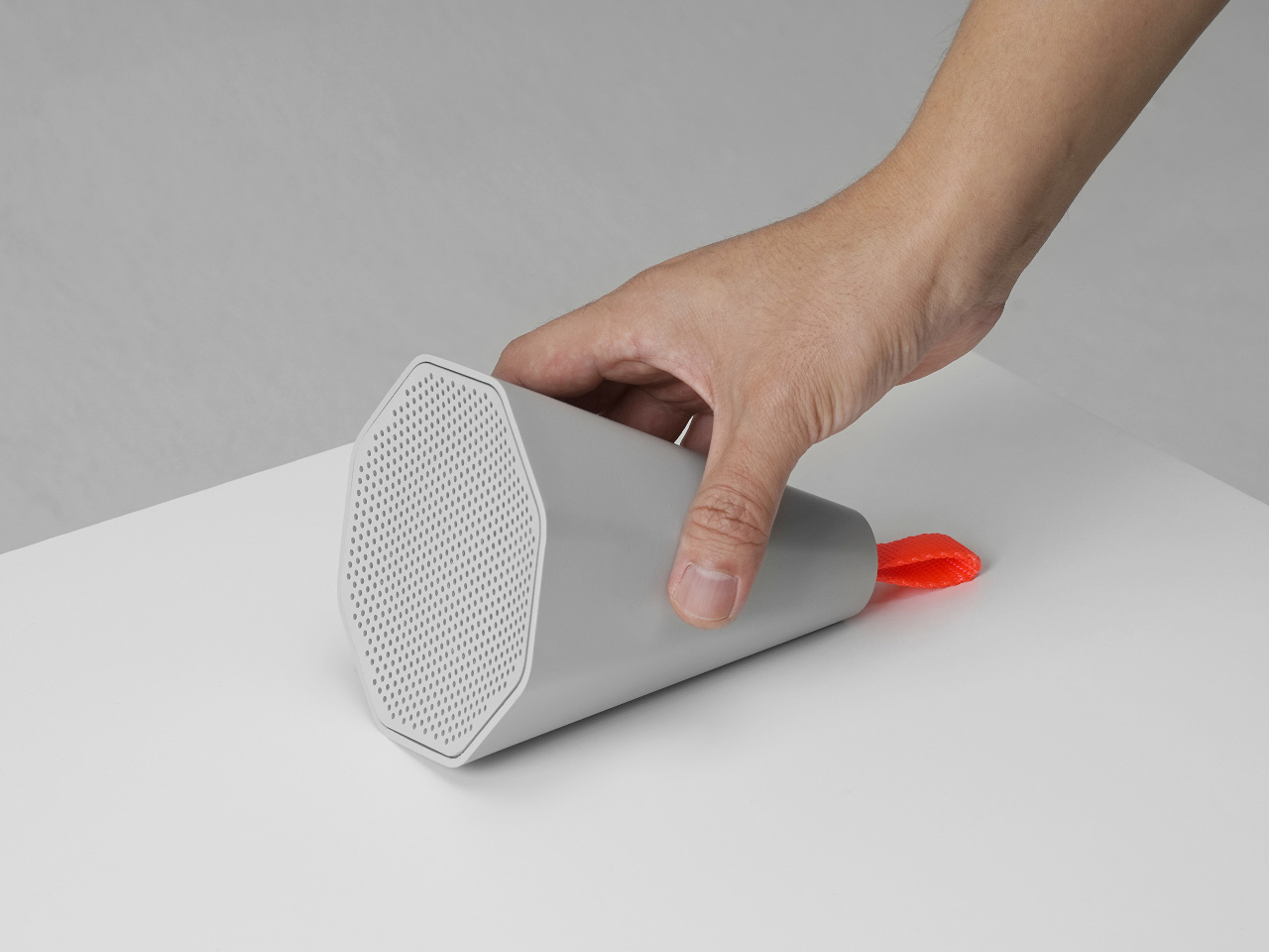
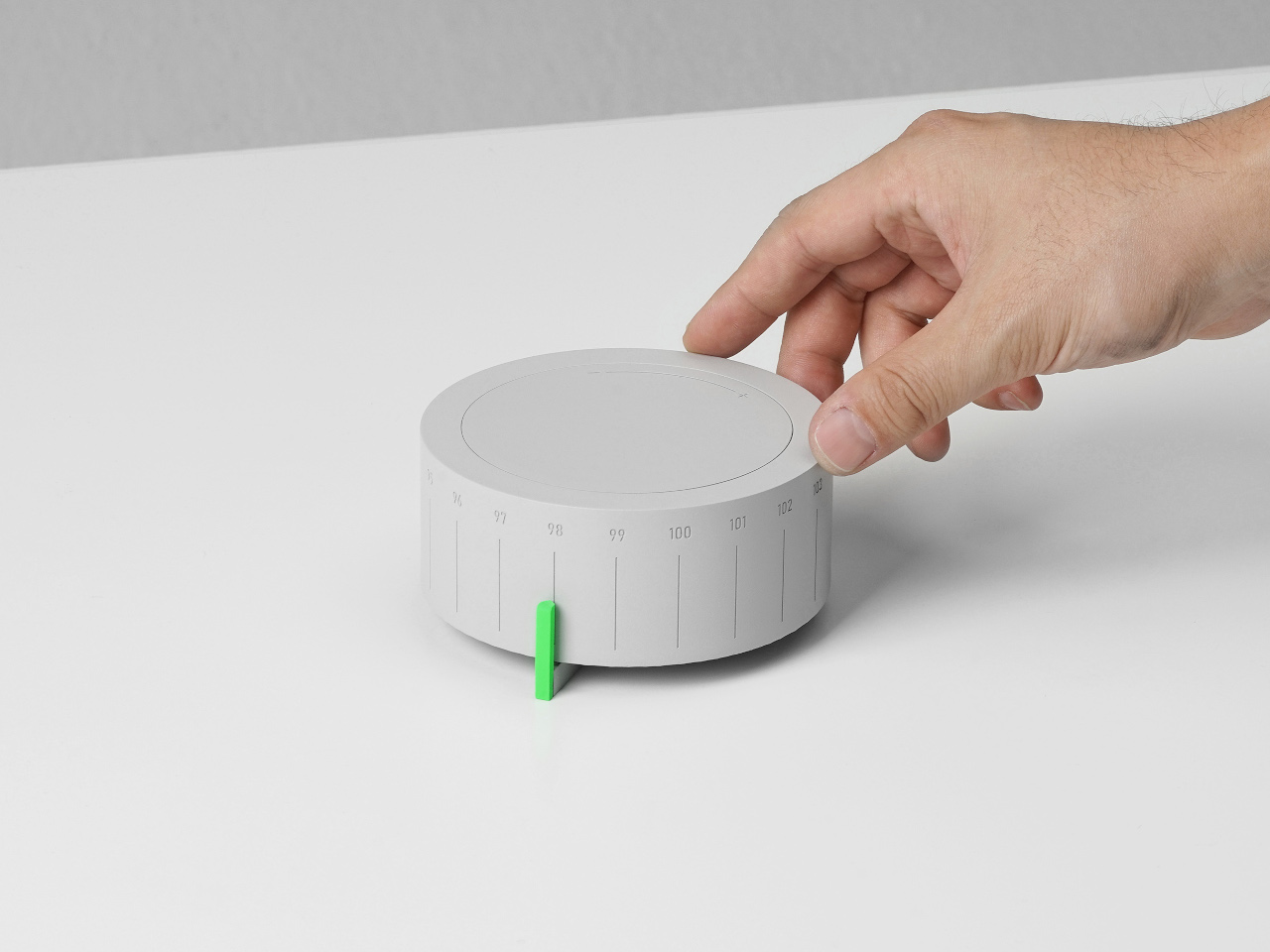
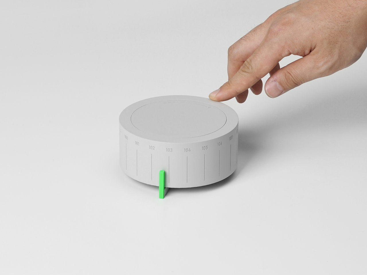
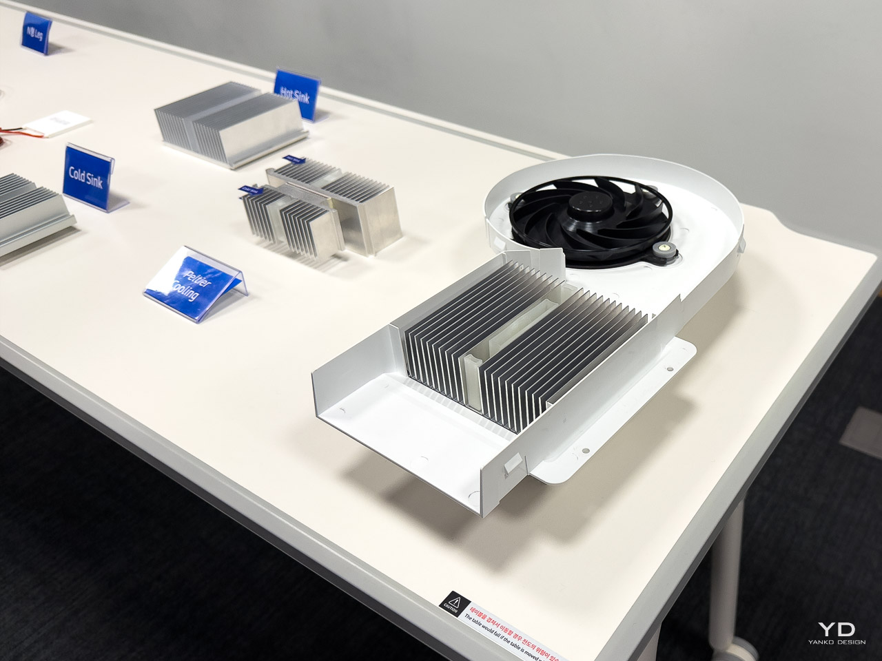
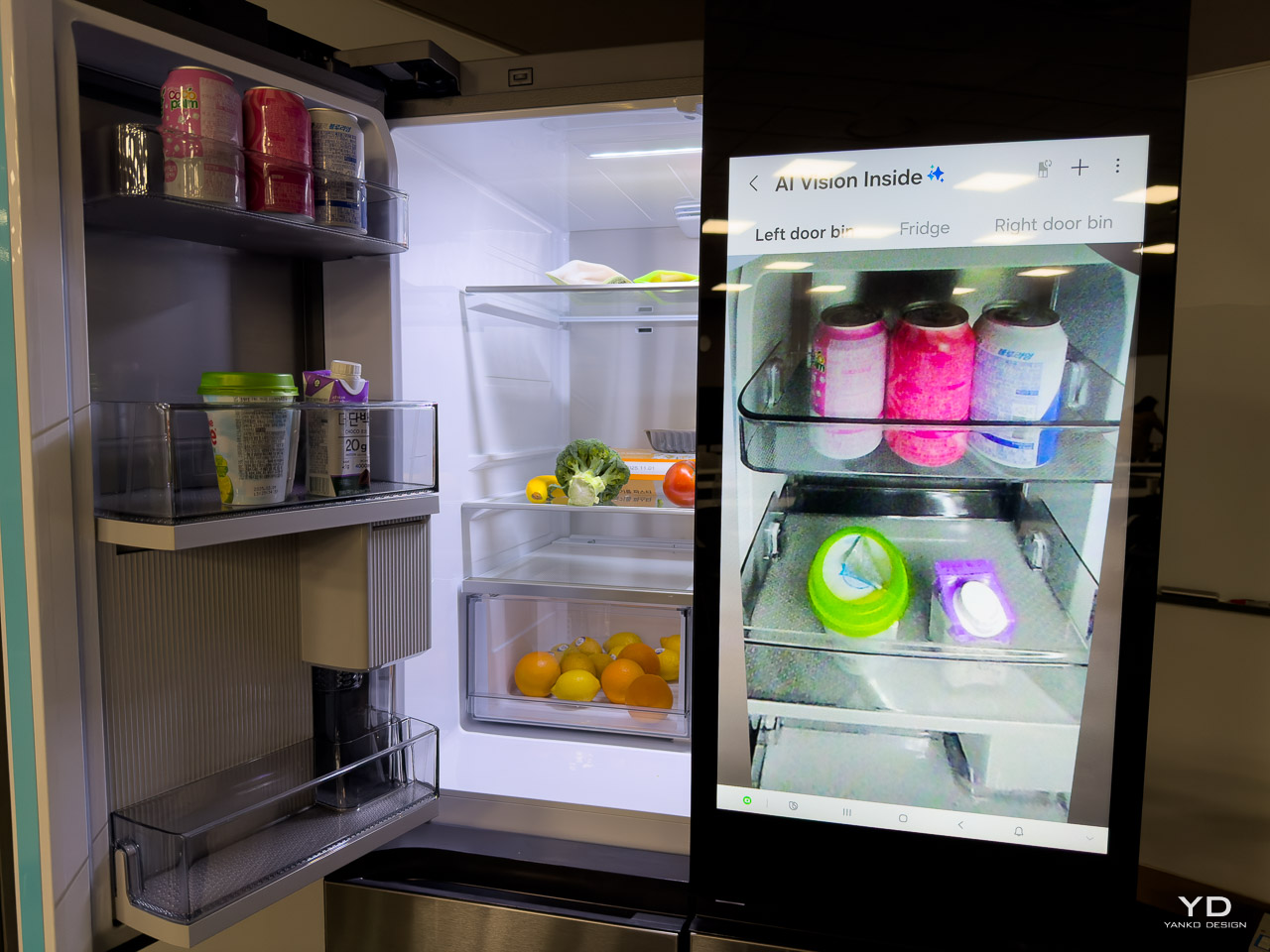
During my visit to Samsung’s home appliance R&D facility in Seoul, Jay Yoon, Corporate VP and Head of the Refrigerator R&D Group, explained something remarkable about the development of their AI Hybrid Cooling refrigerator. His team had completely redesigned the refrigerator’s internal layout mid-development, not to fix a problem, but to maximize consumer benefits. The Peltier cooling chip system worked perfectly in its original rear-mounted position. The engineering was sound. But through continued collaboration between Samsung Research and the product development team, they discovered that repositioning the entire cooling system to the top would dramatically improve interior space and thermal performance. “We completely discarded the layout we initially designed,” Yoon explained, describing how the team abandoned months of engineering work to pursue the better solution.

Designer: Samsung

The team wasn’t fixing a problem. They were refusing to settle for “good enough.”

That willingness to abandon comfortable solutions appeared throughout the two-day facility tour. Over presentations, lab tours, and design team sessions, I watched Samsung wrestle with fundamental challenges about how appliances should integrate into modern homes and how global products can feel locally relevant.

From Statement Pieces to Spatial Harmony

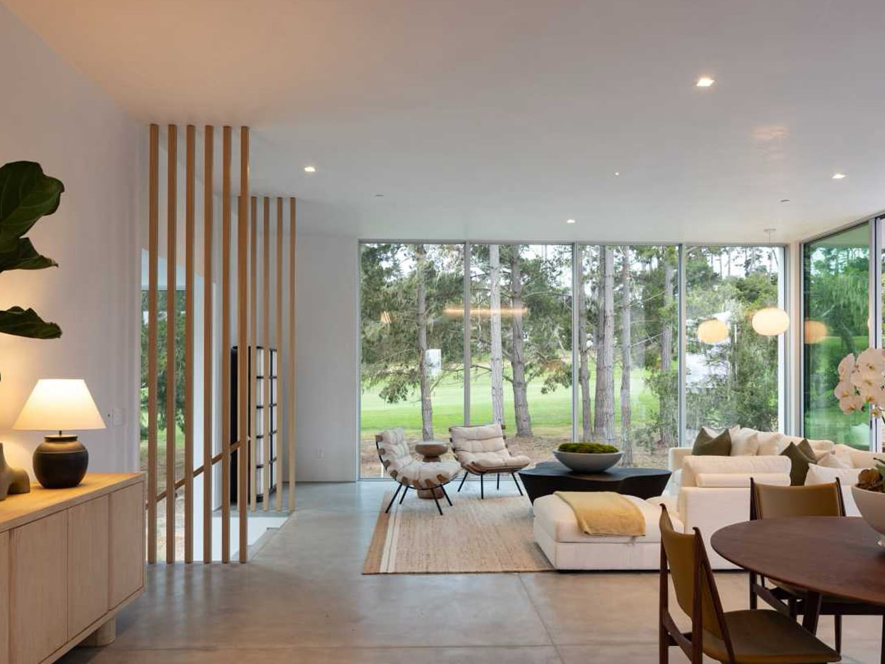
Samsung’s design evolution over the past decade reflects a broader shift in how we think about appliances in our homes. The design team traced this progression explicitly during their presentation. “In the past, Samsung refrigerators featured bold contours and glamorous presence that stood out in kitchen spaces,” explained the design team during their presentation. These were appliances that demanded attention, with dramatic lines and high-contrast finishes that made them focal points in any kitchen. The design language spoke loudly: this is premium technology, and you should notice it.

Today, that approach has inverted.

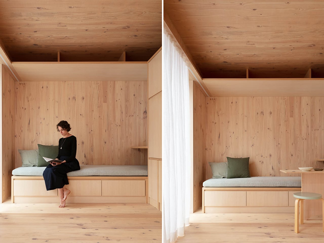
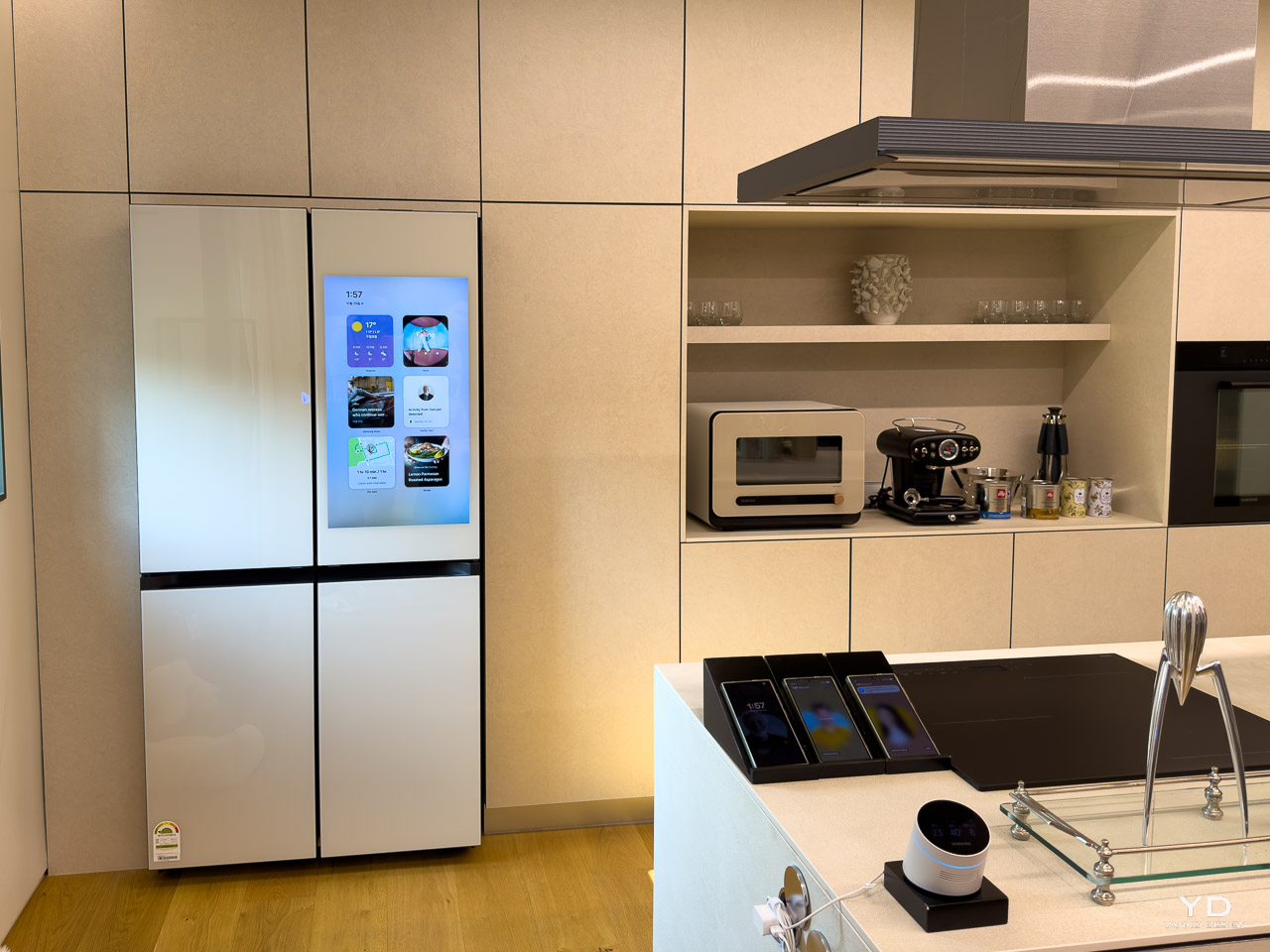
“Today, our designs focus on a flat and geometric look that blends seamlessly with modern interiors,” the design team explained. The Bespoke line exemplifies this shift, offering customizable panels that let consumers match their appliances to their specific aesthetic rather than forcing rooms to adapt to the appliance. As the presentation emphasized, “The Bespoke was the first product tailored to the consumer, rather than led by the manufacturer.”

The evolution makes sense when you consider how kitchens function now. Open floor plans mean appliances sit in continuous sightlines with living spaces. Minimalist interior design emphasizes clean surfaces and reduced visual noise. An appliance that demands attention disrupts the careful balance homeowners work to create. Samsung’s current design language acknowledges this reality, focusing on integration rather than statements.

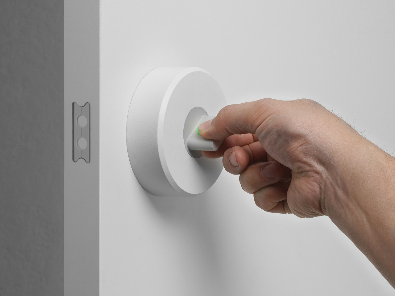
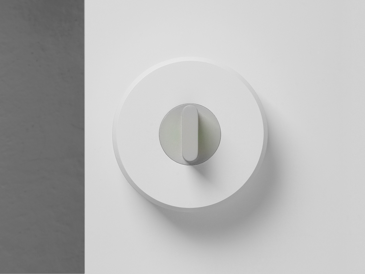
This shift required the design team to develop new methods for creating visual interest without resorting to dramatic forms. They’ve focused on proportion, material quality, and subtle details. During the product showcase, a designer pointed out their signature element: “This very narrow window is Samsung’s signature design identity.”

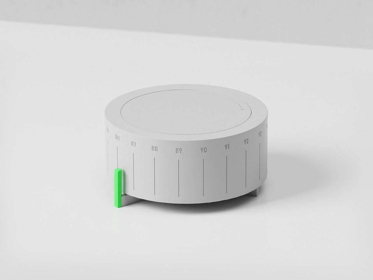
The Three-Stage Design Process

Samsung’s design team walked through their development methodology, which operates in three distinct phases. Understanding this structure reveals how they balance innovation with manufacturability, and why certain design decisions take precedence over others.

Advanced Design comes first. “The first stage, called advanced design, is the very early phase where we explore innovative design directions and develop concepts,” explained the design team. “In this stage, rather than focusing on manufacturability, we aim to discover new opportunities through future-oriented challenges.” The team researches global megatrends, tracks generational differences in appliance expectations, and studies post-pandemic changes in home behavior. This phase feeds the innovation pipeline with ideas that might become products in three to five years.

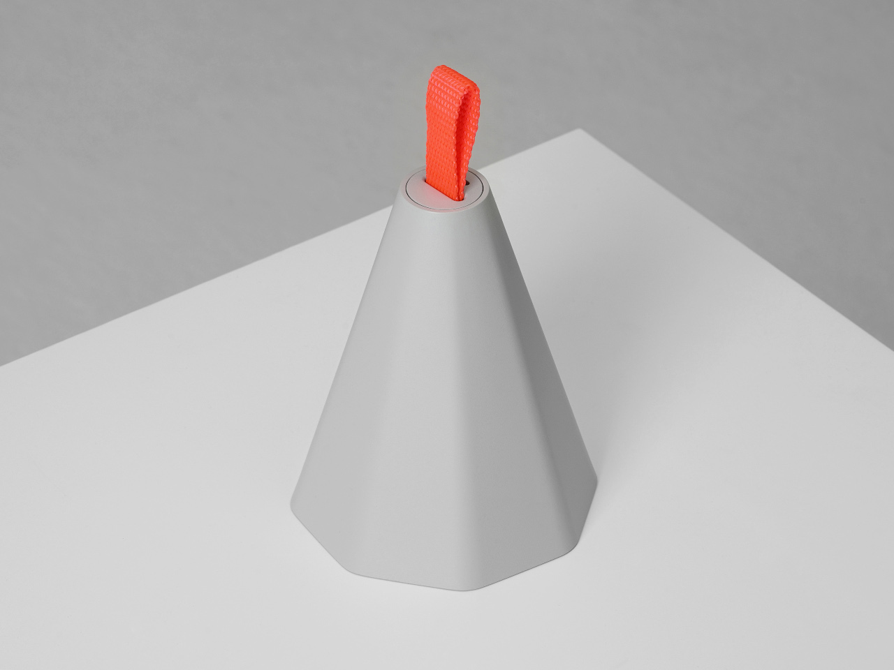
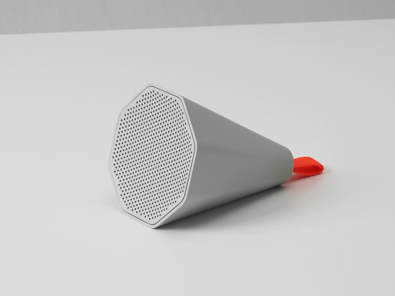
Archetype Design follows. “The second stage is Archetype Design, where we define the core design elements and identities and create prototypes that closely resemble our actual designs,” the team explained. Engineering constraints enter the conversation. Manufacturing realities impose boundaries. Cost structures become factors. The Peltier chip repositioning happened during this phase, when the team realized their initial layout compromised the consumer benefits they were trying to deliver.

Final Design brings everything to market-ready form. “The final phase, where we refine the archetype design into a market-ready form, taking into account feasibility and optimization,” as the presentation described it. The design gets refined for production efficiency, tested for durability, validated through consumer preference studies, and engineered for serviceability. The team emphasized that this isn’t where creativity dies. It’s where creative solutions prove whether they can survive contact with reality.

Some ideas make it through with minimal changes. Others, like the refrigerator layout, require fundamental reimagining even at this late stage.

What struck me about this process is how much research grounds every stage. The team doesn’t rely on designer intuition alone. They conduct extensive consumer preference studies to evaluate design competitiveness. They analyze furniture design trends to ensure their appliances harmonize with what consumers are actually buying for their homes. They run localized projects like their U.S. Laundry Space and Market Trend Sensing study to understand regional differences in how people interact with appliances. Design decisions emerge from this research foundation rather than aesthetic preference alone.

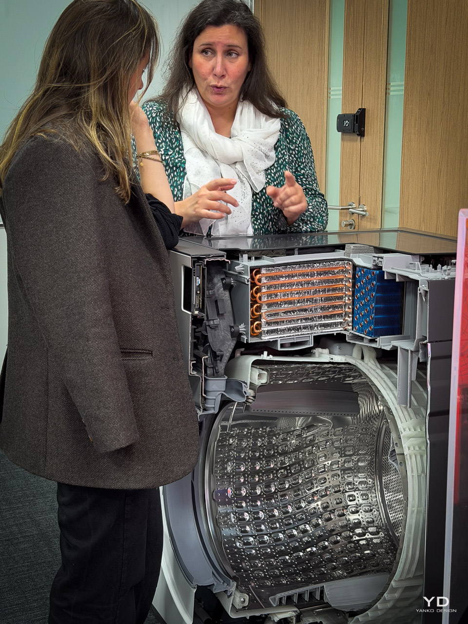
Unibody Express: Washing Machine Minimalism

The washing machine design team introduced their Unibody Express philosophy as a case study in essentialist thinking. The name itself signals the approach: eliminate everything unnecessary until only the fundamental interaction remains.

Their starting point was provocative. Rather than beginning with a washing machine shape and refining it, they asked what the essential form should be. As Sarah Choi, Head of the Living Design Group, explained during the presentation: “We’ve gone back to basics to redefine design and to make people’s lives better. With the design philosophy of Samsung that is essential, innovative, harmonious.” She described stripping away everything extraneous to reach the core: “But rather something fundamental and pure. A single rectangle. This is the essential space where we meet our users.” The presentation showed how they removed decorative elements systematically. “We removed many decorative elements that make up the washing machine. Focused on the fundamental material, the steel.”

What remained was steel, glass, and the pure geometry of the rectangle.

This sounds simple. Executing it proved complex. Removing decorative elements means the fundamental materials and proportions carry all the aesthetic weight. There’s nowhere to hide manufacturing imperfections or component compromises. The team explained they needed higher standards than previous designs required. The steel finish, glass clarity, and panel alignments all had to be essentially perfect since there was nothing else to draw the eye. As the team explained, “This design form allows for effective management of product design variations while enabling efficient operations through part standardization.”

The result aligns with broader movements in industrial design toward essential forms and honest materials. But unlike some minimalist exercises that prioritize aesthetic purity over function, the Unibody Express philosophy emerged from user research. The team studied how people actually interact with washing machines, identified the core interaction space, and designed around that fundamental relationship.

The minimalism isn’t stylistic. It’s structural, based on understanding what matters to someone doing laundry.

CMF: The Language of Premium Materials

Color, Material, and Finish design operates as its own discipline within Samsung’s structure, and watching their CMF team present revealed how much invisible work creates the perception of quality in appliances.

The team expressed particular pride in their black metal work. During the CMF showcase, a designer explained: “Real metal is used by all companies, but we are proud of black metal and have been leading trends in this finish.” Their newest premium direction uses ribbed aluminum. “This is a new material that has not been used much in product design. Aluminum that was used a lot in IT devices,” Oh noted, describing how they applied a ribbed design to create a premium aesthetic for refrigerators in the Korean market.

Glass appears across product categories, from cooking appliances to refrigerators to water purifiers, with the team developing methods to match colors and textures across these different applications. The upcoming ceramic collaboration represents their most ambitious material innovation. During the showcase of unreleased products, Oh explained: “This is ceramic from Italian company Mutina. Ceramic is widely used in furniture and table interiors, but we have applied ceramic CMF to refrigerators for the first time with the technology to apply it to product design.”

What makes CMF design fascinating is how it operates at the intersection of aesthetics and material science. “We continue to study interior design trends across diverse regions, from Asia to the Americas and Europe, through online learning,” explained Oh. “By updating and analyzing the latest trends, we ensure that our home appliances harmonize seamlessly with consumers’ real-life environments.” They create digital twin virtual spaces to simulate how their CMF choices will appear in these real-world contexts. “The CMF combines these elements into two tones, bright and dark, that complement each unique space and its character,” the presentation emphasized.

The team also experiments with perception engineering. “We have the skill to create textures and printing technology that can give a stone feel,” Oh explained during the showcase, demonstrating samples that used glass and coating techniques to simulate stone and ceramic aesthetics without the weight and cost constraints of actual stone or ceramic components.

During the CMF showcase, Oh explained her team’s philosophy of holistic interior integration: “We don’t design products in isolation. We design them to harmonize with furniture, interiors, and fabrics to complete the overall interior mood using these paints and materials.”

Sustainability as Design Constraint

The sustainability integration revealed during the CMF presentation felt refreshingly pragmatic rather than performative.

“All glass samples are made of recycled materials,” Oh explained during the CMF showcase. “Samsung has been working to replace glass products with recycled glass for several years now.” For their premium aluminum products, they’ve adopted a hybrid approach: “The front uses a thin new aluminum layer that can reflect new colors because it needs to express beauty,” while “the base metal behind uses recycled aluminum.” The team was frank about sustainability constraints. When asked about expanding recycled content further, they acknowledged: “It would be most efficient to make suggestions without increasing consumer prices… If there is a need that consumers can tolerate to that extent, we can do it.”

Regional Design: Ergonomics Meets Culture

The most compelling design challenge Samsung faces is creating global products that feel locally appropriate. Refrigerator design makes this visible.

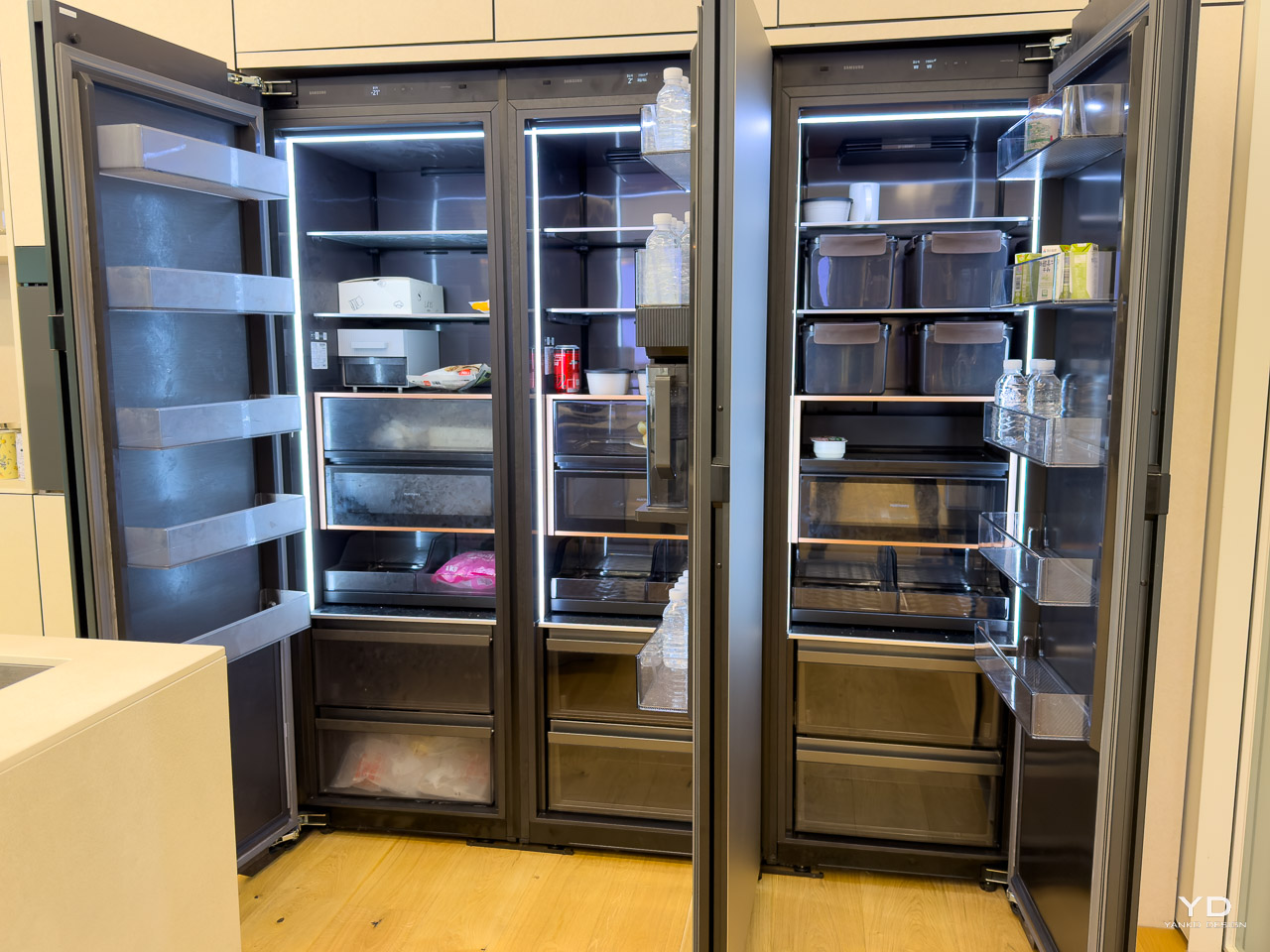
The design team explained: “T-Type is a popular platform here in Asia, whereas the French door type is also preferred in North America.” They detailed the structural differences: “The T-type has segmented freezer box at the bottom, while the French door type uses large capacity freezer drawers, also located at the bottom.” The design presentation emphasized these aren’t arbitrary preferences. They reflect different food cultures, shopping patterns, and kitchen spatial organizations.

The design team explained that understanding these regional differences requires ethnographic research, not just market data. How do Korean families shop for and store kimchi? How do American households manage bulk purchases from warehouse stores? What food preservation expectations exist in European markets with smaller, more frequent shopping patterns? Design decisions about interior layout, drawer sizing, and temperature zone configurations all flow from understanding these cultural contexts.

This regional customization extends beyond refrigerators. Kitchen appliance dimensions differ between markets. During the product showcase, Claire Lee, Head of Kitchen Design Group, explained: “This is a 30-inch wall oven… a product specialized for the North American market,” then showed a contrasting model: “Unlike the North American 30-inch model, this is a 24-inch spec model specialized for the European and Korean markets.” Cooking technology preferences vary too. Lee noted that in North America, “traditionally gas products were common,” but emphasized that “induction products are rapidly expanding” as consumers shift away from gas cooking.

Samsung designs platforms that can accommodate these variations while maintaining design language consistency across regions.

What This Means for Appliance Design’s Future

Samsung’s approach suggests appliance design is entering a more sophisticated phase. The days of technology-first thinking, where impressive specs drove product development and design followed, are giving way to human-centered processes where design insight drives technology application. The Peltier chip repositioning exemplifies this: the technology was ready, but the design team’s understanding of user benefit justified completely reworking the internal architecture.

This shift requires different skills from designers. They need fluency in material science, manufacturing constraints, cultural differences, and sustainability considerations alongside traditional aesthetic capabilities. They need research methodologies to validate assumptions about user preferences. They need collaborative skills to work with engineers who might resist mid-development redesigns.

The Samsung design team’s structure, with specialists in product design, CMF design, design innovation, and design strategy all collaborating, reflects this expanded scope.

The risk in this approach is designing for an idealized user rather than real people. The safety lies in the research foundation. Samsung’s investment in consumer preference studies, localized market sensing projects, and continuous trend analysis keeps their design process grounded in actual behavior rather than designer intuition about what people should want.

Watching their team work through these challenges over two days in Seoul revealed an organization taking appliance design seriously as a discipline. Not as styling applied to engineered products, but as a fundamental methodology for understanding how technology should integrate into daily life.

Whether this produces better appliances remains to be seen. But it definitely produces more thoughtfully considered ones.

The post Design Without Compromise: How Samsung Is Rethinking Home Appliances From the Inside Out first appeared on Yanko Design.

5 Japanese-Scandinavian Homes and Furnitures To Inspire Your Own Zen Spaces

Have you ever walked into a space and instantly felt a sense of calm wash over you? That quiet elegance, a feeling of effortless beauty? If you are yearning for a home that embodies tranquility and timeless style, then it’s time to discover Japandi. This increasingly popular design aesthetic is a beautiful fusion of Japanese minimalism and Scandinavian warmth. It is more than just a trend, but a lifestyle choice.

While emerging in early 2017, Japandi’s popularity surged to become a major trend in 2019. Let’s explore how Japandi is not just decorating spaces, but genuinely redefining modern living by creating havens of peace and practical elegance.

1. Celebrates the Art of Mindful Minimalism

In our fast-paced world, the idea of having less has never felt so relevant. Japandi champions a mindful approach to minimalism, moving away from sterile, empty spaces towards ones that are uncluttered yet inviting. It is all about curating your belongings, keeping only what is essential and brings you joy or serves a purpose, thereby reducing visual noise and mental clutter.

This philosophy creates a serene backdrop for daily life, allowing you to focus on what truly matters. Imagine a living room where every object has its place, contributing to the overall sense of calm and order. It’s not about deprivation, about intentionality and choosing quality over quantity while creating a home that breathes.

The Waterbridge House, nestled among Pebble Beach’s majestic pines, is a glass-clad haven and a testament to thoughtful architecture. Its design embodies the serene Japandi style, where the calm of Japanese aesthetics gracefully meets Scandinavian warmth infused with the relaxed vibe of the California coast.

From the moment you step onto the staggered concrete path, a sense of calm begins. The signature glass corridor, floating above a tranquil pool, isn’t just an entrance but functions as a threshold that connects two distinct wings. One wing offers vibrant, open-plan spaces for gathering, while the other provides a private retreat with an expansive primary suite. Every element, from the seamless indoor-outdoor flow created by vast sliding glass walls to the inspired floating tea house, is meticulously designed to foster a profound connection with nature, inviting the forest and light in at every turn.

2. Blends Textures and Tones

Japandi’s aesthetic appeal lies in its sophisticated color palette and rich textural interplay. Think warm neutrals like soft greys, muted greens, earthy browns, and the timeless elegance of white and black that is combined with natural wood tones, from light birch to darker walnuts. This harmonious blend creates a soothing visual narrative throughout your home.

Beyond color, the emphasis on natural materials is paramount. Picture the raw beauty of linen, the inviting warmth of wool, the subtle grain of unpolished wood, and the organic imperfections of ceramics. These elements add depth and a tactile richness to the space, inviting you to touch, feel, and truly connect with your surroundings while fostering a sense of comfort and authenticity.

The Sawmill Treehouse is nestled amidst the serene alpine landscape at the base of Mt. Buller, Victoria. This architectural marvel isn’t just accommodation but is a profound invitation to reconnect with the natural world and rediscover your inner calm. Crafted in the beautiful Japandi style, this elevated sanctuary seamlessly blends Japanese minimalism with Scandinavian functionality. From the moment you ascend the rusted steel steps, you are enveloped in a sense of being among the trees, where the boundaries between cozy interiors and stunning forest views melt away.

Every detail, from the fire-resistant COR-TEN steel exterior that weathers beautifully to the warm Tasmanian oak interior, speaks of a deep respect for its surroundings. It is an inspiring example of how intentional design can create an unparalleled, immersive experience.

3. Connects with Nature’s Tranquil Beauty

Bringing the outdoors in is a cornerstone of Japandi design that fosters a deep connection with nature and its calming influence. This isn’t just about adding a few potted plants but is about integrating natural light, organic forms, and elemental materials into the very fabric of your home. Imagine large windows framing a view, or the subtle presence of natural stone.

The deliberate inclusion of carefully chosen plants, whether it’s a graceful fiddle leaf fig or a delicate orchid, adds life, purity, and a touch of serene vibrancy to the space. It is about creating an environment that feels fresh, airy, and deeply connected to the natural world while promoting a sense of well-being and peaceful introspection.

Minima is a compact 215-square-foot (20-square-meter) prefab module designed by Australian studio TRIAS in collaboration with FABPREFAB. This flexible unit serves perfectly as a standalone tiny home or an adaptable backyard addition, ideal for a home office or guest retreat. Its construction utilizes sustainable Cross-Laminated Timber (CLT), a material chosen to minimize environmental impact and reduce concrete emissions. It embodies a distinctly modern, Japandi-inspired aesthetic.

Minima’s minimalist exterior is clad in cypress battens with a steel roof, beautifully concealing its thoughtful interior. Hardwood-framed glass doors open to reveal a warm, human-centric space where Scandinavian and Japandi influences converge. What truly sets Minima apart is its innovative design beyond aesthetics, as it requires no concrete foundation, utilizing ground screws for easy relocation, thereby minimizing site disturbance. Furthermore, its modularity allows for expansion, creating accessible and affordable community opportunities.

4. Functionality Meets Form with Intent

One of the most appealing aspects of Japandi is its unwavering commitment to functionality without sacrificing an ounce of style. Every piece of furniture and decorative item serves a purpose. This design approach values clever storage solutions, versatile pieces, and ergonomic considerations, ensuring that your home not only looks beautiful but also works effortlessly for your everyday needs.

Japandi design includes clean lines, simple forms, and smart design that prioritizes usability. This means less clutter, more efficiency, and a home that supports your daily routines rather than hindering them. It is about creating a space where everything has its place and everything is easily accessible, making your life simpler and more streamlined.

Hara House, situated in a small agricultural village north of Tokyo, stands as a testament to the profound connection between Japanese architecture, mindful living, and community. Designed for a young couple seeking to revitalize communal ties, this distinctive A-frame cabin embodies the core tenets of minimalism and warmth. Built with precisely spaced timber and topped with a white steel roof, its design thoughtfully balances private family areas with a semi-public, open-air living and dining space, showcasing efficiency and a minimal material footprint.

Architect Takayuki Shimada envisioned Hara House as an “incomplete” canvas, deliberately inviting villagers to utilize its spaces and become part of its evolving narrative. Parallel glass doors in the central living area promote cross-ventilation and fluid connection with the street, eschewing traditional self-reliance for communal engagement. This home, reminiscent of classic Japanese design and even Ghibli aesthetics, encourages workshops and gatherings to spill outdoors.

5. Promotes Well-being

Additionally, Japandi is an invitation to cultivate a more peaceful and balanced life. By stripping away the unnecessary and focusing on natural elements, thoughtful design, and a serene atmosphere, Japandi homes become true sanctuaries for well-being. They are spaces that encourage mindfulness, relaxation, and a deeper connection with oneself and loved ones.

Imagine coming home to a calm, uncluttered environment that immediately helps you de-stress and recharge. This focus on creating a supportive and restorative living space directly contributes to improved mental clarity, reduced stress, and an overall enhanced quality of life.

Japandi furniture promotes well-being through its thoughtful balance of form, function, and serenity. Characterized by clean lines, natural materials, and understated elegance, Japandi design merges the minimalist ethos of Japanese aesthetics with the warmth and practicality of Scandinavian style.

Crafted primarily from wood, Japandi furniture brings a sense of nature indoors and encourages a slower, more mindful way of living. Its minimalist yet warm presence transforms even the simplest spaces into havens of tranquility. By emphasizing simplicity, craftsmanship, and harmony, Japandi furniture fosters a peaceful atmosphere that is best suited for rest, reflection, and emotional wellness.

Ultimately, Japandi truly redefines modern living by prioritizing serenity, purpose, and natural connection. By inviting Japandi’s principles of minimalism and warmth into your space, you are cultivating a calming environment that supports a balanced and intentional life.

The post 5 Japanese-Scandinavian Homes and Furnitures To Inspire Your Own Zen Spaces first appeared on Yanko Design.

13,000-Lumen Flashlight With Smart Cooling Also Charges Your Phone

There’s something exhilarating about pushing into the wild after dark, whether you’re cycling down a forest trail, hiking a canyon, or just exploring the world beyond the city lights where streetlamps don’t reach and the natural darkness takes over. But adventure after sunset demands gear that’s as tough and adaptable as you are, and most flashlights just aren’t up to the challenge of serious outdoor use in unpredictable, demanding conditions.

The WUBEN X1 Pro is built for explorers who want more than a basic beam and simple on-off functionality from their gear. With 13,000 lumens of combined flood and spot light, a rugged aluminum alloy body, and smart cooling to keep things running smoothly under heavy use, it’s a flashlight that’s as ready for action as you are, designed to handle whatever the night throws at you without fail.

Designer: Mr. Tan (Manager of Wuben Brand)

Click Here to Buy Now: $119 $149 (20% off). Hurry, only a few left! Raised over $181,000.

The WUBEN X1 Pro’s angular, aluminum alloy body feels solid and substantial in your hand, with sculpted lines and a one-handed grip that’s easy to hold even with gloves on during cold-weather expeditions. At 383 grams and just under 14 centimeters long, it packs serious power into a form that fits in a jacket pocket or bike bag without creating annoying bulk or weighing you down.

The minimalist button layout and matte finish look refined and purposeful, while the floating chassis and visible cooling vents hint at the engineering inside that keeps everything running at safe temperatures. It’s a flashlight that looks as good clipped to a backpack as it does on a nightstand, blending outdoor toughness with considered industrial design that doesn’t compromise aesthetics.

With three high-output LEDs arranged for both wide coverage and distance, the WUBEN X1 Pro delivers a wide, 125-degree flood for lighting up campsites or work areas and a focused spot beam that throws up to 337 meters into the distance. Switching between modes is seamless, letting you adapt to changing conditions on the fly without fumbling through complicated menu systems or awkward multi-press combinations.

Multiple brightness settings from Turbo to Eco mean you can go all out for a midnight ride through challenging terrain or conserve power for a long hike that stretches into days. The 13,000-lumen Turbo mode is bright enough to turn night into day across entire clearings, while lower settings stretch battery life for extended trips where charging opportunities are limited or nonexistent.

The WUBEN X1 Pro runs on two replaceable 21700 lithium batteries, providing a combined 9600mAh of capacity that powers hours of high-output use without fading. That’s enough juice for serious adventures, and when you need to recharge your phone or GPS device during extended trips, the flashlight doubles as a 15W power bank via USB-C output without compromising your lighting needs or leaving you in the dark.

Smart cooling keeps everything running safely without overheating or sudden performance drops during extended use. A detachable fan module and copper midframe dissipate heat efficiently, so you can use maximum brightness without worrying about thermal throttling or damage to internal components, no matter how long the adventure lasts or how demanding the conditions become during your exploration.

The X1 Pro is designed for versatile carry, with a rope hole for secure lanyards, and a redesigned bike mount for hands-free lighting on the move. The IP54 rating means it shrugs off rain and dust confidently, while the rugged aluminum build stands up to drops and rough handling during outdoor activities without showing significant damage.

Whether you’re setting up camp in complete darkness, fixing a flat tire at midnight on a deserted road, or leading a group through a dark trail where visibility matters for everyone’s safety, the WUBEN X1 Pro brings confidence and clarity to every situation. Its sculpted design, powerful dual-beam output, and clever features like replaceable batteries and power bank functionality make it a reliable companion for every adventure, big or small.

Click Here to Buy Now: $119 $149 (20% off). Hurry, only a few left! Raised over $181,000.

The post 13,000-Lumen Flashlight With Smart Cooling Also Charges Your Phone first appeared on Yanko Design.

Mechanical Braille Embosser Labels Medicine, Food With No Power

For visually impaired people worldwide, identifying everyday items like medications, kitchen containers, switches, or personal belongings can be a daily challenge that affects independence, safety, and quality of life. Most labeling solutions are either expensive, complicated, or simply not designed with accessibility in mind, forcing users to rely on others or expensive assistive technology for basic organization. Finding a simple, affordable way to create tactile labels remains frustratingly difficult.

The Sakshar Braille Embosser concept reimagines labeling as a tactile, intuitive experience that anyone can master quickly without extensive training. By combining a mechanical interface with smart ergonomics and careful attention to usability, it aims to bring independence and dignity to visually impaired users everywhere, making Braille labeling a simple part of daily life. Sakshar means “literate” in Hindi, reflecting the concept’s mission to empower through accessible information.

Designer: Shruti Kushwaha

Sakshar’s compact, tabletop form is both modern and approachable, with a rectangular body, rounded edges, and large, raised buttons for Braille dot selection across the top panel. The device is shown in a range of colors, including orange, green, and blue, making it easy to identify by touch or sight for sighted family members. The clean, minimalist aesthetic fits naturally into kitchens, bathrooms, or workspaces.

The tactile interface is designed specifically for comfort and ease during extended labeling sessions, with button spacing and feedback optimized for users with limited dexterity or hand strength. The embosser’s compact size and stable base make it easy to use at home, school, or work without requiring special furniture or a dedicated workspace. The handle makes it portable enough to carry between rooms or take when traveling.

At the heart of Sakshar is a precise Geneva mechanism that advances vinyl tape automatically after each character is embossed, ensuring consistent spacing and proper alignment for readable Braille throughout longer labels. Users simply press the tactile buttons to select Braille dots representing specific letters or numbers, roll the driver to advance the tape forward, and tear off the finished label when complete.

The device is fully mechanical, requiring no electricity or batteries whatsoever, making it reliable and low-maintenance for users in any environment, location, or economic situation. The mechanical operation means there’s nothing to charge, no software to update, and no risk of digital failure when you need to create labels quickly for important items. This simplicity makes Sakshar accessible to users of all ages and technical comfort levels.

Sakshar is built from durable, easy-to-clean materials designed to withstand daily use in demanding environments, with water-resistant construction for use in kitchens, bathrooms, or medical settings where spills happen regularly. The vinyl tape is strong, self-adhesive, and sticks securely to medicine bottles, pill strips, light switches, storage containers, or any household item that needs identification. The embossed text is concave and convex for enhanced readability and durability over time.

By making Braille labeling accessible, affordable, and intuitive through thoughtful design principles, Sakshar empowers visually impaired users to organize their lives independently without constantly asking for help from family members or caregivers. The concept supports a wide range of ages and abilities, offering tactile feedback and a frustration-free experience that respects users’ autonomy and dignity in managing their personal spaces and belongings throughout daily routines.

The post Mechanical Braille Embosser Labels Medicine, Food With No Power first appeared on Yanko Design.

4 Smart Devices Controlled by Touch, Not Screens or Apps

Digital devices promise convenience, but too often they deliver complexity instead, with endless menus, constant updates, and a learning curve that never seems to end, no matter how long you use them. Many of us long for the days when using a product was as simple as turning a dial or pressing a button without consulting manuals or watching tutorial videos online to understand basic functions.

The Tamed Digital Devices concept reimagines our relationship with technology by bringing back the tactile, multi-sensory experiences of analog gadgets we used to love and understand instinctively. Created by SF-SO in 2019, it’s a vision of tech that’s calming, intuitive, and designed to fit seamlessly into daily life without demanding constant attention or learning new interfaces. Each device in the series prioritizes touch, sound, and movement over screens and menus.

Designer: Hoyoung Joo (studio SF-SO)

Each device in the series is inspired by classic analog forms and controls that people already understand instinctively without any instruction. The Ball Internet Radio swaps touchscreens for three magnetic balls on top that you roll or lift to change stations, making tuning in both intuitive and satisfying for all ages. The tactile feedback and visual movement of the balls create a playful interaction that feels natural rather than digital or sterile.

The Cone Bluetooth Speaker powers on or off with a simple flip, using a gravity sensor to turn a basic gesture into a moment of physical delight and satisfaction. No buttons to hunt for, no hold-and-press sequences to remember or decipher from tiny icons—just flip the speaker and it responds instantly. The conical shape with its bright orange accent doubles as sculptural home decor when not playing music, blending function with visual warmth.

The Wheel Digital Radio lets you tune frequencies by rotating the entire body like traditional wheel-tuned radios, echoing the mental model of classic analog radios from decades past that everyone intuitively understands. A physical marker shows the tuned station, providing immediate visual feedback without digital displays or complicated interfaces. The cylindrical form with ribbed texture and green accent makes the interaction obvious at a glance to anyone who sees it.

The Fingerprint Smart Door Lock combines the security of a keyless system with the familiar, physical action of turning a traditional lock mechanism that has existed for centuries. Users unlock the door by placing a finger on the sensor and rotating the dial, restoring the satisfying tactile feedback of analog hardware. The circular, wall-mounted form with green accent light provides visual confirmation without overwhelming smart home complexity.

Across the series, the use of tactile controls like rolling balls, turning wheels, and flipping speakers restores a sense of physicality and engagement lost in most digital products today that rely solely on touchscreens. The design language is clean and modern throughout, with geometric shapes, soft edges, and playful color accents that invite touch and curiosity rather than intimidation or confusion about how things work.

Tamed Digital Devices offer a glimpse of a future where technology supports well-being instead of adding stress to already busy lives filled with screens. For anyone craving a calmer, more human connection with their devices and tired of digital overload, this concept series is a reminder that innovation doesn’t have to mean complexity but can mean rediscovering the joy of simplicity and tactile pleasure.

The post 4 Smart Devices Controlled by Touch, Not Screens or Apps first appeared on Yanko Design.

Raspberry Pi E-Ink To-Do Display Disguises as Framed Desk Art

Most productivity tools are designed to grab your attention constantly with pop-up reminders, blinking notifications, and endless browser tabs competing for focus throughout the day. But sometimes, the best way to stay focused is to keep your most important information quietly in view, not fighting for your eyes or demanding immediate action every few minutes. Finding that balance between visibility and distraction remains surprisingly difficult in modern productivity software.

The InkyPi E-Paper Productivity Display is a DIY project that addresses this challenge directly and elegantly with minimal hardware. Built with a Raspberry Pi Zero 2 W and a crisp E-Ink screen, it turns your to-dos, deadlines, and progress into a calm, always-on dashboard that helps you stay organized without the noise. The project is open-source, customizable, and refreshingly simple in its approach to keeping you on track without overwhelming you.

Designer: AKZ Dev

InkyPi’s minimalist design starts with a 7.3-inch or 7.8-inch E-Ink panel from Pimoroni or Waveshare, framed in a simple IKEA picture frame that looks more like a piece of art than a gadget on your desk. The Raspberry Pi Zero 2 W sits discreetly behind the display, keeping the whole setup slim, silent, and consuming minimal power throughout the day. The paper-like display is easy on the eyes and never glows or flickers.

The framed display can be wall-mounted above your desk for easy glances throughout the day or set on a stand for desktop reference during intensive work sessions. The E-Ink screen shows information with the clarity of printed paper, making text and graphics readable from across the room without squinting. The lack of a backlight means it works well in any ambient lighting without causing eye strain during long days.

The open-source InkyPi dashboard runs a growing library of 20 plugins, all managed through a web-based user interface that’s accessible from any device on your network. You can schedule automatic refreshes, rotate through different plugins throughout the day, and customize layouts for your specific workflow. Recent plugin additions include a to-do list, day countdown, GitHub commit graph, year progress bar, and RSS feed reader for staying informed.

Each plugin is designed to give you just enough information to stay on track without overwhelming you with excessive detail or constant updates that break concentration. The to-do list shows three customizable lists with clean formatting, the year progress bar visualizes how much of the year remains for goal planning, and the GitHub graph motivates coding consistency through visual streak tracking. Everything updates automatically on your chosen schedule without requiring manual intervention.

The E-Ink display’s slow refresh rate and lack of backlight mean it’s only updated when necessary, keeping your focus on the task at hand rather than the screen itself pulling attention. The dashboard is intentionally passive, meant for glancing rather than interacting, so you’re never tempted to click, scroll, or dive into rabbit holes when you should be working. The analog feel makes it more like checking a wall calendar or notepad.

All hardware and software files are open-source on GitHub, with active community support and ongoing plugin development from contributors worldwide who continue adding features. For anyone tired of digital noise and constant notifications interrupting deep work, the InkyPi E-Paper Productivity Display offers a reminder that sometimes less screen time is exactly what you need to accomplish more meaningful work throughout your day without burning out.

The post Raspberry Pi E-Ink To-Do Display Disguises as Framed Desk Art first appeared on Yanko Design.