STIPFOLD’s AltiHut Cottages Let the Mountain Stay the Main Character

Reaching AltiHut on Mount Kazbek means a refuge is no longer just a roof over climbers’ heads, but a statement about standing lightly on a fragile landscape. The original hut was conceived as Georgia’s first sustainable high-altitude destination at 3,014 meters, helicopter-delivered and sun-powered, uniting comfort with responsibility. What it offers is not conquest, but a place to pause and pay attention to where you actually are.

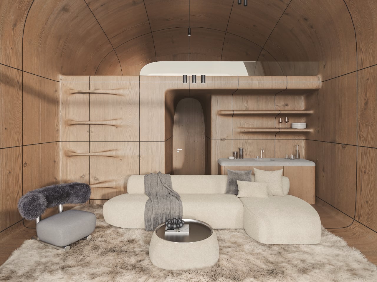
The new AltiHut Cottages are STIPFOLD’s way of making that experience more intimate. Designed for families and small groups, they are small satellites expanding the main hut’s ecosystem without turning the mountain into a resort. Each unit is a compact retreat with a children’s room, central living area, and open mezzanine bedroom facing the horizon, keeping the layout simple enough to disappear into the routine of waking, eating, and sleeping.

Designers: Beka Pkhakadze, George Bendelava, Nini Komurjishvili, Luka Chiteishvili, Nikusha Kharabadze (STIPFOLD)

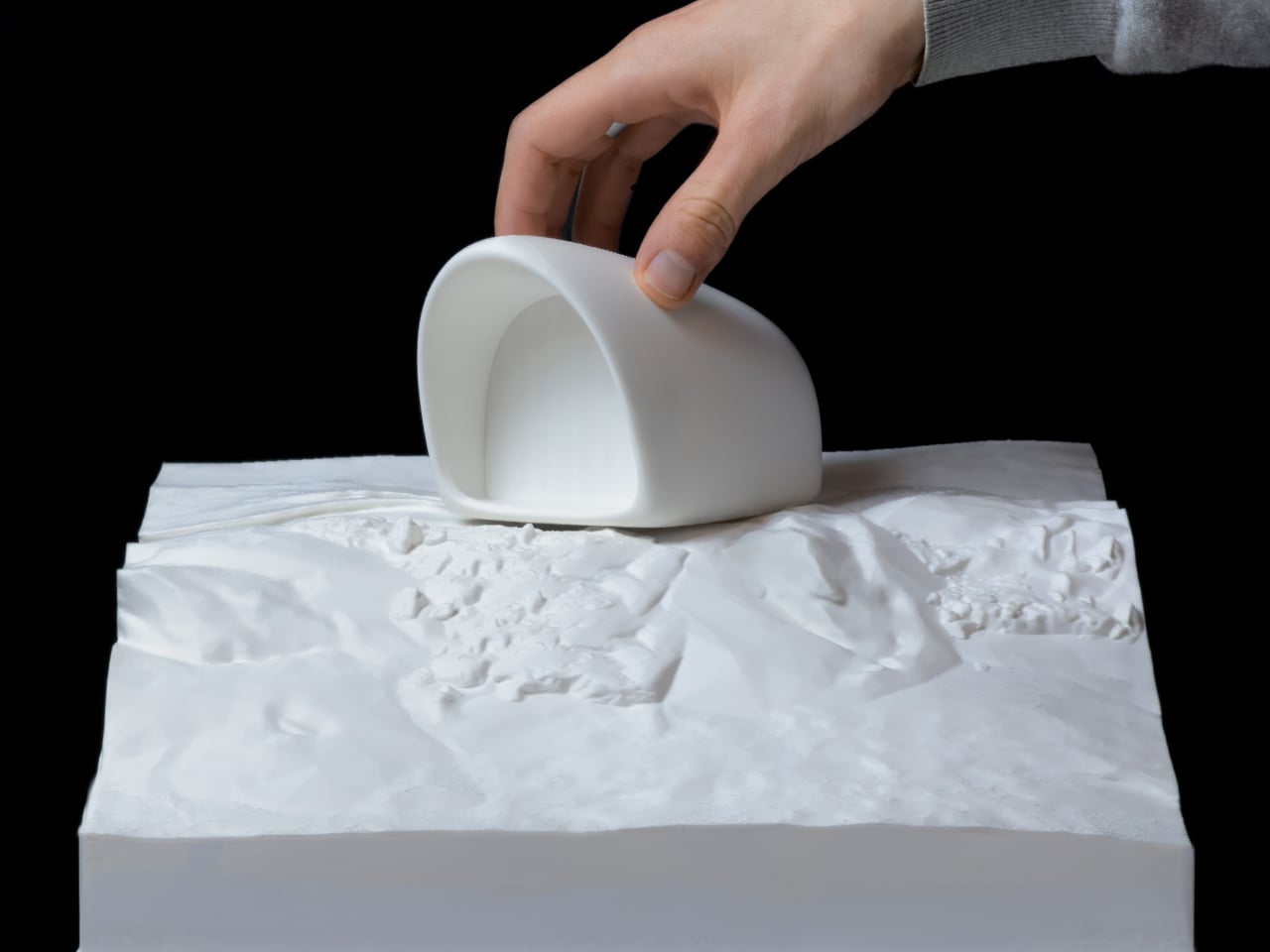
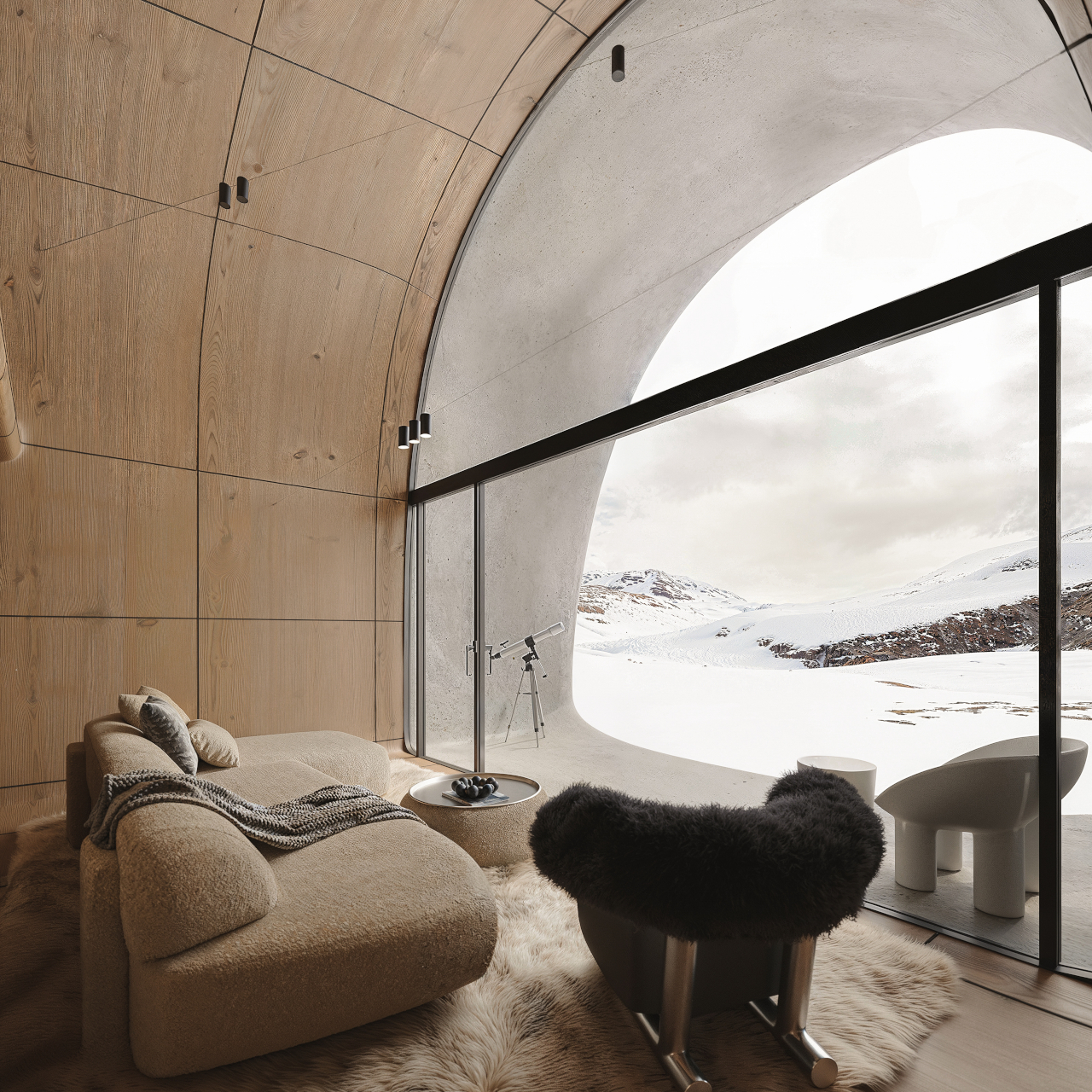
Approaching a cottage across the snow, you see a single opening in a smooth fiber-concrete shell. From outside, it reads less like a house and more like a weathered rock or snow-carved form. Crossing the threshold, you move from wind and glare into a warm wooden interior that still keeps the mountain in full view, so arrival is about balance rather than escape from the cold.

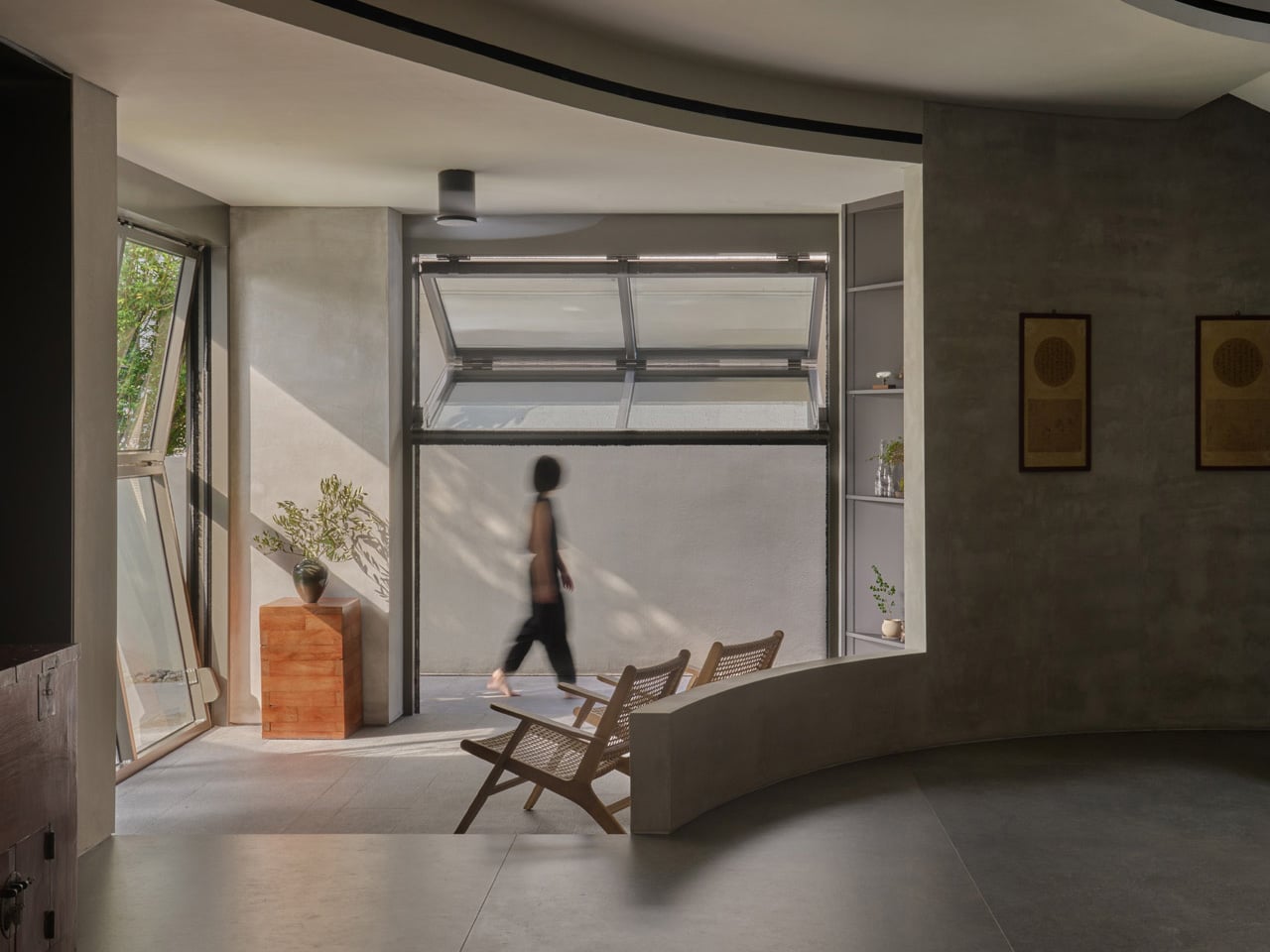
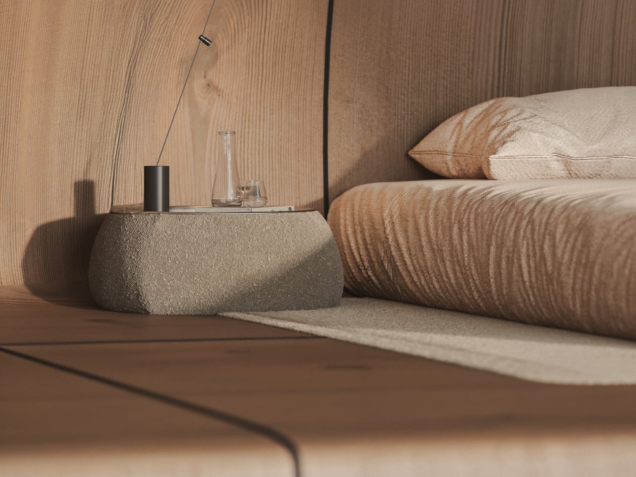
Inside, natural wood wraps walls and ceiling, turning the shell into a continuous, quiet envelope. The central living area becomes the social core, with the children’s room tucked into a protected corner and the mezzanine bedroom hovering above, open to the main space and oriented toward the view. Waking up means looking straight at the horizon, not a wall, which quietly resets what a bedroom is for at altitude.

The fiber-concrete exterior is meant to age and merge with the terrain, picking up the same tones and textures as the surrounding rock over time. Inside, the wood stays calm and enduring, balancing warmth with restraint. The large glass opening turns the landscape into the main interior element, so the view itself becomes part of the design rather than something framed through a small window.

The cottage ties back to the original AltiHut discipline, where every component is delivered by helicopter and powered by the sun. The compact layout, continuous shell, and restrained material palette are not just aesthetic choices; they are ways to reduce impact and simplify construction where every kilogram matters. Comfort is treated as compatible with awareness, not as an excuse to ignore the cost of being there.

AltiHut Cottage reframes shelter at altitude as a place where joy and responsibility meet. Each unit is conceived as a continuation of nature rather than an object placed within it, fading into the terrain while holding a pocket of silence inside. The architecture steps back so that what you remember most is not the cottage itself, but the feeling of the mountain it quietly frames.

The post STIPFOLD’s AltiHut Cottages Let the Mountain Stay the Main Character first appeared on Yanko Design.

5 Countries Just 3D-Printed Homes in Under a Week: The Future Is Here

Traditional construction is often marked by inefficiencies like material waste, labor intensity, and long project timelines that push up the final cost per square foot. In contrast, 3D printing, or Additive Manufacturing in Construction (AMC), introduces a fundamentally different approach, shifting from subtractive to additive building processes. Its central ambition is to make housing more accessible by lowering material and labor costs while enabling faster delivery of structurally sound, architecturally considered homes.

Yet, despite its transformative potential, 3D printing is not a universal solution. While it offers design flexibility and reduced construction waste, challenges remain around material performance, regulatory frameworks, and the impact on skilled labor. These limitations demand a measured, critical adoption rather than unqualified optimism.

1. Material Integrity and Long-Term Performance

A key challenge in 3D-printed construction is ensuring the reliability and durability of printable materials. Although current cement-based mixes offer rapid curing and high compressive strength, questions remain around their long-term tensile performance, response to diverse climatic conditions, and compatibility with conventional finishes such as plaster layers or vapor barriers. These factors are still under close technical evaluation.

Equally critical is the return on investment measured through longevity. Affordable housing cannot compromise on quality; printed structures must match the lifespan of reinforced concrete buildings. At the same time, reducing environmental impact calls for innovation in geopolymers and locally sourced, recyclable aggregates, redefining sustainable material development.

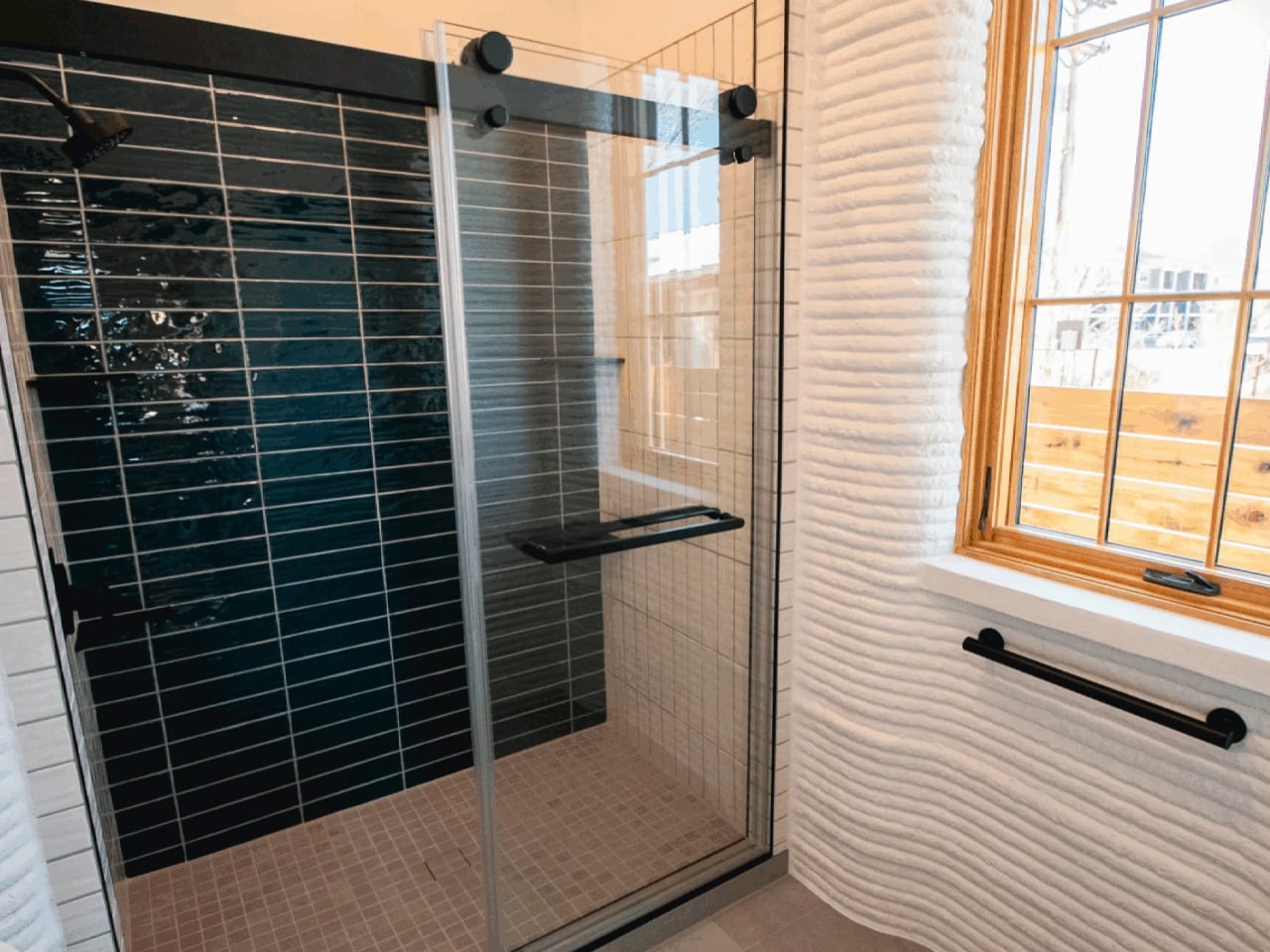
Two side-by-side concrete homes in Buena Vista, Colorado mark a major construction first for the state. Known as VeroVistas, the houses were built layer by layer using a large-scale 3D concrete printer developed by VeroTouch. One home conceals its printed structure beneath stucco, while the other showcases exposed concrete layers, proving the technology can either blend in or stand out. After extensive research and development, the second home was completed in just 16 days of active printing time using a COBOD BOD2 printer, dramatically reducing labour and construction timelines compared to conventional building methods.

Beyond speed, the homes directly address Colorado’s growing wildfire risk. Built with A1-rated concrete walls, they do not ignite or fuel flames, offering the highest level of fire resistance. Designed to be energy-efficient and mould-resistant, the homes combine durability with everyday liveability. Partnering with local developers and contractors, VeroTouch kept work within the community while introducing innovative construction.

2. Adaptive Spatial Design

One of the strongest opportunities offered by 3D printing is its ability to enable complex spatial sequencing and customization without escalating costs. Unlike conventional formwork, additive construction allows curvilinear walls, integrated structural elements, and optimized thermal mass to be produced seamlessly, unlocking a level of design freedom once limited to premium architecture.

This shifts housing from basic shelter to architecturally refined living. Digital fabrication helps avoid visual monotony in low-cost homes, allowing floor plans to evolve as experiential journeys. Biophilic strategies and climate-responsive design can be precisely embedded, enhancing comfort while lowering long-term energy consumption.

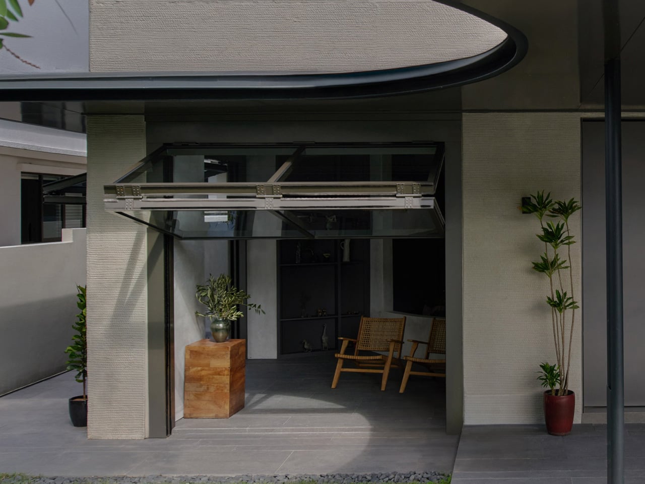
QR3D, designed by Park + Associates, is Singapore’s first multi-storey 3D-printed home and a bold statement on the future of urban living. Located in Bukit Timah, the four-storey prototype responds to land scarcity with innovation, using digital fabrication to reimagine domestic architecture. Rather than treating technology as spectacle, the house integrates it seamlessly into a familiar residential form, resulting in a structure that is expressive, functional, and suited to dense city life.

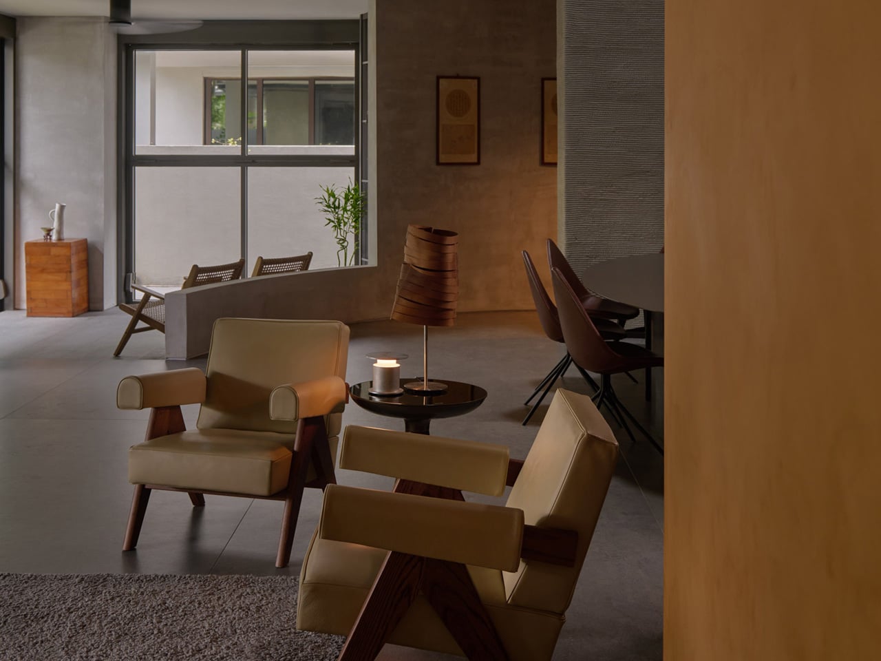
The home’s layered concrete façade openly reveals its 3D-printed construction, with most walls fabricated on site by a robotic printer. These textured lines continue indoors, creating visual continuity throughout the interiors. At the centre, a dramatic vertical void connects all four levels, drawing in daylight and enhancing ventilation while adding spatial generosity. Exposed concrete surfaces reduce the need for additional finishes, celebrating material honesty and process.

3. Regulatory Integration Barriers

A major challenge for additive manufacturing in construction is its alignment with existing building codes. Most national and regional regulations are structured around conventional systems such as brickwork, timber framing, and reinforced concrete, leaving limited guidance for layer-by-layer printed structures—especially in areas like fire safety, insulation standards, and service integration.

To move forward, the industry must develop standardized testing and certification frameworks tailored to the tectonic logic of printed buildings. Without regulatory clarity and cross-authority consensus, large-scale adoption remains regionally limited, slowing deployment and restricting the technology’s potential to reduce construction-related carbon emissions at scale.


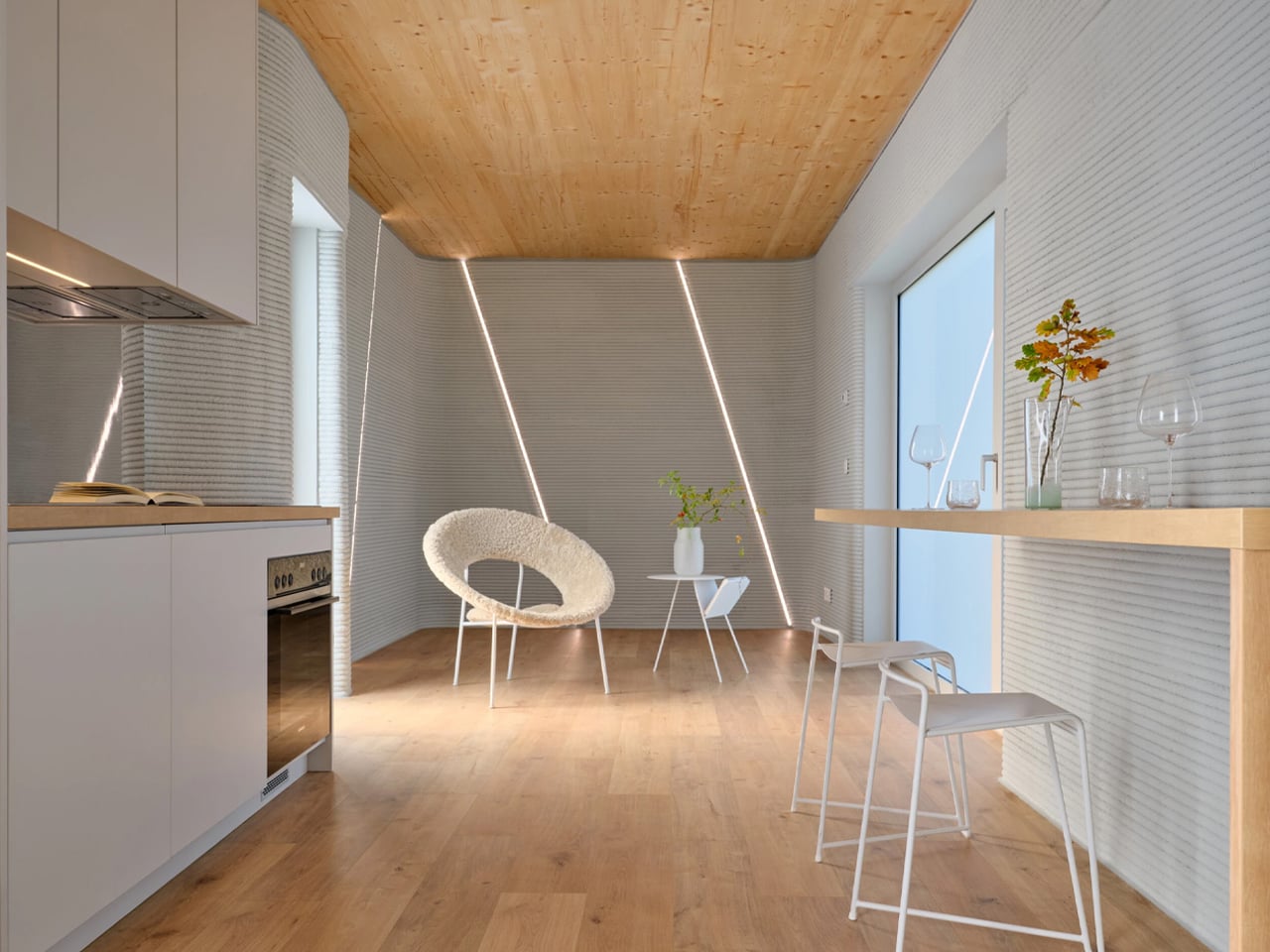
Tiny House Lux is Luxembourg’s first 3D-printed residential product, designed by ODA Architects as a compact, self-sufficient housing unit for challenging urban plots. Built in Niederanven using on-site 3D concrete printing and locally sourced aggregates, the home demonstrates how advanced construction technology can unlock the potential of narrow, previously unusable land. Measuring just 3.5 metres wide and 17.72 metres deep, the 47-square-metre structure is engineered for efficiency, with printed concrete walls completed in about a week and the full build finalised within four weeks. Its ribbed concrete surface functions as both structure and finish, creating a durable, low-maintenance exterior that responds to daylight.

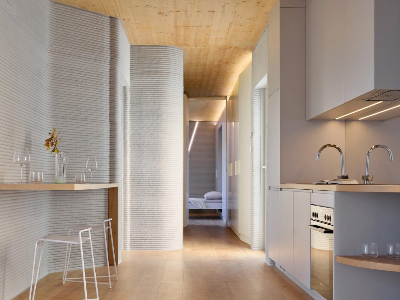
Inside, the house prioritises clarity and performance. A linear layout runs from the south-facing entrance to the rear, maximising natural light and ventilation, while services are neatly integrated along the sides. Underfloor heating powered by rooftop solar panels ensures energy autonomy and reduced operating costs. As a replicable housing solution, Tiny House Lux positions 3D printing as a viable, scalable product for municipalities seeking efficient, affordable residential options.

4. Low-Carbon Construction Speed

The most transformative opportunity of 3D printing lies in its ability to dramatically accelerate construction while reducing site waste. Core structural shells can be printed within days, shortening project timelines and lowering labor demands. This speed directly supports carbon reduction by optimizing material use and cutting down on transport and logistical emissions.

Here, the technology delivers its strongest return on investment. On-demand printing minimizes waste and compresses on-site activity, reducing environmental and neighborhood impact. These efficiencies position 3D printing as a powerful solution for rapid disaster response and scalable affordable housing development.
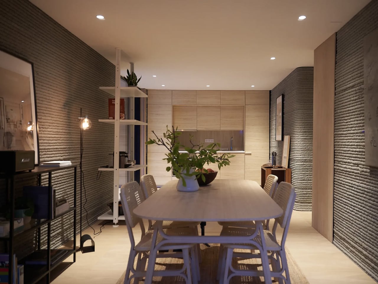
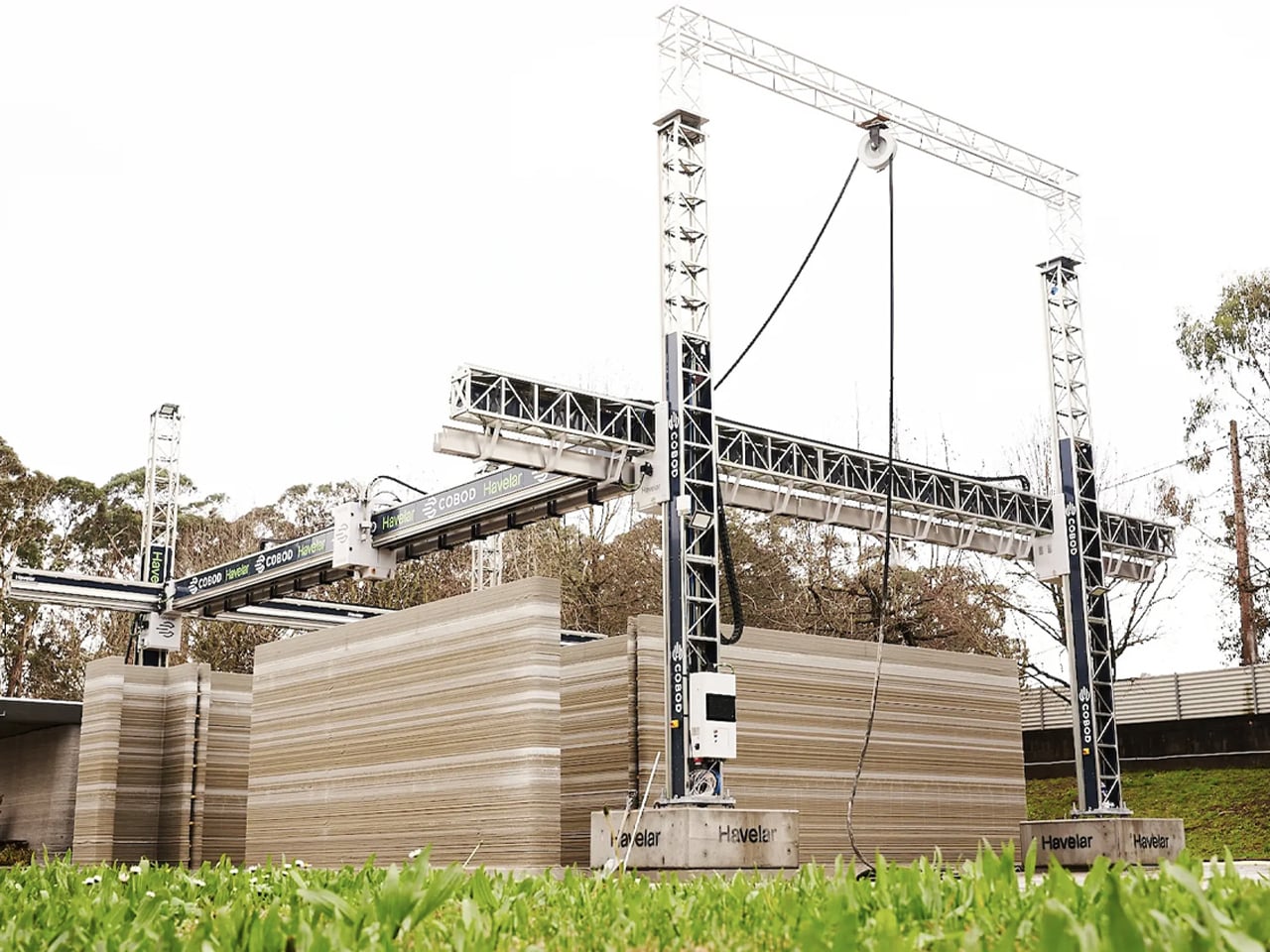
 

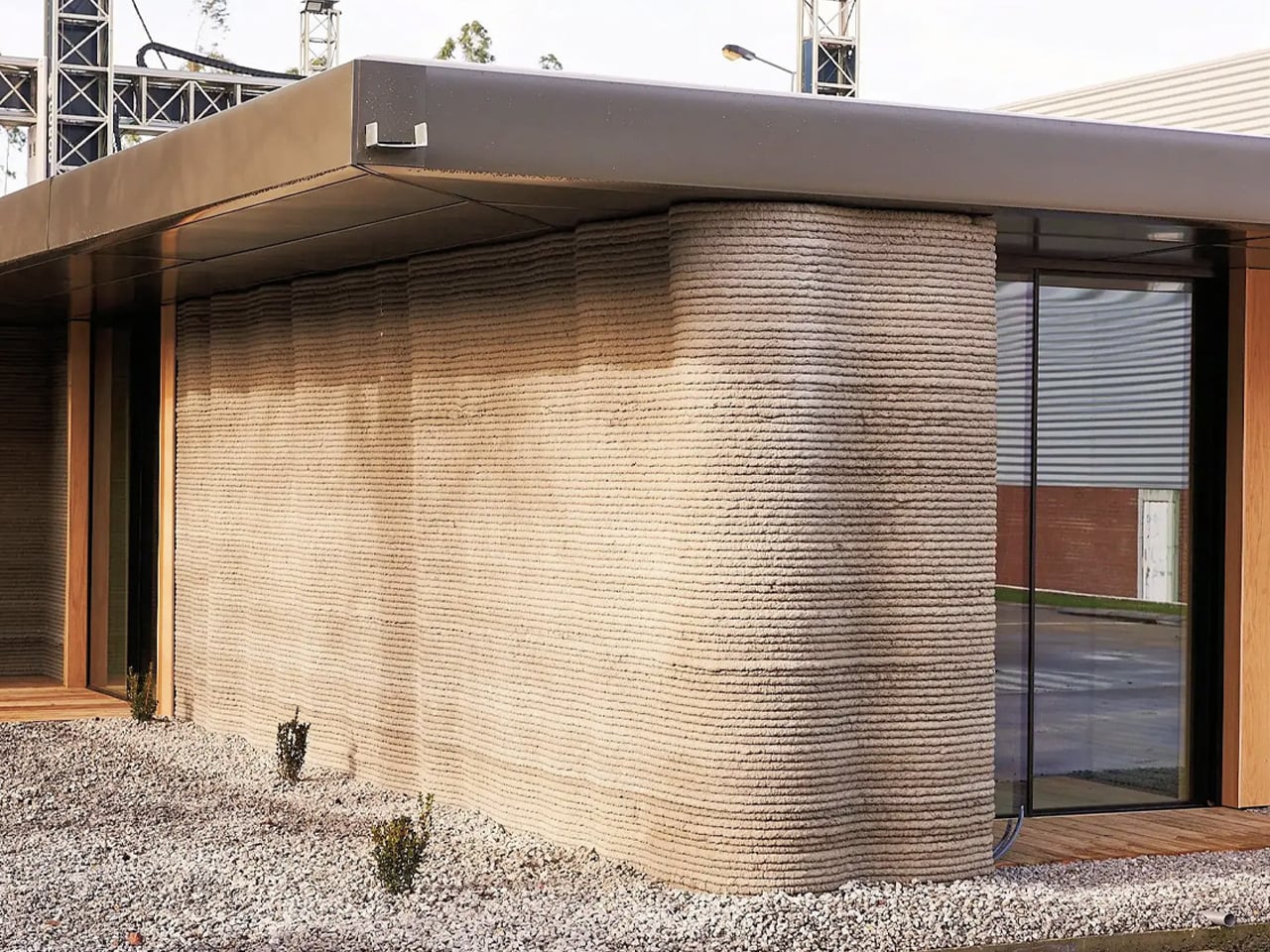
Portugal-based firm Havelar has constructed its first 3D-printed home, produced in just 18 hours using a COBOD BOD2 printer. Located in the Greater Porto area, the single-storey residence is designed as a compact two-bedroom dwelling. A robotic printer extrudes a cement-based mixture layer by layer to form the structure, significantly reducing build time and reliance on intensive labour.
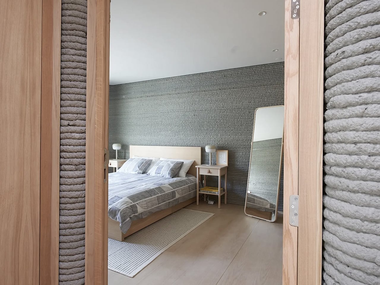
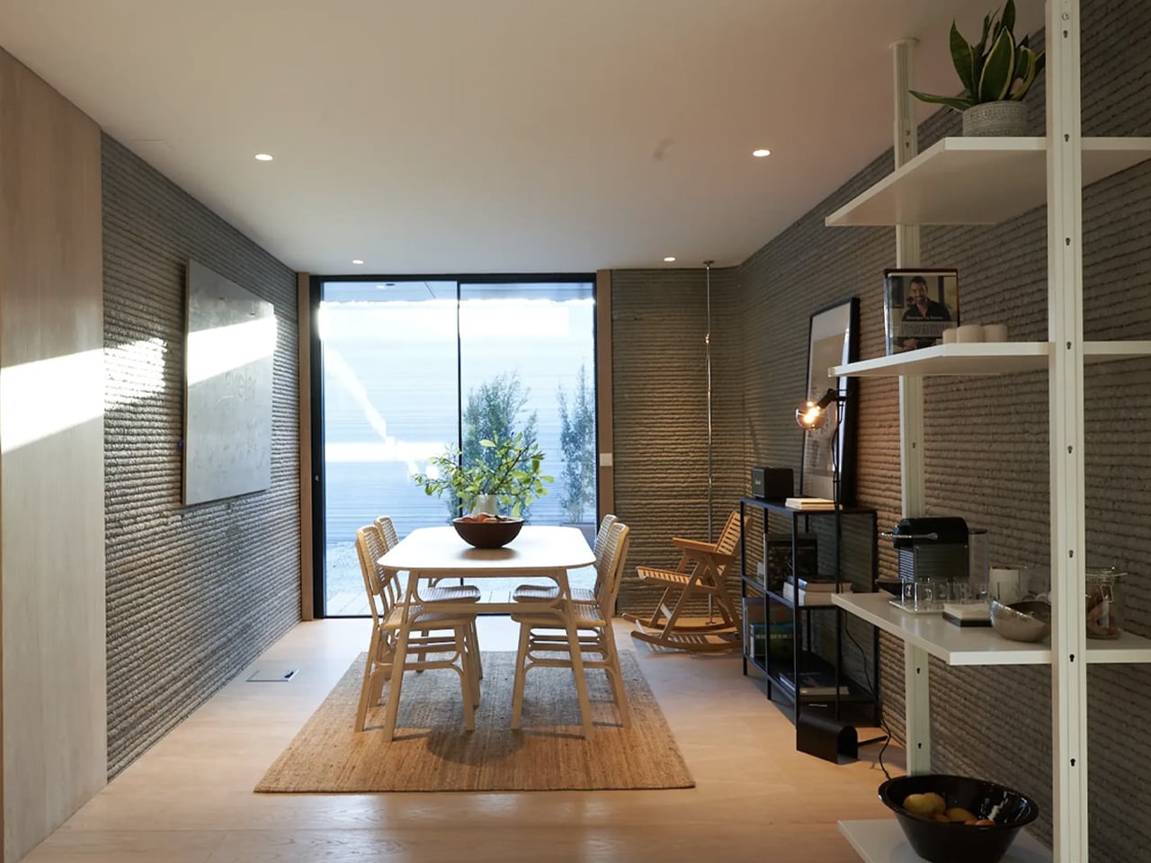
Once printing was complete, traditional construction methods were used to install the roof, windows, doors, and interior fittings, bringing the total construction timeline to under two months. The home features ribbed concrete walls that clearly express its printed origin, along with a simple, efficient layout comprising a central kitchen and dining area, living space, bathroom, and two bedrooms. While minimal in finish, the project prioritises accessibility and efficiency. Havelar sees this prototype as a foundation for scaling production and transitioning to alternative materials, with long-term ambitions of achieving carbon-neutral construction.

5. Scalability and Logistics Constraints

A major challenge in construction-scale 3D printing lies in the size and mobility of printing systems. Large gantry frames and robotic arms are costly to transport and complex to assemble, often offsetting the time saved during the printing process itself. In addition, reliable access to uniform printing materials remains limited, particularly in remote or developing regions where affordable housing demand is highest.

True scalability requires a shift toward compact, modular, and easily deployable machines. Cost evaluations must factor in equipment mobilization alongside material and print efficiency. Until printing systems become as flexible as the designs they produce, widespread economic viability remains constrained.

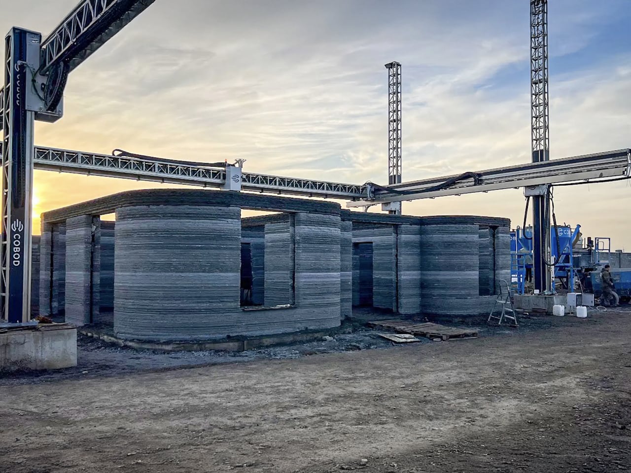
Designed by BM Partners and produced using a COBOD BOD2 printer, this unnamed home in Almaty, Kazakhstan, is recognised as Central Asia’s first 3D-printed residence. The project demonstrates how additive construction can meet demanding environmental and seismic conditions. Built with resilience in mind, the house is engineered to withstand extreme temperatures and earthquakes of up to magnitude 7.0. Its walls can be printed in just five days, significantly reducing construction time while offering a more economical alternative to conventional housing methods.
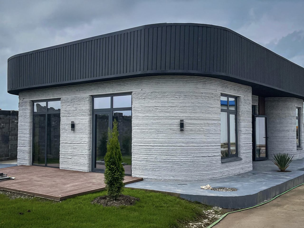
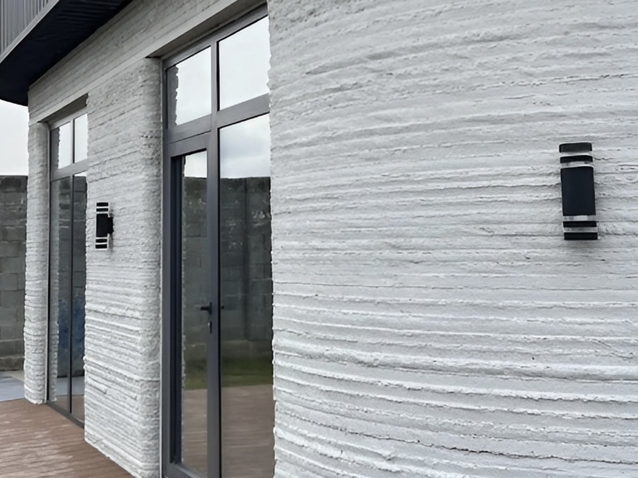
A high-strength concrete mix with a compressive strength of nearly 60 MPa was used, far exceeding typical local materials. Made from locally sourced cement, sand, and gravel and enhanced with a specialised admixture, the mix was tailored to regional conditions. Expanded polystyrene concrete offers thermal and acoustic insulation, providing comfort across a wide range of temperature variations. Once printing was complete, conventional construction teams added windows, doors, and interiors.

3D printing in construction marks a critical intersection of innovation and social responsibility. Despite challenges in materials and regulation, its advantages in design flexibility and rapid delivery make it inevitable. Treated as a new tectonic system and not merely a tool, it can redefine affordable housing by uniting efficiency, quality, and architectural value.

The post 5 Countries Just 3D-Printed Homes in Under a Week: The Future Is Here first appeared on Yanko Design.


5 Best Transparent Tech Of January 2026 That Just Beat Nothing at Its Own Game

Transparent technology has moved far beyond its novelty phase to become a legitimate design movement reshaping how we interact with our devices. What started as a nostalgia trip courtesy of Nothing’s transparent phones has evolved into a full-blown aesthetic revolution where seeing the guts of your gadgets is no longer just acceptable but desirable. The best transparent designs do more than simply expose circuitry; they create visual narratives about how technology works while delivering genuine functional benefits that justify their existence beyond mere eye candy.

January 2026 has given us a particularly strong lineup of transparent tech that ranges from retro-futuristic audio devices to gaming powerhouses wrapped in see-through shells. These designs prove that transparency works across every category of consumer electronics when executed with intention and intelligence. The following five products represent the pinnacle of this movement, each bringing something unique to the table while celebrating the beauty of visible mechanics and electronic components in ways that feel fresh rather than gimmicky.

1. Transparent Sony Walkman Concept

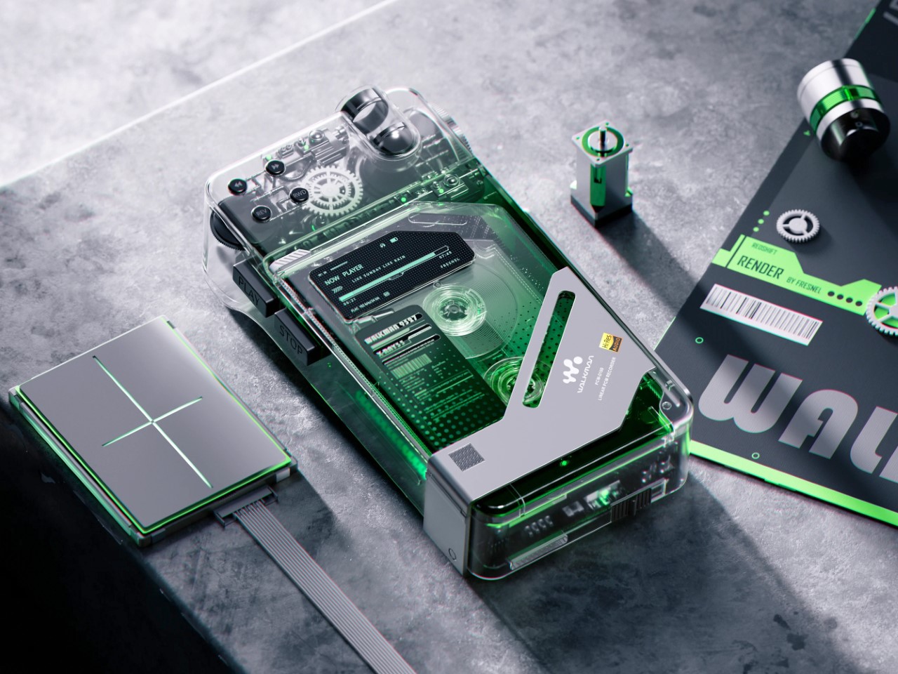
This transparent cassette recorder concept represents everything compelling about retro-futurism executed with modern design sensibilities. The device combines the tactile satisfaction of analog media with visual transparency that transforms mechanical components into the main attraction. Those exposed gears and rollers work their magic through crystal-clear housing that makes the entire mechanism visible during operation, creating a mesmerizing display of analog technology in motion. The top-mounted mechanical elements evoke luxury watch movements where visible complexity becomes the primary selling point rather than something to hide behind opaque shells.

The design succeeds because it creates genuine tension between old and new technologies rather than simply copying vintage aesthetics. A digital display nestles among analog components, suggesting computational intelligence working alongside mechanical systems. Those pixel-perfect UI elements visible through transparent housing indicate this isn’t merely a playback device but something with smart capabilities. The tiny control buttons along the top edge deliberately reference 80s Sony recorders while embracing modern miniaturization techniques. This Walkman concept could easily exist in Blade Runner’s world or on a contemporary design enthusiast’s shelf with equal credibility.

What We Like

  • The visible gear systems create a hypnotic viewing experience during tape playback.
  • The combination of analog mechanics and digital intelligence feels genuinely innovative.
  • The transparent housing transforms mechanical movement into visual entertainment.
  • The design language successfully bridges multiple decades of technology evolution.

What We Dislike

  • Physical media dependence limits practicality for streaming-era consumers.
  • The concept status means you cannot actually purchase this beautiful object.

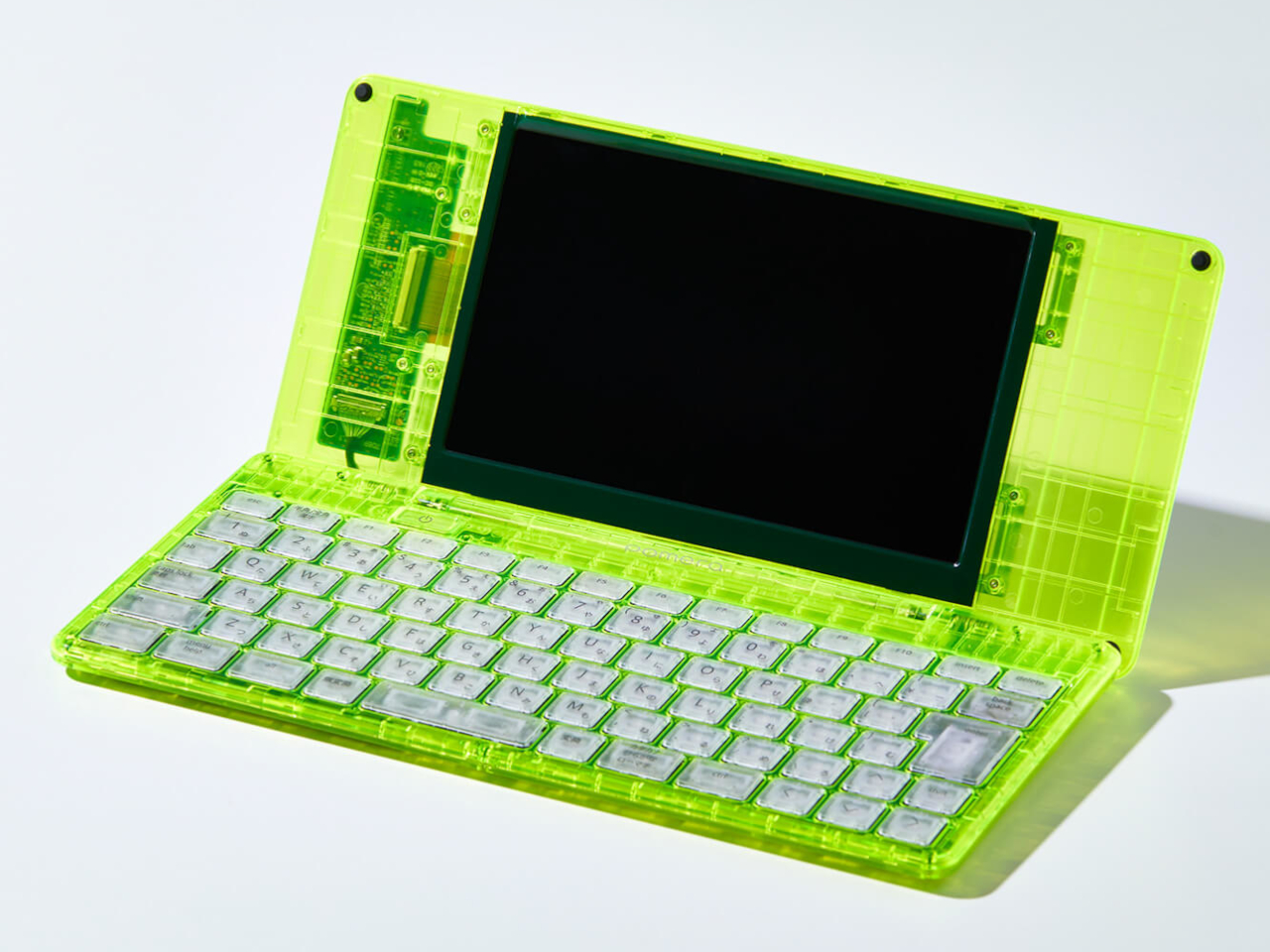
2. Pomera DM250 Crystal Neon Yellow

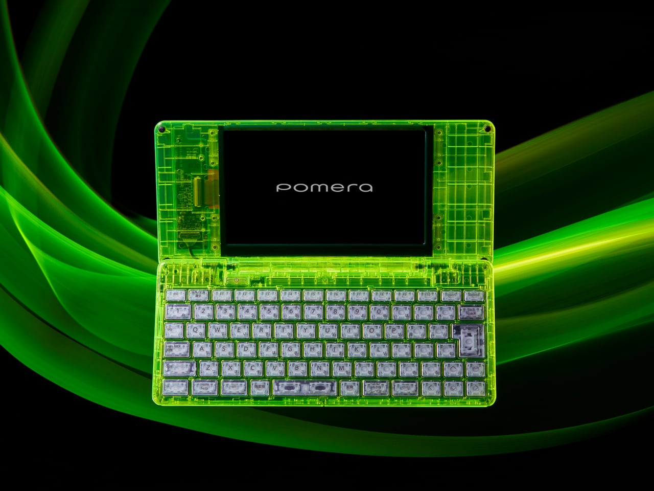
The limited-edition Pomera DM250 in Crystal Neon Yellow ditches conventional white or black finishes for a vivid, almost glowing green shell that channels cyberpunk aesthetics straight out of futuristic cinema. The transparent design feels deliberately pulled from a William Gibson novel, mixing nostalgia for vintage computing with an ultra-modern sensibility that makes the device feel both retro and cutting-edge simultaneously. This isn’t just a writing tool but a statement piece that announces your commitment to focused creativity before you type a single word.

The core philosophy here centers on unwavering dedication to one task: getting words onto the screen without distractions. The DM250 sports a compact yet full-size 80-key keyboard paired with a crisp monochrome LCD that strips away every possible distraction. The software is deliberately minimal, offering everything a writer needs for text creation while providing nothing that might derail focus or waste precious writing time. That transparent shell showcasing the device’s internal components serves as a visual reminder of its pure functionality, where every element exists to support the writing process rather than tempt you toward multitasking.

What We Like

  • The monochrome display eliminates distractions that kill writing productivity.
  • The full-size keyboard delivers proper typing ergonomics in a compact form.
  • The Crystal Neon Yellow finish makes a bold visual statement.
  • The single-purpose design philosophy respects writers’ focus needs.

What We Dislike

  • The monochrome display feels dated compared to modern screen technology.
  • Limited functionality beyond text editing restricts versatility for mixed workflows.

3. RedMagic Astra Gaming Tablet

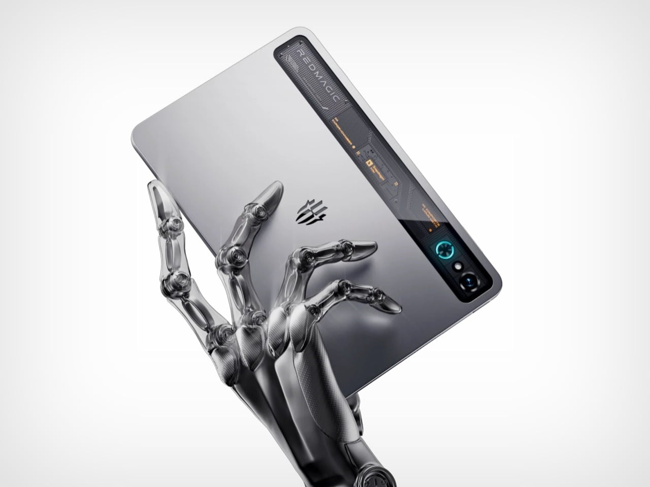
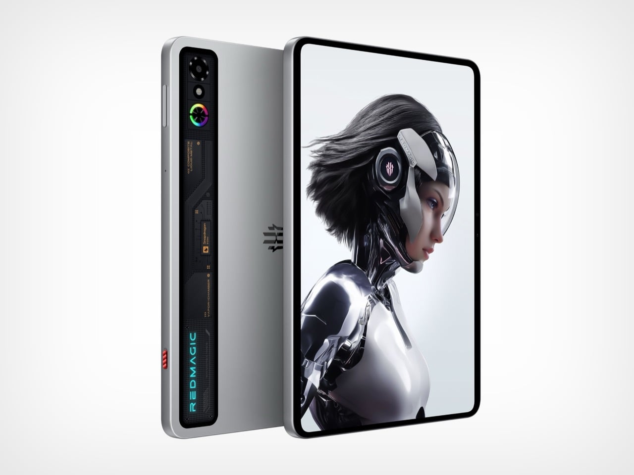
Nothing spent years teasing transparent design language, while RedMagic simply dropped the Astra with a full transparent strip down its back panel, complete with faux circuit board details that scream technological prowess. The visual trickery taps into tech enthusiast psychology that made transparent Game Boys and iMacs cultural phenomena decades ago. Those faux components create an impression of hardware sophistication perfectly aligned with gaming tablet expectations. RedMagic effectively claimed transparent tablet territory before Nothing could plant their flag, proving that execution speed sometimes matters more than brand heritage in emerging design categories.

The transparent strip serves as eye candy on what might be the most compelling compact gaming tablet available. RedMagic packed the Astra with the Snapdragon 8 Elite processor and hardware that puts most full-sized tablets to shame. The 9.06-inch form factor feels genuinely manageable for handheld gaming while maintaining enough screen real estate for immersive experiences. Aggressive pricing makes the iPad Mini look overpriced and underpowered by comparison. The Astra knows exactly what it wants to be: a gaming powerhouse that happens to work as a tablet, rather than a tablet that sorta plays games. This focused approach pays dividends across every aspect, from display technology to thermal management systems.

What We Like

  • The Snapdragon 8 Elite processor delivers flagship performance in a compact package.
  • The transparent design differentiates it from generic black rectangles flooding the market.
  • The 9.06-inch size balances portability with usable screen space for gaming.
  • Aggressive pricing undercuts competitors while delivering superior hardware specifications.

What We Dislike

  • Faux circuit board details might feel inauthentic to purists wanting real component exposure.
  • Gaming focus means it might not excel at productivity tasks that some users expect from tablets.

4. Nothing-Inspired Transparent Robot Vacuum

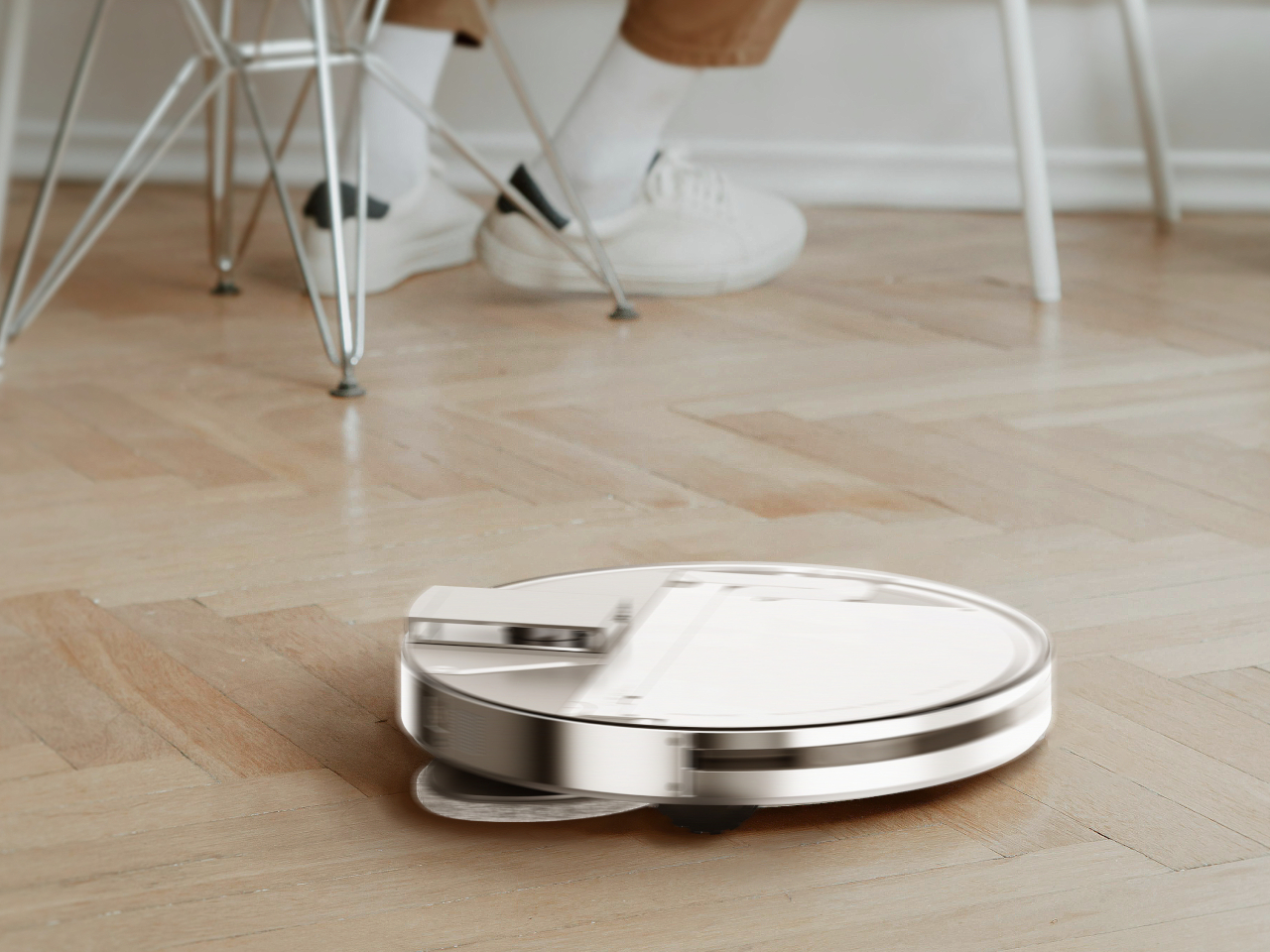
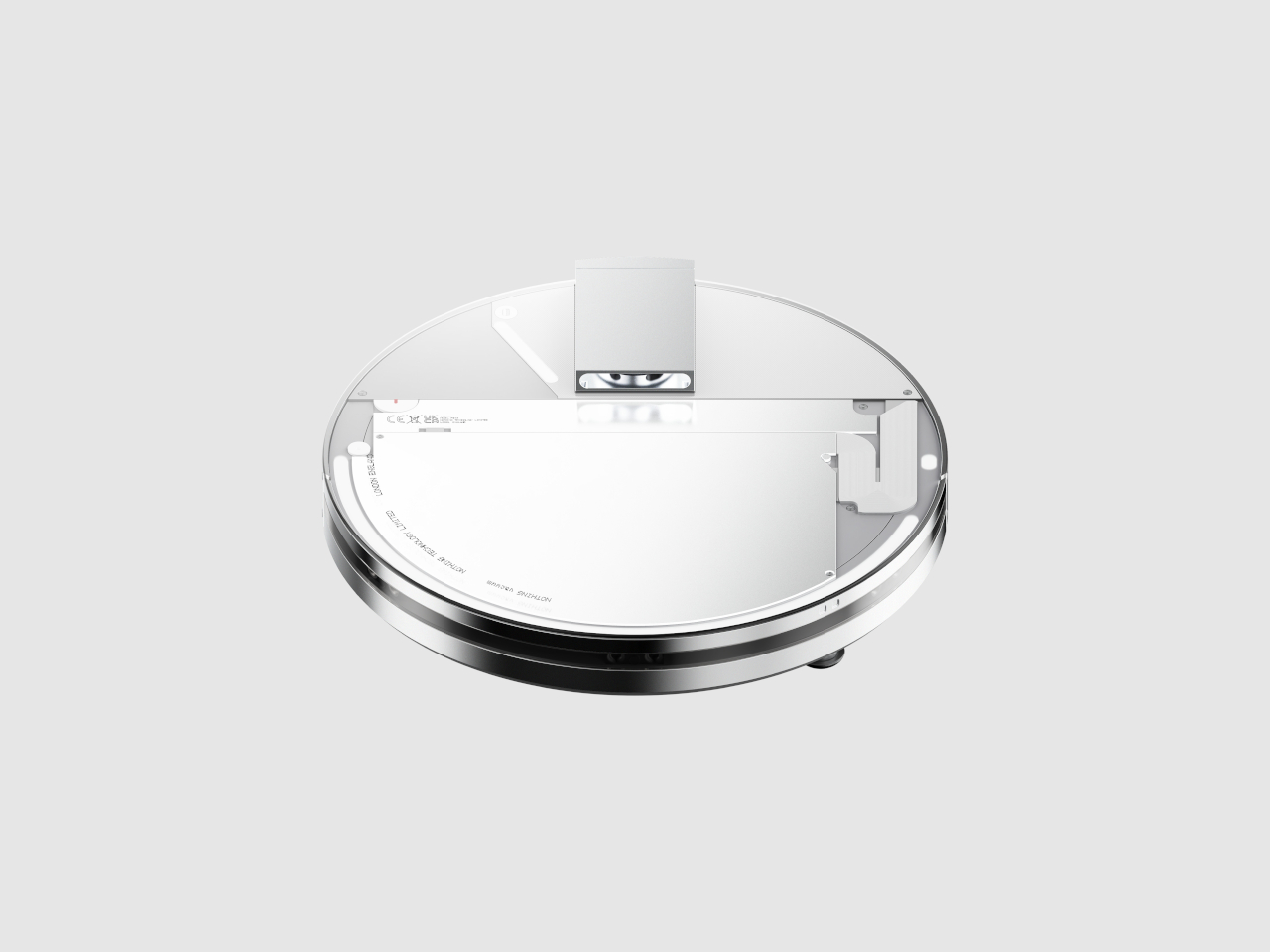
Designer Taeyeon Kim took the transparent tech aesthetic and applied it to one of the most mundane household appliances imaginable, creating an independent concept that reimagines how cleaning technology could integrate into daily life. The transparent philosophy celebrates inner workings rather than hiding them behind opaque plastic shells that make appliances invisible and forgettable. This vacuum features a completely clear shell exposing all internal components from the motor and sensors to the circuitry, making it function, transforming utilitarian hardware into something worth displaying prominently.

Most robot vacuums are designed for invisibility, tucked away in corners where they won’t interfere with carefully curated interior design schemes. Kim’s concept takes the opposite approach entirely, embracing transparency and modularity to create a cleaning system that actually wants to be seen and interacted with regularly. The exposed components serve educational purposes, helping users understand how their cleaning technology actually works while making maintenance and troubleshooting more intuitive. The modular design philosophy means components can be swapped or upgraded without replacing the entire unit, extending product lifespan while reducing electronic waste that plagues the appliance industry.

What We Like

  • The transparent shell transforms a mundane appliance into an interesting design object.
  • Exposed components make maintenance and troubleshooting more intuitive for users.
  • The modular philosophy extends product lifespan through component upgrades.
  • The design challenges the appliance industry norms around hiding technology from view.

What We Dislike

  • Visible dirt accumulation in transparent components might require more frequent cleaning.
  • The concept status means this innovative design isn’t available for purchase yet.

5. Sony WF-C710N Glass Blue Earbuds

The Glass Blue variant of Sony’s WF-C710N earbuds challenges the industry’s tendency toward either clinical white or anonymous black with a design choice that celebrates rather than conceals technological sophistication. The transparent housing goes beyond mere novelty to create a visual narrative about the engineering packed into these tiny devices. Sony offers four color options, but the Glass Blue stands out by making the internal components part of the aesthetic rather than something requiring concealment. The naturally elegant, compact form factor prioritizes both aesthetics and functionality in ways that prove transparent design works even at this miniature scale.

Sound quality remains Sony’s primary focus despite attention-grabbing aesthetics that could easily overshadow performance. The unique 5mm drivers deliver powerful bass and crystal-clear vocals across all music genres, while Digital Sound Enhancement Engine processing restores high-frequency elements often lost in compressed digital audio files. This technical prowess ensures the WF-C710N earbuds sound as impressive as they look, delivering an audio experience satisfying even discerning listeners who prioritize performance over style. The noise-canceling capabilities work seamlessly with the compact design, proving that transparent housings don’t require compromises in acoustic performance or active noise management systems.

What We Like

  • The Glass Blue finish makes a bold statement against boring black or white alternatives.
  • The 5mm drivers deliver impressive audio quality from compact components.
  • Digital Sound Enhancement Engine processing restores lost audio details effectively.
  • Active noise canceling proves transparent design doesn’t compromise acoustic performance.

What We Dislike

  • The transparent design might show dirt and debris accumulation more visibly than opaque alternatives.
  • The 5mm drivers might not satisfy audiophiles seeking maximum bass response depth.

The Transparent Future

Transparent technology has matured from gimmick to genuine design movement with staying power. The five products showcased here demonstrate how exposure of internal components can serve both aesthetic and functional purposes when executed thoughtfully. Designers are moving beyond simply slapping clear cases on existing products to creating devices where transparency informs every aspect of the user experience, from interaction patterns to maintenance accessibility. The visual honesty of exposed mechanics and circuitry creates connections between users and their technology that opaque housings cannot replicate.

What makes January 2026’s transparent offerings particularly compelling is their diversity across product categories and price points. From retro-futuristic Walkman concepts to pragmatic writing tools and gaming tablets, transparent design proves its versatility. These products suggest we’re entering an era where seeing how our devices work isn’t just acceptable but expected by consumers who want deeper relationships with their technology. The transparent revolution is just beginning, and these five designs point toward a future where every electronic device might celebrate rather than hide its technological sophistication.

The post 5 Best Transparent Tech Of January 2026 That Just Beat Nothing at Its Own Game first appeared on Yanko Design.
The Most Addictive EDC Tool of 2026: A $45 Magnetic Fidget Knife You Can’t Put Down

Most utility knives work perfectly fine. They cut boxes, strip packages, slice tape, then disappear into drawers or pockets until the next mundane task arrives. They’re functional, reliable, forgettable. The problem isn’t that they fail at their job. The problem is they offer nothing beyond the cut itself, no texture or personality, no reason to reach for them when they’re not strictly necessary. They exist in a utilitarian void where efficiency trumps experience.

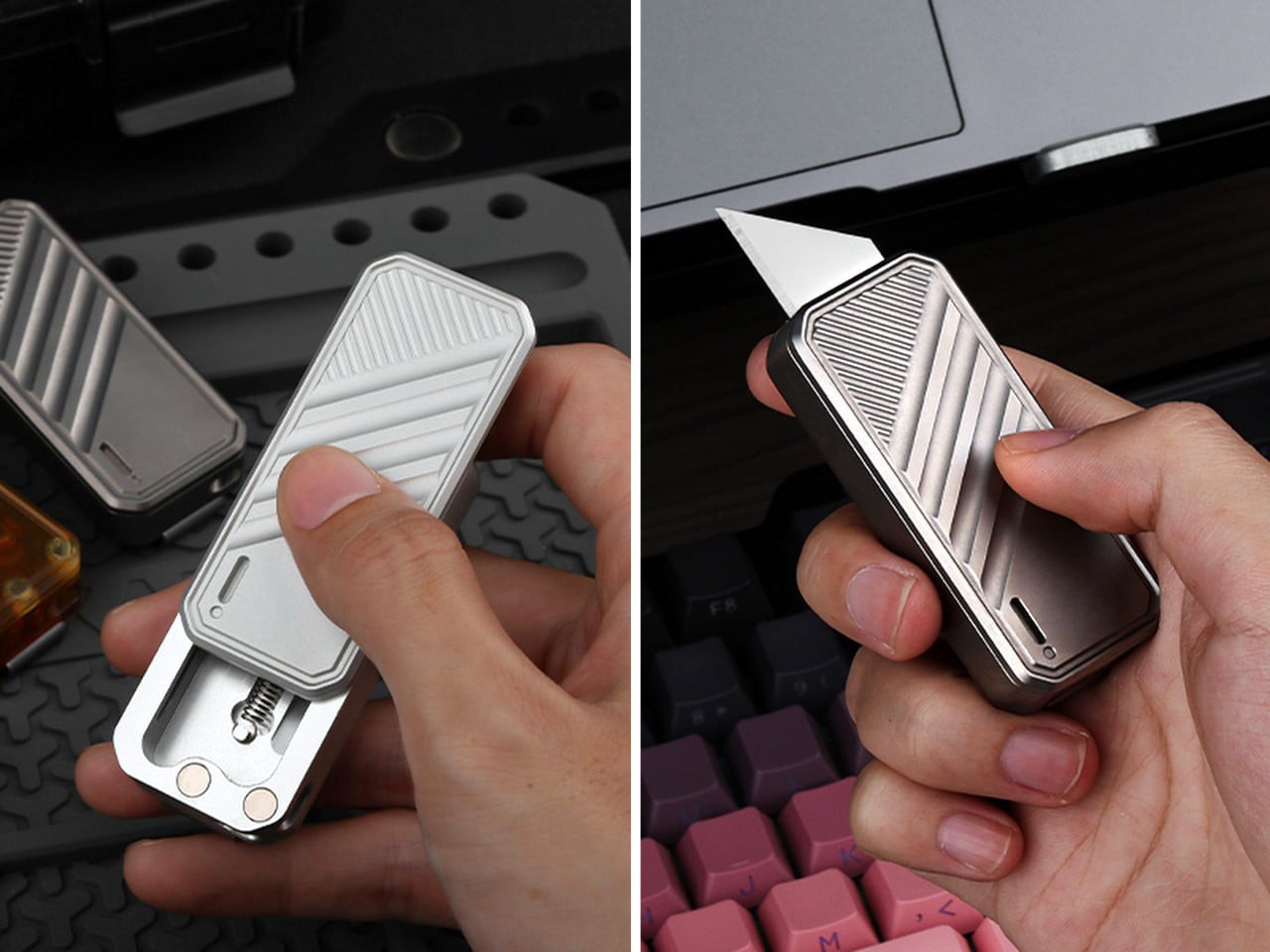
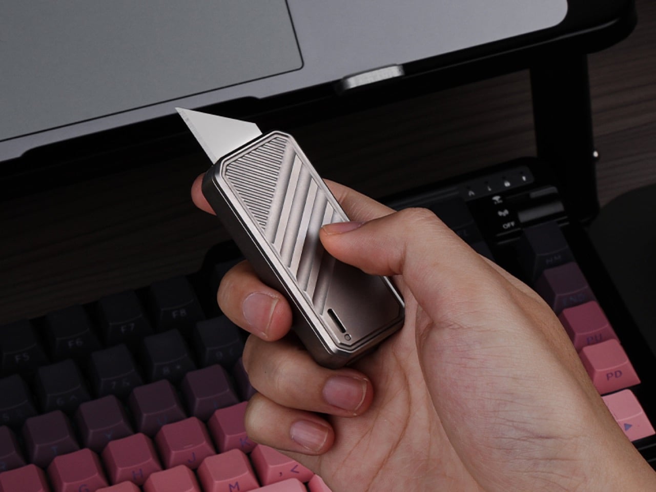
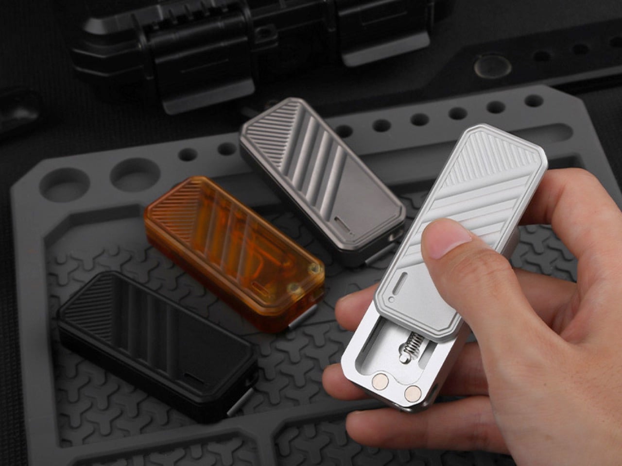
DeckShiv by ActMax takes a different approach entirely. This magnetic fidget slider utility knife was designed to stay in your hand long after the cutting is done. The sliding mechanism deploys and retracts a standard utility blade, but the real story lives in the magnetically guided movement itself. Every slide forward feels intentional, controlled, deliberate. Every return journey happens smoothly, pulled back by magnetic force into a soft, satisfying click. It’s a utility knife that doubles as a fidget device, built for people who appreciate tactile feedback in their everyday tools.

Designer: ActMax

Click Here to Buy Now: $45 $55 (18% off) Hurry! Only 32 of 120 left.

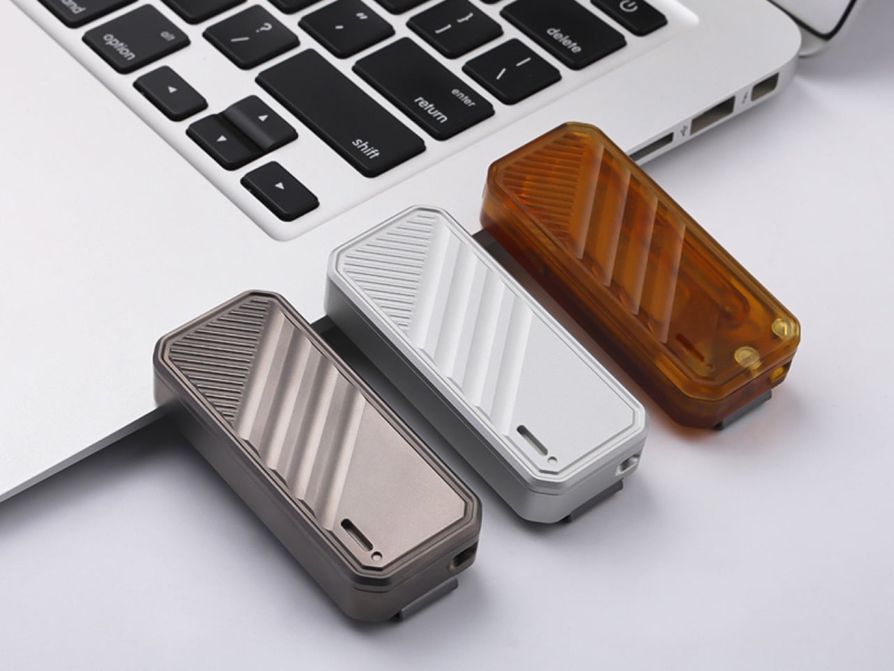
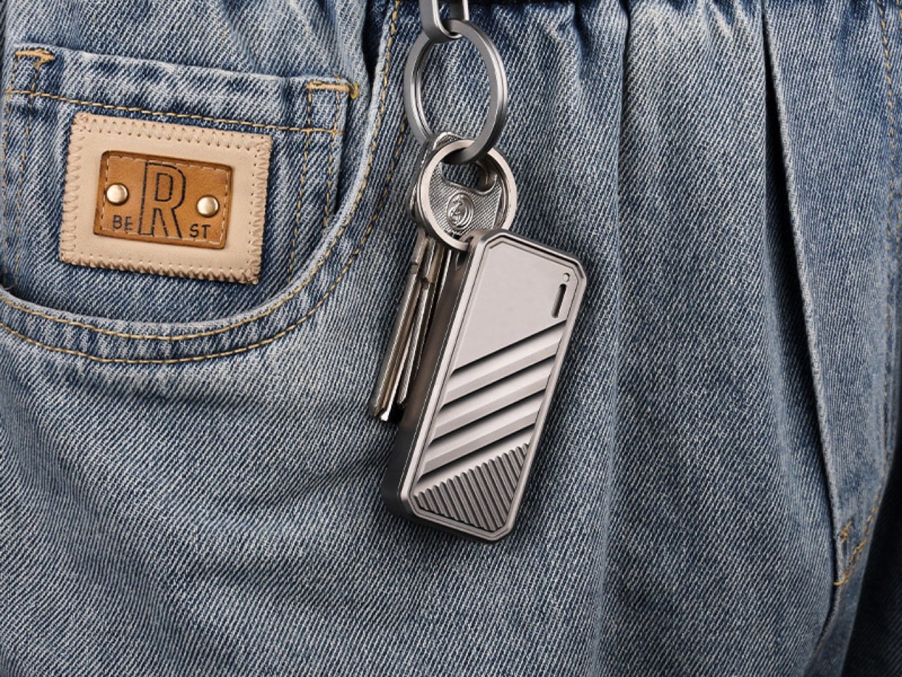
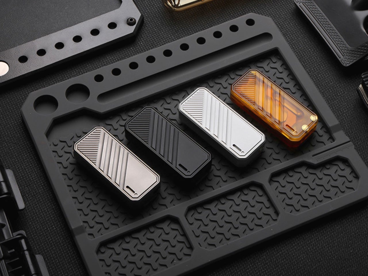
The slider doesn’t just glide loosely; magnets guide the path with a controlled drag that lets you precisely meter out blade exposure. When you let go, that same system pulls the blade back home without any of the jarring snaps common in cheaper auto-retractors. The whole package is just 67mm long by 29mm wide, a palm-sized 12mm thick, so it feels more like a Zippo than a piece of hardware. The body is covered in CNC-machined diagonal lines that give your thumb a natural track to follow, a smart touch that makes the action feel even more intuitive.

Of course, that whole tactile experience changes depending on what you’re holding. The titanium alloy version has a satisfying heft that adds a certain gravitas to the sliding motion; its momentum feels deliberate and smooth. Dropping down to the aluminum alloy model shaves off significant weight for a much lighter carry, making the action feel a bit quicker and snappier. Then there’s the PEI option, a high-performance polyetherimide that feels warm to the touch and has a unique, semi-transparent amber look. The choice isn’t just cosmetic, it fundamentally alters the knife’s presence and the feedback you get from the mechanism.

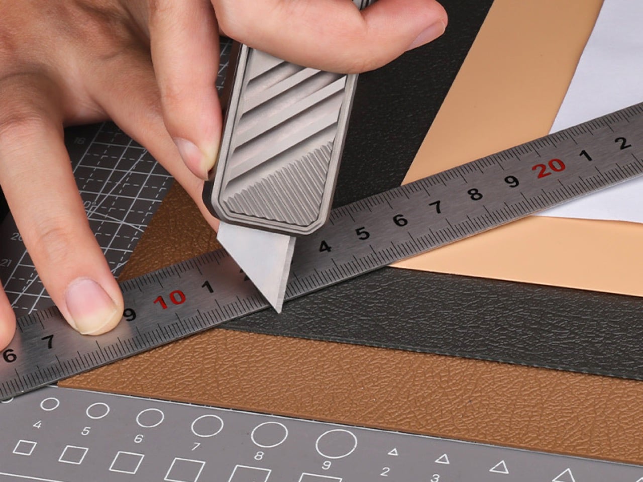
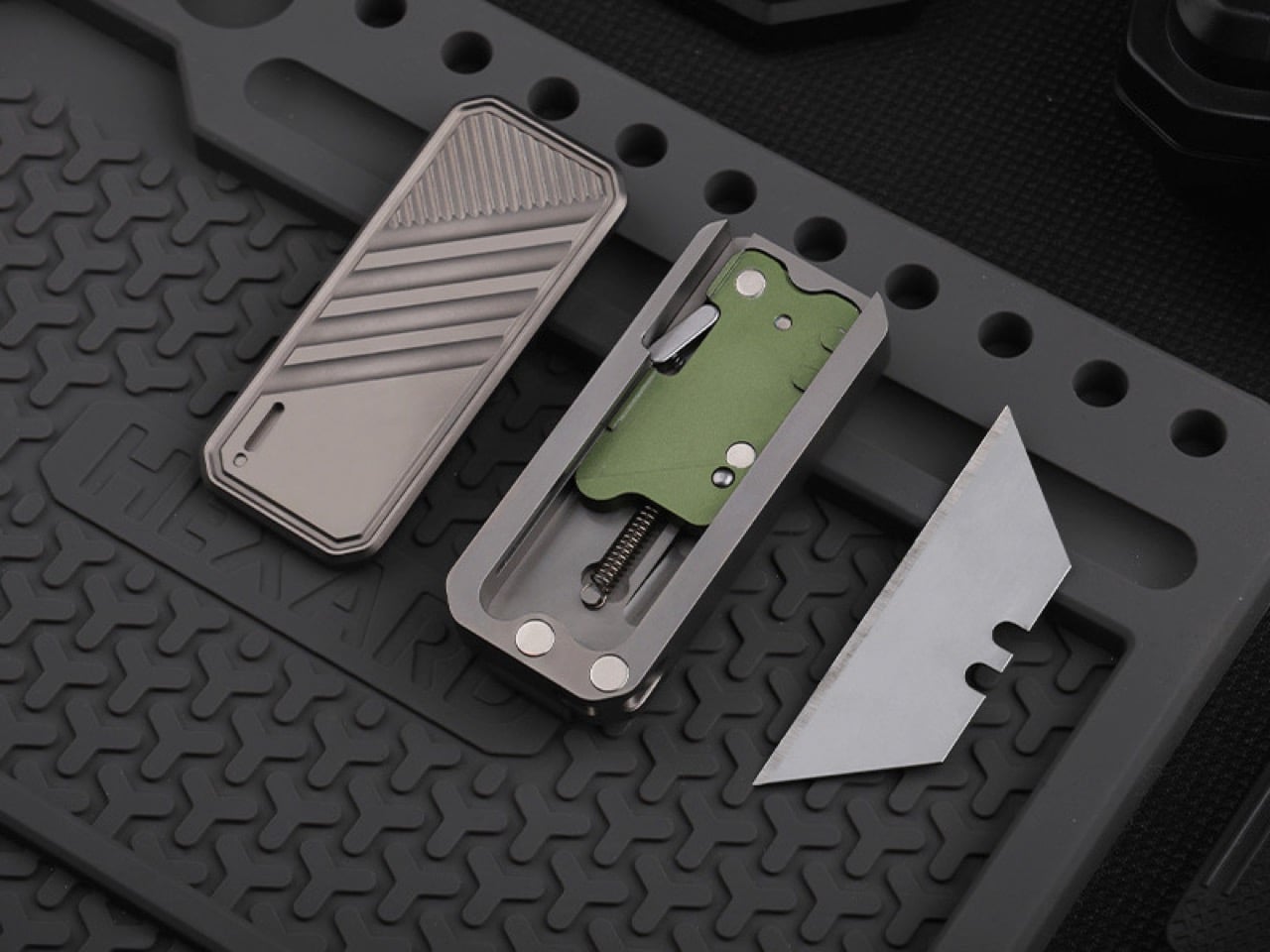
For all the fidget-friendly engineering, it still needs to cut things. ActMax wisely stuck with standard SK5 utility blades, the trapezoidal workhorses you can find anywhere. The blade itself is seated magnetically, which is a clever bit of design that completely eliminates the annoying rattle you get with a lot of replaceable-blade knives. It feels solid, locked in place until you decide to remove it. Because the blade only extends as far as you push, there’s little chance of accidental full deployment, a crucial safety feature for a tool designed to be handled constantly.

And you’ll be swapping blades often if you’re actually using it on cardboard. The process here is dead simple, taking about two seconds with no tools. The same magnetic system that holds the blade secure also makes it easy to pop out and replace. This is one of those small quality-of-life details that becomes a huge deal with long-term use. There’s nothing worse than having to hunt down a tool just to maintain your tool, and ActMax completely sidestepped that headache.

The body itself is clearly built for the long haul, especially the titanium version, which is famously resistant to corrosion and abuse. This feeds directly into a more sustainable ownership model; instead of tossing an entire knife when the edge dulls, you’re only swapping out a small, recyclable sliver of steel. The real genius, though, is its travel-readiness. Pop the blade out, and the DeckShiv body becomes a completely harmless metal slider. The TSA won’t look twice at it, meaning you can carry the handle in your pocket and just buy a new blade for a couple of bucks when you land. That’s a level of everyday practicality most fixed-blade EDCs simply can’t offer.

The final decision really comes down to aesthetics and carry style. You can get the titanium and aluminum versions in either a raw metal or a stealthy black finish, while the PEI comes in its natural amber hue. There’s a small slot for a 1.5mm by 6mm tritium vial if you want a constant low-light glow, plus a removable pocket clip and a keychain loop. The Kickstarter pricing is aggressive, starting at $45 for aluminum and topping out at $75 for titanium, with free worldwide shipping starting June 2026.

Click Here to Buy Now: $45 $55 (18% off) Hurry! Only 32 of 120 left.

The post The Most Addictive EDC Tool of 2026: A $45 Magnetic Fidget Knife You Can’t Put Down first appeared on Yanko Design.

Sony releases two new Bluetooth turntables to spark Gen Z’s love for vinyl

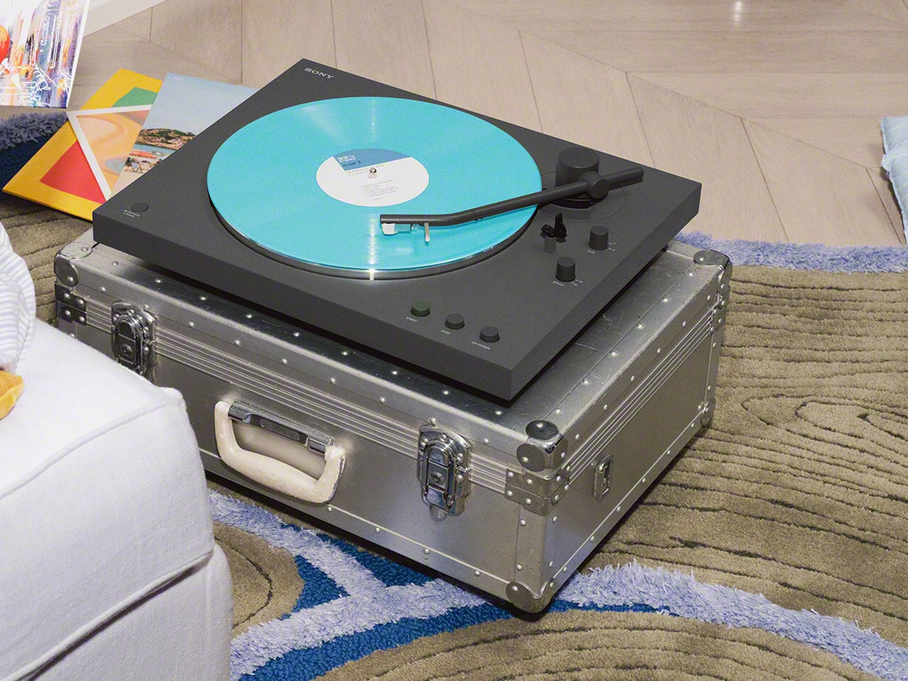
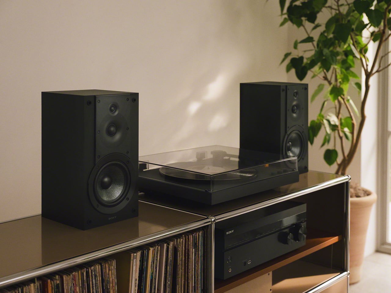
Sony is revisiting the vinyl arena with two new Bluetooth turntables, and for me, it’s resounding confirmation that records have made the comeback we were only speculating about over these years. The new models, the PS-LX3BT and PS-LX5BT, aren’t designed solely for established vinyl audiophiles. With their easy-to-use approach, these Sony turntables are aimed at Gen Z listeners who are just beginning to explore classic record players and CDs.

This is Sony’s first adventure in the vinyl market since the launch of the PS-LX310BT. Released in 2019, the turntable ensured hassle-free Bluetooth connectivity and reliable performance sans complex setups, and the new options are built on the same formula; adding a refined design approach and authentic vinyl sound.

Designer: Sony

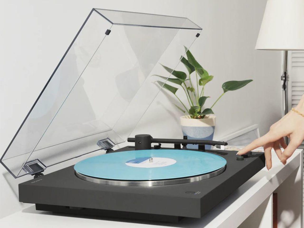
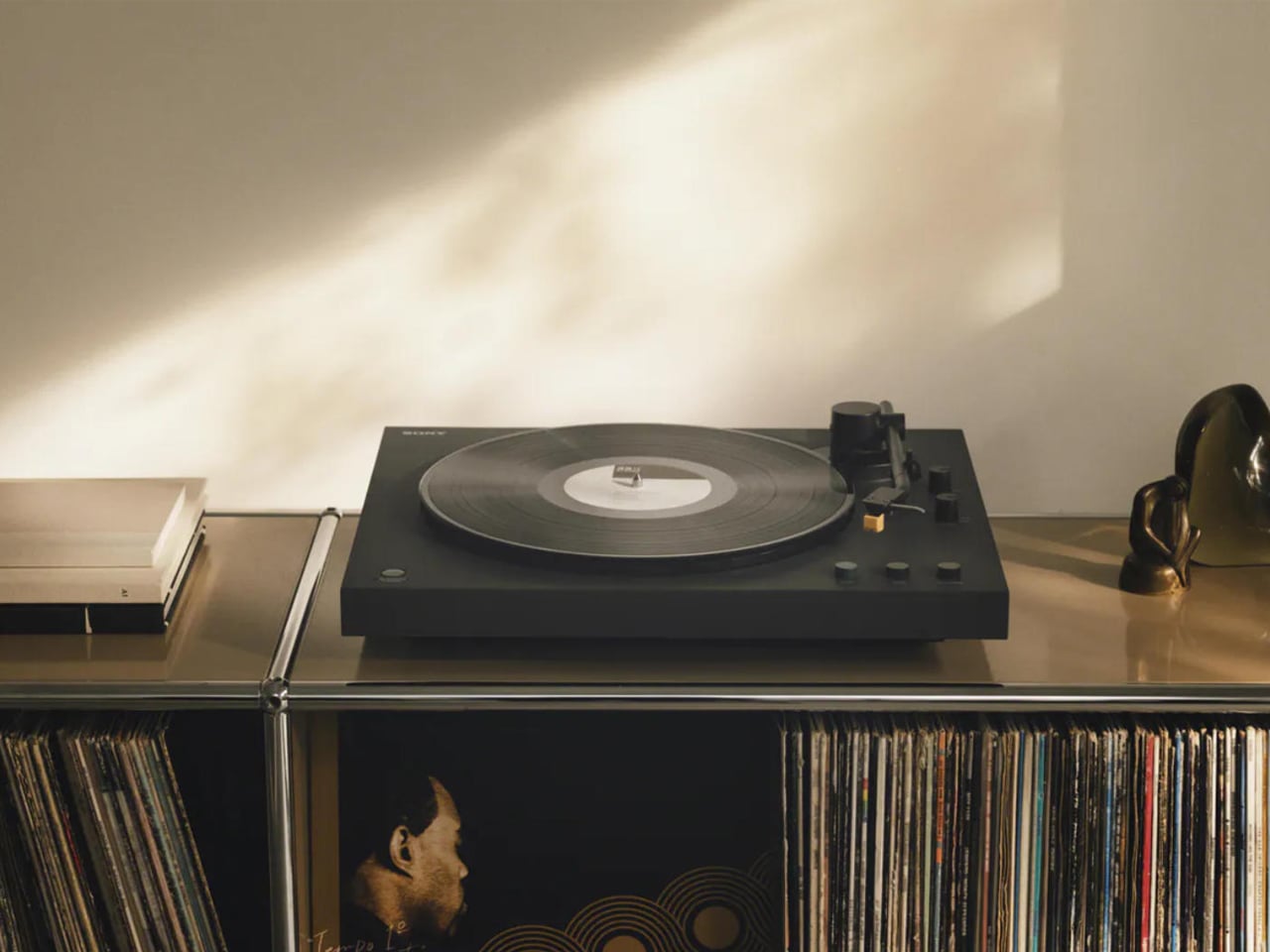
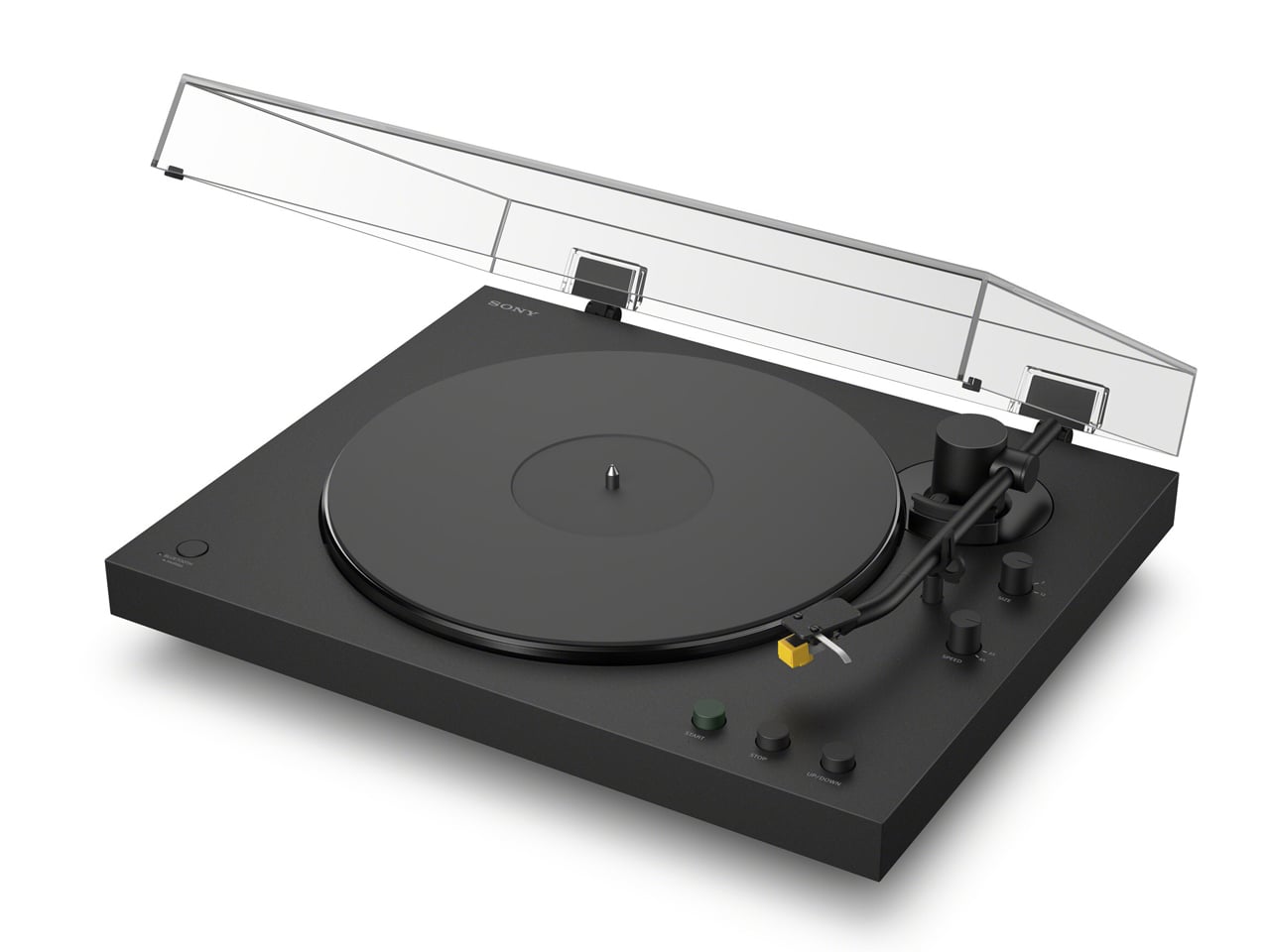
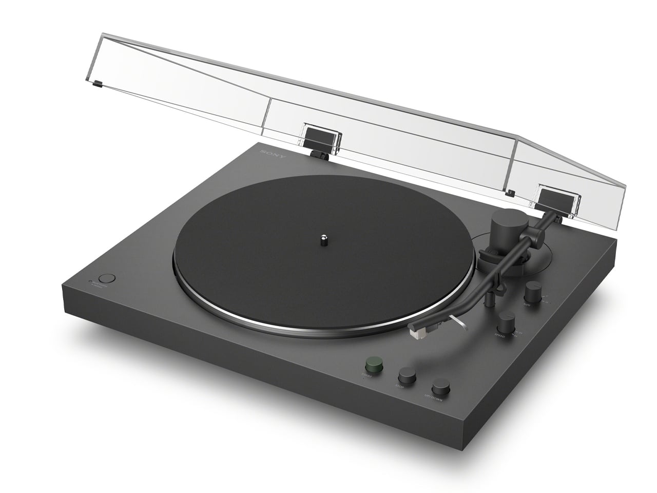
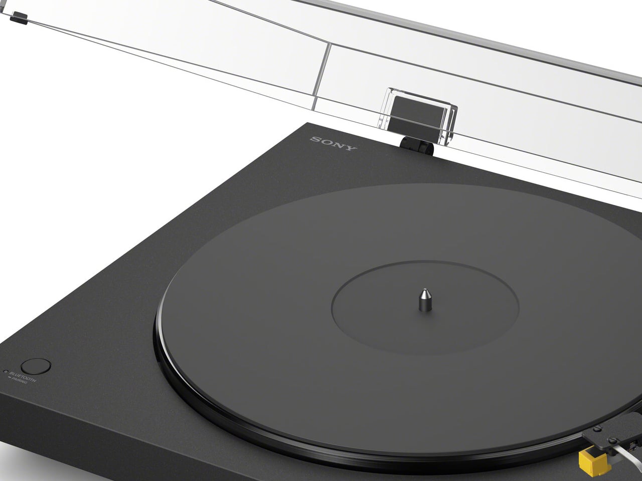
Sony PS-LX3BT and the PS-LX5BT do not have biases. Both the turntables are targeted at first-time vinyl listeners and audiophiles, according to the company’s press information. The units thrive on advanced wireless connectivity options and craftsmanship, standing out visually thanks to the transparent dust cover over the platter. This not only protects the gorgeous thing from dust but also protects the components underneath from accidental damage.

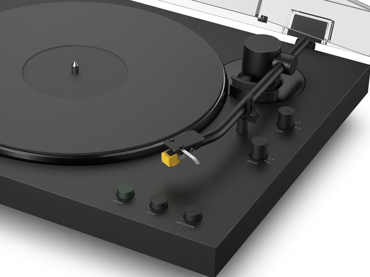
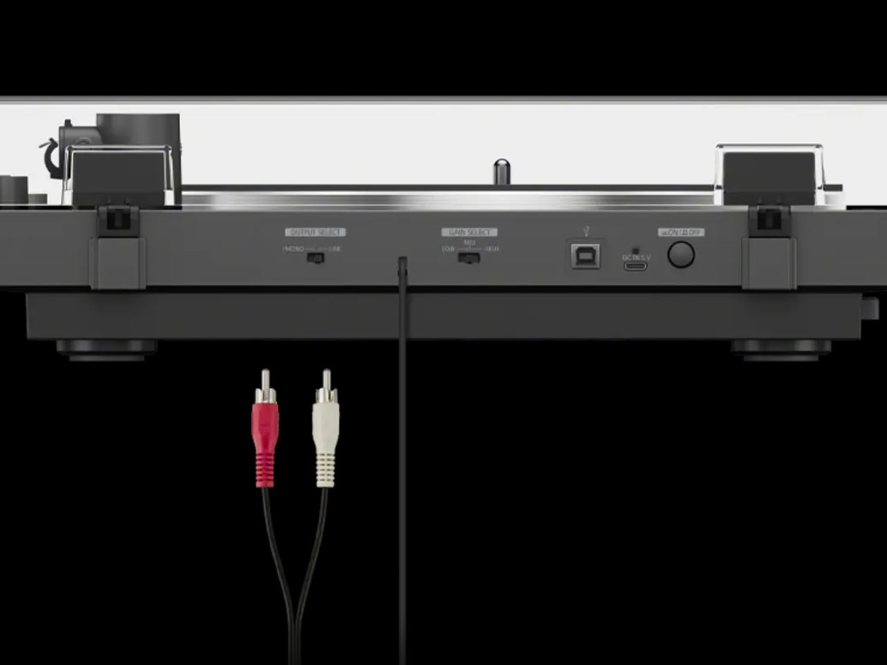
Both units, Sony affirms, are intuitive and easy to operate. A single-button automatic playback and Bluetooth connectivity are configured to allow detailed output in both wired as well as wireless connections. For this, the turntables support aptX, aptX Adaptive, and Hi-Res Wireless Audio, which allow users to connect their devices – headphones and speakers – directly to the turntables without requiring a fully-fledged amp setup.

Even though both turntable supports 33⅓ and 45 RPM records (7″ and 12″) and include built-in phono equalizers to work with powered speakers, they differ in positioning. PS-LX5BT is more premium of the two. It features a slightly more refined look with a unibody design, rubber mat and an aluminum tonearm, offering a premium sound experience. “Engineered to suppress unwanted vibration and preserve audio purity,” it comes with a high-grade cartridge. Priced at a competitive $500, the PS-LX5BT offers audiophile-level wireless audio and features a gold-plated audio jack for wired connections.

The PS-LX3BT, on the other hand, offers “warm analogue sound with smooth tracking” for those enjoyable everyday moments that are rare to create with the turntable,s otherwise cumbersome to use. The turntable is equipped with an audio cable and phono equalizer to be used straight out of the box, no real setup required, even for those just starting out with vinyl. This unit is priced comparatively lower and is available for preorder at $400. Interestingly, both of Sony’s new turntables will be sold in recycled packaging, reflecting Sony’s commitment to sustainability.

The post Sony releases two new Bluetooth turntables to spark Gen Z’s love for vinyl first appeared on Yanko Design.
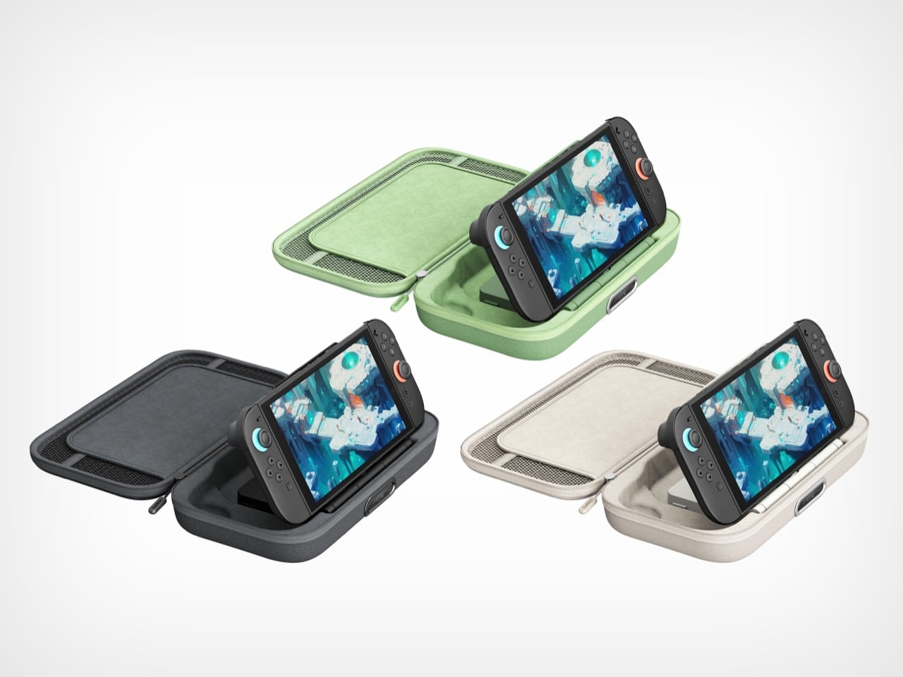
Belkin’s New Switch 2 Docking Case Has a 10,000mAh Battery That Lets You Charge While Shut

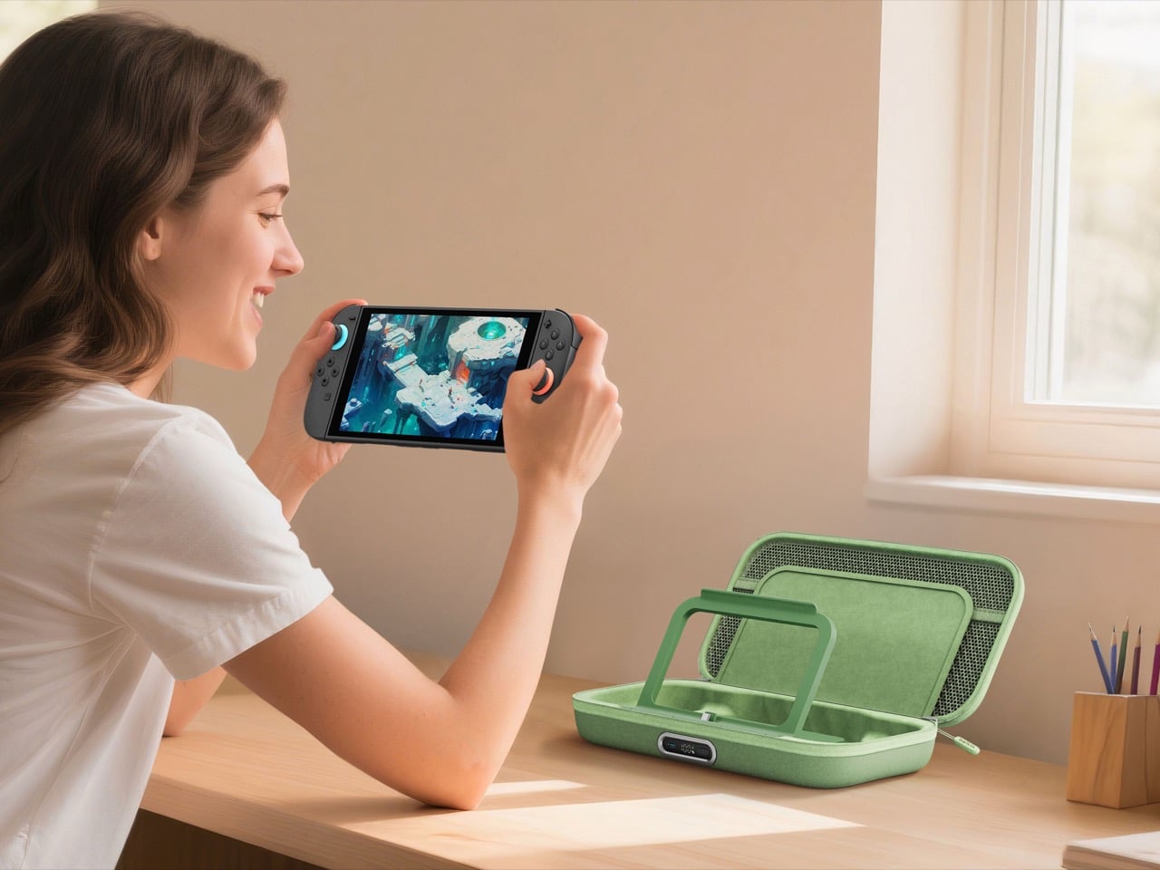
The best gaming accessories solve problems you didn’t know you had. Before you use them, the old way seems fine. After you use them, going back feels like torture. Belkin’s new Charging Case Pro for Nintendo Switch 2 falls squarely into this category.

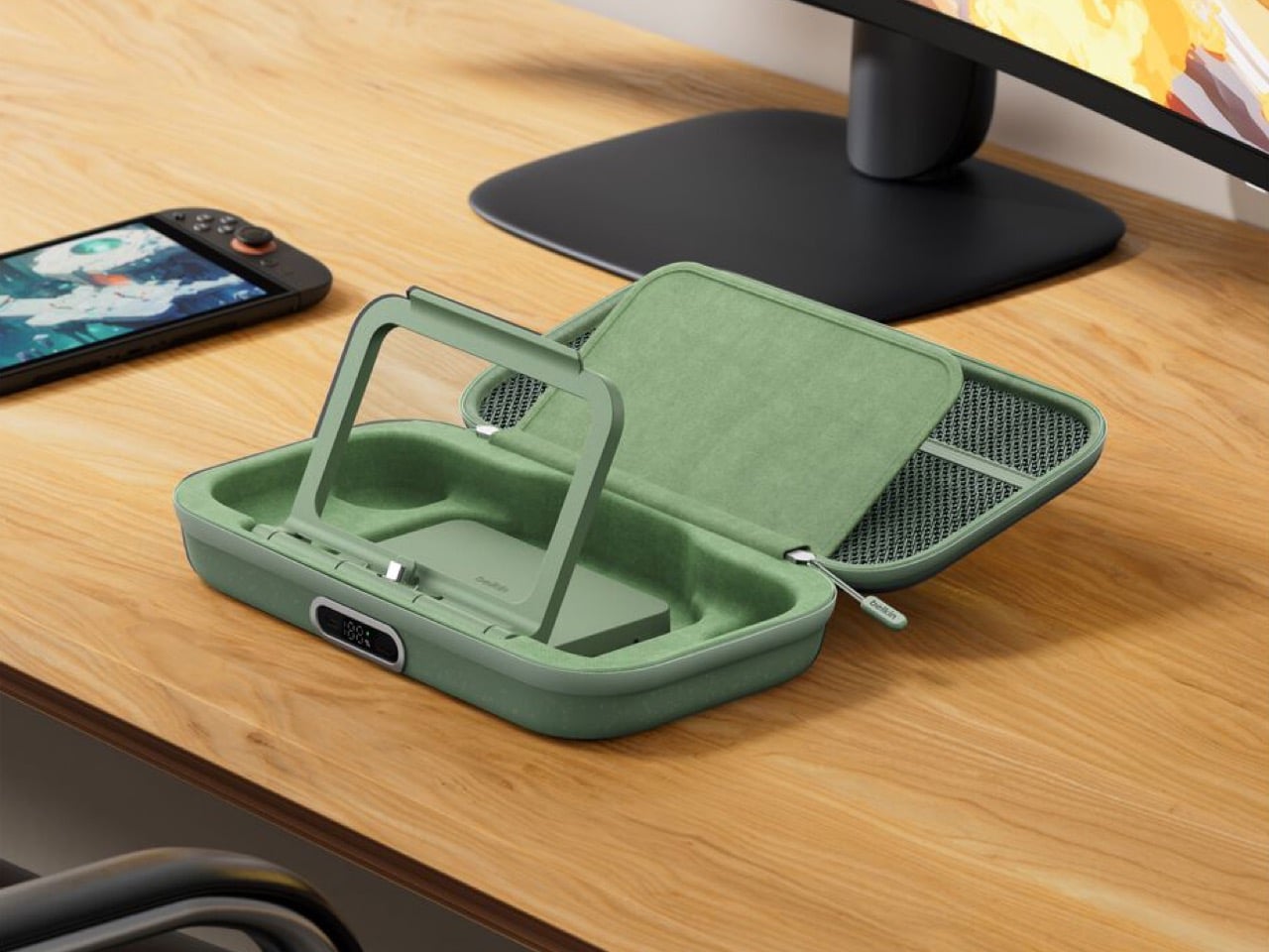
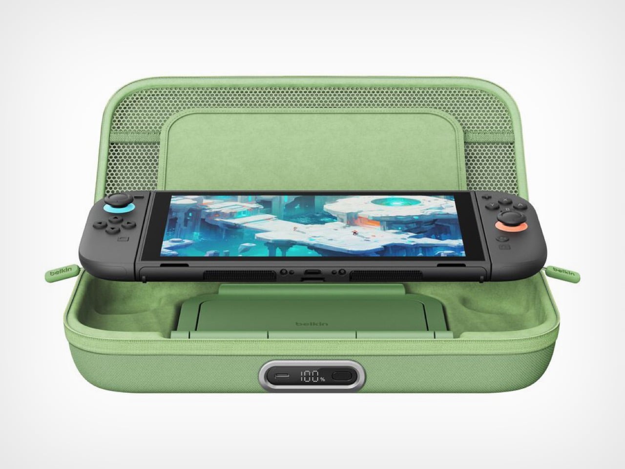
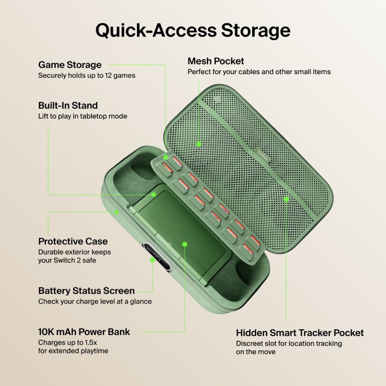
The original Charging Case launched last June with a solid concept: protect your Switch 2 and keep it powered during long trips. But Belkin’s designers clearly listened to user feedback and spotted the pain points. The Pro version addresses nearly every frustration from the first generation. You can charge the battery without unzipping the case. You get a proper integrated stand instead of relying on the console’s kickstand. There’s even a battery level display so you’re never guessing how much juice remains. These aren’t revolutionary features individually, but together they transform a good accessory into an essential one.

Designer: Belkin

Having to unzip your case, fish out the battery pack, plug it in separately, then put everything back together just to charge overnight is the kind of stupid friction that kills products. The external USB-C port fixes this entirely. Leave your Switch 2 inside, plug one cable into the front, done. The little OLED display shows precise battery percentage, which actually matters when you’re deciding whether to top up before a three-hour flight or risk it.

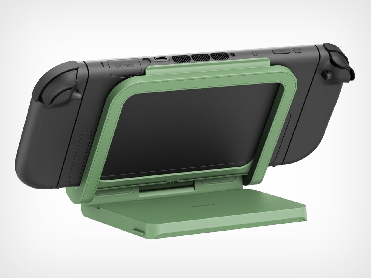
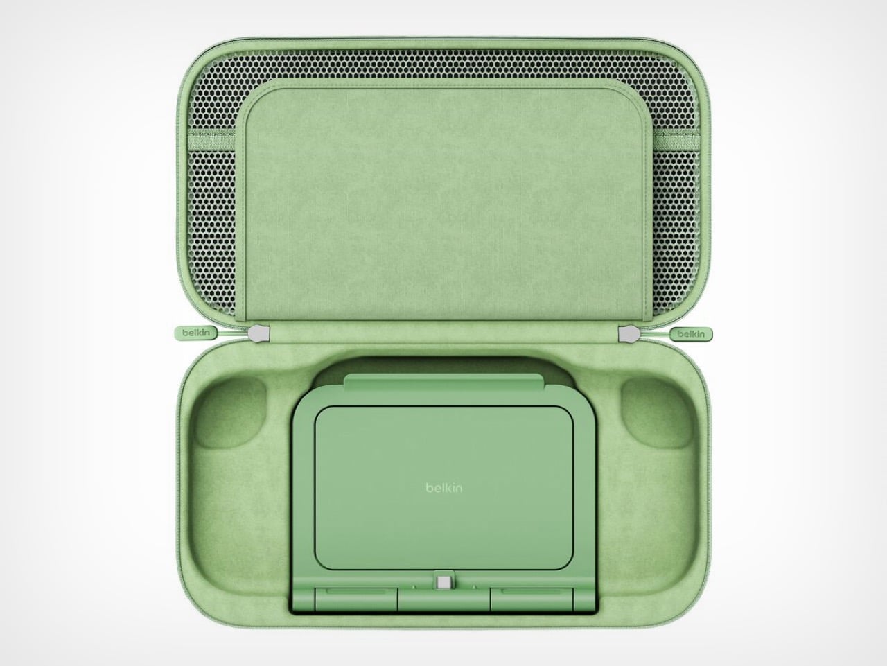
The 10,000mAh battery doubles as an adjustable stand with a built-in USB-C connector. The Switch 2 slots onto it like the official dock and starts charging immediately at whatever viewing angle works. The original version forced users to balance the console on its mediocre kickstand while a cable dangled between device and battery. One approach solves the problem. The other creates new ones.

Belkin claims 1.5 full charges from the 10,000mAh capacity, translating to 12 to 15 extra hours depending on what’s running. Graphically intensive games like Zelda sequels will drain faster than pixel art indie platformers, but either way that’s enough power to cross the Atlantic twice before needing an outlet. For a case this compact, the capacity-to-size ratio makes sense. A bigger battery would mean carrying a brick.

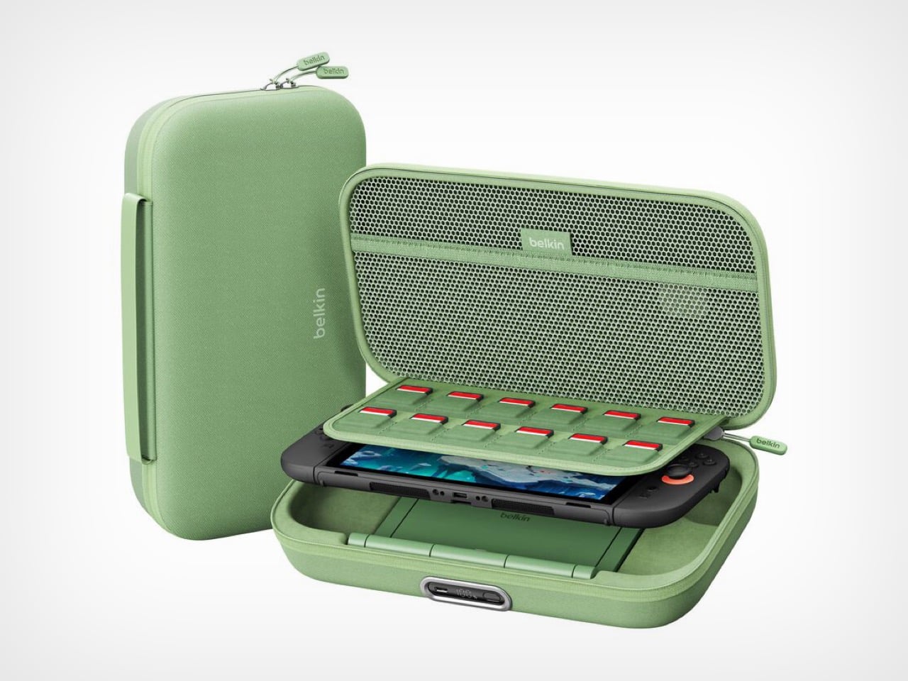
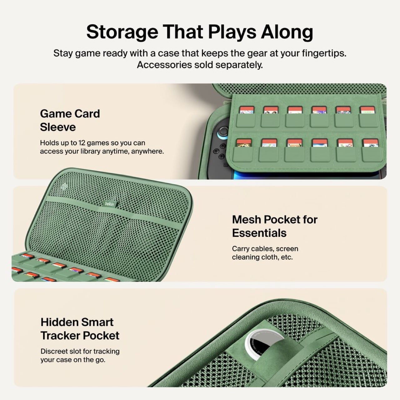
Twelve individual game cartridge slots sit under a flip-down cover, each one molded to prevent rattling. A mesh pocket handles cables and microfiber cloths. Belkin included a hidden compartment sized exactly for an AirTag or Tile tracker. Considering a fully loaded case with console represents about $500 of hardware, location tracking becomes a practical feature rather than a gimmick. People lose things. Expensive things get stolen. Planning for that shows sensible product design.

Three colorways: sage green, black, sandy beige. The green matches Nintendo’s brand aesthetic. Black hides wear better over time. The beige photographs well but might show dirt faster than the darker options.

Charging $99.99 means a $30 jump from the original’s $69.99 price. That’s a 43% increase, which sounds aggressive until you itemize the changes. External charging port. Battery display. Integrated stand with direct connection. Better storage. Refined build quality throughout. Spread $30 across those improvements and the math works. Belkin could have pushed $120 easily and still moved units. They left money on the table, frankly.

This reads like version 2.0 engineering instead of the lazy incremental updates most companies ship. Belkin rebuilt the internal layout, redesigned the battery for dual purpose use, and solved actual user complaints instead of adding RGB lighting or whatever. Most “Pro” accessories just mean “black version, higher price.” This one actually earns the name.

Own the original and it works fine? Skip this. Shopping for your first Switch 2 charging solution or fed up with your current setup? Start here. It’s up on Belkin’s site now, probably hitting Amazon within a week because that’s how 2026 works.

The post Belkin’s New Switch 2 Docking Case Has a 10,000mAh Battery That Lets You Charge While Shut first appeared on Yanko Design.

Tower Desk Organizer Turns a Strip of Desk into a Calm Landing Zone

Desks and side tables collect phones, glasses, remotes, pens, keys, and watches by the end of the day. The half-hearted attempts to corral them in a bowl or let them drift into a loose pile never quite work, and by the next morning, you are hunting for your phone under a stack of papers or fishing keys out from behind the lamp. What is missing is not more storage, but a small, clear structure that tells each thing where to go.

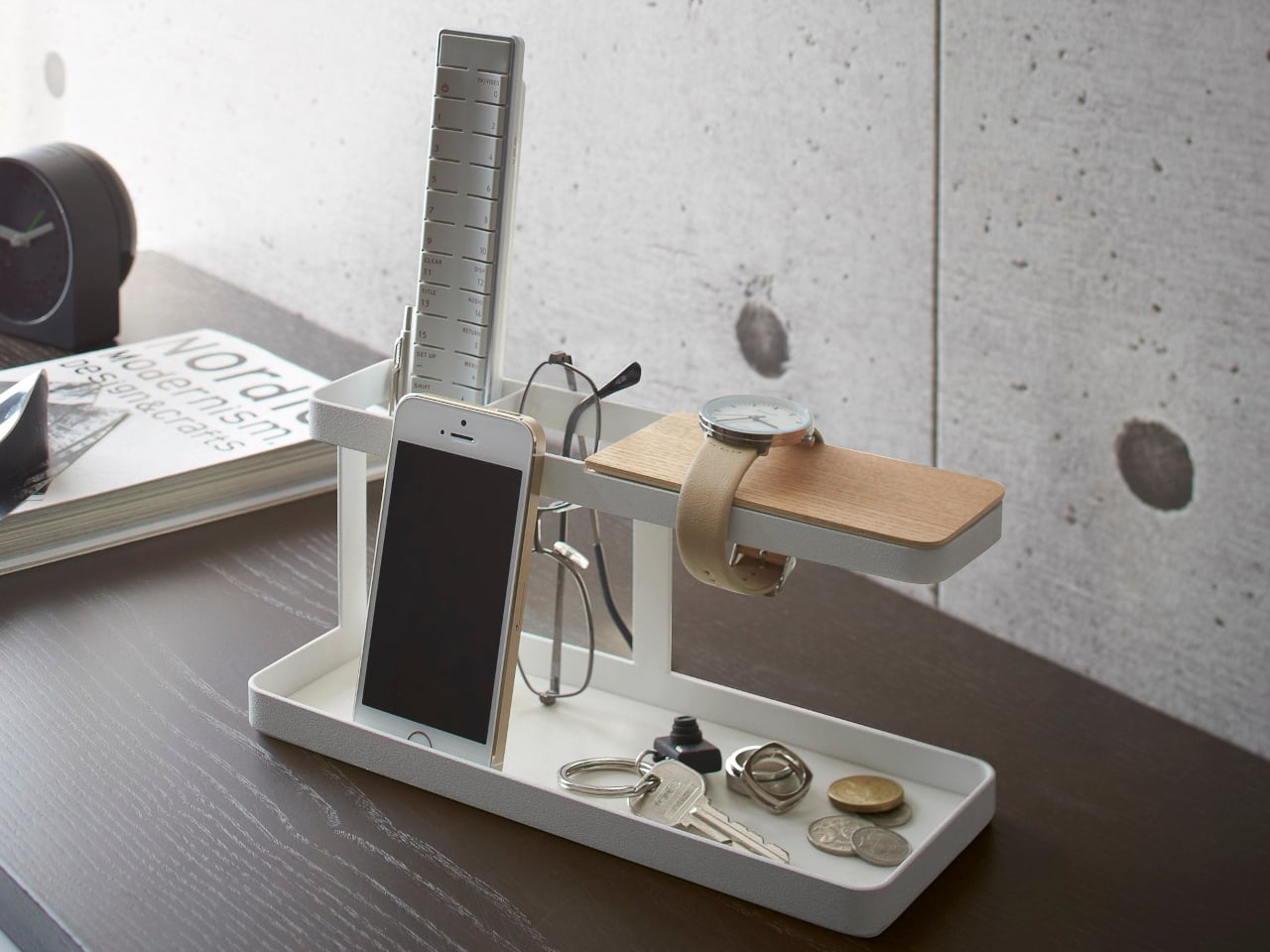
Yamazaki’s Tower Desk Organizer is a compact steel and wood bar that behaves more like a miniature piece of furniture than a generic tray. It has a slim base tray divided into two zones, a vertical post, and a raised wooden rest for watches or bracelets, all within a footprint that fits between a keyboard and monitor or next to a sofa arm.

Designer: Yamazaki Home

Sitting down at a desk in the morning, you drop your phone into one side of the tray, slide a pen and small notebook into the other, and hang a watch on the wooden bar while you type. The silicone mat keeps the phone from sliding when notifications buzz, and the low walls of the tray stop things from drifting under papers or behind the laptop. It becomes a predictable spot instead of another improvised pile.

By evening, the same organizer moves to a living room table, where it now holds a couple of remotes, reading glasses, and a phone while you watch something or read. The two compartments make it easy to separate tech from analog items, so you are not fishing for a remote under a pile of keys. The watch bar doubles as a small display for a bracelet or everyday watch when you are off the clock.

The powder-coated steel body with its textured matte finish, available in white or black, and the plywood top plate that adds a warm accent, feel more like a quiet architectural element than a gadget. The combination lets it blend into both minimal workspaces and softer living-room setups without drawing attention to itself, staying useful while staying calm.

The organizer is designed for smartphones, not tablets, and the watch bar comfortably holds two large watches rather than an entire collection. It is a home for a curated set of essentials, not a dumping ground. That constraint is part of what keeps it from turning into another overstuffed catch-all that defeats its own purpose and ends up just as messy as the pile it replaced.

The Tower Desk Organizer treats everyday clutter as something worth designing for at a structural level. By giving phones, glasses, remotes, and watches a simple base, post, and beam to relate to, it turns a messy corner of the room into a small, legible landscape. Sometimes the most effective organizing tools are not big systems with a dozen compartments, but a single, well-drawn line on the desk that quietly suggests where things belong.

The post Tower Desk Organizer Turns a Strip of Desk into a Calm Landing Zone first appeared on Yanko Design.

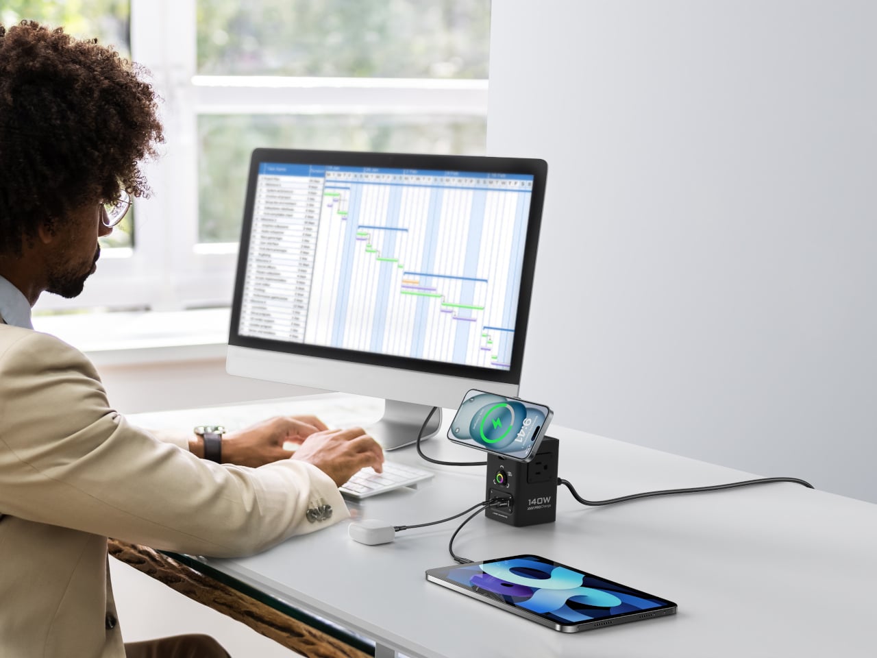
PISEN 140W Tower Replaces 7 Chargers with One Vertical MagSafe Hub

Most desks end up with a laptop brick, a phone charger, a watch puck, a wireless stand, and a small power strip fighting for space. The ritual of swapping plugs, stealing power from lamps, and dragging cables across the keyboard becomes part of the background noise. The problem is not just power but how scattered that power has become and how much horizontal real estate disappears under adapters.

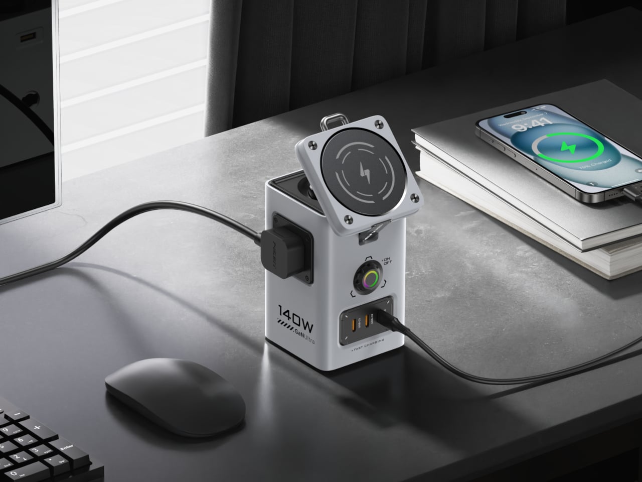
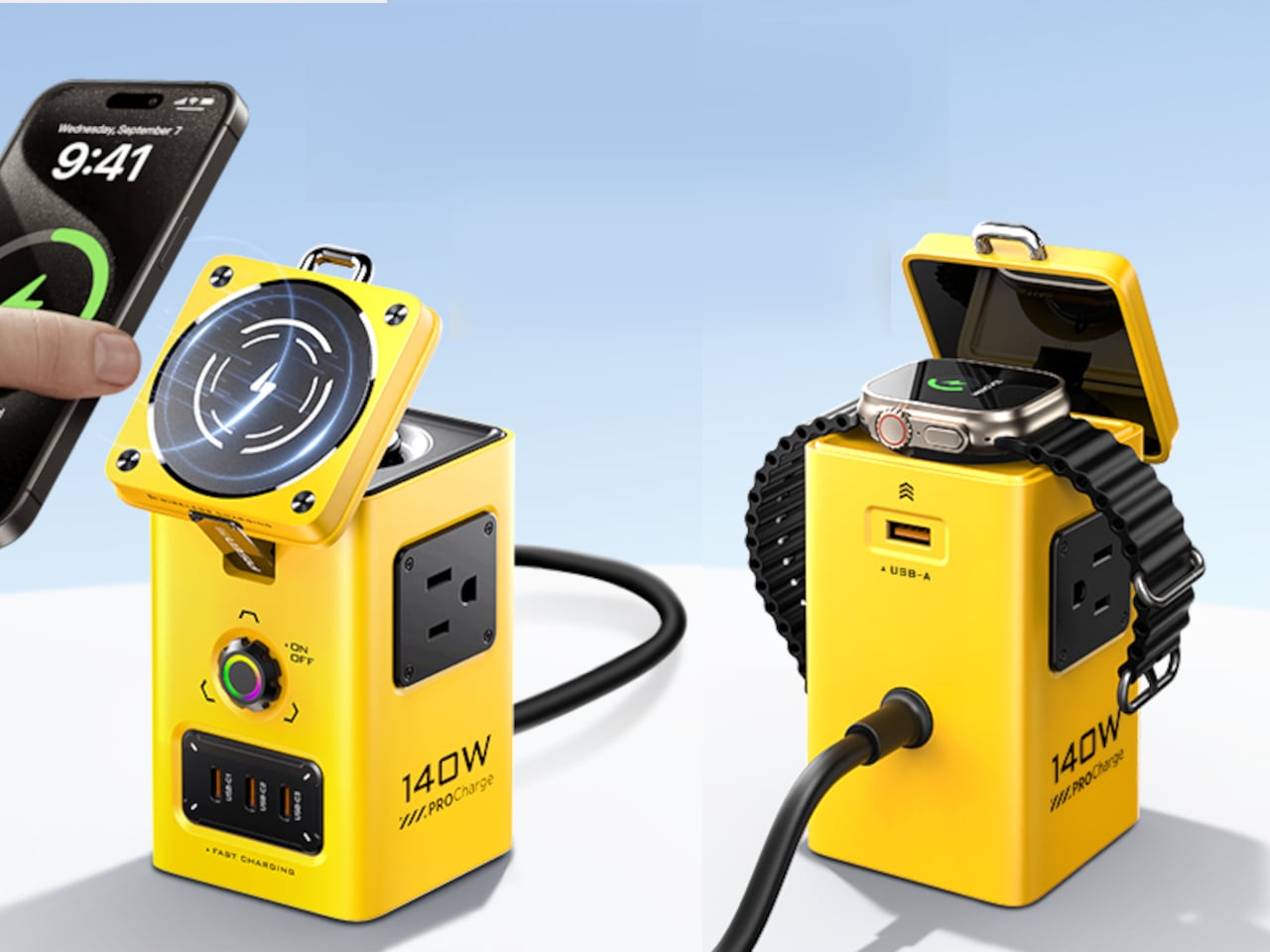
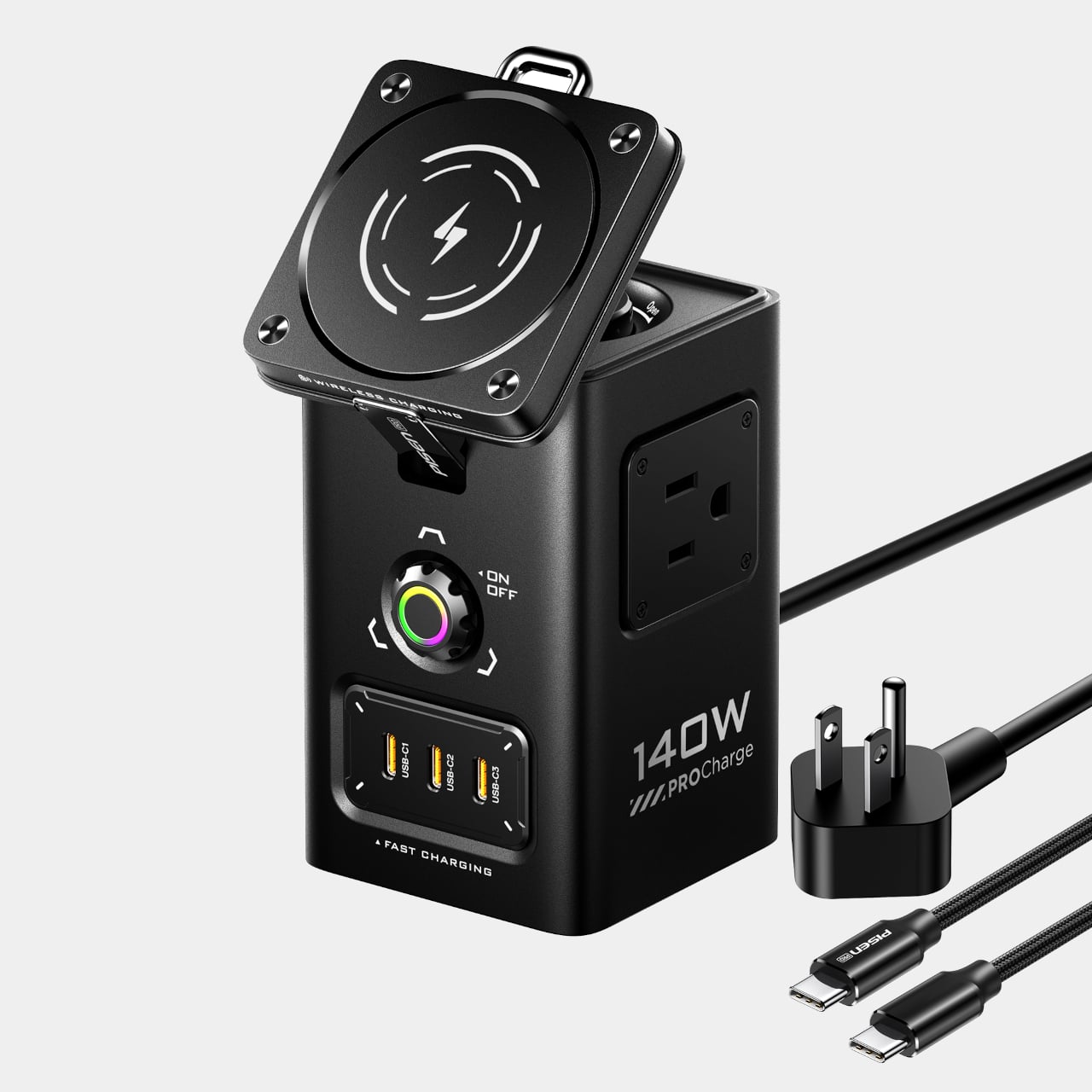
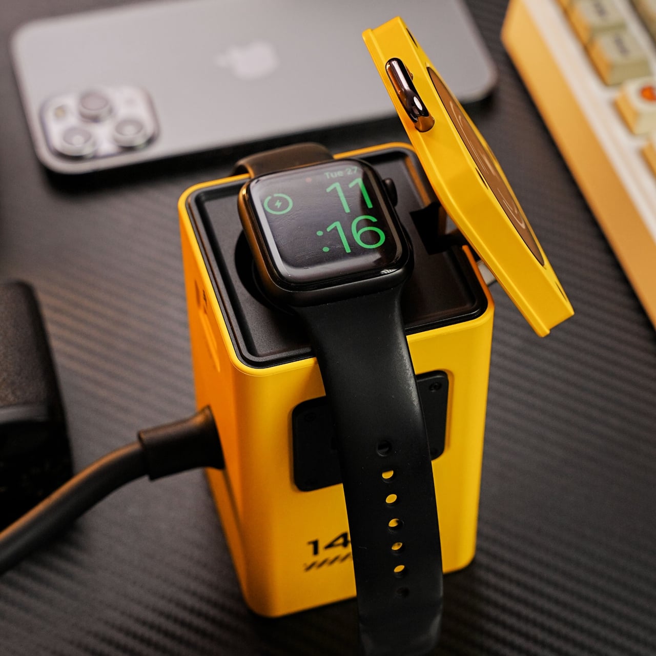
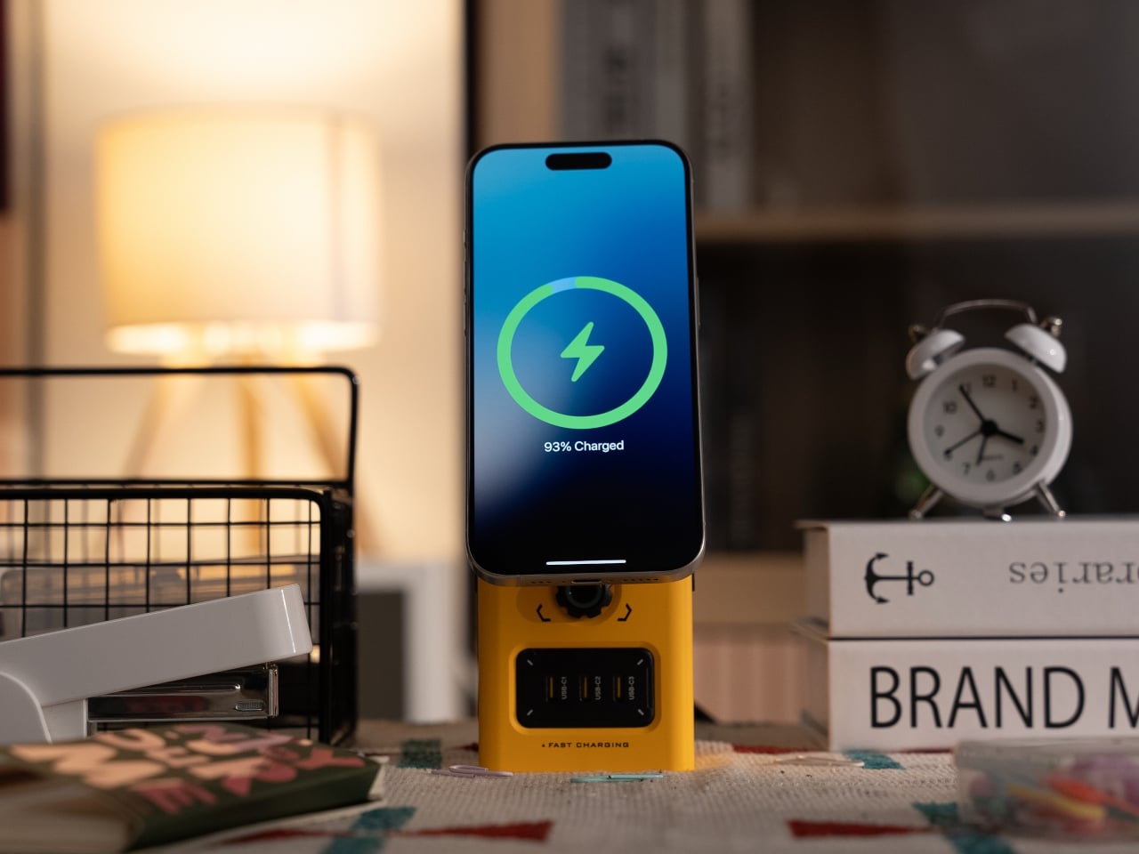
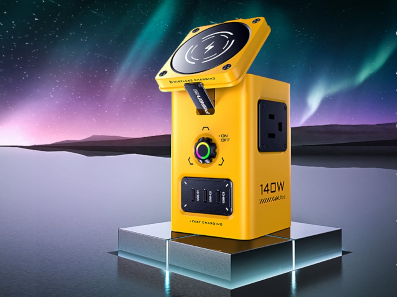
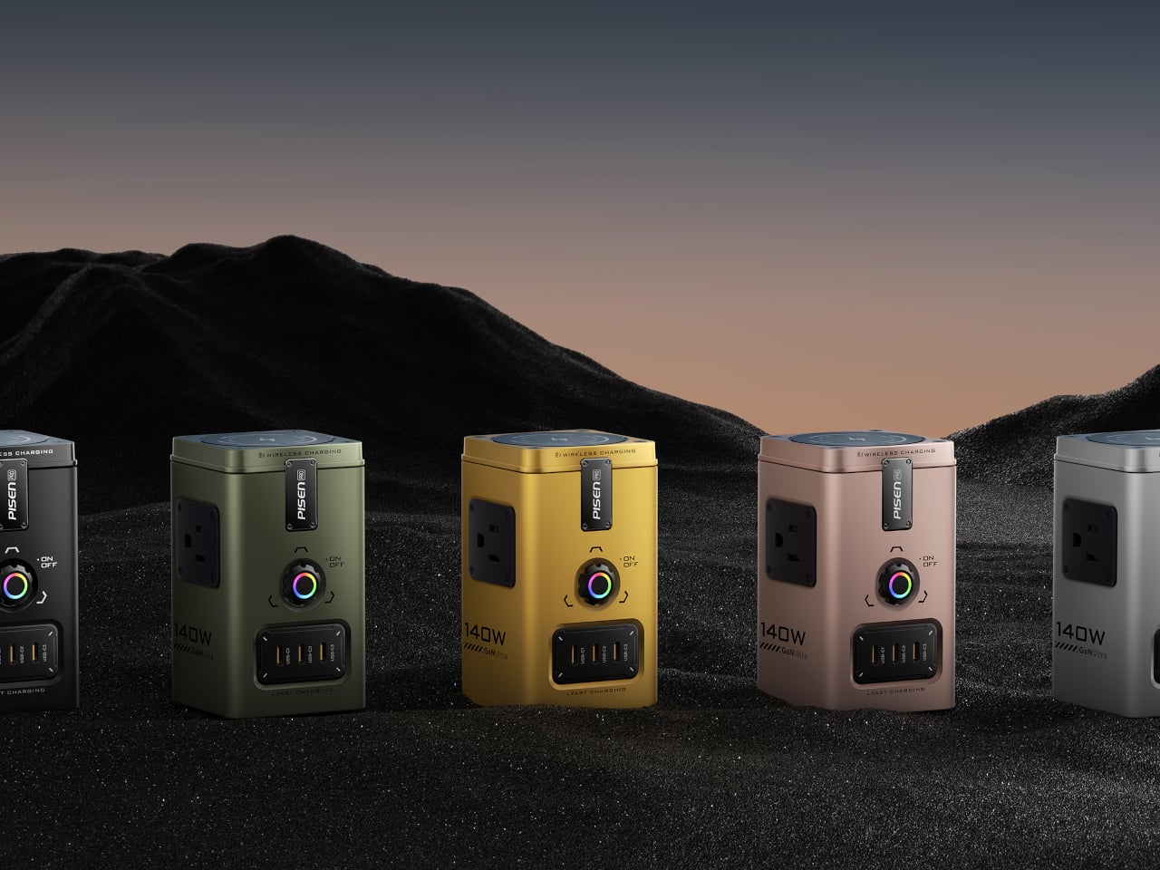
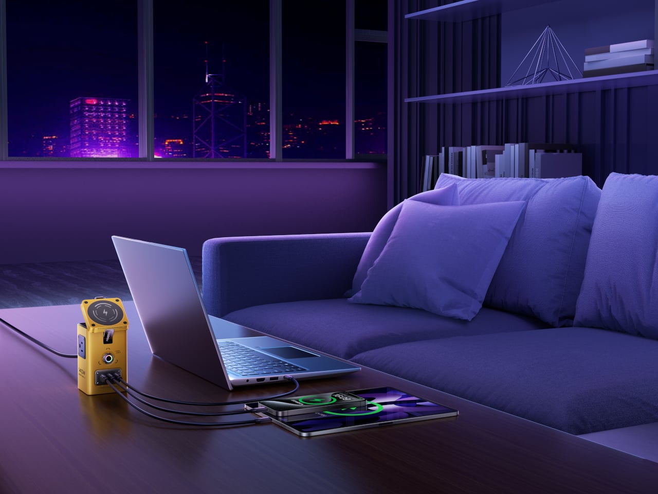
PISEN’s 140W Mega Charging Hub is a compact vertical tower that pulls everything into one place. It combines two AC outlets, three USB-C ports, one USB-A port, a Qi2-certified 15 W MagSafe pad for iPhone, and a dedicated wireless charger for Apple Watch and compatible earbuds. Available in black or bright yellow, it is meant to live on the desk, with its color and form turning a charging hub into something closer to a small power console.

Designer: PISEN

Dropping a laptop cable into one USB-C port, plugging a monitor or lamp into the AC outlets, and snapping an iPhone onto the magnetic pad, the tower becomes a small staging area. The watch rests on its charger, earbuds sit nearby, and the remaining ports top up a tablet or spare phone. Instead of a tangle of bricks scattered across the surface, there is one hub doing the work, tucked into a corner but fully loaded.

The hub uses GaN to push up to 140 W through a single USB-C port when needed, enough to feed a power-hungry laptop. It supports PD3.1, QC3.0, PPS, AFC, FCP, DCP, and PE, so tablets and phones see their preferred fast-charging profiles. When more devices join, power is shared intelligently across ports instead of everything grinding to a slow trickle, keeping the desk humming through long sessions.

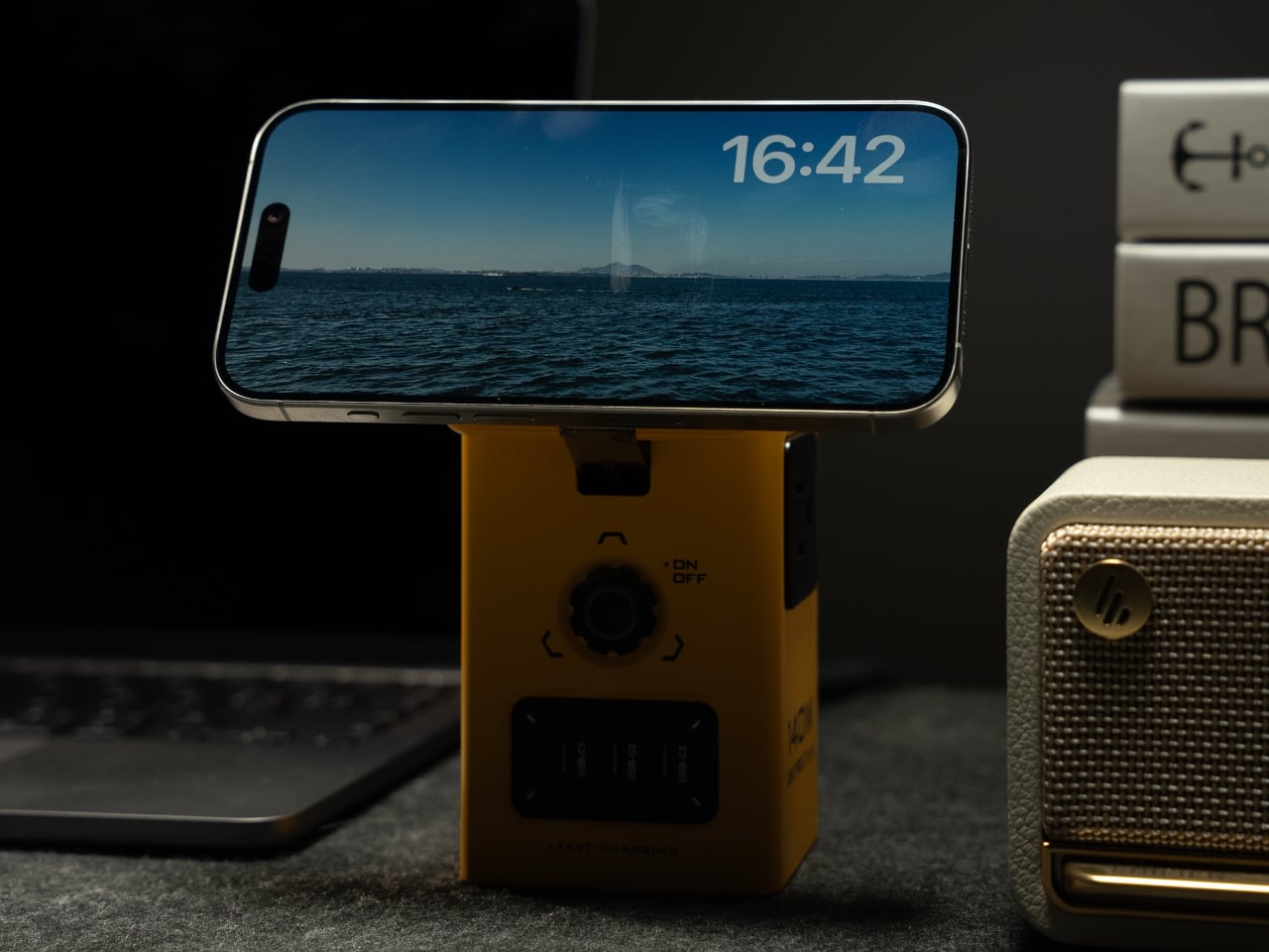
The Qi2 MagSafe pad on top locks onto iPhone 12 through 16 series with proper magnetic alignment and can tilt up to 65 degrees, making it easy to glance at notifications, take a call, or watch a video while charging. That small hinge turns the charger into a stand, which matters when the phone effectively becomes your second screen or the only thing within arm’s reach when the laptop is buried.

An Aurora Australis-inspired breathing light pulses gently when charging, shifting color with voltage, green at 5 V, purple between 9 and 15 V, yellow at 20 V. It is part status indicator, part ambient detail, giving the hub a slightly cyberpunk, glowing-console vibe. Underneath, nine layers of protection handle overvoltage, undervoltage, overcurrent, overheating, short circuit, and foreign object detection, with GaN keeping temperatures under control.

It is not a minimalist block that disappears. Once loaded with cables and a phone perched on top, it looks more like a small power tower with intentional visual density. The yellow version especially leans into that industrial, almost sci-fi energy. The PISEN hub condenses that scattered ecosystem into one vertical footprint where everything plugs in, pulses, and charges without taking over the entire desk.

The post PISEN 140W Tower Replaces 7 Chargers with One Vertical MagSafe Hub first appeared on Yanko Design.
Tab Keeps Papers Visible on Your Desk Instead of Buried in Folders

Desks start tidy and slowly fill with stacks of printouts, notebooks, sketchpads, and loose sheets. The half-hearted attempts to tame it with file folders and trays end up closed, stacked, and forgotten in a corner or drawer. Most filing systems are great at hiding things but not so great at keeping the work you are actually doing visible and ready, which means you either let the surface turn into chaos or you bury everything and lose track.

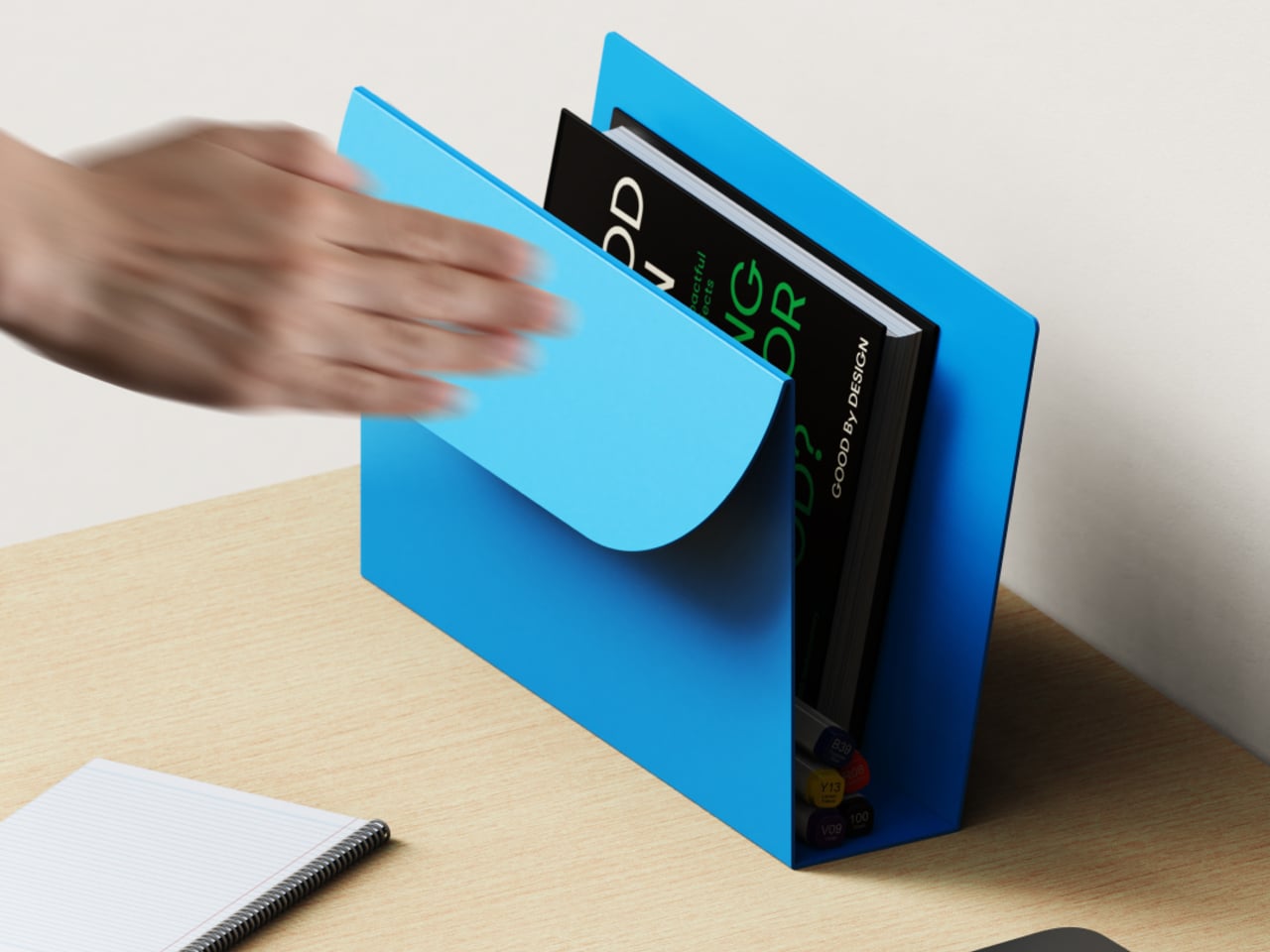
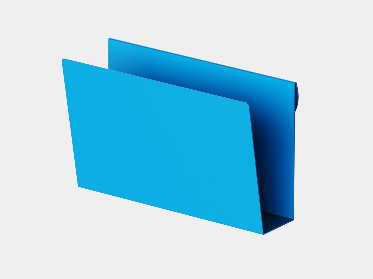
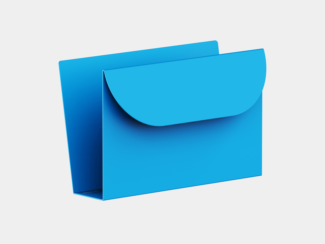
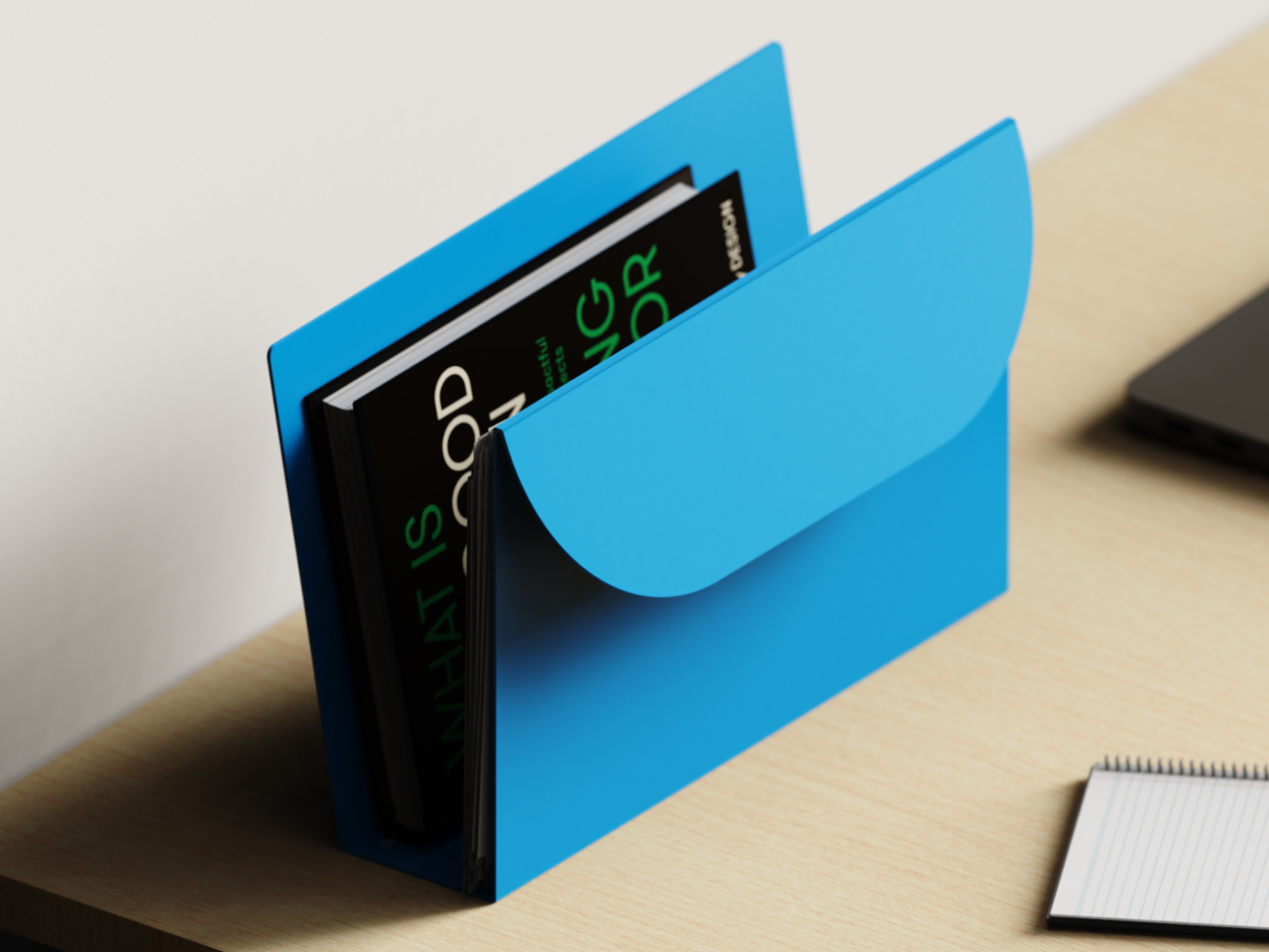
Tab is a desk organizer that rethinks the file through form, material, and use. It is made from a single folded sheet of metal, forming a self-standing sleeve that holds papers, books, sketches, and everyday tools in one continuous, open structure. Instead of zips, lids, or clasps, it borrows the logic of a folder but leaves everything accessible from the top and side, removing the need for hiding or closing.

Designer: Rithik Ravi

Sitting down to work with a few active projects, the current book, notebook, and reference prints slide into Tab, standing upright instead of spreading across the surface. When you switch tasks, you reach into the same place, pull out what you need, and drop it back when you are done. The organizer becomes a physical “now” stack that keeps the desk clear without burying anything in a drawer you will forget to check.

The open, continuous form changes behavior in small ways. Because there is no lid to open or box to slide out, grabbing a sketch or document feels as low-friction as picking something up off the table, which means you are more likely to put it back when you are done. The metal walls keep everything aligned and upright, so even a handful of items feels ordered rather than precarious.

The choice of a single folded metal sheet keeps the object visually quiet and structurally clear. There are no visible joints or added parts, just a few decisive bends that create the base, back, and front. The minimal geometry and solid color let it sit quietly on a desk, acting as a calm backdrop for whatever you place inside, rather than adding another fussy object to the mix.

Tab is not meant to swallow an entire archive. Its narrow footprint and single compartment work best when you treat it as a home for active work, not everything you own. Overfilling it would defeat the point, and people who need strict separation between projects might want more than one. But that constraint is also what keeps it from turning into another overstuffed in-tray that never gets emptied.

Tab turns a familiar storage object into a purposeful everyday design. By keeping active work visible and immediately accessible, it nudges you toward a simple rhythm of organizing, selecting, and returning without much thought. A single folded sheet of metal, shaped with the right intent, can do more for focus and clarity than a whole stack of labeled folders ever did, especially when those folders are closed and stacked somewhere you stopped looking six weeks ago.

The post Tab Keeps Papers Visible on Your Desk Instead of Buried in Folders first appeared on Yanko Design.
A Wireless Charger Shaped Like a Picnic Bag That Also Cleans Your Phone

Phones became both lifelines and germ magnets during the pandemic: the one thing you touched constantly but probably never cleaned properly. People started wiping screens with alcohol wipes or shirt sleeves, while juggling separate UV boxes and wireless chargers that never felt portable. The idea of a cleaner phone battling the reality of one more device to pack rarely worked out in daily practice.

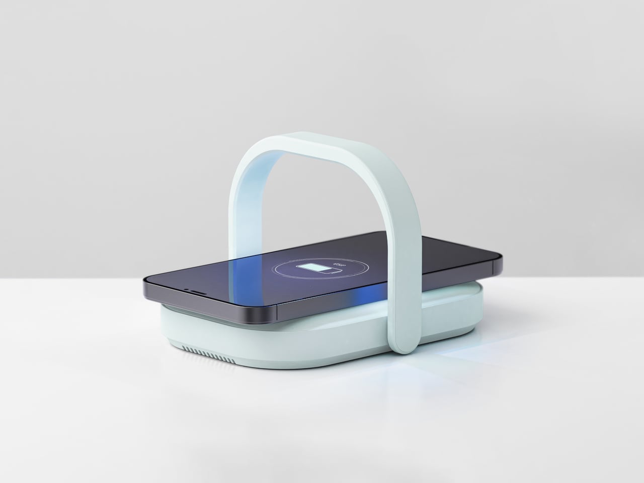
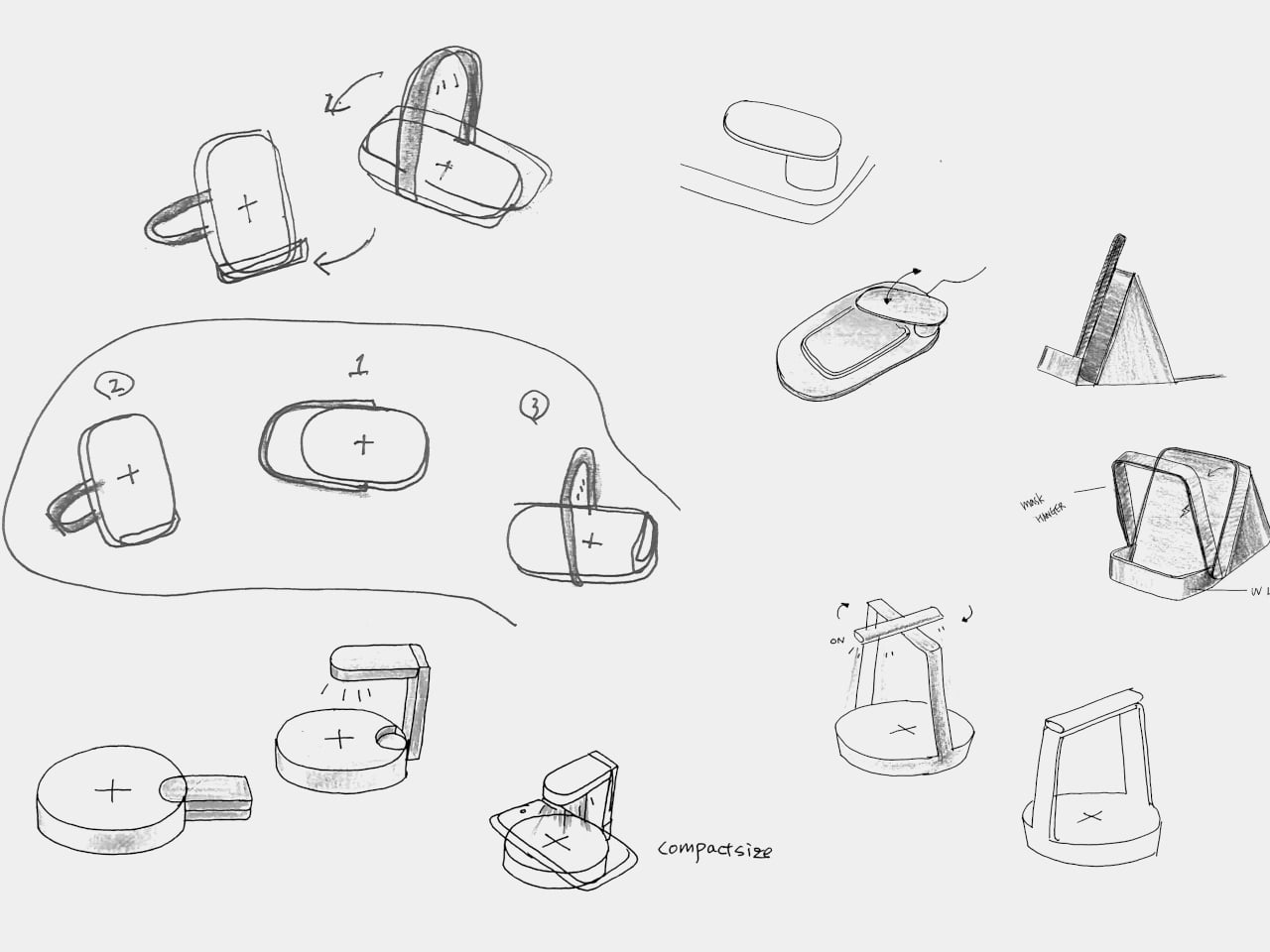
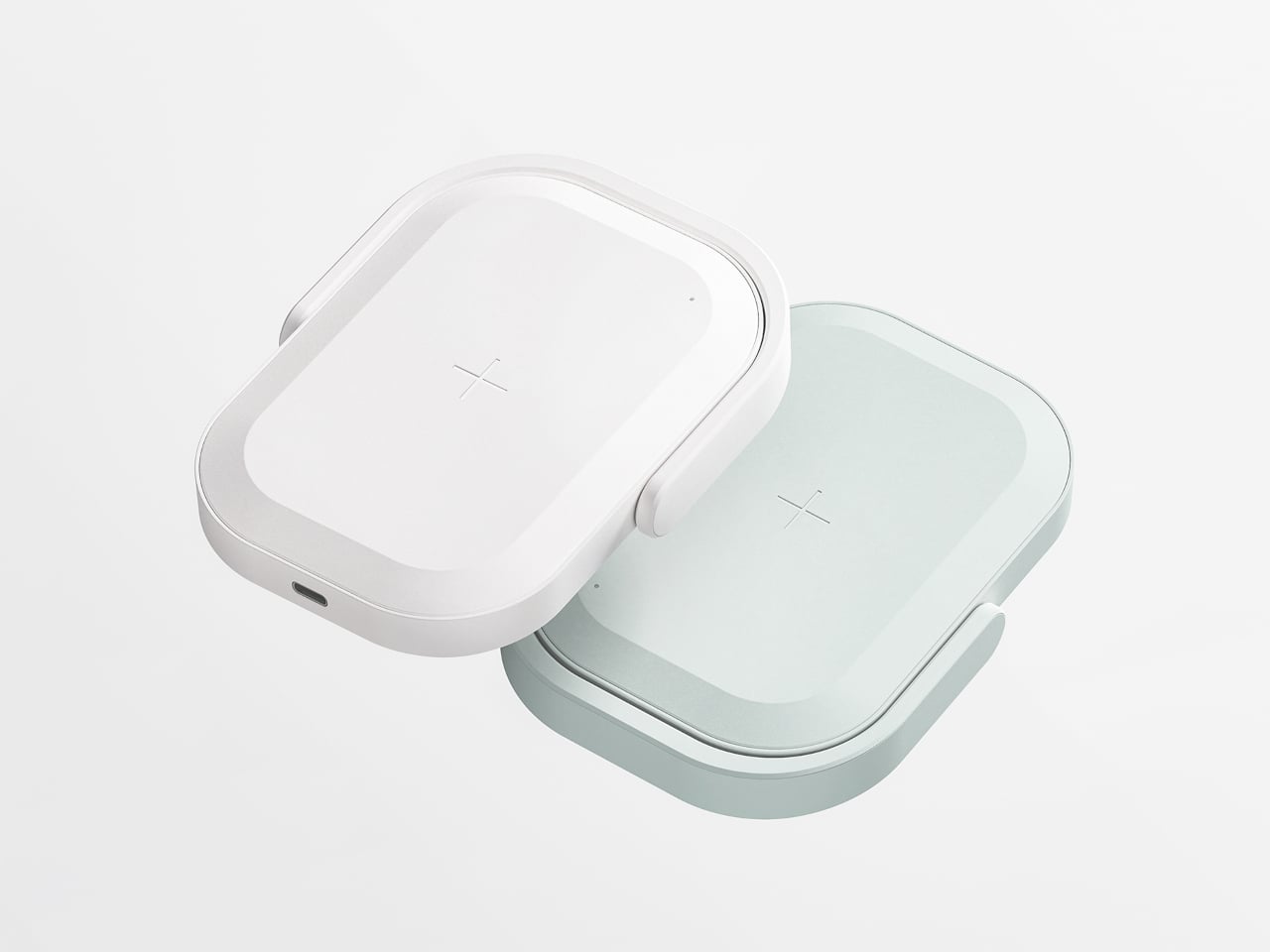
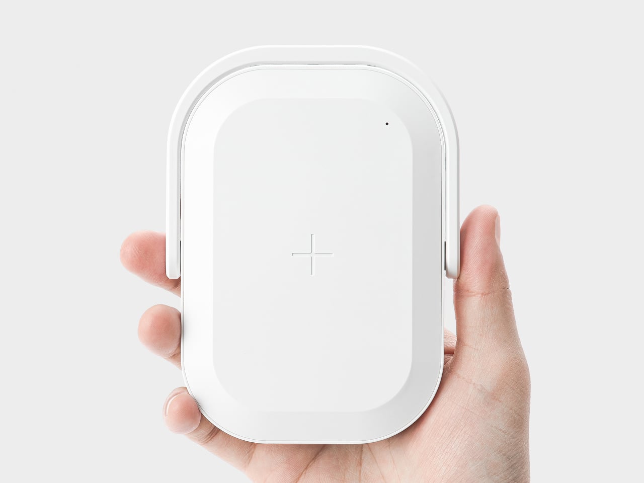
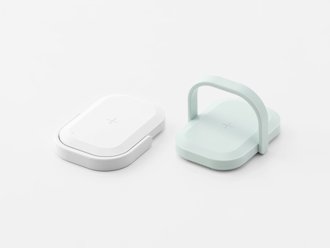
Picnic UV Charger merges those two needs, an extra battery and a cleaner phone, into one object. It is a wireless charger with a built-in UV sanitizer and a 10,000 mAh battery, shaped like a tiny picnic bag you can grab by the handle and drop into a tote or backpack. The compact body and soft colors keep it from looking like medical equipment parked on your desk.

Designer: SWNA Office

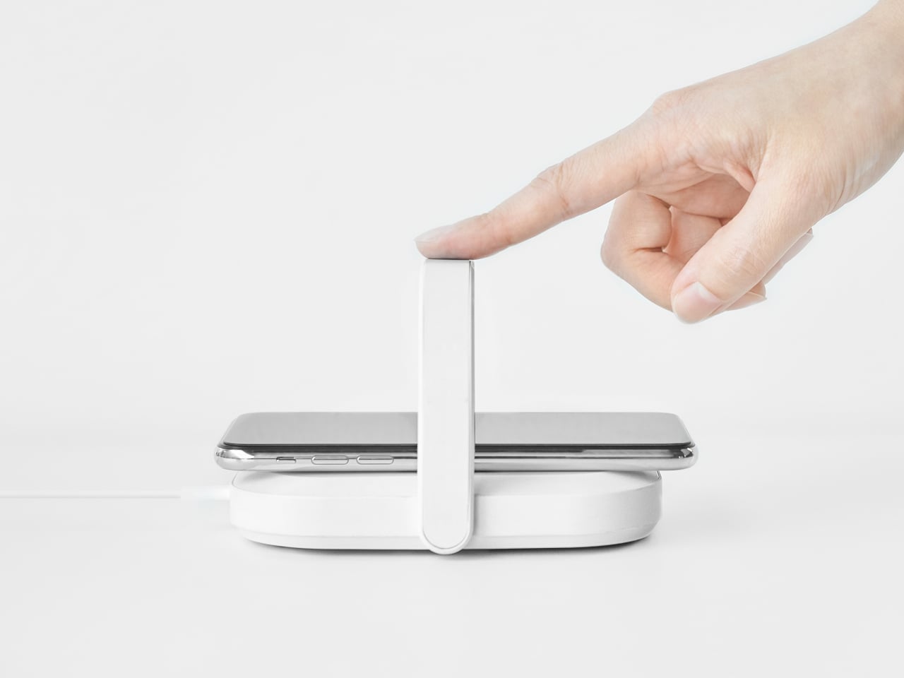
At a café with a questionably clean table, your battery is low, and you drop your phone onto the Picnic UV Charger instead of directly on the surface. You flip up the handle, which arches over the phone, and in about five minutes, the UV light has done its 99.9 percent sterilization pass while wireless charging quietly tops up the battery. Both tasks happen in a single gesture instead of requiring two separate gadgets.

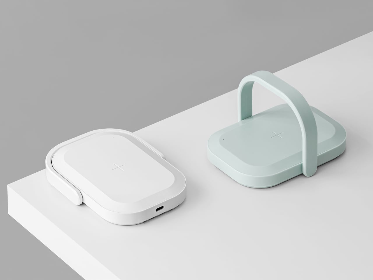
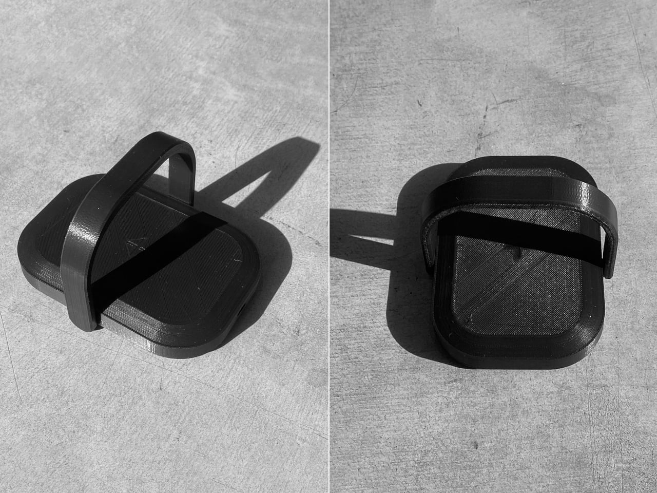
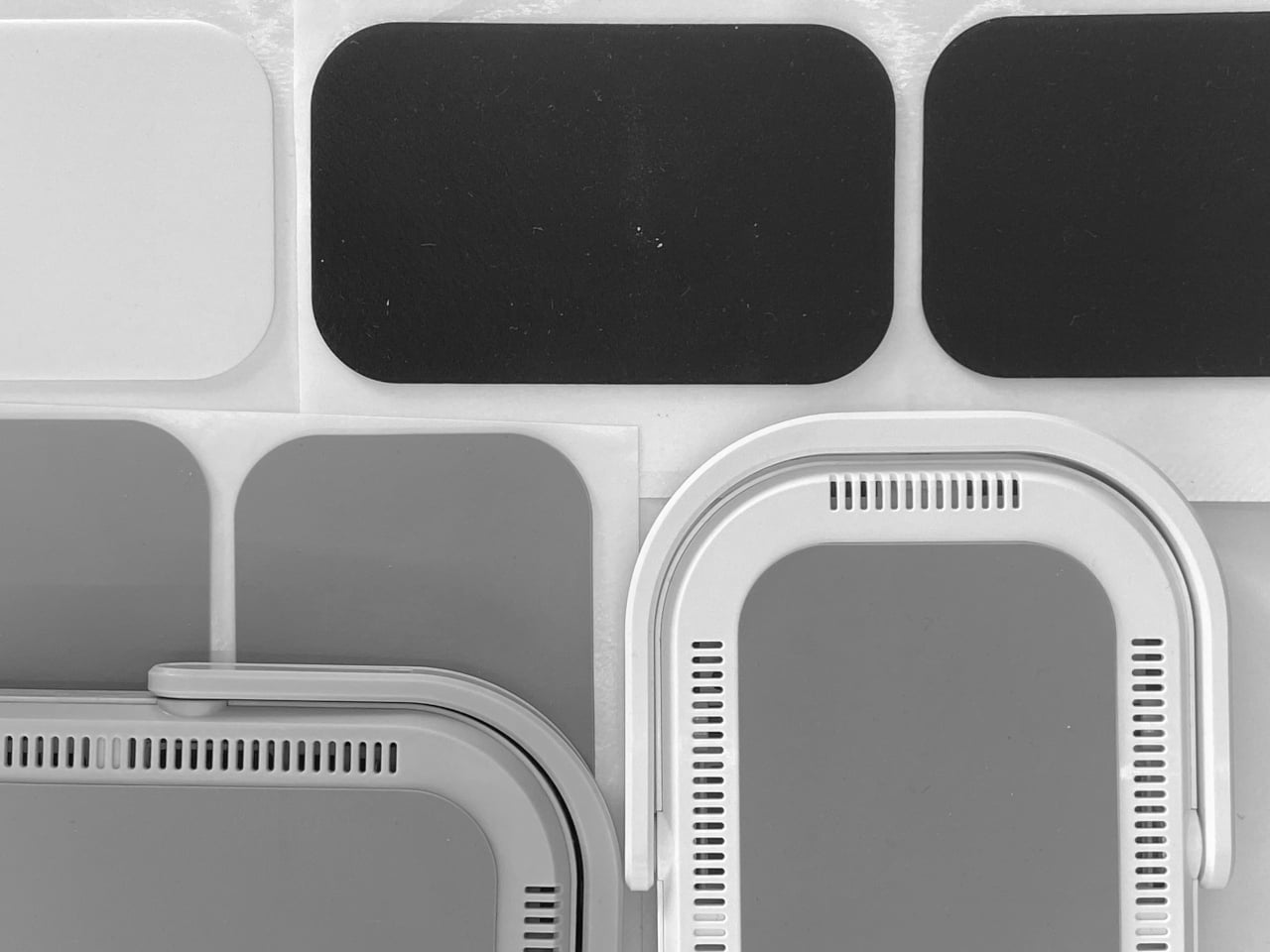
The handle does double duty: acting as a grip and carrying the UV LEDs. Its outline follows the shape of the body, so when folded down, it disappears into the silhouette, keeping everything compact and flat enough to slip into a bag. The form was prototyped with foam and paper to check scale, then refined with 3D printing to make sure the handle felt natural to raise and lower without snagging.

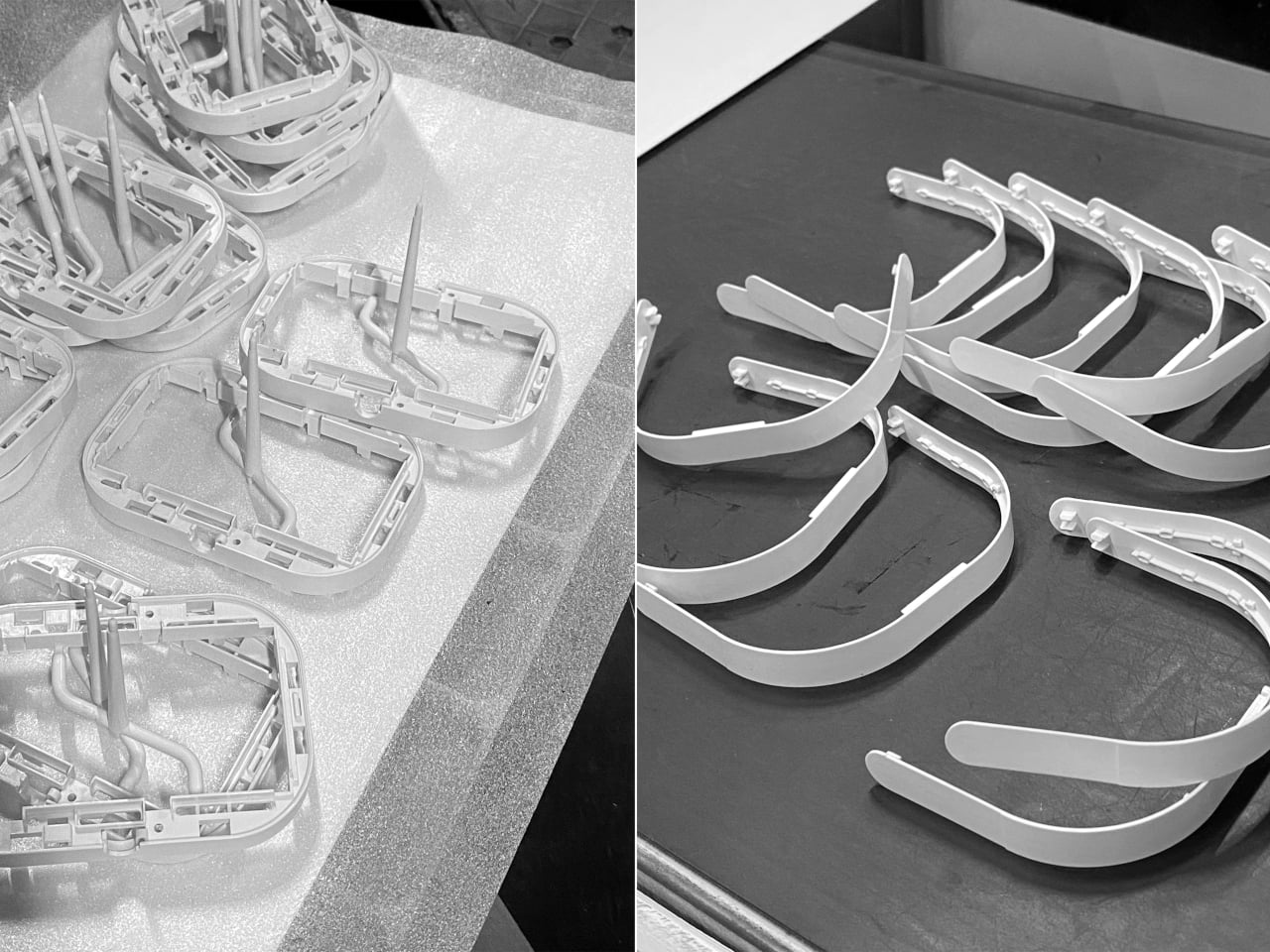
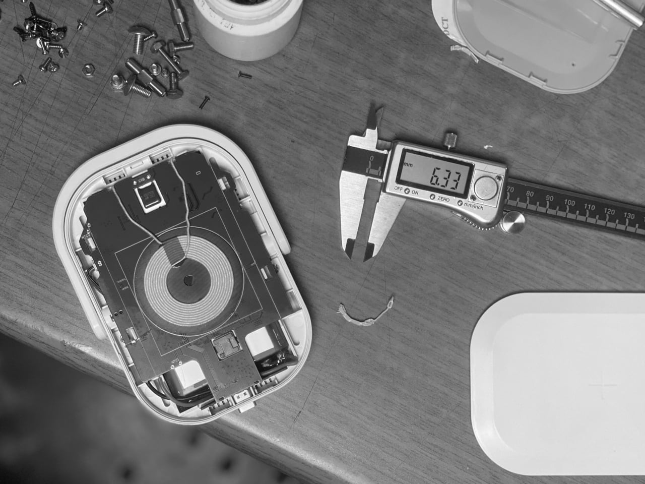
Working mock-ups were used to check battery heat and operation, which is important when combining a 10,000 mAh pack, wireless charging, and UV light in a small enclosure. The team iterated the molds several times to improve assembly and minimize breakage risk, suggesting attention to hinges, snaps, and internal ribs. It is the kind of work that makes a product feel trustworthy rather than fragile after a few uses.

The soft white and mint color options, rounded corners, and lunchbox-like proportions keep it from looking clinical. Even as Covid-era anxiety fades, a portable wireless charger that also sanitizes your phone still makes sense in crowded cities, shared offices, and travel. It turns a slightly uncomfortable task into something folded into a familiar ritual: place phone on charger, flip handle, walk away.

Picnic UV Charger treats hygiene as an add-on to something you already do, charging, instead of a separate chore. The handle, the compact body, and the dual function make it feel like a small, friendly object rather than a reminder of worst-case scenarios. A wireless power bank that also quietly cleans the screen you have been tapping all day turns out to be useful, especially when it fits into your bag without looking like you are carrying a sterilization station.
The post A Wireless Charger Shaped Like a Picnic Bag That Also Cleans Your Phone first appeared on Yanko Design.