The 5 LEGO Designs of June 2026 That Prove the Brick Has Never Been More Interesting

June has been a remarkable month for LEGO, and not just in the way it usually is. The sets, concepts, and collaborations landing right now feel less like product launches and more like cultural moments. Whether it’s a musician’s legacy cast in brick or a charcuterie spread that somehow makes you hungry, the breadth of creative ambition on display right now is hard to ignore. This is LEGO at its most wide-ranging and most interesting.

From the circuits of Monaco to the golden age of commercial aviation, LEGO is pulling from every corner of culture and giving it the tactile, buildable treatment it deserves. These five designs prove that the brick is still one of the most versatile creative mediums around. Not all of them are official sets, and some are still living on the Ideas platform. Every one of them, though, earned a place on this list by doing something genuinely worth paying attention to.

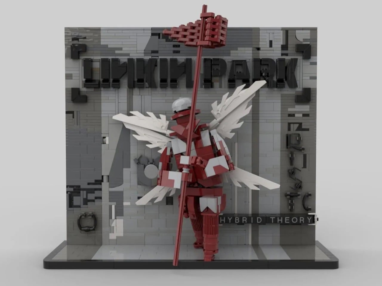
1. Linkin Park Hybrid Theory LEGO Brickset

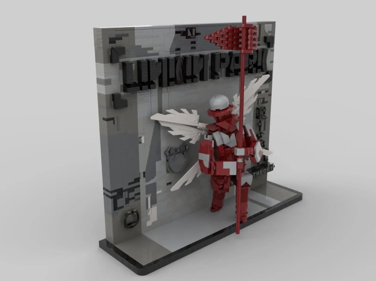
There is a generation of people for whom Hybrid Theory wasn’t just a debut album; it was a kind of first language. A LEGO Ideas submission is now marking the record’s 26th anniversary with a freestanding 3D display piece built around the Winged Herald, that iconic soldier in red and white holding a tall red staff before a wall that simply reads “Hybrid Theory.” The recreation captures the album’s layered visual identity in brick form, with raised lettering and bold, graphic geometry throughout.

What makes this design resonate beyond pure nostalgia is how well it functions as a display object independent of any fan loyalty. The layered wings, the structural depth, the interplay between red, white, and gray brickwork all hold up on their own compositional terms. For Linkin Park fans, it’s a shrine. For builders, it’s a satisfying technical exercise that earns its place on a shelf and starts conversations the moment anyone walks into the room.

What we like

  • The Winged Herald sculpture is genuinely striking as a standalone piece, with layered wing geometry and raised lettering that shows real structural ambition
  • The strong graphic contrast between red, white, and gray gives it the visual punch of the original album artwork without relying on printed tiles

What we dislike

  • It’s still an Ideas submission, meaning it needs 10,000 votes before LEGO will consider it for official production
  • The concept is niche enough that it may struggle to connect with LEGO fans who don’t already have a relationship with the album

2. LEGO Icons Douglas DC-3 Pan Am Airliner

Few names in aviation carry the kind of romantic weight that Pan Am does. Before the airline folded in 1991, it was the symbol of a particular glamour, the kind where passengers dressed up just to board. The LEGO Icons Douglas DC-3 Pan Am Airliner (11378) channels all of that into a 1,903-piece set released in April 2026, priced at $219.99. Built for adults 18 and up, it’s a love letter to an era of flight that no longer exists but refuses to be forgotten.

The set features removable fuselage panels that reveal a detailed cockpit and passenger cabin complete with an aisle, seating, and four minifigures dressed in late-1950s Pan Am uniforms. A rotating dial deploys and retracts the landing gear, and when the build is done, it sits on a display stand with an information plaque. That’s the kind of centerpiece that earns every inch of shelf space it takes up. For anyone drawn to retro design, aviation history, or beautifully realized objects, this one is difficult to walk past.

What we like

  • The retractable landing gear dial adds genuine interactive depth to what is primarily a display piece, making the build feel alive even after it’s finished
  • Four minifigures in period-accurate Pan Am uniforms are a considered detail that roots the set firmly in its historical moment

What we dislike

  • At $219.99, it’s a significant investment for a set that functions mainly as a display object rather than an active play experience
  • The 18+ positioning puts it entirely out of reach for younger builders who might be just as drawn to the aviation history angle

3. LEGO Pokémon SMART Play Training House with Pikachu

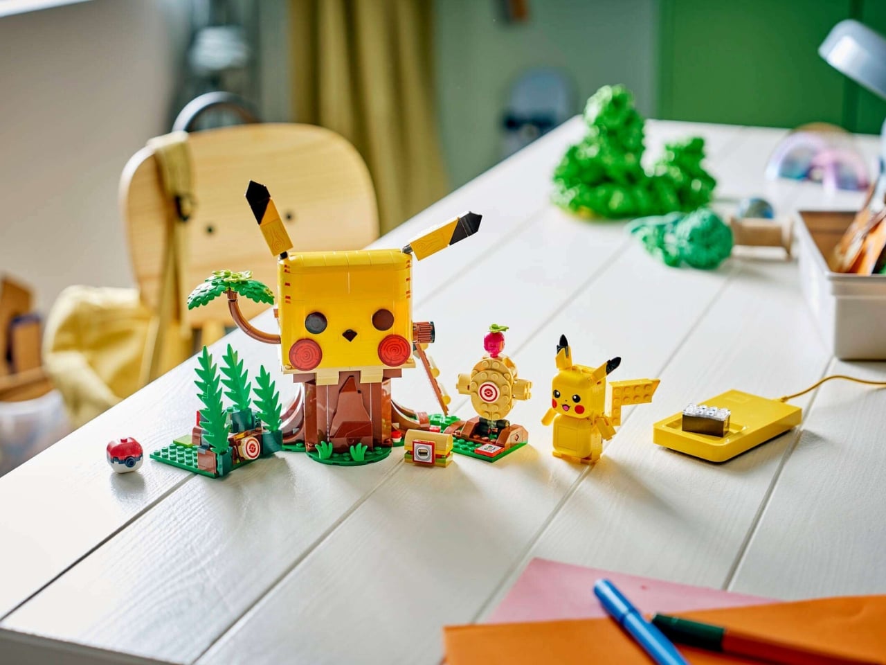
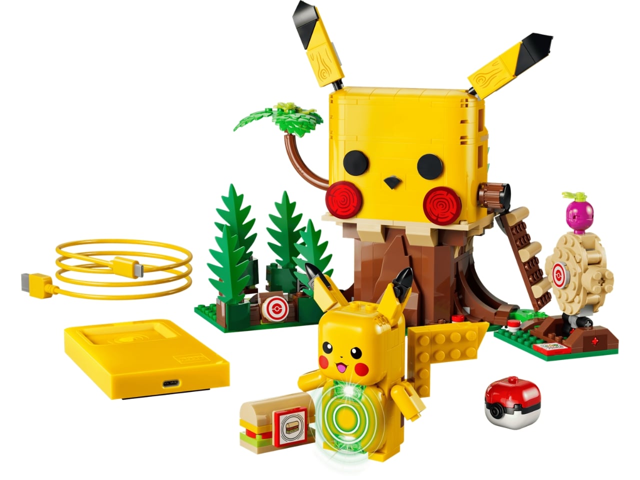
LEGO has never built something quite like this before. The LEGO Pokémon SMART Play line, announced on June 2, 2026, introduces the LEGO SMART Brick, a component packed with more than twenty patented world-firsts that makes builds respond to how you play through light, sound, motion, and sensing, all without a screen. The Training House with Pikachu (72164) is the centerpiece of the launch, letting you feed your brick-built Pikachu using a SMART Tag attached to a brick-built sandwich, or train it for battle in ways that actually register and respond.

What separates this from a gimmick is the feedback loop. The SMART Brick responds across multiple inputs: tickle Charizard, and it laughs; offer food with a SMART Tag and Pikachu reacts. The bond between player and build is designed to deepen the more time spent with it, which is a genuinely novel direction for a brand that has long operated in static, display-focused territory. Twelve sets launch across the full range on August 1, 2026, but the Pikachu Training House makes the clearest case for where LEGO play is headed next.

What we like

  • Screen-free interactive play powered by the SMART Brick is a genuinely new direction for LEGO, and the technology behind it is ambitious by any measure
  • The Pikachu Training House captures the warmth and personality of the franchise without reducing it to a passive display piece

What we dislike

  • Sets aren’t available to purchase until August 1, 2026, so the current excitement runs ahead of anything you can actually build right now
  • Questions around the SMART Brick’s longevity and repairability over years of play remain unanswered at this stage

4. LEGO Charcuterie Board

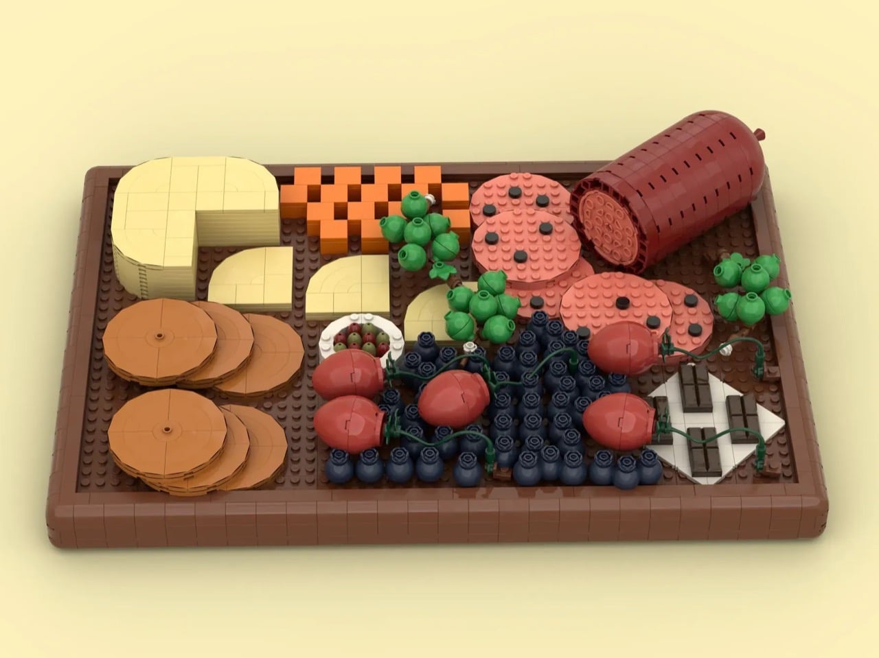
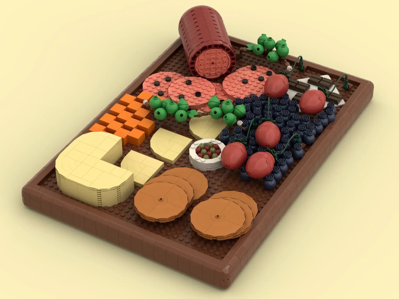
A LEGO Ideas submission from June 2, 2026 might be the most pleasantly disarming design of the month. Creator BiologyBuilder built a fully realized charcuterie board across 1,079 pieces, and the results are genuinely convincing. Salami is rendered in dark red round bricks with a salmon-colored plate at the end to show the pink interior of the cured meat. Brie is built from cream-colored round plates and tiles. Cheddar cubes are stacked from 2×2 bricks. It’s food that cannot be eaten and somehow still looks entirely appetizing.

The rest of the board fills out with strawberries, dark chocolate sitting on a napkin beside the fruit, and olives scattered across the spread. It works equally well as a coffee table object or a kitchen shelf accent, something that bridges LEGO’s world with the food and entertaining aesthetic dominating interior design right now. If the Ideas platform does what it should, this one gathers the votes it needs and eventually earns its place on a store shelf where it clearly belongs.

What we like

  • The material translations are inventive throughout: dark red round bricks for salami, cream tiles for brie, a napkin detail beneath the chocolate, showing a thorough understanding of LEGO’s parts library
  • The concept sits at the intersection of food culture and home décor, giving it appeal well beyond LEGO’s core audience

What we dislike

  • As a fan-created submission, it has no guaranteed path to official production, and the Ideas process can stretch across years
  • At 1,079 pieces, the likely retail price would be a harder sell for something positioned as a décor object rather than a traditional play set

5. McLaren F1 1000th Race LEGO Helmet Sets

For McLaren’s 1,000th Formula 1 race, the team didn’t arrive at Monaco with just a special livery. They co-created buildable LEGO helmet sets with Lando Norris and Oscar Piastri, released on June 3, 2026. The two LEGO Editions sets mark the first time either driver has appeared in LEGO minifigure form. The real helmets worn by both drivers at Monaco were based directly on the LEGO sets, meaning the design process ran in a direction you rarely see: from brick to track.

Lando’s set leads with his iconic fluorescent blob design alongside his new driver number, the coveted 1, rendered in brick form. Each set comes with a display stand and a printed signature plaque. The LEGO design team worked directly with both drivers, and the organic shapes involved pushed them toward new building techniques, which is visible in the finished results. As race-day collectibles go, this is one of the more thoughtful executions of sport and design meeting inside a LEGO format.

What we like

  • The reversed design process, from LEGO set to real-world helmet, makes this collaboration feel genuinely original rather than a standard licensing exercise
  • Both drivers appearing as minifigures for the first time gives collectors a meaningful, first-edition reason to own the sets beyond the build itself

What we dislike

  • Translating the organic, curved geometry of a race helmet into right-angled brickwork is a genuine challenge, and the compromise shows at certain angles
  • Tied tightly to a single race milestone, these sets may feel less resonant on display once Monaco weekend fades into the background

The Brick Is Still the Most Interesting Canvas Around

June 2026 makes clear that the most interesting LEGO designs aren’t arriving from a single direction. They’re coming from fan creators on the Ideas platform, from decades of aviation history, from the Monaco pit lane, from music anniversaries, and from the logic of a well-built cheese spread. The through line is the same as it has always been: someone thought carefully about what a subject looks like when rendered in brick, and they cared enough to get it right.

Some of these will make it to store shelves. Some won’t. The Pikachu set already has a launch date. The Pan Am DC-3 is already sitting on yours. The Hybrid Theory brickset and the charcuterie board are still waiting for their moment. What they all share is a clarity of concept, a designer, official or otherwise, who knew exactly what they were building and why it was worth building in the first place.

The post The 5 LEGO Designs of June 2026 That Prove the Brick Has Never Been More Interesting first appeared on Yanko Design.

A Wireless Clip-On Mic With AI Noise Cancellation for Under $50 Sounds Ridiculous. Here’s Why It Works.

The modern smartphone has set a remarkably high baseline for video quality, and its built-in microphone is surprisingly capable for casual use. But for creators who need their voice to cut through ambient noise, reach across distance, or maintain consistent clarity on the move, phone audio quickly reveals its physical limits. This is the complex mindset of the budget-conscious creator: they won’t spend money on a dedicated camera unless it’s dramatically better than their phone, and they certainly won’t carry a separate microphone unless it delivers a sound that is fundamentally impossible to capture with the device already in their pocket. It has to solve a problem, not just offer a marginal improvement.

This is the precise challenge the Saramonic Air SE is designed to meet. It justifies its space in a creator’s bag by breaking the physical limitations of a smartphone. Its core function is to get the microphone off the camera and place it exactly where it needs to be: clipped discreetly to a collar, just inches from the speaker’s mouth. Thumb-sized and weighing just 5 grams, the mic wears almost unnoticed on camera. It operates across 200 meters of wireless range, delivering crystal-clear, detailed 48kHz/24-bit audio while an AI engine actively removes up to 40dB of background noise. Snap it back onto the charging bar and it instantly becomes a handheld mic, ready for interviews. At $49 for the USB-C version, it’s positioned squarely as an entry-level system built for mobile-first creators and content teams who need professional capabilities without the professional price tag.

Designer: Saramonic

Click Here to Buy Now: $40 $50 ($10 off, use coupon code “YD20”). Hurry, deal ends in 48-hours!

The impossibly compact design makes it a marvel of engineering but also a testimony of how much discreetness matters to Saramonic’s core audience. The transmitter measures 28.5 x 17 x 13.4 millimeters, roughly thumb-sized, and weighs 5 grams. That makes it among the most compact in its class—significantly smaller than most entry-level wireless systems. When clipped to a collar or shirt, it genuinely disappears on camera, solving one of the oldest visual compromises in video production. The modular charging bar is the real design story here, sized like a lighter and engineered to magnetically house two mics and a receiver for easy carry. Everything you need for a two-person recording setup fits in your pocket. Dock a transmitter onto the bar, power it on, and it doubles as a handheld interview mic. Two form factors, one object, no adapters or workflow interruptions. The magnetic connection is strong enough that the bar feels natural to hold, weighted specifically for that second use case. Saramonic calls it “Clip It. Hold It.” and the simplicity of that statement captures exactly what makes this system different.

The Air SE’s noise cancellation represents Saramonic’s first-ever true AI system, trained on over 700,000 noise samples across 20,000 hours of audio. Unlike traditional ENC (electronic noise cancellation), which only handles steady ambient sounds like air conditioners or distant traffic, this AI engine identifies and separates voices from complex or sudden noise in real time. It runs in two modes: Weak at -15dB for natural-sounding environments where you still want some atmosphere, and Strong at -40dB for genuinely loud scenes like street shoots or crowded events. A single press on the receiver toggles the feature on and off. The companion app handles three EQ presets (Vocal Boost, High Boost, and Bass Boost) that let you fine-tune your vocal tone effortlessly, plus mono or stereo output selection and gain control. It’s plug-and-play simplicity with easy controls, approachable enough that a beginner can use it without touching settings, and flexible enough that someone with audio experience can dial in exactly what they need.

The technical fundamentals are solid in ways that matter for real-world use. The Air SE captures 48kHz/24-bit high-resolution audio with an 80dB signal-to-noise ratio and 120dB max SPL, preserving details with an ultra-low noise floor. The built-in limiter with -12dB safety track prevents distortion in unpredictable situations, recording a backup channel the whole time. If your main track clips because someone suddenly shouts or laughs too close to the mic, the safety track has you covered. The transmitter runs for about 6 hours on a single charge, and with charge-while-record capability through the modular bar, you get up to 28 hours of total runtime. That’s enough for a full day of street interviews or event coverage. The receiver draws power directly from your phone via USB-C or Lightning, so there’s no separate battery to manage. The plug-and-play design means seamless smartphone use from the moment you connect.

Saramonic is offering two configurations – the Air SE-01 at $49 includes a USB-C receiver and works with modern iPhones, Android devices, computers, and select action cameras like the DJI Osmo Pocket 3 and DJI Action 4. The Air SE-02 at $69 adds a Lightning receiver for older Apple hardware. Both kits include two transmitters, the charging bar, furry windshields, magnetic clips, a carry bag, and a USB-A to USB-C cable. That’s a complete field recording setup in one box, no additional purchases required. Competitors like the DJI Mic 3 and Hollyland Lark systems start around $150, making the Air SE’s price positioning genuinely aggressive for mobile content creators, streamers, and interviewers who need affordable wireless audio with outstanding value.

The Air SE is available now through Saramonic’s official store with free worldwide shipping, a 15-day return window, and a 2-year warranty. For creators who have been making do with phone audio and wondering if a dedicated wireless mic is worth the investment, this is a system designed to answer that question definitively. Pure, natural-sounding voice with powerful noise cancellation, ultra-light portability, and broad compatibility with mainstream smartphones and tablets, all in a package that fits in your pocket and costs less than most creators spend on a single camera accessory.

Click Here to Buy Now: $40 $50 ($10 off, use coupon code “YD20”). Hurry, deal ends in 48-hours!

The post A Wireless Clip-On Mic With AI Noise Cancellation for Under $50 Sounds Ridiculous. Here’s Why It Works. first appeared on Yanko Design.

This $90 Light-Up Cyclops Visor From Hasbro Is Going to Make You Feel Things You’re Not Ready For

Somewhere out there is a version of you who was eight years old in 1992, watched Cyclops fire an optic blast through a Sentinel’s chest on Saturday morning television, and immediately needed that visor on their face. That version of you did not get it, because it did not exist, because the toy industry of the early 90s was not making premium LED light-up 1:1 scale roleplay props for children who deserved them. That version of you had to use their imagination, which is a polite way of saying they held a ruler over their eyes and made beam sounds with their mouth in the backyard. Adult you, the one with income and a deep and slightly embarrassing knowledge of X-Men lore, has finally been handed the thing that child deserved. The tragedy is that you are no longer a child. The consolation is that you are also no longer supervised.

The Marvel Legends Series X-Men ’97 Cyclops Premium Roleplay Visor arrives July 1, 2026 at $89.99, and Hasbro built it for exactly that person. The 1:1 scale yellow shell curves across the full width of the face, the recessed red lens sits in a slot that gives the sculpt genuine mechanical credibility, and the LED optic blast effect, activated by a side dial with beam-width control via double tap, delivers the one feature no 90s toy could have managed. Spring-loaded ear pieces and a swappable nose piece handle fit across different face geometries. A removable display stand and colored lens insert handle the dignified adult shelf-display use case, which is how most of us are going to justify this to ourselves and to anyone who notices it on our desk.

Designer: Hasbro

Click Here to Buy Now

Cyclops’ visor is one of the most recognizable accessories in the Marvel universe precisely because it reads as functional rather than decorative, a containment device with a job to do, engineered to hold back something genuinely dangerous. Translating that into a wearable prop means balancing cartoon faithfulness with enough physical presence to feel premium at $89.99. Looking at the product images, Hasbro threaded that needle well. The gloss yellow shell has a sculptural confidence to it, the kind of clean, rounded geometry that echoes the X-Men ’97 animation without tipping into caricature. The red lens is properly recessed within the frame rather than sitting flush, which gives the whole thing a layered, architectural quality that cheaper props almost always skip. The circular activation dial on the temple is prominent without being ungainly, and the interior reveals a dark gray structural frame that makes the thing feel engineered rather than hollow.

The LED effect is truly the centerpiece. A single button press illuminates the lens to simulate the optic blast charging up, and the double-tap beam-width adjustment is a detail that will mean everything to the right buyer, the one who already knows that Cyclops can narrow his blast for precision targeting or open it wide for area suppression. Hasbro clearly knows who is reading the spec sheet. The LEDs auto-off after two minutes, which is a practical battery-conservation decision that also means you will be pressing that button approximately forty additional times per session just to keep the glow going. This is a feature, not a flaw.

The X-Men ’97 animated series, which premiered on Disney+ in 2024 as a direct continuation of the beloved 1992 original, gave Cyclops one of his strongest character arcs in decades, and the show’s Emmy win confirmed what fans already knew: this IP still has serious cultural weight. Hasbro releasing this visor in 2026 is timed well, catching the long tail of that cultural moment while the emotional investment is still warm. The Hulk Hands set the bar for what a Marvel roleplay prop could become in the broader cultural imagination, but this visor is aimed at a more specific and more serious buyer, one who wants something that works as cosplay, as a Halloween costume anchor, and as a display piece simultaneously.

At $89.99, the Cyclops visor sits in that precise pricing zone where adult collectors can rationalize the purchase and children cannot access it without a parent’s help, which is either poetic justice or the cruellest possible joke depending on how old you were in 1992. You can pre-order it on Amazon now. Your eight-year-old self would be furious that it took this long. Buy it anyway.

Click Here to Buy Now

The post This $90 Light-Up Cyclops Visor From Hasbro Is Going to Make You Feel Things You’re Not Ready For first appeared on Yanko Design.

“Exoskeleton Mouse” Gives Each Individual Finger Its Own Ergonomic Saddle

The history of mouse design is essentially a history of addition. More buttons, more weight options, more RGB zones, more surface textures, more software profiles, more reasons to spend three hundred dollars on a peripheral that still cradles your hand in the same closed-shell geometry Bill English built in 1972. The ergonomics conversation in particular has produced some genuinely thoughtful vertical mice and trackball revivals, but even those radical-seeming pivots keep the fundamental assumption intact: that a mouse is a body, and your hand rests on top of it. Psudoku, a maker and keyboard enthusiast whose work lives on GitHub, decided that assumption was the problem.

Kotinos is what a wireless mouse fossil looks like, the skeletal trace of an input device after everything non-essential has been removed by time or intent. An open 3D-printed scaffold rises from a flat base, each branch terminating in a small saddle pad matched to a specific fingertip, with the HSK Pro mouse internals sitting completely naked at the center of the lattice. Hand size and paddle geometry are both configurable through OpenSCAD scripts, meaning the fit is genuinely personal rather than averaging across a bell curve of palm measurements.

Designer: psudoku

The structural logic here is closer to a finger splint or an orthotic brace than anything in the Logitech catalog, and that framing is deliberate. Traditional mouse shells work by distributing contact across the entire palm and finger surface, which sounds ergonomic until you realize that it also means your hand is constantly fighting the geometry of a form designed for an average that probably doesn’t match you. Kotinos inverts the relationship entirely. The scaffold contacts only the fingertips, each pad saddle-shaped to cradle the distal phalanx rather than the whole finger, and the palm floats free of any surface entirely. Whether that produces genuine relief for RSI sufferers or just relocates the pressure points somewhere new is a question only long-term use can answer, but the premise is at least architecturally honest in a way that most ergonomic marketing copy never manages to be.

The construction photographs suggest multi-jet fusion 3D printing for psudoku’s own unit, that characteristic fine-grained grey surface that reads almost like sandstone in photographs, though the OpenSCAD source files mean any hobbyist with a resin or FDM printer can generate their own version. The exposed internals are genuinely striking in person: purple PCBs, a teal scroll wheel housing, ribbon cables and red wiring running between struts, all visible through the open lattice like a dissection model. There’s no attempt to prettify any of it. The aesthetic is pure function, which ends up being far more visually arresting than another matte-black gaming peripheral with aggressive chamfers and a glowing logo.

The files are free, the build is approachable, and the only real donor hardware you need is an HSK Pro mouse to gut for parts. Psudoku suggests applying fabric tape on the contact points to give the Kotinos mouse a more natural, comfortable feel. Because the Kotinos only touches you at the fingertips, those few contact points carry all the sensory weight that a conventional mouse spreads across your entire palm. If the saddle pads feel rough or cold or slightly wrong, there’s nowhere else for your hand to escape to. For a mouse built from struts and exposed circuit boards, that kind of tactile warmth might be exactly what keeps it from feeling like the medical device it occasionally resembles.

The post “Exoskeleton Mouse” Gives Each Individual Finger Its Own Ergonomic Saddle first appeared on Yanko Design.

Nothing 4a Pro with an E-ink Display Looks Way More Interesting than the Glyph Matrix

The Glyph Matrix is nice, but it’s not really useful, is it? How much value can you extract from spinning the bottle on the back of your phone, or playing unique patterns on it every time your phone rings? Sure, Nothing will have you believe that the Glyph Matrix is the natural evolution of the Glyph Lights – but one redditor had a different idea. Ditch the matrix instead, give the consumers an actual screen.

This Nothing 4a Pro revised concept features a full-fledged e-ink display on the back, serving as a useful second space for notifications, alerts, QR codes, etc. It’s a little less manic than the original with the flashing lights and all, but I kind of like the silent seriousness of a phone that sports an e-ink screen on the back. Everything else remains the same, the exact same triple-camera layout, the same Snapdragon 7 Gen 4 processor, the same screen. Just, less flashy, more useful.

Designer: Taweros

Here’s where Carl Pei would come in objecting to this entirely. The Glyph Matrix is supposed to be Nothing’s secret sauce, the thing that makes you look twice at a phone, the element of surprise. Ditching flashing lights for an e-ink screen feels a little less TikTok and a little more LinkedIn. That’s not Nothing’s brand, and I can understand. It’s more YotaPhone or TCL NXTPaper than Nothing. However, reddit user ‘Taweros’ has a case to make.

“I’ve been thinking about an alternative to the Glyph Matrix on a future Nothing phone: a small always-on E-Ink display integrated into the same area on the back. Instead of only showing animations, it could display useful information with no power consumption,” Taweros says. “The idea is to keep the minimalist Nothing aesthetic while making the space more practical. Since E-Ink only uses power when the image changes, it could stay visible all day without significantly affecting battery life.”

This new glyph replacement offers a more discreet, low-power, always-on alternative that can be used for a bunch of things. Aside from actually displaying information (instead of wonky patterns), it becomes this ambient second screen that you learn to rely on. Keep it displaying weather notifications, or have it show the face of someone who’s calling, or even use it to display the QR code of your business at a networking event – all this is stuff you CAN’T do with the current Nothing 4a Pro, and to be honest, that feels like a bit of a shame.

To be clear, I don’t hate the glyph matrix. I saw it first-hand at a launch and was blown by how beautiful it looked. I just think beauty without utility is just… art. It’s fun. It isn’t function. Here’s to hoping the Nothing 5 will surprise us!

The post Nothing 4a Pro with an E-ink Display Looks Way More Interesting than the Glyph Matrix first appeared on Yanko Design.

This zero-gravity motorized workstation replaces your setup to eliminate back pain and boost productivity

If you’re working out of a desk with a triple monitor setup and a regular office chair, you don’t have a workstation worthy of 2026. To upgrade your working environment, MWE Labs has created a zero-gravity ergonomic workstation, which it calls the Emperor S2. Dubbed the world’s most advanced workstation, the Emperor S2 actually has some distinctions to qualify the humongous claim.

Transitioning the setup from a regular table and chair into a more integrated system that looks uniform, the Emperor S2 resembles a simulator you would get into and start flying a fighter jet. It is engineered to ensure you feel relaxed while working, and to that end, the workstation comprises an ergonomic chair with lumbar support, a magnetic pillow for the backrest, and a footrest right underneath the monitor setup to stretch your legs and relax during long hours of sitting.

Designer: MWE Labs

This unification of table and chair for a functional workstation that you and I can use with convenience is designed and built in Canada. It’s beyond the usual workstation, somewhat in the domain previously explored by this portable workstation that goes outdoors with you or this workstation that converts into a dining table in minutes, but still feels worth your money for a few reasons.

The setup is clean, and it comes in a carbon black color theme. The workstation is targeted more toward the work-from-home generation, and I feel it has a little bent toward gamers. But no one is stopping you from throwing in a multiple-display setup and getting into high-stakes gaming action. From its appearance though, which lacks the colorful, flashing LEDs and futuristic decals, it’s easy to presume that people focused on productivity will give this one a good look.

“The Emperor S2 transforms your workspace into a fully supported, ergonomic environment built for long-lasting comfort and performance,” the product listing page notes. It allows one to sit back on the zero-gravity chair, adjust the monitor positioning, and set out on a productive work day with the least distraction. The entire system, especially the seat, adapts to your posture throughout the day with a range of motorized adjustments that you can personalize to your convenience.

The “all-in-one workstation with a minimal footprint…is ideal for home offices, corporate environments, and flexible workspaces.” To match different environmental needs, MWE Labs offers the workstation in two configurations, with a single monitor and an option to install a dual or triple-display setup. With the option to adjust the monitor height, the footrest position, and the height of the armrests on the press on a button located on the right side of the frame connection the seat and the monitor, the Emperor S2 also arrives with a keyboard extender and side-tray for accessories.

The workspace engineered to maximize focus, productivity, and well-being starts at CAD $5,795 (approximately $4,200) for the single monitor setup. A three-monitor setup will set you back CAD $6,140 (about $4,500). If you like more colors or want some feature specific to your work setup, you can have the Emperor S2 customized, though we believe that would entail some additional cost.

The post This zero-gravity motorized workstation replaces your setup to eliminate back pain and boost productivity first appeared on Yanko Design.

The Inflatable Umbrella That Finally Makes Sense

Count how many umbrellas you’ve owned in your lifetime. Go ahead, try. Most people lose count somewhere around five or six, often because the memory of each one ends the same way: a gust of wind, a bent rib, a mangled heap left in a trash can on a rainy corner somewhere. We accept this as the unavoidable cost of staying dry. But a group of graduate students from the Savannah College of Art and Design decided that was a terrible deal, and they designed their way out of it.

Nimbus is their answer. It’s an inflatable umbrella made entirely from recyclable thermoplastic polyurethane, or TPU, and the absence of the usual suspects is the whole point. No metal ribs. No complex mechanical joints. No layered materials that make recycling a logistical nightmare. Just one material, doing everything.

Designers: Hannah Klein, Vishva Chauhan, Manasi Khatavkar, and Annika Hogan

Hannah Klein, Vishva Chauhan, Manasi Khatavkar, and Annika Hogan created Nimbus as part of their Master’s program in Design for Sustainability at SCAD. Their combined backgrounds span Interior Design, Graphic Design, Studio Arts, and Environmental Science, which is probably why the concept feels so well-rounded. When a team brings that range of perspectives to a single everyday object, it shows. They weren’t just asking how to make a better umbrella. They were asking why we’ve been making them so badly for so long.

The answer, it turns out, is that nobody really stopped to question it. The standard umbrella has looked more or less the same for generations: a metal skeleton, a nylon canopy, a plastic handle, all bonded together in ways that make the whole thing essentially un-recyclable. When it breaks, and it will break, it goes straight to landfill. Multiply that by the sheer volume of umbrellas sold globally every year, and you’re looking at a quiet but significant waste problem hiding in plain sight.

Nimbus addresses this by stripping the design down to its core job: keeping rain off your head. The inflatable structure replaces the rigid rib system entirely, which means fewer points of failure and a much longer functional life. It’s lightweight, designed to be repaired rather than replaced, and when the time does come to retire it, the single-material construction makes it genuinely recyclable. The team has also built in a buy-back program to support that end-of-life process, which tells you they’ve thought beyond the object itself and into the broader system it lives in.

The numbers behind this are worth sitting with. Compared to a standard umbrella, Nimbus carries a 99% lower impact according to life cycle assessment, the metric that tracks environmental cost from production to disposal. That’s not an incremental upgrade. That’s a complete rethink of what the object is allowed to be.

But what I keep returning to is the broader point Nimbus is making about design itself. We tend to celebrate innovation when it arrives in the form of something new, a gadget that didn’t exist before, a category that had to be invented from scratch. But sometimes the more interesting work happens when someone looks at something deeply familiar and asks whether it needed to be done this way at all. An umbrella feels like a settled question. These four designers disagreed.

The project has already been recognized by the Green Product Award, which is a good sign that the design community is paying attention. Whether Nimbus moves toward commercial production remains to be seen, but as a concept, it raises the right questions at exactly the right time. Consumers are increasingly asking where their things come from and where they end up. Products that can answer both questions honestly are going to matter more, not less, as those expectations grow.

You probably have an umbrella somewhere. Maybe it still works. Maybe it’s one rough commute away from the bin. Either way, Nimbus is a useful reminder that even the most unremarkable objects in our lives are worth questioning, and that sometimes the best design is just someone refusing to accept a bad answer.

The post The Inflatable Umbrella That Finally Makes Sense first appeared on Yanko Design.

Forget Jerseys – These 5 FIFA World Cup 2026 Products Are Actually Worth Buying

The FIFA World Cup has evolved far beyond the boundaries of sport. As one of the world’s most-watched events, it influences culture, technology, fashion, and consumer behavior on a global scale. Brands increasingly use the tournament as a platform to create products that capture the excitement, passion, and identity associated with football’s biggest stage.

From luxury collectibles and limited-edition gadgets to pet accessories and interactive merchandise, designers are finding new ways to connect fans with the World Cup experience. These products show how major sporting events inspire innovation, storytelling, and emotional engagement across multiple industries.

1. Limited-Edition Collectibles Create Emotional Connections

Global sporting events often drive demand for exclusive products that celebrate memorable moments and national pride. Designers are responding by creating collectible items that combine functionality with strong emotional appeal. These products are often produced in limited quantities, making them highly desirable among fans and collectors alike.

To celebrate the FIFA World Cup 2026, Motorola has introduced a special-edition Razr smartphone that blends football-inspired design with premium mobile technology. Created as a collectible device for fans of the tournament, the foldable phone features a vibrant green finish inspired by the football pitch, complemented by geometric graphics that symbolize movement, energy, and the global spirit of the World Cup. Exclusive FIFA-themed wallpapers, ringtones, and content further connect the device to the tournament, turning it into more than just a smartphone.

Alongside its distinctive World Cup branding, the device offers a range of features designed for modern entertainment and content creation. A large foldable AMOLED display, advanced camera system, durable construction, and long-lasting battery make it well-suited for watching matches, capturing memorable moments, and staying connected throughout the tournament. By combining cutting-edge technology with FIFA-inspired design elements, Motorola has created a product that reflects how the World Cup continues to influence consumer electronics and drive demand for limited-edition fan-focused experiences.

2. Sports-Inspired Technology Is Becoming More Expressive

Technology products are no longer designed solely around performance. Brands are increasingly incorporating sports-inspired aesthetics, symbolic forms, and tournament themes into everyday devices. This approach helps products stand out while strengthening their connection to global sporting culture.

SanDisk has transformed a simple USB-C flash drive into a playful piece of FIFA-inspired merchandise with its whistle-shaped storage drive. Designed to resemble a referee’s whistle, the compact drive combines novelty and practicality, offering up to 128GB of storage in a highly recognizable form. Available in multiple colorways representing the World Cup host nations as well as universal editions for global fans, the device doubles as a wearable accessory due to its included lanyard.

Beyond its eye-catching design, the whistle drive serves as a fully functional storage solution compatible with smartphones, laptops, smart TVs, and gaming devices. The USB-C connector is cleverly concealed within the whistle body, creating a product that blends sports memorabilia with everyday technology. By disguising a flash drive as a familiar object, SanDisk has created a unique collectible that celebrates football culture while delivering practical utility for fans and tech enthusiasts alike.

3. Fan Engagement Is Driving Functional Innovation

Modern consumers want products that enhance how they experience major events. Designers are responding with practical innovations that make it easier to watch, record, share, and interact with sporting moments. Functionality is becoming a key part of fan-centered design.

Created in partnership with the Portuguese Football Federation ahead of the FIFA World Cup 2026, the TORRAS Q3 Air Portugal National Football Team Edition transforms a smartphone case into a celebration of football culture. Inspired by Portugal’s national team colors, the case features a red-to-green gradient, gold accents, football-themed graphics, and the iconic Quinas crest. The design reflects the identity and heritage of Portuguese football while connecting fans to one of the tournament’s most anticipated teams.

Beyond its visual appeal, the case combines World Cup-inspired branding with practical functionality. It features TORRAS’ signature magnetic Ostand ring, which rotates and folds into a hands-free stand for viewing matches, recording content, or capturing memorable tournament moments. With MagSafe compatibility, military-grade drop protection, and a design tailored for football enthusiasts, the case seamlessly blends convenience, durability, and fan-focused style.

4. The World Cup Is Expanding Into Lifestyle and Pet Products

The influence of football now extends well beyond traditional merchandise. Brands are introducing lifestyle products that allow fans to express their enthusiasm in everyday settings, including products designed for pets, home environments, and personal accessories.

Adidas has expanded FIFA World Cup 2026 merchandise beyond traditional fan apparel with a collection of pet jerseys inspired by official national team kits. Designed for football-loving pet owners, the collection features miniature versions of the home jerseys of Argentina, Mexico, Colombia, and Japan. Each jersey incorporates recognizable team graphics, federation crests, and tournament-inspired details, allowing pets to become part of the World Cup celebration while reflecting the identity and spirit of their chosen nation.

The collection highlights how the World Cup is influencing lifestyle and pet product design, extending fan engagement into new categories. By adapting official team aesthetics for pets, adidas has created products that encourage shared experiences between fans and their companions during match-day gatherings and tournament celebrations.

5. Interactive and Experiential Products Are Growing in Popularity

Consumers increasingly seek products that offer immersive experiences instead of simple ownership. As a result, designers are creating interactive items that encourage participation, creativity, and deeper engagement with the World Cup story.

Created to celebrate the FIFA World Cup 2026, the LEGO FIFA World Cup Official Trophy set transforms one of sport’s most recognizable symbols into an immersive building experience. Consisting of 2,842 pieces, the model recreates the iconic trophy at an impressive scale, allowing football fans to own a detailed replica inspired by the tournament that will be hosted by the United States, Canada, and Mexico. Finished with gold-colored elements and authentic design details, the set captures the prestige and excitement associated with football’s biggest event.

More than a display piece, the collectible combines sports fandom with interactive design. The model features commemorative details, including references to past World Cup champions and hidden surprises that celebrate the 2026 tournament. By turning the famous trophy into a hands-on construction project, LEGO has created a product that extends the World Cup experience beyond the stadium, offering fans a memorable way to engage with the tournament while creating a centerpiece worthy of any football collection.

Global Events Are Becoming Powerful Design Inspiration

The World Cup indicates how major international events can influence product design across multiple categories. Brands are using the tournament as a source of inspiration to create products that blend innovation, identity, and entertainment. As fan expectations continue to evolve, event-driven design is likely to become an even more significant force shaping future consumer products.

The FIFA World Cup is no longer just a sporting spectacle as it has become a catalyst for product innovation. From technology and collectibles to lifestyle accessories and interactive experiences, brands are leveraging football’s global appeal to create products that resonate with fans long after the final whistle.

The post Forget Jerseys – These 5 FIFA World Cup 2026 Products Are Actually Worth Buying first appeared on Yanko Design.

8 Japanese Kitchen Gadgets & Tools That Make Dad Feel Like a Michelin-Star Chef This Father’s Day

There’s a reason Michelin-starred Japanese kitchens don’t look like the ones you see on American cooking shows. No plastic cutting boards. No thin-gauge nonstick pans. The tools themselves carry the weight of centuries of refinement: cast iron developed over generations, blades sharpened to tolerances measured in fractions of a millimeter, clay vessels fired in kilns with thousand-year histories. These eight tools bring that level of kitchen confidence home.

Japan’s approach to cookware has never been about accumulating tools. It’s about choosing the right one and understanding it deeply. The best Japanese kitchen gadgets don’t ask you to cook faster or easier. They ask you to cook better, with more presence, more attention, more respect for the ingredient. For a dad who cooks with intention rather than convenience, these eight pieces are the kind of upgrade that changes how a kitchen feels to work in.

1. Precision Ceramic Sashimi Knife

Raw fish demands knife performance that metal blades, for all their centuries of refinement, struggle to deliver. The Precision Ceramic Sashimi Knife represents the convergence of Japanese craftsmanship and advanced materials science, creating a blade twice as hard as stainless steel, with sharpness that lasts 200 times longer than conventional edges. The single-bevel design emulates the classic yanagiba with a concave back, reducing friction for effortless, drag-free cuts. The lightweight ceramic construction enables extended use without hand fatigue, while the advanced material requires minimal maintenance and virtually eliminates sharpening routines.

The cutting experience transforms sashimi preparation from a technical challenge into a flowing motion. The exceptional sharpness preserves delicate fish texture and cell structure that duller blades tear and compress. The friction-reducing concave back allows the blade to glide through ingredients with minimal resistance and maximum control. The lightweight design enables the precise, continuous strokes required for proper sashimi cutting without the arm fatigue associated with metal blades. The ceramic material doesn’t impart metallic taste or oxidation to delicate seafood, keeping every flavor entirely clean.

Click Here to Buy Now: $300.00

What We Like

  • The ceramic material maintains sharpness 200 times longer than conventional steel blades
  • The non-reactive material prevents metallic taste transfer to delicate seafood

What We Dislike

  • The ceramic blade, while exceptionally hard, is more brittle than steel and requires careful handling
  • The specialized design focuses on sashimi and delicate work rather than general-purpose cutting

2. Nagatani-en Iga-yaki Donabe

The donabe is arguably the single most important vessel in Japanese home cooking, and the Nagatani-en Iga-yaki version is the one professionals reference when the subject comes up. Made in Iga, Mie Prefecture, from clay drawn from ancient sediment layers unique to the region, the pot’s porous walls absorb heat slowly and distribute it evenly, creating conditions that braise meat, steam vegetables, and cook rice in ways that modern stainless steel and ceramic-coated vessels simply cannot replicate. There is a textural depth to food cooked in a donabe that registers immediately.

Nagatani-en has been crafting donabe in Iga for generations, and the design reflects that continuity. The textured clay exterior and smooth interior create a vessel that reads as a sculptural object as readily as a cooking tool, something worth leaving on the stovetop between uses. Available in the US through TOIRO Kitchen, where each piece is individually checked before shipping, it arrives ready for first use after a simple initial preparation. For a dad who treats cooking as a practice rather than a task, the donabe reframes what a pot is capable of entirely.

What We Like

  • The porous Iga clay distributes heat with remarkable consistency, transforming braises, steaming, and rice cooking
  • The design is as much sculpture as cookware, worthy of staying out on the stovetop between uses

What We Dislike

  • Requires a short initial preparation process before first use to condition the clay
  • Not compatible with induction cooktops without a separate converter plate

3. Iron Frying Plate

Western dining creates an artificial separation between cooking vessel and serving dish, transferring food from pan to plate in a ritual that cools ingredients and adds cleanup steps. The Iron Frying Plate eliminates that middleman: the frying pan is your plate, the plate is your frying pan, collapsing cooking and eating into a seamless experience. Crafted from rust-resistant mill scale steel with a detachable wooden handle, this cookware brings out superior flavors and textures while reducing the barriers between preparation and enjoyment. The uncoated surface comes ready to use immediately, requiring no seasoning or special preparation rituals.

The boundary-blurring design creates intimacy with your food that standard plating disrupts. Eggs sizzle on your breakfast table, fish arrives still crackling from the heat, and vegetables steam visibly as you lift your fork to your mouth. The immediacy preserves temperature, texture, and visual drama that dissipate during transfers. The detachable wooden handle attaches and releases with one hand, transforming cookware into serveware in seconds. The rust-resistant mill scale steel develops natural non-stick properties through use without chemical coatings. The design invites slower, more attentive eating, pacing yourself with a vessel that retains heat and presence throughout the meal.

Click Here to Buy Now: $69.00

What We Like

  • The cook-and-serve design preserves temperature and texture better than transferred plating
  • The one-handed handle attachment provides seamless transitions from stove to table

What We Dislike

  • The hot serving surface requires careful handling and might not suit households with young children
  • The iron construction adds weight compared to standard plates

4. Benriner Super Mandoline Slicer No. 95

The Benriner has been the vegetable slicer of record in professional Japanese kitchens for decades, made in Yamaguchi Prefecture with an edge quality that made it standard equipment long before Western food media caught up. The No. 95 Super Benriner is the larger professional model, featuring four ultra-sharp Japanese stainless steel blades covering uniform slicing, julienne, and fry-cut work at a price that makes it one of the few genuine bargains in serious kitchen equipment.

Where most mandolines frustrate cooks with inconsistent blade adjustment and loose mounting, the Benriner holds its settings reliably cut after cut. Katsuobushi shaved paper-thin, daikon cut to near-translucent rounds, cucumber ribboned for sunomono: the cuts that separate restaurant-quality Japanese food from home attempts are largely a function of this tool.

What We Like

  • Four interchangeable Japanese steel blades handle everything from paper-thin slices to julienne cuts with professional-grade precision

What We Dislike

  • A cut-resistant glove is essential for safe use, and one isn’t included with the slicer
  • Can feel slightly unstable when processing larger produce without the finger guard properly seated

5. Hinoki Essence Cutting Board

Cutting boards in Western kitchens lean toward two extremes: hard plastic that preserves knife edges but feels clinical, or soft wood that comforts hands but dulls blades. The Hinoki Essence Cutting Board achieves the balance that Japanese cypress is renowned for: medium hardness that offers resistance without damaging knives. The majestic hinoki wood naturally resists mold, while the water-resistant silicone coating penetrates wood fibers to prevent damage. The gentle, rounded shapes and integrated handle provide both aesthetic grace and practical functionality for hanging and hygienic drying.

The cutting experience on hinoki transforms knife work from task into sensory practice. The wood provides satisfying feedback without the harsh impact of hard surfaces or the mushy give of soft materials. The natural aroma of cypress adds olfactory dimension to food preparation, creating an atmosphere that plastic and bamboo cannot replicate. The integrated handle facilitates hanging storage that promotes air circulation and drying. The water-resistant treatment extends durability without coating the surface in synthetic films. The gentle curves blend naturally with contemporary kitchen interiors while honoring traditional Japanese woodworking aesthetics. Paired with the ceramic sashimi knife, this is the right surface for the right blade.

Click Here to Buy Now: $75.00

What We Like

  • Hinoki’s medium hardness protects knife edges while delivering satisfying, precise cutting feedback
  • The natural cypress aroma adds a sensory quality to prep work that no synthetic material can offer

What We Dislike

  • Wood requires more care than plastic, including occasional oiling and thorough drying after washing
  • The premium material comes at a higher price point than most cutting boards on the market

6. Oku Knife

Every knife you own lies flat on the table. That’s not a law of physics, just a 400-year-old habit nobody bothered to question. Scottish metalworker Kathleen Reilly questioned it during a residency in Tsubame-Sanjo, Niigata Prefecture, one of Japan’s most celebrated metalworking regions, and the answer was Oku: a table knife with a folded handle that hooks over the edge of a plate or wooden board, holding the blade elevated entirely off the surface.

The knife is made by craftspeople in Tsubame-Sanjo using techniques refined over four centuries, from domestically produced high-quality stainless steel. The paired wooden boards come from Karimoku Furniture, Japan’s leading wooden furniture maker, using sustainably sourced Japanese forest wood. For a dad who cooks with intention, Oku adds something most kitchen tools cannot: a design that creates dialogue between cultures, between Eastern arrangement philosophy and Western dining conventions, and between the object and whatever surface it is placed on. Nothing else on the table will look like it.

What We Like

  • The folded handle elevates the blade completely off the table, keeping the cutting edge cleaner between uses
  • A genuine cultural collaboration between Scottish design sensibility and 400-year-old Japanese metalworking craft, with a story worth telling at the table

What We Dislike

  • Availability is through the designer’s studio rather than a mainstream retail channel, which takes more effort to source
  • The concept-forward design is purposefully singular, working as a table knife rather than a multi-purpose kitchen workhorse

7. Suribachi and Surikogi Set

Grinding in Japanese cooking is fundamentally different from crushing. The suribachi achieves that distinction through its ridged ceramic interior, where scored grooves catch and shear ingredients rather than simply pressing them flat. Making gomadare sesame sauce, the kind that appears in cold noodle dishes and spinach salads at high-end Japanese restaurants, depends entirely on this action: sesame seeds releasing their oils through friction against the ridges rather than being pulverized against a smooth surface. No Western mortar produces this result or this texture.

The suribachi and surikogi set from Akazuki comes in three nested sizes, made from unglazed ceramic with the traditional scored interior that defines the tool. The wooden surikogi pestle grips the ridges effectively without damaging the bowl. For a dad who already cooks Japanese food with confidence, this closes the last gap in most Japanese-inspired home kitchens. For one who is beginning to explore the cuisine properly, it introduces a grinding technique that changes how sauces and dressings taste from the very first use.

What We Like

  • The ridged ceramic interior releases oils and extracts flavor from seeds and aromatics in ways no smooth mortar can replicate
  • The nested three-piece set covers different ingredient volumes without requiring multiple tools

What We Dislike

  • The ceramic bowl requires careful handling and won’t survive a drop onto a hard floor
  • Developing a consistent grinding rhythm takes a few sessions, particularly when working with sesame seeds

8. BALMUDA The Kettle

Temperature is one of the least visible but most consequential variables in Japanese cooking. Dashi performs best within a specific heat range. Green tea becomes bitter above 80°C. BALMUDA The Kettle approaches precision temperature control with the same seriousness that Tokyo-based BALMUDA brings to every product it makes: a minimal design language wrapped around functional performance that makes the object as intentional to look at as it is to use.

BALMUDA’s attention to proportion is visible in the kettle’s structure: a wide base tapering to a narrow, curved gooseneck spout engineered for controlled, targeted pouring. This matters for precise dashi work, for pour-over preparations, for the temperature discipline that separates a thoughtful Japanese home cook from someone following a recipe. The Kettle is not a generic appliance that happens to look elegant. It’s an object designed to make a daily preparation ritual feel considered, which is exactly what Japanese kitchen culture asks of every tool it produces.

What We Like

  • The precision gooseneck spout allows controlled, targeted pouring for dashi, tea, and any temperature-sensitive preparation
  • BALMUDA’s build quality and visual design make it as worthy of display as of daily use

What We Dislike

  • The premium brand carries a price considerably higher than functional alternatives with comparable temperature control
  • Some home cooks may want more granular degree-specific settings than the kettle’s range provides

The Gift That Gets Better Every Time He Cooks

Japanese kitchen tools don’t compete with each other for drawer space. They each occupy a specific role with such precision that using the wrong version becomes apparent the moment you try the right one. This collection covers that full range: the tools that produce results no substitute can replicate and the surfaces that make everything they touch perform better. Together, they build a kitchen that takes cooking seriously from prep board to serving vessel.

Father’s Day gifts often end up used once and forgotten. The tools here don’t work that way. A donabe improves every time it’s fired. An Oku knife perches at the edge of every plate it touches, carrying the weight of four centuries of craft. A hinoki board holds the character of every preparation made on its surface. These aren’t purchases. They’re the beginning of a cooking practice that rewards attention for years.

The post 8 Japanese Kitchen Gadgets & Tools That Make Dad Feel Like a Michelin-Star Chef This Father’s Day first appeared on Yanko Design.

A Student Just Designed a Self-Driving Beehive for Cities

Bees are in trouble, and we’ve known this for a while. Colony collapse disorder, habitat fragmentation, pesticide exposure, urban sprawl cutting off foraging routes. The list is long and the consequences, frankly, are dire. What we haven’t had until now is a design response that feels both beautifully pragmatic and genuinely hopeful. Nicolas Nielsen’s Hyve, a finalist at the 2026 Rimowa Design Prize, might just be that. And the way it looks is a big part of why it works.

The form is immediately disarming. Hyve is a four-wheeled autonomous vehicle with a rounded, softly rectangular body finished in a matte granular silver, the kind of surface texture that reads as both industrial and tactile. It’s compact and low-slung, with a silhouette that sits somewhere between a utility rover and a vintage camper van. That reference isn’t accidental. The proportions are warm rather than clinical, and the overall object has a personality that most eco-tech concepts deliberately avoid. It doesn’t look like it’s trying to save the world. It looks like it belongs in it.

Designer: Nicolas Nielsen

The canopy is one of the more quietly intelligent details. A translucent mesh shell arches over the top of the body, held in place by thin wire-like supports that read almost like antennae. From above, it’s gauzy and semi-transparent, allowing you to sense the living colony beneath without fully exposing it. The mesh serves a real function: ventilation, protection, light diffusion. But it also gives Hyve an organic quality that the rest of the machine-finished body doesn’t have. The tension between those two registers, the engineered and the biological, runs through the entire design.

On one face of the body, a cluster of circular bee entry ports is arranged in a near-grid pattern. Each one is recessed slightly into the body and emits a warm amber glow from inside, as if the colony itself is producing light. It’s a small detail that does a lot of work. It signals life. It communicates that something living is operating from within this machine, which is exactly the conceptual point Nielsen is making. The opposite face carries a single large oval recess, more utilitarian, balanced against the ports’ almost decorative quality.

The exploded drawings tell the fuller story. The interior is layered: a living habitat tray sits within the body, holding the actual comb and colony, with a perforated ventilation layer separating it from the mechanical systems below. A hydrogen fuel cell unit, boxy and neatly vented, sits at the rear of the chassis. Below everything, a tubular steel frame supports the four independently driven wheels, each one milled with spoke detailing and fitted with wide-tread tires that have a suggestion of orange at the hub. The assembly reads like a small, purposeful machine. Every component has a clear role, and nothing looks over-engineered.

The interior view is the one that stops you. Looking directly down through the canopy into the colony chamber, you see a dense, organic landscape of moss, comb and natural building material. It’s wild and textured and completely alive, framed by the precision geometry of the machine around it. Nielsen made no attempt to tidy it up or render it neutral. The contrast between the manicured exterior and the raw interior feels intentional, like the design is making a quiet argument: that nature doesn’t need to be controlled to be held.

Seen outdoors, resting on rocky terrain with the ambient light catching the silver body and the amber ports glowing in the dusk, Hyve looks like it genuinely belongs in a landscape. Not as a foreign object dropped into nature, but as something designed to move through it with care. That’s a harder thing to pull off than it sounds. A lot of sustainability-focused design ends up looking apologetic, as though the object is embarrassed by its own existence. Hyve doesn’t have that problem. It’s confident, considered, and clearly built by someone who understood that how a thing looks is part of what it says. Nicolas Nielsen said something worth listening to.

The post A Student Just Designed a Self-Driving Beehive for Cities first appeared on Yanko Design.