UMBRELLA+ Moves the Umbrella Stand Off the Floor and Into Your Exit Routine

Leaving the house, getting halfway down the block, and realizing it is raining, but your umbrella is still in the bucket by the door, is familiar. Traditional umbrella stands live on the floor, out of sight and out of mind, collecting drips and getting kicked aside. The problem is not just storage. It is where that storage lives in the exit routine, and how easy it becomes to completely ignore.

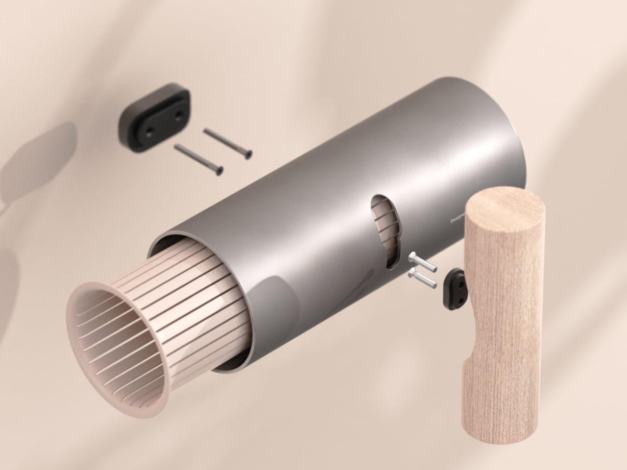
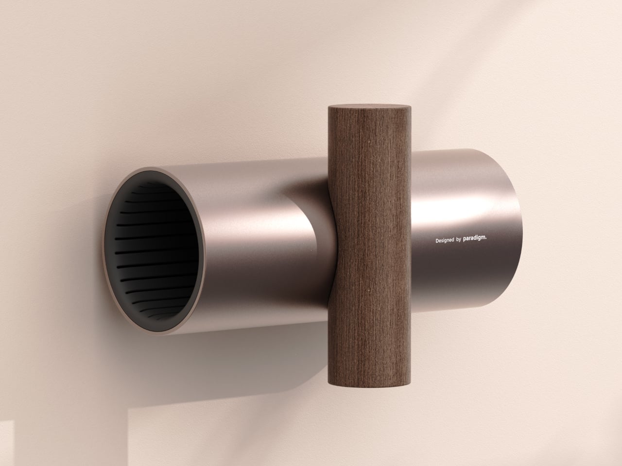
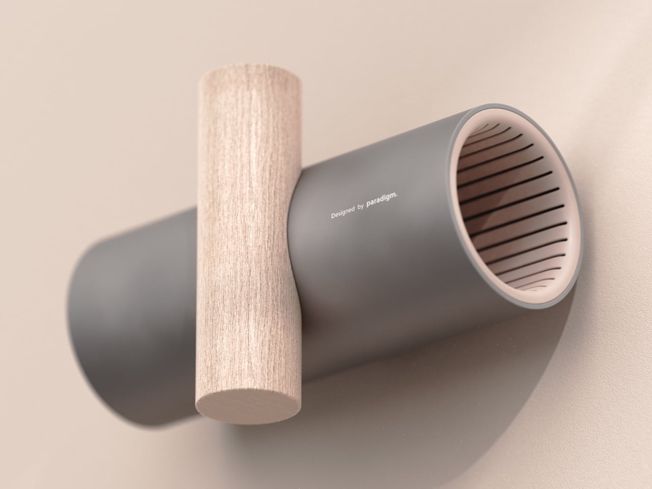
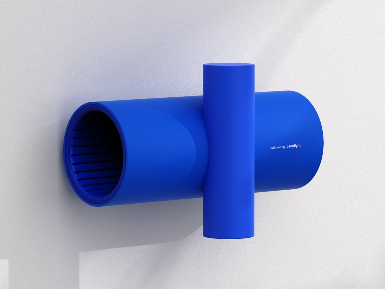
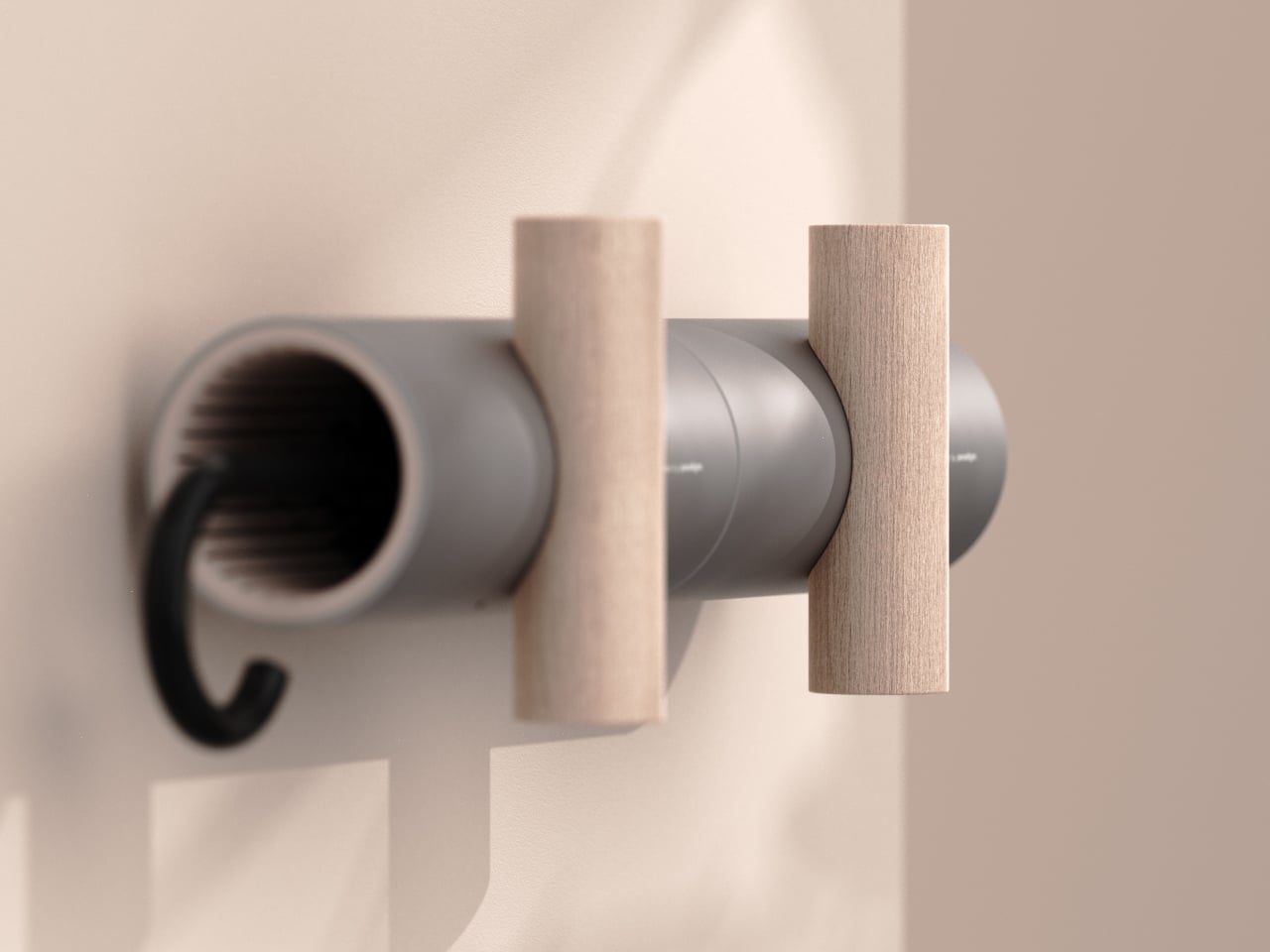
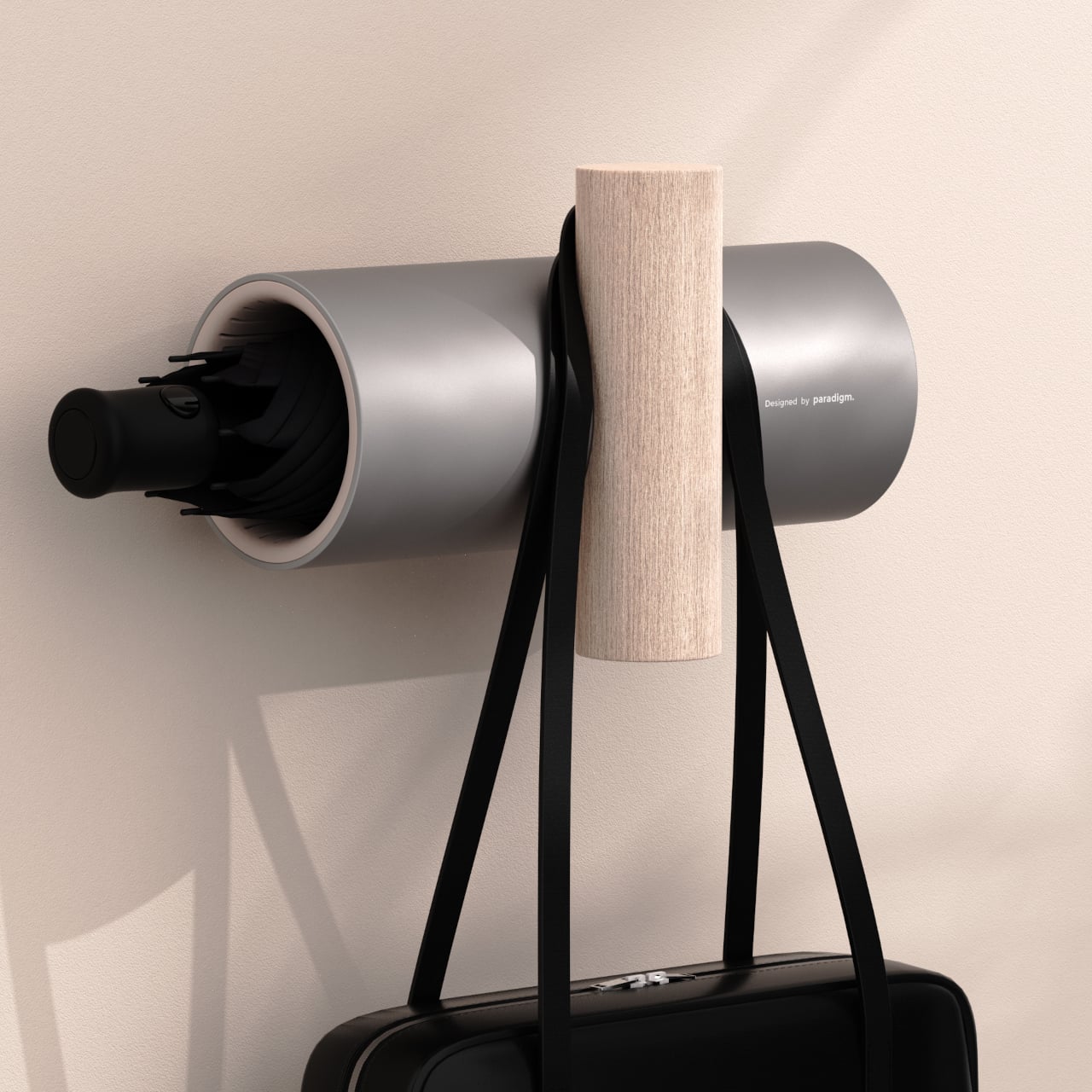
UMBRELLA+ is a concept that revisits the umbrella stand by moving it onto the wall. It is a horizontal cylinder that receives the folded umbrella, intersected by a vertical wooden element that acts as a hook for bags or coats. The T-shaped gesture pulls the umbrella into your field of view at entry height, merging storage and hanging into one coherent system.

Designer: Germain Verbrackel

Getting ready to leave, you grab your coat, loop your bag onto the vertical bar, and the umbrella is right there in the same reach, tucked into the tube or hanging by its handle. Because it sits in the same visual band as the things you already check before walking out, you are less likely to leave it behind. The object rewires the routine by placing the umbrella where your hand already goes.

Coming back wet, the umbrella slides into the tube, where internal ribbing gives the fabric somewhere to rest without collapsing and lets air circulate. It is not a sealed drip tray, so some water may reach the floor, but the design assumes the umbrella is mostly shaken off before it goes inside, which is already part of most people’s entry ritual anyway.

The pairing of a cool, matte cylinder with a warm wooden bar lets UMBRELLA+ slide between different moods. In neutral grey and light wood, it blends into minimal entryways. In bronze and dark wood, it feels warmer and more premium. In full blue, it turns into a playful graphic object. That flexibility lets the same form read as a quiet background or deliberate accent.

UMBRELLA+ is designed for one umbrella plus a bag or coat, not a family with multiple umbrellas fighting for space. That constraint is part of what keeps it visually clean and behaviorally focused. It is a personal entryway object, not a communal storage solution, which makes the most sense in apartments or homes where one or two people are managing their own gear.

UMBRELLA+ is less about inventing a new function and more about moving an existing one into a different part of the wall and the routine. By elevating the umbrella physically and symbolically, it turns something easy to forget into something harder to ignore. Sometimes the best way to solve small daily friction is not a smarter object, but a smarter place to put it, especially when that place is already where you reach every time you leave.

The post UMBRELLA+ Moves the Umbrella Stand Off the Floor and Into Your Exit Routine first appeared on Yanko Design.

Even Plant Killers Can Appreciate This Beautifully Designed Germinator

During the pandemic and even after, there were a lot of people who started becoming plant parents, growing their own plants and flowers in their backyards, on window sills, or even in just one pot. I am not one of those people, specifically because I seem to kill green things accidentally. But for those who love growing things and are looking for beautifully designed and convenient tools to help them, this germinator might pique your interest.

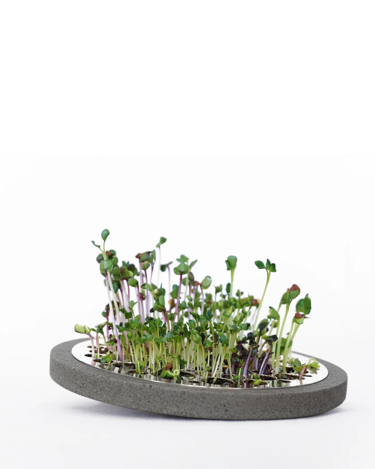
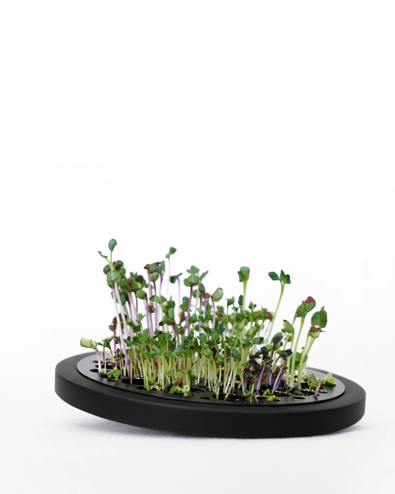
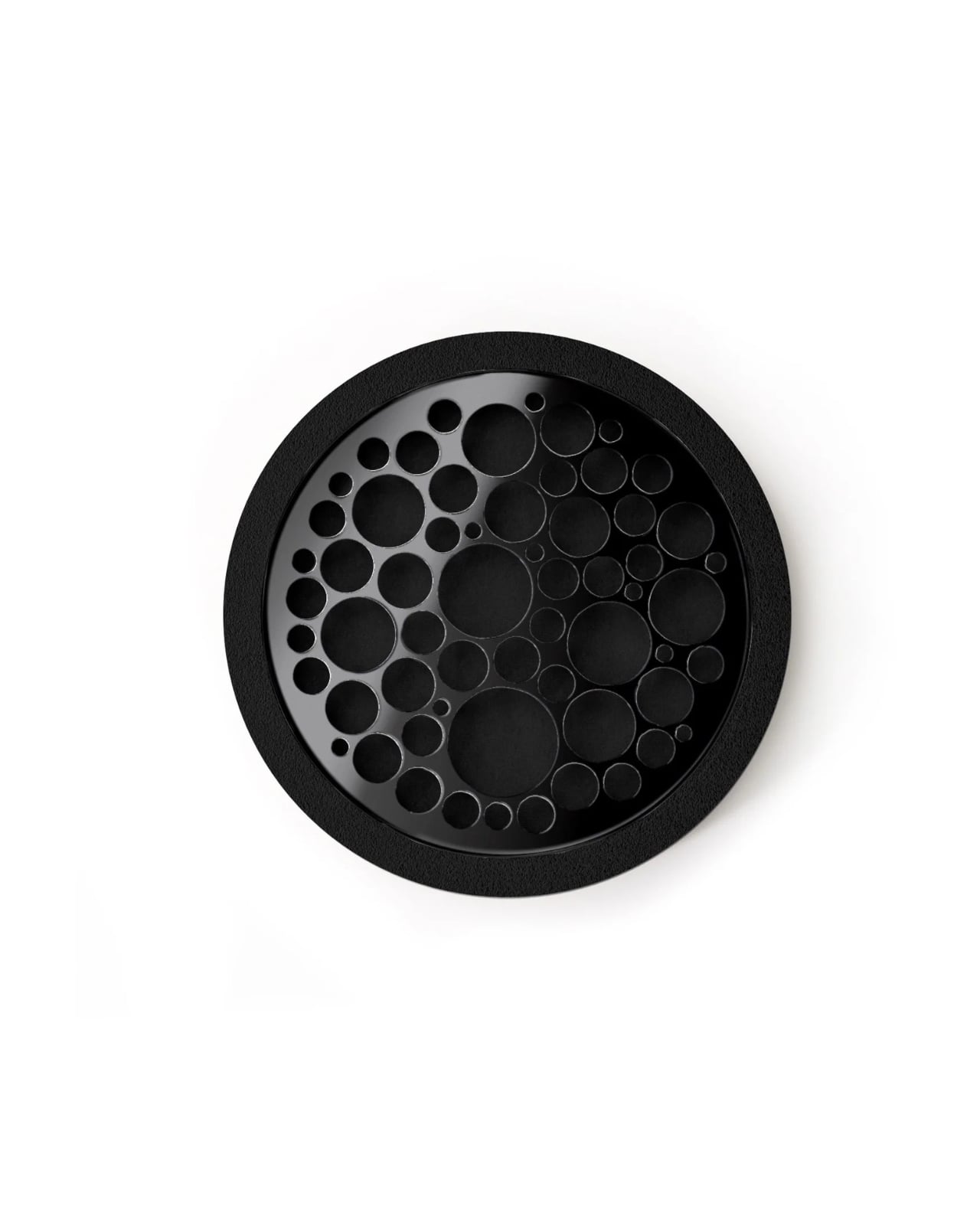
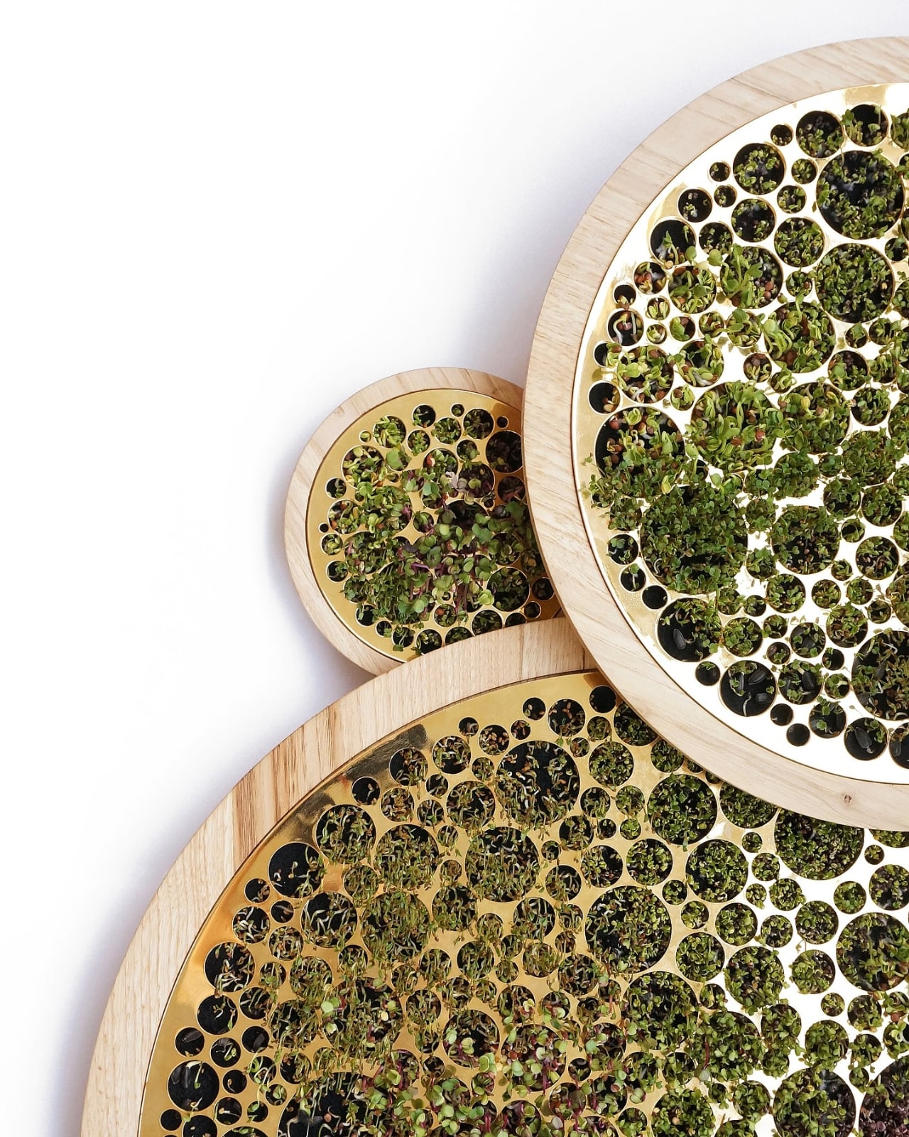
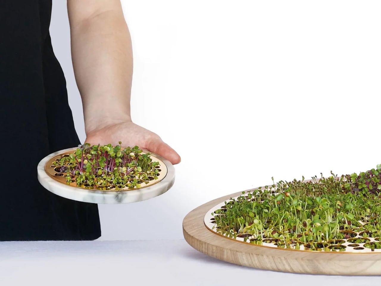
OV is a germinator designed by SOMbyMOS, which is basically a beautifully crafted plate to grow your sprouts using an innovative felt substrate system. You can even choose from several material options for your base to match your space’s aesthetics and to reflect your own personal style: marble, wood, grey stone, or plastic.

Designer Name: Som by Mos

Usually, some germinators use traditional mesh or plastic grids, but this one uses a felt substrate so your sprouts will stay fresh as they grow. It’s gentler on those that are more delicate and also creates better moisture distribution. Plus, it also looks more refined than the typical germination systems in the market. The choice of the base also adds an element of great design, especially if you want to marry form and function.

The marble base brings sophistication with its cool, smooth surface and natural veining that makes each piece unique. The grey stone option brings earthy texture with subtle color variations that add character. The wood variant has a more organic appeal with its warmth and natural grain patterns, while the plastic option has a more contemporary and accessible look without compromising on aesthetic quality.

This germinator is able to embrace its dual purpose beautifully. When you’re growing sprouts, you can watch as it evolves into a living piece that adorns your home. It’s probably fun to see those tiny seeds eventually become vibrant greens day by day, transforming from dormant potential into actual nourishment right before your eyes. But here’s what makes the OV special: when you’re not growing anything, it can still become a beautiful, decorative object, so you don’t need to hide it somewhere and just bring it out when you want to use it as a germinator. It deserves to stay displayed on your counter or shelf, earning its keep as a design piece even during its “off-duty” hours.

The OV comes from Barcelona-based multidisciplinary studio MOS, and their design philosophy really shines through here. They focus on turning “the ordinary into extraordinary” through thoughtful simplicity, and growing sprouts, something that usually happens in plastic containers tucked away in dark corners, becomes this elevated ritual you’ll actually want to engage with daily.

What SOMbyMOS has created is more than just a functional tool; it’s what they call a “growing ritual”. The process of tending to your sprouts becomes meditative and rewarding when your germinator is this beautiful. You’re not just checking on seeds; you’re interacting with a design object that brings joy to your space.

For those interested, the OV is available at various price points depending on your chosen material, ranging from €55 to €121, making it accessible whether you’re just starting your design collection or you’re a seasoned collector looking for something unique and functional.

Even for someone like me who struggles to keep plants alive, I can appreciate the thoughtfulness behind the OV’s design. It acknowledges that the tools we use in our daily lives should be beautiful, not just functional. While I might not trust myself with growing anything (the sprouts would probably stage a revolt), I can absolutely see the appeal for those who have that green thumb I clearly lack.

If you’re someone who loves the ritual of growing your own food, appreciates Scandinavian-inspired minimalism with a Mediterranean twist, or simply wants to add more intentional, beautiful objects to your home, the OV offers exactly that. It’s a reminder that even the simplest activities, like growing sprouts, can become something special when we surround ourselves with thoughtfully designed objects that bring us joy.

The post Even Plant Killers Can Appreciate This Beautifully Designed Germinator first appeared on Yanko Design.

This Battery Charger Shows Which AAs Are Dead on an E-Ink Display

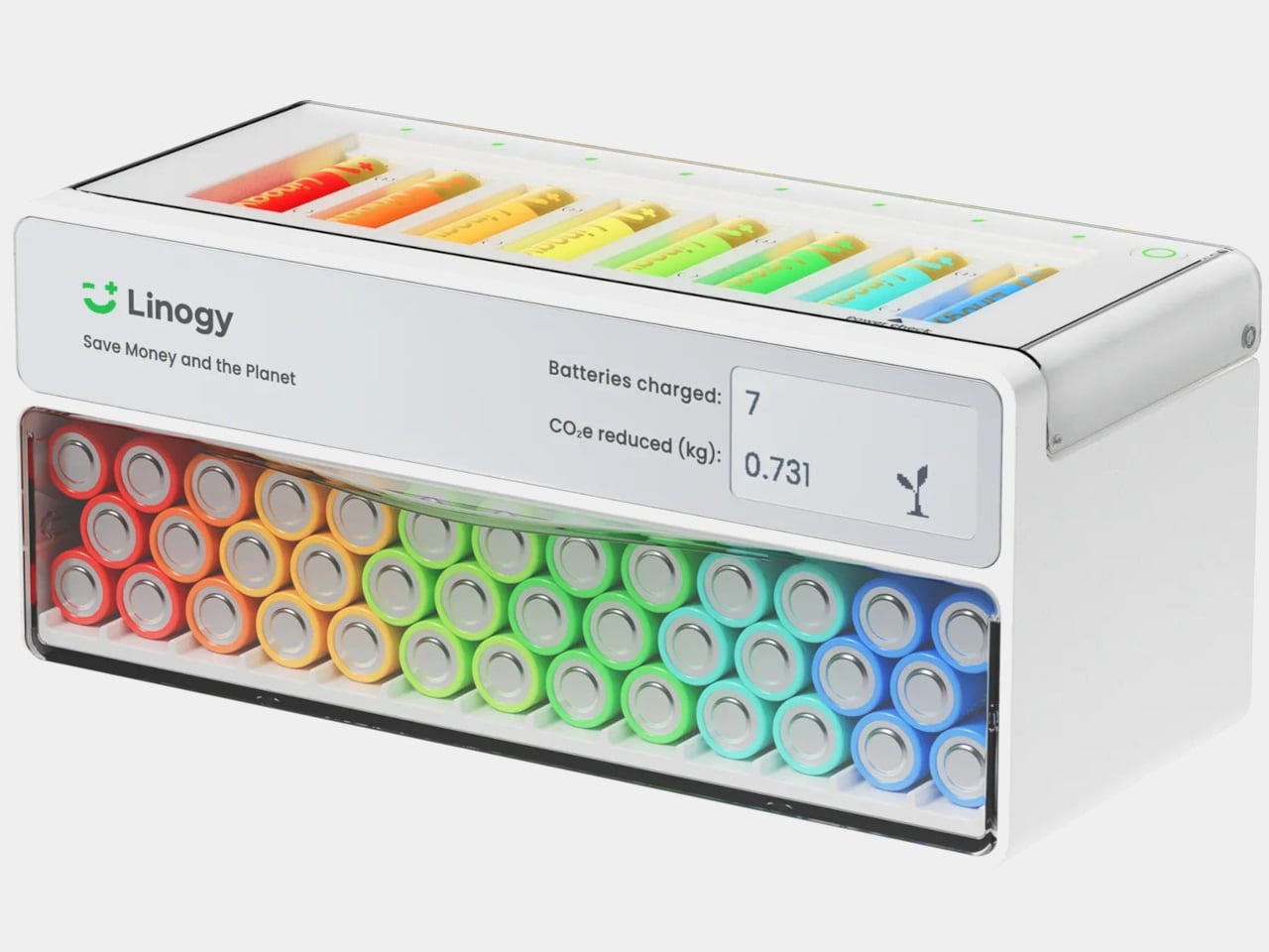
The drawer full of half-used AA and AAA batteries, some new, some dead, some leaking, is familiar. The last-minute scramble for batteries when a remote dies usually means digging through the pile, testing them one by one, and feeling uneasy about throwing spent alkalines into the trash. The problem is not just waste, it is the lack of a clear system for how we power small devices scattered around a home.

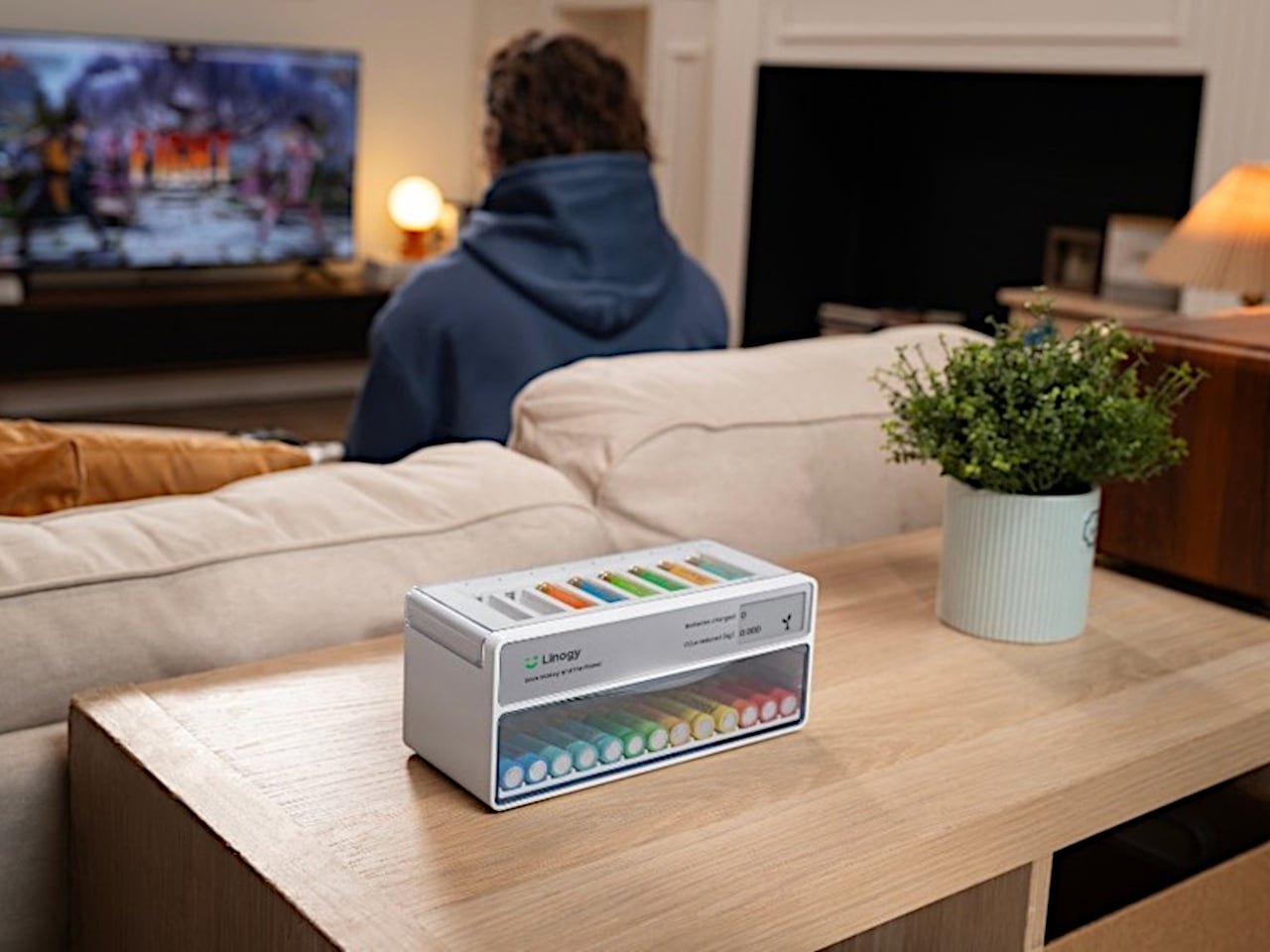
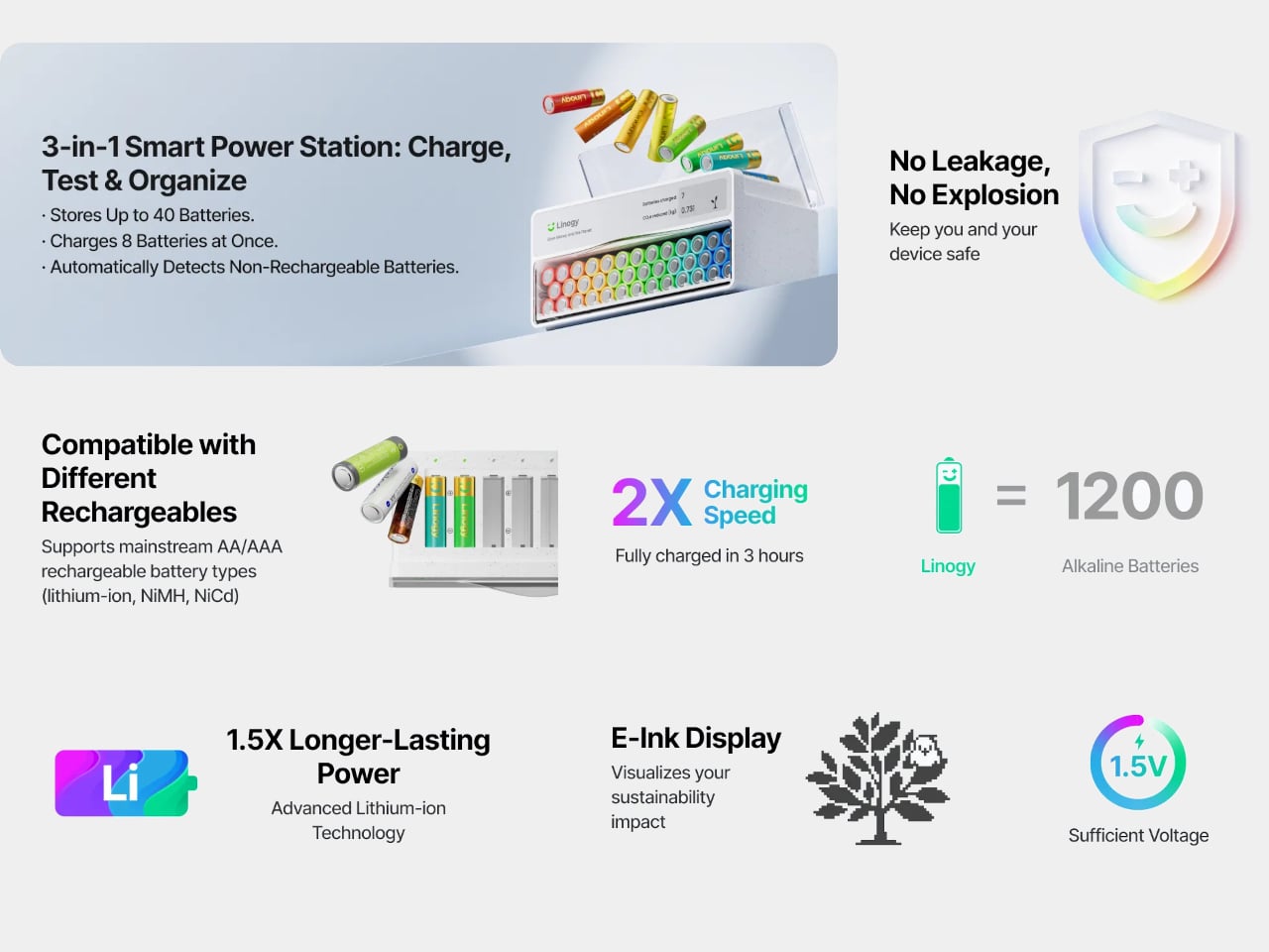
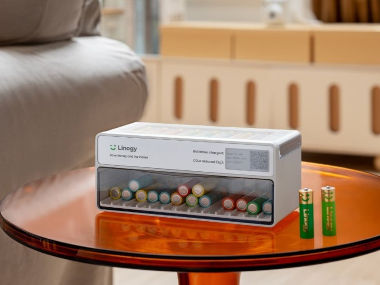
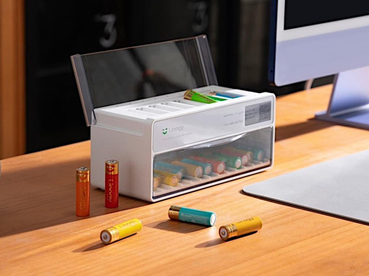
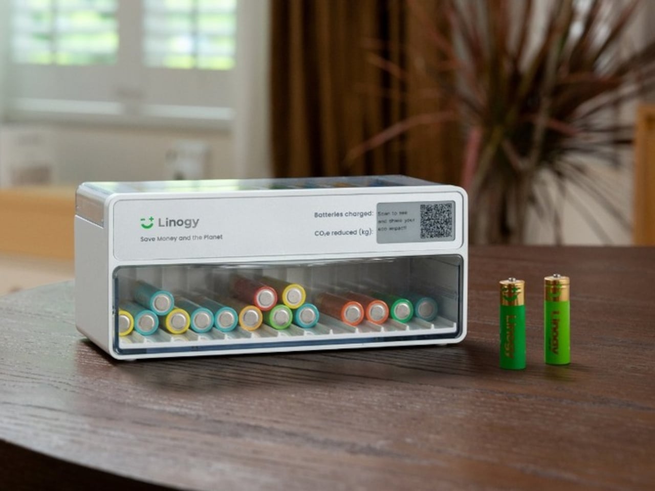
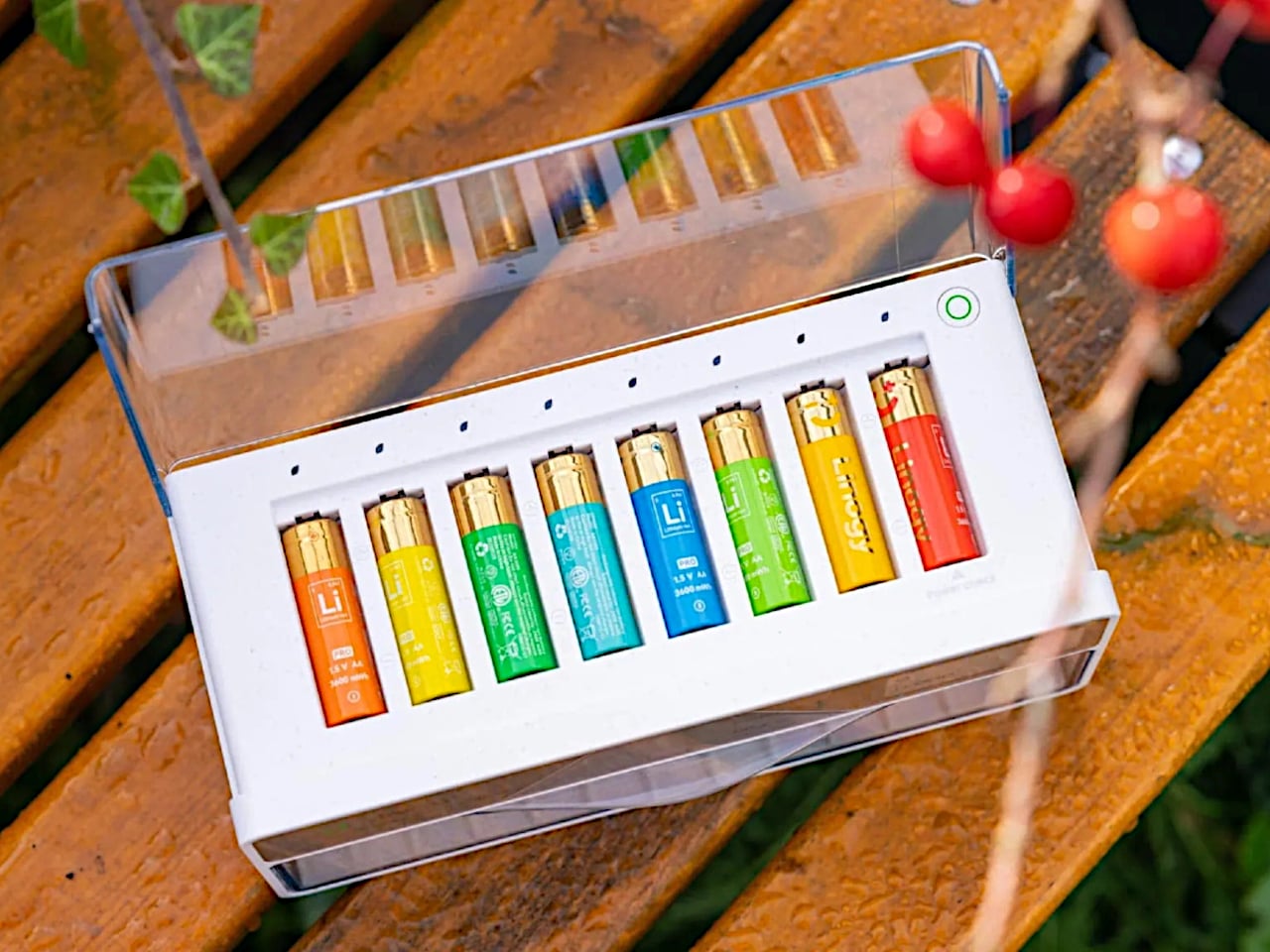
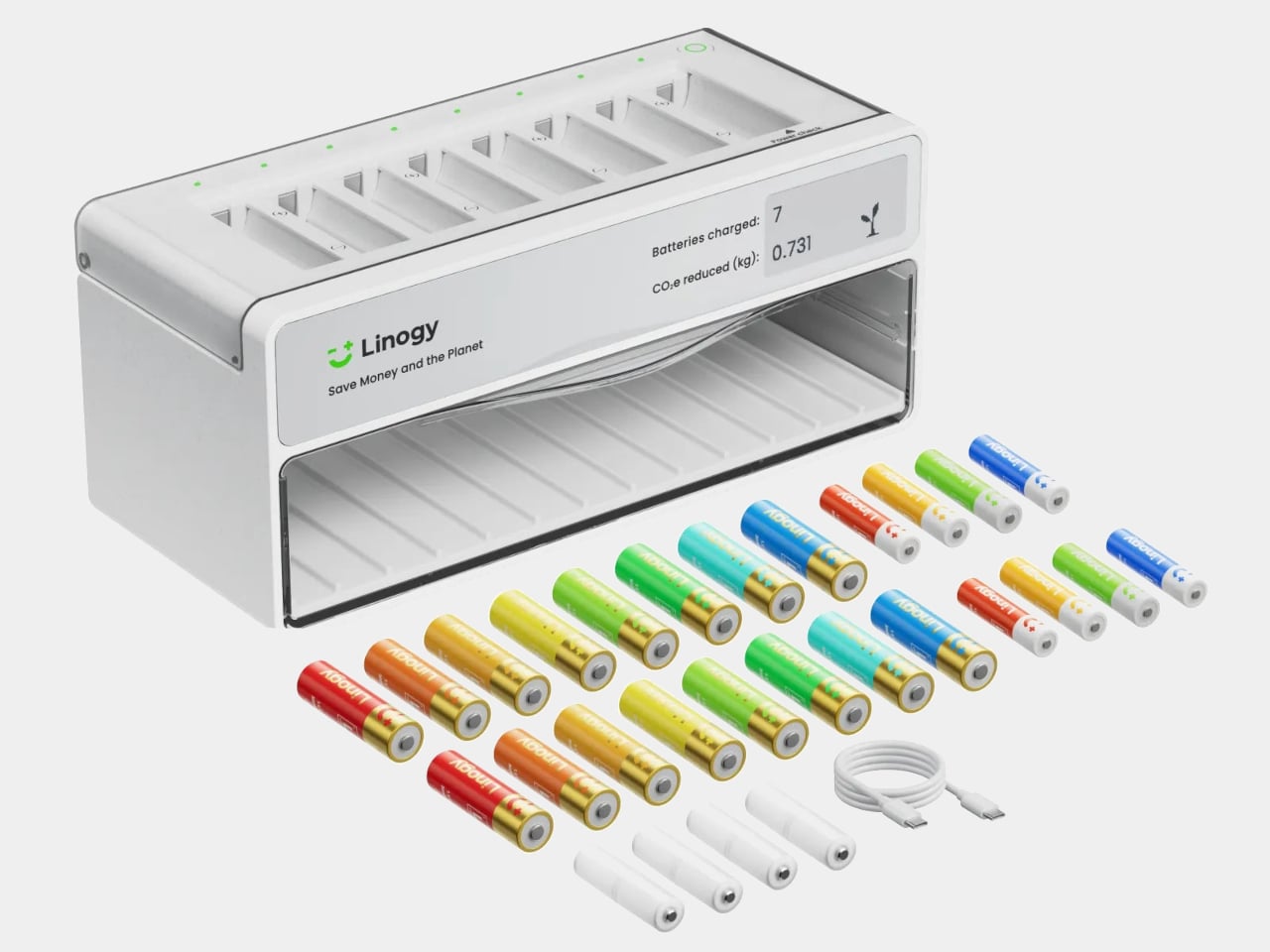
Linogy is a rechargeable battery ecosystem built around 1.5 V Li-ion AA and AAA cells plus an all-in-one smart station. The station lives on a desk or shelf, acting as a battery tester, fast charger, and organizer case that holds up to 40 cells. The goal is to replace the random drawer with a single, visible place where all your batteries live and get managed.

Designer: Linogy

Disposable alkalines are convenient but add up to billions of cells tossed each year, along with tens of thousands of tons of waste and CO₂. Ni-MH rechargeables solve part of that but bring their own quirks: 1.2V output that some devices dislike, high self-discharge, lower energy density, and slow charging that makes topping them up feel like a chore you keep postponing.

Linogy’s cells pack around 3,600mWh and deliver stable 1.5V, closer to what devices expect from alkalines, so performance and battery indicators behave more predictably. The cells are rated for up to 1,200 cycles, meaning one rechargeable can stand in for roughly 1,200 disposables over its life, and built-in protection layers handle overcharge, short circuit, and drop impacts without leaks or smoke.

Dropping a mix of AA and AAA cells into the station, it automatically detects type, health, and charge level. The e-ink display shows which batteries are full, which are charging, and which are ready to retire, without bright LEDs or guesswork. A full charge takes around three hours, and once topped up, the station stops charging and simply holds the cells until something needs power.

The station is compatible with Linogy’s Li-ion cells, Ni-MH, and Ni-Cd AA and AAA batteries. You do not have to throw out existing rechargeables; the same box can test and charge them while you gradually swap in higher-capacity 1.5V cells. Over time, the random mix becomes a more coherent set of batteries you actually trust instead of avoiding.

A simple change in how you handle AA and AAA power can reduce waste and friction. One Linogy cell replacing up to 1,200 alkalines, recyclable packaging, and a charger that looks like a small appliance rather than a tangle of cables all add up. It turns the humble battery from something you forget about until it fails into a part of the home that is designed, visible, and surprisingly satisfying to keep in order.

The post This Battery Charger Shows Which AAs Are Dead on an E-Ink Display first appeared on Yanko Design.

This 600g Tablet Snaps into a Keyboard, Then into a Cooling Stand

The question of whether a single small device can replace a laptop and desktop without feeling compromised keeps surfacing. Past attempts include phone lapdocks and 2-in-1 tablets that end up either too heavy to hold or too weak to be real workstations. Khadas’ Mind Go tries a different path. Instead of forcing everything into one slab, it lets the form factor grow and shrink depending on what you need.

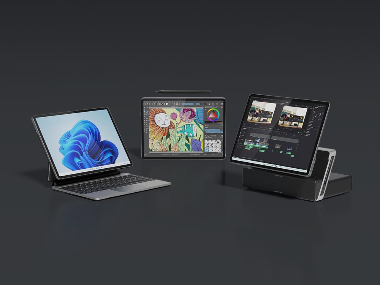
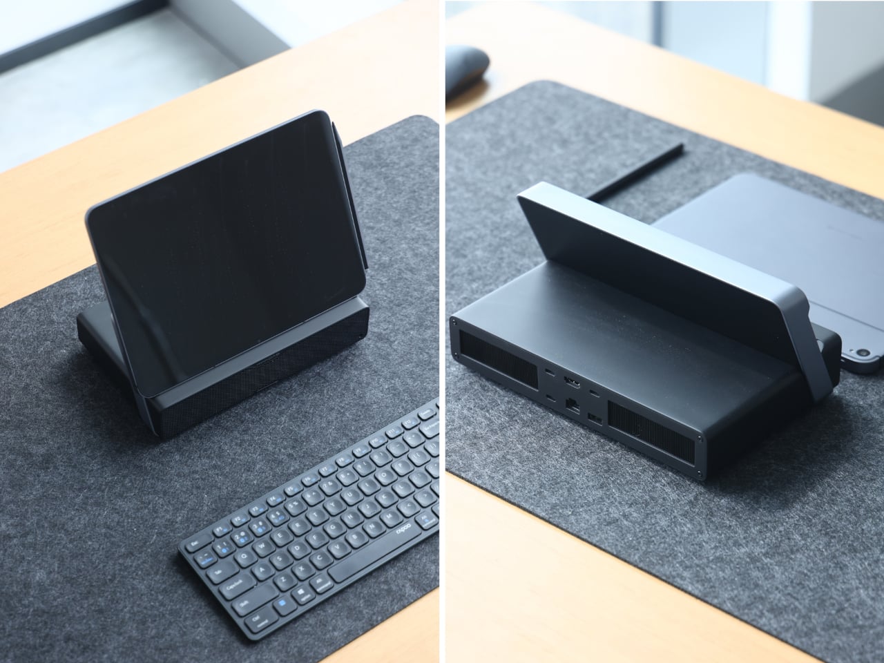
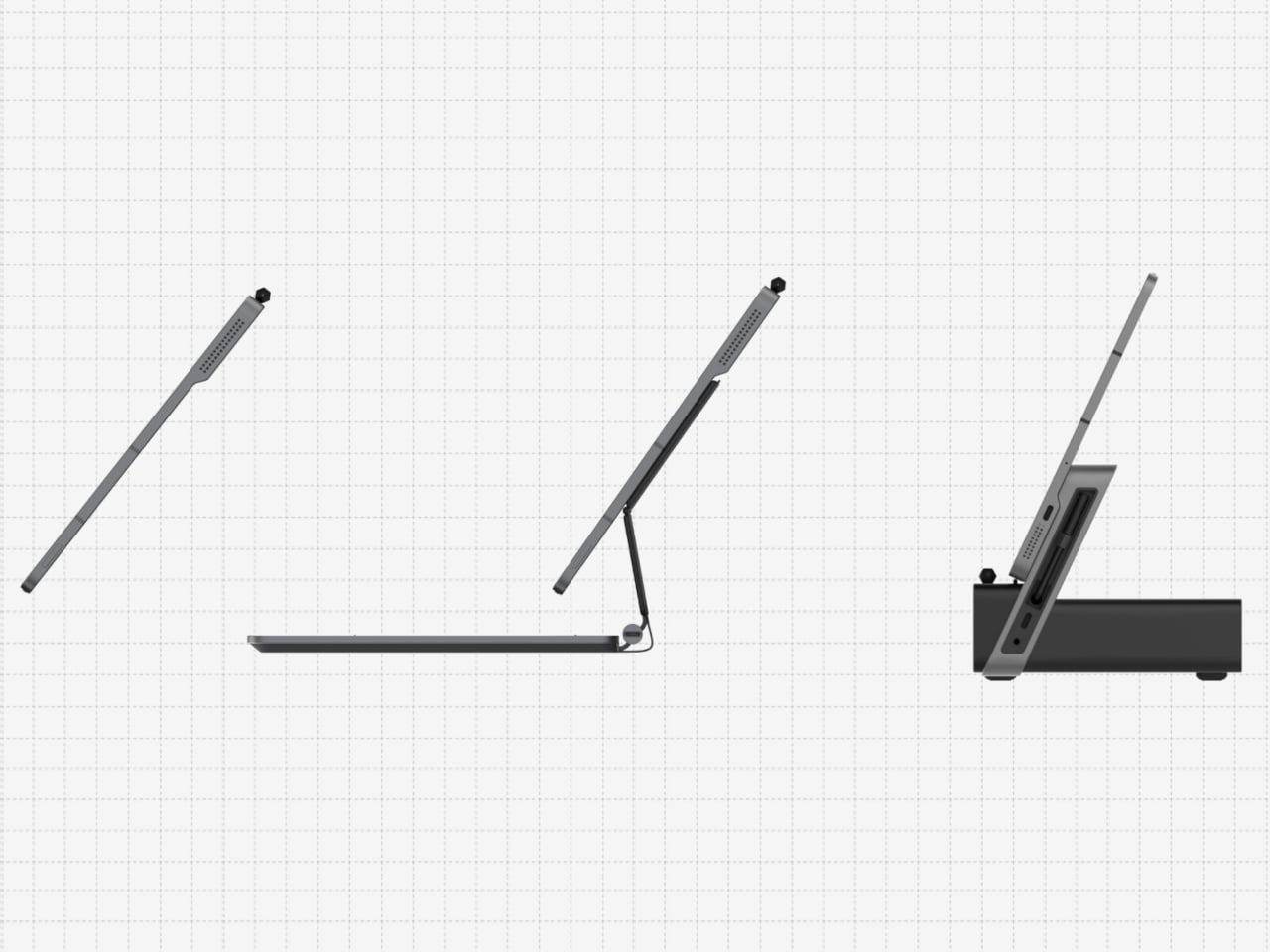
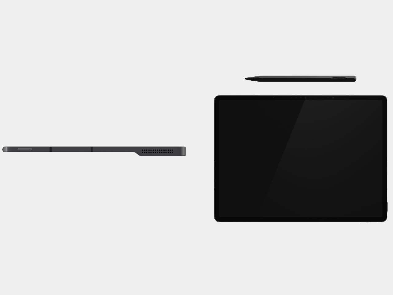
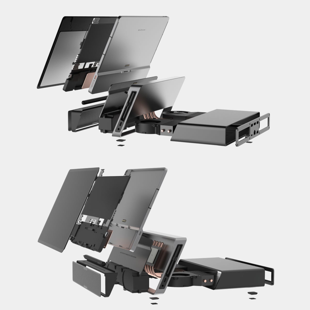
Mind Go is a modular 3-in-1 that starts with an 11.6-inch tablet, weighing around 600g and roughly 6.1mm thick in the current prototype. It is fanless, with built-in speakers, a front camera, Mind Pencil support, and a raised edge on the back that makes one-handed grip easier. The tablet is deliberately not a battery monster on its own because it is meant for shorter, mobile sessions where lightness matters more than runtime.

Designer: Khadas

Slipping the tablet into a bag, reading or sketching on the train, reviewing documents while standing, or sharing a screen in a hallway all become easier with the smaller 11.6-inch size. The lack of fans keeps it quiet and cool. You are not running a full workstation here, just doing the kind of light work that benefits from being truly portable and easy to hold without needing a table.

At a desk or café, the tablet drops into the Mind Go Keyboard. The keyboard is both input and battery, connected through pogo pins, bringing total capacity to 45Wh and roughly nine hours of local video playback. The trackpad and full keys turn the setup into a familiar laptop, and you can detach or reattach the tablet without interrupting what you are doing, shifting between seated and walk-around work.

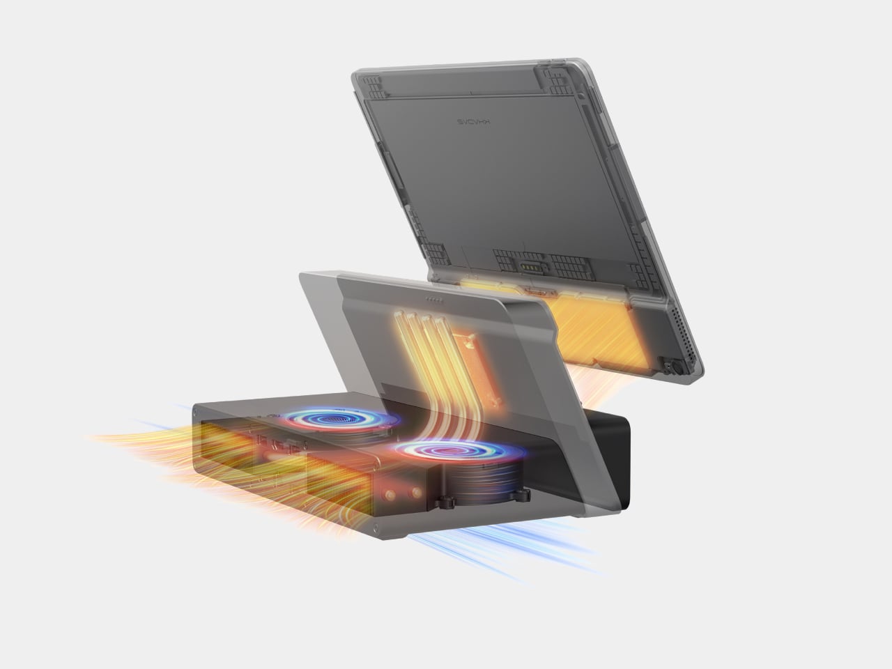
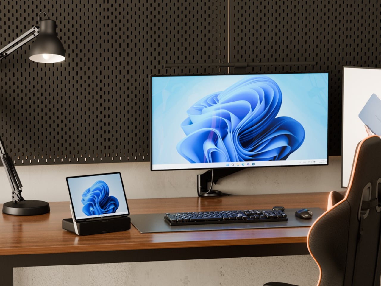
The Mind Go Stand is where the device stops pretending to be just a tablet. The stand adds active cooling and a full set of ports, USB-C, HDMI, USB-A, Ethernet, headphone jack, plus integrated speakers. With sustained cooling, Mind Go can push up to about 30 W of performance, roughly double its tablet mode, and suddenly the small screen is driving multiple external displays and heavier workloads.

This setup changes the usual dance of syncing files between machines. Your projects live on the same device that moves from commute to meeting to desk. On the way home, you are not hunched over a tiny laptop debating whether to sync to a desktop later. You just drop the tablet into the stand, and your posture, visual space, and performance all expand around the same core without transferring files or logging into another machine.

Mind Go is still in market validation, with Khadas asking the community to help decide big questions, Snapdragon or Intel, 11.6 or 13 inches, LCD or OLED, pogo pins or wired stand, even whether the dock should offer optional GPU support. It is an unusual invitation to shape not just the look but the architecture of a device that wants to be your tablet, laptop, and desktop without pretending those are the same thing.

The post This 600g Tablet Snaps into a Keyboard, Then into a Cooling Stand first appeared on Yanko Design.

Edifier D32 Retro Hi-Fi Speaker Hides AirPlay and 11-Hour Battery

Music has become the backdrop to almost everything, cooking, working, reading, but the hardware that plays it often looks like a leftover from a tech store, plastic boxes that clash with furniture. There is a tension between wanting good sound in every room and not wanting your living space to feel like a gadget shelf. A speaker that behaves like hi-fi but looks like it belongs on a sideboard can quietly solve that.

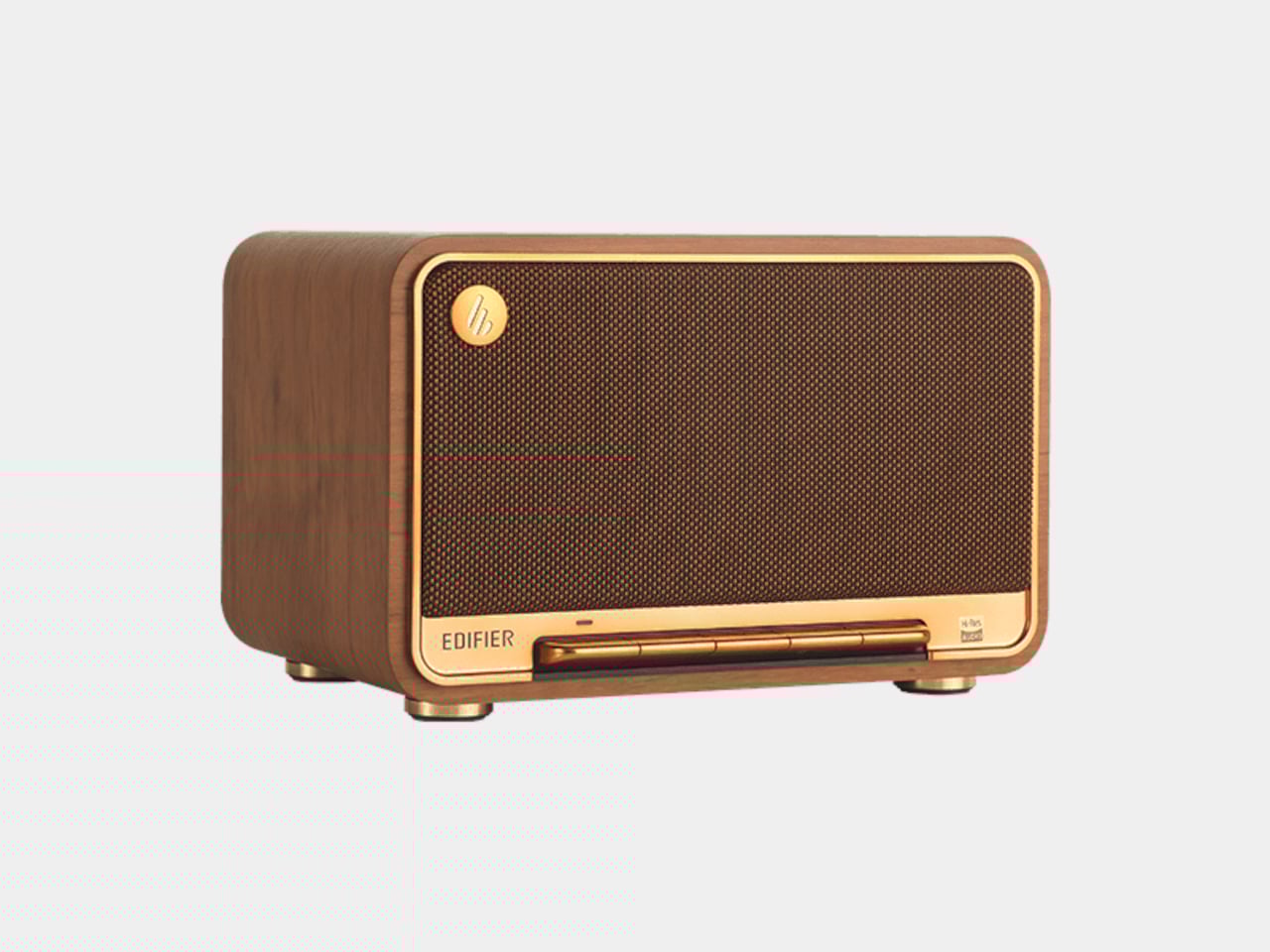
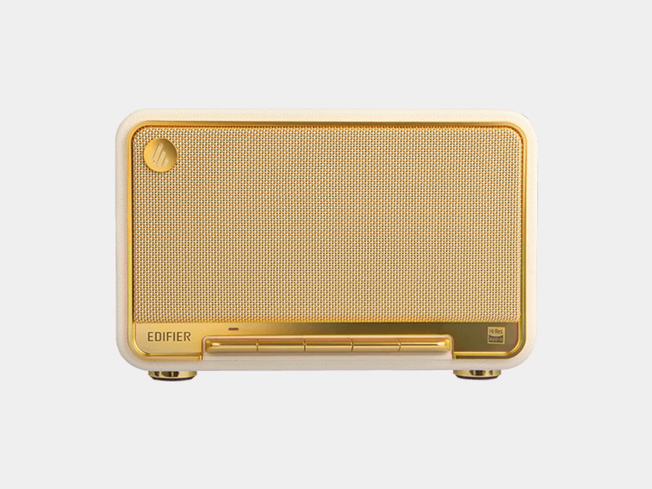
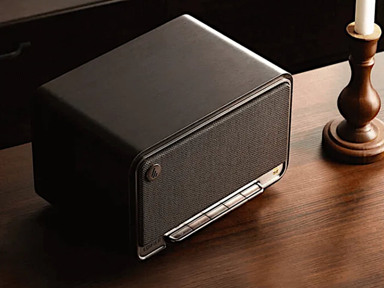
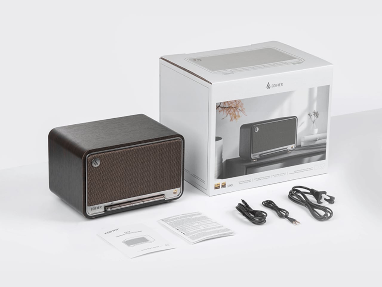
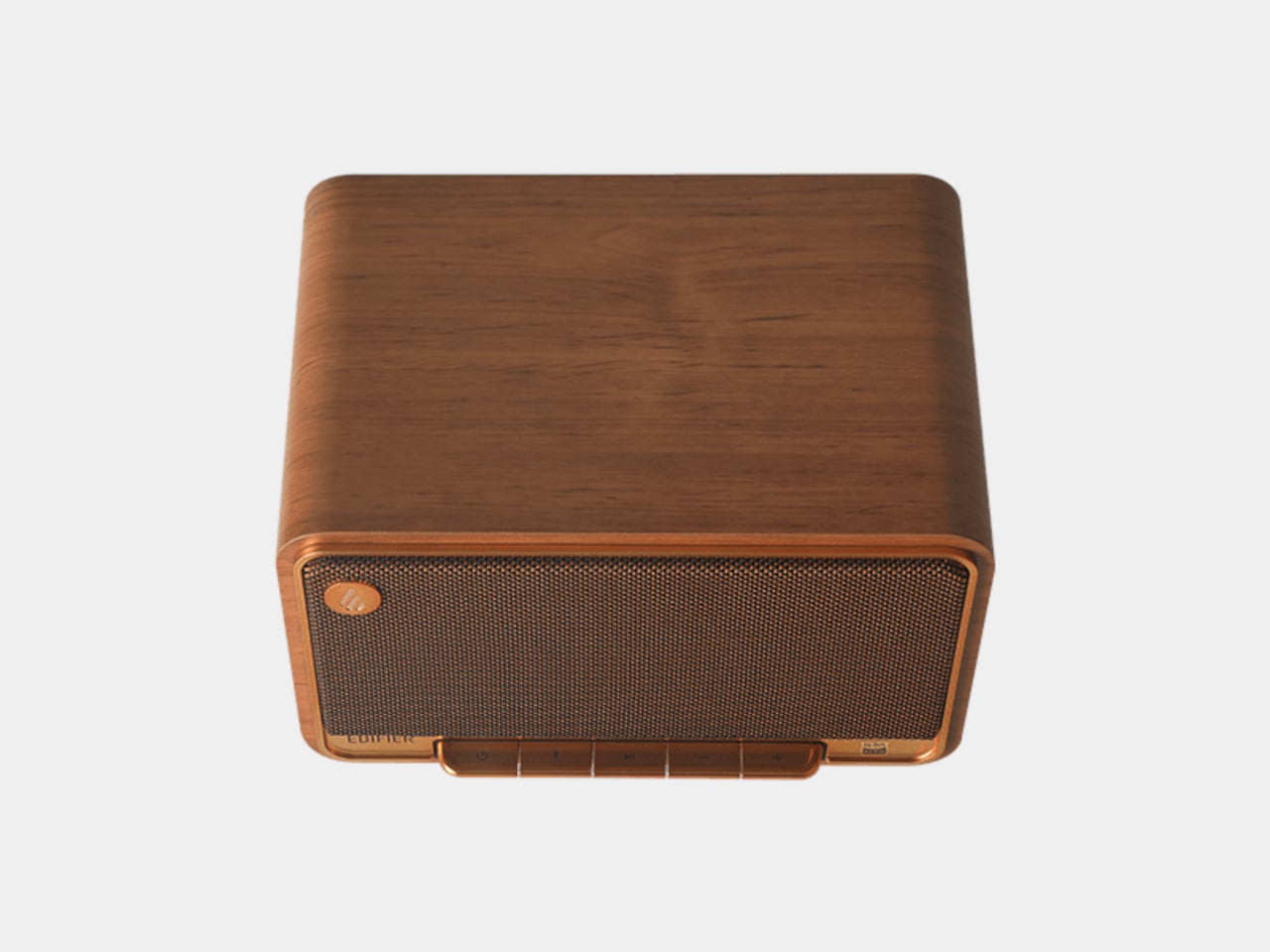
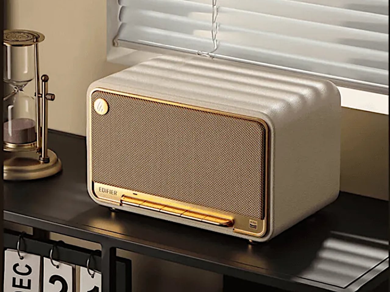
The Edifier D32 tabletop wireless speaker is that kind of object, a retro-styled piece with a hand-made wooden cabinet, braided grille, and accordion keyboard that feels closer to a mid-century radio than a Bluetooth brick. Behind the nostalgia is a modern 2.1 acoustic architecture and 60 W RMS of power, so it is not just a pretty box pretending to be a speaker. It is meant to fill a room with sound that actually holds up when you stop and listen.

Designer: Edifier

The D32 uses two 1-inch silk dome tweeters and a 4-inch long-throw mid-low driver inside an MDF cabinet with dual bass-reflex ports. The tweeters handle the crisp top end, the long-throw driver and ports take care of the low end, and the enclosure is tuned to minimize resonance and distortion. The result is a compact speaker that can throw clear highs, solid mids, and punchy bass without sounding strained when you turn it up, which is rare for something this size.

The signal path supports hi-res audio up to 24-bit/96 kHz and runs everything through full digital signal processing, a two-way active crossover, and dynamic range control. That means the tweeters and woofer get exactly what they need, and the electronics keep things clean and controlled even when tracks get dense. It is the kind of setup you expect in a bookshelf system, shrunk into something that can sit under a window or on a kitchen counter.

The wireless side covers Bluetooth 5.3 with LDAC for high-bandwidth streaming from compatible Android devices, plus AAC and ALAC support, and dual-band Wi-Fi with Apple AirPlay for network playback. There is an 11-hour built-in battery, so you can unplug and move it to another room or out onto a balcony without killing the mood. It can be a fixed living room piece most of the time, then wander when you need sound somewhere else.

Morning coffee with a low-volume playlist coming from the D32 on a sideboard, a workday where it pulls double duty as a Bluetooth speaker for a laptop and a Wi-Fi endpoint for lossless streaming, an evening where it becomes the main system for a movie or a focused album listen. The point is that you do not have to think about what it is connected to. You just pick a source and let the speaker handle the rest, switching smoothly between Bluetooth, Wi-Fi, USB, and AUX without fuss.

The D32’s mix of retro design and modern audio tech makes it feel like something you keep around, not cycle through. The wooden cabinet and accordion keys give it a presence that does not age the way glossy plastic does, while the 2.1 architecture, hi-res support, and flexible wireless stack mean it can keep up with whatever you are listening to next. It is the kind of speaker that quietly becomes part of the room, doing its job without shouting about it, which might be the best thing a piece of audio furniture can do.

The post Edifier D32 Retro Hi-Fi Speaker Hides AirPlay and 11-Hour Battery first appeared on Yanko Design.

The JVC Pyramid TV That Defined Retro Futurism in the 70s Now Wants to Be a LEGO Set

Before flat screens colonized every wall and surface, televisions had personality. They came in wild shapes and bold colors, designed by people who believed consumer electronics could be sculpture. The JVC 3100R Video Capsule, produced throughout the 1970s, exemplified this philosophy. Its pyramid form and space-helmet aesthetic made it a favorite among collectors of “space-abilia,” that peculiar category of objects inspired by Apollo missions and science fiction films.

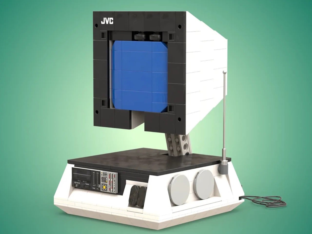
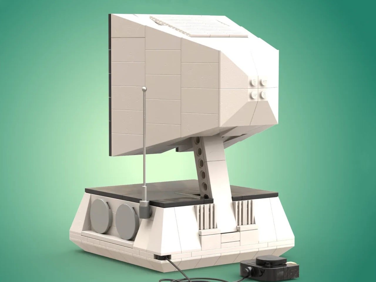
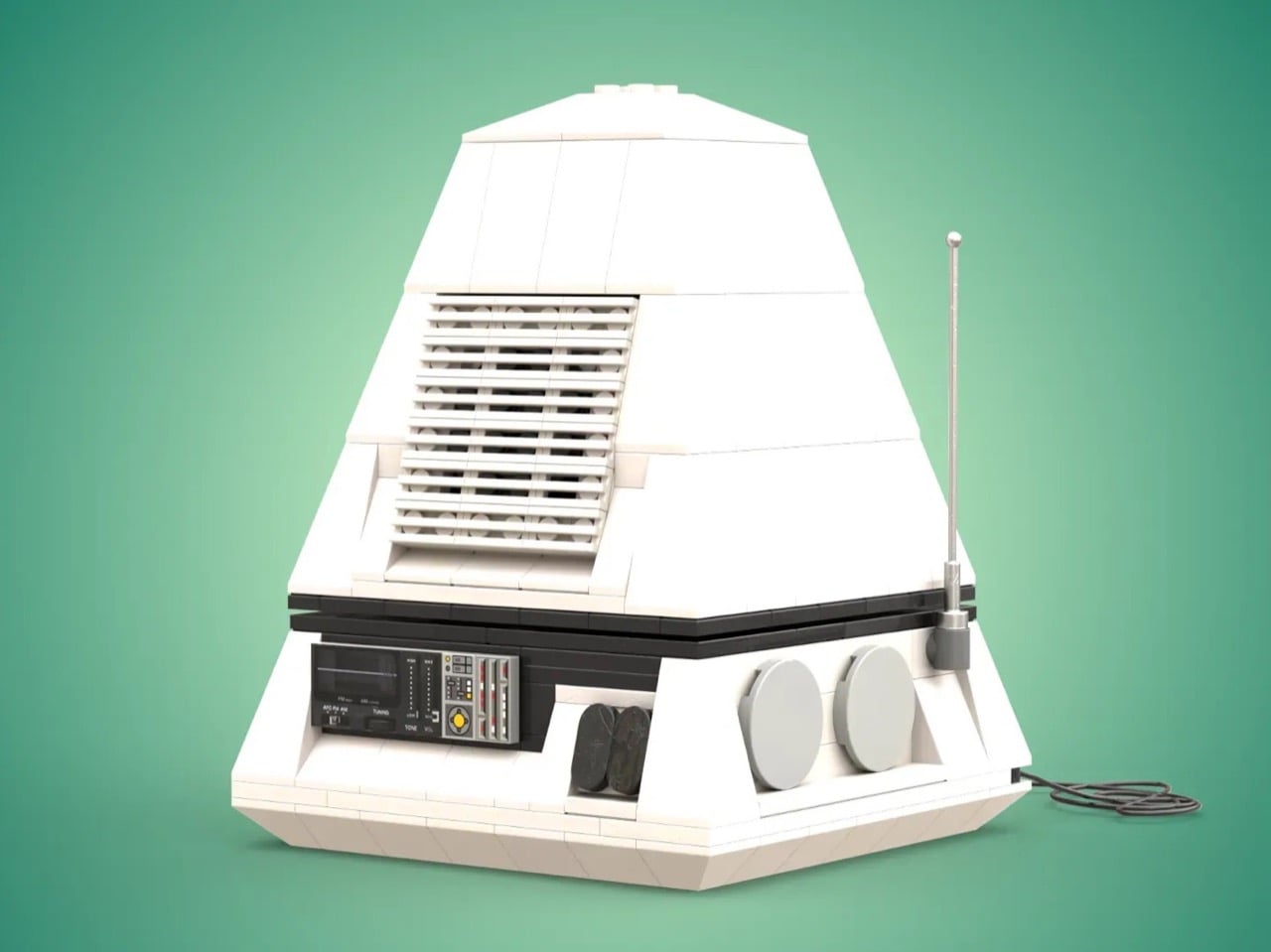
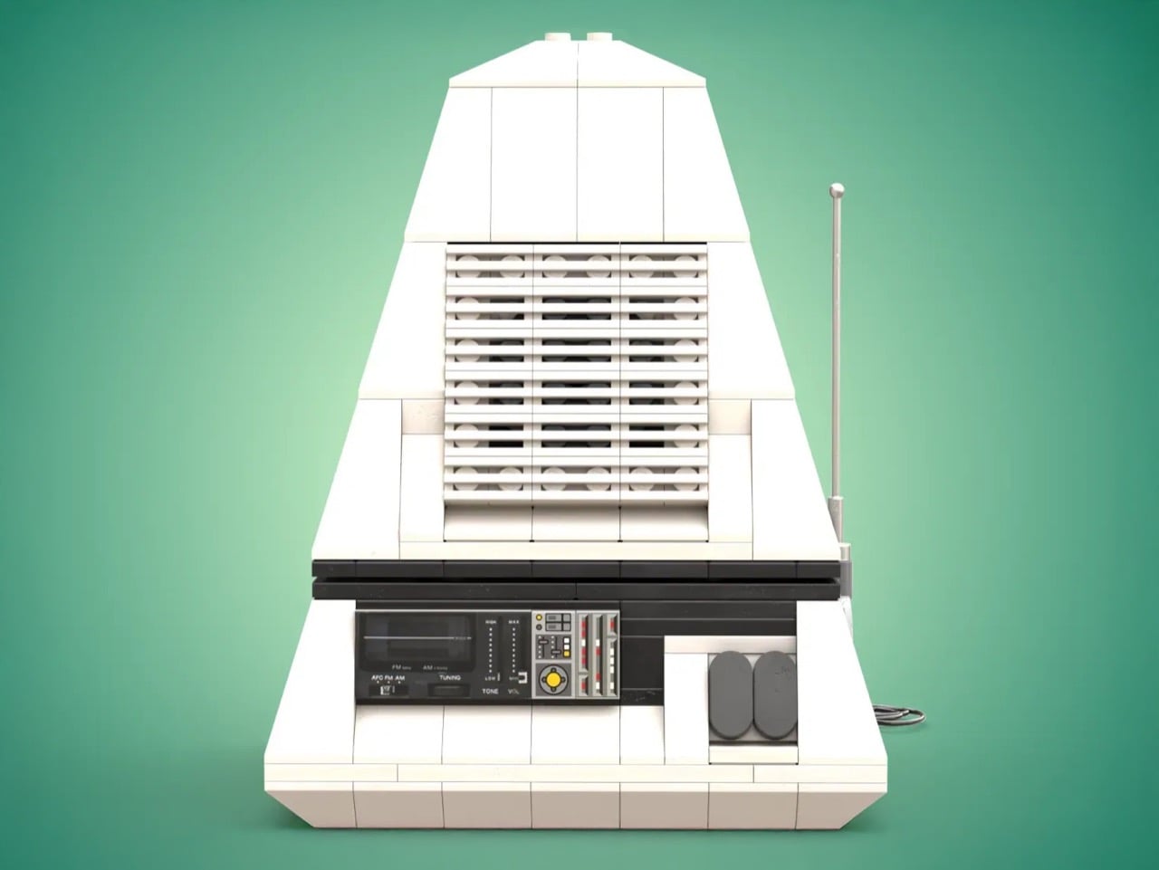
Enter DocBrickJones, a LEGO builder who has recreated this vintage icon in remarkable detail. His LEGO Ideas submission captures everything from the angled white body to the frequency gauge on the control panel. The project needs 10,000 supporters to be considered for production, but it’s currently sitting at just over 200. For anyone who appreciates when design took risks, or when LEGO tackles interesting real-world objects, this pyramid-shaped tribute deserves a closer look.

Designer: DocBrickJones

The original 3100R combined a 6-inch black and white CRT screen with an AM/FM radio in a package that could transform. Collapsed into pyramid mode, it functioned as a radio. Truncate that pyramid by opening the top section, and suddenly you had a television. The design language borrowed heavily from the cultural moment: the black and white color scheme echoed Saturn rockets, while the pyramid geometry nodded to San Francisco’s Transamerica Pyramid skyscraper, completed just a year before the 3100R hit shelves. This was 1972, when the Apollo program still dominated headlines and anything vaguely space-themed sold like crazy. JVC understood the assignment.

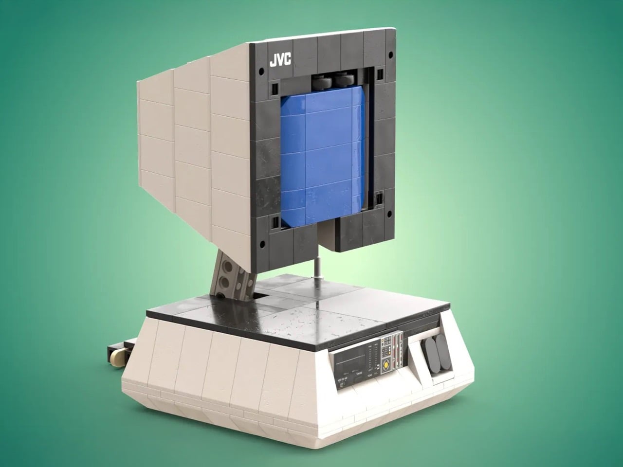
What makes DocBrickJones’ LEGO version impressive is how he’s translated analog curves and slopes into a medium that fundamentally works in right angles. The angled faces of the pyramid base use carefully placed slope bricks to maintain clean lines. The blue-tiled screen sits recessed behind a dark gray frame, complete with speaker grills and control dials. There’s even a telescoping antenna in light gray and a brick-built power cable trailing from the base. These details matter because they demonstrate an understanding of what made the original compelling: the interplay between smooth surfaces and functional elements, the visual weight of that wide base supporting a delicate screen assembly, the contrast between the pristine white body and the technical-looking control panel.

The current LEGO Ideas lineup skews heavily toward nostalgic tech objects. The Polaroid OneStep camera, the classic typewriter, even the Atari 2600 have all found success by appealing to adults who remember when consumer electronics felt tactile and specific rather than generic and touchscreen. The 3100R fits this pattern perfectly, maybe even better than some approved projects. It represents a specific design philosophy from a specific moment when optimism about technology translated into physical form. You looked at a 3100R and thought about the future, even if that future was technically just watching grainy UHF broadcasts.

LEGO Ideas operates as a democratic platform where fan-created designs compete for official production. Submit a project, gather 10,000 supporters within a set timeframe, and LEGO reviews it for potential manufacturing. The newly minted JVC 3100R build currently sits at 207 votes and needs to hit the 1,000 vote margin to reach the next stage, which means there’s plenty of runway for this design to find its audience. Voting costs nothing beyond a free LEGO account, and successful projects get produced as official sets with the original creator receiving royalties and credit. The platform has launched everything from the Saturn V rocket to the Medieval Blacksmith, proving that niche appeal can translate into mainstream success. If you want to see this space-age pyramid sitting on store shelves next to other design-focused sets, the voting link lives on the LEGO Ideas website. The 3100R deserves a second act, this time in brick form.

The post The JVC Pyramid TV That Defined Retro Futurism in the 70s Now Wants to Be a LEGO Set first appeared on Yanko Design.

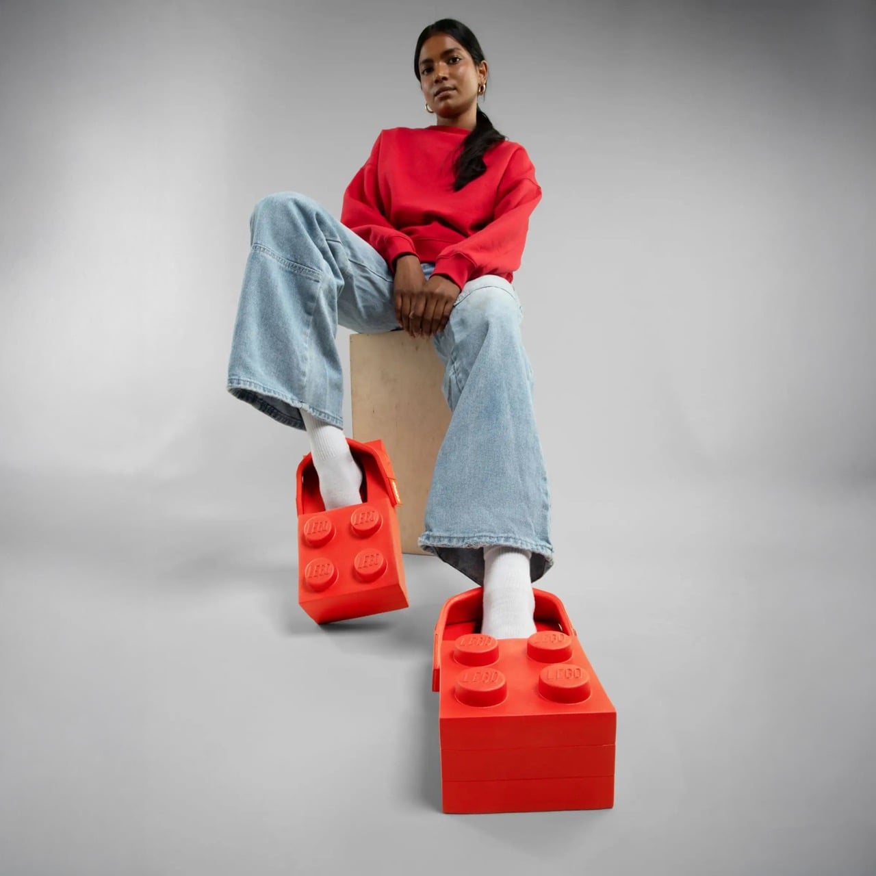
These LEGO Brick Crocs Cost $150 and Look Exactly as Weird as You’d Expect

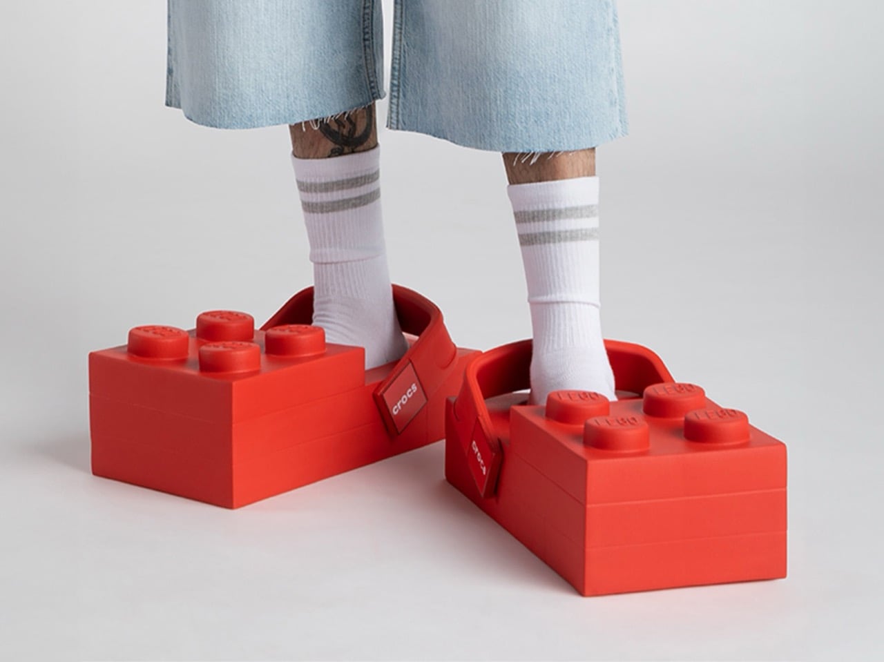
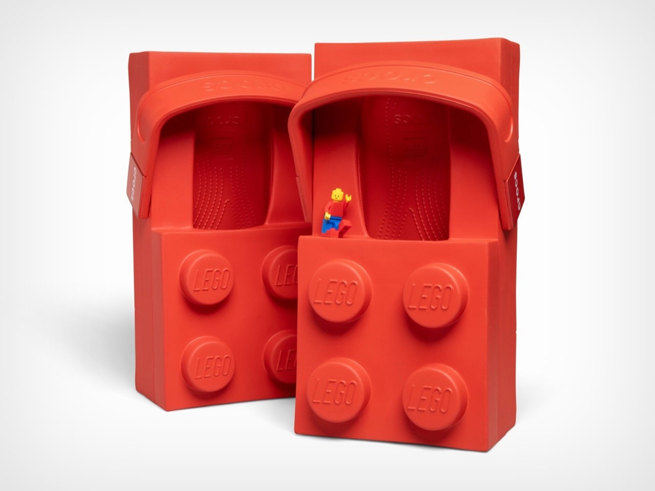
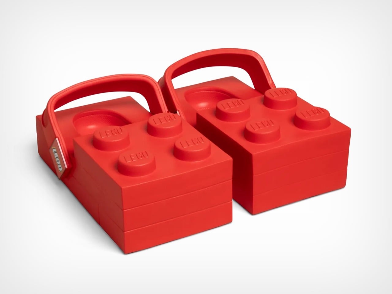
The LEGO Brick Clogs are not subtle. They are not refined. They are giant red rectangles that you strap to your feet, complete with four oversized studs jutting from the top like a toddler’s building block scaled up for adult wear. This is footwear that makes no apologies for its absurdity. Your feet disappear entirely into chunky brick shapes that add inches of height and pounds of visual weight, transforming your lower legs into what looks like a sight gag from a cartoon.

Both LEGO and Crocs seem thrilled by how ridiculous this looks. The design commits fully to the brick concept, maintaining the rectangular shape from every angle and ensuring that yes, you will absolutely look like you raided a giant’s toy chest. The studs aren’t decorative accents. They’re prominent, impossible to miss, and stamped with the LEGO logo so everyone knows exactly what you’ve done to your feet. Crocs even admits these aren’t meant for all-day wear, which feels like the understatement of the year when you’re essentially walking on building blocks.

Designers: LEGO X Crocs

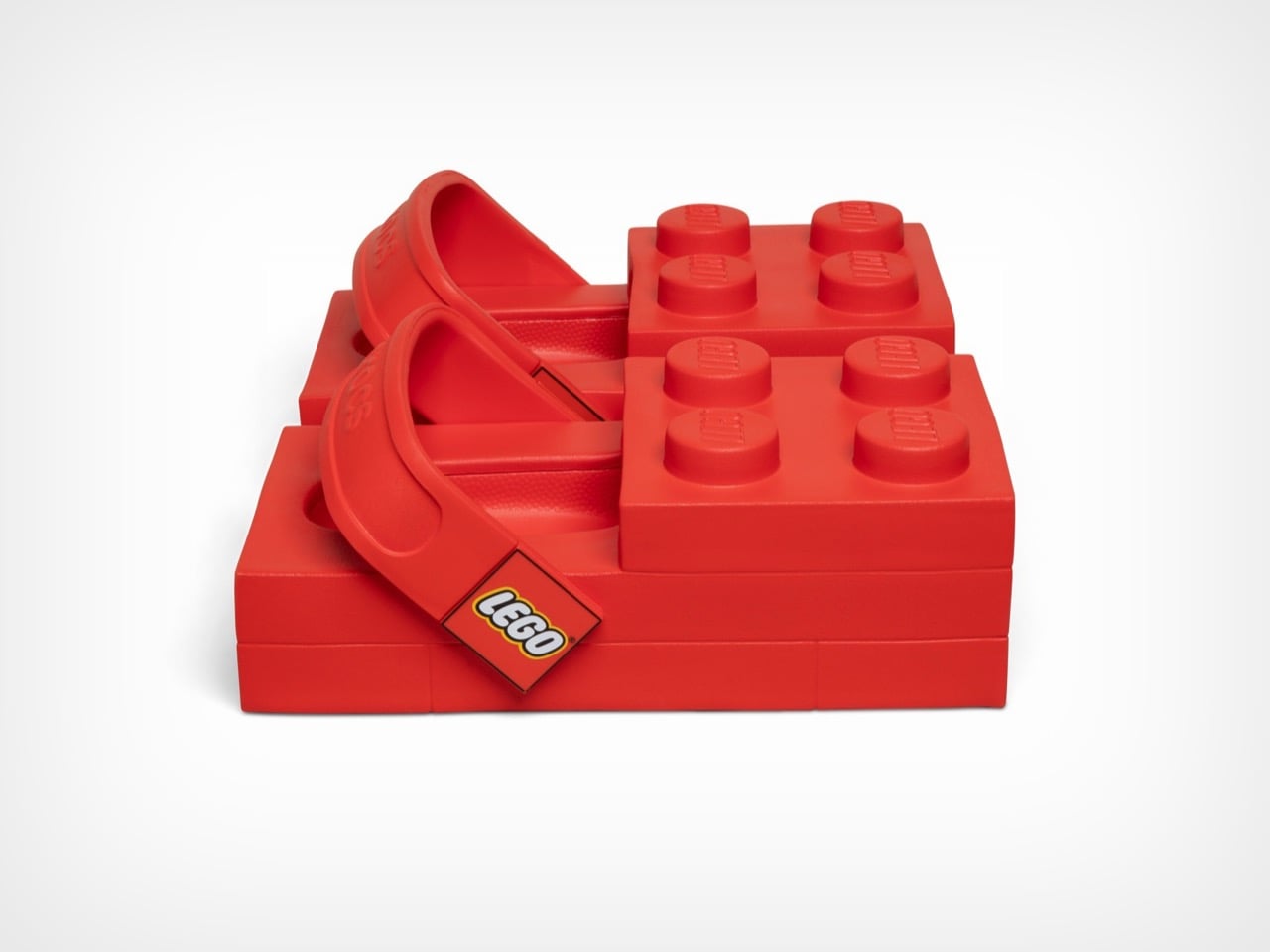
These launch February 16th at $149.99 on Crocs’ site and $199.99 on LEGO’s store, a price discrepancy nobody seems able to explain. They’re available in women’s sizes 7 through 12 and men’s sizes 5 through 13, which means a decent range of people can participate in this social experiment. Each pair includes a LEGO minifigure wearing matching tiny brick clogs because apparently the joke needed extending beyond your actual feet. The shoes use Crocs’ standard Croslite foam material, so they’ll presumably be comfortable despite looking like orthopedic nightmares. The heel strap pivots just like regular Crocs, with one side branded LEGO and the other Crocs, because why choose when you can advertise both brands simultaneously.

From a design perspective, these things are fascinating disasters. The 2×4 brick silhouette creates a platform that extends well beyond normal shoe boundaries, adding considerable visual bulk to an area of the body that most footwear tries to streamline. The four studs on top serve zero functional purpose but dominate the entire aesthetic, sitting roughly where your toes would be if your feet were actually brick-shaped. Inside, you get standard Crocs Croslite foam, the same cushioned EVA material that made the brand famous for comfort. The heel strap pivots like any other Croc, with Crocs branding on one side and LEGO on the other, a small detail that somehow makes the whole package feel even more committed to the bit.

Rapper Tommy Cash debuted them at Paris Fashion Week on January 21st, which tracks perfectly. These needed a runway moment, needed to exist in a context where people expect the unexpected. The fashion world has spent decades normalizing increasingly bizarre footwear, from Balenciaga’s platform Crocs to various luxury brands’ takes on chunky dad shoes. The LEGO Brick Clogs fit right into that lineage while simultaneously mocking it. They’re high fashion and low culture colliding at maximum velocity, wrapped in a bright red package that costs as much as a decent pair of running shoes.

The multi-year partnership promises more releases beyond this initial brick clog, with additional drops planned for spring 2026. Both companies hint at customizable Jibbitz charms made from actual LEGO brick plastic, which could genuinely be interesting if they figure out the attachment mechanism. The collaboration might seem random until you consider that both brands built empires on letting people express themselves through unconventional means. LEGO gives you infinite creative possibilities with plastic bricks. Crocs gave the world permission to prioritize comfort over convention and then added holes for decorative charms. Put them together and you get footwear that dares you to take it seriously while simultaneously proving it doesn’t care if you do.

The post These LEGO Brick Crocs Cost $150 and Look Exactly as Weird as You’d Expect first appeared on Yanko Design.

5 Furniture Trends That Just Made IKEA Look Obsolete in 2026

Furniture is now understood as a core architectural component rather than a purely functional addition to a space. In 2026, instead of sharp, rigid forms, current design directions favor softer, organic silhouettes that promote comfort and visual calm. These shapes help create interiors that feel more balanced and human-centred, supporting everyday use while enhancing the emotional quality of the environment.

This evolution is reinforced by the use of advanced materials and modular construction systems that improve durability and adaptability. Flexible configurations allow furniture to respond to changing needs, extending product life and long-term value. When thoughtfully integrated, these pieces guide movement and define zones within an interior. Take a look at the furniture trends that remains relevant as lifestyles and design preferences evolve in 2026.

1. Soft Spatial Forms

Design is steadily shifting away from rigid, rectilinear furniture toward softer, curving silhouettes inspired by natural movement. Rounded edges and flowing profiles reduce visual tension, helping spaces feel more relaxed and continuous. These forms also support smoother spatial flow, allowing furniture to guide movement gently rather than interrupt it with sharp transitions.

Curved surfaces interact with ambient light in more subtle ways, creating soft highlights and layered shadows that add depth to interiors. Beyond visual appeal, these shapes offer practical advantages, including improved ergonomics and reduced edge damage over time. By combining comfort, durability, and visual warmth, soft-form furniture supports long-term usability while maintaining a calm, human-centred interior environment.
When furniture follows rounded geometries, it contributes to a more welcoming environment while maintaining a strong design identity. These forms work especially well in minimal interiors, where shape and proportion become the primary visual language rather than surface decoration.
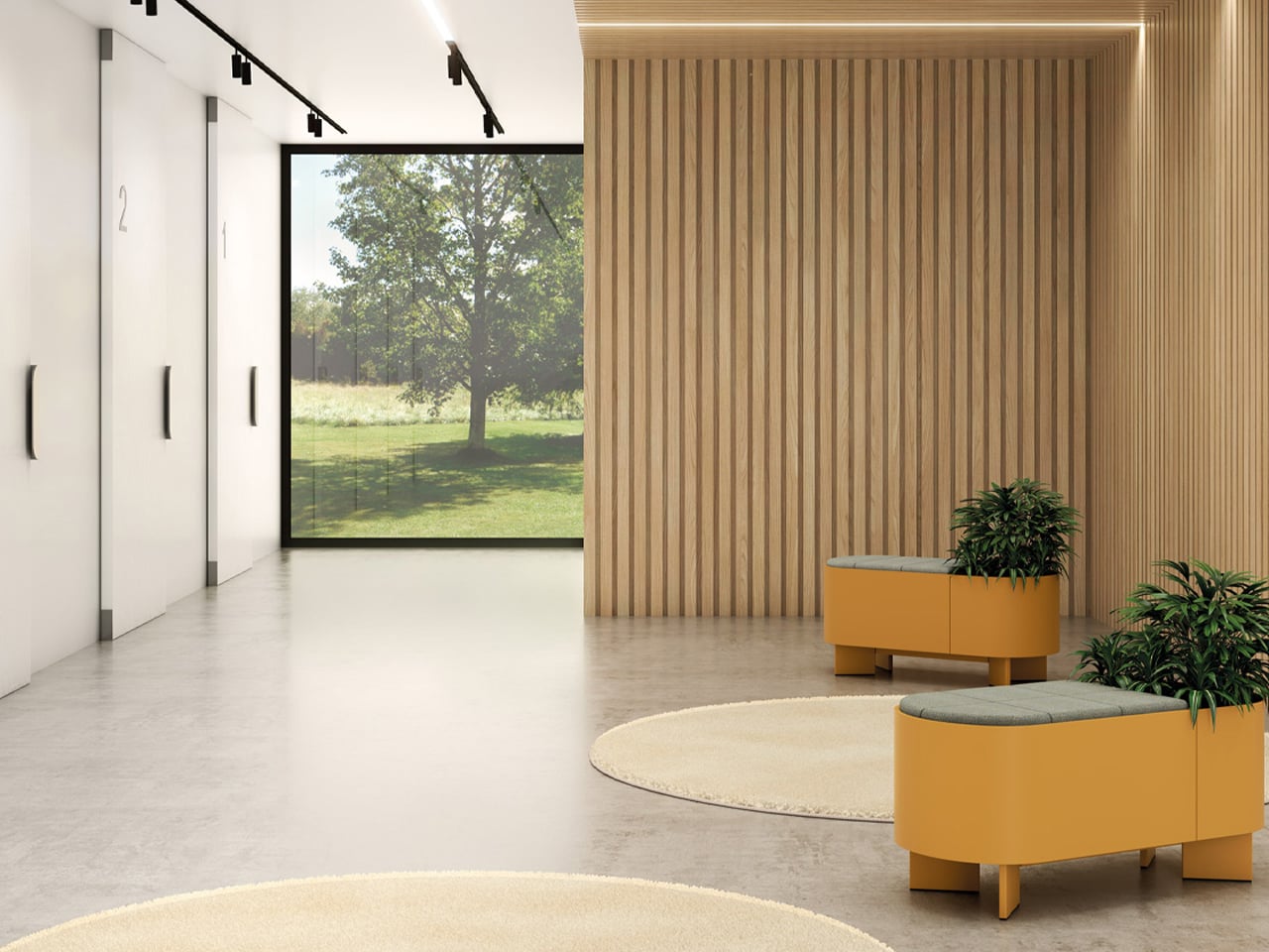
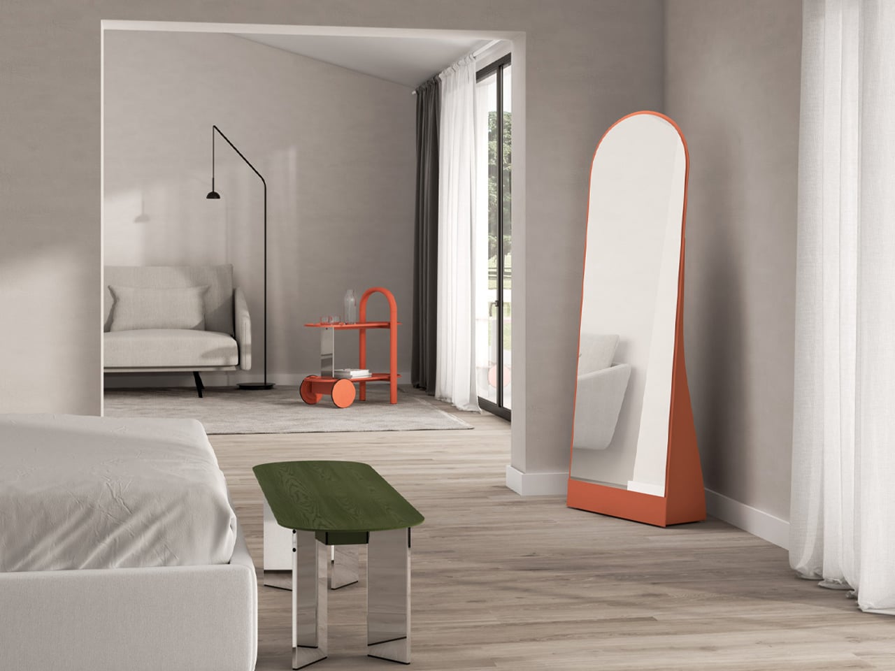
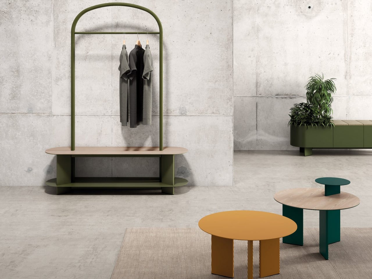
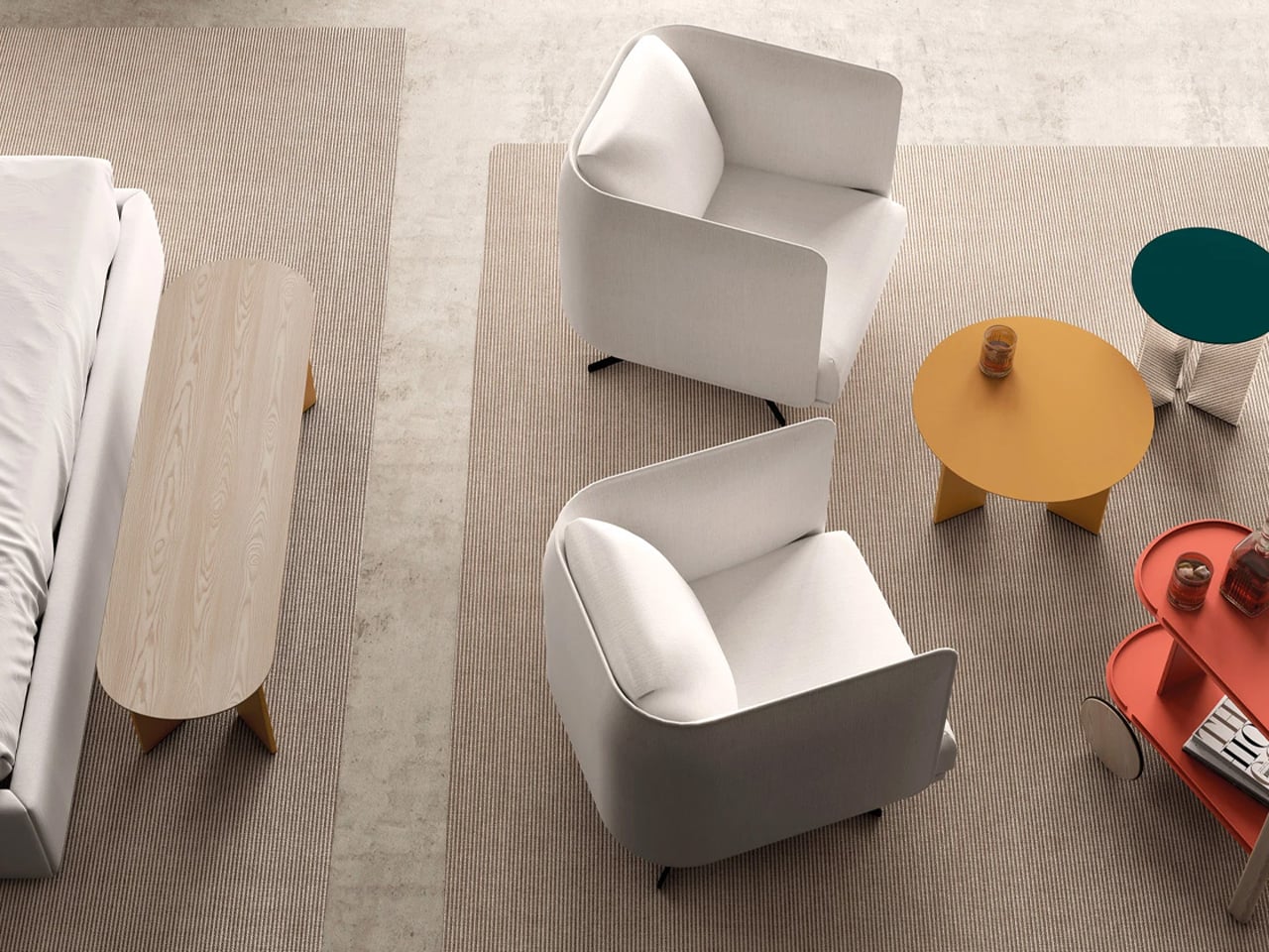
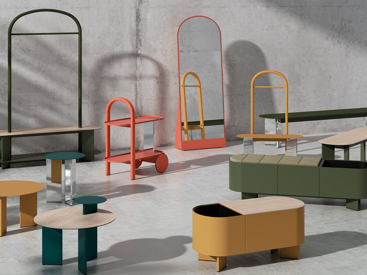
Designed by Lagranja Design for Systemtronic, the Croma furniture collection is defined by consistent curved lines and warm-toned finishes inspired by Mediterranean materials. Natural and stained ash wood is combined with painted and chrome-plated aluminium to create contrast while maintaining visual softness. The collection includes arched wardrobes, rounded planter benches, circular tables in multiple sizes, mirrors, valet stands, and trolleys. Unified geometry across all pieces ensures compatibility within shared spaces, allowing the collection to function as a coordinated system rather than isolated objects.

2. Bio-Smart Materials

In 2026 material innovation is moving toward bio-engineered alternatives that reduce reliance on fossil-fuel-based synthetics. Regenerative materials such as mycelium and algae-based polymers offer low carbon impact while introducing rich, tactile surfaces that feel organic and visually distinctive. These bio-composites support responsible production methods while maintaining the structural performance required for everyday furniture use.

Textiles are also evolving through the use of self-cleaning and pollutant-breaking coatings, including titanium dioxide finishes that react to light exposure. These treatments improve hygiene, reduce maintenance needs, and extend fabric lifespan. Together, bio-based structures and advanced surface technologies support sustainability and long-term design relevance, ensuring furniture remains compliant with future environmental standards while delivering consistent aesthetic and functional performance.
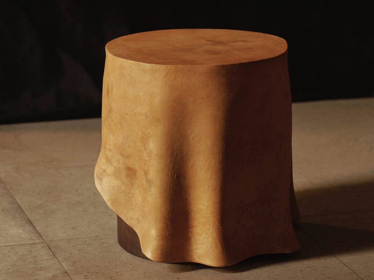
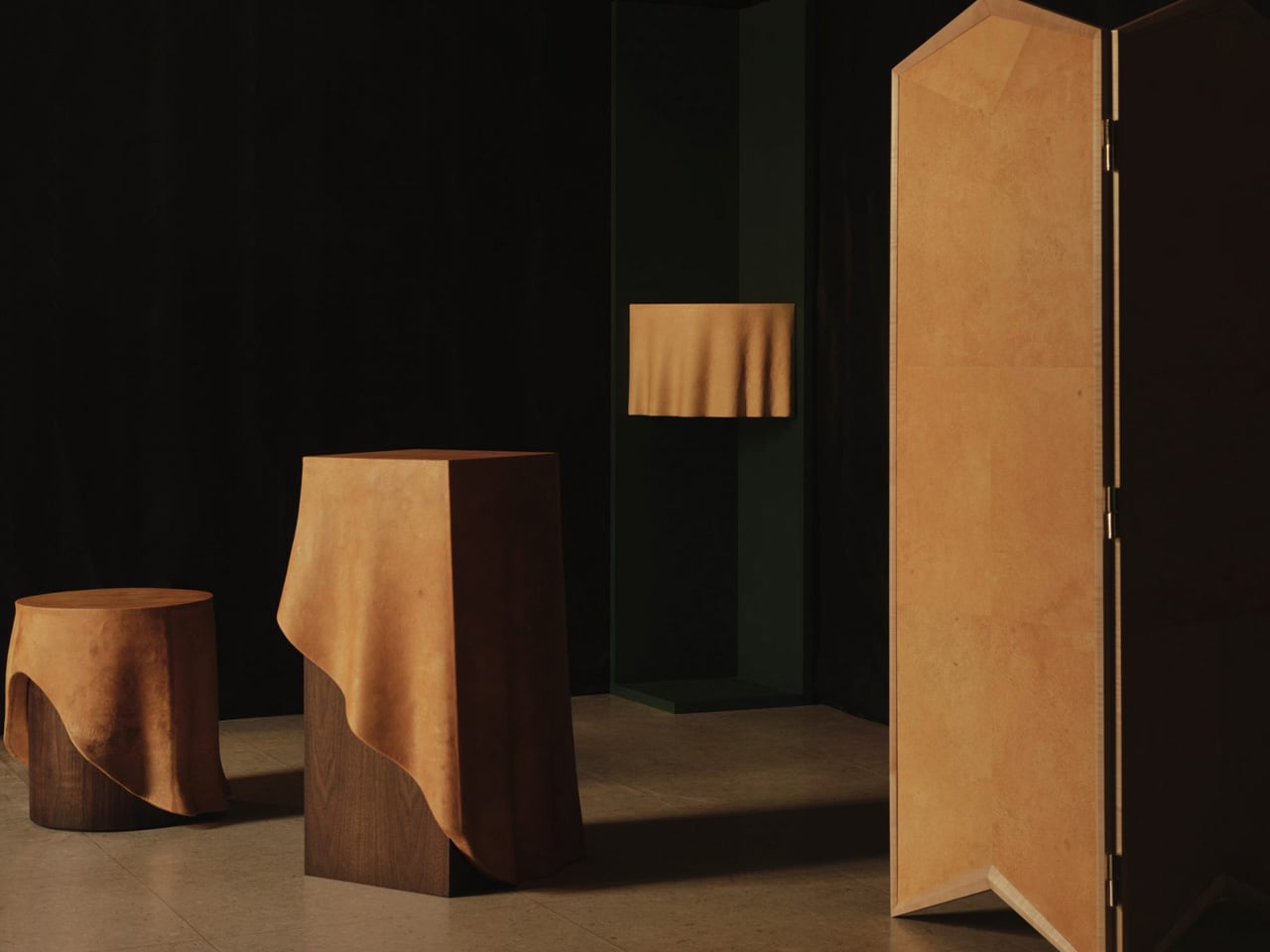
Studio TOOJ’s Duk furniture series explores how mycelium-based materials can transform the surface and perception of solid furniture. Each piece is formed from sculpted wood and finished with Reishi, a biomaterial developed by MycoWorks from mushroom root structures. This layered construction allows rigid forms to visually resemble soft, draped fabric while maintaining structural stability. The mycelium surface introduces organic texture and matte softness, creating a textile-like appearance without using traditional upholstery or leather.
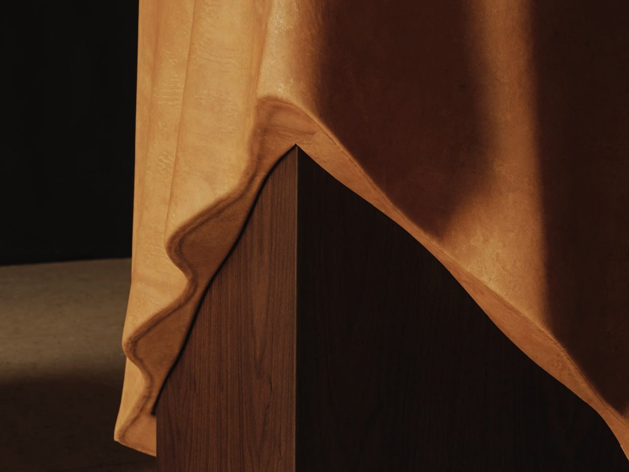
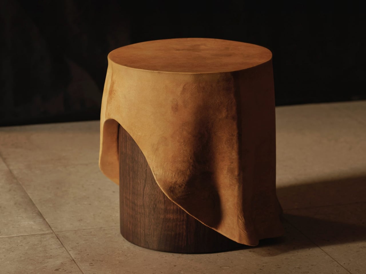
Reishi is cultivated under controlled conditions, allowing precise control over thickness, strength, and surface quality. This consistency supports complex furniture applications where uniform performance is essential. Unlike animal-based leather, the material can be grown to specification, reducing waste and enabling repeatable production standards.

3. Adaptive Modular Furniture

Furniture design is increasingly focused on modular systems that support multiple functions within compact interiors. Rather than simple add-on components, these systems are architecturally integrated, allowing pieces to shift between layouts with minimal effort. Magnetic connectors and precision interlocking joints enable fast reconfiguration without tools, making it easy to adapt furniture to different daily activities.

This flexibility improves spatial efficiency by allowing a single system to perform several roles, such as converting seating into lounge or guest arrangements. Loose-fit construction also supports easy repair and part replacement, extending product lifespan and reducing material waste. By combining adaptability with structural clarity, modular furniture delivers long-term value while responding to changing space requirements and evolving lifestyle needs.
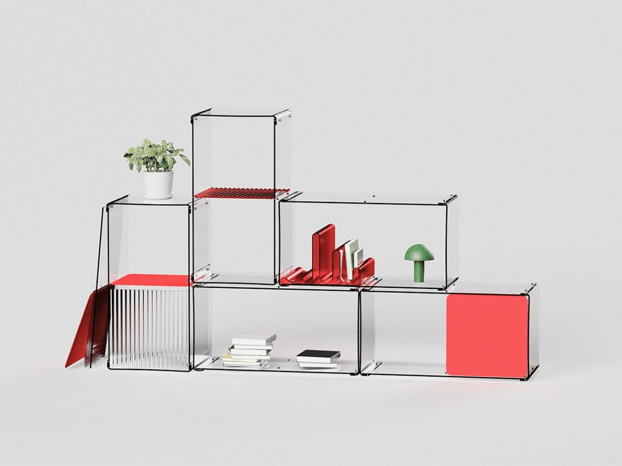
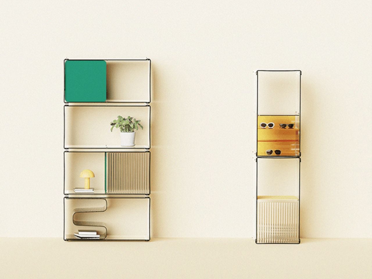
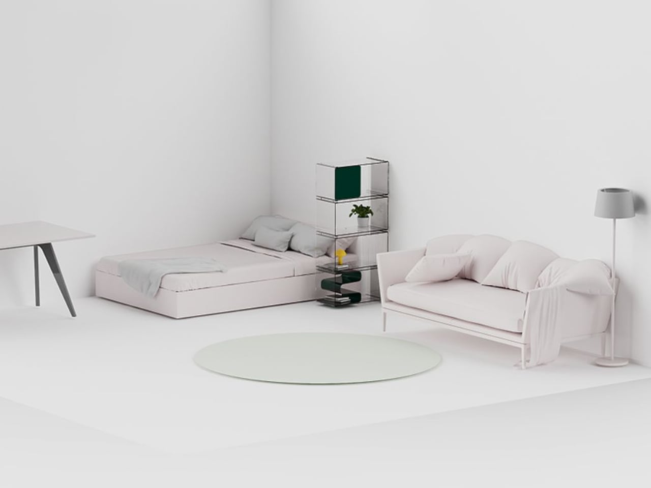
The ZERO modular furniture collection redefines minimalism through visual lightness and reduced spatial impact. Designed to occupy less visual and physical volume, the pieces use clean lines, slim profiles, and restrained colour palettes to integrate quietly into interiors. This approach allows furniture to frame space rather than dominate it, supporting open layouts and reducing visual clutter. The neutral design language makes the system adaptable across residential and commercial environments, including contemporary, industrial, and modernist interiors.
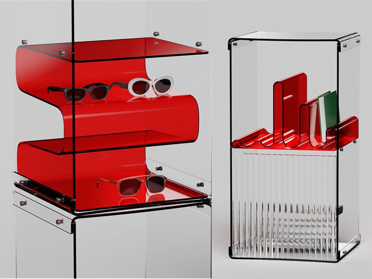
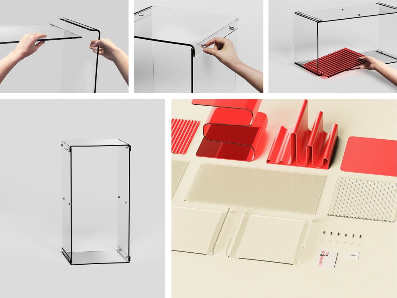
Modularity is central to the system’s function. Each unit can be assembled, reconfigured, and expanded to support changing layouts, from compact living areas to larger open-plan spaces. This flexibility allows users to create seating, storage, or zoning solutions without adding visual density. Custom colour options support personalisation while preserving a cohesive aesthetic.

4. Thermal Comfort Surfaces

Furniture surfaces are increasingly designed to support thermal stability and physical comfort. Upholstery now integrates phase-change materials that absorb, store, and release heat, helping maintain consistent surface temperatures in response to body contact and room conditions. This technology reduces discomfort from cold or overheating, improving long-term seating comfort across changing seasons.

Material selection also prioritises tactile performance. High-tannin woods, honed stone, and heavy-weave natural fabrics provide stable, grounding textures that enhance sensory interaction with furniture. These finishes balance temperature control with durability and visual depth. By combining thermal responsiveness with carefully chosen surface materials, furniture delivers a measurable comfort advantage while contributing to passive climate regulation within interior spaces.
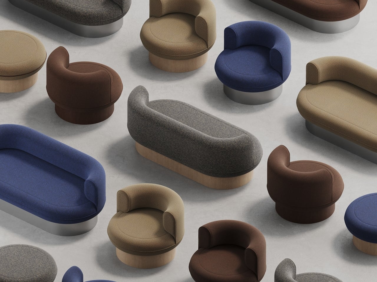
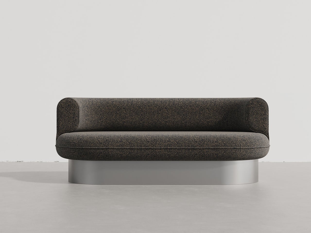
The SOLO furniture collection by Mudu Studios is a seating concept that balances visual refinement and thermal comfort with ergonomic comfort. The range includes an armchair, sofa, and pouf, all characterised by generously cushioned upholstery set on raised bases made from metal or natural veneer. This pedestal-style structure visually lifts the soft seating volumes, creating a strong contrast between plush textiles and solid foundations. Accent stitching adds subtle definition to the upholstery, reinforcing form while enhancing durability and finish quality.
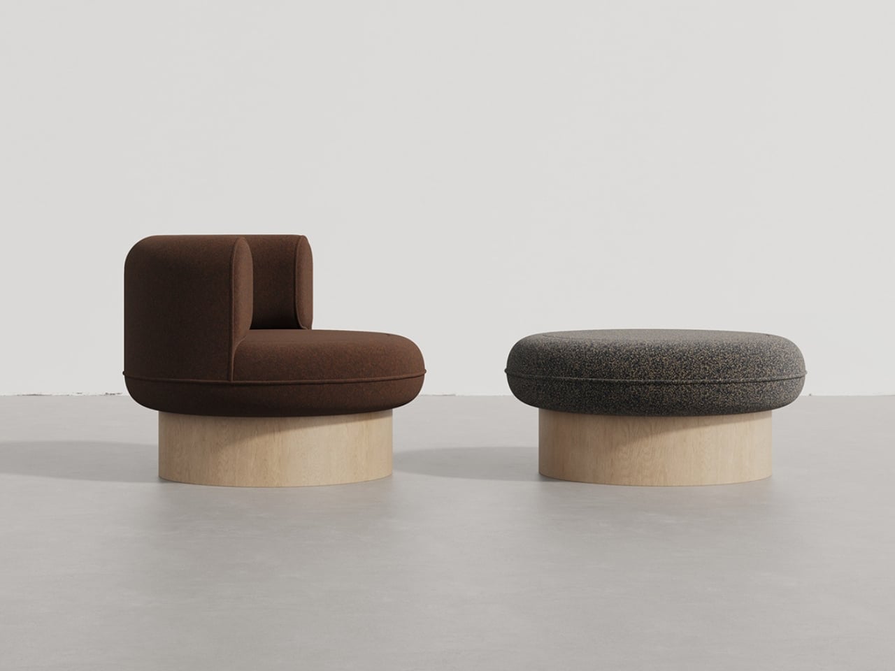
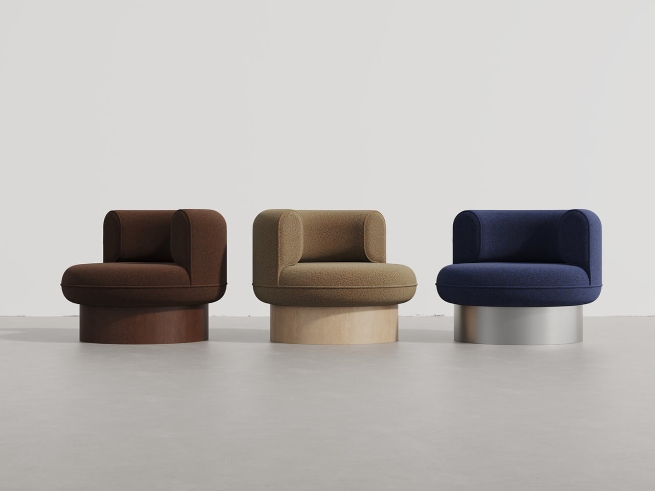
Designed to integrate across multiple interior styles, the collection supports varied colour options to suit different spatial palettes. A key functional feature is the armchair’s twist mechanism, which allows controlled rotation for relaxed seating positions without compromising stability. Elevated proportions also contribute to proper seating support and ease of movement.

5. Seamless Embedded Technology

Furniture is increasingly integrating technology directly into its structure, eliminating the need for visible devices or external accessories. Inductive charging systems are now concealed beneath thin layers of stone or solid wood, allowing phones and small electronics to charge when placed on tabletops or shelves. This integration maintains clean surfaces while delivering everyday functionality without additional hardware.

Control interfaces are also being built into materials, with touch-sensitive zones embedded in fabric or carved into timber for lighting and audio adjustment. These systems remove the reliance on separate remotes and illuminated panels, reducing visual clutter. By embedding technology within traditional materials, furniture maintains architectural continuity while offering discreet, intuitive interaction aligned with contemporary living needs.
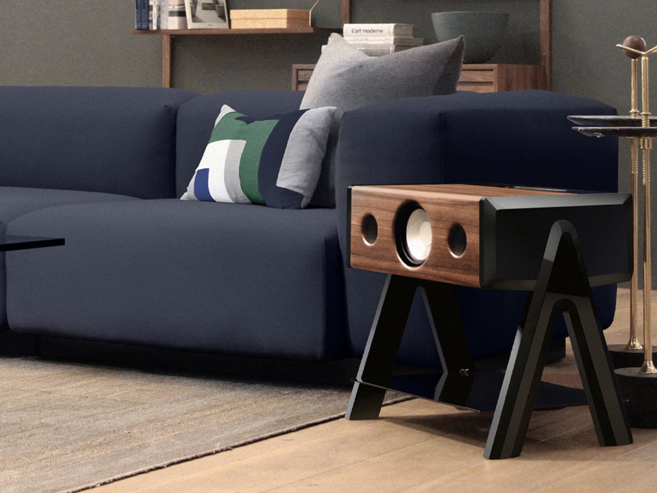
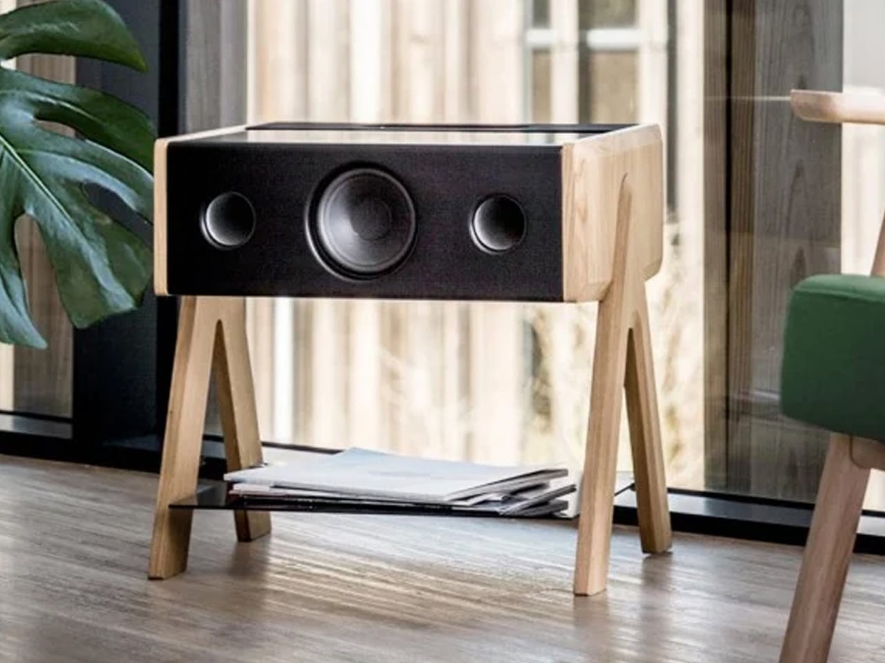
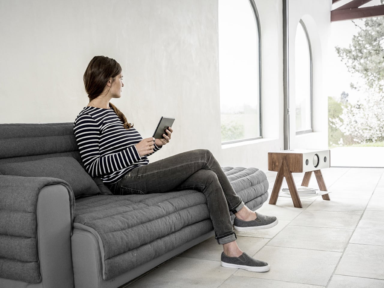
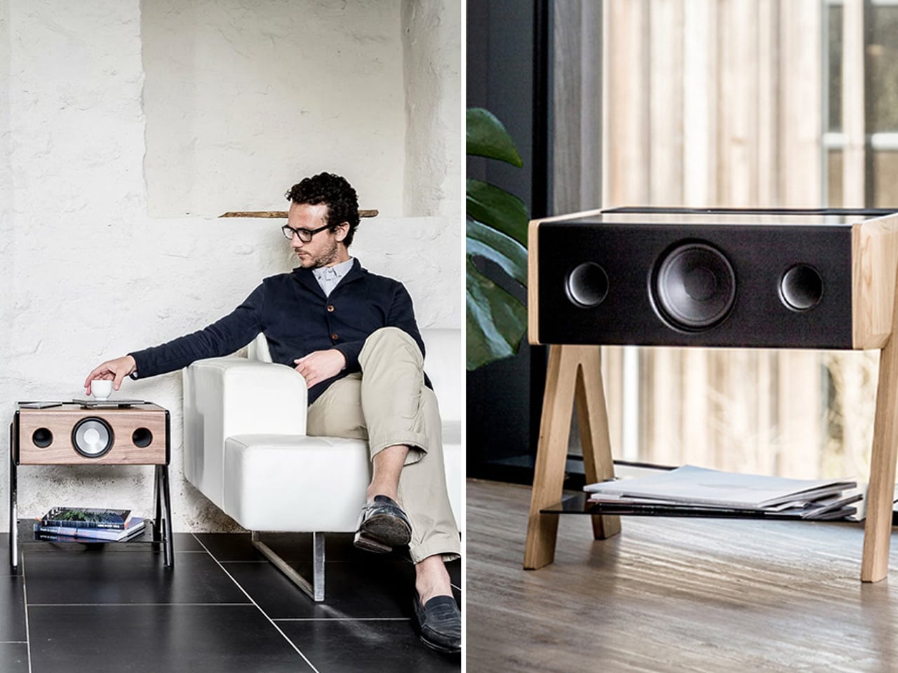
The Cube by French audio brand La Boite is a wireless high-fidelity loudspeaker designed to function as both an audio system and a compact coffee or side table. Measuring approximately 47 × 35 × 49 cm, its form allows placement in central living are as without additional floor space for separate speakers. La Boite’s patented acoustic architecture ensures consistent sound dispersion regardless of positioning, maintaining balanced volume and clarity across the room. The furniture-grade enclosure supports everyday use while housing integrated audio components.
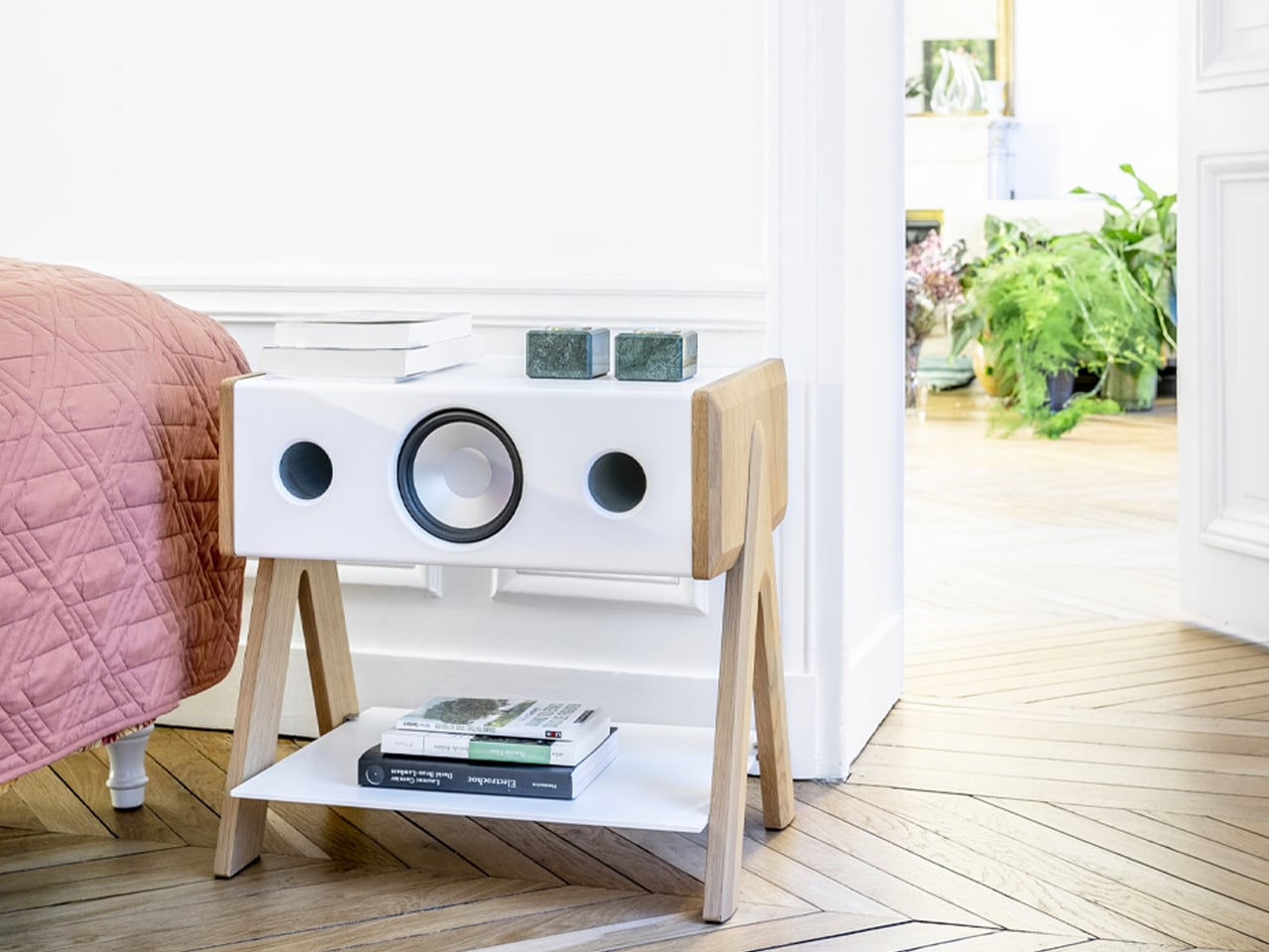
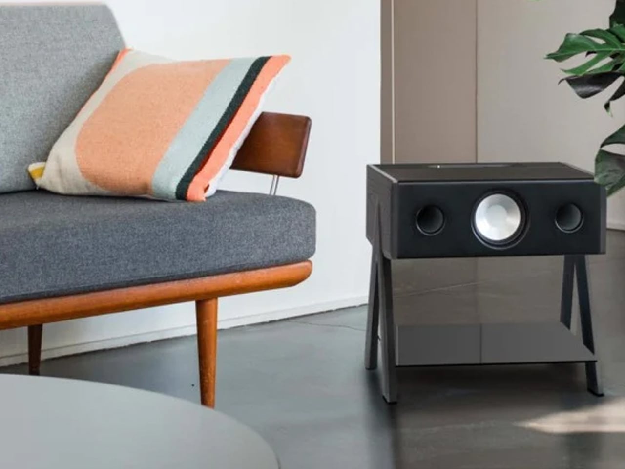
Each unit delivers a total power output of 200W and includes a multi-speaker configuration with front and rear drivers supported by aluminium bass-reflex ports. La Boite’s Wide Sound 2.0 technology expands the listening field for immersive playback from a single unit. Connectivity options include Bluetooth with AptX codec, analogue RCA, optical Toslink, and a 3.5 mm input, allowing compatibility with wireless streaming and traditional audio sources.

Furniture now functions as an adaptive layer of the built environment, combining biophilic form with intelligent, sustainable materials. Integrated technology and modular design extend product lifespan while improving daily comfort. Rather than acting as mere decoration, 2026 furniture trends position furniture as part of a responsive interior system – where performance, longevity, and well-being define true design value.

The post 5 Furniture Trends That Just Made IKEA Look Obsolete in 2026 first appeared on Yanko Design.
This Insane Vertical MMO Mouse Packs 10 Thumb Buttons And A 45-Degree Grip For Your Wrist

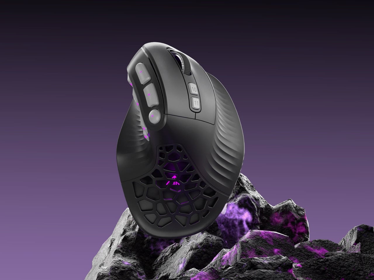
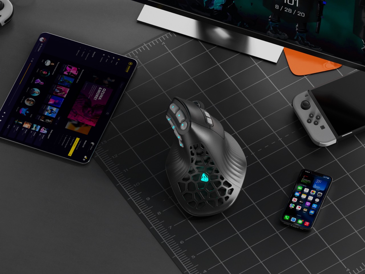
Vertical mice promise ergonomic relief. MMO mice deliver tactical control. Pick one, because the market says you can’t have both. Except SOLAKAKA apparently didn’t get that memo. The E9 Pro arrives as the first vertical MMO mouse, featuring a 45 degree ergonomic grip alongside a 10 button thumb panel that would make World of Warcraft players weep with joy. It feels like the peripheral equivalent of discovering your favorite coffee shop also serves excellent ramen.

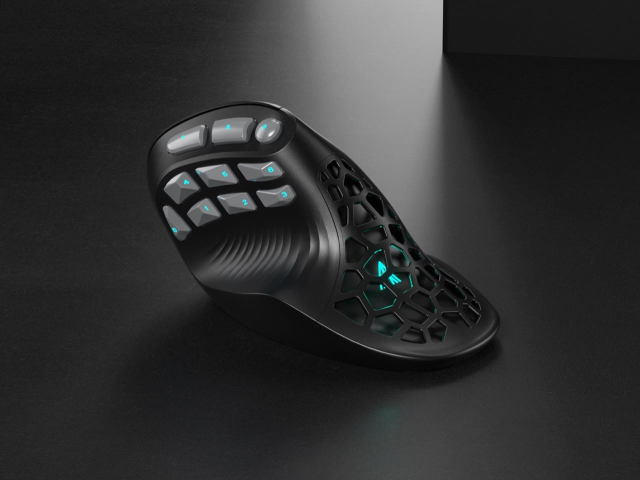
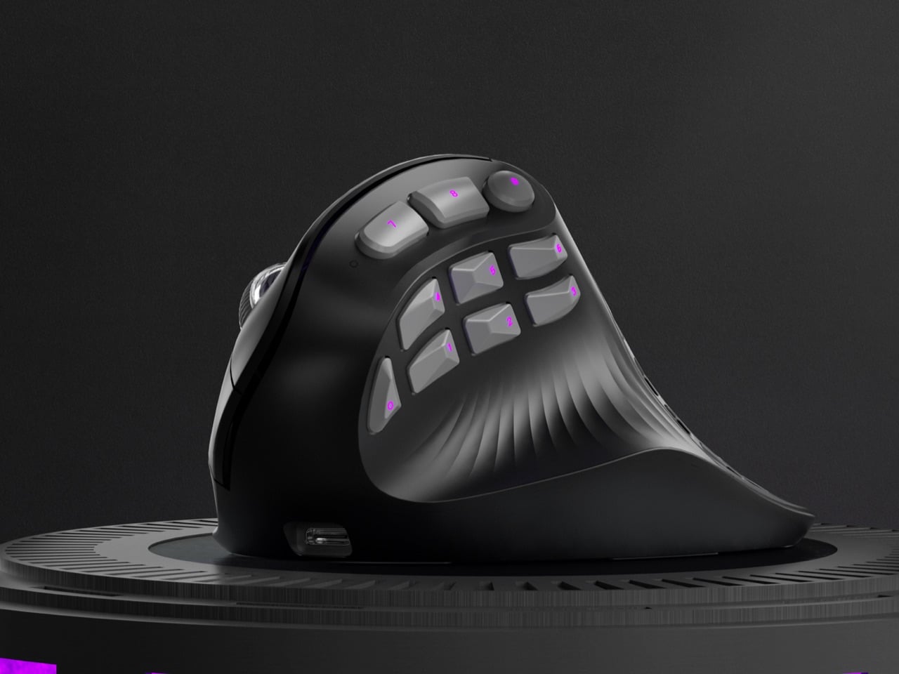
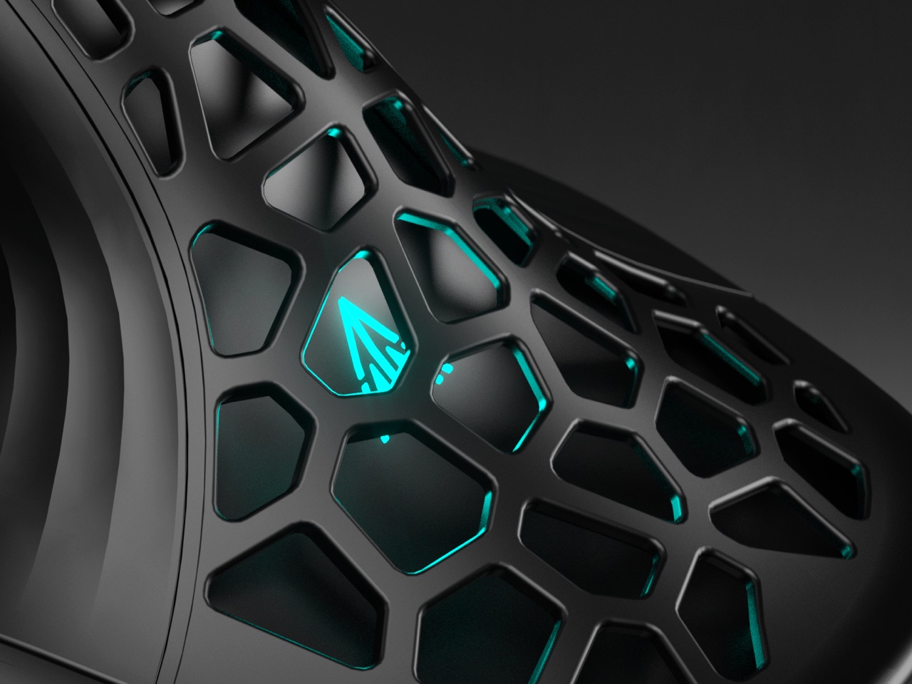
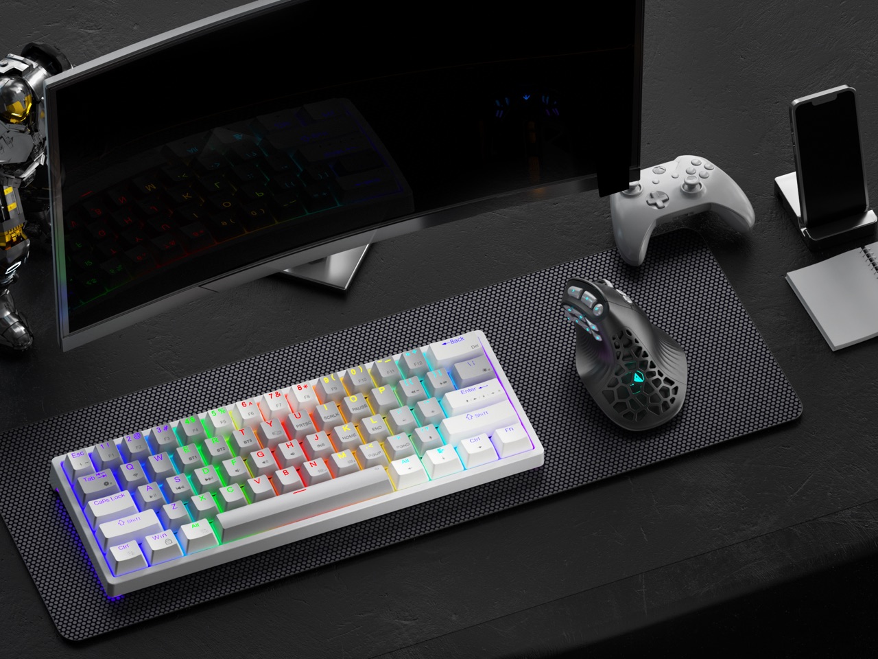
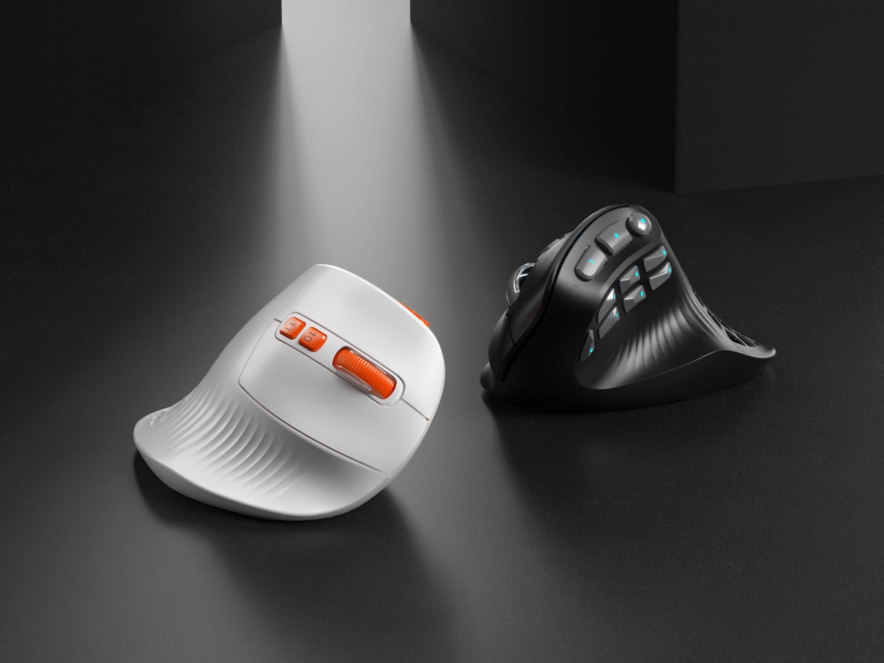
The design centers on a tactical thumb zone where all 10 side buttons follow the natural arc of your thumb movement. No stretching, no hunting, just muscle memory doing its thing. The vertical orientation keeps your wrist in a handshake position rather than the pronated twist that causes repetitive strain. A grille style cutout pattern ventilates the palm rest while dropping weight to 97 grams, and the PAW3395 sensor handles up to 36,000 DPI for people who like their precision surgical. Offered in understated black gray and louder white orange colorways, the E9 Pro targets anyone who refuses to choose between comfort and capability.

Designer: SOLAKAKA

Click Here to Buy Now: $69 $89 ($20 off) Hurry! Only 41 left of 850.

You just have to admire the silhouette for a second. Most ergonomic mice look like orthopedic devices that got lost on the way to the pharmacy. The E9 Pro, however, still reads as a performance machine. Its shell is all sharp planes and deliberate curves, giving it a confident, architectural presence on a desk. That grille cutout on the palm rest is a brilliant piece of multi-tasking design; it slashes weight, creates a distinct visual identity, and provides some welcome ventilation for those marathon gaming sessions. It’s a design that feels both aggressive and intelligent, which is a tough needle to thread.

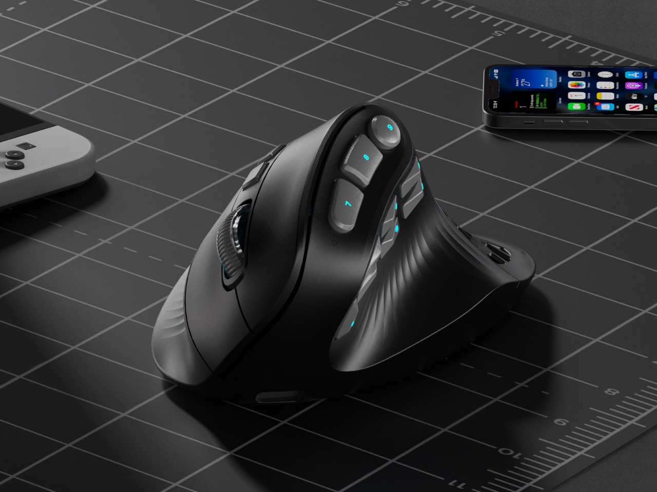
That 45 degree tilt is the perfect middle ground, offering a natural handshake grip that takes the strain off your forearm without feeling as alien as some of the more extreme 90 degree vertical mice. You can feel the logic behind it instantly. SOLAKAKA says they landed on this angle after 300 hours of testing across gaming, coding, and design, and it shows. The sculpted palm and thumb supports provide a secure anchor for your hand, letting you relax your grip instead of constantly pinching the mouse. It feels less like you’re holding a device and more like the device is an extension of your hand’s natural posture.

But let’s be real, we’re all here for that thumb cluster. Ten buttons on a vertical mouse sounds like a recipe for chaos, but the execution is incredibly clever. Instead of a boring grid, the buttons are laid out in a gentle arc that follows the natural sweeping motion of your thumb. It’s a racetrack for your digit, with each button acting as a distinct landmark. This is a massive leap forward for muscle memory, turning what could be a fumbling mess into an intuitive control panel. For anyone juggling macros, creative tool palettes, or complex skill rotations, this layout is a game changer.

And the performance hardware inside is absolutely top-tier. The PixArt PAW3395 is the same flagship sensor you find in elite esports mice, capable of a wild 36,000 DPI, 650 IPS tracking, and 50g of acceleration. This isn’t an ergonomic mouse with gaming parts bolted on; it’s a legitimate performance mouse built on an ergonomic chassis. The polling rate ramps up to 8,000 Hz in wired mode for near-zero latency, and the tri-mode connectivity gives you the freedom to switch between a lag-free 2.4 GHz dongle, Bluetooth, and a direct USB C connection. A beefy 1000 mAh battery keeps the whole operation running for ages.

This brings us to the weight. Vertical mice with this many features often have some heft, easily tipping the scales at 120 grams or more. The E9 Pro comes in at a nimble 97 grams, and that makes a world of difference. The lighter weight, combined with the ergonomic grip, means less inertia and less torque on your wrist when you’re making fast, sweeping movements or quick flick shots. It’s a detail that shows a deep understanding of how ergonomics and performance are intertwined. That grille isn’t just for looks; it’s a core part of a thoughtful weight-reduction strategy that pays off every time you move the mouse.

The whole package comes in two distinct flavors. The black and gray model is pure stealth, ready to blend into a professional workstation or a minimalist gaming setup. Then you have the white and orange version, which looks like it drove right off a sci-fi movie set, with vibrant orange accents highlighting the buttons and grille. It’s a fantastic bit of personality. Through its Kickstarter campaign, the E9 Pro is available for around $69 for early backers, which is an incredibly competitive price for a mouse that’s not just entering a category but creating a new one. This is one of those designs that feels so right, you wonder why nobody did it sooner.

Click Here to Buy Now: $69 $89 ($20 off) Hurry! Only 41 left of 850.

The post This Insane Vertical MMO Mouse Packs 10 Thumb Buttons And A 45-Degree Grip For Your Wrist first appeared on Yanko Design.
NYXI Hyperion 3 Finally Gives the Switch 2 a Grown-Up Controller

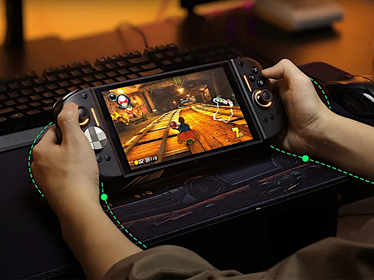
Playing the Switch 2 for more than an hour in handheld mode means the flat Joy-Cons and small buttons start to feel like a compromise. Your hands end up clawed around the rails, drift anxiety creeps in, and you start shifting your grip to avoid cramping. NYXI’s Hyperion 3 is built for people who treat the Switch 2 like a main console, not a travel toy used in short bursts.

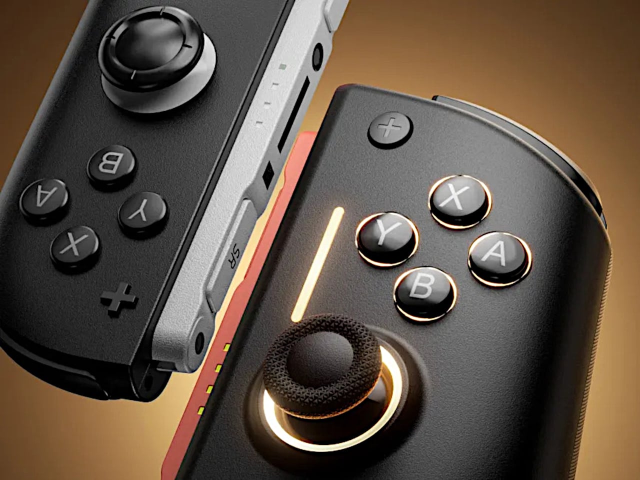
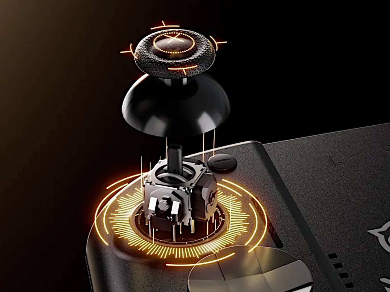
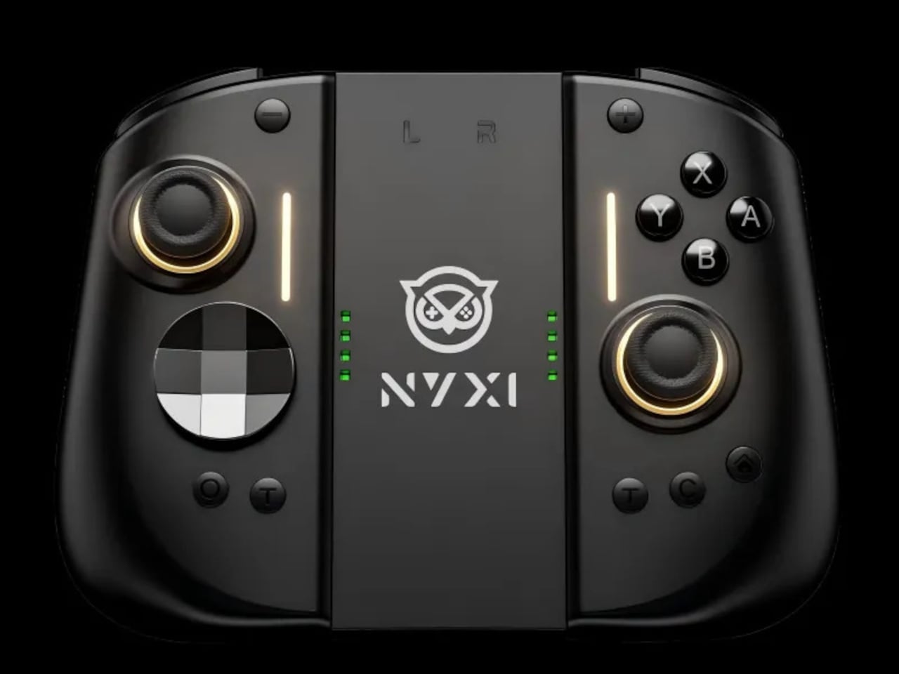
NYXI’s Hyperion 3 is a wireless JoyPad that snaps onto the Switch 2 for handheld play and works as a standalone pad when docked. It adds real grips, larger sticks, and more spaced-out buttons, swapping the usual potentiometer sticks for hall-effect joysticks designed to be drift-free over the long haul. It is pitched as the world’s first ergonomic JoyPad for Switch 2, treating comfort and reliability as primary goals.

Designer: NYXI

Settling into a long RPG or racing game in handheld mode, the full-size grips let your hands relax instead of pinching edges. The hall-effect sticks feel smooth and precise, and you are not waiting for the first sign of drift that ruined your last controller. The strong magnetic lock keeps everything solid, so the console feels like one piece rather than a screen with two wobbly handles threatening to flex apart.

The larger micro-switch face buttons and D-pad click with a clear, mechanical feel, making fast inputs and diagonals more reliable in fighters or platformers. The 9-axis gyro gives you fine motion aiming in shooters or steering in racers, so you can lean on tilt controls without fighting laggy sensors or imprecise calibration that drifts halfway through a match.

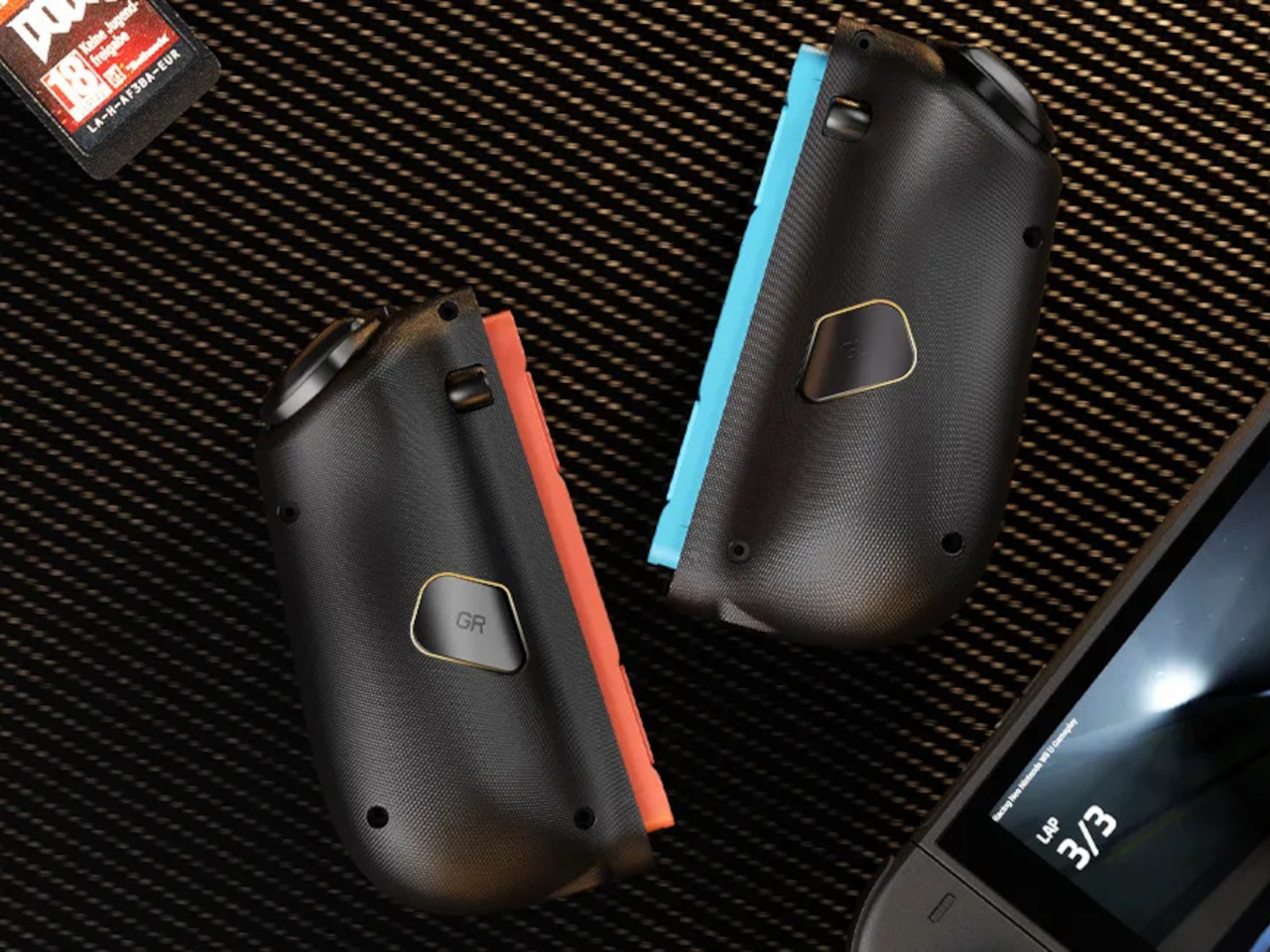
The programmable back buttons let you move key actions off the face buttons, so your thumbs can stay on the sticks more often. Mapping jump, reload, or item use to the back means fewer awkward stretches, especially in games designed around a traditional pad. Over time, that small shift in where your fingers land makes the controller feel tailored to your habits instead of forcing you into Nintendo’s layout.
Hyperion 3 is not as slim or neutral as Nintendo’s own Joy-Cons. The full-size grips and gaming-centric styling make the Switch 2 less pocketable and more like a small console with a screen. That is exactly the point, though, a handheld that finally feels built for adult hands, even if it means giving up a bit of throw-in-a-bag convenience.

Hyperion 3 shows what happens when a third-party accessory takes the Joy-Con format seriously as a starting point, not a template to clone. By fixing drift, upgrading buttons, adding back paddles, and leaning into ergonomics, it treats the Switch 2 like a platform deserving of pro-level hardware. Playing on Nintendo’s hybrid for hours makes that kind of overkill feel pretty reasonable.

The post NYXI Hyperion 3 Finally Gives the Switch 2 a Grown-Up Controller first appeared on Yanko Design.