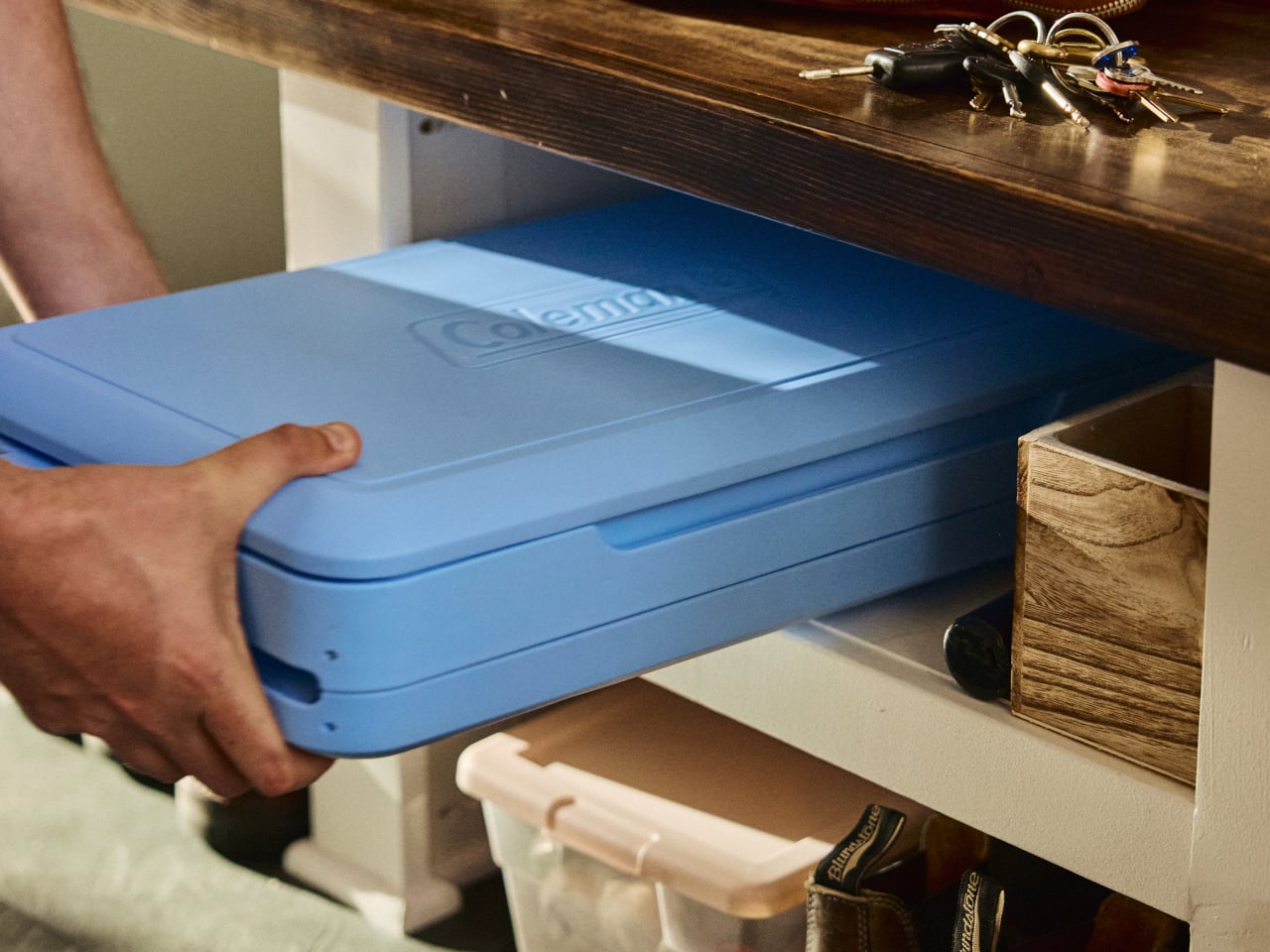
Coolers are great until the trip ends. Then they become a large, oddly shaped object that takes up the entire trunk on the way home, sits on the garage floor for a month, and eventually gets shoved into whatever corner will take it. For apartment dwellers especially, owning a full-sized hard cooler is less a convenience and more a spatial negotiation that rarely ends well.
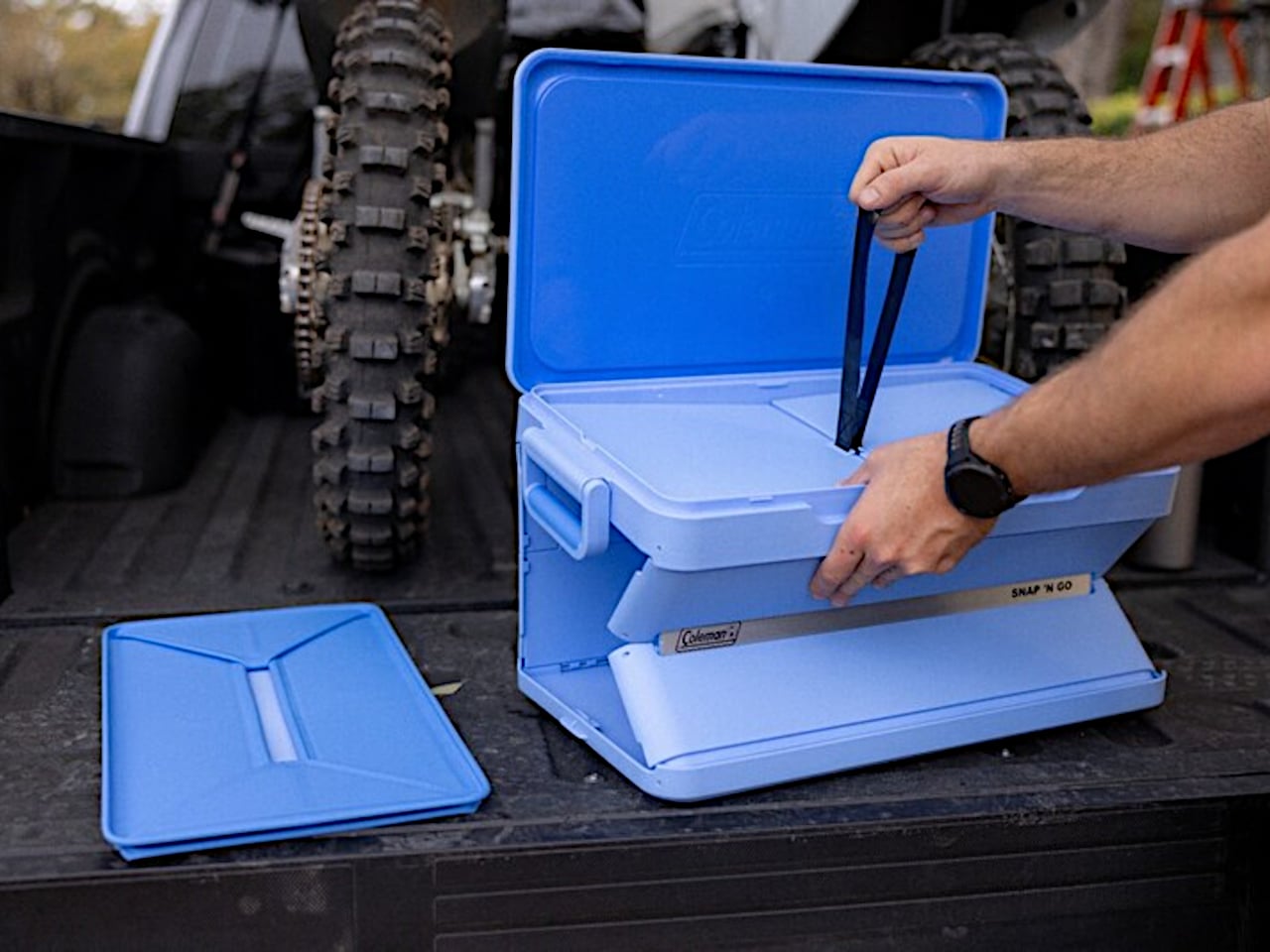
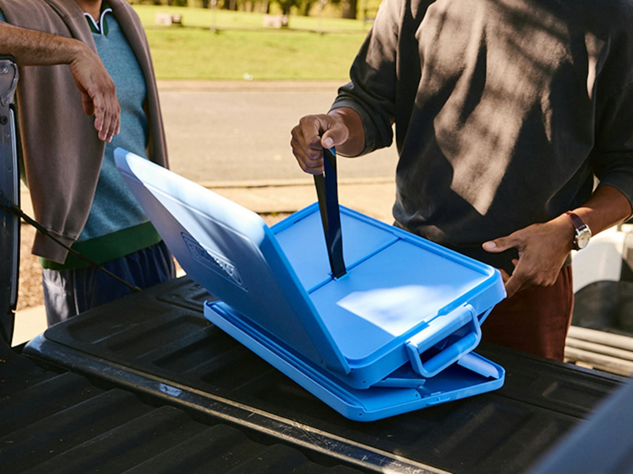
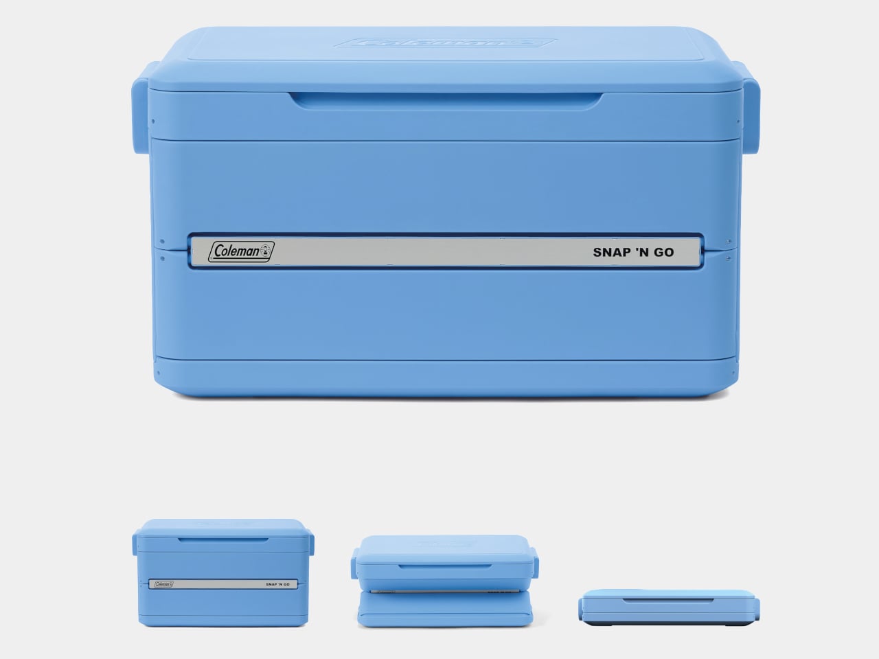
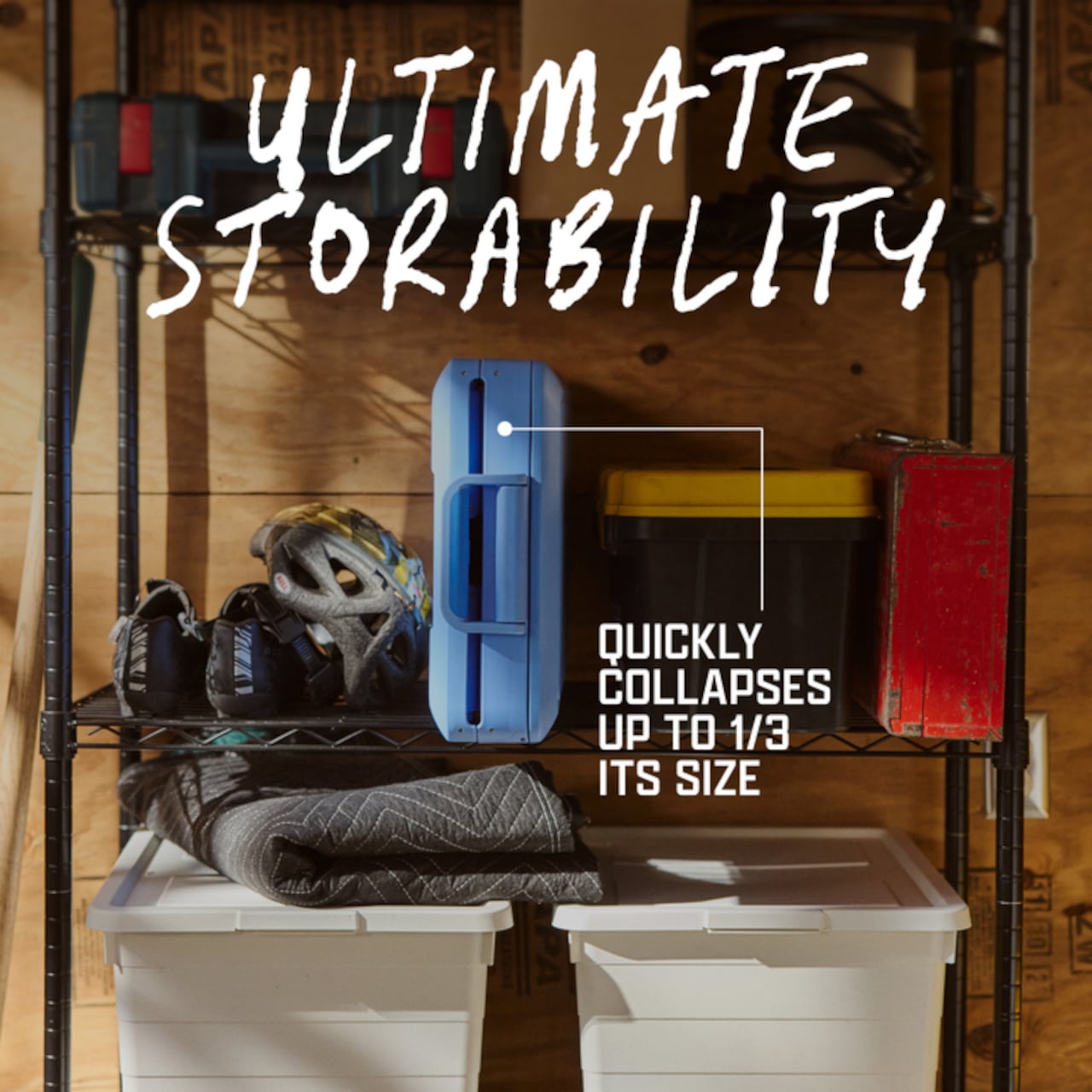
Coleman’s Snap ‘N Go is a hard-sided cooler with a patent-pending collapsible design that compresses to one-third of its open volume in under 10 seconds. The mechanism borrows logic from folding storage crates: the body panels snap down in sequence, and the removable interior liner folds flat and stows inside the lid. What was a full-sized cooler becomes a flat slab thin enough to slide under a bed or stand upright on a shelf between uses.
Designer: Coleman
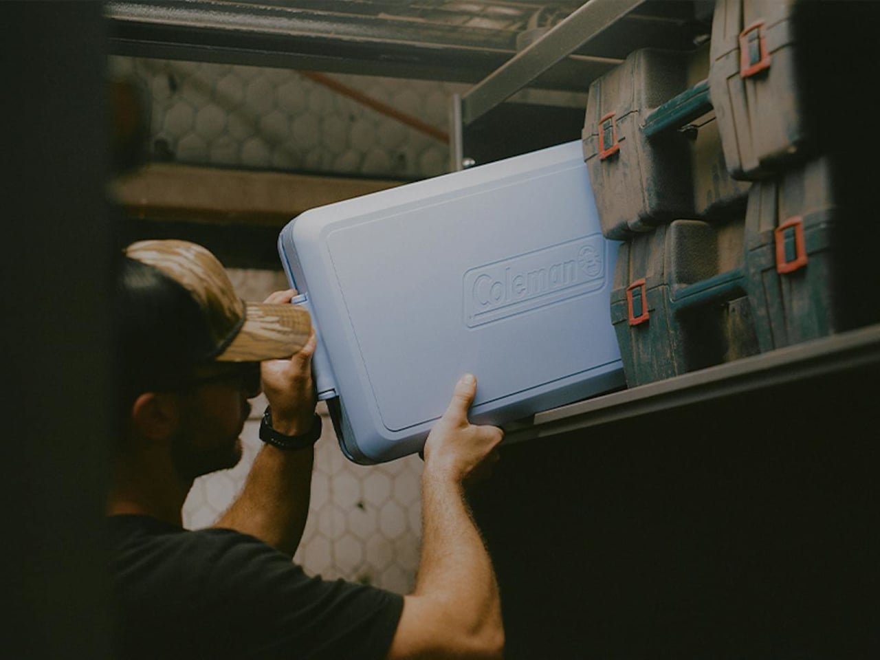
The construction is hard polypropylene, which matters more than it sounds. Soft collapsible coolers already exist, but they sacrifice insulation to achieve that flexibility. The Snap ‘N Go maintains a fully insulated lid and body, rated to hold ice for up to 64 hours. That’s two full days of cold retention from something that, an hour later, disappears into a closet, which is a combination the soft-sided category has never managed.

Setup works in reverse, just as quickly. From flat storage to loaded and latched takes under 10 seconds, and the removable liner handles watertight containment once the body is expanded. The liner also makes post-trip cleanup more manageable, since it pulls out separately rather than requiring the whole cooler to be rinsed out and dried upright somewhere. It’s a small detail, but one that addresses one of the more tedious parts of cooler ownership.
Three sizes cover most group sizes: 35 qt at $200, 45 qt at $220, and 55 qt at $240. The 55-qt model holds up to 93 cans without ice and supports 200 lbs. when expanded, though Coleman is careful to note it isn’t intended as a seat. Handles are designed to accommodate both carry orientations, vertical when the cooler is collapsed flat and horizontal when it’s fully open and loaded.

The one question the design raises, and doesn’t fully answer yet, is how the collapsible mechanism ages. The hinges, panel connections, and liner attachment points are all doing repetitive work that a standard molded cooler body never has to perform. Coleman backs it with a three-year limited warranty, which covers the expected lifespan question in practical terms but doesn’t tell you much about what happens in year four after a few dozen collapse cycles on a tailgate.

The post Coleman’s $200 Cooler Chills for 2 Days, Folds Flat in 10 Seconds first appeared on Yanko Design.