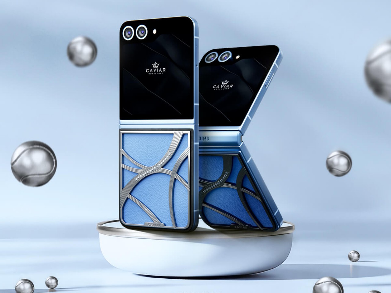
There’s a reason why many people find fashion to be inscrutable, and not just the haute couture variety you see on runways. Fashion trends come and go, and sometimes they take inspiration from the most unexpected sources. One of the newest, for example, was spurred by the combination of the 2024 Paris Olympics, the film “Challengers” starring Zandaya, and the ongoing US Open tournament. Yes, this is the so-called “tennis core” fashion trend, and custom luxury phone maker Caviar is only too happy to jump on that bandwagon with extremely limited editions of the Galaxy Z Flip 6 that’s designed to show off your sports affinity, fashion tastes, and, of course, your affluence.
Designer: Caviar
Tennis core is simple to grasp yet hard to execute. As it revolves around the aesthetics of clothes worn in tennis matches, it has to strike a balance between being sporty and being casual. For Caviar, however, the trend is easy enough to interpret and implement, focusing on the visuals and forms most easily associated with the sport: the tennis ball.
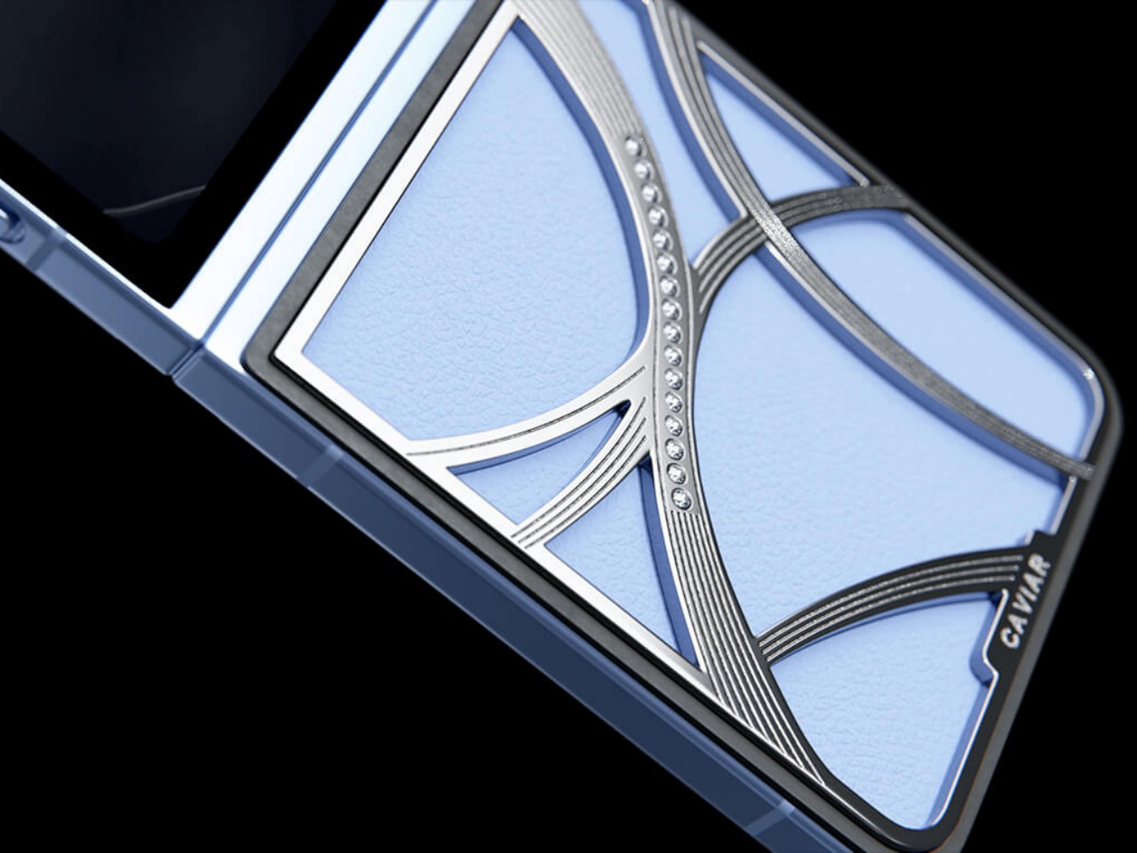
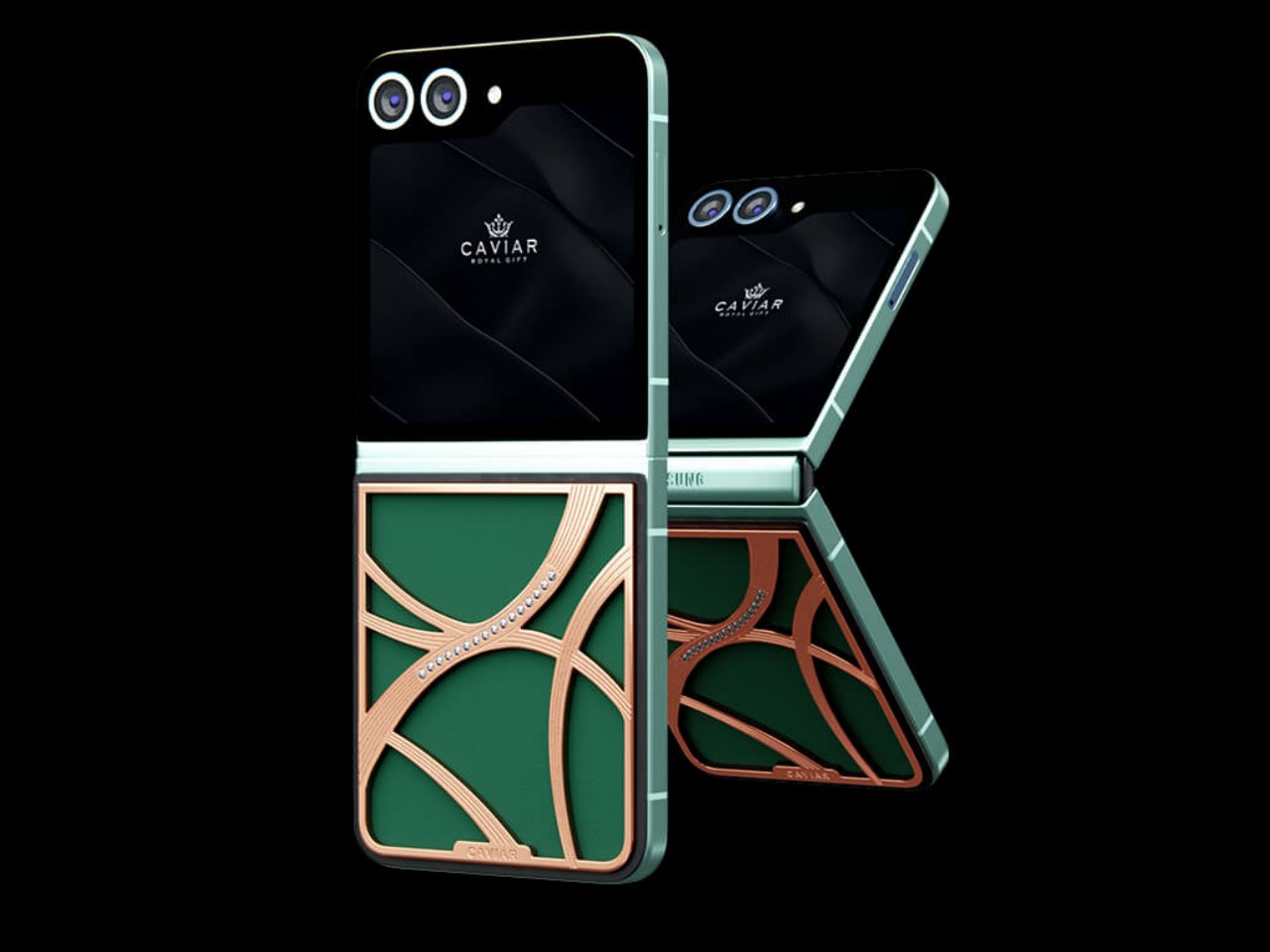
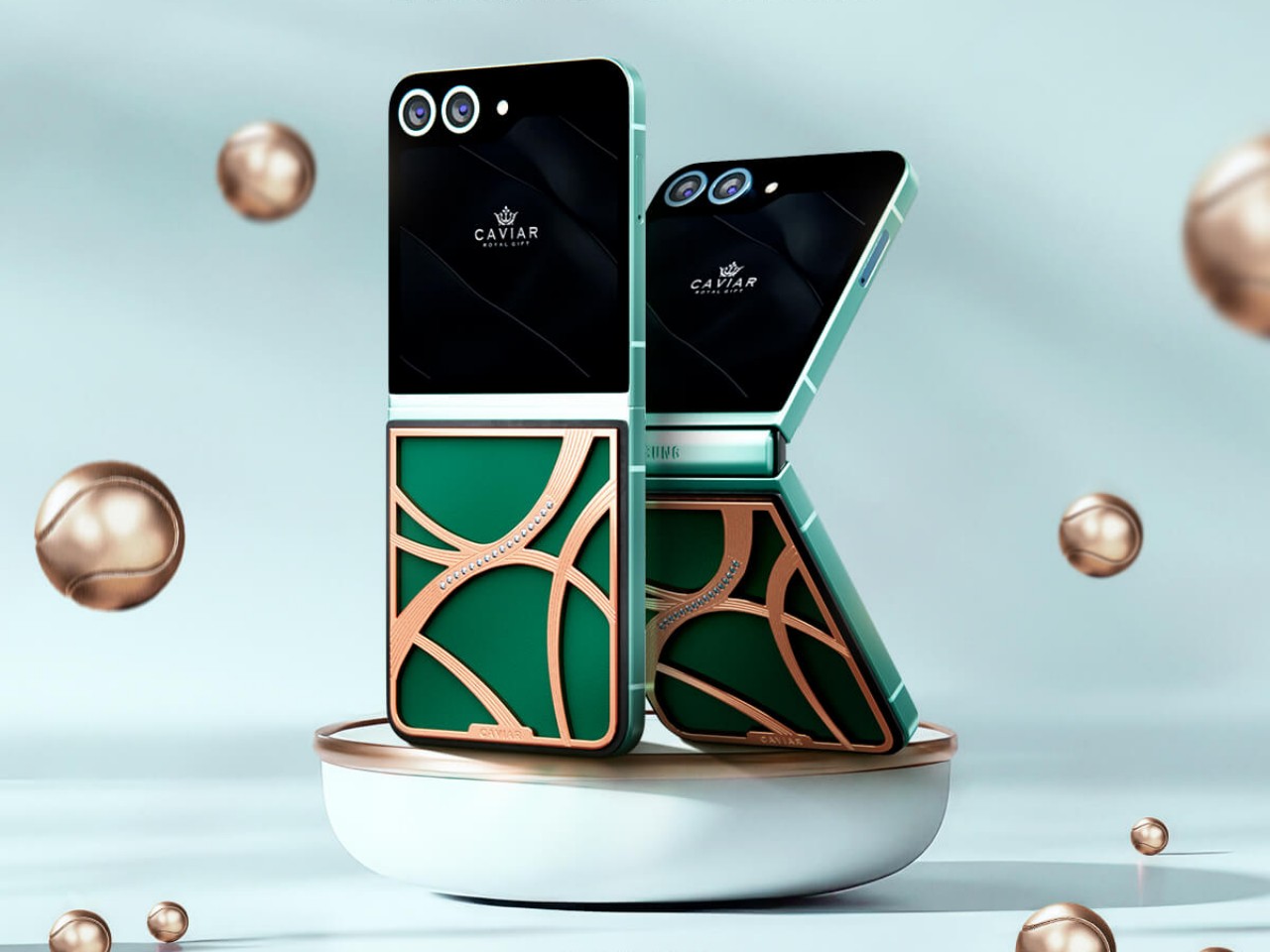
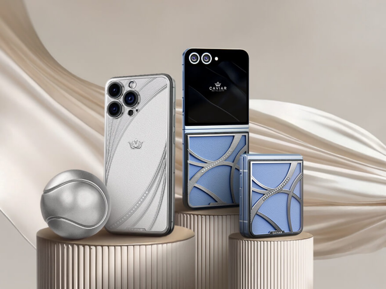
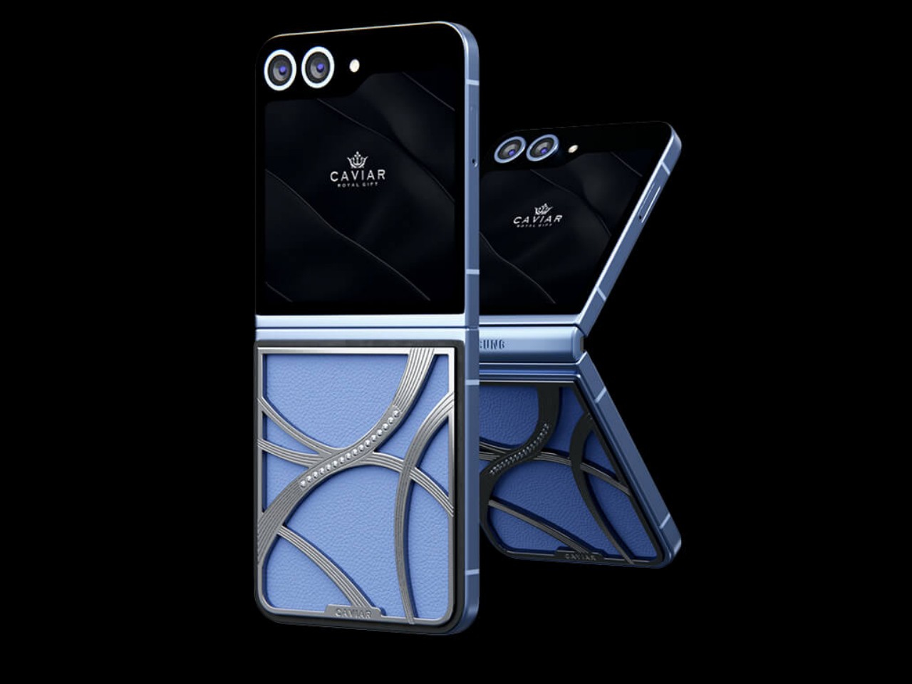
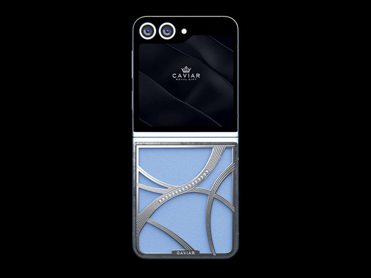
The Samsung Galaxy Z Flip 6 that’s part of this “Elegance” tennis core collection bears curved accents on its back that resemble the lines of a tennis ball, at least if you actually knew beforehand what the design is meant to represent. Depending on the color of the model, the accents can be covered in either pure 24-carat rose gold or 22-carat silver. Regardless of the color, however, both designs flaunt 16 22mm-diameter Swarovski crystals, because this wouldn’t be a Caviar phone if it didn’t have any.
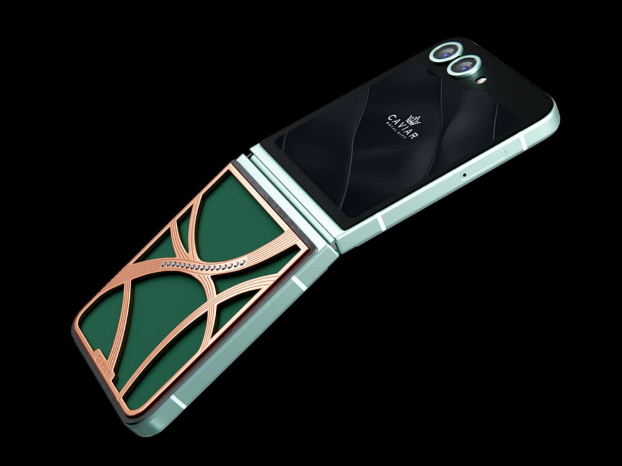
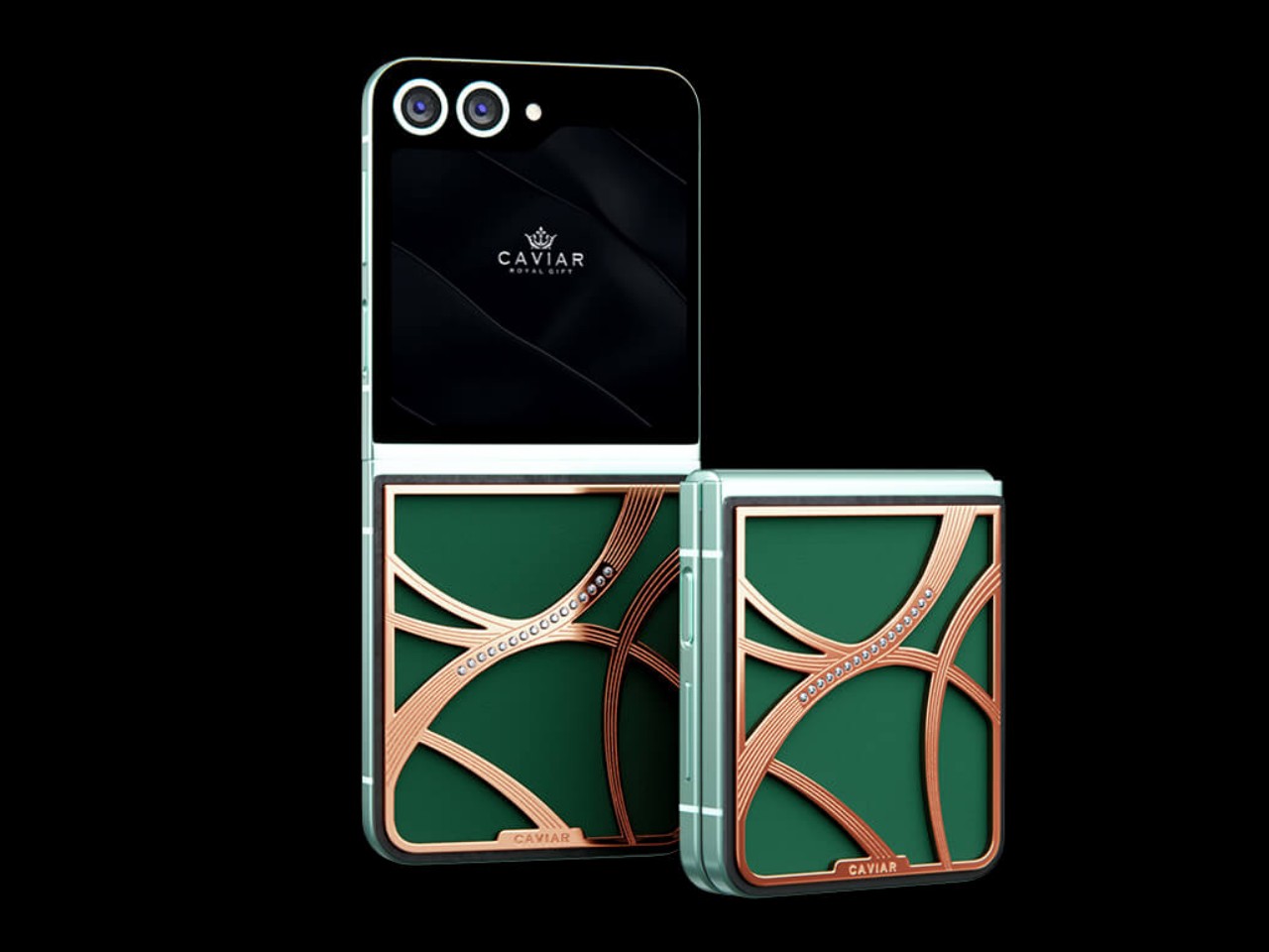
The phones have colorways that are reminiscent of some of the popular colors for tennis courts. Emerald is probably the most familiar hue, with deep and rich greens that are not unlike the grassy type of some courts. Sapphire is perhaps a little less common but blue is used to give better contrast, especially considering a tennis ball is traditionally light green in color. Both models use premium Chevre leather, the very same kind used by luxury brand Hermes for its products.
It might not be as outlandish as Caviar’s other custom designs, but the Galaxy Z Flip 6 Elegance edition still fetches an extremely steep price starting at $8,777 for the 256GB Emerald model and $9,770 for the 256GB Sapphire variant. And in typical Caviar fashion, these phones will be made in a very limited run, only 99 pieces each, making sure that owning one earns you a spot not only among fashionistas but as a true tennis aficionado as well.
The post Caviar Galaxy Z Flip 6 Elegance Edition Rides on the Latest Tennis Fashion Trend first appeared on Yanko Design.