PROS:
- Simple yet beautiful design
- Large, bright, and vibrant foldable screen
- Distinctive "porthole" external screen design
- Attractive and affordable price point
CONS:
- Dated hardware and software
- Unimpressive camera output
RATINGS:
SUSTAINABILITY / REPAIRABILITY
EDITOR'S QUOTE:
The nubia Flip 5G delivers the essentials of a foldable phone experience without burning a hole through your wallet.
In order to sell more foldable phones, this niche market segment needs to be as common as regular, non-folding phones. These normal phones, however, appeal to the masses because they can cater to a wide range of buyers, including those with tighter budgets. There has long been a clamor for more affordable foldable phones, both the larger book-style design as well as the clamshell type, but few manufacturers have dared to heed the call. The nubia Flip 5G is arguably the first flip-style foldable to really bring the design to the masses, boldly claiming the title of most affordable foldable. Nothing comes for free, however, especially in this industry, so we naturally wonder what nubia had to sacrifice to meet such an unbelievably low price point. We give the nubia Flip 5G a good turn to find out.
Designer: nubia
Aesthetics
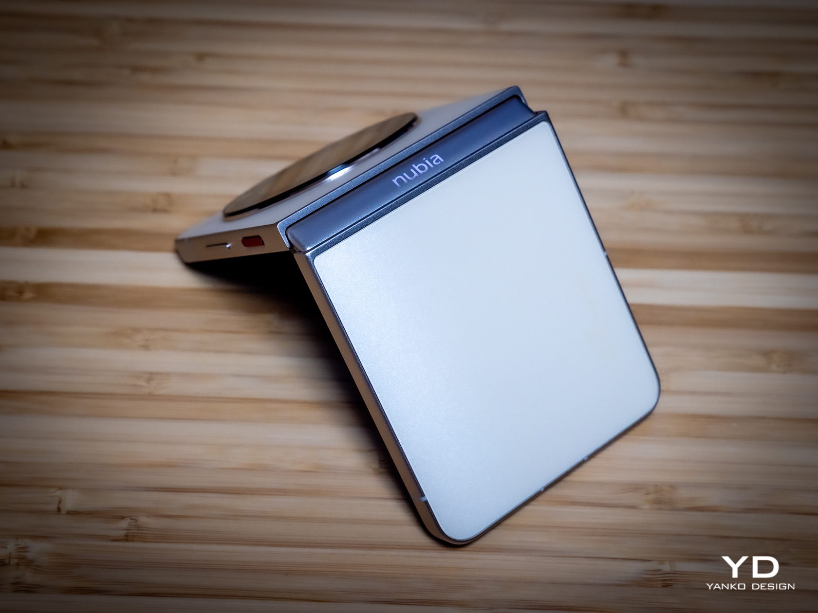
Right off the bat, you wouldn’t be able to tell the nubia Flip 5G’s price just from its looks. The word “cheap” has unfortunately acquired a negative reputation, but there is definitely nothing cheap about this phone’s design. Aside from the large black disc on its back, which we’ll get to later, the phone is a poster child for minimalist design, simple yet evocative in its pleasing appearance. There is not a line, edge, or corner out of place, making it exude class and style that would shock you if you knew the price tag it carried.
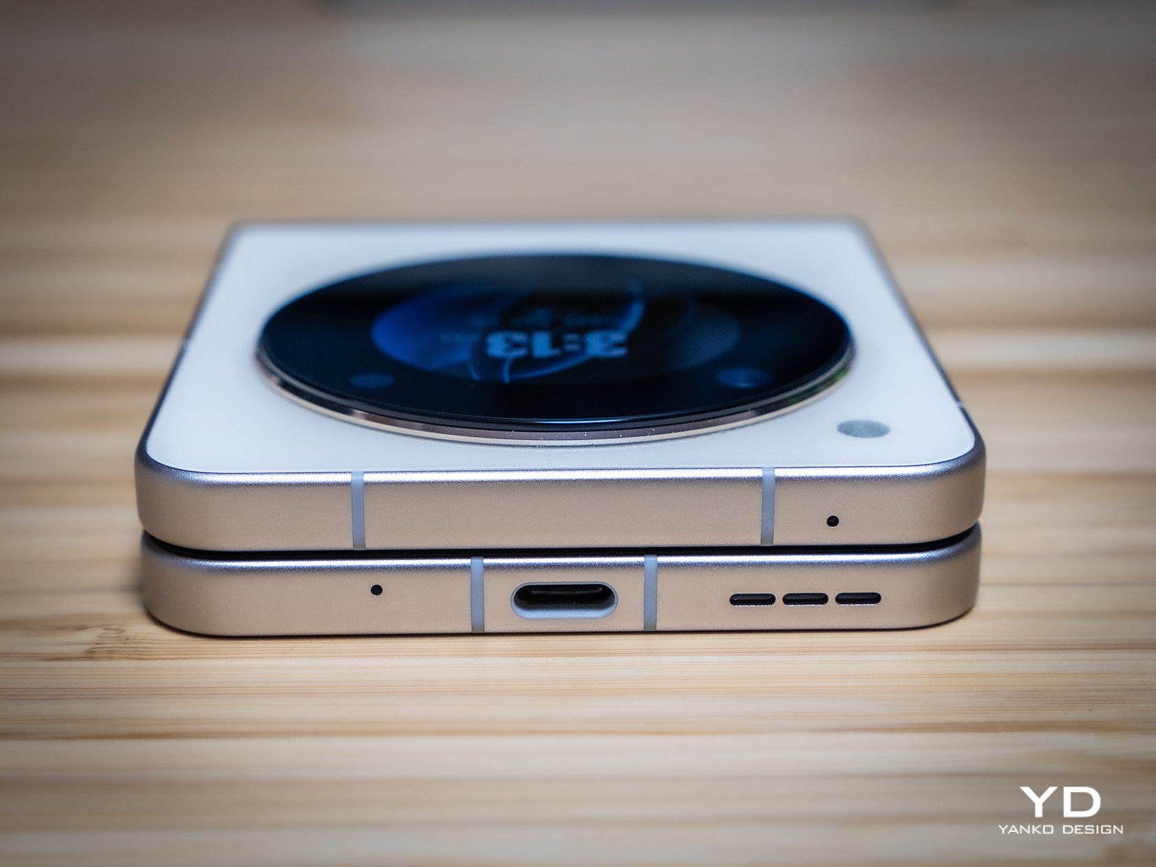
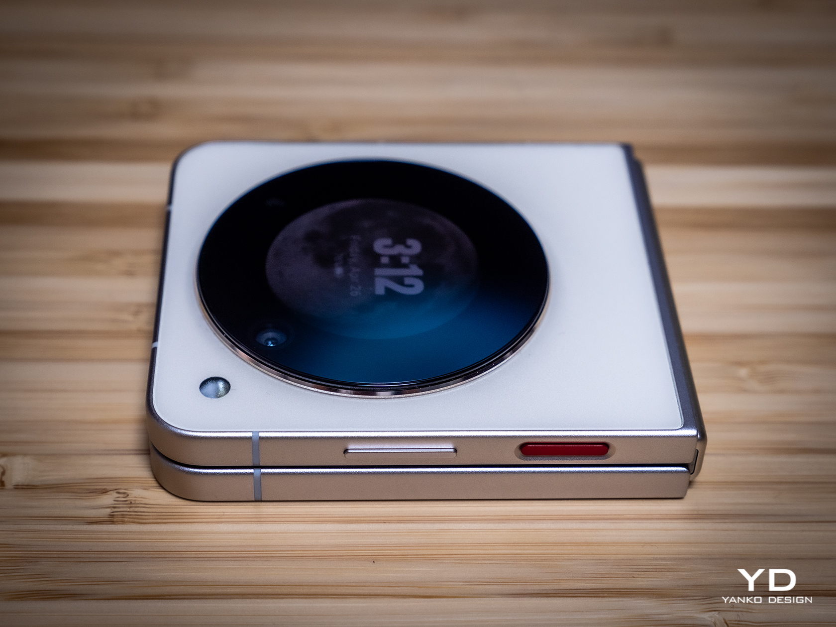
nubia didn’t skimp on materials either, giving the phone a matte AG glass for its back that not only adds a better grip but also makes the “sparkling sand” surface of the design stand out even more. This is better seen on the Cosmic Black cover which gives you the impression of looking at a starry night sky, while the Sunshine Gold of our review unit gives off a more calming and ethereal presence. The aluminum alloy frame isn’t far behind with its zircon sandblasted finish, adding texture that won’t be easily smudged by fingerprints.
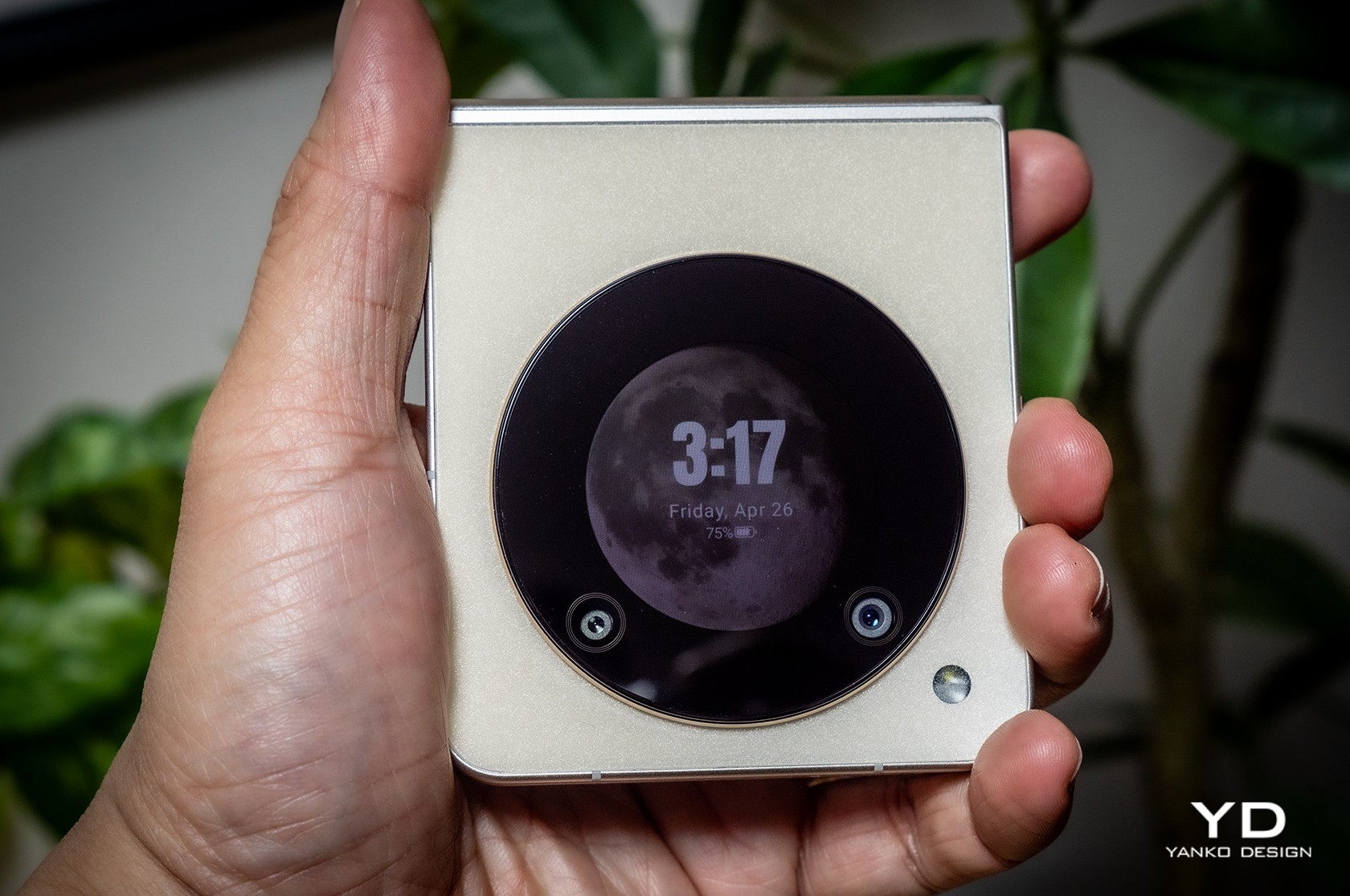
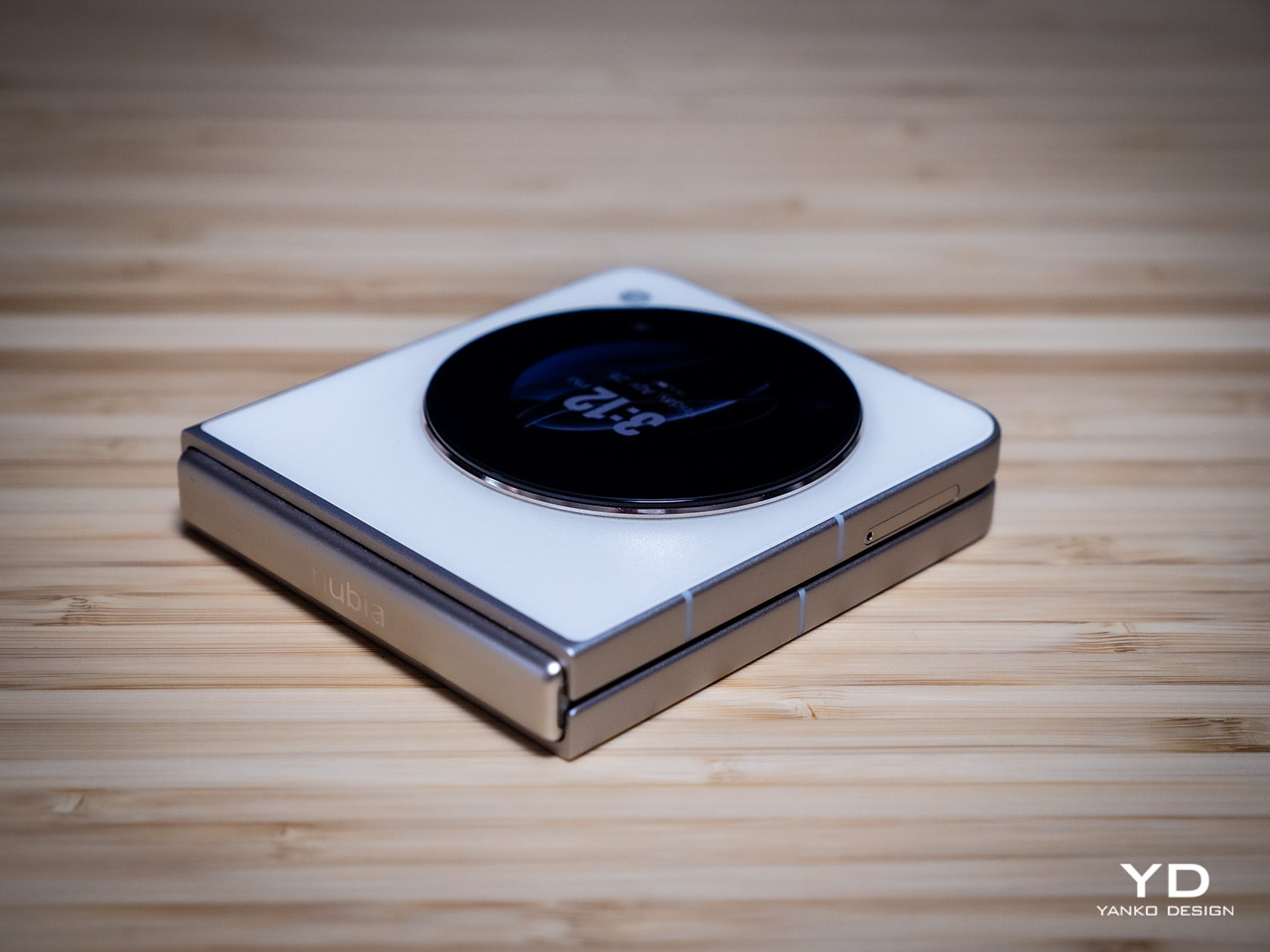
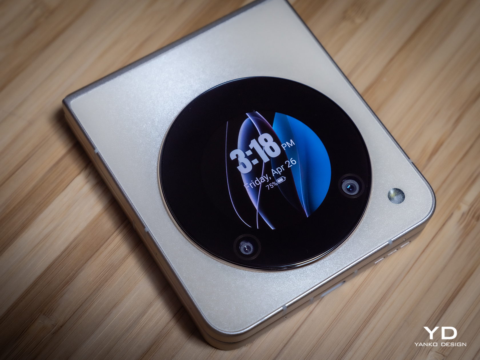
Of course, the nubia Flip 5G needs to have cameras and a second screen on its back, and this is done just as tastefully as the rest of its design. The large black circle is located dead center, giving it symmetry and balance that is admittedly becoming less common in smartphone designs, foldable or otherwise. Once the screen lights up, however, that darkness becomes something like a window to another world, a technological equivalent of the porthole of old ships. This gives the phone a completely different vibe from other clamshell foldables that, while not unattractive, tend to focus more on the technical functionality at the expense of overall design.
Ergonomics
Foldable phones promise a different level of usability and flexibility, but they also demand some changes in the way we use phones. For example, we need to open them up to be able to fully utilize their functions, but the external screen also offers some interactions while the phone is closed. Being able to comfortably and confidently hold such a device in both forms is even more important with foldables than it is for regular, flat smartphones.
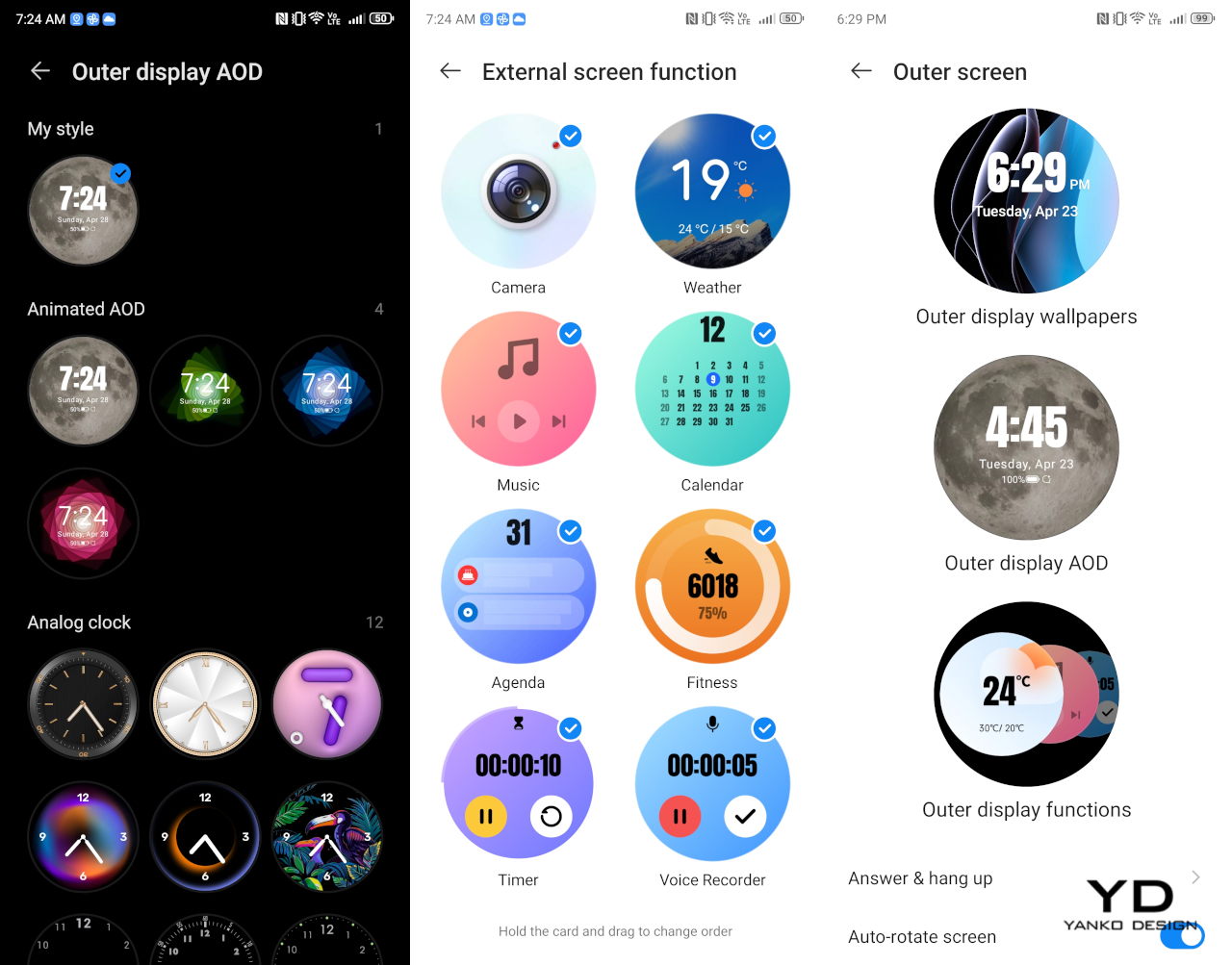
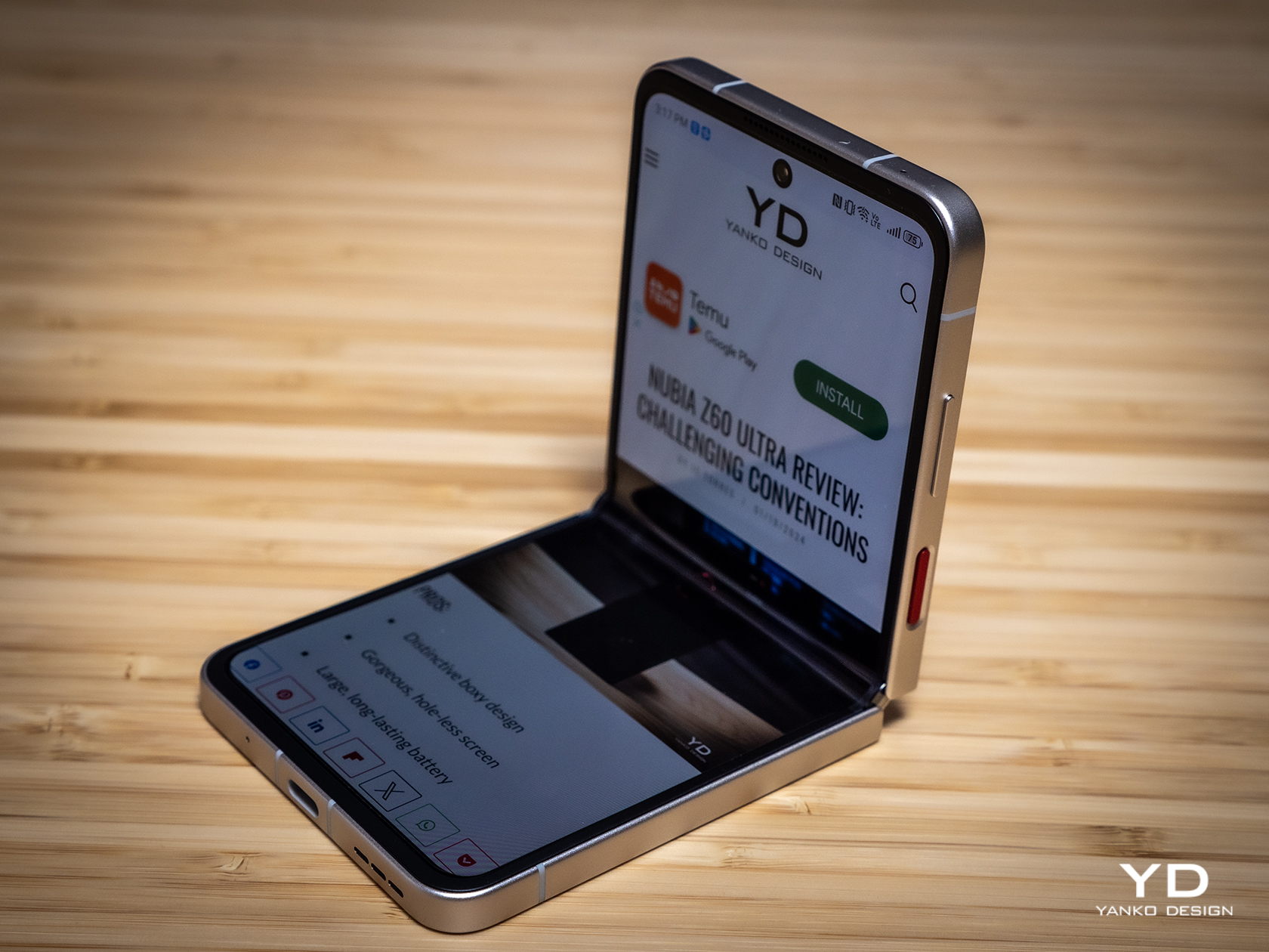
Fortunately, the nubia Flip 5G delivers exactly that, and in both forms no less. Holding the folded phone is the easiest thing to do with one hand, and you don’t even have to turn the block around because the external display will automatically adjust itself depending on how you’re holding it. Whether your top is bottom or your bottom is top, you can instantly dive into the notifications, controls, or the camera without having to turn it right side up.
That said, the nubia Flip 5G is admittedly taller and wider than other flip phones, so those with smaller hands might have even more difficulty using it with a single hand. The flat, textured edges help with the grip, but reaching for the other side of the screen with your thumb will still be a tedious task. Then again, most phones these days really take single-handed use for granted, so it’s not exactly alone in this area.
Performance
So far, the nubia Flip 5G seems to punch above its price when it comes to design and comfort, so it raises the question of how the brand was able to push that price tag so low. The answer, if you haven’t guessed it already, is in the hardware. It’s not terrible, mind you, but you would do well to manage your expectations that this isn’t a $1,000 phone.
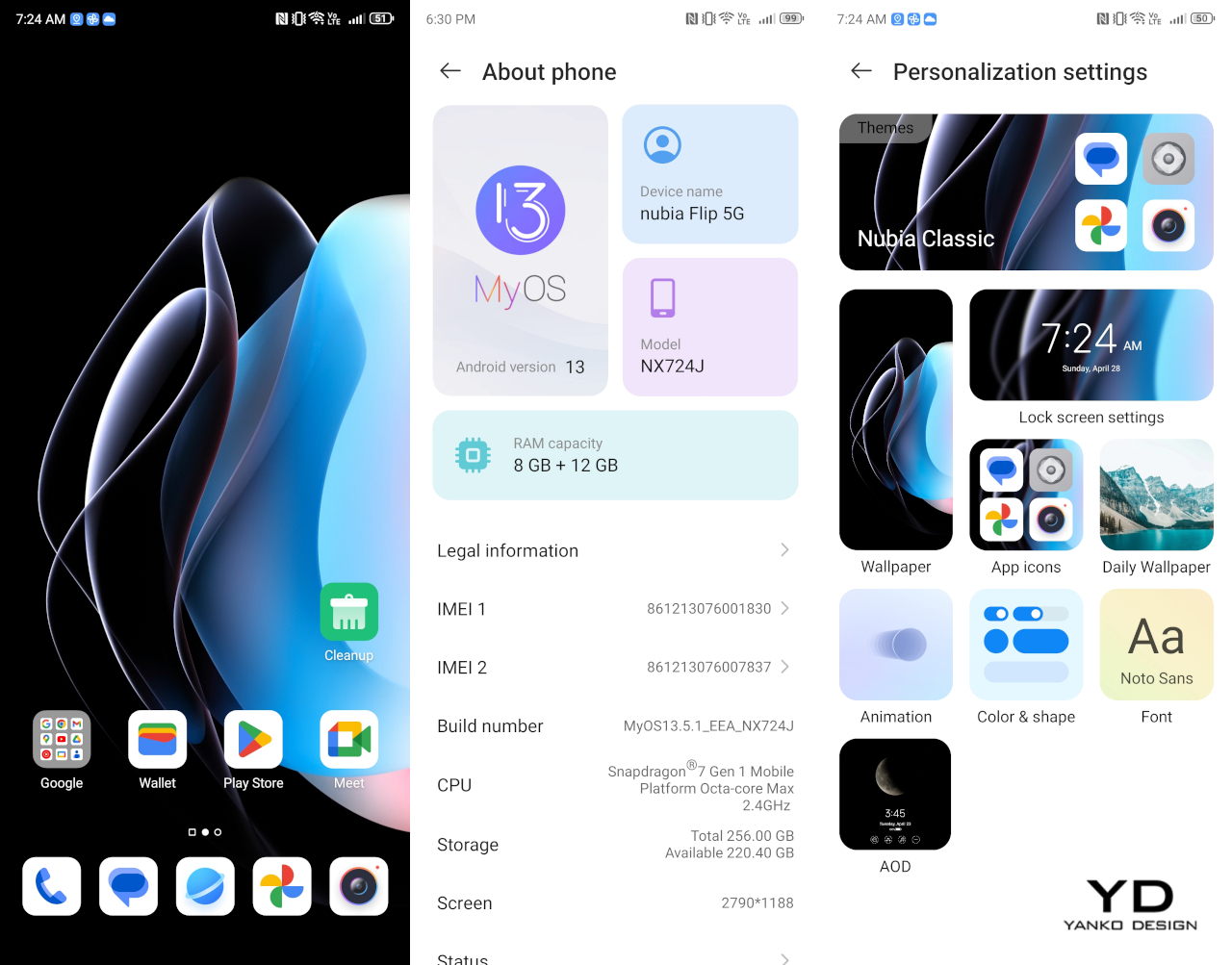
If you were to really put the flip phone in a box, you would file it under the “mid-range” category. The Qualcomm Snapdragon 7 Gen 1 processor it uses is from way back in 2022, and its 8GB of RAM sounds almost meager. Fortunately, this combination has enough silicon muscle to drive a fluid and responsive user experience (especially if you boost the RAM by 12GB by taking away some internal storage space), so you might not even notice the difference. Yes, games need to be set to medium or lower, and certain activities will really raise the temperatures, but there are no show-stopping flaws that would make you throw the phone in frustration.
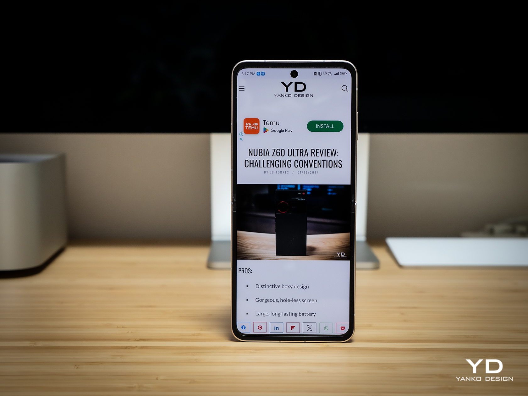
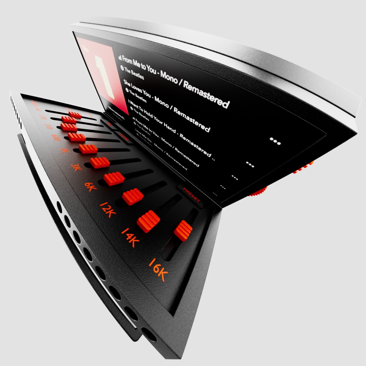
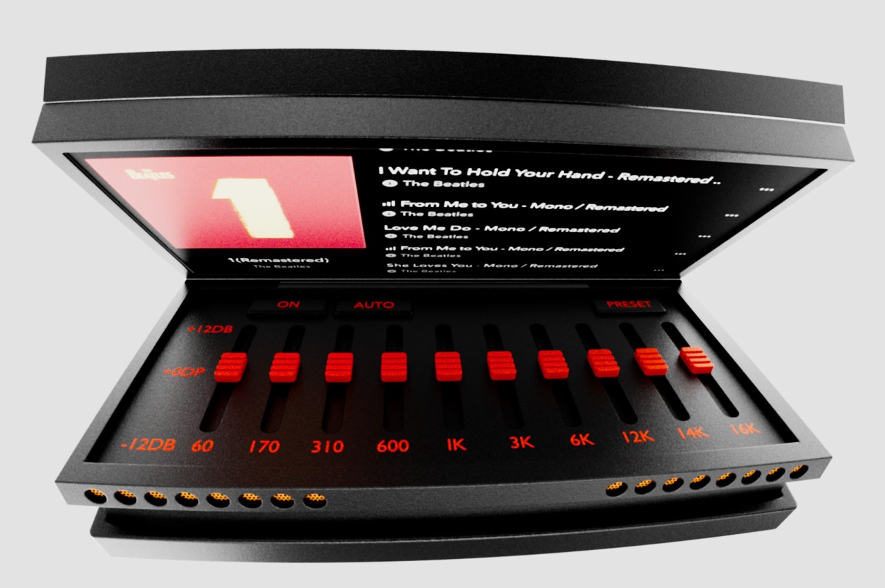
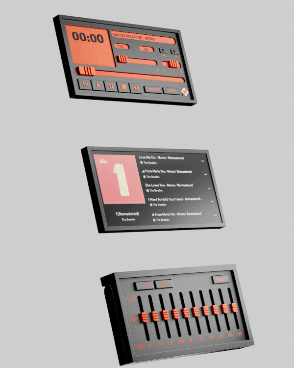
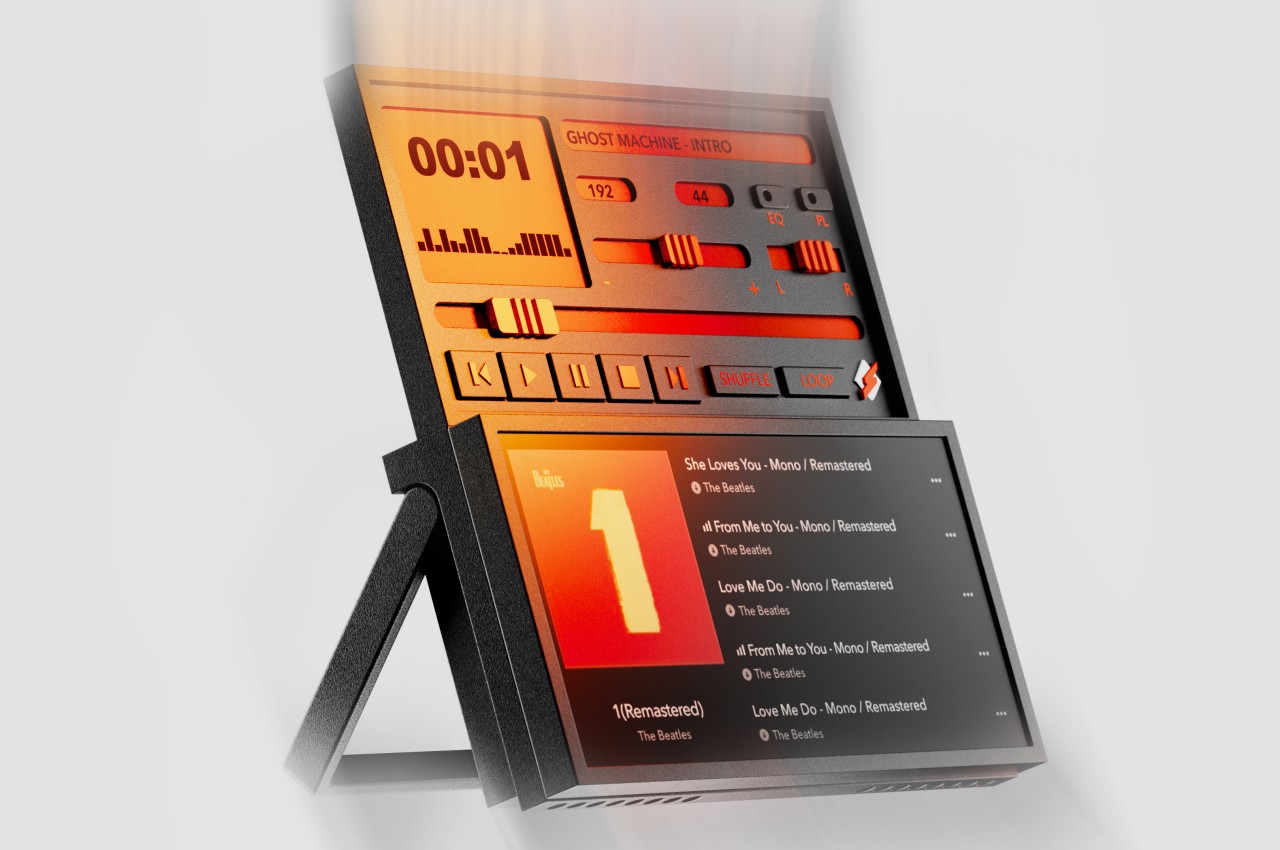
Even better, the 6.9-inch 120Hz OLED foldable display is actually impressive in its brightness and performance. You’ll have to fiddle with the refresh rate settings to get the right speed you want, but the screen is no joke when it comes to responsiveness and colors. Thanks to the phone’s hinge design, you’ll hardly see the crease unless you intentionally go looking for it. Your finger with definitely feel its existence, but you’ll barely notice it in day-to-day operations. The 1.43-inch circular OLED screen on the back shares these same properties, minus the flexibility, but its small size looks odd when placed side-by-side with other flip phones. At the same time, however, this allows nubia to craft simpler, more beautiful, and less distracting experiences rather than giving you another phone on the back of your phone.
In addition to older hardware, the nubia Flip 5G also runs MyOS 13 which is based on, you guessed it, Android 13. We’re past the time when new devices would come out with old Android versions, so this comes as a bit of a surprise. In 6 months, Android 15 will also be out, making this version very old in terms of features and bug fixes. What makes the situation a little worse is that we’re not confident about nubia’s track record in pushing timely updates, so new owners of this foldable phone might be stuck with the same Android version for a long time.
Battery life is a bit of a mixed bag. On paper, its 4,310mAh capacity is definitely the highest in this foldable category, but the older technology of the Snapdragon 7 Gen 1 is less battery-efficient, so it all evens out at the end. The 33W charging speed, however, makes up for its short battery life, letting you get as much as a 50% charge in just 15 minutes. In other words, you’ll still be charging almost every night, despite having a bigger battery capacity.
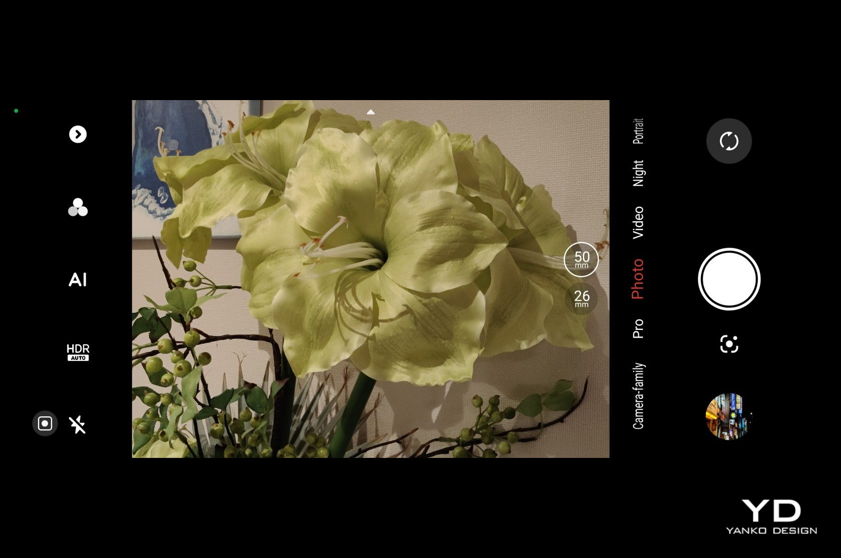


nubia’s cost-cutting strategy, however, really shows when it comes to the cameras. The 16MP front-facing camera is serviceable and takes OK selfies, but for all intents and purposes, you’ll probably end up using the main 50MP camera even for the latter. There are two sensors on the back of the nubia Flip 5G, but you can actively use only one of them as the 2MP camera is really just a depth sensor. That means you’ll be relying on that lone 50MP shooter for everything, including a 2x lossless digital zoom. And yes, there is no ultra-wide camera at all.


While megapixel count isn’t always everything, it still matters when that’s all you really have. In practice, the nubia Flip 5G’s lone camera is like a hero, doing everything to the best of its abilities, even when it sometimes fails. Images are passable and at least have enough details to make the mark. Colors, however, can sometimes look a bit washed out or dull, and there is a clear loss of detail when you zoom in. There’s no OIS, so you’ll have to make sure your subject stays still for a second or two. On the upside, this rear camera takes great portrait photos with pleasing blurs and correct separation of subject and background. With so many smartphones boasting impressive photography chops, the nubia Flip 5G sadly comes up glaringly short of expectations. Then again, it’s not exactly that shocking given how much you’re paying for it anyway.

Sustainability
Compared to regular phones, foldable phones are still infants, and some brands are just as new to playing this game. In that sense, it’s really not surprising that using more sustainable materials is probably the farthest from their minds at this point. They first want to establish the durability and reliability of their design before they change the formula to boast about the use of recycled plastics and metal. The nubia Flip 5G is no different in this regard.
That said, it naturally takes the topic of durability very seriously, even if it doesn’t make any guarantees about even being splash-proof, let alone waterproof and dustproof. The waterdrop-style hinge that allows it to fold completely flat does come with the claim of having withstood more than 200,000 folding and unfolding actions. There is a bit of a crunching sound when opening and folding the phone, though, but that’s probably more from how rigid the hinge is rather than anything breaking inside.
Value
If this were a regular smartphone, we’d consider it pretty basic to the point of being disappointing and leave it at that. But the nubia Flip 5G isn’t your regular smartphone, not by a long shot. It’s hardly the first clamshell-style foldable phone either, but it’s definitely the most affordable one in this specific category. It starts at $499 for 8GB of RAM and 256GB of storage, but $699 will get you double that memory. When you consider that something like the Samsung Galaxy Z Flip 5 starts at $1,000, then it’s really no contest.
That said, nubia’s real competition would come from its peers, like the TECNO Phantom V Flip launched last year. Yes, the $600 price tag puts it above the nubia Flip 5G, but it also comes with some important upgrades, like a more recent processor, faster charging, and more importantly, a better camera system that includes an ultra-wide shooter. It all boils down to how much you’re willing to cut out for a basic foldable experience, and you might be surprised at how much the nubia Flip 5G is able to deliver for less.
Verdict
Foldable phones are here to stay, though it’s taking quite some time for them to become the norm. Part of it is because of consumer hesitation regarding seemingly fragile devices, but an even bigger factor is the price attached to such products that may easily break from the slightest accident. Offering an affordable yet decent foldable phone goes a long way in allaying fears, and the nubia Flip 5G is the commendable hero that is bravely paving the way for others like it.
The $499 price tag for a foldable phone is nothing short of tempting, but it also raises questions about what corners were cut to get there. The camera story is definitely disappointing, as is the use of somewhat older hardware and software. None of these, however, take away from the truth that the nubia Flip 5G is a surprisingly decent foldable smartphone for its price. If you want to sink your teeth into this still-young device category but are too reluctant to spend too much on it, the nubia Flip 5G is definitely a great way to get started, as long as you set your expectations right.
The post nubia Flip 5G Foldable Phone Review: Finally, A Foldable Phone You Can Afford first appeared on Yanko Design.