Hot Take: Just enlarge the camera bump and turn the smartphone into a handycam already…

This piece isn’t really about the camera in the article, but is rather a point I’m trying to make through this camera concept that popped up while I was searching the internet for content. Just to satisfy your own curiosity, this is the Girls Night Out camera, created by Youmeus Design as a commissioned work for Lumix in 2011, when the smartphones were thicc enough to not have those godawful camera bulges.

Fast-forward to today, present-day-2019. Phones are getting thinner, but cameras larger. The result, an unsightly hump on the top of almost every smartphone you see today. The hump’s only actual credit is that it clicks some remarkable pictures… it is, otherwise, a visual and physical weak-point in smartphone design. But camera bulges aren’t going anywhere, are they, so what’s really stopping us from adding a few more millimeters to them and turning them into full-blown photography tools with large lenses, large sensors, and the ability to be physically great cameras, rather than being computationally great ones?

The concept below is literally a handycam from 2011, but if you take a second to look at the second-last image, it almost feels like a smartphone with one of those Pictar Pro or Moment-style accessories. So here’s my hot take… why not just make a bump that isn’t too large (anything less than half an inch is great), and add the lens on the edge of the phone, like a handycam. Have yourself a swiveling screen for easy filming purposes and you’ve got yourself a phone that is admittedly thick, but would ostensibly have the most amazing camera on it. The entire bump could be utilized to add a hefty stabilization unit, and the fact that you’ve got the lens on an edge, rather than a surface, means you can literally turn that cylindrical bump into a lens with incredible telephoto capabilities. Not to mention a thicker phone would also allow you to have a thicker battery. Not saying the format would be a sureshot crowd-favorite, but hey, anything’s better than those ridiculous flexible display phones, am I right? I mean, if you’re going to add millimeters to a smartphone, at least give it a great camera!

Designer: Youmeus Design

The constant evolution of Product Design and how semantics stole my job…

Hey I’m Sam, and I do design.

What type of design do I design? Well… I don’t know any more.

I studied at university as a product designer. We were there to learn how products are designed on an industrial scale. Not handmade, not batch produced, but on a global and industrial level. For this reason, product design was also often called industrial design. I could interchange the term I used, depending on who I was talking to, and the terms were synonyms of each other, depending on who you asked.

But that was 6 years ago. That was a time when we were still mourning the loss of skeuomorphism in the iPhone. It was a time when digital design had finished copying the real world in order for users to “understand” the interface, and it had started to make its own way in life. We saw flat design and multi-tap gestures that weren’t possible in traditional product design.

However, 6 years later, it is clear that digital design didn’t have a clean divorce from product design. It decided instead to take its name. Now the entire design industry refers to anything digital, service, user experience, or user interface design, as “product design”.

I spent four years at university studying what I thought was the cutting edge of User-Centered thinking and empathy within product design. My head was buried in an industrial design dream.

Now that I’ve emerged from the other side of graduation, it has suddenly hit me that I’m not a product designer any more. That title was adopted by the UXers and UIers. Product design is now any service that a consumer can interact with. I can only officially call myself an industrial designer now (though I have started calling myself an “item” designer, even if it’s not catching on just yet).

At the end of the day, I’m the designer that wraps the “product” in an outer shell that customers can buy. The item is a physical embodiment of the product which is stored on local chips and on cloud servers. Arguably, the shells are a deciding factor when choosing an “item”, but no way near as much as the “product”. Few would turn down the new iPhone 11 and iPhone 11 Pro because they don’t like the camera design. People care more about the photos it can take and the services it provides (product) than the shape of the camera bump (item) in that scenario.

The real question is (and this is the question that keeps me awake at night): how long will it be before a product doesn’t need the shell at all?

That’s actually the exciting thing about the creative field we’re in.

The human race has been creating since the dawn of time but “design” as we know it is relatively new. The industrial revolution that kicked it all off was 200 years ago. “Modern” design thinking brought to us with Bauhaus was 100 years ago. When compared to the artists and craftspeople of ancient civilizations, modern design is still taking its first steps. As such, we are collectively pioneers; steering our profession in ways that would have seemed impossible even 20 years ago. Our industry is malleable and never still.

By its very nature, our profession pushes the boundaries of what human creativity is capable of. Design works with social, business, and environmental constraints that must be navigated to design a good product. That process in itself is a skill that is ever-changing. In the time it took me to choose a degree and finish it, the landscape has shifted to a brand new location.

As creatives, it’s no longer the case that we learn one discipline and stay segregated for the rest of our career. The skill sets that we pick up are heavily transferable to different sectors, and I would argue that it’s best to learn as many disciplines as possible. Want to future-proof your job? Learn the skill that may replace it.

Our job is to literally change the world. I don’t mind if my job title changes along with it – I just need to remember that I need to as well.


ABOUT THE AUTHOR

Sam Gwilt is an industrial designer with an eclectic mix of skills. He graduated Brunel University London and worked for Paul Cocksedge Studio, specializing in bespoke lighting installations and exhibitions internationally. He now works with clients globally at consultancy Precipice Design, and also runs an Instagram Page and YouTube channel – Sam_Does_Design – where he shares industry tips with the community.

YD Editorial – AirPods Pro: Decent tech in a disappointing design

Before you paint me as an Apple Naysayer (and some of you will, I’m sure), I’m a proud owner of not one but TWO iPads which I love, and my critical approach only comes from wanting what’s good for the company. Having said that, the fact that Apple launched the AirPods Pro at a separate, un-televised event says that the company probably doesn’t believe the product deserves its massive reveal. What’s really worth asking is that is this yet another one of Jony Ive’s ‘serving-his-notice-period’ designs, or is this the work of Apple’s new design heads?

Apple just wound up a product launch event in September, approximately a month and a half ago. Cook could have easily teased the AirPods Pro then, right? Here’s a personal opinion. The AirPods Pro basically are a slap in the face for anyone who just bought the AirPods 2. The AirPods 2 are barely a year old and they’ve already been apparently bested with a product that Apple claims is better… and doesn’t slip out of the ear when you’re doing parkour in the streets. Here’s the lowdown on the AirPods Pro. It’s smaller, which is the most significant improvement. It comes with grippy, customizable silicone tips that honestly make it look less like the iconic AirPods and more like something else (I’ll leave that to your imagination). The new earbuds feature active noise cancellation, adaptive EQ which is a fancy way of saying it sounds better, and a transparency mode, which allows you to hear the outside world so you don’t get hit by a car because you were vibing to Marshmello. The AirPods Pro are, simply put, just marginally better than your regular AirPods… and the fact that Apple’s wireless earphones JUST got noise-cancellation in 2019 is honestly embarrassing. The Pro earbuds are much smaller, which also means their battery isn’t as powerful as the AirPods or the AirPods 2 (it provides 30 minutes less listening time)… which begs the question, which of the three generations really stands out as the solid winner? I’m not sure if I know the answer.

I feel that the AirPods Pro could have gotten a slight upper edge if Apple had taken its design more seriously. The AirPods Pro now come with a silicone sleeve that sits inside your ear, which means you need to wipe the earpieces clean every time you take them out. It also gives the earbud a strange silhouette, and the somewhat lack of a proportion-led design approach makes the earbuds look like an older, stouter, hunched-over version of last year’s AirPods. Maybe we’re all missing something. Maybe Cook and Ive didn’t really want to work on this product, but the market-research team did, which is why it got its cold launch, outside of Apple’s grand keynote. Or maybe the AirPods Pro are the ‘best earphones designed to work seamlessly with the best smartphone on the market’ and I’m just disillusioned by the “we need to release a new product every year” business model.

Designer: Apple

The new Pixel 4 isn’t just a great phone for users, it’s a great phone for Google too.

I was in the Scottish Highlands a week ago, on a road trip with the family, with absolutely no network on my Pixel 2 phone. In essence, I was cut off from the rest of the world. No internet, no messages, no calls. All I had was the car’s radio, which happened to be catching some music on a DAB station. I looked at my Pixel 2’s screen, completely stunned to see that without any network or internet, my Google Pixel 2 had identified what song was playing. Right underneath the notification bar, it said “Come Together – The Beatles” (the radio channel was celebrating Lennon’s birthday on the 9th of October). My phone had essentially identified a (pretty popular but) completely random track on the radio… completely on its own. I was partly terrified but mostly impressed. Fast forward to today, a full week later.

I’m sitting in front of my TV, watching the Google Keynote live. I’m feeling a similar feeling of euphoria and mild terror at how incredibly advanced Google’s new devices are getting. The Google Assistant has the ability to work incredibly well WITHOUT being connected to the internet. Everything sits in Google’s small machine-learning chip, allowing your phone to be smart on its own. That’s incredible and terrifying, depending on how you look at it. Google’s devices, its smartphone in particular, are growing increasingly powerful in order to achieve what Google calls ‘ambient helpful computing’.

Google’s keynote, just nearly over a month after Apple’s keynote, feels quite different. In fact, I’d say the roles have reversed. Apple was once a bastion of serious innovation, and Google, a fun-loving company that made delightful hardware to complement its software. Now the tables are turned, as Apple takes on a more informal route, with its partnerships with Oprah and Jason Momoa, and its foray into Arcade and Apple TV Plus, while Google has assumed the mantle of power, having just built the most powerful Quantum Computer among other achievements. The once fun-loving company is all about showing how they can ‘help’ change the world, one product at a time. I mean, they even had an on-stage interview with Annie Leibovitz, to talk about how a professional would use Google’s Pixel camera.

The Pixel 4 is built around Google’s motto for being an incredibly advanced piece of tech envisioned to help you. Its incredible advancement comes from the fact that it’s now the first and only phone to use radar as an input, allowing you to wave your hands in the air to swipe through your music playlist, mute your alarm by showing your phone your palm, and much more. The Soli radar chip, developed in 2015, went from 4 square-feet in size, to a mere 4 square-millimeters, sitting in the Pixel 4’s upper bezel. The Soli is so powerful, it knows what to do before you even tell it to. When your hands approach your phone, Soli activates the facial recognition camera on your phone, so you just need to look at it to wake it up… no pressing buttons or anything. It even reduces the volume of your alarm when it senses your hand approaching the phone. It can detect and differentiate between you waving to a friend versus trying to swipe in the air to change tracks on your phone, making it both ground-breaking and incredibly intelligent for something so new. Google’s assistant grew a tad bit smarter too, being able to work across apps, completely offline, and being able to recognize complex commands without even needing the phrase “Hey Google”. If that wasn’t enough, the Pixel 4 will be the first smartphone to be Google Stadia compatible, come 19th November when Stadia finally launches.

As for the camera, Google’s found new ways to excel in that department. There was a good 15 minute segment just on how Google practically built and perfected computational photography. The camera can now click infinitely better HDR images with HDR+, better Portrait photos with its two lenses, even completing it with realistic bokeh, and absolutely stunning low-light pictures that puts the Pixel 4 in the category of SLR cameras. You’re literally looking at a powerful professional camera touted by Annie Leibovitz herself, that fits right in your pocket.

The Pixel 4 comes in three colors, with no fingerprint sensor and a massive square camera bump that easily overtakes the iPhone 11 Pro in its photography capabilities (although there’s a high chance the 11 Pro still dominates in the video department). Google’s very cleverly moved on from showcasing trivial details like wireless chargers and fabric cases (or even the Pixel 4’s battery life) to focusing on the larger picture, like how the Pixel 4 is an incredibly powerful digital assistant in your pocket. From being able to anticipate and understand your needs much in advance and being able to read your gestures in mid-air, to being able to allow you to talk to its assistant in a natural seamless manner (so the technology recedes into the background), the Pixel 4 is a great phone for users, while being a complete magnum opus for Google, showcasing its absolute potential as a dominating force in practically every department, from Voice AI to the state-of-the-art computational photography. That feeling of delight (with the zest of terror) is a pretty interesting one. It shows that there’s still a lot left in the smartphone innovation department, that Google is capable of still blowing our socks off, and there’s no stopping them.

Designer: Google

YD Talks: Looking at the new iPhones and why Jony Ive and Apple are better split apart…

Would you rather design the world’s first diamond ring that’s entirely made out of a single diamond stone? Or would you try to design an 8mm slab of a smartphone that practically looks the same as the 8mm slab of a smartphone you designed last year, because it needs to?

This keynote marks the first of many without Jony Ive lending his suave baritone to the background audio as Tim unveils the new iPhone. Jony Ive left Apple earlier this year, moving on to forming his own design studio LoveFrom along with long-time friend and design collaborator Marc Newson.

There’s no room for Apple to innovate in industrial design, as the company isn’t really set to launch new products anymore. They scrapped AirPower and pulled a disappearing act on the entire ‘smart-car’ project. The last product that Ive could really go wild with was the infamous 2019 Mac Pro, and that design isn’t changing at least for the next 5 years.

I remember a time when Ive allegedly expressed intent to leave Apple (a year after Jobs’ passing), and was made to stay by being promoted to the position of Chief Design Officer. Now at a position that is just second to the CEO, there isn’t much room for Jony to move upwards, and the company’s pivot to services like Apple Pay, Apple TV+, and Apple Arcade means Ive can finally move out of Apple’s structure, extending and experimenting beyond designing notches on 8mm slabs of metal and glass, putting arguably the most disastrous keyboards on their flagship laptops, and over-designing a $1999 display stand for a $5999 cheese-grater-esque computer.

So onto the new iPhone. The iPhone 11 and 11 Pro are, like every iPhone, the greatest iPhones ever made. They showcase design similar to their predecessors, but with major upgrades to the inner hardware and software, including a chip that provides better CPU and GPU capabilities with lesser power consumption, and camera features that are really professional-grade. The merits of the new iPhones aren’t really visual, but rather strictly technological. Remember the visual jump from the iPhone 3G to the 4, from the 5 to the 6, and from the 8 to the X? They were all spaced roughly 2-3 years apart, but the iPhone X is perhaps the last stop for the iPhone’s industrial design journey (I hope to stand corrected). With an aesthetic that’s now sort of in the sweet spot, Apple’s focus is now on making each subsequent phone perform better than the last.

To reiterate, the new iPhones aren’t really NEW LOOKING iPhones. They’re old iPhones with new tricks. There’s no way in hell that Apple’s teasing a folding iPhone yet, or a 5G iPhone before the infrastructure is ready… or even a bezel-less iPhone because that would need a sliding camera module which would make the iPhone thicker, a cardinal sin in Jony’s design playbook. In fact, the iPhone can’t even get much thinner than it already has, thanks to the limitations of Moore’s Law.

Tim’s pivot to services is probably his lasting legacy as CEO, and it doesn’t have much room in it for radical industrial design. Ive stuck around to help complete Jobs’ vision of releasing the best consumer products, but if anything, those products are now Apple’s undoing. iPhone sales have gradually seen a steady decline, in part because it isn’t worth spending over a grand on new phones each year, but also because Apple’s gadgets stand the test of time, with people on an average using their phones for over 3-4 years before finally making the switch (my flatmate still uses a 6S; pretty happily, if I might add). The bendgate debacle was perhaps a blip in Apple’s otherwise long-standing record of making products that last longer than the competition (they’ll last even longer now, ever since Apple’s begun advocating for the Right To Repair Act that allows third-parties to officially fix broken Apple gadgets). Couple that with the fact that each flagship iPhone now costs more than a grand, and you’ve got a product line that’s losing its annual hype.

So, I ask again… would you willingly choose to play second fiddle to engineers, strategists, UI/UX designers, and service designers, condemned to a lifetime of minutely redesigning old products? Probably not for long, right? The new iPhone is remarkable in many ways, but it also marks the perfect departure for Apple’s design legend who deserves to be able to do MUCH more.

The top five design portfolio tips of 2019 from ‘Sam Does Design’

Hey I’m Sam and I do design. Some of the most popular YouTube videos I make are about portfolios and tips on getting a design job. For that exact reason, I wanted to write about portfolios here so I can share this information with you.

I’m the first one to admit that I have limited experience in the real world, with just two years of post-grad experience to my name. However, now that I’m sat on the opposite side of the interview desk, I have already started to see patterns emerging within the vast number of portfolios that I see. That also means that I can spot the mistakes that people make again and again. In order to help you, and to save myself from going through another portfolio with mistakes from someone who doesn’t know any better, I’m here to let you know EXACTLY what I look for.

Using these 5 techniques will be sure to improve your portfolio and make it a pleasure to read. If you’re unsure on what format your masterpiece should take, make sure to catch up on my last article for the pros and cons of PDFs, personal websites, portfolio websites, and printed books.

Tip 1: Only show your best work

The real world is different to university. As much as I would like there to be, there is no mark scheme, work schedule, or banded grade system. This means that you do not get extra points for showing more work. You actually lose points for showing filler work. I am guilty of this too, but it’s definitely worth only showing the work that you are truly proud of. Your portfolio is only as good as your worst project.

Tip 2: Show the type of work you want to be doing

As I mentioned in my last article, a red carpet set design company needs to see that you can design red carpet sets. Without seeing the work that the company needs help with, they cannot employ you because it becomes a risk when compared to someone who showcases it. You need to show the company that you’re already doing the work that they need help with. If that means spending some time on a personal unpaid project, then it could make all the difference when applying to your preferred design field.

Tip 3: World-build with a story

Each project needs to clearly show the problem that it’s solving, the journey the design took, and the decision making in the process. I find the best way to do this is to imagine each project is an article for a design website. This means capturing the audience with an in-context hero shot at the very beginning, followed by “the behind the scenes”, and then finishing with hero shots at the end. Without seeing the context shot at the start, there is no clear direction for the “behind the scenes”. Without the “behind the scenes”, there is no substance. Without the final hero shots, there is no finale. Using this formula can be seen in my portfolio reviews again and again.

Tip 4: Show, don’t tell.

While it is important to explain the whole story, it is industry standard to spend a maximum of 10 seconds flicking through an entire portfolio. Designers and hiring managers don’t have time to read all 100 portfolios they see word for word. Paragraphs should be kept to a minimum at all times. That means showing your skills naturally through visual means, and in turn means integrating your skills into the projects. From what I have seen, those with less experience will have dedicated “sketching” and “rendering” pages – showing a mish-mash of projects and segregating their portfolio into skills. This is something that schools and universities may use to assign marks or check that the work is being done, but it is not how the real world works. Your skills should be apparent and wrapped in the narrative of your project case studies, which should be beautifully laid out, with as little text as possible.

Tip 5: Compare yourself to others.

I can’t believe I just wrote that on the internet and I feel like a horrible person for suggesting it. But this is the one time in life when you should compare yourself to others, because your employer will be doing so as well. Ask yourself, would you employ yourself if you saw your portfolio for the first time? How about when compared against 5 other portfolios? What can you do to improve? You should be critical of your own submission before the employer gets a chance to be. As the saying goes, you are your own worst critic.

You can see how I documented the Gantri Weight light throughout this article. By using these 5 tips, I’m sure that your portfolio will be the best it can be. Good luck!


ABOUT THE AUTHOR

Sam Gwilt is an industrial designer with an eclectic mix of skills. He graduated Brunel University London and worked for Paul Cocksedge Studio, specializing in bespoke lighting installations and exhibitions internationally. He now works with clients globally at consultancy Precipice Design, and also runs an Instagram Page and YouTube channel – Sam_Does_Design – where he shares industry tips with the community.

PDF, Printed Document, or Portfolio Website? What works the best for job applications?

Hey I’m Sam and I do design. Some of the most popular YouTube videos I make are about portfolios and tips on getting a design job. For that exact reason, I wanted to write about portfolios here so I can share this information with you.

Sharing your work as a creator can be a daunting task, especially if you’re attempting to summarize solving a complex problem that took 6 months to define, and 6 months to develop the solution. In situations like this, it’s important to remember that the reader (your recruiter) must understand the project at face value as they’re speed-browsing through hundreds or even thousands of job applications. I make a point in my videos to flick through portfolios as fast as possible when first looking at them, with no time to read the headings or the body text. This reflects exactly what happens in industry, even if it does appear unfair to the designer on the other side of the portfolio. This is also the reason why each portfolio should be tailored to the job you’re applying for. For example, a red carpet set designer won’t be interested in seeing the baby walker that you designed (true story, I didn’t get that set design job).

Every employer will have different application specifications. My current job still asks for a PDF portfolio from students. We ask for them because we can archive them, and pull them out if we have a specific project that the specific designer can help with. And if they supply a completely different type of portfolio? Well, it unfortunately shows they can’t follow employer instructions. Next!

Beyond specific employer instructions, how should you show your work? There honestly isn’t one perfect be-all-end-all format. There are pros and cons to all of the solutions, so let’s run through some of them now to help you decide which is best for you.

PERSONAL WEBSITE

A personal website is a great way to show creativity and give the impression of a professional and well established designer. The pages and layout are also a showcase of how you think and organize information, and the format of a website means you can have multiple types of projects that your potential employer can choose to look for, or choose to ignore if they don’t suit the particular role available (just like a baby walker or set design). A personal website is great for these reasons, IF it works. The problem I personally had with my first portfolio website, especially as a student, was that it was expensive to keep it running. It came to the point where I needed to choose between renewing the website domain, or eating that week. I chose the latter. That meant that any potential employers that I had given my website details to now couldn’t find me if they had a project that would suit my talents. And even if they could find me through the email address I also gave them, a broken website gives a horrible impression anyway.

PDF DOCUMENTS

A PDF document is a traditional method by today’s standards. They lack the fancy animations that websites can have, and they need to be emailed around and stored locally. However, this can also be seen as a positive point, as each portfolio can be tailored to include only the most relevant project for maximum impact with employers. Having a PDF that pinpoints the exact type of projects that the employer needs help with shows that you are capable not only of the design work itself, but also understand the company’s needs and shows how you can help. If a website is a great place for employers to come and choose what they’re interested in, a PDF is a great way for you to show that you understand what they need.
However, dealing with file sizes and compression can be the difference between a 500mb monstrosity, and a file that’s pixelated beyond recognition. This is the final hurdle of a PDF document, and one that many designers trip on. A sensible file size is 5mb-10mb, and there are ways to compress your document while keeping the image quality high. I have a YouTube tutorial on that very problem!

PHYSICAL PRINTED BOOK

A physical copy leaves the most impact on a potential employer. In a world where everything is increasingly digital, it seems that providing a beautifully made book always provides that “wow” moment. There is just something about turning each page to reveal the next piece of information that is so satisfying, and the physicality of it often means that I would flick through a book slower than I would a PDF.

However, there are of course drawbacks with a physical portfolio. They are expensive. Very expensive. And it’s almost impossible to tailor each portfolio to include the exact projects specific to the job at hand. I’ve seen workarounds with binders and replaceable pages and projects, but that gets even more expensive.
In addition, while books are suited to archiving and being stored, they don’t possess the magical “search” feature that PDF’s and websites have. In 6 months time if I have a project that a designer could help with, and I can only vaguely remember that their work was in a book (and definitely can’t remember their name), then it takes a lot of effort to go searching. The effort I might spend searching could easily be re-assigned to finding a new designer with similar skills, even if the “wow” factor of the book was so nice 6 months ago.

COMMUNITY PORTFOLIOS

Community websites like Behance are more stable than personal website, but they also bring attention to the competition and their design work. While it’s very easy to plug in your images and copy into the pre-existing templates with fancy animations, it’s also true for every other designer on that website. The very nature of these types of sites mean that they make it oh-so easy to click through to find more designers and more work.

It could work in your favor by showing your projects are better than the competition, or it could show other designers and their work as well. You can rest safe in the knowledge that your links are going to work for as long as your project is on the website, but is it worth also potentially exhibiting the competition too?

THE BEST OF ALL WORLDS

It may be a catch-all cliche, but I do think it’s best to have a mix of portfolio types up to date at all times. It’s really important to be able to provide a current portfolio at any given moment as you never know when the next opportunity can come along. The best plan of action is often to use two or more types of portfolio for the same submission. PDF portfolios plus physical or website is also common. Remember, if specified, always listen to the employer’s instructions when it comes to formatting. Beyond that, a portfolio is a reflection of your mindset and your creativeness. The more creative you can be with a portfolio, the better. But don’t forget what a portfolio is used for once it’s left the drafts folder on your computer and out in the real world: it should be to the point, tailored, archive-able, and searchable. Oh, and don’t forget the “wow” factor.


ABOUT THE AUTHOR

Sam Gwilt is an industrial designer with an eclectic mix of skills. He graduated Brunel University London and worked for Paul Cocksedge Studio, specializing in bespoke lighting installations and exhibitions internationally. He now works with clients globally at consultancy Precipice Design, and also runs an Instagram Page and YouTube channel – Sam_Does_Design – where he shares industry tips with the community.

Rendering Realistically in Keyshot with Sam Gwilt

Hey I’m Sam and I do design! I recently made a YouTube video demonstrating how to Render Realistically Really Rapidly! This process helps break down your 3D models and turn them into photorealistic renders. Below are a few tips that should help you get some eye-poppingly real Keyshot renders.

I recently attended a talk at Develop3D Live by Luxion Chief Scientist Henrik Wann Jensen and was amazed by how detailed the algorithms behind Keyshot are. He showed sample renders of the Ford Interceptor renderings used as adverts in car magazines, as well as various glasses of milk that, by inputting the chemical compounds of each into the Keyshot algorithm, could even distinguish between skimmed, semi-skimmed, and full-fat!

WANT GREAT RENDERS? THINK LIKE A PHOTOGRAPHER

If realism is what you’re looking for, it’s important to understand what you’re trying to replicate. Keyshot’s algorithms can do a lot behind the scenes, but making realistic renders means understanding photography theory, and knowing what to look for when it comes to image styles.

There are three golden rules that make up a good photograph:

• Subject matter: what is the thing you’re capturing?
• Composition: what is the right angle and the framing?
• Lighting: How is the scene lit?

The same principles apply to renders. In Keyshot, the first thing I do is import the data I want to render, and start laying things out to get the composition right. Camera settings also contribute to the composition: as a rule of thumb, I usually stick between 50mm and 80mm lenses. These are typically what photographers use for portrait and product photography, as it replicates what our eyes naturally see.

Here you can see the two image layouts I chose to render, before applying the materials.

The difference between a 30mm and 50mm lens can be seen here. The 30mm gives this coffee pot a strange perspective, whereas the 50mm is a lot more natural.

THE MORE ACCURATE THE MATERIALS AND LIGHTING, THE BETTER THE RENDER

With the scene set, it’s time to apply the materials. Keyshot’s material graph has become incredibly powerful recently. It’s possible to fine tune each material to have an exact base colour, reflection, translucency, opacity, and much more. Adding in these complex material nodes increases the render time so, while you’re still fine-tuning your scene, I would recommend keeping things simple with just the base materials (and possibly reflection maps to check the highlights aren’t blown out).

Once the base materials are set, it’s time to light the scene. Deciding on the lighting setup really depends on the style of image that you’re aiming for. A soft white light in a studio environment or a sharp warm 2700k temperature light simulating a sunrise with crisp shadows can really change how the scene looks, so remember to replicate real photography if you’re going for realism. I’d recommend learning the basics, like colour temperature and 3-point lighting as a starting point, and then you can really start to have fun!

IMPERFECTIONS MAKE IMAGES FEEL MORE NATURAL

The final push for realism comes from disrupting the perfect geometry that only computers can create; nothing in the real word has a mathematically perfect straight line. This is where rendering is different from product photography, even though the end goal is the same. Photographing products in the real world involves post-production editing in which all of the imperfections are airbrushed out to produce an “ideal reality”. Renderings come from the opposite direction; starting with perfect geometry and applying precise surface imperfections to make it look realistic. The end goal for both is to hit the ideal reality target, without falling into the uncanny valley, which would make the product look like an eerie airbrushed painting.

Adding displacement maps, refraction maps, specular maps etc. are great ways of adding these surface imperfections. Combining these textures, along with the three golden photography rules, will help create realistic images could one day be on the front of a magazine. Now the only thing left to decide is; would you like to advertise cars or milk?

For more tips and tricks, don’t forget to check out the @sam_does_design Instagram and Youtube pages, and www.samdoes.design


ABOUT THE AUTHOR

Sam Gwilt is an industrial designer with an eclectic mix of skills. He graduated Brunel University London and worked for Paul Cocksedge Studio, specializing in bespoke lighting installations and exhibitions internationally. He now works with clients globally at consultancy Precipice Design, and also runs an Instagram Page and YouTube channel – Sam_Does_Design – where he shares industry tips with the community.

How to win a design award: A handy guide

If you haven’t read our piece on What Awards Do For Your Design Career, I do recommend you check that out first. An award is instant validation. It puts a stamp of approval on your work, your process, and even you as a designer, helping you stand out from the rest. Awards, aside from validation, also have a number of additional benefits. Cash prizes, trophies, internship opportunities, interested funders/clients, collaborators, and just a fast-track to getting your work seen by thousands if not millions. Here, we try to break down the process of applying for a design award and deliver some insights on what you can do to maximize your chances of winning one. This is, by no means, some cheat-sheet or a hack, but just a very structured way of choosing your battles properly and having the correct strategy in place to win them. So let’s dive in, shall we?

WHAT ARE YOU GUNNING FOR?

You’ve got a project, you want an award. Pretty simple, right? Actually, it’s much more complicated than that! Awards, as many as they are, don’t operate on the same principle. Yes, they do reward great design, but a few things change from award to award… the most noteworthy ones being –

A. Different award programmes reward different aspects/types of design. Not all awards are the same.
B. Jury panels vary from award to award, and from location to location.
C. Prizes vary from award to award too.
D. Budget – Perhaps the most crucial part of a design award. Awards require money. Some more than others.

So ask yourself what you’re gunning for. You could be looking for a stamp of approval on your work/portfolio, or you could be looking for potential collaborators/investors, or even press coverage. You could perhaps do it for the prize money, or a dream job. Based on what you exactly want to achieve, your choice of which design award to apply for will change. Here are a few steps to help you get on the right path.

KNOW YOUR AWARD

Every award is different. It’s important to do a little research on the awards, their requirements, etc. If you’ve got a conceptual product, maybe an award for design concepts is your best bet. If you’ve got a product/proof of concept and you’re looking to take it forward, an award that grants you that sounds like a perfect plan of action. Some awards are category-specific too. There are awards that are strictly for architecture, some specifically for designs aimed at enabling people with special needs, and some just for consumer electronics, or even earth-friendly. Sometimes an award could be country-specific as well. Knowing which award suits your requirements, and which award your project fits best into really goes far to help secure your spot on the winner’s stand.

Spend a healthy amount of time reading the award’s About Us page. See what their aim is, what their ethos is. Take things a step further and look at past winners to get a better idea of the qualitative standard the award demands. Ask yourself if your work compares to theirs. You wouldn’t design a product without putting in a healthy amount of research, so why would you send your product for an award without doing your due diligence too, right?


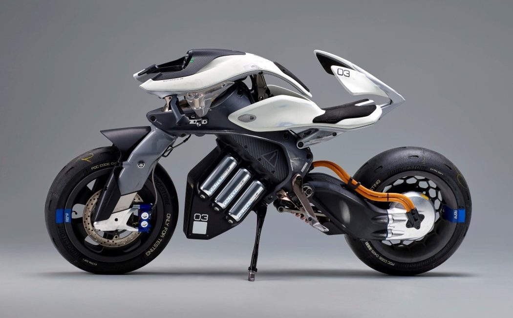
The MOTOROiD by Japanese Yamaha Motor Co Ltd won the Luminary Award at the 2018 Red Dot Concept Design Award. Red Dot is arguably one of the most well-known international award programs and is split into two legs, one specifically for product design, and one for concept design.


KNOW THE JURY

An award is perhaps the best way to get a panel of established designers and judges to look at your work. Look at the jury panels to see any noteworthy figures. Not only does the jury speak of the award’s qualitative standards, the jury is also a pretty great way to stick your foot in the door at a good design firm. Not sure what I meant? Imagine your favorite designer is on the jury panel for a design award. Sending your work to the award is a sure-fire way to get them to see your work. If they do like it, chances are they’ll remember you because of your project, making it easier to strike up a chat with them, or to even get an opportunity to work for/with them!


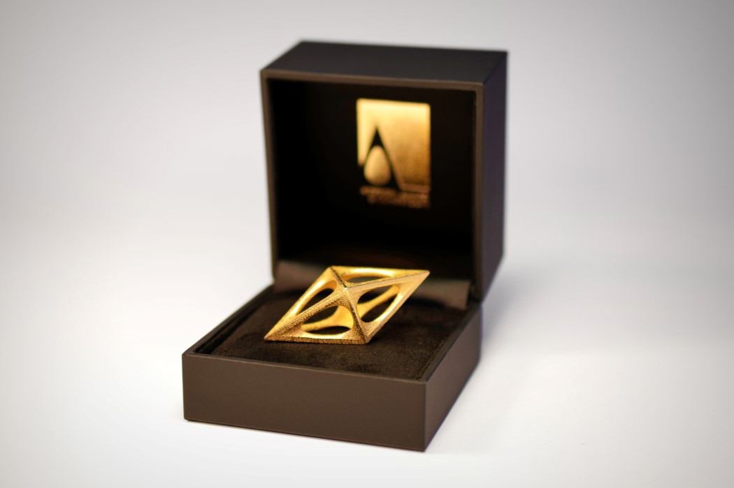
A camera for the visually impaired, the 2C3D Camera secured a win at the Asia Design Prize in 2018. The 2019 jury panel is presided over by none other than Karim Rashid, among some incredibly noteworthy talents.


KEEP YOUR EYES ON THE PRIZE

Here’s the most interesting bit… The reward! First and foremost, figure out what you’re really looking to achieve. Some awards give you media-coverage, some awards give you a cash prize, some awards give you job or internship opportunities, and most awards come with their fair share of recognition. If you’re looking to put your name on the map, choose a reputed national or international award… preferably one that has a strong marketing/publication component. If you’re looking for a cash prize to fund the growth of your product, some awards do give out hefty rewards to their winners, although winning them is definitely an uphill battle. If you’re looking to launch a product, look for an award that’s interested in prototyping your ideas. If you’re looking for a stellar work opportunity, some award programs reward internships or exchange programs too! (We’ve got a nifty design award guide coming up soon!) And here’s a critical bit. Always be prepared. Without sounding like a complete buzzkill, being handed an award is a great feeling, but it can often come with unintended consequences. Winning an award can often result in a lot of media coverage, and may open you up to a wide variety of counterfeiters, embroiling you in a copyright battle… and moreover, all awards require NDA clearance from your client, or your college, so make sure you’ve taken proper legal advice before applying for an award… Especially if you’re looking to file a patent later down the road.


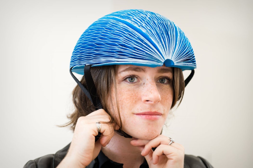
The splendid, portable, lightweight, foldable EcoHelmet received the James Dyson Inventor Award in 2016. The James Dyson Award is always looking to find young innovators with life-changing ideas for products. The winning designs are reviewed by Sir James Dyson himself, and are entitled to a hefty cash prize to help kick-start their career or their product journey.


AWARDS ARE BUSINESSES TOO… YOU NEED TO PAY TO PLAY

It’s important to look at the award from the organizer’s perspective too. Medals, trophies, prizes, juries, exhibitions, galas, and a lot of moving parts in between them, they all require a budget… and more often than none, that budget comes from award application payments, which means you need to pay to enroll for the awards program. Depending on how grand the award is, its enrollment fee varies too, which can sometimes make awards an expensive ordeal. So, factor your budget into your choice of awards too. Some awards are cheaper for students, which is just great if you’re studying with no source of income and you’re looking to bootstrap your future career. In fact, some schools will even pay the entire or a portion of the fee just to help students out (after all, a school’s reputation does increase if its student wins an award). If you’re not a student, you may be required to pay full price, so make sure you allocate a sufficient amount. If you’ve worked with a client on the project, you can even ask them to pay for the award too… after all, they benefit the most from it because the award also goes to the product AND the company. Some companies use the award logo on their websites, products, or packaging, so it’s a win-win for everyone! Along with money, time plays a big role too. Make sure you’re ready with your project way in advance, so you can enroll during the early-bird stages of the award, and conveniently skip the hefty late-application fee if you cross the deadline. Conversely, if the award is free for all (because their business model relies on something else altogether), more power to you! Go for it, you rockstar!


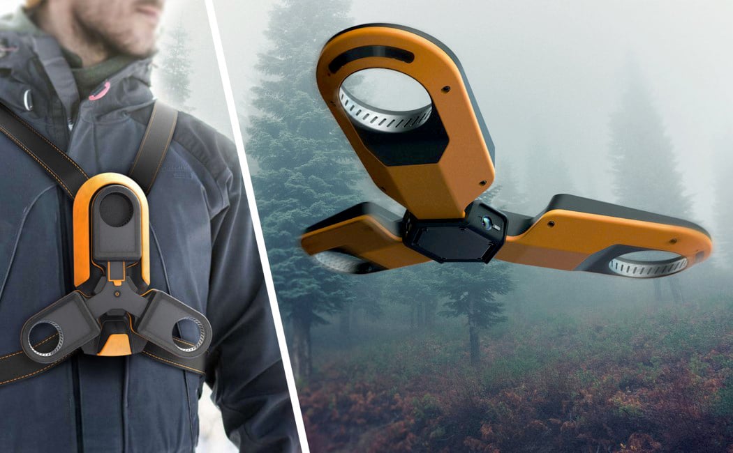
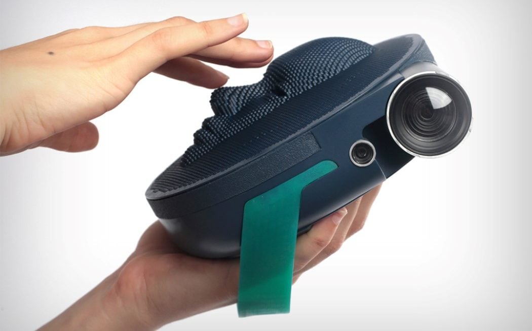
The Humla Forest Recon Drone won the iF Design Talent Award in 2018. A separate award program dedicated to rewarding upcoming talent, the Design Talent Award is a branch of the widely known, international iF Design Award. It’s exclusively for design students and is completely free of any charge.


CHOSEN THE AWARD YOU WANT TO APPLY FOR? NOW PREPARE FOR IT.

Selecting the right award is just a mere first step. The application is the daunting bit. Make sure you do the following. First, carefully read through the guidelines to see if you and your design are applicable. Once that’s done, make sure you’re aware of the deadlines, and more importantly, the deliverables. Some awards require JPEGS in certain aspect ratios and sizes, some require PDFs, some actually require printed documents, and some make it a point to ask for videos of proof-of-concept, or even your actual product (to examine and/or to showcase at their exhibition). Go through your project with a fine-toothed comb making sure the renders aren’t pixelated, colors are accurate, and DEFINITELY avoid grammatical errors or typos. Ask a friend, colleague, or mentor for feedback on the layout, the aesthetics, and whether the information and design intent looks crisp and clear. You can even go one step further and ask past-winners of the award for some key pointers and tips. Never underestimate the power of a fresh perspective or a piece of critical advice.

Lastly, check to make sure your client, university, design-teammates, or even your boss are all okay with you sending the project for an award. Getting that approval is crucial because the last thing you want is to violate confidentiality agreements, or not credit an individual or organization if they played a part in your project! Once you get a green signal, and you’re happy with the quality of your output, and you’ve checked everything off your to-do list, send the application in! The earlier you send your application, the better. Not only do you save money on regular or late fees, but some competitions offer preliminary judging to give you pointers and feedback that can help make your application better. It’s always great to know that you’ve put in every bit of effort to deliver your best work!

What next? Well, you know what’s better than one award? Multiple awards! Securing accolades from multiple award programs and competitions is a sure-fire way to brand yourself as a great designer. Whether you’re a student, a professional, a team, or even a studio, winning awards is a great way to gain a reputation. It helps put you, your product, your client, your university, and even your own company/brand on the map! Applying for awards can be a daunting task, but the benefits definitely outweigh the demerits – besides, if you don’t apply, you can never win, right!? So I hope this guide should prove incredibly handy when you’re looking to send your work in for a design award! And hey, all the best!


Also Check Out: You’ve Won A Design Award, What Next?

Creating realistic textures with displacement maps in Keyshot 8

The guys at Luxion just released their latest version of Keyshot, and I’m absolutely thrilled because displacement maps are one feature I was rather impatiently waiting for! Displacement (or depth) maps are an absolutely great way to create REAL textures that can absolutely make your renders POP! Let’s take a look at what this newfangled feature is and how to master it!

DIFFERENCE BETWEEN BUMP AND DISPLACEMENT MAPS

Up until now, perhaps the biggest thing missing from Keyshot’s arsenal was its support for depth or displacement maps. You could only use bump maps in Keyshot to simulate textures, but that’s all. Now the difference between bump and displacement maps is visible in this image below.

The one on the left uses a bump map, and the other on the right has a displacement map. Bump maps only simulate texture, they don’t create it. They manipulate light and shadow to make it look like a surface has a texture, but in reality, that texture is an illusion. Displacement maps, on the other hand, actually create that texture. They physically manipulate 3D geometry to make the texture, and if you look at the silhouettes of the two below, you’ll get the gist. The one on the left is still a perfect circle. Even with the texture. The texture is an illusion. The one on the right, however, literally has those bumps that you see in the image above.

This ability to actually manipulate 3D surfaces is great for a couple of reasons. Firstly, it makes materials incredibly realistic. Concrete LOOKS like concrete. Tiled surfaces literally have 3D tiles in them. Gravel looks great too, because it’s actual gravel, not a flat surface with gravel texture. Secondly, it takes the pain out of actually modeling minor details. You can make folds in cloth by just dropping a displacement map. Crinkles on paper, grass on a lawn. You don’t need to physically model these minor details anymore. You can rely on a good displacement map you downloaded (or created!) to give you instant results.

HOW DISPLACEMENT MAPS WORK

It’s quite literally black and white. Displacement maps use grayscale to determine height, just like bump maps do (you can actually use those bump maps as displacement maps). In short, if you look at a bump map, notice that the parts that usually stick out (like the bumps on the ball in the image way up top) are the white bits, while the parts that are black recess downwards. The whiter the pixel gets, the more elevated/extruded it is, the blacker the pixel is, the further inward or downward it moves. In theory anything that’s exactly 50% gray stays untouched. Here’s a snippet of the map along with the result alongside.

Most bump maps can be used as displacement maps. Make sure you have maps that are of a high resolution because a pixelated image will result in a pixelated surface, and that isn’t good. Conversely, if you’ve got details that are way too sharp, just carry the map image to photoshop and gently blur the parts you want softened. Blurring a sharp edge that’s black on one side and white on another will cause the colors to intermingle and form the grays in between. As a result, you’ll get softer edges with bevels/fillets without having even done anything!

You can find displacement maps online (the good ones come at a price) or you can even MAKE your own bump maps. Using the black-to-white principle, you can create maps of common textures like woven carpet in a software like Photoshop or Illustrator and just export the maps to hi-resolution images. Go ahead and experiment with the portrait-mode on your smartphone camera too. It has the ability to capture a decent amount of depth, and you can use websites like www.depthy.me to extract the displacement map from your image (depthy.me will give you an inverted version of the displacement map, so make sure you take it to PhotoShop and invert the colors to get the real map). You can see two images below of a ‘portrait-mode’ photo and the displacement map placed alongside. You won’t get incredibly crisp displacement maps with your phone, but using your phone’s portrait mode is a pretty nifty and handy way of learning about new textures, patterns, and shapes, and how they’re recreated in grayscale to allow computers to see depth.

ADDING DISPLACEMENT MAPS IN KEYSHOT 8

Just to fuel my curiosity, I carried that avocado displacement map and image file to keyshot to see what I got and boy! You notice a few things off the bat. The map is far from accurate, but here’s why. A. You’re using a pretty basic piece of 3D imaging which mainly uses algorithms to calculate depth. And B. This ‘displacement’ map is actually a blur map. It doesn’t calculate depth. It calculates what’s in the foreground and what’s in the background, and uses that data to create DoF, or depth of field. (That’s why the displacement map is inverted, because the algorithm blurs the white and doesn’t touch the black. It’s essentially the same principle but a different operation.)

So let’s look at Keyshot’s Displacement Map feature in depth (hehehe, get it?) The displacement, or the geometry, forms just one part of the entire material… which is why we’re looking at Keyshot’s material graph (right-click, edit material graph), which deconstructs everything for us to better understand and build materials. Keyshot separates materials into Surface and Geometry. Surface allows you to create materials, finishes, textures, and Geometry allows you to edit or tinker with the third dimension of the model itself. In the Surface section, you get to decide whether your material is plastic, or metal, or concrete, etc. You can add other aspects like color, roughness, graphical patterns to this. The Geometry section is where things get interesting. There are basically only two components to using a displacement map. One is your map… an image file. And the second is a displacement block, which tells Keyshot you want to use the map as a displacement map.

Connect the map to the block, and the block to the geometry tab, and you’re good to go. The geometry doesn’t change right away (because it’s processor-intensive), which is why you need to “execute” the map. First off, double click on the image map block and make sure you’ve got the size, scale, placement right. You can press the ‘C’ key to preview your map on your model and press it again to hide the map. Once you’re satisfied with how the map is laid out, double click on the displacement block and hit execute. Certain things happen. The map gets executed, and you get a first impression of how your geometry changes. In order to tweak the end-result, try changing the displacement parameters.

Displacement Height: Changes how high or low the highest and lowest points of your displacement map are. For something like large pebbles, you’d have a larger height. For something like gravel, the height would be negligible.

Offset: Determines whether your displacement map pushes stuff outward or inward. Grass sprouts out of a surface, but holes in Swiss cheese go inside a surface. You’ll need to tell the software which direction to process the map in.

Resolution: The lower the resolution amount, the clearer the pixels on the map are. The resolution value basically tells Keyshot how small you want the smallest detail to be. A large value creates lesser detail, a smaller value makes details more intricate.

Max Triangles: This tells the software how many pixels (or triangles) to allow your map to have. So for maps with lots of details (individual grains of gravel), you’ll need more triangles. For something fairly simple like a tiled surface, a low triangle count works just fine!

MAKING TEXTURES MORE REALISTIC USING DISPLACEMENT MAPS

Okay, at just over a thousand words, I’ll stop talking! Displacement maps are a great way to create geometry without creating it. If you’ve got bump maps lying around, try using them with the displacement block to get some stunning results! You can even go further to create wrinkles on skin, crumpled patterns on paper, or actual threads in a loosely woven material. I recommend checking out Poliigon for their incredible database of materials and textures. Just remember one thing. Keyshot is already rendering all your scenes in real-time. Telling it to start building 3D surfaces basically is going to require more resources. Very detailed or large depth maps may take more time to load as well as render, so depending on your needs, and how powerful your machine is, go ahead and give displacement maps a shot! They’ll “grow” on you!

Image Credits: Poliigon

KEYSHOT 8: POWERFUL RENDERING MADE EASY

Keyshot isn’t an unheard of name in the industry. Most design companies like Motorola, Microsoft, Oakley, Skullcandy, Nissan, Chrysler and DeWalt regularly use Keyshot, and nearly half of the designers we asked used Keyshot for their renderings. Its biggest achievement is making renders as simple as dragging and dropping materials, textures, environments. For a beginner, Keyshot is a great way to get the job done, and for a power user, Keyshot retains all the tools to make absolutely stunning visualizations. The rendering software released its 8th version at the beginning of this year, including a massive variety of easy-to-use features, from intersecting/cutaway materials, to the introduction of fog/smoke and volumetric lighting, to being able to add bubbles/flakes in solid materials, and perhaps the biggest update yet, support for displacement/depth maps!

Let us know what Keyshot feature you want us to talk about next!
Drop us a line here.