The perfect way to nap!

LULA has been designed with the avid napper firmly in mind! It aims to revolutionize how we go about having our daily siestas! This intriguing piece of furniture is a perfect example of biomorphic design; as one sits on the piece of furniture, its shape changes and adapts to best support the user.

The foam construction gives the impression of sleeping on a cloud; its form embraces the human body, leading to a safe, secure and ultimately comfortable sleeping experience! The soft, organic shape gives this unique item of furniture an almost sculptural presence. This, combined with its imposing size, makes LULA a statement piece within any room!

Designer: Gaudutė Žilytė

A more social way to cook with this double sided cooking station

Cooking has become less of a task and more of a chore; whilst it was once a daily gathering, it has evolved into anything but sociable. We stand over a hot stove with our face to the wall and our backs to our friends and family, but does this have to be the case? COCOOK challenges this behavior by encouraging people to communicate once more, and it has achieved this by bringing campsite cooking, into the home!

The double-sided cooking station allows two users to use the same stove simultaneously, whilst also ensuring they can carry a healthy conversation with each other! But it goes without saying, simply bringing the camping stove inside, utilitarian aesthetic and all, wouldn’t be appropriate for the domestic environment. So, instead, COCOOK carries a beautifully clean design that has been designed to complement the existing products found within the home!

Designer: Junku Jung

A dehumidifier or a piece of furniture?

For the vast majority of the time dehumidifiers aren’t pretty, they aren’t designed to be features in the room and their aesthetics don’t drive the design, but instead they are functional and efficient products with just their primary use in mind. But does this have to be the case?

‘Drip’ is less of a dehumidifier and more of a highly functional piece of furniture! With a design that has been inspired by a Dutch Coffee Machine, the water drips into a collection reservoir and becomes the main feature of the design. This 3.5 liter, clear reservoir enables the user to know exactly when it needs emptying as they can visibly see the amount of dehumidification inside.

While the form drove its design, practical elements of Drip have also been greatly considered; most noticeably perhaps is the silicone top, which makes for an excellent side table!

Designer: Lee Hyo Min

“This project is tried to get off the basic dehumidifier’s form and home appliances’ cold images. so I suggest the product which name is ‘DRIP’ that would be looked like furniture more than home appliances,” Lee told Yanko Design.

Waterspout’s main body is made by plastic and the top is made by silicon.

User can know instinctively the time which should empty water from inside and amount of dehumidification. The maximum amounts is 3.5L.

The Nike baton minds your step and gives real-time feedback while running

Nowadays if a person has the sudden urge to take up running and they are after some tech to assist them, they have an extensive range of wearables to choose from. However, Byeongjun Kim identified that these are often best suited to advanced runners and they may not offer the same benefits to novices.

Traditional wearables offer feedback at set intervals throughout the run, while the Nike Baton allows the user to receive feedback, through small vibrations, continuously. This method considers the inconstancy of a beginner’s pace and aims to keep them at a constant pace for the duration of their run, rather than speeding up and slowing down which could soon exhaust them.

Its seamless body features a heartrate monitor on the side, this is in contact with the user’s palm as they run to ensure for accurate and continuous readings. Located on the top is a simple dial where the target pace can be set, prior to them starting the run.

Designer: Byeongjun Kim

Real-time Pacemaker for Runners

“There are various kinds of wearable devices in the market, and they tracks users’ activities to help them keep healthy. Especially, some of those devices are specialized in running to be loved by many runners. However, those typical devices are not appropriate to novice runners because they usually give feedback to runners every specific time interval or distance, instead of giving it continuously or in real-time,” Kim told Yanko Design.

Hard to Keep Running Pace with Feedback at Regular Intervals

“For example, assuming that a novice runner gets feedback such as duration and average pace every single kilometer, the following problem happens. Because it’s hard to keep the pace for beginners, the runner tends to speed up to compensate his or her pace when he or she gets the feedback which tells he or she slows down. Consequently, the runner’s pace repeats up and down periodically and he or she will soon get exhausted.”

The Pacemaker Giving Feedback by Vibration in Real-time

“Nike Baton was designed to solve these issues. It detects runners’ pace and gives feedback with vibration whenever the pace is slower or faster than desired pace in order to help runners keep their pace. Highly inspired by a baton which stands for a connection between ends and starts for runners, Nike Baton helps runners to work out constantly in a right way.”

Wireless Charging and Auto-sync

“The accompanying wireless charging dock displays the running information and history, so that runners can get always motivated. While Baton is placed on the dock, it is automatically synchronized with the Nike+ Run Club App or other health Apps to update the work out data.”

Minimal Interface

“Using the dial on top, the target pace can be set before starting running. In addition to the pre-set pace, the ‘Auto’ mode provides personalized target pace by analyzing runners’ work out pattern and history.”

“The heart rate sensor is located on the back side and it perfectly contacts to the runners palm. The sensor detects runners’ heart rate to provide more accurate work out information and calculate calories burnt.”

Prototyping

“The concept was prototyped with Arduino and an accelerometer. First, the acceleration data of the movement of arms when running was analyzed. Arduino Pro mini was used to make it smaller after getting the patterns with Arduino Uno. Besides vibration motors, 2 LEDs were used to visualize the feedback. 3D printed parts were modeled to be assembled and they were painted after polishing.”

A house that compliments its surroundings

Housing that complements its surroundings as opposed to disrupting it has and always will have a place in our hearts. So naturally, this concept titled FRANCO HOUSE, is right up our street! Designing a house isn’t always plain sailing and this project certainly wasn’t without its hurdles; but it’s how the design tackles the challenges that make it so beautiful. The bulk of the issues stem around the slope it is perched on, which sees a staggering 12-meter elevation change! The tiered, geometric design allows the building to descend the hill gracefully, whilst simultaneously offering an intriguingly unique home to reside within.

This striking example of architecture is sensitive to the surrounding nature that has stood there for decades before it; its position preserves the trees whilst the solar panels and eco-sensitive design allow it to be extremely energy efficient! This may just be the home of our dreams!

Designers: Illya Rastvorov and MONO Architects

“The customer, a successful startup owner from Silicon Valley, easily went along with challenging and out of the box ideas, which led to the creation of a modern and functional facility,” Rastvorov told Yanko Design.

“The first challenge for us was the location of the villa. Given that the construction was planned on a slope with 12 meters difference, it was necessary to create a convenient entry to the territory for residents. Structurally, the house consists of three tiers: the upper one, with a garage for 4 cars, the middle one with the entry, and the lower one, with a lounge area on the roof.”

“The villa was designed taking into account all the specifics of the surrounding area. The building is inscribed in the landscape in such a way that it preserves the trees growing here, and in order to be energy efficient, solar panels were installed on the roof of the garage. In addition, thanks to the tiered construction, the building does not prevent residents of neighboring villas from enjoying stunning views of the bay.”

“The simple geometry of the facade ideally fits into the unusual arrangement of tiers, and the use of modern materials made the building visually light and still solid and massive. There is a lot of space inside the villa: four bedrooms, a living room, a personal office, a wine room, a kitchen-dining room, a gym and a cinema. On the middle tier there is a swimming pool and a viewing terrace, and on the lower tier there is a relaxation area for a barbecue or an open-air party.”

“Due to glass facade the sun freely penetrates into the room providing a lot of natural light throughout the day. Ergonomic and functional interior complements the general idea: everything you need without any frills. Using soft colors and preserving the maximum free space, the designers created an ideal place for relaxation, “a get away” from daily routine.”

The inhaler has been re-designed both inside and out!

Inhaler re-designs are something we see a lot of, but the designers behind Aria have taken a slightly different approach for their project. Having analyzed the shortcomings that current inhalers have, and identified that both the stigma that they carry and their “throwaway” nature are two of their main issues, they created not one, not two, but four inhalers.

As the name suggests, the Aria Youth is targeted towards youngsters; it features a rubberized body that will protect it from the inevitable drops that will be thrown its way. This, combined with the large paddle accusation makes this product a far more suitable alternative.

Asthma can greatly impact athletes, so the conveniently-compact Aria Sport is perfect for them. As is the same with the other three, it utilisers vape technology in order to administer the drugs both easily and effectively. The final two designs focus around removing the stigma that is caused by the medical-aesthetic that the conventional inhaler carries; these clean and modern alternatives are a welcomed change and blend perfectly into today’s fashion.

Designers: Ryan Lee Sanderson, Justin Arsenault & Thrive Design

“The form and function of the common rescue inhaler has hardly changed in the past few decades. The devices are about as subtle as a sledgehammer! We explored how we could update the technology and evolve the form to help users feel better—health-wise, and their connection to the device,” Sanderson explains.

Our team created four different Aria inhalers based on four prominent personas and their needs: Youth, Contemporary, Heritage, and Active. The Youth device is petite and made of silicone to increase dosing precision and withstand drops. The Contemporary model looks clean and modern—more like everyday tech than a medical device. The Heritage product connects with older users through a wood shell body and features a larger paddle actuator. The Sports option is designed to appeal to active asthmatics, with a miniaturized form, attachment clip and waterproof body for ultimate durability on the go.

The Aria Youth is kid-sized. It has a rubberized body to not only survive impacts but also to increase grip and precision during dosing. The large paddle actuation makes the whole process easier by removing precision from the equation.

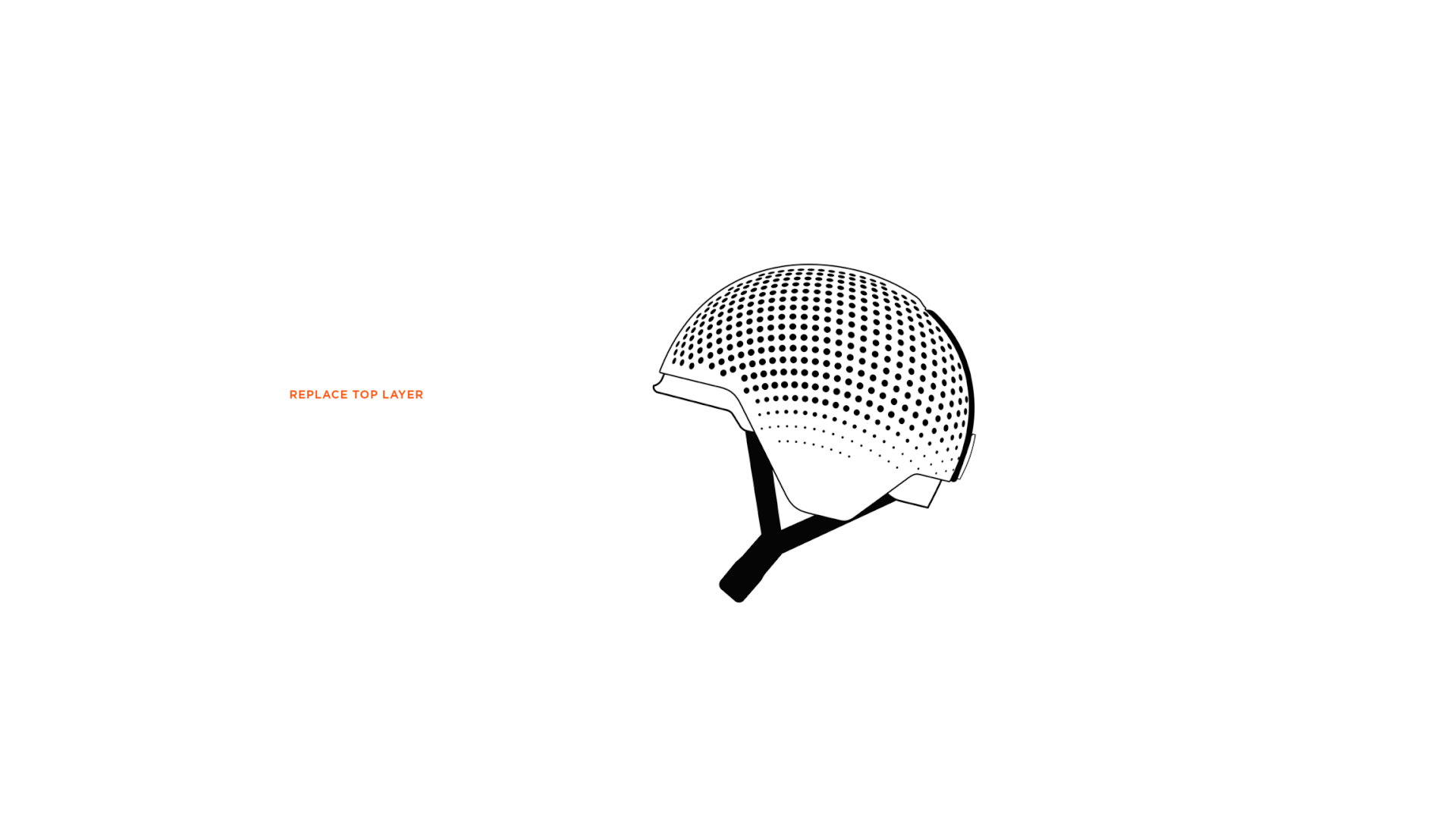
Aria Contemporary looks clean and modern. Its horizontal orientation allows for a more discrete holding position, while its tech-forward aesthetic blends into the current technology landscape.

Current inhalers felt foreign and embarrassing to users, so to create a connection, we updated the devices in two significant ways. First, by incorporating vape technology, which allows for flexibility in the drugs that can be administered and makes dosing easier. Secondly, we rethought form, creating prototypes that look more like small sculptures than medical devices, can be palmed discreetly, and are made of materials that feel high quality, less disposable and easier to feel attached to—wood, porcelain, and aluminum.

Aria Sport is designed for active asthmatics with a miniature anodized aluminum body, attachment clip, and is waterproof for ultimate durability on the go. Its large diameter actuation pad gives users a bigger area to depress during a time of emergency, removing the need for focus and precision.

Aria Heritage connects with long-time asthma sufferers through a timeless inset wood and aluminum body meant to weather over time, like an old compass or pocket-knife. It features a larger paddle actuator for older hands.

To officially bring the inhaler into the 21st century, we added an app that works in conjunction with the inhaler too, well, make life easier for an asthma sufferer. The dashboard features information about weather and air quality conditions in their area that can impact their breathing. And the digital humanization is taken one step further: With data inputs unique to the user’s ailments and lifestyle, it synthesizes this information and customizes it through the filter of their life, providing insights and recommendations that are tailored to them and their needs. (They can even ask it questions, like “Hey, I’m about to go for a run…are conditions right?”) A “find my inhaler” function, and alerts before medicine expires — which users can reorder straight from the app — round out the UI/UX component. The gist? By combining insight-driven design with intuitive technologies that can further personalize a product to benefit the user and better their experience, we can all truly breathe easier.

When safety and style meet!

Kitesurfing takes aspects of wakeboarding, windsurfing, paragliding, surfing, etc. and fuses them together to create one incredible extreme sport. So, it’s only appropriate for the participant to have an equally exciting helmet, right?!

Jakob Tiefenbacher also thought this, and thus the EVO Kitesurfing Helmet was born! Made up of two layers, the form is distinctive and unique. The bottom layer provides stability as well as allowing airflow and ventilation, while also being the part that secures it to the user. The top layer is designed to break surface tension, while simultaneously adding another layer of protection.

Designed to be replaceable, the top layer features an oversized pull-tab which releases it for quick, simple removal. The brightly colored, orange touchpoints stand out from the translucent pale, blue finish of the top layer, enhancing both the ease of use and extreme aesthetic.

Designer: Jakob Tiefenbacher

Making VR even more Immersive!

This beautifully intriguing example of design aims to push the boundaries of VR even further than ever before! The 220-degree viewing angle provides a panoramic view of the virtual world, making the immersive experience of VR even more captivating! To complement the futuristic technology, this headset carries an aesthetic that puts other headsets to shame; any unnecessary lines and crevasses have been removed, leaving a seamlessly beautiful and pure device. Even the little details, such as the adjustment for the headset’s sizing and power buttons have been carefully considered, allowing for them to be integrated elegantly into the form of the device.

Designer: BDCI for Samsung C.lab

A design so clever that it changes our perception of medical devices

Hplus is a family of equally beautiful devices that have been thoughtfully designed to streamline the repetitive routine of monitoring nine of the most common health conditions. The assortment of products includes a finger-prick, urine-analyzer, blood tester and spirometer, where all but the most essential of user interactions have been abolished!

What makes this project so fascinating to us as designers, is the thoughtful, empathy-rich approach to design that completely eliminates the stigma that we are so used to seeing with medical products; by changing the form and materials to something we more commonly see in domestic decorations, it dramatically alters how we perceive the products. As opposed to being an inconvenience in our daily-routines, it instead integrates itself almost seamlessly.

Designer: Matt Canham

“The project is designed to alleviate the pressure on general practitioners, by allowing patients to monitor elements of their condition that wouldn’t normally be possible with in-home devices. Underlying this aim, there is a core belief that functional devices should be intuitive and beautiful,” Canham explains.

The devices within the hplus collection are accompanied by a mobile app that acts as the core user interface, handling data collection and test operations.

Inside the app users select the test they want to perform and are then guided through the process of carrying out a successful clinical test. When the GP prescribes a new device, users can scan the barcode on its packaging, automatically adding it into their app. In doing this, the process of learning a new testing procedure is simple and hassle-free.

After tests have been performed, users can view the results within the same application. Data is collated into simplified overviews that show how well a patient is progressing, with a more detailed analysis available when required. When a data set is at a dangerous level, it is automatically flagged and an alert is sent to both the patient and clinician.

The devices that include a urine-analyzer, finger-prick, blood tester, and spirometer, are removed of all but the most essential of user interactions, ensuring that the user experience is streamlined and hassle-free.

Colored fabric tabs reference the individual color palette of each device used within the UI of the mobile application; helping to create a unified product experience and increase users understanding.

A custom folding adapter plug and tangle-free flat USB-c charging cable are included with each of the hplus devices. No instruction manual is needed as to set up the device, users scan the QR code on the back of the box within the hplus application to be guided through installation, while a single button on the base of each design allows the product to pair with the users app.

Each base station or base until features a single button and LED indicator that are used in pairing the device to the users application.

By changing the way we interact with products and the materials they are made from, it is possible to change the associations we give to them, and in turn, make them more acceptable in society and our daily lives.

Modular roof-shaped lighting that goes from your desk to your floor with ease!

Lamps are an almost essential addition to our workspaces, they allow us to burn the midnight oil or introduce a little bit of atmosphere into the room, in fact, they are used in a plethora of different environments for an extensive list of uses! This is the exact reason ‘Roof’ was designed.

Roof uses modular design to beautifully create a family of products, each created for their own unique use. As the name suggests, Roof gets its unusual design from the distinctive shape of conventional roofing; this element of the design is the only part that is consistently present on each of its many forms.

The interchangeable bases and supports allow it to transform into a lamp that is appropriate for the task at hand, without losing any of its beautiful personality. Packed into the over-sized base is a wireless charging pad that elegantly turns this lamp into a multifunctional, highly convenient and stunning piece of design.

Designer: Gunwoong Kim