Super slim wallets with fifteen layers and invisible stitching are good for posture, high on innovation

It’s taken years for many men to realize that carrying bulky wallets in the back pocket is actually bad for their spine and posture. Perhaps this is one of the reasons why my brother always takes his wallet out of his back pocket, before sitting down. This habit however, has caused him to lose one too many wallets.

YeongKyu Yoo of cloudandco has designed two wallets that are extremely slim – WalletType1 and SlimWalletType1. The former is a bi-fold design with 6 pockets, and the latter is a card wallet with 2 pockets. Both of them look to be a solution to the above problem.

The key to the form are the layers and the invisible stitches. Sporting a multi-layer construction with uniform thickness, the edges of the wallets are precisely painted for the ultimate seamless look. The wallets look like a solid sheet of beautiful leather and nothing more.

WalletType1 is constructed from 15 layers and each layer contributes to become a singular form. The SlimWalletType1 has up to 13 layers of construction. Each wallet is envisioned in four colors.

Designer: YeongKyu Yoo of cloudandco

Invisible Stitches

To capture the beauty of quality leather, we focused on bringing its texture to the foreground. This meant keeping all unnecessary details invisible, including stitches. The multi-layer construction was carefully conceived so that once assembled, the form is completely uniform in thickness. To finish it off, the edges are precisely painted for the ultimate seamless look — just like a solid sheet of beautiful leather.

A Simple Initiative

Our goal was simple — to create a wallet that feels like one in the hands. A monolith to the eye, without any visible seams. To achieve such a form, we hid all the magic underneath. Below the surface lies up to 13 layers of construction, depending on the wallet. Each layer is artfully engineered. The resulting form is a fluid shape that is seamless, slim and durable — effortless on the surface, thoughtful within.

WalletType1 is constructed from 15 layers —— every layer contributes to become a singular form.

Maker

Made by Hanbo Enc and based in Seoul, they are expert in shaping and manipulating leather and fabric for over 20 years. Product production led by an artisan with 30 years+ of experience in relevant field. Has worked extensively with partners including Montblanc, Microsoft and Samsung.

Type 1 or 2, This is Type Cool

arkray_glucometer_10

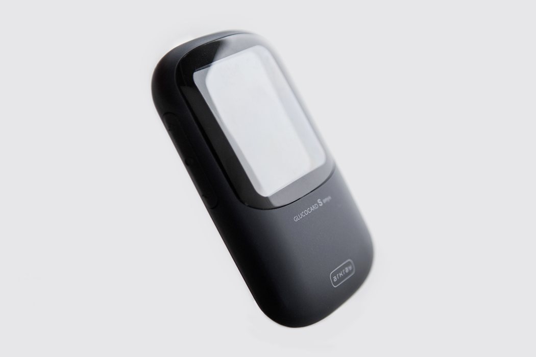
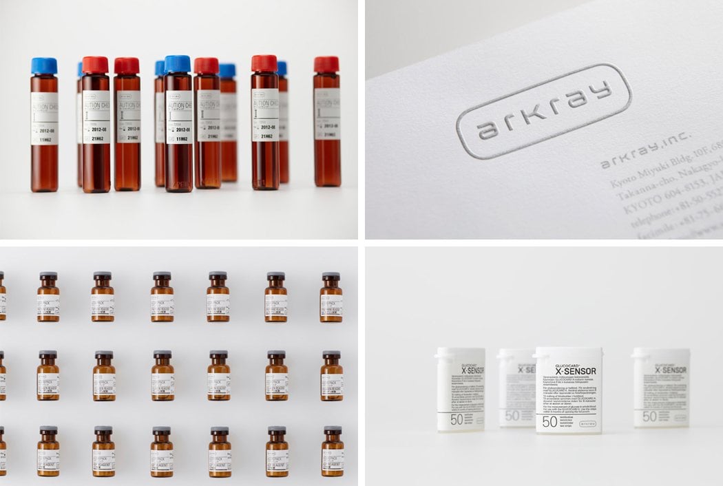
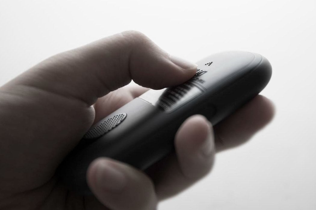
Medical devices are often generic looking, boxy edged products with poor material finishes and a string of afterthoughts. This can make sense due to the limited number of batches produced yearly, margins, visibility of product etc. That’s why it’s so nice to see the complete rebranding and stunning redesign of the Arkray glucometer. In 2012, Kenya Hara (former director of Muji) asked Yeongkyu Yoo (founder of cloudandco) to redesign the Arkray glucometer to match the brand vision and UI design language set in place by Kenya Hara, and after much anticipation, here it is.

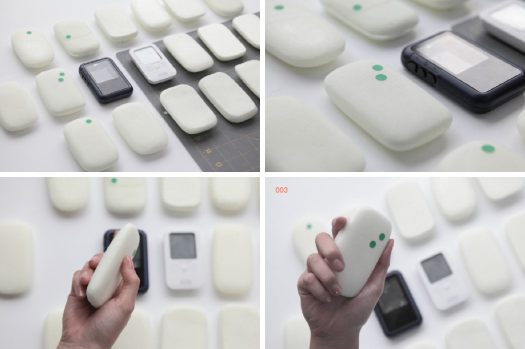
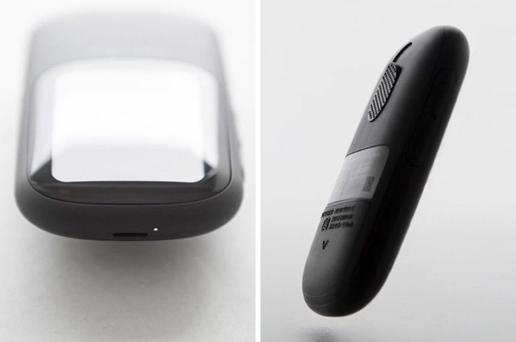
Yoo did this in spectacular fashion, with what can only be described as a positively gorgeous upgrade – the glucometer has a somewhat pebble shape to it, fitting softly into the hand. The interface is located on the front of the device, large enough to be seen clearly but not too large as to be obstructed by the user’s hand while holding the device. The glucometer is covered in a powder coated ABS material, soft to the touch, with very simple branding located below the screen and towards the bottom of the device. The interaction points on the rear of the device are very straightforward and elegant, making this product a strong foot forward in the innovation and rejuvenation of medical devices. I certainly hope that Hara and Yoo are taking on more medical companies because if this definitely showing us how it’s done.

Designers: Yeongkyu Yoo of cloudandco & Kenya Hara

arkray_glucometer_11

arkray_glucometer_14

arkray_glucometer_12

arkray_glucometer_13

S is for Sexy

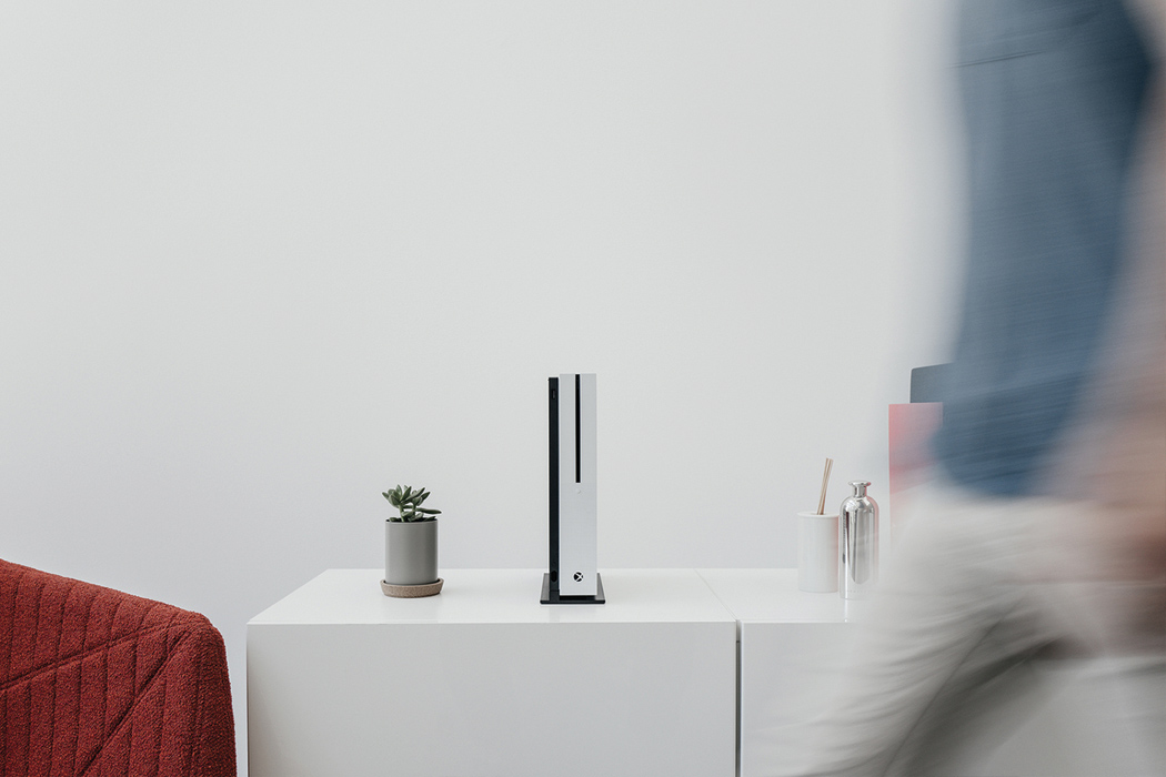
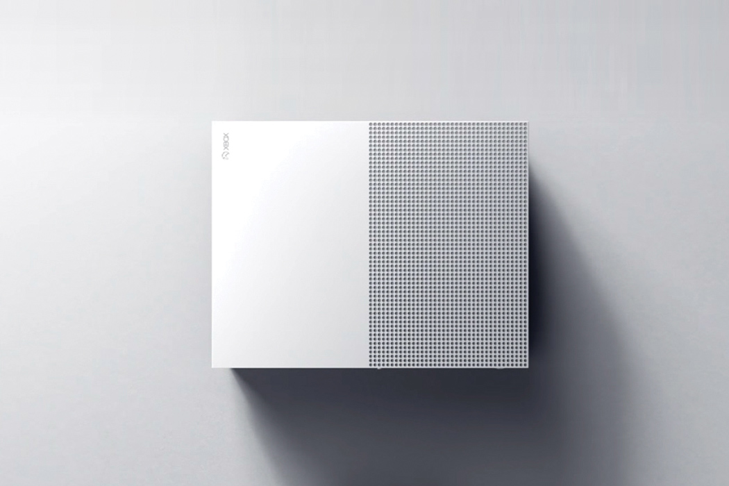
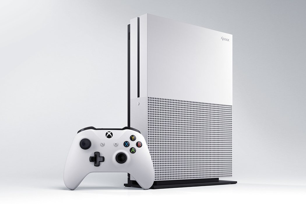
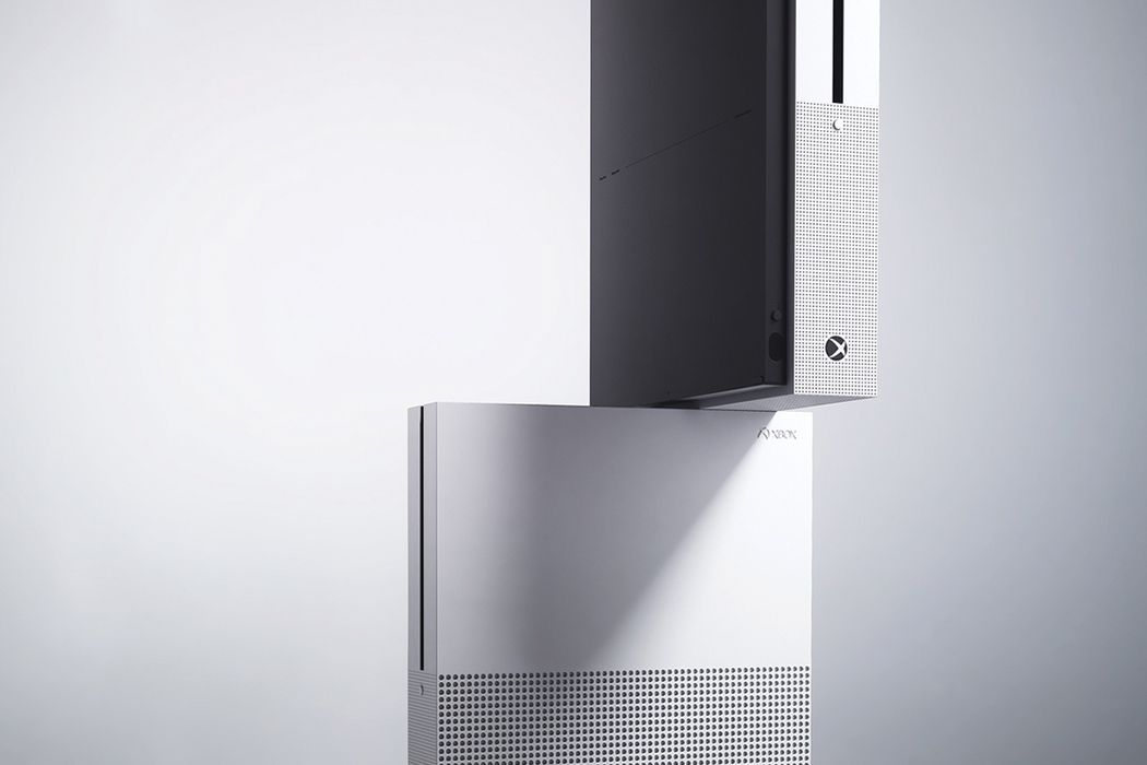
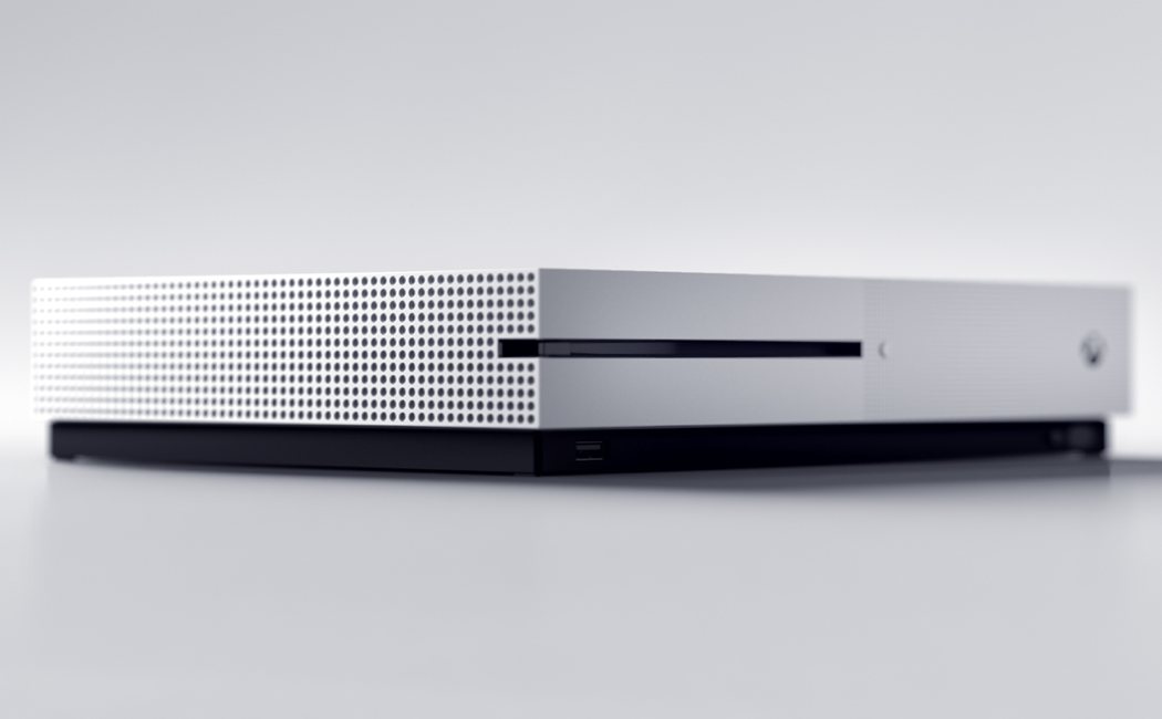
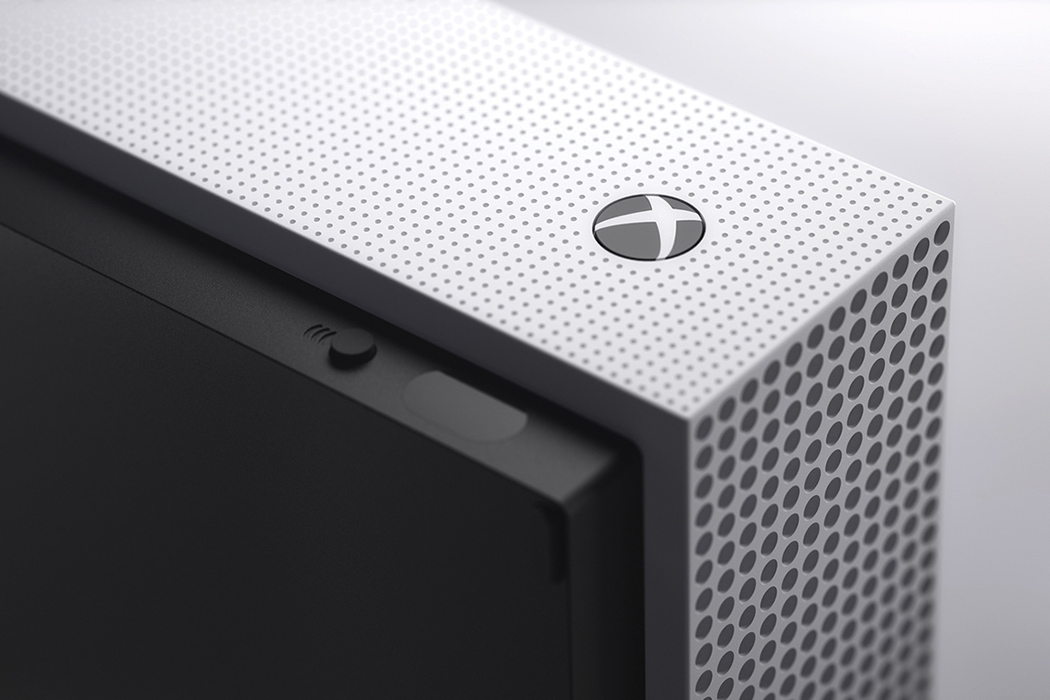
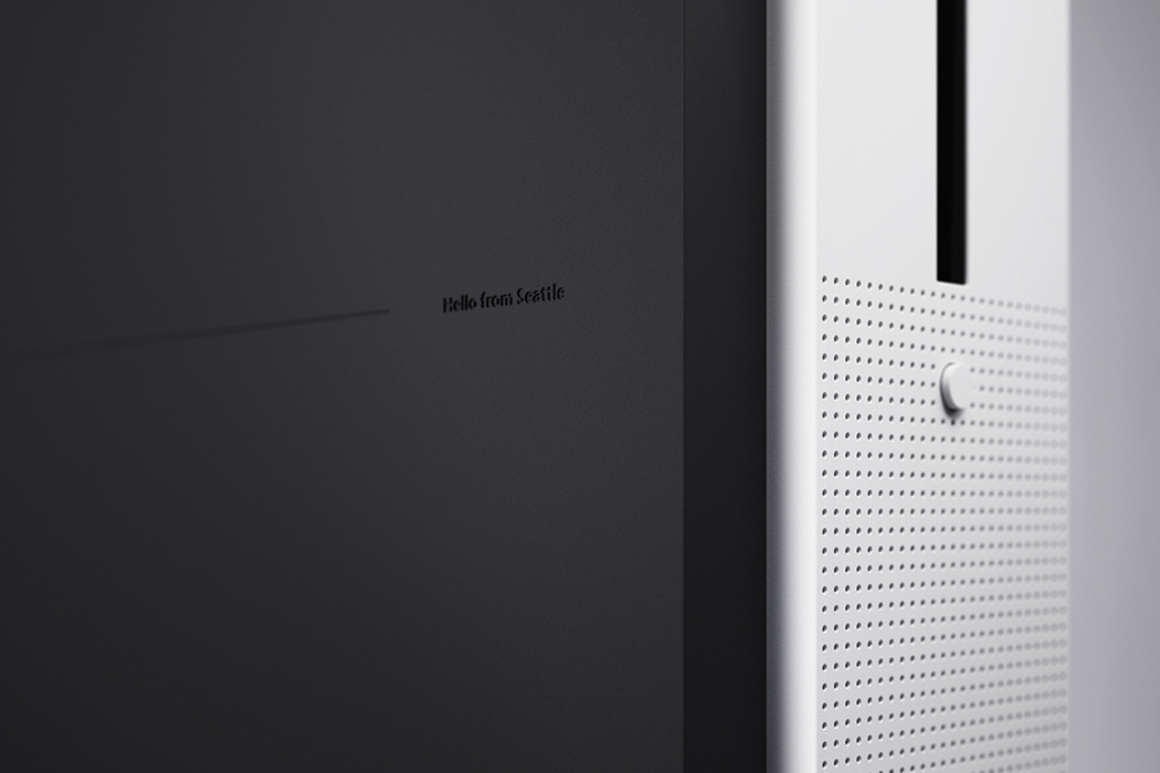
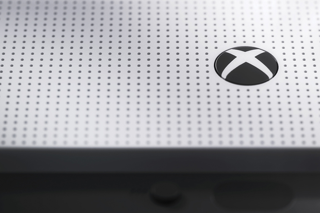
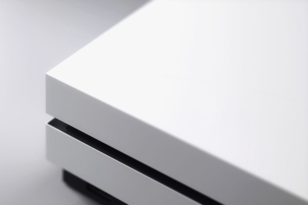
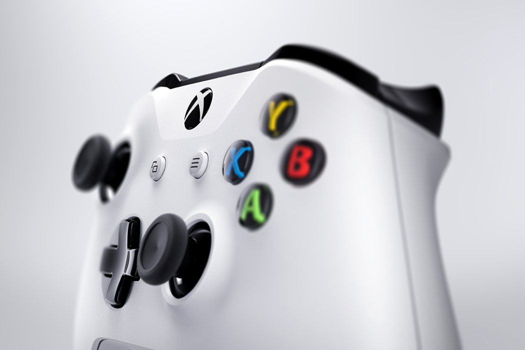
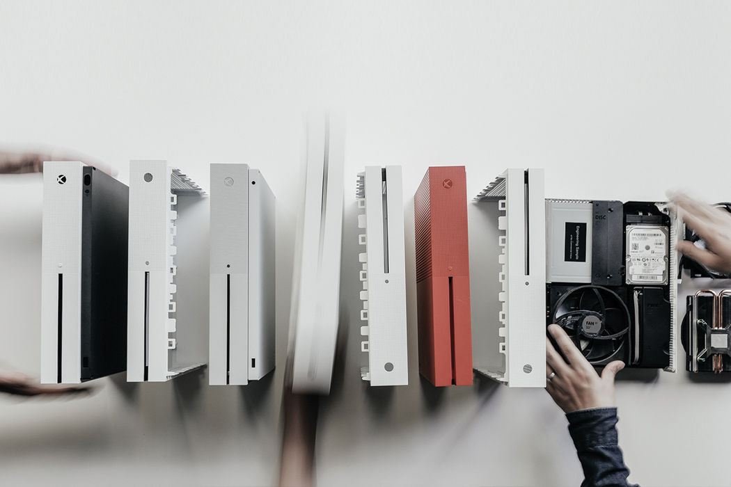
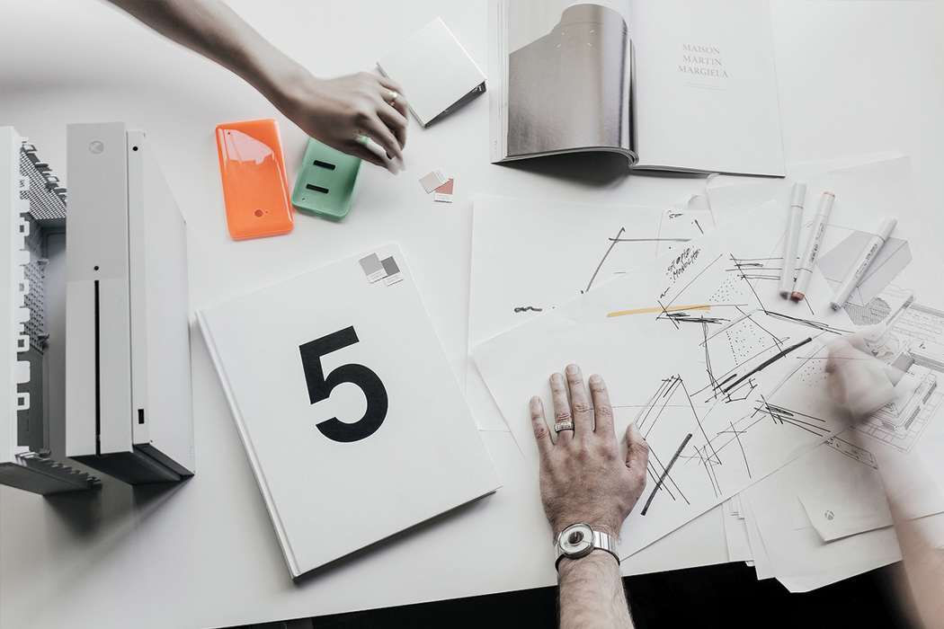
The One S is the better-looking, younger brother of the Xbox One that many are heralding as the most attractive console ever. The design team, led by Andrew Kim, was tasked with creating “a more friendly and universal product that doesn’t evoke traditional ‘gaming’ cues,” while maintaining the Windows 10 design language within the new hardware. The minimalist console’s most noticeable features are a new crisp white color and overall down-scaling which includes ditching that bulky power supply! Reduced to just 3 distinct external structures, the resulting aesthetic is slender, stark and way more stylish than any console before it… especially any Xbox!

Designers: Andrew Kim, Nicolas Denhez, YeongKyu Yoo, Bryan Sparks, Youngduk Song & Travis Hosler

ones_00

ones_01

ones_10

ones_03

ones_9

ones_5

ones_6

ones_02

ones_04

ones_11

ones_07

ones_8