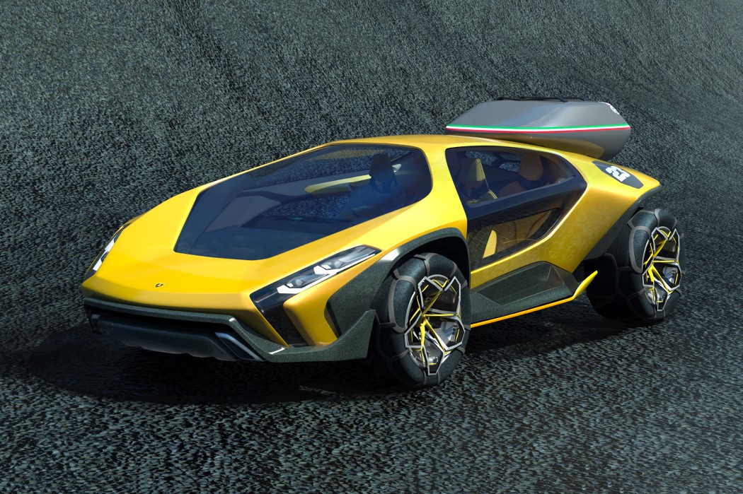
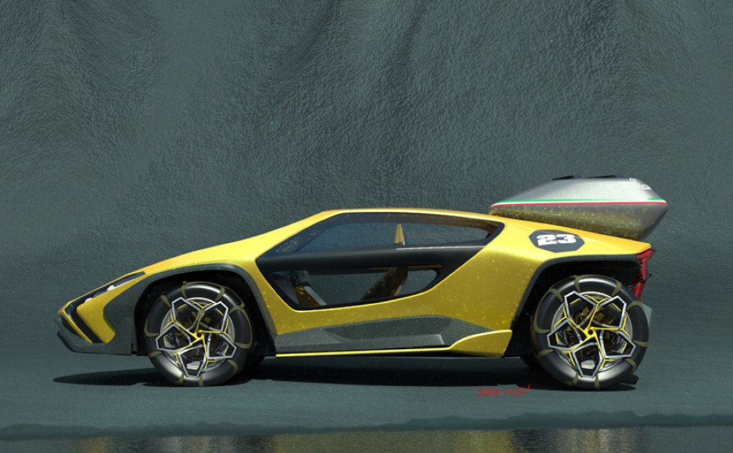
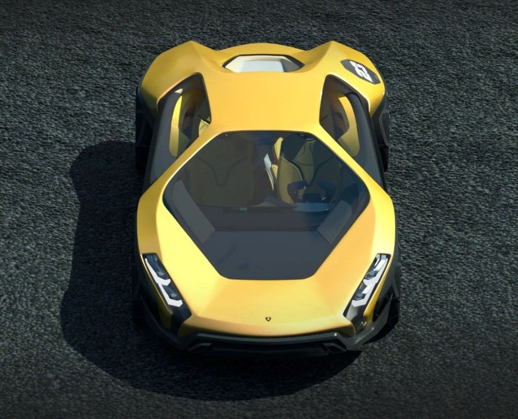
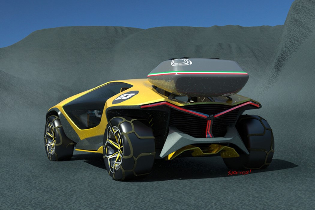
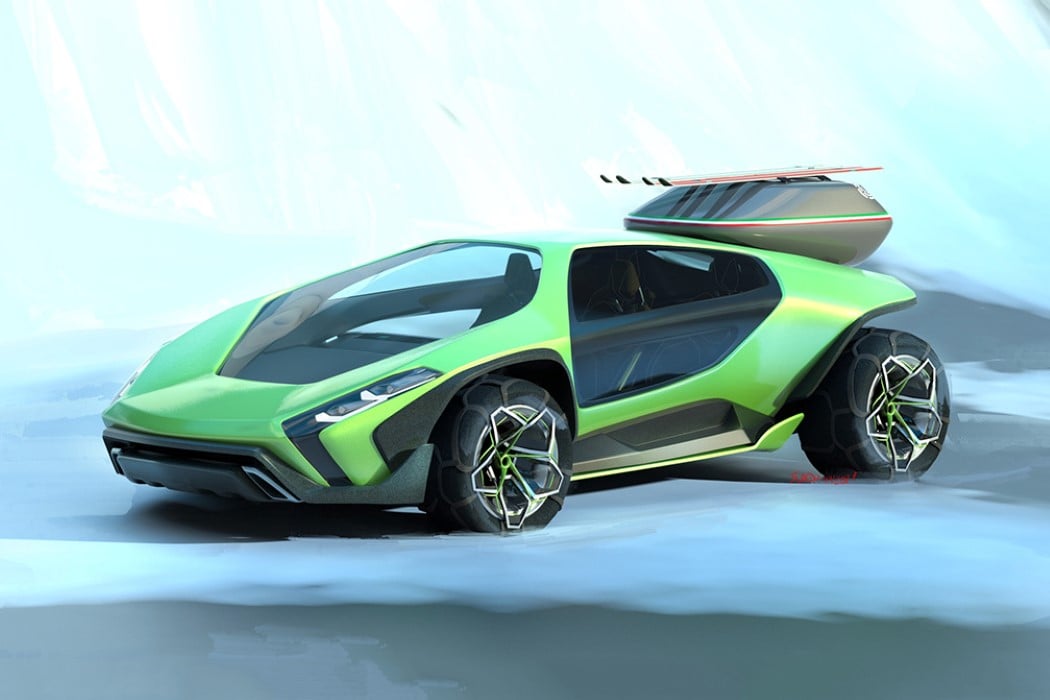
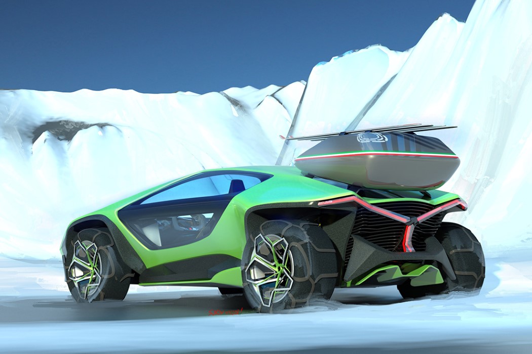
Rumor has it that Lamborghini is giving the Urus a significant facelift this year – its first since 2017 when the Urus was announced. I personally think the Urus is the kind of vehicle Lamborghini should openly embrace. After all, if your brand logo is a raging bull, why not create cars that embody that physically? Don’t get me wrong, their hypercars, if I may borrow a term from my generation, are certainly bae… but nothing says sheer unbridled power than a large vehicle with a larger-than-life presence. The Urus, to a degree, embodied that; and the Lamborghini Marzal wears that distinction proudly on its sleeve too. Meet the Marzal a conceptual off-roader designed to be just about as brutish and powerful as the ‘fighting bull’ brand it represents!
It isn’t like Lamborghini hasn’t built off-road vehicles before. The company was literally established as a tractor manufacturer before evolving into and embracing its racecar DNA. Designed by Parisian designer Andrej Suchov using Gravity Sketch, the Marzal concept is a confluence of sorts, created to be a vehicle that can shine on the tarmac but isn’t scared of leaving its comfort zone to dominate rough terrain.
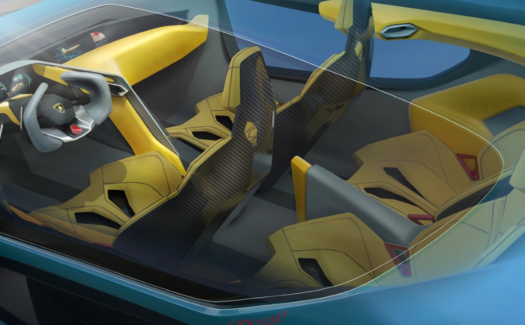
Its profile certainly captures the signature Lamborghini silhouette, with its iconic wedge-shaped design… however with higher ground clearance, a larger rear, and bigger tires designed to handle rough roads. It’s quite rare to see a Lamborghini with a rear windshield, and the Marzal boasts of that too, although it does get blocked when you include the storage unit. With its aggressive design styling and that iconic yellow color, the Marzal looks every bit like something Lamborghini would make – a testament to the company’s strong visual language. It also sports a rather interesting Y-shaped taillight, often seen in Lamborghinis, but not like this. In the case of the Marzal, the Y-shape is a prominent, defining feature on the rear, and I personally think it gives the vehicle character.
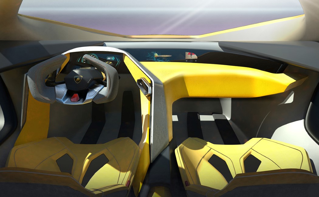
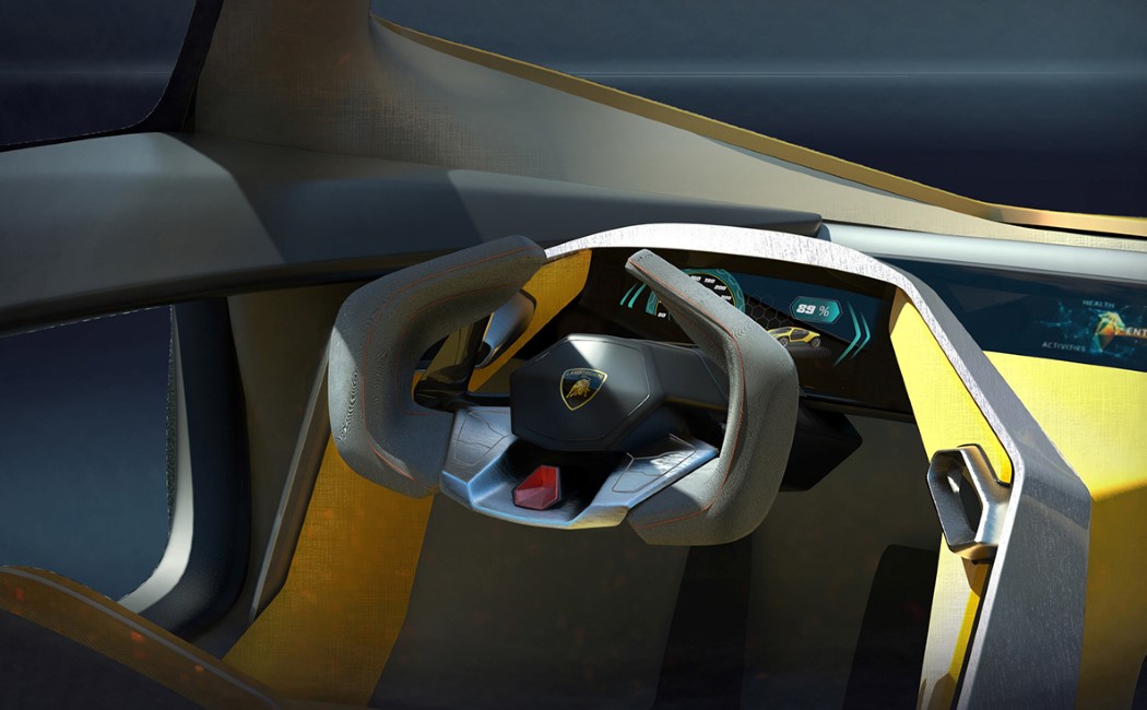
Part slick supercar, part all-terrain vehicle, the Marzal definitely is a hybrid, but looks quite comfortable in its skin. It boasts of a hexagonal windscreen that extends into the hood, and rather unusual doors that curve upward into the roof and don’t really come with any pillars. Rather, there’s a horizontal bar running through the door that I can’t help but attribute to the designer’s creative license. On the inside, the car seats four – with yellow leather-clad carbon-fiber seats. The driver, however, gets the best experience with an incredibly stylish cockpit outfitted with a neat sporty steering wheel.
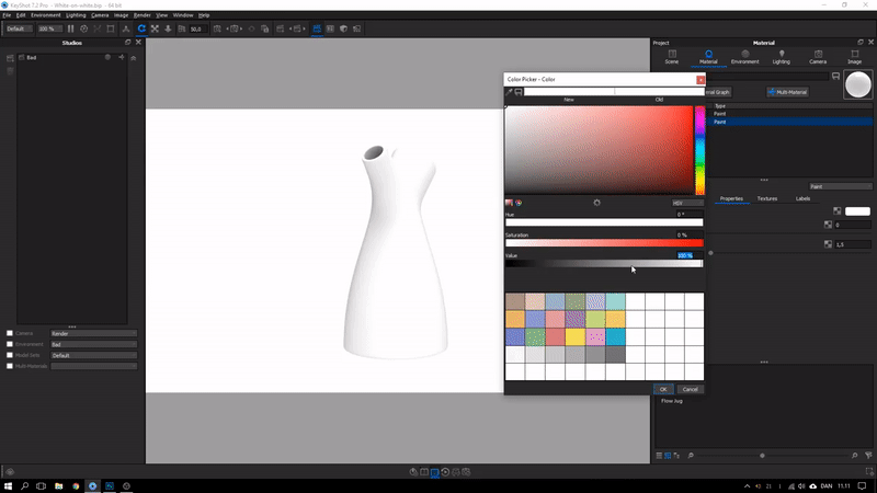
Keyshot’s Material Graph offers the ability to go beyond simply tweaking a material’s color, roughness, or refractive index. If Keyshot’s material library is a restaurant menu-card, the material graph is literally the most versatile salad bar you’ve ever seen. You can pick and choose various aspects of different materials, creating a visually gorgeous mishmash of nodes and blocks to ‘build’ a material that looks stunningly real. I’m probably making it sound complicated, but here’s the truth – it really isn’t. All you need is a little patience and the ability to spot how your material reacts when you make changes to it in the material graph. Combine them and in no time, you’ll have a material that behaves exactly the way you want it to… because it was designed to!
Read further to see how to build this aged, oxidized, grungy material in Keyshot’s Material Graph. You can use this technique to make all sorts of material variants, like rusted iron, oxidized silver, or even aged bronze that’s turning green around the crevasses.
UNDERSTANDING THE BASICS
Imperfections form a major part of what makes a render photorealistic. Scratches, dust, fingerprints, dirt accumulated in tiny corners, signs of aging, all this plays a heavy role in making the eyes believe what they see. You seldom see a phone without some smudges on its screen, or a table without a bit of dust or scratches, or a leather bag without patina. Imperfections are what make life real and embracing them is a great way to make your 3D renders feel “life-like”.
The best way to look at this complex material is by splitting it into its subsequent parts. If you look at the image above, or the material graph below, you see two broad materials. Material 1 is an old, aged, dirty brownish metal, Material 2 is a shiny, golden/bronze metal. Once you create these two materials, it’s just a question of adding them together in a way that allows the right metal to show up in the right place. I’ll explain how we do that, but first, let’s create the two materials.
Before we begin, I’ve set up my scene using a model of the Bearded Man, downloaded for free from Three D Scans. Fun fact, the model is a scanned historic artifact titled ‘Portrait of a Bearded Man’ made in Marble back in the Hellenistic Period in 150 B.C. Greece. It’s perfect for our aged material because it has a stony texture with a stunning amount of detail that causes the material to look incredibly realistic. Remember that your material will only be as good as your model. A model with real-world imperfections will result in a material that’s believable and realistic.
Once you’ve set the scene up with the model, start by opening the material graph and making the old metal first. The key is always factoring imperfections into the model, so rather than just using the same color and roughness throughout, we’ll use texture maps to make sure the color and roughness of the old metal are inconsistent. Similarly, drop a texture into the Bump section too (with a low bump height) to create that undulating imperfect surface. The material interprets these texture images as data to control its properties. Depending on the whites and blacks and greys in the texture maps, the material has high or low roughness, or a higher or lower bump. Play around with the values to get a dark, rough-ish metal with barely any reflectivity… and then make Material 2, which is just the opposite.
Since Material 1 is the base material, Material 2 will sit on top of it as a layer… or in Keyshot parlance, a Label. Right-click in the empty space and create a new metal material, with image maps controlling its color, roughness, and bump. Apart from the bump, which essentially stays the same in both materials, the color and roughness are fundamentally the opposite. Where Material 1 is rough and dark, Material 2 is shiny and golden. Once you’ve made Material 2, link it to the Final Material Node using the Label option. What you now have is a shiny metal ‘coating’ sitting on top of a dirty, rusty metal. Now we control which parts of the model appear dark and rusty, and which parts appear shiny and metallic!
EXPLORING THE MATERIAL GRAPH’S CURVATURE NODE
If you’ve ever taken a walk in the mud with sneakers on, you’ll notice something interesting. The mud gets right into the gaps of your sneaker’s tread pattern. The surface of the sole may stay clean, because it’s constantly rubbing against the ground, but the mud that gets into the negative spaces of your sneaker sole stays there until you clean it out properly. Interestingly enough, that’s exactly what we’re doing with this old, aged material too. We’re sort of keeping the ‘outer surface’ clean and shiny, while allowing the dents, cracks, gaps, and holes to be dirty… and we’re doing this using the Curvature Node.
Simply put, the Curvature Node splits your model into three types of surfaces – Convex surfaces, Concave surfaces, and Flat surfaces. When you connect this node to Material 2’s opacity, what you’re basically doing is making Material 2 visible in certain parts of the model, and invisible in other parts. The Curvature Node comes with three primary controls. One for Negative Curvature or concaves, one for Zero Curvature or flats, and one for Positive Curvature or convexes. What we want is for the shiny material to be visible on all convex surfaces, and the dirt to sort of be lodged into the tough-to-clean concave surfaces. By assigning the color white to the Positive control and the color black to the Negative (and even the Flat) control, you effectively control Material 2’s opacity, making it visible only in convex parts like the tip of the nose, the eyeball, etc. Everything else immediately appears dark and dirty, thanks to the underlying Material 1. You can periodically click on the Curvature Node and press the C key to toggle the preview of the black and white colors instead of the old and new materials.
The Curvature Node also has other controls that let you tweak the output. The Cutoff control basically determines how Keyshot treats the flat surfaces. If there’s a surface that’s almost flat, a high Cutoff value tells Keyshot to treat it as flat. Similarly, if your cutoff is at 0, Keyshot looks at every polygon accurately with no tolerance. Similarly, Radius controls clusters of polygons. A larger Radius value blurs the gap between the blacks and whites, while a smaller radius allows the difference to be sharper. Meanwhile, make sure you un-check the Radius In Pixels box. (That allows the radius to change depending on how much you zoom in or out, and we don’t want that)
Add some dramatic lights and Voila, you’ve got yourself an aged, old metal! If you followed along and built your own version yourself, that’s amazing! If not, just tinker around with the file we made by downloading it here. You could also watch this video by Esben Oxholm who uses this technique to make rusted iron. Similarly, you can use this process to make aged variations of materials yourself, like oxidized silver, greenish oxidized bronze, or your very own rusted metal. Scroll down to check out some results below, and hit us up on Instagram if you’ve got any suggestions for other materials you want us to make tutorials for!
Hey I’m Sam and I do design! I recently made a YouTube video demonstrating how to Render Realistically Really Rapidly! This process helps break down your 3D models and turn them into photorealistic renders. Below are a few tips that should help you get some eye-poppingly real Keyshot renders.
I recently attended a talk at Develop3D Live by Luxion Chief Scientist Henrik Wann Jensen and was amazed by how detailed the algorithms behind Keyshot are. He showed sample renders of the Ford Interceptor renderings used as adverts in car magazines, as well as various glasses of milk that, by inputting the chemical compounds of each into the Keyshot algorithm, could even distinguish between skimmed, semi-skimmed, and full-fat!
WANT GREAT RENDERS? THINK LIKE A PHOTOGRAPHER
If realism is what you’re looking for, it’s important to understand what you’re trying to replicate. Keyshot’s algorithms can do a lot behind the scenes, but making realistic renders means understanding photography theory, and knowing what to look for when it comes to image styles.
There are three golden rules that make up a good photograph:
• Subject matter: what is the thing you’re capturing? • Composition: what is the right angle and the framing? • Lighting: How is the scene lit?
The same principles apply to renders. In Keyshot, the first thing I do is import the data I want to render, and start laying things out to get the composition right. Camera settings also contribute to the composition: as a rule of thumb, I usually stick between 50mm and 80mm lenses. These are typically what photographers use for portrait and product photography, as it replicates what our eyes naturally see.
Here you can see the two image layouts I chose to render, before applying the materials.
The difference between a 30mm and 50mm lens can be seen here. The 30mm gives this coffee pot a strange perspective, whereas the 50mm is a lot more natural.
THE MORE ACCURATE THE MATERIALS AND LIGHTING, THE BETTER THE RENDER
With the scene set, it’s time to apply the materials. Keyshot’s material graph has become incredibly powerful recently. It’s possible to fine tune each material to have an exact base colour, reflection, translucency, opacity, and much more. Adding in these complex material nodes increases the render time so, while you’re still fine-tuning your scene, I would recommend keeping things simple with just the base materials (and possibly reflection maps to check the highlights aren’t blown out).
Once the base materials are set, it’s time to light the scene. Deciding on the lighting setup really depends on the style of image that you’re aiming for. A soft white light in a studio environment or a sharp warm 2700k temperature light simulating a sunrise with crisp shadows can really change how the scene looks, so remember to replicate real photography if you’re going for realism. I’d recommend learning the basics, like colour temperature and 3-point lighting as a starting point, and then you can really start to have fun!
IMPERFECTIONS MAKE IMAGES FEEL MORE NATURAL
The final push for realism comes from disrupting the perfect geometry that only computers can create; nothing in the real word has a mathematically perfect straight line. This is where rendering is different from product photography, even though the end goal is the same. Photographing products in the real world involves post-production editing in which all of the imperfections are airbrushed out to produce an “ideal reality”. Renderings come from the opposite direction; starting with perfect geometry and applying precise surface imperfections to make it look realistic. The end goal for both is to hit the ideal reality target, without falling into the uncanny valley, which would make the product look like an eerie airbrushed painting.
Adding displacement maps, refraction maps, specular maps etc. are great ways of adding these surface imperfections. Combining these textures, along with the three golden photography rules, will help create realistic images could one day be on the front of a magazine. Now the only thing left to decide is; would you like to advertise cars or milk?
Sam Gwilt is an industrial designer with an eclectic mix of skills. He graduated Brunel University London and worked for Paul Cocksedge Studio, specializing in bespoke lighting installations and exhibitions internationally. He now works with clients globally at consultancy Precipice Design, and also runs an Instagram Page and YouTube channel – Sam_Does_Design – where he shares industry tips with the community.
The guys at Luxion just released their latest version of Keyshot, and I’m absolutely thrilled because displacement maps are one feature I was rather impatiently waiting for! Displacement (or depth) maps are an absolutely great way to create REAL textures that can absolutely make your renders POP! Let’s take a look at what this newfangled feature is and how to master it!
DIFFERENCE BETWEEN BUMP AND DISPLACEMENT MAPS
Up until now, perhaps the biggest thing missing from Keyshot’s arsenal was its support for depth or displacement maps. You could only use bump maps in Keyshot to simulate textures, but that’s all. Now the difference between bump and displacement maps is visible in this image below.
The one on the left uses a bump map, and the other on the right has a displacement map. Bump maps only simulate texture, they don’t create it. They manipulate light and shadow to make it look like a surface has a texture, but in reality, that texture is an illusion. Displacement maps, on the other hand, actually create that texture. They physically manipulate 3D geometry to make the texture, and if you look at the silhouettes of the two below, you’ll get the gist. The one on the left is still a perfect circle. Even with the texture. The texture is an illusion. The one on the right, however, literally has those bumps that you see in the image above.
This ability to actually manipulate 3D surfaces is great for a couple of reasons. Firstly, it makes materials incredibly realistic. Concrete LOOKS like concrete. Tiled surfaces literally have 3D tiles in them. Gravel looks great too, because it’s actual gravel, not a flat surface with gravel texture. Secondly, it takes the pain out of actually modeling minor details. You can make folds in cloth by just dropping a displacement map. Crinkles on paper, grass on a lawn. You don’t need to physically model these minor details anymore. You can rely on a good displacement map you downloaded (or created!) to give you instant results.
HOW DISPLACEMENT MAPS WORK
It’s quite literally black and white. Displacement maps use grayscale to determine height, just like bump maps do (you can actually use those bump maps as displacement maps). In short, if you look at a bump map, notice that the parts that usually stick out (like the bumps on the ball in the image way up top) are the white bits, while the parts that are black recess downwards. The whiter the pixel gets, the more elevated/extruded it is, the blacker the pixel is, the further inward or downward it moves. In theory anything that’s exactly 50% gray stays untouched. Here’s a snippet of the map along with the result alongside.
Most bump maps can be used as displacement maps. Make sure you have maps that are of a high resolution because a pixelated image will result in a pixelated surface, and that isn’t good. Conversely, if you’ve got details that are way too sharp, just carry the map image to photoshop and gently blur the parts you want softened. Blurring a sharp edge that’s black on one side and white on another will cause the colors to intermingle and form the grays in between. As a result, you’ll get softer edges with bevels/fillets without having even done anything!
You can find displacement maps online (the good ones come at a price) or you can even MAKE your own bump maps. Using the black-to-white principle, you can create maps of common textures like woven carpet in a software like Photoshop or Illustrator and just export the maps to hi-resolution images. Go ahead and experiment with the portrait-mode on your smartphone camera too. It has the ability to capture a decent amount of depth, and you can use websites like www.depthy.me to extract the displacement map from your image (depthy.me will give you an inverted version of the displacement map, so make sure you take it to PhotoShop and invert the colors to get the real map). You can see two images below of a ‘portrait-mode’ photo and the displacement map placed alongside. You won’t get incredibly crisp displacement maps with your phone, but using your phone’s portrait mode is a pretty nifty and handy way of learning about new textures, patterns, and shapes, and how they’re recreated in grayscale to allow computers to see depth.
ADDING DISPLACEMENT MAPS IN KEYSHOT 8
Just to fuel my curiosity, I carried that avocado displacement map and image file to keyshot to see what I got and boy! You notice a few things off the bat. The map is far from accurate, but here’s why. A. You’re using a pretty basic piece of 3D imaging which mainly uses algorithms to calculate depth. And B. This ‘displacement’ map is actually a blur map. It doesn’t calculate depth. It calculates what’s in the foreground and what’s in the background, and uses that data to create DoF, or depth of field. (That’s why the displacement map is inverted, because the algorithm blurs the white and doesn’t touch the black. It’s essentially the same principle but a different operation.)
So let’s look at Keyshot’s Displacement Map feature in depth (hehehe, get it?) The displacement, or the geometry, forms just one part of the entire material… which is why we’re looking at Keyshot’s material graph (right-click, edit material graph), which deconstructs everything for us to better understand and build materials. Keyshot separates materials into Surface and Geometry. Surface allows you to create materials, finishes, textures, and Geometry allows you to edit or tinker with the third dimension of the model itself. In the Surface section, you get to decide whether your material is plastic, or metal, or concrete, etc. You can add other aspects like color, roughness, graphical patterns to this. The Geometry section is where things get interesting. There are basically only two components to using a displacement map. One is your map… an image file. And the second is a displacement block, which tells Keyshot you want to use the map as a displacement map.
Connect the map to the block, and the block to the geometry tab, and you’re good to go. The geometry doesn’t change right away (because it’s processor-intensive), which is why you need to “execute” the map. First off, double click on the image map block and make sure you’ve got the size, scale, placement right. You can press the ‘C’ key to preview your map on your model and press it again to hide the map. Once you’re satisfied with how the map is laid out, double click on the displacement block and hit execute. Certain things happen. The map gets executed, and you get a first impression of how your geometry changes. In order to tweak the end-result, try changing the displacement parameters.
Displacement Height: Changes how high or low the highest and lowest points of your displacement map are. For something like large pebbles, you’d have a larger height. For something like gravel, the height would be negligible.
Offset: Determines whether your displacement map pushes stuff outward or inward. Grass sprouts out of a surface, but holes in Swiss cheese go inside a surface. You’ll need to tell the software which direction to process the map in.
Resolution: The lower the resolution amount, the clearer the pixels on the map are. The resolution value basically tells Keyshot how small you want the smallest detail to be. A large value creates lesser detail, a smaller value makes details more intricate.
Max Triangles: This tells the software how many pixels (or triangles) to allow your map to have. So for maps with lots of details (individual grains of gravel), you’ll need more triangles. For something fairly simple like a tiled surface, a low triangle count works just fine!
MAKING TEXTURES MORE REALISTIC USING DISPLACEMENT MAPS
Okay, at just over a thousand words, I’ll stop talking! Displacement maps are a great way to create geometry without creating it. If you’ve got bump maps lying around, try using them with the displacement block to get some stunning results! You can even go further to create wrinkles on skin, crumpled patterns on paper, or actual threads in a loosely woven material. I recommend checking out Poliigon for their incredible database of materials and textures. Just remember one thing. Keyshot is already rendering all your scenes in real-time. Telling it to start building 3D surfaces basically is going to require more resources. Very detailed or large depth maps may take more time to load as well as render, so depending on your needs, and how powerful your machine is, go ahead and give displacement maps a shot! They’ll “grow” on you!
Image Credits: Poliigon
KEYSHOT 8: POWERFUL RENDERING MADE EASY
Keyshot isn’t an unheard of name in the industry. Most design companies like Motorola, Microsoft, Oakley, Skullcandy, Nissan, Chrysler and DeWalt regularly use Keyshot, and nearly half of the designers we asked used Keyshot for their renderings. Its biggest achievement is making renders as simple as dragging and dropping materials, textures, environments. For a beginner, Keyshot is a great way to get the job done, and for a power user, Keyshot retains all the tools to make absolutely stunning visualizations. The rendering software released its 8th version at the beginning of this year, including a massive variety of easy-to-use features, from intersecting/cutaway materials, to the introduction of fog/smoke and volumetric lighting, to being able to add bubbles/flakes in solid materials, and perhaps the biggest update yet, support for displacement/depth maps!
I usually never recommend rendering any sort of product on a white background unless it’s truly necessary. When rendering, the background plays an important role along with the foreground, helping complement/balance it, or create a heavy contrast (that’s usually the photographer or designer’s call), but a white background can generally feel slightly template-ish. The real problem, however, is rendering white on white. A white product on a white background can usually be a nightmare because they tend to merge into one and another, creating ambiguity, and often end up concealing details of the product rather than revealing them… so how exactly does one render white on white? There are a few tricks you could master.
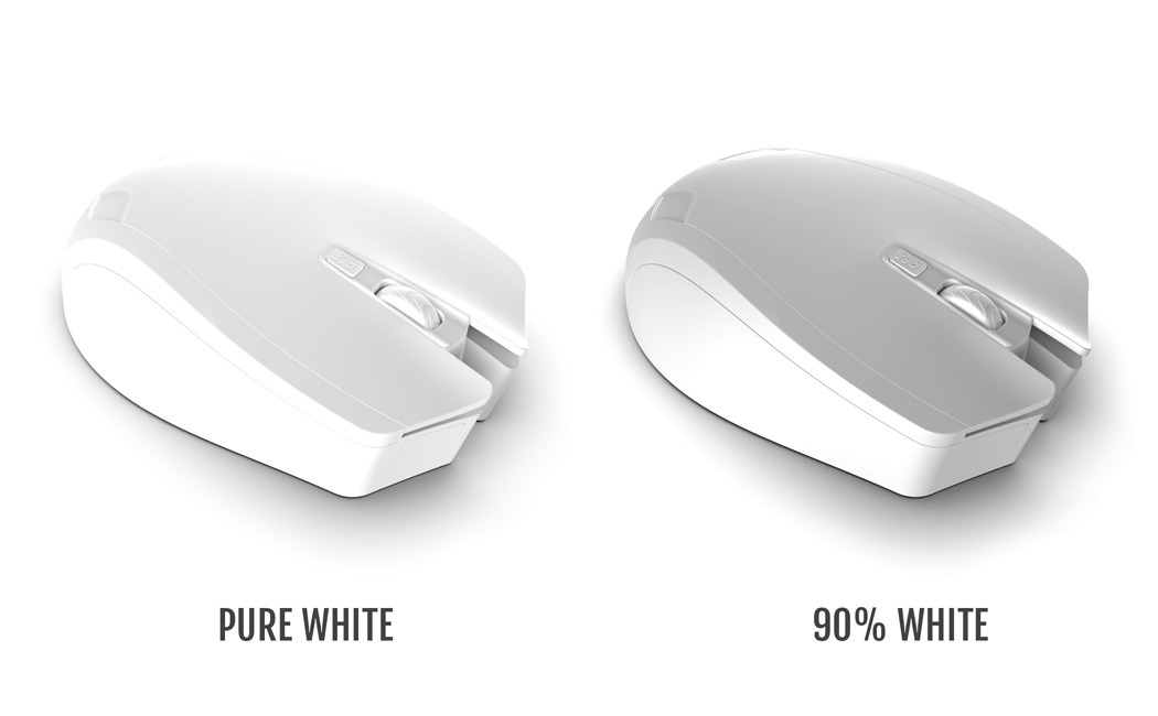
The first trick is realizing that your product, background, and lighting are NEVER the same color. When you load a model into a rendering software, chances are, you’ll use pure white on your product, while the background and lights by default are set at white too. This similarity begins causing your product and background to be practically indistinguishable. The fix? No product is perfectly white, and conversely, no backgrounds are perfectly white either. Choose a shade that’s 98% white (on the black to white spectrum) and your product immediately stands out against the background, while looking more realistically white, rather than perfectly white. You may also want to add a hint of blue to enhance its perceived whiteness, or maybe go in the other direction and drop in a tiny bit of yellow to make it look on the warmer side. Consider using a warmer or cooler shade of white as your background too to create a contrast that your eye will easily pick up on because of the difference in color. You could exploit Keyshot’s color options, even using their extensive Pantone color set.
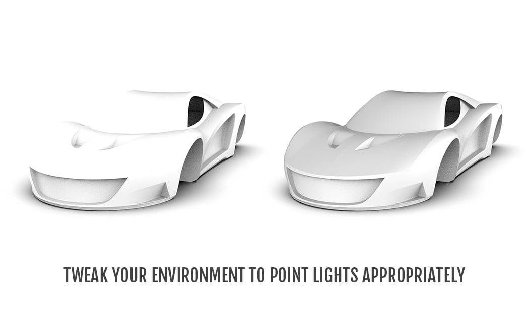
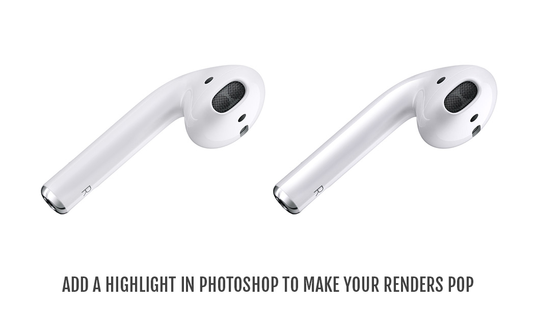
Trick one relied on choosing your product and background colors. Trick two requires a fair amount of expertise, but if done right, can make renders look stunning, regardless of how plain your product is. In fact, it’s something Apple has mastered over the years. With products that usually constitute straight lines and geometric curves, Apple relies heavily on perfect lighting to make their products pop. Take for instance the Apple Airpods (image below) that are placed against a white background. The idea is to have lights that illuminate the correct places, and cast shadows on the correct places. Never have a light shining on the side of a product, because a highlight on the side makes your product’s edge disappear into a white background. Always aim for a shadow around the edge, giving your product a gray outline, which helps a viewer easily pick up on the product’s shape. If all fails, add a light in a way that casts a shadow on the floor around the edge of a product, making it more visible. Keyshot has tonnes of environment options that help accentuate product details (consider experimenting with an environment that has a dark-ish background rather than settling for the default environment setting). With time, you can build your own environments to add a signature touch to your renders, placing lights exactly where you need them, creating accurate highlights on your products. This, in turn, will also help you brush up on your studio lighting skills, when you’re dabbling in photography. Another pro-tip? A glossy finish on your product makes highlights and shadows more pronounced. If your product is matte, the crisp lighting details often turn fuzzy. Want to render a matte-finish white product? Make sure your environment has a good balance between light and dark elements, so that they show up well on your matte product.
Not really getting the exact highlight you want on your rendering software? No problem! Trick number 2.5… just build the highlights in photoshop. Take your render to a photo editing software, and add your highlights using a brush. This gives you MUCH more control over your render, and if it’s any consolation, touching up renders and adding artificial highlights is something ALL companies do to make their renders look more flashy.
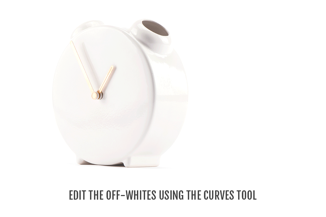
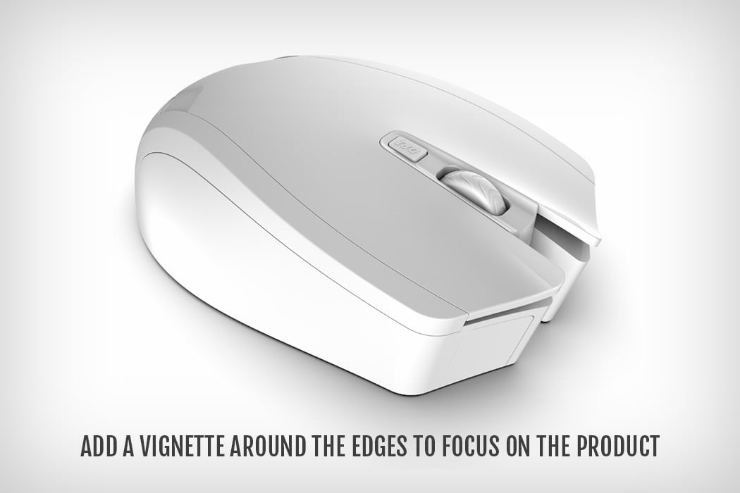
The last trick… just manually increase the contrast on your pictures. If your product has black details that are getting lost when you increase the contrast, try meddling with the Curves tool (ctrl + M or command + M) in photoshop to increase the intensity of just the grays. That way, you’re not touching the whites or the blacks. You’re just taking the ‘almost white’ parts of the image and making them more gray. To finish off, try adding a vignette to the image, giving it a bit of a distinct border, and helping it create a spotlight on your product.
Rendering white on white is quite a challenge, but the trick is being able to have either a mental or visual reference. If you know exactly what you want, where you want highlights, where you want shadows, it makes execution easier. As far as personal advice goes, stay away from templates and try to build materials and environments from scratch. It makes rendering a much more hands-on activity, and more so, helps YOU stay true to YOUR vision, rather than getting lucky by dragging and dropping colors, textures, materials, and environments. And most importantly, when rendering white on white or rendering anything in general… stop thinking like a product designer, and start thinking like a photographer. Your renders will look absolutely stunning!
Video Credits: Luxion Keyshot Mouse 3D Model: Luxion Keyshot Car 3D Model: Taufiqul Islam Airpods Image: Apple Clock Vase Image: Jaro Kose
Start your (render) engines! This October, Luxion kicks off their annual KeyShot render competition to submit your best automotive-related rendering created in KeyShot for the opportunity to win a license of KeyShot Pro. What can you submit? Well, it could be a car, a motorcycle or a rim, headlamp or aftermarket part for any vehicle. Send it in and show what you’ve got!
KeyShot is used throughout the automotive industry, from the automakers to the aftermarket, for its accurate paint materials and unmatched lighting capabilities. Shift your automotive scenes into overdrive and submit your render or animation today!
The best rendering wins a seat of KeyShot Pro, the best animation wins a seat of KeyShot Pro + Animation, 10 will receive Honorable Mention prizes and all will receive the enduring admiration of the KeyShot community! Here are all the details.
Create a captivating 3D rendering or animation of an automotive related 3D model
Rendering and/or animation must be done in KeyShot
Screenshots, fully rendered images, animations or KeyShotVR’s may be submitted
Multiple entries are acceptable
Post edits are acceptable
The competition is open to everyone
Team entries are welcome – prize will be transferred to team leader
Additional Notes:
Learn from a Pro! Watch Tim Feher’s webinar on rendering automotive models in KeyShot, see this KeyShot Webinar. Or, sign up for the upcoming ‘Automotive Render Q&A’ where Tim will answer your questions about creating visuals with KeyShot.
For a license of KeyShot without watermarked renderings, email license@luxion.com with “KeyShot 2014 Render Competition” in the subject line. You will receive a license for use in the contest.
With your submission, it’s nice to know what work went into your rendering or animation! Tell Luxion what modeling software or other tools are used. If post editing is done, show a before and after. It’s always interesting to see!
Luxion retains the right to use any image or animation submitted for purposes of promotion and marketing. All rights to the image belong to the person creating the image and attribution will be given when an image is used. Additional requests for use of render or animation files may be requested of the user via email.
Judging Criteria:
The submissions will be judged on three criteria: creativity, originality and composition.
Prizes:
Grand Prize Animation: KeyShot Pro + Animation (total value $2,495)
Grand Prize Rendering: KeyShot Pro (total value $1,995)
Honorable mentions (up to 10): KeyShot t-shirts
Deadline: Sunday, November 16th, 2014 (last time zone)
Announcement: The winner will be announced Thursday, November 20, 2014 on the KeyShot website, forum and social media sites.
As a designer, you know what goes into the creation and delivery of a product. The visuals play a huge role in that from initial concept to stacking them on the shelves. No matter what the product is, it’s got to look hot. These companies, along with many others, are creating the most striking images in there industry. They’re using KeyShot to do it. Here is just a sample of what they do.
“KeyShot is instrumental in our creative process. We use it a lot for rapid visualization of product concepts, and it really gives a tangible look at an idea in a very short amount of time.”
“KeyShot helped the engineering teams understand materials and finishes prior to the development of early prototypes which helped them plan and cost out certain applications and manufacturing processes.”
“Keyshot is integral to our process. We use it in the usual ways to evaluate designs visually, but also to simulate complex color, material and finish combinations…”
“It’s amazing how quickly we started implementing images for catalog shots… KeyShot has been a great tool to communicate design intent before production to internal managers, big box retailers and the factories.”
“KeyShot is an integral part of our design process, helping us create killer visuals and motion assets in minimal time… It is a truly efficient process integration.”
“KeyShot has become the tool of choice to communicate concepts to non-designers as well as serve as a virtual photo studio specific to form and material studies.”
Plastic. As product designers the look has to be spot on. Whether it’s a rough matte finish or a glossy transparent cover, it’s just easier to get the look you need with 3D rendering software. Dries Vervoort is a mechanical designer who has honed is skills creating visuals for radiator components. It’s paid off for him, with the ability to produce plastics that look like the real thing, and he shows you how using KeyShot to make it happen. You can see how and download the resources he uses here. Below are just a few samples of his work.
Creating perfect plastics and beautiful materials in KeyShot is very easy. Dries Vervoort walks you through the development of materials and more in KeyShot. His tips and tricks help you to create the most accurate array of plastic materials possible!
What you get to take away are lessons on how to create materials in KeyShot and what settings affect reflection and transparency.
You also get to learn what material types are best to use for certain plastics and how light effects the look of materials.
Dries has shared all the assets he used so you can pick them apart and see exactly the material and settings he used.