Govee RGBIC Neon Rope Light 2 Review: Helping Your Creativity Really Shine

PROS:


  • Highly flexible material for creating any shape or pattern

  • Minimalist design with black or white options to match your decor

  • Impressive lighting options and AI-generated effects

  • Easy customization with new Shape Mapping function

CONS:


  • Very difficult to reposition or modify after it's installed

  • Wi-Fi connection only supports 2.4GHz network band

RATINGS:

AESTHETICS
ERGONOMICS
PERFORMANCE
SUSTAINABILITY / REPAIRABILITY
VALUE FOR MONEY

EDITOR'S QUOTE:

With a more flexible design and powerful customization options, the Govee RGBIC Neon Rope Light 2 offers a powerful tool for everyone to express their designs in dazzling colorful lights.

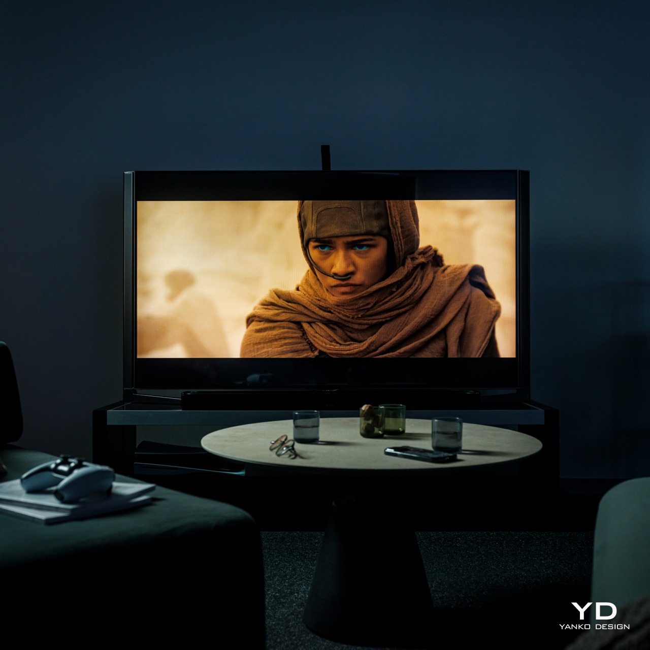
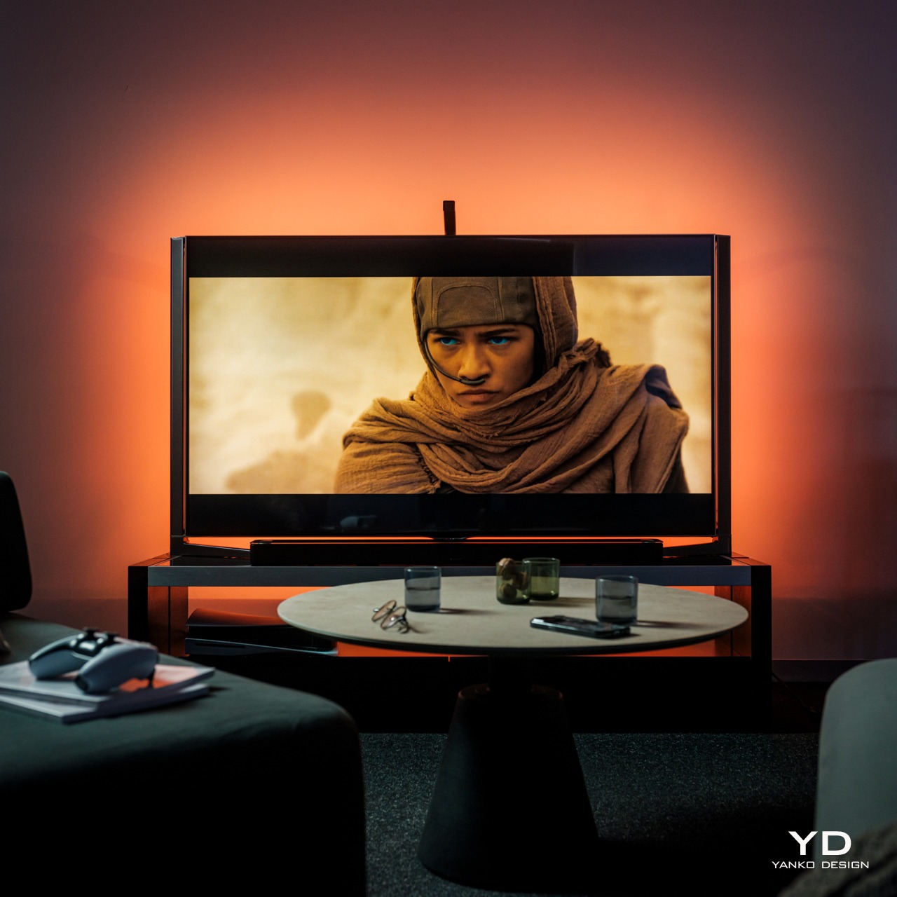
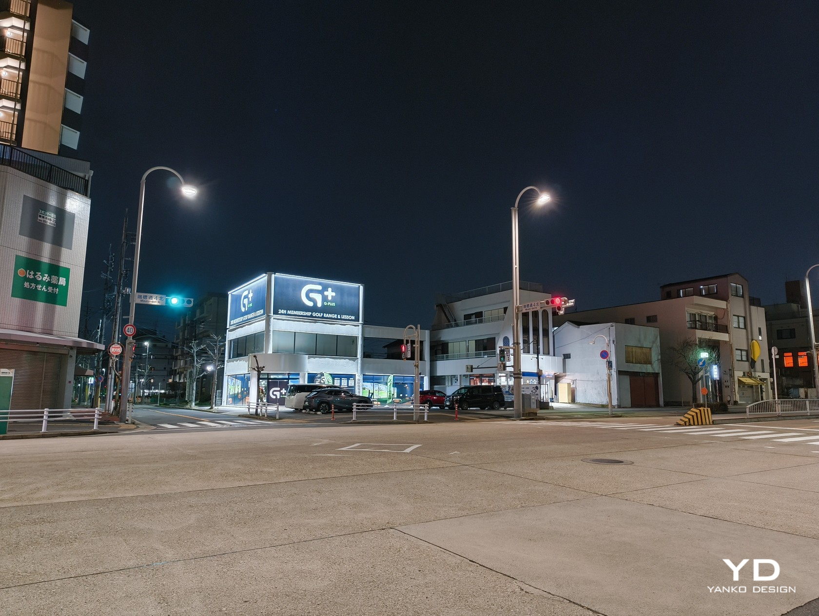
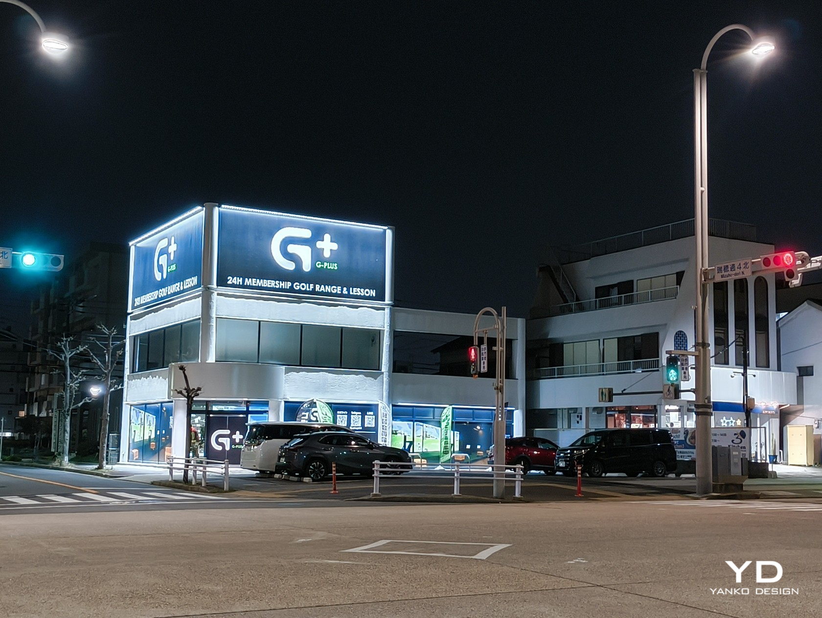
Smart lighting is one of the easiest ways to get into smart homes. Often you simply have to screw bulbs or plug lamps in, connect them to your phone, and you’re instantly able to control them remotely or through automated schedules. That kind of smart light is practical and convenient but not exactly impressive, nor does it let you easily create the lighting atmosphere that you want without investing heavily in multiple expensive products. If you really want to jazz up your space and dazzle your guests or viewers, you’ll want something like programmable string or rope lights to leave a lasting positive impression. Govee just launched its latest product in that category, the RGBIC Neon Rope Light 2, promising better build quality, more extensive customization, and more intelligent smart features, so we put this second-gen smart rope light to the test if it can really become our kaleidoscopic paintbrush to brighten up the room with our creativity.

Designer: Govee

Click here to Buy Now: $99.99

Aesthetics

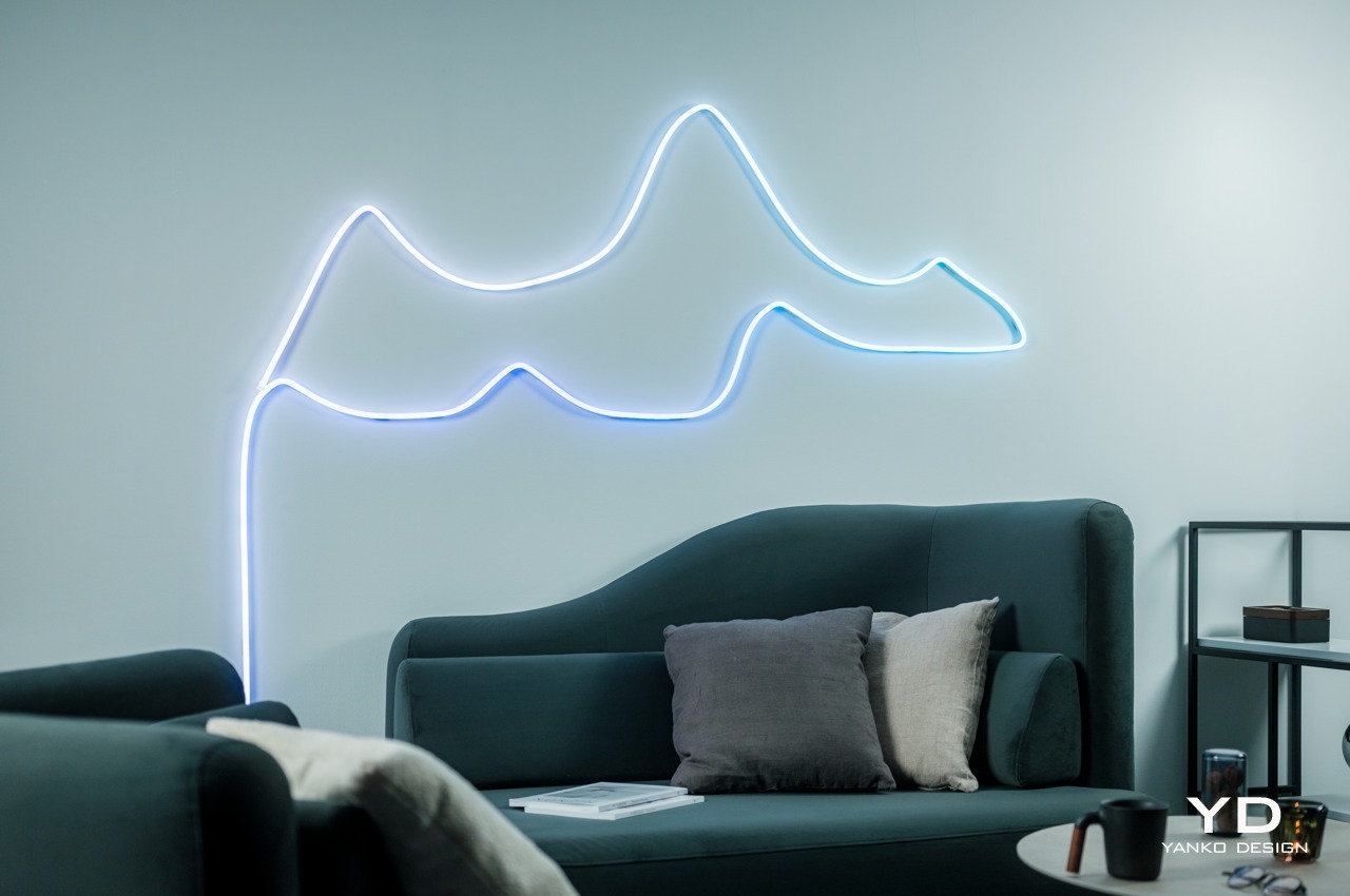
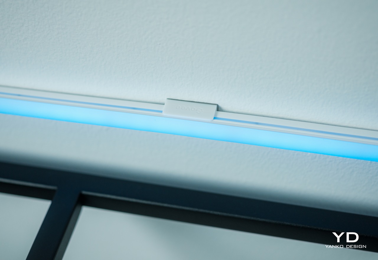
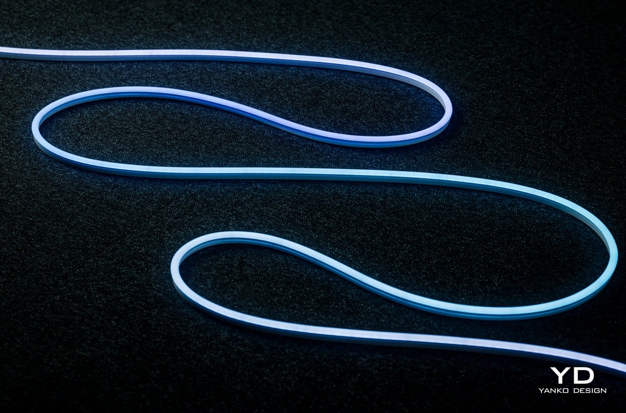
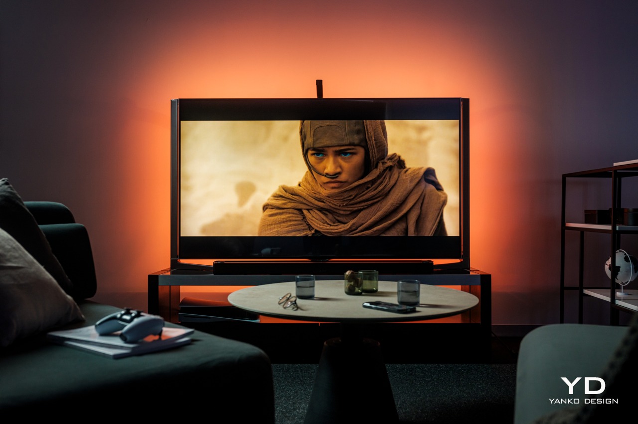
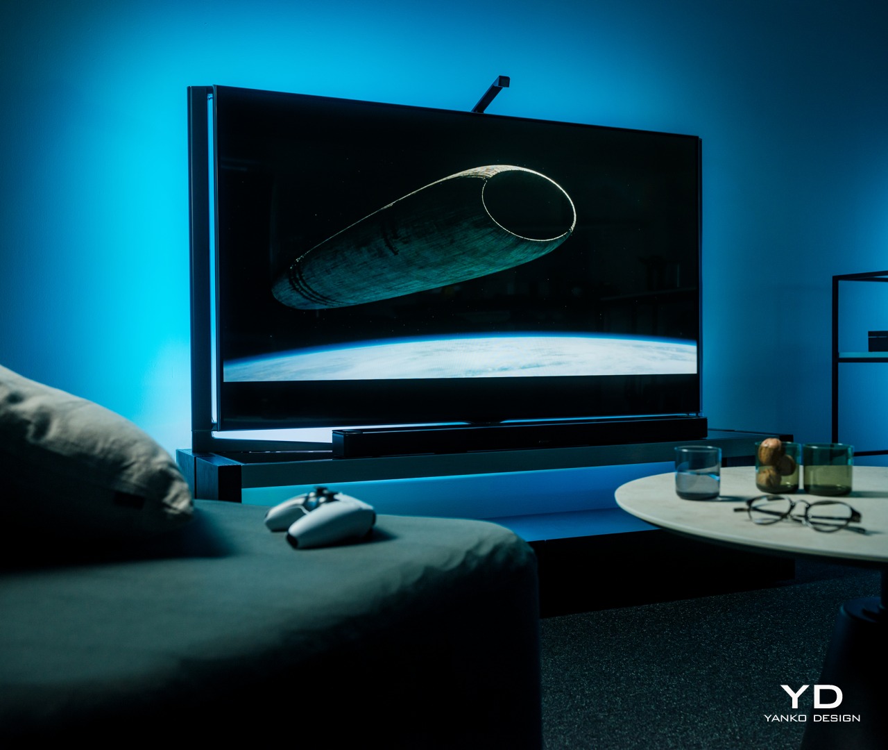
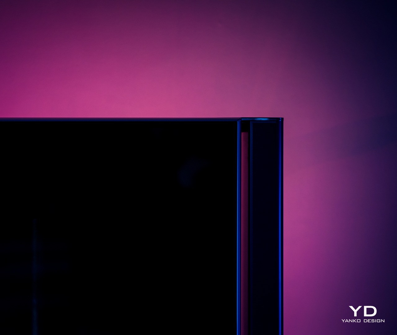
Right out of the box, you can already tell that the Govee RGBIC Neon Rope Light 2 is a class above your typical string light. You don’t see any braided cords or LED “bulbs.” Instead, you have a roll of tubing that looks clean, simple, and very bendable. It has a minimalist aesthetic that looks appealing even when the lights are turned off. Even better, Govee now offers black and white color options so that the rope can match whatever motif you have going. Of course, the actual area where light shines through is a translucent white surface, so you’ll still have to take that into account when designing around walls and furniture.

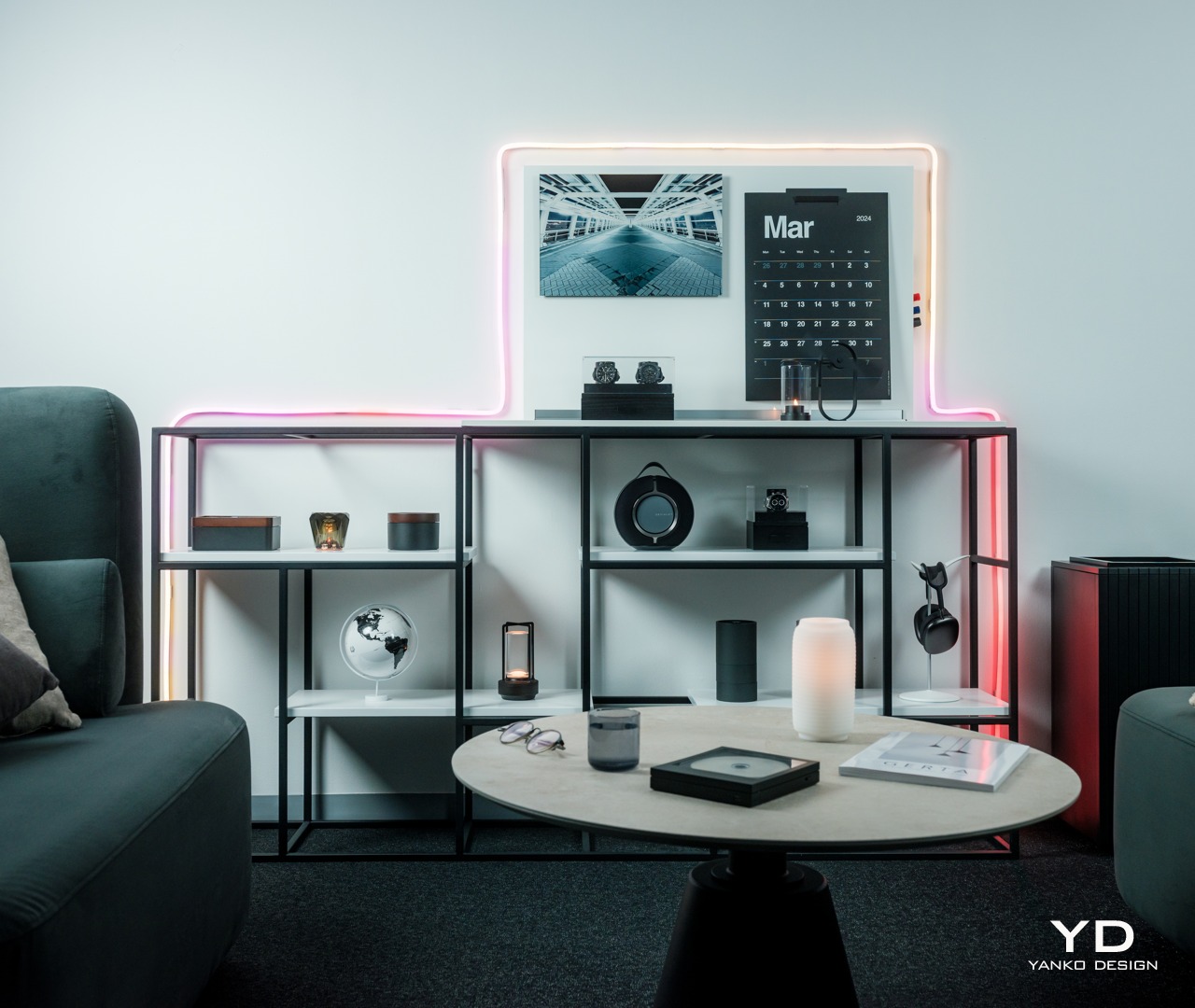
When the lights do turn on, the Govee Neon Rope Light 2 becomes a dazzling array of colors. With an astounding 420 of these RGBIC LEDs split into 42 zones, there is not a single inch that can’t be painted in a hue of your choosing. The lights are bright, not bright enough for being the main light source but perfect for setting the mood or adding accents to a room. And the sheer amount of effects you can use will never grow old.

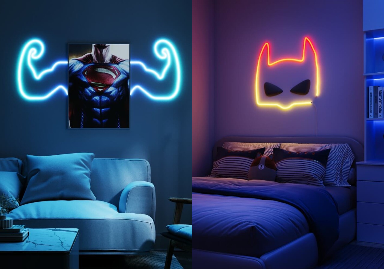
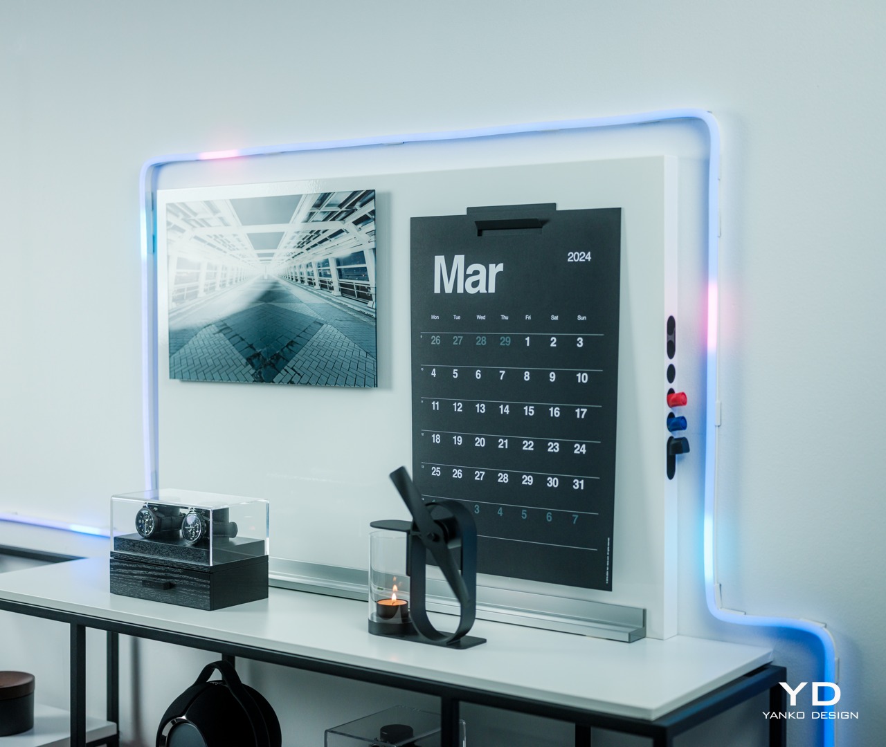
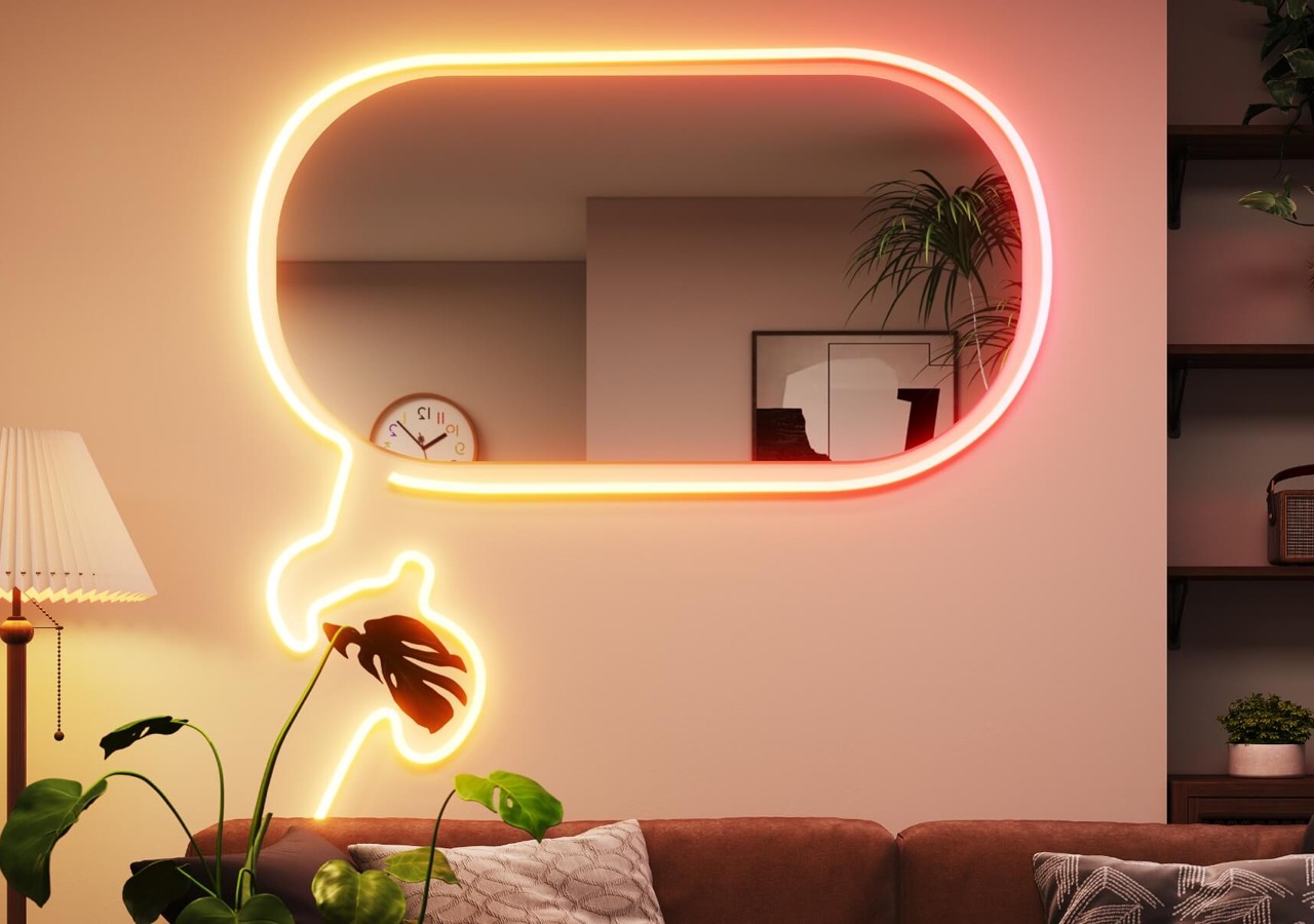
The most impressive part about the RGBIC Neon Rope Light 2’s appearance, however, is not the product itself but what you can make out of it. Thanks to an even more flexible material, you can easily design almost anything you want with the rope, from seemingly random patterns to carefully planned outlines of objects. This kind of flexibility, literally and figuratively, can inspire the artist in you, turning your wall into a canvas and the rope light into a brush paint of hundreds of colors.

Ergonomics

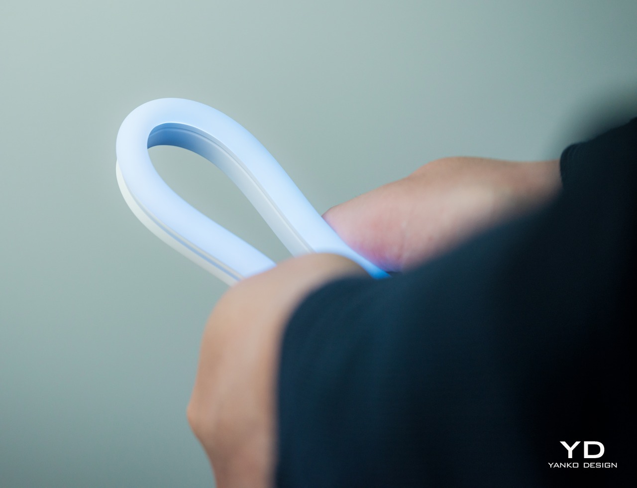
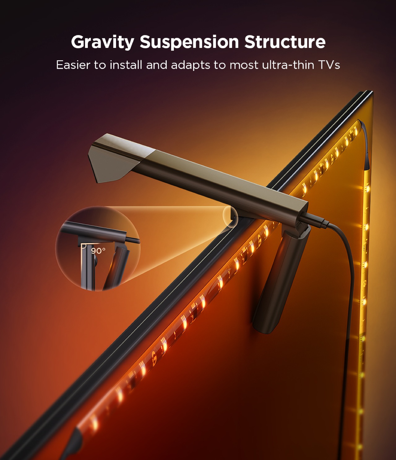
You won’t be holding the Govee RGBIC Neon Rope Light 2 whenever you use it, but you will naturally need to handle it when you’re installing it in the first place. It’s important for that process to be as easy and painless as possible, and Govee has thankfully ensured that it will be the case. Compared to its predecessor, this second-gen rope light is 14% more flexible and 14% lighter, key traits for something you’ll be bending a lot to your desired shape.

What all these mean is that you have more freedom to let your creativity loose in turning the rope light where you want it to go. Yes, you still have to mind the proper way to bend the rope light, but it’s pretty much common sense: you only bend it so the light is actually facing outward. The included bend clips that help the rope retain its shape have the same “outward bending” design, though neither the clips nor the rope actually stop you from bending it the wrong way, much to your own peril.

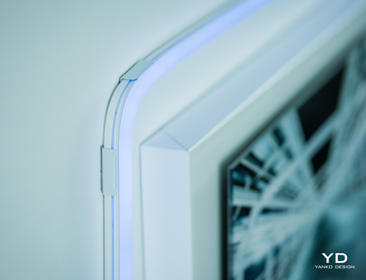
Despite its flexibility, the rope light won’t stay in that curved shape for long, so you’ll need to stick it with the built-in adhesives on its back. The good news is that these adhesives are extremely strong so you won’t have to worry about the rope going out of shape. The bad news is that they’re so strong that you won’t be able to easily remove them if you need to make changes. This means you have to be extra sure and careful that you have the final design you really want before you start sticking it to a surface. Hopefully, Govee will be able to come up with a more flexible solution someday that will let you reposition and reshape the light more easily.

Performance

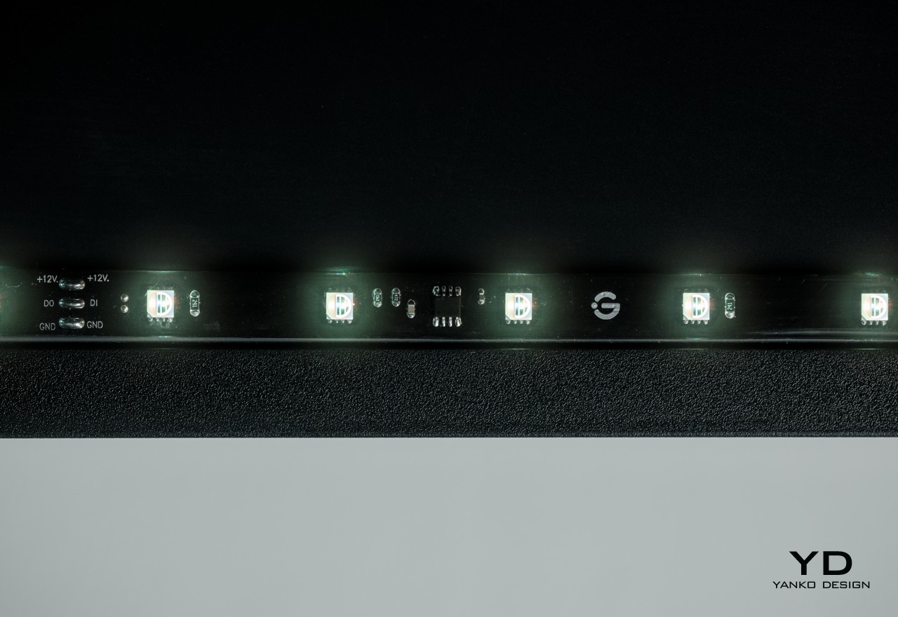
Govee’s RGBIC LED technology has been impressive from what we’ve seen in previous reviews, and the Neon Rope Light 2 is thankfully no different. There are two variants of the rope, one in 10ft/3m length and another in 16.4ft/5m, which is our review unit, with 42 and 70 segments of light, respectively. For the 5-meter rope, there are an impressive 420 LEDs running its length, with as many as 84 LEDs per meter. As with any Govee RGBIC product, you can control each of those segments separately, though you’ll most likely be doing it through lighting effects and scenes anyway.

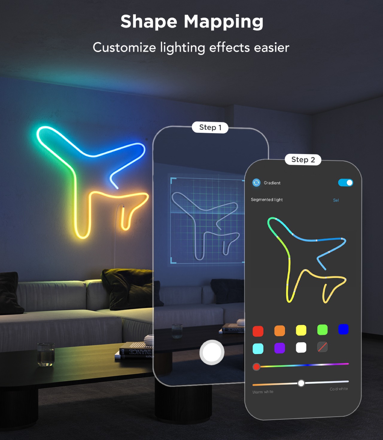
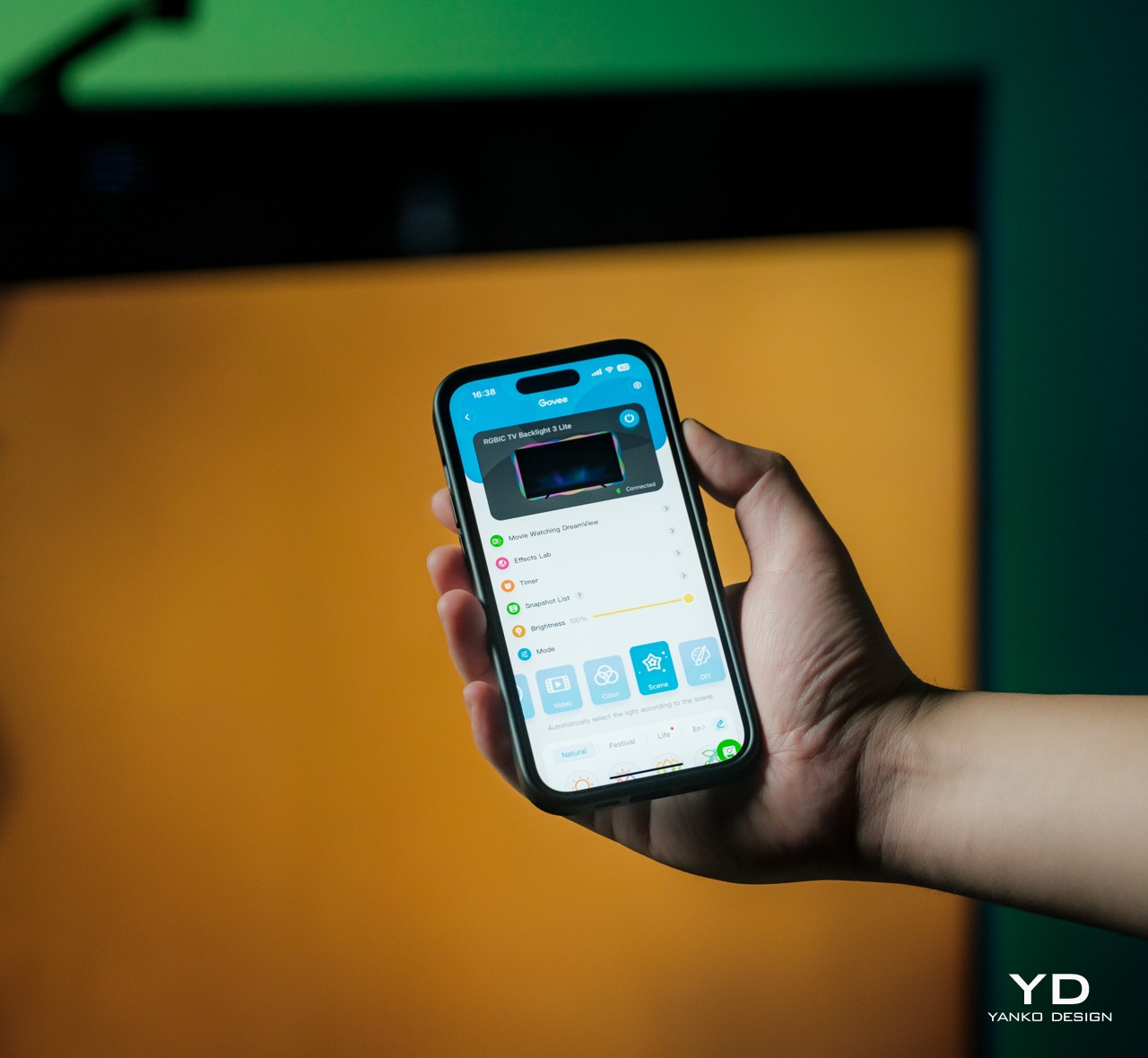
If you want to do things a bit more manually, Govee also has a nifty feature that makes the process a lot easier. With the app’s Shape Mapping mode, you can take a picture of your rope light design with your phone’s camera and then select which color goes to which segment, giving you full control of the composition without having to guess which part of the rope corresponds to which part of your design. Whether you’re going the full automated route with AI or exercising complete control over every LED, the Govee RGBIC Neon Rope Light 2 gives you the tools you need to express your design in a burst of color.

As mentioned earlier, the lights are pretty bright, though not blindingly so. The gamut of colors each LED supports is more than enough to cover every hue your eyes can detect, although it does lack the ability to display pure white without a dedicated white LED. Govee has a newer RGBICW that solves that problem, but that’s not available here on the RGBIC Neon Rope Light 2. You’ll have to make do with off-white blended from the combination of red, blue, and green, though that probably won’t be a problem for most use cases anyway.

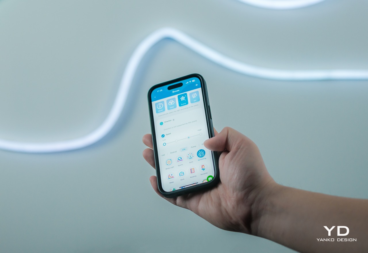
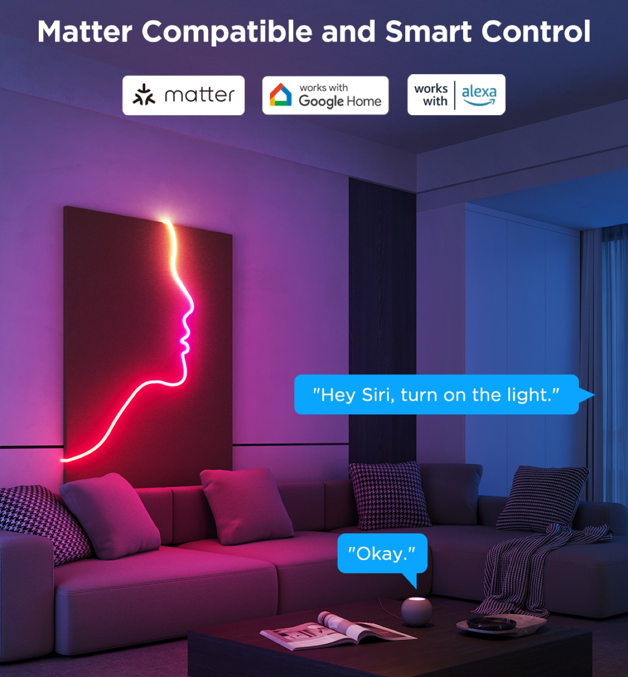
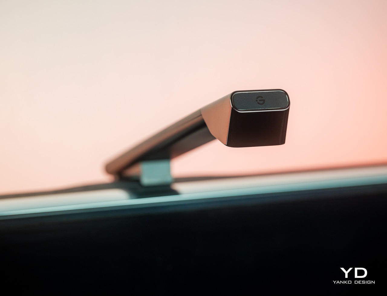
The rope light’s real strength, aside from its flexibility, can be found in the Govee Home App which is home (pun intended) to all the settings and customization options you can ever want. Connecting the rope light to your phone is easy peasy and is done over Bluetooth, after which you can remotely control the lights without breaking a sweat. If you do want to connect it to smart home platforms, particularly through the new Matter support, you’ll have to do it over Wi-Fi. It should be noted that, like many smart home devices so far, it requires a 2.5GHz Wi-Fi network so 5GHz-only routers will have difficulty making that connection.

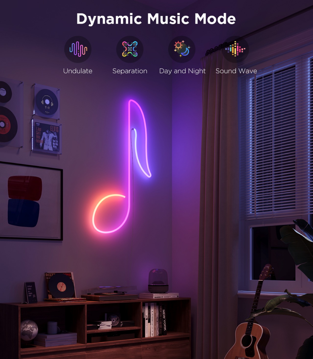
Govee provides a huge library of effects for the Neon Rope Light 2, including 12 Music Modes that can sync to the beat of music, and 64 Scene Modes with preset settings to cover a wide variety of occasions, seasons, and moods. Things get really interesting with the arrival of the AI Lighting Bot this March, which will let you harness the power of generative AI to create new effects not included in Govee’s catalog. Simply give it a prompt with specific elements, situations, and even brands and it will scour the Internet and its database to come up with the (hopefully) perfect combination that delivers what you asked for.

Sustainability

Like with string lights, the Neon Rope Light 2 suffers from the problem of becoming significantly less usable once LEDs start failing. Yes, you can probably live with one or two blank spots, but they’re there forever with no option to replace them individually. In fact, one of the Neon Rope Light 2’s greatest strengths, its clean and simple tubing, is also its greatest weakness in this regard. You can’t easily access the LED’s inside anyway, let alone repair or replace them. Your only recourse, in the final analysis, is to ship them for repairs or, worse, buy a new rope. Either way, that involves removing the rope light from its installation, which can be a laborious process.

As for the materials used for the RGBIC Neon Rope Light 2, we can perhaps presume that Govee is using standard synthetic materials like silicone. Yes, the material is lighter and more flexible now, but it’s not more sustainable. As Govee grows, we hope to see more efforts from the brand toward this aspect, especially since its products will be filling the market and homes.

Value

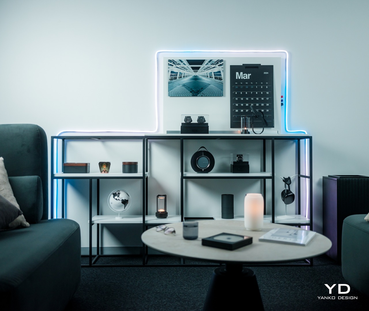
String lights try to offer a way to illuminate a path or shape, but they can only do so much in actually forming that shape. Worse, because of their inherent design, they’re often better off hidden from view so that their presence only becomes known once the lights turn on. While there will always be uses for string lights, the Govee RGBIC Neon Rope Light 2 delivers something new, different, and mind-blowing. It gives you the creative freedom to design your own lighting masterpiece without too much effort.

The more flexible and lighter material of this 2nd-gen rope light enables owners to really bend the light to the shape they want, and the impressive performance of Govee’s RGBIC LED technology really outshines the competition. Best of all, the Neon Rope Light 2 has a mind-blowing assortment of effects, from the upcoming AI-generated Lighting Bot to the easy-to-use Shape Mapping feature. All of these for an equally impressive price tag that makes the experience accessible to everyone.

Verdict

RGB lighting was once considered the domain of gamers who prefer dark corners just to show off their neon-lit equipment, but everyone has now grown to appreciate what a splash of color can do not just to brighten up a space but also to create a mood, amaze, and entertain. Many RGB lamps exist for that purpose, but the majority of them force owners to design around the lamps instead of having the products cater to their needs. Fortunately, Govee has the perfect solution to fix that problem.

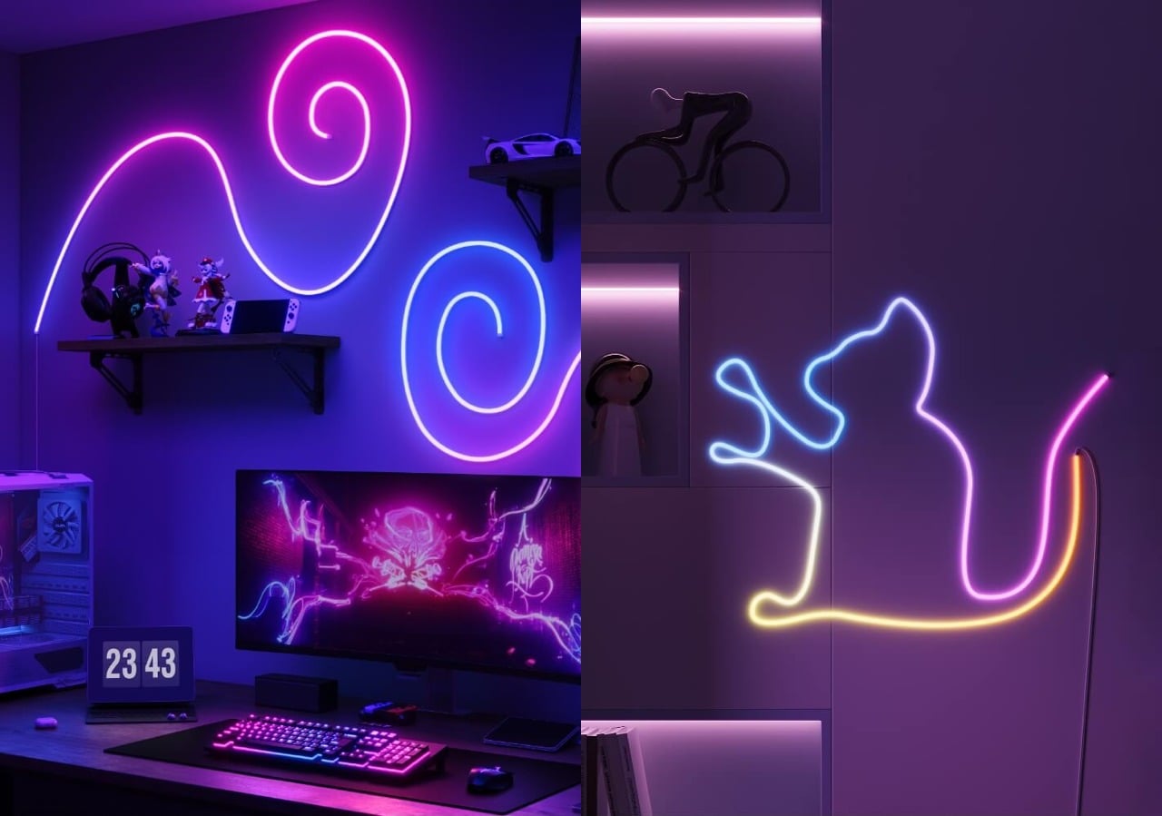
The Govee RGBIC Neon Rope Light 2’s upgraded flexibility allows you to “draw” on a wall or around furniture, giving you complete freedom to create the design that you want. An impressive library of effects from the Govee Home app lets you create the light show of your dreams, whether with the upcoming AI Lighting Bot’s assistance or with full control using the Shape Mapping tool. We wished it was just as easy to remove the rope light and create a different design as it was to install it the first time, but it’s a minor consideration that could happen in future versions of the product. All in all, the Govee RGBIC Neon Rope Light 2 delivers a very powerful tool for letting your creativity shine, literally.

Click here to Buy Now: $99.99

The post Govee RGBIC Neon Rope Light 2 Review: Helping Your Creativity Really Shine first appeared on Yanko Design.

HIX Tutor Review – An In-Depth Analysis of Their AI Homework Helper

Are you struggling with your homework and exam preparation? Do you find yourself spending hours trying to solve complex math problems or deciphering difficult concepts in physics, chemistry, or biology? Consider HIX Tutor, the AI homework helper aims to make studying a joy and alleviate your academic stress.   HIX Tutor is an online platform […]

The post HIX Tutor Review – An In-Depth Analysis of Their AI Homework Helper appeared first on Geeky Gadgets.

Posted in Uncategorized | Tagged

Govee TV Backlight 3 Lite with Dune-themed Packaging Review: Elevating Your Home Theater Experience

PROS:


  • Bright and vibrant colors thanks to RGBICW LED technology

  • Superb color-matching using a future-proof camera system

  • Incredible value for its price

CONS:


  • Camera design is a bit awkward and might not fit thicker TVs

  • Wi-Fi connectivity is compatible with 2.4GHz networks only

RATINGS:

AESTHETICS
ERGONOMICS
PERFORMANCE
SUSTAINABILITY / REPAIRABILITY
VALUE FOR MONEY

EDITOR'S QUOTE:

With rich colors, fast color-matching, and unbeatable price value, the Govee TV Backlight 3 Lite with Dune-themed packaging helps fully immerse viewers in the content they're watching.

TVs today are more than just large boxes that show moving pictures. They have also become pieces of decoration that add to the ambiance of a space, whether they’re turned on or not. The lush and vibrant colors that a TV can display can definitely light up a dark room, but that glow stops at the TV’s frame. Yes, the TV’s light can bounce off nearby walls, depending on where it’s placed, but you have absolutely no control over what happens. TV backlights were made to help better immerse you in the show or movie you’re watching by making sure that the light behind and around your TV reflects the content that’s on screen. Smart lighting expert Govee recently launched its latest contender in that category and even partnered with Warner Bros to tie in with the studio’s latest new science fiction film, Dune: Part Two. It’s the perfect time, then, to take a close look at the Govee TV Backlight 3 Lite, particularly with this Dune-themed packaging, to see what value it adds to your viewing experience and if it’s tempting price tag sounds too good to be true.

Designer: Govee

Click Here to Buy Now: $74.99 $89.99 (16% off).

Aesthetics

For something you will never see again after you’ve installed it, the Govee TV Backlight 3 Lite has quite an interesting appearance. Of course, it’s just a flat strip of LEDS grouped into four segments that need to go around your large TV, but the transparent material that covers the LEDs and some of the circuitry that controls allows you to see some of the secrets behind the magic. It’s not unlike that trend in consumer electronics where transparent cases showed off the parts that actually made the product work. It’s not as sophisticated as those, but it still adds a bit of flavor to the design.

Of course, the Govee TV Backlight 3 Lite’s beauty really shines, literally, it has been installed and enabled, and boy does it shine! The light the strips produce is quite bright, especially in a dim room, and the colors are rich and vibrant. The way those colors shift almost instantly to match what’s on the screen is also magical, making it look like the TV actually goes beyond its frame. We’ll get to the technical details that make that possible in a bit, but suffice it to say, the backlight definitely delivers an enriching experience when watching any kind of content on TV.

While the backlight itself is something you won’t see, there is one part of the system that is actually always visible and, depending on your setup, always in your face. Given how the Govee TV Backlight 3 Lite works, it’s necessary to have that camera hanging from the top of the TV, extending a bit forward from the frame. Depending on the design of the TV itself, this black cantilever-like part may or may not easily stand out, and it will definitely add a little blemish to more artful TV designs. Unfortunately, there is no other way to implement this kind of dynamic color-matching system, so it’s a cost that owners will have to live with. Fortunately, it might actually be the biggest cost after all.

Ergonomics

Since the Govee TV Backlight 3 Lite is not something you’ll be using in your hand every time, its ergonomics mostly apply to the installation process as well as the hands-free control of the lights. In that regard, Govee’s light strip is not really unlike others in this market, which isn’t completely a good thing either. Installing the lights on the TV is a very involved process, which will be even more difficult if your TV is mounted on a wall.

In a nutshell, you attach the four segments of the strip on the four edges of the TV’s back. The exact placement of the strips will depend on the shape of that rear, with curved ones being the trickiest. The strips are attached using 3M adhesive, which will worry some owners about the permanence of the installation and the marks it will leave behind when removed. Special care must also be taken to hide the loose cables at the corners so that they don’t peek out of the frame or cast shadows when the lights are turned on.

Compared to its previous two TV backlights, Govee changed the design of the camera bracket significantly. It no longer uses an adhesive and instead relies on gravity and the weighted bracket to attach the camera to the top of the TV without sticking it with an adhesive. In theory, it works and won’t wobble too much (unless you’re constantly moving the TV), but some might worry enough to actually use the included adhesive anyway. The bigger problem, however, is that this design also limits the bracket to certain TVs, particularly thinner ones. It’s certainly possible to attach it to other TVs, but not without putting in a lot more effort as well.

Once that hard work is done, however, the rest of the setup is easy as pie. You only need to turn the control box on, connect it to the Govee app on your phone, and go through the initialization process. That will include calibrating the camera by placing removable orange markers on the front edges of the TV, and that’s pretty much it. The mobile app has tons of settings and modes you can play with, but even leaving it at the default color-matching mode is more than enough to enhance your watching experience. You don’t even need that app if you connect it to your Wi-Fi so that you can control it by voice using smart home platforms, though like any Govee product, it requires 2.4GHz Wi-Fi, so 5GHz-only routers will be incompatible.

Performance

Without the Govee TV Backlight 3 Lite

Although TV backlights are not uncommon, dynamic color-matching ones are still hard to come by, especially at the price point that the Govee TV Backlight 3 Lite with Dune-themed packaging comes with. It’s even harder to find one that works so well, which is why this Govee product is actually impressive and a dream come true for TV owners who want to take their cinematic experience to the next level.

With the Govee TV Backlight 3 Lite

Govee upgrades the backlight from its usual RGBIC LEDs to a new RGBICW tech which adds a fourth color to the combination. With a dedicated white LED, the lights can cover even more colors as well as different white temperatures. The lights become more expressive and more vibrant, able to better match the colors being displayed on the screen in front.

Of course, that color-matching doesn’t happen by magic, which is where that odd protruding comes in. With improved Envisual technology and upgraded processors, the Govee TV Backlight 3 Lite is able to identify colors on the screen faster and adjust the lights accordingly. The new fish-eye correction also makes sure that the 180-degree field of view camera sees the edges correctly as well. Admittedly, there’s still about a split-second delay between what happens on the screen and the backlight changing, but it’s almost negligible, to say the least. An HDMI control box would have made things faster but that would only work for content coming through HDMI sources and might not support future versions of the HDMI standard. This camera-based system is, therefore, more flexible and more future-proof, making that milliseconds delay a small price to pay.

Although the color-matching feature is already incredible, the Govee app still has a lot in store for those who want to customize every detail. That includes different modes for what lights to play, even if that means not matching what goes on screen. This is where the collaboration with Warner Bros. comes in, turning the Govee TV Backlight 3 Lite into a portal into the world of Dune: Part Two. There are two new lighting effects, namely Arrakis and Spice, that will make you feel like you’re actually in that fictional world. Even the app itself gets a Dune theme to match. But if you really want to be transported to Arrakis, Govee’s DreamView technology allows you to sync with other Govee lights in the room, bathing you in the warm orange glow of the planet’s environment.

From its fast responsive color-matching to its bright, vibrant colors, the Govee TV Backlight 3 Lite definitely delivers on its promises. It’s not a perfect solution, of course, at least not yet, but the company seems to be heading in the right direction. And with tons of customizable options, including those from the Dune: Part Two collab, the design definitely has a lot to offer, especially if you have other Govee lights in the room.

Sustainability

Sustainability in lighting can be a difficult goal to chase after. Many of the materials needed to make such electronics work are sadly not sustainable by nature. One can only do so much to offset their negative effects, like using recycled materials for packaging or using more power-efficient lights like LEDs, but those can only go so far. Making matters worse is that the Govee TV Backlight 3 Lite, like any other TV backlight, isn’t exactly repairable by design. Once an LED gets busted or a part of the strip stops working, there’s no recourse possible. The whole thing becomes unusable and you either have to replace it or ship the whole thing for repairs. Either way, that means you have to pull it off the TV’s back, which will be tricky with that much adhesive used, and then go through the installation process again with the new strip.

Value

Compared to other TV backlights, the Govee TV Backlight 3 Lite with Dune-themed packaging is quite a steal at $74.99 for 55-65 inches with this sweet deal for Yanko Design readers, especially when considering all you’re getting for that price. You have bright and vibrant RGBICW LEDs that can display almost any hue and color-matching capabilities that can quickly follow the action on the screen. You also have plenty of customization options for modes and effects, including immersing yourself in the desert world of Arrakis if you want to.

The camera will probably be the most contentious part of its design, but it’s a flexible solution that is guaranteed to work regardless of TV and display technologies of the future. Hopefully, Govee will be able to create a better design for the camera in future iterations, but TV owners will just have to live with something hanging at the top of their TV in exchange for a more cinematic viewing experience.

Verdict

It’s actually astounding how a little change of light can affect the atmosphere in a room, even more so when you have a dazzling burst of color to match a mood. TV backlights are one of those things you never knew you needed until you actually try it out and realize how “dead” even the most colorful TV can be without colorful lights shining behind and around it. Some TVs these days come with their own ambient backlighting system, but those come at added cost and no upgrade path for the future.

The Govee TV Backlight 3 Lite with Dune-themed packaging brings that flood of light and color in a package that almost anyone can afford. Its upgraded Envisual color-matching technology is simply mind-blowing in its ability to keep up with the fast-paced action on the screen, and the gamut of colors provided by new RGBICW LEDs helps make the content pop out even more. The variety of customization options, including Arrakis and Spice lighting effects inspired by the Dune: Part Two makes sure that no viewing experience will be plain and boring ever again.

Click Here to Buy Now: $74.99 $89.99 (16% off).

The post Govee TV Backlight 3 Lite with Dune-themed Packaging Review: Elevating Your Home Theater Experience first appeared on Yanko Design.

Nothing Phone (2a) Review: Nothing Beats the Beauty of Essentials

PROS:


  • Beautiful and distinctive semi-transparent design

  • Decent dual 50MP cameras, 32MP front camera

  • Huge 5,000 mAh battery

  • Good value for its price

CONS:


  • No dedicated telephoto camera

  • Average mid-range performance

RATINGS:

AESTHETICS
ERGONOMICS
PERFORMANCE
SUSTAINABILITY / REPAIRABILITY
VALUE FOR MONEY

EDITOR'S QUOTE:

The Nothing Phone (2a) distills the smartphone experience to its most important essentials and wraps it in a gorgeous design you will never get tired of.

Smartphones are getting more and more powerful every year, but that power comes at the cost of complexity and cost. While there’s nothing wrong with a super powerful, uber-luxurious, and expensive device, it’s just not for everyone. Unfortunately, those who prefer to stick to the important basics are often left compromising in terms of performance and especially aesthetics. Nothing is a young brand that is trying to shake up the status quo with a heavy focus on thoughtful design, transparent practices, and accessible technology, and it has already been making headlines with its smartphones and accessories. With the Phone (2a), it’s dipping its hands into a different segment of the mobile market, so take it for a spin to see if it has anything substantial to offer or if it’s nothing at all, pun totally intended.

Designer: Nothing

Aesthetics

Nothing made a name for itself with the distinctive design of its products, especially its phones. While it was not the full transparency idealized by risky DIY hacks or printed skins, Nothing’s decision to have a semi-transparent design actually made better sense. It gave the phone a cleaner look, without the distracting noise of electronics and labels, but still had enough character to stand out from the crowd quickly.

The Nothing Phone (2a) is clearly a member of this family but also differs in significant ways. The arrangement of components is very different, with the camera bump now lying horizontally in the middle, surrounded by a Glyph Interface that’s also completely new and unique to this model. The camera array is enclosed in a circular area from which a covered path snakes down to the bottom, almost like the ribbon connectors between components you’d see inside phones. This distinctive design gives the phone a facsimile of a robotic face, friendly and welcoming like those in cartoons and kids’ shows.

Unlike earlier rumors that worried Nothing fans, the Phone (2a) does indeed have the Glyph Interface, except it’s also simplified like the rest of the phone’s design. There are only three components this time, two asymmetrical arcs on the left of the cameras and a vertical bar on the right, that delivers that same dynamic lighting but with less fanfare. Considering how you’re usually holding your phone, this makes sure that the glyphs will always be visible to everyone in front of you when they light up, rather than having parts of it covered by your hand.

The Nothing Phone (2a)’s aesthetics pretty much reflects the overarching theme of the phone. It delivers the essentials for a pleasing user experience without being showy but still having enough impact to be worth your while. It strives to strike a balance even harder than its older siblings in order to cater to a market that has long been in need of that kind of design that doesn’t compromise too much for the sake of driving down costs.

Ergonomics

The Nothing Phone (2a) is also an anomaly in the sense that it’s actually a large phone that weighs almost like nothing. With a 6.7-inch screen, it’s definitely one of the bigger slabs in the market, yet its 190g weight feels almost nothing in your hand. And that’s despite the large battery it hides inside, which makes the phone a bit of a mystery.

This means that the Phone (2a) is quite comfortable to hold, even for long periods of time. It doesn’t weigh down on your hand that much, though you might also be worried its lightness can become a liability instead. Fortunately, the flat edges of the phone do provide a bit of grip to aid your hand. All in all, it was a pleasurable experience to hold the phone, perfectly matching its pleasing aesthetic.

Performance

There’s no going around the fact that the Nothing Phone (2a) is not your super-powerful high-end premium flagship. Nothing partnered with chipmaker MediaTek for a custom Dimensity 7200 Pro chip, but that is also two tiers from MediaTek’s own top-of-the-line series. Even the GPU technology is from back in 2021, and benchmark scores seem to paint a rather disappointing picture. It’s theoretically better than its peers, the Snapdragon 7s Gen 2 and Snapdragon 782G, but those are mid-range processors as well.

The good news is that it hardly really matters because the Phone (2a) still manages to hold its own with most tasks you throw at it, especially with 12GB of RAM. Gaming is going to be less impressive, of course, so you’ll have to dial down the settings a bit, but it’s still a decent experience. The Nothing Phone (2a) is meant to be an everyday phone for everybody, rather than a hyper-focused tool for gaming or photography, and when it comes to general activities, it thankfully does quite well despite those numbers being stacked against it.

As mentioned earlier, the Nothing Phone (2a) has quite a sizable battery, specifically a 5,000 mAh pack. That’s actually very generous even by premium smartphone standards, and given the rest of the specs, it’s sure to give you more than a day’s worth of use, at least with reasonable measure. Charging is capped at 45W, which isn’t exactly the fastest but still an upgrade over previous technologies. As expected, there is no wireless charging, which is one of the very few compromises this design does make.

In addition to its unique semi-transparent design, the Nothing Phone was characterized by its Glyph Interface, basically a light-based notification system that adds a bit of flavor to the user experience. Some considered it gimmicky at first, but it’s actually a useful tool for minimizing distractions. You can keep your phone face down on your desk and only see the glyphs light up for important events, like a call, an important message, or a timer. You don’t have to glance at your phone’s screen every time something comes in, reducing the risk of you getting distracted when you other notifications as well. And because the glyphs are confined to the upper portion of the Phone (2a), they’re also less invasive and more restrained, focusing on just the essentials of the function rather than the glamour.

When it comes to the cameras, the Nothing Phone (2a) is a bit of a mixed bag. As you may have noticed, there are only two cameras, but both of them, fortunately, have 50MP sensors. The main Samsung GN9 camera features OIS and autofocus, while the ultra-wide Samsung JN1 has a 114-degree field of view. Both perform rather well, even at night, with clear details and low noise. Unfortunately, there is no dedicated telephoto camera, so you’ll have to settle for the main wide camera’s cropped 2x zoom, which is less impressive than regular shots.

The front-facing camera has an impressive 32MP sensor, and it definitely shows in the quality of selfies you can take. There’s no aggressive beautification like what you’d find in other brands, so what you see is really what you get. That means this camera isn’t just great for social media but, more importantly, for video calls and meetings as well.

Sustainability

Right from the start, Nothing wanted to be different from the way it ran its smartphone business, which also included its commitment to sustainability. From the use of recycled materials to the packaging, Nothing has been ensuring that its products reduce their negative impact on the environment. The Nothing Phone (2a) thankfully follows that practice, and although it’s not yet on the same level as bigger brands, it’s definitely a strong start.

That commitment to sustainable design is helped by the fact that the Nothing Phone (2a) is also made to last longer. With an IP54 dust and water resistance rating, it’s guaranteed to hold up against most accidents. It’s not the highest rating, of course, but just that mark goes a long way in assuring owners that their fun-looking mobile partner isn’t going to abandon them at the slightest incident.

Value

Given all the specs and features, it’s perhaps pretty clear that the Nothing Phone (2a) is the brand’s foray into a segment traditionally considered to be mid-range or mid-tier. In fact, its $349 price tag confirms that classification and that figure is nothing to scoff at. There’s a certain negative connotation to the phrase “you get what you pay for,” but this is a case where you’re actually getting a whole lot more than that price value.

Yes, performance is decent at best, but the Phone (2a) has enough power to get you through the day and more, both in terms of raw power as well as battery life. The cameras are serviceable, though you’ll definitely feel the absence of a proper zoom camera. Best of all, you’re getting all of that in a distinctive and eye-catching design that’s pleasing to the eyes and light in the hand. In other words, you’re getting a beautiful, no-nonsense smartphone that feels worth more than what Nothing is asking for.

Verdict

Nothing has definitely stirred up the waters by challenging the market giants with an ambitious vision and a visionary design. But while the first two Nothing Phones served to put the brand on the map, there was still a segment that was left underserved by these premium products. To bring its design to everyone, Nothing also needs to target different tiers, tiers with different needs and budgets.

The Nothing Phone (2a) was clearly made to address that need, offering an experience that focuses on the essentials without all the bells and whistles that, in the end, could also burden the user. It packages that in a design that is bare-bones yet distinctive and characteristic of Nothing’s design language. It distills the Glyph Interface down to its core purpose, to provide a distraction-free way to get notified of important events. The Nothing Phone (2a) is a laudable example of a design that deftly balances features and costs to craft an experience that is clearly made with the user in mind.

The post Nothing Phone (2a) Review: Nothing Beats the Beauty of Essentials first appeared on Yanko Design.

Vivo V30 Pro Review: Putting The Focus Where It Counts

PROS:


  • Thin, lightweight, and beautiful design

  • 50MP wide-angle selfie camera with autofocus

  • Impressive triple 50MP camera system

  • Long-lasting, fast-charging battery

CONS:


  • No stereo speakers

  • Thin edges make it difficult to grip and pick up

  • Limited global availability

RATINGS:

AESTHETICS
ERGONOMICS
PERFORMANCE
SUSTAINABILITY / REPAIRABILITY
VALUE FOR MONEY

EDITOR'S QUOTE:

With breath-taking elegance and ZEISS-tuned Triple Main Cameras, the Vivo V30 Pro offers unbeatable value to mobile shutterbugs and design-conscious buyers alike.

It’s really difficult these days to pin a phone down to a specific market tier or device range, especially since brands tend to advertise every single model as the best in its class. Technology has advanced to a point that what some might consider mid-range due to one or two features might surpass flagship models in other aspects. That seems to be the case with the Vivo V30 Pro, arriving on the heels of the Vivo V30 that we reviewed just last month. The “Pro” in its name is pretty telling, promising a higher level of experience while still staying faithful to the spirit, not to mention the design, of the base model. In what ways does the Vivo V30 Pro actually improve on the Vivo V30, and are those enough to warrant giving this pricier version a serious look? We give it a whirl to find out.

Designer: Vivo

Aesthetics

Something can be beautiful without being too flashy. A flower’s charm, for example, often comes from its simplicity and the pleasing way it combines shapes and colors in a way that only Mother Nature can really accomplish. The Vivo V30 Pro tries to capture that spirit almost literally, combining subtle details and minimalist aesthetics in a composition that delights the eyes without being distracting. It’s no coincidence that Vivo’s designs for the V30 Pro are clearly patterned from nature, and it definitely pulls this feat off with aplomb.

It’s not just a matter of painting patterns on the phone either. Our Bloom White review unit, for example, looks like it has flowers pressed on its back. This “3D Petal Pattern” was accomplished by 3D engraving 13 million tangent lines on the material’s surface using photolithography. The greenish-blue Waving Aqua, on the other hand, employs thousands of tiny magnetic particles to create the illusion of rippling waters. The visual effects are subtle, almost invisible unless you take a second look, but they definitely add to the Vivo 30 Pro’s elegance.

Coupled with its thin profile and lightweight body, the Vivo V30 Pro exudes class and beauty without being overbearing. The process and cost of such designs might sound overkill for what would be classified as a mid-range phone, but these designs not only demonstrate Vivo’s manufacturing prowess, they also reflect the evolving tastes of smartphone owners today who want an attractive phone they won’t need or even want to cover up with a case.

Ergonomics

Despite the large 6.78-inch screen, Vivo manages to make the impossible possible with a thin and lightweight handset. Only 7.45mm thin and 188g light, the Vivo V30 Pro is comfortable and pleasurable to hold, even after long periods of time. That thinness is very accentuated by the curved edges of both the screen and the rear panel, a trend that is slowly dying and being pushed out by flat edges. Some defend that this design is gentler on your palms, but others criticize it for also reducing the phone’s grip, making it more likely to slip from your grasp.

If there is one drawback to the Vivo V30 Pro’s very thin edges, it’s that it makes it a bit tricky to pick it up from a table or any solid flat surface. There’s very little area for your fingers to grip the edges and you might find the phone slipping or sliding before you can have a solid hold on it. The included clear case adds some thickness and texture to fix that, but it also puts a less premium layer of material between you and your phone, no matter how transparent it is.

Performance

Gone are the days when you could easily predict a phone’s performance by simply looking at its specs, especially the processor. The time when MediaTek’s silicon was considered cheap and underpowered is long over as well, and the Vivo V30 Pro is living proof of that. Granted, the 4nm Dimensity 8200 processor it’s using is actually last year’s generation, but it’s hardly any slouch. In fact, it manages to beat Qualcomm’s Snapdragon 7 series from the same generation in some benchmarks, which is quite telling.

What all this means in practice is that the Vivo V30 Pro can handle everyday tasks without breaking a sweat. Sure, you shouldn’t expect it to run toe-to-toe with high-end and more expensive smartphones, but setting graphics settings to medium is sure to still satisfy your gaming needs. The cooling system is effective, though not exactly stellar, so expect your hands to feel some heat after prolonged gaming. The best part of its performance, however, is the generous 5,000 mAh battery that’s guaranteed to last you more than a day of average use. With the included 80W charger, you don’t even need to wait long to get it from zero to full, just a little under 50 minutes, in fact.

The large 6.78-inch 120Hz AMOLED display mirrors the phone’s back in providing a beautiful sight, though it’s naturally flashier and more eye-catching. The panel is bright and the colors are vibrant, though they tend to lean more towards being very saturated by default. While the visual experience is superb, the same can’t be said of the audio aspect. There’s a single bottom-firing speaker that is very basic. You’ll be hard-pressed to detect much bass, for example, and the quality degrades noticeably at maximum volume. You might be better off connecting Bluetooth speakers if you really want to spread your tunes around.

Smartphones these days almost feel like cameras that just happen to have phone functionality because of the heavy emphasis put on mobile photography. The Vivo V30 Pro is no exception and, in fact, celebrates it and takes it to the next level. It challenges the status quo of using different sensors for different cameras and comes bearing 50MP cameras for primary wide, ultra-wide, and 2x telephoto. In fact, it even uses a 50MP sensor for the front-facing camera, complete with a wide-angle lens and autofocus.

For its camera system, Vivo enlisted the expertise of optics experts ZEISS, and the results definitely speak for themselves. The output of the main camera is clear, highly detailed, accurate, and just gorgeous. That is true even at night, with Vivo’s special night mode kicking in. The 2x optical zoom of the dedicated telephoto, while not that far in reach, is still better than relying on digital zoom and cropping the way the Vivo V30 does. The ultra-wide camera, while decent, isn’t as impressive as these other two, but you’ll still get clear and detailed images from it, regardless of the lighting condition.

One special feature of the Vivo V30 series, which can be seen from the unusual design of the phone’s camera bump, is the square Aura Light that sits below the cameras. If you’re familiar with the effect of ring lights in diffusing a gentler glow on your face, then you’ll know how this feature works. Instead of a focused light like a typical LED flash, it spread the light around more evenly, making it the perfect illumination for portrait photos. Even better, the Aura Light can automatically change its intensity and warmth depending on ambient lighting, all thanks to AI, of course. Now if only Vivo could do the same for the front-facing camera, then it would really be able to leave its competition in the dust.

Sustainability

Despite the Vivo V30 Pro’s nature-inspired design, the phone itself isn’t exactly that environment-friendly, at least as far as its build materials go. It’s not exactly an outlier in this regard and it merely follows the industry status quo. Sadly, it’s also an opportunity for Vivo to rise above the rest and set a new industry standard, but we’ll probably have to wait a bit longer for the company to really take its sustainability efforts to the next level.

At least the Vivo V30 Pro is designed to last long, especially with an official IP54 dust and water protection rating. It’s far from being the highest and is, in fact, the bare minimum for waterproof devices, but it’s also something that’s usually missing from most smartphones on this tier. When accidents do happen, however, you have very little option other than to send it to Vivo or its authorized repair centers for servicing. Self-repair is just not a thing in this space yet.

Value

Truth be told, it’s hard to find any fault with the Vivo V30 Pro. Yes, it doesn’t max out all the potential that more powerful hardware can provide, but it also doesn’t tax buyers for features they may never use in the first place. It has a pretty good balance of features and tends to perform well in areas that matter the most, such as mobile photography and battery life. Plus, it looks stylish and classy, so you’ll probably fall in love with it quickly.

The expected $500 price tag brings a bit of uncertainty, though. It’s definitely higher than its sub-$400 peers, but it offers features you won’t find on more expensive handsets either. The biggest deal-breaker, however, is its availability. The Vivo V30 Pro will only be sold in select markets in Asia, at least for now, so all that beautiful design and impressive cameras will be out of reach for many people around the world.

Verdict

Smartphones are no longer just tools for communication or even for staying connected to the Internet. They have become irreplaceable partners in creating and preserving memories, as well as extensions of our personalities and aspirations. Smartphone designs have matured over the years, shedding off flashy and gimmicky features for reliable functionality and appealing aesthetics. This trend has trickled down even to the so-called mid-tier market, as embodied by the Vivo V30 Pro.

Inspired by nature, the Vivo V30 Pro’s beauty is subtle yet impactful, employing innovative manufacturing techniques to create more natural designs that catch the eye and soothe the soul. It’s no racehorse, but what the phone lacks in raw processing power it makes up for in reliability and value, offering a more balanced product. At the same time, its Triple 50MP Main Camera system and 50MP front-facing camera challenge the status quo and prove beyond reasonable doubt what is possible even on this tier. All-in-all, the Vivo V30 Pro is a well-rounded contender that you’ll want to consider for your next phone purchase, presuming it’s even available in your area.

The post Vivo V30 Pro Review: Putting The Focus Where It Counts first appeared on Yanko Design.

Vivo X100 Pro Review: A strong contendar for the best camera phone of 2024

PROS:


  • Exceptional imaging capabilities

  • Great display

  • Snappy performance

CONS:


  • Front facing video is capped at 1080p

  • Limited market availability

RATINGS:

AESTHETICS
ERGONOMICS
PERFORMANCE
SUSTAINABILITY / REPAIRABILITY
VALUE FOR MONEY

EDITOR'S QUOTE:

The Vivo X100 Pro currently stands as one of the best camera phone on the market, transforming even the most maudane scene into form of artistic expression.

In the landscape of mobile phone space, making a significant impact can be challenging unless you belong to the elite trio of Apple, Google, and Samsung. The task becomes even more formidable for an underdog like Vivo. If you are not familiar with Vivo, the company was founded in 2009 and has since become a significant player in the mobile phone industry with a strong presence in Asia and the Middle East with its footprint extended to certain regions in Europe. The company is known for offering devices with innovative features, and its X-series flagship, in particular, has gained attention for its impressive mobile imaging performance, through continual collaboration with the renowned lens manufacturer Zeiss. Vivo’s new flagship X100 Pro, which was launched in China on December 19th last year, is yet another Vivo device with outstanding camera capabilities.

We’ll explore how Vivo continues to push boundaries in the realm of mobile photography and invocation. From its sleek aesthetics to the powerful internals, the X100 Pro promises an immersive user experience. Join us as we uncover the nuances of its design, performance, and unique features, providing you with a comprehensive insight into what makes this smartphone a noteworthy contender in the ever-evolving world of mobile phones.

Designer: Vivo

Aesthetics

A large, circular camera module proudly graces the top of the device and rightly commands attention. Aside from the massive camera module, Vivo does not shy away from splashing X100 Pro’s camera capabilities. At the center of the camera module, the Zeiss logo gleams, accompanied by the red letter T* beneath it to indicate the anti-reflective coating that significantly increases light transmittance and helps accurately reproduce colors, according to Vivo. Made of aerospace-grade stainless steel, the “Sun Halo” or “Moon Halo” Ring surrounds the camera module with lens specs on the ring. Underneath the camera module, you’ll find “Xtreme Imagination” Vivo Zeiss Co-engineering branding. On the bottom, you’ll find big, but subtle Vivo branding. If all these texts on the back of the device are not enough for you, look at the top of the phone, and you’ll find a “Professional photography” sign.

A bit cluttered with texts aside, the X100 Pro is a sleek-looking device. It is available in two color options: Asteroid Black and Startrail Blue. We received the Asteroid Black variant which has a glass back panel with a matte finish, resembling sandblasting. The Startrail Blue variant also boasts a glass back panel but distinguishes itself with patterns that emulate the streaks of light created in the night sky.

Ergonomics

Vivo X100 Pro measures 164.05 x 75.28 x 8.91 mm and weighs 225 g. The display features slightly curved side edges. The side edges of the back panel are also slightly curved. The device fits nicely in the hand and thanks to the curved edges, it does not bite into the palm. In the Asteroid Black variant, the glass back panel offers a velvety touch that is quite pleasing but tends to be a bit slippery. Luckily the textured gray case came with the phone to provide a nice grip, though it tends to show scratches easily.

Like numerous other smartphones with an in-display fingerprint scanner, the positioning of the scanner near the bottom edge of the display can present a challenge for swift unlocking and seamless navigation with one hand. Fortunately, the fingerprint proves to be fast and accurate. The arrangement of the physical buttons and SIM tray is also similar to other phones, with the volume control button situated on the right side, and below it, the power button. At the bottom, you’ll find a SIM tray, primary microphone, USB-C port, and speaker. Meanwhile, on the top, there is a secondary microphone and an IR emitter.

Performance

There is absolutely no doubt that the main attraction of the Vivo X100 Pro is its upgraded ZEISS co-engineered imaging system. Before delving into the details, I’ll spill the beans – it is phenomenal. X100 Pro boasts a triple camera setup. The main 50MP camera uses a Sony 1-inch IMX989 sensor with an aperture of f/1.75. However, the true standout in the triple camera setup is the Zeiss APO floating telephoto camera with an aperture of f/2.5. The telephoto camera features an innovative periscope group structure called the Floating Elements Design, enabling sharp focus both up close and at a distance, by allowing individual lens elements to move freely. Both the main and telephoto cameras support OIS. Rounding up the triple camera setting is a 50MP ultra-wide with an aperture of f/2.0.

The main camera produces excellent images with plenty of details and a wide dynamic range. The photos are sharp and color rendering is realistic. The 2x zoom photos, captured with the main camera, are great as well.

The ultra-wide does its job well, and the photos captured are equally impressive as those taken by the main camera. However, it’s not very wide (119-degree field-of-view) compared to some other phones.

Both the main and ultra-wide cameras are also very capable in low-light conditions, capturing images with the right level of exposure, excellent dynamic range, and substantial details even in dark areas.

However, as stated before, 4.3x Telephoto is hands down the star of the triple camera setup, delivering superb photos in nearly every lighting scenario. Even in low-light settings, the handset takes photos with plenty of details, balanced exposure, and minimal noise. With the 100mm equivalent focal length, you can get close to your subject and snap the photos with a nice bokeh, and if you need to get even closer to the subject, the device is capable of digitally zooming up to 100x.

I took the Vivo X100 Pro to Ed Sheeran’s show in Osaka, Japan, and captured many photos and videos using mainly telephoto throughout the show. My seat was located on the first floor of the baseball stadium, which had been transformed into a concert venue with a capacity of 36,447. I was very impressed with the photos and videos I snapped at the show where lighting was constantly changing and tricky.

Given that this is an imaging-focused mobile handset, the device offers an array of shooting modes and styles to cater to your creative vision. There are Snapshot mode, Night mode, and Portrait to name a few. In Photo mode, the users can select from three distinct color treatments: Vivid, Natural, and Zeiss. The Portrait mode offers various styles to choose from, with my personal favorite being Vintage, delivering a film-like output.

With photos captured in Portrait mode, you have the flexibility to adjust the focus point and aperture after the fact, allowing you to customize the desired focal point and level of bokeh.

I usually don’t find much interest in Macro mode as the photos produced are subpar. However, the X100 Pro proves to be an exception. It produces sharp images with a pleasing bokeh effect, as you can see in the sample photo below.

Vivo X100 Pro’s excellent capability does not stop at taking photos. The device takes great videos as well. The phone is capable of taking up to 8K 30fps video with its main camera. The telephoto and ultra-wide cameras can record videos up to 4K at 60fps. Unfortunately, the front-facing camera is maxed out at 1080p at 30fps. Stabilization works very well in well-lit conditions but struggles a bit under low-light conditions.

There is a 4k Cinematic Portrait mode that offers automatic focus switching, similar to Apple’s Cinematic Mode. While its performance can be inconsistent, it takes artistic videos when it gets right.

Powered by MediaTek’s latest and most powerful Dimensity 9300, the device offers a seamless experience whether you are playing graphically demanding games or multi-tasking with numerous apps opened. Despite the phone’s responsiveness and speed, the battery performance can be somewhat underwhelming depending on what you do on the phone. Equipped with an enhanced 5,400mAh battery, the phone provides ample power for normal daily use. If you take tons of photos and videos(which with the phone this good, you will be inclined to do so), topping up during the day might be required. Fortunately, it supports 100W FlashCharge and 50W wireless FlashCharge.

Vivo X100 Pro sports a 6.78-inch AMOLED screen with 2,800 x 1,260 resolution, a refresh rate of up to 120Hz, and is equipped with LTPO technology for dynamically adjusting the refresh rate while saving the battery. With a local peak brightness of 3,000 nits, the screen is ample bright even under direct sunlight. It delivers smooth images with vibrant colors.

Running on Funtouch OS 14 on Android 14, the photo provides smooth performance. There are many customization options for things like lock screen styles and useful features like split-screen and small windows. Another welcoming change is having less bloatware.

Sustainability/Repairability

With its exceptional ability to capture high-quality photos in diverse situations, the likelihood of reaching for the Vivo X100 Pro to snap moments becomes a natural inclination. Considering the exposure to elements like water and dust, it’s comforting to know that the device has an IP68 rating, meaning it can endure submersion up to a depth of 1.5 meters for a duration of up to 30 minutes.

Vivo does not specify the use of sustainable materials for the phone. However, the material used for the ring around the camera module is crafted from aerospace-grade stainless steel, known for its resistance to wear, high temperature, and corrosion, ensuring durability.

Value

Vivo X100 Pro X was launched in China with a price tag of 5,499 CNY (about 770 USD)for the 16GB RAM/ 512GB storage variant. Since then the company has gradually rolled out the device into other Asian markets including India, Malaysia, and Thailand. It has finally reached some European markets. It’s worth noting that the price is higher than anticipated, at 1,199 Euros (about 1230 USD). However, given the phone’s quality, particularly its exceptional and versatile imaging capabilities, it is not excessively expensive.

Verdict

If mobile photography is your priority when choosing a phone, the Vivo X100 Pro currently stands as one of the best camera phones on the market. Whether capturing moments with friends and family, street scenes, or exploring the intricacies of subjects like flowers and bugs in macro mode, this device has the remarkable ability to transform even the most mundane scene into a form of artistic expression, thanks to its exceptional camera features. The images captured by the telephoto camera are just another level, setting the new standard for mobile photography. Beyond its impressive camera capabilities, the Vivo X100 Pro is a solid device with a vibrant and sharp display, responsive software, great build quality, and fast wired and wireless charge capabilities. The handset also offers a well-rounded and high-performing smartphone experience.

The post Vivo X100 Pro Review: A strong contendar for the best camera phone of 2024 first appeared on Yanko Design.

Vivo V30 Review: Slim, Stylish, Simple

PROS:


  • Thin profile and lightweight body

  • Beautiful and subtle water ripple design (Waving Aqua)

  • 50MP wide front camera with autofocus

  • AI-powered Aura Light for studio-quality portrait photos

CONS:


  • No telephoto camera

  • Decent but unimpressive camera output

RATINGS:

AESTHETICS
ERGONOMICS
PERFORMANCE
SUSTAINABILITY / REPAIRABILITY
VALUE FOR MONEY

EDITOR'S QUOTE:

With an incredibly thin profile and a simple yet elegant design, the Vivo V30 is like a breath of fresh air, presenting a familiar face and offering a well-rounded set of features that speak to the hearts of a selfie-loving generation.

Design in the mobile market never sits still, although we are now seeing certain brands leave their design DNA on their phones for longer periods of time. Most of those designs involve cramming everything but the kitchen sink, turning smartphones into a display of technological marvels more than anything else. That’s great for specs and features, but not always for the overall user experience, especially when it comes to aesthetics and usability. Amidst a sea of thick slabs of glass and metal and bulging camera bumps, the Vivo V30 arrives with a more familiar yet still enchanting face. But is it just a pretty face or does it offer something more inside its incredibly slim physique? We take it for a spin to find out.

Designer: Vivo

Aesthetics

The Vivo V30 will immediately strike you as a very different beast from its peers, and that’s even before you pay close attention to the rather graceful patterns on its back, which we’ll get to later. Even before you hold it in your hand, you can already get an impression of how thin it is, a trait that seems to be quickly disappearing even among premium smartphones. Yes, it’s probably because of that curved glass back and “3D curved screen,” a design that some consider to be no longer fashionable these days, but at just the right angles and with the right play of light, it’s hard to deny how sleek and slim it makes the phone look.

The camera bump is similarly distinctive and unique as far as conventional camera designs go. It’s a single raised rectangle with rounded corners that catches your attention not with an obnoxious size but with a pleasant combination of form, color, and finish. The black rounded square of the camera lenses contrasts and complements the similarly shaped Aura Light ring below it. The “2.5D” curved edges of this raised “One-Piece Cloud Step” design are surrounded by a polished metal bezel refined using a diamond cutting technique, providing not just protection for the cameras but also adding a sleek look to anyone looking at those cameras.

The real design highlight, however, is the subtle patterns that give each Vivo V30 model a unique personality. The greenish-blue Waving Aqua review unit we received employs tens of thousands of tiny magnetic particles integrated into a flowing resin material, creating the illusion of ripples that may conjure up images of beaches, lakes, or rivers, all giving a serene and peaceful vibe. The other designs are no less stunning, with Bloom White’s 3D Petal Pattern, created by engraving 13 million tangent lines into the surface using photolithography, or the color-changing Lush Green that turns into tranquil Blue when exposed to UV light. Even Noble Black, with a typical Fluorite AG Glass back, sparkles like a starry night sky thanks to an etching liquid process that transforms the microscopic crystals on the glass surface into prism-like structures.

All in all, the Vivo V30’s slim profile, minimalist aesthetic, and subtle yet elegant design make it easily stand out from the rest of the crowd, especially at its price point. Yes, some might say that its curves make it a bit dated, but that’s exactly why it also feels rather refreshing to take a break from that current trend, especially when the end result is definitely just as beautiful, if not more so.

Ergonomics

There is still some debate on which predominant smartphone design is actually more ergonomic. Fans of curves claim that their preferred design is more comfortable and gentler on the hand, while advocates of flat edges criticize how it doesn’t provide a confident and solid grip. The Vivo V30 is obviously on the former camp so your mileage may vary, but there’s one aspect that puts all those debates to rest: its weight.

At only 186g, the Vivo V30 is easily one of the lightest smartphones on the market, making it comfortable to hold for long periods of time. That’s even more impressive when you find out that it hides a 5,000mAh battery, also one of the largest among smartphones, which should have weighed the phone down significantly, not to mention adding to its bulk. Thanks to a new “One-Piece Encapsulation Technique,” that large battery can become unbelievably thin, and a “Comprehensive Cushioning Structure” is credited for not just the phone’s aesthetics but also its durability.

Performance

The lines between traditional smartphone market tiers are continually blurring as hardware becomes more diversified yet also more powerful. In the old days, a phone like the Vivo V30 would be classified as a mid-range device because of its Snapdragon 7 Gen 3, but that distinction barely holds today. With 12GB of RAM (plus 12GB Extended memory), the Vivo V30 can handle pretty much anything you can throw at it, with moderation, of course. Mobile gaming is no sweat, especially if you turn down the settings a bit, and the large vapor cooling chamber inside ensures your hands won’t burn when you do so.

The large 6.78-inch AMOLED screen boasts 2800 nits of brightness and a fast 120Hz refresh right. The display is definitely bright and vibrant enough to make your content pop, though it’s not exactly something that will blow your mind either. Audio is a bit so-so, decent enough to let you enjoy music, videos, and games without having to reach for wireless earphones, but more discerning users will prefer higher-quality sound anyway. As mentioned, the 5,000 mAh battery is a major highlight for this unbelievably thin phone, and the 80W charger makes sure you can fully top off in a little just 50 minutes or so.

Like any smartphone these days, a lot of focus is placed on the Vivo V30’s cameras, no pun intended. Truth be told, it’s a rather mixed bag for Vivo’s 2024 V-Series frontrunner, checking a few boxes in some areas while missing out on others. For example, there is no dedicated telephoto camera, which means you’ll have to rely on digital zoom and in-sensor cropping for those closeups. Instead, Vivo puts two co-equal 50MP cameras on the V30’s back, one for the main shooter and the other for ultra-wide panoramic or group shots. In fact, group shots are a big thing for the Vivo V30, but we’ll get to that later.

The main 50MP camera advertises a “True Color” Camera-Bionic-Spectrum VCS technology that is supposed to produce color-accurate images that are close to how our eyes see. While the resulting photos do look vibrant and colorful, they still tend to lean more towards oversaturation rather than the more natural and realistic tones. A highlight of the Vivo V30’s camera system is the latest iteration of its Aura Light, basically a mini Ring Light that’s popular among live streamers and influencers. Used for portrait shots, it offers a softer and more distributed light than what a single LED flash can give. It’s even guided by AI so it can automatically adjust its intensity and temperature depending on the distance from the subject and ambient light.

Vivo positions the V series as a line that targets a more youthful crowd, and nowhere is that more evident than with the selfie camera and its whopping 50MP sensor, complete with autofocus and a 92-degree field of view. Just like the 50MP ultra-wide on its back, this camera was made for taking Group Selfies, ensuring that your friends won’t be left out of those Insta-worthy shots. That said, you don’t have the advantage of the Aura Light with this selfie camera, something Vivo might want to look into for future iterations.

Sustainability

It’s going to be hard to deny that the Vivo V30 isn’t exactly a premium device, at least not with the specs above. Most of the phones on this tier skimp on a few features to meet a certain low price point. In most cases, some corners are cut when it comes to durability, but not this beautiful phone. The V30 boasts an IP54 rating, which is modest but sufficient to protect the phone from dust and water accidents. Given who the phone was made for, those accidents are often the norm rather than the exception.

When it comes to materials, however, the phone doesn’t exactly have anything to boast. It uses quite a variety of special materials and processes to make those intricate patterns on its back, none of which can be said to be sustainable or environment-friendly. The V30 doesn’t stray from the beaten path in this aspect, but hopefully, trends will change and even the young will start demanding for more responsibly made smartphones to put inside their pockets.

Value

Given its target audience, it wouldn’t be a surprise if Vivo prices the V30 very competitively. It’s still playing coy about exact figures, but it should start somewhere around $300 upward, depending on the configuration. It’s something that those with very tight budgets would be able to afford, but it’s almost too easy to say you will also get what you pay for. In reality, however, you’re actually getting a solid deal.

Vivo chose its battles wisely and focused on the things that matter most to its core customer base. The phone is light, easy to hold, and easy to take out of or slip into your pocket. Its design adds a bit of glam to the device, and its cameras, though lacking one member, are made for a generation that loves to take selfies, either alone or with others. With gaming performance the only consideration, the Vivo V30 actually offers a well-rounded set of features wrapped in an elegant aesthetic and matched with an accessible price tag.

Verdict

The market is overflowing with smartphones and, despite all the analysts’ warnings, there doesn’t seem to be any sign of slowing down. Designs are also ever-changing, though the trend seems to be moving towards bigger, thicker, and flatter smartphones. Against this backdrop, the Vivo V30 arrives like a breath of fresh air, offering a face that is both familiar and striking. It’s not going to win benchmarks or photo contests, but its features have been carefully selected to really address the needs and desires of its target market: people who just love taking selfies and holding their phones almost all day.

The post Vivo V30 Review: Slim, Stylish, Simple first appeared on Yanko Design.

Beatbot AquaSense Pro review: Smart and Powerful Swimming Pool Cleaner

PROS:


  • Versatile 5-in-1 pool cleaning functionality

  • Long battery life up to 9.5 hours continuous runtime

  • Smart MemoryPark feature ensures effortless retrieval from the surface

CONS:


  • Needs to be charged

  • Unable to detect new debris in previously cleaned areas

  • Larger debris may float away during surface cleaning

RATINGS:

AESTHETICS
ERGONOMICS
PERFORMANCE
SUSTAINABILITY / REPAIRABILITY
VALUE FOR MONEY

EDITOR'S QUOTE:

Beatbot AquaSense Pro redefines pool cleaning with AI, efficient floor-to-surface cleaning, and water clarification, becoming a dream for pool owners.

Swimming pool cleaners have been around for a long time, but those available from Leslie’s Pool Supply or even the robotic ones on Amazon lack technological innovation, making them no better than traditional pool cleaners. These traditional pool cleaners, often known as suction-side or pressure-side cleaners, operate more simply than their robotic counterparts. They’re costly and need to be connected to a hose that hooks up to the pool’s existing filtration system.

This review explores why smart robotic pool cleaners, particularly the Beatbot AquaSense Pro, are the future. As a spoiler, Yanko Design named it one of the best consumer products at CES 2024.

Designer: Beatbot

Aesthetics

The Beatbot AquaSense Pro is the world’s first all-in-one intelligent pool-cleaning robot. It’s cordless and cleans the floor, waterline, and surface. It also features a water clarification function. With 20 onboard sensors, nine powerful motors, a dedicated Quad-Core 1.8 GHz processor, and an AI algorithm powered by Beatbot OS, it’s a dream come true for pool owners.

The “holistic” view of this robotic pool cleaner is impressive, given its numerous industry-first innovations. Let’s start with its simulated flight propulsion design. No other pool cleaner on the market can float to the surface and clean it intelligently.

This design draws inspiration from nature, specifically from the feeding mechanism of blue or humpback whales. These whales use a unique mechanism called filter feeding to consume large quantities of small prey, such as fish and tiny sea creatures. They do this by opening their mouths wide to gulp in a massive amount of water, then pushing the water out through their baleen plates with their tongues.

The AquaSense Pro robotic pool cleaner works similarly. It has a front flap and uses two propeller motors and two floating chamber motors to glide and suck in debris, leaves, bugs, and other pool pollutants. Its unique AquaGlide™ 
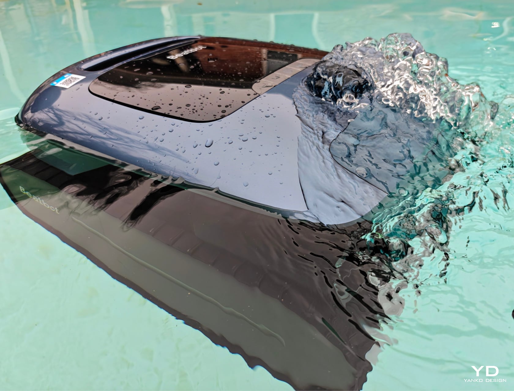
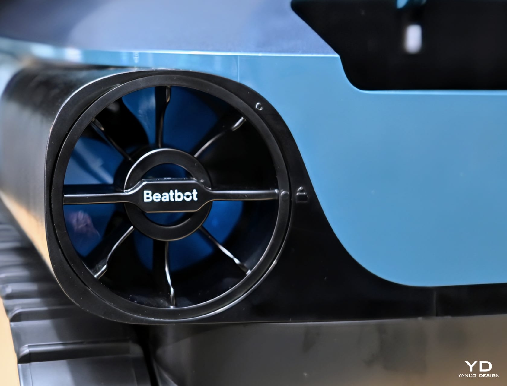
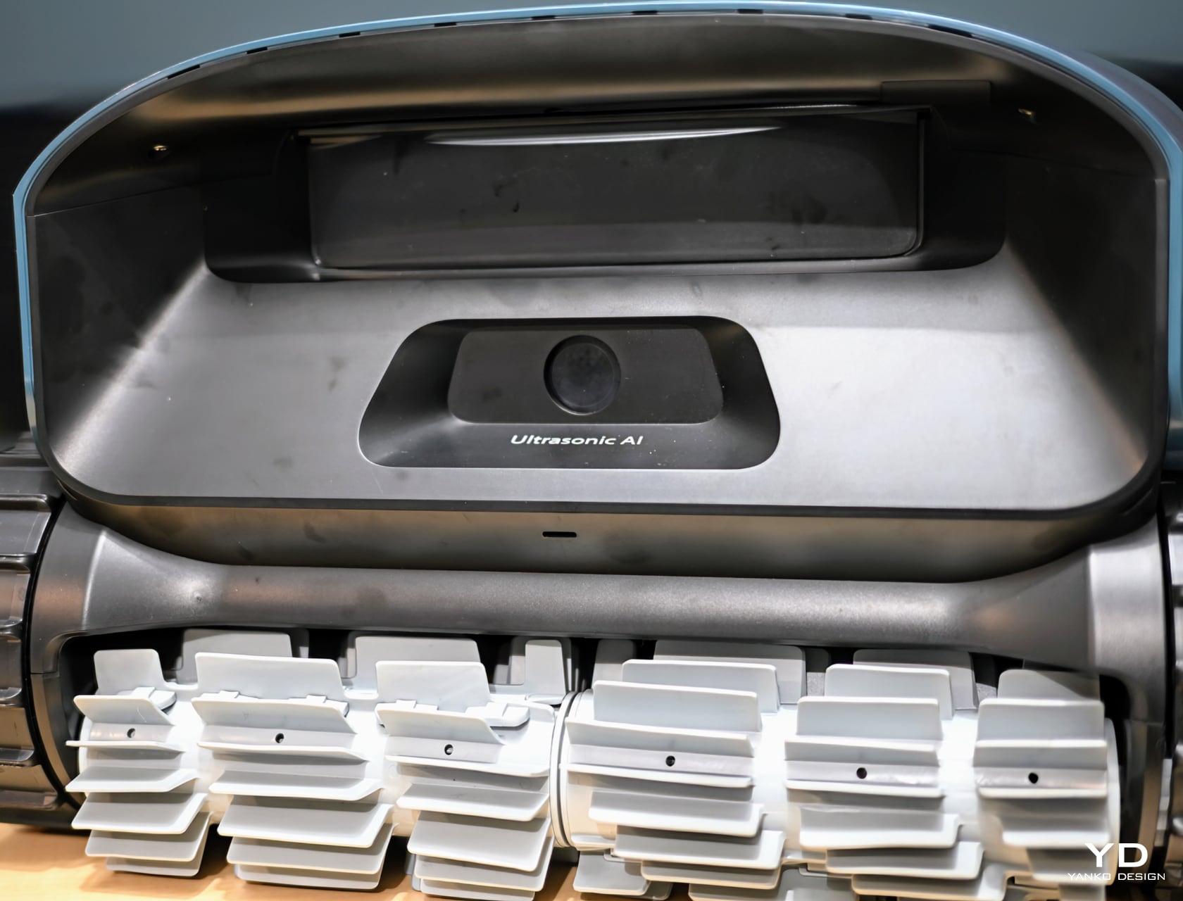
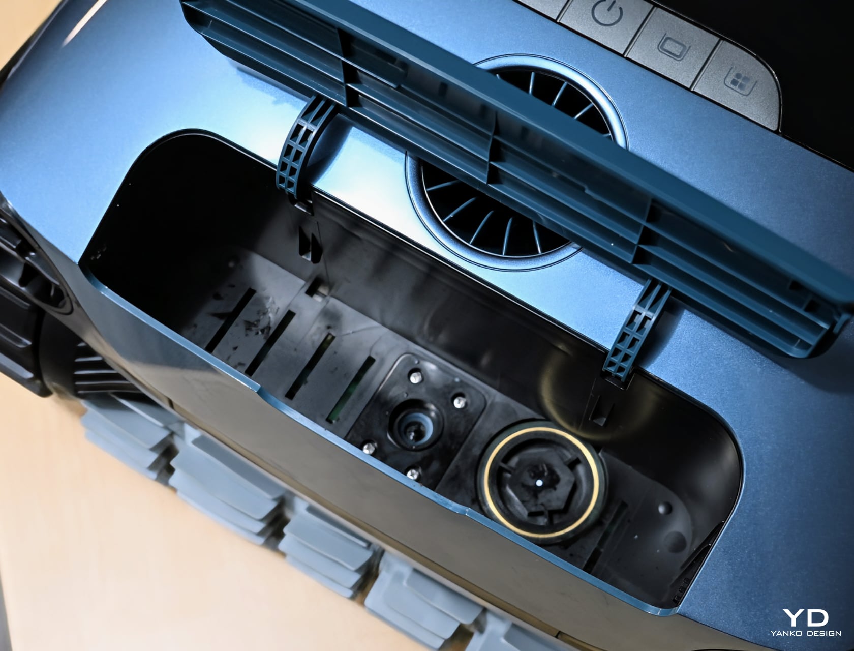
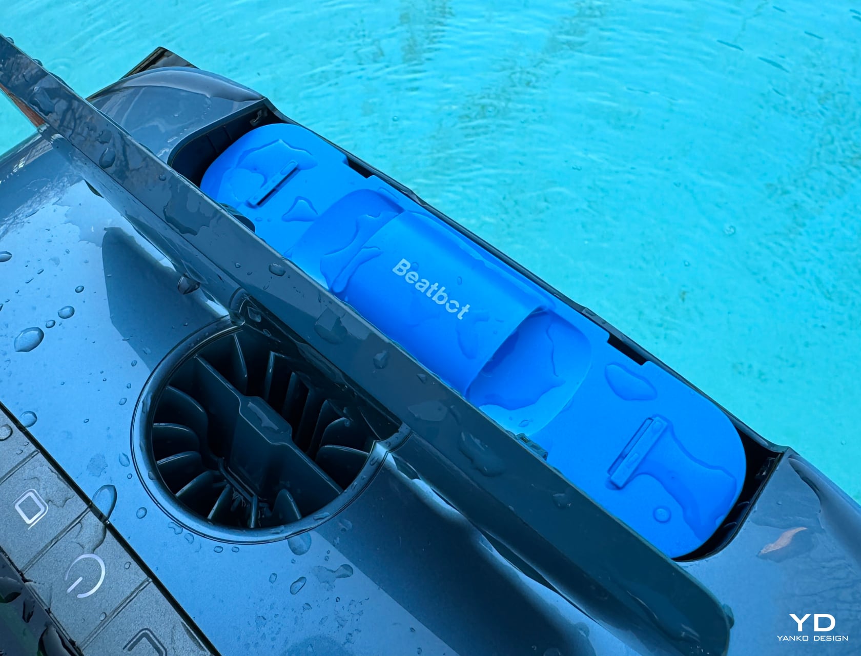
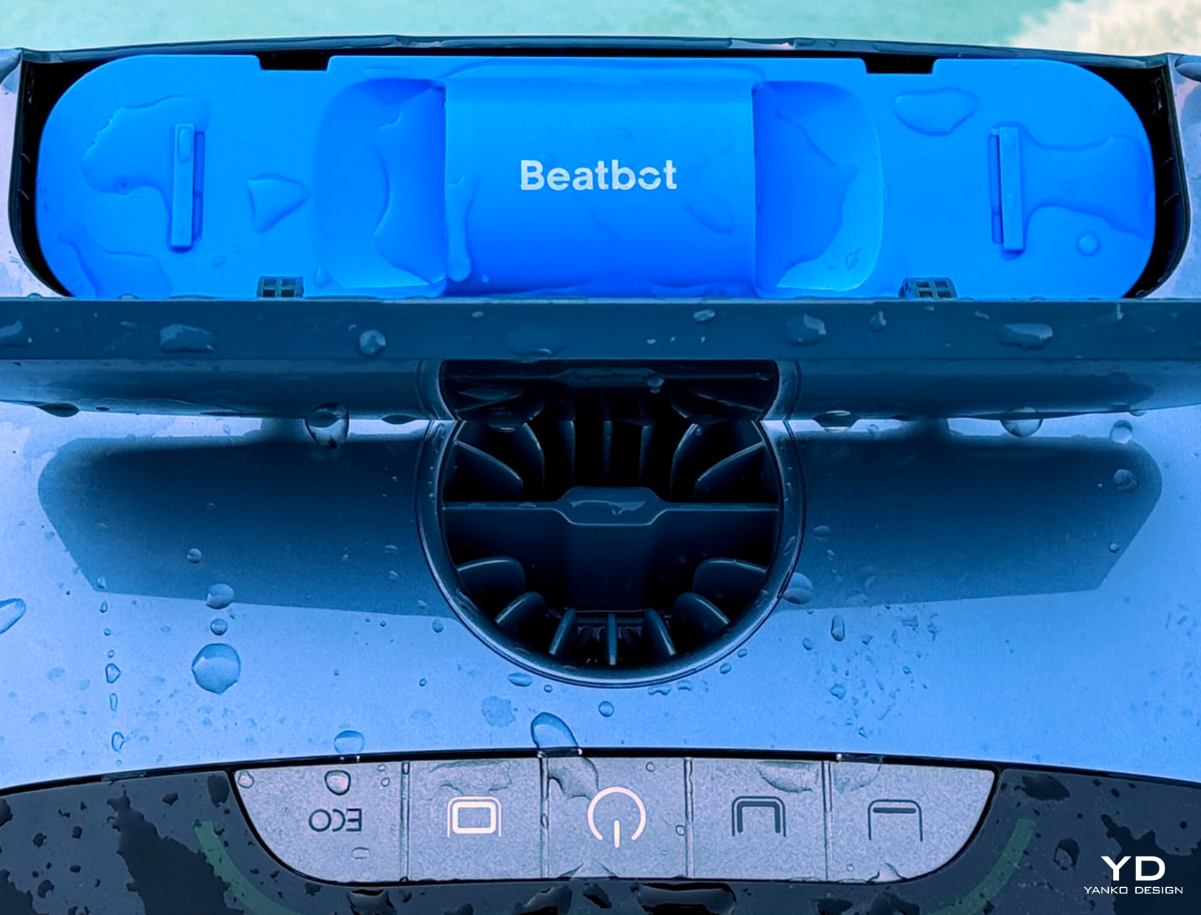
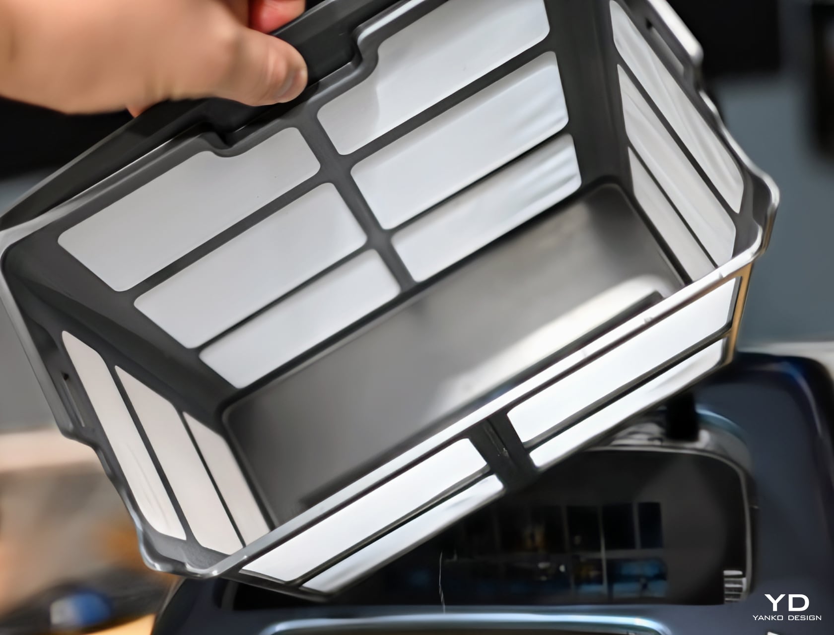
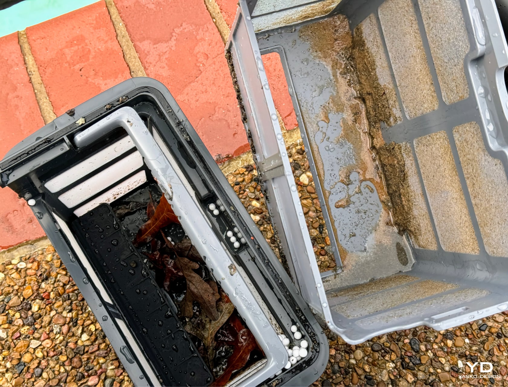
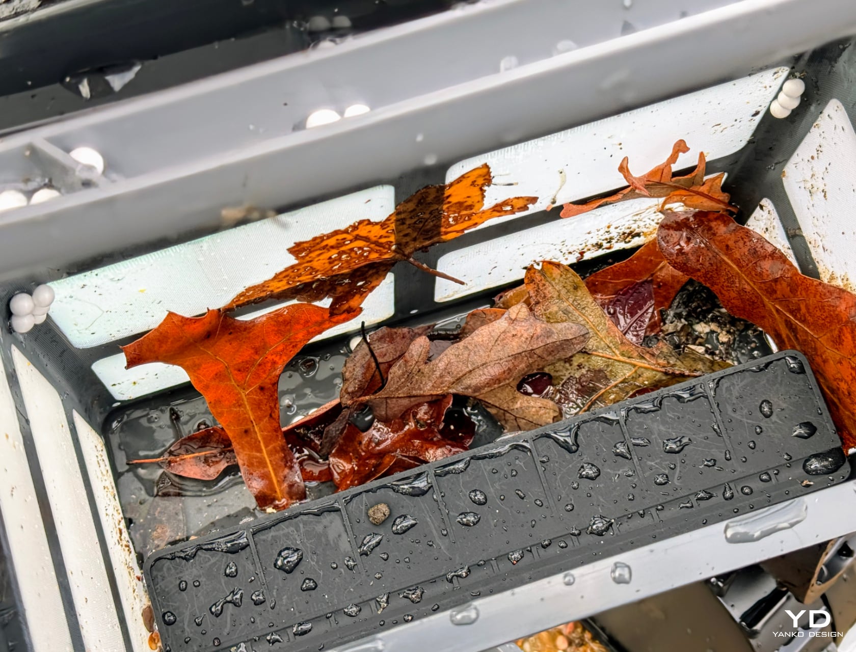
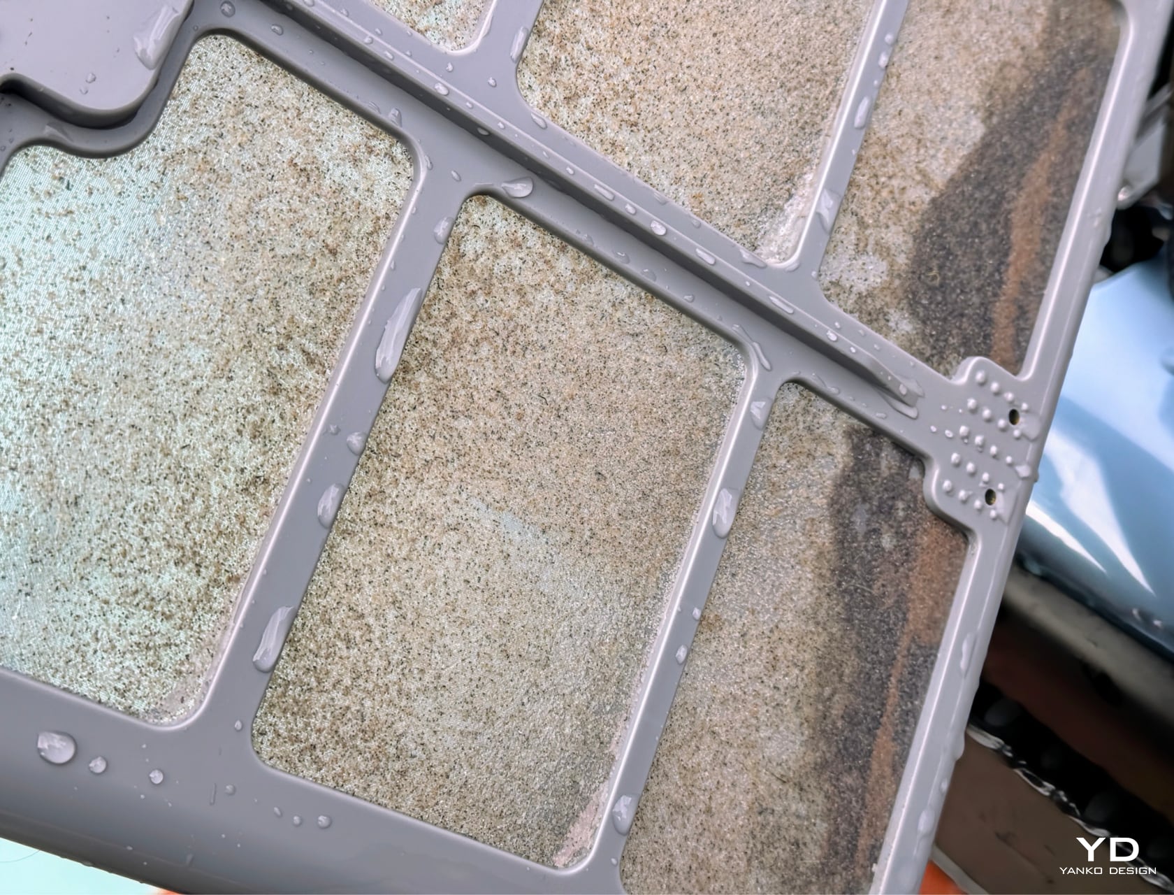
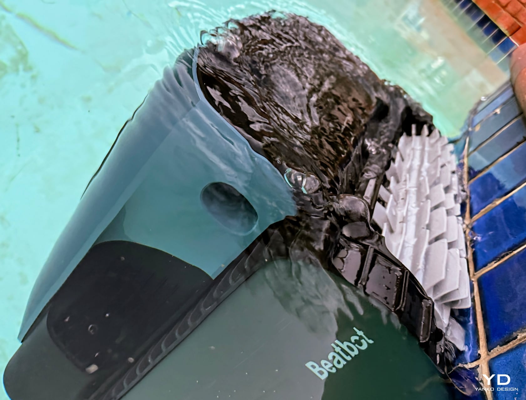
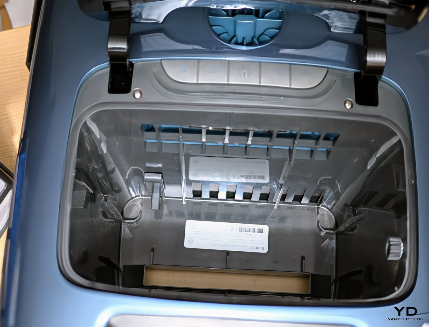
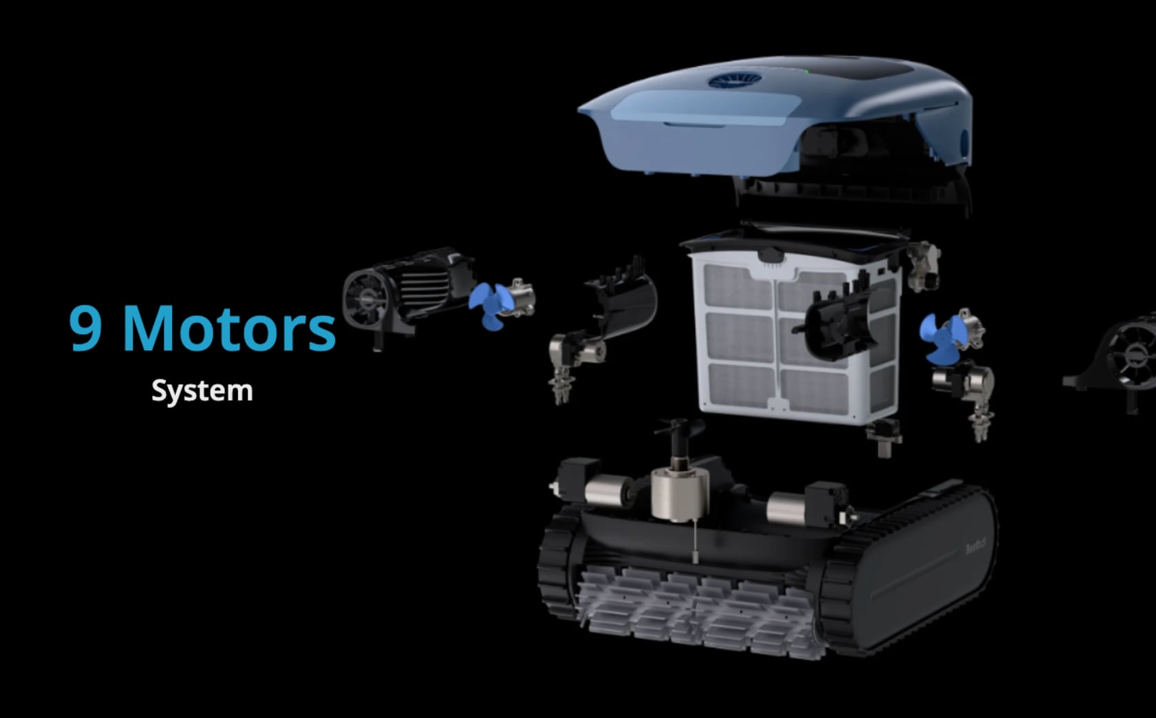
Simulated Flight Propulsion Design System enables it to move on water. Its top suction mouth and dust-rolling brush capture debris, preventing them from sinking. This feature alone saves significant pool cleaning time. After each cleaning cycle, the results are satisfactory.

It’s important to note that in its current form, the Pro Mode only makes one pass over the surface. After cleaning an area in an S-shaped pattern on the pool floor and surface, additional debris or leaves may fall into the pool. In such cases, do not expect the device to recognize and go back to clean that area again.

Performance

Where the AquaSense Pro truly shines, literally, in every sense of the word, is another industry-first — the built-in clarifier dispenser for a cleaner-looking pool by clearing up the pool water. This process takes place while cleaning the floor. The AI algorithm determines the amount needed based on the pool size for the most efficient use of the chemical.

In terms of cleaning, this robotic swimming pool cleaner excels. I’ve had the opportunity to use it in my pool and can attest that it effectively removes both visible and invisible debris. It’s surprising to realize how dirty the pool water is when you remove and clean the two-layer filter. This filter basket captures and holds all debris, accommodating particles as tiny as 150 micrometers.


Strong suction is just one aspect. The two sets of brushes, placed at the front and back, scrub simultaneously, enhancing the cleaning power. It’s quite captivating to observe them in action. These brushes operate at different speeds and in different directions at times for precise control and extensive coverage, ensuring a thoroughly clean pool. Usually, I find myself scrubbing the sides and bottom of the swimming pool every few days. Now, that task is reliably delegated.

The CleverNav plan effectively maps out and charts the path forward for an S-shape cleaning pattern for the pool floor and surface, while the sides and waterline utilize the N-shaped cleaning pattern. It does a great job of preventing overlaps. However, I don’t mind a bit of overlap, considering my swimming pool is as old as the house, which is over 35 years old.

Beatbot informed me that future firmware updates will allow for customized cleaning modes, which could enable the robot to clean continuously for up to 9.5 hours if necessary. On average, the battery life of the robot is over 5.5 hours on a single charge, taking less than 3 hours to fully recharge from complete depletion. If the battery level falls below 15%, the robot smartly returns to its starting point and parks itself on the water surface near a wall. It then automatically expels the water from its cavities. This makes it lighter when lifting it out of the pool and prevents a lot of water from spilling out. This MemoryPark smart return to the starting point is another industry first.

Ergonomics

I appreciate that, unlike other robotic pool cleaners, I don’t need to manually turn this one on or off for charging or use. It begins charging as soon as I place it on the charger, regardless of whether it’s on or off. After removing it from the base charger, it takes only 3 seconds to calibrate on a level surface before it’s ready to clean.

The buttons are designed and arranged intuitively. From left to right, they include quick clean mode, standard mode, power on/off, pro mode, and eco mode. My preference is the pro mode as it cleans the entire pool, encompassing the bottom, sides, water line, and surface. The Quick mode cleans the floor once, while the Standard mode also cleans the floor, walls, and waterline once. The ECO mode cleans the floor once every other day. A Custom mode, set to be available later through an over-the-air update, will allow for personalized cleaning settings.

Verdict

Beatbot has impressively incorporated a vast amount of technology and innovation into the AquaSense Pro. It’s hard to comprehend the 131 patents it holds, including 51 inventions and 20 sensors measuring water pressure, ultrasonic sensors, hall sensors, and temperature and humidity sensors. It even includes IMU and electrical current sensors to ensure smooth operation. Thanks to its nine motors, this robot can climb steps, clean them, and then proceed. The brushless main water pump motor at the robot’s core is a powerhouse. It’s akin to a 16-cylinder engine on a Bugatti arranged in a unique W configuration, ready for action every time water oozes out. Collectively, the drive-wheel motors, floating chamber peristaltic pump, surface propeller, stepping motor, and reagent pump motor make the AquaSense Pro one of the best swimming pool cleaners I’ve used in the past two decades. If you’re looking for a new cordless, hassle-free robotic cleaner, this will be the last one you’ll need to invest in.

The post Beatbot AquaSense Pro review: Smart and Powerful Swimming Pool Cleaner first appeared on Yanko Design.

2024 Lamborghini Huracan Sterrato Review

PROS:


  • Stellar all-weather performance

  • Dramatic styling

  • Amazing sound

CONS:


  • Terrible rearward visibility

  • No more Corsa mode

  • The cost

RATINGS:

AESTHETICS
ERGONOMICS
PERFORMANCE
VALUE FOR MONEY

EDITOR'S QUOTE:

A beautiful all-weather supercar, a true joy in inclement conditions, and a hell of a lot of fun even when the roads are dry and smooth.

The Huracan is getting on a bit. Now entering its 10th year of production, it’s not quite as long in the tooth as the venerable Aventador became before it was finally replaced last year, but it’s getting there.

To keep things feeling fresh, the Huracan formula must keep tweaking and extending. Typically, Lamborghini does this by slapping letters like S, SV, and SVJ to its cars, dialing up the power and asking price all the while. The Sterrato, though, is something new, something different, and, as it turns out, something extraordinary.

The concept

The Huracan Sterrato is, quite simply, the ultimate off-road Lamborghini. Sure, the Urus has more ground clearance and would surely be better for climbing up a rocky trail, but the rest of the time it offers little in terms of Lamborghini feel and flare. There was also the LM002 SUV of the 1980s. That thing was a true off-road beast, but having piloted one around Northern Italy, I can tell you that when it comes to actual driving enjoyment, there’s not much to be had.

Meanwhile, the Sterrato looks and drives like a true Lamborghini, just one that’s had a few subtle additions and enhancements to ensure that the fun doesn’t stop when the asphalt does.

That starts with the suspension, which raises the car by 44 mm. Part of that lift is helped by the tread on a set of chunky Bridgestone Dueler AT002 tires mounted to 19-inch wheels. Five wheels, as it happens, with the car you see here outfitted with an optional spare mounted to the roof. That, though, is one option that I can’t recommend against strongly. The Sterrato, you see, doesn’t come with a jack, so even if you get a flat, you’ll have no way to change that wheel.

The engine, the Huracan’s brilliant 610-horsepower 5.2-liter V10, comes with top-mounted air intake, which not only looks fantastic but should help the engine suck in a little less grit on a dusty rally trail.

The rest of the changes are more on the lifestyle side, as ever, “style” being the most important part. The Sterrato comes with a pair of permanently affixed roof rails, to which you can mount crossbars and put whatever accessories you like. The car you see here came into my life with a top cargo basket of sorts, but given my wintery testing, a ski rack would have been more appropriate.

Chunky, bolted-on fender flares at every corner add stance and aggression, while some light underbody protection should keep gravel and the like from damaging that aluminum and composite chassis.

The overall shape and appearance of the Huracan isn’t much impacted. It looks essentially the same as it ever did, just slightly angrier and, most importantly, more ready for adventure.

Interior

On the inside, Sterrato-specific changes are few. Lamborghini offers a pair of all-weather, rubber floor mats that fit perfectly and extend up the sides of the Huracan’s microfiber-lined interior. They’re a must-have if you’ll be braving inclement conditions.

But otherwise, it’s much the same interior as we’ve seen elsewhere in the Huracan. Alcantara is the material of choice, feeling luxurious and looking great, especially with the contrasting yellow stitching and the lurid seatbelts to match. The attention to detail here is impressive, and while many will find the styling a bit excessive, it’s absolutely on-point for a Lamborghini.

The Huracan was recently updated with a new touchscreen interface that is simple but effective. Both Android Auto and Apple CarPlay are on offer, but only wired. There’s also Alexa in here if you have an active Amazon account.

More importantly are the various telemetry screens on offer, including a new one for the Sterrato that shows off-road angle information, plus GPS coordinates, just perfect for when you’re really going out there. I found the differential display far more interesting, showing in real-time where the Huracan is sending its power, front-to-rear and side-to-side. As much of my testing was done in low-grip situations, it was a never-ending source of entertainment to see the flow of torque.

While entertaining to watch, you won’t need to spend much time stabbing at that touchscreen. Most of the essential driving controls are right on the steering wheel. Your left thumb controls the turn signals plus flashing or toggling the high beams. On the right, you’ll find the windshield wiper button.

The mode toggle is on the bottom, customized for the Sterrato. Strada is the default mode on top, followed by the racier Sport, and then Rally, a new dedicated, low-grip, high-performance mode that is the hallmark of this car. The final controls within reach are the column-mounted shift paddles, made of metal and standing proud behind the wheel.

While most inputs are on the wheel, the Huracan still has plenty of physical controls elsewhere, including a row of plastic toggles that run above the touchscreen and that iconic, crimson ENGINE START/STOP button in the center console lurking under a plastic protector. Flip that up, stab the button, and everything changes.

Ignition

The Sterrato’s V10 is situated just about a foot behind the driver’s right ear, so when it spins into life, you absolutely know it.

However, to enjoy the engine’s sound, you need to toggle to Sport mode, which opens up the exhaust and adds a fair bit of bass to the experience.

In fact, you’re better off avoiding Strada mode almost entirely. The Sterrato’s default drive mode is extremely, oddly tame. It’s always trying to run you a gear or two higher in the seven-speed dual-clutch transmission than you might like and feels quite reluctant to downshift. It also enables the somewhat annoying engine start/stop feature (which you can quickly disable if you like). Finally, it’s all too eager to drop the V10 down to an inline five-cylinder whenever you’re light on the throttle.

Driven in this way, I managed 15.1 mpg during my testing, which is quite reasonable for a 600-plus hp car. Indeed, that’s precisely why that mode exists. But if you want an engaging drive, step on up to Sport.

In Sport, everything just feels better. The shifts are rougher than before, but they’re lightning-quick and exactly where you want them to be. The exhaust sounds better, the engine is more responsive, and the Sterrato just feels ready to play.

However, it’s in Rally mode when things get wild. This new mode was designed to provide a much more playful experience in low-grip situations, allowing the Sterrato to spin up its wheels with more aggression than would normally be beneficial for a high-grip situation like the Corsa mode was designed for, which is found on other Huracans.

In Rally, the Sterrato is happy to let you let loose, not cutting power for me even when all four wheels were spinning wildly on an icy surface. It did cut power when I made larger steering inputs, being somewhat selective in how much counter-steering was allowed before it decided I needed some help. But it certainly didn’t ruin the fun.

I do, though, lament the loss of the Corsa mode. While the Rally mode is a good trade, it’s a shame you can’t have both. After all, though its suspension is softer, with a proper set of tires the Sterrato would still be a wonderful track day toy.

Regarding the tires, the Sterrato’s Dueler AT002s are rated for mud and snow, but certainly seem better suited for the former. While I wasn’t able to test that condition, I did spend lots of time amid wintery stuff with the Sterrato you see here. The tires didn’t provide the confidence offered by a dedicated snow tire, especially in more icy conditions, but they delivered plenty of grip to have fun. Most importantly, when they gave up that grip, they did so in a clean, predictable manner.

Options and pricing

The Huracan Sterrato starts at $273,177, plus a $3,695 destination charge and a $2,100 gas guzzler tax. The car you see here had a suite of mostly cosmetic options, including $9,800 for the lovely Giallo Inti paint and $7,600 for the sports seats.

It doesn’t take long to add another six figures onto the price of your Sterrato, with this one costing $348,649 in total, but that’s the name of the game with a car like this.

The Sterrato’s performance, however, is anything but predictable. It’s a beautiful all-weather supercar, a true joy in inclement conditions, and a hell of a lot of fun even when the roads are dry and smooth. It’s even more comfortable to drive than a regular Huracan and much less likely to dig its nose into the slightest inclines, too.

It’s the complete package, and while you’ll certainly have to pay for it, it feels very much worth every penny.

The post 2024 Lamborghini Huracan Sterrato Review first appeared on Yanko Design.

2024 Audi Q8 E-Tron Review

PROS:


  • Engaging handling

  • Comfort seating

  • Plenty of storage

CONS:


  • Range still a bit short

  • No hands-off tech

RATINGS:

AESTHETICS
ERGONOMICS
PERFORMANCE
VALUE FOR MONEY

EDITOR'S QUOTE:

A refresh that moves Audi's E-Tron forward in all the right directions.

As far as EVs go, the E-Tron has been around long enough to have seen a few things. Debuting back in 2018, Audi’s first battery-powered ride was a great car in many ways, but it also felt lacking in others. Most notably, its range was on the middling side and its handling made it a pleasant drive but far from a memorable one. Finally, there was the name: E-Tron. It just didn’t really fit in with anything Audi had done before or since.

For 2024, it’s back, and now it’s called the Q8 E-Tron. Despite the new name, now fitting squarely within Audi’s model taxonomy, this is actually a subtle refresh. It’s so subtle that you’d be forgiven for not being able to identify the new car from the old were they sitting side-by-side. But, after having driven both quite extensively, I’m happy to say it’s a refresh that moves the car forward in all the right directions — though perhaps not far enough in some.

By the numbers

The Q8 E-Tron is, like before, a five-passenger SUV that, to my eye, looks more like a tall station wagon. Its height of 64.3 inches splits the difference quite handily between the regular Q8 SUV and the A8 sedan, so it really is its own thing.

It’s available in three trims, with starting prices in the U.S. just under $75,000 on the low end and $85,000 on the high end. The car tested here is a Prestige trim with just a few options added.

It has a dual-motor all-wheel-drive system offering a total system output of 402 horsepower and 490 pound-feet of torque. The range from the new and larger 114-kilowatt-hour battery is 285 miles per the EPA, while the maximum charging rate is 170 kW. In my testing, I didn’t come anywhere near that EPA rating, averaging 2.3 miles per kilowatt hour at best, for an estimated 243 miles from the 106 usable kWh in that new battery.

But don’t hold that against it. I did all my testing in the winter months, and that result is actually quite good given the low temperatures. Even the best EVs hate the cold. In the summer, I have no doubt that drivers will meet or exceed that EPA figure.

More importantly, the Q8 E-Tron did an excellent job of providing accurate, reliable range estimates based on weather conditions and terrain, something that many other EV makes still struggle with.

Deja-Q

Squint, and you’ll hardly be able to tell the difference between the Q8 and the E-Tron that came before. Put on your glasses, and the differences are still easy to miss. The highlights are definitely in the front facia, which is sharper, cleaner, and fresher than before. Revised lighting, too, makes the Q8 E-Tron have a subtly greater presence than before.

New 20-inch wheels also provide more visual intrigue from the side without compromising ride quality too much, but the overall visual aesthetic of the Q8 is still very much an understated one. That’s doubly so, thanks to a decidedly muted selection of colors. The shade you see here, Plasma Blue, is the most dramatic of the bunch, and yet it easily blends into your average parking lot palette.

Even less has changed on the inside, and that doesn’t bother me so much. The original E-Tron’s interior was a standout, and while it’s perhaps a bit familiar now, it still delivers in all the right ways. It also still bears the indentations in the door cars where the digital side-view mirrors would live in the American version of the Q8 E-Tron, were they legal. Five years after the original E-Tron’s launch, they’re still not.

Though mostly dark and dominated by soft-touch rubbers and plenty of harder, harsher stuff, the look is clean, and everything feels durable. The slash of open-pore wood across the dash, though desaturated and still not providing much visual flare, does at least add some organic appeal to what would otherwise be too cold a space. (Brown leather is also on offer, as well as off-white.)

The primary interface is a pair of touchscreens stacked vertically. The lower is primarily dedicated to HVAC controls and other features like smart home integration, charging, and toggling hill descent control.

The touchscreen above is the more significant of the two, where the bulk of Audi’s MMI lives and where either Apple CarPlay or Android Auto will be wirelessly displayed should you choose to enable it. To the left, there’s Audi’s Virtual Cockpit Plus, augmented further by a heads-up display.

That’s plenty of displays for sure. Though this version of MMI feels more than a little dated at this point, its voice recognition in particular offering little assistance compared to the more recent offerings from BMW or Mercedes-Benz. That said, it’s quick and easy to use, and the haptic pulse received when selecting touch controls is still a pleasant thing.

Interior comfort

At 193.5 inches long, the Q8 E-Tron is a big car, and it makes use of that volume by offering comfortable seating in the front or the rear. Out back, there’s plenty of legroom and headroom, plus a pair of USB-C ports and dedicated controls for rear HVAC, plus heating the rear seats.

Front seats add ventilation, and while the cooling isn’t particularly effective, the heating is certainly the more important part of the equation, and there they do not disappoint. The heated steering wheel, however, could use a few more watts.

Front seats are power-adjustable, with two memory settings, and visibility from the driver’s seat is quite good. The shaping of the A-pillars keeps them from blocking too much of your perspective, while the panoramic sunroof above helps keep things looking lighter and brighter than the dark materials otherwise would.

In practical terms, 28.5 cubic feet of cargo space make for a very livable machine. Fold the split rear seats, which flop down at the pull of a lever at the back of the cargo compartment, and you’re greeted with an expansive 56.4 cubic feet of space. Plenty for the most indulgent of trips to the big-box shops.

The drive

The outgoing E-Tron was pleasant to drive, calm and relaxed, quite nicely composed on the sorts of roads that will try the best of suspension systems. The revised Q8 E-Tron, I’m pleased to say, has lost none of that valuable, though ultimately forgettable demeanor.

What’s added is a surprising amount of engagement. The Q8 E-Tron, when pushed hard and toggled over to Sport mode, is quite fun to drive. No, we’re not coming close to the levels offered even by any member of Audi’s RS family. Still, revised steering and some subtle suspension tweaks help make for a car that’s eager when the road turns away from you.

It’s also eager when that road is straight and narrow. The new Q8 E-Tron feels even quicker than its 402 hp. To get maximum power, you need to be in Sport mode, where the throttle is sharpest. The Q8 E-Tron is genuinely eager, so eager that you’ll only want to deploy that mode when you’re by yourself, lest you threaten the patience — or the stomachs — of anyone else in the car.

They won’t have to worry about getting car sick from excessive regenerative braking, though. Like the old E-Tron, the Q8 doesn’t have much to offer. Tap the left paddle a few times to enable maximum regen, but the maximum is barely any. Audi’s dogged dislike of one-pedal driving continues, which continues to be a shame for any buyer who prefers not to step on the brake pedal so often.

Regarding safety systems, the Q8 E-Tron has a comprehensive stack, including automatic emergency braking, blind-spot monitoring with rear cross-traffic alerts, and a lane departure warning system. It was enough to earn it an IIHS Top Safety Pick+ award.

However, where more and more competitors offer hands-off highway driving, this SUV is still very much in the hands-on mode. Its lane-keep system also got a little confused when approaching exit ramps where the right painted lines split off to make room for the exit, resulting in an occasional, uncomfortable lurch. But the adaptive cruise worked well, always identifying and reacting to traffic early and smoothly.

Options and pricing

The 2024 Audi Q8 E-Tron you see here had a starting MSRP of $74,400, while the Prestige package added a further $10,400. Compared to the base Q8 E-Tron, Premium Plus adds on the better Bang & Olufsen sound system, ventilated front seats, and the 360 camera. Prestige steps that up further with a basic massaging system on those seats, which are now wrapped in higher-spec leather, with upgraded matrix lighting up front.

This car also blacked out much of the chrome with the $2,000 Black Optic Package, $400 for additional rear side airbags, and $595 for that Plasma Blue paint. Add on the $1,195 destination charge, and you have a final sticker price of $88,990.

That’s a comprehensively equipped and properly luxurious machine for that money. Really, it’s only the range that’s still a bit light compared to the competition, on par with something like the Mercedes-Benz EQE SUV’s 279 miles, but short of BMW’s iX, which offers 311 miles for comparable money. But, most buyers will find the E-Tron’s 285 miles plenty enough, and they’ll also find the Q8 to be a comfortable, upscale, and now subtly engaging all-electric SUV.

The post 2024 Audi Q8 E-Tron Review first appeared on Yanko Design.