This all-black titanium hammer is so magnetic, even Thor would be drawn to it!

While everyday household tools like hammers or pliers might not be expected to have a major design or functional shift from the ones that have been time tested for centuries, it’s time to think again. Can your average hammer have an aesthetic design shift with an added flair that draws you towards its magnetic form factor? Looks like, yes there is one hammer design that you’ll instantly want to make your prized possession. Even Thor would want to hold this hammer in his grasps!

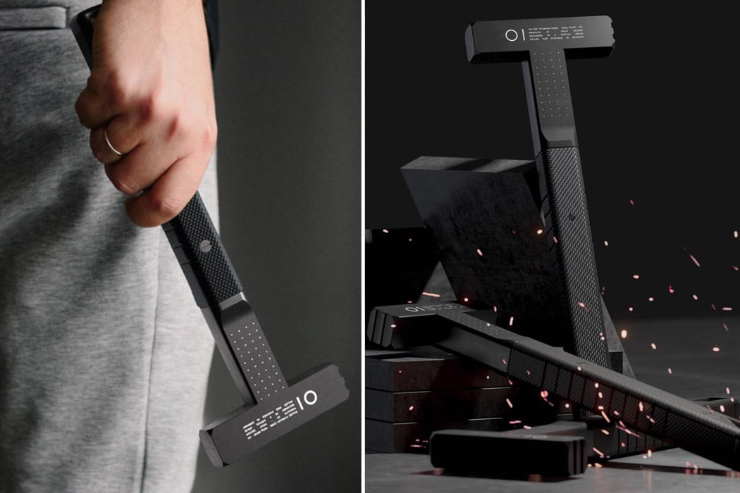
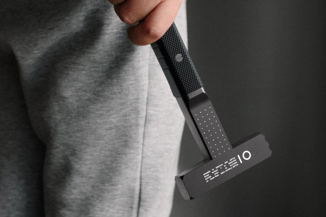
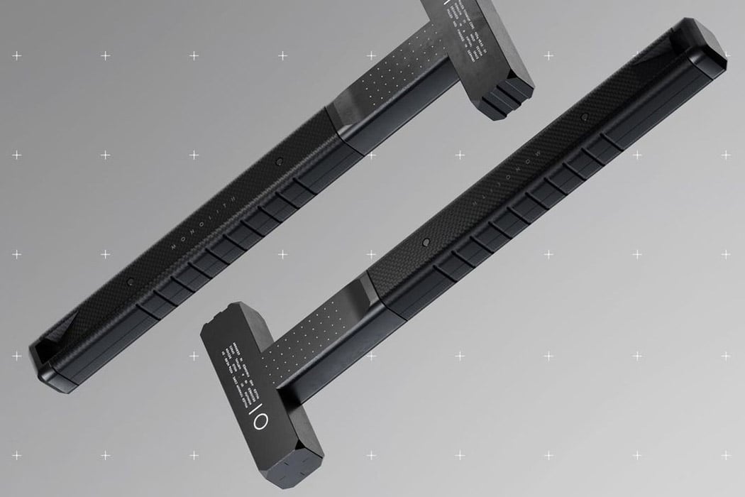
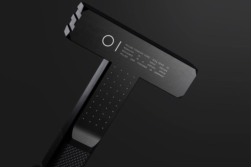
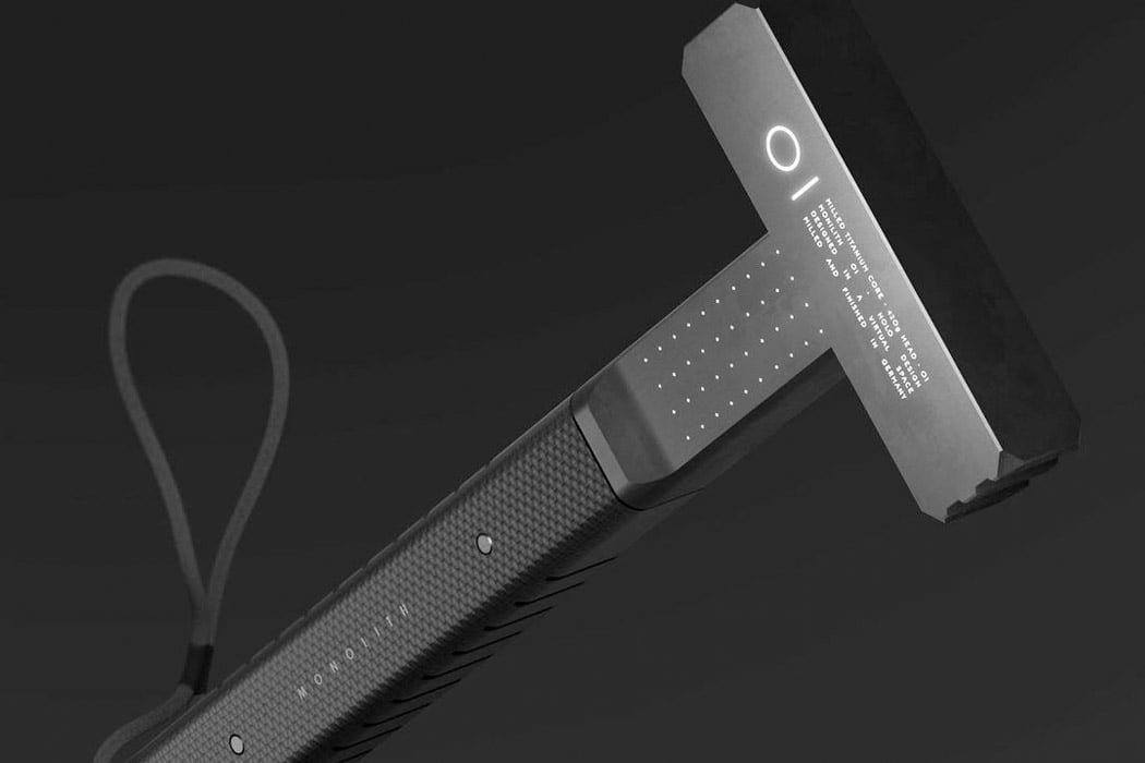
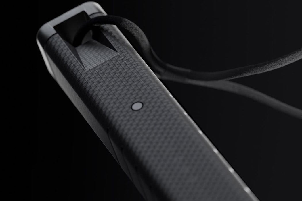
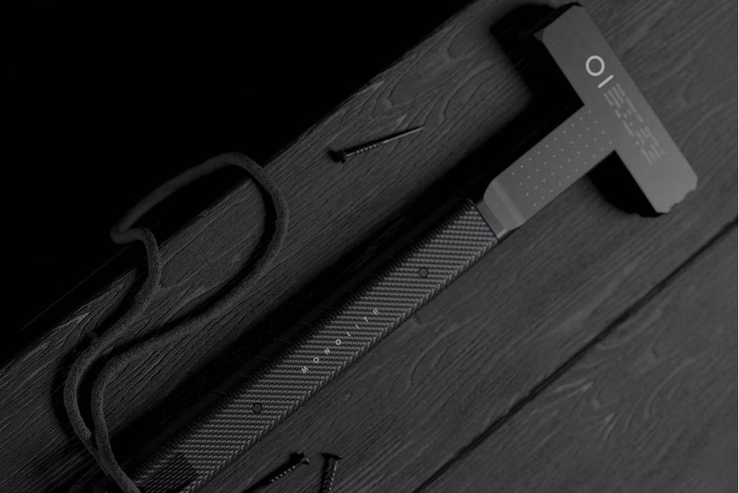
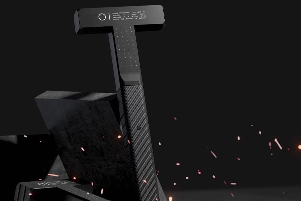
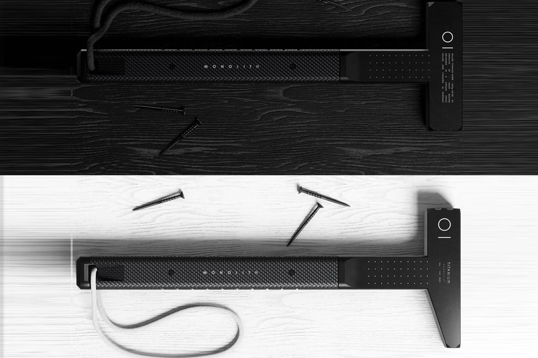
The brainchild of Design by Holo, the matte-black Monolith 01 hammer comes milled from a single billet of solid titanium, and will last a lifetime while still maintaining its hypnotic minimal form. While most hammers have a rounded base, this one has a rectangular grip and the hammerhead to deliver maximum force down to the nail with minimum effort. It looks more like a cop’s baton rather than a hammer, so one can assume it can be doubled as a baton too. After all, who won’t want to carry around this tool along at all times? It can even double as a self-defense instrument for desperate times!

The stability and ergonomics of the Monolith 01 Hammer are what make it shine among other hammer designs that are nothing extraordinary. The textured finish of the grip and the titanium finish of this hammer strikes the nail on the head when it comes to redefined aesthetics for a tool as simple as a hammer that’s not seen much of a functional boost since it has been delivering what’s required of it for ages!

Designer: Design by Holo
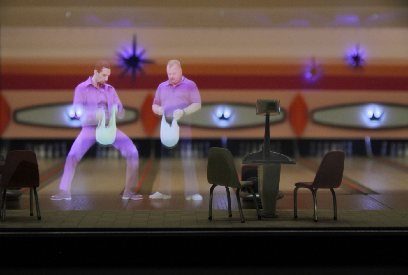
doubleTwist gets Holo-inspired makeover in latest release

doubleTwist gets Holo-inspired makeover in latest release

Now with a brand-new streaming music service under its belt, Android player doubleTwist is undergoing a makeover. The app's latest incarnation has just landed on Google Play and features a Holo-inspired refresh that still keeps the character and dark looks of its predecessor. As you'd expect, the application now uses the system action bar on all screens and incorporates the "Up" button. The fresh release also includes cleaner alert and dialog prompts, refined typography and pages that work in both portrait and landscape views, with the occasional optimized layout for the latter. Despite the big tweaks, the outfit says this is just phase one of its Holo facelift, and that more drastic changes and optimizations for devices toting larger screens are coming down the pike. Click the neighboring source links to download the app and catch a grand tour of the revamp.

Filed under:

Comments

Source: doubleTwist, Google Play

WordPress 2.3 for Android gains Holo interface and menu drawer

WordPress 23 for Android gains Holo interface and menu drawer

Bloggers have been getting plenty of love on Android as of late, and if WordPress happens to be your platform of choice, you'll be glad to know that your time in the sun has arrived. Similar to Tumblr's recent overhaul, WordPress was just updated with a new Holo interface, and it's really quite the looker. First and foremost, you'll notice that WordPress now looks like a proper Android app, complete with an action bar for tasks such as creating posts and sharing to other apps. With a flick of the thumb, you'll also notice a menu drawer that's accessible from the left-hand side, which replaces the old school dashboard interface that was found in previous versions of WordPress for Android. We can't say the new features will help you overcome writer's block, but at least you'll have something pretty to look at while you ponder your next great post.

Filed under:

Comments

Source: WordPress

Tumblr for Android gets overhauled with new interface

Tumblr for Android gets overhauled with new interface

It looks like April is the month for major Android apps to get a visual overhaul. Following Twitter's refresh last week (and Facebook's decidedly more ambitious effort), Tumblr has today released its own app update that offers a whole new user interface. As you can see above, that includes some Path-esque expandable controls for creating various types of posts, as well as new post animations and a general appearance that's more consistent with Android's "Holo" theme. There's no indication yet of that new interface heading to iOS, which just got its own Tumblr update last month.

Filed under: , ,

Comments

Source: Google Play, Tumblr

WhatsApp for Android gets Holo-themed makeover in latest beta

WhatsApp for Android gets Holothemed makeover in latest beta

Despite being one of the most successful software entities on Android, WhatsApp's been a little late to adopt certain design guidelines preferred by Google's mobile platform. Thankfully, the renowned messaging application appears to be ready to take on a more elegant UI, with the most recent beta bundling in Mountain View's praised Holo theme and, as noticed by some Android Police readers, expandable notifications for all. However, folks attracted by the idea of going Holo in WhatsApp will have to snag the goods straight from the source, as the changes have yet to make their way onto Google Play.

Filed under: ,

Comments

Via: Android Police

Source: WhatsApp, Jose Luis de la Torre (Google+)

RunKeeper 3.0 for Android gets a Holo-native UI, puts us front and center

RunKeeper 30 for Android takes on a Holonative look, puts athletes front and center

It must be the season for Android-native makeovers within our apps. RunKeeper has just pushed out a 3.0 update to its exercise tracker that brings the interface in line with Google's Holo concepts from Android 4.0 and beyond. There's more to see once acclimated to the look and feel, however. The 3.0 revamp now has a dedicated tab to show all of an athlete's progress in one area, such as goals and recent history. It also displays both intervals and pacing in mid-activity while making easy to set a reminder for the next run while cooling down. Runners wanting to modernize just need to hit Google Play to give RunKeeper a makeover that could very well improve their health in the process.

Filed under: ,

Comments

Source: Google Play

Stitcher overhauls its Android app to dovetail with Google’s interface world

Stitcher overhauls its Android app to dovetail with Google's interface world

Stitcher's Android app can do many things with radio and podcasts, but one thing it hasn't done lately is blend in -- its interface is out of sync with a platform that has had its own distinct style for more than two years. A major remake today helps make amends. The new Stitcher app relies on the Action Bar and overall concepts of Holo-native apps for input, simplifying things for anyone who's comfortable with Ice Cream Sandwich or Jelly Bean -- and more than a little prettier, we'd add. It's more than just eye candy, though. The Android build now has a dedicated Smart Station to listen to recommendations, browsing that keeps interruptions to a minimum and Jelly Bean-specific playback controls in notifications. While there's no fundamental changes that would lure someone who's wedded to a single-purpose app, the Stitcher refresh could be worth a look if previous versions ever felt like strangers on Google's turf.

Filed under: , ,

Comments

Source: Google Play