Microsoft Graph bridges the gap between Windows and your phone

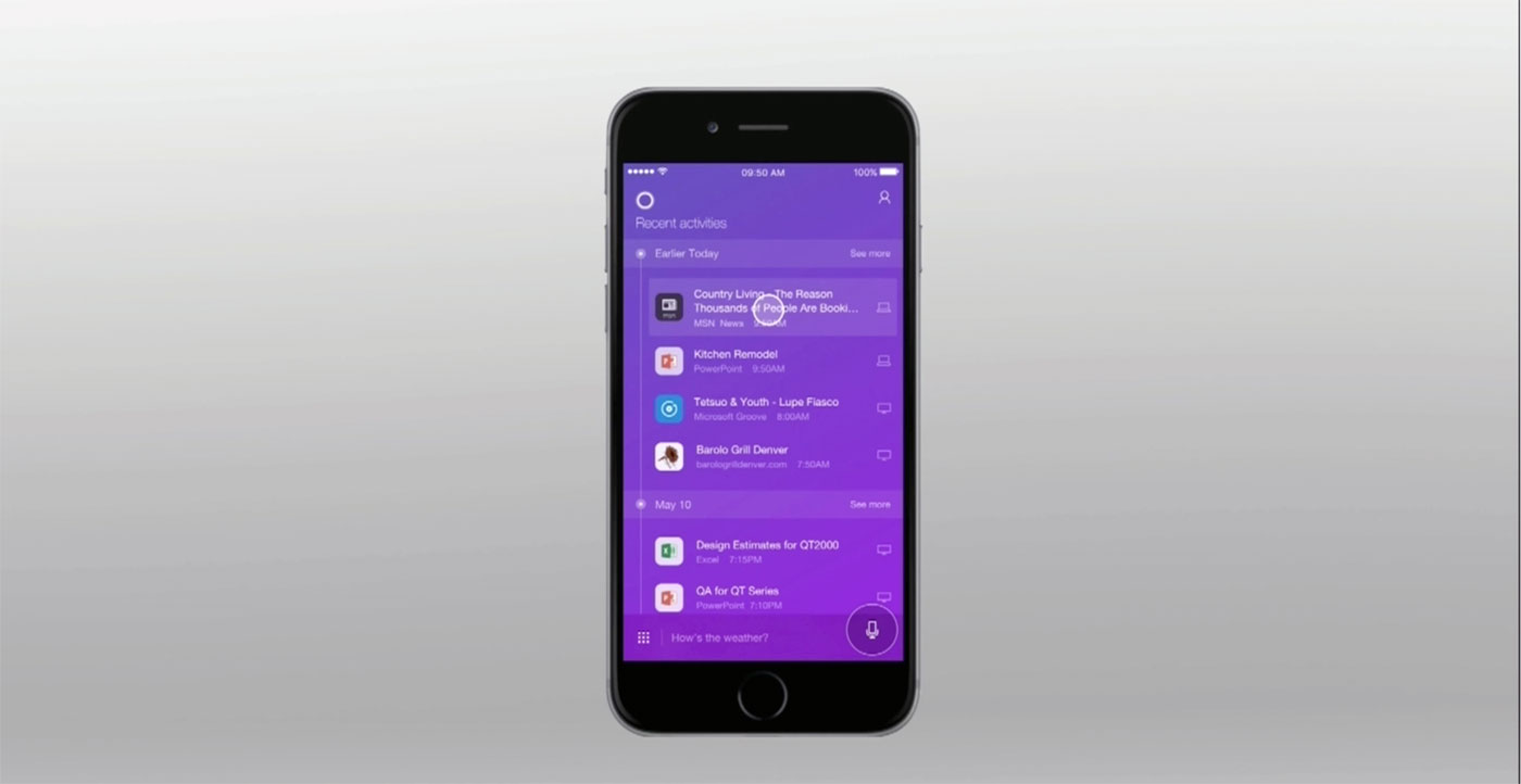
Microsoft's push into being the connective glue between all your devices is encompassed in Graph. That is what the company is calling a handful of features it says will "connect dots between people, conversations, projects and content." Announced dur...

Luminous Electronic Bar Graph Clock: Telling Time with Charts & Graphs

The Luminous Electronic Bar Graph Clock looks pretty cool. This isn’t some lame digital clock or a common round analog clock. This clock is a bar graph. Just like the ones, you made back in fifth grade. It displays hours on the top bar, and minutes on the bottom bar.

luminous-clock_6zoom in

Above the quarter hour marks are icons that indicate phases that might teach your kids what fifteen till means. I think my dad always told me that just to troll me. This clock has no hands mind you, it has IN-9 old stock gas discharge tubes inside that have amber color inside and get longer or shorter to tell you the time. It’s fancy. That’s the sort of Cold War tech that broke the Russians.

luminous-clock_5 luminous-clock_4 luminous-clock_3 luminous-clock_2 luminous-clock_1

The clock comes with a natural wood or black wood case. It can be used horizontally or vertically, and displays a pendulum animation, and works as a countdown timer when placed on one end. Flip it to the other end, and it becomes a sound level meter. Like anything cool and worth having, it’s not cheap at $229.99(USD). You can get one for yourself at ThinkGeek.

Microsoft Office 365 to be Revamped


Microsoft has added some new features to its Office 365 and even given a preview of what lies in store for the platform. At the SharePoint Conference in Sin City, the whole scheme got elaborated upon...

Facebook Released Advanced Graph Search Feature for all US Users Today


Starting from today, Facebook introduces its Graph Search to all US citizens. This is a sophisticated and stylish tool which will allow greater accuracy in finding data on Facebook. Suppose you were...

Facebook Graph Search is Targeting Tool on Steroids for Advertisers


Facebook unveiled Graph Search yesterday. The presentation was all about the user benefit. In the Q&A session Facebook talked a little bit about the business opportunity of Graph Search....

Samsung launches S Health services: Monitors weight, blood sugar and graphs it all

Samsung launches S Health services Monitors weight, blood sugar and graphs it all

Samsung mentioned its S Health app in passing during the grand unveiling of the Galaxy S III -- presumably due to the glut of similarly S-suffixed apps and services that were also unveiled. The service has now apparently launched in Samsung's homeland, alongside more details of what it'll offer. This includes a raft of metric-measuring charts, as well as the ability to connect through Bluetooth and USB to health devices like heart-rate monitors and connectivity-friendly scales. The app will record and even graph your health ups and downs, aiming to help "regulate" what you eat and gauge exactly how much you exercise. It has now launch on Samsung's App hub and will make its way to the US and five to-be-confirmed European countries soon. Let Samsung explain the "warm emotional experience" in a Google-translated release right after the break.

Update: We've just received the English version of the PR, which adds that the app is now live in the UK, alongside an initial list of compatible health devices. Take a look after the break.

Continue reading Samsung launches S Health services: Monitors weight, blood sugar and graphs it all

Samsung launches S Health services: Monitors weight, blood sugar and graphs it all originally appeared on Engadget on Mon, 02 Jul 2012 04:41:00 EDT. Please see our terms for use of feeds.

Permalink   |  sourceSamsung Tomorrow (translated)  | Email this | Comments

Visualized: Android’s device diversity cut up into 3,997 little pieces

Image

Some call it diversity, some call it fragmentation. However you slice it, there's a lot of Android devices out there. OpenSignalMaps has tracked a staggering 3,997 unique phones, tablets and other Google-powered gadgets, and has put them into a chart weighted by popularity. Not surprisingly, it's powerhouses like Samsung's Galaxy S II and HTC's Desire line that dictate the platform, while that Concorde Tab you bought in Hungary sadly doesn't have much traction. The normally signal mapping-oriented crew is careful to warn that the actual variety might be less: there's 1,363 one-timers in the group, and some of those may be custom ROMs and the endless carrier-specific variants that OEMs are sometimes eager to make. There's even more to look at through the source, including Android 2.3's continuing dominance and the mind-boggling number of Android screen resolutions, so click ahead for an even fuller picture.

Visualized: Android's device diversity cut up into 3,997 little pieces originally appeared on Engadget on Wed, 16 May 2012 17:41:00 EDT. Please see our terms for use of feeds.

Permalink Phone Arena  |  sourceOpenSignalMaps  | Email this | Comments

Visualized: Apple and Samsung occupy the 99 percent… of phone profits

Image

Financial maven and maker of beautiful graphs Horace Dediu has found that between the top eight mobile phone vendors, Apple and Samsung share 99 percent of the total spoils. Of RIM, LG, Sony (Ericsson), Motorola, Nokia and HTC, only the latter made a profit -- claiming that left over one percent. The remaining six all recorded losses for the quarter, Mr. Deidu adding that several of those companies are carrying feature phone businesses that they should shed before they become an albatross around their neck.

Visualized: Apple and Samsung occupy the 99 percent... of phone profits originally appeared on Engadget on Fri, 04 May 2012 12:17:00 EDT. Please see our terms for use of feeds.

Permalink Macrumors  |  sourceAsymco  | Email this | Comments

Webcam programmed to capture your face while playing Xbox: gauges your excitement, graphs ennui

Webcam programmed to capture your face while playing Xbox: gauges your excitement, graphs ennui

Sometimes, those Modern Warfare sessions really take their toll. Now, there is a way to measure the emotional rollercoaster you're subjecting yourself to when you login for those regular gaming stints. Dale Lane decided to hook up the webcam above his main TV to grab a shot of his face every 15 seconds. This then wings its way to the Face.com API, which calculates all sorts of information about the image and sends it back to Dale, who uses a Python script to cook it into these graphs. This one measures his early evening session playing Blur on Xbox Live. Yeah, red means angry.

Webcam programmed to capture your face while playing Xbox: gauges your excitement, graphs ennui originally appeared on Engadget on Thu, 05 Apr 2012 19:51:00 EDT. Please see our terms for use of feeds.

Permalink Hack A Day  |  sourceDale Lane  | Email this | Comments