These wild Bugatti SUV concepts are the perfect fusion of sporty luxury and rugged utility

In Greek mythology, ‘Chiron’ was the name of a wise centaur – a half-human, half-beast entity. These Bugatti Chiron SUV concepts are pretty much the same thing – they’re half sleek Bugatti supercars, half otherworldly Mad Max-style monster vehicles. Generated by AI artist Flybyartist, these customized Bugatti Chirons aren’t meant for garages… they’re meant to brave zombie apocalypses, endure the elements, and get you from A to B regardless of what’s in between. In style, of course!

Designer: Flybyartist via Midjourney

These images were created in Midjourney, proving that AI has an absolutely wicked imagination, and that if Bugatti were to ever venture into SUV territory (or if someone were enthusiastic enough to modify a Chiron), the results would be thrilling. These images scream Mad Max a little too loudly, but then again, you don’t see me complaining. If the 2019 Chiron Super Sport 300+ was the fastest car on land, these Chiron Utility Vehicles would be the fastest car on sand.

Each concept has the characteristics of a Chiron, with those super-sleek headlights, the C-shaped pillar, and a semblance of that horseshoe cutout grille on the front. However, the Chiron’s audacity gets amped up with those angular panels, aggressive air-intakes on the front, and conquer-everything tires. The ground clearance gets a bump too, given the need to be able to drive comfortably on rough terrain, and in a few concepts, you’ve also got the hint of a truck bed at the back. Finally, a few fog lights on top of the roof give the Chiron its off-road persona, and that black-and-red paint job ensures the Chiron blends right into its sandy home, while also screaming for attention when it’s hurtling towards you at those high speeds that only the quad-turbocharged W16 engine is capable of!

The post These wild Bugatti SUV concepts are the perfect fusion of sporty luxury and rugged utility first appeared on Yanko Design.

AI imagines Renaissance Architecture as Footwear to create absolutely stunning new styles

Putting soul and sole together…

With the kind of attention to detail that only AI can come up with, these shoes are an avant-garde combination of two industries that have very little of an overlap. Envisioned by AI-artist Str4ngeThing, the footwear, which range in a variety of styles, capture architectural and artistic expressions and details from Renaissance Architecture. The results are absolutely stunning, even though impractical. They are, however, “a testament to the power of design and innovation using AI,” according to the designer.

Designer: Str4ngeThing

These heels use a combination of floral motifs and traditional Renaissance spires and towers

Looking like it’s made using a combination of thin-sliced wood veneer or cork, these shoes have an immense amount of detail in them. While footwear design usually sticks to a “less is more” agenda, these shoes are the absolute antithesis to the fact. Chuck Taylors are iconic for their simplicity, so are Crocs, and Christian Louboutins… but these Renaissance Footwear concepts aren’t. Every shoe compresses an entire era of iconic architecture into its small ‘footprint’. Sure, the AI loses some crucial details and makes a few assumptions while generating the images, but the results look marvelous no less.

A classic interpretation of the Italian Renaissance, this mocassin features arched windows like the ones seen in Roman architecture

Some shoes go a step further by including sculptural elements in their details like the one above. The tongue of the shoe, right near the shin, looks like a grotesque – a key element of Renaissance and even medieval architecture. The midsole area has some wonderful detailing, while the entire shoe looks like it was carved from sandstone. The shoe concept below is a stunning example of grandiosity, with an entire relief mural ‘carved’ into the side of the stone. The top of the shoe is an interpretation of the highly detailed Corinthian-style orders seen at the top of architectural columns. Is it practical? Absolutely not. Is it awe-striking? Undeniably.

“This collection is also a true testament to the importance of creativity and innovation in the world of fashion. It demonstrates that with a forward-thinking approach and a commitment to excellence, it is possible to create something truly exceptional,” says designer Str4ngeThing.

Not all footwear designs get the balance between different aesthetic elements right, though… like the proportions between architecture and human sculpture.

The shoe concept above goes way beyond architecture and builds an entire diorama on the footwear body. Although it isn’t perfect, you can see the Roman columns, the angled roofs of the Pantheon-style building, and the environments around it. The footwear below feels like a fresco brought to life, almost like Michelangelo made the footwear himself.

The AI has a long way to go in making concepts that are feasible, but at least in its current stage, Midjourney’s images are about as stunningly hyperrealistic as they can be. “I’m excited to see how this collection will inspire and influence the world of fashion, and I’m proud to have played a part in bringing it to life,” Str4ngeThing mentions in his Instagram post.

The post AI imagines Renaissance Architecture as Footwear to create absolutely stunning new styles first appeared on Yanko Design.

These AI-generated self-contained living pods under city bridges bring an affordable solution to society problems

Homelessness is an ever-prevailing issue that only seems to be growing as time passes. Architect Shail Patel decided to create and harness a rather innovative and unique solution to address the complex social issue that is space shortage in an increasingly expensive world. He utilized the artificial intelligence design tool Midjourney to create a series of modular pods that are designed to help those in a tough situation find a space for the night or even become a permanent place they can count on.

Designer: Shail Patel

Shail’s plan is to bring to life and utilize urban spaces, particularly the areas under bridges, that are otherwise ignored and have been forgotten. He aims to make use of modular design to build a safe, clean, and respectful living space for the homeless population. He wants to transform these ignored urban spaces into decent and dignified homes for them. The plan is to build pods that function as self-contained living spaces which will provide citizens with a private and comfortable home throughout the year.

The pods will feature heating and cooling systems, ventilation, and natural light. In fact, they will even be built using eco-friendly materials. The pods have been imparted with a modular form to ensure easy construction and assembly. This allows the project to be quickly expanded as and when needed, providing homes to the needy in a swift and efficient manner. As mentioned earlier, the pods are built using sustainable materials, which gives them a lot of longevity, and they’re also supposed to be quite durable. They will be equipped with energy-efficient features such as rainwater harvesting and solar panels. Patel’s careful consideration and design of the bridge pods will definitely ensure that they have a small carbon footprint.

Given that this sector is highly unorganized, we hope that training and teaching is the method used to regulate this environment for the prolonged success of this project.

Since these pods are going to be placed in empty lots under bridges, which may not always be the safest, measures have been taken to ensure the safety of the residents. The sites will be equipped with state-of-the-art security systems. Staff such as social workers and healthcare professionals who can provide counseling, job training, and healthcare for rehabilitation will be assigned to the pod sites. Patel hopes that these pods will be introduced to cities and communities all over the world, providing an ingenious and innovative solution to the current cycle of poverty and space constraints in a rapidly changing world.

The post These AI-generated self-contained living pods under city bridges bring an affordable solution to society problems first appeared on Yanko Design.

Marvel superheros and supervillains get their custom speedsters in this mystic AI-generated universe

Midjourney is all over the internet with renders of unrelated stuff created using the platform. Earlier we had the mashup of famous architects and their unique luxury cars, now popular superheroes and villains get their ultra-modern rides in their own signature styles.

The renders generated by the tool are whimsical, imaginative and perhaps an inspiration for future creations by the respective franchises. All these images were procured via Carcover and YouTube user AI Takeover, so we are guessing someone flexed the AI-muscles well to get this collection rolling!

Designer: Midjourney

Every popular and not-so-known superhero and supervillain supercars can be found in this extended collection and we’re sure they’ll traverse you to an alternate reality. Just like the superbike series generated by AI, the supercar series ups the ante for the scope of imagination when it comes to your favorite superheroes or villains.

Be it Spiderman, Iron Man, Hulk, Thor, Loki, Captain America or Doctor Strange; these supercars perfectly match the personality and the attire of each one of them. The supercar adaptations artificial intelligence has chosen for most of them come from popular automotive supercar names like the Ferrari, Lamborghini, Bugatti, Renault, Mercedes and BMW if I’m not wrong.

On closer inspection, you will notice the more aggressive version of each of these supercars in the form of beefy wheels, broader body frame and sharper aesthetics to make a lasting statement. Of course, the mythical color choices seal the deal and what we have is a journey in the world of superheroes’ supercars any franchise would be tempted to introduce in their next big installation.

Antman

Black Panther

Black Widow

Captain America

Cyclops

Deadpool

Doctor Doom

Doctor Strange

Groot

Hawkeye

Hulk

Iron Man

Loki

Magneto

Mystique

Professor X

Spiderman

Star Lord

Storm

Thanos

Winter Soldier

Wolverine

The post Marvel superheros and supervillains get their custom speedsters in this mystic AI-generated universe first appeared on Yanko Design.

Drool over your favorite superheroes and villains as superbikes in this eye-popping AI-generated series

Most of the superheroes have one thing in common – they have a cool set of wheels that adds to their heroic presence. While we already went bonkers over the AI-generated helmets and footwear, deep down I wished there was a bike that would perfectly match popular superheroes. AI-generated mash-up of cars in the style of famous designers was consolation but I was always longing for more…

This crazy wish has been fulfilled, and in a way more than I could ever envisage. This is an imaginative mock-up of what superhero sports bikes would look like and the results are jaw-dropping. Midjourney AI tool must take most of the credit here, along with the creator’s unique keywords to generate the intended artwork.

Designer: Synergy Art AI

King Cobra, the famous supervillain from the Marvel universe who’s the enemy of Thor, Captain America, Deadpool and the Falcon would appreciate AI for such a cool ride to hop on. There’s the intimidating scaly form done in matte black and gold acescents that matches the character’s mean personality.

Then there’s the Aquaman bike which gets the familiar green hues and bronze inserts of the superhero capable of controlling aquatic lifeforms telepathically in their language.

The super-speedy Flash has superhuman reflexes and is known as the Scarlet Speedster for obvious reasons. To match his physics-defying abilities, the sports bike has a dynamic presence, ready for the ultimate Need for Speed. I guess this one will be the fastest of them, ready to shatter all the salt flats records once and for all.

Another supervillain getting a supercool two-wheeled monster is none other than Bane. “The Man Who Broke the Bat” forcing Bruce Wayne to give up in a fight, gets an equally powerful superbike to celebrate his victory.

Next up on the AI’s list is Firestorm who’s basically a fused entity with extraordinary transmutation powers. The ability of particle manipulation to alter the structure of any substance is adopted in a sports bike with a super fearsome persona. The glossy shades in deep red, gold and black do complete justice to the superheroes’ character.

One of the most famous superheroes of all time, Spiderman gets a matching ride to scout the city filled with thugs and villains. The AI-generated bike has an exoskeleton-like frame to match Spiderman’s creepy yet cool look in matte red and black.

Last but not the least, the AI algorithm gets Iron Man’s larger-than-life presence to perfection. Just imagine Arno Stark (previously Tony Stark) riding this supercool bike in the fictional city of the Marvel world.

If I must pick canny little details missed by the AI, then the handlebars on some of these are designed wrong and most of these rides don’t have footpegs. Somehow it reminds me of the missing fingers of humans generated by AI which are otherwise impressive as hell creations. It would have been great if Flash got an electric sports bike, Bane had a muscle cruiser and Iron Man had a sports tourer to keep things versatile. That said, this artwork is perfect to go up on a superhero fanatic’s Wall of Fame!

The post Drool over your favorite superheroes and villains as superbikes in this eye-popping AI-generated series first appeared on Yanko Design.

Safety never looked sexier with these AI-generated superhero motorbike helmets

Sure, not every single one of them is practical, but I’d personally sell my kidney for the Bumblebee-themed helmet below.

I can’t help but reinforce my point that Midjourney and other similar AI art-generators are incredible ideation tools. In a matter of mere seconds, they spit up inspirational images that can sometimes directly and oftentimes indirectly be taken as design inputs. Not everything the AI bots make is ‘usable’ in an industrial design sense, but it does a pretty good job of boiling down the concept-generation phase from weeks to mere minutes, whether you’re creating concept images for an imaginary Tesla Cyberbike, or Marvel-themed Nike sneakers. These superhero-themed helmets are quite similar in nature. Designed by Instagram user Coldstar Art, these futuristic helmets take inspiration from popular cinematic legends spanning a variety of universes. Not all of them are great to wear, but every single one of them is stunning to look at!

Designer: Coldstar Art

The first two helmets exist in Hasbro’s Transformer-verse, with a Bumblebee helmet above, and a Megatron one below. The former helmet distinctly borrows from the friendly black-and-yellow robot’s head design, albeit with a larger visor, while the latter has all the features of a Decepticon, The segmented helmet design is reminiscent of Megatron’s face, which features multiple moving parts, and a gun-metal finish just makes the helmet look brilliantly devious.

We’re now dipping our toes in the MCU, with a Punisher helmet above, and a Deadpool helmet below. The Punisher helmet looks unapologetically badass, with its skull-inspired design and a respirator on the front where you’d expect the mouth to be. Grill lines on it make it look like the Punisher logo’s teeth, while the rest of the helmet looks almost like an exoskeleton with an emphasis on skeleton! Moving forward into slightly more familiar territory, the helmet below pays homage to our favorite merc with a mouth, Deadpool. The headgear is almost instantly recognizable, with its red and black colorway, and those large expressive eye cutouts, although unlike Deadpool’s mask, which is made from fabric, this hard-hat can take impact. Deadpool-meets-Deathstroke, maybe?

Sure, these two helmets look incredibly familiar, but let’s just say that Midjourney took a bit of creative liberty with them. You’ve got a green Iron Man helmet on the top, and a purple and gold Iron Man helmet on the bottom. I’ll be honest, the green helmet just doesn’t feel right. There’s something deeply unsettling when I look at that helmet in green, although the purple+gold helmet sort of feels weirdly familiar in a Thanos-meets-Tony-Stark way. Perhaps a conceptual helmet for a Thanos-buster suit?

We near the end of this list with two Power Ranger helmets for good measure. The helmets really feel natural because the superheroes wore helmets too, but Midjourney really pulled no stops, giving each headgear flaps/horns on the top that make the helmets look more edgy. The two helmets also display one of Midjourney’s most fundamental flaws – the inability to maintain basic symmetry with its art generation. The notch on top of the visor on the blue helmet seems discernibly off-center, and it seems like the purple helmet doesn’t even have a matching set of horns on its left side.

Our final helmet is perhaps the most easily recognizable yet, following the Marvel helmets. Meet the Predator helmet – it looks rustic with its stony finish, rasta-futuristic with its dreadlocks, and is the kind of helmet you wouldn’t want to see in your rearview mirror… definitely not if you identify as an alien!

The post Safety never looked sexier with these AI-generated superhero motorbike helmets first appeared on Yanko Design.

Custom Bugatti RV and other concepts show what the supercar’s DNA would look like across categories

Personally, Bugatti has the most distinctly beautiful product DNA. I remember seeing the Veyron for the first time and falling instantly in love… a feeling that’s somehow sustained across a whole variety of models even up to the Mistral which debuted just last year. There’s something absolutely captivating about its design, its proportions, and its eclectic use of curves and edgy lines. However, Bugatti’s never really gone beyond the hypercar realm… which makes me wonder, what if the French automotive company made more than just hypercars? Would that DNA work well across different automotive categories? An account that goes by the name FLYBYARTIST shared these stellar AI-generated images of what Bugatti automobiles would look like in different avatars, and to be absolutely honest, it absolutely confirms my hunch. There’s something truly spectacular about the car’s visual language, and even translating it to an ATV, RV, or van doesn’t diminish its appeal. If anything, I’ll say I like it even more!

Designer: FLYBYARTIST

The Bugatti ATV just feels like something that a custom automobile maker absolutely needs to create. The image above (and the one further above it) show what a Bugatti all-terrain vehicle would look like, and it feels as if Mad Max were just a tad bit posh. Sure, you make some sacrifices with AI-generated images (symmetry is often the first of those), but these renders look absolutely bonkers. You’ve got a car that’s unapologetically Bugatti, featuring all the classics like the horseshoe grill and even the C-shaped pillar, but with larger tires, a reinforced chassis, and what look like monstrous air intakes right below the headlights. The first image is bordering into monster truck territory, but its ground clearance puts it firmly in the ATV camp.

The next explorations we have are a little larger. Looking like RVs but made for an apocalyptic desert-city, these ones aren’t to be messed with. The image above is perhaps the most well-rendered, with a fair bit of symmetry. The AI also grasps design concepts like the C-shaped cutout near the red panel at the back, and those Chiron headlights definitely look like they belong. The RV below feels like a signature AI image. It lacks symmetry around the headlights, but the vehicle itself is rather remarkable. It’s more spacious, feeling almost like a semi-truck, although that door looks a little too high-placed for my liking.

Next we’ve got a Bugatti van. What would it even be used for? Cops or paramilitary, perhaps. Although my gut instinct is to think of it as a luxury UPS-style delivery van, there’s no way I’d expect the rear of that vehicle to store something as benign as carton boxes. Bugattis are domination machines, and there’s nothing dominating about a cardboard box. I’d rather see a crew of law enforcers with riot gear sitting inside.

Not all vehicles need to be trucks and RVs, some of them can be good old hypercars too! This one feels like a modern classic that combines the Bolide, Divo, and Chiron together. The one below amps things up a little more by playing with form and aerodynamics, but it makes tradeoffs in the symmetry department.

Our last two explorations look at edge-cases. On the top, you’ve got a logistical truck, designed for carrying cargo, while the lower image feels like some sort of tourism vehicle with exposed sides that allow passengers to look at the city around them. The cargo truck is a heavy-set vehicle with dual rear wheels for carrying maximum load, and an armor-like design that feels like it could cut through obstacles like a knife through butter. The lower exploration, on the flipside, creates a more luxurious ambiance. Glossy black paint job, golden trims, a liberal use of red for the interiors, giving the passengers a literal red carpet treatment… this is just the kind of vehicle you’d find in a Saudi prince’s home, escorting guests from one wing of the palace to the other!

Check out more of FLYBYARTIST’s work on his Instagram.

The post Custom Bugatti RV and other concepts show what the supercar’s DNA would look like across categories first appeared on Yanko Design.

Designer depicts Apple Stores from around the world in different architectural styles

Ever wondered what Apple stores from around the world would look like if they were built in the style of regional architecture? Designer Shail Patel used MidJourney to see what flagship stores would look like around the world, combined with the architectural flavor of the region.

The different stores broadly show two things – firstly, they show the AI’s understanding of specific architectural styles from around the world and from different eras. Secondly, they also take things a step further by depicting what a “tech showroom” would look like in the same architectural style. The results definitely give us something to think about.

Designer: Shail Patel

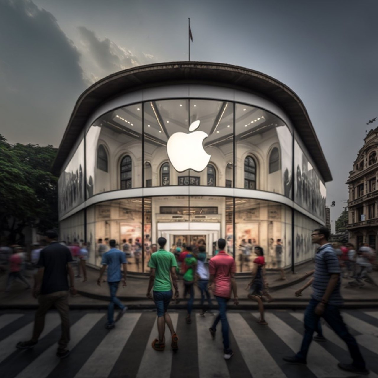
Apple Store meets Renaissance Revival (Europe)

The glass paneling provides the perfect facade to this imaginary store, with a distinct renaissance architectural style. There’s a certain grandiosity to this store, both with the massive glass front along with the high ceilings and arched columns behind it. The store sits at an intersection of sorts, making it an absolute prime spot and accessible/visible from multiple sides. That Apple logo also ends up becoming a very strong symbol, attracting people into the store… even if it’s just to browse!

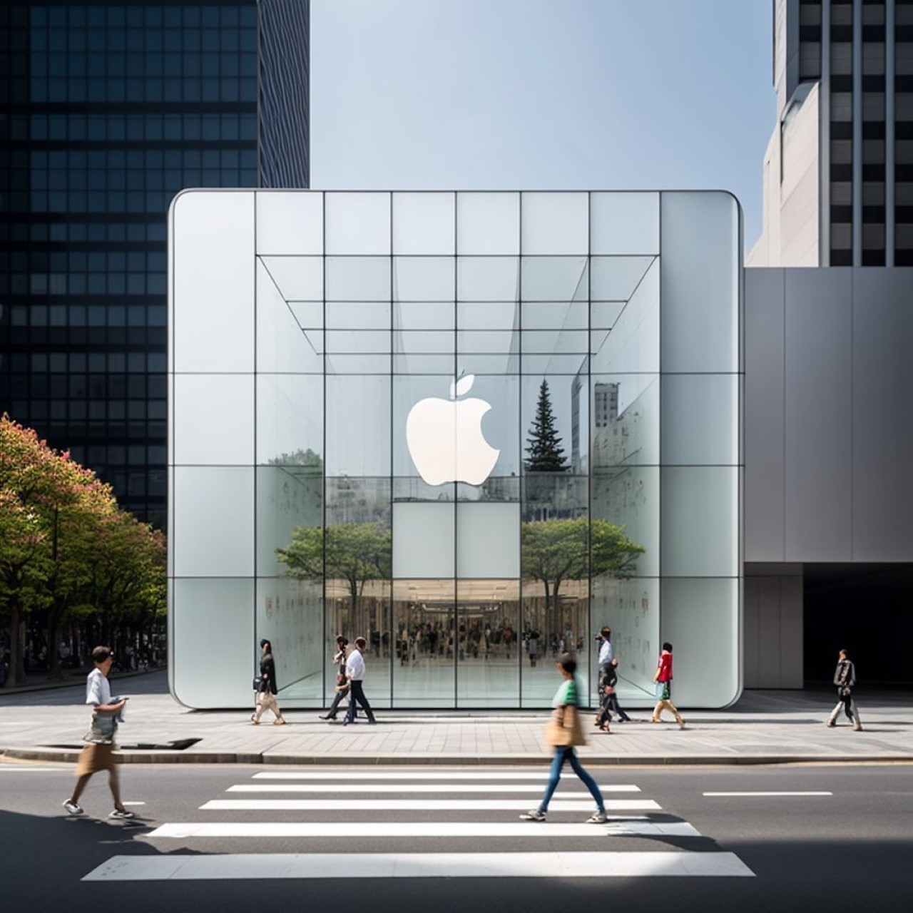
Apple Store meets Urban Minimalism (Scandinavia + Tokyo)

This sort of minimalism is something Apple does best. Glas facade, square-shaped building, the storefront looks like an Apple product! The use of white on the inside keeps the interiors looking pristine (just the way Apple likes it), and the flat glass paneling on the front reflects the buildings around it, creating an illusion that lets it blend into the background, while still being pretty eye-catching and iconic.

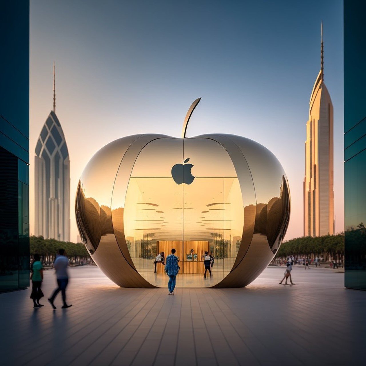
Apple Store meets Kitsch/Novelty Architecture (New York – Big Apple)

Speaking of eye-catching and iconic, nothing beats this store! Situated probably in New York (also known as The Big Apple), this storefront is oddly appealing, and between you and me, Apple wouldn’t be caught dead making something like this. That’s why we have the power of AI to help us imagine what a Mimetic/Novelty Apple store would look like. Recognizable even from a distance, the store looks like a massive golden apple, complete with a stem on top. The outer facade makes the store look larger than it actually is, because the insides remain traditional with flat vertical walls. I could see something like this in Dubai, if you ask me.

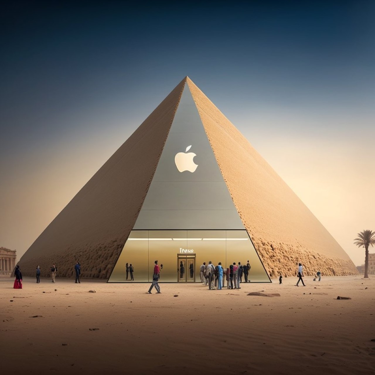
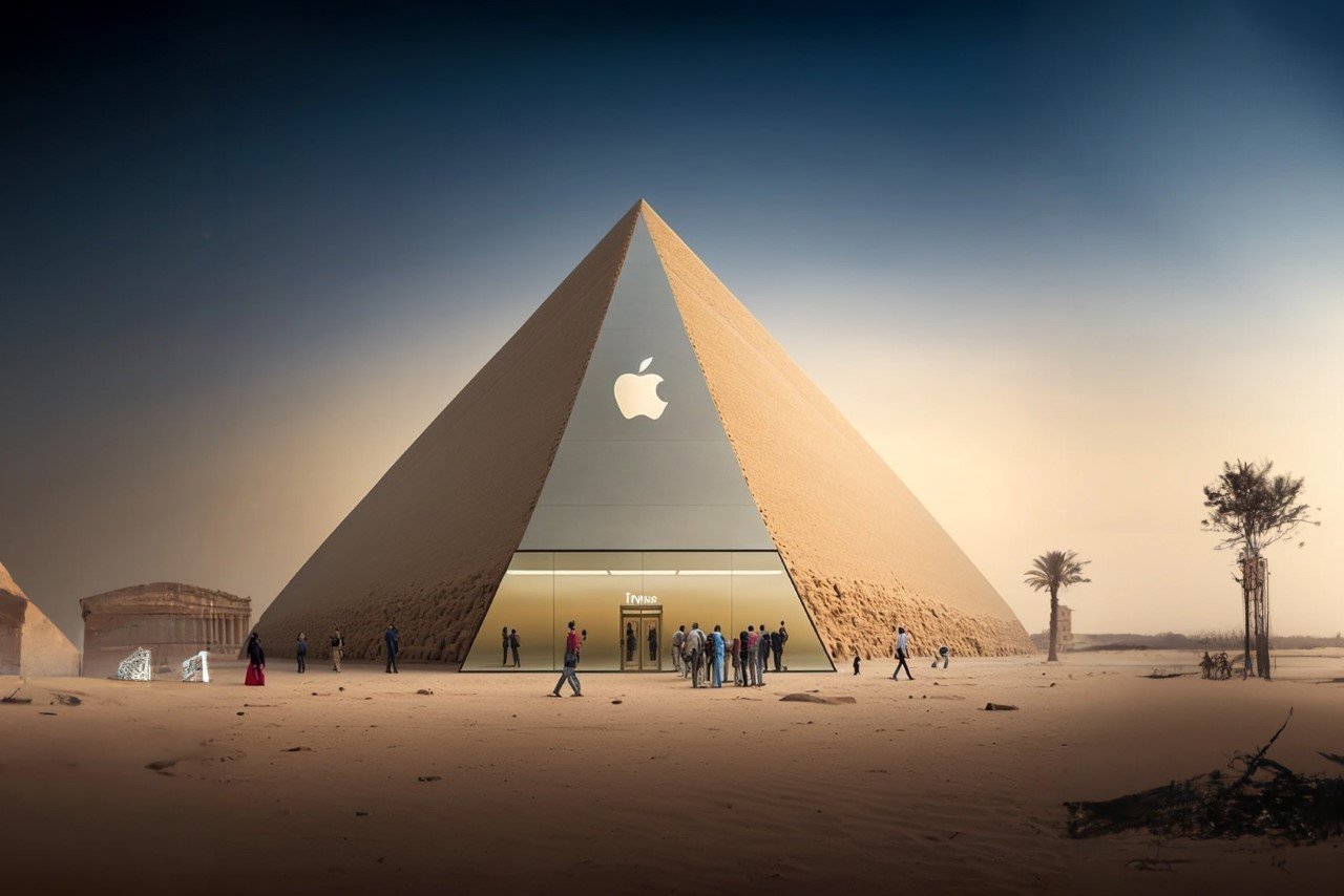
Apple Store meets Pyramids (Egypt)

This one’s bordering on a tiring stereotype, but I do like the idea of a pyramid-inspired Apple Store. It looks mysterious, sophisticated, and regal. The pyramid’s clean design fits perfectly with Apple’s own design ethos, although it looks a little too large for a single retail space. I’m pretty sure it would be some form of cultural appropriation too, which isn’t a good look for Apple.

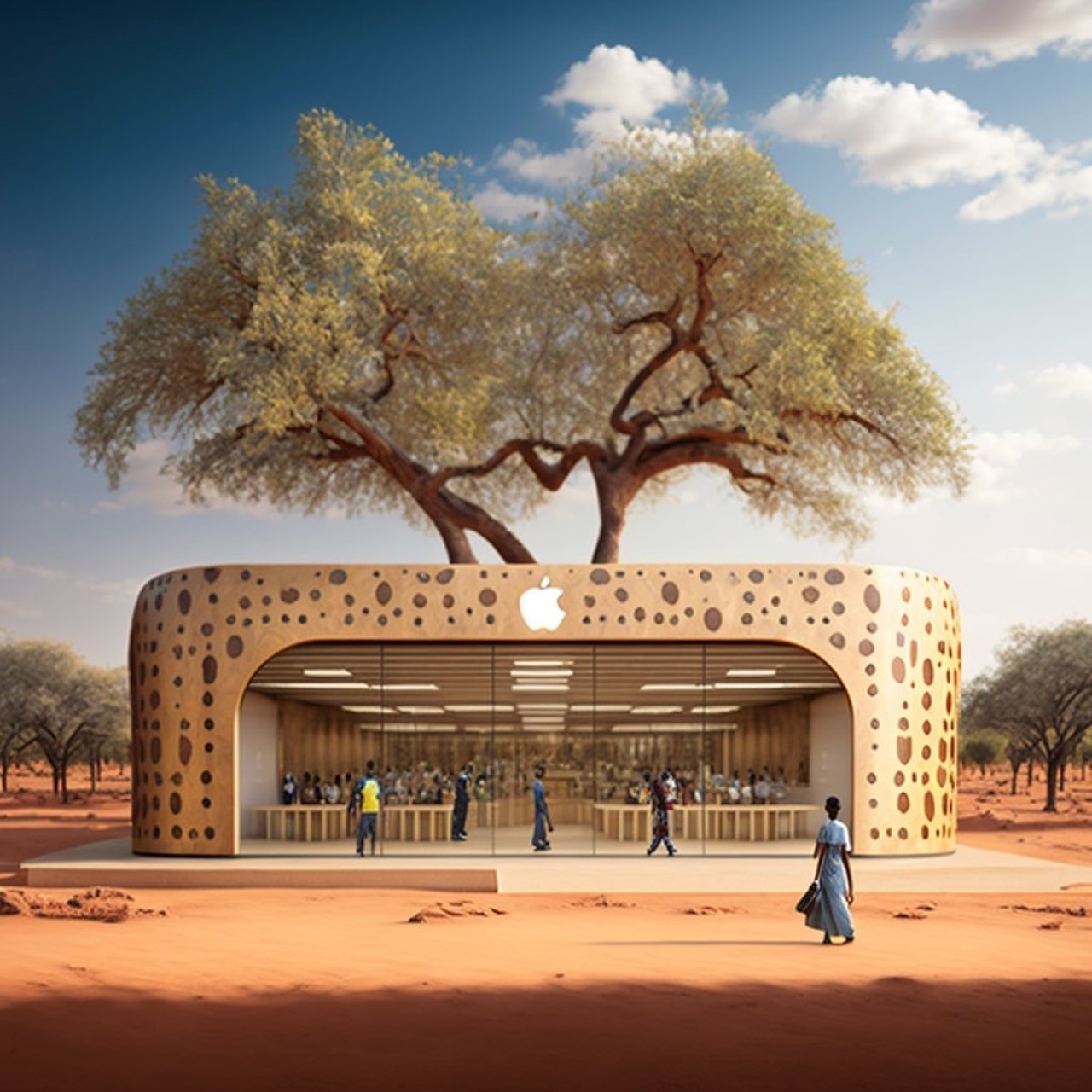
Apple Store meets Indigenous Sudano-Sahelian Africa (Central Africa, Sudan)

This one is an understated beauty. It’s raw yet incredibly inviting and shows how Apple’s retail architecture melts perfectly into the mud and clay-based styles of the Nubian or Sudano-Sahelian world. This particular style, found in parts of southern Egypt and Sudan, uses indigenous materials in its architecture, while also incorporating geometric themes and motifs to elevate it. The Apple logo built right into the mud storefront frame looks absolutely beautiful, and the glass facade on the front reveals a warm, earthy, woody interior.

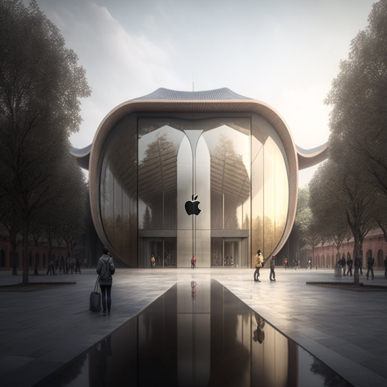
Apple Store meets Japanese ‘Nihon Kenchiku’ (Japan)

Inspired clearly by the buildings and monuments found in Japan, this Apple Store has the signature curved roof that’s an iconic part of Japanese architecture. There’s also the use of glass and concrete, which aren’t really traditional, but then again, having an Apple store with paper walls isn’t particularly desirable, now is it?! The entire store evokes a sense of tranquility and zen, aligning it perfectly with Apple’s own brand of no-nonsense minimalism.

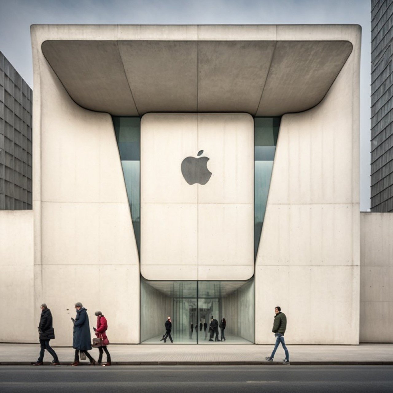
Apple Store meets Brutalism (Post-War Europe + USSR)

Brutalism itself was born out of a zero-frills mentality too. Originating in post-war Europe, Brutalism sought to revive and reconstruct a war-torn continent. Now, the Brutalist style roots itself in sensiblism – its characteristics are the use of large concrete panels and angular shapes. The buildings are made to look large and imposing, rather than compact. The Apple Store, similarly, has a massive concrete outer structure, with judicious use of glass paneling. The interiors would probably be open and airy, but the corridor that takes you from the main gate to the interiors is narrow, with a low-ish ceiling. A moment of discomfort and claustrophobia before you emerge into the real Apple store.

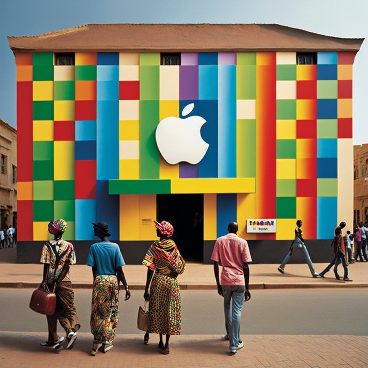
Apple Store meets South African Architecture (South Africa)

With its vibrant facade, there’s no missing this Apple store. Although not entirely following a distinct architectural style, this store does make use of vibrant colors, referencing the Ndebele tribe’s common practice of painting colorful murals on the walls of their buildings. The color does wonders for the retail space, allowing it to stand out against the beige tones of the city.

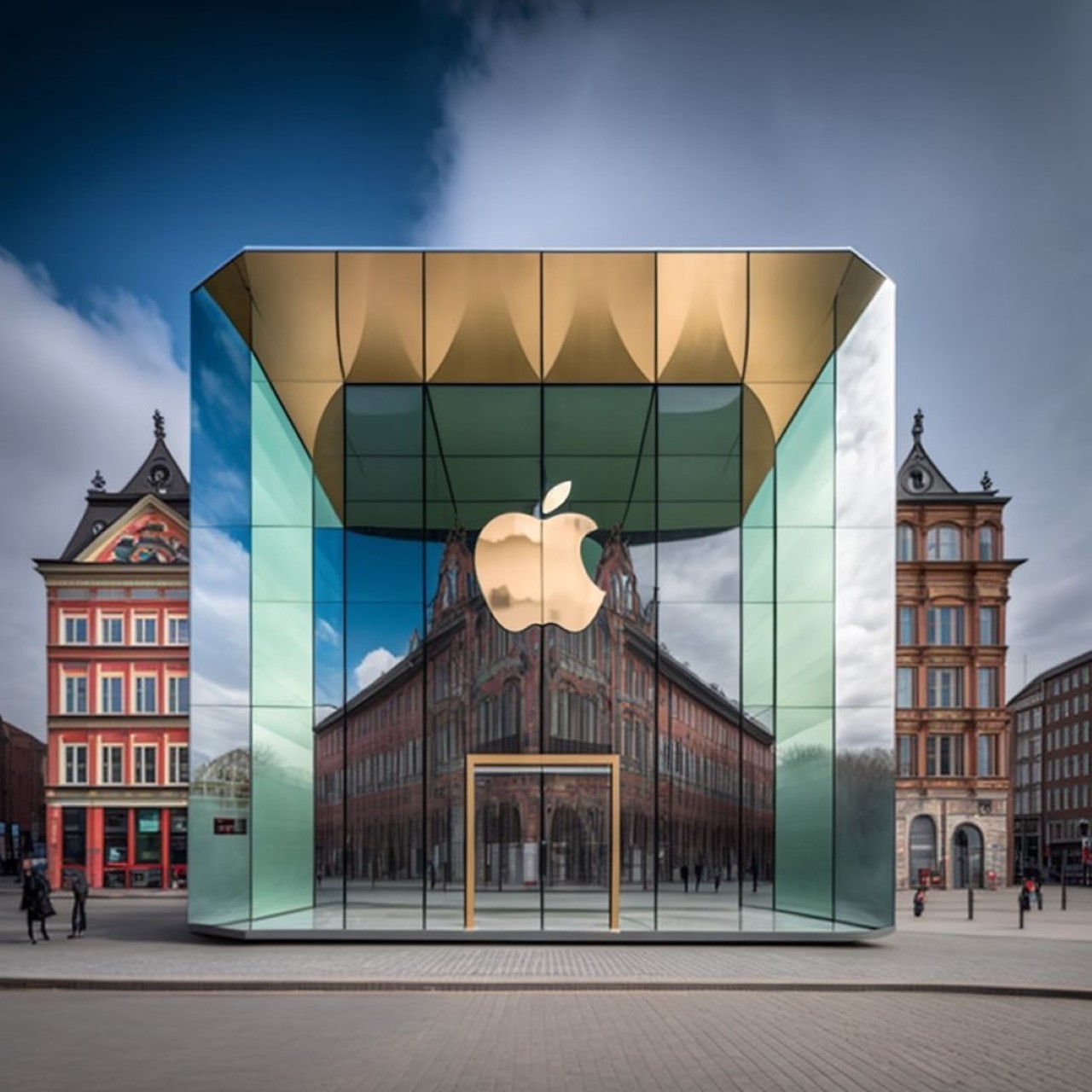
Apple Store meets European Modernist (Europe)

The final Apple store as a part of this tour takes us to Northern Europe. The image above shows us two distinct architectural approaches of the region – Art Deco (stemming from the neoclassical style), and Modernism. The Apple store here is clearly the latter, but it stands out wonderfully against its background of buildings from nearly a 100 years ago. The modernist style is a slight bit different from its sibling, the minimalist style. While minimalism looks to remove any sort of unnecessary detail, modernism tries to balance minimalism with a sense of flair. The Apple store here is all glass, to begin with, but it has facets in the right places, gold details, and reflects the art deco buildings around it. The building also seemingly floats a couple of inches off the ground, setting it a literal notch above its competition!

The post Designer depicts Apple Stores from around the world in different architectural styles first appeared on Yanko Design.

These MARVEL X Nike collab footwear concepts turn your favorite Avengers into dope sneakers

Little did I know the Loki color palette would look THIS good on footwear!

It’s not like there’s a shortage of Marvel merch out there… but designer Paul Parsons managed to concoct something that looks and feels so awesome I’m literally trying to manifest it into existence. Created with the help of MidJourney’s AI, these Marvel X Nike football sneakers capture the grandeur of some of the MCU’s most memorable heroes (and anti-heroes). Treading a fine line between being sporty footwear and an homage to a comic-book character, these football boots look exceptional on their own, even when observed without context. The series spans 9 different footwear models, dedicated to distinct characters from the Avengers movie… and Wolverine. Scroll down to see which one is your favorite!

Designer: Paul Parsons

The Spider-Man sneaker obviously uses the traditional color palette, with a liberal application of randomized lines to represent the friendly neighborhood web-slinger’s webbing. Notice how none of the sneakers actually use logos of the Marvel heroes (so as to avoid any copyright infringement, I suppose), but do wonderfully integrate Nike’s tick sign into the shoes to give them their unique character. I assume Nike’s much more liberal with fan-made concepts than Disney.

Iron Man and Black Panther tie in second place just because I have so much love for the characters in general. The former’s shoe has a lean design but with more ‘chunky’ 3D elements that give it an exoskeleton-like appeal, coupled with that signature metallic red and gold interplay that we love so much. The Black Panther shoe, on the other hand, relies on a more Afrofuturistic-leaning design that’s heavy on textures and lines, much like T’Challa and Shuri’s suits. The use of gold makes me guess these are for the new Black Panther in our lives.

Loki and Thor are arguably the most difficult to replicate. Given that it’s difficult to add any signature motifs like horns or hammers on the shoes, everything boils down to color themes, and the use of thunder in the latter’s artwork. I really have a newfound appreciation for the green and gold combo, which Parsons’ football sneaker concept utilizes beautifully. The golden studs near the heel and the golden tick mark really make the shoe stand out. With Thor, I’d much rather see the use of the square chainmail that was found in Thor’s sleeves in earlier movies. The shoe uses a white and red interplay, with lightning streaks to invoke the Norse God of thunder.

Hulk’s footwear treatment seems more on the side of realism, given that the proportions are still very human. A creative call on the designer’s part, I still quite like this one. There’s a bit of an acidic toxic aesthetic here that feels more akin to The Lizard here, but still, a job well done! The creases and lines on the shoe somewhat feel like sinews and muscles, without the exaggerated proportions of The Hulk. Maybe a little purple would do the trick, as is found in the hero’s (tattered but holding-together) pants.

Wolverine seemed like a bit of a wild card here, but I’ve always loved what Hugh Jackman brought to the role. He’s more Wolverine than Robert is Iron Man, if you ask me… and I know that’s a controversial hot take. Again, this concept stays on the lines of realism by not including any razor-sharp adamantium studs at the bottom of the footwear… but that yellow and black aesthetic is just instantly recognizable. It uses stripes that can be found in the original costume too, with a sharp tick mark ‘cutting’ through for extra impact.

We bring our collection to its conclusion with Groot and Thanos. The two non-human sources of inspiration in this collection. The Groot footwear (grootwear?) has a wonderfully woody appeal, with roots and twigs curling around each other the way they do on the woody superhero’s body. The shoe rests on a carpet of leaves too, completely honoring the theme. With Thanos, however, the shoe’s design misses the inclusion of the Infinity Stones… but there’s the signature purple and golden melange that is synonymous with the character’s purple skin and golden gauntlet. Lines around the shoe’s ‘chin’ resemble the creases found on Thanos’ chin too!

The post These MARVEL X Nike collab footwear concepts turn your favorite Avengers into dope sneakers first appeared on Yanko Design.

Futuristic tennis racquet was designed by Artificial Intelligence to be lighter, stronger, and better looking

Using a combination of DALL.E/Midjourney along with generative algorithms, the team at All Design Lab created the Hìtëkw – a modern take on the classic tennis racquet. Except this modern take isn’t just some aesthetic overhaul… the redesigned racquet is lighter yet stronger, and is infinitely better looking!

“From the start of the project, we wanted to explore new opportunities. We wanted to create something exciting to tell a new story within this sport”, mentioned the folks at All Design Lab. The recent rise of AI programs such as DALL·E and Midjourney proved to be an interesting starting point. Rather than plotting a user experience, browsing Pinterest, and building moodboards, the designers decided to simply ask AI text-to-image chatbots to reimagine tennis racquets in their own unique ways. This fundamentally different approach took the designers down a completely new path, introducing them to ideas and paths that would otherwise remain unexplored.

Designer: All Design Lab

A look at the tennis racquet inspiration images DALL.E and Midjourney helped generate.

Interestingly enough, for All Design Lab, the images had one commonality – they were all pretty identifiable as racquets. ” What we learned from this was that while these programs are extremely powerful, they are only as powerful as the source material they have to sample. And with tennis rackets, the form doesn’t really change all that much from its inception.” The AI made them realize a strong area of intervention – redesigning the racquet’s silhouette itself.

Suffice to say, Hìtëkw isn’t quite like any racquet you’ve ever seen. Its top and bottom are fairly standard, although what connects them at the middle feels almost like an alien-like organic series of branches/webs. It’s an interesting deviation from the Y-frame seen on most racquets, but what sets it apart isn’t just its unique aesthetic – it’s also its functionality.

“Rackets have become more lightweight and durable through new materials and advanced manufacturing techniques”, the designers mention. “Yet the potential is still there to envision an even lighter and stronger racket that takes advantage of new design techniques, specifically, advanced CAD processes such as generative design tools.”

This generative approach resulted in a frame that was stronger while requiring lesser material, making it lighter in the process. It took the team multiple iterations to arrive at a form that was equal parts aesthetic and functional. They used DALL.E as a starting point, but moved to 3D iterations to create the generative branch-like structure you see here. The only caveat is that while most racquets are made using metal casting/molding techniques, the only way to really make a Hìtëkw racquet is through metal 3D printing. The reward of this laborious process, however, is an increase in performance because of the racquet’s stronger/lighter design. “Potentially, in practice and real-life physical testing, a racket similar to Hìtëkw could introduce a new level of performance to players.”

You can follow All Design Lab’s experiments with Hìtëkw on their Instagram page.

The post Futuristic tennis racquet was designed by Artificial Intelligence to be lighter, stronger, and better looking first appeared on Yanko Design.