Timetelling made minimal, made simple.

With the title of the Stormtrooper Clock, Guillaume Saussey’s timepiece design is simple both in color and in form. With the classic black and white Stormtrooper aesthetic from Star Wars, the clock uses black-on-white contrast to create dynamism, while keeping the clock’s working foolishly simple… much like the troopers themselves. To complete the Stormtrooper aesthetic, the clock even has a logo on the back inspired by the Stormtrooper uniform!

The way the clock works is rather simple too. Three circles at the 3 o’clock position denote the time by displaying the hour, minute, and second values accordingly. Numbered discs on the inside rotate as time progresses, while the circular holes on the clock’s face give you a clear indication of the time. It’s as simple as it gets!

Designer: Guillaume Saussey for Render Weekly

This ‘Blue Pill’ will get you shiny teeth on the go

If there was a guessing game for ‘what’s in your travel bag’, then I know mine would be an easy win for most. I carry my shampoo, face wash, toothbrush, moisturizer… you get the drift. You name it, and it’s packed into travel-sized minion bottles, and are ready to go for their ride. However, most people are not like me – and one of the most common things that people tend to forget to pack is the toothpaste. I concur this is mainly because we typically buy the big tube and travel-sizes don’t retain much. Hence, packing a big tube can be unnecessary.

I like what designer Fernando Maldonado has done though – he’s designed a travel toothbrush that has a squeezable compartment. You see the blue pill shape one? That’s the space you fill up with toothpaste and carry the kit as a whole. When you need to use it – simply squeeze out the required amount, and brush. Clever!

Designer: Fernando Maldonado

This sustainable toothbrush comes with replaceable miniature bristle-heads

The sustainable toothbrush started off as a rendering exercise, and turned into a pretty remarkable product. Designed by Paris-based Alexandre Touguet, the toothbrush features a three part system that drastically reduces the amount of waste generated by disposing toothbrushes. While the idea of having a toothbrush with a removable head isn’t new, Touguet’s design pushes it to its absolute limit, with the disposable part being a small, capsule-shaped unit that just holds the bristles. With a relatively uncomplicated assembly that allows you to screw and unscrew the handle to pull the toothbrush apart, Touguet’s designed a system that allows you to retain and reuse a majority of the brush, only disposing of the bristles every few months, and helping drastically cut down on plastic waste.

Designer: Alexandre Touguet for Render Weekly

‘Mesa’ Combines a Planter and Hand-held Vacuum Into a Surprisingly Elegant Solution!

One’s designed to hold dirt, the other’s designed to eliminate dirt. Sam Lavoie says there’s no reason the two of them can’t get along! The Mesa, designed as an entry for Render Weekly’s design challenge, combines a planter and a hand-held vacuum cleaner into a singular form. The result is a design that’s decorative, utilitarian, and creates a pretty harmonious partnership between two unlikely categories and products.

The Mesa makes for a pretty decorative planter to be placed inside your house, along with a nice indoor plant. Sam capitalized on the fact that planters are usually placed against walls and near power outlets, giving you a product that can easily be plugged into a socket in the wall quite inconspicuously. The vacuum fits right in the planter and charges once docked, and can be easily used by pulling it out and powered using the standby button on the base. The vacuum’s design elegantly complements the planter, and while home appliances usually come in pretty standard glossy finishes and in black or white, the Mesa explores earthy terracotta as a potential color and texture for the vacuum and the planter. Needless to say, it clearly works!

Designer: Sam Lavoie for Render Weekly

The Eames Chair-inspired “Lounge Mouse” is also a luxurious arm-rest

Claiming he was tired of ‘electronic-looking electronics’, Shane Chen designed what one might consider an awakening for the tech industry. Taking inspiration from an iconic chapter in furniture design, Chen envisioned the Lounge Mouse, a hat-tip to Ray and Charles Eames’ Lounge Chair. The Lounge Mouse follows the form and visual direction of the ottoman footrest that comes along with the chair. The base of the mouse is made from bent plywood, while the upper half is an incredibly soft leather clad with a scroll-wheel in its upper center. “The design addresses the ergonomics and style of a computer mouse from the perspective of designing furniture”, says Chen, who designed the Lounge Mouse as an entry for Render Weekly’s online rendering challenge.

Designer: Shane Chen for Render Weekly

The Manta Mouse is a mouse and mousepad all-in-one!

The Manta Mouse takes inspiration from the Manta Ray, with its wide, stingray-inspired design. At the very center is a bulbous volume forms the bulk of the mouse, the part your palm rests on, while the rest of the mouse skirts around the side. This side-skirt essentially works as a cushion for the base of your palm, promising to give your hand a comfortable place to rest as you operate the mouse. The mouse’s finish looks like blackened cork too, so you’ve essentially got yourself a mouse that isn’t rigid, bulky, and uncomfortable. It’s almost like a recliner chair… for your hands!

Designer: Alberto Aguado Baudil for Render Weekly

This hemispherical mouse adds a different aesthetic to your work-desk

Look at the Hemisphere and tell me it isn’t adorably eye-catching. The mouse’s name pretty much tells you all you need to know. Its design is a perfect hemisphere, unlike most organically-designed computer mice, and features the standard two click buttons and a scroller, but laid out in the mouse’s half-sphere design.

The mouse has, for too long, been bound to ergonomics-influenced design. I am, by no means, bashing ergonomics, but different mice appeal to different people. There’s no one-glove-fits-all design for computer mice. The Hemisphere takes advantage of that. Much like holding a cricket or tennis ball, the Hemisphere’s half-spherical construction feels comfortable yet sort of radical too. Plus, I can’t get enough of that glossy green finish!

Designer: Deokhee Jeong for Render Weekly

YD’s top 10 entries from the #renderweekly razor challenge

If you’re an industrial designer who hasn’t heard of Render Weekly, stop everything you’re doing and head down to their website to have a look at the community of designers and render-artists who come together week after week to showcase their talents in modeling and rendering. The idea is simple. Render Weekly suggests a product every week, and you have a week to upload your work on Instagram with the hashtag #renderweekly. The best designs get picked and showcased on Render Weekly’s Instagram account, and their modelers/renderers get immense designer street-cred.

The prompt for Week 45 was Razor. Pretty open ended if you ask me. Designers were required to design as well as model and render out their razor concepts and the results ranged from sleek and minimal, to chunky and masculine. Some designs even redefined the razor as we knew it. Among hundreds of entries, we picked our favorite ten based on their concept, choice of material, CMF, and lighting!

Credits: Render Weekly


Jake Lee’s Z-Razor is simple, beautiful, and looks like it would be an absolute pleasure to hold and use. The stainless steel body comes with its share of curves and a nice weighted design that looks like it would feel great to grip. The blade has an innovative docking mechanism too, and can be easily ejected with a simple click of a button.


Jonathan Welch’s razor is as simple as they get. Made entirely from metal, and with an incredibly slim body, Welch’s razor wouldn’t be as grippy as Jake’s Z-Razor, but it does look incredibly desirable, and even features a rotating razor-head that lets you maneuver the blade easily across your jaw.


This razor designed by Kevin Klöcker actually champions portability. It features a swiveling razor-head that rotates 90° to vertically align with the handle, allowing the razor to become as thin as a pencil, allowing it to slip easily into toiletry bags or your luggage compartments without occupying any space. When you need to shave, open the razor out into its ‘T’ shaped format and the razor clicks back in place, holding its shape until you press a button on the back to close the razor down to its slim ‘I’ shaped form.

Seoul-based Hyunsol Park decided to channel a leManoosh vibe with his use of form, close-up renders, and a design language that’s universally appealing. The razor also features a weighted flat base that allows it to stand vertically when not in use, and a rather interesting silicone neck that connects the razor to the handle, allowing the razor-head to flex ever so gently to follow the contours of your face as you shave.


Another champion of portability, the Pill razor by Jeffrey Lee is a completely different concept. Designed to be a vertically oriented electric trimmer, the Pill slides easily into pockets and backpacks, letting you carry it around just as easily as you would a pen. Pop its magnetic cap off and the Pill begins working. Hold the mesh against your stubble and the Pill trims your beard, giving you a neat, clean shave. Pop the cap on and voila, the Pill turns off! The area below the razor not only serves as a handle but also houses the AA battery that runs the razor.


Max Syme’s brass razor looks retro but also reliable. There’s a certain masculine comfort in the way Syme’s razor looks. Does it have something to do with its robust looking Y shape? I don’t know. The razor is made from solid brass, features a slightly distressed look for that macho touch, and comes with a knurled handle that’s great to hold onto as you run the razor across your jawline.


Dave Joseph’s razor features a Y frame too, but captures a completely different spirit. Warm, inviting, and friendly, Dave’s razor design features a plastic body that’s absolutely rendered to perfection. The material, its roughness, self-reflections, and color are simply spectacular. Modeled with TSplines in Fusion and rendered in Keyshot.


One of the few straight razors to get submitted in this challenge, Mehmet Ergul’s razor design features a hollow, hub-less rotating hinge, and a beautifully organic texture on the handle that stands out against the blade’s angular, geometric design. The hollow hinge forms a great concave rest for your thumb as you shave, and here’s a little secret. Ergul used a dope displacement map to render that handle texture!


Dustin Low’s razor stands out as one of the most detaild looking razors of the lot. Overcomplicated, but in a good way, Low’s razor design explores a lot of things. Form, proportion, material, textures, transparency, and their ultimate effect on aesthetics. Low’s even created a pretty awesome looking timelapse of the modeling process in Autodesk Fusion 360!


Last, but definitely not the least, Dennis Johann Mueller’s razor concept lets this round-up article end on a complete high. Compact, and definitely a product you’d want to try to use at least once, Mueller’s razor ditches the handle for a thimble. The razor literally mounts on your fingertip, allowing you to shave in a way that feels a little more natural because you’re running your fingertip down your jaw, rather than maneuvering a handle. I imagine this is how the Black Panther shaves too. Mueller calls his concept the RZR, which is such a perfect name because it’s just as compact and compressed as the concept design itself!

YD’s top 10 entries from the #renderweekly challenge

renderweekly_nikevapormax_layout

If you’re an industrial designer who hasn’t heard of Render Weekly, stop everything you’re doing and head down to their website to have a look at the community of designers and render-artists who come together week after week to showcase their talents in modeling and rendering. The idea is simple. Render Weekly suggests a product every week, and you have a week to upload your work on Instagram with the hashtag #renderweekly. The best designs get picked and showcased on Render Weekly’s Instagram account, and their modelers/renderers get immense designer street-cred.

This week’s prompt was in collaboration with designer Sam Whitworth, who was kind enough to share a CAD model of a conceptual Nike VaporMax shoe. Designers were told to download the 3D file and render it out in an eye-catching way. Among hundreds of entries, we picked our favorite ten based on their choice of material, CMF, and lighting!

Designer: Sam Whitworth in collaboration with Render Weekly

renderweekly_nikevapormax_1
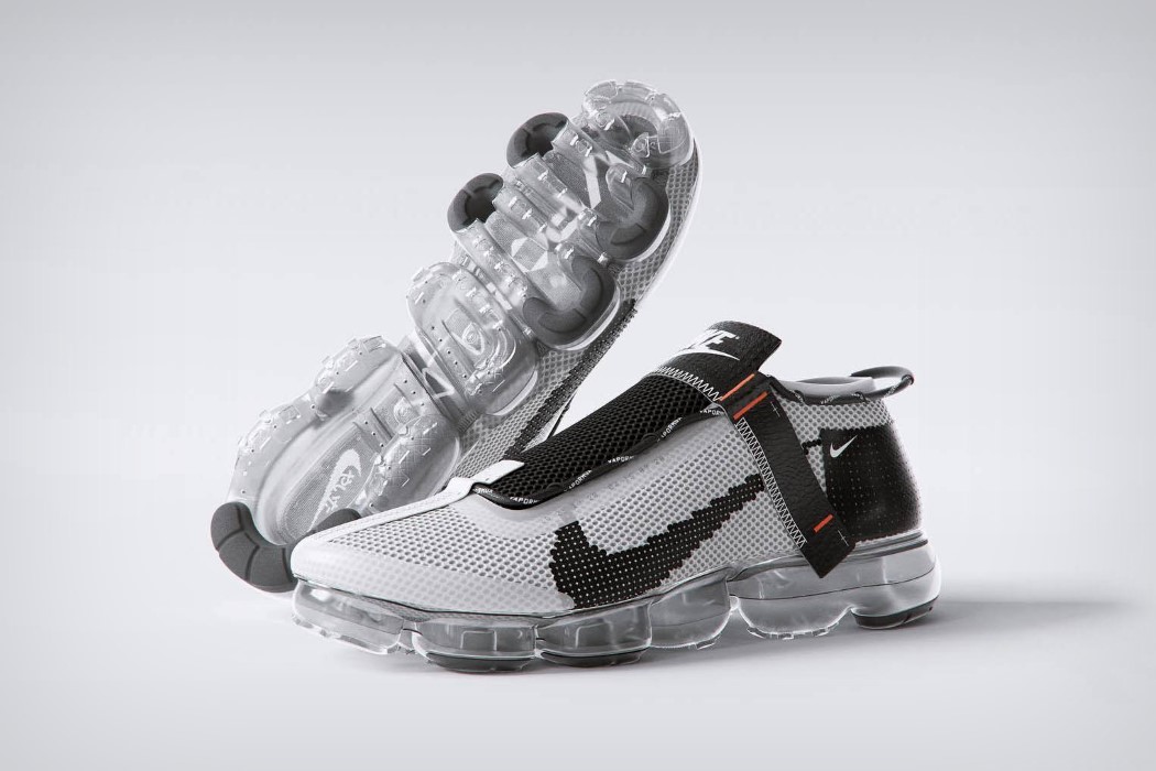
You really have to appreciate how Tim Zarki managed to pull off the net texture on the shoe body as well as the stitch along the sidestrap and the shoe tongue. Also, killer transparent outsole! Modified using Blender 3D, Cinema4D, and Redshift.

renderweekly_nikevapormax_2
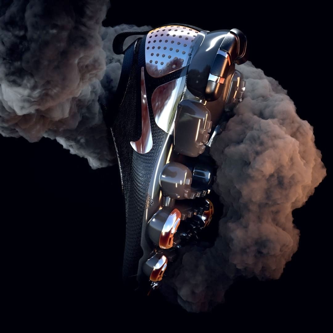
Chrome detailing against black, and the use of smoke… this render looks absolutely lit! Courtesy Johannes Olerås.

renderweekly_nikevapormax_3
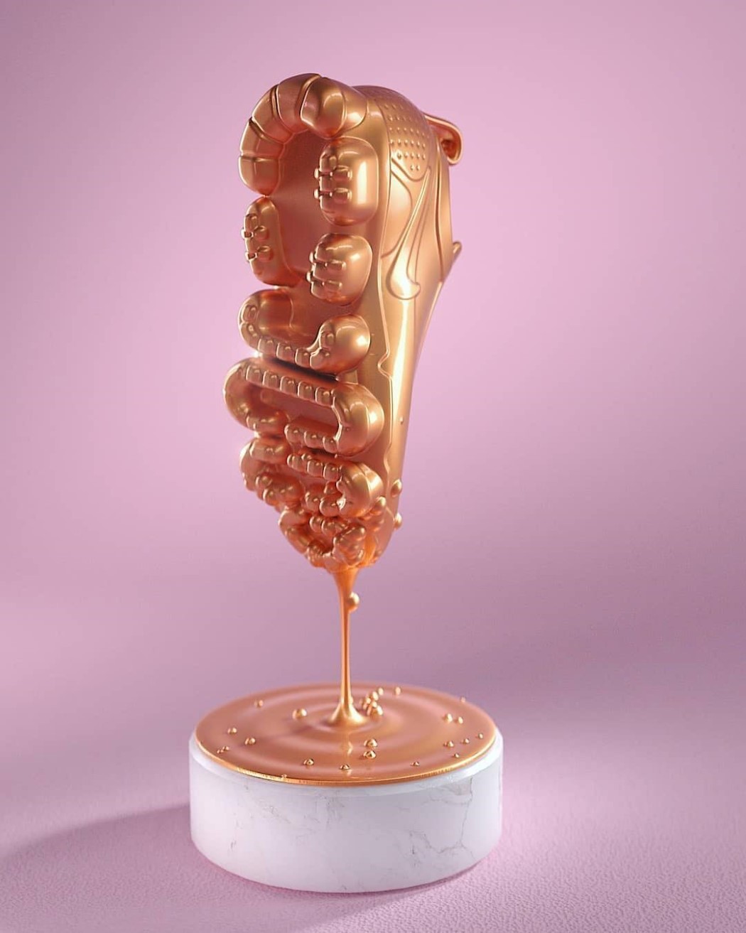
This shoe is quite literally dipped in gold. A little tinkering with fluid simulation and you’ve got quite literally a Golden Shoe, rendered artistically by Philipp Thoma.

renderweekly_nikevapormax_4
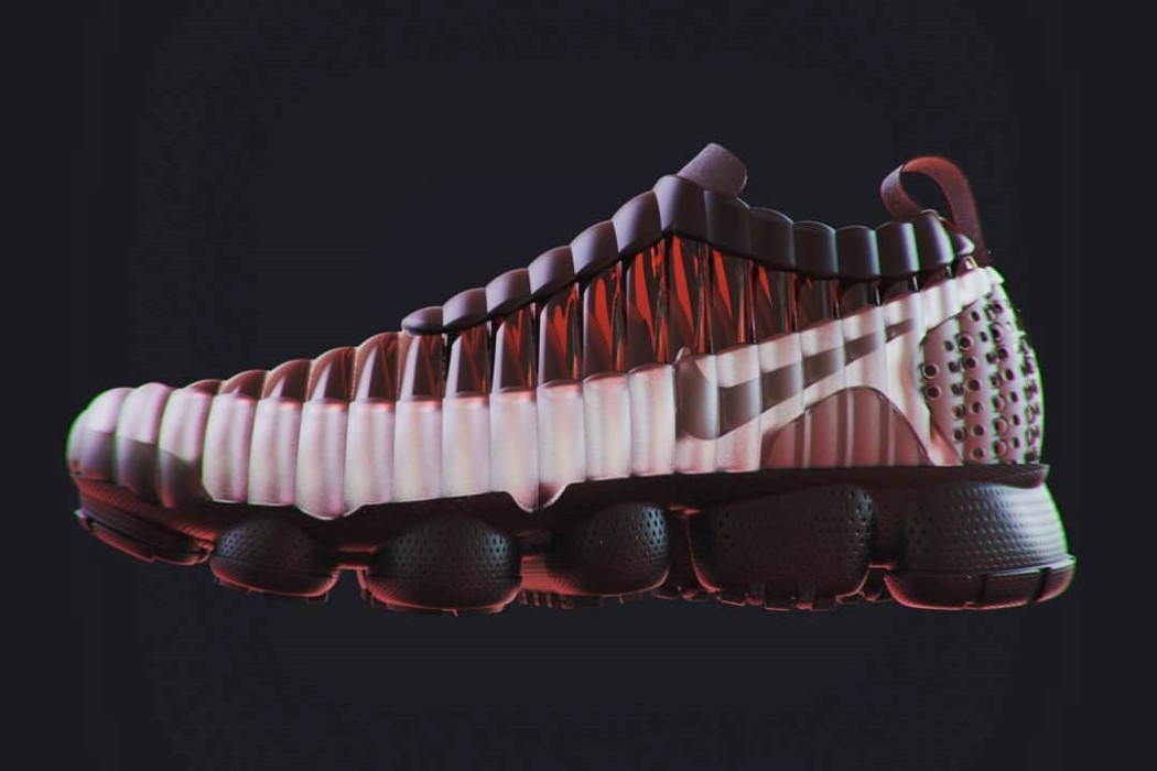
This rendition by Kaelan Abernathey wins our heart just for being different. With its unusual air-cushioned body and the leather trim right above the outsole, this VaporMax concept is unusual and grabbed our eyes even despite its beige and brown color combination. Would totally wear this if it existed.

renderweekly_nikevapormax_5
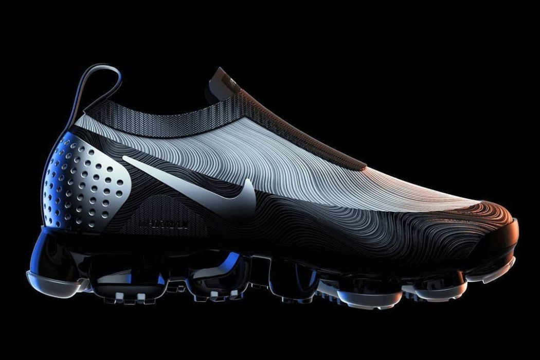
What really makes Shaun Wellens’ rendering pop is his choice of the Oreo color scheme, and the use of hypnotic contour lines on the body. You gotta love that subtle warm and cool lighting work too!

renderweekly_nikevapormax_6
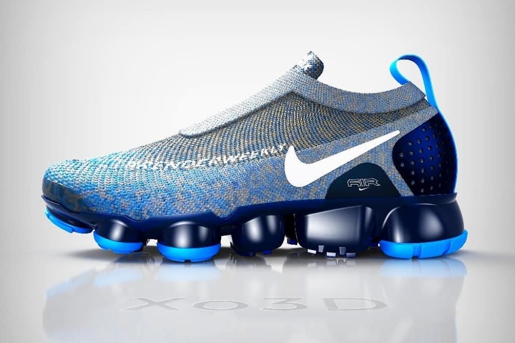
While I’ll admit that the knitted fabric sort of stretches at the toe of the shoe, XO3D‘s rendition of the VaporMax is rather appealing. The fabric body comes with its own blue-gray spatter design, and bright blue trims on the outsole that stand out against a sea of rich Navy Blue. The designer also very cleverly weaved RenderWeekly onto the shoe’s body!

renderweekly_nikevapormax_7
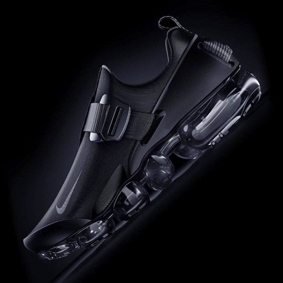
Draped in a tightly woven fabric, with straps around the top and back, this all-black VaporMax concept from Bobby Turner looks notorious! I can’t quite get enough of transparent outsoles, personally!

renderweekly_nikevapormax_8
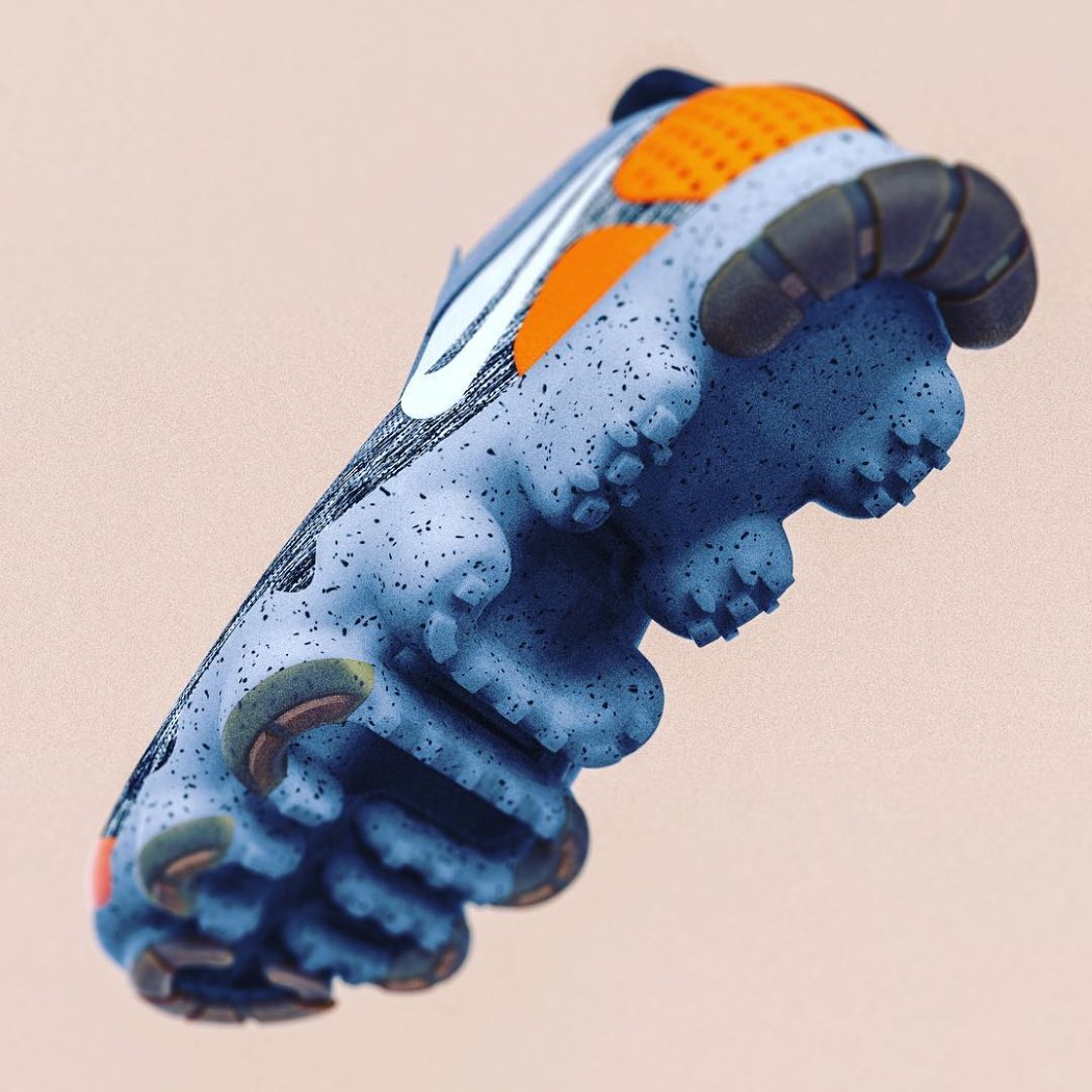
Positively Lemanooshian with its use of the industrial designer’s favorite splatter material for the outsole, David Cohen‘s VaporMax concept is an eyeball-grabber. Woven top with a striated pattern, speckled base, and a bright orange heel-cap. Win!

renderweekly_nikevapormax_9
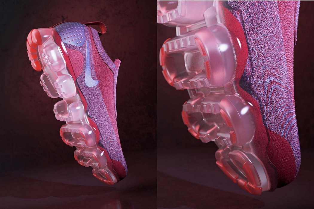
Speaking of woven tops and interesting outsoles, you have to take a pause to admire these kicks from Will Gibbons. Rendering quality is top notch, with great lighting and a background that doesn’t steal from the product. All lights on the product, which showcase the woven texture and a cloudy, translucent outsole that has an absolutely wonderful bubblegum appeal!

renderweekly_nikevapormax_10
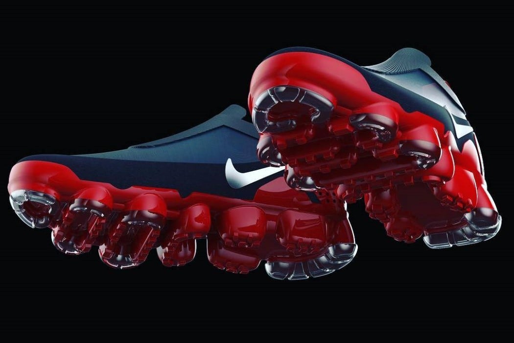
Simplicity at its finest, Dan Devine‘s Vapormax comes with a Superman color scheme and a chrome Nike Logo as well as chrome trims on a gorgeous, vibrant red outsole. A classic color scheme on an absolutely wicked model.