Nothing Ear (2) Review: An Exercise in Iterative Refinement

PROS:


  • Unique, distinctive design

  • Personalized sound profiles

  • Well-balanced performance for price

  • Clear sustainability strategy

CONS:


  • Noticeable wind noise despite ANC
  • Available only in white

  • Visually identical to Ear (1)

RATINGS:

AESTHETICS
ERGONOMICS
PERFORMANCE
SUSTAINABILITY / REPAIRABILITY
VALUE FOR MONEY

EDITOR'S QUOTE:

The Nothing Ear (1) represents a clear step forward in quality while retaining the first-gen earbuds' winning points.

The removal of headphone jacks from smartphones initiated by Apple caused a surge in the number of wireless earbuds in the market. That, of course, also gave birth to the need for good earbuds designs, though many, unsurprisingly, were content to just copy the leading brands. It isn’t always about looking different, though, since a unique design might also end up being unusable or don’t deliver an adequate level of performance. Form and function should always go hand in hand in the first place, and that seems to be the goal of the second-gen Nothing Ear (2) TWS earbuds, keeping what worked and refining what needed improvement. Given the reputation of the first-ever Nothing product, we just had to take it for a spin to check if its successor sounds as clear as it looks.
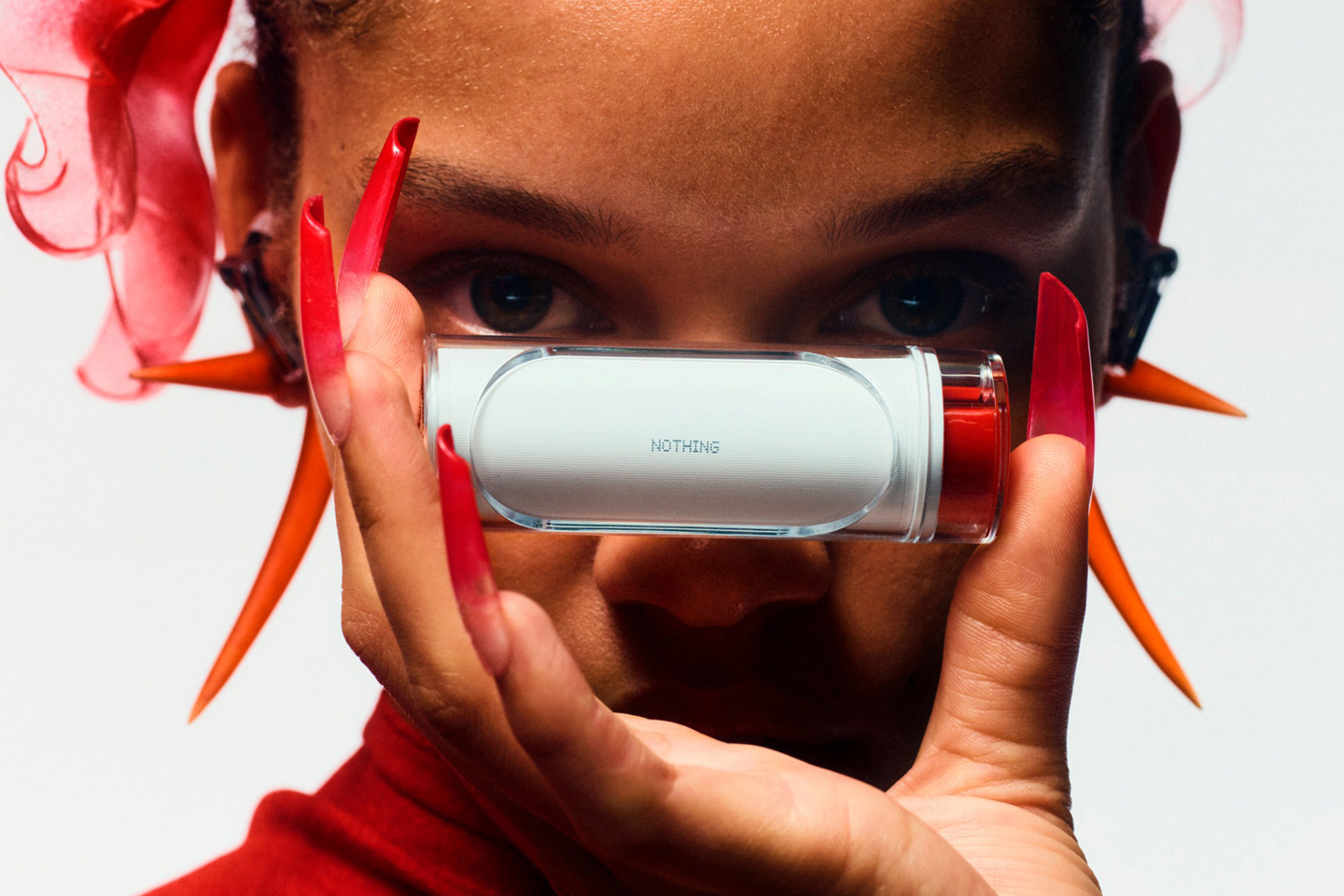
Designer: Nothing

Aesthetics

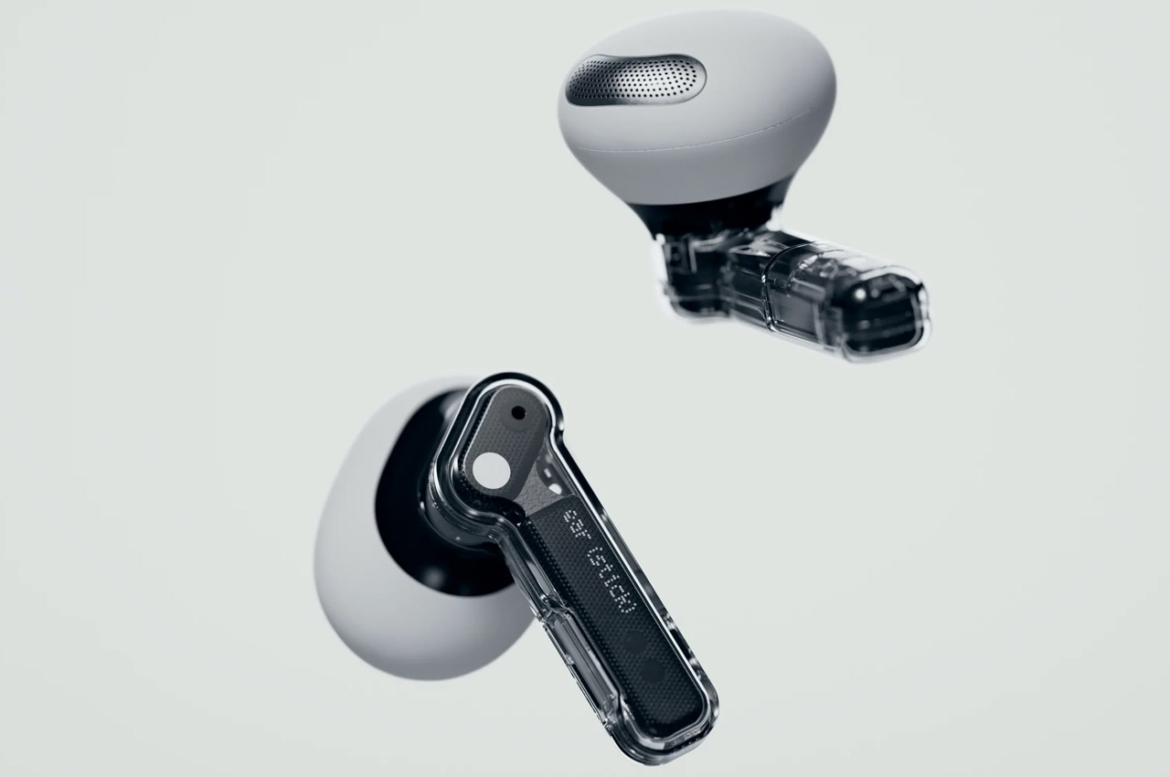
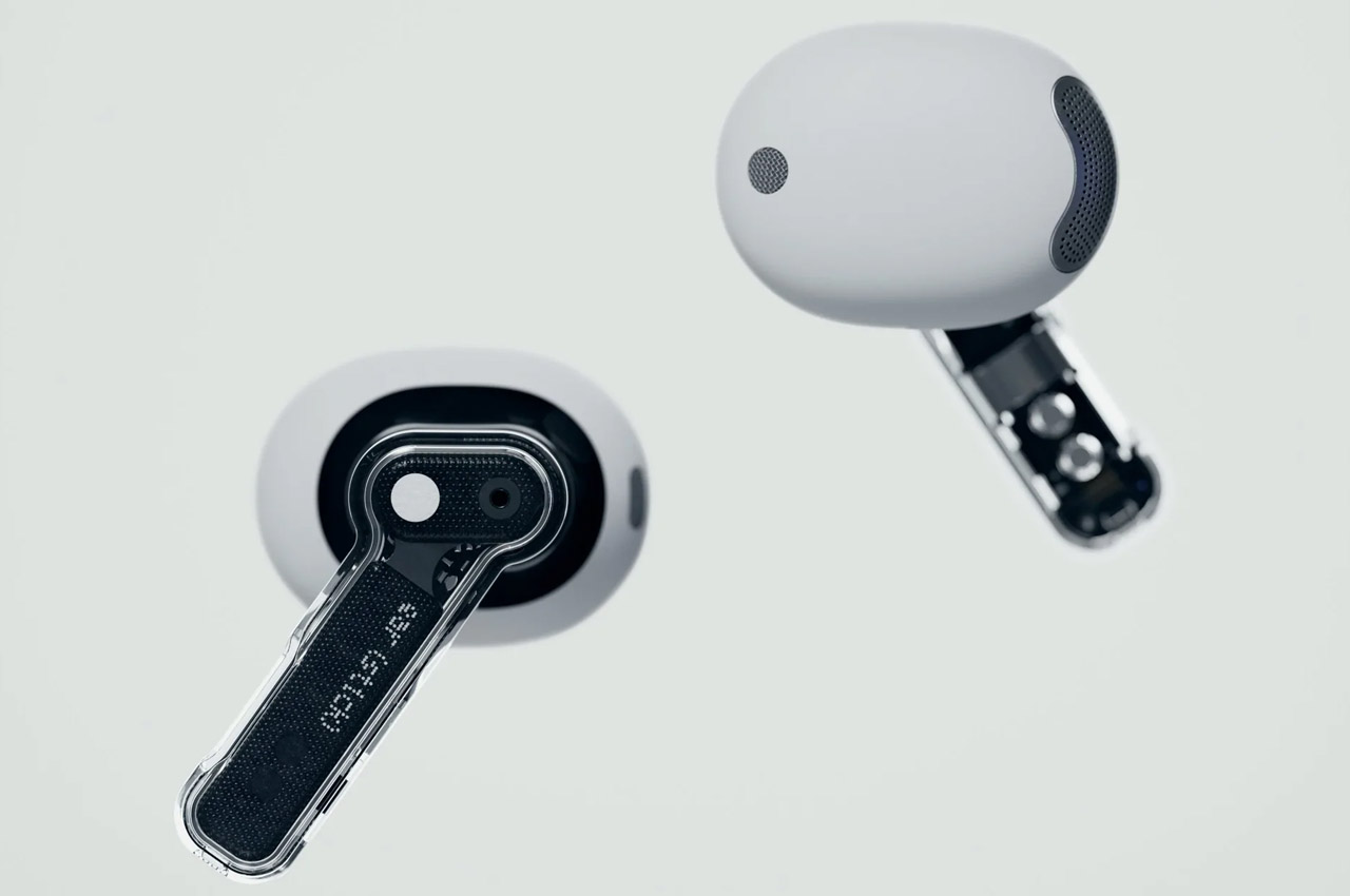
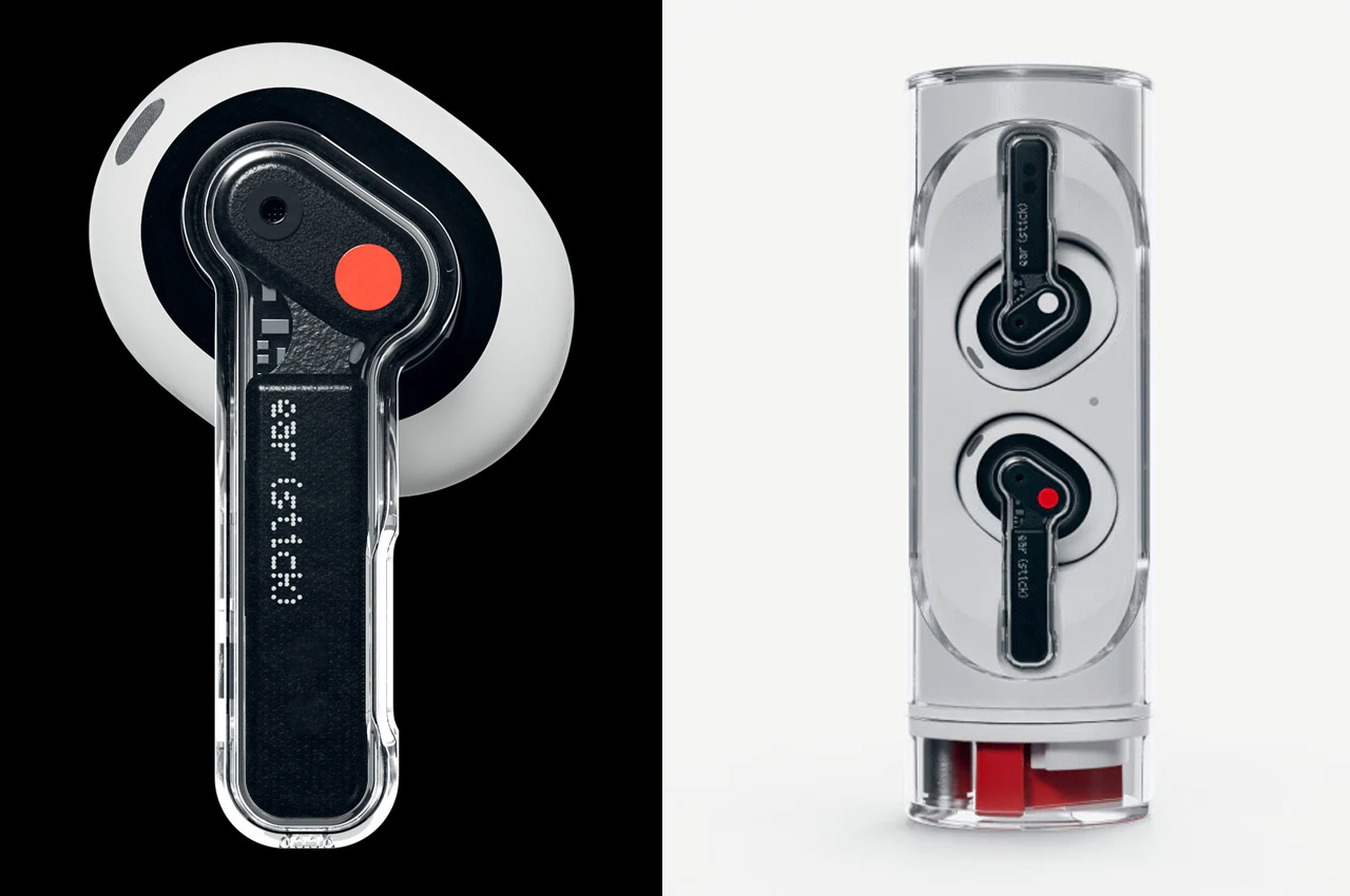
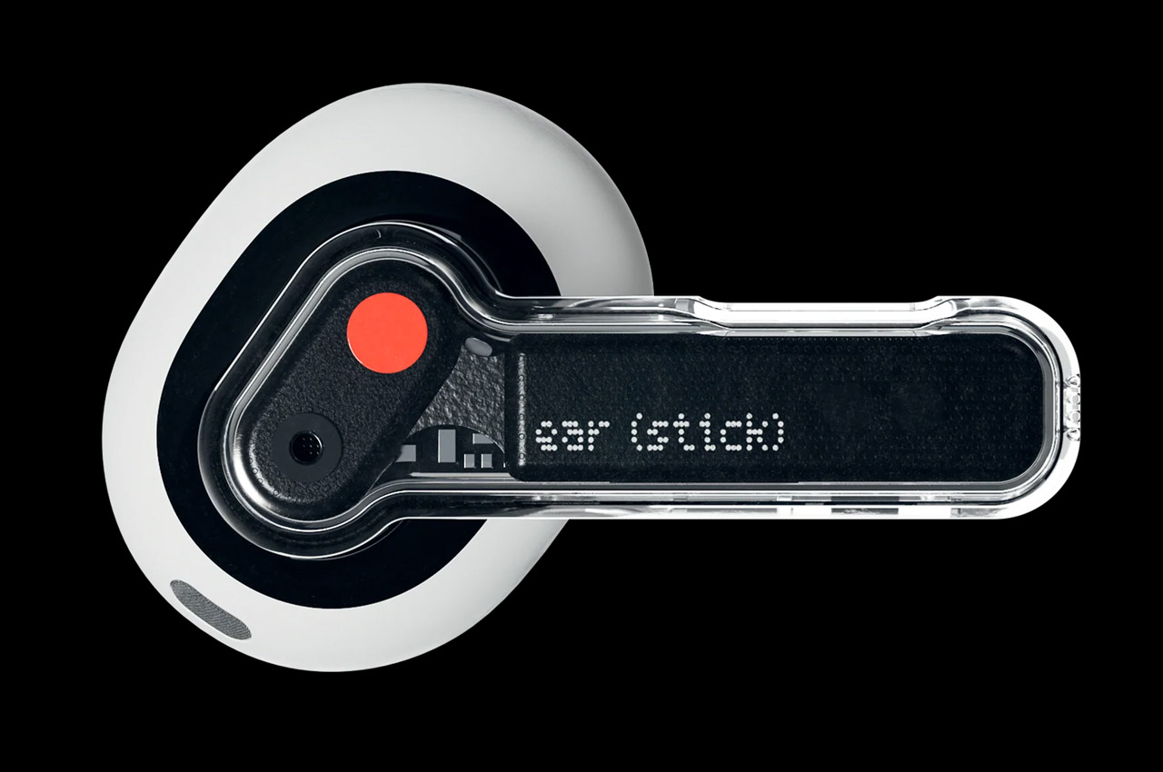
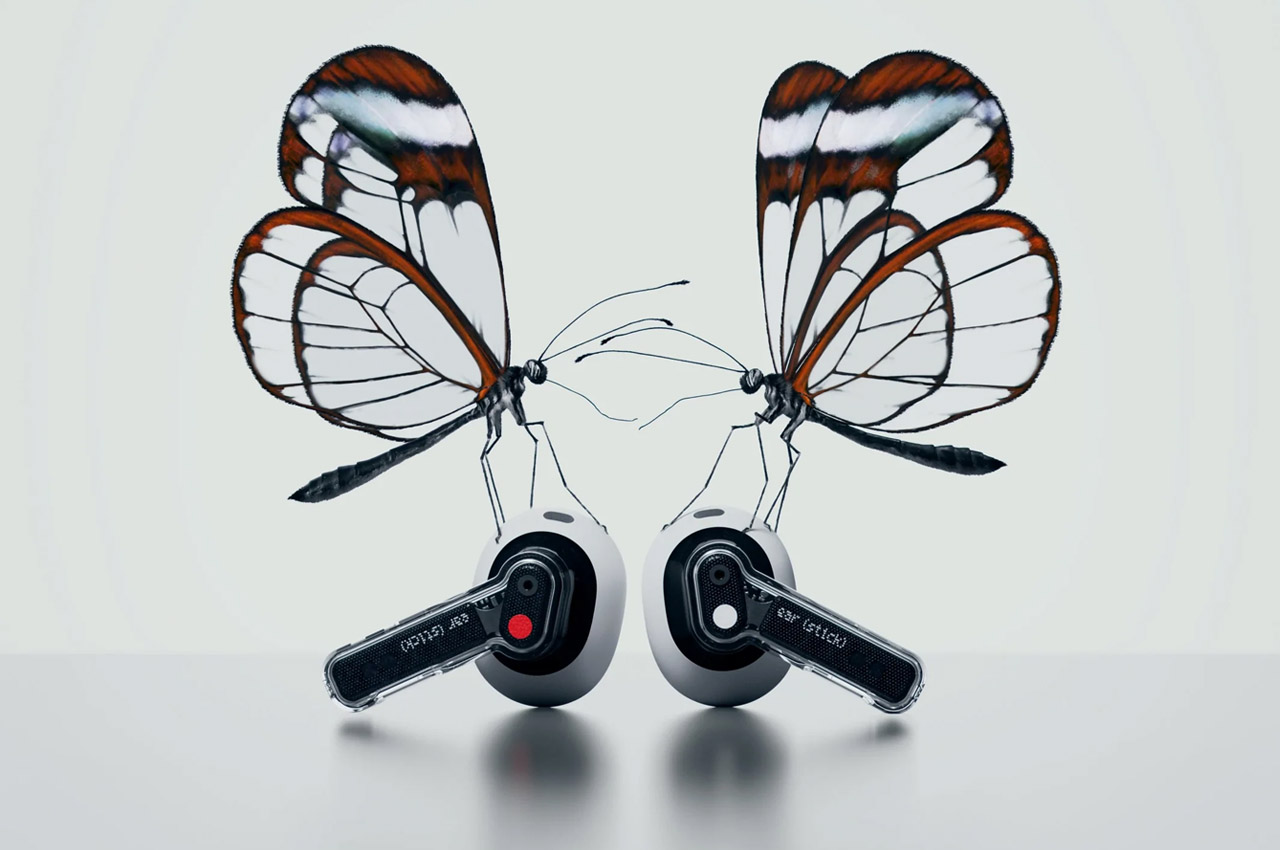
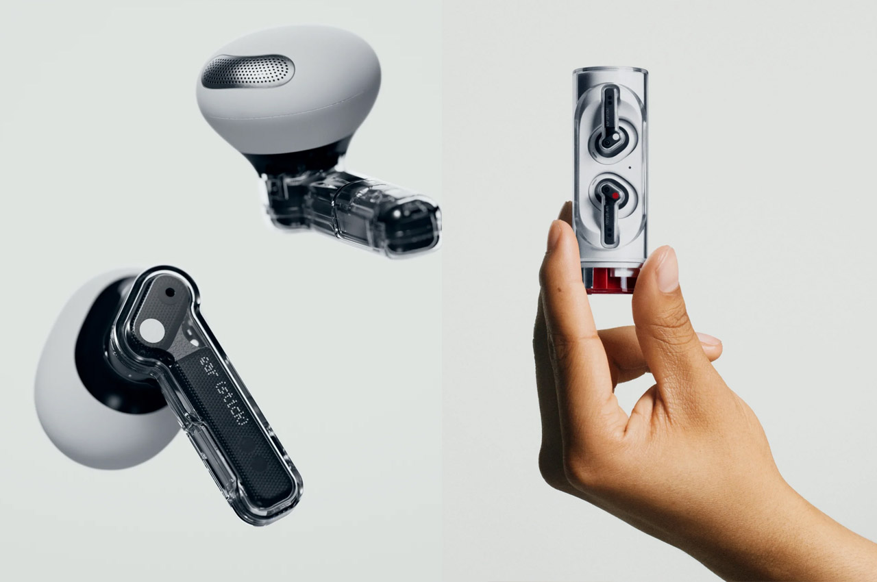
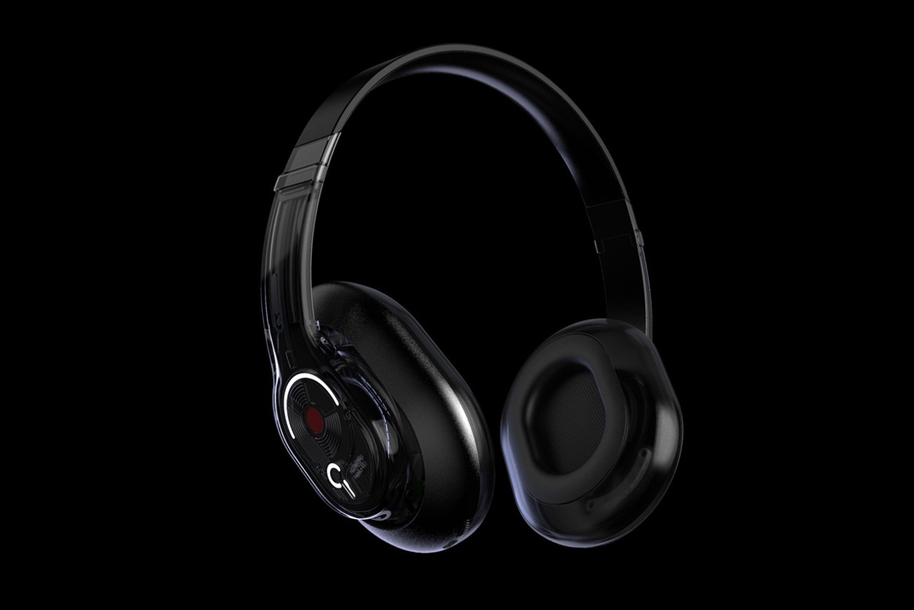
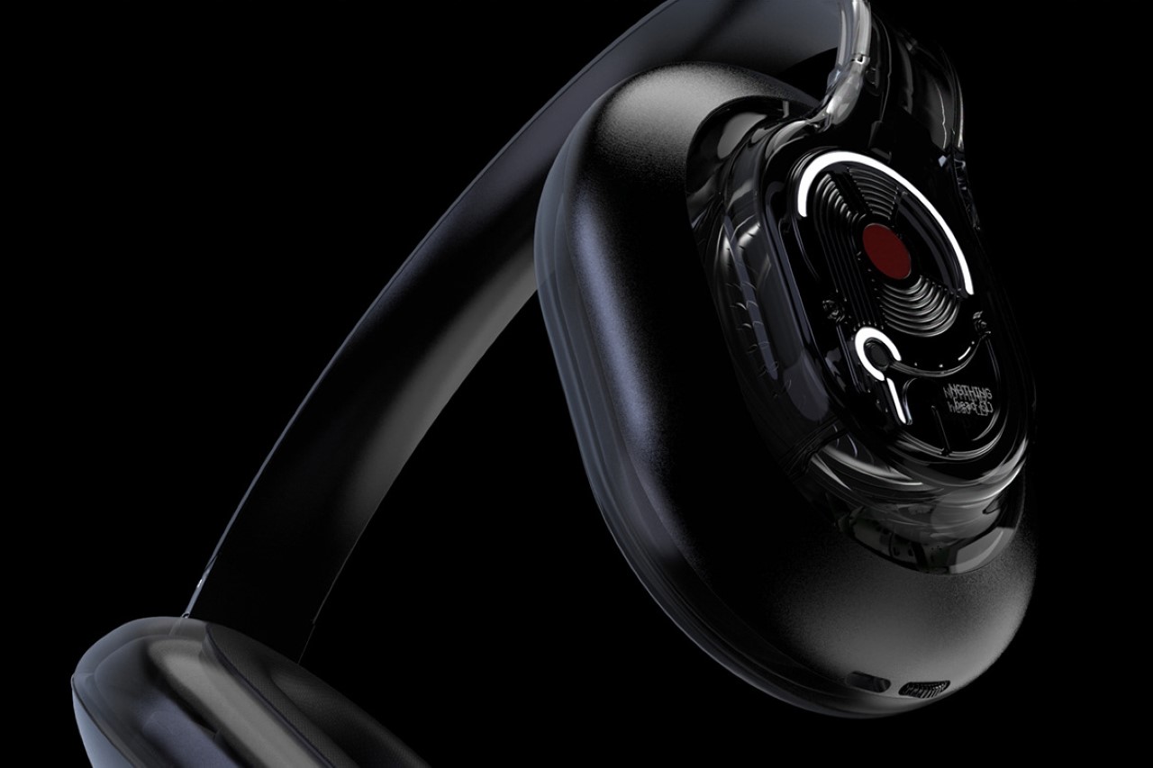
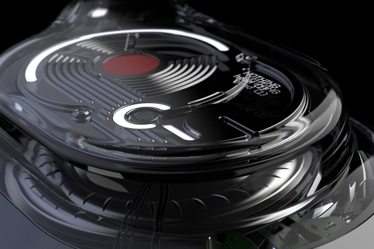
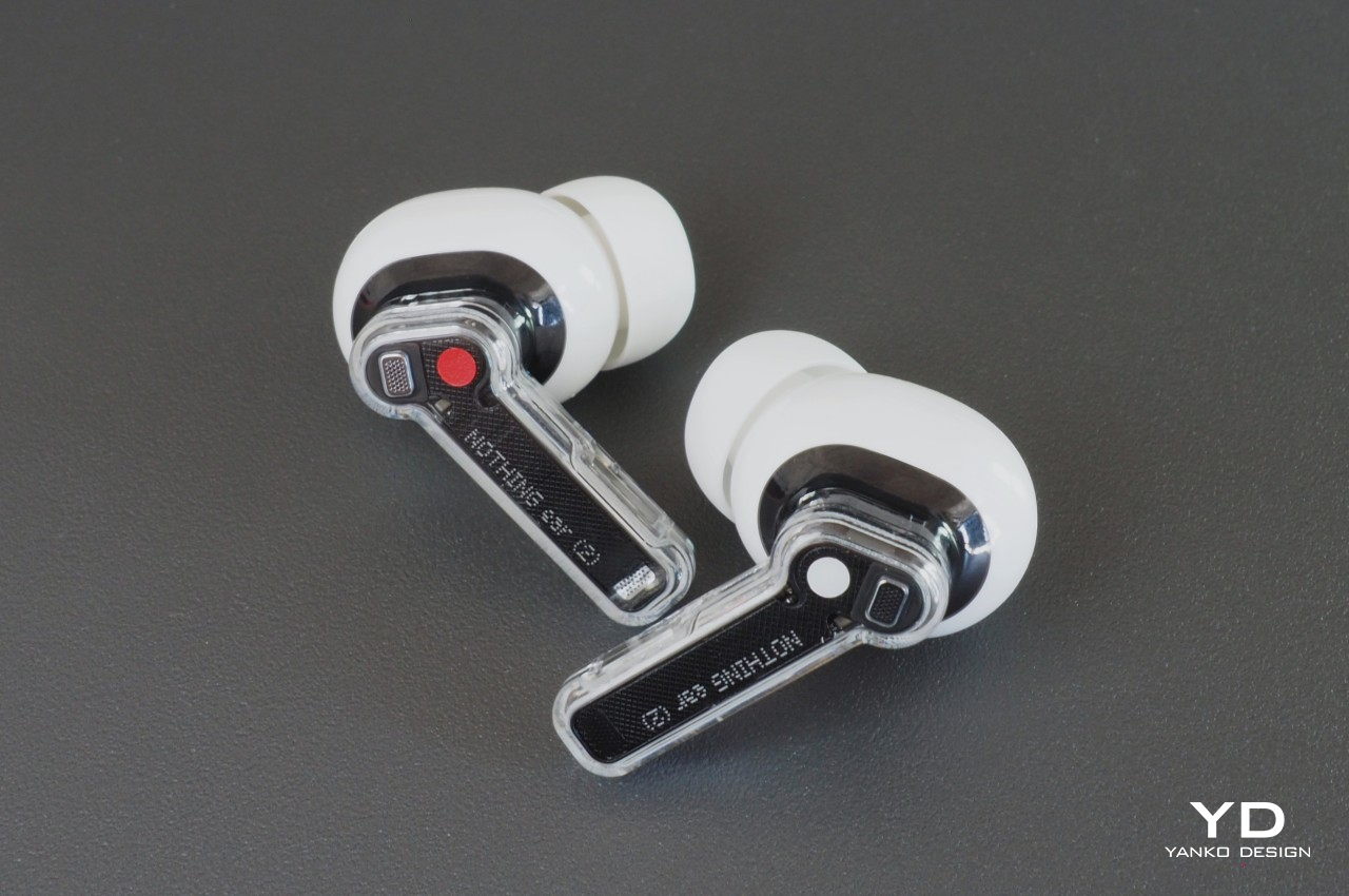
With so many TWS buds looking like AirPods knockoffs, it’s not surprising that some manufacturers have tried moving away from that design with mixed results. Some have gotten rid of stems completely, while others have added wings. Nothing’s strategy wasn’t to go overboard by changing the shape of the buds and instead gave it a distinct character with a transparent stem that truly set it apart from the crowd.

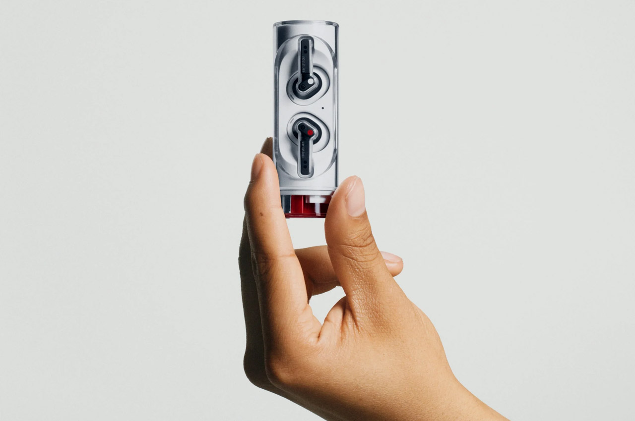
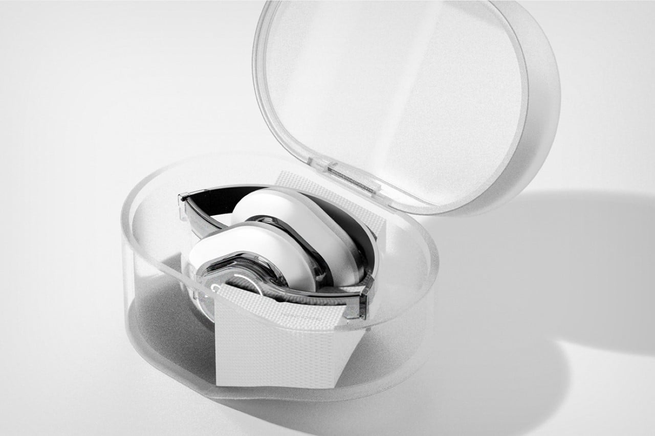
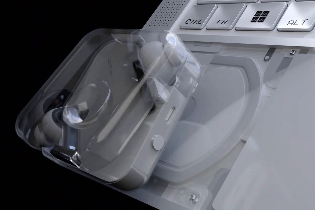
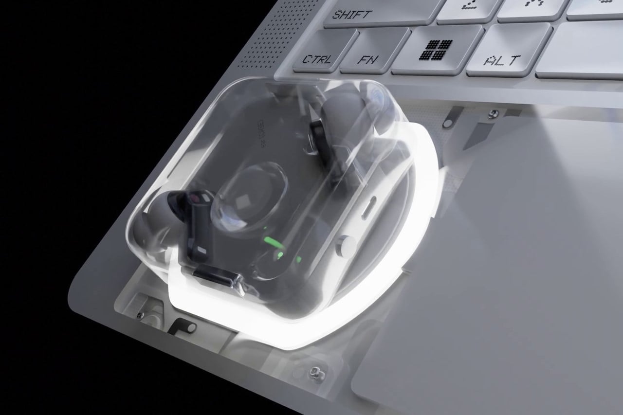
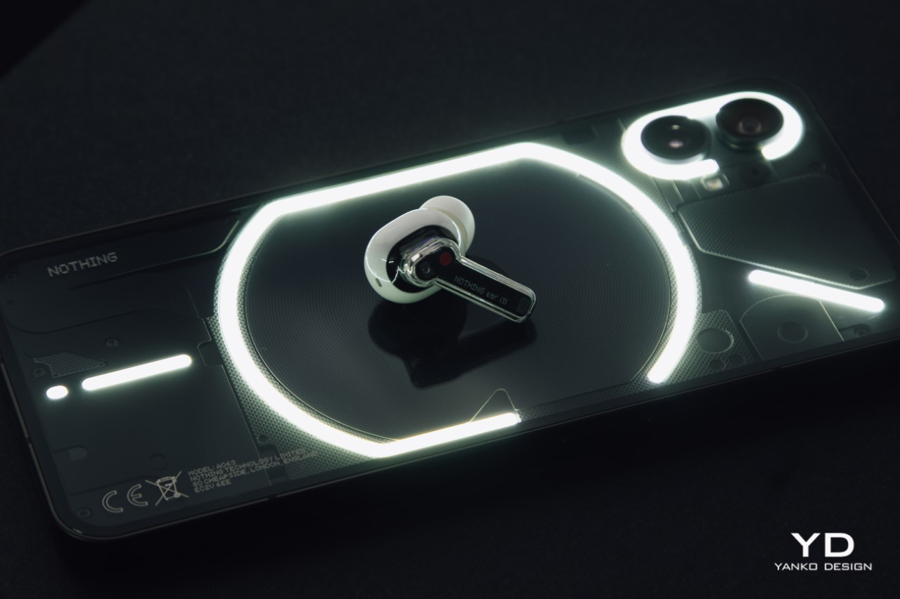
The Nothing Ear (2) retains this character and, in fact, looks eerily similar to the Ear (1). You could almost call this the Ear (1.5) or Ear (1) II because of how little it has changed, at least on the outside. Internally, however, this new pair definitely steps up the game enough to be called a successor. This theme of not changing what isn’t broken is pretty much the essence of the Ear (2), and it’s not exactly a bad thing.

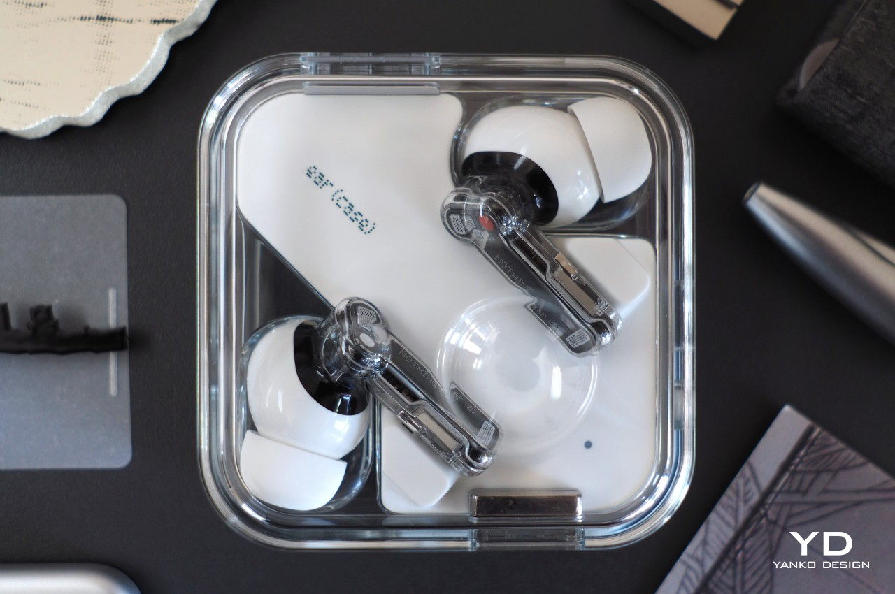
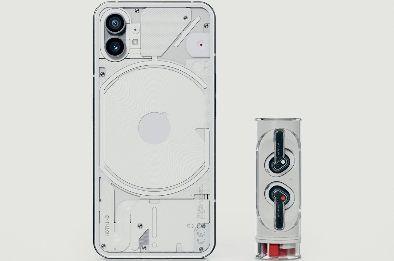
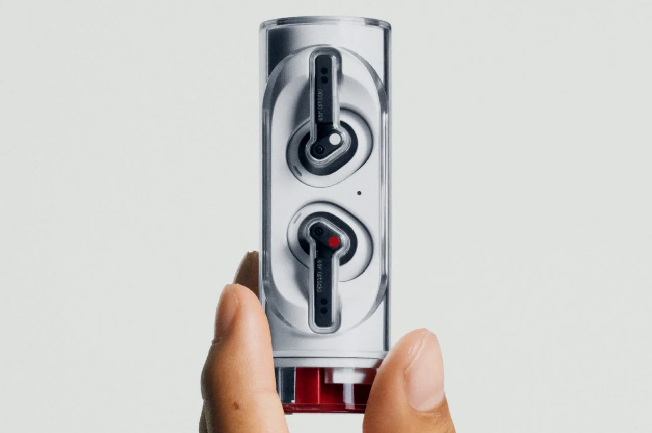
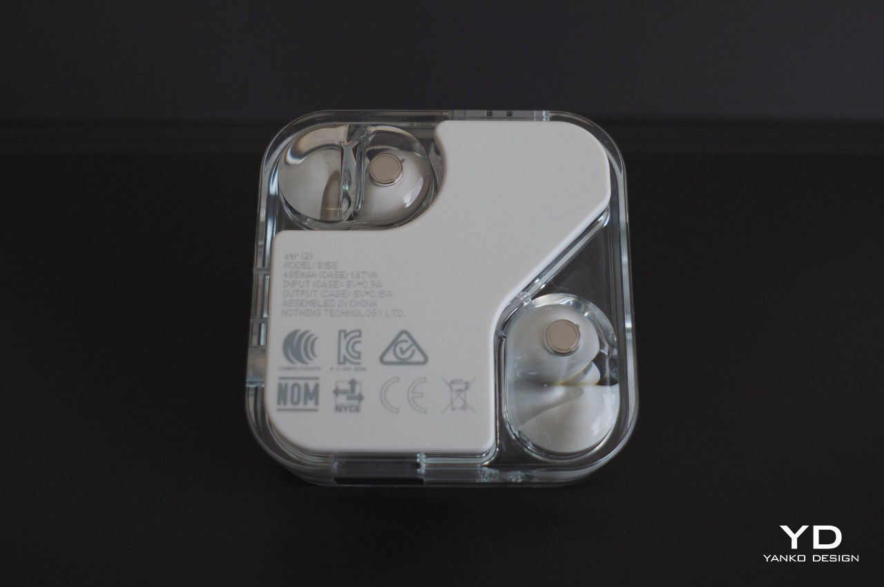
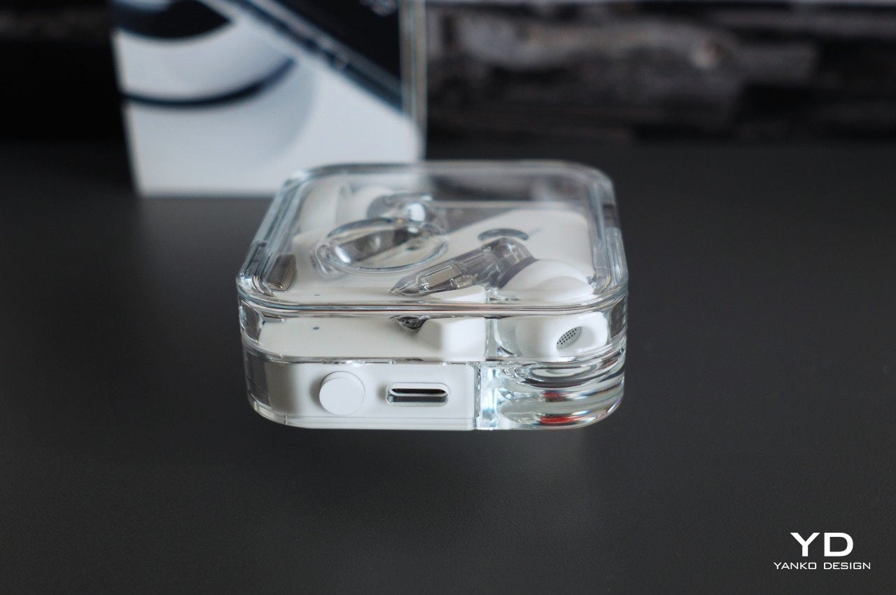
There are some visual differences, of course, though you’ll find them mostly on the charging case. The rounded box’s edges are squarer now, and the white panel on the bottom is slightly raised to act as a protective bumper. The case is made of a new material that’s supposed to make it more resistant to scratches, though ours showed slight marks very early into the game. What hasn’t changed is the dimple on the top cover that still lets you twirl the case around between your fingers like a fidget toy.

In terms of looks, you’d be forgiven if you mistook the Ear (2) for the Ear (1). Those who expected something more sensational from Nothing’s first product might walk away disappointed yet again. It’s not a complete loss, though, because using the same design helps reinforce the Nothing Ear’s image as a fun and enjoyable product, now made even better, at least on paper. One knock against it, however, is that Nothing doesn’t have plans on making the Ear (2) available in any other color, at least for now. That could very well change in the future, just like how the black Ear (1) eventually came to be.

Ergonomics

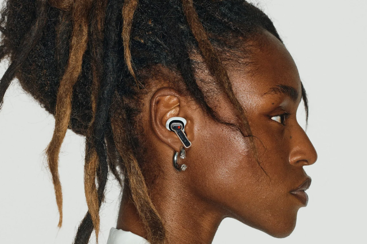
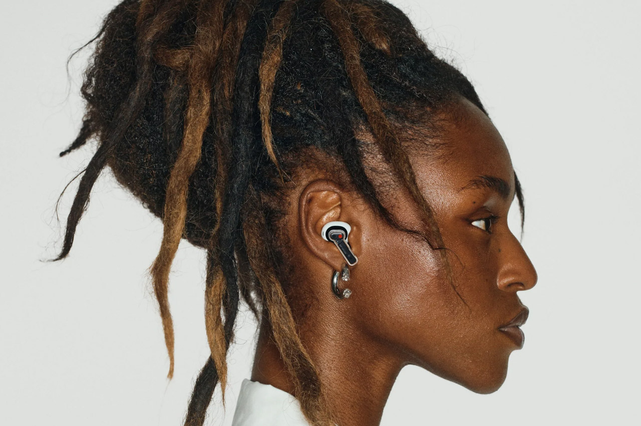
Since there isn’t much of a difference from the first Nothing earbuds, it shouldn’t be a surprise that the Ear (2) is just as comfortable. In fact, the buds’ more compact design makes it a wee bit lighter at 4.5g, but that doesn’t reduce its ergonomic performance in any way. It has a secure fit and won’t suddenly fall off your ear while you’re moving around or even just talking, which we can’t say the same for other buds we’ve tested.

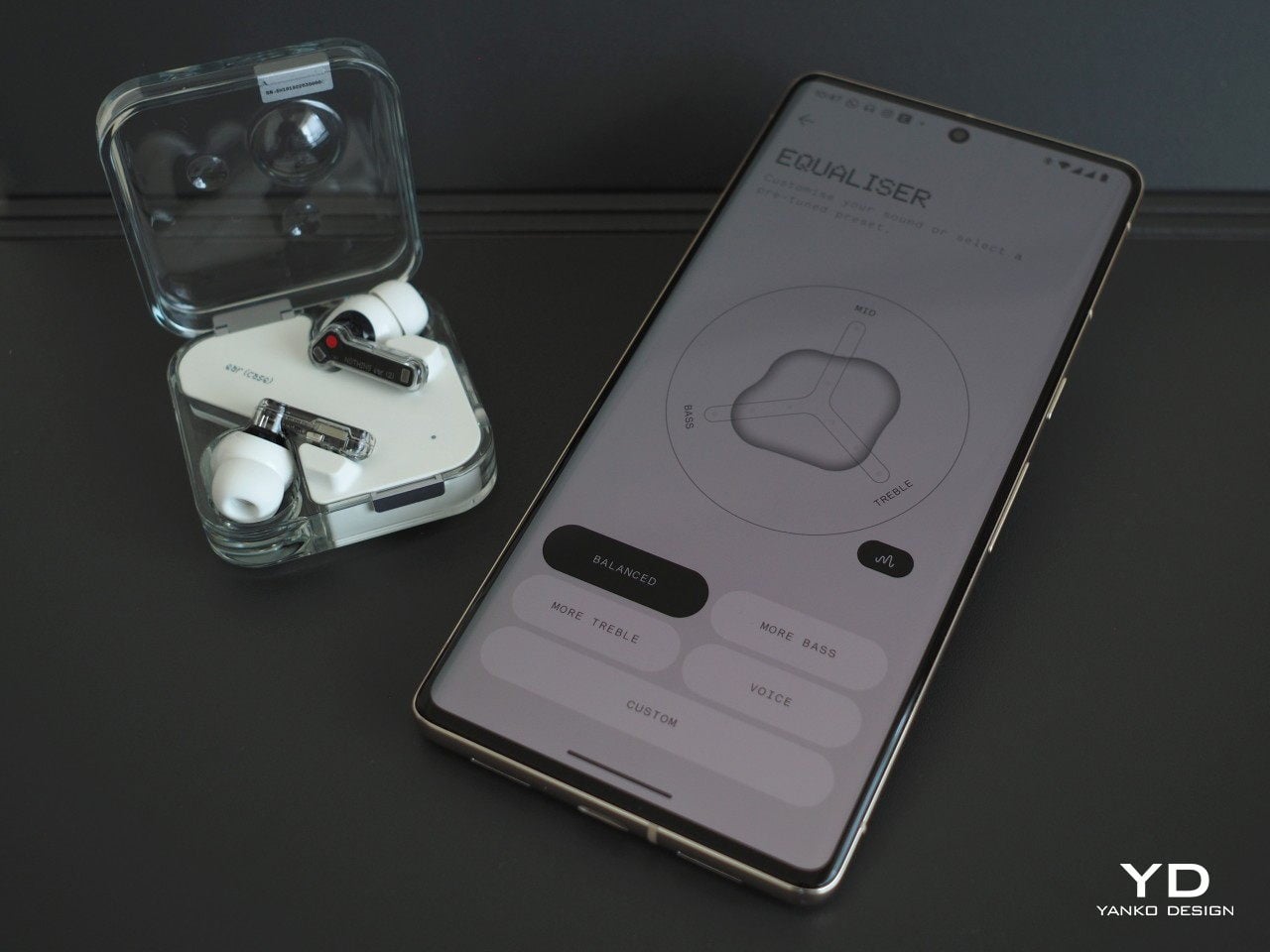
One thing that takes that comfort and fit to the next level is the new Ear Tip Fit Test. It goes beyond just letting you pick tips that you’re comfortable with but also makes sure that they form a proper seal in your ears for the best audio. This test is the first part of Nothing’s new Personal Sound Profile feature that truly makes the buds yours, putting you in the driver’s seat of your listening experience and enjoyment.

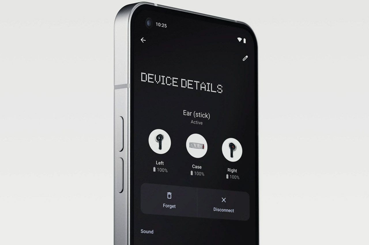
Another invisible change that Nothing made for the comfort of its customers is the way you control the buds. It has done away with taps and slides, which are often error-prone and are easily triggered by accident. With the Ear (2), you press or squeeze the stem for more intentional control, and each of the actions can be customized through the Nothing X mobile app.

Performance

If the Ear (2) looks a lot like the Ear (1) on the outside, the hardware and software upgrades inside make all the difference in the next-gen product. It is, unfortunately, also the reason why these new features can’t be made available to the first Nothing Ear, because that older pair doesn’t have the necessary hardware to support those nifty treats. Then again, that’s also the reason why you’d want to buy a new Ear (2) in the first place.

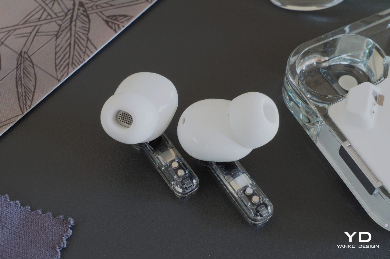
In addition to a more powerful chipset and more stable Bluetooth connection, the Ear (2) now features a custom 11.6mm driver that’s paired with a new diaphragm. That diaphragm combines a softer polyurethane (PU) material to let lower frequencies come through and a more rigid graphene for more sensitivity to higher frequencies. These new parts are enclosed in a similarly new dual-chamber design that expands the sound space and increases airflow.

What all these mean in practice is that the Nothing Ear (2) delivers an impressive audio quality that is clear and full, regardless of the range. You get mighty bass and crisp vocals from every tune or podcast that you play through it. But not everyone hears the exact same way, and this is where the Ear (2) really shines. It introduces the Personal Sound Profile test powered by Mimi, the same hearing test app certified for medical hearing devices, to a personalized equalizer setting formed around what you can hear and can’t hear. The test is a simple series of questions that try to determine your hearing range, and the settings are all automatically done based on the results. Of course, you can still choose your own settings if you prefer, but the generated equalizer will be great for users that don’t have much audio expertise.

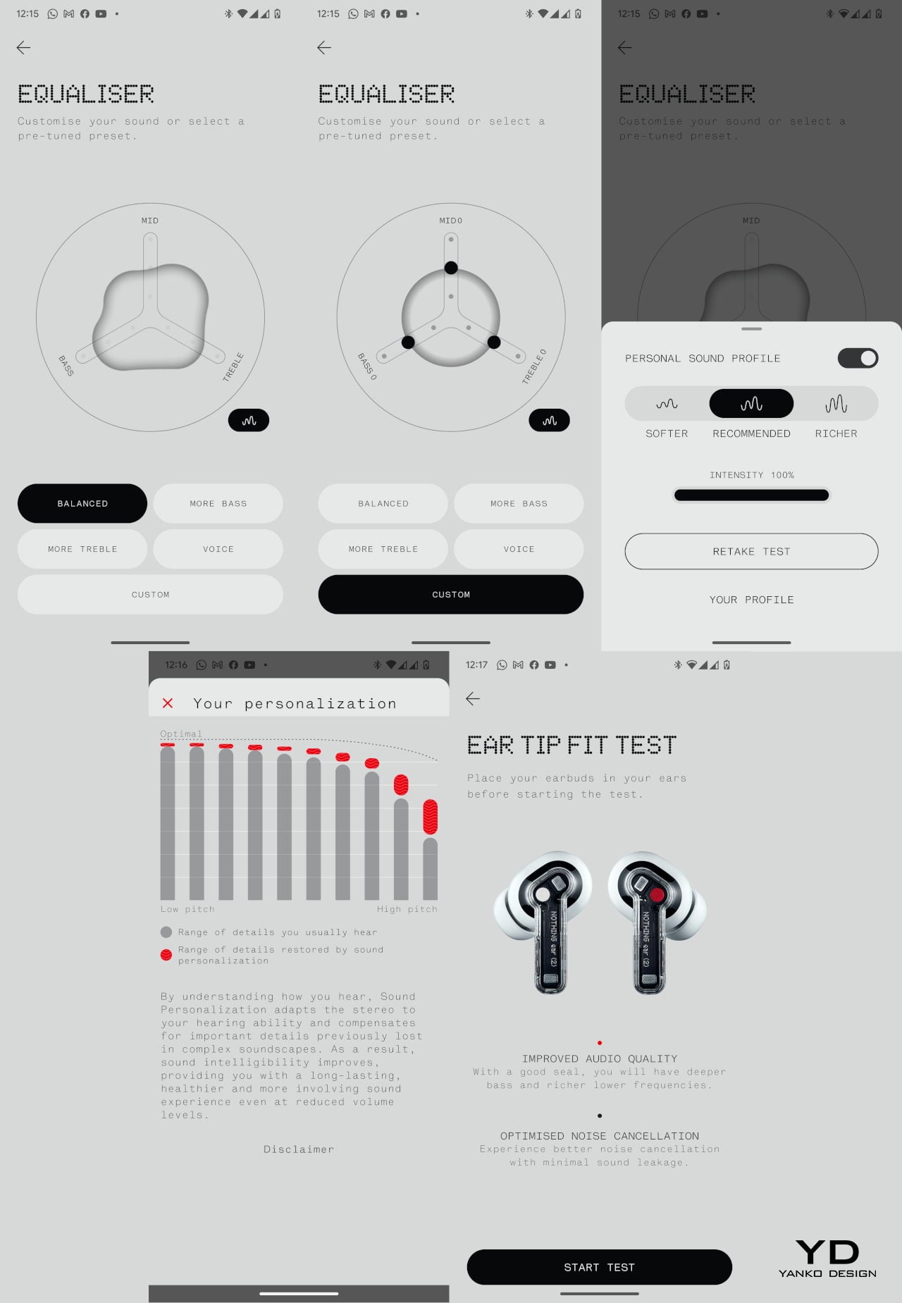
The Ear (2) now also offers three levels of Active Noise Cancellation or ANC, letting you decide just how much of the outside world you want to let in. You can even let the buds decide the best level for you with Adaptive Mode, taking into account the amount of distracting noise around you. While it does work in general, we still heard some wind gusts while riding our bike, something we didn’t experience on another pair of buds.

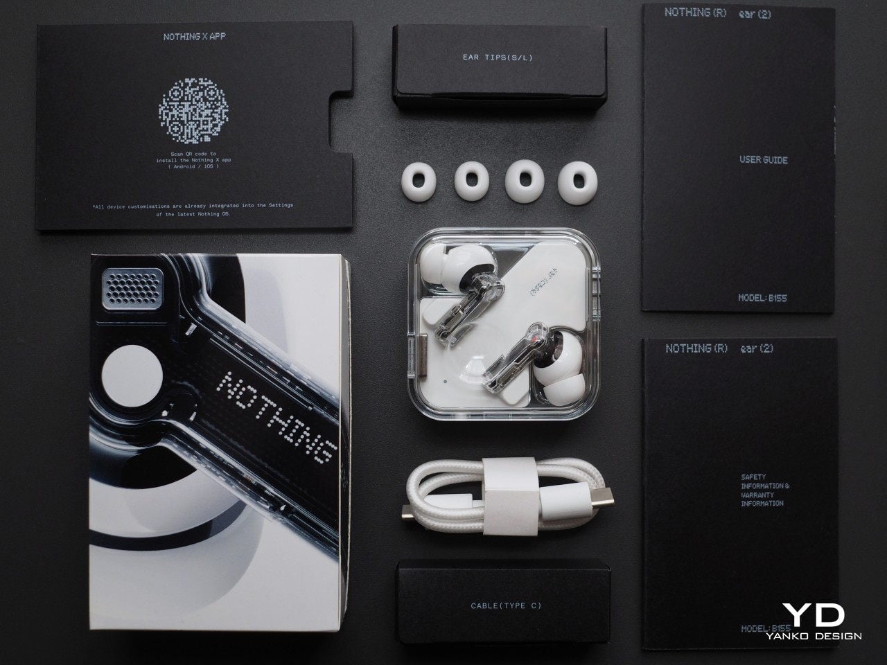
Nothing did retain some of the “fan-favorite” features from the Ear (1), most notably, a low-latency mode for playing games and the ability to detect whether you’re wearing the buds or not. For the Ear (2), Nothing adds the ability to connect to two Bluetooth sources simultaneously, allowing the buds to switch between calls from your phone and music from your laptop as needed. The charging case still supports both USB-C wired as well as wireless charging, and you can even charge it on top of the Nothing Phone (1) if you have one.

Sustainability

Finally, we get to review a consumer electronics product that does have a word or two to say about the environment. Given how wireless earbuds are littering the market, there’s some comfort in knowing that there are companies acting responsibly to make sure they don’t litter the planet as well. Make no mistake, the Ear (2) is still mostly made from non-sustainable materials like plastic, but Nothing deserves some kudos for not only taking steps to minimize its carbon footprint but also making it clear what those steps are.

The circuit boards for the Ear (2), for example, are made from 100% recycled materials. It would be great if the plastics were also made similarly, but that could happen after Nothing has checked off all the other important boxes for its buds. The company does claim that it uses renewable electricity in manufacturing this product and that its lifetime carbon footprint is only 3.1kg of carbon dioxide equivalent. And, of course, there’s the plastic wrap-free packaging, which should be the standard for mobile devices and accessories by now.

Value

People seem to go through earbuds at a worryingly rapid rate, so they’re always on the lookout for great deals and prices. There is also a very wide range of prices for these products, and some are not always worth their weight in gold, while others turn out to be unexpected treasures. At $149, the Nothing Ear (2) will clearly be compared with the likes of higher-end TWS earbuds that sit a little below the luxury line. The good news is that you get what you pay for and maybe even more.

For that price tag, the Ear (2) delivers the quality you’d expect but also wraps it in a personalized experience tailored to your unique hearing profile. It’s not absolutely perfect, and some audiophiles might prefer buds coming from more established brands, but those usually cost twice as much. You also don’t get a head-turning design with those, and the Ear (2) definitely stands out in that respect.

Verdict

There was some degree of disappointment over the Ear (1) due to the hype it generated before its launch, but its reception and review definitely satisfied naysayers. There’s always room for improvement, of course, and that is what the Ear (2) is bringing to the table. Going beyond just delivering impressive audio quality, it gives people more control over their listening experience, from personal sound profiles to customizable controls. All in a design that is distinctive, popular, and striking.

The decision to buy a new pair might be more difficult for those who already own the Ear (1) and are happy with it. Then again, the Ear (2) is replacing its predecessor, so this is pretty much the only way forward anyway. In terms of design, the second-gen buds isn’t a sensational and revolutionary new product, but its careful and calculated approach to iterative improvement makes the Nothing Ear (2) deserve a place on your shopping list.

The Nothing Ear (2) launches on nothing.tech starting March 22nd and will be available in the Nothing Store in Soho as well as Kith stores worldwide on March 23rd. Open sales begin on March 28th from online and in-person partner stores globally, including Stock X in the US.

Aki Ukita contributed to this review.

The post Nothing Ear (2) Review: An Exercise in Iterative Refinement first appeared on Yanko Design.

See-through Nothing speakers in Black or White will liven up any house party

Nothing and its see-through aesthetics (denoting the transparency of company values) for gadgets had the tech community all worked up before the launch of their first-ever product. But the hype turned out to be overkill.

Still, the USP of the Nothing Earbuds (1) and the follow-up Nothing Phone (1) captured everyone’s imagination. Creative beasts have been giving us a vision of prospective Nothing gadgets that could arrive in the near future, given Carl Pei revolutionizes the industry with that one winning design.

Designer: Ivan Llaneza

We’ve seen Nothing smartwatch concept and concept headphones spark our imagination, and now, a see-through portable speaker design is getting us excited. Of course, the core idea is to load the accessory with the same semi-naked DNA that’s made Nothing, what it is. To compete with the likes of Bang & Olufsen, Marshal, JBL, Bose, Anker or Sony is not going to be easy; but with stand-out design aesthetics, Nothing might just bring home the advantage.

Dubbed Nothing Bass (1), this portable speaker in Black or White color will be the perfect conversation starter for any house party. Combine this with the addition of LED lighting that synchs to the rhythm of beats, and no one will be able to keep their eyes off this gadget. The speaker’s cone touches the transparent housing, sealing everything inside off from the outside elements. Seeming just like a glass décor that elevates the feel of any living room.

The touch-sensitive volume controls on the back add another element of coolness to the Nothing Bass (1) speaker. All the other toggle elements like play/pause, next/previous track and Bluetooth pairing reside on the bottom front for easy accessibility. The speaker’s geeky personality is topped off by the big illuminated Nothing logo in cool white on one side. If only the version could have a small superimposed display with Album Art, current playing track and artist information; that’ll be the icing on the cake.

Without any doubt, such a portable speaker would be a head-turner any place, anytime. Would Carl Pei be intrigued by the idea? That’s if he has not got anything better churning up right now in his creative factory!

The post See-through Nothing speakers in Black or White will liven up any house party first appeared on Yanko Design.

Nothing Mini Phone adds glamor to glyph light with customizable designs inspired by car decals in games

Nothing Phone (1) was expected to shake up the smartphone market, at least everyone following Carl Pei from inventive revelations at One Plus thought as much. More so, the tech fraternity and industry analysts had the consumers on their toes with a bombardment of scoops. Eventually what unfolded was a device with an iPhone 13-like display, a purposeless transparent back panel, and a mid-tier processor on the inside.

It wasn’t really the product to break a tech enthusiast from his preference. Someone who toiled the impulsive waters had a mixed experience, both with the phone and the array of over 900 LEDs on the transparent back that glowed to notify you when a contact was calling.

Designer: Priyanshu Jaiswal

Now when Pei and team are working their way to perfect the creases from the first iteration of the transparent phone. A designer is giving us a walk-through of a handier version of a Phone (1) called the Nothing Mini Phone. As the name (not too difficult to distinguish its origin) suggests, the Mini Phone is a trimmed (form factor) clone of the Phone (1), but of course with some additional features to make it even more hep – how useful, that’s a story for another day.

While sticking to the basics of the Phone (1)’s aesthetics, Priyanshu has managed to create a body in matte finish with textured metal on the side for better grip and protection against accidental drops.
The Mini Phone features a vertically running display on one side and Essential TAB, vertical scroll, and a physical button on the other side (ideally, it’s to kick in the camera). The screens are not touch-enabled to avoid accidental touches. The extended screen on the left features a battery indicator that fills with a fizz when the phone is charging (interesting visual).

The Mini Phone is meant to be enticing to the younger generation with the play of glyph light and the option to customize the design through a color-changing backlight and sidebar. A user can change the design of the Mini Phone as they would customize the decal on a car in a video game.

The post Nothing Mini Phone adds glamor to glyph light with customizable designs inspired by car decals in games first appeared on Yanko Design.

Nothing’s downgraded earbuds minus ANC is a typical Apple copycat move

Nothing arrived on the scene with its first highly anticipated product the Nothing Ear (1) and followed up the next year by debuting its first-ever smartphone, the Nothing Phone (1). Whether Carl Pie’s company lived up to the build-up is subjective, still, both these gadgets have die-hard lovers as well as biased haters.

Now Nothing is back with a follow-up pair of wireless earbuds dubbed Ear (stick) that seem like a stripped-down version rather than an upgrade to the inaugural TWS earbuds. Something similar to what the Apple AirPods are to the premium AirPods Pro.

Designer: Nothing

Click Here to Buy Now!

The target market for these audio accessories clearly seems to be the crowd who prefer comfort to sound isolation. That’s because Nothing Ear (stick) earbuds ditch the silicone ear tips for half in-ear design and sadly also trench the active noise cancellation feature. All this for a stripped-down price tag of $99 as an alternate version for ones on a budget. We also have to consider the Ear 1 earbuds came at an intal price tag of $99 but recently the price was hiked by 50 percent as Carl cited “an increase in costs” to be the primary reason. Either way, now both these Nothing earbuds feel like a pinching choice in hindsight.

Moving on, there are a few pluses to the Ear (stick) earbuds in the form of a 12.6-millimeter custom driver compared to the 11-millimeter drivers in the Ear (1). That’ll excite music listeners who prefer audio quality more than anything else. There are three mics on each earbud to compensate for the noise bleed (remember it doesn’t have sealing ear tips) by measuring bass frequencies and then employing automatic equalization. A feature Nothing calls Bass Lock. The mics will also negate the windy noises during calls for a seamless listening experience. This should make the earbuds good enough for listening in less noisy environments but a bit short while air traveling, on public transit, or on a crowded street.

Another advantage comes in the form of a redesigned antenna in the stems to help minimize blocked signals. The charging case on these ones looks more like a cylindrical stick with a twisting mechanism to access the buds. This should make the earbuds less prone to tossing out in case of accidental drops when compared to the predecessor. Other modifications on the IP54 earbuds include physical press controls instead of touch controls.

Thankfully, the Ear (stick) has a claimed seven hours of battery life with additional 22 hours in the charging case. A quick dash of two hours of battery life can be achieved with a 10-minute charge. Phone (1) owners can access the earbuds in a jiffy via the quick settings toggle and other Android owners can download the Nothing X app to get access to all the available features with the Ear (stick).

The post Nothing’s downgraded earbuds minus ANC is a typical Apple copycat move first appeared on Yanko Design.

These Nothing Wireless Headphones are the perfect open-ecosystem alternative to the Apple AirPods Max

If Carl Pei had to aim his guns at his next target, a pair of over-ear smart wireless headphones would probably be the best way to go.

What better product for Nothing to reinvent next? The smart wireless headphone space has absolutely been lacking. Sony seems to be the only worthwhile competitor to Apple’s AirPods Max and its relatively lackluster Beats sub-brand. What better time for Nothing to enter and disrupt a market that needs a new iconic product? Heck, with its partnership with Teenage Engineering, the Nothing Head (1) could easily be a runaway success!

Designers: Junwoo Kim, Chaewon Lee, Hyeonseung Yang, Joonho Sung

The Nothing Head (1) are a conceptual pair of over-ear cans designed keeping Nothing’s design language and company DNA in mind. Carl Pei’s latest venture has focused on wanting to make products more open, transparent, and fun, and the Head (1) is quite literally all those things. It comes with its own Glyph Interface, like on the phone (1), taking the audio experience of a headphone and turning it into an audiovisual one. It acts as branding, doing exactly what the Beats logo did, but better… although more importantly, it can act as notification lights to let you know if your Head (1) is connected, or let others know that you’re busy listening to music and shouldn’t be disturbed.

For the designers behind the Head (1), the biggest challenge was to imagine what a pair of large headphones would look like if they came from the nascent brand. There isn’t much to work with, apart from the Ear (1) TWS earbuds and the phone (1) – both of which reflect rather well in the Head (1)’s design. The headphone comes with a transparency-focused design that lets you see underneath the hood. The glyph LEDs surround the headphone’s wireless charging coils, underneath which sit the audio drivers. The headphones probably respond to most touch gestures, although there’s a wheel at the bottom that I presume helps with volume control.

Unlike any headphone before it, the Head (1) also relies on transparent cushion cups, giving the overall product a very futuristic touch.

Designed to be different, the earphones come with a unique charging stand that puts the cans on display when they’re not in use. The stand sports an angled design that lets you dock your earphones into after a long day, and wireless coils built into the sides align with the coils on the headphones, charging them wirelessly while keeping the headphones standing vertical so they occupy less space and look incredibly dynamic while they charge. A horizontal charging surface on the back lets you also charge your phone and earbuds!

The post These Nothing Wireless Headphones are the perfect open-ecosystem alternative to the Apple AirPods Max first appeared on Yanko Design.

Carl Pei hints at a Nothing Laptop in the near future. Here’s what we think it should look like…

Asked about a Nothing Laptop during an AMA on Twitter, Carl responded by saying “Considered – yes. We’ve even made some concepts. But as a 2-year-old company, really need to really focus on becoming successful in our current categories.”

The Nothing Book (1) comes from the mind of YouTube channel Concept Central and features a similar transparency-focused design, along with a pleasant surprise in the form of a charging dock for your phone (1) and Ear (1) to the left of the trackpad.

Designer: Concept Central

Transparency has always been at the heart of Nothing’s design ethos, and the Nothing Book (1) is no different. It builds on the visual library left behind by the products before it, i.e., the phone (1) and the Ear (1). The Book (1) sports a minimalist design that combines white elements with transparent ones, creating a device that’s all-telling and detailed, yet minimalist and sleek. Just the way the phone (1) looks a lot like an iPhone, the Book (1) pays a hat-tip to the MacBook’s classic design with a similar visual language, barring that transparent panel around the touchpad.

The bug theme also shines through in this concept. The use of the butterfly is a tribute to the laptop’s folding design.

While the phone (1) was purely an Android device running on Nothing’s minimal skin, It seems like this concept is a Windows laptop that possibly comes with a stripped version of Microsoft’s OS, focusing on the essentials (sort of like the Surface Laptop). You’ve got a 15.6″ device that fits an entire keyboard in (sans the numpad of course). The keyboard also comes outfitted with Nothing’s signature dot-matrix font, even including a row of function keys for good measure.

The minimal notebook concept comes with two USB-C ports, a USB-A port, and a headphone jack.

Everything of consequence really lies below the keyboard. The Nothing Book (1) comes with a transparent panel overlaying the lower half of the laptop’s body. This houses the trackpad in the center, and a series of easter eggs around – the most notable one being a wireless charging coil to the left of the trackpad.

The wireless charger to the side of the trackpad provides the perfect place to rest your Ear (1) or phone (1) while working. Place your device in the designated zone and LEDs around the charger light up, like on the Nothing phone (1). The laptop also has another set of lights to the right of the trackpad that light up to indicate things like notifications, battery level, etc.

The Nothing Book (1) is clearly just a fan concept for now… but the main takeaway lies in Pei’s statement which mentions that Nothing has built laptop prototypes already. While our idea of the company’s vision can only base itself on the two (and a half) products it’s launched, I really wonder what’s on the Nothing team’s mind regarding the future of the company… and the potential of a kickass Nothing Book (1).

The post Carl Pei hints at a Nothing Laptop in the near future. Here’s what we think it should look like… first appeared on Yanko Design.

Nothing just cryptically revealed a new (old) pair of TWS Earbuds

It’s not entirely clear if Nothing is releasing an upgrade to the Ear (1) TWS earbuds, but the rumor mill seems to indicate that their latest product, the Nothing Ear (Stick) is simply a new charging case for their existing TWS earbud design from last year.

I bet you have a lot of questions. Don’t worry, so do I. The announcement (or rather reveal) for the Ear (Stick) dropped rather unexpectedly, without as much as a poster or keynote to mark its moment. Revealed as an accessory at Chet Lo’s SS23 fashion show on the runway, the Ear (Stick) seems to be a new case design for the Ear (1) buds. Unlike the old case that’s square-shaped, this one is styled to be the same shape and size as a lipstick (or if you’re looking for a less glamorous term, a nebulizer). It’s unfair to assume or speculate that the earbuds with the Ear (Stick) are simply the older earbuds. As far as we know, the design hasn’t changed, although Nothing did indicate that maybe this new SKU will get some sort of revamp in the form of a spec upgrade.

Designer: Nothing

Without getting too much into the actual art direction of the images (I never really understood experimental fashion, tbh), let’s just analyze the tech before us. Pei has often claimed that Nothing aims at doing things differently, creating an ecosystem that’s open to all and that’s designed to shake the status quo. Without any details on the Ear (Stick), it’s difficult to really make critiques on the company’s implementation of the philosophy… however, the Ear (Stick) does look different from any other TWS case from a major company. They also open differently, by rotating the transparent outer cylinder to have the cutout on it match up with the TWS earbuds in the inner cylinder.

Maybe there’s also an ecosystem feature in play (who knows, the earbud case could also unlock your Tesla or something), although one thing stands out… the company has touted the phone (1)’s ability to reverse-charge devices like TWS earbuds simply by placing them on top of the phone (1)’s coil. This seems unlikely with the Ear (Stick) given its cylindrical shape will probably roll right off the phone.

With this announcement, it’s expected that Nothing will reveal more details about the Ear (Stick) over time. If anything, the company’s mastered the art of the reveal, leaking out bits strategically to fans and the media… like the Glyph Interface was first debuted in March, 4 months before its launch in July!

The post Nothing just cryptically revealed a new (old) pair of TWS Earbuds first appeared on Yanko Design.

Nothing phone (1) Review – Resurrection of the Android Flagship Killer

PROS:


  • Great value for money

  • Perhaps the cleanest version of Android on a non-Google phone

  • Premium design with a smooth UI and surprisingly good camera

CONS:


  • Phone heats up significantly during use

  • Glass back is incredibly slippery and fingerprint-prone

  • Still not everything that Nothing promised.

RATINGS:

AESTHETICS
ERGONOMICS
PERFORMANCE
SUSTAINABILITY / REPAIRABILITY
VALUE FOR MONEY

EDITOR'S QUOTE:

The phone is just remarkable for its price and fits wonderfully into the flagship killer category. The Glyph Interface feels like a compelling feature - but the lights there are entirely utilitarian. They weren't meant to be played with and enjoyed as an individual element... and that feels like somewhat of a let-down.

Pei made a promise to give us a phone that challenges the status quo by being fun and functional together. To a decent extent, the Nothing phone (1) fits that very description that Pei painted before us… but perhaps the most important thing about the Nothing phone (1) is its timing. At a time when the hype for OnePlus has absolutely died down (with ardent fans now turning against the brand), combined with the fact that Google doesn’t seem to care even a bit about getting people excited about their phones (the Pixel 4 and 5 were absolute marketing disasters), this empty period of nothingness seemed like a perfect time for a new contender to emerge. Almost through sheer coincidence, the brand was named Nothing.

Click Here to Visit the Nothing Website

About The Phone

Although we did cover the phone in great detail when it launched back in July, here’s a brief overview of what this phone is and what it hopes to achieve. When founder Carl Pei took to the stage in March of this year to talk about Nothing’s next product, he set a few things straight. Phones were becoming boring, operating systems becoming bloated, walled gardens were being created, and there was an empty space in the market – a space Nothing hoped to fill. The phone’s launch in July definitely felt like it did justice (to a certain degree) to Carl’s little March monologue. The Nothing phone (1) is easily the most interesting-looking phone I’ve seen in a while. It comes with a unique transparent back that comes to life thanks to a Glyph Interface – or a series of lights, that flicker when you get calls or notifications. The phone, very competitively priced, is incredibly premium for its price. It comes with a Snapdragon 778G+ processor, has an iPhone-mimicking exterior, supports wireless charging, and has a clean OS. Its few shortcomings aside (and I’ll get to them in a bit), the phone absolutely nails the brief, the price, and the timing.

The Design

Unboxing this smartphone is an experience, to say the least. The Nothing phone (1) oozes sex appeal with its slim design and aluminum frame. The bezels around the screen are just perfectly uniform (there’s no chin), which makes the phone (1) really feel top-notch. The screen’s marvelous too, thanks to that 120Hz refresh rate that makes using the phone a dream. There’s a deceptive lightness to the phone, which, when coupled with its thin form factor, makes the device feel magical in your hands. However, I do have two significant complaints.

In order to make the phone’s interiors visible, the rear uses a glossy glass panel which is A. incredibly slippery, and B. an absolute fingerprint magnet. Customers who buy the white variant won’t have a problem with the latter, but at least on the black model, the back is incredibly prone to smudges, dust, and prints. This isn’t so much of a problem in the grander scheme of things… at least as much as the fact that this phone is just ridiculously slippery. It will almost certainly slide off surfaces that aren’t perfectly horizontal (don’t even THINK of putting it on your car dashboard), and I couldn’t even seem to keep the phone on my lap without having it just glide right off. It holds fairly well in your hands, but does rather poorly on other surfaces that offer less friction like tabletops, countertops, and more notably, car dashboards. The solution is simple – slap a case on the back. However, given the phone (1)’s unique back, that seems like a shame.

The Glyph Interface

This unique back is quite literally what everyone is most likely to talk about. If you kept an iPhone, a OnePlus, a Pixel, and a Nothing phone (1) face down on a table, 9 times out of 10, people will pick up the Nothing phone (1) to get a better look. The phone’s back manages to look interesting even when static (which is a massive achievement), but things only get better when that Glyph Interface comes to life.

The Glyph Interface was designed to be a communicative feature that could alert you during calls and notifications. The lights flash and dance to your ringtones, giving the phone a flair that other smartphones only dream of. It’s easily the most publicly enjoyable part of the phone and I honestly wish Nothing’s design team did a little more with it. Here’s what I mean.

The lights on the Glyph Interface can be activated in one of three ways – when you get a call/notification, through the camera app that allows you to use the Glyph Interface as a makeshift flash, and finally while charging when the light shows a progress bar. It seems like there’s no other way to tinker or interact with the lights, which really was one major let-down for me. The most fun part of your phone wasn’t designed to be played around with. You can’t activate the lights on the back as a torch (the torch feature only switches the camera flash on), and it seems like Nothing really missed out on a bunch of opportunities. There’s a test feature that lets you sync the lights to music, but with most people listening to music on AirPods with their phone in the pocket, I doubt this would end up being used as much. There should easily be a slew of games based on the Glyph Interface like spinning the dice, rock paper scissor, etc., but that isn’t the case as of now. This setback, however, isn’t necessarily a permanent one. Future updates could easily introduce new features to the phone (1)’s Glyph Interface, although future predictions don’t hold much weight in a present-day review.

The Operating System

Perhaps one of the MOST impressive bits about the phone is its interface. As an ardent Google fan and Android enthusiast, the Nothing OS struck me as the cleanest, most beautiful version of Android I’ve ever seen on a modern phone. Outdoing perhaps even Google itself, the Nothing OS is crystal clean, incredibly responsive, and comes with absolutely NO bloatware. None, whatsoever. The only apps that come with the phone are Google’s app suite, YouTube + YouTube Music, and the basic apps you’d expect from your dialer and message apps to your camera and recorder apps.

Pei spoke at length about the latter during his summer reveal of the phone’s OS. There’s an analog beauty to the recorder app, and the camera app is intuitive and responsive. Speaking of responsive, the phone’s in-screen fingerprint reader is buttery smooth, unlocking the phone before you can even think about what you want to do next.

The OS also ditches the signature 3-button Android interface for a bar that feels heavily inspired by the iPhone. At times I did miss the back button, but the bar is something you’ll easily get used to… and if you’re an iOS convert, it’s something you’ll find very familiar. Notably missing in the OS, however, is Pei’s vision of an expansive ecosystem. Pei fired shots against Apple for their walled garden and claimed that the Nothing OS wouldn’t be as restrictive. Promises were made of an open ecosystem with integrations for all sorts of products, but that feels like something that won’t happen overnight. Here’s hoping.

The Camera

I’ll keep this part short and sweet. The camera is GREAT… for its price. Don’t expect the phone (1) to dethrone an iPhone Pro or a Pixel 6, but apples to apples, you can expect that the phone (1) will put up a really good fight. The phone’s capable of recording 4K video and shooting with a 50-megapixel output in RAW format. The videos aren’t exceptional – the phone’s image stabilization system feels great in the viewfinder, but the videos still feel slightly choppy. The photos, however, are surprisingly good. The ultrawide camera takes great landscape shots (although there’s a slight white balance shift as you switch between cameras), the portrait/pano/expert modes work pretty well, and I was pleasantly surprised by the macro mode (although there’s a fair amount of computational distortion + blur happening around the edges). The front-facing camera does a stellar job too, with the portrait mode being just about as good as it can get. With just two lenses on the back, the phone (1) manages to take on the 3 and 4-lensed flagships.

Shot on the Nothing phone (1)

Shot on the Nothing phone (1)

The Performance + Battery

The one significant hardware setback I had with this phone was its tendency to rapidly heat up. The phone comes with an aluminum frame and a glass back, both of which heat up quite significantly (sometimes even while charging). While the phone’s designed to do some heavy lifting, it does heat up a bit (especially right behind the hole-punch camera on the front) – enough to make you feel a little uncomfortable. Keeping the camera app open for 5-6 minutes (or even running a heavy game) can cause the phone’s top edge to get warm and even hot sometimes. This problem could be limited to just my handset, although it’s certainly the first thing I noticed about the phone as I put it to charge for the first time.

Speaking of charge, a 4500 mAh battery on the inside does a decent job of getting you through the day. Moderate usage will comfortably get you through the day with just one charge, although if you’re relying on many apps, using heavy programs, and just keeping your phone running for hours, you may need to bust out your charger for a bit. That being said, it’s worth reminding you that the Nothing phone (1) doesn’t come with a charger inside the box.

The Price

While it’s important to judge a phone objectively, its price says a lot about its intent and overall quality both intentionally and unintentionally. With the Nothing phone (1), the intent to disrupt the current status quo is extremely evident. When presented to people without context, nobody would ever guess that this phone is in the sub $500 category. It’s an extremely compelling alternative to phones almost double its price, as far as aesthetics, branding, and vision go… however, the fact that the phone is priced at roughly $499 makes me be a little more critical of its capabilities and flaws. That being said, the $499 price tag is probably the best thing about the Nothing phone (1). I can confidently say that it’s probably the best phone you can buy for that price, and while I don’t see it dethroning the flagship iPhone any time soon, you can expect that it’ll cause a major dent in the Android market, stealing customers from OnePlus, Nord, Poco, and even Google. Who knows, even potential iPhone SE buyers could switch over to the Nothing brand.

The Verdict

For a new company just trying to make its mark in the pretty vast sea of smartphones, Nothing does a phenomenal job. I do tend to take shots at the company for how much they hype stuff up, but given how young they are and how far ahead their competitors have gotten, it seems like a winning strategy. After all, they did a much better job marketing their product and generating interest than Google ever did for the Pixel phones.

My verdict hinges heavily on the phone’s impressions and its price. For starters, even though Carl paints a vision of Nothing offering an alternative to Apple’s walled garden, don’t quite expect the phone (1) to be an iPhone replacement. The phone (1) is still a first attempt, and has a long way to go if it needs to overtake Apple’s 15-year headstart in the smartphone market. Carl’s entire vision of an open ecosystem seems like something that’s still a work in progress, so it’s important to take note of what you’re getting NOW rather than what’s being promised a year or two later.

What you’re getting NOW is a pretty slick-looking phone that’s full of surprises and doesn’t break the bank. The phone (1)’s UI is super minimal and buttery smooth (thanks to that 120Hz display) and stands out clearly against the bloated phones from OnePlus, Xiaomi, Oppo, etc… but its heating issues stood out within the first hour of using the phone. It seems like something maybe an update could fix, but whether that would mean throttling the performance is something I can only speculate.

However, what keeps bringing me back to this phone is its price. It costs 60% of what I paid for my OnePlus 8 Pro two years back but feels just as incredible (if not better). At that price point, you’re more likely to be impressed with a Nothing phone than you are with some other mid-tier Android device. For a first smartphone release from a nascent brand, Nothing definitely deserves to pat itself on the back. I can’t wait to see where the brand goes from here.

Click Here to Visit the Nothing Website

The post Nothing phone (1) Review – Resurrection of the Android Flagship Killer first appeared on Yanko Design.

Nothing Watch (1) concept is a glass skinned wearable for young buyers

All the hype around the mid-range rockstar, Nothing Phone (1), is not a mere fad as the smartphone is designed for simplicity and deeper interaction. The brand’s inaugural product, the ear (1) TWS earbuds also garnered attention for good reason. So, what direction will Car Pei’s adventure head onto next? If we are to believe this concept design, it’s going to be a classy wearable.

A smartwatch that carries the brand’s signature see-through aesthetics and a simple design that lays focus on functionality.  What’s it going to be called from all the presumable options? Well, quite obviously the Nothing Watch (1). What else could a Nothing gadget be named other than this.

Designer: JunSeo Oh

The concept design smartwatch is as attractive a wearable could be imagined as, and the Apple Watch influence is predictable. That’s because the official Nothing Phone (1) has the evident structural semblance to the iPhone 13. That transparent dial, sides and the backplate makes me wish this product actually hits Carl’s checklist for the next winning product to create ripples in the market.

This one is not the sole concept design envisioning an incoming smartwatch gadget from the company – Gian Luigi Singh’s Wrist (1) smartwatch concept is a prime example. That one though had more of an iPhone 13 like design inspiration to it, while the concept by JunSeo is more eye-pleasing according to my perspective. The see through character is more attractive, and the renders created by the designer clearly display the unique persona of this 45mm ceramic case smartwatch.

The crown and the mode selector buttons on the side expose the innards just like on the backplate made of clear glass. For ergonomic comfort and better readability for the sensors, the glass is a slightly raised from the middle section to sit flush on the skin without any discomfort. The glass-skinned look is complemented by the high quality strap in white.

Looking at the logical aspect of things, it’ll be pretty unlikely that Nothing will go for this all out transparent look, as we’ve seen in the recently released smartphone design. However, these see-through aesthetics do appeal me wildly without doubt, and it gets my thumbs up for the uniqueness of design.


The post Nothing Watch (1) concept is a glass skinned wearable for young buyers first appeared on Yanko Design.

Make your iPhone 13 Max Pro or Galaxy S22 Ultra to look like Nothing Phone (1) for a change

Nothing Phone (1) is finally here after the immense hype – focused majorly on its Glyph interface LED lights on the rear that makes it stand out from the other mobile devices. Whether or not the smartphone lived up to its hype is too early to judge, but the transparent rear has surely turned eyeballs in the tech industry.

No one can deny the out-of-the-box design of Nothing Phone (1) – though there is the obvious iPhone 13 inspiration – the device has to be practical enough as a daily driver. For now, that Glyph interface has got everyone talking positively, and D Brand has even created custom skins for other smartphones to cover them up in the sci-fi futuristic look!

Designer: Dbrand

Yes, this is the coolest way to get that super cool translucent rear without shelling out money for the Nothing Phone (1). The device outfitter pros have created a line-up of cool case covers dubbed “Something” for the major flagships on the market. The attractive skin will be available for devices including the iPhone Pro Max, Pixel 6 Pro and the Samsung S22 Ultra. Depending on the response for these devices, support for even more handsets is inevitable. Dbrand plans to release a Nintendo Switch version too which will be interesting for mobile gamers.

Dbrand has been known for its snarky tactics in the past and in their pitch for this particular accessory, they suggested that “Something is better than Nothing.” On their website, it’s clearly mentioned that they could get a copyright notice for theft, but their belief is – this is plagiarism not theft of any kind. For buyers though, this is a nice prospect if they want to stick to their Apple, Samsung or Google devices but enjoy Nothing’s unique rear look. Especially for ones who won’t have the option to buy the Car Pei’s second offering in their region.

The skin shows the internals of the compatible device and with the Something branding in Nothing’s signature font, the users won’t complain. Of course, the Glyph interface will be missing, but still, a good look to flaunt. The detailing on these skins and cases is intricate – for instance – the S22 Ultra version has the S Pen placed inside the slot. The skin version of the Nothing Phone (1) themed rear is available for the aforementioned devices at a price tag of $24.95 while the grip case goes for $49.90. So, will you ultimately be going for Nothing or hold on to Something!

The post Make your iPhone 13 Max Pro or Galaxy S22 Ultra to look like Nothing Phone (1) for a change first appeared on Yanko Design.