The James Brand’s vinyl record opening scalpel, 70s audiophile would have adored

The excitement of putting a new record on the turntable is something only purists can relate with. And when the vinyl record you’ve been after for ages is more precious than your priced possessions, opening the brand-new vinyl without even a semblance of damage is important. Reason enough for knife experts The James Brand and vinyl pros Vinyl Me, Please (VMP) to join forces to create a stylish EDC blade for immaculately opening vinyl record packaging.

Christened “The Abbey”, it’s a fixed-blade knife crafted out of highly corrosion-resistant stainless steel. The interesting part is, that the EDC has real vinyl LP inlay made from recycled VMP records. When not in use audiophiles can tuck it away in a top-grain leather sheath, by the side of the turntable for next time use. It goes without saying this utility knife is tailored for this specific purpose, and is too refined for people who don’t mind a usual pocketknife or box cutter to do the task.

Designers: The James Brand and VMP

The Portland, Oregon-based group has created this quirky yet useful EDC purely for audiophiles’ love for analog copies of their favorite music. In fact, James Brand themselves seem to be from this very camp as they said, “ You know that feeling when you finally get your hands on a new record that you’ve been coveting? The first thing you want to do is get it opened up and spinning on your turntable. We know that feeling, and we designed the Abbey for precisely that moment.”

Coming on to the exact specifications of the scalpel, it weighs just 0.6 ounces and has a thickness of 0.2-inch. It comes with a custom TJB x VMP-branded EDC lanyard bead and 3mm paracord too – justifying its EDC DNA. According to The James Brand and Vinyl Me, Please websites, The Abbey knife is going to be available for a price tag of $79 in a limited number which makes absolute sense!

The post The James Brand’s vinyl record opening scalpel, 70s audiophile would have adored first appeared on Yanko Design.

This chair design concept uses anthropometric studies to construct ergonomic seating from cardboard

Cardboard Chair Process Book is a chair design concept that constructs custom chairs from cardboard based on anthropometric studies and client interviews.

Goldilocks was right–the comfort of a chair depends on many different factors. Everything from a chair’s frame to its upholstery and everything in between comes into play. At the end of the day, a chair’s comfort depends on what we use it for–a plush loveseat might be the perfect spot to nestle up in and watch a rom-com, but it’s not the spot for working at our laptops. It’s just not the vibe! Lissette Romero unlocked the vibe with a new design concept called the Cardboard Chair Process Book that constructs bespoke chairs from cardboard using a set of criteria collected from client interviews and anthropometric measurements.

Designer: Lissette Romero

Built from 5 4’x4’ sheets of single-ply corrugated cardboard, the custom chairs require no hardware, fasteners, or adhesives for construction or assembly. Before settling on the chair’s overall structure and ergonomics, Romero imagines conducting client interviews to determine each chair’s main function according to the sitter’s needs. For instance, a client looking for a lounge chair to play video games will end up with a very different chair design from a client who’s looking for a desk chair to use for studying.

Describing the design process as Romero envisions it, the designer notes, “The chair is to be tailored to [the client’s] body measurements, personal aesthetic, and tasks that they will be performing while seated. To achieve this, an anthropometric study of the client will be performed, seated tasks will be observed, and an interview will be conducted.” During this ideation phase, Romero prototypes three different conceptual chair designs, each of which takes on different design languages.

While conceptualizing Cardboard Chair Process Book, Romero conducted a research phase with a client named Julio. During this phase, Romero learned that “Julio has a need for a chair that has a shorter profile, a good backrest, comfortable armrests, a cup holder, and a place to prop up his iPad.” Using this set of criteria to settle on the chair’s shape, tilt, height, size, and assets, Romero settled on a final prototype.

The client ultimately decided on a chair with a round form language, large armrest, body frame tapered in two directions, a backrest that falls just below the shoulder blades, and integrated cardboard beams that connect everything together.

Upon collecting the client’s anthropometric measurements and task interviews, Romero found three possible prototypes.

The first chair finds a round form language influenced by Julio’s need for an ergonomic backrest. 

The second prototype is reinforced by wide, triangular cardboard beams. 

The third prototype emphasizes a short seat depth.

The chair’s final form brings together every aspect of the criteria collected from interviews and body measurements. 

The cardboard chair is built from 5 4′ x 4′ sheets of corrugated cardboard.

The post This chair design concept uses anthropometric studies to construct ergonomic seating from cardboard first appeared on Yanko Design.

Celebrating over a century of design and creativity, the ADC Annual Awards return for their 101st edition

Established in 1920, the ADC Annual Awards are touted as the world’s longest-running award initiative in the design and creative industry. Held every year as a part of The One Club of Creativity, the ADC Annual Awards are back for their 101st edition of the competition to scout and celebrate the very best in advertising, digital media, graphic and publication design, packaging and product design, motion, experiential and spatial design, photography, illustration, and fashion design all with a focus on artistry and craftsmanship.

Entry for the awards is open to creative professionals from all around the world, with a tiered entry-pricing structure that makes it easier for smaller agencies, studios, and freelancers to participate by paying a discounted entry fee, while larger agencies and brands pay the standard entry fee (read more about the tiered pricing structure here). The awards only accept design entries from industry professionals, and projects that have been created or printed/published/aired for the first time between January 1, 2021 – March 4, 2022. Outstanding entrants are selected by highly respected juries and honored with coveted Gold, Silver, and Bronze Cubes, presented at the Annual Awards Gala. Beyond these Cubes, however, ADC Annual Awards winners join a rich legacy of past honorees that include some of the most influential artists of the past century.

The 101st ADC Annual Awards are officially open for submissions across all their categories, with the Final Extended Deadline for entries on March 4th, 2022. Scroll below to take a look at some of our favorite 2021 Winners from the Product and Packaging categories.

Or Click Here to Enroll in the 2022 Edition of the ADC Annual Awards and stand a chance to be a part of history and win one of the most prestigious awards in the creative industry!


Winners of the 100th ADC Annual Awards

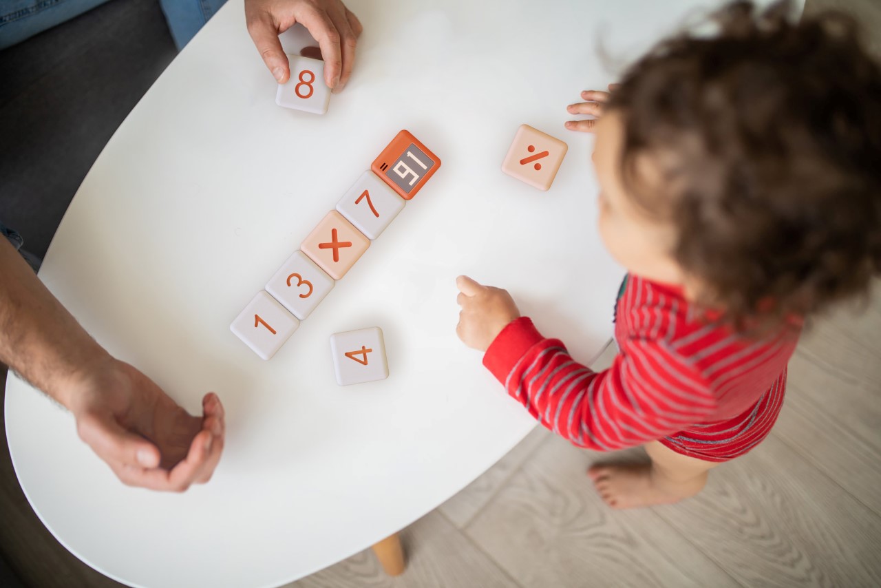
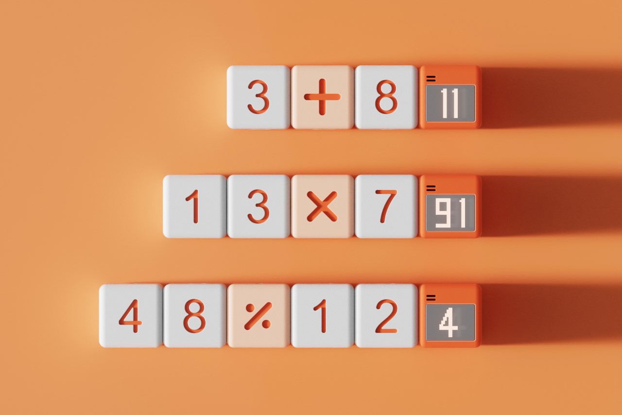
Smart Box by Peng Ren for Shenzhen explore home Industrial Design Co., Ltd (Product Design Gold Cube)

A clever way to introduce the concepts of mathematics through calculation, right at an early age, the Smart Box by Peng Ren is the kind of smart-toy a kid can play with from their early years right up to their early teens. The blocks in two formats – with numeric faces and symbolic faces. They attach magnetically to form a math equation with a solution block right at the end that displays the answer to the equation. By turning the act of pressing a bunch of keys together on a calculator and hitting the ‘equals’ button, the Smart Box set gamifies it in a way that makes mathematics playful!


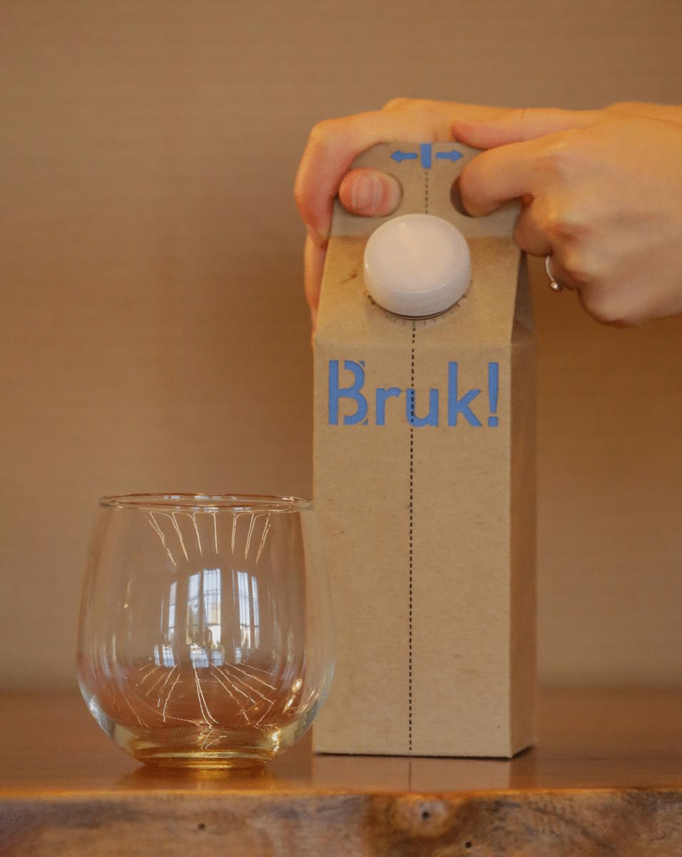
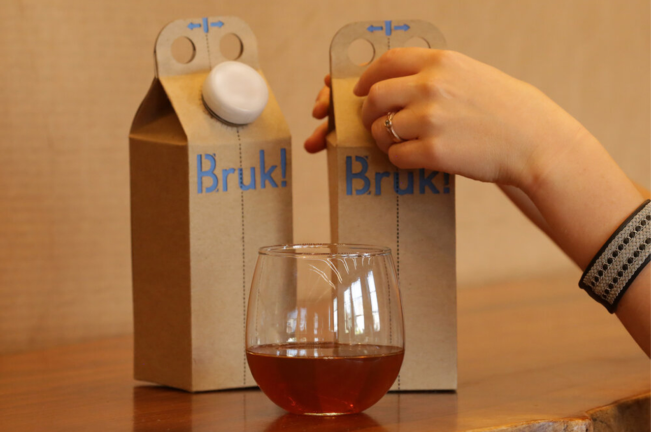
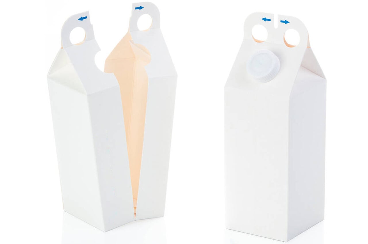
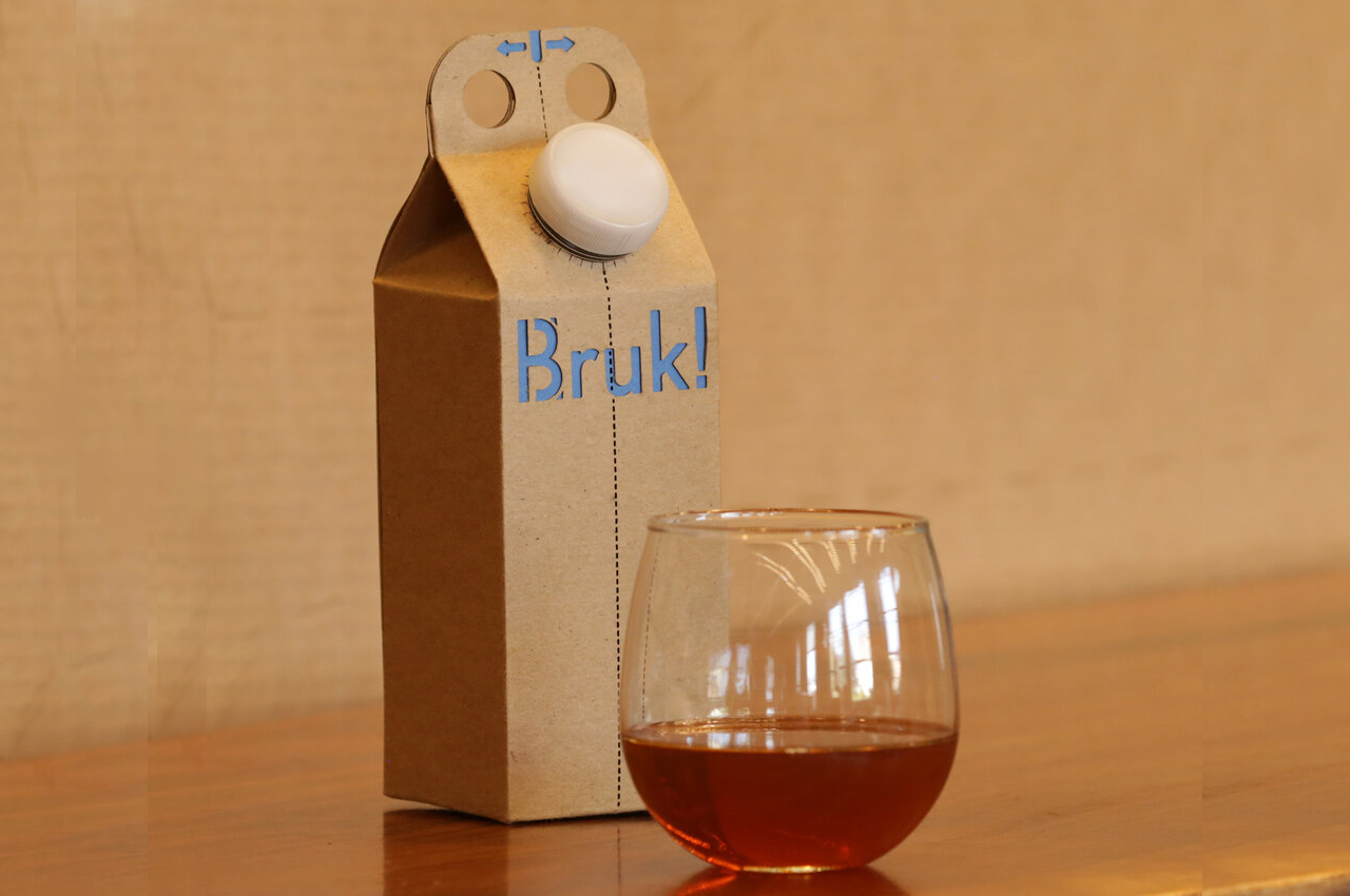
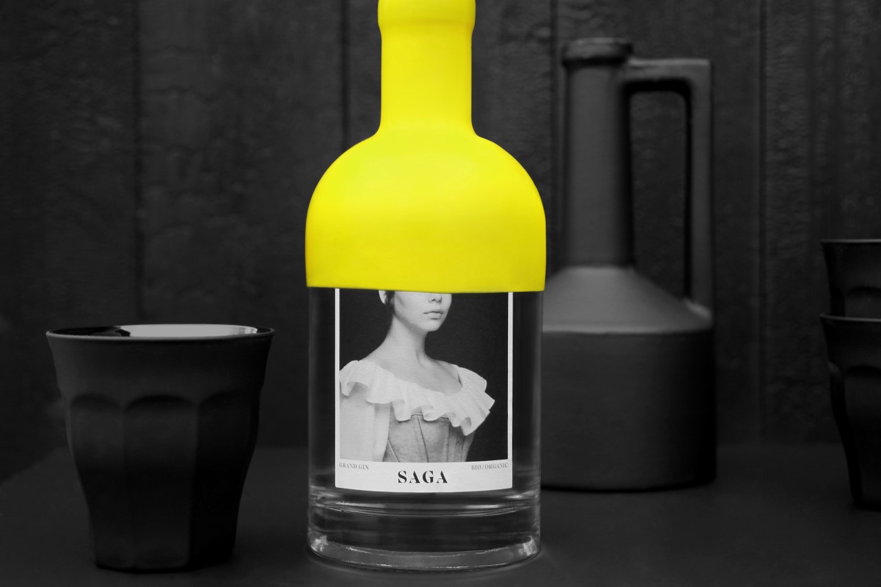
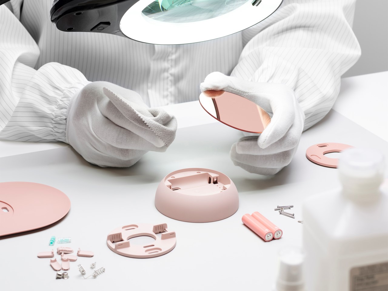
SAGA Grand Gin by Paprika for Distillerie Grand Dérangement (Packaging Design Gold Cube)

A brilliantly quirky piece of packaging design, the SAGA Grand Gin bottle instantly makes you curious. With a vibrant yellow wax seal that covers almost half the bottle, the SAGA comes with a concealed label too. The label design showcases a face, with the eyes covered by the wax. You’re immediately intrigued to know more and see more – what’s the face behind the label? Is it a gin-maker, is it a clue, a game? Chances are you’ll pick up the bottle just for how visually engaging it is… and possibly come back more because of how great the gin is.


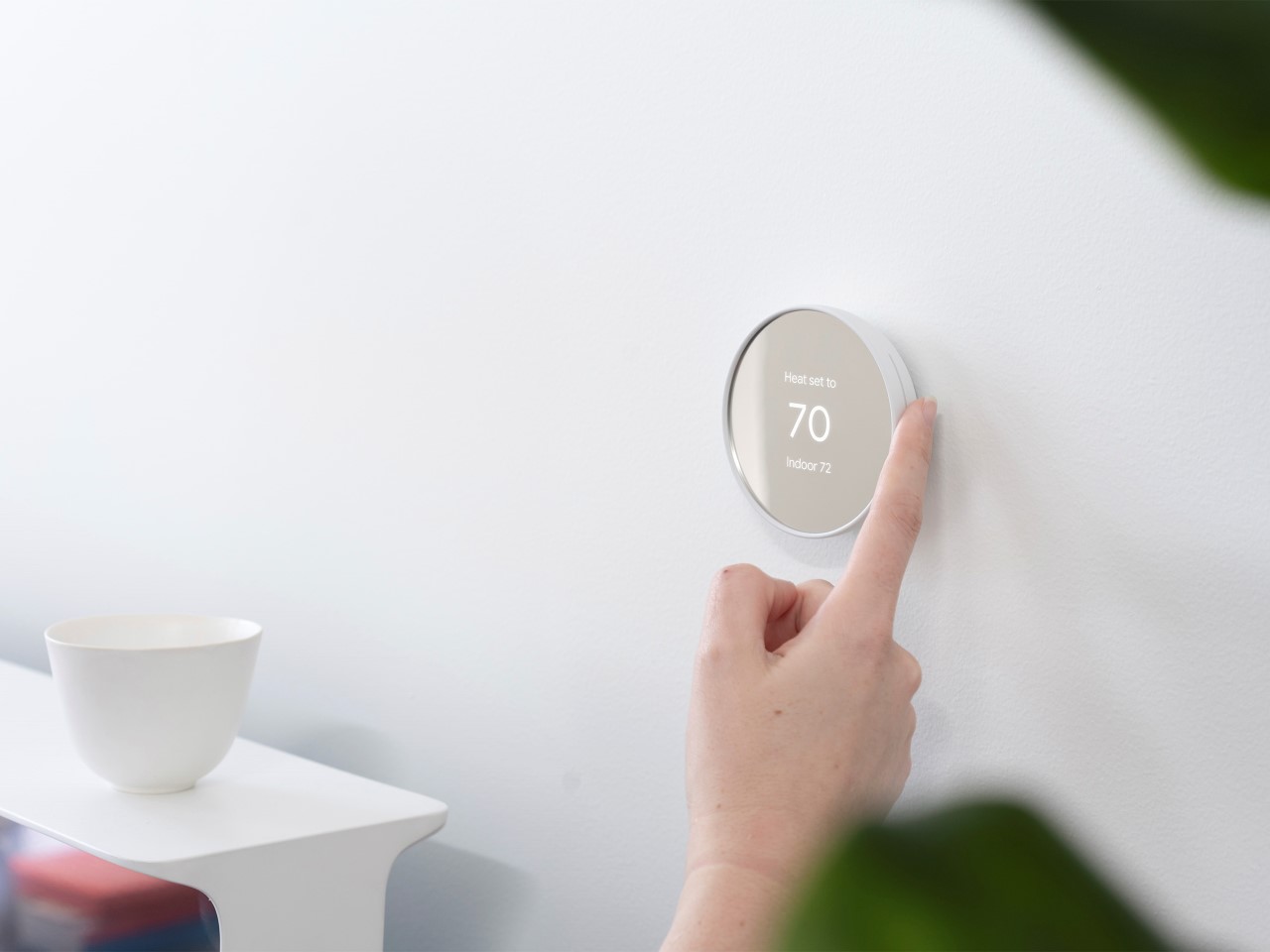
Nest Thermostat by Google LLC (Product Design Silver Cube)

Perhaps one of the foremost examples of a ‘smart home device’, the Nest thermostat returns in a new format that embraces the same classic design language of Nest the Alphabet company, along with Google’s hardware color-palette. The new Nest Thermostat sports a more clock-like proportion, with a relatively bezel-less display. It still comes with the numbers on the front (a design choice popularized by Honeywell and then Nest), although with the rest of the thermostat in muted, pastel shades that go incredibly well with home decor. Perhaps one of its most celebrated aspects is the Nest’s design, which came from Tony Fadell, who prioritized simplicity and sensibility over everything else. The new Nest thermostat still honors that tradition.


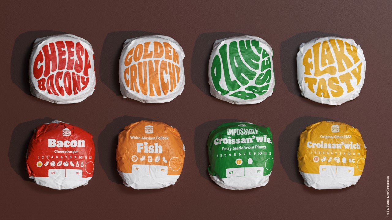
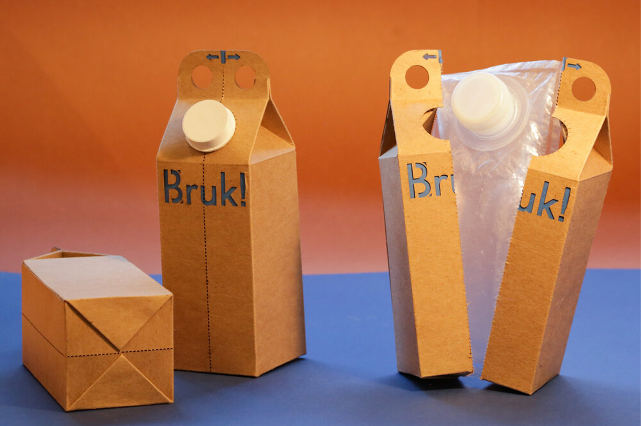
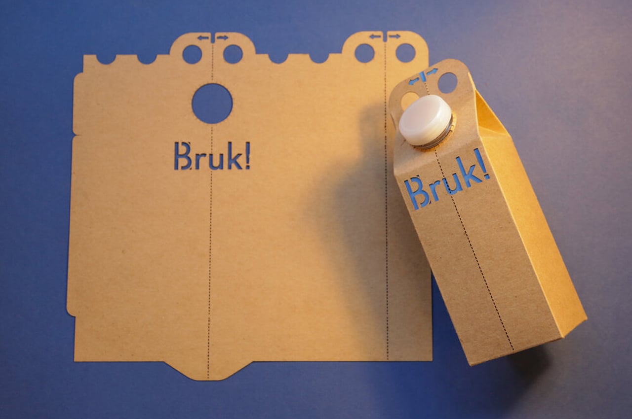
Your Taste, Your Way by Jones Knowles Ritchie for Burger King (Packaging Design Silver Cube)

What the Your Taste, Your Way campaign does for Burger King is turns its packaging into an eye-catching, tongue-tantalizing piece of art. The packaging helps prepare the consumer for what’s within, not only by telling them which burger sits behind the wrapper but also by describing its tastes and flavors… just to get those juices flowing!


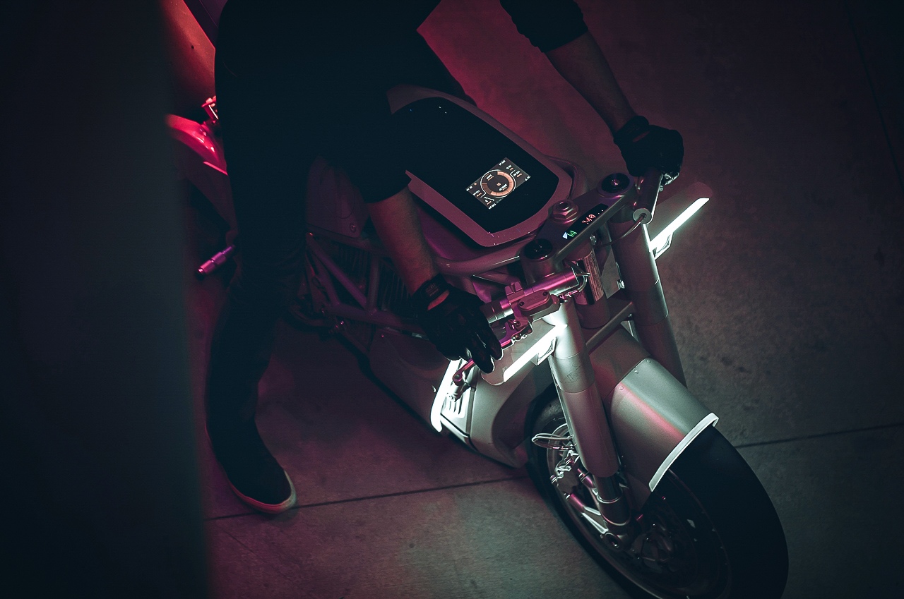
XP Zero by Hugo Eccles for Untitled Motorcycles (Product Design Bronze Cube)

Untitled Motorcycles (UMC) turned a lot of heads when it unveiled its XP Zero design. Based on Zero Motorcycles’ SR/F naked sportbike, the XP Zero floored audiences with its classic lines, modern performance, and minimalist styling. Since its debut at the prestigious Goodwood Festival of Speed, the XP has exhibited in Milan, Italy and Portland, Oregon; won nine design awards; and been featured in hundreds of magazine articles. Now that alone is pretty impressive… aside from that bare-basic beautiful design!


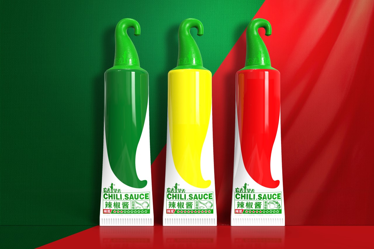
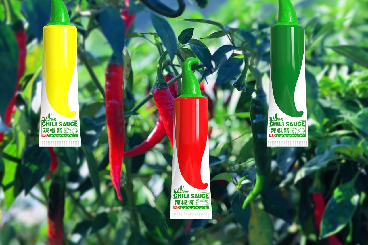
Nongfu Wangtian Chili Sauce by Shenzhen Bob Design for Nonfunctional Wangtian Agricultural Technology (Packaging Design Bronze Cube)

Perhaps one of the most simple and creative pieces of food packaging I’ve seen in a while, the Nongfu Wangtian Chili Sauce quite literally embodies its origin, with a chili-inspired design! The sauce comes within a tube that has the graphic of a chili on it, while the cap is shaped like the curved stem of the chili. Depending on the type of chili used, the tubes come with green, yellow, or red chilis on the label. A star rating system on the bottom near the crimp also tells you how spicy the sauce inside is!

Click Here to Enroll in the 2022 Edition of the ADC Annual Awards and stand a chance to be a part of history and win one of the most prestigious awards in the creative industry!

The post Celebrating over a century of design and creativity, the ADC Annual Awards return for their 101st edition first appeared on Yanko Design.

This sustainable packaging is built to separate plastic lining from paper products like peeling a banana

Bruk is a sustainable alternative to plastic-lined paper packaging built to separate the plastic lining from its paper covering like peeling a banana.

While paper cartons look environmentally friendly, recycling them can get complicated. Typically, these paper cartons are made by sandwiching two layers of plastic inside a paper covering. It is true that paper cartons use less plastic than packaging made entirely from PET plastics, but the layered construction of paper cartons complicates the recycling process.

Designer: Pushan Panda

Before the recycling process begins, the plastic and paper must be separated, which requires a special process that’s expensive and not readily available worldwide. In an effort to streamline the separation period, California-based designer Pushan Panda created Bruk, a sustainable packaging concept that makes separating the plastic from the paper as easy as peeling a banana.

As a result of the complicated recycling process behind plastic-lined paper packaging, only 49% of beverage cartons are recycled in the UK, while only 16% are recycled in the USA. Pushan Panda designed Bruk to look unassuming and familiar so that consumers will recognize the shape and overall look of the beverage container. What sets Bruk apart from other beverage containers is what’s going on inside.

When users are finished with their beverage cartons, they can simply tear Bruk in half from its top, just like peeling a banana. Once the paper covering has been torn in half, the HDPE liner is revealed and can be recycled on its own. Pushan Panda notes, “We designed Bruk to be intuitive and inclusive, easy for everyone regardless of physical ability. Bruk is as convenient and easy to use as a conventional carton, but uses less plastic than a plastic carton and is 100% recyclable with conventional equipment, unlike paper cartons.

The post This sustainable packaging is built to separate plastic lining from paper products like peeling a banana first appeared on Yanko Design.

Teenage Engineering’s Computer-1 Mini-ITX Chassis shows off how a PC can look awesome

Teenage Engineering Computer–1 Release

Don’t be fooled by the name of the team behind this gorgeous computer case. The Computer-1 is no youngster when it comes to power. The choice of color alone is bold which tells us Teenage Engineering is one brave company.

The new Computer-1 case is simply a computer chassis that offers a small footprint. It’s compact and portable so you can easily transport your machine and move it to different locations. It’s just a PC case which means you need to build your desktop computer from scratch. This is not for people who don’t care much for their computers. The Computer-1 is aimed at those who like customized PCs and not the generic ones available in most stores.

Designer: Teenage Engineering

Teenage Engineering Computer–1

Before the final design is reached, the design team had gone through several changes. They started by using a laser cutter to cut through a high-density board and spray-painted the case. The handles could not support the weight so they tried to use aluminum for the case and chrome for the handles. The result was a sturdier but lighter design at only 6.69 x 7.48 x 12.67-inches (dimension).

You only need a very small GPU so it could fit. It’s unclear though why the GPU’s location is not at the bottom which is the usual position. One problem we see is airflow but we’re assuming there is a workaround.

Teenage Engineering Computer–1 Chassis

This Computer-1 is built around the SFX power supply format and a mini-ITX motherboard. It can fit a dual-slot graphics card (170mm max) and other parts that are important to almost every kind of computer user whether a game, designer, engineer, or programmer. The system features a flat pack design and is only 1mm aluminum thin.

Teenage Engineering Computer–1 Colors

This PC case requires some tools to assemble. They will come in a special kit when you buy a Computer-1 case. Its $195 price tag makes us think it is a worthy investment especially if you’re planning to build a mega computer machine but we believe there are less inexpensive options.

Teenage Engineering Computer–1 Launch

Many will probably say this reminds them of the Mac Pro. It looks a bit like it with the handles and the holes that act as air vents but you can make the Computer-1 more powerful as you like with the custom hardware and components. You don’t need to be an expert as the computer case can be assembled easily like most products from Ikea.

So this is another DIY system? It’s better to call it build-your-own. You’re not just building the computer case. You’re also building the computer itself with the components and all. We can imagine now the power your computer system housed in Computer-1  can be.

Teenage Engineering Computer–1 Features

Teenage Engineering Computer–1 Specs

The post Teenage Engineering’s Computer-1 Mini-ITX Chassis shows off how a PC can look awesome first appeared on Yanko Design.

A cardboard cat house stripped down to its bare essentials delivers affordability, portability and fun

Petsy is a cat house made from the bare essentials—just cardboard.

Cats don’t need much, even a cardboard box will do. Moments after opening one from a shipment, your cat’s already found their hideaway, zen zone for the day. When they’re not in the mood for cuddling, a cardboard box is their personal playpen and private hideaway.

Designer: Ekaterina Vagurina

If cats are so agreeable when it comes to new digs, why spend more money than you have to? Ekaterina Vagurina used just cardboard to give rise to her cat house called Petsy to encourage cat owners to skip carpeted cat towers and opt instead for an affordable and simple cardboard house.

Resembling the shape of an actual house, Petsy keeps a wide and lofty internal volume for cats to stretch and curl up to their heart’s content. Unadorned and unpainted, Petsy is a no-nonsense cat house that’s stripped down to its bare essentials—just the cardboard. In fact, if Petsy were to hit the markets, the entire house could be shipped as-is, no extra packaging necessary.

Cats are known to be curious and temperamental at the same time. They like to supervise, but good luck supervising them. Petsy comes with a large front door that only your cat will be small enough to slip into, as well as perforated holes on both ends of the house. On one end, a large circular hole allows your cat to poke their head through, while smaller perforations on the opposite end are just the right size for your cat to paw at the outside.

The post A cardboard cat house stripped down to its bare essentials delivers affordability, portability and fun first appeared on Yanko Design.

Modraker mountain bikes to come in 100% recyclable cardboard packaging that’s compact than ever

Mondraker has the laurels of being one of the elite manufacturers of the most lightweight mountain bikes, future-forward electric mountain bikes, and the pinnacle of quality when it comes to hardtrail mountain bikes. The Spain-based brand specializing in making gravity-oriented bikes has been long committed to the school of thought promoting a sustainable world, and now it is their turn to inspire others to do the same. Apparently, Cannondale and VAAST have already gone down this route, with Trek also committed to the plastic-free goal by 2024.

To play their part in the bigger scheme of things to safeguard our planet earth, Mondraker has introduced their 100 percent plastic-free and 100 percent recyclable initiative. The MTB pro has introduced the industry first, completely recyclable cardboard packaging and other associated components for all its mountain bikes. The bicycle industry which on one side addresses green travel living with its zero-emission characteristics is juxtaposed on the flip side as a contributor to plastic and other toxic wastes in the form of packaging.

Designer: Mondraker

That’ll no longer be the problem with owning a Mondraker mountain bike, as the cardboard packaging is accompanied by organic, compostable materials. They’ll ship with an adhesive tape made out of rice and a security seal crafted from potato pulp. The inks used on the packaging are all biodegradable, along with the two reusable Velcro straps. The whole package is strategically designed to cut down waste and leave no footprint, whatsoever, for the local dealers as well. Meaning, there will be no zip-ties, foam or plastic packets to deal with when you unpack the bicycle.

The internal layout of the new packaging box is such that it takes less time to assemble the bike on the production lines. The overall volume of the package has also been reduced compared to the outgoing packaging which will save shipping space. To top it off, the design parameters of the recyclable boxes offer better protection to the bicycle in transit. The new packaging design is not just about removing plastic from the equation but providing superior shock absorption too. Mondraker hence devised this totally recyclable solution which they produce in-house in their new headquarters.

The post Modraker mountain bikes to come in 100% recyclable cardboard packaging that’s compact than ever first appeared on Yanko Design.

This reusable alternative to single-use packaging foresees a green future for the e-commerce sector

What do you do with the packaging material your favorite dress has just arrived in from Amazon? Once you have received the online order, the packaging material is thrown in the trash, right? It’s a story with each one of us, especially because most of the packaging is not designed with reuse or sustainability in mind. This is why the idea of creating home delivery packaging reusable sticks with us more keenly than anything else.

Ecommerce portals have grown exponentially over the last two years, during the pandemic, because they provide consumers unparalleled options and accessibility. With the increase in online shopping, the pileup of shipping cartons and plastic packaging material is also piling up in landfills. In such a scenario, if we watch closely, packaging has a single purpose – to deliver the item safely to the consumer – and when this purpose is over, packaging has no further usage and landfill is the ultimate destination.

Designer: Simon Chantrel

Considering over 100 billion deliveries happen each year, it’s a huge pile of packaging waste that we are discussing here. Through the INFLATE – a flexible and reusable delivery package – designer Simon Chantrel presents a very viable solution to this problem. The alternative to single-purpose packaging, INFLATE is made to be reused a number of times so it doesn’t have to retire after its single journey from an eCommerce store’s warehouse to your doorstep. It can, in fact, be returned and reused for another delivery… and then another… and another!

INFLATE we presume is made from recyclable canvas or polyethylene because of its tarpaulin-like material. The renders also depict, the packaging material is flexible and it can be inflated to the size of the item it’s going to carry. The inflatable packaging can adapt to its content and once delivered, it can be deflated and rolled back. The INFLATE can then be dropped at an external collection point or a deposit location so it can be reused to limit packaging waste accumulated because of deliveries in traditional packaging.

INFLATE intends to bypass the linear economy, where packaging material is used once in the delivery process and then disposed of. It takes delivery services toward a circular packaging economy where resources are reusable and can reduce the packaging waste to ultimately make the e-commerce sector greener.

The post This reusable alternative to single-use packaging foresees a green future for the e-commerce sector first appeared on Yanko Design.

This sustainable packaging for eggs is inspired by stamps & made from paper foam!

Sustainable designs, especially packaging designs, are giving designers food for thought – very literally in some cases – to find solutions that can reduce waste and the burden on the planet! The Stamp Egg packaging stands out from the rest because it is detachable and made of PaperFoam which is sustainable, eco-friendly, low-carbon, highly recyclable, and home compostable material – it is truly egg-cellent!

Think of Stamp Egg as having your eggs individually wrapped but instead of plastic, it is a super sustainable and compostable material. It has all the necessary elements for an egg carton – easy open and close, protective form, and stackability. As the name suggested, it is inspired by a postage stamp that lets you tear out individual pieces from the collection, and now you can do it with your eggs.

This form also helps you save more space in the refrigerator and easily count the eggs without opening the package thus keeping them fresh for longer as they are less affected by temperature changes. Also, the separately packaged eggs can be easily packed for a picnic or in a lunch box without compromising on protectiveness or playing Jenga with the other items.

PaperFoam is a studio based in the Netherlands that specializes in making environmentally friendly packaging material widely used in electronics, cosmetics, medical devices, and food applications. The bio-based product is made out of starch, cellulose fibers, and water all with a very low carbon footprint. It can be composted or recycled at home with paper. Curious to learn more about this innovative material? Read about the manufacturing process, detailed benefits, and more here! 

“After experimenting with the material to enhance its look and its mechanical properties, I had to find a proper application for it. I aimed at designing a mass-produced everyday object within the packaging industry, which proved to be a successful field of application for PaperFoam as it was resistant, natural, and could be customized with branding,” says Yoon. “The purpose was to approach this project in a sustainable way, think about a valid and meaningful alternative to already existing products, combine maximum efficiency with aesthetic quality using an environment-friendly approach throughout the whole lifecycle.”

Compared to the cellulose-pulp, foam, or plastic boxes, the Stamp PaperFoam egg trays are lighter (beaten only by the Polystyrene ones) and emit much less carbon dioxide compared to their competitors (96% less than pulp, 91% less than PS, and 87% less than PET). Easy to achieve with the injection-molded manufacturing process, the product is cost-effective, energy-efficient, high-performing, and attractive!

The carton’s dimpled form accommodates individual eggs and prevents them from coming into contact with one another. An improved hinge holds the units together and makes the cups easy to separate into single independent boxes which saves space and keeps them fresh for longer. The name of the brand and the nutrient contents can be directly embossed on the material surface, saving on additional labeling costs and making recycling easier. Stamp is egg-straordinary!

Designer: Il-Seop Yoon

The post This sustainable packaging for eggs is inspired by stamps & made from paper foam! first appeared on Yanko Design.

McDonald’s iconic Happy Meal could be replaced by this greener, prettier, and ‘Happier Meal’ concept!

The forest-themed meal box incorporates all of McDonald’s iconic branding and design values but with a fairytale-ish twist!

There’s a lot to be said for the amount of heat Mcdonald’s has gotten in the past few years for their non-sustainable practices. Although, we can deem this heat fruitful because the fast-food giant says it is attempting to make its Happy Meals greener! They intend to upgrade their packaging and make Happy Meal toys with recycled plastic or plastic sourced from renewable materials. But the fact of the matter remains that neither of these materials is really biodegradable. So, Malaysian designer Regina Lim decided to take matters into her own hand! She redesigned a ‘Happier Meal’ – one that is free of plastic, created from sustainable materials, and full of beautiful illustrations!

The entire box is inspired by the forests of East Malaysia where Lim grew up. “My parents took me out into nature as a child, and I thought it was important to teach the next generation to appreciate these spaces, which are dying off,” says Lim. “But I think it’s possible to teach kids about sustainability in a fun way.” The pack is adorned with magical depictions of flora, fauna, and McDonalds’ food products! The outer protective sleeve and the inner box are printed on a single sheet of paper, which is then folded artfully like Origami. This also transforms into an interesting infographic that shows us how seeds grow into trees – making the storytelling element a complete delight for kids!

The usual plastic Happy Meal toys are replaced by wooden sculptures of trees, and little 3D cardboard cutouts of animals – an elephant, zebra, and giraffe. Lim’s reimagined design omits a few of the design flaws that the original Happy Meal possesses. She says there is more space in the box to now accommodate fries, nuggets, a drink, toys, and other items. In fact, if you’ve noticed McDonald’s Happy Meal box cannot hold a drink. Our drink of choice is often provided to us in a drink holder, or another bag altogether. But Lim’s Happier Meal can store our favorite soda for us. In fact, the revamped meal box is even AR-enabled! You can scan the QR code on the box to kickstart an educational AR feature, which brings this mystical forest to life. This helps make the design more timeless instead of the usual ‘use and throw’ approach currently used.

Lim hopes that her inspirational prototype can encourage major companies like Mcdonald’s to “make small changes, (as) it can make a big difference because of the impact and influence they have.” Will McDonald’s be on board with this greener and prettier version of their beloved Happy Meal? Time will tell. Although, it is high time for a fresh change, and I’m sure everyone will be “lovin’ it”.

Designer: Regina Lim

The post McDonald’s iconic Happy Meal could be replaced by this greener, prettier, and ‘Happier Meal’ concept! first appeared on Yanko Design.