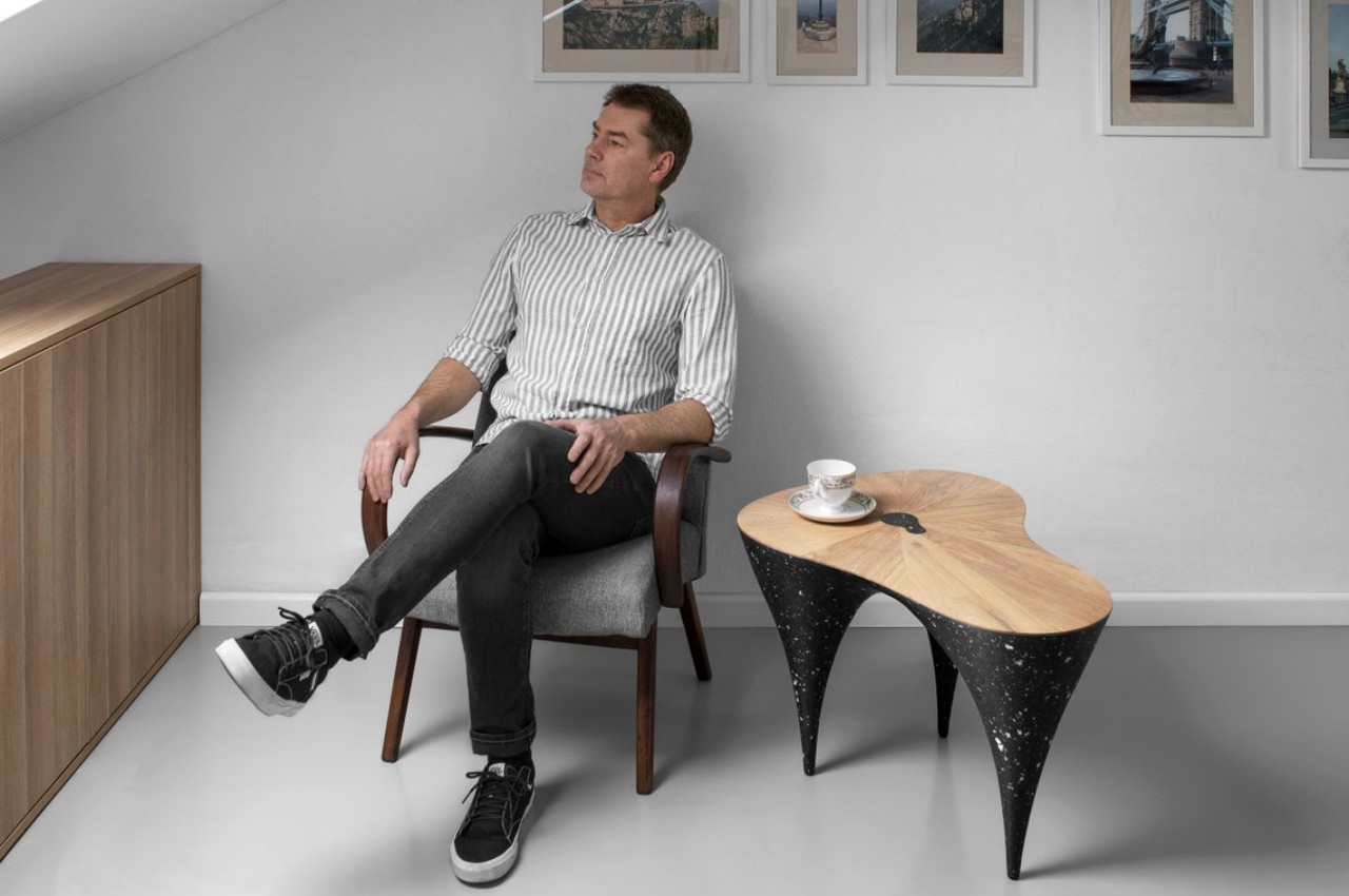
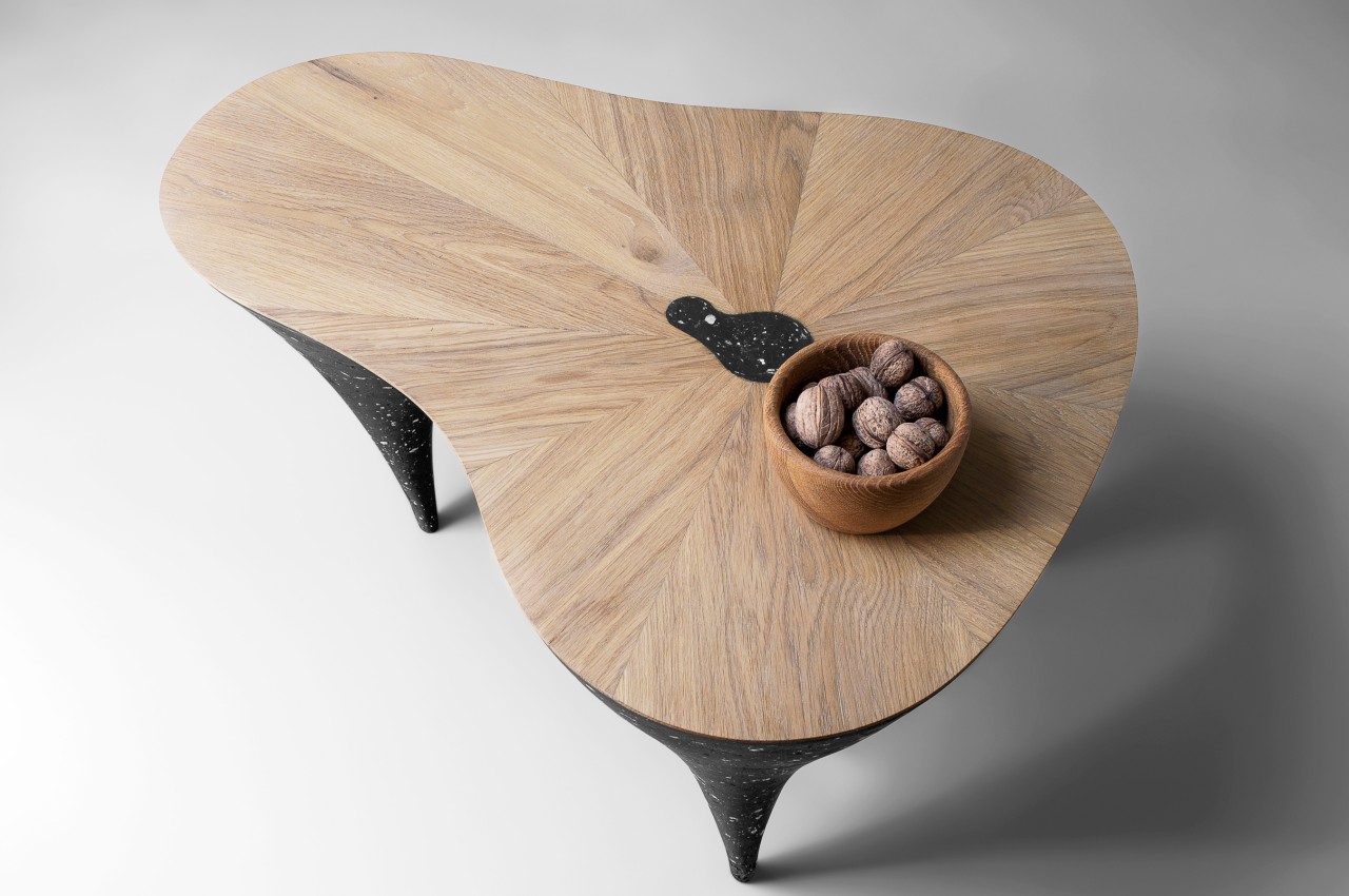
This distinctive coffee table blends contrasting elements to give it a unique character

Coffee tables today do more than just hold your coffee or your coffee table books. They have become both literal and figurative centers of a room, providing visual impact through their eye-catching appearances. Some coffee tables grab your attention with their exquisite shapes, while others prefer to do it through remarkable materials. This unique coffee table does both, creating a piece of furniture that could almost be described as sculptural art. What’s more noteworthy, however, is that it uses what seems to be opposing or contrasting materials, giving it a distinct personality that’s like a Yin and Yang of furniture design.

Designer: Donatas Žukauskas
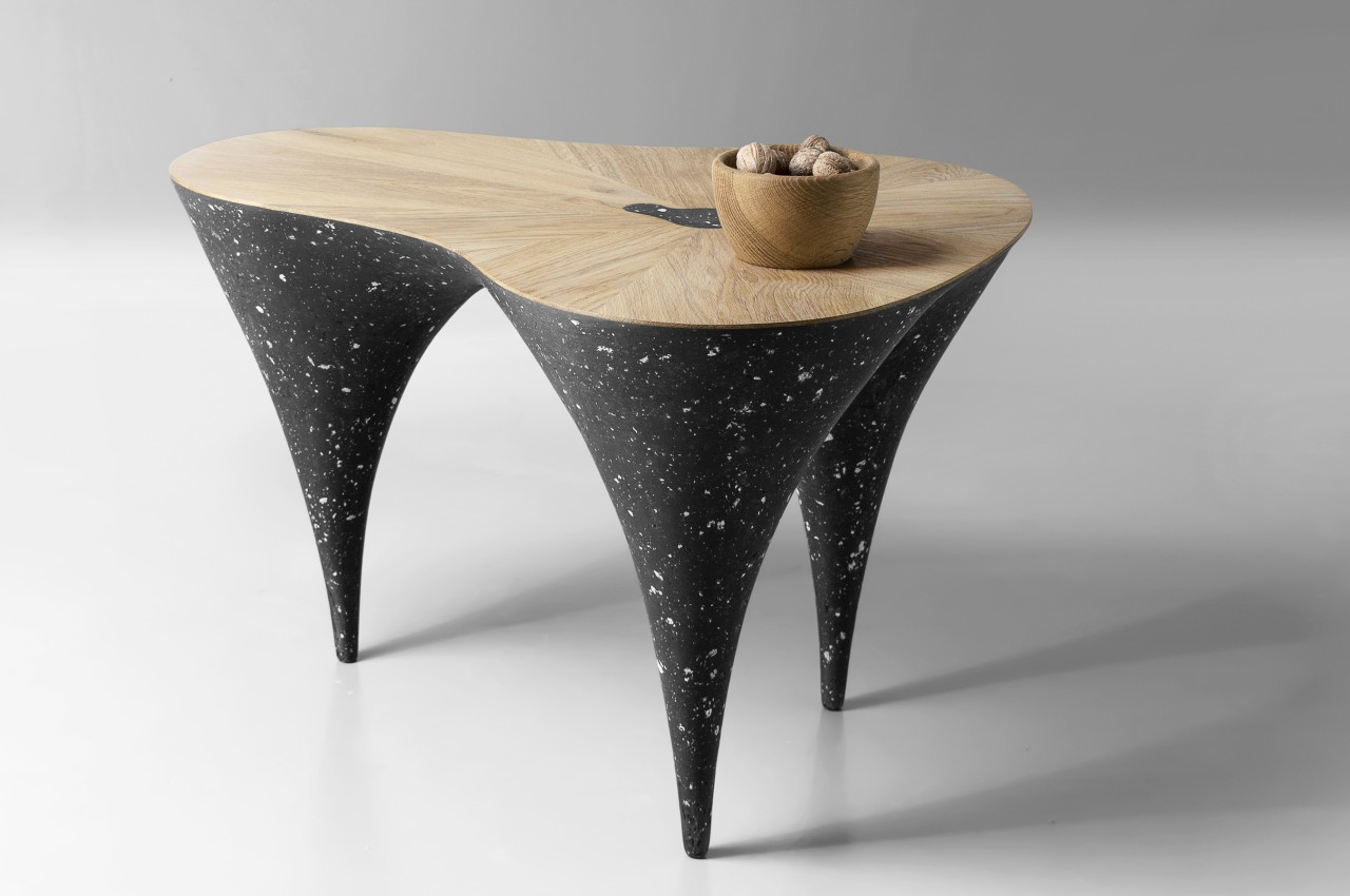
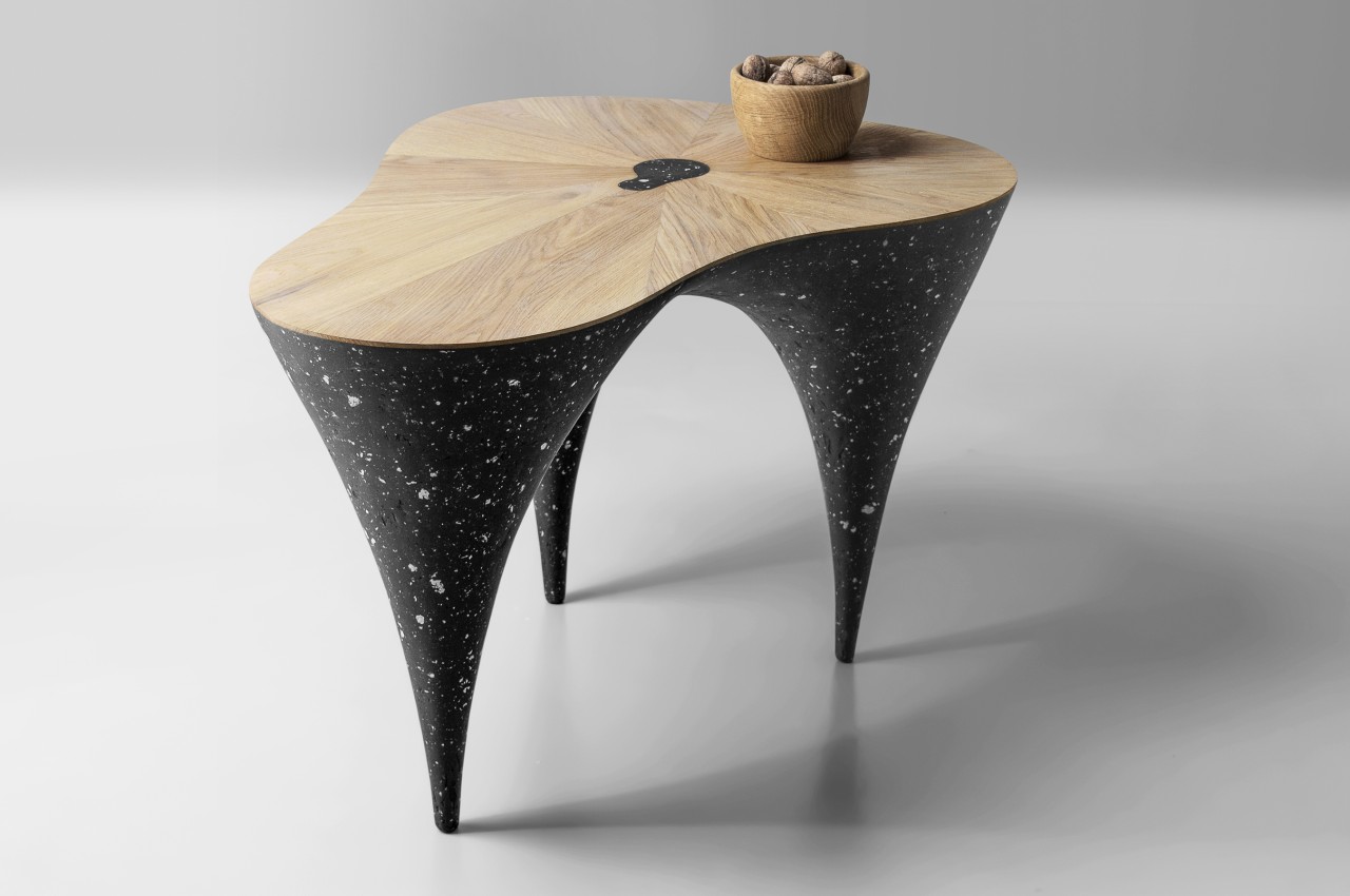
There are some materials, both natural and man-made, that seem to be associated with certain emotions and concepts. Water, for example, can be calming and cleansing, while plastic is soft and pliable. Wood is warm and cozy, while stone, in its many forms, is cold and impersonal. These latter two might seem to stand on opposite ends, but they come together in a harmonious and even artistic way in this sculptural coffee table made of natural wood and a new concrete-like material.
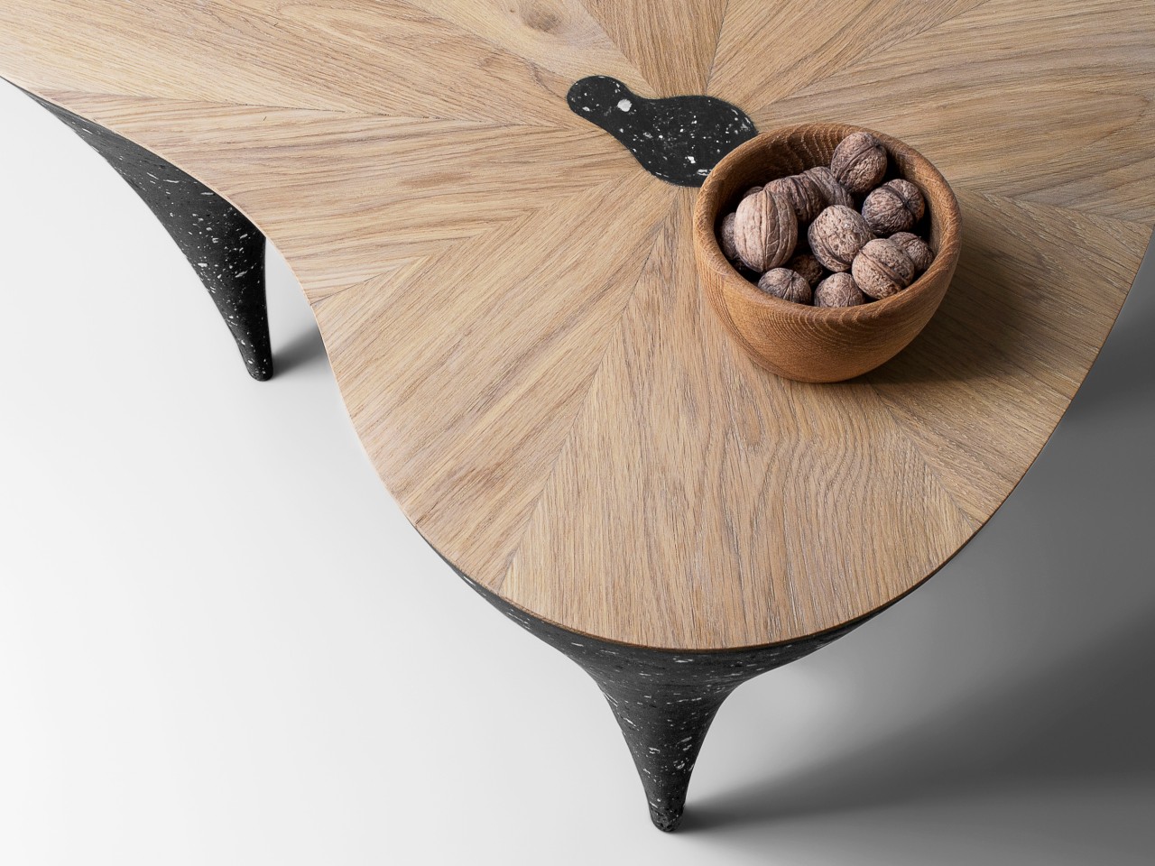
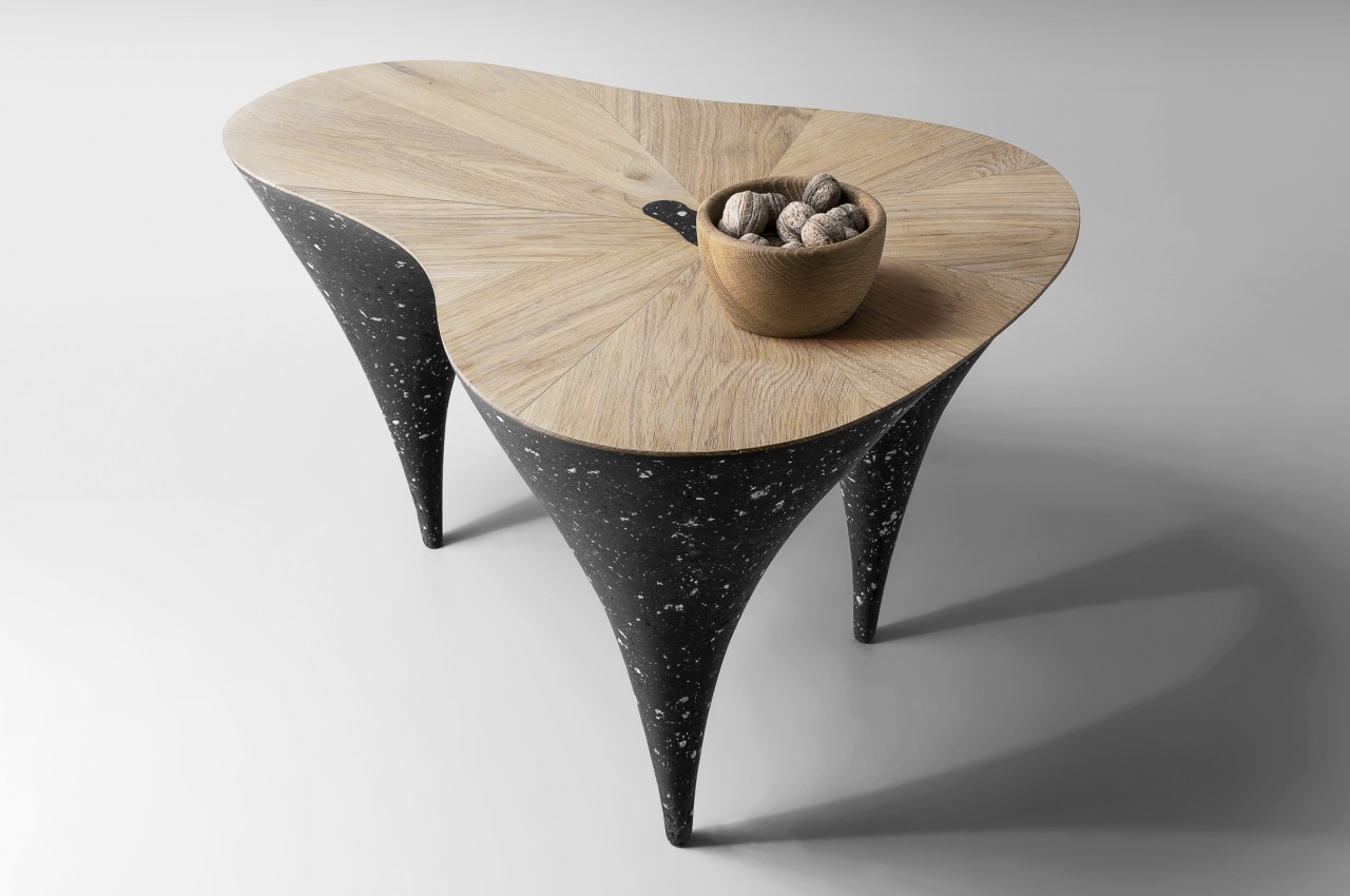
The very shape of the table itself seems to convey this character of combining contrasting elements. The wide, irregularly-shaped wooden top is held up by three conical legs that end in very thin feet that seem to test fate. Its form has elements of both stability and irregularity as if challenging the mind to decide whether the table is steady or is ready to collapse on one end.
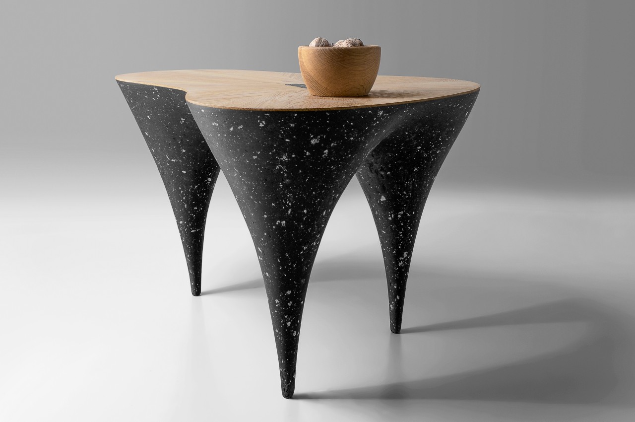
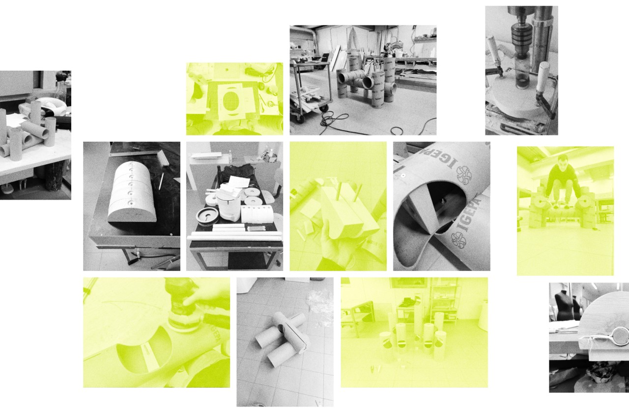
What makes this table even more interesting is that its concrete legs aren’t exactly made from actual concrete. Instead, it is a solid yet elastic mass that is actually closer to wood but was designed to look like concrete. It is made from paper mass, which is again the opposite of the rigidity of concrete, but mixed with various other materials to give it the desired texture, water resistance, and rigidity. Fusing this wet mass, which is poured into a mold, with the wood top proved to be a tricky task, but the result was well worth the trouble.
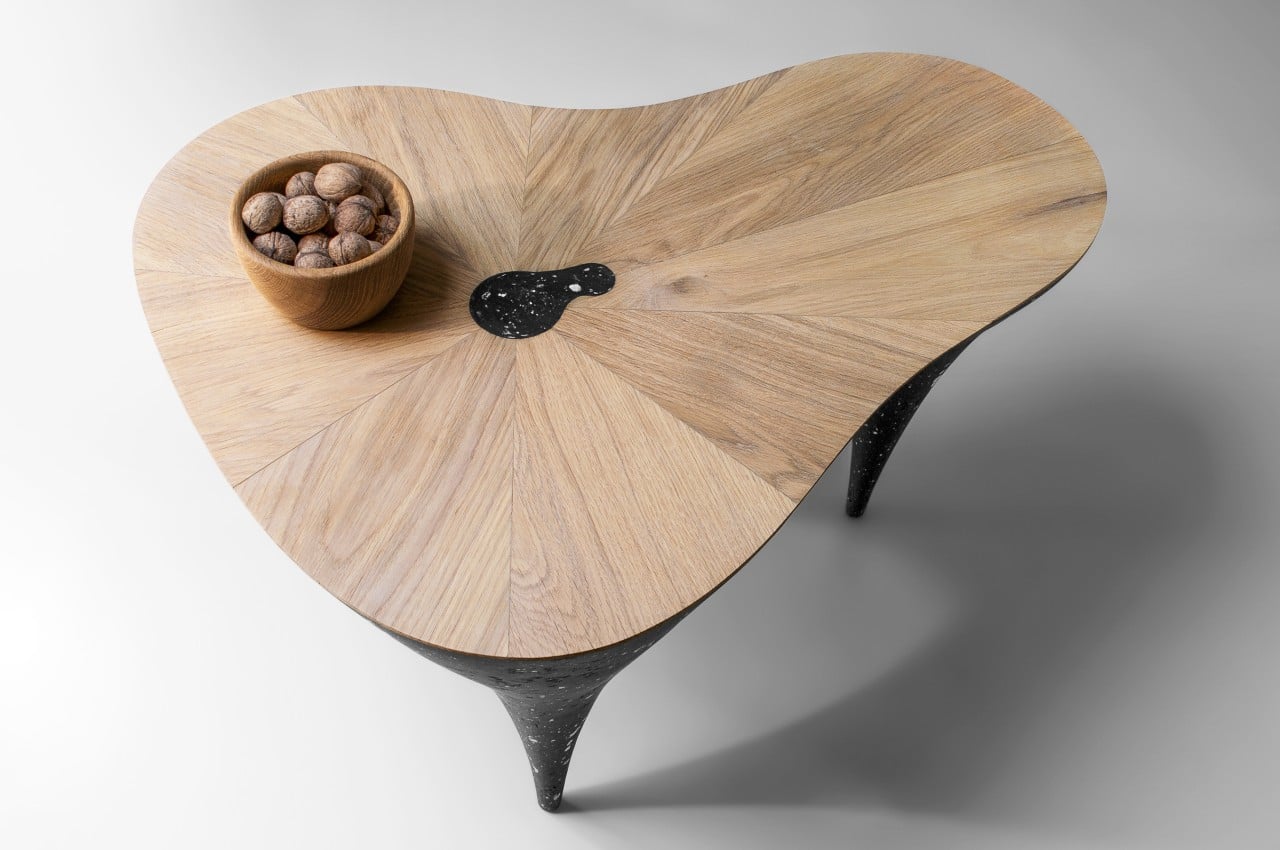
This sculptural coffee table of opposites is definitely a sight to behold in a room, and of course, it’s quite functional, too. So yes, you can place your favorite mug and books on top without fear of breaking down. Its special character, however, doesn’t stop at its aesthetics. Recycled materials were utilized in creating this table, making it a sustainable piece of furniture and sculptural art as well.
The post This distinctive coffee table blends contrasting elements to give it a unique character first appeared on Yanko Design.
This simplistic wooden chair imagines a future Google that has gone back to nature

It’s not uncommon for design trends to swing back and forth like a pendulum, making what was once old new again or seeing old practices in a new light. That kind of back and forth seemingly applies to almost all facets of life and history that it became even part of major philosophies. All that it means is that what may be the prevalent style or mindset now could take a U-turn after a few decades, and all our obsession with advanced technologies could lead to a counter-movement that will bring us back to nature and the basics. The tech companies today won’t be the same decades from now, and some of them might even adopt a style that might even be perceived as devoid of tech completely, like this wooden chair that might be Google’s signature furniture 24 years from now.

Designer: Povilas Grigas

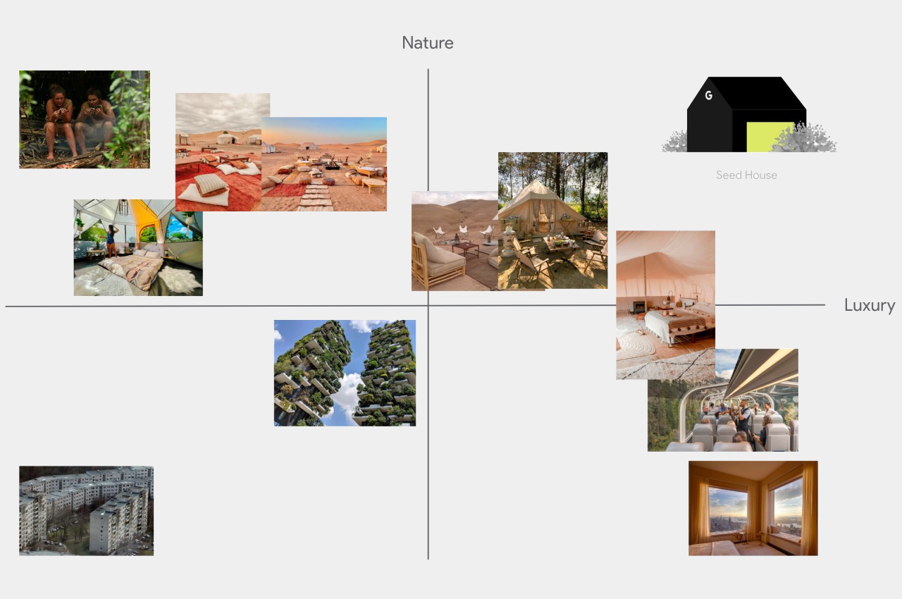
When it comes to tech companies, Google is definitely one of the big three, along with Microsoft and Apple. With its hands in so many different technological fields, you could almost say that it is the most popular icon of technology. The company has undergone so many changes since its birth, not least of which is splitting into different companies under Alphabet, but its biggest change is probably yet to come. Just as humans are wont to return to simpler and more natural things, so too Google’s design language might swing that way a few decades from now.

1

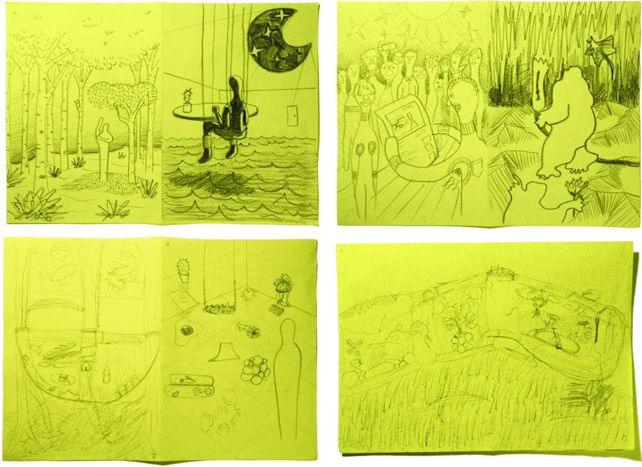
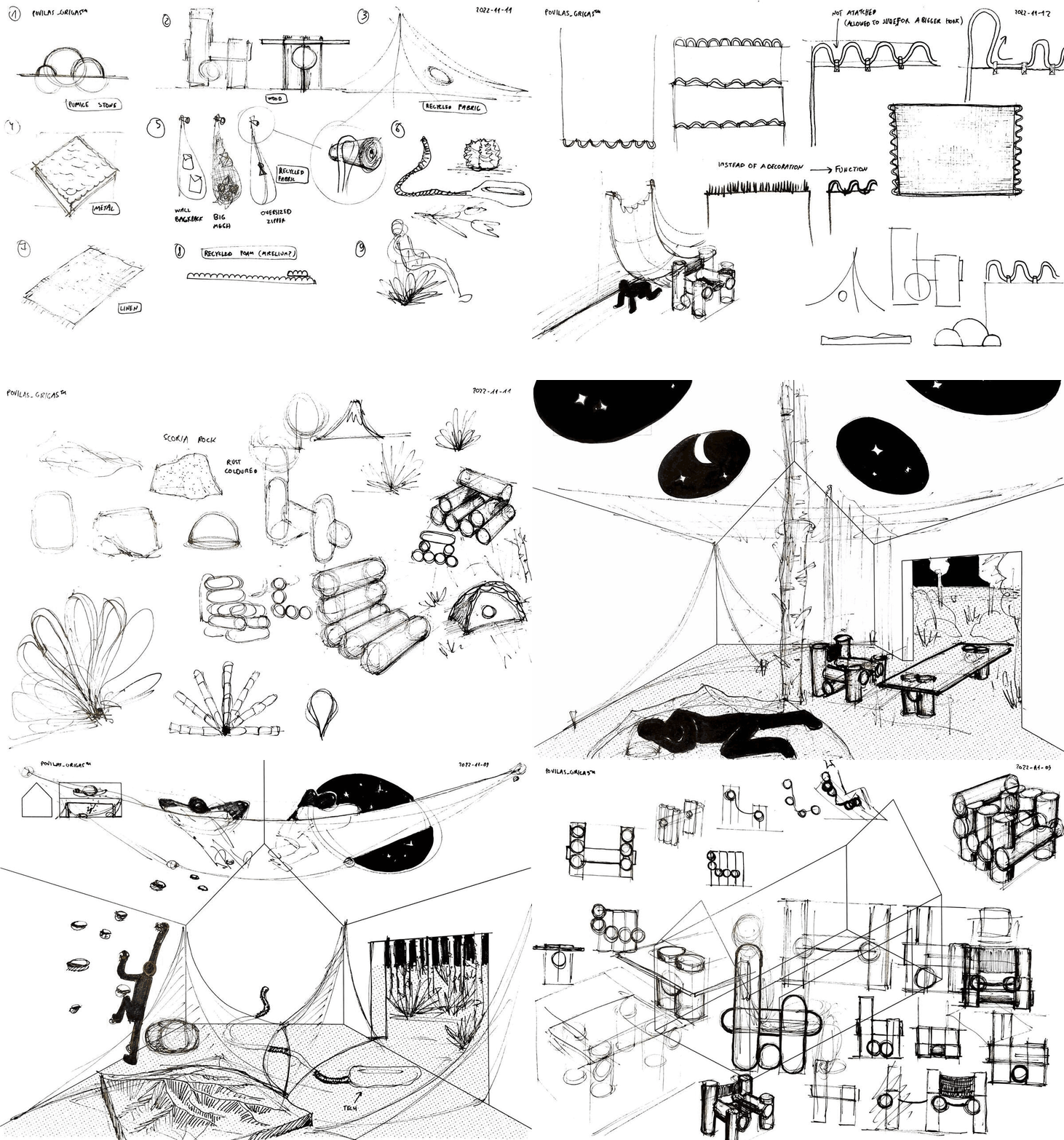
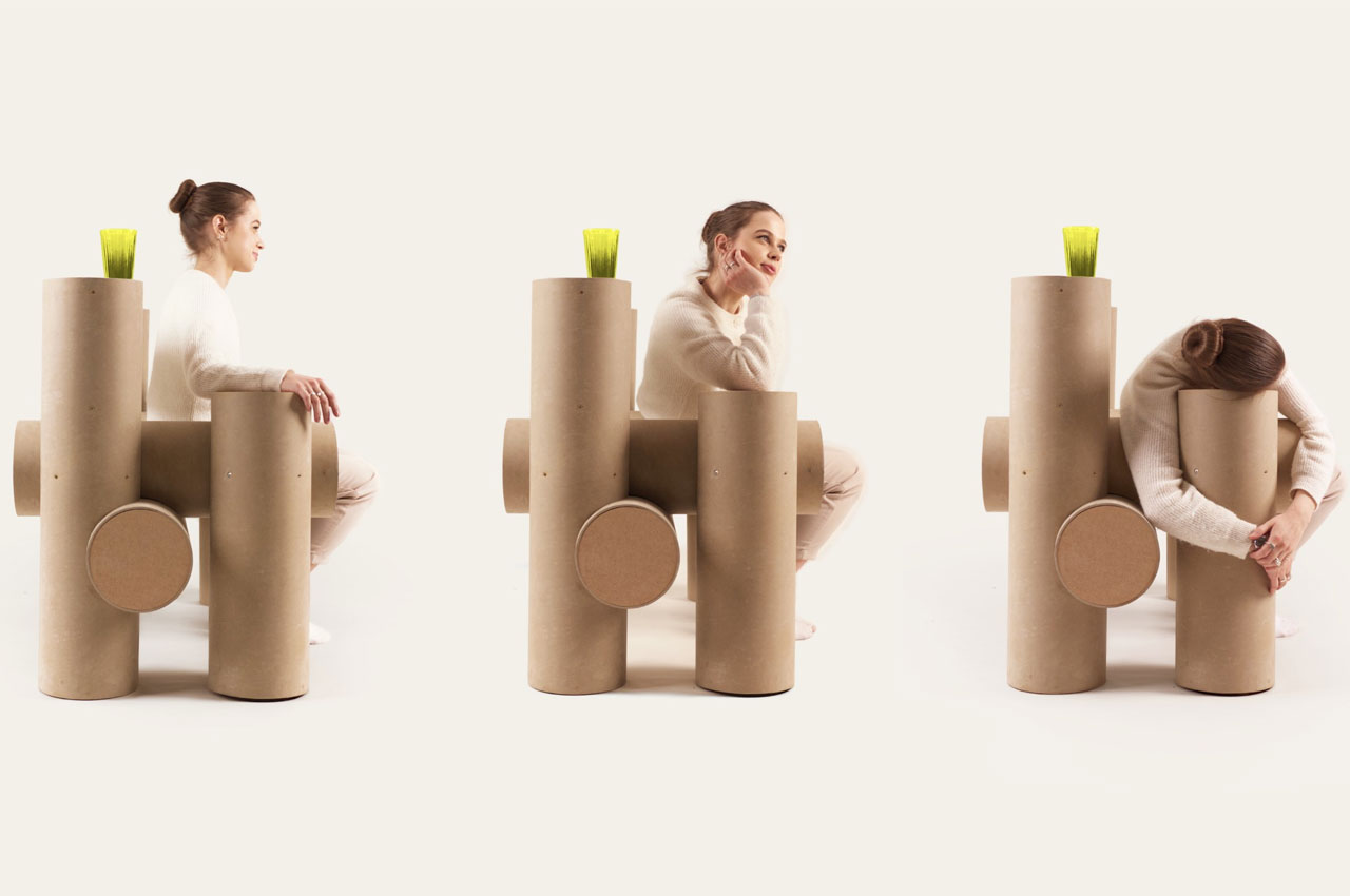
One speculative design project envisions what Google’s design language would be like by 2046 or so, based on the principle above as well as Google’s current design philosophy. Google has always had a penchant for minimalism, though the exact application of that design philosophy changes over time. And what could be more minimalist than pieces of furniture that are not only natural but are also inspired by nature’s more basic designs. The Seed Chair, for example, looks like nothing more than a few short logs joined together to form a seat, representing the most basic interaction between nature and man.

Admittedly, the Seed Chair doesn’t look like the most comfortable seat around, though it does embrace Google’s spartan aesthetics and preference for geometric shapes. At the same time, however, it is almost the complete opposite of Google’s spirit. The chair is large, heavy, and has plenty of friction, while Google’s culture is always associated with agility and fast-paced change, almost to a fault.

Of course, it is unlikely that Google will adopt this nature-centric design wholesale, at least not in the foreseeable future. It is, however, more likely to dip its toes into this area of product design, researching and experimenting with ways technology can make such designs possible, especially with a nod towards sustainability and the use of natural materials. That might be more in line with Google’s character and mindset, one that tries to inject technology everywhere, especially in places where data can be harvested, utilized, and maybe even turned into a profit.

The post This simplistic wooden chair imagines a future Google that has gone back to nature first appeared on Yanko Design.

This graceful coffee table will make you want to wrap yourself up in a comfy blanket

Coffee tables often serve as centerpieces in a living room, providing a visual focal point for anyone entering that space. It may indeed sometimes serve as a table for resting coffee or tea cups, and it’s also a place where homeowners display their favorite books, magazines, or other reading materials, whether or not they’re actually reading them. Given this purpose, coffee tables are designed to be eye-catching or at least visually pleasing to enamor guests without being overbearing. To some extent, this design concept for such a table does capture one’s attention, but it also evokes feelings of coziness and warmth that will almost make you feel like curling up beside it, along with a good book and a hot cup of cocoa.

Designer: Deniz Aktay

The “standard” design of coffee tables comes in rectangular or circular shapes, the former for space efficiency, while the latter aims for visual impact. From those two shapes, designers try to create interesting forms and combinations that serve to attract attention without becoming an obstacle to the table’s functionality. We’ve seen quite a few designs in this regard, ranging from super minimalist metal furniture to stunningly elaborate pieces of sculptural art.

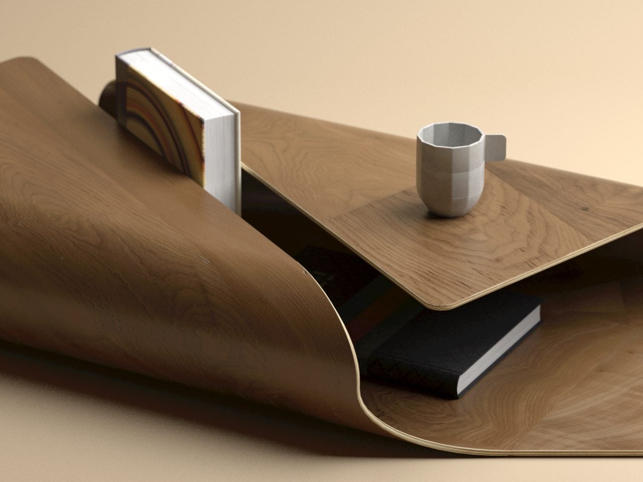
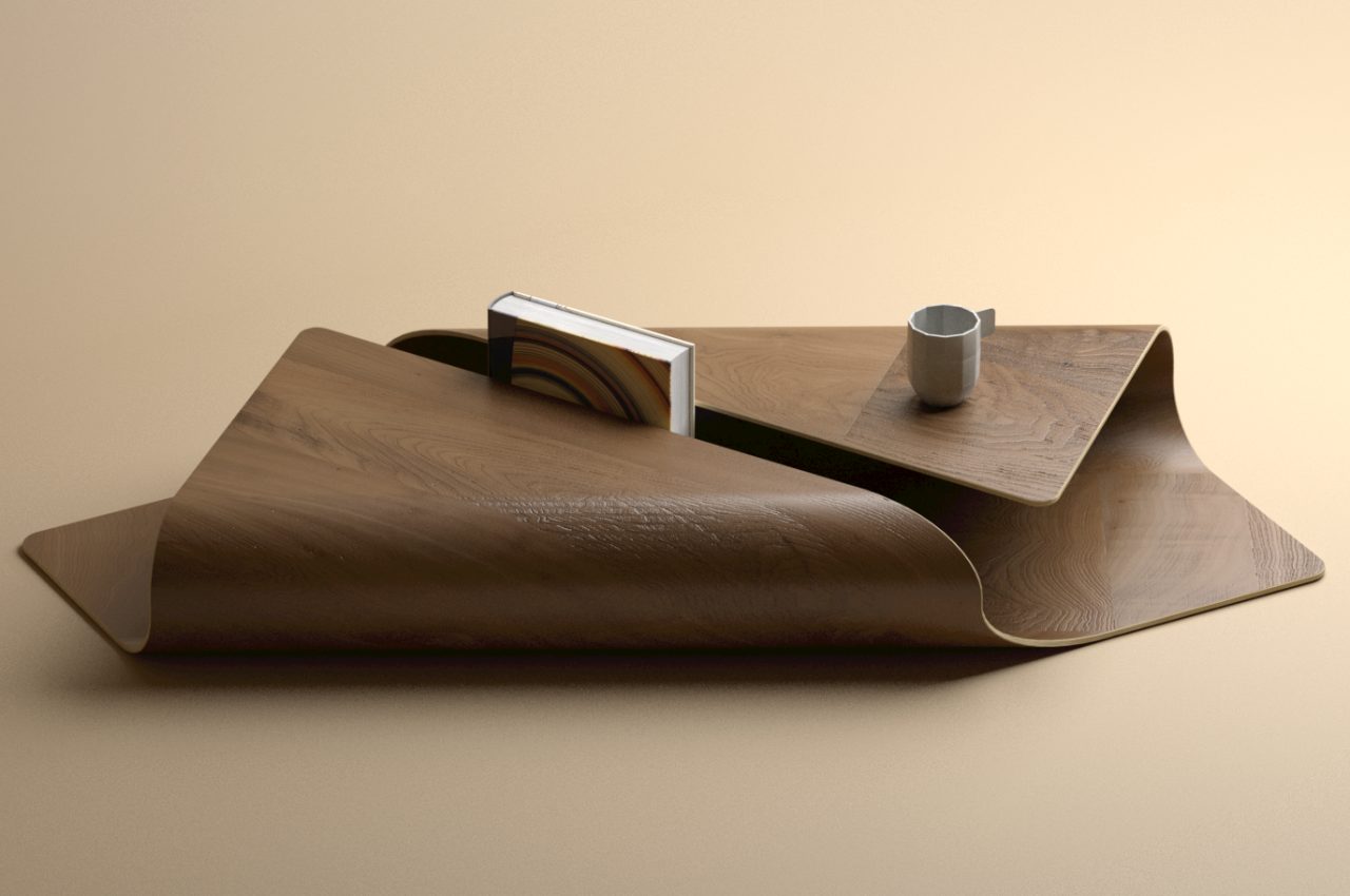
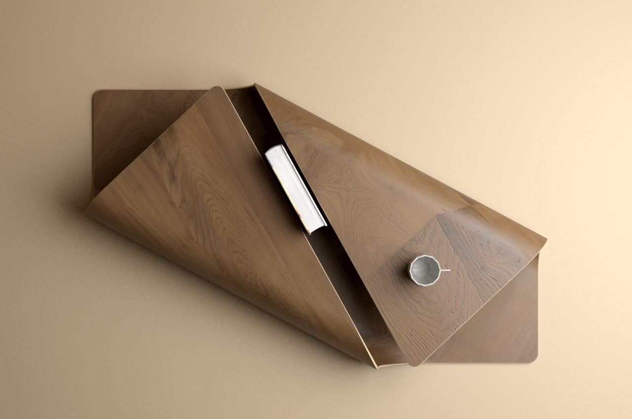
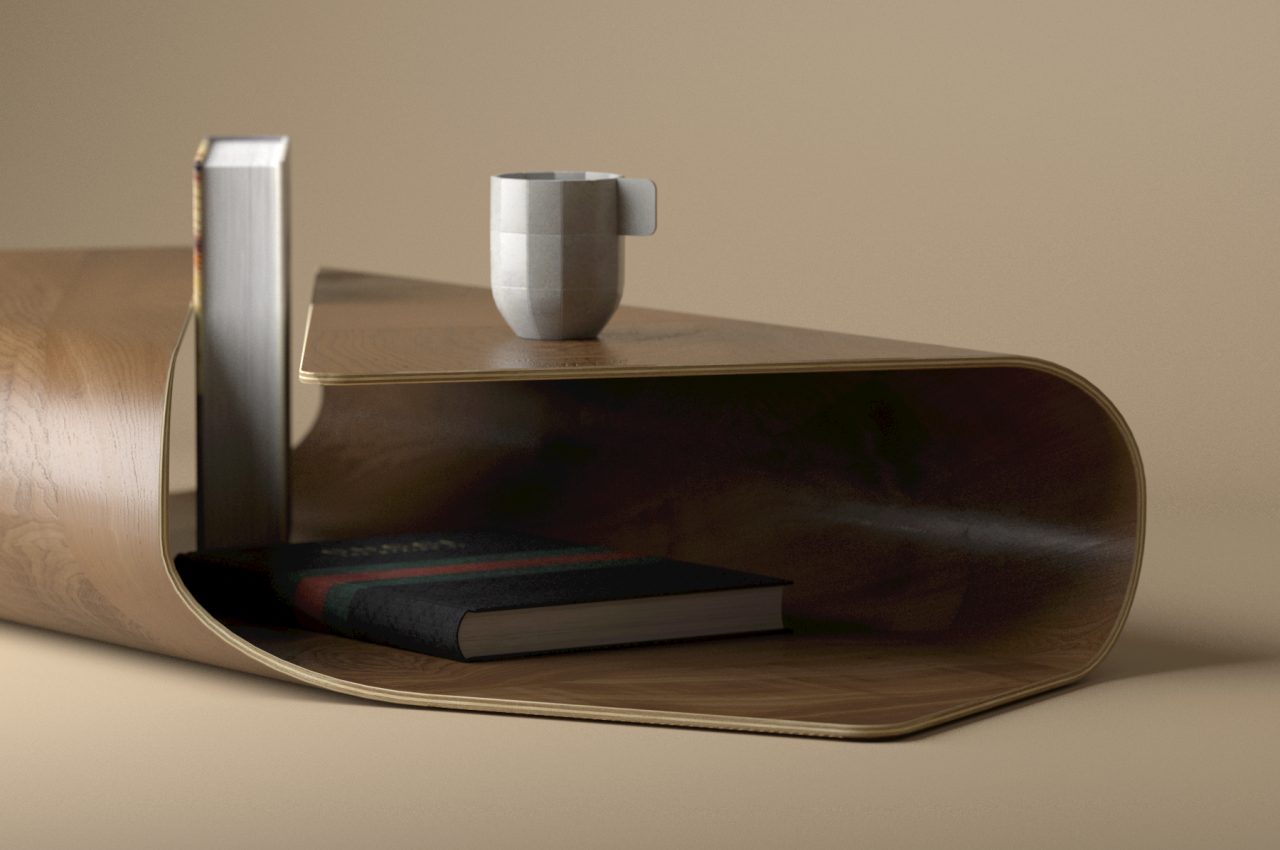
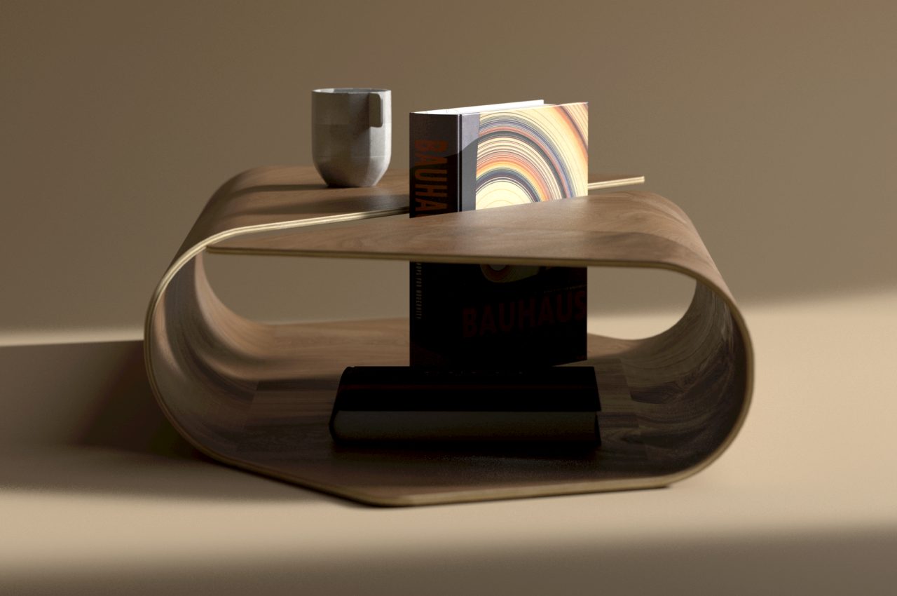
The Cocoon is a design that embraces all those elements in a rather simple way. At its core, it is just a flat wooden plane where two opposite edges are raised and curved to almost meet, creating an elevated surface that acts as the tabletop. The gap between these two edges becomes a rather unique slot to display part of a book, while the space underneath can be used as storage for small items or other reading materials.

The very form of the coffee table itself is already quite stunning, but the images and emotions it conjures up are just as appealing. The word “cocoon” often evokes feelings of having a snug home or blanket wrapped around you to give comfort. Some people do love this arrangement when relaxing and reading books, so the imagery is quite fitting. Alternatively, the design might also remind one of burritos.

Given how this design needs to bend wood at a rather large radius, it might be difficult to pull off in practice. The coffee table will also take up more floor space than typical tables, though you can always use the open area inside to hide things you wouldn’t be able to otherwise. Regardless of whether it’s a practical design to turn into a real product, it’s undoubtedly a beautiful one that creates a notable presence in a room without being overpowering.

The post This graceful coffee table will make you want to wrap yourself up in a comfy blanket first appeared on Yanko Design.
This beautiful MagSafe collection offers a sustainable way to top up your devices

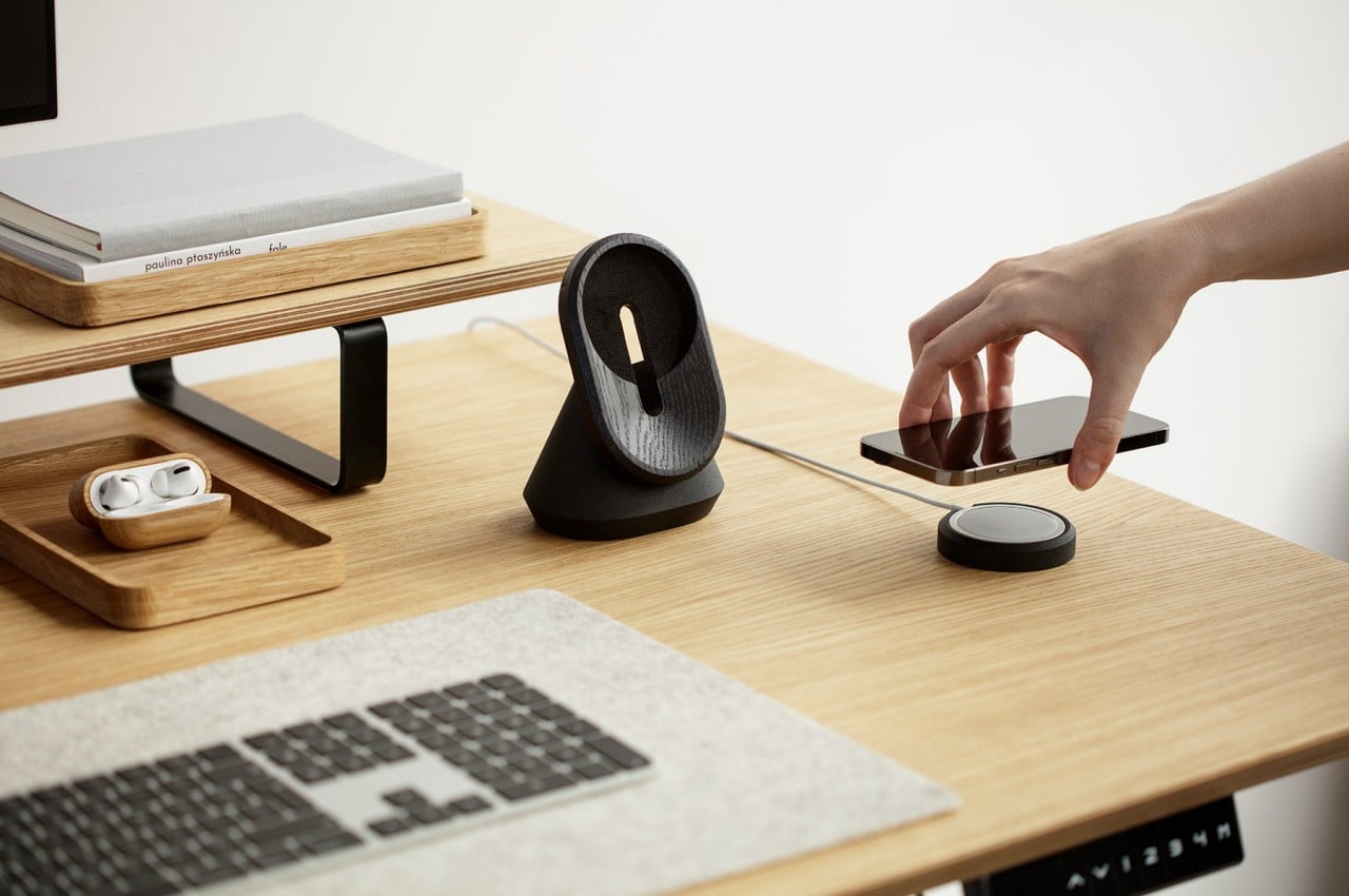
Some might consider Apple’s new MagSafe tech for iPhones and Apple Watches as simply catching up to the already existing wireless charging technology, but it clearly does a lot more than what its industry rivals have accomplished so far. The smart addition of magnets is no small matter, as it enabled many different forms of wireless chargers that no longer required devices to lie horizontally flat on a desk or charging bed. That kind of freedom and flexibility gave way to rather interesting designs, some minimal, some multi-functional. It also gave manufacturers a bit more leeway when it came to materials, which this new collection of MagSafe chargers takes advantage of in order to bring accessories that are not only handsome but also less harmful to the environment.

Designer: Magdalena Gembala (Oakywood)

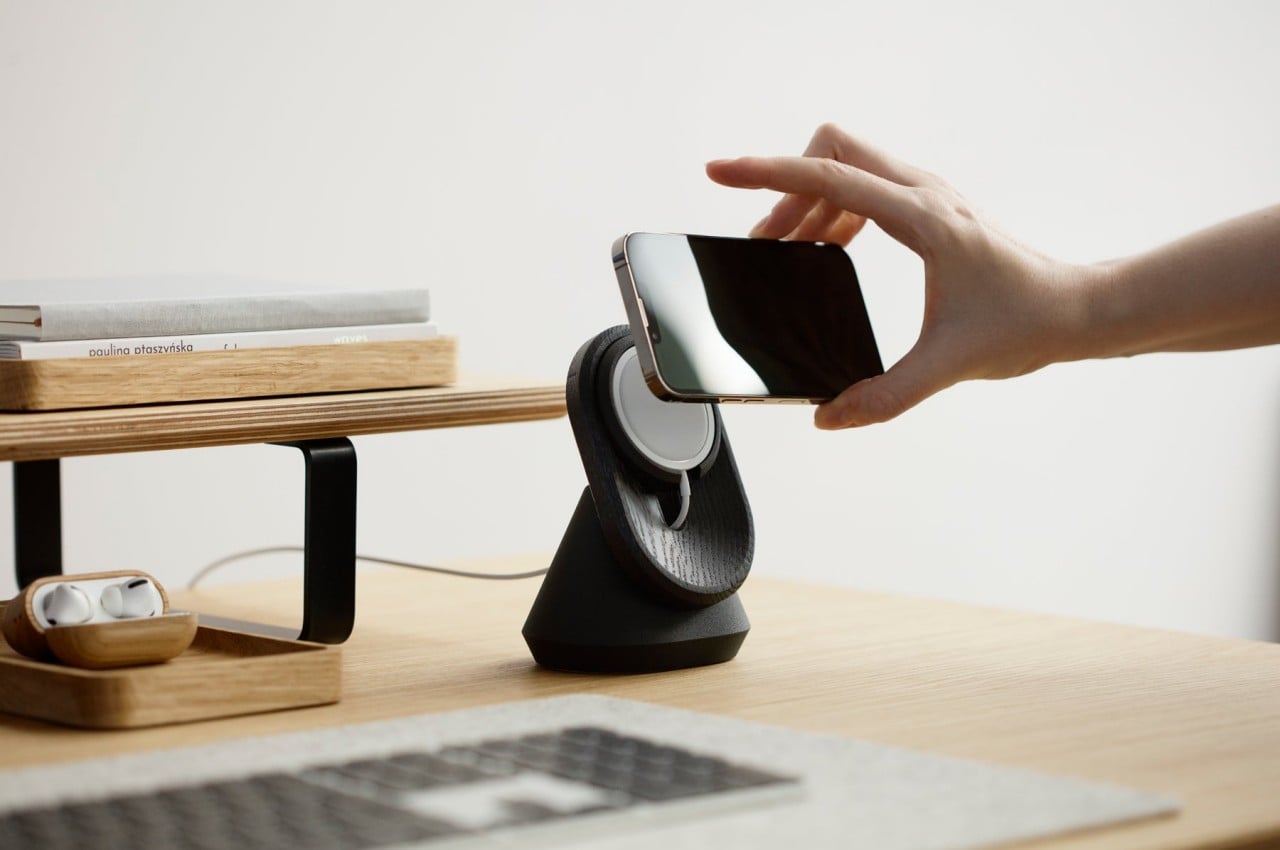
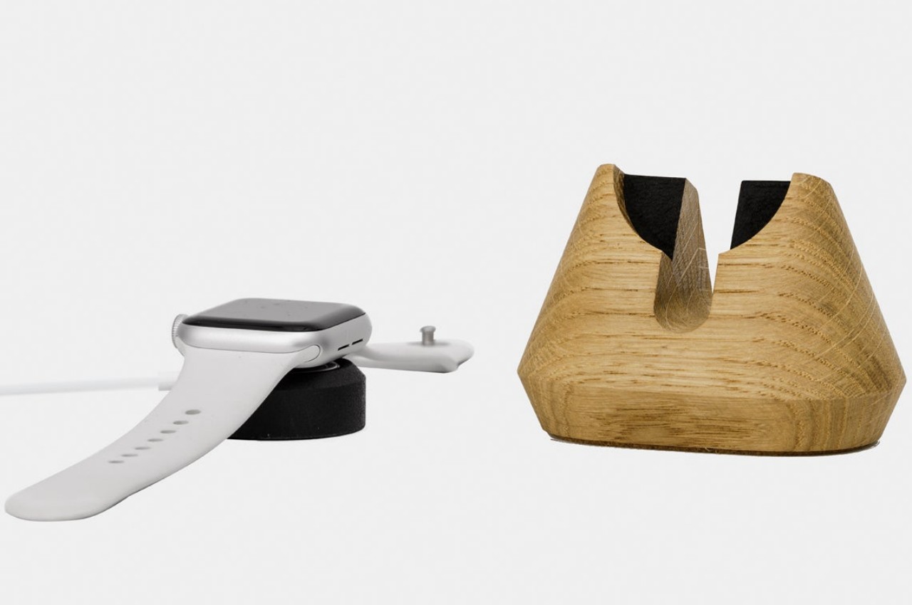
Apple’s first-party MagSafe chargers are already extremely minimal, comprising only a small puck that magnetically latches on to an iPhone or Apple Watch. While that did offer more flexibility in how to use it, the designs were not entirely elegant. Fortunately, it’s also possible to actually use those official chargers in ways Apple doesn’t, like putting them inside bases and holders that add a little more functionality and style to the charger.

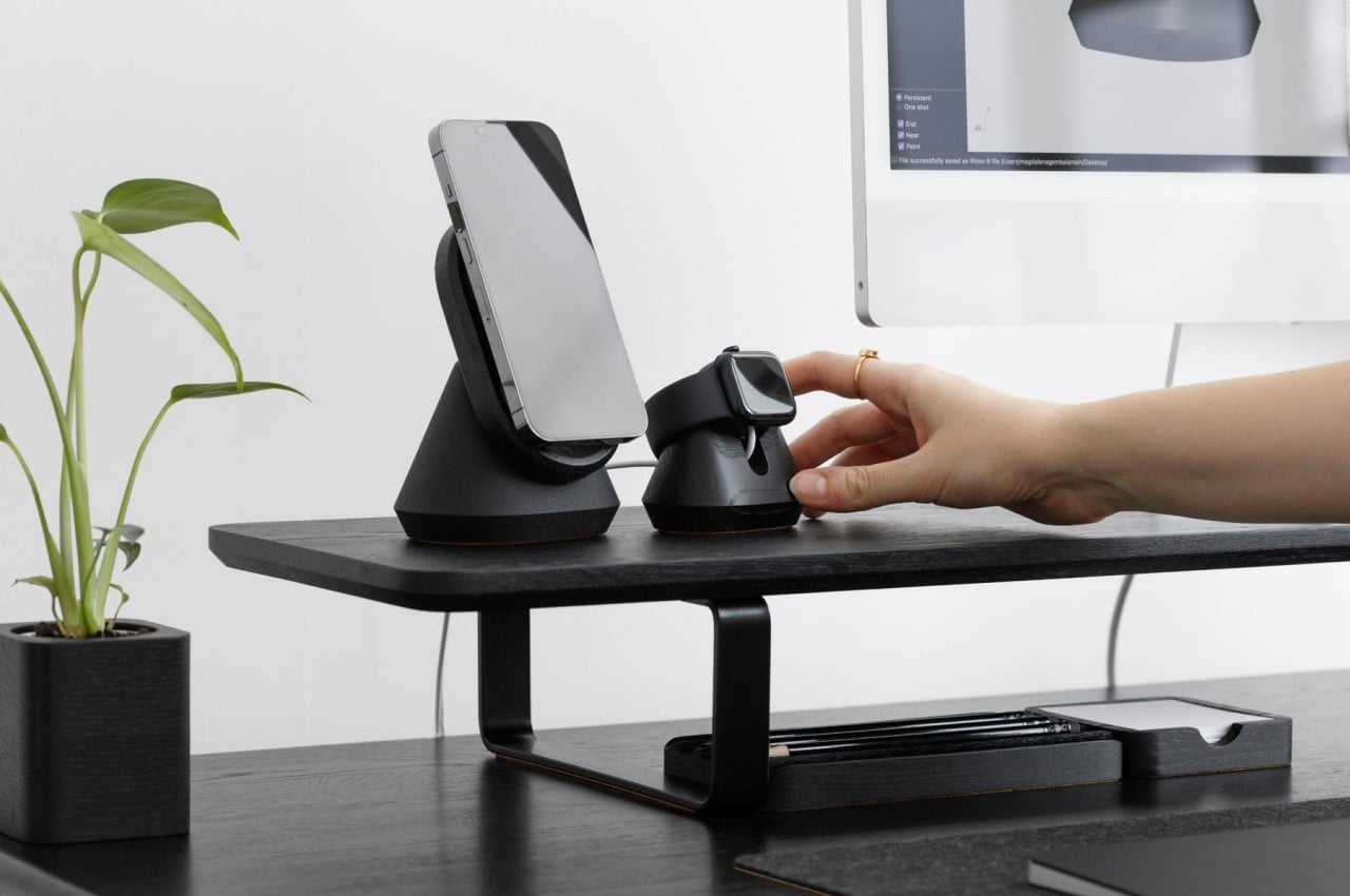
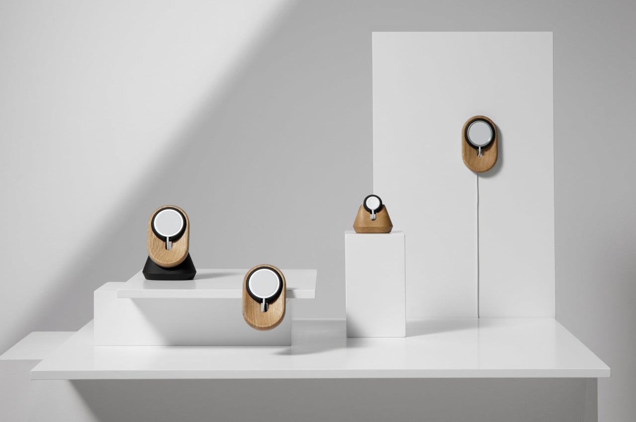
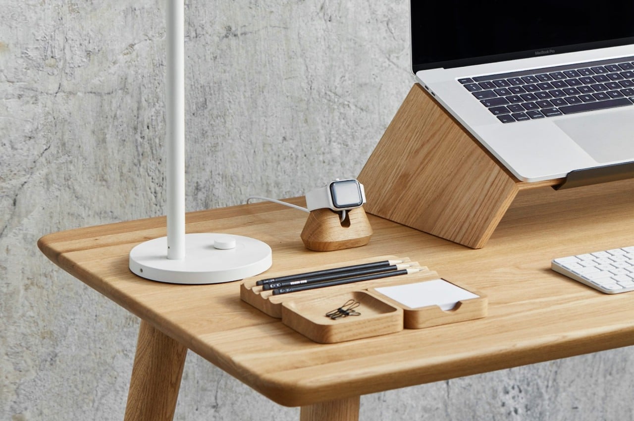
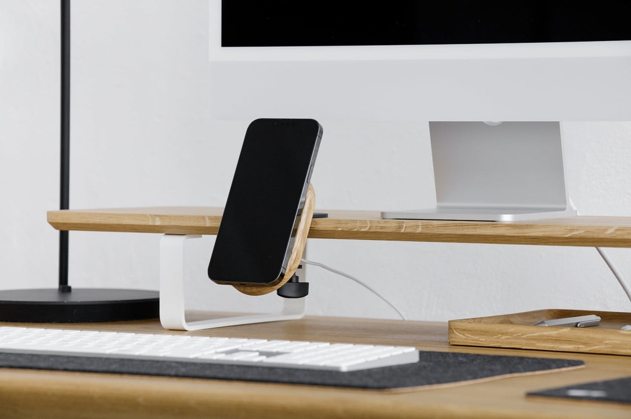
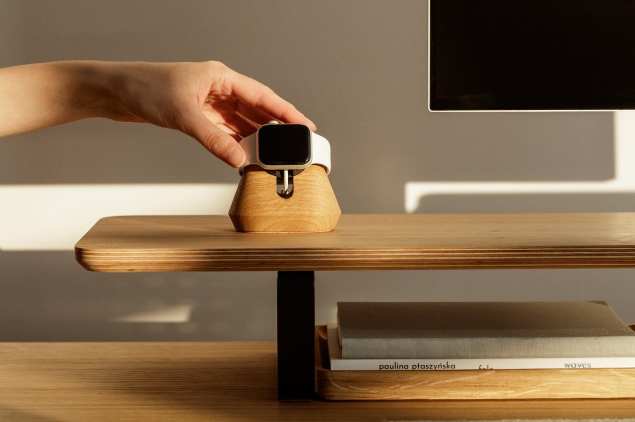
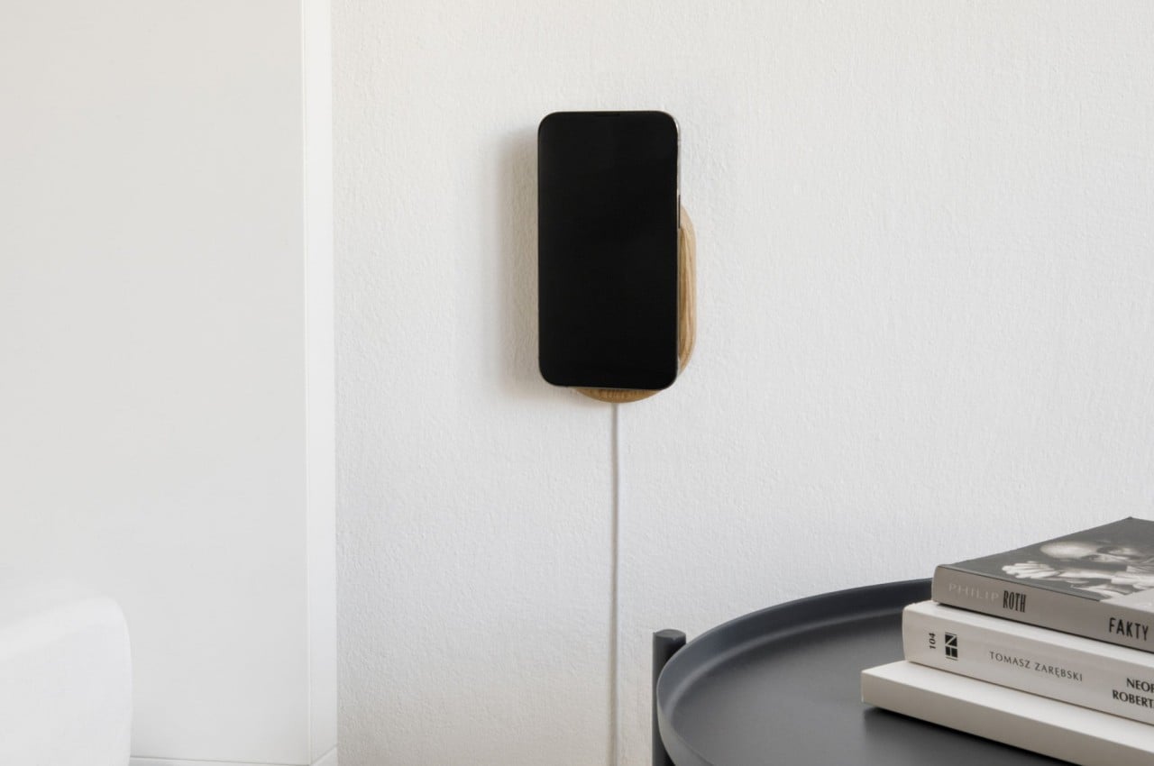
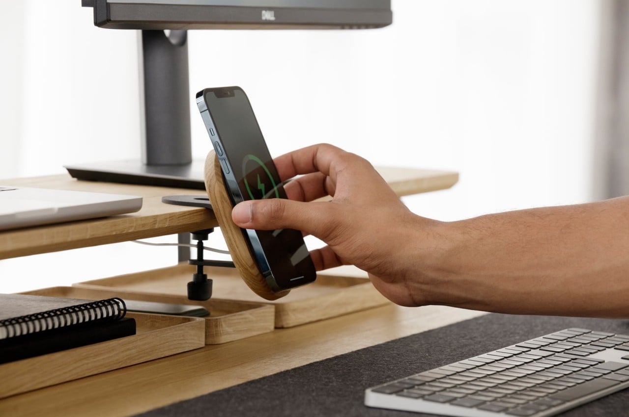
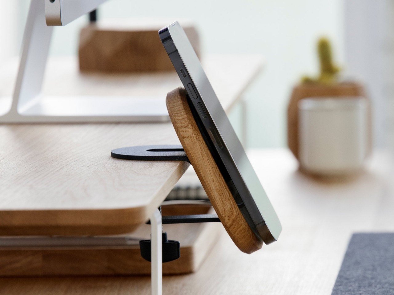
This Oakywood MagSafe collection does exactly that, utilizing the Apple MagSafe chargers to provide the actual charging function of these beautifully designed products. What they offer, instead, are solid and multi-functional bases that not only keep your iPhone or Apple Watch in place but also add some life to your desk. With a mix of wood and matte aluminum materials, these stands and mounts look handsome on any motif you might have going for your desk, providing eye-catching ornaments without being distracting.

These MagSafe accessories are not as trivial as they might seem. One actually mounts onto an edge of a shelf, preferably one on or near your desk, while another sticks to a wall. In all cases, the MagSafe charger they hold can be removed and used as normal, just in case you prefer not to see the device’s screen but still want the beautiful presence of these wood and metal ornaments.

This Oakywood collection isn’t sustainable just because of the materials used, though that definitely plays an important role. None of these accessories actually come with an Apple MagSafe charger, so you can and will have to use what you already have anyway. Not only does this mean that the stands and mounts themselves don’t have any non-sustainable components, it also helps prevent more e-waste in the long run. It’s definitely a win-win situation when you get not only a multi-functional MagSafe charging stand but also beautiful accessories that, at the very least, don’t contribute to the death of the planet by their mere existence.

The post This beautiful MagSafe collection offers a sustainable way to top up your devices first appeared on Yanko Design.
This wooden debit card puts your money to work in saving the planet

Money makes the world go round, and it comes in many forms these days. While there are many proponents of e-wallets and digital forms of currencies, physical representations of money still make up the majority. Usually, cash has a minimal direct impact on the environment until they are used to fund activities or products that do harm to the planet in the long run. Credit cards and debit cards, however, are the clear exceptions because their very nature as pieces of plastic immediately makes them non-sustainable. That plastic design is mostly by convention, though, and this unique card proves that not only can these cards be sustainable, they can also help make the planet heal every time they’re used.

Designer: Treecard

The reason for plastic’s ubiquity is simply that there were no viable alternatives to it until recently. Plastic is cheap to make and durable, ideal properties for mass-produced products, including credit and debit cards that get distributed by the hundreds, if not thousands. Of course, there are no more sustainable options, like bioplastics or other newer materials. Some designers, however, have always preferred actual natural materials like wood, especially because of their unique characteristics and aesthetics.

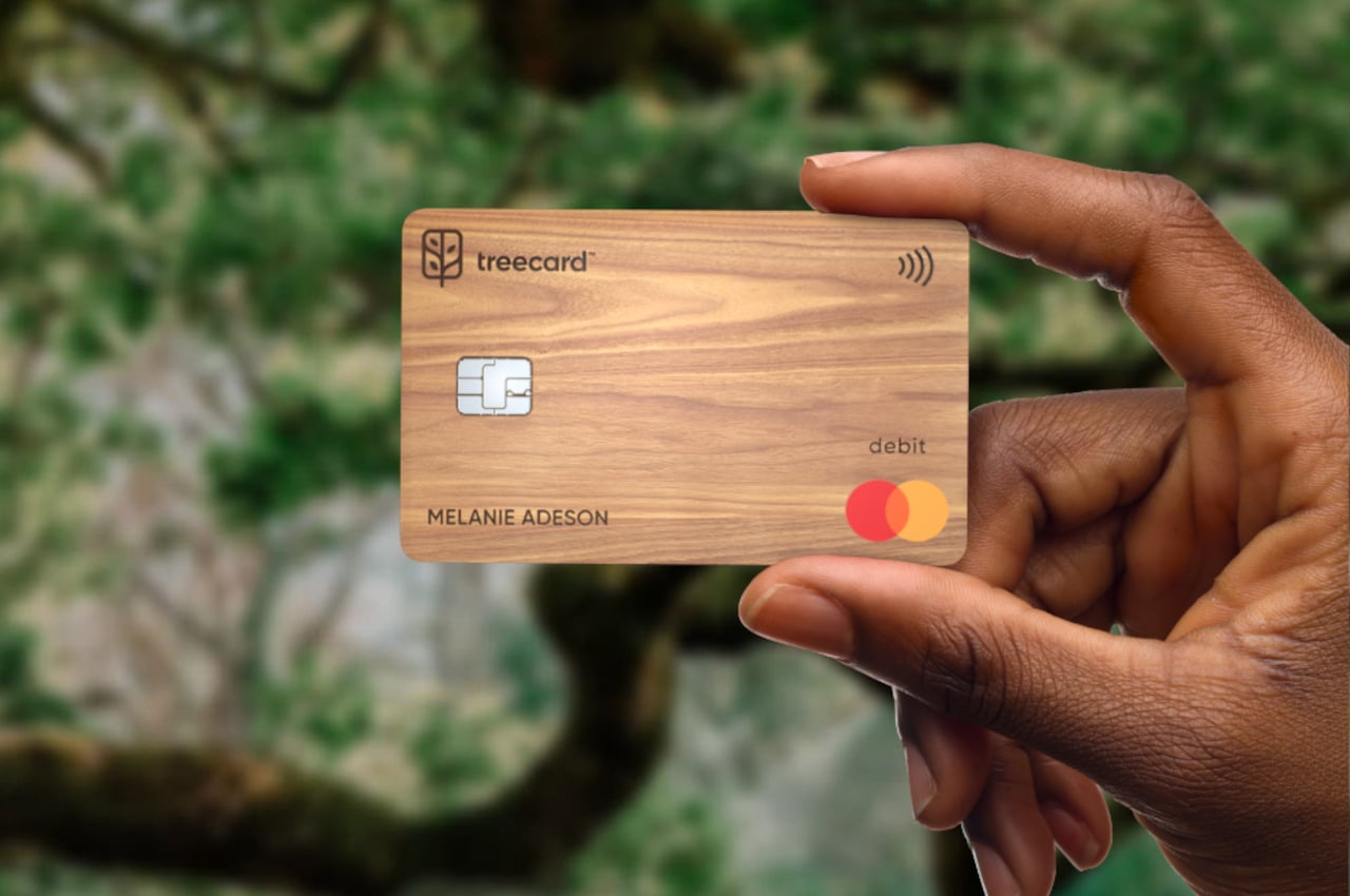
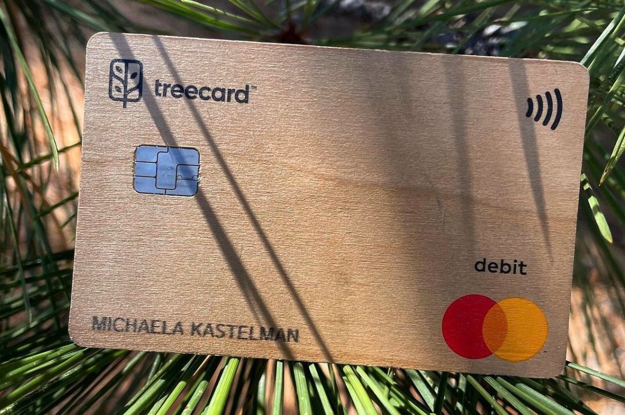
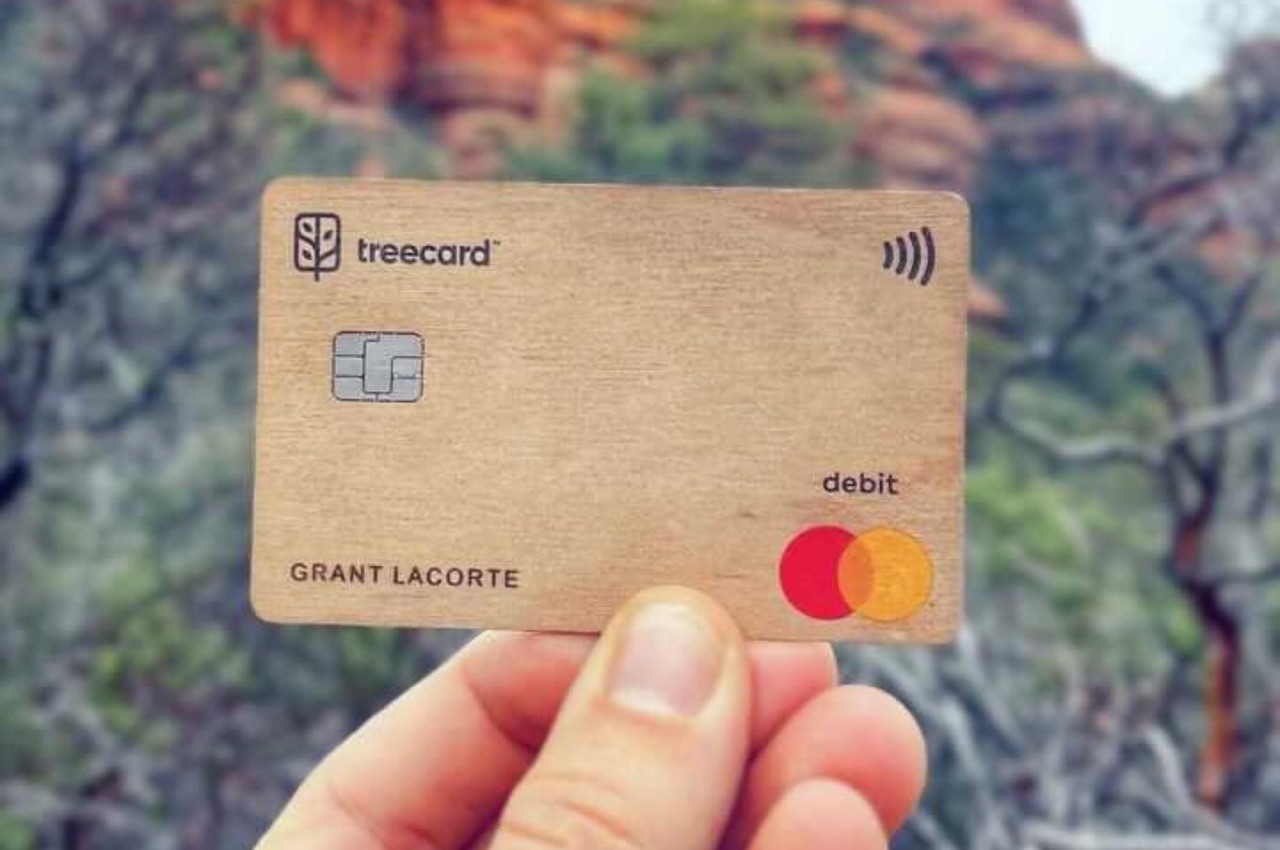
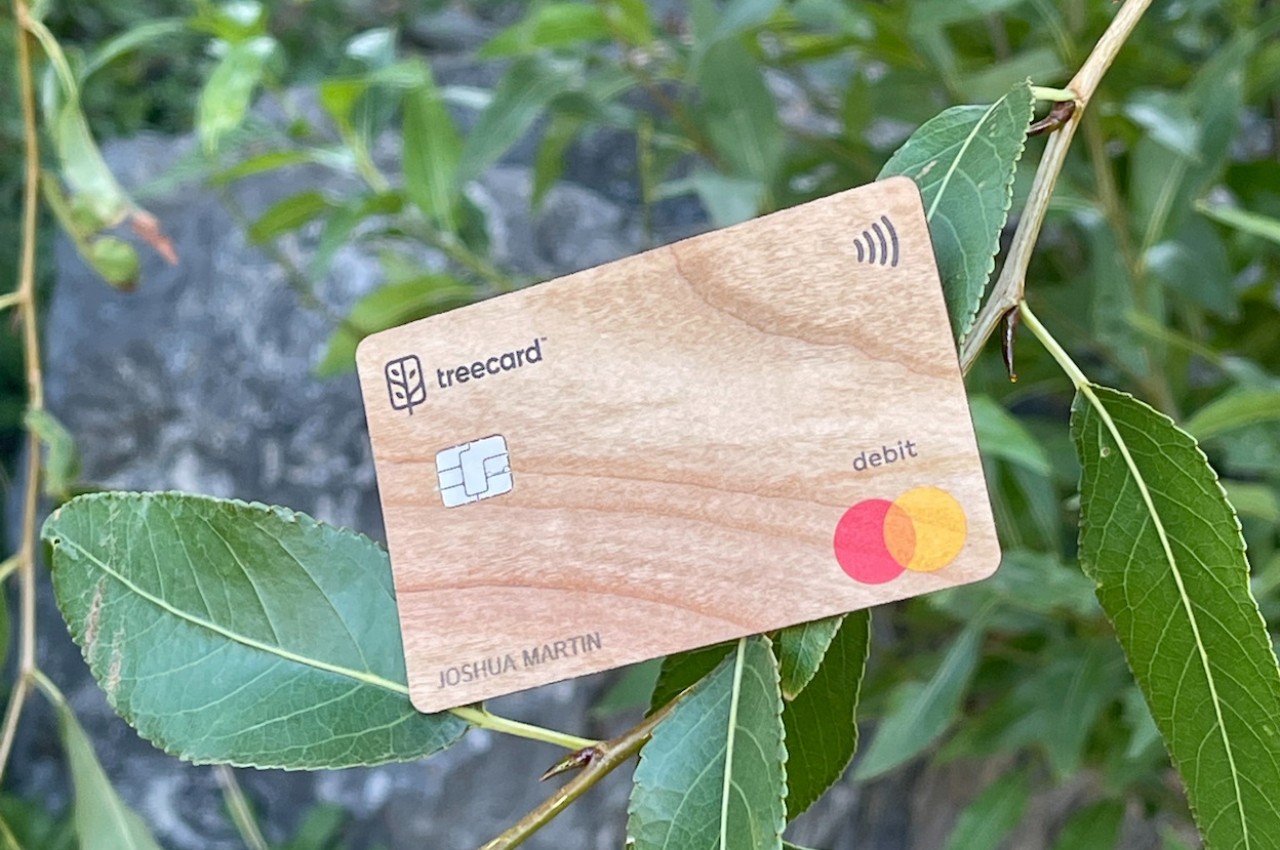
Wood might not always be the best material to use for everything, and you might think that a card that sits in your wallet or jeans pocket isn’t a good place for it. Treecard, however, challenges that assumption with a debit card that is made from wood, at least except for the chip that is now standard in such cards. That does confirm that this isn’t just a decorative card but a fully functional one that can be used anywhere that accepts MasterCard. It also supports digital wallets like Apple Pay, Google Pay, and even Samsung Pay.

What makes Treecard extra special is that its commitment to sustainability goes beyond the card itself. It tries to give back to the environment by working with a partner so that a tree gets planted for every $50 spent using the card. Given how much people, especially in the US, make use of “plastic,” Treecard’s strategy will almost ensure that more trees will be available for future generations. It takes its mission one step further by promising never to use what it earns to fund fossil fuels or deforestation activities.

A wooden debit card is admittedly a novel proposition and one that actually looks handsome and eye-catching wherever you use it. There might be some concerns about its durability, though, since wood is less resilient under pressure and wear and tear, something that plastic does have over it. That said, the idea that you’ll be helping make the Earth greener while you spend might be enticing enough for environment-conscious consumers to make the leap of faith. They just need to take better care of their stylish debit card now.

The post This wooden debit card puts your money to work in saving the planet first appeared on Yanko Design.
This distinctive wood-like material is made from worthless scraps of wood

The use of wood in products and design goes back millennia, and the material continues to be a favorite today, especially among those turning their backs on harmful plastics. But while wood is inherently sustainable in the sense of being biodegradable and recyclable, great care must be taken in sourcing this material. Anything that uses wood, from the thinnest paper to the largest furniture, almost always involves cutting down trees, and even the discarded bits and pieces that can be recycled and used elsewhere still trace their origins from large trees. This can eventually be a problem if we don’t plant trees fast enough to replenish our sources of wood. Trees, however, might not be the only source of the materials we can use for making furniture, and this rather novel material tries to use the unlikeliest objects for that purpose.

Designer: Yuma Kano (Studio Yumakano)

Wood has always been special among the different materials we use for making things. It has particular properties and textures, and the grains and striations that raw lumber has are unique and appealing. Wood is also easily available, presuming we have enough trees, of course. As such, it comes with its own set of problems, including the amount of waste material that is left unused and discarded. There are designers and manufacturers that try to utilize these wooden chips and crafts, but a bolder solution might be not to cut down trees in the first place.

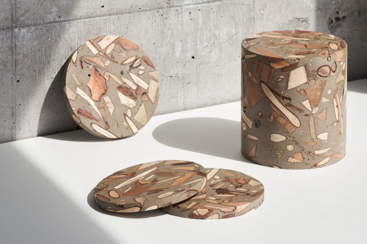
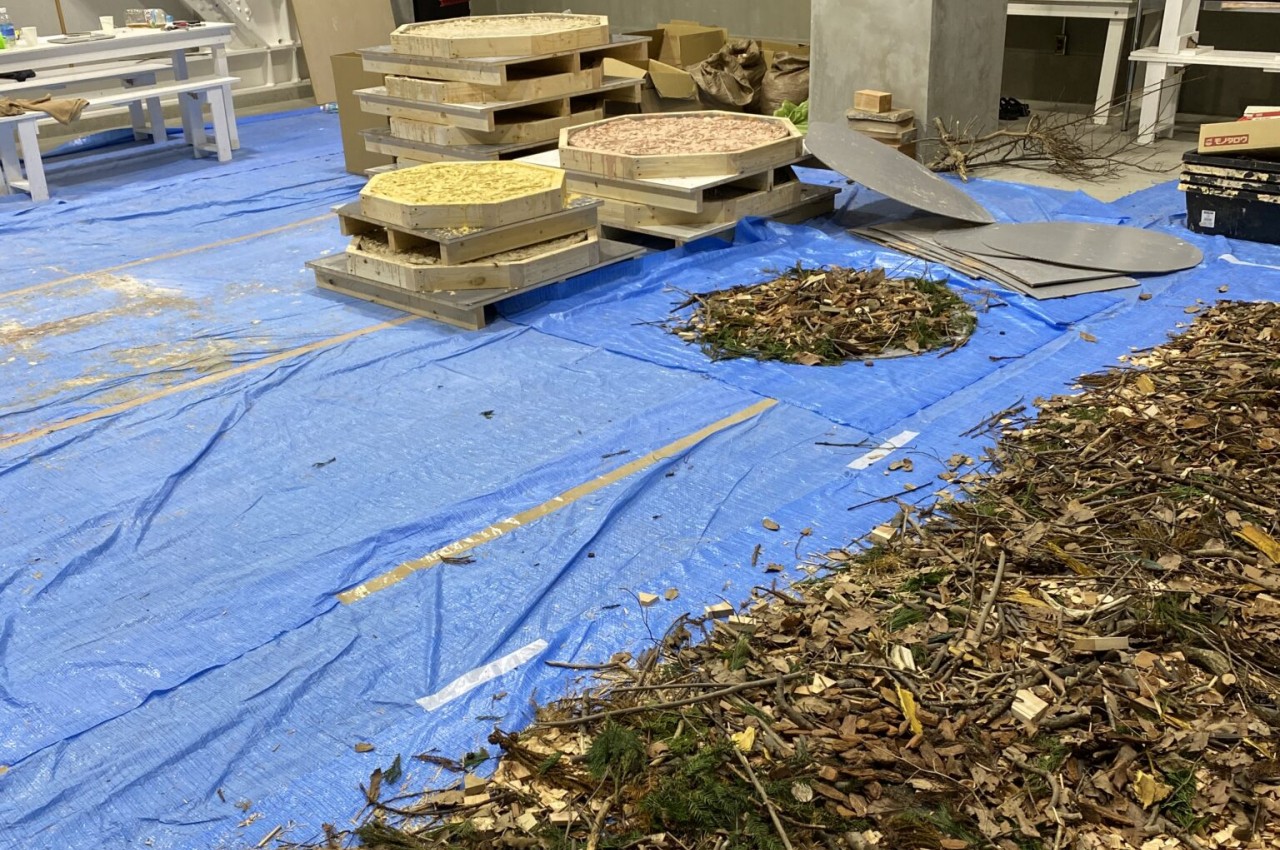
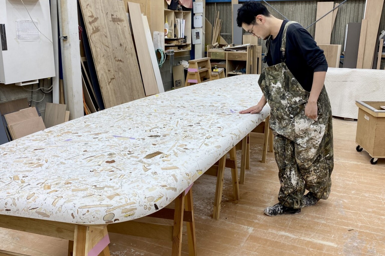
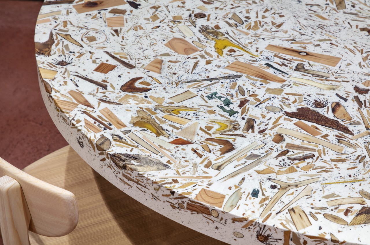
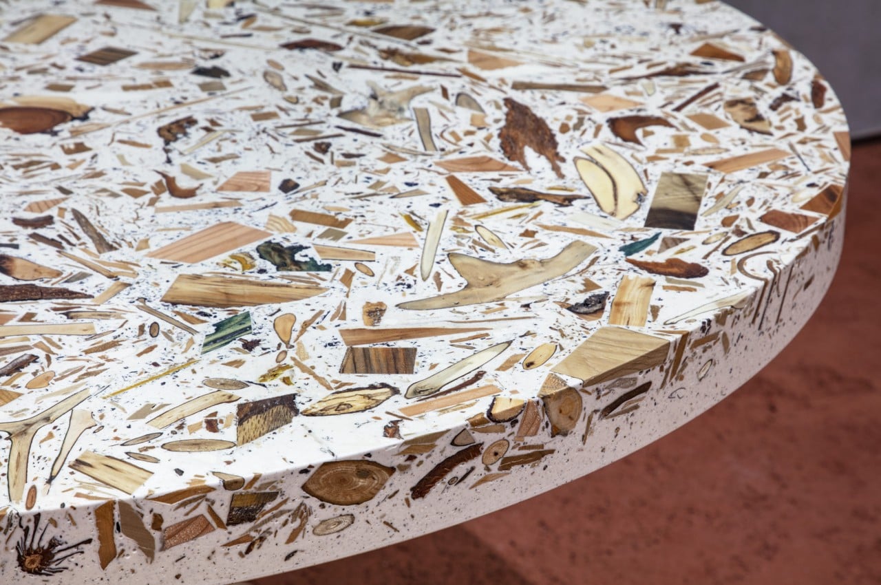
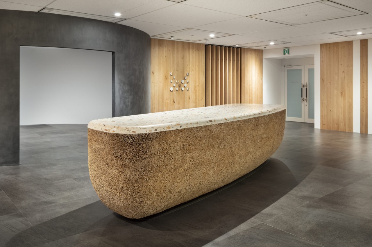
ForestBank is an attempt to produce a different kind of wood without resorting to synthetic processes and materials that end up harming the environment anyway. Instead, it sets its eyes on the other materials that can be found in forests, materials that are normally deemed worthless and useless for construction. These include foliage, bark, seeds, and even small trees, things that just decompose on the forest floor anyway. These pieces are gathered and mixed with a reactive mineral base and water-based acrylic resin that uses no organic solvents or volatile organic compounds.

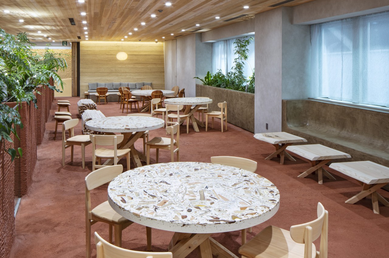
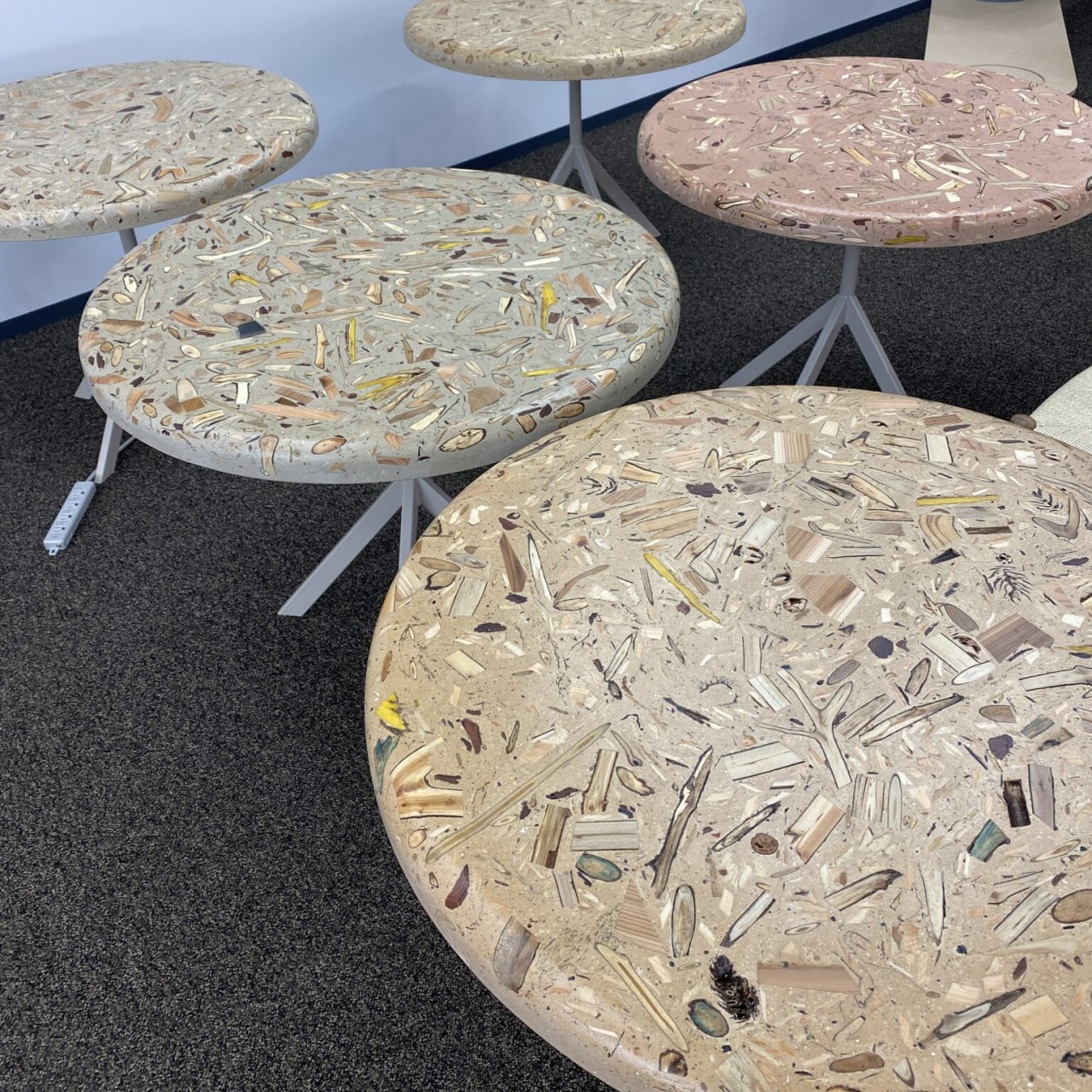
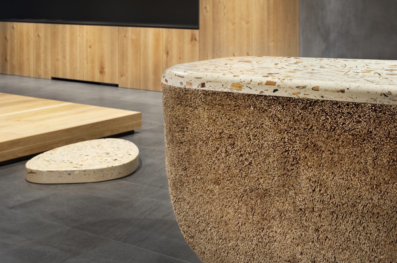
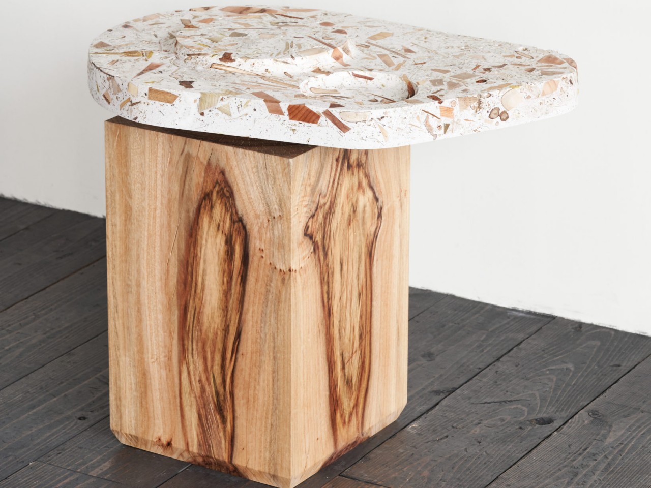
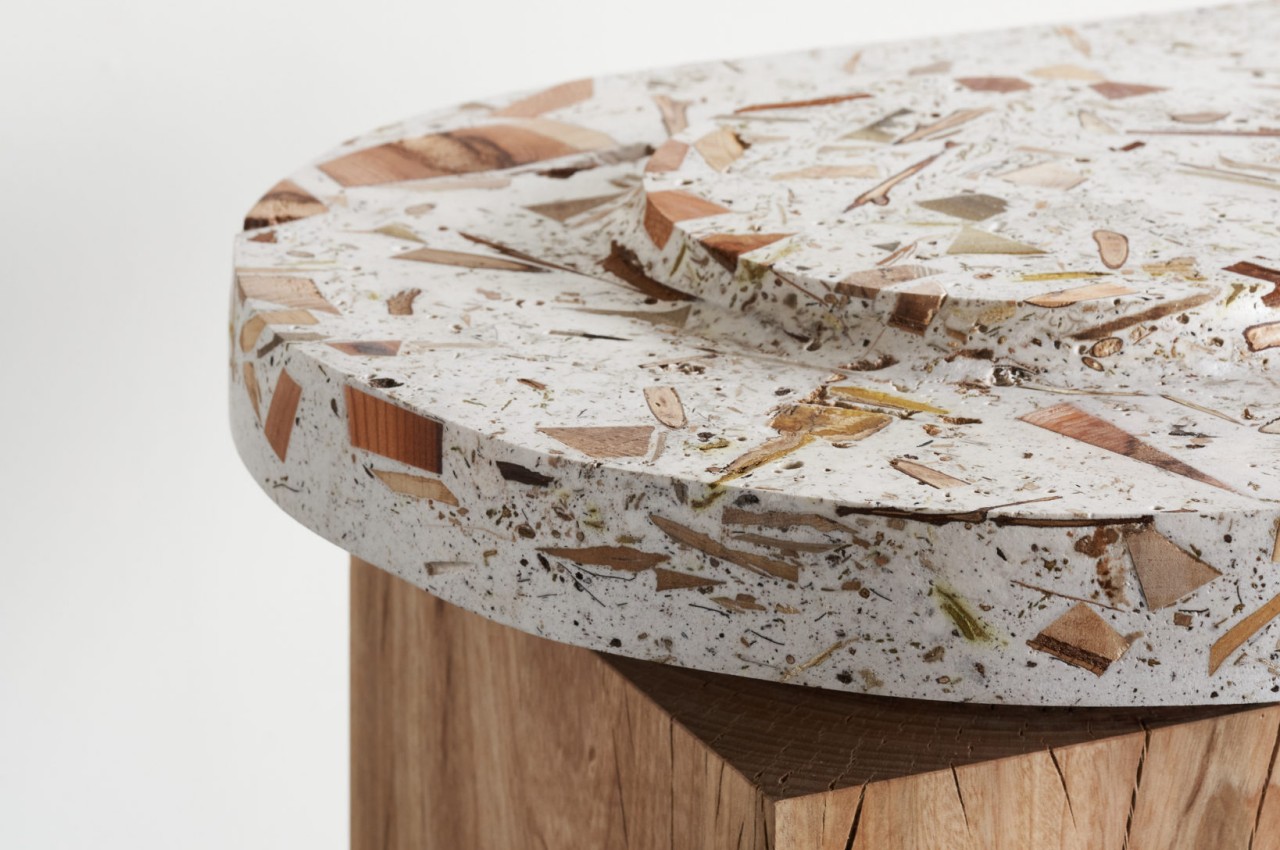
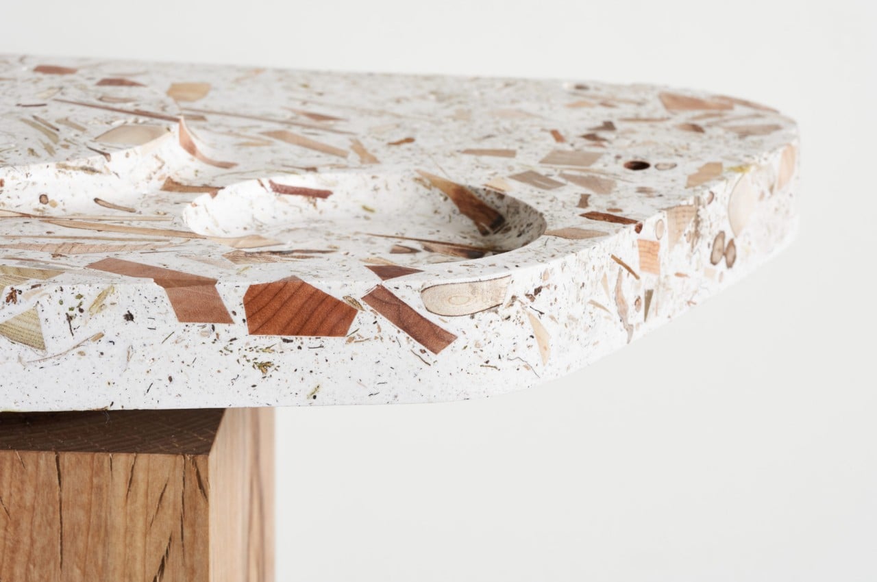
The result is something that is like wood but is clearly not wood. The material can definitely be shaped using ordinary woodworking methods and be used as different parts of furniture, practically anywhere wood can be used. Its unique makeup, however, gives it a terrazzo-like appearance that is both unique and also a bit chaotic. The different bits and pieces of source material have their own earthy tones, adding to this rather unique soup of shapes and colors.

What makes this innovative material even more sustainable is that it doesn’t need to be limited to being sourced from forests. Those same waste materials can be taken from tree pruning on streets and in gardens or scraps from woodworking studios. The different qualities and appearances of each source material add to the unique character of each ForestBank production, turning furniture, walls, and any other wood-based product into true one-of-a-kind masterpieces.

The post This distinctive wood-like material is made from worthless scraps of wood first appeared on Yanko Design.
Mudra is a minimalist cutting with a simple game-changing trick

There are a lot of tools in the kitchen that we take for granted. While we pay very close attention to knives, pots, pans, and ovens, things like graters and cutting boards are often neglected. After all, they don’t get displayed in the kitchen that often, though probably that’s because they’re not much to look at in the first place. Cutting or chopping boards, in particular, have even less time under the spotlight since it’s almost always expected to get stained and dirty over time. They also don’t have many purposes outside of food prep, stored away after use and after cleaning. Of course, that’s only by convention and tradition, and there’s no reason why a cutting board can’t be more than that. This slab of wood, for example, is beautiful enough to show off, but it actually has a few other tricks up its sleeve, all thanks to a single cutout.

Designer: Contexte Design

Of all kitchen tools, the cutting board is probably the simplest. Its most basic requirement is just a flat material that can withstand slicing and chopping from a sharp knife. Bonus points if that material doesn’t stain or can be easily cleaned, retaining its pristine appearance and texture over the years. That’s why most cutting board designers try to mix things up by using different types of materials and colors, including transparent tempered glass, to produce an attractive yet functional piece for your kitchen.

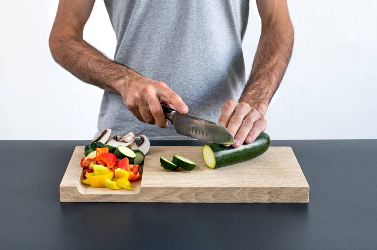
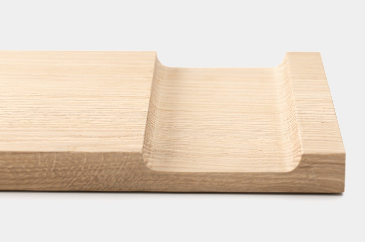
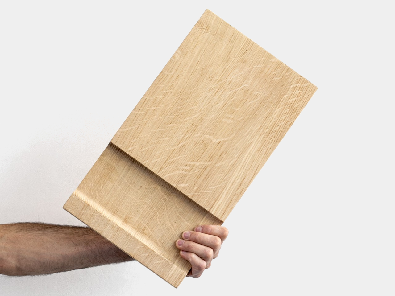
At first glance, Mudra might actually look comparatively plain, though its simple appearance does have its charm. Made from solid oak or beech, the board is already quite handsome on its own. Unlike most wooden cutting boards, though, there is a very noticeable notch on its body. This cutout, however, isn’t just a whimsical embellishment and is probably the main draw of this board.

That cutout serves as a holding place for cut and chopped pieces, as well as a sort of funnel when you have to pour the contents over to some container. Most cutting boards are completely flat on all sides and corners, which means there’s a tendency for pieces to fall off in the process. It’s a small change in the basic form of a cutting board, but one that has a huge impact on the tool’s usability and flexibility.

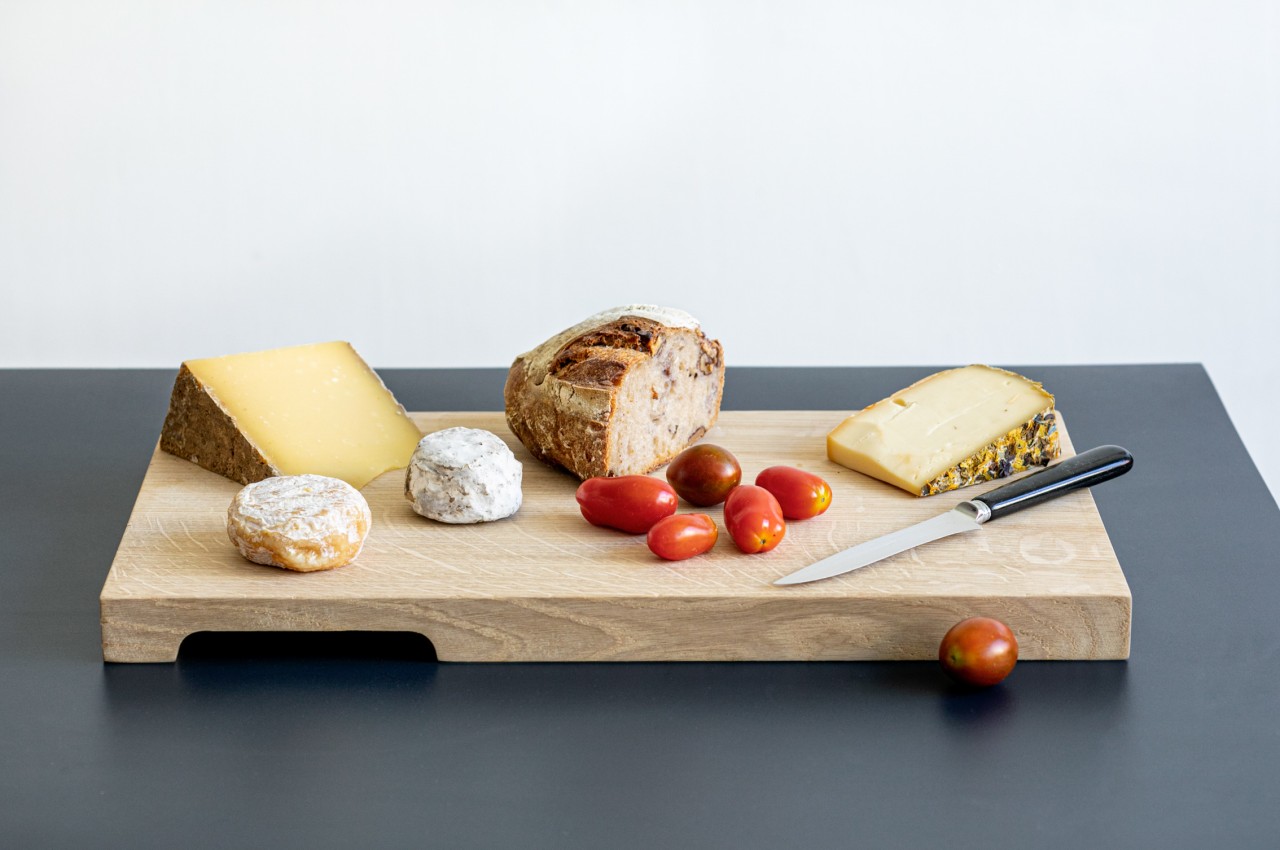
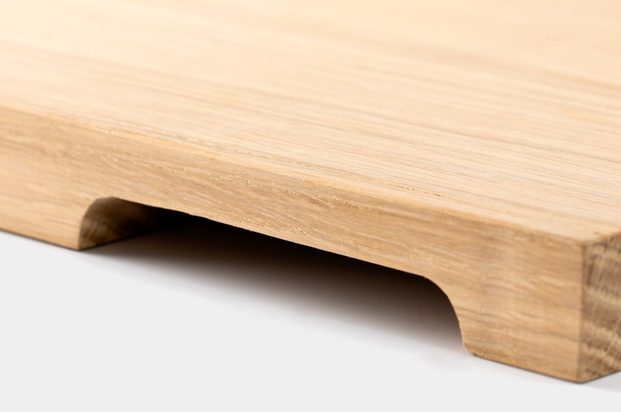
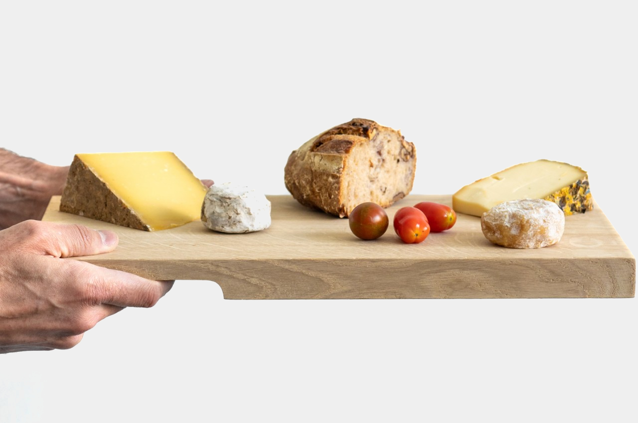
That notch also functions as a sort of handle when carrying the board upside-down. That transforms the cutting board into a tasting board, perfect for showing off pieces of cheese, meats, and fruits, as well as a way of serving them fresh off the cutting board, literally. It’s another example of how that simple design change turns this cutting board’s world on its head, again literally, allowing it to be both a functional kitchen tool as well as a beautiful platform for showing off your culinary skills.

The post Mudra is a minimalist cutting with a simple game-changing trick first appeared on Yanko Design.
Wav is a handsome desk tray that proudly puts your stationery on display

It’s too easy for clean and tidy desks to turn into a messy nightmare if things don’t have a proper place for them to call home. Desk organizers come in all shapes and sizes, though most of them take the form of trays or containers with drawers. There are a few exceptions, of course, such as pen holders that show only half of your writing implements or book stands that display some of your notes or reading materials. Granted, most of the time, you’d probably want your stationery to be out of sight and out of mind, which is why you’d want to stow them away in containers anyway. Sometimes, however, you probably want to flaunt your stuff and also have them within easy reach, so this desk organizer not only makes it possible to have the best of both worlds while also becoming something you’d want to show off as well.

Designer: Bao Loi

Keeping a desk tidy and presentable can be quite a challenge, which is probably why some people mentally freeze up when faced with the task. There are just so many ways to go, depending on the stationery, tools, and containers you have. There has also never been a shortage of accessories and organizers for that purpose, some with complicated gimmicks and fancy embellishments to stand out from the crowd.

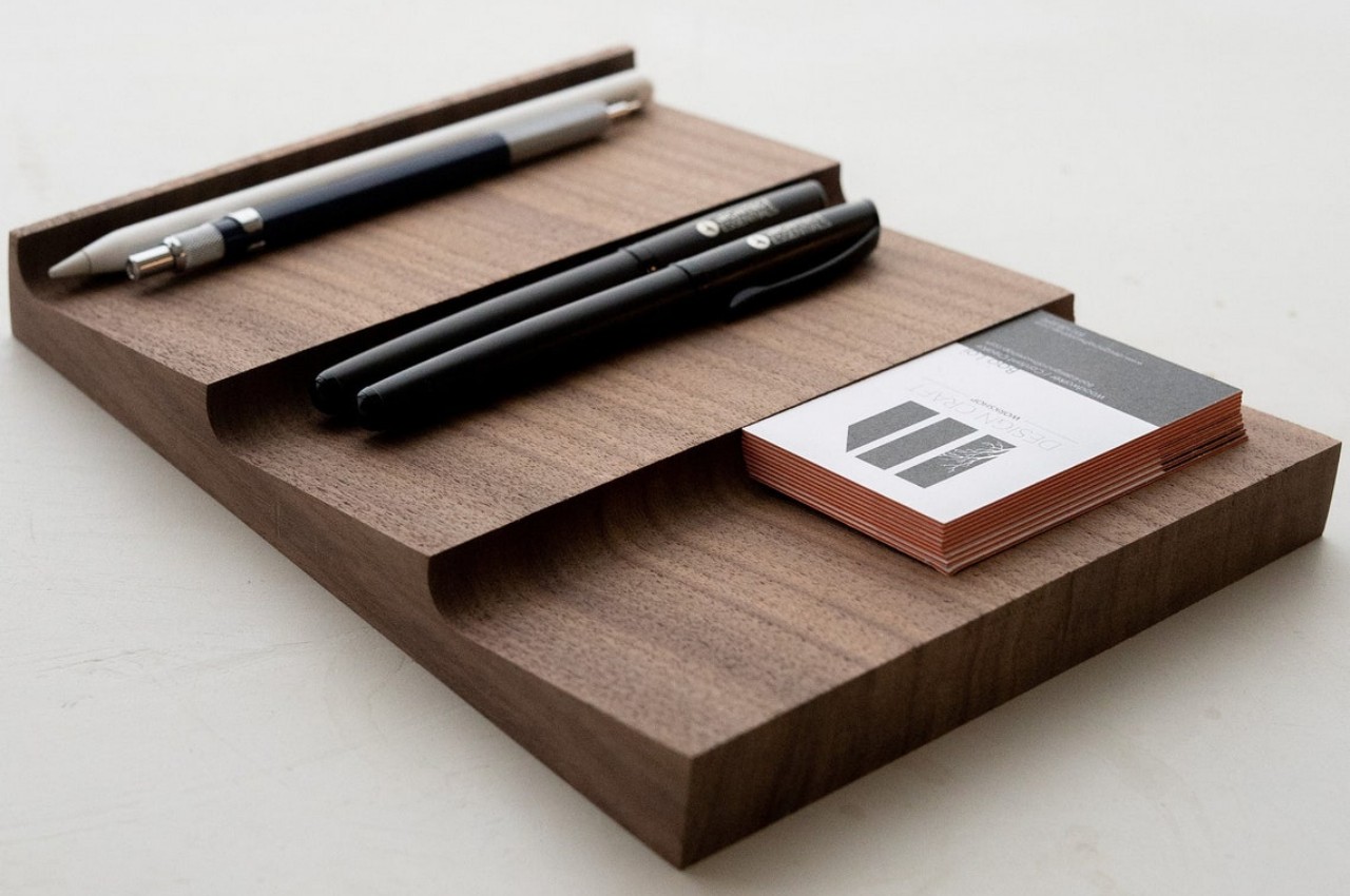
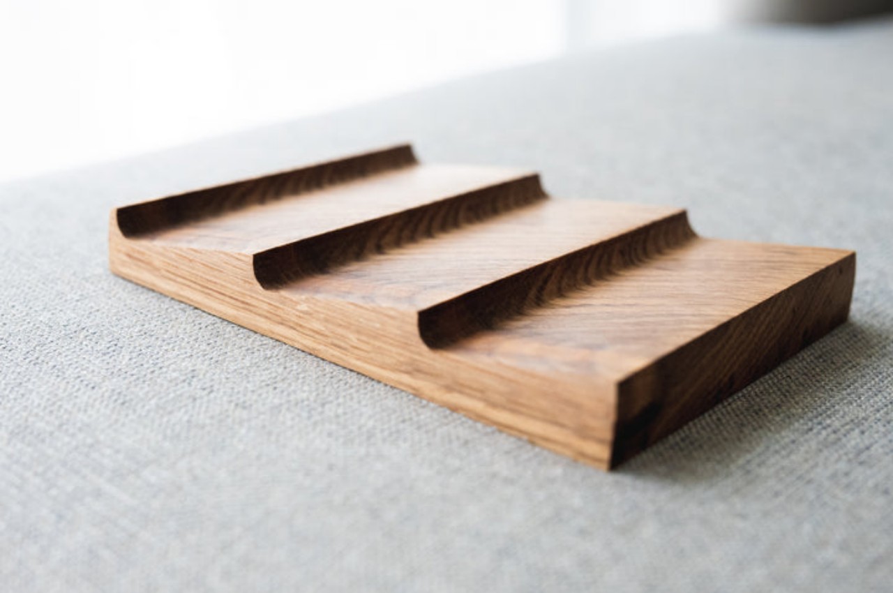
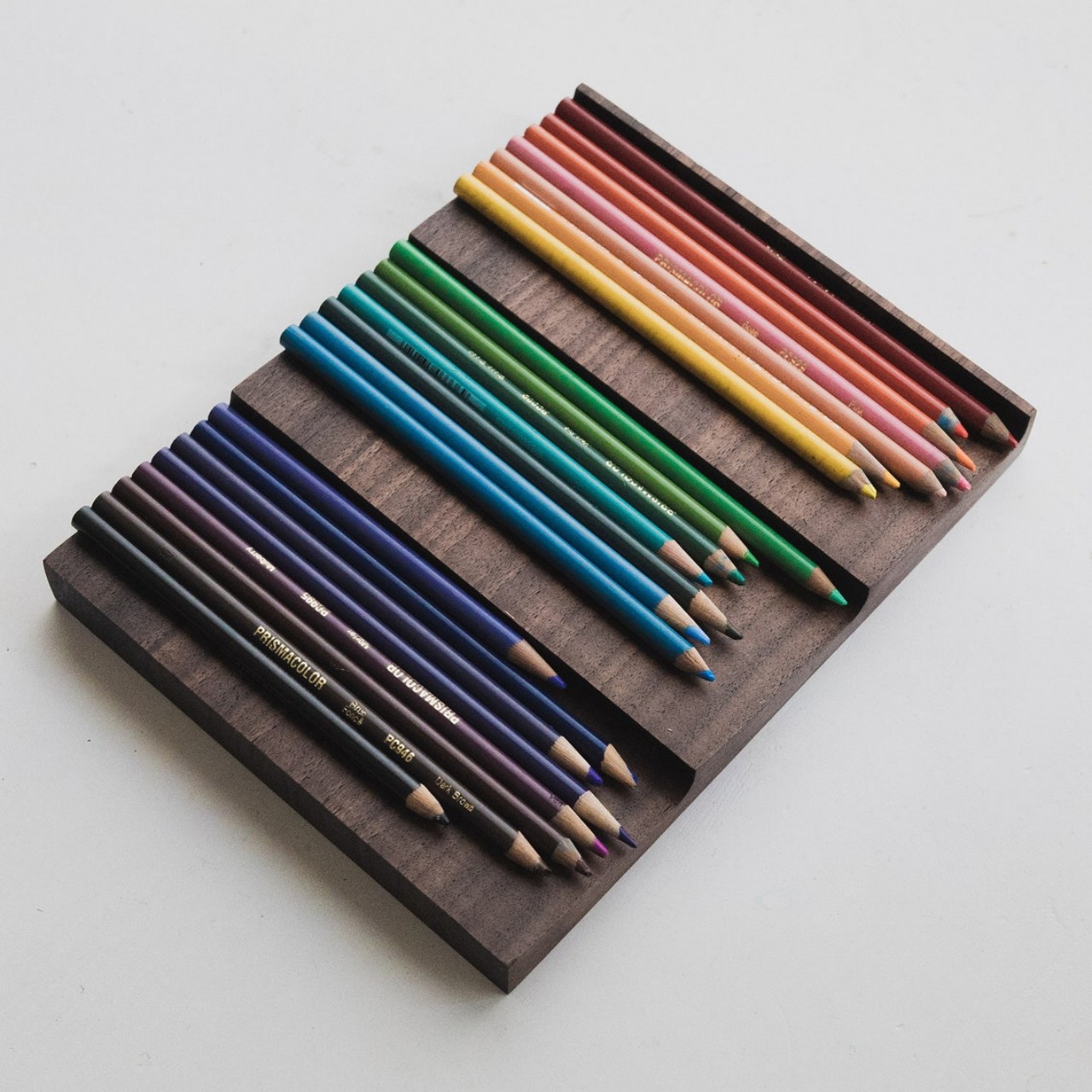
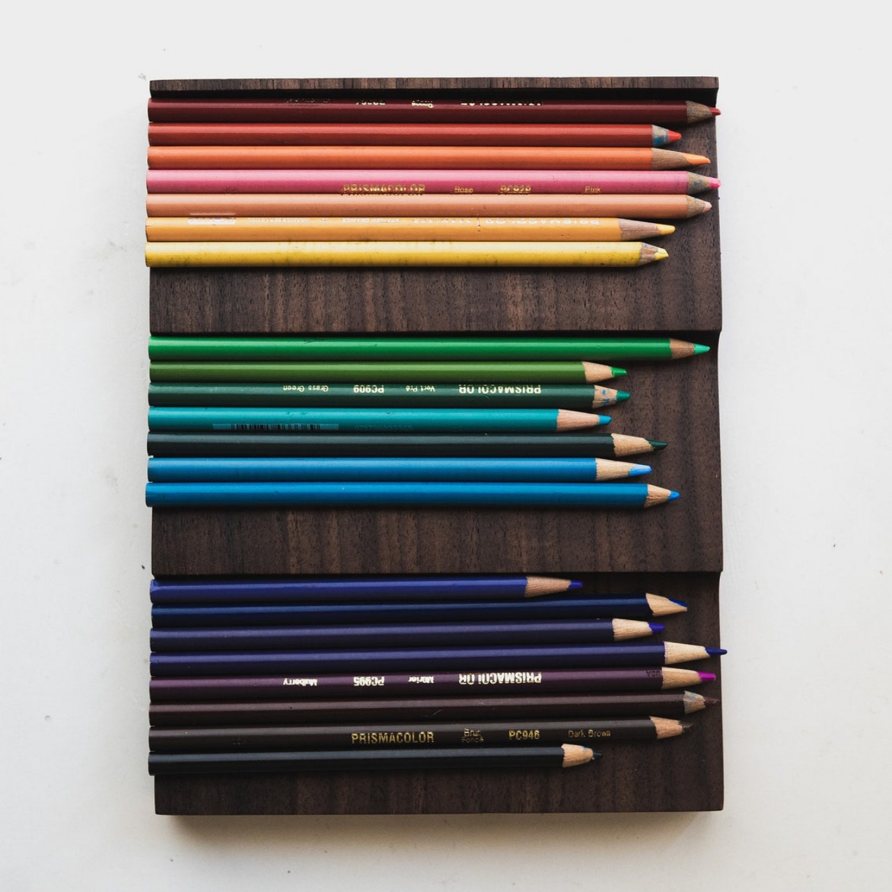
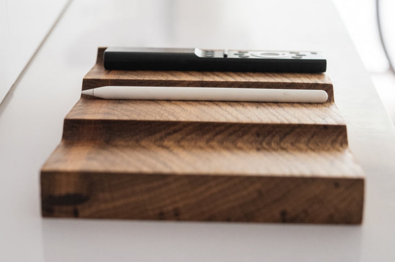
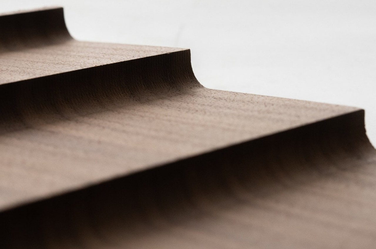
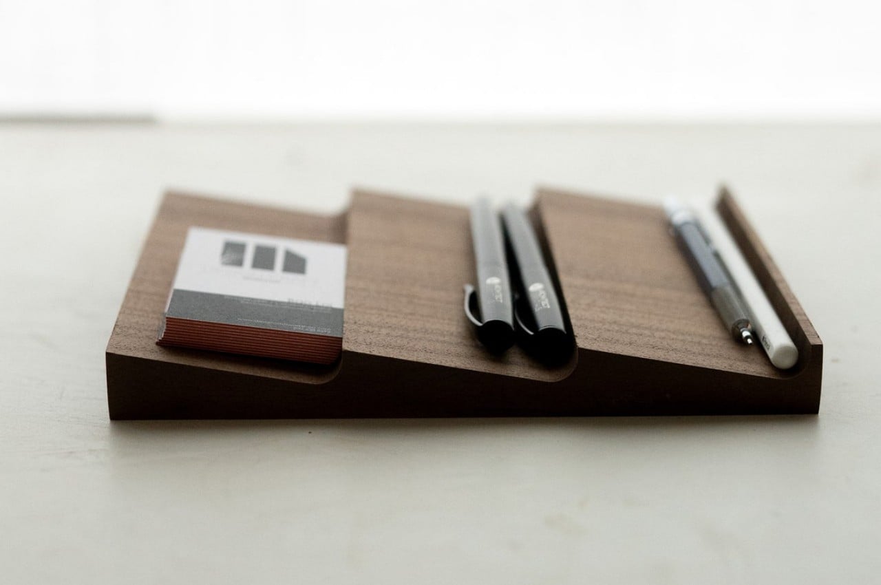
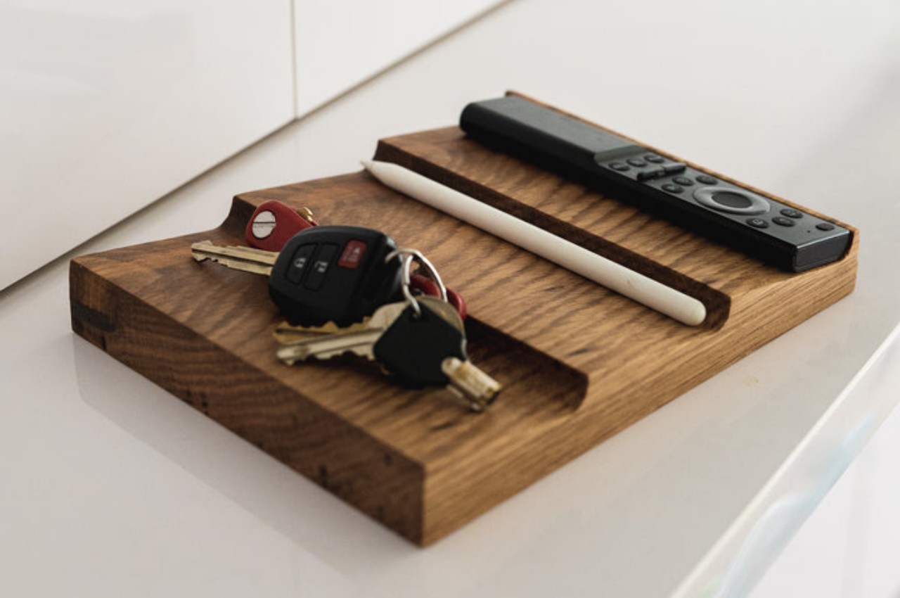
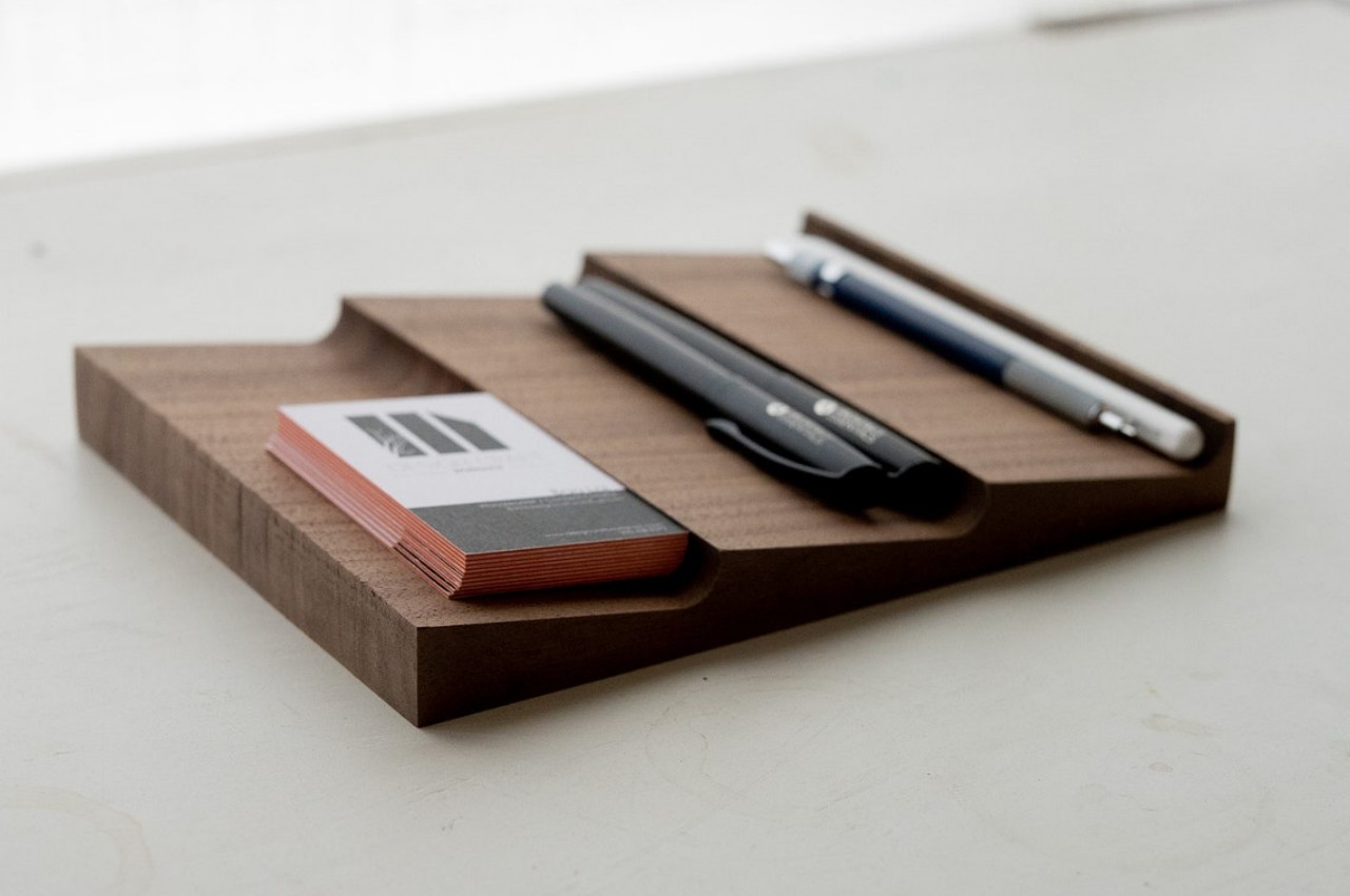
The Wav, in contrast, is a simple single-piece wooden tray that uses its unique shape both for function and form. The inclined surfaces make sure that things only slide or roll on one side, and the angle they make with the crests stops them from actually falling off. With an open surface without borders, the Wav makes it easy to remove what’s on display and put them back again. No need to worry about pulling drawers, removing lids, or even guessing which section holds which items.

The curved troughs are perfect for stopping pens and pencils from rolling off, but the tray can really hold anything that fits its surfaces, from cards to keys to even a small remote control. It can’t hold everything, of course, but it lets you exercise your decision-making muscles in picking which things you need to be within arm’s reach all the time. There will always be plenty of things on your desk that need a place to stay, even for a little while, and the Wav offers a simple yet elegant abode for that purpose.

Even when empty, the tray doesn’t waste space since it also stands as a handsome desk decor. Made from real wood and finished with natural oil that gives it a slightly matte texture, the Wav desk tray stands as a proud example of how you don’t need to go overboard just to have a functional yet beautiful tool on your desk.

The post Wav is a handsome desk tray that proudly puts your stationery on display first appeared on Yanko Design.
This quirky sideboard is like a loyal pet that brings your favorite book forward

Most people have plenty of reading materials scattered around the house, whether they’re actual books or collections of magazines. No one reads all of these at the same time, of course, and some might have favorites among the ones they’ve already read. Keeping books organized is relatively easy if you have the right storage options for them, like shelves and even side tables. Keeping track of your current book or favorite magazines, however, might be a bit trickier. You can have one place to store books and another to enthrone your special stuff, but that means keeping two pieces of furniture. To simplify things while making your room look a bit more interesting, this rather cute design gives the sideboard a literal twist that gives the furniture a personality not that different from a friendly pet.

Designer: Deniz Aktay

Although originally intended to store tableware and other culinary items, sideboards have become multipurpose furniture that serves as a dedicated space for anything you need to keep. Traditional designs are really no different from cabinets with drawers and doors, but there is definitely more than one way to make these room accessories, especially if they serve as accents to make a space look more interesting. After all, if a piece of furniture is going to stand at the side and occupy a lot of space, it might as well make your room look appealing.

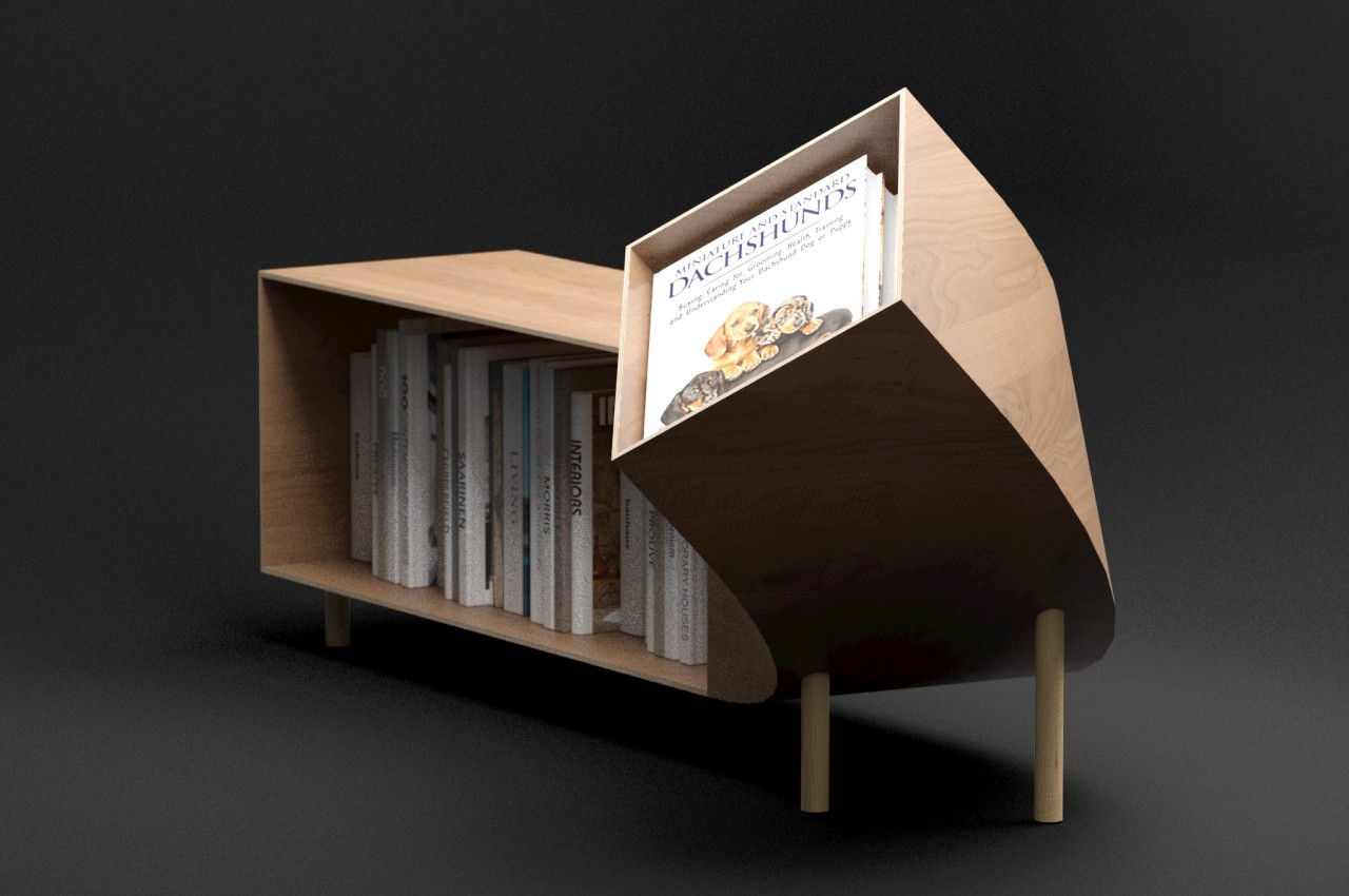
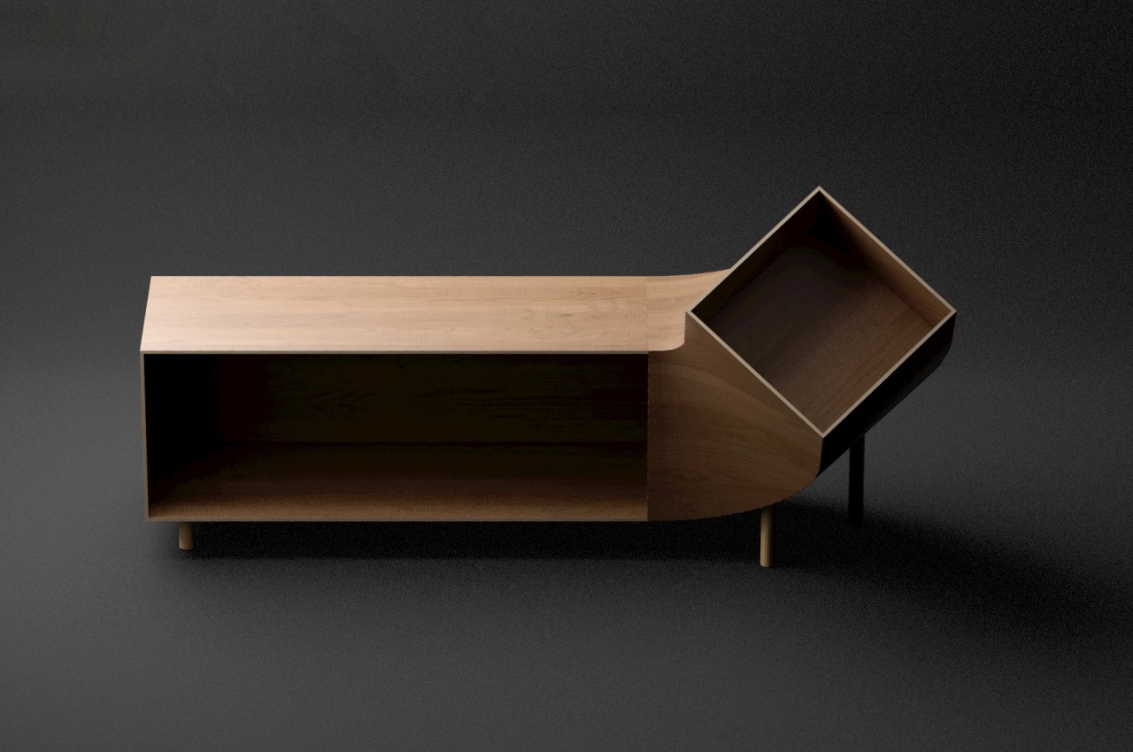
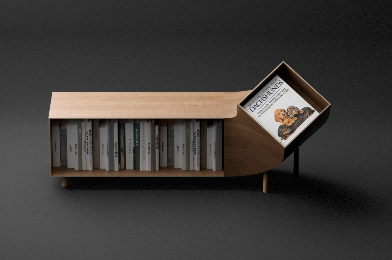
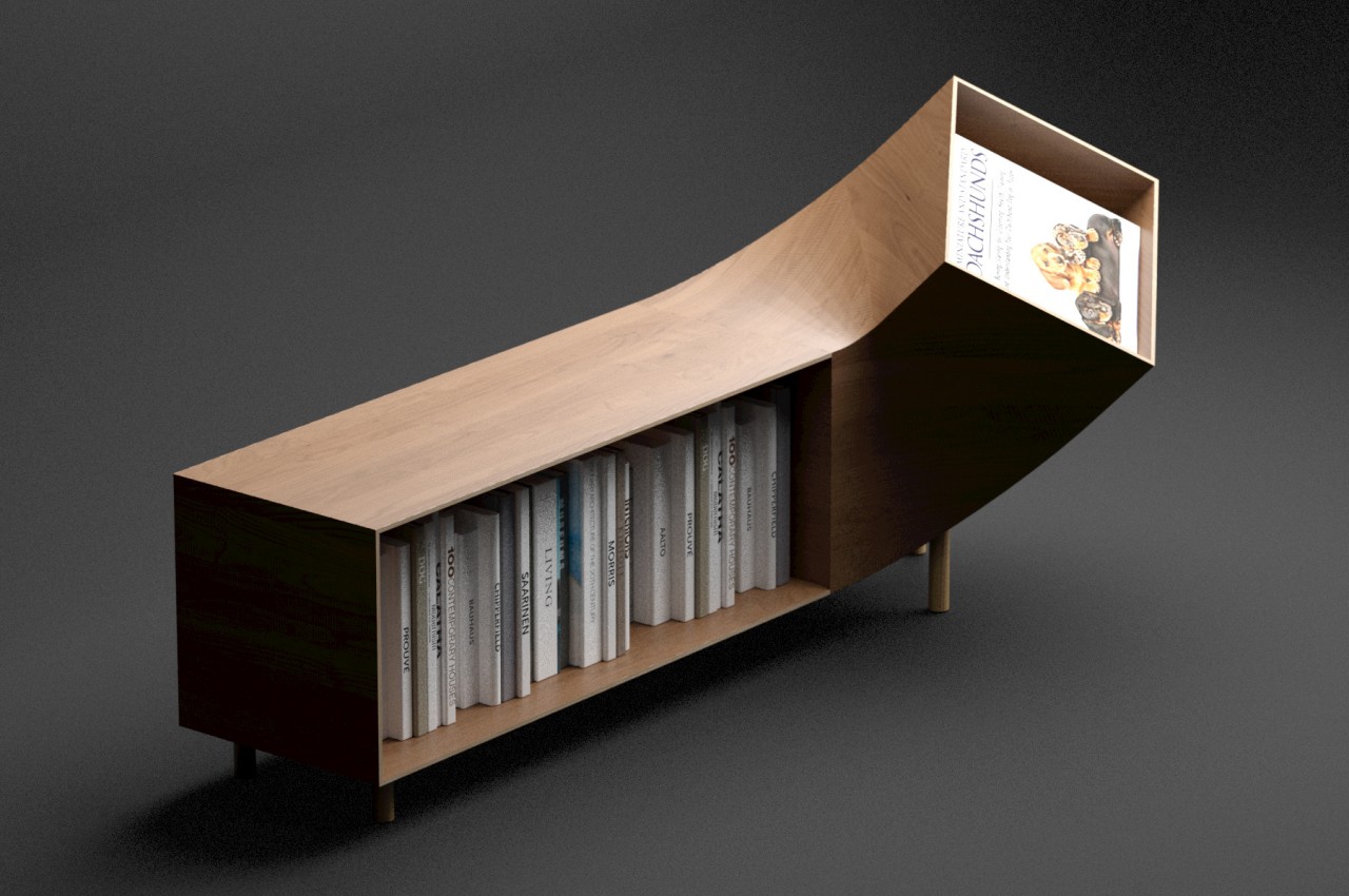
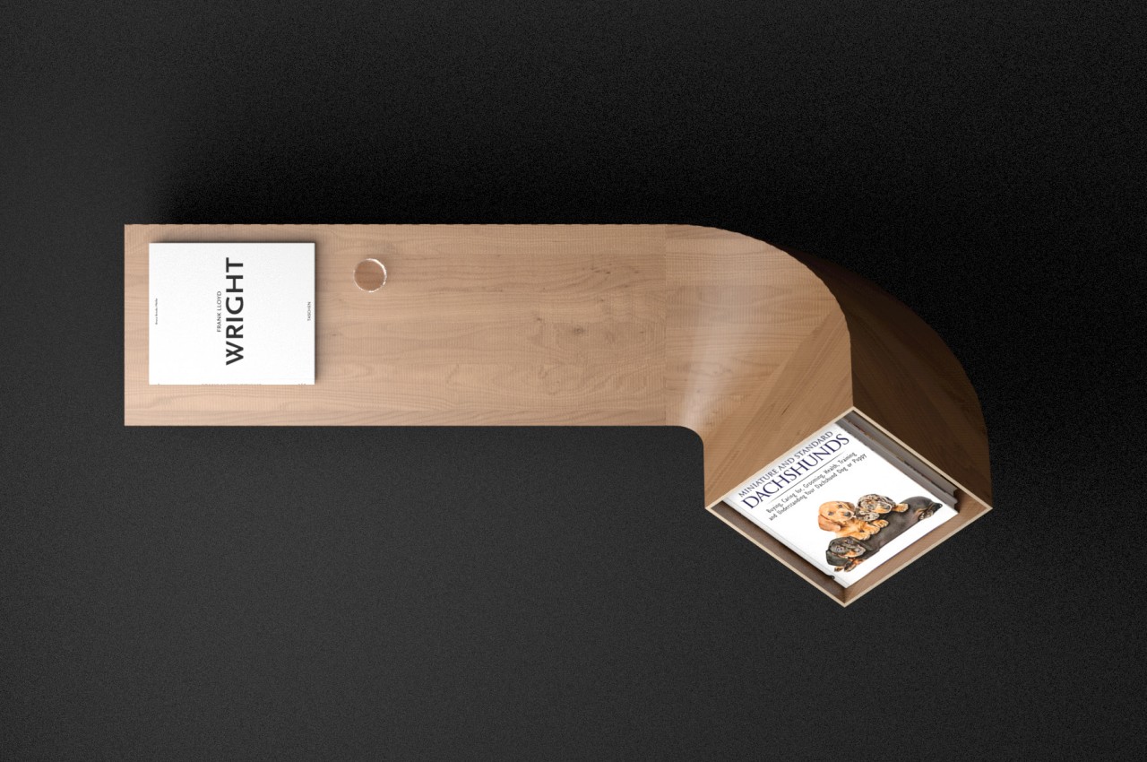
The Dachshund trades the multipurpose compartments of a typical sideboard for a single, open area. Although it’s certainly possible to put anything in this space, it is designed particularly to hold a row of books or magazines. In essence, it’s like a single for reading materials expressed as a low sideboard. That alone wouldn’t really be enough to catch anyone’s attention, but the sideboard’s body twists upward on one end to add a bit of flavor and functionality.

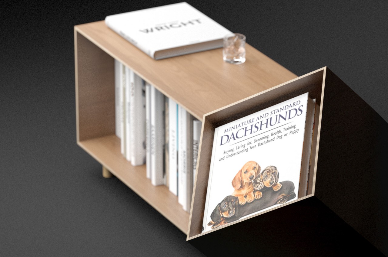
This twisted end has a somewhat shallow box that can be used to hold a few items. The most natural thing to put inside it would be the book or magazine you’re currently reading, making it easy to access without having to pull it out from a pile. Alternatively, you can also enshrine your favorite or most beautiful book, setting it apart for everyone to see. Of course, you can also just put decorative items to complement whatever decor or theme you might have going in the room.

The Dachshund sideboard puts a simple twist on a standard design to create a memorable sight and a new experience. The furniture’s form is akin to a pet, like the canine namesake, that wags its tail or, more appropriately, brings you your newspaper or, in this case, your book. The smooth curve of that part is also something that’s difficult to pull off with wood, making this unusual piece of furniture a fun yet elegant addition to your interior.

The post This quirky sideboard is like a loyal pet that brings your favorite book forward first appeared on Yanko Design.
This gorgeous desk will dominate any room with its mid-century design

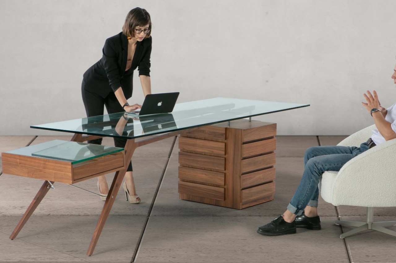
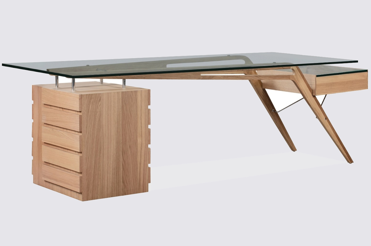
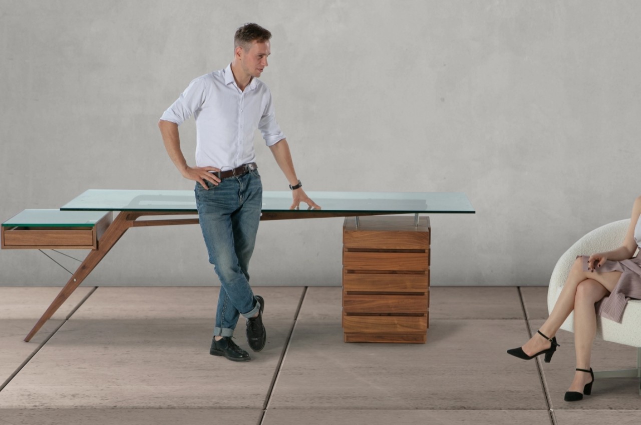
Minimalism never meant small, though many products that espouse that design philosophy do tend to minimize the space they occupy. When it comes to desks and work tables, there has also been a trend to lean more towards space efficiency, especially since offices and homes often have limited space for large furniture. There are instances, however, when a desk does need to be the focal point of a room, especially in offices that are designed around a single person’s work or presence. If you have enough space for it, this wood and glass protractor desk will definitely be an eye-catching piece thanks to its clean, minimalist design that makes the desk seem to be magically floating on air.
Designer: Kardiel

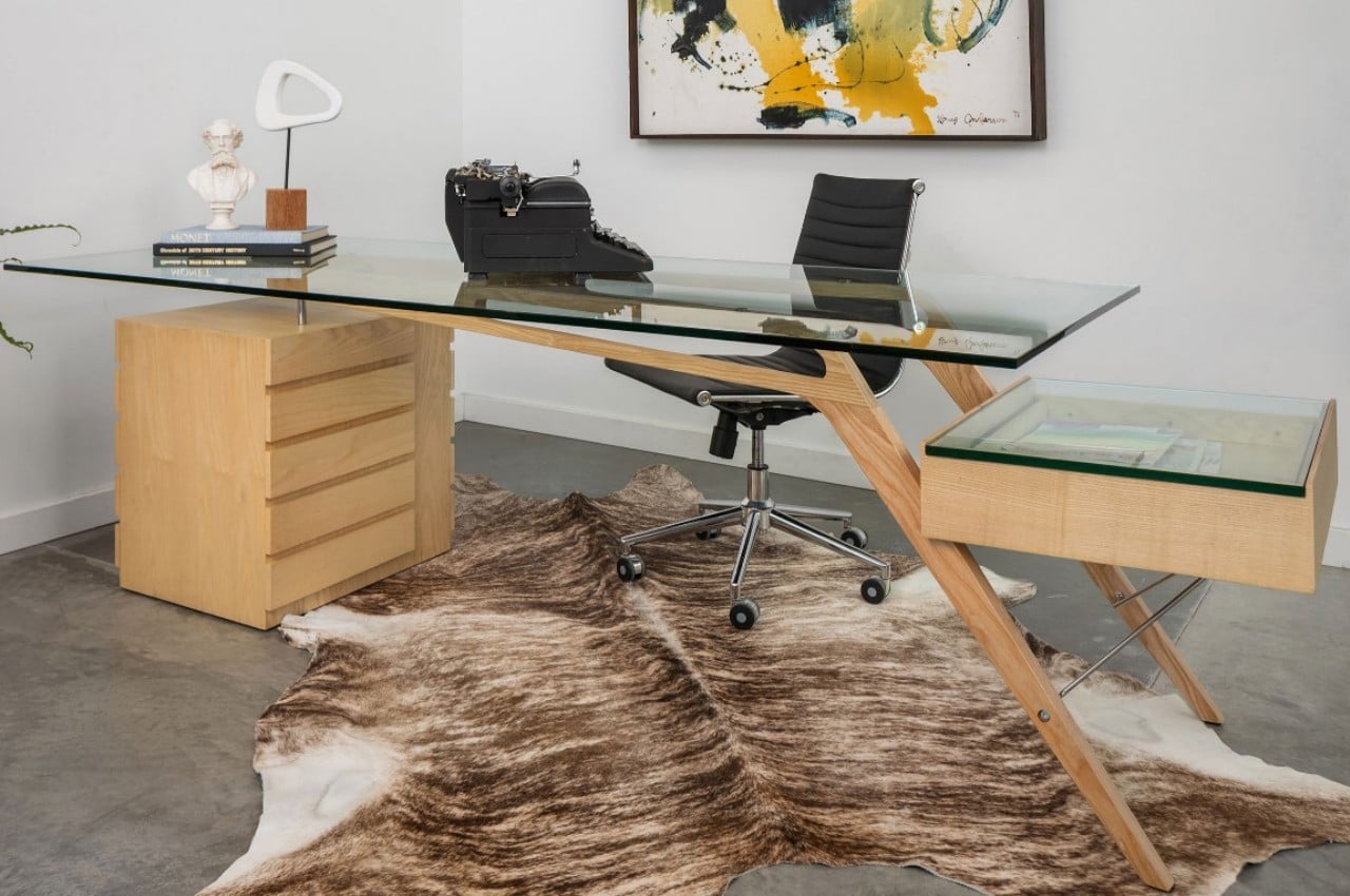
Based on the original by Italian architect and designer Carlo Mollino, the 1949 Protractor Desk combines a mid-century aesthetic with modern design techniques to create a piece of architectural art worthy of becoming the centerpiece of any office or room. It uses very simple forms yet has an air of sophistication to it through its use of fine materials and organic lines.

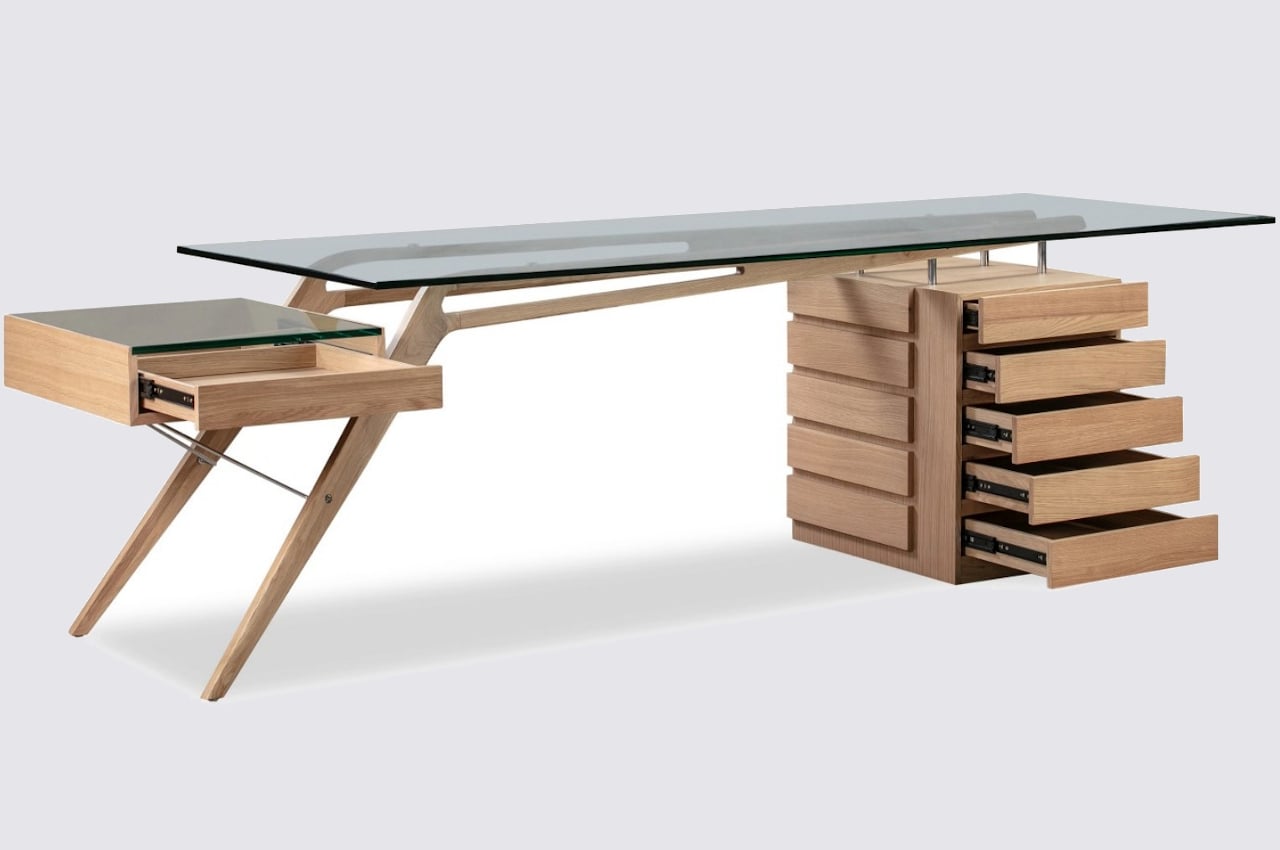
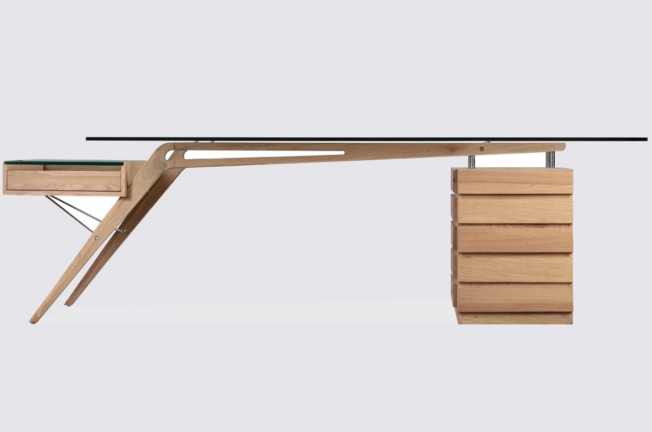
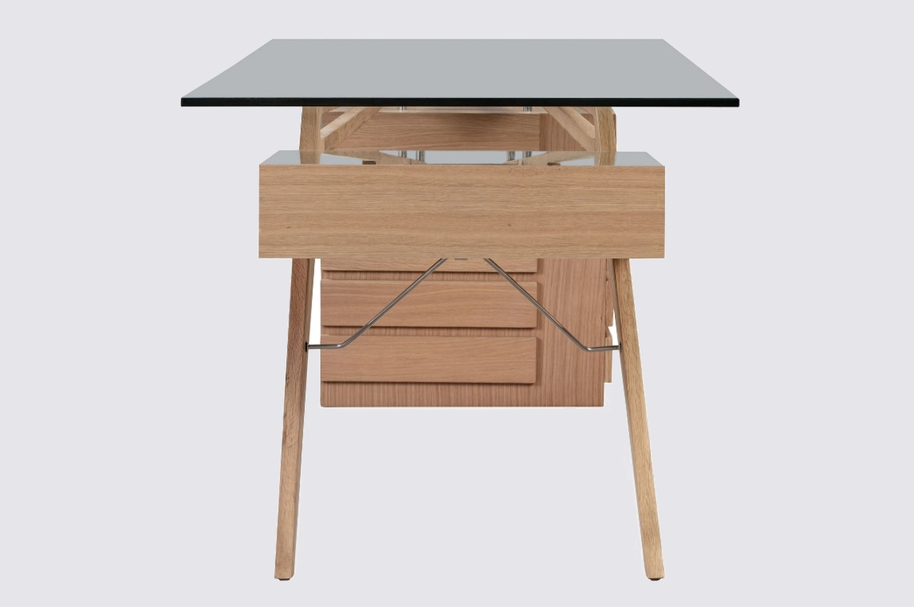
Although it is literally the most minimal part of the piece, the mid-century Protractor Desk’s unbelievably thin legs immediately catch your attention, puzzling the mind on how it is able to hold the glass tabletop aloft at all. Shaped like a boomerang or an opened compass, the wooden beams form intersecting and contrasting lines that give the table a dynamic character. The horizontal beam has oblong cutouts that give the illusion of an invisible frame. There is very little to obscure your view beneath the desk, leaving ample room for a chair to slide into.

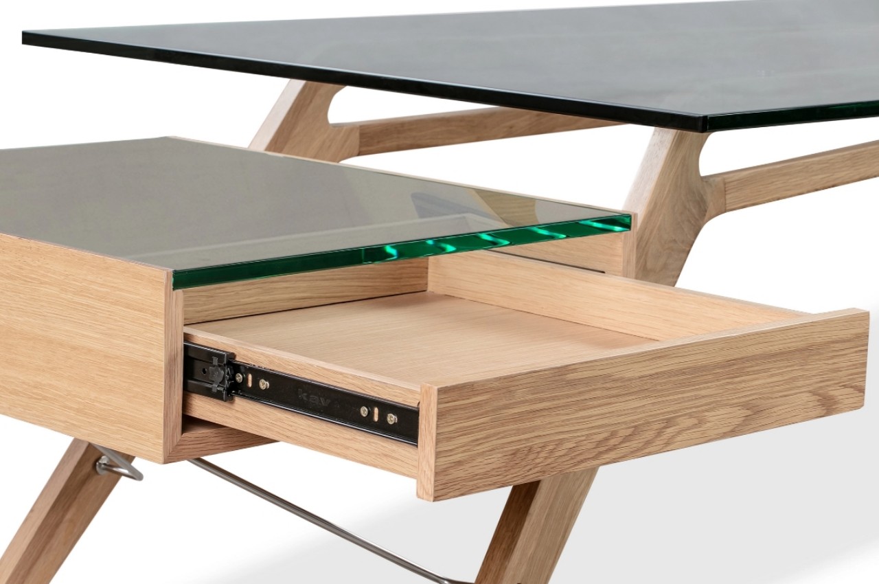
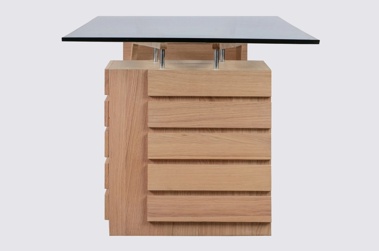
Of course, its airy appearance is just an illusion, and the desk’s fine legs on one side are balanced by a slatted wooden cube that is home to five drawers. Four stainless steel bolts connect the box to the end of the wooden beam. Its solid and simpler form provides a sharp contrast to the thin legs on the opposite side, providing both visual and structural balance to the desk. Opposite the box is an open-faced single pull-out drawer that seemingly floats in the air, supported only by two steel rods. This reinforces the table’s almost ethereal design, which complements and contrasts the earthy tones of its wooden body.

The 1949 Protractor Desk is definitely long by regular desk measures, about 98.4 inches long to be precise. You’ll need to reserve a lot of space for this piece of furniture, but given its dominating presence and eye-catching design, it’s one that you’ll want to really stand out anyway.

The post This gorgeous desk will dominate any room with its mid-century design first appeared on Yanko Design.