With Apple and Amazon continuing to surprise us with their inventions, we are waiting in anticipation of their September 30th event. While the company usually unveils the new Pixel sometime in mid-October, the virtual event is set to be where the company unveils the latest and greatest Pixel phones, along with a new Nest smart speaker and a new Chromecast. The rumors of these products have been floating around and while we wait, here is a list of designs that we surely hope to see come true, if not in this release, but in the next one at least!
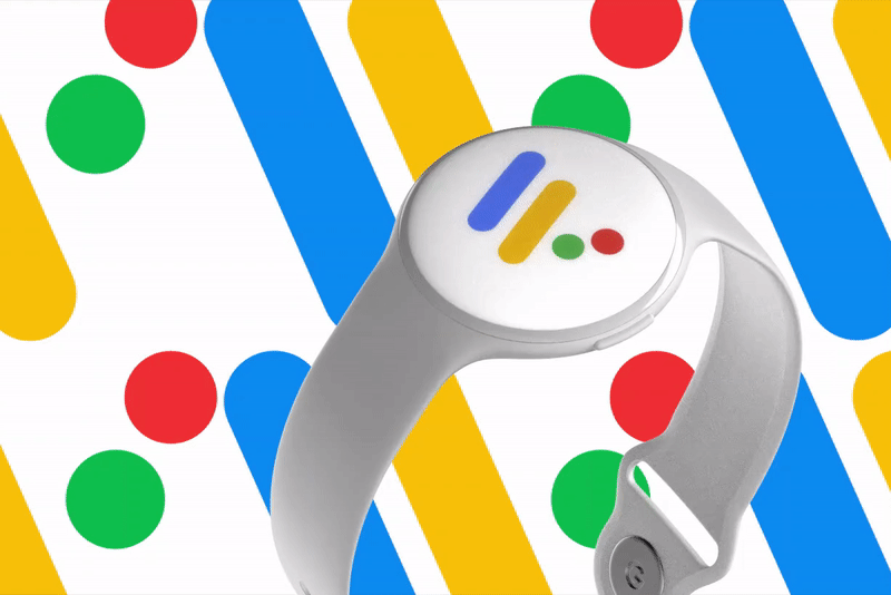
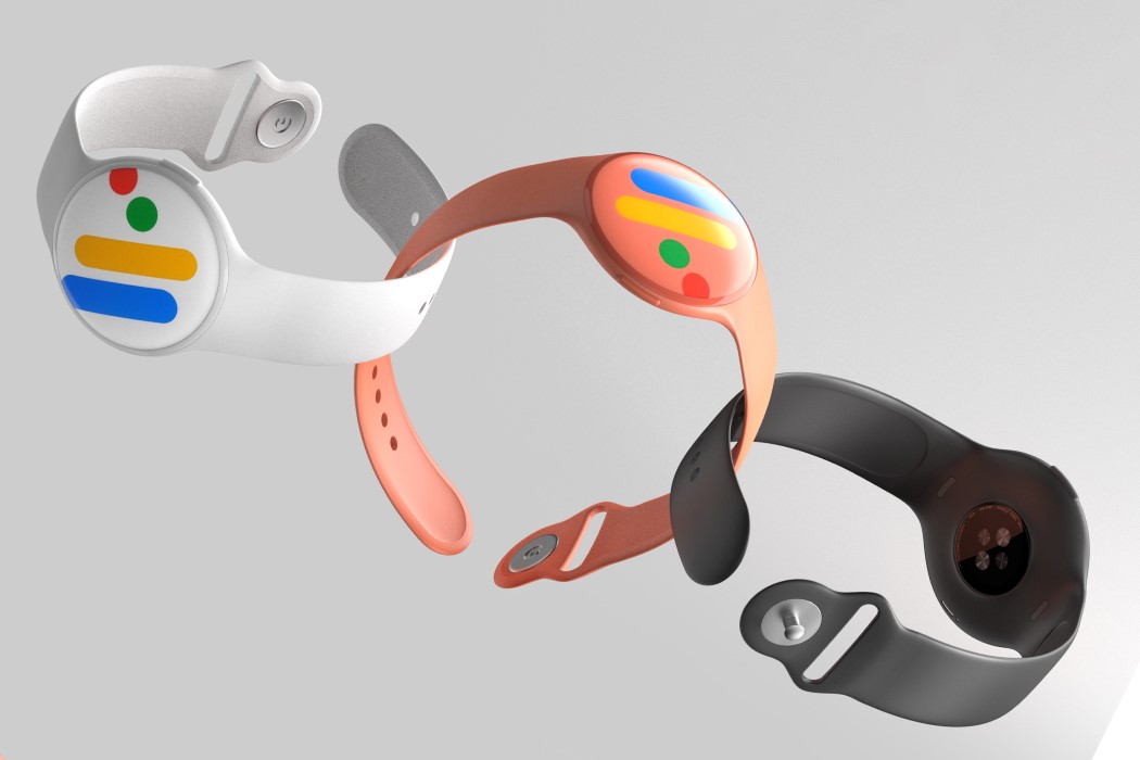
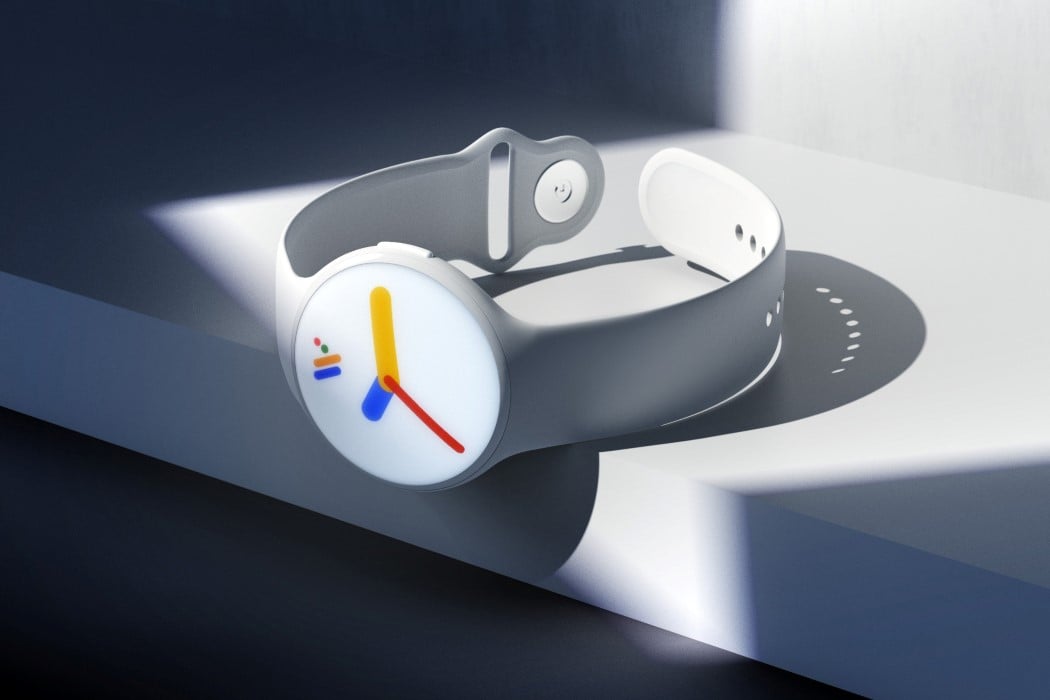
The Pixel smartphone went onto redefine what a pure Android experience could look like, becoming the gold standard in the Android OS experience. James Tsai’s Google Pixel Smartwatch concept does the same for the Android Wear OS. Embodying Google’s playful-serious aesthetic, the Pixel Smartwatch concept comes in a traditional round format, and in a variety of quirkily named colors. The Android Wear OS logo displays clearly on the always-on display of the watch, transforming into a colorful set of watch hands every time you look at it to read the time. The watch comes with Google’s top-notch voice AI, all of Google’s native apps, and a heart-rate monitor on the back, which ties in well with Google’s plan of acquiring Fitbit and their entire fitness-tech ecosystem. I wouldn’t be surprised if this wearable concept were entirely waterproof too, just to fire shots at Apple!
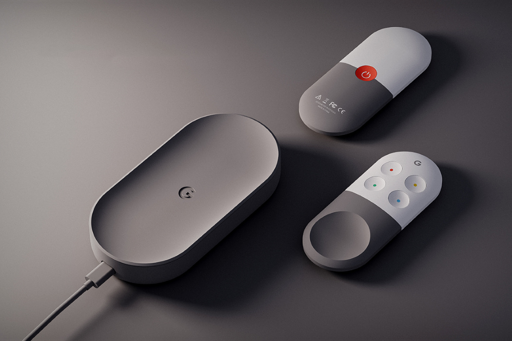
The Chromecast 3 concept by Roel Heyninck isn’t a hockey-puck as much as it’s a hub. Designed with the stylings of the Apple TV box, Heyninck’s Chromecast 3 box looks pretty nifty, and in many ways follows Google’s product and CMF language. The box connects to a television via a single USB-C connection that has the ability to pull power as well as push media. Using the Chromecast 3 is as simple as pressing the ‘cast’ button on your phone or tablet and forgetting about it. If you want to interact with or navigate through media, the Chromecast 3 comes with a pretty slick remote control that features 4 buttons and a touchpad on the top, and a standby button on the bottom that you can use to switch the TV on or off.
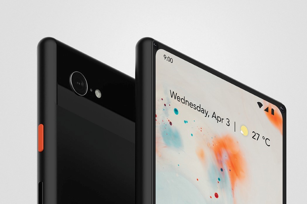
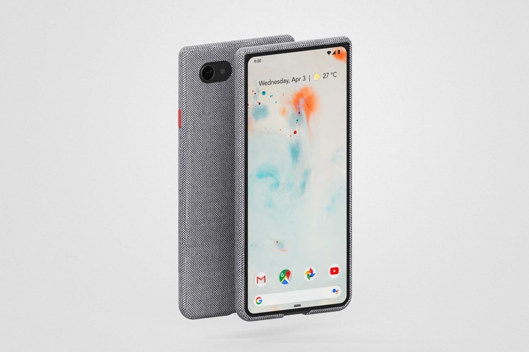
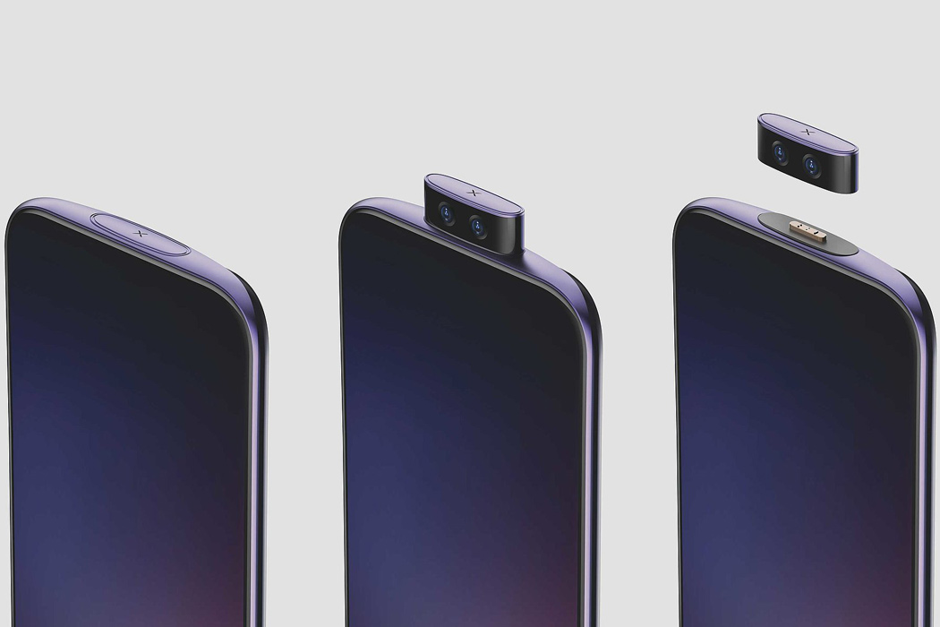
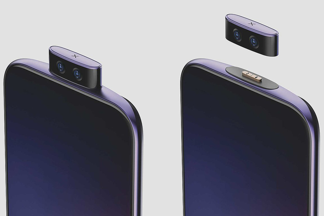
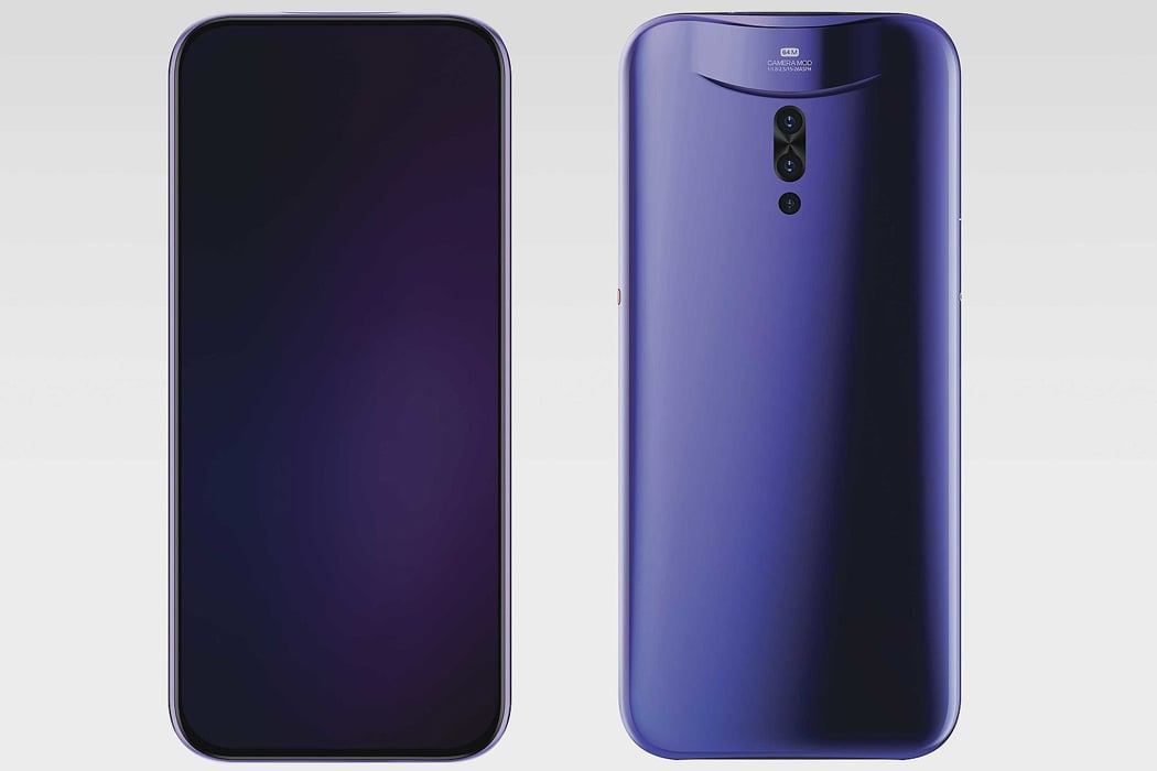
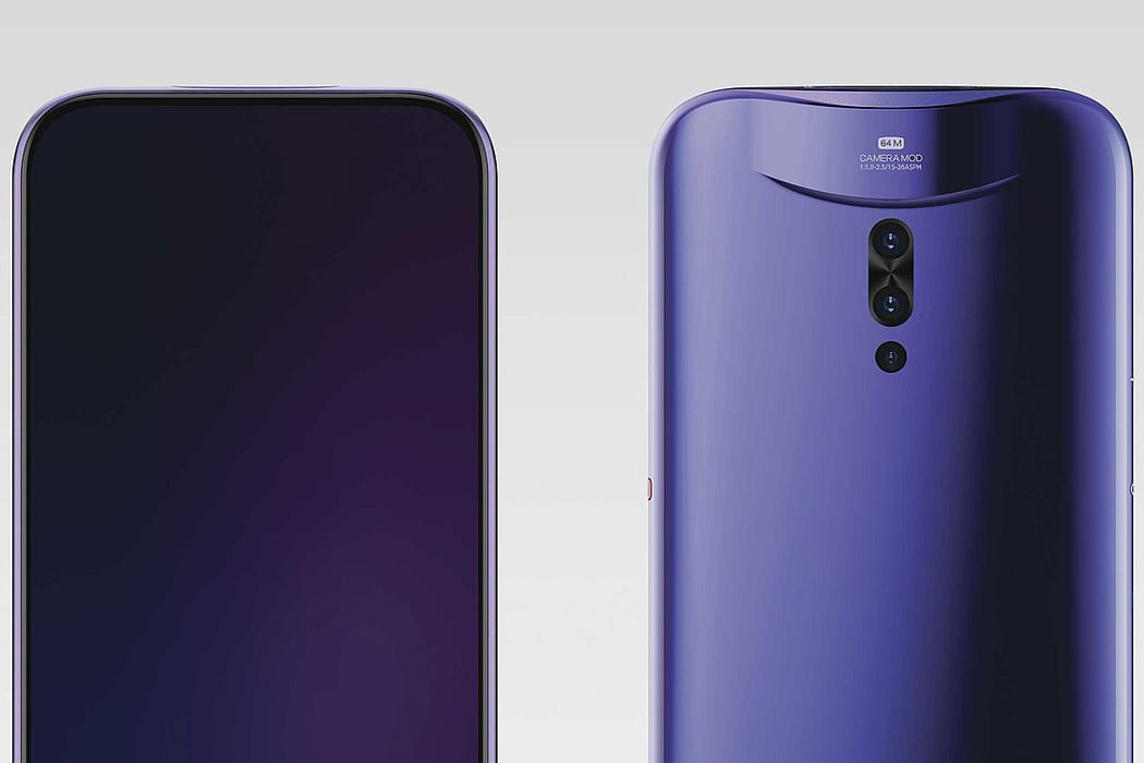
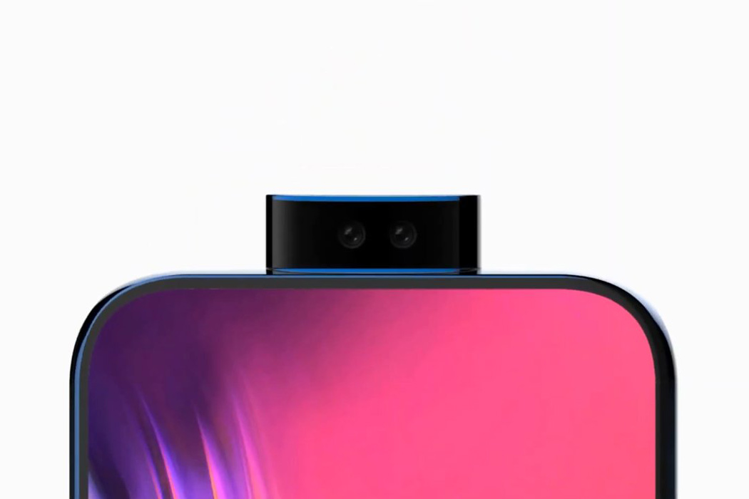
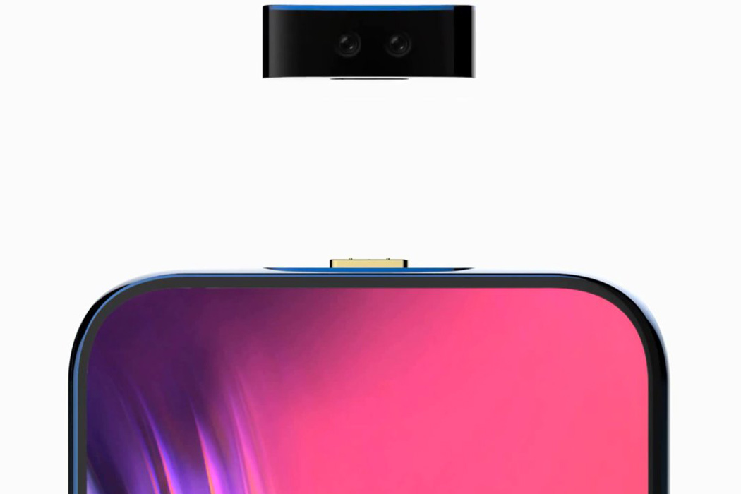
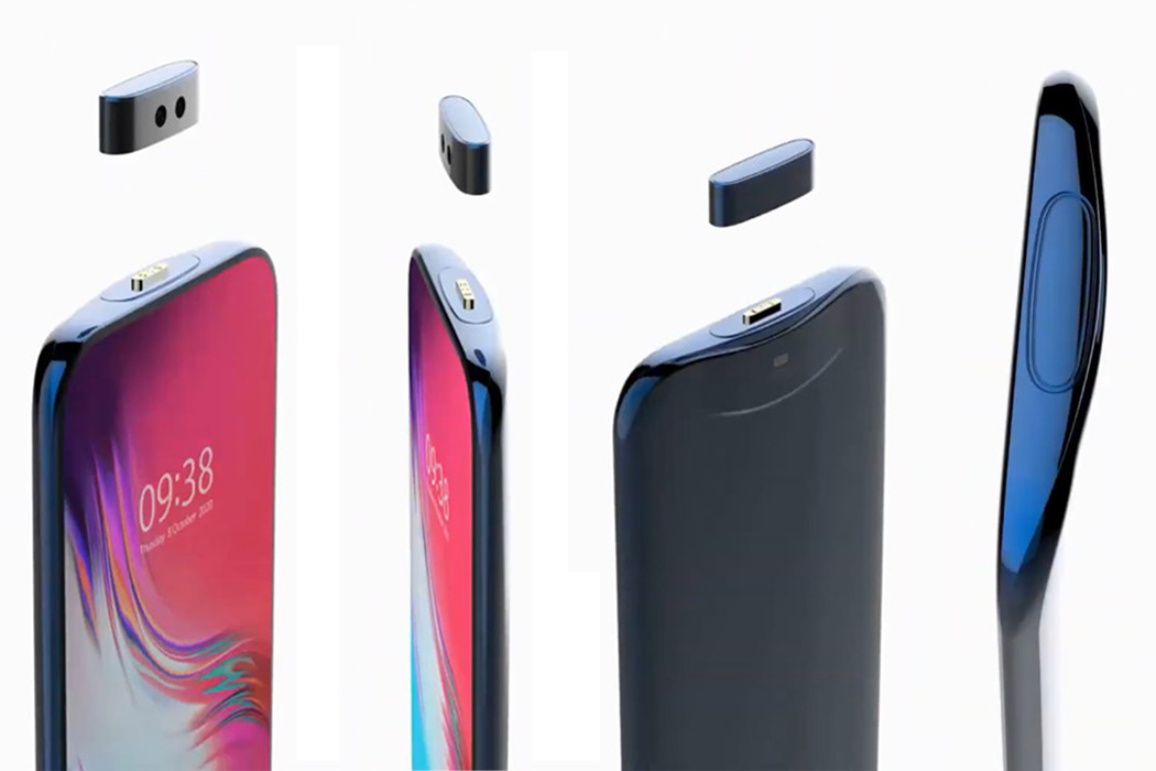
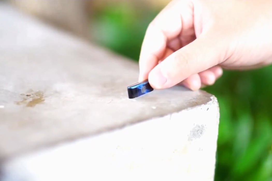
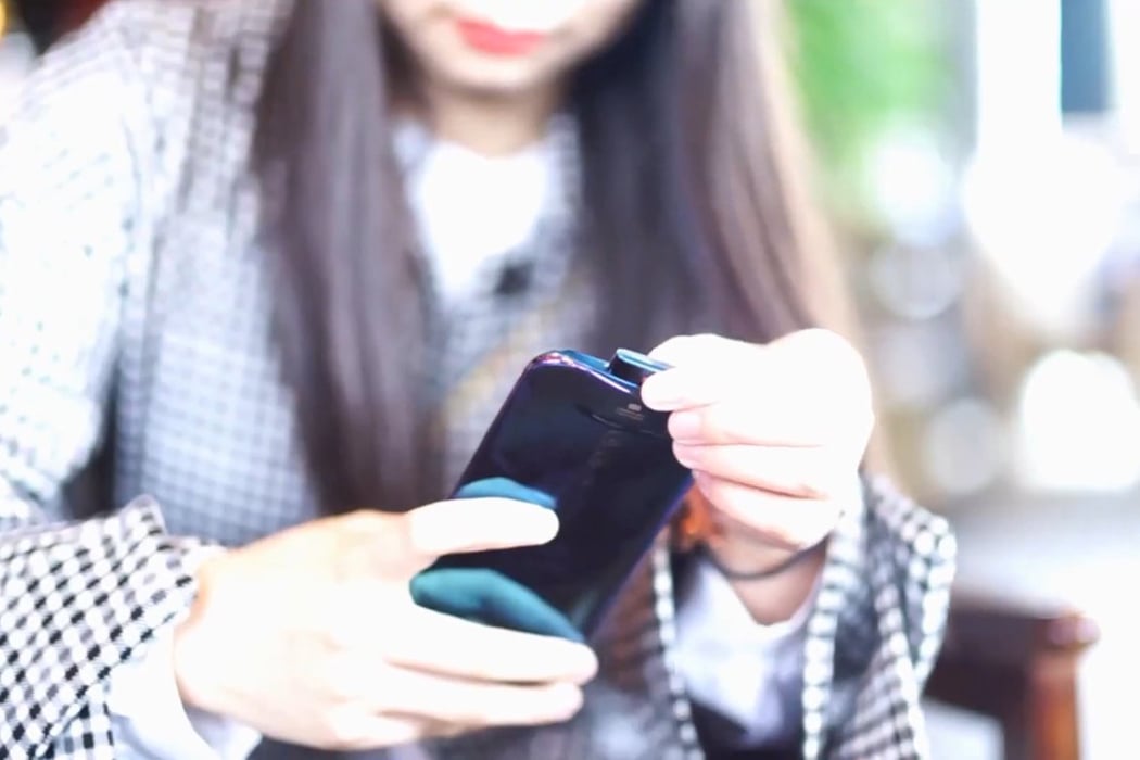
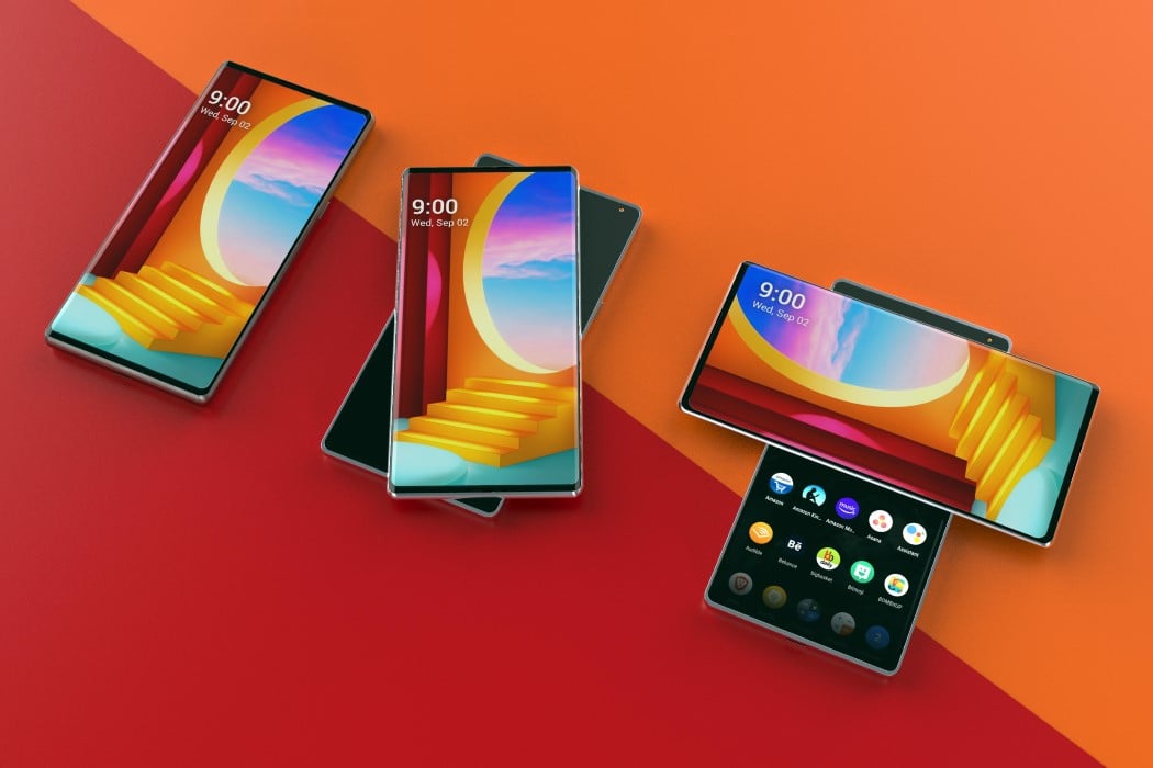
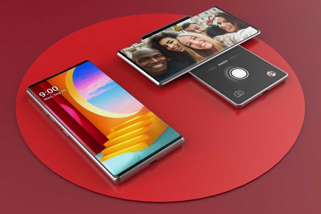
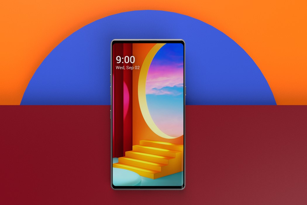
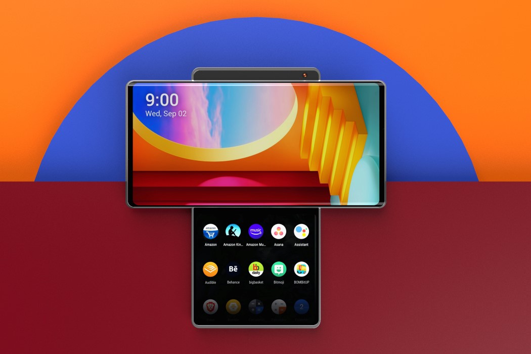
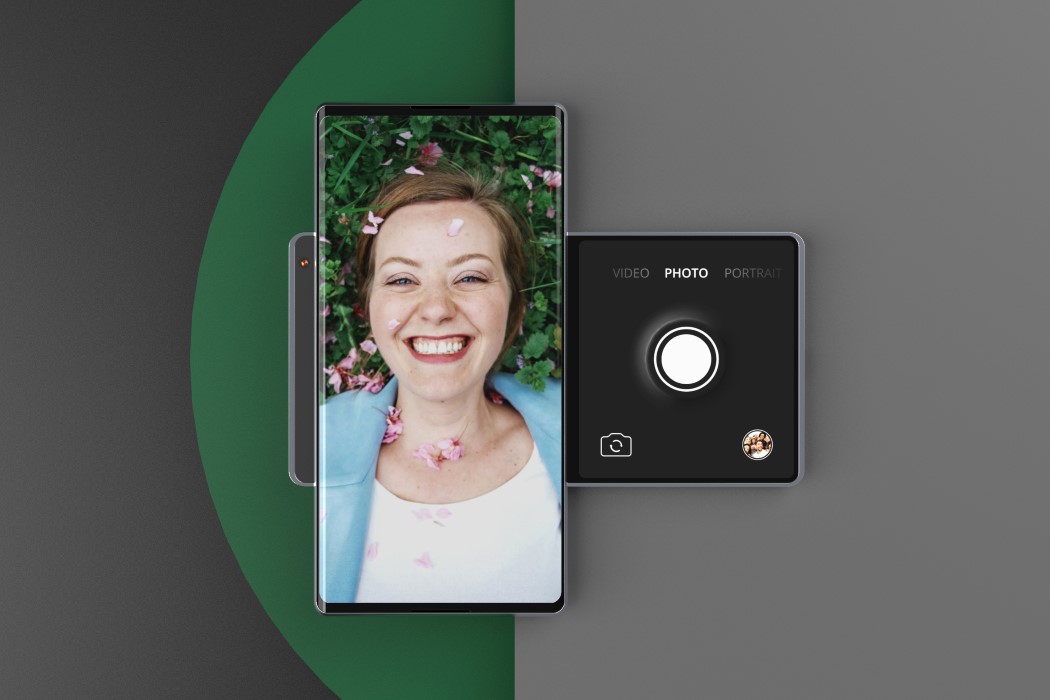
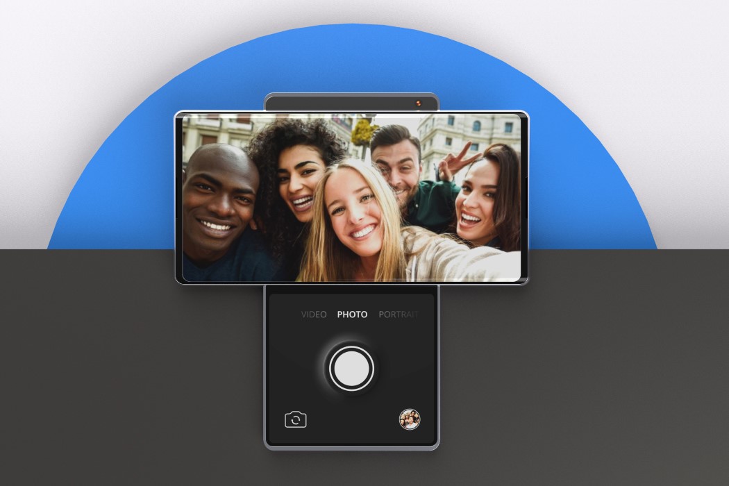
Meet the Pixel Vector, a smartphone concept by Ferdinand Aichriedler that challenges the notion that phones need to have thick bezels, hole-punches, or notches to have front-facing cameras. The Pixel Vector cleverly uses the negative space between the phone and the screen’s corner to throw in not one, but two front-facing cameras. The phone’s sharp edges and display’s rounded corners provide the perfect triangular negative spacing for cameras, spacing them out too, so they can perform 3D scanning required for facial recognition.
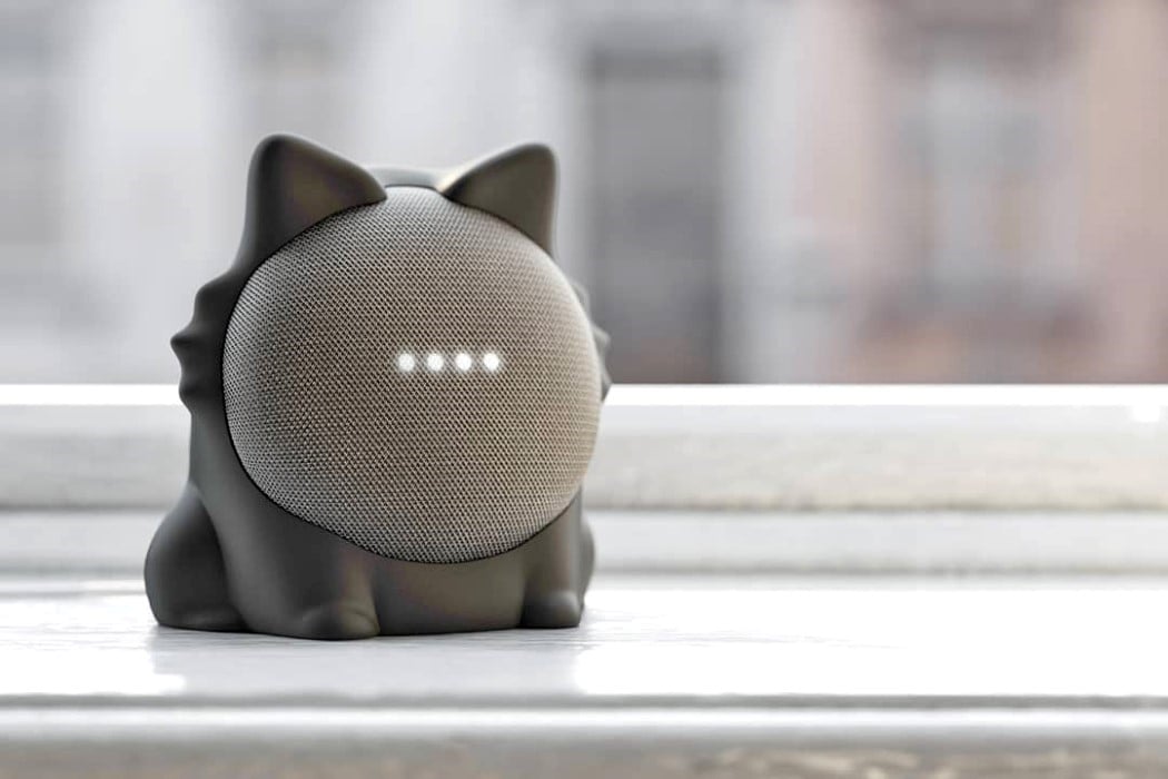
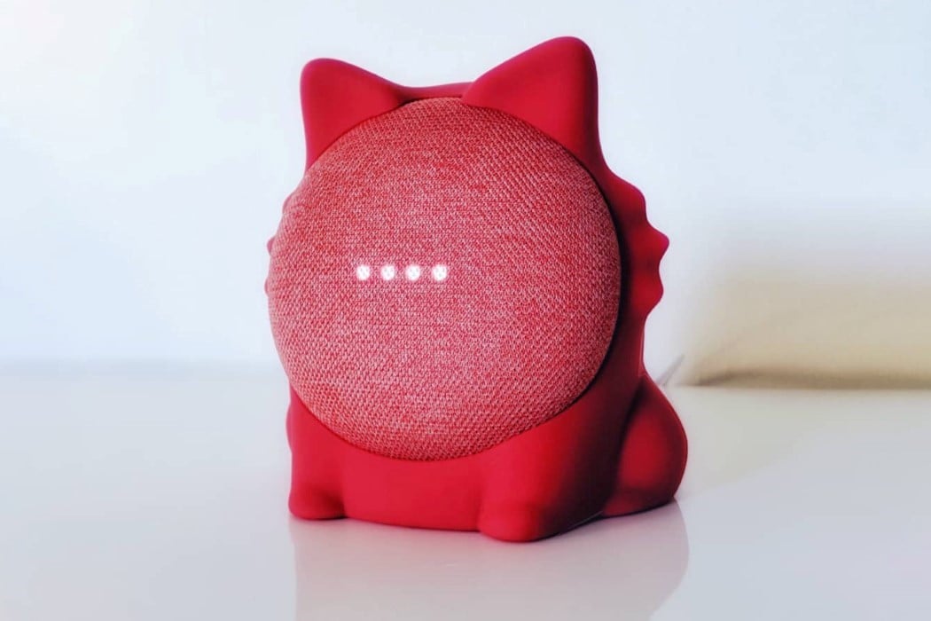
ODD-ON’s cute silicone skin transforms your Google Nest Mini into an adorable tabletop cat that, for once, responds to commands instead of maintaining an air of feline attitude! Titled the Caat, the outer body for the Google Nest Mini props your speaker up so it’s pointing forwards, rather than upwards. This allows the Nest Mini to look rather adorable as it sits patiently on your mantelpiece, responding to all your questions and commands.

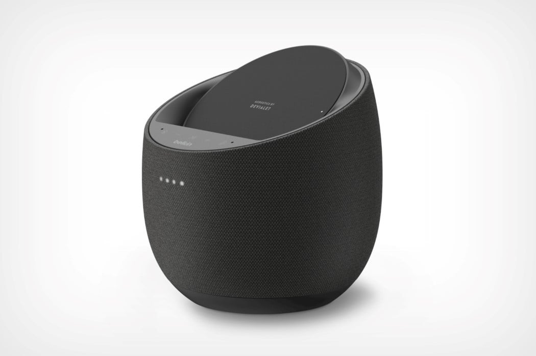
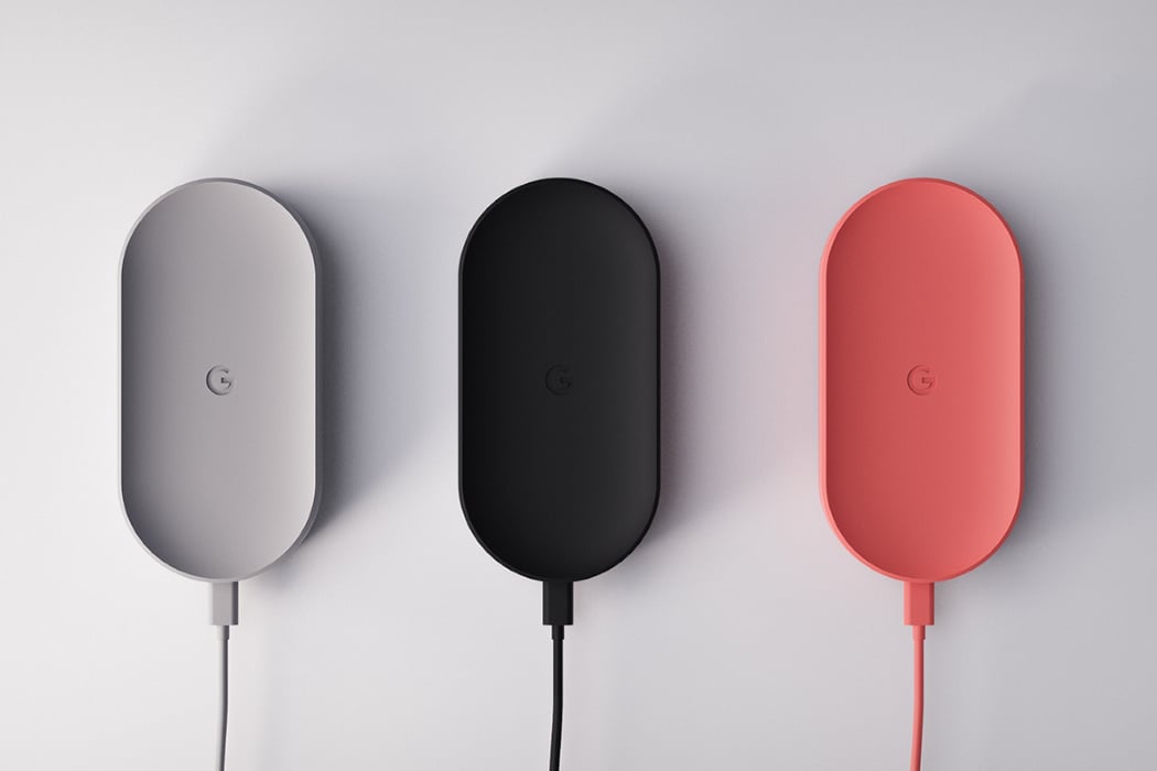
The partnership between Belkin and Devialet is interesting for a number of reasons. Belkin is famed for making some of the best charging cables, hubs, adapters, and extension boxes on the market, while Devialet still reigns as the most awarded audio company in the world. The companies announced their collaboration at CES this year, with the Soundform Elite, which happens to be Devialet’s second smart-speaker after its collab with Huawei. The Soundform Elite works just like any smart-speaker, albeit with a docking area for your phone. Equipped with a fast-charging 10W Qi charger, the Soundform Elite has the unique feature of being able to charge a wide variety of compatible Android phones as well as iPhones, making it a worthy pick for Apple enthusiasts too.
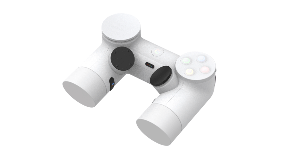
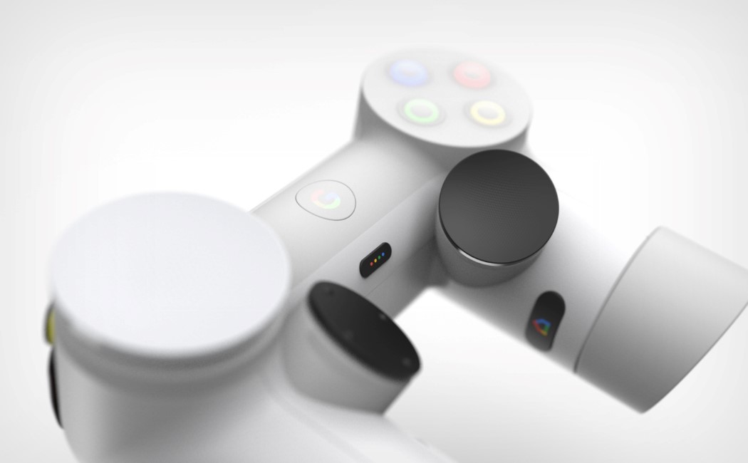
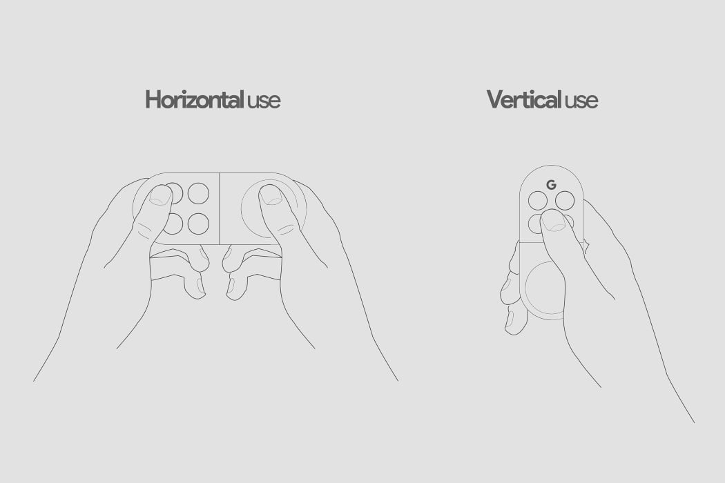
If Sundar Pichai walked up on stage and unveiled Daniel Cheung’s concept of the Stadia controller, I’d absolutely believe that it was completely meant to be. Stadia is a revolutionary concept that demands a revolutionary controller, and Daniel Cheung’s Playdream is that controller! Ergonomic, but non-organic, the Playdream comprises a tubular design that instantly stands apart as unique, and at the same time, comfortable. Designed for an absolutely robust grip, the Playdream has all the necessary controls, from the buttons to a redesigned D-Pad, to the triggers, Google button, and even two extra buttons on the inside of the grip.
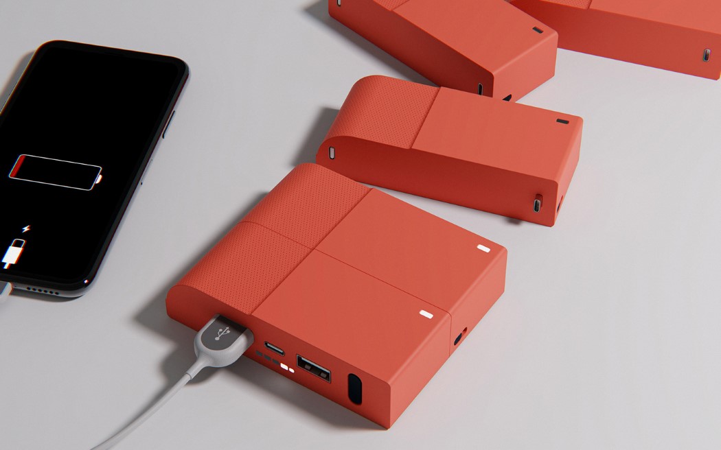
The PixelBloc is comprised of multiple 2500mAh battery-units that connect together using a USB-C port system. The main bloc, which sits at its base, comes with a USB-C port and two USB-A ports, while subsequent blocs only house the USB-C ports. This means the modules need to be plugged into the main bloc to charge them, creating a foolproof system, and the charger is smart enough to recognize them when they’re plugged in together. The PixelBloc uses sequential charging and discharging, which means when the entire unit is assembled, the main bloc is always recharged first (so you always know which bloc to use when you’re low on power) after which subsequent bloc-units get recharged. When you’re using the entire power-bank to juice up your device, power is pulled from the last bloc first, discharging it from the back to the front and maintaining the system so you’re never left with arbitrarily charged individual bloc-units.
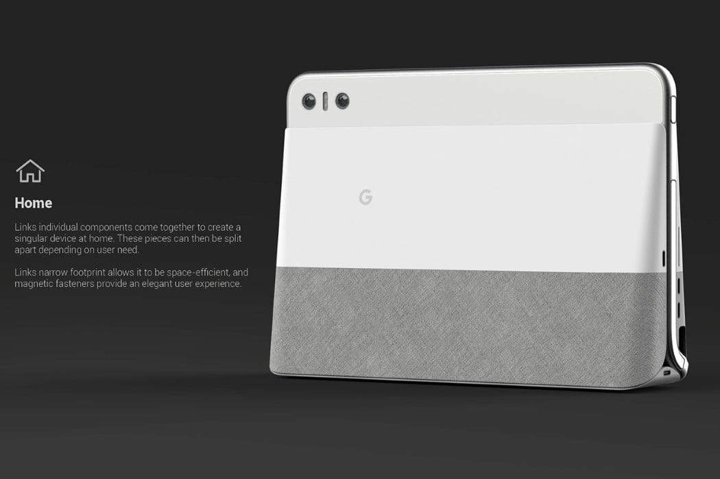
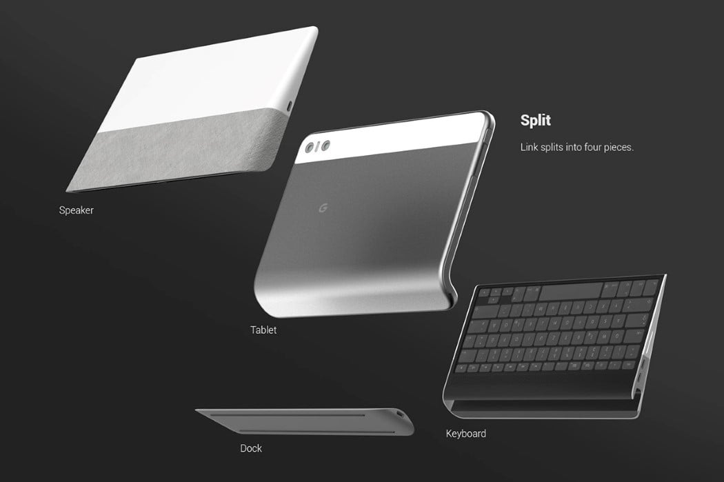
Designer Michio Papers created a bridge between the two faces of the tech industry- smart homes tech and laptops, to revive the laptop and the tablet while giving them the makeover they needed. The Google Link is everything you, your workspace, and your home needs. Made of multiple separate gadgets that come together, the Google Link serves all purposes. When assembled together, it’s your dedicated smart-home device capable of connecting via the internet to all other IoT gadgets in your house. Separate it and things get really interesting. You have a speaker dock that makes the Google Link your very own AI Assistant while being a wireless speaker too.
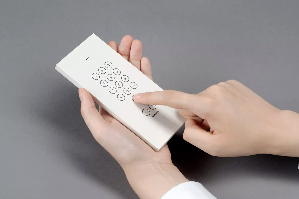
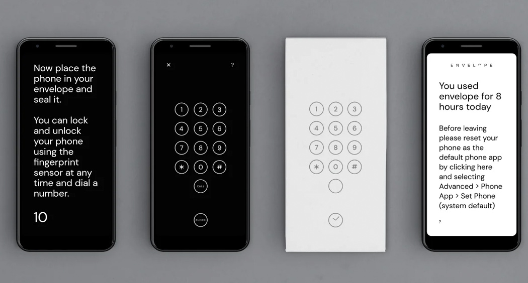
Google started a digital wellbeing initiative in an attempt to reduce the time we spend on our smart devices and to be honest, they’re pretty cool ideas! One of them is the Envelope cover. London-based design studio Special Projects came up with the Envelope cover, hoping we would break away from the digital world, and enter the real world…even for a while. Though it only works for the Pixed 3A at the moment, the cover is easily accessible! You download the app called Envelope on your Play Store App, print out the template for the envelope, and assemble it right at home! All you need is some glue to patch it up together. Once you slide your phone into the case, it transforms your phone into a much simpler one.
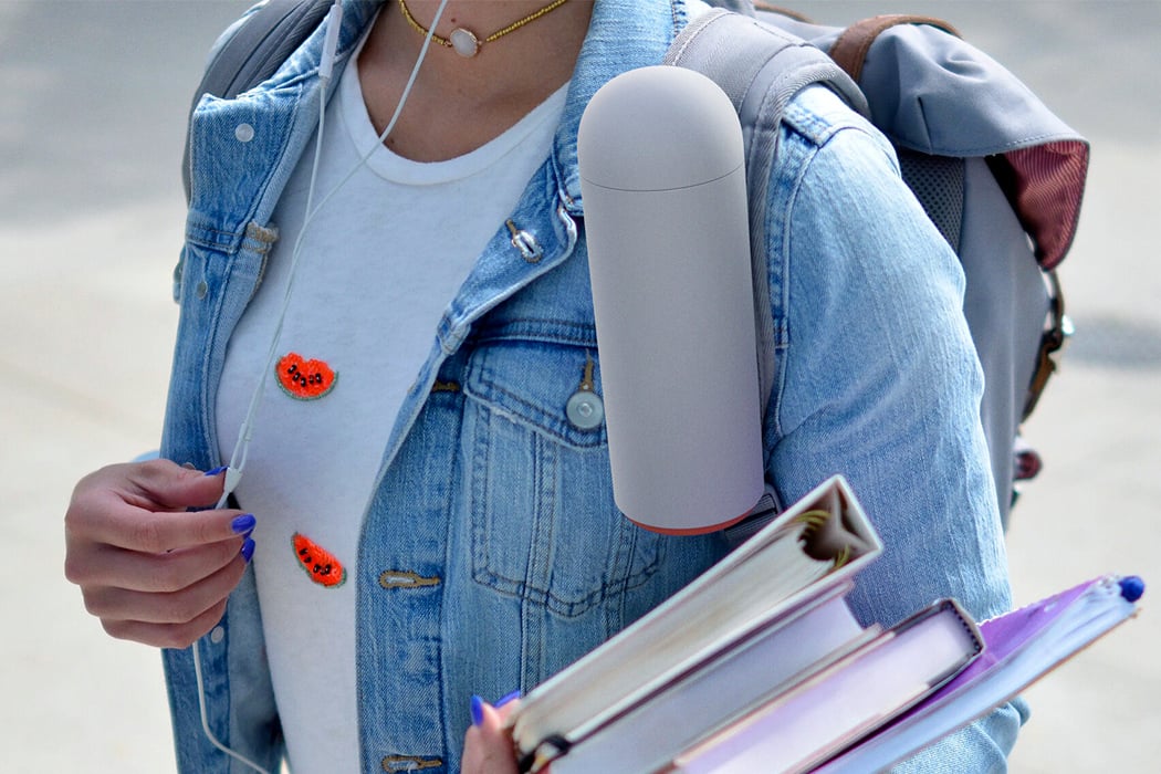
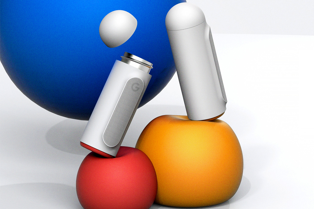
Designed to enhance the user’s lifestyle, the G flask by Yoonjae Song is a pure white cylinder with a rounded cap, ensuring a perfect hand grip. Shaped like a capsule, the clean aesthetics of the G flask instantly soothe you down. Devoid of any digital screens or lighting, sipping from it should be a pretty calm experience. Crafted from durable stainless steel, the flask guarantees to keep your water fresh at all times, as it is incapable of retaining any odors or flavors. Accompanied by an app, utilizing the flask couldn’t get any easier! It not only tracks your daily water intake, and how much water you’ve consumed so far, but you can also use it to set goals and compete with your friends, to see who reaches their intake for the day first!
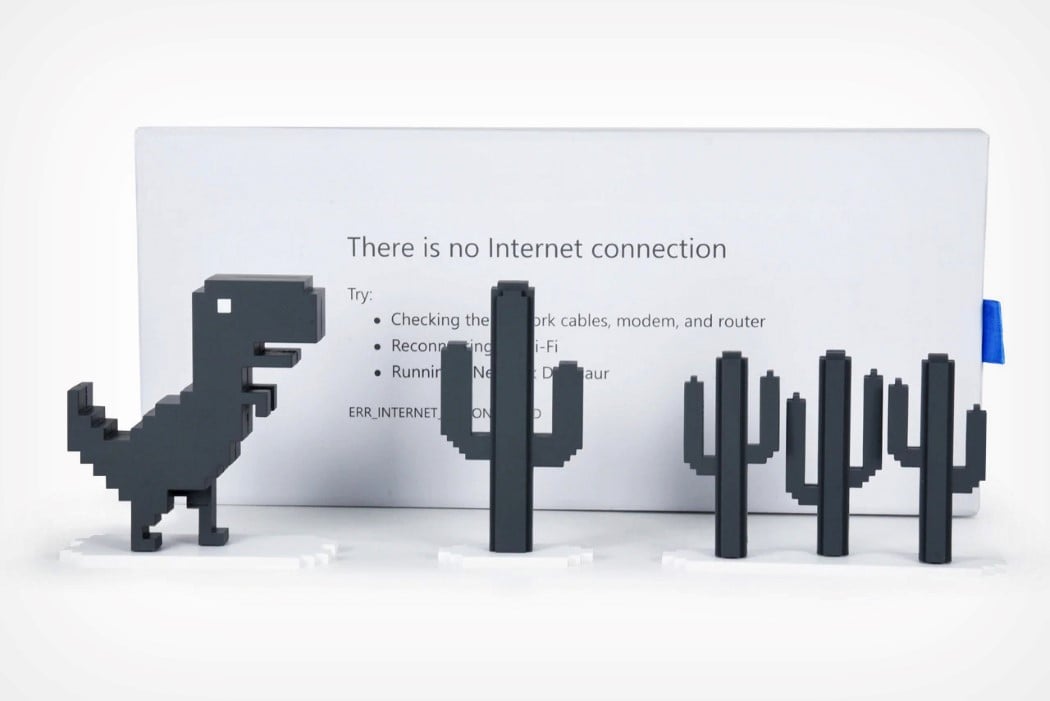
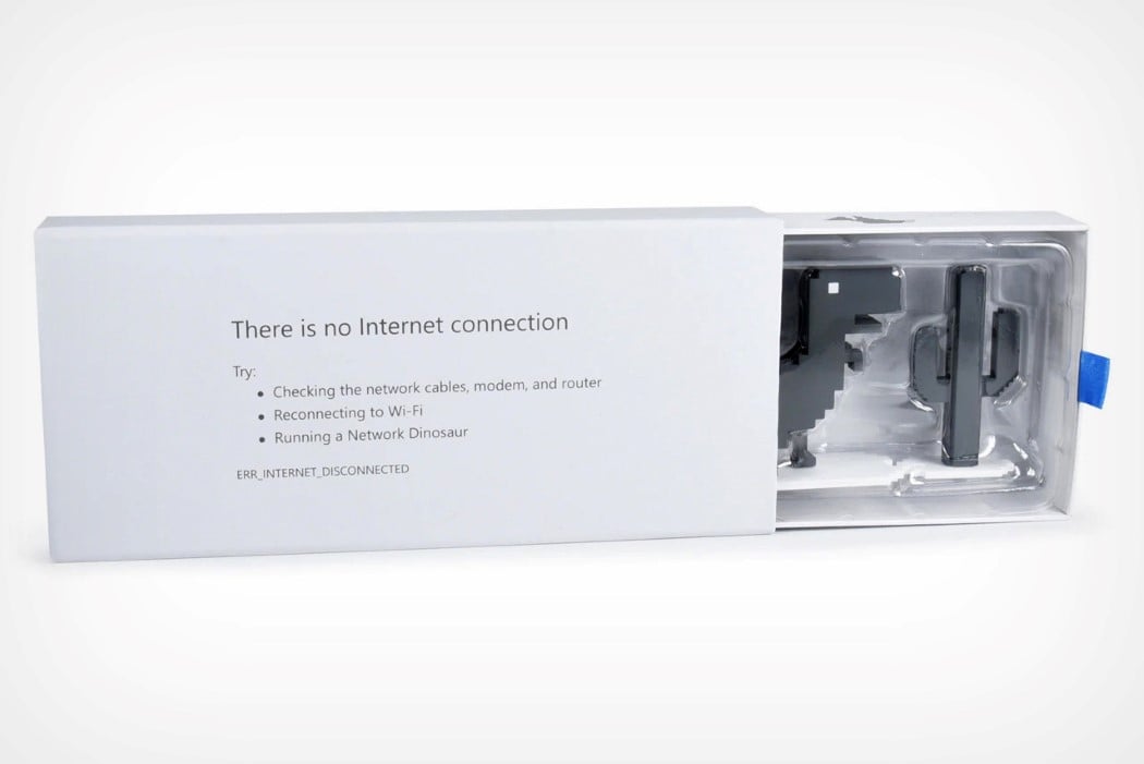
For the people who don’t know what this game is about (basically Safari users), the game starts as a webpage that tells you that your browser is offline. Press any key, and the game initiates, and you’re tasked with getting the dinosaur to jump over cacti, and under flying pterodactyls. Your high score gets recorded on the top corner. Bell’s toy set captures the key elements of the game. While there are no pterodactyls in the box set (also because they make their appearance later on in the game), the set actually stays incredibly true to its inspiration. You’ve got the dinosaur, four different cacti, and the box is designed to serve as the backdrop too! The box comes with a reversible design, with the starting message on the face, and the game-over message on the back… and the jumping Dino is reversible too!


 At nearly 1/4th the price of Apple’s own Magic Keyboard for the iPad Pro, the


