This ergonomic mouse concept tries to break free of traditional designs

Sticking to a familiar product design carries some benefits, such as inspiring confidence that you don’t have to retrain your brain on how to use the product. At the same time, though, it also carries a risk of making a product stagnate and refusing to fix flaws in the design for fear of the unknown. The tech industry has many examples of these, particularly with things like keyboards and mice that are critical to using computers. The mouse, in particular, hasn’t seen a major redesign every since its conception, even if its core form has been known to lead to wrist injury over time. It’s probably time to rethink ye olde mouse design into something that takes into account today’s needs, just like this take on an ergonomic mouse that looks nothing like your typical mouse.

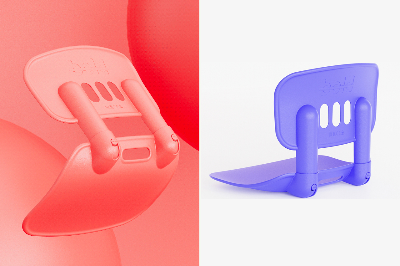
Designer: Dongjun Choi

Ever since it was first unveiled in 1964, the fundamental design of the computer mouse hasn’t changed significantly. You still have a block-like shape with buttons on top and a mechanism underneath for moving the screen cursor. A few more buttons have been added on top or on the sides, but the core design has remained the same. Unfortunately, the same ergonomic problems that lead to repetitive strain injuries have also become a constant for all but the most unorthodox mouse designs.

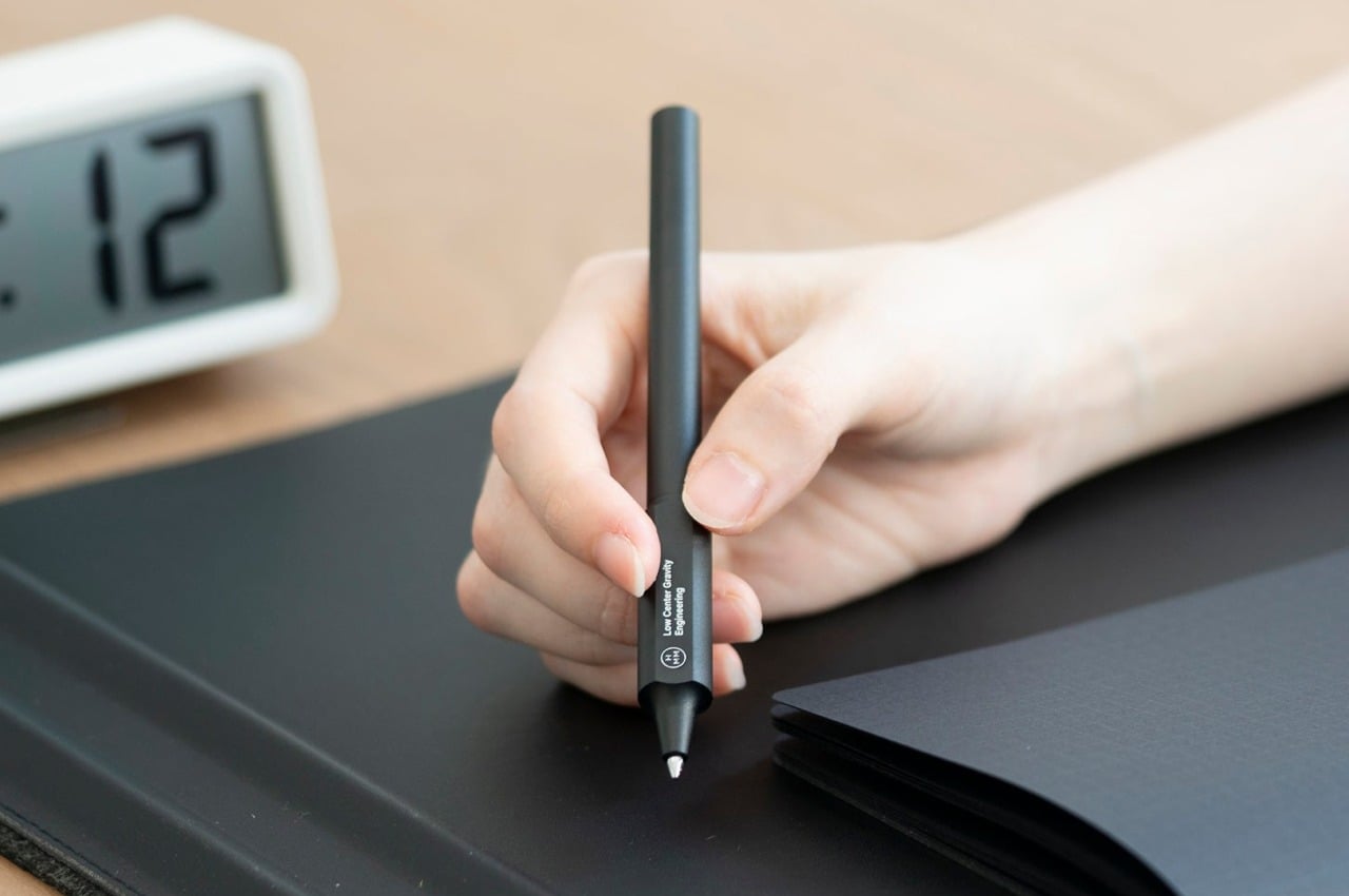
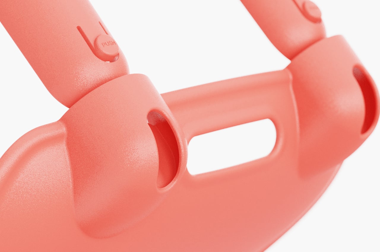
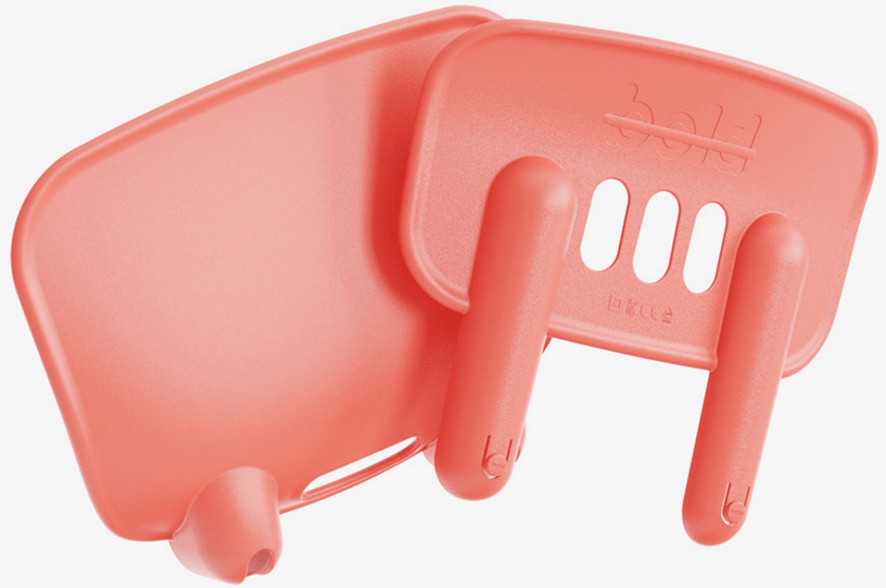
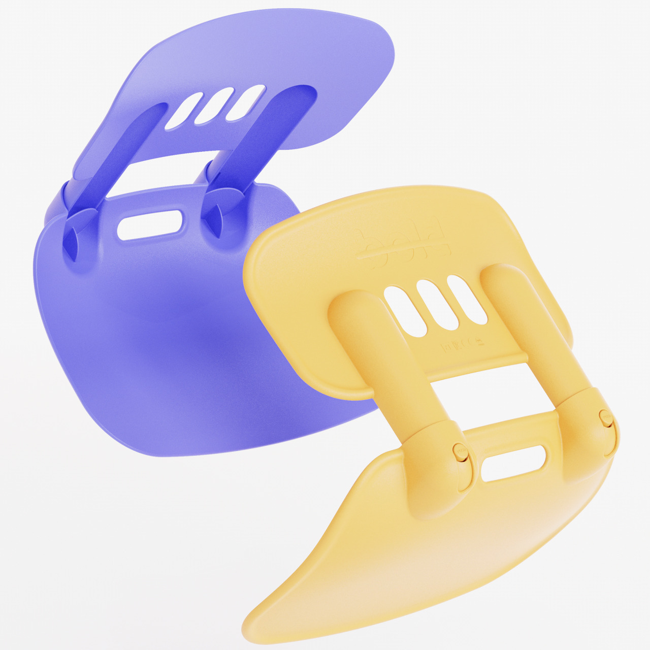
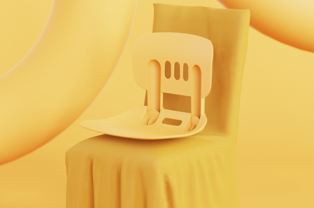
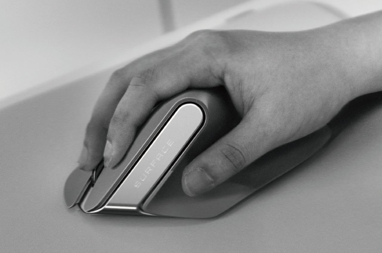
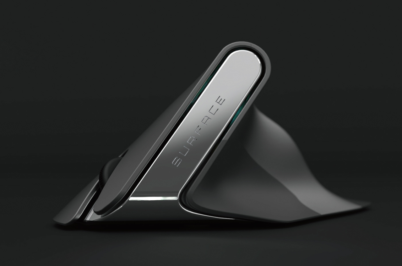
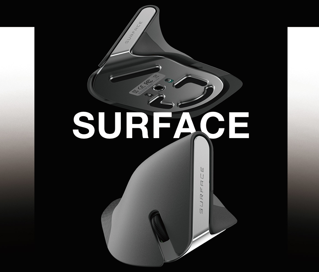
Although almost everyone knows there are problems and limitations to this design, the industry still sticks to it because it is so familiar to people today. There are, fortunately, a few creative minds that dare to imagine something better that takes into account the lessons of the past decades. This concept, for example, takes into account the hand’s natural position, which is more vertical than the horizontal position that common mice force our hands into.

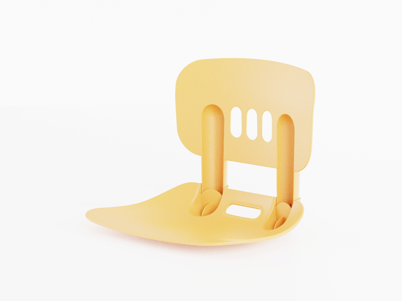
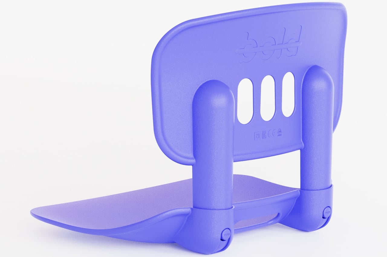
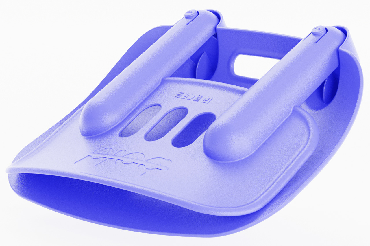
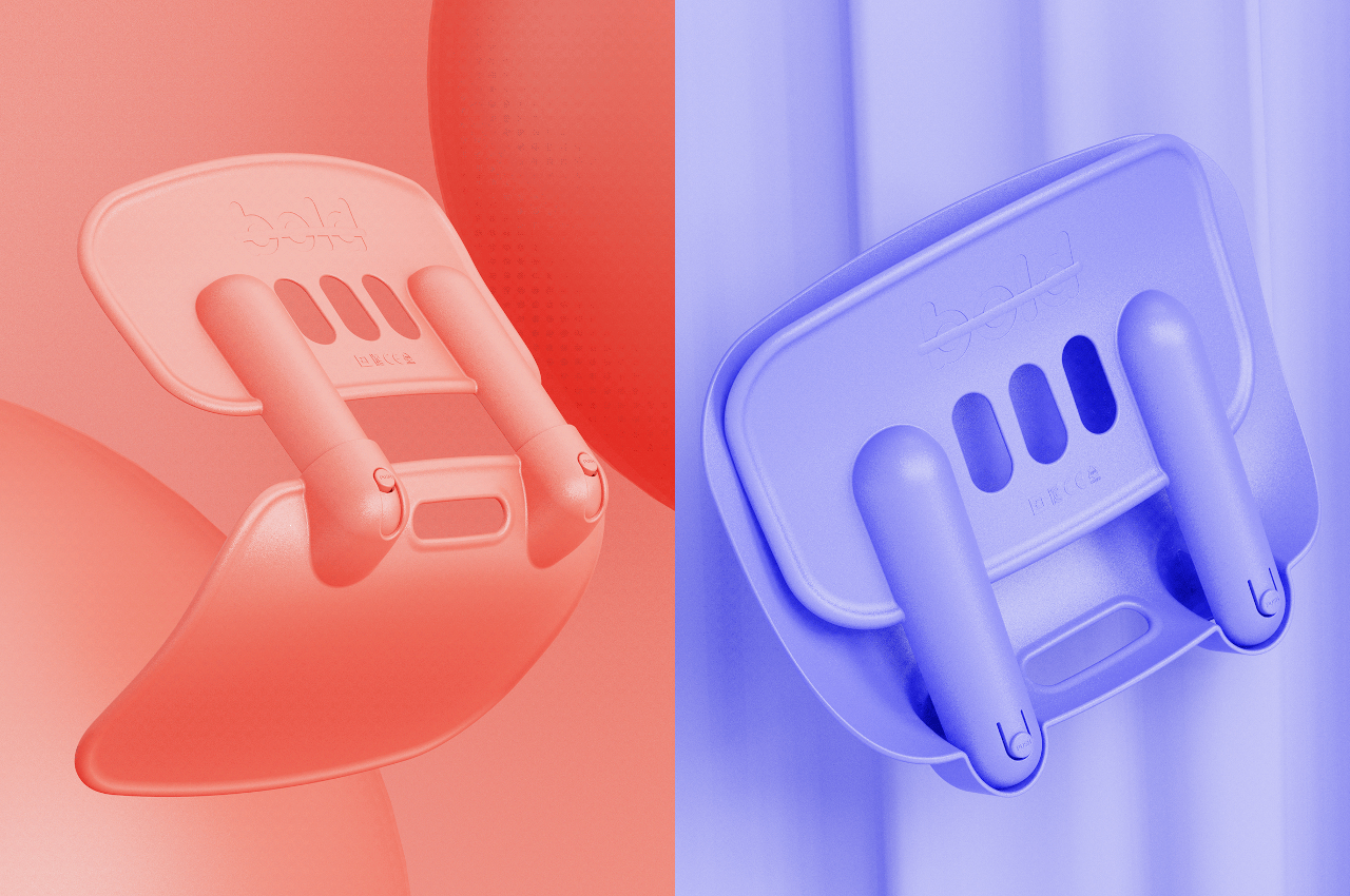
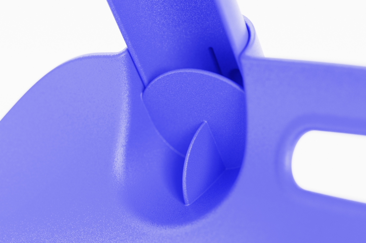
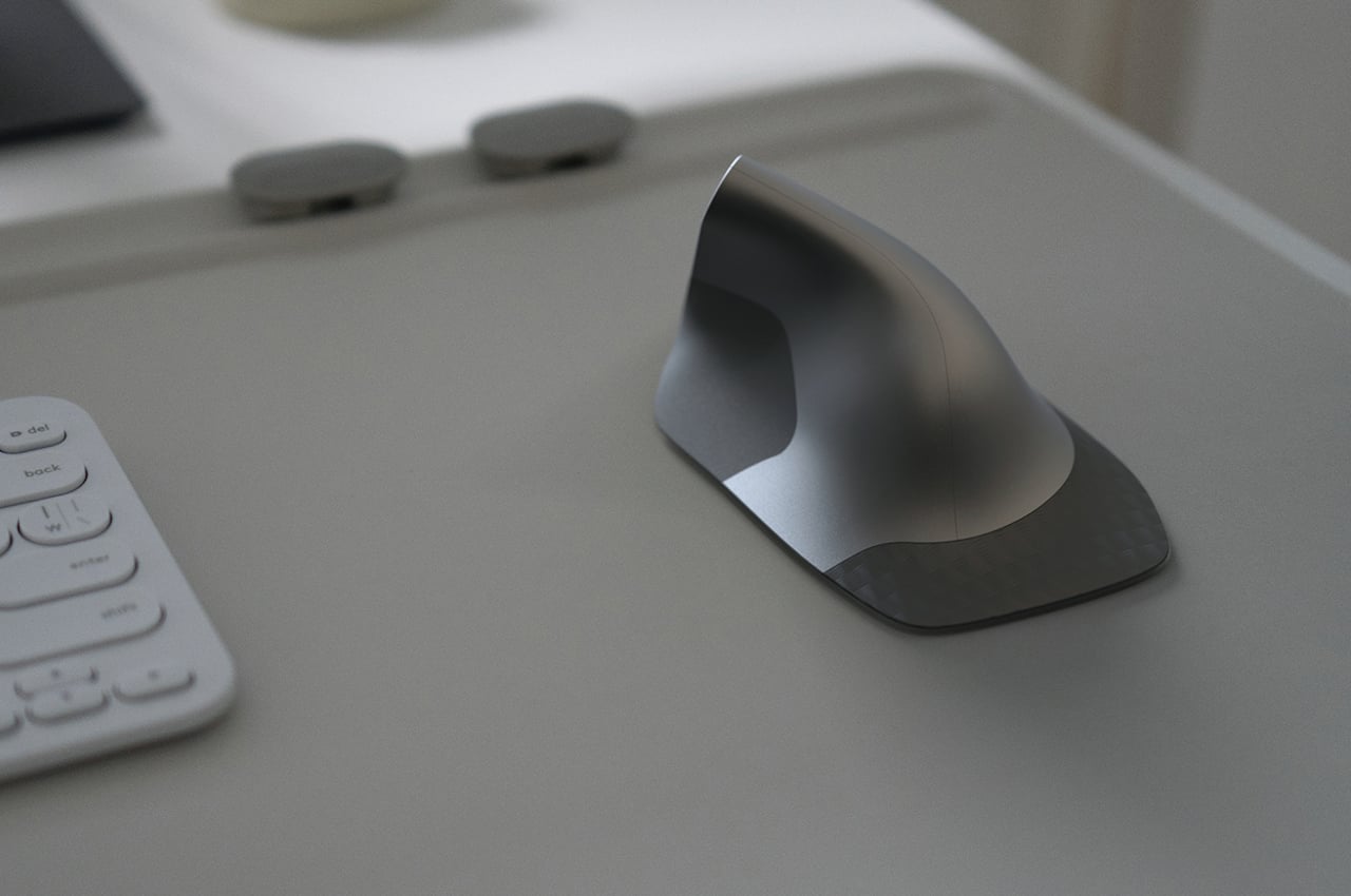
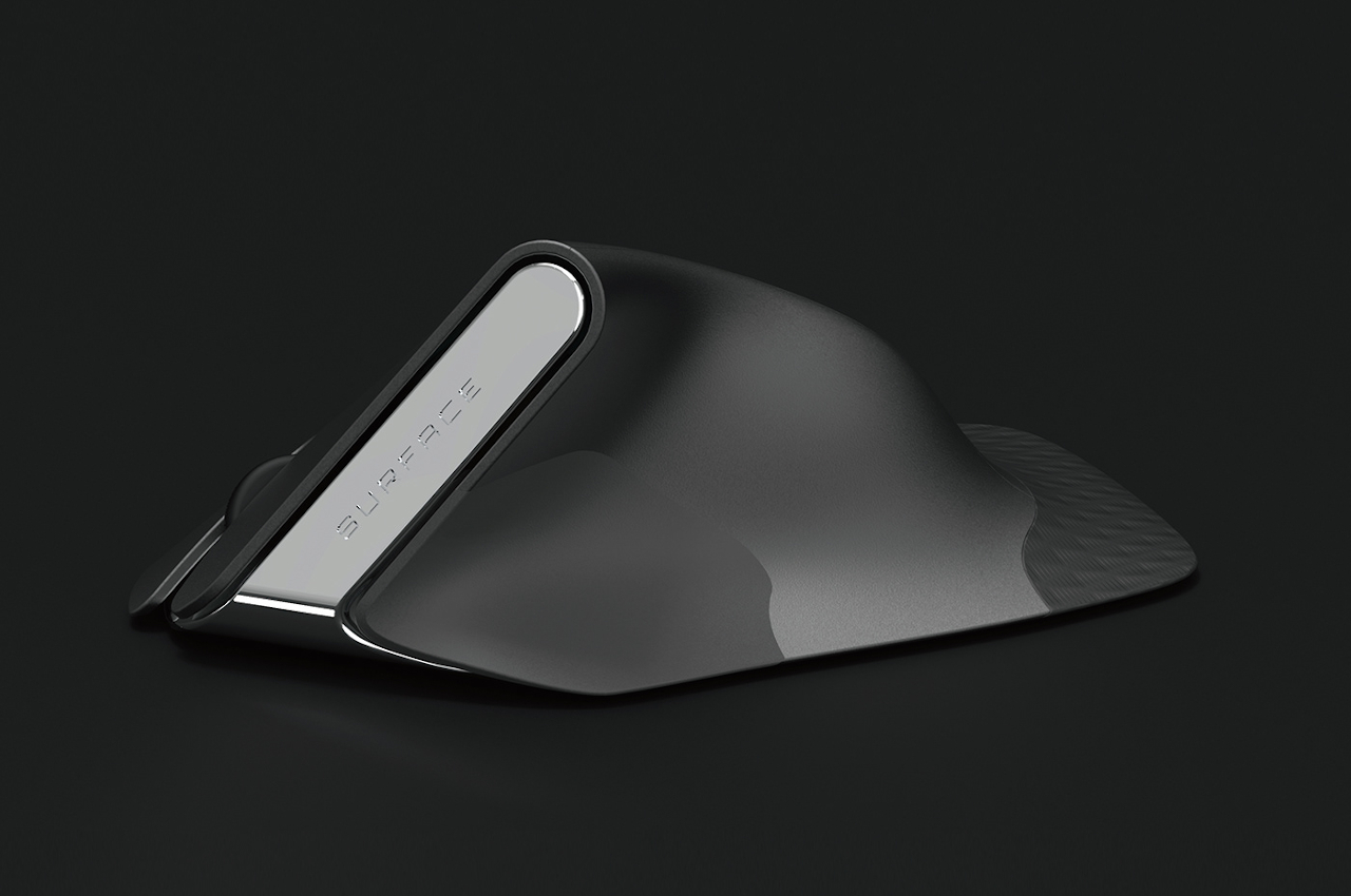
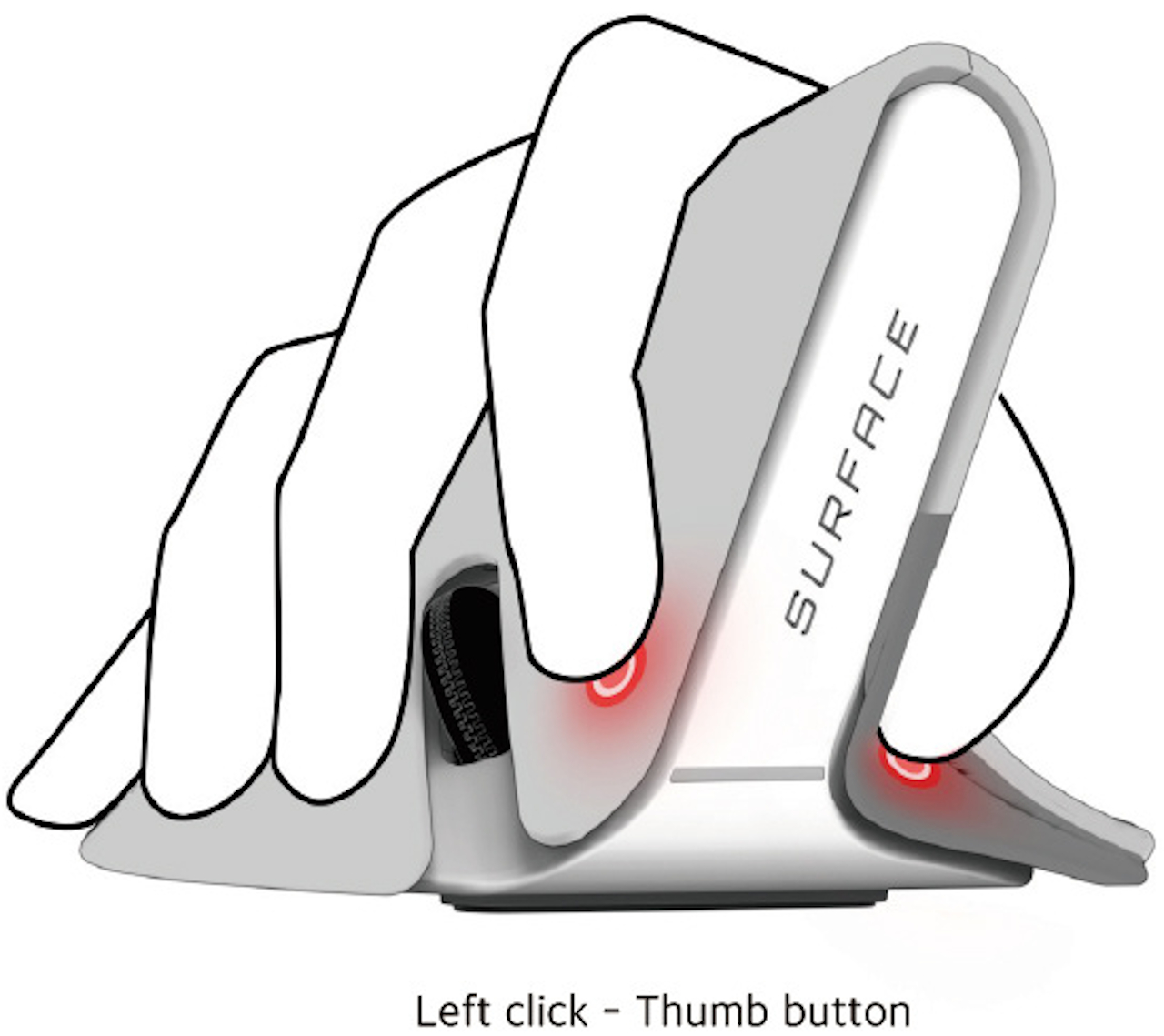
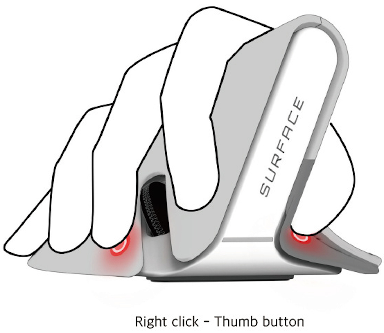
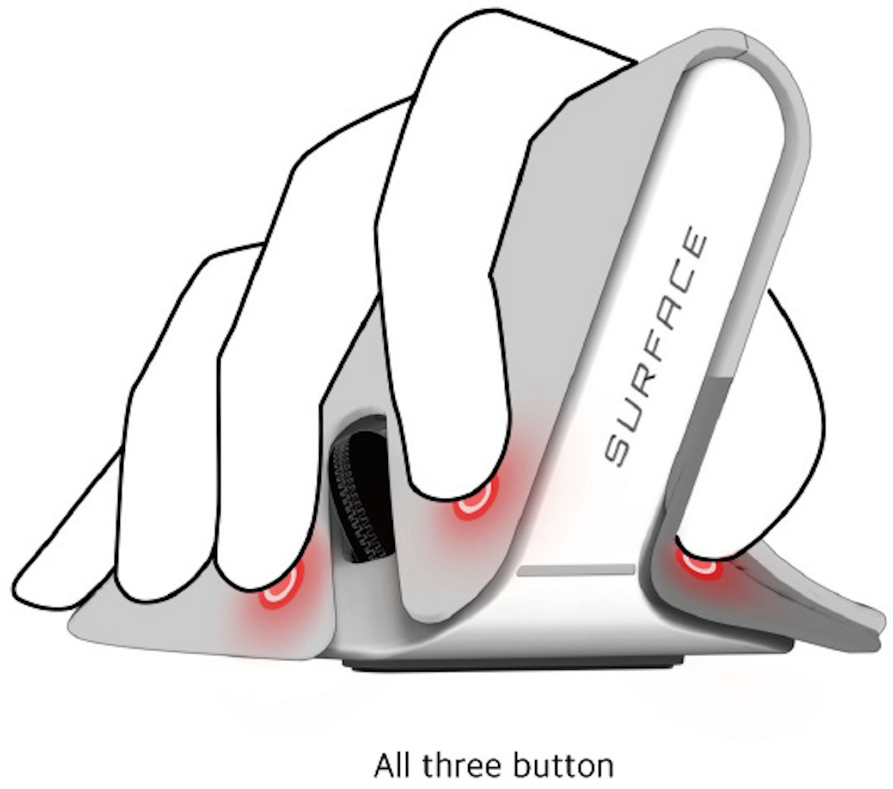
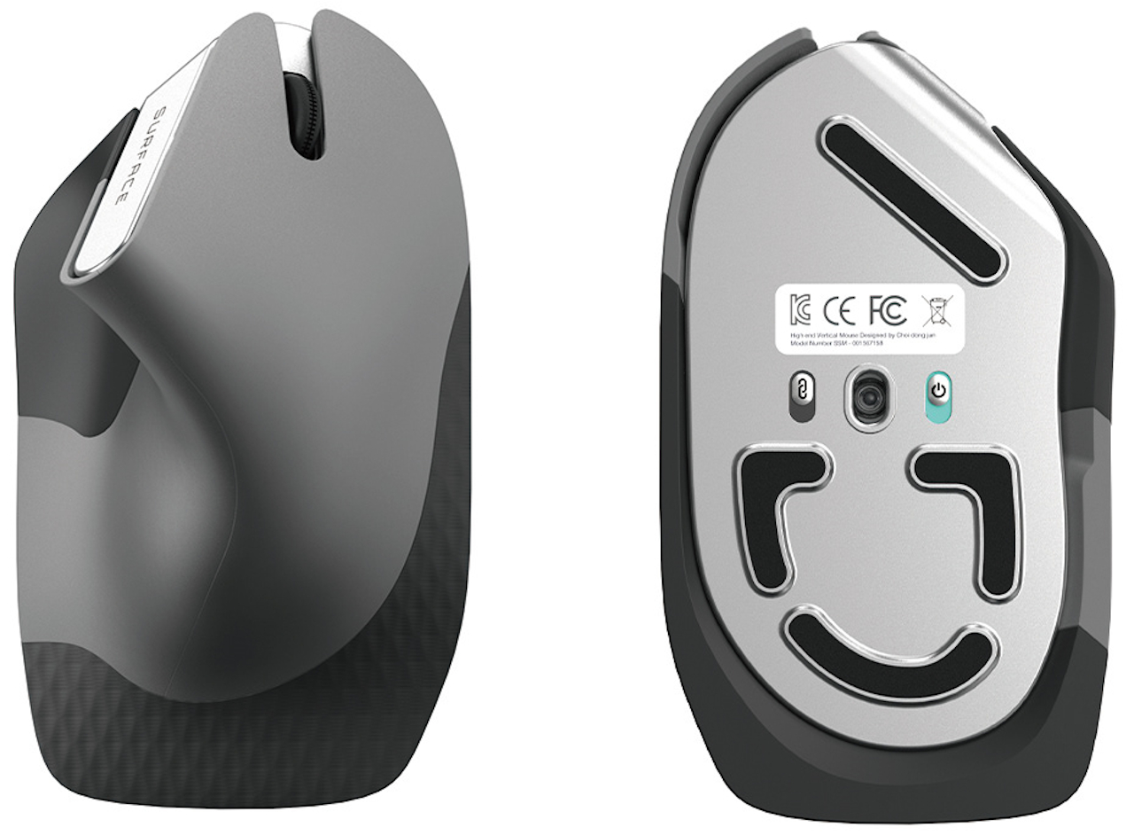
Given how we’ve been conditioned to use such mice for years, the design of this input device is admittedly alien and might even look awkward. You grip the elevated part of the device like a joystick, nestling the curve between your thumb and index finger. This idea is similar to a few other concept designs, suggesting there could really be something to this ergonomic form. What makes this design rather unique is the placement of buttons on the mouse, which is to say, there are no visible buttons at all.

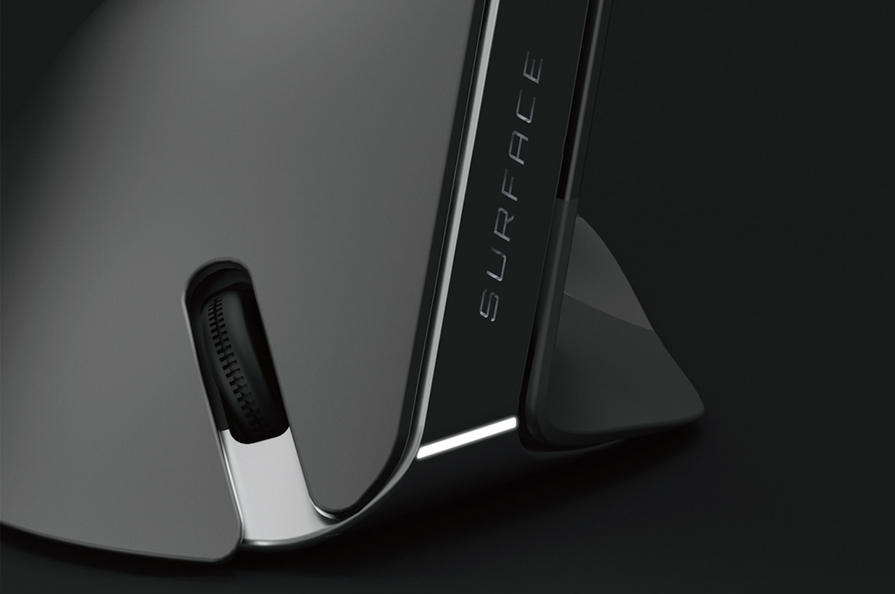
There are no distinct mouse buttons, but there are three pressure-sensitive areas where the thumb, index finger, and middle finger would normally rest. Rather than being mapped to the typical left, right, or middle buttons, the mouse relies on gestures instead. A pinch would correspond to a left click while pressing the thumb and middle finger could be a right click. There’s also the option to press all three areas, which could be configured to act as the middle button.

The concept design still relies on the same optical technology used by today’s mice, so you’ll still have to move your hand around the desk to move the cursor. That, unfortunately, could still lead to injury and also needs to be addressed as well. In the ideal future, we probably wouldn’t need mice or even keyboards anymore, but that would be an even bigger leap compared to simply changing the mouse’s design today.

The post This ergonomic mouse concept tries to break free of traditional designs first appeared on Yanko Design.

Lenovo Legion VR headset tries to be the Meta Quest 2 of China

Virtual and augmented reality news seems to have taken a backseat these days. Even coverage about the Metaverse has somewhat died down after the initial hype and frenzy. Of course, it’s not that these technologies and buzzwords have actually disappeared, just that the market is slowly starting to settle down and become less sensational. That said, there still aren’t that many mainstream VR headsets available, especially in some markets with restricted access to some brands and technologies. Their design also still has plenty of room for improvement, especially in terms of convenience and comfort. Although Meta’s (formerly Oculus’) Quest 2 and HTC’s Vive seem to be the top two choices in VR, Lenovo is taking another stab at that market, particularly one that Meta can’t reach.

Designer: Lenovo

This isn’t Lenovo’s first virtual reality headset, not by a long shot. Since 2017, it has dabbled in that space and experimented with wildly different designs. There’s the Mirage Solo, for example, which was a standalone headset for Google’s now-defunct Daydream platform. And then there’s the Lenovo Explorer that ran the Windows Mixed Reality and would have made you imagine you were cosplaying as Cyclops from X-Men. This time, Lenovo is attaching its Legion gaming brand to its latest headset, and it’s taking on the Meta Quest 2 in both looks and specs.

The Lenovo Legion VR700 didn’t have much fanfare when it was announced a few days ago, probably because it is serving only one country so far. With no word on a global launch yet, Lenovo’s new VR headset might be limited to the Chinese market only. Given its design, it’s almost a direct stand-in for the Meta Quest 2, which can’t be officially activated in China due to regional restrictions. The HTC Vive is available there, though, so it’s not like Lenovo can claim dominance in the market even with this Quest 2 look-alike.

Some might consider it unfair to even suggest that Lenovo is copying Meta (or Oculus), though there are definitely some similarities you can’t ignore, like the design of the visor as well as the controllers. The two also have some similar specs, like the aging Qualcomm Snapdragon XR2 chipset that allows the headset to function without being tethered to a computer. Then again, the designs of VR headsets, as well as their basic hardware, have become almost too common for any single headset to claim originality.

What the Legion VR700 does differently, however, is the way it has designed the head strap for comfort and balance. The main strap wraps around the head as normal, but there is no third strap that goes over the head of the wearer. Additionally, the battery pack is located at the back of the head mount, creating a counterbalance to the heavy visor on the front. This tries to solve one of the biggest problems with front-heavy headsets that become tiring after long periods of use.

Whether the Lenovo Legion VR700 makes it big in China will largely depend on the software platform it will use. Without something like Oculus or Vive, Lenovo might be forced to come up with its own VR experience, which isn’t that easy to pull off these days. If that is the case, the VR700 headset could fall flat on its face, no matter how cheaper it is than the competition.

The post Lenovo Legion VR headset tries to be the Meta Quest 2 of China first appeared on Yanko Design.

Electric guitar with a curved fretboard offers a much more ergonomic experience

Meet Curvo, a guitar that’s far from traditional. Although the knee-jerk term is to call Curvo an electric guitar, it is in fact, an electronic guitar that works using touch and velocity sensors sort of like a MIDI controller. The absence of strings, however, isn’t a feature but rather the consequence of a feature. You see, unlike any guitar ever made, Curvo comes with a radically curved fretboard that’s designed to make playing, jamming, and shredding much more comfortable without causing repetitive strain injury to parts of your palm, fingers, and wrist.

Designer: Ezra Feldman

“A guitar is somewhat of a ‘primitive’ instrument and the players have to maneuver themselves around the instrument in order to play – which can lead to the misuse of the instrument”, says Curvo’s designer, Ezra Feldman. “Over time this will result in injury.”

While instances of injury with guitarists is rather rare, Feldman does have a point. The guitar was designed primarily around the fact that it required a straight fretboard with taut strings hovering over it. Remove the strings and you’ve removed the one barrier that’s stopping you from making the guitar more ergonomic. With the strings gone, Feldman was allowed to curve the fretboard, allowing your hand to move much more freely in an arc shape, so your elbow and wrist don’t have to do much of the work. This shifts the movement to your shoulder, reducing the strain on your wrist and your fingers from having to stretch and contort in weird shapes while you play.

Without strings, the Curvo is free to be a much more unique instrument. Rather than relying on electromagnetics and acoustics, Curvo uses sensors to detect which ‘string’ you’re pressing with your left hand, and strumming with your right. sensors built into the entire length of the guitar pick up on a variety of cues, from which string you’re pressing to how hard you’re pressing it. On the right side, velocity sensors capture the intensity of your picking or strumming, as well as which strings you’re plucking away at. All this data is then used to generate audio that corresponds to what you’re playing. Another major benefit of not having strings? The Curvo doesn’t need any sort of tuning, and always stays in tune no matter what.

However, to retain the kind of control you’d get from an electric guitar, the Curvo also comes with a set of knobs on the right to modulate effects and volume.

The way Curvo is constructed is different from your average guitar. While most guitars use wood or composites, Curvo uses Airsonic carbon fiber (like the one found on LAVA MUSIC’s guitars). It also uses soft plastic all along the fretboard, almost mimicking Roli’s Seaboard, and actually allows you to adjust the curvature of the fretboard depending on your own personal anthropometrics and your comfort level. For example, people with shorter arms will need higher curvature as compared to people with longer arms.

Given its electronic nature, Feldman also seized the opportunity to unlock Curvo’s true potential by making its sound infinitely customizable. Just like an electronic MIDI keyboard can pretty much play any sort of sound, Curvo can be programmed to play any sort of sound style too. Its app gives you access to a massive sound back and effect rack, while even letting you remotely adjust your guitar’s tuning to suit your needs. Moreover, you can even record music right to the app, create layers, and produce full-fledged tracks right on your phone!

The post Electric guitar with a curved fretboard offers a much more ergonomic experience first appeared on Yanko Design.

ASUS Zenfone 9 could be the mini flagship you’ve been waiting for

They were ridiculed at first, especially by those from Apple’s camp, but the gigantic phones previously known as “phablets” have become the norm today. Naturally, there are now people wishing for the old days, with phones that don’t like they want to jump out of your hand and drop to the ground. These compact or mini phones are becoming rare, especially among the more premium smartphone models. Once in a while, however, there does come something that bucks the trend and offers something that seems to answer those cries. Based on an accidental leak from the manufacturer itself, the ASUS Zenfone 9 could very well be that blast from the past that you’ve been waiting to happen for a very long time.

Designer: ASUS

Smartphone design has always been a matter of making compromises. After all, you can’t throw everything, including the kitchen sink, inside a device that should still fit in your pocket. Today’s breed of smartphones almost make that impossible with their extra-large screens, and foldable phones were conceived as another form of compromise. Of course, one could just adopt a slightly smaller screen, and ASUS seems to be going old-school with its next high-end flagship.

Granted, 5.9 inches is hardly small compared to iPhones before the 2019 iPhone 11, but it’s significantly smaller compared to today’s premium devices. While it does mean that it has a more compact and handier size, it also means there’s less space to view content, especially with rather sizable bezels around the screen. To some extent, ASUS is prioritizing ergonomics over functionality, which seems to go in line with its vision of using the Zenfone 9 as a sports action camera with the right accessories.

The phone also has a headphone jack, something that has become almost extinct in smartphone designs. Even the modular and repairable Fairphone 4 has eschewed this connection in favor of a single USB-C port for both charging and audio output. With the Zenfone 9, however, you won’t have to ignore your wired audio equipment or spend for an adapter that you will often lose. It’s a subtle yet important feature for those who aren’t in the market to buy new speakers or headphones. And despite that gaping hole, the phone still boasts the highest dust and water resistance rating for its kind.

Unfortunately, the compact size of the Zenfone 9 makes the two cameras look even bigger than they would normally be, like two bulging eyes peeking from the phone’s back. As mentioned, ASUS seems to be aiming for practicality and ergonomics rather than aesthetics, and the Zenfone 9 won’t be a looker, at least not in a good way. In exchange, however, the phone’s main camera is being promoted to have 6-axis stabilization, which makes it a good tool for recording sports or active scenes. Given its smaller size, it would give you a better grip to make that happen as well.

Since the promotional video was taken down, it’s not entirely certain whether this is the final form of the ASUS Zenfone 9 or just an early concept. Given the mainline Zenfone’s history, it’s not that far from reality and could be the real deal. It’s definitely an outlier in the smartphone market, so it’s good that consumers still have a choice when looking for these rare features. Hopefully, next year’s Zenfone will be able to deliver the same things but in a more aesthetically pleasing package.

The post ASUS Zenfone 9 could be the mini flagship you’ve been waiting for first appeared on Yanko Design.

This revolutionary ergonomic pen with a ‘low centre of gravity’ uses basic physics to provide the ultimate writing comfort

You’ll never take pens for granted again after you’ve used one that is designed to make writing feel so natural and free.

Pen designs are a dime a dozen, but the majority of them are simply fat sticks that let you leave ink marks on paper or other surfaces. Some pens are beautifully designed, but few are made to make the act of writing both pleasurable and painless. Some pens do come with ergonomic shapes that let you grip the barrel more comfortably, but some of these also come with heavy clips or caps that make the entire shaft more top-heavy. This pen, in contrast, uses simple physics to elevate the writing process and, in turn, help elevate your thinking process as well, making it feel as if gravity is pulling down not only the ink but also the ideas you want to put on paper.

Click Here to Buy Now: $39 $45 (15% off). Hurry, only 5/75 left!

It’s easy enough to take for granted how well a pen is constructed. After all, what else do you need aside from having ink flow unhindered from the chamber through the nib and onto the paper? When your life starts to depend on that writing activity, figuratively and literally, and your writing hand starts showing signs of daily strain, then you start to become more conscious about how the right pen can make or break your flow, almost literally too. Many pens labeled as “ergonomic” have specific barrel shapes or grips, but this pen takes ergonomics to the next level.

Most pens are strangely designed to be top- or back-heavy, with the end opposite the nib having the most weight. In effect, this creates a sort of counterweight that causes the nib end to get lifted, forcing the writer to exert more effort in keeping it down. The end result is that writing feels a little bit more forced, putting unnecessary strain on the fingers and the hand. More than just a physiological effect, this design also has a subtle psychological effect that makes the process of writing less enjoyable.

The Gravity Pen puts the center of gravity closer to where your fingers are, making it easier to make more agile strokes. The pen pulls that off with a grip that’s larger than the barrel, expanding the area of grip for a more comfortable hold. The faceted form of that grip also makes it easier to grip the pen, allowing for a more stable grip as well. It’s the ultimate ergonomic pen design, thanks to a smart application of physics and minimalist design principles.

Of course, the Gravity Pen isn’t just ergonomic. It is also sleek and handsome, thanks to that same minimalist character. Made from aluminum alloy, the pen is durable while still maintaining a light and comfortable 20g weight. It’s also easy to use, with a simple twist mechanism to reveal or conceal the nib. No caps to lose or clickers to break, just pure, unadulterated joy of writing.

Compatible with SCHMIDT P900M refills, you won’t have to worry about having to part ways with this ingenious pen when the ink literally runs dry. Ergonomic and elegant, this Gravity Pen lets physics do the work in keeping the nib close to the surface, leaving your brain free to focus on the most important task at hand. Plus, it looks fabulous on any desk, especially when standing proud on our Wooden Pen Holder.

Click Here to Buy Now: $39 $45 (15% off). Hurry, only 5/75 left!

The post This revolutionary ergonomic pen with a ‘low centre of gravity’ uses basic physics to provide the ultimate writing comfort first appeared on Yanko Design.

This chunky palm-sized DIY laptop cleverly hides a split ergonomic keyboard

We’ve seen our fair share of small laptops over the past years, some of them made and sold by actual manufacturers, while others are works of love and passion by hobbyists. Tiny laptops, sometimes called palmtops, have the advantage of portability over normal notebooks, but they are terrible when it comes to comfort while typing. You can only cram so many keys in such a small space, forcing designers and users to perform finger acrobatics to activate additional keys. That’s not even considering yet the ergonomics of bending your wrists to fit your fingers in such a cramped space. That is the problem that this bulky “palmtop” tries to address by miraculously fitting a slightly more comfortable keyboard in a 7-inch space.

Designer: Daniel Norris

This contraption isn’t called the Chonky Palmtop for no reason. Unlike other DIY laptop projects, this one makes no qualms about being a large plastic brick. It’s not going to be usable on your palm, though you probably won’t use it like that anyway. After all, what makes this special is how it tries to make typing a bit more comfortable on a laptop of this size.

The secret is that it splits the keyboard into two halves, adopting a layout that is similar to those ergonomic keyboards you’d find in the market. Those, however, are giants compared even to regular keyboards, so the designer that created this wonder of engineering adopted a sliding mechanism that allows the halves to fan in and out as needed. Even this kind of keyboard layout is still no match for a proper typing tool, but it is loads better than the cramped keyboards on some 8-inch laptops.

That mechanism is one reason why this machine is so “chonky,” but it isn’t the only culprit. A full-sized Raspberry Pi 4 is used, along with additional components for the battery and the controller for the 7-inch touch screen display. Very few compromises were made, so these pieces are used in their full form, leading to a very large chassis to house everything. That and the keycaps themselves are your chocolate keyboard sizes, adding to the overall height of the laptop.

As with most DIY computers, assembling this one takes a lot of effort and soldering work. Fortunately, the thinking and designing involved are already done, and Daniel Norris generously lists almost everything you need. What software you run on this thing really depends on you, but the RPi itself is quite preferential to specific flavors of Linux.

Of course, it does raise the question of whether you’d even want to use a computer of that size for your everyday needs, but it also raises the need for better computer keyboards in general. Hopefully, laptop designers will figure out a mechanism like this that will enable ergonomic keyboards to fit in cramped spaces, making portable computers less of a pain, literally.

The post This chunky palm-sized DIY laptop cleverly hides a split ergonomic keyboard first appeared on Yanko Design.

Dell XPS 13 Plus tries to evolve the laptop with questionable features

Laptops have become the go-to computing solutions of people, be it for personal use or for work. They have reached a point where they can match desktop computers in all but the most specialized cases, though the ability to expand their power through things like external graphics docks evens out the score as well. Laptop design, in general, has remained the same in the past few decades, at least as far as the placement of components goes. Some have, of course, become thinner and lighter have almost all but banished bezels, but the placement of screens, keys, and trackpads are more or less standard by now (even if keyboard layouts aren’t). Dell, however, is trying to mix things up a bit to make the laptop look more futuristic and less busy, but it raises some important questions about the usability and ergonomics of such a new design.

Designer: Dell

Laptop Ergonomics

One can argue that laptops have never been the most ergonomic computing devices in the first place. Their overall design was meant to make a computer more portable, going as far as being able to use it on your lap. The strain it puts on your legs and neck, and the angle of your arms and wrist have made laptops have made the earliest laptops the anti-thesis of ergonomics.

Things have improved over the decades, but more thanks to accessories and peripherals rather than the actual design of laptops themselves. The position and angle of the screen, keys, and touchpad still don’t lend themselves well to good posture, and manufacturers haven’t exactly been too keen on changing a working formula. Instead, the likes of Dell, ASUS, and Lenovo have tried to reinvent the laptop with features that drastically change how you use it.

ASUS, for example, has been putting a second screen right above the keyboard, which ends up pushing the keyboard further down. This means that the traditional trackpad is given the boot, though technically, it has been relocated to the right side as a configurable second screen. Lenovo takes that to the extreme by actually putting a tablet-sized display to the right of the keyboard, though the trackpad is still there, now off to the left instead of dead center.

Dell XPS 13 Plus

Compared to those two, Dell’s big changes to the laptop design almost look modest, though they carry their own head-scratching moments. In a nutshell, the new Dell XPS 13 Plus embraces minimalism to its fullest, giving the area opposite the display a completely flat look. That means no bumps and almost no gaps save for what’s necessary for the keycaps. Even then, the gaps are minimal, thanks to what Dell calls a “zero-lattice” keyboard.

There’s also a touch-sensitive area above the keyboard that serves as the function keys. We’ve seen a similar technology with the MacBook Pro’s Touch Bar, which was equally controversial. The difference is that Dell’s version is clearly minimalist and blends cleanly into the background, without any visual separation between that area and the rest of the laptop.

The biggest change, however, is the invisible trackpad. It’s still there and occupies the same area as a regular trackpad, perhaps even bigger, but there’s no clear way for you to actually see where it is. You’re given haptic feedback, so you’re not completely clueless, but it remains to be seen (or felt) how effective that will be in practice.

Eye Candy, Touch-Deprived

Dell definitely accomplished what it set out to do with the Dell XPS 13 Plus. The laptop is truly beautiful and clean; a minimalist dream’s come true. As an added bonus, the PC maker took steps to reduce the carbon footprint of the laptop, both during its production as well as its packaging. It definitely checks most of the boxes of product design and sustainability. It does, however, leave some questions hanging when it comes to other aspects that would affect how people use the product.

The MacBook Pro Touch Bar wasn’t exactly that popular, and the XPS 13 Plus’ version actually misses out on some of the flexibility and benefits of a screen-based solution in favor of a minimalist design. The lack of physical keys could make it harder to hit them by muscle memory, so you’ll always end up looking down. The same could almost be said of the zero-lattice keys, whose larger sizes could be negated by the very same thing that makes them special. Our fingers almost instinctively know the keys to hit, partly because of how they feel with those bumps and gaps in between keys.

The biggest question mark, however, is the invisible trackpad. It might take a lot of trial and error for people to get used to where the active area is or how far it extends. There is no argument that it definitely looks elegant in its cleanliness, and we give Dell the benefit of the doubt that it did due diligence in R&D, but we’ll have to wait and see for real-world feedback on whether this beautiful but unusual $1,299 laptop is worth those changes.

The post Dell XPS 13 Plus tries to evolve the laptop with questionable features first appeared on Yanko Design.

Meditation Desk Chair Lets You Sit Cross-Legged at Your Computer

The Pipersong Meditation Desk Chair is a desk chair designed for sitting cross-legged at your computer, so you can get your work done and align your chakras simultaneously. MULTI-TASKING. Not only is the chair suitable for cross-legged sitting, but also a variety of other unorthodox seated/kneeling/squatting positions so you can “activate your sit” or switch between numerous positions without the need for more chairs. Me? I’m lying in bed right now.

The chair is available on Amazon (affiliate link) in four colors and features 4″ of vertical adjustment in the seat, as well as a footstool with 360-degrees of swivel motion, so it can be placed to the side or behind you in the event you want to sit traditional style. Alternatively, greet coworkers crouched on your desk like a tiger about to attack. HR loves it when I do that.

Hey, whatever increases blood flow and prevents my legs from going numb, I’m all for. I hate walking on numb legs. Honestly, I hate walking in general. I mean, where the hell are the hoverboards Back to the Future II promised we’d have by 2015? You lied to me, Robert Zemeckis!

[via DudeIWantThat]

bold is a foldable legless chair concept that will have you rocking on the floor

Everyone needs a place to sit down once in a while, but not every place has a dedicated seat or chair. Some might have simple raised structures that force you to precariously perch your behind on a surface, while others just have a flat floor to work with. You can always bring your own stool or sit anywhere on the floor, but that often poses problems for your back. This design concept tries to make a bold statement on portability and lumbar support but leaves the door open for questions about its ergonomics and comfort.

Designer: Wonjun Jo

1

Legless chairs are becoming more popular these days, especially with the rising prices of living spaces and furniture. It allows you to have a seat without having to commit to a more or less fixed setup, especially when there’s a desk involved. For some people who actually prefer sitting near floor level, it’s actually more comfortable, depending on the design of the chair.

As with regular chairs, the design of legless chairs comes in all shapes and sizes. Most of them, however, try to offer an almost literal slice of a couch or sofa in terms of cushioning and upholstery. bold, however, goes in a completely different direction with a bigger focus on being space-efficient when not in use and providing support for your lower back.

bold doesn’t actually fold and more like separates into two parts. These parts can then be rejoined in a flat form that makes it look like it folded down instead. The entire weight of the chair is 0.785kg, and it’s only 5mm at its thickest part, making it extremely portable. You can, in theory, take it anywhere with you and set it up on any ledge, allowing you to sit without worrying about straining your back.

The backrest flexes a bit, though, but that design is intentional in order to provide proper support in the lumbar regions. The designer says it can still withstand 200kgf of force, so safety wouldn’t be an issue, at least in theory. The biggest question, however, is where it would be comfortable to sit on or even stable.

The curved shape of the seat itself means that it will be rocking back and forth on a flat surface. The hard material of the entire chair, which is presumably plastic, doesn’t exactly exude an air of comfort. The designer might have perhaps spent too much time trying to defend the idea of a sturdy, foldable chair while potentially forgetting how a legless chair also needs to be comfortable, or perhaps even more comfortable than a typical seat with legs.

The post bold is a foldable legless chair concept that will have you rocking on the floor first appeared on Yanko Design.

Honor Magic 4 Ultimate phone design stands out in the wrong ways

Smartphone cameras are getting bigger, and manufacturers are getting bolder with their designs. Former Huawei subsidiary Honor seems to be taking both ideas to hear, but not exactly in a good way.

It’s not unusual for a single smartphone manufacturer to release multiple models under the same name, often to confusing effect. It’s also not unusual for those variants to differ slightly in their design, also to sometimes confusing degrees. Honor’s latest flagship, however, leaves no room for ambiguity as there is currently no other smartphone that looks like it. Hopefully, there will also be no other smartphone that will ever look like it, and brands will stay away from a design that brings attention to itself without providing many benefits in terms of usability or aesthetics.

Designer: Honor

Design Consciousness

Smartphone brands have thankfully become more conscious of the designs of their products, both in terms of visual appeal and ergonomics. Formerly believed to be Apple’s territory, some companies have become more attentive and even more talkative about the design thinking behind their latest creations. This means that the smartphone industry has started to move towards making these devices more human and more humane, appealing to the senses as much as they appeal to the mind.

Sometimes it works, like in the case of the iPhone and, more recently, OPPO’s and realme’s bold designs. While all products naturally go through the process of product design, not all smartphones reflect this in their final form. Brands like Samsung and Huawei are more than happy to wax philosophical about their design process, but the best designs are the ones that really don’t need a documentary to go along with them.

In some cases, it almost feels as if there wasn’t much thought given to the design at all, resulting in something that looks and feels like a mishmash of ideas and design elements. It’s almost as if someone simply took pieces that may have worked in older products and then smashed them together, hoping that the result will be the sum of its parts.

Center of Distraction

You can almost see that in the Honor Magic 4 Ultimate, the latest and probably final variant in the Magic 4 series from the old Huawei sub-brand. The large circular camera bump is not exactly new, and the gently rising structure has been done before as well. With the Magic 4 Ultimate, however, these elements are magnified to the extent that makes them the visual and conceptual focus of the phone.

To some extent, that’s actually true and probably intentional. The Honor Magic 4 Ultimate was launched with a heavy focus on the cameras, which occupy more space than most camera arrays do. It’s not like they actually need that much space, especially if they are arranged in a more compact and efficient manner. Honor intentionally chose a design that enthrones the cameras, as if the phone is a digital camera first and only a phone second.

Unfortunately, the smorgasbord of visual elements plays against each other in an almost disharmonious way. In effect, you have a large circle enclosing a hexagon with smaller circles in it and a rectangle in the middle with another circle inside. There are times when a mix of shapes and forms contrast with each other in a pleasing manner. This doesn’t seem to be the case, and the arrangement of elements seems almost messy.

Ergonomic Balance

There’s also the way how the camera bump is made to look like it’s rising out of the back of the phone. To its credit, Honor tried to make it look more natural with inclined planes from the top and from the bottom, rising to meet the camera bump’s elevation. Some manufacturers or models, like other Honor Magic 4 variants, simply have the camera bump jut out like a wart.

Unfortunately, this creates both unnecessary visual noise and some level of imbalance. Due to the lack of space, the left and right sides of the camera bump don’t have the same inclined structure but instead make use of a soft, curved slope. The visual elements do effectively guide your eyes towards the camera bump but do so in a way that is almost jarring and confusing.

More importantly, the form of the camera’s back panel raises (no pun intended) questions about ergonomics. While Honor will boast of its ability to produce such a shape, it could make holding the phone more awkward and, worse, more prone to being dropped. The fingers, in particular, will be forced to curve around the incline, which could weaken the person’s grip instead of strengthening it.

The Honor Magic 4 Ultimate is definitely an interesting phone in terms of design, though that shouldn’t immediately be seen as a net positive. It is clear that Honor is trying to mix things up in order to make this particular model stand out from its own siblings, but it does so in a way that looks confused and contrived. It could even result in a worse experience as far as ergonomics are concerned, which makes it a good example of poor product design.

The post Honor Magic 4 Ultimate phone design stands out in the wrong ways first appeared on Yanko Design.