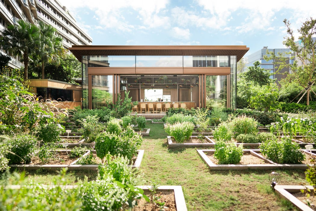
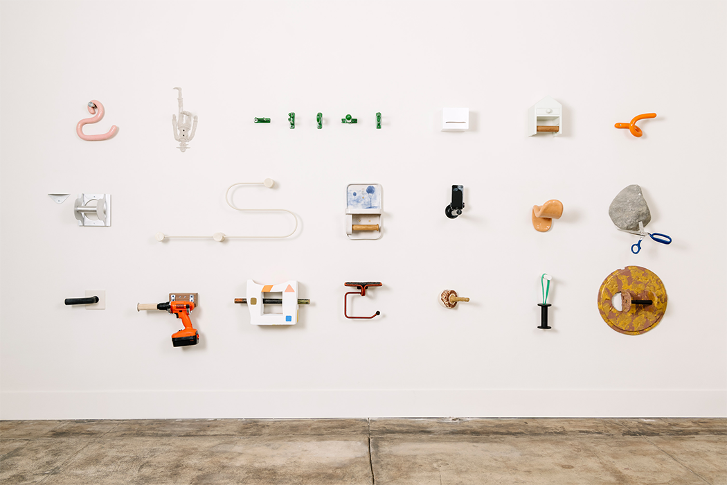
I find myself increasingly being asked which countries are on my watch-list for design growth and discourse, and the one answer I keep going back to is the East. Regions like Taiwan, Japan, Hong Kong, and Korea are truly experiencing a renaissance of design, especially with local and national authorities contributing towards and even sometimes spearheading the growth of design as a profession and a force for social good. Taiwan, for instance, has very rapidly become the epicenter of design in the east, having even organized large-scale international design awards and competitions to their credit… the Golden Pin Design Award and the Taiwan International Student Design Competition (TISDC) being among the most noteworthy. Couple their vast tech manufacturing resources, and their meteoric rise in the global design industry and you’ve got yourself a country that produces some of the most inventive, innovative, and inspirational design-driven products you’ll ever see. In fact, Taiwan’s Ministry of Culture and Taiwan Design Center are even putting those designs on display at the NY NOW Summer 2019 event in New York! Titled Fresh Taiwan, the exhibition aims at showcasing the island’s design power on a global scale. Fresh Taiwan consists of 10 handpicked designers and studios showcasing their work and their processes at NY NOW. We’re here to have a look at the designers and their creations that are making waves at Fresh Taiwan x NY NOW Summer 2019, Level 3 / HOME: Accent on Design — 3712.
Click Here for Fresh Taiwan Details

22STUDIO
With their incredible command over concrete, Taipei’s own 22STUDIO makes some of the most fascinating products that highlight concrete in ways that seem virtually impossible. Molding the grey building-material into something as precise as injection-molded plastic, 22STUDIO’s products have the cool, calming color and texture of concrete, but explore chiseled, simplistic forms that look absolutely like miniature architecture. Our favorite is the 4D Concrete Watch Automatic that showcases absolute depth with its stepped watch-face. No one does it better than 22STUDIO.
www.22designstudio.net

CELIA&PERAH
Commanding over wood and audio the way 22STUDIO commands over concrete, CELIA&PERAH specializes in making hi-fi audio devices with a rustic charm. Designed as incredibly capable speakers with great fidelity, CELIA&PERAH integrate a DIY aspect into their speakers where users put the model together piece-by-piece not only appreciating the nuances of great audio engineering, but also learning a bit about the product, while also creating a speaker that’s designed to be opened up, tinkered with, and repaired. CELIA&PERAH’s speakers use quality audio drivers that, for their size, can reach frequencies as low as 58Hz. Our favorite is the vintage-radio-esque R-Series DIY Bluetooth Radio that comes in Mono as well as Stereo formats.
www.celia-perah.com

Mordeco
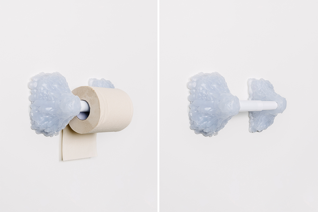
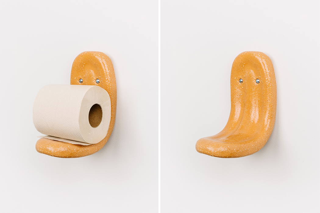
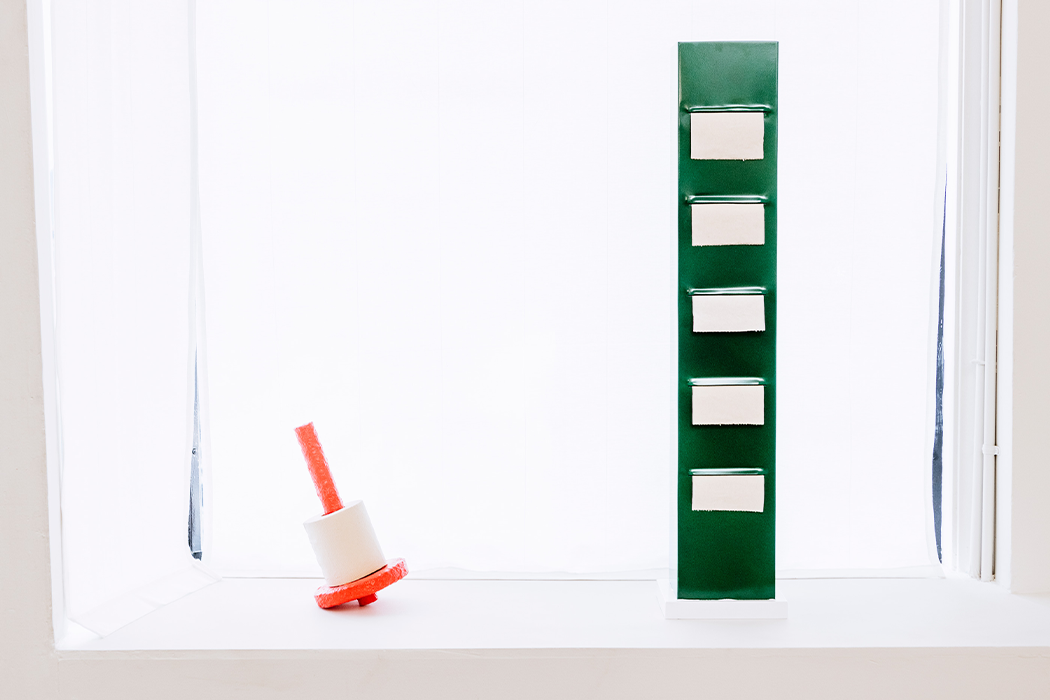
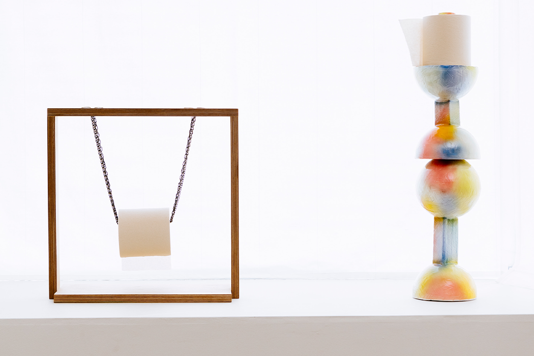
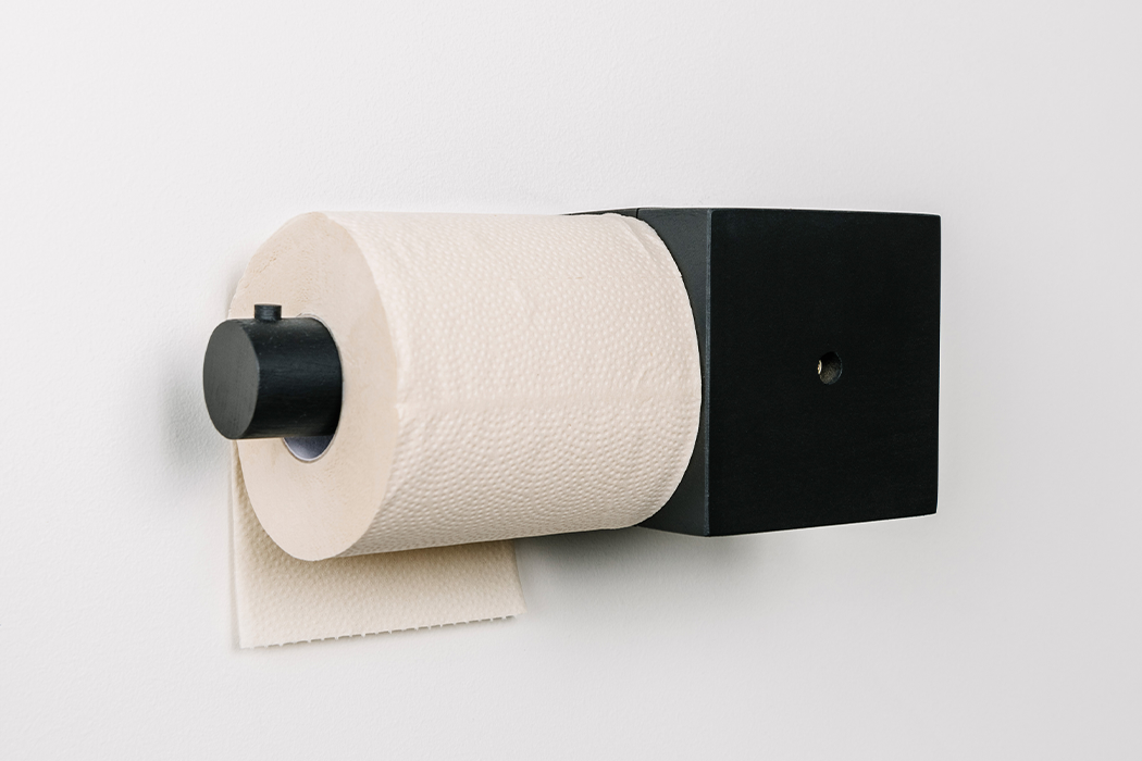
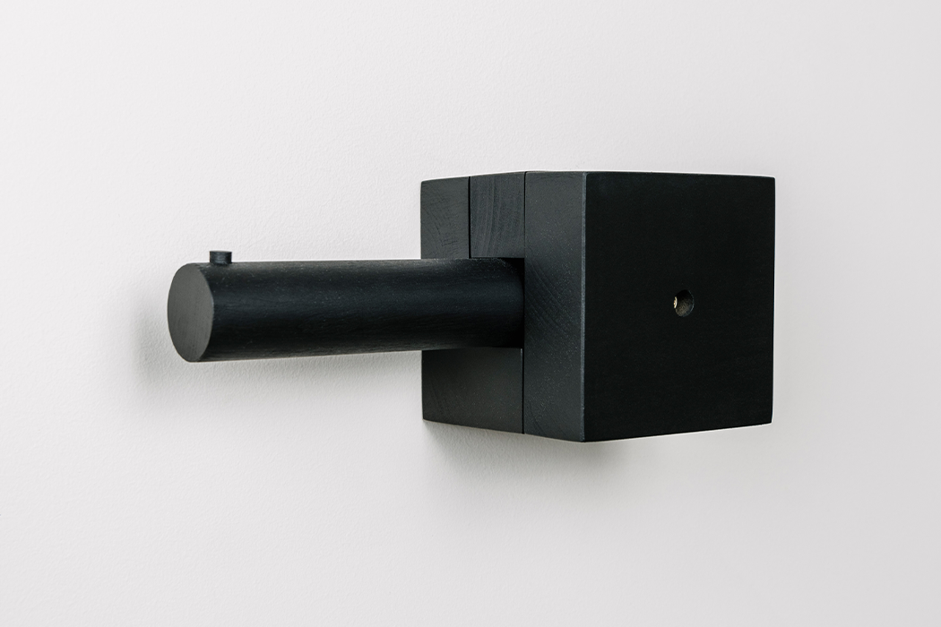
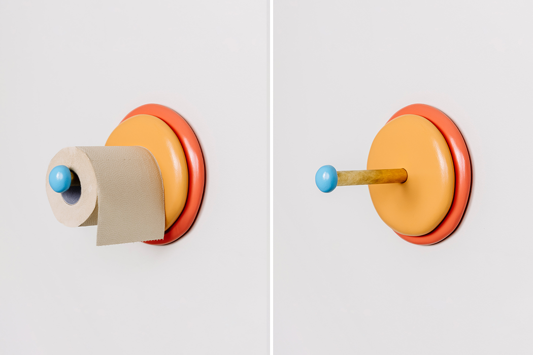
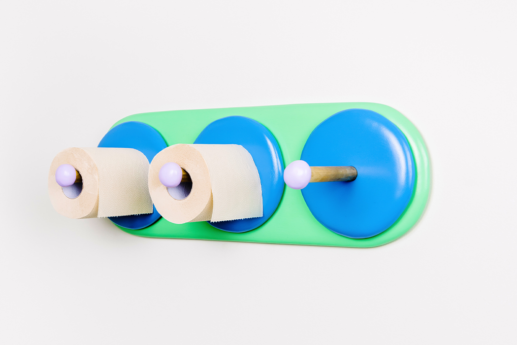
The name Mordeco perfectly captures the design studio’s ethos of being ‘more than decor’. Mordeco experiments wonderfully with forms, resorting to unlikely shapes for common objects, creating experiences that are either dominated by joy or curiosity, or a combination of both! One of our favorite Mordeco pieces has to be the MIRRO LED+ Tissue Ambient Light, which uses the napkin’s inherent fan-shape and a hidden LED light to make the napkin light up like a lamp!
www.mordeco.com

ystudio
ystudio focuses on creating some of the most cherishable writing instruments ever. Working traditionally with metal, ystudio’s pens come in all varieties, from ballpoint to fountain-tip, and they’re built to last an absolute lifetime, being valued as keepsakes and passed down generations as heirlooms. One of ystudio’s more rare, unique pieces is the YAKIHAKU PEN, which makes use of an Unryu foil, a rare, specialty material that gives the pen its unique, distressed aesthetic that’s unparalleled in its beauty.
www.ystudiostyle.com

Yenchenyawen design studio
Yenchenyawen design studio’s works combine minimal forms, quite characteristic of Japanese/Scandinavian design styles, along with the traditional art of Kintsugi, or porcelain-restoration using melted gold. Some of their unique processes involve copper patination, a procedure that requires the product to be buried up to 3 days for unique patinas to form on the product, creating bespoke patterns. Yenchenyawen design studio also explore Jesmonite as a material, bringing an eclectic mixture of cultures, materials, processes, and contemporary styles together to create products that virtually look as precious as jewelry!
www.yenchenyawen.com

eguchi toys
eguchi toy’s designs are all-natural and whimsical. Playing with basic geometric forms and using different sorts and types of woods to create unique looking toys, puzzles, and figurines, eguchi toy’s designs are fun, engaging, and have universal appeal! Our favorite? The flat-and-colorful Mobile Birds series!
www.eguchitoys.com

Studio Smoll
Studio Smoll’s high-street fashion bags feature a unique design element. Made from vegetable-tanned leather, the bags rely on a series of patented cuts and folds to be assembled, almost like Origami, without generating any waste leather trims. This environmentally conscious approach isn’t just a company mantra, it’s also a design aesthetic, because the bag designs are dictated by these design constraints. In fact, the bags are assembled by the users themselves, as they navigate around the leather sheets to magically transform them into tote-bags and purses!
www.studiosmoll.com

Kamaro’an
Bringing Taiwanese indigenous culture and fashion to the forefront, Kamaro’an makes some of the most unique-looking products that showcase delicate craftsmanship in their culture-heavy details. Kamaro’an’s bags are their forté, using woven leather to create some memorable details around the bag’s rim or around the handle. Talk about showcasing authentic Taiwanese culture on the world stage!
www.kamaroan.com/

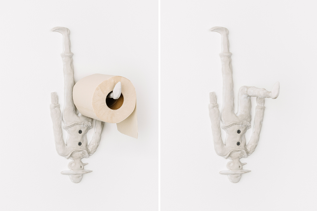
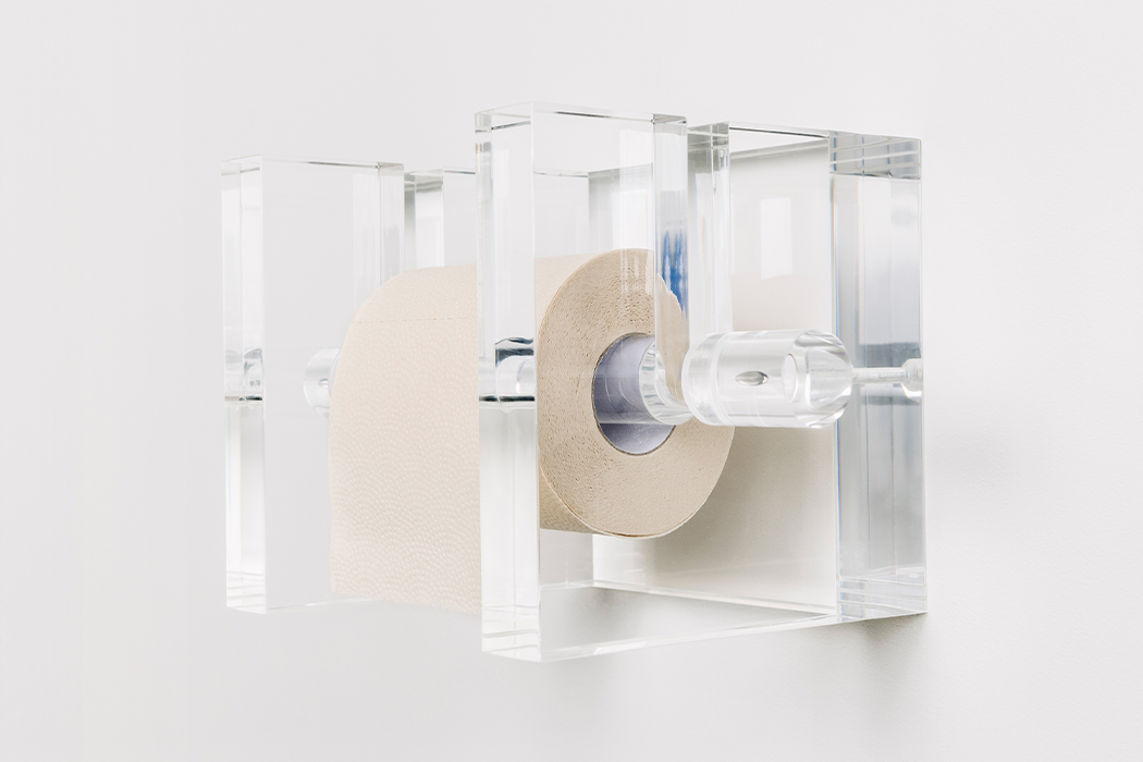
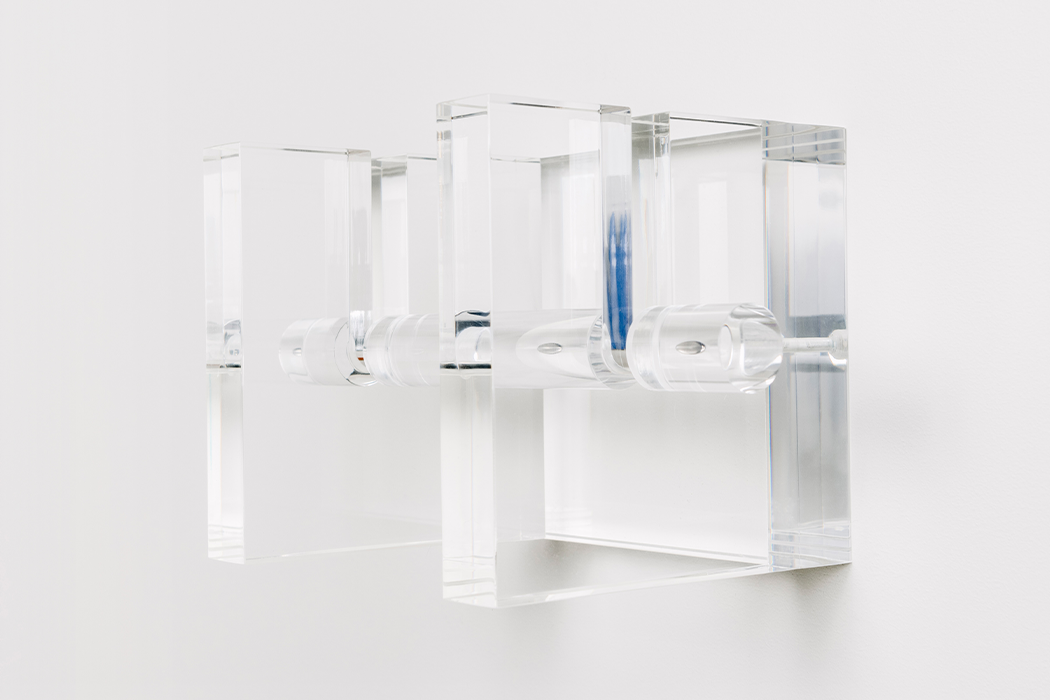
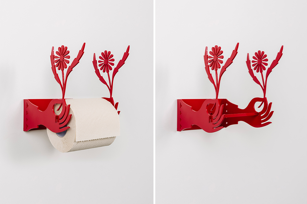
Kanari
Conceived in London and founded in Taipei, Kanari explores the symbiotic relationship between humans and objects. Playing with forms that you’re first confused by, then delighted by, Kanari’s products are like visual riddles… you figure them out as you use them. Even with their unconventional forms, Kanari’s products retain every bit of functionality, whether it’s a minaret-shaped bottle opener, or a clock with a skeletal framework around it. Form, function, emotion, Kanari’s products have them all.
www.studiokanari.com

PAPER SHOOT
PAPER SHOOT is responsible for creating some of the most unique cameras we’ve seen. Using materials not commonly found in consumer electronics, be it wood, acrylic, cork, papier-mache, or even something as bizarre as faux jadeite, PAPER SHOOT’s cameras are a combination of vintage, steampunk, and DIY. Designed as functional collectibles, the cameras are capable of great digital photography, although their material choices would suggest otherwise. A great fusion of old-world styling and rather contemporary technology. It’s honestly hard to pick a favorite!
www.papershoot.com.tw
Click Here for Fresh Taiwan Details