Even as more and more people have started going back to the office on a daily basis, the uncertainty of the times has forced many companies to switch to a hybrid arrangement that still allocates some working time at home. For some, the past two years have been enough to adjust to this kind of setup, but many more are still at a loss on how to survive the new world order. Creating a work from home or WFH setup doesn’t require hiring a designer, and you can easily build your work haven at home in just ten easy steps.
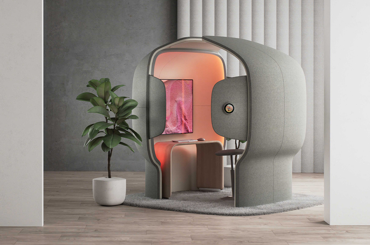
Designer: Microsoft
1. Claim the Space
One of the biggest problems people encountered when they were forced to work from home for the first time was realizing that they didn’t exactly have a dedicated space for it. Not everyone has a home office, and some don’t even have a spare room to convert to a workspace. Thankfully, work has also adjusted these days so that colleagues and even bosses don’t always expect people to be holed up in a closet away from the rest of the household.
That said, it is critical to still establish some space as your workspace, like staking a claim to some physical area of the house. Whether that’s a corner of your room or the dining table outside of meals, it’s important to designate a location to do your work. It doesn’t even have to be a single place as long as they will be the same two or three areas you use for work.
Designer: Tony Heap
Setting up a physical space isn’t just about creating order in the midst of the chaos of the home, though that is important as well. Having a designated spot for working has the psychological effect of preparing you for work whenever you approach that space with your tools in hand. You don’t have the mental transition that occurs when you enter and leave the office, so having a specific space for doing work becomes that switch your brain needs when working at home.
2. Set boundaries
Choosing a space at home naturally creates a physical boundary that separates your work life from your home life. That compartmentalization is easier to pull off when home and office are located in different places, but sometimes even just having a few square feet of dedicated space is enough to avoid overloading your brain. Not all boundaries are physical, however, and there are some walls that need to be built even when your office is in the living room.
Despite working from home, some offices still have set hours when they expect employees to actually be working. Whether or not you have fixed or fluid arrangements, you will need to establish the time when you will actually be using that space for work, especially if it’s actually a common family area just repurposed for work. This allows you to set ground rules when no one should bother you (unless it’s an emergency) and when it might be ok to invade your space from some much-needed cuddles. No guarantee pets will respect those rules, especially when cuddles are involved.
Designer: Juhee Park
Distractions, however, pose an even bigger problem than physical space and time. Even those with separate home offices find themselves in embarrassing situations when cute toddlers barge in during meetings. Accidents do happen, but it’s still important to lay down the law when it comes to your work time, even if you don’t have any door to lock in the first place. You can also wear headphones, even when you’re not actually listening to anything, as a visual reminder to everyone around you that you’re not supposed to be disturbed. Distractions coming from the Internet, like social media and chats, are sometimes harder to ward off, but there is no shortage of tools and apps to rein them in for a period of time.
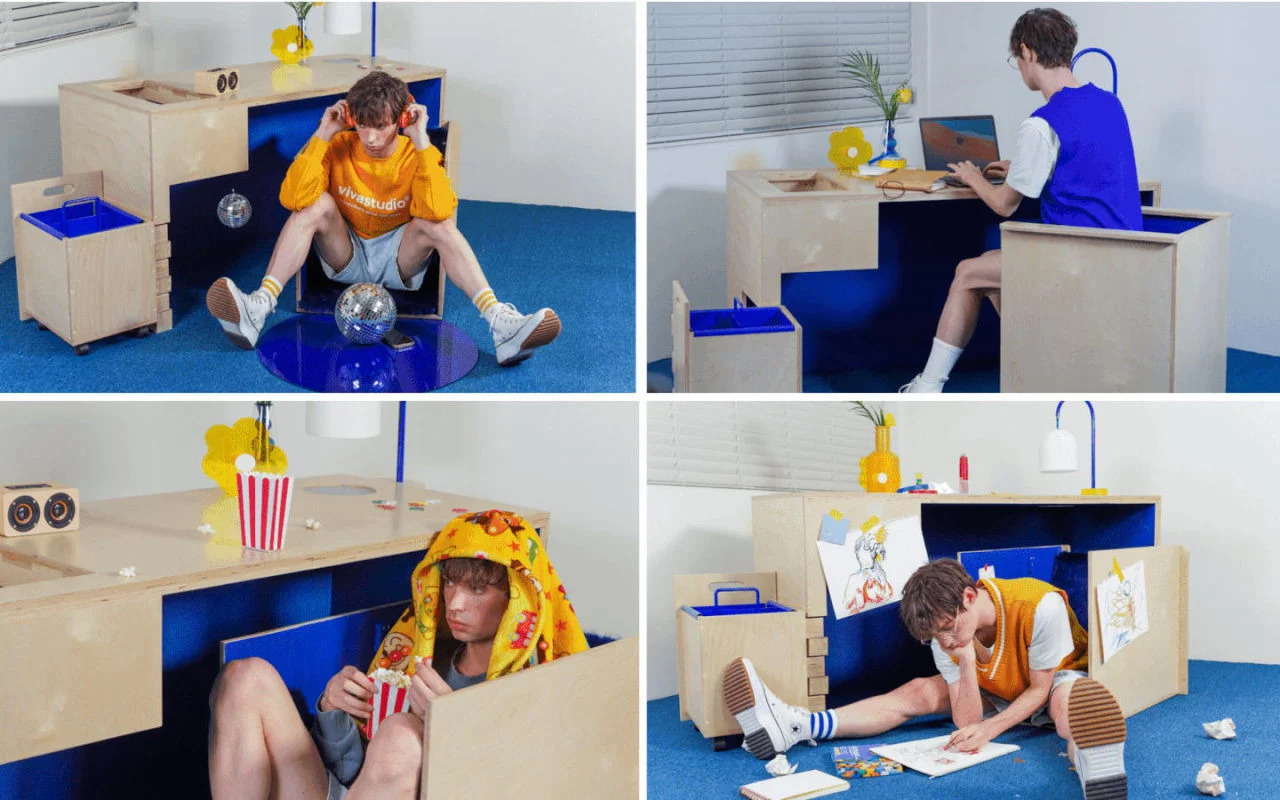
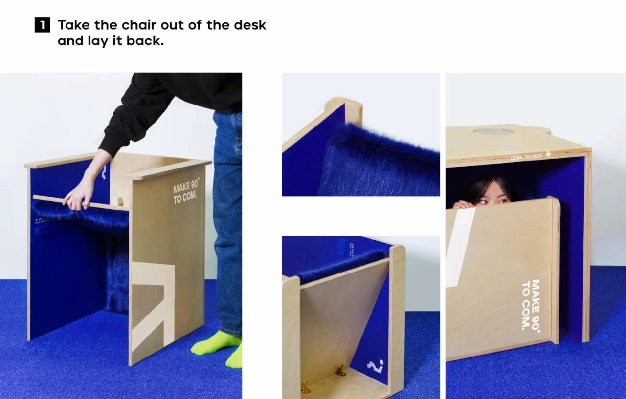
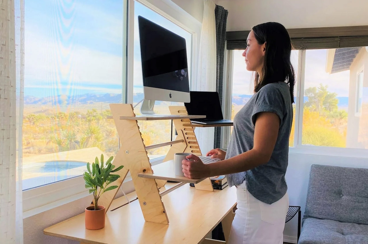
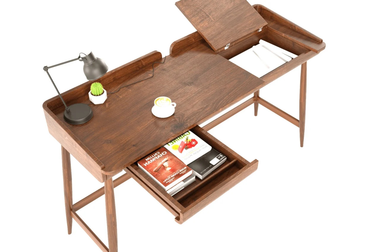
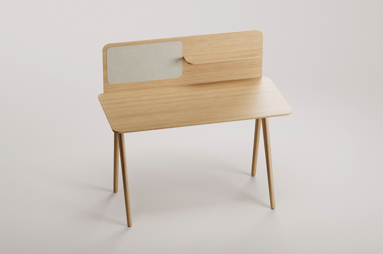
3. Choose a desk
Whether you’re working with digital files or paper, the chances are that you’ll need a desk to work on. Contrary to popular belief, buying a new desk is only secondary to establishing your space and time for work. You don’t even have to buy a new one if you can use the tables that you have at home. Of course, it’s sometimes also the most exciting part of setting up a WFH environment because of the number of options available.
The past two years have seen a sudden increase in desks and tables sold on the market, many of them designed for WFH scenarios. We’ve even seen our fair share of design concepts that we wished actually existed as commercial products. For designers and design-conscious people, the decision-making process can both be exciting and overwhelming, but there are really only a few critical details you have to consider when looking for the perfect WFH desk.
The very first consideration is, of course, the space you have available for setting the desk up, which might sometimes mean settling for a table you can fold away when not in use. Depending on your needs, you might also go for one with plenty of storage space or none at all. Whether you opt for a fixed desk or one that can go away at a moment’s notice, it is critical that it’s comfortable to use, which brings us to the next important step in the setup process.
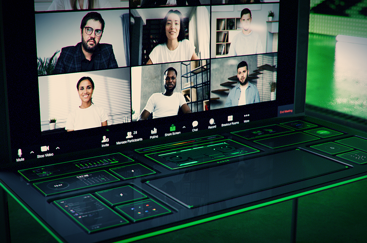
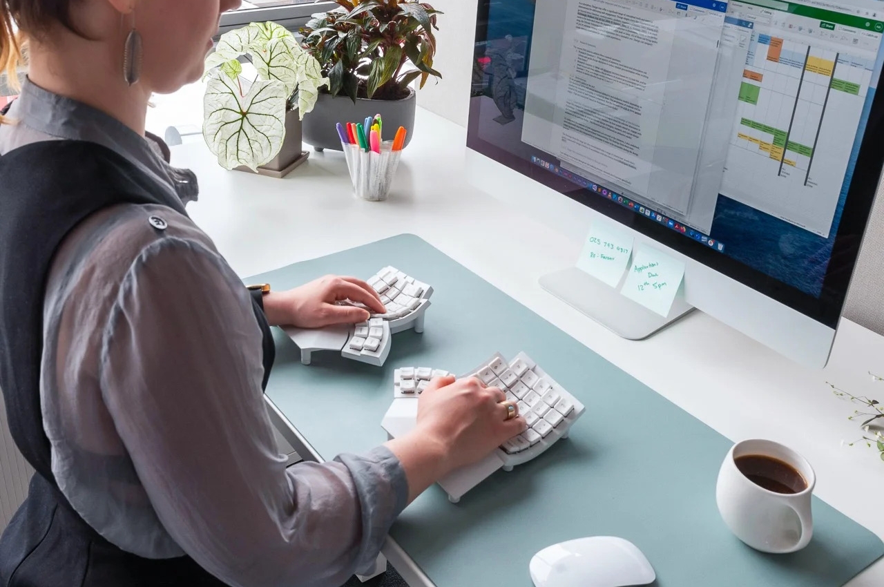
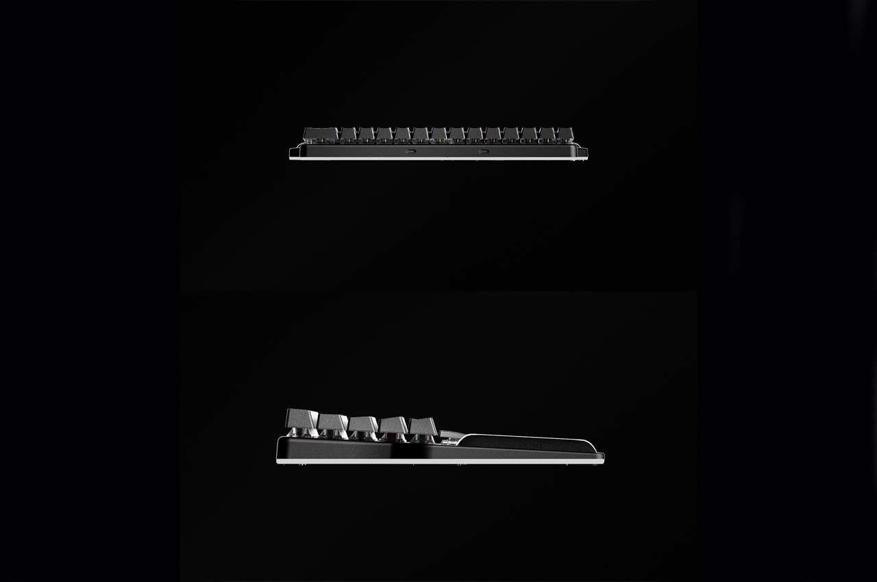
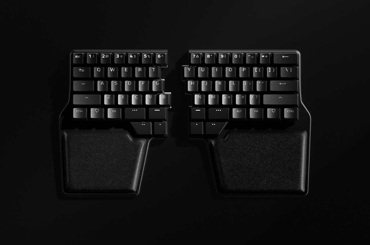
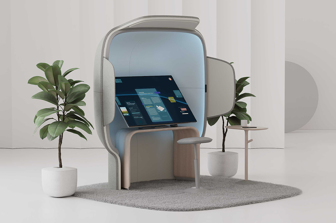
Designer: Razer
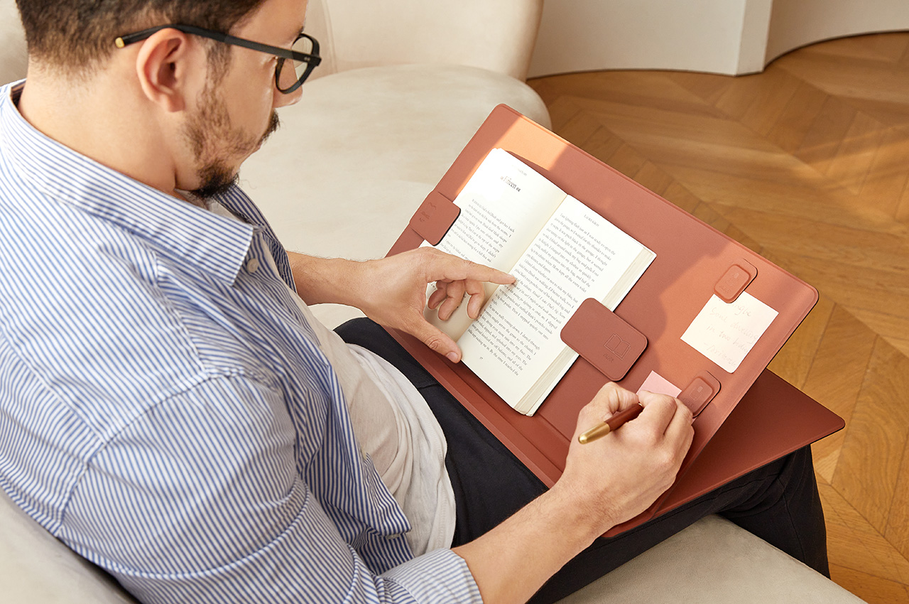
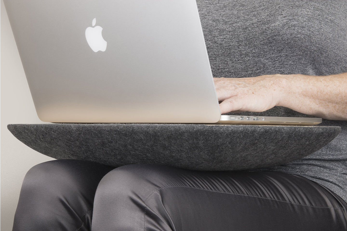
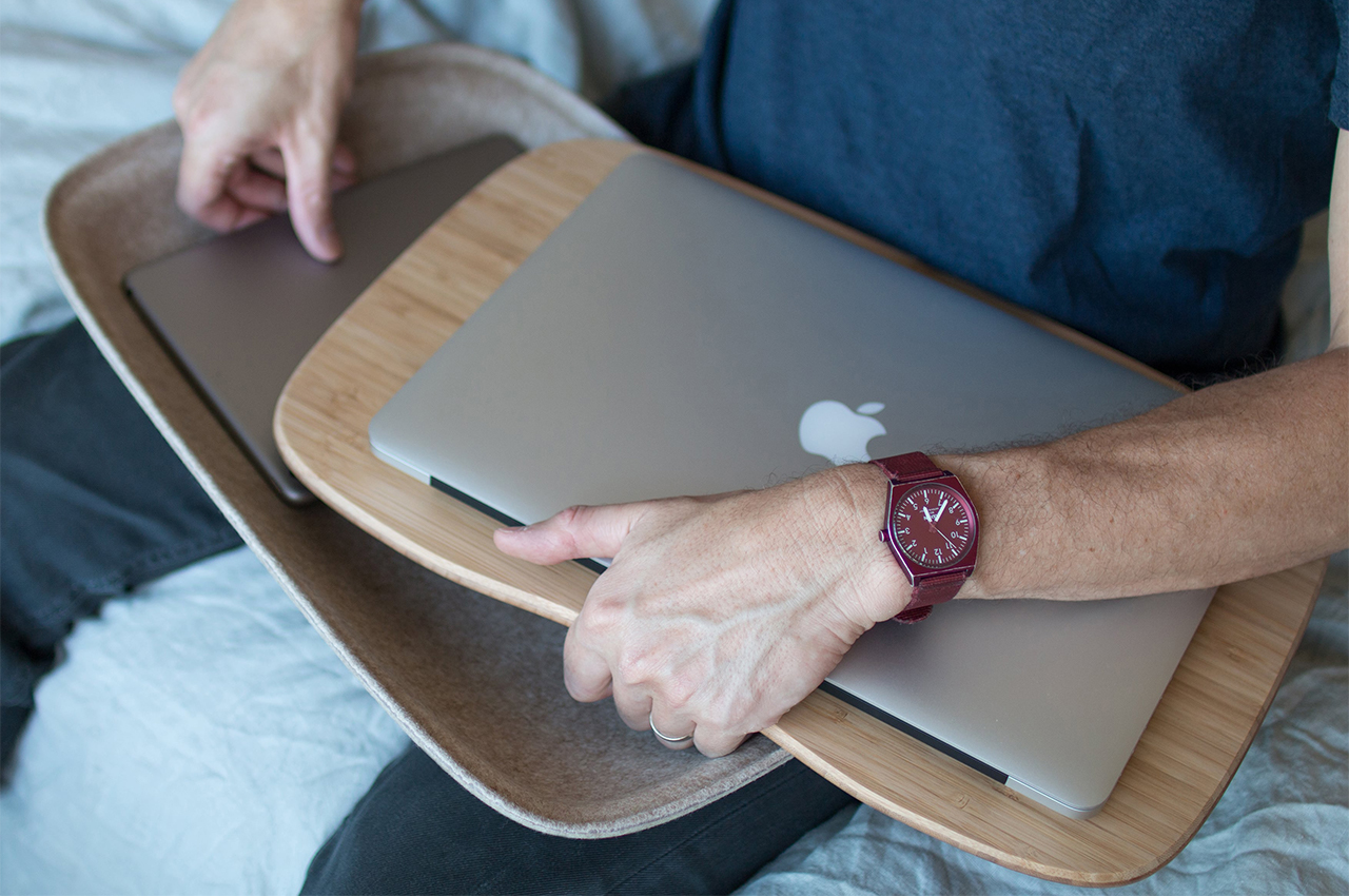
Designer: MOFT
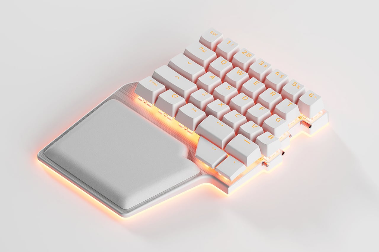
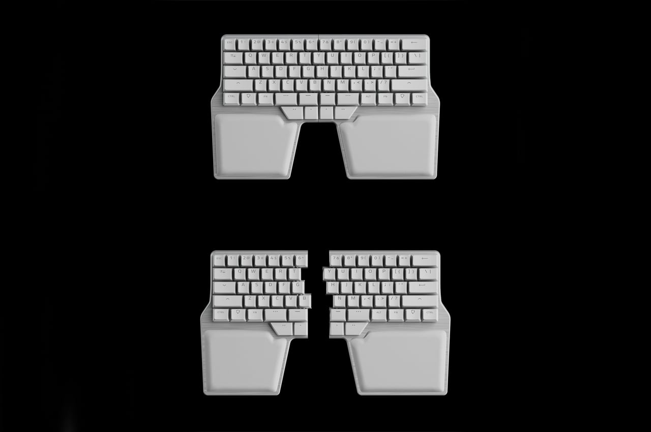
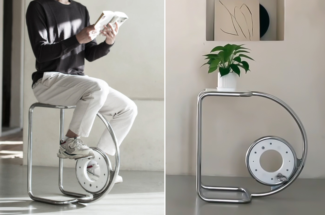
4. Ergonomics counts
Whether you go for that beautiful IKEA desk or the kitchen table, you will want to make sure that you aren’t literally breaking your back over it. This is true not just for desks but also for chairs, something that is often taken for granted by people, whether at home or at work. In the office, few people have the luxury of choosing their own furniture, so why not take advantage of that luxury at home and pick out ergonomic equipment.
Designer: RLDH
If you’re simply reusing the tables and chairs you have at hand, there are still ways to make sure you’re protecting your body during your long hours of work. Accessories that promote proper posture are easily accessible these days, but sometimes you don’t even have to go that far. Simply adjusting your screen to a proper height could already do wonders for your back and neck.
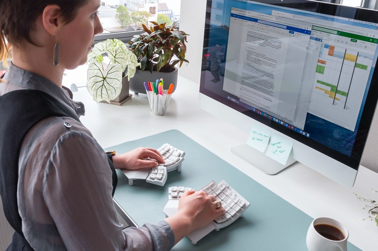
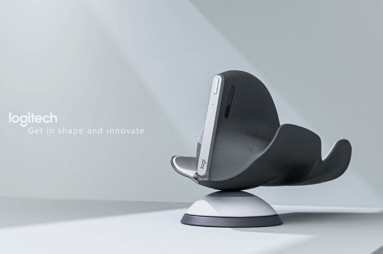
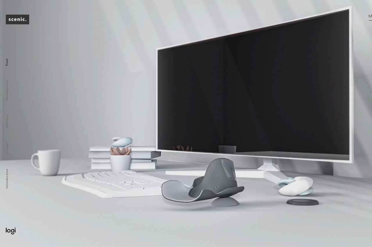
Designers: Stephen Cheng & Chris Andreae
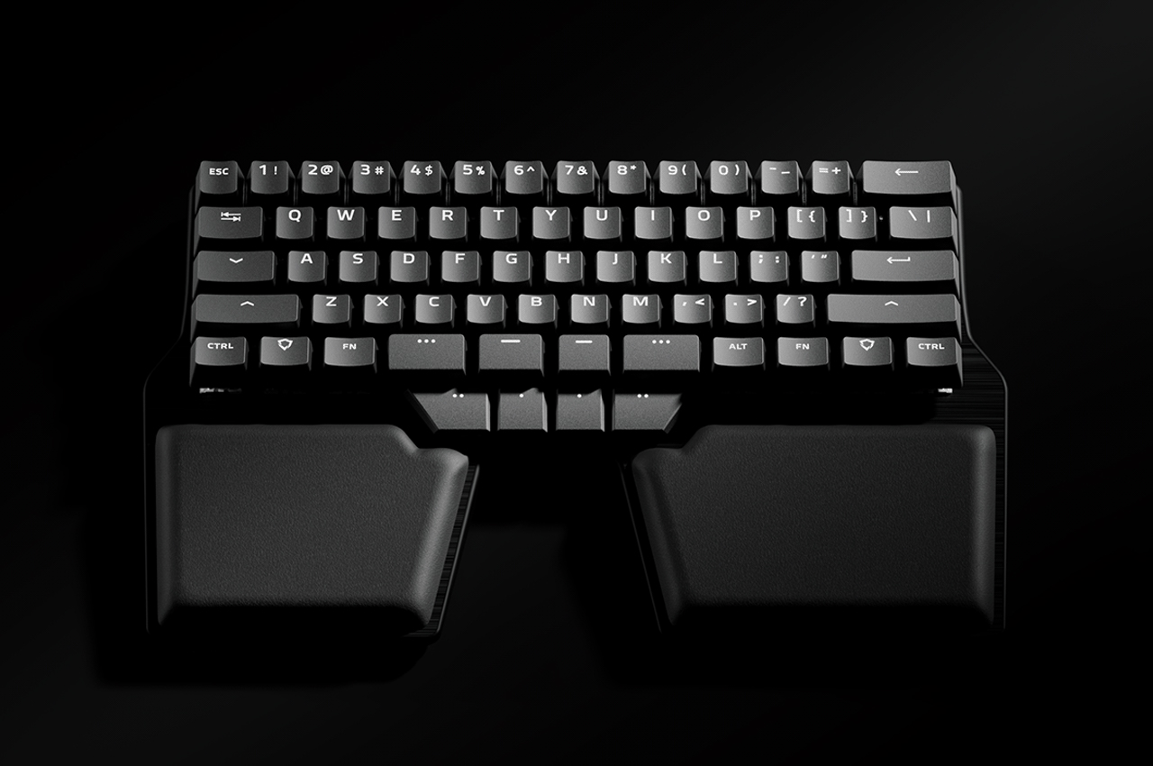
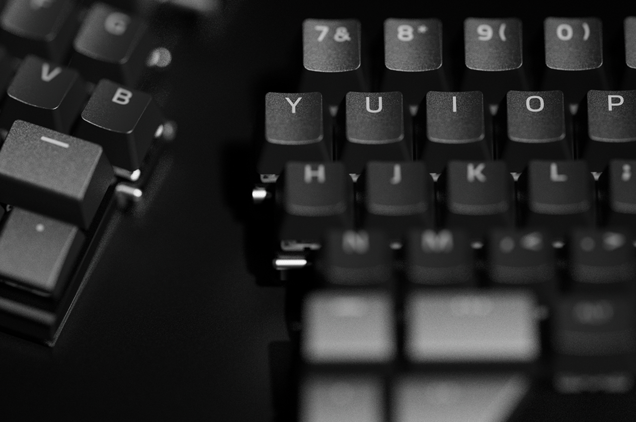
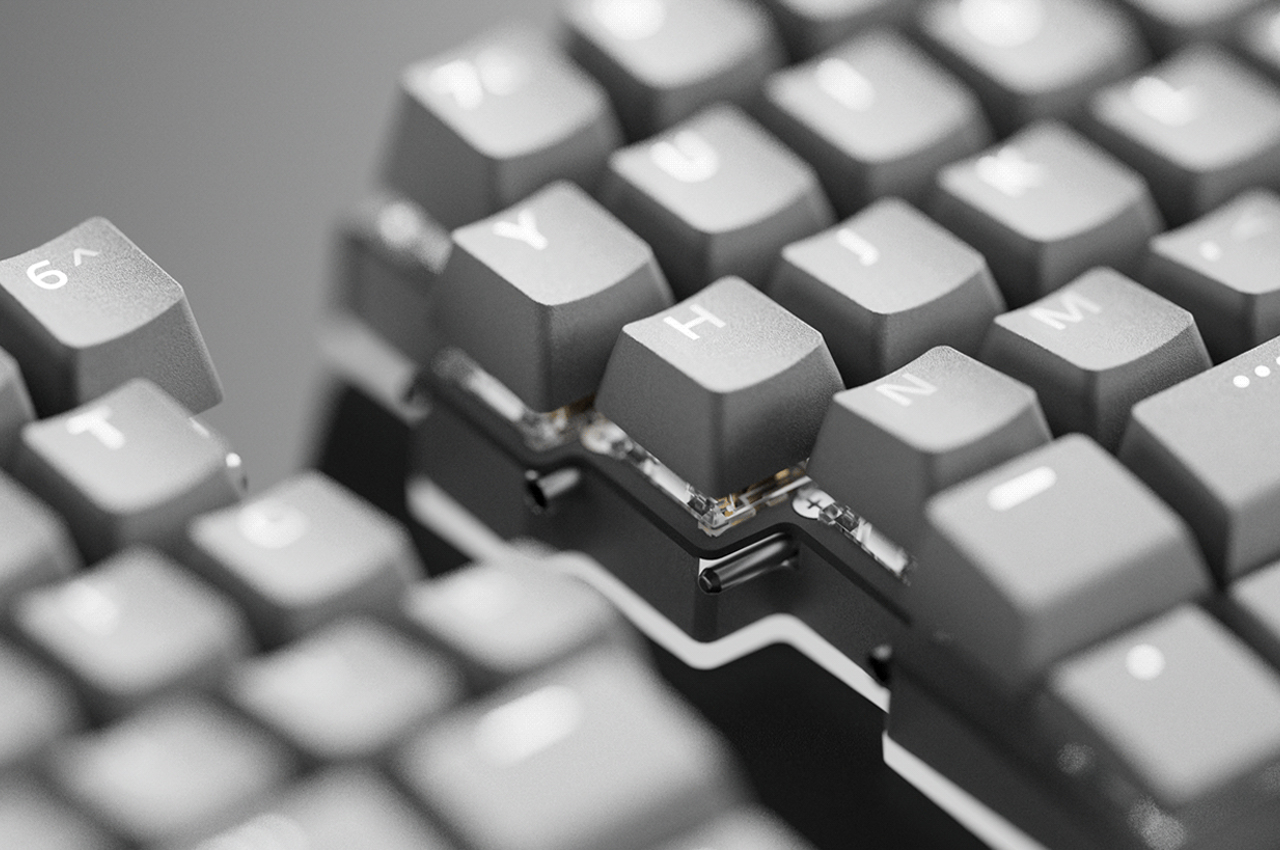
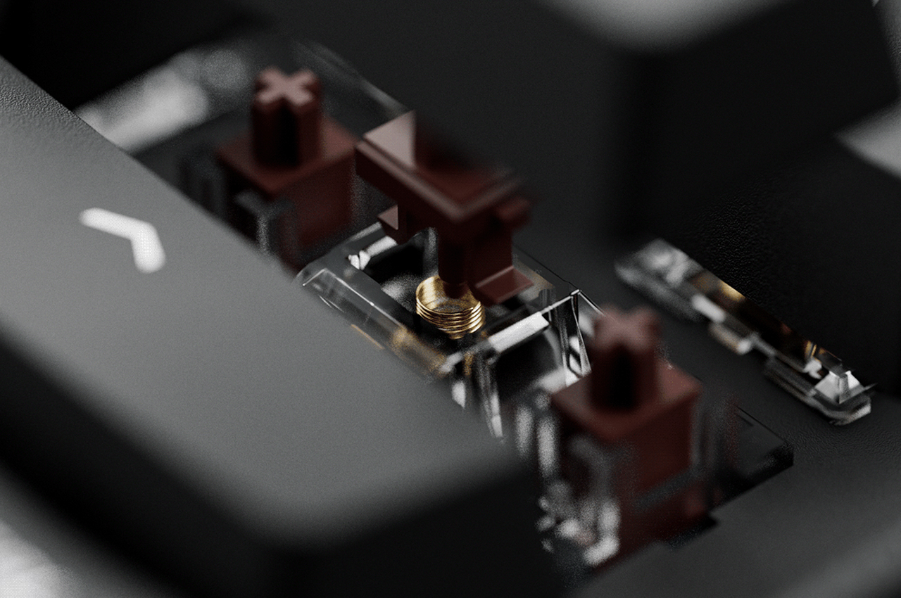
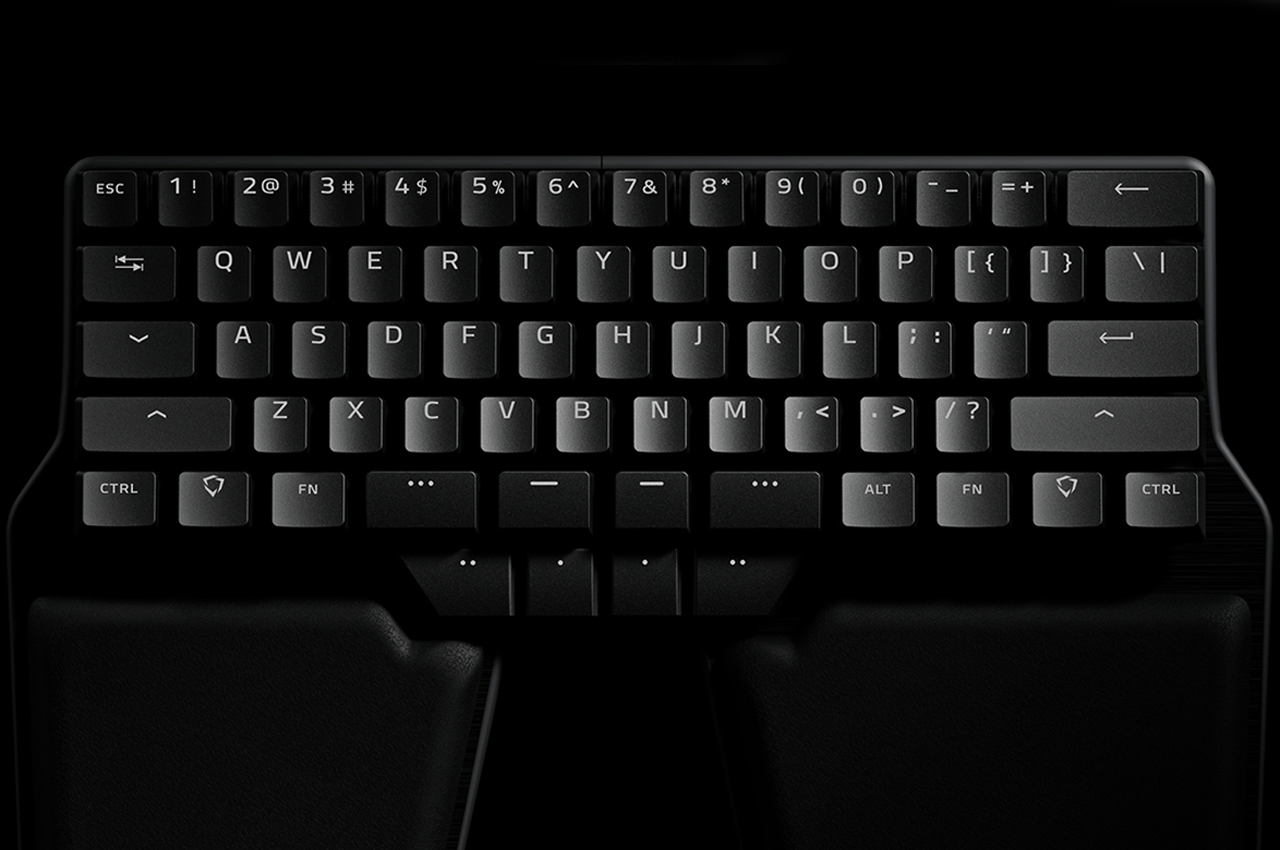
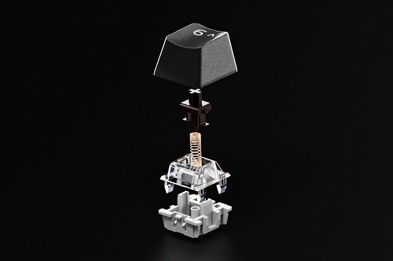
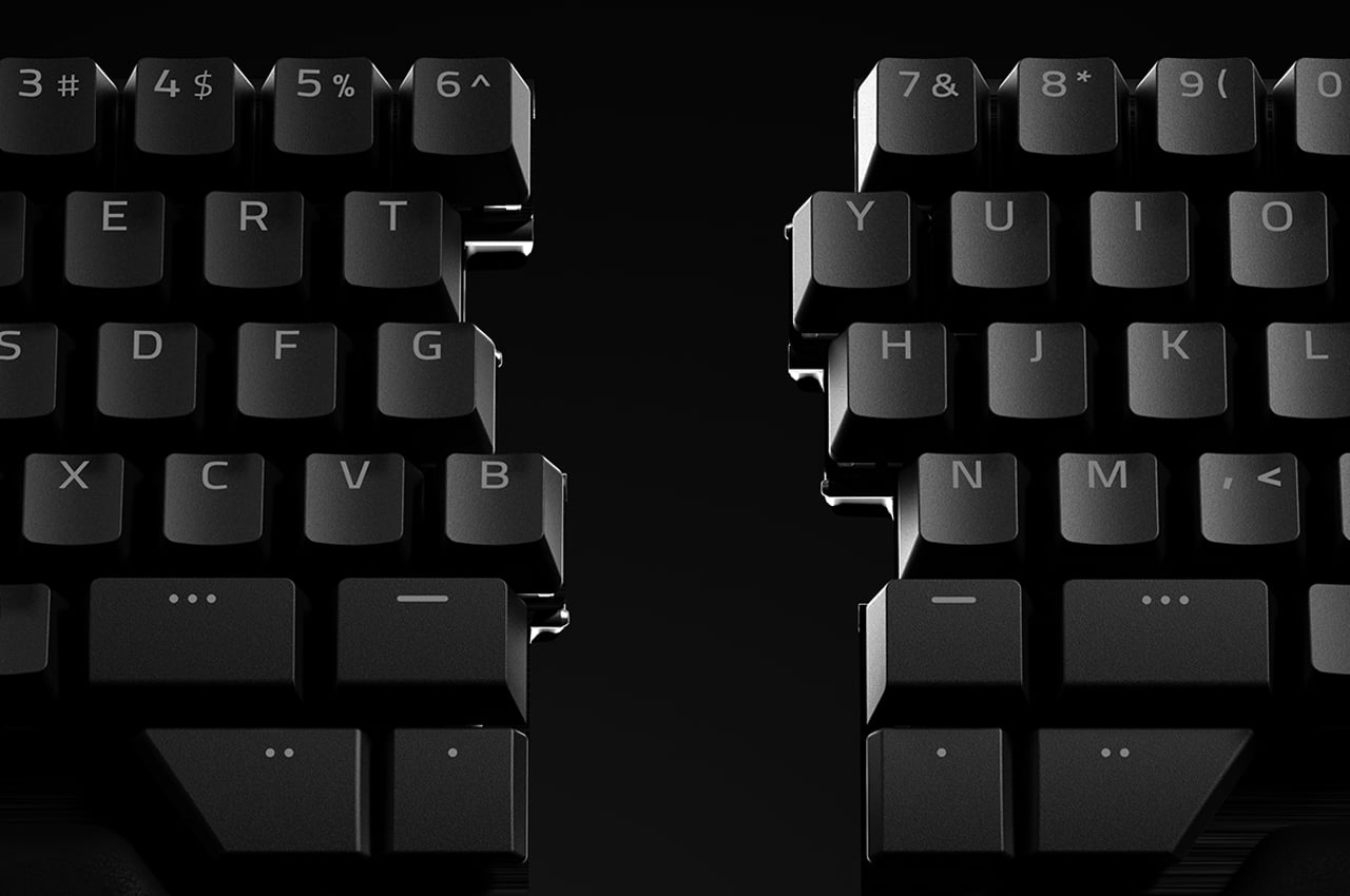
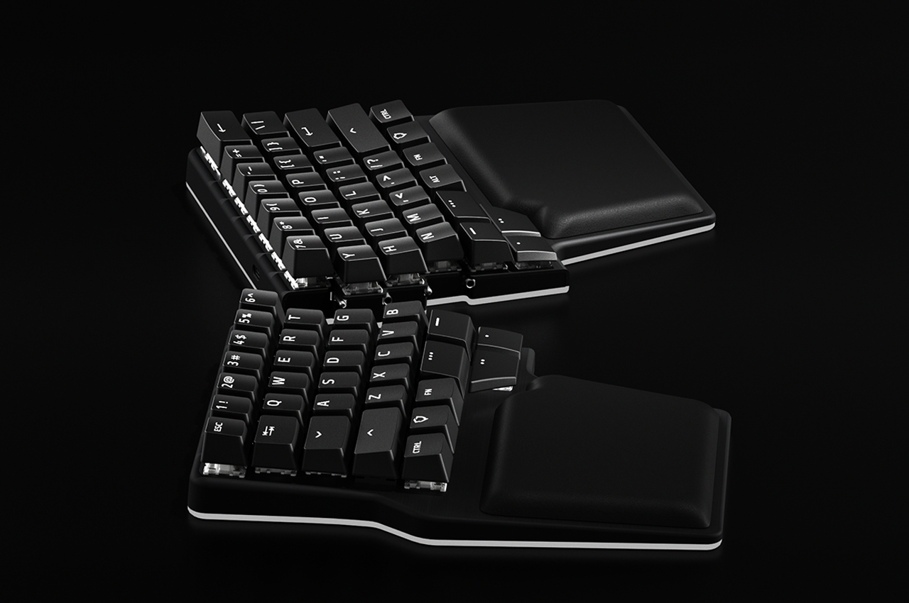
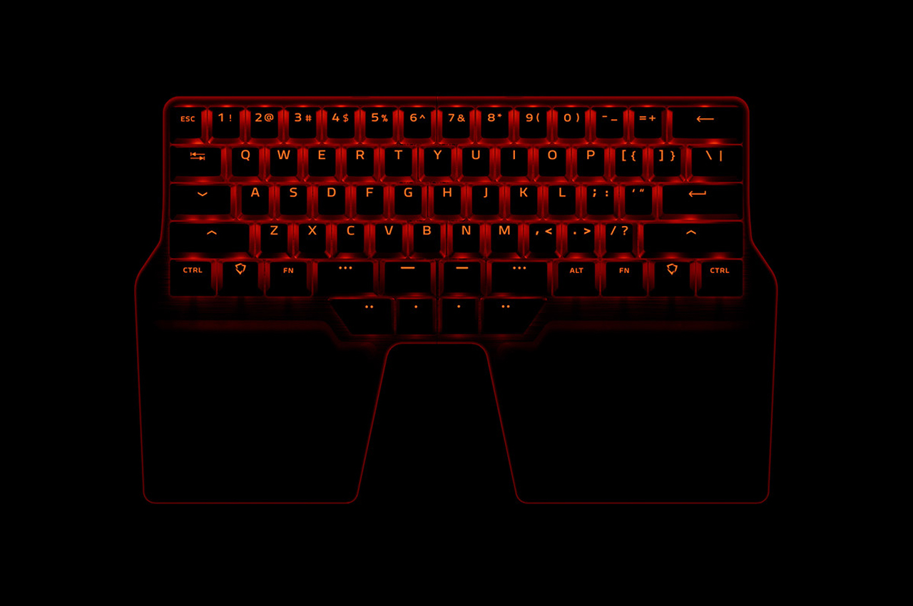
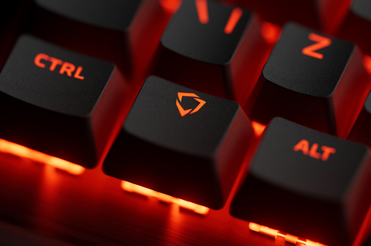
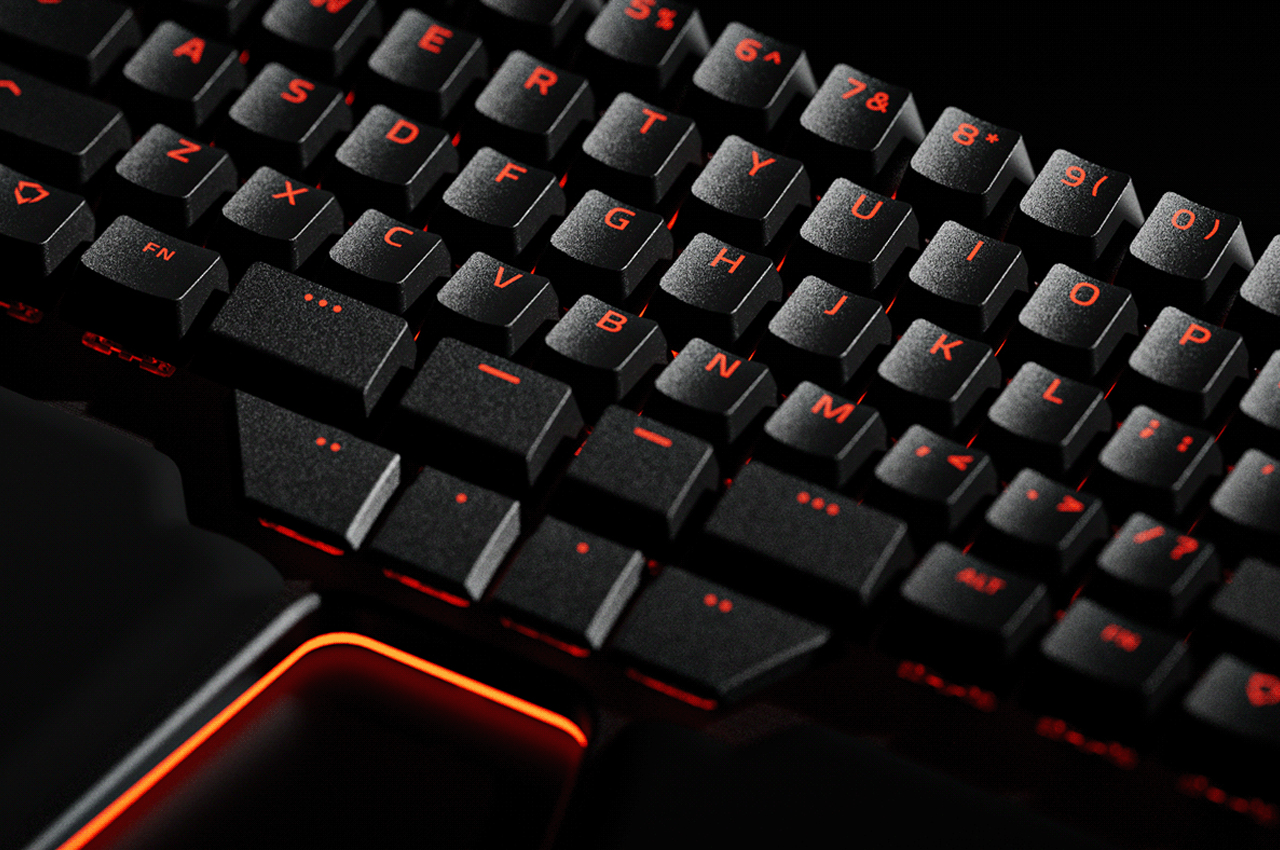
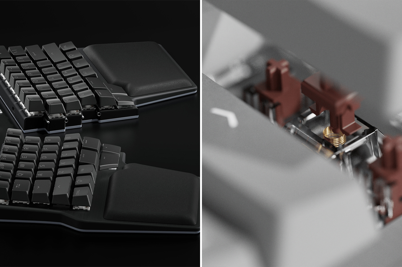
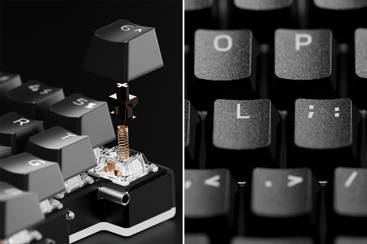
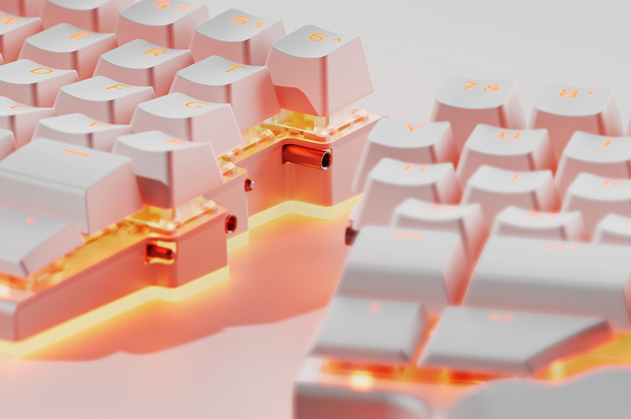
Every little bit counts in creating a more ergonomic workspace. Lighting is also easily taken for granted, but your eyes will be grateful and more cooperative in the long run if you take note of it. There are tons of ergonomic keyboards and mice in the market today, but you don’t have to go broke when there are more affordable and equally comfortable options available. The important thing is to let your body be more comfortable, something that isn’t easily possible in a traditional workplace.
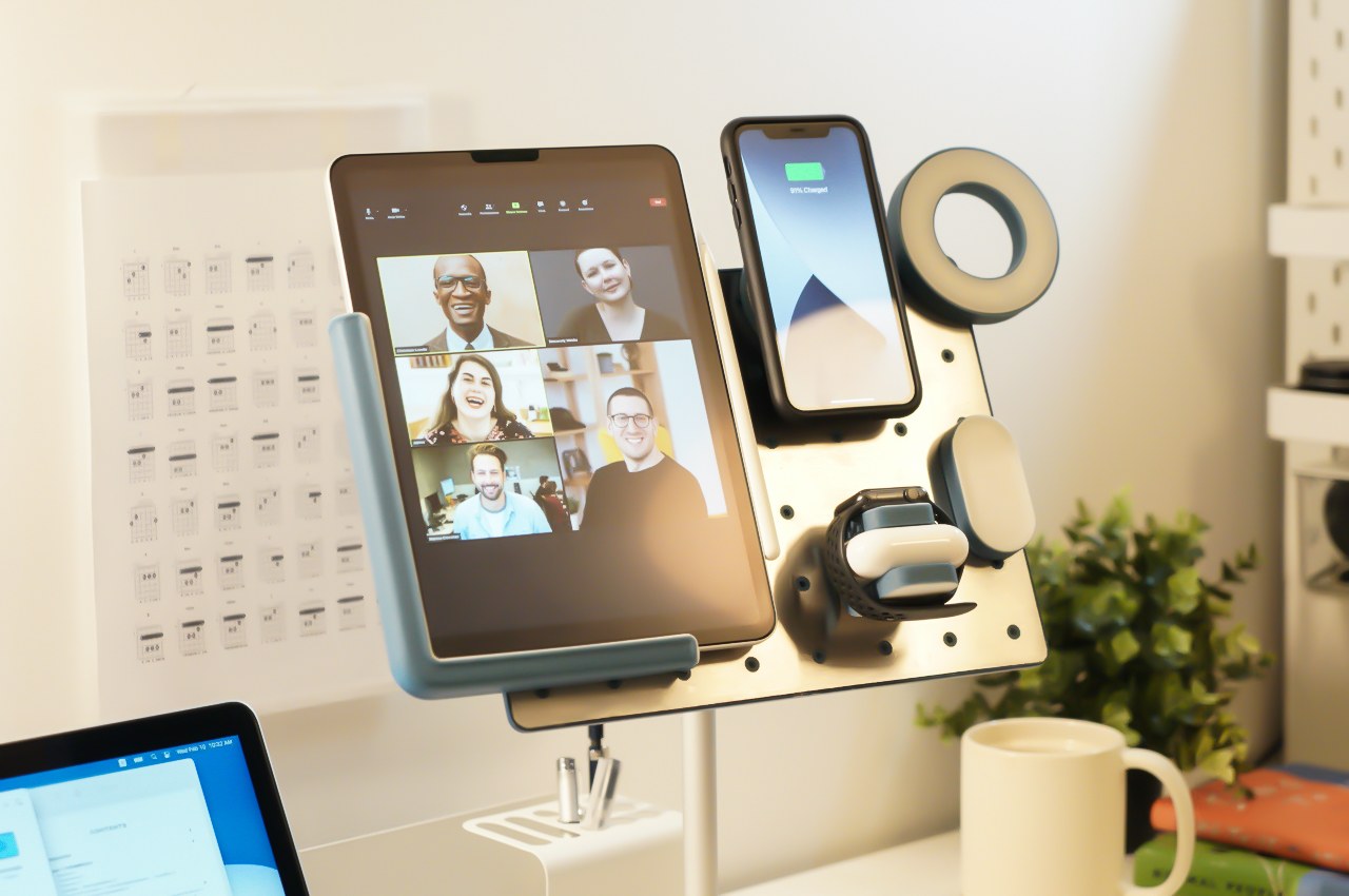
5. Choose your tools
You won’t get work done with just a desk and a chair, even if they’re the most ergonomically advanced and multi-functional minimalist piece of equipment in the world. You will need the tools of the trade, of course, and it can be too exciting trying to decide which ones to buy.
The tools you will need will differ from person to person and from job to job. You might need a new desktop or laptop if your job calls for it, and some software may not have been on your wishlist because the company provides for its employees. There are, however, a few general guidelines you can follow in making smart decisions, especially when taking the future in mind.
Work from home arrangements might not last forever, at least for some industries, so it might be best to invest in tools that can be useful even outside of that context. Most office supplies and desk accessories are like that, fortunately, but dedicated tablet arms and holders might not be at the top of your shopping list. If you have set your heart on creating a permanent working space, you’ll probably want to buy things that will match the aesthetic that you’re aiming for. Multi-functional furniture and equipment are also better in this regard because they can be used for different purposes, even outside of a WFH context.
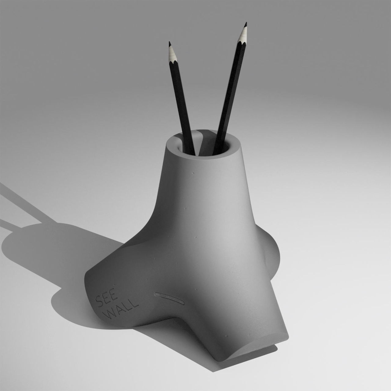
Designer: Jinwoo Jang
6. Prepare what you need
Nothing wastes time more than looking for a working pen right when you need to write something down. You may have purchased the best set of tools for your work, but they mean zilch if they’re not available when and where you need them. It might not sound as exciting as buying new stuff, but being able to use the new stuff you buy means they’re actually at hand when it comes time to do your work.
Preparing your tools before you start your work might sound like a no-brainer, especially when you have a dedicated desk and storage for them. You might be surprised, however, at the amount of time we lose in looking for things inside drawers and under piles of “stuff.” You don’t need to be the most organized person in the world (more on that later), but you should at least prepare the things you need before you clock in for work. Alternatively, you could buy specific storage for the work tools you’ll need and separate them from the rest of the things on or near your desk. Bonus points if it blends well with the rest of the decor.
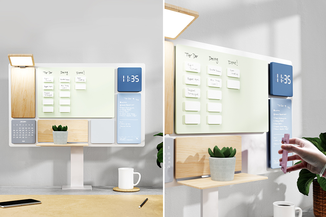
Designers: Hernan Gregorio and Julia Stabio
Those without a permanent desk might actually have it easier because they’re forced to prepare and clean up before and after work. This might even be the perfect opportunity to be in the market for organizes, containers, and bags that you can carry around the house or, if needed, to someone else’s house.
7. Uncluttered doesn’t mean empty
The previous point seems to suggest that we always need to keep our workspaces clear of clutter, which is true to some extent. By “clutter,” we mean things that aren’t where they should be or are actually detrimental to your mental health every time you see them. Unfortunately, it seems that some have taken that to also mean that the desk or work area should be clean, spotless, and, to some extent, minimalist to the extreme.
Designer: Can Türker
The reality is that this doesn’t always work for some people, and you’ll have to figure out which side of the spectrum you’re on. Some people do get a psychological high from having everything in their proper place, without a stray object in sight. Others prefer to have visual reminders here and there.
This isn’t just about decorative things, which we’ll get to later. It’s about organizing your work tools and maybe even some personal trinkets, which is a surprisingly more personal matter than what classic productivity gurus would have us believe. More than tidiness, the important thing is to have a place for the things you need, know where they are, and have them ready before you need them.
8. Health Matters
For all the problems that working from home has been advertised to create, there is one often overlooked benefit. Freed from the constraints of common office space, it is actually easier to stay healthy when working from home. That said, it can sometimes also be more difficult to exercise that discipline.
You don’t have to travel to work and be exposed to all the pollution out there. You can take breaks when you need to and won’t look like you’re slacking off. You can prepare and eat healthier meals rather than buying from the nearest store. You can also do some exercises before, after, or even in between work, whether or not you have fitness equipment at home.
Designer: Kim Dambi, Kim Kyung Jin, Park Sangjin, Park Sung Soon
All these presume, however, that you do take note of your health when working from home, something that might be harder to do when your bed is just a few feet away. Beyond building habits, there are also things you can use (or buy) to give your health a boost, like plants to soothe your eyes, humidifiers and purifiers to clean up the air, or a pretty water bottle on your desk that will remind you to hydrate every so often.
9. Reach out
The previous steps mostly revolved around the physical aspects of creating a perfect WFH environment, but humans aren’t just physical beings. Most of the complaints that people raised in the past two years being holed up at home were the sudden lack of social interaction with peers, classmates, and friends. Conversely, video meetings only induced “Zoom fatigue” because it wasn’t the kind of social interaction that we humans needed as social animals.
Until we arrive at the promise of a full-body AR or VR representation in the multiverse, we’ll have to make do with virtual forms of communication. What’s important is to keep those communication lines open, even beyond the typical work chats. You might not have what has been called “water cooler conversations” at work these days, but there are so many ways to keep in touch with colleagues and friends as well.
Designer: Bodosnap with Ecco Design
That said, keeping and respecting boundaries also apply here, perhaps more than ever. You wouldn’t just drop by at a co-worker’s house unannounced after office hours, so you probably shouldn’t bother them at the end of the day. Not unless you’ve already developed a level of friendship that goes beyond office hours, too.
10. Minimal or Maximal: Make it Yours
At the end of the day, the biggest consideration in creating the perfect WFH space is you. Unlike the sometimes cold and uniform cubicles and desks of offices, working from home offers people the opportunity to actually shape their workspace according to their needs and, more importantly, their budgets. That goes not only for the things you’ll need for work, like desks, chairs, computers, apps, pens, and the like but also for the aesthetic and decorative aspects of the environment.
Along with tidiness, the product and interior design industries have long leaned towards minimalist designs. The sudden spurt of video meetings has also pushed people to clean up their rooms or find creative ways to hide their things (thank goodness for new privacy features!). That might work for some, but others find this too clinical or even impersonal.
Designer: OEO Studio, Jonathan Formento x HBF
That is why many people today have found refuge in the polar opposite of minimalism. Maximalism, which doesn’t equate to clutter or hoarding, is more forgiving of inconsistent visual styles and designs. In fact, it encourages keeping things that “spark joy,” to use Marie Kondo’s words, even if it means having a bunch of knickknacks on your desk (hopefully arranged neatly). Whether you aim for minimalism or maximalism, a permanent desk, or a rotating arrangement, if you’re going to claim a space for you to work in, you might as well make it your own.

Designer: Luke Edward Hall (c/o The Spaces)
The post Create the perfect WFH setup with these 10 steps first appeared on Yanko Design.