These everyday products hide their true functions like a hidden object game

Tech gadgets don’t need to look futuristic to be useful and can even look like an innocent pebble or an artist’s canvas leaning against the wall.

Homes today are filled with so much technology that it’s impossible not to notice one or two in a room, whether it be the latest smart TV or a fabric-covered smart speaker. While many of these home-centric devices are intentionally designed to look at home in your home, they often still stick out and call attention to themselves, which is also an intentional marketing strategy. That doesn’t have to be the case, however, and you might be surprised at how easy it is to make devices look like ordinary, everyday things you might easily take for granted.

Designer: Hoyoung Joo/studio SFSO

There might be nothing inherently wrong with consumer tech that looks like what they’re supposed to. Some might actually want their smart speakers to look like canisters and their TV remote control to show off all the functionality it has to offer. It’s hard to argue, however, that these things sometimes add unnecessary visual stimulation through designs and shapes that seem out of place in the back of our minds. These may, in turn, produce subconscious stress in what should be a stress-free living space.

One solution is to meticulously design a product to blend in with everyday objects, but a simpler method might be to actually turn these tech products into inconspicuous everyday objects themselves. Design studio SFSO dubs these “Hidden Objects,” a nod to a type of casual game where you have to squint your eyes to see a teacup hiding in a messy wardrobe.
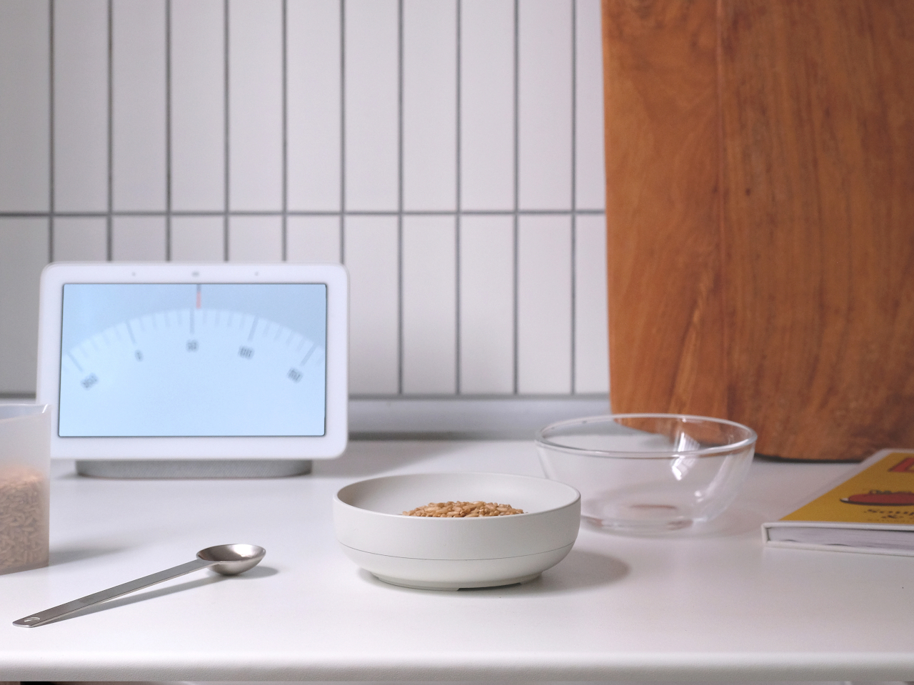
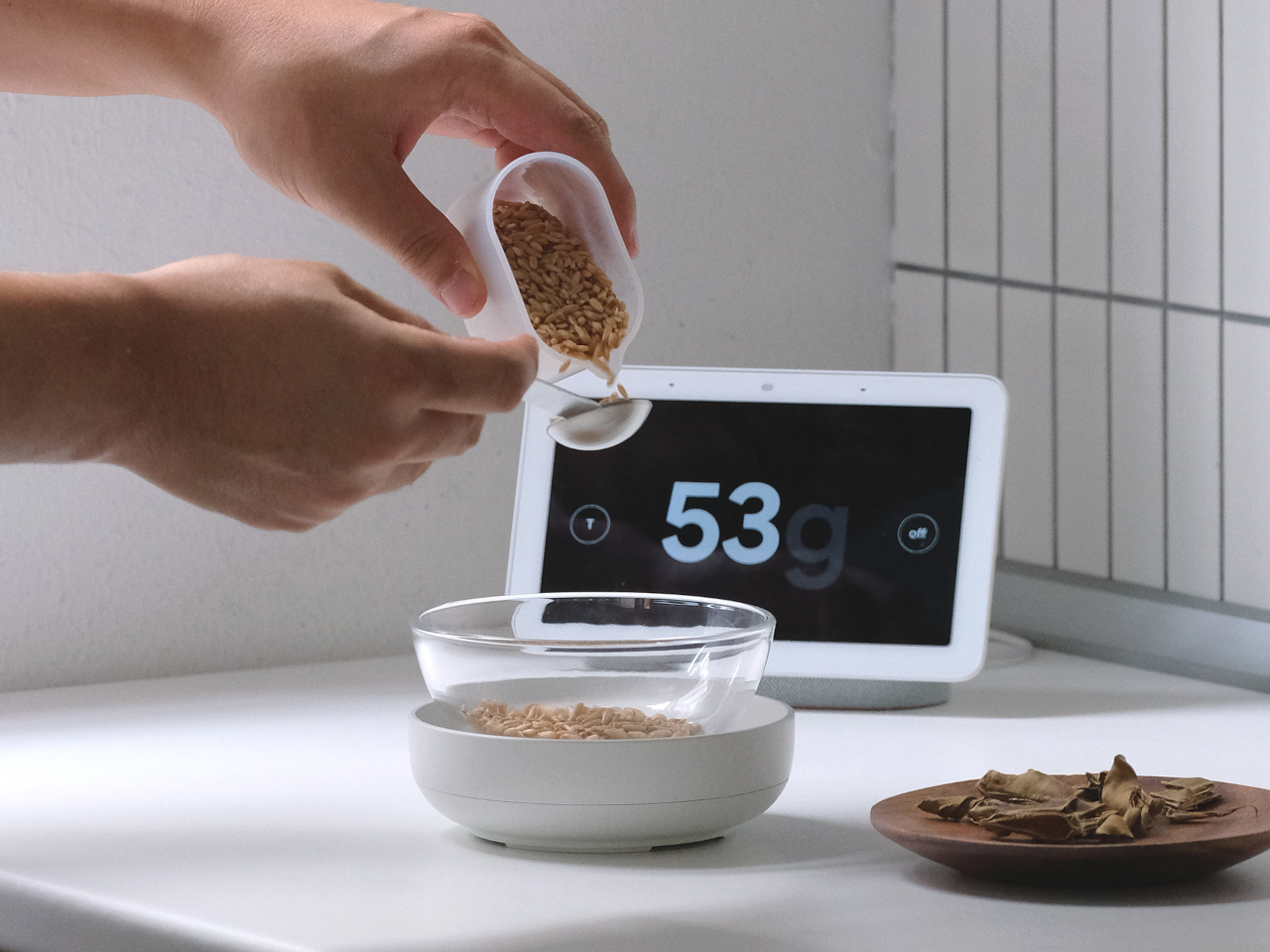
A kitchen scale, for example, can simply look like a bowl, which simplifies not just the visual design but also its use. You can easily stack similar-looking bowls when measuring ingredients, though you might also be tempted to just put those directly into the bowl-shaped scale instead. The familiar shape of the bowl makes it look unobtrusive and uncomplicated, with the actual measurement being sent to a connected smartphone or smart speaker rather than an LCD display that breaks the illusion.

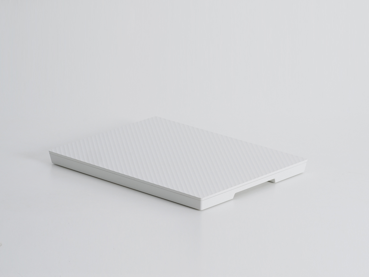
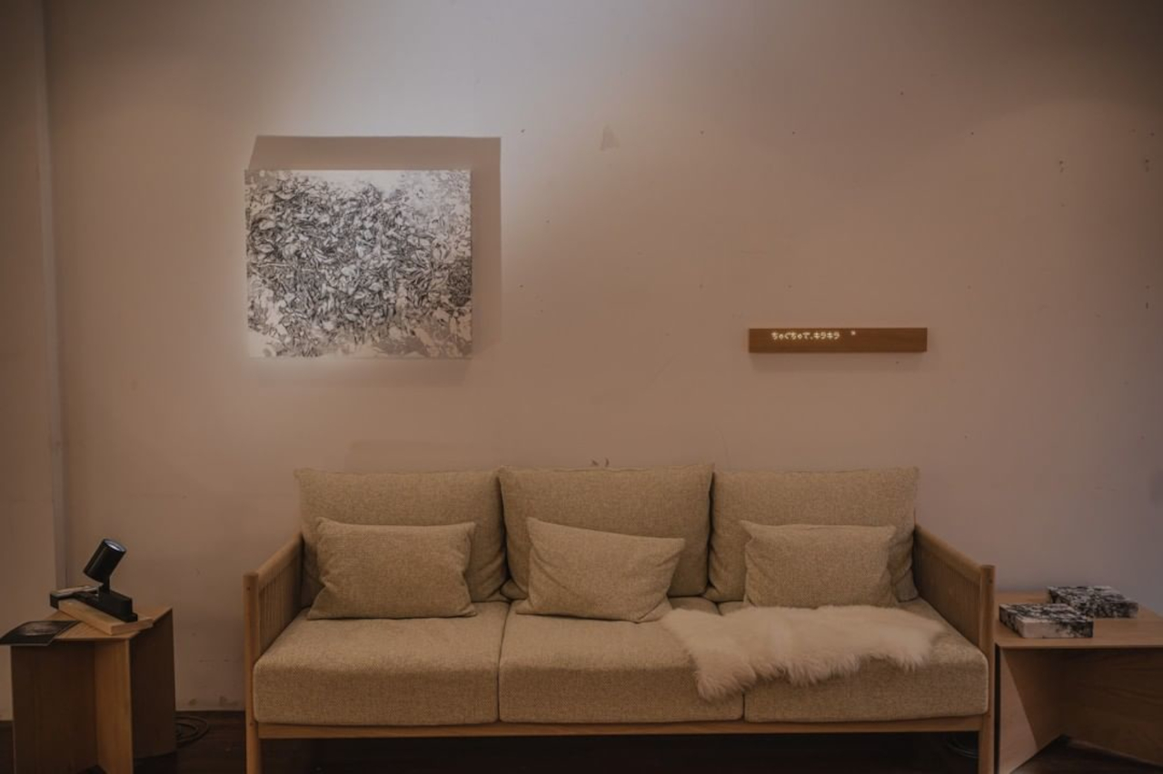
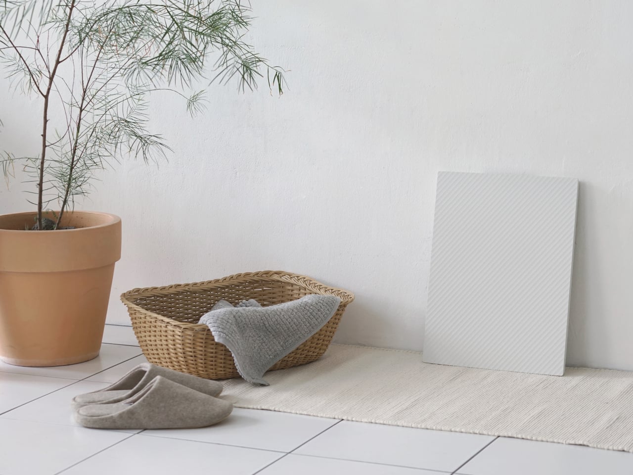
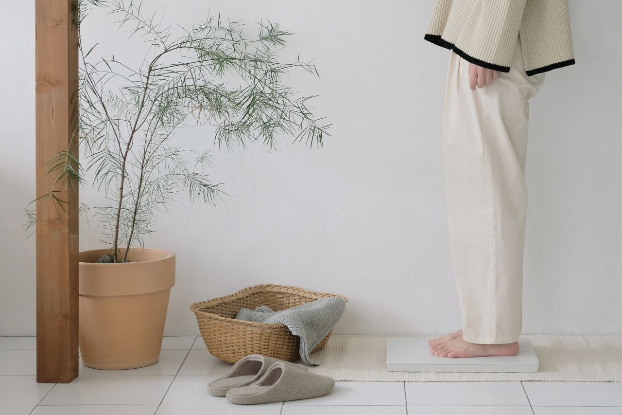
A larger weighing scale for humans, on the other hand, could masquerade as a tile or canvas leaning on your wall off to the side. There are no visible displays as well, with data sent directly to a paired smart device, and the scale looks more like an unassuming block of wood. It makes it easier to approach and use the scale with confidence, unlike many smart scales whose glass surfaces evoke a feeling of fragility.
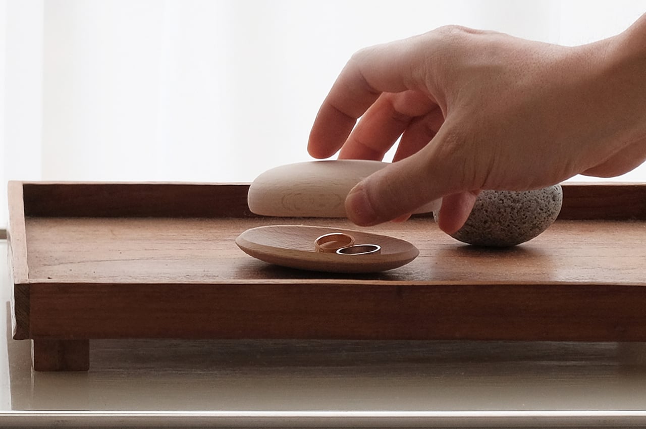
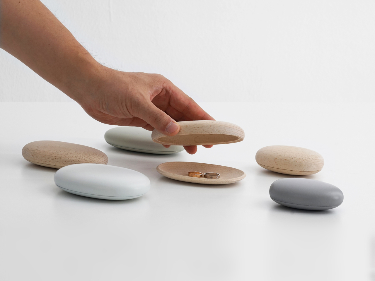
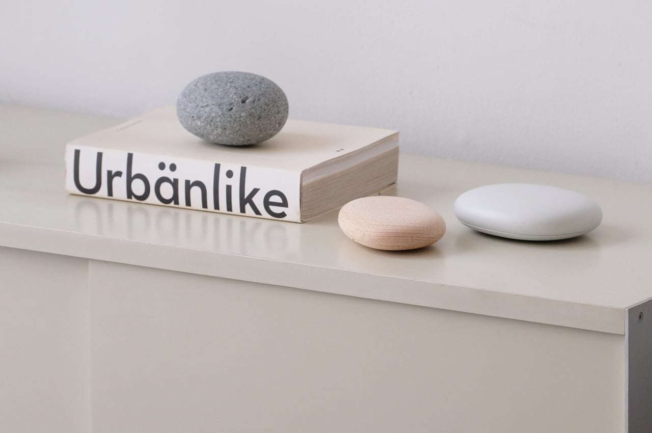
Japanese-inspired interior decorations have introduced the use of smooth, oval rocks as room decorations. Why not turn these objects into containers at the same time, hitting two birds with one stone, pun intended. The Pebble Tray is almost a cunning way to hide important things almost in plain view without adding visual clutter to a serene rock garden or pebble beach theme.
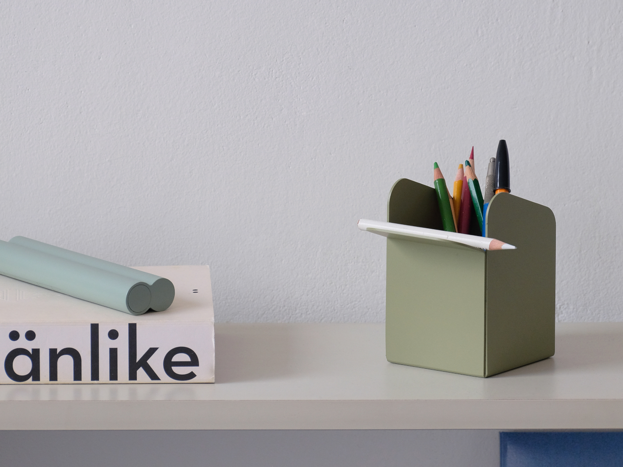
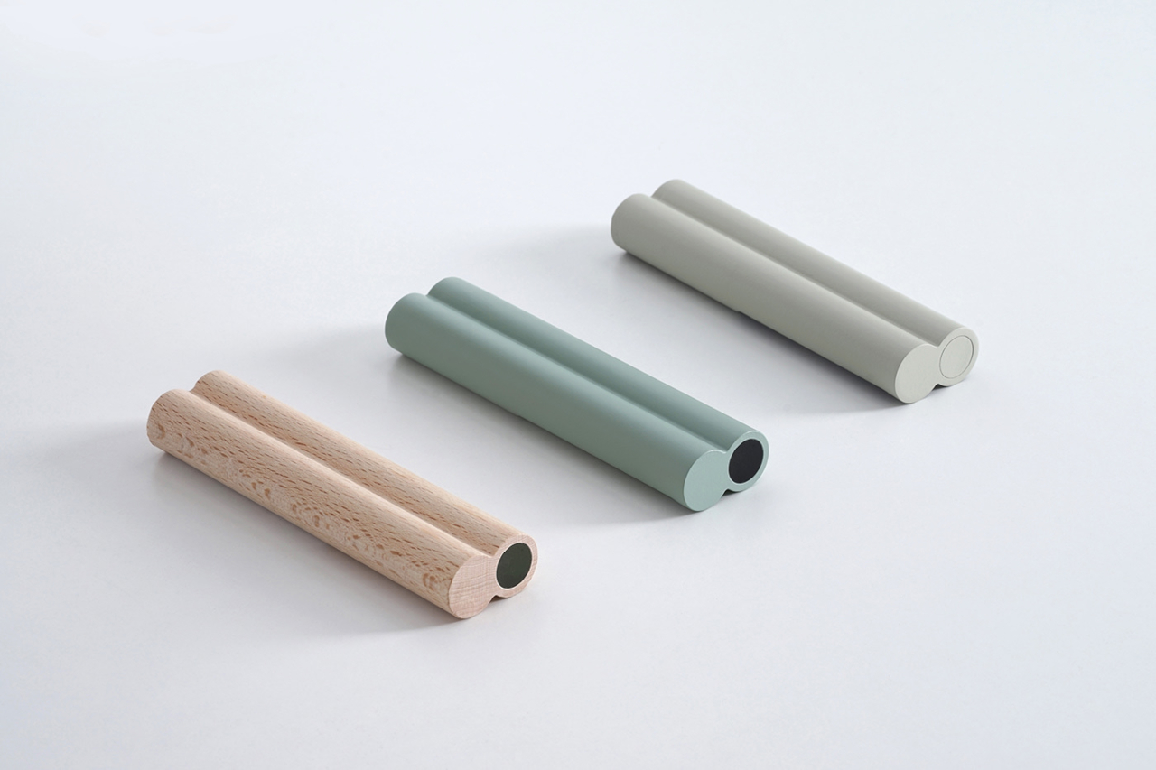
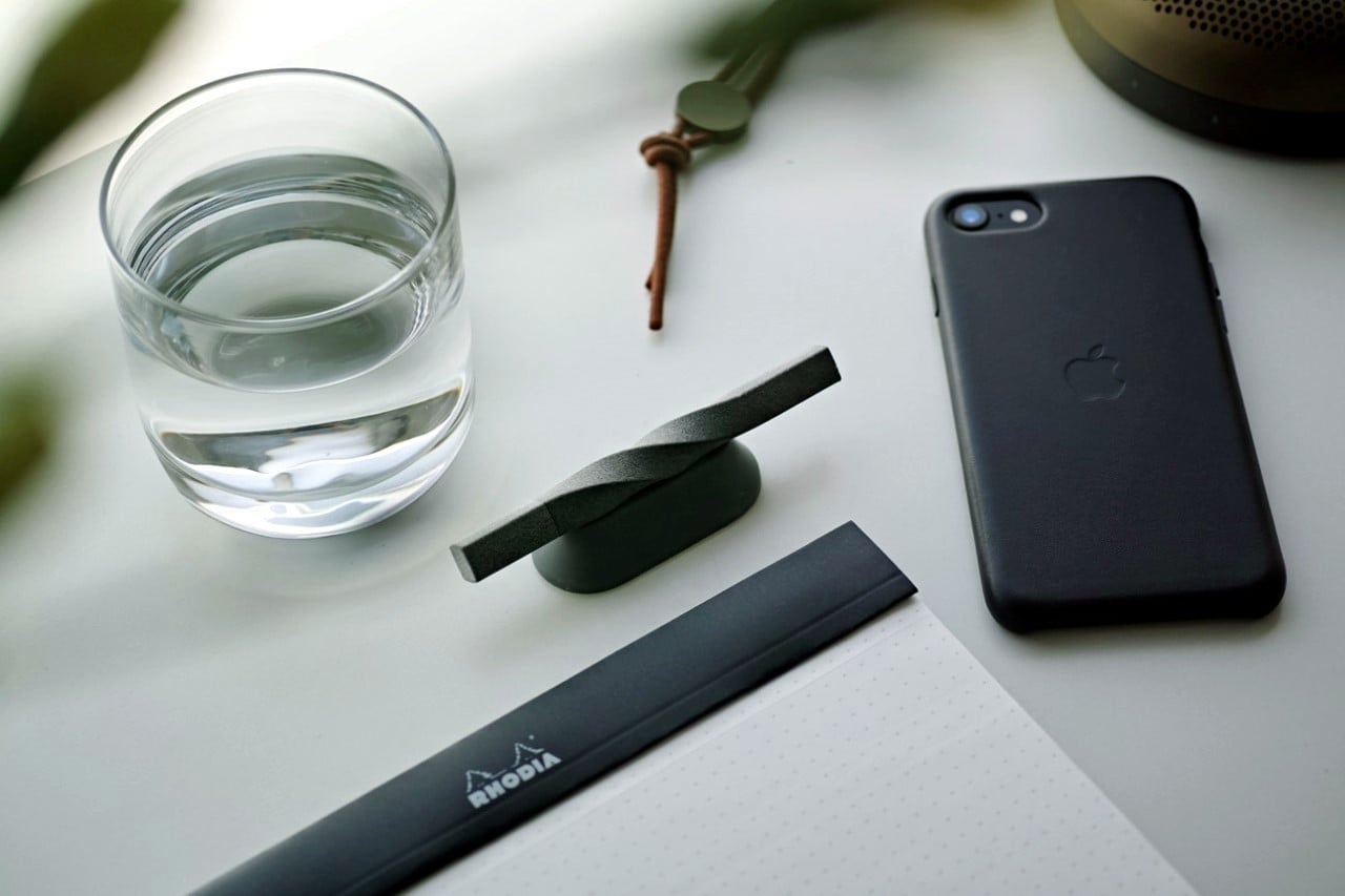
The Stick Remote Control is admittedly harder to pull off, only because you don’t regularly find two conjoined round bars in most living rooms. Its flat top and bottom edges, however, make it easy to prop the stick up on its feet and hide the buttons from view. And unlike most remote controls, you can have it lie on its face and still look like a piece of minimalist decor.
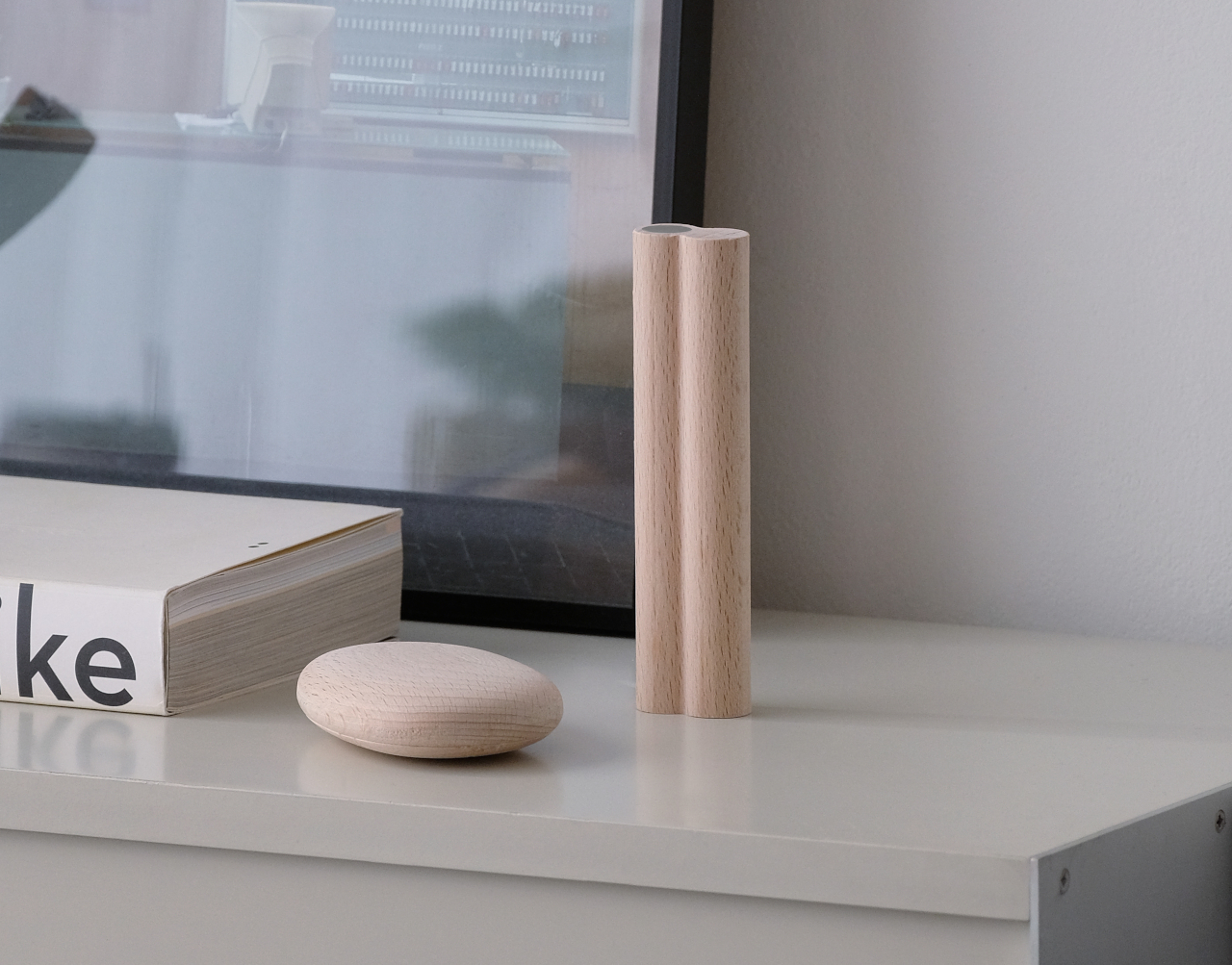
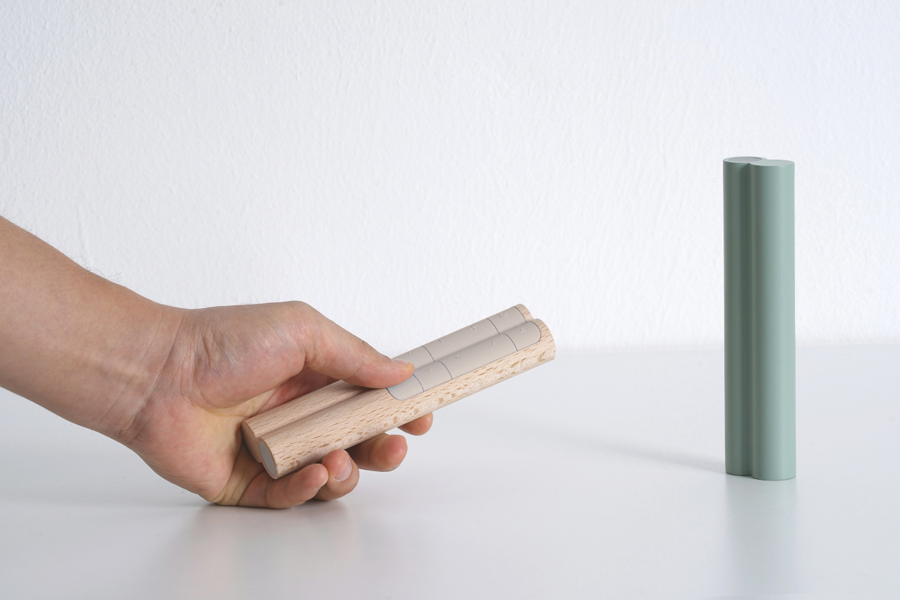
These are definitely interesting industrial design ideas that can have a calming effect in a tech-filled home. Most consumer tech companies, however, are unlikely to take such an approach that would make their branding and design identity practically invisible. There are, of course, companies like IKEA and MUJI that specialize in minimalist designs like these, and they are slowly but surely moving towards integrating more smart features into their products, hopefully in a similar minimalist fashion.
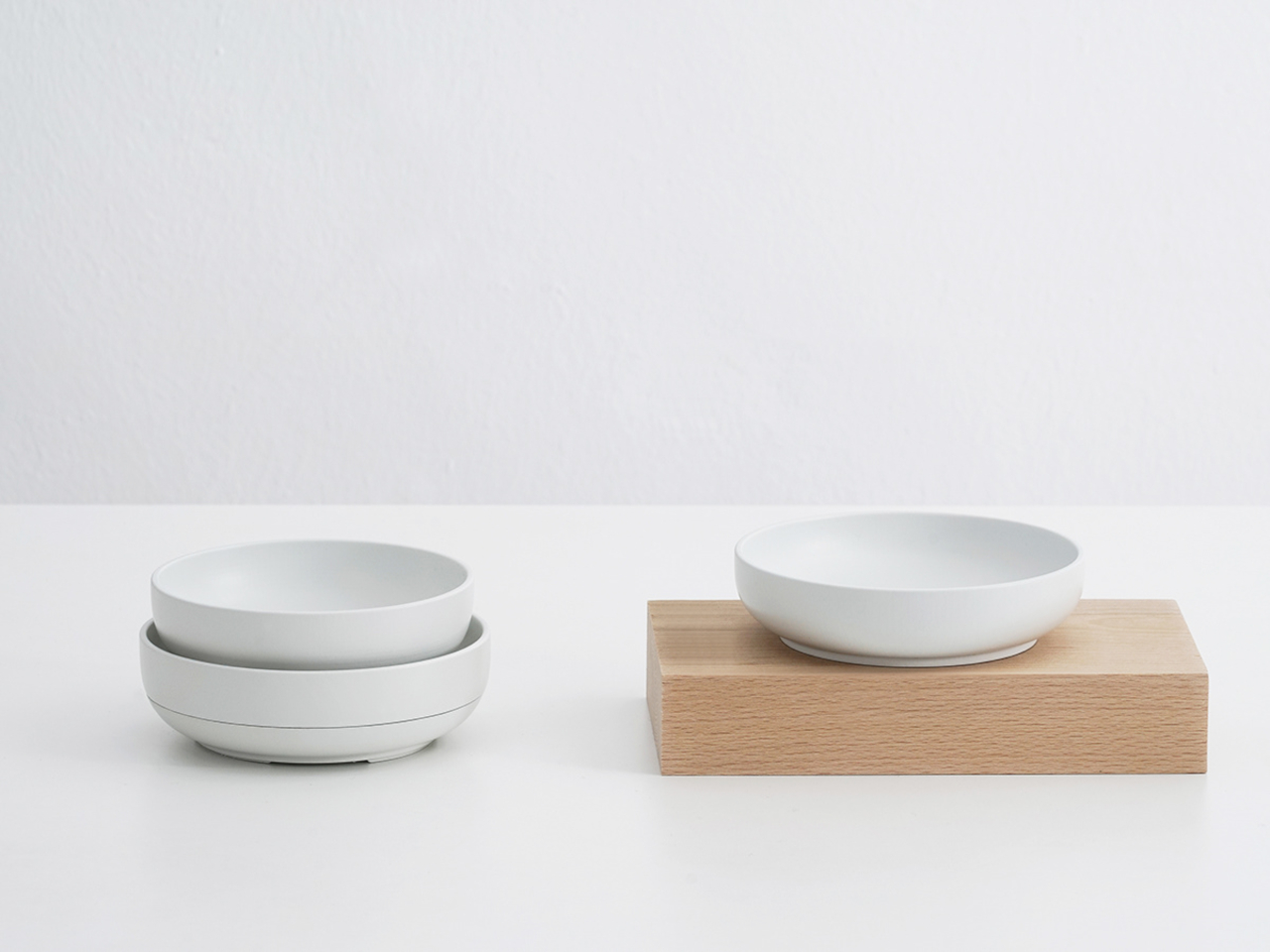
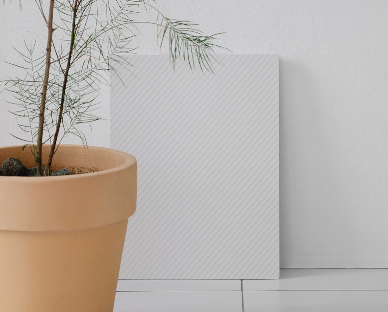
The post These everyday products hide their true functions like a hidden object game first appeared on Yanko Design.
This tiny cabin rises above the ground on four stilts to mimic treehouses


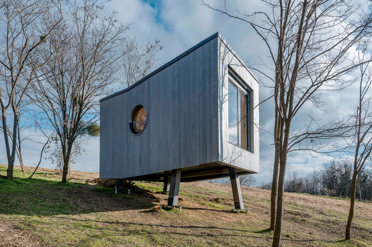
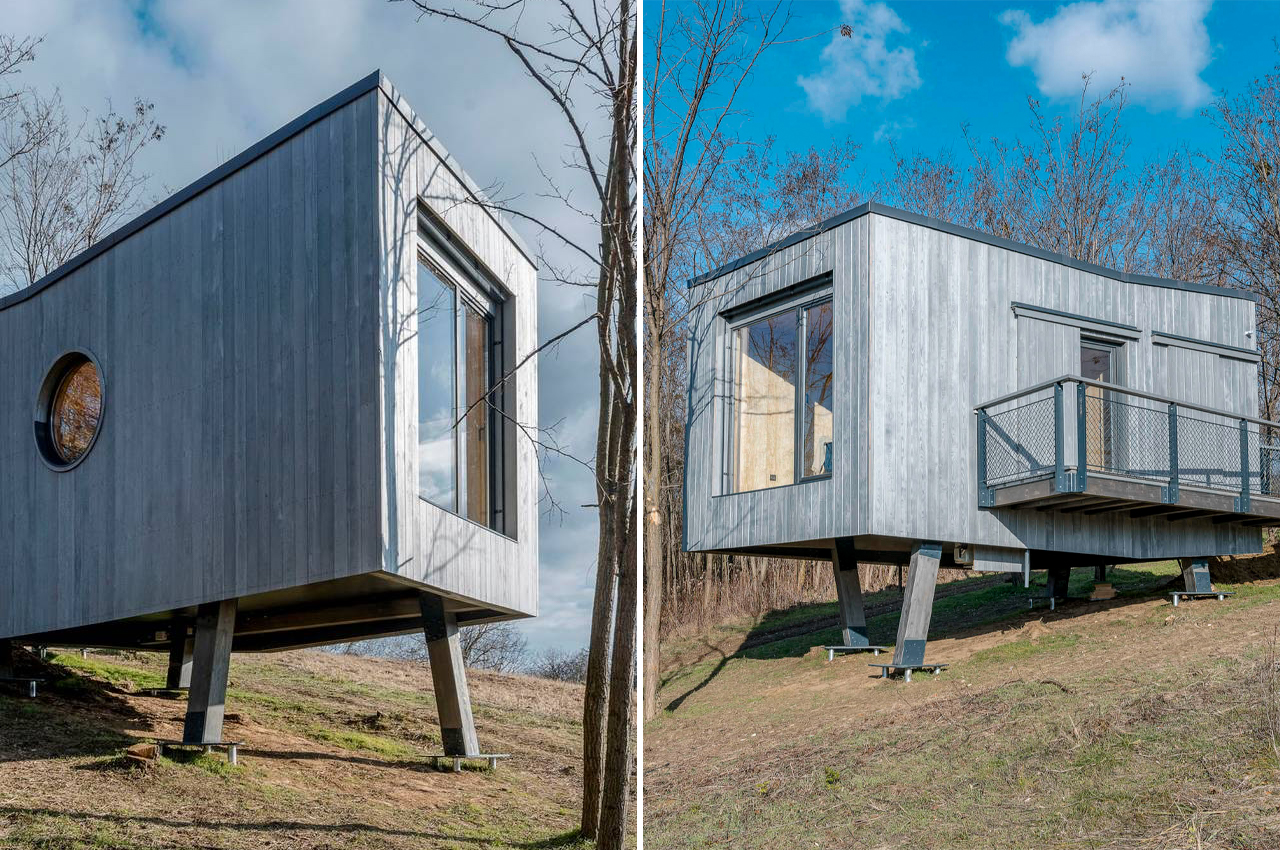
Wauhaus is a 20sqm tiny cabin on stilts that was inspired by the build of treehouses.

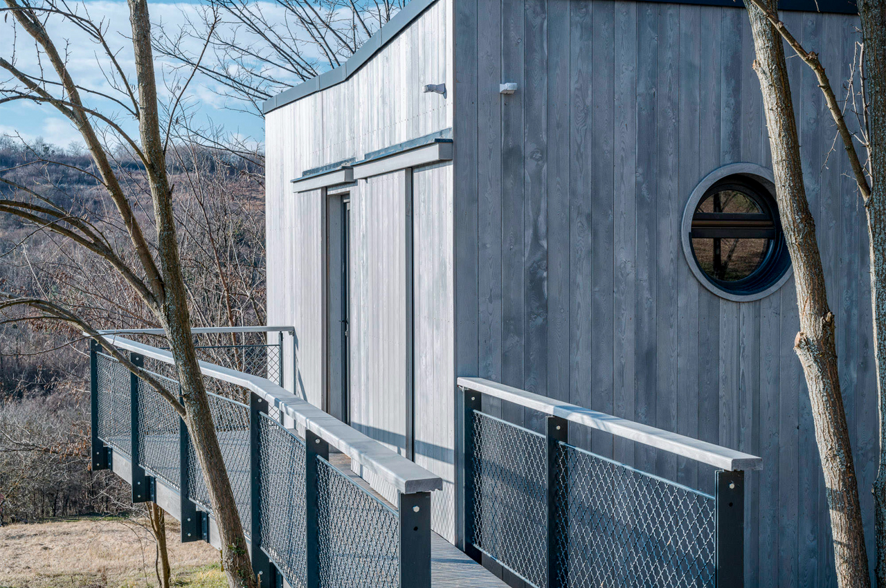
Even when we were little, we dreamed of escaping to some treehouse in the forest, free from the humdrum of everyday life to start a new one in the woods. Taking cues from the treehouses that defined our childhoods, Hello Wood, an international architecture studio based in Budapest, designed Wauhaus. Perched above a sloping hillside in Hungary’s Zala County, Wauhaus is a tiny cabin inspired by children’s treehouses that depends on four stilts to remain aboveground.

Spurred by the recent popularity gained by mobile lifestyles and downsized living, the architects at Hello Wood tried their hand at constructing their own tiny cabin. Describing this recent cultural shift towards tiny, mobile living, Hello Wood writes,

“Treehouses, design cabins, forest huts, glamping–the long-lasting popularity of exciting accommodations is not surprising; many of us want to leave behind the noise of the city from time to time and get closer to nature. Modern treehouses–which take the children’s tree platforms to a whole new level–provide this experience. We can retreat in a canopy-level house or a cabin with legs to watch the wildlife of the quiet forest, listen to the rustle of leaves, or immerse ourselves in the view unfolding before us.”

Envisioned to be a private workspace or remote holiday retreat, the 20sqm Wauhaus keeps a low profile and the charm in the details. Reinforced by triple screws, Wauhaus rises above the ground on four wooden beams of varying heights to form a unique silhouette and standing profile. The exterior facades are wrapped in graphite gray larch planking to maintain a discreet profile amidst the cabin’s natural surroundings.

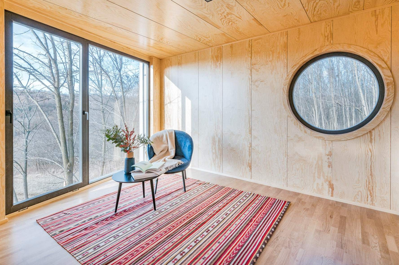
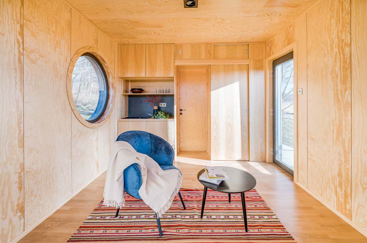
A side ramp gradually ascends from the ground to the home’s entrance. Inside, residents are greeted by an open-plan layout that culminates as a single space that leaves enough room for a workstation or sleeping accommodations, a small kitchenette, and a bathroom. The interiors are planked by natural birch plywood, offering a sun-soaked, bright contrast to the tiny cabin’s gray-scale exterior.

Designer: Hello Wood

The post This tiny cabin rises above the ground on four stilts to mimic treehouses first appeared on Yanko Design.

This minimalist wooden board offers a interior-friendly way to control your home with Alexa


The last thing you probably expected is for a beautiful piece of wood to be your control dashboard for your smart home.

The Internet of Things has slowly but surely invaded our homes in the guise of smart lighting, dynamic photo frames, and, of course, smart speakers. While many of these are designed to look stylish and handsome, most of them carry an aesthetic that often clashes with minimalist rooms or decor. Smart speakers are perhaps the biggest culprits in this regard, but a Japanese company has found a solution that lets you put Alexa-powered smart speakers out of sight.

Designer: mui Lab

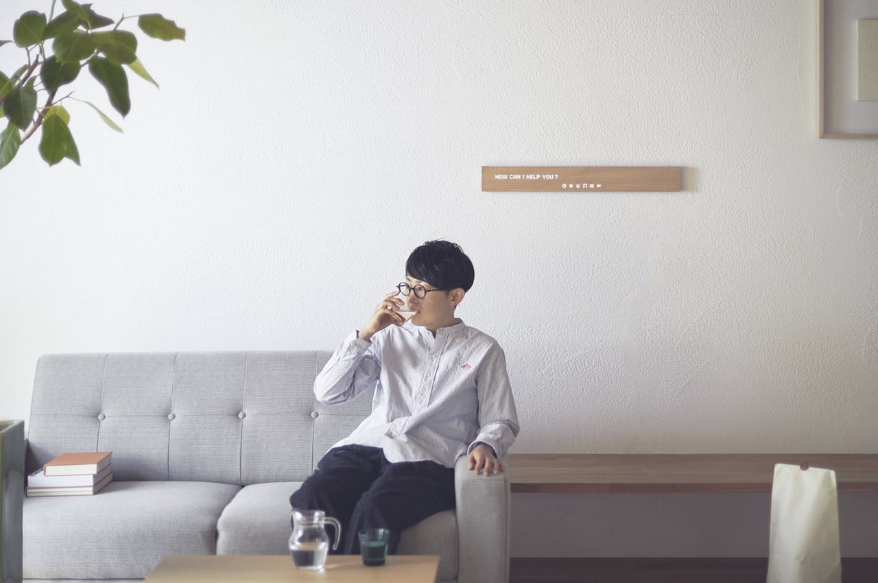
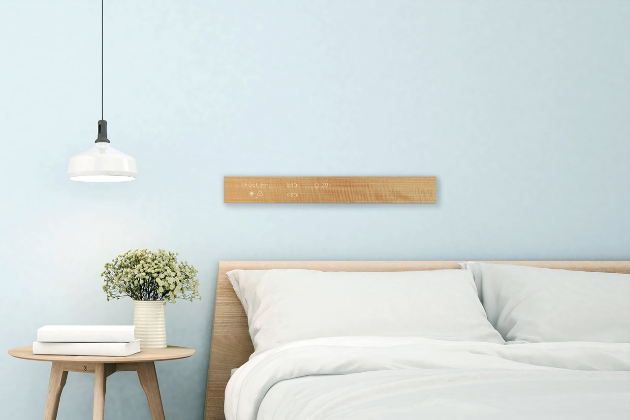
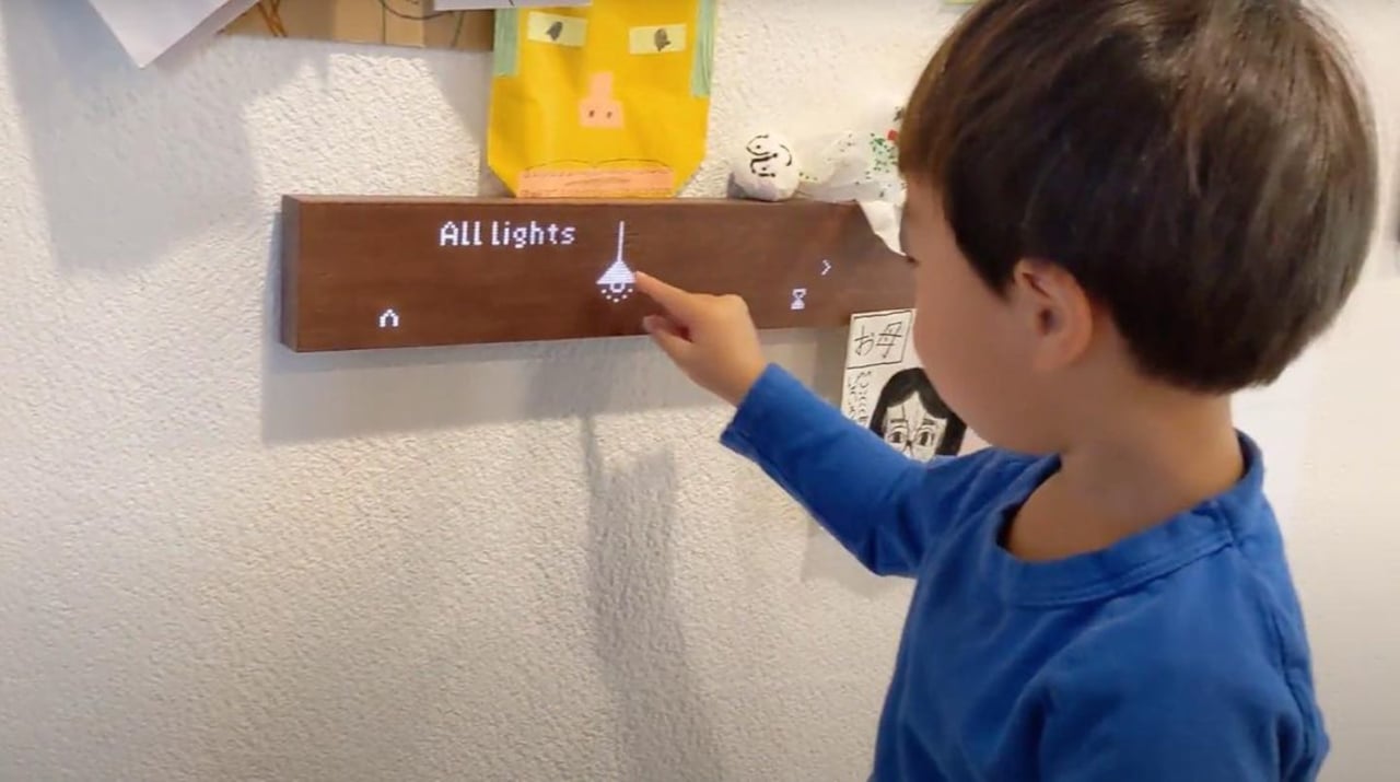
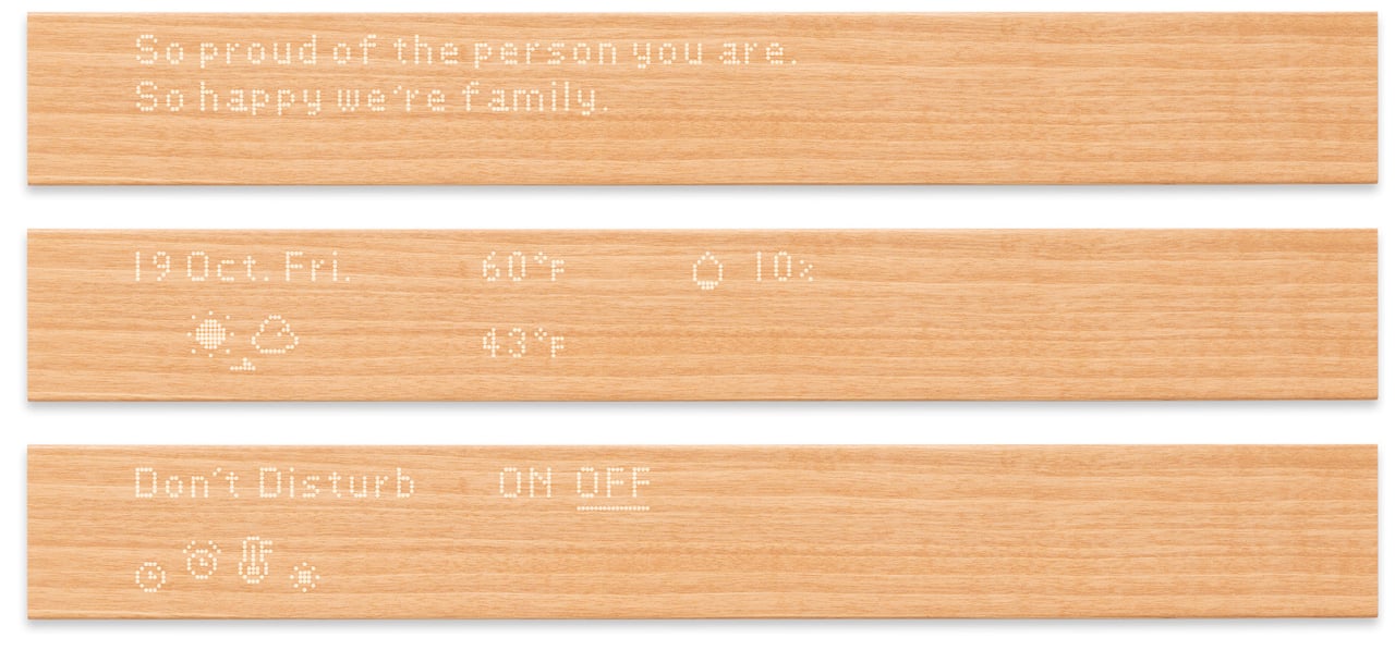
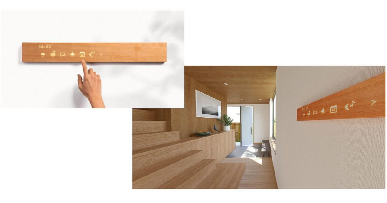
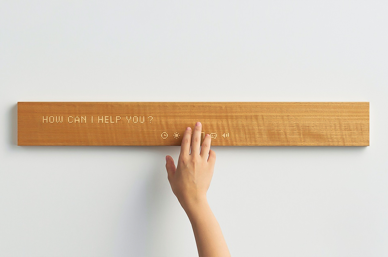
mui looks like an unassuming block of wood, but it’s actually just as talented as a smart speaker. Actually, it can do more than what most voice-only speakers can, like the Amazon Echo, because it has a touch panel on its front surface. Unlike a busy and overwhelming touch screen, however, the mui board presents visual feedback as monochromatic icons and text in a dot-matrix style that matches the board’s minimalist aesthetic.

More than just being a novel way to present a smart home hub, mui offers an equally unique approach to mixing nature and technology. Rather than the usual cold elements of a tablet, a phone, or even a smart speaker, the wooden board adds a warm and almost human touch to interact with devices and appliances. Its designers want to evoke joy and calm, feelings that should be associated with the home in the first place.

Despite its minimalist appearance, the mui is by no means minimal in features. In addition to its own mobile app, mui Lab is introducing a new “calm” interface that turns the board into a visual interface for connected Amazon Alexa speakers. That’s in addition to the original mui Platform’s compatibility with the new Matter smart home platform.


Inspired by Taoist philosophy, the mui board offers a refreshing spin on how we interact with our smart homes, basically by doing or showing almost nothing. It’s not going to appeal to people who prefer seeing everything in one go, but this design will definitely go well with rooms and furniture that try to hide the tech behind soothing organic materials.

The post This minimalist wooden board offers a interior-friendly way to control your home with Alexa first appeared on Yanko Design.

A tiny glass cabin lets you enjoy Finnish nature in warmth and safety

For those who dream of living with nature but worry they might not have the stomach for it, this cabin in Finland might have the perfect answer.

Congested cities, crowded spaces, and COVID-19 may have had some people thinking about escaping to the great outdoors. Even the biggest technophiles will probably admit to being in awe in the face of the splendor of nature. Few, however, might have the heart to really camp out and give up on modern amenities for even just a day. An architectural firm in Finland has thought of the perfect solution, presuming you have no qualms about living in a tiny cabin that has glass for its roof and walls.

Designer: Luauri Solo/Pirinen Salo Oy

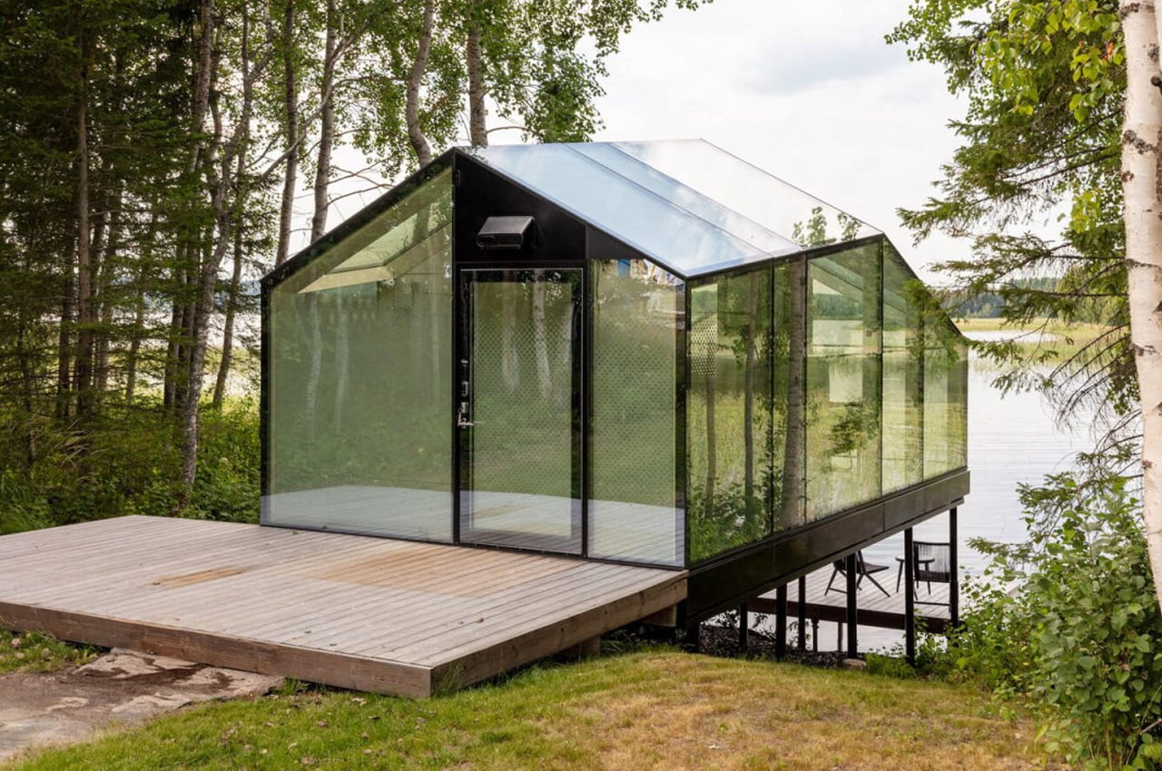
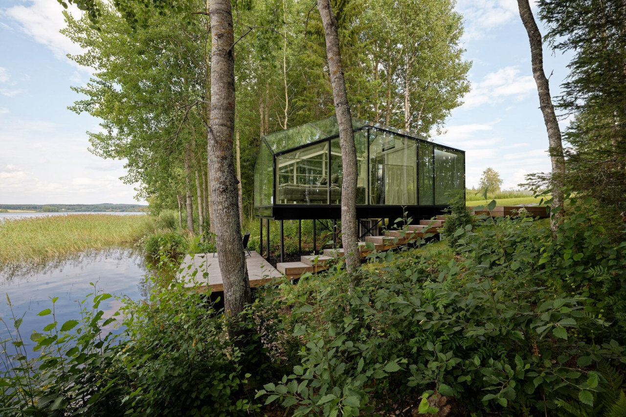
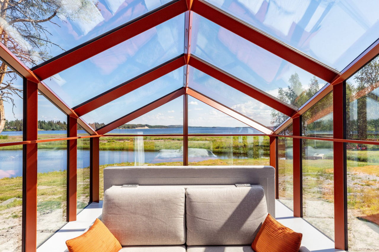
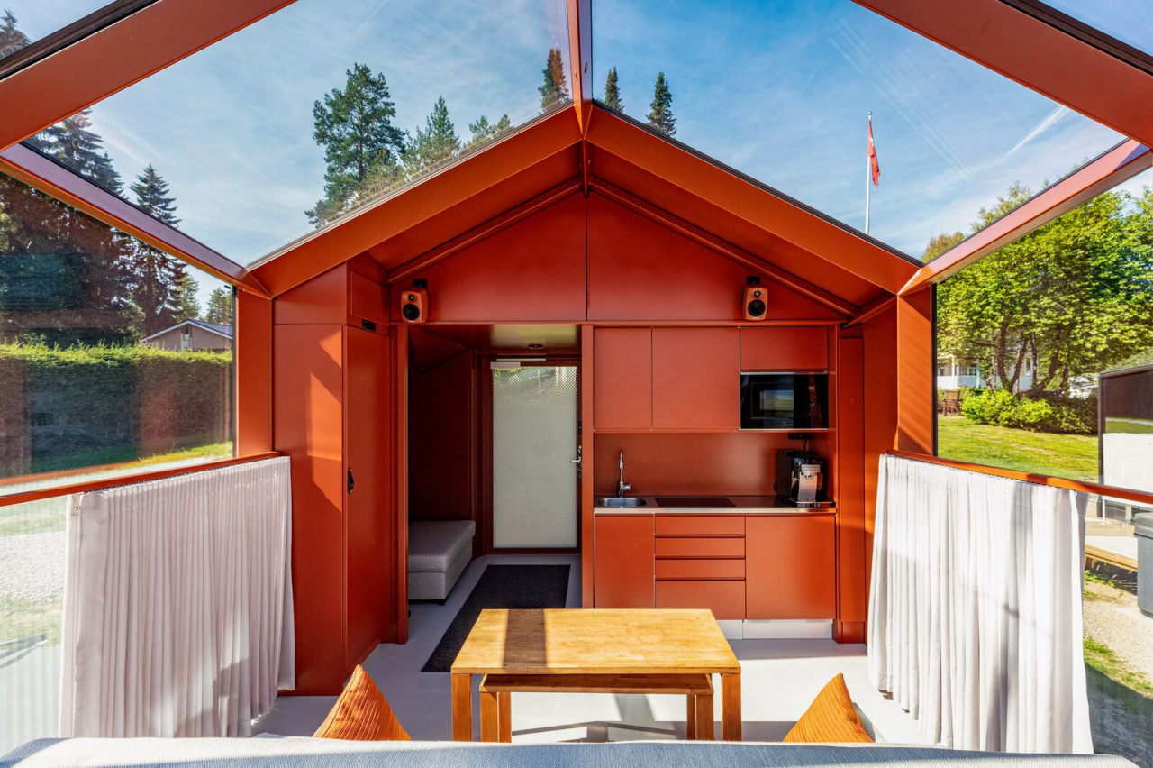
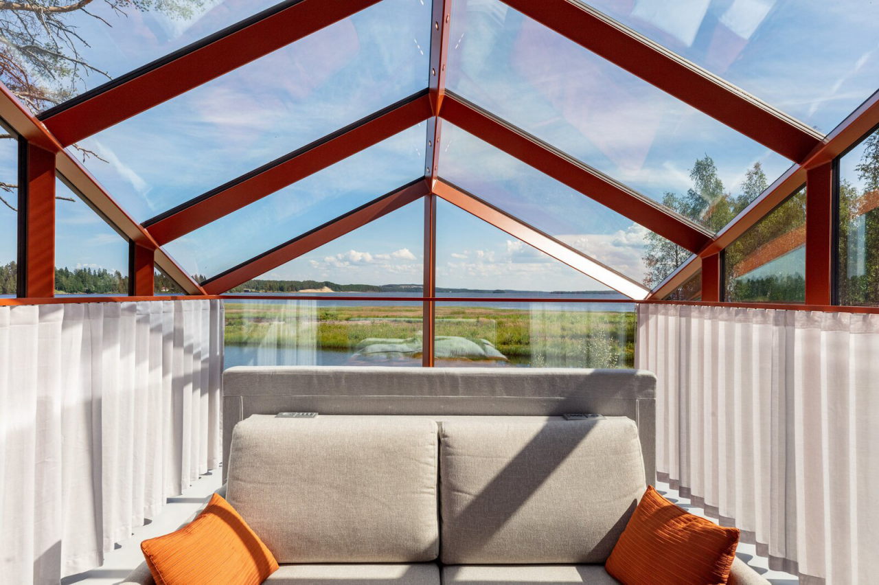
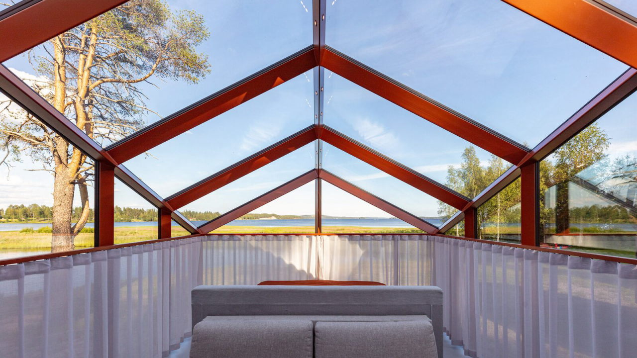
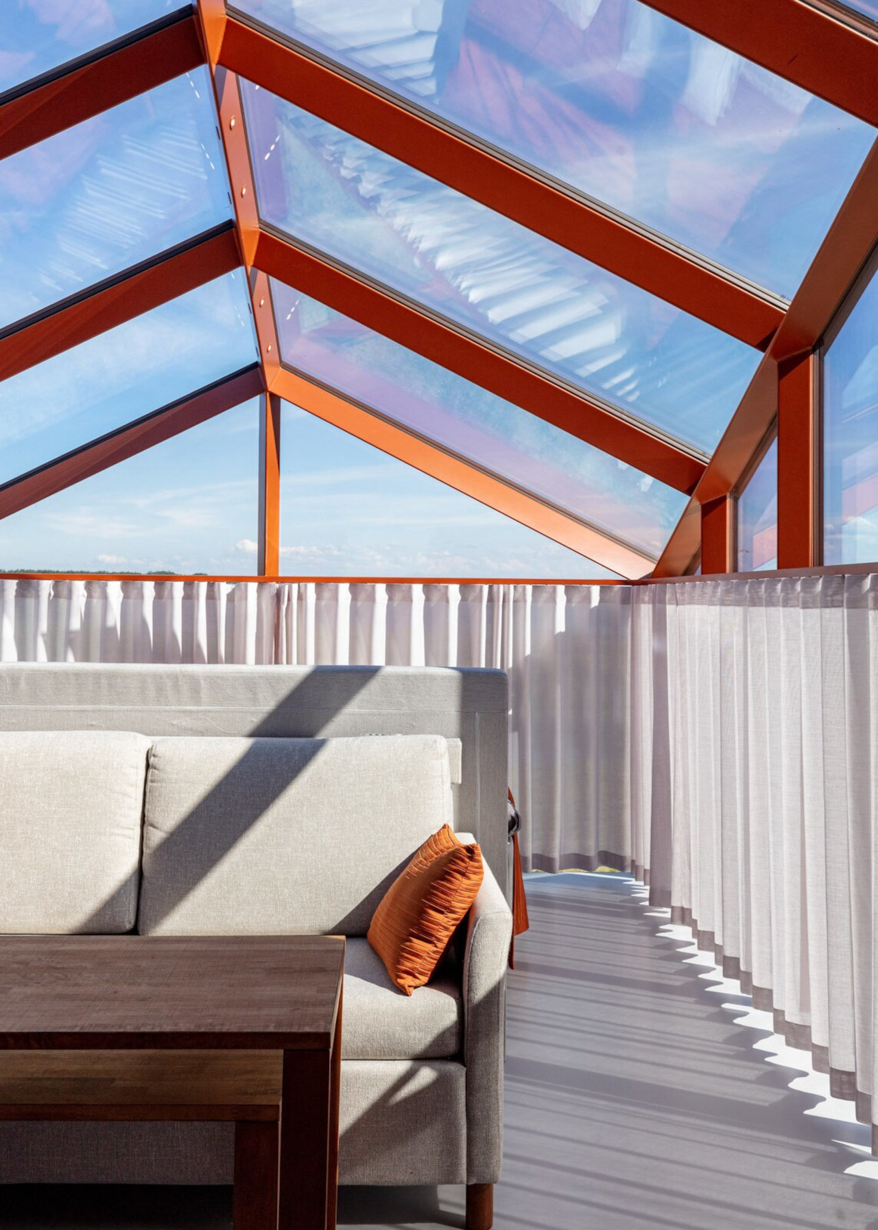
The Smart Lucia gives a whole new meaning to “living in a glass house,” though the glass, in this case, is far from the fragile material that the idiom implies. The glass here serves as more than just a safe viewing window into Finland’s majestic greenery. The thermal glass, along with glass and floor heating, will save you from frostbite during the country’s notoriously unforgiving winters. Then again, there might not be much to see during that season anyway, unless you’re the type that does enjoy frozen sceneries.

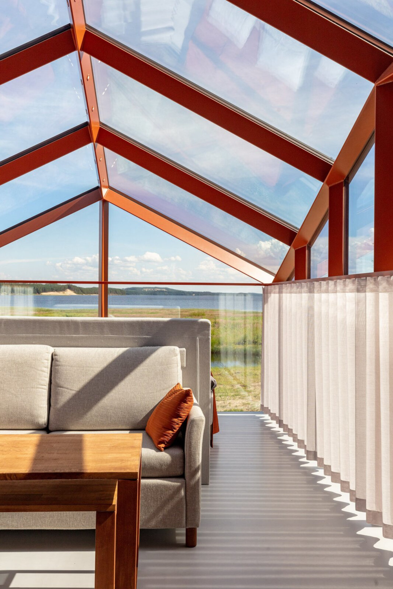
The glass allows natural light, be it from the sun or stars, to be the main lighting source for the cabin, though artificial lighting is also integrated into the structure’s slim steel structures. This has the combined effect of adding layers of lighting that seem almost magical, especially when the glass acts like a prism to break sunlight into its component colors.

In keeping with Finnish tastes, the Smart Lucia espouses a minimalist design even indoors. But where most houses make the living room or the dining table the centerpiece of the home, the bedroom or rather the bed is the pivotal element inside this tiny house. While the glass house is situated and oriented to capture the best views of nature at that location, you can really enjoy that view only when you’re lying in bed.

Of course, privacy can become an issue with a house that has glass for walls, and there are definitely options to address those concerns. Darkened or mirrored glass is available, but that could affect one’s unmarred view of the outside world. The simplest solution would be to have curtains that cover only the lower half of the house, obscuring only portions of the vista when the need calls for it.

Pirinen Salo Oy’s Smart Lucia is perhaps a dream come true for minimalists looking in search of tiny homes in the heart of nature. It probably won’t be the most efficient tiny home and is unlikely to be accessible to most people, even those living in Finland. Its design and concept, however, do spark the imagination and open up possibilities for enjoying the majesty of nature in a safe, comfortable, and modern but hopefully still environment-friendly environment.

The post A tiny glass cabin lets you enjoy Finnish nature in warmth and safety first appeared on Yanko Design.

The ‘Ripple’ turntable transforms the idea of sound-waves into actual waves modeled onto the surface

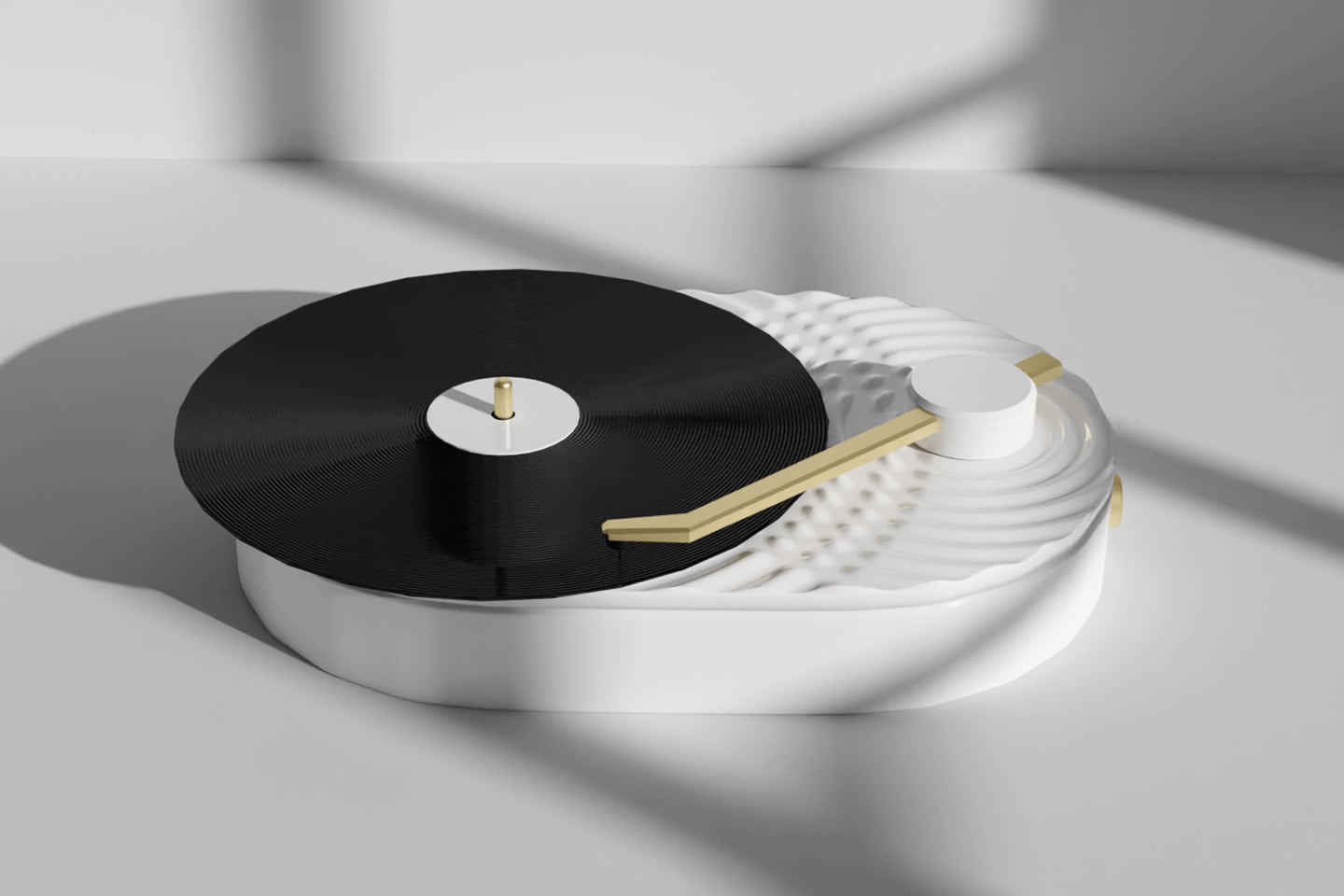
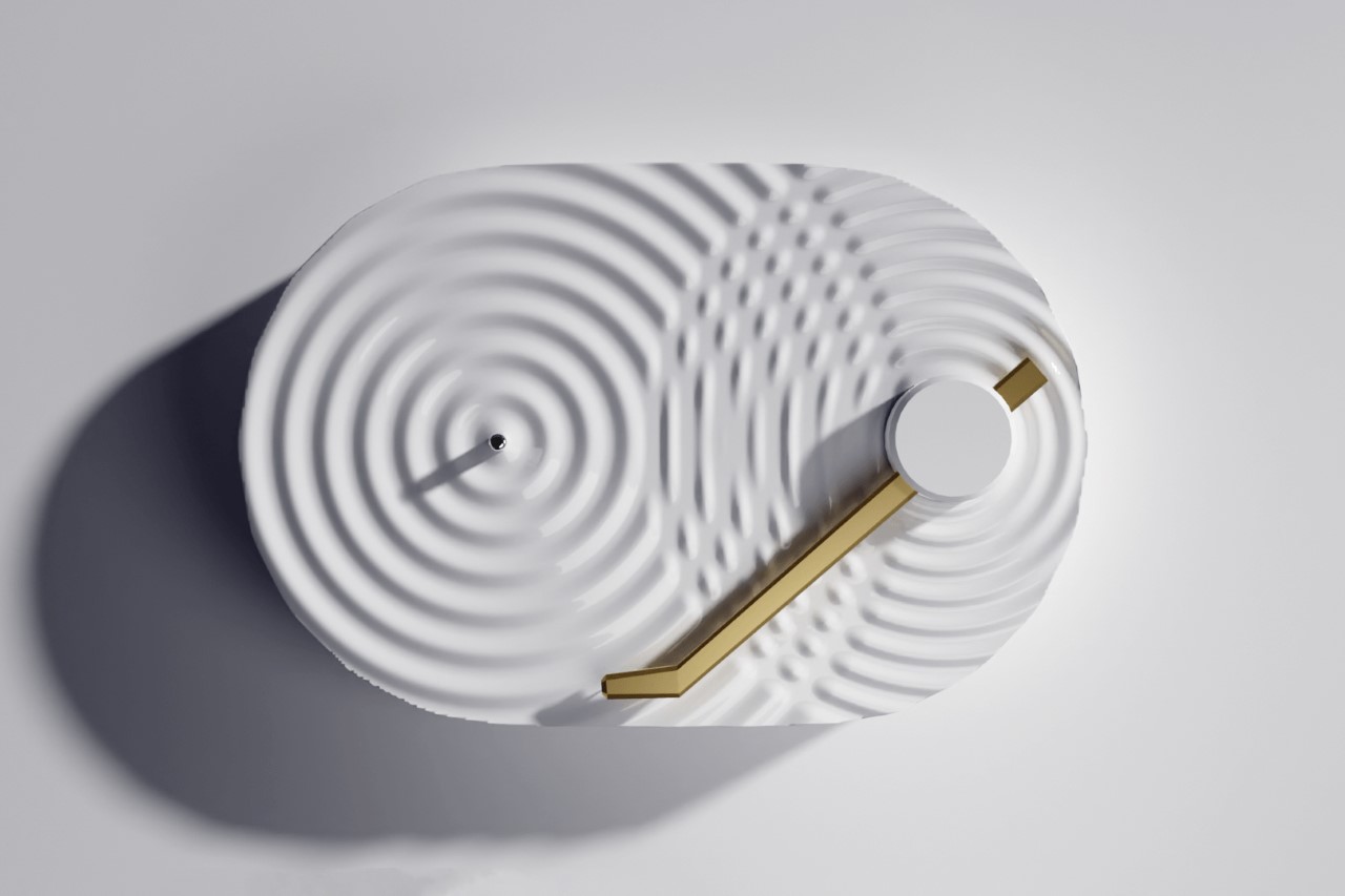
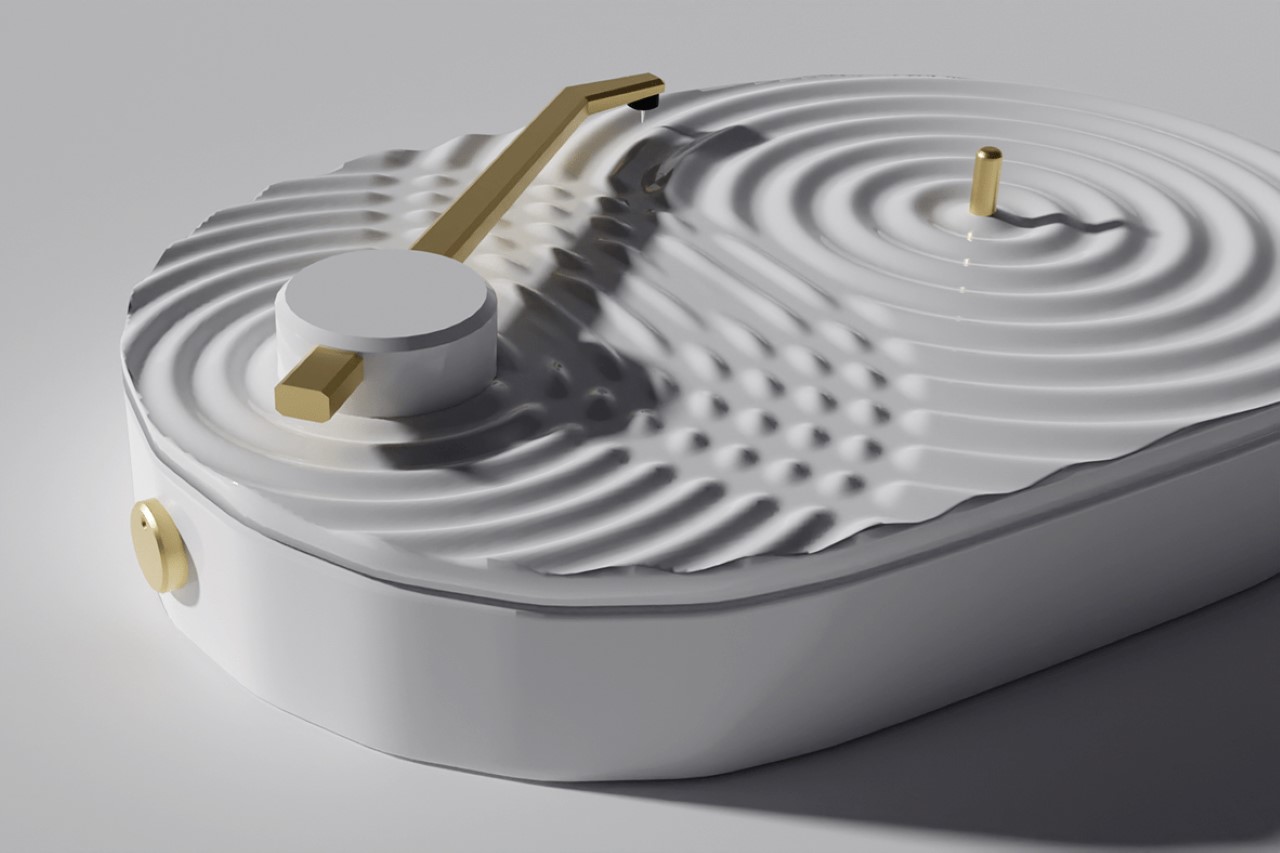
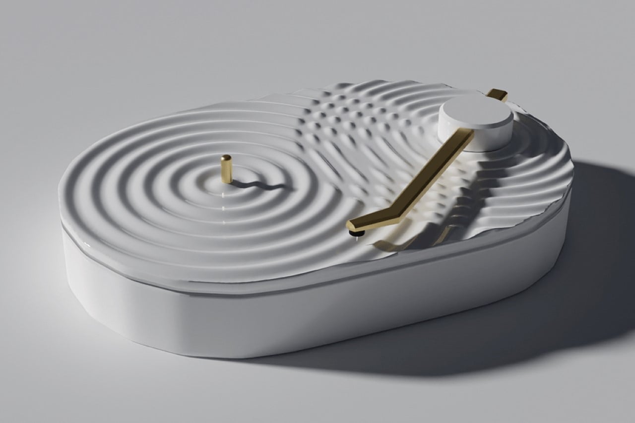
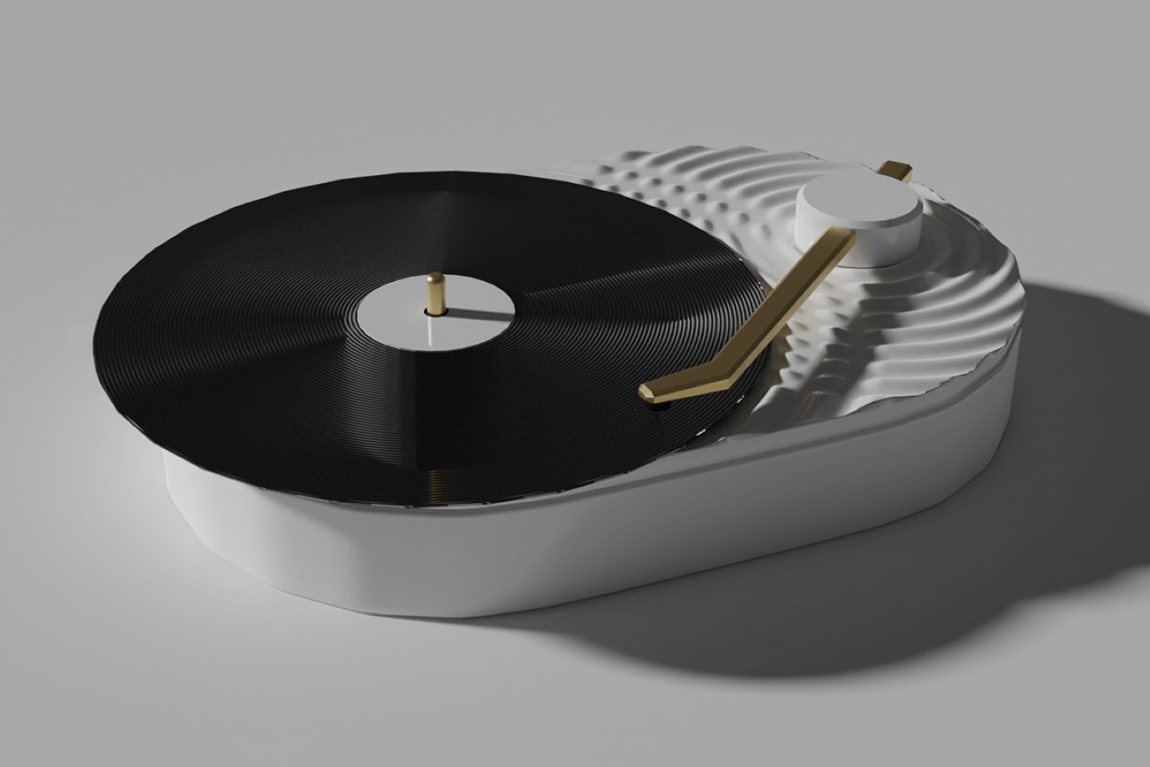
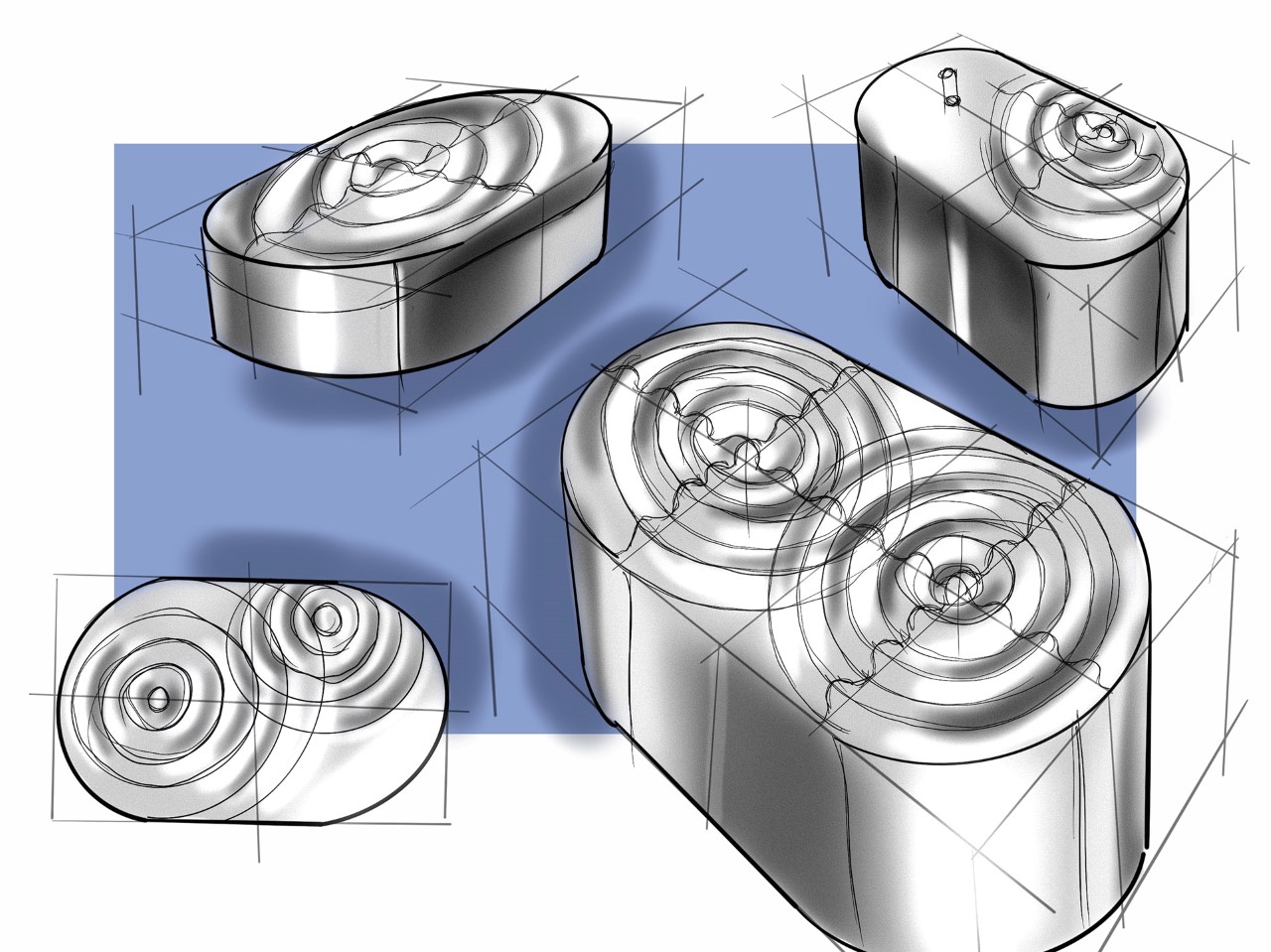
A clever play on how sound emanates from a source like ripples from a single point, the Ripple Turntable turns audio waves into literal waves, with its surface treatment. The pristine white turntable comes with a rippled surface, with waves emanating from the spindle at the center of the platter, as well as from the origin of the swing-arm, and intersecting in the middle to create that perfect bit of visual drama.

The entire turntable is white, with the swing-arm adding a gold accent to it, and the vinyl disc itself bringing a bit of black to the mix. Although conceptual, the turntable’s visual experiment is interesting, to say the least. Most turntables are either designed to look retro, or over-the-top luxurious. The Ripple, however, is a deviation from the norm, with a design that’s minimal, quirky, and has a great sculptural quality that lends beautifully to Scandinavian or Japanese home decor styles!

Designer: Pelin Özbalcı

The post The ‘Ripple’ turntable transforms the idea of sound-waves into actual waves modeled onto the surface first appeared on Yanko Design.
This crafty little bed comes with overhead storage… just like on an airplane!


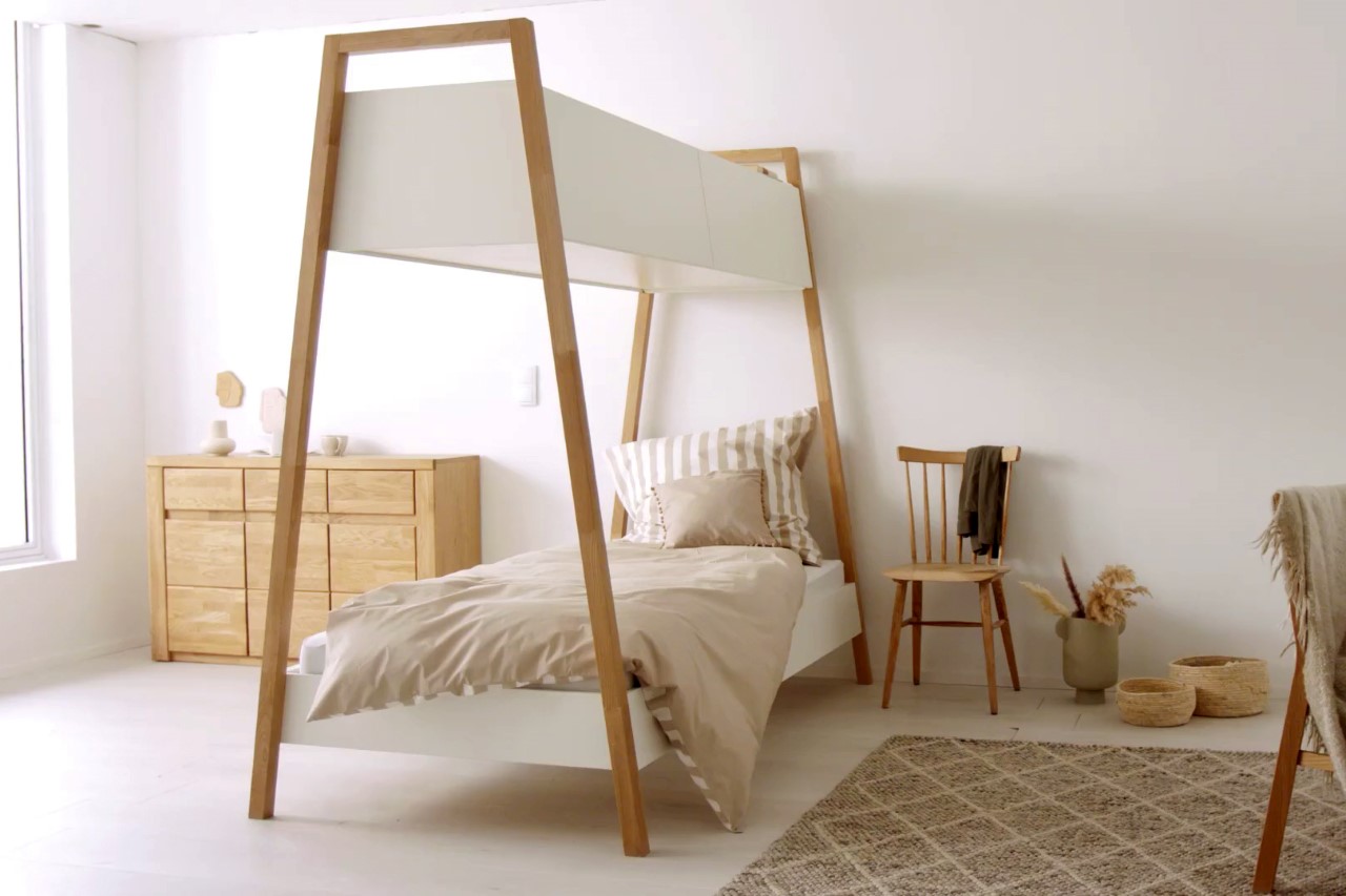
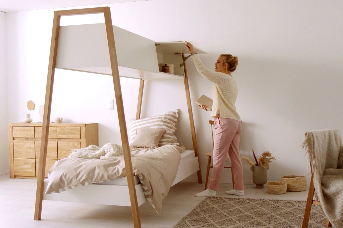
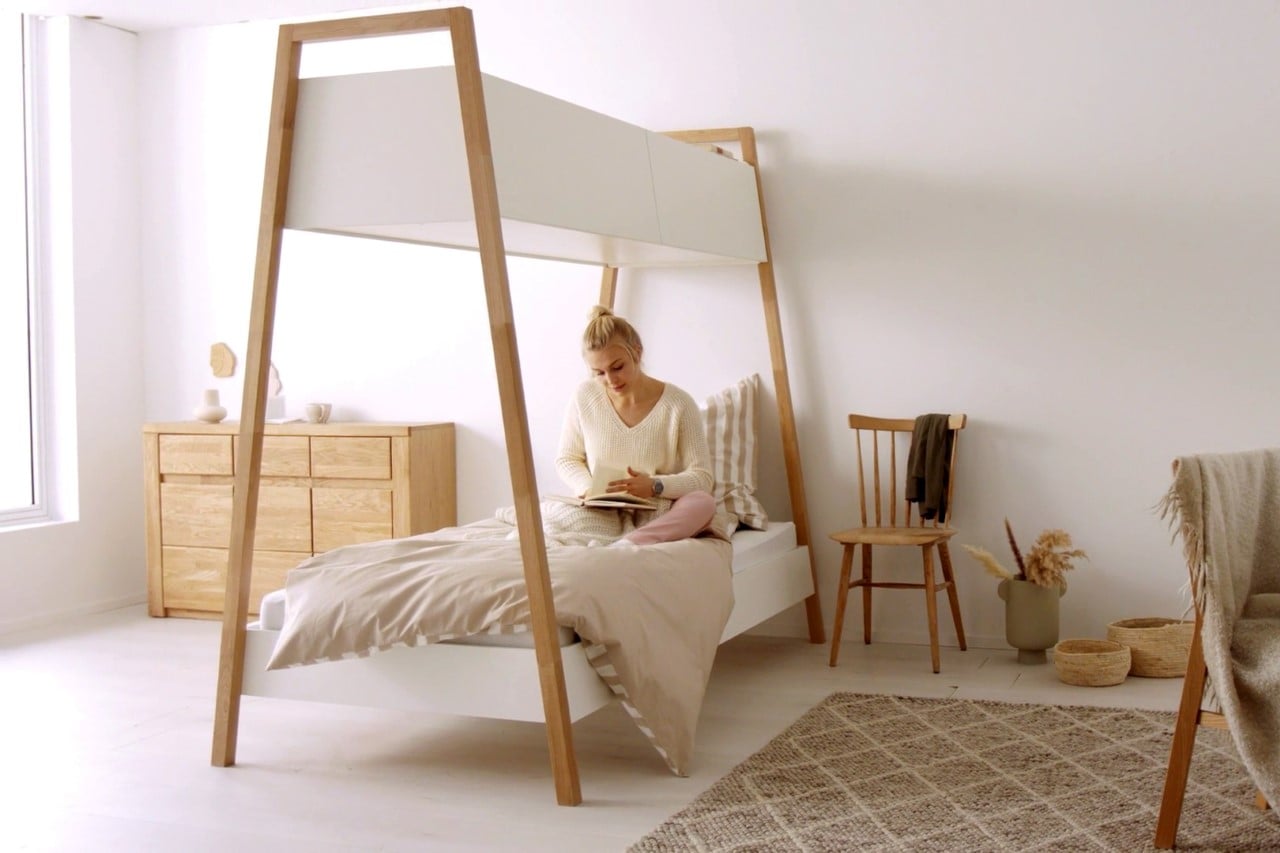
Perhaps the most ingenious inspirational overlap I’ve seen in a while, the COBBO bed gives beds a rather clever little upgrade! The COBBO bed uses the empty space between the mattress to put a nifty cabinet, reminiscent of the overhead storage you get on airplanes… so you can live out your wanderlust airplane fantasies while sitting at home!

An airplane’s cabin is perhaps the most ideal example of space optimization. Every single nook and corner of an airplane cabin goes unwasted… with the seats being packed in the most space-saving orientation, tables being folded up to eat less space, and overhead areas being used to store luggage, that would otherwise need to be kept on the floor. Michael Hilgers decided to carry this utilitarian approach from aircrafts into regular homes, giving it a minimalist upgrade that looks much more visually aesthetic than functional.

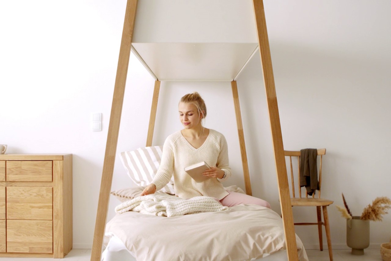
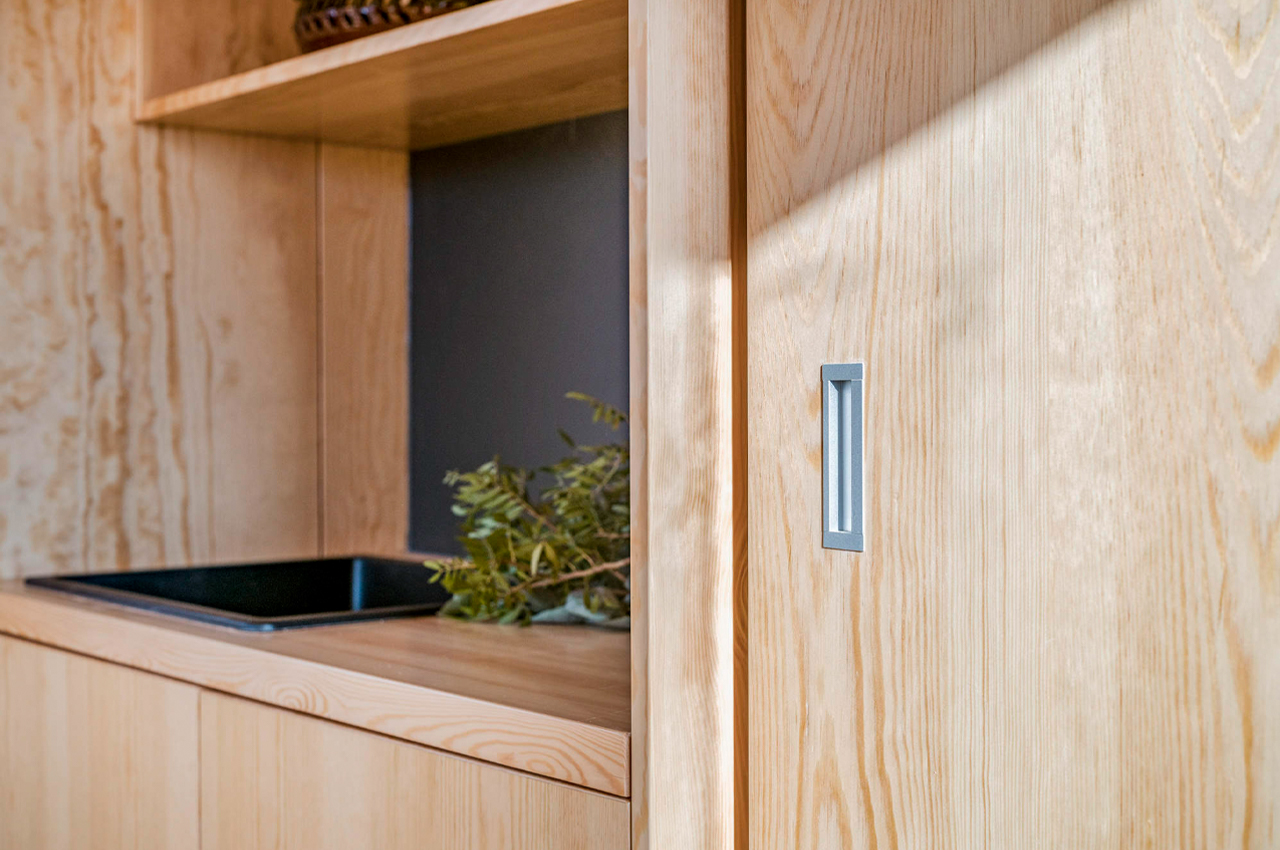
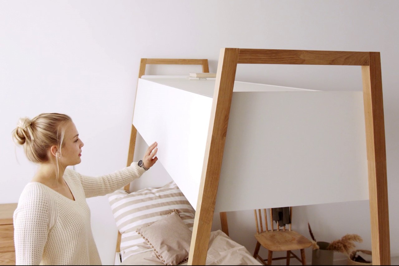
The COBBO bed, designed for furniture manufacturer OTTO, comes with a simple Nordic-inspired design with solid oak legs and white storage cabinets that are located above the sleeping area. The bed’s slightly tapered design serves two purposes, it gives the piece of furniture both visual and physical lightness, since the cabinet above the bed is significantly slimmer than the bed itself. This allowed Hilgers to use slim wooden pillars instead of metal ones, since the cabinet above the bed wouldn’t end up being overly heavy.

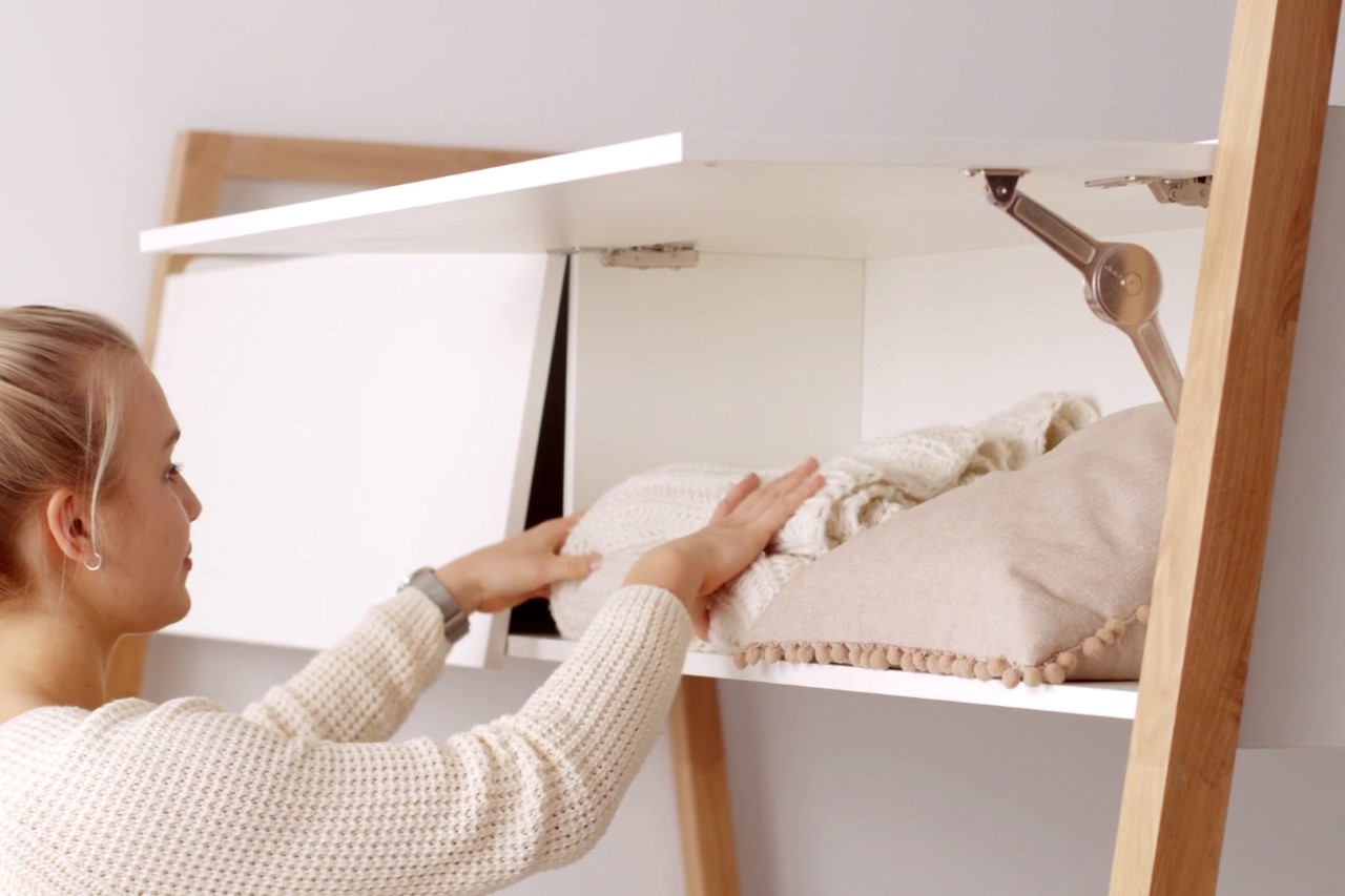
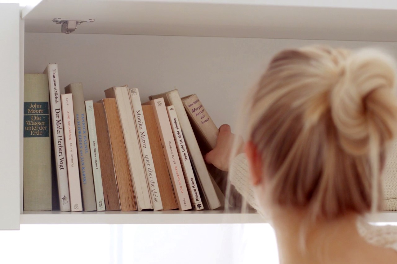
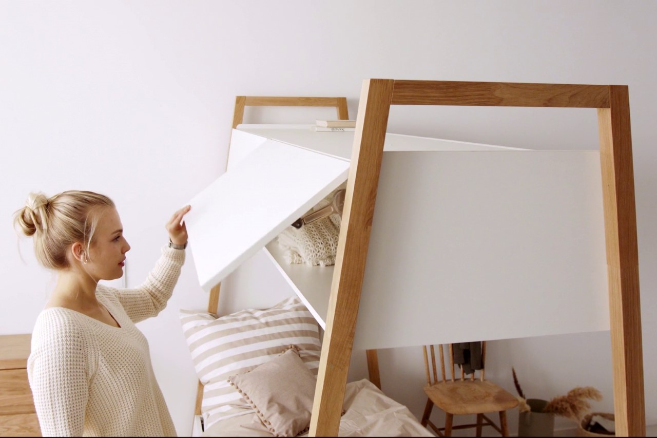
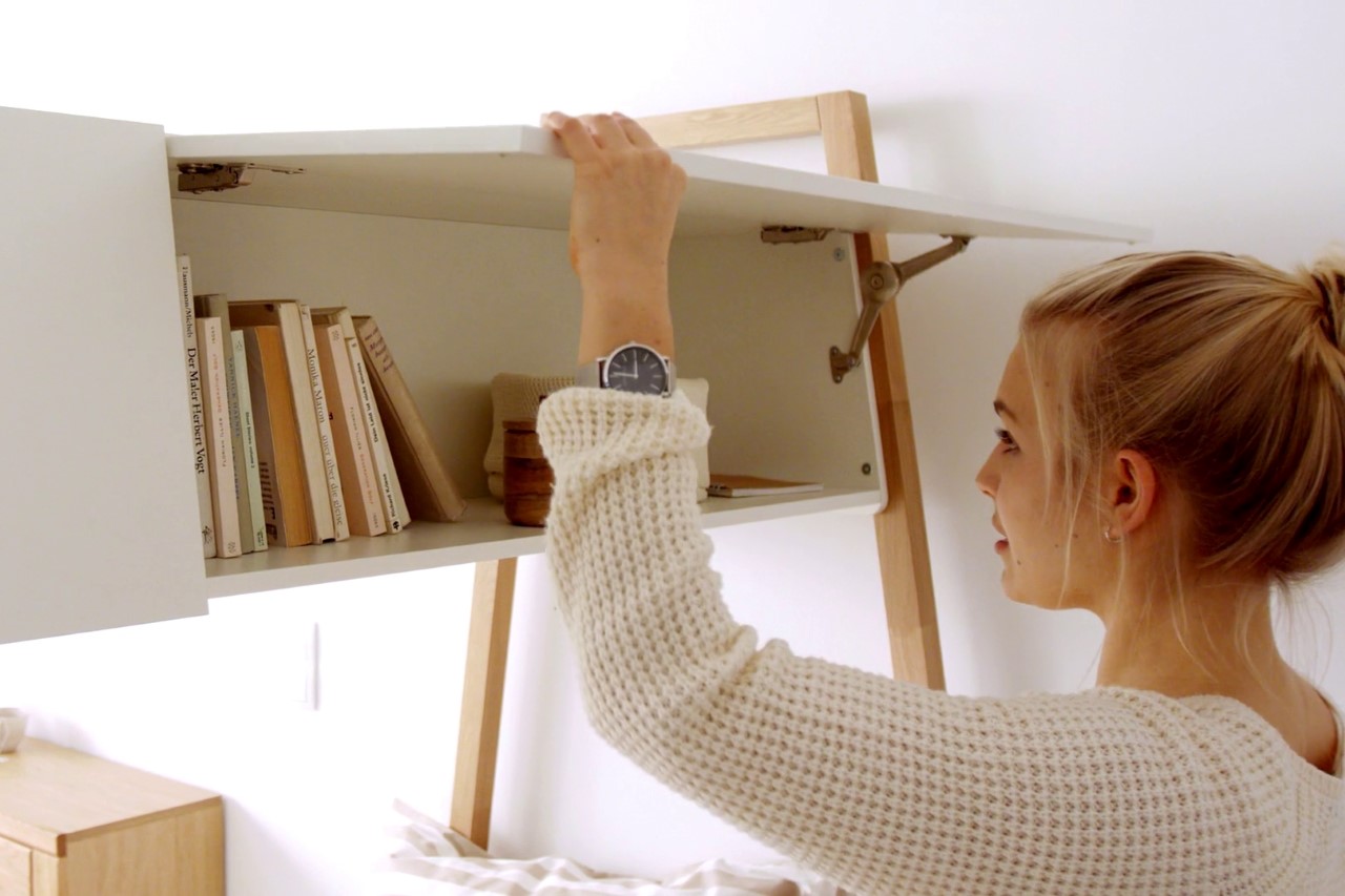
The slim cabinet/shelf comes with four doors (two on either side) that open to reveal a perfectly slim nook to store items like books, quilts, throws, and cushions. It’s a clever way to provide storage without cluttering the floor, making it perfect for smaller rooms, student housing, people who like minimal interiors, or just the wanderlust who wants the experience of being in an airplane but can’t travel much because of the pandemic!

Designer: Michael Hilgers for OTTO

The post This crafty little bed comes with overhead storage… just like on an airplane! first appeared on Yanko Design.
This multifunctional furniture system designed to create more living space is the solution tiny apartments need!


No matter the city, tiny living is in right now. As cities become more populated, their residents and architects are finding ways of making crowded spaces feel a lot more comfortable through versatile furniture and innovative interior design. From micro apartments to co-living spaces, city homes come in all shapes and sizes.
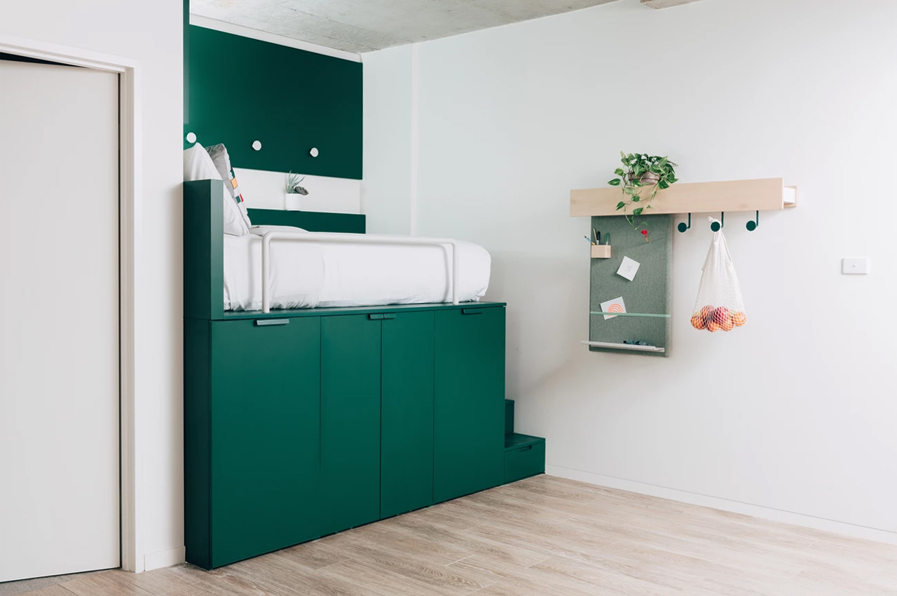
In Sydney’s Stanmore neighborhood, Australian architecture firm Mostaghim and co-living group UKO designed and constructed a multifunctional furniture system into the layout of a small studio apartment to augment the available living space and take full advantage of the system’s integrated storage units.

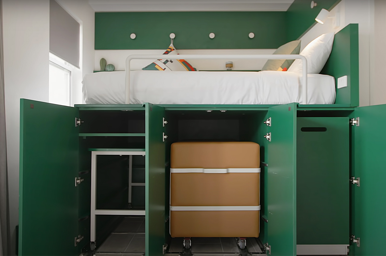
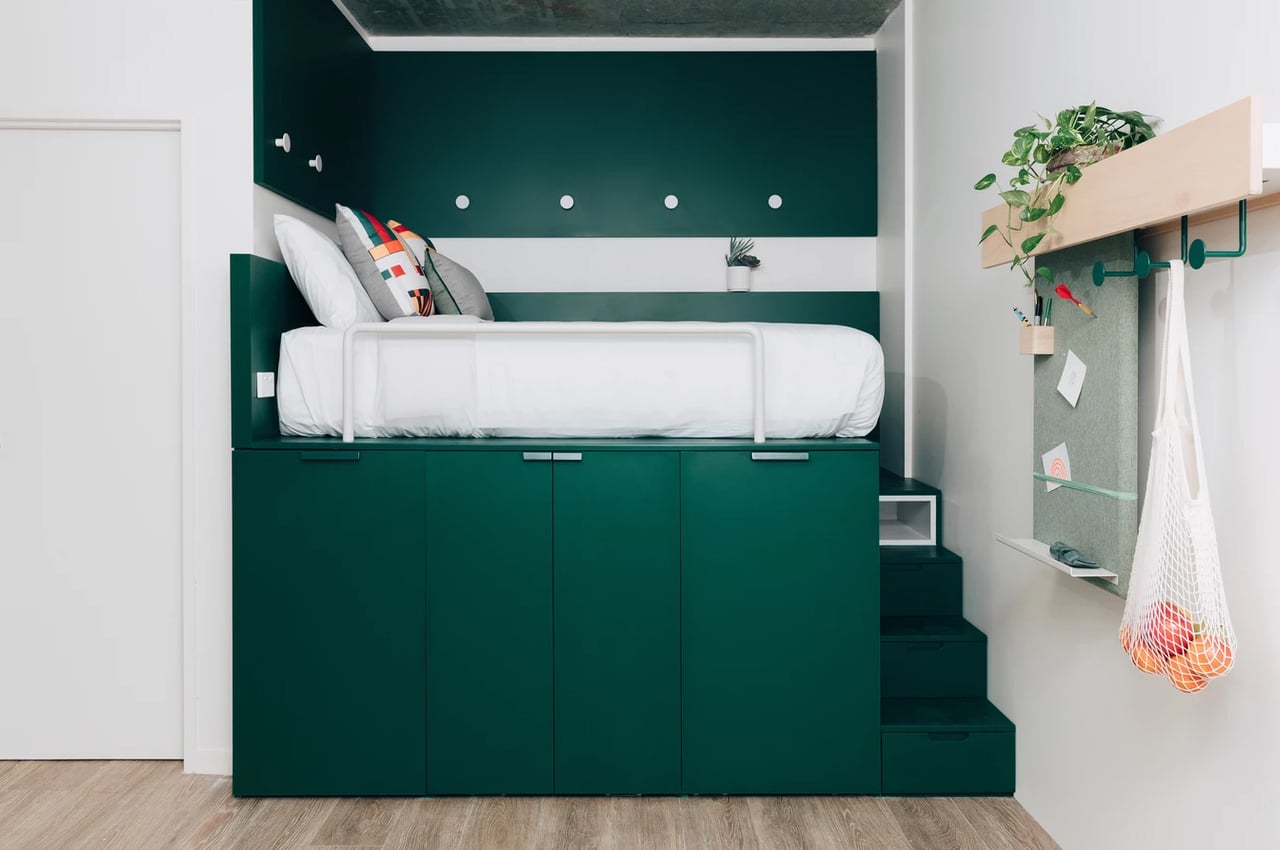
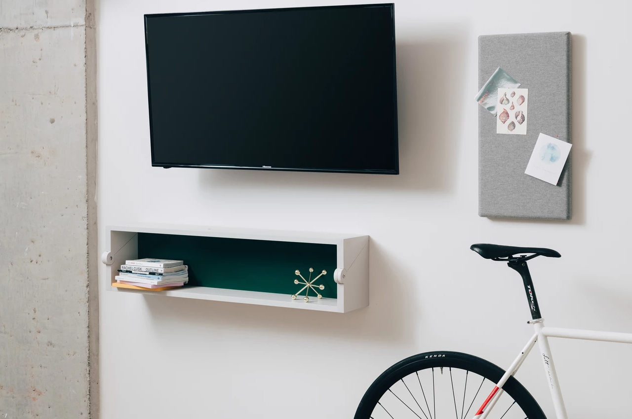
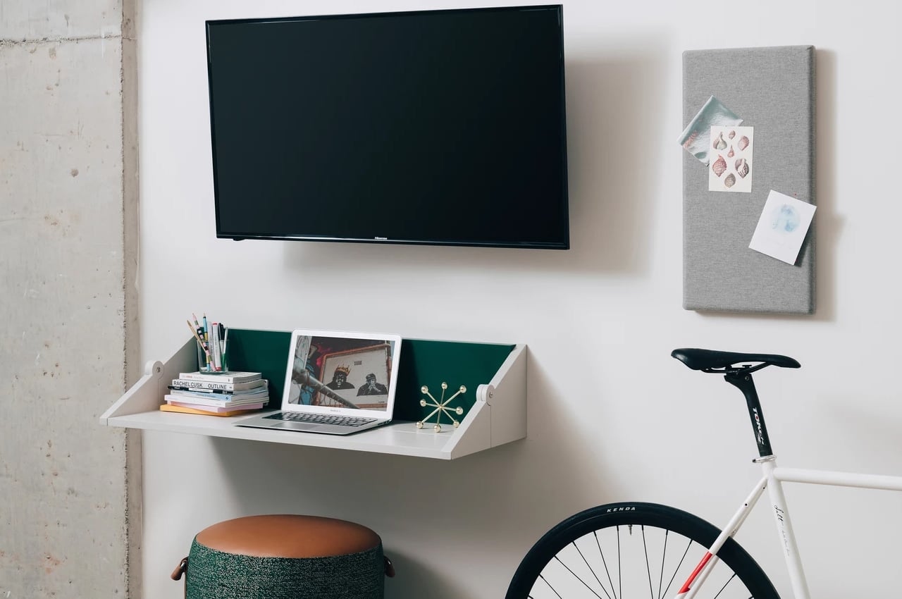
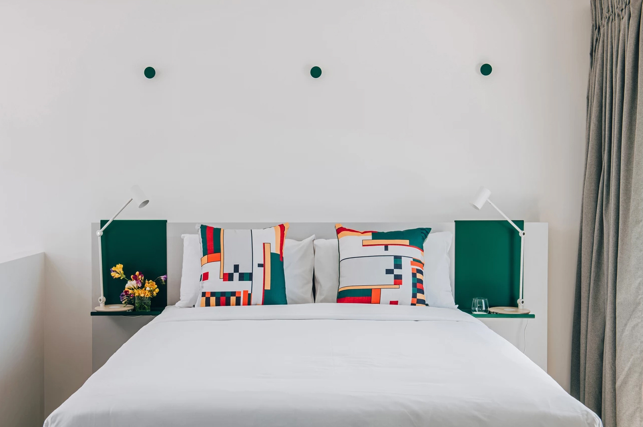
Captured by Never Too Small, a video channel dedicated to small footprint design and living, UKO and Mostaghim’s furniture system measures 205 square feet (19 square meters) to include a kitchenette, compact bathroom, and a catalog of multipurpose furniture systems from a bed unit with integrated storage to a fold-out wall desk. While a kitchenette and a compact shower are standard for micro-apartments, the versatile bed unit is what makes this tiny space feel a lot bigger than just 19 square meters. Just beneath the unit’s mattress, pull-out drawers and cabinets conceal closet space and additional furniture like a sofa and dining table.

The left-most cabinet unveils the rectangular kitchen table for dining and cooking purposes. Just next door to the kitchen table, a pull-out sofa with automated lock brakes remains in place on a set of trolley tracks and moves freely all over the apartment’s floor when taken off the tracks. To the right, a concealed clothes rack and storage compartment provides storage space for clothes and shoes. For larger wardrobes, the stairs leading to the unit’s bed double as hidden drawers for folded clothes.

Inspired by the design of Swiss-French modern architecture pioneer Le Corbusier, the multipurpose furniture system from Mostaghim and UKO is a modern solution for the timeless dilemma of finding comfort and space in the craze and excitement of a crowded city.

Designers: UKO Stanmore x Mostaghim Architecture x Never Too Small

The Lamborghini Countach gets a GORGEOUS minimalist redesign after nearly 50 years!

ARC Design Studio has refined an Italian classic, and I’m sure Gandini would be impressed with the result!

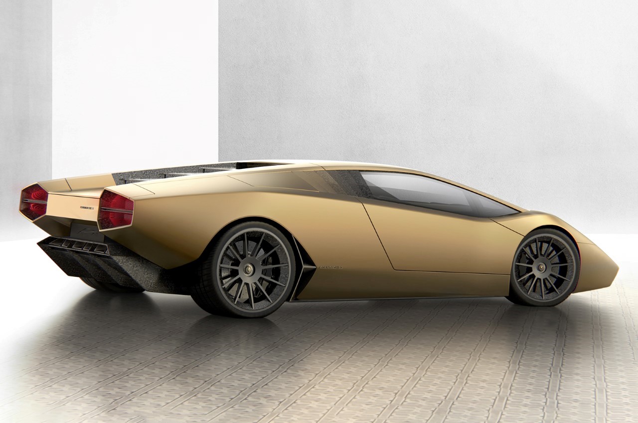
Some could argue that the Countach was the car that defined Lamborghini‘s future. Unveiled in the early 70s, the radical design was the handiwork of Marcello Gandini of Bertone, following the commercial success of the Miura. However, the Countach was nothing like its predecessor. It had that wedge-shaped angular design that became Lamborghini’s brand DNA and a signature element in all their cars moving forward. The designers at ARC Design gave the nearly 50-year old Countach a modern facelift by retaining its futuristic design while simplifying the surfaces and making it even more of an icon. The resulting Countach 50 looks like its original but on Botox. The surfaces are smoother, the edges sharper, the parting lines smaller, and headlights and taillights… well, they’re arguably the same, but also a lot more modern.

They say a design becomes more realistic as it goes from sketch to prototype. Parting lines come in, tolerances increase the gaps between different components, proportions change, the real world constraints add their ‘imperfections’ to the design. ARC Design’s Countach 50 looks exactly like something Gandini would have sketched back in the 60-70s. Its silhouette is just incredibly well-balanced, and that contour line running along the side couldn’t be more perfect. The car comes in a matte gold paint job that enhances the minimalist design – because you don’t get distracted by all the reflections on the flat surfaces – and it also sort of pays a tip to the bronze paint-job on the Lancia Stratos Zero, the Countach’s spiritual ancestor.
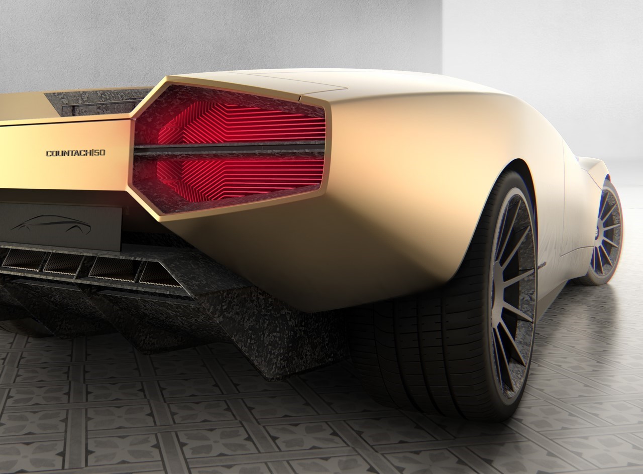
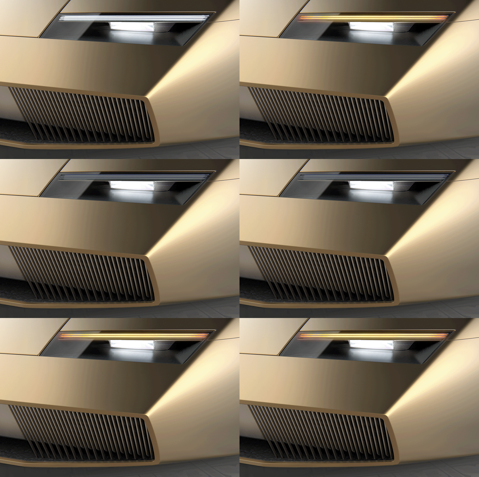
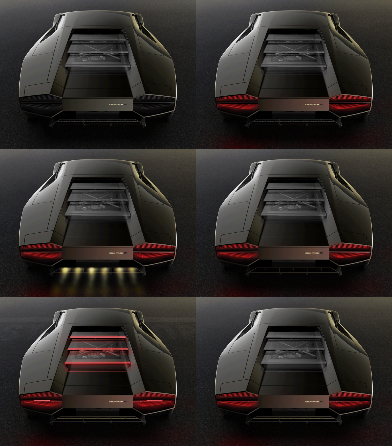
The transparent vents on the rear give a peek into the car’s internals, showcasing its engine, while the taillights are an absolute exercise in design minimalism 101. They retain the original Countach’s familiar hexagonal shape, but instead come with edge-lit light strips in the signature Y-shaped pattern. The front ditches the familiar pop-up headlights for a minimalist feel, capitalizing on the narrow strip on the front, with edge-lit indicators on the top.

ARC Design’s Countach 50 is unmistakable in its appearance. It doesn’t take more than a glance to recognize the familiar shape and form of one of Lamborghini’s most famous cars, even when it’s not in its familiar red color. However, you notice something different. It feels a lot cleaner, more refined, polished.

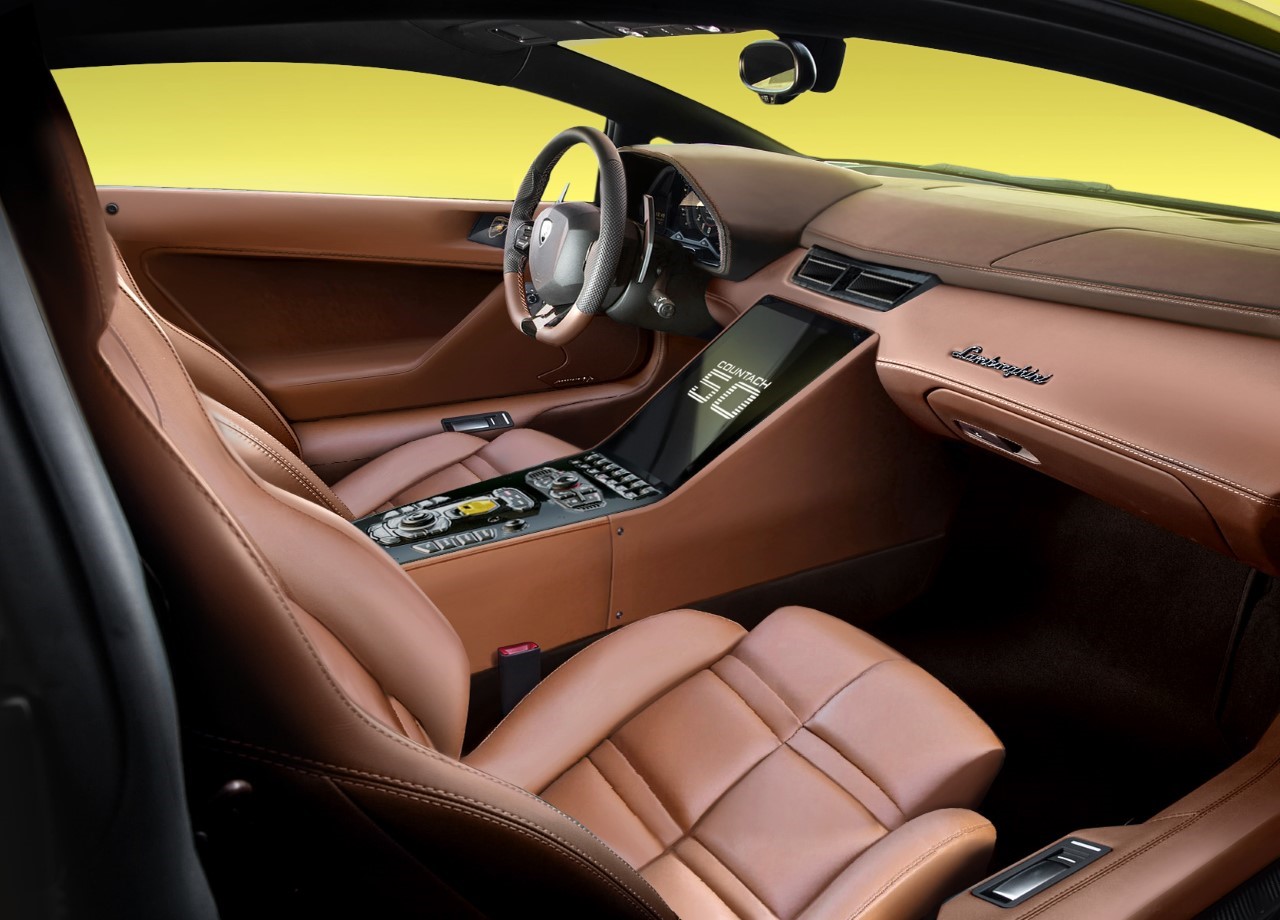
Although the Countach 50 upgrades certain aspects of the design, it retains a few favorites too, like the scissor doors, and the vents on the side that pop out when the car’s driving and sit flush against the surface when parked. The interiors use an all-leather design too, from the seats to the dashboard, and even the insides of the doors. There is, however, a significant upgrade in the central interface, which sports a massive display and the palpable lack of a stick-shift.

Designer: ARC Design

The Countach 50 is a fan-made concept. ARC Design isn’t affiliated with Lamborghini. The use of the Lamborghini logo is purely for representative purposes.

Minimalist 3D-printed pen comes with a literal ‘twist’ that acts as its eye-catching detail!

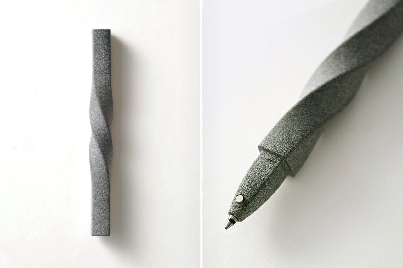
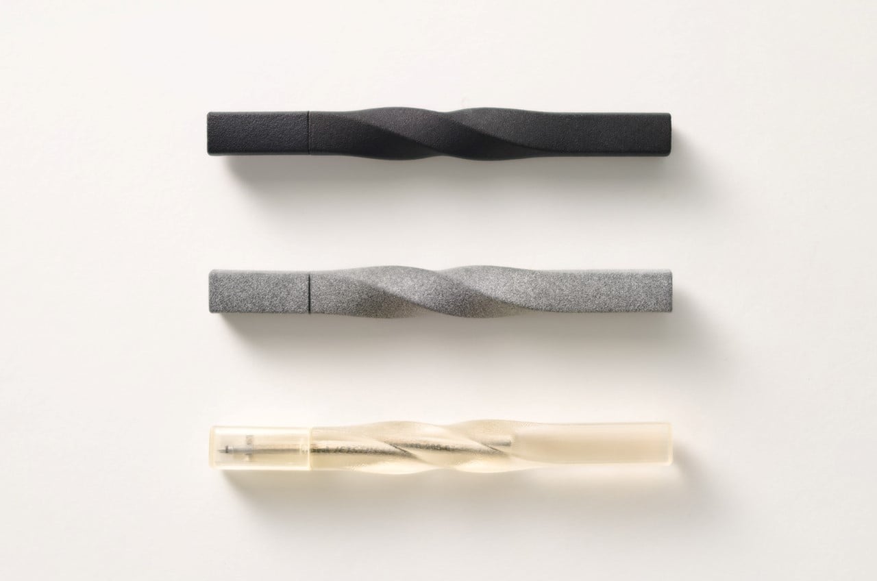
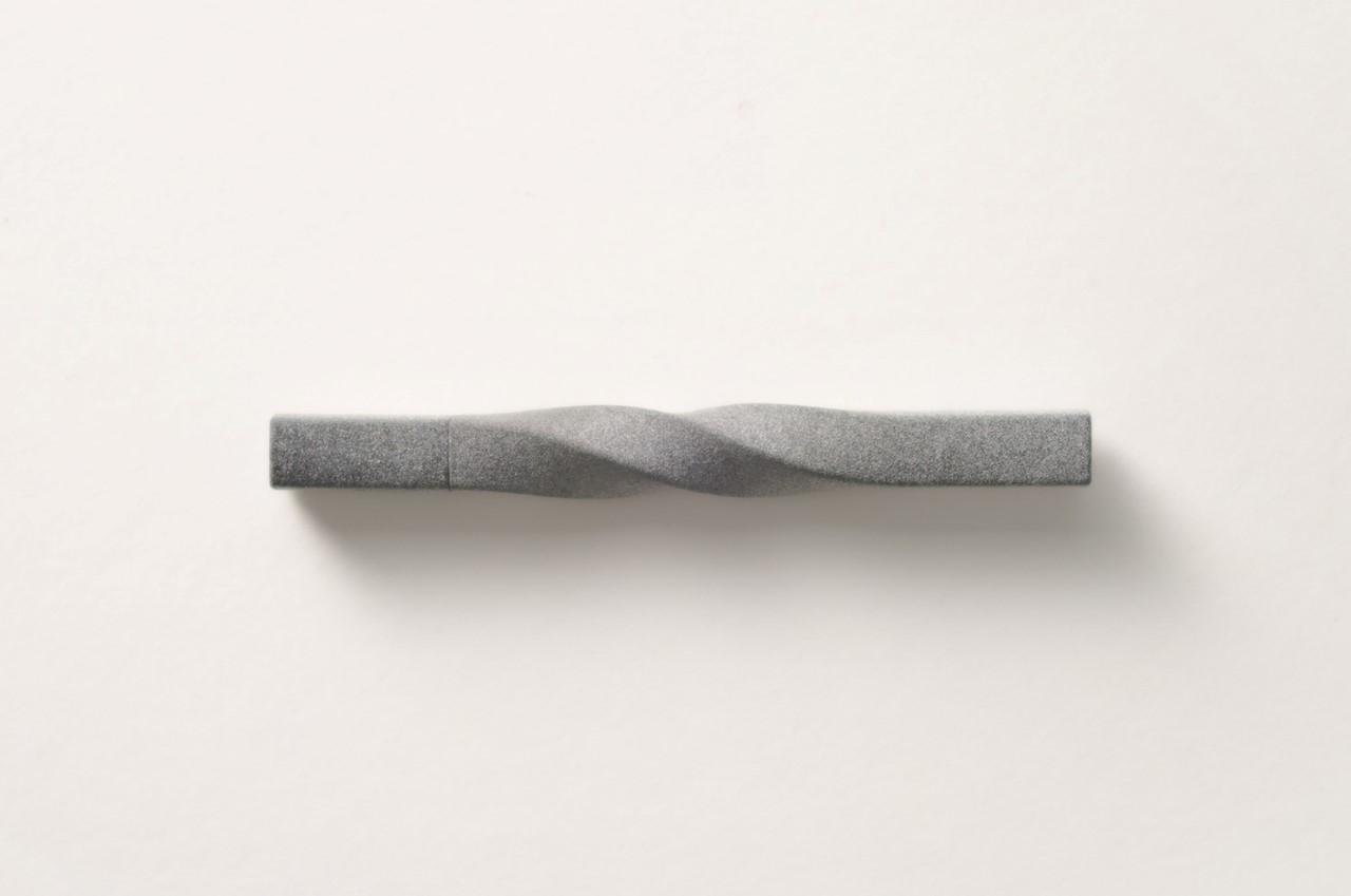
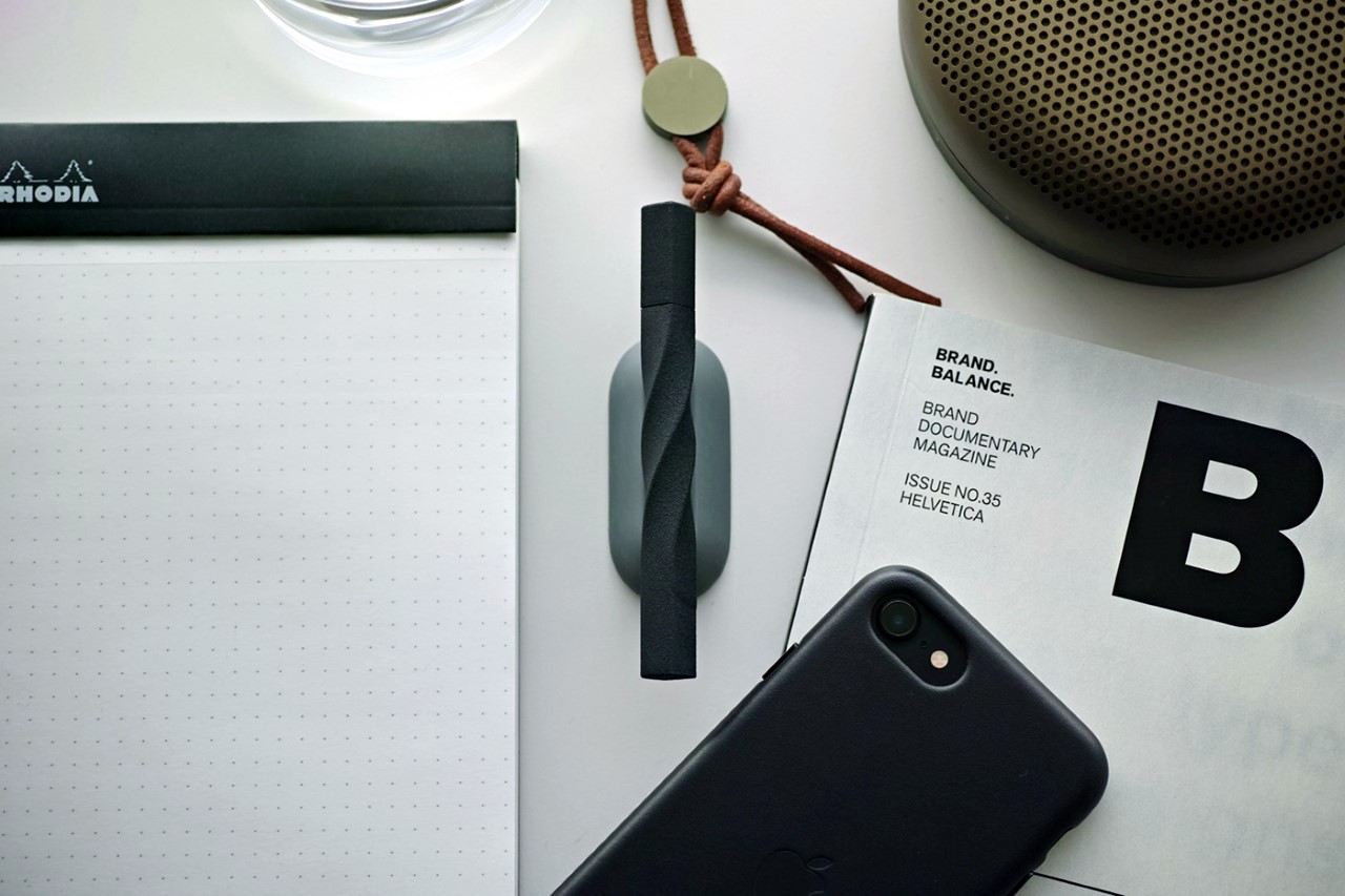
Kairi Eguchi’s 3D-printed pen has a pretty unique way of balancing minimalism along with an expressive design. It’s rather simple if you break it down by its cross-section – The pen’s basically square-shaped, but it isn’t just a simple extruded square. Somewhere down the middle, the square profile makes a gradual 180° twist, creating a form that’s wonderful to look at and has a tactile appeal!
Designer: Kairi Eguchi

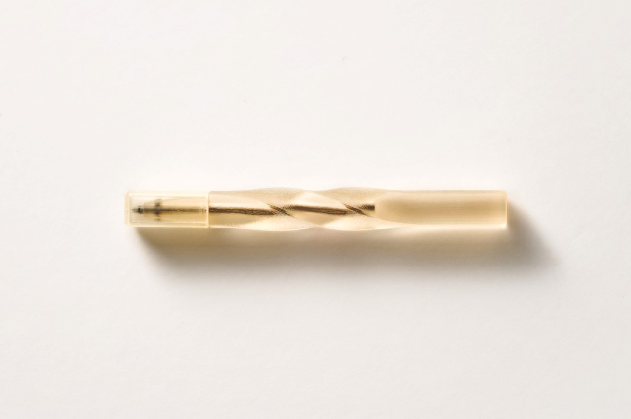
The pens come with a rather rough stone-ish texture as a result of the sandstone FDM printing. This adds to the pen’s unique appearance and its tactile appeal. It looks like stone, but feels surprisingly light, while that rough surface is also great to grip. The twist in the pen’s design is right above where one would normally grip it, so it ideally rests in the web of your hand rather than being difficult to hold. The twisted surface also allows the pen to roll, which seems rather unusual for something that’s originally square-shaped.

Titled the Serpentina (for ‘serpentine’), the pen takes on a snake-like quality with its long, twisting, dynamic-looking body. The pen’s showcased in 3 colors, a concrete grey, charcoal black, and a rather unusual resin-like transparent yellow.

The Serpentina Pen is a Silver Winner of the Design For Asia Awards for the year 2020.

Minimalist Chair inspired by the elegant design of a paperclip

Paperclip Chair by Andrew Edge

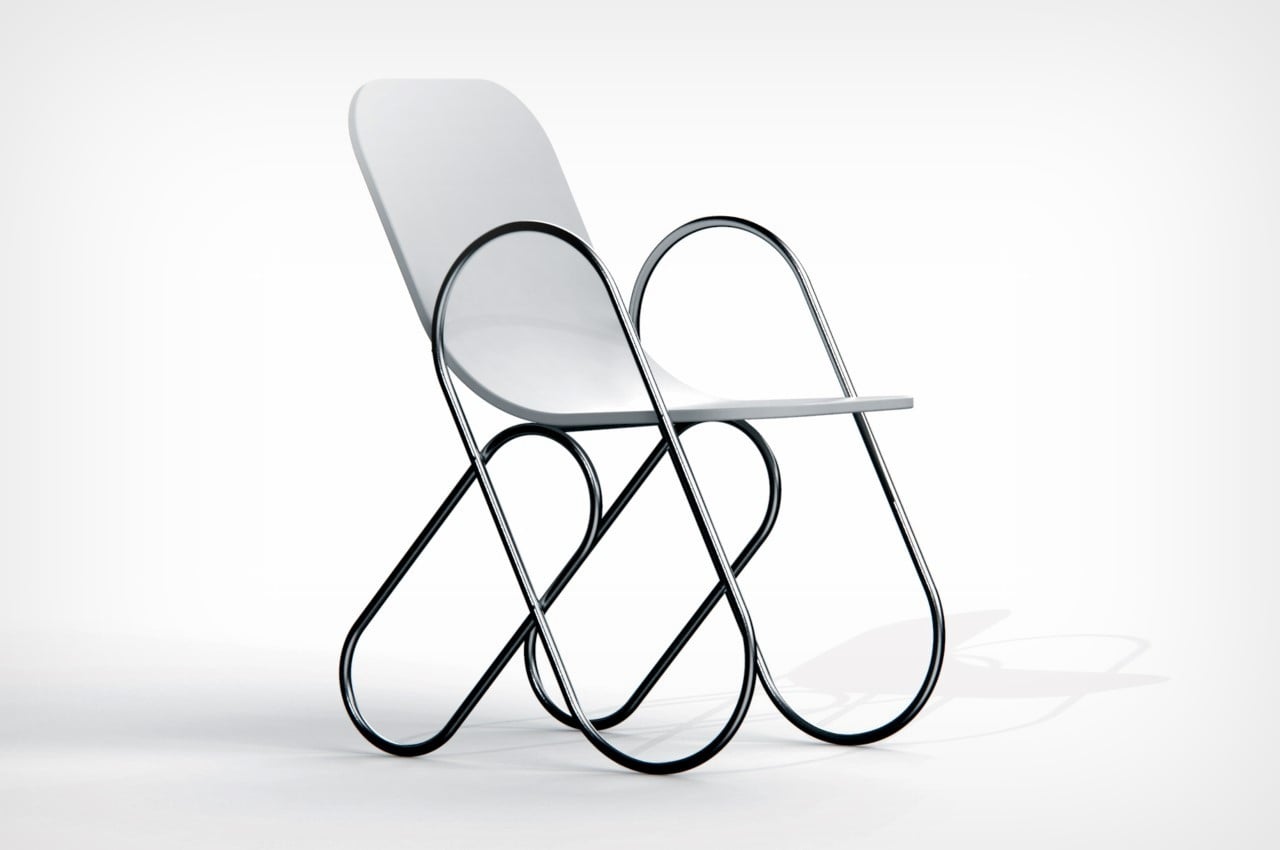
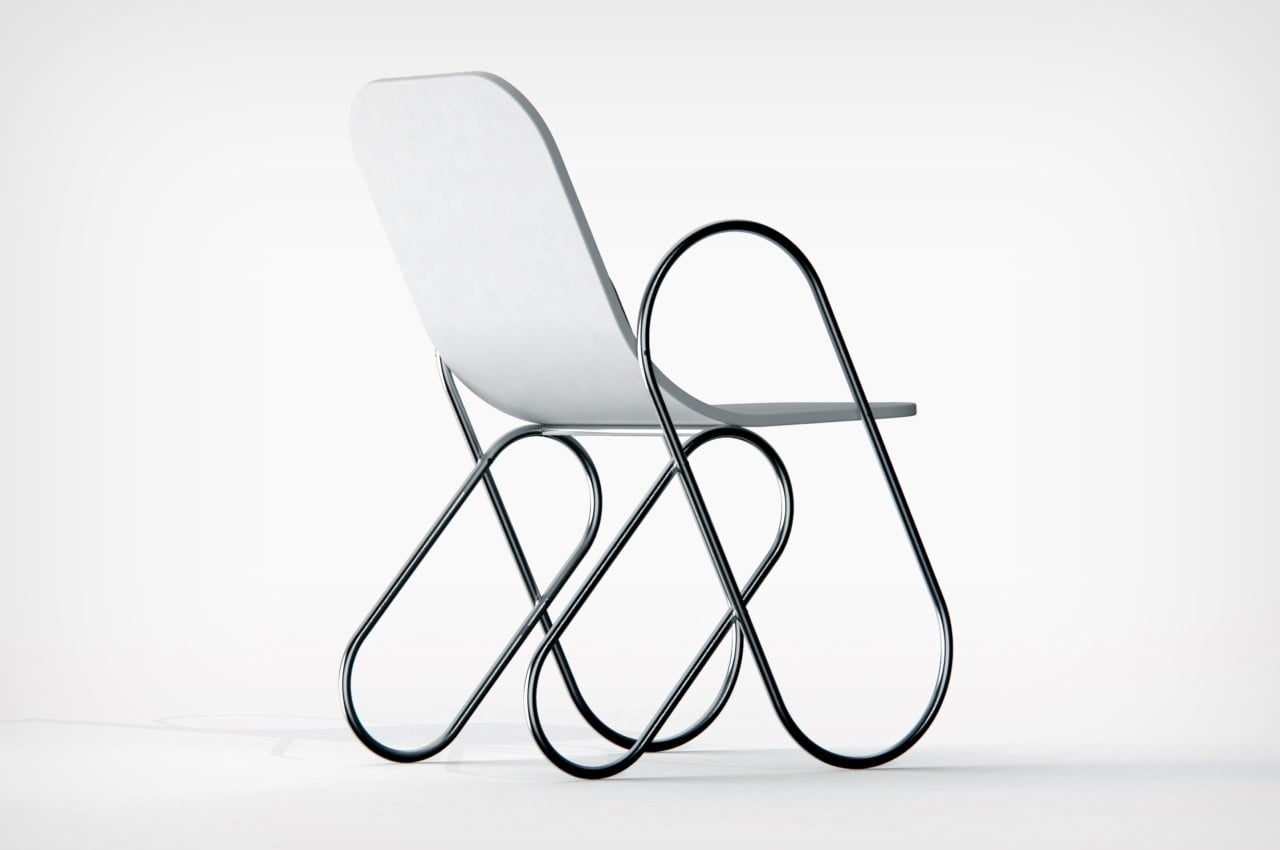
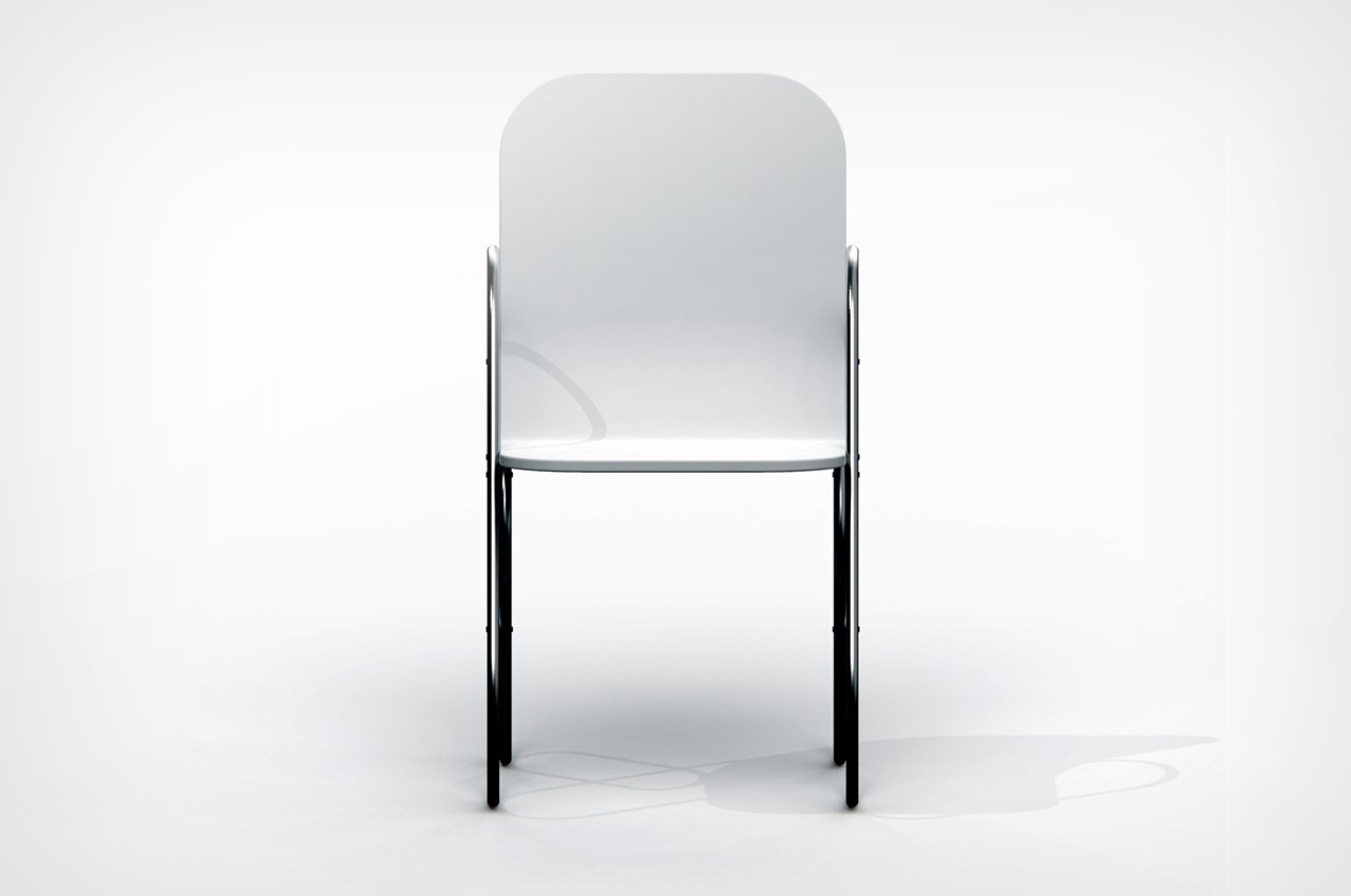
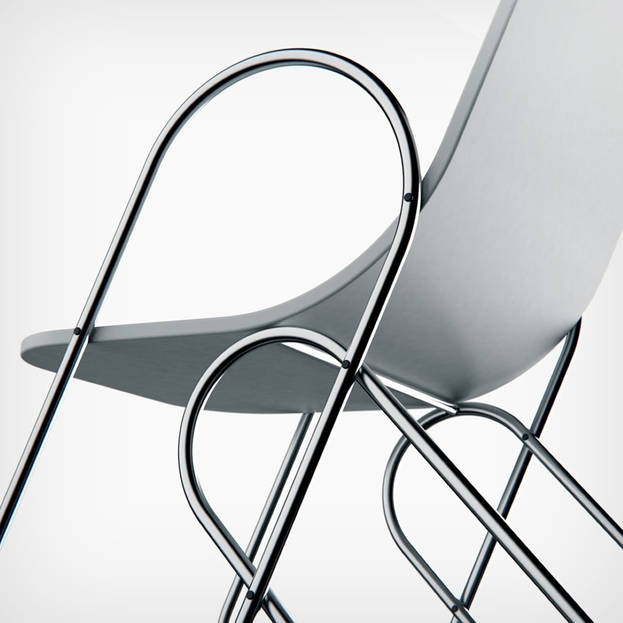
Stationery and Furniture really don’t have that much influence over one another. Just given their sheer size difference, the way a piece of stationery interacts with its surroundings is vastly different from how a piece of furniture does, considering their scale. However, Boston-based designer Andrew Edge is hoping to switch things up with the Paperclip Chair, a rather minimalist piece of furniture with oddly pleasing paperclip-shaped legs. The legs come with curved, angled forms made from metal piping, upon which rests the seat, yet another minimally designed detail.

Designer: Andrew Edge

Paperclip Chair by Andrew Edge

What’s remarkable about the Paperclip Chair is its almost 2D nature made using geometric forms. Even though there’s practically nothing to the chair’s design, it has an eye-catching presence. The curved legs do look like the chair could rock, but given the 4 points of contact, it’s pretty sturdy to sit on. In fact, it’s rather clever how the designer has even used the curves on the front legs to create armrests on the top!
Paperclip Chair by Andrew Edge

Paperclip Chair by Andrew Edge

Paperclip Chair by Andrew Edge