This insulin pen cap concept tries to make diabetes management less tedious

There’s still no escaping having to prick yourself to deliver life-saving insulin, but that doesn’t mean keeping track of your diabetes data has to be stuck in the past either.

Smartwatches and fitness trackers have become a lot more sophisticated in the past few years, but there are still some medical conditions that are still outside the grasp of these devices. Accurately measuring blood pressure, for example, still requires some sort of inflatable cuff. Diabetes management is even more painful, almost literally, because of the need to draw blood and inject the medication. We’re still far from reaching that non-intrusive goal of diabetic management, but one seemingly innocuous product is trying to make that process a little bit smarter.

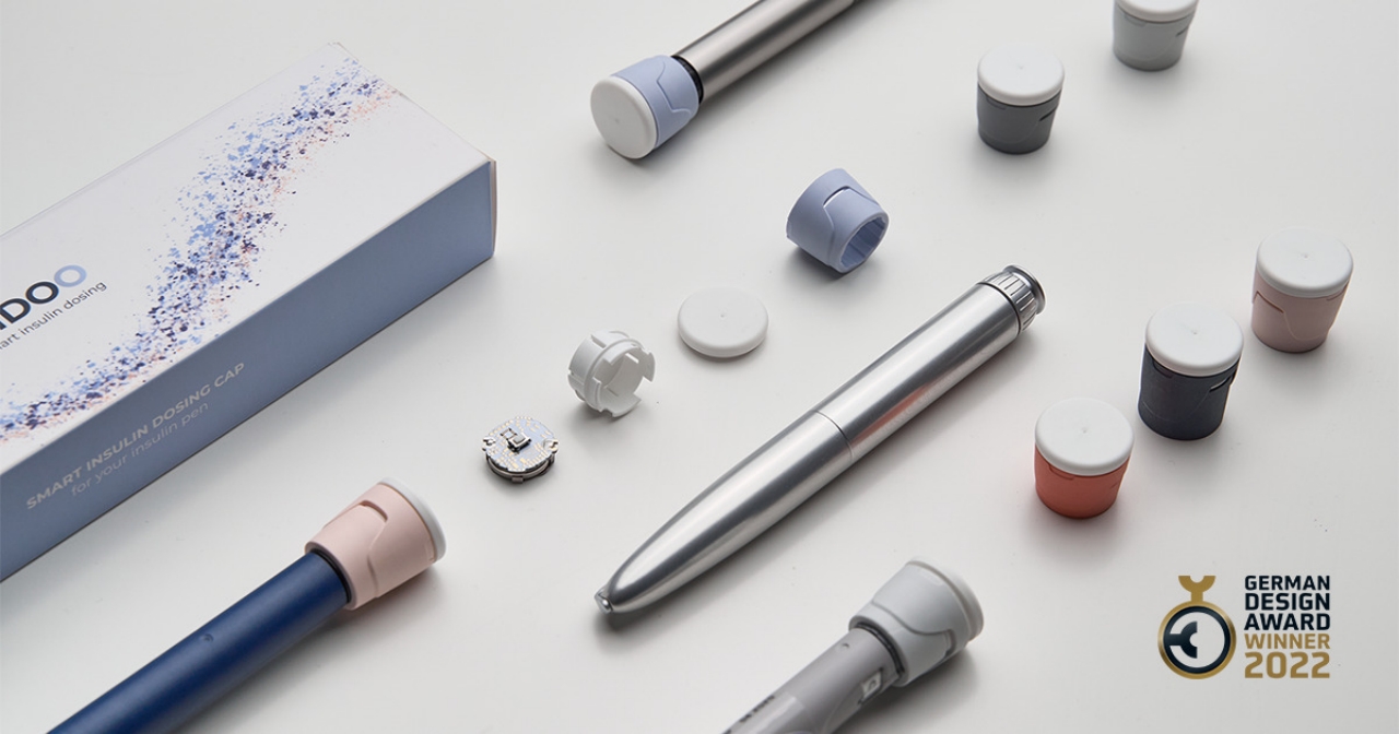
Designer: Luca Lili Takacs, Csilia Antal for X-Plast

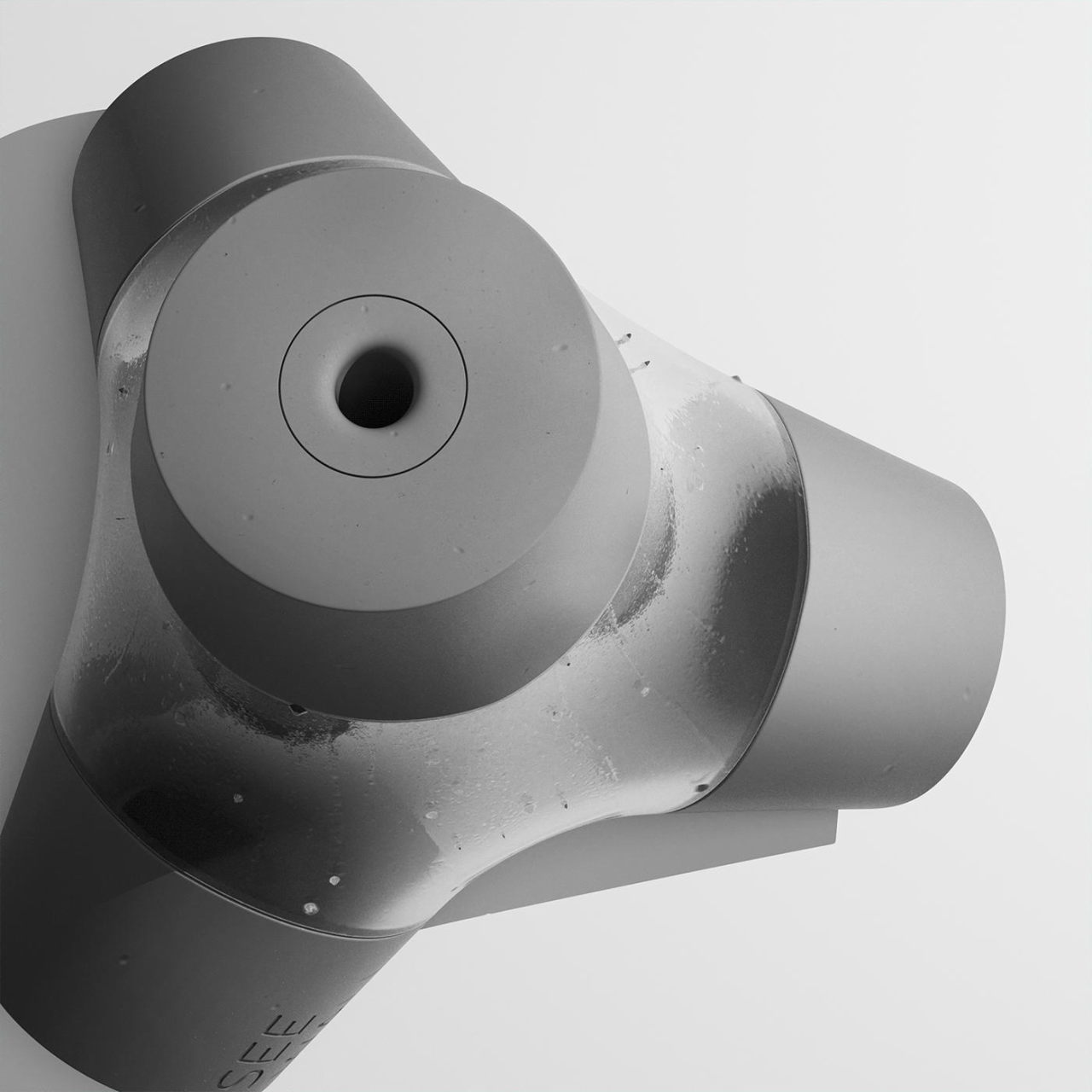
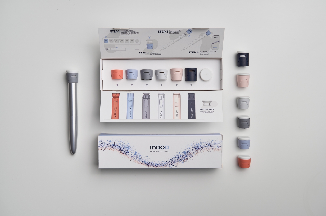
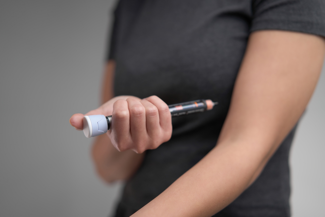
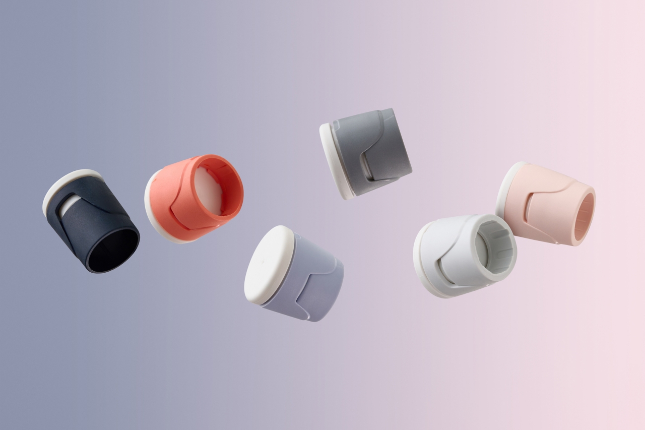
Injecting insulin into the body used to require some medical know-how, but anyone with diabetes can now administer a dose on their own. There are also more alternatives these days to the typical syringes and pumps, with the insulin pen becoming to most convenient and most stylish option. All of these methods, however, still require no small amount of manual data tracking, something that the INDOO smart insulin pen caps are trying to address.

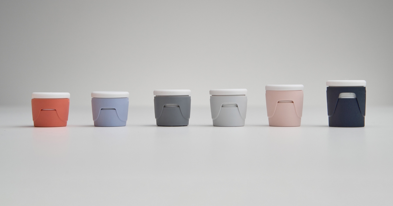
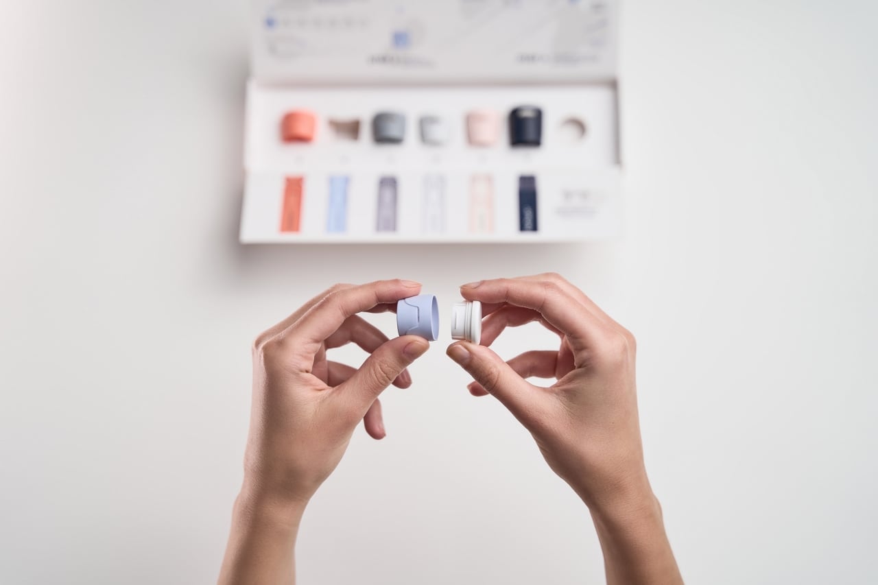
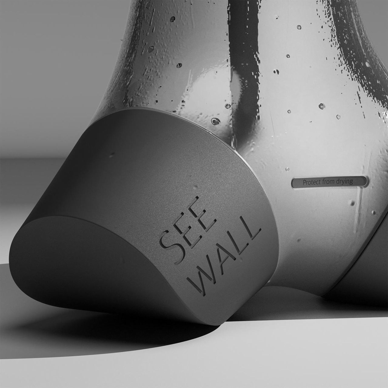
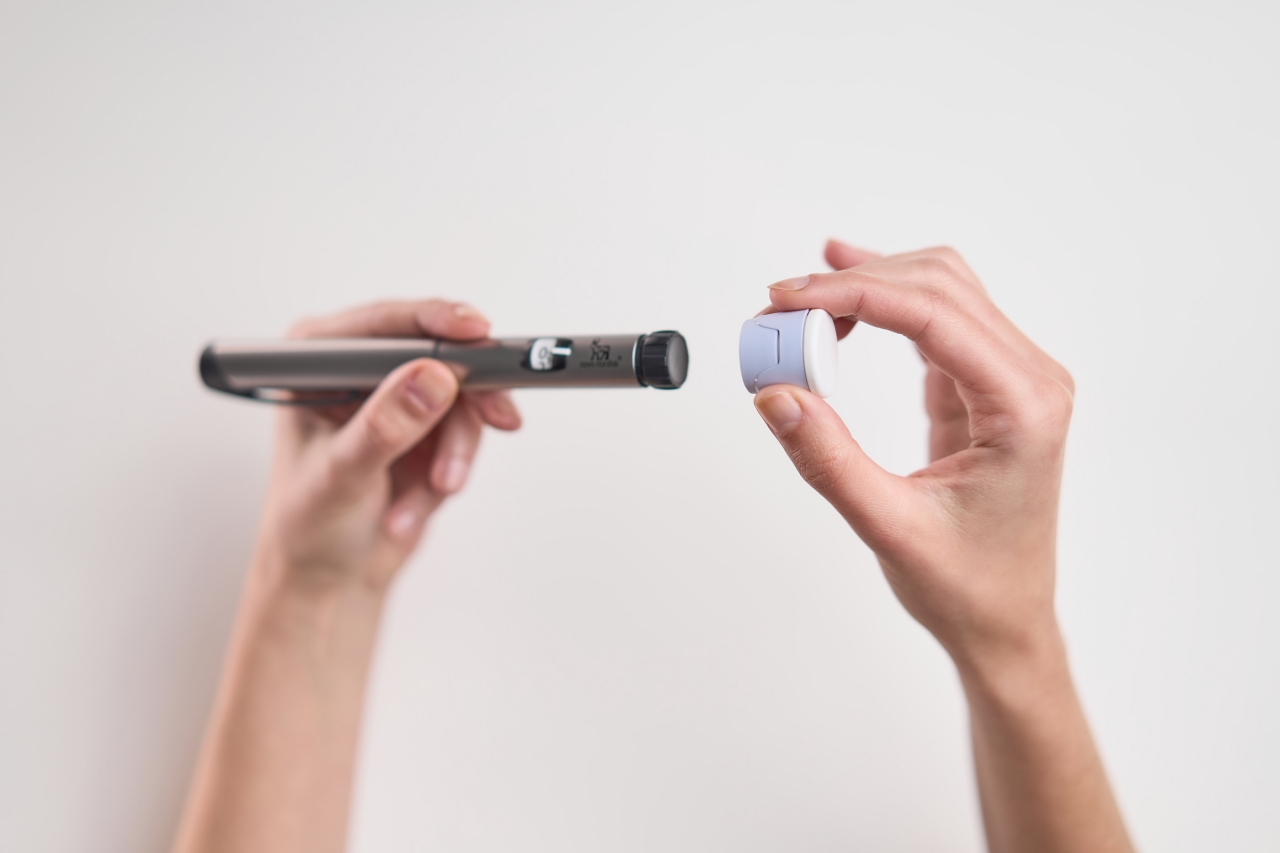
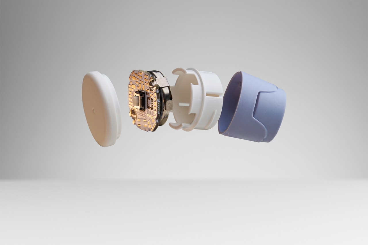
These caps look like gigantic versions of typical pen caps, which isn’t surprising given how insulin pens are equally gigantic compared to the handwriting tool. A box contains different caps designed to fit the different types of insulin pens available in the market today. This makes it easy to switch brands without having to buy a new set. The electronics part can simply be transferred from one cap to another.

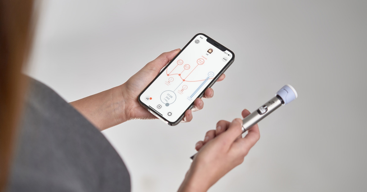
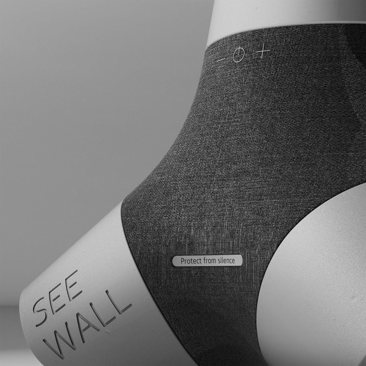
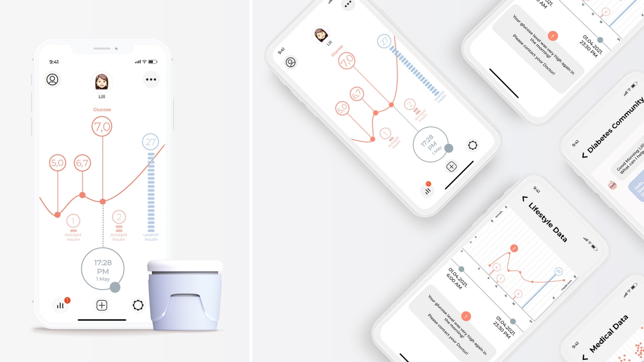
The INDOO isn’t just decorative, of course, and it turns any insulin pen into a smart insulin pen. It helps with the management and tracking of doses and insulin levels, a critical activity that can mean life or death for a diabetic patient. As with any smart accessory, it has to be paired with a smartphone app that will offer notifications, warnings, and suggestions that could save the person’s life.

There are some insulin pens that are starting to offer smart features, but the INDOO offers a solution that won’t force you to change brands unless you really need to. Considering how some insulin pens do get thrown out after a period of use, these savings add up in the long run.

The post This insulin pen cap concept tries to make diabetes management less tedious first appeared on Yanko Design.

Harry Potter Nimbus 2022 concept takes the classic broomstick to new heights

If you’re going to ride a broomstick anyway, you might as well make sure you look good on it.

Although it eventually ended up being a tale that could give younger kids some nightmares, Harry Potter possessed the classic elements of children’s fairy tales when it came to witches and wizards. You hand long-flowing robes, pointy hats, wands, and, of course, flying broomsticks. The wizarding world of Harry Potter hasn’t exactly been receptive to technological advances, and it can be clearly seen even the most mundane of these magical tools. Naturally, someone just had to give Harry Potter a modern makeover, resulting in a broomstick no wizard or witch would want to pass up.

Designer: Simone Caronni/3L Design

Harry Potter tried to stay true to the tropes of witches and wizards, even as it grew into adulthood, from kids’ books to YA novels. The broomstick, for example, strayed little from the traditional designs of medieval broomsticks, complete with crooked shafts and unmanageable brushes. There’s plenty of room for design exploration and experimentation, of course, and the Nimbus 2022 concept sticks out as one that is the most believable, especially to one that has seen electric scooters of this non-fictional age.

Designer Simone Caronni didn’t have to go far and took inspiration from the things that are already in Harry Potter’s world as well as ours. The basic bent profile is still present, almost a nod to the natural shapes of wands that wizards use. The concept does give the vehicle, if one could call it that, a brush-up, almost literally. The aluminum material of the shaft plus the nearly uniform strands of the brush make it look more like an artist’s paintbrush or even a makeup brush.

The most critical upgrades, however, are the addition of a proper seat and some semblance of modern electronics. Witches and wizards have been bearing the pain of riding on a stick for centuries, so it’s high time that comfort becomes a priority in the design of a broomstick. The handle also shows the equivalent of an instrumentation panel, but we’ll presume it’s magic-driven instead of electricity-powered. Of course, the design has room for customization, or rather for proudly showing off our House colors.

The Nimbus 2022 is an interesting take on what was one of Harry Potter’s most iconic props, though it’s also easy to see how this new design probably won’t sit well with the Ministry of Magic. The modern design and features definitely bring the rather uncomfortable mode of transportation to the present age, but it reeks too much of Muggle technology to pass without comment among the wizarding population.

The post Harry Potter Nimbus 2022 concept takes the classic broomstick to new heights first appeared on Yanko Design.

This levitating smart assistant concept makes smart speakers look antiquated

What better way to show how smart assistants are the future than with a futuristic speaker that seems to defy the laws of gravity.

When Amazon came out with the first-ever smart speaker housing a smart assistant, there was a bit of bewilderment over its place in our modern life. Half a decade later, it almost seems inconceivable to have a modern home that doesn’t have either some smart speaker or at least a way to get in touch with Alexa, Google Assistant, Siri, and everything in between. While these smart assistants have evolved in the past years, the design of speakers hasn’t seen many notable changes in terms of design. One concept, however, breaks out of the mold and aims to make the smart assistant truly look futuristic while still setting a foot down on familiar and comforting materials.

Designer: Alex Casabò

That’s not to say that smart speakers are ugly, especially since many of them are intentionally designed to be more aesthetic than most speakers. The shapes for these speakers, however, seem to be limited to a few basic forms like cylinders or rectangles. There are some exceptions, like the BeoSound Emerge, but this beautiful book-like audio product is more the exception than the norm.

You don’t have to go overboard to envision a more interesting take on smart speakers. Floating speakers aren’t exactly new by now, though they are pretty much novelty items. Designer Alex Casabò, however, took that idea and put a familiar smart speaker design convention, creating something that is both mystifying but strangely also calming.

Unlike most floating speakers, the sphere that hovers above its metallic base is covered with what looks like a coarse material that gives the impression that it’s made of granite or something similar. In addition to evoking a sense of wonder over something heavy that floats in the air, the somewhat organic and rough texture creates a satisfying visual contrast to the smooth and lustrous box beneath. It also calls to mind the familiar design of some smart speakers, particularly those that use fabric to blend in with some room decorations.

The concept also has room for visual feedback, not just in the form of icons but also text. This reinforces the image of something that is so futuristic it almost looks like magic, creating a beautiful contrast in themes. With an organic sphere floating on top of a metallic block and a design that’s novel yet also familiar, the levitating smart assistant concept is almost like a product of contrasting elements that have been harmoniously mixed to enchanting effect.

The post This levitating smart assistant concept makes smart speakers look antiquated first appeared on Yanko Design.

This fashionable smartwatch keeps track of your sleep and the air quality in your room

While most wearables are more focused on what you do when you are awake, this smartwatch is more concerned about getting the best sleep that you can.

Smartwatch sales have exploded in the past two or so years, eclipsing even the older smart fitness band categories, thanks to a sudden interest and obsession over personal health. While it’s good that people are now more conscious about staying active even at home, exercise, movement, and even diet don’t complete the whole fitness picture. Sleep plays an equally important role in staying healthy, and this smartwatch is just as concerned about that as it is with the rest of your body, including the air you breathe in at home.

Designer: Heyok Shin

Most smartwatches these days do keep track of sleep quality or length, but mostly as an afterthought. Sleep, however, is a critical part of our health, and length isn’t the only relevant metric to keep track of. In fact, different people need different amounts of sleep, so there’s no one size fits all recommendation. The ZOS smartwatch tries to take the mystery out of sleep management and analyzes sleeping habits in order to recommend better sleeping times and conditions. It also has features like smart alarms and even ASMR audio recordings to help induce sleep.

The ZOS smartwatch concept doesn’t exactly look like your typical smartwatch, especially with its elongated screen. It is, however, designed for maximum comfort since you are supposed to be wearing it even in your sleep. The choice of magnetic straps and leather material was made with that in mind, ensuring the wearer’s wrist won’t be irritated in the middle of the night, disrupting their sleep.

Sleep management is actually just one-half of the ZOS smartwatch’s purpose. The other half ties into the designer’s other concept, the CLOSSY air purifier and plant care cabinet in one. This smart home concept product can analyze the quality of air inside a room and keep an eye on the plant that will also help purify the air. While these pieces of information can be seen from a smartphone, the ZOS smartwatch is imagined to be the perfect companion for the CLOSSY product.

The post This fashionable smartwatch keeps track of your sleep and the air quality in your room first appeared on Yanko Design.

Nintendo phone concept is a glimpse of a dream that will never come to be

Although it’s unlikely the company will ever go down this route, this concept smartphone is easily every Nintendo fan’s dream.

Although it is hardly Nintendo’s first handheld gaming device, the Nintendo Switch not only sparked the imagination but also drove sales sky-high when it launched back in 2017. Since then, the gaming giant has continued to milk that cow for all it’s worth, ignoring clamor for a long-overdue Switch Pro upgrade. Some Nintendo fans, however, actually wished that the company went smaller rather than bigger, bringing its iconic characters and titles to phones. Nintendo has sadly withdrawn from mobile games, but one fan tried to envision the best combination of Nintendo’s spirit and mobile technology.

Designer: Lee Huang

In terms of technical capabilities, Nintendo definitely has what it takes to make a Nintendo Phone. The Switch, after all, is pretty much a tablet with custom software and a very successful gimmick in the form of the Joy-cons. Nintendo could have also easily partnered with some smartphone maker for a “Nintendo Edition” phone, but that will probably pale in comparison to one that bears Nintendo’s iconic design language.

It’s easy enough to actually mistake this Nintendo Phone concept as a toy, especially with its use of soft pastel colors and round buttons. That’s precisely the point, though, because this is a handheld gaming device first and foremost, a phone only second. It might look out of place in a boardroom meeting unless you’re the type who will flaunt their inner gamer in any setting.

Those colorful rear plates are also the perfect palette for branding, like the special edition consoles that Nintendo and its competitors would occasionally put out. There’s also an opportunity for slapping on skins, of course, and you won’t be as hesitant to put a Pokemon-themed skin on this as you would a regular phone. There’s also plenty of room for accessories, including game controllers, given how more open phone designs are compared to something like the Switch.

The rather sad reality is that this concept will remain just that, a concept that will tickle Nintendo fans’ fancy and make them yearn for better days. Nintendo hasn’t had much success with mobile games for phones, and it might not have the capability to run an Android spin of its own. For now, Nintendo fans can take comfort in knowing that their community has no shortage of creative people who can share their dreams of things Nintendo could do but never did.

The post Nintendo phone concept is a glimpse of a dream that will never come to be first appeared on Yanko Design.

Razer’s all-in-one modular gaming desk design is a sci-fi dream come to life


If you find yourself having trouble juggling different desks for your different roles, then Razer’s latest dream might be yours as well.

All of us have different roles to play in life. Some of those are easily compartmentalized, thanks to being confined to a specific location. With new arrangements that have left many people stuck at home, however, the boundaries between work, study, and play have started to get muddled. While there are those that advocate keeping different spaces and even desks for different tasks, most people probably have to live with just one at home. If Razer’s Project Sophia concept ever becomes a reality, however, that will be a problem of the very distant past.

Designer: Razer

Whether you have one desk or three, you most likely have different setups for the different roles you play. Work might require you to be professional and productive, but video or audio streaming requires specialized tools to keep quality up and noise down. Switching between setups and desks will always be a chore, and it would be nice if a single desk could reconfigure itself depending on the task at hand. While an autonomous workspace is probably still a fantasy, Razer is envisioning the next best thing.

Project Sophia is an all-in-one modular desk concept that employs strong magnets and crafty electronics to reconfigure its functionality, depending on the task at hand. The desk itself is actually a computer in disguise, powered by an Intel processor and NVIDIA graphics to drive the modular system. There’s even a huge OLED screen, either 66 or 77 inches, so you really have a complete computer setup even without the modules.

Those modules, however, are the magic sauce to Project Sophia. These snap beneath the desk’s glass surface and offer a wide variety of functionality for different use cases. The idea is that you can quickly swap out modules when you switch from work to play to your other work as a streamer, no need to leave your desk. Except perhaps to get the modules you need and reconfigure the desk.

Razer said that there are 13 separate modules, including a programmable hotkey, media controls, system monitors, and a wireless charger. The company even says there’s even a cup warmer module available for avid coffee fans. And, in typical Razer fashion, there is an RGB LED strip lining the desk that people can customize to fit the mood.

If these images make you fantasize about futuristic dashboards and cockpits, you wouldn’t really be far from the truth. Just like how most of those are fantasy, Razer’s Project Sophia is sadly still just a concept at this point, but it’s an exciting concept nonetheless, especially for those who find themselves with different shoes to fill in a single day.

The post Razer’s all-in-one modular gaming desk design is a sci-fi dream come to life first appeared on Yanko Design.

The odd contours on this smartphone case design are meant to make you feel calmer


Smartphones are meant to be placed in our hands, but this concept design creates a totally different tactile experience that could help you stay in control even during an emotionally stressful day.

Some smartphone makers and software developers boast about their product’s accessible design, but the majority of those stop at the most common physical disabilities. Of course, those don’t cover all the kinds of hurdles that may prevent people from enjoying a product, especially those with emotional or psychological issues that may pop up from time to time or are with them since birth. Even accessibility features don’t have provisions for those, but a new kind of smartphone case attempts to do just that, at least for those on the autism spectrum.

Designer: Chloe Leigh-Smith

Autism is probably one of the most misunderstood and, at the same time, stereotyped developmental disabilities, partly because of how varied the symptoms and manifestations might be. One of the most common triggers or expressions, however, is a severe emotional change that sometimes requires help from someone else. That external assistance might not always be available, so this E.Cue case tries to help those with ASD to self-regulate using the power of touch.

As far as a smartphone case goes, the E.Cue is definitely an oddity, even for cases that have textured surfaces or beads and stickers stuck to them. The almost random contours and bumps across the case’s back might remind some people of topographical maps, and that’s not by accident. It turns out, those are the exact things that can relieve stress and soothe emotions.

Everything about the E.Cue is designed to be calming, from the topographical patterns to the choice of colors. Designer Leigh-Smith cites “biophilia” as the design philosophy for the case’s unique structure. Naturally recurring forms and contours provide a tactile experience that is designed to reduce stress and induce calm. At the same time, the case hides some actual piece of technology inside, with pressure sensors that use colors to provide feedback on hard someone is pressing their finger on the case, which, in turn, could represent their emotional state.

Although the user of such a phone case might not be aware of it, the E.Cue is also designed to be sustainable, repairable, and, when the time comes, recyclable. Thermoplastics are chosen not just for durability but also for their environment-friendly properties, while the electronic components and the battery are designed to be easy to remove and replace.

Although it’s unlikely that we’ll see the E.Cue become a mainstream product, it’s still encouraging to see concepts that try to make critical objects like smartphones more accessible. The great thing about accessibility is that these features can also benefit those outside of its intended audience, making it truly for everyone. You may not be on the autism spectrum, but no one will deny having a fit of rage or a panic attack every now and then, and the E.Cue could help you calm down before you decide to throw your phone across the room.

The post The odd contours on this smartphone case design are meant to make you feel calmer first appeared on Yanko Design.

This tetrapod-inspired desk accessory is designed to keep the waves of stress at bay

Arm yourself against the discomforts of life with your own personal seawall for your desk.

Life has been anything but kind to most of us in the past two years. Even as we face the new year with hope, many also wait with bated breath for the challenges that 2022 will bring. Wave after wave of problems and setbacks threaten to wash away whatever joy we have managed to build on the shores of our lives. Fortunately, some of those waves can be broken even before they hit, and these accessories for your desk and room are specifically designed to remind you that it is indeed possible to find comfort and joy in the little things in life.

Designer: Jinwoo Jang

People living near coastal areas or frequent these places might be familiar with the almost alien-looking shapes that litter some of these shores. Perhaps inspired by natural corals, these tetrahedral concrete structures are used as seawalls and breakwaters, where their odd shape not only helps dissipate the force of oncoming waves but also remains locked in place, no matter how strong those waves are. For people familiar with these man-made structures, seawalls convey a sense of comfort and security, and those are the emotions that these Seawall desk accessories are hoping to evoke.

Shaped exactly like those tetrapods, each product serves one and only one purpose. That may seem almost like a waste of space, but at the same time, it’s designed to actually reduce discomfort and stress. And what better way to stress someone out than by overloading a single product with a multitude of unrelated features?

One Seawall, for example, is meant to hold pens, keeping the stress of clutter away. Another is a smart speaker that also utilizes soft fabrics at its literal center to add a warm and fuzzy feeling to an otherwise faceless entity. There’s also a mood lamp with an equally soft glow to make the darkness less uncomfortable. And for the room’s center table, a Seawall-shaped humidifier puts the gentler kind of water to good use in your room.

Ironically, these Seawall products don’t seem to be designed like their real counterparts and function better alone. Given their size and shape, it might actually cause people more stress in trying to put all of them together. They’re a set that’s better apart, each in their own place, perhaps at the center of a table, a desk, or a shelf. Even in isolation, however, each well-balanced structure stands proud, as if to remind us that no matter what discomfort life may bring, there are always ways to protect ourselves, even if that means having a tetrapod standing in the middle of your living room coffee table.

The post This tetrapod-inspired desk accessory is designed to keep the waves of stress at bay first appeared on Yanko Design.

Birdhouses hide in these ingenious home address signs to encourage avian-urban biodiversity!

Our Common House is a household design concept that’s part-address sign and part-birdhouse, designed to increase avian-urban biodiversity.

When we’re not thinking about whether or not they’re real, watching birds always seems to bring us back to nature. Whether we live in a big city or in a rural small town, waking up to the sounds of hummingbirds or looking on as a sparrow builds its nest reminds us that we share our homes with all kinds of birds. Sometimes the concrete and traffic of busy cities make us forget, but products like birdhouses and feeders always bring us back. Designer Mikołaj Nicer conceptualized Our Common House for this reason. Part address sign and part birdhouse, Our Common House is a household design that aims to encourage avian-urban biodiversity.

From a distance, Our Common House is your typical household address display. Made from natural fired clay, the outer casing of Our Common House is unassuming and minimalist. Unadorned by design, Our Common House sports an adaptable design that could fit onto any modern home’s exterior. Whenever the address digits look like they could use some cleaning, residents can remove the outer casing to clean it up before attaching it back on. Just beneath the natural fired clay exterior casing is a nesting box constructed from natural wood. Available in either oak, pine, or poplar, the nesting box provides a safe space for birds to breed, eat, and take care of their young safe from the threat of predators. When conceptualizing Our Common House, Nicer hoped to combine the functionality of address signs with a sustainable cause.

Describing this, Nicer notes, “The lack of nesting opportunities is one of the most important factors limiting the success of urban bird populations. Modern building technologies and concepts of city space organization leave little room for…nesting…Our Common House offers a simple and scalable solution to this problem. It turns the common element of building aesthetics into a functional nesting unit, thus providing the population of urban birds with an invaluable resource.”

Designer: Mikołaj Nicer

The post Birdhouses hide in these ingenious home address signs to encourage avian-urban biodiversity! first appeared on Yanko Design.

A modular light fixture inspired by the abacus lets you add, subtract and have fun with your light setup!

Abaculux is a modular light fixture inspired by the abacus, an ancient counting tool used for centuries, allowing users to add and subtract as many light bulbs necessary to achieve that prime lighting.

The abacus is an ancient counting frame tool that can aid in addition, multiplication, subtraction, and division. While they have been used for centuries, abacuses are still made today, often with a bamboo frame and sliding wires stocked with counting beads. Taking inspiration from the ancient mathematical tool, designer Pranjal Uday developed Abaculux, a modular light fixture that takes the same shape as an abacus, allowing users to add and subtract light bulbs however they choose.

The Abaculux is a minimalist light fixture, rising as a single standing rod with a collection of golden light bulbs lining it up and down. Outfitted with a flared trumpet base, Abaculux is bottom-heavy with a steady build that manages to carry multiple light bulbs at once. Uday created Abaculux in part to make the energy consumption of light more apparent by revealing to users how much light they use in a visual presentation they can actually count.

When users want to add a bulb to the electrical rod, they can be slid down and onto the dock where they light up once connected to the pole’s conduction terminals. Following the same method, users can add or subtract however many light bulbs necessary for their preferred lighting. The lightbulbs can also be configured in varying layouts, allowing users to bunch the bulbs at the bottom or appear more spread out over the pole.

Designed for users to witness how much energy they consume when using light fixtures like lamps and LEDs, Pranjal Uday’s Abaculux is a clever reinterpretation of the ancient counting tool we’ve relied on for accurate measurement for centuries. Inspired by the abacus’s shape and design, Abaculux is familiar in appearance but unconventional in design, enhancing its ergonomic build and savvy look.

Designer: Pranjal Uday

Users can either let the light bulbs bunch up at the pole’s bottom or leave them to spread out. 

The conduction terminal gives light to each bulb when connected.

The post A modular light fixture inspired by the abacus lets you add, subtract and have fun with your light setup! first appeared on Yanko Design.